Table of Contents for
Responsive Web Design Patterns
 Responsive Web Design Patterns
Published by
Packt Publishing, 2015
Responsive Web Design Patterns
Published by
Packt Publishing, 2015
- Cover
- Table of Contents
- Responsive Web Design Patterns
- Responsive Web Design Patterns
- Credits
- About the Author
- About the Reviewers
- www.PacktPub.com
- Preface
- What you need for this book
- Who this book is for
- Conventions
- Reader feedback
- Customer support
- 1. Creating a Home for Responsive Patterns
- Why and how to create a responsive site
- Breaking websites down to their patterns
- Building a home for your patterns
- Summary
- 2. The Main Stage – Building Responsive Layouts
- Most popular layout patterns
- Creating complex systems
- Summary
- 3. Make Way for Responsive Navigations
- Responsive navigation patterns
- Summary
- 4. From Static to Dynamic – Embedding Media
- Responsive image patterns
- Understanding sliders and carousels
- Implementing videos
- Summary
- 5. Gathering and Displaying Information
- Responsive table patterns
- Summary
- 6. Combining Responsive Patterns
- Continuing to look for patterns
- Your pattern library is not done yet!
- Summary
- 7. Ship It – Finalizing Your Pattern Library
- Getting ready to handoff
- Publishing your library
- Further exploration
- Summary
- Index
Just by reviewing these patterns, we can already see repetition and combination. For more complex systems, these patterns can be combined in an infinite amount of ways. Of course, infinity can get a little messy.
When designing a website, we don't place content, modules, and text whenever we want. Websites such as these may look more like a cubist painting than a functional site. Website designs should be simple, usable, and approachable. A way to maintain order throughout a website is to base templates and pages off a grid system. The grid system is comprised of columns, typically in the range of 10-16 on large screens. Elements on a template are then aligned with the edges of the columns to bring order to the page.
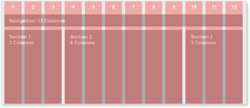
Between each red column, there is space called the gutter. By always keeping this same sized space empty between elements, the page has breathing room and white space. The famous shoe brand, Vans, implements a 12-column grid system.
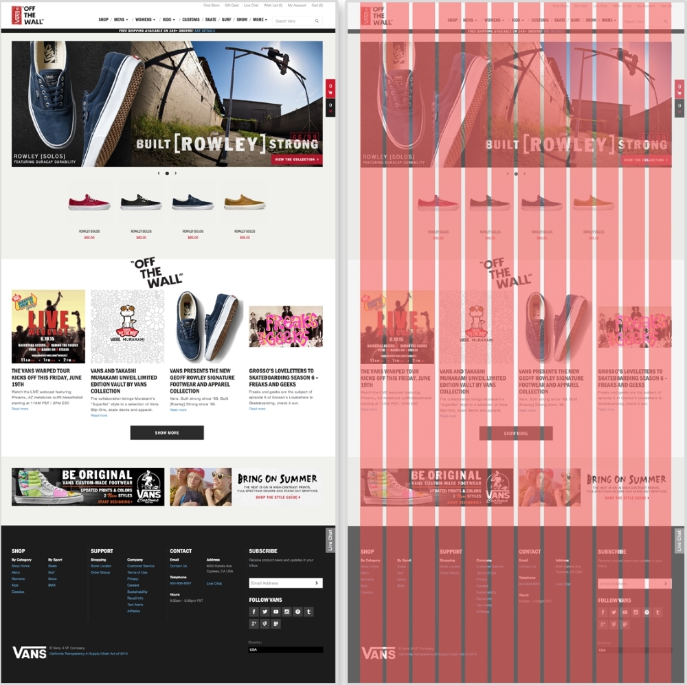
The Vans' website (http://www.vans.com/) with an example grid system
On Vans' home page, different sections of the page line up with the grid. The carousel spans the full width of the grid system, taking up 12 columns. The featured shoes underneath only take up two columns each. The articles under the OFF THE WALL section spans three columns each. Even the BE ORIGINAL banner at the bottom of the site lies on the grid. We see not only each section lined up with the grid system, but the images and text within each as well.
We don't have to create these grids from scratch though. Back when websites were acceptably one size and static, a popular tool to create these grid systems was 960 Grid System (http://960.gs/). This tool provides grid overlays in Photoshop, Flash, Fireworks, Illustrator, and many others. Each overlay is a 12, 16, or 24-column grid system with a 960-pixel width. Along with each column version, 960 Grid System also provides all the CSS needed to have page elements span across a certain number of columns.
We are not designing websites that are only 960-pixel wide. For a responsive website, we can use a responsive grid system. The patterns reviewed in this book can all be applied projects using a responsive grid system. Grid systems can help you determine how wide a pattern should span. With a responsive grid system, even though every column should be the same size, this one size can be a percentage and scale. This means that, on smaller screens, each column's width is narrower. Also with media queries, columns can be dropped too. A 12-column layout can become a 6-column one on smaller devices. Determining how a responsive grid system scales down for a project can help figure out how the project's patterns scale down too.
There are again tools already out there that help us create these responsive grid systems. Gridpak (http://gridpak.com/) lets us create a responsive grid system right there in the browser. By default, each column, column padding, and gutter value is a percentage. This allows the system to scale up and down depending on the browser's size. We can even add breakpoints to the system and change each value. When we download the file, Gridpak provides a .png file for design and the CSS files for implementation.
Note
Check out other responsive grid systems such as Golden Grid System (http://goldengridsystem.com/) and Responsive Grid System (http://www.responsivegridsystem.com/) to find one that best fits your needs.