Table of Contents for
Responsive Web Design Patterns
 Responsive Web Design Patterns
Published by
Packt Publishing, 2015
Responsive Web Design Patterns
Published by
Packt Publishing, 2015
- Cover
- Table of Contents
- Responsive Web Design Patterns
- Responsive Web Design Patterns
- Credits
- About the Author
- About the Reviewers
- www.PacktPub.com
- Preface
- What you need for this book
- Who this book is for
- Conventions
- Reader feedback
- Customer support
- 1. Creating a Home for Responsive Patterns
- Why and how to create a responsive site
- Breaking websites down to their patterns
- Building a home for your patterns
- Summary
- 2. The Main Stage – Building Responsive Layouts
- Most popular layout patterns
- Creating complex systems
- Summary
- 3. Make Way for Responsive Navigations
- Responsive navigation patterns
- Summary
- 4. From Static to Dynamic – Embedding Media
- Responsive image patterns
- Understanding sliders and carousels
- Implementing videos
- Summary
- 5. Gathering and Displaying Information
- Responsive table patterns
- Summary
- 6. Combining Responsive Patterns
- Continuing to look for patterns
- Your pattern library is not done yet!
- Summary
- 7. Ship It – Finalizing Your Pattern Library
- Getting ready to handoff
- Publishing your library
- Further exploration
- Summary
- Index
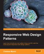
This book is all about reviewing popular responsive patterns. Just copying patterns straight out of this book, however, will leave you with a website that looks like everyone else's. It seems today that many websites consist of one large banner followed by two columns. We know that one column is the "main" column and holds the content that interests us. The smaller side column holds perhaps related posts, ads, or a cornucopia of miscellaneous content. Have a look at the following image to see what I mean:
Most of the sites we frequent daily follow this pattern. To some designers and developers, this layout is safe. It is tested and true. But that does not mean we should rely on it like a crutch. The patterns in this book are popular patterns. They are effective patterns, if used properly, but they are not the only solution. RWD patterns are like house blueprints and a website's content is like the homeowner. Every time a house is built, we don't forget what all previous houses looked like. We don't come up with a design from scratch. We also don't ignore the fact that different people will be living in each one.
Blueprints are great because they show us what works. For houses, they can tell us how high ceilings should be, how wide to make staircases, and how to layout a kitchen. A functional, well-designed house can be a good house. And sometimes, if we are lucky, this is enough. But what if we stopped coming up with new house layouts and always depended on the same blueprints for every future home? We would have functional houses but they would not meet the needs of every homeowner. Maybe the homeowner loves koi fish and needs a shady space in the backyard with a pond to keep them. Maybe the family keeps kosher and needs a kitchen with two fridges and two ovens to prepare food. And maybe the family has a lot of children and wants a slide on the staircase for the kids to enjoy. Yes, these exist. And yes, they are amazing. Have a look at the following image:

Why have boring stairs when you can have this?
Photo: Michaelis Boyd Associates
The point is that we should not reuse the old only because it works. One blueprint will not work for every family home just like one RWD pattern will not work for every responsive website. We need to work upon what we know and modify it for future projects. In this chapter, we will review the following:
- Guidelines for picking out a pattern
- How to combine patterns
- Finding new patterns and inspiration
- Finishing your pattern library
You are not expected to come up with your own patterns from scratch. One of the best ways to innovate is to combine the old to make something new. In this book so far, we have covered patterns for:
- Layouts
- Navigation
- Media
- Forms and data
This gives us some building blocks to work with. Before you get started, though, don't combine patterns for the sake of combining. You have to analyze the pattern and your website's content to make sure they are the right fit. When designing a responsive website and thinking of patterns to use, consider the following:
- Does this pattern make sense for my content?
- Does it meet my browser requirements?
- Will my user understand it?
Really think about these questions instead of going with your gut. You may find yourself saying, "Yes, but…" to these questions. If you do, then think about why the pattern isn't 100% ready for what you need and what needs to change to make it so.
Focus on the content, what the pattern holds, first. If the pattern doesn't serve the content, then don't use it. If it hides the content from the user, don't use it. If it makes the content harder to get to, even if it is "really cool," still don't use it. Elegant patterns don't matter if they aren't doing their job. You can have the coolest animations on your website, but if they distract the user in a negative way from their main goal, they are failing.
If you read the pros and cons section for the patterns in this book, you will have seen comments on the type of content each can hold. For example, some of the navigational patterns can only effectively hold a small number of links. If you are creating a splash page, say for a conference or an event, you might only need a small navigation. But what if you are developing a website for a smaller company that may grow in the future? If you are lucky, they will contact you and ask you to develop a new navigation to fit their growing content. However, more commonly the company will just cram new links into the existing navigation and think that is good enough. Now, the users of that website may have issues navigating with the jumbled menu. And whenever you show off your work on the website, you'll have to say, "It looked great until the company did that."
Hypothetically, let's say we are designing the home page of a responsive site for a local motion graphics company. We first talk to the company to see what will be featured on the website and what they are trying to accomplish with it. We also talk to the company's clients if we can (people who actually use the website) and see what information they needed from it. From this feedback, we know that the company wants to:
- Show off their work and the past clients they have worked for
- Provide a way for potential clients to contact them
- Exhibit the company's culture
The users (the company's clients) want to:
- See the company's best work (for example, a demo reel)
- Read about the company's services
- Contact the company
Now, you should be doing a lot more research that just this. But for this brief example and this imaginary website, this will do. We can see that the website is going to need a lot of visuals since the company will be showing off their work (and their work is motion graphics). We can think of the media patterns we reviewed and see if any of them fit. We know how to scale images, how to make image grids, and how to create big image heroes. The issue with these patterns is that our company makes motion graphics. This means all their work is animated and moving. We could provide thumbnails that when clicked go to a video, or even pop open a video, but why not present the animated content from the start? This is what the company wants to show off. This is what the user wants to see. Instead of forcing requirements into the patterns we know, we can come up with something else.
Let's look at a website that does this right. Panic is an animation studio in Latvia (yes, you can Google where that is). The studio provides services for motion graphics, 3D animations, graphic design, and illustration. When you first visit their website, http://www.panic.lv/, you are greeted with a loading animation. Boom, right away we have the movement. Loading screens are rarely fun, but this one sets the tone of their studio and even showcases some of their skills, which makes sense for an animation studio. The "panic" logo gets written right in front of us and then animates off the page while the rest of the page drops in. The same happens on both small and large screen sizes.
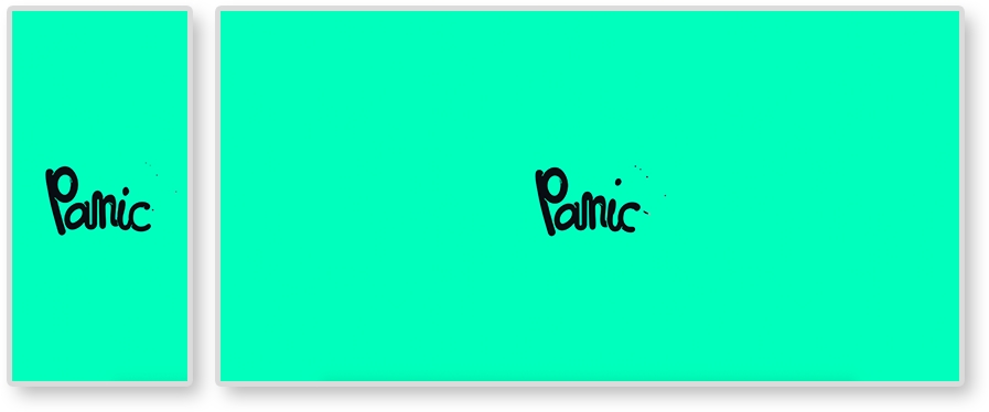
Once the site loads in, the first thing on the page is Panic's demo reel. Behind the play button is another video automatically playing, almost like a teaser. Green and pink 3D objects animate on repeat. This animation is an HTML5 video element set to loop. On mobile devices, we see the reel too. The video behind it is only an image now, no animation. We will get to why this is so later in the chapter.
When you click on the play button, a full span Vimeo iframe video pops up. Even the Vimeo player is styled to match Panic's brand.
In Chapter 4, From Static to Dynamic – Embedding Media, we also reviewed how to make responsive videos with the HTML5 video element and an iframe. Instead of picking one and using just that, Panic uses both ways to embed videos. The "teaser" video on loop uses an HTML5 video element and the popup is an iframe. This is because both versions provide different features and Panic's website is utilizing this.
We know how to make both types of videos responsive, but instead of picking the easiest to implement, look at what they are holding. HTML5 video allows you to hide the controls of a video and easily loop. Perfect for an ambient background video. Using a Vimeo iframe means you have to worry less about compression and let Vimeo handle serving up the highest quality video the user's Internet connection can afford. This is why we see the lower-quality video being embedded using HTML5 and the higher in an iframe. These are the sort of thing to consider while selecting a responsive pattern. Let the content dictate the pattern and not the other way around.
Besides the website's content, there are plenty of other factors to consider. When a website is nearing completion, the site undergoes quality assurance (QA) testing. QA or QAing means loading the website on different browsers and devices and searching for bugs. Typically, bugs are logged, or "ticketed", using a ticketing system, and resolved by a developer. At the beginning of a project, the developer and client can agree upon which browsers and devices to support. Knowing this list before you start designing is crucial. You may be able to work with the client to decide this list together.
For example, IE 8 does not support media queries. This means that, if your client requires a responsive website to be fully functional on IE 8, you need to come up with a solution. Remember, developing mobile first means all your base styles are mobile styles. All other styles are contained in media queries. And since IE 8 does not support media queries, a weird stretched-out version of your mobile layout will show up on IE 8 if you develop mobile first. Nor does IE 8 and IE 9 support the new HTML5 semantic elements (for example, nav, section, header, and so on). Basically, your responsive website will just be completely broken in IE 8. This is why developers usually groan when hearing they have to support it.
Note
The HTML5 Shiv
If you are using HTML5 layout elements, you can enable styling them in IE 8 and IE 9 with the HTML 5 Shiv JavaScript plugin (https://github.com/afarkas/html5shiv). You can also let Google host it for you with the following URL http://html5shiv.googlecode.com/svn/trunk/html5.js.
But this shows why knowing your technical requirements beforehand can help you prepare. To figure out what browsers you need to support, look to a site's analytics first. Hopefully, your client uses something like Google Analytics to track the traffic on their site. With application such as these, we can easily see what browsers and devices to support. Here, we can see the Google Analytics for an example site, where we can see what browser our visitors are using:
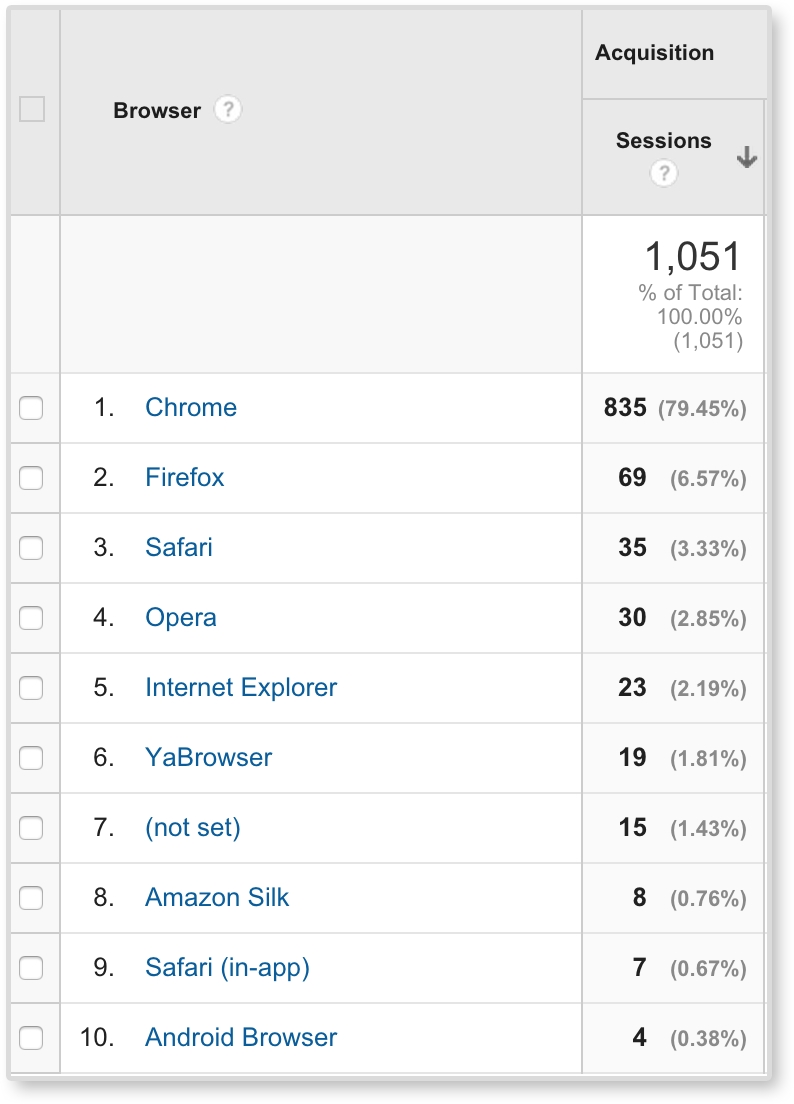
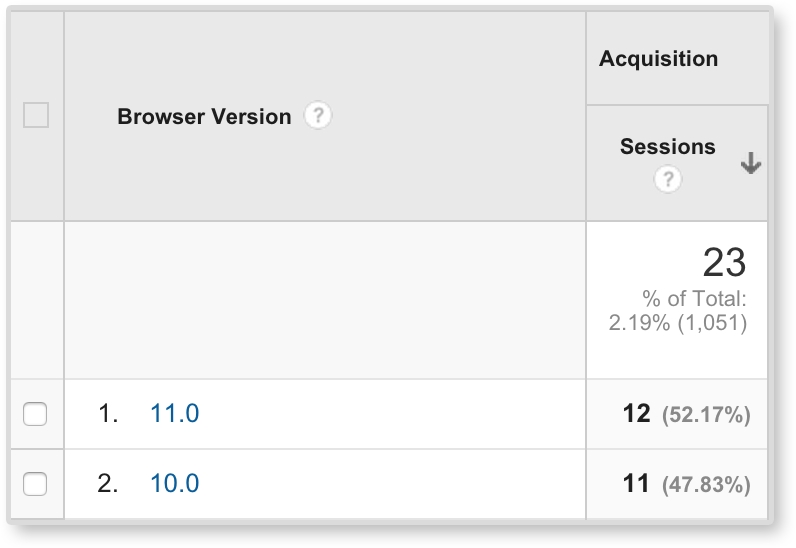
Here, we can see that Chrome and Firefox are dominating, but Safari, Opera, and Internet Explorer are still present. We can then click on Internet Explorer and see (like in the following image) that only IE 10 and IE 11 were used to access this site. From this data, we can start to form QA requirements. We can even view devices and networks (for example, Comcast and Verizon) in Google Analytics.
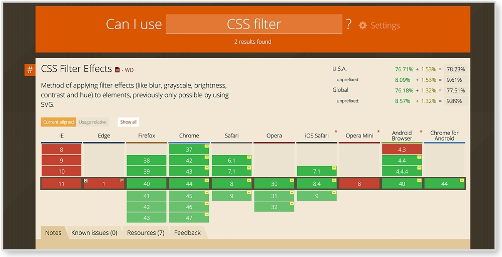
Once you have your required browsers and devices, you can be more conscious of what extra work you may need to do to ensure quality across them all. This does not mean you should sacrifice using newer techniques for the sake of older browsers. How are we ever going to advance and continue to grow our development skills if we do that? Instead, we need to know our limitations, and work with them. For example, we can easily make images black and white with CSS by using filter: grayscale(100%). With some prefixes, this solution works in pretty much all the popular browsers, except Internet Explorer. Not one IE version supports CSS filter effects right now. To see what browsers support, check out http://caniuse.com/. Here, we can type in CSS filter and the site shows the support for it.
Just because IE and Edge do not support CSS filters, does that mean we will forego grayscale images in our website? No! Instead, we continue using filter: grayscale(100%) and find alternate solutions for IE browsers. A quick Google search can point us in the right direction.
After you figure out if the pattern will fit your content and that you can technically execute it, consider if your user will actually understand it. Web design can lean on conventions; as an example, we are used to seeing the logo on the top left and the menu on the top right of the page. If we swap these, the user might be temporarily confused when they first visit the site. Responsive websites start to break these conventions because we are dealing with smaller screen sizes. And that's okay. We should always be pushing these boundaries; repetition can be boring. New conventions can evolve.
But when we are pushing the boundaries and trying something new, we have to make sure that our user will understand it. Google Analytics can also give us some insight into who is using our site. This information can help you run usability tests to ensure the site's users understand the patterns. But project timelines can be short. You may not have time to test on your user demographic. It happens. Although I highly advocate user testing to make sure your design is actually navigable by your user, if you can't do this, you can lean on the research of others. Some of the popular ones are listed here:
- Nielsen Norman Group: I highly recommend starting to read Nielsen Norman Group's (NNG) research and articles. NNG is led by usability experts Jakob Nielsen and Don Norman. Worried about what icon to use for your user interface? They wrote about that. Considering hiding your navigation behind an icon? They also have research on that. Their website, http://www.nngroup.com/, is packed with great information. You can trust it is coming from a good source as well.
- Pew Research Center: If you need more statistics, check out reports from the Pew Research Center, http://www.pewresearch.org/. Pew provides thorough reports looking into who is using the Internet, how, and why. Be careful, though; there is an immense amount of information on this website. Don't know where to start? Check out "U.S. Smartphone Use in 2015" by Aaron Smith first.
Once you are sure of the patterns you want to use, you still have to create them. You can always create patterns from scratch, but look at patterns you already know before you start. Let's say you wanted to create a fullscreen video such as the one we saw on Panic's website. We know how to create full span images, and we know how to make responsive videos. We can look at the markup for these and start to come up with our own solutions by combining what you know.
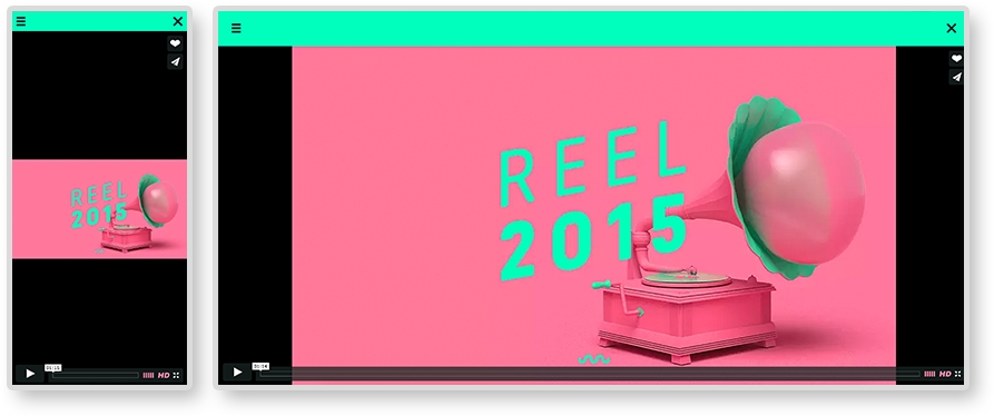
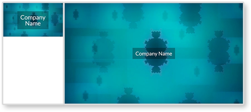
In Chapter 4, From Static to Dynamic – Embedding Media, we went over responsive media patterns. As mentioned, we know how to create responsive videos and full span images. For this example, we are combining these patterns. See the finished product in the image here:
HTML
<header>
  <img class="fallback" src="i/kaleidoscope-fallback.png" alt="kaleidoscope"/>

  <video autoplay loop poster="i/kaleidoscope-fallback.png">
    <source src="v/kaleidoscope.mp4" type="video/mp4"/>
    <source src="v/kaleidoscope.webm" type="video/webm"/>
    <source src="v/kaleidoscope.ogv" type="video/ogv"/>
    <img src="i/kaleidoscope-fallback.png" alt="kaleidoscope"/>
  </video>

  <div class="banner-overlay">
    <h1>Company Name</h1>
  </div>
</header>
We are using the same HTML structure as the full span image pattern. The video will be wrapped in a header tag. The overlay is in a div element with a class of banner-overlay. Inside the header and video tags, we also have an img tag. These img tags are fallbacks. The first img tag will be toggled on and off for small and large screens. Smartphone browsers, such as the iPhone's Safari, do not allow for auto-playing video. Like Panic's website, on smaller screens we will show only a still image taken from the video. On larger screens, we will then show the video and have it play. The second img tag acts as a fallback in case the browser does not support the HTML5 video element (looking at you, IE 8). If you do not need to support IE 8, then you can take out the image inside the video tag. This way the user does not have to download content they will never see since they are on a browser that does support the video tag. The fallback image can also be replaced with text telling the user that their browser does not support the video tag.
The video tag is almost the same as the responsive video pattern. Its attributes are different though. If you look at the opening tag, you will see <video autoplay loop>. No longer do we see control present in this opening tag because we do not want to show the video's controllers. The autoplay attribute has the video play on load while the loop attribute loops the playback.
CSS
video, img {
  width: 100%;
}

video {
  display: none;
}

header {
  position: relative;
}

.banner-overlay {
  background: rgba(0, 0, 0, 0.3);
  color: white;
  text-align: center;
  padding: 20px;
  position: absolute;
  top:50%;left: 50%;
  transform: translate(-50%, -50%);
  -webkit-transform: translate(-50%, -50%);
}

@media screen and (min-width: 600px) {
  .fallback {
    display: none;
  }

  video {
    display: block;
  }
}
In the CSS, we are setting the video and the fallback image to have width:100%. Since we want only the image to show in small screens, we are hiding the video first with display: none. Next, we set header to position: relative, and center .banner-overlay just like we did in the big hero image pattern. The only difference here is we are adding some more styles to make the text legible on the video. Inside the media query, we are then hiding the fallback image, and showing the video on screens larger than 600 pixels.
Note
View the example of this live at http://chelmyers.github.io/RPL/media/index.html#fullSpanVideo.
Let's have a look at the pros and cons of this pattern.
Pros:
Cons:
Ambient video backgrounds are very trendy right now, but this should not mean every website you make should have one. They are cool because you get a sense of the company, or product, quickly with the moving visuals. But this pattern should only be used if it really makes sense for the client and the website's content. Too many websites are using ambient video backgrounds for the sake of the trend. As reviewed, Panic Studio is a great example of how and why you should use full span video. Panic's whole business is creating motion graphics and animations. Their website should have movement. An insurance company on the other hand does not need a video to sell their services. This pattern requires the user to download a whole video to make it work. That's a lot of megabytes. Because of this, make sure you use this pattern with care, not just because it looks cool.
- Monkiers game (http://www.monikersgame.com/)
- Bluecadet (http://bluecadet.com/)
- P'unk Ave (http://punkave.com/)