Table of Contents for
Responsive Web Design Patterns
 Responsive Web Design Patterns
Published by
Packt Publishing, 2015
Responsive Web Design Patterns
Published by
Packt Publishing, 2015
- Cover
- Table of Contents
- Responsive Web Design Patterns
- Responsive Web Design Patterns
- Credits
- About the Author
- About the Reviewers
- www.PacktPub.com
- Preface
- What you need for this book
- Who this book is for
- Conventions
- Reader feedback
- Customer support
- 1. Creating a Home for Responsive Patterns
- Why and how to create a responsive site
- Breaking websites down to their patterns
- Building a home for your patterns
- Summary
- 2. The Main Stage – Building Responsive Layouts
- Most popular layout patterns
- Creating complex systems
- Summary
- 3. Make Way for Responsive Navigations
- Responsive navigation patterns
- Summary
- 4. From Static to Dynamic – Embedding Media
- Responsive image patterns
- Understanding sliders and carousels
- Implementing videos
- Summary
- 5. Gathering and Displaying Information
- Responsive table patterns
- Summary
- 6. Combining Responsive Patterns
- Continuing to look for patterns
- Your pattern library is not done yet!
- Summary
- 7. Ship It – Finalizing Your Pattern Library
- Getting ready to handoff
- Publishing your library
- Further exploration
- Summary
- Index
Designing for small screens comes with its limits. But instead of viewing these limitations as a hindrance, view them as constructive guidelines. Two teachers from Drexel University, Troy Finamore and Jervis Thompson, embrace RWD both in class and outside. Finamore chooses to have his students develop responsive websites and mobile applications for their final projects. Giving the students this type of constraint allows them to prioritize the content and functionality. Designing mobile first equips these students with organizational skills that are key for responsive sites.
When starting a new project, Thompson has his clients write down each section of content desired for their site on a post-it note and prioritize them in a single column. The first item in the column is the most important element the client wants seen on the page. Since And since the stacked post-its are almost the same width as a smartphone, a rough layout of the web page on smaller screens can already be seen.
It is most likely that people are not visiting websites for a fantastic navigation or a great footer with social media links. They visit for the content. Navigation and footer elements are tools for the user to travel through the website. A page's layout holds the content they seek. In this chapter, we will discuss the following topics:
- The responsive nature of HTML
- Popular responsive layout patterns
Our challenge is to design a layout flexible enough to accommodate not only the range of content it might hold, but the device it will be displayed on.
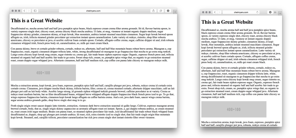
All of the responsive tools and practices we have reviewed so far helped us utilize what is natural to the Web. HTML websites are naturally responsive. If we create a basic website, such as the following example, the site will naturally shrink and stretch to meet the browser's width. RWD builds on top of this function rather than halting it.
Tip
Spicing up your dummy text
You may have noticed I don't use the normal "Lorem Ipsum" dummy text in the preceding example. For personal projects and experiments, I like to add some spice and use interesting text generators. Here, I am using Coffee Ipsum from http://coffeeipsum.com/. Visit the Meet the Ipsums website (http://meettheipsums.com/) to add some fun to your workflow. Use it with caution though; clients may not have a sense of humor that is similar to yours.
To keep a website responsive, stay away from using pixel widths on elements. Instead use ems and percentages. We should use ems for font sizes too. CSS Guru, Chris Coyier, in "Why Ems?" (https://css-tricks.com/why-ems/), sums up why we should do this.
"Let's say you look through your stylesheet and find 50 different font-size declarations in px. That's 50 places you need to change that font size through a media query when the screen size changes. That's 50 suck points." | ||
| --Chris Coyier | ||
With ems, all sizes set are relative to its parent's font size. Let's say there is an h1 tag whose parent is a div tag; the font size of h1 will be relative to the div font size. If we increased the div tag's font size, the h1 font size would increase also. Another value is root ems, or rems. Rems are relative always to the body tag's font size. For both, if we needed to increase the font size overall on smaller screens, we can use media queries to change the body element's font size.
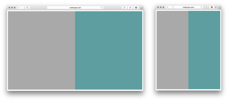
By setting the width of sections on a page using percentages instead of pixels, we can see the natural fluidity of web pages. The following is an example of a two-column layout using only percentages. This may seem familiar to you.
HTML
<div class="col-1">
</div>

<div class="col-2">
</div>
CSS
.col-1, .col-2 {
  margin:0;
  float: left;
  width: 50%;
  height: 600px;
}
.col-1 {
  background-color: darkgray;
}
.col-2 {
  background-color: cadetblue;
}
Here, we are using the .col-1 and .col-2 classes (col is short for column) to align the sections and set the widths. We then use these classes to set background colors as well. We also gave the columns a height so that we can actually see them appear on the page (the default height would be 0 pixels).
You may recall categorizing website layouts into three types: fixed, fluid, and adaptive. A website locked at 960 pixels wide has a fixed layout. Percentage-based layouts, such as the preceding example, are fluid. Adaptive layouts are fixed layouts that use media queries to change at different screen sizes. Now, you might be thinking that adaptive layouts are the same as responsive layouts. Even the terms for each are similar. Responsive layouts do use media queries too, but their layouts are based on percentages instead of being fixed. Responsive layouts scale based on a percentage-based grid. Adaptive layouts only snap to new layouts at different sizes.
Tip
Creating quick examples
Remembering all the CSS colors and creating images for examples sites such as these can be a hassle. Use placeholder sites such as Placehold.it (http://placehold.it/) and PlaceKitten (http://placekitten.com/) to generate images quickly. I also visit http://colours.neilorangepeel.com/ to help remember the CSS colors and pick the right shade for the example.