Table of Contents for
Using SVG with CSS3 and HTML5
 Using SVG with CSS3 and HTML5
Published by
O'Reilly Media, Inc., 2017
Using SVG with CSS3 and HTML5
Published by
O'Reilly Media, Inc., 2017
- nav
- Cover
- Using SVG with CSS3 and HTML5
- Using SVG with CSS3 and HTML5
- Preface
- I. SVG on the Web
- 1. Graphics from Vectors
- 2. The Big Picture
- 3. A Sense of Style
- 4. Tools of the Trade
- II. Drawing with Markup
- 5. Building Blocks
- 6. Following Your Own Path
- 7. The Art of the Word
- III. Putting Graphics in Their Place
- 8. Scaling Up
- 9. A New Point of View
- 10. Seeing Double
- 11. Transformative Changes
- IV. Artistic Touches
- 12. Filling Up to Full
- 13. Drawing the Lines
- 14. Marking the Way
- 15. Less Is More
- 16. Playing with Pixels
- V. SVG as an Application
- 17. Beyond the Visible
- 18. Drawing on Demand
- 19. Transitioning in Time
- 20. Good Manners
- Index
- About the Authors
- Colophon
Chapter 20. Good Manners
Chapter 20. Best Practices for SVG
An image is more than just a collection of details, and a complex SVG document is more than just a series of independent elements and styles. When you are starting a project, it is worthwhile to take some time to plan your approach.
This chapter summarizes some of our best advice for managing SVG on the web. If you are building an important website component using SVG, a little bit of up-front strategy and analysis can help save time and frustration later.
Planning Your Project
Got a great idea for a design, a game, an unusual interface widget? Wonderful! Time to bring it to life!
But before you start writing code—even before you start drawing in Illustrator or Sketch—make a plan. You aren’t just creating a picture, you’re building a product. It needs to work for your end users, and it needs to be maintainable and adaptable for future design changes.
Does Your Project Need SVG at All?
It may seem strange to ask this question in a book devoted to SVG, but, as much as we love vector graphics, we also understand that it isn’t applicable to absolutely everything in web design and development.
If your diagram can be represented as colored squares on a web page, it’s usually easier to create it using HTML elements with a little CSS, rather than using an inline SVG. You can even make the elements quickly scalable by using % or vw units for width and height.
When SVG first became available in web browsers, it replaced 1px-wide repeating raster images as the best solution for background gradients. It was also the easiest solution for rounded rectangles and circles. But CSS gradients and border-radius have rightly replaced both use cases.
Throughout the book, we’ve been comparing SVG and CSS-only solutions so you can make better decisions about which tool to use. If your all-CSS approach involves multiple nested elements, transforms, and hidden overflow to draw a shape that could be defined with a simple SVG <polygon>, this is a good time for SVG.
But if you can create the effect with well-supported CSS properties on the elements you’ve got, you can skip the SVG. We won’t be offended.
While SVG’s abilities extend well beyond those of CSS-only graphics, SVG must be considered as part of the continuum of web technologies, never as a sole answer.
Similarly, once an SVG drawing is started, there’s a tendency to create everything inside it. But the best solution may sometimes be a hybrid one. Create a graph in SVG, but add text labels as HTML elements. Or use multiple separate <svg> elements and then combine them with CSS layout so they can be easily rearranged. You’ve now got a firm handle on a new tool for your toolbox, but that doesn’t mean it should be the only tool you use.
Identify Your Browser Support Requirements
When building for the web, you are designing for an uncertain environment. The code you generate will be rendered differently depending on which web browser views it, in which device.
Throughout the book, we’ve warned you about browser quirks and support limitations. And while those warnings can be discouraging, they should have also clarified that things are getting better. Newer browsers have better support and fewer SVG bugs.
But not everyone who visits your website will be on the newest browser. You need to decide early on which older browsers you will be trying to support. There’s little point in developing a site heavily infused wih SVG only to learn later that the client wants it to work in Internet Explorer 6.
If you have analytics data for the website you’re working on, wonderful. But even if you don’t, you can find general data about browser usage for your country, and adjust it based on your website’s audience. If you’re only interested in tech-savvy users with plenty of spending cash, you might only code for fairly recent software. But for many businesses, and especially for public services or health care, you need to consider a much broader audience who might be using much older computers or phones.
Once you’ve identified the browsers and devices you need to support, ask: does your graphic need to look the same in every browser? Or are some graphical effects optional enhancements, for which fallbacks are acceptable? If you are willing to accept compromises on older browsers, you can use more of the new features and shorthand options that simplify your code—and reduce file sizes—for the browsers that do support them.
Tip
For supporting really old browsers (Internet Explorer 8 or under, and Android versions under 4), you have to accept that some users won’t have SVG at all. That means planning for plain-text fallbacks or alternative image formats.
A related decision is the performance budget for your site and for the graphics in particular. How many kilobytes are acceptable? How much battery power is that animated effect worth? How many seconds will users wait for this graphic to load? A good starting point might be “three seconds on 3G”: every page should be ready to read and use in less than three seconds on a third-generation mobile data connection.
There are no hard-and-fast rules for how fast and lean a website has to be, or for how to make it so. Your standard should be negotiated to balance the needs of the web development team, your client or boss, the expected audience, and other stakeholders. But by having standards—based on real user data whenever possible—you have benchmarks against which you can test your work, and make adjustments as you go.
SVG often means a smaller file size than alternative graphics formats, but not always. SVG can also mean more processing on the end device. Some features, like filters and animation (and especially animated filters), use much more processing power than others. By testing your works-in-progress against preset performance budgets, you can identify when you need to change strategies.
Decide How SVG Will Integrate in Your Website
SVG on the web doesn’t exist in isolation; it nearly always will be integrated in a larger website. We’ve discussed, in many chapters, the differences in SVG behavior that relate to how the SVG is integrated with HTML. Inline SVG has different requirements and possibilities than SVG as an image.
For this reason, it helps to plan early on for the embedding method. To recap, the three options and their key differences are as follows:
- SVG as an image
-
SVG embedded with
<img>or as a CSS background image will be limited in its animation and interactivity. CSS inside the SVG document will be used for styling vector elements in the document itself, but these styles cannot be read or manipulated from the outside. Scripts, interactivity, and alternative text written inside the SVG will be ignored. There are also currently limitations in browser support for declarative animation.The primary advantage of SVG-as-image is its encapsulation: just like a bitmap image, the SVG is contained in a single file that will behave predictably when it is embedded across multiple pages.
- SVG as an embedded object
-
SVG embedded with
<object>or<iframe>also has encapsulation and reusability, but it can have interactivity and scripting. It is often a good compromise solution, but it isn’t used as much these days, which means it isn’t tested as thoroughly. New bugs in scaling, sizing, and accessibility sometimes pop up in browsers. - Inline SVG
-
Inline SVG is also fully interactive and scriptable, but as part of the larger document. One of the biggest benefits is that SVG elements can be dynamically styled as part of the main document’s stylesheets. One of the biggest limitations is that those styles can cross over even when you don’t want them to. Inline SVG also currently has the best browser support for keyboard and screen-reader accessibility.
All other factors being equal, inline SVG will usually load faster than a separate file reference, but at the cost of more complicated maintainability. For most websites, you will need content management systems and/or build tools that can integrate the SVG markup in your HTML. If the same SVG code needs to be reused across pages, you’ll usually require server-side includes or similar technologies to share the same source file between them. The repeated code also needs to be downloaded for each page, slowing down subsequent page loads compared to cached image files.
Sometimes you’ll be able to decide on the embed method that best suits your project, while other times you’ll be restricted by the structure of your existing codebase. Whichever approach you use, development of the SVG code will be easier if you know up front what the final capabilities will be.
Design for All Users
Very few graphics are purely decorative. They exist as part of the content of your website, to communicate meaning or mood. SVG content is often also a functional, interactive part of the website.
It is therefore essential that the meaning and the function is available to all users, even those who experience the web quite differently from how you do.
We’ve discussed SVG accessibility in Chapter 17 with regards to alternative text and ARIA roles, in Chapter 18 with regards to keyboard controls, and in scattered other locations with warnings and suggestions.
The best approach to creating an accessible website is to design it that way from the beginning. Extra code added at the last minute will always be awkwardly trying to patch holes, when those holes maybe could have been avoided altogether.
Designing for accessibility also means designing for performance. Large downloads and high CPU requirements are other ways in which users can be blocked from accessing your content or using its function. Similarly, building in solid fallbacks for older devices, and considering a diversity of screen sizes and input methods, both help increase the number of people who can use your website. But some users have requirements that go beyond the experience of switching to an older or smaller device.
As you’re (literally or figuratively) sketching out your design, here are a few situations to keep in mind:
- Color blindness
-
Color blindness is the most common visual limitation that cannot be corrected with eyeglasses. Frequently, it means an inability to distinguish red from green, but other versions of the disorder cause difficulties with different colors.
Use color to enhance meaning conveyed by shapes, text, or luminance changes, but never use color as the only source of meaning.
Not sure if your design works without color? Apply a
grayscale(100%)filter on the root element and show it to a colleague. If they can’t figure it out, you’ve got more work to do. - Limited contrast sensitivity
-
Viewing computer screens in bright sunlight makes it difficult to distinguish subtle changes in brightness in the image. Various eyesight conditions, often exacerbated by age, have the same effect.
The Web Content Accessibility Guidelines (WCAG) include minimum standards for the contrast of text against their background. Apply the same standards for important graphical details that affect the meaning of the content.
- Extreme zoom
-
Small screen sizes don’t leave a lot of room to draw text-heavy graphics, so users may need to zoom in and pan around a diagram. Even on larger screens, some users will need to zoom in considerably (using browser zoom tools or dedicated screen magnification software) to be able to read it clearly.
The scalability of SVG only applies to the resolution of the zoomed graphics, not to their content. The two-dimensional nature of SVG—and of graphics in general—does not make it easy to reformat content for smaller viewports. Create responsive versions if you are able, but recognize that some users will only be seeing part of your graphic at a time.
Whenever possible, position labels in a diagram close to the graphic, so that users don’t have to scroll back and forth. Label individual data points in a chart if you have the room, instead of requiring users to scan across to measure the value on an axis.
- Style overrides
-
As an alternative to zooming in the entire graphical layout, some browsers allow users to override the
font-sizesetting. Similarly, some users will overridefont-familychoices to force the use of a font that is easier to read. Browsers and operating systems also have options that allow users to force the use of certain color schemes, usually in the context of creating better contrast.You can’t anticipate every possible style variation that might be applied to your website. But you can try to build more robust content that will be functional in a variety of situations.
Be especially careful of minimum font-size settings in browsers, as these can break SVG even when it isn’t an accessibility issue. Scaling may mean that
font-size: 4pxwill be drawn in 1-inch-tall letters, but it might still get adjusted to 16px or 20px. Consider this when deciding on yourviewBoxfor a graphic with text; pick a scale that is close to the size it will be displayed (and yes, we know there are examples in this book that don’t follow that guideline). If possible, make sure the layout won’t break completely if text doubles in size.To create graphics that automatically adapt to color overrides, consider using
currentColorto inherit the text color instead of assuming that it will be black (or whatever value you set in the design). Internet Explorer, MS Edge, and Firefox on Windows also all support a limited subset of the CSS system color keywords to allow you to access the modified values of other colors from Windows High Contrast Mode. The Microsoft browsers (although not Firefox) also support a media query to detect if custom colors are being applied. - No sound
-
Although SVG is a visual format, it is often used in the context of audiovisual applications. Remember that many users will have sound turned off, and some users don’t have the option of turning sound on—because they could not hear it anyway. Warning or notification sounds need visual equivalents; video and audio need captions or transcripts.
- Missing context for symbols
-
SVG is often used for iconography. But icons are a language unto themselves, and not everyone speaks it. Unlabeled icons assume that your user shares a certain cultural training into what the symbols mean. People from a different background (or age range) than you may interpret them differently. Neurological differences, including autism, can also change how someone interprets the visual metaphors inherent in icons. Include text labels for icons whenever you can.
- Confusing text
-
Don’t go overboard with text instructions, however. Too much text is another usability problem. Long text is an obstacle for users working in a second language, for users with reading difficulties such as dyslexia, and for anyone who is too tired, busy, or distracted to read every word.
- Distracting animation
-
An even worse culprit for distraction is animation or video that plays when the user is trying to focus on something else. For some users, animation goes beyond a distraction to become a health risk, triggering nauseating vertigo or even epileptic seizures.
Whenever you’re using extreme graphical effects, such as strobes or immersive 3D animation, give users a warning before it starts. For all animations and sound, give users a way to pause or control the effect. Consider also using new features like the
prefers-reduced-motionmedia query1 to adjust your defaults. And provide a way to bypass the animation to get straight to the main function of the website. - Alternative inputs
-
With the wide adoption of touchscreens, more developers have become aware of alternative inputs. But creating larger buttons for finger-sized touch taps is only the start. Any interactive content needs to work with touchscreens, mouse, or keyboard. Other input devices usually mimic one of these controls in the events they pass to the browser—but they may not allow fine or fast control. In addition, screen readers and voice controls rely on having clear and consistent names for all interactive elements.
If the meaning and function of your design can survive all these conditions, you’re doing better than many. But a checklist will only get you so far: the real measure of your site’s accessibility will come from testing with real users.
Working with Graphical Editors
Graphical editors, such as Adobe Illustrator and Inkscape, are a huge part of creating SVG for the web. But these tools were built primarily with print design in mind. Certain defaults and settings need to be tweaked for better code output. Creating a graphic that is optimized for animation, interactivity, and dynamic styling requires a little bit of planning ahead.
In Chapter 4, we gave some application-specific tips for a few of the most common programs, particularly regarding SVG export settings. This section outlines some general tips, applicable to most drawing tools.
Regardless of which software suite you use, there are some common steps that should be part of your project to help you get the result you want. Be aware that the terms used for specific features (such as Adobe Illustrator referring to the drawing space as the “Artboard”) will change from one application to the other.
Some of these strategies, like creating carefully structured groups, also make it much easier to work with the drawing while it is still in the graphical editor. They’re also good ideas if you’re creating a graphic by writing code yourself.
Most of the items in this section, in contrast, are more about changes you can make in the visual editor to help with later coding. They may be less obvious to designers who only work with the visual graphic—but they will make a huge difference to developers working with the exported code.
In addition, as we discussed in Chapter 4, you will often want to run your exported code through a dedicated optimization tool (although graphics software is getting better at optimizing code on export).
Define Your Artboard or Drawing Size
The first step of creating a graphic should be to choose the right reference system for your work in your application of choice. While vector shapes are indifferent to size and scale, it’s logical to use measurements that mirror the purpose of your SVG file. For the web, this usually means pixels.
Although SVG is scalable, it helps to start with an idea of how large the graphic will be displayed. That way, you can make sure that text and stroke sizes are appropriate.
Using pixels is particularly important for small SVG icons, where the pixelation of the display becomes more obvious. If curves and lines do not neatly line up with screen pixels, the end result can have a blurred effect (as we discussed in “Anti-Anti-Aliasing for Crisp Lines” in Chapter 13).
Tip
Snapping path points to the pixel grid can also help in larger graphics, by ensuring that coordinates can be represented by integers—and therefore with fewer characters in the code.
Of course, if your work is a precise illustration of a real-life object, you might prefer inches, centimeters, or millimeters, to match your source data. Just beware that many SVG export settings convert these to px, anyway. And even if they don’t, a browser rendering won’t necessarily be true to the real-life scale.
For most software and export options, the size you choose for your drawing region (artboard) will be reflected in the final SVG viewBox, width, and height. (Double-check your export options to make sure you get all three attributes in the final code!) An oversized artboard may be convenient in the editor, but it will leave whitespace around the final graphic, potentially ruining the layout. You can always change the artboard size after initially setting it.
Many programs allow you to crop the view on export to just fit the current selection or visible drawing. This can cause its own problems. Curved shapes that touch the very edges of the SVG image may appear to be trimmed in the final display, because anti-aliasing effects (which help “smooth” curves on raster screens) get cropped off. Leaving one or two pixels from the edge of the viewBox to any nonrectangular SVG elements is usually a good idea.
Of course, if the SVG export results in incorrect cropping, you can always manually adjust the viewBox in the exported code.
Structure Your Graphic
When you draw in SVG you’re not just making images: you’re creating data. A well-organized design file will create a well-organized SVG.
Whether you’re creating your graphic with code or in a visual editor, you’ll want to create meaningful groups that make it easier to transform substructures as a unit, and which can be given meaningful alternative text or ARIA roles.
In many graphical editors, you can have both groups and layers, but they are just groups inside groups within the final SVG. Use both features wisely. You don’t want too many extra <g> elements in the final code, but you do need structured groups for applying transformations and effects like filters and masking. If you decide to reposition part of a diagram later, you want to be able to move the entire logical section with a single attribute or style property.
The most extreme version of grouping is merging multiple subpaths into a single <path> element. That ensures that all the parts will always stay together and be styled together—but at the expense of not being able to easily separate them later.
If you are going to animate your design, or reorganize it for different screen sizes, it helps to sketch out the possibilities before you start drawing. That way, you’ll know which parts need to be grouped and which parts need to be separate elements.
You will sometimes have to break logical groups across layers to accommodate the lack of z-index support to alter the layering between groups. For example, text labels often need to be in a separate layer group (to prevent other shapes from overlapping the text) instead of being grouped with the shapes they label. But make sure you have a clear reason for these compromises.
Name Things
It’s a well-worn joke that “naming things” is one of the hardest problems in computer science. It’s still worth the effort.
Give elements names—in the form of class or id values—that will mean something to you later. For classes, focus on the common connections: why are these elements styled the same way?
If you are drawing shapes in a visual editor, name elements (shapes, groups, and layers) as you draw, using the software’s object properties. Most applications export these layer or group names as the id attribute of SVG elements. But double-check your export and optimization settings: id values that aren’t used in cross-references are sometimes removed during export.
Tip
For best results, avoid using any spaces (separate words with - hyphens), so the name can be directly converted into a valid id attribute. Avoiding uppercase letters can also help prevent case-sensitivity issues when you’re switching between SVG, HTML, and JavaScript.
It’s much easier to create these references during visual editing, rather than later. When you’re working with the markup code, one <path> looks much like another. Names can make it much easier to find the one you need.
Set Up Color Preferences for Web Use
Many vector illustration applications were originally designed for print, and therefore have their color space set to CMYK. In contrast, computer displays use RGB (specifically sRGB). RGB has a wider gamut (range of colors) than CMYK, so converting colors at the end of the design process is suboptimal; set the color mode before you begin drawing.
Of course, if your SVG is also expected to be used in print, the reverse is true: if you use RGB colors, some colors may not be accurately represented in the final printing. However, even if you are designing with CMYK palette, be aware that tools will usually remap your color selections into equivalent RGB or hexadecimal values during SVG export.
Tip
As mentioned in Chapter 12, there are old and new proposals for alternative color profile support in SVG. CSS Color Module Level 4 also includes a cmyk() color function. However, as of this writing, no web browser yet supports these options.
Simplify Paths
In most SVG drawings, the largest contribution to file size is the path data or polygon points that describe complex drawing shapes.
You can significantly reduce the file size by using a reasonable viewBox scale and snapping points to exact pixel values (so that it takes fewer digits to specify each coordinate), and by reducing the total number of points in each path.
You can make both changes after the fact, by rounding down decimal precision on export, and by “smoothing” or simplifying paths using your editor’s commands. However, you can often get better results by planning for simple paths from the beginning.
Drawing with the least possible number of points for each shape means fighting against the common instinct to add points to a curve whenever you need to tweak the shape. Instead, try to get as far as you can by adjusting the points and control points on the curve sections you already have.
Working with control points takes some practice. But it can make shapes easier to control in the end, particularly if you’re trying to create symmetrical shapes.
As an illustration, let’s consider drawing a simple heart shape. The heart icon that we’ve been using throughout the book was created (in Chapter 6) by carefully calculating coordinates and path data. But most designers prefer to work with a visual editor when drawing icons.
A first sketch at the path might use eight points, as in Figure 20-1. The shape is shown as it appears when selected in Adobe Illustrator, showing the on-path points (but not control points) and the bounding box.
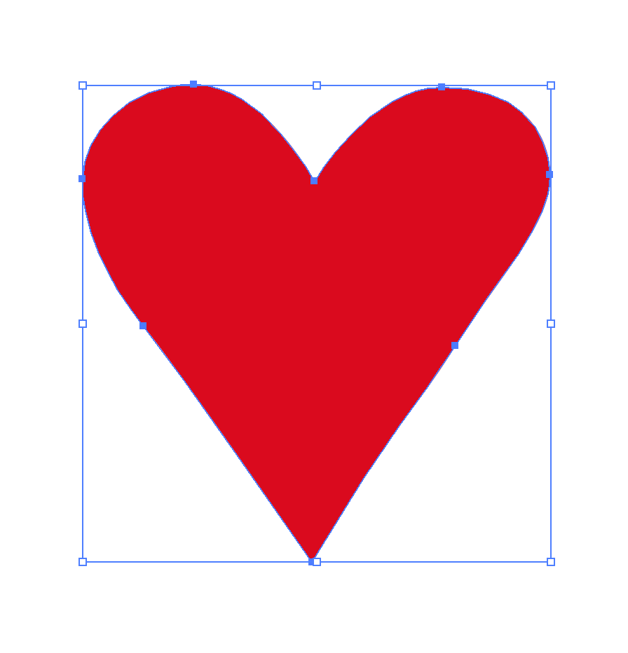
Figure 20-1. A heart drawn in Illustrator using eight curve segments
To make this heart symmetrical, you need to adjust three pairs of points (and their control points) to be perfect matches on either side of the center axis. Remove extra points, and you have fewer points that you need to synchronize.
At its most extreme, you can create a heart shape with only two vertex points and two symmetrical cubic curves connecting them, as shown in Figure 20-2, which now shows the control points that create the shape.
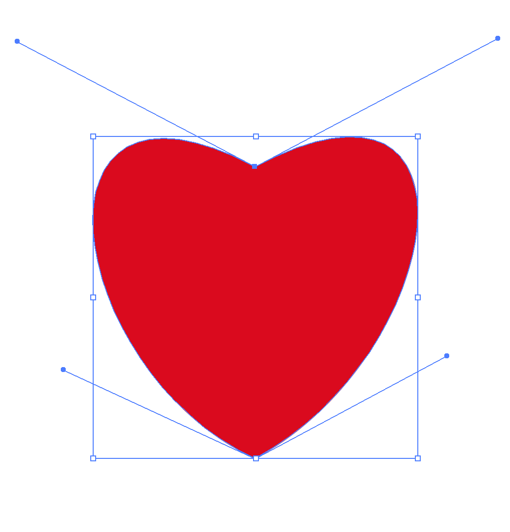
Figure 20-2. A heart drawn using two cubic Bézier segments
This may be too extreme, and may limit your ability to create just the right curve you want. But until you try it, you won’t know how much nuance you can create just by adjusting those control-point handles.
Another way to keep your path data compact is to make use of strokes, instead of drawing both the inside and outside outlines of shapes. For example, a circular donut shape could be drawn as a path with a cutout subpath. But it can also be drawn as a thick stroke around a much simpler path (or around a <circle>).
Tip
If you start by drawing a shape with stroke outlines, and later decide that you need it as an independent fill region, most graphical editors have a single-click option to convert the current stroke region into its own path definition.
Remember that thick strokes can have significantly different appearances depending on the stroke-linecap and stroke-linejoin options. With a little creativity and careful planning, you can use strokes to create clean geometric shapes that don’t appear at first glance to be an outline at all.
Figure 20-3 shows a very different way of drawing a heart shape, as a thick stroke with round line caps on a three-point polyline.

Figure 20-3. A heart drawn as a round-capped stroke on a V-shape open-ended path
The blue rectangle in Figure 20-3 is the bounding-box outline that highlights the shape in Illustrator. Note that it is now much smaller than the visible shape, and remember that this can cause problems with objectBoundingBox graphical effects. Also beware of inconsistent browser rendering when a stroke curves in on itself.
A final path simplification option is to merge shapes that will always be styled and transformed as a whole. The more advanced graphical editors have multiple merge options. The simplest version concatenates all the shapes into a multipart path, keeping all the data. Other options recalculate the path data to represent the merged outline of overlapping (or intersecting, or cutout) shapes.
For example, you might draw a cloud shape as a series of overlapping circles, but then merge them into a single path representing the united outline. With a solid fill, the result looks the same, but with much less data required to define it. And now you can also switch to semitransparent fill or stroke, without the appearance breaking apart into individual circles.
Test Text Fallbacks, or Convert to Paths
Within your graphical editor, you have full control of the fonts used for your SVG text. Out on the web, less so. Try out your design with reasonable fallback fonts, and make adjustments to the text-anchor and other text layout properties to ensure that a font substitution doesn’t completely break your layout.
You’ll also need to add the fallback font-family lists and/or @font-face rules. Currently, the main SVG editors don’t have tools to do this; you’ll need to edit the CSS yourself, as described in Chapter 7.
If precise text rendering is more important than editability—for example, in a logo—many programs allow you to convert styled text elements into graphical shapes for each letter. Adobe Illustrator will also provide you with the option to convert type to shapes when you export the SVG file.
It’s a bit more work, but a compromise option is to duplicate the text elements, convert the lower layer into paths, and then make the upper text layer transparent (but still accessible to search and to screen readers).
Of course, the approach you choose should depend on how you will be embedding the SVG. Text inside SVG used as an image isn’t accessible in the first place, so might as well be converted to paths.
Consider the Backdrop
An SVG image only covers up the sections on which you explicitly draw elements. By default, the background is transparent. Graphical editors may allow you to change the background color in the display, but it is usually not automatically included in the export.
To add a background color to an SVG, you have three choices:
-
Apply a
backgroundstyle to the element (<img>,<object>, or inline<svg>) that you use to embed the SVG in the web page. -
Add a
background-colorto the root<svg>element in the SVG file (that you’ll be including as an image or embedded object). This is supported in all web browsers, although the background color is not used by most graphical editors. -
Include a colored backdrop shape as the rearmost layer in the SVG itself, usually a
<rect>that covers the entireviewBox.
Many of the examples in this book use a <rect> backdrop, because it guarantees a consistent rendering when the SVG is viewed on its own. However, you get much greater flexibility by leaving the backdrop transparent and styling it when you embed it. Solid or see-through, consistent or flexible: you need to decide based on the needs of your website.
“Unset” Styles
If you’re creating icons or other symbols that should inherit styles when they are used, try to remove style settings from the individual elements before export.
Inkscape has an “unset” option for both fill and stroke (represented as a question-mark icon), so that the shape will inherit styles wherever it is used. Illustrator has export options that will treat black fill as equivalent to inherit.
The SVG export options of the main software tools are also getting better at not including unnecessary style declarations for every element. However, if you do end up with SVG code that has dozens of inline styles for each element, an SVG optimizer can usually remove a lot of it.
Learn the Limits of Your Tool’s SVG Output
One common theme of this book is that there is often more than one way to create a certain visual result with SVG. Different code structures may appear to have the same effect, but they create different possibilities for animation, scripting, and restyling.
If you’re working with a graphical editor, take some time to look at the code it produces, so that you know when you need to intervene to get the result you want.
Many editors use <path> elements even when they could use one of the basic shapes. When you copy graphics, the default is usually to copy them as independent elements, not as <use> clones. Gradients might be always defined as independent user-space effects, instead of references to a shared bounding-box gradient that stretches to fit each shape.
This doesn’t make their SVG export “wrong” or “bad” neccessarily. So long as the SVG visually renders correctly, it’s good enough for most use cases.
The important thing is that you understand these limitations if you are going to be using the exported code in more complex projects. If the precise appearence is “baked” into the SVG, you’ll often need to make changes in the original file in the original editor, and re-export the result, rather than being able to change things easily at the code level.
Many of these choices are defaults only, and can be changed if you fully investigate the software’s options. For example, both Illustrator and Inkscape can use symbols and <use> if that’s what you need.
Alternatively, you can take the approach of using the SVG output of the drawing tool as a starting point for your work, enhancing and modifying the code by hand to take advantage of features that the tool is not yet aware of. Draw individual bits and pieces in the editor, then copy and paste them into a separate file in your code editor, where you have full control of the document structure. In this way you can build up <symbol> and <pattern> elements from simple drawings, and use them in turn to create more complex work.
Learn the Limits of SVG, Compared to Your Tool
On the other side, a big problem with exporting SVG from graphical editors is that some editor features cannot be directly represented in standard, well-supported SVG. Each of the editors has different ways of handling SVG’s limitations in its export.
For example, many editors support inset/outset strokes, instead of strokes centered over the edge of the path. SVG can’t (yet) draw them directly. So there are a few possible outcomes of export:
-
The inset/outset stroke feature is ignored, and the end result is an SVG that doesn’t quite match the design.
-
The stroke is converted to a separate path that draws the outline of the stroke shape.
-
The path dimensions are adjusted slightly so that the centered SVG stroke matches the inset/outset stroke on the original shape.
Every option has pros and cons. But your preference might not match your editor’s default.
If you know you are creating designs for use as SVG on the web, the best solution is to avoid using unsupported features in the first place. But if you’ve already got a design ready to go, the next step is to understand the export and whether you can control it.
For some effects that can’t be represented in compatible SVG code, the result of export is a raster image of the editor’s current rendering. For example, if you create a mesh gradient in Adobe Illustrator and then export as SVG, you will currently get a JPEG image, converted to a base-64 data URI, and then embedded in an SVG file. If the mesh gradient was the primary content of your graphic, it will be much easier—and a smaller file size—to just export it as JPEG directly.
Rasterized images are also used by Adobe Illustrator for many of its non-SVG-compatible filter effects. If you never look at the generated SVG markup, the only clue that you’ve got a raster image—and not a vector filter effect—will be the surprisingly large exported SVG file size.
Tip
Adobe Illustrator has two types of filter effects. Only the “SVG filters” get exported as SVG filters; other effects are rasterized.
Figure 20-4 is an example that Dudley recently came across in a student’s work. The vector diagram included a drop shadow created with one of Illustrator’s default effects. The export had turned the shadow into its own data URI image layer.
Now, as we discussed in Chapter 16, a drop shadow does not need fancy graphics software. It can be created with SVG filter effects, or with shorthand filter functions in the latest browsers.

Figure 20-4. An SVG illustration with CSS drop-shadow filter
For this project, recreating the drop shadow involved applying CSS shorthands to the <img> elements that embedded the SVG, as it rendered faster than the equivalent longhand SVG filter effect. Since the affected images always had a filename that ended with product.svg, an attribute selector could be used to apply the drop shadow from the HTML file:
img[src$="product.svg"]{filter:drop-shadow(12px12px7pxrgba(0,0,0,0.5));}
This change helped to reduce the file size of the image from hundreds of kilobytes to a little over 4KB, after the base-64 image was removed and the remaining code was optimized.
Coordinating Code
Some parts of SVG development can’t be completed in a graphical editor. When you switch to working with the code itself, you open up much more flexibility in what you create—which means many more opportunities to create confusing, difficult-to-maintain code.
In large projects with many developers, consider using style guides and pattern libraries to ensure consistency in the final product and efficiency in your workflow. SVG components should be integrated in those guidelines along with your HTML, CSS, and JS.
In addition, here are a few SVG-specific considerations for code organization.
Structuring Styles
SVG style properties can be set as presentation attributes, as inline styles, as CSS rules in a <style> section, or (except for SVG-as-image) as linked stylesheets. Which should you use?
If you’re creating SVG in a graphical editor, it will usually give you the option of using presentation attributes or inline styles for export. In addition, recent versions of Adobe Illustrator can also create styles assigned by classes and rules in a <style> section.
At the time of writing, you have no control over the class names that Illustrator generates. The names it picks, such as .cls-6, aren’t terribly imaginative. The result looks fine, but reading through the CSS later doesn’t make it clear which styles refer to what. This can be improved with a little find-and-replace in your code editor, but it does mean extra work.
For other software—or for more complex CSS—you’re going to need to edit the styles yourself to create a <style> section. Exporting your SVG with inline styles may be a useful first step, since at least it means you can cut and paste the property: value pairs as is.
Other than cut and paste, there are few benefits of inline styles over presentation attributes. As the examples in this book demonstrate, the style attribute is mostly only useful for new CSS properties that don’t have presentation attribute versions, or for setting CSS variables.
So the main question is: should you use presentation attributes mixed in the markup, or CSS rules organized separately? The usual HTML/CSS rules about separating markup and styles rarely apply to SVG, where markup and styles are intertwined to create the graphical content.
Instead, here are some practical considerations when deciding how to organize your styles:
- Preprocessors and build systems
-
If you’re working within a larger project with CSS preprocessors, linters, and other build tools, you may prefer linked (external) stylesheets for your SVG code, so you can use those tools. However, remember that linked stylesheets don’t work in SVG-as-image, and that same-document
url()references won’t work cross-browser if the styles are set in an external stylesheet. - Loading time
-
Linked stylesheets can be cached and reused by many pages, but they are slower; you’ll sometimes see a “flash of unstyled SVG” (large, black SVG icons) while waiting for the stylesheet to be downloaded and parsed. At the very least, add
widthandheightpresentation attributes if you’re using linked stylesheets.Even inline
<style>blocks can be slowed down by an@importrule at the top of the block, which is why we often used a separate<style>block later in the document to import Google font declarations. - Style computation time
-
If a document does not have any stylesheets or
<style>sections, the browser can skip a lot of the style computation (selector matching and cascading different values from different rules). This means that presentation attributes and inline styles can be faster. But this only applies for independent SVG files; for inline SVG, the browser still needs to parse and scan all the stylesheets from your HTML, so using presentation attributes in the SVG won’t save any style computation time. - Authoring convenience
-
For many authors, presentation attributes are simply easier, meaning no headaches about CSS selector specificity, with one value overriding another. This is a valid reason to stick with attributes. (Of course, if you really want to avoid unintentional overrides from your document stylesheet, you would use inline style attributes.)
For many SVG drawings, each shape is uniquely styled, or shared styles can be applied by inheritance from a group. In those cases, classes and style rules add complexity without reducing the total amount of code.
But be careful not to get so stuck in the habit that you use presentation attributes even when they cease to be practical. If you do have multiple elements that should be styled the same, and which can’t be easily grouped, repeating the style values as attributes on each element ruins the DRY-ness of your code, making it difficult to maintain.
- Scripting efficiency
-
Presentation attributes are easy to read and modify from JavaScript with
getAttribute()andsetAttribute(). Inline styles are even easier (using theelement.styleobject). In contrast, reading CSS set with stylesheets requires the (slower)getComputedStyle()approach; modifying CSS stylesheet rules means working with the CSS OM, and there’s currently no easy way to access all the rule objects that apply to a given element.But the computed style is more comprehensive, covering styles set in any method, including inherited styles, so use it whenever you really need to find out the current style value (like the actual width and height of an
<svg>), especially if styles may come from a mix of sources. - DOM performance
-
CSS rules can reduce the total amount of style data the browser needs to keep in memory, even separate from the size of file downloads. Setting attributes or inline styles on each element, whether from markup or from script, means that the CSS text string has to be parsed and stored for each. When you have large numbers of elements (hundreds or more), this can be an important performance hit compared to creating shared style rules and setting classes on the elements.
There’s no hard-and-fast answer, and you might choose to use a combination of different methods. Presentation attributes can be used as defaults that can be reset by CSS, or they can be used for unique features of a given element while shared styles are set with classes.
Sharing SVG Assets
When you have inline SVG components shared across multiple web pages, you need to think about the most practical way to manage shared SVG assets, so that everything stays coordinated.
In an ideal world, you’d create shared asset files and access each symbol or graphical effect as you need it. But if you’ve read the rest of the book, you know that SVG on the web is far from an ideal world. So: do you use server-side includes or build tools to add the same SVG markup to every page, or do you use a client-side AJAX (asynchronous JavaScript and XMLHttpRequest) solution to import them?
For simple cross-file <use> references, where the referenced element is a symbol that will be styled entirely by inheritance, browser support is getting to be pretty good. Add an AJAX solution like SVG4Everybody to cover older browsers, and you’re good to go.
But for more complex cross-references, the browser support isn’t there (and can’t easily be detected by the SVG4Everybody script). This includes <use> references to files with <style> sections, as well as references to patterns, gradients, masks, clipping paths, filters, and markers. For all of these cases, you currently need the elements to be in the same document for decent browser support.
Tip
The one exception: if you’re using SVG masks, clipping paths, and filters applied to non-SVG elements, then the browser support for external file references is pretty close to the browser support for using the effect in the first place. So you might as well directly reference the separate asset file from your style declaration.
Just be sure to have fallback plans for the browsers that don’t support either feature.
So how do you get the SVG into the HTML?
If you’re already using a markup templating system—whether a static-site generator, server-side scripting, or a client-side framework—it is often easiest to use it to include your SVG markup as well. However, a custom AJAX solution may sometimes make sense as an enhancement to a server-side build routine, if the shared SVG files are very large, and you’re confident most users will visit multiple pages. In those cases, adding the SVG markup to every page can slow down every download compared to AJAX-ing a cached asset file.
At this point—once you are using templating tools to copy your code into each HTML file—you’ll also want to consider if it still makes sense to use <use>.
The <use> element is mostly an authoring convenience to keep your code DRY—but a templating system does the same thing. A <use> also reduces file size—but the difference is small if you’re compressing your files with Gzip or Brotli (as you should). As currently implemented in most browsers, <use> shadow-DOM trees require as much or more memory and processing as the graphics they represent. So unless you need the live copies in the browser to all stay in sync as they are modified, it may make sense to just copy the raw markup where you need it, instead of creating symbol definitions and reusing them.
Selecting a JavaScript Library
The JavaScript examples in this book have all been of the “vanilla” variety, using standard JS methods and the DOM APIs available directly in the browser. However, we recognize that most complex scripted SVG on the web is built on one JavaScript library or another.
There are three reasons we chose the vanilla approach:
-
We wanted to emphasize that you can script SVG directly, so long as you watch out for XML namespaces.
-
We didn’t want to get too distracted discussing the specifics of any particular library. SVG JavaScript libraries are huge topics unto themselves, and deserve books devoted to the subject.
-
All our examples were fairly simple anyway.
If you’re creating an interactive SVG that goes beyond what CSS pseudoclasses can do, or if you’re building complex maps and charts from data files, it is worth taking a moment to assess whether using someone else’s ready-made code will make your job easier.
That’s not to say you always need to use a JS library. Library code is most often useful in four situations:
-
You prefer a declarative interface for describing animations (that is, describing animations based on the desired outcome, instead of frame-by-frame calculations), but need better cross-browser support or performance than is currently available with CSS and SMIL animation.
-
You want to create abstract drawing code that could be rendered using either SVG or the HTML Canvas2D API.
-
You need your SVG code to play nicely with a JavaScript framework used for the rest of your website.
-
You are building a complex—but not unique—data visualization and don’t want to waste time reinventing the wheel…or the pie chart…or the radial-tree organizational diagram.
Some things to consider when selecting a library:
-
How large a file size is the library code? Can you easily create a subset of only the methods you are using? Large libraries slow down your website both for the time to download and for the time and memory required to parse the JavaScript.
-
Is the library API intuitive to use for what you want to use it for? If you have to hack around the API’s limitations to create the desired effect, you’re probably better off just hacking it together from vanilla JS.
-
Is it optimized for your use case, particularly when it comes to tricky aspects like animation performance or asynchronous event handling?
-
Does it include extra functions, such as complex mathematical or text-parsing methods, which you’d have to recreate anyway?
-
Does it handle cross-browser compatibility issues for you?
If you do choose to use a JavaScript library, make sure it is designed to work with SVG, so that it uses the correct XML-namespaced DOM methods “under the hood.” We listed a few common SVG-related libraries in Chapter 4.
Test, Test, Test!
Planning ahead for browser support issues is important, and the warnings in the book should help with that. Build in compatibility as you go by working around known support limitations, or by integrating fallbacks.
But nothing replaces thorough testing of your own code.
You will often encounter “gotchas” or bugs that you did not expect or plan for. This is particularly true when your work is shown on mobile plaforms, where browsers become even more fragmented. But it is true of the major desktop browsers as well. We’ve filed dozens of browser bug reports while working on this book. Many of those were for weird intersections of multiple features, where the bug wouldn’t show up in unit tests for support of one feature or the other.
For this reason, cross-browser and cross-platform testing is particularly important. You can develop your SVG-infused site using any browser you wish, but before publishing the work you need to check that it works.
And don’t wait until you’re done before testing. Regularly check your assumptions.
It’s much easier to address problems as they occur, rather than having to go back and fix things after the work is otherwise complete. For this reason, it’s important to check your work as you go: if possible, test in all the major rendering engines, meaning Chrome, Firefox, Safari, Edge, and Internet Explorer. If you can, test different operating systems as well: Windows, macOS, iOS, Android, and Linux.
That’s quite a bit of ground to cover. Broadly speaking, there are three ways of dealing with it, from best to worst:
- Test each browser in its native operating system
-
The ideal testing situation is to test real browsers running on real devices. This will mean multiple machines and multiple displays, all connected to your testing server.
To avoid having to manually refresh each browser to visually check the results of code changes, you can use a tool like BrowserSync or CodeKit; many integrated development environments (IDEs) now have similar capabilities. All of them work on similar principles, running a server in the background that pushes refresh requests to browsers looking at a particular URL, whenever the code is updated.
- Use emulators and virtual machines
-
You may not have access to an extensive device lab of different phones and computer operating systems. Even if you have the correct OS, some browsers are tied to operating system upgrades, so you can’t run multiple versions of the same browser on the same device.
Virtual machines can help. That means loading an entire operating system in a separate application window, sandboxed from the main system in which it is running. Using this approach, you can (in theory) run as many instances as you wish, each with its own browser version. The most common virtualization software is VirtualBox, and Microsoft offers virtual machines for all versions of Internet Explorer and MS Edge, starting with IE8.
There are also virtual machines (emulators) for the major mobile operating systems, in which you can run the preinstalled stock browsers and compatible versions of other major browsers. Emulation is never quite the same as having a real device, but it can identify major support issues.
A slightly less ideal option is software emulation without recreating the full operating system. Most browser developer tools can now recreate different screen sizes and resolutions, and many can simulate touch support on a desktop. But this isn’t the same as recreating the full mobile versions of those browsers. In addition, Internet Explorer 11 dev tools can emulate earlier IE versions, turning off features that weren’t supported in earlier versions and recreating many (but not all) of their quirks.
- Use online multibrowser testing services
-
The final option is to mostly rely on online testing and emulation services like CrossBrowserTesting, BrowserStack, and BrowserLing. Microsoft also offers free online access to its IE and Edge virtual machines, via BrowserStack. Being online, they tend to be slower in response, and take more time to update, but they are still very useful. (The browser support warnings in this book owe quite a lot to CrossBrowserTesting.)
Depending on your subscription option, you may be able to automate the testing process, running your site on many browsers and screen size, retrieving screenshots, and comparing them against reference images to see if anything is broken. However, remember that screenshots only capture some of the possible ways a browser can break your website: interactive features still need to be tested directly.
Don’t assume that the same version of a browser is equivalent across platforms. While features are usually the same for a browser release across different platforms, there can be surprising support gaps or rendering inconsistencies.
Tip
Many browsers (particularly Firefox and Chrome) will use different low-level graphics rendering libraries depending on the operating system and the type of GPU available.
Also remember that all browsers on iOS devices use WebKit code for rendering web page content, including SVG.
Just because your graphic looks perfect in a specific version of a browser on Windows does not mean it will yield the same result in the same browser version on macOS or Android. Trust us—we’ve been caught by this exact problem when building demos for this book!
Final Thoughts
This book has been a fairly major undertaking, passing from one author to the next and filling up free time over many years.
When Kurt first began the book in 2011, SVG was just beginning to achieve practical browser support. Many things were simply not possible with SVG on the web. Since then, support for core SVG 1 features has improved incredibly—but numerous new features have also been added, with their own support issues.
The final book is the result of various tradeoffs between wanting to be exhaustive and wanting to be instructive, between wanting to make examples clear and simple and wanting to make them realistic and interesting.
Scalable Vector Graphics is a powerful document language, but its flexibility creates great complexity. Until SVG, there was generally a clear division between word and picture on the web, and the web consequently was very rectilinear: always divided into boxes. With SVG, that division breaks down. SVG has helped usher in a new era in which web interfaces have become more gamelike, immersive, and adaptive, where graphics can be interactive and dynamic, and therefore much more informative.
The final book is much more exhaustive than originally planned, but cannot hope to cover all possible quirks and complications you will discover when working with SVG. We hope that the explanations and the examples have inspired you to imagine new possibilities. We encourage you to make use of the online reference sections, as you continue to learn through experimentation.
Most of all, have fun, and don’t be afraid to play.
1 prefers-reduced-motion is discussed in the online supplementary example “Clipping on the Outside, with a Mask”.