Table of Contents for
Using SVG with CSS3 and HTML5
 Using SVG with CSS3 and HTML5
Published by
O'Reilly Media, Inc., 2017
Using SVG with CSS3 and HTML5
Published by
O'Reilly Media, Inc., 2017
- nav
- Cover
- Using SVG with CSS3 and HTML5
- Using SVG with CSS3 and HTML5
- Preface
- I. SVG on the Web
- 1. Graphics from Vectors
- 2. The Big Picture
- 3. A Sense of Style
- 4. Tools of the Trade
- II. Drawing with Markup
- 5. Building Blocks
- 6. Following Your Own Path
- 7. The Art of the Word
- III. Putting Graphics in Their Place
- 8. Scaling Up
- 9. A New Point of View
- 10. Seeing Double
- 11. Transformative Changes
- IV. Artistic Touches
- 12. Filling Up to Full
- 13. Drawing the Lines
- 14. Marking the Way
- 15. Less Is More
- 16. Playing with Pixels
- V. SVG as an Application
- 17. Beyond the Visible
- 18. Drawing on Demand
- 19. Transitioning in Time
- 20. Good Manners
- Index
- About the Authors
- Colophon
Chapter 15. Less Is More
Chapter 15. Clipping and Masking
The graphical effects we’ve covered in the past few chapters have applied effects to individual shapes or text elements, changing the way the vectors are painted into pixels. The effects we’ll cover in this chapter (clipping and masking) and the next one (filters and blend modes) are layer effects: they can apply to single shapes, but also to composited groups, <image> elements in SVG, or—with browser support limitations—to non-SVG elements styled with CSS.
This chapter looks at clipping and masking, two methods for removing pieces from a graphic layer, making it partially transparent.
Clipping and masking are often confused. Many visual effects can be achieved by either a clip or a mask. But there are important differences.
Clipping is a vector operation. It uses a clipping path that always references a geometrical shape, and creates a cleanly cut result. Parts of the graphic are either inside or outside the clipping path: there are no halfway measures.
Masking is a pixel operation. The masks that it uses are variable-strength image layers (typically grayscale) that define the amount of transparency at each point. The variation means that a mask can smooth or “feather” the edges of the transparency effect, creating semitransparent sections and blurred edges.
Both options have well-supported SVG definitions (using the <clipPath> and <mask> elements), as well as newer CSS shorthand approaches. The CSS-only versions were designed as extensions of the SVG methods, not as competitors. Both versions are intended to apply to both SVG elements and CSS-styled HTML elements. However, browser implementations have been erratic, updating the SVG and CSS rendering code separately.
Unfortunately, automatic CSS fallback and @supports tests are not reliable for either property: the CSS parser may recognize a declaration as valid, but that doesn’t mean the browser rendering engine will use that style when drawing a particular element.
The best browser support comes from the SVG-defined effects applied to elements within an SVG graphic. For anything other than the all-SVG methods, carefully consider the appearance of your website if the effect is not applied.
Fading Away with the opacity Property
Before we get into clipping and masking, let’s take a moment to review the simplest way to make a layer of your graphic partially transparent: the opacity property. Opacity changes can be thought of as a uniform mask, making every pixel in that graphic layer transparent by an equal amount.
Tip
The opacity property was one of the first SVG features to cross over into general CSS use. Any web browser that supports SVG will also support opacity applied to HTML elements.
Just like the fill-opacity and stroke-opacity properties, the value of opacity is a number between 0 (completely transparent) and 1 (completely opaque).
Unlike the fill and stroke versions, the core opacity property is a layer effect. If you change the opacity of an <svg>, <g>, or <use> element, the effect does not inherit down to the individual shapes. Instead, all the graphics in that container are painted together, and then the final result is made more transparent.
Figure 15-1 shows the difference. It uses three copies of the cartoon face we created in Example 5-5 in Chapter 5, arranged as inline SVG in a web page. The first face is directly copied from the original example, except that the <svg> element has been given the id="face". The second and third copies are <use> duplicates, with slight style tweaks:
<svg><usexlink:href="#face"fill-opacity="0.7"stroke-opacity="0.7"/></svg><svg><usexlink:href="#face"opacity="0.7"/></svg>
Each <svg> element has also been given a repeating CSS gradient background, so that the transparency changes are obvious.
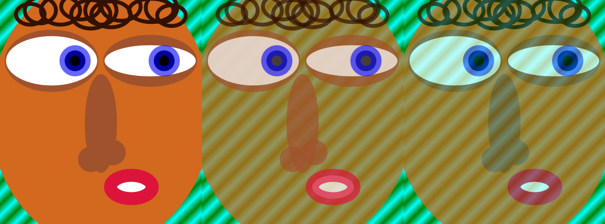
Figure 15-1. An SVG face, and versions of it made transparent with fill-opacity and stroke-opacity (center) or with opacity (right)
With semitransparent fill and stroke, the layered construction of the graphic becomes visible. Each overlapping layer obscures a bit more of the background.
With reduced opacity, however, the entire <use> element is treated as a single image. Every point becomes equally transparent. The individual shapes don’t matter, only the final colors at each point.
Tip
If parts of the original graphic had been partially transparent, the opacity change on the parent element would have compounded the transparency. An opacity value of 0.7 makes every point 70% as opaque as it otherwise would have been.
There are consequences of the layer-effect behavior of opacity. Because it applies to the final, composited (painted) result of that element’s child content, it flattens effects such as 3D transformations and z-index stacking layers.
The same is true for clipping, masking, filters, and blend modes, all of which apply an effect to a flattened layer of a graphic.
The Clean-Cut Clip
We’ve used the term “clipping” informally throughout the book to discuss the overflow property: when overflow is hidden on an <svg> or other element with defined boundaries, any graphics outside of the boundary rectangle are not drawn. They are clipped off.
Clipping paths work similarly, except that the boundary doesn’t have to be a rectangle: it can be any vector shape. When you clip a graphic to a clipping path, only the parts of the graphic that are inside the path will be drawn. Because a clipping path is a binary, on-or-off operation, it operates very fast in terms of rendering and processing overhead.
Figure 15-2 illustrates the process at a conceptual level. We’ll look at the different ways to create it with code in the following sections.
The clipping path (triangle) is scaled and aligned to fit over the graphic (photograph). Then all parts of the photograph that don’t overlap the triangle are removed.
Note
The photograph in Figure 15-2 is of an F/A-18 fighter jet passing through the sound barrier, creating a shockwave of condensation behind it. It was taken by Ensign John Gay of the USS Constellation, US Navy. You can read more about the photo and science from NASA.
Clipping paths can be somewhat frustrating to debug. If the clipping path does not intersect the clipped graphic, the graphic will completely disappear—clipped away to nothing. For the clipped graphic to actually be visible, the clipping path and the graphic must overlap.
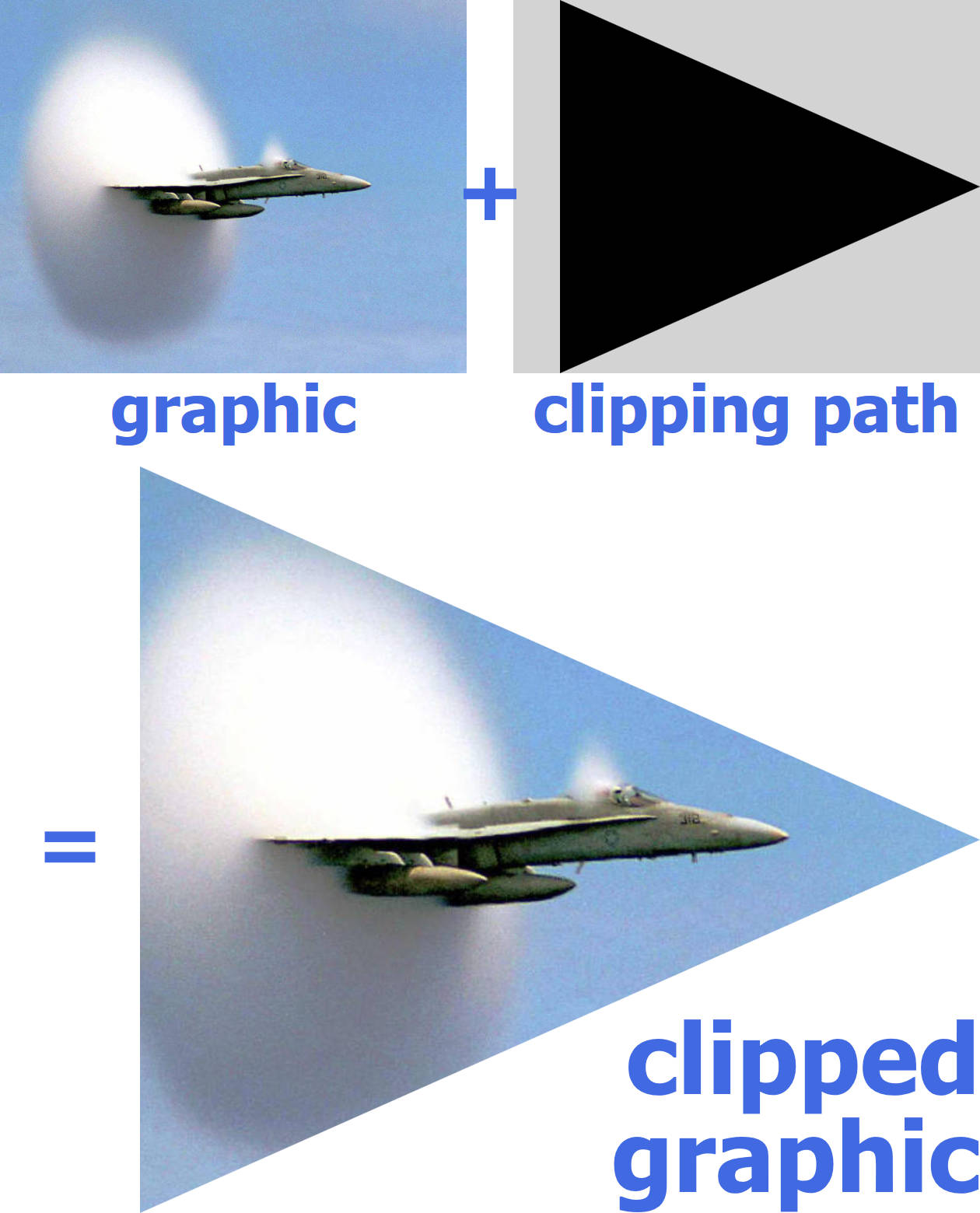
Figure 15-2. A clipped graphic is constructed from a graphic (here, a photograph) and a vector clipping path (here, a triangular polygon)
Tip
If you’re fighting with a completely clipped graphic, try making your clipping-path shape larger and larger, until at least some of it intersects the graphic. Then you can figure out where both shapes are, and—hopefully—why they weren’t where you thought they should be.
The examples in this chapter mostly use the well-supported all-SVG approach to clipping paths, but we’ve also included examples of the newer options created by the CSS Masking module.
Creating a Custom Clipping Path
Clipping paths are applied to a graphic layer with the clip-path CSS property or presentation attribute. Since clipping is a layer effect, the clip-path property is not normally inherited.
In SVG 1.1, the value of clip-path is either none (the default, no clipping) or a url() reference to an SVG <clipPath> element.
Tip
Note the spelling: the CSS property is clip-path (with a hyphen); the XML element is <clipPath> (capital P, no hyphen).
The <clipPath> element can theoretically be in another file, but—as with most SVG graphical effects—browser support is best if the referenced element is in the same document.
If it is in another file, cross-origin restrictions apply.
The only required attribute on the <clipPath> element is an id, so you can reference it in the clip-path property of the other graphic.
A <clipPath> element has one unique attribute: clipPathUnits. If you’ve read Chapter 12, it will look familiar. The options are the same as the *Units attributes for patterns and gradients: objectBoundingBox or userSpaceOnUse.
Tip
The default value of clipPathUnits is userSpaceOnUse.
The actual clipping path is defined by shapes included as children of the <clipPath> element. Specifically, a <clipPath> may contain:
-
shape elements, normally
<rect>,<circle>,<ellipse>,<polygon>, or<path> -
<text>elements (although beware: this text is completely inaccessible!) -
<use>elements that directly copy individual shape or text elements
The triangular clipping path used in Figure 15-2 was defined by a simple three-point <polygon> inside a bounding-box <clipPath>:
<clipPathid="clip"clipPathUnits="objectBoundingBox"><polygonid="p"points="0.1,0 1,0.5 0.1,1"/></clipPath>
We then apply that clipping path by referencing the <clipPath> element’s id in the clip-path presentation attribute of the second copy of the image:
<usexlink:href="#image"x="20"y="200"width="400"height="320"clip-path="url(#clip)"/>
We could also have applied the clipping directly to an <image> element (instead of a <use> copy), or with a CSS rule instead of a presentation attribute.
The actual clipping path is defined solely by the fill-region geometry of the elements inside the <clipPath>. Strokes, fill, opacity, and most other styles have no effect. For this reason, a <polyline> will behave exactly like a <polygon>, and a straight <line> will have no effect.
The only styles that are relevant inside a <clipPath> are the properties that affect the core geometry of the vector shapes:
-
the SVG 2 geometric properties (which correspond to SVG 1.1 geometric attributes)
-
the
transformproperty (which also was only available as an attribute in SVG 1.1) -
clip-pathclipping -
text layout and font-selection properties
-
displayandvisibility
Tip
If any of the <clipPath> child elements has display set to none, or visibility set to hidden, then that element does not contribute to the clipping path. This could be useful if you are animating the clipping path, to show or hide different parts of your graphic.
The fill-rule property affects geometry of a shape, but it doesn’t affect shapes inside a <clipPath>. Instead, there is a dedicated clip-rule property that has the exact same options (evenodd versus nonzero) and default (nonzero). It only applies on each shape individually, not the combination of multiple shapes in the clipping path.
Intersecting Shapes
Since the result of a clipping operation is the overlap of two vector graphics, clipping can be used to draw complex shapes that are the intersection of simpler shapes. To demonstrate, we’ll use a common example of two basic shapes intersecting: a Venn diagram of two overlapping circles.
In a Venn diagram, you use two or three circles to represent two or three different categories, and then overlap the circles to represent items that fit in multiple categories. We’ll draw it by predefining a circle in the middle of a centered coordinate system, and then <use>-ing it with different horizontal offsets:
<defs><circleid="circle"r="12"/></defs><usexlink:href="#circle"x="-6"fill="royalBlue"/><usexlink:href="#circle"x="+6"fill="lightGreen"/>
On their own, these circles look like Figure 15-3.
To turn these overlapping circles into a proper Venn diagram, the area shared between the circles needs to be visibly distinguished. There are many possible ways to achieve this: we could make the circles partially transparent, or use blending modes, so that you could see one circle through the other. But in order to have full control over the appearence of the overlap, we need to draw the “intersection section” of the diagram as its own element.
We could do that with a <path> element, figuring out the coordinates for arc segments. But we won’t. Instead, we’re going to draw the overlap exactly as we defined it: as the region where one circle intersects another. One circle will be our graphic, and the other circle will be our clipping path.
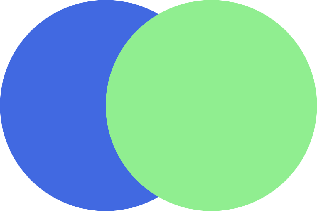
Figure 15-3. An incomplete Venn diagram, without the intersection section
For this example, we are going to draw the circle on the right, and then clip it to fit within the circle on the left. So in order to keep ourselves straight, we call the clipping path clip-left:
<clipPathid="clip-left"></clipPath>
We want our clipping path to be defined in terms of the main coordinate system, so we will be able to align the circle in the clipping path with the existing circle in our diagram. This means that the default userSpaceOnUse value of clipPathUnits is just what we need.
As it’s currently defined, if we applied clip-path: url(#clip-left) to a graphic, that graphic would disappear. This is an empty <clipPath> element: it does not include any shapes to define the actual clipping path. There is nothing for the clipped graphic to intersect with, so the graphic would get clipped away to nothing.
To create a clipping path that clips a graphic to only include the parts that overlap the left circle, we <use> a copy of our predefined circle as a child of the <clipPath> element:
<clipPathid="clip-left"><usexlink:href="#circle"x="-6"/></clipPath>
The x offset is the same as that for the left circle in the actual drawing.
Warning
You cannot reuse the <use> element that already has the x offset applied. The SVG specs only allow <use> elements in a <clipPath> if they directly reference a shape or <text> element.
Microsoft browsers allow indirect references to other <use> elements, but other browsers don’t: they treat it as an empty clipping path, meaning that the graphic gets clipped away to nothing.
SVG 2 suggests that browsers should ignore the clipping path altogether if it has invalid content, but none have implemented it this way yet.
The final step is to draw a circle that overlaps the right circle in our Venn diagram, and apply our clip-left clipping path to it.
You might think you could do that with code like this:
<usexlink:href="#circle"x="+6"fill="mediumTurquoise"clip-path="url(#clip-left)"/>
But if you did that, you’d get Figure 15-4—which isn’t quite what a Venn diagram should look like.
The problem? The x and y attributes on <use> elements are treated as transformations. And transformations change the user-space coordinate system. The turquoise copy of the circle is getting clipped to the parts that overlap the blue circle, before it gets shifted right to align with the green circle.
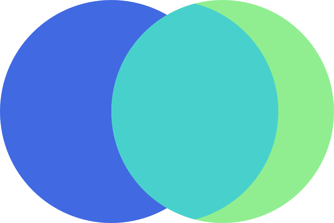
Figure 15-4. A misaligned Venn diagram, caused by clipping a <use> element directly
The solution—for this and most other problems involving transformations messing up userSpaceOnUse clipping or masking—is to apply the clipping to a group in the untransformed coordinate system. Then include the transformed element (or in this case, the <use> with an x attribute) inside that group:
<gclip-path="url(#clip-left)"><usexlink:href="#circle"x="+6"fill="mediumTurquoise"/></g>
With that, we finally have a proper Venn diagram: Figure 15-5. The turquoise-colored cat’s-eye shape in the middle now correctly matches the intersecting circles on either side.
Now that we have three distinct shapes for the three distinct areas, we can fill those shapes however we like. Example 15-1 compiles all the code snippets together, then adds a stripe pattern (instead of a blended color) to represent the overlap, and some stroke outlines over the top, as shown in Figure 15-6.
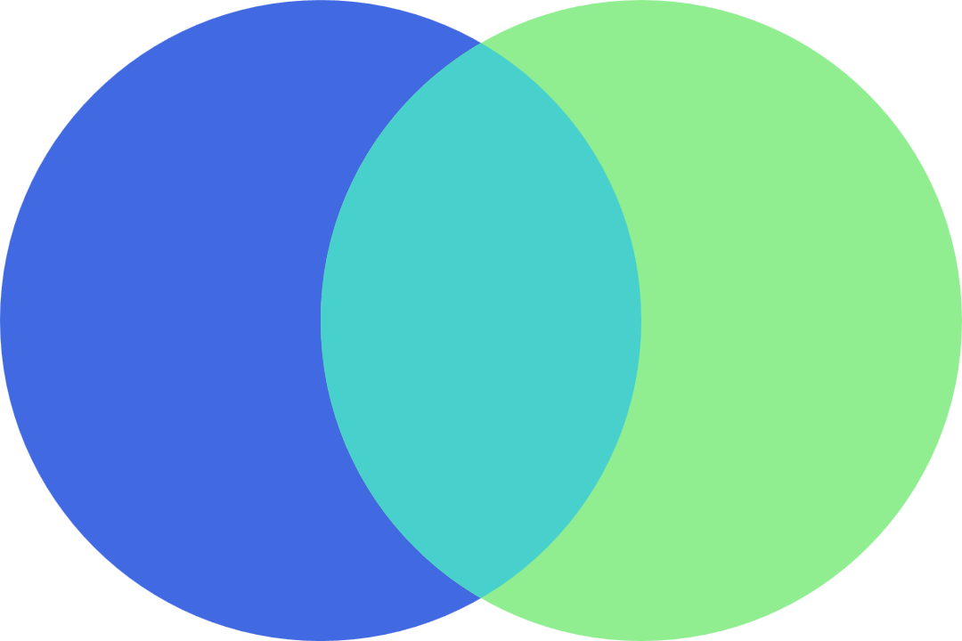
Figure 15-5. A solid-color Venn diagram, created with clipping paths
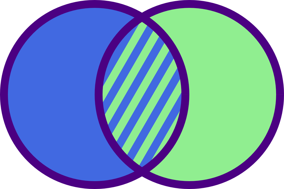
Figure 15-6. A two-circle Venn diagram with a striped pattern fill
Example 15-1. Using clipping paths to draw a patterned Venn diagram
<svgxmlns="http://www.w3.org/2000/svg"xml:lang="en"xmlns:xlink="http://www.w3.org/1999/xlink"height="240px"width="360px"viewBox="-18 -12 36 24"><title>Two-Circle Venn Diagram</title><style>.left{fill:royalBlue;}.right{fill:lightGreen;}.outlines{fill:none;stroke:indigo;}</style><defs><circleid="circle"r="11.5"/><useid="left"xlink:href="#circle"x="-6"/><useid="right"xlink:href="#circle"x="6"/></defs><clipPathid="clip-left"><usexlink:href="#circle"x="-6"/></clipPath><patternid="stripes"patternUnits="userSpaceOnUse"width="2"height="100%"patternTransform="rotate(30)"><rectwidth="2"height="100%"class="left"/><rectwidth="1"height="100%"class="right"/></pattern><usexlink:href="#left"class="left"/><usexlink:href="#right"class="right"/><gclip-path="url(#clip-left)"><usexlink:href="#circle"x="+6"fill="url(#stripes)"/></g><gclass="outlines"><usexlink:href="#left"/><usexlink:href="#right"/></g></svg>
The strokes in Example 15-1 are worth a second look. We can’t stroke the clipped shape directly. Well, we could, but the stroke would only wrap around the curve that is actually an edge of the circle, not the curve that was created by the clipping path. And we can’t just stroke the underlying circles, because those strokes would get hidden by the overlapping layers.
So, instead, the strokes are their own layer: copies of the intersecting circles, drawn with just strokes and no fill.
Finally, because “inside” strokes aren’t yet supported in SVG, the overall radius of our predefined circle has been shrunk slightly, so that the outside radius of the circle + stroke is still 12 units.
Clipping a clipPath
With that example accomplished, how would we create a three-category Venn diagram? That’s a diagram like Figure 15-7, with three circles, all overlapping, including a center section for items that belong in all three categories.
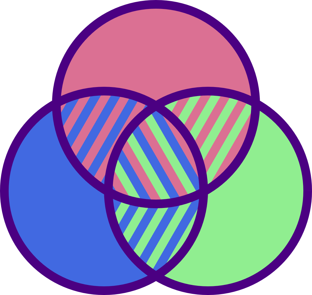
Figure 15-7. A three-circle Venn diagram
The three overlapping sections between pairs of circles can be created by the same method as in Example 15-1. The overlap between the top circle and the left circle can be created with the existing clip-left clipping path, but you’ll also need a clip-right path to cut out the overlap on the other side.
But the center section is a little more complicated. It is the intersection of all three circles. To create it, we need to draw a circle (for example, aligned with the top circle) and then clip it twice: first to include only the parts that overlap the left circle and then to include only the parts that also overlap the right circle.
The clip-path property can’t apply two separate clipping paths to the same element. Instead, you have a few choices:
-
Use nested
<g>groups to apply the two different clipping paths consecutively:<gclip-path="url(#clip-left)"><gclip-path="url(#clip-right)"><usexlink:href="#circle"y="-10"fill="url(#stripes-all)"/></g></g> -
Create a dedicated
clip-both<clipPath>element, where the shape inside it is the result of clipping the left circle to the right circle. However, because we can’t clip a positioned<use>element directly, and because we can’t include a<g>element inside a clipping path, that means redefining the<circle>and positioning it on the right withcx:<clipPathid="clip-both"><circler="11.5"cx="6"clip-path="url(#clip-left)"/></clipPath><gclip-path="url(#clip-both)"><usexlink:href="#circle"y="-10"fill="url(#stripes-all)"/></g> -
Create a dedicated
clip-both<clipPath>element, where the shape inside it is one of the circles, and apply aclip-pathdirectly to the<clipPath>to clip it to the other circle:<clipPathid="clip-both"clip-path="url(#clip-left)"><usexlink:href="#circle"x="6"/></clipPath><gclip-path="url(#clip-both)"><usexlink:href="#circle"y="-10"fill="url(#stripes-all)"/></g>
Tip
Yes, a <clipPath> element can have a clip-path applied to it. The effective clipping path is then the intersection of the two paths.
All these options decrease the size of the final clipped graphic: only the parts that intersect both clipping shapes will be drawn.
If you instead wanted a clipping path that clipped to areas that overlap either of two shapes, the solution is simpler: include both shapes (or <use> copies of them) inside the same <clipPath> element.
For example, the following <clipPath> would clip an element to the combined shape of both our left and right circles:
<clipPathid="clip-either"><usexlink:href="#circle"x="-6"/><usexlink:href="#circle"x="+6"/></clipPath>
That <clipPath>, applied to a gradient-filled rectangle, results in Figure 15-8.
Figure 15-8. A gradient-filled rectangle, clipped to two overlapping circles
Unfortunately, the (rather arbitrary) restrictions on <clipPath> contents means that you cannot easily generate a clipping path from an existing <g> group of shapes, or from a <symbol> or <svg>. You need to copy all the shapes individually, and position each one with transformations, without using groups or viewBox scaling.
Stretch-to-Fit Clipping Effects
The previous <clipPath> examples have used the default userSpaceOnUse scaling. It’s usually the easiest to use, because the shapes in your <clipPath> can be sized and positioned to match shapes in your drawing. But when clipping an entire <svg> or an <image> element—and especially when clipping HTML elements—you often want to define the clipping path relative to the normal size and position of that element, not relative to the SVG coordinate system.
In other words, you will want to change clipPathUnits to objectBoundingBox.
With objectBoundingBox units, the shapes in the clipping path should be defined in units between 0 and 1. Don’t use percentages—just like with patterns, percentages are scaled up by the bounding-box scale and are therefore not useful.
The shapes in your bounding-box clipping path will stretch to fit the graphic being clipped. If the graphic’s bounding box isn’t square, that stretching effect will be nonuniform, distorting the clipping path. So a <circle> clipping path will be stretched into an ellipse, if it is applied to a rectangular shape.
When a bounding-box clipping path (or other layer effect, such as mask or filter) is applied to a <g>, or <use> element, the bounding box used is the tightest box that fits all the grouped content’s bounding boxes, after their sizes and positions have been converted to the parent element’s coordinate system.
Tip
The bounding box isn’t affected by any clipping or hidden overflow on the child content.
Bounding-box units can trigger the second type of frustrating clipping-path debugging situation—a clipping path that doesn’t appear to have any effect at all!
That can be caused if the shapes inside your <clipPath> are too big, completely overlapping the 1×1 bounding-box dimensions, so nothing gets clipped off.
Tip
Of course, a lack of clipping sometimes just means that a typo in an element or attribute name or id value has prevented the clipping path from being applied at all. So remember to check that, too.
In addition, bounding-box clipping paths have all the same frustrations as bounding-box gradients and patterns: they stretch and distort shapes, they don’t include strokes and markers when determining the scale, and they create errors if applied to a straight horizontal or vertical line.
Example 15-2 creates a bounding-box <clipPath> within inline SVG, and then uses it to clip both an SVG <image> and CSS layout boxes within the HTML section of the page. Figure 15-9 shows the resulting web page.
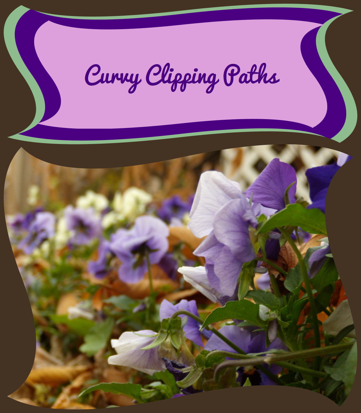
Figure 15-9. HTML elements (and CSS pseudoelements) and an SVG image, all clipped by the same object bounding-box clipping path
Example 15-2. Creating curved boxes, in SVG and HTML, with object bounding-box clipping paths
<!DOCTYPE html><html><head><metacharset='UTF-8'><title>Object Bounding-Box Clipping paths, on SVG and HTML elements</title><style>@importurl('https://fonts.googleapis.com/css?family=Pacifico');svg{display:block;}body{background-color:#432;margin:0.5em;}header{background:darkSeaGreen;position:relative;z-index:0;padding:0.1rem;}header::before{background:indigo;content:"";display:block;position:absolute;z-index:-1;top:0.5rem;bottom:0.5rem;left:1.5rem;right:1.5rem;}h1{background:plum;color:indigo;text-align:center;padding:10%;margin:2rem4rem;font-size:300%;font-family:Pacifico,sans-serif;font-weight:normal;}header,header::before,h1{-webkit-clip-path:url(#wave-edges);clip-path:url(#wave-edges);}</style></head><body><header><h1>Curvy Clipping Paths</h1></header><svgviewBox="0 0 400 300"role="img"aria-label="Blue and white violets,in a garden filled with autumn leaves"><clipPathid="wave-edges"clipPathUnits="objectBoundingBox"><pathd="M0.05,0.01Q0.15,0.15 0.5,0.05 T0.99,0.05Q0.85,0.15 0.95,0.5 T0.95,0.99Q0.85,0.85 0.5,0.95 T0.01,0.95Q0.15,0.85 0.05,0.5 T0.05,0.01Z"/></clipPath><imagexlink:href="violets.jpg"width="100%"height="100%"preserveAspectRatio="xMidYMid slice"clip-path="url(#wave-edges)"/></svg></body></html>
The stacked outlines in the header in Example 15-2 are created with separate elements (the <header> and <h1>) and a CSS pseudoelement, all clipped with the same wavy SVG <clipPath>. When you clip an element, you clip all of it, including SVG strokes and markers, CSS padding and borders, and even shadow and filter effects. So, in order to have a contrasting border for our heading, we needed to draw the contrasting color in a separate element, outside the clipping path.
The three heading layers are all clipped to the same shape, in bounding-box units. However, the clipping path gets stretched and scaled slightly differently for each, so the final curves are not neatly parallel.
Tip
The “bounding box” for a CSS layout element is the border-box. In contrast, the “user space” for non-SVG elements is not well defined, and may not work how you expect.
Just like the opacity property, a clip-path has a flattening effect. It turns each layer into its own stacking context for CSS z-index layering. This means that the z-index declarations in Example 15-2 aren’t actually required: they are there to ensure that the stacking is correct in browsers that don’t support clip-path on CSS boxes.
As we mentioned at the start of the chapter, support for SVG clipping paths on non-SVG elements is not universal. At the time of writing, the -webkit- prefix is required for support in Safari; Microsoft Edge won’t clip the HTML elements at all. However, the fallback layout—with simple layered rectangles for the heading—looks acceptable in Edge and other browsers that don’t support clip-path outside SVG. And the SVG <image> element gets clipped to the curved shape in any browser that supports SVG.
Shorthand Shapes
As we’ve hinted at previously, the CSS Masking module extends the clip-path property in more ways than just applying it on CSS layout boxes.
Instead of defining the clipping path in a SVG <clipPath> element, and then using a url() reference in the clip-path property, you can define the clipping path shape directly in the clip-path property with a CSS shape function. For example, a circular clipping path like the one used in the Venn diagram examples earlier in the chapter would look like this:
clip-path:circle(12pxat-6pxcenter);
We introduced the shape functions in Chapters 5 and 6. To recap, they are:
-
circle()andellipse() -
inset()for drawing rectangles and rounded rectangles -
polygon() -
path()
Warning
The path() shape function for creating curved shapes in CSS was defined later than the other shapes. At the time of writing, it is not supported in any web browsers for clip-path.
You rarely need to use the circle() and ellipse() functions in clip-path for CSS boxes: you can achieve elliptical clipping—with much better browser support—with border-radius combined with overflow: hidden. So, for now, CSS shapes and clip-path is mostly about the polygon() function.
Within a shape function, you can create fixed-size clipping paths with absolute length units, or create a bounding-box effect by using percentages. The exception is the path() function, which uses the SVG path syntax, and therefore only accepts user-unit coordinates (not lengths or percentages).
You can also mix percentages with absolute values, using the calc() function. This allows you to create clipping paths that scale to the full size of the element and then clip a fixed distance from each edge, something that is not currently possible with SVG <clipPath>.
For example, the following polygon clips a 30px wide and tall triangle from each corner of the box, regardless of the box size:
clip-path:polygon(030px,30px0,calc(100%-30px)0,100%30px,100%calc(100%-30px),calc(100%-30px)100%,30px100%,0calc(100%-30px));
Figure 15-10 shows the result if we use that clipping path to replace the wavy <clipPath> in Example 15-2.
Figure 15-10 offers a warning about the limits of “absolute” sizing: the clipping path on the SVG <image> is applied in the scaled SVG coordinate system, so the 30px triangles are much larger than they are for the boxes in the header. (For this example, you could avoid that discrepancy by clipping the <svg> element instead of the scaled <image>.)
According to the latest specs, you should also be able to specify which reference box to use for measuring percentages: content-box instead of border-box, for example. For SVG, you could use stroke-box instead of fill-box. An SVG user-space clipping path would be equivalent to using view-box as the reference box.
Warning
At the time of writing, changing the reference box is not supported in Chrome/Blink browsers, or in the -webkit- prefixed property used in Safari/WebKit.
Because a CSS shape’s geometry is defined entirely in the clip-path property, you can animate or transition between similar shapes. For example, you could transition a circular clipping path down to zero radius to make an element disappear. To be “similar” enough to transition, shapes must be the same type. For polygon() and path(), they must have the same number of points.
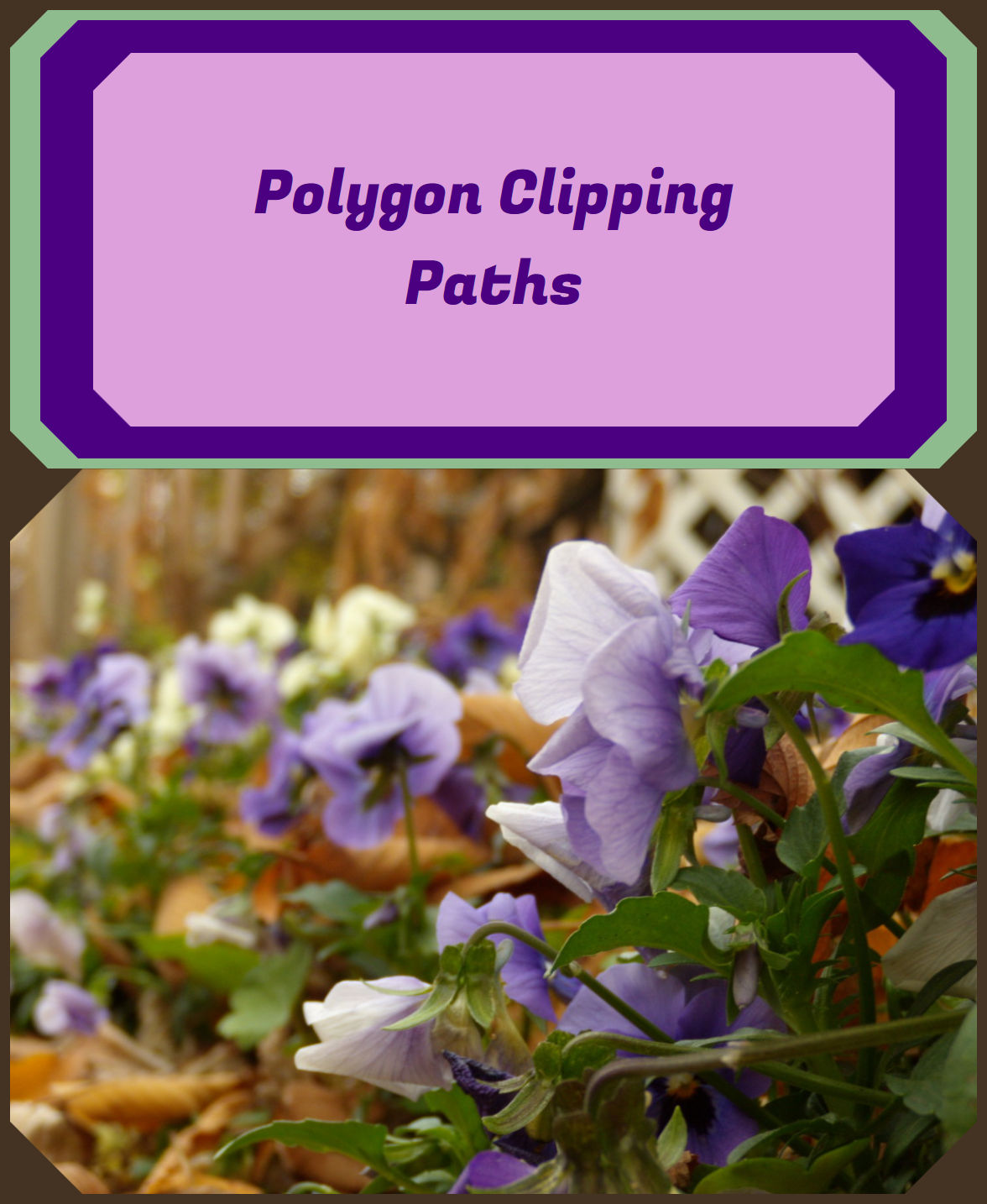
Figure 15-10. HTML and SVG elements clipped to the same CSS polygon clipping path
In contrast, when you animate the shapes inside in an SVG <clipPath>, it affects all elements that use that graphical effect. (Also, support is currently poor for animating SVG geometry properties with CSS.)
One limitation of using CSS shapes functions, particularly for polygon(), is that you can’t draw the shapes in a visual software and then copy the generated SVG code: the coordinates need to be in the CSS syntax. A few tools are currently available to help you draw shapes, especially for clipping image files:
-
Clippy, by Bennett Feely, provides a web interface with click-and-drag points, as well as a number of preset polygons for common shapes.
-
The Adobe CSS Shapes Editor JavaScript library allows you to add a visual CSS shapes editor into a web page, such as the web interface to a content management system.
-
The CSS Shapes Editor extension for Chrome (and related browsers), by Razvan Caliman, adds an extra tab to your Developer Tools panel that allows you to edit shape functions for elements in your page using the Adobe JS library. It’s currently optimized for use with the
shape-outsideproperty, but you can copy and paste the code intoclip-path.
A similar CSS shapes editor will be natively included in Firefox dev tools, starting sometime in late 2017.
As we mentioned in Chapter 5, the shape-outside property controls how text wraps around floated elements in CSS layout. It uses the same CSS shapes functions as clip-path, so you may find yourself reusing the same value twice, making them a good candidate for CSS variables. However, beware that the two properties have different default reference boxes: if you don’t specify the reference box, shapes are measured relative to border-box for clip-path, but margin-box for shape-outside.
Hiding Behind Masks
Clipping paths are useful for quickly including or excluding specific regions of a graphic, or changing the shape of rectangular elements such as images. But clipping paths are limited. You must be able to define them with simple vector shapes. The final effect is binary: graphics are either inside or outside the path, never in between.
For more subtle effects, you need a mask.
A mask works somewhat differently from a clipping path. Where a clipping path is defined as a vector shape, a mask is defined as a single-channel (e.g., grayscale) image layer. The resulting transparency effect doesn’t have a 1-bit, on-or-off value—it has a full 8-bit (1 byte) channel of 256 possible levels. Masks are commonly used in photo-editing applications such as Adobe Photoshop and GIMP, because they operate on pixels, not vectors.
Warning
Android browsers did not support SVG masking until version 4.4. Masking is also not supported in some software that is used to convert SVG to raster images or PDF, so if you’re creating fallback PNG images with an automated script, double-check that they look correct.
Masks can create stunning visual effects, but going from 1 bit to 1 byte of transparency information adds considerable computational cost.
If you can achieve an effect with clip-path instead of mask, it will give you better performance, especially for animated graphics.
The masks defined in SVG 1.1 are known as luminance masks. Loosely, that means that the brightness (luminance) of the mask image determines the opacity of the final masked graphic. The mask’s image layer is converted to grayscale, it is scaled and positioned as required, and then the grayscale intensity of a given pixel in the mask becomes the alpha factor applied to the corresponding pixel in the graphic that you are masking.
Pure white areas in the mask (100% luminance) correspond to an opacity of 1 (opaque), meaning no masking occurs—the masked graphic has its normal transparency in those sections. Pure black (0% luminance) corresponds to an opacity of 0 (transparent), meaning those sections of the masked graphic will be entirely clipped away, letting the background shine through.
Tip
The luminance calculation converts colors to grayscale using a formula the recognizes that yellows and greens are brighter (higher luminance) than equally intense reds and blues.
The same formula is used in filters (but not in blend modes!), and in calculating contrast ratios for accessibility.
Figure 15-11 shows a mask in action: the mask is created from black-to-white linear and radial gradients. We’ll look at the code to create the effect in the following sections.
The masked version of the photograph is drawn in the regions that are white in the mask, and fades away to transparent (revealing the white page background) in the regions that are black in the mask. The end result is much softer than the sharp lines created when the same photograph was clipped to a triangle in Figure 15-2.
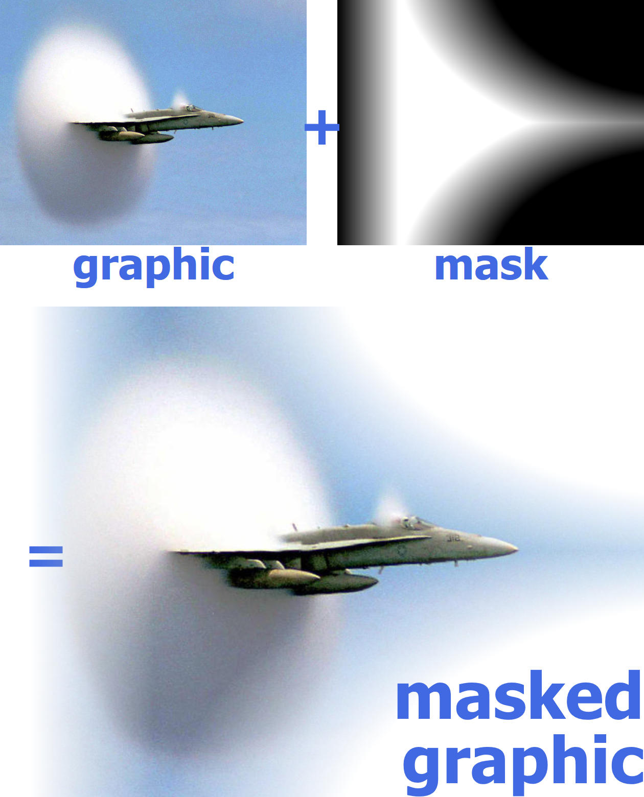
Figure 15-11. A masked graphic is constructed from a full-color graphic (here, a photograph) and a single-channel mask image (here, an arrangement of grayscale gradients)
The luminance levels of the mask are calculated after the brightness is scaled down according to the transparency of the mask image itself, as if the mask content were drawn on a black background.
That means that any transparent sections in the mask content are treated the same as black, completely masking that section of the graphic. This can be a problem when you’re creating a mask from SVG shapes. Unstyled SVG elements are drawn as black shapes on a transparent background. Within a luminance mask, those black shapes and transparent background are treated equally, turning your masked graphic invisible.
Tip
Just like with clipping paths, debugging masks can be frustrating because of graphics that completely disappear. A white rectangle inside the mask can make your graphics reappear, and help you figure out the layout issues.
In contrast, in an alpha mask, the alpha (transparency) levels in the mask image are used directly to determine the alpha factors for the masking effect. That means that opaque black, white, and color sections in the mask are all treated equally. Alpha masks are included in the CSS Masking module.
Who Was That Masked Graphic?
A mask effect is defined in SVG with a <mask> element, and applied to another element with the mask style property or presentation attribute.
The mask property works much like the clip-path property—in SVG 1.1, anyway: its value is either none (the default) or a url() reference. But this time, the element in the cross-reference must be a <mask>.
Warning
Or at least, that’s how it’s supposed to work. WebKit browsers currently apply the mask separately to every drawing operation: every child of the masked element is masked before being layered together, and strokes are masked separately from the fill.
That means you get an incorrect appearance if you are masking a group with more than one element, or if any of the elements you are masking have strokes on them. Unfortunately, there is no easy workaround for the problem.
Like <clipPath>, a <mask> element is a container for other graphics, and it can be scaled to the object bounding box or to the user space. But that’s about where their similarities end.
A <clipPath> had extensive restrictions on its contents, because those contents needed to be converted into pure vector outlines. A <mask> doesn’t have those restrictions.
Any valid SVG graphics can be drawn inside the mask, including groups, reused symbols, and embedded images. All the normal SVG styles apply: strokes, markers, fill patterns and gradients, opacity changes: they are all used to draw the image layer, which will then be converted into the luminance mask.
The <mask> element’s scaling attributes follow the same format as the <pattern> element attributes, one for the dimensions and one for the contents:
-
maskUnits(objectBoundingBoxby default) controls the scale of the overall mask region, a rectangle defined byx,y,width, andheightattributes on the<mask>. -
maskContentUnits(userSpaceOnUseby default) controls the scale of the elements inside the mask. There is noviewBoxto make scaling easier, however: only bounding-box or user-space scale.
The mask region defined by maskUnits and x, y, width, and height defines the outer bounds of the mask. Everything outside of that rectangle will be clipped completely. You can usually ignore these attributes, and just use the default mask dimensions.
The defaults for the mask dimensions create a mask that covers the object bounding box of the graphic being masked, plus 10% padding on each side. That’s good enough for masking images (which fit neatly in their bounding box) and for shapes or text with thin strokes.
The defaults are a problem if the actual dimensions of the graphic are noticeably bigger than its official bounding box:
-
shapes or text with thick strokes
-
shapes with large markers
-
text with large “swash” characters that extend beyond their layout boxes
In those cases, you may need to expand the mask region to completely cover the graphic.
Tip
When you use a <mask> on an element that is larger than its fill bounding box, x and y on the mask should be negative, and width and height should be greater than 100%.
This is how the defaults work: x and y default to –10%, and width and height default to 120%.
Adjusting the attributes won’t be enough if the fill bounding box of your shape might have zero height or width (e.g., arrows drawn from straight lines). In that case, you’ll need to switch maskUnits to userSpaceOnUse, and adjust x, y, width, and height to match.
The choice of maskContentUnits is more of a design decision.
The userSpaceOnUse default means that the shapes inside the mask are measured in the main SVG coordinate system. This makes it easy to size and scale the content, but you’re also responsible for making sure your mask content correctly overlaps the shapes you are masking.
If you switch maskContentUnits to objectBoundingBox, then all coordinates in the mask contents are relative to the width and height of the masked graphic’s fill bounding box.
Just like with bounding-box clipping paths, this means using lengths scaled from 0 to 1. (Or slightly larger, to cover strokes outside the fill bounding box.) Just like with bounding-box everything in SVG, it also means watching out for distorted shapes and errors from zero-height or zero-width bounding boxes.
Tip
Just like with patterns, avoid using percentage lengths and lengths with units in the content of bounding-box masks. They are scaled up proportional to the scaling of SVG user units.
In contrast, percentages for x, y, width, and height work as you would expect them to: relative to the bounding-box size when maskUnits is set to objectBoundingBox.
The <mask> in Figure 15-11 used bounding-box units to position three gradient-filled rectangles to cover the 1×1 bounding box:
<maskid="mask"maskContentUnits="objectBoundingBox"><gid="mask-contents"><rectfill="url(#fade-left)"width="0.2"height="1"/><rectfill="url(#fade-top-right)"x="0.2"width="0.8"height="0.5"/><rectfill="url(#fade-bottom-right)"x="0.2"y="0.5"width="0.8"height="0.5"/></g></mask>
The <g> element is there solely so that the contents could be copied with a <use> element to draw them in the figure—like a <pattern> or <symbol>, the <mask> is never drawn directly. But it’s also a reminder that <mask>, unlike <clipPath>, lets you use groups in the content.
Warning
Depending on the browser and the size of the SVG, you may detect hairline cracks in the mask, caused by rounding errors that leave a pixel gap (or smaller) between the rectangles. For SVG luminance masks like this, you can usually fix it by making each rectangle slightly larger that it should be, so they overlap by a few pixels.
Because this mask was going to be applied to an <image>, not a stroked shape, we did not need to scale the mask contents to cover any graphics outside the bounding-box rectangle.
Because we’re using bounding-box units—by default for the mask boundaries, and explicitly for the mask content—this mask will strech or compress to fit images, or other SVG graphics, of different dimensions. Figure 15-12 shows the mask applied to different versions of the photo, cropped to different aspect ratios.
We created the black-and-white versions of the mask in Figure 15-12 (and Figure 15-11) by copying the mask contents into a <symbol> with a 1×1 viewBox and no aspect-ratio control:
<symbolid="mask-image"viewBox="0 0 1 1"preserveAspectRatio="none"><usexlink:href="#mask-contents"/></symbol>
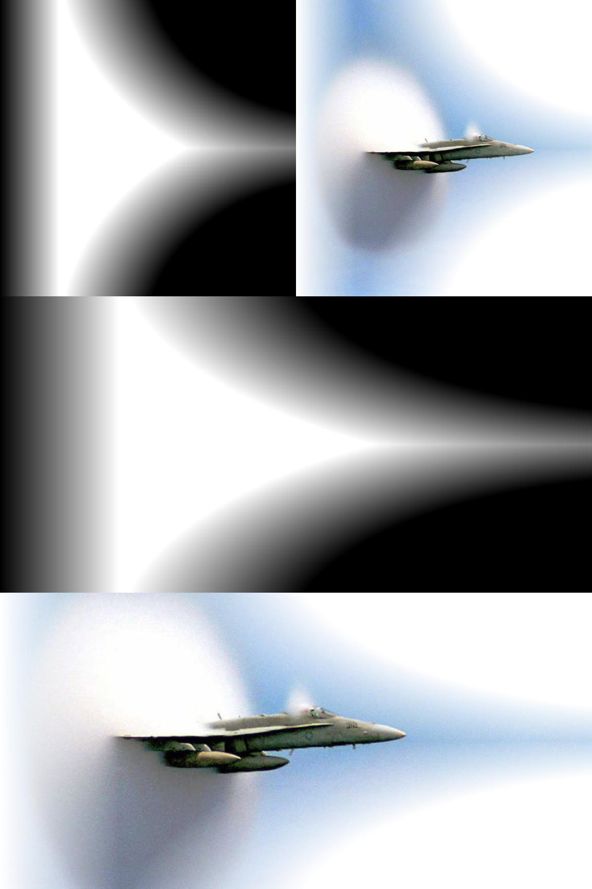
Figure 15-12. The object bounding-box mask stretches to fit masked images of different dimensions
The symbol is then reused at dimensions matching each bounding box, so that the nonuniform viewBox scaling mimics the scaling from objectBoundingBox units.
The photos were cropped in a photo editor, and saved as separate files. Normally, you can “crop” a photo dynamically in SVG by putting it inside a nested <svg> element with hidden overflow (using viewBox to adjust the scale and offset of the visible portion, as we did in Example 10-4 in Chapter 10).
But that hidden overflow is still used to determine the bounding-box size, which would mean that our masks would stretch to cover the full image size, ignoring any cropping. That would be good if the mask had been carefully designed to match the full image. But it’s not so useful for demonstrating how masks can stretch to fit different bounding boxes.
Masks aren’t just for photos, of course. You can also mask SVG vector shapes or text.
Figure 15-13 shows the same mask applied to a <text> element (containing the word “SPEED” with solid black fill) to show an all-SVG masking effect.
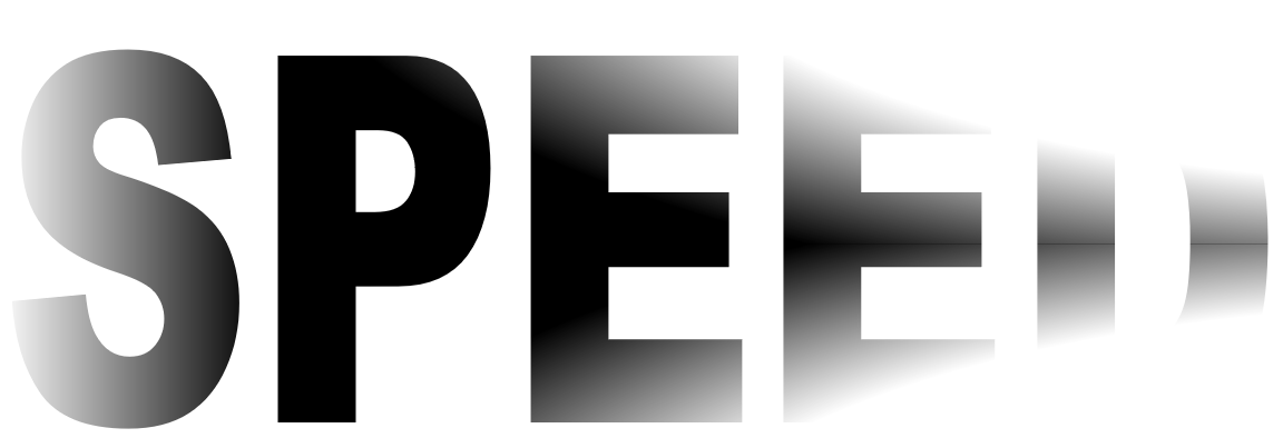
Figure 15-13. An object bounding-box mask applied to SVG text
If you look closely at the text in Figure 15-13, you’ll notice another bounding-box issue, which we briefly mentioned in Chapter 12: text bounding boxes are sized to the layout boxes of the individual characters, not to the visible shapes. The mask isn’t perfectly centered over the visible text. It is stretching to cover the space that would be used for lowercase letters that drop below the baseline, or accents that sit above the capitals.
Tip
Using a mask this extreme on <text> is probably not a good idea—it’s hard to tell that the last letter in Figure 15-13 is a D when most of it has been masked away! But if it were included in inline SVG or an embedded SVG object, it would still nonetheless be “real” text that can be selected and copied, or read by screen readers.
In contrast, when you include text inside the <mask> itself (or inside a <clipPath> or <pattern>), that text is just a decorative effect on another element, and is not accessible.
As we mentioned at the start of the section, for performance reasons, you should never use a <mask> when a <clipPath> will do. That means that most masks will have gradations in brightness. Gradients like those used in Figure 15-12 are one possibility. Another possibility is to use a photograph—not as the masked graphic, but as the mask itself!
Making a Stencil
One of the more interesting applications of masks is to create dynamic duotones out of photographs or other images.
A duotone is an image in which the darkest color in the image is mapped to one color (call it the background), the lightest is mapped to the foreground color, and in-between brightnesses become in-between colors. Depending on the colors you choose, the end result can look like lightly tinted black-and-white photographs, or like psychedelic posters.
You can create duotones by manipulating the colors in an <image> directly with filters.1 But masks require less math.
You create the effect by including the photograph (as an <image>) inside a <mask>. The mask effectively converts your photograph into a stencil, through which your masked graphics will be painted. The masked “graphic” is normally just a rectangle of solid color, painted on top of a background (unmasked) rectangle of a contrasting color.
The colors in the image are automatically converted to grayscale, based on their luminance. The dark parts in the image become transparent parts in your masked rectangle, so your background color shines through. The bright parts in your image become the parts that are drawn in the color of the foreground rectangle.
To test this effect, we’re going to work with the photograph in Figure 15-14. To show off all the color possibilities, we’re going to arrange four copies of our duotone image in a figure.
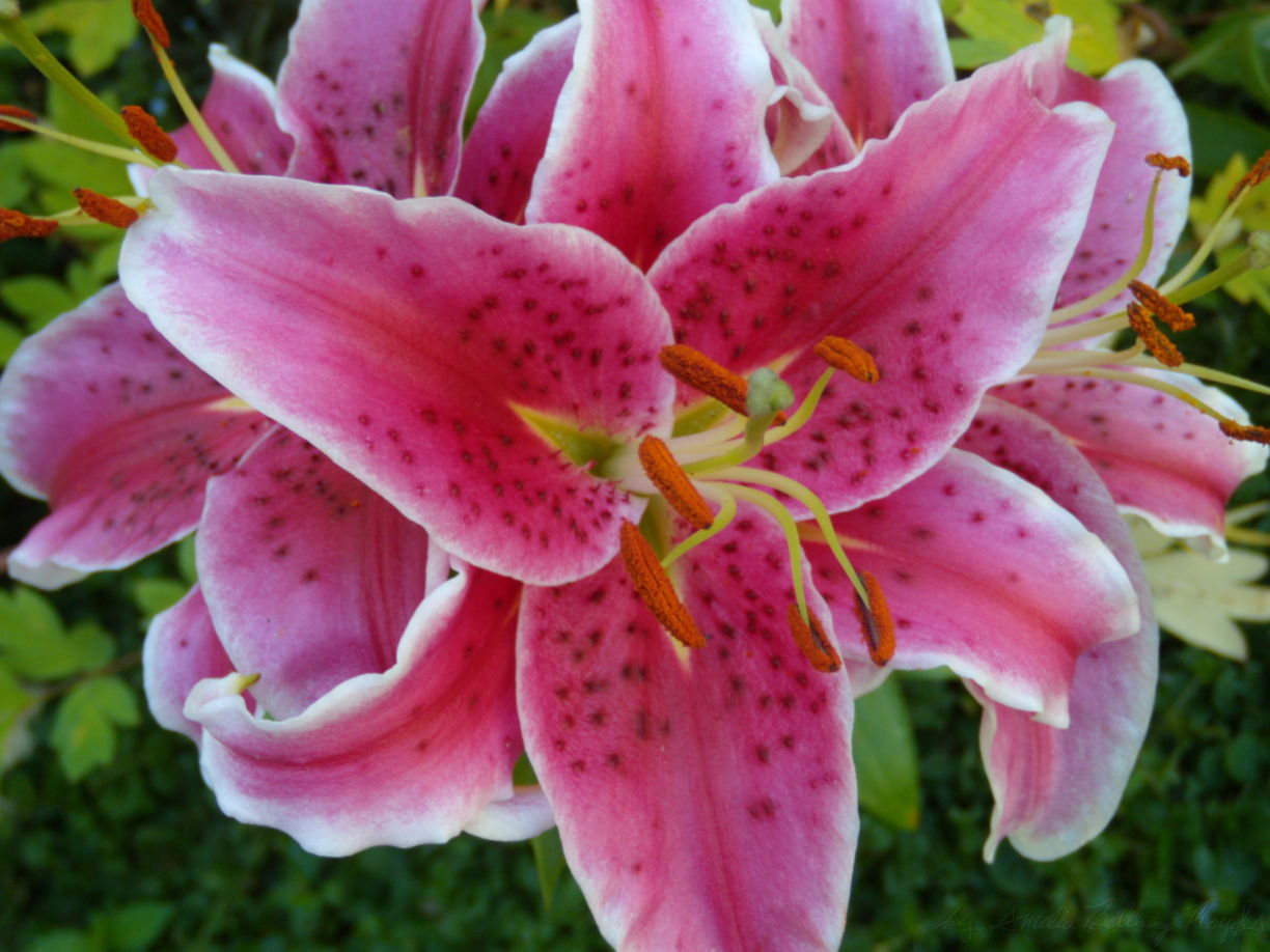
Figure 15-14. The photograph that will be used to create the duotone
So should this mask use userSpaceOnUse or objectBoundingBox units? It turns out, neither is ideal.
Tip
What we really need is a viewBox option, like we used in Chapter 12 for including images inside pattern fills. But that’s not yet available for <mask>.
An objectBoundingBox mask distorts the mask when the shape being masked isn’t square. Since our image isn’t square, our duotone rectangles won’t be, either.
We could distort the image inside the mask in the reverse direction, drawing it to exactly fit the 1×1 bounding-box region. Then we would make sure that the <rect> dimensions match the correct image ratio, so that the bounding-box scaling exactly cancels out the image scaling. But (depending on the browser implementation), this may mean that the browser applies the scale twice, using up extra processing power and risking lingering distortions in the image.
A userSpaceOnUse mask avoids distortion, but means that we can’t rely on the mask to scale our photograph and position it over each masked rectangle. We need to directly size the <image> inside the <mask> to the same size as the rectangles, and we need to position them both in the same position of the coordinate system.
But we want four different copies of the image, in four different positions. Do we need four different masks?
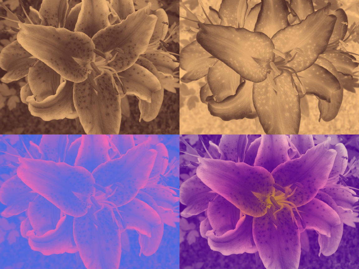
Figure 15-15. Duotone effects created from a photographic mask on SVG rectangles
Thankfully, no. If we use transformations to position the different duotones, we can draw all the rectangles—and the <image> in the mask—at the origin, so the mask will align with all of them simultaneously.
Example 15-3 gives the code, and Figure 15-15 shows the final result.
Example 15-3. Creating a duotone photograph with a mask
<svgxmlns="http://www.w3.org/2000/svg"xml:lang="en"xmlns:xlink="http://www.w3.org/1999/xlink"width="4in"height="3in"viewBox="0 0 8 6"><title>Duotone Photographs from Masked Rectangles</title><maskid="photo-mask"maskContentUnits="userSpaceOnUse"><imagexlink:href="lilies.jpg"width="4"height="3"/></mask><g><title>#FFC480 (cream) over #402020 (dark brown)</title><rectwidth="4"height="3"fill="#402020"/><rectwidth="4"height="3"fill="#FFC480"mask="url(#photo-mask)"/></g><gtransform="translate(4,0)"><title>#402020 (dark brown) over #FFC480 (cream)</title><rectwidth="4"height="3"fill="#FFC480"/><rectwidth="4"height="3"fill="#402020"mask="url(#photo-mask)"/></g><gtransform="translate(0,3)"><title>hotPink over royalBlue</title><rectwidth="4"height="3"fill="royalBlue"/><rectwidth="4"height="3"fill="hotPink"mask="url(#photo-mask)"/></g><gtransform="translate(4,3)"><title>3-color radial gradient over indigo</title><radialGradientid="pink-grad"r="0.6"><stopoffset="0"stop-color="gold"/><stopoffset="0.4"stop-color="hotPink"/><stopoffset="1"stop-color="papayaWhip"/></radialGradient><rectwidth="4"height="3"fill="indigo"/><rectwidth="4"height="3"fill="url(#pink-grad)"mask="url(#photo-mask)"/></g></svg>
The duotone on the upper left uses a dark brown background and cream-colored foreground. Since the foreground paints the bright parts of the mask, the result is a sepia-toned print of the photograph.
The duotone on the upper right reverses the colors. The dark foreground color is preserved in the bright parts of the photo, and the light background color shows through in places where the photo was dark: the final impression is that of an old photographic negative.
The third sample (on the bottom left) slides into psychedelic territory, with pink brights on blue background.
The fourth sample isn’t technically a duotone, but it’s there to prove a point: once you create the “stencil” from your photograph, you don’t have to fill it in with a solid color. Here, we use a radial gradient as the fill on the foreground rectangle.
To make our sepia-toned photograph a little more authentic, we can add a “vignette” effect. Early photographs had a characteristic dark fading or fogging along the outer edges, which were not lit as effectively by the light from the curved lens. This round shadow is now known as a vignette.
To recreate it, we need to combine our photograph mask with a mask that uses a radial gradient. Because the content of a mask can be any SVG graphic, we can most easily create compound masking effects like this by masking the mask contents (the <image> in this case).
Tip
Unlike with clipping paths, you cannot apply the mask property to the <mask> element itself: it needs to be on the mask contents.
(But, unlike with clipping paths, you can always group the mask contents in a <g> if you want to apply an effect to all of them!)
In Example 15-4 we create an artificial vignette by using a radial gradient in a bounding-box mask to fade out the corners of the photograph in our duotone mask. The transparent corners of that masked image are treated the same as underexposed (dark) areas when the second mask is used to create a sepia duotone, as shown in Figure 15-16.
Figure 15-16. A sepia photograph, with vignette corners, created with SVG masks
Example 15-4. Creating a duotone photograph with a mask
<svgxmlns="http://www.w3.org/2000/svg"xml:lang="en"xmlns:xlink="http://www.w3.org/1999/xlink"width="4in"height="3in"viewBox="0 0 4 3"><title>A Faded Photograph from a Masked Mask</title><radialGradientid="dark-corners"r="0.6"><stopoffset="0.7"stop-color="white"/><stopoffset="1"stop-color="#222"/></radialGradient><maskid="vignette"maskContentUnits="objectBoundingBox"><rectwidth="1"height="1"fill="url(#dark-corners)"/></mask><maskid="photo-mask"><imagexlink:href="lilies-large.jpg"width="4"height="3"mask="url(#vignette)"/></mask><g><rectwidth="4"height="3"fill="#402020"/><rectwidth="4"height="3"fill="#FFC480"mask="url(#photo-mask)"/></g></svg>
Summary: Clipping and Masking
Both clipping and masking achieve the same broad ends: restricting the user’s view to a portion of a element. The element being clipped or masked may be any SVG content, including vector graphics, text, or embedded raster images. In the latest browsers, it can also be any CSS layout box, so you can clip or mask HTML images or video.
The clipping paths and masks are distinguished by the way in which they affect elements: a mask is an image layer, and it is applied to the masked element pixel by pixel. Each pixel in the mask is converted into an alpha (transparency) value that can have any intensity from fully transparent to fully opaque. Those values are then used to reduce the opacity of the corresponding pixel in the masked element.
A clipping path is similar to a “1-bit” mask, where every pixel is either fully transparent or fully opaque. However, because clipping paths are defined with vector shapes, they can be much more efficient to implement, and they can affect pointer-events hit testing, changing the interactive region of an element.
Clipping and masking share many similarities with filters, which are the subject of Chapter 16. Clipping, masking, and filters are all layer effects that can apply to a composited group or image, not just to individual vector shapes. But while clipping and masking can only alter that graphic layer to change its transparency, filters can twist and remix the painted pixels in many different ways.
1 For a discussion of how to make duotones with filters, see “Color Filters Can Turn Your Gray Skies Blue,” by Amelia Bellamy-Royds, on CSS-Tricks.