Table of Contents for
Using SVG with CSS3 and HTML5
 Using SVG with CSS3 and HTML5
Published by
O'Reilly Media, Inc., 2017
Using SVG with CSS3 and HTML5
Published by
O'Reilly Media, Inc., 2017
- nav
- Cover
- Using SVG with CSS3 and HTML5
- Using SVG with CSS3 and HTML5
- Preface
- I. SVG on the Web
- 1. Graphics from Vectors
- 2. The Big Picture
- 3. A Sense of Style
- 4. Tools of the Trade
- II. Drawing with Markup
- 5. Building Blocks
- 6. Following Your Own Path
- 7. The Art of the Word
- III. Putting Graphics in Their Place
- 8. Scaling Up
- 9. A New Point of View
- 10. Seeing Double
- 11. Transformative Changes
- IV. Artistic Touches
- 12. Filling Up to Full
- 13. Drawing the Lines
- 14. Marking the Way
- 15. Less Is More
- 16. Playing with Pixels
- V. SVG as an Application
- 17. Beyond the Visible
- 18. Drawing on Demand
- 19. Transitioning in Time
- 20. Good Manners
- Index
- About the Authors
- Colophon
Chapter 11. Transformative Changes
Chapter 11. Coordinate System Transformations
When you define a coordinate system, using the viewBox and preserveAspectRatio attributes introduced in Chapter 8, you create an invisible grid that the browser fits into a rectangular space. When you transform a coordinate system, you pick up that grid and move, twist, or stretch it. Any shapes, text, or images drawn in the transformed coordinate system are moved, twisted, or stretched to match.
This chapter introduces the SVG transform attribute, and examines the ways in which you can work with the SVG coordinate system to make the most of transformations.
Like the nested coordinate systems created with <svg> and <symbol>, transformations allow you to reposition your origin or change the scale of your units. But transformations don’t stop there.
Transformations can change the definition of what “horizontal” or “vertical” means. This means you can draw rectangles and ellipses that don’t align with the browser window, without having to use <path> notation and trigonometry.
Furthermore, while new coordinate systems must be defined with a separate <svg> or <symbol> element, a transform can be applied directly—as an attribute—on individual shapes or on groups. This makes transformations incredibly flexible, and they are widely used in SVG.
Since transformations control the geometry of your drawing, transform was originally defined as a core XML attribute. However, transformations are so useful that web designers wanted to use them for non-SVG content.
The CSS Transforms module defines how transformations can be set using CSS style rules, for any content controlled by CSS.
This wasn’t supposed to be a “CSS versus SVG” situation, however. The new CSS module doesn’t compete with SVG, it extends and replaces the original SVG specification. The module upgrades the SVG transform attribute to a presentation attribute, so it can be overridden by CSS. That means that SVG transforms will be controllable with CSS classes, pseudoclasses, and media queries.
But the upgrade process hasn’t been easy.
All of the major browsers now implement support for CSS transformations on HTML elements; you can increase support in older browsers by duplicating properties with the -webkit- prefix. But as of early 2017, the same syntax applied to SVG elements is either not supported at all (Microsoft Edge and IE 11) or implemented in inconsistent ways between browsers (Chrome and WebKit versus Firefox).
This book therefore considers CSS transformations in SVG to still be a “future” feature; you can use them, but only as an enhancement, with careful testing and consideration of fallback. Notes throughout the chapter explain the important differences between the well-supported SVG transform attribute and the new CSS transform property.
A Simpler Scale
In Chapters 8 and 10 we discussed scaling your graphics from the perspective of getting them to scale to fit an available drawing region. This is an implicit scale: the browser calculates how much to scale the drawing (up or down) using the difference between the viewBox dimensions and the element’s width and height. The final scale is also affected—sometimes extremely so—by the preserveAspectRatio option.
What if you just want to enlarge one copy of an icon to be two or three times the size of another copy? It’s possible to use nested coordinate systems to do so. Example 11-1 uses a <symbol> element to define a coordinate system, and then reuses it at different sizes. Figure 11-1 shows the result; note that the elements are listed from largest to smallest in the code, so that the smaller versions are drawn on top of the larger ones.
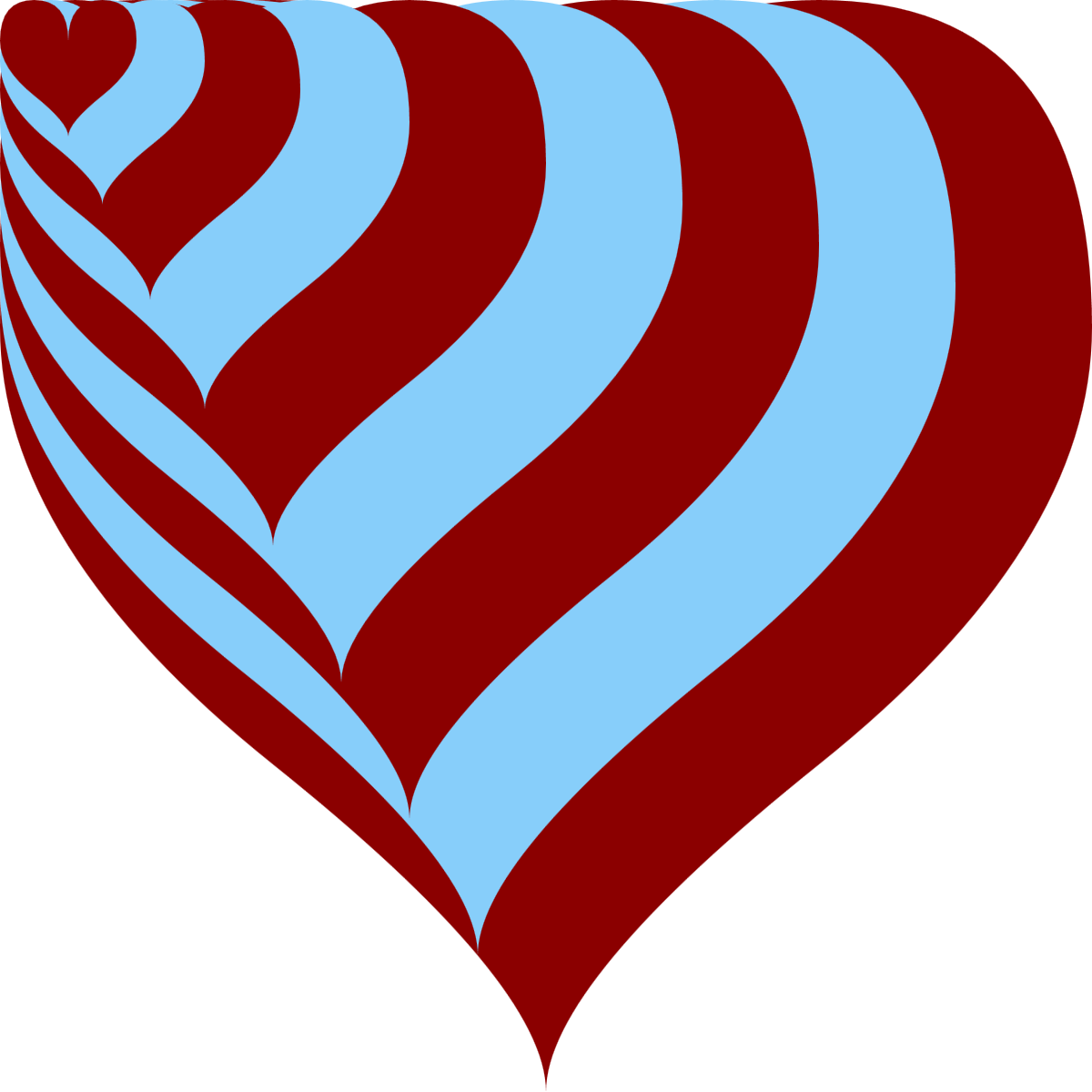
Figure 11-1. A heart icon at many scales
Example 11-1. Scaling an icon with <symbol> and <use>
<svgxmlns="http://www.w3.org/2000/svg"xml:lang="en"xmlns:xlink="http://www.w3.org/1999/xlink"width="400px"height="400px"viewBox="0 0 80 80"><title>Scaling with viewBox</title><styletype="text/css">use{fill:darkRed;}use:nth-of-type(2n){fill:lightSkyBlue;}</style><symbolviewBox="0 0 20 20"id="heart"><title>Heart</title><pathd="M10,6 Q10,0 15,0T20,6Q20,10 15,14 T10,20Q10,18 5,14T0,6Q0,0 5,0T10,6Z"/></symbol><usexlink:href="#heart"width="80"height="80"/><usexlink:href="#heart"width="70"height="70"/><usexlink:href="#heart"width="60"height="60"/><usexlink:href="#heart"width="50"height="50"/><usexlink:href="#heart"width="40"height="40"/><usexlink:href="#heart"width="30"height="30"/><usexlink:href="#heart"width="22"height="22"/><usexlink:href="#heart"width="15"height="15"/><usexlink:href="#heart"width="10"height="10"/></svg>

A
viewBoxon the<svg>defines the overall coordinate system.
The reused elements are styled with CSS; the
:nth-of-type(2n)pseudoclass selector applies to every second sibling element. You could also use:nth-of-type(even), which has the same effect, selecting even-numbered elements (as opposed toodd).
The
<symbol>defines the graphic and its coordinate system, but is not drawn directly.
Each use element defines the height and width of the space that the symbol’s
viewBoxshould stretch to fit. Because the height and width are always equal, matching the square aspect ratio defined in theviewBox, a consistent scale is achieved.
To scale the icons by a given factor (for example, two or three times as large), you need to define the viewBox width and height for the icon, and then define a drawing region width and height that is that many times larger. You also need to make sure that the aspect ratio is correct; otherwise, the scale will be adjusted to fit. That’s a lot of arithmetic, and a lot of attributes to keep synchronized. Not very DRY at all.
In contrast, with coordinate system transformations, if you want one copy of an icon to be two or three times the size of the original, you just say so.
The attribute transform="scale(2)" tells the browser to draw that element twice as large as it normally would. It doesn’t matter how much space is available, or what the aspect ratio is. It just makes every unit in the coordinate system twice as large, and draws the shape with those new units.
“Every unit twice as large” is an important distinction. Scaling does not change the number of units in your drawing. Scaling changes the size of the units. A scale factor of 2 means that each unit is now twice as large within the new coordinate system as it was in the old one, giving the appearance of zooming in. A scale factor of 0.5 (one-half) does the opposite—each unit is half as large within the new coordinate system, creating the effect of zooming out.
Tip
As with scaling using viewBox, all the other units (cm, in, pt, em) scale to match the change in size of the basic user units. With transformations, the definitions of 100% width and 100% height also scale.
Example 11-2 creates the exact same image from Figure 11-1, but does it using scale transformations.
Example 11-2. Scaling an icon with transformations
<svgxmlns="http://www.w3.org/2000/svg"xml:lang="en"xmlns:xlink="http://www.w3.org/1999/xlink"width="400px"height="400px"viewBox="0 0 80 80"><title>Scaling with transformations</title><styletype="text/css">use{fill:darkRed;}use:nth-of-type(2n){fill:lightSkyBlue;}</style><defs><pathid="heart"d="M10,6 Q10,0 15,0T20,6Q20,10 15,14 T10,20Q10,18 5,14T0,6Q0,0 5,0T10,6Z"/></defs><usexlink:href="#heart"transform="scale(4)"/><usexlink:href="#heart"transform="scale(3.5)"/><usexlink:href="#heart"transform="scale(3)"/><usexlink:href="#heart"transform="scale(2.5)"/><usexlink:href="#heart"transform="scale(2)"/><usexlink:href="#heart"transform="scale(1.5)"/><usexlink:href="#heart"transform="scale(1.1)"/><usexlink:href="#heart"transform="scale(0.75)"/><usexlink:href="#heart"transform="scale(0.5)"/></svg>
The base coordinate system, defined on the
<svg>, is the same.Rather than creating a nested coordinate system with a
<symbol>, we define a simple<path>for reuse inside a<defs>block.Each
<use>element copies the path, in the main coordinate system, but then scales it by the factor specified in thetransformattribute.
Regardless of their size, all the heart icons in Example 11-2 are aligned at the top and left edges. More specifically, they are all aligned at the origin, the (0,0) point in the coordinate system, which does not change when the shape is scaled.
Tip
Scaling transformations never change the position of the origin. Every other point is scaled based on its distance to the origin.
Scaling is one of the reasons why it is often convenient to define a centered coordinate system, as we discussed in “Framing the View, with viewBox” in Chapter 8.
Example 11-3 changes the layered hearts example to use a centered coordinate system, redefining the heart <path> itself so it is centered on the origin, as shown in Figure 11-2.

Figure 11-2. Scaling a heart icon within a centered coordinate system
Example 11-3. Centering an icon within the coordinate system to control the scaling origin
<svgxmlns="http://www.w3.org/2000/svg"xml:lang="en"xmlns:xlink="http://www.w3.org/1999/xlink"width="400px"height="400px"viewBox="-40 -40 80 80"><title>Centering the scale effect using coordinates</title><styletype="text/css">use{fill:darkRed;}use:nth-of-type(2n){fill:lightSkyBlue;}</style><defs><pathid="heart"d="M0,-4 Q0,-10 5,-10T10,-4Q10,0 5,4 T0,10Q0,8 -5,4T-10,-4Q-10,-10 -5,-10T0,-4Z"/></defs><usexlink:href="#heart"transform="scale(4)"/><usexlink:href="#heart"transform="scale(3.5)"/><usexlink:href="#heart"transform="scale(3)"/><usexlink:href="#heart"transform="scale(2.5)"/><usexlink:href="#heart"transform="scale(2)"/><usexlink:href="#heart"transform="scale(1.5)"/><usexlink:href="#heart"transform="scale(1.1)"/><usexlink:href="#heart"transform="scale(0.75)"/><usexlink:href="#heart"transform="scale(0.5)"/></svg>
The
viewBoxon the main SVG still defines an 80×80 coordinate system, but it is now offset by 40 units in each direction, so that the origin will be in the center of the drawing.The original heart icon filled the space from (0,0) to (20,20), meaning it was centered on (10,10). To create a heart icon centered on (0,0), therefore, we subtract 10 from each coordinate. If we’d used relative path coordinates originally, this would have been much easier—only the initial coordinate would need to change!
The
<use>elements andtransformattributes are the same, but the result is very different.
We’ll return to this example once we start discussing other transformation types, to show other ways in which you can change the center of your coordinate system.
First, there are a few more details about scaling transformations that you should know.
Unbalanced Scales
The scale() transformation function has two forms. The simpler version, used in Examples 11-2 and 11-3, applies the same scaling factor to both x and y coordinates. This is known as uniform scaling. The single scaling factor is given as a number in parentheses after the name of the transformation:
transform="scale(s)"
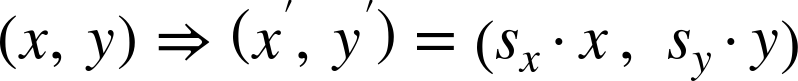
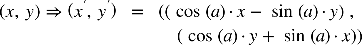
Mathematically, we can describe the transformation of each point, (x,y) in the graphic to its transformed position as:

The point (x′, y′) is the position of (x,y) after the transformation, as measured in the original coordinate system.
If s is 2, the point (1,3) in the transformed coordinate system would be at the same position as (2×1, 2×3) = (2,6) in the original coordinate system. This should hopefully be what you expect from scaling by a factor of two—but the mathematical approach can be useful as the transformations get more complicated.
Note
A changed variable in algebra is denoted by an apostrophe or prime symbol after the variable name, like x′ (called x-prime). Transformations are indicated by an arrow from the original to the final state.
In the second form of scaling transformation, each coordinate axis has its own scaling factor. We indicate this by specifying two numbers within the parentheses; the first is the x-scale, the second the y-scale:
transform="scale(sx, sy)"
A nonuniform scale such as this has the effect of squashing the coordinate system in one direction relative to the other, distorting the shapes of elements.
And distorting more than just the shape: scaling—whether uniform or not—applies to all aspects of the graphic, including presentation effects such as strokes. These get scaled and stretched along with the basic geometry.
Example 11-4 draws a series of stroked circles, identical except for their transform attribute. Figure 11-3 shows the resulting scaled shapes, including the stretched effect of an unevenly scaled stroke. Example 11-4 also demonstrates that you can use the transform attribute directly on shape elements, not only on <use> elements.

Figure 11-3. Stroked circles at various scales
Example 11-4. Scaling a stroked shape
<svgxmlns="http://www.w3.org/2000/svg"xml:lang="en"xmlns:xlink="http://www.w3.org/1999/xlink"width="400px"height="400px"viewBox="-40 -40 80 80"><title>Scaling stroked shapes</title><styletype="text/css">circle{fill:darkSlateBlue;stroke:darkSeaGreen;}</style><circler="10"transform="scale(3)"/><circler="10"transform="scale(3.5,1)"/><circler="10"transform="scale(2,2)"/><circler="10"transform="scale(1,3.5)"/><circler="10"/><circler="10"transform="scale(0.5)"/></svg>
The centered coordinate system ensures that the circles will be centered in the graphic by default.
Specifying a color for
strokeapplies the defaultstroke-widthof 1 user unit.All the shapes in the graphic are (officially) circles with a radius 10; the first (bottom) layer is scaled up three times.
We stretch the next
<circle>into an elliptical shape by giving it a nonuniform scale.
By explicitly giving the same scale factor for both sx and sy, you can create a uniform scale with the two-value syntax. In other words, the third
<circle>is still a circle, doubled in all directions.
The second-smallest circle is the untransformed version, drawn in the base coordinate system created by the
<svg>.
And finally, the last
<circle>is drawn half size, with a half-pixel stroke—as measured by theviewBoxcoordinate system.
All the shapes in Figure 11-3 are <circle> elements. All the strokes are 1 unit wide, in their transformed coordinate system. The scales result in strokes that range from 0.5 units to 3.5 units in the SVG’s coordinate system, including the unevenly scaled strokes on the unevenly scaled shapes.
Tip
As we mentioned briefly in Chapter 8, and will discuss more in Chapter 13, you can prevent strokes from scaling with the shape (in most but not all recent browsers) with the vector-effect property:
vector-effect:non-scaling-stroke;
The smallest circle in Figure 11-3 was created by a scale factor of 0.5, which shrunk it to half the original width and height. Scale factors greater than 1 enlarge the graphic, scale factors between 0 and 1 shrink it. When the scale factor is exactly 1, the coordinate system stays the same as before.
A scale factor of 0 will cause your graphic to disappear, collapsing into nothingness. But go a little bit further, and more possibilites open up.
Reflecting on Transformations
Negative scaling factors aren’t an error. The same transformation equations apply. If you multiply an (x,y) point by a negative scale factor, positive coordinates end up at negative positions and negative coordinates end up at positive positions. This causes your image to appear flipped, as well as scaled.
When the scale factor in one direction or another is exactly –1, the image stays the same size, but is reflected—it appears as if it were reflected in a mirror placed along the other axis:
-
scale(-1, 1)will reflect the image onto the other side of the y-axis (the sign of each x coordinate is flipped). -
scale(1,-1)will reflect the image onto the other side of the x-axis (each y effectively becomes –y). -
scale(-1,-1)will reflect around the origin: (x,y) gets shifted to (–x,–y) for each point in the graphic.
Example 11-5 demonstrates all these reflections, using the text “SVG” as our transformed graphic. The example therefore also demonstrates that <use> elements can be used to duplicate text for graphical effect. Each copy is drawn in different colors, so you can tell which transform creates which reflection. Figure 11-4 shows the result.
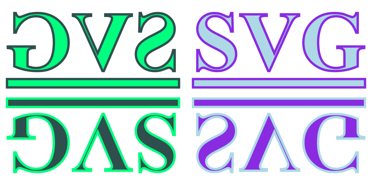
Figure 11-4. Mirrored text created with negative scaling factors
Example 11-5. Using negative scaling factors to create reflections of text
<svgxmlns="http://www.w3.org/2000/svg"xml:lang="en"xmlns:xlink="http://www.w3.org/1999/xlink"width="400px"height="200px"viewBox="-40 -20 80 40"><title>Reflections using scale transformations</title><styletype="text/css">text{font:bold18px"Times New Roman",serif;text-decoration:underline;stroke-width:0.5px;}</style><gfill="lightBlue"stroke="blueViolet"><textid="t"x="1.5"y="-5">SVG</text></g><garia-hidden="true"><usexlink:href="#t"transform="scale(-1,1)"fill="springGreen"stroke="darkSlateGray"/><usexlink:href="#t"transform="scale(1,-1)"fill="blueViolet"stroke="lightBlue"/><usexlink:href="#t"transform="scale(-1,-1)"fill="darkSlateGray"stroke="springGreen"/></g></svg>
Once again, the
viewBoxcreates a centered coordinate system, with the origin offset by half the width and half the height.A half-unit stroke width is sufficient to make a clear outline, given the initial scaling effect created by the
width,height, andviewBoxattributes.The original, untransformed, text is positioned in the positive-x and negative-y quadrant of the graphic, in the top right. It inherits
fillandstrokesettings from the surrounding<g>, so that its clones will use inherited styles, too.To prevent screen readers from repeating “SVG” four times, the reflections are contained in a group with the
aria-hidden="true"attribute, which indicates that this entire branch of the DOM tree is decorative.The three
<use>elements duplicate the text—including the underline—and apply the transformations; the first element flips the x coordinates (the mirror reflection in the top left of the graphic), the second flips the y coordinates (the upside-down text in the bottom right), while the third flips both axes (the upside-down and backward text in the bottom left). Thefillandstrokesettings on each<use>inherit to the text.
Pay attention to the centered coordinate system in Figure 11-4. The reflected content ends up on the opposite side of the coordinate system origin. If a default origin was used, in the top-left corner, then reflected content would be hidden offscreen.
If you wanted to change the size of the content as well as reflect it, just multiply the –1 reflection factor by the scaling factor. For example, scale(3,-2) is the same as scaling to scale(3,2) followed by a reflection across the x-axis.
Alternatively, you can list both transformations separately. The transform attribute can take a list of whitespace-separated transformation functions, like the following:
transform="scale(3,2) scale(-1,1)"
The transformations are applied in the order they are listed: the size is adjusted first, and then the content is reflected. In this particular case, the end result would be the same if you used scale(-1,1) followed by scale(3,2). However, that isn’t true in general; when you’re using a mix of transformation types, the order can be very important.
New Origins
Scaling a coordinate system changes how far each point is from the origin, without moving the origin. However, as we saw with Example 11-3, the origin you used when initially defining your shapes isn’t always where you want it to be when you redraw them.
In contrast, a translation of a coordinate system moves the origin from one point to another on the drawing canvas, without changing the relative positions of different points. In other words, a translate operation does not change the size or shape of your graphics, it just moves them around.
The translate function used in the transform attribute takes two parameters, defining the horizontal and vertical offset in user units:
transform="translate(tx, ty)"
Mathematically, the transformation can be described as:

As with scaling, multiple transformations can be strung together in a transform list. Because the offsets defined by a translation are added together, it doesn’t matter which order you use for multiple translations: (a + b) + c is the same as (a + c) + b. However, once you start mixing translation and scale operations, the order becomes relevant: (a + b) × s is not the same as (a × s) + b (except for special cases such as a scale of 1 or an offset of 0).
Tip
The second parameter to translate() is optional. If you only provide one number, it is used as the tx value and ty is set to 0. This is in contrast to scaling, where a single scaling factor will apply to both directions equally.
Example 11-6 creates a pattern from the basic club icon, repeated at different translation offsets. Figure 11-5 shows the result; note how the overlapping icons are drawn in exactly the same order that they are specified in the code: left to right, top to bottom.
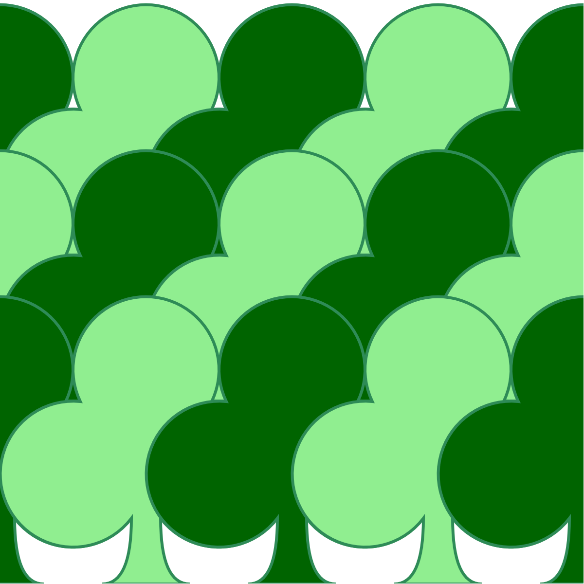
Figure 11-5. A forest pattern created with translated club icons
Example 11-6. Using translations to position a repeated icon
<svgxmlns="http://www.w3.org/2000/svg"xml:lang="en"xmlns:xlink="http://www.w3.org/1999/xlink"width="400px"height="400px"viewBox="0 0 40 40"><title>Translation transformations</title><styletype="text/css">use{fill:darkGreen;stroke:seaGreen;stroke-width:0.2;}use:nth-of-type(2n){fill:lightGreen;}</style><defs><pathid="club"d="M9,15.5A5,5 0 1 1 5.5, 7.5 A5,5 0 1 1 14.5, 7.5A5,5 0 1 1 11, 15.5 Q11,20 13,20H7Q9,20 9,15.5Z"/></defs><usexlink:href="#club"transform="translate(-10)"/><usexlink:href="#club"transform="translate(0)"/><usexlink:href="#club"transform="translate(10)"/><usexlink:href="#club"transform="translate(20)"/><usexlink:href="#club"transform="translate(30)"/><usexlink:href="#club"transform="translate(-10,10)"/><usexlink:href="#club"transform="translate(0,10)"/><usexlink:href="#club"transform="translate(10,10)"/><usexlink:href="#club"transform="translate(20,10)"/><usexlink:href="#club"transform="translate(30,10)"/><usexlink:href="#club"transform="translate(-10,20)"/><usexlink:href="#club"transform="translate(0,20)"/><usexlink:href="#club"transform="translate(10,20)"/><usexlink:href="#club"transform="translate(20,20)"/><usexlink:href="#club"transform="translate(30,20)"/></svg>
The 40×40 initial coordinate system has its origin in the top-left corner.
Fill and stroke styles are set on the
<use>elements; only the fill style is reset for the even-numbered elements, so the same stroke styles will still apply.The icon is the basic club shape from Chapter 6.
The first few elements use a
translatewith a single value; the x-position is therefore translated, while the y-position stays the same. These elements create the first row of icons, staggered along the top of the graphic.The remainder of the
<use>elements use the two-valuetranslatefunction, to set both x and y offsets.
Using translations, it is possible to reposition the origin of your graphics prior to adjusting their scale. In other words, you do not have to carefully edit your complex <path> code in order to create a centered path; you can just translate it until it is centered over the origin.
Example 11-7 redraws Example 11-3, but now using translations to center all the scaled icons, instead of redefining the <path> itself. Figure 11-6 shows the result; it should be identical to Figure 11-2.
Figure 11-6. Scaling a heart icon after centering it with translations
Example 11-7. Using translations to center a coordinate system for scaling
<svgxmlns="http://www.w3.org/2000/svg"xml:lang="en"xmlns:xlink="http://www.w3.org/1999/xlink"width="400px"height="400px"viewBox="0 0 80 80"><title>Centering the scaled effect using translations</title><styletype="text/css">use{fill:darkRed;}use:nth-of-type(2n){fill:lightSkyBlue;}</style><defs><pathid="heart"d="M10,6 Q10,0 15,0T20,6Q20,10 15,14 T10,20Q10,18 5,14T0,6Q0,0 5,0T10,6Z"transform="translate(-10, -10)"/></defs><gtransform="translate(40, 40)"><usexlink:href="#heart"transform="scale(4)"/><usexlink:href="#heart"transform="scale(3.5)"/><usexlink:href="#heart"transform="scale(3)"/><usexlink:href="#heart"transform="scale(2.5)"/><usexlink:href="#heart"transform="scale(2)"/><usexlink:href="#heart"transform="scale(1.5)"/><usexlink:href="#heart"transform="scale(1.1)"/><usexlink:href="#heart"transform="scale(0.75)"/><usexlink:href="#heart"transform="scale(0.5)"/></g></svg>
The
viewBoxon the main SVG defines an 80×80 coordinate system with a default top-left origin.This is the original heart icon, extending from (0,0) to (20,20), centered on (10,10). The
translate(-10,-10)transformation shifts it up and over to center it within its coordinate system.A
<g>grouping element is used to redefine the origin for all the child<use>elements. Thetranslate(40, 40)moves the origin from the top-left corner to the center of the 80×80 drawing region.The
<use>elements draw each copy of the heart within the new, centered coordinate system. Since the<path>element itself is centered over the origin because of its owntransformattribute, the hearts are all aligned at the center when the different scales are applied.
In Chapters 1 and 8, we discussed another way to reposition content duplicated with <use>: the x and y attributes. These attributes effectively create a supplemental translation, applied after any transformations defined in the transform attribute. The following code:
<usexlink:href="#icon"x="50"y="80"transform="scale(2)"/>
is directly equivalent to:
<usexlink:href="#icon"transform="scale(2)translate(50,80)"/>
In other words, the x and y offsets are calculated in the transformed coordinate system, after the units are scaled. This is true for geometric attributes on shape elements, too.
Tip
All geometric attributes on an element (position as well as size) are applied after that element’s coordinate system is transformed.
There is one advantage to using the attributes instead of translations, however: the values for x and y can be lengths with units or percentages. The values for transformations—in SVG 1.1, anyway—must be plain numbers. For translations, those numbers are interpreted as user-unit lengths.
Turning Things Around
Scaling changes the size of units, and translations change the position of the origin, but neither does anything that you can’t already do with viewBox.
Rotations do something new: they change the directions of the axes. They twist the entire coordinate system as a whole, without changing the size of elements.
As with scaling, rotations are defined relative to the origin of the coordinate system.
Rotations use the rotate() transformation function, which takes one parameter: the number of degrees to rotate the coordinate system.
Positive rotations are clockwise (deosil, to use the Neo-Pagan terminology) and negative rotations are counterclockwise (or widdershins, another delightful but underused word).
Of course, those directions only apply if you haven’t flipped the coordinate system with a negative scale. If you’ve transformed the coordinate system so much that you’re not sure which way is which, remember that a rotation from the positive x-axis to the positive y-axis is always +90 degrees.
Rotations are also, like translations, cumulative and commutive on their own. All three of these transformations have the same final result:
transform="rotate(120) rotate(60)"
transform="rotate(60) rotate(120)"
transform="rotate(180)"
A "rotate(90) rotate(-90)" transformation is the same as transform="rotate(0)", which keeps the coordinate system the same as it had been.
Tip
There’s one exception to these equivalencies: animations. When you animate a set of transformation, each function is animated separately, if possible. In that case, the order of operations matters as much as the final result.
However, once you mix rotations and translations, the order of operations matters: “turn left, then walk 10 steps” will take you to a different point than “walk 10 steps, then turn left.”
Example 11-8 applies rotations to a series of spade icons; Figure 11-7 shows the result. Because the spades are not centered on the origin, the rotated icons sweep out a large wreath shape, circling around the coordinate system origin.

Figure 11-7. A wreath of icons created with rotations
Example 11-8. Rotating a graphic around the origin
<svgxmlns="http://www.w3.org/2000/svg"xml:lang="en"xmlns:xlink="http://www.w3.org/1999/xlink"width="400px"height="400px"viewBox="-27 -27 54 54"><title>Rotations around the origin</title><styletype="text/css">use{fill:slateBlue;}use:nth-of-type(2n){fill:lightGreen;}use:last-of-type{stroke:darkSlateGray;}</style><defs><pathid="spade"d="M9,15C9,20 0,21 0,16S6,9 10,0C14,9 20,11 20,16 S11,20 11,15Q11,20 13,20H7Q9,20 9,15Z"/></defs><usexlink:href="#spade"transform="rotate(30)"/><usexlink:href="#spade"transform="rotate(60)"/><usexlink:href="#spade"transform="rotate(90)"/><usexlink:href="#spade"transform="rotate(120)"/><usexlink:href="#spade"transform="rotate(150)"/><usexlink:href="#spade"transform="rotate(180)"/><usexlink:href="#spade"transform="rotate(210)"/><usexlink:href="#spade"transform="rotate(240)"/><usexlink:href="#spade"transform="rotate(270)"/><usexlink:href="#spade"transform="rotate(300)"/><usexlink:href="#spade"transform="rotate(330)"/><usexlink:href="#spade"/></svg>
The coordinate system defined by the
viewBoxhas a centered origin. The exact number of units was adjusted to fit the graphic neatly.The spade icon is not centered; it will by default (without transformations) be drawn below and to the left of the origin.
Each subsequent icon is drawn rotated 30 degrees clockwise relative to the previous one, with the icons overlapping each other in the order in which they are specified.
After rotating through a complete circle, the last element (which would have had a
rotate(360)transformation) is equivalent to having no transformation at all. This final, untransformed elemented is highlighted with a dark stroke via the:last-of-typeselector.
Mathematically, the transformation rotate(a) can be defined as follows:
…which is just the kind of math that makes you glad the browser does it for you!
Tip
If you do have to use JavaScript to calculate complex geometry, be aware that the JavaScript trigonometric functions require angles to be given in radians, not degrees. To convert between the two, use the Math.PI JavaScript constant in the following helper functions:
functionrad2Deg(rad){returnrad*180/Math.PI;}functiondeg2Rad(deg){returndeg*Math.PI/180;}
If you want the rotations to be relative to a different point, you could use translations to reposition the origin, as we did in Example 11-7. However, SVG also defined an alternative version of the rotate function that allows you to rotate around any point. It uses a three-value rotation syntax:
transform="rotate(a, cx, cy)"
This has the same effect as a rotation combined with before-and-after translations, as follows:
transform="translate(cx, cy) rotate(a) translate(-cx, -cy)"
Warning
The three-value rotate is not valid in the CSS transformation property, which has its own way of changing the center of rotation.
Example 11-9 uses three-value rotations to create a complex pattern with the spade icon rotated around different points. Figure 11-8 shows the result, including two circles used to mark the rotational centers.
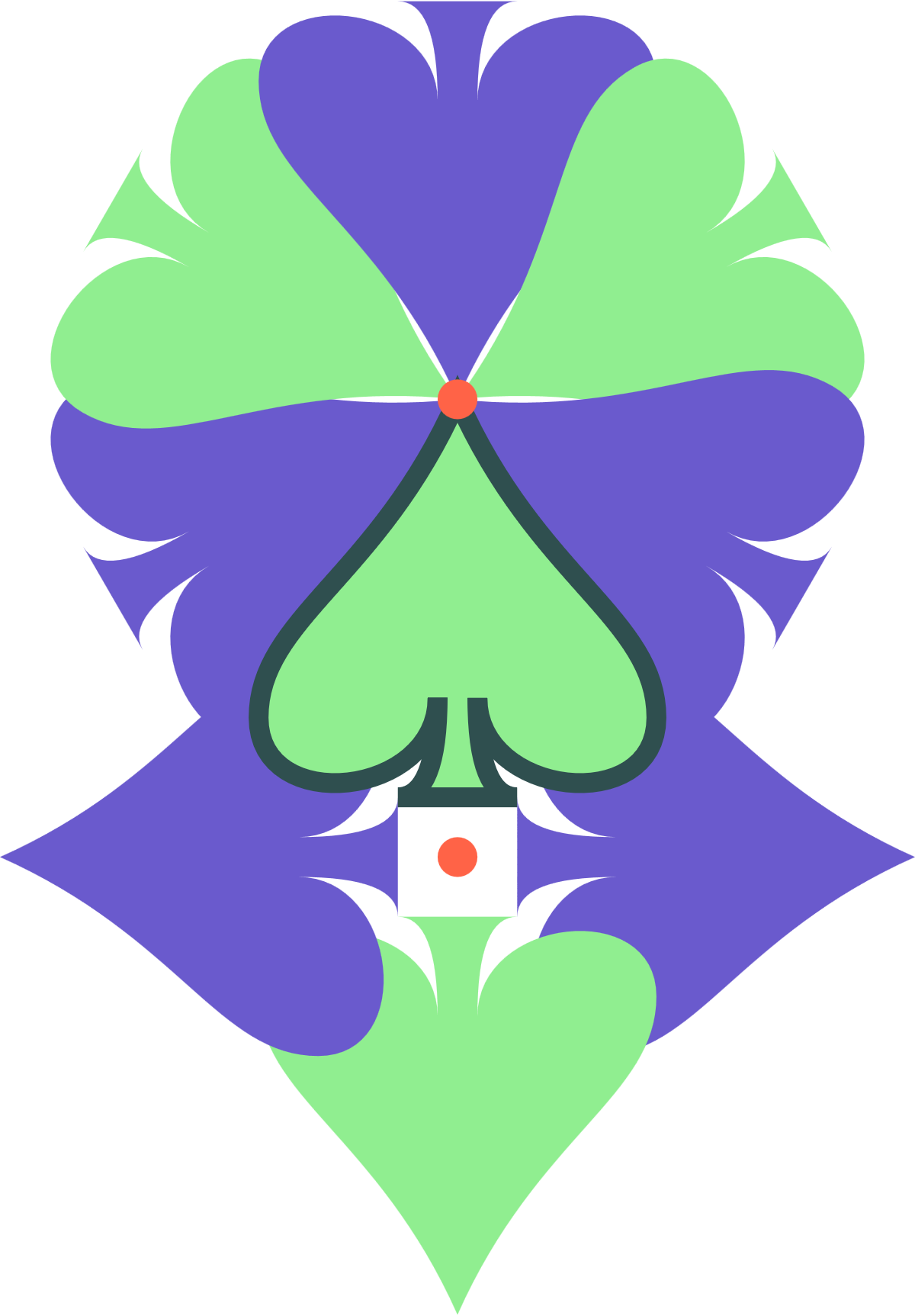
Figure 11-8. A complex pattern created by rotating a single icon around two centers
Example 11-9. Rotations around arbitrary points
<svgxmlns="http://www.w3.org/2000/svg"xml:lang="en"xmlns:xlink="http://www.w3.org/1999/xlink"width="400px"height="575px"viewBox="-13 -20 46 66"><title>Rotations around arbitrary points</title><styletype="text/css">use{fill:slateBlue;}use:nth-of-type(2n){fill:lightGreen;}use:last-of-type{stroke:darkSlateGray;}circle{fill:tomato;}</style><defs><pathid="spade"d="M9,15C9,20 0,21 0,16S6,9 10,0C14,9 20,11 20,16 S11,20 11,15Q11,20 13,20H7Q9,20 9,15Z"/></defs><usexlink:href="#spade"transform="rotate(60,10,0)"/><usexlink:href="#spade"transform="rotate(120,10,0)"/><usexlink:href="#spade"transform="rotate(180,10,0)"/><usexlink:href="#spade"transform="rotate(240,10,0)"/><usexlink:href="#spade"transform="rotate(300,10,0)"/><usexlink:href="#spade"transform="rotate(360,10,0)"/><usexlink:href="#spade"transform="rotate(90,10,23)"/><usexlink:href="#spade"transform="rotate(180,10,23)"/><usexlink:href="#spade"transform="rotate(-90,10,23)"/><usexlink:href="#spade"/><circlecx="10"cy="0"r="1"/><circlecx="10"cy="23"r="1"/></svg>
The coordinate system is not centered. At first glance, it looks kind of arbitrary. Consider it a reminder that centered origin or top-left origin are not the only options. In this case, it’s the result of drawing the graphic first, and then adjusting the
viewBoxto neatly fit the shapes.The first six icons are rotated around the point (10,0). This conveniently happens to be the coordinate of the tip of the spade in the original untransformed icon.
The remaining icons are rotated around the point (10,23), which is slightly below the base of the untransformed icon.
A rotation of –90° is equivalent to a rotation of +270°.
Again, the final
<use>element is untransformed, and will be marked by a dark stroke.The two tomato-orange circles mark the points of rotation, at (10,0) and (10,23).
Once you have rotated a coordinate system, the x- and y-axes point in new directions. Any subsequent translations are applied in the new directions. So are x and y attributes on shape elements. Text will also be drawn along the rotated x-axis, allowing you to create angled labels on diagrams—but be aware that text in small font sizes on computer-monitor resolutions tends to look pixelated and uneven when written at an angle.
Skewed Perspective
Moving up the chain of complexity are skew transformations.
Like a rotation, a skew is specified as an angle. While a rotation changes the orientation of both axes relative to the screen, a skew changes the orientation of one axis but not the other. That means that it changes the angle between the axes. A skew, therefore, distorts the shape of graphics.
A good way to understand a skew is to envision a box used to pack drinking glasses, with dividers that partition the box into individual cells. If you flatten the box, the entire grid flattens with it. Sections that are normally at right angles get squished at narrower and narrower angles until they are flat against each other. Well, it is never perfectly flat, because the thickness of the cardboard prevents it, but you can get pretty close!
A skew is similar, in that it collapses the angles between the x- and y-axis. However, there is an important difference. In the packing box grid, the length of the cardboard sections remains constant as you flatten the box. As the angles compress, and the ends shift farther out, the opposite sides are drawn together.
Skew works differently, as shown in Figure 11-9. The position of points never changes relative to the axis that isn’t being skewed. Lines get stretched, shapes get distorted, but the grid doesn’t flatten. Instead, the image gets stretched out. There is still a limit to a skew, though: eventually the angle between the axes will be zero, and the stretching will be infinite.
The particular skew transform used in Figure 11-9 is skewX(50). The naming of skew transformations is not intuitive: a skewX transformation results in slanted vertical lines. However, if you consider the figure again, you’ll notice that it’s the x coordinates that get shifted sideways, while the y coordinates are unchanged; this is why it is skewX. Similarly, a skewY transform will distort the y positions of the shapes, creating angled horizontal lines.
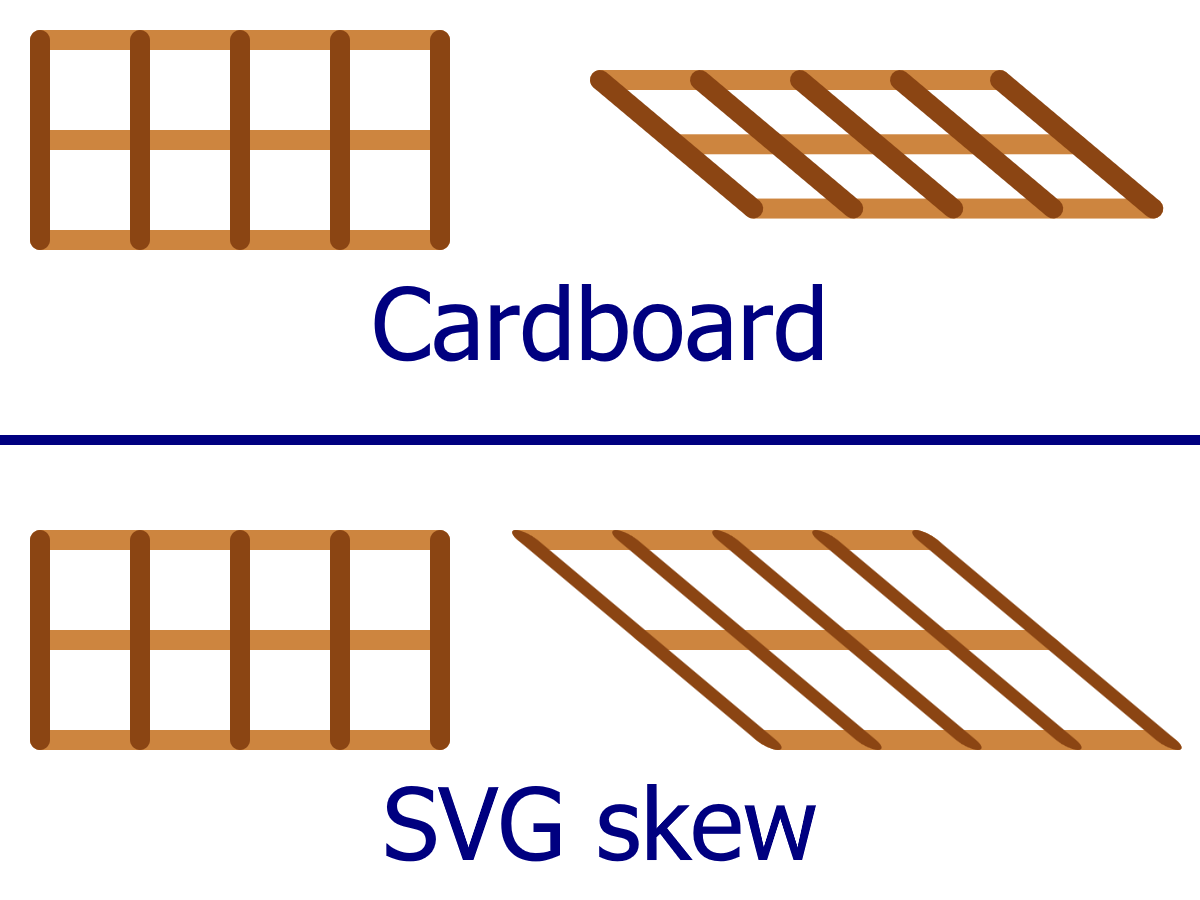
Figure 11-9. Understanding skew: flattening a cardboard grid versus skewing an SVG grid
The value you give to a skewX or skewY function is an angle in degrees; it is the amount by which the angled axis is shifted from its original position. The angle can be positive or negative. However, there isn’t an easy clockwise/counterclockwise rule to use. Instead, remember that positive skewing angles increase the position of points with positive coordinates.
(That’s assuming you’re still using the default SVG (0,0) transform origin. It gets more complicated with other transformation origins.)
A skew of 0 degrees doesn’t change anything; a skew of 90° or –90° creates infinite coordinates, which is an error in SVG. Nothing gets drawn in that case.
Mathematically, the transformation skewX(a) can be defined as follows:

The transformation skewY(a) can be defined as follows:

In other words, when you skew the x-axis, the amount you change the x-positions depends on the size of the y coordinate. When you skew the y-axis, the amount you change the y-positions depends on the size of the x coordinate. Skews have no effect when the other coordinate is zero.
Tip
Interested in creating the “flattened cardboard” effect from Figure 11-9? That image was created with rotate and translate transformations, neither of which will stretch or distort a shape. The horizontal lines were offset with transformations of the form:
transform="rotate(-50) translate(0,y)
           rotate(50)"
The formerly vertical lines were positioned and angled with transformations like the following:
transform="translate(x,0) rotate(-50)"
All the lines start from the origin of their transformed coordinate system.
What use is skew, besides making your graphics strange and distorted? Its primary use is to simulate three-dimensional perspective.
In technical drawings, lines skewed at a consistent angle (usually 30° or 45°) can be used to represent edges that extend at right angles in front of or behind the rest of the drawing. Example 11-10 uses skewed coordinates to draw a projection of an empty box in this style. It uses 45° skews to keep the math simple: the amount of skew offset on the y-axis will be exactly equal to the distance from the origin on the x-axis. Figure 11-10 is the result.
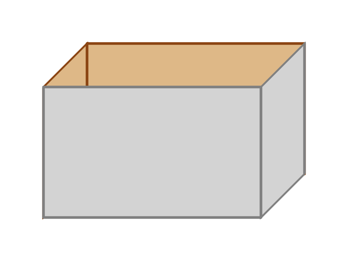
Figure 11-10. A pseudo-3D drawing of a box built from skewed rectangles
Example 11-10. Using skew transformations to simulate three dimensions
<svgxmlns="http://www.w3.org/2000/svg"xml:lang="en"xmlns:xlink="http://www.w3.org/1999/xlink"width="400px"height="300px"viewBox="0 0 40 30"><title>Using skew to create an orthographic projection</title><styletype="text/css">rect{stroke-width:0.3;stroke-linejoin:round;}.inside{fill:burlywood;stroke:saddleBrown;}.outside{fill:lightGray;stroke:gray;}</style><gtransform="translate(5,10)"><rectclass="inside"width="25"height="15"transform="translate(5,-5)"/><rectclass="inside"width="5"height="15"transform="skewY(-45)"/><rectclass="outside"width="25"height="15"/><rectclass="outside"width="5"height="15"transform="translate(25,0) skewY(-45)"/></g></svg>
The group contains the box as a whole, and a transformation moves it into place. The individual panels are all
<rect>elements with their top-left corner at (0,0). The transformation on the group shifts that position away from the very top left of the SVG.The first rectangle is the back of the box, translated up and to the side.
The next rectangle is the left side; it starts at the same origin as the front, but then is skewed to meet the offset back.
The untransformed rectangle draws the front panel.
The right side is positioned with a translation, then skewed to match the other side.
An important thing to note with the skewed rectangles in Example 11-10 is that the width attribute is the straight-line distance between the two sides, not the distance along the slanted edge.
Note
A technical diagram that uses angled lines to simulate 3D, like this, is known as an orthographic projection (ortho meaning right, as in right-angled, and graphic meaning drawing).
For more decorative web-based graphics, skew transformations can be useful in simulating shadows. If you have an upright object with a light shining on it from above and to the side, a first approximation of this shadow can be rendered as a skew. This technique is used in Example 11-11, as illustrated in Figure 11-11.

Figure 11-11. Text with a projected shadow created with skew transformations
Example 11-11. Creating a projected shadow effect with skew transformations
<svgxmlns="http://www.w3.org/2000/svg"xml:lang="en"xmlns:xlink="http://www.w3.org/1999/xlink"width="400px"height="140px"viewBox="0 0 400 140"><title>Skewed shadows</title><styletype="text/css">text{font:bold144pxGeorgia,serif;}</style><defs><linearGradientid="fadeGray"y2="100%"x2="0%"><stopstop-color="gray"stop-opacity="0"offset="0"/><stopstop-color="gray"stop-opacity="1"offset="1"/></linearGradient></defs><gtransform="translate(10,120)"><usexlink:href="#t"fill="url(#fadeGray)"transform="skewX(-45) scale(1,0.7)"aria-hidden="true"/><gfill="blue"stroke="navy"><textid="t">SVG</text></g></g></svg>
A few additional tricks increase the realism in Example 11-11. The first is the introduction of a linear gradient that fades away from the text itself. The second is scaling the skewed text so that it’s slightly smaller than the original, so that the tops of shadow and original are not perfectly aligned.
So the shadow can be styled differently from the original, the <text> itself doesn’t have any styles. The fill and stroke are declared on a surrounding <g>, and inherit to the text—but not to its clone, which inherits the styles from the <use> instead.
Because the shadow needs to be behind the text (and because browsers don’t support z-index for SVG), it comes first in the DOM. However, the shadow is the <use> and the real text is the <text> so that the main text is accessible and selectable in all browsers. Nonetheless, some browsers (Chrome) do make <use> copies of text accessible, so aria-hidden is used to mark it as redundant.
Warning
Older WebKit browsers will not correctly clone an element that is defined later in the document than the <use> element. In this case, that means that you wouldn’t see the shadow, which is a reasonable fallback, considering it ensures accessible text in other browsers.
Neither Example 11-10 nor Example 11-11 creates a true 3D drawing environment. The shadow is at best a rough approximation of real shadows, but it’s a fairly convincing effect at far less cost. Because skews can be directly calculated from the x and y coordinates and the constant parameter, the computer can rapidly calculate them by applying matrix mathematics to the vector shapes. The same holds true for scaling, rotation, and translation. These are all known technically as affine transformations.
Affine transformations convert between coordinate systems in a way that points remain points, straight lines remain straight lines, and parallel lines remain parallel. But true 3D perspective doesn’t work like that. When you look at parallel lines on a road stretching out in front of you to the horizon, they appear to angle together towards a single point at infinity. Affine transformations cannot recreate this effect without separate calculations to factor in three-dimensional perspective.
Enter the Matrix
So far, we’ve described the mathematics behind transformations in terms of functions that convert (x,y) to (x′,y′). In the case of translations and scaling functions, the functions that convert x are independent of y, and vice versa. For rotations and skew functions, in contrast, the values of x′ and y′ depend on both x and y. They also use trigonometry.
These transformation functions may seem like very different types of mathematics, but they can all be described with the same matrix multiplication structure.
If the word matrix conjures up a science fiction movie where reality is not what it seems, be assured that it is nothing that insidious. Matrix multiplication is just a structured way of applying mathematical equations to multiple variables (x and y) at the same time.
Warning! There’s a bit of math ahead.
The matrices used in 2D affine transformations have the following structure:
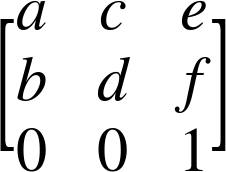
The matrix is the basis of the final 2D transformation function: matrix(a,b,c,d,e,f). The six variable values from the matrix are specified in column order.
You can create all sorts of interesting transformations with the matrix() function. Try a few numbers and see. For example, Figure 11-12 shows the face drawing from Example 5-5 in Chapter 5, and then shows what it looks like if you group all the drawing code with the following matrix transformation:
<gtransform="matrix(1,2,3,-1,-2,-3)">
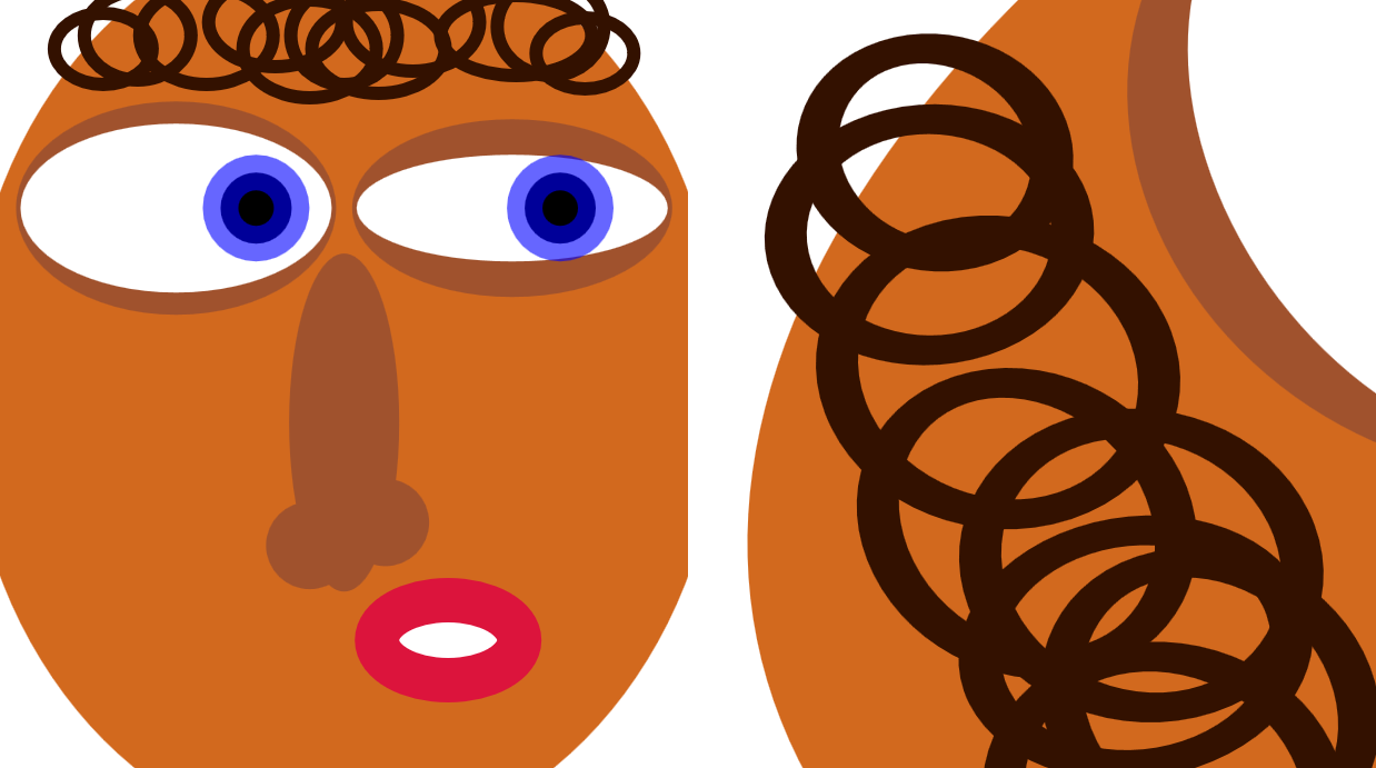
Figure 11-12. An SVG face, and the same drawing with a matrix transformation applied
You may come across matrix transformation functions like this in SVG created by other software (such as Inkscape) or JavaScript libraries (such as Snap.svg). Well, it probably won’t be exactly like this, but it will be a matrix() function with six numbers.
But how does this seemingly obscure set of numbers relate to the changes you see onscreen?
The matrix expresses scale, rotation, skew, and translation transformations, all at once. If you just throw numbers in the function, you’ll get a mix of all of the above.
The universal mapping equation for all the transformations, using matrix multiplication, looks like:
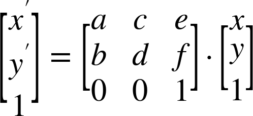
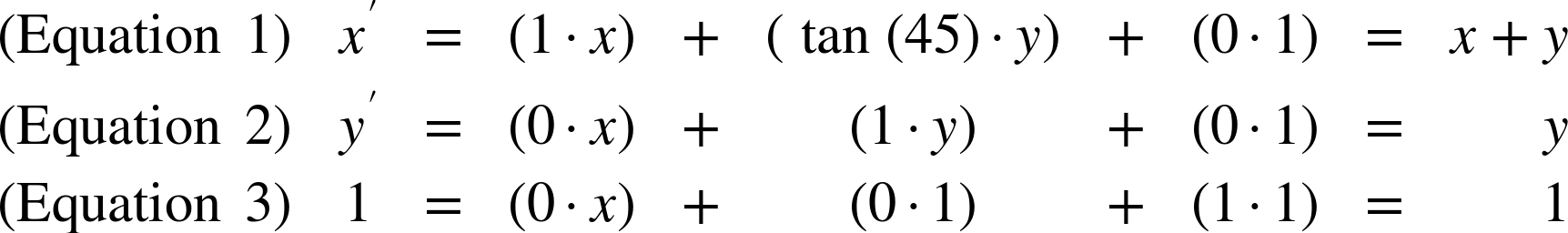
The preceding matrix equation is the equivalent to the following set of algebraic equations:
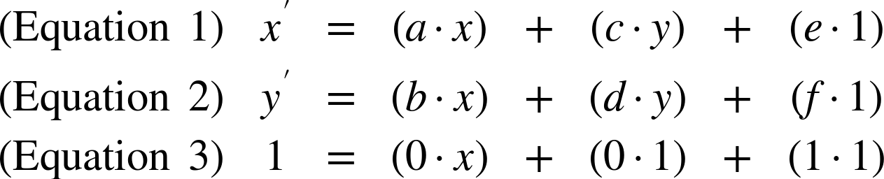
Equation 3 should hold true no matter what you do—it works out as 1 = 1, so if that fails you might as well give up on mathematics altogether. Equations 1 and 2 describe the actual transformation. You can describe all the 2D transformations in this structure, substituting in constant values—often 0 or 1—for a, b, c, d, e, and f.
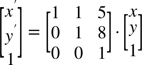
For example, in the transformation translate(5,8), the matrix looks like:
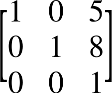
The resulting equations therefore look like:
This is exactly what the equations for a translation should look like.
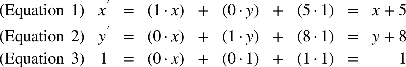
For the transformation skewX(45), the matrix looks like:
Because tan(45°) equals 1, the equations work out as follows:
Again, this is what an x-skew looks like: the x coordinate is adjusted by an amount proportional to the y coordinate, but the y coordinate itself does not change.
Each of the transformation functions affects particular values in the matrix:
-
Scaling transformations set the
a(x-scale) andd(y-scale) parameters to the matrix. -
Translations use a scale of 1 for
aandd, and then adjust theeandfparameters. These are the constants in the equations; they are not multiplied by either x or y. -
Skews also use 1 for
aandd, but then set eitherb(skewY) orc(skewX). These are the parameters that describe how x affects y and how y affects x, respectively. -
Rotations set all of
a,b,c, andd.
Tip
If a and b are both zero, the final coordinates are not affected by the input x. Similarly, if b and c are both zero, the final coordinates are not affected by the input y. In either case, your 2D drawing collapses into a 1D mathematical concept, and won’t be drawn. This is what happens with a scale() where one of the factors is 0.
Why is all this relevant? Why use the matrices at all, when the simplified equations are easier to understand?
The benefit of using matrix mathematics comes when you’re applying multiple transformations in sequence. The matrix equation for the transformation translate(5,8) skewX(45) looks like:
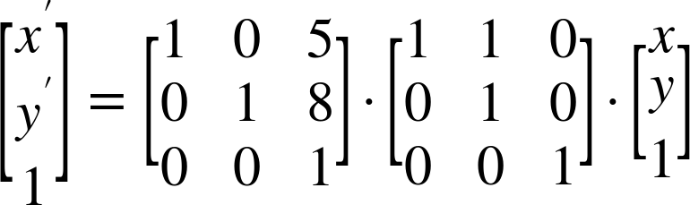
The reason this is important is because the two separate transformation matrices can be multiplied together. Multiplying creates a single matrix that describes both transformations. It looks like the following:
Using this consolidated matrix, the browser can apply both transformations simultaneously to any point, in one set of calculations.
Although this example was simple, it doesn’t have to be: you can have dozens of nested transformations on an SVG element, including the transformations specified on parent elements and the implicit scaling and translating created by viewBox values. Each of those transformations can be described as a matrix, and all those matrices can be multiplied together. The resulting cumulative transformation matrix can then be used to transform individual points.
Even if you never use matrix transformations yourself, it’s good to know that the obscure set of numbers is just a condensed list of other transformation functions.
Summary: Coordinate System Transformations
Coordinate system transformations are used throughout SVG to lay out graphics and manipulate their appearance. Rotations and skews allow you to break free of the strict horizontal and vertical coordinate system, while translations and scaling transformations offer a simple way to adjust the coordinate system origin and scale.
In the future, the new 3D transformation options will open up even more possibilities, as will the ability to assign transformations using CSS style rules, including media queries and CSS animations. For now, test carefully when applying CSS transforms to SVG, and use the transform attribute of the same elements to provide an acceptable fallback layout.
With the information in this and the previous few chapters, you have everything you need to create basic vector graphics: you can define coordinate systems, draw shapes within them, transform those coordinate systems, and reuse the shapes in the transformed space. Part IV will explore the options for decorating those shapes, with gradients, patterns, stroke effects, filters, masks, and more.