Table of Contents for
Using SVG with CSS3 and HTML5
 Using SVG with CSS3 and HTML5
Published by
O'Reilly Media, Inc., 2017
Using SVG with CSS3 and HTML5
Published by
O'Reilly Media, Inc., 2017
- nav
- Cover
- Using SVG with CSS3 and HTML5
- Using SVG with CSS3 and HTML5
- Preface
- I. SVG on the Web
- 1. Graphics from Vectors
- 2. The Big Picture
- 3. A Sense of Style
- 4. Tools of the Trade
- II. Drawing with Markup
- 5. Building Blocks
- 6. Following Your Own Path
- 7. The Art of the Word
- III. Putting Graphics in Their Place
- 8. Scaling Up
- 9. A New Point of View
- 10. Seeing Double
- 11. Transformative Changes
- IV. Artistic Touches
- 12. Filling Up to Full
- 13. Drawing the Lines
- 14. Marking the Way
- 15. Less Is More
- 16. Playing with Pixels
- V. SVG as an Application
- 17. Beyond the Visible
- 18. Drawing on Demand
- 19. Transitioning in Time
- 20. Good Manners
- Index
- About the Authors
- Colophon
Chapter 16. Playing with Pixels
Chapter 16. Filters and Blend Modes
Vector graphics are defined with mathematics. That tends to mean a very geometric design style. Since SVG is a 2D vector graphics format, it also means a very “flat” design style.
Gradients and masks offered the first steps toward softening those crisp, precise geometric lines. Filters break them down completely.
Filters are instructions for modifying a rendered layer of a graphic or web page by performing calculations on its individual pixel values. When applied to vector shapes or text elements, SVG filters allow you to add blur or jitter to shake up the smooth edges. When applied to embedded images, filters can also dynamically adjust color and contrast.
SVG filters are incredibly powerful. By some measures, they are the most complex aspect of SVG.
Not only are there many possible filter operations to choose from, but there are countless possible combinations. Filter instructions can be chained together, so the result of one filter becomes the input of another. Some filter operations combine multiple inputs, so you can split and recombine the chain of filtered graphic layers in complex flow-chart arrangements.
That complexity has a cost. The SVG filter syntax can make some simple filters unnecessarily obscure. The sheer number of options can scare off some developers who don’t know where to start.
The open-ended nature of SVG filters also makes it more difficult for browsers to optimize filter processing. Modern graphical processing unit (GPU) chips can perform some filter operations efficiently, but not others, and reading data back from the GPU to the main software can cancel out the performance benefits.
New CSS shorthand functions have been designed to reduce these barriers, making it easier to define simple, easily optimized filter effects. However, the shorthands only represent a slice of what is possible with the full SVG filter syntax.
This chapter introduces the most common SVG filter elements, and compares them with the shorthand filter convenience functions for the same operations. By necessity, it is only a brief overview of what filters can do, focusing on the big concepts and some unique features. The full possibilities of SVG filters are only limited by the creativity of the developer—and the processing speed of the browser.
This chapter also describes the mix-blend-mode property. It replaces a feature of SVG filters that was never well supported in web browsers: the ability to alter how the filtered element is combined with its backdrop.
The Filter Framework
Just like masks and clipping paths, filters were defined in SVG as a matching pair of element and style property. The <filter> element defines a filter effect, which is referenced in the filter style property or presentation attribute of another element:
<filterid="wow"><!-- filter contents here --></filter><style>.wow-me{filter:url(#wow);}</style><pathd="..."filter="url(#wow)"/>
Just like masks and clipping paths, the url() references can theoretically be to a different file, but browser support isn’t great and cross-origin restrictions apply.
Just like masks and clipping paths, filters have expanded from SVG to all of CSS. The Filter Effects module redefines the filter property to apply to CSS layout boxes as well as SVG graphics. It also defines the new shorthand functions.
Warning
Just like masks and clipping paths, implementation of the new filter options has been inconsistent. Some browsers implemented SVG filters on HTML elements before they implemented the shorthands, and some implemented the shorthands to apply to HTML elements before implementing them for filtering SVG elements. And some browsers initially only supported prefixed versions.
At the time of writing (mid-2017), filter support in the latest browser versions is as follows:
-
Blink/Chrome and WebKit/Safari: both shorthand functions and
url()references on HTML elements, onlyurl()references on SVG elements -
MS Edge: only shorthand functions on HTML elements, only
url()references on SVG elements -
Firefox: shorthand functions or
url()references everywhere, but with a few bugs in the details
These combinations mean that @supports tests are not reliable. It also means that you need to think carefully about fallback, and use different approaches for SVG elements versus CSS layout boxes.
All the latest browsers also support the -webkit-filter prefixed property in the same ways as the unprefixed version. But please, only add prefixes for backward compatibility, and use an automated preprocessor script to do it.
Unlike masks and clipping paths, the content of a <filter> element isn’t defined with SVG graphic elements. Instead, a <filter> contains filter primitive elements, which define the individidual processing instructions.
There are 16 different filter primitive elements in SVG 1.1, some of which have their own child elements. This can make filters somewhat overwhelming at first, since each filter primitive has its own attributes to learn, and many of them are defined in very mathematical ways.
Tip
All the filter primitive elements have names starting with fe, like <feFlood> or <feMerge>. The fe stands for “filter element.”
But you don’t need to know all the filter primitives. You can get started with just one.
A Basic Blur
One of the most effective single-primitive filters is the Gaussian blur. A blur is useful on both vector shapes and photographs. On its own, it creates either an “out of focus” effect or a fast-motion swipe effect. But blurs are also an important first step in more complex filters, including drop shadows and glows.
Note
The “Gaussian” in a Gaussian blur refers to the Gaussian statistical distribution, named after 19th-century German mathematician Carl Friedrich Gauss. You might know the Gaussian distribution as the normal distribution, or the bell curve.
In statistics, a Gaussian distribution represents the probability of achieving different outcomes when there is random and unbiased variation around an expected (or mean) value.
In graphics, a Gaussian blur is one where the color value of each pixel is distributed among neighboring pixels, by amounts that approximate a Gaussian distribution. The “expected” value in this case is that the pixel’s color doesn’t move at all.
A blur is defined in SVG with the <feGaussianBlur> element. The <feGaussianBlur> element must be a child of a <filter> element. It is the <filter> element that gets the id you reference in the filter property:
<filterid="blur"><feGaussianBlur/></filter>
This is technically a valid filter already. But it won’t have a visible effect. You need to tell the browser how much blurring to apply. By default, it doesn’t apply any.
The amount of blur created by an <feGaussianBlur> element is determined by the stdDeviation attribute. Its value is either one or two numbers (separated with whitespace or a comma), which cannot be negative. The default is 0.
Tip
The numbers represent a length in SVG user units (px), but they must be given as unitless numbers, not lengths with units.
If you give a single value for stdDeviation, you will get a uniform blur in all directions. If you give two values, the first is the amount of blur in the horizontal direction and the second is the amount of blur in the vertical direction.
Example 16-1 defines two blur filters: a normal bidirectional blur filter, and a single-direction blur that smears colors in the vertical direction without blurring them horizontally. Both filters are then applied to a photograph and to SVG text, as shown in Figure 16-1.
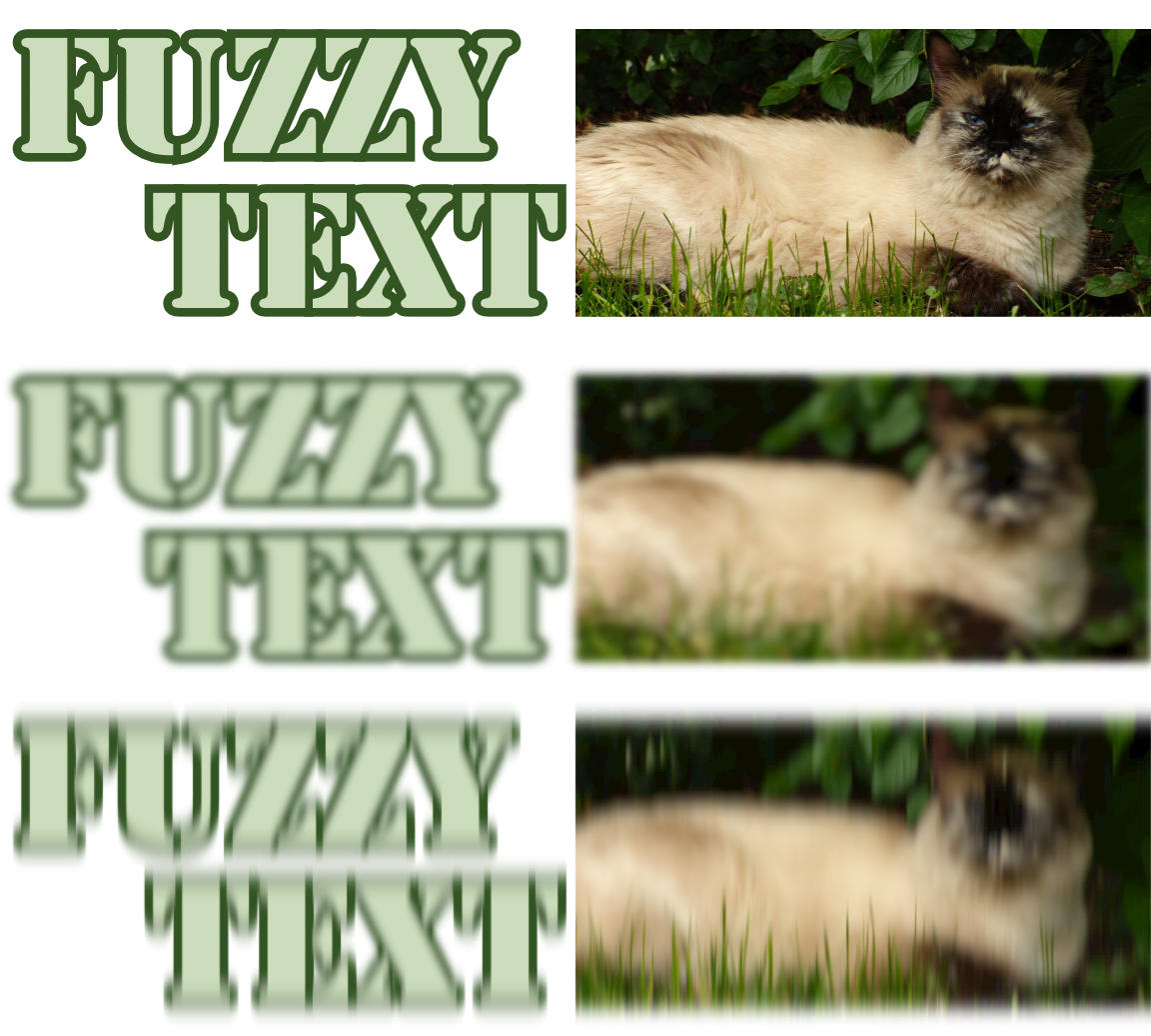
Figure 16-1. Blur filters applied to SVG text and an embedded photo: (top) unfiltered, (middle) bidirectional Gaussian blur, (bottom) vertical motion blur
Example 16-1. Defining bidirectional and unidirectional blur effects
<svgxmlns="http://www.w3.org/2000/svg"xml:lang="en"xmlns:xlink="http://www.w3.org/1999/xlink"viewBox="0 0 400 360"width="4in"height="3.6in"><title>Blur Filters, bi-directional or vertical only</title><filterid="blur"><feGaussianBlurstdDeviation="1.5"/></filter><filterid="vertical-smear"><feGaussianBlurstdDeviation="0 3"/></filter><textid="t"font-size="60px"font-family="Stencil, Stencil Std,Copperplate, sans-serif"fill="#CDB"stroke="#352"stroke-width="6px"paint-order="stroke"x="5"y="107"dy="-0.9em"text-anchor="start">Fuzzy<tspandy="0.9em"x="195"text-anchor="end">Text</tspan></text><imageid="i"x="200"y="10"width="200"height="100"xlink:href="sleepy-siamese.jpg"/><usexlink:href="#t"y="120"filter="url(#blur)"/><usexlink:href="#i"y="120"filter="url(#blur)"/><usexlink:href="#t"y="240"filter="url(#vertical-smear)"/><usexlink:href="#i"y="240"filter="url(#vertical-smear)"/></svg>
The bidirectional Gaussian blur (with only one stdDeviation value) creates a soft, fuzzy, out-of-focus effect. The vertical-only blur creates the blur effect of something moving quickly up and/or down. This is known as a motion blur effect. Although SVG doesn’t have a general-purpose motion blur option (you can’t create a one-direction blur on an angle other than horizontal or vertical), with careful use of transformations you can use the two-value <feGaussianBlur> effect for that purpose.
Tip
Be careful with motion blur effects. If the motion blur effect doesn’t agree with the actual motion of an element (like here, where the elements aren’t actually moving) it sends conflicting messages to your brain, and can trigger vestibular disorders.
In contrast, a motion blur carefully applied to an animated item can help smooth the appearance of the animation, making it feel much more natural.
A larger stdDeviation value means more blur. A smaller stdDeviation is less blur, and of course a 0 value for stdDeviation is no blur at all.
You can pick a stdDeviation value with trial and error in your web browser. But what do the numbers mean?
stdDeviation is short for standard deviation. In statistics, the standard deviation of a data set is a measure of how much variation there is from the mean. It is measured in the same units as whatever the statistics are measuring. For the Gaussian blur, the statistic is the x- and y-position of the pixel’s color value. The standard deviation is a measure of how far away from the initial position that color ends up.
Figure 16-2 shows the normal (Gaussian) distribution as a chart. The x-axis is measured in the number of standard deviations from the mean; the y-axis is the probability. The majority of the values (68%, to be precise) are within one standard deviation from the mean. 95% will be within two standard deviations from it, and 99.7% will be within three standard deviations.
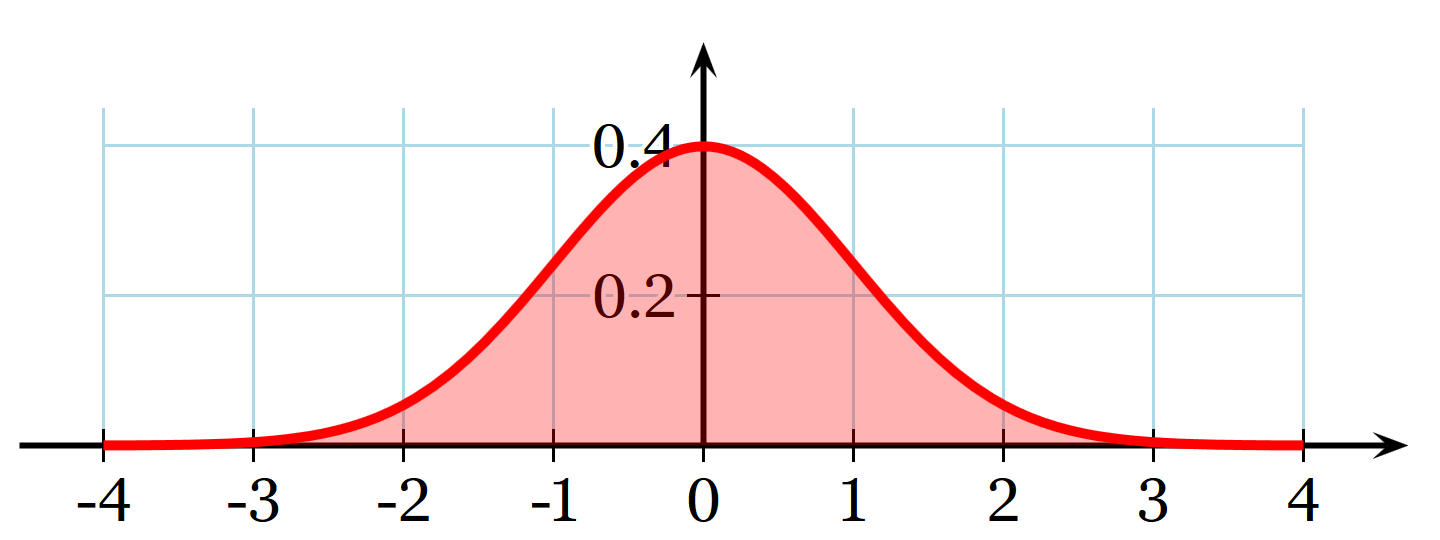
Figure 16-2. The normal distribution, measured as a probability distribution (y) relative to standard deviations offset from mean (x) (adapted from a graphic by Wikimedia commons contributor Geek3)
In a Gaussian blur, that means that 95% of the color from the original pixel will stay within a circle with a radius of two standard deviations, centered on the original pixel. Nearly all of the color will stay within three standard deviations. In fact, most Gaussian blur algorithms don’t bother calculating any effects further than three standard deviations.
Of course, you don’t usually blur a single pixel. You blur a picture. The final color of each pixel in the blurred result is the sum of the color that didn’t get blurred away from the original pixel, plus the color that spilled over from all the neighboring pixels.
The uniform blur in Example 16-1 used stdDeviation="1.5", or 1.5px. That means that most (95%) of the blurring effect is spread within a radius of 3px (two standard deviations) from the original. This is enough spread to make it obviously blurred, without completely obscuring the original shape.
Fast Filters from CSS Alone
Blurs are popular, so it’s no surprise that Gaussian blurs are included in the shorthand filter function. The url(#blur) filter from Example 16-1 is equivalent to the following shorthand declaration:
filter:blur(1.5px);
The value inside the blur() function is the standard deviation, as a length with units.
There is currently no shorthand function for a nonuniform blur (one with a different standard deviation for the x and y directions). This reflects the fact that uniform blurs are more popular, but also that many GPUs have optimized pathways for uniform blurs (but not for single-direction blurs).
In general, browsers that have implemented the shorthand filters have integrated them with GPU processing where available. Browsers are starting to optimize their SVG filter implementations to use the GPU where possible, but some SVG filters can be noticeably slower than the shorthands in animated web pages.
The shorthand blur() function isn’t just less code to write—it also adds new functionality! Because the blur’s standard deviation is part of the CSS declaration, it can be animated or transitioned from CSS.
For example, the following code blurs an image within a link until the user hovers over or focuses it, at which point the blur clears up in a smooth transition:
img{filter:blur(3px);transition:filter0.3s;}img:hover,a:focusimg{filter:none;}
This will be treated as a transition from blur(3px) to blur(0px) in supporting browsers, with the standard deviation changing according to your transition timing function. All of the filter functions have a “none” equivalent that is used for transitioning.
Tip
Short and simple transitions are good, but test carefully before applying significant, ongoing animations with filters, especially to large graphics: they can be huge performance killers! This includes animating the appearance of elements that are being filtered, since the filter results need to be recalculated after each change.
If you want to blur an HTML element like an <img>, you can now get pretty good browser support with just the shorthand (and slightly better if you duplicate it with the -webkit- prefix). But at the time of writing, if you want to blur an SVG element—whether it is inline SVG or in an SVG document—you are better off referencing an SVG <filter> element.
The only exception is the <svg> element that is the root element or a direct child of HTML elements: it has a CSS reference box, and is therefore treated like other CSS layout elements by the browsers that have different filtering support for SVG. (This also means that—for now—you should avoid applying SVG filters on the root <svg> element.)
Unfortunately, you can’t just define a set of SVG filters in a separate file and reference them from your CSS. Theoretically, that’s allowed, but Firefox is the only browser that currently supports it. Similarly, Firefox is the only browser with reliable support for SVG filters specified as data URIs. And Firefox is the one we don’t need fallbacks for any more.
What’s worse: if browsers cannot find or apply a filter you specify with url() reference, the filtered element disappears!
Warning
Based on SVG 1.1 error-handling rules, most browsers will not draw an element at all if it has a filter that causes an error.
The latest specs instead recommend that the erroneous filter be ignored, and that the element should be drawn without the filter.
So, for best support, when filtering individual SVG elements, use SVG filter markup in the same document.
Note
Older versions of Internet Explorer had a (unprefixed, but nonstandard) filter property. The syntax is completely unlike the new filter shorthands—or any standard CSS syntax, in any property.
The old IE filter isn’t supported in any browser that supports SVG filters (that is, IE 10 and later). But it’s one more reason why testing for browser support of filters is painfully difficult.
Mixing Multiple Filter Operations
Beyond browser support issues, why would you use SVG filter markup instead of shorthands? Because the full SVG syntax lets you do things the shorthands can’t.
We already mentioned one example: unidirectional motion blurs are currently only available with <feGaussianBlur>. Most of the other shorthands are similarly limited to common options for each primitive. This chapter focuses on some of the less common operations. If you need to, you can look up the markup equivalent of a contrast(150%) or saturation(70%) filter in the Filter Effects spec.
But the real power of SVG filters comes when you combine multiple filter primitives to create compound effects. Multistep filters can mix, modify, and recombine the vector graphics in surprising ways.
You can find lots of interesting filter examples online, and there are many available as presets in SVG software. The purpose of this chapter is to give you just enough knowledge to start tweaking and remixing those filters to your own needs—and maybe creating new ones from scratch.
Warning
If you’re using Adobe Illustrator or other software, pay attention to the difference between true SVG filters, which can be exported into standard SVG, versus other effects which need to be converted into images for export.
The Chain of Commands
Filters convert input images to output or result images. Each filter primitive has its own inputs and outputs.
You can chain filter primitives together. If you include multiple filter primitive elements as children of the <filter>, the output from one is passed (by default) as the input to the next in a straight chain.
The output of the final filter primitive in the filter is the final appearance of the element. Well, not quite final: clipping, masking, and hidden overflow all apply after filters.
So the following blur-desaturate filter blurs an element (with a 2px standard deviation) and then desaturates the blurred image (to 30% of the original color saturation):
<filterid="blur-desaturate"><feGaussianBlurstdDeviation="2"/><feColorMatrixtype="saturate"values="0.3"/></filter>
Figure 16-3 shows the steps, from the original image to the blur.
For this particular case, the results would look fairly similar if you desaturated first and blurred second, but that’s not true in general—the order of operations matters in filters.
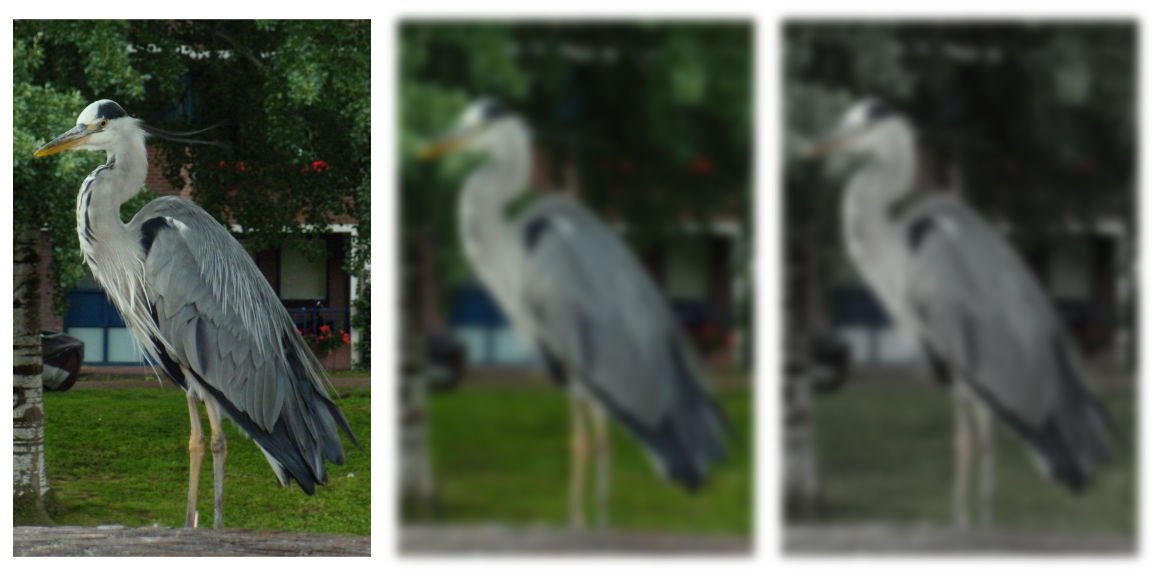
Figure 16-3. A two-step SVG filter applied to a photograph: (left) unfiltered, (middle) after the first primitive is applied, (right) final result
The <feColorMatrix> element is another of the most common filter primitives. It comes in four type variations, each of which has a different values requirement:
-
type="saturate"increases and decreases saturation, while preserving luminance;valuesis a positive number where1means no change,0means complete desaturation (grayscale), and values greater than 1 increase saturation. There is an equivalentsaturate()shorthand that takes either numbers or percentages (100%is no change), and also agrayscale()shorthand where the values are reversed:100%is fully gray and0%is no change. -
type="hueRotate"spins every color around the color wheel, adjusting the lightness to maintain constant luminance while changing hue;valuesis a number representing the angle between hues, in degrees. For the shorthandhue-rotate(), you need to specify the angle unit explicitly. -
type="luminanceToAlpha"performs a conversion like the one used in luminance masks, converting colors to degrees of transparency;valuesis ignored. -
type="matrix"performs complex color manipulations using matrix algebra;valuesis a list of 20 numbers.
For any filter primitive element that adjusts colors, the color-interpolation-filters property (or presentation attribute) can change the calculations. To get consistent results with the equivalent shorthand filters, set it to sRGB (the default is linearRGB). The property is inherited, so you can set it once on a <filter>, or even on the <svg> as a whole.
Warning
The final colors in Firefox (version 54, anyway) are noticeably different for some color effects, regardless of whether you use the longhand or shorthand formats, or whether you set color-interpolation-filters. The problem shows up most noticeably on the hue-rotate, saturate, and grayscale filters.
You can also chain filter operations together when you are using shorthand filter functions, by giving a list of functions as the filter value. So in shorthand notation, the blur-desaturate filter can be written in one line:
filter:blur(2px)saturate(30%);
Tip
You can also include url() references to SVG markup filters within the filter operations list.
Or at least, you can when more browsers support both the new shorthand filter syntax and SVG markup filters on the same elements…
There is no formal limit to the number of filter operations you can chain together in a row, although browsers may have their own practical limits. But at a certain point, there’s not much more you can do to the graphic by adding another filter function to the chain that you couldn’t do by changing one of the other functions earlier in the list.
Chaining outputs to inputs is the default behavior. For the shorthands, it’s the only behavior: a straight chain from the original graphic appearance, through the filter list, to the final result.
For SVG markup filters, however, you can mix things up.
Mixing and Merging
By default, the input to the first filter primitive is the source graphic—the rendered result of whatever element has the filter property. That includes all its child elements, layered together, after any filters, clipping, and masking are applied to them.
The default input to every other filter primitive is the output (result) from the previous primitive.
You can change the input to a filter primitive by giving it an in attribute. So this primitive blurs the SourceAlpha layer:
<feGaussianBlurstdDeviation="2"in="SourceAlpha"/>
The value of in is either a predefined keyword or a name you have given to the result of a previous primitive in the filter.
There are two keyword inputs that are currently supported in all web browsers:
-
SourceGraphicis the painted result of the element being filtered, before any filters are applied (in other words, the default input for the first primitive). -
SourceAlphais the source graphic with all colors set to black, so only the transparency outline remains.
The other keywords defined in the specifications are BackgroundImage, BackgroundAlpha, FillPaint, and StrokePaint. None of them are currently supported reliably cross-browser. Internet Explorer and Microsoft Edge support the background inputs (but they are buggy in IE).
If you’re using filters generated by Adobe Illustrator or Inkscape, make sure they aren’t using these inputs. Browsers either treat unknown keywords as a transparent black layer (sometimes not too bad a result) or as an error stopping filter processing (a very bad result: the filtered element disappears).
Tip
The keyword names are case-sensitive, and don’t follow the normal camel-casing rules. in="sourceGraphic" won’t work.
The other option for naming inputs is to use a custom named output from a previous step.
You give a filter output a name by setting it in a result attribute. So the output of the following primitive would be named “blur” for the purpose of other primitives’ inputs:
<feGaussianBlurstdDeviation="2"result="blur"/>
Tip
The result name is a case-sensitive identifier. It should be unique within a given <filter>, but doesn’t have to be unique within the document.
The Filter Effects module says it should be a valid CSS identifier (no whitespace, and doesn’t start with a number), but browsers seem to accept any string. Just don’t use any of the keywords as your custom result names—even the keywords that don’t have good browser support.
Using named inputs and outputs, we can rewrite the blur-desaturate filter from the previous section, but with the inputs made explicit:
<filterid="blur-desaturate"><feGaussianBlurin="SourceGraphic"stdDeviation="2"result="blur"/><feColorMatrixin="blur"type="saturate"values="0.3"result="final"/></filter>
If all filter primitives were like <feGaussianBlur> and <feColorMatrix>, and only accepted one input, the ability to name your inputs and results wouldn’t be that interesting. The usefulness comes from the filter primitives that accept a second input, indicated with an in2 attribute.
Three filter elements use an in2 attribute; we’ll have examples of each later in the chapter:
-
<feBlend>combines the two inputs by performing mathematical operations on the color channels (red, blue, and green) on each pixel, after adjusting for opacity of that pixel. -
<feComposite>combines the inputs based on opaque versus transparent areas, or by applying a specified set of mathematical calculations to all four channels (red, green, blue, and alpha) equally. -
<feDisplacementMap>moves the pixels in one input by an amount determined by the color of the pixel from the other input, creating distortion effects.
If in2 isn’t specified, the default input for the element is used, so you often only need to specify either in or in2.
In addition, the <feMerge> primitive combines any number of inputs, each of which is specified with the in attribute on a child <feMergeNode> element. If any <feMergeNode> doesn’t have an in attribute, it gets the default input for its parent <feMerge> primitive.
Tip
The different inputs to <feMerge> are layered together from bottom to top, just as if they were sibling images in the document.
Example 16-2 uses <feMerge> to create a filter that merges the source graphic over the top of multiple copies of a blurred version of its alpha channel shadow. The filter is then applied to our heart icon, drawn 180px tall, as shown in Figure 16-4.

Figure 16-4. A heart surrounded by a dark shadow
Example 16-2. Creating a blurred shadow by merging filter layers
<svgxmlns="http://www.w3.org/2000/svg"xml:lang="en"xmlns:xlink="http://www.w3.org/1999/xlink"viewBox="0 0 200 200"width="2.5in"height="2.5in"><title>Dark Blurred Halo</title><filterid="halo-dark"><feGaussianBlurin="SourceAlpha"stdDeviation="5"/><feMerge><feMergeNode/><feMergeNode/><feMergeNode/><feMergeNodein="SourceGraphic"/></feMerge></filter><usexlink:href="../ch10-reuse-files/suits-symbols.svg#heart"fill="mediumVioletRed"filter="url(#halo-dark)"x="10"y="10"width="180"height="180"/></svg>
The result is the original shape surrounded by a blurred black shadow. The extra layers make the shadow darker than the blur would have otherwise created.
Tip
The size of the icon matters, because the standard deviation of the blur is (by default) measured in user-space units.
When the filter is applied on a reused symbol like this, the user space is that of the <use> element with the filter, not of the scaled <path> inside—because a filter is a layer effect, applied to the <use> directly.
To finish off the discussion of inputs, there are a few primitives that ignore their in value, creating completely new image layers:
-
<feFlood>creates a uniform layer of a single color, based on itsflood-colorandflood-opacitypresentation attributes. -
<feImage>loads a separate image file (or, with limited support, clones an element from the document) as a new filter layer. -
<feTurbulence>creates pseudorandom patterns of swirling color.
You can then blend or composite these onto your source graphic or other filter primitive results, to add colors or textures.
Example 16-3 adds an <feFlood> and <feComposite> filter primitives to Example 16-2, to turn that dark shadow into a golden glow. Figure 16-5 shows the result on a dark background.

Figure 16-5. A heart with a golden glow
Example 16-3. Creating a golden glow by compositing a flood color on a shadow layer
<filterid="halo-gold"><feGaussianBlurin="SourceAlpha"stdDeviation="5"result="blur"/><feFloodflood-color="#fe7"/><feCompositein2="blur"operator="in"/><feMerge><feMergeNode/><feMergeNode/><feMergeNode/><feMergeNodein="SourceGraphic"/></feMerge></filter>
By default, <feComposite> acts like <feMerge> with only two inputs, layering the in on top of in2. The operator attribute defines how those two layers are combined, or composited, together. The default operator, over, means the first layer on top of the second.
Using operator="in" turns the compositing step into an alpha-masking operation: you get the first input (the yellow layer from <feFlood>) masked by the alpha channel of the second input (the blurred shadow). In other words, you turn the shadow gold, making the heart appear to glow from behind.
Tip
The in operator name stands for inside—you get the colors of the first layer, but only when they are inside the opaque regions from the second layer. Try not to confuse it with the in and in2 attributes (which are inputs).
With the addition of the <feOffset> filter primitive—which translates the filter input layer according to distances set in its dx and dy attributes—you have all the makings of a drop-shadow filter. Drop shadows are so common that there’s a shorthand drop-shadow() function for that—and a new <feDropShadow> primitive to match. But the same techniques can be applied to less common solutions.
Building a Better Blur
The basic all-direction blur we introduced in Example 16-1 blurs both the colors within a graphic and the edges of the graphic. Figure 16-6 shows the results again, so you don’t have to flip back to the beginning.

Figure 16-6. A basic blur filter applied to SVG text and an embedded photo
The text is indeed “fuzzy,” and the edges of the <image> reveal that this is a blurred image element, and not just a blurry photograph.
Sometimes this is the effect you want. Sometimes it isn’t.
The “dissolving edges” result of blurring a photograph is such a common complaint that the Filter Effects module adds a new edgeMode attribute that allows you to control it. A value of duplicate would pad the edges with the nearest color. A value of wrap would treat the input graphic as if it were a pattern tile, and blur from one tile to the next. The shorthand blur() function is supposed to use duplicate mode.
Warning
At the time of writing, WebKit/Safari is the only browser to have implemented edgeMode, and they treat “wrap” as equivalent to “duplicate.”
So we’ll have to fix the blurry edges ourselves.
We can use the <feComposite> in operation to remove the blurred bits that have strayed outside the outline of the original graphic:
<filterid="blur-trimmed"><feGaussianBlurstdDeviation="1.5"/><feCompositein2="SourceAlpha"operator="in"/></filter>
Figure 16-7 shows what that looks like.

Figure 16-7. A blur filter on SVG text and a photo, with the result trimmed to the original alpha outline
It’s better, but the edges are still a little fuzzy. We’ve cleaned up the blurred color that spilled off the edges, but we haven’t replaced the color that was lost.
One option would be to composite our blurred layer on top of a copy of the source. That looks pretty good for the text outlines. But in a photo, especially with a large blur radius (or if you zoom in), it can be obvious that the edges aren’t as blurry as the rest.
Example 16-4 shows another possible solution, using an <feMorphology> filter to pad the edges of the blur result, before trimming it to fit within the original outline. Figure 16-8 shows the final result.

Figure 16-8. Text and a photo in which the edges have been reconstructed after blurring
Example 16-4. Blurring colors but not edges
<filterid="blur-trimmed-filled"><feGaussianBlurstdDeviation="1.5"result="blur"/><feMorphologyradius="3"operator="dilate"/><feMerge><feMergeNode/><feMergeNodein="blur"/></feMerge><feCompositein2="SourceAlpha"operator="in"/></filter>

The first step is still a basic blur of the source graphic (as the default
into the first primitive). However, we now give the result a name (blur) so that we can reference it later in the filter.
The result of the blur is also passed to the following
<feMorphology>filter primitive (which does not specify aninattribute). An<feMorphology>filter with thedilateoperator—among other effects—causes transparent pixels to become solid if they are withinradiusunits of a solid pixel. Here, theradiusis twice the blurstdDeviation, so we should more than compensate for the dissolved edges.
An
<feMerge>primitive layers the<feMorphology>result (as the defaultin) underneath the originalblur(identified by name).
Finally, an
<feComposite>inoperation clips those combined layers to include only the pixels that are within the original alpha outline.
Even when edgeMode is fully implemented—and able to preserve edges when filtering rectangular shapes, like the embedded photo—the <feMorphology> approach would still be useful to reconstruct edges of text and vector shapes.
How does it work? The name “morphology” refers to the change in shape. But an <feMorphology> filter is a very particular change in shape, created by expanding pixels into rectangles.
The <feMorphology> element has two modes, which are specified as the value of its operator attribute:
-
erode(the default) sets each pixel to its darkest or most transparent neighbor, as measured separately for the red, green, blue, and alpha channels. This causes shapes to crumble away at the edges, while still maintaining—approximately—strokes around the edge. -
dilatesets each channel of each pixel to match the brightest or least transparent value from its neighbors. This causes edges to expand into transparent areas.
The amount of erosion or dilation (the distance at which a pixel is considered a “neighbor”) is set by a radius parameter, as a number of user units (px). Similar to the standard deviation in blurs, you can give two radius numbers to have different horizontal and vertical values.
Although it’s called a radius, the effect is rectangular, not elliptical.
Whether eroding or dilating, the result of applying <feMorphology> to a finely detailed image tends to look like someone painted a portrait using a paint roller, with lots of big blocks of color and very few fine details, as shown in Figure 16-9.
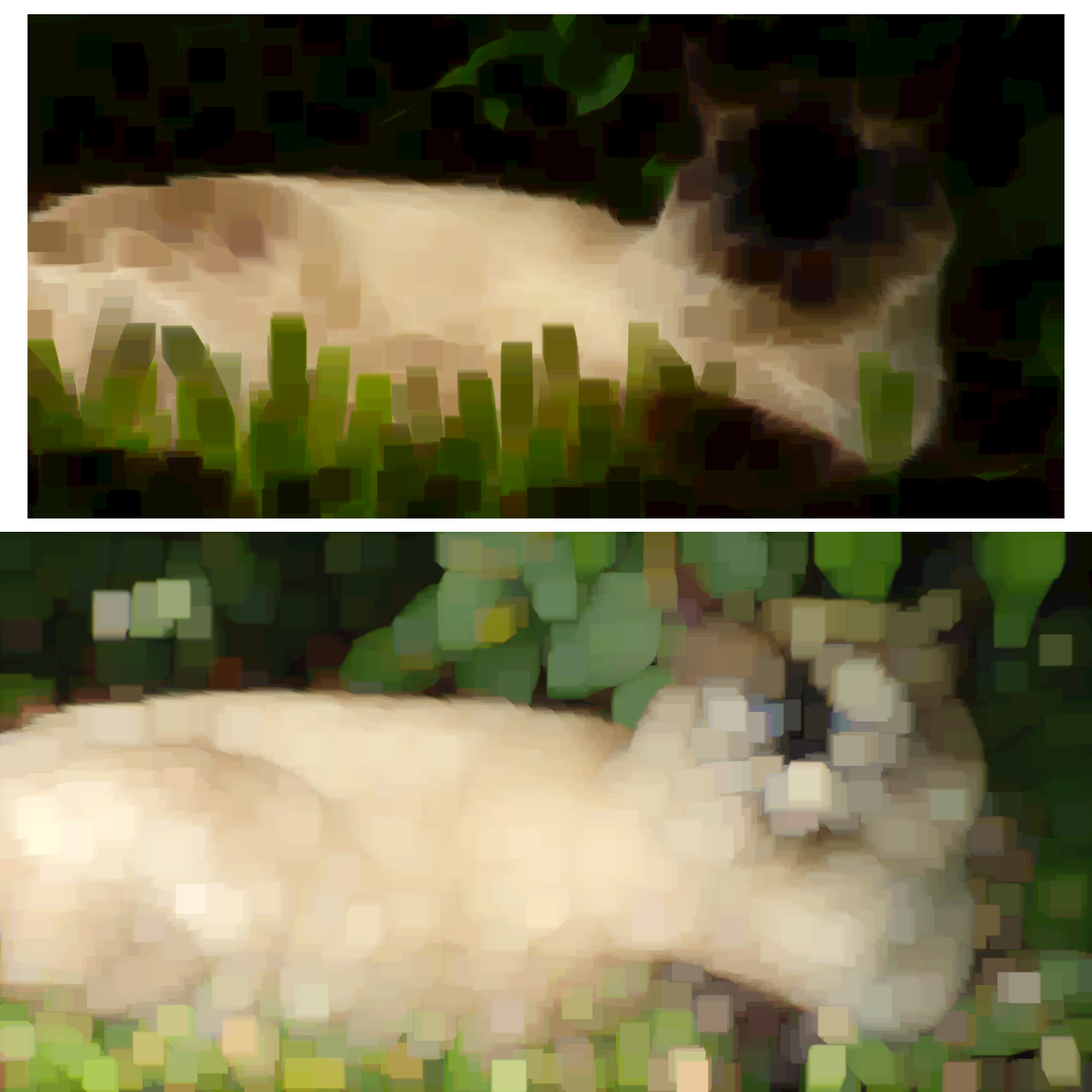
Figure 16-9. A photo modified with an <feMorphology> filter: (top) with an erode operator, (bottom) with a dilate operator
Note that both <image> elements in Figure 16-9 are the same size, before filtering.
When <feMorphology> is applied to smooth gradients and blurs, the effect is more subtle. Edges and bright spots expand or contract, without changing the intermediary colors too much.
Morphology applied to photographs creates a very specific effect, with not a lot of subtleties. But it’s the only option we have in filters for scaling up or down a shape—as rough as it is—so it’s not surprising that it has many uses.
Morphing Shapes into Strokes
SVG strokes can create many effects (have you read Chapter 13 yet?), but they can’t do everything. One limitation of strokes is that there is no “group” stroke effect, to stroke the composite outline of a set of shapes.
For text, this ruins many desired effects. Each letter in a text element is stroked individually. Under normal circumstances, characters with strokes that are brought closer to each other will overlap, not merge. If you have cursive letters that are supposed to look continuous, stroking them reveals the seams.
Even paint-order can’t help you, as individual letters are still painted one after the other in most browsers. You could merge all the letters into a single <path> in graphics software, but that ruins the accessibility and editability of the text.
By using <feMorphology> to dilate the joined letter shapes and then compositing the results back with the original, we can create a rough outline around the combined shape. Example 16-5 gives the code applied to some comic-book text, and Figure 16-10 shows the result.

Figure 16-10. Merged letters with a shared “stroke”
Example 16-5. Creating a group outline with <feMorphology>
<svgxmlns="http://www.w3.org/2000/svg"xml:lang="en"viewBox="0 0 120 60"width="4in"height="2in"><title>Merge Stroke with feMorphology</title><filterid="outline"><feMorphologyin="SourceAlpha"operator="dilate"radius="3"/><feCompositein="SourceGraphic"/></filter><style>@font-face{/* omitted */}text{font-size:60px;font-family:BadaboomBB,Impact,sans-serif;text-anchor:middle;}</style><rectfill="aqua"width="100%"height="100%"/><textfill="yellow"filter="url(#outline)"x="50%"y="50%"dy="0.35em"dx="0, -10, -10, -12">BOOM</text></svg>
The filter starts with the
SourceAlphaoutline of the filtered shape (which will be the unstroked text). The dilation morphology filter converts any transparent pixels that are within 3px (in the scaled coordinate system) of the shape’s edge into opaque pixels.The
<feComposite>primitive, with the defaultoveroperator, layers two inputs over one another. The primary (in) input (here, theSourceGraphic) goes on top of the secondary (in2) input. Sincein2isn’t specified on the element, it defaults to the result of the previous primitive—the expanded alpha outline.The
<text>that we are filtering is styled to use a web font, but the really important detail is thedxattribute. The negative values cause subsequent letters to be pulled back from their normal relative position, so that they overlap.
Filters on text, like this, are particularly useful due to the fact that the text remains readable, selectable, and accessible for both users and search engines. The visual effect itself remains easily editable if you need to change the text. This makes the technique far more powerful and adaptable than “baked in” effects created in an image editor and saved as a bitmap image or SVG paths.
For text in particular, filters are also an improvement over many vector effects that rely on <use> copies. Multiple <use> copies of text can be interpreted as repeated words by screen readers, or when copying and pasting. Within the filter, you can copy the image of the text as many times as you require, without duplicating the text itself.
Warning
For best support, only apply filters on complete <text> elements (or their parent groups). Although most browsers support filters on <tspan> and <textPath> elements, this was not allowed in the SVG 1.1 specs and—at the time of writing—is not yet supported in Firefox.
Filters in CSS layout apply to both inline and block elements.
Nonetheless, filters have their limitations. Because this “group stroke” is a pixel effect, not a true SVG stroke, it can create a pixelated edge, especially with large dilation radius values. The stroke in Figure 16-10 is noticeably blocky at the corners. You could use additional filter operations to smooth it out, but you can’t recreate the precise geometry of a true stroke, let alone all the other functionality of SVG strokes.

Figure 16-11. Changing the color of “stroke”
The outline in Example 16-5 is black because it is derived from the colorless SourceAlpha input. You could color the outline by compositing it with an <feFlood> layer, in the same way we colored the glow shadow in Example 16-3. Example 16-6 shows the code for an indigo outline; Figure 16-11 shows the result.
Example 16-6. Coloring the group outline
<filterid="outline-indigo"><feMorphologyin="SourceAlpha"result="expanded"operator="dilate"radius="3"/><feFloodflood-color="indigo"/><feCompositein2="expanded"operator="in"/><feCompositein="SourceGraphic"/></filter>
The expanded outline is created with the same
<feMorphology>primitive. It’s now given a name (expanded) so we can access it later.The
<feFlood>creates a continuous indigo layer.The first
<feComposite>takes that infinite color layer (as the defaultininput) and clips it to only include the pixels that are inside theexpandedshape.The second
<feComposite>layers the originalSourceGraphicover the colored expanded shape from the previous step (as the defaultin2input).
A filter like that in Example 16-5 is exactly the use case for the StrokePaint input. The idea of StrokePaint (and FillPaint) is that your filter could access the continuous “wallpaper” of the color, gradient, or pattern used to stroke the filtered shape.
Instead of hardcoding the outline color in the filter, you would be able to apply a stroke value on the <text> (but with zero stroke width), then create the outline shape in the filter, and use it to clip the StrokePaint wallpaper.
Unfortunately, not only is StrokePaint not supported anywhere yet, but Firefox currently treats it as an error of the sort that causes the filtered element to disappear. (Other browsers treat it as a black input, so the results look the same as Figure 16-10.)
Sigh. The good news is that flood-color (on an <feFlood> element) is a presentation attribute, so you can set it with CSS rules. You can also use currentColor or CSS variables to quickly change the color your filter applies. The bad news is that when you change the color, you change it for all elements that use that filter. You would need a separate filter for a separate color.
Drawing Out of Bounds
Blurs, dilation morphology, and a few other filters can create graphical effects that are larger than your input. Is there a limit to how big you can get?
There is. But there’s also a way to control it.
We’re Going to Need a Bigger Boom
Like masks, filters require the browser to construct temporary image layers, which can use up memory. For that reason, the results of the filter are limited to a rectangular filter region, outside of which everything is clipped.
Just like with masks, the default filter is the object bounding box plus 10% padding. The exact dimensions are set by rectangular attributes on the <filter> element: x and y default to –10%, and width and height default to 120%. These are bounding-box units by default; you switch them to userSpaceOnUse with the filterUnits attribute.
There are the usual reasons for modifying the default dimensions, or switching away from bounding-box units completely:
-
The bounding box is based on the fill region only; if your graphic has thick strokes or large markers, it may extend more than 10% beyond its box.
-
If the bounding box has zero height or width (straight horizontal or vertical lines), bounding-box calculations will cause an error. And errors with filters usually mean that the filtered element disappears.
In addition, filters (unlike masks) can create an output result that is larger than the input, so certain filters will always need larger bounds, regardless of which element you apply them to.
Example 16-7 provides a variation on the text-outline filter from Example 16-5. To really emphasize a “BOOM!” sound effect, we’re going to add visible “echoes” of the text offset from the center. Figure 16-12 shows what happens if we apply this filter (as written in Example 16-7) to the “BOOM!” text from Example 16-5 (but in an SVG with a larger viewBox).

Figure 16-12. Offset filter layers, clipped to the filter region
Example 16-7. Adding duplicate, offset layers with a filter
<filterid="outline-echo"><feFloodflood-color="darkRed"/><feCompositein2="SourceAlpha"operator="in"result="echo"/><feOffsetin="echo"dx="-45"dy="-25"result="echo-1"/><feOffsetin="echo"dx="-40"dy="+30"result="echo-2"/><feOffsetin="echo"dx="+45"dy="+25"result="echo-3"/><feOffsetin="echo"dx="+40"dy="-30"result="echo-4"/><feMorphologyin="SourceAlpha"result="expanded"operator="dilate"radius="3"/><feMerge><feMergeNodein="echo-1"/><feMergeNodein="echo-2"/><feMergeNodein="echo-3"/><feMergeNodein="echo-4"/><feMergeNodein="expanded"/><feMergeNodein="SourceGraphic"/></feMerge></filter>
A dark red copy of the original text is created with
<feFlood>and<feComposite>.Four named copies of the red text are created with
<feOffset>, each one offset to left or right, up or down, with differentdxanddyvalues.The expanded outline is created with the same
<feMorphology>primitive.All the red copies are layered together, then the expanded black outline, and finally the original graphic, in an
<feMerge>stack.
As we warned—and as Figure 16-12 clearly demonstrates—the default filter region is not big enough for all the offset layers in Example 16-7. We’re going to need a bigger filter region.
But how much bigger? And how do we specify it?
The final size of our filter result is the full bounding-box size, plus 30px above and below, and 45px to the left and right. If you’re used to working with CSS, you may be thinking that now is a good time to reach for your trusty calc() function:
x="-45px"width="calc(100% + 2*45px)"y="-30px"height="calc(100% + 2*30px)"
That would be a great idea, if we could use calc() in SVG filter attributes. But we can’t. (Not yet, anyway.)
So, instead, we have to roughly estimate (and, to be sure, over-estimate) how much the absolute-distance offsets will be as a percentage of the bounding box:
<filterid="outline-echo"x="-50%"y="-50%"width="200%"height="200%">
That gives us enough room for all the “echo” copies of the text, as shown in Figure 16-13. But if you applied the same filter to a much smaller element, you might still get clipping.

Figure 16-13. Offset filter layers, in a filter region that is large enough to contain them
For this particular SVG, where the filtered element takes up most of the SVG dimensions (but doesn’t overflow them), a simpler solution is to switch to user-space dimensions:
<filterid="outline-echo"filterUnits="userSpaceOnUse"x="0"y="0"width="100%"height="100%">
You could even skip the x, y, width, and height attributes, leaving them as their default 10% padding around the box—which in this case is the SVG’s viewBox.
Tip
Despite the problems with bounding-box units, avoid creating excessively large filter regions, especially if you will be animating content within the filter. It consumes extra memory, and more pixels means more processing time.
User-space coordinate systems are not without their own issues, of course. In most browsers, you cannot easily predefine the graphical effect in one <svg> in an HTML document and use it elsewhere, because percentages will be misinterpreted. And if your SVG uses a viewBox with a centered coordinate system, you’ll need to change the x and y attributes to match, or else your filter will only cover the bottom-right corner of your SVG.
You mostly only need to worry about the filter region when it is too small, to avoid clipping. It can sometimes be useful to make it fit tightly against the bounding box to clip overflowing blur or dilation, by setting the <filter> element’s x and y to 0, and width and height to 100%. But if you want to do any creative clipping, you’ll usually use a <clipPath>. (Remember that clipping paths are applied after filters on the same element.)
In contrast, it is often useful to clip the output from a particular step in the filter chain.
Half-and-Half Filter Effects
Each filter primitive works with input image layers and output image layers. These layers, like the filter as a whole, are defined by rectangular boundaries.
By default, the layers match the filter region set on the <filter> element. However, you can specify filter primitive regions for each layer. Once you do, each subsequent layer matches the previous one unless you give it different dimensions.
You set the dimensions of the filter primitive element with x, y, width, and height attributes on that element. These cause that primitive’s result to be clipped to the specified rectangle. The rectangle dimensions are measured according to the primitiveUnits (not filterPrimitiveUnits) value for the <filter> element, which is userSpaceOnUse by default.
In addition to x, y, width, and height, the primitiveUnits setting controls most length-based attributes on filter primitives, including:
-
stdDeviationon<feGaussianBlur> -
radiuson<feMorphology> -
dxanddyon<feOffset>
Tip
You can’t change the primitiveUnits for individual filter primitives, let alone individual attributes. This means, if you switch to objectBoundingBox units, you need to redefine every blur radius and offset distance to match. That’s an awful bother, so pick your primitiveUnits carefully.
Example 16-8 makes use of the filter primitive regions to apply a filter to part of an element, without having to duplicate it with <use> and apply a clipping path. Instead, the two halves will be clipped with filter region attributes, and then merged back together after processing, as shown in Figure 16-14.
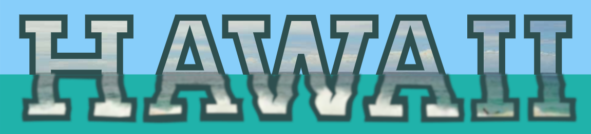
Figure 16-14. Photo-filled text in which the bottom half is given a wave distortion effect
The example makes use of two of the more exotic SVG filter primitives, <feTurbulence> and <feDisplacementMap>, to apply a wavy distorted effect to the filtered section of the text. For now, though, just focus on the inputs, outputs, and filter-region attributes.
Example 16-8. Applying filter effects to a subregion of the element
<svgxmlns="http://www.w3.org/2000/svg"xml:lang="en"xmlns:xlink="http://www.w3.org/1999/xlink"viewBox="0 0 285 65"width="4in"><title>Wave-Filtering Half of an Element</title><patternid="beach"patternUnits="userSpaceOnUse"width="285"height="65"><imagex="0"y="-50"width="300"height="200"xlink:href="hawaii-beach.jpg"transform="rotate(0.5)"/><!--photo by Daniel Ramirez, licensed CC-BY https://www.flickr.com/photos/danramarch/6225153931--></pattern><filterid="hawaiifilter"><feOffsetresult="top"y="0"height="36px"/><feTurbulencey="30px"height="40px"result="waves"type="turbulence"baseFrequency="0.01 0.1"numOctaves="1"seed="53"/><feDisplacementMapin="SourceGraphic"in2="waves"y="36px"height="29px"scale="4"xChannelSelector="G"yChannelSelector="B"/><feGaussianBlurresult="bottom"y="34px"height="32px"stdDeviation="0.4"/><feMerge><feMergeNodein="top"/><feMergeNodein="bottom"/></feMerge></filter><style>svgtext{font-family:Arvo,Rockwell,sans-serif;font-weight:700;text-transform:uppercase;font-size:64px;fill:url(#beach)azure;stroke:darkSlateGray;stroke-width:3px;filter:url(#hawaiifilter);}</style><style>@import url(https://fonts.googleapis.com/css?family=Arvo:700);</style><rectwidth="100%"height="100%"fill="lightSkyBlue"/><rectwidth="100%"y="36px"height="30px"fill="lightSeaGreen"/><textx="50%"y="56"text-anchor="middle"dx="-1 2 -7 -7 2 2">Hawaii</text></svg>
The text will be filled with a photograph of water and sky, using a
<pattern>. The pattern tile is defined in user-space units, and scaled to completely cover the SVG. The photo inside is scaled and positioned to reveal the parts we want to use. A half-degree rotation straightens the horizon line between sea and sky. If this were the only place in the website using this photo, it would be a good idea to crop it ahead of time, to save on file downloads. But here, the hidden overflow of the pattern crops it for us.The filter will be applied to the same element as the pattern, and it’s important that we haven’t changed the default user-space
primitiveUnits. That means that theyandheightattributes on the filter primitives are defined in the user space.The output from the first
<feOffset>primitive will therefore be clipped to the area from the top of the SVG to the line where y = 36px. And 36px just happens to be the height of the horizon line in the photo after we positioned it in the user-space<pattern>. The<feOffset>itself doesn’t do anything withoutdxordy, so the effect of this element is just to clip and set aside the top half of our element as a named filter layer.The next filter primitive,
<feTurbulence>, generates a wavy pattern of colors from a mathematical algorithm. Theyandheightattributes ensure that the output color will be slightly larger than the bottom half of our SVG.
The
<feDisplacementMap>filter primitive takes our originalSourceGraphicas input, then distorts it according to the waves generated by the<feTurbulence>. The distorted image is precisely clipped to the bottom of our SVG, starting from y = 36px.
An
<feGaussianBlur>softens the distorted image slightly, using a slightly larger filter primitive region so that the blurred top edge isn’t clipped.
Finally, an
<feMerge>combines the top and bottom sections back together.
The visible parts of the SVG consist of two colored rectangles and our
<text>element. The bottom, sea-green rectangle is precisely positioned to start at that y = 36px horizontal horizon line.
The text itself is mostly styled with CSS, using a web font. However, the letter spacing is manually tweaked with
dx, to leave extra space for the strokes while also tightening up the kerning around the “AWA” part of the word.
This example isn’t as DRY as we normally like. The magic number 36 (calculated from the photograph itself) appears in multiple places. But it is defined so that it can easily be reused. The alignment between the photo pattern and the filter layers is measured entirely in user-space units, so neither has to be adjusted if you change the text content, or even the text font-size, as shown in Figure 16-15.

Figure 16-15. The same paired photo pattern and filter effect, on different text
You can even make the text editable, by placing the SVG inline in an HTML element with the contenteditable attribute. But it’s a little buggy: if the user completely erases the text and then types new material to replace it, the extra text gets added as a sibling to the <svg>, instead of being included in the SVG <text>. So you’d need a bit of JavaScript to make it work nicely.
Warning
Although some browsers (MS Edge and IE) support contenteditable directly on SVG elements, it is not defined in the SVG specs, and isn’t supported elsewhere.
In an ideal world, you could replace the “magic number” in the filter, at least in part, by accessing the <rect> element behind the text as a separate filter input, the BackgroundAlpha layer. Then you could use it (with <feComposite>) to mask the above- and below-water sections of the text. And it wouldn’t even have to be a rectangle: since you’d be masking according to the alpha region of the shape, it could be a wavy path instead.
But web browsers don’t (yet) support access to the backdrop from within your filter. The relevant part of the filters spec has been redefined—to fix the most problematic parts from SVG 1.1—so hopefully this will change in the future. But in the meantime, we can be glad of the one area where implementations have moved ahead: blend modes.
Blending with the Backdrop
If you use graphics software that is built around “layers” (such as Adobe Photoshop or GIMP), you may be familiar with blend modes, which control how the pixels on different layers interact with and influence the resulting color that is shown for that portion of your screen.
Blend modes allow you to create many unique color effects, making your images look like light being projected onto a screen instead of layers of paint on paper.
SVG 1.1 defined blend modes as a filter operation. The new Compositing and Blending module redefines them as a separate graphical effect, applied using the mix-blend-mode property. There’s also a background-blend-mode property for CSS layered backgrounds, and in the future there may be similar properties for layered SVG strokes and fills.
Blending Basics
We’ve already used blend modes, in a way. The type of blending that is used everywhere in SVG and CSS is known as normal blending.
With normal blending, layers in an image are combined as if they were physical prints (sometimes on transparent film) stacked together, and you were looking down from above. If the top layer is completely opaque, it completely obscures any elements that it overlaps.
Blend modes take things much further, allowing the pixels of an element to “read” the color of the pixel underneath them, and calculate the result based on a particular set of algorithms.
Even normal blending—also known as alpha blending—has some math hidden in the implementation. If the top layer is semitransparent, the final color of each pixel is calculated as a combination of the color for that pixel in the top layer and the cumulative color of the layers stacked below. Blend modes change the formula for that calculation.
In SVG filters, blend modes are used in the <feBlend> filter primitive. It blends its primary (in) input layer over the top of the secondary (in2) input. By default, it uses normal blending, and is therefore the same as <feMerge>, or the default operator for <feComposite>. You change the default by setting the mode attribute.
SVG 1.1 defined four other blend modes for <feBlend>, in addition to the default mode="normal". The exact mathematical formulas can be found in the Compositing and Blending specification. But conceptually this is how they work for fully opaque layers:
screen-
Imagine that the two image layers are being displayed by two different projectors shining on the same screen. The only areas that stay dark in the final result will be those that are dark in both pictures. Light tones overlapping will combine to make the result lighter than either input. Colors will combine like they do in the RGB model, so that red plus green will create yellow.
multiply-
Imagine a single slide projector shining light through two different slides, stacked together. For light to reach the display, it must pass through both images: the only areas that will be light in the final result are those that are light in both pictures. Dark sections overlapping will make the result darker than either of the inputs. Opposite colors (like red and green) will cancel each other out to create black.
darken-
This mode can’t be imagined by a physical process, but is much easier to think of mathematically. For each channel (red, green, and blue), on every pixel where the two layers overlap, select the smaller (darker) value from either the top layer or the cumulative bottom layer. This means that opposite colors again cancel out (red + green = black), but equal colors don’t get any darker or lighter.
lighten-
Not surprisingly, this mode is the opposite of
darken: for each color channel, for each pixel, take the larger (brighter) value from either the top layer or the backdrop.
For semitransparent layers, all the blend modes are adjusted so that you see more of the original backdrop color in the final blend, proportional to the amount of transparency in that pixel on the top layer. The alpha channels themselves are not calculated with the same formulas as the color channels.
Tip
Note the spelling of darken and lighten; they are often confused as “darker” and “lighter.”
If you misspell a mode name, the attribute will be ignored and you’ll get normal blending. Which…is better error handling than most errors with filters, actually.
The Compositing and Blending spec defines 11 additional modes: overlay, color-dodge, color-burn, hard-light, soft-light, difference, hue, saturation, color, luminosity, and exclusion. The names and definitions are all based on blend modes used in other graphical software.
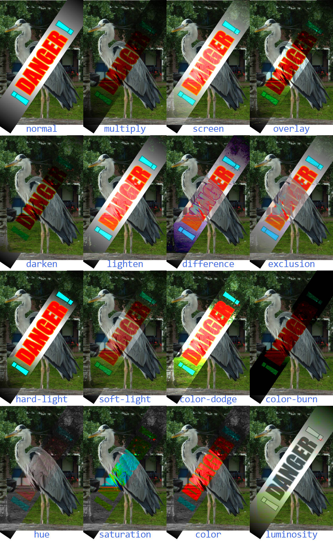
Figure 16-16. The 16 blend modes, when applied to a vector graphic layer over the top of a photo layer
Warning
The newer blend modes are supported for <feBlend> in all the latest browsers, but might not be recognized in older browsers (e.g., Internet Explorer) or other software.
Figure 16-16 shows all 16 blend modes, including normal, applied to a vector graphic (red and cyan SVG text on a white-to-black gradient rectangle) over the top of a photograph.
Example 16-9 provides the code for creating Figure 16-16 with <feBlend>. Only the markup for the normal and multiply mode is included. All the others are the same except for the filter id, <svg> offsets, and the mode attribute on <feBlend>. Note that we’ve set color-interpolation-filters to sRGB, so that color calculation will use the standard color model used in browsers and most graphics software.
Example 16-9. Blending a vector graphic onto a photo, with filters
<svgxmlns="http://www.w3.org/2000/svg"xml:lang="en"xmlns:xlink="http://www.w3.org/1999/xlink"viewBox="0 0 240 390"width="4in"><title>Blending Modes Compared</title><style>filter{color-interpolation-filters:sRGB;}.label{font:7pxConsolas,monospace;text-anchor:middle;fill:royalBlue;}.warning{font:16pximpact,sans-serif;text-anchor:middle;fill:red;stroke:orange;paint-order:stroke;}.warningtspan{fill:cyan;stroke:darkCyan;}</style><defs><linearGradientid="b-w-b"><stopoffset="0"/><stopoffset="0.4"stop-color="white"/><stopoffset="0.6"stop-color="white"/><stopoffset="1"/></linearGradient><gid="warning"transform="rotate(-56 30,45)"><rectfill="url(#b-w-b) white"x="-25"width="110"y="35"height="20"/><textclass="warning"x="30"y="45"dy="0.6ex"><tspan>¡</tspan>DANGER<tspan>!</tspan></text></g></defs><svgwidth="60"height="25%"><filterid="blend-normal"filterUnits="userSpaceOnUse"><feImagexlink:href="heron.jpg"x="0"y="0"width="60"height="90"/><feBlendin="SourceGraphic"mode="normal"/></filter><usexlink:href="#warning"filter="url(#blend-normal)"/><textclass="label"y="95"x="50%">normal</text></svg><svgwidth="60"height="25%"x="60"><filterid="blend-multiply"filterUnits="userSpaceOnUse"><feImagexlink:href="heron.jpg"x="0"y="0"width="60"height="90"/><feBlendin="SourceGraphic"mode="multiply"/></filter><usexlink:href="#warning"filter="url(#blend-multiply)"/><textclass="label"y="95"x="50%">multiply</text></svg><!--...and the rest...--></svg>
There’s an important limitation of using <feBlend> to merge two graphics like this. The image file is directly incorporated in the filter, using <feImage>. That means you can’t change the photo or its position within the SVG without creating a new filter. The photo is also not an accessible element in the document. You can’t add a <title> or aria-label to it to provide an accessible description. And it can’t be interactive—as far as the browser is concerned, the entire photo is just a decoration on the warning label.
Ideally, the <feImage> element would only be used when you want to import a small bitmap for creating a textured effect within a filter, and not as a substitute for actual document content.
Warning
The <feImage> element, as defined in the specs, can be used for both importing image files (like <image>) and for duplicating sections of the current document (like <use>). However, the second case wasn’t very well defined, and has never been implemented in Firefox.
For cross-browser support, only use <feImage> for importing complete image files (or data URI images).
The logical way to create this graphic would be to use an <image> element to draw the photo as a direct child of our SVG, before drawing the #warning label on top. We would then set the warning label to blend with its backdrop.
Tip
The original SVG filter specs used the term background to refer to all the graphics behind an element. But that’s confusing when you are working with CSS layout boxes, which can have their own background as part of the element itself.
This chapter therefore follows the terminology of the Compositing and Blending spec: the graphics behind an element are the backdrop for it.
The BackgroundImage input would have supported this directly in filters, among many other interesting backdrop-filtering effects. Most browsers aren’t yet ready to support general filter access to the backdrop, but they have implemented blending into the backdrop—just with a very different approach.
Premade Mixes
The new mix-blend-mode property allows you to apply blend modes without filters. The blend mode is calculated as part of the browser’s process of compositing an element on its backdrop.
Tip
This means that mix-blend-mode applies after all filters, clipping, and masking. It isn’t part of how this element is painted, but of how this element is combined with other elements.
The mix-blend-mode property is a layer effect, like filters and masking. It applies to the combined image layer created by this element and all its children, and creates a stacking context. It therefore does not inherit by default. The value of mix-blend-mode is one of the 16 blending mode keywords, with the default being normal.
Warning
At the time of writing, WebKit/Safari does not support the hue, saturation, color, and luminosity values in CSS blend modes. These four are unique because pixel values can’t be calculated for red, green, and blue channels separately, and therefore they aren’t as easily optimized.
Microsoft Edge has not implemented CSS blending support at all. It and older browsers will ignore mix-blend-mode completely.
Consider fallbacks carefully, and use CSS @supports tests if required.
To redefine Example 16-9 to use mix-blend-mode, you would create an <image> element in each <svg> to embed the photograph of the heron, as the prior sibling to the group containing the warning text. Then you would remove the filter property from the warning group and instead set the mix-blend-mode property.
Example 16-10 provides the modified code for the multiply blend. The end result in supporting browsers would still look like Figure 16-16. In unsupporting browsers, all versions would look like normal blending—which, in this case, is an acceptable fallback appearance.
Example 16-10. Blending a vector graphic onto a photo, with mix-blend-mode
<defs><imageid="heron"xlink:href="heron.jpg"width="60"height="90"/></defs><svgwidth="60"height="25%"x="60"><usexlink:href="#heron"/><usexlink:href="#warning"style="mix-blend-mode: multiply"/><textclass="label"y="95"x="50%">multiply</text></svg>
No more extra filter markup; only one keyword to change to change the blend mode. The color-interpolation-filters property is also no longer required: CSS blend mode properties, like the shorthand filter functions, are always calculated in the color space used for compositing, which is usually sRGB.1
Isolating the Blend Effect
The separation of blending from filters means you can use and modify filters and blending separately. It is also closer to how it works in Photoshop and other software. And it is absolutely essential when you’re using shorthand functions as filters, as they do not have any way of merging multiple inputs in the first place.
The compositing-stage timing of mix-blend-mode is also designed to make it easier for browsers to optimize blend modes, just like they optimize normal compositing of semitransparent layers, using the GPU.
Tip
But not all GPUs support blend modes, so beware that blend modes (like filters) can use up a lot of processing power.
But the order of operations for blend modes can cause some confusion. You need to remember that the colors you see aren’t part of one element or the other, but are instead generated from the combination of the two. So if you want to use a filter to tweak that blended color (changing its saturation or brightness, for example), the filter needs to be applied on a group that contains both layers that you are blending.
A filter is one way to create an isolation group for blend modes. This is similar to how filters create a flattening effect for 3D transforms and z-index stacking.
When a container element is isolated from its backdrop, its child elements do not “see” the greater backdrop. Instead, they are blended as if the isolated container created a new image layer, starting from transparent black.
Tip
An isolated container element can itself have a blend mode, but all of its children will be blended together first, to create a combined image layer that will be blended with the backdrop.
Blending modes, whether in CSS or in Photoshop layers, are applied cumulatively, from bottom to top. The second layer is blended into the bottom layer to create a cumulative result. The third layer is blended into that combined result, without needing to know that the result was created from two other layers. The only way you can change the order that your blends are applied is by grouping elements in the DOM and isolating them.
Most “layer effect” properties create an isolation group, including opacity, filter, mask, and mix-blend-mode itself, when any of them is set to its nondefault value. Three-dimensional transformations also force isolation. In CSS layout, so do 2D transforms and anything else that creates a stacking context, including z-index.
But those are all side effects. In order to control isolation directly, you can set the isolation property to isolate. The default value for the property is auto, reflecting all the other properties that can automatically isolate an element.
Warning
Firefox is currently buggy about isolation, isolating groups that shouldn’t be isolated, including SVG elements with 2D transforms and those that are direct children of an element with viewBox scaling.
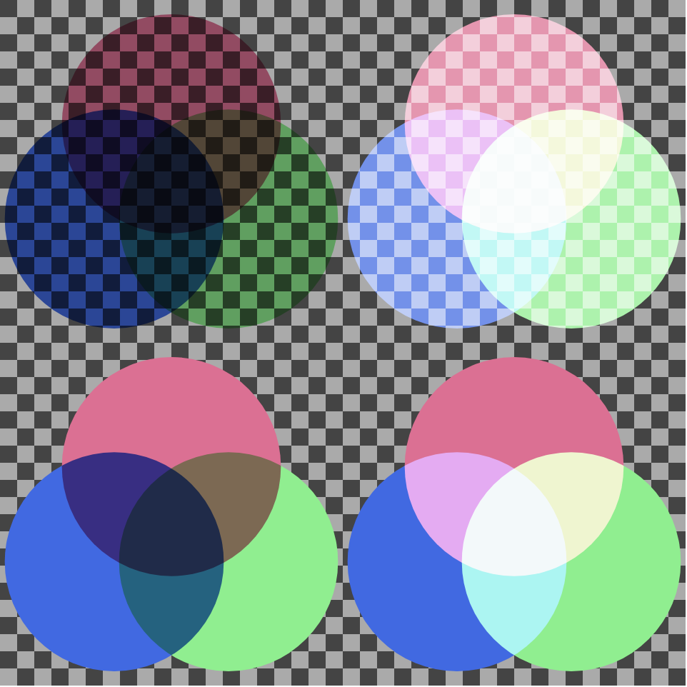
Figure 16-17. Venn diagrams created from colored circles with mix-blend-mode: (top row) without isolation, (bottom row) where each diagram is an isolated group; (left column) blending uses multiply mode, (right column) blending uses screen mode
Example 16-11 demonstrates the use of isolation to create a group of elements that blend with each other but not with their backdrop. Figure 16-17 is the result: the top pair of Venn diagrams are not isolated, so they blend with the checkered backdrop. The bottom set are contained in isolated groups. The samples on the left use multiply blending; those on the right use screen. CSS variables are used to pass the different blend mode options through the <use> element trees, since mix-blend-mode itself isn’t inherited.
Example 16-11. Using isolation to limit the impact of blend modes
<svgxmlns="http://www.w3.org/2000/svg"xml:lang="en"xmlns:xlink="http://www.w3.org/1999/xlink"viewBox="0 0 400 400"width="4in"height="4in"><title>Blend Modes and Isolation</title><style>#vennuse{mix-blend-mode:var(--mode);}.multiply{--mode:multiply;}.screen{--mode:screen;}.isolate{isolation:isolate;}.left{fill:royalBlue;}.right{fill:lightGreen;}.top{fill:paleVioletRed;}</style><patternid="checks"width="20"height="20"patternUnits="userSpaceOnUse"><rectfill="#aaa"width="20"height="20"/><rectfill="#444"width="10"height="10"/><rectfill="#444"x="10"y="10"width="10"height="10"/></pattern><rectwidth="100%"height="100%"fill="url(#checks)"/><defs><circleid="c"r="11.5"/><svgid="venn"width="200"height="200"viewBox="-18 -22 36 34"><usexlink:href="#c"x="-6"class="left"/><usexlink:href="#c"x="6"class="right"/><usexlink:href="#c"y="-10"class="top"/></svg></defs><usexlink:href="#venn"class="multiply"/><usexlink:href="#venn"class="screen"x="200"/><usexlink:href="#venn"class="isolate multiply"y="200"/><usexlink:href="#venn"class="isolate screen"x="200"y="200"/></svg>
The isolation property replaces the enable-background property (or presentation attribute) from SVG 1.1 filters.
There were two problems with enable-background:
-
The
enable-backgroundsyntax did not translate well to non-SVG contexts. It used aviewBox-like parameter to specify the region of an element that needed to be remembered. Even the name is confusing in a CSS context. -
enable-backgroundwas required to be specified at some point in order for child elements to use backgrounds in filters. That resulted in many SVG tools automatically adding it to the root SVG, whether it was needed or not. So it ceased to be useful as a hint to browsers about whether or not it needed to keep a copy of the graphical layer in memory.
Microsoft browsers support enable-background: new, but not the viewBox-style qualifications on the enabled background size. Unfortunately, when Adobe Illustrator adds enable-background presentation attributes, it always adds the extra parameters. So if you decide to use BackgroundImage to polyfill mix-blend-mode in Microsoft browsers, keep this in mind!
If both isolation and BackgroundImage/BackgroundAlpha were supported in the same browser, the nearest isolation group would also limit the background used for those inputs.
Summary: Filters and Blend Modes
The set of filter primitives available in SVG is very extensive, as are the effects that can be achieved with them. There are, however, three problems with filters that limit their utility in complex web applications.
One issue, which is thankfully fading, is lack of support: when this book was started in 2011, no browser supported the full set of SVG filter features. Over the years since then, that situation has changed dramatically: basic filter support (SVG filters on SVG elements) is available in all modern browser versions, although there are still areas that need improvement, and bugs that need fixing.
A second problem with filters is that they can be expensive in terms of performance. This is because they are render-time operations, and a filtered object may require several layers of rasterizing and then pixel manipulations. This becomes especially costly if filter operations occur when you’re animating the elements that make up your source graphic.
The final problem has more to do with the SVG standard itself. The primitive operations are, taken together, fairly comprehensive, but their effects—and the syntax used to create them—are far from obvious, even to people who are relatively familiar with computer graphics theory. This means that becoming proficient with filters requires a little bit of math and a whole lot of experimentation.
The new shorthand filter functions and the mix-blend-mode property directly address the authoring complexity issue, making it simple to specify simple filter effects. The shorthands don’t replace SVG markup filters, however. Complex effects still need the full filter capability.
The shorthands and newer approach to blend modes are also designed to improve the performance issues, by making it easier for browsers to use the GPU in their implementations.
Hopefully, with more developers experimenting with filters, we’ll also see an improvement in the remaining browser bugs and support limitations.
1 GPU-optimized blending on a newer system with a high color-depth monitor might use a different color space, but it will likely be closer to sRGB than to linearRGB.