Table of Contents for
Using SVG with CSS3 and HTML5
 Using SVG with CSS3 and HTML5
Published by
O'Reilly Media, Inc., 2017
Using SVG with CSS3 and HTML5
Published by
O'Reilly Media, Inc., 2017
- nav
- Cover
- Using SVG with CSS3 and HTML5
- Using SVG with CSS3 and HTML5
- Preface
- I. SVG on the Web
- 1. Graphics from Vectors
- 2. The Big Picture
- 3. A Sense of Style
- 4. Tools of the Trade
- II. Drawing with Markup
- 5. Building Blocks
- 6. Following Your Own Path
- 7. The Art of the Word
- III. Putting Graphics in Their Place
- 8. Scaling Up
- 9. A New Point of View
- 10. Seeing Double
- 11. Transformative Changes
- IV. Artistic Touches
- 12. Filling Up to Full
- 13. Drawing the Lines
- 14. Marking the Way
- 15. Less Is More
- 16. Playing with Pixels
- V. SVG as an Application
- 17. Beyond the Visible
- 18. Drawing on Demand
- 19. Transitioning in Time
- 20. Good Manners
- Index
- About the Authors
- Colophon
Chapter 18. Drawing on Demand
Chapter 18. Interactive SVG
If you only think of SVG as a replacement for raster image formats like PNG and JPEG, then you’re only scraping the surface of what SVG can be on the web.
Sure, static SVG has its benefits: small files that are easily updated, accessible text and structured alternative text, crisp curves at any scale or resolution. If that’s all you want, you are still making good use of SVG.
But comparing SVG to static graphics is like comparing HTML websites to printed articles. There is so much that the web can do that print can’t. The web is a dynamic, interactive medium. Web pages can be static content documents, but they can also be software applications, or any combination of the two. And that’s just as true for SVG as for HTML.
This chapter explores the potential for using SVG in interactive web content. It is not in any way a comprehensive discussion of the topic: interactive SVG is as complex a topic as interactive HTML. We cover the main ways in which you can enable and react to user actions—what you do with that is up to you. Interactive SVG can be used in web application interfaces, games, and explorable data visualizations, among many other possibilities.
As we’ve mentioned various times throughout the book, the capabilities of SVG differ depending on how you add that SVG to your HTML. If you use an SVG file as an image, in an <img> tag or as a CSS image type, it will behave as an image. None of the components will be interactive.
To add interactive SVG to a web page, you need to either use inline SVG markup or embedded SVG objects (with <object> or <iframe>). Alternatively (and especially for testing), you can open the SVG files directly as the main web page—which becomes much more practical once you include links from that SVG web page to other pages on the web.
Linking It All Together
Hyperlinks are the threads that hold the World Wide Web together. To be a true web document language, of course SVG has links.
The link in SVG looks familiar to most web developers: it’s created with an <a> (anchor) element. The only catch is that (in SVG 1, at least) the link’s target is set with an xlink:href attribute, instead of href like in HTML.
Tip
Like every other use of xlink:href in SVG, the attribute has been simplified to plain href in SVG 2, and in most new browsers. But keep using the xlink prefix for now, for support in Safari and older versions of other browsers.
Since SVG 1.1, the SVG <a> also accepts the familiar target attribute to indicate whether the linked page should replace the SVG document (target="_self", the default), replace a higher-level document in the same tab (_parent or _top, useful for when the SVG is an embedded object but you want the link to replace the entire web page), or open in a new tab (_blank). As we mentioned in Chapter 9, link targets can also be named <iframe> or <object> elements in the same web page, or a named new tab.
Warning
As we mentioned in Chapter 9, Microsoft browsers don’t currently support named <object> contexts as a link target.
SVG 2 also adopts the download, rel, hreflang, and type attributes from HTML. SVG 1 had used various xlink-namespaced elements for similar purposes (but they never had any effect in browsers).
For anyone used to HTML hyperlinks, the most familiar use of links in SVG would be to create linked text. You can do that. The <a> element can be nested inside a <text> to turn a span of text into a hyperlink. The text inside the link inherits any SVG text layout from the surrounding elements, just like a <tspan> with no layout attributes. You can also set any CSS styles on the link that would apply to a <tspan>, such as different fonts or fill styles.
Example 18-1 shows an example of using links inside an SVG <textPath>, to create a curved navigation menu; Figure 18-1 shows the result, when the final link is focused. The complete SVG code could be copy-pasted as inline markup in the header of an HTML file for the bestest blog navigation ever.
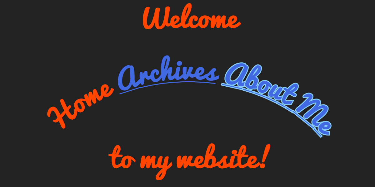
Figure 18-1. Links in SVG text used as website navigation
Example 18-1. Adding hyperlinks to SVG text layouts
<svgxmlns="http://www.w3.org/2000/svg"xml:lang="en"xmlns:xlink="http://www.w3.org/1999/xlink"width="400px"height="200px"viewBox="0 0 400 200"><title>SVG Navigation Links</title><defs><pathid="p"d="M30,220 C50,40 350,40 380,220"/></defs><style>svg{background:#222;margin:0auto;}text{font:bold28pxPacifico,sans-serif;text-anchor:middle;fill:orangeRed;}svga:link,svga:visited{text-decoration:underline;fill:royalBlue;}svga:focus{outline:none;stroke:lightSkyBlue;stroke-width:2px;paint-order:stroke;}</style><style>@import url('https://fonts.googleapis.com/css?family=Pacifico');</style><textx="200"y="30"role="heading"aria-level="1">Welcome<tspanx="200"y="180">to my website!</tspan></text><textrole="navigation"><textPathxlink:href="#p"startOffset="50%"><aaria-current="page">Home</a><axlink:href="/archives.html">Archives</a><axlink:href="/about.html">About Me</a></textPath></text></svg>
Warning
This particular layout is broken in MS Edge and Internet Explorer. When a <textPath> has multiple element children (links or <tspan>), only the first element is used to determine the text-anchor alignment.
Also, Internet Explorer and Safari don’t leave spaces between the links.
In other words, if you want to use SVG text layout for a creative website navigation, be prepared to do a lot of testing and fussing to get everything working correctly in every browser.
Unlike with HTML links, there are no default link styles for SVG. In order for users to know that something is a link, you need to add underline, color change, or other styles yourself. Similarly, default focus styles are often missing or are problematic. Without focus styles, keyboard users are lost, unable to tell which link will be activated if they hit Enter.
The link styles in Example 18-1 are applied with the :link and :visited CSS pseudoclasses, so they only apply to <a> elements that are valid links, and not to the placeholder <a> element for the current page in the navigation. The aria-current attribute conveys the same meaning as the style change to supporting screen readers.1
Warning
Any styles set with a:link should also apply to visited links, unless an a:visited selector overrides them. But Firefox doesn’t implement it that way, which caused the blue link color to disappear once a link had been visited, without the second selector.
The link selectors in Example 18-1 are qualified to only apply to descendents of an <svg> element, to minimize style clashes if the SVG was copied inline. Alternatively, namespace-sensitive CSS selectors could be used to ensure that the styles only applied to SVG-namespaced <a> elements, and not to HTML links.
The keyboard focus styles, set with the :focus pseudoclass, are similarly qualified, to only apply to the links within the SVG. The normal default focus style for links (and other focusable objects) in a web page uses the outline property. But that created two issues: Firefox couldn’t draw an outline around a span within a <textPath> at all; in browsers that did draw the outline, it was drawn as a large rectangle, ignoring the curve of the text.
So the default outline is explicitly turned off in the focus rule, and a stroke is used instead. It’s not perfect. Stroking cursive text emphasizes the edges between letters, and in the case of underlined text on a path, it also emphasizes the edges between the underline sections. But it is, above all, functional. And function is what focus styles are all about.
Interactive Style Switches
The CSS pseudoclasses are a simple way in which a graphic can be made interactive. You don’t need to click a link for something to change in Example 18-1: simply tabbing through the links (that is, changing the keyboard focus by using the Tab key) will change the styles set with the :focus pseudoclass.
There are three pseudoclasses that are specifically defined by user interaction states:
-
:focusapplies to the element that currently has keyboard focus. -
:hoverapplies to an element that currently has the mouse pointer positioned over a clickable region, and also to any of its ancestor elements. -
:activeapplies to an element that is in the process of being activated, meaning it is currently being clicked, during the time when the mouse is being pressed. For HTML elements that are normally activated by the space bar (buttons, checkboxes, and radio buttons), it also applies if the space bar is being held down while the element has focus.
These selectors can apply to any graphical SVG element, not just links. But links are the only element in SVG that are by default keyboard-focusable. Also remember that touchscreen users or keyboard users won’t be able to trigger :hover and may not be able to trigger :active states.
There are other CSS pseudoclasses that can be used to create interactive effects, with a little more work. In “Targeting the Interaction”, we’ll discuss using the :target pseudoclass, in combination with same-document links. And as we demonstrated in Chapter 2, the form-status pseudoclasses, like :valid or :checked, can be used to control inline SVG elements that are child or sibling to HTML form elements.
A Better Image Map
Links on text are all very well, but SVG is all about graphics. Can you create a hyperlink out of a <path> or a <use> or other graphic? Of course!
The <a> element can be used to wrap any SVG graphical elements—shapes, images, entire <text> elements, or reused icons:
<axlink:href="home.html"aria-label="Acme Company Home Page"><usexlink:href="#acme-logo"><title>Acme Co.</title></use></a>
In this context, the link element (<a>) behaves much the same as a <g> for styling and layout purposes.
Warning
Do not use the <a> element within a <defs> section or inside a <symbol> or other unrendered element. Many browsers still allow the unrendered element to receive keyboard focus. Reused copies of graphics containing the link may or may not be functional, depending on the browser.
When a link’s contents are entirely graphical, instead of text, be sure to add a meaningful name to the link element itself or to its child content, using the methods described in Chapter 17. The best-supported method for screen readers would be to use an aria-label attribute on the <a> element itself, but a <title> that is a direct child of the link also has fairly good support. Using a <title> has the benefit of adding tooltip hints for visual users on a device with hover support.
Tip
Elements with certain ARIA roles, including button, are treated as if they don’t have any children. That means that if you use aria-label to replace the name that would normally be generated from the child content, that content (whether plain text or alternative text on child elements) is no longer accessible.
This problem is not SVG specific, but it may show up more often in SVG because of the more frequent need to use aria-label for alternative text.
Graphical links, known as image maps, have been a part of HTML since the 1990s. In brief, HTML image maps are defined by a <map> element containing <area> elements representing the individual links as vector shapes. The map is then applied to an <img> element as a cross-reference in the usemap attribute. The map and link areas are themselves invisible; they only serve to define the hyperlinked “hotspots” on the visible image.
There are several problems with traditional HTML image maps:
-
The map hotspots cannot easily be made responsive: they are defined in pixels, and cannot scale to match the image size. This means that you cannot adjust the image size to match the available screen size, because then the invisible linked areas will be misaligned.
-
Loading a large image (especially for navigation) often delays the page. And browsers currently do not provide functional links if the image cannot load at all.
-
It’s difficult to add interactive feedback or hover effects to an image map. Browsers show basic focus outlines around link areas, but you cannot alter them with CSS like you can for normal focus outlines.
-
It can be challenging to generate the markup for the invisible hotspot areas, as very few tools output the correct code.
You can eliminate all of these disadvantages by using linked regions in interactive SVG. When correctly set up, all of the elements in an SVG are responsive; you can load extra image files, but (if carefully designed) your SVG can still be functional without them; you can use :hover and :focus styles to give interactive feedback; and it’s easy to add <a> elements to SVG markup generated from graphical editors—or however else you usually create SVG.
But what if the image you want to use as a map isn’t a vector image? What if it’s a photograph? Can you make parts of a photograph hyperlinks to different destinations?
You can’t, but you can.
You can’t make only parts of an SVG <image> element clickable. If the <image> is a child of an <a> element, all of the image (after clipping) will be clickable. There is no way to have multiple <a> elements associated with the embedded image, equivalent to the <map> and <area> elements in HTML.
But what you can do is draw your <image> as a backdrop, and then draw transparent SVG <path> (or other shape) elements, each one inside a different link, as invisible hit regions over top.
Defining a <path> element to match a feature in a photograph is exceptionally difficult to achieve by hand. If you are only creating a link hotspot, it doesn’t need to be super-precise (a rough polygon will do), but if you want to add visual enhancements then you usually want a close match between the curves of your path and the objects in the photo.
The regular solutions for converting images to vectors—using “Trace” in Adobe Illustrator, for example—provide sketchy edges, not overall shape outlines. A better solution is to load the image into Adobe Photoshop or GIMP and use the advanced selection tools (“Magnetic Lasso” tool in Photoshop, or “Intelligent Scissors” in GIMP) to select the region you want. Selections can then be converted into paths within the software, and those paths can be exported as SVG.
For this example, we’re using the photograph of a skateboarding crew from Figure 18-2. The goal is to create an image map where each person in the photograph is a link to their biography page. SVG paths for each person were created with Photoshop selections.
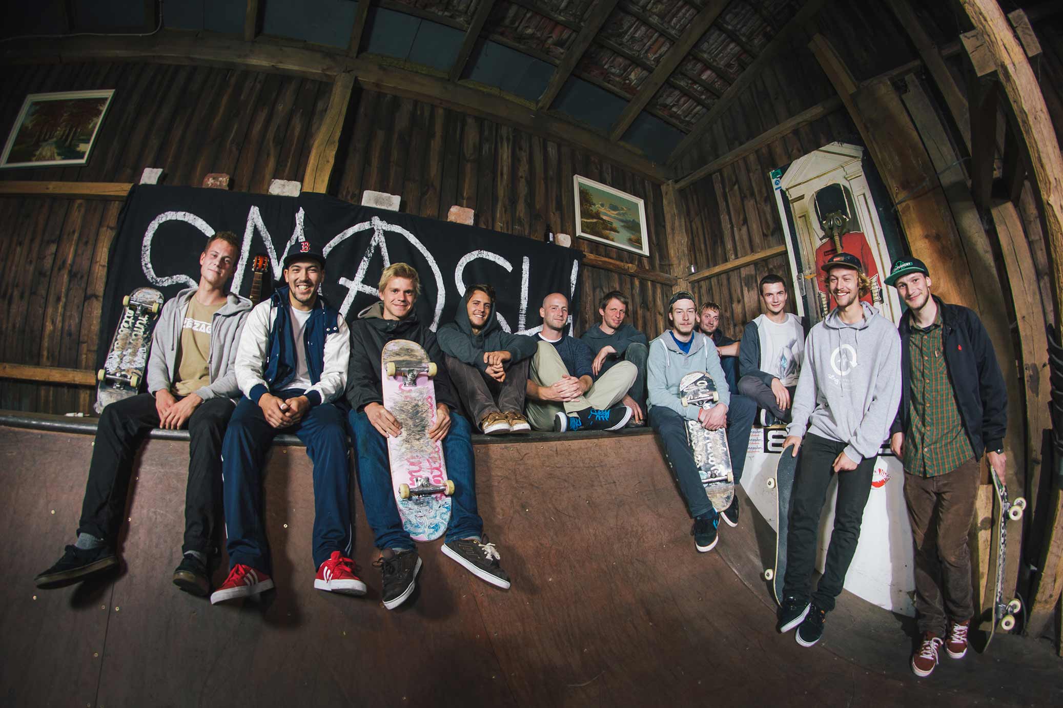
Figure 18-2. The photograph to use in the image map
To add a little more interactivity, emphasizing the clickability of the shapes, we want to turn most of the photograph black and white, but with the skater under inspection—a link that is hovered, touched, or focused—remaining in color, as shown in Figure 18-3.
There are a number of ways to achieve this effect, some simpler than others. The approach we use relies on multiple copies of the photograph:
-
The bottom layer is the grayscale backdrop, created with a desaturating filter effect.
-
For each link, there is a color version of the photo, clipped to the desired person’s outline, which will be faded into view when that link is hovered or focused. The clipping paths use copies of the same outline paths used for the hotspot regions.
-
A final color copy of the photo provides the main color view when no links are hovered. It will be faded in and out (with
opacitychanges), so that the color doesn’t instantly disappear and reappear when the clipping path is changed.
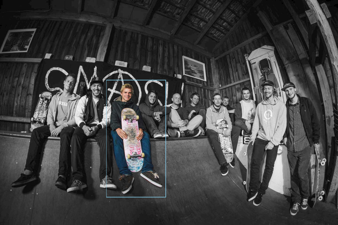
Figure 18-3. The final result, when one link is focused
Example 18-2 provides part of the code. To keep it readable, we only show the elements for one of the 11 linked skateboarders in the image, and we skip the actual path data.
Example 18-2. Creating an interactive image map with SVG links and clipping paths
SVG Markup:
<svgxmlns="http://www.w3.org/2000/svg"xml:lang="en"xmlns:xlink="http://www.w3.org/1999/xlink"viewBox="0 0 2074 1382"><title>Color-transitioning Image Map Links</title><style>/* styles could be in the file or linked */</style><defs><imageid="team-photo"width="2074"height="1382"xlink:href="team-photo.jpg"/></defs><filterid="grayscaleFilter"x="0"y="0"width="100%"height="100%"><feColorMatrixtype="saturate"values="0"/></filter><usexlink:href="#team-photo"filter="url(#grayscaleFilter)"/><aclass="hotspot"id="konni"xlink:href="/team-bios/konni.html"><title>Konni</title><pathid="konni-mask-path"d="..."/><clipPathid="konni-clip"><usexlink:href="#konni-mask-path"/></clipPath><useclass="clip"xlink:href="#team-photo"clip-path="url(#konni-clip)"/></a><!--and 10 other links with paths and clipped images--><useid="fade"xlink:href="#team-photo"/></svg>

The
<image>is defined once, within a<defs>section, and will be reused as required. It and the SVGviewBoxare sized in the image’s original high-resolution pixel size, to match the path data generated by Photoshop.
The base copy of the image is made grayscale with an
<feColorMatrix>filter effect.
The links come next, one for each person in the photograph, arranged left to right so that keyboard focus moves in a predictable order. Each link has a
<title>to create a tooltip and an accessible name.
The
<path>element within each link outlines that person’s position in the photograph. The path is then reused in a matching<clipPath>element, which creates a clipped color version of that person’s shape in the photograph.
Finally, at the end of the document is the unclipped color copy of the photo that will be faded in and out.
CSS Styles:
.hotspotpath{fill:none;pointer-events:visibleFill;}#fade{pointer-events:none;}#fade,.clip{transition:opacity400msease-in-out;}.hotspot:hover~#fade,.hotspot:focus~#fade,.hotspot:active~#fade{opacity:0;}.clip{opacity:0;}.hotspot:hover.clip,.hotspot:focus.clip,.hotspot:active.clip{opacity:1;}.hotspot:focus{outline:none;}.hotspot:focuspath{outline:skyBlue3pxsolid;outline-offset:20px;}
The
<path>elements inside eachhotspotlink have nofill(and by default, no stroke either); however, thepointer-eventsvalue ensures that the fill region is sensitive to mouse events so long as the path element is itself visible.The
#team-photoelement—and all its<use>copies—are made transparent to clicks and taps, withpointer-events: none.The opacity changes on the
#fadecolor layer (the top, unclipped image) and all of the clipped color images will have smooth transitions.The
#fadecolor layer will normally be visible, but will transition to transparent whenever one of the hotspot links is hovered or focused or activated by touch.The
.clipclipped color images will normally be invisible, but will be made visible when the user is interacting with the image’s parent link.
The color changes will provide an indication of keyboard focus, but color alone is not an accessible distinction—some people can’t see color well, and some devices can’t display color well. To ensure focus is always clear, a standard focus
outlineis also used. However, if theoutlinewas drawn around the link, it would be drawn around the combined bounding box of all its children, including the unclipped dimensions of the<image>. Because that would mean that every link would have the same bounding box, it’s not very useful. So, that outline is turned off, and an outline specifically around the<path>element is used instead.
Browsers that support the
outline-offsetproperty will position the outline 20px outside the bounding box of the path, keeping it from looking too cramped.
To be able to use the :hover pseudoclass on the <a> elements to affect the top color photo layer, the complete photograph must come later in the document than the links. That means it will be drawn on top of the links (because of the lack of z-index support for SVG), and would normally grab all the mouse hover, click, and tap events. That not only would ruin the interactive effect, it would mean that the links couldn’t be opened!
The pointer-events property is used to ensure that the invisible paths in the links are sensitive to clicks, but that the images drawn on top are not.
Getting the Point(er) Across
The pointer-events property is one of those SVG features that has spread into CSS-styling of other web content. But the standard CSS version only includes a narrow slice of the SVG property’s function. Many web developers have thrown pointer-events: none on an element to fix a user interface, without any idea of all the SVG-specific options for the property.
The pointer-events property determines whether an element receives mouse and touch events that pass over its region of the screen. When there are multiple elements in the same region, the topmost layer (i.e., the last element in the DOM for SVG elements) normally receives the event. If that element isn’t sensitive to pointer events, the event gets passed to a lower layer.
There are nine different pointer-events options for SVG shapes. They control whether the fill region and/or the stroke region of the shape is sensitive to pointer events, and whether the hit region is affected by the visibility, fill, and stroke properties.
The pointer-events setting is inherited.
Tip
The fill region is the shape that would be colored if fill were a solid-color value, and is affected by fill-rule.
The stroke region is the shape that would be colored if stroke were a solid-color value, and is affected by stroke-width, stroke-dasharray, stroke-dashoffset, stroke-linejoin, stroke-linecap, and stroke-miterlimit. In other words: it includes dashes and line caps/line joins, but not gaps in a dashed stroke.
Using pointer-events, you can make unpainted or hidden elements, or sections of elements, sensitive to pointer events (like we did in Example 18-2).
The values have the following meanings:
visiblePainted-
If the element has
visibilityset tovisible, then the fill region is sensitive unlessfillisnone, and the stroke region is sensitive unlessstrokeisnone. visibleFill-
If the element has
visibilityset tovisible, the fill region is sensitive (whether it is painted or not); the stroke region is never sensitive. visibleStroke-
If the element has
visibilityset tovisible, the stroke region is sensitive (whether it is painted or not); the fill region is never sensitive. visible-
If the element has
visibilityset tovisible, both the fill region and the stroke region are sensitive, regardless of whether or not they are painted. painted-
The fill region is sensitive unless
fillisnoneand the stroke region is sensitive unlessstrokeisnone, regardless of thevisibilityvalue. fill-
The fill region is sensitive, regardless of whether it is painted or not, and regardless of the
visibilityvalue; the stroke region is never sensitive. stroke-
The stroke region is sensitive, regardless of whether it is painted or not, and regardless of the
visibilityvalue; the fill region is never sensitive. all-
Both the fill region and the stroke region are sensitive, regardless of whether they are painted or not, and regardless of the
visibilityvalue. none-
No parts of the element are sensitive to pointer events.
As mentioned in Chapter 15, the pointer-sensitive region of an element can also be restricted by clipping paths (but this isn’t yet supported in Microsoft browsers). Hidden overflow also clips the clickable region.
Tip
An element that has display: none is never sensitive to pointer events, regardless of the pointer-events property.
The default pointer-events value is visiblePainted, which means that the shape is sensitive to mouse events only in the places where it is filled and stroked, and only if it is visible. Fill regions with no fill, stroke regions that are unstroked, and hidden elements do not receive clicks, taps, or hover events.
However, even with the default pointer-events, you can still create invisible hit regions. The opacity, fill-opacity, and stroke-opacity properties never affect pointer sensitivity. Neither does the transparency of patterns, gradients, or colors used for fill or stroke.
Tip
This means, if you can’t remember all the keywords, you can always leave pointer-events as the default and create transparent fill or stroke hit regions using the opacity properties.
The one thing you can’t fake with opacity is having a section of an element that is visible but not interactive. For that, you always need pointer-events. In addition to turning off pointer sensitivity altogether with the none option, you may find it useful to ensure that shapes have a consistent hover shape regardless of whether or not they are being stroked.
Example 18-3 shows a simplified case. The shapes in the graphic are given a hover effect that causes the stroke-width to increase from 0 to 24px wide (as shown in Figure 18-4). With the default pointer-events option, this would cause the size of the hoverable region to change underneath the mouse pointer, making the hover effect flicker on and off for certain mouse positions. By making pointer events only sensitive in the fill region, the changing stroke width does not affect the hoverable shape, preventing any flickering feedback loops.
Figure 18-4. The hoverable shapes, with the second circle hovered
Example 18-3. Maintaining predictable hover regions despite changing strokes
<svgxmlns="http://www.w3.org/2000/svg"xml:lang="en"viewBox="0 0 400 200"width="400px"height="200px"><title>Hover Effects that Don't Affect Hover Regions</title><style>circle{fill:currentColor;stroke:currentColor;stroke-width:0px;pointer-events:visibleFill;transition:all0.5s;}circle:hover{stroke-width:24px;fill-opacity:0.3;}</style><circlecolor="crimson"cx="75"cy="75"r="60"/><circlecolor="springGreen"cx="200"cy="125"r="60"/><circlecolor="royalBlue"cx="325"cy="75"r="60"/></svg>
Turning off stroke pointer events to avoid flickering hover effects can also be useful if you are animating a stroke dash pattern. The stroke region for pointer events only includes the dash shapes, not the gaps, so animated dashes means flickering hover effects. Again, you’d want to use the visibleFill value to ignore the shifting stroke sections.
On the other hand, a visible value (forcing both the fill and the stroke region to be clickable, even if they are set to none) can be useful to create an invisible—but still clickable—stroke region around the outside of shapes. With a large stroke-width value, this can increase the clickable size of links or buttons in an SVG interface, making it easier to use.
Think you’ve got a handle on pointer-events? Maybe? It gets worse. Everything we’ve said so far only applies to SVG shape elements. Other elements have their own rules.
For SVG text elements, pointer-events does not distinguish the fill region and stroke region. Instead, the sensitive region is always based on the character cell (em-box) rectangles: rectangles around each character, where each rectangle is 1 em tall and as wide as the normal spacing for that letter.
With the visiblePainted and painted values for text, the complete character cells are sensitive if the text has either fill or stroke. With the other values (including fill and stroke), the character cells will be sensitive even if the text is not painted at all—although visibility continues to have its normal effect on the visible* values.
For <image> elements, the fill and stroke settings have no effect, but visibility does. So all the visible* values are equivalent: the element will be sensitive to pointer events so long as it is not hidden. Similarly, fill, stroke, and painted are all equivalent to all. For images, the sensitive region is the rectangular shape of the <image> element.
Warning
The SVG specs suggest that images should only be considered “painted” for pixels that aren’t fully transparent. No browsers implement this behavior: all treat an image as a rectangular element, regardless of transparency.
For CSS layout boxes, pointer-events behavior isn’t specified anywhere. The browsers, however, all act as if there are only two possible values: visible and none. Any value other than none causes a CSS layout box to be sensitive to pointer events over its entire border-box region (after adjusting for radiused corners), but only if it has visibility: visible.
There is no way to make a CSS layout box sensitive to pointer events when it has visibility: hidden. You can hide it with opacity: 0, since opacity never affects pointer events. But with opacity, you can’t unhide a specific child element, like you can with visibility.
Tip
Inline <svg> elements, and the root <svg> element in an SVG file, have CSS layout boxes and behave like other CSS boxes, not like SVG graphics. That means they are pointer-sensitive over the entire border-box region, unless visibility is hidden or pointer-events is none.
Within SVG layout, pointer-events only applies directly to graphical elements that actually draw content to the screen. Groups, links, <use> elements, and nested <svg> elements don’t directly capture pointer events. However, containers will match the :hover class if any of their child elements are hovered, and other pointer events will bubble up the DOM tree (or shadow DOM tree) from children, which by default inherit the container’s pointer-events setting.
Targeting the Interaction
Before we get to DOM events and JavaScript interaction, there is one more important type of declarative (nonscripted) interaction: links! Again! This time, not links to a different web page, but links within the same web page.
In other words, a link where the destination is a target fragment: a # followed by an element’s id.
Same-page web links are used all the time in HTML, to allow the user to jump to a different part of a long document. If you have a number of small inline SVG graphics within an HTML page, you can use this type of same-page links to jump to the graphic from a table of contents, or from a cross-reference in the main text.
Warning
When most browsers scroll to an SVG element within an HTML document, they scroll to the top of the <svg> that contains it, not to the specific element’s position. If your SVG is too large to fit on the screen, this can mean that your desired element is still offscreen.
If the SVG is already fully in view, jumping to a particular element with a same-page link doesn’t cause a scroll effect. So why would you want to do it? Because you can create other effects in response to the change in the web page’s target.
There are two SVG-specific ways to change the graphic by using link targets:
-
SVG views, which we introduced in Chapter 9. By including links to views within the SVG, you can zoom in and out of the graphic dynamically. Unfortunately, you can’t currently make that zoom effect transition smoothly; you’ll get a sudden switch from one view to the other.
-
SVG animation elements, which we’ll introduce in Chapter 19. When an animation element is the target of a link, that animation effect is started when you trigger the link.
A final interaction option is to use the CSS :target pseudoclass selector to change styles on the targeted element or a sibling/child. Although not SVG-specific, it can be put to good use within interactive SVG.
Example 18-4 uses :target styles to create an interactive version of our stroke-linejoin comparison from Chapter 13 (Figure 13-5). Rather than show the three stroke-linejoin values side by side, there is one large sample shape, and three links for the three possible values. The targets are the links themselves, which has the benefit of not losing the keyboard focus position when a link is activated. The shape is then restyled according to which sibling <a> element matches the :target pseudoclass.
Figure 18-5 shows one possible state, after the round value has been set (but focus has been shifted to the next value).
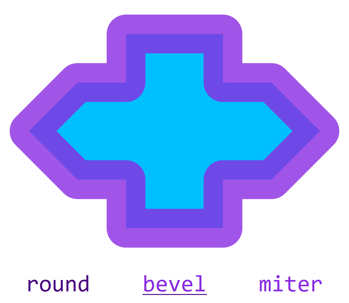
Figure 18-5. An interactive SVG style sample, after the first link has been activated (but the second link is focused)
Example 18-4. Using same-page links and :target to create a style switch
<svgxmlns="http://www.w3.org/2000/svg"xml:lang="en"xmlns:xlink="http://www.w3.org/1999/xlink"width="390px"height="338px"viewBox="0 0 300 260"><title>Strokes with Interactive Linejoin Options</title><desc>Selecting one of the stroke-linejoin options will apply that effect to the sample shape.</desc><style>svg{font:20pxConsolas,monospace;text-anchor:middle;}.shape{fill:deepSkyBlue;stroke:blueViolet;stroke-width:4px;stroke-opacity:0.8;}#round:target~.shape{stroke-linejoin:round;}#bevel:target~.shape{stroke-linejoin:bevel;}#miter:target~.shape{stroke-linejoin:miter;}.option{fill:indigo;}text{fill:blueViolet;}.option:focus,.option:hover{outline:none;text-decoration:underline;}.option:targettext{fill:inherit;}</style><symbolid="shape"viewBox="-18 -12 36 24"><pathd="M-5,-10 H5 V-5 H10 L15,0 L10,5 H5 V10H-5 V5 H-10 L-15,0 L-10,-5 H-5 V-10 Z"/></symbol><aid="round"class="option"xlink:href="#round"><textx="50"y="250">round</text></a><aid="bevel"class="option"xlink:href="#bevel"><textx="150"y="250">bevel</text></a><aid="miter"class="option"xlink:href="#miter"><textx="250"y="250">miter</text></a><useclass="shape"xlink:href="#shape"width="300"height="225"/></svg>
There are a few limitations to using :target styles for interactive graphics. You can only alter CSS-stylable properties, not XML attributes. And you can only have one target at a time, so you can only have a single set of options to pick from.
The Big Event
There’s only so far you can go with interactivity using just CSS and links. You can go a little further with animation elements (albeit with worse browser support), but you’re still going to hit barriers. For flexible interaction, you need JavaScript.
We’ve used JavaScript in scattered examples throughout the book to build SVG documents, but haven’t touched on interactivity yet.
Interactive scripting on the web uses an event model. The user (or sometimes the browser, behind the scenes) does something, which creates an Event object. The event is associated with a particular DOM element, the event’s target. For example, when you click the mouse or tap the screen, the target is the element under your pointer that receives the pointer event.
After creating an event, the browser looks for any JavaScript instructions you—the web page author—set for what to do with an event of that type. Those instructions could be set as event handler functions (using the onclick attribute or property, for example) or event listener functions (set using an element’s addEventListener() function). Depending on the type of the event, those handlers or listeners could be set directly on the target or on one of its ancestors in the DOM tree.
Most things about JavaScript event handling work the same for SVG as they do for HTML. So we’re not going to discuss them in detail here. Instead, we’re going to review a few cases where SVG gets a little more complicated.
Back in Chapter 2, we reviewed some of the trickier aspects of scripting and SVG, mostly related to XML namespaces. All of that still applies here. Thankfully, event objects don’t have namespaces. The complications come from switching to the SVG layout model, from dealing with <use> shadow-DOM elements, and from working around the fact that SVG doesn’t have native input elements like HTML does.
Counting Clicks
For our basic event-handler demo, we’re going to build a simple SVG game. We’ll draw a bunch of circles (confetti pieces) on the screen, and run down a timer, and the user has to click as many circles as possible before the time runs out. We won’t worry about keyboard interaction right now, which will keep things simpler.
Example 18-5 provides the JavaScript. We haven’t included the matching markup here, because the script is designed to work with many different structures, either inline SVG or standalone. The requirements:
-
an
<svg>element in the document with anidofgameboard, to which the click targets will be added, and which is styled to have a dark background (although the script could easily be tweaked for a different color scheme) -
text elements (SVG or HTML) with the IDs of
timerandscoreboard, with appropriate styles on them, whose text content will be overwritten as the game progresses
Additional style changes should be triggered by the clicked class on the circles and the game-over class on the document root element; we’ll show one possible stylesheet in Example 19-1 in Chapter 19.
Figure 18-6 shows a version of the game in progress.
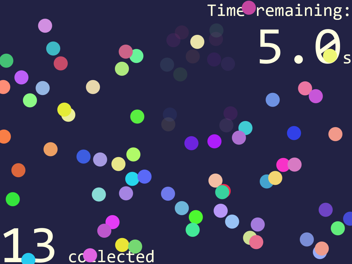
Figure 18-6. An SVG game using click events on colored circles
Example 18-5. Using click events to create an SVG game with JavaScript
(function(){/* constants */varwidth=400,//viewBox width in pxheight=300,//viewBox height in pxnShapes=80,//number of confetti pieces to drawtimeLimit=15,//total time in seconds,gameboard=document.getElementById("gameboard"),//the SVGtimer=document.getElementById("timer"),//for time remainingscoreboard=document.getElementById("scoreboard"),//countersvgNS=gameboard.namespaceURI;varscore=0;//number of pieces collected so far/* initialize */gameboard.setAttribute("viewBox",[0,0,width,height]);for(vari=0;i<nShapes;i++){varcircle=document.createElementNS(svgNS,"circle");circle.setAttribute("class","clickable");circle.setAttribute("r",8);//fixed sizecircle.setAttribute("fill",randomColor());circle.setAttribute("cx",Math.random()*width);circle.setAttribute("cy",Math.random()*height);gameboard.appendChild(circle);}varendTime=Date.now()+timeLimit*1000;updateTime();vartimerInterval=setInterval(updateTime,100);updateScore();gameboard.addEventListener("click",checkClick);functionrandomColor(){/* returns a random color with at least 50% saturation and 50-80% lightness (for drawing on dark background) */varhue=Math.random()*360,sat=50+Math.random()*50,light=50+Math.random()*30;return"hsl("+hue+","+sat+"%,"+light+"% )";}functionupdateTime(){vartimeLeft=endTime-Date.now();if(timeLeft<=0){endGame();timeLeft=0;}timer.textContent=(timeLeft/1000).toFixed(1);}functionupdateScore(){scoreboard.textContent=score.toFixed(0);}functionendGame(){clearInterval(timerInterval);gameboard.removeEventListener("click",checkClick);document.documentElement.setAttribute("class","game-over");}functioncheckClick(event){varelement=event.target;if(element.getAttribute("class")=="clickable"){element.setAttribute("class","clicked");score++;updateScore();}}})();
Customizable game-play constants are set at the top of the script, including the size of the board, the number of confetti pieces to create, the initial time for the countdown, and the IDs of the elements we’ll be modifying.
The
viewBoxof the gameboard<svg>is updated to match the dimensions that will be used in the script. The value is set using an array of four numbers, which will automatically be converted into a string as a comma-separated list.For each confetti piece, we create a new
<circle>element, using the namespace-sensitivecreateElementNSmethod and a namespace URI string we extracted from the<svg>element.Each circle is given the same class name, a fixed radius, and then a random color (using a function we define later in the script) and a random position within the gameboard. The
Math.random()method returns a value between0and1, so multiplying it bywidthreturns a value between0andwidth(and similarly forheight). The circles are then appended as children of the gameboard<svg>element.With the confetti in place, it’s time to start the timer.
Date.now()returns a timestamp from the system clock, measured in milliseconds. Since ourtimeLimitis measured in seconds, we need to multiply it by 1,000 to convert. TheupdateTime()function will update the timer display and also check if we’ve run out of time. We call it once to start and then tell the browser to call it repeatedly on a 100ms interval.An
updateScore()function sets the initial score display; changes to the score, however, won’t come at predictable intervals, but based on user events. We add the event listener to the gameboard<svg>element, so that it can react to click events from all the child confetti elements.The
randomColor()function usesMath.random()and CSShsl()color notation to create random colors that will still be bright and easy to see on our dark gameboard.
The
updateTime()function usesDate.now()again, comparing it against our saved value, in order to calculate how many milliseconds remain in the game. After checking whether theendGame()method needs to be called, it updates the onscreen timer, using theNumber.toFixed(digits)method to format the time nicely.
The
endGame()function is fairly simple: it turns off the timer using theclearInterval()method, removes the event listener that was counting clicks, and then sets thegame-overclass on the document, which will trigger additional changes in the CSS. The class is changed usingsetAttribute(), notclassList, to avoid issues on Internet Explorer and other older browsers that don’t supportclassListfor SVG—but beware that this will replace any other classes on the element. If using inline SVG in a more complex HTML document, you may want to switch to a more robust method.
The final method,
checkClick(), is our event listener. The browser calls it with theMouseEventobject as a parameter. The event object’stargetproperty is a reference to the element that initially received the click. If that element is one of our confetti circles, it will match ourclickableclass. We switch it to theclickedclass (again, using backward-compatible methods) so that the CSS can change the styles and then update the score.
The styles used in Figure 18-6 make the clicked confetti pieces almost transparent (with opacity). We can also make those pieces fully transparent to further click events using pointer-events: none, although the changed class means we will ignore those clicks anyway:
.clicked{opacity:0.1;pointer-events:none;}
We don’t, however, remove the <circle> elements completely. That makes it easy to switch styles when the game is over, to highlight the pieces that were collected, as shown in Figure 18-7. The unclicked pieces are turned to black with another style rule that overrides the fill presentation attributes on the individual circles:
.game-over.clickable{fill:black;}.game-over.clicked{opacity:1;filter:drop-shadow(003pxgold);}
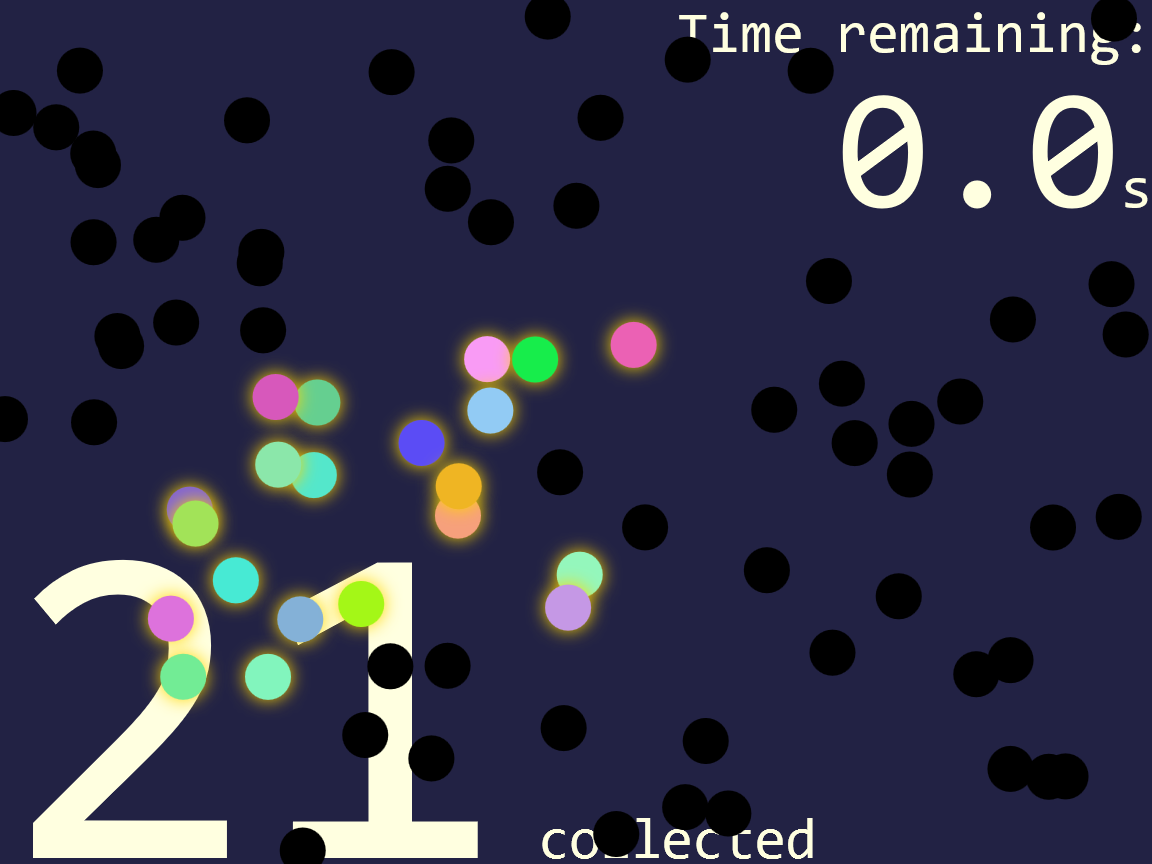
Figure 18-7. A completed version of the confetti game
Although this game isn’t keyboard accessible, we still want to make it accessible to screen readers and other assistive tech. (After all, it could be played on a touchscreen even if your eyesight wasn’t perfect.) Frequently updating text can be a distraction with screen readers, so appropriate ARIA roles are needed to tell the browser to be more polite:
<divclass="count"role="timer"aria-atomic="true">Time remaining:<spanid="timer">00.0</span>s</div><divclass="count"role="status"aria-atomic="true"><spanid="scoreboard">0</span>collected</div>
The ARIA attributes would be the same if you used SVG <text> elements; this version is HTML to minimize the number of other attributes you need.
For the score count, the status role tells screen readers that the user probably wants to know the changed value, and it should be read out the next time there is a break in speech.
Adding aria-atomic="true" to the parent element indicates that the changed value makes more sense if read out in context of the entire element—for example, “13 collected” instead of just “13.”
For the timer, the timer role indicates that the value is changing automatically and doesn’t normally need to be read out. However, we might want to give the user a warning when time is almost up; the aria-live attribute can be changed to indicate that the timer is a bit more important.
To add that to our script, we would add a new game variable, and then add one more check in the updateTime() function:
if((!last5seconds)&&(timeLeft<=5000)){//less than 5 seconds lefttimer.setAttribute("aria-live","polite");last5seconds=true;}
Because we don’t want to reset the attribute every tenth of a second, we use a Boolean variable to record the fact that we’ve already passed the 5-second warning point.
The polite value for aria-live switches the timer to the same behavior as the status role: the screen reader mentions the updated value whenever it has a break in speech, counting down the last few seconds on the timer. In contrast, the default behavior for a timer is equivalent to aria-live="off".
Finally, to give visual users the same warning, you could change the color of the timer text when it matches the [aria-live] attribute selector.
Bubbling Out of Shadows
The confetti collector game is all very well. But what if you wanted to collect something more interesting than confetti? For example, maybe we would like to use the gemstone shapes from Example 17-4 in Chapter 17, creating a game that looks like Figure 18-8.
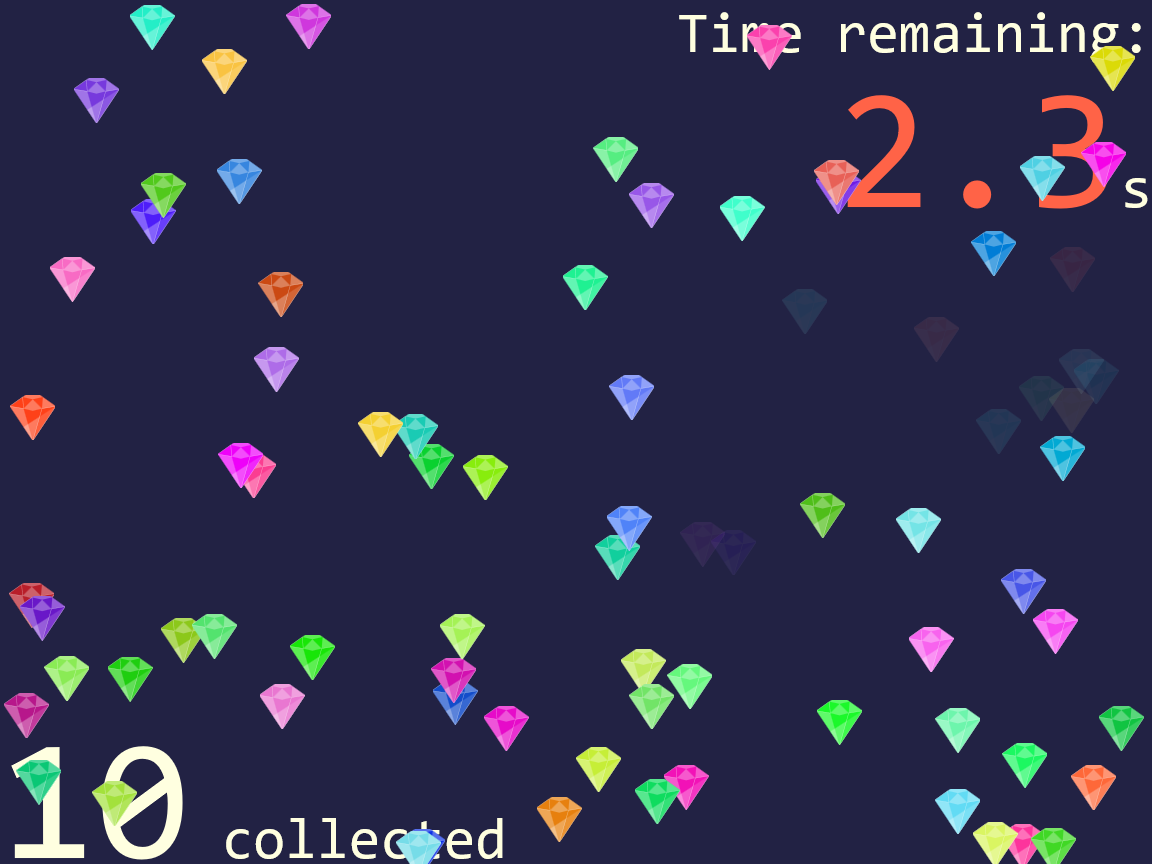
Figure 18-8. An SVG game using click events on colored gems made from <use> elements
There are a few changes to the code required. For starters, we’ll want to predefine our gemstone shape as a graphic we can reuse.
Although we could define it as a <symbol>, we’re going to instead define it as a nested <svg> so we can set a default size and offset the position:
<defs><svgid="gem"viewBox="0 0 100 100"x="-8"y="-8"width="16"height="16"><polygonpoints="0,25 35,0 65,0 100,25 50,100"/><gfill="white"fill-opacity="0.3"><polygonpoints="0,25 30,30 50,100"/><polygonpoints="100,25 30,70 50,100"/><polygonpoints="28,5 35,0 65,0 72,5 50,10"/><polygonpoints="50,10 30,30 50,35 70,30"/><polygonpoints="72,5 70,30 100,25"/></g><gstroke="white"stroke-opacity="0.5"fill-opacity="0.5"><polygonpoints="100,25 70,30 50,100"/><polygonpoints="28,5 30,30 0,25"/></g></svg></defs>
The x, y, width, and height attributes on the gem <svg> set it to be approximately the same size as our confetti circles, and similarly centered on our reference point. That way, gems will never be more than half-outside our gameboard, in either direction.
In the script, we switch the code for creating circles to instead create <use> elements. The only extra hassle is having to use namespace-sensitive methods for setting xlink:href:
for(vari=0;i<nShapes;i++){varuse=document.createElementNS(svgNS,"use");use.setAttribute("class","clickable");use.setAttributeNS("http://www.w3.org/1999/xlink","href","#gem");use.setAttribute("fill",randomColor());use.setAttribute("x",Math.random()*width);use.setAttribute("y",Math.random()*height);gameboard.appendChild(use);}
The randomColor() method could be tweaked slightly to create brighter fill colors, since the gemstone drawing adds white tints anyway. The x and y attributes on the <use> are directly equivalent to the cx and cy attributes on the circles.
For most browsers, that’s all you have to change.
But not for all browsers.
What’s the confusion? The problem is that a <use> element doesn’t receive click events directly. Instead, the cloned <polygon> shapes that draw the graphic receive the clicks. The SVG 1 specs defined a special DOM object for these cloned shapes, SVGElementInstance. An SVGElementInstance wasn’t a full DOM Element, but it was a valid EventTarget object in the DOM event model.
In browsers that implement the SVG 1 model for the <use> element DOM, therefore, when we access the event.target object in our checkClick() event listener, we won’t get the <use> element that we need to modify. Instead, we’ll get one of these SVGElementInstance objects for the cloned polygons.
Warning
In Internet Explorer, MS Edge up to EdgeHTML 14, and older versions of Blink and WebKit, the event.target of click events on <use> elements is an SVGElementInstance object in the <use> element’s shadow DOM.
Firefox never implemented the SVG 1 <use> element shadow DOM; the target is always the <use>.
Blink, WebKit, and MS Edge 15+ have switched to a model where event listeners in the main document receive a modified Event object, where the target has been switched to point to the <use> element.
In the newer browsers (and in the SVG 2 specs), when the click event “bubbles” out of the shadow DOM and into the regular DOM, it is retargeted, so that all events that start in the shadow DOM instead appear to come from the <use> element directly. This is part of the encapsulation model of web components’ shadow DOM, but it also makes SVG event handling easier for most cases.
The implementation details aren’t entirely consistent between the different browsers and the spec yet, but the main result is the same: in an event listener attached to the <use> element or one of its ancestors, event.target points to the <use> element, not to the shadow DOM.
But what can we do about the older browsers? We can make use of the fact that the SVGElementInstance interface includes a property that points to its host <use> element. If the event target has a value for that property, it will point to the <use> element. Otherwise, the event target is already a real-DOM element, and we can use it directly.
The Boolean OR (||) operator in JavaScript can be used to collapse the two options. The result of an OR operation between two JavaScript objects is the first object if it exists or the second object otherwise:
functioncheckClick(event){varelement=event.target.correspondingUseElement||event.target;if(element.getAttribute("class")=="clickable"){element.setAttribute("class","clicked");score++;updateScore();}}
This works in all the browsers—but Firefox is a little flaky about whether it registers a click event at all. The problem seems to be that if the mouse pointer shifts from one polygon to another between mouse-down and mouse-up, it does not register as a “click” on either element. Changing the event listeners to use mouseup (instead of click) solves that problem.
Tip
A tap on a touchscreen should create mouseup and click events. However, there may be a slight delay (as the browser waits to see if you’re doing a complex touch gesture).
You can listen explicitly for the touchend event instead—but then be sure to call preventDefault() on the touch event, so you don’t get a mouse event as well.
Doing anything more complicated with <use> element shadow DOM—actually trying to detect which shadow element was clicked, for example—cannot currently be done in a cross-browser way. If you need to make the individual elements within a clone interactive, use the Element.cloneNode(true) DOM method to create the clones, instead of cloning with <use> elements.
Measuring Mouse Positions
A nice feature about the code in Example 18-5 is that we never have to worry about where the user’s mouse—or finger—is on the screen. All we need to focus on is which element was underneath it. The browser takes care of converting from (x,y) locations to element positions.
But often, when handling pointer events in a graphical interface, you do need to know exactly where the pointer is. And that requires some extra work.
The MouseEvent interface used for click and mouseup events (including those created by touch taps) has properties to help you figure out pointer coordinates. In fact, they have multiple different versions. In modern browsers, mouse events can give you screenX and screenY coordinates, clientX/Y, offsetX/Y, or pageX/Y. Each pair is calculated relative to a different reference frame.
What we want for SVG is usually SVG user-space coordinates, for however the coordinate system is scaled and transformed for the current element. For example, for our clicking game we might want to draw a symbol at the location of each “miss”: places where the user clicked, but not on a clickable element. In order to position the symbols correctly, we need to know the (x,y) position of that click within the SVG viewBox.
Unfortunately, none of the MouseEvent options currently serve that purpose.
Warning
For offsetX and offsetY, you don’t even get consistent results cross-browser for SVG elements.
So we’re going to need a little math, to convert mouse coordinates into SVG coordinates. Luckily, the SVG DOM has some helper functions for us.
Every SVG element that can take a transform (basically, all the graphical elements except <textPath> and <tspan>) has a getScreenCTM() method. The CTM stands for cumulative transformation matrix. It’s a matrix in the sense of a matrix transformation function. We mentioned cumulative matrices in Chapter 11 when discussing how the many transformation functions in a list can be compiled into a single matrix.
The screen CTM is that and more. It defines how you can convert points in that element’s coordinate system back into the original, unscaled, untransformed coordinate system of the document window. It includes transformations on this element and its ancestors, plus viewBox scaling.
Warning
Internet Explorer 9 also included the transformation from browser zoom in the CTM—which breaks the mouse-conversion method in IE9 if the user has their browser set to anything other than 100% zoom.
Here’s the confusing part: the coordinate system of the document window is not the coordinate system used to measure the screenX/Y mouse positions. But it is the coordinate system used to measure the clientX/Y mouse positions. So getScreenCTM() should really be called getClientCTM(). But it isn’t.
Tip
Using the getScreenCTM() transformation matrix, we can convert between our local SVG coordinate system and the client coordinate system used by mouse events.
How do we convert the coordinates? Do we need to do the matrix math ourselves? Thankfully, no.
There is an SVGPoint object (now renamed DOMPoint in the latest browsers) that can do the math for us. Here’s how it works:
-
Create an
SVG/DOMPointobject with thecreateSVGPoint()method of any<svg>element. (The name of the method doesn’t change, even if the object is now calledDOMPoint.) -
Set the
xandyproperties on the point object to the values of the x,y position you want to convert. -
Call the point object’s
matrixTransform(matrix)method, wherematrixis a transformation matrix object like the one returned bygetScreenCTM()(anSVGMatrixorDOMMatrix, depending on the browser).The resulting value is a new point object, whose
xandyproperties represent the transformed position of your point.
There’s just one more complication. The transformation matrix returned by getScreenCTM() is the matrix for converting from SVG coordinates to mouse-client coordinates. We want to do the reverse transformation.
Or more precisely, we want to do the inverse transformation. Inverting a matrix reverses its effect. And luckily for us, the transformation matrix object has an inverse() method that does just the job.
So, let’s put it all together to add the “miss” shapes to our game.
First, we’ll edit our markup to add an extra group to hold these shapes:
<gid="misses"></g>
The group should be layered above (meaning, after in the DOM) any backdrop elements and optionally the text, but below (before) our gemstones, which will be added by the script at the end of the gameboard SVG.
In the constants section of the script, we’ll grab that element by its ID for easy reference:
varmisses=document.getElementById("misses");
And then we’ll modify our checkClick() event listener to react to both hits and misses. Example 18-6 provides the new function code.
Example 18-6. Creating new elements when click events do not hit a target
functioncheckClick(event){varelement=event.target.correspondingUseElement||event.target;if(element.getAttribute("class")=="clickable"){element.setAttribute("class","clicked");score++;updateScore();}else{/* create a point for the click location */varclickPoint=gameboard.createSVGPoint();clickPoint.x=event.clientX;clickPoint.y=event.clientY;/* convert it to the coordinate systemof the `misses` group element */varmissPoint=clickPoint.matrixTransform(misses.getScreenCTM().inverse());/* add a circle element centered at that point */varcircle=document.createElementNS(svgNS,"circle");circle.setAttribute("class","miss");circle.setAttribute("r",4);circle.setAttribute("cx",missPoint.x);circle.setAttribute("cy",missPoint.y);misses.appendChild(circle);}}
You’ll also want to add some styles for elements with the miss class. For our demo, we used a thick semitransparent stroke to create a bull’s-eye effect, and added CSS animations that cause the elements to fade away (to zero opacity) a few seconds after they are added to the document. The animation code—and the rest of the CSS for this example—is included as Example 19-1 in Chapter 19.
The end result (for a player with rather poor aim) looks like Figure 18-9.
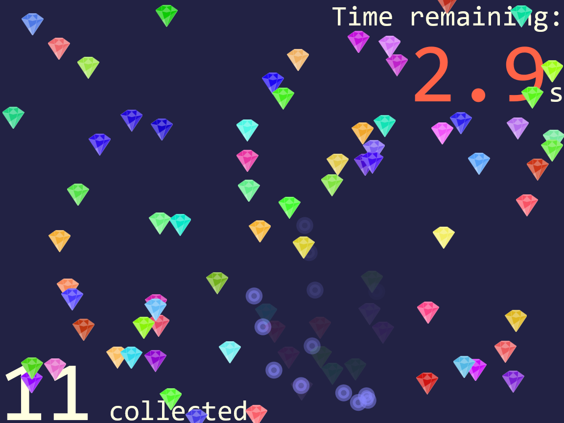
Figure 18-9. A game with additional elements added based on mouse-click positions
You could, of course, also keep count of the number of misses, or generate a net score of some sort. It’s a game—get creative. And be glad that the DOM handles so much of the math for you.
Capturing the Keyboard with JavaScript-Enhanced Links
For the click-counter games, we have been ignoring keyboard accessibility. For certain gameplay structures, keyboards just don’t make sense. But for general website interactivity, keyboard input is essential.
SVG 1 had no ability to handle keyboard controls—none. OK, well, there was an access key feature for the animation elements, but none of the browsers implemented that.
Because SVG 1 had full DOM support, you could react to keypress events, just like you could react to any other event. But you couldn’t control keyboard focus so that those key strokes were directed at a particular element.
The browsers, or most of them, at least added basic keyboard access to links. Keyboard users could tab to the link and activate it with the Enter key.
Warning
Safari, by default, does not make links keyboard accessible—in SVG or HTML. The user needs to turn on an accessibility setting to allow tabbing to links. Most users who prefer keyboard access will know about this, but not all.
Because links can receive focus, and scripts can receive keyboard events from the focused element, you can turn any valid link into a widget that listens for particular keyboard inputs. Just be sure to update the role and any other ARIA attributes so that all users clearly understand how the element functions, and make sure that you’re listening for the correct keyboard actions for that role.
We can therefore adapt Example 18-4 (the interactive stroke-linejoin demo) to reflect that the interactive links used to set the :target styles were really behaving more like buttons (changing the current document) instead of like links (moving to a different location).
The normal keyboard behavior of a button is as follows:
-
You can reach each button by pressing the Tab key.
-
You can activate each button by pressing either the space bar or Enter.
The links have the Tab behavior (in every browser except Safari), and can be activated with Enter. So all we need to add (for most browsers) is space-bar activation.
Tip
To get the correct behavior in Safari, you also need to add the tabindex="0" attribute, which we’ll discuss in the next section.
If the script runs, making the links behave like buttons, it should also add the corresponding ARIA role, so assistive tech will know to call them a button. Example 18-7 provides the additional JavaScript for the demo.
Example 18-7. Making links behave like buttons, with JavaScript event handlers
varxlinkNS="http://www.w3.org/1999/xlink";varoptions=document.getElementsByClassName("option");for(vari=0,n=options.length;i<n;i++){options[i].addEventListener("keypress",spaceActivation);options[i].setAttribute("role","button");}functionspaceActivation(event){if(event.charCode==32){//spacebarvaroption=event.currentTarget;varhref=option.getAttribute("href")||option.getAttributeNS(xlinkNS,"href");if(href){location.assign(href);event.preventDefault();returnfalse;}}}
The elements with class
optionare the links that we are going to turn into buttons.Each is assigned the same event listener to detect space-bar keypresses; the listener function will check the event object each time to determine which link received the event.
Once the listener is assigned, we can update the
roleof the elements tobutton.The
spaceActivation()function gets called for any keypress, but only does anything for space bars. The script doesn’t need to respond to the Enter key (or, for that matter, to mouse clicks or touch taps) because the regular link behavior already works in that case.The
currentTargetof the event is the element that had the event listener added to it; in other words, the option link that received the keyboard event.The function looks up the
hrefvalue for that link, checking first the default-namespace version of the attribute (in case we switch to SVG 2–style links), and then thexlinkversion.If either attribute returned a valid reference, we update the
locationobject (part of the global scope for the window) accordingly.Finally, because we’ve successfully handled the space-bar press, we cancel the browser’s normal space-bar behavior (scrolling the web page), using both the modern standard method (
preventDefault()) and the older compatibility approach (return false).
Of course, now that you have the keypress-capturing script ready, you could do whatever you want with it, not just activate a link. This means you could create general-purpose link buttons that create interactive effects directly, instead of using :target styles to react to the click. Just remember to still give the <a> element a valid target (even if it is just xlink:href="#") so that it is recognized as a functional, focusable link.
You could extend the same method to other types of inputs.
For example, you could create a range slider by listening for arrow keys instead of the space bar. Of course, the ARIA role would be different (slider), and you would probably want to add other ARIA attributes to explain the possible values. And of course you’d also want the slider to be accessible to mouse and touchscreen users, which means more event listeners and JavaScript to detect drag actions.
So, it would be considerably more code. But the basic idea is the same: a dummy link element grabs the keyboard focus, so that you can listen for keyboard inputs.
One limitation, however, is that we are still relying on the links and tab order to control focus in the first place. That means we can’t create proper radio buttons, which is what the buttons in Example 18-4 really should be: a set of choices in a group. But the proper behavior of radio buttons is to use Tab to move focus in and out of the group as a whole, and use arrow keys to switch focus between the individual options. Links cannot (by default) do that.
Controlling the Keyboard with tabindex and focus()
Using links as buttons, with a bit of JavaScript help, solves many use cases—but it is a bit of a hack, and it doesn’t support more complex keyboard-focus control options. Proper control of keyboard focus has long been a requested feature for SVG.
The aborted SVG 1.2 spec added a focusable attribute, with three values: true, false, and auto (the default), meaning do what the browser normally does. However, focusable was only ever implemented in Internet Explorer (and later MS Edge).
Currently, the main use of focusable is to turn off focusability on inline <svg> elements. In Internet Explorer, every <svg> is focusable by default, which can be annoying when that SVG is a noninteractive graphic, and can be really problematic when it is a hidden element used for definitions of symbols, gradients, and so on.
Tip
To fix keyboard focusability in Internet Explorer, add focusable="false" to noninteractive inline <svg> elements, especially hidden SVGs.
SVG 2 deprecates focusable and instead adopts the HTML tabindex attribute. The behavior is the same as HTML: a value of 0 adds an item to the regular tab order; a positive integer value puts it in a priority tab order (not recommended); and a value of -1 makes it focusable by scripts but not by tabbing.
You focus an element from scripts by calling the element’s focus() method (also added to SVG 2). Scripted focus control is used for creating widgets where focus is controlled by the arrow keys, similar to the native behavior of radio button groups or drop-down lists. A tabindex of -1 is also used to deactivate normally focusable elements (links, in SVG) to create a disabled state.
Where supported, these features all work in SVG the same as HTML. So if you want to create custom interactive widgets (such as radio buttons) within a graphic, look up design pattern guidelines for creating keyboard-accessible widgets in HTML, and work from there.
But remember: support is not yet universal, so even well-coded SVG widgets will not be keyboard-accessible everywhere.
Warning
Internet Explorer and other older browsers do not support tabindex and focus() for SVG elements.
MS Edge supports tabindex in inline SVG but not in embedded or standalone SVG files (as of EdgeHTML version 15), and doesn’t yet support focus().
If you do look up recommendations for making accessible interactive widgets in HTML, the first advice you will (hopefully) find is to use native HTML elements whenever possible. HTML <button>, <input>, and related interactive elements should have keyboard accessibility built in, making your scripts much simpler.
SVG doesn’t have any native input elements other than <a>. But that doesn’t mean that you need to always script your own input widgets, one keypress at a time.
To create the illusion of proper text inputs, drop-down lists, and other inputs in SVG—without having to code all the interaction yourself—you can often borrow fully functioning input elements from HTML and then hide them.
In this approach, the HTML elements are clipped, transparent, or drawn offscreen, but they still handle keyboard (and screen reader) accessibility. You then listen for events on the HTML, and update the SVG display to match. For mouse and touch events, you handle the events directly on the graphic elements, and then update the current value of the HTML elements, if required.
Summary: Interactive SVG
SVG is so much more than an image format. When used on the web, it can be a fully interactive web document. This means you can use it to build games, educational demos, or graphics-heavy web applications of all types.
Unlike HTML, SVG doesn’t come with built-in form input elements. But you can do a lot with the one interactive element you do have—the <a> link—and CSS pseudoclasses. You can do even more by adding JavaScript or by integrating your SVG with interactive HTML elements.
There are pitfalls to watch out for. Browser support for full keyboard focus control is still not great in SVG. The <use> element shadow DOM is not implemented in a cross-browser-compatible way. And the coordinates used by mouse and touch events need to be converted into SVG coordinates using extra DOM methods. But you can work around those obstacles if you plan for them from the beginning.
1 For more on aria-current usage and support, see “Using the aria-current attribute” by Léonie Watson.