Table of Contents for
Using SVG with CSS3 and HTML5
 Using SVG with CSS3 and HTML5
Published by
O'Reilly Media, Inc., 2017
Using SVG with CSS3 and HTML5
Published by
O'Reilly Media, Inc., 2017
- nav
- Cover
- Using SVG with CSS3 and HTML5
- Using SVG with CSS3 and HTML5
- Preface
- I. SVG on the Web
- 1. Graphics from Vectors
- 2. The Big Picture
- 3. A Sense of Style
- 4. Tools of the Trade
- II. Drawing with Markup
- 5. Building Blocks
- 6. Following Your Own Path
- 7. The Art of the Word
- III. Putting Graphics in Their Place
- 8. Scaling Up
- 9. A New Point of View
- 10. Seeing Double
- 11. Transformative Changes
- IV. Artistic Touches
- 12. Filling Up to Full
- 13. Drawing the Lines
- 14. Marking the Way
- 15. Less Is More
- 16. Playing with Pixels
- V. SVG as an Application
- 17. Beyond the Visible
- 18. Drawing on Demand
- 19. Transitioning in Time
- 20. Good Manners
- Index
- About the Authors
- Colophon
Chapter 9. A New Point of View
Chapter 9. Cropping Embedded SVG Files
This chapter discusses ways to control the coordinate system when you embed the SVG in a web page, changing the graphic’s scale or crop, without editing the SVG file. These SVG view options allow you to override the SVG file’s viewBox or preserveAspectRatio by modifying the URL you use to access the SVG file.
There are two ways to apply views:
-
by using a target fragment (the part of the URL after the
#or hash character) to reference theidof a<view>element in the SVG file, or -
by using the SVG view fragment syntax to directly set the view information in the URL.
The chapter also covers a related technique, known as SVG stacks, which also uses URL fragments to activate different versions of the same SVG file.
These techniques only apply to embedded SVG: a separate .svg file that is included as an image or object in the HTML, or an image in the CSS. They cannot be used with inline SVG markup that is part of the main HTML document, since inline SVG does not have its own URL. To change the view of an inline SVG, you need to directly edit the viewBox and preserveAspectRatio attributes, either in the markup or with JavaScript.
Warning
Use of these features is currently limited by a number of bugs and restrictions in WebKit/Safari. Even in other browsers, support for views arrived later than other SVG features; older browsers may not adjust the SVG to the view, particularly when embedding images via CSS. Finally, because they are not widely used, bugs have a bad habit of slipping through browser QA. Test carefully!
Since we’re working with embedded SVG, we’ll also be looking a little more closely at your embedding options (<img>, <object>, and <iframe>), and how they differ now that we’re working with viewBox and scalable SVG. Unfortunately, that also includes how they differ from one browser to another.
In the course of discussing these options, we’ll also introduce nested SVG coordinate systems: <svg> inside <svg>. Thankfully, nested SVG doesn’t have any big browser bugs to warn about.
Alternate Takes, with the <view> Element
The SVG <view> element defines alternate viewBox and preserveAspectRatio options for the graphic. The <view> element does not directly contain any graphics; instead, its attributes will modify those of its parent <svg> element, changing how the rest of the graphic appears within the drawing region.
Views can therefore be used to change the cropping or scaling and alignment of SVG files, according to the needs of the web page using the SVG. But if you’re going to use views for cropping, avoid using percentage lengths in your graphic: changing the viewBox with a <view> also changes the definition of 100% width and height!
Warning
Safari/WebKit does not apply views (as of version 10) for cross-origin file embeds, or embeds from unencrypted (http:) origins. If your web page and SVG aren’t both served from the same HTTPS domain, only use SVG views for nonessential adjustments, where the normal view of the SVG is still an acceptable fallback.
Warning
As mentioned in Chapter 3, WebKit and older Blink browsers ignore target fragments on image URLs specified in CSS files. Only use them in CSS background images for nonessential adjustments.
There can be any number of <view> elements within an SVG; each is distinguished by its id attribute.
The following code defines two views for one of our card-suit icons. The first expands the 20×20 viewBox to add an extra unit of padding space (in the scaled coordinate system) on all sides; the second overrides the default aspect-ratio control:
<viewid="padding"viewBox="-1 -1 22 22"/><viewid="stretch"preserveAspectRatio="none"/>
Any view attributes not specified in the <view> element are taken from the <svg> itself—or from the default values, if the <svg> does not have the attributes either. So, for the padding <view>, the preserveAspectRatio option won’t be changed, and for the stretch <view>, the viewBox will have the dimensions set for the main SVG.
Warning
Or at least, that’s how it’s supposed to work. A bug in recent versions of Chrome (from approximately version 42 to at least 59) means that you must always specify viewBox on the <view> element. The second view should therefore be:
<viewid="stretch"viewBox="0 0 20 20"preserveAspectRatio="none"/>
You use a view by adding a target fragment to the file URL, referencing the ID of the <view> element. For example, you could specify the view ID when embedding an SVG image in HTML:
<imgsrc="club.svg#stretch"/>
Alternatively, you could link to the SVG file, so that it will be opened directly in the browser. The following HTML link would open the graphic in the frame with the browsing context name frame1 (if it currently exists in the web page, or as another tab or window) or in a new tab/window otherwise:
<ahref="club.svg#padding"target="frame1">Show the icon</a>
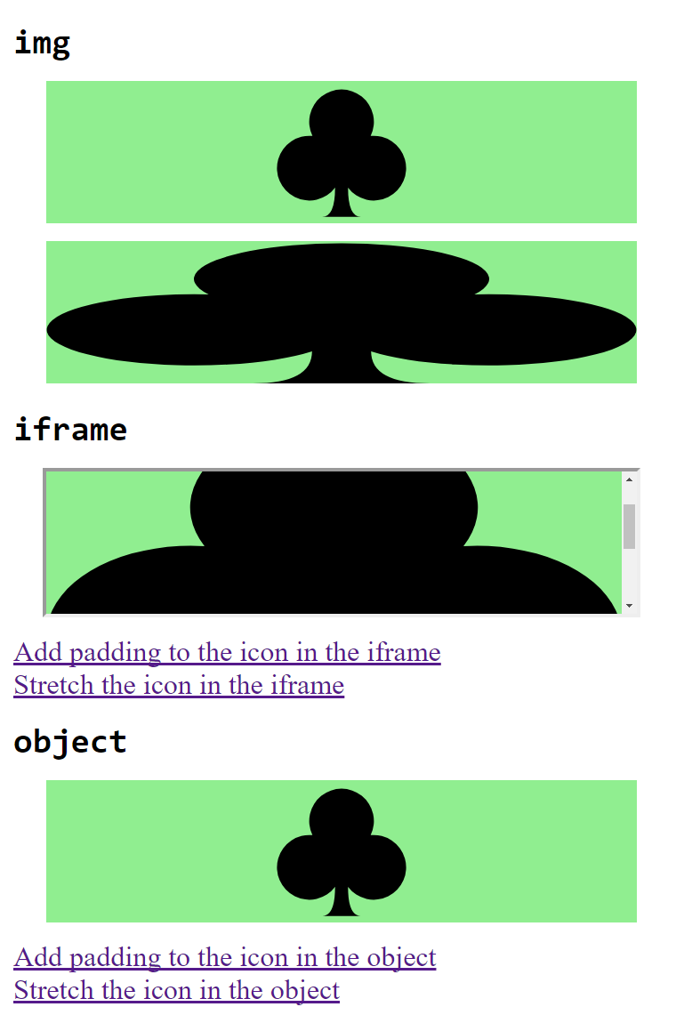
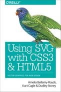
Figure 9-1. A web page using SVG views, some of which can be changed dynamically
Example 9-1 uses all these snippets to create different views of a single icon file. The resulting web page—as it appears after some of the links have been followed—is displayed in Figure 9-1.
Example 9-1. Using an SVG with multiple views in a web page
SVG file: club-alternate-views.svg
<svgxmlns="http://www.w3.org/2000/svg"xml:lang="en"viewBox="0 0 20 20"width="100%"height="200px"><title>Club, with alternate views</title><viewid="padding"viewBox="-1 -1 22 22"/><viewid="stretch"viewBox="0 0 20 20"preserveAspectRatio="none"/><pathfill="black"d="M9,15.5 A5,5 0 1 1 5.5,7.5 A5,5 0 1 1 14.5,7.5 A5,5 0 1 1 11,15.5 Q11,20 13,20 H7 Q9,20 9,15.5Z"/></svg>

We’ve mixed up the
widthandheightin the SVG file to be a mix of percentage and absolute values, so you can see all the scaling effects.
The
<view>elements are as described in the text.
The
<path>is the one from Example 6-4, but compacted into fewer lines of code.
HTML markup:
<!DOCTYPE html><htmllang="en"><head><metacharset="utf-8"/><title>Different views of an SVG</title><style>img,iframe,object{display:block;width:90%;height:80px;margin:10pxauto;background-color:lightgreen;}h2{margin:0.3em00;}a{display:block;}</style></head><body><h2><code>img</code></h2><imgsrc="club-alternate-views.svg#padding"/><imgsrc="club-alternate-views.svg#stretch"/><h2><code>iframe</code></h2><iframename="frame1"src="club-alternate-views.svg"></iframe><ahref="club-alternate-views.svg#padding"target="frame1">Add padding to the icon in the iframe</a><ahref="club-alternate-views.svg#stretch"target="frame1">Stretch the icon in the iframe</a><h2><code>object</code></h2><objectname="object1"type="image/svg+xml"data="club-alternate-views.svg"></object><ahref="club-alternate-views.svg#padding"target="object1">Add padding to the icon in the object</a><ahref="club-alternate-views.svg#stretch"target="object1">Stretch the icon in the object</a></body></html>
The
nameattribute on the<iframe>defines the browsing context name for the embedded document.The
targetattribute on the links matches the declared name on the<iframe>.The
<object>also has a declared browsing context name, as well as atypethat indicates this object should always contain SVG.
If you test out Example 9-1 in multiple web browsers, you will discover a few disagreements (in addition to the Chrome bug that we already adjusted the code for).
In most browsers (Chrome, Edge, IE, and older versions of Firefox), the SVG inside the <iframe> does not scale to fit the available size of the frame; instead, it is sized according to the 200px-tall height from the SVG file, and scroll bars are added to the frame. Figure 9-1 shows this result, in Chrome 58.
Warning
Safari and recent versions of Firefox (starting with 51) do not use scroll bars on an SVG in an <iframe>. Instead, they ignore the width and height from the SVG file, so that an SVG in an <iframe> scales just like one in an object.
In contrast, when <object> has a fixed width and height, like in this demo, an SVG with a viewBox will be adjusted to fit within the object; the height and width attributes on the <svg> in the file are always ignored. This is consistent across browsers, and means that SVG in objects scale like SVG in <img> tags, so long as a viewBox is included.
The improved cross-browser consistency is one reason that this book mostly recommends <object> for embedding interactive SVG, instead of <iframe>. Unfortunately, for this example, <object> has its own browser bug:
Warning
Internet Explorer and MS Edge do not support the name attribute to create a browsing context name for an <object> element (as opposed to an <iframe>). The links open in a separate browser tab.
If you need the consistent scaling of <object>, but still want links to replace the embedded SVG document, you could use JavaScript to override the normal link activation behavior, directly changing the object’s data source. But you’ll need to use some very careful browser sniffing if you go this route—while writing up a sample script, I discovered that Chrome (versions 57 to 59, anyway) can freeze completely if you try to change an <object> element’s data source from JavaScript to point to a <view> of the original file!
Another important difference between <object> and <iframe> is that an <iframe> can be sandboxed (restricted) in modern browsers. This can be important if you’re embedding documents you don’t fully control. Adding a sandbox attribute to an <iframe> applies a long list of security restrictions on the embedded file. The value of the sandbox attribute is a list of permissions that are explicitly granted, like allow-scripts or allow-top-navigation.
If you are embedding interactive SVG files from other domains that you don’t control, using a sandboxed <iframe> may be worth the hassle of dealing with cross-browser scaling inconsistencies.
Rescaling on the Fly, with SVG View Fragments
Alternate views created with a <view> element are known as predefined views. The author of the SVG file has specifically defined them within the SVG markup.
However, web page authors can also create custom views of an SVG when they embed the SVG, without having to alter the SVG file itself. This view is instead defined with a special URL syntax, called SVG view fragments.
The SVG view fragments are used instead of an element ID in the fragment part of the URL (after the # character). The structure is as follows:
fileURL#svgView(attributeName(value))
The attributeName would be one of the attributes that control the view, such as viewBox or preserveAspectRatio. The value would be the value that you would use for that attribute.
Warning
To accommodate software that does not support whitespace within URL target fragments, the SVG 1.1 specifications suggested that you use commas (,) to separate parts of the attribute value. This works fine for viewBox, for which the numbers can always be separated by commas instead of whitespace. However, it is problematic for preserveAspectRatio values like xMinYMax slice.
After trying various alternatives (using a comma, using the %20 URL code for the space character, and omitting the spacing entirely), we found that the only option that was supported in all current browsers was using an actual space character in the URL.
In addition to viewBox and preserveAspectRatio, the other allowed attribute names are:
-
transform, which adds an extra coordinate system transformation to the SVG element; this value syntax is the same as the attribute we’ll discuss in Chapter 11, but browsers have some problematic inconsistencies in how thesvgViewtransformation interacts with transformations andviewBox. -
zoomAndPan, which tells the SVG viewer whether to disable zooming, but has no effect in current web browsers. -
viewTarget, which indicates theidof the element that would be the target, if you weren’t busy changing the view; it also has no effect in current browsers.
To specify multiple view attributes in the same fragment, separate them with semicolons, as follows:
fileURL#svgView(attributeName(value);attributeName(value))
To show how SVG view fragments can be useful, we’re going to adapt Example 9-1 so that it shows the heart icon instead of the club. However, instead of creating a custom SVG file, we’ll directly reuse the original 20px-square heart icon file from Example 6-2 in Chapter 6.
We won’t reprint all the code here, because it is a simple find-and-replace change from Example 9-1.
Wherever the original code referenced "club-alternate-views.svg#padding", the new code uses:
"heart.svg#svgView(viewBox(-1,-1,22,22))"
Wherever the original code referenced "club-alternate-views.svg#stretch", the new code uses:
"heart.svg#svgView(viewBox(0,0,20,20);preserveAspectRatio(none))"
The resulting web page (after following some of the links) is shown in Figure 9-2.
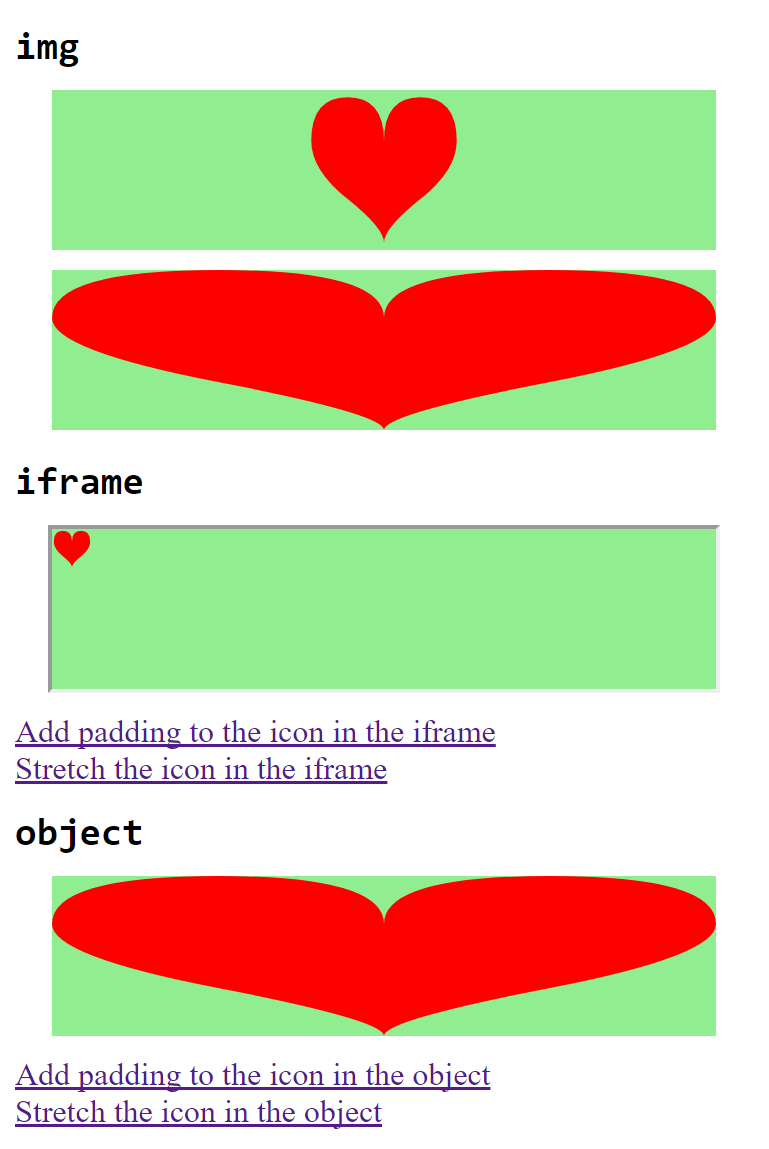
Figure 9-2. A web page using SVG view fragments to modify an existing file
As with the <view> element, any parameters not specified in the SVG view fragment are taken from the values on the <svg> element (or the defaults).
Warning
Blink browsers prior to Chromium version 42 (mid-2015) incorrectly ignored all view attributes from the <svg> when an SVG view fragment is used; for consistent cross-browser results, include all the nondefault attributes in the fragment.
In this case, the original file from Example 6-2 did not contain any viewBox attributes, so it is always explicitly specified in order to trigger scaling.
As with Example 9-1, the sizing for the <iframe> varies by browser: Figure 9-2 is from Chrome, and uses the 20px width and height defined in the original file. The aspect ratio is therefore never distorted, and the padding only adds a single pixel between the heart and the frame.
In contrast, the SVG-as-object fits to the <object> element size, once the view fragment gives it a viewBox.
Interactive Views
The code in Example 9-1 used HTML links to trigger the new views. There is also an <a> link element in SVG, which can be used to link out to other files or to link to a targeted view (predefined or via #svgView() notation) in the same file. The link reference is indicated with a xlink:href attribute, but it is otherwise similar to HTML.
Tip
An SVG <a> element is a generic grouping element that can contain either text or graphics. We’ll discuss more about SVG links in Chapter 18.
By default, an SVG link will update the file that contains it, whether that is inside an <object>, <iframe>, or the main tab. That means you can link to a <view> in the same file without repeating the filename, as in Example 9-2, which creates an SVG that can zoom in on itself—and then back out again. Figure 9-3 shows both views of the drawing.
Figure 9-3. An interactive SVG, before and after being zoomed in to a view
Example 9-2. Using SVG links and views to create interactive zooming
<svgxmlns="http://www.w3.org/2000/svg"xml:lang="en"xmlns:xlink="http://www.w3.org/1999/xlink"id="top"height="200px"width="200px"viewBox="0,0 100,100"><title>Zoomable Interactive SVG</title><style>text{font:15pxSnapITC,Ravie,Markerfelt,Impact,sans-serif;text-anchor:middle;}texta{fill:indigo;}</style><rectwidth="100"height="100"fill="lightBlue"/><pathfill="palevioletred"d="M40,50 C-20,45 15,25 20,20 S45,-20 50,40 C55,-20 75,15 80,20 S120,45 60,50 C120,55 85,75 80,80 S55,120 50,60 C45,120 25,85 20,80 S-20,55 40,50 Z"/><circlefill="gold"stroke="gold"stroke-width="3"stroke-dasharray="0.4 3"stroke-linecap="round"cx="50"cy="50"r="8"/><texty="100"dy="-0.5em"x="50"><axlink:href="#zoom">Zoom in!</a></text><viewid="zoom"viewBox="40,40 20,20"/><texty="50"dy="0.5ex"x="50"style="font-size: 3px"><axlink:href="#top">Zoom out!</a></text></svg>
The
<svg>has a 100×100viewBox, and theidoftop.The backdrop rectangle (and the rest of the graphic) is sized with absolute lengths, not percentages, so it won’t move around when we change the
viewBoxsize.The flower petals are a single
<path>element. Each petal is a 90° rotation of the previous—so it would have been a lot easier to define if the bearing command from SVG 2 was supported anywhere.
The lobed pattern on the center of the flower, in contrast, was created from a simple
<circle>and a lot of fancy stroke properties—which you’ll learn all about in Chapter 13.
The
<a>link with the “Zoom in!” text points to an element with theidofzoom.
That
idis located on the<view>element, which defines a newviewBoxthat is 20×20 units, centered around the center of the flower.
That conveniently happens to be where we drew the “Zoom out!” link, in a much smaller
font-size. This link points back to the root<svg>element.
If this SVG were used in an interactive environment (e.g., embedded as an <object>), clicking on the “Zoom in!” text would cause the graphic to do just that, switching to the cropped view. Clicking on “Zoom out!” would change the target fragment, cancelling the view—and zooming back to the original scale. Of course, to be interactive, the SVG would need to be embedded in an <object> or <iframe> (not an <img>).
Packaged Deals
The view examples so far have focused on fine-tuning the display of a single graphic. The rest of the chapter looks at ways to pack multiple graphics into a single SVG file—and then use URL fragments to show only one at a time.
The <view> element is key to one of the ways to create a single SVG file with many icons within it. As we mentioned briefly in “Using SVG Images Within CSS” in Chapter 3, an image sprite file is one in which a set of icons is laid out in a neat grid format; you then show only one cell in that grid at a time.
Sprites reduce the number of files the browser downloads from the web server, which can speed up page load times, and allow the Gzip compression algorithm to condense repeated markup from one icon to the next.
Traditional CSS sprites require you to coordinate your sprite layout with CSS properties that crop the image when it is used. With SVG views, you can predefine the cropping coordinates for each icon within the SVG file, and use the sprites anywhere you can use an image URL with a target fragment.
Warning
Sprites don’t qualify as “nonessential adjustments” of an image, so you’ll need to keep the browser support limitations in mind: use them in <img> or <object>, not CSS background images, and only if both the SVG and the HTML page will be served from the same secure domain.
With this approach, we can create a single file with all four of the card-suit icons.
If you were drawing the icons in a graphics program, you could use rulers or guidelines to divide up the file into your different icon regions, exactly matching the coordinates you’ll use for your views.
Since we already have all our shapes drawn to appear in a 20×20 region, we want to shift them in the main graphic without redefining the coordinates. One way to do this would be to use coordinate system transformations, as we’ll show in Chapter 11. For now, we’ll take a different approach: defining local coordinate systems with nested <svg> elements.
In an SVG graphic, you can always create a nested coordinate system simply by introducing a new <svg> element. Nested SVGs have x, y, width, and height attributes that define the rectangle in which the new coordinate system will be fit.
The nested <svg> can also have viewBox and preserveAspectRatio attributes to create a custom coordinate system, the same as for a root SVG. All graphical elements contained within the nested <svg> element will be drawn in the new coordinate system.
Tip
By default, x and y are 0, width and height are 100%, and there is no viewBox scaling. So, by default, your nested SVG exactly matches the parent coordinate system.
Some points to consider when using nested SVGs:
-
If you don’t include a
viewBox, a default coordinate system is created in which the length of the user units is the same as for the parent SVG. However, the origin is reset to the top-left corner of the nested SVG (defined byxandy) and percentages are reset to use the nested SVG’swidthandheight. -
If the parent SVG used
preserveAspectRatio= "none", the vertical and horizontal units used to establish the new coordinate system may not be equal. The aspect ratio of the new coordinate system will be evaluated according to the length in parent units, not according to the actual displayed aspect ratio.In other words, it is impossible to “reset” aspect ratio control once it has been turned off.
-
By default, any content that extends outside the width and height of the nested
<svg>will be clipped. You can change this behavior by setting the CSSoverflowproperty (or presentation attribute) tovisible.
Warning
When using <view> elements with nested <svg> elements, do not nest the <view> inside the inner <svg> regions. The SVG specifications were not clear about how a <view> within a nested <svg> should be interpreted, and each browser handles it differently.
Instead, use a <view> as a sibling to the <svg>, with its viewBox matching the x, y, width, and height on the paired <svg>. The coordinates in the view’s viewBox apply to the top-level SVG, not the nested coordinate system.
As we warned at the top of the chapter, when using views to crop an SVG (changing the viewBox width and height), don’t use percentages that depend on the main SVG’s dimensions. That means: don’t use percentages to lay out your nested <svg> elements. However, you can safely use percentages inside the nested coordinate systems, because they have their own viewBox context.
With all that advice in mind,
Example 9-3 takes the four suit icons from Chapter 6 and arranges them in a grid within a single SVG file, using nested <svg> elements. For each icon, a <view> element is defined that sets the viewBox so it will show only that icon.
Example 9-3. Using views and nested SVGs to arrange multiple icons in a single file
<svgxmlns="http://www.w3.org/2000/svg"xml:lang="en"width="400px"height="400px"viewBox="0 0 200 200"><title>Card Suits</title><viewid="diamond"viewBox="0 0 100 100"/><svgheight="100"width="100"viewBox="0 0 20 20"><title>Diamond</title><pathfill="red"d="M3,10L10,0 17,10 10,20ZM9,11L10,18V10H15L11,9 10,2V10H5Z"/></svg><viewid="club"viewBox="100 0 100 100"/><svgx="100"y="0"height="100"width="100"viewBox="0 0 20 20"><title>Club</title><pathfill="black"d="M9,15.5A5,5 0 1 1 5.5, 7.5A5,5 0 1 1 14.5, 7.5A5,5 0 1 1 11, 15.5Q11,20 13,20H7Q9,20 9,15.5Z"/></svg><viewid="spade"viewBox="0 100 100 100"/><svgx="0"y="100"height="100"width="100"viewBox="0 0 20 20"><title>Spade</title><pathfill="black"d="M9,15C9,20 0,21 0,16S6,9 10,0C14,9 20,11 20,16S11,20 11,15Q11,20 13,20H7Q9,20 9,15Z"/></svg><viewid="heart"viewBox="100 100 100 100"/><svgx="100"y="100"height="100"width="100"viewBox="0 0 20 20"><title>Heart</title><pathfill="red"d="M10,6 Q10,0 15,0T20,6Q20,10 15,14T10,20Q10,18 5,14T0,6Q0,0 5,0T10,6Z"/></svg></svg>
The default view of the SVG file—with all four icons visible—is shown in Figure 9-4.
The SVG file from Example 9-3 can be used to display the icons in HTML <img> or <object> elements. You’d display individual icons by adding the target fragment (#heart, #spade, etc.) to the URL.

Figure 9-4. An SVG icon sprite
Example 9-4 creates a sample website that does just that, using the icons as images in HTML. It uses the icons both as inline icons and as illustrations, adding CSS background, borders, and padding to the <img> element to create a different appearance for the larger figures. Figure 9-5 shows the result.
Figure 9-5. A web page with many images that all come from one image file
Example 9-4. Using an SVG view sprite within a web page
HTML markup:
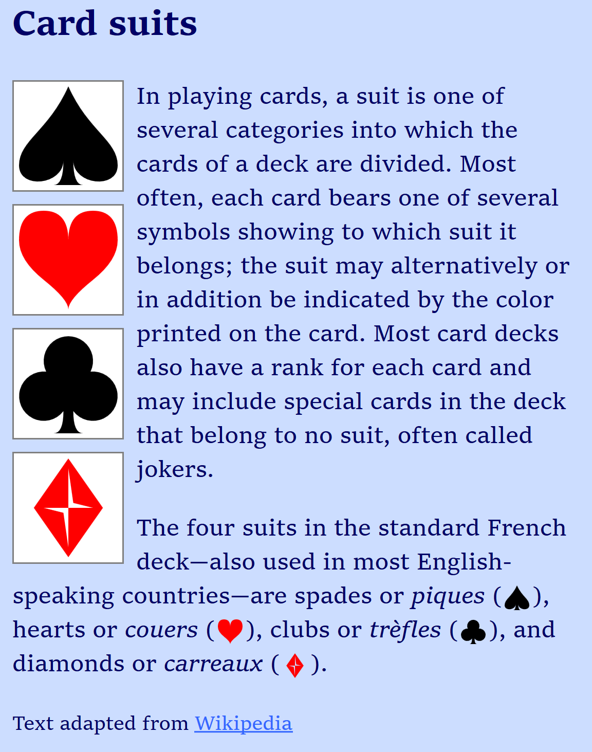
<!DOCTYPE html><htmllang="en"><head><metacharset="utf-8"/><title>Using SVG Icons from a Sprite Sheet with Views</title><linkrel="stylesheet"href="sprites-suits.css"/></head><body><h2>Card suits</h2><figurerole="img"aria-label="The four card suits"><imgclass="icon float big"src="suits-views.svg#spade"><imgclass="icon float big"src="suits-views.svg#heart"><imgclass="icon float big"src="suits-views.svg#club"><imgclass="icon float big"src="suits-views.svg#diamond"></figure><p>In playing cards, a suit is one of several categories into which the cards of a deck are divided. Most often, each card bears one of several symbols showing to which suit it belongs; the suit may alternatively or in addition be indicated by the color printed on the card. Most card decks also have a rank for each card and may include special cards in the deck that belong to no suit, often called jokers.</p><p>The four suits in the standard French deck—also used in most English-speaking countries—are spades or<ilang="fr">piques</i>(<imgclass="icon inline"src="suits-views.svg#spade"alt="a black spade"width="16"height="16"/>),hearts or<ilang="fr">couers</i>(<imgclass="icon inline"src="suits-views.svg#heart"alt="a red heart"width="16"height="16"/>), clubs or<ilang="fr">trèfles</i>(<imgclass="icon inline"src="suits-views.svg#club"alt="a black club"width="16"height="16"/>), and diamonds or<ilang="fr">carreaux</i>(<imgclass="icon inline"src="suits-views.svg#diamond"alt="a red diamond"width="16"height="16"/>).</p><small>Text adapted from<ahref="http://en.wikipedia.org/wiki/Suit_(cards)">Wikipedia</a></small></body></html>
The
roleandaria-labelon the<figure>element tell the browser to treat the four graphics as a single image for accessibility purposes—while still allowing us the layout flexibility of having four separate<img>elements.The inline images, in contrast, each have their own
alttext.
CSS styles: sprites-suits.css
body{font-family:serif;background-color:#CDF;}figure{padding:0;margin:0;}.icon{width:1em;height:1em;}.icon.big{width:4em;height:4em;}.icon.float{display:block;float:left;clear:left;margin:00.5em0.5em0;padding:0.2em;border:graysolidthin;background-color:white;}.icon.inline{display:inline;vertical-align:middle;padding:0.1em;}
There are two different types of icons used in the web page—large floated graphics and the inline icons in the text—but the styling is controlled by a set of logically independent classes.
The position and layout of each icon is controlled by one of the classes inline or float. The float class also adds the border, background, and padding for the illustrations.
The size of each icon is by default 1em square, but is enlarged to 4em square with the big class.
However, the intrinsic size of our SVG, defined by the width and height in our suits-views.svg file (Example 9-3) is 400px square. If our CSS doesn’t load, that’s the size that we’ll get. That would be mildly problematic for the floated figures, but it would completely ruin the inline layout. To prevent that, we give the inline images a default width and height of 16 (meaning 16px) in the markup.
Tip
The width and height attributes on HTML <img> elements only accept integer values, for the number of pixels. Just like SVG presentation attributes, they will be overridden by any CSS width and height properties on the element.
Even if the layout of the web page were much more flexible, you would still usually need to set both width and height on the images, controlling the aspect ratio to match the view.
If you don’t, you may find that your helpful sprites turn into troublesome imps, sneaking in where they don’t belong.
Example 9-5 gives the code for a (very basic) web page layout where each icon is drawn within a fixed-height image that stretches according to the width of the page. Figure 9-6 shows the result.
Example 9-5. Using an SVG view sprite, without constraining the image dimensions to the aspect ratio
HTML markup:
<!DOCTYPE html><htmllang="en"><head><title>SVG views, in Flexibly-Sized Images</title><style>img{display:block;width:90%;height:80px;margin:10pxauto;background-color:lightgreen;}</style></head><body><code>#diamond</code><imgsrc="suits-views.svg#diamond"/><code>#heart</code><imgsrc="suits-views.svg#heart"/><code>#club</code><imgsrc="suits-views.svg#club"/><code>#spade</code><imgsrc="suits-views.svg#spade"/></body></html>
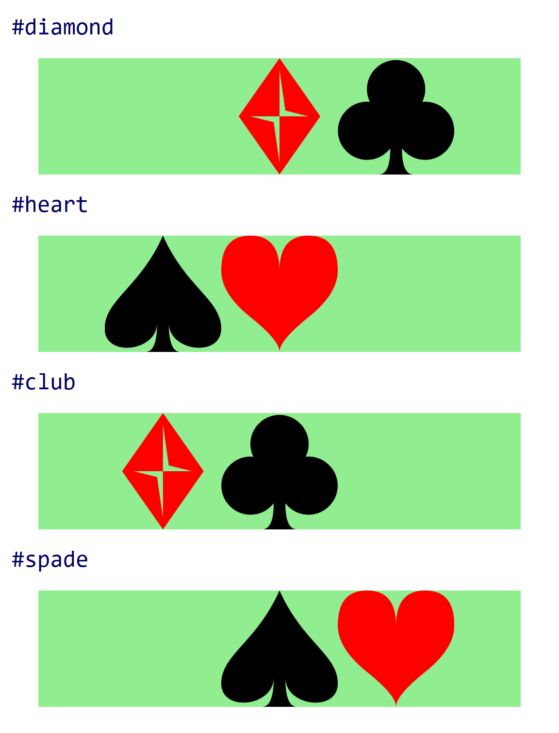
Figure 9-6. An SVG icon sprite used in a web page, without clipping to the icon dimensions
The extra icons appear because the (default) meet value for preserveAspectRatio creates a view that only takes up part of the available drawing space when the aspect ratio doesn’t match.
The viewBox for each <view> ensures that the selected icon will scale to fit the drawing region, and it will be centered within the image. However, it does not clip the content to that view. The CSS overflow property doesn’t help. Hiding overflow only clips to the drawing region for the <svg>, not to the viewBox.
Ideally, you could use auto sizing to let the browser size the image to match the view. Nearly all browsers support autosizing of SVG in <img> and <object>, using the viewBox to determine the intrinsic aspect ratio of the image when you set height or width but not both. This should mean that the browser will automatically clip the image to the specified view.
Unfortunately, this cannot be used reliably in practice:
Warning
When you use an SVG view to reset the viewBox, web browsers currently do not update the intrinsic aspect ratio that is used for auto height and width. Instead, they use the aspect ratio from the viewBox on the root <svg> to set the image size, and use the view only for scaling.
In the SVG from Example 9-3, the aspect ratio of the image as a whole (200:200) is equal to the aspect ratio of the individual views (100:100). As a result, for this particular case you can safely use views and autosizing in all browsers. With a fixed height and width: auto, each image would become a square, cropped to the correct icon.
But if you know the aspect ratio in advance, you could just set the width to match.
For the more general case, a different approach is needed to ensure that only one icon is displayed at a time.
One option is to space the icons out with lots of whitespace in between: unlike with PNG sprites, this does not add to the SVG file size. However, it is difficult to know in advance how much space you would need, and the extra size can lead to extra memory requirements in some browsers, which rasterize the entire image even if only part is displayed.
The other strategy would be to use the CSS :target pseudoclass to only show each graphic when the correct view is targeted. The following CSS code, if added to Example 9-3, would hide the icons unless the correct <view> (the previous sibling in the document) was in effect:
view:not(:target)+svg{display:none;}
Warning
Older versions of Firefox (prior to 39) did not apply the :target pseudoclass for <view> element targets.
SVG 1 defined a viewTarget attribute for <view> elements that would allow you to specify the logical “target” element for a view: that is, the drawing element(s) that are visually emphasized by the view. The value of viewTarget would be one or more element id values:
<viewid="diamond"viewBox="0 0 100 100"viewTarget="diamondsvg"/><svgid="diamondsvg"viewBox="0 0 20 20"height="100"width="100">
The original specifications suggested that this could be somehow used directly to style the targeted element. But that was never implemented in browsers; the sibling-selector (+ or ~) approach is the only one that works.
Note
Current drafts of SVG 2 have dropped viewTarget. This reduces some of the semantic logic of views, but doesn’t actually remove any functionality in browsers.
Showing and hiding graphics with :target styles can also be used without <view> elements, with a URL that targets the graphical content directly. This is the basis of an SVG stack file.
Flat Pack Stacks
If only one icon will be displayed at any time—because of :target styles—you don’t really need to space them out into a sprite grid. Instead, you can stack them all on top of each other, as layers in the same coordinate space—an SVG stack file.
By stacking all your icons in the same region of your SVG, you avoid having to change the viewBox to switch from one to the other. But it means that all the icons need to be drawn to fit in the same viewBox dimensions.
Of course, you would not normally see them stacked together in the browser. The :target style hides nontargeted graphics, so if you open the file in a browser without using a target fragment, you wouldn’t see anything at all. But for many designers, it can be easier to work with stacked icons in a graphics program. The software’s layers feature can hide or show each icon, so the designer can ensure that they are all neatly aligned in the same width and height.
Figure 9-7. An SVG stack used in a web page
Example 9-6 redefines the card-suit set so that it uses the SVG stack structure. Figure 9-7 shows the result when this file is used in the web page from Example 9-5.
Example 9-6. Using :target styles to stack multiple icons in a single file
<svgxmlns="http://www.w3.org/2000/svg"xml:lang="en"width="100px"height="100px"viewBox="0 0 20 20"><title>Card Suits</title><styletype="text/css">svg>svg:not(:target){display:none;}</style><svgid="diamond"><title>Diamond</title><pathfill="red"d="M3,10L10,0 17,10 10,20Z M9,11L10,18V10H15L11,9 10,2V10H5Z"/></svg><svgid="club"><title>Club</title><pathfill="black"d="M9,15.5A5,5 0 1 1 5.5, 7.5 A5,5 0 1 1 14.5, 7.5A5,5 0 1 1 11, 15.5 Q11,20 13,20H7Q9,20 9,15.5Z"/></svg><svgid="spade"><title>Spade</title><pathfill="black"d="M9,15C9,20 0,21 0,16S6,9 10,0C14,9 20,11 20,16 S11,20 11,15Q11,20 13,20H7Q9,20 9,15Z"/></svg><svgid="heart"><title>Heart</title><pathfill="red"d="M10,6 Q10,0 15,0T20,6Q20,10 15,14 T10,20Q10,18 5,14T0,6Q0,0 5,0T10,6Z"/></svg></svg>
The
viewBoxon the parent SVG has been reset to the dimensions of a single icon.The style rule hides all the nested SVGs unless they are the target of a URL fragment.
The
idvalues have been moved to the nested<svg>elements.The
xandyattributes have been removed from the subsequent<svg>elements, so all the icons appear in the same place.Similarly, the
heightandwidthattributes have been removed so that each nested SVG takes up the full (100%) space of the parent SVG. In fact, you don’t even need to use nested SVGs anymore, since you’re not creating nested coordinate systems—the results would be the same with<g>elements.
The use of a :not() selector ensures that programs that don’t recognize the :target pseudoclass (such as graphics editors) will display all the content.
Figure 9-8 shows what the file looks like in Inkscape, with all layers visible.
Figure 9-8. An SVG stack, as it appears in a graphics editor
Although SVG stacks perform better than SVG view sprites in this example, the choice between them is not always straightforward. Here are the main differences:
-
SVG view sprites, with each icon arranged in a grid, are easy to work with in a browser, since you can see all the icons at once; stacks require a graphics program that can show and hide individual layers as you work.
-
You can also use view sprites with CSS background images, without target fragments, by using
background-sizeandbackground-positionto display the correct portion of the file. This has almost-universal browser support, although you needwidthandheightin your SVG file, and even then some older WebKit (Android) browsers have bugs withbackground-positionand SVG.In contrast, stacks do not display anything if target fragments are not supported by the browser, and so cannot reliably be used in CSS.
-
In a sprite file, the individual icons can be different sizes or aspect ratios, so long as you don’t need the browser to autosize the element based on aspect ratio; stacks use a single
viewBoxfor all icons. -
For sprites, you need to externally clip the image to the chosen icon; stacks use
:targetstyles to hide the extra content.
Both stacks and sprites are ways to compile multiple icons in a single file, when that file will be used as an image (or embedded object) in a web page. Because they rely on the URL target fragment, they only work when you are embedding SVG by URL reference.
When you’re using inline SVG in HTML—or when using icons within a larger SVG file—a different approach is required. Chapter 10 will explore how icons and other content can be reused within a single document.
Summary: Cropping Embedded SVG Files
The SVG viewBox and preserveAspectRatio options we introduced in Chapter 8 let you control the cropping and alignment of the SVG graphic. But often the exact crop and alignment you need will change each time you use a file. SVG files allow you to dynamically adjust these parameters when you use the SVG, by altering the target fragment of the URL you use to reference the SVG file.
There are two approaches to views: predefined views, created with <view> elements in the SVG file and referenced by ID, or SVG view fragments, where all the view parameters are set in the URL. A related technique is the SVG stack method, which uses URL target fragments to hide or show content using the CSS :target pseudoclass.
There are a number of browser inconsistencies and support limitations to keep in mind when you’re using views. The most practical use case is for slight adjustments where the graphic will still look acceptable if the view isn’t applied: padding or cropping an image, or changing the preserveAspectRatio alignment.
More complex subsetting of images, using views or :target styles, are currently only recommended where support is good: within <img> or <object> tags, for same-origin embeds on secure domains.