Table of Contents for
Using SVG with CSS3 and HTML5
 Using SVG with CSS3 and HTML5
Published by
O'Reilly Media, Inc., 2017
Using SVG with CSS3 and HTML5
Published by
O'Reilly Media, Inc., 2017
- nav
- Cover
- Using SVG with CSS3 and HTML5
- Using SVG with CSS3 and HTML5
- Preface
- I. SVG on the Web
- 1. Graphics from Vectors
- 2. The Big Picture
- 3. A Sense of Style
- 4. Tools of the Trade
- II. Drawing with Markup
- 5. Building Blocks
- 6. Following Your Own Path
- 7. The Art of the Word
- III. Putting Graphics in Their Place
- 8. Scaling Up
- 9. A New Point of View
- 10. Seeing Double
- 11. Transformative Changes
- IV. Artistic Touches
- 12. Filling Up to Full
- 13. Drawing the Lines
- 14. Marking the Way
- 15. Less Is More
- 16. Playing with Pixels
- V. SVG as an Application
- 17. Beyond the Visible
- 18. Drawing on Demand
- 19. Transitioning in Time
- 20. Good Manners
- Index
- About the Authors
- Colophon
Chapter 13. Drawing the Lines
Chapter 13. Stroke Effects
Throughout the book, we have used the stroke property to draw outlines around a shape (or text). In this chapter, we will explore the full possibilities of strokes.
At first glance, it may not seem that there are a lot of possibilities for a stroke. It’s just an outline, right?
It can be, but it doesn’t have to be. A stroke is really a secondary shape, built upon the element that defines it. When that stroke is only a single pixel wide, it is easy to figure out where those pixels should go. But as strokes get thicker, they create multiple options for how the stroke’s geometry should relate to the underlying shape’s geometry, at corners and at line ends.
You can also change up the geometry of the stroke more directly, by breaking it into a dash pattern. This can be used to create a number of patterns and effects, beyond simple dashed lines.
Once you have a stroke shape (dashed or otherwise), you need to decide how to color it in. Just like with the fill shape, you have a choice of a solid color, semitransparent color, or a complex paint server—gradients and patterns. The options are mostly the same as fill, but with a few extra complications.
Different Strokes
In the simple case, a stroke is a continuous outline around the shape, drawn in a single color.
Except…even that isn’t always simple. The wider a stroke gets, the more you start to notice the details of how it is constructed.
A Simple Stroke to Start
There are three stroke-related properties that we have introduced so far: stroke, stroke-width, and stroke-opacity. With these, we’ve drawn solid-colored strokes of various sizes and degrees of transparency. All three can be set as presentation attributes or style declarations, and all three inherit by default.
The stroke property controls whether the stroke is painted at all; by default its value is none. All other stroke values create a stroke, by specifying what it will be painted with.
The syntax is the same as for fill: a color value or a url() reference to a paint server element. Paint server references can have an optional fallback color:
stroke:none;stroke:rgba(100%,30%,50%,0.7);stroke:url(#pink-polka-dots)hotPink;
The stroke-width property controls the thickness of the stroke, expressed as a number of user units, a length with units, or a percentage:
stroke-width:10px;stroke-width:0.5em;stroke-width:5%;
The default stroke-width is 1px (scaled to the current user-unit size). A value of 0 would look the same as stroke: none, but would create some added complications when you’re using markers (Chapter 14) or pointer-events (Chapter 18).
Warning
Although unitless numbers are valid (stroke-width: 3), MS Edge does not currently support them in CSS animations and transitions. Use px units instead.
The stroke-opacity property is directly comparable to fill-opacity. It makes the color or stroke paint content transparent. By default, the value is 1, which creates an opaque stroke.
stroke-opacity:1;stroke-opacity:0.5;
A stroke-opacity of 0 would again look like no stroke at all, but would work differently for pointer-events.
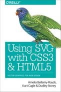
We use all three of these properties in Example 13-1, to stroke a circle (with a thick, semitransparent stroke) and a polygon (with a thin, solid stroke). Figure 13-1 shows the result.
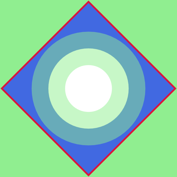
Figure 13-1. Thick and thin strokes on round and square shapes
Example 13-1. Stroking shapes with various styles
<svgxmlns="http://www.w3.org/2000/svg"xml:lang="en"width="200"height="200"viewBox="-100 -100 200 200"style="background-color: lightGreen"><title>Stroking Shapes</title><polygonpoints="-98,0 0,-98 98,0 0,98"fill="royalBlue"stroke="crimson"stroke-width="2"/><circler="1.2cm"fill="white"stroke="lightGreen"stroke-width="1cm"stroke-opacity="0.5"/></svg>
Percentage values for stroke-width are—like percentage values for a circle’s radius—proportional to the diagonal of the coordinate system, not either height or width. This is true even when the strokes are being applied to a rectangle or other shape with clear directionality.
As we’ve discussed a few times already, strokes are centered over the edge of the shape, and the circle in Figure 13-1 demonstrates that effectively. The inner half of the transparent stroke, which overlaps the solid white circle fill, has a very different appearance from the outer half, which overlaps the blue fill of the polygon.
A circle—by definition—does not have any corners or dead ends. That makes it fairly straightforward to stroke, and the stroke shape creates a single, smooth ring. However, there can still be complications. If the inside half of the stroke width is wider than the radius, it will overlap itself. Some browsers treat the overlapping inner circle as a cutout donut hole.
Warning
Browsers that use the Skia or AppleCore graphics libraries (all versions of WebKit and Blink, plus Firefox on Mac and Android), will sometimes draw overlapping strokes as cut-outs.
Once you make the shape a little more complex, you start to notice even more complications in the stroke shapes.
Example 13-2 applies the three basic stroke properties to the spade icon from Chapter 6, and the letter A. We apply the properties using a set of independent classes that trigger CSS rules. The results are shown in Figure 13-2.
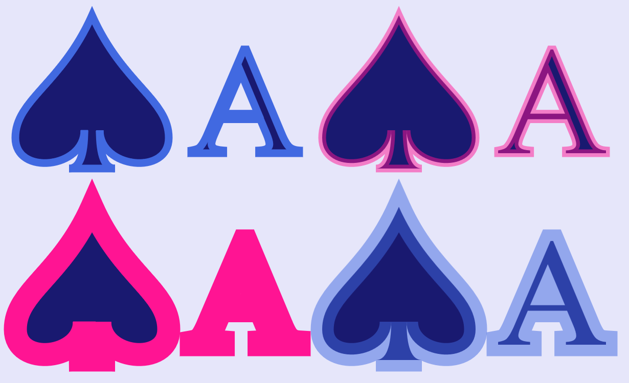
Figure 13-2. The same shape and text, with varying stroke options
Example 13-2. Using stroke properties to modify the appearance of a reused symbol and text
<svgxmlns="http://www.w3.org/2000/svg"xml:lang="en"xmlns:xlink="http://www.w3.org/1999/xlink"width="410"height="250"viewBox="0 0 410 250"><title>Stroking Shapes and Text</title><styletype="text/css">text{font-family:TimesNewRoman,Times,Georgia,serif;}.blue{stroke:royalBlue;}.pink{stroke:deepPink;}.see-through{stroke-opacity:0.5;}.wide{stroke-width:3px;}</style><symbolid="spades-ace"viewBox="0 0 40 20"style="overflow: visible"><title>Ace Spade</title><pathd="M9,15C9,20 0,21 0,16S6,9 10,0C14,9 20,11 20,16S11,20 11,15Q11,20 13,20H7Q9,20 9,15Z"/><textx="30"y="18"font-size="20"text-anchor="middle">A</text></symbol><rectheight="100%"width="100%"fill="lavender"/><gfill="midnightBlue"><usexlink:href="#spades-ace"class="blue"width="200"height="100"x="10"y="10"/><usexlink:href="#spades-ace"class="pink see-through"width="200"height="100"x="210"y="10"/><usexlink:href="#spades-ace"class="pink wide"width="200"height="100"x="10"y="135"/><usexlink:href="#spades-ace"class="blue wide see-through"width="200"height="100"x="210"y="135"/></g></svg>
An important thing to note is that the <symbol> element has an overflow: visible style rule applied. As we mentioned when discussing symbols, by default symbols have hidden overflow. Since strokes extend beyond the official edges of a shape, they would be clipped in this example. The viewBox tightly fits the fill region of the spade shape on three sides. Figure 13-3 shows a wide-stroked version with hidden overflow, for comparison.
Figure 13-3. Strokes extending beyond the edge of a symbol with (default) hidden overflow
Another important takeaway from Figure 13-2: wide strokes can completely obscure fine details in shapes and letters. Even the strokes in the top row—which have the default stroke-width of 1—are thick relative to the thin lines of the serif letter A. And if those strokes don’t look 1px wide to you, remember that the symbols define their own coordinate system, within which the icon is 20 units wide and tall, and the text has a font-size of 18px.
Tip
The stroke-width is always calculated in the current coordinate system, including all transformations. As a result, nonuniform scales or skews can create uneven-width strokes, as we saw in Example 11-4 in Chapter 11.
On these more complex shapes, the distance from the edge of the shape to the edge of the stroke can vary—and not just in the places where multiple strokes overlap. At the point of the spade, the strokes extend well beyond the point of the fill. At the sharp corners around its base, however, the strokes get cut off tight against the points. The next section will explore why this is so, and the ways in which you can change the behavior.
Making the Connection with Line Joins
The basic geometry of a stroke along a smooth path is straightforward. Imagine a “brush” that is a line stroke-width units long. Center it over the edge of the shape, and trace out the path, keeping your line perpendicular to the path at all times. All the points that were touched by the “brush,” as you moved it along, are part of your stroke region.
But what happens at sharp corners? If you only included the regions that were directly perpendicular to the stroke segments, you’d get something like Figure 13-4 (which uses a semitransparent stroke to clearly show the underlying fill shape). Every corner has a chip in it.
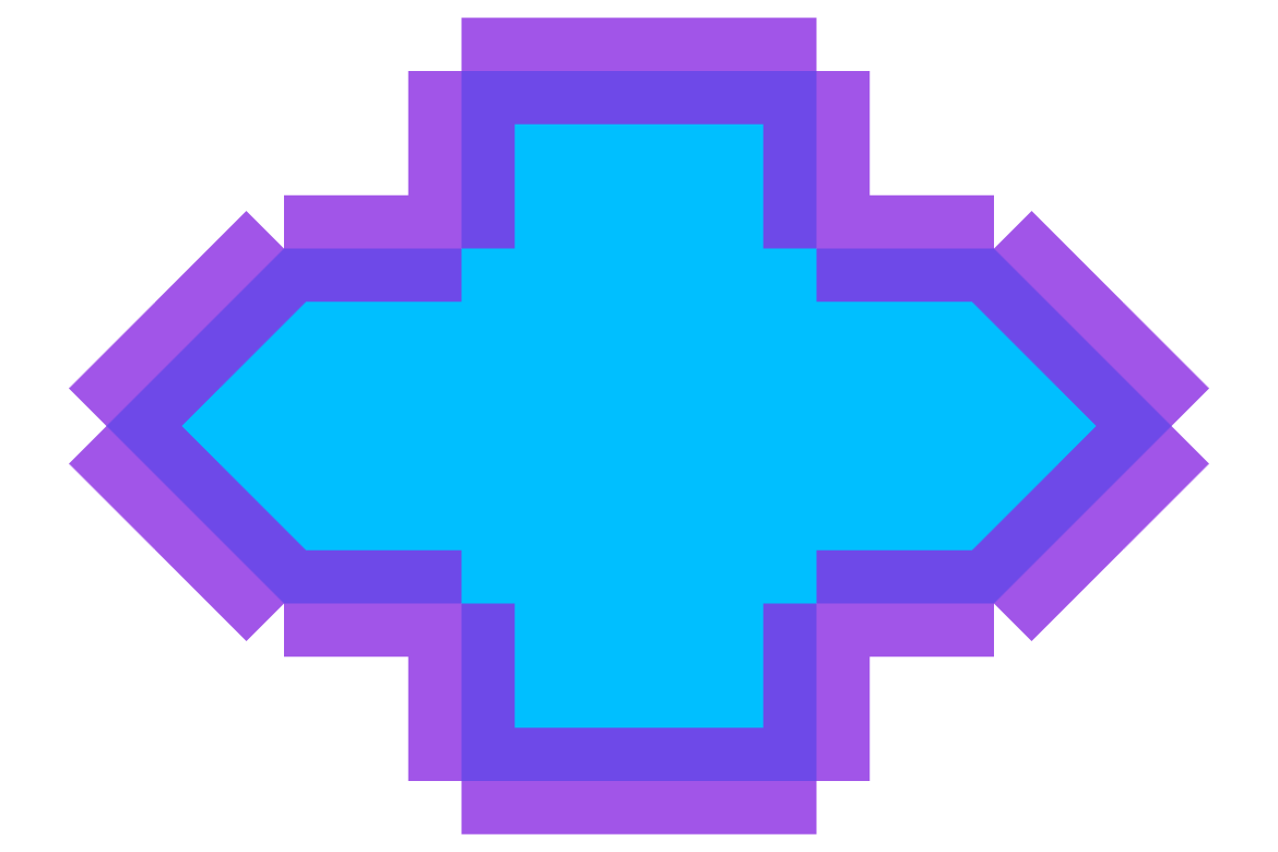
Figure 13-4. Strokes without line joins
Note
You can’t naturally draw an unjoined stroke, like Figure 13-4, in SVG.
It was created with a second <path> just for the stroke, with m0,0 commands inserted between each line segment in the path data. This breaks it into disconnected subpaths, which don’t join together. This is similar to the disconnect in the final corner of a <path> that doesn’t have a Z close-path command.
Clearly, you need a way to fill in the gaps to create a continuous shape outline. But how? What shape fills in each chip?
These choices are decided by the stroke-linejoin property. It applies anytime a shape has a sharp corner. There are three possible values:
round-
Swivel your “brush” in place, so that the gap between the end of one stroke segment and the start of the next is filled with a circular arc.
bevel-
Trim it off tightly, by connecting the corners of the “chip” with a straight line, creating an angled corner piece.
miter-
Extend the outer edge of each stroke segment in a straight line, until they meet in a point.
The value of stroke-linejoin may be set as a presentation attribute or style property; like the other stroke properties, it inherits by default.
Figure 13-5 shows how each of those of stroke-linejoin styles look when applied to the shape from Figure 13-4.
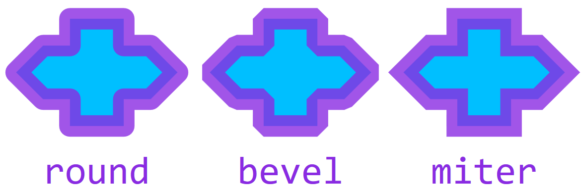
Figure 13-5. Strokes with joined lines, in different stroke-linejoin styles
A miter corner is the default. However, it introduces a complication: on really tight corners, you have to extend the strokes for quite a distance, before the two edges meet. For that reason, there is a secondary property: stroke-miterlimit. It defines how far you can extend the point when creating a miter corner. The value is a number, measured as a multiple of the current stroke-width. If the miter corner would exceed the miter limit, it is replaced by a bevelled corner.
Tip
By default, stroke-miterlimit is 4. The value must always be at least 1.
A value of 60 would be enough to guarantee miters for angles as tight as 2°. In general, the miter length of a line join is (sin(θ/2))–1, where θ is the angle of the corner.
Example 13-3 applies the three possible stroke-linejoin options to the diamond icon from Chapter 6 and the digit 4; it also creates a miter version with stroke-miterlimit set to 10. The results are displayed in Figure 13-6.
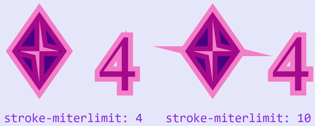
Figure 13-6. Shapes and text with mitered corners, at the default settings, and with stroke-miterlimit of 10
Example 13-3. Using stroke-linejoin options
<svgxmlns="http://www.w3.org/2000/svg"xml:lang="en"xmlns:xlink="http://www.w3.org/1999/xlink"width="400"height="160"viewBox="0 0 400 160"><title>Stroke Miter Limit Effects</title><symbolid="diamonds-4"viewBox="0 0 36 20"style="overflow: visible"><title>4 Diamond</title><pathd="M3,10 L10,0 17,10 10,20 ZM9,11 L10,18 V10 H15 L11,9 10,2 V10 H5 Z"/><textx="35"y="20"font-size="20"font-family="Times New Roman, Times, Georgia, serif"style="font-variant-numeric: lining-nums"text-anchor="end">4</text></symbol><rectheight="100%"width="100%"fill="lavender"/><gfill="indigo"stroke="deepPink"stroke-width="2.5"stroke-opacity="0.5"><usexlink:href="#diamonds-4"width="180"height="100"x="0"y="15"stroke-linejoin="miter"/><usexlink:href="#diamonds-4"width="180"height="100"x="220"y="15"stroke-linejoin="miter"stroke-miterlimit="10"/></g><gfill="blueViolet"font-family="Consolas, monospace"font-size="16"><textx="5"text-anchor="start"y="155">stroke-miterlimit: 4</text><textx="395"text-anchor="end"y="155">stroke-miterlimit: 10</text></g></svg>
There are numerous corners of different angles in the figure, in both the inner and outer subpaths of the icon and the digit.
The sharpest angles, in both the diamond and the 4, are on the inner cut-out subpaths. These create the “spikes” sticking out of the diamond with a stroke-miterlimit of 10. There aren’t matching spikes at the top and bottom, because those miters would have extended more than 10 times the stroke width, and so were cut back completely to bevel corners. It’s more subtle, but there are similar spikes at the left and top of the number 4, at both the default and extended miter limits.
Capping It Off with Line Caps
The stroke-linejoin effect only applies when two segments of a continuous shape meet. A separate property, stroke-linecap, controls appearance of open-ended strokes on <line>, <polyline>, or unclosed <path> subpaths. The line cap also applies to dashed strokes, which we’ll talk about starting in “A Dashing Design”.
The stroke-linecap also has three options:
butt-
The stroke ends exactly where the line does, in a straight perpendicular line
round-
The stroke ends in a semicircle that extends beyond the end of the line
square-
The stroke extends beyond the official end of the line by half the stroke’s width, creating a square around the line ending point
The butt value is the default. Like the other stroke settings, it is inheritable and can be set with an attribute or a style declaration.
Although the values do not directly correspond to stroke-linejoin options, they can be used to create line endings that harmonize with the joins for your particular shape.
Example 13-4 shows the three line cap options applied to an open path that also includes some line joins. The upper row uses the default miter line join, while the bottom row uses line joins that are most complementary to each type of line cap on this zig-zagging shape:
-
bevelcaps withbuttjoins -
roundcaps withroundjoins -
squarecaps withmiterjoins
A narrower version of the stroke (with the default line joins and caps) helps you see the exact dimensions of the path, as displayed in Figure 13-7.
Figure 13-7. An open path with various stroke options: stroke-linecap of butt (left), round (center), and square (right), with stroke-linejoin modifications in the bottom row
Example 13-4. Using stroke-linecap to create line endings that match line joins
<svgxmlns="http://www.w3.org/2000/svg"xml:lang="en"xmlns:xlink="http://www.w3.org/1999/xlink"width="390"height="260"viewBox="0 0 390 260"><title>Stroke Linecap Options</title><symbolid="open-path"viewBox="0 0 30 30"style="overflow: visible"><pathid="p"d="M25,5 H5 V15 H25 V25 H5"fill="none"/><usexlink:href="#p"stroke="coral"stroke-width="0.5"stroke-linecap="initial"stroke-linejoin="initial"/></symbol><rectheight="100%"width="100%"fill="lightcoral"/><gstroke="indigo"stroke-width="5"stroke-opacity="0.75"><gstroke-linecap="butt"><usexlink:href="#open-path"width="30%"height="50%"x="1%"/><usexlink:href="#open-path"width="30%"height="50%"x="1%"y="50%"stroke-linejoin="bevel"/></g><gstroke-linecap="round"><usexlink:href="#open-path"width="30%"height="50%"x="35%"/><usexlink:href="#open-path"width="30%"height="50%"x="35%"y="50%"stroke-linejoin="round"/></g><gstroke-linecap="square"><usexlink:href="#open-path"width="30%"height="50%"x="69%"/><usexlink:href="#open-path"width="30%"height="50%"x="69%"y="50%"stroke-linejoin="miter"/></g></g></svg>
An important thing to note is that the stroke-linecap value only applies if the subpath actually ends at that point. If you create a U-turn in a single subpath, that will be drawn as a line join, not a line cap. Figure 13-8 shows what happens if you take the code from Example 13-4, but change it to use the following E-shaped path instead of the S-shaped path in the original:
<pathid="p"d="M25,5 H5 V15 H25 H5 V25 H25"fill="none"/>
The path consists of a single subpath that creates the appearance of an extra line ending by reversing back on itself (H25 H5) after drawing the middle stroke of the E.
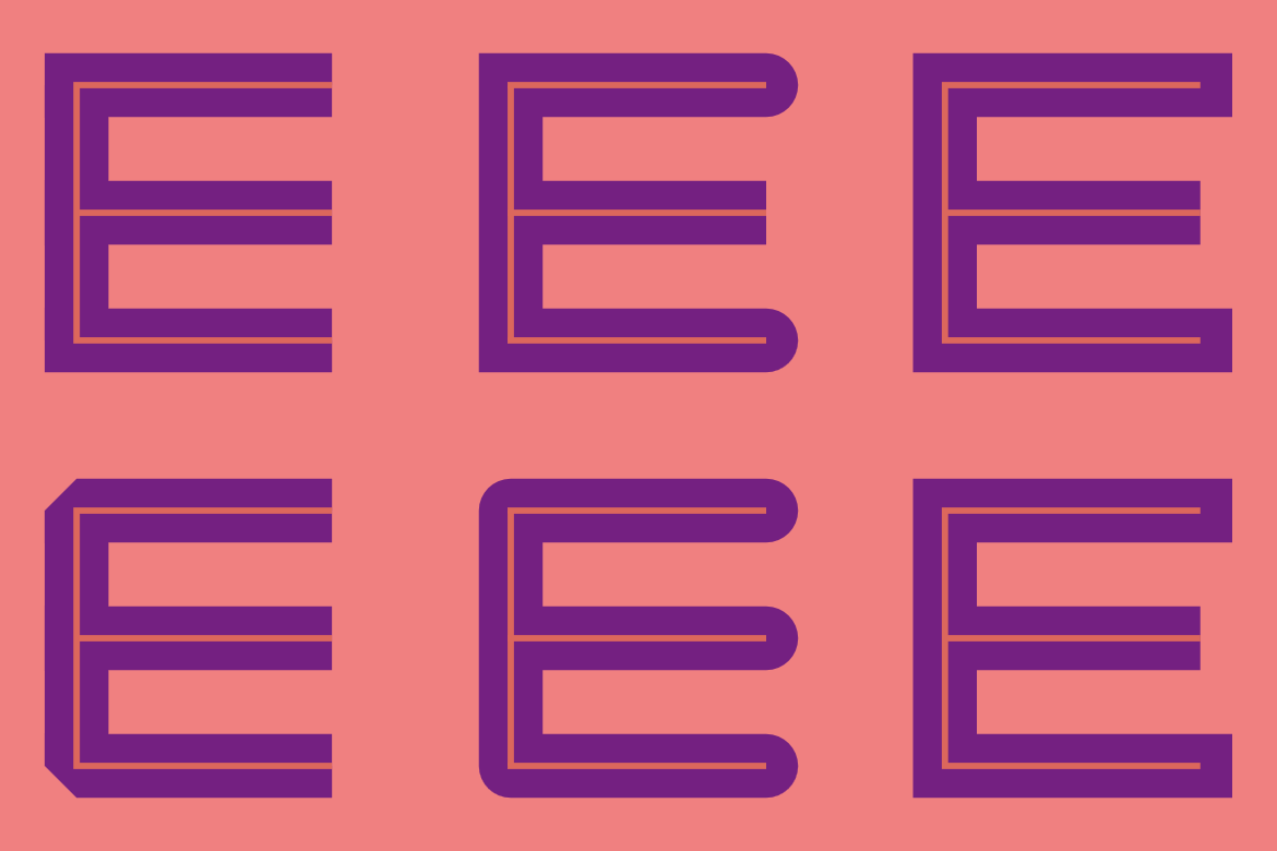
Figure 13-8. An open path with a 180° line join in the middle, and the same stroke-linecap and stroke-linejoin options as Figure 13-7
With a 180° U-turn such as this, a round line join is indistinguishable from a round line cap. A bevel line join looks like a butt line cap, cropped tight against the point. A miter line join in this case will always be converted to a bevelled join, because the hypothetical length of the miter is infinite: no matter how far you extend the “corner,” the two edges will never meet in a point.
This may seem like an extreme edge case, drawing a line that backtracks on itself exactly. However, 180° turns (creating a 0° or 360° corner) are more common when you’re connecting curved lines. For curves, the angle of the tangents at the line join can coincide even if the curves don’t. Figure 13-9 identifies four such U-turns in the spade icon.
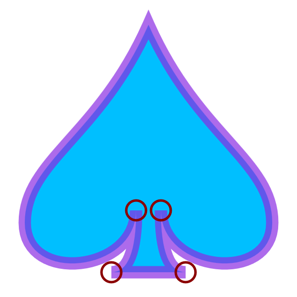
Figure 13-9. The 180° turns (circled) between curves in an icon
For line joins like this, both bevel and miter values of stroke-linejoin will crop the stroke exactly at the point of the fill. (A round line join would add a semicircle cap.) Both of the proposed SVG 2 joins, miter-clip and arcs, would extend the stroke beyond the point in a straight line, to a distance set by stroke-miterlimit, before clipping it perpendicular to the stroke direction.
Adjusting Stroke Appearance
You may have figured out by now that SVG strokes can sometimes be frustrating. They don’t always line up just where you want. Many options can’t yet be controlled by the available stroke styles.
However, there are a few extra style properties that you can use to adjust the appearance of strokes. They even have fairly good browser support.
Anti-Anti-Aliasing for Crisp Lines
We’ve been focusing on thick strokes so we can discuss the geometry of line caps and line joins. But thin strokes have their own problems.
When drawn on a computer monitor—unless it’s very high resolution—a thin stroke can look a little blurry. A 1px stroke line will often be positioned so that it is spread across multiple screen pixels. If the stroke is solid black, the actual pixels will be colored in transparent gray.
Consider the following icon, which uses a 1px stroke, in the same darkMagenta color, for both the X and the outline:
Figure 13-10 uses Firefox Dev Tool’s color-picker to look at the color of individual pixels when that icon is drawn to the screen. On the left is the standard view, with the 1px stroke blurred across multiple pixels. On the right is the result when every pixel is forced to be either fully colored or not colored at all.
Figure 13-10. Zooming in on a 1px-stroke icon, with anti-aliasing (left) and without (right)
The process of breaking up the diagonal vector lines to exactly match the pixel grid (the right side of Figure 13-10) is called aliasing the graphic to the grid. In the early days of computer graphics, that was the normal approach. The blurring effect is called anti-aliasing. It smooths out the jagged pixel edges, and is now the standard for vector graphics.
The shape-rendering property lets you tell the browser whether anti-aliasing would be a good idea for this element. It has four possible values:
-
crispEdgesturns off anti-aliasing, causing pixels on the edge of a shape to either be fully colored or not at all -
geometricPrecisionrequests anti-aliasing
-
auto(the default) usually means anti-aliasing in modern browsers -
optimizeSpeedwill usually be the same asauto
The property is inherited, so you can set it once for your <svg> as a whole.
Tip
shape-rendering is one of a series of “rendering hint” properties in SVG. The others either don’t have much effect in current browsers, or are being redefined by CSS3 modules. See https://oreillymedia.github.io/Using_SVG/guide/style.html for their definitions.
Be sure to test your graphic carefully if you change shape-rendering. Although “crisp edges” can improve some drawings, they can make others look pixellated and uneven. The exact effect will depend on the browser and the screen resolution.
Swapping Stroke and Fill
One of the basic rules of SVG stroking is that the stroke is painted on top of the fill. As we’ve seen in a few figures so far, this can often completely obscure details in the geometry of a shape or letter.
In SVG 1.1, you cannot change this ordering.
In SVG 2, you can. The new paint-order property allows you to control which goes first, stroke or fill. It also controls the order of line markers (which we’ll introduce in Chapter 14). It is an inheritable style property.
Warning
Although paint-order is now supported in the latest versions of most browsers, it has not yet been implemented in MS Edge, and is not supported in older browsers.
If the effect is essential, duplicate the shape with <use> elements to paint the stroke and fill separately, in the order you prefer.
The value of paint-order is a list of the stroke, fill, and markers keywords, ordered the way you want them painted, from bottom to top. You can indicate the default paint-order by using the normal keyword instead.
If the list doesn’t include all possible values, the remaining layers will be painted on top, in their usual order. This means that to paint stroke under the fill, all you need is:
paint-order:stroke;
Figure 13-11 shows the result if you apply that style rule to the root <svg> element in Example 13-2 from the beginning of the chapter.
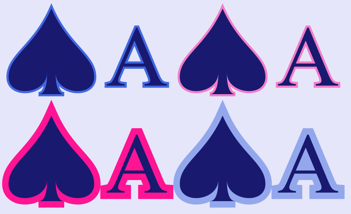
Figure 13-11. Shapes and text with various stroke options, when strokes are painted before fill
As you can see, with a solid fill color like this, all the details of the shapes and letters are now clearly visible, over the top of the stroke. However, the strokes now appear to be half as wide as they were, because half of each stroke is obscured behind the fill.
There is not yet any proposal for integrating paint-order with layered fills and strokes in such a way that you can position some stroke layers under the fill and others on top.
Scaling Shapes Without Scaling Strokes
Another new feature that now has fairly wide support is nonscaling strokes. The idea of a nonscaling stroke is that the stroke width would not be affected by any transforms or viewBox scaling on a shape. So a 1px stroke would actually be 1px, regardless of any scaling used to change the size of the shape.
Nonscaling strokes are implemented as part of the vector-effect property, which we mentioned in Chapter 8 when discussing the related ability to prevent text or symbols from scaling with the overall coordinate system. At the time of writing, non-scaling-stroke is the only vector effect option that is implemented in web browsers.
Warning
vector-effect: non-scaling-stroke is not yet implemented in Microsoft browsers, and isn’t supported in older versions of other browsers. Even where it is supported, there can be quirks and inconsistencies in some cases.
If you need consistent rendering, you will need to directly calculate the adjusted stroke-width for the current scale. For viewBox scaling (but not transforms), you can sometimes approximate nonscaling strokes with percentages or CSS viewport units.
The vector-effect property does not inherit by default, as this wouldn’t make sense for some of the proposed vector effects. To be able to apply non-scaling-stroke on a <g> or <use> element—and actually have an impact on the component shapes—you will need to set vector-effect: inherit on all the elements in between.
That’s the approach used in Example 13-5, which redraws a stroked version of the club-suit icon at various scales, using both transforms and viewBox scaling. It then reuses the complete layout, but applies non-scaling-stroke. Forced inheritance ensures that the scaling adjustment applies to the individual copies of the path. Figure 13-12 shows the result.
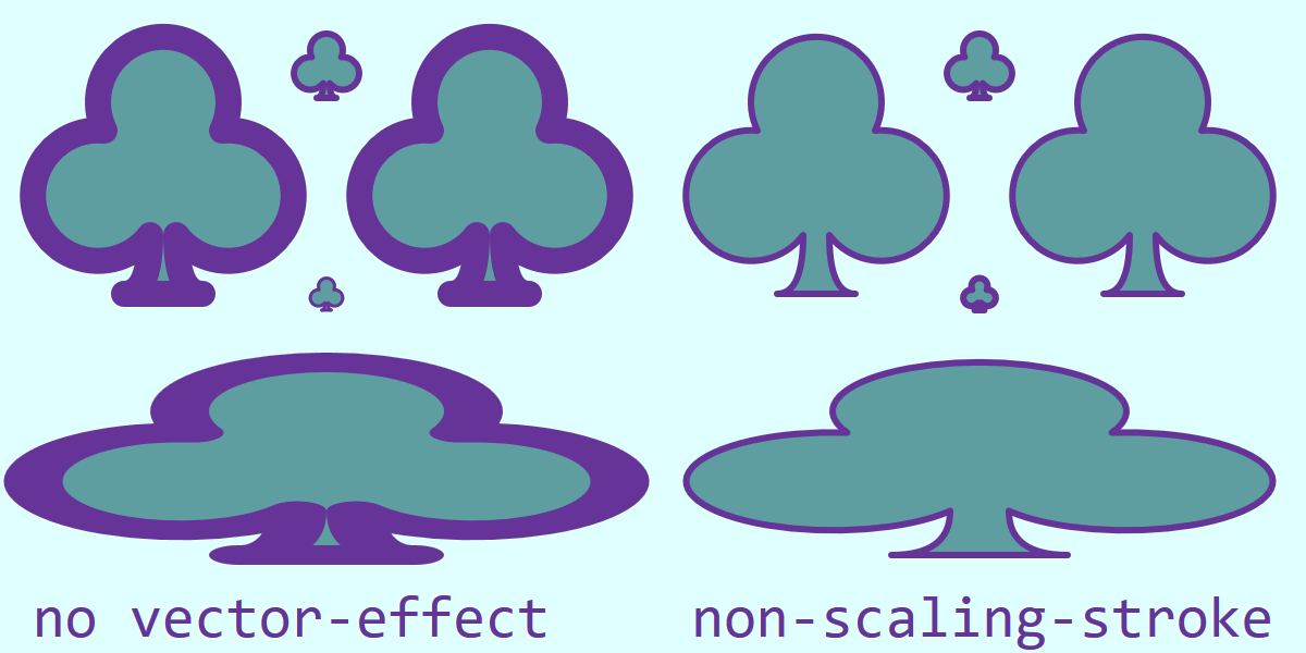
Figure 13-12. A 20×20 icon, drawn at various scales, with or without vector-effect: non-scaling-stroke
Example 13-5. Using non-scaling-stroke on icons reused at various scales
<svgxmlns="http://www.w3.org/2000/svg"xml:lang="en"xmlns:xlink="http://www.w3.org/1999/xlink"width="400"height="200"viewBox="0 0 400 200"><title>Non-Scaling Stroke Vector Effect</title><style>*{vector-effect:inherit;}</style><symbolid="club-symbol"viewBox="0 0 20 20"style="overflow: visible"><pathid="club-path"stroke="rebeccaPurple"fill="cadetBlue"stroke-width="2"stroke-linejoin="round"d="M 9,15.5 A 5,5 0 1 1 5.5,7.5 A 5,5 0 1 1 14.5,7.5 A 5,5 0 1 1 11,15.5 Q 11,20 13,20 H 7 Q 9,20 9,15.5 Z"/></symbol><rectheight="100%"width="100%"fill="lightCyan"/><gid="layout"><usexlink:href="#club-path"x="90"y="10"/><usexlink:href="#club-symbol"width="80"height="80"x="10"y="10"/><usexlink:href="#club-symbol"width="10"height="10"x="95"y="85"/><usexlink:href="#club-path"transform="translate(110,10) scale(4)"/><usexlink:href="#club-path"transform="translate(10,110) scale(9,3)"/></g><usexlink:href="#layout"x="200"style="vector-effect: non-scaling-stroke"/><gfill="rebeccaPurple"font-family="Consolas, monospace"font-size="18"><textx="10"text-anchor="start"y="195">no vector-effect</text><textx="390"text-anchor="end"y="195">non-scaling-stroke</text></g></svg>

A universal CSS selector forces the
vector-effectto inherit on all elements, unless changed by a more specific CSS declaration.
The club is drawn to just fit within a 20×20
<symbol>viewBox. Both the<symbol>and the<path>it contains are givenidvalues, so they can be reused separately. The path has stroke and fill styles set on it directly, including a 2pxstroke-width.
The first copy of the club redraws the
<path>at its natural size.
The second copy scales the
<symbol>to fit an 80×80 square.
Another copy of the
<symbol>is scaled down, to fit in 10×10.
A copy of the
<path>is scaled up and positioned with atransform.
The final copy of the
<path>is also transformed, but this time with an uneven scale.
The entire set of five clubs is then redrawn on the right side of the figure, with a
non-scaling-strokeforvector-effect.
The copy of the club that is drawn at its “natural” size (20×20, in the top center of each side of Figure 13-12) is identical with or without the vector-effect. For all the scaled icons, the default (no vector-effect) behavior maintains consistent proportions between fill and stroke, even when the entire shape is distorted by an uneven scale. The non-scaling-stroke option maintains consistent stroke dimensions in the main SVG’s coordinate system.
A Dashing Design
An SVG stroke does not have to be a continuous line. You can introduce breaks in the stroke—without breaking your shape into separate subpaths—to create a dashed line, using the stroke-dasharray property.
A Wide Array of Dashes (and Gaps Between Them)
The dash array is a list of lengths of alternating dashes (stroked line sections) and gaps (unstroked spaces). The dashes are positioned by measuring along the path, from start to end, turning on and off the stroke as you go. The dash pattern is repeated as many times as necessary to finish stroking the shape.
The value of stroke-dasharray is a space- or comma-separated list of lengths, percentages, or numbers of user units. It can be specified as a presentation attribute or in a CSS rule, and is inherited. The default is none, meaning no dashing (solid stroke).
Warning
The comma-separated option is likely to be deprecated by the CSS Fill and Stroke module, in order to better support comma-separated lists of different arrays for different stroke layers. For future compatibility, use spaces as separators in your dash array list.
The first value in the dash array list always describes a dash; after that, gaps and dashes alternate. So this array defines long dashes and short gaps:
stroke-dasharray:10px2px;
This looks like the following:

If there is an uneven number of lengths within the dash array, the lengths of dashes and gaps will alternate during each repeat of the pattern. In other words, the following two patterns are equivalent:
stroke-dasharray:1em10px1em;stroke-dasharray:1em10px1em1em10px1em;
Either version looks like this if the font-size is 16px:

Percentages within a dash array are measured in the same way as percentages for stroke widths: relative to the diagonal of the coordinate system divided by the square root of two.
Tip
Percentage dashes are not related to the length of the stroke.
The dash and gap lengths must be positive; negative values are an error. However, any value in the list may be 0 to create a zero-length gap or dash. This can be useful when you’re trying to control the dash and gap lengths precisely, instead of in a simple repeating pattern. A stroke-dasharray value of 0 0 (or any other number of zeros) should be treated the same as stroke-dasharray of none, meaning a solid line.
Warning
Because of unclear language in SVG 1.1, Firefox up to version 40 treated a zero-length dash pattern as a stroke="none", meaning no line at all.
You would normally only use a zero-length dash pattern as the start or end of an animation effect.
The visual effect of a given dash pattern can be quite different depending on the width of the stroke it is applied to. Figure 13-13 repeats the two previous dashing samples, along with a dash array of 3 3 (meaning: 3px-long dashes separated by 3px-long gaps), each on 3px-wide strokes. It then repeats the same three patterns, but on 15px-wide strokes.
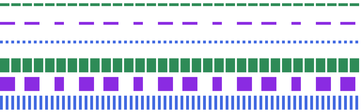
Figure 13-13. Dashed lines with different dash patterns, and (bottom) the same patterns on wider strokes
The 3px dashes on a 3px-wide stroke create a dotted line; on a 15px-wide stroke, however, they create a finely spaced grate.
Unfortunately, there is no way to define a dash pattern that automatically scales with the stroke width. (Although you could hack it—for nontext elements—by defining both properties in em units and then scaling the font-size.)
On straight lines like those in Figure 13-13, the shape of each dash is, well, straightforward. On more complex shapes there are, well, more complications. To demonstrate the impact, Example 13-6 applies a dash pattern to two of the card-suit icons, as shown in Figure 13-14.
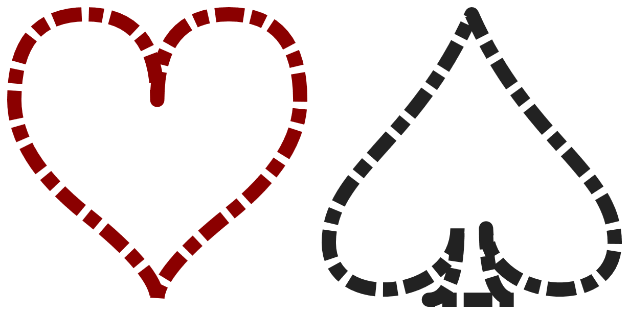
Figure 13-14. Dashed lines on shapes with smooth curves and sharp corners
Example 13-6. Creating dashed lines on curved shapes
<svgxmlns="http://www.w3.org/2000/svg"xml:lang="en"xmlns:xlink="http://www.w3.org/1999/xlink"width="410px"height="205px"viewBox="-1 -1 44 22"><title>Dashing SVG Shapes</title><styletype="text/css">svg{fill:none;stroke-linejoin:round;stroke-dasharray:20.510.5;}</style><pathid="heart"stroke="darkRed"d="M10,6 Q10,0 15,0T20,6Q20,10 15,14 T10,20Q10,18 5,14T0,6Q0,0 5,0T10,6Z"/><pathid="spade"stroke="#222"transform="translate(22,0)"d="M9,15C9,20 0,21 0,16S6,9 10,0C14,9 20,11 20,16 S11,20 11,15Q11,20 13,20H7Q9,20 9,15Z"/></svg>
To leave room for the strokes, the
viewBoxoffsets the origin of the icons one unit away from the top-left corner of the SVG. The width and height have been increased to include both this padding and an equivalent amount on the opposite side and in between the shapes.All the shapes will have
roundline joins and a pattern of alternating long and short dashes with shorter gaps in between. This dash pattern will be applied in the scaled coordinate system, so a half-unit gap will still be clearly visible.Both shapes were originally designed to just fit within a 20-unit square. With the padding, they each take up 22 units in each direction. The spade is translated horizontally into position.
There are a few things to pay attention to in Figure 13-14. The first is that the dashes follow the curve of the strokes. The start and end of the dash lines are always perpendicular to the path at that particular point—which may not be parallel to the other end of the dash.
Another thing to notice is that the dash pattern continues from one path segment to another, irrespective of any sharp corners. When there is a dash at a corner, the stroke-linejoin shape is painted—but if there’s a gap at the line join, the tip gets left off. The result can be somewhat unbalanced, as the spade shape certainly demonstrates.
Turning Dashes into Dots
Although stroke-linejoin shapes do not coordinate well with dashes, stroke-linecap can. But it may take a little adjustment to your dash pattern.
Tip
The stroke’s line cap shape is added to the start and end of every dash.
Example 13-6 used the default butt line cap, which does not add anything to the measured end of each dash. However, for round and square line caps, the cap extends beyond the end of the dash into the gap. If you do not factor this in, it could throw off your gap spacing. In order to have a visible gap, the gap space must be larger than your stroke width.
Line caps can be used to create circular or square dots that automatically adjust to the stroke width. The trick is to use a very small dash length—ideally, less than 1 pixel on the display, after adjusting for the scale of the SVG. Then use a gap length that includes the room required for the dots, which will take up as much space as the stroke is wide. The gaps, unfortunately, will not automatically scale to match the stroke width.
Warning
Using a zero-length dash, in order to draw perfect circles or squares with just the line caps, is not recommended. Older Blink browsers did not draw the dash line caps at all in this case. In newer Blink, caps are drawn for the zero-length dashes, but they do not rotate with the path direction.
The following styles, when applied to the markup from Example 13-6, create round and square dotted patterns on the heart and spade icons, respectively, with the results shown in Figure 13-15:
svg{fill:none;stroke-dasharray:0.0011.999;}path[id="heart"]{stroke-linecap:round;}path[id="spade"]{stroke-linecap:square;}
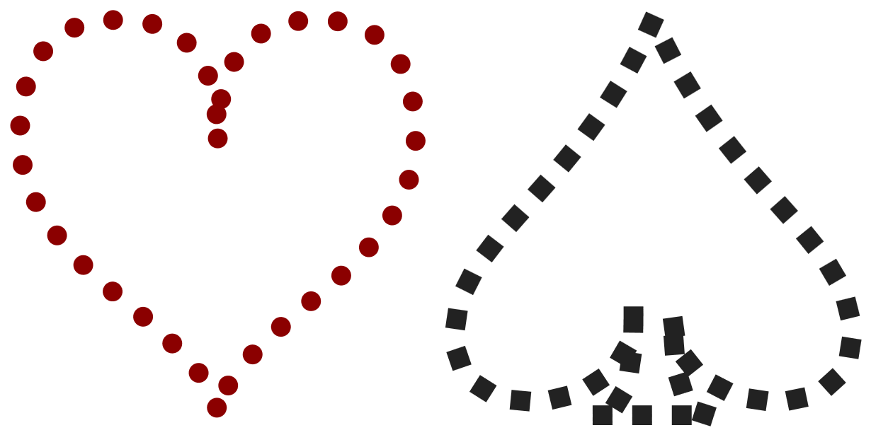
Figure 13-15. Dotted lines created with stroke-linecap
The difference created by the round line caps is obvious, but the square line caps may at first glance appear to be equivalent to a dash pattern of 1 1 with butt line caps. The difference shows up on the strong curves: the dots created by the square line caps remain square, instead of stretching with the path.
More Pleasing Dash Patterns, Made with Math
On symmetrical shapes such as those in Figure 13-15, the lack of symmetry in the dotting or dashing pattern may irritate many designers. To create a symmetrical pattern, you need a dash sequence that evenly matches the length of the stroke.
For a simple rectangle, it is relatively easy to figure out the total length of the stroke around the shape (twice the width plus twice the height) and create a dash pattern to match. For Bézier curves, however, the math is a whole other level of complexity.
Luckily, the browser can do the math for you, using the getTotalLength() method that we first introduced when working with <textPath> in Chapter 7. It returns the length of the complete path in user units. By opening up the SVG in a browser, you can use the developer’s console to call the method on the chosen path.
Tip
In SVG 1.1, getTotalLength() was only available on <path> elements, not on other shapes. SVG 2 makes it available on all shapes, but at the time of writing only Blink has implemented the method on the other elements.
The following snippet cycles through all the <path> elements in a document:
varpaths=document.getElementsByTagName("path");for(vari=0,n=paths.length;i<n;i++){console.log(paths[i].getTotalLength(),paths[i].id);}
The code prints out each path’s length, as well as its id value, so that it is easy to tell which is which. If your paths don’t have id attributes, you could print something else such as the first part of the path data.
Of course, instead of printing out values and using them in your markup, you could use the results directly in your code, setting styles from a script.
In one version of Firefox, the code printed out the following values for the SVG in Example 13-6:
71.2459716796875 "heart"
82.3443603515625 "spade"
In other browsers, the calculated path lengths vary by as much as ±0.3 units.
Note
The variation in path lengths is explicitly allowed by the SVG specifications: the math for calculating Bézier curve length is computationally intensive, and the browsers are allowed to use approximations.
To account for discrepancies in the browser’s path length calculations, SVG <path> elements contain a pathLength attribute that allows you to specify the length you expect the path to be (in user units). The browser must then adjust many of its calculations on paths, scaling its calculated lengths to match your stated length.
Warning
Unfortunately, stroke dashing was not one of the areas where the SVG 1.1 specifications explicitly required browsers to adjust for the stated pathLength. SVG 2 makes it clear that dashes should be adjusted. Firefox and recent Chrome/Blink (since 2016) make the adjustments; other browsers don’t.
Theoretically, it should be easy to create an even dot pattern for the heart: just set the stated pathLength to twice an even multiple of the dash-array length (2 units), and both halves of the heart will have an even number of repeats, and therefore a matching pattern. Since the measured length of the path was slightly more than 71 units, the closest multiple of 4 units is 72.
However, for these subpixel “dashes,” rounding errors add up in Chrome, and most other browsers ignore the pathLength completely. So it only works in Firefox.
Figure 13-16 shows the result (in Firefox) of setting pathLength to 72 on the dotted heart from Figure 13-15.
Both the dashes and the gaps scale equally. However, the dash is so small relative to the size of the line caps that the scaling is not visible.
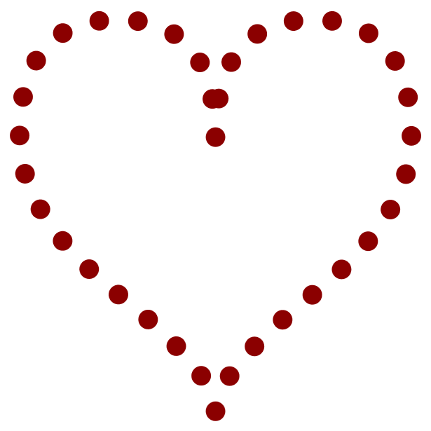
Figure 13-16. Dotted lines after the dash pattern is adjusted with pathLength
To achieve a result similar to Figure 13-16 in the other browsers, you would need to adjust the total dash pattern length yourself, for each shape separately. Instead of a total dash pattern of 2 units, you would want each repeat to total 2 × 71.24 / 72, or 1.9789 units:
stroke-dasharray:0.00891.97;
With that change (and with the pathLength attribute removed), the heart looks like Figure 13-16 in all browsers.
You would still get some slight variation between browsers because of the differences in path length approximations, but they are minor.
On a more complex shape, like the spade, the same strategy is not practical. There are too many corners for a simple repeat pattern to look elegant around all of them. You would need to divide the shape into multiple paths, and set separate dash patterns for each.
Starting Mid-Stride
When trying to place dashes precisely, you can end up wishing you’d defined the shape starting from a different point. For example, the spade icon starts off-center, where the left lobe connects with the stem, instead of at the point. For basic shapes, you don’t have any control over the start of the path at all.
Although it wasn’t explicitly specified in SVG 1.1, all the major browsers are consistent about where to start stroking a shape. Specifically:
-
For rectangles, the “start” of a rectangle is the top-left corner, and then the path continues clockwise. If the corners are rounded, it starts after the curve ends.
-
For a circle or ellipse, the start is the 3 o’clock position (technically: the point where the shape’s edge crosses the
cyposition, at an x-value greater than thecxposition). Again, the path is clockwise. -
Polygons, polylines, and paths follow the values in the
pointslist ordinstructions.
The start point of the stroke in a text character will depend on the font, and isn’t guaranteed to be consistent from one browser to the next.
Warning
SVG 2 makes these behaviors standard, by defining an “equivalent path” for each shape. However, some SVG tools may use different start points for basic shapes.
By default, the first dash in your dash array starts at this start point.
If that’s not what you want, don’t worry—you don’t have to rewrite all your code just to get greater control over dashing. The stroke-dashoffset property allows you to adjust the pattern position directly.
The dash offset is the distance into the dashing pattern at which the start of the path should be positioned. As usual, the length can be specified with or without units, or as a percentage (proportional to the coordinate system diagonal, same as the other stroke properties). The stroke-dashoffset property is inheritable, and can be specified with CSS or as a presentation attribute.
Tip
Positive offsets start the dash before the path start. Negative offsets start the first dash after the path start.
The offset distance isn’t an extra gap: the extra space is filled in with more dash array repeats, just at different positions than they would otherwise be.
There are two main uses of stroke-dashoffset: precise position of dashes for geometric effect, and animated dash movement.
Example 13-7 demonstrates the first use case. It uses dashes on a rectangle and a polyline. In both cases, the stroke length can be easily calculated, and the dash pattern is set to repeat an even number of times around the shape. The dash offset is used to make sure the gaps are positioned in the middle of lines instead of at the corners, creating the patterns shown in Figure 13-17.
Figure 13-17. Geometric patterns created with offset dashes
Example 13-7. Using stroke-dashoffset to control which parts of a shape are stroked
<svgxmlns="http://www.w3.org/2000/svg"xml:lang="en"xmlns:xlink="http://www.w3.org/1999/xlink"width="410px"height="210px"viewBox="-5 -5 410 210"><title>Stroke Dash Offsets</title><styletype="text/css">svg{stroke-width:10px;}</style><rectwidth="400"height="200"fill="none"stroke="indigo"stroke-dasharray="500 100"stroke-dashoffset="50"/><polylinepoints="0,75 50,125 100,75 150,125 200,75 250,125 300,75 350,125 400,75"fill="darkSeaGreen"stroke="seaGreen"stroke-dasharray="70.71 25 20.71 25"stroke-dashoffset="-35.355"/></svg>
The
viewBoxcreates a 400×200 drawing region with 5 units of padding on each side, to make room for the outer half of the thick 10px strokes.The dash array pattern on the rectangle is 600 units long, so there will be exactly two dashes and two gaps around the 400×200 rectangle. By default, the dash would start at the top-left corner and continue until halfway down the right side; the
stroke-dashoffsetvalue positions the starting corner 50 units into the dash, so that it is evenly distributed left and right.Each line segment in the zig-zagging polyline moves 50 units right and 50 units up or down. Pythagoras’s theorem tells us that the length of the line will be √(502 + 502), or 70.71 units. The total dash pattern therefore exactly covers two line segments. The offset positions the first long dash to start halfway down the first line segment, so that it is evenly balanced around the corner.
Figure 13-17 also re-emphasizes that a <polyline> creates the fill region by connecting the end of the path back to the beginning in a straight line, but that connecting line is not stroked. Dashes don’t change that.
Again, for positioning dashes on more complex shapes, you can use a <path> element’s getTotalLength() DOM method to calculate the length of a curve. Unfortunately, there is no easy way to calculate the length of part of a path; you would need to create a new <path> element that only includes the relevant path segments. As mentioned previously, be aware that browsers differ slightly in their path length calculations.
The second use of stroke-dashoffset, to create animated dashes, is a little more forgiving of these geometric complexities.
In an animation, the specific positions of the dashes are usually less important than the relative change. By shifting the dash offset by the exact length of one full repeat of the dash pattern, and then repeating that animation, you can create smooth movement that appears to cycle the dashes around the entire path.
Warning
MS Edge has the same problem with animations and transitions of unitless numbers in stroke-dashoffset as it does in stroke-width. Use explicit px units if you will be using CSS to animate. Use them anyway, to get in the habit.
Example 13-8 uses CSS animations to cycle a chain of dashes around the heart and spade icons. Figure 13-18 shows the chain-link pattern, but you’ll need to run the SVG in a web browser to see the full effect.
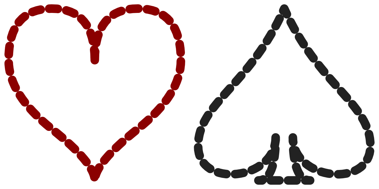
Figure 13-18. Chain-link strokes, which could be animated
Example 13-8. Animating dashes with stroke-dashoffset
<svgxmlns="http://www.w3.org/2000/svg"xml:lang="en"xmlns:xlink="http://www.w3.org/1999/xlink"width="410px"height="205px"viewBox="-1 -1 44 22"><title>Rotating Dash Links</title><styletype="text/css">svg{fill:none;stroke-linejoin:round;stroke-linecap:round;stroke-dasharray:1px1px;animation:cycle0.5s20linear;}@keyframescycle{from{stroke-dashoffset:0px;}to{stroke-dashoffset:2px;}}</style><pathid="heart"stroke="darkRed"d="M10,6 Q10,0 15,0T20,6Q20,10 15,14 T10,20Q10,18 5,14T0,6Q0,0 5,0T10,6Z"/><pathid="spade"stroke="#222"transform="translate(22,0)"d="M9,15C9,20 0,21 0,16S6,9 10,0C14,9 20,11 20,16 S11,20 11,15Q11,20 13,20H7Q9,20 9,15Z"/></svg>
Round line caps and line joins create the oval links from each dash.
When the line caps are added on to the 1-unit-long dashes, in a 1-unit-wide stroke, they will just touch across the 1-unit-long gaps in the
stroke-dasharraypattern.The shorthand
animationproperty instructs the browser to apply the animation sequence namedcycleover the course of 0.5s, to repeat it 20 times, and to transition the values in a linear manner, without slowing down or speeding up.The
@keyframesrule defines which properties should be changed by thecycleanimation:fromzero offset,toan offset equal to the total dash array pattern length.
Warning
Internet Explorer does not support CSS animations of SVG properties like stroke-dashoffset (Microsoft Edge animates it so long as the lengths have units). Firefox does not correctly update the <use> copy of the shape if the animation is applied directly to the <path> instead of being inherited through the <use> itself.
You can increase support in older Webkit and Blink browsers by duplicating all the animation-related CSS rules (including @keyframes) with a -webkit- prefix.
The same effect could have been created with a nonrepeating animation that changed the stroke-dashoffset from 0 to 40 over 10 seconds. By using the minimum repeat, we keep it DRY: to change the total length of the animation, we would only have to update the animation rule, and not the @keyframes.
Painting Lines
Strokes, as we’ve briefly mentioned, do not have to use solid colors. The stroke property, like the fill property, can use a url() function to reference a paint server—a gradient or pattern—by its id value.
There are two main areas where designers tend to get frustrated when using paint servers for strokes:
-
The
objectBoundingBoxunits used by paint servers do not include the stroke region. -
All paint servers create a rectangle region of paint that is unaffected by the shape or direction of the stroke.
The second point is a conceptual issue, that you will just need to wrap your head around. As much as you may logically think of a “gradient on a stroke” as meaning that the gradient follows the path direction, it doesn’t work that way in SVG. The stroke is treated as another shape, not a line drawn with a pen or brush. That stroke shape is clipped from the rectangle of wallpaper-like paint server content.
Tip
For straight-line paths, you can create gradients that follow the line by using userSpaceOnUse units and matching up the x1, y1, x2, and y2 attributes between the <line> and the <linearGradient>.
For curved paths, there’s no easy solution currently. When <meshGradient> is supported in browsers, you could match the path data to the mesh paths.
The misalignment of objectBoundingBox units and stroke sizes is more of a mathematical issue—and sometimes the numbers just don’t add up.
Many gradients or patterns look fine on a stroke, without modifications. Others, you can fix by tweaking the numbers—maybe a little, maybe a lot. But in some cases, you’ll have to redesign your code significantly.
It often depends on the shape you’re stroking. Figure 13-19 takes the bull’s-eye gradient from Example 12-5 (in Chapter 12) and applies it to the following path:
<pathstroke="url(#bullseye)"stroke-width="20"d="M-100,0 H100 M0,-100 V100M-71,-71 L71,71 M-71,71 L71,-71"/>
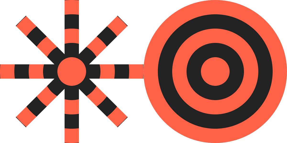
Figure 13-19. A repeating radial gradient applied to the stroke of a path (left) and the fill of a circle (right)
The path draws an 8-point asterisk. As a set of disconnected straight lines, it doesn’t have a fill region, but the bounding box is still determined by the maximum and minimum x- and y-values: from (–100,100) to (100,100). In other words, the same fill region as the circle of radius 100 from the original demo (which is redrawn in Figure 13-19 for comparison). The bounding-box gradient is therefore the same size. And because the strokes of the asterisk don’t go outside of the bounding box, it looks almost as if it was clipped out of the circle.
The asterisk is a bit of an exception. With most shapes, the stroke extends outside the bounding box. The visual size of the stroked shape doesn’t match the size used for bounding-box scaling.
Figure 13-20 applies the linear gradient from Example 12-3 as the stroke on the following <rect> element:
<rectwidth="180"height="180"ry="18"x="10"y="10"fill="darkSlateGray"stroke="url(#green-gradient)"stroke-width="20"/>
It is then compared with the same gradient on the fill of the rectangle from the original demo:
<rectwidth="200"height="200"ry="20"fill="url(#green-gradient)"/>
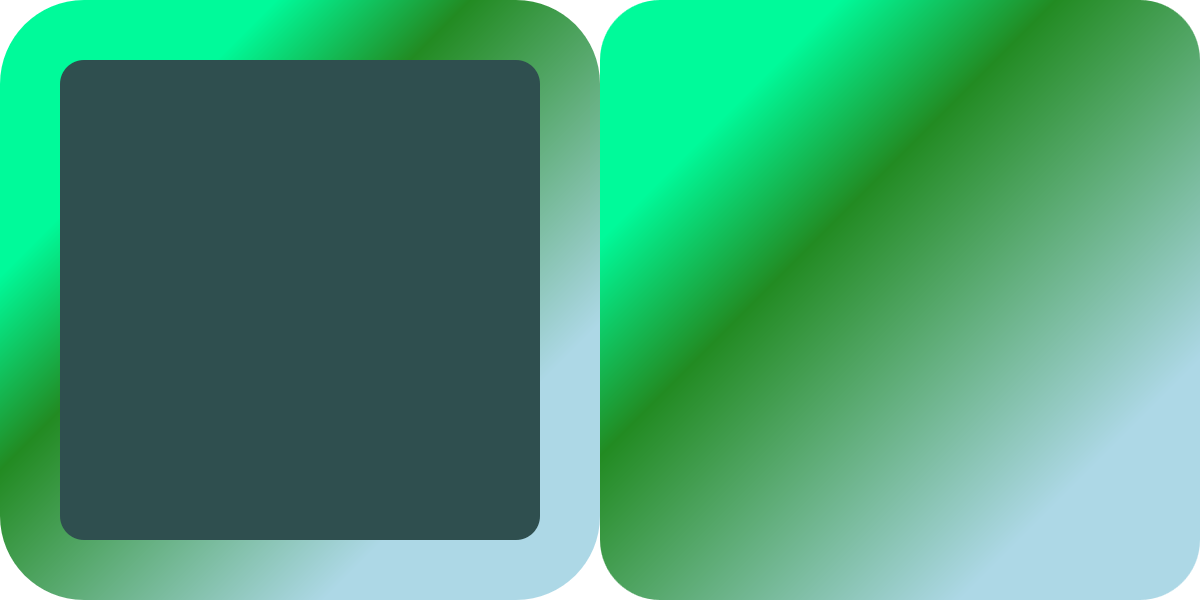
Figure 13-20. A repeating radial gradient applied to the stroke of one rectangle (left) and fill of another (right)
In order to have the total—outer—size of both rectangles be equal, the width and height are slightly smaller on the stroked version. If you look closely, you’ll see that the distance between color stops has been scaled down to match. But with a smooth, padded gradient such as this, it is hard to tell.
You only really start to notice the bounding-box difference when you use a paint server that has been precisely sized to fit the bounding box. In Chapter 12, we did that to create a nonrepeating image fill, in Example 12-9.
Figure 13-21 shows what happens when we apply that same <pattern> to the following thick-stroked version of the club icon:
<usexlink:href="../ch10-reuse-files/suits-symbols.svg#club"fill="none"stroke="url(#image-fill)"stroke-width="5"x="20"y="20"width="160"height="160"/>
Tip
The 5px stroke-width may not seem that thick compared to a 160×160 width and height. But remember: that stroke will be painted in the original <symbol> element’s 20×20 coordinate system. With 20px scaled up to fill 160px, 5px in the <symbol> will be equivalent to 40px in the outer <svg>.
For comparison, Figure 13-21 includes a second 160×160 copy of the <symbol>, but with the pattern used as a fill, not a stroke.
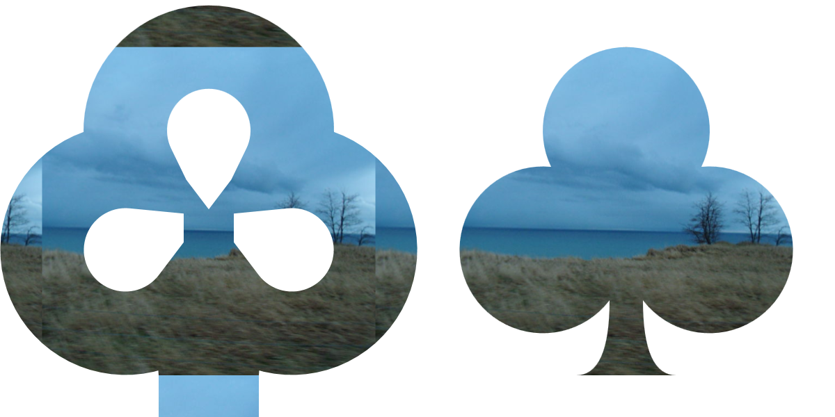
Figure 13-21. A photographic pattern tile that exactly fills the bounding box, applied to a stroked shape (left), versus the same size shape, filled (right)
The photographic pattern tile is the same size in both elements: scaled to fit in the fill region of the shape. Since half the stroke extends outside the fill, however, that isn’t enough. To fill the extra sections of stroke on each side, our “nonrepeating” pattern tile gets repeated on each side.
We’re going to need a bigger tile.
Specifically, we need to make the pattern tile large enough that it can cover the entire stroke region without repeats. To do that, we need to adjust the x, y, width, and height of the tile on a copy of the <pattern>:
<patternid="image-stroke"xlink:href="#image-fill"x="-12.5%"y="-12.5%"width="125%"height="125%"/>
Figure 13-22 shows what that looks like, when applied to the stroked icon.
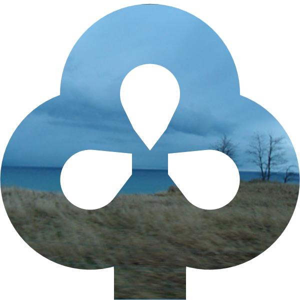
Figure 13-22. A photographic pattern tile that is sized to cover an element including its stroke
This approach is not ideal. The amount by which the attributes on the <pattern> need to be adjusted depends on the ratio of the stroke-width (5px) to the bounding-box dimensions for the original <path> element (slightly less than 20×20). The stroke-width is 25% of the bounding-box width, and half of that will extend on each side, so the tile needs to extend 12.5% outside the bounding box, on all sides.
The adjusted <pattern> is therefore not very reusable. You may need to create separately adjusted versions for elements with different dimensions or with different stroke widths.
Warning
This would be slightly easier if you could use CSS calc() in SVG attributes:
<patternid="image-stroke"xlink:href="#image-fill"x="-5px"y="-5px"width="calc(100% + 10px)"height="calc(100% + 10px)"/>
It would be even better with calc() and CSS variables.
SVG 2 says that both should be valid, but it’s not supported in browsers yet (and completely breaks the pattern in some of them).
But even this is not the worst problem from using fill-based bounding boxes to scale stroke paint servers.
The worst problem with objectBoundingBox units occurs when you are stroking straight horizontal and vertical lines. In that case, the fill bounding box has zero height or zero width. This means the scale applied to the paint has a factor of 0 in it—and a scale of zero makes graphics disappear.
Using an objectBoundingBox pattern or gradient to stroke a straight horizontal or vertical line is therefore an error. If you specify a fallback color in your stroke declaration, it will be used instead.
The only workaround, currently, is to recreate your bounding-box pattern or gradient in userSpaceOnUse units, with attributes exactly scaled to match the shape you are stroking.
Summary: Stroke Effects
Stroking effects are one of the areas of SVG where styles and geometry intersect. The stroke region itself is a type of derived shape, built from the offical shape’s geometry according to the many stroke style properties.
The full creative potential of stroking effects comes from the ways in which the different style properties intersect, such as using line caps to change the appearance of dashes. The examples in this chapter have only hinted at all the possibilities.
Nonetheless, there are countless other effects that are currently difficult to create, or require multiple shapes to be layered on top of each other. The new options proposed for SVG 2 and in the CSS Fill and Strokes module will allow much greater control, and therefore much greater creativity. Those changes, and updated implementations, will hopefully one day remove some of the most irritating obstacles to using strokes, especially with paint servers.