Table of Contents for
Using SVG with CSS3 and HTML5
 Using SVG with CSS3 and HTML5
Published by
O'Reilly Media, Inc., 2017
Using SVG with CSS3 and HTML5
Published by
O'Reilly Media, Inc., 2017
- nav
- Cover
- Using SVG with CSS3 and HTML5
- Using SVG with CSS3 and HTML5
- Preface
- I. SVG on the Web
- 1. Graphics from Vectors
- 2. The Big Picture
- 3. A Sense of Style
- 4. Tools of the Trade
- II. Drawing with Markup
- 5. Building Blocks
- 6. Following Your Own Path
- 7. The Art of the Word
- III. Putting Graphics in Their Place
- 8. Scaling Up
- 9. A New Point of View
- 10. Seeing Double
- 11. Transformative Changes
- IV. Artistic Touches
- 12. Filling Up to Full
- 13. Drawing the Lines
- 14. Marking the Way
- 15. Less Is More
- 16. Playing with Pixels
- V. SVG as an Application
- 17. Beyond the Visible
- 18. Drawing on Demand
- 19. Transitioning in Time
- 20. Good Manners
- Index
- About the Authors
- Colophon
Chapter 19. Transitioning in Time
Chapter 19. Animation
An interactive web graphic is, by definition, animated, in the sense that it changes over time. But not all changes are created equal.
The interaction examples in Chapter 18 mostly involved simple switches between different states: one moment, the graphic was in one state, and the next moment, it had changed. Although this is technically animation, it skips the most interesting aspects of animated SVG graphics: the ability to show a transition between two states. This transition (also known as tweening or interpolation) can greatly enhance the user’s understanding of a change, making it easier to comprehend a new state or fresh information.
Even without interaction, animation can enhance many graphical elements, focusing the user on one area of the screen, or emphasizing the relationships between different components. Extend those little animated moments and connect multiple animations together, and you can create a complete animated short film in SVG.
We’ve used animation in a few examples so far, but have not really discussed what it means to animate a vector graphic, or how to plan a project that involves animation.
This chapter runs through your options for creating animated SVG. It is neither a detailed look at designing dynamic graphics, nor a comprehensive introduction to any of the animation techniques. Instead, it tries to lay out the options so you can decide which approach is appropriate for the project at hand.
Even more than any other aspect of web design, planning for performance becomes particularly important in animation. If a browser takes too long to update a graphic, the transition between states can stutter and jerk, exhibiting jank, to use the animator’s term. Rather than enhancing your website, a janky animation can make it look broken—distracting and irritating your users instead of captivating them.
To avoid the dreaded jank, you’ll need to plan—and test—your animations carefully. There are often many ways to code a given effect, but browsers can optimize certain operations better than others.
Scalable Vector Animations
Animation adds a new dimension to web design: time. Not only do you need to know where to draw a given shape or piece of text, you need to know when to draw it.
Traditional film animation—the type pioneered by Walt Disney and other fledgling animation studios in the 1920s—involves drawing individual pictures (stills, or frames) for each moment in the animation. When the film roll switches from one frame to the next in quick sequence, you create the illusion of life and movement.
Animation frames are to time what pixels are to space: the smallest units of the graphic. Traditional animation and film are the time equivalents of a raster image. They divide up continuous time into a fixed number of intervals, and specify exactly what the image should look like at each point. Just like raster graphics have a fixed spatial resolution, so frame-based animation has a predefined temporal resolution, known as the frame rate.
You know by now that vector graphics are different from raster. Vector graphics specify paths in a theoretical mathematical coordinate space, and let the rendering engine (the web browser) convert that into pixels at whatever resolution they need.
Vector graphics define a path through space; it was only a short step to apply the same concept to describe a path through time. Specify the points—in space and time—that a graphic should pass through, and let the rendering engine calculate the individual frames.
The vector approach to animation on the web was first used successfully by Jonathon Gay in the mid-1990s for FutureSplash, which later became Flash. Taking a series of PostScript (vector) drawings, FutureSplash would calculate the transitional stages between the graphics, and render the interpolated states quickly via an animation engine.
Although it was a controversial decision at the time, the original SVG specs adopted vector animation principles in the form of dedicated animation elements. This set up SVG as an interactive, dynamic graphics language—and a competitor to Flash—rather than the static visual description it was originally conceived to be.
This “vector animation” approach is more commonly known as declarative animation. You declare in your code what you want the browser to do, and let it figure out how to make it so.
Declarative animation provides information on where and how an animated element should appear, but does not define every step. The code usually specifies the start and end points of an animation, and may set some rules for how to get from one to the other, but it relies on the browser to calculate the individual frames in between. For that reason, this approach is also known as tweening.
The concept is similar to the assembly-line approach Disney took later in his animation career, where keyframes—frames containing major poses—were drawn by lead animators. When the keyframes were complete, the work of drawing the remaining, in-between frames was handed off to apprentices. In declarative animation, the values you set in your code are the keyframes, and the computer is the apprentice.
Tip
There are now two distinct syntaxes for declarative web animation: the SVG/SMIL animation elements, and CSS animations and transitions.
We’ll review the main pros and cons of both in this chapter, but with a focus on the CSS approach, which has better browser support. The supplementary material has additional information about SVG/SMIL.
Within computer graphics, the opposite of declarative animation is often known as procedural animation. Procedural animation provides explicit, step-by-step instructions for how an animated graphic should look at each point in time.
That doesn’t mean that you need to draw every frame ahead of time, like in a film or video. Procedural animation computer programs usually condense the drawing instructions by creating animation loops. An animation loop is any function that runs at regular intervals and updates the graphic to create an animated effect. For example, the function might add 1px to the x-position of a graphic every few microseconds. All the positions aren’t saved ahead of time, but the code still provides an explicit instruction to the graphic at every step.
SVG has also always had procedural animation, in the form of JavaScript loops and callbacks that can modify the document at regular intervals. However, it’s no coincidence that many JavaScript animation libraries abstract away the procedural details, allowing you to declare your animations in parameters to the library’s methods. The library code becomes your apprentice, drawing the in-between frames and updating the DOM accordingly.
Similarly, the new Web Animations API is a declarative animation language that you can access from JavaScript. In addition to being built in to the browser, the API will have the benefit that it is the browser—not someone else’s JavaScript code—that calculates the individual frames. That means that the frames can be updated independently from other JavaScript code and event-handling processes.
Smoothly Switching Styles
A few examples so far have included animation, in the form of CSS animations or transitions. The CSS syntax is easy to add as an enhancement, with just a few lines of code—perfect for when the animations were secondary to the main topic of an example. The CSS animation properties are also now familiar to many web developers, and they are fairly well supported in browsers.
Fairly well supported, but not universally. Particularly not for SVG.
Warning
CSS animations and transitions aren’t supported for SVG-specific properties in Internet Explorer (and aren’t supported at all prior to IE10). Pre-2017 versions of MS Edge and Firefox did not support them in SVG embedded as images. Older versions of Blink and WebKit browsers (up to Safari 8) required a -webkit- prefix.
For detailed discussions of all the CSS animation and transition options, you’ll need a dedicated book on the topic. Sarah Drasner’s SVG Animations and Kirupa Chinnathambi’s Creating Web Animations (both from O’Reilly) are good places to start. There’s also good documentation on MDN.
This section will be a quick overview, and then a discussion of the pros and cons for animating SVG, compared to the other animation methods we’ll be discussing in this chapter.
CSS animations come in two varieties, transitions and keyframe animations. Transitions are the simpler version, so we’ll start with them.
CSS Transitions
CSS transitions tell the browser to apply any changes to specified style properties progressively, over a set period of time. The transition only applies if some other factor causes the style to change. Transitions don’t change the styles themselves.
CSS transitions are applied to an element with the transition shorthand property or by longhand properties of the form transition-*:
-
transition-propertysets the name of the style property to transition, if its value is changed. It can beallfor transitioning every property (but be careful of this getting out of hand), ornone(the default) to not apply any transitions.The
transition-propertycan also be a comma-separated list of property names. All the other transition properties can either be given in matching lists, or as a single value that will apply to all properties. -
transition-durationsets the length of time over which each property will be changed, in seconds (s) or milliseconds (ms). It’s 0s by default, so no visible transition will be applied. -
transition-delayspecifies an amount of time the browser should wait after the time when a new style value applies (for example, a:hoverrule is triggered by a mouse-over), before starting the transition duration. It is useful for staggering changes to multiple properties, especially if one property cannot be smoothly transitioned. -
transition-timing-functiondescribes the rate of change of the property value over the transition duration. There are various keyword values (including the defaultease) and acubic-bezier()function that allows you to specify the control points for a curve from (0,0) to (1,1).If none of the keywords create the effect you want, there are a number of websites that have copy-and-paste cubic Bézier functions, and Chrome and Firefox now both have visual timing-function editors in the dev tools.
The shorthand transition property sets all the values at once. For the timing values, the delay is always specified after a duration; other values can be set in any order, or omitted (which sets it to the default value). For a list of different transitions, each item in the list sets all the values for a particular transition property.
Tip
There are no SVG presentation attributes for any of these properties, or for the animation properties described in the next section. None of them are inherited by default.
In Chapter 7, we used transitions to smooth out font-size change for text labels that were resized based on media queries (Figure 7-4):
svgtext{transition:font-size0.5s;}
Not all properties can be smoothly transitioned through a set of continuous values, like font-size can. There is no halfway point between font-family: Arial and font-family: Times. Keyword values and other properties with no valid mid-point will flip from the old to the new value when the transition timing function passes the midway position.
Originally, the CSS Transitions spec had a limited list of transitionable properties, and font-family was not on it. The spec has since been updated so that nearly all properties can be animated, using the midway “flip” rule.
Warning
In browsers that don’t support transitioning a given property, the change will apply immediately, instead of at the mid-point of the transition duration.
At the time of writing (mid-2017), Chrome and Firefox support the new rules, but Safari and MS Edge do not. Also beware: most resources on the web still refer to the old rules when discussing “animatable” CSS properties.
Even in the browsers that have updated, transitioning the transition-* properties doesn’t work, and you can’t transition the display property, either. Animations and transitions are only calculated for elements that are currently being displayed.
You can’t transition to display: none, but you can transition to visibility: hidden. In SVG, the two are mostly equivalent, so visibility should be used if you want to add a transition effect before hiding an element. It works even in browsers that haven’t been updated to the latest spec—visibility was always a transitionable property.
For example, to fade out an element, you could transition opacity to 0 over a 0.5s duration, and transition visibility to hidden with a 0s duration but 0.5s delay. That way, you get the accessibility benefits of properly hiding the element—so it can’t receive keyboard and pointer events—but still have a smooth fade-out transition.
Tip
You can’t use 0 without units for duration and delay times; the CSS parser won’t accept it as a valid declaration. Instead, always specify 0s or 0ms.
The following CSS would create that transition to apply whenever you added the aria-hidden="true" attribute to an element with JavaScript:
.may-be-hidden{transition-property:opacity,visibility;transition-duration:0.5s,0s;}.may-be-hidden[aria-hidden="true"]{opacity:0;visibility:hidden;transition-delay:0s,0.5s;}
The transition-delay for visibility is only applied when the element is in its hidden state. That means, when we unhide the element (remove the aria-hidden attribute), the delay won’t apply anymore. The visibility will immediately turn back on, so that you can actually see the opacity transition.
In general, if you want a different transition—or no transition at all—for different directions of a state change, you change the transition properties as part of the same style rule that changes the values.
CSS Keyframe Animations
CSS animations are applied to an element with the animation shorthand property or by longhand properties of the form animation-*.
CSS animations are more specifically known as CSS keyframe animations, and also require an @keyframes rule. Animations apply a series of new property values to an element. The timing of the animation cycle is set in the animation properties on the element, but the new style values are defined in the @keyframes rule set.
The @keyframes rule set is identified by a custom name, which is followed by curly braces ({}) containing CSS rules. So the following defines an animation effect named flicker:
@keyframesflicker{/* keyframe rules go here */}
You have a lot of flexibility in the names you can use (only CSS-wide keywords like inherit and initial are forbidden). However, try to avoid picking a name that could be confused for an animation-related keyword (like alternate or backwards), or your shorthand animation declarations might not work as expected.
Inside an @keyframes rule set, the individual rules mostly look like normal CSS style rules, but with one key (ahem) difference: keyframe selectors don’t identify elements in the DOM, they identify positions in the animation cycle, as percentages of the animation duration time.
Tip
The keywords from and to are also valid keyframe-rule selectors, where from equals 0% and to equals 100%.
To set the same style properties to apply at multiple points in the cycle, you can use a comma-separated selector list. This means that these rules define the flicker effect as one that starts and ends at full opacity but applies zero opacity at the halfway point:
@keyframesflicker{from,to{opacity:1;}50%{opacity:0;}}
If you don’t specify the 0%/from or the 100%/to keyframe, both default to the current values on the element. So if your elements start at full opacity, this @keyframes rule is equivalent to the last one:
@keyframesflicker2{50%{opacity:0;}}
In the original CSS animation draft—where only certain properties were animatable—nonanimatable properties specified in @keyframes rules were ignored completely. Under the latest spec, these properties “flip” from one value to the next when the timing function crosses the mid-point value, the same as for transitions.
Warning
The latest Chrome and Firefox support the new rules; other browsers ignore keyframe declarations for many properties that only have keyword values.
However, animation properties and display still can’t be animated. If you use a CSS variable in an animation property, you also cannot animate that CSS variable. Otherwise, CSS variables are animated using the mid-point flip rule, since the browser doesn’t know what the intermediate values should be.
Declaring @keyframes does not have any effect on its own.
To actually make an element flicker with that animation, you would need to reference the name of that keyframe set in the element’s animation properties.
There are eight longhand properties for animations:
-
animation-nameis the name you specified in the@keyframesrule (e.g.,flicker), or a comma-separated list of multiple keyframe rules to apply. If it is a list, then you can give each animation its own distinct timing values, by giving the other properties as matching lists. -
animation-durationis the total time for one run of the keyframe cycle, from 0% to 100%. -
animation-delayis a wait time to apply from the time the animation rule applies to an element or the time the element is displayed in the document until the start of the first duration.The delay can be negative, which causes the animation to begin right away, partway through the animation cycle. We used negative animation delays for the stoplights in Example 1-8, so that the lights would be staggered, turning on at different times.
-
animation-directionsets whether to apply the keyframes innormalorder (0% to 100%),reverseorder (100% to 0%), or toalternateback and forth in each iteration. -
animation-timing-functionsets the transition timing function to be used between each keyframe value (that is, each rule in the@keyframesblock). It defaults toease.This is the only animation property that can be set within the keyframes rules, to give a unique timing function for the transition from that keyframe to the following one (in normal direction). So the following code creates alternating “in” and “out” eases between each keyframe:
.ball{animation-name:bounce;animation-duration:5s;animation-timing-function:ease-in;/* default for each keyframe transition */}@keyframesbounce{/* start high, then each bounce is smaller */0%{transform:translateY(-50px);}20%{transform:translateY(-40px);}40%{transform:translateY(-30px);}60%{transform:translateY(-20px);}80%{transform:translateY(-10px);}10%,30%,50%,70%,90%,100%{/* the bottom of each bounce */transform:translateY(0px);animation-timing-function:ease-out;/* applies to transition _after_ this state,i.e., for the upwards bounces */}} -
animation-iteration-countis a number for how many times to repeat the keyframes cycle (default1), or the keywordinfinite. -
animation-fill-modeallows you to extend the final values of an animation after the animation is complete (forwards), to apply the initial values during the delay period before the animation starts (backwards),both, ornone(the default). -
animation-play-stateallows you to pause and restart an animation without resetting the values; the value is eitherrunning(the default) orpaused.
You can also set all of the longhands using the animation shorthand, which takes a comma-separated list of complete animation descriptions. Just like with transitions, the duration time must always be given before the delay time, but otherwise the values can be given in any order. Any of the subproperties can also be omitted from any animation in the list, which sets it to the default value.
The stoplight animation from Chapter 1 (Example 1-8) used the following code to define the keyframes, the shared animation properties, and then the negative delays that cause each light to start at a different point in the cycle:
@keyframescycle{33.3%{visibility:visible;}100%{visibility:hidden;}}.lit{animation:cycle9sstep-startinfinite;}.red.lit{animation-delay:-3s;}.yellow.lit{animation-delay:-6s;}.green.lit{animation-delay:0s;}
That animation shorthand is equivalent to the following long-hands:
.lit{animation-name:cycle;animation-duration:9s;animation-timing-function:step-start;animation-iteration-count:infinite;animation-delay:0s;/* re-set to initial */animation-direction:normal;/* re-set */animation-fill-mode:none;/* re-set */animation-play-state:running;/* re-set */}
The step-start timing function forces all frame changes to be discrete switches from one value to the next. For visibility, that would happen anyway—since it can only take discrete values—but step-start forces the switch to happen at the beginning of each transition period instead of at the mid-point.
We also used CSS animations for some of the stroking examples in Chapter 13 and its supplementary material. In Example 13-8 (which cycled chain-link dashes around the shape) we used the following code:
animation:cycle0.5s20linear;
The linear timing function was essential to create the appearance of continuous movement, without any speeding up or slowing down during the 20 iterations.
In contrast, in the supplementary line-drawing example, we used an ease-in timing function, which caused the transitions (drawing the path and fading in the fill color) to start slowly but end sharply.
Although we didn’t include the CSS code in Chapter 18, we also used CSS animations and transitions to enhance the confetti and gem collection games. Example 19-1 provides the CSS used in the final version of the figures (Figure 18-9). It assumes SVG text elements, but could easily be adapted for HTML elements.
Example 19-1. Enhancing a scripted SVG game with CSS animations and transitions
#gameboard{max-height:100vh;max-width:100%;background:#224;}.count{/* class for all the text elements */fill:lightYellow;/* or use `color` if using HTML text */font:20pxConsolas,monospace;}#timer,#scoreboard{/* the specific numbers being updated */font-size:300%;}#scoreboard{transition:font-size1s;}.clicked{opacity:0.1;pointer-events:none;}.miss{color:#88f;stroke:currentColor;stroke-width:4px;stroke-opacity:0.5;fill:currentColor;fill-opacity:0.5;animation:flicker-fadeease-in-out3sforwards;}@keyframesflicker-fade{from{opacity:1;animation-timing-function:ease-out;}60%{opacity:0.2;}70%{opacity:0.3;}80%{opacity:0.1;}90%{opacity:0.2;}to{opacity:0.0;visibility:hidden;}}#timer[aria-live]{animation:flash-color0.3salternateinfinite;}@keyframesflash-color{/* again, use `color` for HTML text */to{fill:tomato;}}.game-over#scoreboard{font-size:800%;animation:flash-color0.5s16alternate;}.game-over.clickable{fill:black;}.game-over.clicked{opacity:1;filter:drop-shadow(003pxgold);}

The first animation effect is a
transitiononfont-sizeapplied to the scoreboard. The transition kicks in when we later change the font-size is by adding thegame-overclass to the document.
The elements with class
misswere the circles adding to mark a click that missed the game pieces. The animation (flicker-fade) makes them fade to transparent a few seconds later, but with a little bit of flickering before they disappear completely. Theforwardsfill mode ensures that after the animation is complete they stay hidden indefinitely.
Most of the keyframes in the
flicker-fadeset use theease-in-outtiming function set on the circles, but the first transition usesease-outso that the very beginning of the animation sequence starts without any easing.
In the JavaScript, during the last five seconds of the countdown we add the
aria-liveattribute to the timer. An attribute selector is used to add a matching visibleflash-coloreffect, which alternates for as long as the[aria-live]selector matches the#timerelement.
Because we use
alternatein the animation property, the keyframe effect itself is very simple, only setting thetoframe. The animation therefore starts from the element’s originalfillcolor, transitions totomatofill, and then transitions back in the next iteration.
The same
flash-colorkeyframe set is used to flash the scoreboard color after the game is over (starting while the scoreboardfont-sizeis transitioning to 800%). This time, the flashes are a little slower (each on-off cycle taking 1s total, 0.5s in each direction), and there are a finite number of flashes (16 iterations).
By defining all the animation effects in the game using CSS, the JavaScript code was able to focus on the game logic and event handling. The classes and attributes set by the script are meaningful (semantic), not specific to particular styles. The entire game could be restyled, including the animation effects, without the JavaScript being changed.
Benefits and Limits of Animating SVG with CSS
Animating SVG—or any other web content—with CSS has a number of benefits. CSS transitions, in particular, are wonderful in their simplicity, often only requiring a single line of code to enhance an existing interactive project. Keyframe animations have a slightly more complicated syntax, but they are still fairly simple to write compared to the complexity of the effects you can create.
CSS animation effects also have performance benefits. Because the effects are declarative, the browser knows what future changes will be required, and can optimize rendering calculations to avoid repeating all the work every time it repaints the screen. It can also skip calculations entirely if it knows that an element is currently off-screen. And it can adjust the repaint frequency to prioritize other processing tasks, such as event handling. In many cases, the animation updates can run on a separate processor thread than JavaScript and events—or even on a separate processor, the GPU instead of the CPU.
You can usually create acceptable unanimated fallback in browsers that don’t support CSS animations. If transitions are not supported, you just have instantaneous value changes. If keyframe animations are not supported, you get whatever base value you set on the element, with the keyframe declarations ignored. So the only extra effort is to ensure that those base values create an acceptable appearance and a functional website.
But CSS animations and transitions have their limitations. Limitations that are important for animated SVG include:
-
They can only animate CSS properties. For SVG, that leaves out many attributes that you often want to animate. The possibilities will improve once there is better browser support for SVG geometry and transforms in CSS, but there is no spec yet for converting many SVG attributes to CSS properties.
SVG features you can’t animate with CSS, even in SVG 2, include
viewBox, polygon/polylinepoints, filter parameters, and geometric attributes on text and graphical effects elements. -
Although an element can have multiple animations, you must set all animations (or all transitions) in the same property declaration. If you apply a different
animation(ortransition) property to the same element with a different CSS selector, one replaces the other. If you have two classes that apply independent animation effects, you’ll need a separate rule for the combination of both classes:.flicker{animation:flicker0.3sinfinitealternate;}.grow{animation:grow5sforwards;}.flicker.grow{animation:flicker0.3sinfinitealternate,grow5sforwards;}If you do create a graphic with multiple interactive animations being set and removed by different classes, be sure to test carefully. There are now rules in the spec for how it should behave, but browsers may not have caught up.
-
Similarly, there is no way for changes made by one animation effect to add to changes from another animation. If both animations are changing the
opacityor thetransformproperty on the same element, CSS cascade rules apply, and the last animation (in theanimation-namelist) wins out.To create a cumulative effect, you often need to add extra nested elements (e.g.,
<g>groups) to your DOM, one for each animation effect. -
You can’t easily coordinate one animation effect to start after another animation finishes. You either need to string them all together in a single
@keyframesrule set, or adjust theanimation-delayon the second effect to always match the duration on the first effect—and then adjust the delay on a third effect to match the sum of durations of the first two effects, and so on.CSS variables and
calc()will make this easier, but it can still be fussy for long animation sequences. -
You cannot set an animation to repeat at regular intervals with a delay between repeats; you need to incorporate the delay into the percentage values used in the
@keyframesrule set. -
You cannot precisely coordinate animations on different elements. The animation timeline for each element starts (or re-starts) when that element is added to the DOM, when it is given a
displayother thannone, or when the animation effect is applied. If anything delays DOM or CSS parsing (or scripted execution), some elements will get a head start compared to others. -
You can pause animations easily, but trying to fast-forward or rewind animations by adjusting CSS properties is fussy and awkward.
In other words: CSS animations and transitions are wonderful for many effects, but they are not the solution for all your animation needs on the web.
Animations as Document Elements
The original syntax for declarative animation in SVG didn’t use style properties to describe animations. Instead, each animation effect was an XML element of its own; the element’s attributes define what should happen and when.
The SVG animation elements have features that solve some of CSS animation’s limitations—but, of course, they also have limitations of their own.
SVG animation elements are based on SMIL, the Synchronized Multimedia Integration Language. SMIL was part of the flurry of XML language proposals from the late 1990s. It was orginally conceieved as a way to coordinate on-screen events with music (thus the name), but evolved over time to become a declarative way to indicate when specific animation events should occur.
Tip
You don’t need to worry about a new XML namespace to use the SVG/SMIL animation elements. The relevant elements were all redefined in the SVG namespace.
The SVG version of SMIL provides a somewhat more limited subset of the full specification, but it provides enough for handling reasonably simple animation and even a certain degree of interactivity.
The biggest limitation for SVG animation elements is browser support. Internet Explorer and MS Edge have never supported them. The wider, non-SVG version of SMIL never caught on. And as CSS animations become popular, the Chrome team announced that they would be deprecating SVG/SMIL. Starting in Chrome 45, web pages using the elements showed warnings in the Chrome developer’s console.
The Chrome team have since put deprecation on hold, and the browser still runs the animations without complaint. But the temporary deprecation was enough to ruin any chance (for now) to get SVG/SMIL support in MS Edge. Optimizations and improvements in existing browser implentations are also low priority, as are any new spec proposals.
This doesn’t mean that an SVG element that incorprates SMIL animation won’t show in IE or Edge: only that the animation won’t be shown. The initial, default state of the SVG will still be seen in Microsoft browsers.
SMIL is very powerful, but its lack of support relegates it to the “interesting, useful, but probably not for production in most websites” category. There are JavaScript polyfills, but none that can compare to the performance of the best JavaScript animation libraries.
Tip
For the web, only use SVG/SMIL animation elements for nonessential enhancements to your graphics. In particular, use it when CSS animations cannot create your desired effect, and when scripting isn’t a practical option (such as for SVG used as an image).
The following sections, and the online supplementary material, provide a basic introduction to the syntax, with a focus on features that can’t be achieved with CSS animations and transitions.
Animating Attributes, Declaratively
The primary SMIL animation element, conveniently named <animate>, can modify nearly any attribute or style property on another SVG element. It can switch instantly between values or transition smoothly between them, and can do it at a fixed time, in response to a DOM event, or chained after another animation.
In the simplest case, <animate> provides an interpolation service. You specify the attribute or style property you want to change, the value you want to change it to, and the duration (length of time) it should take to get there.
The browser determines in-between values between the “base” value set on the shape and the to value set in the animation, and updates the attribute for every frame as the animation proceeds. This is the same as CSS transitions, except that the attribute you’re changing does not need to have a CSS equivalent.
For instance, suppose that you wanted to show a circle that grows from a dot to a certain size. That would be animating the r attribute from 0 to the full size. The code for defining that animation with <animate> is given in Example 19-2.
Example 19-2. Simple animation using <animate>
<svgxmlns="http://www.w3.org/2000/svg"xml:lang="en"xmlns:xlink="http://www.w3.org/1999/xlink"width="100%"height="100%"viewBox="-200 -200 400 400"><title>Animated Circle</title><circler="0"fill="darkOrchid"stroke="plum"stroke-width="16"><animateattributeName="r"to="190"dur="5s"fill="freeze"end="10s"/></circle></svg>
The <animate> element, by default, animates its parent element. So we include it as a child of the <circle> element.
Tip
Alternatively, you can give an explicit target element for the animation by using an xlink:href attribute to cross-reference the target’s id. The examples in the supplementary material include this approach.
Most of the attributes on the <animate> in Example 19-2 are mostly self-explanatory:
-
attributeNamespecifies the name of the attribute we want to change (here,r, the circle’s radius). The “attribute” can also be a style property. -
tospecifies the new value that we want to transition the attribute to. -
durdefines the duration of the animation (here, 5 seconds). Durations are by default infinite, which means that if you don’t specify a duration, nothing will change in your lifetime. Durations can be in seconds (s), milliseconds (ms), or even minutes (min) or hours (h), or a combination like03:30(3 minutes, 30 seconds).
The confusing attribute in Example 19-2 is probably fill="freeze".
This fill attribute comes from SMIL, not SVG, and has nothing to do with the fill color of the circle. Instead, it tells the browser how to “fill up” any extra time after the duration of the animation completes. The freeze value says to keep the last value of the animation “frozen in time” indefinitely, unless another animation replaces the value.
Tip
The SMIL fill is therefore the equivalent of the CSS animation-fill-mode property, although the allowed values are different.
The default for SMIL’s fill is remove, which means that once the animation is over, the animated effect is removed. The attribute reverts to the base value set on the element. Here, that would revert our circle down to nothing.
And that’s a problem. Freezing the value is all very well for browsers that applied the animation, but without SVG/SMIL support Example 19-2 is a picture of an empty screen.
To design animations with acceptable fallback, you need the base values to create an acceptable static graphic. This usually means setting the base value to whatever value you were going to “freeze” in place anyway.
Then, how do you create an entry or reveal animation? With the from attribute, which gives an explicit starting value for the animation:
<circler="190"fill="darkOrchid"stroke="plum"stroke-width="16"><animateattributeName="r"from="0"to="190"dur="5s"/></circle>
Note that the to attribute on <animate> is still required. Unlike in CSS, to in SVG/SMIL does not default to the base value.
Complex Animations
A single from-to <animate> effect isn’t terribly impressive. But you can create complex combinations of different animation elements, animating the same or different properties, on the same or different elements, simultaneously or in sequence. An individual <animate> element can also have multiple values (similar to CSS keyframes) and repeats.
In addition to <animate>, there are three other SVG/SMIL animation elements:
-
<set>applies a discrete change, setting an attribute to a different value for a specified duration. -
<animateTransform>applies a specific transformation function (translate,rotate,scale,skew, ormatrix). -
<animateMotion>applies a complex transformation, defined not with transformation functions but by the route, or motion path, that you want the element to follow as it moves. The motion path can reference an existing SVG<path>element, by using a child<mpath>element to create the cross-reference.
The <animateMotion> effect is one of the highlights of SVG/SMIL, allowing the creation of elegant effects with a simple, declarative format.
Example 19-3 uses <animateMotion> to create an infinitely repeating animation, such as you might use for a loader image (a placeholder image for when you are loading other content). It also demonstrates a few more of the SVG/SMIL animation timing attributes. Figure 19-1 shows three different stages of the animation—but you’ll need to run the code to get the full effect.
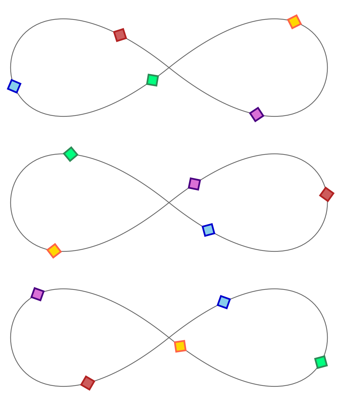
Figure 19-1. Three stages of an infinite animation of shapes moving around a path
Example 19-3. Animating motion along a path
<svgxmlns="http://www.w3.org/2000/svg"xml:lang="en"xmlns:xlink="http://www.w3.org/1999/xlink"viewBox="0 0 400 160"width="4in"height="1.6in"><title>Motion on a Path, with<animateMotion></title><defs><polygonid="bead"points="-8,0 0,-8 8,0 0,8"stroke-width="2"/></defs><pathid="track"fill="none"stroke="dimGray"d="M200,80 C-50,280 -50,-120 200,80 C450,280 450,-120 200,80Z"/><usexlink:href="#bead"fill="orchid"stroke="indigo"><animateMotiondur="5s"repeatDur="indefinite"rotate="auto"><mpathxlink:href="#track"/></animateMotion></use><usexlink:href="#bead"fill="gold"stroke="tomato"><animateMotiondur="5s"repeatDur="indefinite"rotate="auto"begin="-1s"><mpathxlink:href="#track"/></animateMotion></use><usexlink:href="#bead"fill="springGreen"stroke="seaGreen"><animateMotiondur="5s"repeatDur="indefinite"rotate="auto"begin="-2s"><mpathxlink:href="#track"/></animateMotion></use><usexlink:href="#bead"fill="skyBlue"stroke="mediumBlue"><animateMotiondur="5s"repeatDur="indefinite"rotate="auto"begin="-3s"><mpathxlink:href="#track"/></animateMotion></use><usexlink:href="#bead"fill="indianRed"stroke="firebrick"><animateMotiondur="5s"repeatDur="indefinite"rotate="auto"begin="-4s"><mpathxlink:href="#track"/></animateMotion></use></svg>
The objects that we’re going to move along the path will be
<use>copies of a predefined<polygon>“beads.” The polygon is a square centered on the origin and rotated so that the corners of the square are positioned on the x- and y-axes.The path (which we’ll move the beads along) consists of two teardrop-shaped cubic Bézier curve segments on either side of the center point. The result is a sideways figure 8, otherwise known as an infinity symbol. The path is drawn visibly in the SVG, with a thin gray stroke.
Each
<use>copy of the bead contains an<animateMotion>element that defines a 5-second animation that loops indefinitely. By default, the animation duration will be the time it takes to complete a full loop of the path. Therotateattribute tells our beads to rotate to match the path.The
<path>element is referenced from the<mpath>element within the<animateMotion>.The subsequent beads are similar, except for different colors on the
<use>, and a differentbeginvalue on the animation element. Just like with CSS animations, negative start times can be used to start an animation partway through its cycle.
The code for Example 19-3 amply demonstrates a significant limitation of the SVG/SMIL syntax: it is not DRY at all. Each <animateMotion> element is almost identical, but the attributes and child <mpath> element all need to be repeated. There is no equivalent to the cross-references used in SVG patterns and gradients to make one effect a template for another.
Note
OK, theoretically there’s a way to reduce repetition, by using custom XML DOCTYPE declarations to set default attribute values for elements of a given tag name. But if you don’t already know what that means, you probably don’t want to.
For <animateMotion> in particular, an important limitation is that you can’t easily include a fallback static position for unsupporting browsers. The extra transformation from the motion effect is added to whatever position or transformation the element already had; it doesn’t replace a base attribute. Without SMIL support, all the beads are drawn centered over the origin of the SVG.
We’ll consider another—cross-browser compatible—way to create this effect in the section on scripted animations.
Benefits and Limits of SVG/SMIL Animation Elements
The SVG/SMIL animation elements have a number of capabilities that CSS animations and transitions don’t, some of which we’ve covered here and some of which we describe in the supplementary material:
-
They can animate attributes, not only styles.
-
Many independent animations can be set on the same element, and animations of the same property can be additive.
-
Progressive animations can be defined as accumulative repeats.
-
Animations on the same or different elements can be synchronized or chained together, optionally with time offsets.
-
By tying an element’s
begintime to its ownendtime, plus an offset, you can create animations that repeat after a delay. -
You can specify the number of repeats in terms of the total animation time instead of as a repeat count.
-
Animation times are coordinated for the entire document; with JavaScript, you can pause or reset all animations in sync.
-
Animations (or
<set>changes to any value) can be triggered by any DOM event, not only the ones that create CSS pseudoclasses. -
You can animate the
displayproperty (although, for SVG,displayis only a benefit relative tovisibilityif you are hiding and showing text spans).
However, the syntax also has some limitations compared to CSS:
-
Each animation element can only animate a single target element, and there’s no easy way to copy attributes from one animation to another. This means a lot of repeated code for many designs.
-
There is no shorthand way to create alternating animations, or animations from a specified value to the base value specified on the element, so you end up repeating values.
-
There are no keyword easing (timing) functions, there’s no way to create bounce/overshoot easings without adding extra
values, and there is no way to specify that the same easing should apply for multiple transitions in avalueslist. Overall, the easing syntax is just painful to use compared to CSS. -
Applying a backward fill to a delayed animation requires a separate
<set>element. -
You cannot easily pause individual animation effects in process.
-
Transitions to and from a state that can last an indefinite amount of time (e.g., a hover effect, or a toggle button) are very difficult to coordinate using the event-triggered timing model.
But of course the biggest limitation of the animation elements is the lack of support in Microsoft browsers. This limits their practical use on the web, which means that other browsers don’t have a strong incentive to improve their implementations. Bugs accumulate and performance is ignored.
The solution in most cases is JavaScript, which we’ll discuss in the next section.
But JavaScript does not work in SVG used as images, or in some non-web SVG applications. And it is often overkill for simple decorative animations that can be defined in a few lines of SVG/SMIL code.
That means there is still a use for SVG/SMIL on the web, but not as the centerpiece of an animated web interface.
Scripting Every Frame
Anything you can do with SVG/SMIL and CSS animations you can do with JavaScript, because JavaScript can modify every attribute and style property on any element. JavaScript can also animate text content, not only its visibility. Scripts can create or delete elements, and can rearrange the order of elements in the DOM, which is needed—for now—to simulate z-index changes in SVG.
The downside—for now—is that your script needs to tell the browser what to draw at every single frame of the animation, not only at the keyframes. And those calculations normally run in the main JavaScript thread, which can conflict with other code that you have running.
At its most basic, animating your document with JavaScript is just updating attributes or style properties to new values. We’ve already done that in many different examples. But in order to transition those changes, like you can with CSS and SMIL animations, you don’t want the full change to happen all at once. Instead, you need to spread out those updates over the duration of the animation.
To create the appearance of continuous change, the updates need to be made faster than the human eye can detect the individual changes. Just like the difference between a slideshow and a film, the secret to creating moving pictures is to change the graphic frequently, but only a little bit each time.
Note
The accepted standard for “continuous” animation on the web is 60 frames per second (fps), or about 16ms betweeen updates. But this is only a rough approximation.
If the updates from one frame to the next are subtle, you can get away with a lower frame rate (that is, longer time between updates) and it will still look continuous. However, if the updates involve significant changes—like moving long distances across the screen—even 60fps can look jumpy. You may need to soften the change with a motion blur effect, to create the appearance of smooth motion.
Continuous scripted animations therefore require repeated code that runs at regular intervals, updating values a little bit at each iteration. That means we need two things:
-
an animation update function that will keep track of all the in-progress animations, and calculate and apply the current values based on the current time
-
a timer function that will call our update function at regular intervals
Together, these create our animation loop.
The animation update functions can be as simple or as creative as you like. We’ll give some basic examples, but we can’t cover all the possibilities. But the timer functions are what drive your custom JavaScript animation, and there are only a few options for them.
Triggering Regular Updates
In Chapter 2, we used JavaScript to animate our stoplight graphic. It wasn’t a continuous animation, but it was an animation. The update function (cycle() in Example 2-2) changed which versions of the lights were visible to create the effect of one light switching off and another light switching on.
To trigger our cycle updates once every 3 seconds, we used the setInterval() JavaScript function. We also used setInterval() in Chapter 18, to update the countdown timer in our game.
The setInterval() function is a core JavaScript function. It takes two parameters: a function object and a time in milliseconds. The browser will then run that function repeatedly until the interval is cancelled, with a delay between runs of approximately the number of milliseconds you specify.
Tip
You cancel a previously set interval with the clearInterval() method, passing it the token that was returned when you initially called setInterval(). Example 18-5 includes a clearInterval() after the timer is complete.
setInterval() and the similar, but nonrepeating setTimeout() used to be the only options available for regularly updating JavaScript animations.
If you’re creating a discrete animation that only updates every few seconds—like the stoplight—then setInterval() is still a great choice.
The problem comes when you want to update your animation frequently, like every 16ms for a 60fps continuous animation. setInterval() is a little too bossy. The browser will try to keep up with that interval even if it has other code to run, and even if the web page is currently in a nonactive browser tab (although browsers are changing both behaviors, to keep interval-based code from locking up your computer completely).
Even the every-100ms update we used for the timer in Example 18-5 (10fps) is getting a little too frequent for setInterval().
If the timer code were more complicated, and the game were inline in a web page with a lot else going on, there could be noticeable lags. If the timer ran indefinitely—instead of for max 15 seconds—it could slow down your browser if you left it open in a background tab.
Modern browsers have a better solution for triggering animation updates: requestAnimationFrame().
The requestAnimationFrame() method asks the browser to run a function—which you specify as a parameter—the next time the browser is ready to update the visual rendering of this web page.
If the web page is currently in a nonactive browser tab, the function won’t run until the user switches back to view the page. When the page is visible, the browser will adjust how frequently it updates, to provide a balance between animation smoothness and overall performance.
Warning
requestAnimationFrame() is supported in most browsers you need to worry about, but you may want to add a polyfill script for Internet Explorer 9 and Android 4.3 and under—for example, Paul Irish’s version.
A polyfill converts your modern code into setTimeout() loops for the older browsers.
The behavior of requestAnimationFrame() is closer to setTimeout() than setInterval(): by default, it runs the function only once. If you want the animation to continue, your update function itself needs to request another frame.
Because you don’t know exactly when your function will run, or how frequently, you’ll need to check the current time in your update code. You could do this by grabbing the Date.now() system timestamp, but the browser passes a dedicated animation timestamp as a parameter to your update function.
Tip
The timestamps passed to animation functions are not interchangeable with the system time used in Date.now() timestamps. Instead, they are measured since the document was loaded or refreshed.
If you have multiple animation functions, they’ll all get the exact same timestamp value for the same animation frame.
The following code adapts our timer code in Example 18-5 to use animation frames instead of fixed intervals, and to use the animation timestamp instead of Date.now():
varendTime;requestAnimationFrame(updateTime);functionupdateTime(t){if(!endTime){endTime=t+timeLimit*1000;}vartimeLeft=endTime-t;if(timeLeft<=0){endGame();timeLeft=0;}else{requestAnimationFrame(updateTime);}timer.textContent=(timeLeft/1000).toFixed(1);}
The initial request (outside of the update function) starts the animation running. The function then requests additional animation frames until the time expires.
The timer won’t run in the background if you switch to a different browser tab, but the time will be correct if you switch back to this tab.
However, because we are now relying on the animation loop itself for the timestamps, our timer only starts when the first frame of the animation is painted, not when the initial request was made. If you need an independent start time, you can use the performance.now() method to get a compatible timestamp outside of the animation loop.
Warning
Browser support for the performance object isn’t quite as good as for requestAnimationFrame(). If you use it, you may need to polyfill it as well.
As before, the updateTime() function checks whether the time has run out. The request for the new animation frame only runs if that isn’t true, so the loop will stop automatically when the timer reaches 0. Note also that the new request isn’t the last line of the function. It doesn’t need to be; it is only queuing the request to run later.
There is also a cancelAnimationFrame() method, which you can use instead of adding an if test in your animation loop. Similar to clearInterval(), it requires a token value that is returned when you call requestAnimationFrame():
/* in the updateTime() function... */frame=requestAnimationFrame(updateTime);/* separately */functionstopTimer(){if(frame){cancelAnimationFrame(frame);}}
requestAnimationFrame() isn’t perfect. It only runs if the browser is repainting the web page, but it doesn’t include a check for whether the part of the web page you’re updating is currently visible. If you’ve got many inline SVGs within a large web page, you’ll want to add your own check to determine which ones are onscreen and therefore need updating.
Beyond that, the main limitation of requestAnimationFrame() animations—compared to CSS, SMIL, most JS animation libraries, or the future Web Animations API—is that you need to write your own code to calculate the updated graphic at each frame. That makes it incredibly flexible. But it can be easy to get tangled up in all that flexibility.
Calculating the Current Value
Broadly speaking, there are two main approaches to calculating animation progression:
- Interpolation
-
Interpolation animation is the type of tweening animation used by CSS animations and transitions, SVG/SMIL, and the Web Animations API (level 1, anyway). The animation is defined by the amount of change that you want to apply, and the amount of time that it should take.
To create your own interpolation function, you convert the current time into a proportion of the animation duration, and then convert that into a proportion of the distance between your initial and final values. The conversion from time percentage to value percentage can be linear (one-to-one, the easiest choice), or it can use an easing function, equivalent to the timing functions used in CSS animations and transitions.
- Physics-based animation
-
Used primarily for motion, physics-based animation defines the properties of the moving objects (particularly their speed and acceleration), and calculates their motion from that. The “physics” used in the animation calculation can be as realistic or as simplistic as you want. How long it takes the objects to reach a given position is determined entirely from the calculations you use.
Physics-based motion is preferred in games, where you don’t want everything to be predetermined. In games, you will often change the properties of the objects—such as their speed or their direction—based on user interaction or randomization.
There is really no end to the possible calculations you could integrate into an animation loop. So we’re not going to try to discuss them here. There are plenty of other good resources on game and animation design if you are interested.
Instead, as a simple example of a JavaScript animation loop, we’re going to recreate our motion-along-a-path graphic from Example 19-3.
This is an interpolated animation, since we know exactly how we want the “bead” elements to move, and how long they should take. Specifically, we are interpolating the distance along the path. Each bead should move the same distance along the path in the same time period, completing a full loop every 5 seconds (which was the dur in our <animateMotion> elements).
To transform our beads into the correct position, we therefore need to figure out the (x,y) position of a point that is a certain distance along the path. That sounds like a lot of math, but luckily the browser does it for us.
The <path> element has a method called getPointAtLength(). (In SVG 2, all the other basic shape elements will have the method, too.) You pass in a distance in user units (px), and you get back a point object with x and y properties for the coordinates of that point on the path.
Tip
The point object is the same as the ones we used in Chapter 18 to calculate transformations on mouse-click points. Depending on the browser, the object will either be called SVGPoint or DOMPoint.
We also want to rotate our beads to match the angle of the path. Unfortunately, there is no getAngleAtLength() method for paths. So we need to do a little bit of math ourselves.
By getting two different points from the path—close to each other but not identical—we can calculate the approximate rate of change of the curve at that point. The relative x and y change can then be converted to a tangent angle, using a little bit of trigonometry (an arc-tangent function, to be precise).
Example 19-4 provides the code. The visual result is the same as Figure 19-1.
Example 19-4. Animating motion along a path, with JavaScript
<svgxmlns="http://www.w3.org/2000/svg"xml:lang="en"xmlns:xlink="http://www.w3.org/1999/xlink"viewBox="0 0 400 160"width="4in"height="1.6in"><title>Motion on a Path, with JavaScript</title><defs><polygonid="bead"points="-8,0 0,-8 8,0 0,8"stroke-width="2"/></defs><pathid="track"fill="none"stroke="dimGray"d="M200,80 C-50,280 -50,-120 200,80 C450,280 450,-120 200,80Z"/><usexlink:href="#bead"fill="orchid"stroke="indigo"/><usexlink:href="#bead"fill="gold"stroke="tomato"/><usexlink:href="#bead"fill="springGreen"stroke="seaGreen"/><usexlink:href="#bead"fill="skyBlue"stroke="mediumBlue"/><usexlink:href="#bead"fill="indianRed"stroke="firebrick"/><script><![CDATA[(function(){vartrack=document.getElementById("track"),trackLength=track.getTotalLength(),beads=document.querySelectorAll("[*|href='#bead']"),nBeads=beads.length,dur=5000;//duration of one loop of track, in msfunctionupdate(time){vart=(time%dur)/dur,/* position in repeat cycle */distance,/* distance along the path for this bead */point,/* SVGPoint for that distance */point2;/* SVGPoint for a slightly different distance */for(vari=0;i<nBeads;i++){distance=trackLength*((t+i/nBeads)%1);point=track.getPointAtLength(distance);point2=track.getPointAtLength((distance+2)%trackLength);angle=Math.atan2((point2.y-point.y),(point2.x-point.x));beads[i].setAttribute("transform","translate("+[point.x,point.y]+")"+"rotate("+angle*180/Math.PI+")");}requestAnimationFrame(update);}requestAnimationFrame(update);})();]]></script></svg>
The markup is the same as Example 19-3, except that we’ve removed all the animation elements. The
<use>elements are by default all drawn centered on the origin; we will be transforming them into place.We save the
trackpath in a variable, since we’ll need it for the distance calculations, but we also save its total length in a variable, since the path itself isn’t changing. ThegetTotalLength()method is the same one we used in Chapter 13 for calculating dash lengths.We also select the bead elements ahead of time, using the namespace-insensitive version of a CSS attribute selector. Since the number of beads isn’t changing, we save that to a variable, too, to save us one more step in each loop of our update function.
The first step of each
update()is to convert the timestamp into a value between0and1, representing the proportion of the animation cycle. Because it’s an infinitely repeating animation, we don’t have to worry about exact start times. Instead, the modulus (%) operator finds the amount by which the timestamp exceeds an even number ofdurcycles. Division converts that to a proportion.The remainder of the calculations are done separately for each bead. The beads are evenly staggered along the track, so that bead number 4 out of 5 is 4/5 farther along the path than the first bead. The modulus operator again comes in handy to handle wraparounds, for beads that are so far ahead they are behind again. The saved
trackLengthscales up the proportions of the path to actualpxdistances.Once we have the calculated distance, we can get the point object from the
<path>element—and then we get the point 2px farther ahead (with modulus for the wraparound), so we can calculate the tangent angle.
The
Math.atan2()function calculates a tangent angle (in radians) from two parameters: the change in y-value and the change in x-value (in that order).
Using our primary point and our calculated angle, we can therefore set the
transformattribute on our bead: first a translation to the correct point, then a rotation to the correct angle. Because thetransformattribute needs angles in degrees (but the JavaScript trigonometry functions use radians), we need a little more math to do the conversion: 180° equals π radians.
At the end of the
update()function, we request that the browser do it all again at the next frame.
Finally (and most importantly), we start the loop running by requesting the first animation frame, from our main procedure function.
This version of the animation runs in every browser, including MS Edge and Internet Explorer. But if you want to use it as a loader, remember to embed it with <object>, not <img>, or copy it as inline SVG: the script won’t run at all in SVG used as an image.
Summary: Animation
SVG used in web browsers is dynamic, able to change over time. Animated SVG can consist of predetermined, noninteractive loops—the vector equivalent of animated GIFs. But animated SVG can also be part of complex interactive games and documents, giving feedback to user actions and providing continuity through content changes.
CSS animations and transitions are now the first choice for many simple animations. They have an easy-to-use syntax and are fairly well supported in browsers—and familiar to many web developers. However, they cannot be used to animate many SVG attributes, or for complex animation sequences.
The SVG/SMIL animation elements are incredibly flexible for defining animations, including attribute animations, synchronized sequences of animations, and complex motion animations. However, they have never reached full cross-browser support, and can be buggy even where supported.
For complex interactive animations, and for anything where browser support is essential, you can animate your SVG document with JavaScript. If you’re adding a lot of animation, there are dedicated JavaScript libraries to help you do so efficiently. The Web Animations API also makes simple animations easier, although it still requires a polyfill library for complete browser support.
However you choose to animate your document, you’ll need to consider the design of your animation carefully to ensure good performance.
You also need to design your animations carefully to consider usability. We haven’t discussed design and usability in this chapter, but we cover a few points as part of our best practice guidelines in Chapter 20.