Table of Contents for
Using SVG with CSS3 and HTML5
 Using SVG with CSS3 and HTML5
Published by
O'Reilly Media, Inc., 2017
Using SVG with CSS3 and HTML5
Published by
O'Reilly Media, Inc., 2017
- nav
- Cover
- Using SVG with CSS3 and HTML5
- Using SVG with CSS3 and HTML5
- Preface
- I. SVG on the Web
- 1. Graphics from Vectors
- 2. The Big Picture
- 3. A Sense of Style
- 4. Tools of the Trade
- II. Drawing with Markup
- 5. Building Blocks
- 6. Following Your Own Path
- 7. The Art of the Word
- III. Putting Graphics in Their Place
- 8. Scaling Up
- 9. A New Point of View
- 10. Seeing Double
- 11. Transformative Changes
- IV. Artistic Touches
- 12. Filling Up to Full
- 13. Drawing the Lines
- 14. Marking the Way
- 15. Less Is More
- 16. Playing with Pixels
- V. SVG as an Application
- 17. Beyond the Visible
- 18. Drawing on Demand
- 19. Transitioning in Time
- 20. Good Manners
- Index
- About the Authors
- Colophon
Chapter 5. Building Blocks
Chapter 5. Basic Shapes
Most SVG graphics are built from one or more shape elements. Shapes—along with text and embedded images—provide the basic graphical content that is drawn to the screen. The attributes of each shape element define the geometrical region of that shape; its style properties control how that vector region is displayed on the screen (or printed on paper).
SVG defines two different ways of creating a shape. The first is to make use of the predefined shape primitives. In Chapter 1, we introduced two of these: circles and rectangles. The others are <line> and <ellipse>. These are “quick and dirty” shapes that are useful for fast layout, common operations, and fairly standard interface and graphic design layouts. They can also make your code easier to read, as the element tag names clearly define what shape it is.
However, predefined shapes are limited. For most drawings, you will need to create custom shapes, using <polygon>, <polyline>, or <path>. A <path> can be used to replace any of the other shape elements, but is considerably more flexible. SVG paths can be used to draw incredibly complex shapes that are not included in any geometry textbook.
This chapter introduces the basic shapes in detail, discussing how you can specify lengths and positions in SVG. With this information, you will be able to lay out many simple geometric designs. Chapter 6 then explores <path> and the other custom shape elements, and the variety of shapes they can create. At the end, you’ll have all the information you need to create basic vector icons and line drawings with SVG. In theory, anyway—it takes a lot of practice to really get comfortable with manipulating curved paths!
For now, the shapes will be filled or stroked with solid colors, and they will be drawn at a specific size and position within the graphic. In Part III, we’ll explore the ways you can manipulate the geometry of shapes by altering the coordinate system in which the vector shapes are defined. In Part IV, we will discuss the ways in which you can change the appearance of the shapes.
Drawing Lines, from Here to There
The simplest shape in the SVG lexicon is the <line>. It represents a straight segment connecting two points. A line’s geometry is defined by four attributes: x1 and y1 give the coordinates of the starting point, while x2 and y2 give the coordinates of the end point. The following code describes a diagonal line from (0,100) to (100,0):
<linex1="0"y1="100"x2="100"y2="0"/>
Tip
All SVG shapes, even <line> and <polyline>, are by default styled with fill: black and stroke: none. This means that, by default, a <line> will not be visible. There is no area inside a straight line to be filled in.
Use CSS or presentation attributes to give the lines a stroke color. You can also optionally set fill: none, although this won’t have a visible effect with <line>.
As described in Chapter 1, coordinates are (by default) measured from the top-left corner of the graphic. When numbers are given without units, these user coordinate lengths are (again, by default) equivalent to CSS px units. Figure 5-1 shows the line with a royal blue stroke 10px wide, in a 1.5in square SVG with a golden yellow background.
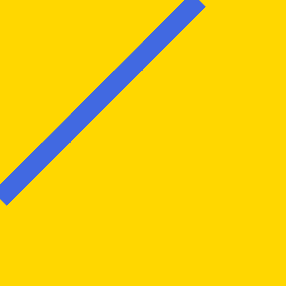
Figure 5-1. An SVG line, stroked in blue
Tip
CSS background and border properties are supported in web browsers for the root <svg> element of an SVG file, in the same way that they apply to an inline <svg> in an HTML page. But beware: borders, margin, and padding on that root <svg> will mess up sizing and scaling if you use that SVG file in an HTML <img> or <object>.
If any of the geometric attributes are left out, the corresponding coordinate will default to 0. The following <line> is therefore equivalent to the previous one:
<liney1="100"x2="100"/>
In contrast, the following code draws a line from (100,0) to (0,100). Although it will often look exactly the same as the previous lines, some styles (stroke dashes and line markers, which we discuss in Chapters 13 and 14) will distinguish between the start and end points of a line.
<liney2="100"x1="100"/>
Tip
The order in which you list the attributes makes no difference, only the attribute names.
In addition to user coordinate values, each attribute can be given as a percentage, or as a length with unit. The units defined in SVG 1.1 are the same as those defined in CSS 2: px, pt, pc, cm, mm, in, em, and ex.
Example 5-1 uses a simple JavaScript routine to create an arrangement of lines with their start and end points offset at 1-centimeter intervals.
Tip
The script uses the document.documentElement property to access the root SVG element. This only works in a .svg file. In a .html file, the documentElement would be the <html> element, not an <svg>!
To adapt this script for inline SVG, use querySelector("svg") to find the first <svg> element from your markup, or use a class or id.
The code takes advantage of the default coordinates, and does not explicitly set attributes that will always be zero. This is a common trick in SVG coding. The origin is your friend: the more that you can rely upon it, the fewer positioning attributes you need to specify in the SVG markup. Chapters 8 and 11 will discuss how you can control the position of the origin—the (0,0) point—relative to the image region.
Example 5-1. Drawing SVG lines with JavaScript
SVG markup:
<svgxmlns="http://www.w3.org/2000/svg"xml:lang="en"height="10cm"width="10cm"><title>Line Art</title><styletype="text/css">line{stroke:purple;}svg{margin:1cm;}</style><script><![CDATA[/* script goes here */]]></script></svg>

The SVG is given a square drawing region, 10cm wide and tall.

The markup consists only of the title, style rules, and JavaScript.

Although
marginisn’t well defined for standalone SVG, it is supported on the root element in most web browsers.
The entire drawing is created within the
<script>. The<![CDATA[and]]>markers ensure that less than/greater than signs within the script are not interpreted as XML markup (don’t include them in HTML scripts).
JavaScript:
(function(){varsize=10;vardoc=document;varsvg=doc.documentElement;varsvgNS=svg.namespaceURI;if(!(svg.classList&&svg.classList.contains("initialized")))draw();functiondraw(){varl1,l2;for(vari=0;i<=size;i++){l1=doc.createElementNS(svgNS,"line");l1.setAttribute("x1",i+"cm");l1.setAttribute("x2",size+"cm");l1.setAttribute("y2",i+"cm");svg.appendChild(l1);l2=doc.createElementNS(svgNS,"line");l2.setAttribute("y1",i+"cm");l2.setAttribute("x2",i+"cm");l2.setAttribute("y2",size+"cm");svg.appendChild(l2);}if(svg.classList)svg.classList.add("initialized");}})()
The size of the drawing region, in centimeters, is stored in a variable to avoid repeating the number 10 multiple times in the code. Once again, the entire script is encapsulated in an anonymous function call.
The
documentElementis the root element created in the markup; here, it is the main<svg>element.Rather than repeat the SVG namespace URI multiple times in the code (and risk a typo), we access it from the
<svg>element itself.In some browsers, if you save a web page that was generated from a script, the saved page will include both the generated elements and the script. When you reopen the saved file, the script runs again, doubling all the generated elements. (Other browsers save the raw source code.) This line tests to see if the SVG has already been initialized, and only draws the graphic if it hasn’t. Before using the DOM 3
classListobject, it checks to confirm it exists, avoiding errors on older platforms.
Inside the
draw()function, aforloop creates the lines, adjusting their start and end points by 1cm at a time, from 0 to 10cm (inclusive).
The first block of code creates the lines for the top-right corner of the graphic, using the methods
createElementNS()andsetAttribute().
For all of these lines, we leave
y1as the default0, and setx2to10cm. Thex1andy2attributes are adjusted for each cycle of theforloop.
The
appendChild()method adds the newly created<line>element to the SVG, as the last child of the<svg>.
The second batch of instructions is similar, but it now creates lines in the lower left of the graphic. All the lines have
x1of0(default) andy2set to10cm.
Finally, after drawing is complete, we mark the
<svg>element with theinitializedclass (after again checking that theclassListproperty is supported).
The script (and other scripts in this book) uses what is commonly known as “Vanilla JavaScript.” Elements are created, and attributes modified, with the core DOM methods directly supported by the browsers, not with shorthand methods from an imported library or framework. It may look more verbose than a JQuery or d3 script, but it’s a lot less code from the perspective of the browser’s JavaScript parser—and the user’s data plan!
Tip
As we warned in Chapter 2, you need to use createElementNS with the SVG namespace URI in order to create a valid SVG element. However, the namespace can be accessed from the namespaceURI property of any existing SVG element.
The graphic generated by the script is displayed in Figure 5-2. Mathematically, you could say that the lines create a mesh envelope for the curved region in the center. You may also recognize the pattern as recreating the kind of string-and-peg artwork that was popular in the 1960s.
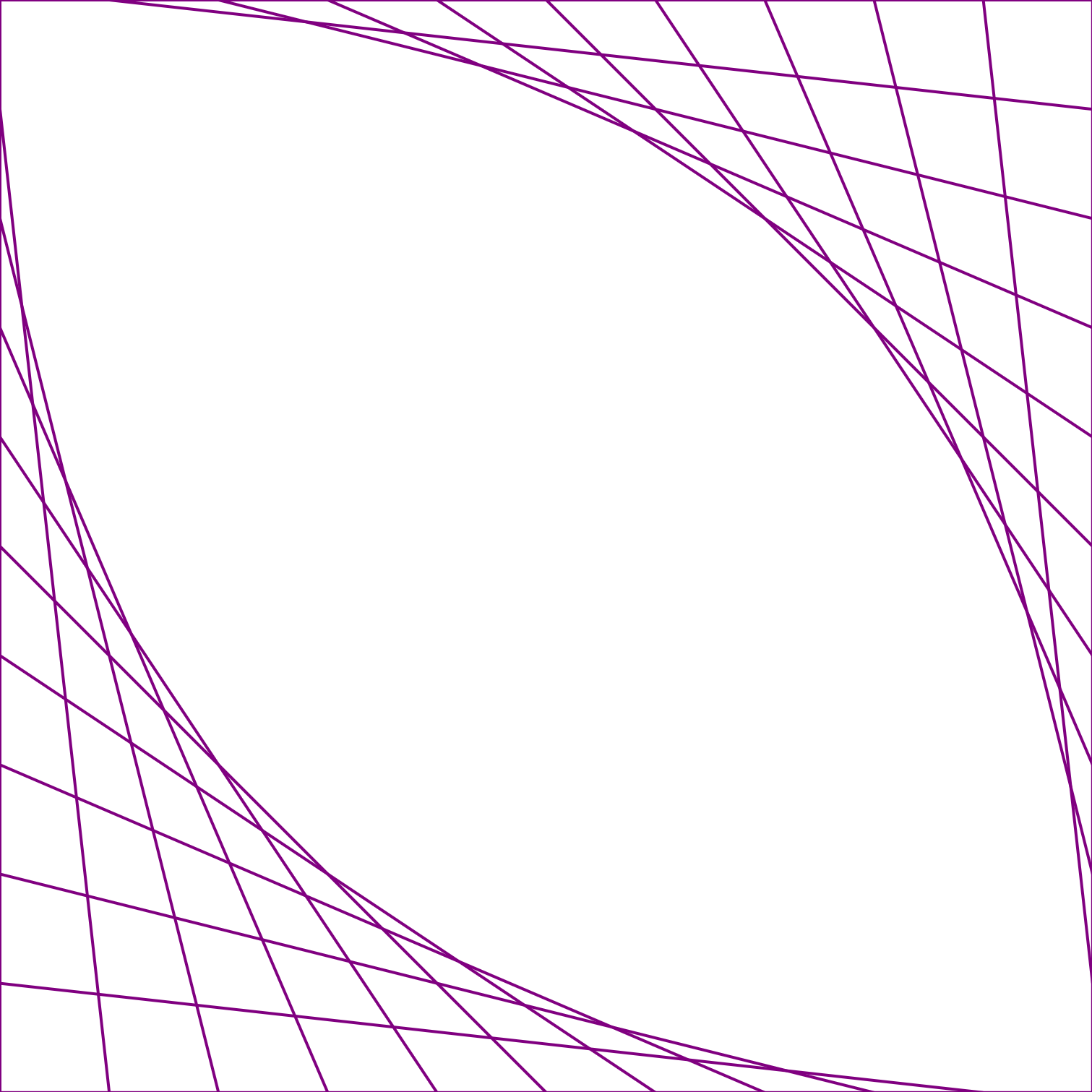
Figure 5-2. String art “curves” created from SVG lines
The code in Example 5-1 includes a <style> section that sets the stroke property for all line elements. This creates the visible line, drawn centered along the line defined by the vector coordinates.
The exact geometry of a stroke is controlled by a variety of other style properties—stroke-width, stroke-opacity, stroke-dasharray, and so forth—that will be covered in more detail in Chapter 13. For now, it’s worth noting that stroke-width has a default value of 1; this creates the 1px-wide “strings” in the graphic (Figure 5-2).
Although the lines were created with JavaScript, the final result is an SVG document held in your browser’s memory. Example 5-2 shows the markup that describes that SVG document, similar to what you would see in the DOM inspector of your browser’s developer tools.
Example 5-2. The SVG document created by the line-art script
<svgxmlns="http://www.w3.org/2000/svg"xml:lang="en"height="10cm"width="10cm"class="initialized"><title>Line Art</title><styletype="text/css">line{stroke:purple;}svg{margin:1cm;}</style><script><![CDATA[/* the script is still here */]]></script><linex1="0cm"x2="10cm"y2="0cm"/><liney1="0cm"x2="0cm"y2="10cm"/><linex1="1cm"x2="10cm"y2="1cm"/><liney1="1cm"x2="1cm"y2="10cm"/><linex1="2cm"x2="10cm"y2="2cm"/><liney1="2cm"x2="2cm"y2="10cm"/><linex1="3cm"x2="10cm"y2="3cm"/><liney1="3cm"x2="3cm"y2="10cm"/><linex1="4cm"x2="10cm"y2="4cm"/><liney1="4cm"x2="4cm"y2="10cm"/><linex1="5cm"x2="10cm"y2="5cm"/><liney1="5cm"x2="5cm"y2="10cm"/><linex1="6cm"x2="10cm"y2="6cm"/><liney1="6cm"x2="6cm"y2="10cm"/><linex1="7cm"x2="10cm"y2="7cm"/><liney1="7cm"x2="7cm"y2="10cm"/><linex1="8cm"x2="10cm"y2="8cm"/><liney1="8cm"x2="8cm"y2="10cm"/><linex1="9cm"x2="10cm"y2="9cm"/><liney1="9cm"x2="9cm"y2="10cm"/><linex1="10cm"x2="10cm"y2="10cm"/><liney1="10cm"x2="10cm"y2="10cm"/></svg>
The SVG now has the
initializedclass, as the drawing script has completed.The script code is still part of the DOM, but if the page is reloaded it will only run as far as the point where it checks for the initialized class.
The 22 generated
<line>elements are appended at the end of the SVG in the order they were created by the script.
The many lines in Example 5-2 may appear to create a single shape, but they don’t. Each line is still a separate element in the document. And although they appear to outline a square and also enclose a curved region, you cannot fill in either region as a block of color.
The remaining shape elements, in contrast, allow you to define shapes as you’re probably more used to thinking of them—as two-dimensional areas with an inner fill region surrounded by stroked edges.
It’s Hip to Be Square (or Rectangular)
Extending the straight line to two dimensions creates the next basic shape, the rectangle. As we saw in Chapter 1, a rectangle is represented in SVG by the <rect> element. While lines are defined by the coordinates of two different points, the SVG rectangle follows a slightly different approach. Instead of defining start and end points, a <rect> is defined by one point and a width and height. The positioning point is set by x and y attributes (not x1 and y1 like for a line); this defines the upper-left corner of the rectangle.
Tip
As with <line>, if any of the geometric attributes x, y, width, or height are not specified on a <rect>, they default to 0. However, if either width or height is zero, the rectangle will not be drawn at all—not even the stroke. A negative width or height is invalid.
You can use the <rect> element to create a square simply by setting the width and height equal. The following creates a 1-inch square:
<rectwidth="1in"height="1in"/>
Each attribute is independent, and can have different units—or no units at all. The following code shifts the square 1cm from the left edge of the SVG and 12pt (⅙ inch) from the top edge:
<rectx="1cm"y="12pt"width="1in"height="1in"/>
That square <rect>, filled in purple—darkOrchid, to be precise—and added to the line from Figure 5-1, creates Figure 5-3.
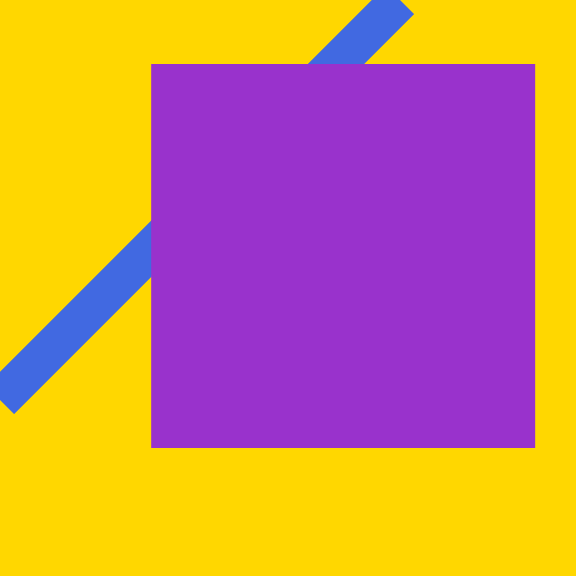
Figure 5-3. An SVG rectangle, filled in purple
Tip
If you’re displaying the preceding square on a screen, and measure it with a ruler, you’ll probably discover that it is not exactly 1 inch square.
Browsers that support CSS3 units will always adjust the definition of real-world units (like in and cm) to maintain a constant ratio to CSS px units (96px per inch), while also allowing px layout units to line up neatly with the physical pixels of your screen. When printing, the browser will generally use the real-world inch as the base unit, and adjust px accordingly.
The following describes a rectangle that is 80% of the height and width of the parent <svg> and centered in the SVG region (10% offset from each side):
<rectx="10%"y="10%"width="80%"height="80%"/>
The actual width-to-height ratio of this rectangle will depend on the width-to-height aspect ratio of the SVG itself; it may be a square, but not necessarily.
Simple rectangles may not be very exciting, but there are lots of practical designs that use them.
Example 5-3 generates a chess- or checkerboard design from <rect> elements, using JavaScript. The final graphic contains one large rectangle for the edges of the board, then 64 (8×8) smaller black and white squares.
Example 5-3. Creating a checkerboard of SVG rectangles with JavaScript
SVG markup:
<svgxmlns="http://www.w3.org/2000/svg"xml:lang="en"height="9in"width="9in"><title>Checkerboard</title><styletype="text/css">.board{fill:saddleBrown;}.white{fill:linen;}.black{fill:#222;}</style><script><![CDATA[/* script goes here */]]></script></svg>
The checkerboard will be 9 inches square in total; an 8 × 8 grid of 1-inch-square tiles, with a half-inch border on all sides for the board’s frame.
The white and black tiles will be identified by class names, rather than by fill colors set directly in the DOM. This allows us to adjust the actual color used for
whiteandblack; in this case, to use a creamy off-white color and a dark charcoal gray.
JavaScript:
(function(){varsquares=8;vardoc=document;varsvg=doc.documentElement;varsvgNS=svg.namespaceURI;if(!(svg.classList&&svg.classList.contains("initialized")))draw();functiondraw(){varboard=doc.createElementNS(svgNS,"rect");board.setAttribute("width","100%");board.setAttribute("height","100%");board.setAttribute("class","board");svg.appendChild(board);varsquare;for(vari=0;i<squares;i++){for(varj=0;j<squares;j++){square=doc.createElementNS(svgNS,"rect");square.setAttribute("x",(i+0.5)+"in");square.setAttribute("y",(j+0.5)+"in");square.setAttribute("width","1in");square.setAttribute("height","1in");square.setAttribute("class",(i+j)%2?"black":"white");svg.appendChild(square);}}svg.classList.add("initialized");}})()
The script uses the same structure as Example 5-1. In this case, the
squaresvariable stores the number of squares in each row and column of the checkerboard.The first block of the
draw()function creates the background rectangle that represents the wooden board.We create the individual tiles using nested
forloops; the outer loop (with variablei) cycles through the rows of the grid, while the inner loop (with variablej) cycles through the tiles within each row.The horizontal and vertical positions of each tile (
xandyattributes) are set from theiandjvariables, adding a half-inch offset for the frame of the checkerboard.We set the class, either
blackorwhite, by testing whether the sum of the row and column index is even or odd; that is, whether the sum modulus 2 is 1 (truthy) or 0 (falsy). This creates the correct alternating pattern in both the horizontal and vertical directions.The tiles are all inserted after the board, and are therefore drawn on top of it.
Figure 5-4 shows the graphic generated by Example 5-3, scaled down to fit the page. We’re not going to print out all 65 generated <rect> elements, but be sure to open the SVG file in a browser and use the developer tools to inspect the DOM, so that you understand how it would look as SVG markup.
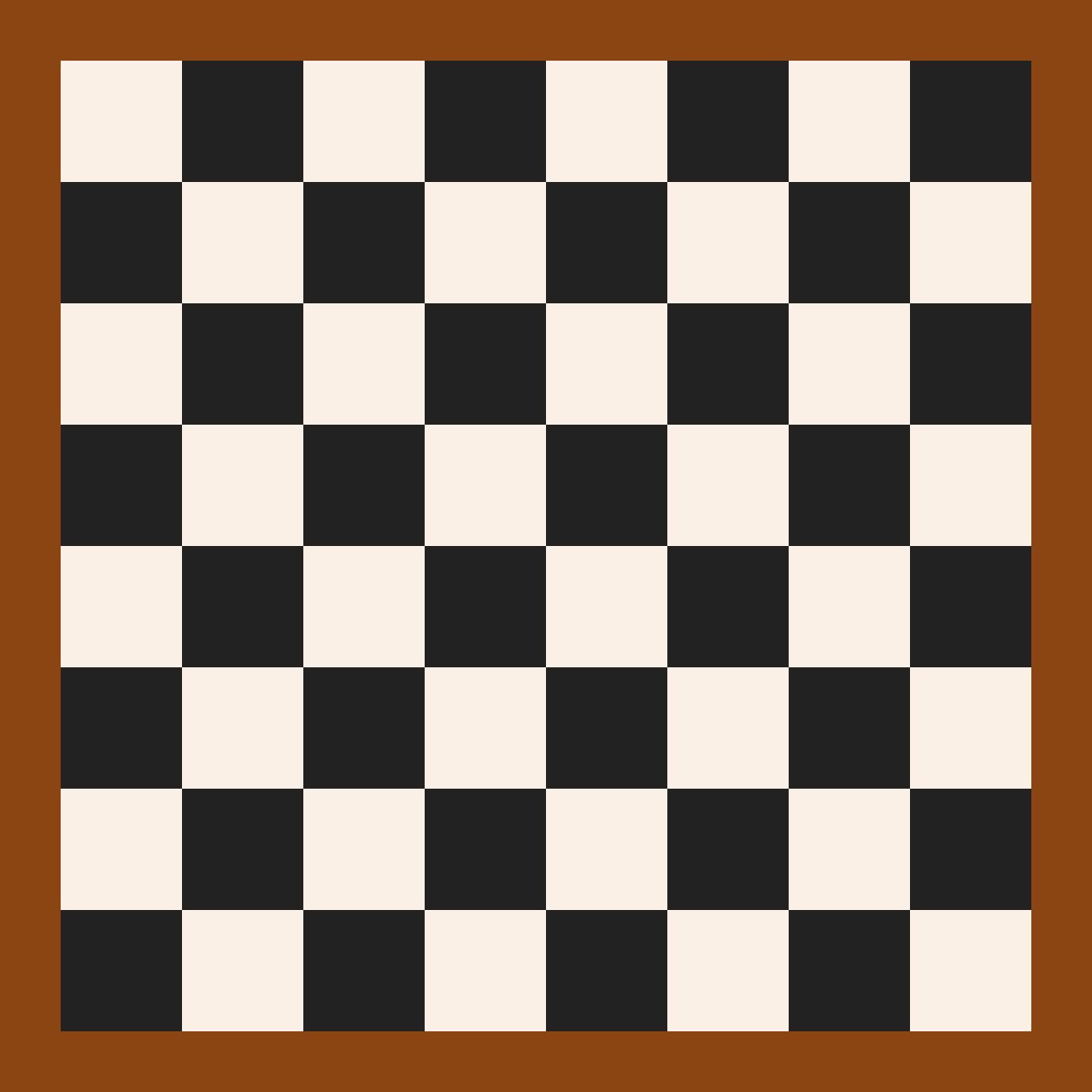
Figure 5-4. A checkerboard of SVG rectangles created with JavaScript
The final checkerboard document includes many very similar elements, and therefore is a candidate for reducing repetition with <use> elements. However, since all these repeated properties are only written once in the original script, it still meets the Don’t Repeat Yourself (DRY) principle.
Nonetheless, if you had a much larger number of repeated elements (hundreds or thousands, not just dozens), the size and complexity of the DOM could slow down your browser. For this reason, if you’re creating a repeated pattern for decorative effect only—and do not need the individual elements to respond to user events separately—you will want to use a <pattern> element, which we’ll discuss in Chapter 12.
Cutting Corners
The <rect> object is more flexible than it appears at first glance. It has two additional geometric attributes: rx and ry. These parameters are used to create rounded corners on the rectangle. Specifically, they give the horizontal (rx) and vertical (ry) radii of an ellipse (oval) used to draw the rounded corners.
As before, you can use any mix of CSS units you want, or omit the units for px coordinates:
<rectx="1cm"y="18pt"width="1in"height="5pc"rx="18pt"ry="5mm"/>
Adding that shape, with deepSkyBlue fill, to our simple example from earlier creates Figure 5-5.
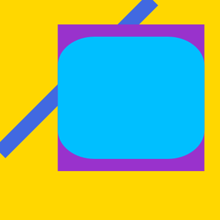
Figure 5-5. An SVG rectangle with rounded corners, positioned atop a regular <rect> and a line
The rx value sets the distance from the left and right edges of the rectangle that should be curved, while ry sets the distance from the top and bottom. These attributes also default to 0 when not specified, making the sharp-cornered rectangles we’ve seen so far.
Except…the defaults for rx and ry are more complicated than that. If you specify one of rx or ry, but not the other, the missing value is automatically calculated to match.
Tip
This creates symmetrical, circular corners—even if you use a percentage length, where the same percentage would create a different length in the other direction.
Percentages for the radius, just like percentages for all the other SVG geometry attributes, are measured relative to the SVG coordinate system as a whole: the width for rx, or the height for ry. The percentages don’t scale according to the size of the rectangle itself.
However, regardless of how you specify the radius, it will never be more than half the width or height of the rectangle. This means that sometimes a single radius value won’t create symmetrical corners, after all.
Example 5-4 uses both symmetrical and asymmetrical corner rounding on layered rectangles to create a ripple pattern radiating out from a central shape. Figure 5-6 shows the result.
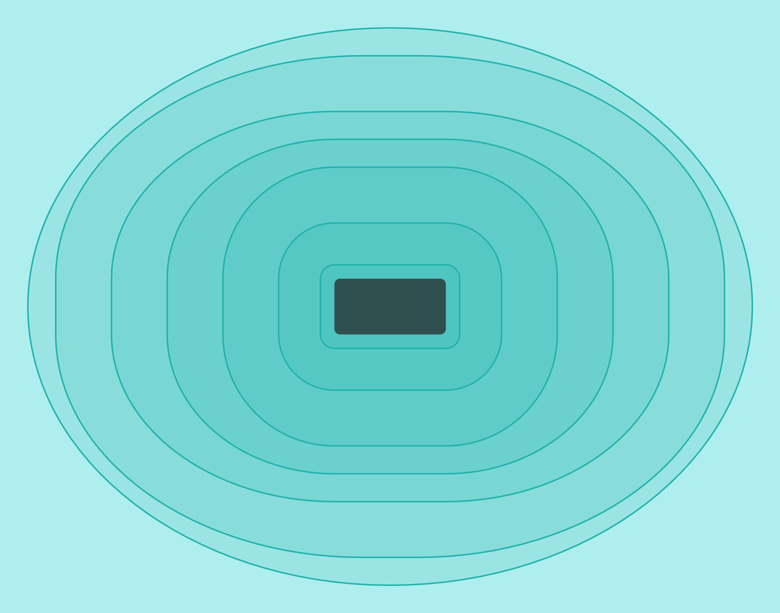
Figure 5-6. A ripple pattern created with rounded rectangles
Example 5-4. Using radiused corners to round rectangles
<svgxmlns="http://www.w3.org/2000/svg"xml:lang="en"width="14cm"height="11cm"><title>Splash!</title><styletype="text/css">.water{fill:paleTurquoise;}.ripples{stroke:lightSeaGreen;fill:lightSeaGreen;fill-opacity:0.15;}.stone{fill:darkSlateGray;}</style><rectclass="water"width="14cm"height="11cm"/><gclass="ripples"><rectx="5.75cm"y="4.75cm"width="2.5cm"height="1.5cm"rx="0.25cm"/><rectx="5cm"y="4cm"width="4cm"height="3cm"rx="1cm"/><rectx="4cm"y="3cm"width="6cm"height="5cm"rx="2cm"/><rectx="3cm"y="2.5cm"width="8cm"height="6cm"rx="3cm"ry="2.5cm"/><rectx="2cm"y="2cm"width="10cm"height="7cm"rx="4cm"ry="3cm"/><rectx="1cm"y="1cm"width="12cm"height="9cm"rx="5.5cm"ry="4cm"/><rectx="0.5cm"y="0.5cm"width="13cm"height="10cm"rx="6.5cm"ry="5cm"/></g><rectclass="stone"x="6cm"y="5cm"width="2cm"height="1cm"rx="0.1cm"/></svg>
If you inspect the code in Example 5-4 closely, you’ll notice that the layered <rect> elements are arranged with the smallest, center ripple drawn first and the largest drawn last. Nonetheless, all the elements are visible in Figure 5-6, because the fill-opacity property defines a semitransparent fill color. We’ll discuss fill-opacity again in Chapter 12, and will look at more options for transparency and blending colors in Chapters 15 and 16.
Circular Logic
The next step from rounded rectangles is to create completely rounded shapes: circles and their extended cousins, ellipses.
In Chapter 3, we showed how you can make a rectangular CSS layout box to look like a circle by setting the border radius to half the box’s width and height. The same approach could be used to create an ellipse from a <rect> element. In fact, we’ve already done that: the outermost ripple rectangle in Example 5-4 was actually an ellipse!
There is a more intuitive way to draw ellipses in SVG, however: the <ellipse> element. The rx and ry attributes are used again to specify horizontal and vertical radii, but there’s no need to specify width and height separately—they will always be exactly twice the corresponding radius.
Tip
Unlike with rounded rectangles, SVG 1 did not define any special automatic-sizing behavior for ellipses if you set one of rx or ry, but not the other. SVG 2 adds in this automatic behavior as part of the changes to make geometry more compatible with CSS.
The default would be equivalent to a new auto keyword.
At the time of writing, auto behavior for ellipses isn’t supported in web browsers.
One further difference between rounded rectangles and ellipses is how they are positioned. Rectangles are positioned by the x and y coordinates of their top-left corner, even when that corner is rounded off. Ellipses, in contrast, are positioned by their center point, through the same cx and cy attributes that we used when positioning circles in Chapter 1.
The largest, elliptical ripple <rect> from Example 5-4 was drawn with this code:
<rectx="0.5cm"y="0.5cm"width="13cm"height="10cm"rx="6.5cm"ry="5cm"/>
The exact same size and shape can be drawn as follows:
<ellipsecx="7cm"cy="5.5cm"rx="6.5cm"ry="5cm"/>
The second version is not only DRY-er (because width and height don’t need to be set separately from the corresponding radii), it is also much more clear at a glance that it is an ellipse.
As with lines and rectangles, if you don’t specify a geometric attribute, it defaults to 0; if either rx or ry is 0, the ellipse will not be drawn at all. If rx and ry compute to the same length, the ellipse becomes a circle.
However, if you want a circle, an ellipse isn’t your DRY-est option:
as we saw in Chapter 1, circles can be drawn more concisely using the <circle> element. A circle uses cx and cy to position the center point, but takes a single radius parameter, r, instead of rx and ry.
Both ellipses and circles are used in Example 5-5, with various units of measurements in the positioning and sizing attributes. (If you’re not used to imperial units, it may help to know that there are 72pt in an inch.) The resulting face, Figure 5-7, may not be terribly artistic, but it demonstrates how you can create detailed drawings by layering simple shapes.
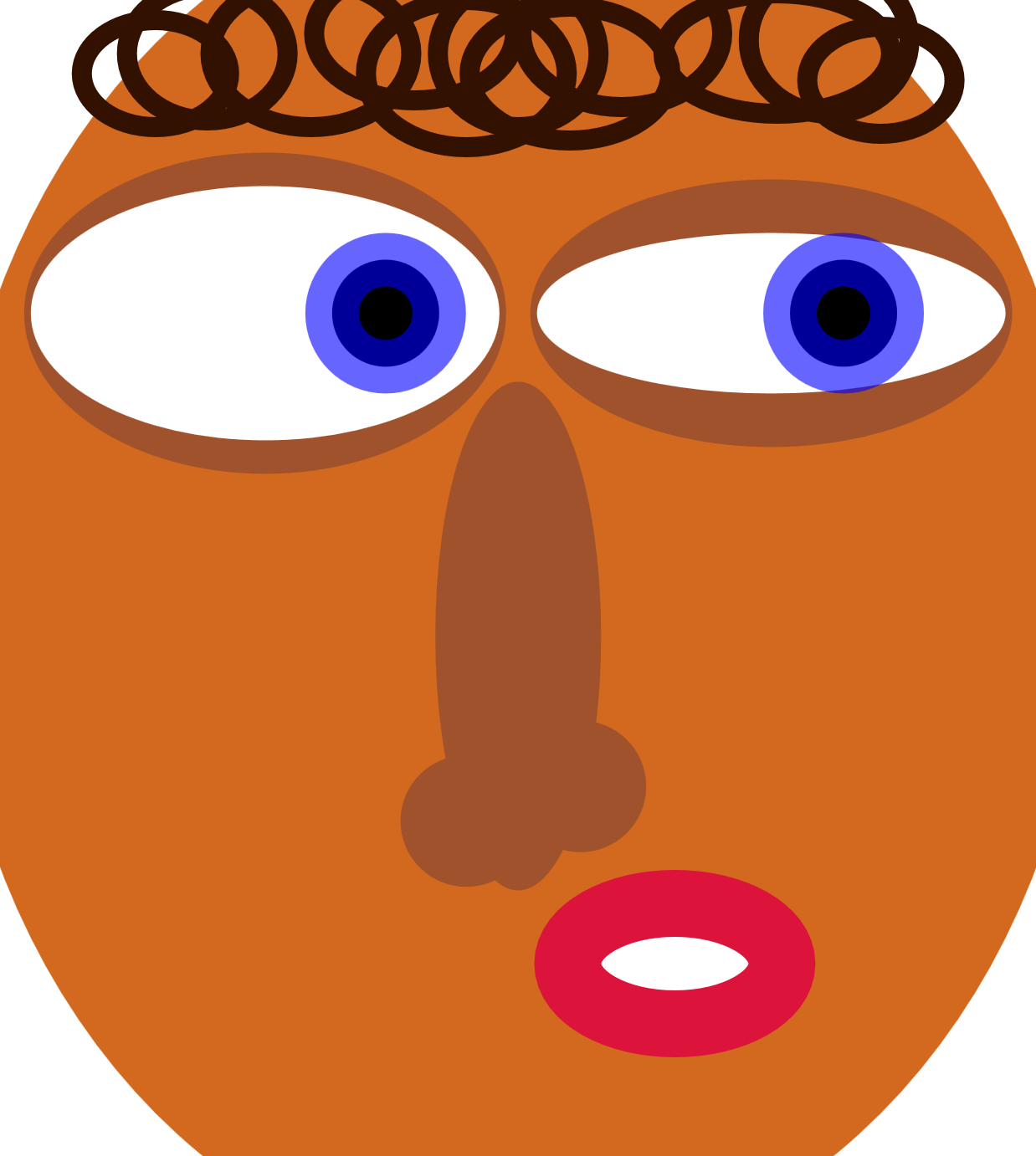
Figure 5-7. A funny-looking face making a funny face
Example 5-5. Positioning and sizing circles and ellipses in a drawing
<svgxmlns="http://www.w3.org/2000/svg"xml:lang="en"width="4.3in"height="4.8in"><title>Quizzical Elliptical Face</title><ellipsefill="chocolate"rx="55%"ry="60%"cx="50%"cy="50%"/><gfill="sienna"><ellipsecx="1.1in"cy="1.3in"rx="1in"ry="48pt"/><ellipsecx="3.2in"cy="1.3in"rx="1in"ry="40pt"/><ellipsecx="50%"cy="55%"rx="8%"ry="22%"/><circlecx="45%"cy="71%"r="6%"/><circlecx="56%"cy="68%"r="6%"/></g><gfill="white"><ellipsecx="1.1in"cy="1.3in"rx="70pt"ry="38pt"/><ellipsecx="3.2in"cy="1.3in"rx="70pt"ry="24pt"/></g><gfill="black"stroke="blue"stroke-width="16pt"stroke-opacity="0.6"><circlecx="1.6in"cy="1.3in"r="16pt"/><circlecx="3.5in"cy="1.3in"r="16pt"/></g><ellipsefill="white"stroke="crimson"stroke-width="20pt"cx="2.8in"cy="4in"rx="32pt"ry="18pt"/><gfill="none"stroke="#310"stroke-width="6pt"><ellipsecx="45%"cy="22pt"rx="30pt"ry="22pt"/><ellipsecx="40%"cy="10pt"rx="30pt"ry="20pt"/><ellipsecx="30%"cy="16pt"rx="30pt"ry="22pt"/><ellipsecx="20%"cy="16pt"rx="24pt"ry="20pt"/><ellipsecx="15%"cy="22pt"rx="22pt"ry="16pt"/><ellipsecx="50%"cy="16pt"rx="24pt"ry="22pt"/><ellipsecx="55%"cy="22pt"rx="30pt"ry="20pt"/><ellipsecx="60%"cy="10pt"rx="30pt"ry="22pt"/><ellipsecx="75%"cy="16pt"rx="34pt"ry="18pt"/><ellipsecx="80%"cy="12pt"rx="24pt"ry="22pt"/><ellipsecx="85%"cy="24pt"rx="22pt"ry="16pt"/></g></svg>
Looking at Figure 5-7, you may be surprised to look back at the code and count the number of <circle> elements. There is only one for each eye. The bull’s-eye pattern of the iris and pupil is created by a thick, partially transparent stroke.
The example demonstrates two features of strokes that we haven’t previously emphasized: they are drawn centered over the edge of the shape, and are drawn on top of the shape’s fill. When you make the stroke partially transparent (by setting the stroke-opacity property, as in the example, or by using a partially transparent color), this creates a two-toned effect; the fill is partially visible through the inner half of the stroke.
We’ll discuss strokes in more detail in Chapter 13.
There’s also a hidden complication in the markup for the “nose” shape, which uses percentages:
<ellipsecx="50%"cy="55%"rx="8%"ry="22%"/><circlecx="45%"cy="71%"r="6%"/><circlecx="56%"cy="68%"r="6%"/>
Positioning circles and ellipses with percentages (for cx and cy) is fairly straightforward. But sizing them with percentages (in rx, ry, or r) can be nonintuitive, especially for circles.
We mentioned when drawing rectangles that the same percentage value for height and for width might represent different actual lengths. Similarly, an ellipse with rx="50%" and ry="50%" will usually not be a circle, because rx is relative to the SVG width while ry is relative to the SVG height. But what happens when you use percentages for r, which is always a single radius value for a circle? Is that relative to width or height?
The answer is neither, and both. Percentage lengths in SVG, if they are neither horizontal nor vertical, are calculated such that they grow and shrink proportional to the length of the diagonal of the SVG region.
That doesn’t mean that they are percentages of the diagonal, however. Instead, they are percentages of the diagonal’s length divided by the square root of two (√2, approximately 1.41).
These same “adjusted diagonal” percentages are used for any length in SVG that isn’t clearly associated with either the horizontal or vertical direction, including stroke widths and stroke dash lengths.
Summary: Basic Shapes
The SVG basic shapes are each defined by an element in the markup. Their size, position, and proportions are controlled by individual attributes.
The value of each attribute can be specified as a length, percentage, or number. Numbers are lengths in user units, which are equivalent to px units. Percentages are proportional to the SVG size: its width, its height, or its diagonal divided by √2, depending on whether the measurement is horizontal, vertical, or other.
The <circle>, the <ellipse>, the <rect>, and the <line> are the only “standard” shapes of SVG. There is no <triangle>, no <pentagon>, and no <semi-circle> or <pie-slice>. At first, this may seem strange—a graphics language with only a handful of shapes doesn’t seem like much of a language—but the reality is that these shapes are standard only because rectangles, circles, lines, and ellipses occur often enough that it makes sense to mark them out as special.
Every other shape can be rendered by other means, through the <polygon>, <polyline>, and—most especially—the <path> element.