Table of Contents for
Using SVG with CSS3 and HTML5
 Using SVG with CSS3 and HTML5
Published by
O'Reilly Media, Inc., 2017
Using SVG with CSS3 and HTML5
Published by
O'Reilly Media, Inc., 2017
- nav
- Cover
- Using SVG with CSS3 and HTML5
- Using SVG with CSS3 and HTML5
- Preface
- I. SVG on the Web
- 1. Graphics from Vectors
- 2. The Big Picture
- 3. A Sense of Style
- 4. Tools of the Trade
- II. Drawing with Markup
- 5. Building Blocks
- 6. Following Your Own Path
- 7. The Art of the Word
- III. Putting Graphics in Their Place
- 8. Scaling Up
- 9. A New Point of View
- 10. Seeing Double
- 11. Transformative Changes
- IV. Artistic Touches
- 12. Filling Up to Full
- 13. Drawing the Lines
- 14. Marking the Way
- 15. Less Is More
- 16. Playing with Pixels
- V. SVG as an Application
- 17. Beyond the Visible
- 18. Drawing on Demand
- 19. Transitioning in Time
- 20. Good Manners
- Index
- About the Authors
- Colophon
Chapter 12. Filling Up to Full
Chapter 12. The fill Property, Gradients, and Patterns
Parts II and III focused on the geometry of vector graphics: laying down the lines, curves, and shapes of the design. Such work is necessary; even the most skilled of painters usually work out their rough concepts as drawings first, applying paint only after they’ve finalized in their mind what they are painting. And as with paintings created with a brush and pigments, an SVG graphic is not truly “complete” until after color has been applied to transform the visual outline into a completed work.
In this chapter, we examine more thoroughly the options you have for filling your graphics with colors and patterns.
The fill style on shape or text determines how the region inside that shape is colored. We’ve been using fill in examples throughout the book, usually setting its value to a simple color. But SVG shapes and text can also be filled with gradients or patterns. These more complex painting instructions are defined with their own elements and attributes, and then another element uses them with a cross-reference from its fill value.
This chapter briefly reviews your options for declaring colors in SVG—but assumes that you’re already familiar with the same options in CSS. It then introduces SVG gradients and patterns. These paint server elements are incredibly flexible, and this book isn’t going to describe every possible combination.1 However, by the end of this chapter, you should be able to create simple patterns or gradients, and to understand and adapt the markup created for you by graphics software.
When SVG was first introduced, the only option for patterns or gradients in CSS and HTML was to use repeating background images. Since then, however, CSS has introduced gradient functions, and has greatly increased the flexibility of background images. The syntax differs considerably between CSS and SVG, although the net effect is often similar. This chapter compares the two, to make it easier for you to switch back and forth. It also introduces proposals to adapt the CSS syntax for use in SVG.
Coloring Between the Lines
The fill property is one of the simplest to get started with, but one of the most complex in all its possibilities. The next few sections start with the simplest type of fill: colors.
Except it turns out that colors aren’t always simple.
The Rainbow Connection
As we’ve seen in nearly every example so far, the fill of a shape can be a simple color. In most of those examples we define the color using a keyword such as black, red, or saddleBrown. These keywords (147 in all) were originally distinguished by their two sources:
-
the original HTML color keywords, used in outdated styling attributes like
BGCOLORandVLINK, and integrated in CSS and then SVG from the beginning -
the X11 color set (used in many open source software programs), which were integrated in the original SVG specifications, but only later adopted by CSS
Any SVG-supporting web browser also supports the X11 color keywords in CSS. There is no need to really distinguish between the two color sets, unless you’re defining fallback colors for old browsers. However, the mixed origins leave their legacy in inconsistent naming patterns (like gray from HTML being darker than darkGray from X11).
Note
Browsers also now support the X11 color keywords in HTML’s deprecated presentation attributes, like bgcolor. But HTML’s color parsing rules also generate (somewhat arbitrary) colors from any other attribute text, too. So… maybe just avoid specifying colors in HTML attributes altogether, OK?
More recent additions to CSS colors (transparent and rebeccaPurple) can also be used in SVG, but watch for support, particularly in nonbrowser software.
Figure 12-1 shows spot colors for all the named keywords, divided into dark and light, and then arranged with the most intense colors at the edge of the color wheel and darker, lighter, and less saturated colors closer to the middle. It’s a two-dimensional visualization of three-dimensional data, but it’s enough to make it clear that the named colors aren’t evenly distributed in the color space.
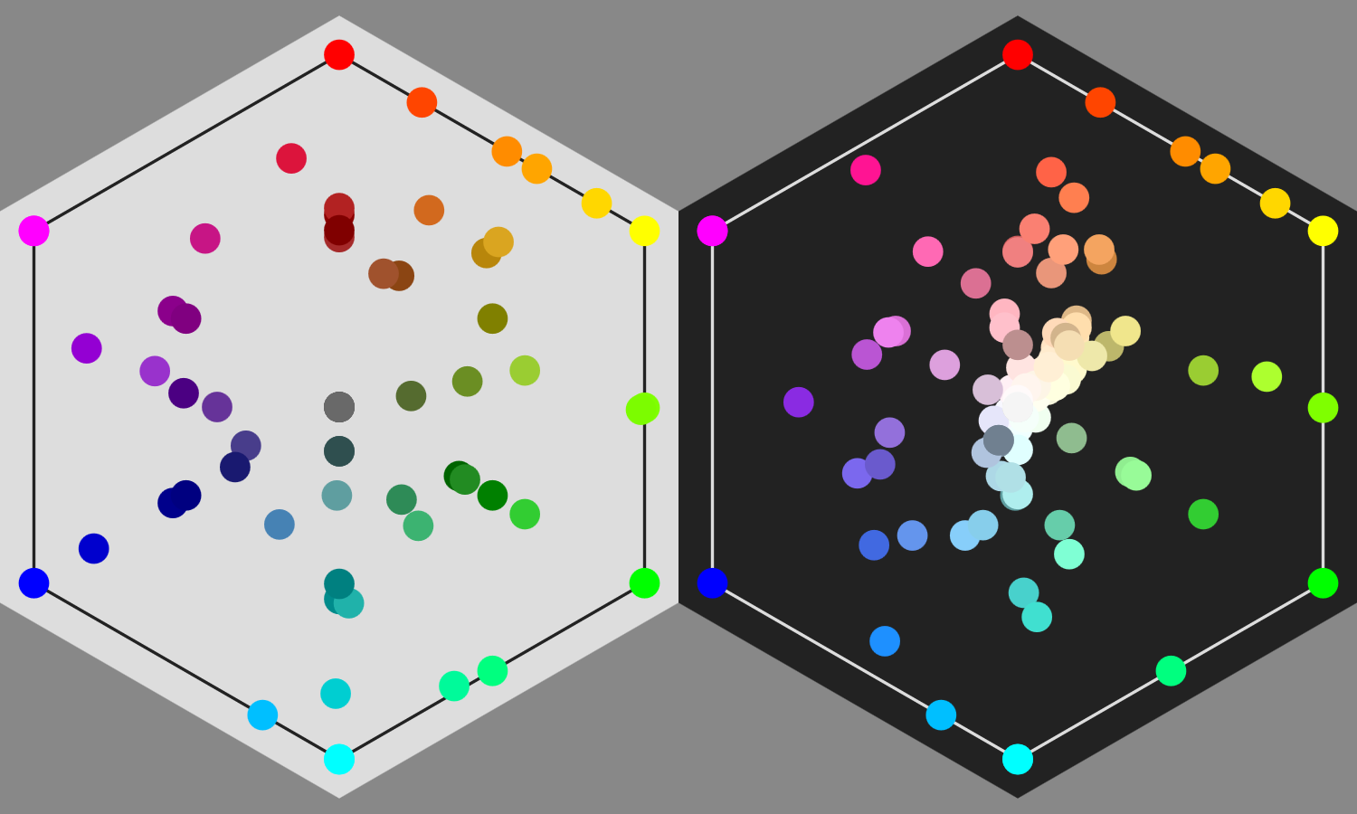
Figure 12-1. Named color keywords recognized in SVG and CSS
Use the keywords for convenience, but do not expect the color names to be systematic or logical. Learn a few combinations of keywords that create nice palettes, and you can quickly whip up a demonstration page or graphic. But for complex design and custom branding, you’ll probably want to pick custom colors: colors defined by a triplet of numerical values.
There are multiple CSS custom color formats. For best support in nonbrowser SVG software, stick with the CSS color formats that existed at the time of the original SVG specifications:
-
three and six-digit hex codes, like
#F00(red) or#fabdad(fabulous pink); each digit is a hexadecimal in the range 0–9 or a–f (or A–F; capitalization doesn’t matter) -
integer RGB functions, like
rgb(255, 0, 0)(red again) orrgb(250, 189, 173)(that same Fab Dad pink); each value in the function is an integer from 0 to 255 -
percentage RGB functions, like
rgb(100%, 0%, 0%)orrgb(98%, 74.1%, 67.8%)(same colors); each value in the function is a decimal percentage
Nonetheless, on the modern web, you can use any colors in SVG that you use in CSS, including those from CSS3. HSL has good support in browsers and newer graphics editors:
-
HSL color functions, like
hsl(0, 100%, 50%)for red, orhsl(12, 89%, 83%)for#fabdad; the first number is an integer for the hue in degrees, and the second and third are percentages
Most graphical SVG editors use hex codes for colors in the output file. However, their color-picking dialogs usually offer multiple ways of expressing the same value. Browser dev tools also can convert from one format to another.
Just be careful: there are a lot of hue/saturation/something color systems, where the final value isn’t the same as CSS “lightness”!
Coordinating Colors
There is another way to define a color in SVG: the currentColor keyword. This equates to the current value of the color property.
currentColor is one of the many SVG features that has been adopted by the rest of CSS. It can now be used in place of any CSS color value, and is the default for many properties, including border-color and text-decoration-color.
Since color isn’t otherwise used in SVG, that means it can be used with currentColor as a variable to coordinate other color-related properties:
<gcolor="mediumOrchid"><circler="50"stroke="currentColor"/><textfill="currentColor">Matching Label</text></g>
Tip
Yes, you can use color as a presentation attribute in SVG, even though it doesn’t have a direct effect.
For inline SVG, the color property inherits into the SVG from the surrounding text. It can therefore be used to coordinate inline SVG icons with your HTML text color.
When you set an inherited style property to the currentColor value, it is supposed to inherit as the keyword, not as the computed color value (according to the original SVG specifications and the latest CSS Color modules). That means that child elements use their color value, not the color value from the element on which the style was set.
In other words, these circles should have different fill colors (one orchid-purple, the other pink):
<gcolor="mediumOrchid"fill="currentColor"><circlecx="50"r="50"/><circlecx="150"r="50"color="deepPink"/></g>
But…don’t rely on it:
Warning
At the time of writing, most browsers (Safari, Firefox, and IE/Edge) convert currentColor to a specific color value before the CSS property is inherited (following the original wording in CSS Color 3). So both of those circles are drawn as mediumOrchid purple.
You need to explicitly set fill: currentColor on the element that has the correct color property.
Using currentColor as a variable is particularly useful with <use> elements in SVG. You can’t directly set styles on elements within each copy of a symbol, but you can control the inherited styles, including the color value. That means you can coordinate fill and stroke of different elements within the content.
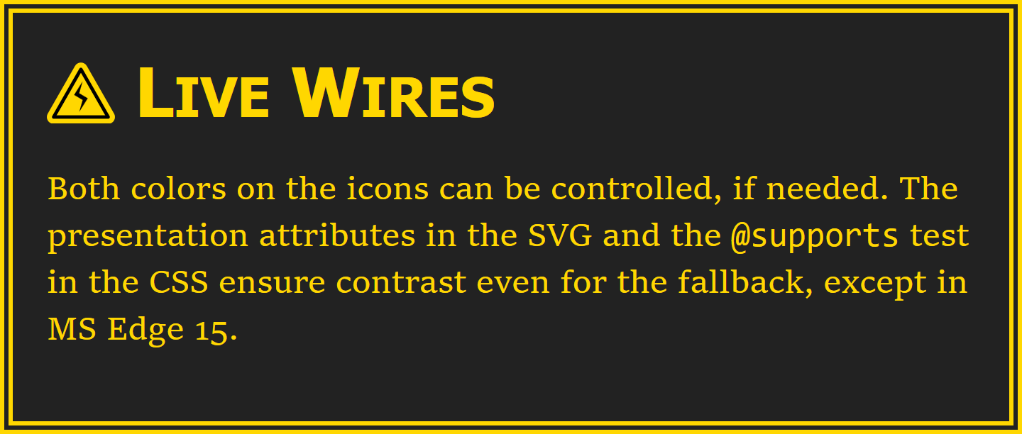
Example 12-1 shows an example of using currentColor in an icon sprite file to set the color of both fill and stroke. The icons look like this:
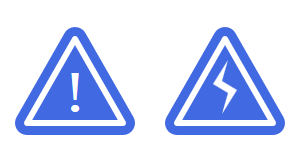
In order to create the inset-outline effect, two copies of the triangle are drawn on top of each other. The lower layer has a thick stroke in the same color as the fill; the upper layer is just a thin white stroke and no fill. By using currentColor for the fill and outer stroke, we can do this and still have the background of the icon change to match the text color.
Example 12-1 includes both the icon sprite file and a sample web page, displayed in Figure 12-2.
Figure 12-2. A warning sign with a color-coordinated icon
Example 12-1. Using currentColor in reused SVG symbols
SVG icon file: warning-icons.svg
<svgxmlns="http://www.w3.org/2000/svg"xml:lang="en"xmlns:xlink="http://www.w3.org/1999/xlink"><title>Warning Icons</title><defs><pathid="triangle"d="M10,4 18,18 2,18 Z"stroke-linejoin="round"/><gid="triangle-sign"><usexlink:href="#triangle"fill="currentColor"stroke="currentColor"stroke-width="4"/><usexlink:href="#triangle"fill="none"stroke="white"stroke-width="1"/></g></defs><symbolid="important"viewBox="0 0 20 20"overflow="visible"><usexlink:href="#triangle-sign"/><texttext-anchor="middle"fill="white"stroke="none"x="10"y="16"font-size="10">!</text></symbol><rectx="5"y="5"width="40"height="40"fill="lightBlue"/><usexlink:href="#important"color="indigo"x="5"y="5"width="40"height="40"/><symbolid="electricity"viewBox="0 0 20 20"overflow="visible"><usexlink:href="#triangle-sign"/><polygonpoints="10.5,7.5 8,11.5 10.5,13 9.5,16.5 12,12.5 9.5,11"fill="white"stroke="none"/></symbol><rectx="55"y="5"width="40"height="40"fill="lightBlue"/><usexlink:href="#electricity"color="indigo"x="55"y="5"width="40"height="40"/><!--and more, using similar coloring--></svg>

The triangle is predefined for use in multiple icons. It’s approximately equilateral, with its base along the line y = 18. We’ll talk more about the
stroke-linejoinpresentation attribute in Chapter 13; it is used here to give any strokes on the triangle rounded corners.
Two copies of the triangle are grouped together as
triangle-sign, and givenfillandstrokestyles. The thick 4-unit-wide stroke on the lower layer means that the outer edge of the triangle (now with rounded corners) will be 20 units wide, sitting on the line y=20.
Each symbol has a 20×20
viewBox(with visible overflow to prevent pixels getting clipped). That exactly fits the copy of thetriangle-signgroup that is reused inside it.
The
importanticon has a<text>element drawing an exclamation mark inside it. The text will match the inherited font settings from the web page, except for thefont-size, which is adjusted to fit. The fill is set directly, and any inherited stroke is explicitly cancelled out.
The
<symbol>is never directly drawn, so to make the sprite file easier to use,<use>copies of each icon are arranged so you can see them if you view the warning-icons.svg file directly. A light blue<rect>element makes the full dimensions of each symbol visible, too.
The second icon uses the same triangular backdrop, but creates a lightning bolt out of a
<polygon>for the icon itself. Again, the<symbol>created for reuse is also printed to the sprite sheet.
HTML and CSS
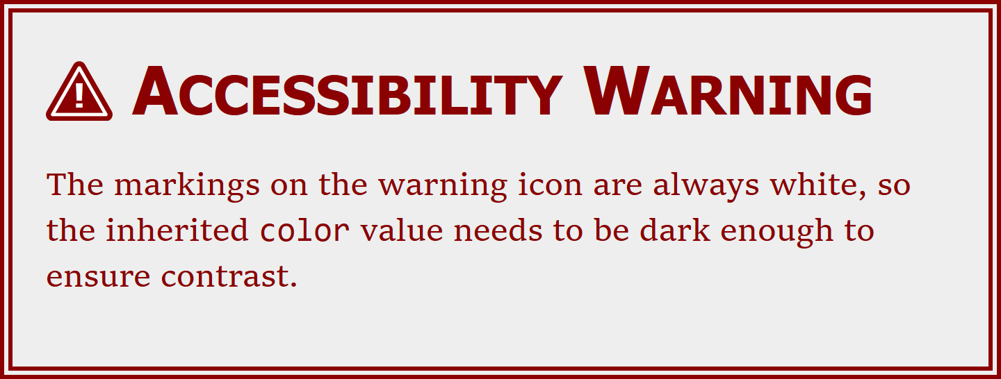
<!DOCTYPE html><htmllang="en"><head><metacharset="utf-8"/><title>Warning Notice</title><style>.icon{width:1em;height:1em;vertical-align:-0.1em;}.warning{max-width:30em;margin:0auto;padding:1em;border:double6px;background-color:#eee;color:darkRed;}h1{font:boldsmall-caps200%sans-serif;margin:000.5em;}code{font:100%Consolas,monospace;}</style></head><body><sectionclass="warning"><h1><svgclass="icon"role="img"><title>Attention</title><usexlink:href="warning-icons.svg#important"/></svg>Accessibility Warning</h1><p>The markings on the warning icon are always white, so the inherited<code>color</code>value needs to be dark enough to ensure contrast.</p></section></body></html>
The inline SVG elements will have an
iconclass. They are sized to match the surrounding text withwidthandheightof1em. Thevertical-alignproperty shifts them slightly, relative to the text baseline, so that they line up more neatly: for Latin letters, part of the1emheight of a line of text is always below the baseline.The
warningclass is for the entire warning alert. For this example, the most important part iscolor: darkRed. The unspecifiedbordercolor defaults todarkRedas well.The inline
<svg>is contained inside the<h1>heading, so it will inherit the heading’sfont-sizeandcolor. A<title>gives an accessible description, while therole="img"ensures that the entire SVG is treated as a single image—in particular, the exclamation mark in the icon won’t be read out as text.
Warning
As we warned in Chapter 10, many older browsers do not support <use> references to separate files. You may want to use a JavaScript polyfill to increase support.
Even the browsers that support cross-file <use> references don’t currently apply CSS rules from <style> sections inside that file. They only support inline styles or presentation attributes—so that’s what we use here.
This is the most heavily nested <use> example we’ve seen so far. But the styles inherit through all the nesting levels, just like they inherit through nested <div> or <g> elements.
Warning
As we warned in Chapter 10, some versions of Chrome (including the latest at the time of writing) have bugs with nested <use> combined with external file <use>. This particular demo works fine, but always test carefully!
The color style applied to the HTML <section> inherits down to the <use> element in the inline SVG, then to the clone of the <symbol> and the elements inside it, including the <use> element that clones the triangle-sign group; the cloned group inherits the color and passes it, finally, to the two different clones of the triangle <path> itself.
This example only uses color on the <use> element, ignoring the inherited fill and stroke. However, you could of course use all three, with some parts of the icon using inherited fill and stroke styles and other elements using currentColor. To get more options than that, however, you need CSS variables.
Variables for Every Property
Coordinating multiple styles is useful for more than just colors. And it’s often useful to have more than one color that you can coordinate to. In other words: currentColor is nice, but it’s not enough.
CSS custom properties, more commonly known as CSS variables, fill in the gap. They allow you to declare your own CSS properties with any value you want, just by giving it a name starting with -- (two hyphen/minus characters). You can then use those property values in any other property, by referencing your custom property name inside a var() function.
Note
Many people find the --property syntax confusing, or ugly. The syntax needed to be compatible with existing CSS parsers, and it also needed to avoid conflicts with popular CSS pre-processors, which usually have their own variable syntax.
Think of the custom property syntax as an extension of the CSS prefixed property syntax, like -ms-grid-rows or -webkit-transform. But because these are your properties, not the browser’s, there is no browser prefix between the two hyphens.
At the time of writing, CSS Custom Properties are now supported in the latest versions of every major browser. So they aren’t really a “future” feature—you can use them now! Just be careful about creating reasonable fallbacks for older browsers and nonbrowser software.
Warning
MS Edge introduced support for CSS variables as of EdgeHTML version 15 (released as stable in April 2017). However, the variable values do not inherit into the <use> element shadow trees. This will hopefully be fixed for the next update.
We can extend our <use> warning icon sprite from Example 12-1 with custom properties. We’ll have two properties, to allow the author to set the sign color directly, if desired, and to set the text color to something other than white. In our sprite file, the code for the triangle would look like the following:
<gid="triangle-sign"><usexlink:href="#triangle"fill="currentColor"stroke="currentColor"stroke-width="4"style="fill: var(--icon-sign-bg, currentColor);stroke: var(--icon-sign-bg, currentColor)"/><usexlink:href="#triangle"fill="none"stroke="white"stroke-width="1"style="stroke: var(--icon-sign-text, white)"/></g>
We’d then make similar changes to the rest of the icon code, setting the fill of the <text> and <polygon> elements to var(--icon-sign-text, white).
The presentation attributes are still there, for software that doesn’t support CSS variables. For modern browsers, fill and stroke are reset in a style attribute to use var() functions. Each var() has two parameters: the name of a CSS custom property, and a fallback value to use if the browser supports variables but that particular variable hasn’t been set on the element. The fallbacks for that case are exactly the same as the fallbacks in the presentation attributes.
In the final web page, we can choose to set either --icon-sign-bg (the sign background), --icon-sign-text, or both. For example, if our warning had yellow-gold text on a dark gray background, we might want the sign background to still use currentColor but the markings to be in black:
.warning{background-color:#222;color:gold;--icon-sign-text:black;}
However, that leaves us with an issue in browsers that don’t support CSS variables: we’ll get white markings on gold, which will be almost indistinguishable. To prevent this, we can use a CSS @supports test to adjust the color depending on whether or not CSS custom properties and var() functions are recognized:
.warning.icon{color:darkGoldenrod;/* fallback, if CSS variables aren't supported */}@supports(--css:var(--iables)){.warning.icon{color:inherit;}}
The specific custom property names in the @supports test don’t matter; it’s just testing the syntax. If the syntax is acceptable, the icon will inherit the gold color value from the rest of the warning sign; otherwise, it will be set to a darker gold to ensure enough contrast against white.
Warning
Because MS Edge 15 recognizes CSS variables, but doesn’t use them in SVG <use>, all the fallback methods fail: the @supports test says variables are supported, but the variable value isn’t passed to the icon. The icons are barely readable white on gold. Good thing the full meaning is also conveyed by the heading text.
Figure 12-3 shows what the end result would look like in a browser with CSS variable support.
Figure 12-3. A warning sign with color coordination and contrast control
There are limitations to variables as currently specified:
-
Default values must be set in every
var()function: there’s no initial value. -
The CSS parser does not know what type of value should be allowed in your property, so it can’t do any type checking or fallbacks for you.
-
Similarly, the browser cannot interpolate between custom values in an animation or transition. However, if you change a variable, it will trigger a transition on properties that use that variable.
Proposals for future versions of CSS custom properties address these issues, but nothing has been finalized yet. The usefulness of CSS variables for colors will also be considerably enhanced when browsers support the new color-adjustment functions in CSS Color Module Level 4.
Water Colors
If you’ve worked with color in modern CSS web design, you may also be familiar with the semitransparent color functions. The rgba and hsla color functions take a fourth value, alpha, that defines how opaque the color should be. An alpha of 0 creates a perfectly transparent color; an alpha of 1 creates a perfectly opaque (solid) color. Some examples:
-
rgba(0,0,0,0)is transparent black, equivalent to thetransparentkeyword. -
hsla(0,0%,100%,0)is transparent white; in most situations, it would look identical to transparent black, but it can have different effects in gradients or animations. -
rgba(100%,0%,0%,0.5)is half-transparent red. -
hsla(240,100%,50%,1)is fully opaque blue, equal tohsl(240,100%,50%)or#00F.
These alpha color functions were introduced in the level 3 CSS Color module. Although they are now supported in nearly all web browsers that support SVG, they were not part of the original SVG specifications.
Warning
Support for semitransparent colors may be limited in nonbrowser SVG software.
There are also a few bugs in browsers related to these colors in SVG: for example, semitransparent colors don’t work in gradients in WebKit.
SVG 1 did support semitransparent colors, but in a different way.
SVG has a separate property, fill-opacity, to control the opacity of the fill. There are similar opacity properties that pair with other properties in SVG that define a color value: stroke-opacity, stop-opacity (for gradient stops), and flood-opacity (for the <feFlood> filter component). All of these properties can be set using either presentation attributes or CSS.
Tip
The overall opacity property also adjusts transparency, but in a different way:
it applies to the final painted result of the element on which it is applied, even if that element is a group of multiple shapes. opacity is discussed in Chapter 15.
Similar to the alpha values in the color functions, the fill-opacity property accepts a value from 0 (completely transparent) to 1 (completely opaque). The other *-opacity properties work the same.
When using fill colors, setting fill-opacity has much the same visual effect as using a color with the equivalent alpha value. A shape with fill: red and fill-opacity: 0.5 would look the same as one with fill: rgba(255,0,0,0.5).
Tip
If you use both fill-opacity and a semitransparent color for fill, the transparency effect is compounded: the net opacity is the two values multiplied together.
Example 12-2 shows all the possibilities, applied to copies of our heart icon (the <symbol> version we created for Example 10-2 in Chapter 10).
The icons in the right column (with x="10") have reduced fill-opacity. The icons in the bottom row (with y="10") have reduced alpha in the fill color. This means the icon in the bottom right has both types of transparency, compounded.
To clearly show the effect of the transparency, the hearts are drawn over the coordinate system grid created for the figures in Chapter 6. Figure 12-4 shows the result.
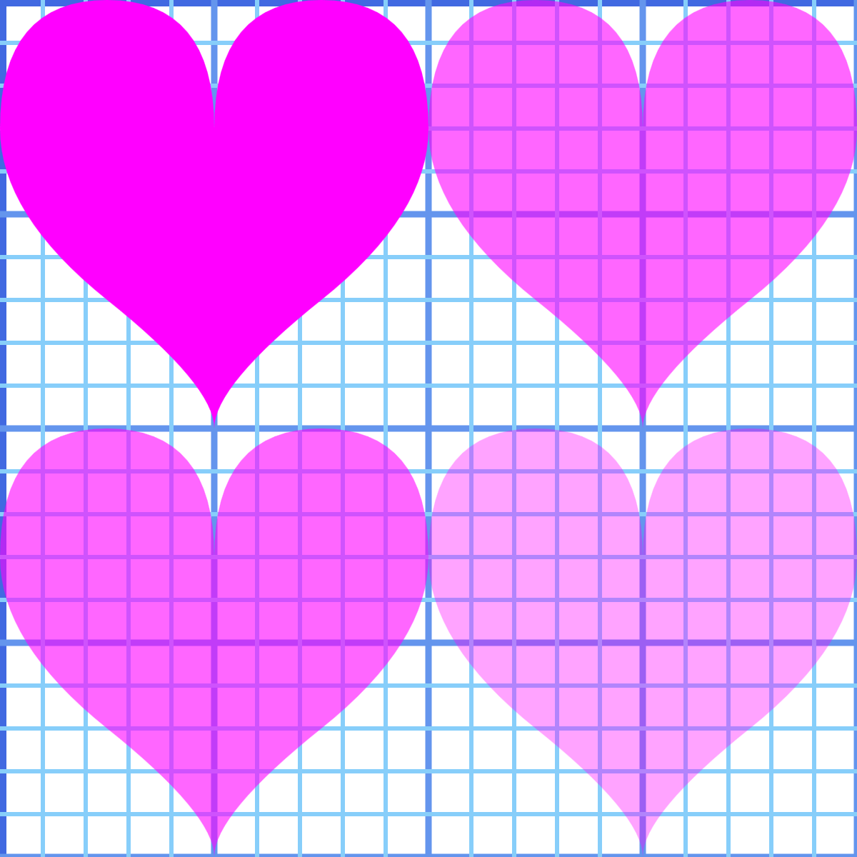
Figure 12-4. Shapes with and without reduced fill-opacity (right versus left column), and with and without reduced-alpha fill colors (bottom versus top row)
Example 12-2. Creating semitransparent fill in different ways
<svgxmlns="http://www.w3.org/2000/svg"xml:lang="en"xmlns:xlink="http://www.w3.org/1999/xlink"height="400px"width="400px"viewBox="0 0 20 20"><title>fill-opacity versus (and with) Semi-Transparent Fill</title><usexlink:href="../ch06-path-files/graphing.svg#grid"/><usexlink:href="../ch10-reuse-files/suits-symbols.svg#heart"width="10"height="10"/><usexlink:href="../ch10-reuse-files/suits-symbols.svg#heart"width="10"height="10"x="10"/><usexlink:href="../ch10-reuse-files/suits-symbols.svg#heart"width="10"height="10"y="10"/><usexlink:href="../ch10-reuse-files/suits-symbols.svg#heart"width="10"height="10"x="10"y="10"/><style>[*|href$='#heart']{fill:magenta;}[x='10']{fill-opacity:0.6;}[y='10']{fill:rgba(100%,0%,100%,0.6);}</style></svg>
The
#gridin the other file is a<g>, not a<symbol>. When reused, it is therefore drawn in this SVG’s coordinate system using the exact coordinates with which it was originally defined. It was defined to draw grid lines from –5 to +25 in both the x and y directions; this SVG’sviewBoxwill only show the section of the grid from 0 to +20. The stroke styles are also defined in the other file, as presentation attributes.The remaining
<use>elements reference the heart icon<symbol>. Thewidthandheightattributes constrain them to each use only a 10×10 region of the 20×20viewBoxfor this file. The icon code in the sprite file does not define any styles; it will inherit styles set on the<use>elements.The four hearts are positioned in two rows and columns using the
xandyattributes on the<use>elements.We could have set the
fillandfill-opacityin presentation attributes, but it’s good to remind you of all the options CSS opens up. That’s the XML-namespace-wildcard version of a CSS attribute selector, which we introduced back in Chapter 3. The dollar sign before the equals ($=) means that it will select elements whosehreforxlink:hrefattribute ends with#heart. All four heart icons match that selector, and so they are assigned thefillcolormagenta.The
<use>elements withx="10"are selected with a (much-simpler) CSS attribute selector, and given reducedfill-opacity.The final selector picks the
<use>elements withy="10", and overrides the earlierfillsetting, to apply anrgbacolor. The color is a semitransparent version ofmagenta; themagentakeyword is equal torgb(100%, 0, 100%)in functional notation.
The effective transparency of the final (bottom right) icon is 0.6×0.6, or 0.36.
Tip
It’s good to know that you can play around with CSS selectors, like we did in Example 12-2. But attribute selectors, especially with common attributes like x and y, can easily cause unintended consequences. It’s fine for a single small, standalone SVG, but use classes in inline SVG or more complex design systems.
If you’re used to working with transparent colors in CSS, it may be tempting to stick with what you know. But there are important benefits of fill-opacity to consider:
-
It is supported in nearly all SVG software.
-
It can be modified independently from the fill color.
-
It allows you to use named color keywords or hex colors—whatever you’re already using.
-
It also applies to fill paint.
What’s fill paint? That’s when the shape isn’t filled with a single color, but instead by complex graphical instructions from a gradient or a pattern.
Filling with More Than Solid Colors
The fill property, as we discovered in Chapter 1, can be set with a url() reference to another element. That other element—the one that describes how to fill in this shape—is known as a paint server.
There are three paint server elements in SVG 1.1, which can be used to fill (or stroke) shapes or text:
<linearGradient>-
A gradient defined by color transitions along a line. The colors are then extended away from that line infinitely on either side.
<radialGradient>-
A gradient defined by color transitions along rays extending outward from a point, in all directions, to a circular boundary.
<pattern>-
A tiled pattern of the same rectangle of SVG drawing elements, repeated infinitely in rows and columns.
Figure 12-5 shows some of the effects you can create with these elements. We’ll explain the code used to create them when we explore the individual elements, later in this chapter.
When you apply a fill-opacity of less than 1 to a shape with a gradient or pattern fill, the entire gradient or pattern is made semitransparent. If parts of it were already transparent, the effect is compounded, in the same way that reducing fill-opacity makes semitransparent colors even more transparent.
The next few sections will discuss some common conceptual features of SVG paint servers, before the rest of the chapter outlines the specific elements and attributes.
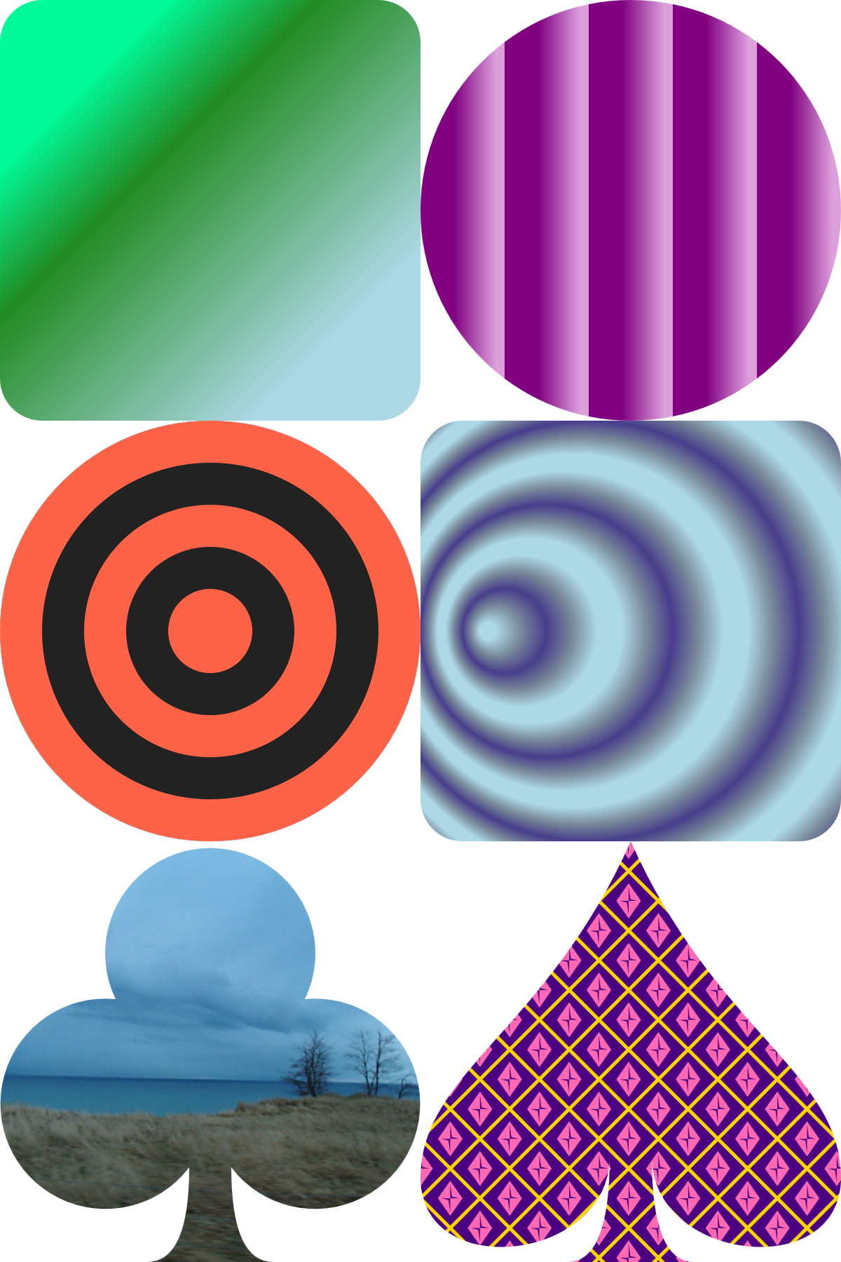
Figure 12-5. Linear gradients (top), radial gradients (middle), and patterns (bottom)
Fallbacks for Fills
Whenever the fill property (or presentation attribute) is set with a url() value, it can optionally be followed by a color, with whitespace separating the two values:
fill:url(#gold)#f0b020;
The color is used as a fallback, in case there is a problem with the URL reference. Some examples of potential problems:
-
No element exists with an
idthat matches the URL reference. -
The element exists, but it’s not a paint server type recognized by the browser.
-
The element exists and is a paint server, but it is invalid for some other reason (for example: zero-width pattern tiles that will never fill a shape no matter how many times they are repeated).
-
The URL references an element in another file, and the browser doesn’t support cross-file references (we saw an example of this in Chapter 2).
-
The browser supports cross-file references, but for network reasons or security reasons, it isn’t able to access the file.
-
The paint server URL is in this file, but the painted shape is reused from another file, and you’re using a version of a (Blink) browser that has bugs with this.
Fallback colors can be useful for debugging. They are essential if you’re going to use paint servers in other files (as we did, in the interest of code brevity, in Example 2-4 in Chapter 2), and would be even if browser support for this wasn’t utterly horrible.
Warning
At the time of writing, references to paint servers in other files are only supported fully in Firefox (and other Gecko-based browsers) and Presto-based browsers (old Opera and Opera Mini). MS Edge supports it from .svg files only, not from inline SVG.
Even where they are supported, there will be cross-origin restrictions.
Without cross-browser support of cross-file references, your paint server elements have to be copied into every page.
This also means that your CSS rules assigning the fill and stroke values need to be on that page, so the local url(#id) references will be calculated correctly. New rules for #id-only URLs in CSS files have been proposed, but aren’t supported reliably yet.
If you’re using gradients or patterns as part of an inline SVG icon system, you’ll either want to use server-side templating tools to add the markup into every page, or use client-side JavaScript to download the markup and inject it. For the JavaScript approach, you’ll want to have fallback colors in place, in case your script fails.
Picturing Paint
“Paint” is the accepted name in SVG for gradients and patterns used to fill (or stroke) a shape, and the elements that define them. But the word is a little misleading.
When you paint something—furniture, a wall, or the shapes in a paint-by-number coloring book—you adjust the paint to fit within the space available. Paint is liquid; it adapts to the space available. You can run your paint brush around the edges, just so.
SVG paint doesn’t work that way. SVG paint is more like wallpaper—or fabric. It has its own design that is independent of the shape that you are filling. You need to clip the paper or fabric to fit it to a specific shape, like in Figure 12-6.
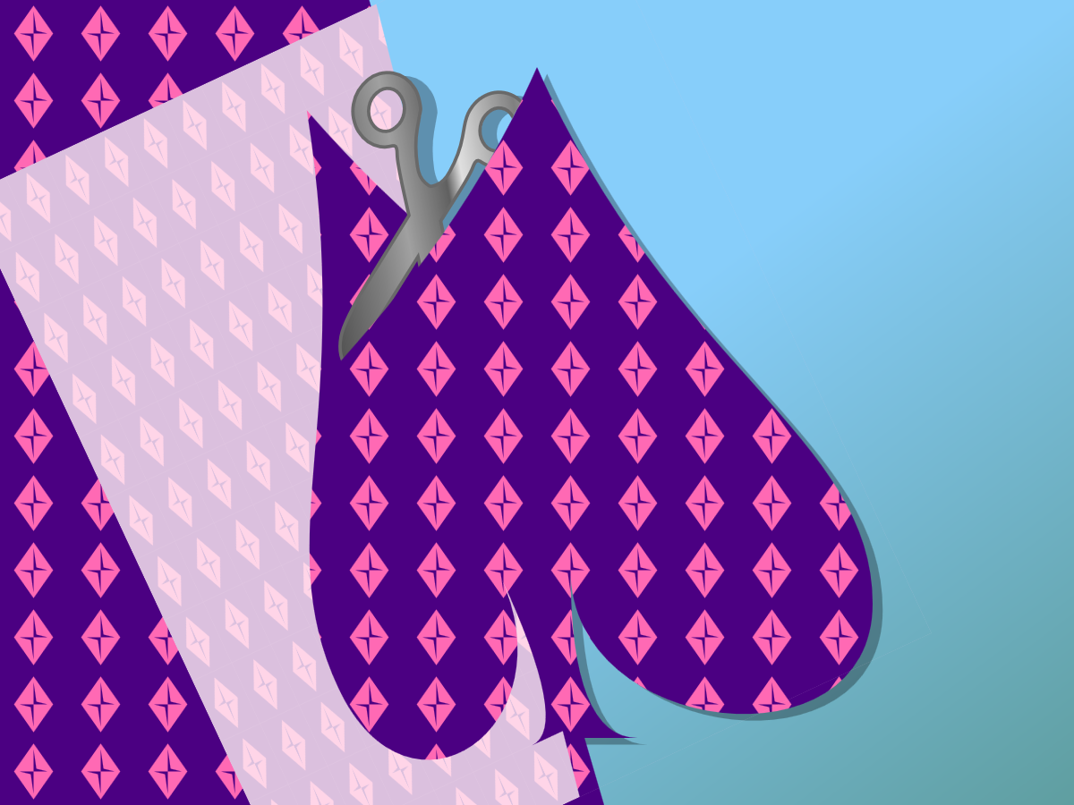
Figure 12-6. “Painting” a shape in SVG, by cutting it out from a patterned sheet
When you define a gradient or pattern in SVG, you are defining a (theoretically infinite) image of its own. The browser then uses that image as a reference as it fills shape or text.
When the browser rasterizes vector shapes, converting it to pixels, it scans across the image row-by-row to figure out which points are in or outside of it. In Chapter 6, when we talked about the fill-rule property, we explained how the direction of each edge is used to determine whether the region on the other side of that edge is inside or outside the fill.
Paint servers are the next step in the process. For every point that is inside the fill, the SVG rendering software looks up a matching point in the paint server image, and uses that image to determine what color the point should be.
This doesn’t mean that SVG paint is completely independent of the shape being painted, however. The image created by a SVG paint server is a scalable vector graphic in its own way: it’s defined by geometric instructions, and those instructions are executed in a scaled coordinate system. The shape being painted helps set the scale.
Scaling Paint Servers
The coordinate system used to scale a pattern or a gradient, like all coordinate systems in SVG, is defined by width, height, an origin point, and a scale (i.e., the size of a px user unit). There are two options for how that coordinate system is calculated, which are expressed in uncomfortably long mixed-case keyword phrases that you’re just going to have to memorize:
userSpaceOnUse-
With
userSpaceOnUseunits, the reference coordinate system for the graphical effect is the user space, the main coordinate system used to draw the shape or text that has the paint (or other effect) applied.
Warning
Or at least, that’s how it’s supposed to work. Unfortunately, most web browsers (WebKit, Blink, and IE/Edge) treat userSpaceOnUse as “user space on definition” when it comes to percentages: they use the coordinate system of the <svg> that contains the pattern or gradient element, instead of the coordinate system of the shape being painted. They transform the basic units to match the scale and transform in the coordinate system on the shape, but they don’t change how percentages translate to px.
To get consistent scaling cross-browser, you need to define the paint server in the same <svg> as the shape it is painting. This severely limits the function of many userSpaceOnUse graphical effects with inline SVG icon systems, where you have many independent <svg> elements and you want your effect to scale to 100% for each SVG.
objectBoundingBox-
The reference coordinate system is a square 1 unit wide and 1 unit tall—with its origin in the top-left corner—that is scaled to fit the fill bounding box of the shape being painted—that is, a rectangle defining the extent of the shape’s fill region.
The reference coordinate system is a 1×1 square, but the bounding box can be any rectangle. That means the scale may be non-uniform, with height and width scaled to different degrees, and a corresponding distortion to the paint-server image, stretching or squishing the gradient or pattern.
The same two scaling options (bounding box and user space) are used in other graphical effects in SVG, notably filters (Chapter 16), clipping, and masking (Chapter 15). So if you take the time to fully understand how objectBoundingBox and userSpaceOnUse work—and to memorize those uncomfortably long keyword phrases—you’ll be more comfortable working with any SVG graphical effect.
Tip
The keyword phrases must be capitalized correctly (first letter of subsequent words is uppercase). Because these are attribute values—not attribute names—you can’t even rely on the HTML parser to fix it for you.
We’ve already extensively discussed the user coordinates and the SVG coordinate system (in Chapter 8 and subsequently). But bounding boxes require a closer look.
The Boundaries of the Box
The bounding box of a shape is the rectangle that tightly fits around it, in its own coordinate system. The fill bounding box is the rectangle that exactly fits the fill region, not counting strokes or other effects. In SVG 1.1, it’s the only bounding box that is used.
Figure 12-7 shows a variety of SVG shapes (each with a different fill color) and their bounding boxes (the dashed outlines). Regardless of the shape of the element, the bounding box is always a rectangle; however, if you transform the shape, the bounding box transforms with it.
You can find the bounding box of any SVG element by selecting it in JavaScript and running the getBBox() method. It returns an object with x, y, width, and height properties.
In general, if you look at every (x,y) point in the shape, the bounding box would stretch from the minimum to maximum x coordinates and from the minimum to maximum y coordinates.
Figure 12-7. Assorted SVG shapes (filled), some transformed, and their bounding boxes (outlines)
Warning
Or at least, that’s how it’s supposed to work. Some browsers (WebKit and Blink up to version 62, and Firefox up to version 55 on Mac/Android) use a “fast” calculation for bounding boxes of Bézier curves, which creates a polygon from the points and control points and uses the bounding box of that.
For some shapes, this results in a bounding box that is larger than it should be. And the box that’s used for painting may not match the getBBox() result.
The rules are slightly more complicated for <text> elements—and slightly more inconsistent from one browser to another. The key points that are consistent:
-
The text bounding box includes the full layout rectangle for each character, even if the drawn glyph only takes up part of that space.
-
The bounding box for painting
<tspan>and<textPath>elements is based on the shared bounding box for the entire<text>, so that gradients and patterns are continuous from one<tspan>to the next.
Because text elements use different bounding boxes than paths do, converting text to paths can cause gradients and patterns to change shape or size. You can reduce the impact by merging the paths for each letter into a single multipart path (depending on the software you use, it might do this already), but it will never be exactly the same.
Great Gradients
Gradients consist of smooth transitions from one color or opacity state to another. We first introduced gradients in Chapter 1, but without dissecting how they are put together. The next few sections look at the elements and attributes that create those gradients, so you can build your own.
Shared Structures
The gradient itself is created by a <linearGradient> element or a <radialGradient> element. That’s the element that has the id that you reference from your fill (or stroke) property. Inside the gradient element are <stop> elements, which describe the colors.
Here’s the simplest structure, with two stops and no extra attributes:
<linearGradientid="horizontal"><stopstop-color="gold"offset="0"/><stopstop-color="deepPink"offset="1"/></linearGradient>
Tip
Technically, you can get simpler than this, and only have one color <stop>. But then your gradient isn’t a gradient, it’s just a solid color paint server, similar to the proposed <solidcolor> element.
The <stop> elements are distinguished by three features:
-
offsetis a number between 0 and 1, or a percentage between 0% and 100%. It defines how far into the gradient this color should occur. It is a regular attribute—it cannot be set with CSS.If you don’t specify offsets, they will all default to
0, and you won’t get a gradient. The<stop>elements must be arranged in order according to theiroffsetvalues, from smallest to largest; each offset will be adjusted to be no less than the offset of the previous<stop>. -
stop-colorsets the color at this offset point in the gradient. It is a presentation attribute, so you can set it with a class or other CSS rule. However, it doesn’t inherit (unless you force it by settingstop-color: inherit). AcurrentColorvalue would be thecoloron the<stop>element, not on the element you’re painting with the gradient. -
stop-opacity(not used in our “simplest” gradient) makes the color stop partially transparent. It is also a presentation attribute, not inherited, and defaults to1(opaque).
Warning
For consistent cross-browser results when you’re creating partially transparent gradients, use stop-opacity, not semitransparent colors. WebKit completely ignores stop-color transparency. Other browsers disagree on the exact algorithm to use when fading to a semitransparent color.
The <stop> elements in a <radialGradient> work the exact same way. This gradient creates a ring of color, transparent in the middle and the outside, transitioning to opaque in between. It has four stops, each with an offset and a stop-opacity:
<radialGradientid="gradient-ring"><stopstop-opacity="0"offset="50%"/><stopstop-opacity="1"offset="70%"/><stopstop-opacity="1"offset="80%"/><stopstop-opacity="0"offset="100%"/></radialGradient>
The stop-color isn’t specified on any stop, so will default to black. But you could change it with CSS. For example, the following rules would turn that ring to crimson red:
#gradient-ringstop{stop-color:crimson;}
The <linearGradient> and <radialGradient> elements themselves share common attributes, which we’ll describe in the following sections:
-
gradientUnitsdefines whether the gradient is scaled using theobjectBoundingBoxmethod (the default) oruserSpaceOnUse. -
spreadMethodcan be used to create repeating or reflecting gradients (but beware—they aren’t currently supported in WebKit/Safari). -
gradientTransformlets you transform the gradient (scale, rotate, skew, or translate) separately from the shape it is painting. -
xlink:hrefallows you to reference a separate gradient, and have it become a template for this one.
These attributes all have the same options for both types of gradients.
The differences between linear gradients and radial gradients come in how the stop list—which describes a one-dimensional color transition in arbitrary “offset” units—is transformed into the two-dimensional coordinate space of the paint server.
Aligning Linear Gradients
A <linearGradient> element creates a gradient defined by the geometry of a line. That line is known as the gradient vector. The stop offset values are positioned along that line, and then the colors are extended to infinity on either side.
It therefore might not surprise you that the geometry of a <linearGradient> is defined by the same attributes as the geometry of a <line> element: x1, y1, x2, and y2. Just like with a <line>, the four attributes collectively describe the start and end points of the line.
Tip
Unlike with a <line>, the default value for x2 in a <linearGradient> is 100%. The defaults for the other positioning attributes remain 0.
By default, therefore, the line of a <linearGradient> runs horizontally left to right across the coordinate space.
That coordinate space is the object bounding box by default. If you set gradientUnits to userSpaceOnUse, it is the SVG’s coordinate system, after any transformations in effect for the shape being painted.
Example 12-3 shows a gradient that uses all four geometric attributes to create a diagonal gradient, but one that doesn’t quite reach the opposite corners of the bounding box. Figure 12-8 shows the result, twice: once as defined, and the second time with the vector line and the offsets marked out in crimson-red.
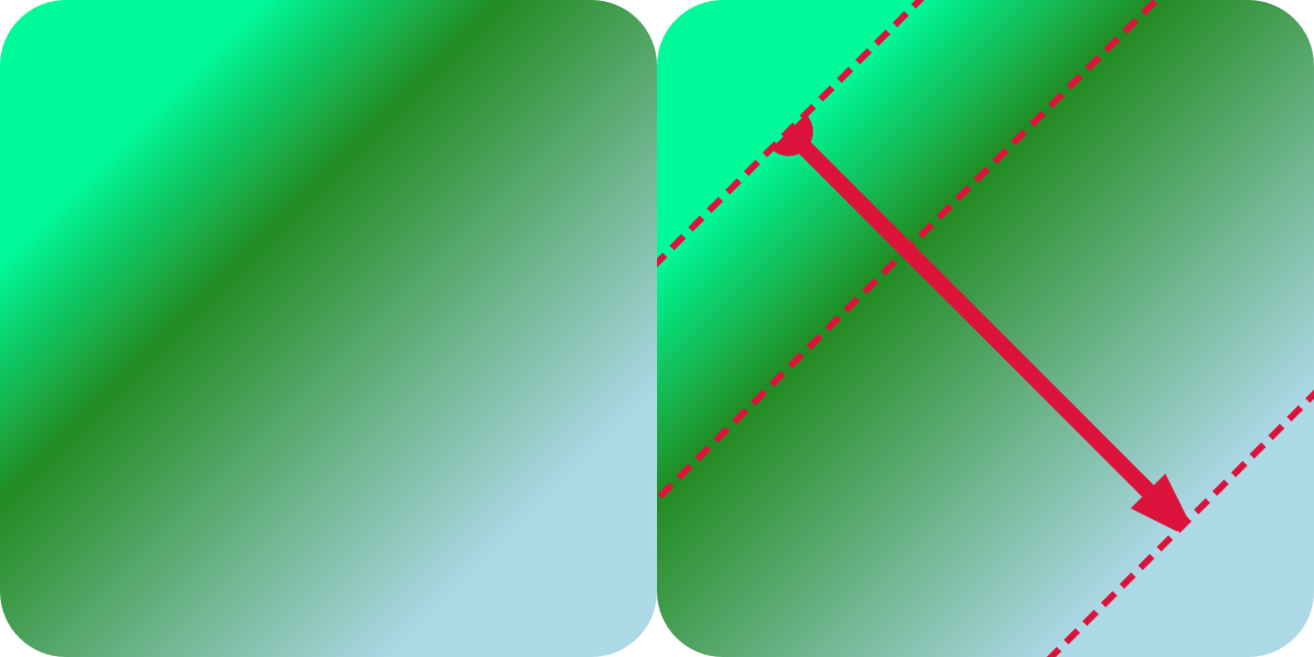
Figure 12-8. A rounded square filled with a diagonal linear gradient, and the same square with the gradient’s line vector and stop offsets marked on it
Example 12-3. Drawing a simple linear gradient
<svgxmlns="http://www.w3.org/2000/svg"xml:lang="en"width="200px"height="200px"viewBox="0 0 200 200"><title>Simple Linear Gradient</title><linearGradientid="green-gradient"x1="20%"y1="20%"x2="80%"y2="80%"><stopstop-color="mediumSpringGreen"offset="0"/><stopstop-color="forestGreen"offset="0.3"/><stopstop-color="lightBlue"offset="1"/></linearGradient><rectwidth="100%"height="100%"ry="10%"fill="url(#green-gradient)"/></svg>
The shapes in Figure 12-8 have a square bounding box, so the object bounding-box units don’t do anything strange to the coordinate system.
In contrast, Figure 12-9 shows how the same gradient is stretched to fit a rectangle that is twice as wide as it is tall. Note how the uneven scale changes the angles of the gradient: they still match the diagonals of the box, even though those diagonals are no longer at right angles to each other.
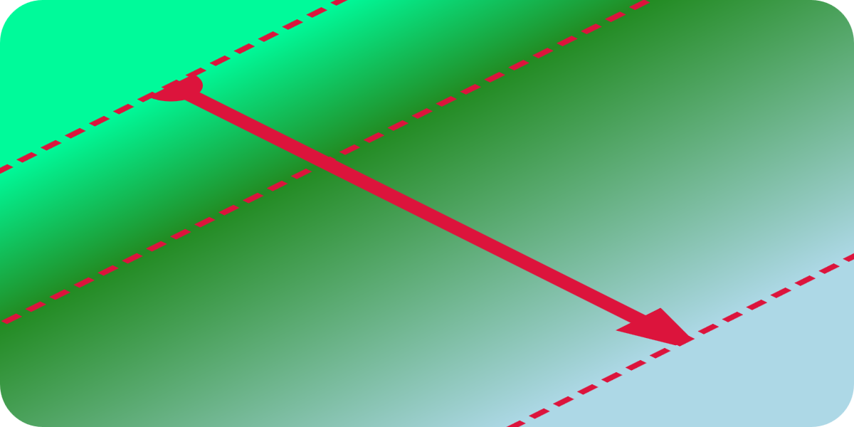
Figure 12-9. A rounded rectangle filled with a diagonal linear gradient, with the line vector and stop offsets marked on it
The corners of the shapes in Figures 12-8 and 12-9, beyond the ends of the gradient vector, are filled with solid colors matching the first and last <stop>. There are actually two ways to achieve this effect:
-
Make the gradient vector line shorter than the bounding box (as in this example).
-
Inset the
offsetvalues so they don’t extend all the way from 0 to 1.
Tip
To create a solid-colored region in the middle of a gradient, you need to have two subsequent <stop> elements with the same color and opacity. This is a case where it is helpful to set stop-color and stop-opacity values with a class—or even with CSS variables!
The difference between insetting the offsets and insetting the ends of the vector is only revealed when you change the spreadMethod. The spreadMethod attribute defines how the browser fills in the space beyond the ends of the gradient vector. The default value is pad, which pads the space with the nearest <stop> value. The other options are repeat and reflect.
Warning
WebKit (as of Safari 10.12) does not support reflecting and repeating SVG gradients. Firefox also lost support for a while when changing graphics libraries—but they’ve been fine since version 33, in 2015.
Example 12-4 uses a repeating user-space gradient to create gradient stripes. The basic gradient extends from x1=-20 to x2=+20, relative to the user-space coordinate system. In other words, it’s a horizontal vector, 40px wide, centered on the origin. Since the SVG has a centered coordinate system, that means the gradient is centered in the graphic, too.
Figure 12-10 shows the result as defined, and with the vector and stops marked on it. The bright cyan annotations in the center are the positions defined by the attributes; the repeats are marked in peachy-yellow.
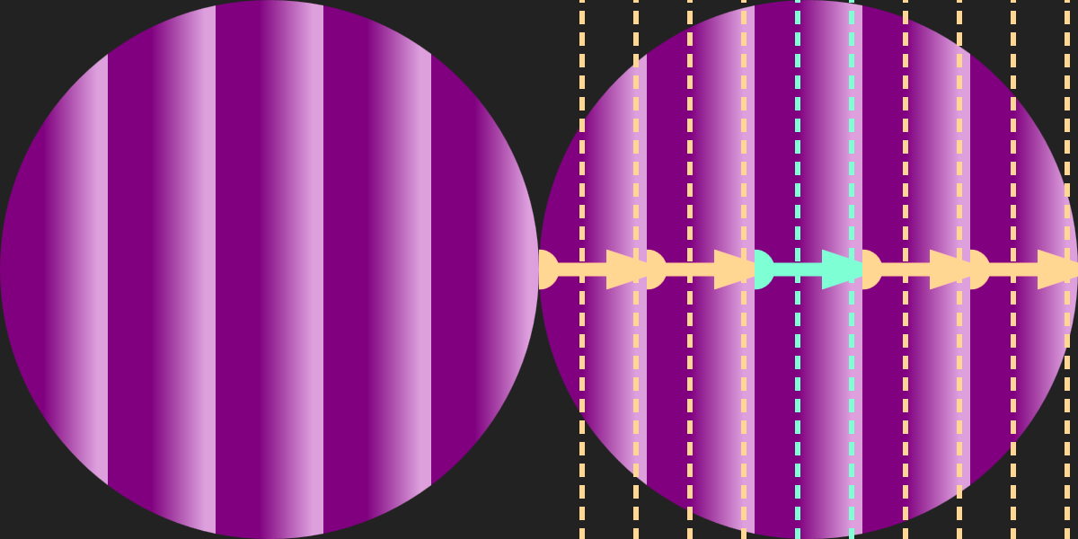
Figure 12-10. A repeating linear gradient in a circle, and the same shape with the gradient’s line vector and stop offsets marked on it
Example 12-4. Drawing a repeating linear gradient
<svgxmlns="http://www.w3.org/2000/svg"xml:lang="en"xmlns:xlink="http://www.w3.org/1999/xlink"width="200px"height="200px"viewBox="-100 -100 200 200"><title>Repeating Linear Gradient</title><linearGradientid="purple-stripes"gradientUnits="userSpaceOnUse"x1="-20"x2="+20"spreadMethod="repeat"><stopstop-color="purple"offset="0.4"/><stopstop-color="plum"offset="0.9"/></linearGradient><circler="50%"fill="url(#purple-stripes)"/></svg>
The offset values in Example 12-4 are 0.4 and 0.9, not 0 and 1. This creates solid bands of color at the edge of each stripe, from the start of the vector (the x1 position) to the first <stop>, and then from the second, final <stop> to the end of the vector (x2 position). The stripe repeat length is defined entirely by the x1 and x2 attributes, and isn’t affected by the offsets.
Figure 12-11 shows the result if the code in Example 12-4 was modified to change spreadMethod to reflect (instead of repeat). The annotated version shows how we created the very different pattern from the same basic stripe unit, by flipping it back to front in each repetition.
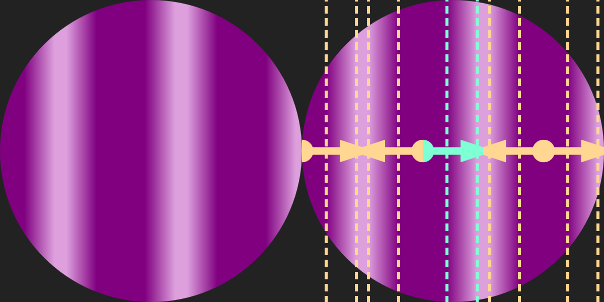
Figure 12-11. A reflecting linear gradient in a circle, and the same shape with the gradient’s line vector and stop offsets marked on it
If you wanted to include both the repeating and the reflecting gradients in the same graphic, there’s an easy way to reduce your code. One gradient element can cross-reference another with an xlink:href attribute.
Warning
As with all other xlink:href attributes, most modern browsers support simple href, but keep using xlink for Safari and older versions of other browsers.
Gradient cross-references to other files are only supported in Firefox and MS Edge.
When you use xlink:href on gradients, the referenced gradient becomes a template. All gradient-related attributes from the referenced element are used as defaults for the new gradient. They will be used unless the new gradient sets its own value for that attribute.
If the new gradient doesn’t have any <stop> elements, it uses the template gradient’s stops.
Tip
You can even create a cross-reference from a <linearGradient> to a <radialGradient>, and vice versa: the shared attributes and the stops will be copied, while other geometric attributes will have their normal defaults.
Using cross-references, you could define the reflecting gradient as follows:
<linearGradientid="purple-reflections"spreadMethod="reflect"xlink:href="#purple-stripes"/>
The <stop> elements (including their colors and offsets) and the geometric attributes (gradientUnits, x1, and x2) are all copied from the original gradient with id purple-stripes. The new gradient then changes the spreadMethod.
Transforming Gradients
The x1, y1, x2, and y2 attributes aren’t your only options for switching from simple horizontal gradients.
There’s another way you can reposition a gradient element: the gradientTransform attribute. It transforms the entire canvas on which the gradient is drawn, after it has been sized and scaled according to the gradientUnits, but before it is actually used to paint the shape.
A gradientTransform was used in the shiny metallic gradient for the frame of the stoplight from Chapter 1. The same gradient code was reused for the scissors in Figure 12-6 in this chapter. Both are shown as close-up detail views in Figure 12-12. The gradient markup is as follows:
<linearGradientid="metal"spreadMethod="repeat"gradientTransform="scale(0.7) rotate(75)"><stopstop-color="#808080"offset="0"/><stopstop-color="#404040"offset="0.25"/><stopstop-color="#C0C0C0"offset="0.35"/><stopstop-color="#808080"offset="0.5"/><stopstop-color="#E0E0E0"offset="0.7"/><stopstop-color="#606060"offset="0.75"/><stopstop-color="#A0A0A0"offset="0.9"/><stopstop-color="#808080"offset="1"/></linearGradient>
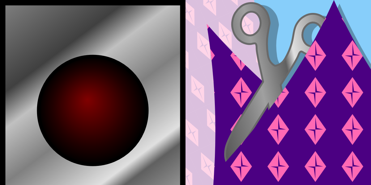
Figure 12-12. Two different shapes, in two different drawings, using the same linear gradient
For the gradient, the eight stops, in oscillating shades of gray, are arranged along the default gradient line, from left to right across the bounding box. The transform takes that pattern, shrinks it slightly, than rotates it 75° clockwise to create a diagonal gradient. The rotation is applied in the distorted bounding-box units, so it’s not actually 75°, and the gradient gets stretched out as it rotates, but you still end up with a diagonal gradient that starts in the top-left corner of the bounding box and changes color as you move down and to the right.
The scissors icon was itself drawn with a 100° rotational transform. That transformation applies to the fill gradient, too, rotating the final gradient angle along with the shape (which actually is a <text>✂</text>).
A gradientTransform on a <linearGradient> cannot create any unique shapes: no matter how you transform the canvas, the end result is still a linear gradient. However, for many authors, thinking in transforms is easier than dealing with multiple attributes. And you can combine them, of course, adding a transform to slightly tweak an existing gradient.
Warning
According to the CSS Transforms module, you should be able to use the CSS transform property to replace a gradientTransform attribute. However, that is not supported in browsers yet.
According to the spec, 3D transforms on gradients (and also patterns) should be ignored.
On a <radialGradient>, gradientTransform is even more powerful: skew transformations and nonuniform scales create unique appearances that you cannot create with the basic attributes. Similarly, the patternTransform attribute on the <pattern> element can be used to great effect.
Radiating Radial Gradients
While <linearGradient> elements base their geometry on a <line>, <radialGradient> elements use a <circle>. So a <radialGradient> accepts r, cx, and cy attributes that define a sizing circle.
Tip
Unlike in a <circle> element, the defaults for r, cx, and cy in a <radialGradient> are all 50%.
In object bounding-box units, that means the default circle fits neatly in the box, touching all four sides. With user-space units, the coordinate system might not be square, so the sizing can get complicated: the rules for percentages in r are the same as for <circle>.
The circle defined by the r, cx, and cy attributes defines the position of the <stop> with offset of 1 or 100%. The zero offset is positioned at the focal point of the gradient; by default, the focal point matches the center of the circle. The stop offsets are positioned along rays from the focal point to the sizing circle, in all directions. This means that each <stop> becomes a circle.
Tip
As we mentioned in “Scaling Paint Servers”, object bounding-box units can distort the shape of gradients. That means that the circles in an SVG radial gradient can get stretched into ellipses. They can also be stretched or skewed by a gradientTransform.
Example 12-5 uses an r value of 0.2 (equal to 20%, in the scaled object bounding-box units) to create a small radial pattern in the center of the shape, and then uses spreadMethod="repeat" to extend that pattern to fill the rest of the shape. Figure 12-13 shows the result, once as defined and once with geometric annotations. Again, the repeats are annotated in a different color.
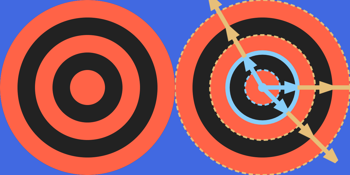
Figure 12-13. A repeating radial gradient with sharp stops, and the same shape with sample rays and the stop offsets marked on it
Example 12-5. Controlling the size of a radial gradient to generate repeated rings
<svgxmlns="http://www.w3.org/2000/svg"xml:lang="en"xmlns:xlink="http://www.w3.org/1999/xlink"width="200px"height="200px"viewBox="-100 -100 200 200"><title>Bulls-eye Repeating Radial Gradient</title><radialGradientid="bullseye"spreadMethod="repeat"r="0.2"><stopstop-color="tomato"offset="50%"/><stopstop-color="#222"offset="50%"/></radialGradient><circler="50%"fill="url(#bullseye)"/></svg>
The code in Example 12-5 takes advantage of the fact that using two consecutive <stop> elements with the same offset creates a sharp color change. It also takes advantage of the fact that the first and last <stop> are extended to fill up the entire offset distance, from 0 to 1, and that a repeating spreadMethod can create sharp color changes of its own.
Warning
Sharp gradient color transitions like these can look pixelated in many browsers. Gradient rendering code was built for, well, gradients—not stripes or rings. You can smooth the transitions slightly by setting offsets that are a couple pixels apart, or you can redesign your drawing to use shapes instead of gradients, and let the browser anti-alias the edges for you.
As we mentioned earlier, WebKit browsers don’t currently support repeating SVG gradients. So they’d just show the center red bull’s eye surrounded by black. To make the full concentric-circle pattern available cross-browser, we need to define a gradient that fills the full bounding box, with each ring specified as a separate pair of <stop> elements, one for the inside edge of the ring and one for the outside. The (much less elegant) code is given in Example 12-6.
Example 12-6. Repeating gradient stops to generate rings, without using spreadMethod
<svgxmlns="http://www.w3.org/2000/svg"xml:lang="en"xmlns:xlink="http://www.w3.org/1999/xlink"width="200px"height="200px"viewBox="-100 -100 200 200"><title>WebKit-friendly Bulls-eye Gradient</title><style>stop.A{stop-color:tomato;}stop.B{stop-color:#222;}</style><radialGradientid="bullseye"r="0.6"><stopclass="A"offset="0.1667"/><stopclass="B"/><stopclass="B"offset="0.3333"/><stopclass="A"/><stopclass="A"offset="0.5"/><stopclass="B"/><stopclass="B"offset="0.6667"/><stopclass="A"/><stopclass="A"offset="0.8333"/><stopclass="B"/></radialGradient><circler="50%"fill="url(#bullseye)"/></svg>
The radius is now three times as large as before (0.6, or 60% of the bounding box, so the total gradient width is 120% of the box width) and the stop offsets are at multiples of ⅙.
To make the code slightly easier to maintain, the <stop> elements have classes to distinguish the two colors, so the color values themselves only have to be defined once, in the CSS rules.
Furthermore, the offset values have been simplified to take advantage of the fact that a stop offset is never less than the previous offset. When we omit the offset on the second <stop> at each color change, it defaults to 0 and then will be automatically adjusted to match the previous stop and create a sharp transition, without our having to explicitly repeat the previous value.
Warning
Default offset values and stop-color set with CSS3 selectors may not be supported in nonbrowser SVG software.
Example 12-6 doesn’t work in Inkscape (0.91), for example. In browsers, it also fails in old Android (e.g., version 4.0). You could improve support by repeating the stop-color values on every <stop> element.
The end result still looks identical to Figure 12-13, in the browsers that rendered Figure 12-13 correctly.
Switching Focus
A <radialGradient> has two additional geometric attributes: fx and fy. These define the focal point of the gradient. If either attribute is unspecified, the value automatically matches cx or cy, respectively.
Off-center focal points allow radial gradients to go beyond perfect geometric symmetry and provide a sense of three-dimensionality. Although we didn’t discuss it at the time, we used this technique to make the stoplights appear three-dimensional in Example 1-7 in Chapter 1. The markup for one of those stoplight gradients is repeated here, including the off-center fx and fy values:
<radialGradientid="green-light-on"fx="0.45"fy="0.4"><stopstop-color="#88FF00"offset="0.1"/><stopstop-color="forestGreen"offset="0.7"/><stopstop-color="darkGreen"offset="1.0"/></radialGradient>
To remind you what that looked like, Figure 1-4 from Chapter 1 is redrawn here as Figure 12-14.
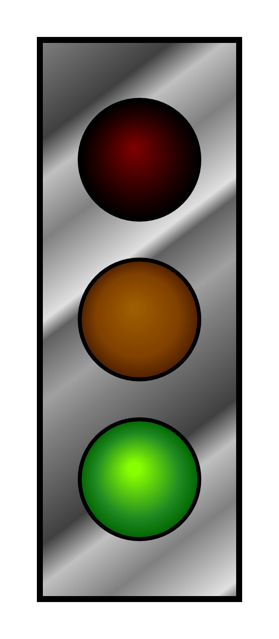
Figure 12-14. Stoplight with gradient fills
Off-center focal points create particularly interesting effects in repeated or reflected gradients. The repetitions as measured in each direction are spaced at the same distance as the spacing between the focal point and that circle in that direction. This means that the repetitions bunch together at one side and spread out in another.
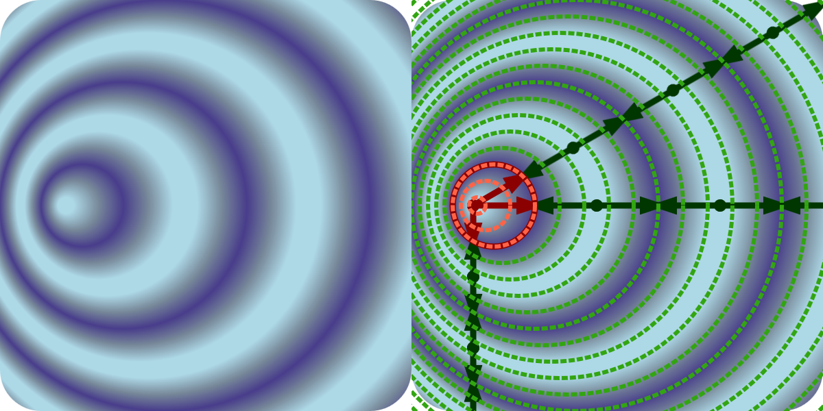
Figure 12-15. A reflecting, off-center radial gradient, and the same shape with the stop offsets and sample rays marked on it
Example 12-7 gives the code for an off-center repeating gradient, shown in Figure 12-15.
Example 12-7. Generating asymmetrical patterns with fx and fy in a reflected radial gradient
<svgxmlns="http://www.w3.org/2000/svg"xml:lang="en"xmlns:xlink="http://www.w3.org/1999/xlink"width="200px"height="200px"viewBox="0 0 200 200"><title>Asymmetrical Reflected Radial Gradient</title><radialGradientid="ripples"spreadMethod="reflect"cx="20%"cy="50%"r="10%"fx="15%"><stopstop-color="lightBlue"offset="0.2"/><stopstop-color="lightSlateGray"offset="0.6"/><stopstop-color="darkSlateBlue"offset="1"/></radialGradient><rectwidth="100%"height="100%"rx="10%"fill="url(#ripples)"/></svg>
Note that the offsets always cross each ray at the same proportion (offset distance) along the repeat. However, the repeat distance is different in each direction, matching the distance from the focal point to the original circle in that direction.
Unfortunately, there is no easy way to recreate the asymmetrical-repetition effect in browsers that don’t support spreadMethod.
Patterns of Possibility
The final paint server you can use to fill (or stroke) in SVG 1.1 is the <pattern> element. In simplest terms, a <pattern> defines a rectangle, or tile, of SVG content. The tile is then repeated in rows and columns, as many times as necessary to paint the shape.
But a <pattern>, in practice, is far from simple.
A <pattern> can contain any SVG graphics: solid-colored shapes, shapes filled with gradients, shapes filled with other patterns, text (providing it is purely decorative), or embedded images. So the possibilities are as open-ended as SVG itself.
But <pattern> elements are also complex in less inspiring ways. The options for scaling the pattern tiles are so open-ended that they are often confusing. And there are a few unfortunate details in the specifications—and bugs in the implementations—which introduce obstacles for many designs.
The next few sections outline some of the most common structures for SVG patterns.
All the Units to Use
A <pattern>, like a gradient, can be scaled to the object bounding box or to the user-space coordinate system. However, it is more complicated than that. You have two attributes to set the scale: patternUnits and patternContentUnits.
The patternUnits attribute sets the scale you use for defining the size and position of the initial pattern tile. In other words, it controls the attributes on the <pattern> itself. It defaults to objectBoundingBox units.
Tip
The pattern tile attributes affected by patternUnits are x, y, width, and height. Set these attributes to percentages or numbers from 0–1 for objectBoundingBox units, or use any SVG lengths if you change patternUnits to userSpaceOnUse.
The patternContentUnits attribute sets the scale of the drawing content inside the <pattern> element. It defaults to userSpaceOnUse units. You can change it to objectBoundingBox units, or you can use a viewBox attribute to define your own scale for each pattern tile. If a viewBox is provided, patternContentUnits has no effect.
Tip
Avoid percentages in the pattern contents when using a viewBox or objectBoundingBox content units—they are not relative to the tile size, the viewBox, or the bounding box.
Instead, the definition of 100% from the user-space coordinate system is scaled up proportional to the scaling effect on all other units—which is not particularly useful.
You almost never want the default mixed-unit combination of patternUnits and patternContentUnits. You will usually do one of the following:
-
Set
patternContentUnits="objectBoundingBox"to create a fully scalable pattern that divides the box into an even number of tiles, regardless of box size. Or doesn’t divide it: you can create single-tile pattern instead, which fills the shape with a nonrepeating graphic. -
Set a
viewBoxto create a fully scalable pattern with aspect-ratio control and/or easier reuse of content that has been drawn at a scale other than 0–1. -
Set
patternUnits="userSpaceOnUse"to create a wallpaper-style fixed-size pattern, where the size of the pattern tiles is consistent regardless of the size of the shape being painted. -
Set
patternUnits="userSpaceOnUse"and set aviewBoxto create a fixed-size pattern (or one scaled to the SVG dimensions, using percentages) with aspect-ratio control or rescaling.
Warning
Older versions of Firefox did not handle viewBox in patterns correctly, especially in combination with a patternUnits value of objectBoundingBox (which is the default). It’s been fixed since version 40 (mid-2015).
Warning
Internet Explorer and MS Edge (up to at least EdgeHTML 15) only apply the scaling aspect of viewBox values, not the translation aspect.
To ensure support in Microsoft browsers, only use viewBox values where the first two numbers are zero. To shift the origin of the pattern contents, use a <g> inside the pattern with a translate transformation.
If it weren’t for these bugs and the issue with percentages, viewBox patterns would probably be the preferred approach in most cases. As it is, you need to weigh the convenience of defining your own local coordinate system against the bother of working around the bugs.
One final warning about working with patterns: the <pattern> contents will always be clipped to the tile. Not only is the default value of overflow set to hidden for patterns, but no web browser currently supports visible overflow. The original SVG specs weren’t clear about how visible overflow should work, and so far there hasn’t been consensus support from browsers to implement it.
Dividing the Box
In Chapter 5, we drew a checkerboard using a script to generate each individual square (Example 5-3). At the time, however, we noted that a <pattern> could be used to generate the same effect if you did not need each square to be an independent, interactive element.
Boards for chess and checkers come in many different sizes, but they always have the same number of squares: eight alternating black and white squares in each row and column. This therefore makes it a perfect example of a pattern that scales to fit the object bounding box. The repeating pattern is not a fixed size relative to the SVG coordinate system, but relative to the size of the board.
To use objectBoundingBox units for the pattern contents, we need to convert all the measurements to decimal fractions of the bounding-box width and height. As mentioned in the last section, percentages don’t work. Instead of 25%, use 0.25.
Example 12-8 creates the pattern, and then uses it to draw two boards of different sizes, as shown in Figure 12-16.
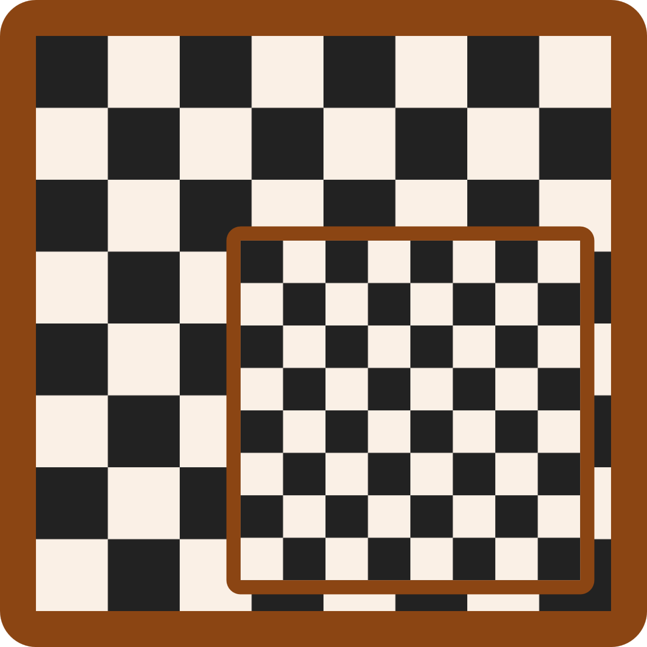
Figure 12-16. Checkerboards drawn with a scalable pattern
Example 12-8. Drawing a checkerboard with a pattern
<svgxmlns="http://www.w3.org/2000/svg"xml:lang="en"height="9in"width="9in"viewBox="0 0 864 864"><title>Checkerboard from a Pattern</title><styletype="text/css">.board{fill:saddleBrown;}.white{fill:linen;}.black{fill:#222;}.squares{fill:url(#checks);}</style><patternid="checks"width="25%"height="25%"patternContentUnits="objectBoundingBox"><rectclass="white"width="0.25"height="0.25"/><rectclass="black"width="0.125"height="0.125"/><rectclass="black"x="0.125"y="0.125"width="0.125"height="0.125"/></pattern><g><rectclass="board"width="9in"height="9in"rx="0.5in"/><rectclass="squares"x="0.5in"y="0.5in"width="8in"height="8in"/></g><g><rectclass="board"x="8cm"y="8cm"width="13cm"height="13cm"rx="0.5cm"/><rectclass="squares"x="8.5cm"y="8.5cm"width="12cm"height="12cm"/></g></svg>
The styles are mostly the same as Example 5-3; an additional class has been added to set the pattern fill on the shape that will hold all the checks.
Although there are eight squares in each row and column, the alternating colors means that the pattern only repeats four times in each direction. In other words, the pattern tile is one-quarter (25%) of the width and height of the bounding box.
Within each pattern tile, we draw a 2×2 set of alternating black and white squares. To reduce the number of elements, the white squares are drawn as a single background
<rect>filling up the entire pattern tile.The two black squares are then drawn on top. They are each 12.5% of the board’s width and height, or 0.125 in the scaled object bounding-box coordinates.
The full-size board is drawn with two elements: one for the border and one for the checkerboard pattern.
The second board uses the same structure, but everything is smaller—and measured in metric units.
When using object bounding-box units like this, keep in mind the lessons from “Scaling Paint Servers” about the distorting effect of the coordinate system. If the box is not square, the coordinate system will be nonuniform with horizontal and vertical units of different lengths. Circles, text, and images will all be stretched, and rotational angles will be uneven. Also note that everything is scaled according to the new units, including stroke widths and font size.
In addition to creating scale-to-fit repeating patterns, object bounding-box units are useful for creating a pattern that fills the entire shape without repeating.
Picture Perfect
By creating a <pattern> tile that is too large to repeat, you can remove the “pattern” appearance and create a custom-designed paint server. Since the <pattern> can contain any SVG graphics, you can turn any SVG image into paint for other shapes. With the addition of the <image> element, you can use any other image type, too.
To create a nonrepeating pattern tile, set the width and height on the <pattern> element to 100%. If using userSpaceOnUse units, also set x and y on the <pattern> to match the first two numbers of the SVG’s viewBox, so that your tile perfectly fills the coordinate system.
Tip
The width and height attributes are still required: they default to 0. A pattern tile with zero width or height is invalid. If you specified a fallback fill color, it will be used instead.
You can use a single-tile pattern to fill an SVG element with a photograph or other raster image file, by using an <image> element as the content of the <pattern>.
Tip
As mentioned earlier in the chapter, the CSS Fill and Stroke module will make filling an SVG element with a photograph much easier—you could just use a url() reference to the image file.
Until that’s supported in browsers, <pattern> provides the workaround.
For image fills, you usually don’t want the image to be stretched or squished to fit the shape. A viewBox pattern, with aspect-ratio control, is preferred. A slice scaling mode ensures that the image completely covers the shape.
Example 12-9 uses a photograph (of clouds over the flat expanse of Lake Ontario) to fill the club shape from our card-suit set. Figure 12-17 shows the result.
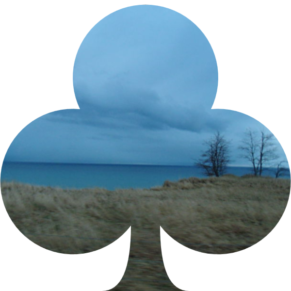
Figure 12-17. An SVG shape filled with a photograph
Example 12-9. Using a <pattern> to create a photographic fill
<svgxmlns="http://www.w3.org/2000/svg"xml:lang="en"xmlns:xlink="http://www.w3.org/1999/xlink"width="200px"height="200px"viewBox="0 0 200 200"><title>Image Fill using a Pattern</title><patternid="image-fill"width="1"height="1"viewBox="0 0 800 600"preserveAspectRatio="xMidYMid slice"><imagewidth="800"height="600"xlink:href="lake-ontario.jpg"/></pattern><symbolviewBox="0 0 20 20"id="club"style="overflow: visible"><title>Club</title><pathd="M9,15.5A5,5 0 1 1 5.5, 7.5 A5,5 0 1 1 14.5, 7.5A5,5 0 1 1 11, 15.5 Q11,20 13,20H7Q9,20 9,15.5Z"/></symbol><usexlink:href="#club"fill="url(#image-fill)"/></svg>
The pattern has
widthandheightof 1, equivalent to 100% in object bounding-box units. TheviewBoxis based on the actual dimensions of the JPEG image file: 800×600. Asliceoption forpreserveAspectRatioensures that the rectangular photograph will completely cover the shape we’re painting.The JPEG’s dimensions need to be repeated in the
widthandheightof the<image>element (since most browsers don’t yet support the SVG 2 autosize option). Since the<image>size is set explicitly, we don’t need to worry about preserving aspect ratio at this step.The
<symbol>code is directly copied from the sprite file created for Example 10-2 in Chapter 10. The visible overflow won’t have an effect in this example, but it will when we use this pattern again with stroked symbols, in Chapter 13.Because it is a
<symbol>, and there are no dimensions on the<use>element, the copy will scale to fit the current SVG’s dimensions. Afillpresentation attribute assigns the image pattern.
Tip
Because the SVG code in Example 12-9 loads an external image file, it would not work if the SVG itself were embedded as an image. Inline SVG or embedded objects only.
Warning
To ensure cross-browser support, we copies the <symbol> code directly into the file, instead of referencing the sprite file from Chapter 10 in the <use> element.
The lack of support includes some recent versions of Chrome, which support external <use> references but don’t apply paint servers to them.
Since there are no limits to how many <image> elements you can include in your <pattern>, you can use this technique to mimic layered fills. And the layers don’t have to be external images: they could be <rect> elements filled with other patterns or gradients. A <pattern> is therefore also the workaround for layered fills, until browsers support layers set directly in the fill property.
Patterned Prints
The <pattern> designs we’ve worked with so far aren’t exactly what most people think of when they think of patterned fill: fixed-sized patterns that are tiled as many times as necessary to fill up a shape. In this sort of pattern, large shapes get more repeats than small shapes, but the size of the pattern tile doesn’t change.
In other words: user-space patterns.
To create such a pattern, you need patternUnits to be userSpaceOnUse, and you need to set the width and height in absolute values (not percentages).
Pattern contents could also be absolute—with the default userSpaceOnUse value for patternContentUnits—or they can be scaled to fit within the pattern tile, with a viewBox.
Example 12-10 uses the viewBox approach to turn our diamond icon (from Chapter 6) into a wallpaper pattern (which we’ve already seen in figures in this chapter). The pattern is then used to fill a copy of our spade icon. To avoid Chrome bugs with external <use> references, the markup for both card-suit icons has been copied directly into the new file.
A variation on the pattern emphasizes the tile boundaries, and is created by an xlink:href reference to the first. As with gradients, the cross-reference makes one pattern a template for the other. All geometric attributes from the first pattern become defaults for the second.
Tip
If the second pattern didn’t have any contents, the contents from the template pattern would have been duplicated as part of the template, the same as for the stops of a gradient template.
Figure 12-18 shows the end result of both patterns.
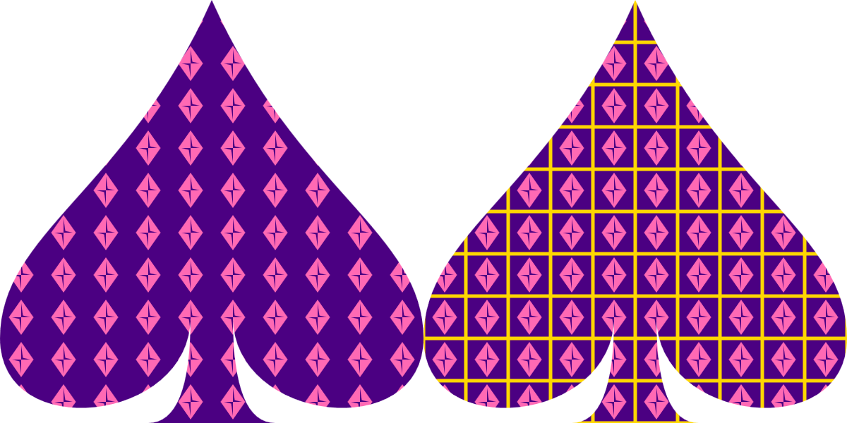
Figure 12-18. A pattern made from a card-suit symbol, used to fill a different suit’s symbol
Example 12-10. Defining a classic, fixed-size <pattern> using predefined symbols
<svgxmlns="http://www.w3.org/2000/svg"xml:lang="en"xmlns:xlink="http://www.w3.org/1999/xlink"width="400px"height="200px"viewBox="0 0 400 200"><title>userSpaceOnUse Patterns, with re-used symbols</title><patternid="wallpaper"patternUnits="userSpaceOnUse"width="2"height="2"viewBox="0 0 24 24"><rectfill="indigo"width="24"height="24"/><pathid="pink-diamond"d="M3,10L10,0 17,10 10,20Z M9,11L10,18V10H15L11,9 10,2V10H5Z"fill="hotPink"transform="translate(2,2)"/></pattern><patternid="wallpaper2"xlink:href="#wallpaper"><rectfill="indigo"stroke="gold"stroke-width="2"x="0"y="0"width="24"height="24"/><usexlink:href="#pink-diamond"/></pattern><symbolviewBox="0 0 20 20"id="spade"style="overflow: visible"><title>Spade</title><pathd="M9,15C9,20 0,21 0,16S6,9 10,0C14,9 20,11 20,16 S11,20 11,15Q11,20 13,20H7Q9,20 9,15Z"/></symbol><usefill="url(#wallpaper)"xlink:href="#spade"width="200"/><usefill="url(#wallpaper2)"xlink:href="#spade"x="200"width="200"/></svg>
The basic pattern defines 2×2 tiles in the user-space coordinate system, and then defines a 24×24
viewBoxscale for the contents of each tile, slightly larger than the 20×20 we used when defining our club-suit icons.The contents consist of an indigo
<rect>that fills the entire tile, and then a<path>copy of the diamond icon, filled in pink. Atransformattribute on the<path>centers it within the tile.The second
<pattern>cross-references the first, and does not change any of the geometric attributes.The contents, however, are altered for the second pattern, to add a gold stroke to the backdrop
<rect>. The strokes will extend outside the pattern tile and be clipped by the hidden overflow, but the strokes on adjacent tiles will appear to be continuous.Once we change some of the pattern contents, we have to replace it all. We keep the code DRY by reusing the styled diamond from the previous pattern.
The spade is defined as a
<symbol>, and then reused twice, filled with each pattern. Thewidthandxattributes scale and position the<use>elements within the main SVG coordinate system.
There are a few complications of patterns and nested coordinate systems hidden in the code in Example 12-10:
-
The pattern is applied to the shape in the
<symbol>element’s coordinate system used for drawing the spade<path>, not in the main SVG’s coordinate system used for scaling the<use>elements. The card-suit symbols are defined as being 20px wide and tall, so the 2×2 pattern tiles mean 10 columns of tiles across the width of the spade, even though each spade is drawn 200px wide in the final graphic. -
The
widthandheightattributes on the<rect>inside the pattern contents are set in user units, not as 100%, even though we want the rectangle to completely fill the tile’sviewBox. A 100% width and height would be interpreted as 100% of the outer SVG’s width and height (400×200px), scaled up according to the local definition of apx. That would make the rectangle many times the size of the pattern tile. For the solid backdrop, the difference would not be obvious—the overflow would still be clipped—but the stroked rectangle would lose half of its strokes.
Tip
The problem with percentages also applies to the default 100% width and height of a reused symbol. For a <use> that copies a <symbol> inside a <pattern>, always include width and height attributes.
When you have a small, repeated pattern like this, it becomes very obvious that the pattern tiles are always arranged in exact rows and columns. If this is too square for your style, a little creativity can help reduce this rectilinear rigidity.
The patternTransform attribute is the easiest way to mix things up. Rotations and skews can create diamond or parallelogram tiles out of the simple rectangles in your code.
Tip
Just like with gradientTransform, patternTransform is merged into the general transform property by the CSS Transforms spec—but browsers haven’t made the switch yet.
For example, if you add the following attribute to the wallpaper pattern in Example 12-10, the end result is as shown in Figure 12-19:
patternTransform="rotate(45)"
In the version without the extra outlines, the rotated pattern looks almost like a checkerboard of alternating content in rows and columns, because the exactly repeated rows and columns are now actually diagonals.
Tip
You only need to add patternTransform to the first of the linked patterns; it will be copied to the second pattern by the xlink:href reference.
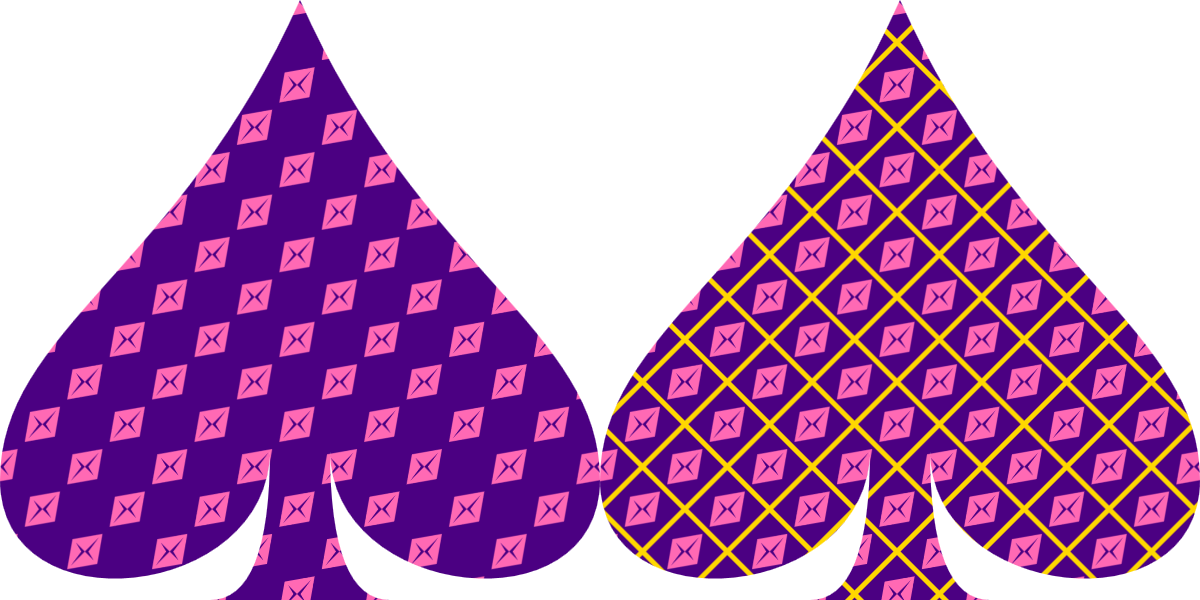
Figure 12-19. Square pattern tiles, rotated 45°
If you design your pattern tile with the transformation in mind, even more possibilities open up. Figure 12-20 shows the final result if you add the reverse transformation to the pink-diamond <path> element:
transform="translate(2,2) rotate(-45, 10,10)"
The negative rotation on the <use> exactly cancels out the rotation on the pattern tile, so that the diamond icons are drawn upright again. The three-value rotate function is used to ensure that the rotation is centered around the center of the icon.
When you apply transformations to patterns with solid backdrops—like this one—the edges of the pattern tiles sometimes appear in some browsers, because of rounding errors. If this problem shows up in your pattern, one solution is to make your backdrop <rect> slightly larger than the pattern tile.
In future, the solution would be to use a solid-color fill layer underneath the pattern layer, instead of having to include the backdrop in the pattern itself.
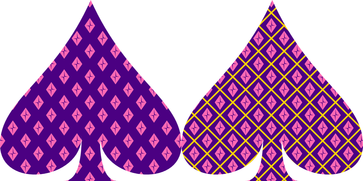
Figure 12-20. Square pattern tiles, rotated 45°, containing icons rotated in the opposite direction
Summary: The fill Property, Gradients, and Patterns
It is easy to fall into an analytical, mathematical approach to SVG when working with the markup, drawing using coordinates. But SVG is about graphics as much as it is about vectors. Filling shapes with complex content is the first step to going beyond simple solid-color, flat icons. Of course, creating those effects, and controlling them precisely from code, requires diving back in to vector geometry.
The gradients and patterns introduced in this chapter use a structure we’ll see again in other SVG graphical effects: dedicated markup elements define an effect, without drawing anything themselves; the effect is applied with a url() reference from a style property of another element.
Simple gradients and patterns can be created with not much markup, but the many attributes for scaling and adjusting the effects create countless possible combinations. The options can seem overwhelming. Browser support limitations don’t make it any easier. But if you start from something simple and work up, you can build incredibly complex and creative results.
CSS gradients and repeating backgrounds achieve many of the same effects as SVG gradients and patterns. Many SVG-focused web developers (including us) look forward to the day when the CSS syntax can be used in SVG fill and stroke. However, there are numerous small details and differences that can trip up developers switching from one to the other. Even when the CSS-focused approaches are available in SVG, there will be some effects that require the full markup to recreate.
1 If you want more details, we have written an entire book on SVG paint servers, SVG Colors, Patterns & Gradients (O’Reilly, 2015), that does explore all the options.