Table of Contents for
Using SVG with CSS3 and HTML5
 Using SVG with CSS3 and HTML5
Published by
O'Reilly Media, Inc., 2017
Using SVG with CSS3 and HTML5
Published by
O'Reilly Media, Inc., 2017
- nav
- Cover
- Using SVG with CSS3 and HTML5
- Using SVG with CSS3 and HTML5
- Preface
- I. SVG on the Web
- 1. Graphics from Vectors
- 2. The Big Picture
- 3. A Sense of Style
- 4. Tools of the Trade
- II. Drawing with Markup
- 5. Building Blocks
- 6. Following Your Own Path
- 7. The Art of the Word
- III. Putting Graphics in Their Place
- 8. Scaling Up
- 9. A New Point of View
- 10. Seeing Double
- 11. Transformative Changes
- IV. Artistic Touches
- 12. Filling Up to Full
- 13. Drawing the Lines
- 14. Marking the Way
- 15. Less Is More
- 16. Playing with Pixels
- V. SVG as an Application
- 17. Beyond the Visible
- 18. Drawing on Demand
- 19. Transitioning in Time
- 20. Good Manners
- Index
- About the Authors
- Colophon
Chapter 8. Scaling Up
Chapter 8. Defining Coordinate Systems
So far in this book, when talking about the layout of SVG shapes, we have used the word default a lot. By default, the origin of the coordinate system is in the top-left corner. By default, user coordinates are equal to CSS layout px units. By default, SVG coordinate systems seem restrictive and arbitrary.
But you don’t have to use the default options.
In this chapter, we introduce the ways you can control the coordinate system. Which means we’ll introduce the scalable side of Scalable Vector Graphics. By controlling the coordinate system, you control the size of your graphics.
This chapter focuses on defining the initial coordinate systems for your graphic. Defining a coordinate system means setting the origin point, establishing the size of a user unit, and determining the meaning of 100% width or height. All of these are set with the powerful viewBox attribute we’ve already mentioned multiple times. Other attributes control the size and alignment.
The coordinate system concepts discussed in this chapter will be revisited in the following chapters. The attributes used to define the initial coordinate system of an <svg> are also used in scaling reused content (<use> and <image>), creating local coordinate systems (with nested <svg>), and cropping the graphic during embedding (with <view>).
Another way to modify coordinate systems is by geometrically transforming them, as we’ll discuss in Chapter 11. Transformations can also change the origin and the size of a user unit. Transformations don’t change the meaning of 100% width and height (at least, they don’t change it proportional to the size of a user unit). Transformations can also rotate or skew the x and y axes, which is not possible when you’re creating coordinate systems with viewBox.
Coordinated Efforts
We’ve talked about the coordinate system in previous examples. We’ve had to—it’s impossible to draw anything in SVG without defining where to draw it, and how big to draw it, using coordinates.
The SVG coordinate system is a Cartesian coordinate system. That means that positions in space are defined relative to an origin point and axes that are at right angles to each other. The number of axes is equal to the number of dimensions in space. For the two-dimensional space used for SVG, the two axes are the x-axis describing the horizontal distance from the origin and the y-axis describing the vertical distance.
Note
Axes (pronounced ax-EEZ) is the plural of axis (ax-ISS), a reference direction in space. Not to be confused with axes (pronounced AX-ez), which is the plural of ax, the sharp implement used to chop wood.
Conceptually, you start from the origin point, then measure the distance along one axis until you’re as close to the desired point as you can get, then turn at a right angle—so that your measuring stick is parallel to the other axis—and measure the distance to the point. Figure 8-1 shows how you could measure out the position where x = 50 and y = 80. By convention, when talking about 2D points, the horizontal x distance is given first, then the vertical y distance, so this point is also known as (50,80).
The complete coordinate system is defined by (a) the position of the origin point, (b) the direction of the axes, and (c) the scale of units on each axis.
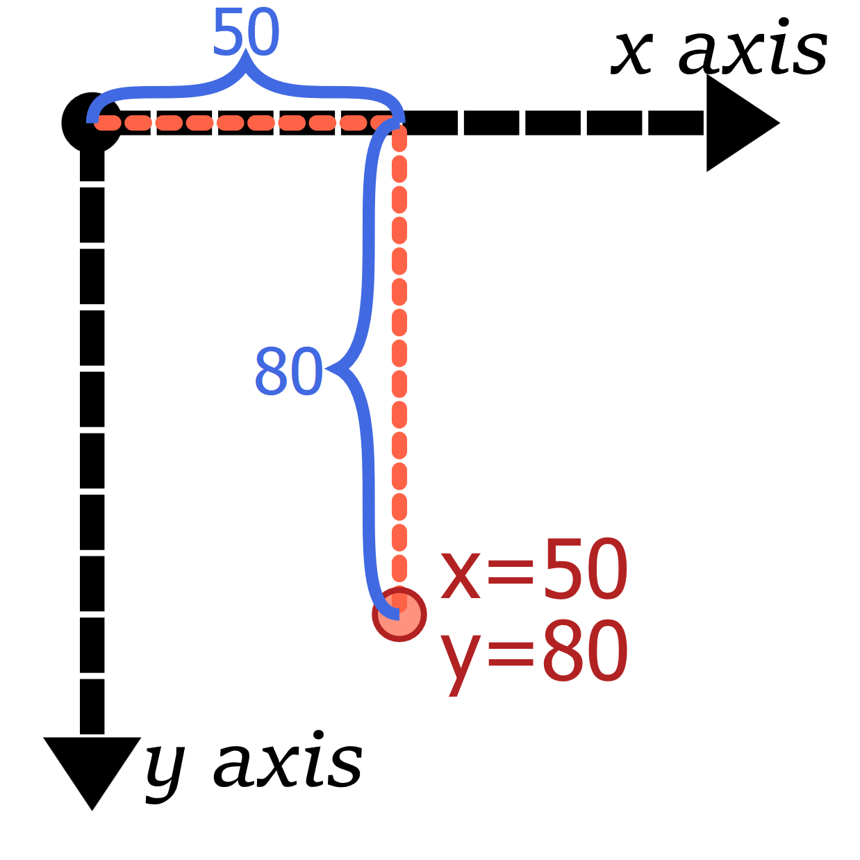
Figure 8-1. Positioning a point in a 2D Cartesian coordinate systems; black lines are the axes, while the orange-red (tomato) line shows how the coordinates are measured
Note
Cartesian coordinates are named after René Descartes, a famous French mathematician and philosopher. Something of a disreputable rogue, Descartes’s work on probability theory was inspired by his gambling. The story goes that he developed coordinate geometry while sick in bed, watching ants moving across the walls and ceiling of his apartment.
Those ignominious beginnings led to a breakthrough with profound influence on the development of mathematics, physics, and eventually, computer science—and SVG. Cartesian coordinates merged the then-new disciplines of algebra and calculus to the centuries-old discipline of geometry.
The Cartesian coordinate system that most people learn in high school algebra has an origin—the “zero-point” where both x and y coordinates are given the value of 0—at the bottom left, or at the center if both negative and positive coordinates are used. Generations of schoolchildren have learned that the x-axis grows toward the right, counting up 0, 1, 2, and so on. Moving left gets you into negative numbers: –1, –2, –3, and so on. The y-axis used in school math textbooks grows from bottom to top: positive numbers above the origin and negative numbers below.
However, the history of computer graphics changed that somewhat. The CRTs used for the original computer monitors had scan guns that swept from left to right and from top to bottom. Because of this, it made sense to use an inverted coordinate system.
The x-axis still goes from left to right (the same as algebra class), but the y-axis starts from the top and increases as it progresses down the screen or page. The origin is typically placed at the upper-left corner of the screen. Figure 8-2 compares the familiar x/y coordinate system from algebra class against the SVG coordinate system, both for the default origin (with only positive coordinates) and a centered origin (both positive and negative coordinates).
This coordinate system is ingrained in most computer graphics systems, with SVG being no exception. The origin is at the top left, x coordinates increase from left to right, and y coordinates increase from top to bottom:
-
(150,100) is 150 units to the right and 100 units below the (0,0) origin.
-
(–150,–100) will be 150 units to the left and 100 units above the origin.
With the default coordinate system, (–150,–100) would be offscreen. You could move it onto the screen by defining the coordinate system with a different origin, in the center of the graphic or somewhere else. The point (–150,–100) would still be 150 units to the left and 100 units above the origin, wherever that origin is. You can only change the directions of the axes using coordinate system transformations, which we’ll get to in Chapter 11.
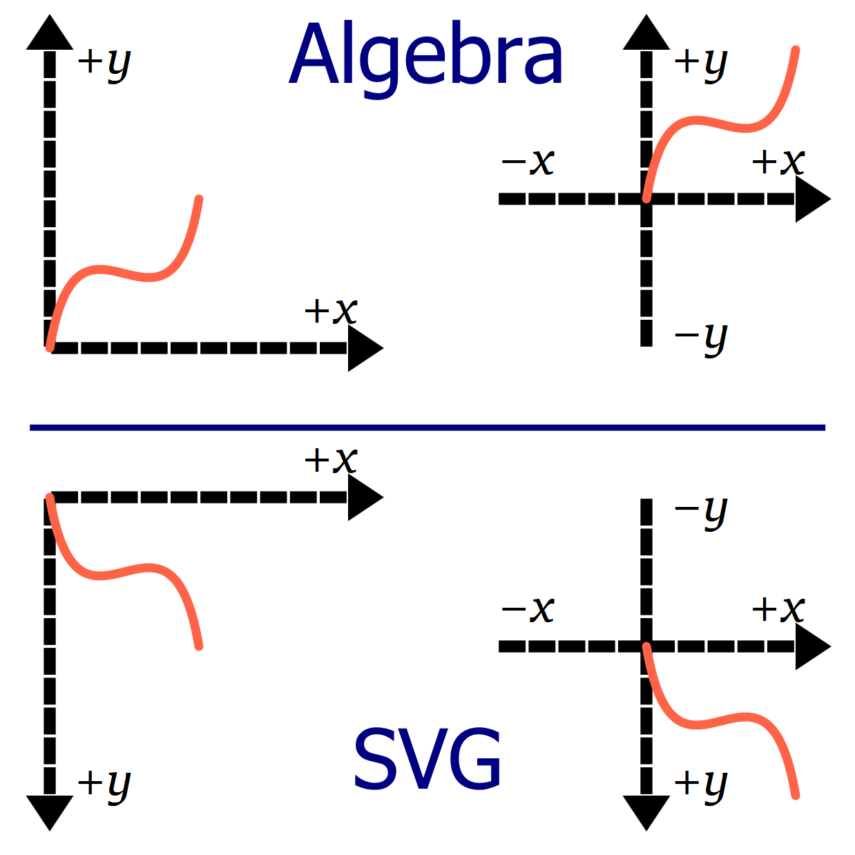
Figure 8-2. Two-dimensional coordinate systems, as they are defined in algebra textbooks (top) versus how they are defined in SVG (bottom); each coordinate system is 100 units wide and 100 units tall, and the orange path is drawn from (0,0) to (50,50) in each.
The final aspect of SVG coordinate systems is not part of purely mathematical Cartesian systems: their width and height. The width and height of the SVG coordinate system are used to determine the meaning of percentage lengths, as discussed in Chapter 5. But the coordinate system’s width and height are not firm boundaries: you can still use coordinates that are bigger or smaller than that range.
Framing the View, with viewBox
In theory, the SVG coordinate plane is infinite in extent. Your interest, however, is usually in the fairly confined region that you can display on a screen or print to a page.
This rectangular window into the infinite graphical plane is known as a viewport. It defines what you actually see of the graphic.
You experience viewports every time you open a web page that is too big to fit on your screen; the browser knows the position of the rest of the text, but it won’t show it to you until you scroll. A more graphical instance of viewports can be found on any digital map. The mapping website or software has information about the whole world, but it only shows you a small rectangle at a time.
On maps, elements are positioned by their longitude and latitude. In SVG, they are positioned by their coordinates. You can tell the browser to draw shapes at any coordinates you choose, but if the resulting shape doesn’t overlap the viewport, you won’t see it.
Tip
Unlike with HTML web pages, most SVG viewers currently do not allow you to scroll or pan to content outside the declared width and height.
An SVG graphic with the root element <svg width="400px" height="200px"> will create a default viewport with the origin of (0,0) at the upper-left of the box and the point (400, 200) at the lower-right corner of the viewport.
These points are defined in the internal user coordinates or user units, which are always equal to px units, regardless of how the width and height are defined—the fact that the width and height were specified in px is only a convenience. If the coordinates were given as <svg width="6in" height="4in">, the user coordinates would still be equivalent to pixels. With 96 pixels to the inch, the lower-right corner would be at the point (576, 384).
Both SVGs in Figure 8-3 have the exact same content: overlapping vertical and horizontal rectangles arranged to create a grid (in plaid!); circles and text elements mark the coordinates of points along the diagonal. In the top part, the SVG is set to 400px by 200px; at the bottom, the dimensions were changed to 6in and 4in.
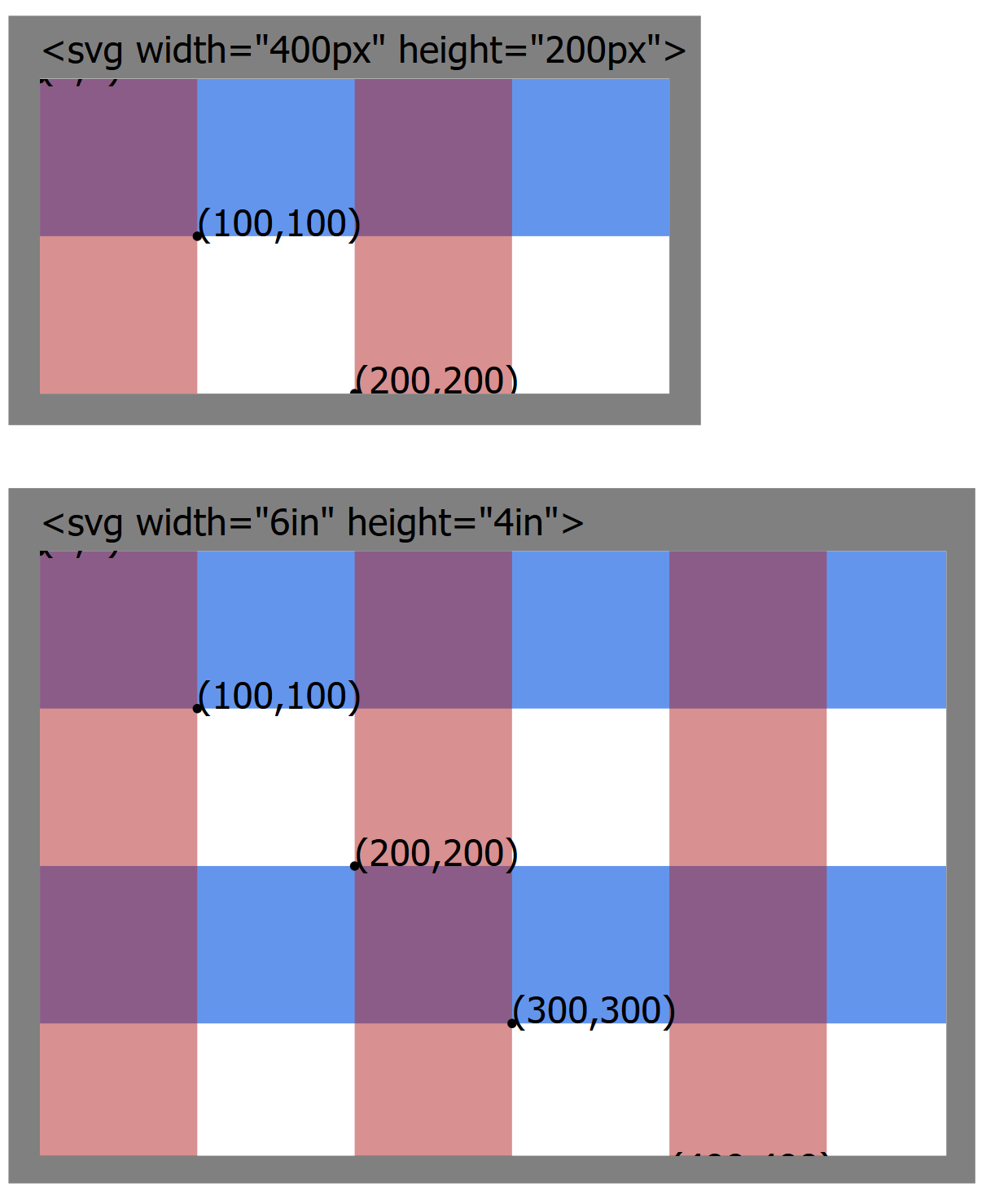
Figure 8-3. A plaid SVG grid, in two differently sized SVG viewports
In total, the grid defined in the SVG file is 1,000 units wide and 1,000 units tall. But in both parts of Figure 8-3, most of the content gets cropped off—including the text that sits above the y = 0 baseline. The size of the individual stripes does not change, only how much of them are visible.
By default, when you declare the width and height of an <svg>, the browser calculates how many pixels will fit in those dimensions. It then displays any and all SVG content whose coordinates fit in between (0,0) and the calculated width and height, scaled at 1px per user unit.
But oftentimes, this isn’t what you want.
Sometimes, it would be very convenient to have user units scale to a different size.
In Chapter 6, we discussed how it would have been much easier (in Figure 6-6) if we could use centimeters, instead of px, to define our curved path to match the lines we already drew using cm units.
Sometimes, it would be convenient to locate the origin of the coordinate system at the visual center of a graphic rather than in the top-left corner.
Most of the time, it would be convenient if your Scalable Vector Graphics would scale to fit within a particular region on your web page.
To do all of the above, you use a viewBox attribute. The viewBox specifies which coordinates should be positioned within the viewport created by the browser window or the web page layout. By defining how many user units, in total, should fit, the viewBox defines the size of the default units. By giving exact coordinate values that should fit, the viewBox indirectly sets the position of the coordinate system origin.
Tip
Viewports in SVG are similar to but different from the viewport used in CSS viewport units. The SVG viewport used for scaling is created by the CSS layout box for the <svg> element, not by the size of the screen (unless the SVG is set to fill the screen exactly). The CSS vh, vw, vmin, and vmax units follow the CSS meaning, even when you’re drawing in SVG.
The number of user units specified by the viewBox is independent of the width and height of the <svg> element (the viewport). The same coordinates of the graphic will be shown, regardless of how large the image is drawn; the graphic scales so that they will fit.
Figure 8-4 takes the plaid grid used in Figure 8-3 and adjusts the attributes on the <svg> again. This time, the width and height create a 4-inch square, but the viewBox ensures that 1,000 units are scaled to fit horizontally and vertically. The text ends up tiny, but it all fits. Well, except for the very first text label, which still ends up on the negative side of the origin and cropped off.
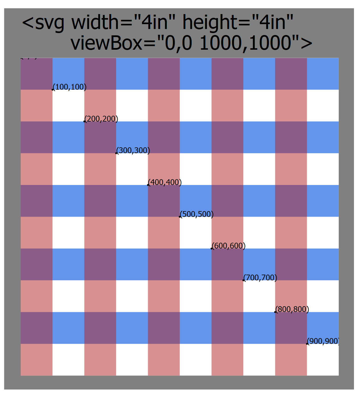
Figure 8-4. The same plaid SVG grid, scaled to fit the viewport using a viewBox attribute
The graphical code within the SVG is the same as in Figure 8-3. The only changes in the code for Figure 8-4 were the attributes on the <svg> element: changed width and height, and the new attribute viewBox="0,0 1000,1000".
The value of viewBox is a list of four numbers: min-x, min-y, width, height. The four numbers can be separated by whitespace or by commas. The first two values give the minimum coordinate, in each direction, that should be included in the viewport region. The width and height values represent the total number of coordinates, in each direction, that should fit within the viewport.
Tip
The width and height values must always be positive numbers. They represent distances, not the coordinates at the end of the range.
The minimum coordinates implicitly define where the origin of the coordinate system—the (0,0) point—will be. The default coordinate systems are equivalent to using 0,0 for these values. For the SVG with a 400px width and 200px height, the default coordinate system would be equivalent to a viewBox with the values "0,0 400,200".
What if you wanted the origin to be in the center of the SVG? That’s the same as saying that you want half that width to the left of the origin, half to the right, and half the height above and half below. The minimum coordinates would therefore be negative values equivalent to half the width and half the height. In other words, the viewBox would be "-200,-100 400,200".
Tip
In general: if you want the origin to be positioned x units from the left side and y units from the top, the first two values in the viewBox are –x and –y.
Centered coordinate systems are often useful when you’re creating geometric diagrams. They can make drawing some shapes easier, but other shapes can be more difficult. Example 8-1 creates an HTML web page with two 400×200 inline SVGs. Both have the same graphical content, but one uses the default coordinate system while the other has a centered coordinate system. Figure 8-5 shows the result.
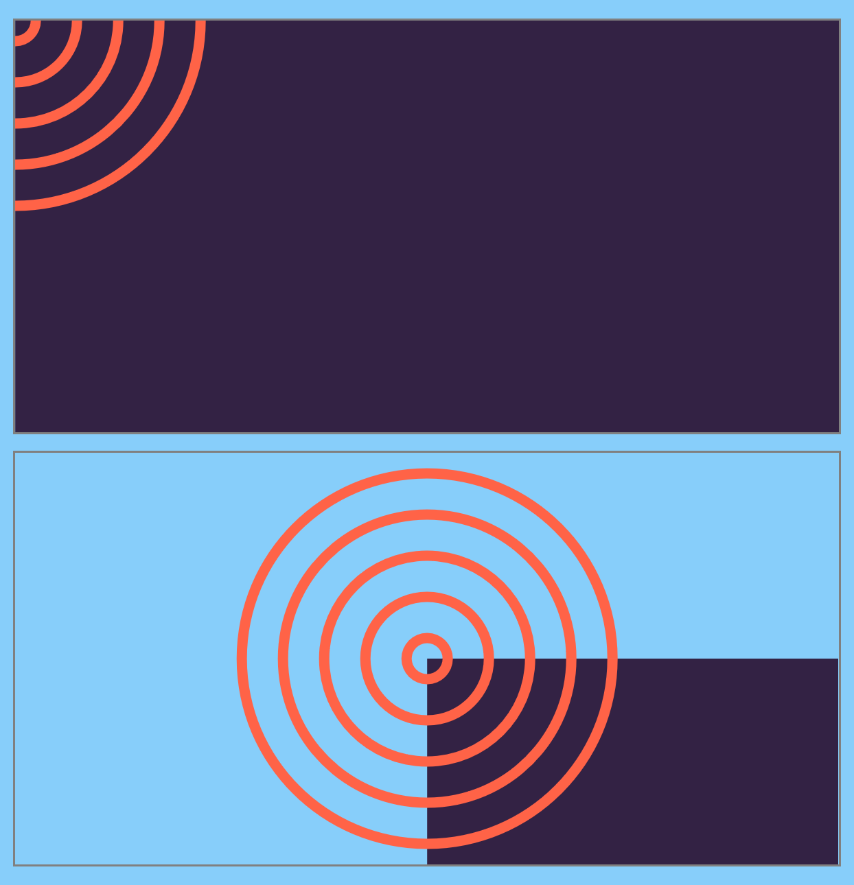
Figure 8-5. Two SVGs with the same shapes, using (top) default and (bottom) centered coordinate systems
Example 8-1. Using viewBox to create a centered coordinate system
<!DOCTYPE html><htmllang="en"><head><metacharset="utf-8"/><title>Default and centered SVG coordinate systems</title><linkrel="stylesheet"href="centered-viewBox.css"></head><body><svgwidth="400px"height="200px"><title>Default coordinates</title><gid="content"><rectclass="backdrop"width="100%"height="100%"/><gclass="target"><circler="10"/><circler="30"/><circler="50"/><circler="70"/><circler="90"/></g></g></svg><svgwidth="400px"height="200px"viewBox="-200 -100 400 200"><title>Centered coordinates</title><usexlink:href="#content"/></svg></body></html>

The linked styles (not printed here) describe the layout of the page and the coloring of the SVG shapes: dark purple fill for class
backdropand tomato strokes for classtarget.
The first
<svg>is sized withwidthandheightonly, noviewBox; the default coordinate system will be used.
The
backdroprectangle is sized to 100% width and height. Thexandyattributes aren’t specified, so default to0; this positions the top-left corner of the rectangle in the top-left corner of the SVG, so it completely fills the space.
The set of concentric circles doesn’t have
cxorcyattributes; these also default to0. For circles, that means that three-quarters of each circle will be cropped off, because they will be centered on the top-left corner.
The second SVG is given a
viewBoxattribute to center the coordinate system, as described in the text.
The entire content of the first SVG is duplicated into the second one. There are no positioning attributes on the
<use>element, so all the shapes will retain their original coordinates. Those coordinates, however, will be positioned in the new coordinate system.
The width and height of the rectangle has not changed in the second SVG. However, it no longer fills the SVG, instead getting cropped at the bottom and right edges. The top-left corner of the rectangle is still positioned at (0,0), but that is now the center of the graphic.
In order to create a rectangle that fills the SVG with a centered coordinate system, you have to set the rectangle’s x and y attributes to negative values. The following are two possible ways of doing so:
<rectwidth="100%"height="100%"x="-200"y="-100"/><rectwidth="100%"height="100%"x="-50%"y="-50%"/>
In the first case, the positions are in user units and directly match the viewBox offset; in the second case, the value of 50% is calculated against the width or height from the viewBox, and the result is then turned into a negative offset.
In contrast, the circles centered on (0,0) are nicely positioned in the middle of the centered coordinate system, without requiring additional attributes.
Warning
In current web browsers, when you use <use> to duplicate a shape that is defined with percentages, those percentages are calculated based on the original coordinate system width and height. In other words, the size of the shape doesn’t change, only its position. This was not well defined in the original SVG specs; SVG 2 recommends using percentages from the new context.
In Example 8-1, the width and height of both <svg> elements is the same, so this did not make a difference. In other cases, it’s best to avoid mixing percentages with <use>.
In Chapter 10, we’ll discuss the <symbol> element, which allows you to duplicate content and have it scale to fit the new context.
Whether a centered coordinate system simplifies your SVG code, or complicates it, will really depend on what you’re trying to draw. Positioning “centered” shapes, such as circles and ellipses, can be easier with a centered coordinate system, but shapes and elements that are positioned from the top left, such as rectangles, require extra arithmetic. In Chapter 11, we will see more examples of how controlling the coordinate system origin can simplify your code.
Calibrating the Scales
When you use a viewBox, the units you define do not have to match the px units used by the web page. If you want 1 unit per inch, instead of 96, all you have to do is say so:
<svgwidth="6in"height="4in"viewBox="0,0 6,4">
This code defines a user coordinate system with 6 user units horizontally and 4 user units vertically. It then stretches that coordinate system to fit within a space 6 inches wide and 4 inches tall. As a result, each user unit is 1 inch long, in both directions. Because the first two values of the viewBox are both 0, the origin of the coordinate system is in the top left.
You might think that you could now use in (inch) units interchangeably with user coordinates. So you might try to add our 1-inch square from Chapter 5 into this SVG:
<svgwidth="6in"height="4in"viewBox="0,0 6,4"><rectwidth="1in"height="1in"/></svg>
But that will draw a square that overflows the SVG, many times over.
When you scale up the coordinate system in SVG, the length units get adjusted accordingly. A px is still equal to a user unit, and an in is still 96px. At this scale, that would be drawn as 96 real-world inches—8 feet!
Tip
The ratios between the different length units and user coordinates never change when you scale the SVG; all units scale equally.
If you’re going to use viewBox to set the scale of your user units, you need to use those user units (i.e., no units at all) in your drawing:
<svgwidth="6in"height="4in"viewBox="0,0 6,4"><rectwidth="1"height="1"/></svg>
If you need a unit (some CSS properties won’t accept plain numbers), you can always use px as equal to the SVG user unit.
Scaling to Fit
The viewBox examples so far have all used SVGs of fixed size. In that situation, viewBox is a convenience. It lets us use a coordinate system we choose, independent of the number of pixels.
But this means that we can define our paths and shapes once, then change the width and height later. After all, SVG is scalable, right?
It is, if it has a viewBox!
The dimensions that you specify in the viewBox attribute will stretch (or shrink) to fit whatever width and height you set. For example, all the card-suit icons in Chapter 6 were defined as tiny 20px squares. Adding viewBox="0,0 20,20" allows you to redraw the same icon at any size, by setting width and height on the SVG.
Tip
For the full-sized figures in Chapter 6, we used viewBox="-5,-5 30,30", to give 5 units of extra room on all sides (including above and to the left of the origin) for drawing grid lines and control points. Changing the viewBox can also be used to pad and crop an image.
The viewBox is most useful when you don’t know the final size of the SVG. Maybe the SVG is sized to fit a browser window, or maybe it’s an icon that adjusts to font-size.
Example 8-2 goes one step further, allowing the user to adjust the size. It uses the CSS resize property to create an adjustable <div> element. The <svg> inside is absolutely positioned to completely fill that <div>, whatever its dimensions. The viewBox controls the scale that is used to draw the <path>. Figure 8-6 shows multiple screenshots.
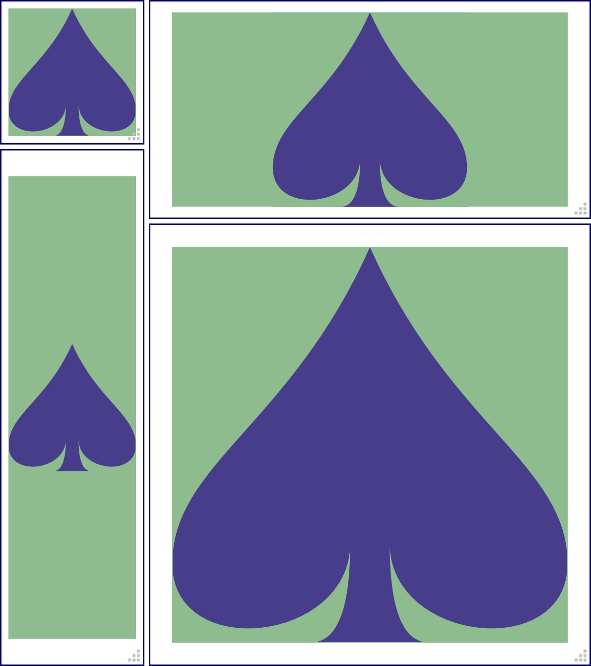
Figure 8-6. Using viewBox to scale a graphic to fit, at various sizes
Example 8-2. Using viewBox to scale a graphic to fit
HTML markup:
<!DOCTYPE html><htmllang="en"><head><metacharset="utf-8"/><title>Scaling with viewBox</title><linkrel="stylesheet"href="flex-scale-viewBox.css"/></head><body><divclass="wrapper"><svgviewBox="0,0 20,20"><title>Spade</title><pathd="M9,15C9,20 0,21 0,16S6,9 10,0C14,9 20,11 20,16 S11,20 11,15Q11,20 13,20H7Q9,20 9,15Z"/></svg></div></body></html>
That’s the path data for the spade from Example 6-3 in Chapter 6, just condensed onto fewer lines—more compact, less readable. It still draws the same shape, in the same 20×20 square region, matching the
viewBoxon the<svg>.
CSS styles: flex-scale-viewBox.css
html,body{height:100%;}.wrapper{position:relative;height:10em;width:10em;resize:both;overflow:hidden;border:thinsolid;}svg{display:block;position:absolute;height:90%;width:90%;top:5%;left:5%;background-color:darkSeaGreen;}path{fill:darkslateblue;}
Warning
The CSS resize property is not implemented in Microsoft Edge or Internet Explorer, or in many mobile browsers. To see the scaling effect in those browsers, you can set the width and height of the wrapper element with percentages or viewport units, and then rescale your browser window.
The final benefit of using viewBox to reset the coordinate system is that you can scale the image according to a coordinate system that makes sense for the data that you are using. For instance, if you were making a map of North America, you might create a coordinate system in degrees latitude and longitude, with a viewBox of "-180,86 130,80", corresponding to a map that spans from (180°W 86°N) to (50°W 6°N).
Note
Directly converting longitude and latitude coordinates into horizontal and vertical coordinates creates an equirectangular map projection. It is very convenient for converting geographical coordinates to SVG, but doesn’t always create a good map. Because longitude lines (meridians) are not actually parallel—they join together at the North and South Poles—using the longitude as a horizontal coordinate distorts the scale, stretching east-west distances everywhere except the equator.
When using real-world units like this, you need to keep an eye on how big your numbers are—and how small the distances you are trying to graph. Web browsers have limits on how much memory they allocate to each number, and they use approximations for mathematical calculations with large numbers.
For best results, only use real-world numbers if they are fairly close in size to screen pixel values. Aim for no more than 100 px per unit, or 100 units per px.
A Poor Fit (and How preserveAspectRatio Fixes It)
In the theoretical map of North America, the width declared in the viewBox was 130 units, and the height was 80 units. Ideally, the width and height attributes on the SVG should have the same width/height ratio, equivalent to 130/80 or 1.625. In other words, if the height is 200 pixels, the width should be 325 pixels.
Now suppose that, for reasons beyond the control of the SVG designer, the aspect ratio—the ratio of width to height—of the SVG on the page or screen has to be something other that 1.625, such as 1.5 or 2.0 or, more likely, some flexible region that will stretch and shrink according to the user’s browser size.
There are three possible ways the SVG could scale to fit within this mismatched space:
-
The SVG graphic is contorted—stretched or squeezed—to fit the available aspect ratio.
-
The whole graphic is fit within the available space, with everything in the right proportions, but with extra blank areas filling the too-large dimension.
-
The graphic is scaled to completely fill the space without leaving anything blank, but some parts of the graphic get cut off in the too-small direction.
The choice between these options is controlled by the preserveAspectRatio attribute on the <svg> element. This is used to determine how the picture fits into the available space, and has a variety of values. It has no effect unless you define a viewBox on the same element. The width and height from the viewBox value define the intrinsic aspect ratio of your graphic; preserveAspectRatio tells the browser what to do when the actual aspect ratio of the SVG region doesn’t match.
The simplest property for preserveAspectRatio is "none". This is not the default; you need to set it explicitly:
<svgviewBox="0,0 20,20"preserveAspectRatio="none">
In this mode, the graphic will conform to the size of the container, even if that container has a different aspect ratio. One direction will stretch, while the other will compress, until the exact number of units specified in the viewBox width and height fit the SVG width and height.
The resulting coordinate units are no longer square—one unit in the x direction does not equal one unit in the y direction. Your graphic will be distorted to match: circles stretched into ellipses, text looking like it passed through a fun-house mirror, and even the stroke width stretching or compressing depending on which direction it is going.
If you paid attention to the resizable graphic in Example 8-2, you would have noticed that, by default, the aspect ratio is preserved. No matter how you change the size of the SVG, the shape is never distorted. To see the difference, edit the <svg> to match the preceding snippet.
Then, stretch and squish the icon. The results should look something like Figure 8-7.
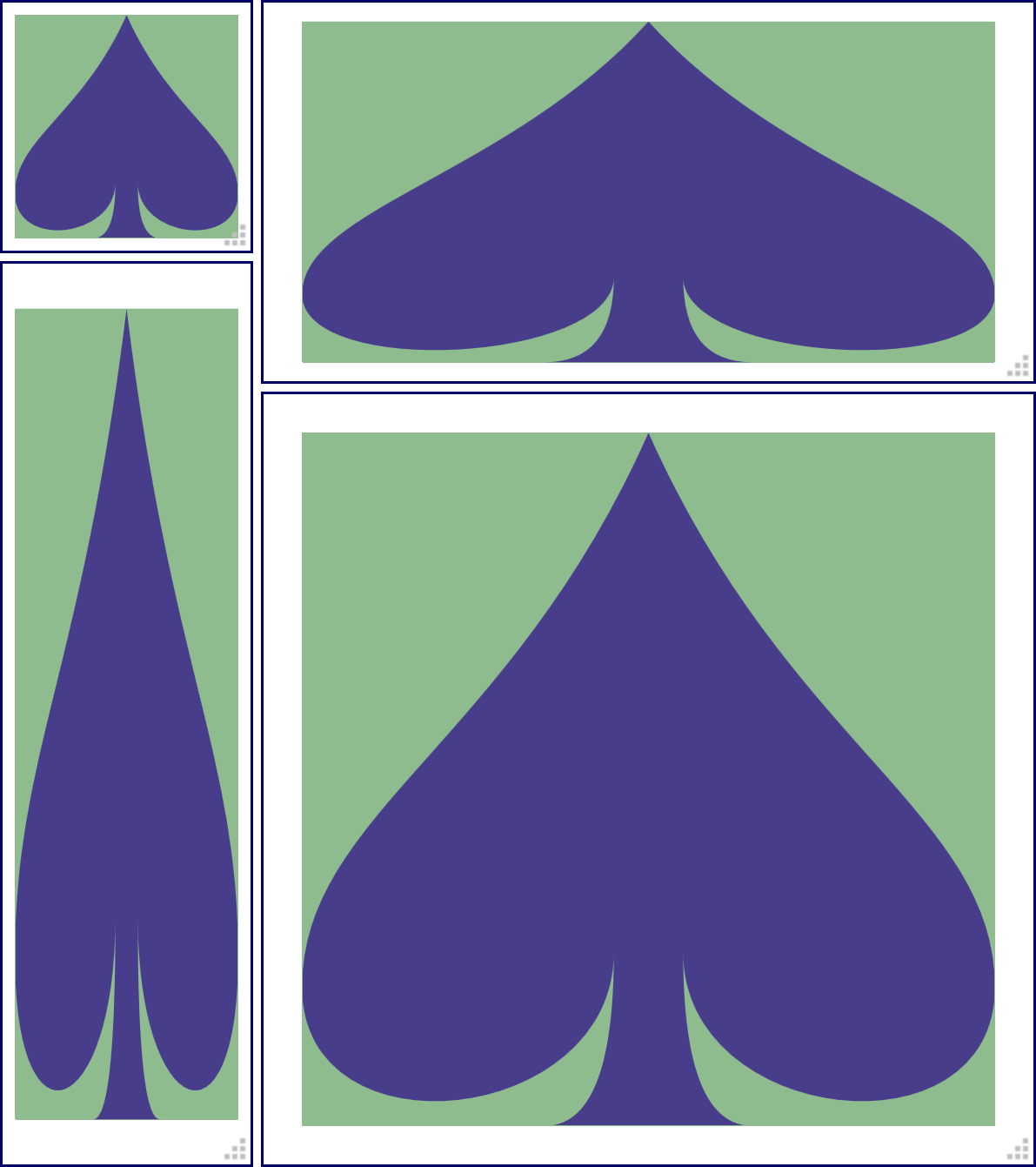
Figure 8-7. Using viewBox to scale a graphic to fit, without preserving the aspect ratio
If that’s not the default, what is?
What is the opposite of none for preserving aspect ratio?
It isn’t that simple. There isn’t just one preserveAspectRatio value that tells the software drawing the SVG to preserve the aspect ratio: there are 18. Each variant indicates how the software should size and position the graphic within the drawing region, when the aspect ratios don’t match.
The general format for these values is as follows:
xAlignYAlign meet-or-slice
Keywords fill in the parts of that value:
-
three options for
xAlign:xMin,xMid, orxMax -
three for
YAlign:YMin,YMid, orYMax -
two for
meet-or-slice: not surprisingly,meetorslice
Multiply those out (3 × 3 × 2), and you get the 18 possible variants.
The xAlignYAlign keyword determines how the scaled graphic is positioned in the available space. Specifically, it indicates which point to align between the viewport (the region specified by the SVG width and height) and the graphic’s viewBox.
A xMinYMin value means that the minimum values in both directions—in other words, the top-left corner—will be aligned; xMinYMax indicates that the lefthand side (xMin) and the bottom edge (YMax) will be aligned; xMidYMid means that the center points, in both directions, will be aligned.
Tip
The alignment values are indicated as a single token (word), with no spaces in between. To maintain proper camelCase capitalization, the first letter—the x in the x-alignment value—is lowercase, but the Y is uppercase.
After you define the anchor point with the alignment options, the scale of the graphic depends on the choice between meet and slice.
The meet value indicates that the image is anchored at the alignment point, and then expanded until it meets either the horizontal or vertical boundaries of the viewport. This ensures that the whole viewBox image will be displayed, but the SVG may also include areas outside the viewBox. This often means there will be blank space around the graphic.
The slice attribute value, on the other hand, anchors the image, then expands it until both dimensions of the graphic have reached a viewport boundary. This will fill up the entire space of the container, but at the cost of slicing off portions of the viewBox dimensions (or causing them to overflow the SVG, for inline SVG with overflow: visible).
Tip
The default value for preserveAspectRatio is xMidYMid meet; it fits the entire viewBox region within the drawing area, and centers it in any extra space. This behavior was demonstrated in Figure 8-6.
You can test out the other options by editing the file from Example 8-2.
Figure 8-8 shows the same sizes of the graphic, but when preserveAspectRatio is set to xMinYMax slice. The bottom-right corner of the viewBox (minimum x and maximum y) is always visible—but other parts get sliced off.
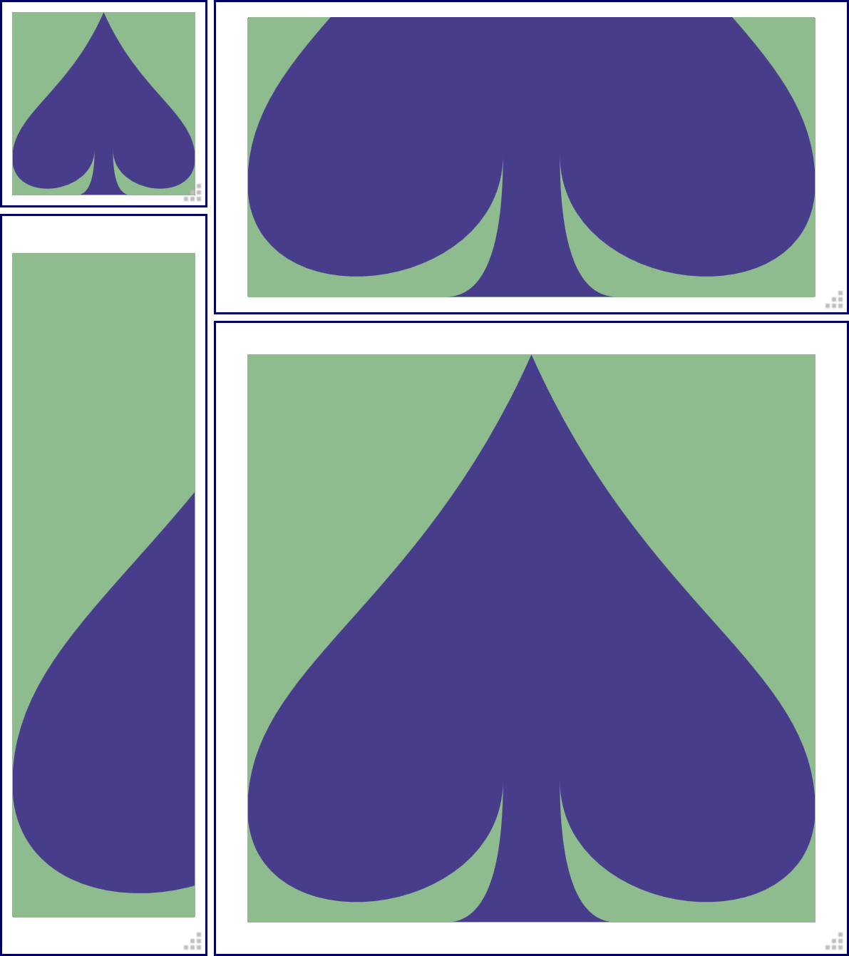
Figure 8-8. A graphic resized with viewBox and slice scaling, with xMinYMax alignment
As you experiment, it should become clear that only one of the alignment options at a time has an effect. The graphic always exactly fits one dimension of the available space. Whether it’s the x or y dimension is determined both by the shape of the space, and by meet versus slice.
The viewBox and preserveAspectRatio have a huge effect on the final presentation of the graphic. One complication, however, is that the perfect viewBox for a graphic can sometimes depend on the specific styles you use. The spade in the previous examples was drawn to just fit inside its viewBox. If you added a stroke to the shape, it would extend outside the box.
One option is to adjust the viewBox to give a little extra room. However, to make the change dynamically, you’ll need to use JavaScript: CSS can’t change viewBox.
For inline SVG, you can instead use CSS padding to make room for the stroke, setting the overflow property to visible to allow it to be painted.
When you use SVG as a separate image or object, overflow isn’t an option—the image is clipped to its canvas before being inserted in the document. However, you can define completely separate alternate viewBox parameters, which you can turn on by changing the embedding URL. Chapter 9 will describe how it works.
Just-Right Sizing
SVG’s aspect-ratio control options ensure that the graphic fits neatly in the “frame” you give it. They assume that the size of that frame is controlled by external forces: the screen or page size, or the CSS of the embedding web page.
For small icons and logos, where you know the exact size you want for the graphic, this usually makes sense. Set the width and height properties on the <img>, <object>, or (for inline SVG) <svg> element in the main web page, and you’re good to go.
Tip
An SVG file embedded in HTML using <iframe> will not always rescale to fit the frame; instead, scroll bars can be added. But browsers are rather inconsistent with SVG scaling and iframes, so use <object> if you can.
But often in web design, especially in responsive web design, you want that frame to adjust to match the content. Specifically, you might set a height or width on your SVG container element, and want the other direction to be calculated automatically based on the SVG aspect ratio, without any whitespace gaps or sliced-off bits from the SVG’s aspect ratio adjustments.
Raster images in CSS-styled HTML have always had autosizing like this: set either height or width to auto (the default), and it will be calculated from the other dimension and the image’s aspect ratio.
Unfortunately, this inside-out approach to sizing wasn’t fully considered when SVG was originally designed. It has taken a while for web browsers to standardize around a consistent and useful approach to the problem. You may need some hacks to get support in all browsers. How to solve it depends on how you are inserting the SVG into your web page, and on how much information you give the browser to work with.
Autosizing Embedded SVG
The best results, cross-browser, for autosizing occur under the following conditions:
-
embedding an independent SVG file in your web page with an
<img>or<object>element; -
the root
<svg>in the file has aviewBoxattribute; -
the
<img>or<object>in the web page has eitherheightorwidthset to an explicit value with CSS, which could be a percentage value.
In this case, scaling the SVG image works pretty much how it does for raster image formats like PNG or JPEG. The auto dimension is adjusted to exactly match the aspect ratio of the SVG from the viewBox. But unlike with raster images, your graphic will be crisp and clear at any size!
So, for example, if you want an SVG image to always scale to fit the available width, you could use the following CSS code in your web page:
img.full-width{width:100%;/* height is auto by default */}
So long as the SVG has a defined aspect ratio (the intrinsic aspect ratio), the height of the image will scale to match the width. You won’t have to worry about the preserveAspectRatio value. Your image will end up not too big and not too small: just right.
Warning
Almost always just right, anyway. Things can get weird with display: table or flexbox layout. But that’s true for other images, too.
The most reliable way to define an aspect ratio is to use viewBox.
You can define an aspect ratio using both width and height attributes on the root <svg>, without viewBox. But it can get buggy.
Warning
As mentioned in Chapter 2, when your SVG file has width and height attributes but not viewBox, Internet Explorer won’t scale the drawing to match the size of the drawing region. However, it will still autosize the embedding <img> according to the aspect ratio.
In addition, when you embed with an <object>, the units in an SVG without viewBox will never scale: it will be drawn at exactly the specified width and height.
For these reasons, using width and height without viewBox is only recommended if you have carefully designed your graphic to control scaling yourself—for example, if you position elements entirely using percentages or nested coordinate systems (which we’ll talk about in Chapters 9 and 10).
That said: it is often helpful to add width and height, in addition to viewBox. These set the default (intrinsic) size for your graphic.
The default size is what will be used if you embed an image in a web page without any CSS sizing instructions—that is, with both width and height set to the default auto. For raster images, the default size is the pixel size. For SVG, it is the size set by the width and height attributes on the root <svg> element in the file.
Tip
For consistent autosizing, the width and height aspect ratio should match the viewBox aspect ratio. (They don’t need to be the same numbers, just the same ratio.)
If they don’t match, height and width take precedence. The viewBox will be used to fit the graphic in the resulting size, with gaps or slices.
If the SVG doesn’t have an intrinsic size (no width or height), and the embedding web page doesn’t provide any size for the <img> or <object> (both width and height are auto), that’s when things get buggy.
At the time web browsers first started integrating SVG into web pages, there were two competing sets of instructions about what to do when an SVG didn’t have a set size:
-
The HTML specs defined a “default object size” of 300px wide and 150px tall.
-
The SVG specs said that the
widthandheightattributes had a default of 100% (but then had a whole bunch of text about how these attributes weren’t the same as CSSwidthandheight).
Different browsers picked different combinations of these sizes to apply:
-
In Internet Explorer, the 100% values are used, but if a percentage height can’t be calculated by CSS rules (which is common, because height on web pages isn’t usually restricted), the 150px height applied.
-
In old Firefox, both the 300px width and 150px height were applied.
-
In old WebKit and Blink (Safari and Chrome) browsers, 100% width was used, while height was set to 100% of the screen size (100vh).
Newer browsers have settled on a de facto standard:
-
If the SVG has a
viewBox, the default size is 100% width and a height based on the aspect ratio. -
Otherwise, the default object size of 300px wide and 150px tall is used.
This isn’t quite based in any written standard, or logic for that matter, but is often acceptable enough that it can be easy to forget to apply an explicit width: 100% to your <img> element.
Warning
For consistent results in Internet Explorer, and older versions of other browsers, always include some sizing information for your SVG: either default width and height attributes in the SVG file, or at least one of width or height CSS properties on the <img> or <object>.
So to recap, when creating an SVG file that you’ll be embedding in a web page:
-
Use a
viewBoxunless you have specifically designed your graphic to work without it. -
Include
widthandheightvalues that provide a good default size and match theviewBoxaspect ratio, unless you know you’ll always control the size from the web page. Even then, it rarely hurts to add them. -
If you might be embedding the SVG in such a way that both width and height are constricted (for example, to exactly fit the screen size), decide whether you need a nondefault
preserveAspectRatiovalue.
If you’re exporting the SVG from a graphical editor like Illustrator or Inkscape, look for options to ensure that viewBox is included, and other options to include/remove the width and height attributes.
Resizing Inline SVG
That was for SVG files embedded as images and objects. What about inline <svg>? It should work the same way, right? Just set the viewBox attribute and the width property, and the height should adjust to match.
It seems logical, but it wasn’t obvious when browsers first started implementing inline SVG.
The SVG 1.1 specifications didn’t have rules for this situation, and HTML didn’t clearly define it, either. Once again, browsers came up with their own defaults for what to do if the width or height of an inline SVG wasn’t set explicitly. Not surprisingly, those unstandardized defaults were not consistent with each other.
The situation is getting better: recent browsers (released since 2015) will all happily autosize an inline <svg> to match the aspect ratio defined in a viewBox attribute, just like they do with <img>.
They also all now apply the same de facto standard as for images when neither height nor width is set on the <svg>: 100% width if it has a viewBox; 300px × 150px otherwise.
Warning
Safari doesn’t update the size of an element with auto width and height when the user resizes the browser. Avoid this by explicitly setting 100% width.
Browsers are also inconsistent about what to do if percentage widths are not defined in the CSS layout context (for example, within inline block or floated boxes, which are sized to their contents). In some browsers, an SVG will scale down to zero width and height in this case.
Unfortunately, at the time of writing (mid-2017), most web developers still have to support older browsers that do not autosize inline SVG based on its aspect ratio.
Warning
If you leave the height and/or width of an inline <svg> as auto, Internet Explorer will apply the default size for replaced content, 300px width and 150px height, regardless of the SVG’s aspect ratio.
Other older browsers will apply 100% width and 100vh height (i.e., the full height of the viewport).
What can you do to create scale-to-fit inline SVG in older browsers?
If it’s possible, the simplest solution is to set both width and height of the inline SVG directly, with units that preserve the aspect ratio.
For icons and other smaller SVGs, use em units. In that way, you can adjust the overall size (e.g., for smaller screens) by changing the font size on the <svg> in a media query, without having to worry about the aspect ratio each time you change the size.
For full-size diagrams that you want to fill the browser window, CSS viewport units can often help. Because viewport units allow you to set height proportional to width, and vice versa, you can set both dimensions while maintaining an aspect ratio:
svg.ratio-2-1{width:80vw;height:40vw;max-width:200vh;max-height:100vh;}
The preceding code will normally size the SVG to 80% of the browser window’s width, with a 2:1 aspect ratio. However, the maximum values ensure that the SVG never gets taller than the window’s height, while still preserving the 2:1 ratio.
Warning
Viewport units are either buggy or not supported on many older mobile browsers, so you’ll also want to add fixed-size fallbacks.
Also, while Internet Explorer 9+ and MS Edge support vw and vh units without problem, they have assorted bugs with vmin and vmax units.
These solutions, however, don’t address the most common desire for images: have them size to fit the available width, adjusting the height to maintain the correct aspect ratio. To make that happen cross-browser, you need to get creative with CSS layout rules.
Preserving Aspect Ratios, with CSS Padding
If the older browsers won’t allow us to use CSS to scale while using SVG to preserve the aspect ratio, we’ll have to use CSS to preserve the aspect ratio instead.
One strategy is to wrap the <svg> in an HTML element (e.g., a <div> or <figure>) that is constrained to the correct aspect ratio, and then use absolute positioning to make the SVG stretch to fit that wrapper.
The absolute positioning approach we’ve seen before. In Example 8-2, we positioned an SVG to fill the width and height of a resizable HTML element. In that case, we were demonstrating how the SVG adjusts to different aspect ratios. But how do you constrain that container to a specific aspect ratio?
You do it by setting the element’s padding instead of its height.
In CSS layout, you cannot directly set the height of an element to be proportional to its width, which is what you need for a controlled aspect ratio. However, padding set using percentage values is always proportional to the available width, even when it is padding on the top and bottom.1 This is so that, when you set padding: 5%, the padding space will be the same on all sides of the element.
But we can also use it to only set vertical padding, and have that vertical padding be proportional to the width.
Tip
This “padding hack” is also useful for many other cases where you want to control the aspect ratio of a container, such as to scale down embedded videos or to frame a large background image. It also works for SVG embedded with <iframe>.
Example 8-3 demonstrates how this approach can be used to create a large inline SVG figure that scales to fill the width of the web page. Figure 8-9 shows what that web page looks like.
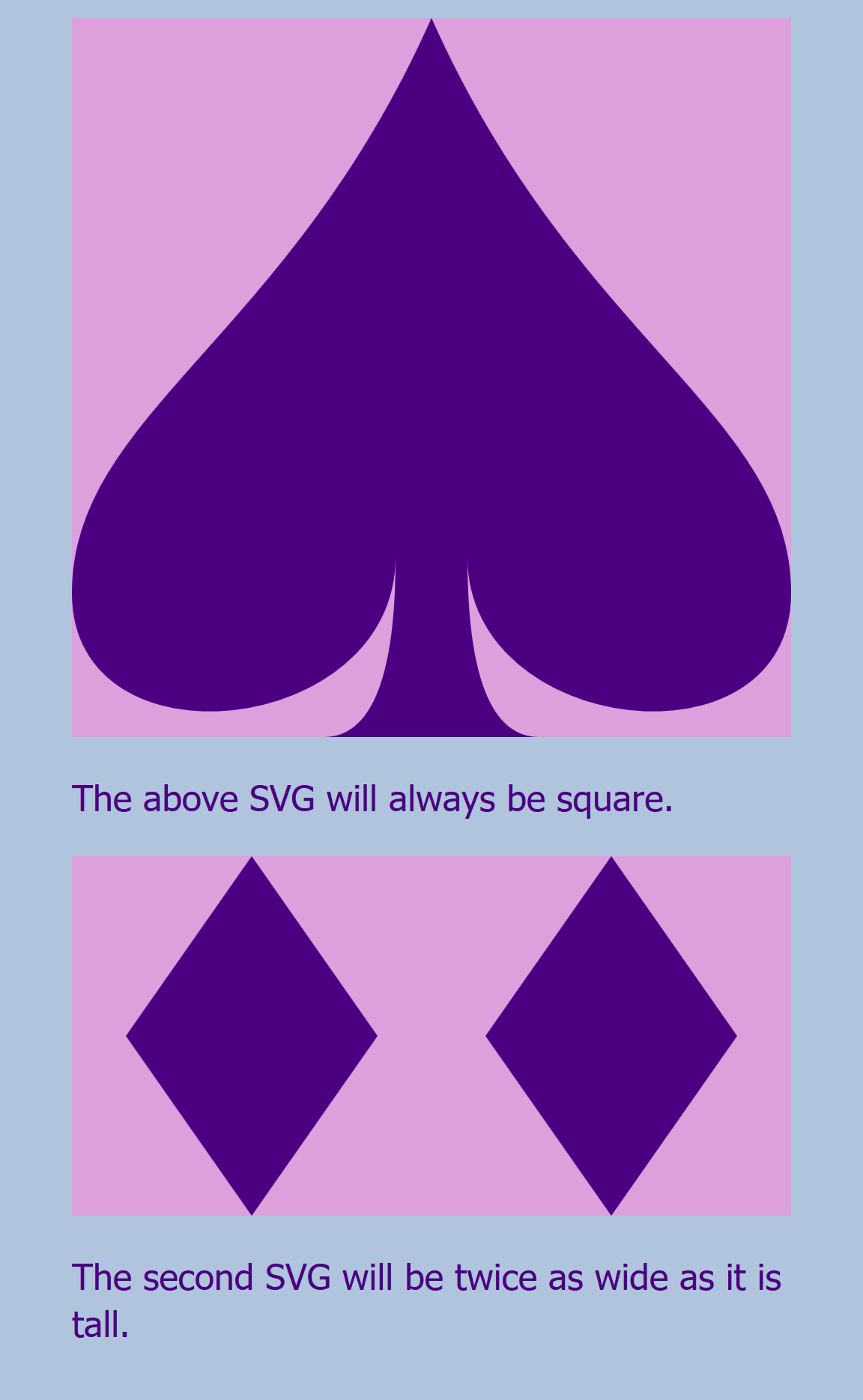
Figure 8-9. A web page with an SVG that fills a controlled aspect ratio container
Example 8-3. Using an HTML element with padding-controlled aspect ratio to scale an SVG evenly in both directions
HTML markup:
<!DOCTYPE html><htmllang="en"><head><metacharset="utf-8"/><title>Scaling inline SVG using a padded wrapper</title><linkrel="stylesheet"href="fixed-ratio-wrapper.css"/></head><body><divclass="svg-wrapper square"><svgviewBox="0,0 20,20"><title>Spade</title><pathd="M9,15C9,20 0,21 0,16S6,9 10,0C14,9 20,11 20,16 S11,20 11,15Q11,20 13,20H7Q9,20 9,15Z"/></svg></div><p>The above SVG will always be square.</p><divclass="svg-wrapper ratio-2-1"><svgviewBox="0,0 40,20"><title>Double Diamond</title><pathd="m3,10 l7,-10 l7,10 l-7,10 l-7,-10z M20,0 m3,10 l7,-10 l7,10 l-7,10 l-7,-10z"/></svg></div><p>The second SVG will be twice as wide as it is tall.</p></body></html>
Each SVG is contained within an HTML element that has classes that will trigger the relevant styles; the
squareclass will create a 1:1 aspect ratio.The aspect ratio defined by the SVG
viewBoxwill control how the graphic is drawn in the available space, but it won’t affect the layout of the web page as a whole.The second SVG has a different
viewBox, but it is theratio-2-1that will adjust the size to match.
CSS styles: fixed-ratio-wrapper.css
/* page styles */body{padding:0.5em2em;font-family:sans-serif;background-color:lightSteelBlue;color:indigo;}svg{background-color:plum;}path{fill:currentColor;}/* aspect-ratio control styles */.svg-wrapper{position:relative;width:100%;height:1px;box-sizing:content-box;margin:0;padding:0;}.svg-wrapper.square{padding-bottom:100%;padding-bottom:calc(100%-1px);}.svg-wrapper.ratio-2-1{padding-bottom:50%;padding-bottom:calc(50%-1px);}.svg-wrapper>svg{display:block;position:absolute;height:100%;width:100%;}
The wrapper element uses nondefault positioning, so that it will be the reference frame for its absolutely positioned child content.
The wrapper uses up 100% of the available width, but is set to 1px height. We use 1px, and not 0, so that screen readers won’t assume that this element is invisible.
The
box-sizingproperty ensures that the specified zero height is only the height of the content region of the wrapper;content-boxis the default forbox-sizing, but many stylesheets override the default, so be sure it is set correctly here. Similarly, margin and padding are cancelled out, just in case.We control the aspect ratio by setting the
padding-bottomproperty. To make sure it cancels out the shorthandpaddingset in the previous rule, the selector is a repeat of the previous selector, plus the aspect-ratio class. Thesquareclass means we need height equal to width, so the padding is 100%, the same value as the wrapper’swidthproperty.Except that 1px height will add to the padding. So, to be extra precise, we use CSS
calc()to cancel it out. But because this code is all about backward compatibility, we keep the basic declaration as a fallback, in casecalc()isn’t supported.For the 2:1 aspect ratio, the height needs to be half the width. Because the width is 100%, the
padding-bottomis 50% (minus 1px).
The SVG itself is absolutely positioned within the wrapper. That means that its available width and height includes the wrapper’s padding region. It takes up 100% of that space, in both directions.
The limitations of this strategy are that you need an extra markup element (the wrapper) whose sole role is to control the layout of the SVG. Furthermore, if you change the dimensions of the SVG, you’ll need to change the styles on the wrapper to match, which can make maintainability difficult.
A slightly more streamlined approach is to control the aspect ratio of the inline <svg> element directly.
In an HTML page, the top-level inline SVG element is positioned using the CSS box model, which means it can have margins, borders, and padding. Normally, this padding area would not be used to draw the SVG content. However, by using a slice option for preserveAspectRatio, and an overflow: visible setting, you can make an inline SVG spill out onto its padding region.
Example 8-4 provides the code for this approach. The result would look exactly the same as Figure 8-9.
Example 8-4. Using sliced SVG scaling, visible overflow, and padding-controlled aspect ratio to scale an SVG evenly in both directions
HTML markup:
<!DOCTYPE html><htmllang="en"><head><metacharset="utf-8"/><title>Using slice and padding to scale inline SVG</title><linkrel="stylesheet"href="fixed-ratio-slice.css"/></head><body><svgclass="sliced-svg square"viewBox="0,0 20,20"preserveAspectRatio="xMidYMin slice"><title>Spade</title><pathd="M9,15C9,20 0,21 0,16S6,9 10,0C14,9 20,11 20,16 S11,20 11,15Q11,20 13,20H7Q9,20 9,15Z"/></svg><p>The above SVG will always be square.</p><svgclass="sliced-svg ratio-2-1"viewBox="0,0 40,20"preserveAspectRatio="xMidYMin slice"><title>Double Diamond</title><pathd="m3,10 l7,-10 l7,10 l-7,10 l-7,-10z M20,0 m3,10 l7,-10 l7,10 l-7,10 l-7,-10z"/></svg><p>The second SVG will be twice as wide as it is tall.</p></body></html>
The wrapper containers have been eliminated, and the
squareaspect ratio class is now on the<svg>itself. So is the newpreserveAspectRatioattribute, which will align the top edge of the graphic with the top edge of the SVG content box (using aYMinalignment setting), then make it scale to fit the larger dimension and spill out onto the padding (using aslicesetting).Again, a separate class is required for a separate
viewBoxaspect ratio, to set the different padding value.
CSS styles: fixed-ratio-slice.css
/* page styles haven't changed *//* aspect-ratio control styles */.sliced-svg{display:block;width:100%;height:1px;box-sizing:content-box;margin:0;padding:0;overflow:visible;}.sliced-svg.square{padding-bottom:100%;padding-bottom:calc(100%-1px);}.sliced-svg.ratio-2-1{padding-bottom:50%;padding-bottom:calc(50%-1px);}
The 1px height is even more important now; if the SVG is set to zero content height, it won’t be drawn at all.
The
overflow: visiblesetting ensures that the graphic is visible even where it extends beyond the content region. This isn’t required in all browsers, but it is on Firefox; the HTML and SVG specifications differ on whether the padding region should be consideredoverflow.Again, we control the aspect ratio of the entire layout box using
padding-bottomto define height as a percentage of the available width.
The main benefit of this approach is that all the styles that control the SVG are assigned to the <svg> element itself. If you have a nonstandard aspect ratio, you could use inline styles to set the padding-bottom value, so that it is right next to the corresponding viewBox in your markup.
One limitation is that you cannot use hidden overflow or other preserveAspectRatio settings to control which parts of your SVG are visible. If your SVG had shapes that extended outside of the viewBox (like the circles around the origin in the first half of Figure 8-5), they will now spill out onto your HTML page.
Both methods (Examples 8-3 and 8-4) depend on the fact that the percentage used to set padding-bottom, which is always a percentage of the available width for the element, is directly proportional to the 100% used width. If you do not want the element to use 100% of the available width, you will need to either adjust the padding calculation, or add another wrapper element that constrains the SVG to the width you want.
The HTML5 <figure> element is a good choice for adding another wrapper element to control layout. It is actually intended for this purpose: to identify and set off a graphic or other supporting content that complements your main text. A <figcaption> (figure caption) element enclosed within the <figure> can be used to add a caption that is recognized by most screen readers and search engines.
Figure 8-10 shows a slightly more realistic example of our SVG in a web page layout, using a <figure> containing the <svg> (from Example 8-4) and a <figcaption>.
Figure 8-10. A web page with a controlled aspect ratio SVG inside an HTML5 figure
The figure is styled with the following additional CSS:
figure{margin:0.5em0;padding:4%;border:graythinsolid;background-color:white;}figcaption{text-align:center;font-style:italic;margin-top:0.5em;margin-bottom:-0.35em;}
The <svg> continues to take up 100% of the available width, as defined by the content region of the <figure>, even if that isn’t 100% of the HTML body region.
Summary: Defining Coordinate Systems
Vector graphics are defined by coordinates, and controlling the coordinate system is essential for controlling how SVG appears. When you define the coordinate system of an SVG, you define the scale and reference point used for the graphical content. You also define the intrinsic aspect ratio used when embedding that SVG in other documents.
The coordinate system is established with a viewBox attribute, which sets the x and y offset of the coordinate system relative to the top-left corner, and the width and height of the coordinate system in user units. Within the SVG graphic, those user units are equivalent to px units, and all other units are scaled proportionately. The amount of scaling depends on how the width and height defined in the viewBox compare with the available width and height.
When the width and height defined in the viewBox do not match the aspect ratio of the available drawing space, the preserveAspectRatio attribute controls whether the graphic scales to match the too-small dimension or the too-large dimension, or whether it stretches to fit in each direction, ignoring the aspect ratio of the graphic. The same attribute also sets the alignment to be used when the aspect ratio is preserved.
Both viewBox and preserveAspectRatio are important attributes for many of the elements we’ll discuss in Chapter 10, controlling the scaling effects to use when content from one SVG coordinate system is inserted into another. They are also fundamental to the SVG views feature that we introduce next, in Chapter 9; we’ll also look at nested coordinate systems, using a child <svg> element to redefine a new viewBox for part of a graphic.
Whether defining the original coordinate system on an <svg> or re-defining it with an alternate view, you can significantly alter the final appearance of the graphic using viewBox and preserveAspectRatio.
1 This statement is actually out of date. It used to be that percentage padding was always proportional to the available width. Flexbox and grid layout have changed that. But if you’re using flexbox and grid layout, you don’t need this layout hack.