Table of Contents for
Using SVG with CSS3 and HTML5
 Using SVG with CSS3 and HTML5
Published by
O'Reilly Media, Inc., 2017
Using SVG with CSS3 and HTML5
Published by
O'Reilly Media, Inc., 2017
- nav
- Cover
- Using SVG with CSS3 and HTML5
- Using SVG with CSS3 and HTML5
- Preface
- I. SVG on the Web
- 1. Graphics from Vectors
- 2. The Big Picture
- 3. A Sense of Style
- 4. Tools of the Trade
- II. Drawing with Markup
- 5. Building Blocks
- 6. Following Your Own Path
- 7. The Art of the Word
- III. Putting Graphics in Their Place
- 8. Scaling Up
- 9. A New Point of View
- 10. Seeing Double
- 11. Transformative Changes
- IV. Artistic Touches
- 12. Filling Up to Full
- 13. Drawing the Lines
- 14. Marking the Way
- 15. Less Is More
- 16. Playing with Pixels
- V. SVG as an Application
- 17. Beyond the Visible
- 18. Drawing on Demand
- 19. Transitioning in Time
- 20. Good Manners
- Index
- About the Authors
- Colophon
Chapter 14. Marking the Way
Chapter 14. Line Markers
This chapter examines line markers, symbols that can be used to accent the points of a custom shape.
Markers can be added to the start and end of every segment in a path (or line, polyline, or polygon), or only to the very beginning or end.
Markers have some similarity to line joins and line caps (which we discussed in Chapter 13). Line joins and line caps can change the appearance of the ends and corners of paths, but maybe not as much as you want. They can’t draw line-cap shapes other than circles or squares, and they can’t draw anything wider than the stroke itself. That means they can’t draw an arrowhead.
Arrowheads are the quintessential use of the <marker> element, but there are many other possibilities. Markers can be used to create custom line-join shapes, or to draw symbols on all the points in a line chart.
Markers offer a number of conveniences, compared to line joins, or compared to drawing each marker symbol individually as a <use> copy of a <symbol>. However, as defined in SVG 1.1, markers are still rather limited. Many things that you might expect to be able to do aren’t supported. There are also a number of bugs and inconsistencies that limit the use of markers to the simpler cases.
A few additional marker options are included in SVG 2, but many other advanced features were deferred to a separate SVG Markers module. At the time of writing, it’s not clear when further work might happen on those proposals.
Emphasizing Points
A <marker> element is much like a <symbol> in that it defines a small, self-contained icon. Like symbols, markers and their contents are never drawn directly. Unlike symbols, markers are not positioned one at a time, with a <use> element. Instead, they are applied to a path, line, polygon, or polyline.
The browser positions copies of the marker automatically at the line joins or line ends of the shape—any point where a path segment starts and ends (regardless of whether or not there is a visible corner).
Warning
As of SVG 1.1, <line>, <path>, <polygon>, and <polyline> are the only shapes that support markers.
SVG 2 makes markers available on the basic shapes (<rect>, <circle>, and <ellipse>), but no web browser supports this at the time of writing.
You assign a marker to a shape using one of the marker-start, marker-end, or marker-mid properties or presentation attributes, or the marker CSS shorthand. The value of any of these properties is a url() reference to the id of a <marker> element, or the keyword none (which is the default). All the marker properties are inherited, so you can set them on a group.
The marker-start property assigns a marker to the first point in the path or shape; the marker-end property places the marker on the final point. The marker-mid property adds markers to all the line joins or subpath start or end points in between. Unlike stroke-linecap versus stroke-linejoin, the marker properties only distinguish between the start and end of the overall shape, and not by whether the path has subpaths, or by whether the shape is opened or closed.
Tip
Closed shapes will have a start and end marker at the same point.
Line caps for subpaths in the middle of the path will be marked with the “mid” marker, not the start or end version.
The marker shorthand property assigns the same marker to every position. In other words, it resets all of marker-start, marker-end, and marker-mid to the same value.
Tip
The shorthand property can only be used in CSS declarations, not as a presentation attribute.
By default, the origin (0,0) point of the marker contents is positioned at the exact vertex (corner or end point) of the shape. The simplest <marker> markup to create a circle around the marked point would look like this:
<markerid="m"overflow="visible"><circler="2.5"/></marker>
Tip
The visible overflow is required, or else the parts of the circle on negative sides of the origin will be clipped, leaving you with a quarter-circle instead of a full one.
We’ll discuss other ways to achieve the same effect in “Defining Dimensions”.
That marker would then be applied with the value url(#m) in one of the marker properties on a markable shape element:
<pathd="M5,5 Q5,35 35,35"marker-start="url(#m)"/>
Put those together with some fill and stroke styles on the <circle> and the <path>, and you get Figure 14-1.
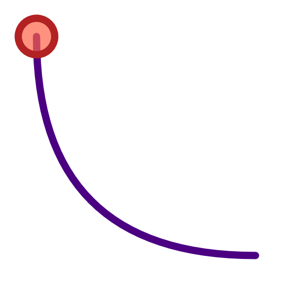
Figure 14-1. A path with a marker on it
Which…is not very exciting. A single marker on a single path isn’t a very good use of the <marker> element: you can just as easily draw the circle directly.
Markers only really become useful when there are a lot of them, or when the shapes they mark are dynamic. Then, the automatic positioning becomes an advantage.
Example 14-1 uses two markers, a circle and a diamond polygon, to highlight and differentiate the points for two different data lines in a chart. The lines in the chart are <polyline> elements, whose points are generated from a script. In a real-world example, that script would grab data from a file or a server; here, the data points are randomly generated. Figure 14-2 shows one possible arrangement of data.
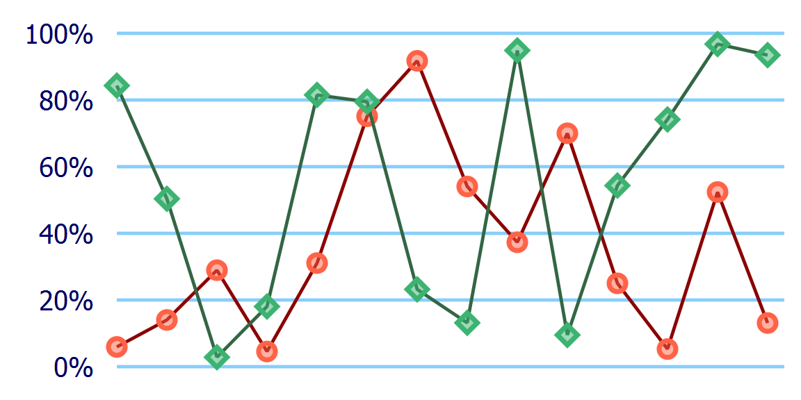
Figure 14-2. A line chart with markers at every data point
Example 14-1. Using markers to annotate a line chart
<svgxmlns="http://www.w3.org/2000/svg"xml:lang="en"width="4in"height="2in"viewBox="-35 -10 240 120"><title>DataPoint Markers on a Data Line</title><pathstroke="lightSkyBlue"d="M0, 0H200 M0,20H200 M0,40H200 M0,60H200 M0,80H200 M0,100H200"/><gtext-anchor="end"aria-label="y-axis"style="font: 8px sans-serif; fill: navy"><desc>Y-axis tick labels</desc><textx="-7"dy="0.7ex"y="100">0%</text><textx="-7"dy="0.7ex"y="80">20%</text><textx="-7"dy="0.7ex"y="60">40%</text><textx="-7"dy="0.7ex"y="40">60%</text><textx="-7"dy="0.7ex"y="20">80%</text><textx="-7"dy="0.7ex"y="0">100%</text></g><style>.dataline{fill:none;stroke:currentColor;stroke-linejoin:bevel;}.data-marker{stroke:currentColor;stroke-width:1.5px;fill:currentColor;fill-opacity:0.5;}</style><markerid="datapoint-1"overflow="visible"><circleclass="data-marker"r="2.5"color="tomato"/></marker><polylineid="dataline-1"class="dataline"color="darkRed"style="marker: url(#datapoint-1)"><title>Team Red</title></polyline><markerid="datapoint-2"overflow="visible"><polygonclass="data-marker"points="-3,0 0,3 3,0 0,-3"color="mediumSeaGreen"/></marker><polylineid="dataline-2"class="dataline"color="#364"style="marker: url(#datapoint-2)"><title>Team Green</title></polyline><script><![CDATA[(function(){vardatalines=["dataline-1","dataline-2"],nLines=datalines.length,nPoints=14,dx=15,maxY=100;for(varl=0;l<nLines;l++){vardata=newArray(nPoints),points=newArray(nPoints);for(vari=0;i<nPoints;i++){data[i]=[i,Math.random()];points[i]=[i*dx,maxY*(1-data[i][1])];}document.getElementById(datalines[l]).setAttribute("points",points.toString());}})()]]></script></svg>

The
viewBoxof the SVG is defined such that the main chart area—where the data will be plotted—will be 200×100 units, with the origin aligned with the y-axis. Extra space outside that region leaves room for axis labels and for data points that are close to the edges.
The initial
<path>and<text>elements draw the y-axis grid lines and labels.
The first
<marker>will be used for the first data line. It contains a circle centered around the origin. CSS rules for thedata-markerclass give it a solid stroke and semitransparent fill in thecurrentColor, which we set in the markup using thecolorpresentation attribute.
We define and style the data lines in the markup, using a
classfor the shared styles and attributes for the unique ones. We assign the marker with an inlinestyleattribute so we can use the shorthandmarkerproperty instead of setting all three presentation attributes to the same value. A child<title>element gives a label for the data series (which browsers use for accessibility and as an automatic tooltip). Despite all the styling, the lines won’t be drawn unless the script runs, because the<polyline>elements do not have apointsattribute.
The second data line follows the same structure as the first, except that shape inside the
markeris now apolygon, which again is centered on the origin. Theid,color, and<title>values are also different.
The simplified data visualization script includes references to the
idvalues of the different data lines, as well as constants for how many data points will fit in the plot (14), for how much space to leave between each value on the x-axis (15 units), and for the maximum y-position on the plot (assuming the minimum is 0).
The data for each line is generated as an array where each item is another two-value array, containing an integer x-value and a random y-value between
0and1. These data values are then converted into (x,y) points in the drawing coordinate system using our constants. In data coordinates, the y-values increase from bottom to top, but in the drawing they increase from top to bottom.
The
pointsarray is transformed into apointsattribute for the corresponding<polyline>with the JavaScript array’stoString()method, which concatenates all the values in the individual two-value arrays, separating each number with commas. This conveniently happens to be a valid syntax for SVGpoints.
Warning
To avoid style-matching bugs in Microsoft Edge and Internet Explorer, the styles on the marker contents are set directly on the <circle> and <polygon> (with the class data-marker), rather than being assigned with a class on the <marker> itself.
By using two different marker shapes, we make it easier to distinguish the two lines, even if the graphic is displayed in black and white—or if the person looking at it is red-green colorblind. However, this example isn’t fully accessible to other users: the data values are not exposed to screen readers. You would need to provide the data in another format, such as an HTML table.
When using markers in data visualizations, it is important to realize that they are not independent elements for accessibility, user events, and other interactions. Instead, they are decorations on the main shape element, similar to the graphics inside a <pattern>.
Unlike independent elements, the markers cannot have <title> elements to create unique tooltips (and accessible names) for each value. (We talk more about <title>, accessibility, and tooltips in Chapter 17.) Any mouse or tap events (click or hover) are passed through to underlying shapes.
If you want the individual data markers to be independent and interactive, you’ll need to draw them as independent <use> elements.
Scaling to Strokes
There are a couple details in Example 14-1 that we’ve glossed over, creating a simple example without warning you about the hidden complexities. The next few sections explore those complications, and the possibilities they create.
The first important detail that we didn’t mention is that the <polyline> elements used the default stroke-width value of 1. Why is this important? Well, Figure 14-3 shows what happens if you decide to give the line a thicker stroke.
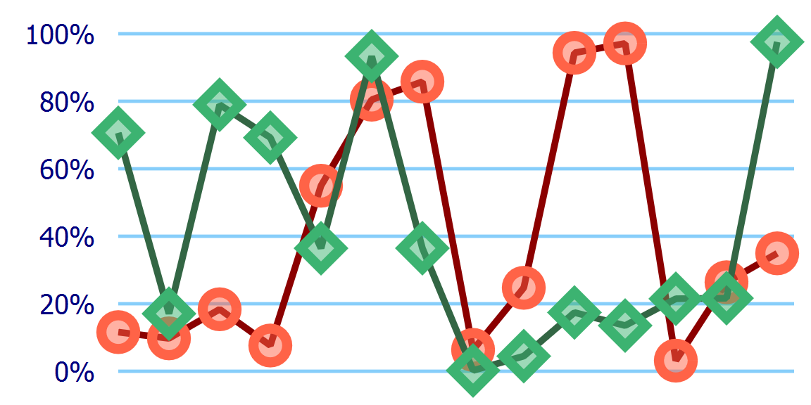
Figure 14-3. A line chart with markers, where the lines are drawn twice as thick
The only change between Figures 14-3 and 14-2 (besides a different set of randomly generated data points) is one extra CSS declaration:
.dataline{stroke-width:2;}
But as you can tell from the figures, the stroke on the data lines is not the only thing that has doubled in size. The markers have also been doubled, in their height, width, and stroke width, equivalent to a scale(2) transform.
This is the default behavior for markers: they scale according to the stroke-width of the shape they are marking. It is a useful default when you’re drawing arrowheads, but is less useful in this particular example.
You can control the marker scaling with the markerUnits attribute on the <marker> element. markerUnits has some similarities to the gradient and pattern *Units attributes we used in Chapter 12, but is not directly equivalent. While gradients and patterns are scaled relative to a reference box, markerUnits only applies a single, uniform scaling factor.
The default markerUnits value is strokeWidth; to prevent scaling with the stroke width, switch it to userSpaceOnUse:
<markerid="datapoint-2"overflow="visible"markerUnits="userSpaceOnUse">
Tip
A userSpaceOnUse value for markerUnits only affects the scale of the marker, not the origin of the coordinate system—which always gets repositioned to the marked vertex point.
According to the specifications, percentage lengths within markers should be treated the same as any other unit, using the value from the main coordinate system, possibly scaled up for marker Units="strokeWidth".
Warning
Both Internet Explorer and Microsoft Edge treat a <marker> as if it creates its own coordinate system (like a <symbol> or <svg>), so that percentages are relative to the marker size.
In other words, just like for patterns, it is best to avoid percentage lengths inside markers.
The markerUnits setting is an XML attribute, not a style property, so it needs to be set separately on each <marker>. There is no xlink:href attribute for markers, to use one marker as a template for another.
Figure 14-4 shows another version of the chart. The dataline class still has stroke-width of 2, but markerUnits has been set to userSpaceOnUse for both <marker> elements.
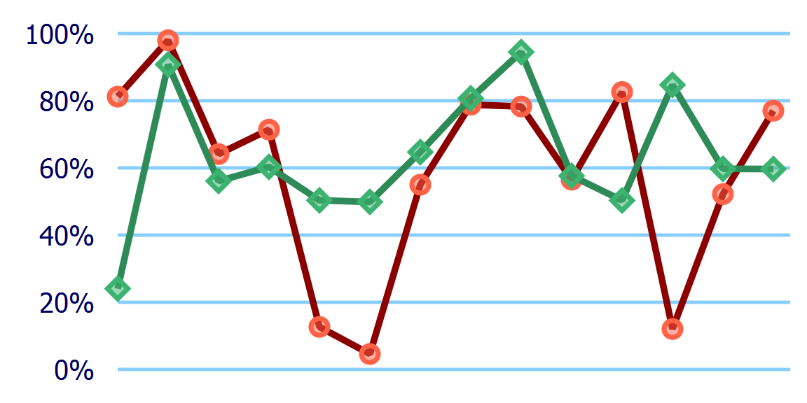
Figure 14-4. A line chart with markers, where the lines are drawn twice as thick, but the markers have a fixed size
But maybe you want the data line to be even more visible, and find the markers a bit distracting. By default, markers are painted on top of the shape, after the fill and stroke, and in order from start to end of the path.
You can change the layering of the stroke and the markers with the paint-order property that we introduced in Chapter 13. The following declaration would paint markers first, then stroke, then fill (if there was any fill):
.dataline{paint-order:markersstroke;}
Adding that declaration to the dataline class in our modified code from Example 14-1 creates a chart like Figure 14-5.
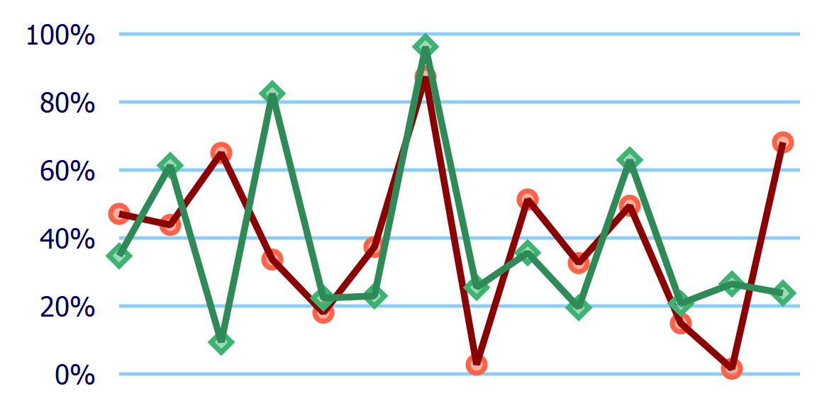
Figure 14-5. A line chart with markers drawn under the line
The two different lines are still drawn separately: markers and line for “Team Green” are drawn on top of the markers and line for “Team Red.” If you wanted both lines to be drawn on top of both sets of markers, you would need to <use> separate copies of the <polyline> elements, and apply the markers to the bottom layers and the stroke styles to the top layer.
Multiple <use> layers are also the workaround to create paint-order effects in browsers that don’t support the property.
Warning
The paint-order property is not yet supported in Microsoft Edge, and is not supported in many older web browsers still in use. It should therefore only be used for minor design tweaks such as this.
Drawing markers without a stroke isn’t just for workarounds, though. It can be used if you want to emphasize the points but not the order in which they are connected. Figure 14-6 shows one run of our example code if the dataline class is set to have stroke: none. The line chart has become a scatterplot.
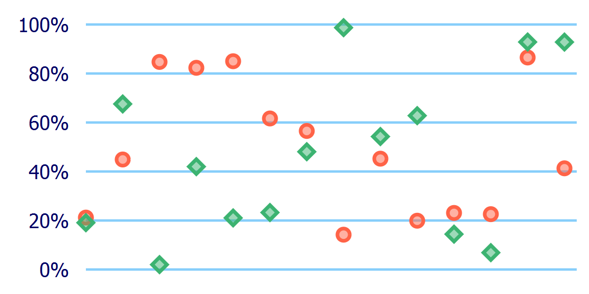
Figure 14-6. A scatterplot chart drawn as markers on unstroked polylines
Using markers to draw an entire data series with a single element can have an important performance boost for very large data sets. But it comes at a cost: the data values are now completely transparent to mouse and tap events, so you can’t add any :hover effects or JavaScript event handling, and the <title> of the <polyline> elements never shows up as a tooltip.
Tip
You can make the invisible stroke interactive again by changing the pointer-events property, which we’ll discuss in Chapter 18. But there is currently no way to make the markers themselves react to pointer events.
Another thing to note: with the default markerUnits value, the markers will still scale according to stroke-width, even if the stroke is not drawn.
Orienting Arrows
The markers in the data chart examples are all drawn in the same orientation as the main coordinate system (although you can’t really tell for the circles). This is the default, and is usually what you want for labeling points, especially if the marker includes text or other content that should stay horizontal regardless of the direction of the line it decorates.
However, we’ve mentioned a few times that markers are also used for arrowheads. And it would be a pretty strange-looking arrow if the arrowheads always pointed in the same direction, regardless of the angle of the line they are attached to.
The orient attribute on the <marker> element can be used to control whether markers reorient themselves according to the direction of the line. The default value is 0, which means that all markers are drawn with a 0° rotation, or no rotation at all. Any other numeric value will be treated as a rotation in degrees, relative to the shape’s coordinate system.
The orient value you are most likely to use is auto, which will rotate the shape to match the line, so that the marker’s x-axis lines up with the angle of the line (or the line tangent to a curve).
<markerid="arrowhead"orient="auto">
On corners, autorotation rotates to match the average of the incoming and outgoing line angles.
Warning
Browsers are very inconsistent about calculating the orientation angle of markers at the start or end of disconnected subpaths, or markers that are followed or preceded by a zero-length path segment.
Example 14-2 uses the orient attribute to create start markers that stay at a fixed angle, and mid and end markers (arrowheads) that rotate to match the line. Figure 14-7 shows the result, applied to paths pointing in various directions.
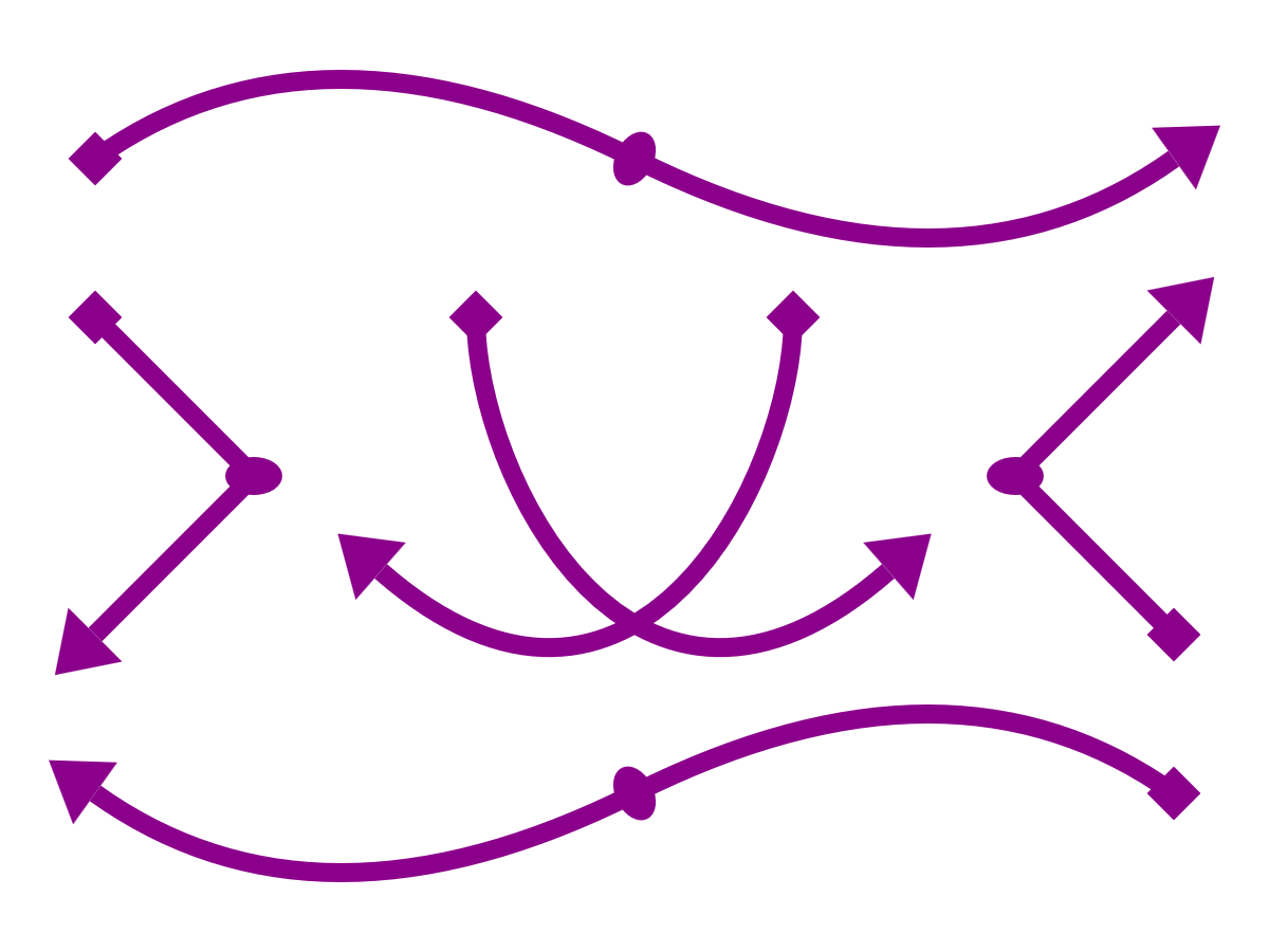
Figure 14-7. Arrows created with line markers on paths
Example 14-2. Drawing arrowheads that rotate with a line—and starting markers that don’t—with the orient attribute
<svgxmlns="http://www.w3.org/2000/svg"xml:lang="en"xmlns:xlink="http://www.w3.org/1999/xlink"width="400px"height="300px"viewBox="0 0 400 300"><title>Arrow Markers with Automatic and Fixed Orientation</title><styletype="text/css">.arrow{fill:none;stroke:darkMagenta;stroke-width:6;marker-start:url(#start);marker-end:url(#end);marker-mid:url(#mid);}marker{fill:darkMagenta;stroke:none;overflow:visible;}</style><markerid="start"orient="45"><rectx="-1"y="-1"width="2"height="2"/></marker><markerid="end"orient="auto"><polygonpoints="0,-2 3,0 0,2"/></marker><markerid="mid"orient="auto"><ellipserx="1"ry="1.5"/></marker><pathclass="arrow"d="M30,50 Q100,0 200,50 T370,50"/><pathclass="arrow"d="M370,250 Q300,200 200,250 T30,250"/><pathclass="arrow"d="M30,100 L80,150 30,200"/><pathclass="arrow"d="M370,200 L320,150 370,100"/><pathclass="arrow"d="M150,100 C150,150 200,250 280,180"/><pathclass="arrow"d="M250,100 C250,150 200,250 120,180"/></svg>
The different markers are assigned to the arrows with the
marker-start,marker-end, andmarker-midproperties in CSS.The
<marker>elements themselves are also styled, to use afillcolor that matches the arrows’ stroke.The start-point marker uses a
<rect>element to draw a square centered on the origin, and then uses theorientattribute to rotate that square by 45°.The end-point marker uses a
<polygon>to draw a triangle that points toward the positive x-axis, with its base at the origin. It uses theautovalue fororientso that the marker’s x-axis—and therefore the triangle’s point—will always point in the direction of the line being marked.The mid-point marker also uses
autoorientation. The marker content is an ellipse with a largerryvalue thanrx; after reorientation, this means that the long axis of the ellipse will be angled across the average angle of the lines, and the short axis will go along the average angle.The arrows are drawn as
<path>elements with various segment types: smoothly connected quadratic Beziér curves, sharply bent lines, and single-segment cubic curves.
Warning
Example 14-2 doesn’t use any arc path segments, for a reason: Blink and WebKit browsers convert arcs into a series of cubic Beziér curves, and then draw extra mid markers at the points where those curves connect. For consistent behavior cross-browser, avoid mid-point markers on paths with arcs in them.
The markers in Example 14-2 all use the default (strokeWidth) value of markerUnits. Since the arrows use stroke-width: 6, the markers are drawn six times their defined size. The <rect> in the start marker is therefore not 2px square, but is instead two times the stroke width, or 12px square.
An important thing to note about Example 14-2 is that we had to explicitly style the markers to match the lines. If we had different-colored arrows, we would need different <marker> elements for each color.
Unlike symbols duplicated with <use>, markers do not inherit any styles from the element they are used on. Even if they did, this wouldn’t be what we needed, since it is the marker’s fill property that needs to match the line’s stroke.
Warning
Or at least, that’s what the specifications say.
Internet Explorer incorrectly inherits style attributes from the <path> to the <marker>. To avoid overly large marker shapes, you need to explicitly set stroke: none to override the inherited value.
Microsoft Edge corrects the style inheritance (so marker contents inherit from the <marker> element), but does not completely match the spec for style matching. Avoid selectors like marker > path, which depend on the relationships between the marker and its contents.
Manually coordinating marker and stroke styles is a bother when using solid colors, but it is impossible when using complex paint. Figure 14-8 shows the end result if the solid darkMagenta is replaced by a horizontal, purple-to-magenta linear gradient on both the paths’ stroke and the markers’ fill.
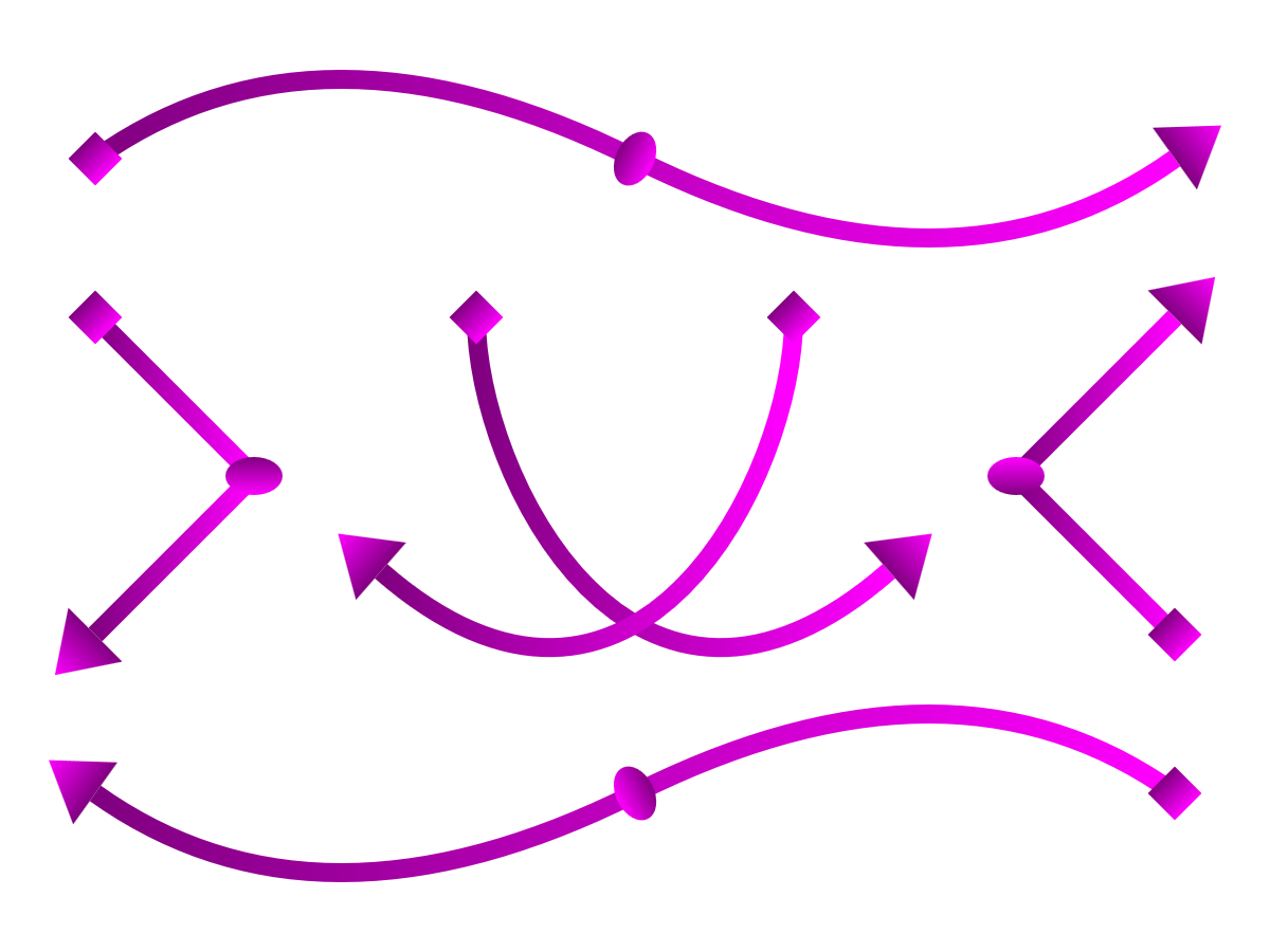
Figure 14-8. Line-marker arrows, where the line and the markers are painted with the same gradient
Each marker shape gets its own copy of the gradient, scaled to fit that shape, independent of the gradient on the path it is marking.
Even a userSpaceOnUse gradient won’t fix matters, since each marker is painted in its own coordinate system, centered on the origin and then rotated into the correct orientation.
Defining Dimensions
All the marker examples so far have explicitly allowed overflow, using either CSS or presentation attributes to set it to visible. From that, you might have guessed that markers have fixed boundaries, and content that extends outside those boundaries is normally hidden.
So why have we been forcing our markers to overflow?
Because the default position of the marker boundaries isn’t particularly useful. But it’s only a default, and there are multiple attributes that allow you to control it. Once you know how to control the size and position of the marker boundaries, you can safely let overflow be hidden, without hiding the marker itself.
A <marker> element has a default width and height of 3 units in both directions. The origin (the marked point, by default) is at the top-left corner of this 3×3 square.
Tip
Those dimensions are in the scaled units, after the markerUnits attribute is applied. That means that, by default, the marker is a square three times the stroke-width of the marked shape.
If you do not reset overflow, any graphics outside of the marker rectangle are clipped.
In other words, without visible overflow and using all the default attributes, a marker is positioned so the unclipped parts of the marker are off-center, to the left and below the marked point. That’s the not-very-useful part.
You can change the size of the marker rectangle using markerWidth and markerHeight attributes on the <marker> element. The value can be a number of user units, length with units, or percentage—but all will be affected by any scaling from markerUnits.
Why would you need to set a different markerWidth and markerHeight value when you can simply make overflow visible? Partly because it can make the browser implementation more efficient if it knows that a graphic will be clipped to a certain region. But more usefully, you can use viewBox to create a scaled coordinate system of your choice that fits within the marker region.
With a viewBox, you can turn any symbol or icon you have already created into a marker, and then scale it to your desired markerWidth and markerHeight. If need be, you can also use a preserveAspectRatio attribute to control how the viewBox adjusts to the available space.
We’ve mentioned a few times that (by default) the origin of the marker’s coordinate system is positioned over the corner or end point of the line that you are marking:
-
If you have a
viewBox, the marker’s origin is the origin of theviewBoxcoordinate system. -
If you don’t have a
viewBox, the origin will be in the top-left corner of the marker rectangle.
So, one option to control the position of your marker is to use the viewBox to adjust the marker’s origin.
The other option is to change which coordinate gets aligned, using the refX and refY attributes.
refX and refY define a reference point, in the marker’s coordinate system, that will be aligned with the exact vertex point of the shape being marked. They are both 0 by default, which creates the default reference point—the (0,0) origin.
The value of refX or refY is a length or a number of user units, measured in the scaled marker coordinate system, after it has been adjusted for viewBox.
Tip
You can even use refX and refY values that are outside of the marker dimensions to create a marker label that is offset from the line it is marking.
Example 14-3 uses all of these attributes to modify the code from Example 14-2 in such a way that the marker contents are drawn within the marker boundaries, and overflow can remain hidden. The result will still look identical to Figure 14-7.
Example 14-3. Positioning and scaling a marker, without needing visible overflow
<svgxmlns="http://www.w3.org/2000/svg"xml:lang="en"xmlns:xlink="http://www.w3.org/1999/xlink"width="400px"height="300px"viewBox="0 0 400 300"><title>Arrow Markers using Size and Position Attributes</title><styletype="text/css">.arrow{fill:none;stroke:darkMagenta;stroke-width:6;marker-start:url(#start);marker-end:url(#end);marker-mid:url(#mid);}marker{fill:darkMagenta;stroke:none;}</style><markerid="start"markerWidth="2"markerHeight="2"refX="1"refY="1"orient="45"><rectwidth="2"height="2"/></marker><markerid="end"viewBox="0 -2 3 4"orient="auto"markerHeight="4"><polygonpoints="0,-2 3,0 0,2"/></marker><markerid="mid"orient="auto"viewBox="-1 -1.5 2 3"><ellipserx="1"ry="1.5"/></marker><pathclass="arrow"d="M30,50 Q100,0 200,50 T370,50"/><pathclass="arrow"d="M370,250 Q300,200 200,250 T30,250"/><pathclass="arrow"d="M30,100 L80,150 30,200"/><pathclass="arrow"d="M370,200 L320,150 370,100"/><pathclass="arrow"d="M150,100 C150,150 200,250 280,180"/><pathclass="arrow"d="M250,100 C250,150 200,250 120,180"/></svg>
The
overflow: visiblestyle is no longer required.The start marker uses a default coordinate system in a 2×2 marker, but then uses
refXandrefYto change the position of the marker relative to the marked point. The<rect>can therefore be positioned at the origin (instead of offset withxandyattributes) and still be centered over the end of the line. Theorientrotation is applied relative to therefXandrefYpoint.The end marker uses the default (0,0) reference point, but uses a
viewBoxto position that origin point somewhere other than the top-left corner (in this case, the center-left edge). AmarkerHeightattribute increases the size of the marker to 3×4; without it, the arrowhead would be scaled down to fit the 3×3 default marker size.The mid-point marker also uses a
viewBoxwith a centered origin to fit around the<ellipse>. TheviewBoxdimensions are 2×3, but the marker height and width are left as the default 3×3. The defaultpreserveAspectRatioapplies, centering theviewBoxwithin the available space.
For simple markers like these, you generally only need to use either a viewBox or refX and refY, since the viewBox can be used to reposition the origin within the marker clipping region. However, if you are reusing graphics that have already been drawn for another purpose, they might not be conveniently centered over the origin. In that case, the viewBox can control the scale while refX and refY control the positioning.
Summary: Line Markers
Markers have all the appearance of individual icons, but are positioned within your graphic as decorations on another shape. Like other SVG graphical effects, the marker structure is defined in your SVG markup, and the other shape references the <marker> with a url() reference in a style property.
Attributes on the <marker> element give you considerable flexibility in sizing and positioning the markers relative to the points they mark—which almost makes up for the fact that the default size and position is off-center. However, you currently can only mark the vertex points on a shape, and other than the start and end points, all points are marked the same. This makes markers less useful for annotating lines on a map or creating decorative effects.
Your options for styling the markers, and in particular, styling them to match the shape they are marking, are also currently limited—partly by the SVG 1.1 spec, and partly by browser bugs. Be sure to fully define all styles on the marker contents directly, and to test your graphics thoroughly.