Table of Contents for
Using SVG with CSS3 and HTML5
 Using SVG with CSS3 and HTML5
Published by
O'Reilly Media, Inc., 2017
Using SVG with CSS3 and HTML5
Published by
O'Reilly Media, Inc., 2017
- nav
- Cover
- Using SVG with CSS3 and HTML5
- Using SVG with CSS3 and HTML5
- Preface
- I. SVG on the Web
- 1. Graphics from Vectors
- 2. The Big Picture
- 3. A Sense of Style
- 4. Tools of the Trade
- II. Drawing with Markup
- 5. Building Blocks
- 6. Following Your Own Path
- 7. The Art of the Word
- III. Putting Graphics in Their Place
- 8. Scaling Up
- 9. A New Point of View
- 10. Seeing Double
- 11. Transformative Changes
- IV. Artistic Touches
- 12. Filling Up to Full
- 13. Drawing the Lines
- 14. Marking the Way
- 15. Less Is More
- 16. Playing with Pixels
- V. SVG as an Application
- 17. Beyond the Visible
- 18. Drawing on Demand
- 19. Transitioning in Time
- 20. Good Manners
- Index
- About the Authors
- Colophon
Chapter 10. Seeing Double
Chapter 10. Reusing Content
An SVG file is a structured description of a graphic that can be organized into logical parts and groups. An important consequence of this structure is that you can reuse the same content in multiple contexts without having to repeat all the information used to create that graphic. Symbols, icons, and other repeated motifs can be defined once, then used again and again.
This chapter examines the key structural SVG elements that allow you to copy content defined elsewhere into your graphic.
When it comes to reusing content, there are two distinct strategies used in SVG. On the one hand, you can reuse entire images, embedding the complete graphic in your SVG similar to how an <img> element embeds an image in an HTML page. On the other hand, you can reuse individual SVG shapes or groups, from another file or another part of the same file.
With the SVG <image> element, you can embed not only SVG files but also raster image formats. This allows an SVG to include photos and other graphics that cannot effectively be represented with vector drawing elements. Regardless of whether an embedded image was originally SVG or not, when you embed it as an image, it is treated as an indivisible element. It can be manipulated with graphical effects, but its component parts are inaccessible to styles or scripts from the main document.
In contrast, when you duplicate SVG content with a <use> element, you duplicate the vector graphics instructions for that content. The duplicated elements are rendered almost as if they were cloned into the markup, inheriting new styles from the context where they are used.
Reduce, Reuse, Recycle
We introduced the <use> element in Chapter 1, but did not explore its full potential. In that chapter, <use> elements were used to duplicate, position, and style the circles in the stoplight graphic.
A quick recap of the basics:
-
The
<use>element allows you to duplicate SVG graphics without repeating the complete markup. -
The original copy of the graphic is identified with an
idvalue, and the<use>element references it with anxlink:hrefattribute, wherexlinkis the standard prefix for the namespace http://www.w3.org/1999/xlink. -
To prevent the original copy from being drawn directly, you can put it inside a
<defs>element, indicating that it is a definition for future reuse. -
You can position the duplicated graphics using
xandyattributes on the<use>element. -
The duplicated graphics inherit style properties from the
<use>element.
We’ve also hinted a few times that the element you’re reusing doesn’t have to be in the same file. You can use a URL to reference another file, and then a target fragment to reference the element ID, like <use xlink:href="icons.svg#shape" />. But there are limitations, which we’ll get to in “File Management”.
There are a few more things to know about <use> elements, now that we’ve discussed coordinate systems:
-
The content duplicated by a
<use>element does not have to be a single shape. It can be a<text>element or a container such as a group (<g>element) or an<svg>. -
The
xandyattributes on the<use>element reposition the coordinate system origin for the graphics it duplicates—and also for the<use>element itself, similar to a transform.
The <use> element can also take width and height attributes. They allow you to create a scaled, nested coordinate system, but only in specific cases:
-
If the duplicated element is an
<svg>with aviewBoxattribute, the copy will scale to fit these new dimensions (respecting anypreserveAspectRatiooptions on the original). The same is true for duplicated<symbol>elements, which we’ll introduce in “Symbolic Usage”. -
The
widthandheightattributes have no effect on other content. They do not create a new coordinate system width and height on their own, meaning they do not affect percentage lengths of duplicated shapes that aren’t contained inside an<svg>. -
If a duplicated
<svg>haswidthandheightattributes, and the<use>element does not, those dimensions will be used to size the SVG (similar to what would happen if you drew the SVG in an HTML<object>). -
Otherwise, the defaults for
widthandheightare 100%, meaning a duplicated<svg>will scale to fill the current SVG coordinate system, offset by the<use>element’sxandyattributes. -
Any
xandypositioning attributes on an<svg>will be applied to the duplicate in addition to thexandyvalues for the<use>, as will transforms.
That last point is also true for duplicated shapes and groups: positioning attributes and transforms on the original elements apply in addition to the attributes and transforms on the <use>. Only width and height on <svg> and <symbol> have the special override behavior.
Tip
Usually, it’s easiest if the original graphics are positioned at—or centered around—the origin. That way, the x and y attributes on the <use> element have predictable results.
If you use percentage lengths on shapes inside your reused <svg> or <symbol>, the percentages will be recalculated according to the width or height of the coordinate system created by the <use> element.
In all other cases (that is, if the <use> element directly references the shape or a <g> group), percentage lengths are best avoided.
Warning
In current web browsers, percentage lengths are not recalculated for reused shapes that aren’t part of a nested coordinate system. The original SVG specs were not clear about the correct behavior in this case.
Putting it all together, Example 10-1 reuses the card-suit icons from Chapter 6 to draw complete playing cards. The resulting cards are displayed in Figure 10-1.
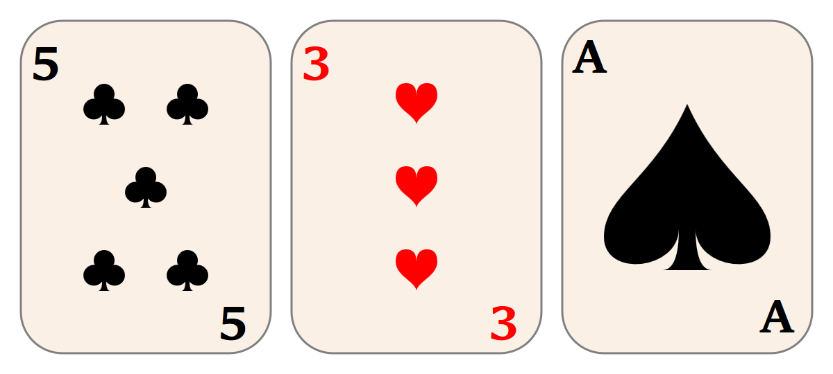
Figure 10-1. Playing card graphics created with reused SVG icons
Example 10-1. Reusing SVG icons to draw playing cards
<svgxmlns="http://www.w3.org/2000/svg"xml:lang="en"xmlns:xlink="http://www.w3.org/1999/xlink"width="400px"height="180px"viewBox="0 0 400 180"><title>Playing Cards</title><styletype="text/css">svg:root{font-size:24px;font-weight:bold;}svg{overflow:visible;}.card{stroke:gray;fill:linen;}.diamond,.heart{fill:red;}.club,.spade{fill:black;}</style><defs><svgheight="20"width="20"viewBox="0 0 20 20"id="diamond"><title>Diamond</title><pathd="M3,10L10,0 17,10 10,20Z M9,11L10,18V10H15L11,9 10,2V10H5Z"/></svg><svgheight="20"width="20"viewBox="0 0 20 20"id="club"><title>Club</title><pathd="M9,15.5A5,5 0 1 1 5.5, 7.5 A5,5 0 1 1 14.5, 7.5A5,5 0 1 1 11, 15.5 Q11,20 13,20H7Q9,20 9,15.5Z"/></svg><svgheight="20"width="20"viewBox="0 0 20 20"id="spade"><title>Spade</title><pathd="M9,15C9,20 0,21 0,16S6,9 10,0C14,9 20,11 20,16 S11,20 11,15Q11,20 13,20H7Q9,20 9,15Z"/></svg><svgheight="20"width="20"viewBox="0 0 20 20"id="heart"><title>Heart</title><pathd="M10,6 Q10,0 15,0T20,6Q20,10 15,14 T10,20Q10,18 5,14T0,6Q0,0 5,0T10,6Z"/></svg><rectid="card-front"class="card"width="120"height="160"rx="20"/></defs><svgwidth="140"height="180"class="club"id="club5"><title>5 of clubs</title><usexlink:href="#card-front"x="10"y="10"/><textx="15"y="35">5</text><textx="105"y="160">5</text><usexlink:href="#club"x="40"y="40"/><usexlink:href="#club"x="80"y="40"/><usexlink:href="#club"x="60"y="80"/><usexlink:href="#club"x="40"y="120"/><usexlink:href="#club"x="80"y="120"/></svg><svgx="130"width="140"height="180"class="heart"id="heart3"><title>3 of hearts</title><usexlink:href="#card-front"x="10"y="10"/><textx="15"y="35">3</text><textx="105"y="160">3</text><usexlink:href="#heart"x="60"y="40"/><usexlink:href="#heart"x="60"y="80"/><usexlink:href="#heart"x="60"y="120"/></svg><svgx="260"width="140"height="180"class="spade"id="spadeA"><title>Ace of spades</title><usexlink:href="#card-front"x="10"y="10"/><textx="15"y="35">A</text><textx="105"y="160">A</text><usexlink:href="#spade"x="30"y="50"width="80"height="80"/></svg><!--and many more, to draw the rest of the cards--></svg>

For this and most of the rest of the examples in the book, we’ll be following our own advice and including both
widthandheightdimensions and aviewBoxon our root<svg>elements; the former define the default size when displaying the graphic on its own, while the latter ensures it will scale correctly when displayed at other sizes.
As this is a relatively complex graphic, we’ve expressed all the presentation styles CSS using classes; this makes it easier to change styles later.

The four icons are defined as individual
<svg>elements within a<defs>block. Each icon has both default size attributes (widthandheight) and aviewBox.
A rounded
<rect>is also predefined; it will be used to draw the basic card shapes.
Each card is also contained within a nested
<svg>to create a self-contained element coordinate system. However, these SVGs are not inside the<defs>, and so will be drawn.
We construct each card by reusing the basic card shape, using
<text>elements to write the number or letter in the corners, and then reusing the basic icon as many times as appropriate, positioning it withxandyattributes.
For the number cards, the icons are used at their default (20×20) size; for the ace, we create the large icon by setting
widthandheightattributes on the<use>element.
Reusing elements with <use> can be recursive. You can reuse a component that contains other reused components—so long as you don’t create any circular reference loops!
This means, instead of creating a simple grid of playing cards, you could predefine a complete set of cards, and then code up a card game layout where each card is drawn with a single <use> element. For example, an ace of spades would be <use xlink:href="#spadeA"/>. Of course, if you were going to do that, you’d want to go back and remove the x and y attributes from each playing card <svg>, so that the cards in your game would be positioned predictably.
Symbolic Usage
Creating scalable, reusable icons, as was done in Example 10-1 with nested SVG elements, is a common requirement—so common that SVG has a special element for this purpose: the <symbol>.
A <symbol> is a compound graphic defined specifically for the purpose of reuse. Similar to a nested <svg>, a <symbol> can be given viewBox and preserveAspectRatio attributes so that it will scale to fit the dimensions specified when it is used.
The contents of the <symbol> are never drawn directly; they are only drawn through <use> instances. In this way, a <symbol> is similar to an <svg> inside a <defs> element.
Tip
You can place your symbol code inside a <defs> definition block, to maintain a logical organization for your SVG file, but it isn’t required.
The <symbol> does not add any extra functionality that you can’t achieve with an <svg> inside a <defs>. However, it adds clarity about the purpose of your file. Many SVG icon systems and related tools look specifically for <symbol> elements to identify independent icons. For example, in the latest versions of Inkscape (0.91+), you can import a file of <symbol> elements, and use them in other drawings.
The key differences between <symbol> and <svg> are as follows:
-
The
<symbol>is never drawn directly. -
There are no
xandyattributes on the<symbol>, because it is never directly positioned in the graphic. -
There are no
widthandheightattributes on the<symbol>; its size is controlled entirely by the<use>element.
The last point can sometimes be a limitation; in Example 10-1, switching to <symbol> for the suit icons would require a lot of extra attributes on the <use> elements, most of which currently reproduce the <svg> at its default size.
Tip
When you reuse a <symbol> with a <use> element that doesn’t have width and height specified, the default <use> dimensions apply: 100% of the parent SVG’s height and width.
Nonetheless, if we did want to convert the icons to symbols—and future examples will use such symbols—they would look something like this:
<symbolviewBox="0 0 20 20"id="diamond"style="overflow: visible"><title>Diamond</title><pathd="M3,10L10,0 17,10 10,20ZM9,11L10,18V10H15L11,9 10,2V10H5Z"/></symbol>
Because this symbol is intended for reuse as a single-color icon, the color has not been specified in the definition. You would color the diamond using inherited styles defined on the <use> element, so you could make it bright red, or crimson, or light purple pink if you chose. Similarly, strokes or other styles could be set at the time of use.
The one style that is included is the CSS overflow property. Like the <svg> element—and all other elements that can take a viewBox attribute—the <symbol> is by default set to hide any content that overflows its available width and height. In the case of a <symbol>, that’s the width and height defined by the <use> element (or by the <use> element’s parent SVG, if it doesn’t have specific width and height attributes).
With the card-suit icon symbols, which exactly touch the boundaries of their viewBox, this would mean that any strokes on the shape would be clipped to a square. Setting overflow: visible ensures that the symbol can be used with any styles.
Warning
Firefox (up until version 56, which will be stable in late 2017) has a number of bugs with respect to CSS styles and reused content. Their style-matching process did not distinguish between the “real” DOM and the hidden, duplicated DOM.
One consequence is that reused instances of <symbol> elements instead match style rules for <svg> elements. In order to correctly set overflow on symbols, either set the style with attributes or use the following style rule:
symbol,use>svg{overflow:visible;}
The use > svg selector (which matches an <svg> that is a direct child of a <use>) will not match anything in browsers that conform to the specifications.
Whether you’re creating a set of icon symbols or a full set of playing cards, there are many cases where you want to reuse graphics not only within a single SVG, but across multiple web pages. In these cases, it can be much easier to use a separate asset file for the symbol definitions, and then access the same definitions from any page that requires them.
File Management
As we’ve mentioned a few times, you can <use> content from another file. This allows you to create icon library files, with many complex graphics that you can grab one at a time for use in another web page, whether that is a complex SVG application or an HTML file.
There are some important limitations. For starters, most browsers don’t support cross-file use when you’re viewing SVGs from your own filesystem (file: URLs); you’ll need to run a local web server or view the examples online. We’ll get to why that is in a moment, but first: an illustration of what it looks like when everything works.
Example 10-2 adapts the web page from Example 9-4 in Chapter 9. Instead of using <img> elements to reference views of an external SVG, we use inline SVG and <use> elements to copy the individual icons.
Our icon sprite SVG still uses familiar card-suit icons, but now redefined as <symbol> elements. The final result is shown in Figure 10-2.
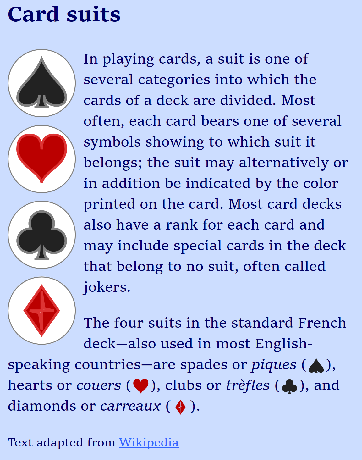
Figure 10-2. A web page using external SVG icons as inline code
Example 10-2. Using SVG icons from an external file in a web page
SVG symbol file: suits-symbols.svg
<svgxmlns="http://www.w3.org/2000/svg"xml:lang="en"xmlns:xlink="http://www.w3.org/1999/xlink"width="400px"height="400px"viewBox="0 0 200 200"><title>Card Suit Icons</title><symbolviewBox="0 0 20 20"id="diamond"style="overflow: visible"><title>Diamond</title><pathd="M3,10L10,0 17,10 10,20Z M9,11L10,18V10H15L11,9 10,2V10H5Z"/></symbol><usexlink:href="#diamond"x="0"y="0"width="100"height="100"/><symbolviewBox="0 0 20 20"id="club"style="overflow: visible"><title>Club</title><pathd="M9,15.5A5,5 0 1 1 5.5, 7.5 A5,5 0 1 1 14.5, 7.5A5,5 0 1 1 11, 15.5 Q11,20 13,20H7Q9,20 9,15.5Z"/></symbol><usexlink:href="#club"x="100"y="0"width="100"height="100"/><symbolviewBox="0 0 20 20"id="spade"style="overflow: visible"><title>Spade</title><pathd="M9,15C9,20 0,21 0,16S6,9 10,0C14,9 20,11 20,16 S11,20 11,15Q11,20 13,20H7Q9,20 9,15Z"/></symbol><usexlink:href="#spade"x="0"y="100"width="100"height="100"/><symbolviewBox="0 0 20 20"id="heart"style="overflow: visible"><title>Heart</title><pathd="M10,6 Q10,0 15,0T20,6Q20,10 15,14 T10,20Q10,18 5,14T0,6Q0,0 5,0T10,6Z"/></symbol><usexlink:href="#heart"x="100"y="100"width="100"height="100"/></svg>
Since the
<symbol>elements do not draw anything themselves, a<use>copy of each icon draws it to the screen. That way, you won’t see a completely blank file if you open your symbol sheet directly.
HTML markup:
<!DOCTYPE html><htmllang="en"><head><metacharset="utf-8"/><title>Using SVG Icons from an External File</title><linkrel="stylesheet"href="../ch09-views-files/sprites-suits.css"/><style>.icon{overflow:visible;}.icon.float{border-radius:50%;}.black{fill:#222;}.red{fill:#b00;}.big.black{stroke:gray;}.big.red{stroke:#d33;}</style></head><body><h2>Card suits</h2><figurerole="img"aria-label="The four card suits"><svgclass="icon float big black"><usexlink:href="suits-symbols.svg#spade"x="10%"y="10%"width="80%"height="80%"/></svg><svgclass="icon float big red"><usexlink:href="suits-symbols.svg#heart"x="10%"y="10%"width="80%"height="80%"/></svg><svgclass="icon float big black"><usexlink:href="suits-symbols.svg#club"x="10%"y="10%"width="80%"height="80%"/></svg><svgclass="icon float big red"><usexlink:href="suits-symbols.svg#diamond"x="10%"y="10%"width="80%"height="80%"/></svg></figure><p>In playing cards, a suit is one of several categories into which the cards of a deck are divided. Most often, each card bears one of several symbols showing to which suit it belongs; the suit may alternatively or in addition be indicated by the color printed on the card. Most card decks also have a rank for each card and may include special cards in the deck that belong to no suit, often called jokers.</p><p>The four suits in the standard French deck—also used in most English-speaking countries—are spades or<ilang="fr">piques</i>(<svgclass="icon inline black"width="1em"height="1em"role="img"aria-label="a black spade"><usexlink:href="suits-symbols.svg#spade"/></svg>), hearts or<ilang="fr">couers</i>(<svgclass="icon inline red"width="1em"height="1em"role="img"aria-label="a red heart"><usexlink:href="suits-symbols.svg#heart"/></svg>), clubs or<ilang="fr">trèfles</i>(<svgclass="icon inline black"width="1em"height="1em"role="img"aria-label="a black club"><usexlink:href="suits-symbols.svg#club"/></svg>), and diamonds or<ilang="fr">carreaux</i>(<svgclass="icon inline red"width="1em"height="1em"role="img"aria-label="a red diamond"><usexlink:href="suits-symbols.svg#diamond"/></svg>).</p><small>Text adapted from<ahref="http://en.wikipedia.org/wiki/Suit_(cards)">Wikipedia</a></small></body></html>
Let’s break that down. Each SVG icon is embedded within its own inline <svg> element, replacing the <img> elements from Example 9-4. The markup here consists of only the <svg> and the <use> element:
<svgclass="icon inline black"width="1em"height="1em"role="img"aria-label="a black spade"><usexlink:href="suits-symbols.svg#spade"/></svg>
The classes are mostly the same as for the <img> version of the icons. However, we’ve added some extra styles, to reflect the extra styling flexibility that inline SVG gives us.
The aria-label attribute replaces the image’s alt, and role="img" tells browsers that this is a noninteractive SVG that should be treated like an image for accessibility purposes.
You could also use a <title> instead of aria-label; we discuss the difference in Chapter 17.
The larger icons are set as 4em square, minus padding, in the CSS, the same as for the images in Example 9-4. However, the <use> elements are scaled down inside each <svg> (with x, y, width, and height attributes). This gives us room to round off the corners of each <svg> with border-radius and add strokes to the icons. (We couldn’t do that with the <img> icons without adding more <view> elements to change the scaling.)
The small icons fill up the entire SVG, so the <use> elements don’t need any attributes—a reused <symbol> automatically scales to 100% height and width, allowing you to control the size entirely with styles on the <svg>. This is usually preferable when you are reusing SVG icons in HTML.
Tip
In contrast, when we were reusing icons within a larger SVG (Example 10-1), it was preferable to reuse nested <svg> elements with default height and width attributes, since we didn’t want the icons to take up the entire SVG region.
Nonetheless, just like in Example 9-4, we add default width and height attributes on the inline SVG icons, in case our external stylesheet doesn’t load. However, because these are now SVG presentation attributes, the default size can use CSS em units.
Alternatively, we could have shifted the width and height CSS from the external stylesheet to our <style> block. The main point is: make sure your small inline SVG icons have a good width and height defined in the same file, to avoid the “flash of unstyled SVG” while waiting for your stylesheet to load.
The final change to the code (relative to Example 9-4) is the new red and black classes that set the fill colors. These also interact with the big class to add matching strokes when there is room.
There are no fill styles at all in the SVG symbol file.
The reused icons in Example 10-2 are styled entirely with inherited styles. This allows us to tweak the styles to match our design: the icon colors aren’t pure black and red, and the styles are different depending on context.
This is the primary benefit of using icons as inline SVG, instead of images: the web page can control the styling. You can even use CSS pseudoclasses, such as :hover or :focus, to make those styles dynamic.
However, to be able to style the icons by styling the <use> elements, we need to draw the <path> elements in the symbols entirely with inherited values.
If the <path> (or <symbol>) had a fill attribute, it would be used instead of the inherited color. So you can’t set a default fill in your icon file, and then override it from the main web page styles.
Tip
Actually, you can set a default fill and override it, too, in recent browsers. But you need CSS variables to do so. We’ll have an example of how it works in Chapter 12.
When you reuse content from the same file, any other styles set on the symbols and path are also copied with the cloned graphic. For external-file <use>, it’s complicated.
Warning
When you reuse content from an external SVG, browsers currently only clone styles set with presentation attributes or the style attribute. They ignore styles that were defined in the external file via <style> elements and do not download additional stylesheets.
Warning
Some versions of Chrome have a bug where they will not apply patterns and gradients to content reused from external files, regardless of whether the patterns and gradients (or the styles applying them) are defined in the main file or the sprite file.
Despite those bugs, styling <use> icons is still much more flexible than styling image icons, where your only option is a :target style rule in the icon file—or a filter effect applied on the HTML <img>.
Using icons from external files means that your inline SVG code is short and concise—almost as short and concise as an <img>. Furthermore, it allows you to use those icons in many different web pages, and have the user’s browser cache the icon file, instead of downloading the data with each HTML page.
However, there are two ways in which this approach is limited in practice.
For starters, some browsers don’t support cross-file <use> references at all.
Warning
Internet Explorer and older versions of other browsers (including Safari up to version 6) do not allow <use> elements to access content from other files. MS Edge supports external file references starting in version 13.
Warning
Some versions of Chrome have a bug where they do not support nested reuse of externally referenced content. That means that if you <use> the content from the external file inside a group or symbol in the current file, and then reference that group or symbol in a second <use>, the external content won’t show up in the copy.
However, even in browsers that support cross-file <use>, there is no support for cross-origin <use> references. The two files (the one with the <use> and the one with the icon) need to be on the same origin:
-
served over either HTTP or HTTPS web server, with both URLs using the same protocol
-
from the same URL domain, including ports and subdomains (www.example.com and static.example.com are separate origins)
Cross-origin restrictions like these apply to any “active” content, including files used by scripts. However, most other ways of accessing files for websites now support a cross-origin permission system. These cross-origin (CORS) permissions (provided in the form of HTTP headers) allow one web origin to request access to files from another origin.
SVG <use> does not—yet—have a way to tell the browser it should request cross-origin permissions. Even if the other web server provides permissions automatically (with HTTP headers), the browser will not use the file.
If you host your images and other asset files on a different web domain than your main web pages, and you want to do the same with your <use> assets, you need to work around the restrictions:
-
Use JavaScript to download the file with cross-origin headers.
-
Inject the markup into your current document, where the SVG renderer can access it.
Conveniently, this is the same approach we use to work around browsers that don’t support external file <use> references at all.
To get the full benefits of <use> elements in a reliable, cross-browser manner, you need to directly define the content in the main HTML or SVG document. However, adding the code for frequently used icons to every file weighs down every web page download. It also causes maintainability problems at the server end, since you need to make sure that every page is updated correctly with the latest versions of the icons.
By using JavaScript to download your icon file (using XMLHttpRequest, or the newer Fetch API), you can access files on other domains so long as the web server provides permission in the CORS HTTP header. Just as importantly, it will work on every browser that supports SVG.
By dynamically copying the DOM of the downloaded file into the DOM of the current document, you make all your icon definitions available to <use> elements in the current document, in every browser that supports SVG.
Tip
Dynamically injecting arbritrary markup into the current document could inject scripts or other active content. Only use this approach for accessing SVG files that you trust and control. To be extra sure, only use it for SVG files you serve over HTTPS connections.
There are ready-made JavaScript libraries designed to take care of this for you. SVG4Everybody by Jonathan Neal is probably the best known. In addition to fetching external file <use> requests for browsers that don’t support them, it can replace your inline SVG markup with <img> tags pointing to fallback PNG files, for browsers that don’t support SVG at all.
Alternatively, SVGxUse looks specifically for broken cross-references, regardless of browser, so it also catches <use> requests that fail because of cross-origin references.
All this work to use external files may seem overly complicated, compared to using images and image sprite files. The complications come from the fact that graphics duplicated with <use> become live, modifiable parts of your document—and therefore trigger the corresponding browser security precautions.
Of course, if you don’t need the flexibility of <use> elements, you can embed your external SVG file as an image. Not only can you embed them within HTML with <img>, but you can also embed them within larger SVG documents, using the SVG <image> element.
Picture Perfect: Raster Images in SVG
Loading external images in SVG works much the same way as embedding an image file in HTML. The external file is drawn as a completely independent document. The result is then painted onto a rectangular region of the main graphic, defined by an SVG <image> element.
As far as the main graphic is concerned, the embedded image is a single object. If it’s an SVG image, it has all the same restrictions as SVG used in HTML images: no scripts, and no additional file assets. The elements within it don’t respond to user events, and its stylesheets are completely independent from the parent document.
But the primary use of the SVG <image> element isn’t to embed other SVG files: it’s to embed other image types altogether.
Up until now the focus in this book has been on the use of SVG as a means to handle vector graphics. But SVG is also designed to handle raster images. The SVG <image> tag can be used to embed PNG, JPEG, or any other bitmap images supported by the browser. You can use it combined with filters, patterns, and masks to do things like creating drop shadows, watermarks, color modifications, and other vector effects over photographs.
Tip
We’ve already shown one example of enhancing a photograph with SVG, in Chapter 7, where we used SVG <text> elements to add labels to a product photo (in Example 7-3).
The external image file is specified with an xlink:href attribute on the <image> element. The link can be a relative URL to a file on the same web server, but it can also be an absolute URL to any file on the web; there are no security restrictions on embedding images. When you’re embedding SVG, the URL can include target fragments to select a view or trigger specific styles, using any of the methods described in Chapter 9.
Tip
As with every other use of xlink:href in SVG, most new browsers all support simple href, but keep using xlink for support in Safari and older browsers.
The region in which to draw the image is defined by x, y, width, and height attributes. The x and y offsets default to 0; width and height default to 0 in SVG 1.1, but to auto (similar to auto for an HTML <img>) in SVG 2. If either width or height is 0, the image will not be drawn.
Warning
Although some browsers (Chrome/Blink, at the time of writing) now support auto sizing on SVG <image>, most won’t draw an image unless you specify both width and height.
Example 10-3 offers one way in which external images could be used to decorate the face cards in our playing card set; we’ve only included the new code, relative to Example 10-1. The portraits of Elizabeth I of England and Marie Antoinette of France are photographs of public domain paintings, downloaded from Wikimedia Commons. Figure 10-3 shows the result.
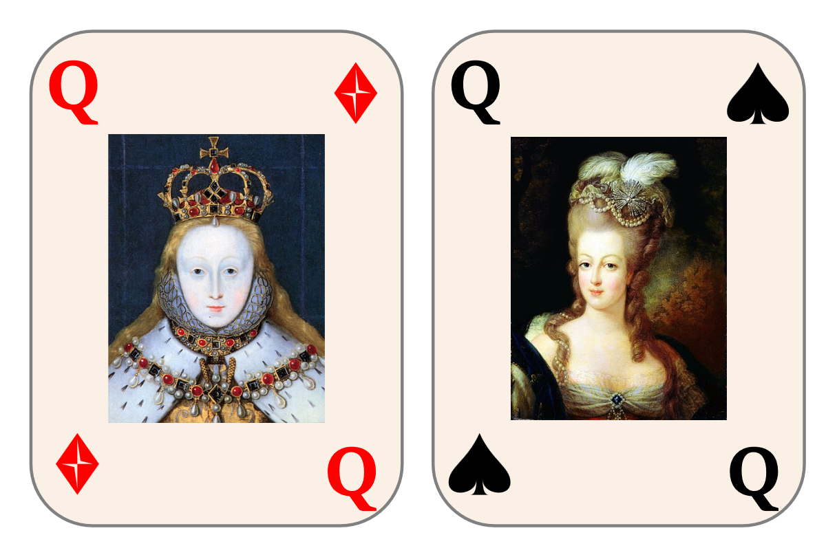
Figure 10-3. Playing card queens using photographs embedded in the SVG
Example 10-3. Using external images in SVG
<svgxmlns="http://www.w3.org/2000/svg"xml:lang="en"xmlns:xlink="http://www.w3.org/1999/xlink"width="400px"height="270px"viewBox="0 0 267 180"><title>Playing Cards</title><!--Same styles and definitions as before--><svgwidth="140"height="180"class="diamond"id="diamondQ"><title>Queen of Diamonds</title><usexlink:href="#card-front"x="10"y="10"/><textx="15"y="35">Q</text><textx="105"y="160">Q</text><usexlink:href="#diamond"x="105"y="20"/><usexlink:href="#diamond"x="15"y="140"/><imagex="35"y="40"width="70"height="100"xlink:href="Elizabeth_I.jpg"/></svg><svgx="130"width="140"height="180"class="spade"id="spadeQ"><title>Queen of Spades</title><usexlink:href="#card-front"x="10"y="10"/><textx="15"y="35">Q</text><textx="105"y="160">Q</text><usexlink:href="#spade"x="105"y="20"/><usexlink:href="#spade"x="15"y="140"/><imagex="35"y="40"width="70"height="100"xlink:href="Marie-Antoinette.jpg"/></svg></svg>
A new
viewBoxand dimensions allow us to reuse the same code, while scaling the image to display two cards in a 400px width, instead of three.The styles and icon definitions are exactly the same as for Example 10-1, which created the number and ace cards.
The suit is indicated by icons in the corners.
The image is stored in the same folder on the server as the SVG code, so all we need is to indicate the filename in the
xlink:hrefattribute, along with the position and size attributes.
There’s another use for <image>, although it’s unofficial: to provide a fallback image file for inline SVG in HTML.
Most browsers recognize an <image> element in HTML as a synonym for <img> (to support old, nonstandard web pages). A browser that doesn’t support SVG will therefore treat the <image> element as an HTML image, and look for a src attribute to find the file to download. An SVG-aware browser will see <image> inside <svg>, and look for an xlink:href attribute.
If you include a valid src but an invalid (empty) xlink:href on an SVG <image>, the src fallback image will display in pre-SVG browsers, but won’t interfere with your vector graphics in new ones.
Warning
Use an empty xlink:href, instead of omitting the attribute, to avoid a bug where SVG-supporting Internet Explorer versions download the fallback even though they won’t use it.
Of course, you can also use this behavior to create a fallback for SVG-enhanced photographs. In that case, src and xlink:href would point to the same image file: modern browsers would show the photograph plus all the SVG annotations, filters, or masking effects. The old browsers would still get the plain photograph.
Smooth Scaling Photographs
Images in SVG might not have been originally designed to autosize, but they were given one feature that HTML images didn’t have: the ability to scale without distorting aspect ratios.
A preserveAspectRatio attribute on <image> describes what to do if the dimensions of the <image> region don’t match the embedded image’s intrinsic ratio. You can set it to none to get the stretch-and-squish behavior of <img>, but the default is xMidYMid meet, the same as for <svg>. So your photo will scale to fit, centered inside the width and height you specify.
Tip
As discussed in Chapter 8, the CSS object-fit and object-position properties (in supporting browsers) provide preserveAspectRatio-style control for images and other objects in HTML.
Using an <image> inside inline SVG can be a fallback approach for object-fit.
For the most part, preserveAspectRatio on an image works the same way as for SVGs, as defined in “A Poor Fit (and How preserveAspectRatio Fixes It)”. There is no viewBox attribute, however: the intrinsic aspect ratio is calculated from the downloaded image data.
The preserveAspectRatio attribute is particularly useful when you are designing an SVG to work with arbitrary image files, where you don’t have control over the image dimensions. You can decide whether you want the image to fill the full space, even if it gets cropped (slice) or if you want to scale it down to fit (meet).
If you do know the details of the image, however, you may want to crop it more precisely than min/mid/max options.
If you’re embedding an SVG file, you can use #svgView() fragments in the URL to define a custom crop. In the future, you would be able to use #xywh= fragments on other image types to do similar cropping. But until that’s supported, you can draw the <image> inside a nested <svg>, using the SVG’s hidden overflow to crop parts of the image.
In that approach, the x, y, width, and height on the <svg> are the final dimensions and position for the clipped image; the SVG’s viewBox specifies the rectangle you want to display from the image. The <image>’s own width and height should match its natural aspect ratio, in the same units you used for the viewBox. So the following creates a square crop from within a 4×3 photo, offset slightly from the center:
<svgwidth="100"height="100"viewBox="0.8 0 3 3"><imagewidth="4"height="3"xlink:href="photo_4x3.jpg"/></svg>
Alternatively, you can use clipping paths (which we discuss in Chapter 15), or even the old clip property. But it’s a little harder to control the final position that way.
Tip
Clipping paths are required if you want to create rounded corners on the <image>; there is no border-radius or rx/ry on SVG <image>.
Example 10-4 creates an author profile page for this book. Each author’s profile photo has a very different aspect ratio, but the width and height on each photo’s <image> element is the same. The example also uses the nested-<svg> cropping technique to crop down an image of the book’s cover to focus on the title and illustration.
Figure 10-4 shows the code as written (meet scaling, so each photo fits within the <image> dimensions), and then again with preserveAspectRatio changed to xMinYMin slice (so each photo fills the <image> dimensions, with cropping). You’ll have to play with the online example to see the distortions that result from changing preserveAspectRatio to none.
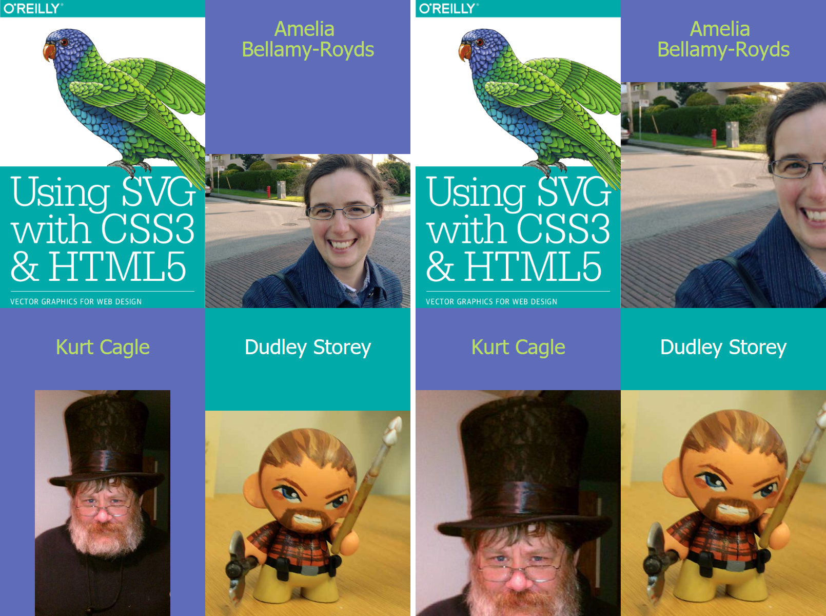
Figure 10-4. Profile photos with different aspect ratios: (left) with meet aspect ratio options, and (right) slice settings
Example 10-4. Demonstrating preserveAspectRatio options on embedded images
<svgxmlns="http://www.w3.org/2000/svg"xml:lang="en"xmlns:xlink="http://www.w3.org/1999/xlink"width="400"height="600"viewBox="0 0 400 600"><title>The Authors of Using SVG with CSS3 and HTML5</title><style>text{font:20pxTahoma,sans-serif;text-anchor:middle;fill:darkRed;}.bird-colorsrect{fill:#5f6cb9;}.bird-colorstext{fill:#bbde60;}.theme-colorsrect{fill:#00aaa9;}.theme-colorstext{fill:white;}</style><svgviewBox="50 5 500 750"width="50%"height="50%"><imageheight="900"width="600"aria-label="Using SVG cover image"xlink:href="using_svg_cover.png"/></svg><gclass="bird-colors"><rectx="50%"height="50%"width="50%"/><textx="75%"y="45"dy="-0.5em">Amelia<tspanx="75%"dy="1em">Bellamy-Royds</tspan></text><imagex="50%"y="80"height="220"width="200"preserveAspectRatio="xMidYMax meet"aria-label="Amelia in the sunshine"xlink:href="Amelia.jpg"/></g><gclass="bird-colors"><recty="50%"height="50%"width="50%"/><textx="25%"y="345">Kurt Cagle</text><imagey="380"height="220"width="200"preserveAspectRatio="xMidYMax meet"aria-label="Kurt in a top hat"xlink:href="Kurt.jpg"/></g><gclass="theme-colors"><rectx="50%"y="50%"height="50%"width="50%"/><textx="75%"y="345">Dudley Storey</text><imagex="50%"y="380"height="220"width="200"preserveAspectRatio="xMidYMax meet"aria-label="Dudley, re-imagined as a tiny warrior"xlink:href="Dudley.jpg"/></g></svg>
The overall SVG layout has a 2×3 (400×600) aspect ratio, which will be divided into quarters (two rows and two columns) with the same aspect ratio.
The cover image is in the correct aspect ratio to fill one quarter (600×900), but it includes the authors’ names, which would be slightly redundant in this layout. The
viewBoxon the nested<svg>defines a custom crop to show only the part we want to feature. Both the<image>and the<svg>have the correct aspect ratios, so we don’t need to worry about “preserving” anything.After we leave room for the names, the photos all have an almost-square aspect ratio of 200×210.
The
xMidYMax meetsetting forpreserveAspectRatiowill position the photos horizontally centered and bottom-aligned in each<image>rectangle.There is no
altattribute on SVG<image>. You can either add a child<title>element (which will also create a tooltip), or use anaria-labelattribute, like we did here.
When the <image> embeds another SVG file, there is an additional option for preserveAspectRatio. The defer keyword tells the browser to use the preserveAspectRatio value specified in the external file, if it exists. It is specified in combination with a fallback value, which applies if the external file does not specify a value—or is not an SVG. The following code would use xMidYMid meet behavior unless different instructions are in the external file:
<imagexlink:href="overlay.svg"preserveAspectRatio="defer xMidYMid meet"width="100%"height="100%"/>
Warning
Based on limited use, the SVG 2 specs proposed removing the defer keyword to make implementations simpler. Test carefully before using.
Summary: Reusing Content
A key tenet of computer programming is that you should not have the same information repeated in multiple parts of your code. If you need a value multiple times, assign it to a variable. If you need to perform a calculation multiple times, make it into a function. Keep it DRY: Don’t Repeat Yourself.
The specifics are somewhat different with SVG, but the principle is the same. If multiple elements have the same styles, either group them together or use CSS classes so that those styles are only declared once. If an entire shape is repeated, use a <use> element to minimize the repeated markup. Both approaches keep file sizes down, and make it easier to understand and update the code.
Keeping file sizes down also means recognizing when a different image format is required, and the <image> element makes it easy to integrate photographs and other images into the SVG.
The <use>, <symbol>, and <image> elements build upon SVG’s scaling mechanisms and the viewBox and preserveAspectRatio attributes introduced in Chapter 8. They will themselves be a fundamental component of many examples throughout the rest of the book.
Images are particularly interesting in the context of masking (Chapter 15) and filters (Chapter 16); many uses of SVG do not include any vector graphic shapes at all, just images manipulated with these graphical effects.
The <use> element will show up in many contexts, including the next chapter—which examines how you can manipulate and distort graphics by transforming the very coordinate system in which they are drawn.