Table of Contents for
Using SVG with CSS3 and HTML5
 Using SVG with CSS3 and HTML5
Published by
O'Reilly Media, Inc., 2017
Using SVG with CSS3 and HTML5
Published by
O'Reilly Media, Inc., 2017
- nav
- Cover
- Using SVG with CSS3 and HTML5
- Using SVG with CSS3 and HTML5
- Preface
- I. SVG on the Web
- 1. Graphics from Vectors
- 2. The Big Picture
- 3. A Sense of Style
- 4. Tools of the Trade
- II. Drawing with Markup
- 5. Building Blocks
- 6. Following Your Own Path
- 7. The Art of the Word
- III. Putting Graphics in Their Place
- 8. Scaling Up
- 9. A New Point of View
- 10. Seeing Double
- 11. Transformative Changes
- IV. Artistic Touches
- 12. Filling Up to Full
- 13. Drawing the Lines
- 14. Marking the Way
- 15. Less Is More
- 16. Playing with Pixels
- V. SVG as an Application
- 17. Beyond the Visible
- 18. Drawing on Demand
- 19. Transitioning in Time
- 20. Good Manners
- Index
- About the Authors
- Colophon
Chapter 3. A Sense of Style
Chapter 3. Working with CSS
On the web, style means CSS. Cascading Style Sheets are used to indicate how the plain text of HTML should be formatted into the colorful diversity of websites and applications that you interact with every day.
SVG and CSS have an intertwined relationship. SVG incorporates CSS styling of decorative aspects of the drawing, but uses a basic layout model completely independent of CSS layout. CSS has been expanded to include so many graphical effects (formerly only available in SVG) that it has become a rudimentary vector graphics language of its own.
This chapter covers how to use CSS styles to modify your SVG graphics, and how to reference SVG images and elements in CSS code used to style HTML. It also discusses the benefits and limitations of using CSS+HTML to create graphics, including its similarities and differences with SVG, and outlines factors for you to consider when deciding between the two.
CSS in SVG
CSS is not required for SVG; it is perfectly possible to define a complete SVG graphic using presentation attributes. However, using CSS to control presentation makes it easier to create a consistent look and feel. It also makes it easier to change the presentation later.
Style Declarations
There are four different ways to define presentation properties for an SVG element: presentation attributes, inline styles, internal stylesheets (<style> blocks), and external stylesheets.
Presentation attributes
Most style properties used in SVG may be specified as an XML attribute. For the most part, the effect is the same as if CSS were used. Properties that are normally inherited will be inherited, and the inherit keyword can be used to force inheritance on other properties.
Things to note:
-
There are no shorthand versions of the presentation attributes (e.g., use
font-size,font-family, and so on, notfont). -
The XML parser is case-sensitive for property names (must be lowercase) and for some keyword values (although SVG 2 requires presentation attribute values to be parsed the same way as in CSS).
-
You cannot include multiple declarations for the same property in order to provide fallbacks for older browsers; you can only have one of each attribute per element.
-
Values set using CSS take priority over a presentation attribute on the same element. However, presentation attributes supercede inherited style values, even if the inherited value was set with CSS.
A <style> block
You can include an internal stylesheet within your SVG document using a <style> element, similar to the <style> element in HTML.
The element can be placed anywhere, but is usually at the top of the file or inside a <defs> section. In addition, when your SVG code is included inline within another document, such as HTML5, any stylesheets declared for that document—or declared in other SVG graphics within the document—will affect your graphic.
The <style> block can include any valid CSS stylesheet content, but the main content will be CSS style rules consisting of a CSS selector followed, within braces (curly brackets), by a list of property: value pairs that will apply to elements matching that selector:
selector{property1:value;property2:value;/* comment */property3:value!important;}
The !important modifier clobbers the normal CSS cascade rules, and it should only be used as a last resort.
If you’re not familiar with CSS and CSS selectors, you’ll want to consult a CSS-specific reference guide, such as Eric Meyer’s CSS Pocket Reference or the CSS-Tricks online almanac. Most browsers now support CSS level 3 selectors (and some level 4 selectors), but older browsers and SVG tools that have not been updated since SVG 1.1 may only support CSS 2 selectors.
Warning
Although the SVG <style> element works much the same way as its HTML counterpart, HTML introduced additional DOM interfaces that allow you to access and modify the stylesheet using JavaScript, which SVG did not initially match. SVG 2 harmonizes the two, but implementations have not all caught up.
Some other details to consider when using internal stylesheets in SVG files (especially if you’re not used to working with CSS in XML):
-
The SVG 1.1 specifications did not define a default stylesheet type. Although all web browsers will assume
type="text/css", other tools (notably Apache Batik and out-of-date versions of Inkscape) will ignore the<style>block if the type isn’t declared. SVG 2 makes the de facto default official. -
The contents of the
<style>block can be (but don’t have to be) contained in an XML “character data” section. This avoids parsing errors if your comments contain stray<,>, or&characters. The start of the character data region is indicated by<![CDATA[and the end by]]>, like this:<styletype="text/css"><![CDATA[circle{/* Styles for <circle>s */fill:red;/* red & purple are my favorite colors */}]]></style> -
CSS has its own way of handling XML namespaces, which is completely distinct from any namespace prefixes declared in the XML markup.
We only use one type of namespaced CSS selector in the examples in this book, and it is to specifically cancel out the distinction between href and xlink:href in attribute selectors.
The [href] attribute selector only selects href attributes without namespaces. To also select xlink:href attributes, you need to add *| (asterisk and pipe) ahead of the attribute name, as a wildcard namespace marker. It looks like this:
pattern[*|href]/* pattern elements with anhref or xlink:href attribute*/use[*|href="#icon"]/* use elements that clone `icon` */a[*|href$='.pdf']/* links to a PDF file */use:not([*|href^='#'])/* use elements whose cross-referencesdon't start with a `#` target */
The issues with type and namespaces also apply to external stylesheets.
External stylesheets
Style rules may be collected into external .css files so that they can be used by multiple documents.
Tip
External stylesheets (or any external file resources) are never loaded from SVG files that are used as images in web pages (e.g., <img> or CSS background-image).
There are four ways to include external stylesheets for SVG, all of which allow the stylesheet to be restricted to certain media types:
-
An import rule at the top of another CSS stylesheet or
<style>block, like:<styletype="text/css">@import"style.css";@importurl("print.css")print;</style> -
An XML stylesheet processing instruction in the prolog of an SVG or XML file (the “prolog” being any code before the opening
<svg>or other root tag), like:<?xml-stylesheet href="style.css" type="text/css"?><?xml-stylesheet href="print.css" media="print"type="text/css"?><svgxmlns="http://www.w3.org/2000/svg"><!-- ... --></svg>
-
A
<link>element in the<head>of an HTML5 document that includes inline SVG, like:<html><head><!-- ... --><linkhref="style.css"rel="stylesheet"type="text/css"><linkhref="print.css"rel="stylesheet"media="print"type="text/css"></head><body><!-- ... --><svg><!-- ... --> -
An HTML
<link>element in a standalone SVG file, using proper XML namespaces (either a prefix or anxmlnsattribute on the<link>element itself) to identify it as the HTML element:<svgxmlns="http://www.w3.org/2000/svg"xmlns:html="http://www.w3.org/1999/xhtml"><html:linkhref="style.css"rel="stylesheet"type="text/css"><linkxmlns="http://www.w3.org/1999/xhtml"href="print.css"rel="stylesheet"media="print"type="text/css"/><!-- ... --></svg>
Warning
Support for the HTML <link> in SVG files was only officially added in SVG 2. It is supported in every web browser we’ve tested, but will probably not be supported in other SVG tools.
In all these cases, the first stylesheet (style.css) would be used for all media, while the second (print.css) would only be used for printing out the graphic.
Overriding Styles
Once the browser has all your different style rules, it cascades them together with the default values to create a specified value for each property on each element, and then applies inheritance as necessary to create a final used value. For SVG, this works the same as elsewhere in CSS, except that presentation attributes add an extra step to the cascade.
Presentation attributes are treated as an author-level style rule with zero specificity. In fact, they have less than zero specificity, because the zero-specificity universal * selector outranks them.
Tip
There are also a few SVG-specific style defaults that are defined in the SVG specs and applied as browser-level style rules. The most notable one is that overflow is set to hidden on most SVG elements where it has an effect, even though the normal CSS initial value is visible.
CSS cascading and specificity rules can be used to create a stylesheet that completely overrules presentation attributes in the code.
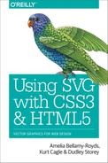
For example, you could use CSS overrides to create a separate set of styles for black-and-white printing. Example 3-1 presents such a stylesheet for the grouped primary-color stoplight from Example 1-4 in Chapter 1. (Other versions of the stoplight could have been used, but this one has short and sweet markup.) The print-preview result is shown in Figure 3-1.
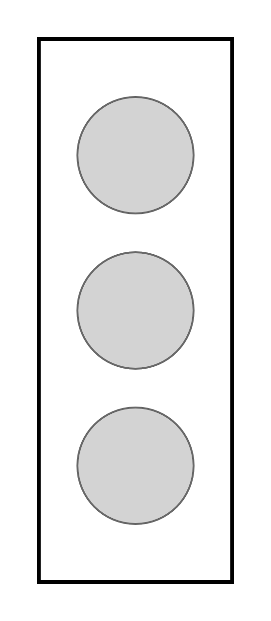
Figure 3-1. A minimalist, monochrome stoplight
Example 3-1. Stylesheet for monochrome printing of an SVG
SVG Markup:
<?xml-stylesheet media="print" href="grouped-stoplight-print-styles.css" ?><svgxmlns="http://www.w3.org/2000/svg"xml:lang="en"height="320px"width="140px"><title>Grouped Lights Stoplight</title><rectx="20"y="20"width="100"height="280"fill="blue"stroke="black"stroke-width="3"/><gclass="lights"stroke="black"stroke-width="2"><circlecx="70"cy="80"r="30"fill="red"/><circlecx="70"cy="160"r="30"fill="yellow"/><circlecx="70"cy="240"r="30"fill="#40CC40"/></g></svg>

We’ve used the
xml-stylesheetformat to include the print stylesheet; an alternative would be to add an HTML-namespaced<link>after the<title>. Themedia="print"attribute lets the browser know to only use these styles when printing.
The only change to the markup is a
classattribute on the<g>group.
CSS styles: grouped-stoplight-print-styles.css
*{fill:inherit;stroke:inherit;stroke-width:inherit;}g.lights{fill:lightgray;stroke:dimgray;stroke-width:1;}rect{fill:none;stroke:black;stroke-width:2;}
The universal selector (
*) is used to reset the styles declared on all elements using presentation attributes.We use the
inheritkeyword, instead of setting a value directly on every element, so that style inheritance will work normally.
We give all the lights the same appearance by setting the styles once on the
<g>element (using the class added to the markup).
The
<rect>is styled separately. Note that, because we reset thestrokeandstroke-widthpresentation attributes for all elements, the styles have to be set in the CSS even when, like the black stroke, they have not been changed from the original.
If there are multiple valid stylesheet rules with the same specificity, the final value is used. To determine which value comes last, different stylesheets (both external files and <style> blocks) are concatenated together in the order in which they are included in the document. This allows you to use an external stylesheet for many documents and then modify it for a particular document using a <style> element. It also allows you to specify fallback styles for new features that may not be universally supported.
Conditional Styles
Declaring styles in CSS stylesheets is often simply a convenience compared to using presentation attributes, allowing you to apply the same style rules to many elements (or many files) without repeating your code. However, with CSS, you can create much greater flexibility in your graphic, by using fallback values, media queries, and interactive pseudoclasses to create styles that adapt to the context.
Parser fallbacks
The most basic, and universally supported, conditional CSS is the fallback value. CSS error handling rules require browsers to skip any invalid style declarations, and continue reading the rest of the file. If you use a new feature the browser doesn’t support, it will ignore the declaration.
In combination with the cascade rules, this means that you can provide fallback values for new property features simply by declaring—earlier in the stylesheet—a more widely supported value for the same property. Browsers will apply the last value that they recognize and support. For example, the following code would provide a fallback for a semitransparent rgba() color value (which was introduced in the CSS level 3 Color specification):
.stained-glass{fill:#FF8888;/* solid pink */fill:rgba(100%,0,0,0.5);/* transparent red */}
Fallback styles allow you to use new features while providing alternatives for tools that only support the SVG 1.1 specifications. There are currently only a few such features relevant to styling SVG, such as CSS3 colors and units, and new filter and masking options. However, the number of inconsistently supported style values will likely increase as new CSS3 and SVG 2 specifications are rolled out.
@supports tests
One limitation of CSS error-handling fallbacks is that they only apply to a single property. Sometimes you need to coordinate multiple property values to provide fallback support for a complex feature. The new @supports rule allows this type of coordination. The basic structure looks like the following:
.stained-glass{fill:#FF0000;/* solid red */fill-opacity:0.5;}@supports(fill:rgba(100%,0,0,0.5)){.stained-glass{fill:rgba(100%,0,0,0.5);/* transparent red */fill-opacity:1;/* reset */}}
With this code, the SVG fill-opacity property is used as an alternative to CSS3 transparent colors. Again, thanks to CSS error-handling rules, browsers that don’t recognize the @supports rule will skip that entire block.
Warning
CSS @supports is supported in all the latest browsers, but older browsers (such as Internet Explorer) will skip over the entire block. Make sure you still have decent fallbacks if “nothing” is supported by the @supports test!
Be aware that @supports only tests whether the CSS parser recognizes a particular property/value combination. It can’t test whether that property will be applied when a particular element is being styled.
This is particularly frustrating when you’re working with SVG in web browsers. Certain properties (such as filter or mask) may be recognized but only applied on SVG elements, despite applying to all elements in the latest specs. Other properties (such as text-shadow or z-index) may be recognized and applied for CSS box model content, but not for SVG.
Media queries
The @supports rule is a type of conditional CSS rule block.
A more established conditional CSS rule is the @media rule, more commonly known as a media query. A media query applies certain styles according to the type of output medium used to display the document. We already discussed how it is possible to use the media attribute to limit the use of external stylesheets. @media rules allow those same conditions to be included within a single stylesheet or <style> block:
@media{/* These styles only apply when the document is printed */}
Originally, CSS used a fixed number of media type descriptions, such as screen, print, tv, and handheld. But this proved limiting.
Handheld devices today are quite different from what they were 15 years ago, and screens come in all shapes and sizes. The only media type distinction that is still relevant is screen versus print. For all other distinctions, use feature-based media queries, which directly test whether the output device is a certain size, or a certain resolution, or able to display full-color images (among other features).
For general information on media query syntax and options, consult a CSS reference. For SVG, there are a couple complications to keep in mind.
The first thing to realize is that the media query is evaluated before any of the SVG code; in other words, before any scaling effects within the SVG change the definition of what a px or a cm is.
The second thing to be aware of, particularly if you’re switching between separate SVG files and inline SVG code, is that the media being tested is the window or printed page for the document containing the SVG code. If the SVG is inline within HTML5, that means the entire frame containing the HTML web page. However, if the SVG is embedded as an <object> or <img>, it means the specific frame area created to draw the graphic.
In practice, this means that media queries can be a little more predictable with embedded SVG files. You can design around the SVG dimensions directly, without needing to know the rest of the layout.
It should be clear that a thorough understanding of CSS can help you make the most of your SVG graphics. However, that is not the end of the relationship; it also works the other way.
SVG in CSS
There are two distinct ways in which you can reference SVG files from within a CSS file:
-
use the entire SVG file as an image
-
use specific SVG elements that apply graphical effects
Complete SVG images can be used like other image types in CSS-styled HTML or XML documents. Theoretically, they can also be used in CSS-styled SVG (for example, as a background-image on the root element), although the practical need is more limited.
SVG element references were initially a feature unique to SVG, for styling other SVG elements; however, many of these properties that use these references (including fill, stroke, filter, mask, and clip-path) are now being expanded to other types of CSS-styled content.
Using SVG Images Within CSS
The ability to reference image files from CSS has existed from the earliest versions of the language. Any HTML element that participates in the document layout flow—that is, anything that takes up space on a web page—has a background. The ability to modify this background was one of the first CSS capabilities implemented in contemporary browsers, and as such is quite robust, fully supported by all popular browsers still in common use.
The background-image property, like any CSS property that accepts an image, takes a URL value, contained within the url() function:
background-image:url('/images/myImage.jpg');
The quotes around the argument in the url() function are recommended, but can often be omitted, so long as the URL only contains ASCII characters with no whitespace.
The URL could be global, starting with a protocol (https://), or at least a double slash (//):
- https://www.example.com/images/myImage.jpg
Or it could be local, starting with a single slash (/), meaning it is on the same server as the web page:
- /images/myImage.jpg
Or relative to the current web page or stylesheet location:
- myImage.jpg
- ../images/myImage.jpg
Tip
The ../ in that last URL means “go up one level in the file directory, then find the specified folder and file.” We use it in the examples, when linking to a file from a different chapter, stored in a different folder in the example repository.
The HTML5 specification, when describing SVG as a required format for images, states that it should also be valid format for background-image in CSS-styled HTML.
This means that if you have an SVG file, such as myImage.svg, you can use it in exactly the same manner as you could use a JPEG, GIF, or PNG file, in any modern browser:
background-image:url('/images/myImage.svg');
If you want to provide fallback images for older browsers that don’t support SVG, you have a few options:
-
Use a JavaScript tool, such as Modernizr, to test whether SVG images are supported and change the classes (and therefore style rules) on your elements accordingly.
-
Use a server script to identify the old browsers and edit your web page to use different style rules.
-
Use Internet Explorer conditional comments to include a stylesheet that overrides your main style rules (this doesn’t help with older mobile browsers that don’t support SVG).
-
Use other modern CSS syntax not supported by the older browsers, such as layered background images and CSS gradients, to make the browser ignore the background image declaration that includes SVG, and apply fallback declaration instead.
The layered-image fallback approach looks like the following:
background-image:url('/images/myImage.jpg');/*fallback*/background-image:url('/images/myImage.svg'),linear-gradient(transparent,transparent);
This prevents the SVG file from being downloaded in both old Internet Explorer and old Android browsers.
Although backgrounds are the most common use for images in CSS, there are currently three other well-supported properties that accept image values:
list-style-image-
Specifies a custom graphic to replace the bullet or number for a list element (technically, any element with CSS display type
list-item). border-imagecontent-
Provides content to be used in the
::beforeand::afterpseudoelements, as a series of text strings and/or images. The images are displayed at their natural size, like a series of inline block elements, so this is best only used for small icons with defined sizes in the SVG file.
Tip
New CSS properties, including mask-image and shape-outside, are extending this list. SVG images are also fairly well supported in the cursor property—so long as the image has defined height and width.
In general, if a CSS property takes an image file, it should accept an SVG file.
Figure 3-2. A web page using SVG graphics as CSS backgrounds, bullets, and borders
Example 3-2 applies all four properties to an HTML web page, using card suit shapes that we’ll learn how to draw in Chapter 6. The (somewhat intense-looking) web page that results is shown in Figure 3-2.
Example 3-2. Using CSS properties that accept an SVG image value
HTML markup:
<!DOCTYPE html><htmllang="en"><head><metacharset="utf-8"><title>Using SVG in CSS for an HTML page</title><linkrel="stylesheet"href="svg-in-css.css"/></head><body><h1>Card Sharks</h1><ul><li>First point</li><li>Second point</li><li>Third</li><li>Fourth</li><li>And another</li><li>One more</li><li>In conclusion</li><li>This is the last point</li></ul></body></html>
CSS styles: svg-in-css.css
body{margin:01em;font-family:sans-serif;color:navy;background-color:red;background-image:url('../ch06-path-files/spade.svg'),url('../ch06-path-files/heart.svg'),url('../ch06-path-files/club.svg');background-size:40px40px;background-position:00,20px0,20px20px;}h1{text-align:center;border-radius:2em/50%;}h1::before,h1::after{display:block;content:url('../ch06-path-files/diamond.svg')url('../ch06-path-files/spade.svg')url('../ch06-path-files/heart.svg')url('../ch06-path-files/club.svg');}h1,ul{background-color:white;background-color:rgba(100%,100%,100%,0.85);max-width:70%;margin:0.5emauto;}ul{padding:1em;padding-left:calc(1em+10%);border:solid#9991em;border-radius:10%;border-image-source:url(svg-in-css-border-gradient.svg);border-image-slice:5%5%;border-image-width:4.7%;/* = 5% / 105% */border-image-repeat:stretch;}li{line-height:2em;}ulli:nth-of-type(4n+1){list-style-image:url('../ch06-path-files/diamond.svg');}ulli:nth-of-type(4n+2){list-style-image:url('../ch06-path-files/spade.svg');}ulli:nth-of-type(4n+3){list-style-image:url('../ch06-path-files/heart.svg');}ulli:nth-of-type(4n+4){list-style-image:url('../ch06-path-files/club.svg');}
The solid red background color will be visible on any parts of the web page not covered by the background images; it will also provide a fallback if SVG images are not supported.
For browsers that support SVG and the CSS3 Backgrounds and Borders specification, a complex pattern consisting of three overlapping images will be used as the background. The backgrounds will be layered top to bottom in the same order they are given in the CSS.
A list of values is given for
background-position, setting the initial offset for each corresponding graphic in the list of background images. Each shape will have the 40px square size set bybackground-size. The positions are the initial offset, but each image will repeat in a tiled pattern (set thebackground-repeatproperty for a different behavior).The
contentproperty on the pseudoelements of the heading is used to provide a decorative row of icons above and below the heading text.
The
<ul>will be surrounded by a decorative border image; however, a solid gray border is defined as a fallback. Theborder-radiuscurvature is used to ensure that the padding area will not extend beyond the curved corners of the border image.
The border image consists of a rounded rectangle with a repeating diagonal gradient. The other properties control how the image is divided into edges and corners to fill the border region. CSS border images are a complex topic, with many options, which do not take advantage of any SVG features. You may find it easier to use layered background images to achieve the same effect.

To create a rotating series of custom bullets, the
nth-of-typeCSS pseudoclass selector is used to assign the different list images. The selectorli:nth-of-type(4n+1)will apply to every<li>element that is one more than a multiple of four (when counting all list-item elements that are children of the same parent). In other words, the first, fifth, and ninth item and so on. Unlike JavaScript, CSS does not count the first element in a set as index 0.
The stylesheet presented in Example 3-2 references five separate SVG image files. Each one is only a few hundred bytes in size before compression, but requesting each file from the web server may slow display of the web page.
Tip
The HTTP/2 protocol, now available in the latest browsers and many web servers, reduces the time spent by the browser requesting each new file. With HTTP/2, you probably wouldn’t worry about having five different image files. But you might worry about 100.
This is especially true because the server’s ability to compress the file size depends on how much repetition there is in a single file: repetition that is divided across many different files cannot be compressed away.
Making Every File Count
There are various options to reduce the number of file requests when you have a large number of small SVG graphics:
-
Construct a single sprite image, with the separate icons arranged in a row or grid, to use as a
background-imagefile for multiple elements. Then use thebackground-sizeandbackground-positionproperties to position the sprite file in such a way that the correct icon is visible.This technique has been used for years with raster image sprites; there is nothing specific to SVG about it. However, it only works for background images—there are no similar size and position options to reposition a list image file.
-
Create a sprite image as above, but add
<view>elements that describe the target region for each icon. Then specify the ID of the relevant view as the target fragment (after the#mark) in the URI. -
Create an SVG stack file, with your different icons overlapping in the same position. Then use the CSS
:targetpseudoclass to only display each graphic if it is referenced in the URL target fragment. -
Convert each image reference to a data URI, which allows you to pass an entire file’s contents in the form of a URI value.
We’ll discuss SVG views and stacks in Chapter 9. Theoretically, they should be usable anywhere you use an SVG image file (in CSS or in HTML), since all the information about position and size is contained in the SVG code and the URL fragment. However, at the time of writing there are serious limitations on browser support in WebKit, and in many older Blink browsers still in use (e.g., on Android).
That last option is worth a longer discussion. It’s currently the recommended approach for embedding very small SVG files in a CSS file, such as might be used for custom list bullets or simple background patterns.
A data URI is an entire file encoded in a URL string. You can therefore use it anywhere a URL is required, without needing to download a separate file.
Warning
For security reasons, Internet Explorer and Edge do not let you directly open data URIs in a browser tab. IE also doesn’t allow them as an <iframe> source. However, you can use them almost anywhere else you would use an SVG: <img>, <object>, or CSS image properties.
To use data URIs, you specify the data: file protocol, the media type, optional encoding information, and then the file contents as a URI-safe string. Many browsers allow you to pass a simple SVG file as plain-text markup, with only %, #, and ? characters encoded (since these have special meaning in URIs). However, for cross-browser support, you also need to URL-encode all ", <, and > markup characters and any non-ASCII Unicode characters.
You can guarantee compatibility by using the JavaScript encodeURIComponent(string) method to encode your plain-text markup. The result would be entered in the following code to create a data URI:
url("data:image/svg+xml,URI-encoded ASCII text file");
url("data:image/svg+xml;charset=utf-8,URI-encoded
            Unicode file");
Be sure to use a complete, valid SVG file to create your data URI, including XML namespaces. However, you can minify the file as much as possible before encoding, in particular to remove extra whitespace.
Taylor Hunt has discovered that you can keep the encoding URI size smaller by using single-quote characters (') instead of double quotes (") in your markup; the single quotes do not need to be escaped in a URL, so long as the entire string is surrounded by double quotes. His article on SVG data URIs has a more detailed JavaScript function for making optimal data URIs. Jakob Eriksen used the same approach to create a Sass CSS preprocessor function. And Dave Rupert turned it into a copy-and-paste website, if you’re only encoding a few short graphics.
For raster image files—which don’t have a plain-text representation—data URIs use the base-64 encoding algorithm. Base-64 encoding converts the raw binary data of a file to a string using 64 URL-safe characters.
Base-64 encoding is not recommended for SVG data URIs in CSS or HTML files, because the end result cannot be compressed (with Gzip or Brotli) as effectively as a URL-encoded text. Even uncompressed, it may be longer than an optimal URI-encoded version.
Nonetheless, base-64 encoding is the best choice for encoding many other file types that you might wish to embed in your SVG file itself. The JavaScript function btoa(data) converts file data to base-64 encoding, and there are also lots of online tools that can convert a file. The result is embedded as follows:
url("data:image/jpeg;base64,base64-encoded JPEG file");
For different file formats, replace the JPEG media type (image/jpeg) as needed.
Using SVG Effects Within CSS
We have already seen, in Chapter 1, how an SVG presentation attribute can reference another SVG element using the url() notation. In that case, it was a fill property referencing a gradient element:
<usexlink:href="#light"y="80"fill="url(#red-light-off)"/>
Other SVG style properties follow the same syntax: you define the details of the graphical effect you want to apply in the SVG markup, and then apply that effect to another element using a url() reference.
For masks, clipping paths, and filters (which we’ll discuss in Chapters 15 and 16), these graphical effects can now also be applied to non-SVG content in the latest web browsers. Proposed new CSS modules would also allow SVG gradients and patterns to be used directly as image sources or text fill.
To reference a graphical effect, use a URL that contains a # targeting the reference to a specific element’s id.
Theoretically, the URL for most effect properties can reference an element in a different file, either as a local relative URL or an absolute URL (e.g., to a content-delivery network serving up your static image assets). However, browser support for cross-file references varies, and depends on the property.
Even when external files are supported, you can’t just reference an SVG filter or mask from someone else’s website (a cross-origin reference). We talk more about cross-origin issues in “File Management”.
If the URL is either a local target fragment like url(#filter), or a relative file path like url("../assets/filters.svg#blur"), the URL will be resolved relative to the file that contains the CSS rule. This means that local target fragments can only be used for <style> blocks, inline styles, and presentation attributes—never an external stylesheet, which cannot contain valid SVG elements.
The location of relative URLs, including local target fragments, will also be affected by the HTML <base> tag and by xml:base attributes, which instruct the browser to treat all relative URLs as being relative to a different web address.
Tip
SVG 2 and the latest CSS specs propose special rules for URLs that only have a target fragment (i.e., they start with a # character), so that they would not be affected by <base> change, and they could be used in external stylesheets. However, browser support isn’t consistent yet, and some of the specification details may still change.
With SVG graphical effects, combining many effects into a single file is not a problem: the URL references always target a specific element. Unfortunately, for the time being that file is usually your main web page, not a reusable asset file.
CSS Versus SVG
This chapter has so far emphasized the ways in which CSS and SVG are interdependent and complementary. However, there are also many ways in which the two are contradictory and competitive. As CSS has expanded to include more graphical options, it has included many features that were previously the exclusive domain of SVG, such as gradients, complex shapes, and animation.
Although some of the new CSS graphical effects have been coordinated with work on SVG, others have implemented completely new rules and syntax. As a result, switching between CSS graphics and SVG can be confusing.
Styling Documents Versus Drawing Graphics
The tension between CSS and SVG is driven by their differing goals of formatting documents versus rendering graphics. Both are involved in handling layout; both control the incorporation of images, colors, and patterns; and both determine how text gets rendered. It’s easy to get lost in the overlap; some CSS properties work in SVG just the same as in HTML, while others are completely different.
It helps to focus on the different purposes of the two languages.
CSS was designed to describe the presentation of text documents. It assumes that most of the elements in the document contain text. CSS rules define the regions of the web page in which the text should be arranged (layout boxes), the decoration of those boxes, and the styling of the text itself. For the most part, the text is treated as a continuous stream that can be wrapped from one line to another to fit within the layout boxes. When you change the available space for each line, the layout will be rearranged: text wrapping at different points, boxes expanding to fit more or fewer lines of text, and the overall page layout shifting to accommodate them.
In contrast, SVG defines a two-dimensional graphic. There is no single flow of content that can be wrapped to a new line if there isn’t enough space on this one. The entire SVG expands or contracts together, preserving the relative positions of all the elements in both horizontal and vertical directions.
The shape and position of SVG elements are a fundamental part of their meaning and purpose. In contrast, the fundamental meaning of HTML elements is contained in their text content and the semantic meaning associated with the HTML tags; the shape and position of the CSS layout boxes is (usually) pure decoration.
When you add a border to a CSS layout box, it takes up extra space around the outside of the box, and the layout adjusts to accommodate it. In contrast, when you add a stroke to an SVG shape, it is positioned exactly centered over the geometric edge of the shape. If that stroke overlaps something else, it’s up to you to decide whether to move or resize the shapes to accommodate it; the browser makes no assumptions about why you’re drawing graphics in the particular places you specify.
Many other syntax differences come from this difference between styling independent, flexible boxes versus drawing graphics that are explicitly positioned by x- and y-coordinates. Even for the CSS features that have been adapted from SVG, such as transformations (Chapter 11) or masks (Chapter 15), new rules were required to apply the effects to elements that aren’t part of a fixed coordinate system.
Nonetheless, although CSS layout and style properties were created to format text documents, they can just as easily be applied to empty elements in order to construct purely graphical content. It is with this usage that CSS becomes a direct competitor to SVG.
CSS as a Vector Graphics Language
As described in Chapter 1, vector graphics describe where and how a computer should draw an image, rather than describing the pixelated result. In this way, the combination of an HTML document plus CSS stylesheet can be seen as a vector language; together, they describe how the browser should display the web page.
Most web pages do not use the precise coordinate-system layout usually associated with vector graphics. However, CSS absolute positioning can be used to provide coordinate-like positioning, placing elements at a certain point on the page regardless of the flowing layout of the text. CSS also allows you to set the width and height of elements exactly, regardless of the width available or the height required to display their text content.
With these properties—and the many styles available to decorate CSS boxes with borders, backgrounds, and more—CSS can turn a nested series of HTML elements into a vector graphic. Example 3-3 uses CSS and HTML to recreate the original, primary-color stoplight from Chapter 1. Figure 3-3 shows the result, which is very close to Figure 1-1.
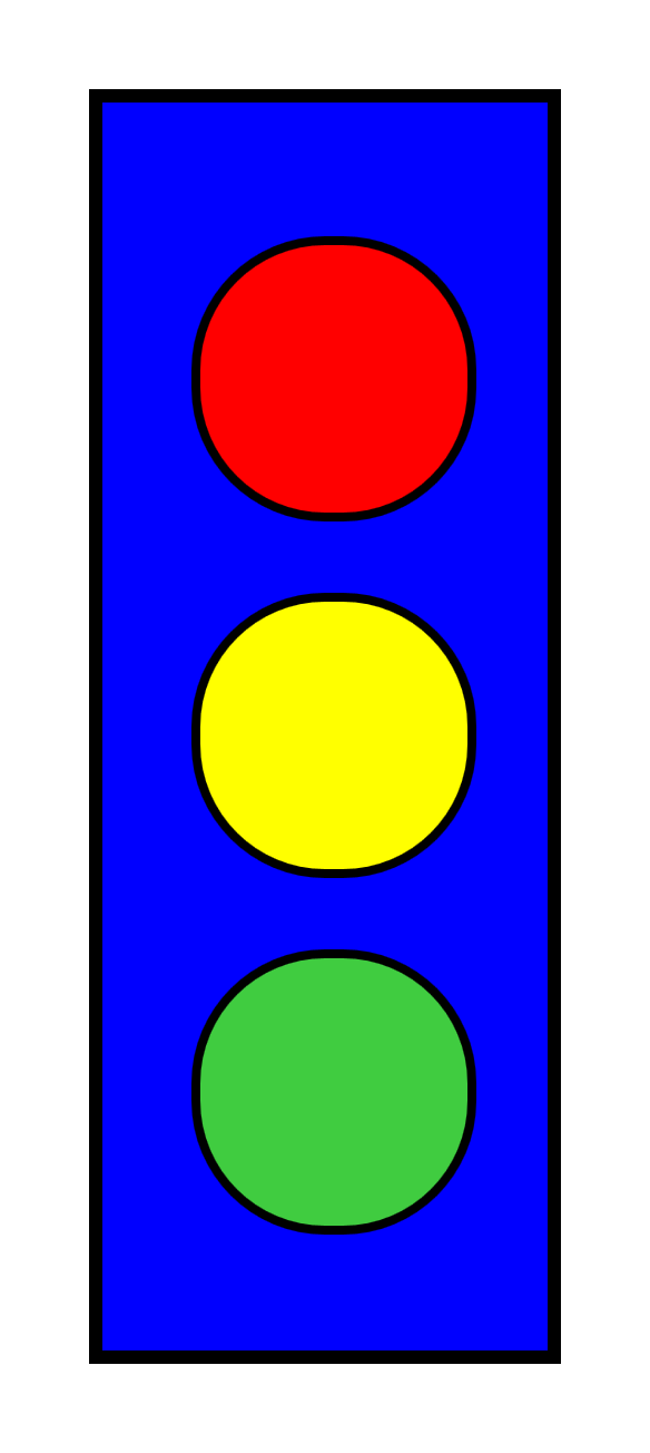
Figure 3-3. The CSS vector graphic stoplight
Example 3-3. Drawing a simple stoplight, with CSS and HTML
HTML markup:
<!DOCTYPE html><htmllang="en"><head><title>Stoplight Drawn Using CSS Styles</title><style>/* Style rules go here (or as an external stylesheet) */</style></head><body><figurearia-label="A stoplight"><divclass="stoplight-frame"><divclass="stoplight-light red"></div><divclass="stoplight-light yellow"></div><divclass="stoplight-light green"></div></div></figure></body></html>
An HTML5
<figure>element is used to group the elements that will be part of the graphic. Anaria-labelattribute adds a text description for accessibility purposes.The frame and the lights are each
<div>elements; by default, these will be displayed as independent boxes, but they have no other meaning or default styles. A class attribute is used so that the custom styles can be applied in the stylesheet.The three elements that will represent the lights are contained inside the element that will represent the frame; unlike SVG shapes, HTML
<div>elements can be nested, which allows you to position smaller elements relative to the boundaries of larger components.Each light has been given two class names: one (
stoplight-light) will be used to assign the common features (size and shape); the other (e.g.,green) will be used to assign the unique features (color and position).
CSS styles:
figure{margin:0;padding:0;}.stoplight-frame{margin:20px;width:100px;height:280px;background-color:blue;border:solidblack3px;position:relative;}.stoplight-light{width:60px;height:60px;border-radius:30px;border:solidblack2px;position:absolute;left:20px;}.stoplight-light.red{background-color:red;top:30px;}.stoplight-light.yellow{background-color:yellow;top:110px;}.stoplight-light.green{background-color:#40CC40;top:190px;}
Most browsers inset
<figure>elements relative to the rest of the text; here, the margin and padding are reset so that positions of the graphic components will be relative to the browser window.The element with class
stoplight-frameis offset from the edge of the window using margin spacing, then is given a fixed width and height. It is filled in usingbackground-colorand given a stroke-like effect withborder.The stoplight frame element is also given the
position: relativeproperty. This does not affect the display of this component, but it defines the component as the reference coordinate system for its absolutely positioned child elements.All three of the elements representing the lights will share the
.stoplight-lightstyles. Thewidthandheightmake the element square; then,border-radiusrounds it into a circle andborderadds a stroke effect.The light elements are set to use absolute positioning, then the
leftproperty sets the horizontal position of each light as an offset from the left edge of the frame element.Each individual light has its color set according to its class. The vertical position is set with the
topproperty, again as an offset from the frame element.
The example may be simple, but it demonstrates some common features in CSS vector graphics:
-
Although CSS elements are by default rectangular, the
border-radiusfeature can be used to create circles or ellipses. -
You can position elements using margin and padding, but it is usually more reliable to position them absolutely.
-
You can use one element as the reference frame for absolutely positioning other elements by nesting them in the HTML, by giving it a nondefault
positionvalue.
In Chapter 12, we will expand upon this simple stoplight example to recreate the gradient effects from Figure 1-4 using CSS gradients.
Which to Choose?
If you can create vector graphics with CSS, why bother learning SVG? It really depends on what type of graphics you’re trying to create.
For advanced graphics, SVG has the undoubted advantage. CSS can create simple rectangles and circles, but other shapes require clipping paths (which aren’t well supported) or complex nested structures. There is also much better browser support for graphical effects in SVG, and more flexible options for decorative text.
For graphical decorations on a text document, however, CSS styling may provide a simple solution. For a simple background gradient, styling with CSS is easier than creating a separate SVG file, encoding it, and embedding it as a data URI in your CSS file. By taking advantage of the ::before and ::after pseudoelements available on most elements, you can create moderately complex decorations such as turned-down corners, menu icons, or stylistic dividing rules.
Tip
The ::before and ::after pseudoelements do not apply to “replaced content” such as images, form input elements, or SVG content. They do apply to other void (always empty) HTML elements such as <hr/> (horizontal rule), which is rendered using the CSS layout model.
When the CSS graphic requires more than the three layout boxes you can create from a single element, simplicity is compromised. Creating a scaffolding of HTML elements to represent each part of the graphic, as we did in Example 3-3, divides your graphical code between the CSS and the markup. Although the same could be said about inline SVG graphics with external stylesheets, it is generally easier to distinguish SVG graphical markup from the rest of the HTML content of the web page. SVG’s <use> element, in particular, makes it easier to organize your graphical markup into a single section of your HTML file.
Compatibility adds another layer of complexity. For the most part, browsers either support SVG or they don’t; certain effects may not always render the same, but the geometric structure will be consistent. In contrast, when you’re building CSS vectors, the geometric appearance often depends on relatively recent features of the language. Without support for border-radius, the stoplight would have been barely recognizable.
This book focuses on SVG, and so it will for the most part emphasize the SVG way of creating vector graphics. However, this is also intended to be a practical reference for web designers, so the question of CSS versus SVG will be revisited regularly throughout the rest of the book. Whenever an SVG feature is introduced that has a CSS counterpart, the two will be compared and contrasted to highlight the key differences in how they work.
Summary: Working with CSS
CSS and SVG have an interdependent relationship, which has both been enhanced and complicated by the development of level 3 CSS specifications.
CSS3 is big, consisting of more than two dozen different documents representing new functionality beyond what is supported in CSS 2.1. There are specifications covering animations, 2D and 3D transformations, transitions, text to speech, print layout, advanced selectors, and more. Throughout this book, where appropriate, each chapter will cover the CSS capabilities in comparison with SVG features.
It’s worth noting that the CSS specifications are a perpetual work in progress. One of the key roles of this chapter was to point out features that were available and relevant to SVG. If you are working with advanced CSS features, it is always worth spending some time looking at the current state of work on CSS specifications at the W3C and experimenting to see what is and is not implemented in your target browsers.
When you’re using CSS to style SVG content, new CSS features such as media queries can increase the functionality and flexibility of your graphics. Browsers use the same CSS parser and selector-matching implementations for SVG as for HTML. So you can use these new CSS features in your SVG files, in any web browser that supports them, even though they did not exist at the time the SVG 1.1 specifications were finalized. The future-focused CSS error-handling rules allow you to define limited fallback options for software that has not implemented the latest features. The @supports rule allows more nuanced control.
SVG has also become an important part of CSS styling for text documents. This chapter has discussed the use of complete SVG images in CSS; other chapters will explore the SVG graphical effects, which can now be used in the latest browsers to manipulate the appearance of HTML content.
At the same time, CSS3 has developed alternatives to many SVG features, so that you can use it to directly create vector graphics from empty elements in your HTML code. This chapter has given a hint of the possibilities. By the end of the book, you should have a clearer understanding of what is possible with CSS and HTML alone, and what is made much easier with SVG.