Table of Contents for
React Quickly: Painless web apps with React, JSX, Redux, and GraphQL
 React Quickly: Painless web apps with React, JSX, Redux, and GraphQL
Published by
Manning Publications, 2017
React Quickly: Painless web apps with React, JSX, Redux, and GraphQL
Published by
Manning Publications, 2017
- Cover
- React Quickly: Painless web apps with React, JSX, Redux, and GraphQL
- Copyright
- React Quickly: Painless web apps with React, JSX, Redux, and GraphQL
- Brief Table of Contents
- Table of Contents
- Praise for React Quickly
- Foreword
- Preface
- Acknowledgments
- About This Book
- About the Author
- About the Cover
- Part 1. React foundation
- Chapter 1. Meeting React
- Chapter 2. Baby steps with React
- Chapter 3. Introduction to JSX
- Chapter 4. Making React interactive with states
- Chapter 5. React component lifecycle events
- Chapter 6. Handling events in React
- Chapter 7. Working with forms in React
- Chapter 8. Scaling React components
- Chapter 9. Project: Menu component
- Chapter 10. Project: Tooltip component
- Chapter 11. Project: Timer component
- Part 2. React architecture
- Chapter 12. The Webpack build tool
- Chapter 13. React routing
- Chapter 14. Working with data using Redux
- Chapter 15. Working with data using GraphQL
- Chapter 16. Unit testing React with Jest
- Chapter 17. React on Node and Universal JavaScript
- Chapter 18. Project: Building a bookstore with React Router
- Chapter 19. Project: Checking passwords with Jest
- Chapter 20. Project: Implementing autocomplete with Jest, Express, and MongoDB
- Appendix A. Installing applications used in this book
- Appendix B. React cheatsheet
- Appendix C. Express.js cheatsheet
- Appendix D. MongoDB and Mongoose cheatsheet
- Appendix E. ES6 for success
- React Cheatsheet
- Index
- List of Figures
- List of Tables
- List of Listings
Chapter 10. Project: Tooltip component
This chapter covers
- Understanding the project structure and scaffolding
- Building the Tooltip component
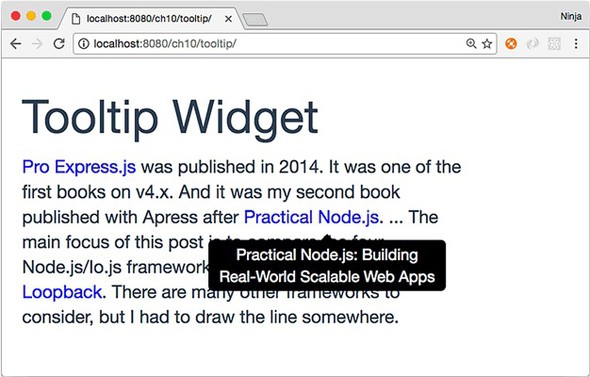
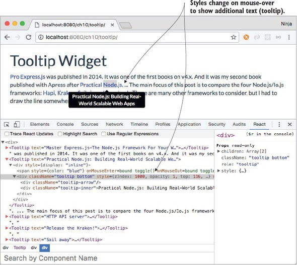
When you’re working on websites that have a lot of text, such as Wikipedia, it’s a great idea to allow users to get additional information without losing their position and context. For example, you can give them an extra hint in a box when they hover the cursor (see figure 10.1). This hint hover box is called a tooltip.
Figure 10.1. A tooltip appears when a user hovers their cursor over the marked text.
React is all about UIs and a better UX, so it’s a good fit for a tooltip implementation. Let’s build a component to display helpful text on a mouse-over event.
There are a few out-of-the-box tooltip solutions, including react-tooltip (www.npmjs.com/package/react-tooltip), but the goal here is to learn about React. Building a tooltip from scratch is a really good exercise. Maybe you’ll use this example in your daily work by making it a part of your app, or extend it into a new open source React component!
The key to creating the Tooltip component is to be able to take any text, hide it with CSS, and make it visible again on mouse-over. You’ll use if/else conditions, JSX, and other programming elements for this project. For the CSS part, you’ll use Twitter Bootstrap classes and a special Twitter Bootstrap theme to make the tooltip look nice in a short amount of time.
Note
To follow along with this project, you’ll need to download the unminified version of React and install node.js and npm for compiling JSX. In this example, I also use a theme called Flatly from Bootswatch (https://bootswatch.com/flatly). This theme depends on Twitter Bootstrap. Appendix A covers how to install everything.
Note
The source code for the example in this chapter is at www.manning.com/books/react-quickly and https://github.com/azat-co/react-quickly/tree/master/ch10 (in the ch10 folder of the GitHub repository https://github.com/azat-co/react-quickly). You can also find some demos at http://reactquickly.co/demos.
10.1. Project structure and scaffolding
The project structure for the Tooltip component is as follows:
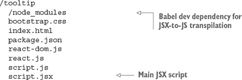
As in chapter 9, there’s a node_modules folder for developer dependencies such as Babel, which is used for JSX-to-JS transpilation. The structure is flat, with styles and scripts in the same folder. I did this to keep everything simple. Of course, in a real app, you’ll put styles and scripts in separate folders.
The key parts in package.json are the npm script to build, the Babel configuration, dependencies, and other metadata.
Listing 10.1. Tooltip project package.json file
{
  "name": "tooltip",
  "version": "1.0.0",
  "description": "",
  "main": "script.js",
  "scripts": {
    "build": "./node_modules/.bin/babel script.jsx -o script.js -w"
  },
  "author": "Azat Mardan",
  "license": "MIT",
  "babel": {
    "presets": ["react"]
  },
  "devDependencies": {
    "babel-cli": "6.9.0",
    "babel-preset-react": "6.5.0"
  }
}
After you’ve created package.json, be sure to run npm i or npm install.
Next, you’ll start on the HTML. Create index.html, as shown in the following listing (ch10/tooltip/index.html).
Listing 10.2. Tooltip project index.html file
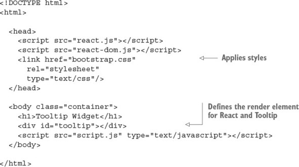
In <head>, you include React, React DOM files, and Twitter Bootstrap styles. body is minimal: it contains a <div> with ID tooltip and the application’s script.js file.
Next, you’ll create script.jsx. That’s right—this isn’t a typo. The source code is in script.jsx, but you include the script.js file in your HTML. That’s because you’ll be using the command-line Babel tool.
10.2. The Tooltip component
Let’s look at script.jsx (ch10/tooltip/script.jsx). It’s pretty much just the code for the component and the tooltip text you want to render. The tooltip text is a property that you set when you create Tooltip in ReactDOM.render().
Listing 10.3. Tooltip component and text
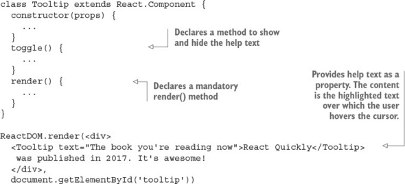
Let’s implement Tooltip and declare the component with an initial state of opacity: false. This state commands the help text to be hidden or shown. (Chapter 4 covered states in more detail.) Here’s the constructor() method in action:
class Tooltip extends React.Component {
  constructor(props) {
    super(props)
    this.state = {opacity: false}
    this.toggle = this.toggle.bind(this)
  }
  ...
}
The initial state hides the help text. Toggling changes this state and the visibility of the tooltip—that is, whether the help text is shown. Let’s implement toggle().
10.2.1. The toggle() function
Now you’ll define the toggle() function that switches the visibility of the tooltip by changing the opacity state to the opposite of what it was before (true to false, or false to true):
toggle() {
    const tooltipNode = ReactDOM.findDOMNode(this)
    this.setState({
      opacity: !this.state.opacity,
      ...
    })
  }
To change opacity, you use the this.setState() method, which you learned about in chapter 4.
A tricky thing about tooltip help text is that you must place the help text close to the element the mouse is hovering over. To do so, you need to get the position of the component using tooltipNode. You position the tooltip text using offsetTop and offsetLeft on the DOM node. These are DOM Node properties from the HTML standard (https://developer.mozilla.org/en-US/docs/Web/API/Node), not a React thing:
      top: tooltipNode.offsetTop,
      left: tooltipNode.offsetLeft
    })
  },
Here’s the full code for toggle() (ch10/tooltip/script.jsx).
Listing 10.4. toggle() function
  toggle() {
    const tooltipNode = ReactDOM.findDOMNode(this)
    this.setState({
      opacity: !this.state.opacity,
      top: tooltipNode.offsetTop,
      left: tooltipNode.offsetLeft
    })
  }
Here it is using ES destructuring:
  toggle() {
    const {offsetTop: top, offsetLeft: left} = ReactDOM.findDOMNode(this)
    this.setState({
     opacity: !this.state.opacity,
      top,
      left
    })
  }
Looking at the code, you can see that it changes the state and position. Do you need to rerender the view now? No, because React will update the view for you. setState() will invoke a rerender automatically. It may or may not result in DOM changes, depending on whether the state was used in render()—which you’ll implement next.
10.2.2. The render() function
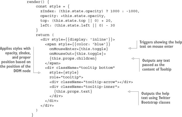
The render() function holds the CSS style object for the help text and also holds Twitter Bootstrap styles. First, you need to define the style object. You’ll set the opacity and z-index CSS styles depending on the value of this.state.opacity. You need z-index to float the help text above any other elements, so set the value reasonably high—1000 when the text is visible and -1000 when it’s not:
zIndex: (this.state.opacity) ? 1000 : -1000,
For z-index, you need to use zIndex (note the camelCase). Figure 10.2 shows how the styles are applied at mouse-over (opacity is true).
Figure 10.2. The help text is shown on mouse-over by using an opacity value of 1 and zIndex value of 1000.
Tip
Remember to use camelCase with React instead of dash syntax. The CSS property z-index becomes the React style property zIndex; background-color becomes backgroundColor; font-family becomes fontFamily, and so on. When you use valid JavaScript names, React can update the real DOM from the virtual one more quickly.
State opacity this.state.opacity is a Boolean true or false, but CSS opacity is a binary 0 or 1. If state opacity is false, CSS opacity is 0; and if state opacity is true, CSS opacity is 1. You need to convert, using a binary operator (+):
opacity: +this.state.opacity,
As far as the position of the tooltip goes, you want to place the help text near the text over which the mouse is hovering by adding 20 pixels to top (the distance from the top edge of the window to the element) and subtracting 30 pixels from left (the distance from the left edge of the window to the element). The values were chosen visually; feel free to adjust the logic as you see fit:
  render() {
    const style = {
      zIndex: (this.state.opacity) ? 1000 : -1000,
      opacity: +this.state.opacity,
      top: (this.state.top || 0) + 20,
      left: (this.state.left || 0) -30
    }
Next is return. The component will render both the text over which to hover and the help text. I’m using Twitter Bootstrap classes along with my style object to hide the help text and to show it later.
The text over which users can hover to see a tooltip is colored blue, so they can tell it apart visually from other text. It has two mouse events for when the cursor enters and leaves the span:
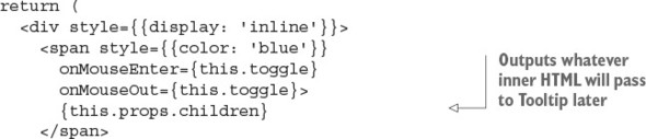
Next is the code for the help text. It’s static-like, except for {style}. React will change the state, and that will trigger the change in the UI:
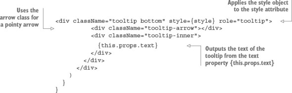
The next listing shows the Tooltip component’s full render() method.
Listing 10.5. Full render() function for Tooltip
That’s it. You’re finished with the Tooltip component!
10.3. Getting it running
Try this component or use it in your projects by compiling the JSX with npm:
$ npm run build
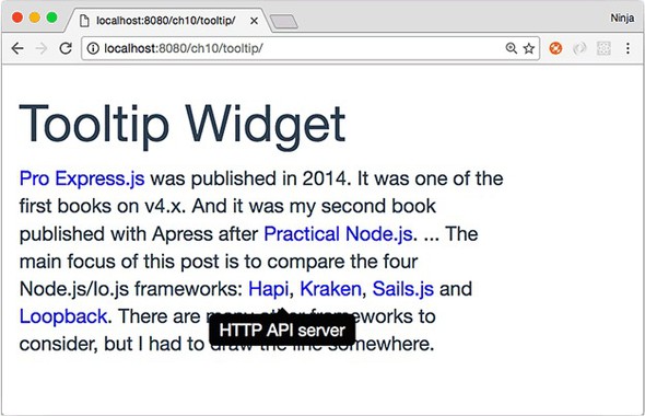
This Tooltip component is pretty cool, thanks to Twitter Bootstrap styles. Maybe it’s not as versatile as some other modules out there, but you built it yourself from scratch. That’s what I’m talking about! With the help of Twitter Bootstrap classes and React, you were able to create a good tooltip (see figure 10.3) in almost no time. It’s even responsive: it adapts to various screen sizes, thanks to dynamic positioning!
Figure 10.3. When the user hovers over blue text, a black container with text and a pointy arrow appears, offering additional information.
10.4. Homework
For bonus points, do the following:
- Create a variation that works in response to a mouse click—that is, shows the tooltip when you click the highlighted text and hides it when you click the text again.
- Enhance Tooltip by making it take a property that determines whether it’s on-mouse-over or on-click behavior.
- Enhance Tooltip by making it take a property that positions the help text above the text instead of in the default position below the text (hint: change the TB class, and change top and left).
Submit your code in a new folder under ch10 as a pull request to this book’s GitHub repository: https://github.com/azat-co/react-quickly.