Table of Contents for
React Quickly: Painless web apps with React, JSX, Redux, and GraphQL
 React Quickly: Painless web apps with React, JSX, Redux, and GraphQL
Published by
Manning Publications, 2017
React Quickly: Painless web apps with React, JSX, Redux, and GraphQL
Published by
Manning Publications, 2017
- Cover
- React Quickly: Painless web apps with React, JSX, Redux, and GraphQL
- Copyright
- React Quickly: Painless web apps with React, JSX, Redux, and GraphQL
- Brief Table of Contents
- Table of Contents
- Praise for React Quickly
- Foreword
- Preface
- Acknowledgments
- About This Book
- About the Author
- About the Cover
- Part 1. React foundation
- Chapter 1. Meeting React
- Chapter 2. Baby steps with React
- Chapter 3. Introduction to JSX
- Chapter 4. Making React interactive with states
- Chapter 5. React component lifecycle events
- Chapter 6. Handling events in React
- Chapter 7. Working with forms in React
- Chapter 8. Scaling React components
- Chapter 9. Project: Menu component
- Chapter 10. Project: Tooltip component
- Chapter 11. Project: Timer component
- Part 2. React architecture
- Chapter 12. The Webpack build tool
- Chapter 13. React routing
- Chapter 14. Working with data using Redux
- Chapter 15. Working with data using GraphQL
- Chapter 16. Unit testing React with Jest
- Chapter 17. React on Node and Universal JavaScript
- Chapter 18. Project: Building a bookstore with React Router
- Chapter 19. Project: Checking passwords with Jest
- Chapter 20. Project: Implementing autocomplete with Jest, Express, and MongoDB
- Appendix A. Installing applications used in this book
- Appendix B. React cheatsheet
- Appendix C. Express.js cheatsheet
- Appendix D. MongoDB and Mongoose cheatsheet
- Appendix E. ES6 for success
- React Cheatsheet
- Index
- List of Figures
- List of Tables
- List of Listings
Chapter 8. Scaling React components
This chapter covers
- Setting default properties for components
- Understanding React property types and validation
- Rendering children
- Creating higher-order components for code reuse
- Best practices: presentational versus container components
Thus far, we’ve covered how to create components and make them interactive, and work with user input (events and input elements). Using this knowledge will take you a long way in building sites with React components, but you’ll notice that certain annoyances keep cropping up. This is especially true for large projects when you rely on components created by other software engineers (open source contributors or your teammates).
For example, when you consume a component someone else wrote, how do you know whether you’re providing the right properties for it? Also, how can you use an existing component with a little added functionality (which is also applied to other components)? These are developmental scalability issues: how to scale your code, meaning how to work with your code when the code base grows larger. Certain features and patterns in React can help with that.
These topics are important if you’d like to learn how to effectively build a complex React application. For example, higher-order components allow you to enhance the functionality of a component, and property types provide the security of type checking and no small measure of sanity.
By the end of this chapter, you’ll be familiar with most features of React. You’ll become adept at making your code more developer friendly (using property types) and your work more efficient (using component names and higher-order components). Your teammates may even marvel at your elegant solutions. These features will help you use React effectively, so let’s dive in without further ado.
Note
The source code for the examples in this chapter is at www.manning.com/books/react-quickly and https://github.com/azat-co/react-quickly/tree/master/ch08 (in the ch08 folder of the GitHub repository https://github.com/azat-co/react-quickly). You can also find some demos at http://reactquickly.co/demos.
8.1. Default properties in components
Imagine that you’re building a Datepicker component that takes a few required properties such as number of rows, locale, and current date:
<Datepicker currentDate={Date()} locale="US" rows={4}/>
What will happen if a new team member tries to use your component but forgets to pass the essential currentDate property? Then, what if another coworker passes a "4" string instead of a 4 number? Your component will do nothing (values undefined) or worse: it may crash, and they may blame you (ReferenceError anyone?). Oops.
Sadly, this isn’t an uncommon situation in web development, because JavaScript is a loosely typed language. Fortunately, React provides a feature that lets you set default values for properties: the defaultProps static attribute. We’ll return to flagging issues with property types in the next section.
The key benefit of defaultProps is that if a property is missing, a default value is rendered. To set a default property value on the component class, you define defaultProps. For example, in the aforementioned Datepicker component definition, you can add a static class attribute (not an instance attribute, because that won’t work—instance attributes are set in constructor()):
class Datepicker extends React.Component {
  ...
}
Datepicker.defaultProps = {
  currentDate: Date(),
  rows: 4,
  locale: 'US'
}
To illustrate defaultProps further, let’s say you have a component that renders a button. Typically, buttons have labels, but those labels need to be customizable. In case the custom value is omitted, it’s good to have a default value.
The button’s label is the buttonLabel property, which you use in render()’s return attribute. You want this property to always include Submit, even if the value isn’t set from above. To do this, you implement the defaultProps static class attribute, which is an object containing the property buttonLabel with a default value:
class Button extends React.Component {
  render() {
    return <button className="btn" >{this.props.buttonLabel}</button>
  }
}
Button.defaultProps = {buttonLabel: 'Submit'}
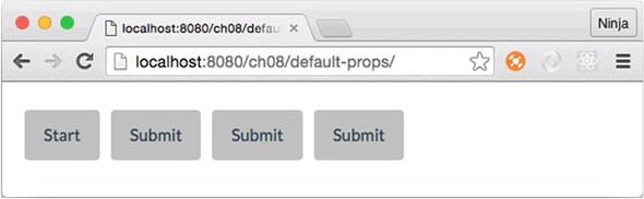
The parent component Content renders four buttons. But three of these four button components are missing properties:
class Content extends React.Component {
  render() {
    return (
      <div>
        <Button buttonLabel="Start"/>
        <Button />
        <Button />
        <Button />
      </div>
    )
  }
}
Can you guess the result? The first button will have the label Start, and the rest of the buttons will have the label Submit (see figure 8.1).
Figure 8.1. The first button has a label that’s set on creation. The other elements don’t and thus fall back to the default property value.
Setting default property values is almost always a good idea, because doing so makes your components more fault tolerant. In other words, your components become smarter because they have a baseline look and behavior even when nothing is supplied.
Looking at it another way, having a default value means you can skip declaring the same old value over and over again. If you use a single property value most of the time but still want to provide a way to modify this value (override the default), the defaultProps feature is the way to go. Overriding a default value doesn’t cause any issues, as you saw with the first button element in the example.
8.2. React property types and validation
Going back to the earlier example with the Datepicker component and coworkers who aren’t aware of property types ("5" versus 5), you can set property types to use with React.js component classes. You do so via the propTypes static attribute. This feature of property types doesn’t enforce data types on property values and instead gives you a warning. That is, if you’re in development mode, and a type doesn’t match, you’ll get a warning message in the console and in production; nothing will be done to prevent the wrong type from being used. In essence, React.js suppresses this warning in production mode. Thus, propTypes is mostly a convenience feature to warn you about mismatches in data types at a developmental stage.
The React.js team defines development mode as using the unminified (uncompressed) version of React and production mode as using the minified version. From the React authors:
- We provide two versions of React: an uncompressed version for development and a minified version for production. The development version includes extra warnings about common mistakes, whereas the production version includes extra performance optimizations and strips all error messages.
For React 15.5 and later versions (most of the examples in this book use React v15.5), type definitions come from a separate package called prop-types (www.npmjs.com/package/prop-types). You need to include prop-types in your HTML file. The package will become a global object (window.PropTypes):
<!-- development version -->
<script src="https://unpkg.com/prop-types/prop-types.js"></script>

<!-- production version -->
<script src="https://unpkg.com/prop-types/prop-types.min.js"></script>
If you’re using React 15.4 and earlier, there’s no need to include prop-types, because the types are in React: React.propTypes.
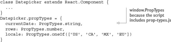
Here’s a basic example of defining a static propTypes attribute on a Datepicker class with types string, number, and enumerator. The example uses React v15.5 and includes prop-types in HTML (not shown here):
Warning
Never rely on front-end user-input validation, because it can be easily bypassed. Use it only for a better UX, and check everything on the server side.
To validate property types, use the propTypes property with the object containing the properties as keys and types as values. React.js types are in the PropTypes object:
- PropTypes.string
- PropTypes.string
- PropTypes.number
- PropTypes.bool
- PropTypes.object
- PropTypes.array
- PropTypes.func
- PropTypes.shape
- PropTypes.any.isRequired
- PropTypes.objectOf(PropTypes.number)
- PropTypes.arrayOf(PropTypes.number)
- PropTypes.node
- PropTypes.instanceOf(Message)
- PropTypes.element
- PropTypes.oneOfType([PropTypes.number, ...])
To demonstrate, let’s enhance the defaultProps example by adding some property types in addition to default property values. The structure of this project is similar: content.jsx, button.jsx, and script.jsx. The index.html file has a reference to prop-types.js:
<!DOCTYPE html>
<html>

  <head>
    <script src="js/react.js"></script>
    <script src="js/prop-types.js"></script>
    <script src="js/react-dom.js"></script>
    <link href="css/bootstrap.css" type="text/css" rel="stylesheet"/>
    <link href="css/style.css" type="text/css" rel="stylesheet"/>

  </head>

  <body>
    <div id="content" class="container"></div>
    <script src="js/button.js"></script>
    <script src="js/content.js"></script>
    <script src="js/script.js"></script>
  </body>

</html>
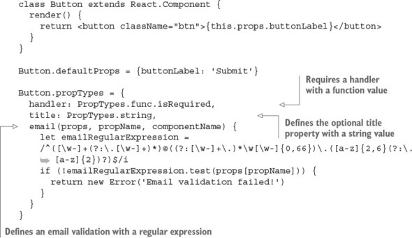
Let’s define a Button class with an optional title with a string type. To implement it, you define a static class attribute (a property of that class) propTypes with key title and PropTypes.string as a value of that key. This code goes into button.js:
Button.propTypes = {
  title: PropTypes.string
}
You can also require properties. To do so, add isRequired to the type. For example, the title property is mandatory and of type string:
Button.propTypes = {
  title: PropTypes.string.isRequired
}
This button also requires a handler property, which must have a function as a value. (Last time I checked, buttons without actions were useless.)
Button.propTypes = {
  handler: PropTypes.func.isRequired
}
What’s also nice is that you can define your own custom validation. To implement custom validation, all you need to do is create an expression that returns an instance of Error. Then, you use that expression in propTypes: {..} as the value of the property. For example, the following code validates the email property with the regex from emailRegularExpression (which I copied from the internet—that means it has to be correct, right?):[1]
There are many versions of the email regex, depending on strictness, domain zones, and other criteria. See “Email Address Regular Expression That 99.99% Works,” http://emailregex.com; “Validate email address in JavaScript?” (question on Stack Overflow), http://mng.bz/zm37; and Regular Expression Library, http://regexlib.com/Search.aspx?k=email.
...
propTypes = {
    email: function(props, propName, componentName) {
      var emailRegularExpression =
    /^([\w-]+(?:\.[\w-]+)*)@((?:[\w-]+\.)*\w[\w-]{0,66})\.([a-z]{2,6}(?:\.
     [a-z]{2})?)$/i
      if (!emailRegularExpression.test(props[propName])) {
        return new Error('Email validation failed!')
      }
    }
}
...
[a-z]{2})?)$/i
if (!emailRegularExpression.test(props[propName])) {
return new Error('Email validation failed!')
}
}
}
...
Now let’s put everything together. The Button component will be called with and without a property title (string) and a handler (required function). The following listing (ch08/prop-types) uses property types to ensure that handler is a function, title is a string, and email adheres to the provided regular expression.
Listing 8.1. Using propTypes and defaultProps
Next, let’s implement the parent component Content, which renders six buttons to test the warning messages produced from property types (ch08/prop-types/jsx/content.jsx).
Listing 8.2. Rendering six buttons
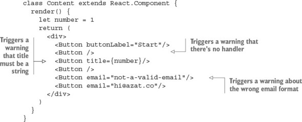
Running this code results in three warning messages being displayed on your console (don’t forget to open it); mine are shown here and in figure 8.2. The first warning is about the handler function that must be specified, which I omitted in a few buttons:
Warning: Failed propType: Required prop `handler` was not specified in
`Button`. Check the render method of `Content`.
Figure 8.2. Warnings due to wrong property types
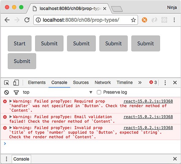
The second warning is about the wrong email format for the fourth button:
Warning: Failed propType: Email validation failed! Check the render method
of `Content`.
The third warning is about the wrong type for the title, which should be a string (I provided a number for one button):
Warning: Failed propType: Invalid prop `title` of type `number` supplied to
`Button`, expected `string`. Check the render method of `Content`.
The interesting thing is that more than one button is missing handler, but you see only one warning. React warns about each property only once per single render() of Content.
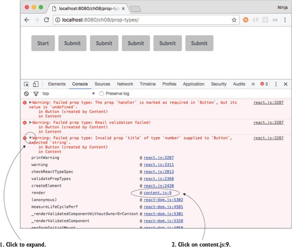
What I love about React is that it tells you what parent component to check. It’s Content in the example. Imagine if you had hundreds of components. This is useful!
Conveniently, if you expand the message in DevTools, you can spot a line number for the Button element that’s causing trouble and that resulted in the warning. In figure 8.3, I first expanded the message and then located my file (content.js). The message said that the issue was on line 9.
Figure 8.3. Expanding a warning revealed the problematic line number: 9.
By clicking content.js:9 in the console, you can open the Source tab at that line, as shown in figure 8.4. It clearly shows what’s to blame:
React.createElement(Button, { title: number }),
Figure 8.4. Inspecting the compiled source code is often enough to understand the problem.
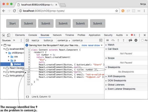
You don’t need source maps (although you’ll set them up and use them in part 2 of the book) to know that the third button is causing the problem.
Note
I’ll repeat it again: only the unminified or uncompressed version (that is, development mode) of React shows these warnings.
Try playing with the property types and validation. It’s a neat feature. Consider that this code uses the same Button component as before:
<Button title={number}/>
Can you spot the problem? How many warnings do you think you’ll get? (Hint: handler and title properties.)
I got the warnings shown in figure 8.2 because of the poorly written Content (I wrote it that way on purpose, to show how defaultProps and propTypes work). The warning messages identify the component and where in the component the problem is happening.
But the line numbers won’t match your source code, because they refer to compiled JavaScript, not JSX. To get the correct line numbers, you’ll need to use a source-map plug-in like source-map-support (https://github.com/evanw/node-source-map-support) or Webpack. Chapter 12 discusses Webpack.
You can get support for source maps with pure non-Webpack Babel by adding --sourceMaps=true to the command and/or the package.json build script. For more Babel options, see https://babeljs.io/docs/usage/options/#options.
It’s important to know and use propTypes (property types and custom validation) in large projects or open source components. Of course, property types don’t have strict enforcement or error exceptions, but the benefit is that when you use someone else’s component, you can verify that the supplied properties are of the right type. Same applies when other software engineers use your components. They’ll appreciate that you provided correct property types. That leads to a better developer experience for everyone!
Finally, there are many additional types and helper methods. To see the full reference, please refer to the documentation at http://mng.bz/4Lep.
8.3. Rendering children
Let’s continue with the fictional React project; but instead of a Datepicker (which is now robust and warns you about any missing or incorrect properties), you’re tasked with creating a component that’s universal enough to use with any children you pass to it. It’s a blog post Content component that may consist of a heading and a paragraph of text:
<Content>
  <h1>React.js</h1>
  <p>Rocks</p>
</Content>
Another blog post may consist of an image (think Instagram or Tumblr):
<Content>
  <img src="images/azat.jpg" width="100"/>
</Content>
Both posts use Content, but they pass different children to it. Wouldn’t it be great to have a special way to render any children (<p> or <img>)? Meet children.
The children property is an easy way to render all children with {this.props.children}. You can also do more than rendering. For example, add a <div> and pass along child elements:
class Content extends React.Component {
  render() {
    return (
      <div className="content">
        {this.props.children}
      </div>
    )
  }
}
The parent of Content has the children <h1> and <p>:
ReactDOM.render(
  <div>
    <Content>
      <h1>React</h1>
      <p>Rocks</p>
    </Content>
  </div>,
  document.getElementById('content')
)
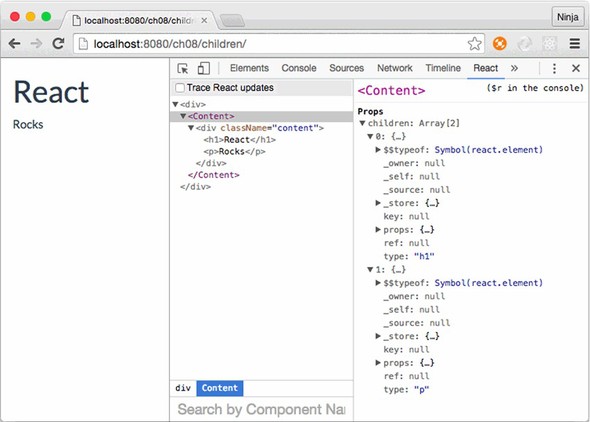
The end result is that <h1> and <p> are wrapped in the <div> container with a content class, as shown in figure 8.5. Remember, for class attributes, you use className in React.
Figure 8.5. Rendering a single Content component with a heading and paragraph using this.props .children, which shows two items
Obviously, you can add many more things to a component like Content; for example, more classes for styling, layouts, and even access properties and interactivity with events and states. With this.props.children, you can create pass-through components that are flexible, powerful, and universal.
Let’s say you need to display a link or a button in addition to text and images, as shown in the previous example. The Content component will still be the wrapper <div> with the CSS class content (className property), but now there will be more different children. The benefit is that Content can be children-agnostic.[2] You don’t need to change the Content class.
“Agnostic, in an information technology (IT) context, refers to something that is generalized so that it is interoperable among various systems.” From http://whatis.techtarget.com/definition/agnostic.
Put the children in Content when you instantiate the class (ch08/children/jsx/script.jsx).
Listing 8.3. Rendering elements using Content
ReactDOM.render(
  <div>
    <Content>
      <h1>React</h1>
      <p>Rocks</p>
    </Content>
    <Content>
      <img src="images/azat.jpg" width="100"/>
    </Content>
    <Content>
      <a href="http://react.rocks">http://react.rocks</a>
    </Content>
    <Content>
      <a className="btn btn-danger"
       href="http://react.rocks">http://react.rocks</a>
    </Content>
  </div>,
  document.getElementById('content')
)
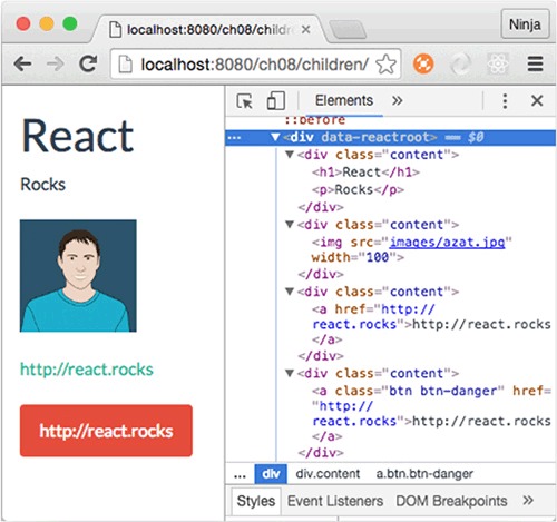
The resulting HTML will have two <div> elements with content CSS classes. Your layouts! One will have <h1> and <p> and the other will have <span>, as shown in DevTools in figure 8.6.
Figure 8.6. Rendering four elements with different content using a single component class
What’s interesting about the children property is that it can be an array if there’s more than one child element (as seen in figure 8.5). You can access individual elements like this:
{this.props.children[0]}
{this.props.children[1]}
Be careful when validating children. When there’s only one child element, this.props.children isn’t an array. If you use this.props.children.length and the single child node is a string, this can lead to bugs because length is a valid string property. Instead, use React.Children.count(this.props.children) to get an accurate count of child elements.
React has other helpers like React.Children.count. The most interesting (in my opinion) are these:
- React.Children.map()
- React.Children.forEach()
- React.Children.toArray()
There’s no reason to duplicate the ever-changing list; you can find the official documentation at http://mng.bz/Oi2W.
8.4. Creating React higher-order components for code reuse
We’ll continue to suppose that you work on a large team and create components that other developers use in their projects. Let’s say you’re working on a piece of an interface. Three of your teammates ask you to implement a way to load a resource (the React.js website), but each of them wants to use their own visual representation for the button, image, and link. Perhaps you could implement a method and call it from an event handler, but there’s a more elegant solution: higher-order components.
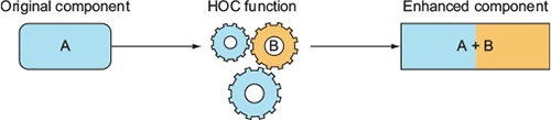
A higher-order component (HOC) lets you enhance a component with additional logic (see figure 8.7). You can think of this pattern as components inheriting functionality when used with HOCs. In other words, HOCs let you reuse code. This allows you and your team to share functionality among React.js components. By doing so, you can avoid repeating yourselves (DRY, http://mng.bz/1K5k).
Figure 8.7. Simplified representation of the higher-order component pattern, where an enhanced component has properties not just of A but of A and B
In essence, HOCs are React component classes that render the original classes while adding extra functionality along the way. Defining an HOC is straightforward, because it’s only a function. You declare it with a fat arrow:
const LoadWebsite = (Component) => {
  ...
}
The name LoadWebsite is arbitrary; you can name the HOC anything, as long as you use the same name when you enhance a component. The same is true for the argument to the function (LoadWebsite); it’s the original (not yet enhanced) component.
To demonstrate, let’s set up a project for your three coworkers. The project structure is as follows, with three stateless components, Button, Link, and Logo in elements.jsx, and the HOC function in load-website.jsx:
/hi-order
  /css
    bootstrap.css
    style.css
  /js
    content.js
    elements.js
    load-website.js
    react.js
    react-dom.js
    script.js
  /jsx
    content.jsx
    elements.jsx
    load-website.jsx
    script.jsx
  index.html
  logo.png
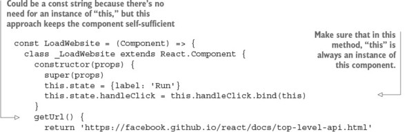
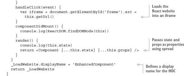
Your coworkers need a label and a click event handler. Let’s set the label and define the handleClick() method. The mounting events demonstrate the component lifecycle (ch08/hi-order/jsx/load-website.jsx).
Listing 8.4. Implementing a higher-order component
Nothing complex, right? There are two new techniques not covered previously in this book: displayName and the spread operator .... Let’s quickly (as the title of this book suggests) examine them now.
8.4.1. Using displayName: distinguishing child components from their parent
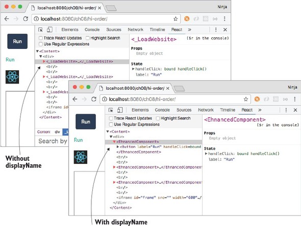
By default, JSX uses the class name as the name of the instance (element). Thus elements created with an HOC in the example have _LoadWebsite names.
In JavaScript, an underscore (_) is a valid character for a name (the Lodash and Underscore libraries use it). In addition, an underscore as the start of a name of a variable or method typically means it’s a private attribute, variable, or method that isn’t intended for use as a public interface (for example, by another module, class, object, function, and so on). Using private APIs is highly discouraged because they’re likely to change more often and contain undocumented behavior.
An underscore at the beginning of a name is a convention, meaning it’s not enforced by the engine or platform. It’s solely a common pattern used and recognized by JavaScript software engineers. In other words, methods and variables don’t become private automatically when _ is used in their names. To make a variable/method private, use a closure. See http://developer.mozilla.org/en/docs/Web/JavaScript/Closures and http://javascript.crockford.com/private.html.
When you want to change this name, there’s the displayName static attribute. As you may know, static class attributes in ES6 must be defined outside of the class definition. (As of this writing, the standard for static attributes hasn’t been finalized.)
To sum up, displayName is necessary to set React element names when they need to be different from the component class name, as shown in figure 8.8. You can see how useful it is to use displayName in the load-website.jsx HOC to augment the name, because by default the component name is the function name (which may not always be the name you want).
Figure 8.8. By using the displayName static attribute, you can change the name of the component from _LoadWebsite to EnhancedComponent.
8.4.2. Using the spread operator: passing all of your attributes
Next, let’s look at the spread operator (...). It’s part of ES6+/ES2015+ for arrays (http://mng.bz/8fjN); as of the time of this writing, there’s a proposal to use spreads for objects (https://github.com/sebmarkbage/ecmascript-rest-spread). It’s only natural that the React team added support for spreads to JSX.
The idea isn’t complicated. The spread operator lets you pass all the attributes of an object (obj) as properties when used in the element:
<Component {...obj}/>
You used spread in load-website.jsx to pass state and property variables to the original component when you were rendering it. You needed it because you didn’t know ahead of time all the properties the function would take as arguments; thus, the spread operator is a blanket statement to pass all of your data (in that variable or an object).
In React and JSX, you can have more than one spread operator or mix them with traditional key=value property declarations. For example, you can pass all states and all properties from a current class as well as className to a new element Component:
<Component {...this.state} {...this.props} className="main" />
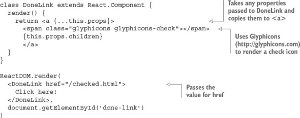
Let’s consider an example with children. In this scenario, using the spread operator with this.props will pass all the properties of DoneLink to the anchor element <a>:
In the HOC, you pass all properties and states to the original component when you render it. By doing so, you don’t have to manually add properties to or remove them from render() each time you want to pass something new or stop passing existing data from Content, where you instantiate LoadWebsite/EnhancedComponent for each original element.
8.4.3. Using higher-order components
You’ve learned more about displayName and ... in JSX and React. Now we can look at how to use HOCs.
Let’s go back to Content and content.jsx, where you’re using LoadWebsite. After defining the HOC, you need to create components using it in content.jsx:
const EnhancedButton = LoadWebsite(Button)
const EnhancedLink = LoadWebsite(Link)
const EnhancedLogo = LoadWebsite(Logo)
Now, you’ll implement three components—Button, Link, and Logo—to reuse the code with the HOC pattern. The Button component is created via LoadWebsite and as a result magically inherits its properties (this.props.handleClick and this.props.label):
class Button extends React.Component {
  render() {
    return <button
      className="btn btn-primary"
      onClick={this.props.handleClick}>
      {this.props.label}
    </button>
  }
}
The Link component is created by the HOC, which is why you can also use handleClick and label properties:
class Link extends React.Component {
  render() {
    return <a onClick={this.props.handleClick} href="#">
     {this.props.label}</a>
  }
}
And finally, the Logo component also uses the same properties. You guessed it: they’re magically there because you used a spread operator when you created Logo in content.jsx:
class Logo extends React.Component {
  render() {
    return <img onClick={this.props.handleClick} width="40" src="logo.png"
     href="#"/>
  }
}
The three components have different renderings, but they all get this.props.handleClick and this.props.label from LoadWebsite. The parent component Content renders the elements as shown in the following listing (ch08/hi-order/jsx/content.jsx).
Listing 8.5. HOCs sharing an event handler
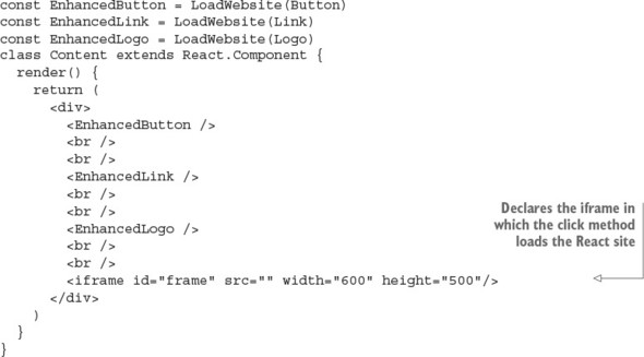
Finally, let’s not forget to render Content on the last lines of script.jsx:
ReactDOM.render(
  <Content />,
  document.getElementById('content')
)
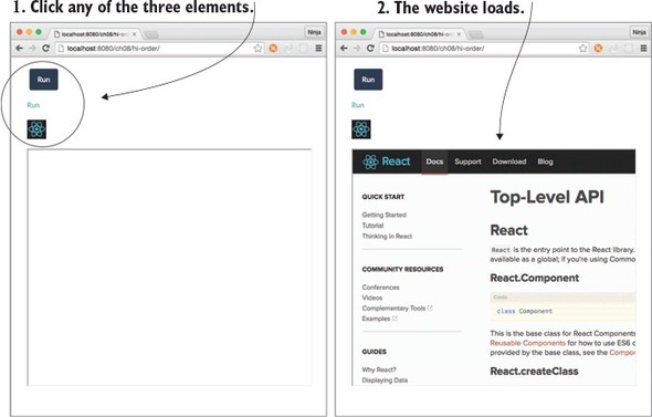
When you open the page, it has the three elements (Button, Link, and Logo). The elements have the same functionality: they load the IFrame when a click happens, as shown in figure 8.9.
Figure 8.9. All three components load the React website, thanks to the function that provides the code to load it.
As you’ve seen, HOCs are great for abstracting code. You can use them to write your own mini-modules, which are reusable React components. HOCs, along with property types, are excellent tools for creating developer-friendly components that others will love to use.
8.5. Best practices: presentational vs. container components
There’s a distinction that lets you scale your React code in terms of code and team size: presentational versus container components. We’ve touched on them in previous chapters, but now, because you know about passing children and HOCs, it’ll be easier to reason about container components.
Generally speaking, splitting your code into two types makes it simpler and more maintainable. Presentational components typically only add structure to DOM and styling. They take properties but often don’t have their own states. Most of the time, you can use functions for stateless presentational components. For example, Logo is a good illustration of a presentational component in a class style
class Logo extends React.Component {
  render() {
    return <img onClick={this.props.handleClick} width="40" src="logo.png"
     href="#"/>
  }
}
or in a functional style:
const Logo = (props)=>{
    return <img onClick={props.handleClick} width="40" src="logo.png"
     href="#"/>
}
Presentational components often use this.props.children when they act as wrappers to style child components. Examples are Button, Content, Layout, Post, and so on. But they rarely deal with data or states; that’s the job of container components.
Container components are often generated by HOCs to inject data sources. They have states. Examples are SaveButton, ImagePostContent, and so on. Both presentational and container components can contain other presentational or container components; but when you’re starting out, you’ll generally use presentational components containing only other presentational components. Container components contain either other container components or presentational ones.
The best approach is to start with components that solve your needs. If you begin to see repeating patterns or properties that you’re passing over multiple layers of nested components but aren’t using in the interim components, introduce a container component or two.
Note
You may hear terms such as dumb or skinny and smart or fat components. These are synonyms for presentational and container components, with the latter being more recent additions to React terminology.
8.6. Quiz
React provides robust validation, which eliminates the necessity to check input on the server side. True or false?
In addition to setting properties with defaultProps, you can set them in constructor using this.prop.NAME = VALUE. True or false?
The children property can be an array or a node. True or false?
A higher-order component pattern is implemented via a function. True or false?
The main difference between the minified development and unminified production versions of the React library file is that the minified version has warnings and the unminified version has optimized code. True or false?
8.7. Summary
- You can define a default value for any component property by setting the component’s defaultProps attribute.
- You can enforce validation checks on component property values while working with the uncompressed, development version of the React library.
- You can check the type of a property, set it to isRequired so it’s mandatory, or define your own custom validation, as required.
- If a property value fails validation, a warning appears in your browser’s console.
- The minified, production version of the React library doesn’t include these validation checks.
- React allows you to encapsulate and reuse common properties, methods, and events among your components by creating higher-order components.
- Higher-order components are defined as functions that take another component as an argument. This argument is the component inheriting from the HOC.
- Any HTML or React components nested within a JSX element can be accessed through the props.children property of the parent component.
8.8. Quiz answers
False. Front-end validation isn’t a substitute for back-end validation. Front-end code is exposed to anyone, and anyone can bypass it by reverse-engineering how the front-end app communicates with the server and send any data directly to the server.
False. React needs defaultProps as a static class field/attribute when an element is created, but this.props is an instance attribute.
True. If there’s only one child, then this.props.children is a single node.
True. The HOC pattern is implemented as a function that takes a component and creates another component class with enhanced functionality. This new class renders the original component while passing properties and states to it.
True. The minified version doesn’t show warnings.