Table of Contents for
Designing for How People Think
 Designing for How People Think
Published by
O'Reilly Media, Inc., 2019
Designing for How People Think
Published by
O'Reilly Media, Inc., 2019
- Cover
- Title Page
- Copyright
- 01 Rethinking "The" Experience
- 02 The Six Minds of User Experience
- 03 In the Blink of an Eye- Vision, Attention, and Automaticity
- 04 Wayfinding- Where Am I?
- 05 Memory:Semantics
- 06 Language- I Told You So
- 07 Decision-Making and Problem Solving- Enter Consciousness Stage Left
- 08 Emotion- Logical Decision Making Meets Its Match
- 09 User Research- Contextual Interviews
- 10 Vision- Are You Looking at Me?
- 11 Language- Did They Just Say That?
- 12 Wayfinding- How Do You Get There?
- 13 Memory- Expectations and Filling in Gaps
- 14 Decision-Making - Following the Breadcrumbs
- 15 Emotion- The Unspoken Reality
- 16 Sense-Making
- 17 Putting the Six Minds to work- Appeal, Enhance, Awaken
- 18 Succeed Fast, Succeed Often
- 19 Now see what you’ve done?
- 20 How To Make a Better Human
- 20 How To Make a Better Human
Chapter 4. Wayfinding: Where Am I?
A logical extension to thinking about what we are looking and where our attention is drawn to and how we represent the space around us and where we are within that space. A large portion of the brain is devoted to this “where” representation in the brain, so we ought to discuss it and consider how this cognitive process might be harnessed in our designs from two respects: knowing where we are, and knowing how we can move around in space.
The ant in the desert: Computing Euclidean space
To help you think about the concept of wayfinding, I’m going to tell you about large Tunisian ants in the desert — who interestingly share an important ability that we have, too! I first read about this and other amazing animal abilities in Randy Gallistel’s The Organization of Learning, which suggests that living creatures great and small share many more cognitive capabilities than you might have first thought. Representations of time, space, distance, light and sound intensity, and proportion of food over a geographic area are just a few examples of computations many creatures are capable of.
It turns out that as a big Tunesian ant – but still a very small one in a very large desert – determining your location is a particularly thorny problem. These landscapes have no landmarks like trees, and deserts can frequently change their shape in the wind. Therefore, ants that leave their nest must use something other than landmarks to find their way home again. Their footprints, any landmarks, and scent in the sand are all unreliable as they can change with a strong breeze.
Furthermore, these ants take meandering walks in the Tunisian desert scouting for food (in this case in the diagram below, the ant is generally heading north west from his nest). In this experiment, a scientist has left out a bird feeder full of sweet syrup. This lucky ant climbs into the feeder, finds the syrup and realizes he just found the motherload of all food sources. After sampling the syrup, he can’t wait to tell fellow ants about the great news! However, before he does, the experimenter picks up the feeder (with the ant inside) and moves it East about 12 meters (depicted by the red arrow in diagram).
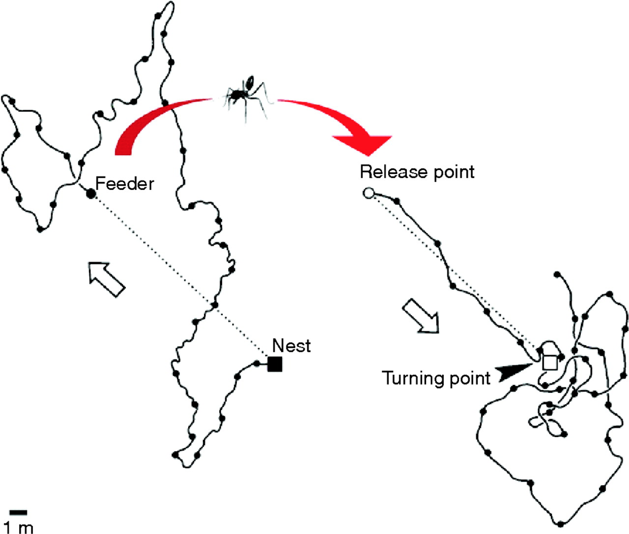
Figure 4.1: Tunisian Ant in the Desert
The ant, still eager to spread the good news with everyone at home, attempts to make a bee-line (or “ant-line”), back home. The ant heads straight southeast, almost exactly in the direction where the anthill should have been, had he not been moved. He travels approximately the distance needed, then starts walking in circles to spot the nest (which is a sensible strategy given there are no landmarks). Sadly, this particular ant doesn’t take into consideration being picked up, and so is off by exactly the amount the experimenter moved the feeder.
Nevertheless, this pattern of behavior demonstrates that the ant is capable of computing the net direction and distance traveled in Euclidean space (using the sun no less) and is a great example of what our parietal lobes are great at computing.
Locating yourself in physical and virtual space
Just like that ant, we all have to determine where we are in space, where we want to go, and what we must do in order to get to our destination. We do this using the “where” system in our own brains, which is itself located in our parietal lobes — one of the largest regions of the mammalian cerebral cortex.
If we have this uncanny, impressive ability to map space in the physical world built into us, wouldn’t it make sense if we as product and service designers tapped into its potential when it comes to wayfinding in the digital world?
(Note: If you feel like you’re not good with directions, you might be surprised to find you’re better than you realize. Just think about how you walk effortlessly to the bathroom in the morning from your bed without thinking about it. If it is of any solace, know that like the ant, we were never designed to be picked up by a car and transported into the middle of a parking lot that has very few unique visual cues.)
As I talk about “wayfinding” in this book, please note that I’m linking two concepts which are similar, but do not necessarily harness the same underlying cognitive processes:
- 1. Human wayfinding skills in the physical world with 3-D space and time; and
- 2. Wayfinding and interaction skills in the virtual world.
There is an overlap between the two, but as we study this more carefully, we’ll see that this is not a simple one-to-one mapping. The virtual world in most of today’s interfaces on phones and web browsers strips away many wayfinding landmarks and cues. It isn’t always clear where we are within a web page, app, or virtual experience, nor it is always clear how to get where we want to be (or even creating a mental map of where that “where” is). Yet understanding where you are and how to interact with the environment (real or virtual) in order to navigate space is clearly critical to a great experience.
Where can I go? How will I get there?
In the physical world, it’s hard to get anywhere without distinct cues. Gate numbers at airports, signs on the highway, and trail markers on a hike are just a few of the tangible “breadcrumbs” that (most of the time) make our lives easier.
Navigating a new digital interface can be like walking around a shopping mall without a map: it is easy to get lost because there are so few distinct cues to indicate where you are in space. Below is a picture of a mall near my house. There are about eight hallways that are nearly identical to this one. Just imagine your friend saying “I’m near the tables and chairs that are under the chandeliers” and then trying to find your friend!

Figure 4.2: Westfield Montgomery Mall
To make things even harder, unlike the real world, where we know how to locomote by walking, in the digital world, the actions we need to take to get to where we are going sometimes differ dramatically between products (e.g., apps vs. operating systems). You may need to tap your phone for the desired action to occur, shake the whole phone, hit the center button, double tap, control-click, swipe right, etc.
Some interfaces make wayfinding much harder than it needs to be. Many (older?) people find it incredibly difficult to navigate around Snapchat, for example. Perhaps you are one of them! In many cases, there is no button or link to get you from one place to the other, so you just have to know where to click or swipe to get places. It is full of hidden “Easter eggs” that most people (Gen Y and Z excepted) don’t know how to find.
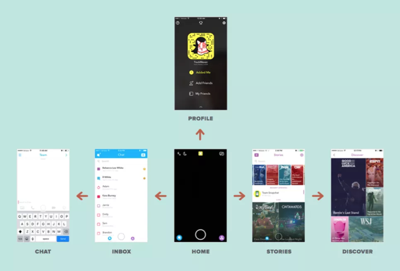
Figure 4.3: Snapchat Navigation
When Snapchat was updated in 2017, there was a mass revolt from the teens who loved it. Why? Because their existing wayfinding expectations no longer applied. As I write this book, Snapchat is working hard to unwind those changes to conform better to existing expectations. Take note of that lesson as you design and redesign your products and services: matched expectations can make for a great experience (and violated expectations can destroy an experience).
The more we can connect our virtual world to some equivalency of the physical world, the better our virtual world will be. We’re starting to get there, with augmented reality (AR) and virtual reality (VR), or even cues like edges of tiles that protrude from the edge of an interface (like Pinterest’s) to suggest a horizontally scrollable area. But there is so many more opportunities to improve today’s interfaces! Even something as basic as virtual breadcrumbs or cues (e.g., a slightly different background color for each section of a news site) could serve us well as navigational hints (that goes for you too Westfield Montgomery Mall).
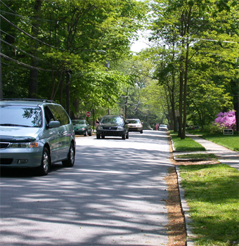
Figure 4.4: Visual Perspective
One of the navigational cues we cognitive scientists believe product designers vastly underuse is our sense of 3-D space. While you may never need to “walk” through a virtual space, there may be interesting ways to use 3-D spatial cues, like in the scene above. This scene provides perspective through the change in size of the cars and the width of the sidewalk as it extends back. This is an automatic cognitive processing system that we (as designers and humans) essentially “get for free.” Everyone has it. Further, this part of the “fast” system works automatically without taxing conscious mental processes. A myriad of interesting and as-of-yet untapped possibilities abound!
Testing interfaces to reveal metaphors for interaction
One thing that we do know today is that it is crucial to test interfaces to see if the metaphors we have created (for where customers are and how customers interact with a product) are clear. One of the early studies done using touchscreen laptops demonstrated the value of testing to learn how users think they can move around in the virtual space of an app or site. When for the first time ever they were attempting to use touchscreen laptops, the users instinctively used metaphors from the physical world. Participants touched what they wanted to select (upper right frame), dragged a web page up or down like it was a physical scroll (lower left frame), and touched the screen in the location where they wanted to type something (upper left frame).
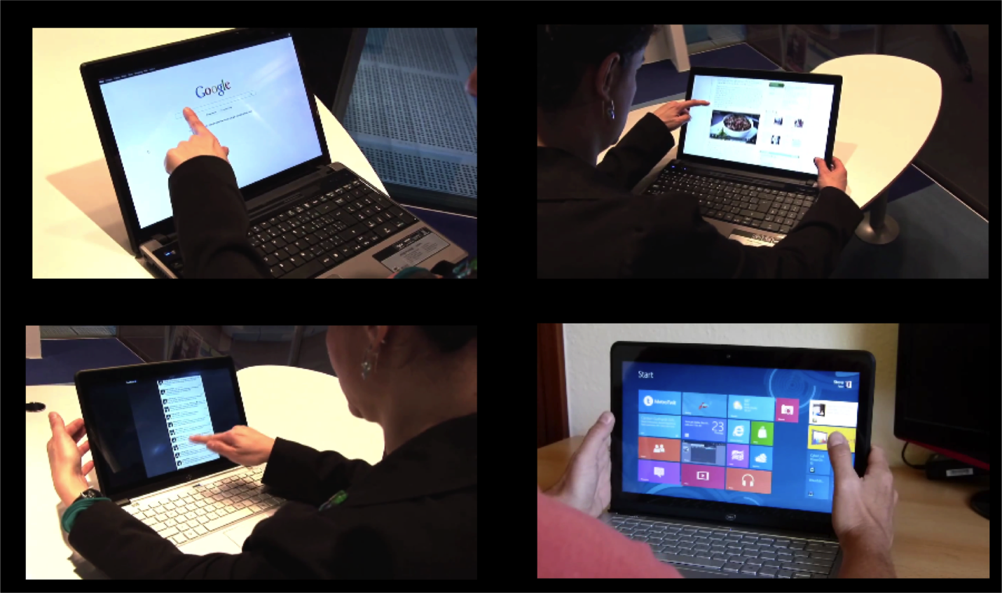
Figure 4.5: First reactions to touchscreen laptop
However, in addition to simply doing what might be expected, as in every user test I’ve ever conducted, it also uncovered things that were completely unexpected — particularly, how people attempted to interact with the laptop.
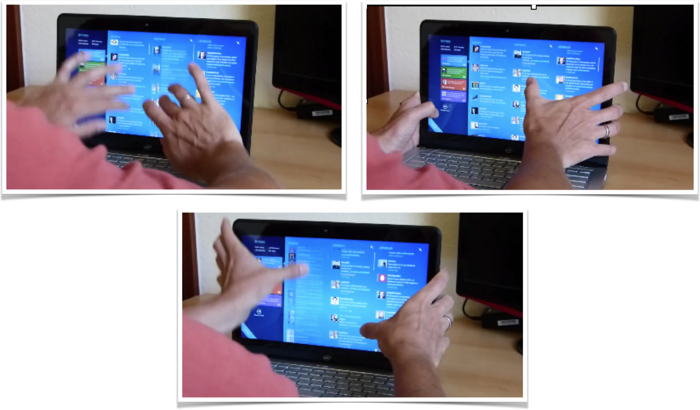
Figure 4.6: Using touchscreen laptop with two thumbs
One user used both thumbs on the monitor while resting his hands on the sides of the monitor. He used his thumbs to attempt to slide the interface up and down using both thumbs on either side of the screen. Who knew?!
The touchscreen test demonstrated:
- 1. We can never fully anticipate how customers will interact with a new tool, which is why it’s so important to test products with actual customers and observe their behavior.
- 2. It’s crucial to learn how people represent virtual space, and which interactions they believe will allow them to move around in that space. You are observing those parietal lobes at work!
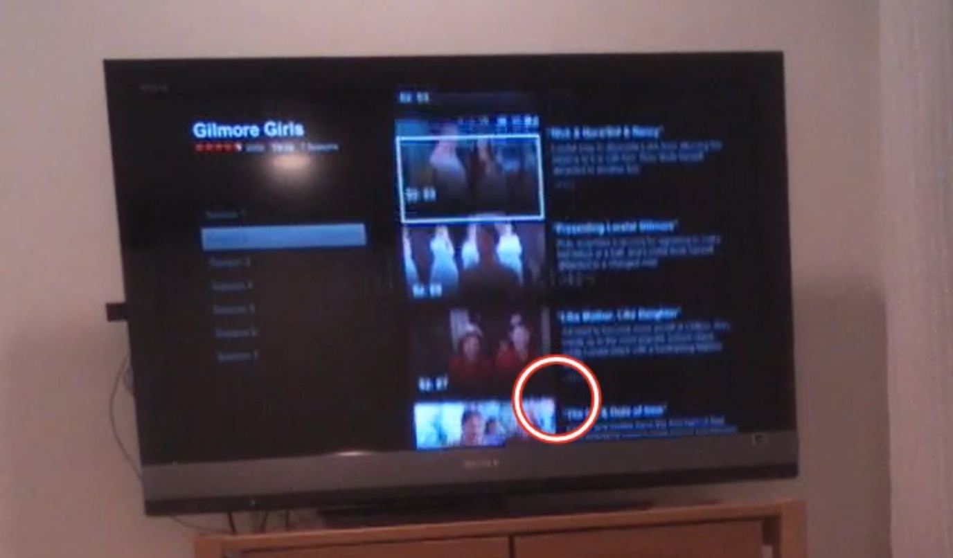
Figure 4.7: Eye-tracking TV screen interface
While observing users interact with relatively “flat” (i.e., lacking 3-D cues) on-screen television app like Netflix or Amazon Fire, we’ve learned not only about how they try to navigate the virtual menu options, but also what their expectations are for that space.
In the real world, there is no delay when you move something. Naturally then, when users select something in virtual space, they expect the system to respond instantaneously. If (as in the case above) nothing happens a few seconds after you “click” something, your are puzzled, and instinctively you focus on that oddity, thus taking away from the intended experience. Only after receiving some sort of acknowledgement from the system (e.g., screen update) will your brain relax and know the system “heard” your request.
Response times are extremely important cues that help users navigate new virtual interfaces, where they are even less tolerant of delays than they are with web pages. Often, flat displays and other similar interfaces show no evidence of feedback — neither a cue that a selection was made, nor anything to suggest the interface is working on the resultant action. Knowing the users’ metaphor and expectations will provide an indication of what sorts of interface responses are needed.
Thinking to the future: Is there a “where” in a voice interface?
There is great potential for voice-activated interfaces like Google Home, Amazon Echo, Hound, Apple Siri, Microsoft Cortana, and more. In our testing of these voice interfaces, we’ve found new users often demonstrate anxiety around these devices because they lack any physical cues that the device is listening or hearing them, and the system timing is far from perfect.
In testing both business and personal uses for these tools in a series of head-to-head comparisons, we’ve found there are a few major challenges that lie ahead for voice interfaces. First, unlike the real world or screen-based interfaces, there are no cues about where you are in the system. If you start to discuss the weather in Paris, while the human still is thinking about Paris, it is never clear if the voice system’s frame of reference is still Paris. After asking about the weather in Paris, you might ask a follow-up question like “How long does it take to get from there to Monaco?” Today, with only a few exceptions, these systems start fresh in every discussion and rarely follow a conversational thread (e.g., that we are still talking about Paris).
Second, if the system does jump to a specific topical or app “area” (e.g., Spotify functionality within Alexa), unlike physical space, there are no cues that you are in that “area,” nor are there any cues as to what you can do or how you can interact. I can’t help but think that experts in accessibility and sound-based interfaces will save the day and help us to improve today’s impressive — but still suboptimal — voice interfaces.
As product and service designers, we’re here to solve problems, not come up with new puzzles for our users. We should strive to match our audience’s perception of space (whatever that may be) and align our offerings to the ways our users already move around and interact. To help our users get from virtual place to place, we need to figure out how to harness the brain’s huge parietal lobes.