Table of Contents for
Designing for How People Think
 Designing for How People Think
Published by
O'Reilly Media, Inc., 2019
Designing for How People Think
Published by
O'Reilly Media, Inc., 2019
- Cover
- Title Page
- Copyright
- 01 Rethinking "The" Experience
- 02 The Six Minds of User Experience
- 03 In the Blink of an Eye- Vision, Attention, and Automaticity
- 04 Wayfinding- Where Am I?
- 05 Memory:Semantics
- 06 Language- I Told You So
- 07 Decision-Making and Problem Solving- Enter Consciousness Stage Left
- 08 Emotion- Logical Decision Making Meets Its Match
- 09 User Research- Contextual Interviews
- 10 Vision- Are You Looking at Me?
- 11 Language- Did They Just Say That?
- 12 Wayfinding- How Do You Get There?
- 13 Memory- Expectations and Filling in Gaps
- 14 Decision-Making - Following the Breadcrumbs
- 15 Emotion- The Unspoken Reality
- 16 Sense-Making
- 17 Putting the Six Minds to work- Appeal, Enhance, Awaken
- 18 Succeed Fast, Succeed Often
- 19 Now see what you’ve done?
- 20 How To Make a Better Human
- 20 How To Make a Better Human
Chapter 19. Now see what you’ve done?
Congratulations! Now that you’ve followed all the steps I’ve walked you through so far, you are ready to design an experience on multiple levels of human experience. You are now able to test the experience of your product or service more systematically with the Six Minds framework. Be prepared to get to better designs faster, and with less debate over design direction.
In this chapter, I’ll present a summary of everything we’ve looked at up to this point. I’ll also provide a few examples of some of the kinds of outcomes you might expect when designing using the Six Minds.
One of the things that I think is unique to this approach is the notion of empathy on multiple levels. Not only are we empathizing with the problem our audience is facing, but we’re also taking into account lots of other pieces when we’re making decisions about how to form a possible design solution to that problem. By focusing on specific aspects of the experience (e.g., language, or decision making, or emotional qualities), our Six Minds approach allows us to approach the decision-making process with a lot more evidence than if we had relied on more traditional audience research channels.
The last thing I want to speak to in this chapter goes back to something I mentioned back in the Introduction, about all the elements that add up to make an experience brilliant. And when I say experience, I’m actually thinking of the series of little experiences that add up to what we think of as a singular experience. The experience of going to the airport, for example, is made up of many small experiences, like being dropped off at curbside, finding a kiosk to print your boarding pass, checking your bag, going through security, getting to customs, finding the right terminal, heading to your gate, buying a snack. In many cases, our “experience” actually involves a string of experiences, not a singular moment in time, and I think we need to keep this realization in mind as we design.
Empathy on multiple levels
In Lean Startup speak, people talk about GOOB, which stands for Get Out Of (the) Building. In traditional design thinking, empathy research starts with simply seeing the context in which your actual users live, work, and play. We need to empathize with our target audience to understand what their needs and issues really are. There are some great people out there who can do this by intuition. But for the rest of us mortals, I think there are ways to systematize this type of research. If you do it the way I proposed in Part 2 of this book, through contextual inquiry, you’ll come home with pages of notes, scribbles, sketches, diagrams, and interview tapes.
In a moment, I’ll show you how we get from these scribbles to the final product. But I wanted to quickly say that so far, a lot of this is very similar to traditional empathy research or Lean Startup principles. Where I think my process differs is that we’ve delved into much more than just the problem that end users are trying to solve. We’re also thinking about Memory and Language and Emotion and Decision-Making and Attention and Wayfinding and lots of different things.
Findings from each of the Six Minds won’t necessarily influence every design decision. But I wanted to provide a representative example where I think they all come into play.
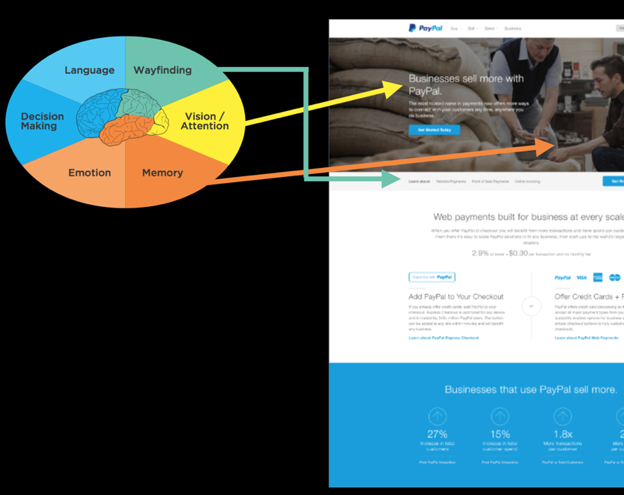
19.1
19.2
In this example, we were designing a page for PayPal for small businesses. The end users were people who might consider using PayPal for their small business ventures, like being able to receive credit card payments on their website or moving to accept in-person credit card payments instead of cash. Let’s put our design to the Six Minds test, based on the interviews we conducted and watching people work.
- ● Vision/Attention: We designed this page to only have one image at the top. It’s darker than the rest of the page and has much more visual complexity. Inevitably, people’s attention will be drawn to that picture. On top of it, we placed white type that’s much bigger than the rest, and white to stand out against the dark image. People’s eyes are drawn to that box of text. The other visual thing is that we wanted to make it clear how small business owners could sign up for PayPal. That’s why we made sure our sign-up button visually “pops out” in terms of its blue color and shape relative to the background image.
- ● Language: The text at the top of the page simply says “Businesses sell more with PayPal.” It’s very straightforward language. It doesn’t use a lot of fancy marketing terms or “marketing-itis.” It matches word-for-word what we heard business owners say they wanted to accomplish. It literally speaks their language. This was intentional. The previous iteration of this site used much more brand-specific marketing language to describe online invoicing and electronic checkout, for example. For this version, we did away with the marketing buzzwords because we found that the majority of the business owners we talked to were quite new to e-commerce and credit card processing. They wanted to add PayPal because they didn’t want to slow down anyone making purchases through their website. That’s why we added buttons that say things like “add PayPal to your checkout,” and “offer credit cards + PayPal” — these statements were taken verbatim from our interviews. Our interviewees told us what they wanted the presentation to be straightforward, so why complicate things by putting a marketing spin on their words? We also left out anything that wouldn’t directly appeal to our audience — like language describing PayPal’s state-of-the-art technical competencies or security certifications. We used the clientele’s exact language to sell and direct them to the things they wanted. Eventually, this is what builds trust and gets users to identify with what we’re offering.
- ● Memory: We wanted to appeal to people’s memory and interpretation of the picture to set the tone of what we’re talking about here. The image looks like it’s in the back of a coffee shop. You can see big sacks of coffee beans and it looks like these two casually dressed men are looking at some of the beans. The image doesn’t give off a big, corporate vibe, which has forklifts to haul all the sacks of beans. It feels more like a small, two-man, maybe even family-owned operation, a sort of boutique coffee shop where the owners would the names of their “regulars.” This vibe, of course, was intentionally chosen to activate memories of a small business, since it’s small business owners we’re trying to attract. We’re not trying to evoke mental patterns for an IBM or Goldman Sachs or some gleaming tower in New York City. We’re trying to evoke something smaller and tucked away, the work of two artisans who really understand their craft. Just by using one image, we can set the stage and let small business owners know they’re in the right place.
- ● Wayfinding: In light gray, above the fold, we used some navigation to show users what’s available further down the page: things like About PayPal, Online Payments, Point-of-Sale Payments, and Online Invoicing. This navigation bar shows the audience both where they are and where they can jump to next. It orients them to what this page is all about and how they can interact with it. We also introduced an equivalent navigation in the responsive mobile version.
- ● Decision-Making: At the end of the day, we wanted to both awaken their passion while at the same time providing rational reasons for acting. We knew the problem these business owners were trying to solve: how to sell more. At the bottom of the page, we added four statistics about companies that use PayPal for their business and what selling more has looked like for them. In one case, we worked with a husband and wife team and the husband said he would have to convince his wife to get onboard. That’s what why provided these statistics: because business owners and partners need the cold, hard, logical rationale before they’re going to jump into any business decision with both feet.
- ● Emotion: We also wanted to get people excited about the possibility of selling more. Tapping into the audience’s immediate objective of selling more (Appeal), we stated — twice — in our mockup that businesses sell more with PayPal. It sounds like pretty modest language. It doesn’t use marketing words or even stats to show that businesses sell, say, 10 times more. But to a business owner hearing that they can sell more, their imagination goes straight to that new Mercedes, or a down payment on a beach house, or paying off student loan debt, or upgrading a piece of equipment they use for the business. The statement reinforces that they could be selling more, which opens up endless possibilities for their life (Enhance) and even their overall sense of success and identity. Because as we spoke with these business owners, we observed how they put so much time and sweat equity into their companies that their sense of self-worth was tied up in their identity as a small business owner. They couldn’t wait to be on the cover of Fortune Magazine and share their success story, and on the flip side, they were terrified of having to declaring bankruptcy and admit defeat. We wanted to Awaken this longing to reinforce the possibility of their success as business owners.
Evidence-driven decision-making
In the example above, just in this portion of a page, we talked about all Six Minds and how we can use evidence-driven decision-making when we’re deciding on a product design or what direction to go in. I believe, of course, that this process gives you much clearer input than traditional types of prototyping/user testing.
That said, getting to this mockup didn’t happen overnight, or even halfway through our contextual interviews. Sure, we saw some patterns and inklings through our Six Minds analysis. But getting to that actual design was a slow and gradual process. We tried out many iterations with stakeholders and made micro-decisions as we went based on their input. We also considered comparable sites and some of the weaknesses that we found in those so we could make sure we did better than all of them.
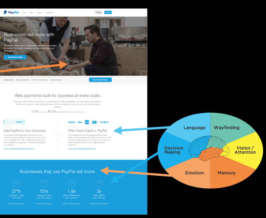
19.3
I believe there is so much we can learn through the process of just formulating these designs, or “design thinking.”
In the photo above, you can see some early sketches of the different ideas we had for what the page would look like, including things like flow and functionality and visuals. We started with lots of sketches and possibilities, doing a lot of ideating, rapid prototyping, and considering alternatives. As we narrowed down the possibilities through user testing and our own observations, we went from our really simple sketches to black-and-white mockups to clickable prototypes to the very high-fidelity one that you saw a little earlier in the chapter.
In sketching out those early designs, we looked at each option using what we knew of our end audience based on their Vision/Attention, Memory, and so on. This helped us realize some of the design challenges and inconsistencies in them.
One option broke all of the audience’s expectations of how an interaction should work, for example. Another would have been a huge departure from the audience’s mental model of how decision-making should work in an e-commerce transaction. It really helped us to have evidence showing why each of the designs did or didn’t satisfy the six criteria. Once we found one that satisfied five of the Six Minds, we went with that one and went from there, tweaking it until it satisfied all six.
When you don’t have this evidence base backing you up, you run the risk of being swayed by personal preferences — usually, the personal preferences of the “HIPPO” (the highest paid person in the room and their opinions). Instead, you can use the Six Minds as much to appeal to your HIPPOs as you can to your end clients. Your boss or CEO is probably not used to doing audience research or product testing in this way. Point to what you know from the Six Minds about the way the audience is framing the problem and how they think they can solve it, or what appeals to them and what they’re attending to. Time and again, I have found that pointing to the Six Minds helps us get away from opinion-based decision-making and embrace evidence-based decision-making instead. Ultimately, this makes the process go much more quickly and smoothly. Skip the drama of your office politics. Embrace the Six Minds of your audience.
Experience over time
The example we just walked through was a snapshot of someone’s decision to sign up for PayPal for Business at a certain point in time. I want to go one step further here and show you how the Six Minds are applicable throughout the lifecycle of a decision, and can actually be quite fluid, rather than static, over time.
19.4
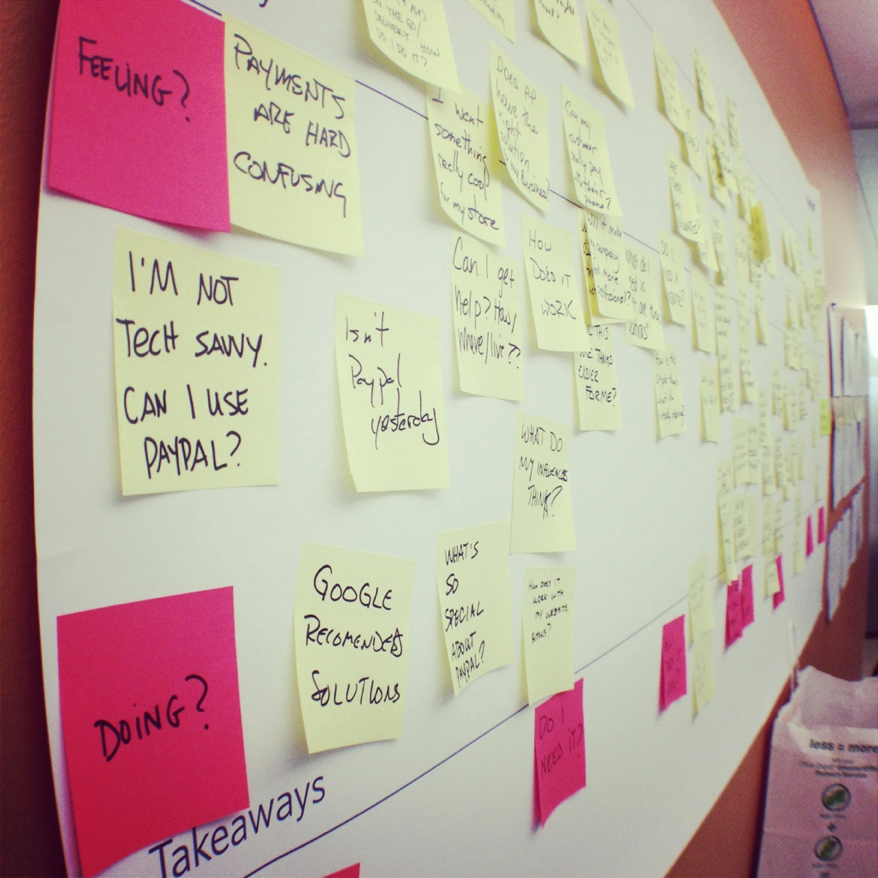
Service design is a good example of this. In this case, this is a photo of sticky notes with all the questions we heard from business owners about why they would or wouldn’t consider PayPal for Business to start an ecommerce store.
Looking at the pink sticky notes on the left of the big piece of paper where we organized the yellow sticky notes, you can see that we toyed briefly with the idea of categorizing the questions into Thinking/Feeling/Doing. You already know how I feel about the See/Feel/Say/Do system of classification. I think this metaphor is just not practical. It limits your audience to their thoughts, feelings, and actions. It says nothing of their motivation for doing what they’re doing. Instead, I’d rather use the metaphor of the decision-making continuum. That’s what we did with the pink sticky notes along the bottom.
When we looked at all the questions together, we saw that the questions started at a pretty fundamental level (e.g., “can this do what I need?”) to follow-up questions (e.g., “is the price fair?”) to implementation (e.g., “is this compatible with my website provider?”) all the way to emotions like fear (e.g., “what happens to me if someone hacks the system?”). We organized these questions into several key steps along the decision-making continuum.
This is common: people have to go sub-goal by sub-goal, micro-decision by micro-decision, until they reach their ultimate end goal. They might not be asking about website compatibility straight out of the gate; first they have to make sure this tool is even in the ballpark of what they need. Later, right before they hit “go,” some of those emotional blockers might come up, like fear that the system would get hacked and end up costing the business money.
People’s questions, concerns, and objections tend to get more and more specific as they go. As you test your system, take note of when these questions come up in the process. Then you design a system that presents information and answers questions at the logical time. It may be that in the steps right before they hit “buy,” you’re presenting things to them in a more sophisticated way because they now already know the basics of what you’re offering in relation to what they’re currently using. Now you can answer those last questions that might relate to their fears that are holding them back.
Multiple vantage points
In addition to considering multiple steps along the decision-making process, we need to consider multiple vantage points when we design. We haven’t talked about this as much, but you can certainly use the Six Minds for processes involving multiple individuals. To show you how, let’s go back to our example of builders who install insulation.
There are a lot of players involved in building a big building. There’s the financial backer, the architect, the general contractor, and all the subcontractors managed by the general contractor. And then there are the companies like the insulation company we worked with who provide the building materials you need.
Just like there are many players, there are many steps in the decision-making process of something as seemingly simple as choosing which insulation to buy. There’s the early concept of building a building, then there’s actually trying to figure out what materials to use, then someone approves those materials, someone buys them, and somebody else installs them.
In our work for this client, we wanted to identify those different micro-decision and stages within the decision-making process. We met with people at all levels to learn who makes what decisions, when. We learned about the perspective and level of expertise of each decision-maker. The general contractor, for example, had a fundamental knowledge about insulation. The person who actually installs insulation day in and day out possessed much more specific knowledge, as you might expect. Both knew more about insulation than the architect.
All of their concerns were different as well; the general contractor was concerned with (and is responsible for) the building’s longevity. The installer was concerned with the time that it would take to install the materials, as well as the safety of his fellow workers who would be installing them. The architect was mostly concerned with the building’s aesthetic qualities.
By identifying — and listening to — the various influencers, we were able to determine what messages needed to be delivered to each group, at each stage of the process. Often, you’ll find that the opportunities at each stage are very different for each group you’re targeting because of the varied problems they’re trying to solve.
If you remember, our client’s overarching problem was that specialized contractors weren’t switching over to their innovative insulation — even though they were more efficient, cost-effective, and easier to install than the competition. They were sticking with the same old insulation they’d always used.
As we started to investigate and meet with the key decision-makers involved, we learned that the architect was often quite keen on using innovative new materials, especially since they often offers new design possibilities. The general contractor wants the materials aligned with the project’s timing and budget. They just needed to check with the subcontractor.
The subcontractors were a lot like the working parents I mentioned earlier, who are going a million miles an hour trying to balance multiple jobs, issues that pop up, and sales simultaneously. Time is everything to them. They work within a fixed bid or flat fee to make it easier for the general contractor to estimate the overall cost of the project. Because of this, the installers are laser-focused on making the whole process faster. The long term longevity or aesthetic qualities of the building may not be their number one focus. They want to know if the materials are easy to install quickly, with as little startup and training time as possible.
The main message these subcontractors needed to hear was that this new product could actually be installed faster than the old one. It was easy to work with and get the hang of quickly. The main message for the general contractors, on the other hand, was all about cost benefit and durability. The new product lasted longer than the traditional materials, so they would be less likely to have to fix any building problems moving forward. The main message for the architect was that the end product would look good in the building. We showed the architect what the new insulation would look like, and explained that it came in different colors and could be conformed to curved walls.
You can see that each of those decision-makers were approaching the problem space from three very different perspectives: efficiency, cost, and visual appeal. The way we Appeal, Enhance, and Awaken in our messaging and design needed to be different for each.
Recognizing all three of these perspectives helped us frame how to present our product to each group — from messaging to distribution. Should you create one message for everybody, or three separate messages to reach your various stakeholders, for example? Or have all your information on a website, but segmented by the different audience groups? If you recall the earlier example I gave of cancer.gov, National Cancer Institute provides two definitions of cancers on its site: a version for health professionals and a version for patients. I provided that example in the context of language, but I think this type of approach also can speak to the different motivators and underlying ambitions that we’re trying to awaken in our audiences.
In summary, I first encourage you to embrace the notion of user experience as multi-dimensional and multi-sensory. We can and should tap into these multiple dimensions and levels when we’re doing empathy research and design.
Second, as you encounter micro-decisions within your product or service, remember that even these seemingly small steps can have a logical rationale based on your interviews. Embrace this rationale, especially in the face of HIPPO opposition — and embrace your creativity while you’re at it. The type of evidence-driven design methodology I’m suggesting allows for plenty of creativity. It’s creativity within what’s more likely to be a winning sphere.
Last, try thinking about your product or service as more than just a transaction. Think about it as a process that will touch multiple people, over multiple points in time. Try thinking of the Six Minds of your product — where people’s attention is; how they interact with it; how they expect this experience to go; the words they are using to describe it; what problem they’re trying to solve; what’s really driving them — as constantly evolving. The more they learn about this topic through your product or service, the more expert they’ll become, which changes how you engage them, the language you use, and so on.
Concrete recommendations:
- ● Consider your user’s experience over time.
- o How will their behaviors change over time as they gain expertise with this product and in this topic?
- o How will their problem space change over time?
- o How will their language and semantic representations of the words change?