Copyright © 2019 John Whalen
All rights reserved.
Published by O’Reilly Media, Inc., 1005 Gravenstein Highway North, Sebastopol, CA 95472.
ISBN-13: 9781491985380
2018-11-06
Chapter 1. Rethinking “The” Experience
Great experiences
Think of a truly great experience in your life.
Was it one of life’s milestones? The birth of a child, marriage, graduation, etc.? Or was it a specific moment in time—a concert with your favorite band, a play on Broadway, an immersive dance club, an amazing sunset by the ocean, or watching your favorite movie.
You might remark that it was “brilliant”, or “an amazing experience!” to a friend.
What you probably didn’t think about was how many different sensations and cognitive processes blend together to make that experience for you. Could you almost smell the popcorn when you thought of that movie? Maybe the play had not only great acting but creative costumes and lighting and starred someone you had a crush on at the time. Was the concert experience exceptional because you were unexpectedly offered a free drink, then escorted to your seats, filled with glorious music, and dancing with festive fans nearby. So many elements come together to provide a “singularly” great experience.
What if you wanted to make an experience yourself? How might you go about designing a great experience with your product or service? What are the sensations and cognitive processes that make up your experience? How can you tease it apart systematically into component parts? How will you know you are building the right thing?
This book is designed to help you understand and harness what we know about human psychology to unpack experiences into their component parts and uncover what is needed to build a great experience. This is a great time to do so. The pace of scientific discoveries in brain science has been steadily increasing. There have been tremendous breakthroughs in psychology, neuroscience, behavioral economics, and human-computer interaction that provide new information about distinct brain functions and how humans process that information to generate that feeling of a single experience.
How humans think about thinking (and what we don’t realize)
Your thoughts about your own thinking can be misleading. We all have the feeling of being sentient beings (at least I hope you do, too). We know what it’s like to experience our own thoughts – what early psychologists like the Gestaltists called “introspection”. But there are limits to your awareness of your own mental processes.
We all know what it’s like to struggle over a decision about which outfit to wear for something like a job interview: Do you meet their initial expectations? Will they get the wrong impression? Does it look good? Do you look professional enough? Do those pants still fit? Are those shoes too attention-grabbing? There are a lot of thoughts there – but there are still more thoughts that you are unable to articulate, or even be aware of.
One of the fascinating things about consciousness is that we are not aware of all of our cognition. For example, while we are easily able to identify the shoes we plan to wear to the interview, we do not have insight into how we recognized shoes as shoes, or how we were able to sense the color of the shoes. In fact, there are an amazing variety of cognitive processes that are impenetrable to introspection. We generally don’t know where our eyes are moving to next, the position of our tongue, the speed of our heart rate, how we see, how we recognize words, how we remembered our first home (or anything), to mention just a few.
There are other more advanced mental processes that are also automatic. When we think of Spring, we might automatically think of green plants, busy songbirds, or blooming flowers. Those together might give you a pleasant emotional state, too. As soon as you think of almost any concept, your brain automatically conjures any number of related ideas and emotions without conscious effort.
This book is about measuring and unpacking an experience, and so we must identify not only consciously accessible cognitive processes, but also those that are unconscious (like eye movements often are) and deep-seated emotions related to those concepts.
Why product managers, designers and strategists need this information
No product, service, or experience will ever be a runaway success if it does not end up meeting the needs of the target audience. But beyond that we want someone who is introduced to the product or service for the first time to say something like a London-er might: “Right, that’s brilliant!”
But how, as a corporate leader, marketer, product owner, or designer do you make certain your products or services have a great experience? You might ask someone what they want, but we know that many people don’t actually understand what they are trying to solve and often can’t clearly articulate their needs. You might work from the vantage of what you would want, but do you really know how a 13-year-old girl wants to work with Instagram? So how should you proceed?
This book is designed to give you the tools you need to deeply understand the needs and perspective of your product or service’s audience. As a cognitive scientist, I felt like “usability testing” and “market surveys” and “empathy research” were at times both too simplistic and too complicated. These methods focus on understanding the challenge or the problem users are experiencing, but sometimes I think they miss the mark in helping you, the product team, understand what you need to do.
I believe there is a better way: By understanding the elements of an experience (in this book we will describe six), you can better identify audience needs at different levels of explanation. Throughout this book, I’ll help you better understand what the audience needs at those different levels and make sure you hit the mark with each one.
When I’ve given talks on “Cognitive Design” or the “Six Minds of Experience,” corporate leaders, product owners, and designers in the room usually say something to the effect of “That is so cool! But how could I use that?” or “Do I need to be a psychologist to use this?”
Create evidence-based and psychologically-driven products and services
This book is not designed to simply by a fun trip into the world of psychology. Rather, it is a practical one designed to let you put what you learn into immediate practice. It is divided into three major parts. Part 1 details each of the “six minds” which together form an experience. Part 2 describes how to work with your target audience through interviews and watching their behavior to collect the right data and gather useful information for each of the Six Minds. Part 3 suggests how you can apply what you’ve learned about your audiences’ Six Minds and put it to use in your product and service designs.
A final note the to the psychologists and cognitive scientists reading this
Bear with me. In a practical and applied book I simply can’t get to all the nuances of the mind/brain that exist, and I need a way to communicate to a broad audience what to look for that is relevant to design. There are a myriad of amazing facts about our minds which (sadly) I am forced to gloss over, but I do so intentionally so that we may focus on the broader notion of designing with multiple cognitive processes in mind, and ultimately allow for an evidence-based and psychologically-driven design process. It would be an honor to have my fellow scientists work with me to integrate more of what we know about our minds into the design of products and services. I welcome your refinements. At the end of each chapter I will point to further citations the interested reader can pursue to get more of the science they should know.
Chapter 2. The Six Minds of User Experience
The six minds of experience
Surely it is the case that there are hundreds of cognitive processes happening every second in your brain. But to simplify to a level that might be more relevant to product and service design, I propose that we limit ourselves to a subset that we can realistically measure and influence.
What are these processes and what are their functions? Let’s use a concrete example to explain them. Consider the act of purchasing a chair suitable for your mid-century modern house. Perhaps you might be interested in a classic design from that period, like the Eames’ chair and ottoman below. You are seeking to buy this online and browsing an ecommerce site.

Figure 2.1: Eames Chair
1. Vision, Attention, and Automaticity
As you first land on the furniture website to look for chairs, your eyes scan the page to make sure you are on the right site. Your eyes might scan the page for words such as furniture, or for the word “chairs”, from which you might look for the appropriate category of chair, or you might choose to look for the search option to type in “Eames chair”. If you don’t find chair, you look for other words that might represent a category that includes chair. Let’s suppose on scanning the options below, you pick the “Living” option.
![]()
Figure 2.2: Navigation from Design within Reach
2. Wayfinding
Once you believe you’ve found a way forward into the site, the next task is to understand how to navigate the virtual space. While in the physical world we’ve learned (or hopefully have learned!) the geography around our homes and how to get to some of our most frequented locations like our favorite grocery store or coffee shop, the virtual world may not always present our minds with the navigational cues that our brains are designed for — notably three-dimensional space.
We often aren’t exactly sure where we are within a website, app, or virtual experience. Nor do we always know how to navigate around in a virtual space. On a webpage you might think to click on a term, like “Living” in the option above. But in other cases like Snapchat or Instagram, many people over the age of 18 might struggle to understand how to get around by swiping, clicking, or even waving their phone. Both understanding where you are in space (real or virtual) and how you can navigate your space (moving in 3D, swiping or tapping on phones) are critical to a great experience.
3. Language
I find when I’m around interior designers, I start to wonder if they speak a different language altogether than I do. The words in a conceptual category such as furniture can vary dramatically based on your level of expertise. If you are an interior design expert, you might masterfully navigate a furniture site, because you know what distinguishes an egg chair, swan chair, diamond chair, and lounge chair. In contrast, if you are more novice to the world of interior design, you might need to Google all these names to figure out what they are talking about! To create a great experience, we must understand the words our audience uses and meet them at the appropriate level. Asking experts to simply look up the category “chair” (far too imprecise) is about as helpful as asking a non-expert about the differences between dorsolateral prefrontal cortex (DLPFC) and anterior cingulate gyrus (both of which are neuroanatomical terms).
4. Memory
As I navigate an e-commerce site, I also have expectations about how it works. For example, I might expect that an e-commerce site will have search (and search results), product category pages (chairs), product pages (a specific chair), and a checkout process. The fact that you have expectations is true for any number of concepts. We automatically build mental expectations about people, places, processes, and more. As product designers, we need to make sure we understand what our customers’ expectations are, and anticipate confusions that might arise if we deviate from those norms (e.g., think about how you felt the first time you left a Lyft or Uber or limousine without physically paying the driver).
5. Decision-Making
Ultimately you are seeking to accomplish your goals and make decisions. Should you buy this chair? There are any number of questions that might go through your head as you make that decision. Would this look good in my living room? Can I afford it? Would it fit through the front door? At nearly $5,000, what happens if it is scratched or damaged during transit? Am I getting the best price? How should I maintain it? As product and service managers and designers, we need to think about all the steps along an individual customer’s mental journey and be ready to answer the questions that come up along the way.
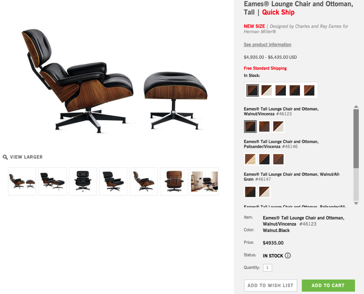
Figure 2.3: Product detail page from Design with Reach
6. Emotion
While we may like to think we can be like Spock from Star Trek and make decisions completely logically, it has been well documented that a myriad of emotions affect our experience and thinking. Perhaps as you look at this chair you are thinking about how your friends would be impressed, and thinking that might show your status. Perhaps you’re thinking “How pretentious!” or “$5,000 for a chair — How am I going to pay for that, rent and food?!” and starting to panic. Identifying underlying emotions and deep-seated beliefs will be critical to building a great experience.
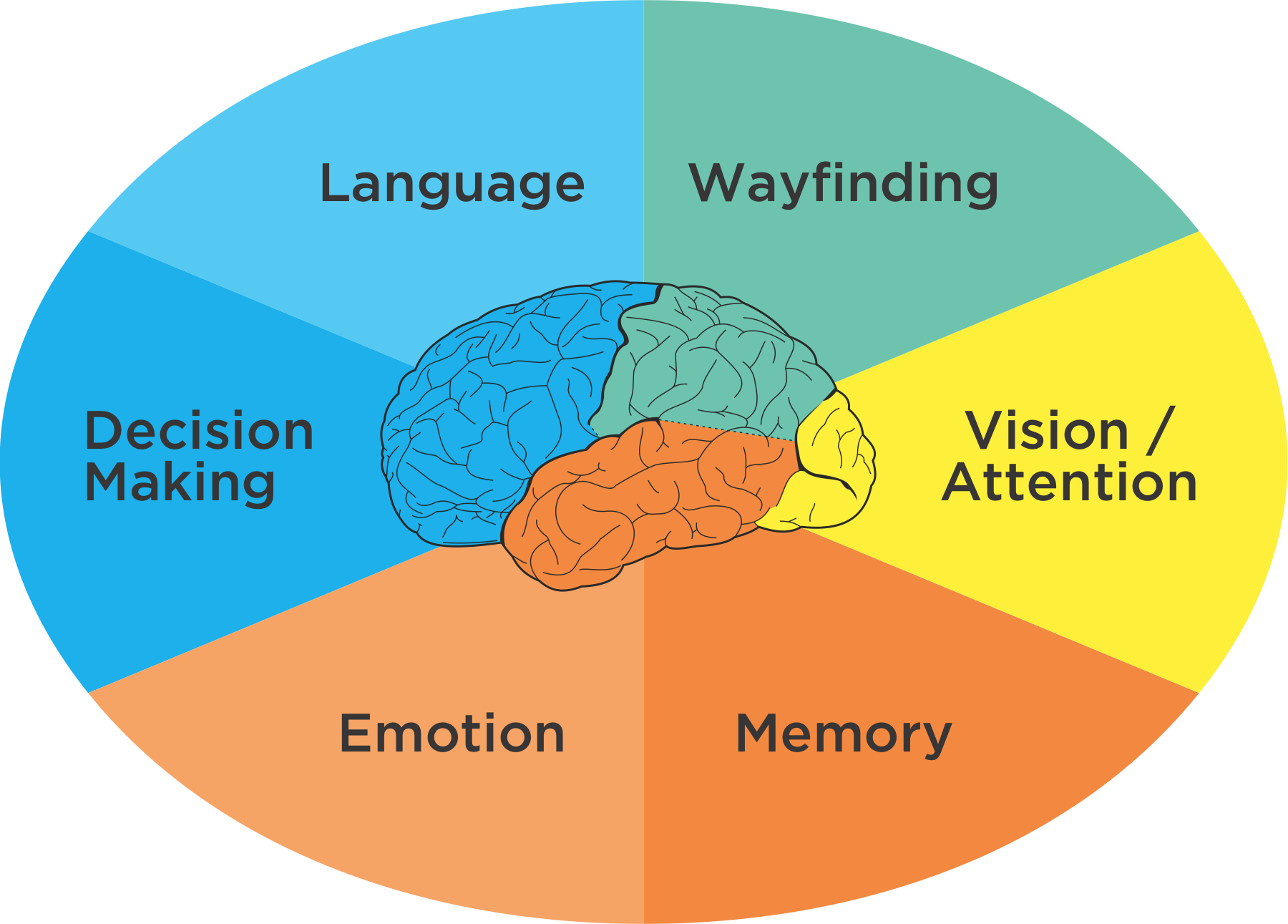
Figure 2.4: Six Minds of Experience
Together, these very different processes, which are generally located in unique brain areas, come together to create what you perceive as a singular experience. While my fellow cognitive neuropsychologists would quickly agree that this is an oversimplification of both human anatomy and processes, there are some reasonable overarching themes that make this a level at which we can connect product design and neuroscience.
I think we all might agree that “an experience” is not singular at all, but rather is multidimensional, nuanced, and composed of many brain processes and representations. It is multisensory. Customer experience doesn’t happen on a screen, it happens in the mind.
“The customer experience doesn’t happen on a screen, it happens in the mind.”
Activity
Let me recommend you take a brief pause in your reading, and go to an e-commerce website — ideally, one that you’ve rarely used — and search for books on the topic of “customer experience.” When you do, do so in a new and self-aware state:
Now that you have some sense of the mental representations you need to be aware of, you might ask: How do I, as a product manager, not a psychologist, determine where someone is looking and what they are looking for? How do I know what my product audience’s expectations are? How can I expose deep-seated emotions? We’ll get there in Part 2 of the book, but for right now I want to agree on what we mean by vision/attention, wayfinding, memory, language, emotion and decision making. I want you to know more about each of these so you can recognize these processes “in the wild” as you observe and interview your customers.
Chapter 3. In the Blink of an Eye: Vision, Attention, and Automaticity
From representations to experiences
Think of a time when you were asked to close your eyes for a big surprise (no peeking!), and then opened your eyes for the big reveal. At the moment you open your eyes you are taking in all kinds of sensations: light and dark areas in your scene, colors, objects (cake and candles?), faces (family and friends), sounds, smells, likely joy and other emotions. It is a great example of how instantaneous, multidimensional, and complex an experience can be.
Despite the vast ocean of input streaming in from our senses, we have the gift of nearly instant perception of an enormous portion of any given scene. It comes to you so naturally, yet is so difficult for a machine like a self-driving car. Upon reflection, it is amazing how ‘effortless’ these processes are. They just work. You don’t have to think about how to recognize objects or make sense of the physical world in three dimensions except in very rare circumstances (e.g., dense fog).
These automatic processes start with neurons in the back of your eyeballs, through your Corpus Callosum, to the back of your brain in the Occipital cortex, then your Temporal and Parietal lobes in near real-time. In this chapter we’ll focus on the “what” and in the next we’ll discuss the “where”.
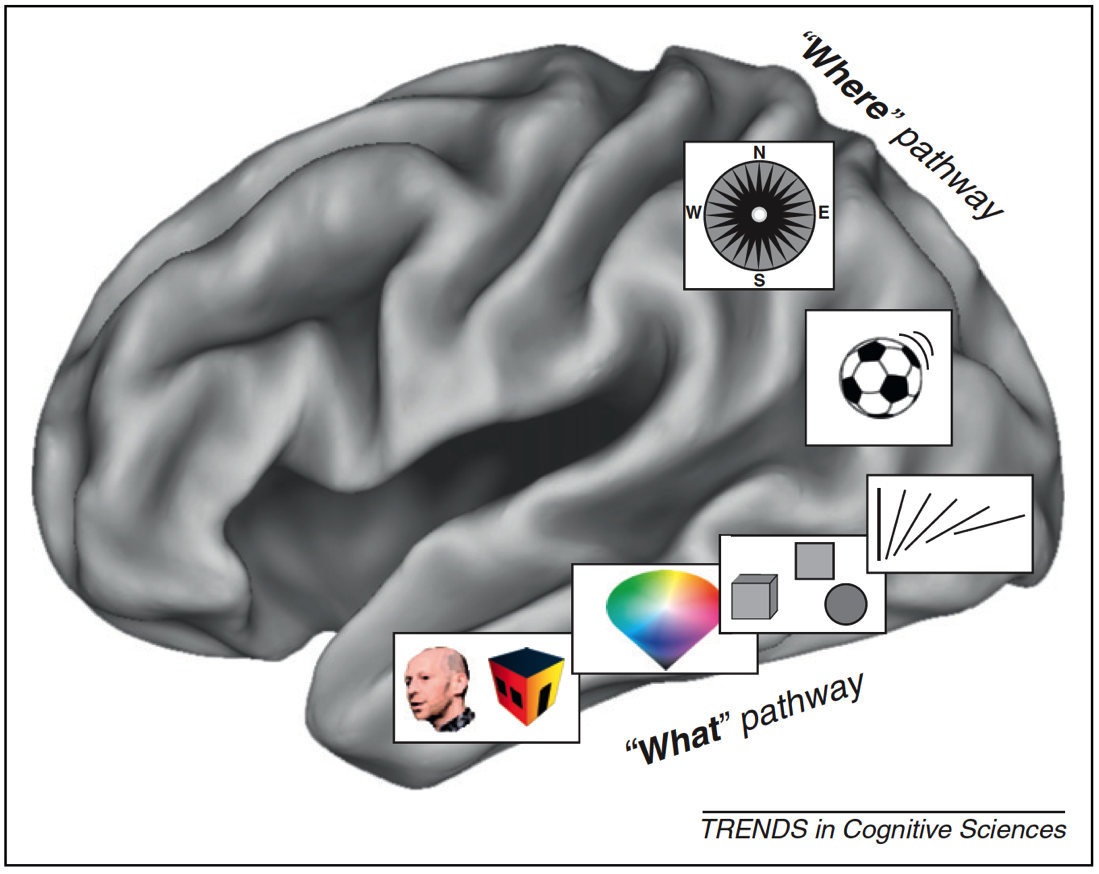
Figure 3.1: What/Where Pathways
With almost no conscious control, your brain brings together separate representations of brightness, edges, lines, line orientation, color, motion, objects, and space (in addition to sounds, feelings, and proprioception) into a singular experience. We have no conscious awareness that we had separate and distinct representations, or that they were brought together into a single experience, or that past memories influences your perception, or that they evoked certain emotions.
This is a non-trivial accomplishment. It is incredibly difficult to build a machine that can mimic even the most basic differences between objects that have similar colors and shapes — for example, between muffins and Chihuahuas — which with a brief inspection you, as a human, will get correct every time.
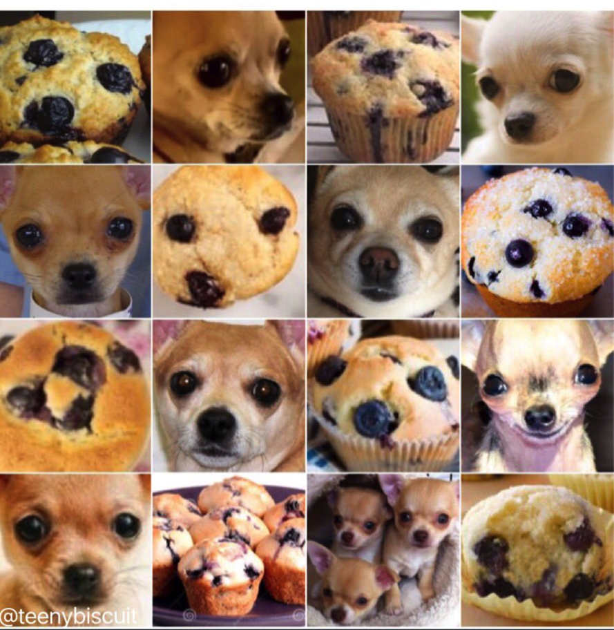
Figure 3.2: Muffins or Chihuahuas?
There are many, many things I could share about vision, object recognition and perception, but the most important for our purposes are: (a) there are many processes taking place simultaneously, of which you have little conscious awareness or control, and (b) many computationally challenging processes are taking place constantly that don’t require conscious mental effort on your part.
In Nobel Prize winner Daniel Kahneman’s fantastic book “Thinking, Fast and Slow,” he makes the compelling point that there are two very different ways in which your brain works. You are aware and in conscious control over the first set of processes, which are relatively slow. And you have little to no conscious control or introspection, over the other set of processes, which are lightning-fast. Together, these two types of thinking encompass thinking fast (automatic processes) and thinking slow (conscious processing).
When designing products and services, we as designers are often very good at focusing on the conscious processes (e.g., decision-making), but we rarely design with the intention of engaging our fast automatic processes. They occur quickly and automatically, and we almost “get them for free” in terms of the mental effort we need to expend as we use them. As product designers, we should harness both these automatic systems and conscious processes because they are relatively independent. The former don’t meaningfully tax the latter. In later chapters, we’ll describe exactly how to do so in detail, but for now let’s discuss one good example of an automatic visual process we can harness: visual attention.
Unconscious behaviors: Caught you looking
Think back to the vignette I gave you at the start of the chapter: Opening your eyes for that big surprise. If you try covering your eyes now and suddenly uncovering them, you may find that your eyes dart around the scene. In fact, that is consistent with your typical eye movements. Eyes don’t typically move in a smooth pattern. Rather, they jump from location to location (something we call saccades). This motion can be measured using specialized tools like an infrared eye-tracking system, which can now be built into specialized glasses, or a small strip under a computer monitor.
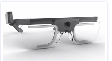
Figure 3.3: Tobii Glasses II

Figure 3.4: Tobii X2-30 (positioned below the computer screen)
These tools have documented what is now a well-established pattern of eye movements on things like web pages and search results. Imagine that you just typed in a Google search and are viewing the results on a laptop. On average we tend to look 7 to 10 words into the first line of the results, 5 to 7 words into the next line, and even fewer words into the third line of results. There is a characteristic “F-shaped” pattern that our eye movements (saccades) form. Looking at the image below, the more red the value, the more time was spent on that part of the screen.
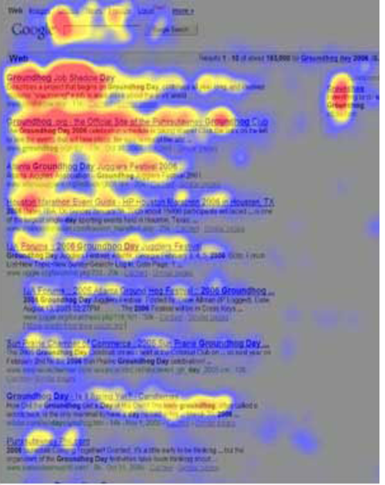
Figure 3.5: Heatmap of search eye-tracking “F” Pattern
[Source: https://www.nngroup.com/articles/f-shaped-pattern-reading-web-content/]
Visual Popout
While humans are capable of controlling our eye movements, much of the time we let our automatic processes take charge. Having our eye movements on “autopilot” works well in part, because things in our visual field strongly attract our attention when they stand out from the other features in our visual scene. These outliers automatically “pop out” to draw your attention and eye movements.
As product designers, we often fail to harness this powerful automatic process. Sesa you might have learned from Sesame Street: “One of these things is not like the other, one of these things just doesn’t belong...” is a great way to draw attention to right elements in a display. Some of the ways something can pop out in a scene are demonstrated below. An important feature I would add to the list below is visual contrast (relative bright and dark). The items below that are unique pop out in this particular case because they have both a unique attribute (e.g., shape, size, orientation) and a unique visual contrast relative to the others in their groupings.
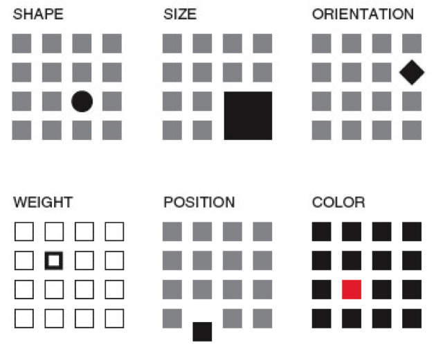
Figure 3.6: Visual Popout
One interesting thing about visual popout is that the distinctive element draws attention regardless of the number of competing elements. In a complex scene (e.g., modern car dashboards), this can be an extremely helpful method of directing one’s attention when needed.
If you are an astute reader thinking about the locus of control with eye movements, one question you might have is who decides where to look next if you aren’t consciously directing your eyes? How exactly do your eyes get drawn to one part of a visual scene? It turns out that your visual attention system — the system used to decide where to take your eyes next — forms a blurry (somewhat Gaussian), and largely black-and-white representation of the scene. It uses that representation, which is constantly being updated, to decide where the locus of your attention should be, provided you are not directing your eyes (that is, “conscious you”).
You can anticipate where someone’s eyes might go in a visual scene if you take that scene and use a program like Photoshop to turn down the color of a design and you squint your eyes (and/or use more than one Gaussian blur using that design program). That test will give you a pretty good guess where people’s eyes will be drawn in the scene, were you to measure their actual eye gaze pattern using an eye tracking device.
Oops, you missed that!
One of the most interesting results you get from studying eye movements is the null result: that is, what people never look at. For example, I’ve seen a web form design in which the designers tried to put helpful supplemental information in a column off to the side on the right of the screen — exactly where ads are typically placed. Unfortunately, we as consumers have been trained to assume that information on the right side of the screen is an ad or otherwise irrelevant, and as a result will simply ignore anything in that location (helpful or not). Knowing about past experiences will surely help us to anticipate where people are looking and help to craft designs in a way that actually directs — not repels — attention to the helpful information.
If your customers never look at a part of your product or screen, then they will never know what is there. You might as well have never put the information there to begin with. However, when attentional systems are harnessed correctly through psychology-driven design, there is amazing potential to draw people’s attention to precisely what they need. This is the opportunity we as product designers should always employ to optimize the experience.
Ceci n’est pas une pipe: Seeing what we understand something to be, not what might actually be there
Whether we present words on a page, image, or chart, the displayed elements are only useful to the extent the end users recognize what they’re seeing.
 Figure 3.7: Instagram Controls
Icons are a particularly good example. If you ask someone who has never used Instagram what each of the icons above represent, I’m willing to bet they won’t correctly guess what each icon means without some trial and error. If someone interprets an icon to mean something, for that person, that is effectively its meaning at that moment (regardless of what it was meant to represent). As a design team, it is essential to test all of your visuals and make sure they are widely recognized or, if absolutely needed, that they can be learned with practice. When in doubt, do not battle standards to be different and creative. Go with the standard icon and be unique in other ways.
We’ve also seen a case where participants in eye tracking research thought that a sporting goods site only offered three soccer balls because only three (of the many that were actually for sale) were readily visible on the “soccer” screen.
Figure 3.8: Sporting Goods Store Layout
Visual designs are only useful to the extent that they invoke the understanding you were hoping they would. If they don’t, then any of the other elements (or meanings) that you created simply don’t exist.
How our visual system creates clarity when there is none
Before we move on to other systems, I can’t resist sharing one more characteristic of human vision — specifically, about visual acuity. When looking at a scene, our subjective experience is that all parts of that scene are equally clear, in focus, and detailed. In actuality, both your visual acuity and ability to perceive color drop off precipitously from your focal point (what you are staring at). Only about 2° of visual angle (the equivalent of your two thumbs at arms-length distance) are packed with neurons and can provide both excellent acuity and strong color accuracy.
Don’t believe me? Go to your closest bookshelf. Stare at one particular book cover and try to read the name of the book that is two books over. You may be shocked to realize you are unable to do so. Go ahead, I’ll wait!
Just a few degrees of visual angle from where our eyes are staring (foveating), our brains make all kinds of assumptions as to what is there, and we are unable to read it or fully process it. This makes where you are looking turn out to be crucial for an experience. Nearby just doesn’t cut it!
Chapter 4. Wayfinding: Where Am I?
A logical extension to thinking about what we are looking and where our attention is drawn to and how we represent the space around us and where we are within that space. A large portion of the brain is devoted to this “where” representation in the brain, so we ought to discuss it and consider how this cognitive process might be harnessed in our designs from two respects: knowing where we are, and knowing how we can move around in space.
The ant in the desert: Computing Euclidean space
To help you think about the concept of wayfinding, I’m going to tell you about large Tunisian ants in the desert — who interestingly share an important ability that we have, too! I first read about this and other amazing animal abilities in Randy Gallistel’s The Organization of Learning, which suggests that living creatures great and small share many more cognitive capabilities than you might have first thought. Representations of time, space, distance, light and sound intensity, and proportion of food over a geographic area are just a few examples of computations many creatures are capable of.
It turns out that as a big Tunesian ant – but still a very small one in a very large desert – determining your location is a particularly thorny problem. These landscapes have no landmarks like trees, and deserts can frequently change their shape in the wind. Therefore, ants that leave their nest must use something other than landmarks to find their way home again. Their footprints, any landmarks, and scent in the sand are all unreliable as they can change with a strong breeze.
Furthermore, these ants take meandering walks in the Tunisian desert scouting for food (in this case in the diagram below, the ant is generally heading north west from his nest). In this experiment, a scientist has left out a bird feeder full of sweet syrup. This lucky ant climbs into the feeder, finds the syrup and realizes he just found the motherload of all food sources. After sampling the syrup, he can’t wait to tell fellow ants about the great news! However, before he does, the experimenter picks up the feeder (with the ant inside) and moves it East about 12 meters (depicted by the red arrow in diagram).
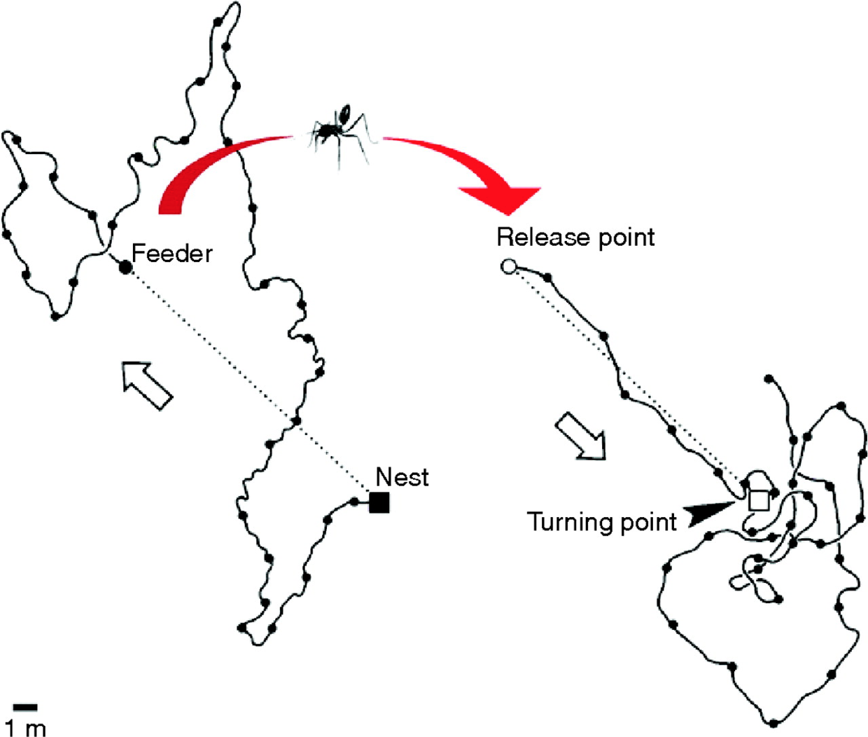
Figure 4.1: Tunisian Ant in the Desert
The ant, still eager to spread the good news with everyone at home, attempts to make a bee-line (or “ant-line”), back home. The ant heads straight southeast, almost exactly in the direction where the anthill should have been, had he not been moved. He travels approximately the distance needed, then starts walking in circles to spot the nest (which is a sensible strategy given there are no landmarks). Sadly, this particular ant doesn’t take into consideration being picked up, and so is off by exactly the amount the experimenter moved the feeder.
Nevertheless, this pattern of behavior demonstrates that the ant is capable of computing the net direction and distance traveled in Euclidean space (using the sun no less) and is a great example of what our parietal lobes are great at computing.
Locating yourself in physical and virtual space
Just like that ant, we all have to determine where we are in space, where we want to go, and what we must do in order to get to our destination. We do this using the “where” system in our own brains, which is itself located in our parietal lobes — one of the largest regions of the mammalian cerebral cortex.
If we have this uncanny, impressive ability to map space in the physical world built into us, wouldn’t it make sense if we as product and service designers tapped into its potential when it comes to wayfinding in the digital world?
(Note: If you feel like you’re not good with directions, you might be surprised to find you’re better than you realize. Just think about how you walk effortlessly to the bathroom in the morning from your bed without thinking about it. If it is of any solace, know that like the ant, we were never designed to be picked up by a car and transported into the middle of a parking lot that has very few unique visual cues.)
As I talk about “wayfinding” in this book, please note that I’m linking two concepts which are similar, but do not necessarily harness the same underlying cognitive processes:
There is an overlap between the two, but as we study this more carefully, we’ll see that this is not a simple one-to-one mapping. The virtual world in most of today’s interfaces on phones and web browsers strips away many wayfinding landmarks and cues. It isn’t always clear where we are within a web page, app, or virtual experience, nor it is always clear how to get where we want to be (or even creating a mental map of where that “where” is). Yet understanding where you are and how to interact with the environment (real or virtual) in order to navigate space is clearly critical to a great experience.
Where can I go? How will I get there?
In the physical world, it’s hard to get anywhere without distinct cues. Gate numbers at airports, signs on the highway, and trail markers on a hike are just a few of the tangible “breadcrumbs” that (most of the time) make our lives easier.
Navigating a new digital interface can be like walking around a shopping mall without a map: it is easy to get lost because there are so few distinct cues to indicate where you are in space. Below is a picture of a mall near my house. There are about eight hallways that are nearly identical to this one. Just imagine your friend saying “I’m near the tables and chairs that are under the chandeliers” and then trying to find your friend!

Figure 4.2: Westfield Montgomery Mall
To make things even harder, unlike the real world, where we know how to locomote by walking, in the digital world, the actions we need to take to get to where we are going sometimes differ dramatically between products (e.g., apps vs. operating systems). You may need to tap your phone for the desired action to occur, shake the whole phone, hit the center button, double tap, control-click, swipe right, etc.
Some interfaces make wayfinding much harder than it needs to be. Many (older?) people find it incredibly difficult to navigate around Snapchat, for example. Perhaps you are one of them! In many cases, there is no button or link to get you from one place to the other, so you just have to know where to click or swipe to get places. It is full of hidden “Easter eggs” that most people (Gen Y and Z excepted) don’t know how to find.
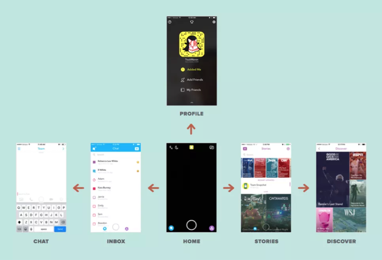
Figure 4.3: Snapchat Navigation
When Snapchat was updated in 2017, there was a mass revolt from the teens who loved it. Why? Because their existing wayfinding expectations no longer applied. As I write this book, Snapchat is working hard to unwind those changes to conform better to existing expectations. Take note of that lesson as you design and redesign your products and services: matched expectations can make for a great experience (and violated expectations can destroy an experience).
The more we can connect our virtual world to some equivalency of the physical world, the better our virtual world will be. We’re starting to get there, with augmented reality (AR) and virtual reality (VR), or even cues like edges of tiles that protrude from the edge of an interface (like Pinterest’s) to suggest a horizontally scrollable area. But there is so many more opportunities to improve today’s interfaces! Even something as basic as virtual breadcrumbs or cues (e.g., a slightly different background color for each section of a news site) could serve us well as navigational hints (that goes for you too Westfield Montgomery Mall).

Figure 4.4: Visual Perspective
One of the navigational cues we cognitive scientists believe product designers vastly underuse is our sense of 3-D space. While you may never need to “walk” through a virtual space, there may be interesting ways to use 3-D spatial cues, like in the scene above. This scene provides perspective through the change in size of the cars and the width of the sidewalk as it extends back. This is an automatic cognitive processing system that we (as designers and humans) essentially “get for free.” Everyone has it. Further, this part of the “fast” system works automatically without taxing conscious mental processes. A myriad of interesting and as-of-yet untapped possibilities abound!
Testing interfaces to reveal metaphors for interaction
One thing that we do know today is that it is crucial to test interfaces to see if the metaphors we have created (for where customers are and how customers interact with a product) are clear. One of the early studies done using touchscreen laptops demonstrated the value of testing to learn how users think they can move around in the virtual space of an app or site. When for the first time ever they were attempting to use touchscreen laptops, the users instinctively used metaphors from the physical world. Participants touched what they wanted to select (upper right frame), dragged a web page up or down like it was a physical scroll (lower left frame), and touched the screen in the location where they wanted to type something (upper left frame).
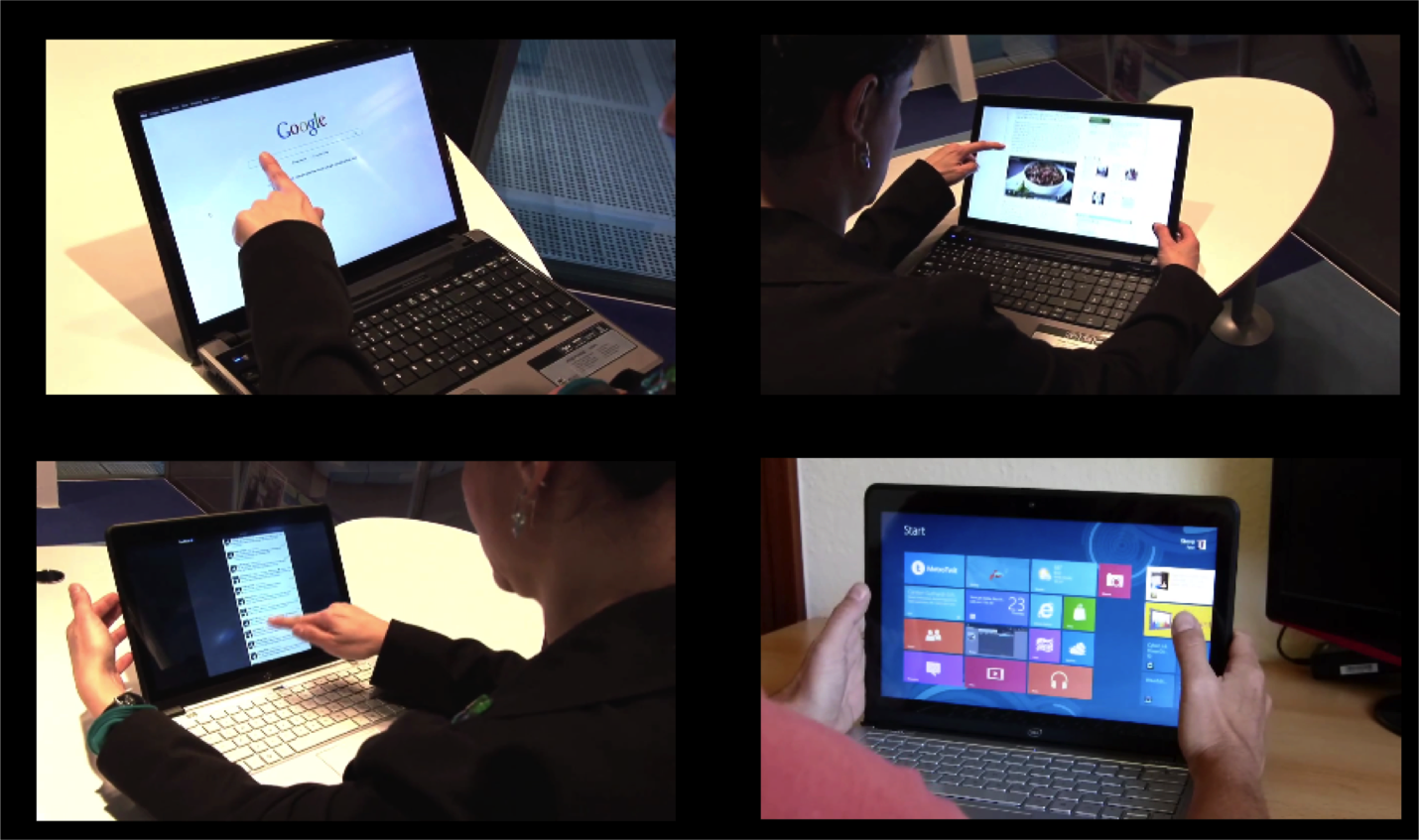
Figure 4.5: First reactions to touchscreen laptop
However, in addition to simply doing what might be expected, as in every user test I’ve ever conducted, it also uncovered things that were completely unexpected — particularly, how people attempted to interact with the laptop.
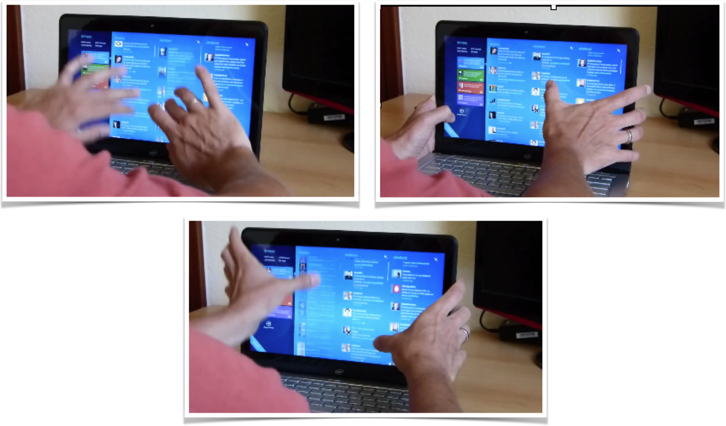
Figure 4.6: Using touchscreen laptop with two thumbs
One user used both thumbs on the monitor while resting his hands on the sides of the monitor. He used his thumbs to attempt to slide the interface up and down using both thumbs on either side of the screen. Who knew?!
The touchscreen test demonstrated:
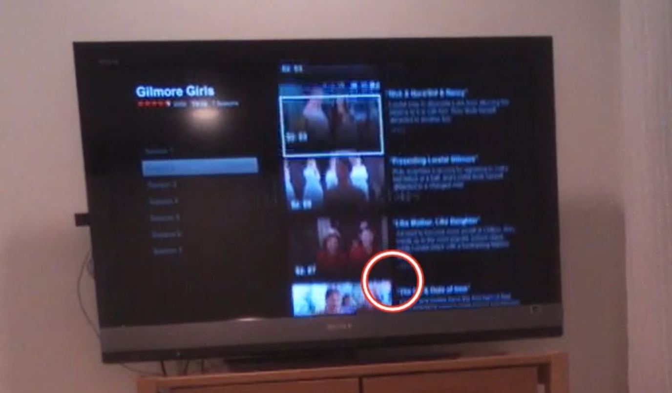
Figure 4.7: Eye-tracking TV screen interface
While observing users interact with relatively “flat” (i.e., lacking 3-D cues) on-screen television app like Netflix or Amazon Fire, we’ve learned not only about how they try to navigate the virtual menu options, but also what their expectations are for that space.
In the real world, there is no delay when you move something. Naturally then, when users select something in virtual space, they expect the system to respond instantaneously. If (as in the case above) nothing happens a few seconds after you “click” something, your are puzzled, and instinctively you focus on that oddity, thus taking away from the intended experience. Only after receiving some sort of acknowledgement from the system (e.g., screen update) will your brain relax and know the system “heard” your request.
Response times are extremely important cues that help users navigate new virtual interfaces, where they are even less tolerant of delays than they are with web pages. Often, flat displays and other similar interfaces show no evidence of feedback — neither a cue that a selection was made, nor anything to suggest the interface is working on the resultant action. Knowing the users’ metaphor and expectations will provide an indication of what sorts of interface responses are needed.
Thinking to the future: Is there a “where” in a voice interface?
There is great potential for voice-activated interfaces like Google Home, Amazon Echo, Hound, Apple Siri, Microsoft Cortana, and more. In our testing of these voice interfaces, we’ve found new users often demonstrate anxiety around these devices because they lack any physical cues that the device is listening or hearing them, and the system timing is far from perfect.
In testing both business and personal uses for these tools in a series of head-to-head comparisons, we’ve found there are a few major challenges that lie ahead for voice interfaces. First, unlike the real world or screen-based interfaces, there are no cues about where you are in the system. If you start to discuss the weather in Paris, while the human still is thinking about Paris, it is never clear if the voice system’s frame of reference is still Paris. After asking about the weather in Paris, you might ask a follow-up question like “How long does it take to get from there to Monaco?” Today, with only a few exceptions, these systems start fresh in every discussion and rarely follow a conversational thread (e.g., that we are still talking about Paris).
Second, if the system does jump to a specific topical or app “area” (e.g., Spotify functionality within Alexa), unlike physical space, there are no cues that you are in that “area,” nor are there any cues as to what you can do or how you can interact. I can’t help but think that experts in accessibility and sound-based interfaces will save the day and help us to improve today’s impressive — but still suboptimal — voice interfaces.
As product and service designers, we’re here to solve problems, not come up with new puzzles for our users. We should strive to match our audience’s perception of space (whatever that may be) and align our offerings to the ways our users already move around and interact. To help our users get from virtual place to place, we need to figure out how to harness the brain’s huge parietal lobes.
Abstracting away the detail
It may not feel like it, but as we take in a scene or a conversation, we are continuously dropping a majority of the concrete physical representation of the scene, leaving us with a very abstract and concept-based representation of what we were focusing on. But perhaps you feel like you are much more of a “visual thinker” and really do get all the details. Great! Please tell me which of the below is the real U.S. penny:
Figure 5.1: Which is the real U.S. penny?
If you are American, you may have seen a thousand examples of these in your lifetime. So surely this isn’t hard for a visual thinker! (You can find the answers to these riddles at the end of the chapter.)
Okay maybe that last test might be considered unfair for you if you rarely have paper currency, let alone metal change. Well then, let’s consider a letter you’ve seen millions of times: The letter “G”. Which of the following is the correct orientation of the letter “G” in lower case?
Figure 5.2: Which is the real “G”?
Not so easy, right? In most cases, when we look at something, we feel like we have a camera snapshot in our mind. But in less than a second, your mind loses the physical details and reverts to a pre-stored stereotype of it — and all the assumptions that go along with it.
Remember, not all stereotypes are negative. The actual Merriam-Webster definition is “something conforming to a fixed or general pattern.” We have stereotypes for almost anything: a telephone, coffee cup, bird, tree, etc.
Figure 5.3: Stereotypes of phone
When we think of these things, our memory summons up certain key characteristics. These concepts are constantly evolving (e.g., from wired telephone to mobile phone). Only the older generations might pick the one on the left as a “phone.”
It terms of cognitive economy, it makes logical sense that we wouldn’t store every perspective, color, and light/shadow angle of every phone we have ever seen. Rather, we quickly move to the concept of a phone and use that representation (e.g., modern iPhone) and fill in the gaps in memory for a specific instance with the concept of that object.
Design Tip: As product designers, we can use this quirk of human cognition to our benefit. By activating an abstract concept that is already in someone’s head (e.g., the steps required to buy something online), we can efficiently manage expectations, be consistent with expectations, and make the person more trusting of the experience.
Trash Talk
Let me provide you with an experiment to show just how abstract our memory can be. First, get out a piece of paper and pencil and draw an empty square on the piece of paper. After reading this paragraph, go to the next page and look at the image for 20 seconds (don’t pick up your pencil yet, though). After 20 seconds are up, I want you to scroll back or hide your screen so that you can’t look at the image. Only then, I want you to pick up your pencil and draw everything that you saw. It doesn’t have to be Rembrandt (or an abstract Picasso), just a quick big-picture depiction of the objects you saw and where they were in the scene. Just a sketch is fine — and you can have 2 minutes for that.
Figure 5.4: Draw your image here
Okay, go! Remember, 20 seconds to look (no drawing), then 2 minutes to sketch (no peeking).
FIgure 5.55.: Picture of an alleyway
Since I can’t see your drawing (though I’m sure it’s quite beautiful), I’ll need you to grade yourself. Look back at the image and compare it to your sketch. Did you capture everything? Two trash cans, one trash can lid, a crumpled-up piece of trash, and the fence?
Now, going one step further, did you capture the fact that one of the trash cans and the fence are both cut off at the top? Or that you can’t see the bottom of the trash cans or lid? When many people see this image, or images like it, they unconsciously “zoom out” and complete the objects according to their stored representations of similar objects. In this example, they tend to extend the fence so its edges go into a point, make the lid into a complete circle, and sketch the unseen edges of the two garbage cans. All of this makes perfect sense if you are using the stereotypes and assumptions we have about trash cans, but it isn’t consistent with what we actually saw in this particular image.
Figure 5.6: Examples of Boundary Extension (Weintraub, 1997)
Technically, we don’t know what’s actually beyond the rectangular frame of this image. We don’t know for sure that the trash can lid extends beyond what we can see, or that the fence top ends just beyond what we can see in this image. There could be a whole bunch of statues of David sitting on top of the fence, for all we know.
Figure 5.7: Did you draw these statues above the tops of the fence posts?
https://flic.kr/p/4t29M3
Our natural tendency to mentally complete the image is called “boundary extension.” Our visual system prepares for the rest of the image as if we’re looking through a cardboard tube, or a narrow doorway. Boundary extension is just one example of how our minds move quickly from very concrete representations of things to representations that are much more abstract and conceptual.
The main implication for product managers and designers is this: A lot of what we do and how we act is based on unseen expectations, stereotypes, and anticipations, rather than what we’re actually seeing when light hits the back of our retinas. We as product and service designers need to discover what those hidden anticipations and stereotypes might be (as we’ll discuss in Part II of the book).
Stereotypes of services
Human memory, as we’ve been discussing, is much more abstract than we generally think it is. When remembering something, we often forget many perceptual details and rely on what we have stored in our semantic memory. The same is true of events. How many times have you heard a parent talk about the time that one of their kids misbehaved many years ago, and incorrectly blamed it on “the child that was always getting into trouble”, rather than the “good one” (I was fortunate enough to be in the latter camp and got away with all kinds of things according to my Mom’s memory, thanks to stereotypes).
The trash can drawing above was a very visual example of stereotypes, but it need not be all about visual perception. We have stereotypes about how things might work, and how we might interact in a certain situation. Here’s an example that has to do more with language, interactions, and events.
Imagine inviting a colleague to a celebratory happy hour. In her mind, “happy hour” may mean swanky decorations, modern bar stools, drinks with fancy ice cube blocks, and sophisticated “mixologists” with impeccable clothing. Happy hour in your mind, on the other hand, might mean sticky floors, $2 beers on tap, and the same grumpy guy named “Buddy” in the same old t-shirt asking “Whatcha want?”
Figures 5.8 and 5.9: What is “Happy Hour” to you?
Both of these are “happy hour,” but the underlying expectations of what’s going to happen in each of these places might be very different. Just like we did in the sketching exercise, we jump quickly from concrete representations (e.g., the words “happy hour”) to abstract inferences. We anticipate where we might sit, how we might pay, what it might smell like, what we will hear, who we will meet there, how you order drinks, and so on.
In product and service design, we need to know what words mean to our customers, and what associate they have with those words. “Happy hour” is a perfect example. When there is a dramatic difference between a customer’s expectation of a product or service and how we designed it, we are suddenly fighting an uphill battle by trying to overcome our audience’s well-practiced expectations.
The value of understanding mental models
Knowing and activating the right mental model (i.e., “psychological representations of real, hypothetical, or imaginary situations”) can save us a huge amount of time as product or service designers. This is something we rarely hear anything about in customer experience — and yet, understanding and activating the right mental models will build trust with our target audience and reduce the need for instructions.
Case study: The concept “weekend”
Figure 5.10: Words used to describe a Weekend
Challenge: In one project for a financial institution, my team and I interviewed two groups of people regarding how they use, manage, and harness money to accomplish their goals in life. The two groups consisted of: 1) a set of young professionals, most of whom were unmarried, without children, and 2) a group that was a little bit older, most of whom had young children. We asked them what they did on the weekend. You can see their responses in the visualizations above.
Result: Clearly, the two groups had very different semantic associations with the concept of “weekend.” Their answers helped us glean: (A) What the phrase “the weekend” means to each of these groups, and (B) How the two groups are categorically different, including what they value and how they spend their time. Our further research found very large differences in the concept of luxury for each group. In tailoring products/services to each of these groups, we would need to keep in mind their respective mental model of “weekend.” This could influence everything from the language and images we use to the emotions we try to evoke.
Acknowledging the diversity of types of mental models
Thus far, we’ve discussed how our minds go very quickly from specific visual details or words to abstract concepts, and the representations that are generated by those visual features or words can be distinct across audiences. But also recognize there are many other types of stereotypical patterns. In addition to these perceptual or semantic patterns, there are also stereotypical eye patterns and motor movements.
You probably remember being handed someone’s phone or a remote control you’ve never used before and saying to yourself something like: “Ugh! Where do I begin? Why is this thing not working? How do I get it to…? I can’t find the…?”. That experience is the collision between your stereotypical eye and motor movements, and the need to override them.
The point I’m driving home here is that there are a wide range of customer expectations baked into interactions with products and services. Our experiences form the basis for mental assumptions about people, places, words, interaction designs … pretty much everything. This makes sense because under normal circumstances, stored and automated patterns are incredibly more mentally efficient and allow your mental focus to be elsewhere. As product and service managers and designers, we need to both:
Riddle Answer Key!
Chapter 6. Language: I Told You So
In Voltaire’s words, “Language is very difficult to put into words.” But I’m going to try to anyway.
In this chapter, we’re going to discuss what words our audiences are using, and why it’s so important for us to understand what they tell us about how we should design our products and services.
Wait, didn’t we just cover this?
In the previous chapter, we discussed our mental representations of meaning. We have linguistic references for these concepts as well. Often, as non-linguists, it is easy to think of a concept and the linguistic references to that concept as one and the same. But they’re not. Words are actually strings of morphemes/phonemes/letters that are associated with semantic concepts. Semantics are the abstract concepts that are associated with the words. In English, there is no relationship between the sounds or characters and a concept without the complete set of elements. For example, “rain” and “rail” share three letters, but that doesn’t mean their associated meanings are nearly identical. Rather, there are essentially random associations between a group of elements and their underlying meanings.
What’s more, these associations can differ from person to person. This chapter focuses on how different subsets of your target audiences (e.g., non-experts and experts) can use very different words, or use the same word – but attach different meanings to it. This is why it’s so important to carefully study word use to inform product and service design.
Figure 6.1: Semantic Map
The language of the mind
As humans and product designers, we assume that the words we utter have the same meanings for other people as they do for us. Although that might make our lives, relationships, and designs much easier, it’s simply not true. Just like the abstract memories that we looked at in the previous chapter, word-concept associations are more unique across individuals and especially across groups than we might realize. We might all do better in understanding each other by focusing on what makes each of us unique and special.
Because most consumers don’t realize this, and have the assumption that “words are words” and mean what they believe them to mean, they are sometimes very shocked (and trust products less) when those products or services use unexpected words or unexpected meanings for words. This can include anything from cultural references (“BAE”) to informality in tone (“dude!”) to technical jargon (“apraxic dysphasia”).
If I told you to “use your noggin,” for example, you may try to concentrate harder on something — or you may be offended that I didn’t tell you to use your dorsolateral prefrontal cortex. If you’re a fellow cognitive scientist, you might find the informality I started with insultingly imprecise. If you’re not, and I told you to use your dorsolateral prefrontal cortex, you might find my language confusing (“Is that even English?”), meaningless, and likely scary (“Can I catch that in a public space?”). Either way, I run the risk of losing your trust by deviating from your expected style of prose.
|
Ordinary American’s terms |
Cognitive neuropsychologist’s terms |
|
Stroke, brain freeze, brain area near the middle of your forehead |
Cerebral vascular accident (CVA), transient ischemic attack (TIA), anterior cingulate gyrus |
The same challenge applies to texting. Have you ever received a text reading “SMH” or “ROTFL” and wondered what it meant? Or perhaps you were the one sending it, and received a confused response from an older adult. Differences in culture, age, and geographic location are just a few of the factors that influence the meanings of words in our minds, or even the existence of that entry in our mental dictionaries — our mental “lexicon.”
|
Adult terms |
Teen texter’s terms |
|
I’ll be right back, that’s really funny, for what it’s worth, in my opinion |
BRB, ROTFL, FWIW, IMHO |
“What we’ve got here is failure to communicate”
When we think about B2C communication fails, it’s often language that gets in between the business and the customer, causing customers to lose faith in the company and end the relationship. Have you ever seen an incomprehensible error message on your laptop? Or been frustrated with an online registration form that asks you to provide things you’ve never even heard of (e.g., Actual health care enrollment question: What is your FBGL, in mg/dl)?
This failure to communicate usually stems from a business-centric perspective, resulting in overly technical language or sometimes, an over-enthusiastic branding strategy that results in the company being too cryptic with their customers (e.g., What is the difference between a “venti” and a “tall”?). To reach our customer, it’s crucial that we understand the customer’s level of sophistication of your line of work (as opposed to your intimate in-house knowledge of it), and that we provide products that are meaningful to them at their level.
(Case in point: Did you catch my “Cool Hand Luke” reference earlier? You may or may not have, depending on your level of expertise when it comes to Paul Newman movies from the 60s, or your age, or your upbringing. If I were trying to reach Millennials in a clever marketing campaign, I probably wouldn’t quote from that movie; instead, I might choose something from “The Matrix.”)
Revealing words
The words that people use when describing something can reveal their level of expertise. If I’m talking with an insurance agent, for example, she may ask whether I have a PLUP. For that agent, it’s a perfectly normal word, even though I may have no idea what a PLUP is (in case you don’t, either, it’s short for a Personal Liability Umbrella Policy, which provides coverage for any liability issue). Upon first hearing what the acronym stood for, I thought it might protect you from rain and flooding!
|
Ordinary American’s terms |
Insurance broker’s terms |
|
Home insurance, car insurance, liability insurance |
Annualization, Ceded Reinsurance Leverage, Personal Liability Umbrella Policy (PLUP), Development to Policyholder Surplus |
Over time, people like this insurance agent build up expertise and familiarity with the jargon of their field. The language they use suggests their level of expertise. To reach them (or any other potential customer), we need to understand both:
As product owners and designers, we want to make sure we’re using words that resonate with our audience — words that are neither over nor beneath their level of expertise. If we are communicating with a group of orthopedic specialists, we would use very different language than if we were trying to communicate to young preschool patients. If we tried to use the specialists’ complicated language when speaking to patients, instead of layman’s terms, we’d run the risk of confusing and intimidating our audience, and probably losing their trust as well.
Perhaps this is why cancer.gov provides two definitions of each type of cancer; the health professional version and the patient version. You’ve heard people say “you’re speaking my language.” Just like cancer.gov, we want your customers to experience this same comfort level when they come across your products or services — whether as an expert or novice. It’s a comfort level that comes from a common understanding and leads to a trusting relationship.
|
How many of these Canadian terms do you understand? |
|
chesterfield, kerfuffle, deke, pogie, toonie, soaker, toboggan, keener, toque, eavestroughs |
When your products and services have a global reach, there is also the question of the accuracy of translation, and the identification and use of localized terms (e.g., trunk (U.S.) = boot (U.K.)). We must ensure that the words that are used in the new location mean what we want them to mean when they’re translated into the new language or dialect. I remember a Tide detergent ad from several years ago saying things like “Here’s how to clean a stain from the garage (e.g., oil), or a workshop stain, or lawn stain.” While the translations were reasonably accurate, the intent went awry. Why? When they translated this American ad for Indian and Pakistani populations, they forgot to realize that most people had a “flat” (apartment) and didn’t have a garage, workshop, or lawn. Their conceptual structure was all different!
I’m listening
Remember in the last chapter, how I used the example of my team using interviews with young professionals and parents of young children to uncover underlying semantic representations among our audience? I can’t overstate the importance of interviews, and transcripts of those interviews, in researching your audience. We want to know the exact terms they use (not just our interpretation of what they said) when we ask a question like, “What do you think’s going to happen when you buy a car?” Examining transcripts will often reveal the lexicon your customers use is likely very different than your own (as a car salesperson).
Through listening to their exact words, we can learn what words they’re commonly using, the level of expertise their words imply, and ultimately, what sort of process this audience is expecting. This helps experience designers either conform more closely to customers’ anticipated experience or warn their customers that the process may differ from what they might expect.
Overall, here’s our key takeaway. It’s pretty simple, or at least it sounds simple enough. Once we have an understanding of our users’ level of understanding, we can create products and services that have the sophistication and terminology that works best for our customers. This leads to a common understanding of what is being discussed and trust — ultimately leading to happy, loyal customers.
Chapter 7. Decision-Making and Problem Solving: Enter Consciousness Stage Left
Up until now, most of the processes I’ve introduced so far, like attentional shifts and representing 3-D space, occur automatically, even if influenced by consciousness. In contrast, this chapter focuses on the very deliberate and conscious process of decision-making and problem-solving. Relative to other processes, this is one that you’re the most aware of and in control of. Right now I’m pretty sure that you’re thinking about the fact that you’re thinking about it.
We will focus on how we, as decision-makers, define where we are now and our goal state, and make make decisions to get us closer to our desired goal. Designers rarely think in these terms but I hope to change that.
What is my problem (definition)?
When you’re problem solving and decision making, you have to answer a series of questions. The first one is “What is my problem?” I don’t mean that you’re beating yourself up — I mean what is the problem you’re trying to solve: where are you now (current state) and where do you want to be (goal state).

Figure 7.1 People searching for clues in an escape room.
If you’ve ever experienced an Escape Room, an adventure game where you have to solve a series of riddles as quickly as possible to get out of a room. While getting unlocking the door may be your ultimate goal, there are sub-goals you’ll need to accomplish before that (e.g., finding the key) in order to get to your end goal. Sub-goals like finding a lost necklace, which you’ll need for your next sub-goal of opening a locked box, for instance (I’m making these up; no spoiler alerts here!).
Chess is another example of building sub-goals within larger goals. Ultimate goal: checkmate the opponent’s king. As the game progresses, however, you’ll need to create sub-goals to help you reach your ultimate goal. Your opponent’s king is protected by his queen and a bishop, so a sub-goal (to the ultimate goal of putting the opponent’s king into checkmate) could be eliminating the bishop. To do this, you may want to use your own bishop, which then necessitates another sub-goal of moving a pawn out of the way to free up that piece. Your opponent’s moves will also trigger new sub-goals for you — such as getting your queen out of a dangerous spot, or transforming a pawn by moving it across the board. In each of these instances, sub-goals are necessary to reach our desired end goal.
How might problems be framed differently?
Remember when we talked about experts and novices in the last chapter, and the unique words each group uses? When it comes to decision-making, experts and novices are often thinking very differently, too.
Let’s consider buying a house, for example. The novice home buyer might be thinking “What amount of money do we need to offer in order to be the bid the owner will accept?” Experts, however, might be thinking several more things: Can this buyer qualify for a loan? What is their credit score? Have they had any prior issues with credit? Do the buyers have the cash needed for a down payment? Will this house pass an inspection? What are the likely repairs that will need to be made before the buyers might accept the deal? Is this owner motivated to sell? Is the title of the property free and clear of any liens or other disputes?
So while the novice home buyer might frame the problem as just one challenge (convincing the buyer to sell at a specific price), the expert is thinking about many other things as well (e.g., a “clean” title, building inspection, credit scores, seller motivations, etc.). From these different perspectives, the problem definition is very different, and the decisions they make and actions they might take will also likely be very different.
In many cases, novices (whether first-time home buyers or college applicants or AirBnB renters) don’t define the problem that they really need to solve because they don’t understand all the complexities and decisions they need to make. Their knowledge of the problem might be very simplistic relative to what really happens.
This is why the first thing we need to understand is how our customer defines the problem. Then, we have an indication of what they think they need to do to solve that problem. As product and service designers, we need to meet them there, and over time, help to redirect them to what their actual (and likely more complex) problem is and the decisions they have to make along the way. This is known as redefining the problem space.
Figure 7.2: Williams Sonoma blenders
Sidenote: Framing and defining the problem are very different, but both apply to this section. To boost a product’s online sales, you may place it in between two higher- and lower-priced items. You will have successfully framed your product’s pricing. Instead of viewing it on its own, as a $300 blender, users will now see it as a “middle-of-the-road” option, not too cheap but not $400, either. As a consumer, be aware of how the art of framing a price can influence your decision-making skills. And as a designer, be aware of the power of framing.
Mutilated Checkerboard Problem
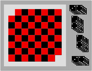
Figure 7.3: Mutilated Checkerboard
A helpful example of redefining a problem space comes from the so-called “mutilated checkerboard problem” as defined by cognitive psychologists Kaplan and Simon. The basic premise is this: Imagine you have a checkerboard. (If you’re in the U.S., you’re probably imagining intermittent red and black squares; if in the U.K., you might call this a chessboard, with white and black squares. Either version works in this example.) It’s a normal checkerboard, except for the fact that you’ve taken away the two opposite black corner squares away from the board, leaving you with 62 squares instead of 64. You also have a bunch of dominoes, which cover two squares each.
Your challenge: Arrange 31 dominoes on the checkerboard such that each domino lies across its own pair of red/black squares (no diagonals).
Moving around the problem space: When you hand someone this problem, they inevitably start putting dominoes down to solve it. Near the end of that process they inevitably get stuck, and try repeating the process. (If you are able to solve the problem without breaking the dominoes — be sure to send me your solution!)
The problem definition challenge: The problem is logically unsolvable. If every domino has to go on one red and one black square, and we no longer have an even number of red and black squares on the board (since we removed two black squares and no red squares). To the novice, the definition of the problem, and the way to move around in the problem space, is to lay out all the dominoes and figure it out. Each time they put down a domino they believe you are getting closer to the end goal. They likely calculated that since there are now 62 squares, and 31 dominoes, and each domino covers two spaces, the math works. An expert, however, instantly knows that you need equal numbers of red and black squares to make this work, and wouldn’t even bother to try and figure it out.
It’s an example of how experts can approach a problem one way and novices another. In this case, we saw how novices – after considerable frustration – redefined the problem. As product and service designers, if our challenge was to redefine the problem for novices in this instance, it would involve moving novices from holding their original problem definition (i.e., 62 squares = 31 x 2 dominos, and I have to place the dominoes on squares to figure this out) to a more sophisticated representation (i.e., acknowledging that you need an even number of red and black squares to solve this problem, and therefore there is no need to touch the dominos).
Finding the yellow brick road to problem resolution
I’ve mentioned moving around in the problem space. Let’s look at that component more closely.
First, it’s really important that as product or service designers, that we make no assumptions about what the problem space looks like for our users. As experts in the problem space, we know all the possible moves around the problem space that can be taken, and it often seems obvious what decisions need to be made and needs to be done. That same problem may look very different to our more novice users. Conversely, they might have a more sophisticated perspective on the problem than we initially anticipated.
In games like chess, it’s very clear to all parties involved what their possible moves are, if not all the consequences of their moves. That’s why we love games, isn’t it? In other realms, like getting health care or renting an apartment, the steps aren’t always so clear. As designers of these processes, we need to learn what our audiences see as their “yellow brick road.” What do they think the path is that will take them from their beginning state to their goal state? What do they see as the critical decisions to make? The road they’re envisioning may be very different from what an expert would envision, or what is even possible. But once we understand their perspective, we can work to gradually morph their novice mental models into a more educated one so that they make better decisions and understand what might be coming next.
When you get stuck en route: Sub-goals
We’ve talked about problem definition for our target audiences, but what about when they get stuck? How do they get around the things that may block them (“blockers”)? Many users see their end goal, but what they don’t see, and what we product and service designers can help them see, are the sub-goals they must have, and the steps, options, possibilities, for solving those sub-goals.
One way to get around blockers is through creating sub-goals, like those we discussed in the Escape Room example. You realize that you need a certain key to unlock the door. You can see that the key is in a glass box with a padlock on it. Your new sub-goal is getting the code to the padlock (to unlock the glass box, to get the key, to unlock the door).
We can also think of these sub-goals in terms of questions the user needs to answer. To lease a car, the customer will need to answer many sub-questions (e.g., How old are you?, How is your credit?, Can you afford the monthly payments?, Can you get insurance?) before the ultimate question (i.e., Can I lease this car?) can be answered. In service design, we want to address all of these potential sub-goals and sub-questions for our user so they feel prepared for what they’re going to get from us. It’s important that we address these micro-questions in a logical progression.
Ultimately, you as a product or service designer need to understand:
We almost always make decisions at two levels: A very logical, rational “Does this make sense?” level (which is sometimes described as “System 2,” or “conscious decisions”), and a much more emotional level (you may have heard references to “System 1,” the “lizard brain,” or “midbrain”). The last chapter in this section covers emotions and how emotions and decision-making are inherently intertwined.
Chapter 8. Emotion: Logical Decision Making Meets Its Match

Figure 8.1: Portraits of Emotion
Up to now, we’ve treated everyone like they’re perfectly rational and make sound decisions every time. While I’m sure that applies in your case (not!), for most of us there are many ways to systematically deviate from logic, and often using mental shortcuts. When overwhelmed, we default to heuristics and end up “satisficing”, which means picking the best option not through careful decision making and logic, but something that is easy to recall and is about right.
As psychologists, there is a lot we can say about the study of emotions and their physiological and cognitive underpinnings. I plan to leave more details to some of the great resources at the end of this chapter, but for now let us turn to the more practical.
As designers, I want you to think about emotions that are critical to product and service design. This does mean the emotions and emotional qualities that are evoked as a customer experiences our products and services. But it also means going deeper, to the customer’s underlying and deep-seated goals and desires (which I hope you will help them accomplish with your product or service), as well as the customer’s biggest fears (which you may need to design around should they play a role in decision making).
Too much information jamming up my brain! Too much information driving me insane!
I mentioned Daniel Kahneman earlier in reference to his work on attention and mental effort in his book “Thinking, Fast and Slow.” He shows how, in a quiet room, by yourself, you can usually make quite logical decisions. If, however, you’re trying to make that same decision in the middle of a New York City subway platform at rush hour, with someone shouting in the background and your child tugging at your arm, you’ll be unable to make as good a decision. This is because all of your attention and working memory are being occupied with other things.
Herbert Simon coined the notion of satisficing, which means accepting an available (easily recallable) option as not the ideal decision or choice, but perhaps satisfactory given the limited cognitive resources available for decision-making at the time. In times when you are mentally taxed, either due to overstimulation or emotions, you often rely on a gut response — a quick, intuitive association or judgment.
It makes sense, right? Simply having your attention overwhelmed can dramatically affect how you make decisions. If I ask you what 17 minus 9 is, for example, you’ll probably get the answer right fairly quickly. If I ask you to remember the letters A-K-G-M-T-L-S-H in that order and be ready to repeat them, and while holding onto those letters ask you to subtract 8 from 17, however, you are likely to make the same arithmetic errors that someone who suffers from math phobia would produce. For those who get extremely distraught and emotional thinking about and dealing with numbers, those worries can fill up our working memory capacity and impair our ability to make rational decisions, forcing us to fall back on strategies like satisficing.
Some businesses have mastered the dark art of getting consumers to make suboptimal decisions. That’s why casinos intentionally overwhelm you with lighting and music and drinks, and make sure clocks and other time cues are nowhere to be found so you keep gambling. It’s why car dealerships often make you wait around for a while, then ask you to make snap decisions for which you either get a car, or nothing. When is the last time a car salesperson asked you to go home and sleep on a deal? I encourage you to do exactly that, so the emotional content is not affecting your decision-making.
Spock, I am not
With a better understanding of decision-making, you might assume that those who study decision-making for a living (e.g., psychologists and scientists) might make more logical, rational decisions, like Captain Kirk’s stoic counterpart Spock. Like other humans, we have our rational systems competing with our feelings and emotions as we make decisions. Beyond the cerebral cortex lie more primitive centers that generate competing urges to follow our emotional response and ignore the logical.
Early cognitive psychologists thought about decision-making in simple terms, focusing on all of the “minds” you’ve seen up until now, like perception, semantics, and problem-solving. But they left out one crucial piece: emotion. In his 1984 “Cognition and Emotion,” Joseph LeDoux argued that traditional cognitive psychology was making things unrealistically simple. There are so many ways that we deviate from logic, and so many ways that our lower reptilian brain affects our decision-making. Dan Ariely demonstrates several ways in his book “Predictably Irrational: The Hidden Forces That Shape Our Decisions.”
This affects us in a myriad of ways. For example, it has been well demonstrated that humans hate losses more than we love gains. “People tend to be risk averse in the domain of gains and risk seeking in the domain of losses,” Ariely writes. Because we find more pain in losing than we find pleasure in winning, we don’t work rationally in economic and other decisions. To intuitively understand this, consider a lottery. You are unlikely to buy a $1 ticket with a possible payoff of $2. You would want the chance to win $10,000, or $100,000, just from that one ticket. You are imagining what it would be like with all that money (a very emotional response), just as picturing losing that $1 and not winning can elicit the feeling of loss.
Our irrationality, however, is predictable, as Ariely demonstrates. He argues that we are systematic in the ways we deviate from what would be logically right. According to Ariely, “we consistently overpay, underestimate, and procrastinate. Yet these misguided behaviors are neither random nor senseless. They’re systematic and predictable — making us predictably irrational.”
Competing for conscious attention
Sometimes, your brain is overwhelmed by your setting, like the subway platform example. Other times, it’s overwhelmed by emotions.
A good deal of research has gone into all of these systematic deviations from logic, which I simply don’t have time to present in this book. But the key point is that in optimal conditions (no time pressure, quiet room, time to focus, no additional stress put on you), you can make great, logical decisions. However, in the real world, we often lack the ability to concentrate sufficiently to make that logical decision. What we do instead is “satisfice” — we make decisions using shortcuts. One of the tools we use in lieu of careful thought includes: “If I think of a prototypical example of this, does the ideal in my mind’s eye match a choice I’ve been given?”
Imagine yourself in that car dealership negotiating a price. Your two children were as good as gold during the test drive, but they’re getting restless and you’re growing worried that they are going to fall off a chair or knock something over. You are hungry and tired. The salesperson leaves for what seems like an eternity and finally returns with an offer, which has many lines and includes decisions about percentages down, loan rates, options, damage protections, services, insurances, and much more. During the explanation it happens — child #2 falls, and is now crying and talking to you as you hold their fidgeting body and attempt to listen to the salesperson. You simply don’t have the attentional resources to give to the problem at hand (determining if this is a fair deal and which options you want to choose). Instead, you imagine yourself driving on the open road with the sunroof open (far from the car dealership and family) — and that emotional side takes over.
As product designers, we need to understand both what the rational, conscious part of our mind is seeking (data, decisions they seek to make) as well as what the underlying emotional drivers are for making the decision. It is my hope that you will provide your buyers the information they need and support them in making the best decision for them, rather than seeking to overwhelm and obfuscate in order to drive emotional decision making. Both the rational and emotional are crucial in every decision being made. This is why people who are not salespeople often encourage you to “sleep on it” to make the decision, giving you the time you need to make more informed, less emotional decisions.
All of these feelings flooding in are subconscious emotional qualities. Just like having your attention overwhelmed on the subway, you now have less of your memory to make good decisions when you’re overwhelmed with emotion. (That’s why as a psychologist, I never let a salesperson sit me in a car that I’m not planning on buying. Seriously, don’t try me.) We all have emotions competing for our conscious resources. When the competition ramps up, that’s how we start to make decisions we regret later.
Getting to deep desires, goals and fears
When we’re overwhelmed by attention, emotion, or the character of Morpheus offering to show us just how far the rabbit hole goes in “The Matrix,” we tend to end up making an emotional gut decision, throwing logic out the window. We let ourselves be guided by the stereotypes associated with an item in question, casting aside all the factors that we might have wanted to consider in our decision.
In these moments, we default to heuristics, or simple procedures that help us “find adequate, though often imperfect, answers to difficult questions,” as Kahneman explains.
“You have intuitive feelings and opinions about almost everything that comes your way. You like or dislike people long before you know much about them; you trust or distrust strangers without knowing why; you feel that an enterprise is bound to succeed without analyzing it. Whether you state them or not, you often have answers to questions that you do not completely understand, relying on evidence that you can neither explain nor defend.” — Daniel Kahneman, “Thinking, Fast and Slow”
In an observational study for a client in the credit card industry, I started out by asking consumers innocuous questions about their favorite credit cards. The questions got progressively deeper, as I probed “What are your goals for the next three years?” and “What worries or excites you most about the future?” The session ended in tears and hugs, with respondents saying this was the best therapy session they’d had in a long time. In a series of eight questions, I went from people saying what cards were in their wallet to sharing their deepest hopes and fears. By listening to them, I was able to draw out:
Numbers 1 and 2 are essential to getting to Number 3 — but once you get to Number 3, you’ve got your selling point: The deep, underlying meaning of what it is your product is trying to address for your target audience. This is why many commercials don’t actually feature the product itself until the very end, if at all. Instead, they focus on the feeling or image that the ideal consumer is trying to mirror: successful businesswoman, family man, thrill-seeking retiree, etc. By uncovering (and leveraging) what appeals to your audience immediately, what will help them in the long term, and what will ultimately awaken some of their deepest goals in life, you’ve gone from surface level to their gut reaction level — which can’t be overestimated in the decision-making process. In the next part of the book we’ll describe how to get there.
Chapter 9. User Research: Contextual Interviews
Market research has taken many forms through the years. Some may immediately think of the kind of focus group shown in the TV show “Mad Men.” Others may think of a large surveys, and still others may have conducted empathy research when taking a Design Thinking approach to product and service design.
While focus groups and surveys can be great tools to get to what people are saying, and maybe some of what they are doing, they just don’t get to the why behind these behaviors, and it doesn’t get us the level of detail in analysis we would like to have in order to meaningfully influence product and service design decisions.
In this chapter, I’ll recommend a different take on market research that combines watching people in their typical work or play, and interviewing them. I’ll show you that if you’ve already done some qualitative studies, you might already have a fair bit of interesting data to work with already. And if you don’t have that data, that collecting it is within your grasp. And what I’m proposing is designed so that anyone can conduct the research — no psychology PhD’s or white lab coats required. It may be very familiar to psychologists and anthropologists: the contextual interview.
Why a contextual interview?
If I had to get to the essence of what a contextual interview is, I’d say “looking over someone’s shoulder and asking questions,” with a focus on observing customers where they do their work (e.g., at their desk at the office, or at the checkout counter) or where they live and play.
The number one reason why digital products take longer and cost more than planned is a mismatch between user needs and functionality. We need to know what our customers’ needs are. Unfortunately, we can’t learn what we need to simply asking by them. There are several reasons why this is the case.
First, customers often just want to keep doing what they’re doing, but better. As product and service designers who are outside that day-to-day grind, we can sometimes envision possibilities beyond today’s status quo and leapfrog to a completely different, more efficient, or more pleasurable paradigm. It’s not your customer’s job to envision what’s possible in the future; it’s ours!
Second, there are a lot of nuanced behaviors people do unconsciously. When we watch people work or play in the moment, we can see some of the problems with an experience or that don’t make sense, that customers compensate for and don’t even know they are doing so. How likely is it that customers are going to be able to report behaviors they themselves aren’t even aware of?
For example, I’ve observed Millennials flipping wildly between apps to connect with their peers socially. They never reported flipping back and forth between apps, and I don’t think they were always conscious of what they were doing. Without actively observing them in the moment, we might never have known about this behavior, which turned out to be critical to the products we were gathering research for.
We also want to see the amazing lengths to which “super-users” — users of your products and services who really need them and find a way to make them work — go to in order to create innovations and workarounds that make the existing (flawed) systems work. We’ll talk about this later, but this notion of watching people “in the moment” is similar to what those in the lean startup movement call to GOOB, or Getting Out Of (the) Building, to truly see the context in which your users are living.
Third, if your customers are not “in the moment,” they often forget all the important details that are critical to creating successful product and service experiences. Memory is highly contextual. For example, I am confident that when you visit somewhere you haven’t been in years you will remember things about your childhood you wouldn’t otherwise because the context triggers those memories. The same is true of customers and their recollections of their experiences.
In psychology, especially organizational psychology or anthropology, watching people to learn how they work is not a new idea at all. Corporations are starting to catch on; it’s becoming more common for companies to have a “research anthropologist” on their staff who studies how people are living, communicating, and working. (Fun fact: There is even one researcher that calls herself a cyborg anthropologist! Given how much we rely on our mobile devices, perhaps we all are cyborgs, and we all practice cyborg anthropology!)
Jan Chipchase, founder and director of human behavioral research group Studio D, brought prominence to the anthropological side of research through his research for Nokia. Through in-person investigation, which he calls “stalking with permission” (see, it’s not just me!), he discovered an ingenious and off-the-grid banking system that Ugandans had created for sharing mobile phones.
“I never could have designed something as elegant and as totally in tune with the local conditions as this. … If we’re smart, we’ll look at [these innovations] that are going on, and we’ll figure out a way to enable them to inform and infuse both what we design and how we design.” — Jan Chipchase, “The Anthropology of Mobile Phones,” TED Talk, March 2007
Chipchase’s approach uses classic anthropology as a tool for building products and thinking from a business perspective. Below, I explain how you can do this too.
Empathy research: Understanding what the user really needs
Leave assumptions at the door and embrace another’s reality
Chipchase’s work is just one example of how we can only understand what the user really needs through stepping into their shoes — or ideally, their minds — for a little while.
To think like our customers, we need to start by dispeling your (and your company’s) assumptions about what your customers need and think like your customers. In their Human-Centred Design Toolkit, IDEO writes that the first step to design thinking is empathy research, or a “deep understanding of the problems and realities of the people you are designing for.”
In my own work, I’ve been immersed in the worlds of people who create new drugs, traders managing billion-dollar funds, organic goat farmers, YouTube video stars, and people who need to buy many millions of dollars of “Shotcrete” (like concrete, but it can be pumped) to build a skyscraper. Over and over, I’ve found that the more I’m able to think like that person, the better I’m able to identify opportunities to help them and lead my clients to optimal product and service designs.
Suppose, however, that you were the customer in the past (or worse yet, your boss was that customer decades ago) and you and/or your boss “know exactly what customers want and need” making research unnecessary. Wrong! You are not the customer, and when we do research in this context it can makes it even harder because we fight against preconceived notions and it is harder to listen customers about their needs today.
I remember one client who in the past had been the target customer for his products, but he had been the customer before the advent of smartphones. Imagine being at a construction site and purchasing concrete 10 years ago, around the time of flip phones (if you were lucky!). The world has changed so much since then, and surely the way we purchase concrete has too. This is why to embrace a customer’s reality, you need to park your expectations at the door and live today’s challenges.
Here’s just one example I noticed while securing a moving truck permit. To give me the permit, the government employee had to walk to one end of this huge office to get a form, and then walk all the way over to the opposite corner to stamp it with an official seal, and then walk nearly as foar over to the place where he could photocopy it, and then bring it to me. Meanwhile, the line behind me got longer and longer. Seeing this inefficient process left me wondering why these three items weren’t grouped together. It’s a small example of the little, unexpected improvements you can note just through watching people at work. I’m not sure the government worker even noticed the inefficiencies!
Moments like these abound in our everyday life. Stop and think for a second about a clunky system you witnessed just by looking around you. Was it the payment system on the subway? Your health care portal? An app? What could have made the process smoother for you? Once you start observing, you’ll find it hard to stop. Trust me. May your kids, friends, and relatives be patient with your “helpful hints” from here on out!
Any interview can be contextual
Because so much of memory is contextual, and there are so many things our customers will do that are unconscious we can learn learn so much when immersed in their worlds. That means meeting with farmers in the middle of Pennsylvania, sitting with traders in front of their big bank of screens on Wall St., having happy hour with high-net worth jet setters near the ocean (darn!), observing folks who do tax research in their windowless offices, or even chatting with Millennials at their organic avocado toast joint. The key point is, they’re all doing what they normally do.
Contextual interviews allow the researcher to see workers’ post-its on their desk, what piles of paper are active and what piles are gathering dust, how many times they’re being interrupted, and what kind of processes they actually follow (which are often different than the ones that they might describe during a traditional interview). Your product or service has to be useful and delightful for your user, which means you need to observe your customers and how they work. The more immersive and closer to their actual day, the better.

Figure 9.1: Observing how a small business owner is organizing his business
In contextual inquiry, while I want to be quiet sometimes and just observe, I also ask my research subjects questions like:
What researchers notice

Figure 9.2: Example of the desk of a research participant. Why do they have the psychology book “Influence” right in the middle I wonder?
Researchers who do contextual interviews typically consider the following:
Why not surveys or usability test findings?: Discovering the what vs. why
Clients sometimes assure me that their user research is solid and they need no other data because they received thousands of survey responses. It is true that that client has an accurate reading of the what of the immediate problem (e.g., the customer wants a faster process, step 3 of a problem is problematic, or the mobile app is cumbersome). These get at the what the customer is asking for, but as product and service designers, we need to get to the why of the problem, and the underlying reasons and rationale behind the what.
It could be that the customer is overwhelmed by the appearance of an interface, or was expecting something different, or is confused by the language you’re using. It could be a hundred different things. It is extremely hard to infer the underlying root cause of the issue from a survey or from talking to your colleagues who build the product or service. We can only know why customers are thinking the way they are through meeting them and observing them in context.
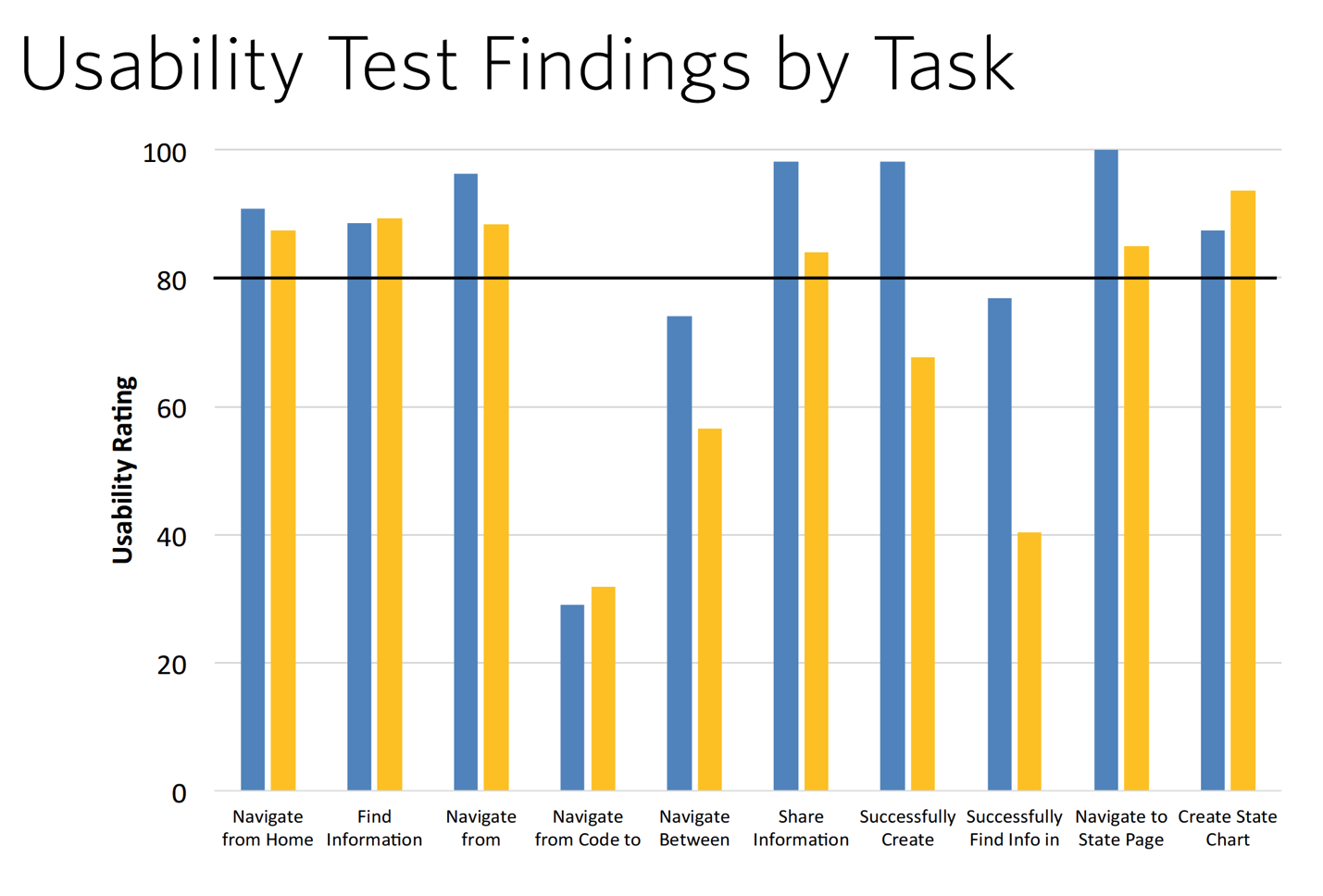
Figure 9.3: Example of usability test findings. From the above chart, can you tell why these participants are having trouble “Navigating from Code” in the fourth set of bars? [Me neither!]
Classic usability test findings often provide the same “what” information. They will tell you that your users were good at some tasks and bad at others, but often don’t provide the clues you need to get to the why. That is where conducting research with the Six Minds in mind comes to the rescue.
Recommended approach for contextual interviews and their analysis
As I’ve implied throughout this chapter, shadowing people in the context of their actual work allows you to observe both explicit behaviors, as well as implicit nuances that your interviewees don’t even realize they are doing. The more that users show you their processes step-by-step, the more accurate they will be when it comes to the contextual memory of remembering that certain process.
With our Six Minds of Experience, I want you to not just experience the situation in context, but also be actively thinking about many different types of mental representations within your customer’s mind:
The sort of observation I’ve described so far has mostly focused on how people work, but it can work equally well in the consumer space. Depending on what your end product or service is, your research might include observing a family watch TV at home (with their permission, of course), going shopping at the mall with them, or enjoying happy hour or a coffee with their friends. Trust me: you’ll have many stories to tell about all the things your customers do that you didn’t expectwhen you return to the office!
This is probably the funnest part, and shouldn’t be creepy if you do it correctly. I give you permission (and they should provide their or their parents’ written permission) to be nosy, and curious, and really to question all your existing assumptions. When I’m hiring someone, I often ask them if they like to go to an outdoor cafe and just people-watch. Because that’s my kind of researcher: we’re totally fascinated by what people are thinking, what they’re doing, and why. Why is that person here? Why are they dressed the way they are? Where are they going next? What are they thinking about? What makes them tick? What would make them laugh?
There are terrific whole books dedicated to the contextual interviews I’ll mention at the end of this chapter. I’ll leave it to them to provide all the nuances to these interviews, but I definitely want you to go into your meetings in the following mindset:
Common questions
From data to insights
Many people get stuck at this step. They have interviewed a set of customers and feel overwhelmed with all of their findings, quotes, images, and videos. Is it really possible to learn what we need to know just through these observations? All of these nuanced observations that you’ve gathered can be overwhelming if not organized correctly. Where should I begin?
To distill hundreds of data points into valuable insights on how you should shape your product or service, you need to identify patterns and trends. To do so, you need the right organizational pattern. Here’s what my process looks like.
Step 1: Review and write down observations
In reviewing my own notes and video recordings, I’ll pull out bite-sized quotes and insights on users’ actions (aka, my “findings”). I write these onto post-it notes (or on virtual stickies in a tool like Mural or RealTimeBoard). What counts as an observation? Anything that might be relevant to our Six Minds:
In addition, if there are social interactions that are important (e.g., how the boss works with employees), I’ll write those down as well.
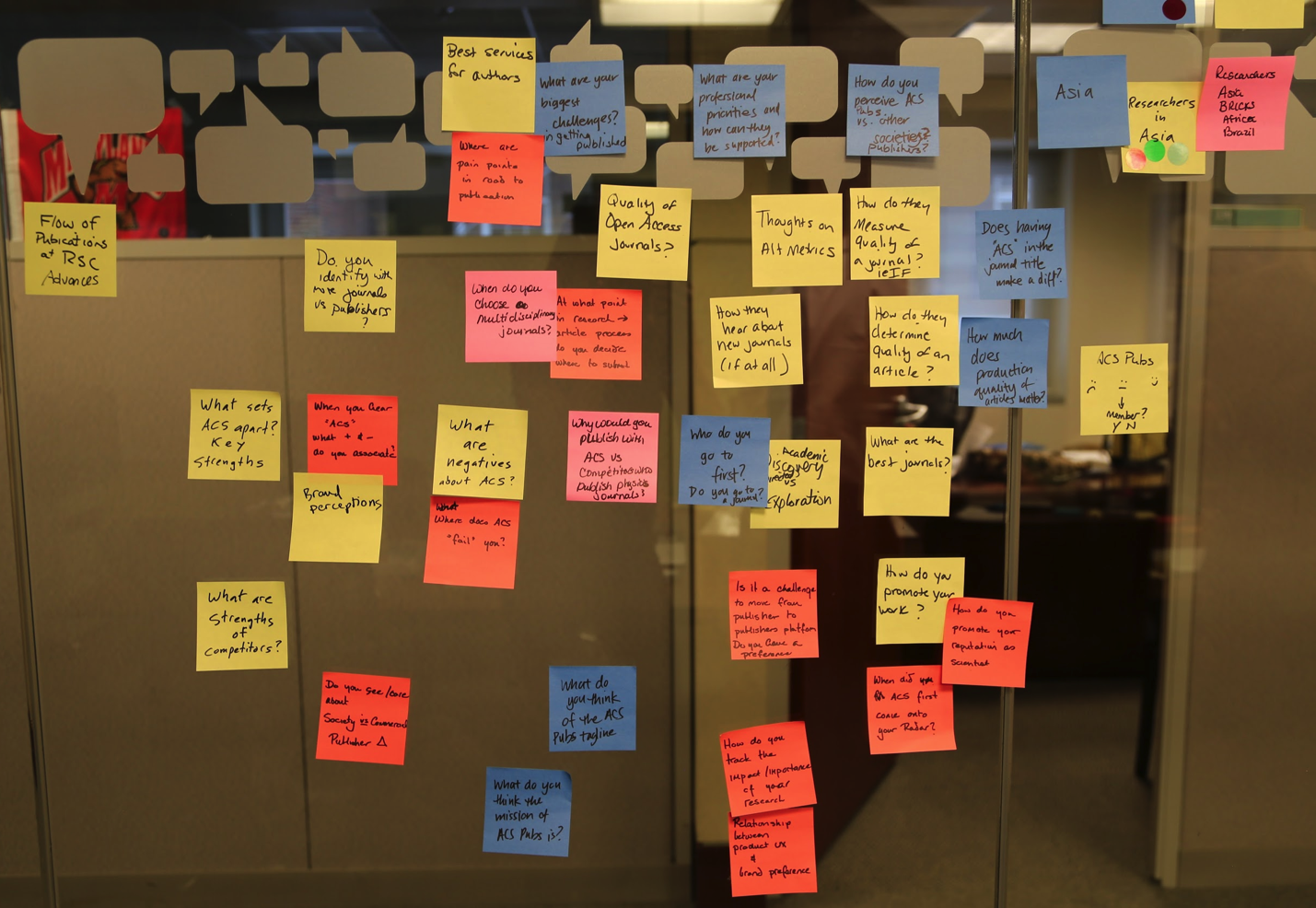
Figure 9.4: Example of findings from contextual interviews.
Step 2: Organize each participant’s findings into the Six Minds
After doing this for each of my participants, I place all the sticky notes up on a wall, organized by participant. I then align them into six columns, one each for the Six Minds. A comment like “Can’t find the ‘save for later’ feature” might be placed in the Vision/Attention column, whereas “Wants to know right away if this site accepts PayPal” might be filed as Decision-Making. Much more detail on this to follow in the next few chapters.
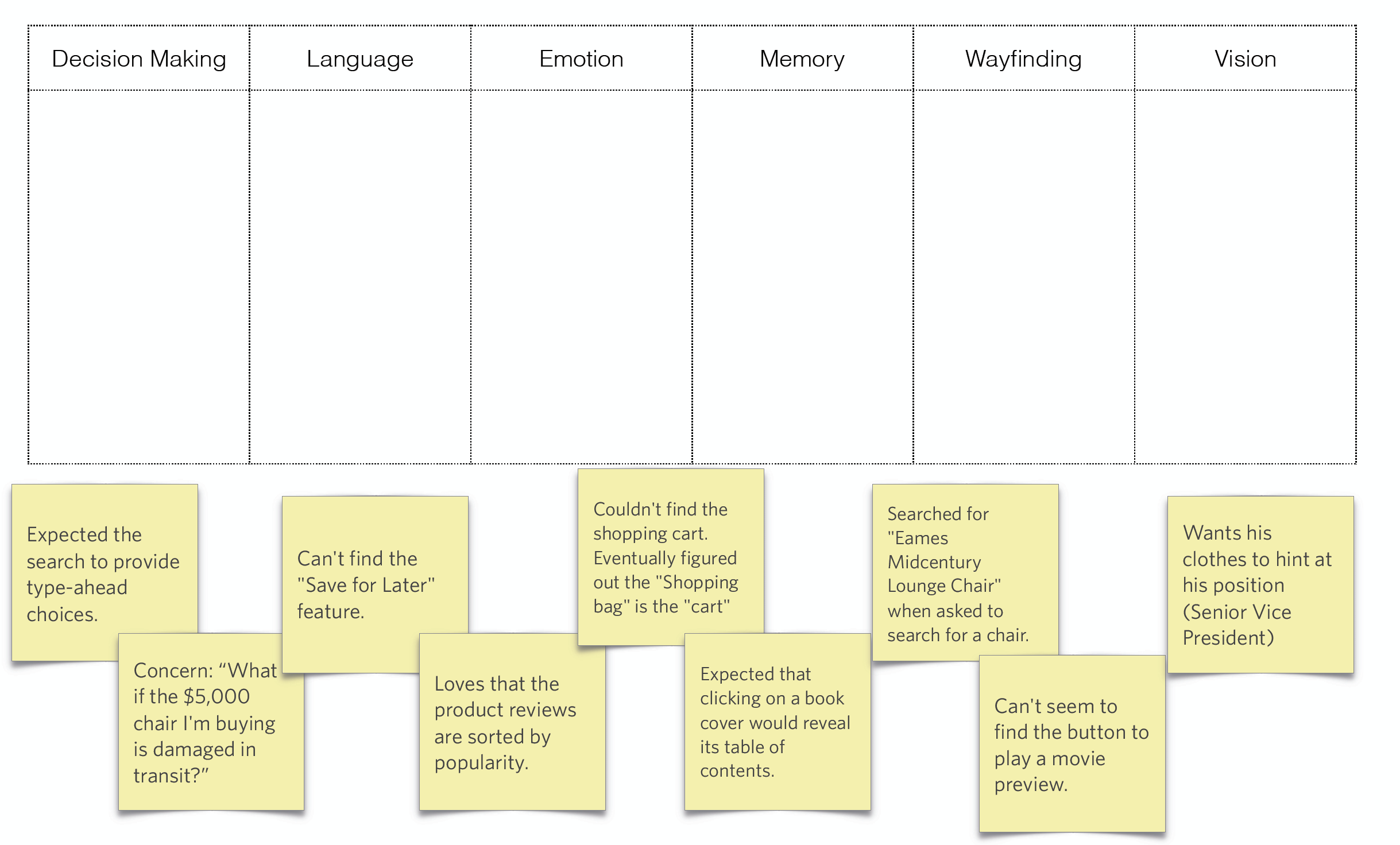
Figure 9.5: Getting ready to organize findings into the six minds.
If you try out this method, you’ll inevitably find some overlap; this is completely to be expected. To make this exercise useful for you, however, I’d like you to determine what the most important component of an insight is for you as the designer, and categorize it as such. Is the biggest problem visual design? Interaction design? Is the language sophisticated enough? Is it the right frame of reference? Are you providing people the right things to solve the problems that they encounter along the way to a bigger decision? Are you upsetting them in some way?
Step 3: Look for trends across participants and create an audience segmentation
In Part 3 of this book we talk about audience segmentation. If you look for trends across groups of participants, you’ll observe trends and commonalities across findings, which can provide important insights about the future direction for your products and services. Separating your findings into the six minds can also help you manage product improvements. You can give the decision-making feedback to your UI expert who worked on the flow, the vision/attention feedback to your graphic designer, and so on. The end result will be a better experience for your user.
In the next few chapters, I’ll give some concrete examples from real participants I observed in an e-commerce study. I want you to be able to identify what might count as an interesting data point, and have you be able to think about some of the nuance that you can get from the insights you collect.
Exercise
In my online classes on the six minds, I provide participants with a small set of data I’ve appropriated from actual research participants (and somewhat fictionalized so I don’t give away trade secrets).
On the following images are the notes from 6 participants who were in an ecommerce research study. They were asked to make purchasing decisions and were seeking either a favorite item, or selecting an online movie for purchase and viewing. The focus of the study was on searching for the item and selecting it (the checkout was not a focus of the study). The notes below reflect the findings collected during contextual interviews.
Your challenge: Please put each of the notes about the study in the most appropriate category (Vision/Attention, Wayfinding, etc.).
Feeling stuck? Perhaps this guide can help:
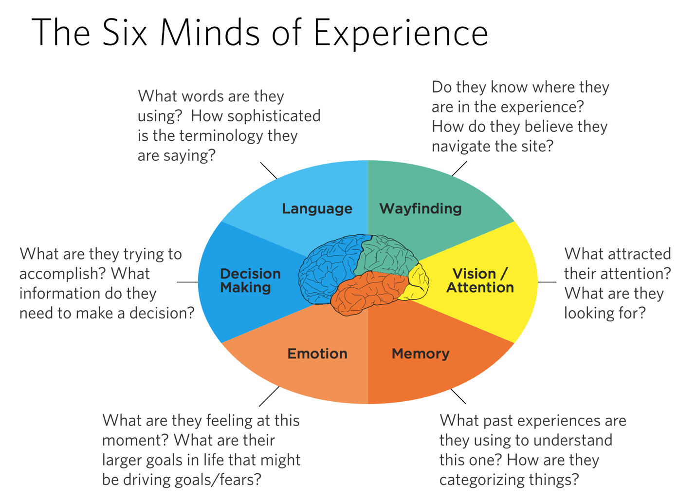
Figure 9.6: The Six Minds of Experience
If you feel it should be in more than category on occasion you may do so, but try to limit yourself to the most important category. What did you learn about how each individual was thinking? Were there any trends between participants?
Participant: ________________________
|
Decision Making |
Language |
Emotion |
Memory |
Wayfinding |
Vision |
|
|
|
|
|
|
|
Figure 9.7: In which category would you place each finding?
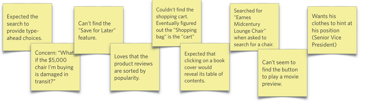
Figure 9.8: Findings from participant 1, Joe
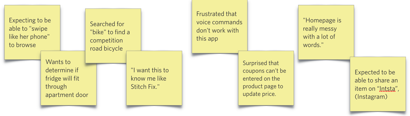
Figure 9.9: Findings from participant 2, Lily
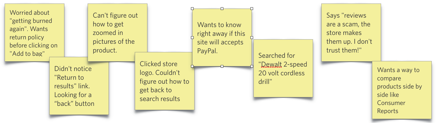
Figure 9.10: Findings from participant 3, Dominic

Figure 9.11: Findings from participant 4, Kim
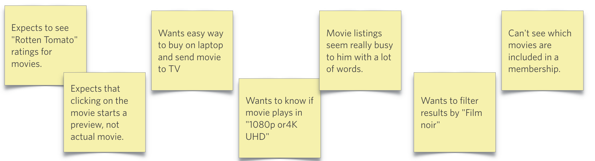
Figure 9.12: Findings from participant 5, Michael
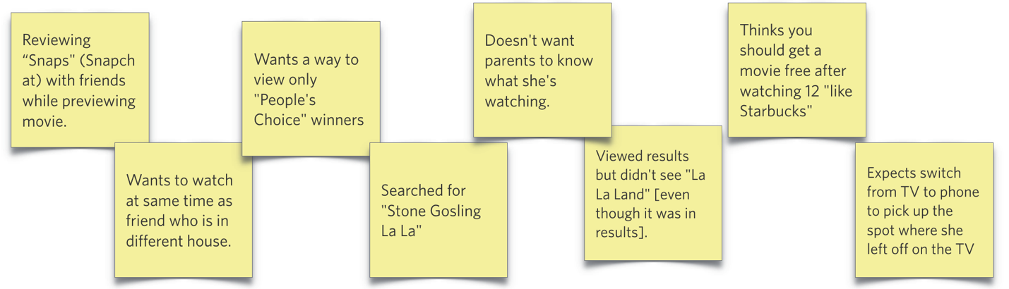
Figure 9.13: Findings from participant 6, Caroline
I’ll return to these 6 participants and provide snippets of that dataset as needed in the next six chapters to concretely illustrate some nuance and sharpen your analytic swords and know how to handle data in different situations.
Can’t wait to find complete the exercise and share it with your friends? Great! Please download the Apple Keynote or MS PowerPoint versions to make it easy to complete and share [LINK HERE].
Completed the exercise and want to see how your organization compares to the authors? Please go to Appendix [NUMBER].
Concrete recommendations:
Chapter 10. Vision: Are You Looking at Me?
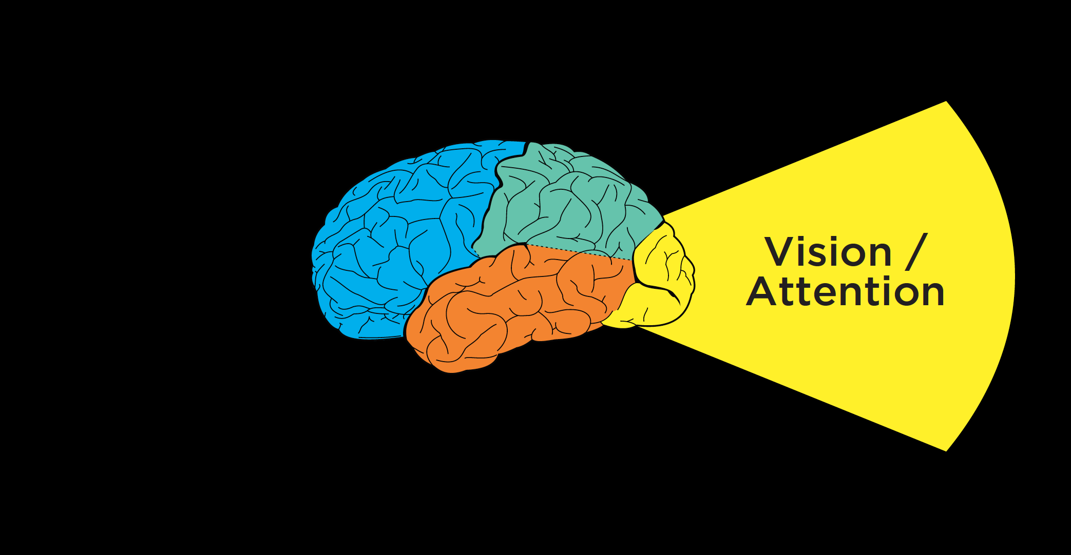
Figure 10.1
Now that we’ve discussed how to conduct contextual interviews and observe people as they’re interacting with a product or service, I want to think about how those interviews can provide important clues for each of the Six Minds.
I’d like to start by looking at this from a vision/attention perspective. In considering vision, we’re seeking to answer these questions:
In this chapter, we’ll discuss not only where customers look and what they expect to see when they look there, but also what this data suggests about what is visually salient to them. We’ll consider whether users are finding what they are hoping to, what their frame of reference is, and what their goals might be.
Where are their eyes: Eye-tracking can tell you some things, but not everything
When it comes to improving interfaces or services, we start with where participants are actually looking. If we’re talking about an interface, where are users looking on the screen? Or where are they looking within an app?
Eye-tracking devices and digital heat maps come in handy for this type of analysis, helping us see where our users are looking. This sort of analysis can help us adjust placement of our content on a page.

Figure 10.2: Moderating contextual interview
But you don’t always need eye-tracking if you use good old-fashioned observation methods like those we discussed in the previous chapter. When I’m conducting a contextual interview, I try to set myself up at 90 degrees to the participant (so that I’m a little bit behind them without creeping them out) for several reasons:
Speaking of where people’s eyes are, I’d like to show you a representation of what your eyes use to draw attention to the next location in space.
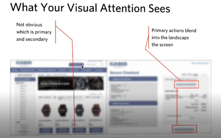
Figure 10.3: What your visual attention system sees from an image.
The image above shows two screens side-by-side from an electronics company — blurred out a bit, with the color toned down. This is the type of representation your visual system uses to determine where to look next.
In this image on the left there are four watches, with two buttons below each watch. Though you can tell these are buttons, it’s not clear from the visual features and this level of representation which is the “buy” button and which is the “save for later” button. The latter should appear as a secondary button, yet it currently draws an equal amount of attention as the “buy” button. That’s something we would work with a graphic designer to adjust.
Similarly on the right panel, the checkout screen, the site showed several buttons for things like commenting, checking on shipping status, and actually making the purchase. By graying out this picture, you can see how incredibly subtle these buttons were, and with that they have little variation between them. By blurring out images of your designs and toning down the color, you can get a good sense of what’s going to be successful in terms of your user finding things.
What lens must they be looking through to see that?
We’ve talked about the bottom-up drivers of attention, like visual features of a scene that are unique: unusual sizes, areas of higher visual contrast, distinct colors, large images, and other features that draw people’s attention. The second step of the visual analysis employs a top-down approach. Here, you should consider not only what users are seeing, but what they’re actually seeking, attending to, processing, and perceiving.
Case Study: Security Department
Challenge: Even though many of my examples are of digital interfaces, we as designers also need to be thinking about attention more broadly. In this case, I worked with a group of people with an enormous responsibility: monitoring security for a football stadium-sized organization (and/or an actual stadium).
Their attention was divided in so many ways. Here are all the systems and tools (along with their respective numerous alerts, bells, and beeping sounds) they monitored at any given time:
If you’re impressed that anyone could get work done in such a busy environment, you’re not alone; I was shocked (and a bit skeptical of whether all these noisy systems were helping or hurting their productivity). Here was an amazing challenge of divided attention, far more distracting than an open office layout (which many people find distracting).
Recommendation: With huge visual and auditory distractions in play, we had to distil the most important thing that they should be attending to at each moment. My team developed a system very similar to a scroll-based Facebook news feed, except with extreme filtering to ensure relevancy of the feed (no cat memes here!). Each potential concern (terror, fire, door jams, etc.) had its own chain of action items associated with it, and staff could filter each issue by location. The system also included a prominent list of top priorities – at that moment – to help tame the beastly amount of items competing for staff’s attention. It has one scroll and could be set to focus on a single topic or all topics, but only when the topics rose to a specific level of importance. As a result, staff knew where to look and what the (distinct) sound of an alert sounded like.
Quick, get a heat map … well …
Eye gaze heat maps can show us where our users’ eyes are looking on an interface. We can get a representation of the total time people are looking on the screen to be “hotter” in some locations than others.
Case Study: Website Hierarchy
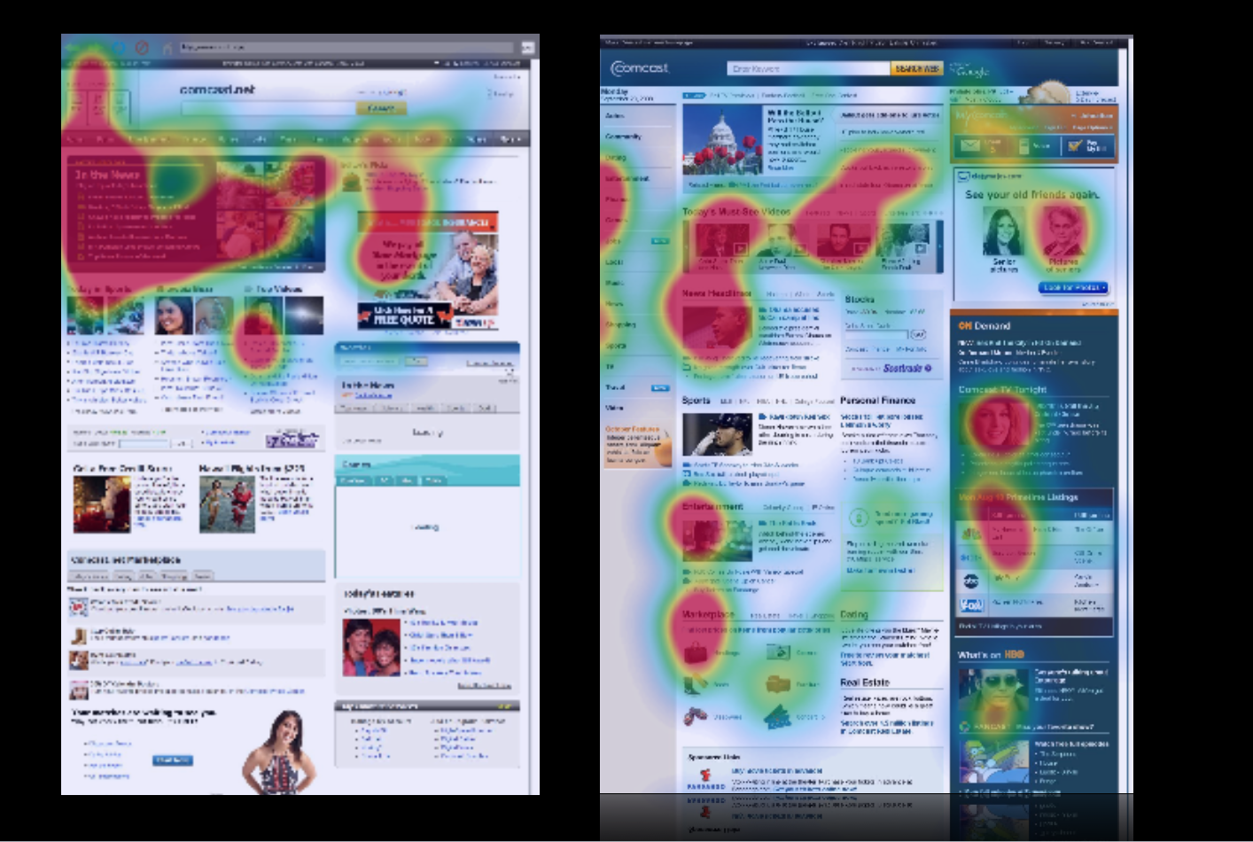
Figure 10.5: Heatmaps
Challenge: In the case of this site (comcast.net, the precursor to Xfinity), consumers were overwhelmingly looking at one area in the upper left-hand corner, but not further down the page, nor the right-hand side of the page. We knew this both from eye-tracking and the fact that the partner links further down the page weren’t getting clicks (and were not happy about that). The problem was that the visual contrast. The upper left of the old page was visually much darker than the rest of the page and more interesting (videos, images), so much so that so that it was overwhelming people’s visual attention system.
Recommendation: We redesigned the page to make sure that the natural visual flow included not only the headlines, but the other information down below to help. We gave more visual prominence to the neglected sections of the page through balancing features like visual contrast, size of pictures, color, fonts, and white space. We were able to draw people down visually to engage “below the fold.” This made a huge difference in where people looked on the page, making end users, Comcast, and its paid advertising partners much happier.
The case study above shows you how helpful tools like eye tracking and heat maps can be. But I want to counter the misperception that these tools on their own are enough for you to make meaningful adjustments to your product. Similar to the survey results and usability testing that I mentioned in the last chapter, heat maps can only provide you with a lot of the what, but not the why behind a person’s vision and attention. The results from heat maps do not tell you what problem users are trying to solve.
To get at that, we need to …
Go with the flow.
We’re trying to satisfy the customers’ needs as they arise, and so we want to know at each stage in problem solving what our users are looking for, what they’re expecting to find, and what they’re hoping to get as a result. Then we can match the flow and with what they’re expecting to find at each stage of the process.
While observing someone interact with a site, I’ll often ask them questions like “What problem are you trying to solve?” and “What are you seeing right now?” This helps me see what’s most interesting to them, at this moment and understand their goals.
There are many unspoken strategies and expectations that users are employing, which is why we can only learn through observing users in their natural flow. These insights, in turn, help us with our visual design, layout, and information architecture (i.e., what are the steps, how should they be represented, where should they be in space, etc.).
Case Study: Auction Website
Challenge: Here’s an example of some of those unspoken expectations that we might observe during contextual interviews. In testing the target audience for a government auction site (GovAuction.gov), I heard the feedback “Why doesn’t this work like eBay?” Even though this site was even larger than eBay, our audience was much more used to eBay, and brought their experience and related expectations regarding how eBay worked to their interactions with this new interface.
Eye-tracking confirmed users’ expectations and confusion: they were staring at a blank space beneath an item’s picture and expecting a “bid” button to appear, since that’s where the “bid” button appears on eBay items. Even though the “bid” button was in fact present in another place, users didn’t see it because they expected it to be in the same location as the eBay “bid” button.
Recommendation: This was one case when I had to encourage my client not to “think different,” but rather admit that other systems like eBay have cemented users’ expectations about where things should be in space. We switched the placement of the button (and a few other aspects of the eBay site architecture) to match people’s expectations, immediately improving performance. This story also exemplifies the lenses I was talking about earlier. We knew where they were looking for this particular feature, and we knew they didn’t find it in that location. This wasn’t because of language or the visual design, but because of their experience with other similar sites and associated expectations.
Research Examples
I don’t know if you’ve had a chance to put my sticky note categorization method into practice yet, but I’d like to share some examples of the findings I’ve noted in the previous chapter from clients interacting with both a video-streaming website and an e-commerce website. These will give you a sense of what we’re looking for when subdividing data according to the Six Minds; in this case, focusing on vision and attention. Remember, there’s often overlap, but I’m most concerned with the biggest problem underlying each comment.
Figure 10.6
Figure 10.7
Figure 10.8
Figure 10.9
Figure 10.10
Warning against literalism #1: In reviewing your findings, you’re going to see a lot of comments about “seeing,” “finding,” “noticing,” etc. Such words might suggest vision, but beware of placing such findings in the “vision” category automatically! In reviewing each finding, ask yourself if it implies an expectation of how things should be (memory), how to navigate through space (wayfinding), how familiar the user is with the product (language), before automatically putting that observation in the vision category.

Figure 10.11
Figure 10.12
Figure 10.13
Once I’ve reviewed all of my customers’ feedback and distilled the major problem to address, I can provide this to the visual design team with quite specific input and recommendations for improvement.
Concrete recommendations:
Chapter 11. Language: Did They Just Say That?
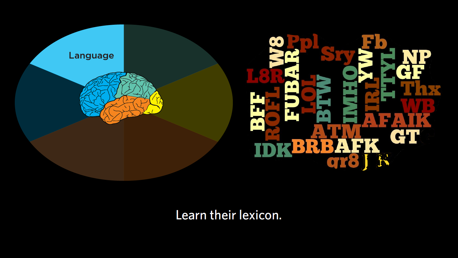
Figure 11.1: Language
In this chapter, I’ll give you recommendations on how to record and analyze interviews, paying special attention to the words people utter, sentence construction, and what this tells us about their level of sophistication in a subject area.
Remember, when it comes to language, we’re considering these questions:
Recording interviews
As I’ve mentioned, when conducting contextual inquiry, I recommend recording interviews. This does not have to be fancy. Sure, wireless mics can come in handy, but in truth, a $200 camcorder can actually give you quite decent audio. It’s very compact and unobtrusive, making it a great way to record interviews, both audio and video. Try to keep your setup as simple as possible so it’s as unobtrusive to the participant as possible and minimally affects their performance.
Prepping raw data: But, but, but…
Warning against literalism #2: After recording your interviews, you’re going to analyze those transcripts for word usage and frequency. When you do this, you’re going to find that unedited, the top words that people use are “but,” “and,” “or,” and other completely irrelevant words. Obviously what we care about is the words people use for representing ideas. So strip out all the conjunctions and other small words to get at the words that are most relevant to your product or service. Then examine how commonly used those words are.
Often, word usage differs by group, age, life status, etc.; we want to know those differences. We also want to learn, through the words people are using, a sense of how much they really understand the issue at hand.
Reading between the lines: Sophistication
The language we use product and service designers can make a customer either trust or mistrust us. As customers, we are often surprised by the words that a product or service uses. Thankfully, the reverse is also true; when you get the language right, customers become confident in what you’re offering.
Suppose you’re my customer at the auto service center, and you’re an incredible car guru. If I say “yes, sir, all we have to do is fix some things under the hood and then your car will go again,” you’ll be frustrated and skeptical, and likely probe for more specifics about the carburetor, the fuel injector, etc. “Under the hood” is not going to cut it for you. By contrast, a 16-year-old with their first car may just know that it’s running or not, and that they need to get it going again. Saying that you’ll “fix things under the hood” may be just what they want to hear.
When we read between the lines of what someone is saying, we can “hear” their understanding of the subject matter, and what this tells us about their level of sophistication. Ultimately, this leads to the right level of discussion that you should be having with this person about the subject matter.
This goes for digital security and cryptography, or scrapbooking, or French cuisine. All of us have expertise in one thing or another, and use language that’s commensurate with that expertise. I’m a DSLR camera fan, and love to talk about “F stops” and “anaphoric lenses” and “ND filters”, none of which may mean anything to you. I’m sure you have expertise in something I don’t and I have much to learn from you.
As product and service designers, what we really want to know is, what is our typical customer’s understanding of the subject matter? Then we can level-set the way we’re talking with them about the problem they’re trying to solve.
In the tax world, for example, we have tax professionals who know Section 368 of “the code” [US Internal Revenue Service tax code] is all about corporate reorganizations and acquisitions, and might know how a Revenue Procedure (or “Rev Proc”) from 1972 helps to moderate the cost-basis for a certain tax computation. These individuals are often shocked that other humans aren’t as passionate about the tax code, and are horrified that some people just want TurboTax to tell them how to file without revealing the inner workings of the tax system in all its complexities. Turbotax speaks to non-experts in terms they can understand — e.g., what was your income this year? Do you have a farm? Did you move?
Case study: Medical terms
Figure 11.2: Medline
Challenge: This is a good example of how important sophistication level is to the language we use in our designs. You may have heard of MedlinePlus, which is part of NIH.gov. Depicted above, it is an excellent and comprehensive list of different medical issues. The challenge we found for customers of the site was that MedlinePlus listed medical situations by their formal names, like “TIA” or “transient ischemic attack,” which is the accurate name for what most people would call a “mini-stroke.” If NIH had only listed TIA, your average person would likely be unable to find what they were looking for in a list of search results.
Recommendation: We advised the NIH to have its search function work both for formal medical titles, and more common vernacular. We knew that both sets of terms should be prominent presented, because if someone is looking for “mini-stroke” and doesn’t see it immediately, they probably would feel like they got the wrong result. A lot of times, experts internal to a company (and doctors at NIH, and tax accountants) will struggle with including more colloquial language because it is often not strictly accurate, but I would argue that as designers, we should lean more towards accommodating the novices than the experts if you can only have one of the two. The usage goals of the site will dictate the ideal choice. Or, if you can, follow the style of Cancer.gov that I mentioned in Chapter 5, where each medical condition is actually divided out into either the health professional version and the patient version.
Reading between the lines: Word order
We also want to know what the word order is that people use. Especially when thinking about commands people might be using, where they say “OK Google, go ahead and start my Pandora to play jazz,” or “I want you to play Blue Note Jazz.” In the second case, it’s more specific to someone who really knows jazz.
All of this teaches us what sort of context to build into a new system to make it successful. This is true for search engines, taxonomies, for AI systems, and so much more. This goes to patterns and semantics, or underlying meanings, of these words. Our product or service would need to know, for example, that “Blue Note” is not the name of a jazz ensemble, but a whole record label.
Real world examples
Looking at our sticky notes, what should we place in the “language” column?
Figure 11.3
Figure 11.4
Figure 11.5
Warning against literalism #3: Someone interpreting these findings too literally might consider “searching” a visual function (i.e., literally scanning a page up and down to find what you’re looking for), whereas this instance of “searching” implies typing something into a search engine. As always, if you’re unsure about a comment or finding that’s out of context, go back to your notes, video footage, or eye-tracking and see if the user is literally searching all over the page for a bike, or typing something into a search engine. In addition, when taking your notes, make sure you’re as clear as possible when you use words like “search” that could be interpreted in two ways.
Figure 11.6
Case study: Institute of Museum and Library Services
Figure 11.7
Challenge: This example demonstrates the importance of appropriate names for links, not just the content. This government-funded agency – that you probably haven’t heard of – does amazing work supporting libraries and museums across the U.S. If you look at the organization of their website navigation, it’s pretty typical: About Us, Research, News, Publications, Issues. When we tested this with users, what caught their eye was the “Issues” tab. All of our participants assumed “issues” meant things that were going wrong at the Institute. This couldn’t be further from the truth; the “Issues” area actually represented the Institute’s areas of top focus and included discussion of topics relevant to museums and libraries across America (e.g., preservation, digitization, accessibility, etc.).
Recommendation: I think the key point here was that we need to consider not only matching the language with customer expectations, but also navigational terminology as well. Moving forward, the Institute will move the “Issues” content to another location with a new name that better conveys the underlying content.
Figure 11.8
Figure 11.9

Figure 11.10
Figure 11.11
Figure 11.12
Through this exercise, I’ve given you a small taste of the breadth of the types of language responses we’re looking for. They range from misnamed buttons to cultural notions of word meanings to nomenclature associated with an interaction/navigation to level of sophistication.
In all of these instances, I would go back and review the feedback, then consider how this might impact the product or service design. Due to the range of expertise that the language demonstrated, I may need to design to better reflect the range of novices and experts that make up my audience.
Concrete recommendations:
Chapter 12. Wayfinding: How Do You Get There?
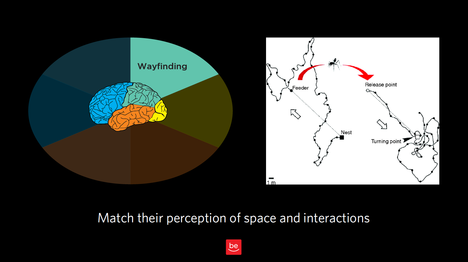
Figure 12.1
Now to discuss your findings that are wayfinding-related. As a reminder of what we discussed in Chapter 3, wayfinding is all about where people think they are in space, what they think they can do to interact and move around, and the challenges they might have there. We want to understand people’s perception of space — in our case, virtual space — and how they can interact in that virtual world.
Remember our story about the ant in the desert? That was all about how he thought he could get home based on his perception of how the world works. In this chapter, we want to observe this type of behavior for our customers and identify any issues they are having in interacting with our products and services.
With wayfinding, we’re seeking to answer these questions:
In this chapter, we’ll look at how our customers “fill in the gaps” with our best guesses of what a typical interaction might be like, and what comes next. This is especially true for service designs and flows. We need to know customer expectations and anticipated steps to build trust and match those expectations.
Where do users think they are?
Let’s start with the most elemental part of wayfinding: where users think they actually are in space. Often with product design, we’re talking about virtual space, but even in virtual space, it’s helpful to consider our users’ concept of physical space.
Case Study: Shopping mall

Figure 12.2
Challenge: You have to know where you are in order to determine if you’ve reached your destination or, if not, how you will get there. In this picture of a mall near my house, you can see that everything is uniform: the chairs, the ceiling, the layout. You can’t even see too many store names. This setup gives you very few clues of where you are and where you’re going (physically and philosophically, especially when you’ve spent as much as I have trying to find my way out of shopping malls). It’s a little bit like the Snapchat problem we looked at in Chapter 3, but in physical space: there’s no way to figure out where you are, no unique cues.
Recommendation: I’ve never talked with our mall’s design team, but if I did, I would probably encourage them to have, say, different colored chairs on different wings, for example, or to remove the poles that block me from seeing the stores ahead of me. All I need is a few cues that can remind me to go the right way (which is out)! The same goes for virtual design: do you have concrete signposts in place so your user can know where s/he is in space? Are the entrances, exits, and other key junctions clearly marked?
How do they think they can get from Place A to Place B?
Just by observing your users in the context of interacting with your product, you’ll notice the tendencies, workarounds, and “tricks” they use to navigate. Often, this happens in ways you never expected when you created the system in the first place (remember the off-the-grid banking system that Ugandans created for sharing mobile phones?). Here’s another example.
Case Study: Search terms
Challenge: Something I find remarkable is how frequently while using expert tools and databases, users actually start out by Googling the terms of art that would come in handy while using those high-end tools to make sure they’re searching for the right terms. In observing a group of tax professionals, I realized that they thought they needed an important term of art (i.e., a certain tax code) to get from Point A to Point B in a database they were using. Instead of searching for the tax code right in the database, they added an extra step for themselves (i.e., Googling the name of the tax law before typing it into their tool’s search function). As designers, we know it’s because they were having trouble navigating the expert tool in the first place that they found other ways around that problem.
Recommendation: In designing our products or services, we need to make sure we take into account not only our product, but the constellation of other “helpers” and tools — search engines are just one example — that our end users are employing in conjunction with our product. We need to consider all of these to fully understand the big picture of how they believe they can go from Point A to Point B.
What are those expectations based on?
As you’ll notice as you embark on your own contextual inquiry, there is a lot of overlap between wayfinding and memory; after all, any time someone interacts with your product or service, s/he comes to it with base assumptions from memory.
Let me try to draw a finer line between the two. When talking about memory, I’m talking about a big-picture expectation of how an experience works (e.g., dining out at a nice restaurant, or going to a car wash). With wayfinding, or interaction design, I’m talking about expectations relating to moving around in space (real or virtual).
Here’s an example of the nuanced differences between the two. In some newer elevators, you have to type the floor you’re headed to into a central screen outside the elevators, which in turn indicates which elevator you should take to get there. There are no floor buttons inside the elevator. This violates many people’s traditional notions of how to get from the lobby to a certain floor using an elevator. But because this relates to moving around in space, I’d argue this is an example of wayfinding — even though it taps into someone’s memories, past precedents, and schemas. In this case, the memory being summoned up is about an interaction design (i.e., getting from the lobby to the 5th floor), as opposed to an entire frame of reference.
With wayfinding, we’re concerned with our users’ expectations of how our product works, and how they can navigate and interact in the space we have created for them. Memory, which we’ll discuss in upcoming chapters, is also concerned with expectations, but about the experience as a whole, not about individual aspects of interaction design.
If you’re looking for buzzwords, “play” buttons often have to do with interaction design relating to a specific action, vs. an entire frame of reference. “Couldn’t get to Place A” is also usually something to do with wayfinding. But again, beware of being too literal! Don’t take any of these findings at face value; always consult your notes, video footage, and/or eye-tracking for the greater context of each observation.
Real world examples
Back to our sticky notes, let’s see what we would categorize as findings related to wayfinding.
Figure 12.3
Figure 12.4
Figure 12.5
Case Study: Distracted movie-watching
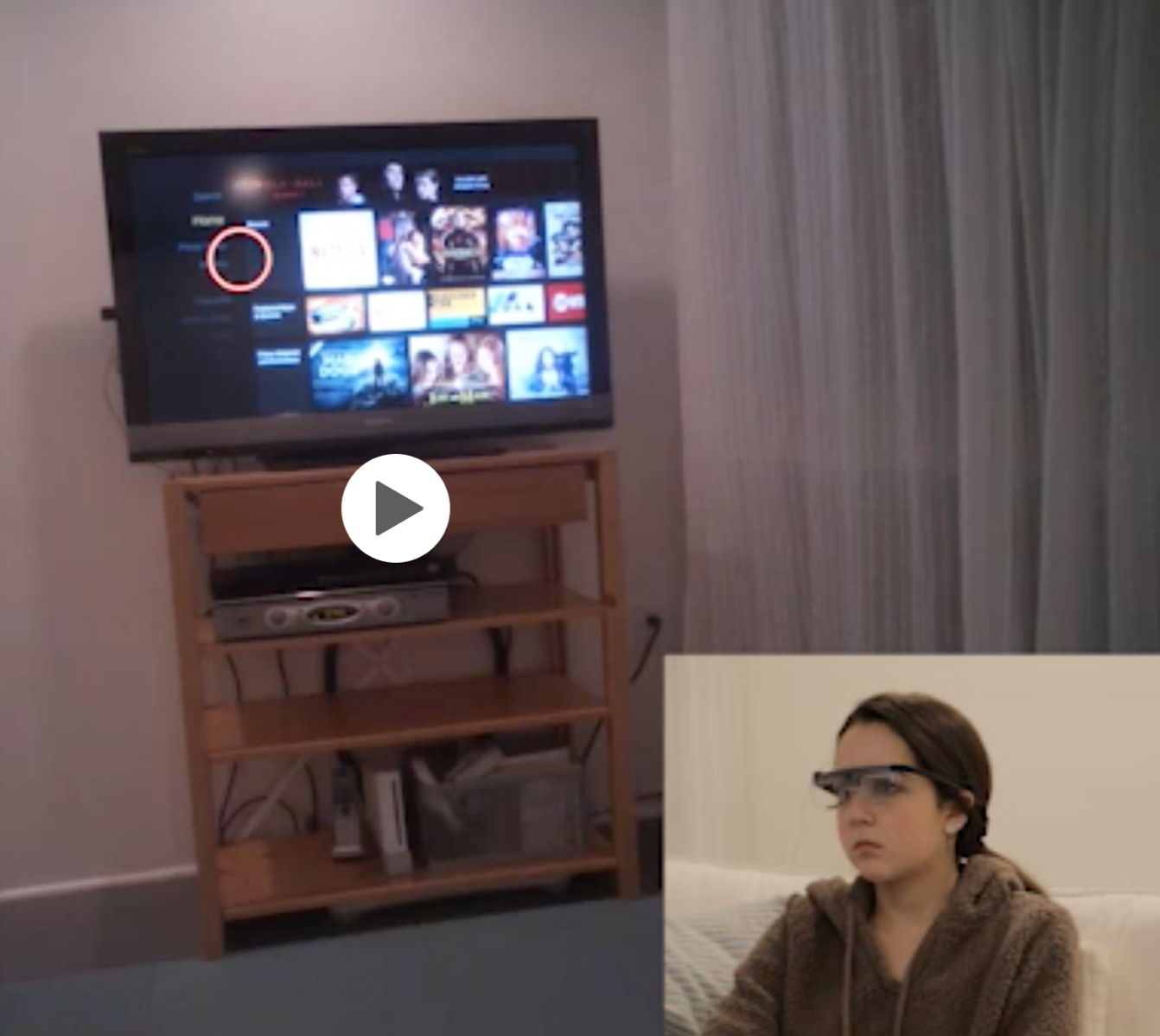
Figure 12.6
Challenge: Since we’re on the topic of phones, I thought I’d mention one study where I observed participants looking at their phone and the TV, and also how they navigated from, say, the Roku to other channels like Hulu, Starz, ESPN, etc. In this case, I was interested in how participants (who were wearing eye-tracking glasses) thought they could go from one place to another within the interface. (Are they going to talk to the voice-activated remote? Are they going to click on something? Are they going to swipe? Is there something else they’re going to do? etc.)
Recommendation: This study reinforced just how distracted the cable company’s customers are. There’s a lot we can learn about how our users navigate when they’re distracted and, often, multitasking. One participant was reviewing “Snap” (Snapchat) with friends while previewing a movie, for example. They often miss cues that identify where they are in space and what to do next. If we know that someone is going to be highly distracted and constantly looking away and coming back, we need to be even more obvious and have even cleaner designs that will grab their attention.
Figure 12.7
Figure 12.8
Figure 12.9
Figure 12.10
Figure 12.11
Figure 12.12
Figure 12.13
Figure 12.14
Figure 12.15
Concrete recommendations:
Chapter 13. Memory: Expectations and Filling in Gaps
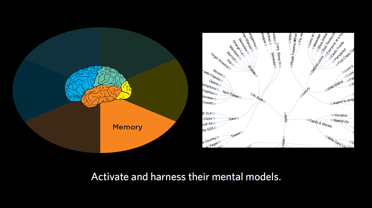
Figure 13.1
Next up, we’re going to look at the lens of memory. In this chapter, we’re going to consider the semantic associations our users have. By this, I mean not just words and their meanings, but also their biases, expectations for flow, and words to use.
For those of you keeping up with the buzzwords, the one you’ll hear a lot when it comes to memory is “expectations.”
Some of the questions we’ll ask include:
Meanings in the mind
Let’s go back to the idea of stereotypes, which I brought up in Chapter 4. These aren’t necessarily negative, as the stereotypical interpretation of stereotype would have you believe — as we discussed earlier, we have stereotypes for everything from what a site or tool should look like to how we think certain experiences are going to work.
Take the experience of eating at a McDonald’s, for example. When I ask you what you expect out of this experience, chances are you’re not expecting white tablecloths or a maitre d’. You’re expecting to line up, place your order, and wait near the counter to pick up your meal. Others at some more modern McDonalds might also expect a touchscreen ordering system. I know someone who recently went to a test McDonald’s and was shocked that they got a table number, sat down at their table, and had their meal brought to them. That experience broke this person’s stereotype of how a quick-serve restaurant works.
For another example of a stereotype, think about buying a charging cable for your phone on an e-commerce site, vs. buying a new car online. For the former, you’re probably expecting to have to select the item, indicate where to ship it, enter your payment information, confirm the purchase, and receive the package a few days later. In contrast, with a car-buying site, you might select the car online, but you’re not expecting to buy it online right then. You’re probably expecting that the dealer will ask for your contact information to set up a time for you to come in and see the car. Buying the car will involve sitting down with people in the dealership’s financial department. Two very different expectations for how the interaction of purchasing something will go.
Soon, we’ll look at some examples from our contextual inquiry exercise. I want you to look out for how different novice stereotypes are from expert stereotypes. As we’ve been discussing with language, it’s crucial that we meet users at their level (which is often novice, when it comes to the lens of memory).
Case Study: Producing the product vs. managing the business
Challenge: For one project with various small business owners, we noticed that, broadly speaking, our audience fell into one of two categories:
Outcome: We saw from these two mental models of how to be a small business owner that each of them needed hugely different products. One group loved Excel, whereas the other group wanted nothing to do with spreadsheets. One group was great at networking; the other group preferred to do their work behind the scenes. This story goes to show that identifying the different types of audiences you have can really help to influence the design of your product. More on audience segmentation coming in Part 3!
Methods of putting it all together
We want to consider people’s pre-programmed expectations, not just for how something should look, but everything from how that thing should work, how they think they’re going to move ahead to the next step, and generally how they think the whole system will work. In contextual inquiry, you’ll often notice that your users are surprised by something. You want to take note of this, and ask them what surprised them, and why. On your own, you might consider what in your product and service design contrasted with their assumptions for how it might work and why.
Now, broadening your perspective even further: was there anything about the language that this person used that might be relevant here for his/her expectations, in terms of their sophistication? What else might be relevant, based on what you learned generally about the audience’s expectations?
Case Study: Tax code
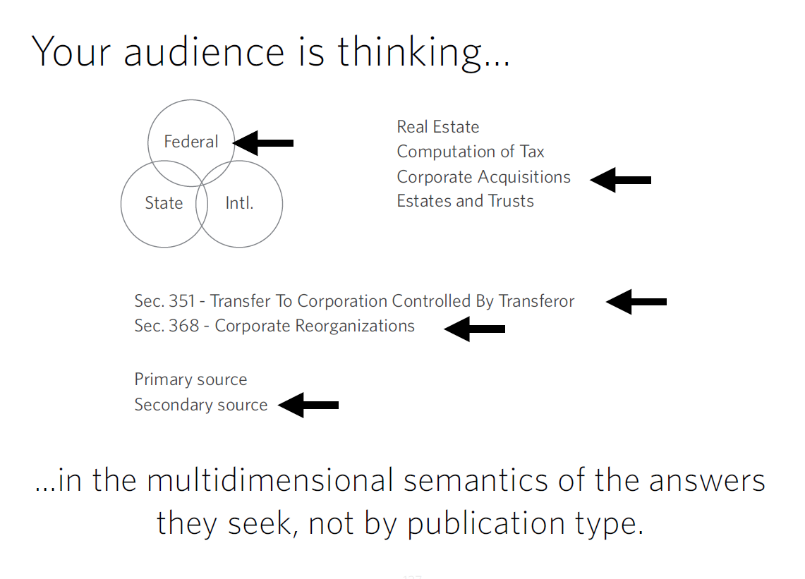
Figure 13.2
Challenge: For one client, we observed accountants and lawyers doing tax research. Specifically, we looked at how they were searching for particular tax codes. They said there were many tools that had the equivalent of CliffsNotes describing a tax issue, the laws associated with it, statutes, regulations, etc. Such tools were organized by publication type, but not by topic. The users, on the other hand, were expecting far more multidimensionality in the results. First, they wanted to categorize the results by federal vs. state vs. international. After that, they wanted to categorize by major topic (e.g., corporate acquisitions vs. real estate). Then, they wanted to know the relevant laws. Then, they might want to know about more secondary research on the topic. The interaction models that were available to them at the time just weren’t matching the multidimensional representation they were seeking.
Recommendation: The way these tax professionals semantically organized the world was very different than the way the results were given. In creating a tool that would be most helpful to this group, designers provide customers with filters that matched their mental model and provided limited/categorized results.
Real life examples:
Going back to our sticky notes, let’s think about memory, and which findings relate to that lens of our mind.
Figure 13.3
Figure 13.4
Sidenote: Because this comment is so unique (and was only mentioned by one participant), we might not address this particular item in our design work. In reviewing all your feedback together, you’ll come across instances like these where you chalk it up to something that’s unique to this individual, and not a pattern you’re seeing for all of your participants. When taken in the totality of this person’s comments, you may also realize that this was a novice shopper (more of that in Part 3, where we’ll look at audience segmentation).
This comment makes me think of a fun tool you all should check out called the Wayback Machine. This internet archive allows you to go back and see old iterations of websites. This check-out counter reminds me of an early version of Southwest Airlines’ website.
Figure 13.5
As you can see, Southwest was trying to be very compatible in its early web designs with the physical nature of a real check-out counter. What you end up with is this overly physical representation of how things work at a checkout counter, with a weigh scale, newspapers, etc. All of these features were incredibly concrete representations of how a “check-out counter” works. Even though digital interfaces have abandoned this type of literal representation (and most of these physical interactions have gone away, too), it’s important to keep older patterns of behavior in mind when designing for older audiences whose expectations may be more in line with the check-out counter days of old.

Figure 13.6
Figure 13.7
What you might discover
In our exercise, we looked at users’ expectations about other tools, products, and companies; how our users are used to interacting with them; and how users carry those expectations over into how they expect to work with our product, or the level of customer service they’re expecting from us. These are the types of things we’re usually looking for with memory. We want to look out for moments of surprise that reveal our audience’s representation, or the memories that are driving them. We also talked a little about language and level of sophistication, as these can indicate our users’ expectations.
We want to understand our users’ mental models and activate the right ones so that our product is intuitive, requiring minimal explanation of how it works. When we activate the right models, we can let our end audience engage those conceptual schemas they have from other situations, do what they need to do, and have more trust in our product or service.
Case Study: Timeline of a researcher’s story
Figure 13.8
Challenge: For one client, we considered the equivalent of LinkedIn or Facebook for a professor, researcher, graduate student, or recent PhD looking for a job. As you may know, Facebook can indicate your marital status, where you went to school, where you grew up, even movies you like. In the case of academics, you might want to list mentors, what you’ve published, if you’ve partnered in a lab with other people or prefer to go solo, and so on. We realized there were a lot of pieces when it comes to representing the life and work of a researcher.
Recommendation: Doing contextual inquiry revealed what a junior professor would have liked to see about a potential graduate student, and how a department head might review the results of someone applying for a job in a very different way. We learned a lot about users’ expectations regarding categories of information they wanted to see and how should it be organized. We didn’t really get into that kind of granularity with the people in the sticky notes study, but with more time and practice, you’ll be able to drive out a bit more about the underlying nature of people’s representations and memory.
Concrete recommendations:
Chapter 14. Decision-Making: Following the Breadcrumbs
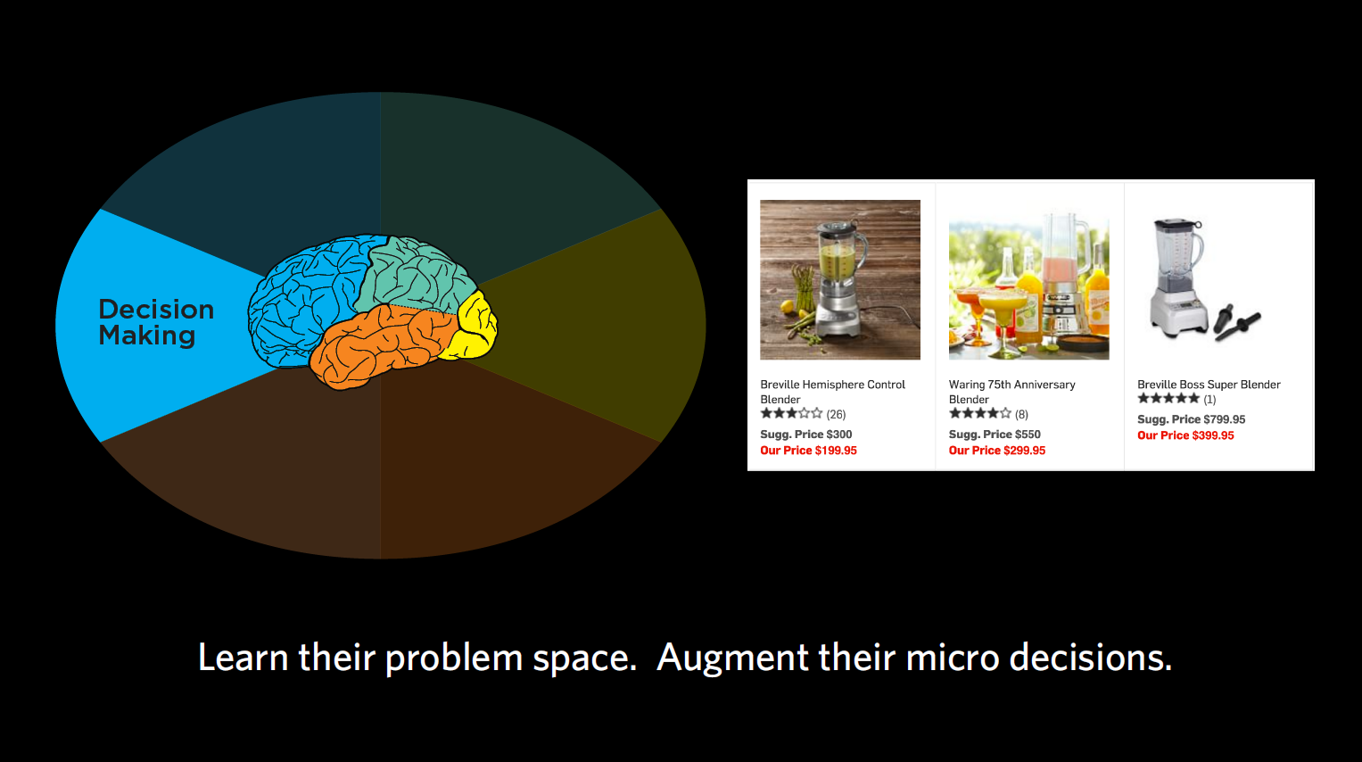
Figure 14.1
When it comes to decision-making, we’re trying to figure out what problems our end users are really trying to solve and the decisions they have to make along the way. What is it the user is trying to accomplish, and what information do they need to make a decision at this moment in time?
With decision-making, we’re asking questions like:
What am I doing? (goals, journeys)
What we want to focus on with decision-making is all the sub-goals we need to accomplish to make us get from our initial state to our final goal.
Your end goal might be making a cake, but to get there, you’re embarking on a journey with quite a few steps along the way. First, you’re going to need to find a recipe, then get all the ingredients, then put them together according to the recipe. Within the recipe, there are many more steps — turning on the oven, getting out the right-sized pan, sifting the flour, mixing your dry ingredients together, etc. We want to identify each of those micro-steps that are involved with our products, and how we can use each step to support our end audience in making their ultimate decision.
Case Study: E-commerce payment
Challenge: For one client, we observed a group that was trying to decide which e-commerce payment tool to use (e.g., PayPal, Stripe, etc.). Through interviews, we collected a series questions or concerns that people had and — you guessed it — wrote them all down on sticky notes. Questions like “What if I need help?,” “How does it work?,” “Can this work with my particular e-commerce system right now?,” “What are the security issues?,” and so on. There were so many of these micro-decisions people wanted answered before they were willing to proceed in acquiring one of these tools.
Outcome: By capturing each of these sub-goals and ordering them, we ensured your designs support each one in a timely fashion. This helps your customers to trust your product/service and make a decision – ultimately giving them a better overall experience where they feel like they’re making an informed decision.
Gimme some of that! (just-in-time needs)
You may remember from Chapter 6 that in decision-making, we can be very susceptible to psychological effects when making decisions (which is why I never let myself sit in a car I’m not intending to buy). Often we get overwhelmed with choices and end up defaulting to satisficing — accepting an available option as satisfactory. That’s why people were more willing to buy the $299.95 blender when it was displayed in between one for $199 and one for $399. Choosing the middle option seems sensible to people. We want to keep this type of classic framing problem in mind as product designers, considering what the “sensible” option may be for our end users.
Case Study: Teacher timeline
Challenge: In one case, we looked at a group of teachers and what they sought at different times of the year in terms of continuing education and support from education PhDs and other groups that could support their teaching. We learned that depending on the time of year, the support these teachers wanted was drastically different.
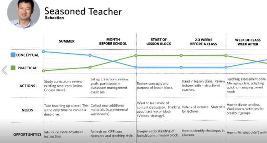
Figure 14.2:
Outcome: In the summertime, teachers had more time to digest concepts and foundational research concerning the philosophy of education. This was the best time for them to focus on their own development as teachers and consider the “why” behind their teaching methods. Right before the school year started, however, they went from wanting this more conceptual development to wanting super pragmatic support. Their kids were starting to show up after a three-month break, and the teachers had to manage the students in addition to the parents. During this time, they wanted highly practical information like worksheets. The micro-decisions they had to make were things like “Can I print this worksheet out right now? Does it have to be printed at all? Can we use it on Chromebooks?” During the school year, they weren’t concerned with the “why” but the “how,” often defaulting to satisficing when they became overwhelmed with too much information. Based on these findings, we were able to recommend the drastically different types of content these teachers needed at different points of the year.
Chart me a course (decision-making journey)
We want to know not just the overall decision our users are making, like buying a car, but also all the little decisions they have to make along the way. “Does it have cup holders?” “Will my daughter be happy riding in it?” “Can it carry my windsurfer?” “Can I put a roof rack on the top?”
Timing of information is crucial when it comes to these micro-decisions. Once we’ve identified those micro-decisions, we want to know when they need to address each of them. Usually, it’s not all at once, but one step at a time along the journey. That’s why most e-commerce sites place shipment information at the end, for example, rather than presenting you with too much information right at the start, when you’re just browsing.
We also want to know what our users think they can do to solve their problem. In cognitive neuroscience, we talk about “operators in a problem space,” which just means the levers that we think we can move in our head to get from where we are to where we need to be. That problem space may be the same or different than reality, depending on how much of a novice or expert we are in the subject matter, which is important to keep in mind when designing for novices.
Sticky situations
Looking once again at the sticky notes, here are some findings that I think relate to decision-making.
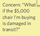
Figure 14.3
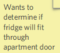
Figure 14.4
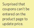
Figure 14.5
Case study: Coupons
Problem: There was one group that offered language classes, which people could buy through their e-commerce system. This group offered coupons, but the programmers placed the coupon code feature at the tail end of the purchasing process. So someone buying a $300 course with a third-off coupon would have to first check a box indicating that they wanted to buy the course at full price, then put in the coupon, and then finally see it drop to $200. Most normal people would feel uncomfortable selecting the full-price course and hitting “go” without seeing confirmation that their coupon code went through.
Recommendation: If I was working with this group, I would strongly advise them to move the coupon code feature up in the process, so that users are checking a box that shows their applied discount. There’s actually a lot of psychology behind “couponing,” but I’ll save that for another book.
Figure 14.6
Figure 14.7
Figure 14.8
Figure 14.9
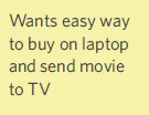
Figure 14.10
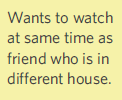
Figure 14.11

Figure 14.12
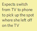
Figure 14.13
Concrete recommendations:
Chapter 15. Emotion: The Unspoken Reality
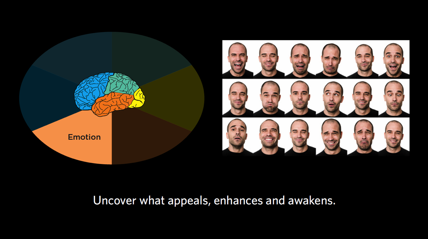
Figure 15.1
Given everything we know so far, what do we think our audiences are trying to accomplish on a deeper level? What emotions do those goals or fears of failure illicit? Based on those emotions, how “Spock-like,” or analytical, will this person be in their decision-making?
In this chapter, we turn back to our last mind: emotion. As we discuss emotion, we’ll consider these questions:
Live a little (finding reality, essence)
When talking about emotion, I want you to be thinking about it on three planes:
Though quite different, all of these forms of emotion are extremely important to consider in our overall experience design. We want to know what our consumers are thinking about themselves at a deep level, what might make that sort of person feel accomplished in society, and what their biggest fears are. Our challenge is then to design products for both the immediate emotional responses as well as those deep-seated goals and fears.
Don’t forget about fear: While it may be tempting to focus on the perks of our product, we have to go back to Kahneman, who tells us that humans hate losses more than we love gains. As such, it’s extremely important to consider fear. There could be short-term fears like not receiving a product in the mail on time, but there are also longer-term fears like not being successful, for example. By addressing not only what people are ultimately striving for but also what they are ultimately afraid of, we can provide ultimate value.
Case study: Credit card theft
Challenge: In talking about identification and identity theft on behalf of a financial institution, we met with a sub-group of people who had had their identity stolen. For them, it was highly emotional to remember trying to buy the house of their dreams and being rejected because someone else had fraudulently made another mortgage using their identity. The house was tied to much deeper underlying notions, like their “forever home” where they wanted to grow old and raise kids, as well as the negative feelings of unfair rejection they had to experience. All in all, they had a lot of fear and mistrust of the process and financial institutions due to their past experiences.
Outcome: In each of these cases, whether it was being denied a mortgage or having a credit card rejected at Staples, these consumers had deeply emotional associations with the idea of credit. For this client, it was essential that we found out the particulars of emotional, life-changing events like these that could help shape not only their unique decision-making process, but also their perceptions and mistrust of financial institutions on the whole. Designing products and services that were not tied to a financial institution helped to distance the product from the strong emotional experience that could easily be elicited.
Analyzing dreams (goals, life stages, fears)
The case study below is just one example of how dreams, goals, and fears can change by life stage.
Case study: Psychographic profile
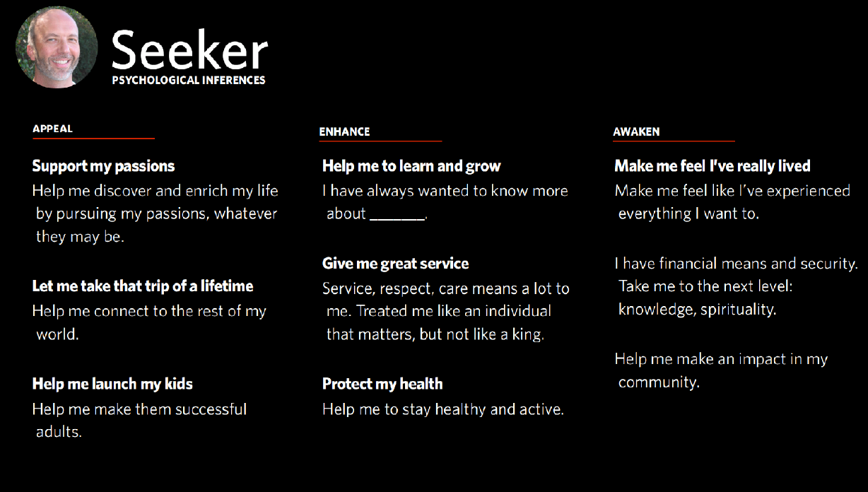
15.2
Challenge: In my line of work, sometimes we create “psychographic profiles” to segment (and better market to) groups of consumers. One artificial, but representative example is shown above. It might remind you of the questions we asked on behalf of a credit card company, which I mentioned back in Chapter 7. In these types of interviews, we go from the short-term emotions to the longer-term emotions to what people are ultimately trying to accomplish. It can be like therapy (for the participants, not us).
Outcome: As you can see in the first column, the things that Appealed to this group of consumers — older, possibly retired adults who might have grown children — were things they could do with their newly discovered free time. Things like taking that trip to Australia, or further supporting their kids in early adulthood by helping them launch their career, buy a house, etc.
Over the course of the contextual interviews, we were able to go a bit further than the short-term goals (e.g., trip to Australia) and get to what they were seeking to Enhance. Things like learning to play the piano, receiving great service and respect when they stay at hotels, or maintaining/improving their health.
Then, going even longer term, we got to this notion of what they wanted to Awaken in their lives. For many in this focus group, they were thinking beyond material success and were seeking things like knowledge, spirituality, service, leaving a lasting impact on their community — sort of the next level of fulfillment and awakening their deepest passions. As well as desire, we also observed a level of fear in not having these passions fulfilled. These are all emotions we want to address in our products and services for this group.
Getting the zeitgeist (person vs. persona specific)
In considering emotion, we’re also taking into account the distinct personalities of our end audience, the deeper undercurrent of who they are, and who it is they’re trying to become.
Case study: Adventure race

15.3: Adventure Race
Challenge: It’s not every day you get to join in on a mud-filled adventure race for work. In the one pictured above, many of the runners were members of the police force, or former military — all very hardcore athletes, as you can imagine. Our client, however, saw an opportunity to attract not-as-hardcore types to the races, from families to your average Joes.
Outcome: In watching people participate in one of these races (truly engaging in contextual inquiry, covered in mud from head to toe I might add), my team and I observed that the runners all had this amazing sense of accomplishment at the end of the race, as well as during the race. It was clear that they were digging really deep into their psyche to push through some obstacle (be it running through freezing cold water or crawling under barbed wire) and finish the race, and that was a metaphor for other obstacles in their lives that they might also overcome. By observing this emotional content, we saw that this was something we could use not only for the dedicated race types, but ordinary people as well (I don’t mean that in a degrading way; even this humble psychologist ran the race, so there’s hope for everyone!). In our product and service design efforts going forward, we harnessed the emotional content like running for a cause (as was the case with a group of cancer survivors or ex-military who were overcoming PTSD), running with a friend for accountability, giving somebody a helping hand, or signing up with others from your family, neighborhood, or gym. We knew these deeper emotions would be crucial to people deciding to sign up and inviting friends.
A crime of passion (in the moment)
Remember the idea of satisficing? It’s somewhere between satisfactory and sufficing. Satisficing is all about emotion, and defaulting to the easiest or most obvious solution when we’re overwhelmed. There are many ways we do this, and our interactions with digital interfaces are no exception.
Maybe a web page is too busy, so we satisfice by leaving the page and going to a tried-and-true favorite. Maybe we’re presented with so many options of a product (or candidates on the ballot for your state’s primaries?) that we select the one that’s displayed the most prominently, not taking specifications into consideration. Maybe we buy something out of our price range simply because we’re feeling stressed out and don’t have time to keep searching. You get the idea.
Case study: Mad Men
Challenge: Let me tell you a story about a group of young ad executives we did contextual inquiry with. Their first job out of college was with a big ad agency in downtown New York City. They thought it was all very cool and were hopeful about their career possibilities. Often, they were put in charge of buying a lot of ads for a major client, and they literally were tasked with spending $10 million on ads in one day. In observing this group of young ad-men and women, we saw emotions were running high. They were so fearful because this task — of picking which ads to run and on which stations — if done incorrectly, could end not only their career, but also the “big city ad executive” lifestyle and persona they had cultivated for themselves. Making one wrong click would end their whole dream and send them packing and ashamed (or so they believed). There was an analytics tool in place for this group of ad buyers, but because the ad buyers were so nervous, they would default to old habits (satifice) and look for basic information on how the campaign was doing, what they could improve, etc. The analytics just didn’t capture their attention immediately.
Outcome: We tweaked the analytics tool to show all the ad campaign stats the buyers would need at a glance. We made them very simple to understand and used visual attributes like bar graphs and colors to grab their attention. With so many emotions weighing in on their decisions, we wanted to make sure this tool made it clear what needed to be done next.
Real life examples
Let’s take a look at the sticky notes relevant to emotion.

Figure 15.4
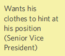
Figure 15.5
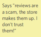
Figure 15.6
Sidenote: Remember to take your users’ feedback in totality. In addition to this comment about reviews, this customer also remarked that he was afraid of “getting burned again” and that he wanted a way to compare products the way Consumer Reports does. Taken in totality, we can surmise that this person might have issues working up trust for any e-commerce system. With feedback like this, we want to think about what we could do to make our site trustworthy for our more nervous customers.
![]()
Figure 15.7
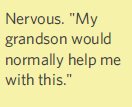
Figure 15.8
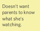
Figure 15.9
Concrete recommendations:
We have collected data from some contextual inquiry interview. That data has been sorted into our Six Minds framework. Now to our next major goals:
We’ll end this chapter with a few notes about another system of classification (See, Feel, Say Do) and why I believe it fails to organize the data in a way that is most helpful for change.
Signal to noise: Affinity diagrams
Using our Six Minds framework, let’s review our five participants from Part 2. We have all our sticky note findings grouped by participants and by the Six Minds. Now it’s time to look at these findings and see if there are any relationships between them or any underlying similarities in how these individuals are thinking.
16.1
Language
16.2
Looking at the column for Language, I see that Participants 1, 2, and 3 are all saying things like “Eames Midcentury Lounge Chair,” or “DeWalt 2-speed, 20-volt cordless drill,” or “1080p or “4K UHD.” While they’re searching for very different things, these three participants seem to have pretty sophisticated language for what they’re talking about. They seem to be more like experts, if not professionals, in their particular fields, and are very knowledgeable in the subject matter.
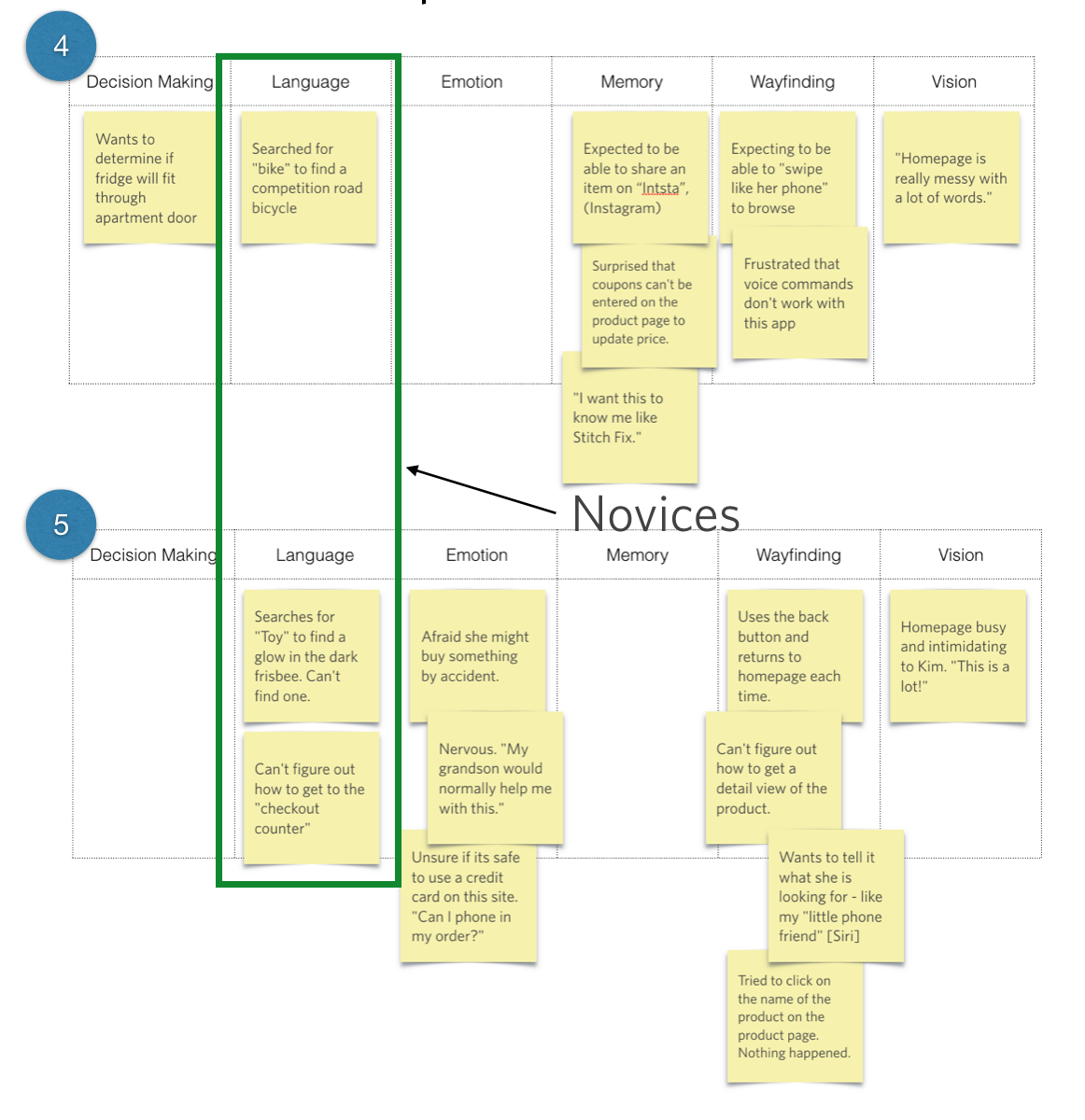
16.3
In contrast, it looks like Participant 4 searched for a “bike” while looking for a competition road bike. Participant 5 searched for a glow-in-the-dark Frisbee by typing in “toy.” Participant 5 also talked about getting to the “checkout counter,” rather than an “Amazon checkout” or “QuickPay,” or something else that would suggest more knowledge of how the online shopping experience works.
Just by looking at language, we see that we’ve got some people with expertise in the field, and others who are much more novices in the area of e-commerce. Moving forward, it might make sense to examine how the experts approach aspects of the interface, vs. how the novices approach those same aspects, and see if there are similarities across those individuals.
This is just a start, though. I don’t want to pigeonhole anyone into just one category, because ultimately I’m trying to find commonalities on many dimensions. Using a different dimension or mind, I could look at these same five people in a very different way.
Emotion
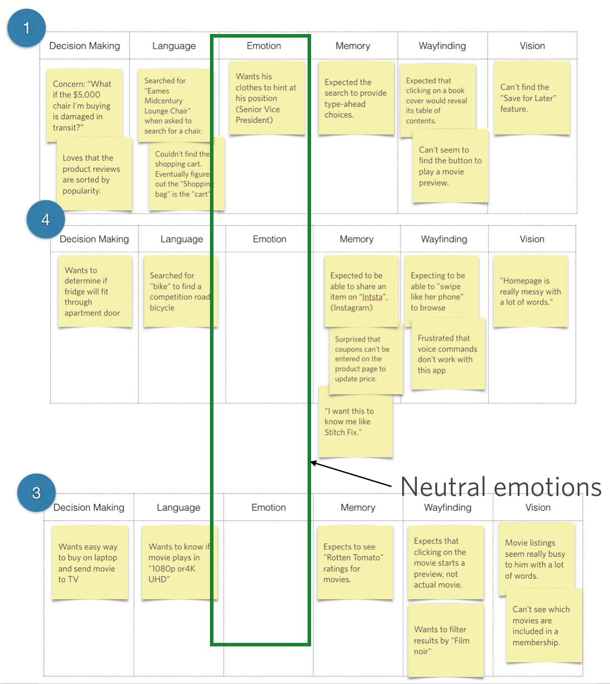
16.4
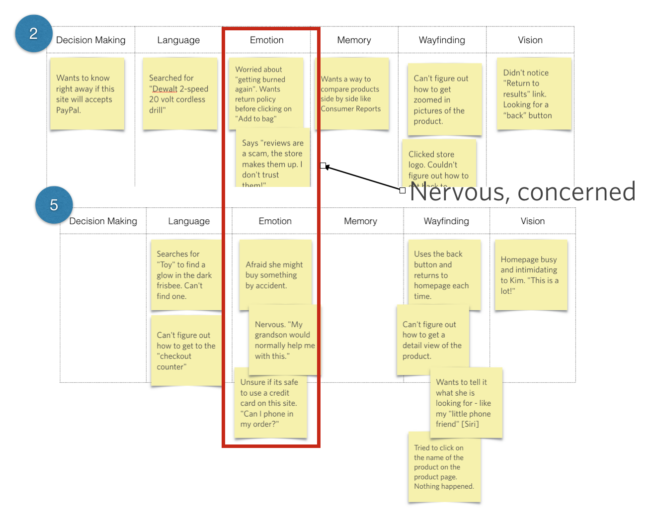
16.5
Let’s take emotion. Looking across these five people, we see that Participants 2 and 5 both seemed pretty concerned about the situation, and were afraid that something bad might happen or that they would “get burned again.” We’re definitely seeing some uncertainty and reticence to go ahead and take the next step because they’re worried about what might happen. These folks might need some reassurance. Participants 1, 3, and 4, on the other hand, aren’t displaying any of that emotion or hesitation.
Could there be other areas in which 2 and 5 are also on the same page? Maybe there are similarities in how they do wayfinding, or the information they’re looking for, as opposed to 1, 3, and 4, who seem to be going through this process in a more matter-of-fact way.
Using different dimensions, we can look at people and see how we might group them. Ideally, we would hope to find these similarities across multiple dimensions. I’m using a tiny sample sample size for the sake of illustration in this book, but typically, we would be looking at this with a much broader set of data, perhaps 24 to 40 people (anticipating groups of 4-10 people depending on how the segments fall out).
Wayfinding
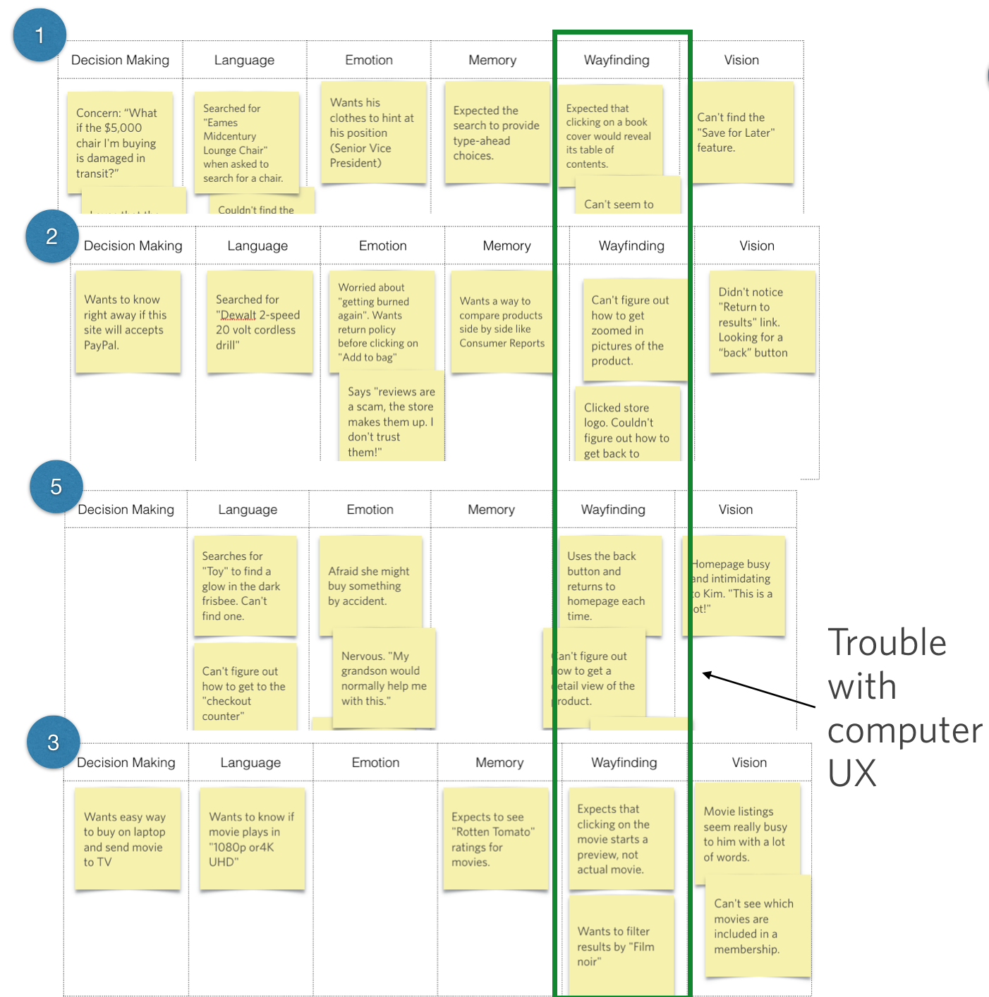
16.6
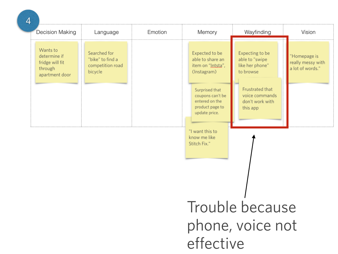
16.7
When we look at wayfinding, we see that Participants 1, 2, 3, and 5 all had problems with the user experience or the way that they interacted with a laptop. Participant 4 approached the experience very differently, expressing a desire to be able to “swipe like her phone” or to use voice commands. This participant seems far more familiar with the technology, to the extent that she has surpassed it and is ready to take it to the next level. From the Wayfinding lens, we see that our participants are looking at the same interface using varied tools and with varied expectations in terms of their level of interaction design and sophistication.
That’s just three ways we could group this batch of users. We’ll talk in a moment about which one makes the most sense to pick. But first, a note on subgroups.
Sometimes — and actually, it’s pretty common — it might be really obvious to you that certain people are of one accord and can be grouped together. Other times, you may see some commonalities among a subgroup, but there’s no real equivalent from the others.
Memory
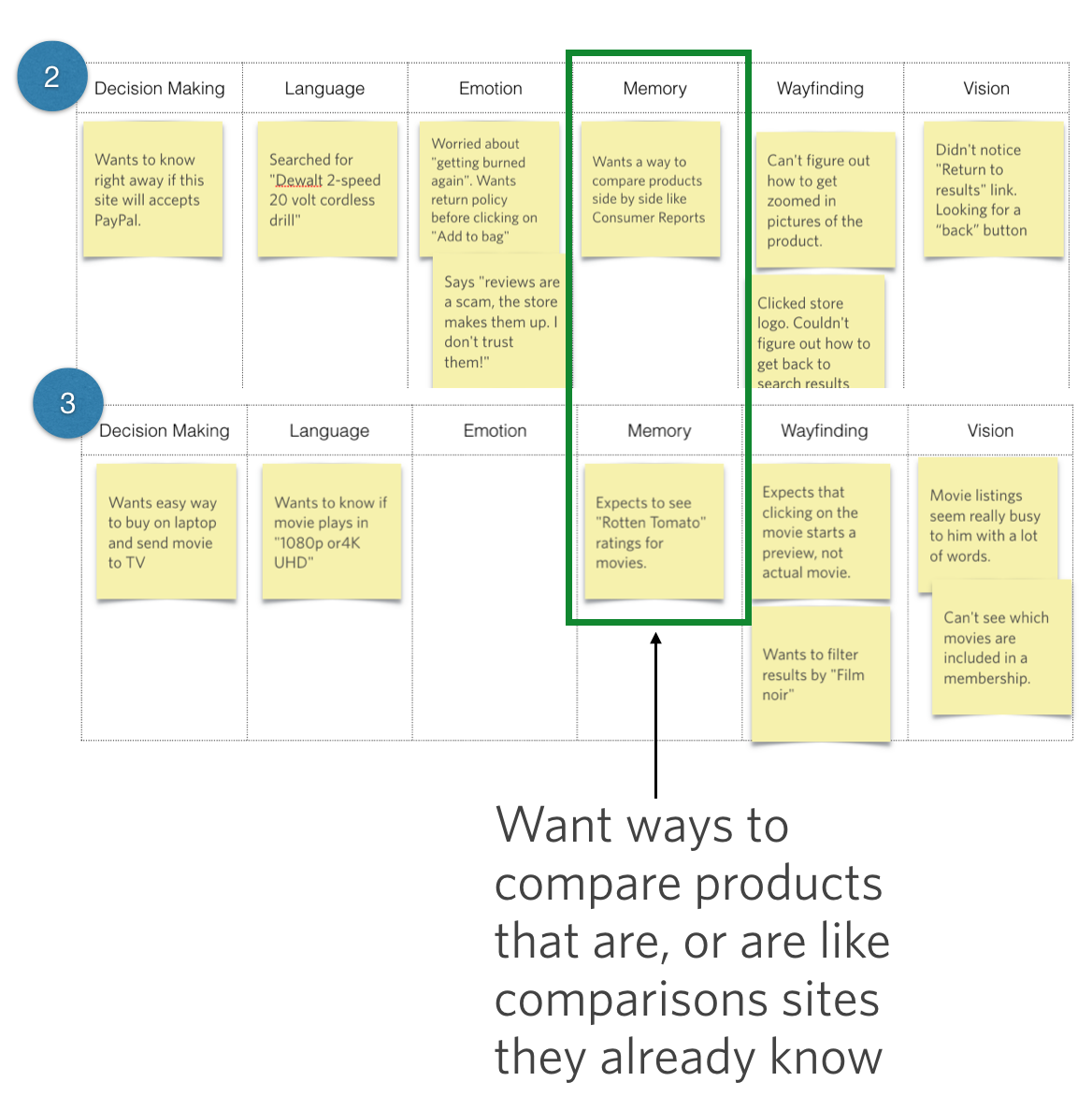
16.8
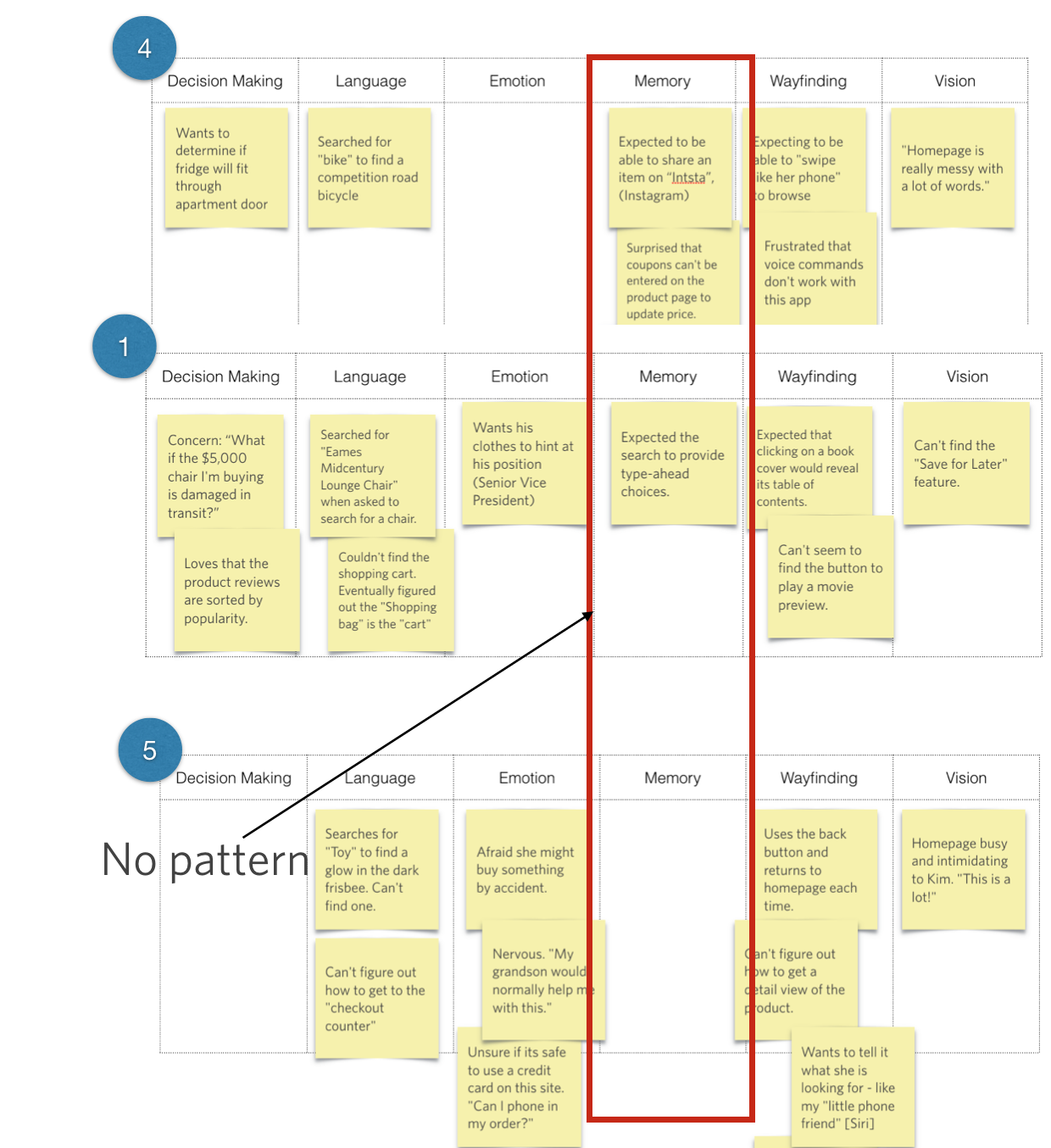
16.9
In the Memory column, for example, we see that Participants 2 and 3 both had a interesting way that they wanted to see comparisons or ratings, which is something we don’t see at all from the other folks. Because there’s no strong equivalent from the others (e.g., sophisticated/not sophisticated, or hesitant/not hesitant), I would label this commonality as interesting, but maybe not the best way to group our participants.
Now if there’s a subgroup that has a relevant attribute we want to identify, it’s fine to recognize that subgroup. Most of the time, however, we want to identify those fundamentally different types of audiences. With this broader type of audience segmentation, I don’t typically spend too much time on subgroups because then I end up with a lot of “Other” categories. Ideally, we want to place our participants into one of each distinct group.
Finding the dimensions
I think the best way to show you the audience segmentation process is through real-life example. With the three case studies that follow, I’ll show you just one grouping per data set, to give you a taste of the kinds of things we might produce.
Case Study: Millennial Money
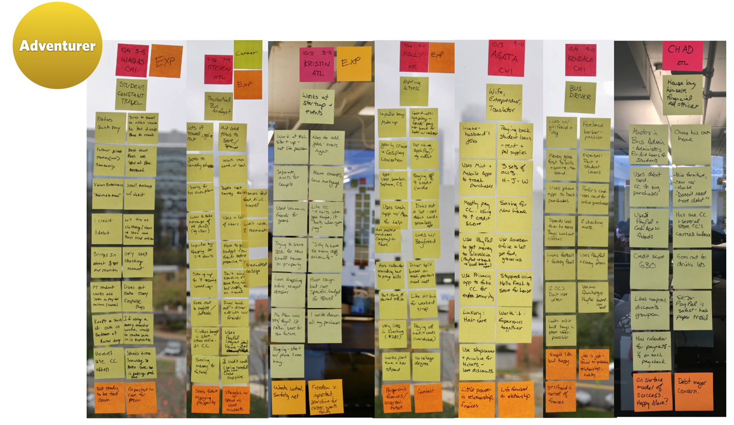
16.10
When working with a worldwide online payments system (you’ve heard of it), we performed contextual interviews with Millennials, trying to understand how they use and manage money and how they define financial success.
Like you saw before, these sticky notes represent real-life cases of people we met with. Once again, the question is: “How would I organize these folks?” This picture shows all the notes sorted by person for a handful of the participants (not obvious is that they were divided into the Six Minds as well).
One subset of the participants studied had the commonality of a life focused on adventure. Their desired lifestyle dramatically affected their decision-making about money — from saving just enough, to immediately use that money for their latest Instagram-ready adventure. We saw that what made these participants happy, and their deepest goal (Emotion), was to have new experiences and adventures. They were putting all their time and money into adventures and travel. Ultimately, what was really meaningful to them at that deep emotional state was experiences, rather than things.
Another observation that falls within Emotion is that the participants weren’t really defining themselves by their job or other traditional definitions (e.g., “I’m an introvert”); instead, they seemed to find their identity in the experiences they wanted to have.
Socially speaking, these people were instigators, and tried to get others to join them in their adventures. New possibilities, and offers of cheap tickets for which they knew the ticket codes (language) easily attracted their attention (attention!). They were masters of manipulating social networks (Instagram, Pinterest) to learn about a new place (wayfinding).
Using the Six Minds framework, I think we saw several things in these participants (remember, this was on behalf of that big online payments system, so we were particularly interested in groupings related to how this group managed their money):
That’s an example of one audience. We looked at other audiences for that study, but I just wanted to give you a feeling for that grouping and how we mostly used decision-making, emotion, and a bit of language as the key drivers for how we organized them. Other dimensions, like the way that they interacted with websites (wayfinding) or their underlying experiences and the metaphors they used (memory) just weren’t as important as that central concept that they organized their life around. So that was how we decided to group them.
This is pretty common. With audience segmentation, bigger-picture dimensions, like decision-making and emotion, tend to stand out more than the other Six Minds dimensions. If you’re study is focused on an interface-intensive situation, like designers using Adobe Photoshop for example, you might find groupings that have more to do with vision or wayfinding, but that’s less common.
Case Study: Small Business Owners
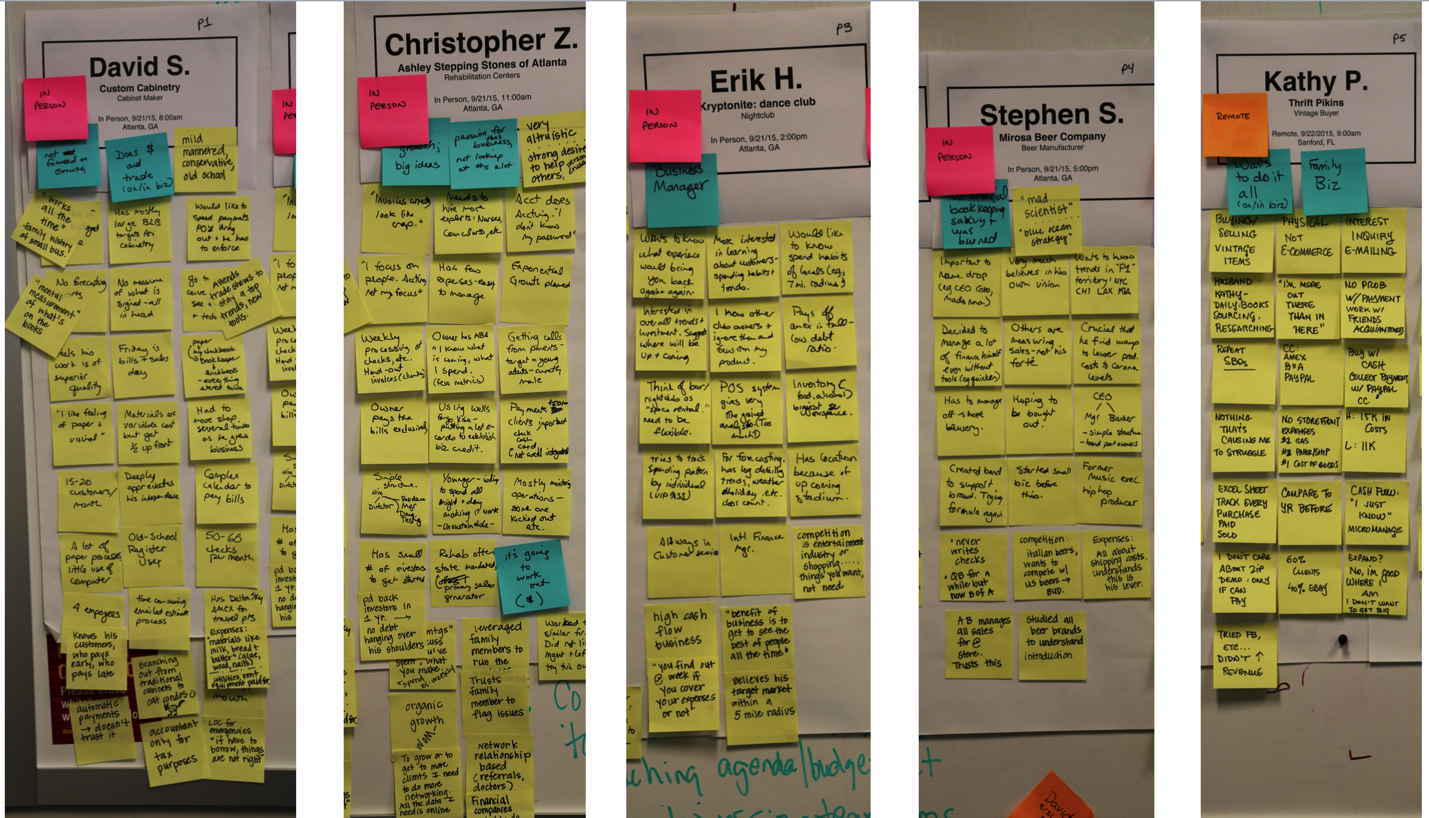
16.11
In this case, we once again started with our findings organized by participants, in this case small business owners. Per usual, we separated those findings into our Six Minds.
We soon saw that two fundamentally different types of small business owners stood out:
Like with the previous case study, these distinctions came through mostly through looking at how the participants approached decision-making, emotion, and language.
Passionate Producers
The “Passionate Producers,” as we called them, had a very emotional decision-making approach. One participant, a woodworker, was so passionate about delivering an amazing product (emotion) that he was willing to pay for better wood than he had budgeted for (decision making). He wasn’t too concerned with the bottom line (attention), and assumed the money would work out. Others in this grouping were so excited about their product that they weren’t worried about taking out huge loans.
A wedding planner that I’ll call Greg was a great example of this. He loved the work of making an amazing wedding. He “spoke wedding fluently” (language) and had an incredibly sophisticated language when it came to things like icing on the cake (literally). Everything he did was focused on making the day beautiful for the bride (memory), using the very best possible materials, and ensuring his clients (all of whom he knew intimately) were thrilled (emotion - his in receiving thanks for his work). He was most fearful of having an embarrassing wedding that the client was dissatisfied with (emotion). He didn’t focus much on record-keeping (attention). He had receipts in an envelope from his team, and didn’t always know which clients they went with (decision making). He struggled with tracking his cash flow and at the end of the day, but was proud of his work, and valued the praise and prestige he received through it.
Calculating Coordinators
Our “Calculating Coordinators,” on the other hand, are not concerned with how the cake looks or the best type of doily to go under a vase (attention). They were much more analytical in their decision-making, and were concerned with the financial viability of the business (decision making). They were much more concerned with what was in the checking account than what the end product looked like, or what their customers thought. Emotion and underlying motivations were still there; they were just different. For these folks, they were driven by their love of organizing, managing, and running companies (emotion).
Someone I’ll call Leo ran several businesses. He didn’t talk about the end products or the customers once, but he knew the back-office side of his business like, well, nobody’s business (attention, memory). More than anything, he loved managing, making decisions, and collecting data (decision making). He spoke fluent business, and used language that demonstrated his expertise in all the systems involved in running these companies. His vocabulary included things like the “60-day moving average of cash” and the “Q ratio” for his companies (language). He also spoke the language of numbers, rather than the language of marketing or branding. He was terrified of a negative profit margin (emotion).
To sum up
To segment these small business owners, we looked at how they are framing decisions (decision making), what means the most to them (emotion), and the language they’re using (language). Together, these three dimensions provided a lasting and valuable method of segmenting the audience and identifying potential products for each.
Case Study: Trust in credit
The last case here concerns a study we did on behalf of a top 10 financial company (you’ve heard of it as well). We studied how much people know about their credit scores and how they’re affected by them. We also wanted to gauge their overall knowledge about credit and fraud.
In this case, I’m only going to show you one persona, but I wanted to say that we found several types of groups. Let’s consider one particular group, who were Fearful & Unsure. For them, financial transactions were tied to so much emotion, much more than is typical of the average individual. One woman we’ll call Ruth was incredibly embarrassed when her credit card was denied at the grocery store because someone had actually stolen her identity. This led to feelings of anxiety, denial, powerlessness, fear, and being overwhelmed.
In this audience segment, people like Ruth were motivated to just hide from the issue (emotion). Unlike other people who were inspired to take action and learn about credit to protect themselves, this segment was too shell-shocked to take much action (decision making). They tried to avoid situations where it could happen again, and were operating in a timid defense mode, rather than offense (attention). This Fearful & Unsure group didn’t consider themselves credit-savvy, which was consistent with the language they used to speak about credit issues (language).
What’s driving these personas is their emotional response to a situation involving credit, resulting in a unique pattern of decision-making, the language of a novice, and being inattentive to ways to reduce their credit risk in the future. Together, those dimensions defined these different groups.
Challenging internal assumptions
In the examples above, you saw how I’ve used more complex cognitive processes like decision-making, emotion, and language to segment audiences across an industry or target audience pool. In many cases, you might have a boss or a manager who’s used to doing audience segmentation in a different way (e.g., “We need people who are in these age-ranges, or these socio-economic brackets, or have these titles”). I want you to be ready to challenge some of these historical assumptions.
Especially if your analysis seems to contradict some of the big patterns from yesteryear, be prepared to receive some flack. Don’t be afraid to say that “No, our data is actually inconsistent with that” — and point to the data! Go ahead and test the old assumptions to see if they’re still valid anymore.
When possible, try to get a sample that’s at least 24 people. If you can get a geographically dispersed or even linguistically diverse sample, even better. All of these considerations are ammunition to help you answer the question “Was this an unusual sample?” When you have a large, diverse sample, you can say, “No; this is well beyond one or two people who happen to think in this way,” and claim it as a broader pattern.
At times, you’ll need to do this not only with the outdated notions of colleagues, but also with your own preconceived ideas. Sometimes the data we find challenges our own ideas and ways of organizing material. In these cases, I urge you to make sure that you’re representing the data accurately, and not from the lens of presupposition.
Back in Chapter 8, I challenged you to approach contextual inquiry with a “tabula rasa” (clean slate) mentality. Leave your assumptions at the door and be open to whatever the data says. The same goes for audience segmentation. As best you can, try not to approach the data with your own hypotheses. We know statistically that people who say “I know that X is true” are looking for confirmation of X in the data, as opposed to people who are just testing out different possibilities. Be the latter type of analyst. Be open to different possibilities.
Always try to negate the other possibilities, as opposed to only looking for information that confirms your hypothesis. Look carefully at the underlying emotional drivers for each person. How are they moving around their problem space, and what are they finding out? What are the past experiences that are affecting them, and do the segments hinge on those past experiences?
In the case of the small business owners, we went back and forth a lot on what the salient features were for audience segmentation. There was the fact that they problem-solved from two very different perspectives. There was the language and sophistication level factor, which also differed greatly based on the subject matter (e.g., craft expertise vs. business expertise). There were several patterns we were seeing. To land on our eventual segmentations, we had to test each of these patterns across our audience segmentations and make sure those patterns were really borne out across the data.
And when possible, try to organize your participants by the highest-level dimension possible. Even though you may start out by the surface level observations, try to go deeper to get at those drivers and underlying vision. As a psychologist, I give you permission to dig deeper into the psyche — into the big, bold emotional state that influences the way they make decisions.
Ending an outdated practice: See/Feel/Say/Do
If you are familiar with empathy research, you may have heard of a See/Feel/Say/Do chart. These charts are popular with many groups looking for a mechanism to develop empathy for a user.
16.12
A lot of empathy research points researchers to use a diagram like the one you see here. See/Feel/Say/Do diagrams ask the following questions of your user(s):
The diagram shown here also includes a Pain/Gain component, asking “What are some of the things your user is having trouble with?” (pain) and “What are some opportunities to improve those components?” (gain).
Before I dispel this notion, I will acknowledge there is an extent to which you could consider See/Feel/Say/Do as a subset of what we’ve been talking about with the Six Minds. Let’s look more closely at See/Feel/Say/Do.
“See.” At first glance, this is pretty clearly tied to vision. But remember that when we consider what the user is seeing, we want to know what they’re actually looking at or attending to — not necessarily what we’re presenting to them, which may be different. I want to make sure that we’re thinking from an audience perspective, and taking into account actually what they’re really seeing. There is an important component that is missing here: What are they not seeing. We want to know what they are searching for, and why. It is crucial to consider the attentional component, too.
“Feel.” It seems like “feel” would be synonymous with emotion. But think again. In these empathy diagrams, “feel” is talking about the immediate emotion of a user in relation to a particular interface. It asks “What is the user experiencing at this very moment?” As you may remember from our discussion of emotion, from a design perspective, we should be more interested in that deeper, underlying source of emotion. What it is that my users are trying to achieve? Why? Are they fearful of what might happen if they’re not able to achieve that? What are some of their deepest concerns? In other words, I want to push beyond the surface level of immediate reactions to an interface and consider the more fundamental concerns that may be driving that reaction.
“Say.” A lot of times, the saying and doing are grouped together, but first let’s focus on the saying. I struggle with the notion of reporting what users are actually saying because at the end of the day, your user can say things that relate to any of the Six Minds. They might say what they’re trying to accomplish, which would be decision-making. They could describe how they’re interacting with something, which would be wayfinding. Or maybe they’re saying something about emotion. If you recall the types of observations we grouped under language in Part 2 with our sticky note exercise, they weren’t a mere litany of all the things our users uttered, but rather all the things our users said (or did) that pertained to the words being used on a certain interface. I believe that language has to do with the user’s level of sophistication and the terms they expect to see when interacting with a product.
By categorizing all of the words coming out of our users’ mouths as “say,” I worry that we’re oversimplifying things and missing what those statements are getting at. I also think we miss the chance to determine people’s overall expertise level based on the kinds of words they’re using. This grouping doesn’t lend itself to an organization that can influence product or service design.
“Do.” When we think about wayfinding, that has to do with how people are getting around on the interface or service design. It asks questions like “Where are you in the process?”, and “How can you get to the next step?”. I think wayfinding gets at what the user is actually doing, as well as what they believe they can do, based on their perception of how this all works. Describing behavior (“do”) is helpful, but not sufficient.
Decision-making (missing). While “do” comes close, I think that we’re missing decision-making in See/Feel/Say/Do. This style of representation doesn’t mention how users are trying to solve the problem. With decision-making or problem-solving, we want to consider how our users think they can solve the problem and what operators they think they can use to move around their decision space.
Memory (missing). Memory also gets the short shrift. We want to know the metaphors people are using to solve this problem, and the expected interaction styles they’re bringing into this new experience. We want to know about their past experiences and expectations that users might not even be aware of, but that they imply through their actions and words. Like how they expect the experience of buying a book to work based on how Amazon works, or how they expect a sit-down restaurant to have waiters and white tablecloths. See/Feel/Say/Do charts leave out the memories and frameworks users are employing.
Hopefully you can see that while better than nothing, See/Feel/Say/Do is missing key elements that we need to consider, and that it also oversimplifies some of the pieces it does consider. We can do better with our Six Minds. Here’s how.
Concrete recommendations:
Chapter 17. Putting the Six Minds to work: Appeal, Enhance, Awaken
At this point we’ve completed contextual interviews. We’ve extracted interesting data points from each participant and organized them according to the Six Minds. We’ve segmented the audience into different groupings. It’s time to put that data to work and think about how it should influence your products and services.
In this chapter I’ll explain exactly what I mean by appealing to your audience, enhancing their experience, and awakening their passion. A summary might be:
We’ll look at the type of Six Minds data that we would use to do those things. And as usual, I’ll give you some examples of how to put all of this into practice.
Cool Hunting: What people say they want (Appeal)
Our first focus is all about appealing to your customers. A digital reference point for this section is the popular website Cool Hunting. If you’re not familiar with the site, it essentially curates articles and recommendations on everything from trendy hotels to yoga gear to the latest tech toys. What are the hot new trends that people are looking for, and saying that they want?
You might think this is a bit superficial given our discussions of going beyond trends and getting at people’s underlying desires. But regardless of what you’re offering, it’s absolutely essential that you can attract your audience. They need to feel like your product or service is what they are looking for.
Some of the time, what our audience wants and what might benefit them are two very different things. The task before us in that case isn’t easy. We have to be prepared to attract them and appeal to them using what they think they want — even if we know that something else might be much more beneficial for them. Ideally after attracting them we can educate them better in order to let the customers make an informed decision.
We have to start with where people are and what they’re saying they want and need, even if that’s not necessarily the case deep-down. Start with what they’re saying at face value.
Going to our Six Minds data, I think there are three dimensions that are most relevant to this conversation around Appeal.
Lifehacker: What people need (Enhance)
Next we’ll look at how you go one step further to enhance your audience’s life. In keeping with the popular website theme, consider Lifehacker, a site that directs you to DIY tips and general life advice for the modern do-er. It’s a great example of presenting an audience with things that actually meet their needs and solve their problems. To enhance our users’ lives, we need to go a bit beyond what they’re saying to consider what would really solve a problem of theirs.
Longer-term solution: Think of Uber. People were having a hard time getting taxis late in the evening. Maybe the taxi didn’t show up, or they experienced poor customer service, or what they really needed was an easy way to order a taxi in advance or arrange one for their mom. Through a new type of tool (enter Uber), you might be able to present users with a longer-term solution for their problem.
Different way of representing something: This might look like creating a chart for a customer who needs to know some analytics but is confused by the clunky way they’re usually presented (think CSV data dump downloaded from a database, for example). Or presenting the data in such a way that makes decision-making easier. Maybe they’re used to recording the hours a staff member works on something, when what they really need is a Gantt chart showing which pieces have been accomplished, and when, and how that aligns with the original project timeline.
New system: Your audience might need a novel type of reminder or alert system. Maybe they jot things down in a notepad, but they don’t refer to that throughout the day, so they end up forgetting to pick up groceries on the way home. They’re on their phone all the time, so what would be more effective is having those reminders or notes on a phone.
Teaching a function: Perhaps your audience is searching and searching and searching for this one email that they know is in their inbox, but just can’t find. A solution might be teaching them a shortcut or command like typing in a colon and the sender’s email address to only pull up emails from that person. There might be ways to teach users a function that would work better for them or even save them hours of work.
Novel tool: Maybe they’re trying to meet someone in person but their schedules just aren’t aligning. It might be better if you taught them how to use a video chat tool.
These are all examples of things that could change people’s behavior, save them a significant amount of time, and address a very concrete problem in the reasonably near future. Now let’s look at how our Six Minds apply.
All of these considerations help us think about what would really enhance our audience’s lives in the medium term.
Soul searching: Realizing loftier goals (Awaken)
If we can both attract users to our product or service by aligning it with what they think they need and solve a longer-term problem for them, ultimately they’re going to stick around … if they feel like your product is matching their loftier goals. With the notion of awaken, I want you to think about soul searching. What would it mean to really awaken people’s passions? That desire they’ve always had to learn to play the piano, or write a book, or swim, or see their child graduate from college.
Let’s consider which of our Six Minds can help us awaken our audience’s loftier goals.
Sidenote: Pinpointing underlying emotional drivers can also help establish a positive feedback loop with customers who are enjoying a product or service. Are there tangible ways that we’ve affected them positively? Throughout the life cycle of a product or service, as we show people the immediate and longer-term benefits and ultimately demonstrate how this is helping them with their big-picture goals, we’re winning loyalty and brand ambassadors. Ideally, our clients start promoting our product for us because they like it so much. In my work, I’ve found there are ways to manage this type of life cycle. Because we’re talking about people’s deep-seated goals and corresponding emotions, this life cycle usually takes months. We want to think about what people are most hopeful for in the long term. What are they really trying to do, and what are they most afraid of that would stop them from getting there? What is the persona they’re striving to become?
These are all concepts we’ve talked about before. But here we’re thinking about framing these insights into something that’s very practical for us as marketers or product designers. What would attract our audience to the product? What would keep them using it in the medium term? What would make them feel like this was satisfying enough to keep using it, or even promote it?
Case Study: Builders
In this case, our client sold construction products — think insulation, rebar, electrical wire – things like that. They had tools and technologies that performed better and were less expensive than some of the most popular products today. But what they were finding was that the builders, who were the ones doing the actual installing, were largely unwilling to change the way they were used to doing their job.
Our client was struggling with getting those who were set in their ways to adapt to new technologies that help them in the long run. Here’s how we used some of the Six Minds to help:
Problem-Solving. As we interviewed the builders through contextual interviews, we realized that they were laser-focused on efficiency more than anything else. Typically, they would offer the job at a fixed price, meaning that if any one project takes more than the time they estimated, they’re losing money — and time they could be spending on other projects. The longer the job took, the less profit the builders were making, which gave them great incentive to complete jobs as efficiently as possible. In installing insulation, for example, the builders would want to make sure — above cost or any other factor — that it was the fastest insulation to install. So my client’s high-performing, inexpensive, new-fangled insulation actually presented a challenge to these builders because they would need to spend time training their staff on how to install it.
Attention. We haven’t used attention as much in these examples, but this was one case where we found that getting the builders’ attention was central to solving our client’s problem. It was clear that the builders were only paying attention to reducing the time of projects. They weren’t thinking about the long-term benefits of any one product over another, but rather the short-term implications of completing this project quickly so they could move onto the next project. Our client needed to market its product in such a way that it would be attractive to these busy, somewhat set-in-their-ways builders.
Language. We observed that two very different languages were being spoken by the product manufacturer and the actual installers. The product manufacturers were using complex engineering terms, like “ProSeal Magnate,” which actually made the installers feel even more uncertain of the new products because they weren’t speaking the same language. In other words, they weren’t picking up what the manufacturers were putting down. This uncertainty also evoked some mistrust, which we’ll discuss below.
Emotion. We sensed some fear in these conversations. The builders were worried that the new material would not work as well, and they’d have to go back and reinstall it. Naturally, it made sense that they would stick to the familiar product they already knew how to install. In a broader sense, though, we saw that the builders’ No. 1 fear was losing the trust of the general contractor, who wields the power to give them more work on subsequent projects. Maintaining a trusting relationship with the general contractor was crucial to these installment contractors keeping their business going.
Result. To bring it all together, we considered what it is the builders were attending to, how they were trying to fix their perceived problem, the language they were using, and the emotional drivers at play. Our findings suggested a very different approach for our client, the product manufacturer. We recommended that they focus on the time-saving potential of the new materials rather than anything else. In branding and promoting the products, it would be essential to use language familiar to the builders ensuring them that these could be put in faster and that they really worked. We recommended the manufacturer consider offering some free training and product samples to builders, and even reach out to general contractors to inform them of the benefits of the new products.
Some of these findings may sound more obvious and less “aha moment,” but that’s often how we feel after analyzing our Six Minds data. It may not be earth-shattering, but if a finding points to a consideration that we might have otherwise missed, especially through more traditional audience research channels, it can completely change how we design and sell our products. Which is pretty “aha,” in my opinion.
Previously, the client hadn’t considered any of these factors. Using the Six Minds, we were able to point to specific things like the fragile relationships between contractor and general contractor, and what these contractors were attending to through their language and emotions. Armed with these findings, we were able to make recommendations for a system that encourages sales around these cognitive and emotional drivers.
Case Study: High net worth individuals
In a very different example, another client in the financial industry wanted to explore what sort of products or services they might be able to offer high net worth individuals. My team and I set out to try to discover some of the unmet needs this audience had.
Attention. One thing we noted was not necessarily what our audience was focusing on, like with our builders, but what they were not focusing on. It’s a gross understatement to say this group was busy. Whether they were young professionals, working parents, or retired adults, they filled their days to bursting with commitments and activities. They were in the office, they were seeing a personal trainer, they were picking up their kid from after-school care, they were cooking, they were doing community service, they were playing on a rec softball league. They were constantly racing to get as much done as possible and get the most out of life. Because of all their competing commitments, needs, and priorities tugging at them from different directions, our audience’s attention was pretty scattered.
Emotion. It was clear that everyone in this audience had ambitions of productivity and success. Going further, however, we saw some key differences in the underlying goals of our audience depending on their life stage. The young professionals were making a lot of money, and many of them were just discovering themselves and starting to define what success and happiness meant to them. As you might imagine, the folks we talked to with small children had very different definitions of those concepts. They were focused on the success of the family unit. They wanted to make sure their kids had whatever they needed for everything from soccer practice to college. Though this group was hyper-focused on family life, they were also worried about losing their sense of self. The older adults we talked to circled back to that first notion of self-discovery. One gentleman who really wanted to keep exploring music built a bandstand in his basement so his friends could play with him. Another decided to follow his dream of taking historical tours, even though he knew it maybe wasn’t “cool,” but it really made him happy.
Language. The differences in people’s deep, underlying life goals also came through in the language they used. When we asked them to define “luxury,” the young professionals mentioned first-class tickets and one-of-a-kind adventures in exotic places, getting at their deeper goals of self-discovery. The people with families talked about going out for dinner somewhere the kids could run around outside and they didn’t have to worry about the dishes, getting at their goals of family togetherness and also just the goals of maintaining sanity as a parent. Older adults like the gentleman I mentioned above talked about taking that trip of a lifetime, getting at their deeper goals of feeling like they’ve really lived and experienced everything they want to. As we know from considering language, something as simple as a word (e.g., “luxury”) can have drastically different meanings to our different audiences.
Solution. These findings, gleaned using the Six Minds, were the keys to making products specific to the needs of these different groups of high net worth individuals. When we offered our recommendations to the client, we focused on our biggest takeaway, which was that relative to the other populations, the older adults were really underserved.
When we looked at how credit cards and other banking instruments were being marketed, we found that they tended to target either young professionals (e.g., skydiving in Oahu) or they would target families (e.g., 529 college savings plans). There was surprisingly little that was targeting older adults around the financial tools they needed for self-discovery. Fortunately, we now had all this Six Minds data we were able to give our client to help change that.
Case Study: Homepage interface for small business owners
This last example concerns some small business owners we interviewed on behalf of an online payments system. We were trying to figure out how best to present the payment system — including the client’s e-commerce cybersecurity tools — to those small business owners. Overall, we found that findings from quite a few of our Six Minds yielded crucial insights into this audience.
Attention. As we were interviewing them and watching them work, we found that the small business owners were pulled in all sorts of directions, making products, selling, marketing, working on back-office systems, ordering materials, getting repairs done, hiring, fending off lawsuits (OK, that was just one guy, but you get the idea). There were all kinds of things competing for their attention, but ultimately what they were attending to was driving new growth for the company. They didn’t have a lot of time or mental energy to spend on thinking about new ways of receiving payments, or the cybersecurity implications of an online payments system. They just wanted to be able to receive payments safely, and for someone else to take care of all the details.
Language. In our client’s existing marketing language, it was clear that they really wanted their customers to know that they had this type of compliance system, with top-notch security standards in place. We saw this earlier with the insulation manufacturers, and it’s actually a trend we come across frequently in our work: companies like to use very technical terms to show their prowess ... yet this often works as a disadvantage. From observing the small business owners, we learned very quickly that the language they used (e.g., “safe way to get paid”) was hugely different from that of our client (e.g., “cybersecurity regulatory compliance”).
Memory. These busy business owners were experts in their specialty, not cybersecurity — and they didn’t really have the time or interest to change that fact. They weren’t impressed by the rationale behind many of the client’s sophisticated tech tools because they didn’t have any preconceived notions or frame of reference for how those tools should work. Appealing to Memory didn’t work in this case!
Emotion and Decision-making. Ultimately, our audience just wanted a product they could trust. The concept of cybersecurity wasn’t clearly meeting their No. 1 goal of growing the business so, perhaps ironically, this notion of cybersecurity ended up making them lose trust.
Solution. Because our audience had no frame of reference for cybersecurity, we knew that trying to impress them with techie talk wasn’t going to be advantageous for our client. What we did instead was go back to what they were attending to, and think about their deepest desires and fears. No. 1 desire: business growth. No. 1 fear: business failure. So what we focused on was having them imagine what a 10 percent sales increase this month would mean for them. Imagining those dollar signs got them really excited. Doing that allowed us to pull them in by appealing to their emotions.
We also knew they needed a way to pull the trigger on this decision. So we provided facts to allay their fears about any complications with a new technology. We showed them that people who had this cybersecurity tool were much less likely to have their credit cards stolen, for example. We used examples and language that these business owners could grasp, and which helped them make their decision.
Concrete recommendations:
Chapter 18. Succeed Fast, Succeed Often
While we are still encouraging industry standard cycles of build/test/learn, we do believe that the information gleaned from the Six Minds approach can get you to a successful solution faster.
We’ll look at the Double Diamond approach to the design process and I’ll show you how we can use the Six Minds to narrow the range of possible options to explore and get you to decision making faster. We’ll also look at learning while making, prototyping, and how we should be contrasting our product with those of our competitors.
Up to now, we’ve focused on empathizing with our audience to understand the challenge from the individuals who are experiencing it. The time we’ve taken to analyze the data should be well worth it in order to more clearly articulate the problem, identify the solution you want to focus on, and inform the design process to avoid waste.
I challenge the notion of “fail fast, fail often” because this approach can reduce the number of iteration cycles needed.
Divergent thinking, then convergent thinking
Many product and project managers are familiar with the “double diamond” product and service creation process, roughly summarized as Discover, Define, Develop, Deliver.
17.1
The double diamond process can appear complicated, and so I want to make sure you understand how the Six Minds process can help to focus your efforts along the way. I won’t focus on discovery stages such as linking enterprise goals to user goals because there are wonderful books on the overall discovery process that have come out recently that I’ll recommend at the end of this chapter.
First Diamond: Discover and Define (“designing the right thing”)
Within a double diamond framework, we first have Discover, where we try to empathize with the audience and understand what the problem is. Then Define -- figuring out which of those problems we may choose to focus on.
The six minds work generally would be seen as fitting into the discovery process. We are simply provided a sophisticated, but efficient way of capturing more information about the customers’ cognitive processes and thinking, in addition to building empathy for their needs and problems. We are collecting research revolving around understanding our customers better, creating insights, themes and specific opportunity areas. Thinking back to our last chapter, we can use our research to figure out:
Even though most of this chapter will focus on the second diamond, I want to acknowledge that our primary research is a treasure trove in terms of helping us to identify specific opportunity areas. After considering Appeal/Enhance/Awaken, you’ll probably have some insights into specific opportunity areas, whether it’s helping this wedding planner with finance management or helping this woodworker with marketing. Now you’re ready to explore some of the possibilities for solutions.
Second Diamond: Develop and Deliver (“designing things right”)
By the time we get to the second diamond, we have selected a customer problem that we want to solve with a product or service, and now we’re identifying all the different ways that we could build a solution to and select the optimal one to deliver.
There are a seemingly infinite number of solution routes you could take. To expedite the process of selecting the right one, we need ways to constrain the possible solution paths we take. The Six Minds framework is designed to dramatically constrain the product possibilities by informing your decision making. The answers to many of the questions we have posed in the analysis can inform design and reduce the need for design exploration.
1. Vision/Attention
Our Six Minds research can answer many questions for designers: What are the end audience looking for? What is attracting their attention? What types of words/images are they expecting? Where in the product/service they might be looking to get the information they desire? Given that understanding, part of the question for design is the design will use knowledge as an advantage, or intentionally break from those expectations.
2. Wayfinding
We will also have significant evidence for designing the interaction model including answers to questions like the following: How does our audience expect to traverse the space, including virtually (e.g., walking through an airport or navigating a phone app)? What are the ways they’re expecting to interact with the design (e.g., just clicking on something, vs. using a three-finger scroll, vs. pinching to zoom in)? What cues or breadcrumbs are they looking for to identify where they are (e.g., a hamburger icon to represent a restaurant, or different colors on a screen)? What interactions might be most helpful for them (e.g., double-tapping)? We will have some of this evidence as well.
3. Memory
We will also have highly relevant information about user expectations: What past experiences are helping to shape their expectations for this one? What designs might be the most compatible or synchronized with those expectations? What past examples will they be referencing as a basis for interacting with this new product? Knowing this, we can help to speed acceptance and build trust in what we are building by matching some of these expectations.
[Sidebar: Have we stifled innovation?]
“But what about innovation?!” you may be wondering. I am not saying thou shalt not innovate. I find it perfectly reasonable that there are times to innovate and come up with new kinds of interactions and ways to draw attention when that’s required for a different paradigm. What I’m saying is that if there are any ways in which you can innovate within an existing body of knowledge and save yourself a huge amount of struggle. When we work within those, we dramatically speed acceptance.
4. Language
Content strategists will want to know to what extent are the users experts in the area. What language style would they find most useful to them (e.g., would they say “the front of the brain” or “anterior cingulate cortex”?)? What is the language that would merit their trust and be the most useful to them?
5. Problem-Solving
What did the user believe the problem to be? In reality, is there more to the problem space than they realize? How might their expectations or beliefs have to change in order to actually solve the problem? For example, I might think I just need to get a passport, but it turns out that what I really need to do is first make sure I have documentation of my citizenship and identity before I can apply. How are users expecting us to make it clear where they are in the proces?
6. Emotion
As we help them with their problem-solving, how can we do this in a way that’s consistent with their goals and even allays some of their fears? We want to first show them that we’re helping them with their short-term goals. Then we want to show them that what they’re doing with our tool is consistent with those big-picture goals they have as well.
All in all, there are so many elements from our Six Minds that can allow you as
the designer to ideate more constructively, in a way that’s consistent with the evidence you have. Which means that your concepts are more likely to be successful when they get to the testing stage. Rather than just having this wild-open, sky’s-the-limit field of ideas, we have all these clues about the direction our designs should take.
This also means you can spend more time on the overall concept, or on branding, vs. debating some of the more basic interaction design.
Learning while making: Design thinking
Several times in this book, I’ve referenced the notion of design thinking. More recently popularized by the design studio IDEO, design thinking can be traced back to early ideas around how we formalize processes for creating industrial designs. The concept also has roots in some of the psychological studies of systematic creativity and problem-solving that were well-known by the psychologist and social scientist Herb Simon, whom I referenced earlier from his research on decision-making in the 70s.
Think of building a concept like a tiny camera that you would put in someone’s bloodstream. Obviously this is a situation you would need to design very carefully to manipulate it to make it bend the right ways. In working to construct a prototype, the engineers of this camera learned a lot about things like the weight and grip of it. No matter what you’re making, there will be all types of things like this that don’t find out until you start making it. That’s why this ideation stage is literally thinking by designing.
Don’t underestimate or overestimate the early sketches and flows and interactions and stories that you build, or the different directions you might use to come up with concepts. I think Bill Buxton, one of the Microsoft’s senior researchers, writes about this really well in his book “Sketching User Experiences: Getting the Design Right and the Right Design.” He proposes is that any designer worth their salt should be able to come up with seven to 10 different ways of solving a problem in 10 minutes. Not fully thought-out solutions, but quick sketches of different solutions and styles. Upon review, these can help to inform which possible design directions might have merit and be worthy of further exploration.
Like Buxton, I think that really quick prototype sketching is really helpful and can show you just how divergent the solutions can be. When you review them, you can see the opportunities and challenges and little gold nuggets in each one.
Starting with the Six Minds ensures that we approach this learning-while-making phase with some previously researched constraints and priorities. Rather than restraining you, these constraints will actually free you to build consensus on a possible solution space that will work best for the user, because you will be able to evaluate the prototypes through evidence-based decision making, focusing on what you’ve learned about the users, rather than have a decision made purely using the most senior person’s intuition.
I’ll give you one example of why it’s so important to do your research prior to just going ahead and building.
Case Study: Let’s just build it!
I was working with one group on a design sprint. After explaining my process, the CEO said it’s great that I have these processes, but he explained that they already knew what they needed to build. I had a suspicion that this wasn’t the case, because it’s rarely the case. Generally, a team doesn’t know what they need to build or if they’re all really set on it, there may not be good reasons why they’re so set on that particular direction.
But he wanted to jump in and get building. So we went right to the ideation phase, skipping over stakeholder priorities and target audiences and priorities and how those things might overlap to constrain our designs. We went straight to design.
I asked he and his team to quickly sketch out their solutions so I could see what it was they wanted to build (since they were on the same page and all).
18.2
As you see from these diagrams, their “solutions” were all over the map because the target audience, and problem to be solved, varied widely between the six people. Quickly the CEO recognized that they were not aligned like he had thought. He graciously asked that we follow the systematic process.
Technically, we could have gone from that initial conversation into design. But I think this exercise brought the point home that the amount of churn and trial and error is so much greater when you aren’t aligned with evidence and constraints to solve your problem.
I’m recommending we start with the problem we think our audience is really trying to solve. From there as we ideate, we should take into account the expectations they have about how to solve the problem, the language they’re using, the ways they're expecting to interact with the problem, the emotional fears and goals they’re bringing to the problem space.
If you’re think from that perspective, it will give you a much clearer vantage point from which to come up with new ideas. I want you to do exactly this: Explore possibilities, but within the constraints of the problem to solve, and the human need you need to solve!
Don’t mind the man behind the curtain: Prototype and test
In our contextual inquiry, we consider where our target audience’s eyes go, how they’re interacting with this tool, what words they’re using, what past experiences they’re referencing, what problems they think they’re going to solve, and what some of their concerns or big goals are. I believe we can be more thoughtful in our build/test/learn stage by taking these findings into account.
With the prototype, we’ll go back to a lot of our Six Minds methods of contextual inquiry. We want to be watching where the eyes go with prototype 1 versus 2. We’ll be looking at how they seem to be interacting with this tool, and what that tells us about their expectations. We’ll consider the words they’re using with these particular prototypes, and whether we’re matching their level of expertise with the wording we’re using. What are their expectations about this prototype, or about the problem they need to solve? In what ways are we contradicting or confirming those expectations? What things are making them hesitate to interact with this product (e.g., they’re not sure if the transaction is secure or if adding an item to the shopping cart means they’ve purchased it)?
In the prototyping process, we’re coming full circle, and using what we learned from our empathy research early on. We’re designing a prototype, or series of prototypes, to test all or part of our solution.
There are other books I’ll point you to in terms of prototyping, but first I have a few observations and suggestions for you to keep in mind.
I’ve noticed that when we present a high-fidelity prototype — one that looks and feels as close as possible to the end product we have in mind — our audience starts to think that this is basically a fait accompli. It’s already so shiny and polished and feels like it’s actually live, even if it’s not fully thought out yet. Something about the near-finished feel of these prototypes makes stakeholders assume it’s too late to criticize. They might say it’s pretty good, or that they wish this one little thing had been done differently, but in general it’s good to go.
That’s why I prefer to work with low-fidelity prototypes that still have a little bit of roughness around the edges. This makes the participant feel like they still have a say in the process and can influence the design and flow. Results vary with paper prototypes, so it’s important that you know going into this exercise what the ideal level of specification is for this stage.
When I’m often showing a low- to medium-fidelity prototypes to a user, for example, I prefer not to use the full branded color palette, but instead stick to black-and-white. I’ll use a big X or hand sketch where an image would go. I’m cutting corners, but I’m doing that very intentionally. Some of these rougher elements signal to a client that this is just an early concept that’s still being worked out, and their input is still valuable in terms of framing how the end product should be built. I like to call this type of a prototype a “Wizard of Oz” prototype. Don’t mind the man behind the curtain.
In one example of this, we were testing how we should design a search engine for one client. For this, we first wanted to understand the context of how they would be using the search engine. We didn’t have a prototype to test, so we had them use an existing search engine. We used the example of needing to find a volleyball for someone who is eight or nine years old. We found that whether they typed in “volleyball” or “kid’s volleyball,” the same search results came up. And that was OK because we weren’t necessarily testing the precision of the search mechanism; we were testing how we should construct the search engine. We were testing how people interacted with the search, what types of results they were expecting, in what format/style, how they would want to filter those results, and generally how they would interact with the search tool. We were able to answer all of those questions without actually having a prototype to test.
2. In-situ prototyping
Now that you know I’m a fan of rough or low-fidelity prototypes, I also want to emphasize that you do still need to do your best to put people into the mode of thinking they will need. Going back to our contextual inquiry, I think it’s important to do prototype testing at someone’s actual place of work so they are thinking of real-world conditions.
3. Observe, observe, observe
This is the full-circle part. When we’re testing the prototype, we observe the Six Minds just like we did in our initial research process. Where are the audience’s eyes going? How are they attempting to interact? What words are they using at this moment? What experiences are they using to frame this experience? How are you being consistent with or breaking those anticipations? Do they feel like they’re actually solving the problem that they have? Going one step further, a bit more subtle: How does this show them that their initial concept of the problem may have been impoverished, and that they’re better off now they’re using this prototype?
When we think of emotion here, it’s not very typical for an early prototype to show someone that they’re accomplishing their deepest life goals. But we can learn a lot through people’s fears at this stage. If someone has deep-seated fears, like those young ad execs buying millions of dollars in ads who were terrified of making the wrong choice and losing their job, we can observe through the prototype what’s stopping them from acting, or where they’re hesitating, or what seems unclear to them.
Test with competitors/comparables
As you’re doing these early prototype tests, I strongly encourage you test them with live competitors if you can. One example of this was when we tested a way that academics could search for papers. In this case, we had a clickable prototype so that people could type in something, even though the search function didn’t work yet. We tested it against a Google search and another academic publishing search engine. Like with the volleyball example earlier, we wanted to test things like how we should display the search results and how we should create the search interface, in contrast with how these competitors were doing those things.
With this sort of comparable testing before you’ve built your product, you can learn a lot about new avenues to explore that will put you ahead of your competitors. Don’t be afraid to do this even if your tool is still in development. Don’t be afraid of crashing and burning in contrast to your competitors’ most slick products — or in contrast to your existing products.
I also recommend presenting several of your own prototypes. I’m pretty sure that every time we’ve shown a single prototype to users, their reaction has been positive. “It’s pretty good.” “I like it.” “Good work.” When we contrast three prototypes, however, they have much more substantive feedback. They’re able to articulate which parts of No. 1 they just can’t stand, vs. the aspects of No. 2 that they really like, if we could possibly combine them with this component of No. 3.
There’s also plenty of literature backing up this approach. Comparison reveals further unmet needs or nuances in interfaces that the interviews might not have brought out, or beneficial features that none of the existing options are offering.
Concrete recommendations:
Chapter 19. Now see what you’ve done?
Congratulations! Now that you’ve followed all the steps I’ve walked you through so far, you are ready to design an experience on multiple levels of human experience. You are now able to test the experience of your product or service more systematically with the Six Minds framework. Be prepared to get to better designs faster, and with less debate over design direction.
In this chapter, I’ll present a summary of everything we’ve looked at up to this point. I’ll also provide a few examples of some of the kinds of outcomes you might expect when designing using the Six Minds.
One of the things that I think is unique to this approach is the notion of empathy on multiple levels. Not only are we empathizing with the problem our audience is facing, but we’re also taking into account lots of other pieces when we’re making decisions about how to form a possible design solution to that problem. By focusing on specific aspects of the experience (e.g., language, or decision making, or emotional qualities), our Six Minds approach allows us to approach the decision-making process with a lot more evidence than if we had relied on more traditional audience research channels.
The last thing I want to speak to in this chapter goes back to something I mentioned back in the Introduction, about all the elements that add up to make an experience brilliant. And when I say experience, I’m actually thinking of the series of little experiences that add up to what we think of as a singular experience. The experience of going to the airport, for example, is made up of many small experiences, like being dropped off at curbside, finding a kiosk to print your boarding pass, checking your bag, going through security, getting to customs, finding the right terminal, heading to your gate, buying a snack. In many cases, our “experience” actually involves a string of experiences, not a singular moment in time, and I think we need to keep this realization in mind as we design.
Empathy on multiple levels
In Lean Startup speak, people talk about GOOB, which stands for Get Out Of (the) Building. In traditional design thinking, empathy research starts with simply seeing the context in which your actual users live, work, and play. We need to empathize with our target audience to understand what their needs and issues really are. There are some great people out there who can do this by intuition. But for the rest of us mortals, I think there are ways to systematize this type of research. If you do it the way I proposed in Part 2 of this book, through contextual inquiry, you’ll come home with pages of notes, scribbles, sketches, diagrams, and interview tapes.
In a moment, I’ll show you how we get from these scribbles to the final product. But I wanted to quickly say that so far, a lot of this is very similar to traditional empathy research or Lean Startup principles. Where I think my process differs is that we’ve delved into much more than just the problem that end users are trying to solve. We’re also thinking about Memory and Language and Emotion and Decision-Making and Attention and Wayfinding and lots of different things.
Findings from each of the Six Minds won’t necessarily influence every design decision. But I wanted to provide a representative example where I think they all come into play.
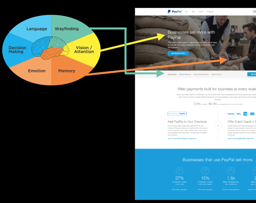
19.1
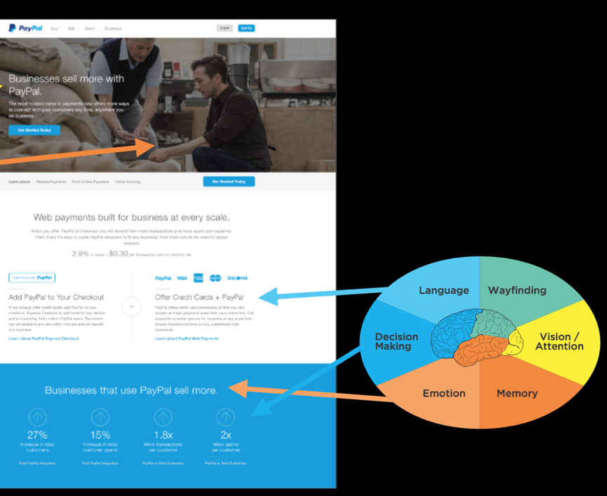
19.2
In this example, we were designing a page for PayPal for small businesses. The end users were people who might consider using PayPal for their small business ventures, like being able to receive credit card payments on their website or moving to accept in-person credit card payments instead of cash. Let’s put our design to the Six Minds test, based on the interviews we conducted and watching people work.
Evidence-driven decision-making
In the example above, just in this portion of a page, we talked about all Six Minds and how we can use evidence-driven decision-making when we’re deciding on a product design or what direction to go in. I believe, of course, that this process gives you much clearer input than traditional types of prototyping/user testing.
That said, getting to this mockup didn’t happen overnight, or even halfway through our contextual interviews. Sure, we saw some patterns and inklings through our Six Minds analysis. But getting to that actual design was a slow and gradual process. We tried out many iterations with stakeholders and made micro-decisions as we went based on their input. We also considered comparable sites and some of the weaknesses that we found in those so we could make sure we did better than all of them.
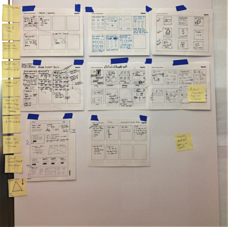
19.3
I believe there is so much we can learn through the process of just formulating these designs, or “design thinking.”
In the photo above, you can see some early sketches of the different ideas we had for what the page would look like, including things like flow and functionality and visuals. We started with lots of sketches and possibilities, doing a lot of ideating, rapid prototyping, and considering alternatives. As we narrowed down the possibilities through user testing and our own observations, we went from our really simple sketches to black-and-white mockups to clickable prototypes to the very high-fidelity one that you saw a little earlier in the chapter.
In sketching out those early designs, we looked at each option using what we knew of our end audience based on their Vision/Attention, Memory, and so on. This helped us realize some of the design challenges and inconsistencies in them.
One option broke all of the audience’s expectations of how an interaction should work, for example. Another would have been a huge departure from the audience’s mental model of how decision-making should work in an e-commerce transaction. It really helped us to have evidence showing why each of the designs did or didn’t satisfy the six criteria. Once we found one that satisfied five of the Six Minds, we went with that one and went from there, tweaking it until it satisfied all six.
When you don’t have this evidence base backing you up, you run the risk of being swayed by personal preferences — usually, the personal preferences of the “HIPPO” (the highest paid person in the room and their opinions). Instead, you can use the Six Minds as much to appeal to your HIPPOs as you can to your end clients. Your boss or CEO is probably not used to doing audience research or product testing in this way. Point to what you know from the Six Minds about the way the audience is framing the problem and how they think they can solve it, or what appeals to them and what they’re attending to. Time and again, I have found that pointing to the Six Minds helps us get away from opinion-based decision-making and embrace evidence-based decision-making instead. Ultimately, this makes the process go much more quickly and smoothly. Skip the drama of your office politics. Embrace the Six Minds of your audience.
Experience over time
The example we just walked through was a snapshot of someone’s decision to sign up for PayPal for Business at a certain point in time. I want to go one step further here and show you how the Six Minds are applicable throughout the lifecycle of a decision, and can actually be quite fluid, rather than static, over time.
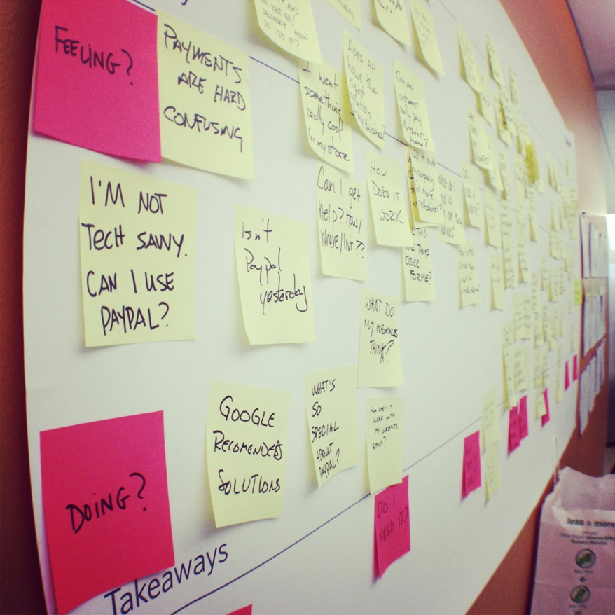
19.4
Service design is a good example of this. In this case, this is a photo of sticky notes with all the questions we heard from business owners about why they would or wouldn’t consider PayPal for Business to start an ecommerce store.
Looking at the pink sticky notes on the left of the big piece of paper where we organized the yellow sticky notes, you can see that we toyed briefly with the idea of categorizing the questions into Thinking/Feeling/Doing. You already know how I feel about the See/Feel/Say/Do system of classification. I think this metaphor is just not practical. It limits your audience to their thoughts, feelings, and actions. It says nothing of their motivation for doing what they’re doing. Instead, I’d rather use the metaphor of the decision-making continuum. That’s what we did with the pink sticky notes along the bottom.
When we looked at all the questions together, we saw that the questions started at a pretty fundamental level (e.g., “can this do what I need?”) to follow-up questions (e.g., “is the price fair?”) to implementation (e.g., “is this compatible with my website provider?”) all the way to emotions like fear (e.g., “what happens to me if someone hacks the system?”). We organized these questions into several key steps along the decision-making continuum.
This is common: people have to go sub-goal by sub-goal, micro-decision by micro-decision, until they reach their ultimate end goal. They might not be asking about website compatibility straight out of the gate; first they have to make sure this tool is even in the ballpark of what they need. Later, right before they hit “go,” some of those emotional blockers might come up, like fear that the system would get hacked and end up costing the business money.
People’s questions, concerns, and objections tend to get more and more specific as they go. As you test your system, take note of when these questions come up in the process. Then you design a system that presents information and answers questions at the logical time. It may be that in the steps right before they hit “buy,” you’re presenting things to them in a more sophisticated way because they now already know the basics of what you’re offering in relation to what they’re currently using. Now you can answer those last questions that might relate to their fears that are holding them back.
Multiple vantage points
In addition to considering multiple steps along the decision-making process, we need to consider multiple vantage points when we design. We haven’t talked about this as much, but you can certainly use the Six Minds for processes involving multiple individuals. To show you how, let’s go back to our example of builders who install insulation.
There are a lot of players involved in building a big building. There’s the financial backer, the architect, the general contractor, and all the subcontractors managed by the general contractor. And then there are the companies like the insulation company we worked with who provide the building materials you need.
Just like there are many players, there are many steps in the decision-making process of something as seemingly simple as choosing which insulation to buy. There’s the early concept of building a building, then there’s actually trying to figure out what materials to use, then someone approves those materials, someone buys them, and somebody else installs them.
In our work for this client, we wanted to identify those different micro-decision and stages within the decision-making process. We met with people at all levels to learn who makes what decisions, when. We learned about the perspective and level of expertise of each decision-maker. The general contractor, for example, had a fundamental knowledge about insulation. The person who actually installs insulation day in and day out possessed much more specific knowledge, as you might expect. Both knew more about insulation than the architect.
All of their concerns were different as well; the general contractor was concerned with (and is responsible for) the building’s longevity. The installer was concerned with the time that it would take to install the materials, as well as the safety of his fellow workers who would be installing them. The architect was mostly concerned with the building’s aesthetic qualities.
By identifying — and listening to — the various influencers, we were able to determine what messages needed to be delivered to each group, at each stage of the process. Often, you’ll find that the opportunities at each stage are very different for each group you’re targeting because of the varied problems they’re trying to solve.
If you remember, our client’s overarching problem was that specialized contractors weren’t switching over to their innovative insulation — even though they were more efficient, cost-effective, and easier to install than the competition. They were sticking with the same old insulation they’d always used.
As we started to investigate and meet with the key decision-makers involved, we learned that the architect was often quite keen on using innovative new materials, especially since they often offers new design possibilities. The general contractor wants the materials aligned with the project’s timing and budget. They just needed to check with the subcontractor.
The subcontractors were a lot like the working parents I mentioned earlier, who are going a million miles an hour trying to balance multiple jobs, issues that pop up, and sales simultaneously. Time is everything to them. They work within a fixed bid or flat fee to make it easier for the general contractor to estimate the overall cost of the project. Because of this, the installers are laser-focused on making the whole process faster. The long term longevity or aesthetic qualities of the building may not be their number one focus. They want to know if the materials are easy to install quickly, with as little startup and training time as possible.
The main message these subcontractors needed to hear was that this new product could actually be installed faster than the old one. It was easy to work with and get the hang of quickly. The main message for the general contractors, on the other hand, was all about cost benefit and durability. The new product lasted longer than the traditional materials, so they would be less likely to have to fix any building problems moving forward. The main message for the architect was that the end product would look good in the building. We showed the architect what the new insulation would look like, and explained that it came in different colors and could be conformed to curved walls.
You can see that each of those decision-makers were approaching the problem space from three very different perspectives: efficiency, cost, and visual appeal. The way we Appeal, Enhance, and Awaken in our messaging and design needed to be different for each.
Recognizing all three of these perspectives helped us frame how to present our product to each group — from messaging to distribution. Should you create one message for everybody, or three separate messages to reach your various stakeholders, for example? Or have all your information on a website, but segmented by the different audience groups? If you recall the earlier example I gave of cancer.gov, National Cancer Institute provides two definitions of cancers on its site: a version for health professionals and a version for patients. I provided that example in the context of language, but I think this type of approach also can speak to the different motivators and underlying ambitions that we’re trying to awaken in our audiences.
In summary, I first encourage you to embrace the notion of user experience as multi-dimensional and multi-sensory. We can and should tap into these multiple dimensions and levels when we’re doing empathy research and design.
Second, as you encounter micro-decisions within your product or service, remember that even these seemingly small steps can have a logical rationale based on your interviews. Embrace this rationale, especially in the face of HIPPO opposition — and embrace your creativity while you’re at it. The type of evidence-driven design methodology I’m suggesting allows for plenty of creativity. It’s creativity within what’s more likely to be a winning sphere.
Last, try thinking about your product or service as more than just a transaction. Think about it as a process that will touch multiple people, over multiple points in time. Try thinking of the Six Minds of your product — where people’s attention is; how they interact with it; how they expect this experience to go; the words they are using to describe it; what problem they’re trying to solve; what’s really driving them — as constantly evolving. The more they learn about this topic through your product or service, the more expert they’ll become, which changes how you engage them, the language you use, and so on.
Concrete recommendations:
Chapter 20: How To Make a Better Human
Growing up, I remember watching reruns of a 1970’s TV show about a NASA pilot who had a terrible crash, but according to the plot, the government scientists said “we can rebuild him, we have the technology” and he became “The Six Million Dollar Man” (now equivalent of about $40 million). With one eye with exceptional zoom vision, and one arm and two legs that were bionic he could run 60 miles per hour and perform great feats. In the show he used his superhuman strength as a spy for good.
It was one of the first mainstream shows that demonstrated what might be accomplished if you seamlessly bring together technology with humans. I’m not sure that it might have been as commercially viable if they called the show “The Six Million Dollar Cyborg,” but that’s really what he was – a human - machine combination. It was interesting, but far-off science TV make believe.
But today we have new possibilities with the resurgence and hype surrounding Artificial Intelligence and machine learning. I’m sure if you are in the product management, product design or innovation space you’ve heard all kinds of prognostications and visions about what might be possible and I’d like to bring together what might be the most powerful combination: thinking about human computational styles and supporting them with machine learning equipped experiences to create not the physical mental prowess of the Six Million Dollar Man, but the mental prowess that they never explored in the TV show.
Symbolic Artificial Intelligence and the AI Winter
I’m not sure if you are aware, but as I write we are in at least the second cycle of such hype and promise surrounding artificial intelligence. In the 1950’s and 1960’s, Alan Turing suggested that mathematically, 0’s and 1’s could represent any type of mathematical deduction, suggesting that computers could any formal reasoning. From there, scientists in neurobiology and information processing started to wonder, given the similarity of brain neurons ability to fire an action potential, or not (effectively a 1 or 0), if there might be the possibility of creating an artificial brain, and reasoning. Turing proposed the Turing test: essentially that if you could pass questions through to some entity, and the entity would provide answers back, and the humans couldn’t distinguish between the artificial and real human, that that artificial system passed, and could be considered artificial intelligence.
From there others like Herb Simon, Alan Newell and Marvin Minsky started to look at intelligent behavior that could be formally represented and worked on how “expert systems” could be built up with understanding of the world. Their artificial intelligence machines tackled some basic language tasks, games like checkers, and learning to do some analogical reasoning. There were bold predictions that within a generation the “problem of AI would largely be solved”.
Unfortunately, their approach showed promise in some fields but great limits in others, in part, because their approach focused on symbolic processing, very high-level reasoning, logic, and problem solving. This symbolic approach to thinking did find success in other areas including semantics, language and cognitive science, though focused much more on understanding human intelligence and than building artificial intelligence.
By the 1970’s in the academic world money for artificial intelligence dried up, and there was what was called the “AI Winter” – going from the amazing promise of the 1950’s to real limitations in the 1970’s.
Artificial Neural Networks and Statistical Learning
Very different approaches to artificial intelligence and the notion of creating an “artificial brain” started to be considered in the 1970’s and 1980’s. Scientists in a divergent set of fields composing cognitive science (psychology, linguistics, computer science), particularly David Rumelhart and James McClelland looked at this from a very different “sub-symbolic” approach. Perhaps rather than trying to build representations that were used by humans, we could instead build systems like brains – that had many individual processes (like neurons) that could affect one another with inhibition or excitation (like neurons) and have “back propagation” which changed the connections between the artificial neurons depending on whether the output of the system was correct.
This approach was radically different than the one above because: (a) it was a much more “brain-like” parallel distributed process (PDP), in comparison to a series of computer commands, (b) it focused much more on statistical learning, and (c) the programmers didn’t explicitly provide the information structure, but rather sought to have the PDP learn through trial and error and adjust its weights between its artificial neurons.
These PDP models had interesting successes in natural language processing and perception. Unlike the symbolic efforts in the first wave, this group did not make any assumptions about how these machine learning systems would represent the information. These systems are the underpinnings of Google Tensorflow, and Facebook Torch. It is this type of parallel process that is responsible for today’s self driving cars and voice interfaces.
With new incredible power in your mobile phone, and in the cloud, these systems have the computing power Newell and Simon likely dreamed of having. And while these systems have made great strides in natural language processing and image processing they are still far from perfect.
20.1
There have been many breathless prognostications about the power of AI and its unstoppable intelligence. While these systems have been getting better, they are highly dependent on having the data to train the system, and clearly as the above shows, have their limitations.
I didn’t say that Siri!
You may have your own experiences with how voice commands can on one hand be incredibly powerful, but on the other have significant limitations. Their ability to recognize any language has been impressive. This is a hard problem and they have shown real ability to do so. We put these systems to the test studying Apple Siri, Google Assistant, Amazon Alexa, Microsoft Cortana and Hound. Using a Jeopardy-like setup we asked participants to create a command or question to get an answer (e.g., Cincinnati, tomorrow, weather) for which participants might say “Hey Siri, what is the weather tomorrow in Cincinnati?).
To make a long story short, we found that these systems were quite good at answering basic facts (e.g., weather, capital of a country), but had real trouble with two very natural human abilities. First, we can put together ideas easily (e.g., population, country with Eiffel Tower – which we know is France). When we asked these systems a question like “What is the population of the country with the Eiffel tower?”, they generally produced the population of Paris or just gave an error. Second, if we followed up: “What is the weather in Cincinnati” [machine answers], “How about the next day?”, they were generally unable to follow the thread of the conversation.
In addition, we found significant preference for the AI systems that responded in the most humanistic way even if they got something incorrect or were unable to answer (e.g., “I don’t know how to answer that yet.”). When it addressed the participants in the way they addressed it, they were most satisfied.
But is Siri really smart? Intelligent? It can add a reminder and turn on music, but you can’t ask it if it is a good idea to purchase a certain car, or how to get out of an escape room. It has limited, machine-learning-based answers. It is not “intelligent” in a way that would pass the Turing test.
The six minds and Artificial Intelligence
So interestingly, the first wave of AI was known for its strength in performing analogies and reasoning (memory, decision making and problem solving), and the more recent approach has been much more successful with voice and image recognition (vision, attention, language). The systems that provided more human-like responses were favored (emotion).
I hope you are seeing where I am headed. The current systems are starting to show the limitations of a brute force, purely statistical, sub-symbolic representation. While these systems are without a doubt amazingly powerful and fantastic for certain problems, no amount of faster chips or new training regimens will achieve the goals of artificial intelligence sought set in the 1950’s.
If more speed isn’t the answer, what is? Some of the most prominent scientists in the machine learning and AI fields are suggesting we take another look at the human mind. If studying the individual- and group-neuron level achieved this success in the perceptual realm, perhaps considering other levels of representation will provide even more success at the symbolic level with: vision/attention, wayfinding and representations of space, language and semantics, memory and decision making.
Just like traditional product and service design, you might expect that I would encourage those building AI systems to consider the representations you using as inputs and outputs, and test representations that are at different symbolic levels of representation (e.g., word-level, semantic-level), rather than purely perceptual levels (e.g., pixels, phonemes, sounds).
I get by with a little help from my (AI) friends
While AI/ML researchers seek to produce independently intelligent systems, it is very likely that more near-term successes can be achieved using artificial intelligence and machine learning tools as cognitive support tools. We have many of these already right on our mobile devices. We can remember things using reminders, translate street signs with our smartphones, get help with directions from mapping programs, and encouragement to achieve goals with programs that count calories, help us save, or get more sleep or exercise.
In our studies of voice activated systems today however, the number one challenge we saw was the difference between the language the system and users used and when the assistance was provided relative to when it was needed. As you begin to build things that allow your customers or workers do things faster and more easily by augmenting their cognitive abilities, the Six Minds should be an excellent framing of how ML/AI can support human endeavors.
Vision/Attention: AI tools, particularly with cameras could easily help to draw attention to the important parts of a scene. I could imagine both drawing relevant information into focus (e.g., what form elements are unfinished), or if it knows what you are seeking highlighting relevant words on a page or in scene. Any number of possibilities come to mind. When entering a hotel room for the first time people want to know where the light switches are, how to change the temperature, and where the outlets are to recharge their devices. Imagine looking through your glasses and having these things highlighted in the scene.
Wayfinding: Given successes with Lidar and automated cars, it could definitely be the case that the heads-up display I just mentioned could also bring into attention the highway exit you need to choose, that tucked away subway entrance, or the store you might be seeking in the mall. Much like game playing, it could show two views – the immediate scene in front of you, and a birds-eye map of the area and where you are in that space.
Memory/Language: We work with a number of major retailers and financial institutions who seek to provide personalization in their digital offerings. By getting evidence through search terms, click streams, communications and surveys, one could easily see the organization and the terminology of the system being tailored to that individual. Video is a good example where you might be just starting out and need a good camera for your YouTube videos, where others might be seeking specific types of ENG (News) cameras with 4:2:2 color, etc. Neither group really wants to see the other’s offerings in the store, and the language and detail each need would be very different.
Decision Making/Problem Solving: We have discussed the fact that problem solving is really a process of breaking down large problems into their component parts and solving each of these sub-problems. Along each step you have to make decisions about your next move. Problems like buying a printer with many different dimensions and micro-decisions is a good example. A design might want a larger format printer with very accurate color. A law firm might want legal paper handling and good multi-user functionality and the ability to bill the printing back to the client automatically, while a parent with school-aged kids might want a quick durable color printer all family members can use. By asking a little of the needs of the individual, and supporting each of the micro decisions along the way (e.g., What is the price? How much is toner? Can it print on different sizes of paper? Do I need double-sided printing? What reviews are there from families?). Having the ML/AI intuit the types of goals the individual might have, and the location in the problem space, might suggest exactly what that person should be presented with, and what they don’t need at this time.
Emotion: Perhaps one of the most interesting possibilities is that increasingly accurate systems for detecting facial expressions, movement and speech patterns can detect the user’s emotional state, which could be used to moderate the amount presented on a screen, the words used, and consideration of the approach the user is taking (perhaps they are overwhelmed and want a simpler route to an answer).
Endless possibilities abound, but they all revolve around what the individual is trying to accomplish, how they think they can accomplish it, what they are looking for right now, the words they expect, how they believe they can interact with the system and where they are looking. I hope that framing the problem in terms of the Six Minds will allow you and your team to exceed all previous attempts at satisfying your users with a brilliant experience. I hope you can heighten every one of your user’s cognitive processes in reality, just as the team augmented the physical capabilities for the fictional Six Million Dollar Man.
Concrete recommendations:
Reading List Suggestions
Part 1
Part 2
Part 3
Copyright © 2019 John Whalen
All rights reserved.
Published by O’Reilly Media, Inc., 1005 Gravenstein Highway North, Sebastopol, CA 95472.
ISBN-13: 9781491985380
2018-11-06
Chapter 1. Rethinking “The” Experience
Great experiences
Think of a truly great experience in your life.
Was it one of life’s milestones? The birth of a child, marriage, graduation, etc.? Or was it a specific moment in time—a concert with your favorite band, a play on Broadway, an immersive dance club, an amazing sunset by the ocean, or watching your favorite movie.
You might remark that it was “brilliant”, or “an amazing experience!” to a friend.
What you probably didn’t think about was how many different sensations and cognitive processes blend together to make that experience for you. Could you almost smell the popcorn when you thought of that movie? Maybe the play had not only great acting but creative costumes and lighting and starred someone you had a crush on at the time. Was the concert experience exceptional because you were unexpectedly offered a free drink, then escorted to your seats, filled with glorious music, and dancing with festive fans nearby. So many elements come together to provide a “singularly” great experience.
What if you wanted to make an experience yourself? How might you go about designing a great experience with your product or service? What are the sensations and cognitive processes that make up your experience? How can you tease it apart systematically into component parts? How will you know you are building the right thing?
This book is designed to help you understand and harness what we know about human psychology to unpack experiences into their component parts and uncover what is needed to build a great experience. This is a great time to do so. The pace of scientific discoveries in brain science has been steadily increasing. There have been tremendous breakthroughs in psychology, neuroscience, behavioral economics, and human-computer interaction that provide new information about distinct brain functions and how humans process that information to generate that feeling of a single experience.
How humans think about thinking (and what we don’t realize)
Your thoughts about your own thinking can be misleading. We all have the feeling of being sentient beings (at least I hope you do, too). We know what it’s like to experience our own thoughts – what early psychologists like the Gestaltists called “introspection”. But there are limits to your awareness of your own mental processes.
We all know what it’s like to struggle over a decision about which outfit to wear for something like a job interview: Do you meet their initial expectations? Will they get the wrong impression? Does it look good? Do you look professional enough? Do those pants still fit? Are those shoes too attention-grabbing? There are a lot of thoughts there – but there are still more thoughts that you are unable to articulate, or even be aware of.
One of the fascinating things about consciousness is that we are not aware of all of our cognition. For example, while we are easily able to identify the shoes we plan to wear to the interview, we do not have insight into how we recognized shoes as shoes, or how we were able to sense the color of the shoes. In fact, there are an amazing variety of cognitive processes that are impenetrable to introspection. We generally don’t know where our eyes are moving to next, the position of our tongue, the speed of our heart rate, how we see, how we recognize words, how we remembered our first home (or anything), to mention just a few.
There are other more advanced mental processes that are also automatic. When we think of Spring, we might automatically think of green plants, busy songbirds, or blooming flowers. Those together might give you a pleasant emotional state, too. As soon as you think of almost any concept, your brain automatically conjures any number of related ideas and emotions without conscious effort.
This book is about measuring and unpacking an experience, and so we must identify not only consciously accessible cognitive processes, but also those that are unconscious (like eye movements often are) and deep-seated emotions related to those concepts.
Why product managers, designers and strategists need this information
No product, service, or experience will ever be a runaway success if it does not end up meeting the needs of the target audience. But beyond that we want someone who is introduced to the product or service for the first time to say something like a London-er might: “Right, that’s brilliant!”
But how, as a corporate leader, marketer, product owner, or designer do you make certain your products or services have a great experience? You might ask someone what they want, but we know that many people don’t actually understand what they are trying to solve and often can’t clearly articulate their needs. You might work from the vantage of what you would want, but do you really know how a 13-year-old girl wants to work with Instagram? So how should you proceed?
This book is designed to give you the tools you need to deeply understand the needs and perspective of your product or service’s audience. As a cognitive scientist, I felt like “usability testing” and “market surveys” and “empathy research” were at times both too simplistic and too complicated. These methods focus on understanding the challenge or the problem users are experiencing, but sometimes I think they miss the mark in helping you, the product team, understand what you need to do.
I believe there is a better way: By understanding the elements of an experience (in this book we will describe six), you can better identify audience needs at different levels of explanation. Throughout this book, I’ll help you better understand what the audience needs at those different levels and make sure you hit the mark with each one.
When I’ve given talks on “Cognitive Design” or the “Six Minds of Experience,” corporate leaders, product owners, and designers in the room usually say something to the effect of “That is so cool! But how could I use that?” or “Do I need to be a psychologist to use this?”
Create evidence-based and psychologically-driven products and services
This book is not designed to simply by a fun trip into the world of psychology. Rather, it is a practical one designed to let you put what you learn into immediate practice. It is divided into three major parts. Part 1 details each of the “six minds” which together form an experience. Part 2 describes how to work with your target audience through interviews and watching their behavior to collect the right data and gather useful information for each of the Six Minds. Part 3 suggests how you can apply what you’ve learned about your audiences’ Six Minds and put it to use in your product and service designs.
A final note the to the psychologists and cognitive scientists reading this
Bear with me. In a practical and applied book I simply can’t get to all the nuances of the mind/brain that exist, and I need a way to communicate to a broad audience what to look for that is relevant to design. There are a myriad of amazing facts about our minds which (sadly) I am forced to gloss over, but I do so intentionally so that we may focus on the broader notion of designing with multiple cognitive processes in mind, and ultimately allow for an evidence-based and psychologically-driven design process. It would be an honor to have my fellow scientists work with me to integrate more of what we know about our minds into the design of products and services. I welcome your refinements. At the end of each chapter I will point to further citations the interested reader can pursue to get more of the science they should know.
Chapter 2. The Six Minds of User Experience
The six minds of experience
Surely it is the case that there are hundreds of cognitive processes happening every second in your brain. But to simplify to a level that might be more relevant to product and service design, I propose that we limit ourselves to a subset that we can realistically measure and influence.
What are these processes and what are their functions? Let’s use a concrete example to explain them. Consider the act of purchasing a chair suitable for your mid-century modern house. Perhaps you might be interested in a classic design from that period, like the Eames’ chair and ottoman below. You are seeking to buy this online and browsing an ecommerce site.
Figure 2.1: Eames Chair
1. Vision, Attention, and Automaticity
As you first land on the furniture website to look for chairs, your eyes scan the page to make sure you are on the right site. Your eyes might scan the page for words such as furniture, or for the word “chairs”, from which you might look for the appropriate category of chair, or you might choose to look for the search option to type in “Eames chair”. If you don’t find chair, you look for other words that might represent a category that includes chair. Let’s suppose on scanning the options below, you pick the “Living” option.
![]()
Figure 2.2: Navigation from Design within Reach
2. Wayfinding
Once you believe you’ve found a way forward into the site, the next task is to understand how to navigate the virtual space. While in the physical world we’ve learned (or hopefully have learned!) the geography around our homes and how to get to some of our most frequented locations like our favorite grocery store or coffee shop, the virtual world may not always present our minds with the navigational cues that our brains are designed for — notably three-dimensional space.
We often aren’t exactly sure where we are within a website, app, or virtual experience. Nor do we always know how to navigate around in a virtual space. On a webpage you might think to click on a term, like “Living” in the option above. But in other cases like Snapchat or Instagram, many people over the age of 18 might struggle to understand how to get around by swiping, clicking, or even waving their phone. Both understanding where you are in space (real or virtual) and how you can navigate your space (moving in 3D, swiping or tapping on phones) are critical to a great experience.
3. Language
I find when I’m around interior designers, I start to wonder if they speak a different language altogether than I do. The words in a conceptual category such as furniture can vary dramatically based on your level of expertise. If you are an interior design expert, you might masterfully navigate a furniture site, because you know what distinguishes an egg chair, swan chair, diamond chair, and lounge chair. In contrast, if you are more novice to the world of interior design, you might need to Google all these names to figure out what they are talking about! To create a great experience, we must understand the words our audience uses and meet them at the appropriate level. Asking experts to simply look up the category “chair” (far too imprecise) is about as helpful as asking a non-expert about the differences between dorsolateral prefrontal cortex (DLPFC) and anterior cingulate gyrus (both of which are neuroanatomical terms).
4. Memory
As I navigate an e-commerce site, I also have expectations about how it works. For example, I might expect that an e-commerce site will have search (and search results), product category pages (chairs), product pages (a specific chair), and a checkout process. The fact that you have expectations is true for any number of concepts. We automatically build mental expectations about people, places, processes, and more. As product designers, we need to make sure we understand what our customers’ expectations are, and anticipate confusions that might arise if we deviate from those norms (e.g., think about how you felt the first time you left a Lyft or Uber or limousine without physically paying the driver).
5. Decision-Making
Ultimately you are seeking to accomplish your goals and make decisions. Should you buy this chair? There are any number of questions that might go through your head as you make that decision. Would this look good in my living room? Can I afford it? Would it fit through the front door? At nearly $5,000, what happens if it is scratched or damaged during transit? Am I getting the best price? How should I maintain it? As product and service managers and designers, we need to think about all the steps along an individual customer’s mental journey and be ready to answer the questions that come up along the way.
Figure 2.3: Product detail page from Design with Reach
6. Emotion
While we may like to think we can be like Spock from Star Trek and make decisions completely logically, it has been well documented that a myriad of emotions affect our experience and thinking. Perhaps as you look at this chair you are thinking about how your friends would be impressed, and thinking that might show your status. Perhaps you’re thinking “How pretentious!” or “$5,000 for a chair — How am I going to pay for that, rent and food?!” and starting to panic. Identifying underlying emotions and deep-seated beliefs will be critical to building a great experience.
Figure 2.4: Six Minds of Experience
Together, these very different processes, which are generally located in unique brain areas, come together to create what you perceive as a singular experience. While my fellow cognitive neuropsychologists would quickly agree that this is an oversimplification of both human anatomy and processes, there are some reasonable overarching themes that make this a level at which we can connect product design and neuroscience.
I think we all might agree that “an experience” is not singular at all, but rather is multidimensional, nuanced, and composed of many brain processes and representations. It is multisensory. Customer experience doesn’t happen on a screen, it happens in the mind.
“The customer experience doesn’t happen on a screen, it happens in the mind.”
Activity
Let me recommend you take a brief pause in your reading, and go to an e-commerce website — ideally, one that you’ve rarely used — and search for books on the topic of “customer experience.” When you do, do so in a new and self-aware state:
Now that you have some sense of the mental representations you need to be aware of, you might ask: How do I, as a product manager, not a psychologist, determine where someone is looking and what they are looking for? How do I know what my product audience’s expectations are? How can I expose deep-seated emotions? We’ll get there in Part 2 of the book, but for right now I want to agree on what we mean by vision/attention, wayfinding, memory, language, emotion and decision making. I want you to know more about each of these so you can recognize these processes “in the wild” as you observe and interview your customers.
Chapter 3. In the Blink of an Eye: Vision, Attention, and Automaticity
From representations to experiences
Think of a time when you were asked to close your eyes for a big surprise (no peeking!), and then opened your eyes for the big reveal. At the moment you open your eyes you are taking in all kinds of sensations: light and dark areas in your scene, colors, objects (cake and candles?), faces (family and friends), sounds, smells, likely joy and other emotions. It is a great example of how instantaneous, multidimensional, and complex an experience can be.
Despite the vast ocean of input streaming in from our senses, we have the gift of nearly instant perception of an enormous portion of any given scene. It comes to you so naturally, yet is so difficult for a machine like a self-driving car. Upon reflection, it is amazing how ‘effortless’ these processes are. They just work. You don’t have to think about how to recognize objects or make sense of the physical world in three dimensions except in very rare circumstances (e.g., dense fog).
These automatic processes start with neurons in the back of your eyeballs, through your Corpus Callosum, to the back of your brain in the Occipital cortex, then your Temporal and Parietal lobes in near real-time. In this chapter we’ll focus on the “what” and in the next we’ll discuss the “where”.
Figure 3.1: What/Where Pathways
With almost no conscious control, your brain brings together separate representations of brightness, edges, lines, line orientation, color, motion, objects, and space (in addition to sounds, feelings, and proprioception) into a singular experience. We have no conscious awareness that we had separate and distinct representations, or that they were brought together into a single experience, or that past memories influences your perception, or that they evoked certain emotions.
This is a non-trivial accomplishment. It is incredibly difficult to build a machine that can mimic even the most basic differences between objects that have similar colors and shapes — for example, between muffins and Chihuahuas — which with a brief inspection you, as a human, will get correct every time.
Figure 3.2: Muffins or Chihuahuas?
There are many, many things I could share about vision, object recognition and perception, but the most important for our purposes are: (a) there are many processes taking place simultaneously, of which you have little conscious awareness or control, and (b) many computationally challenging processes are taking place constantly that don’t require conscious mental effort on your part.
In Nobel Prize winner Daniel Kahneman’s fantastic book “Thinking, Fast and Slow,” he makes the compelling point that there are two very different ways in which your brain works. You are aware and in conscious control over the first set of processes, which are relatively slow. And you have little to no conscious control or introspection, over the other set of processes, which are lightning-fast. Together, these two types of thinking encompass thinking fast (automatic processes) and thinking slow (conscious processing).
When designing products and services, we as designers are often very good at focusing on the conscious processes (e.g., decision-making), but we rarely design with the intention of engaging our fast automatic processes. They occur quickly and automatically, and we almost “get them for free” in terms of the mental effort we need to expend as we use them. As product designers, we should harness both these automatic systems and conscious processes because they are relatively independent. The former don’t meaningfully tax the latter. In later chapters, we’ll describe exactly how to do so in detail, but for now let’s discuss one good example of an automatic visual process we can harness: visual attention.
Unconscious behaviors: Caught you looking
Think back to the vignette I gave you at the start of the chapter: Opening your eyes for that big surprise. If you try covering your eyes now and suddenly uncovering them, you may find that your eyes dart around the scene. In fact, that is consistent with your typical eye movements. Eyes don’t typically move in a smooth pattern. Rather, they jump from location to location (something we call saccades). This motion can be measured using specialized tools like an infrared eye-tracking system, which can now be built into specialized glasses, or a small strip under a computer monitor.
Figure 3.3: Tobii Glasses II
Figure 3.4: Tobii X2-30 (positioned below the computer screen)
These tools have documented what is now a well-established pattern of eye movements on things like web pages and search results. Imagine that you just typed in a Google search and are viewing the results on a laptop. On average we tend to look 7 to 10 words into the first line of the results, 5 to 7 words into the next line, and even fewer words into the third line of results. There is a characteristic “F-shaped” pattern that our eye movements (saccades) form. Looking at the image below, the more red the value, the more time was spent on that part of the screen.
Figure 3.5: Heatmap of search eye-tracking “F” Pattern
[Source: https://www.nngroup.com/articles/f-shaped-pattern-reading-web-content/]
Visual Popout
While humans are capable of controlling our eye movements, much of the time we let our automatic processes take charge. Having our eye movements on “autopilot” works well in part, because things in our visual field strongly attract our attention when they stand out from the other features in our visual scene. These outliers automatically “pop out” to draw your attention and eye movements.
As product designers, we often fail to harness this powerful automatic process. Sesa you might have learned from Sesame Street: “One of these things is not like the other, one of these things just doesn’t belong...” is a great way to draw attention to right elements in a display. Some of the ways something can pop out in a scene are demonstrated below. An important feature I would add to the list below is visual contrast (relative bright and dark). The items below that are unique pop out in this particular case because they have both a unique attribute (e.g., shape, size, orientation) and a unique visual contrast relative to the others in their groupings.
Figure 3.6: Visual Popout
One interesting thing about visual popout is that the distinctive element draws attention regardless of the number of competing elements. In a complex scene (e.g., modern car dashboards), this can be an extremely helpful method of directing one’s attention when needed.
If you are an astute reader thinking about the locus of control with eye movements, one question you might have is who decides where to look next if you aren’t consciously directing your eyes? How exactly do your eyes get drawn to one part of a visual scene? It turns out that your visual attention system — the system used to decide where to take your eyes next — forms a blurry (somewhat Gaussian), and largely black-and-white representation of the scene. It uses that representation, which is constantly being updated, to decide where the locus of your attention should be, provided you are not directing your eyes (that is, “conscious you”).
You can anticipate where someone’s eyes might go in a visual scene if you take that scene and use a program like Photoshop to turn down the color of a design and you squint your eyes (and/or use more than one Gaussian blur using that design program). That test will give you a pretty good guess where people’s eyes will be drawn in the scene, were you to measure their actual eye gaze pattern using an eye tracking device.
Oops, you missed that!
One of the most interesting results you get from studying eye movements is the null result: that is, what people never look at. For example, I’ve seen a web form design in which the designers tried to put helpful supplemental information in a column off to the side on the right of the screen — exactly where ads are typically placed. Unfortunately, we as consumers have been trained to assume that information on the right side of the screen is an ad or otherwise irrelevant, and as a result will simply ignore anything in that location (helpful or not). Knowing about past experiences will surely help us to anticipate where people are looking and help to craft designs in a way that actually directs — not repels — attention to the helpful information.
If your customers never look at a part of your product or screen, then they will never know what is there. You might as well have never put the information there to begin with. However, when attentional systems are harnessed correctly through psychology-driven design, there is amazing potential to draw people’s attention to precisely what they need. This is the opportunity we as product designers should always employ to optimize the experience.
Ceci n’est pas une pipe: Seeing what we understand something to be, not what might actually be there
Whether we present words on a page, image, or chart, the displayed elements are only useful to the extent the end users recognize what they’re seeing.
Figure 3.7: Instagram Controls
Icons are a particularly good example. If you ask someone who has never used Instagram what each of the icons above represent, I’m willing to bet they won’t correctly guess what each icon means without some trial and error. If someone interprets an icon to mean something, for that person, that is effectively its meaning at that moment (regardless of what it was meant to represent). As a design team, it is essential to test all of your visuals and make sure they are widely recognized or, if absolutely needed, that they can be learned with practice. When in doubt, do not battle standards to be different and creative. Go with the standard icon and be unique in other ways.
We’ve also seen a case where participants in eye tracking research thought that a sporting goods site only offered three soccer balls because only three (of the many that were actually for sale) were readily visible on the “soccer” screen.
Figure 3.8: Sporting Goods Store Layout
Visual designs are only useful to the extent that they invoke the understanding you were hoping they would. If they don’t, then any of the other elements (or meanings) that you created simply don’t exist.
How our visual system creates clarity when there is none
Before we move on to other systems, I can’t resist sharing one more characteristic of human vision — specifically, about visual acuity. When looking at a scene, our subjective experience is that all parts of that scene are equally clear, in focus, and detailed. In actuality, both your visual acuity and ability to perceive color drop off precipitously from your focal point (what you are staring at). Only about 2° of visual angle (the equivalent of your two thumbs at arms-length distance) are packed with neurons and can provide both excellent acuity and strong color accuracy.
Don’t believe me? Go to your closest bookshelf. Stare at one particular book cover and try to read the name of the book that is two books over. You may be shocked to realize you are unable to do so. Go ahead, I’ll wait!
Just a few degrees of visual angle from where our eyes are staring (foveating), our brains make all kinds of assumptions as to what is there, and we are unable to read it or fully process it. This makes where you are looking turn out to be crucial for an experience. Nearby just doesn’t cut it!
Chapter 4. Wayfinding: Where Am I?
A logical extension to thinking about what we are looking and where our attention is drawn to and how we represent the space around us and where we are within that space. A large portion of the brain is devoted to this “where” representation in the brain, so we ought to discuss it and consider how this cognitive process might be harnessed in our designs from two respects: knowing where we are, and knowing how we can move around in space.
The ant in the desert: Computing Euclidean space
To help you think about the concept of wayfinding, I’m going to tell you about large Tunisian ants in the desert — who interestingly share an important ability that we have, too! I first read about this and other amazing animal abilities in Randy Gallistel’s The Organization of Learning, which suggests that living creatures great and small share many more cognitive capabilities than you might have first thought. Representations of time, space, distance, light and sound intensity, and proportion of food over a geographic area are just a few examples of computations many creatures are capable of.
It turns out that as a big Tunesian ant – but still a very small one in a very large desert – determining your location is a particularly thorny problem. These landscapes have no landmarks like trees, and deserts can frequently change their shape in the wind. Therefore, ants that leave their nest must use something other than landmarks to find their way home again. Their footprints, any landmarks, and scent in the sand are all unreliable as they can change with a strong breeze.
Furthermore, these ants take meandering walks in the Tunisian desert scouting for food (in this case in the diagram below, the ant is generally heading north west from his nest). In this experiment, a scientist has left out a bird feeder full of sweet syrup. This lucky ant climbs into the feeder, finds the syrup and realizes he just found the motherload of all food sources. After sampling the syrup, he can’t wait to tell fellow ants about the great news! However, before he does, the experimenter picks up the feeder (with the ant inside) and moves it East about 12 meters (depicted by the red arrow in diagram).
Figure 4.1: Tunisian Ant in the Desert
The ant, still eager to spread the good news with everyone at home, attempts to make a bee-line (or “ant-line”), back home. The ant heads straight southeast, almost exactly in the direction where the anthill should have been, had he not been moved. He travels approximately the distance needed, then starts walking in circles to spot the nest (which is a sensible strategy given there are no landmarks). Sadly, this particular ant doesn’t take into consideration being picked up, and so is off by exactly the amount the experimenter moved the feeder.
Nevertheless, this pattern of behavior demonstrates that the ant is capable of computing the net direction and distance traveled in Euclidean space (using the sun no less) and is a great example of what our parietal lobes are great at computing.
Locating yourself in physical and virtual space
Just like that ant, we all have to determine where we are in space, where we want to go, and what we must do in order to get to our destination. We do this using the “where” system in our own brains, which is itself located in our parietal lobes — one of the largest regions of the mammalian cerebral cortex.
If we have this uncanny, impressive ability to map space in the physical world built into us, wouldn’t it make sense if we as product and service designers tapped into its potential when it comes to wayfinding in the digital world?
(Note: If you feel like you’re not good with directions, you might be surprised to find you’re better than you realize. Just think about how you walk effortlessly to the bathroom in the morning from your bed without thinking about it. If it is of any solace, know that like the ant, we were never designed to be picked up by a car and transported into the middle of a parking lot that has very few unique visual cues.)
As I talk about “wayfinding” in this book, please note that I’m linking two concepts which are similar, but do not necessarily harness the same underlying cognitive processes:
There is an overlap between the two, but as we study this more carefully, we’ll see that this is not a simple one-to-one mapping. The virtual world in most of today’s interfaces on phones and web browsers strips away many wayfinding landmarks and cues. It isn’t always clear where we are within a web page, app, or virtual experience, nor it is always clear how to get where we want to be (or even creating a mental map of where that “where” is). Yet understanding where you are and how to interact with the environment (real or virtual) in order to navigate space is clearly critical to a great experience.
Where can I go? How will I get there?
In the physical world, it’s hard to get anywhere without distinct cues. Gate numbers at airports, signs on the highway, and trail markers on a hike are just a few of the tangible “breadcrumbs” that (most of the time) make our lives easier.
Navigating a new digital interface can be like walking around a shopping mall without a map: it is easy to get lost because there are so few distinct cues to indicate where you are in space. Below is a picture of a mall near my house. There are about eight hallways that are nearly identical to this one. Just imagine your friend saying “I’m near the tables and chairs that are under the chandeliers” and then trying to find your friend!
Figure 4.2: Westfield Montgomery Mall
To make things even harder, unlike the real world, where we know how to locomote by walking, in the digital world, the actions we need to take to get to where we are going sometimes differ dramatically between products (e.g., apps vs. operating systems). You may need to tap your phone for the desired action to occur, shake the whole phone, hit the center button, double tap, control-click, swipe right, etc.
Some interfaces make wayfinding much harder than it needs to be. Many (older?) people find it incredibly difficult to navigate around Snapchat, for example. Perhaps you are one of them! In many cases, there is no button or link to get you from one place to the other, so you just have to know where to click or swipe to get places. It is full of hidden “Easter eggs” that most people (Gen Y and Z excepted) don’t know how to find.
Figure 4.3: Snapchat Navigation
When Snapchat was updated in 2017, there was a mass revolt from the teens who loved it. Why? Because their existing wayfinding expectations no longer applied. As I write this book, Snapchat is working hard to unwind those changes to conform better to existing expectations. Take note of that lesson as you design and redesign your products and services: matched expectations can make for a great experience (and violated expectations can destroy an experience).
The more we can connect our virtual world to some equivalency of the physical world, the better our virtual world will be. We’re starting to get there, with augmented reality (AR) and virtual reality (VR), or even cues like edges of tiles that protrude from the edge of an interface (like Pinterest’s) to suggest a horizontally scrollable area. But there is so many more opportunities to improve today’s interfaces! Even something as basic as virtual breadcrumbs or cues (e.g., a slightly different background color for each section of a news site) could serve us well as navigational hints (that goes for you too Westfield Montgomery Mall).
Figure 4.4: Visual Perspective
One of the navigational cues we cognitive scientists believe product designers vastly underuse is our sense of 3-D space. While you may never need to “walk” through a virtual space, there may be interesting ways to use 3-D spatial cues, like in the scene above. This scene provides perspective through the change in size of the cars and the width of the sidewalk as it extends back. This is an automatic cognitive processing system that we (as designers and humans) essentially “get for free.” Everyone has it. Further, this part of the “fast” system works automatically without taxing conscious mental processes. A myriad of interesting and as-of-yet untapped possibilities abound!
Testing interfaces to reveal metaphors for interaction
One thing that we do know today is that it is crucial to test interfaces to see if the metaphors we have created (for where customers are and how customers interact with a product) are clear. One of the early studies done using touchscreen laptops demonstrated the value of testing to learn how users think they can move around in the virtual space of an app or site. When for the first time ever they were attempting to use touchscreen laptops, the users instinctively used metaphors from the physical world. Participants touched what they wanted to select (upper right frame), dragged a web page up or down like it was a physical scroll (lower left frame), and touched the screen in the location where they wanted to type something (upper left frame).
Figure 4.5: First reactions to touchscreen laptop
However, in addition to simply doing what might be expected, as in every user test I’ve ever conducted, it also uncovered things that were completely unexpected — particularly, how people attempted to interact with the laptop.
Figure 4.6: Using touchscreen laptop with two thumbs
One user used both thumbs on the monitor while resting his hands on the sides of the monitor. He used his thumbs to attempt to slide the interface up and down using both thumbs on either side of the screen. Who knew?!
The touchscreen test demonstrated:
Figure 4.7: Eye-tracking TV screen interface
While observing users interact with relatively “flat” (i.e., lacking 3-D cues) on-screen television app like Netflix or Amazon Fire, we’ve learned not only about how they try to navigate the virtual menu options, but also what their expectations are for that space.
In the real world, there is no delay when you move something. Naturally then, when users select something in virtual space, they expect the system to respond instantaneously. If (as in the case above) nothing happens a few seconds after you “click” something, your are puzzled, and instinctively you focus on that oddity, thus taking away from the intended experience. Only after receiving some sort of acknowledgement from the system (e.g., screen update) will your brain relax and know the system “heard” your request.
Response times are extremely important cues that help users navigate new virtual interfaces, where they are even less tolerant of delays than they are with web pages. Often, flat displays and other similar interfaces show no evidence of feedback — neither a cue that a selection was made, nor anything to suggest the interface is working on the resultant action. Knowing the users’ metaphor and expectations will provide an indication of what sorts of interface responses are needed.
Thinking to the future: Is there a “where” in a voice interface?
There is great potential for voice-activated interfaces like Google Home, Amazon Echo, Hound, Apple Siri, Microsoft Cortana, and more. In our testing of these voice interfaces, we’ve found new users often demonstrate anxiety around these devices because they lack any physical cues that the device is listening or hearing them, and the system timing is far from perfect.
In testing both business and personal uses for these tools in a series of head-to-head comparisons, we’ve found there are a few major challenges that lie ahead for voice interfaces. First, unlike the real world or screen-based interfaces, there are no cues about where you are in the system. If you start to discuss the weather in Paris, while the human still is thinking about Paris, it is never clear if the voice system’s frame of reference is still Paris. After asking about the weather in Paris, you might ask a follow-up question like “How long does it take to get from there to Monaco?” Today, with only a few exceptions, these systems start fresh in every discussion and rarely follow a conversational thread (e.g., that we are still talking about Paris).
Second, if the system does jump to a specific topical or app “area” (e.g., Spotify functionality within Alexa), unlike physical space, there are no cues that you are in that “area,” nor are there any cues as to what you can do or how you can interact. I can’t help but think that experts in accessibility and sound-based interfaces will save the day and help us to improve today’s impressive — but still suboptimal — voice interfaces.
As product and service designers, we’re here to solve problems, not come up with new puzzles for our users. We should strive to match our audience’s perception of space (whatever that may be) and align our offerings to the ways our users already move around and interact. To help our users get from virtual place to place, we need to figure out how to harness the brain’s huge parietal lobes.
Abstracting away the detail
It may not feel like it, but as we take in a scene or a conversation, we are continuously dropping a majority of the concrete physical representation of the scene, leaving us with a very abstract and concept-based representation of what we were focusing on. But perhaps you feel like you are much more of a “visual thinker” and really do get all the details. Great! Please tell me which of the below is the real U.S. penny:
Figure 5.1: Which is the real U.S. penny?
If you are American, you may have seen a thousand examples of these in your lifetime. So surely this isn’t hard for a visual thinker! (You can find the answers to these riddles at the end of the chapter.)
Okay maybe that last test might be considered unfair for you if you rarely have paper currency, let alone metal change. Well then, let’s consider a letter you’ve seen millions of times: The letter “G”. Which of the following is the correct orientation of the letter “G” in lower case?
Figure 5.2: Which is the real “G”?
Not so easy, right? In most cases, when we look at something, we feel like we have a camera snapshot in our mind. But in less than a second, your mind loses the physical details and reverts to a pre-stored stereotype of it — and all the assumptions that go along with it.
Remember, not all stereotypes are negative. The actual Merriam-Webster definition is “something conforming to a fixed or general pattern.” We have stereotypes for almost anything: a telephone, coffee cup, bird, tree, etc.
Figure 5.3: Stereotypes of phone
When we think of these things, our memory summons up certain key characteristics. These concepts are constantly evolving (e.g., from wired telephone to mobile phone). Only the older generations might pick the one on the left as a “phone.”
It terms of cognitive economy, it makes logical sense that we wouldn’t store every perspective, color, and light/shadow angle of every phone we have ever seen. Rather, we quickly move to the concept of a phone and use that representation (e.g., modern iPhone) and fill in the gaps in memory for a specific instance with the concept of that object.
Design Tip: As product designers, we can use this quirk of human cognition to our benefit. By activating an abstract concept that is already in someone’s head (e.g., the steps required to buy something online), we can efficiently manage expectations, be consistent with expectations, and make the person more trusting of the experience.
Trash Talk
Let me provide you with an experiment to show just how abstract our memory can be. First, get out a piece of paper and pencil and draw an empty square on the piece of paper. After reading this paragraph, go to the next page and look at the image for 20 seconds (don’t pick up your pencil yet, though). After 20 seconds are up, I want you to scroll back or hide your screen so that you can’t look at the image. Only then, I want you to pick up your pencil and draw everything that you saw. It doesn’t have to be Rembrandt (or an abstract Picasso), just a quick big-picture depiction of the objects you saw and where they were in the scene. Just a sketch is fine — and you can have 2 minutes for that.
Figure 5.4: Draw your image here
Okay, go! Remember, 20 seconds to look (no drawing), then 2 minutes to sketch (no peeking).
FIgure 5.55.: Picture of an alleyway
Since I can’t see your drawing (though I’m sure it’s quite beautiful), I’ll need you to grade yourself. Look back at the image and compare it to your sketch. Did you capture everything? Two trash cans, one trash can lid, a crumpled-up piece of trash, and the fence?
Now, going one step further, did you capture the fact that one of the trash cans and the fence are both cut off at the top? Or that you can’t see the bottom of the trash cans or lid? When many people see this image, or images like it, they unconsciously “zoom out” and complete the objects according to their stored representations of similar objects. In this example, they tend to extend the fence so its edges go into a point, make the lid into a complete circle, and sketch the unseen edges of the two garbage cans. All of this makes perfect sense if you are using the stereotypes and assumptions we have about trash cans, but it isn’t consistent with what we actually saw in this particular image.
Figure 5.6: Examples of Boundary Extension (Weintraub, 1997)
Technically, we don’t know what’s actually beyond the rectangular frame of this image. We don’t know for sure that the trash can lid extends beyond what we can see, or that the fence top ends just beyond what we can see in this image. There could be a whole bunch of statues of David sitting on top of the fence, for all we know.
Figure 5.7: Did you draw these statues above the tops of the fence posts?
https://flic.kr/p/4t29M3
Our natural tendency to mentally complete the image is called “boundary extension.” Our visual system prepares for the rest of the image as if we’re looking through a cardboard tube, or a narrow doorway. Boundary extension is just one example of how our minds move quickly from very concrete representations of things to representations that are much more abstract and conceptual.
The main implication for product managers and designers is this: A lot of what we do and how we act is based on unseen expectations, stereotypes, and anticipations, rather than what we’re actually seeing when light hits the back of our retinas. We as product and service designers need to discover what those hidden anticipations and stereotypes might be (as we’ll discuss in Part II of the book).
Stereotypes of services
Human memory, as we’ve been discussing, is much more abstract than we generally think it is. When remembering something, we often forget many perceptual details and rely on what we have stored in our semantic memory. The same is true of events. How many times have you heard a parent talk about the time that one of their kids misbehaved many years ago, and incorrectly blamed it on “the child that was always getting into trouble”, rather than the “good one” (I was fortunate enough to be in the latter camp and got away with all kinds of things according to my Mom’s memory, thanks to stereotypes).
The trash can drawing above was a very visual example of stereotypes, but it need not be all about visual perception. We have stereotypes about how things might work, and how we might interact in a certain situation. Here’s an example that has to do more with language, interactions, and events.
Imagine inviting a colleague to a celebratory happy hour. In her mind, “happy hour” may mean swanky decorations, modern bar stools, drinks with fancy ice cube blocks, and sophisticated “mixologists” with impeccable clothing. Happy hour in your mind, on the other hand, might mean sticky floors, $2 beers on tap, and the same grumpy guy named “Buddy” in the same old t-shirt asking “Whatcha want?”
Figures 5.8 and 5.9: What is “Happy Hour” to you?
Both of these are “happy hour,” but the underlying expectations of what’s going to happen in each of these places might be very different. Just like we did in the sketching exercise, we jump quickly from concrete representations (e.g., the words “happy hour”) to abstract inferences. We anticipate where we might sit, how we might pay, what it might smell like, what we will hear, who we will meet there, how you order drinks, and so on.
In product and service design, we need to know what words mean to our customers, and what associate they have with those words. “Happy hour” is a perfect example. When there is a dramatic difference between a customer’s expectation of a product or service and how we designed it, we are suddenly fighting an uphill battle by trying to overcome our audience’s well-practiced expectations.
The value of understanding mental models
Knowing and activating the right mental model (i.e., “psychological representations of real, hypothetical, or imaginary situations”) can save us a huge amount of time as product or service designers. This is something we rarely hear anything about in customer experience — and yet, understanding and activating the right mental models will build trust with our target audience and reduce the need for instructions.
Case study: The concept “weekend”
Figure 5.10: Words used to describe a Weekend
Challenge: In one project for a financial institution, my team and I interviewed two groups of people regarding how they use, manage, and harness money to accomplish their goals in life. The two groups consisted of: 1) a set of young professionals, most of whom were unmarried, without children, and 2) a group that was a little bit older, most of whom had young children. We asked them what they did on the weekend. You can see their responses in the visualizations above.
Result: Clearly, the two groups had very different semantic associations with the concept of “weekend.” Their answers helped us glean: (A) What the phrase “the weekend” means to each of these groups, and (B) How the two groups are categorically different, including what they value and how they spend their time. Our further research found very large differences in the concept of luxury for each group. In tailoring products/services to each of these groups, we would need to keep in mind their respective mental model of “weekend.” This could influence everything from the language and images we use to the emotions we try to evoke.
Acknowledging the diversity of types of mental models
Thus far, we’ve discussed how our minds go very quickly from specific visual details or words to abstract concepts, and the representations that are generated by those visual features or words can be distinct across audiences. But also recognize there are many other types of stereotypical patterns. In addition to these perceptual or semantic patterns, there are also stereotypical eye patterns and motor movements.
You probably remember being handed someone’s phone or a remote control you’ve never used before and saying to yourself something like: “Ugh! Where do I begin? Why is this thing not working? How do I get it to…? I can’t find the…?”. That experience is the collision between your stereotypical eye and motor movements, and the need to override them.
The point I’m driving home here is that there are a wide range of customer expectations baked into interactions with products and services. Our experiences form the basis for mental assumptions about people, places, words, interaction designs … pretty much everything. This makes sense because under normal circumstances, stored and automated patterns are incredibly more mentally efficient and allow your mental focus to be elsewhere. As product and service managers and designers, we need to both:
Riddle Answer Key!
Chapter 6. Language: I Told You So
In Voltaire’s words, “Language is very difficult to put into words.” But I’m going to try to anyway.
In this chapter, we’re going to discuss what words our audiences are using, and why it’s so important for us to understand what they tell us about how we should design our products and services.
Wait, didn’t we just cover this?
In the previous chapter, we discussed our mental representations of meaning. We have linguistic references for these concepts as well. Often, as non-linguists, it is easy to think of a concept and the linguistic references to that concept as one and the same. But they’re not. Words are actually strings of morphemes/phonemes/letters that are associated with semantic concepts. Semantics are the abstract concepts that are associated with the words. In English, there is no relationship between the sounds or characters and a concept without the complete set of elements. For example, “rain” and “rail” share three letters, but that doesn’t mean their associated meanings are nearly identical. Rather, there are essentially random associations between a group of elements and their underlying meanings.
What’s more, these associations can differ from person to person. This chapter focuses on how different subsets of your target audiences (e.g., non-experts and experts) can use very different words, or use the same word – but attach different meanings to it. This is why it’s so important to carefully study word use to inform product and service design.
Figure 6.1: Semantic Map
The language of the mind
As humans and product designers, we assume that the words we utter have the same meanings for other people as they do for us. Although that might make our lives, relationships, and designs much easier, it’s simply not true. Just like the abstract memories that we looked at in the previous chapter, word-concept associations are more unique across individuals and especially across groups than we might realize. We might all do better in understanding each other by focusing on what makes each of us unique and special.
Because most consumers don’t realize this, and have the assumption that “words are words” and mean what they believe them to mean, they are sometimes very shocked (and trust products less) when those products or services use unexpected words or unexpected meanings for words. This can include anything from cultural references (“BAE”) to informality in tone (“dude!”) to technical jargon (“apraxic dysphasia”).
If I told you to “use your noggin,” for example, you may try to concentrate harder on something — or you may be offended that I didn’t tell you to use your dorsolateral prefrontal cortex. If you’re a fellow cognitive scientist, you might find the informality I started with insultingly imprecise. If you’re not, and I told you to use your dorsolateral prefrontal cortex, you might find my language confusing (“Is that even English?”), meaningless, and likely scary (“Can I catch that in a public space?”). Either way, I run the risk of losing your trust by deviating from your expected style of prose.
|
Ordinary American’s terms |
Cognitive neuropsychologist’s terms |
|
Stroke, brain freeze, brain area near the middle of your forehead |
Cerebral vascular accident (CVA), transient ischemic attack (TIA), anterior cingulate gyrus |
The same challenge applies to texting. Have you ever received a text reading “SMH” or “ROTFL” and wondered what it meant? Or perhaps you were the one sending it, and received a confused response from an older adult. Differences in culture, age, and geographic location are just a few of the factors that influence the meanings of words in our minds, or even the existence of that entry in our mental dictionaries — our mental “lexicon.”
|
Adult terms |
Teen texter’s terms |
|
I’ll be right back, that’s really funny, for what it’s worth, in my opinion |
BRB, ROTFL, FWIW, IMHO |
“What we’ve got here is failure to communicate”
When we think about B2C communication fails, it’s often language that gets in between the business and the customer, causing customers to lose faith in the company and end the relationship. Have you ever seen an incomprehensible error message on your laptop? Or been frustrated with an online registration form that asks you to provide things you’ve never even heard of (e.g., Actual health care enrollment question: What is your FBGL, in mg/dl)?
This failure to communicate usually stems from a business-centric perspective, resulting in overly technical language or sometimes, an over-enthusiastic branding strategy that results in the company being too cryptic with their customers (e.g., What is the difference between a “venti” and a “tall”?). To reach our customer, it’s crucial that we understand the customer’s level of sophistication of your line of work (as opposed to your intimate in-house knowledge of it), and that we provide products that are meaningful to them at their level.
(Case in point: Did you catch my “Cool Hand Luke” reference earlier? You may or may not have, depending on your level of expertise when it comes to Paul Newman movies from the 60s, or your age, or your upbringing. If I were trying to reach Millennials in a clever marketing campaign, I probably wouldn’t quote from that movie; instead, I might choose something from “The Matrix.”)
Revealing words
The words that people use when describing something can reveal their level of expertise. If I’m talking with an insurance agent, for example, she may ask whether I have a PLUP. For that agent, it’s a perfectly normal word, even though I may have no idea what a PLUP is (in case you don’t, either, it’s short for a Personal Liability Umbrella Policy, which provides coverage for any liability issue). Upon first hearing what the acronym stood for, I thought it might protect you from rain and flooding!
|
Ordinary American’s terms |
Insurance broker’s terms |
|
Home insurance, car insurance, liability insurance |
Annualization, Ceded Reinsurance Leverage, Personal Liability Umbrella Policy (PLUP), Development to Policyholder Surplus |
Over time, people like this insurance agent build up expertise and familiarity with the jargon of their field. The language they use suggests their level of expertise. To reach them (or any other potential customer), we need to understand both:
As product owners and designers, we want to make sure we’re using words that resonate with our audience — words that are neither over nor beneath their level of expertise. If we are communicating with a group of orthopedic specialists, we would use very different language than if we were trying to communicate to young preschool patients. If we tried to use the specialists’ complicated language when speaking to patients, instead of layman’s terms, we’d run the risk of confusing and intimidating our audience, and probably losing their trust as well.
Perhaps this is why cancer.gov provides two definitions of each type of cancer; the health professional version and the patient version. You’ve heard people say “you’re speaking my language.” Just like cancer.gov, we want your customers to experience this same comfort level when they come across your products or services — whether as an expert or novice. It’s a comfort level that comes from a common understanding and leads to a trusting relationship.
|
How many of these Canadian terms do you understand? |
|
chesterfield, kerfuffle, deke, pogie, toonie, soaker, toboggan, keener, toque, eavestroughs |
When your products and services have a global reach, there is also the question of the accuracy of translation, and the identification and use of localized terms (e.g., trunk (U.S.) = boot (U.K.)). We must ensure that the words that are used in the new location mean what we want them to mean when they’re translated into the new language or dialect. I remember a Tide detergent ad from several years ago saying things like “Here’s how to clean a stain from the garage (e.g., oil), or a workshop stain, or lawn stain.” While the translations were reasonably accurate, the intent went awry. Why? When they translated this American ad for Indian and Pakistani populations, they forgot to realize that most people had a “flat” (apartment) and didn’t have a garage, workshop, or lawn. Their conceptual structure was all different!
I’m listening
Remember in the last chapter, how I used the example of my team using interviews with young professionals and parents of young children to uncover underlying semantic representations among our audience? I can’t overstate the importance of interviews, and transcripts of those interviews, in researching your audience. We want to know the exact terms they use (not just our interpretation of what they said) when we ask a question like, “What do you think’s going to happen when you buy a car?” Examining transcripts will often reveal the lexicon your customers use is likely very different than your own (as a car salesperson).
Through listening to their exact words, we can learn what words they’re commonly using, the level of expertise their words imply, and ultimately, what sort of process this audience is expecting. This helps experience designers either conform more closely to customers’ anticipated experience or warn their customers that the process may differ from what they might expect.
Overall, here’s our key takeaway. It’s pretty simple, or at least it sounds simple enough. Once we have an understanding of our users’ level of understanding, we can create products and services that have the sophistication and terminology that works best for our customers. This leads to a common understanding of what is being discussed and trust — ultimately leading to happy, loyal customers.
Chapter 7. Decision-Making and Problem Solving: Enter Consciousness Stage Left
Up until now, most of the processes I’ve introduced so far, like attentional shifts and representing 3-D space, occur automatically, even if influenced by consciousness. In contrast, this chapter focuses on the very deliberate and conscious process of decision-making and problem-solving. Relative to other processes, this is one that you’re the most aware of and in control of. Right now I’m pretty sure that you’re thinking about the fact that you’re thinking about it.
We will focus on how we, as decision-makers, define where we are now and our goal state, and make make decisions to get us closer to our desired goal. Designers rarely think in these terms but I hope to change that.
What is my problem (definition)?
When you’re problem solving and decision making, you have to answer a series of questions. The first one is “What is my problem?” I don’t mean that you’re beating yourself up — I mean what is the problem you’re trying to solve: where are you now (current state) and where do you want to be (goal state).
Figure 7.1 People searching for clues in an escape room.
If you’ve ever experienced an Escape Room, an adventure game where you have to solve a series of riddles as quickly as possible to get out of a room. While getting unlocking the door may be your ultimate goal, there are sub-goals you’ll need to accomplish before that (e.g., finding the key) in order to get to your end goal. Sub-goals like finding a lost necklace, which you’ll need for your next sub-goal of opening a locked box, for instance (I’m making these up; no spoiler alerts here!).
Chess is another example of building sub-goals within larger goals. Ultimate goal: checkmate the opponent’s king. As the game progresses, however, you’ll need to create sub-goals to help you reach your ultimate goal. Your opponent’s king is protected by his queen and a bishop, so a sub-goal (to the ultimate goal of putting the opponent’s king into checkmate) could be eliminating the bishop. To do this, you may want to use your own bishop, which then necessitates another sub-goal of moving a pawn out of the way to free up that piece. Your opponent’s moves will also trigger new sub-goals for you — such as getting your queen out of a dangerous spot, or transforming a pawn by moving it across the board. In each of these instances, sub-goals are necessary to reach our desired end goal.
How might problems be framed differently?
Remember when we talked about experts and novices in the last chapter, and the unique words each group uses? When it comes to decision-making, experts and novices are often thinking very differently, too.
Let’s consider buying a house, for example. The novice home buyer might be thinking “What amount of money do we need to offer in order to be the bid the owner will accept?” Experts, however, might be thinking several more things: Can this buyer qualify for a loan? What is their credit score? Have they had any prior issues with credit? Do the buyers have the cash needed for a down payment? Will this house pass an inspection? What are the likely repairs that will need to be made before the buyers might accept the deal? Is this owner motivated to sell? Is the title of the property free and clear of any liens or other disputes?
So while the novice home buyer might frame the problem as just one challenge (convincing the buyer to sell at a specific price), the expert is thinking about many other things as well (e.g., a “clean” title, building inspection, credit scores, seller motivations, etc.). From these different perspectives, the problem definition is very different, and the decisions they make and actions they might take will also likely be very different.
In many cases, novices (whether first-time home buyers or college applicants or AirBnB renters) don’t define the problem that they really need to solve because they don’t understand all the complexities and decisions they need to make. Their knowledge of the problem might be very simplistic relative to what really happens.
This is why the first thing we need to understand is how our customer defines the problem. Then, we have an indication of what they think they need to do to solve that problem. As product and service designers, we need to meet them there, and over time, help to redirect them to what their actual (and likely more complex) problem is and the decisions they have to make along the way. This is known as redefining the problem space.
Figure 7.2: Williams Sonoma blenders
Sidenote: Framing and defining the problem are very different, but both apply to this section. To boost a product’s online sales, you may place it in between two higher- and lower-priced items. You will have successfully framed your product’s pricing. Instead of viewing it on its own, as a $300 blender, users will now see it as a “middle-of-the-road” option, not too cheap but not $400, either. As a consumer, be aware of how the art of framing a price can influence your decision-making skills. And as a designer, be aware of the power of framing.
Mutilated Checkerboard Problem
Figure 7.3: Mutilated Checkerboard
A helpful example of redefining a problem space comes from the so-called “mutilated checkerboard problem” as defined by cognitive psychologists Kaplan and Simon. The basic premise is this: Imagine you have a checkerboard. (If you’re in the U.S., you’re probably imagining intermittent red and black squares; if in the U.K., you might call this a chessboard, with white and black squares. Either version works in this example.) It’s a normal checkerboard, except for the fact that you’ve taken away the two opposite black corner squares away from the board, leaving you with 62 squares instead of 64. You also have a bunch of dominoes, which cover two squares each.
Your challenge: Arrange 31 dominoes on the checkerboard such that each domino lies across its own pair of red/black squares (no diagonals).
Moving around the problem space: When you hand someone this problem, they inevitably start putting dominoes down to solve it. Near the end of that process they inevitably get stuck, and try repeating the process. (If you are able to solve the problem without breaking the dominoes — be sure to send me your solution!)
The problem definition challenge: The problem is logically unsolvable. If every domino has to go on one red and one black square, and we no longer have an even number of red and black squares on the board (since we removed two black squares and no red squares). To the novice, the definition of the problem, and the way to move around in the problem space, is to lay out all the dominoes and figure it out. Each time they put down a domino they believe you are getting closer to the end goal. They likely calculated that since there are now 62 squares, and 31 dominoes, and each domino covers two spaces, the math works. An expert, however, instantly knows that you need equal numbers of red and black squares to make this work, and wouldn’t even bother to try and figure it out.
It’s an example of how experts can approach a problem one way and novices another. In this case, we saw how novices – after considerable frustration – redefined the problem. As product and service designers, if our challenge was to redefine the problem for novices in this instance, it would involve moving novices from holding their original problem definition (i.e., 62 squares = 31 x 2 dominos, and I have to place the dominoes on squares to figure this out) to a more sophisticated representation (i.e., acknowledging that you need an even number of red and black squares to solve this problem, and therefore there is no need to touch the dominos).
Finding the yellow brick road to problem resolution
I’ve mentioned moving around in the problem space. Let’s look at that component more closely.
First, it’s really important that as product or service designers, that we make no assumptions about what the problem space looks like for our users. As experts in the problem space, we know all the possible moves around the problem space that can be taken, and it often seems obvious what decisions need to be made and needs to be done. That same problem may look very different to our more novice users. Conversely, they might have a more sophisticated perspective on the problem than we initially anticipated.
In games like chess, it’s very clear to all parties involved what their possible moves are, if not all the consequences of their moves. That’s why we love games, isn’t it? In other realms, like getting health care or renting an apartment, the steps aren’t always so clear. As designers of these processes, we need to learn what our audiences see as their “yellow brick road.” What do they think the path is that will take them from their beginning state to their goal state? What do they see as the critical decisions to make? The road they’re envisioning may be very different from what an expert would envision, or what is even possible. But once we understand their perspective, we can work to gradually morph their novice mental models into a more educated one so that they make better decisions and understand what might be coming next.
When you get stuck en route: Sub-goals
We’ve talked about problem definition for our target audiences, but what about when they get stuck? How do they get around the things that may block them (“blockers”)? Many users see their end goal, but what they don’t see, and what we product and service designers can help them see, are the sub-goals they must have, and the steps, options, possibilities, for solving those sub-goals.
One way to get around blockers is through creating sub-goals, like those we discussed in the Escape Room example. You realize that you need a certain key to unlock the door. You can see that the key is in a glass box with a padlock on it. Your new sub-goal is getting the code to the padlock (to unlock the glass box, to get the key, to unlock the door).
We can also think of these sub-goals in terms of questions the user needs to answer. To lease a car, the customer will need to answer many sub-questions (e.g., How old are you?, How is your credit?, Can you afford the monthly payments?, Can you get insurance?) before the ultimate question (i.e., Can I lease this car?) can be answered. In service design, we want to address all of these potential sub-goals and sub-questions for our user so they feel prepared for what they’re going to get from us. It’s important that we address these micro-questions in a logical progression.
Ultimately, you as a product or service designer need to understand:
We almost always make decisions at two levels: A very logical, rational “Does this make sense?” level (which is sometimes described as “System 2,” or “conscious decisions”), and a much more emotional level (you may have heard references to “System 1,” the “lizard brain,” or “midbrain”). The last chapter in this section covers emotions and how emotions and decision-making are inherently intertwined.
Chapter 8. Emotion: Logical Decision Making Meets Its Match
Figure 8.1: Portraits of Emotion
Up to now, we’ve treated everyone like they’re perfectly rational and make sound decisions every time. While I’m sure that applies in your case (not!), for most of us there are many ways to systematically deviate from logic, and often using mental shortcuts. When overwhelmed, we default to heuristics and end up “satisficing”, which means picking the best option not through careful decision making and logic, but something that is easy to recall and is about right.
As psychologists, there is a lot we can say about the study of emotions and their physiological and cognitive underpinnings. I plan to leave more details to some of the great resources at the end of this chapter, but for now let us turn to the more practical.
As designers, I want you to think about emotions that are critical to product and service design. This does mean the emotions and emotional qualities that are evoked as a customer experiences our products and services. But it also means going deeper, to the customer’s underlying and deep-seated goals and desires (which I hope you will help them accomplish with your product or service), as well as the customer’s biggest fears (which you may need to design around should they play a role in decision making).
Too much information jamming up my brain! Too much information driving me insane!
I mentioned Daniel Kahneman earlier in reference to his work on attention and mental effort in his book “Thinking, Fast and Slow.” He shows how, in a quiet room, by yourself, you can usually make quite logical decisions. If, however, you’re trying to make that same decision in the middle of a New York City subway platform at rush hour, with someone shouting in the background and your child tugging at your arm, you’ll be unable to make as good a decision. This is because all of your attention and working memory are being occupied with other things.
Herbert Simon coined the notion of satisficing, which means accepting an available (easily recallable) option as not the ideal decision or choice, but perhaps satisfactory given the limited cognitive resources available for decision-making at the time. In times when you are mentally taxed, either due to overstimulation or emotions, you often rely on a gut response — a quick, intuitive association or judgment.
It makes sense, right? Simply having your attention overwhelmed can dramatically affect how you make decisions. If I ask you what 17 minus 9 is, for example, you’ll probably get the answer right fairly quickly. If I ask you to remember the letters A-K-G-M-T-L-S-H in that order and be ready to repeat them, and while holding onto those letters ask you to subtract 8 from 17, however, you are likely to make the same arithmetic errors that someone who suffers from math phobia would produce. For those who get extremely distraught and emotional thinking about and dealing with numbers, those worries can fill up our working memory capacity and impair our ability to make rational decisions, forcing us to fall back on strategies like satisficing.
Some businesses have mastered the dark art of getting consumers to make suboptimal decisions. That’s why casinos intentionally overwhelm you with lighting and music and drinks, and make sure clocks and other time cues are nowhere to be found so you keep gambling. It’s why car dealerships often make you wait around for a while, then ask you to make snap decisions for which you either get a car, or nothing. When is the last time a car salesperson asked you to go home and sleep on a deal? I encourage you to do exactly that, so the emotional content is not affecting your decision-making.
Spock, I am not
With a better understanding of decision-making, you might assume that those who study decision-making for a living (e.g., psychologists and scientists) might make more logical, rational decisions, like Captain Kirk’s stoic counterpart Spock. Like other humans, we have our rational systems competing with our feelings and emotions as we make decisions. Beyond the cerebral cortex lie more primitive centers that generate competing urges to follow our emotional response and ignore the logical.
Early cognitive psychologists thought about decision-making in simple terms, focusing on all of the “minds” you’ve seen up until now, like perception, semantics, and problem-solving. But they left out one crucial piece: emotion. In his 1984 “Cognition and Emotion,” Joseph LeDoux argued that traditional cognitive psychology was making things unrealistically simple. There are so many ways that we deviate from logic, and so many ways that our lower reptilian brain affects our decision-making. Dan Ariely demonstrates several ways in his book “Predictably Irrational: The Hidden Forces That Shape Our Decisions.”
This affects us in a myriad of ways. For example, it has been well demonstrated that humans hate losses more than we love gains. “People tend to be risk averse in the domain of gains and risk seeking in the domain of losses,” Ariely writes. Because we find more pain in losing than we find pleasure in winning, we don’t work rationally in economic and other decisions. To intuitively understand this, consider a lottery. You are unlikely to buy a $1 ticket with a possible payoff of $2. You would want the chance to win $10,000, or $100,000, just from that one ticket. You are imagining what it would be like with all that money (a very emotional response), just as picturing losing that $1 and not winning can elicit the feeling of loss.
Our irrationality, however, is predictable, as Ariely demonstrates. He argues that we are systematic in the ways we deviate from what would be logically right. According to Ariely, “we consistently overpay, underestimate, and procrastinate. Yet these misguided behaviors are neither random nor senseless. They’re systematic and predictable — making us predictably irrational.”
Competing for conscious attention
Sometimes, your brain is overwhelmed by your setting, like the subway platform example. Other times, it’s overwhelmed by emotions.
A good deal of research has gone into all of these systematic deviations from logic, which I simply don’t have time to present in this book. But the key point is that in optimal conditions (no time pressure, quiet room, time to focus, no additional stress put on you), you can make great, logical decisions. However, in the real world, we often lack the ability to concentrate sufficiently to make that logical decision. What we do instead is “satisfice” — we make decisions using shortcuts. One of the tools we use in lieu of careful thought includes: “If I think of a prototypical example of this, does the ideal in my mind’s eye match a choice I’ve been given?”
Imagine yourself in that car dealership negotiating a price. Your two children were as good as gold during the test drive, but they’re getting restless and you’re growing worried that they are going to fall off a chair or knock something over. You are hungry and tired. The salesperson leaves for what seems like an eternity and finally returns with an offer, which has many lines and includes decisions about percentages down, loan rates, options, damage protections, services, insurances, and much more. During the explanation it happens — child #2 falls, and is now crying and talking to you as you hold their fidgeting body and attempt to listen to the salesperson. You simply don’t have the attentional resources to give to the problem at hand (determining if this is a fair deal and which options you want to choose). Instead, you imagine yourself driving on the open road with the sunroof open (far from the car dealership and family) — and that emotional side takes over.
As product designers, we need to understand both what the rational, conscious part of our mind is seeking (data, decisions they seek to make) as well as what the underlying emotional drivers are for making the decision. It is my hope that you will provide your buyers the information they need and support them in making the best decision for them, rather than seeking to overwhelm and obfuscate in order to drive emotional decision making. Both the rational and emotional are crucial in every decision being made. This is why people who are not salespeople often encourage you to “sleep on it” to make the decision, giving you the time you need to make more informed, less emotional decisions.
All of these feelings flooding in are subconscious emotional qualities. Just like having your attention overwhelmed on the subway, you now have less of your memory to make good decisions when you’re overwhelmed with emotion. (That’s why as a psychologist, I never let a salesperson sit me in a car that I’m not planning on buying. Seriously, don’t try me.) We all have emotions competing for our conscious resources. When the competition ramps up, that’s how we start to make decisions we regret later.
Getting to deep desires, goals and fears
When we’re overwhelmed by attention, emotion, or the character of Morpheus offering to show us just how far the rabbit hole goes in “The Matrix,” we tend to end up making an emotional gut decision, throwing logic out the window. We let ourselves be guided by the stereotypes associated with an item in question, casting aside all the factors that we might have wanted to consider in our decision.
In these moments, we default to heuristics, or simple procedures that help us “find adequate, though often imperfect, answers to difficult questions,” as Kahneman explains.
“You have intuitive feelings and opinions about almost everything that comes your way. You like or dislike people long before you know much about them; you trust or distrust strangers without knowing why; you feel that an enterprise is bound to succeed without analyzing it. Whether you state them or not, you often have answers to questions that you do not completely understand, relying on evidence that you can neither explain nor defend.” — Daniel Kahneman, “Thinking, Fast and Slow”
In an observational study for a client in the credit card industry, I started out by asking consumers innocuous questions about their favorite credit cards. The questions got progressively deeper, as I probed “What are your goals for the next three years?” and “What worries or excites you most about the future?” The session ended in tears and hugs, with respondents saying this was the best therapy session they’d had in a long time. In a series of eight questions, I went from people saying what cards were in their wallet to sharing their deepest hopes and fears. By listening to them, I was able to draw out:
Numbers 1 and 2 are essential to getting to Number 3 — but once you get to Number 3, you’ve got your selling point: The deep, underlying meaning of what it is your product is trying to address for your target audience. This is why many commercials don’t actually feature the product itself until the very end, if at all. Instead, they focus on the feeling or image that the ideal consumer is trying to mirror: successful businesswoman, family man, thrill-seeking retiree, etc. By uncovering (and leveraging) what appeals to your audience immediately, what will help them in the long term, and what will ultimately awaken some of their deepest goals in life, you’ve gone from surface level to their gut reaction level — which can’t be overestimated in the decision-making process. In the next part of the book we’ll describe how to get there.
Chapter 9. User Research: Contextual Interviews
Market research has taken many forms through the years. Some may immediately think of the kind of focus group shown in the TV show “Mad Men.” Others may think of a large surveys, and still others may have conducted empathy research when taking a Design Thinking approach to product and service design.
While focus groups and surveys can be great tools to get to what people are saying, and maybe some of what they are doing, they just don’t get to the why behind these behaviors, and it doesn’t get us the level of detail in analysis we would like to have in order to meaningfully influence product and service design decisions.
In this chapter, I’ll recommend a different take on market research that combines watching people in their typical work or play, and interviewing them. I’ll show you that if you’ve already done some qualitative studies, you might already have a fair bit of interesting data to work with already. And if you don’t have that data, that collecting it is within your grasp. And what I’m proposing is designed so that anyone can conduct the research — no psychology PhD’s or white lab coats required. It may be very familiar to psychologists and anthropologists: the contextual interview.
Why a contextual interview?
If I had to get to the essence of what a contextual interview is, I’d say “looking over someone’s shoulder and asking questions,” with a focus on observing customers where they do their work (e.g., at their desk at the office, or at the checkout counter) or where they live and play.
The number one reason why digital products take longer and cost more than planned is a mismatch between user needs and functionality. We need to know what our customers’ needs are. Unfortunately, we can’t learn what we need to simply asking by them. There are several reasons why this is the case.
First, customers often just want to keep doing what they’re doing, but better. As product and service designers who are outside that day-to-day grind, we can sometimes envision possibilities beyond today’s status quo and leapfrog to a completely different, more efficient, or more pleasurable paradigm. It’s not your customer’s job to envision what’s possible in the future; it’s ours!
Second, there are a lot of nuanced behaviors people do unconsciously. When we watch people work or play in the moment, we can see some of the problems with an experience or that don’t make sense, that customers compensate for and don’t even know they are doing so. How likely is it that customers are going to be able to report behaviors they themselves aren’t even aware of?
For example, I’ve observed Millennials flipping wildly between apps to connect with their peers socially. They never reported flipping back and forth between apps, and I don’t think they were always conscious of what they were doing. Without actively observing them in the moment, we might never have known about this behavior, which turned out to be critical to the products we were gathering research for.
We also want to see the amazing lengths to which “super-users” — users of your products and services who really need them and find a way to make them work — go to in order to create innovations and workarounds that make the existing (flawed) systems work. We’ll talk about this later, but this notion of watching people “in the moment” is similar to what those in the lean startup movement call to GOOB, or Getting Out Of (the) Building, to truly see the context in which your users are living.
Third, if your customers are not “in the moment,” they often forget all the important details that are critical to creating successful product and service experiences. Memory is highly contextual. For example, I am confident that when you visit somewhere you haven’t been in years you will remember things about your childhood you wouldn’t otherwise because the context triggers those memories. The same is true of customers and their recollections of their experiences.
In psychology, especially organizational psychology or anthropology, watching people to learn how they work is not a new idea at all. Corporations are starting to catch on; it’s becoming more common for companies to have a “research anthropologist” on their staff who studies how people are living, communicating, and working. (Fun fact: There is even one researcher that calls herself a cyborg anthropologist! Given how much we rely on our mobile devices, perhaps we all are cyborgs, and we all practice cyborg anthropology!)
Jan Chipchase, founder and director of human behavioral research group Studio D, brought prominence to the anthropological side of research through his research for Nokia. Through in-person investigation, which he calls “stalking with permission” (see, it’s not just me!), he discovered an ingenious and off-the-grid banking system that Ugandans had created for sharing mobile phones.
“I never could have designed something as elegant and as totally in tune with the local conditions as this. … If we’re smart, we’ll look at [these innovations] that are going on, and we’ll figure out a way to enable them to inform and infuse both what we design and how we design.” — Jan Chipchase, “The Anthropology of Mobile Phones,” TED Talk, March 2007
Chipchase’s approach uses classic anthropology as a tool for building products and thinking from a business perspective. Below, I explain how you can do this too.
Empathy research: Understanding what the user really needs
Leave assumptions at the door and embrace another’s reality
Chipchase’s work is just one example of how we can only understand what the user really needs through stepping into their shoes — or ideally, their minds — for a little while.
To think like our customers, we need to start by dispeling your (and your company’s) assumptions about what your customers need and think like your customers. In their Human-Centred Design Toolkit, IDEO writes that the first step to design thinking is empathy research, or a “deep understanding of the problems and realities of the people you are designing for.”
In my own work, I’ve been immersed in the worlds of people who create new drugs, traders managing billion-dollar funds, organic goat farmers, YouTube video stars, and people who need to buy many millions of dollars of “Shotcrete” (like concrete, but it can be pumped) to build a skyscraper. Over and over, I’ve found that the more I’m able to think like that person, the better I’m able to identify opportunities to help them and lead my clients to optimal product and service designs.
Suppose, however, that you were the customer in the past (or worse yet, your boss was that customer decades ago) and you and/or your boss “know exactly what customers want and need” making research unnecessary. Wrong! You are not the customer, and when we do research in this context it can makes it even harder because we fight against preconceived notions and it is harder to listen customers about their needs today.
I remember one client who in the past had been the target customer for his products, but he had been the customer before the advent of smartphones. Imagine being at a construction site and purchasing concrete 10 years ago, around the time of flip phones (if you were lucky!). The world has changed so much since then, and surely the way we purchase concrete has too. This is why to embrace a customer’s reality, you need to park your expectations at the door and live today’s challenges.
Here’s just one example I noticed while securing a moving truck permit. To give me the permit, the government employee had to walk to one end of this huge office to get a form, and then walk all the way over to the opposite corner to stamp it with an official seal, and then walk nearly as foar over to the place where he could photocopy it, and then bring it to me. Meanwhile, the line behind me got longer and longer. Seeing this inefficient process left me wondering why these three items weren’t grouped together. It’s a small example of the little, unexpected improvements you can note just through watching people at work. I’m not sure the government worker even noticed the inefficiencies!
Moments like these abound in our everyday life. Stop and think for a second about a clunky system you witnessed just by looking around you. Was it the payment system on the subway? Your health care portal? An app? What could have made the process smoother for you? Once you start observing, you’ll find it hard to stop. Trust me. May your kids, friends, and relatives be patient with your “helpful hints” from here on out!
Any interview can be contextual
Because so much of memory is contextual, and there are so many things our customers will do that are unconscious we can learn learn so much when immersed in their worlds. That means meeting with farmers in the middle of Pennsylvania, sitting with traders in front of their big bank of screens on Wall St., having happy hour with high-net worth jet setters near the ocean (darn!), observing folks who do tax research in their windowless offices, or even chatting with Millennials at their organic avocado toast joint. The key point is, they’re all doing what they normally do.
Contextual interviews allow the researcher to see workers’ post-its on their desk, what piles of paper are active and what piles are gathering dust, how many times they’re being interrupted, and what kind of processes they actually follow (which are often different than the ones that they might describe during a traditional interview). Your product or service has to be useful and delightful for your user, which means you need to observe your customers and how they work. The more immersive and closer to their actual day, the better.
Figure 9.1: Observing how a small business owner is organizing his business
In contextual inquiry, while I want to be quiet sometimes and just observe, I also ask my research subjects questions like:
What researchers notice
Figure 9.2: Example of the desk of a research participant. Why do they have the psychology book “Influence” right in the middle I wonder?
Researchers who do contextual interviews typically consider the following:
Why not surveys or usability test findings?: Discovering the what vs. why
Clients sometimes assure me that their user research is solid and they need no other data because they received thousands of survey responses. It is true that that client has an accurate reading of the what of the immediate problem (e.g., the customer wants a faster process, step 3 of a problem is problematic, or the mobile app is cumbersome). These get at the what the customer is asking for, but as product and service designers, we need to get to the why of the problem, and the underlying reasons and rationale behind the what.
It could be that the customer is overwhelmed by the appearance of an interface, or was expecting something different, or is confused by the language you’re using. It could be a hundred different things. It is extremely hard to infer the underlying root cause of the issue from a survey or from talking to your colleagues who build the product or service. We can only know why customers are thinking the way they are through meeting them and observing them in context.
Figure 9.3: Example of usability test findings. From the above chart, can you tell why these participants are having trouble “Navigating from Code” in the fourth set of bars? [Me neither!]
Classic usability test findings often provide the same “what” information. They will tell you that your users were good at some tasks and bad at others, but often don’t provide the clues you need to get to the why. That is where conducting research with the Six Minds in mind comes to the rescue.
Recommended approach for contextual interviews and their analysis
As I’ve implied throughout this chapter, shadowing people in the context of their actual work allows you to observe both explicit behaviors, as well as implicit nuances that your interviewees don’t even realize they are doing. The more that users show you their processes step-by-step, the more accurate they will be when it comes to the contextual memory of remembering that certain process.
With our Six Minds of Experience, I want you to not just experience the situation in context, but also be actively thinking about many different types of mental representations within your customer’s mind:
The sort of observation I’ve described so far has mostly focused on how people work, but it can work equally well in the consumer space. Depending on what your end product or service is, your research might include observing a family watch TV at home (with their permission, of course), going shopping at the mall with them, or enjoying happy hour or a coffee with their friends. Trust me: you’ll have many stories to tell about all the things your customers do that you didn’t expectwhen you return to the office!
This is probably the funnest part, and shouldn’t be creepy if you do it correctly. I give you permission (and they should provide their or their parents’ written permission) to be nosy, and curious, and really to question all your existing assumptions. When I’m hiring someone, I often ask them if they like to go to an outdoor cafe and just people-watch. Because that’s my kind of researcher: we’re totally fascinated by what people are thinking, what they’re doing, and why. Why is that person here? Why are they dressed the way they are? Where are they going next? What are they thinking about? What makes them tick? What would make them laugh?
There are terrific whole books dedicated to the contextual interviews I’ll mention at the end of this chapter. I’ll leave it to them to provide all the nuances to these interviews, but I definitely want you to go into your meetings in the following mindset:
Common questions
From data to insights
Many people get stuck at this step. They have interviewed a set of customers and feel overwhelmed with all of their findings, quotes, images, and videos. Is it really possible to learn what we need to know just through these observations? All of these nuanced observations that you’ve gathered can be overwhelming if not organized correctly. Where should I begin?
To distill hundreds of data points into valuable insights on how you should shape your product or service, you need to identify patterns and trends. To do so, you need the right organizational pattern. Here’s what my process looks like.
Step 1: Review and write down observations
In reviewing my own notes and video recordings, I’ll pull out bite-sized quotes and insights on users’ actions (aka, my “findings”). I write these onto post-it notes (or on virtual stickies in a tool like Mural or RealTimeBoard). What counts as an observation? Anything that might be relevant to our Six Minds:
In addition, if there are social interactions that are important (e.g., how the boss works with employees), I’ll write those down as well.
Figure 9.4: Example of findings from contextual interviews.
Step 2: Organize each participant’s findings into the Six Minds
After doing this for each of my participants, I place all the sticky notes up on a wall, organized by participant. I then align them into six columns, one each for the Six Minds. A comment like “Can’t find the ‘save for later’ feature” might be placed in the Vision/Attention column, whereas “Wants to know right away if this site accepts PayPal” might be filed as Decision-Making. Much more detail on this to follow in the next few chapters.
Figure 9.5: Getting ready to organize findings into the six minds.
If you try out this method, you’ll inevitably find some overlap; this is completely to be expected. To make this exercise useful for you, however, I’d like you to determine what the most important component of an insight is for you as the designer, and categorize it as such. Is the biggest problem visual design? Interaction design? Is the language sophisticated enough? Is it the right frame of reference? Are you providing people the right things to solve the problems that they encounter along the way to a bigger decision? Are you upsetting them in some way?
Step 3: Look for trends across participants and create an audience segmentation
In Part 3 of this book we talk about audience segmentation. If you look for trends across groups of participants, you’ll observe trends and commonalities across findings, which can provide important insights about the future direction for your products and services. Separating your findings into the six minds can also help you manage product improvements. You can give the decision-making feedback to your UI expert who worked on the flow, the vision/attention feedback to your graphic designer, and so on. The end result will be a better experience for your user.
In the next few chapters, I’ll give some concrete examples from real participants I observed in an e-commerce study. I want you to be able to identify what might count as an interesting data point, and have you be able to think about some of the nuance that you can get from the insights you collect.
Exercise
In my online classes on the six minds, I provide participants with a small set of data I’ve appropriated from actual research participants (and somewhat fictionalized so I don’t give away trade secrets).
On the following images are the notes from 6 participants who were in an ecommerce research study. They were asked to make purchasing decisions and were seeking either a favorite item, or selecting an online movie for purchase and viewing. The focus of the study was on searching for the item and selecting it (the checkout was not a focus of the study). The notes below reflect the findings collected during contextual interviews.
Your challenge: Please put each of the notes about the study in the most appropriate category (Vision/Attention, Wayfinding, etc.).
Feeling stuck? Perhaps this guide can help:
Figure 9.6: The Six Minds of Experience
If you feel it should be in more than category on occasion you may do so, but try to limit yourself to the most important category. What did you learn about how each individual was thinking? Were there any trends between participants?
Participant: ________________________
|
Decision Making |
Language |
Emotion |
Memory |
Wayfinding |
Vision |
|
|
|
|
|
|
|
Figure 9.7: In which category would you place each finding?
Figure 9.8: Findings from participant 1, Joe
Figure 9.9: Findings from participant 2, Lily
Figure 9.10: Findings from participant 3, Dominic
Figure 9.11: Findings from participant 4, Kim
Figure 9.12: Findings from participant 5, Michael
Figure 9.13: Findings from participant 6, Caroline
I’ll return to these 6 participants and provide snippets of that dataset as needed in the next six chapters to concretely illustrate some nuance and sharpen your analytic swords and know how to handle data in different situations.
Can’t wait to find complete the exercise and share it with your friends? Great! Please download the Apple Keynote or MS PowerPoint versions to make it easy to complete and share [LINK HERE].
Completed the exercise and want to see how your organization compares to the authors? Please go to Appendix [NUMBER].
Concrete recommendations:
Chapter 10. Vision: Are You Looking at Me?
Figure 10.1
Now that we’ve discussed how to conduct contextual interviews and observe people as they’re interacting with a product or service, I want to think about how those interviews can provide important clues for each of the Six Minds.
I’d like to start by looking at this from a vision/attention perspective. In considering vision, we’re seeking to answer these questions:
In this chapter, we’ll discuss not only where customers look and what they expect to see when they look there, but also what this data suggests about what is visually salient to them. We’ll consider whether users are finding what they are hoping to, what their frame of reference is, and what their goals might be.
Where are their eyes: Eye-tracking can tell you some things, but not everything
When it comes to improving interfaces or services, we start with where participants are actually looking. If we’re talking about an interface, where are users looking on the screen? Or where are they looking within an app?
Eye-tracking devices and digital heat maps come in handy for this type of analysis, helping us see where our users are looking. This sort of analysis can help us adjust placement of our content on a page.
Figure 10.2: Moderating contextual interview
But you don’t always need eye-tracking if you use good old-fashioned observation methods like those we discussed in the previous chapter. When I’m conducting a contextual interview, I try to set myself up at 90 degrees to the participant (so that I’m a little bit behind them without creeping them out) for several reasons:
Speaking of where people’s eyes are, I’d like to show you a representation of what your eyes use to draw attention to the next location in space.
Figure 10.3: What your visual attention system sees from an image.
The image above shows two screens side-by-side from an electronics company — blurred out a bit, with the color toned down. This is the type of representation your visual system uses to determine where to look next.
In this image on the left there are four watches, with two buttons below each watch. Though you can tell these are buttons, it’s not clear from the visual features and this level of representation which is the “buy” button and which is the “save for later” button. The latter should appear as a secondary button, yet it currently draws an equal amount of attention as the “buy” button. That’s something we would work with a graphic designer to adjust.
Similarly on the right panel, the checkout screen, the site showed several buttons for things like commenting, checking on shipping status, and actually making the purchase. By graying out this picture, you can see how incredibly subtle these buttons were, and with that they have little variation between them. By blurring out images of your designs and toning down the color, you can get a good sense of what’s going to be successful in terms of your user finding things.
What lens must they be looking through to see that?
We’ve talked about the bottom-up drivers of attention, like visual features of a scene that are unique: unusual sizes, areas of higher visual contrast, distinct colors, large images, and other features that draw people’s attention. The second step of the visual analysis employs a top-down approach. Here, you should consider not only what users are seeing, but what they’re actually seeking, attending to, processing, and perceiving.
Case Study: Security Department
Challenge: Even though many of my examples are of digital interfaces, we as designers also need to be thinking about attention more broadly. In this case, I worked with a group of people with an enormous responsibility: monitoring security for a football stadium-sized organization (and/or an actual stadium).
Their attention was divided in so many ways. Here are all the systems and tools (along with their respective numerous alerts, bells, and beeping sounds) they monitored at any given time:
If you’re impressed that anyone could get work done in such a busy environment, you’re not alone; I was shocked (and a bit skeptical of whether all these noisy systems were helping or hurting their productivity). Here was an amazing challenge of divided attention, far more distracting than an open office layout (which many people find distracting).
Recommendation: With huge visual and auditory distractions in play, we had to distil the most important thing that they should be attending to at each moment. My team developed a system very similar to a scroll-based Facebook news feed, except with extreme filtering to ensure relevancy of the feed (no cat memes here!). Each potential concern (terror, fire, door jams, etc.) had its own chain of action items associated with it, and staff could filter each issue by location. The system also included a prominent list of top priorities – at that moment – to help tame the beastly amount of items competing for staff’s attention. It has one scroll and could be set to focus on a single topic or all topics, but only when the topics rose to a specific level of importance. As a result, staff knew where to look and what the (distinct) sound of an alert sounded like.
Quick, get a heat map … well …
Eye gaze heat maps can show us where our users’ eyes are looking on an interface. We can get a representation of the total time people are looking on the screen to be “hotter” in some locations than others.
Case Study: Website Hierarchy
Figure 10.5: Heatmaps
Challenge: In the case of this site (comcast.net, the precursor to Xfinity), consumers were overwhelmingly looking at one area in the upper left-hand corner, but not further down the page, nor the right-hand side of the page. We knew this both from eye-tracking and the fact that the partner links further down the page weren’t getting clicks (and were not happy about that). The problem was that the visual contrast. The upper left of the old page was visually much darker than the rest of the page and more interesting (videos, images), so much so that so that it was overwhelming people’s visual attention system.
Recommendation: We redesigned the page to make sure that the natural visual flow included not only the headlines, but the other information down below to help. We gave more visual prominence to the neglected sections of the page through balancing features like visual contrast, size of pictures, color, fonts, and white space. We were able to draw people down visually to engage “below the fold.” This made a huge difference in where people looked on the page, making end users, Comcast, and its paid advertising partners much happier.
The case study above shows you how helpful tools like eye tracking and heat maps can be. But I want to counter the misperception that these tools on their own are enough for you to make meaningful adjustments to your product. Similar to the survey results and usability testing that I mentioned in the last chapter, heat maps can only provide you with a lot of the what, but not the why behind a person’s vision and attention. The results from heat maps do not tell you what problem users are trying to solve.
To get at that, we need to …
Go with the flow.
We’re trying to satisfy the customers’ needs as they arise, and so we want to know at each stage in problem solving what our users are looking for, what they’re expecting to find, and what they’re hoping to get as a result. Then we can match the flow and with what they’re expecting to find at each stage of the process.
While observing someone interact with a site, I’ll often ask them questions like “What problem are you trying to solve?” and “What are you seeing right now?” This helps me see what’s most interesting to them, at this moment and understand their goals.
There are many unspoken strategies and expectations that users are employing, which is why we can only learn through observing users in their natural flow. These insights, in turn, help us with our visual design, layout, and information architecture (i.e., what are the steps, how should they be represented, where should they be in space, etc.).
Case Study: Auction Website
Challenge: Here’s an example of some of those unspoken expectations that we might observe during contextual interviews. In testing the target audience for a government auction site (GovAuction.gov), I heard the feedback “Why doesn’t this work like eBay?” Even though this site was even larger than eBay, our audience was much more used to eBay, and brought their experience and related expectations regarding how eBay worked to their interactions with this new interface.
Eye-tracking confirmed users’ expectations and confusion: they were staring at a blank space beneath an item’s picture and expecting a “bid” button to appear, since that’s where the “bid” button appears on eBay items. Even though the “bid” button was in fact present in another place, users didn’t see it because they expected it to be in the same location as the eBay “bid” button.
Recommendation: This was one case when I had to encourage my client not to “think different,” but rather admit that other systems like eBay have cemented users’ expectations about where things should be in space. We switched the placement of the button (and a few other aspects of the eBay site architecture) to match people’s expectations, immediately improving performance. This story also exemplifies the lenses I was talking about earlier. We knew where they were looking for this particular feature, and we knew they didn’t find it in that location. This wasn’t because of language or the visual design, but because of their experience with other similar sites and associated expectations.
Research Examples
I don’t know if you’ve had a chance to put my sticky note categorization method into practice yet, but I’d like to share some examples of the findings I’ve noted in the previous chapter from clients interacting with both a video-streaming website and an e-commerce website. These will give you a sense of what we’re looking for when subdividing data according to the Six Minds; in this case, focusing on vision and attention. Remember, there’s often overlap, but I’m most concerned with the biggest problem underlying each comment.
Figure 10.6
Figure 10.7
Figure 10.8
Figure 10.9
Figure 10.10
Warning against literalism #1: In reviewing your findings, you’re going to see a lot of comments about “seeing,” “finding,” “noticing,” etc. Such words might suggest vision, but beware of placing such findings in the “vision” category automatically! In reviewing each finding, ask yourself if it implies an expectation of how things should be (memory), how to navigate through space (wayfinding), how familiar the user is with the product (language), before automatically putting that observation in the vision category.
Figure 10.11
Figure 10.12
Figure 10.13
Once I’ve reviewed all of my customers’ feedback and distilled the major problem to address, I can provide this to the visual design team with quite specific input and recommendations for improvement.
Concrete recommendations:
Chapter 11. Language: Did They Just Say That?
Figure 11.1: Language
In this chapter, I’ll give you recommendations on how to record and analyze interviews, paying special attention to the words people utter, sentence construction, and what this tells us about their level of sophistication in a subject area.
Remember, when it comes to language, we’re considering these questions:
Recording interviews
As I’ve mentioned, when conducting contextual inquiry, I recommend recording interviews. This does not have to be fancy. Sure, wireless mics can come in handy, but in truth, a $200 camcorder can actually give you quite decent audio. It’s very compact and unobtrusive, making it a great way to record interviews, both audio and video. Try to keep your setup as simple as possible so it’s as unobtrusive to the participant as possible and minimally affects their performance.
Prepping raw data: But, but, but…
Warning against literalism #2: After recording your interviews, you’re going to analyze those transcripts for word usage and frequency. When you do this, you’re going to find that unedited, the top words that people use are “but,” “and,” “or,” and other completely irrelevant words. Obviously what we care about is the words people use for representing ideas. So strip out all the conjunctions and other small words to get at the words that are most relevant to your product or service. Then examine how commonly used those words are.
Often, word usage differs by group, age, life status, etc.; we want to know those differences. We also want to learn, through the words people are using, a sense of how much they really understand the issue at hand.
Reading between the lines: Sophistication
The language we use product and service designers can make a customer either trust or mistrust us. As customers, we are often surprised by the words that a product or service uses. Thankfully, the reverse is also true; when you get the language right, customers become confident in what you’re offering.
Suppose you’re my customer at the auto service center, and you’re an incredible car guru. If I say “yes, sir, all we have to do is fix some things under the hood and then your car will go again,” you’ll be frustrated and skeptical, and likely probe for more specifics about the carburetor, the fuel injector, etc. “Under the hood” is not going to cut it for you. By contrast, a 16-year-old with their first car may just know that it’s running or not, and that they need to get it going again. Saying that you’ll “fix things under the hood” may be just what they want to hear.
When we read between the lines of what someone is saying, we can “hear” their understanding of the subject matter, and what this tells us about their level of sophistication. Ultimately, this leads to the right level of discussion that you should be having with this person about the subject matter.
This goes for digital security and cryptography, or scrapbooking, or French cuisine. All of us have expertise in one thing or another, and use language that’s commensurate with that expertise. I’m a DSLR camera fan, and love to talk about “F stops” and “anaphoric lenses” and “ND filters”, none of which may mean anything to you. I’m sure you have expertise in something I don’t and I have much to learn from you.
As product and service designers, what we really want to know is, what is our typical customer’s understanding of the subject matter? Then we can level-set the way we’re talking with them about the problem they’re trying to solve.
In the tax world, for example, we have tax professionals who know Section 368 of “the code” [US Internal Revenue Service tax code] is all about corporate reorganizations and acquisitions, and might know how a Revenue Procedure (or “Rev Proc”) from 1972 helps to moderate the cost-basis for a certain tax computation. These individuals are often shocked that other humans aren’t as passionate about the tax code, and are horrified that some people just want TurboTax to tell them how to file without revealing the inner workings of the tax system in all its complexities. Turbotax speaks to non-experts in terms they can understand — e.g., what was your income this year? Do you have a farm? Did you move?
Case study: Medical terms
Figure 11.2: Medline
Challenge: This is a good example of how important sophistication level is to the language we use in our designs. You may have heard of MedlinePlus, which is part of NIH.gov. Depicted above, it is an excellent and comprehensive list of different medical issues. The challenge we found for customers of the site was that MedlinePlus listed medical situations by their formal names, like “TIA” or “transient ischemic attack,” which is the accurate name for what most people would call a “mini-stroke.” If NIH had only listed TIA, your average person would likely be unable to find what they were looking for in a list of search results.
Recommendation: We advised the NIH to have its search function work both for formal medical titles, and more common vernacular. We knew that both sets of terms should be prominent presented, because if someone is looking for “mini-stroke” and doesn’t see it immediately, they probably would feel like they got the wrong result. A lot of times, experts internal to a company (and doctors at NIH, and tax accountants) will struggle with including more colloquial language because it is often not strictly accurate, but I would argue that as designers, we should lean more towards accommodating the novices than the experts if you can only have one of the two. The usage goals of the site will dictate the ideal choice. Or, if you can, follow the style of Cancer.gov that I mentioned in Chapter 5, where each medical condition is actually divided out into either the health professional version and the patient version.
Reading between the lines: Word order
We also want to know what the word order is that people use. Especially when thinking about commands people might be using, where they say “OK Google, go ahead and start my Pandora to play jazz,” or “I want you to play Blue Note Jazz.” In the second case, it’s more specific to someone who really knows jazz.
All of this teaches us what sort of context to build into a new system to make it successful. This is true for search engines, taxonomies, for AI systems, and so much more. This goes to patterns and semantics, or underlying meanings, of these words. Our product or service would need to know, for example, that “Blue Note” is not the name of a jazz ensemble, but a whole record label.
Real world examples
Looking at our sticky notes, what should we place in the “language” column?
Figure 11.3
Figure 11.4
Figure 11.5
Warning against literalism #3: Someone interpreting these findings too literally might consider “searching” a visual function (i.e., literally scanning a page up and down to find what you’re looking for), whereas this instance of “searching” implies typing something into a search engine. As always, if you’re unsure about a comment or finding that’s out of context, go back to your notes, video footage, or eye-tracking and see if the user is literally searching all over the page for a bike, or typing something into a search engine. In addition, when taking your notes, make sure you’re as clear as possible when you use words like “search” that could be interpreted in two ways.
Figure 11.6
Case study: Institute of Museum and Library Services
Figure 11.7
Challenge: This example demonstrates the importance of appropriate names for links, not just the content. This government-funded agency – that you probably haven’t heard of – does amazing work supporting libraries and museums across the U.S. If you look at the organization of their website navigation, it’s pretty typical: About Us, Research, News, Publications, Issues. When we tested this with users, what caught their eye was the “Issues” tab. All of our participants assumed “issues” meant things that were going wrong at the Institute. This couldn’t be further from the truth; the “Issues” area actually represented the Institute’s areas of top focus and included discussion of topics relevant to museums and libraries across America (e.g., preservation, digitization, accessibility, etc.).
Recommendation: I think the key point here was that we need to consider not only matching the language with customer expectations, but also navigational terminology as well. Moving forward, the Institute will move the “Issues” content to another location with a new name that better conveys the underlying content.
Figure 11.8
Figure 11.9
Figure 11.10
Figure 11.11
Figure 11.12
Through this exercise, I’ve given you a small taste of the breadth of the types of language responses we’re looking for. They range from misnamed buttons to cultural notions of word meanings to nomenclature associated with an interaction/navigation to level of sophistication.
In all of these instances, I would go back and review the feedback, then consider how this might impact the product or service design. Due to the range of expertise that the language demonstrated, I may need to design to better reflect the range of novices and experts that make up my audience.
Concrete recommendations:
Chapter 12. Wayfinding: How Do You Get There?
Figure 12.1
Now to discuss your findings that are wayfinding-related. As a reminder of what we discussed in Chapter 3, wayfinding is all about where people think they are in space, what they think they can do to interact and move around, and the challenges they might have there. We want to understand people’s perception of space — in our case, virtual space — and how they can interact in that virtual world.
Remember our story about the ant in the desert? That was all about how he thought he could get home based on his perception of how the world works. In this chapter, we want to observe this type of behavior for our customers and identify any issues they are having in interacting with our products and services.
With wayfinding, we’re seeking to answer these questions:
In this chapter, we’ll look at how our customers “fill in the gaps” with our best guesses of what a typical interaction might be like, and what comes next. This is especially true for service designs and flows. We need to know customer expectations and anticipated steps to build trust and match those expectations.
Where do users think they are?
Let’s start with the most elemental part of wayfinding: where users think they actually are in space. Often with product design, we’re talking about virtual space, but even in virtual space, it’s helpful to consider our users’ concept of physical space.
Case Study: Shopping mall
Figure 12.2
Challenge: You have to know where you are in order to determine if you’ve reached your destination or, if not, how you will get there. In this picture of a mall near my house, you can see that everything is uniform: the chairs, the ceiling, the layout. You can’t even see too many store names. This setup gives you very few clues of where you are and where you’re going (physically and philosophically, especially when you’ve spent as much as I have trying to find my way out of shopping malls). It’s a little bit like the Snapchat problem we looked at in Chapter 3, but in physical space: there’s no way to figure out where you are, no unique cues.
Recommendation: I’ve never talked with our mall’s design team, but if I did, I would probably encourage them to have, say, different colored chairs on different wings, for example, or to remove the poles that block me from seeing the stores ahead of me. All I need is a few cues that can remind me to go the right way (which is out)! The same goes for virtual design: do you have concrete signposts in place so your user can know where s/he is in space? Are the entrances, exits, and other key junctions clearly marked?
How do they think they can get from Place A to Place B?
Just by observing your users in the context of interacting with your product, you’ll notice the tendencies, workarounds, and “tricks” they use to navigate. Often, this happens in ways you never expected when you created the system in the first place (remember the off-the-grid banking system that Ugandans created for sharing mobile phones?). Here’s another example.
Case Study: Search terms
Challenge: Something I find remarkable is how frequently while using expert tools and databases, users actually start out by Googling the terms of art that would come in handy while using those high-end tools to make sure they’re searching for the right terms. In observing a group of tax professionals, I realized that they thought they needed an important term of art (i.e., a certain tax code) to get from Point A to Point B in a database they were using. Instead of searching for the tax code right in the database, they added an extra step for themselves (i.e., Googling the name of the tax law before typing it into their tool’s search function). As designers, we know it’s because they were having trouble navigating the expert tool in the first place that they found other ways around that problem.
Recommendation: In designing our products or services, we need to make sure we take into account not only our product, but the constellation of other “helpers” and tools — search engines are just one example — that our end users are employing in conjunction with our product. We need to consider all of these to fully understand the big picture of how they believe they can go from Point A to Point B.
What are those expectations based on?
As you’ll notice as you embark on your own contextual inquiry, there is a lot of overlap between wayfinding and memory; after all, any time someone interacts with your product or service, s/he comes to it with base assumptions from memory.
Let me try to draw a finer line between the two. When talking about memory, I’m talking about a big-picture expectation of how an experience works (e.g., dining out at a nice restaurant, or going to a car wash). With wayfinding, or interaction design, I’m talking about expectations relating to moving around in space (real or virtual).
Here’s an example of the nuanced differences between the two. In some newer elevators, you have to type the floor you’re headed to into a central screen outside the elevators, which in turn indicates which elevator you should take to get there. There are no floor buttons inside the elevator. This violates many people’s traditional notions of how to get from the lobby to a certain floor using an elevator. But because this relates to moving around in space, I’d argue this is an example of wayfinding — even though it taps into someone’s memories, past precedents, and schemas. In this case, the memory being summoned up is about an interaction design (i.e., getting from the lobby to the 5th floor), as opposed to an entire frame of reference.
With wayfinding, we’re concerned with our users’ expectations of how our product works, and how they can navigate and interact in the space we have created for them. Memory, which we’ll discuss in upcoming chapters, is also concerned with expectations, but about the experience as a whole, not about individual aspects of interaction design.
If you’re looking for buzzwords, “play” buttons often have to do with interaction design relating to a specific action, vs. an entire frame of reference. “Couldn’t get to Place A” is also usually something to do with wayfinding. But again, beware of being too literal! Don’t take any of these findings at face value; always consult your notes, video footage, and/or eye-tracking for the greater context of each observation.
Real world examples
Back to our sticky notes, let’s see what we would categorize as findings related to wayfinding.
Figure 12.3
Figure 12.4
Figure 12.5
Case Study: Distracted movie-watching
Figure 12.6
Challenge: Since we’re on the topic of phones, I thought I’d mention one study where I observed participants looking at their phone and the TV, and also how they navigated from, say, the Roku to other channels like Hulu, Starz, ESPN, etc. In this case, I was interested in how participants (who were wearing eye-tracking glasses) thought they could go from one place to another within the interface. (Are they going to talk to the voice-activated remote? Are they going to click on something? Are they going to swipe? Is there something else they’re going to do? etc.)
Recommendation: This study reinforced just how distracted the cable company’s customers are. There’s a lot we can learn about how our users navigate when they’re distracted and, often, multitasking. One participant was reviewing “Snap” (Snapchat) with friends while previewing a movie, for example. They often miss cues that identify where they are in space and what to do next. If we know that someone is going to be highly distracted and constantly looking away and coming back, we need to be even more obvious and have even cleaner designs that will grab their attention.
Figure 12.7
Figure 12.8
Figure 12.9
Figure 12.10
Figure 12.11
Figure 12.12
Figure 12.13
Figure 12.14
Figure 12.15
Concrete recommendations:
Chapter 13. Memory: Expectations and Filling in Gaps
Figure 13.1
Next up, we’re going to look at the lens of memory. In this chapter, we’re going to consider the semantic associations our users have. By this, I mean not just words and their meanings, but also their biases, expectations for flow, and words to use.
For those of you keeping up with the buzzwords, the one you’ll hear a lot when it comes to memory is “expectations.”
Some of the questions we’ll ask include:
Meanings in the mind
Let’s go back to the idea of stereotypes, which I brought up in Chapter 4. These aren’t necessarily negative, as the stereotypical interpretation of stereotype would have you believe — as we discussed earlier, we have stereotypes for everything from what a site or tool should look like to how we think certain experiences are going to work.
Take the experience of eating at a McDonald’s, for example. When I ask you what you expect out of this experience, chances are you’re not expecting white tablecloths or a maitre d’. You’re expecting to line up, place your order, and wait near the counter to pick up your meal. Others at some more modern McDonalds might also expect a touchscreen ordering system. I know someone who recently went to a test McDonald’s and was shocked that they got a table number, sat down at their table, and had their meal brought to them. That experience broke this person’s stereotype of how a quick-serve restaurant works.
For another example of a stereotype, think about buying a charging cable for your phone on an e-commerce site, vs. buying a new car online. For the former, you’re probably expecting to have to select the item, indicate where to ship it, enter your payment information, confirm the purchase, and receive the package a few days later. In contrast, with a car-buying site, you might select the car online, but you’re not expecting to buy it online right then. You’re probably expecting that the dealer will ask for your contact information to set up a time for you to come in and see the car. Buying the car will involve sitting down with people in the dealership’s financial department. Two very different expectations for how the interaction of purchasing something will go.
Soon, we’ll look at some examples from our contextual inquiry exercise. I want you to look out for how different novice stereotypes are from expert stereotypes. As we’ve been discussing with language, it’s crucial that we meet users at their level (which is often novice, when it comes to the lens of memory).
Case Study: Producing the product vs. managing the business
Challenge: For one project with various small business owners, we noticed that, broadly speaking, our audience fell into one of two categories:
Outcome: We saw from these two mental models of how to be a small business owner that each of them needed hugely different products. One group loved Excel, whereas the other group wanted nothing to do with spreadsheets. One group was great at networking; the other group preferred to do their work behind the scenes. This story goes to show that identifying the different types of audiences you have can really help to influence the design of your product. More on audience segmentation coming in Part 3!
Methods of putting it all together
We want to consider people’s pre-programmed expectations, not just for how something should look, but everything from how that thing should work, how they think they’re going to move ahead to the next step, and generally how they think the whole system will work. In contextual inquiry, you’ll often notice that your users are surprised by something. You want to take note of this, and ask them what surprised them, and why. On your own, you might consider what in your product and service design contrasted with their assumptions for how it might work and why.
Now, broadening your perspective even further: was there anything about the language that this person used that might be relevant here for his/her expectations, in terms of their sophistication? What else might be relevant, based on what you learned generally about the audience’s expectations?
Case Study: Tax code
Figure 13.2
Challenge: For one client, we observed accountants and lawyers doing tax research. Specifically, we looked at how they were searching for particular tax codes. They said there were many tools that had the equivalent of CliffsNotes describing a tax issue, the laws associated with it, statutes, regulations, etc. Such tools were organized by publication type, but not by topic. The users, on the other hand, were expecting far more multidimensionality in the results. First, they wanted to categorize the results by federal vs. state vs. international. After that, they wanted to categorize by major topic (e.g., corporate acquisitions vs. real estate). Then, they wanted to know the relevant laws. Then, they might want to know about more secondary research on the topic. The interaction models that were available to them at the time just weren’t matching the multidimensional representation they were seeking.
Recommendation: The way these tax professionals semantically organized the world was very different than the way the results were given. In creating a tool that would be most helpful to this group, designers provide customers with filters that matched their mental model and provided limited/categorized results.
Real life examples:
Going back to our sticky notes, let’s think about memory, and which findings relate to that lens of our mind.
Figure 13.3
Figure 13.4
Sidenote: Because this comment is so unique (and was only mentioned by one participant), we might not address this particular item in our design work. In reviewing all your feedback together, you’ll come across instances like these where you chalk it up to something that’s unique to this individual, and not a pattern you’re seeing for all of your participants. When taken in the totality of this person’s comments, you may also realize that this was a novice shopper (more of that in Part 3, where we’ll look at audience segmentation).
This comment makes me think of a fun tool you all should check out called the Wayback Machine. This internet archive allows you to go back and see old iterations of websites. This check-out counter reminds me of an early version of Southwest Airlines’ website.
Figure 13.5
As you can see, Southwest was trying to be very compatible in its early web designs with the physical nature of a real check-out counter. What you end up with is this overly physical representation of how things work at a checkout counter, with a weigh scale, newspapers, etc. All of these features were incredibly concrete representations of how a “check-out counter” works. Even though digital interfaces have abandoned this type of literal representation (and most of these physical interactions have gone away, too), it’s important to keep older patterns of behavior in mind when designing for older audiences whose expectations may be more in line with the check-out counter days of old.
Figure 13.6
Figure 13.7
What you might discover
In our exercise, we looked at users’ expectations about other tools, products, and companies; how our users are used to interacting with them; and how users carry those expectations over into how they expect to work with our product, or the level of customer service they’re expecting from us. These are the types of things we’re usually looking for with memory. We want to look out for moments of surprise that reveal our audience’s representation, or the memories that are driving them. We also talked a little about language and level of sophistication, as these can indicate our users’ expectations.
We want to understand our users’ mental models and activate the right ones so that our product is intuitive, requiring minimal explanation of how it works. When we activate the right models, we can let our end audience engage those conceptual schemas they have from other situations, do what they need to do, and have more trust in our product or service.
Case Study: Timeline of a researcher’s story
Figure 13.8
Challenge: For one client, we considered the equivalent of LinkedIn or Facebook for a professor, researcher, graduate student, or recent PhD looking for a job. As you may know, Facebook can indicate your marital status, where you went to school, where you grew up, even movies you like. In the case of academics, you might want to list mentors, what you’ve published, if you’ve partnered in a lab with other people or prefer to go solo, and so on. We realized there were a lot of pieces when it comes to representing the life and work of a researcher.
Recommendation: Doing contextual inquiry revealed what a junior professor would have liked to see about a potential graduate student, and how a department head might review the results of someone applying for a job in a very different way. We learned a lot about users’ expectations regarding categories of information they wanted to see and how should it be organized. We didn’t really get into that kind of granularity with the people in the sticky notes study, but with more time and practice, you’ll be able to drive out a bit more about the underlying nature of people’s representations and memory.
Concrete recommendations:
Chapter 14. Decision-Making: Following the Breadcrumbs
Figure 14.1
When it comes to decision-making, we’re trying to figure out what problems our end users are really trying to solve and the decisions they have to make along the way. What is it the user is trying to accomplish, and what information do they need to make a decision at this moment in time?
With decision-making, we’re asking questions like:
What am I doing? (goals, journeys)
What we want to focus on with decision-making is all the sub-goals we need to accomplish to make us get from our initial state to our final goal.
Your end goal might be making a cake, but to get there, you’re embarking on a journey with quite a few steps along the way. First, you’re going to need to find a recipe, then get all the ingredients, then put them together according to the recipe. Within the recipe, there are many more steps — turning on the oven, getting out the right-sized pan, sifting the flour, mixing your dry ingredients together, etc. We want to identify each of those micro-steps that are involved with our products, and how we can use each step to support our end audience in making their ultimate decision.
Case Study: E-commerce payment
Challenge: For one client, we observed a group that was trying to decide which e-commerce payment tool to use (e.g., PayPal, Stripe, etc.). Through interviews, we collected a series questions or concerns that people had and — you guessed it — wrote them all down on sticky notes. Questions like “What if I need help?,” “How does it work?,” “Can this work with my particular e-commerce system right now?,” “What are the security issues?,” and so on. There were so many of these micro-decisions people wanted answered before they were willing to proceed in acquiring one of these tools.
Outcome: By capturing each of these sub-goals and ordering them, we ensured your designs support each one in a timely fashion. This helps your customers to trust your product/service and make a decision – ultimately giving them a better overall experience where they feel like they’re making an informed decision.
Gimme some of that! (just-in-time needs)
You may remember from Chapter 6 that in decision-making, we can be very susceptible to psychological effects when making decisions (which is why I never let myself sit in a car I’m not intending to buy). Often we get overwhelmed with choices and end up defaulting to satisficing — accepting an available option as satisfactory. That’s why people were more willing to buy the $299.95 blender when it was displayed in between one for $199 and one for $399. Choosing the middle option seems sensible to people. We want to keep this type of classic framing problem in mind as product designers, considering what the “sensible” option may be for our end users.
Case Study: Teacher timeline
Challenge: In one case, we looked at a group of teachers and what they sought at different times of the year in terms of continuing education and support from education PhDs and other groups that could support their teaching. We learned that depending on the time of year, the support these teachers wanted was drastically different.
Figure 14.2:
Outcome: In the summertime, teachers had more time to digest concepts and foundational research concerning the philosophy of education. This was the best time for them to focus on their own development as teachers and consider the “why” behind their teaching methods. Right before the school year started, however, they went from wanting this more conceptual development to wanting super pragmatic support. Their kids were starting to show up after a three-month break, and the teachers had to manage the students in addition to the parents. During this time, they wanted highly practical information like worksheets. The micro-decisions they had to make were things like “Can I print this worksheet out right now? Does it have to be printed at all? Can we use it on Chromebooks?” During the school year, they weren’t concerned with the “why” but the “how,” often defaulting to satisficing when they became overwhelmed with too much information. Based on these findings, we were able to recommend the drastically different types of content these teachers needed at different points of the year.
Chart me a course (decision-making journey)
We want to know not just the overall decision our users are making, like buying a car, but also all the little decisions they have to make along the way. “Does it have cup holders?” “Will my daughter be happy riding in it?” “Can it carry my windsurfer?” “Can I put a roof rack on the top?”
Timing of information is crucial when it comes to these micro-decisions. Once we’ve identified those micro-decisions, we want to know when they need to address each of them. Usually, it’s not all at once, but one step at a time along the journey. That’s why most e-commerce sites place shipment information at the end, for example, rather than presenting you with too much information right at the start, when you’re just browsing.
We also want to know what our users think they can do to solve their problem. In cognitive neuroscience, we talk about “operators in a problem space,” which just means the levers that we think we can move in our head to get from where we are to where we need to be. That problem space may be the same or different than reality, depending on how much of a novice or expert we are in the subject matter, which is important to keep in mind when designing for novices.
Sticky situations
Looking once again at the sticky notes, here are some findings that I think relate to decision-making.
Figure 14.3
Figure 14.4
Figure 14.5
Case study: Coupons
Problem: There was one group that offered language classes, which people could buy through their e-commerce system. This group offered coupons, but the programmers placed the coupon code feature at the tail end of the purchasing process. So someone buying a $300 course with a third-off coupon would have to first check a box indicating that they wanted to buy the course at full price, then put in the coupon, and then finally see it drop to $200. Most normal people would feel uncomfortable selecting the full-price course and hitting “go” without seeing confirmation that their coupon code went through.
Recommendation: If I was working with this group, I would strongly advise them to move the coupon code feature up in the process, so that users are checking a box that shows their applied discount. There’s actually a lot of psychology behind “couponing,” but I’ll save that for another book.
Figure 14.6
Figure 14.7
Figure 14.8
Figure 14.9
Figure 14.10
Figure 14.11
Figure 14.12
Figure 14.13
Concrete recommendations:
Chapter 15. Emotion: The Unspoken Reality
Figure 15.1
Given everything we know so far, what do we think our audiences are trying to accomplish on a deeper level? What emotions do those goals or fears of failure illicit? Based on those emotions, how “Spock-like,” or analytical, will this person be in their decision-making?
In this chapter, we turn back to our last mind: emotion. As we discuss emotion, we’ll consider these questions:
Live a little (finding reality, essence)
When talking about emotion, I want you to be thinking about it on three planes:
Though quite different, all of these forms of emotion are extremely important to consider in our overall experience design. We want to know what our consumers are thinking about themselves at a deep level, what might make that sort of person feel accomplished in society, and what their biggest fears are. Our challenge is then to design products for both the immediate emotional responses as well as those deep-seated goals and fears.
Don’t forget about fear: While it may be tempting to focus on the perks of our product, we have to go back to Kahneman, who tells us that humans hate losses more than we love gains. As such, it’s extremely important to consider fear. There could be short-term fears like not receiving a product in the mail on time, but there are also longer-term fears like not being successful, for example. By addressing not only what people are ultimately striving for but also what they are ultimately afraid of, we can provide ultimate value.
Case study: Credit card theft
Challenge: In talking about identification and identity theft on behalf of a financial institution, we met with a sub-group of people who had had their identity stolen. For them, it was highly emotional to remember trying to buy the house of their dreams and being rejected because someone else had fraudulently made another mortgage using their identity. The house was tied to much deeper underlying notions, like their “forever home” where they wanted to grow old and raise kids, as well as the negative feelings of unfair rejection they had to experience. All in all, they had a lot of fear and mistrust of the process and financial institutions due to their past experiences.
Outcome: In each of these cases, whether it was being denied a mortgage or having a credit card rejected at Staples, these consumers had deeply emotional associations with the idea of credit. For this client, it was essential that we found out the particulars of emotional, life-changing events like these that could help shape not only their unique decision-making process, but also their perceptions and mistrust of financial institutions on the whole. Designing products and services that were not tied to a financial institution helped to distance the product from the strong emotional experience that could easily be elicited.
Analyzing dreams (goals, life stages, fears)
The case study below is just one example of how dreams, goals, and fears can change by life stage.
Case study: Psychographic profile
15.2
Challenge: In my line of work, sometimes we create “psychographic profiles” to segment (and better market to) groups of consumers. One artificial, but representative example is shown above. It might remind you of the questions we asked on behalf of a credit card company, which I mentioned back in Chapter 7. In these types of interviews, we go from the short-term emotions to the longer-term emotions to what people are ultimately trying to accomplish. It can be like therapy (for the participants, not us).
Outcome: As you can see in the first column, the things that Appealed to this group of consumers — older, possibly retired adults who might have grown children — were things they could do with their newly discovered free time. Things like taking that trip to Australia, or further supporting their kids in early adulthood by helping them launch their career, buy a house, etc.
Over the course of the contextual interviews, we were able to go a bit further than the short-term goals (e.g., trip to Australia) and get to what they were seeking to Enhance. Things like learning to play the piano, receiving great service and respect when they stay at hotels, or maintaining/improving their health.
Then, going even longer term, we got to this notion of what they wanted to Awaken in their lives. For many in this focus group, they were thinking beyond material success and were seeking things like knowledge, spirituality, service, leaving a lasting impact on their community — sort of the next level of fulfillment and awakening their deepest passions. As well as desire, we also observed a level of fear in not having these passions fulfilled. These are all emotions we want to address in our products and services for this group.
Getting the zeitgeist (person vs. persona specific)
In considering emotion, we’re also taking into account the distinct personalities of our end audience, the deeper undercurrent of who they are, and who it is they’re trying to become.
Case study: Adventure race
15.3: Adventure Race
Challenge: It’s not every day you get to join in on a mud-filled adventure race for work. In the one pictured above, many of the runners were members of the police force, or former military — all very hardcore athletes, as you can imagine. Our client, however, saw an opportunity to attract not-as-hardcore types to the races, from families to your average Joes.
Outcome: In watching people participate in one of these races (truly engaging in contextual inquiry, covered in mud from head to toe I might add), my team and I observed that the runners all had this amazing sense of accomplishment at the end of the race, as well as during the race. It was clear that they were digging really deep into their psyche to push through some obstacle (be it running through freezing cold water or crawling under barbed wire) and finish the race, and that was a metaphor for other obstacles in their lives that they might also overcome. By observing this emotional content, we saw that this was something we could use not only for the dedicated race types, but ordinary people as well (I don’t mean that in a degrading way; even this humble psychologist ran the race, so there’s hope for everyone!). In our product and service design efforts going forward, we harnessed the emotional content like running for a cause (as was the case with a group of cancer survivors or ex-military who were overcoming PTSD), running with a friend for accountability, giving somebody a helping hand, or signing up with others from your family, neighborhood, or gym. We knew these deeper emotions would be crucial to people deciding to sign up and inviting friends.
A crime of passion (in the moment)
Remember the idea of satisficing? It’s somewhere between satisfactory and sufficing. Satisficing is all about emotion, and defaulting to the easiest or most obvious solution when we’re overwhelmed. There are many ways we do this, and our interactions with digital interfaces are no exception.
Maybe a web page is too busy, so we satisfice by leaving the page and going to a tried-and-true favorite. Maybe we’re presented with so many options of a product (or candidates on the ballot for your state’s primaries?) that we select the one that’s displayed the most prominently, not taking specifications into consideration. Maybe we buy something out of our price range simply because we’re feeling stressed out and don’t have time to keep searching. You get the idea.
Case study: Mad Men
Challenge: Let me tell you a story about a group of young ad executives we did contextual inquiry with. Their first job out of college was with a big ad agency in downtown New York City. They thought it was all very cool and were hopeful about their career possibilities. Often, they were put in charge of buying a lot of ads for a major client, and they literally were tasked with spending $10 million on ads in one day. In observing this group of young ad-men and women, we saw emotions were running high. They were so fearful because this task — of picking which ads to run and on which stations — if done incorrectly, could end not only their career, but also the “big city ad executive” lifestyle and persona they had cultivated for themselves. Making one wrong click would end their whole dream and send them packing and ashamed (or so they believed). There was an analytics tool in place for this group of ad buyers, but because the ad buyers were so nervous, they would default to old habits (satifice) and look for basic information on how the campaign was doing, what they could improve, etc. The analytics just didn’t capture their attention immediately.
Outcome: We tweaked the analytics tool to show all the ad campaign stats the buyers would need at a glance. We made them very simple to understand and used visual attributes like bar graphs and colors to grab their attention. With so many emotions weighing in on their decisions, we wanted to make sure this tool made it clear what needed to be done next.
Real life examples
Let’s take a look at the sticky notes relevant to emotion.
Figure 15.4
Figure 15.5
Figure 15.6
Sidenote: Remember to take your users’ feedback in totality. In addition to this comment about reviews, this customer also remarked that he was afraid of “getting burned again” and that he wanted a way to compare products the way Consumer Reports does. Taken in totality, we can surmise that this person might have issues working up trust for any e-commerce system. With feedback like this, we want to think about what we could do to make our site trustworthy for our more nervous customers.
![]()
Figure 15.7
Figure 15.8
Figure 15.9
Concrete recommendations:
We have collected data from some contextual inquiry interview. That data has been sorted into our Six Minds framework. Now to our next major goals:
We’ll end this chapter with a few notes about another system of classification (See, Feel, Say Do) and why I believe it fails to organize the data in a way that is most helpful for change.
Signal to noise: Affinity diagrams
Using our Six Minds framework, let’s review our five participants from Part 2. We have all our sticky note findings grouped by participants and by the Six Minds. Now it’s time to look at these findings and see if there are any relationships between them or any underlying similarities in how these individuals are thinking.
16.1
Language
16.2
Looking at the column for Language, I see that Participants 1, 2, and 3 are all saying things like “Eames Midcentury Lounge Chair,” or “DeWalt 2-speed, 20-volt cordless drill,” or “1080p or “4K UHD.” While they’re searching for very different things, these three participants seem to have pretty sophisticated language for what they’re talking about. They seem to be more like experts, if not professionals, in their particular fields, and are very knowledgeable in the subject matter.
16.3
In contrast, it looks like Participant 4 searched for a “bike” while looking for a competition road bike. Participant 5 searched for a glow-in-the-dark Frisbee by typing in “toy.” Participant 5 also talked about getting to the “checkout counter,” rather than an “Amazon checkout” or “QuickPay,” or something else that would suggest more knowledge of how the online shopping experience works.
Just by looking at language, we see that we’ve got some people with expertise in the field, and others who are much more novices in the area of e-commerce. Moving forward, it might make sense to examine how the experts approach aspects of the interface, vs. how the novices approach those same aspects, and see if there are similarities across those individuals.
This is just a start, though. I don’t want to pigeonhole anyone into just one category, because ultimately I’m trying to find commonalities on many dimensions. Using a different dimension or mind, I could look at these same five people in a very different way.
Emotion
16.4
16.5
Let’s take emotion. Looking across these five people, we see that Participants 2 and 5 both seemed pretty concerned about the situation, and were afraid that something bad might happen or that they would “get burned again.” We’re definitely seeing some uncertainty and reticence to go ahead and take the next step because they’re worried about what might happen. These folks might need some reassurance. Participants 1, 3, and 4, on the other hand, aren’t displaying any of that emotion or hesitation.
Could there be other areas in which 2 and 5 are also on the same page? Maybe there are similarities in how they do wayfinding, or the information they’re looking for, as opposed to 1, 3, and 4, who seem to be going through this process in a more matter-of-fact way.
Using different dimensions, we can look at people and see how we might group them. Ideally, we would hope to find these similarities across multiple dimensions. I’m using a tiny sample sample size for the sake of illustration in this book, but typically, we would be looking at this with a much broader set of data, perhaps 24 to 40 people (anticipating groups of 4-10 people depending on how the segments fall out).
Wayfinding
16.6
16.7
When we look at wayfinding, we see that Participants 1, 2, 3, and 5 all had problems with the user experience or the way that they interacted with a laptop. Participant 4 approached the experience very differently, expressing a desire to be able to “swipe like her phone” or to use voice commands. This participant seems far more familiar with the technology, to the extent that she has surpassed it and is ready to take it to the next level. From the Wayfinding lens, we see that our participants are looking at the same interface using varied tools and with varied expectations in terms of their level of interaction design and sophistication.
That’s just three ways we could group this batch of users. We’ll talk in a moment about which one makes the most sense to pick. But first, a note on subgroups.
Sometimes — and actually, it’s pretty common — it might be really obvious to you that certain people are of one accord and can be grouped together. Other times, you may see some commonalities among a subgroup, but there’s no real equivalent from the others.
Memory
16.8
16.9
In the Memory column, for example, we see that Participants 2 and 3 both had a interesting way that they wanted to see comparisons or ratings, which is something we don’t see at all from the other folks. Because there’s no strong equivalent from the others (e.g., sophisticated/not sophisticated, or hesitant/not hesitant), I would label this commonality as interesting, but maybe not the best way to group our participants.
Now if there’s a subgroup that has a relevant attribute we want to identify, it’s fine to recognize that subgroup. Most of the time, however, we want to identify those fundamentally different types of audiences. With this broader type of audience segmentation, I don’t typically spend too much time on subgroups because then I end up with a lot of “Other” categories. Ideally, we want to place our participants into one of each distinct group.
Finding the dimensions
I think the best way to show you the audience segmentation process is through real-life example. With the three case studies that follow, I’ll show you just one grouping per data set, to give you a taste of the kinds of things we might produce.
Case Study: Millennial Money
16.10
When working with a worldwide online payments system (you’ve heard of it), we performed contextual interviews with Millennials, trying to understand how they use and manage money and how they define financial success.
Like you saw before, these sticky notes represent real-life cases of people we met with. Once again, the question is: “How would I organize these folks?” This picture shows all the notes sorted by person for a handful of the participants (not obvious is that they were divided into the Six Minds as well).
One subset of the participants studied had the commonality of a life focused on adventure. Their desired lifestyle dramatically affected their decision-making about money — from saving just enough, to immediately use that money for their latest Instagram-ready adventure. We saw that what made these participants happy, and their deepest goal (Emotion), was to have new experiences and adventures. They were putting all their time and money into adventures and travel. Ultimately, what was really meaningful to them at that deep emotional state was experiences, rather than things.
Another observation that falls within Emotion is that the participants weren’t really defining themselves by their job or other traditional definitions (e.g., “I’m an introvert”); instead, they seemed to find their identity in the experiences they wanted to have.
Socially speaking, these people were instigators, and tried to get others to join them in their adventures. New possibilities, and offers of cheap tickets for which they knew the ticket codes (language) easily attracted their attention (attention!). They were masters of manipulating social networks (Instagram, Pinterest) to learn about a new place (wayfinding).
Using the Six Minds framework, I think we saw several things in these participants (remember, this was on behalf of that big online payments system, so we were particularly interested in groupings related to how this group managed their money):
That’s an example of one audience. We looked at other audiences for that study, but I just wanted to give you a feeling for that grouping and how we mostly used decision-making, emotion, and a bit of language as the key drivers for how we organized them. Other dimensions, like the way that they interacted with websites (wayfinding) or their underlying experiences and the metaphors they used (memory) just weren’t as important as that central concept that they organized their life around. So that was how we decided to group them.
This is pretty common. With audience segmentation, bigger-picture dimensions, like decision-making and emotion, tend to stand out more than the other Six Minds dimensions. If you’re study is focused on an interface-intensive situation, like designers using Adobe Photoshop for example, you might find groupings that have more to do with vision or wayfinding, but that’s less common.
Case Study: Small Business Owners
16.11
In this case, we once again started with our findings organized by participants, in this case small business owners. Per usual, we separated those findings into our Six Minds.
We soon saw that two fundamentally different types of small business owners stood out:
Like with the previous case study, these distinctions came through mostly through looking at how the participants approached decision-making, emotion, and language.
Passionate Producers
The “Passionate Producers,” as we called them, had a very emotional decision-making approach. One participant, a woodworker, was so passionate about delivering an amazing product (emotion) that he was willing to pay for better wood than he had budgeted for (decision making). He wasn’t too concerned with the bottom line (attention), and assumed the money would work out. Others in this grouping were so excited about their product that they weren’t worried about taking out huge loans.
A wedding planner that I’ll call Greg was a great example of this. He loved the work of making an amazing wedding. He “spoke wedding fluently” (language) and had an incredibly sophisticated language when it came to things like icing on the cake (literally). Everything he did was focused on making the day beautiful for the bride (memory), using the very best possible materials, and ensuring his clients (all of whom he knew intimately) were thrilled (emotion - his in receiving thanks for his work). He was most fearful of having an embarrassing wedding that the client was dissatisfied with (emotion). He didn’t focus much on record-keeping (attention). He had receipts in an envelope from his team, and didn’t always know which clients they went with (decision making). He struggled with tracking his cash flow and at the end of the day, but was proud of his work, and valued the praise and prestige he received through it.
Calculating Coordinators
Our “Calculating Coordinators,” on the other hand, are not concerned with how the cake looks or the best type of doily to go under a vase (attention). They were much more analytical in their decision-making, and were concerned with the financial viability of the business (decision making). They were much more concerned with what was in the checking account than what the end product looked like, or what their customers thought. Emotion and underlying motivations were still there; they were just different. For these folks, they were driven by their love of organizing, managing, and running companies (emotion).
Someone I’ll call Leo ran several businesses. He didn’t talk about the end products or the customers once, but he knew the back-office side of his business like, well, nobody’s business (attention, memory). More than anything, he loved managing, making decisions, and collecting data (decision making). He spoke fluent business, and used language that demonstrated his expertise in all the systems involved in running these companies. His vocabulary included things like the “60-day moving average of cash” and the “Q ratio” for his companies (language). He also spoke the language of numbers, rather than the language of marketing or branding. He was terrified of a negative profit margin (emotion).
To sum up
To segment these small business owners, we looked at how they are framing decisions (decision making), what means the most to them (emotion), and the language they’re using (language). Together, these three dimensions provided a lasting and valuable method of segmenting the audience and identifying potential products for each.
Case Study: Trust in credit
The last case here concerns a study we did on behalf of a top 10 financial company (you’ve heard of it as well). We studied how much people know about their credit scores and how they’re affected by them. We also wanted to gauge their overall knowledge about credit and fraud.
In this case, I’m only going to show you one persona, but I wanted to say that we found several types of groups. Let’s consider one particular group, who were Fearful & Unsure. For them, financial transactions were tied to so much emotion, much more than is typical of the average individual. One woman we’ll call Ruth was incredibly embarrassed when her credit card was denied at the grocery store because someone had actually stolen her identity. This led to feelings of anxiety, denial, powerlessness, fear, and being overwhelmed.
In this audience segment, people like Ruth were motivated to just hide from the issue (emotion). Unlike other people who were inspired to take action and learn about credit to protect themselves, this segment was too shell-shocked to take much action (decision making). They tried to avoid situations where it could happen again, and were operating in a timid defense mode, rather than offense (attention). This Fearful & Unsure group didn’t consider themselves credit-savvy, which was consistent with the language they used to speak about credit issues (language).
What’s driving these personas is their emotional response to a situation involving credit, resulting in a unique pattern of decision-making, the language of a novice, and being inattentive to ways to reduce their credit risk in the future. Together, those dimensions defined these different groups.
Challenging internal assumptions
In the examples above, you saw how I’ve used more complex cognitive processes like decision-making, emotion, and language to segment audiences across an industry or target audience pool. In many cases, you might have a boss or a manager who’s used to doing audience segmentation in a different way (e.g., “We need people who are in these age-ranges, or these socio-economic brackets, or have these titles”). I want you to be ready to challenge some of these historical assumptions.
Especially if your analysis seems to contradict some of the big patterns from yesteryear, be prepared to receive some flack. Don’t be afraid to say that “No, our data is actually inconsistent with that” — and point to the data! Go ahead and test the old assumptions to see if they’re still valid anymore.
When possible, try to get a sample that’s at least 24 people. If you can get a geographically dispersed or even linguistically diverse sample, even better. All of these considerations are ammunition to help you answer the question “Was this an unusual sample?” When you have a large, diverse sample, you can say, “No; this is well beyond one or two people who happen to think in this way,” and claim it as a broader pattern.
At times, you’ll need to do this not only with the outdated notions of colleagues, but also with your own preconceived ideas. Sometimes the data we find challenges our own ideas and ways of organizing material. In these cases, I urge you to make sure that you’re representing the data accurately, and not from the lens of presupposition.
Back in Chapter 8, I challenged you to approach contextual inquiry with a “tabula rasa” (clean slate) mentality. Leave your assumptions at the door and be open to whatever the data says. The same goes for audience segmentation. As best you can, try not to approach the data with your own hypotheses. We know statistically that people who say “I know that X is true” are looking for confirmation of X in the data, as opposed to people who are just testing out different possibilities. Be the latter type of analyst. Be open to different possibilities.
Always try to negate the other possibilities, as opposed to only looking for information that confirms your hypothesis. Look carefully at the underlying emotional drivers for each person. How are they moving around their problem space, and what are they finding out? What are the past experiences that are affecting them, and do the segments hinge on those past experiences?
In the case of the small business owners, we went back and forth a lot on what the salient features were for audience segmentation. There was the fact that they problem-solved from two very different perspectives. There was the language and sophistication level factor, which also differed greatly based on the subject matter (e.g., craft expertise vs. business expertise). There were several patterns we were seeing. To land on our eventual segmentations, we had to test each of these patterns across our audience segmentations and make sure those patterns were really borne out across the data.
And when possible, try to organize your participants by the highest-level dimension possible. Even though you may start out by the surface level observations, try to go deeper to get at those drivers and underlying vision. As a psychologist, I give you permission to dig deeper into the psyche — into the big, bold emotional state that influences the way they make decisions.
Ending an outdated practice: See/Feel/Say/Do
If you are familiar with empathy research, you may have heard of a See/Feel/Say/Do chart. These charts are popular with many groups looking for a mechanism to develop empathy for a user.
16.12
A lot of empathy research points researchers to use a diagram like the one you see here. See/Feel/Say/Do diagrams ask the following questions of your user(s):
The diagram shown here also includes a Pain/Gain component, asking “What are some of the things your user is having trouble with?” (pain) and “What are some opportunities to improve those components?” (gain).
Before I dispel this notion, I will acknowledge there is an extent to which you could consider See/Feel/Say/Do as a subset of what we’ve been talking about with the Six Minds. Let’s look more closely at See/Feel/Say/Do.
“See.” At first glance, this is pretty clearly tied to vision. But remember that when we consider what the user is seeing, we want to know what they’re actually looking at or attending to — not necessarily what we’re presenting to them, which may be different. I want to make sure that we’re thinking from an audience perspective, and taking into account actually what they’re really seeing. There is an important component that is missing here: What are they not seeing. We want to know what they are searching for, and why. It is crucial to consider the attentional component, too.
“Feel.” It seems like “feel” would be synonymous with emotion. But think again. In these empathy diagrams, “feel” is talking about the immediate emotion of a user in relation to a particular interface. It asks “What is the user experiencing at this very moment?” As you may remember from our discussion of emotion, from a design perspective, we should be more interested in that deeper, underlying source of emotion. What it is that my users are trying to achieve? Why? Are they fearful of what might happen if they’re not able to achieve that? What are some of their deepest concerns? In other words, I want to push beyond the surface level of immediate reactions to an interface and consider the more fundamental concerns that may be driving that reaction.
“Say.” A lot of times, the saying and doing are grouped together, but first let’s focus on the saying. I struggle with the notion of reporting what users are actually saying because at the end of the day, your user can say things that relate to any of the Six Minds. They might say what they’re trying to accomplish, which would be decision-making. They could describe how they’re interacting with something, which would be wayfinding. Or maybe they’re saying something about emotion. If you recall the types of observations we grouped under language in Part 2 with our sticky note exercise, they weren’t a mere litany of all the things our users uttered, but rather all the things our users said (or did) that pertained to the words being used on a certain interface. I believe that language has to do with the user’s level of sophistication and the terms they expect to see when interacting with a product.
By categorizing all of the words coming out of our users’ mouths as “say,” I worry that we’re oversimplifying things and missing what those statements are getting at. I also think we miss the chance to determine people’s overall expertise level based on the kinds of words they’re using. This grouping doesn’t lend itself to an organization that can influence product or service design.
“Do.” When we think about wayfinding, that has to do with how people are getting around on the interface or service design. It asks questions like “Where are you in the process?”, and “How can you get to the next step?”. I think wayfinding gets at what the user is actually doing, as well as what they believe they can do, based on their perception of how this all works. Describing behavior (“do”) is helpful, but not sufficient.
Decision-making (missing). While “do” comes close, I think that we’re missing decision-making in See/Feel/Say/Do. This style of representation doesn’t mention how users are trying to solve the problem. With decision-making or problem-solving, we want to consider how our users think they can solve the problem and what operators they think they can use to move around their decision space.
Memory (missing). Memory also gets the short shrift. We want to know the metaphors people are using to solve this problem, and the expected interaction styles they’re bringing into this new experience. We want to know about their past experiences and expectations that users might not even be aware of, but that they imply through their actions and words. Like how they expect the experience of buying a book to work based on how Amazon works, or how they expect a sit-down restaurant to have waiters and white tablecloths. See/Feel/Say/Do charts leave out the memories and frameworks users are employing.
Hopefully you can see that while better than nothing, See/Feel/Say/Do is missing key elements that we need to consider, and that it also oversimplifies some of the pieces it does consider. We can do better with our Six Minds. Here’s how.
Concrete recommendations:
Chapter 17. Putting the Six Minds to work: Appeal, Enhance, Awaken
At this point we’ve completed contextual interviews. We’ve extracted interesting data points from each participant and organized them according to the Six Minds. We’ve segmented the audience into different groupings. It’s time to put that data to work and think about how it should influence your products and services.
In this chapter I’ll explain exactly what I mean by appealing to your audience, enhancing their experience, and awakening their passion. A summary might be:
We’ll look at the type of Six Minds data that we would use to do those things. And as usual, I’ll give you some examples of how to put all of this into practice.
Cool Hunting: What people say they want (Appeal)
Our first focus is all about appealing to your customers. A digital reference point for this section is the popular website Cool Hunting. If you’re not familiar with the site, it essentially curates articles and recommendations on everything from trendy hotels to yoga gear to the latest tech toys. What are the hot new trends that people are looking for, and saying that they want?
You might think this is a bit superficial given our discussions of going beyond trends and getting at people’s underlying desires. But regardless of what you’re offering, it’s absolutely essential that you can attract your audience. They need to feel like your product or service is what they are looking for.
Some of the time, what our audience wants and what might benefit them are two very different things. The task before us in that case isn’t easy. We have to be prepared to attract them and appeal to them using what they think they want — even if we know that something else might be much more beneficial for them. Ideally after attracting them we can educate them better in order to let the customers make an informed decision.
We have to start with where people are and what they’re saying they want and need, even if that’s not necessarily the case deep-down. Start with what they’re saying at face value.
Going to our Six Minds data, I think there are three dimensions that are most relevant to this conversation around Appeal.
Lifehacker: What people need (Enhance)
Next we’ll look at how you go one step further to enhance your audience’s life. In keeping with the popular website theme, consider Lifehacker, a site that directs you to DIY tips and general life advice for the modern do-er. It’s a great example of presenting an audience with things that actually meet their needs and solve their problems. To enhance our users’ lives, we need to go a bit beyond what they’re saying to consider what would really solve a problem of theirs.
Longer-term solution: Think of Uber. People were having a hard time getting taxis late in the evening. Maybe the taxi didn’t show up, or they experienced poor customer service, or what they really needed was an easy way to order a taxi in advance or arrange one for their mom. Through a new type of tool (enter Uber), you might be able to present users with a longer-term solution for their problem.
Different way of representing something: This might look like creating a chart for a customer who needs to know some analytics but is confused by the clunky way they’re usually presented (think CSV data dump downloaded from a database, for example). Or presenting the data in such a way that makes decision-making easier. Maybe they’re used to recording the hours a staff member works on something, when what they really need is a Gantt chart showing which pieces have been accomplished, and when, and how that aligns with the original project timeline.
New system: Your audience might need a novel type of reminder or alert system. Maybe they jot things down in a notepad, but they don’t refer to that throughout the day, so they end up forgetting to pick up groceries on the way home. They’re on their phone all the time, so what would be more effective is having those reminders or notes on a phone.
Teaching a function: Perhaps your audience is searching and searching and searching for this one email that they know is in their inbox, but just can’t find. A solution might be teaching them a shortcut or command like typing in a colon and the sender’s email address to only pull up emails from that person. There might be ways to teach users a function that would work better for them or even save them hours of work.
Novel tool: Maybe they’re trying to meet someone in person but their schedules just aren’t aligning. It might be better if you taught them how to use a video chat tool.
These are all examples of things that could change people’s behavior, save them a significant amount of time, and address a very concrete problem in the reasonably near future. Now let’s look at how our Six Minds apply.
All of these considerations help us think about what would really enhance our audience’s lives in the medium term.
Soul searching: Realizing loftier goals (Awaken)
If we can both attract users to our product or service by aligning it with what they think they need and solve a longer-term problem for them, ultimately they’re going to stick around … if they feel like your product is matching their loftier goals. With the notion of awaken, I want you to think about soul searching. What would it mean to really awaken people’s passions? That desire they’ve always had to learn to play the piano, or write a book, or swim, or see their child graduate from college.
Let’s consider which of our Six Minds can help us awaken our audience’s loftier goals.
Sidenote: Pinpointing underlying emotional drivers can also help establish a positive feedback loop with customers who are enjoying a product or service. Are there tangible ways that we’ve affected them positively? Throughout the life cycle of a product or service, as we show people the immediate and longer-term benefits and ultimately demonstrate how this is helping them with their big-picture goals, we’re winning loyalty and brand ambassadors. Ideally, our clients start promoting our product for us because they like it so much. In my work, I’ve found there are ways to manage this type of life cycle. Because we’re talking about people’s deep-seated goals and corresponding emotions, this life cycle usually takes months. We want to think about what people are most hopeful for in the long term. What are they really trying to do, and what are they most afraid of that would stop them from getting there? What is the persona they’re striving to become?
These are all concepts we’ve talked about before. But here we’re thinking about framing these insights into something that’s very practical for us as marketers or product designers. What would attract our audience to the product? What would keep them using it in the medium term? What would make them feel like this was satisfying enough to keep using it, or even promote it?
Case Study: Builders
In this case, our client sold construction products — think insulation, rebar, electrical wire – things like that. They had tools and technologies that performed better and were less expensive than some of the most popular products today. But what they were finding was that the builders, who were the ones doing the actual installing, were largely unwilling to change the way they were used to doing their job.
Our client was struggling with getting those who were set in their ways to adapt to new technologies that help them in the long run. Here’s how we used some of the Six Minds to help:
Problem-Solving. As we interviewed the builders through contextual interviews, we realized that they were laser-focused on efficiency more than anything else. Typically, they would offer the job at a fixed price, meaning that if any one project takes more than the time they estimated, they’re losing money — and time they could be spending on other projects. The longer the job took, the less profit the builders were making, which gave them great incentive to complete jobs as efficiently as possible. In installing insulation, for example, the builders would want to make sure — above cost or any other factor — that it was the fastest insulation to install. So my client’s high-performing, inexpensive, new-fangled insulation actually presented a challenge to these builders because they would need to spend time training their staff on how to install it.
Attention. We haven’t used attention as much in these examples, but this was one case where we found that getting the builders’ attention was central to solving our client’s problem. It was clear that the builders were only paying attention to reducing the time of projects. They weren’t thinking about the long-term benefits of any one product over another, but rather the short-term implications of completing this project quickly so they could move onto the next project. Our client needed to market its product in such a way that it would be attractive to these busy, somewhat set-in-their-ways builders.
Language. We observed that two very different languages were being spoken by the product manufacturer and the actual installers. The product manufacturers were using complex engineering terms, like “ProSeal Magnate,” which actually made the installers feel even more uncertain of the new products because they weren’t speaking the same language. In other words, they weren’t picking up what the manufacturers were putting down. This uncertainty also evoked some mistrust, which we’ll discuss below.
Emotion. We sensed some fear in these conversations. The builders were worried that the new material would not work as well, and they’d have to go back and reinstall it. Naturally, it made sense that they would stick to the familiar product they already knew how to install. In a broader sense, though, we saw that the builders’ No. 1 fear was losing the trust of the general contractor, who wields the power to give them more work on subsequent projects. Maintaining a trusting relationship with the general contractor was crucial to these installment contractors keeping their business going.
Result. To bring it all together, we considered what it is the builders were attending to, how they were trying to fix their perceived problem, the language they were using, and the emotional drivers at play. Our findings suggested a very different approach for our client, the product manufacturer. We recommended that they focus on the time-saving potential of the new materials rather than anything else. In branding and promoting the products, it would be essential to use language familiar to the builders ensuring them that these could be put in faster and that they really worked. We recommended the manufacturer consider offering some free training and product samples to builders, and even reach out to general contractors to inform them of the benefits of the new products.
Some of these findings may sound more obvious and less “aha moment,” but that’s often how we feel after analyzing our Six Minds data. It may not be earth-shattering, but if a finding points to a consideration that we might have otherwise missed, especially through more traditional audience research channels, it can completely change how we design and sell our products. Which is pretty “aha,” in my opinion.
Previously, the client hadn’t considered any of these factors. Using the Six Minds, we were able to point to specific things like the fragile relationships between contractor and general contractor, and what these contractors were attending to through their language and emotions. Armed with these findings, we were able to make recommendations for a system that encourages sales around these cognitive and emotional drivers.
Case Study: High net worth individuals
In a very different example, another client in the financial industry wanted to explore what sort of products or services they might be able to offer high net worth individuals. My team and I set out to try to discover some of the unmet needs this audience had.
Attention. One thing we noted was not necessarily what our audience was focusing on, like with our builders, but what they were not focusing on. It’s a gross understatement to say this group was busy. Whether they were young professionals, working parents, or retired adults, they filled their days to bursting with commitments and activities. They were in the office, they were seeing a personal trainer, they were picking up their kid from after-school care, they were cooking, they were doing community service, they were playing on a rec softball league. They were constantly racing to get as much done as possible and get the most out of life. Because of all their competing commitments, needs, and priorities tugging at them from different directions, our audience’s attention was pretty scattered.
Emotion. It was clear that everyone in this audience had ambitions of productivity and success. Going further, however, we saw some key differences in the underlying goals of our audience depending on their life stage. The young professionals were making a lot of money, and many of them were just discovering themselves and starting to define what success and happiness meant to them. As you might imagine, the folks we talked to with small children had very different definitions of those concepts. They were focused on the success of the family unit. They wanted to make sure their kids had whatever they needed for everything from soccer practice to college. Though this group was hyper-focused on family life, they were also worried about losing their sense of self. The older adults we talked to circled back to that first notion of self-discovery. One gentleman who really wanted to keep exploring music built a bandstand in his basement so his friends could play with him. Another decided to follow his dream of taking historical tours, even though he knew it maybe wasn’t “cool,” but it really made him happy.
Language. The differences in people’s deep, underlying life goals also came through in the language they used. When we asked them to define “luxury,” the young professionals mentioned first-class tickets and one-of-a-kind adventures in exotic places, getting at their deeper goals of self-discovery. The people with families talked about going out for dinner somewhere the kids could run around outside and they didn’t have to worry about the dishes, getting at their goals of family togetherness and also just the goals of maintaining sanity as a parent. Older adults like the gentleman I mentioned above talked about taking that trip of a lifetime, getting at their deeper goals of feeling like they’ve really lived and experienced everything they want to. As we know from considering language, something as simple as a word (e.g., “luxury”) can have drastically different meanings to our different audiences.
Solution. These findings, gleaned using the Six Minds, were the keys to making products specific to the needs of these different groups of high net worth individuals. When we offered our recommendations to the client, we focused on our biggest takeaway, which was that relative to the other populations, the older adults were really underserved.
When we looked at how credit cards and other banking instruments were being marketed, we found that they tended to target either young professionals (e.g., skydiving in Oahu) or they would target families (e.g., 529 college savings plans). There was surprisingly little that was targeting older adults around the financial tools they needed for self-discovery. Fortunately, we now had all this Six Minds data we were able to give our client to help change that.
Case Study: Homepage interface for small business owners
This last example concerns some small business owners we interviewed on behalf of an online payments system. We were trying to figure out how best to present the payment system — including the client’s e-commerce cybersecurity tools — to those small business owners. Overall, we found that findings from quite a few of our Six Minds yielded crucial insights into this audience.
Attention. As we were interviewing them and watching them work, we found that the small business owners were pulled in all sorts of directions, making products, selling, marketing, working on back-office systems, ordering materials, getting repairs done, hiring, fending off lawsuits (OK, that was just one guy, but you get the idea). There were all kinds of things competing for their attention, but ultimately what they were attending to was driving new growth for the company. They didn’t have a lot of time or mental energy to spend on thinking about new ways of receiving payments, or the cybersecurity implications of an online payments system. They just wanted to be able to receive payments safely, and for someone else to take care of all the details.
Language. In our client’s existing marketing language, it was clear that they really wanted their customers to know that they had this type of compliance system, with top-notch security standards in place. We saw this earlier with the insulation manufacturers, and it’s actually a trend we come across frequently in our work: companies like to use very technical terms to show their prowess ... yet this often works as a disadvantage. From observing the small business owners, we learned very quickly that the language they used (e.g., “safe way to get paid”) was hugely different from that of our client (e.g., “cybersecurity regulatory compliance”).
Memory. These busy business owners were experts in their specialty, not cybersecurity — and they didn’t really have the time or interest to change that fact. They weren’t impressed by the rationale behind many of the client’s sophisticated tech tools because they didn’t have any preconceived notions or frame of reference for how those tools should work. Appealing to Memory didn’t work in this case!
Emotion and Decision-making. Ultimately, our audience just wanted a product they could trust. The concept of cybersecurity wasn’t clearly meeting their No. 1 goal of growing the business so, perhaps ironically, this notion of cybersecurity ended up making them lose trust.
Solution. Because our audience had no frame of reference for cybersecurity, we knew that trying to impress them with techie talk wasn’t going to be advantageous for our client. What we did instead was go back to what they were attending to, and think about their deepest desires and fears. No. 1 desire: business growth. No. 1 fear: business failure. So what we focused on was having them imagine what a 10 percent sales increase this month would mean for them. Imagining those dollar signs got them really excited. Doing that allowed us to pull them in by appealing to their emotions.
We also knew they needed a way to pull the trigger on this decision. So we provided facts to allay their fears about any complications with a new technology. We showed them that people who had this cybersecurity tool were much less likely to have their credit cards stolen, for example. We used examples and language that these business owners could grasp, and which helped them make their decision.
Concrete recommendations:
Chapter 18. Succeed Fast, Succeed Often
While we are still encouraging industry standard cycles of build/test/learn, we do believe that the information gleaned from the Six Minds approach can get you to a successful solution faster.
We’ll look at the Double Diamond approach to the design process and I’ll show you how we can use the Six Minds to narrow the range of possible options to explore and get you to decision making faster. We’ll also look at learning while making, prototyping, and how we should be contrasting our product with those of our competitors.
Up to now, we’ve focused on empathizing with our audience to understand the challenge from the individuals who are experiencing it. The time we’ve taken to analyze the data should be well worth it in order to more clearly articulate the problem, identify the solution you want to focus on, and inform the design process to avoid waste.
I challenge the notion of “fail fast, fail often” because this approach can reduce the number of iteration cycles needed.
Divergent thinking, then convergent thinking
Many product and project managers are familiar with the “double diamond” product and service creation process, roughly summarized as Discover, Define, Develop, Deliver.
17.1
The double diamond process can appear complicated, and so I want to make sure you understand how the Six Minds process can help to focus your efforts along the way. I won’t focus on discovery stages such as linking enterprise goals to user goals because there are wonderful books on the overall discovery process that have come out recently that I’ll recommend at the end of this chapter.
First Diamond: Discover and Define (“designing the right thing”)
Within a double diamond framework, we first have Discover, where we try to empathize with the audience and understand what the problem is. Then Define -- figuring out which of those problems we may choose to focus on.
The six minds work generally would be seen as fitting into the discovery process. We are simply provided a sophisticated, but efficient way of capturing more information about the customers’ cognitive processes and thinking, in addition to building empathy for their needs and problems. We are collecting research revolving around understanding our customers better, creating insights, themes and specific opportunity areas. Thinking back to our last chapter, we can use our research to figure out:
Even though most of this chapter will focus on the second diamond, I want to acknowledge that our primary research is a treasure trove in terms of helping us to identify specific opportunity areas. After considering Appeal/Enhance/Awaken, you’ll probably have some insights into specific opportunity areas, whether it’s helping this wedding planner with finance management or helping this woodworker with marketing. Now you’re ready to explore some of the possibilities for solutions.
Second Diamond: Develop and Deliver (“designing things right”)
By the time we get to the second diamond, we have selected a customer problem that we want to solve with a product or service, and now we’re identifying all the different ways that we could build a solution to and select the optimal one to deliver.
There are a seemingly infinite number of solution routes you could take. To expedite the process of selecting the right one, we need ways to constrain the possible solution paths we take. The Six Minds framework is designed to dramatically constrain the product possibilities by informing your decision making. The answers to many of the questions we have posed in the analysis can inform design and reduce the need for design exploration.
1. Vision/Attention
Our Six Minds research can answer many questions for designers: What are the end audience looking for? What is attracting their attention? What types of words/images are they expecting? Where in the product/service they might be looking to get the information they desire? Given that understanding, part of the question for design is the design will use knowledge as an advantage, or intentionally break from those expectations.
2. Wayfinding
We will also have significant evidence for designing the interaction model including answers to questions like the following: How does our audience expect to traverse the space, including virtually (e.g., walking through an airport or navigating a phone app)? What are the ways they’re expecting to interact with the design (e.g., just clicking on something, vs. using a three-finger scroll, vs. pinching to zoom in)? What cues or breadcrumbs are they looking for to identify where they are (e.g., a hamburger icon to represent a restaurant, or different colors on a screen)? What interactions might be most helpful for them (e.g., double-tapping)? We will have some of this evidence as well.
3. Memory
We will also have highly relevant information about user expectations: What past experiences are helping to shape their expectations for this one? What designs might be the most compatible or synchronized with those expectations? What past examples will they be referencing as a basis for interacting with this new product? Knowing this, we can help to speed acceptance and build trust in what we are building by matching some of these expectations.
[Sidebar: Have we stifled innovation?]
“But what about innovation?!” you may be wondering. I am not saying thou shalt not innovate. I find it perfectly reasonable that there are times to innovate and come up with new kinds of interactions and ways to draw attention when that’s required for a different paradigm. What I’m saying is that if there are any ways in which you can innovate within an existing body of knowledge and save yourself a huge amount of struggle. When we work within those, we dramatically speed acceptance.
4. Language
Content strategists will want to know to what extent are the users experts in the area. What language style would they find most useful to them (e.g., would they say “the front of the brain” or “anterior cingulate cortex”?)? What is the language that would merit their trust and be the most useful to them?
5. Problem-Solving
What did the user believe the problem to be? In reality, is there more to the problem space than they realize? How might their expectations or beliefs have to change in order to actually solve the problem? For example, I might think I just need to get a passport, but it turns out that what I really need to do is first make sure I have documentation of my citizenship and identity before I can apply. How are users expecting us to make it clear where they are in the proces?
6. Emotion
As we help them with their problem-solving, how can we do this in a way that’s consistent with their goals and even allays some of their fears? We want to first show them that we’re helping them with their short-term goals. Then we want to show them that what they’re doing with our tool is consistent with those big-picture goals they have as well.
All in all, there are so many elements from our Six Minds that can allow you as
the designer to ideate more constructively, in a way that’s consistent with the evidence you have. Which means that your concepts are more likely to be successful when they get to the testing stage. Rather than just having this wild-open, sky’s-the-limit field of ideas, we have all these clues about the direction our designs should take.
This also means you can spend more time on the overall concept, or on branding, vs. debating some of the more basic interaction design.
Learning while making: Design thinking
Several times in this book, I’ve referenced the notion of design thinking. More recently popularized by the design studio IDEO, design thinking can be traced back to early ideas around how we formalize processes for creating industrial designs. The concept also has roots in some of the psychological studies of systematic creativity and problem-solving that were well-known by the psychologist and social scientist Herb Simon, whom I referenced earlier from his research on decision-making in the 70s.
Think of building a concept like a tiny camera that you would put in someone’s bloodstream. Obviously this is a situation you would need to design very carefully to manipulate it to make it bend the right ways. In working to construct a prototype, the engineers of this camera learned a lot about things like the weight and grip of it. No matter what you’re making, there will be all types of things like this that don’t find out until you start making it. That’s why this ideation stage is literally thinking by designing.
Don’t underestimate or overestimate the early sketches and flows and interactions and stories that you build, or the different directions you might use to come up with concepts. I think Bill Buxton, one of the Microsoft’s senior researchers, writes about this really well in his book “Sketching User Experiences: Getting the Design Right and the Right Design.” He proposes is that any designer worth their salt should be able to come up with seven to 10 different ways of solving a problem in 10 minutes. Not fully thought-out solutions, but quick sketches of different solutions and styles. Upon review, these can help to inform which possible design directions might have merit and be worthy of further exploration.
Like Buxton, I think that really quick prototype sketching is really helpful and can show you just how divergent the solutions can be. When you review them, you can see the opportunities and challenges and little gold nuggets in each one.
Starting with the Six Minds ensures that we approach this learning-while-making phase with some previously researched constraints and priorities. Rather than restraining you, these constraints will actually free you to build consensus on a possible solution space that will work best for the user, because you will be able to evaluate the prototypes through evidence-based decision making, focusing on what you’ve learned about the users, rather than have a decision made purely using the most senior person’s intuition.
I’ll give you one example of why it’s so important to do your research prior to just going ahead and building.
Case Study: Let’s just build it!
I was working with one group on a design sprint. After explaining my process, the CEO said it’s great that I have these processes, but he explained that they already knew what they needed to build. I had a suspicion that this wasn’t the case, because it’s rarely the case. Generally, a team doesn’t know what they need to build or if they’re all really set on it, there may not be good reasons why they’re so set on that particular direction.
But he wanted to jump in and get building. So we went right to the ideation phase, skipping over stakeholder priorities and target audiences and priorities and how those things might overlap to constrain our designs. We went straight to design.
I asked he and his team to quickly sketch out their solutions so I could see what it was they wanted to build (since they were on the same page and all).
18.2
As you see from these diagrams, their “solutions” were all over the map because the target audience, and problem to be solved, varied widely between the six people. Quickly the CEO recognized that they were not aligned like he had thought. He graciously asked that we follow the systematic process.
Technically, we could have gone from that initial conversation into design. But I think this exercise brought the point home that the amount of churn and trial and error is so much greater when you aren’t aligned with evidence and constraints to solve your problem.
I’m recommending we start with the problem we think our audience is really trying to solve. From there as we ideate, we should take into account the expectations they have about how to solve the problem, the language they’re using, the ways they're expecting to interact with the problem, the emotional fears and goals they’re bringing to the problem space.
If you’re think from that perspective, it will give you a much clearer vantage point from which to come up with new ideas. I want you to do exactly this: Explore possibilities, but within the constraints of the problem to solve, and the human need you need to solve!
Don’t mind the man behind the curtain: Prototype and test
In our contextual inquiry, we consider where our target audience’s eyes go, how they’re interacting with this tool, what words they’re using, what past experiences they’re referencing, what problems they think they’re going to solve, and what some of their concerns or big goals are. I believe we can be more thoughtful in our build/test/learn stage by taking these findings into account.
With the prototype, we’ll go back to a lot of our Six Minds methods of contextual inquiry. We want to be watching where the eyes go with prototype 1 versus 2. We’ll be looking at how they seem to be interacting with this tool, and what that tells us about their expectations. We’ll consider the words they’re using with these particular prototypes, and whether we’re matching their level of expertise with the wording we’re using. What are their expectations about this prototype, or about the problem they need to solve? In what ways are we contradicting or confirming those expectations? What things are making them hesitate to interact with this product (e.g., they’re not sure if the transaction is secure or if adding an item to the shopping cart means they’ve purchased it)?
In the prototyping process, we’re coming full circle, and using what we learned from our empathy research early on. We’re designing a prototype, or series of prototypes, to test all or part of our solution.
There are other books I’ll point you to in terms of prototyping, but first I have a few observations and suggestions for you to keep in mind.
I’ve noticed that when we present a high-fidelity prototype — one that looks and feels as close as possible to the end product we have in mind — our audience starts to think that this is basically a fait accompli. It’s already so shiny and polished and feels like it’s actually live, even if it’s not fully thought out yet. Something about the near-finished feel of these prototypes makes stakeholders assume it’s too late to criticize. They might say it’s pretty good, or that they wish this one little thing had been done differently, but in general it’s good to go.
That’s why I prefer to work with low-fidelity prototypes that still have a little bit of roughness around the edges. This makes the participant feel like they still have a say in the process and can influence the design and flow. Results vary with paper prototypes, so it’s important that you know going into this exercise what the ideal level of specification is for this stage.
When I’m often showing a low- to medium-fidelity prototypes to a user, for example, I prefer not to use the full branded color palette, but instead stick to black-and-white. I’ll use a big X or hand sketch where an image would go. I’m cutting corners, but I’m doing that very intentionally. Some of these rougher elements signal to a client that this is just an early concept that’s still being worked out, and their input is still valuable in terms of framing how the end product should be built. I like to call this type of a prototype a “Wizard of Oz” prototype. Don’t mind the man behind the curtain.
In one example of this, we were testing how we should design a search engine for one client. For this, we first wanted to understand the context of how they would be using the search engine. We didn’t have a prototype to test, so we had them use an existing search engine. We used the example of needing to find a volleyball for someone who is eight or nine years old. We found that whether they typed in “volleyball” or “kid’s volleyball,” the same search results came up. And that was OK because we weren’t necessarily testing the precision of the search mechanism; we were testing how we should construct the search engine. We were testing how people interacted with the search, what types of results they were expecting, in what format/style, how they would want to filter those results, and generally how they would interact with the search tool. We were able to answer all of those questions without actually having a prototype to test.
2. In-situ prototyping
Now that you know I’m a fan of rough or low-fidelity prototypes, I also want to emphasize that you do still need to do your best to put people into the mode of thinking they will need. Going back to our contextual inquiry, I think it’s important to do prototype testing at someone’s actual place of work so they are thinking of real-world conditions.
3. Observe, observe, observe
This is the full-circle part. When we’re testing the prototype, we observe the Six Minds just like we did in our initial research process. Where are the audience’s eyes going? How are they attempting to interact? What words are they using at this moment? What experiences are they using to frame this experience? How are you being consistent with or breaking those anticipations? Do they feel like they’re actually solving the problem that they have? Going one step further, a bit more subtle: How does this show them that their initial concept of the problem may have been impoverished, and that they’re better off now they’re using this prototype?
When we think of emotion here, it’s not very typical for an early prototype to show someone that they’re accomplishing their deepest life goals. But we can learn a lot through people’s fears at this stage. If someone has deep-seated fears, like those young ad execs buying millions of dollars in ads who were terrified of making the wrong choice and losing their job, we can observe through the prototype what’s stopping them from acting, or where they’re hesitating, or what seems unclear to them.
Test with competitors/comparables
As you’re doing these early prototype tests, I strongly encourage you test them with live competitors if you can. One example of this was when we tested a way that academics could search for papers. In this case, we had a clickable prototype so that people could type in something, even though the search function didn’t work yet. We tested it against a Google search and another academic publishing search engine. Like with the volleyball example earlier, we wanted to test things like how we should display the search results and how we should create the search interface, in contrast with how these competitors were doing those things.
With this sort of comparable testing before you’ve built your product, you can learn a lot about new avenues to explore that will put you ahead of your competitors. Don’t be afraid to do this even if your tool is still in development. Don’t be afraid of crashing and burning in contrast to your competitors’ most slick products — or in contrast to your existing products.
I also recommend presenting several of your own prototypes. I’m pretty sure that every time we’ve shown a single prototype to users, their reaction has been positive. “It’s pretty good.” “I like it.” “Good work.” When we contrast three prototypes, however, they have much more substantive feedback. They’re able to articulate which parts of No. 1 they just can’t stand, vs. the aspects of No. 2 that they really like, if we could possibly combine them with this component of No. 3.
There’s also plenty of literature backing up this approach. Comparison reveals further unmet needs or nuances in interfaces that the interviews might not have brought out, or beneficial features that none of the existing options are offering.
Concrete recommendations:
Chapter 19. Now see what you’ve done?
Congratulations! Now that you’ve followed all the steps I’ve walked you through so far, you are ready to design an experience on multiple levels of human experience. You are now able to test the experience of your product or service more systematically with the Six Minds framework. Be prepared to get to better designs faster, and with less debate over design direction.
In this chapter, I’ll present a summary of everything we’ve looked at up to this point. I’ll also provide a few examples of some of the kinds of outcomes you might expect when designing using the Six Minds.
One of the things that I think is unique to this approach is the notion of empathy on multiple levels. Not only are we empathizing with the problem our audience is facing, but we’re also taking into account lots of other pieces when we’re making decisions about how to form a possible design solution to that problem. By focusing on specific aspects of the experience (e.g., language, or decision making, or emotional qualities), our Six Minds approach allows us to approach the decision-making process with a lot more evidence than if we had relied on more traditional audience research channels.
The last thing I want to speak to in this chapter goes back to something I mentioned back in the Introduction, about all the elements that add up to make an experience brilliant. And when I say experience, I’m actually thinking of the series of little experiences that add up to what we think of as a singular experience. The experience of going to the airport, for example, is made up of many small experiences, like being dropped off at curbside, finding a kiosk to print your boarding pass, checking your bag, going through security, getting to customs, finding the right terminal, heading to your gate, buying a snack. In many cases, our “experience” actually involves a string of experiences, not a singular moment in time, and I think we need to keep this realization in mind as we design.
Empathy on multiple levels
In Lean Startup speak, people talk about GOOB, which stands for Get Out Of (the) Building. In traditional design thinking, empathy research starts with simply seeing the context in which your actual users live, work, and play. We need to empathize with our target audience to understand what their needs and issues really are. There are some great people out there who can do this by intuition. But for the rest of us mortals, I think there are ways to systematize this type of research. If you do it the way I proposed in Part 2 of this book, through contextual inquiry, you’ll come home with pages of notes, scribbles, sketches, diagrams, and interview tapes.
In a moment, I’ll show you how we get from these scribbles to the final product. But I wanted to quickly say that so far, a lot of this is very similar to traditional empathy research or Lean Startup principles. Where I think my process differs is that we’ve delved into much more than just the problem that end users are trying to solve. We’re also thinking about Memory and Language and Emotion and Decision-Making and Attention and Wayfinding and lots of different things.
Findings from each of the Six Minds won’t necessarily influence every design decision. But I wanted to provide a representative example where I think they all come into play.
19.1
19.2
In this example, we were designing a page for PayPal for small businesses. The end users were people who might consider using PayPal for their small business ventures, like being able to receive credit card payments on their website or moving to accept in-person credit card payments instead of cash. Let’s put our design to the Six Minds test, based on the interviews we conducted and watching people work.
Evidence-driven decision-making
In the example above, just in this portion of a page, we talked about all Six Minds and how we can use evidence-driven decision-making when we’re deciding on a product design or what direction to go in. I believe, of course, that this process gives you much clearer input than traditional types of prototyping/user testing.
That said, getting to this mockup didn’t happen overnight, or even halfway through our contextual interviews. Sure, we saw some patterns and inklings through our Six Minds analysis. But getting to that actual design was a slow and gradual process. We tried out many iterations with stakeholders and made micro-decisions as we went based on their input. We also considered comparable sites and some of the weaknesses that we found in those so we could make sure we did better than all of them.
19.3
I believe there is so much we can learn through the process of just formulating these designs, or “design thinking.”
In the photo above, you can see some early sketches of the different ideas we had for what the page would look like, including things like flow and functionality and visuals. We started with lots of sketches and possibilities, doing a lot of ideating, rapid prototyping, and considering alternatives. As we narrowed down the possibilities through user testing and our own observations, we went from our really simple sketches to black-and-white mockups to clickable prototypes to the very high-fidelity one that you saw a little earlier in the chapter.
In sketching out those early designs, we looked at each option using what we knew of our end audience based on their Vision/Attention, Memory, and so on. This helped us realize some of the design challenges and inconsistencies in them.
One option broke all of the audience’s expectations of how an interaction should work, for example. Another would have been a huge departure from the audience’s mental model of how decision-making should work in an e-commerce transaction. It really helped us to have evidence showing why each of the designs did or didn’t satisfy the six criteria. Once we found one that satisfied five of the Six Minds, we went with that one and went from there, tweaking it until it satisfied all six.
When you don’t have this evidence base backing you up, you run the risk of being swayed by personal preferences — usually, the personal preferences of the “HIPPO” (the highest paid person in the room and their opinions). Instead, you can use the Six Minds as much to appeal to your HIPPOs as you can to your end clients. Your boss or CEO is probably not used to doing audience research or product testing in this way. Point to what you know from the Six Minds about the way the audience is framing the problem and how they think they can solve it, or what appeals to them and what they’re attending to. Time and again, I have found that pointing to the Six Minds helps us get away from opinion-based decision-making and embrace evidence-based decision-making instead. Ultimately, this makes the process go much more quickly and smoothly. Skip the drama of your office politics. Embrace the Six Minds of your audience.
Experience over time
The example we just walked through was a snapshot of someone’s decision to sign up for PayPal for Business at a certain point in time. I want to go one step further here and show you how the Six Minds are applicable throughout the lifecycle of a decision, and can actually be quite fluid, rather than static, over time.
19.4
Service design is a good example of this. In this case, this is a photo of sticky notes with all the questions we heard from business owners about why they would or wouldn’t consider PayPal for Business to start an ecommerce store.
Looking at the pink sticky notes on the left of the big piece of paper where we organized the yellow sticky notes, you can see that we toyed briefly with the idea of categorizing the questions into Thinking/Feeling/Doing. You already know how I feel about the See/Feel/Say/Do system of classification. I think this metaphor is just not practical. It limits your audience to their thoughts, feelings, and actions. It says nothing of their motivation for doing what they’re doing. Instead, I’d rather use the metaphor of the decision-making continuum. That’s what we did with the pink sticky notes along the bottom.
When we looked at all the questions together, we saw that the questions started at a pretty fundamental level (e.g., “can this do what I need?”) to follow-up questions (e.g., “is the price fair?”) to implementation (e.g., “is this compatible with my website provider?”) all the way to emotions like fear (e.g., “what happens to me if someone hacks the system?”). We organized these questions into several key steps along the decision-making continuum.
This is common: people have to go sub-goal by sub-goal, micro-decision by micro-decision, until they reach their ultimate end goal. They might not be asking about website compatibility straight out of the gate; first they have to make sure this tool is even in the ballpark of what they need. Later, right before they hit “go,” some of those emotional blockers might come up, like fear that the system would get hacked and end up costing the business money.
People’s questions, concerns, and objections tend to get more and more specific as they go. As you test your system, take note of when these questions come up in the process. Then you design a system that presents information and answers questions at the logical time. It may be that in the steps right before they hit “buy,” you’re presenting things to them in a more sophisticated way because they now already know the basics of what you’re offering in relation to what they’re currently using. Now you can answer those last questions that might relate to their fears that are holding them back.
Multiple vantage points
In addition to considering multiple steps along the decision-making process, we need to consider multiple vantage points when we design. We haven’t talked about this as much, but you can certainly use the Six Minds for processes involving multiple individuals. To show you how, let’s go back to our example of builders who install insulation.
There are a lot of players involved in building a big building. There’s the financial backer, the architect, the general contractor, and all the subcontractors managed by the general contractor. And then there are the companies like the insulation company we worked with who provide the building materials you need.
Just like there are many players, there are many steps in the decision-making process of something as seemingly simple as choosing which insulation to buy. There’s the early concept of building a building, then there’s actually trying to figure out what materials to use, then someone approves those materials, someone buys them, and somebody else installs them.
In our work for this client, we wanted to identify those different micro-decision and stages within the decision-making process. We met with people at all levels to learn who makes what decisions, when. We learned about the perspective and level of expertise of each decision-maker. The general contractor, for example, had a fundamental knowledge about insulation. The person who actually installs insulation day in and day out possessed much more specific knowledge, as you might expect. Both knew more about insulation than the architect.
All of their concerns were different as well; the general contractor was concerned with (and is responsible for) the building’s longevity. The installer was concerned with the time that it would take to install the materials, as well as the safety of his fellow workers who would be installing them. The architect was mostly concerned with the building’s aesthetic qualities.
By identifying — and listening to — the various influencers, we were able to determine what messages needed to be delivered to each group, at each stage of the process. Often, you’ll find that the opportunities at each stage are very different for each group you’re targeting because of the varied problems they’re trying to solve.
If you remember, our client’s overarching problem was that specialized contractors weren’t switching over to their innovative insulation — even though they were more efficient, cost-effective, and easier to install than the competition. They were sticking with the same old insulation they’d always used.
As we started to investigate and meet with the key decision-makers involved, we learned that the architect was often quite keen on using innovative new materials, especially since they often offers new design possibilities. The general contractor wants the materials aligned with the project’s timing and budget. They just needed to check with the subcontractor.
The subcontractors were a lot like the working parents I mentioned earlier, who are going a million miles an hour trying to balance multiple jobs, issues that pop up, and sales simultaneously. Time is everything to them. They work within a fixed bid or flat fee to make it easier for the general contractor to estimate the overall cost of the project. Because of this, the installers are laser-focused on making the whole process faster. The long term longevity or aesthetic qualities of the building may not be their number one focus. They want to know if the materials are easy to install quickly, with as little startup and training time as possible.
The main message these subcontractors needed to hear was that this new product could actually be installed faster than the old one. It was easy to work with and get the hang of quickly. The main message for the general contractors, on the other hand, was all about cost benefit and durability. The new product lasted longer than the traditional materials, so they would be less likely to have to fix any building problems moving forward. The main message for the architect was that the end product would look good in the building. We showed the architect what the new insulation would look like, and explained that it came in different colors and could be conformed to curved walls.
You can see that each of those decision-makers were approaching the problem space from three very different perspectives: efficiency, cost, and visual appeal. The way we Appeal, Enhance, and Awaken in our messaging and design needed to be different for each.
Recognizing all three of these perspectives helped us frame how to present our product to each group — from messaging to distribution. Should you create one message for everybody, or three separate messages to reach your various stakeholders, for example? Or have all your information on a website, but segmented by the different audience groups? If you recall the earlier example I gave of cancer.gov, National Cancer Institute provides two definitions of cancers on its site: a version for health professionals and a version for patients. I provided that example in the context of language, but I think this type of approach also can speak to the different motivators and underlying ambitions that we’re trying to awaken in our audiences.
In summary, I first encourage you to embrace the notion of user experience as multi-dimensional and multi-sensory. We can and should tap into these multiple dimensions and levels when we’re doing empathy research and design.
Second, as you encounter micro-decisions within your product or service, remember that even these seemingly small steps can have a logical rationale based on your interviews. Embrace this rationale, especially in the face of HIPPO opposition — and embrace your creativity while you’re at it. The type of evidence-driven design methodology I’m suggesting allows for plenty of creativity. It’s creativity within what’s more likely to be a winning sphere.
Last, try thinking about your product or service as more than just a transaction. Think about it as a process that will touch multiple people, over multiple points in time. Try thinking of the Six Minds of your product — where people’s attention is; how they interact with it; how they expect this experience to go; the words they are using to describe it; what problem they’re trying to solve; what’s really driving them — as constantly evolving. The more they learn about this topic through your product or service, the more expert they’ll become, which changes how you engage them, the language you use, and so on.
Concrete recommendations:
Chapter 20: How To Make a Better Human
Growing up, I remember watching reruns of a 1970’s TV show about a NASA pilot who had a terrible crash, but according to the plot, the government scientists said “we can rebuild him, we have the technology” and he became “The Six Million Dollar Man” (now equivalent of about $40 million). With one eye with exceptional zoom vision, and one arm and two legs that were bionic he could run 60 miles per hour and perform great feats. In the show he used his superhuman strength as a spy for good.
It was one of the first mainstream shows that demonstrated what might be accomplished if you seamlessly bring together technology with humans. I’m not sure that it might have been as commercially viable if they called the show “The Six Million Dollar Cyborg,” but that’s really what he was – a human - machine combination. It was interesting, but far-off science TV make believe.
But today we have new possibilities with the resurgence and hype surrounding Artificial Intelligence and machine learning. I’m sure if you are in the product management, product design or innovation space you’ve heard all kinds of prognostications and visions about what might be possible and I’d like to bring together what might be the most powerful combination: thinking about human computational styles and supporting them with machine learning equipped experiences to create not the physical mental prowess of the Six Million Dollar Man, but the mental prowess that they never explored in the TV show.
Symbolic Artificial Intelligence and the AI Winter
I’m not sure if you are aware, but as I write we are in at least the second cycle of such hype and promise surrounding artificial intelligence. In the 1950’s and 1960’s, Alan Turing suggested that mathematically, 0’s and 1’s could represent any type of mathematical deduction, suggesting that computers could any formal reasoning. From there, scientists in neurobiology and information processing started to wonder, given the similarity of brain neurons ability to fire an action potential, or not (effectively a 1 or 0), if there might be the possibility of creating an artificial brain, and reasoning. Turing proposed the Turing test: essentially that if you could pass questions through to some entity, and the entity would provide answers back, and the humans couldn’t distinguish between the artificial and real human, that that artificial system passed, and could be considered artificial intelligence.
From there others like Herb Simon, Alan Newell and Marvin Minsky started to look at intelligent behavior that could be formally represented and worked on how “expert systems” could be built up with understanding of the world. Their artificial intelligence machines tackled some basic language tasks, games like checkers, and learning to do some analogical reasoning. There were bold predictions that within a generation the “problem of AI would largely be solved”.
Unfortunately, their approach showed promise in some fields but great limits in others, in part, because their approach focused on symbolic processing, very high-level reasoning, logic, and problem solving. This symbolic approach to thinking did find success in other areas including semantics, language and cognitive science, though focused much more on understanding human intelligence and than building artificial intelligence.
By the 1970’s in the academic world money for artificial intelligence dried up, and there was what was called the “AI Winter” – going from the amazing promise of the 1950’s to real limitations in the 1970’s.
Artificial Neural Networks and Statistical Learning
Very different approaches to artificial intelligence and the notion of creating an “artificial brain” started to be considered in the 1970’s and 1980’s. Scientists in a divergent set of fields composing cognitive science (psychology, linguistics, computer science), particularly David Rumelhart and James McClelland looked at this from a very different “sub-symbolic” approach. Perhaps rather than trying to build representations that were used by humans, we could instead build systems like brains – that had many individual processes (like neurons) that could affect one another with inhibition or excitation (like neurons) and have “back propagation” which changed the connections between the artificial neurons depending on whether the output of the system was correct.
This approach was radically different than the one above because: (a) it was a much more “brain-like” parallel distributed process (PDP), in comparison to a series of computer commands, (b) it focused much more on statistical learning, and (c) the programmers didn’t explicitly provide the information structure, but rather sought to have the PDP learn through trial and error and adjust its weights between its artificial neurons.
These PDP models had interesting successes in natural language processing and perception. Unlike the symbolic efforts in the first wave, this group did not make any assumptions about how these machine learning systems would represent the information. These systems are the underpinnings of Google Tensorflow, and Facebook Torch. It is this type of parallel process that is responsible for today’s self driving cars and voice interfaces.
With new incredible power in your mobile phone, and in the cloud, these systems have the computing power Newell and Simon likely dreamed of having. And while these systems have made great strides in natural language processing and image processing they are still far from perfect.
20.1
There have been many breathless prognostications about the power of AI and its unstoppable intelligence. While these systems have been getting better, they are highly dependent on having the data to train the system, and clearly as the above shows, have their limitations.
I didn’t say that Siri!
You may have your own experiences with how voice commands can on one hand be incredibly powerful, but on the other have significant limitations. Their ability to recognize any language has been impressive. This is a hard problem and they have shown real ability to do so. We put these systems to the test studying Apple Siri, Google Assistant, Amazon Alexa, Microsoft Cortana and Hound. Using a Jeopardy-like setup we asked participants to create a command or question to get an answer (e.g., Cincinnati, tomorrow, weather) for which participants might say “Hey Siri, what is the weather tomorrow in Cincinnati?).
To make a long story short, we found that these systems were quite good at answering basic facts (e.g., weather, capital of a country), but had real trouble with two very natural human abilities. First, we can put together ideas easily (e.g., population, country with Eiffel Tower – which we know is France). When we asked these systems a question like “What is the population of the country with the Eiffel tower?”, they generally produced the population of Paris or just gave an error. Second, if we followed up: “What is the weather in Cincinnati” [machine answers], “How about the next day?”, they were generally unable to follow the thread of the conversation.
In addition, we found significant preference for the AI systems that responded in the most humanistic way even if they got something incorrect or were unable to answer (e.g., “I don’t know how to answer that yet.”). When it addressed the participants in the way they addressed it, they were most satisfied.
But is Siri really smart? Intelligent? It can add a reminder and turn on music, but you can’t ask it if it is a good idea to purchase a certain car, or how to get out of an escape room. It has limited, machine-learning-based answers. It is not “intelligent” in a way that would pass the Turing test.
The six minds and Artificial Intelligence
So interestingly, the first wave of AI was known for its strength in performing analogies and reasoning (memory, decision making and problem solving), and the more recent approach has been much more successful with voice and image recognition (vision, attention, language). The systems that provided more human-like responses were favored (emotion).
I hope you are seeing where I am headed. The current systems are starting to show the limitations of a brute force, purely statistical, sub-symbolic representation. While these systems are without a doubt amazingly powerful and fantastic for certain problems, no amount of faster chips or new training regimens will achieve the goals of artificial intelligence sought set in the 1950’s.
If more speed isn’t the answer, what is? Some of the most prominent scientists in the machine learning and AI fields are suggesting we take another look at the human mind. If studying the individual- and group-neuron level achieved this success in the perceptual realm, perhaps considering other levels of representation will provide even more success at the symbolic level with: vision/attention, wayfinding and representations of space, language and semantics, memory and decision making.
Just like traditional product and service design, you might expect that I would encourage those building AI systems to consider the representations you using as inputs and outputs, and test representations that are at different symbolic levels of representation (e.g., word-level, semantic-level), rather than purely perceptual levels (e.g., pixels, phonemes, sounds).
I get by with a little help from my (AI) friends
While AI/ML researchers seek to produce independently intelligent systems, it is very likely that more near-term successes can be achieved using artificial intelligence and machine learning tools as cognitive support tools. We have many of these already right on our mobile devices. We can remember things using reminders, translate street signs with our smartphones, get help with directions from mapping programs, and encouragement to achieve goals with programs that count calories, help us save, or get more sleep or exercise.
In our studies of voice activated systems today however, the number one challenge we saw was the difference between the language the system and users used and when the assistance was provided relative to when it was needed. As you begin to build things that allow your customers or workers do things faster and more easily by augmenting their cognitive abilities, the Six Minds should be an excellent framing of how ML/AI can support human endeavors.
Vision/Attention: AI tools, particularly with cameras could easily help to draw attention to the important parts of a scene. I could imagine both drawing relevant information into focus (e.g., what form elements are unfinished), or if it knows what you are seeking highlighting relevant words on a page or in scene. Any number of possibilities come to mind. When entering a hotel room for the first time people want to know where the light switches are, how to change the temperature, and where the outlets are to recharge their devices. Imagine looking through your glasses and having these things highlighted in the scene.
Wayfinding: Given successes with Lidar and automated cars, it could definitely be the case that the heads-up display I just mentioned could also bring into attention the highway exit you need to choose, that tucked away subway entrance, or the store you might be seeking in the mall. Much like game playing, it could show two views – the immediate scene in front of you, and a birds-eye map of the area and where you are in that space.
Memory/Language: We work with a number of major retailers and financial institutions who seek to provide personalization in their digital offerings. By getting evidence through search terms, click streams, communications and surveys, one could easily see the organization and the terminology of the system being tailored to that individual. Video is a good example where you might be just starting out and need a good camera for your YouTube videos, where others might be seeking specific types of ENG (News) cameras with 4:2:2 color, etc. Neither group really wants to see the other’s offerings in the store, and the language and detail each need would be very different.
Decision Making/Problem Solving: We have discussed the fact that problem solving is really a process of breaking down large problems into their component parts and solving each of these sub-problems. Along each step you have to make decisions about your next move. Problems like buying a printer with many different dimensions and micro-decisions is a good example. A design might want a larger format printer with very accurate color. A law firm might want legal paper handling and good multi-user functionality and the ability to bill the printing back to the client automatically, while a parent with school-aged kids might want a quick durable color printer all family members can use. By asking a little of the needs of the individual, and supporting each of the micro decisions along the way (e.g., What is the price? How much is toner? Can it print on different sizes of paper? Do I need double-sided printing? What reviews are there from families?). Having the ML/AI intuit the types of goals the individual might have, and the location in the problem space, might suggest exactly what that person should be presented with, and what they don’t need at this time.
Emotion: Perhaps one of the most interesting possibilities is that increasingly accurate systems for detecting facial expressions, movement and speech patterns can detect the user’s emotional state, which could be used to moderate the amount presented on a screen, the words used, and consideration of the approach the user is taking (perhaps they are overwhelmed and want a simpler route to an answer).
Endless possibilities abound, but they all revolve around what the individual is trying to accomplish, how they think they can accomplish it, what they are looking for right now, the words they expect, how they believe they can interact with the system and where they are looking. I hope that framing the problem in terms of the Six Minds will allow you and your team to exceed all previous attempts at satisfying your users with a brilliant experience. I hope you can heighten every one of your user’s cognitive processes in reality, just as the team augmented the physical capabilities for the fictional Six Million Dollar Man.
Concrete recommendations:
Reading List Suggestions
Part 1
Part 2
Part 3