Table of Contents for
Designing for How People Think
 Designing for How People Think
Published by
O'Reilly Media, Inc., 2019
Designing for How People Think
Published by
O'Reilly Media, Inc., 2019
- Cover
- Title Page
- Copyright
- 01 Rethinking "The" Experience
- 02 The Six Minds of User Experience
- 03 In the Blink of an Eye- Vision, Attention, and Automaticity
- 04 Wayfinding- Where Am I?
- 05 Memory:Semantics
- 06 Language- I Told You So
- 07 Decision-Making and Problem Solving- Enter Consciousness Stage Left
- 08 Emotion- Logical Decision Making Meets Its Match
- 09 User Research- Contextual Interviews
- 10 Vision- Are You Looking at Me?
- 11 Language- Did They Just Say That?
- 12 Wayfinding- How Do You Get There?
- 13 Memory- Expectations and Filling in Gaps
- 14 Decision-Making - Following the Breadcrumbs
- 15 Emotion- The Unspoken Reality
- 16 Sense-Making
- 17 Putting the Six Minds to work- Appeal, Enhance, Awaken
- 18 Succeed Fast, Succeed Often
- 19 Now see what you’ve done?
- 20 How To Make a Better Human
- 20 How To Make a Better Human
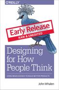
Chapter 12. Wayfinding: How Do You Get There?
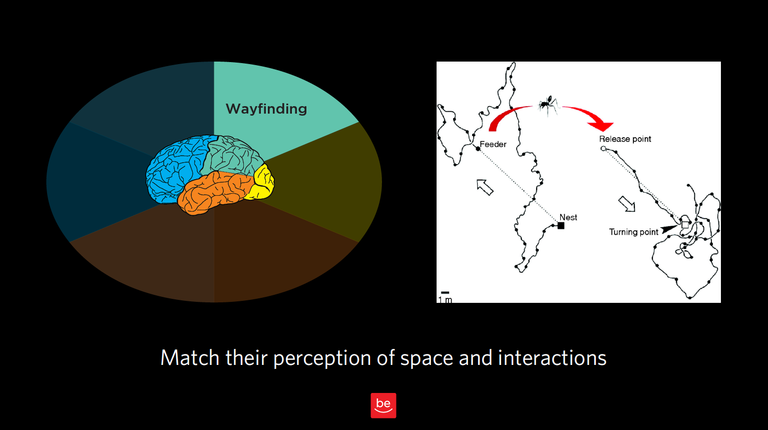
Figure 12.1
Now to discuss your findings that are wayfinding-related. As a reminder of what we discussed in Chapter 3, wayfinding is all about where people think they are in space, what they think they can do to interact and move around, and the challenges they might have there. We want to understand people’s perception of space — in our case, virtual space — and how they can interact in that virtual world.
Remember our story about the ant in the desert? That was all about how he thought he could get home based on his perception of how the world works. In this chapter, we want to observe this type of behavior for our customers and identify any issues they are having in interacting with our products and services.
With wayfinding, we’re seeking to answer these questions:
- 1. Where do customers think they are?
- 2. How do they think they can get from Place A to Place B?
- 3. What do they think will happen next?
- 4. What are their expectations, and what are those expectations based on?
- 5. How do their expectations differ from how this interface really works?
- 6. How successful were they in navigating using these assumptions? What interaction design challenges did they encounter?
In this chapter, we’ll look at how our customers “fill in the gaps” with our best guesses of what a typical interaction might be like, and what comes next. This is especially true for service designs and flows. We need to know customer expectations and anticipated steps to build trust and match those expectations.
Where do users think they are?
Let’s start with the most elemental part of wayfinding: where users think they actually are in space. Often with product design, we’re talking about virtual space, but even in virtual space, it’s helpful to consider our users’ concept of physical space.
Case Study: Shopping mall
Figure 12.2
Challenge: You have to know where you are in order to determine if you’ve reached your destination or, if not, how you will get there. In this picture of a mall near my house, you can see that everything is uniform: the chairs, the ceiling, the layout. You can’t even see too many store names. This setup gives you very few clues of where you are and where you’re going (physically and philosophically, especially when you’ve spent as much as I have trying to find my way out of shopping malls). It’s a little bit like the Snapchat problem we looked at in Chapter 3, but in physical space: there’s no way to figure out where you are, no unique cues.
Recommendation: I’ve never talked with our mall’s design team, but if I did, I would probably encourage them to have, say, different colored chairs on different wings, for example, or to remove the poles that block me from seeing the stores ahead of me. All I need is a few cues that can remind me to go the right way (which is out)! The same goes for virtual design: do you have concrete signposts in place so your user can know where s/he is in space? Are the entrances, exits, and other key junctions clearly marked?
How do they think they can get from Place A to Place B?
Just by observing your users in the context of interacting with your product, you’ll notice the tendencies, workarounds, and “tricks” they use to navigate. Often, this happens in ways you never expected when you created the system in the first place (remember the off-the-grid banking system that Ugandans created for sharing mobile phones?). Here’s another example.
Case Study: Search terms
Challenge: Something I find remarkable is how frequently while using expert tools and databases, users actually start out by Googling the terms of art that would come in handy while using those high-end tools to make sure they’re searching for the right terms. In observing a group of tax professionals, I realized that they thought they needed an important term of art (i.e., a certain tax code) to get from Point A to Point B in a database they were using. Instead of searching for the tax code right in the database, they added an extra step for themselves (i.e., Googling the name of the tax law before typing it into their tool’s search function). As designers, we know it’s because they were having trouble navigating the expert tool in the first place that they found other ways around that problem.
Recommendation: In designing our products or services, we need to make sure we take into account not only our product, but the constellation of other “helpers” and tools — search engines are just one example — that our end users are employing in conjunction with our product. We need to consider all of these to fully understand the big picture of how they believe they can go from Point A to Point B.
What are those expectations based on?
As you’ll notice as you embark on your own contextual inquiry, there is a lot of overlap between wayfinding and memory; after all, any time someone interacts with your product or service, s/he comes to it with base assumptions from memory.
Let me try to draw a finer line between the two. When talking about memory, I’m talking about a big-picture expectation of how an experience works (e.g., dining out at a nice restaurant, or going to a car wash). With wayfinding, or interaction design, I’m talking about expectations relating to moving around in space (real or virtual).
Here’s an example of the nuanced differences between the two. In some newer elevators, you have to type the floor you’re headed to into a central screen outside the elevators, which in turn indicates which elevator you should take to get there. There are no floor buttons inside the elevator. This violates many people’s traditional notions of how to get from the lobby to a certain floor using an elevator. But because this relates to moving around in space, I’d argue this is an example of wayfinding — even though it taps into someone’s memories, past precedents, and schemas. In this case, the memory being summoned up is about an interaction design (i.e., getting from the lobby to the 5th floor), as opposed to an entire frame of reference.
With wayfinding, we’re concerned with our users’ expectations of how our product works, and how they can navigate and interact in the space we have created for them. Memory, which we’ll discuss in upcoming chapters, is also concerned with expectations, but about the experience as a whole, not about individual aspects of interaction design.
If you’re looking for buzzwords, “play” buttons often have to do with interaction design relating to a specific action, vs. an entire frame of reference. “Couldn’t get to Place A” is also usually something to do with wayfinding. But again, beware of being too literal! Don’t take any of these findings at face value; always consult your notes, video footage, and/or eye-tracking for the greater context of each observation.
Real world examples
Back to our sticky notes, let’s see what we would categorize as findings related to wayfinding.
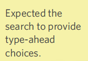
Figure 12.3
- 1. “Expected the search to provide type-ahead choices.” Here, this isn’t analogous to an ant moving around in space, but I do think that it relates to interaction design. It does use the word “expected,” implying memory, but I think the bigger thing is that it’s about how to get from Point A (i.e., the search function) to B (i.e., the relevant search results).
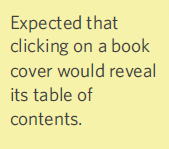
Figure 12.4
- 2. “Expected that clicking on a book cover would reveal its table of contents.” That’s an expectation about interaction design. This person has specific expectations of what will happen when they click on a book cover. This may not be the way most electronic books are working right now, but it’s good to know that’s what the user was expecting.
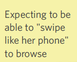
Figure 12.5
- 3. “Expecting to be able to ‘swipe like her phone’ to browse.” Here’s an example that we’re finding more and more as we work with Millennial “digital natives.” Like most of us, this person uses their phone for just about everything. As such, s/he expected to swipe, like on a phone, to browse. This sort of “swipe, swipe, swipe” expectation is increasingly becoming a standard, and something we need to take into account as designers. You could argue there’s a memory/frame of reference component, but I would counter that the memory in question is about an interactive design/how to move around in this virtual space.
Case Study: Distracted movie-watching
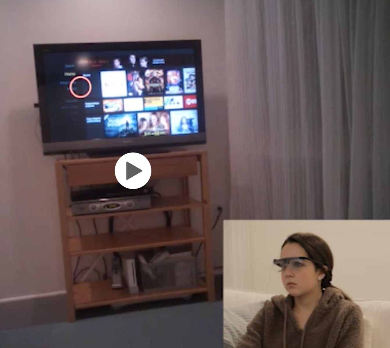
Figure 12.6
Challenge: Since we’re on the topic of phones, I thought I’d mention one study where I observed participants looking at their phone and the TV, and also how they navigated from, say, the Roku to other channels like Hulu, Starz, ESPN, etc. In this case, I was interested in how participants (who were wearing eye-tracking glasses) thought they could go from one place to another within the interface. (Are they going to talk to the voice-activated remote? Are they going to click on something? Are they going to swipe? Is there something else they’re going to do? etc.)
Recommendation: This study reinforced just how distracted the cable company’s customers are. There’s a lot we can learn about how our users navigate when they’re distracted and, often, multitasking. One participant was reviewing “Snap” (Snapchat) with friends while previewing a movie, for example. They often miss cues that identify where they are in space and what to do next. If we know that someone is going to be highly distracted and constantly looking away and coming back, we need to be even more obvious and have even cleaner designs that will grab their attention.
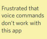
Figure 12.7
- 4. “Frustrated that voice commands don’t work with this app.” This is a fair point about interaction design; the user would like to use voice interactions in addition to, say, clicking somewhere or shaking their phone and expecting something to happen. Here’s a good example of how wayfinding is about more than just physical actions in space. You might argue there is a language component here, but we’re not really sure this user had the expectation of being able to use voice commands; just that they would have liked it. We could get more data to know if a memory of another tool was responsible for this frustration.
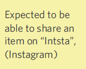
Figure 12.8
- 5. “Expected to be able to share an item on ‘Insta,’ (Instagram).” This comment could be categorized in a couple of ways, as it speaks to both level of expertise (language), in addition to an expectation of how things should work (memory). In this case, because the participant is expecting to be able to move from Point A (the e-commerce store) to Point B (Instagram), I think I would choose wayfinding for this one. This comment also suggests that there are other sites that meet this criteria, which is something we should keep in mind. As we saw in the last chapter with the government auction site, our users are constantly using other sites and tools as their frame of reference for navigating around our sites.
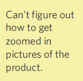
Figure 12.9
- 6. “Can’t figure out how to get zoomed in pictures of the product.” This is a good example of wayfinding; they’re trying to go from where they are now to zoomed-in pictures of the product. They don’t understand the interaction design of how to get from where they are to where they want to go.
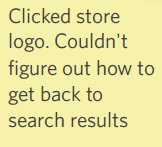
Figure 12.10
- 7. “Clicked store logo. Couldn’t figure out how to get back to search results.” Here’s a classic navigation issue that is analogous to our ant in the desert. This user clicked on a product, then had no concept of how to get back to that list of results. In improving our design, we would want to find out more about the customer’s expectations of how they thought they could get back, and what they tried in their attempt.
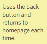
Figure 12.11
- 8. Uses the back button and returns to homepage each time. This is another classic wayfinding example of how a user moves around in virtual space. The user is searching for their North Star and starting from the top level down every time. Let’s say this person was looking for patio chairs and a table. She wound up searching for “table,” looking at the results for “table,” then returned back to “home” to search for chairs that she hoped would match the table she found — rather than looking at a table and expecting to see matching chairs alongside the results for her table.
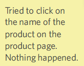
Figure 12.12
- 9. “Tried to click on the name of the product on the product page. Nothing happened. Can’t figure out how to get a detail view of the product.” This one covers both how the user gets from Point A to Point B (i.e., from product page to detailed view), as well as what they’re doing to make that happen (i.e., click on the product). They had an expectation that something would happen based on their action, and nothing did. Therefore, this belongs in Wayfinding.
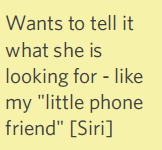
Figure 12.13
- 10. “Wants to tell it what she is looking for - like my ‘little phone friend’ [Siri].” Again, this one is about interaction design, and how this person would love to use spoken commands and we will categorize this item as a wayfinding issue.
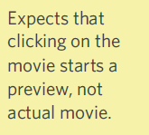
Figure 12.14
- 11. “Expects that clicking on the movie starts a preview, not actual movie.” This person had expectations of how to start a movie preview on a Roku or Netflix-type interface. In this particular case, it sounds like you get either a brief description or the whole movie, and nothing in between, which violates the user’s wayfinding expectations. If a preview option was there, but the user missed it for some reason, we would re-categorize this as a visual issue.
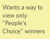
Figure 12.15
- 12. “Wants a way to view only ‘People’s Choice’ winners.” There’s somewhere the person wants to go, or a narrowing/filtering option they want, and they can’t figure out how to achieve that – which clearly falls under wayfinding. It would be great to talk with the customer or watch the video footage to understand how the user thought they could get there. How can you better support this option through your site design and flow?
Concrete recommendations:
- ● Ask users before anything happens with a system how they think it will work and why. Learn as much as you can about user expectations.
- ● Ask these questions throughout the contextual interview: What will happen next? What will you have to do? What will happen if you make a mistake? How will you know it worked?
- ● When a step is taken, moderators can ask (often knowing the answer but not the explanation): Is that what you expected would happen? Why/why not? What should have happened? Did that surprise you?