Table of Contents for
Designing for How People Think
 Designing for How People Think
Published by
O'Reilly Media, Inc., 2019
Designing for How People Think
Published by
O'Reilly Media, Inc., 2019
- Cover
- Title Page
- Copyright
- 01 Rethinking "The" Experience
- 02 The Six Minds of User Experience
- 03 In the Blink of an Eye- Vision, Attention, and Automaticity
- 04 Wayfinding- Where Am I?
- 05 Memory:Semantics
- 06 Language- I Told You So
- 07 Decision-Making and Problem Solving- Enter Consciousness Stage Left
- 08 Emotion- Logical Decision Making Meets Its Match
- 09 User Research- Contextual Interviews
- 10 Vision- Are You Looking at Me?
- 11 Language- Did They Just Say That?
- 12 Wayfinding- How Do You Get There?
- 13 Memory- Expectations and Filling in Gaps
- 14 Decision-Making - Following the Breadcrumbs
- 15 Emotion- The Unspoken Reality
- 16 Sense-Making
- 17 Putting the Six Minds to work- Appeal, Enhance, Awaken
- 18 Succeed Fast, Succeed Often
- 19 Now see what you’ve done?
- 20 How To Make a Better Human
- 20 How To Make a Better Human
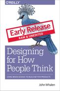
Chapter 10. Vision: Are You Looking at Me?
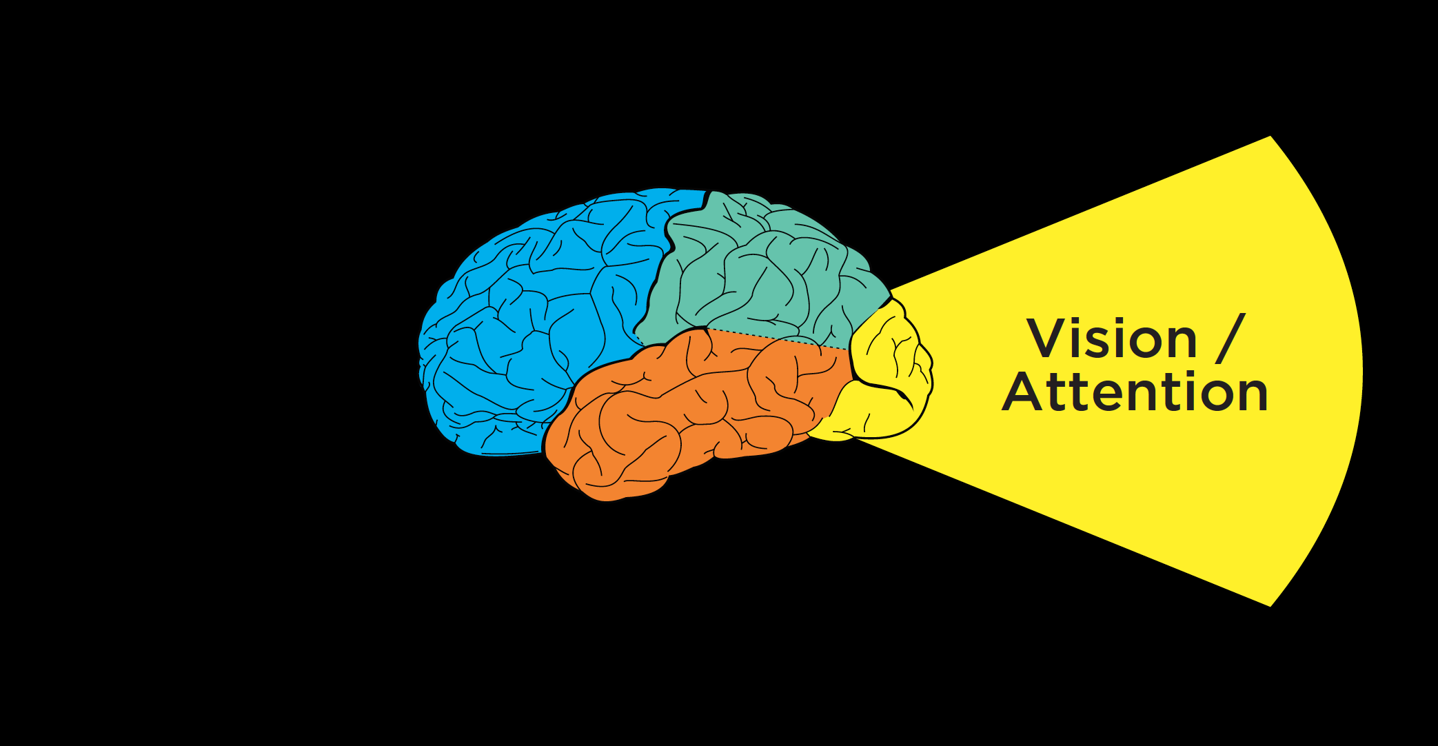
Figure 10.1
Now that we’ve discussed how to conduct contextual interviews and observe people as they’re interacting with a product or service, I want to think about how those interviews can provide important clues for each of the Six Minds.
I’d like to start by looking at this from a vision/attention perspective. In considering vision, we’re seeking to answer these questions:
- 1. Where are their eyes looking? (Where did customers look? What drew their attention? What does that tell us about what they were seeking, and why?)
- 2. Did they find it? If not, why? What were the challenges in them finding what they were looking for?
- 3. What are the ways that new designs might draw their attention to what they’re seeking?
In this chapter, we’ll discuss not only where customers look and what they expect to see when they look there, but also what this data suggests about what is visually salient to them. We’ll consider whether users are finding what they are hoping to, what their frame of reference is, and what their goals might be.
Where are their eyes: Eye-tracking can tell you some things, but not everything
When it comes to improving interfaces or services, we start with where participants are actually looking. If we’re talking about an interface, where are users looking on the screen? Or where are they looking within an app?
Eye-tracking devices and digital heat maps come in handy for this type of analysis, helping us see where our users are looking. This sort of analysis can help us adjust placement of our content on a page.
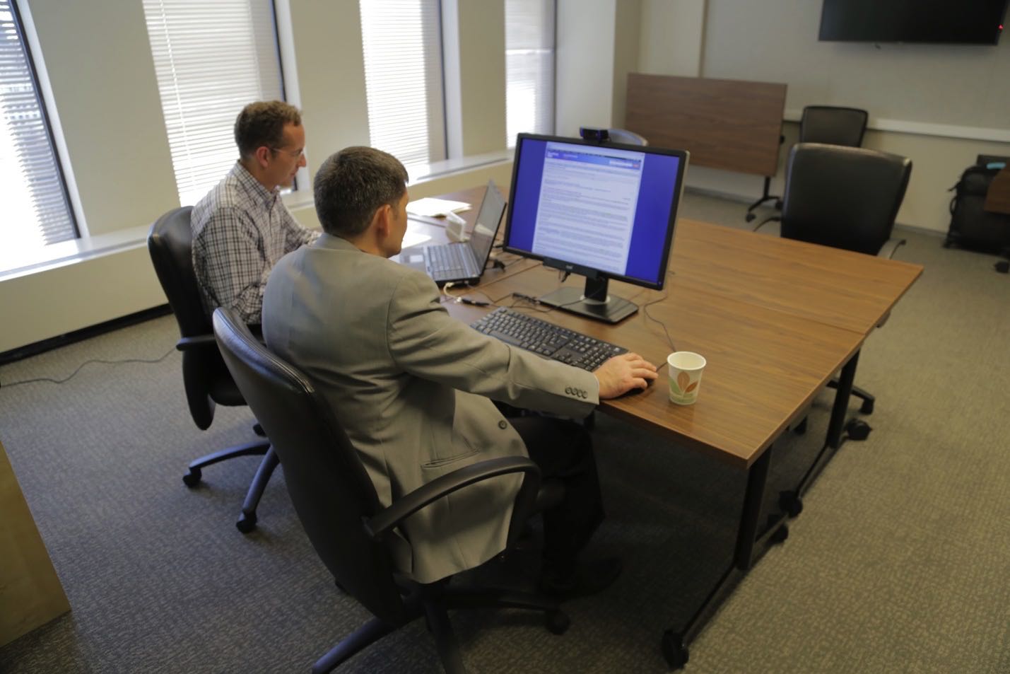
Figure 10.2: Moderating contextual interview
But you don’t always need eye-tracking if you use good old-fashioned observation methods like those we discussed in the previous chapter. When I’m conducting a contextual interview, I try to set myself up at 90 degrees to the participant (so that I’m a little bit behind them without creeping them out) for several reasons:
- 1. It’s a little awkward for them to look over and talk to me. This means that they are primarily looking at the screen or whatever they’re doing, and not me (better allowing me to see what it is they’re working on, clicking on, etc.).
- 2. I can see what they’re looking at. Not 100 percent, of course, but generally, I’m able to see if they’re looking at the top or bottom or the screen, or down at a piece of paper, flipping through a binder to a particular page, etc.
Speaking of where people’s eyes are, I’d like to show you a representation of what your eyes use to draw attention to the next location in space.
Figure 10.3: What your visual attention system sees from an image.
The image above shows two screens side-by-side from an electronics company — blurred out a bit, with the color toned down. This is the type of representation your visual system uses to determine where to look next.
In this image on the left there are four watches, with two buttons below each watch. Though you can tell these are buttons, it’s not clear from the visual features and this level of representation which is the “buy” button and which is the “save for later” button. The latter should appear as a secondary button, yet it currently draws an equal amount of attention as the “buy” button. That’s something we would work with a graphic designer to adjust.
Similarly on the right panel, the checkout screen, the site showed several buttons for things like commenting, checking on shipping status, and actually making the purchase. By graying out this picture, you can see how incredibly subtle these buttons were, and with that they have little variation between them. By blurring out images of your designs and toning down the color, you can get a good sense of what’s going to be successful in terms of your user finding things.
What lens must they be looking through to see that?
We’ve talked about the bottom-up drivers of attention, like visual features of a scene that are unique: unusual sizes, areas of higher visual contrast, distinct colors, large images, and other features that draw people’s attention. The second step of the visual analysis employs a top-down approach. Here, you should consider not only what users are seeing, but what they’re actually seeking, attending to, processing, and perceiving.
Case Study: Security Department
Challenge: Even though many of my examples are of digital interfaces, we as designers also need to be thinking about attention more broadly. In this case, I worked with a group of people with an enormous responsibility: monitoring security for a football stadium-sized organization (and/or an actual stadium).
Their attention was divided in so many ways. Here are all the systems and tools (along with their respective numerous alerts, bells, and beeping sounds) they monitored at any given time:
- ● Literally hundreds of cameras, with the number increasing all the time as they added more
- ● Special cameras focused on problem areas (e.g., the door people frequently used to sneak in the back)
- ● Walkie-talkies with updates from foot patrols
- ● Emails
- ● Texts
- ● The local police radio (with constant communication)
- ● Card-swipe systems for badge-controlled doors (which beeped many times a minute)
- ● Broadcast PA systems
- ● CNN
- ● Fire alarms
- ● Elevator alarms
- ● Electrical alarms
- ● Phone banks
If you’re impressed that anyone could get work done in such a busy environment, you’re not alone; I was shocked (and a bit skeptical of whether all these noisy systems were helping or hurting their productivity). Here was an amazing challenge of divided attention, far more distracting than an open office layout (which many people find distracting).
Recommendation: With huge visual and auditory distractions in play, we had to distil the most important thing that they should be attending to at each moment. My team developed a system very similar to a scroll-based Facebook news feed, except with extreme filtering to ensure relevancy of the feed (no cat memes here!). Each potential concern (terror, fire, door jams, etc.) had its own chain of action items associated with it, and staff could filter each issue by location. The system also included a prominent list of top priorities – at that moment – to help tame the beastly amount of items competing for staff’s attention. It has one scroll and could be set to focus on a single topic or all topics, but only when the topics rose to a specific level of importance. As a result, staff knew where to look and what the (distinct) sound of an alert sounded like.
Quick, get a heat map … well …
Eye gaze heat maps can show us where our users’ eyes are looking on an interface. We can get a representation of the total time people are looking on the screen to be “hotter” in some locations than others.
Case Study: Website Hierarchy
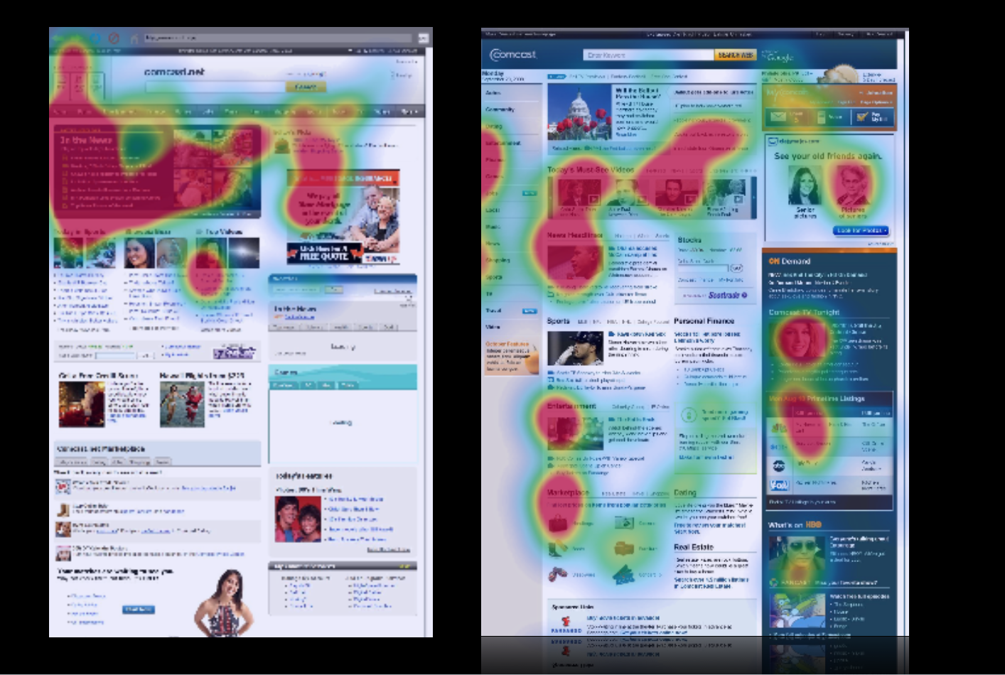
Figure 10.5: Heatmaps
Challenge: In the case of this site (comcast.net, the precursor to Xfinity), consumers were overwhelmingly looking at one area in the upper left-hand corner, but not further down the page, nor the right-hand side of the page. We knew this both from eye-tracking and the fact that the partner links further down the page weren’t getting clicks (and were not happy about that). The problem was that the visual contrast. The upper left of the old page was visually much darker than the rest of the page and more interesting (videos, images), so much so that so that it was overwhelming people’s visual attention system.
Recommendation: We redesigned the page to make sure that the natural visual flow included not only the headlines, but the other information down below to help. We gave more visual prominence to the neglected sections of the page through balancing features like visual contrast, size of pictures, color, fonts, and white space. We were able to draw people down visually to engage “below the fold.” This made a huge difference in where people looked on the page, making end users, Comcast, and its paid advertising partners much happier.
The case study above shows you how helpful tools like eye tracking and heat maps can be. But I want to counter the misperception that these tools on their own are enough for you to make meaningful adjustments to your product. Similar to the survey results and usability testing that I mentioned in the last chapter, heat maps can only provide you with a lot of the what, but not the why behind a person’s vision and attention. The results from heat maps do not tell you what problem users are trying to solve.
To get at that, we need to …
Go with the flow.
We’re trying to satisfy the customers’ needs as they arise, and so we want to know at each stage in problem solving what our users are looking for, what they’re expecting to find, and what they’re hoping to get as a result. Then we can match the flow and with what they’re expecting to find at each stage of the process.
While observing someone interact with a site, I’ll often ask them questions like “What problem are you trying to solve?” and “What are you seeing right now?” This helps me see what’s most interesting to them, at this moment and understand their goals.
There are many unspoken strategies and expectations that users are employing, which is why we can only learn through observing users in their natural flow. These insights, in turn, help us with our visual design, layout, and information architecture (i.e., what are the steps, how should they be represented, where should they be in space, etc.).
Case Study: Auction Website
Challenge: Here’s an example of some of those unspoken expectations that we might observe during contextual interviews. In testing the target audience for a government auction site (GovAuction.gov), I heard the feedback “Why doesn’t this work like eBay?” Even though this site was even larger than eBay, our audience was much more used to eBay, and brought their experience and related expectations regarding how eBay worked to their interactions with this new interface.
Eye-tracking confirmed users’ expectations and confusion: they were staring at a blank space beneath an item’s picture and expecting a “bid” button to appear, since that’s where the “bid” button appears on eBay items. Even though the “bid” button was in fact present in another place, users didn’t see it because they expected it to be in the same location as the eBay “bid” button.
Recommendation: This was one case when I had to encourage my client not to “think different,” but rather admit that other systems like eBay have cemented users’ expectations about where things should be in space. We switched the placement of the button (and a few other aspects of the eBay site architecture) to match people’s expectations, immediately improving performance. This story also exemplifies the lenses I was talking about earlier. We knew where they were looking for this particular feature, and we knew they didn’t find it in that location. This wasn’t because of language or the visual design, but because of their experience with other similar sites and associated expectations.
Research Examples
I don’t know if you’ve had a chance to put my sticky note categorization method into practice yet, but I’d like to share some examples of the findings I’ve noted in the previous chapter from clients interacting with both a video-streaming website and an e-commerce website. These will give you a sense of what we’re looking for when subdividing data according to the Six Minds; in this case, focusing on vision and attention. Remember, there’s often overlap, but I’m most concerned with the biggest problem underlying each comment.
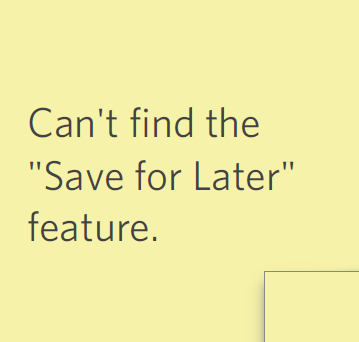
Figure 10.6
- 1. Finding: “Can’t find the ‘save for later’ feature.” In this case, the user was looking for a certain feature on the screen and couldn’t find it, implying a visual challenge. There’s also a language component going on (i.e., the words “save for later”) and a bit of wayfinding (i.e., the expectation that such a feature would allow the user to interact in a certain way with the ecommerce site). In processing this feedback, we want to consider if a “save for later” feature was indeed present, and if so, why this participant was unable to find it. If the feature was there but was named something else (e.g., “keep” or “store for later”), this would be a language issue. Before making any changes, we would want to know if other participants had a similar issue. If this was indeed present, yet the customers’ attention was not attracted to it, then yes indeed, this would be a vision/attention issue. Just note that some comments related to “finding” in a visual scene are not necessarily visual issues (e.g., might be language or other issues).
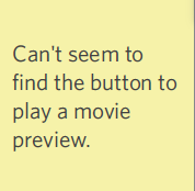
Figure 10.7
- 2. “Can’t seem to find the button to play a movie preview.” On first blush, this one sounds a lot like vision/attention; they’re trying to “find” something. But there could be a wayfinding component here as well, since the user has an expectation of how the action of previewing a movie — and “play” buttons in general — should work. We can only really know if it’s vision or wayfinding by studying where the users were actually looking. If they were staring right at the play button and not seeing it, that would be a visual problem; and the same would be true if the button was too light in color, or the type wasn’t large enough. If the customer was having trouble getting to the play button, or scrolling to the it, that might imply a wayfinding challenge instead.
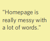
Figure 10.8
- 3. “Homepage is really messy with a lot of words.” This is the first of three similar comments relating to vision and how the viewer is seeing the page. “Messy” definitely implies a cluttered visual scene that is overwhelming vision and attention.
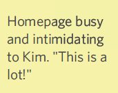
Figure 10.9
- 4. “Homepage busy and intimidating. ‘This is a lot!’” The same goes for the term “busy”; you can usually assume it’s relating to vision and attention (same with the phrase “missed it”). Now we’re starting to see a pattern that suggests we should review the design of this page with relation to the content organization and information density.
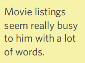
Figure 10.10
- 5. Movie listings seem really busy to him with a lot of words. This note is consistent with the two before it. In cases like where you get consistent feedback about an issue, that’s a crystal clear indicator of something you need to put on your punch list of items to change — ASAP.
Warning against literalism #1: In reviewing your findings, you’re going to see a lot of comments about “seeing,” “finding,” “noticing,” etc. Such words might suggest vision, but beware of placing such findings in the “vision” category automatically! In reviewing each finding, ask yourself if it implies an expectation of how things should be (memory), how to navigate through space (wayfinding), how familiar the user is with the product (language), before automatically putting that observation in the vision category.
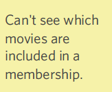
Figure 10.11
- 6. “Can’t see which movies are included in a membership.” Here, the user can’t see what s/he is looking for. If we can confirm that this feature (i.e., showing which movies are included in the user’s membership) is present, it would be a straightforward example of something that should be classified as a visual issue.
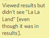
Figure 10.12
- 7. “Viewed results but didn’t see ‘La La Land’.” Similar to the example above, the user missed something on the page. In this example, we know the movie “La La Land” appeared in the search results, but didn’t pop out to the user. For some reason, the visual features of the search results (think back to the examples of visual “pop out” that we looked at in Chapter 2 like shape, size, orientation, etc.) weren’t as captivating as they should be. Perhaps there wasn’t enough visual contrast between the different search results, or there wasn’t an image to draw the user’s attention. Or maybe the page was just too distracting. You can take this type of feedback straight back to your visual designer. The video of this situation might be especially valuable to indicate what improvements might be made.
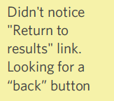
Figure 10.13
- 8. “Didn’t notice ‘Return to results’ link. Looking for a ‘back’ button.” Here’s a great example of the types of nuance we need to pay attention to. When you read “didn’t notice,” you might automatically assume this is about vision. But don’t be fooled … there could be a language component that is the issue as well. To determine which it is (vision or language), you would need to do some sleuthing of your observational data and/or eye-tracking to see where the user was looking at this moment. If the user was scanning the page up and down and simply not seeing the link, it was probably a visual layout issue (i.e., wrong location). But if they were staring right at the “return to results” link and it was still not working for them, then we know it’s a language problem — those words didn’t trigger the semantic content they were looking for (i.e., wrong words).
Once I’ve reviewed all of my customers’ feedback and distilled the major problem to address, I can provide this to the visual design team with quite specific input and recommendations for improvement.
Concrete recommendations:
- ● Sit perpendicular to participant — watch where they are looking on screens and interfaces for next steps.
- ● Determine what they are looking for and why (what is most relevant to this participant at this moment, and what do they think will be good about finding that?).
- ● What are the assumptions they have about the system that justify those anticipations (e.g., I’m looking for the menu because I want to make this word bold, but I don’t see any menu up here; I just see all the words)?
- ● What else does that suggest about their assumptions and unspoken strategies concerning this system?
- ● Build a mental model of their thought process, from their perspective, simply by watching their eye movements and behavior.