Table of Contents for
Designing for How People Think
 Designing for How People Think
Published by
O'Reilly Media, Inc., 2019
Designing for How People Think
Published by
O'Reilly Media, Inc., 2019
- Cover
- Title Page
- Copyright
- 01 Rethinking "The" Experience
- 02 The Six Minds of User Experience
- 03 In the Blink of an Eye- Vision, Attention, and Automaticity
- 04 Wayfinding- Where Am I?
- 05 Memory:Semantics
- 06 Language- I Told You So
- 07 Decision-Making and Problem Solving- Enter Consciousness Stage Left
- 08 Emotion- Logical Decision Making Meets Its Match
- 09 User Research- Contextual Interviews
- 10 Vision- Are You Looking at Me?
- 11 Language- Did They Just Say That?
- 12 Wayfinding- How Do You Get There?
- 13 Memory- Expectations and Filling in Gaps
- 14 Decision-Making - Following the Breadcrumbs
- 15 Emotion- The Unspoken Reality
- 16 Sense-Making
- 17 Putting the Six Minds to work- Appeal, Enhance, Awaken
- 18 Succeed Fast, Succeed Often
- 19 Now see what you’ve done?
- 20 How To Make a Better Human
- 20 How To Make a Better Human
Chapter 3. In the Blink of an Eye: Vision, Attention, and Automaticity
From representations to experiences
Think of a time when you were asked to close your eyes for a big surprise (no peeking!), and then opened your eyes for the big reveal. At the moment you open your eyes you are taking in all kinds of sensations: light and dark areas in your scene, colors, objects (cake and candles?), faces (family and friends), sounds, smells, likely joy and other emotions. It is a great example of how instantaneous, multidimensional, and complex an experience can be.
Despite the vast ocean of input streaming in from our senses, we have the gift of nearly instant perception of an enormous portion of any given scene. It comes to you so naturally, yet is so difficult for a machine like a self-driving car. Upon reflection, it is amazing how ‘effortless’ these processes are. They just work. You don’t have to think about how to recognize objects or make sense of the physical world in three dimensions except in very rare circumstances (e.g., dense fog).
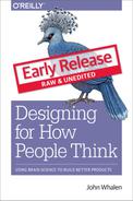
These automatic processes start with neurons in the back of your eyeballs, through your Corpus Callosum, to the back of your brain in the Occipital cortex, then your Temporal and Parietal lobes in near real-time. In this chapter we’ll focus on the “what” and in the next we’ll discuss the “where”.
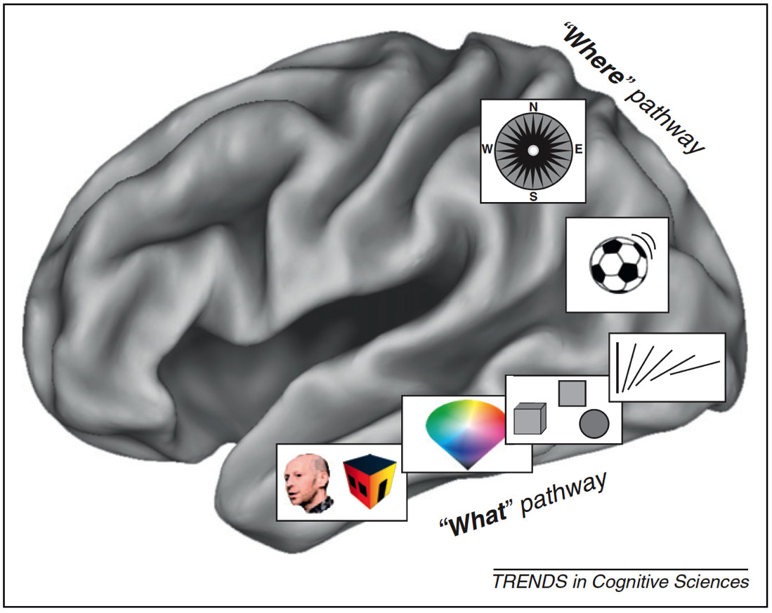
Figure 3.1: What/Where Pathways
With almost no conscious control, your brain brings together separate representations of brightness, edges, lines, line orientation, color, motion, objects, and space (in addition to sounds, feelings, and proprioception) into a singular experience. We have no conscious awareness that we had separate and distinct representations, or that they were brought together into a single experience, or that past memories influences your perception, or that they evoked certain emotions.
This is a non-trivial accomplishment. It is incredibly difficult to build a machine that can mimic even the most basic differences between objects that have similar colors and shapes — for example, between muffins and Chihuahuas — which with a brief inspection you, as a human, will get correct every time.
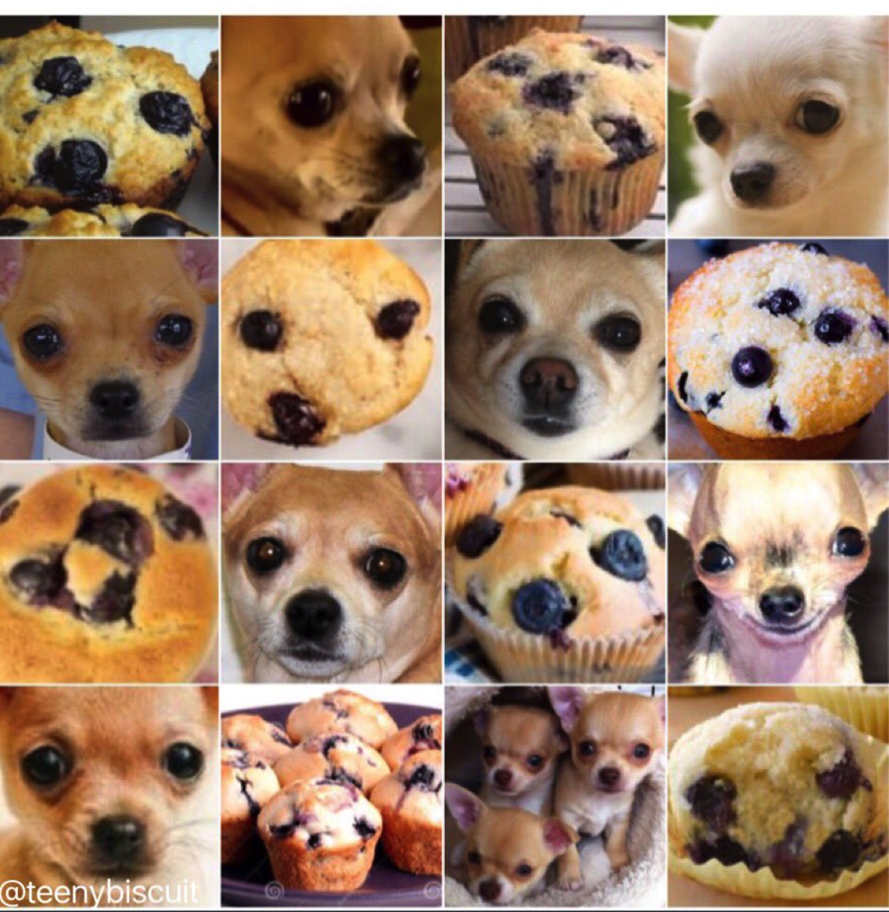
Figure 3.2: Muffins or Chihuahuas?
There are many, many things I could share about vision, object recognition and perception, but the most important for our purposes are: (a) there are many processes taking place simultaneously, of which you have little conscious awareness or control, and (b) many computationally challenging processes are taking place constantly that don’t require conscious mental effort on your part.
In Nobel Prize winner Daniel Kahneman’s fantastic book “Thinking, Fast and Slow,” he makes the compelling point that there are two very different ways in which your brain works. You are aware and in conscious control over the first set of processes, which are relatively slow. And you have little to no conscious control or introspection, over the other set of processes, which are lightning-fast. Together, these two types of thinking encompass thinking fast (automatic processes) and thinking slow (conscious processing).
When designing products and services, we as designers are often very good at focusing on the conscious processes (e.g., decision-making), but we rarely design with the intention of engaging our fast automatic processes. They occur quickly and automatically, and we almost “get them for free” in terms of the mental effort we need to expend as we use them. As product designers, we should harness both these automatic systems and conscious processes because they are relatively independent. The former don’t meaningfully tax the latter. In later chapters, we’ll describe exactly how to do so in detail, but for now let’s discuss one good example of an automatic visual process we can harness: visual attention.
Unconscious behaviors: Caught you looking
Think back to the vignette I gave you at the start of the chapter: Opening your eyes for that big surprise. If you try covering your eyes now and suddenly uncovering them, you may find that your eyes dart around the scene. In fact, that is consistent with your typical eye movements. Eyes don’t typically move in a smooth pattern. Rather, they jump from location to location (something we call saccades). This motion can be measured using specialized tools like an infrared eye-tracking system, which can now be built into specialized glasses, or a small strip under a computer monitor.
Figure 3.3: Tobii Glasses II

Figure 3.4: Tobii X2-30 (positioned below the computer screen)
These tools have documented what is now a well-established pattern of eye movements on things like web pages and search results. Imagine that you just typed in a Google search and are viewing the results on a laptop. On average we tend to look 7 to 10 words into the first line of the results, 5 to 7 words into the next line, and even fewer words into the third line of results. There is a characteristic “F-shaped” pattern that our eye movements (saccades) form. Looking at the image below, the more red the value, the more time was spent on that part of the screen.
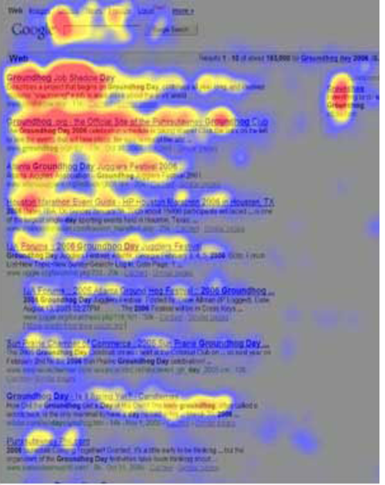
Figure 3.5: Heatmap of search eye-tracking “F” Pattern
[Source: https://www.nngroup.com/articles/f-shaped-pattern-reading-web-content/]
Visual Popout
While humans are capable of controlling our eye movements, much of the time we let our automatic processes take charge. Having our eye movements on “autopilot” works well in part, because things in our visual field strongly attract our attention when they stand out from the other features in our visual scene. These outliers automatically “pop out” to draw your attention and eye movements.
As product designers, we often fail to harness this powerful automatic process. Sesa you might have learned from Sesame Street: “One of these things is not like the other, one of these things just doesn’t belong...” is a great way to draw attention to right elements in a display. Some of the ways something can pop out in a scene are demonstrated below. An important feature I would add to the list below is visual contrast (relative bright and dark). The items below that are unique pop out in this particular case because they have both a unique attribute (e.g., shape, size, orientation) and a unique visual contrast relative to the others in their groupings.
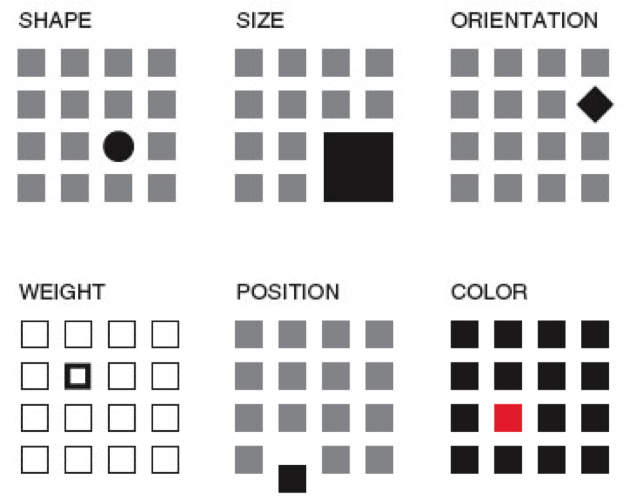
Figure 3.6: Visual Popout
One interesting thing about visual popout is that the distinctive element draws attention regardless of the number of competing elements. In a complex scene (e.g., modern car dashboards), this can be an extremely helpful method of directing one’s attention when needed.
If you are an astute reader thinking about the locus of control with eye movements, one question you might have is who decides where to look next if you aren’t consciously directing your eyes? How exactly do your eyes get drawn to one part of a visual scene? It turns out that your visual attention system — the system used to decide where to take your eyes next — forms a blurry (somewhat Gaussian), and largely black-and-white representation of the scene. It uses that representation, which is constantly being updated, to decide where the locus of your attention should be, provided you are not directing your eyes (that is, “conscious you”).
You can anticipate where someone’s eyes might go in a visual scene if you take that scene and use a program like Photoshop to turn down the color of a design and you squint your eyes (and/or use more than one Gaussian blur using that design program). That test will give you a pretty good guess where people’s eyes will be drawn in the scene, were you to measure their actual eye gaze pattern using an eye tracking device.
Oops, you missed that!
One of the most interesting results you get from studying eye movements is the null result: that is, what people never look at. For example, I’ve seen a web form design in which the designers tried to put helpful supplemental information in a column off to the side on the right of the screen — exactly where ads are typically placed. Unfortunately, we as consumers have been trained to assume that information on the right side of the screen is an ad or otherwise irrelevant, and as a result will simply ignore anything in that location (helpful or not). Knowing about past experiences will surely help us to anticipate where people are looking and help to craft designs in a way that actually directs — not repels — attention to the helpful information.
If your customers never look at a part of your product or screen, then they will never know what is there. You might as well have never put the information there to begin with. However, when attentional systems are harnessed correctly through psychology-driven design, there is amazing potential to draw people’s attention to precisely what they need. This is the opportunity we as product designers should always employ to optimize the experience.
Ceci n’est pas une pipe: Seeing what we understand something to be, not what might actually be there
Whether we present words on a page, image, or chart, the displayed elements are only useful to the extent the end users recognize what they’re seeing.
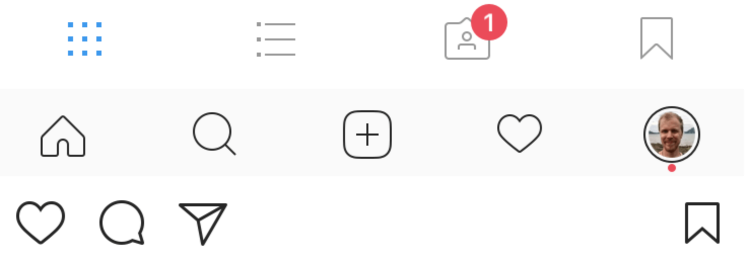 Figure 3.7: Instagram Controls
Icons are a particularly good example. If you ask someone who has never used Instagram what each of the icons above represent, I’m willing to bet they won’t correctly guess what each icon means without some trial and error. If someone interprets an icon to mean something, for that person, that is effectively its meaning at that moment (regardless of what it was meant to represent). As a design team, it is essential to test all of your visuals and make sure they are widely recognized or, if absolutely needed, that they can be learned with practice. When in doubt, do not battle standards to be different and creative. Go with the standard icon and be unique in other ways.
We’ve also seen a case where participants in eye tracking research thought that a sporting goods site only offered three soccer balls because only three (of the many that were actually for sale) were readily visible on the “soccer” screen.
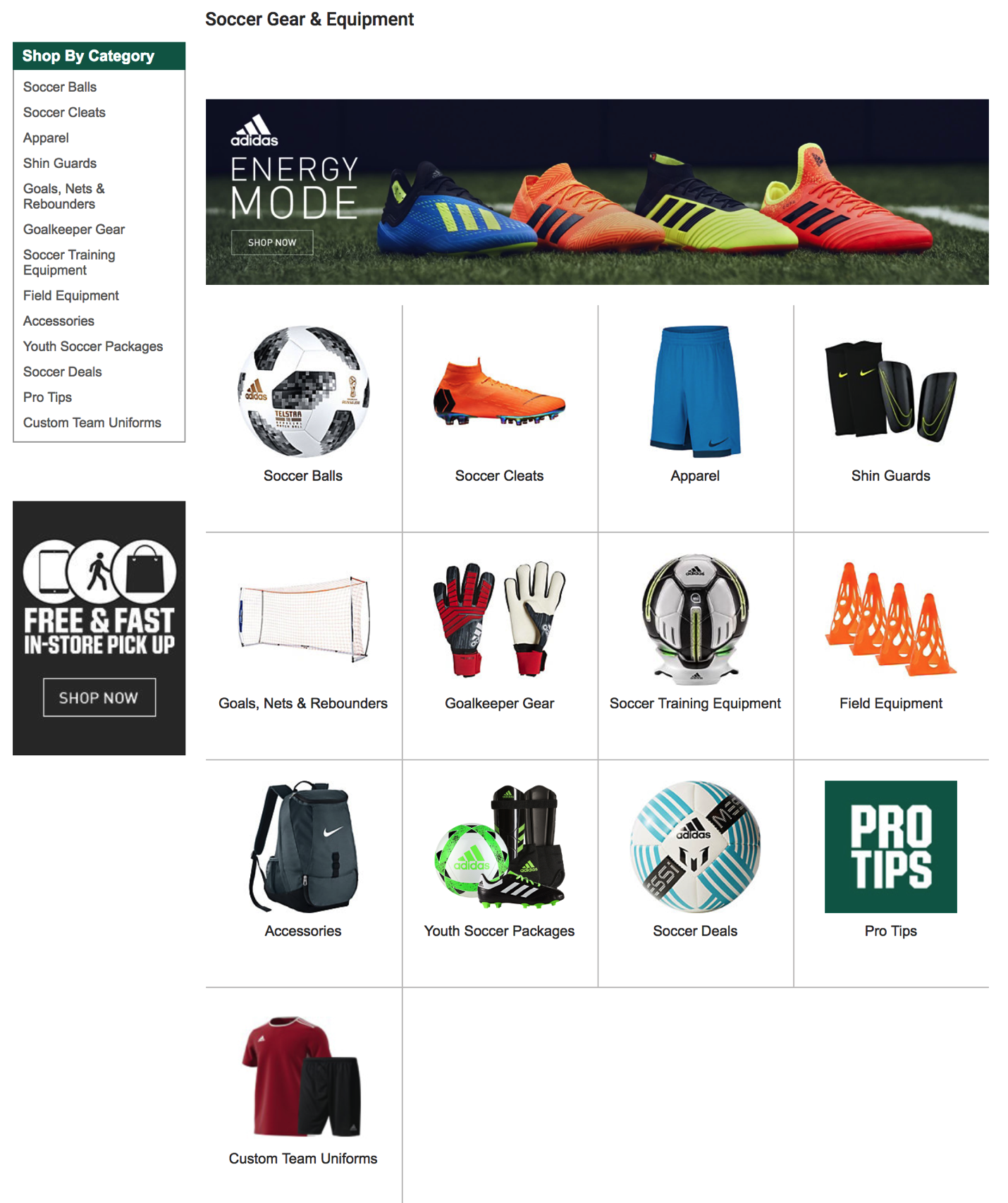
Figure 3.8: Sporting Goods Store Layout
Visual designs are only useful to the extent that they invoke the understanding you were hoping they would. If they don’t, then any of the other elements (or meanings) that you created simply don’t exist.
How our visual system creates clarity when there is none
Before we move on to other systems, I can’t resist sharing one more characteristic of human vision — specifically, about visual acuity. When looking at a scene, our subjective experience is that all parts of that scene are equally clear, in focus, and detailed. In actuality, both your visual acuity and ability to perceive color drop off precipitously from your focal point (what you are staring at). Only about 2° of visual angle (the equivalent of your two thumbs at arms-length distance) are packed with neurons and can provide both excellent acuity and strong color accuracy.
Don’t believe me? Go to your closest bookshelf. Stare at one particular book cover and try to read the name of the book that is two books over. You may be shocked to realize you are unable to do so. Go ahead, I’ll wait!
Just a few degrees of visual angle from where our eyes are staring (foveating), our brains make all kinds of assumptions as to what is there, and we are unable to read it or fully process it. This makes where you are looking turn out to be crucial for an experience. Nearby just doesn’t cut it!