Table of Contents for
Designing for How People Think
 Designing for How People Think
Published by
O'Reilly Media, Inc., 2019
Designing for How People Think
Published by
O'Reilly Media, Inc., 2019
- Cover
- Title Page
- Copyright
- 01 Rethinking "The" Experience
- 02 The Six Minds of User Experience
- 03 In the Blink of an Eye- Vision, Attention, and Automaticity
- 04 Wayfinding- Where Am I?
- 05 Memory:Semantics
- 06 Language- I Told You So
- 07 Decision-Making and Problem Solving- Enter Consciousness Stage Left
- 08 Emotion- Logical Decision Making Meets Its Match
- 09 User Research- Contextual Interviews
- 10 Vision- Are You Looking at Me?
- 11 Language- Did They Just Say That?
- 12 Wayfinding- How Do You Get There?
- 13 Memory- Expectations and Filling in Gaps
- 14 Decision-Making - Following the Breadcrumbs
- 15 Emotion- The Unspoken Reality
- 16 Sense-Making
- 17 Putting the Six Minds to work- Appeal, Enhance, Awaken
- 18 Succeed Fast, Succeed Often
- 19 Now see what you’ve done?
- 20 How To Make a Better Human
- 20 How To Make a Better Human
Chapter 14. Decision-Making: Following the Breadcrumbs
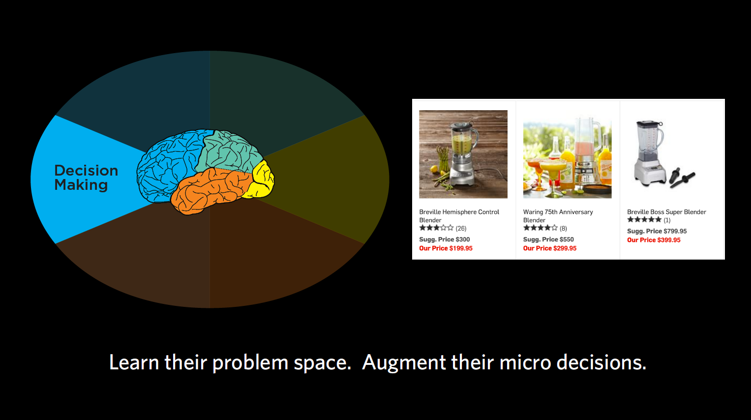
Figure 14.1
When it comes to decision-making, we’re trying to figure out what problems our end users are really trying to solve and the decisions they have to make along the way. What is it the user is trying to accomplish, and what information do they need to make a decision at this moment in time?
With decision-making, we’re asking questions like:
- ● What is the user trying to accomplish?
- ● What does their overall decision-making process look like?
- ● What are all the facts they need to make their decision and problem-solve?
- ● What do they need at each stage in problem solving?
- ● When do they seem to be overwhelmed and “satisfice”? What is the middle-of-the-road, “sensible” option that they default to?
What am I doing? (goals, journeys)
What we want to focus on with decision-making is all the sub-goals we need to accomplish to make us get from our initial state to our final goal.
Your end goal might be making a cake, but to get there, you’re embarking on a journey with quite a few steps along the way. First, you’re going to need to find a recipe, then get all the ingredients, then put them together according to the recipe. Within the recipe, there are many more steps — turning on the oven, getting out the right-sized pan, sifting the flour, mixing your dry ingredients together, etc. We want to identify each of those micro-steps that are involved with our products, and how we can use each step to support our end audience in making their ultimate decision.
Case Study: E-commerce payment
Challenge: For one client, we observed a group that was trying to decide which e-commerce payment tool to use (e.g., PayPal, Stripe, etc.). Through interviews, we collected a series questions or concerns that people had and — you guessed it — wrote them all down on sticky notes. Questions like “What if I need help?,” “How does it work?,” “Can this work with my particular e-commerce system right now?,” “What are the security issues?,” and so on. There were so many of these micro-decisions people wanted answered before they were willing to proceed in acquiring one of these tools.
Outcome: By capturing each of these sub-goals and ordering them, we ensured your designs support each one in a timely fashion. This helps your customers to trust your product/service and make a decision – ultimately giving them a better overall experience where they feel like they’re making an informed decision.
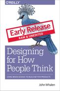
Gimme some of that! (just-in-time needs)
You may remember from Chapter 6 that in decision-making, we can be very susceptible to psychological effects when making decisions (which is why I never let myself sit in a car I’m not intending to buy). Often we get overwhelmed with choices and end up defaulting to satisficing — accepting an available option as satisfactory. That’s why people were more willing to buy the $299.95 blender when it was displayed in between one for $199 and one for $399. Choosing the middle option seems sensible to people. We want to keep this type of classic framing problem in mind as product designers, considering what the “sensible” option may be for our end users.
Case Study: Teacher timeline
Challenge: In one case, we looked at a group of teachers and what they sought at different times of the year in terms of continuing education and support from education PhDs and other groups that could support their teaching. We learned that depending on the time of year, the support these teachers wanted was drastically different.
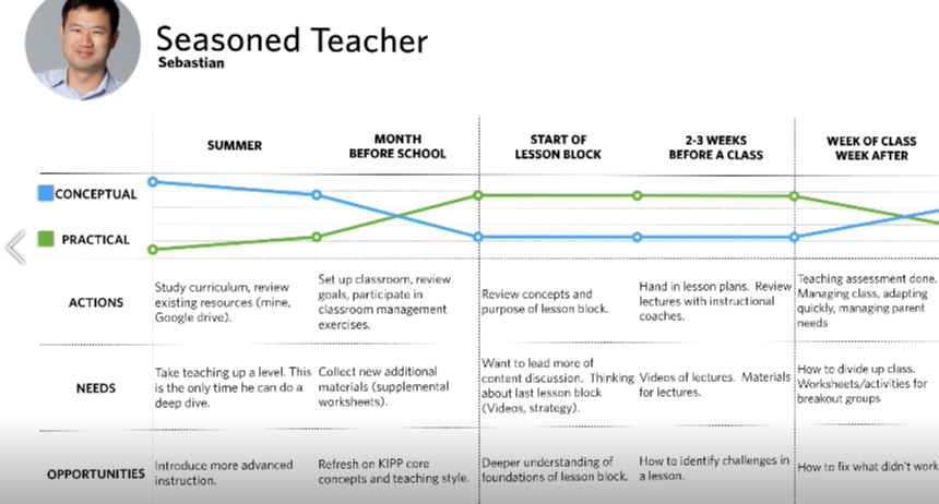
Figure 14.2:
Outcome: In the summertime, teachers had more time to digest concepts and foundational research concerning the philosophy of education. This was the best time for them to focus on their own development as teachers and consider the “why” behind their teaching methods. Right before the school year started, however, they went from wanting this more conceptual development to wanting super pragmatic support. Their kids were starting to show up after a three-month break, and the teachers had to manage the students in addition to the parents. During this time, they wanted highly practical information like worksheets. The micro-decisions they had to make were things like “Can I print this worksheet out right now? Does it have to be printed at all? Can we use it on Chromebooks?” During the school year, they weren’t concerned with the “why” but the “how,” often defaulting to satisficing when they became overwhelmed with too much information. Based on these findings, we were able to recommend the drastically different types of content these teachers needed at different points of the year.
Chart me a course (decision-making journey)
We want to know not just the overall decision our users are making, like buying a car, but also all the little decisions they have to make along the way. “Does it have cup holders?” “Will my daughter be happy riding in it?” “Can it carry my windsurfer?” “Can I put a roof rack on the top?”
Timing of information is crucial when it comes to these micro-decisions. Once we’ve identified those micro-decisions, we want to know when they need to address each of them. Usually, it’s not all at once, but one step at a time along the journey. That’s why most e-commerce sites place shipment information at the end, for example, rather than presenting you with too much information right at the start, when you’re just browsing.
We also want to know what our users think they can do to solve their problem. In cognitive neuroscience, we talk about “operators in a problem space,” which just means the levers that we think we can move in our head to get from where we are to where we need to be. That problem space may be the same or different than reality, depending on how much of a novice or expert we are in the subject matter, which is important to keep in mind when designing for novices.
Sticky situations
Looking once again at the sticky notes, here are some findings that I think relate to decision-making.
Figure 14.3
- 1. “Concern: ‘What if the $5,000 chair I’m buying is damaged in transit?’” This person is basically saying they’re not going to go any further with the purchase until they understand the answer to this shipping and handling question. You could argue there’s some emotional content of worry or fear here, but I would say the most important aspect is that it’s one of several problems to be solved along this user’s decision-making journey.
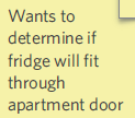
Figure 14.4
- 2. “Wants to determine if fridge will fit through apartment door.” This one sounds like another decision-making roadblock to me. Before buying this fridge, the customer wants to make sure it will actually get through the front door of their house to (presumably) get into the kitchen.
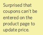
Figure 14.5
- 3. “Surprised that coupons can’t be entered on the product page to update price.” I see this type of comment a lot in e-commerce, and actually have a real-life case study below as an example. In physical shopping interactions, we typically hand the cashier our coupons before we pay. When e-commerce sites order the interaction differently, it can throw us off and make it difficult for us to proceed without assurance that our coupon will go through. This is a great example of a decision-making flow that people need to have addressed before they’re willing to say “yes” to the product at hand.
Case study: Coupons
Problem: There was one group that offered language classes, which people could buy through their e-commerce system. This group offered coupons, but the programmers placed the coupon code feature at the tail end of the purchasing process. So someone buying a $300 course with a third-off coupon would have to first check a box indicating that they wanted to buy the course at full price, then put in the coupon, and then finally see it drop to $200. Most normal people would feel uncomfortable selecting the full-price course and hitting “go” without seeing confirmation that their coupon code went through.
Recommendation: If I was working with this group, I would strongly advise them to move the coupon code feature up in the process, so that users are checking a box that shows their applied discount. There’s actually a lot of psychology behind “couponing,” but I’ll save that for another book.
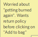
Figure 14.6
- 4. “Worried about ‘getting burned again.’ Wants return policy before clicking on ‘Add to bag.’” Here, this person has clearly had something bad happen to them in the past, and therefore is more anxious, and unwilling to go beyond a certain point without seeing a return policy. There are definitely emotional trust factors at play, but I would argue these emotions are driving the decision-making process. To continue with this process, this shopper wants to see the return policy.
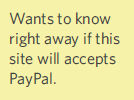
Figure 14.7
- 5. “Wants to know right away if this site accepts PayPal.” Here’s another micro-decision example of something the user wants to know before proceeding any further. A lot of people have a preferred or trusted method of payment, so even though we tend to put payment information toward the end, this feedback suggests that we need some indicator early on alerting the customer to the modes of payment we accept. This is another micro-consideration the customer needs to tick off before s/he is willing to keep going.
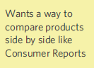
Figure 14.8
- 6. “Wants a way to compare products side by side like Consumer Reports.” I hear you out there, advocating for vision/attention: the user is seeking a certain visual layout in terms of comparison. I also hear those of you arguing that this sounds a lot like the “Stitch Fix” example in the previous chapter, suggesting the user’s memory/mental model of how Consumer Reports works. But most of all, I think this suggests how the user is solving a problem. We may take this into account in terms of how we actually organize the material in our design, potentially adding in a comparison feature. With this type of feedback, you can also ask the participant in the moment to elaborate what s/he means by “like Consumer Reports” so you can get a sense of that expectation for overall flow. It sounds like this customer wants to shop for a general product, then narrow down to a category, then look at a series of similar products to decide which would be the very best. Offering this type of comparison would make this customer’s decision-making process that much simpler.
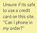
Figure 14.9
- 7. “Unsure if it’s safe to use a credit card on this site. ‘Can I phone in my order?’” The question here is whether the user feels comfortable entering their credit card information to this site. Maybe the site looks disorganized, or outdated, or a little scammy. There’s a little bit of nervousness going on, but on the whole, this represents a piece of the decision-making puzzle (i.e., making sure that they feel safe before they commit) that we have to help the user overcome for them to go on. A lot of the time, people want some sort of fail-safe, so that if they don’t like their decision at any point of the purchasing process, they can easily undo it. Others might want it to be super-clear what they’re buying, like lots of pictures showing the item at different angles. Still others might want to know that they’re buying from a reputable group.
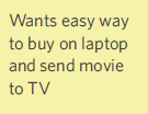
Figure 14.10
- 8. “Wants easy way to buy on laptop and send movie to TV.” This is a good example of classic problem-solving, representing how the user wants to solve a problem and move around in that problem space. The problem is how to use a different tool to do the buying (of a movie) than to do the viewing. There’s a bit of interaction design going on here, but I’d argue that the highest level issue in this case is solving a problem.
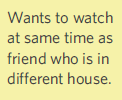
Figure 14.11
- 9. “Wants to watch at same time as friend who is in different house.” This sounds like a realistic desire, to chat back and forth with a friend who’s watching the same Netflix show. That’s a problem the user is trying to solve. If other providers have this functionality, this could be something that causes the user to switch providers, for example.
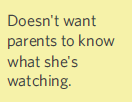
Figure 14.12
- 10. “Doesn’t want parents to know what she’s watching.” This customer is wondering about privacy settings at this stage of her decision-making process. Maybe she wants to make sure her parents don’t know she’s watching horror movies before she commits to this service. Privacy considerations like what’s being recorded and logged, levels of privacy, and who’s receiving that data are all very legitimate concerns in our Big Data world right now.
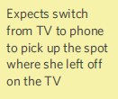
Figure 14.13
- 11. “Expects to switch from TV to phone to pick up the spot where she left off on the TV.” I can also relate to this desire for a seamless interaction from one device to the other (e.g., from your TV to tablet to phone if you’re watching a movie, or maybe from your tablet to car Bluetooth if you’re listening to an audiobook). It uses the word “expects,” possibly suggesting memory, but I think it really suggests a bigger notion of solving a problem that relates to the overall experience question. Because it’s focused on the whole system of being able to watch the same video anywhere, I’d say it falls in the decision-making bucket.
Concrete recommendations:
- ● Periodically ask what users are trying to do at that moment and map out the micro-goals that together suggest the expected path to the end answer (e.g., enter zip code, select movie, select date, view and select a location, view and select seats, reserve those seats).
- ● Build a decision-making journey map — why they are looking for information, what information they want or don’t want at that step, and what they need next.