Table of Contents for
Learning Web Design, 5th Edition
 Learning Web Design, 5th Edition
Published by
O'Reilly Media, Inc., 2018
Learning Web Design, 5th Edition
Published by
O'Reilly Media, Inc., 2018
- cover
- Learning Web Design, Fifth Edition
- lwd5_title_copy
- lwd5_title_copy-1
- lwd5_contents
- Foreword
- Preface
- Part I. Getting Started
- 2. How the Web Works
- 3. Some Big Concepts You Need to Know
- Part II. HTML for STRUCTURE
- 5. Marking Up Text
- 6. Adding Links
- 7. Adding Images
- 8. Table Markup
- 9. Forms
- 10. Embedded Media
- Part III. CSS for Presentation
- 12. Formatting Text
- 13. Colors and Backgrounds
- 14. Thinking Inside the Box
- 15. Floating and Positioning
- 16. CSS Layout with Flexbox and Grid
- 17. Responsive Web Design
- 18. Transitions, Transforms, and Animation
- 19. More CSS Techniques
- 20. Modern Web Development Tools
- Part IV. JavaScript for Behavior
- 22. Using JavaScript
- Part V. Web Images
- 24. Image Asset Production
- 25. SVG
- Part VI. Appendices
- B. HTML5 Global Attributes
- C. CSS Selectors, Levels 3 and 4
- D. From HTML+ to HTML5
24
In this Chapter
Selecting web file formats when exporting
Binary and alpha transparency
Producing responsive images
Image optimization tools and techniques
In the previous chapter, you learned a lot about images, but now we’re going to focus on making them. Because images typically make up 60–70% of the data on the web, it is critical to approach image creation thoughtfully, with a mind toward responsive design requirements and performance. Once again, we’ll be working with bitmapped formats: JPEG, PNG, and GIF. SVG has a different set of considerations and has been given the next chapter all to itself. This chapter is all about pixel-pushing!
You’ll get a chance to save or export images in a variety of bitmap formats and create an image with transparent areas. You’ll learn some shortcuts for creating multiple versions of an image at once for responsive layouts and high-density displays. Finally, you’ll pick up some optimization tools and techniques so you can make your image files as small as they can be.
Let’s start out with the most basic of image production tasks, saving an image in a web-appropriate format.
Saving Images in Web Formats
Let’s dig right in with saving web images in Photoshop CC and GIMP. You may be thinking, “Why just those two?” I wrote you a little sidebar, “Why Just Photoshop and GIMP?” to explain. If you use one of the dozens of other image editors, the process and terminology is likely similar to those described here.
In most programs, you can count on seeing JPEG and PNG options (if there’s only one PNG option, it’s PNG-24) when you Save or Export the final graphic. GIF is available in more established programs like Photoshop, GIMP, and PaintShop Pro; and WebP is beginning to make an appearance.
This section goes over the process of saving or exporting images step-by-step for those who may not be familiar with using graphics tools. If you are already pretty handy with image editors, this could be a review, or you might skip right to Exercise 24-1.
Adobe Photoshop CC
There are a number of ways to save graphics in web-appropriate formats in Photoshop:
Export As
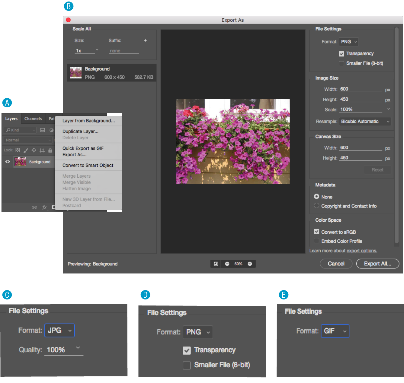
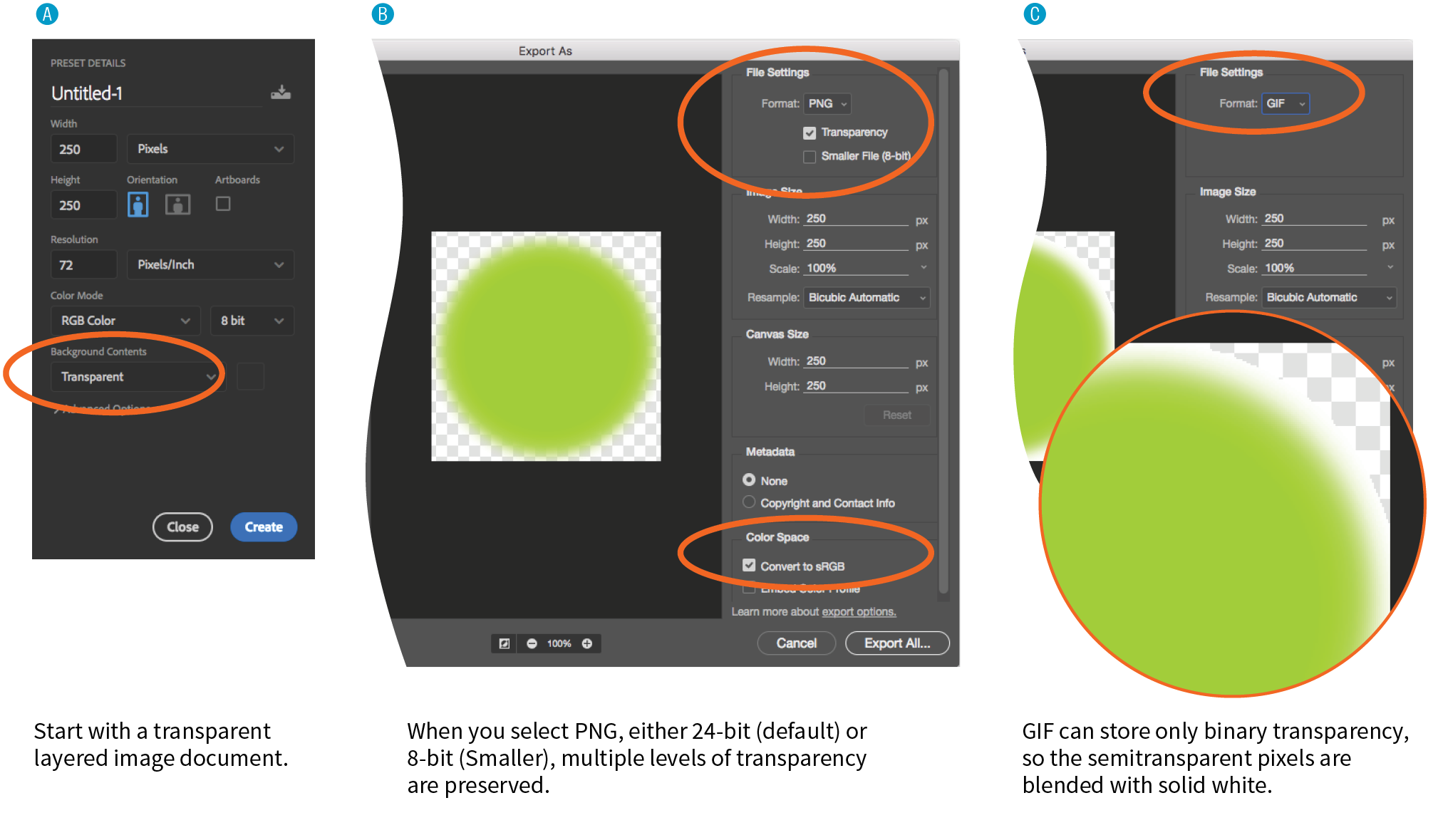
The recommended and most streamlined method is to use the Export As function, either from the → → menu, or by right-clicking (Control-clicking on a Mac) a layer to export its contents (Figure 24-1, A). From there, you get a dialog box with an image preview and a File Settings pop-up menu for selecting JPEG, PNG, GIF, or SVG format B. When you use Export As, Photoshop uses aggressive compression options to give you the smallest file size.
The Export As dialog box includes format-specific options with a preview of the image as it appears with the settings applied.
- For JPEG C, you can set the Quality level (higher quality equals larger files).
- For PNG D, you can choose to preserve transparent areas in the image so soft edges and shadows blend in with the background. By default, Photoshop exports PNG-24 files, but you can select “Smaller File (8-bit)” to export as a PNG-8 while still preserving multiple transparency levels.
- For GIF E, you get no options. I think that’s Adobe’s way of saying you’re much better off with PNG.
The Export As dialog box B also gives you the option to resize the image. This is useful for maintaining a full-size original while exporting copies sized for different layouts.
Save As
You can also use to save the file you’re working on in a new format (you’ll see the web-friendly formats in the long list of options). You’ll generally get a few more options with Save As, such as the ability to turn on interlacing and select a palette for GIFs and to make a JPEG progressive, but you miss out on the extra compression. And it’s a lot of compression. Depending on the image and the file type, a Saved As image could be 10× larger than its exported counterpart.
Save for Web (legacy)
Photoshop’s Save for Web function provides settings for manually optimizing the size of a file while keeping an eye on the resulting image in a preview window, and even comparing up to four settings at a time. For GIF and PNG-8 you can reduce the number of colors (the bit depth), reduce dithering, and turn on interlacing, among other settings. For JPEG, you can choose the quality, make it progressive or optimized, or apply a slight amount of blur to the image to reduce its file size.
Adobe has tagged the Save for Web function as “legacy” starting around 2014, and it will be going away entirely in future versions with no substitutes for many of the settings. But the fact is that there are tools available now that achieve the same amount of compression without all the manual work. If you have access to an older version of Photoshop, you can give it a try, but don’t get too attached (as I am!).
GIMP
In GIMP, working files are always in GIMP’s native XCF format. From there, you need to choose → to select your file format. The quickest way to get the format you want is to type .jpg, .png, or .gif at the end of the filename in the Name field. For example, typing “name.png” triggers GIMP to export that file in PNG format. Alternatively, you can select a file type from the list of options in the menu (shown in Figure 24-2, A).
After you hit the Export button, you get a dialog box with settings appropriate for the format you’ve chosen.
- For PNG B, deselect all of the options, as many of them store unnecessary metadata in the file and others are of limited use when you are exporting a layered file. You may choose to make the image interlaced.
- For GIF C, you can make the image interlaced and embed a comment. You can also save it as an animation if your layers are set up in that way.
- For JPEG D, you can play with the Quality setting, with the option to view the resulting quality as well as its file size in an image window (recommended). Under Advanced Options, you can Optimize the JPEG, make it Progressive, and apply a slight blur (Smoothing) to reduce the file size. Under Subsampling, the 4:4:4 (best quality) is a good choice, especially if your image has areas of flat color, although 4:2:2 produces smaller files. You can see the results of these settings in the image window.
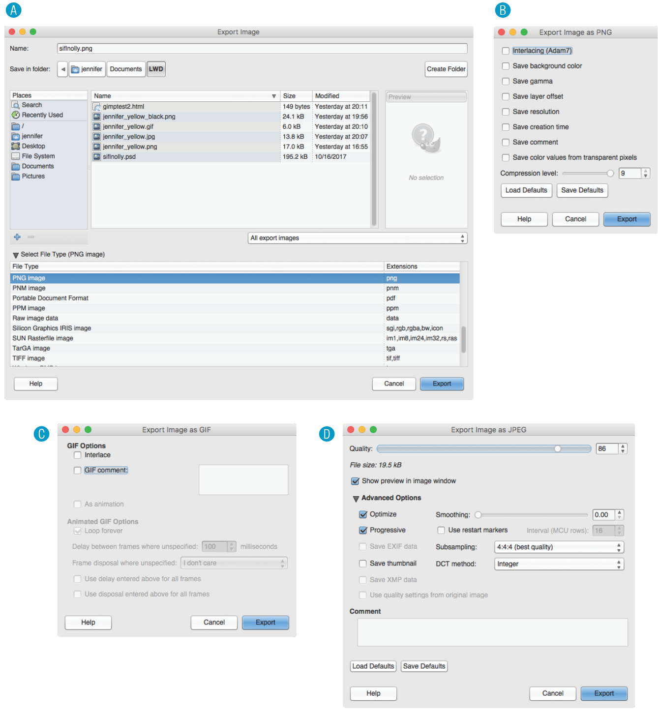
Figure 24-2. Selecting your file format in GIMP.
Why don’t you give this web-image-making a try in Exercise 24-1? You’ll find that the format you choose greatly impacts the size of the file. If you have Photoshop or GIMP, you can follow the instructions just listed, but if you don’t, there’s a good chance that whatever image creation tool you do have will have similar save or export options. Remember that you can download a free trial of Photoshop, and GIMP is always free.
That takes care of basic web image output. After the exercise, we’ll turn our attention to one of the core features of web images that you will certainly want to become handy with: transparency.
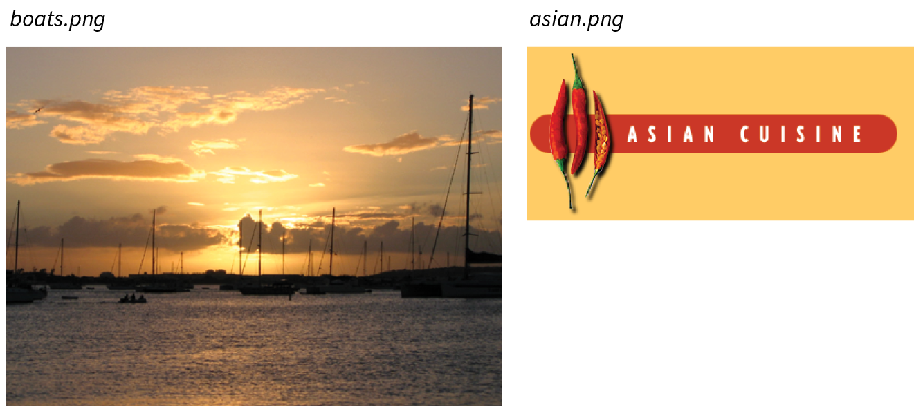
Exercise 24-1. Formats and file size
|
Tool |
JPEG (100) |
JPEG (60) |
JPEG (10) |
PNG-24 |
PNG-8 (32 colors) |
GIF (32 colors) |
|
PhotoshopCC |
22.7 KB |
8.7 KB |
3.3 KB |
14.8 KB |
4.2 KB |
4.3 KB |
|
GIMP |
27.3 KB |
6.8 KB |
3.3 KB |
14.5 KB |
3.3 KB |
3.8 KB |
Working with Transparency
Both GIF and PNG formats allow parts of an image to be transparent, so that the background color or image shows through. In this section, we’ll take a closer look at transparent graphics, including tips on how to make them.
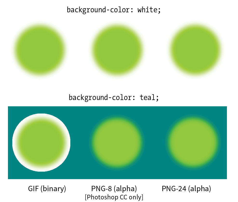
Remember that there are two types of transparency. In binary transparency, pixels are either entirely transparent or entirely opaque, like an on/off switch. Both GIF and PNG-8 files support binary transparency.
In alpha (or alpha-channel) transparency, a pixel may be totally transparent, totally opaque, or up to 254 levels of opacity in between (a total of 256 opacity levels). Only PNG, WebP, and JPEG 2000 support true alpha-layer transparency (see Note). The advantage of PNGs with alpha transparency is that they blend seamlessly with any background color or pattern, as shown back in Figure 23-9. PNG-8 also allows multiple levels of transparency, but it handles it a little differently, as you’ll learn in a moment.
Note
Because of poor tool and browser support for WebP and JPEG 2000, we’ll be focusing on alpha transparency in PNGs in this section.
In this section, you’ll become familiar with how each type of transparency works, and learn how to make transparent images using GIMP and Photoshop.
How Binary Transparency Works
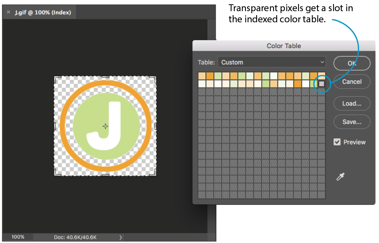
Remember that the pixel colors for PNG-8s and GIFs are stored in an indexed color table. Transparency is simply treated as a separate color, occupying one position in the color table. Figure 24-4 shows the color table in Photoshop for a simple transparent GIF. The slot in the color table that is set to transparent is indicated by a checker pattern. Pixels that correspond to that position in the color map are completely transparent when the image displays in the browser. Note that only one slot is transparent—all the other pixel colors are opaque.
Avoiding halos
When an image has multiple transparency levels, it blends seamlessly with the web page background. With binary transparency, however, there is a risk that the soft edges around the image will have a fringe of pixels that don’t match the color behind it (Figure 24-5). This fringe is commonly known as a halo and it is a potential hazard of binary transparency.
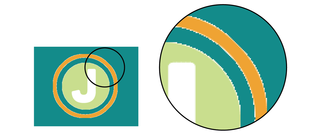
Prevention is the name of the game when it comes to dealing with binary transparency and halos. The trick is to blend the semitransparent pixels in the original image (such as the anti-aliased edges around text or a shape with feathered edges) with a color that is as close as possible to the background color of the page. Many image-editing tools that support web graphic formats provide a way to pick the blend color (also known as the matte color) when saving or exporting.
Some programs use whatever color is selected as the background color to fill in soft edges. Others may allow you to pick your blend color manually. For example, in Photoshop’s legacy Save for Web feature, you can select a matte color whenever transparency is turned on for the image (see Note). The matte color is also used to fill in any transparent image areas when you’re converting an image to JPEG. GIMP, on the other hand, prevents halos by avoiding any sort of blend at all. You get the choice of hard, stair-stepped edges or a dithering pattern made of color and transparent pixels meant to simulate the blurred edge. Neither option looks good, but hey, no halos.
Note
Curiously, Photoshop’s preferred Export As function automatically fills the blurred edges with white and does not seem to provide a way to select a matte color for GIFs and JPEGs. However, with the ability to export PNG-8s with alpha transparency, you may never need to select a matte color in Photoshop again.
Of course, avoiding halos with these methods requires that you know the RGB values of the page’s background color in advance so you can match the matte color to it. If the page color changes, you need to go back and export the graphics again with the new color. That’s where alpha transparency has a real advantage—you can change the background, and everything will still blend in perfectly.
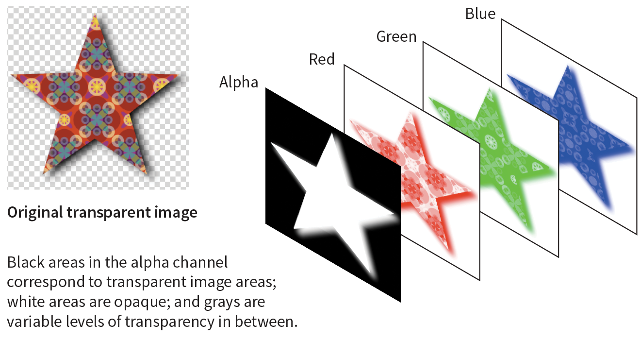
How Alpha Transparency Works
RGB images, such as JPEGs and PNG-24s, store color in separate channels: one for red, one for green, and one for blue. PNG-24 files add another channel, called the alpha channel, to store transparency information. In that channel, each pixel may display one of 256 values, which correspond to 256 levels of transparency when the image is displayed. The black areas of the alpha channel mask are transparent, the white areas are opaque, and the grays are on a scale in between. I think of it as a blanket laid over the image that tells each pixel below it how transparent it is (Figure 24-6).
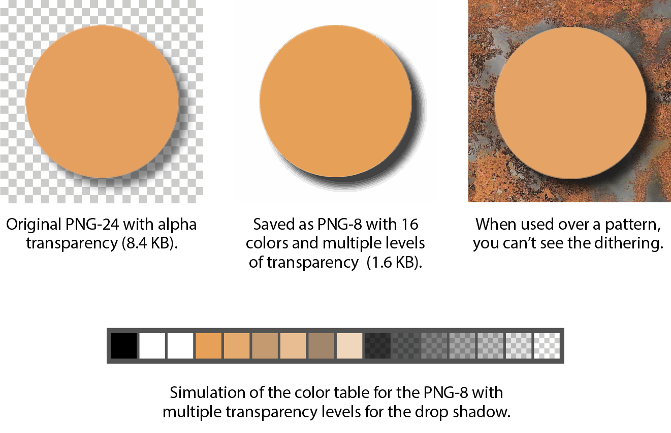
PNG-8 Alpha Transparency
Variable levels of transparency are not limited to 24-bit PNGs—PNG-8 files can do it too! Although they are referred to as PNG8+alpha or alpha-palette PNGs, they do not store transparency information in a separate alpha channel overlay as we saw in Figure 24-6.
PNG expert Greg Roelofs explains PNG-8 “alpha” transparency well in this excerpt from his 1999 book PNG: The Definitive Guide (O’Reilly):
A PNG alpha-palette image is just that: an image whose palette also has alpha information associated with it, not a palette image with a full alpha mask. In other words, each pixel corresponds to an entry in the palette with red, green, blue, and alpha components. So if you want to have bright red pixels with four different levels of transparency, you must use four separate palette entries to accommodate them—all four entries will have identical RGB components, but the alpha values will differ. If you want all of your colors to have four levels of transparency, you’ve effectively reduced your total number of available colors from 256 to 64.
No image program (that I know of) displays PNG-8 color tables with multiple transparency levels, so I’ve simulated one for you in Figure 24-7. I based it on the orange circle with the soft drop shadow from Figure 23-9, with the palette reduced to just 16 colors. The resulting image has a bit of dithering in the drop shadow, but it’s not that noticeable when it appears over a background pattern. With file size savings of 75%, it’s worth it.
Making Transparent PNGs and GIFs
The easiest way to make parts of an image transparent is to design them that way from the start and preserve the transparent areas when you export. Although it is possible to doctor up an existing flattened opaque image and make areas transparent, it is usually difficult to get a seamless blend with the background while avoiding jagged edges.
Instead of just telling you, I’ll let you create a layered image and preserve the transparent areas in Exercise 24-2. When you create your layered Photoshop or GIMP file, be sure that the background layer appears as a gray checkerboard pattern and is not filled with a color. If you end up with a color in the background anyway, you can select it all and delete it.
When you’ve finished playing with transparency, you can come back for some tips on responsive images.
Exercise 24-2. Creating transparent images
Photoshop CC (2018)
GIMP
- OK, revert the file to RGB () and convert it to indexed color again, only this time, click the box next to Enable Dithering. If you’re zoomed in, you can see that GIMP creates a pattern out of solid and transparent pixels that kinda simulates the blurred edges of the circle D. Export this file in PNG format as . You could also save it in GIF format.
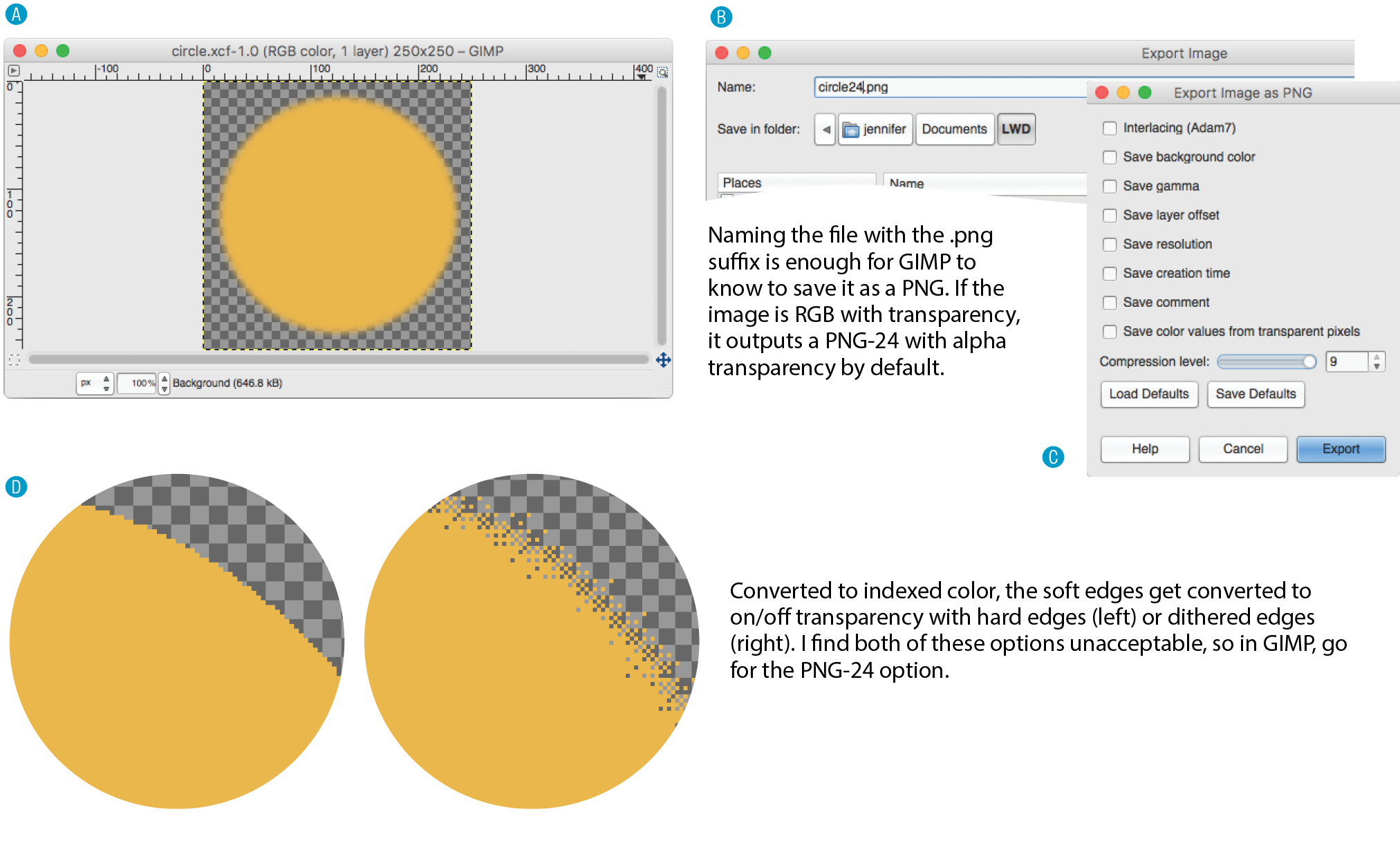
Figure 24-9. Creating a transparent image in GIMP.
How do they look?
<!DOCTYPE html><html><head> <title>Transparency test</title> <style>body {background-color: white;}p {text-align: center;} img {margin: 2em;} </style></head><body><p> <img src="circle.gif" alt=""><!-- left --><img src="circle24.png" alt=""><!-- center --><img src="circle8.png" alt=""><!-- right --></p></body></html>
Wrapping up
Responsive Image Production Tips
If your site is responsive, chances are you’ll need responsive images to go with it. When it comes to bitmapped images, “responsive” actually means “multiple versions” (see Note).
Note
Responsive SVGs are covered in .
In the “Responsive Image Markup” section in Chapter 7, Adding Images, you learned about four responsive image scenarios, but it’s worth a refresher here (that was hundreds of pages ago, after all). Whereas in the past one image did the trick, in our current environment we may choose to do the following:
- Provide a set of images of various dimensions for use in responsive layouts on different viewport sizes.
- Provide versions of the image with varying amounts of detail based on the device size and orientation (also known as the art direction use case).
- Provide large-scale images that look crisp on high-density screens.
- Provide alternative image formats that store the same image at much smaller file sizes.
This section introduces tools, tips, and general strategies for producing (or automating!) the images you need for the first three scenarios. Alternative image formats were addressed in Chapter 23, Web Image Basics.
Images for Responsive Layouts
The first scenario addresses providing a range of image sizes that the browser selects from based on the viewport size. In HTML, you would specify these using srcset with a w-selector that provides the exact pixel width of the image, and the sizes attribute that tells the browser how large the image will appear in the layout.
This example should look familiar:
<img src="strawberries-640.jpg" alt="baskets of ripe strawberries" srcset="strawberries-240.jpg 240w, strawberries-480.jpg 480w, strawberries-672.jpg 672w" sizes="(max-width: 480px) 100vw, (max-width: 960px) 70vw, 240px">
For this particular img element, we’ve provided JPEGs of the strawberry image at 240, 480, and 672 pixels wide. Other layouts may require fewer or more breakpoints for each image. The first question you may ask when producing images for responsive layouts is, “How many images do I need to create?” That is a good question that doesn’t have an easy answer.
Start by determining the smallest and largest dimensions at which you know the image is likely to appear. Then, decide how many interim sizes would be useful to meet the goal of reducing unnecessary downloads. If the range isn’t that large, you might find that providing small, medium, and large versions is fine and better than nothing. If there is a large difference between the extremes, more breakpoints may be required. If there is very little difference, one image size may suffice.
Resize them manually
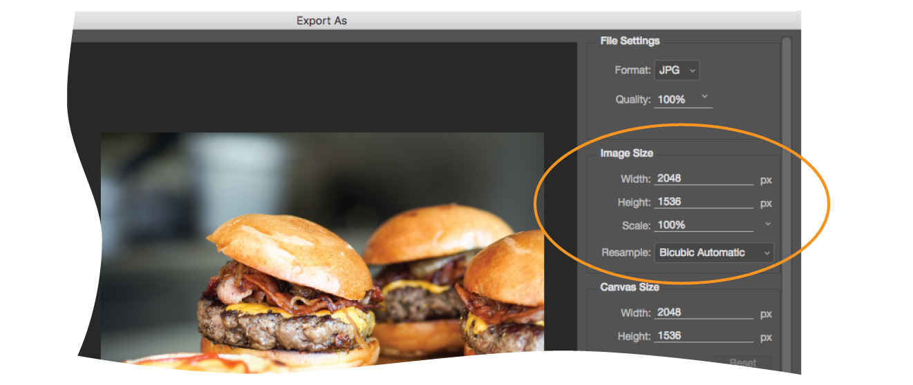
If you find you need only a few versions, resizing images on export is a fine option. Figure 24-11 shows resizing options in Photoshop CC’s Export As dialog box, but you will find similar settings in other programs. Alternatively, you could use the Image Size tool to resize the image manually before saving or exporting. That gives you an opportunity to make adjustments to the image (such as sharpening it up) before committing to the export.
Remember that you always want to start with the image at its largest size in your image editor, and resize it smaller to your target image sizes. Resizing larger (upscaling) results in blurry images.
Generate images based on file size
If your image is used at a wide range of sizes, more breakpoints than “small, medium, and large” may be required. In that case, providing a range of selections based on file size, not pixel dimensions, is a more appropriate approach (see Further Reading). Keep in mind that the primary goal for viewport-based responsive images is limiting wasted data downloads. Remember also that the browser makes the final image file selection based on the user’s viewing environment—we only provide options with our responsive image markup. We can trust the browser to make the right selection, scaling up or down slightly as required.
In the file-size approach to breakpoints, you create a set of images with file sizes that step up in fixed increments, such as 20 KB, 40 KB, or 80 KB, to cover all the possibilities and fine-tune the amount of data that gets downloaded. Granted, that takes a lot of extra work and may not be feasible to do manually for a site with a lot of images.
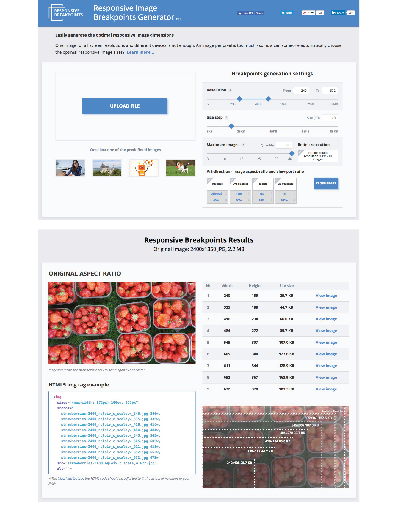
Fortunately, there is a tool that generates the images for you. The Responsive Image Breakpoints Generator by Cloudinary (responsivebreakpoints.com) lets you upload a large image and set the maximum/minimum dimensions, the size step, and the maximum number of images, and it generates all the images automatically. Figure 24-12 shows how I used the tool to create strawberry images at 20 KB increments. By the time you are reading this, there may be more tools like this, so it’s worth a quick web search to see what’s available.
Art-Directed Images
For some images, simply resizing to fit a layout isn’t sufficient. It may be necessary to crop or alter the image so that it works successfully at smartphone size as well as desktop monitor size. This is what is known as the “art direction” case for responsive images. Chapter 7 has a full explanation and examples of art direction–based selections, but as a quick reminder, this is a scenario for the picture element:
<picture> <source media="(min-width: 1024px)" srcset="icecream-large.jpg"> <source media="(min-width: 760px)" srcset="icecream-medium.jpg"> <img src="icecream-small.jpg" alt="Savor the Summer"></picture>
If you want total control over what appears in an image at each size, you need to design and export each image manually in your favorite image editor. Each art-directed version may also need to be generated at several sizes, depending on your breakpoints. That may be just fine if you don’t have too many images to deal with.
But hold onto your hat! Cloudinary figured out a way to automate art direction too. You can use the tools in the bottom-right corner of the Responsive Image Breakpoints Generator to specify image proportions for desktops, laptops, tablets, and smartphones. Cloudinary’s tool does some sophisticated image analysis, including edge detection, face detection, and visual uniqueness to determine the most important parts of the image. The final image is cropped to include the visually “hot” spots. For more information on how it’s done, read the article “Automating Art Direction with the Responsive Image Breakpoints Generator” by Eric Portis at www.smashingmagazine.com/2016/09/automating-art-direction-with-the-responsive-image-breakpoints-generator/.
Other image hosting and automation services also offer face detection and features that improve the quality of the images they generate. If you are shopping for such a service, check to see if smart cropping is available.
Images for High-Density Displays
If you want an image to look its sharpest on high-density screens (@1.5x, @2x and @3x), it needs to be created large enough to cover the device pixels at the highest densities. For example, if you want an image to be 300 pixels wide in your layout, you’ll need a 300-pixel-wide version for standard displays, a 600-pixel-wide version for 2x displays, and a 900-pixel-wide version targeted to 3x displays.
Note
To brush up on the special requirements of high-density displays, see , where I first introduced device-pixel-ratios as well as the markup for targeting images to specific densities. See also the discussion of image and screen resolutions in .
To review, this high-resolution scenario uses the srcset attribute in the img element with an x-descriptor that specifies the target screen density for each image:
<img src="/images/apple-300px.jpg" alt="apple" srcset="/images/apple-600px.jpg2x, /images/apple-900px.jpg3x" >
Thankfully, the people who make our image creation programs get it, and they’ve begun building features into their tools that make it easier to output multiple high-density versions at once.
Export multiple high-density versions
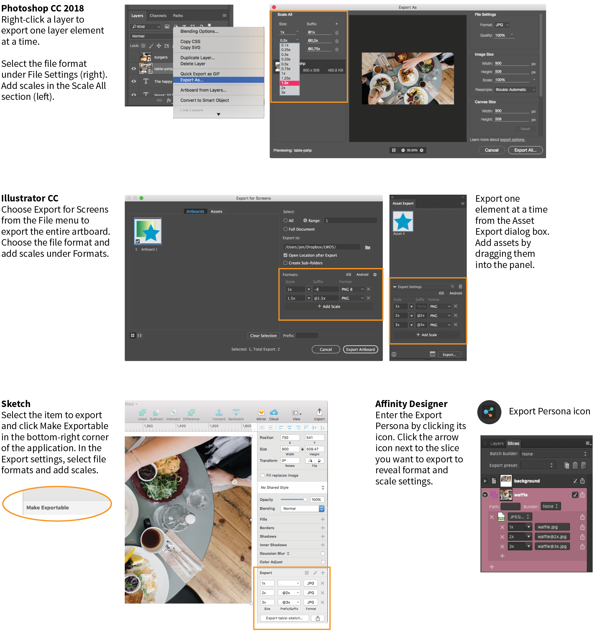
Photoshop CC 2018, Sketch, Illustrator, and Affinity Designer are four tools aimed at screen designers that make it easy to set up simultaneous exports at multiple scales. It’s a nice little time (and math!) saver. If you use another design tool, check to see if it is an option (it is generally located wherever your tool handles exporting). Later in this section, I’ll give you some strategies for making sure the image quality stays crisp even at larger scales.
Adobe Photoshop CC 2018
Photoshop lets you add scales on the top-left corner of the Export As dialog box (Figure 24-13). To export a whole artboard, choose Export As (). You can also export a specific element by right-clicking (Control-clicking on a Mac) its layer name and selecting Export As from the pop-up menu. In the Scale All section, click the + button to add more scales for export. The little down arrows open a menu of standard scales (1x, .5x, 3x, etc.). Click the garbage can to remove a scale. When you click Export All, all of the images are created at once, named with the -@nx suffix (see Note).
Note
The “@nx” (@1x, @2x, etc.) convention was established in the Apple iOS Developer Library. It seems to have crossed over to the web world as well.
Adobe Illustrator CC
In Illustrator, to export the entire artboard, choose . You’ll find the option to Add Scale in the right column (Figure 24-13). You can also export individual assets (such as icons and other elements) via the Assets Export panel (), which has its own export settings. Just drag elements into the panel, and they are ready to go. The Export As dialog box also provides access to individual assets via the Assets tab, but they need to be added to the Assets Export panel first. One click on Export, and voilà! All your scaled assets exported at once!
Sketch
Sketch (Mac only) is a tool for designing website and app interfaces that has rapidly grown in popularity. In Sketch, select an artboard or a page element and click the + icon next to Make Exportable in the bottom-right corner of the Sketch window. In the revealed Export panel (Figure 24-13), select a file format and click the + icon to add more scales to be created on export.
Affinity Designer
Affinity Designer has an export mode (which it calls a “Persona”) in which you access all of its export settings. Create slices for the elements you want to export. Enter the Export Persona (using the menu or clicking the icon that looks like a molecule). Select the slice or slices you want to export in the Slices panel (Figure 24-13); then click the small arrow to the left of the slice name to expose export settings, including file format and the ability to add scales with the + icon. When you are ready, click Export Slices.
The problem to watch out for with all of these tools is that if you design at standard (@1x) resolution, the exported @2x and @3x versions will be much bigger than they are in your working document. That should raise a red flag in your mind, because doubling or tripling the dimensions of images typically makes them blurry. There are ways around that, however, which I’ll discuss next.
Work at @1x scale
Even if you are creating high-definition versions of your images, it is still recommended that you do your design work at @1x scale (see Note). In other words, the pixel dimensions in your working document (whether it’s in Photoshop, Sketch, or some other tool) should match the layout pixels of your design. In Photoshop and other image-editing tools, @1x scale is equivalent to 72ppi. The advantages to working at @1x scale include the following:
- It’s easier to specify font size and other length measurements as they appear in your working documents without the need to divide everything by two. If you work at @2x and you want 16pt type, you need to make it 32pt in your image document. If you want 10 pixels of padding in the layout, you need to create it at 20 pixels, and so on.
- Pixel-snap features work more reliably at @1x. Snapping to even pixels is a way to keep edges crisp in detailed elements such as icons.
- File sizes are much smaller for a design created at @1x, so it is better for performance on your computer. Complex files with lots of artboards and layers at @2x can get sluggish and slow down your work.
- It creates a more realistic sense of how much space you have to work with. A @2x design space might give the impression that you have more room to fit in elements, but they will end up too small and cramped when reduced 50% for @1x displays.
Start with vectors when possible
One way to maintain quality when your design is upscaled is to use vector source images whenever possible. As you’ve learned, vectors can scale up with no loss of quality, so they make a great starting point for web and app design.
Many new UI design tools for screen and web interfaces, such as Sketch, Affinity Designer, and Adobe XD, are vector-based by default, so you’ll have no problem outputting larger versions of elements you create there (the same goes for vector-based Adobe Illustrator). If you prefer to design in Photoshop, make sure to use its vector tools such as shapes, paths, and imported vector smart objects for common web page elements like buttons, icons, and illustrations whenever possible.
Embed large-scale bitmaps
To preserve the image quality of photographs and other necessarily bitmapped page elements at large scales, start with an image source that is at least as large as your largest scale. For example, if you know that your @3x version is 2,880 pixels wide, your source image should be that wide or wider.
In Illustrator, Sketch, and Affinity Designer, “placing” the high-resolution source image on the @1x artboard and resizing it to fit the needs of the layout gives the program all the pixel information it needs to export high-quality, large-scale assets.
In Photoshop CC, to take advantage of the full image resolution, the trick is to add the image to your design as a linked Smart Object. The Smart Object is like a placeholder for the image in your @1x design, with the high-resolution original remaining separate. When it comes time to export at various scales, Photoshop references the high-res version, and you end up with full-resolution exports (see Important Warning). To place an image as a Smart Object, choose and resize the image to fit into your design.
Important Warning
As of this writing, there is a bug in Photoshop CC 2018 that prevents this technique from working with JPEG images. When you link a large-scale JPEG, Photoshop ignores it and scales up a screenshot of the image in the current file. The workaround is to convert the high-resolution JPEG image to a PSD file before adding it as a Smart Object. Adobe knows about this bug, so hopefully they will fix it in an upcoming release.
Viva la Automation!
I mentioned this in the section “Image Asset Strategy” in the previous chapter, but it bears repeating—if your site is image-heavy, consider using server software that automates the process of responsive image generation. As Jason Grigsby says in his article, “Humans shouldn’t be doing this.” I couldn’t agree more (unless you have a penchant for repetitive tasks).
You may choose to install software on your own server, or as a convenience, use a third-party vendor that provides hosted image management services. Again, some popular services currently are Cloudinary (cloudinary.com), Akamai (akamai.com), and Kraken.io (kraken.io).
I hope that you’ve come away with some strategies to improve the workflow for creating multiple versions of images for responsive layouts. Or perhaps you’ve just decided to let the server handle it! Let’s move on to the final topic in our image asset production deep-dive: optimization.
Image Optimization
All web designers should have multiple image optimization tricks up their sleeves.
Because a web page is published over a network, it needs to zip through the lines as little packets of data in order to reach the end user. It is fairly intuitive, then, that larger amounts of data will require a longer time to arrive. And guess which part of a standard web page packs a whole lotta bytes—that’s right, the images.
Thus is born the conflicted relationship with images on the web. On the one hand, images make a web page more interesting than text alone, and the ability to display images is one of the factors contributing to the web’s success. On the other hand, images also try the patience of users with slow internet connections and gobble the data plans of mobile devices.
If you study the flowchart back in Figure 23-16, you will see that all paths end with “Optimize.” Making your image files as small as they can be is critical for fast-loading sites, so all web designers and developers should have multiple image optimization tricks up their sleeves.
As you saw firsthand in Exercise 24-1, choosing the appropriate file format is your first line of defense against bloated file sizes, but it doesn’t stop there. It’s possible to squeeze a lot more data out of the images that your image editor exports.
Optimization approaches fall into two broad categories:
- Efforts you make manually and deliberately during the design and export process
- Post-export compression tools that root through the code and crunch them down even further, generally by throwing out unused data
This section starts with general guidelines for limiting file size. Next, because each image format is slightly different under the hood, we’ll examine optimization strategies for JPEG, PNG-24, PNG-8, and GIF files (see Note). Finally, we’ll round up some optimization tools that work on multiple formats and are a good last step in any image production process.
Note
Of course it is important to optimize SVGs as well, but I’ve saved that discussion for the SVG chapter ().
General Optimization Guidelines
Regardless of the image or file type, there are a few basic strategies to keep in mind for limiting file size. In the broadest of terms, they are as follows:
Start with a high-quality original
Start with the best-quality source image you can get your hands on. From there, you can make copies at various sizes and compression settings, but you’ll want to keep that original safe.
Limit dimensions
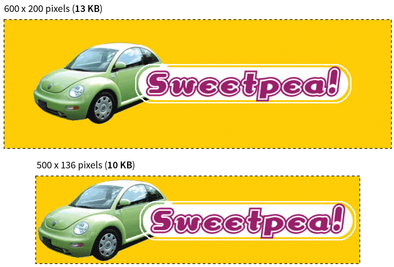
Although fairly obvious, the easiest way to keep file size down is to limit the dimensions of the image itself. There aren’t any magic numbers; just don’t make images any larger than they need to be. By simply eliminating extra space in the graphic in Figure 24-14, I was able to reduce the file size by 3 KB (23%).
Reuse and recycle
If you use the same image repeatedly in a site, it is best to create only one image file and point to it repeatedly wherever it is needed. This allows the browser to take advantage of the cached image and avoid additional downloads.
Use appropriate tools
If you know you will be doing a lot of web image production work, it is worth investing in professional image-editing software with web-specific features. Whether you choose Photoshop, Sketch, PaintShop Pro, or some other program mentioned in this book is up to your personal preference and budget limitations.
Run the image through an optimizer
You should have a number of image optimization tools at your disposal. I’ll list several throughout this section, many of which are free to use.
Optimizing JPEGs
Here are the general strategies for reducing the file size of JPEGs:
- Be aggressive with compression.
- Choose Optimized if available.
- Soften the image (Blur/Smoothing).
- Avoid hard edges and sharp details.
Be aggressive with compression
Your number one tool for optimizing JPEGs is the Quality setting that you’ll find in just about every graphics tool. The Quality setting allows you to set the rate of compression; lower quality means higher compression and smaller files. If your image editor has a preview, you can keep an eye on the image quality while changing the compression level. Different images can withstand different amounts of compression, but in general, images hold up reasonably well at moderate (50–70) and even low (30–40) quality settings. The quality at particular settings varies from program to program, so use whatever setting results in the best balance of quality and file size for your particular image.
Choose Optimized if available
Optimized JPEGs have slightly smaller file sizes and better color fidelity than standard JPEGs (although I’ve never been able to see the difference). For this reason, you should select the Optimized option if your image software offers it.
Blur the image
Because soft images compress smaller than sharp ones, you can try applying a slight Gaussian blur to the image to give the JPEG compression something to chew on. Even an imperceptible blur over the whole image can reduce file size. In GIMP’s Export as JPEG dialog box, there is a Smoothing setting that does just that. Photoshop’s legacy Save for Web feature also includes an option to apply varying amounts of blur across the whole image.
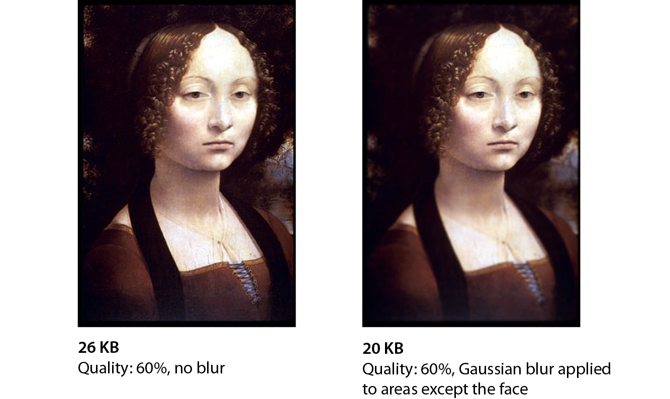
You might also choose to apply a more aggressive blur to less important areas of the image while preserving areas of interest. In Figure 24-15, I applied a blur to all areas of the image except the face, which remains at the original quality, and reduced the file size by 6 KB, or 23%. For this image, I’d say the savings are worth the loss of detail around the edges, but of course, you should decide whether blurring is appropriate based on the content and purpose of your images.
Avoid hard edges and details
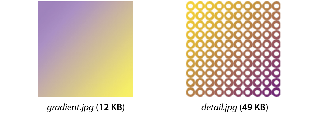
JPEGs compress areas of smooth, blended colors more efficiently than areas with high contrast, hard edges, and sharp detail. To demonstrate the difference, Figure 24-16 shows two similar graphics with blended colors. The image with more contrast and detail is more than four times larger at the same quality setting. You can keep this principle in mind when creating your images. If a photograph has a lot of hard edges, consider whether they can be softened or edited out. Also see whether a PNG-8 might offer similar image quality at a smaller size.
“Optimizing” PNG-24
Because PNG-24 is a lossless format, there isn’t much you can do to these images in terms of optimization. Your best bets are to do the following:
- Avoid them for photographs in favor of JPEGs.
- Run them through an optimization utility.
- Convert them to PNG-8 with multiple levels of transparency.
PNG’s lossless compression makes PNG-24 a wonderful format for preserving quality in images, but the same image will always be smaller saved as a lossy JPEG. Therefore, your first “lean and mean” strategy for photographs is to avoid PNG-24 and go with JPEG instead.
You may be using PNG-24 because you need multiple levels of transparency (a valid reason). If that is the case, you have two options. Running the image through one of the image optimizers listed later in this section is a good way to strip out useless metadata but preserve the image. The other option is to convert it to a PNG-8 while maintaining alpha transparency.
Converting to PNG-8
Until recently, we didn’t have tools for making PNG-8 with alpha transparency (see Note). Now Photoshop CC gives you the option to make PNG-8 with alpha transparency and a smaller file size right in the Export As dialog box.
Note
Adobe Fireworks had the little-known ability to create PNG-8 + alpha, but it was discontinued in 2013.
You can also use a standalone utility for converting a PNG-24 to PNG-8 with alpha transparency. Some options are as follows:
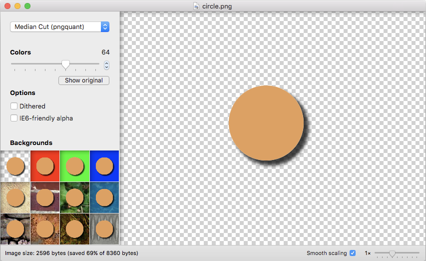
- ImageAlpha (pngmini.com) is a Mac-only program created by Kornel Lesiński for converting PNG-24 to PNG-8 (Figure 24-17). For the image of the orange circle, I was able to reduce the size from 8.4 KB to 2.6 KB, a savings of 69%. Because the circle had flat colors, I was able to reduce the color palette to 64 colors without any significant change in appearance.
- TinyPNG (tinypng.com) allows you to drag PNGs right onto their web page for conversion. They also offer a paid Pro version and developer APIs that let you use the “tinify” tool with most backend platforms.
- PunyPNG Pro (punypng.com) is another compressor with a web interface that offers “lossy” conversion from PNG-24 to PNG-8, although you get that feature only with the paid Pro account.
Optimizing PNG-8 and GIF
Follow these optimization strategies in the PNG-8 and GIF creation and export process:
- Reduce the number of colors (bit depth).
- Avoid or reduce dithering.
- Design with flat colors.
Reduce the number of colors (bit depth)
The most effective way to reduce the size of an indexed color image, and therefore the first stop in your optimization journey, is to reduce the number of colors in the image.
Although PNG-8s and GIFs can contain up to 256 colors, there’s no rule that says they have to. In fact, by reducing the number of colors (bit depth), you significantly reduce the file size of the image. One reason for this is that files with lower bit depths contain less data. Another byproduct of the color reduction is that you create more areas of flat color by combining similar, abutting pixel colors. More flat color areas mean more-efficient compression.
Photoshop and GIMP give you the opportunity to reduce the number of colors when you convert the image from RGB to indexed color. In Photoshop, select , and enter the number of colors to use in the color map in the Colors box. If you have access to Photoshop’s legacy Save for Web feature, there is a bit-depth setting you can play around with while observing the resulting image in the preview before saving the image. In GIMP, go to and enter the “Maximum number of colors” you’d like to use.
If you reduce the number of colors too far, of course, the image begins to fall apart or may cease to communicate effectively. For example, in Figure 24-18, once I reduced the number of colors in the PNG to eight, I lost the rainbow, which was the whole point of the image. This “meltdown” point is different from image to image. (Granted, this barn and sky image should be a JPEG, but it demonstrates the effects of optimization dramatically, so thank you for bearing with me.)
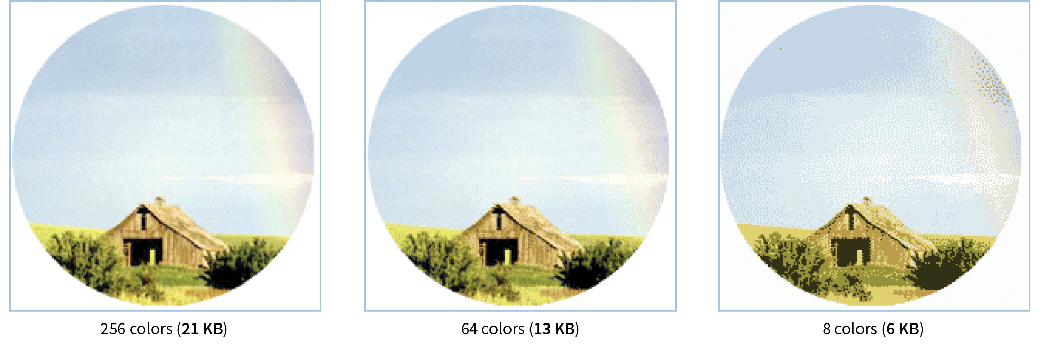
You’ll be surprised to find how many images look perfectly fine with only 32 pixel colors (5-bit), such as the Asian Cuisine image in Exercise 24-1. That is usually my starting point for color reduction, and I go higher only if necessary. Some image types fare better than others with reduced color palettes, but as a general rule, the fewer the colors, the smaller the file.
The real size savings kick in when there are large areas of flat color. Keep in mind that even if your image has 8 pixel colors, if it has a lot of blends, gradients, and detail, you won’t see the kind of file size savings you might expect with such a severe color reduction.
Reduce dithering
When the colors in an RGB image are reduced to a specific palette, the colors that are not in that palette get approximated by dithering. Dithering is a speckle pattern that results when palette colors are mixed to simulate an unavailable color. When converting to indexed color, Photoshop and GIMP (and most other image editors) allow you to specify whether and how the image dithers.
In photographic images, dithering is not a problem and can even be beneficial; however, dithering in flat color areas is usually distracting and undesirable. In terms of optimization, dithering is undesirable because the speckles disrupt otherwise smooth areas of color. Those stray speckles stand in the way of the compression and result in larger files.
NOTE
Not all image-editing tools give you control over the amount of dithering.
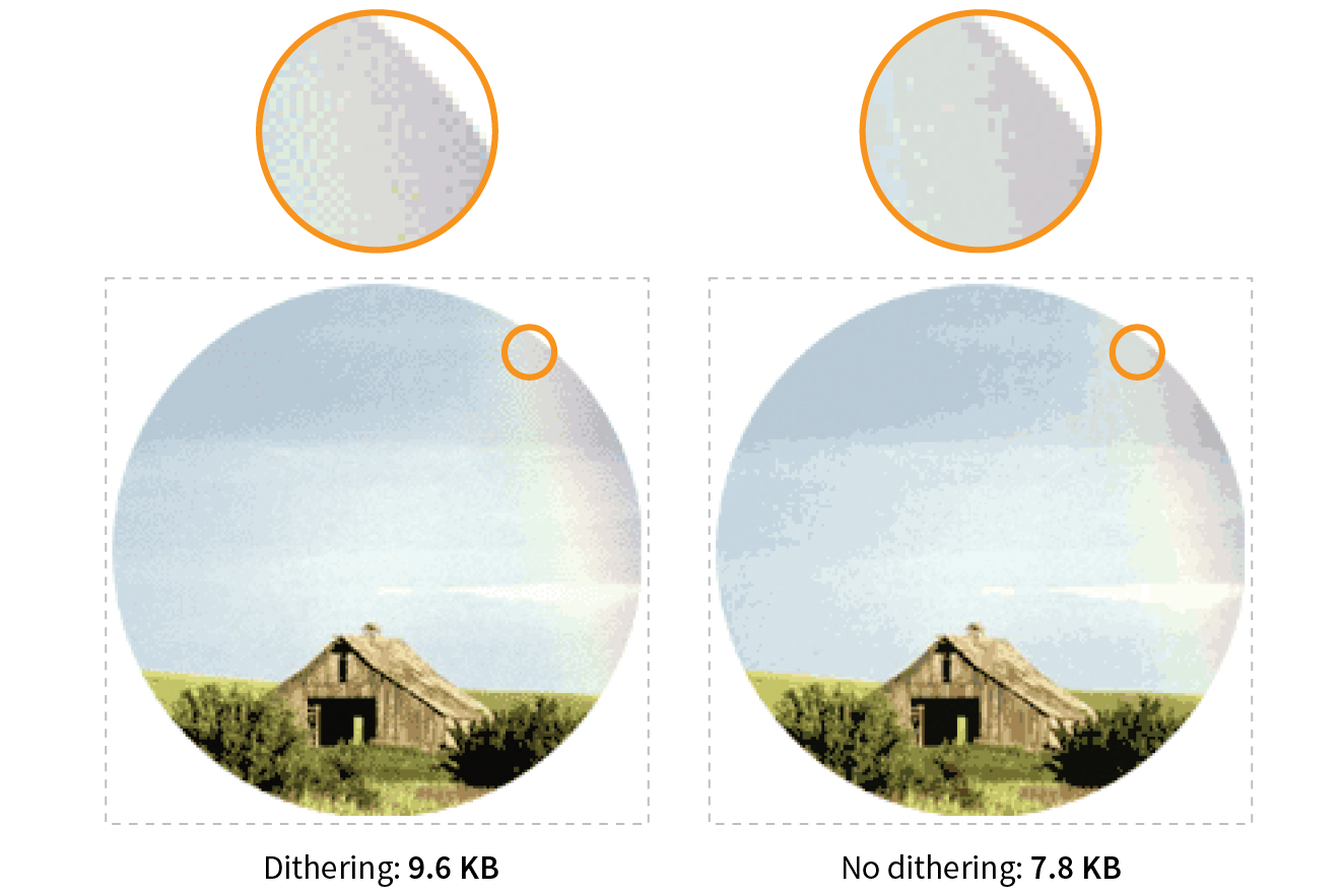
One way to shave bytes off a PNG or GIF is to turn off dithering entirely. For some images, that may result in a banding effect as shown in Figure 24-19. If that is unacceptable, you can turn the dithering back on or try a higher number of colors if the bit depth was set to less than 8-bit.
Design with flat colors
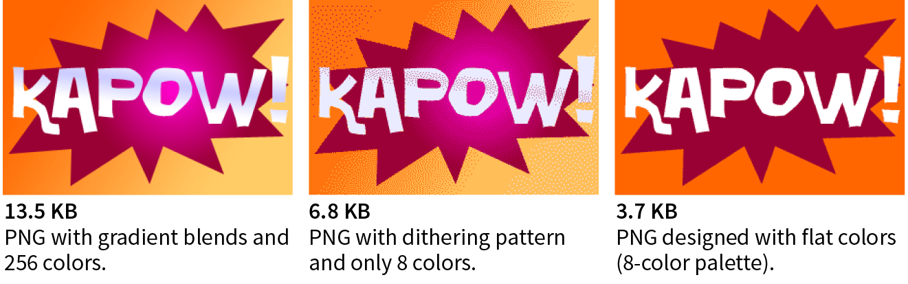
When designing your images keep in mind the fact that PNGs and GIFs are good at compressing areas of flat color.
Choosing flat colors over gradients and patterns makes a big difference in file size, as shown in Figure 24-20. Reducing the colors from 256 to 8 goes a long way in reducing the file size, but the colors in the blend are approximated with a dither pattern, which we just learned is counterproductive to GIF and PNG compression. However, if you create the image with flat colors in the first place, the file size is half that of the dithered version, even though both images have been reduced to 8 colors.
I feel obliged to say that images like this one should be drawn with vectors and saved in SVG format, which will be smaller and more versatile than bitmapped versions. However, if you have a reason for saving PNGs, design them in a way that complements the compression. Similarly, if you are starting with a bitmapped source image, you may be able to edit it in a way that eliminates unnecessary color blends and patterns.
Optimization Tools
Even if you design images to take advantage of their end compression scheme and take full advantage of all the optimizations in your image-editing tool, there’s a good chance that you can squeeze down the file size of your images even further using an optimization tool. These tools are generally lossless, meaning they do not alter the appearance of your image. They find the file savings by tossing out chunks of code dedicated to metadata, color profiles, and other redundant code.
It is recommended that you always run your images through an optimization tool as the last step in the image production process. The good news is, there are many ways to do it, so you will surely find one that fits into your workflow. Let’s look at some options.
Online image optimizers
One easy solution is to use one of the freely available online optimizers. Just drag your images onto the web page interface and download the resulting compressed files. They are a good option if you don’t have too many images to process, and they have the advantage of being cross-platform. In addition to free web-based tools, most of these companies also offer Pro packages that allow you to upload more data and provide additional compression options. Some also offer server-side solutions:
- Optimizilla (optimizilla.com) can optimize both JPEGs and PNGs and allows you to compress up to 20 images at once. It is free to use.
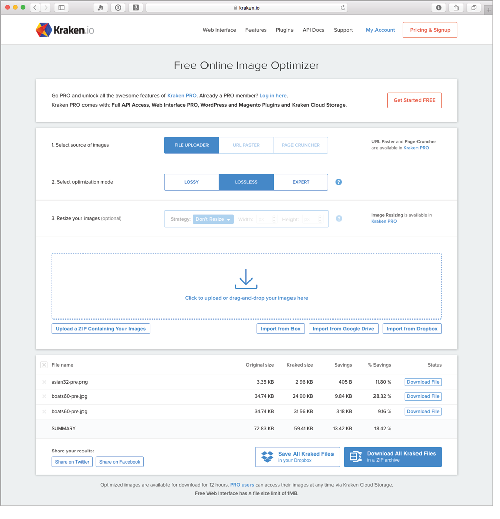
- Kraken.io (kraken.io/web-interface) offers a free web interface in addition to their commercial server-side services. They give you the option of lossy, lossless, manual “expert” settings, and the ability to resize the image as well.
- TinyPNG (tinypng.com) was mentioned earlier as a way to convert transparent PNG-24 to PNG-8, but you can use it to compress any PNG or JPEG.
- PunyPng (punypng.com) boasts that they produce the smallest file sizes for JPEGs, PNGs and GIFs. They also offer a Pro package that gives you more compression options, such as the PNG-24 to PNG-8 conversion mentioned earlier.
Standalone optimization apps
You might prefer to have an optimization program running on your own computer. If that is the case, look into these popular downloadable tools:
- ImageOptim (imageoptim.com) is a Mac-only tool with an easy drag-and-drop interface for optimizing PNGs, JPEGs, GIF (including animated GIF), and even SVG. It was created by Kornel Lesiński, who also brought you ImageAlpha.
- PNGGauntlet (pnggauntlet.com) is a Windows-only tool for PNG optimization. It can also convert JPEG, GIF, TIFF, and BMP files to PNG format.
- JPEGmini (www.jpegmini.com) is a program for Mac and Windows that compresses JPEGs. The free trial is good for 200 images; after that, you need to pay for the Pro version. They offer a free web interface as well as a server-side option.
- Trimage (trimage.org) is an optimization tool similar to ImageOptim that works on the Linux platform.
Grunt and Gulp plug-ins
If your workflow is based around a task runner such as Grunt or Gulp, you can make optimization of PNGs and JPEGs an automated task with the “imagemin” plug-in. imagemin is maintained at github.com/gruntjs/grunt-contrib-imagemin, where you can get instructions and links to download.
Now you should have some strategies for making your images as lean and mean as possible, including techniques for each file format during the creation process as well as tools for squooshing them down even further after they are made. Let’s put them to the test in Exercise 24-3.
Exercise 24-3. Optimize some images
And with that, we end our tour of image asset production techniques. You should feel comfortable opening an image in an image-editing application and saving or exporting to the various web image formats. You’ve gotten to know the various ways image formats store transparency information and how to pick the most appropriate format for transparent images. You’ve picked up some tricks for generating sets of images for responsive sites, and finally, you have some options for optimizing your images as a final step.
As usual, this chapter ends with a quiz so you can put your new knowledge to work.
Test Yourself
Are you an image asset master? Answer these questions to find out. Answers are in Appendix A.
- What are your file format options if you want multiple levels of transparency in a bitmapped image?
- What is your number one tool for optimizing a JPEG?
- What is your number one tool for optimizing an indexed-color image like PNG-8 or GIF?
- How does dithering affect the file size of an indexed color PNG or GIF?
- How does adding a blur affect the file size of a JPEG?
- sRGB: Yes or no? Why?
- Why might you need to create @2x and @3x scales of an image?
- Why might you hire a company like Cloudinary or Akamai?