Table of Contents for
Learning Web Design, 5th Edition
 Learning Web Design, 5th Edition
Published by
O'Reilly Media, Inc., 2018
Learning Web Design, 5th Edition
Published by
O'Reilly Media, Inc., 2018
- cover
- Learning Web Design, Fifth Edition
- lwd5_title_copy
- lwd5_title_copy-1
- lwd5_contents
- Foreword
- Preface
- Part I. Getting Started
- 2. How the Web Works
- 3. Some Big Concepts You Need to Know
- Part II. HTML for STRUCTURE
- 5. Marking Up Text
- 6. Adding Links
- 7. Adding Images
- 8. Table Markup
- 9. Forms
- 10. Embedded Media
- Part III. CSS for Presentation
- 12. Formatting Text
- 13. Colors and Backgrounds
- 14. Thinking Inside the Box
- 15. Floating and Positioning
- 16. CSS Layout with Flexbox and Grid
- 17. Responsive Web Design
- 18. Transitions, Transforms, and Animation
- 19. More CSS Techniques
- 20. Modern Web Development Tools
- Part IV. JavaScript for Behavior
- 22. Using JavaScript
- Part V. Web Images
- 24. Image Asset Production
- 25. SVG
- Part VI. Appendices
- B. HTML5 Global Attributes
- C. CSS Selectors, Levels 3 and 4
- D. From HTML+ to HTML5
8
In this Chapter
How tables are used
Basic table structure
Spanning rows and columns
Row and column groups
Making tables accessible
Before we launch into the markup for tables, let’s check in with our progress so far. We’ve covered a lot of territory: how to establish the basic structure of an HTML document, how to mark up text to give it meaning and structure, how to make links, and how to embed simple images on the page.
This chapter and the next two chapters, Chapter 9, Forms, and Chapter 10, Embedded Media, describe the markup for specialized content that you might not have a need for right away. If you’re getting antsy to make your pages look good, skip right to Part III and start playing with Cascading Style Sheets. The tables, forms, and media chapters will be here when you’re ready for them.
Are you still with me? Great. Let’s talk tables. We’ll start out by reviewing how tables should be used, then learn the elements used to create them. Remember, this is an HTML chapter, so we’re going to focus on the markup that structures the content into tables, and we won’t be concerned with how the tables look (that will be tackled in various CSS chapters in Part III).
How to Use Tables
HTML tables were created for instances when you need to add tabular material (data arranged into rows and columns) to a web page. Tables may be used to organize schedules, product comparisons, statistics, or other types of information, as shown in Figure 8-1. Note that “data” doesn’t necessarily mean numbers. A table cell may contain any sort of information, including numbers, text elements, and even images and multimedia objects.
In visual browsers, the arrangement of data in rows and columns gives readers an instant understanding of the relationships between data cells and their respective header labels. Bear in mind when you are creating tables, however, that some readers will be hearing your data read aloud with a screen reader or reading Braille output. Later in this chapter, we’ll discuss measures you can take to make table content accessible to users who don’t have the benefit of visual presentation.
In the days before style sheets, tables were the only option for creating multicolumn layouts or controlling alignment and whitespace. Layout tables, particularly the complex nested table arrangements that were once standard web design fare, have gone the way of the dodo. If you need rows and columns for presentation purposes, there are alternatives that use CSS to achieve the desired effect. In one approach known as CSS Tables, nested divs provide the markup, and CSS Table properties make them behave like rows and cells in the browser. You can also achieve many of the effects that previously required table markup using Flexbox and Grid Layout techniques (see Chapter 16, CSS Layout with Flexbox and Grid).
That said, this chapter focuses on HTML table elements used to semantically mark up rows and columns of data as described in the HTML specification.
Minimal Table Structure
<table>…</table>
Tabular content (rows and columns)
<tr>…</tr>
Table row
<th>…</th>
Table header
<td>…</td>
Table cell data
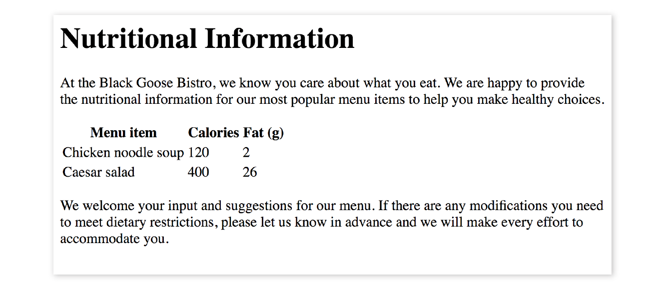
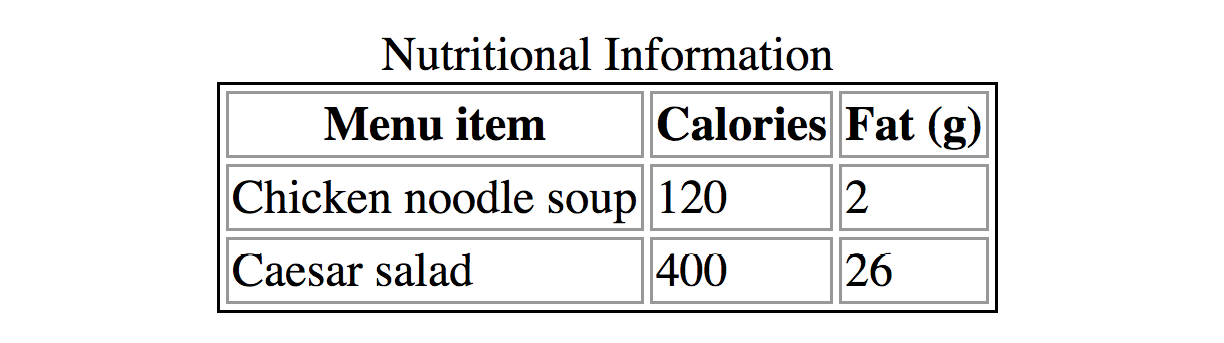
Let’s take a look at a simple table to see what it’s made of. Here is a small table with three rows and three columns that lists nutritional information.
|
Menu item |
Calories |
Fat (g) |
|
Chicken noodle soup |
120 |
2 |
|
Caesar salad |
400 |
26 |
Figure 8-2 reveals the structure of this table according to the HTML table model. All of the table’s content goes into cells that are arranged into rows. Cells contain either header information (titles for the columns, such as “Calories”) or data, which may be any sort of content.
Simple enough, right? Now let’s look at how those parts translate into elements (Figure 8-3).
Figure 8-3 shows the elements that identify the table (table), rows (tr, for “table row”), and cells (th, for “table headers,” and td, for “table data”). Cells are the heart of the table, because that’s where the actual content goes. The other elements just hold things together.
What we don’t see are column elements. The number of columns in a table is implied by the number of cells in each row. This is one of the things that make HTML tables potentially tricky. Rows are easy—if you want the table to have three rows, just use three tr elements. Columns are different. For a table with four columns, you need to make sure that every row has four td or th elements. (There’s more to the column story, which I cover in the section “Row and Column Groups” later in this chapter.)
Written out in a source document, the markup for the table in Figure 8-3 looks like the following sample. It is common to stack the th and td elements in order to make them easier to find in the source. This does not affect how the browser renders them.
<table> <tr> <th>Menu item</th> <th>Calories</th> <th>Fat (g)</th> </tr> <tr> <td>Chicken noodle soup</td> <td>120</td> <td>2</td> </tr> <tr> <td>Caesar salad</td> <td>400</td> <td>26</td> </tr> </table>
Remember, all the content must go in cells—that is, within td or th elements. You can put any content in a cell: text, a graphic, or even another table.
Start and end table tags identify the beginning and end of the tabular material. The table element may directly contain only some number of tr (row) elements, a caption and, optionally, the row and column group elements listed in the “Row and Column Groups” section. The only thing that can go in the tr element is some number of td or th elements. In other words, there may be no text content within the table and tr elements that isn’t contained within a td or th.
Finally, Figure 8-4 shows how the table would look in a simple web page, as displayed by default in a browser. I know it’s not exciting. Excitement happens in the CSS. What is worth noting is that tables always start on new lines by default in browsers.
Here is the source for another table. Can you tell how many rows and columns it will have when it is displayed in a browser?
<table> <tr> <th>Burgers</th> <td>Organic Grass-fed Beef</td> <td>Black Bean Veggie</td> </tr> <tr> <th>Fries</th> <td>Hand-cut Idaho potato</td> <td>Seasoned sweet potato</td> </tr></table>
If you guessed that it’s a table with two rows and three columns, you are correct! Two tr elements create two rows; one th and two td elements in each row create three columns.
Table Headers
As you can see in Figure 8-4, the text marked up as headers (th elements) is displayed differently from the other cells in the table (td elements). The difference, however, is not purely cosmetic. Table headers are important because they provide information or context about the cells in the row or column they precede. The th element may be handled differently than tds by alternative browsing devices. For example, screen readers may read the header aloud before each data cell (“Menu item: Caesar salad, Calories: 400, Fat-g: 26”).
In this way, headers are a key tool for making table content accessible. Don’t try to fake them by formatting a row of td elements differently than the rest of the table. Conversely, don’t avoid using th elements because of their default rendering (bold and centered). Instead, mark up the headers semantically and change the presentation later with a style rule.
That covers the basics. Before we get fancier, try your hand at Exercise 8-1.
Exercise 8-1. Making a simple table
<style> td, th { border: 1px solid gray;} </style>
Spanning Cells
One fundamental feature of table structure is cell spanning, which is the stretching of a cell to cover several rows or columns. Spanning cells allows you to create complex table structures, but it has the side effect of making the markup a little more difficult to keep track of. It can also make it potentially more difficult for users with screen readers to follow.
You make a header or data cell span by adding the colspan or rowspan attributes, as we’ll discuss next.
Column Spans
Column spans, created with the colspan attribute in the td or th element, stretch a cell to the right to span over the subsequent columns (Figure 8-6). Here a column span is used to make a header apply to two columns (I’ve added a border around the cells to reveal the structure of the table in the screenshot).
<table> <tr> <th colspan="2">Fat</th> </tr> <tr> <td>Saturated Fat (g)</td> <td>Unsaturated Fat (g)</td> </tr></table>
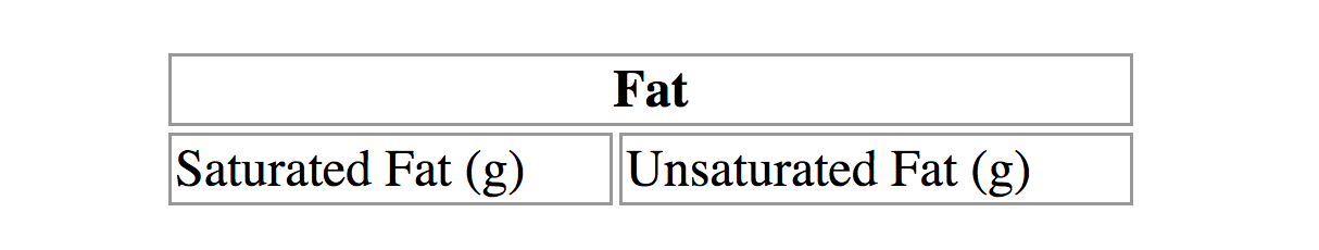
Notice in the first row (tr) that there is only one th element, while the second row has two td elements. The th for the column that was spanned over is no longer in the source; the cell with the colspan stands in for it. Every row should have the same number of cells or equivalent colspan values. For example, there are two td elements and the colspan value is 2, so the implied number of columns in each row is equal.
WARNING
Be careful with values. If you specify a number that exceeds the number of columns in the table, browsers add columns to the existing table, which typically screws things up.
Try your hand at column spanning in Exercise 8-2.
exercise 8-2. Column spans
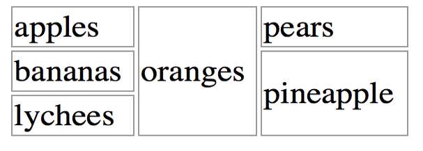
Row Spans
Row spans, created with the rowspan attribute, work just like column spans, but they cause the cell to span downward over several rows. In this example, the first cell in the table spans down three rows (Figure 8-8).
<table> <tr> <th rowspan="3">Serving Size</th> <td>Small (8oz.)</td> </tr> <tr> <td>Medium (16oz.)</td> </tr> <tr> <td>Large (24oz.)</td> </tr></table>
Again, notice that the td elements for the cells that were spanned over (the first cells in the remaining rows) do not appear in the source. The rowspan="3" implies cells for the subsequent two rows, so no td elements are needed.
If you loved spanning columns, you’ll love spanning rows in Exercise 8-3.

exercise 8-3. Row spans
Space in and Between Cells
By default, tables expand just enough to fit the content of the cells, which can look a little cramped. Old versions of HTML included cellpadding and cellspacing attributes for adding space within and between cells, but they have been kicked out of HTML5 as they are obsolete, presentational markup.The proper way to adjust table cell spacing is with style sheets, of course. The “Styling Tables” section in Chapter 19, More CSS Techniques addresses cell spacing.
Table Accessibility
As a web designer, it is important that you always keep in mind how your site’s content is going to be used by visitors with impaired sight. It is especially challenging to make sense of tabular material by using a screen reader, but the HTML specification provides measures to improve the experience and make your content more understandable.
Describing Table Content
<caption>…</caption>
Title or description to be displayed with the table
The most effective way to give sight-impaired users an overview of your table is to give it a title or description with the caption element. Captions display next to the table (generally, above it) and can be used to describe the table’s contents or provide hints on how it is structured.
When used, the caption element must be the first thing within the table element, as shown in this example, which adds a caption to the nutritional chart from earlier in the chapter:
<table><caption>Nutritional Information</caption><tr> <th>Menu item</th> <th>Calories</th> <th>Fat (g)</th> </tr> <!-- table continues --> </table>
The caption is displayed above the table by default, as shown in Figure 8-10, although you can use a style sheet property to move it below the table (caption-side: bottom).
For longer descriptions, you could consider putting the table in a figure element and using the figcaption element for the description. The HTML5 specification has a number of suggestions for providing table descriptions (www.w3.org/TR/html5/tabular-data.html#table-descriptions-techniques).
Connecting Cells and Headers
We discussed headers briefly as a straightforward method for improving the accessibility of table content, but sometimes it may be difficult to know which header applies to which cells. For example, headers may be at the left or right edge of a row rather than at the top of a column. And although it may be easy for sighted users to understand a table structure at a glance, for users hearing the data as text, the overall organization is not as clear. The scope and headers attributes allow authors to explicitly associate headers and their respective content.
scope
The scope attribute associates a table header with the row, column, group of rows (such as tbody), or column group in which it appears by using the values row, col, rowgroup, or colgroup, respectively. This example uses the scope attribute to declare that a header cell applies to the current row:
<tr> <th scope="row">Mars</th> <td>.95</td> <td>.62</td> <td>0</td></tr>
Accessibility experts recommend that every th element contain a scope attribute to make its associated data explicitly clear.
headers
For really complicated tables in which scope is not sufficient to associate a table data cell with its respective header (such as when the table contains multiple spanned cells), the headers attribute is used in the td element to explicitly tie it to a header’s id value. In this example, the cell content “.38” is tied to the header “Diameter measured in earths”:
<thid="diameter">Diameter measured in earths</th><!-- many other cells --> <tdheaders="diameter">.38</td><!-- many other cells -->
Unfortunately, support of the id/headers feature is unreliable. The recommended best practice is to create tables in a way that a simple scope attribute will do the job.
Browser support alert
Although the advanced table features intended to improve accessibility have been in the specs for many years, support by screen readers and other assistive devices is unreliable at best. It is still recommended that you mark up your data semantically within table cells and that they make sense when read in order from the source, which is exactly how some of your visitors may encounter them.
This section is obviously only the tip of the iceberg of table accessibility. In-depth instruction on authoring accessible tables is beyond the scope of this beginner book. If you’d like to learn more, I recommend “Creating Accessible Tables” at WebAIM (webaim.org/techniques/tables/data) as an excellent starting point.
There is one more important set of elements for helping make the semantic structure of a table clear: row and column grouping elements.
Row and Column Groups
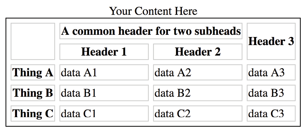
The sample tables we’ve been looking at so far in this chapter have been stripped down to their bare essentials to make the structure clear while you’re learning how tables work. But tables in the real world are not always so simple. Check out the beauty in Figure 8-11 from the CSS Writing Modes Level 3 spec. You can identify three groups of columns (one with headers, two with two columns each), and three groupings of rows (headers, data, and a footnote).
Conceptual table groupings like these are marked up with row group and column group elements that provide additional semantic structure and more “hooks” for styling or scripting. For example, the row and column groups in Figure 8-11 were styled with thicker borders to make them stand out visually.
Row Group Elements
<thead>…</thead>
Table header row group
<tbody>…</tbody>
Table body row group
<tfoot>…</tfoot>
Table footer row group
You can describe rows or groups of rows as belonging to a header, footer, or the body of a table by using the thead, tfoot, and tbody elements, respectively. Some user agents (another word for a browser) may repeat the header and footer rows on tables that span multiple pages. For example, the head and foot rows may print on every page of a multipage table. Authors may also use these elements to apply styles to various regions of a table.
Row group elements may only contain one or more tr elements. They contain no direct text content. The thead element should appear first, followed by any number of tbody elements, followed by an optional tfoot.
This is the row group markup for the table in Figure 8-11 (td and th elements are hidden to save space):
<table>…<thead><!-- headers in these rows--> <tr></tr> <tr></tr> <tr></tr><thead><tbody><!-- data --> <tr></tr> <tr></tr> <tr></tr> <tr></tr> <tr></tr> <tr></tr></tbody><tfoot><!-- footnote --> <tr></tr></tfoot></table>
Column Group Elements
<colgroup>…</colgroup>
A semantically related group of columns
<col>…</col>
One column in a column group
As you’ve learned, columns are implied by the number of cells (td or th) in each row. You can semantically group columns (and assign id and class values) using the colgroup element.
Column groups are identified at the start of the table, just after the caption if there is one, and they give the browser a little heads-up as to the column arrangement in the table. The number of columns a colgroup represents is specified with the span attribute. Here is the column group section at the beginning of the table in Figure 8-11:
<table> <caption>…</caption> <colgroup></colgroup> <colgroup span="2"></colgroup> <colgroup span="2"></colgroup>
<!-- rest of table... -->
That’s all there is to it. If you need to access individual columns within a colgroup for scripting or styling, identify them with col elements. The previous column group section could also have been written like this:
<colgroup></colgroup> <colgroup><col class="start"> <col class="end"></colgroup> <colgroup><col class="start"> <col class="end"></colgroup>
Note that the colgroup elements contain no content—they only provide an indication of semantically relevant column structure. The empty col elements are used as handles for scripts or styles, but are not required.
Wrapping Up Tables
This chapter gave you a good overview of the components of HTML tables. Exercise 8-4 combines most of what we’ve covered to give you a little more practice at authoring tables.
exercise 8-4. The table challenge
Test Yourself
The answers to these questions appear in Appendix A.
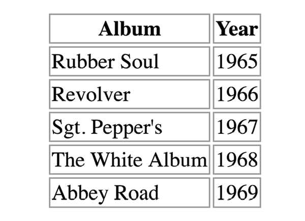
- What are the parts (elements) of a basic HTML table?
- What elements can a table contain directly (i.e., first-level children)?
- What elements can a tr contain?
- When would you use the col (column) element?
- Find five errors in this table markup:
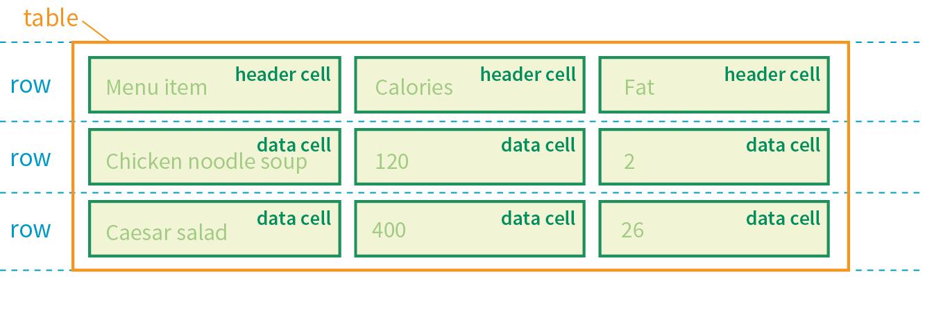
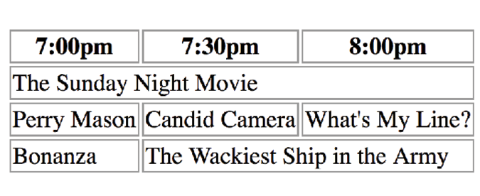
<caption>Primetime Television 1965</caption><table> Thursday Night <tr></tr> <th>7:30</th> <th>8:00</th> <th>8:30</th> <tr> <td>Shindig</td> <td>Donna Reed Show</td> <td>Bewitched</td> <tr> <colspan="2">Laredo</colspan> <td>Daniel Boone</td> </tr></table>
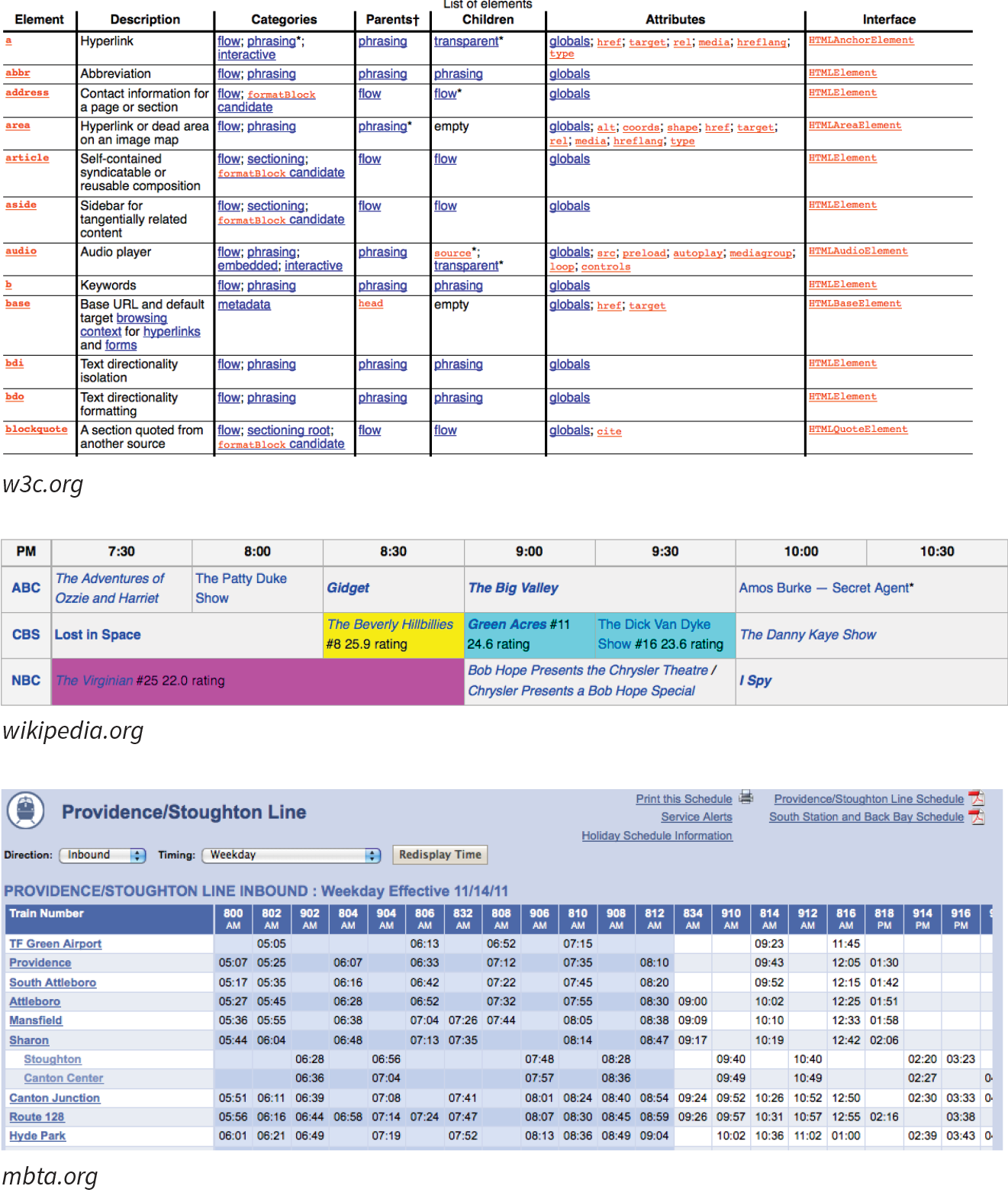
Element Review: Tables
The following is a summary of the elements we covered in this chapter.