Table of Contents for
Learning Web Design, 5th Edition
 Learning Web Design, 5th Edition
Published by
O'Reilly Media, Inc., 2018
Learning Web Design, 5th Edition
Published by
O'Reilly Media, Inc., 2018
- cover
- Learning Web Design, Fifth Edition
- lwd5_title_copy
- lwd5_title_copy-1
- lwd5_contents
- Foreword
- Preface
- Part I. Getting Started
- 2. How the Web Works
- 3. Some Big Concepts You Need to Know
- Part II. HTML for STRUCTURE
- 5. Marking Up Text
- 6. Adding Links
- 7. Adding Images
- 8. Table Markup
- 9. Forms
- 10. Embedded Media
- Part III. CSS for Presentation
- 12. Formatting Text
- 13. Colors and Backgrounds
- 14. Thinking Inside the Box
- 15. Floating and Positioning
- 16. CSS Layout with Flexbox and Grid
- 17. Responsive Web Design
- 18. Transitions, Transforms, and Animation
- 19. More CSS Techniques
- 20. Modern Web Development Tools
- Part IV. JavaScript for Behavior
- 22. Using JavaScript
- Part V. Web Images
- 24. Image Asset Production
- 25. SVG
- Part VI. Appendices
- B. HTML5 Global Attributes
- C. CSS Selectors, Levels 3 and 4
- D. From HTML+ to HTML5
9
In This Chapter
How forms work
Elements for adding form widgets
Making forms accessible
Form design basics
It didn’t take long for the web to shift from a network of pages to read to a place where you go to get things done—making purchases, booking plane tickets, signing petitions, searching a site, posting a tweet…the list goes on! Web forms handle all of these interactions.
In fact, in response to this shift from page to application, HTML5 introduced a bonanza of new form controls and attributes that make it easier for users to fill out forms and for developers to create them. Tasks that have traditionally relied on JavaScript may be handled by markup and native browser behavior alone. HTML5 introduces a number of new form-related elements, 12 new input types, and many new attributes (they are listed in Table 9-1 at the end of this chapter). Some of these features are waiting for browser implementation to catch up, so I will be sure to note which controls may not be universally supported.
This chapter introduces web forms, how they work, and the markup used to create them. I’ll also briefly discuss the importance of web form design.
How Forms Work
There are two parts to a working form. The first part is the form that you see on the page itself that is created using HTML markup. Forms are made up of buttons, input fields, and drop-down menus (collectively known as form controls) used to collect information from the user. Forms may also contain text and other elements.
The other component of a web form is an application or script on the server that processes the information collected by the form and returns an appropriate response. It’s what makes the form work. In other words, posting an HTML document with form elements isn’t enough. Web applications and scripts require programming know-how that is beyond the scope of this book, but the “Getting Your Forms to Work” sidebar, later in this chapter, provides some options for getting the scripts you need.
From Data Entry to Response
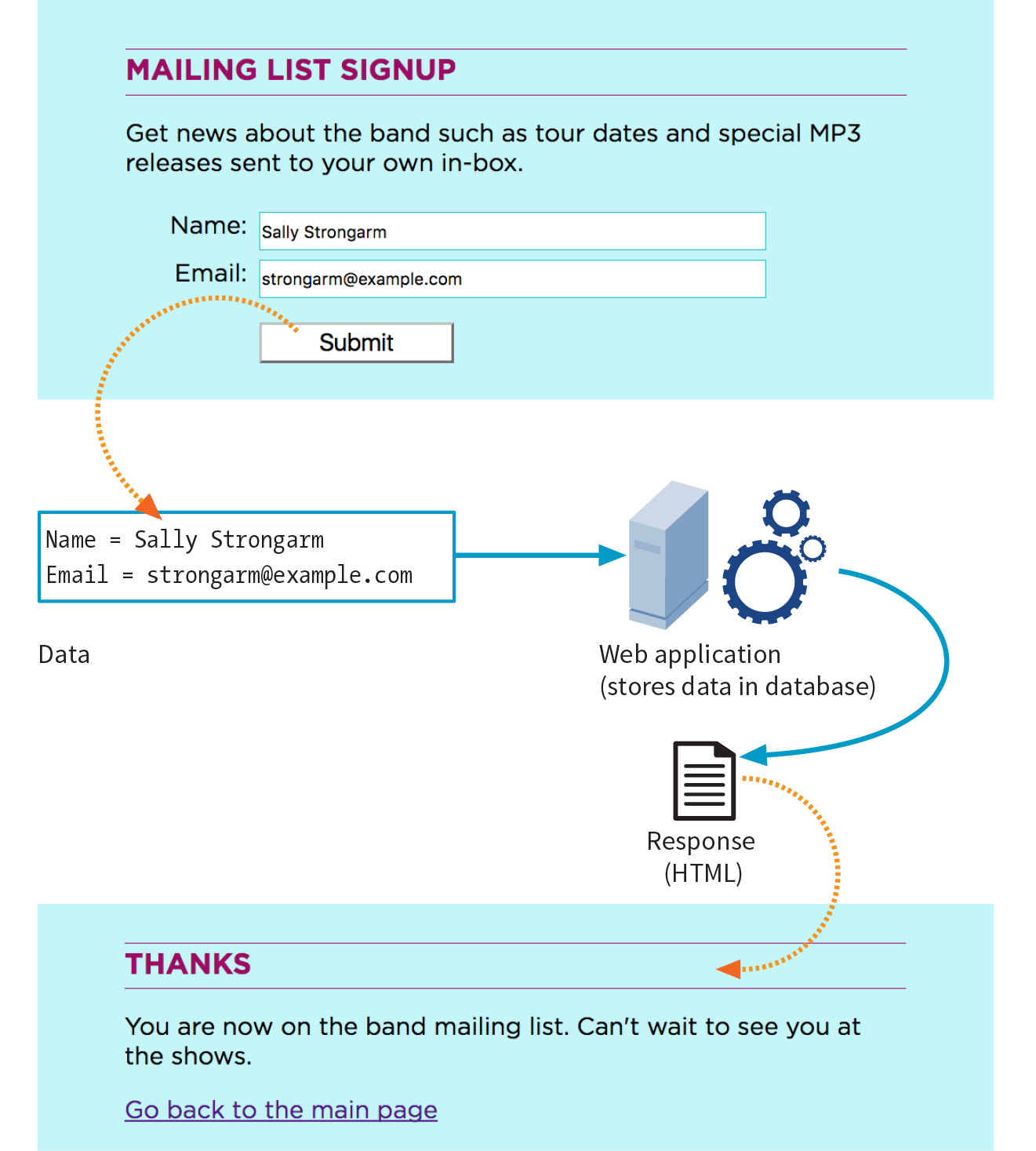
If you are going to be creating web forms, it is beneficial to understand what is happening behind the scenes. This example traces the steps of a transaction using a simple form that gathers names and email addresses for a mailing list; however, it is typical of the process for many forms.
- Your visitor—let’s call her Sally—opens the page with a web form in the browser window. The browser sees the form control elements in the markup and renders them with the appropriate form controls on the page, including two text-entry fields and a Submit button (shown in Figure 9-1).
- Sally would like to sign up for this mailing list, so she enters her name and email address into the fields and submits the form by hitting the Submit button.
- The browser collects the information she entered, encodes it (see the sidebar ), and sends it to the web application on the server.
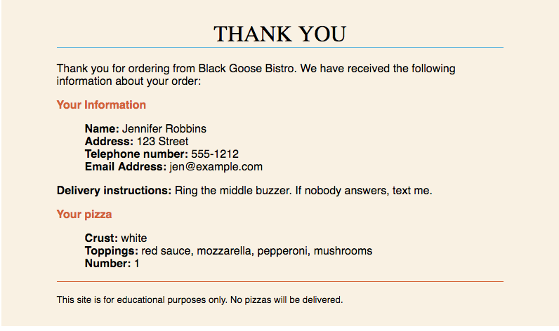
- The web application accepts the information and processes it (that is, does whatever it is programmed to do with it). In this example, the name and email address are added to a mailing list database.
- The web application also returns a response. The kind of response sent back depends on the content and purpose of the form. Here, the response is a simple web page saying thank you for signing up for the mailing list. Other applications might respond by reloading the form page with updated information, by moving the user on to another related form page, or by issuing an error message if the form is not filled out correctly, to name only a few examples.
- The server sends the web application’s response back to the browser, where it is displayed. Sally can see that the form worked and that she has been added to the mailing list.
The form Element
<form>…</form>
Interactive form
Forms are added to web pages with (no surprise here) the form element. The form element is a container for all the content of the form, including some number of form controls, such as text-entry fields and buttons. It may also contain block elements (h1, p, and lists, for example). However, it may not contain another form element.
This sample source document contains a form similar to the one shown in Figure 9-1:
<!DOCTYPE html><html><head> <title>Mailing List Signup</title> <meta charset="utf-8"></head><body> <h1>Mailing List Signup</h1><form action="/mailinglist.php" method="POST"><fieldset> <legend>Join our email list</legend> <p>Get news about the band such as tour dates and special MP3 releases sent to your own in-box.</p> <ol> <li><label for="firstlast">Name:</label> <input type="text" name="fullname" id="firstlast"></li> <li><label for="email">Email:</label> <input type="text" name="email" id="email"></li> </ol> <input type="submit" value="Submit"> </fieldset></form></body></html>
NOTE
It is current best practice to wrap form controls in semantic HTML elements such as lists or s. Ordered lists, as shown in this example, are a popular solution, but know that there are often default styles that you’ll need to clear out before styling them, particularly on mobile browsers. The , , and elements used in the example improve accessibility. They are explained later in this chapter.
In addition to being a container for form control elements, the form element has some attributes that are necessary for interacting with the form processing program on the server. Let’s take a look at each.
The action Attribute
The action attribute provides the location (URL) of the application or script that will be used to process the form. The action attribute in this example sends the data to a script called mailinglist.php:
<form action="/mailinglist.php" method="POST">...</form>
The .php suffix indicates that this form is processed by a script written in the PHP scripting language, but web forms may be processed by any of the following technologies:
- PHP (.php) is an open source scripting language most commonly used with the Apache web server. It is the most popular and widely supported forms processing option.
- Microsoft ASP (Active Server Pages; .asp) is a programming environment for the Microsoft Internet Information Server (IIS).
- Microsoft’s ASP.NET (Active Server Page; .aspx) is a newer Microsoft language that was designed to compete with PHP.
- Ruby on Rails. Ruby is the programming language that is used with the Rails platform. Many popular web applications are built with it.
- JavaServer Pages (.jsp) is a Java-based technology similar to ASP.
- Python is a popular scripting language for web and server applications.
There are other form-processing options that may have their own suffixes or none at all (as is the case for the Ruby on Rails platform). Check with your programmer, server administrator, or script documentation for the proper name and location of the program to be provided by the action attribute (see Web Hosting Tip).
Sometimes there is form processing code such as PHP embedded right in the HTML file. In that case, leave the action empty, and the form will post to the page itself.
The method Attribute
The method attribute specifies how the information should be sent to the server. Let’s use this data gathered from the sample form in Figure 9-1 as an example.
fullname = Sally Strongarm email = strongarm@example.com
When the browser encodes that information for its trip to the server, it looks like this (see the earlier sidebar if you need a refresher on encoding):
fullname=Sally+Strongarm&email=strongarm%40example.com
There are only two methods for sending this encoded data to the server: POST or GET, indicated by the method attribute in the form element. The method is optional and will default to GET if omitted. We’ll look at the difference between the two methods in the following sections. Our example uses the POST method, as shown here:
<form action="/mailinglist.php" method="POST">...</form>
The GET method
With the GET method, the encoded form data gets tacked right onto the URL sent to the server. A question mark character separates the URL from the following data, as shown here:
get http://www.bandname.com/mailinglist.php?name=Sally+Strongarm&email=strongarm%40example.com
GET is inappropriate if the form submission performs an action, such as deleting something or adding data to a database, because if the user goes back, it gets submitted again.
The POST method
When the form’s method is set to POST, the browser sends a separate server request containing some special headers followed by the data. In theory, only the server sees the content of this request, and thus it is the best method for sending secure information such as a home address or other personal information. In practice, make sure HTTPS is enabled on your server so the user’s data is encrypted and inaccessible in transit. (HTTPS is discussed in Chapter 2, How the Web Works.)
The POST method is also preferable for sending a lot of data, such as a lengthy text entry, because there is no character limit as there is for GET.
The GET method is appropriate if you want users to be able to bookmark the results of a form submission (such as a list of search results). Because the content of the form is in plain sight, GET is not appropriate for forms with private personal or financial information. In addition, GET may not be used when the form is used to upload a file.
NOTE
POST and GET are not case-sensitive and are commonly listed in all uppercase by convention. In XHTML documents, however, the value of the attribute (post or get) must be provided in all lowercase letters.
In this chapter, we’ll stick with the more prevalent POST method. Now that we’ve gotten through the technical aspects of the form element, let’s turn our attention to form controls.
Variables and Content
Web forms use a variety of controls that allow users to enter information or choose between options. Control types include various text-entry fields, buttons, menus, and a few controls with special functions. They are added to the document with a collection of form control elements that we’ll be examining one by one in the upcoming “The Great Form Control Roundup” section.
As a web designer, you need to be familiar with control options to make your forms easy and intuitive to use. It is also useful to have an idea of what form controls are doing behind the scenes.
The name Attribute
The job of each form control is to collect one bit of information from a user. In the previous form example, text-entry fields collect the visitor’s name and email address. To use the technical term, “fullname” and “email” are two variables collected by the form. The data entered by the user (“Sally Strongarm” and “strongarm@example.com”) is the value or content of the variables.
All form controls (except submit and reset buttons) must include a name attribute.
The name attribute provides the variable name for the control. In this example, the text gathered by a textarea element is defined as the “comment” variable:
<textarea name="comment" rows="4" cols="45" placeholder="Leave us a comment."></textarea>
When a user enters a comment in the field (“This is the best band ever!”), it would be passed to the server as a name/value (variable/content) pair like this:
comment=This+is+the+best+band+ever%21
All form control elements must include a name attribute so the form processing application can sort the information. You may include a name attribute for submit and reset button elements, but they are not required, because they have special functions (submitting or resetting the form) not related to data collection.
Naming Your Variables
You can’t just name controls willy-nilly. The web application that processes the data is programmed to look for specific variable names. If you are designing a form to work with a preexisting application or script, you need to find out the specific variable names to use in the form so they are speaking the same language. You can get the variable names from the instructions provided with a ready-to-use script on your server, your system administrator, or the programmer you are working with.
If the script or application will be created later, be sure to name your variables simply and descriptively and to document them well. In addition, to avoid confusion, you are advised to name each variable uniquely—that is, don’t use the same name for two variables (however, there may be exceptions for which it is desirable). You should also avoid putting character spaces in variable names. Use an underscore or hyphen instead.
We’ve covered the basics of the form element and how variables are named. Now we can get to the real meat of form markup: the controls.
The Great Form Control Roundup
This is the fun part—playing with the markup that adds form controls to the page. This section introduces the elements used to create the following:
- Text-entry controls
- Specialized text-entry controls
- Submit and reset buttons
- Radio and checkbox buttons
- Pull-down and scrolling menus
- File selection and upload control
- Hidden controls
- Dates and times
- Numerical controls
- Color picker control
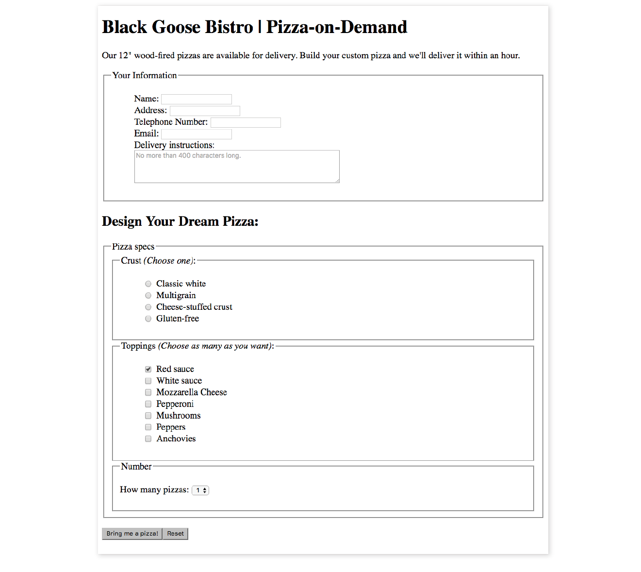
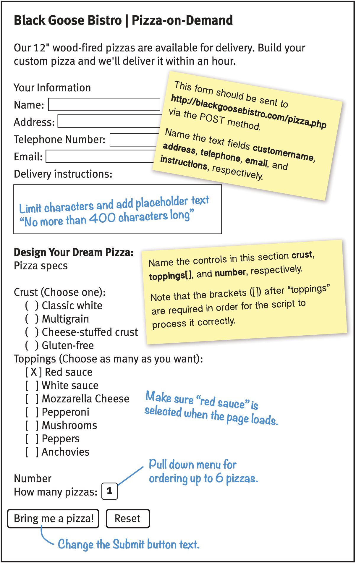
We’ll pause along the way to allow you to try them out by constructing the pizza ordering form shown in Figure 9-2.
As you will see, the majority of controls are added to a form via the input element. The functionality and appearance of the input element changes based on the value of the type attribute in the tag. In HTML5.2, there are twenty-two types of input controls. We’ll take a look at them all.
Note
The attributes associated with each input type are listed in Table 9-1 at the end of this chapter.
Text-Entry Controls
One of the most common web form tasks is entering text information. Which element you use to collect text input depends on whether users are asked to enter a single line of text (input) or multiple lines (textarea).
Be aware that if your form has text-entry fields, it needs to use the secure HTTPS protocol to protect the user-entered content while their data is in transit to the server (see the “HTTPS, the Secure Web Protocol” sidebar in for more information).
Single-line text field
<input type="text">
Single-line text-entry control
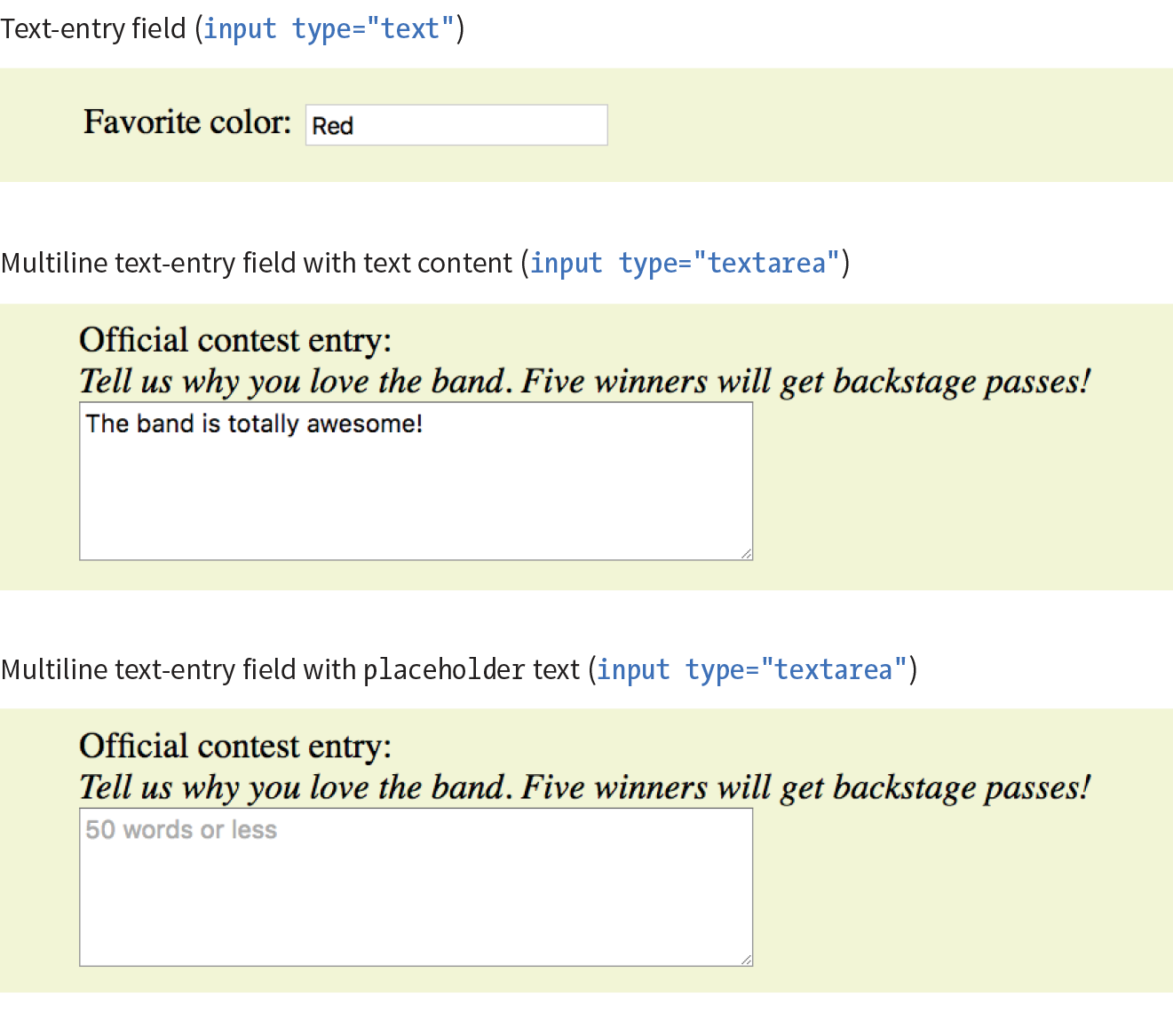
One of the most straightforward form input types is the text-entry field for entering a single word or line of text. In fact, it is the default input type, which means it is what you’ll get if you forget to include the type attribute or include an unrecognized value. Add a text input field to a form by inserting an input element with its type attribute set to text, as shown here and in Figure 9-3:
<li><label>Favorite color:<input type="text"name="favcolor" value="Red" maxlength="50"></label></li>
NOTE
The specific rendering style of form controls varies by operating system and browser version.
There are a few attributes in there that I’d like to point out:
name
The name attribute is required for indicating the variable name.
value
The value attribute specifies default text that appears in the field when the form is loaded. When you reset a form, it returns to this value. The value of the value attribute gets submitted to the server, so in this example, the value “Red” will be sent with the form unless the user changes it. As an alternative, you could use the placeholder attribute to provide a hint of what to type in the field, such as “My favorite color”. The value of placeholder is not submitted with the form, and is purely a user interface enhancement. You’ll see it in action in the upcoming section.
maxlength, minlength
By default, users can type an unlimited number of characters in a text field regardless of its size (the display scrolls to the right if the text exceeds the character width of the box). You can set a maximum character limit using the maxlength attribute if the form-processing program you are using requires it. The minlength attribute specifies the minimum number of characters.
size
The size attribute specifies the length of the input field in number of visible characters. It is more common, however, to use style sheets to set the size of the input area. By default, a text input widget displays at a size that accommodates 20 characters.
Multiline text-entry field
<textarea>…</textarea>
Multiline text-entry control
At times, you’ll want your users to be able to enter more than just one line of text. For these instances, use the textarea element, which is replaced by a multiline, scrollable text entry box when displayed by the browser (Figure 9-3).
Unlike the empty input element, you can put content between the opening and closing tags in the textarea element. The content of the textarea element shows up in the text box when the form is displayed in the browser. It also gets sent to the server when the form is submitted, so carefully consider what goes there.
<p><label>Official contest entry: <br><em>Tell us why you love the band. Five winners will get backstage passes!</em><br><textarea name="contest_entry" rows="5" cols="50">The band is totally awesome!</textarea></label></p>
The rows and cols attributes provide a way to specify the size of the textarea with markup. rows specifies the number of lines the text area should display, and cols specifies the width in number of characters (although it is more common to use CSS to specify the width of the field). Scrollbars will be provided if the user types more text than fits in the allotted space.
There are also a few attributes not shown in the example. The wrap attribute specifies whether the soft line breaks (where the text naturally wraps at the edge of the box) are preserved when the form is submitted. A value of soft (the default) does not preserve line breaks. The hard value preserves line breaks when the cols attribute is used to set the character width of the box. The maxlength and minlength attributes set the maximum and minimum number of characters that can be typed into the field.
It is not uncommon for developers to put nothing between the opening and closing tags, and provide a hint of what should go there with a placeholder attribute instead. Placeholder text, unlike textarea content, is not sent to the server when the form is submitted. Examples of textarea content and placeholder text are shown in Figure 9-3.
<p>Official contest entry:<br><em>Tell us why you love the band. Five winners will get backstage passes!</em><br><textarea name="contest_entry" placeholder="50 words or less" rows="5" cols="50"></textarea></p>
Specialized Text-Entry Fields
In addition to the generic single-line text entry, there are a number of input types for entering specific types of information such as passwords, search terms, email addresses, telephone numbers, and URLs.
Password entry field
<input type="password">
Password text control
A password field works just like a text-entry field, except the characters are obscured from view by asterisk (*) or bullet (•) characters, or another character determined by the browser.
It’s important to note that although the characters entered in the password field are not visible to casual onlookers, the form does not encrypt the information, so it should not be considered a real security measure.
Here is an example of the markup for a password field. Figure 9-4 shows how it might look after the user enters a password in the field.
<li><label for="form-pswd">Password:</label><br> <input type="password" name="pswd" maxlength="12" id="form-pswd"></li>

Search, email, telephone numbers, and URLs
<input type="search">
Search field
<input type="email">
Email address
<input type="tel">
Telephone number
<input type="url">
Location (URL)
Until HTML5, the only way to collect email addresses, telephone numbers, URLs, or search terms was to insert a generic text input field. In HTML5, the email, tel, url, and search input types give the browser a heads-up as to what type of information to expect in the field. These input types use the same attributes as the generic text input type described earlier (name, maxlength, minlength, size, and value), as well as a number of other attributes (see Table 9-1 at the end of the chapter).
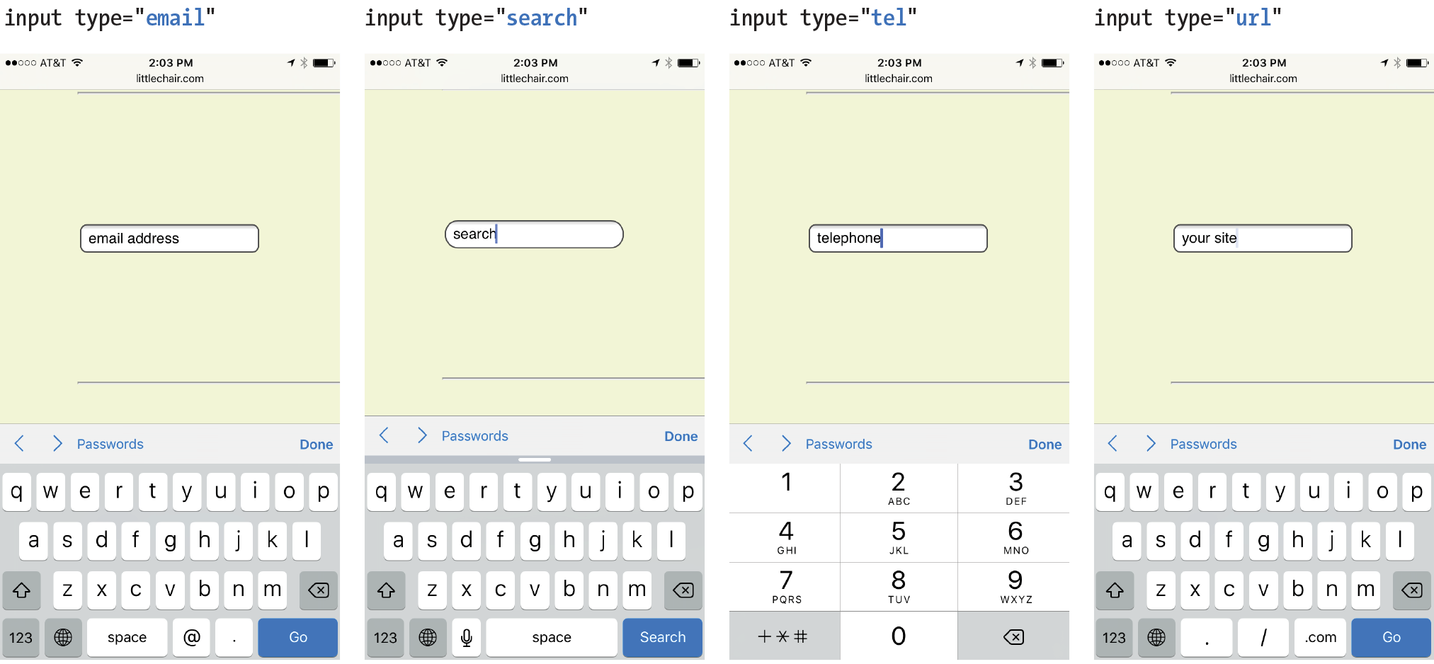
All of these input types are typically displayed as single-line text inputs. But browsers that support them can do some interesting things with the extra semantic information. For example, Safari on iOS uses the input type to provide a keyboard well suited to the entry task, such as the keyboard featuring a Search button for the search input type or a “.com” button when the input type is set to url (Figure 9-5). Browsers usually add a one-click “clear field” icon (usually a little X) in search fields. A supporting browser could check the user’s input to see that it is valid—for example, by making sure text entered in an email input follows the standard email address structure (in the past, you needed JavaScript for validation). For example, the Opera (Figure 9-6) and Chrome browsers display a warning if the input does not match the expected format.
Although email, search, telephone, and URL inputs are well supported by up-to-date browsers, there may be inconsistencies in the way they are handled. Older browsers, such as Opera Mini and any version of Internet Explorer prior to 11, do not recognize them at all, but will display the default generic text input instead, which works perfectly fine.
Warning
The values from form controls should be checked by the server code (PHP, ASP.NET, etc.), as they can be hacked or manipulated. So, although they make controlling and validating user input easier, it is still vital to perform server-side checks before updating the database on the server.

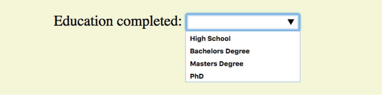
Drop-Down Suggestions
<datalist>…</datalist>
Drop-down menu input
<p>Education completed: <input type="text"list="edulevel"name="education"></p><datalist id="edulevel"><option value="High School"> <option value="Bachelors Degree"> <option value="Masters Degree"> <option value="PhD"></datalist>
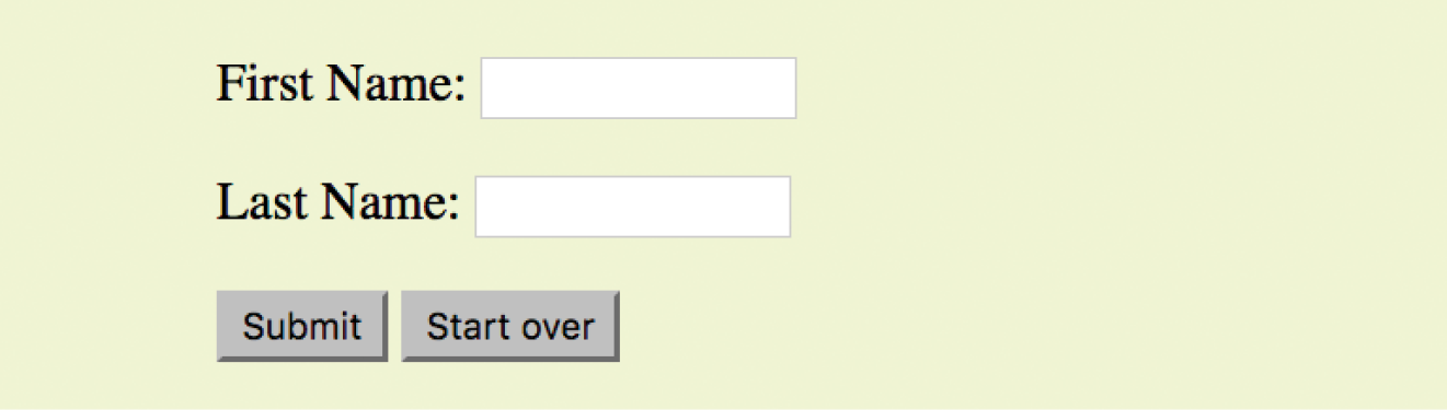
Submit and Reset Buttons
<input type="submit">
Submits the form data to the server
<input type="reset">
Resets the form controls to their default settings
There are several kinds of buttons that can be added to web forms. The most fundamental is the submit button. When clicked or tapped, the submit button immediately sends the collected form data to the server for processing. A reset button returns the form controls to the state they were in when the form initially loaded. In other words, resetting the form doesn’t simply clear all the fields.
Both submit and reset buttons are added via the input element. As mentioned earlier, because these buttons have specific functions that do not include the entry of data, they are the only form control elements that do not require the name attribute, although it is OK to add one if you need it.
Submit and reset buttons are straightforward to use. Just place them in the appropriate place in the form, which in most cases is at the very end. By default, the submit button displays with the label “Submit” or “Submit Query,” and the reset button is labeled “Reset.” You can change the text on the button by using the value attribute, as shown in the reset button in this example (Figure 9-8).
<p><inputtype="submit"> <inputtype="reset" value="Start over"></p>
The reset button is not used in forms as commonly as it used to be. That is because in contemporary form development, we use JavaScript to check the validity of form inputs along the way, so users get feedback as they go along. With thoughtful design and assistance, fewer users should get to the end of the form and need to reset the whole thing. Still, it is a good function to be aware of.
At this point, you know enough about form markup to start building the questionnaire shown in Figure 9-2.
Exercise 9-1 walks you through the first steps.
Exercise 9-1. Starting the pizza order form
Radio and Checkbox Buttons
Both checkbox and radio buttons make it simple for your visitors to choose from a number of provided options. They are similar in that they function like little on/off switches that can be toggled by the user and are added with the input element. They serve distinct functions, however.
A form control made up of a collection of radio buttons is appropriate when only one option from the group is permitted—in other words, when the selections are mutually exclusive (such as “Yes or No,” or “Pick-up or Delivery”). When one radio button is “on,” all of the others must be “off,” sort of the way buttons used to work on old radios: press one button in, and the rest pop out.
When checkboxes are grouped together, however, it is possible to select as many or as few from the group as desired. This makes them the right choice for lists in which more than one selection is OK.
Radio buttons
<input type="radio">
Radio button
Radio buttons are added to a form via the input element with the type attribute set to “radio.” Here is the syntax for a minimal radio button:
<input type="radio" name="variable" value="value">
The name attribute is required and plays an important role in binding multiple radio inputs into a set. When you give a number of radio button inputs the same name value (“age” in the following example), they create a group of mutually exclusive options.
In this example, radio buttons are used as an interface for users to enter their age group. A person can’t belong to more than one age group, so radio buttons are the right choice. Figure 9-11 shows how radio buttons are rendered in the browser.
<p>How old are you?</p><ol> <li><input type="radio" name="age"value="under24" checked> under 24</li> <li><input type="radio" name="age"value="25-34"> 25 to 34</li> <li><input type="radio" name="age"value="35-44"> 35 to 44</li> <li><input type="radio" name="age"value="over45"> 45+</li></ol>
Notice that all of the input elements have the same variable name (“age”), but their values are different. Because these are radio buttons, only one button can be checked at a time, and therefore, only one value will be sent to the server for processing when the form is submitted.
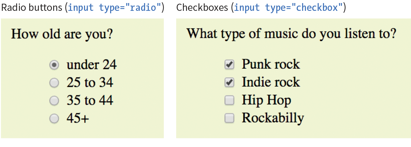
You can decide which button is checked when the form loads by adding the checked attribute to the input element (see Note). In this example, the button next to “under 24” will be checked when the page loads.
NOTE
It may look like the attribute has no value, but it is one of the attributes in HTML that can be to one word. Behind the scenes, the minimized attribute stands for the rather redundant:
checked="checked"
One of the rules of the stricter XHTML syntax is that attributes cannot be minimized in this way.
Checkbox buttons
<input type="checkbox">
Checkbox button
Checkboxes are added via the input element with its type set to checkbox. As with radio buttons, you create groups of checkboxes by assigning them the same name value. The difference, as we’ve already noted, is that more than one checkbox may be checked at a time. The value of every checked button will be sent to the server when the form is submitted. Here’s an example of a group of checkbox buttons used to indicate musical interests; Figure 9-11 shows how they look in the browser:
<p>What type of music do you listen to?</p><ul> <li><input type="checkbox" name="genre"value="punk" checked> Punk rock</li> <li><input type="checkbox" name="genre"value="indie" checked> Indie rock</li> <li><input type="checkbox" name="genre"value="hiphop"> Hip Hop</li> <li><input type="checkbox" name="genre"value="rockabilly"> Rockabilly</li></ul>
Checkboxes don’t necessarily need to be used in groups, of course. In this example, a single checkbox is used to allow visitors to opt in to special promotions. The value of the control will be passed along to the server only if the user checks the box.
<p><input type="checkbox" name="OptIn" value="yes"> Yes, send me news and special promotions by email.</p>
Checkbox buttons also use the checked attribute to make them preselected when the form loads.
In Exercise 9-2, you’ll get a chance to add both radio and checkbox buttons to the pizza ordering form.
exercise 9-2. Adding radio buttons and checkboxes
Menus
<select>…</select>
Menu control
<option>…</option>
An option within a menu
<optgroup>…</optgroup>
A logical grouping of options within a menu
Another way to provide a list of choices is to put them in a drop-down or scrolling menu. Menus tend to be more compact than groups of buttons and checkboxes.
You add both drop-down and scrolling menus to a form with the select element. Whether the menu pulls down or scrolls is the result of how you specify its size and whether you allow more than one option to be selected. Let’s take a look at both menu types.
Drop-down menus
The select element displays as a drop-down menu (also called a pull-down menu) by default when no size is specified or if the size attribute is set to 1. In pull-down menus, only one item may be selected. Here’s an example (shown in Figure 9-12):
<p>What is your favorite 80s band?<select name="EightiesFave"><option>The Cure</option> <option>Cocteau Twins</option> <option>Tears for Fears</option> <option>Thompson Twins</option> <optionvalue="EBTG">Everything But the Girl</option> <option>Depeche Mode</option> <option>The Smiths</option> <option>New Order</option></select></p>
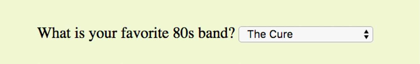
You can see that the select element is just a container for a number of option elements. The content of the chosen option element is what gets passed to the web application when the form is submitted. If, for some reason, you want to send a different value than what appears in the menu, use the value attribute to provide an overriding value. For example, if someone selects “Everything But the Girl” from the sample menu, the form submits the value “EBTG” for the “EightiesFave” variable. For the others, the content between the option tags will be sent as the value.
Scrolling menus
To make the menu display as a scrolling list, simply specify the number of lines you’d like to be visible using the size attribute. This example menu has the same options as the previous one, except it has been set to display as a scrolling list that is six lines tall (Figure 9-13):
<p>What 80s bands did you listen to?<select name="EightiesBands" size="6" multiple><option>The Cure</option> <option>Cocteau Twins</option> <optionselected>Tears for Fears</option> <optionselected>Thompson Twins</option> <option value="EBTG">Everything But the Girl</option> <option>Depeche Mode</option> <option>The Smiths</option> <option>New Order</option></select></p>
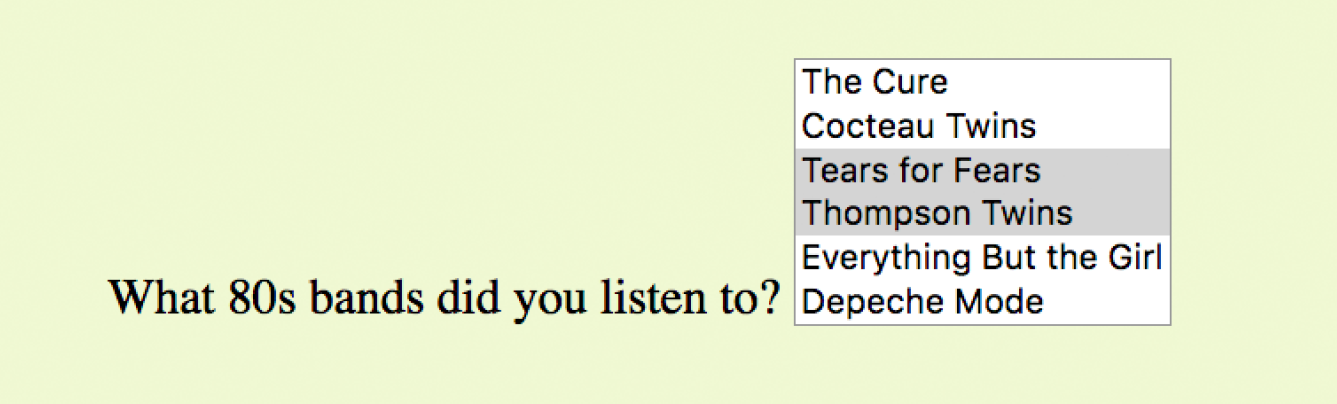
You may notice a few minimized attributes tucked in there. The multiple attribute allows users to make more than one selection from the scrolling list. Note that pull-down menus do not allow multiple selections; when the browser detects the multiple attribute, it displays a small scrolling menu automatically by default.
Use the selected attribute in an option element to make it the default value for the menu control. Selected options are highlighted when the form loads. The selected attribute can be used with pull-down menus as well.
Grouping menu options
You can use the optgroup element to create conceptual groups of options. The required label attribute provides the heading for the group (see Note). Figure 9-14 shows how option groups are rendered in modern browsers.
<select name="icecream" size="7" multiple><optgroup label="traditional"><option>vanilla</option> <option>chocolate</option></optgroup> <optgroup label="fancy"><option>Super praline</option> <option>Nut surprise</option> <option>Candy corn</option></optgroup></select>

In Exercise 9-3, you will use the select element to let Black Goose Bistro customers choose a number of pizzas for their order.
Exercise 9-3. Adding a menu
File Selection Control
<input type="file">
File selection field
Web forms can collect more than just data. They can also be used to transmit external documents from a user’s hard drive. For example, a printing company could use a web form to upload artwork for a business card order. A magazine could use a form to collect digital photos for a photo contest.
The file selection control makes it possible for users to select a document from the hard drive to be submitted with the form data. We add it to the form by using our old friend, the input element, with its type set to file.
The markup sample here (Figure 9-15) shows a file selection control used for photo submissions:
<form action="/client.php" method="POST"enctype="multipart/form-data"> <label>Send a photo to be used as your online icon <em>(optional) </em><br><input type="file" name="photo"></label></form>
The file upload widget varies slightly by browser and operating system, but it is generally a button that allows you to access the file organization system on your computer (Figure 9-15).
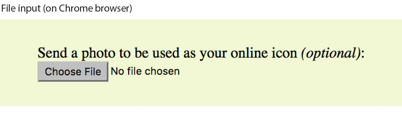
It is important to note that when a form contains a file selection input element, you must specify the encoding type (enctype) as multipart/form-data in the form element and use the POST method.
The file input type has a few attributes. The accept attribute gives the browser a heads-up on what file types may be accepted (audio, video, image, or some other format identified by its media type). Adding the multiple attributes allows multiple files to be selected for upload. The required attribute, as it says, requires a file to be selected.
Hidden Controls
<input type="hidden">
Hidden control field
There may be times when you need to send information to the form processing application that does not come from the user. In these instances, you can use a hidden form control that sends data when the form is submitted, but is not visible when the form is displayed in a browser.
Hidden controls are added via the input element with the type set to hidden. Its sole purpose is to pass a name/value pair to the server when the form is submitted. In this example, a hidden form element is used to provide the location of the appropriate thank-you document to display when the transaction is complete:
<input type="hidden" name="success-link" value="http://www.example.com/ thankyou.html">
I’ve worked with forms that have had dozens of hidden controls in the form element before getting to the parts that the user actually fills out. This is the kind of information you get from the application programmer, system administrator, or whoever is helping you get your forms processed. If you are using an existing script, be sure to check the accompanying instructions to see if any hidden form variables are required.
Warning
It is possible for users to access and manipulate hidden form controls. If you should become a professional web developer, you will learn to program defensively for this sort of thing.
Date and Time Controls
<input type="date">
Date input control
<input type="time">
Time input control
<input type="datetime-local">
Date/time control
<input type="month">
Specifies a month in a year
<input type="week">
Specifies a particular week in a year
If you’ve ever booked a hotel or a flight online, you’ve no doubt used a little calendar widget for choosing the date. Chances are, that little calendar was created with JavaScript. HTML5 introduced six new input types that make date and time selection widgets part of a browser’s standard built-in display capabilities, just as they can display checkboxes, pop-up menus, and other widgets today. As of this writing, the date and time pickers are implemented on only a few browsers (Chrome, Microsoft Edge, Opera, Vivaldi, and Android), but on non-supporting browsers, the date and time input types display as a perfectly usable text-entry field instead. Figure 9-16 shows date and time widgets as rendered in Chrome on macOS.
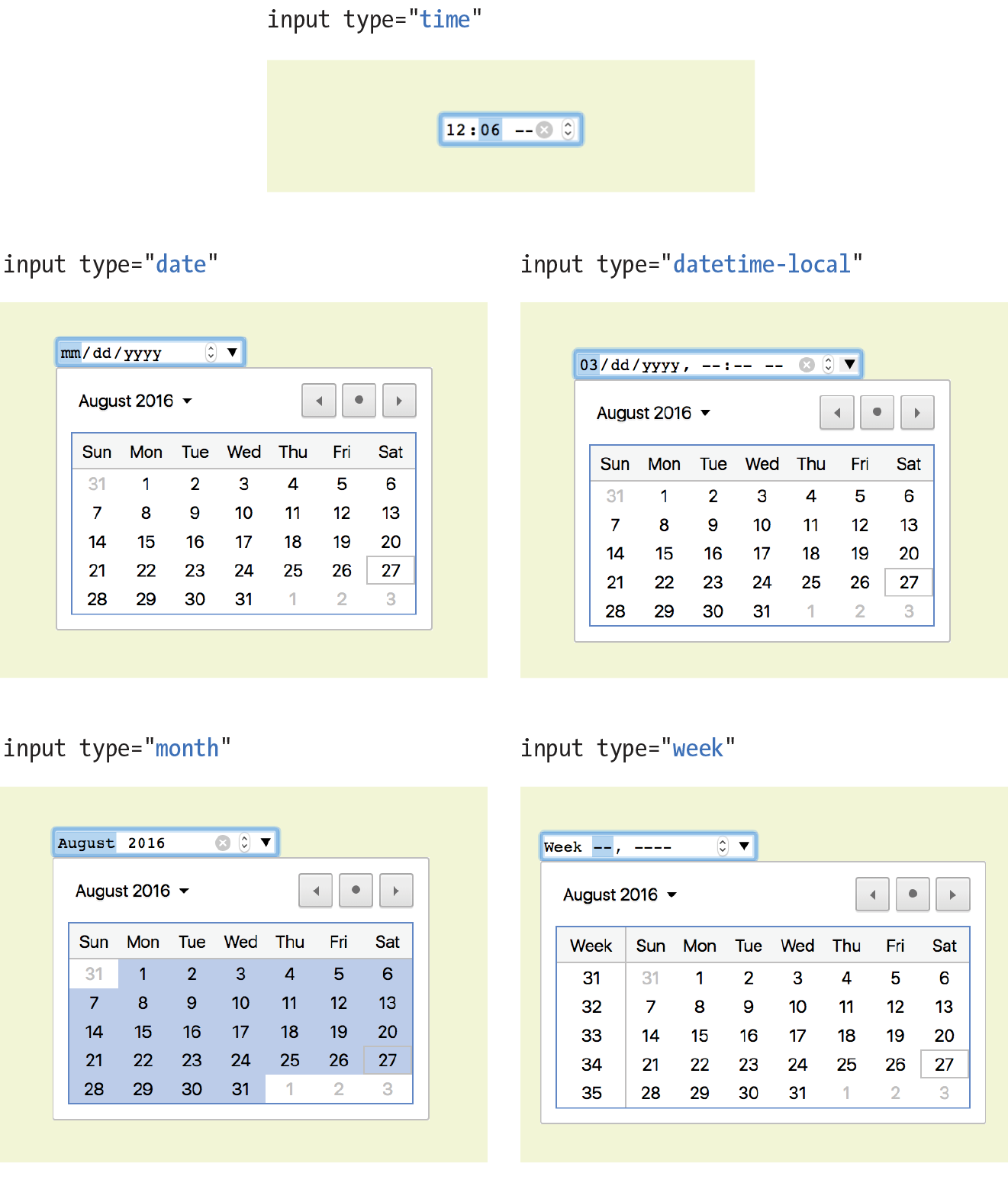
The new date- and time-related input types are as follows:
<input type="date" name="name" value="2017-01-14">
Creates a date input control, such as a pop-up calendar, for specifying a date (year, month, day). The initial value must be provided in ISO date format (YYYY-MM-DD).
<input type="time" name="name" value="03:13:00">
Creates a time input control for specifying a time (hour, minute, seconds, fractional sections) with no time zone indicated. The value is provided as hh:mm:ss.
<input type="datetime-local" name="name" value="2017-01-14T03:13:00">
Creates a combined date/time input control with no time zone information (YYYY-MM-DDThh:mm:ss).
<input type="month" name="name" value="2017-01">
Creates a date input control that specifies a particular month in a year (YYYY-MM).
<input type="week" name="name" value="2017-W2">
Creates a date input control for specifying a particular week in a year using an ISO week numbering format (YYYY-W#).
Numerical Inputs
<input type="number">
Number input
<input type="range">
Slider input
The number and range input types collect numerical data. For the number input, the browser may supply a spinner widget with up and down arrows for selecting a specific numerical value (a text input may display in user agents that don’t support the input type). The range input is typically displayed as a slider (Figure 9-17) that allows the user to select a value within a specified range:
<label>Number of guests <input type="number"name="guests" min="1" max="6"></label> <label>Satisfaction (0 to 10) <input type="range"name="satisfaction" min="0" max="10" step="1"></label>
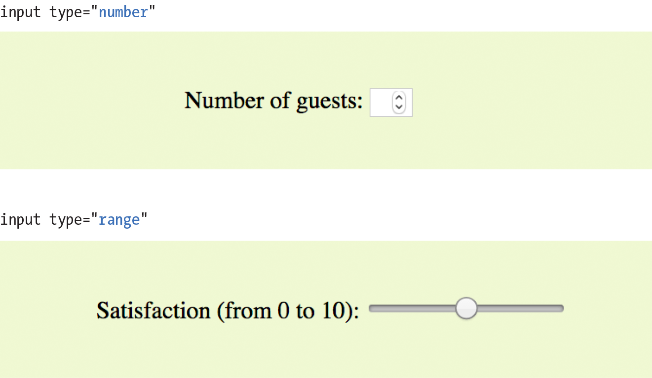
Both the number and range input types accept the min and max attributes for specifying the minimum and maximum values allowed for the input (again, the browser could check that the user input complies with the constraint). Both min and max are optional, and you can also set one without the other. Negative values are allowed. When the element is selected, the value can be increased or decreased with the number keys on a computer keyboard, in addition to being moved with the mouse or a finger.
The step attribute allows developers to specify the acceptable increments for numerical input. The default is 1. A value of “.5” would permit values 1, 1.5, 2, 2.5, and so on; a value of 100 would permit 100, 200, 300, and so on. You can also set the step attribute to any to explicitly accept any value increment.
These two elements allow for only the calculated step values, not for a specified list of allowed values (such as 1, 2, 3, 5, 8, 13, 21). If you need customized values, you need to use JavaScript to program that behavior.
Because these are newer elements, browser support is inconsistent. Some UI widgets include up and down arrows for increasing or decreasing the amount, but many don’t. Mobile browsers (iOS Safari, Android, Chrome for Android) currently do not support min, max, and step. Internet Explorer 9 and earlier do not support number and range inputs at all. Again, browsers that don’t support these new input types display a standard text input field instead, which is a fine fallback.
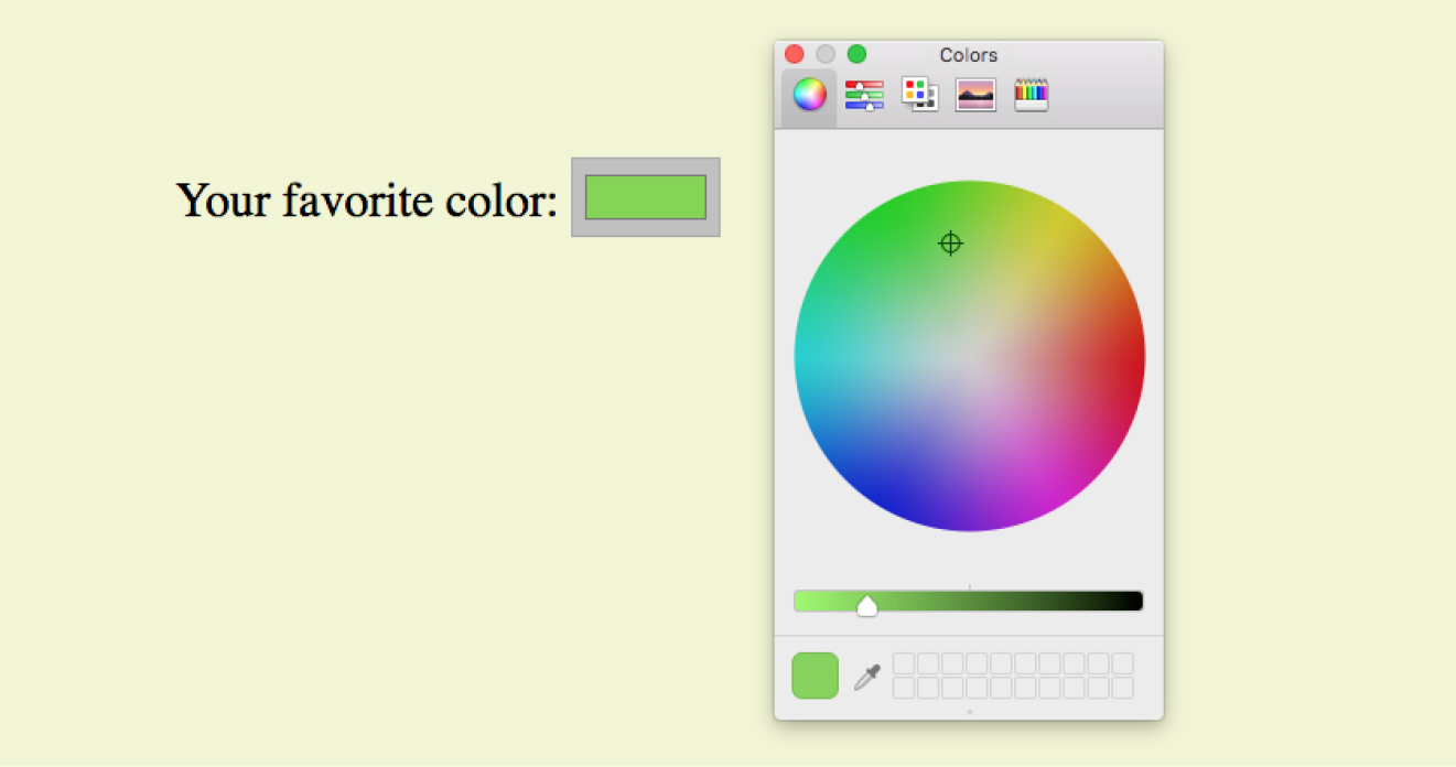
Color Selector
<input type="color">
Color picker
The intent of the color control type is to create a pop-up color picker for visually selecting a color value similar to those used in operating systems or image-editing programs. Values are provided in hexadecimal RGB values (#RRGGBB). Figure 9-18 shows the color picker in Chrome on macOS (it is the same as the macOS color picker). Non-supporting browsers—currently all versions of IE, iOS Safari, and older versions of Android—display the default text input instead.
<label>Your favorite color: <input type="color" name="favorite"></label>
That wraps up the form control roundup. Learning how to insert form controls is one part of the forms production process, but any web developer worth her salt will take the time to make sure the form is as accessible as possible. Fortunately, there are a few things we can do in markup to describe the form’s structure.
Form Accessibility Features
It is essential to consider how users without the benefit of visual browsers will be able to understand and navigate through your web forms. The label, fieldset, and legend form elements improve accessibility by making the semantic connections between the components of a form clear. Not only is the resulting markup more semantically rich, but there are also more elements available to act as “hooks” for style sheet rules. Everybody wins!
Labels
<label>…</label>
Attaches information to form controls
Although we may see the label “Address” right next to a text field for entering an address in a visual browser, in the source, the label and field input may be separated. The label element associates descriptive text with its respective form field. This provides important context for users with speech-based browsers. Another advantage to using labels is that users can click or tap anywhere on them to select or focus the form control. Users with touch devices will appreciate the larger tap target.
Each label element is associated with exactly one form control. There are two ways to use it. One method, called implicit association, nests the control and its description within a label element. In the following example, labels are assigned to individual checkboxes and their related text descriptions. (By the way, this is the way to label radio buttons and checkboxes. You can’t assign a label to the entire group.)
<ul> <li><label><input type="checkbox" name="genre" value="punk"> Punk rock</label></li> <li><label><input type="checkbox" name="genre" value="indie"> Indie rock</label></li> <li><label><input type="checkbox" name="genre" value="hiphop"> Hip Hop</label></li> <li><label><input type="checkbox" name="genre" value="rockabilly"> Rockabilly</label></li></ul>
The other method, called explicit association, matches the label with the control’s id reference. The for attribute says which control the label is for. This approach is useful when the control is not directly next to its descriptive text in the source. It also offers the potential advantage of keeping the label and the control as two distinct elements, which you may find handy when aligning them with style sheets.
<label for="form-login-username">Login account</label><input type="text" name="login"id="form-login-username"><label for="form-login-password">Password</label><input type="password" name="password"id="form-login-password">
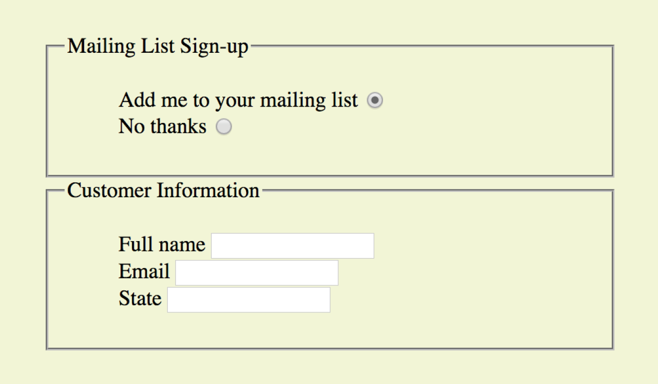
fieldset and legend
<fieldset>…</fieldset
Groups related controls and labels
<legend>…</legend>
Assigns a caption to a fieldset
The fieldset element indicates a logical group of form controls. A fieldset may also include a legend element that provides a caption for the enclosed fields.
Figure 9-19 shows the default rendering of the following example, but you could use style sheets to change the way the fieldset and legend appear (see Warning):
WARNING
Fieldsets and legends tend to throw some curveballs when it comes to styling. For example, background colors in fieldsets are handled differently from browser to browser. Legends are unique in that their text doesn’t wrap. The solution is to put a or element in them and control presentation of the contained element without sacrificing accessibility. Be sure to do lots of testing if you style these form elements.
<fieldset> <legend>Mailing List Sign-up</legend><ul> <li><label>Add me to your mailing list <input type="radio" name="list" value="yes" checked></label></li> <li><label>No thanks <input type="radio" name="list" value="no"> </label></li> </ul></fieldset><fieldset><legend>Customer Information</legend><ul> <li><label>Full name: <input type="text" name="fullname"></label> </li> <li><label>Email: <input type="text" name="email"></label></li> <li><label>State: <input type="text" name="state"></label></li> </ul></fieldset>
In Exercise 9-4, we’ll wrap up the pizza order form by making it more accessible with labels and fieldsets.
Exercise 9-4. Labels and fieldsets
Form Layout and Design
I can’t close this chapter without saying a few words about form design, even though this chapter is about markup, not presentation.
Usable Forms
A poorly designed form can ruin a user’s experience on your site and negatively impact your business goals. Badly designed forms mean lost customers, so it is critical to get it right—both on the desktop and for small-screen devices with their special requirements. You want the path to a purchase or other action to be as frictionless as possible.
The topic of good web form design is a rich one that could fill a book in itself. In fact, there is such a book: Web Form Design (Rosenfeld Media) by web form expert Luke Wroblewski, and I recommend it highly. Luke’s subsequent book, Mobile First (A Book Apart), includes tips for how to format forms in a mobile context. You can browse over a hundred articles about forms on his site at www.lukew.com/ff?tag=forms.
Here I’ll offer just a very small sampling of tips from Web Form Design to get you started, but the whole book is worth a read:
Avoid unnecessary questions.
Help your users get through your form as easily as possible by not including questions that are not absolutely necessary to the task at hand. Extra questions, in addition to slowing things down, may make a user wary of your motivations for asking. If you have another way of getting the information (for example, the type of credit card can be determined from the first four numbers of the account), then use alternative means and don’t put the burden on the user. If there is information that might be nice to have but is not required, consider asking at a later time, after the form has been submitted and you have built a relationship with the user.
Consider the impact of label placement.
The position of the label relative to the input affects the time it takes to fill out the form. The less the user’s eye needs to bounce around the page, the quicker the form completion. Putting the labels above their respective fields creates a single alignment for faster scans and completion, particularly when you’re asking for familiar information (name, address, etc.). Top-positioned labels can also accommodate labels of varying lengths and work best on narrow, small-screen devices. They do result in a longer form, however, so if vertical space is a concern, you can position the labels to the left of the inputs. Left alignment of labels results in the slowest form completion, but it may be appropriate if you want the user to slow down or be able to scan and consider the types of required information.
Choose input types carefully.
As you’ve seen in this chapter, there are quite a few input types to choose from, and sometimes it’s not easy to decide which one to use. For example, a list of options could be presented as a pull-down menu or a number of choices with checkboxes. Weigh the pros and cons of each control type carefully, and follow up with user testing.
Group related inputs.
It is easier to parse the many fields, menus, and buttons in a form if they are visually grouped by related topic. For example, a user’s contact information could be presented in a compact group so that five or six inputs are perceived as one unit. Usually, all you need is a very subtle indication, such as a fine horizontal rule and some extra space. Don’t overdo it.
Clarify primary and secondary actions.
The primary action at the end of the form is usually some form of submit button (“Buy,” “Register,” etc.) that signals the completion of the form and the readiness to move forward. You want that button to be visually dominant and easy to find (aligning it along the main axis of the form is helpful as well). Using JavaScript, you can gray out the submit button as non-functioning until all necessary data has been filled in.
Secondary actions tend to take you a step back, such as clearing or resetting the form. If you must include a secondary action, make sure that it is styled to look different and less important than the primary action. It is also a good idea to provide an opportunity to undo the action.
Styling Forms
As we’ve seen in this chapter, the default rendering of form markup is not up to par with the quality we see on most professional web forms today. As for other elements, you can use style sheets to create a clean form layout as well as change the appearance of most form controls. Something as simple as nice alignment and a look that is consistent with the rest of your site can go a long way toward improving the impression you make on a user.
Keep in mind that form widgets are drawn by the browser and are informed by operating system conventions. However, you can still apply dimensions, margins, fonts, colors, borders, and background effects to form elements such as text inputs, select menus, textareas, fieldsets, labels, and legends. Be sure to test in a variety of browsers to check for unpleasant surprises. Chapter 19, More CSS Techniques, in Part III, lists some specific techniques once you have more experience with CSS. For more help, a web search for “CSS for forms” will turn up a number of tutorials.
Test Yourself
Ready to put your web form know-how to the test? Here are a few questions to make sure you’ve gotten the basics. You’ll find the answers in Appendix A.
- Decide whether each of these forms should be sent via the GET or POST method:
- A form for accessing your bank account online ________
- A form for sending t-shirt artwork to the printer ________
- A form for searching archived articles ________
- A form for collecting long essay entries ________
- Which form control element is best suited for the following tasks? When the answer is “input,” be sure to also include the type. Some tasks may have more than one correct answer.
- Choose your astrological sign from 12 signs.
- Indicate whether you have a history of heart disease (yes or no).
- Write up a book review.
- Select your favorite ice cream flavors from a list of eight flavors.
- Select your favorite ice cream flavors from a list of 25 flavors.
- Each of these markup examples contains an error. Can you spot it?
<checkbox name="color" value="teal"><select name="popsicle"><option value="orange"> <option value="grape"> <option value="cherry"> </select><input type="password"><textarea name="essay" width="100" height="6">Your story.</textarea>
Element Review: Forms
The following table lists all of the form-related elements and attributes included in HTML 5.2 (some attributes were not covered in this chapter). The attributes for each input type are listed in Table 9-1.
|
Input type |
Accepted attributes |
submit |
autofocus, disabled form, formaction, formenctype, formmethod, formnovalidate, formtarget, name, value |
reset |
autofocus, disabled, form, name, value |
button |
autofocus, disabled, form, name, value |
text |
autocomplete, autofocus, disabled, form, list, maxlength, minlength, name, pattern, placeholder, readonly, required, size, value |
password |
autocomplete, autofocus, disabled, form, maxlength, minlength, name, pattern, placeholder, readonly, required, size, valu |
checkbox |
autofocus, checked, disabled, form, name, required, value |
radio |
autofocus, checked, disabled, form, name, required, value |
image |
alt, autofocus, disabled, form, formaction, formenctype, formmethod, formnovalidate, formtarget, height, name, src, width |
file |
accept, autofocus, disabled, form, maxlength, minlength, multiple, name, required, size, value |
hidden |
disabled, form, name, value |
|
|
autocomplete, autofocus, disabled, form, list, maxlength, minlength, multiple, name, pattern, placeholder, readonly, required, size, value |
telephone |
autocomplete, autofocus, disabled, form, list, maxlength, minlength, name, pattern, placeholder, readonly, required, size, value |
search |
autocomplete, autofocus, disabled, form, list, maxlength, minlength, name, pattern, placeholder, readonly, required, size, valu |
url |
autocomplete, autofocus, disabled, form, list, maxlength, minlength, name, pattern, placeholder, readonly, required, size, valu |
number |
autocomplete, autofocus, disabled, form, list, max, min, name, readonly, required, step, value |
range |
autocomplete, autofocus, disabled, form, list, max, min, name, step, value |
date |
autocomplete, autofocus, disabled, form, list, max, min, name, required, step, value |
time |
autocomplete, autofocus, disabled, form, list, max, min, name, required, step, value |
datetime-local |
autocomplete, autofocus, disabled, form, list, max, min, name, required, step, value |
month |
autocomplete, autofocus, disabled, form, list, max, min, name, required, step, value |
week |
autocomplete, autofocus, disabled, form, list, max, min, name, required, step, value |
color |
autocomplete, autofocus, disabled, form, list, name, value |