Table of Contents for
Learning Web Design, 5th Edition
 Learning Web Design, 5th Edition
Published by
O'Reilly Media, Inc., 2018
Learning Web Design, 5th Edition
Published by
O'Reilly Media, Inc., 2018
- cover
- Learning Web Design, Fifth Edition
- lwd5_title_copy
- lwd5_title_copy-1
- lwd5_contents
- Foreword
- Preface
- Part I. Getting Started
- 2. How the Web Works
- 3. Some Big Concepts You Need to Know
- Part II. HTML for STRUCTURE
- 5. Marking Up Text
- 6. Adding Links
- 7. Adding Images
- 8. Table Markup
- 9. Forms
- 10. Embedded Media
- Part III. CSS for Presentation
- 12. Formatting Text
- 13. Colors and Backgrounds
- 14. Thinking Inside the Box
- 15. Floating and Positioning
- 16. CSS Layout with Flexbox and Grid
- 17. Responsive Web Design
- 18. Transitions, Transforms, and Animation
- 19. More CSS Techniques
- 20. Modern Web Development Tools
- Part IV. JavaScript for Behavior
- 22. Using JavaScript
- Part V. Web Images
- 24. Image Asset Production
- 25. SVG
- Part VI. Appendices
- B. HTML5 Global Attributes
- C. CSS Selectors, Levels 3 and 4
- D. From HTML+ to HTML5
18
In This Chapter
Creating smooth transitions
Moving, rotating, and scaling elements
Combining transitions and transforms
A few words about 3-D transforms
Keyframe animations
We’ve seen CSS used for visual effects like rounded corners, color gradients, and drop shadows that previously had to be created with graphics. In this chapter, we’ll look at some CSS3 properties for producing animated interactive effects that were previously possible only with JavaScript or Flash.
We’ll start with CSS Transitions, a nifty way to make style changes fade smoothly from one to another. Then we’ll discuss CSS Transforms for repositioning, scaling, rotating, and skewing elements and look at how you can animate them with transitions. I’m going to close out the chapter with brief introductions to 3-D Transforms and CSS Animation, which are important to know about but are too vast a topic to cover here, so I’ll give you just a taste.
The problem with this chapter is that animation and time-based effects don’t work on paper, so I can’t show them off right here. I did the next best thing, though, and made the source code for the figures available in the materials for this chapter (learningwebdesign.com/5e/materials) in a folder called figures. Just open the file in your browser.
Ease-y Does It (CSS Transitions)
Picture, if you will, a link in a navigation menu that changes from blue to red when the mouse hovers over it. The background is blue…mouse passes over it…BAM! Red! It goes from state to state instantly, with no states in between. Now imagine putting your mouse over the link and having the background gradually change from blue to red, passing through several shades of purple on the way. It’s smoooooth. And when you remove the mouse, it fades back down to blue again.
That’s what CSS Transitions do. They smooth out otherwise abrupt changes to property values between two states over time by filling in the frames in between. Animators call that tweening. When used with reserve, CSS Transitions can add sophistication and polish to your interfaces and even improve usability.
CSS Transitions were originally developed by the WebKit team for the Safari browser, and they are a Working Draft at the W3C (see Note). Browser support for Transitions is excellent (see the “CSS Transition Support” sidebar), so there is no reason not to use them in your designs, particularly if you treat them as an enhancement. For example, on the rare non-supporting browser (I’m looking at you, old IE), our link snapping directly from blue to red is not a big deal.
NOTE
You can read CSS Transitions Module for yourself at
Transition Basics
Transitions are a lot of fun, so let’s give them a whirl. When applying a transition, you have a few decisions to make, each of which is set with a CSS property:
- Which CSS property to change (transition-property) (Required)
- How long it should take (transition-duration) (Required)
- The manner in which the transition accelerates (transition-timing-function)
- Whether there should be a pause before it starts (transition-delay)
Transitions require a beginning state and an end state. The element as it appears when it first loads is the beginning state. The end state needs to be triggered by a state change such as :hover, :focus, or :active, which is what we’ll be using for the examples in this chapter. You could use JavaScript to change the element (such as adding a class attribute) and use that as a transition trigger as well.
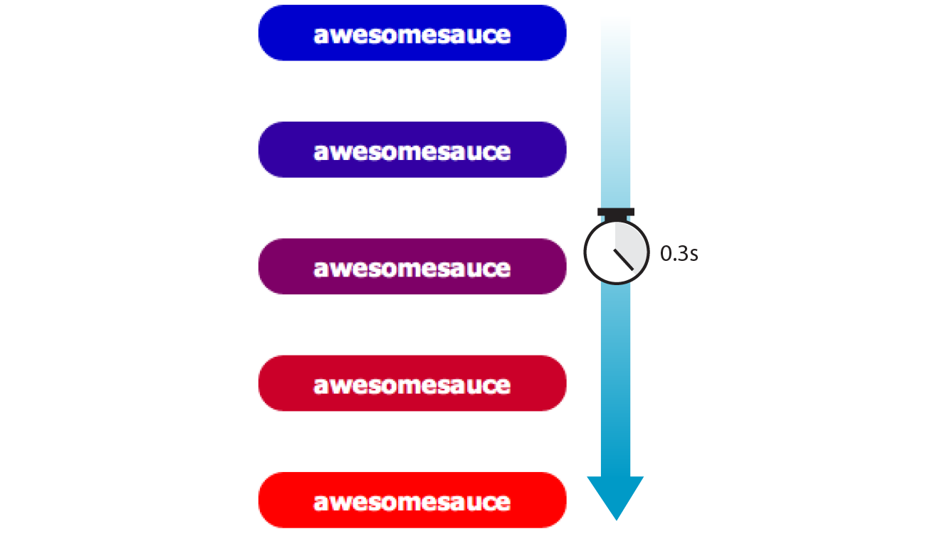
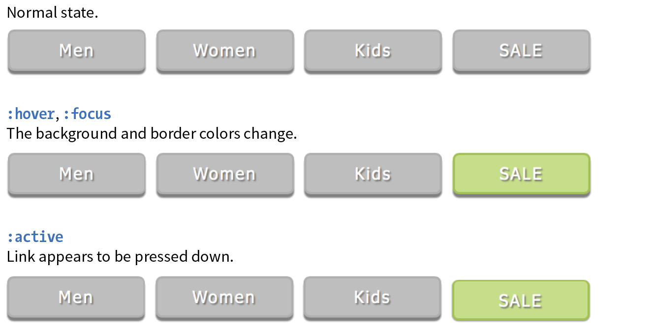
Let’s put that all together with a simple example. Here is that blue-to-red link you imagined earlier (Figure 18-1). There’s nothing special about the markup. I added a class so I could be specific about which links receive transitions.
The transition properties are applied to the object that will be transitioned—in this case, the a element in its normal state. You’ll see them in the set of other declarations for .smooth, like padding and background-color. I’ve changed the background color of the link to red by declaring the background-color for the :hover state (and :focus too, in case someone is tabbing through links with a keyboard).
The markup
<a href="…" class="smooth">awesomesauce</a>
The styles
.smooth { display: block; text-decoration:none; text-align: center; padding: 1em 2em; width: 10em; border-radius: 1.5em; color: #fff; background-color: mediumblue; transition-property: background-color; transition-duration: 0.3s;
}.smooth:hover, .smooth:focus { background-color: red;}
Specifying the property
transition-property
Values: property-name | all | none
Default: all
Applies to: all elements, and pseudo-elements
Inherits: no
transition-property identifies the CSS property that is changing and that you want to transition smoothly. In our example, it’s the background-color. You can also change the foreground color, borders, dimensions, font- and text-related attributes, and many more. Table 18-1 lists the animatable CSS properties as of this writing. The general rule is that if its value is a color, length, or number, that property can be a transition property.
How long should it take?
transition-duration
Values: time
Default: 0s
Applies to: all elements, and pseudo-elements
Inherits: no
transition-duration sets the amount of time it takes for the animation to complete in seconds (s) or milliseconds (ms). I’ve chosen .3 seconds, which is just enough to notice something happened but not so long that the transition feels sluggish or slows the user down. There is no correct duration, of course, but I’ve found that .2s seems to be a popular transition time for UI elements. Experiment to find the duration that makes sense for your application.
Timing Functions
transition-timing-function
Values: ease | linear | ease-in | ease-out | ease-in-out | step-start | step-end | steps | cubic-bezier(#,#,#,#)
Default: ease
Applies to: all elements, :before and :after pseudo-elements
Inherits: no
The property and the duration are required and form the foundation of a transition, but you can refine it further. There are a number of ways a transition can roll out over time. For example, it could start out fast and then slow down, start out slow and speed up, or stay the same speed all the way through, just to name a few possibilities. I think of it as the transition “style,” but in the spec, it is known as the timing function or easing function.
The timing function you choose can have a big impact on the feel and believability of the animation, so if you plan on using transitions and CSS animations, it is a good idea to get familiar with the options.
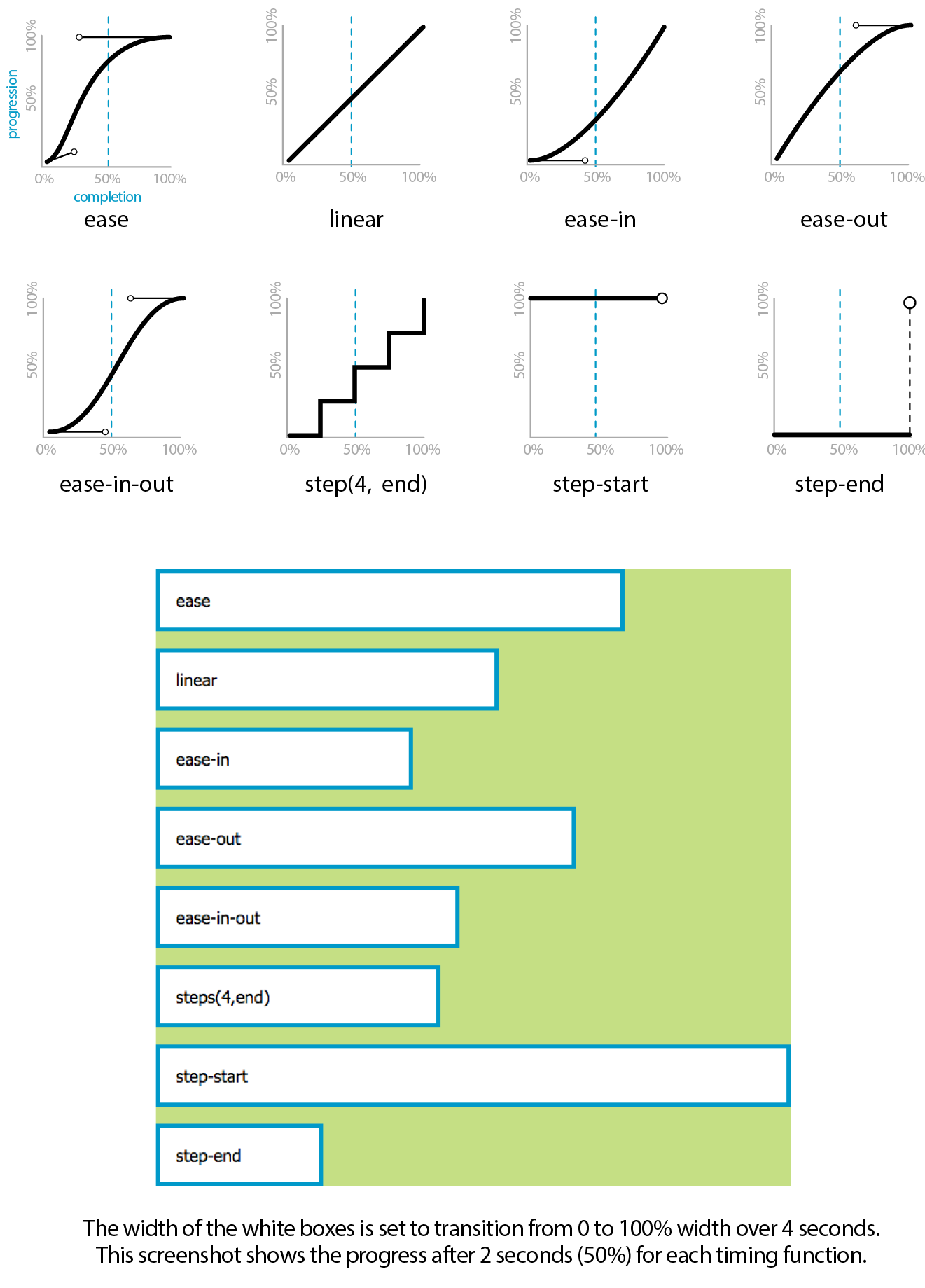
If I set the transition-timing-function to ease-in-out, the transition will start out slow, then speed up, then slow down again as it comes to the end state.
.smooth { … transition-property: background-color; transition-duration: 0.3s; transition-timing-function: ease-in-out;}
The transition-timing-function property takes one of the following keyword values:
ease
Starts slowly, accelerates quickly, and then slows down at the end. This is the default value and works just fine for most short transitions.
linear
Stays consistent from the transition’s beginning to end. Because it is so consistent, some say it has a mechanical feeling.
ease-in
Starts slowly, then speeds up.
ease-out
Starts out fast, then slows down.
ease-in-out
Starts slowly, speeds up, and then slows down again at the very end. It is similar to ease, but with less pronounced acceleration in the middle.
cubic-bezier(x1,y1,x2,y2)
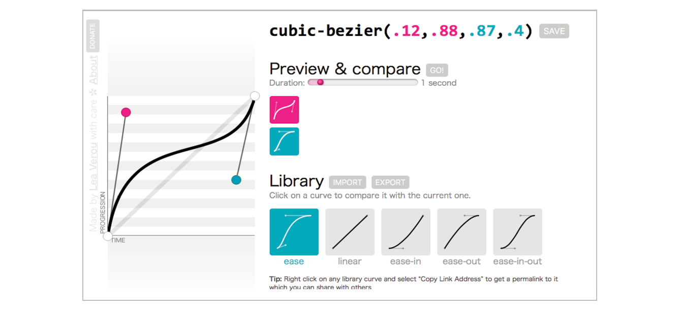
The acceleration of a transition can be plotted with a curve called a Bezier curve. The steep parts of the curve indicate a fast rate of change, and the flat parts indicate a slow rate of change. Figure 18-2 shows the Bezier curves that represent the function keywords as well as a custom curve I created. You can see that the ease curve is a tiny bit flat in the beginning, gets very steep (fast), then ends flat (slow). The linear keyword, on the other hand, moves at a consistent rate for the whole transition.
You can get the feel of your animation just right by creating a custom curve. The site Cubic-Bezier.com is a great tool for playing around with transition timing and generating the resulting code. The four numbers in the value represent the x and y positions of the start and end Bezier curve handles (the pink and blue dots in Figure 18-2).
#
Divides the transitions into a number of steps as defined by a stepping function. The first value is the number of steps, and the start and end keywords define whether the change in state happens at the beginning (start) or end of each step. Step animation is especially useful for keyframe animation with sprite images. For a better explanation and examples, I recommend the article “Using Multi-Step Animations and Transitions,” by Geoff Graham on CSS-Tricks (css-tricks.com/using-multi-step-animations-transitions/).
step-start
Changes states in one step, at the beginning of the duration time (the same as steps(1,start)). The result is a sudden state change, the same as if no transition had been applied at all.
step-end
Changes states in one step, at the end of the duration time (the same as steps(1,end)).
It’s difficult to show the various options on a still page, but I have put together a little demo, which is illustrated in Figure 18-3 and available in the figures folder with the materials for this chapter. The width of each labeled element (white with a blue border) transitions over the course of 4 seconds when you hover over the green box. They all arrive at their full width at exactly the same time, but they get there in different manners. The image shown in Figure 18-3 was taken at the 2-second mark, halfway through the duration of the transition.
Setting a Delay
transition-delay
Values: time
Default: 0s
Applies to: all elements, :before and :after pseudo-elements
Inherits: no
The transition-delay property, as you might guess, delays the start of the animation by a specified amount of time. In the following example, the background color transition starts .2 seconds after the pointer moves over the link.
.smooth { … transition-property: background-color; transition-duration: 0.3s; transition-timing-function: ease-in-out; transition-delay: 0.2s;}
The Shorthand transition Property
Thankfully, the authors of the CSS3 spec had the good sense to give us the shorthand transition property to combine all of these properties into one declaration. You’ve seen this sort of thing with the shorthand border property. Here is the syntax:
transition: property duration timing-function delay;
The values for each of the transition-* properties are listed out, separated by character spaces. The order isn’t important as long as the duration (which is required) appears before delay (which is optional). If you provide only one time value, it will be assumed to be the duration.
Using the blue-to-red link example, we could combine the four transition properties we’ve applied so far into this one line:
.smooth { … transition: background-color 0.3s ease-in-out 0.2s;}
Definitely an improvement.
Applying Multiple Transitions
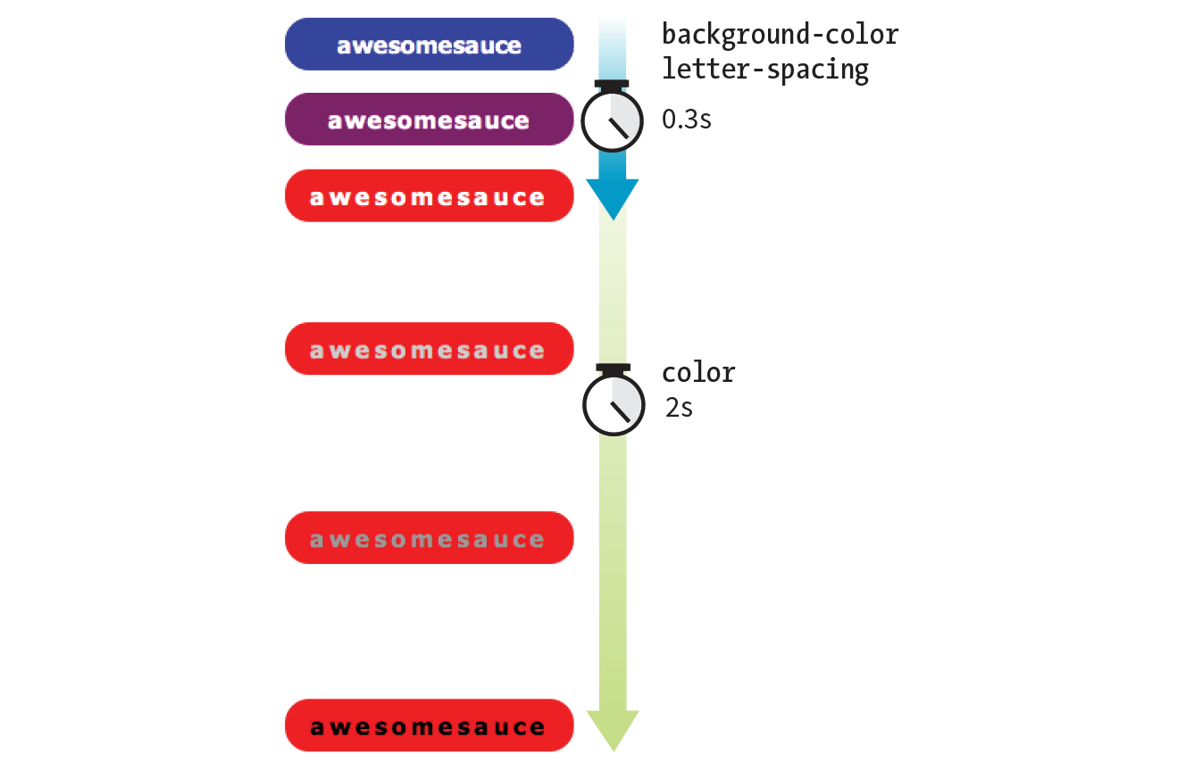
So far, we’ve changed only one property at a time, but it is possible to transition several properties at once. Let’s go back to the “awesomesauce” link example. This time, in addition to changing from blue to red, I’d like the letter-spacing to increase a bit. I also want the text color to change to black, but more slowly than the other animations. Figure 18-4 attempts to show these transitions on this static page.
One way to do this is to list all of the values for each property separated by commas, as shown in this example:
.smooth { … transition-property: background-color, color, letter-spacing; transition-duration: 0.3s, 2s, 0.3s; transition-timing-function: ease-out, ease-in, ease-out;
}.smooth:hover, .smooth:focus { background-color: red; letter-spacing: 3px; color: black;}
The values are matched up according to their positions in the list. For example, the transition on the color property (second in the list) has a duration of 2s and uses the ease-in timing function. If one list has fewer values than the others, the browser repeats the values in the list, starting over at the beginning. In the previous example, if I had omitted the third value (.3s) for transition-duration, the browser would loop back to the beginning of the list and use the first value (.3s) for letter-spacing. In this case, the effect would be the same.
You can line up values for the shorthand transition property as well. The same set of styles we just saw could also be written as follows:
.smooth { … transition: background-color 0.3s ease-out, color 2s ease-in, letter-spacing 0.3s ease-out;
}
A Transition for All Occasions
But what if you just want to add a little bit of smoothness to all your state changes, regardless of which property might change? For cases when you want the same duration, timing function, and delay to apply to all transitions that might occur on an element, use the all value for transition-property. In the following example, I’ve specified that any property that might change for the .smooth element should last .2 seconds and animate via the ease-in-out function.
.smooth {
…
transition: all 0.2s ease-in-out;
}
For user interface changes, a short, subtle transition is often all you need for all your transitions, so the all value will come in handy. Well, that wraps up our lesson on CSS3 Transitions. Now you give it a try in Exercise 18-1.
Exercise 18-1. Trying out transitions
Note
If you’re using a touch device for this exercise, you’ll miss out on this effect because there is no hover state on touch screens. You may see the hover state with a single tap. Transitions triggered by a click/tap or when the page loads will work on all devices, but they are not covered here.
CSS Transforms
transform
Values: rotate() | rotateX() | rotateY() | rotateZ() | rotate3d() | translate() | translateX() | translateY() | scale() | scaleX() | scaleY() | skew() | skewX() | skewY() | none
Default: none
Applies to: transformable elements (see sidebar)
Inherits: no
The CSS3 Transforms Module (www.w3.org/TR/css-transforms-1) gives authors a way to rotate, relocate, resize, and skew HTML elements in both two- and three-dimensional space. It is worth noting up front that transforms change how an element displays, but it is not motion- or time-based. However, you can animate from one transform state to another using transitions or keyframe animations, so they are useful to learn about in the context of animation.
This chapter focuses on the more straightforward two-dimensional transforms because they have more practical uses. Transforms are supported on virtually all current browser versions without vendor prefixes (see the sidebar “CSS Transforms Support” for exceptions).
You can apply a transform to the normal state of an element, and it appears in its transformed state when the page loads. Just be sure that the page is still usable on browsers that don’t support transforms. It is common to introduce a transform only when users interact with the element via :hover or a JavaScript event. Either way, transforms are a good candidate for progressive enhancement—if an IE8 user sees an element straight instead of at a jaunty angle, it’s probably no biggie.
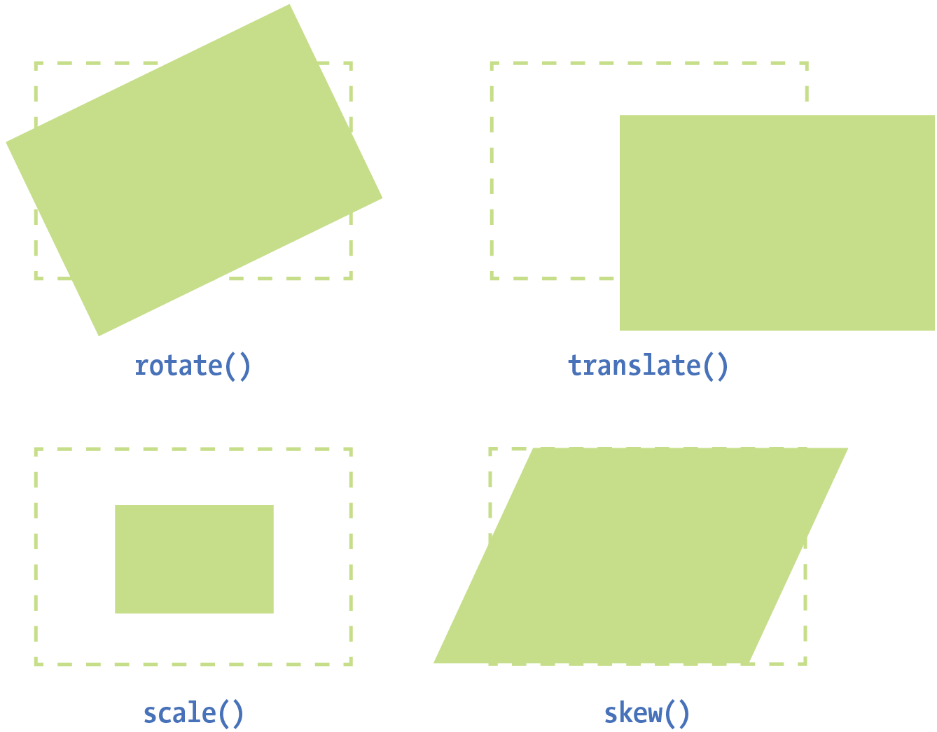
Figure 18-6 shows a representation of four two-dimensional transform functions: rotate(), translate(), scale(), and skew() (see Note). The dashed outline shows the element’s original position.
Note
There are actually five 2-D transform functions in the CSS spec. The fifth, , allows you to craft your own combined transformation using six values and some badass trigonometry. There are tools that can take a number of transforms and combine them into a matrix function, but the result isn’t very user-friendly. Fascinating in theory, but more than I want to take on personally.
When an element transforms, its element box keeps its original position and influences the layout around it, in the same way that space is left behind by a relatively positioned element. It is as though the transformation magically picks up the pixels of the rendered element, messes around with them, and lays them back down on top of the page. So, if you move an element with transform, you’re moving only a picture of it. That picture has no effect on the surrounding layout. Let’s go through the transform functions one by one, starting with rotate().
Transforming the Angle (rotate)
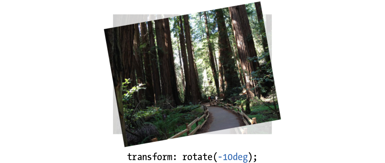
If you’d like an element to appear on a bit of an angle, use the rotate() transform function. The value of the rotate() function is an angle specified in positive (clockwise) or negative (counterclockwise) degrees. The image in Figure 18-7 has been rotated –10 degrees (350 degrees) with the following style rule. The tinted image shows the element’s original position for reference.
img { width: 400px; height: 300px; transform: rotate(-10deg);}
Notice that the image rotates around its center point, which is the default point around which all transformations happen. But you can change that easily with the transform-origin property.
transform-origin
Values: percentage | length | left | center | right | top | bottom
Default: 50% 50%
Applies to: transformable elements
Inherits: no
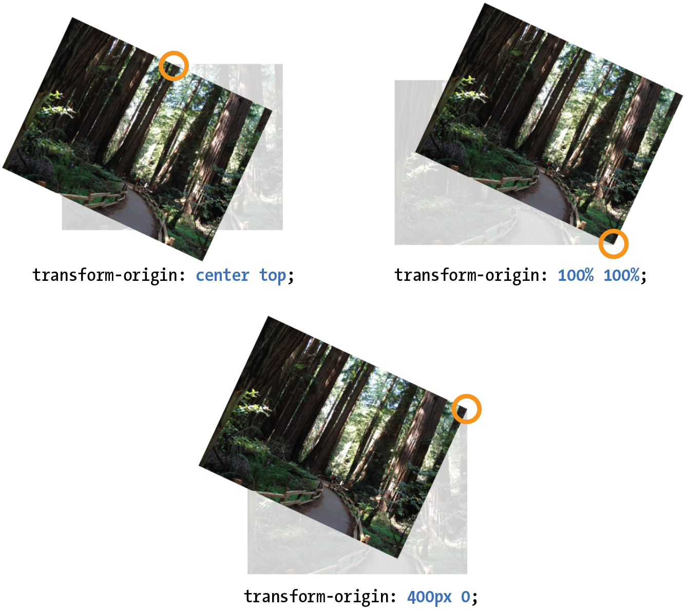
The value for transform-origin is either two keywords, length measurements, or percentage values. The first value is the horizontal offset, and the second is the vertical offset. If only one value is provided, it will be used for both. The syntax is the same as you learned for background-position back in Chapter 13, Colors and Backgrounds. If we wanted to rotate our image around a point at the center of its top edge, we could write it in any of the following ways:
transform-origin: center top; transform-origin: 50%, 0%; transform-origin: 200px, 0;
The images in Figure 18-8 have all been rotated 25 degrees, but from different origin points. It is easy to demonstrate the origin point with the rotate() function, but keep in mind that you can set an origin point for any of the transform functions.
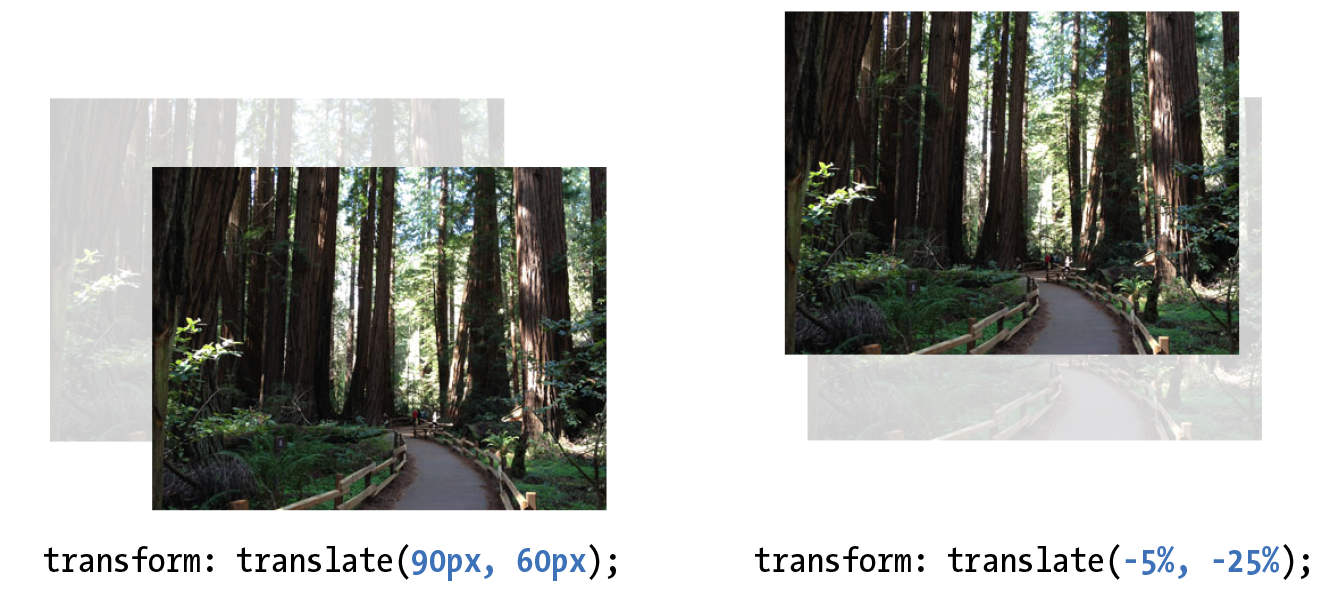
Transforming the Position (translate)
Another thing you can do with the transform property is give the element’s rendering a new location on the page by using one of three translate() functions, as shown in the examples in Figure 18-9. The translateX() function allows you to move an element on a horizontal axis; translateY() is for moving along the vertical axis; and translate() combines both x and y values.
transform:translateX(50px); transform:translateY(25px); transform:translate(50px, 25px); /* (translateX, translateY) */
Provide length values in any of the CSS units or as a percentage value. Percentages are calculated on the width of the bounding box—that is, from border edge to border edge (which, incidentally, is how percentages are calculated in SVG, from which transforms were adapted). You can provide positive or negative values, as shown in Figure 18-9.
If you provide only one value for the shorthand translate() function, it will be presumed to be the translateX value, and translateY will be set to zero. So translate(20px) would be equivalent to applying both translateX(20px) and translateY(0).
How do you like the transform property so far? We have two more functions to go.
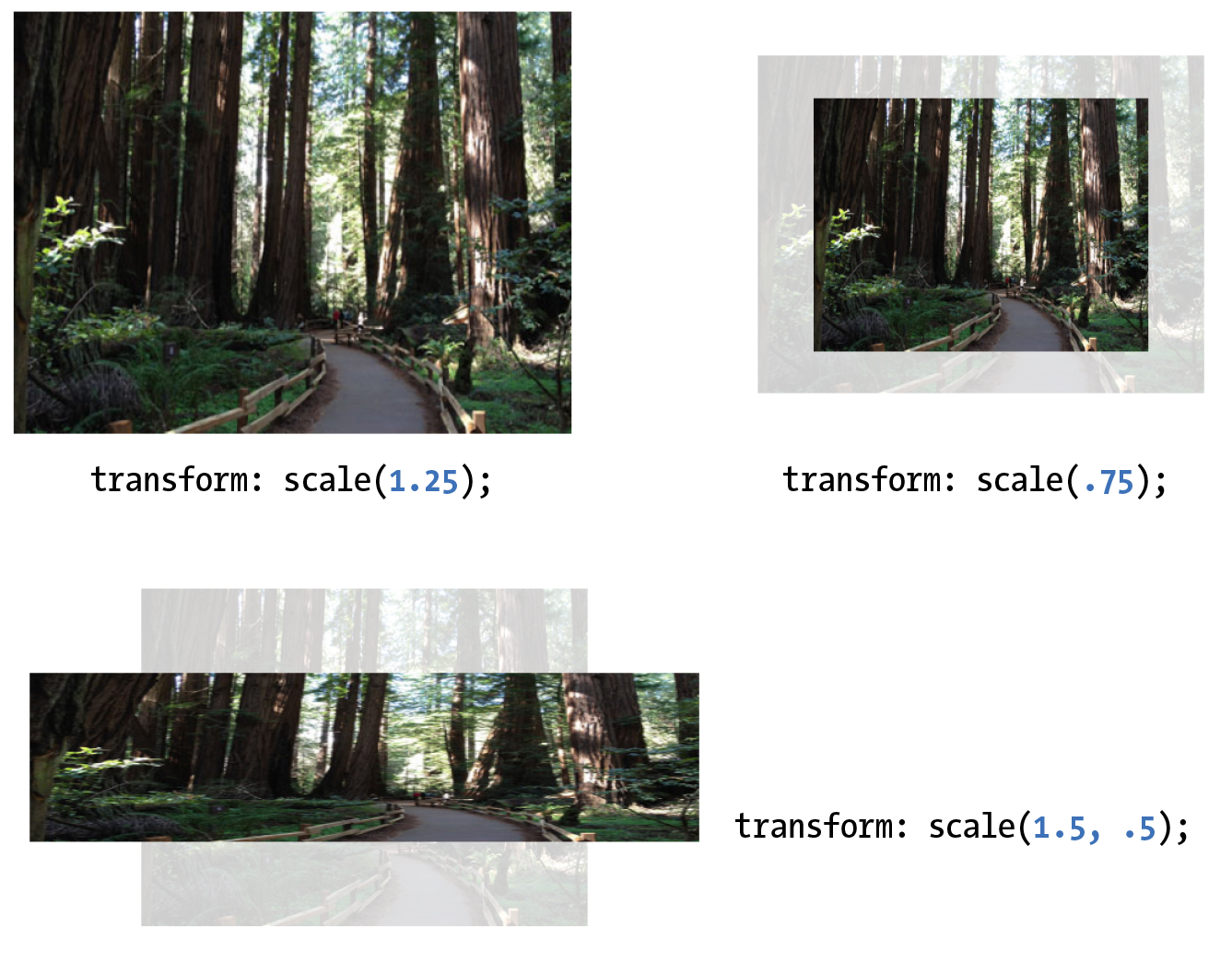
Transforming the Size (scale)
Make an element appear larger or smaller by using one of three scale functions: scaleX() (horizontal), scaleY() (vertical), and the shorthand scale(). The value is a unitless number that specifies a size ratio. This example makes an image 150% its original width:
a img { transform: scaleX(1.5);}
The scale() shorthand lists a value for scaleX and a value for scaleY. This example makes an element twice as wide but half as tall as the original:
a img { transform: scale(2, .5);}
Unlike translate(), however, if you provide only one value for scale(), it will be used as the scaling factor in both directions. So specifying scale(2) is the same as applying scaleX(2) and scaleY(2), which is intuitively the way you’d want it to be.
Figure 18-10 shows the results of all our scaling endeavors.
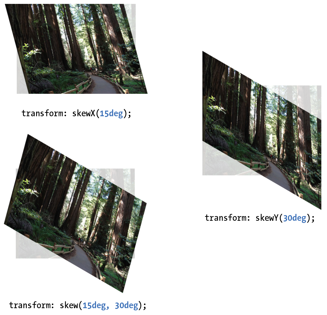
Making It Slanty (skew)
The quirky collection of skew properties—skewX(), skewY(), and the shorthand skew()—changes the angle of either the horizontal or vertical axis (or both axes) by a specified number of degrees. As for translate(), if you provide only one value, it is used for skewX(), and skewY() will be set to zero.
The best way to get an idea of how skewing works is to take a look at some examples (Figure 18-11):
a img { transform: skewX(15deg);} a img { transform: skewY(30deg);} a img { transform: skew(15deg, 30deg);}
Applying Multiple Transforms
It is possible to apply more than one transform to a single element by listing out the functions and their values, separated by spaces, like this:
transform: function(value) function(value);
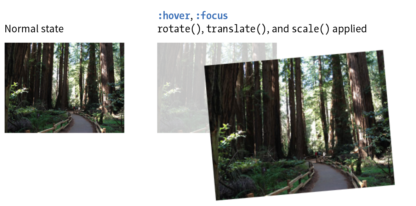
In the example in Figure 18-12, I’ve made the forest image get larger, tilt a little, and move down and to the right when the mouse is over it or when it is in focus:
img:hover, img:focus { transform: scale(1.5) rotate(-5deg) translate(50px,30px);}
It is important to note that transforms are applied in the order in which they are listed. For example, if you apply a translate() and then rotate(), you get a different result than with a rotate() and then a translate(). Order matters.
Another thing to watch out for is that if you want to apply an additional transform on a different state (such as :hover, :focus, or :active), you need to repeat all of the transforms already applied to the element. For example, this a element is rotated 45 degrees in its normal state. If I apply a scale() transform on the hover state, I would lose the rotation unless I explicitly declare it again:
a { transform: rotate(45deg);}a:hover { transform: scale(1.25); /* rotate on a element would be lost */
}
To achieve both the rotation and the scale, provide both transform values:
a:hover { transform: rotate(45deg) scale(1.25); /* rotates and scales */
}
Smooooooth Transforms
The multiple transforms applied to the redwood forest image look interesting, but it might feel better if we got there with a smooth animation instead of just BAM! Now that you know about transitions and transforms, let’s put them together and make some magic happen. And by “magic,” of course I mean some basic animation effects between two states. We’ll do that together, step-by-step, in Exercise 18-2.
Exercise 18-2. Transitioning transforms
Note
The prefixed property should be included in the context of a transition as well, as shown in this fully prefixed declaration:
-webkit-transition: -webkit-transform .3s linear;The prefix is not needed because transitions are not supported by IE9. Those users will see an immediate change to the transformed image without the smooth transition, which is fine.
3-D Transforms
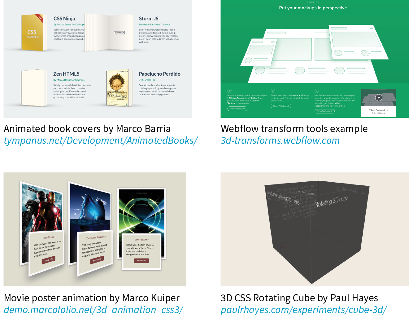
In addition to the two-dimensional transform functions we’ve just seen, the CSS Transforms spec also describes a system for creating a sense of three-dimensional space and perspective. Combined with transitions, you can use 3-D transforms to create rich interactive interfaces, such as image carousels, flippable cards, or spinning cubes! Figure 18-14 shows a few examples of interfaces created with 3-D transforms.
It’s worth noting that this method does not create 3-D objects with a sense of volume; it merely tilts the otherwise flat element box around on three axes (animation expert Val Head calls them “postcards in space”). The rotating cube example in the figure merely stitches together six element boxes at different angles. That said, 3-D transforms still add some interesting depth to an otherwise flat web page.
3-D transforms are not a need-to-know skill for folks just starting out in web design, so I’m not going to go into full detail here, but I will give you a taste of what it takes to add a third dimension to a design. If you’d like to learn more, the following tutorials are good places to start (although the browser support information they contain may be out-of-date):
- “Adventures in the Third Dimension: CSS 3D Transforms” by Peter Gasston (coding.smashingmagazine.com/2012/01/06/adventures-in-the-third-dimension-css-3-d-transforms/)
- “Intro to CSS 3D Transforms” by David DeSandro (desandro.github.com/3dtransforms/)
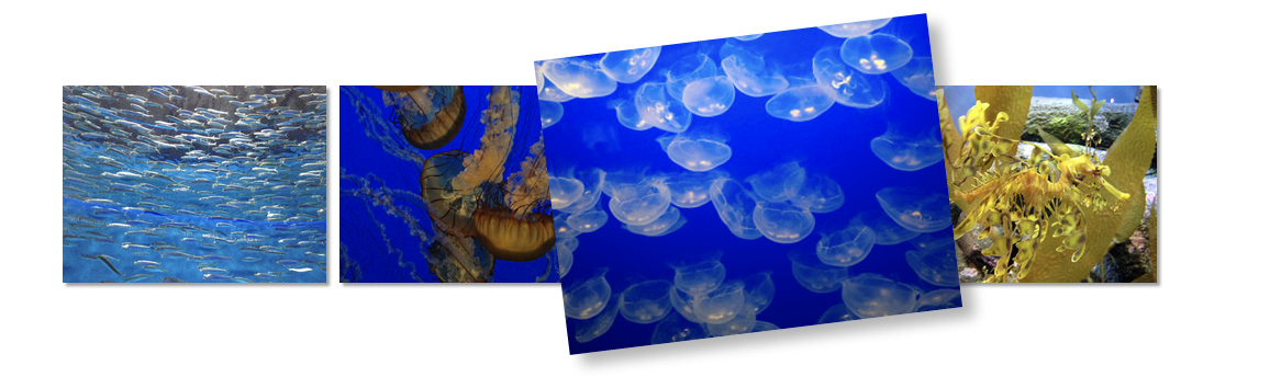
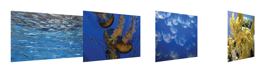
To give you a very basic example, I’m going to use the images from Exercise 18-2 and arrange them as though they are in a 3-D carousel-style gallery (Figure 18-15).
The markup is the same unordered list used in the previous exercise:
<ul> <li><a href=""><img src="anchovies.jpg" id="img1" alt=""></a></li> <li><a href=""><img src="jellyfish1.jpg" id="img2" alt=""></a></li> <li><a href=""><img src="bluejellyfish.jpg" id="img3" alt=""></a> </li> <li><a href=""><img src="seadragon.jpg" id="img4" alt=""></a></li></ul>
The first step is to add some amount of “perspective” to the containing element by using the perspective property. This tells the browser that the child elements should behave as though they are in 3-D space. The value of the perspective property is some integer larger than zero that specifies a distance from the element’s origin on the z-axis. The lower the value, the more extreme the perspective. I have found that values between 300 and 1,500 are reasonable, but this is something you need to fuss around with until you get the desired effect.
ul { width: 1000px; height: 100px; list-style-type: none; padding: 0; margin: 0; perspective: 600;}
Note
When using the prefix for , include the prefixed version of as well ().
The perspective-origin property (not shown) describes the position of your eyes relative to the transformed items. The values are a horizontal position (left, center, right, or a length or percentage) and a vertical position (top, bottom, center, or a length or percentage value). The default (Figure 18-15) is centered vertically and horizontally (perspective-origin: 50% 50%). The final transform-related property is backface-visibility, which controls whether the reverse side of the element is visible when it spins around.
With the 3-D space established, apply one of the 3-D transform functions to each child element—in this case, the li within the ul. The 3-D functions include translate3d, translateZ, scale3d, scaleZ, rotate3d, rotateX, rotateY, rotateZ, and matrix3d. You should recognize some terms in there. The *Z functions define the object’s orientation relative to the z-axis (picture it running from your nose to this page, whereas the x- and y-axes lie flat on the page).
In our example in Figure 18-15, each li is rotated 45 degrees around its y-axis (vertical axis) by using the rotateY function, which works as though the element boxes are rotating around a pole.
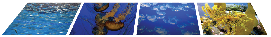
Compare the result to Figure 18-16, in which each li is rotated on its x-axis (horizontal axis) by using rotateX. It’s as though the element boxes are rotating around a horizontal bar.
li { float: left; margin-right: 10px; transform: rotateX(45deg);}
Obviously, I’m barely scratching the surface of what can be done with 3-D transforms, but this should give you a mental model for how it works. Next up, I’ll introduce you to a more sophisticated way to set your web pages in motion.
Keyframe Animation
The CSS Animations Module allows authors to create real, honest-to-goodness keyframe animation. Figure 18-17 shows just a few examples that you can see in action online. Unlike transitions that go from a beginning state to an end state, keyframe animation allows you to explicitly specify other states at points along the way, allowing for more granular control of the action. Those “points along the way” are established by keyframes that define the beginning or end of a segment of animation.
Creating keyframe animations is complex, and more than I can cover here. But I would like for you to have some idea of how it works, so I’ll sketch out the minimal details. The following resources are good starting points for learning more:
- CSS Animations Level 1 (a Working Draft at the time of this writing) at www.w3.org/TR/css-animations-1/.
- Transitions and Animations in CSS by Estelle Weyl (O’Reilly).
- “Animation & UX Resources” by Val Head (valhead.com/ui-animation/). Val has compiled a mega-list of resources regarding web animation, including links to tutorials, articles, tools, galleries, and more. It is not limited to CSS keyframe animation, but as long as you’re delving into animation, you can trust Val to point you to good stuff.
- “CSS: Animation” course by Val Head on Lynda.com (www.lynda.com/CSS-tutorials/CSS-Animation/439683-2.html). You’ll need a subscription to Lynda.com, but if you are in web-design-learning mode, it may be a good investment.
- “CSS Animation for Beginners” by Rachel Cope (robots.thoughtbot.com/css-animation-for-beginners). This is a clearly written tutorial with lots of examples.
- “The Guide to CSS Animation: Principles and Examples” by Tom Waterhouse (www.smashingmagazine.com/2011/09/the-guide-to-css-animation-principles-and-examples/). This tutorial goes beyond CSS code to include tips for creating natural animation effects.
Establishing the Keyframes
The animation process has two parts:
- Establish the keyframes with a @keyframes rule.
- Add the animation properties to the elements that will be animated.
Here is a very simple set of keyframes that changes the background color of an element over time. It’s not a very action-packed animation, but it should give you a basic understanding of what a @keyframes rule does.
@keyframes colors { 0% { background-color: red; } 20% { background-color: orange; } 40% { background-color: yellow; } 60% { background-color: green; } 80% { background-color: blue; } 100% { background-color: purple; }}
The keyframes at-rule identifies the name of the animation, the stages of the animation represented by percentage (%) values, and the CSS properties that are affected for each stage. Here’s what a @keyframes rule looks like abstracted down to its syntax:
@keyframes animation-name{keyframe { property: value;} /* additional keyframes */ }
The sample @keyframes rule says: create an animation sequence called “colors.” At the beginning of the animation, the background-color of the element should be red; at 20% through the animation runtime, the background color should be orange; and so on, until it reaches the end of the animation. The browser fills in all the shades of color in between each keyframe (or tweens it, to use the lingo). This is represented the best I could in Figure 18-18.
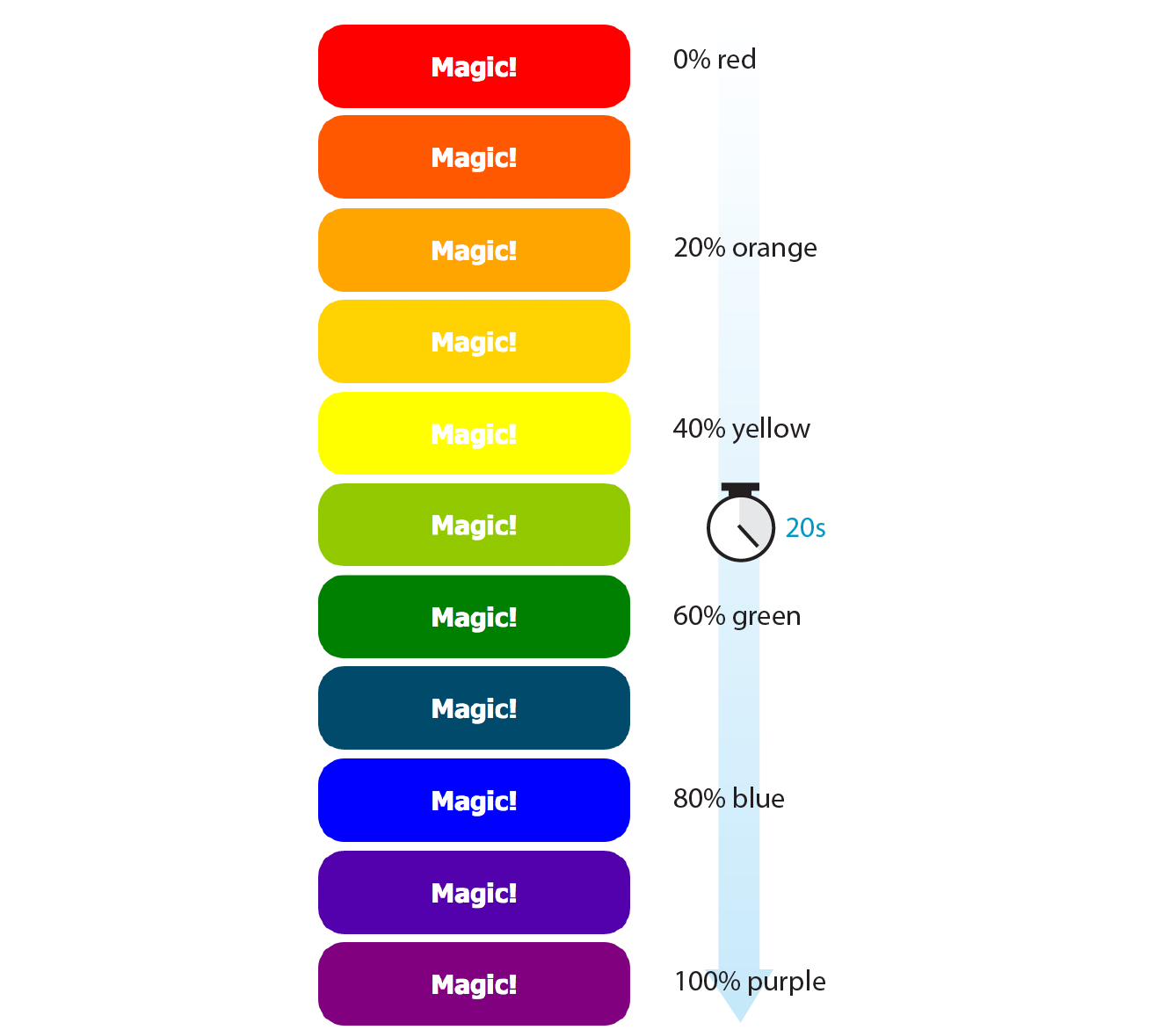
Each percentage value and the property/value declaration defines a keyframe in the animation sequence.
As an alternative to percentages, you can use the keyword from for the start of an animation sequence (equivalent to 0%) and the keyword to for denoting the end (100%). The following example makes an element slide in from right to left as the left margin reduces to 0:
@keyframe slide { from { margin-left: 100% } to { margin-left: 0%; }}
Adding Animation Properties
Now we can apply this animation sequence to an element or multiple elements in the document by using a collection of animation properties that are very similar to the set of transition properties that you already know.
I am going to apply the rainbow animation to the #magic div in my document:
<div id="magic">Magic!</div>
In the CSS rule for #magic, I make decisions about the animation I want to apply:
- Which animation to use (animation-name) (Required).
- How long it should take (animation-duration) (Required).
- The manner in which it should accelerate (animation-timing-function). This property uses the same timing function keywords that we covered for CSS Transitions.
- Whether to pause before it starts (animation-delay).
Looks familiar, right? There are a few other animation-specific properties to know about as well:
animation-iteration-count
How many times the animation should repeat. This can be set to a whole number or infinite.
animation-direction
Whether the animation plays forward (normal), in reverse (reverse), or alternates back and forth starting at the beginning (alternate), or alternates starting from the end (alternate-reverse).
animation-fill-mode
The animation fill mode determines what happens with the animation before it begins and after it ends. By default (none), the animation shows whatever property values were not specified via @keyframes. If you want the last keyframe to stay visible after the animation plays, use the forwards keyword. If there is a delay set on the animation and you want the first keyframe to show during that delay, use backwards. To retain the beginning and end states, use both.
animation-play-state
Whether the animation should be running or paused when it loads. The play-state can be toggled on and off based on user input with JavaScript or on hover.
The animation-name property tells the browser which keyframe sequence to apply to the #magic div. I’ve also set the duration and timing function, and used animation-iteration-count to make it repeat infinitely. I could have provided a specific number value, like 2 to play it twice, but how fun are only two rainbows? And for fun, I’ve set the animation-direction to alternate, which makes the animation play in reverse after it has played forward. Here is the resulting rule for the animated div:
#magic { … animation-name: colors; animation-duration: 5s; animation-timing-function: linear; animation-iteration-count: infinite; animation-direction: alternate;}
That gets a bit verbose, especially when you consider that each property may also follow a prefixed version. You can also use the animation shorthand property to combine the values, just as we did for transition:
#magic { animation: colors 5s linear infinite alternate;}
Those are the bare bones of creating keyframes and applying animations to an element on the page. To make elements move around (what we typically think of as “animation”), use keyframes to change the position of an element on the screen with translate (the best option for performance) or with the top, right, bottom, and left properties. When the keyframes are tweened, the object will move smoothly from position to position. You can also animate the other transform functions such as scale and skew.
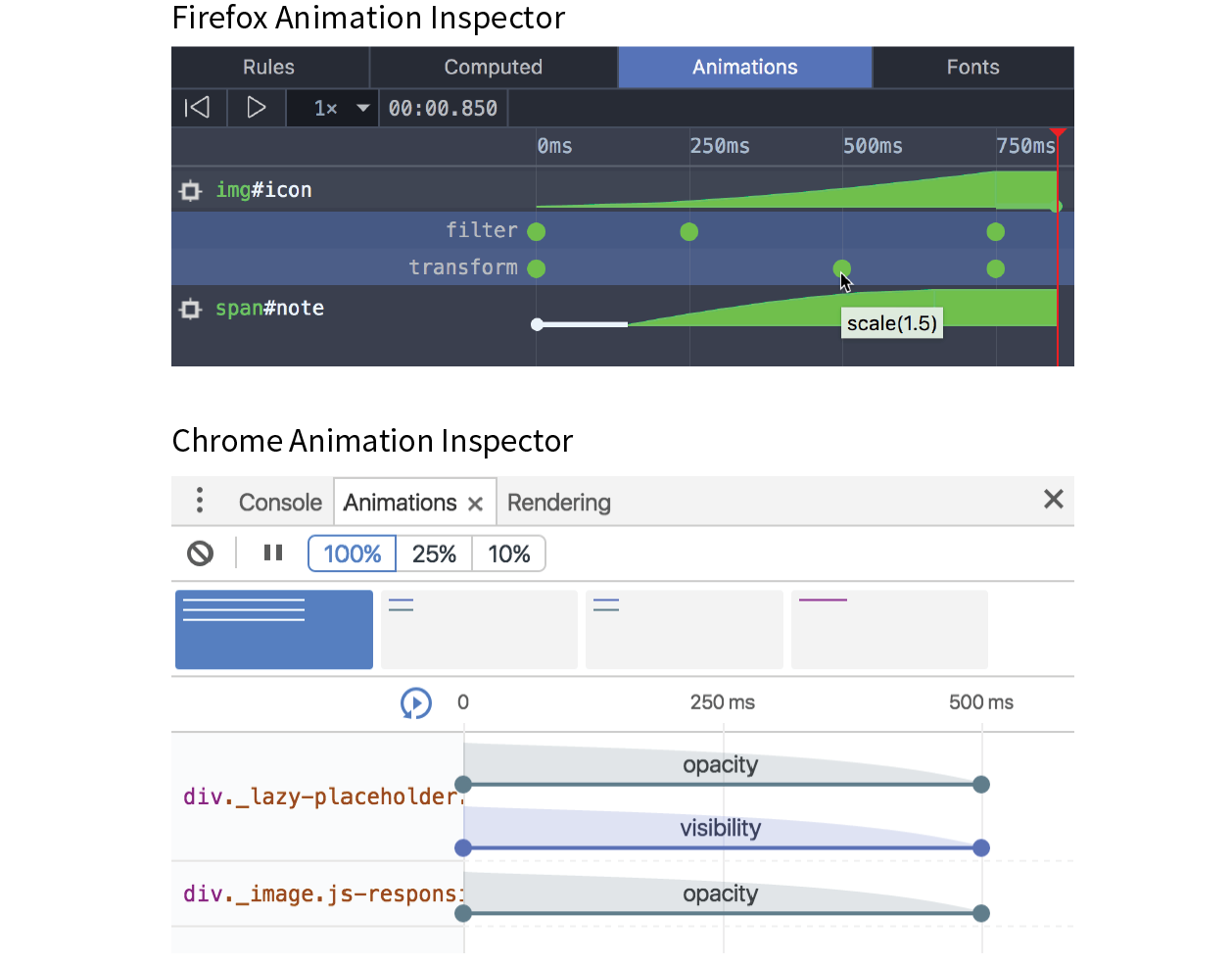
Animation Inspectors
When to Use Keyframe Animation
To keep my example simple, I chose to change only the background color of a button element, but of course, keyframe animations can be used to create real animations, especially when combined with the CSS transform functions for spinning and moving elements around on the page. If you only need to change an element from one state to another, a transition is the way to go. But if you have a linear animation such as moving a character, an object, or its parts around, keyframe animation is the most appropriate choice.
For more complex keyframe animations, particularly those that change with user interaction or require complex physics, using JavaScript for animation may be a better choice than CSS animation. JavaScript animation also has better support in older browsers, making it preferable if animation is critical to the mission of the page. CSS keyframe animation is a good solution for simple animations used as an enhancement to a baseline experience.
I should note that as I write this, there is a lot of excitement in the web community for animating SVG graphics. When you place the source code for an SVG directly in the HTML document, the elements in it are available to be animated. As of this writing, there are still limitations and browser support issues around using CSS to animate SVGs, but as browser support grows, this approach looks very promising. In the meantime, JavaScript has better access to SVG properties, has better browser support, and is the more common solution for SVG animation.
Wrapping Up
I hope I’ve helped you to wrap your head around how CSS can be used to add a little motion and smoothness to your pages. For adding motion to a web page, we have CSS Transitions to smooth out changes from one state to another and CSS Keyframe Animation for animating a series of states. We also looked at CSS Transforms for repositioning, spinning, resizing, or skewing an element when it is rendered on the screen.
Used thoughtfully, animation can make your interfaces more intuitive and enhance your brand personality. It’s powerful stuff, but with great power comes great responsibility. To learn how to use web animation to enhance the user experience in a meaningful way, I recommend the book Designing Interface Animation: Meaningful Motion for User Experience by Val Head (Rosenfeld Media).
Now let’s see if you were paying attention with a 12-question quiz!
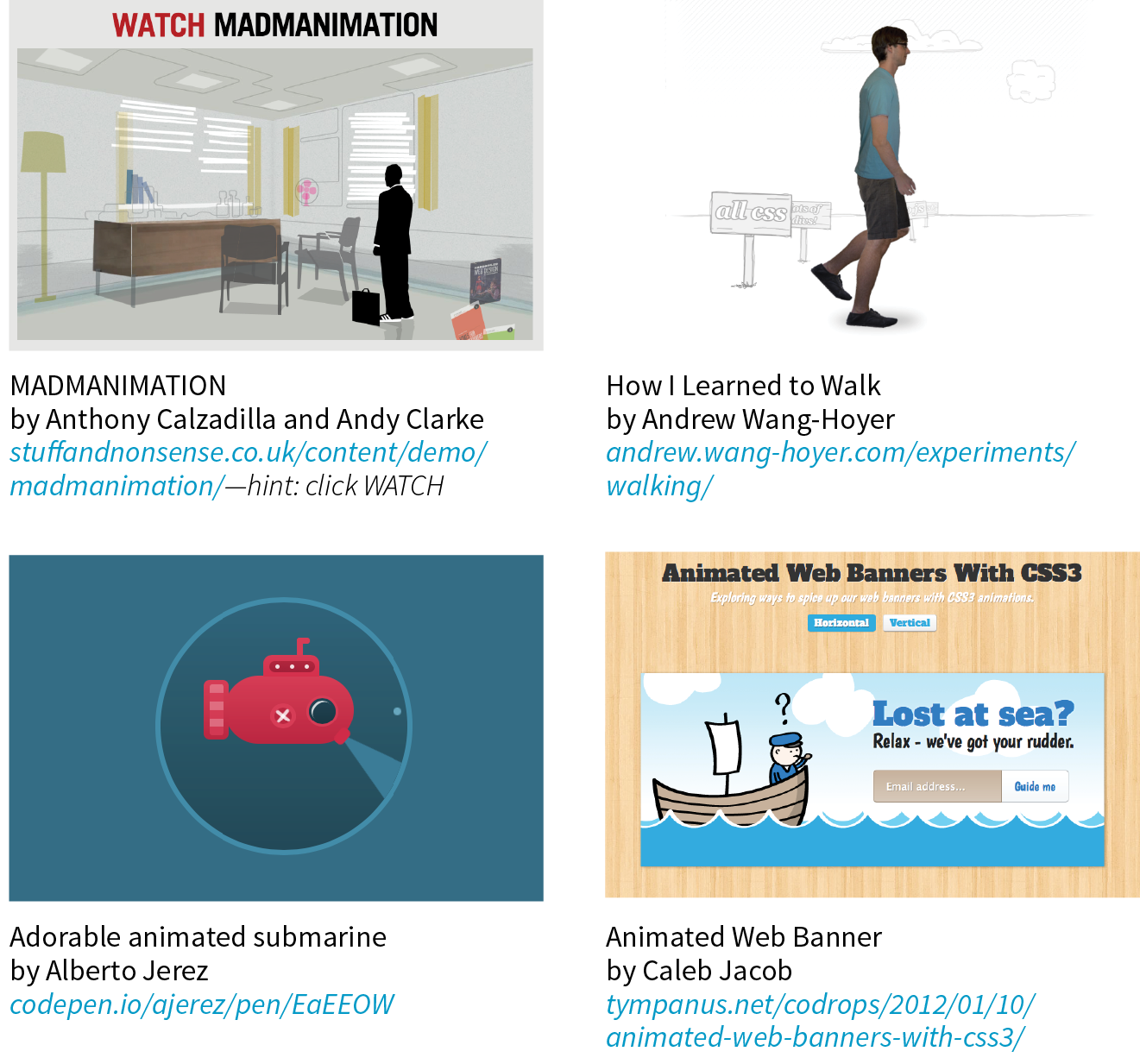
Need a Little Inspiration?

Test Yourself
Think you know your way around transitions, transforms, and keyframe animations? Here are a few questions to find out (answers in Appendix A):
- What is tweening?
- If a transition had keyframes, how many would it have?
- Write out the transition declaration (property and value) you would use to accomplish the following:
- Wait .5 seconds before the transition starts.
- Make the transition happen at a constant speed.
- Make the transition last .5 seconds.
- Make the lines of text slowly grow farther apart.
- Which of the following can you not animate?
widthpaddingtext-transformword-spacing
- Which timing function will be used if you omit the transition-timing-function property? Describe its action.
- In the following transition, what does .2s describe?
transition: color .2s linear; - Which transition will finish first?
transition: width 300ms ease-in;transition: width 300ms ease-out;
- Write the transform declaration to accomplish the following:
- Tilt the element 7 degrees clockwise.
- Reposition the element 25 pixels up and 50 pixels to the left.
- Rotate the element from its bottom-right corner.
- Make a 400-pixel-wide image display at 500 pixels wide.
- In the following transform declaration, what does the 3 value describe?
transform: scale(2, 3) - Which 3-D transform would look more angled and dramatic?
perspective: 250;perspective: 1250;
- What happens halfway through this animation?
@keyframes border-bulge {from { border-width: 1px; } 25% { border-width: 10px; } 50% { border-width: 3px; } to { border-width: 5px; }} - Write the animation declaration you would use to accomplish the following:
- Make the animation play in reverse.
- Make the entire animation last 5 seconds.
- Wait 2 seconds before running the animation.
- Repeat the animation three times and then stop.
- The end state of the animation stays visible after the animation is done playing.
CSS Review: Transitions, Transforms, and Animation
Here is a summary of the properties covered in this chapter.