Table of Contents for
Learning Web Design, 5th Edition
 Learning Web Design, 5th Edition
Published by
O'Reilly Media, Inc., 2018
Learning Web Design, 5th Edition
Published by
O'Reilly Media, Inc., 2018
- cover
- Learning Web Design, Fifth Edition
- lwd5_title_copy
- lwd5_title_copy-1
- lwd5_contents
- Foreword
- Preface
- Part I. Getting Started
- 2. How the Web Works
- 3. Some Big Concepts You Need to Know
- Part II. HTML for STRUCTURE
- 5. Marking Up Text
- 6. Adding Links
- 7. Adding Images
- 8. Table Markup
- 9. Forms
- 10. Embedded Media
- Part III. CSS for Presentation
- 12. Formatting Text
- 13. Colors and Backgrounds
- 14. Thinking Inside the Box
- 15. Floating and Positioning
- 16. CSS Layout with Flexbox and Grid
- 17. Responsive Web Design
- 18. Transitions, Transforms, and Animation
- 19. More CSS Techniques
- 20. Modern Web Development Tools
- Part IV. JavaScript for Behavior
- 22. Using JavaScript
- Part V. Web Images
- 24. Image Asset Production
- 25. SVG
- Part VI. Appendices
- B. HTML5 Global Attributes
- C. CSS Selectors, Levels 3 and 4
- D. From HTML+ to HTML5
12
In this chapter
Font properties
Web fonts
Advanced typography with CSS3
Text line settings
Text effects
Selectors: descendent, ID, and class
Specificity overview
List styles
Now that you’ve gotten your feet wet formatting text, are you ready to jump into the deep end? By the end of this chapter, you’ll pick up over 40 additional CSS properties used to manipulate the appearance of text. Along the way, you’ll also learn how to use more powerful selectors for targeting elements in a particular context and with a specific id or class name.
The nature of the web makes specifying type tricky, if not downright frustrating, particularly if you have experience designing for print or even formatting text in a word processing program. There is no way to know for sure whether the font you specify will be available or how large or small the type will appear when it hits your users’ browsers. We’ll address the best practices for dealing with these challenges as we go along.
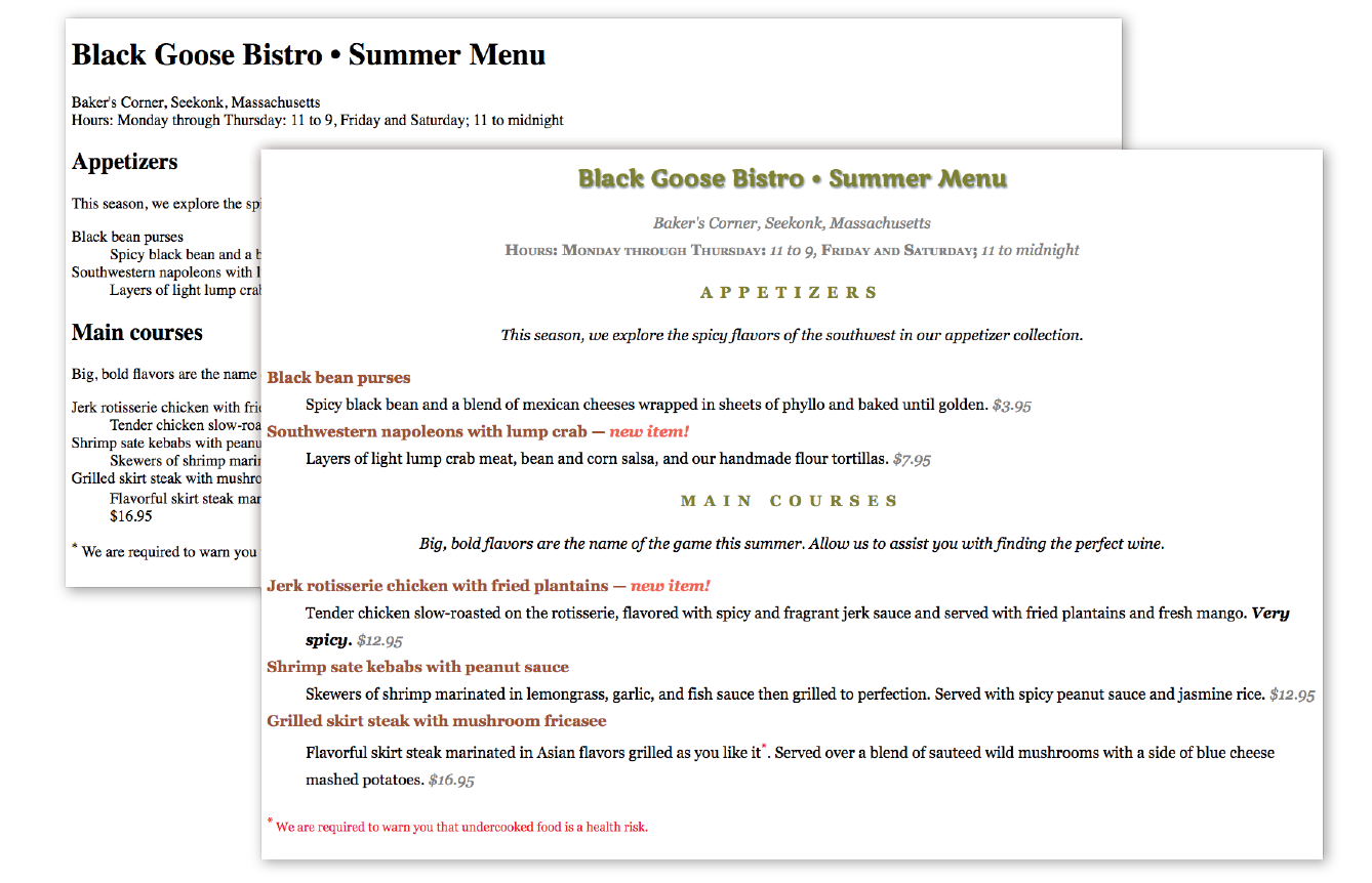
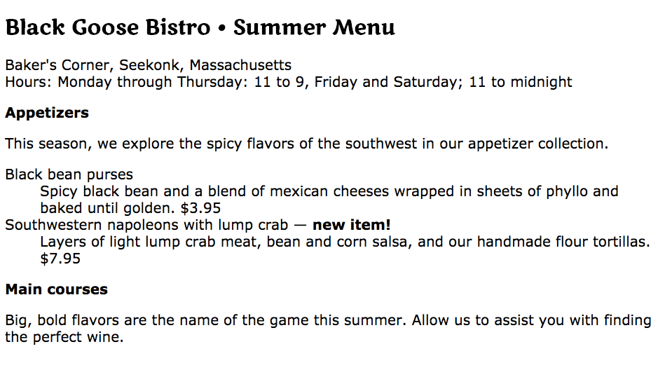
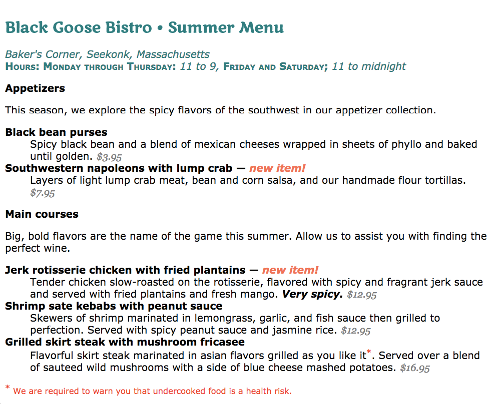
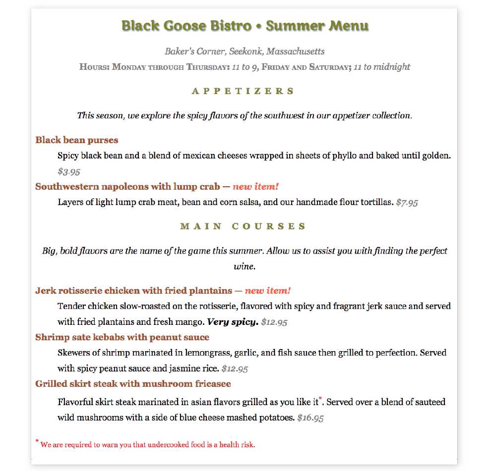
Throughout this chapter, we’ll be sprucing up a Black Goose Bistro online menu similar to the one we marked up back in Chapter 5, Marking Up Text I encourage you to work along with the exercises to get a feel for how the properties work. Figure 12-1 shows how the menu looks before and after we’re done. It’s not a masterpiece, because we’re just scratching the surface of CSS here, but at least the text has more personality.
Basic Font Properties
When I design a text document (for print or the web), one of the first things I do is specify a font. In CSS, fonts are specified using a set of font-related properties for typeface, size, weight, font style, and special characters. There are also shortcut properties that let you specify multiple font attributes in a single rule.
Specifying the Font Name
Choosing a typeface, or font family as it is called in CSS, for your text is a good place to start. Let’s begin with the font-family property and its values.
font-family
Values: one or more font or generic font family names, separated by commas
Default: depends on the browser
Applies to: all elements
Inherits: yes
Use the font-family property to specify a font or list of fonts (known as a font stack) by name, as shown in these examples:
body { font-family: Arial; }var { font-family: Courier, monospace; }p { font-family: "Duru Sans", Verdana, sans-serif; }
Here are some important syntax requirements:
- All font names, with the exception of generic font families, must be capitalized. For example, use Arial instead of arial.
- Use commas to separate multiple font names, as shown in the second and third examples.
- Notice that font names that contain a character space (such as Duru Sans in the third example) must appear within quotation marks.
You might be asking, “Why specify more than one font?” That’s a good question, and it brings us to one of the challenges of specifying fonts for the web.
Font limitations
Browsers are limited to displaying fonts they have access to. Traditionally, that meant the fonts that were already installed on the user’s hard drive. In 2010, however, there was a boom in browser support for embedded web fonts using the CSS @font-face rule, so it became possible for designers to provide their own fonts. See the sidebar “Say Hello to Web Fonts” for more information.
But back to our font-family rule. Even when you specify that the font should be Futura in a style rule, if the browser can’t find it (for example, if that font is not installed on the user’s computer or the provided web font fails to load), the browser uses its default font instead.
Fortunately, CSS allows us to provide a list of back-up fonts (that font stack we saw earlier) should our first choice not be available. If the first specified font is not found, the browser tries the next one, and down through the list until it finds one that works. In the third font-family rule shown in the previous code example, if the browser does not find Duru Sans, it will use Verdana, and if Verdana is not available, it will substitute some other sans-serif font.
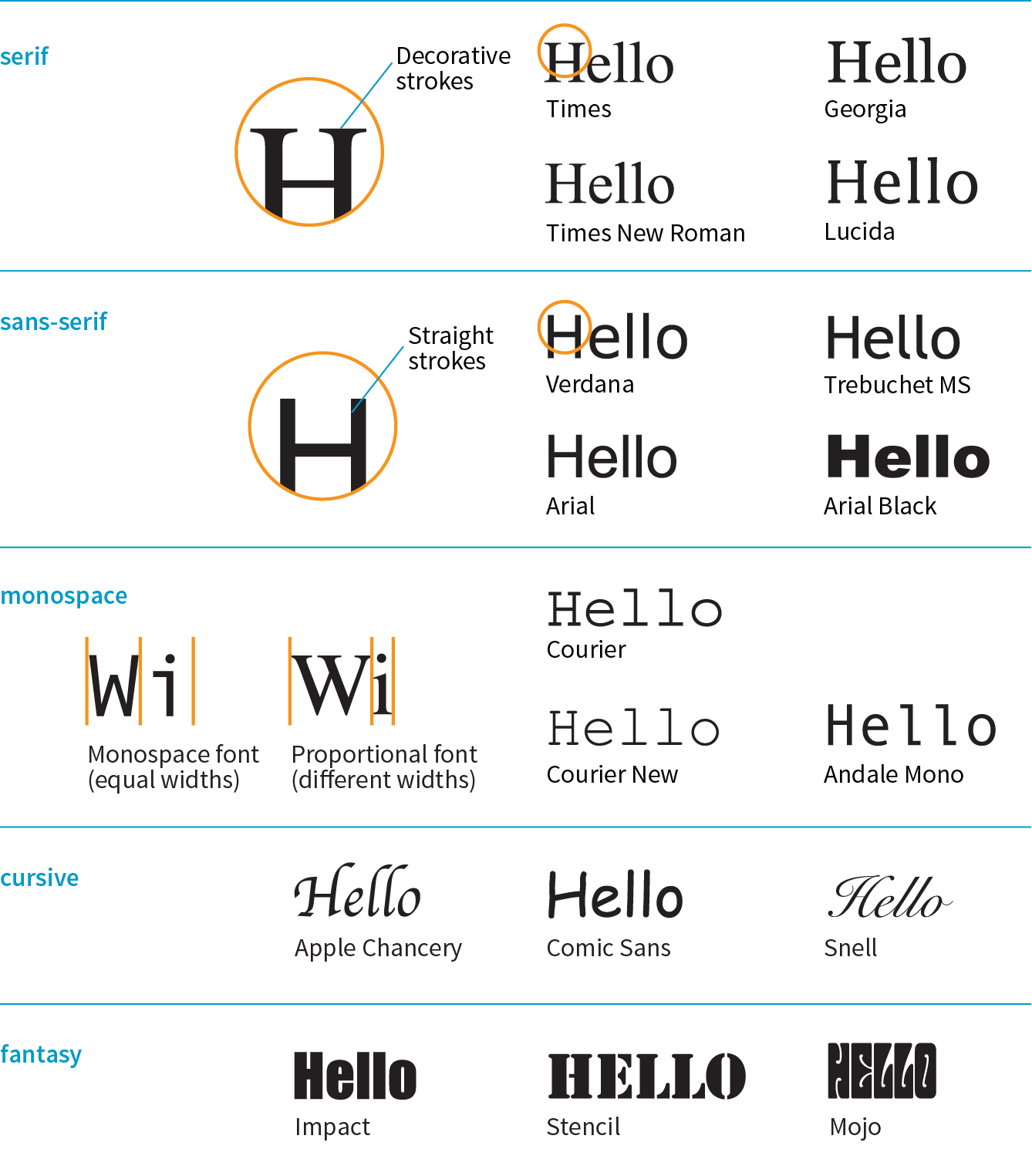
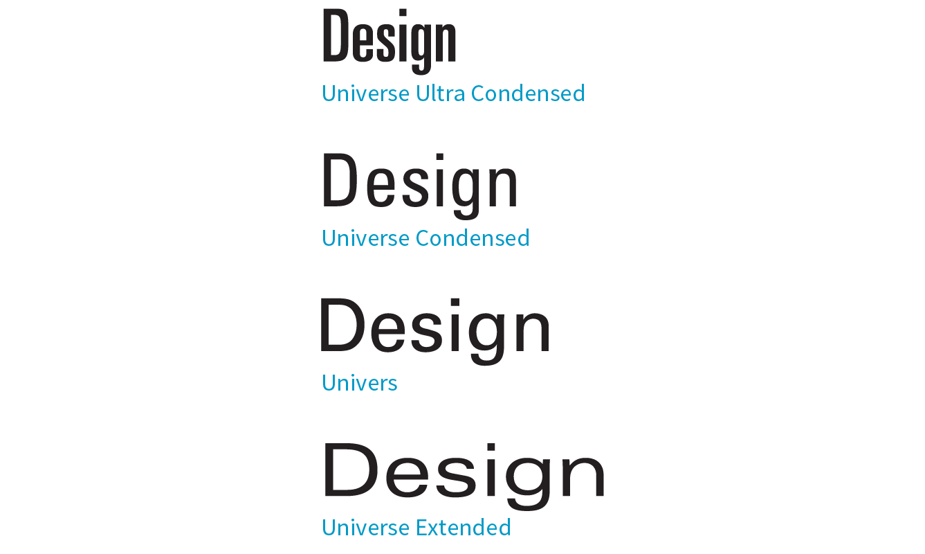
Generic font families
That last option, “some other sans-serif font,” bears more discussion. “Sans-serif” is just one of five generic font families that you can specify with the font-family property. When you specify a generic font family, the browser chooses an available font from that stylistic category. Figure 12-2 shows examples from each family.
NOTE
Generic font family names do not need to be capitalized in the style rule.
Examples: Times, Times New Roman, Georgia
Serif typefaces have decorative slab-like appendages (serifs) on the ends of certain letter strokes.
sans-serif
Examples: Arial, Arial Black, Verdana, Trebuchet MS, Helvetica, Geneva
Sans-serif typefaces have straight letter strokes that do not end in serifs.
monospace
Examples: Courier, Courier New, and Andale Mono
In monospace (also called constant width) typefaces, all characters take up the same amount of space on a line. For example, a capital W will be no wider than a lowercase i. Compare this to proportional typefaces (such as the one you’re reading now) that allot different widths to different characters.
cursive
Examples: Apple Chancery, Zapf-Chancery, and Comic Sans
Cursive fonts emulate a script or handwritten appearance.
fantasy
Examples: Impact, Western, or other decorative font
Fantasy fonts are purely decorative and would be appropriate for headlines and other display type.
Font stack strategies
The best practice for specifying fonts for web pages is to start with your first choice, provide some similar alternatives, and then end with a generic font family that at least gets users in the right stylistic ballpark. For example, if you want an upright, sans-serif font, you might start with a web font if you are providing one (Oswald), list a few that are more common (Univers, Tahoma, Geneva), and finish with the generic sans-serif. There is no limit to the number of fonts you can include, but many designers strive to keep it under 10.
font-family: Oswald, Univers, Tahoma, Geneva, sans-serif;
A good font stack should include stylistically related fonts that are known to be installed on most computers. Sticking with fonts that come with the Windows, macOS, and Linux operating systems, as well as fonts that get installed with popular software packages such as Microsoft Office and Adobe Creative Suite, gives you a solid list of “web-safe” fonts to choose from. A good place to look for stylistically related web-safe fonts is CSS Font Stack (www.cssfontstack.com). There are many articles on font stack strategies that are just a Google search away. I recommend Michael Tuck’s “8 Definitive Font Stacks” (www.sitepoint.com/eight-definitive-font-stacks), which is an oldie but goodie.
So, as you see, specifying fonts for the web is more like merely suggesting them. You don’t have absolute control over which font your users will see. You might get your first choice; you might get the generic fallback. It’s one of those web design quirks you learn to live with.
Now seems like a good time to get started formatting the Black Goose Bistro menu. We’ll add new style rules one at a time as we learn new properties, staring with Exercise 12-1.
exercise 12-1. Formatting a menu
- Save the document and reload the page in the browser. It should look like Figure 12-3. Note that you’ll need to have an internet connection and a current browser to view the Marko One headline font. We’ll work on the text size in the next exercise.
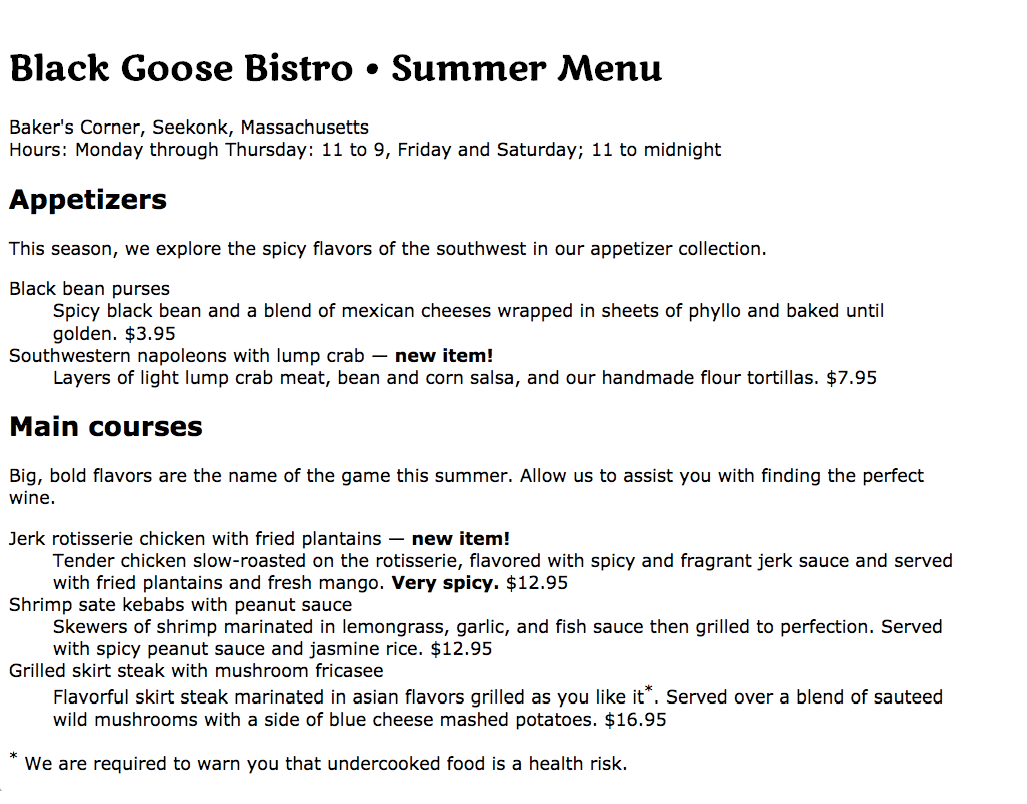
Figure 12-3. The menu after we change only the font family.
Specifying Font Size
Use the aptly named font-size property to specify the size of the text.
font-size
Values: length unit | percentage | xx-small | x-small | small | medium | large | x-large | xx-large | smaller | larger
Default: medium
Applies to: all elements
Inherits: yes
You can specify text size in several ways:
- Using one of the CSS length units, as shown here:
h1 {font-size: 1.5em;}When specifying a number of units, be sure the unit abbreviation immediately follows the number, with no extra character space in between (see the sidebar “Providing Measurement Values”).
CSS length units are discussed in Chapter 11, Introducing Cascading Style Sheets. See also the “CSS Units Cheat Sheet” sidebar.
- As a percentage value, sized up or down from the element’s inherited font size:
h1 {font-size: 150%;} - Using one of the absolute keywords (xx-small, x-small, small, medium, large, x-large, xx-large). On most current browsers, medium corresponds to the default font size.
h1 {font-size: x-large;} - Using a relative keyword (larger or smaller) to nudge the text larger or smaller than the surrounding text:
strong {font-size: larger;}
I’m going to cut to the chase and tell you that, despite all these options, the preferred values for font-size in contemporary web design are the relative length units em and rem, as well as percentage values. You can specify font size in pixels (px), but in general, they do not provide the flexibility required in web page design. All of the other absolute units (pt, pc, in, etc.) are out too, unless you are creating a style sheet specifically for print.
The preferred font-size values are em, rem, and %.
I’ll explain the keyword-based font-size values in a moment, but let’s start our discussion with the best practice using relative values.
Sizing text with relative values
The best practice for setting the font size of web page elements is to do it in a way that respects the user’s preference. Relative sizing values %, rem, and em allow you to use the default font size as the basis for proportional sizing of other text elements. It’s usually not important that the headlines are exactly 24 pixels; it is important that they are 1.5 times larger than the main text so they stand out. If the user changes their preferences to make their default font size larger, the headlines appear larger, too.
To maintain the browser’s default size, set the font-size of the root element to 100% (see Note):
html { font-size: 100%;}
Note
It is also common practice to set the to 100%, but setting it on the element is a more flexible approach.
That sets the basis for relative sizing. Because the default font size for all modern browsers is 16 pixels, we’ll assume our base size is 16 pixels going forward (we’ll also keep in mind that it could be different).
Rem values
The rem unit, which stands for “root em,” is always relative to the size of the root (html) element. If the root size is 16 pixels, then a rem equals 16 pixels. What’s nice about rem units is, because they are always relative to the same element, they are the same size wherever you use them throughout the document. In that way, they work like an absolute unit. However, should the root size be something other than 16 pixels, elements specified in rem values will resize accordingly and proportionally. It’s the best of both worlds.
Here is that same heading sized with rem values:
h1 { font-size: 1.5rem; } /* 1.5 x 16 = 24 */
Browser support note
Note that rem units are not supported in Internet Explorer 8 and earlier. If for some reason you need to support old browsers, you’ll need to provide a fallback declaration set in pixels. There are also tools that change all your rem units to pixels automatically, as discussed in .
Em measurements
Em units are based on the font size of the current element. When you specify font-size in ems, it will be relative to the inherited size for that element. Once the em is calculated for an element, it can be used for other measurements as well, such as margins, padding, element widths, and any other setting you want to always be relative to the size of the font.
Here I’ve used em units to specify the size of an h1 that has inherited the default 16-pixel font size from the root:
h1 { font-size: 1.5em; } /* 1.5 x 16 = 24 */
There are a few snags to working with ems. One is that because of rounding errors, there is some inconsistency in how browsers and platforms render text set in ems.
The other tricky aspect to using ems is that they are based on the inherited size of the element, which means that their size is based on the context in which they are applied.
The h1 in the previous example was based on an inherited size of 16 pixels. But if this h1 had appeared in an article element that had its font size set to 14 pixels, it would inherit the 14-pixel size, and its resulting size would be just 21 pixels (1.5 × 14 = 21). Figure 12-4 shows the results.
The markup
<h1>Headline in Body</h1><p>Pellentesque ligula leo,…</p><article> <h1>Headline in Article</h1> <p>Vivamus …</p></article>
The styles
h1 { font-size: 1.5em; /* sets all h1s to 1.5em */
}article { font-size: .875em /* 14 pixels based on 16px default */
}
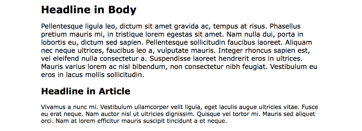
From this example, you can see that an element set in ems might appear at different sizes in different parts of the document. If you wanted the h1 in the article to be 24 pixels as well, you could calculate the em value by dividing the target size by its context: 24 / 14 = 1.71428571 em. (No need to round that figure down…the browser knows what to do with it.)
If you have elements nested several layers deep, the size increase or decrease compounds, which can create problems. With many layers of nesting, text may end up being way too small. When working with ems, pay close attention and write style rules in a way that takes the context into account.
This compounding nature of the em is what has driven the popularity of the predictable rem unit.
Percentage values
We saw a percentage value (100%) used to preserve the default font size, but you can use percentage values for any element. They are pretty straightforward.
In this example, the h1 inherits the default 16px size from the html element, and applying the 150% value multiplies that inherited value, resulting in an h1 that is 24 pixels:
h1 { font-size: 150%; } /* 150% of 16 = 24 */
Working with keywords
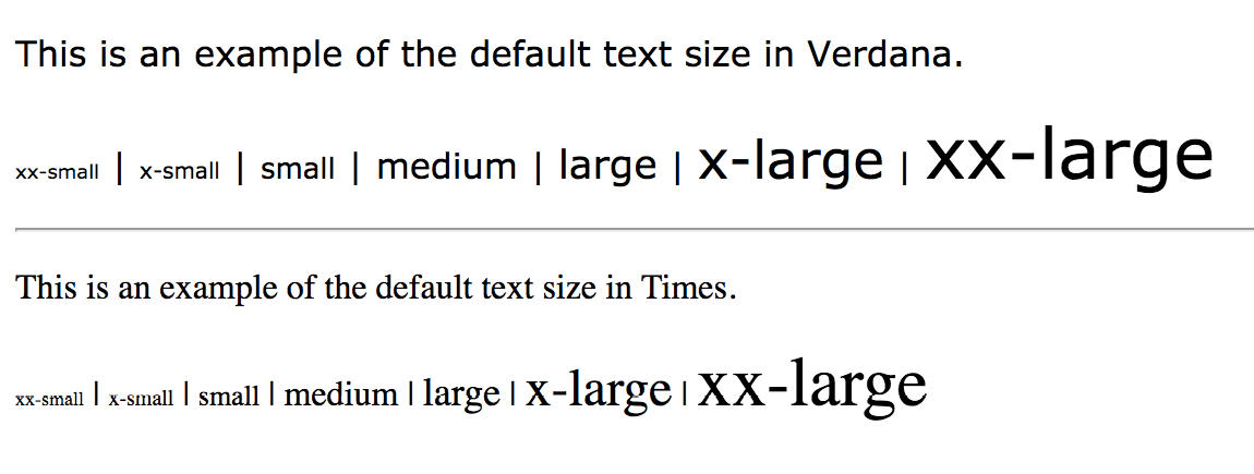
An alternative way to specify font-size is by using one of the predefined absolute keywords: xx-small, x-small, small, medium, large, x-large, and xx-large. The keywords do not correspond to particular measurements, but rather are scaled consistently in relation to one another. The default size is medium in current browsers. Figure 12-5 shows how each of the absolute keywords renders in a browser when the default text is set at 16 pixels. I’ve included samples in Verdana and Times to show that, even with the same base size, there is a big difference in legibility at sizes small and below. Verdana was designed to be legible on screens at small font sizes; Times was designed for print so is less legible in that context.
The relative keywords, larger and smaller, are used to shift the size of text relative to the size of the parent element text. The exact amount of the size change is determined by each browser and is out of your control. Despite that limitation, it is an easy way to nudge type a bit larger or smaller if the exact proportions are not critical.
You can apply your new CSS font knowledge in Exercise 12-2.
exercise 12-2. Setting font size
Font Weight (Boldness)
After font families and size, the remaining font properties are straightforward. For example, if you want a text element to appear in bold, use the font-weight property to adjust the boldness of type.
font-weight
Values: normal | bold | bolder | lighter | 100 | 200 | 300 | 400 | 500 | 600 | 700 | 800 | 900
Default: normal
Applies to: all elements
Inherits: yes
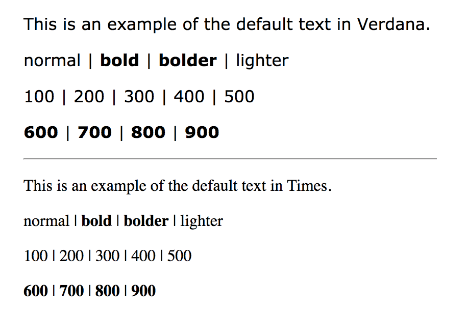
As you can see, the font-weight property has many predefined values, including descriptive terms (normal, bold, bolder, and lighter) and nine numeric values (100 to 900) for targeting various weights of a font if they are available. Because most fonts commonly used on the web have only two weights, normal (or Roman) and bold, the only font weight value you will use in most cases is bold. You may also use normal to make text that would otherwise appear in bold (such as strong text or headlines) appear at a normal weight.
The numeric chart may come in handy when using web fonts with a large range of weights (I’ve seen a few Google web fonts that require numeric size values). If multiple weights are not available, numeric settings of 600 and higher generally result in bold text, as shown in Figure 12-7 (although even that can vary by browser).
If a separate bold face is not available, the browser may “synthesize” a bold font by beefing up the available normal face (see Note).
Font Style (Italics)
The font-style property affects the posture of the text—that is, whether the letter shapes are vertical (normal) or slanted (italic and oblique).
font-style
Values: normal | italic | oblique
Default: normal
Applies to: all elements
Inherits: yes
Use the font-style property to make text italic. Another common use is to make text that is italicized in the browser’s default styles (such as emphasized text) display as normal. There is an oblique value that specifies a slanted version of the font; however, browsers generally display oblique exactly the same as italic.
Try out weight and style in Exercise 12-3.
exercise 12-3. Making text bold and italic
dt { font-weight: bold; }strong { font-style: italic;}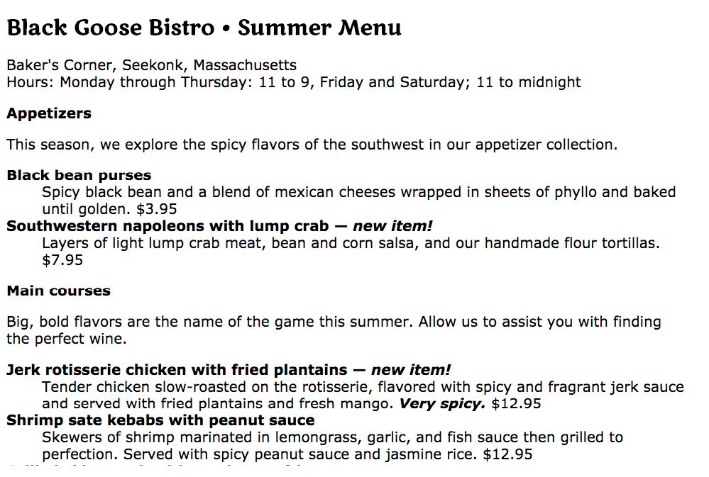
Font Variant in CSS2.1 (Small Caps)
font-variant
Values: normal | small-caps
Default: normal
Applies to: all elements
Inherits: yes
Some typefaces come in a “small caps” variant. This is a separate font design that uses small uppercase-style letters in place of lowercase letters. Small caps characters are designed to match the size and density of lowercase text so they blend in.
Small caps should be used for strings of three or more capital letters appearing in the flow of text, such as acronyms and abbreviations, that may look jarring as full-sized capitals. Compare NASA and USA in the standard font to nasa and usa in small caps. Small caps are also recommended for times, like 1am or 2017ad.
When the font-variant property was introduced in CSS2.1, it was a one-trick pony that allowed designers to specify a small-caps font for text elements. CSS3 has greatly expanded the role of font-variant, as I will cover in the upcoming section “Advanced Typography with CSS3.” For now, we’ll look at only the CSS2.1 version of font-variant.
In most cases, browsers simulate small caps by scaling down uppercase letters in the current font. To typography sticklers, this is less than ideal and results in inconsistent stroke weights, but you may find it an acceptable option for adding variety to small amounts of text. You will see an example of small caps when we use the font-variant property in Exercise 12-5.
Font Stretch (Condensed and Extended)
font-stretch
Values: normal | ultra-condensed | extra-condensed | condensed | semi-condensed | semi-expanded | expanded | extra-expanded | ultra-expanded
Default: normal
Applies to: all elements
Inherits: yes
The CSS3 font-stretch property tells the browser to select a normal, condensed, or extended font in the font family (Figure 12-9). If the browser cannot find a matching font, it will not try to synthesize the width by stretching or squeezing text; it may just substitute a font of a different width. Browser support is just beginning to kick in for this property. As of this writing, it works on IE11+, Edge, Firefox, Chrome 48+, Opera, and Android 52+, but it is not yet supported on Safari or iOS Safari; however, that may change.
The Shortcut font Property
Specifying multiple font properties for each text element can get repetitive and lengthy, so the creators of CSS provided the shorthand font property, which compiles all the font-related properties into one rule.
Warning
Be careful when using shorthand properties like . Any omitted property resets to its default value. On the flip side, the shorthands are a good way to get a blank slate if you need one.
font
Values: font-style font-weight font-variant font-stretch font-size/line-height font-family | caption | icon | menu | message-box | small-caption | status-bar
Default: depends on default value for each property listed
Applies to: all elements
Inherits: yes
The value of the font property is a list of values for all the font properties we just looked at, separated by character spaces. It is important to note that only the CSS2.1 version of font-variant (small-caps) can be used in the font shortcut (which is one reason I kept it separate). In this property, the order of the values is important:
{ font: style weight stretch variant size/line-height font-family; }
At minimum, the font property must include a font-size value and a font-family value, in that order. Omitting one or putting them in the wrong order causes the entire rule to be invalid. This is an example of a minimal font property value:
p { font: 1em sans-serif; }
Once you’ve met the size and family requirements, the other values are optional and may appear in any order prior to the font-size. When style, weight, stretch, or variant is omitted, its value is set to normal. That makes it easy to accidentally override a previous setting with the shorthand property, so be careful when you use it.
There is one value in there, line-height, that we have not seen yet. As it sounds, it adjusts the height of the text line and is used to add space between lines of text. It appears just after font-size, separated by a slash, as shown in these examples. The line-height property is covered in more detail later in this chapter.
h3 { font: oblique bold small-caps 1.5em/1.8em Verdana, sans-serif; }h2 { font: bold 1.75em/2 sans-serif; }
In Exercise 12-4, we’ll use the shorthand font property to make some changes to the h1 headings in the bistro menu.
System font keywords
The font property also has a number of keyword values (caption, icon, menu, message-box, small-caption, and status-bar) that represent system fonts, the fonts used by operating systems for things like labels for icons and menu items. These may be useful when you’re designing a web application so that it matches the environment the user is working on. These are considered shorthand values because they encapsulate the font, size, style, and weight of the font used for each purpose with only one keyword.
Like the shorthand font property, Exercise 12-4 is short and sweet.
Exercise 12-4. Using the shorthand font property
h1 { font: bold 1.5em "Marko One", Georgia, serif;}
Advanced Typography with CSS3
Now you have a good basic toolkit for formatting fonts with CSS. If you want to get fancy, you should read up on all the properties in the CSS Fonts Module Level 3, which give you far more control over character selection and position. I’m going to keep my descriptions brief because of space restraints and the fact that many of these features are still experimental or have very limited browser support. But if nice typography is your thing, I urge you to do more research, starting with the specification at www.w3.org/TR/css-fonts-3.
Font Variant in CSS3
The collection of font-variant- prefixed properties in CSS3 aims to give designers and developers access to special characters (glyphs) in fonts that can make the typography on a page more sophisticated.
As I mentioned earlier, the CSS3 Font Module greatly expanded the definition of font-variant. Now it can serve as a shorthand property for a number of font-variant- prefixed properties. These properties are still considered experimental, although browser support is starting to pick up. Still, it’s interesting to see how font control in web design is evolving, so let’s take a look.
Note
With the exception of , which has a specific purpose, the other properties are great opportunities to practice progressive enhancement. They are nice to have but OK to lose.
font-variant-ligatures
A ligature is a glyph that combines two or more characters into one symbol. One common example is the combination of a lowercase f and i, where the dot on the i becomes part of the f (). Ligatures can smooth out the appearance of known awkward letter pairings, and ligature glyphs are included in many fonts. The font-variant-ligatures property provides a way to control the use of ligatures on web pages. This one is better supported than the others, and already works in IE10+, Chrome 34+, as well as Safari and Opera (with the -webkit- prefix). I would expect browser support to steadily improve.
font-variant-caps
Allows the selection of small-cap glyphs (small-caps) from the font’s character set rather than simulating them in the browser. The all-small-caps value uses small caps for upper- and lowercase letters. unicase uses small caps for uppercase only, and lowercase letters in the word stay the same. titling-caps is used for all-caps titles but is designed to be less strong. Other options are petite-caps and all-petite-caps.
font-variant-position
Selects superscript (super) or subscript (sub) glyphs from the font’s character set when they are available. Otherwise, the browser creates superscript or subscript text for the sup and sub elements by shrinking the character and moving it above or below the baseline.
font-variant-numeric
Allows the selection of various number character styles if they are available. For example, you can pick numerals that are proportional or line up in columns as for a spreadsheet (proportional-numbers/tabular-numbers) opt for old-style numerals (old-style-nums) where some characters dip below the baseline, and specify whether fractions should be on a diagonal or stacked (diagonal-fractions/stacked-fractions). It also allows you to make ordinal numbers look like 2nd instead of 2nd (ordinal) and gives you a way to use zeros with slashes through them as is preferred in some contexts (slashed-zero).
font-variant-alternates
Fonts sometimes offer more than one glyph for a particular character—for example, a few swash designs for the letter S, or an old-fashioned s that looks more like an f. font-variant-alternates provides a way to specify swashes and other alternative characters. Many of its values are font-specific and must be defined first with the @font-features-values at-rule. I’ll leave a deeper explanation to the spec.
font-variant-east-asian
Allows selection of particular Asian glyphs.
Finally, the old font-variant property that has been around since the beginning of CSS has been upgraded to be a shorthand property for all of the properties listed here. You can use it today with the original small-caps value, and it will be perfectly valid. Once these properties gain traction, it will be able to do a whole lot more.
Other CSS3 Properties
It’s time to finish up our review of the font properties in the Fonts Module Level 3. I’ll give you a general idea of what is available (or will be, after browser support catches up) and you can dig deeper in the spec on your own:
font-size-adjust
The size text looks on the page often has more to do with the height of the lowercase x (its x-height) than the specified size of the text. For example, 10-point type with relatively large x-height is likely easier to read than 10-point type with dainty little lowercase letters. The font-size-adjust property allows the browser to adjust the size of a fallback font until its x-height matches the x-height of the first-choice font. This can ensure better legibility even when a fallback font needs to be used.
font-kerning
Kerning is the space between character glyphs. Fonts typically contain metadata about which letter pairs need to be cozied up together to make the spacing in a word look consistent. The font-kerning property allows the font’s kerning information to be applied (normal), turned off (none), or left to the browser’s discretion (auto).
font-feature-settings
This property gives authors the ability to control advanced typographic features in OpenType fonts that are not widely used, such as swashes, small caps, ligatures, automatic fractions, and more. Those features should look familiar, as many of them can be controlled with various font-variant properties. In fact, the spec recommends you use font-variant whenever possible and reserve font-feature-settings for edge cases. As of this writing, however, the font-feature-settings property has better browser support, so for the time being it may be a better option. Just be aware that it cascades poorly, meaning it is easy to undo a setting when you use it later to set something else. CSS-Tricks provides a good overview by Robin Rendle (css-tricks.com/almanac/properties/f/font-feature-settings).
font-language-override
This experimental property controls the use of language-specific glyphs.
We’ve finally made our way through the various ways to control fonts in CSS (it took a while!), but that is just one aspect of text presentation. Changing the color of text is another common design choice.
Changing Text Color
You got a glimpse of how to change text color in Chapter 11, Introducing Cascading Style Sheets, and to be honest, there’s not a lot more to say about it here. You change the color of text with the color property.
color
Values: color value (name or numeric)
Default: depends on the browser and user’s preferences
Applies to: all elements
Inherits: yes
Using the color property is very straightforward. The value of the color property can be a predefined color name (see the “Color Names” sidebar) or a numeric value describing a specific RGB color. Here are a few examples, all of which make the h1 elements in a document gray:
h1 { color: gray; }h1 { color: #666666; }h1 { color: #666; }h1 { color: rgb(102,102,102); }
Don’t worry about the numeric values for now; I just wanted you to see what they look like. RGB color is discussed in detail in Chapter 13, Colors and Backgrounds so in this chapter, we’ll just stick with color names for demonstration purposes.
Color is inherited, so you can change the color of all the text in a document by applying the color property to the body element, as shown here:
body { color: fuchsia; }
OK, so you probably wouldn’t want all your text to be fuchsia, but you get the idea.
For the sake of accuracy, I want to point out that the color property is not strictly a text-related property. In fact, according to the CSS specification, it is used to change the foreground (as opposed to the background) color of an element. The foreground of an element consists of both the text it contains as well as its border. So, when you apply a color to an element (including image elements), know that color will be used for the border as well, unless there is a specific border-color property that overrides it. We’ll talk more about borders and border color in Chapter 14, Thinking Inside the BoxBefore we add color to the online menu, I want to take a little side trip and introduce you to a few more types of selectors that will give us more flexibility in targeting elements in the document for styling.
A Few More Selector Types
So far, we’ve been using element names as selectors. In the last chapter, you saw how to group selectors together in a comma-separated list so you can apply properties to several elements at once. Here are examples of the selectors you already know:
Element selector p { color: navy; }
Grouped selectors p, ul, td, th { color: navy; }
The disadvantage of selecting elements this way, of course, is that the property (in this case, navy blue text) is applied to every paragraph and other listed elements in the document. Sometimes you want to apply a rule to a particular paragraph or paragraphs. In this section, we’ll look at three selector types that allow us to do just that: descendant selectors, ID selectors, and class selectors.
Descendant Selectors
A descendant selector targets elements that are contained within (and therefore are descendants of) another element. It is an example of a contextual selector because it selects the element based on its context or relation to another element. The sidebar “Other Contextual Selectors” lists some more.
Descendant selectors are indicated in a list separated by a character space. This example targets emphasized text (em) elements, but only when they appear in list items (li). Emphasized text in paragraphs and other elements would be unaffected (Figure 12-10).
li em { color: olive; }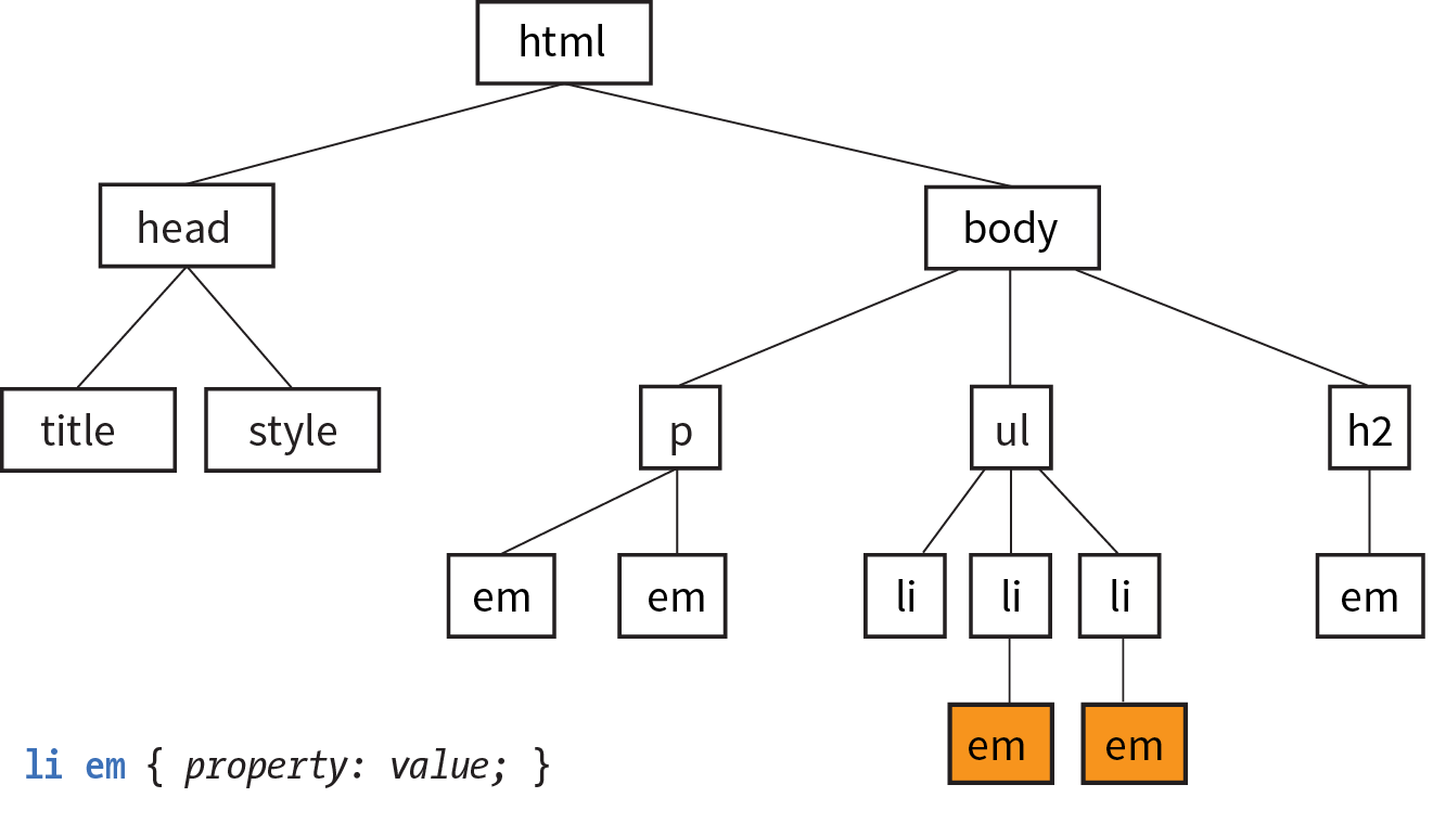
Here’s another example that shows how contextual selectors can be grouped in a comma-separated list, just as we saw earlier. This rule targets em elements, but only when they appear in h1, h2, and h3 headings:
h1 em, h2 em, h3 em { color: red; }It is also possible to nest descendant selectors several layers deep. This example targets em elements that appear in anchors (a) in ordered lists (ol):
ol a em { font-variant: small-caps; }ID Selectors
Back in Chapter 5, Marking Up Text, we learned about the id attribute, which gives an element a unique identifying name (its id reference). The id attribute can be used with any element, and it is commonly used to give meaning to the generic div and span elements. ID selectors allow you to target elements by their id values. The symbol that identifies ID selectors is the octothorpe (#), also known as a hash or pound symbol.
Here is an example of a list item with an id reference:
<li id="sleestak">Sleestak T-shirt</li>
Now you can write a style rule just for that list item using an ID selector, like so (notice the # preceding the id reference):
li#sleestak { color: olive; }Because id values must be unique in the document, it is acceptable to omit the element name. The following rule is equivalent to the last one:
#sleestak { color: olive; }You can also use an ID selector as part of a contextual selector. In this example, a style is applied only to a elements that appear within the element identified as “resources.” In this way, you can treat links in the element named “resources” differently than all the other links on the page without any additional markup.
#resources a { text-decoration: none; }You should be beginning to see the power of selectors and how they can be used strategically along with well-planned semantic markup.
Class Selectors
One last selector type, and then we can get back to text style properties. The other element identifier you learned about in Chapter 5 is the class identifier, used to classify elements into a conceptual group. Unlike the id attribute, multiple elements may share a class name. Not only that, but an element may belong to more than one class.
You can target elements belonging to the same class with—you guessed it—a class selector. Class names are indicated with a period (.) at the beginning of the selector. For example, to select all paragraphs with class="special", use this selector (the period indicates the following word is a class selector):
p.special { color: orange; }To apply a property to all elements of the same class, omit the element name in the selector (be sure to leave the period; it’s the character that indicates a class). This example targets all paragraphs and any other element that has been marked up with class="special":
.special { color: orange; }Specificity 101
In Chapter 11, I introduced you to the term specificity, which refers to the fact that more specific selectors have more weight when it comes to handling style rule conflicts. Now that you know a few more selectors, it is a good time to revisit this very important concept.
This list of selector types from most to least specific should serve you well in most scenarios:
- Inline styles with the style attribute are more specific than (and will override…)
- ID selectors, which are more specific than (and will override…)
- Class selectors, which are more specific than (and will override…)
- Individual element selectors
The full story is a little more complicated, but here it is in a nutshell. To calculate specificity, start by drawing three boxes:
[ ] [ ] [ ]
Now count up the number of IDs in the selector, and put that number in the first box. Next count up the number of classes and pseudo-classes in the selector, and put that number in the second box. Third, count up the element names, and put that number in the third box.
Specificity is compared box by box. The first box that is not a tie determines which selector wins. Here is a simple example of two conflicting rules for the h1 element:
h1{ color: red;} [0] [0] [1]h1.special{ color: lime; } [0] [1] [1]
The second one has a class selector and the first one doesn’t; therefore, the second one is more specific and has more weight.
How about something more complicated?
article#main aside.sidebar:hover > h1:first-of-type [1] [3] [3] .x.x.x.x.x.x.x.x a:link [0] [8] [1]
The second selector targets a link in an element with a string of class names (represented by “.x”). But the first selector has an ID (#main) and is therefore more specific.
You may need to do this full specificity calculation, but in most cases you’ll have a feel for which selector is more specific by following previously listed general guidelines.
You can use specificity strategically to keep your style sheets simple and your markup minimal. For example, it is possible to set a style for an element (p, in this example), and then override when necessary by using more specific selectors.
p{ line-height: 1.2em; } [0] [0] [1]blockquote p{ line-height: 1em; } [0] [0] [2]p.intro{ line-height: 2em; } [0] [1] [1]
In these examples, p elements that appear within a blockquote have a smaller line height than ordinary paragraphs. However, all paragraphs with a class of “intro” will have a 2em line height, even if it appears within a blockquote, because class selectors are more specific.
Understanding the concepts of inheritance and specificity is critical to mastering CSS, and there is a lot more to be said about specificity. The “More About Specificity” sidebar provides useful references.
Now, back to the menu. Fortunately, our Black Goose Bistro page has been marked up thoroughly and semantically, so we have a lot of options for selecting specific elements. Give these new selectors a try in Exercise 12-5.
exercise 12-5. Using selectors
Text Line Adjustments
The next batch of text properties has to do with the treatment of whole lines of text rather than the shapes of characters. They allow web authors to format web text with indents, extra space between lines (leading), and different horizontal alignments, similar to print.
Line Height
line-height
Values: number | length measurement | percentage | normal
Default: normal
Applies to: all elements
Inherits: yes
The line-height property defines the minimum distance from baseline to baseline in text. We saw it earlier as part of the shorthand font property. The line-height property is said to specify a “minimum” distance because if you put a tall image or large characters on a line, the height of that line expands to accommodate it.
A baseline is the imaginary line upon which the bottoms of characters sit. Setting a line height in CSS is similar to adding leading in traditional typesetting; however, instead of space being added between lines, the extra space is split above and below the text. The result is that line-height defines the height of a line-box in which the text line is vertically centered (Figure 12-12).
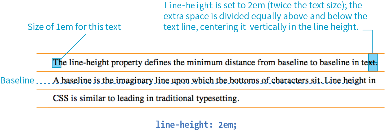
These examples show three different ways to make the line height twice the height of the font size:
p { line-height: 2; } p { line-height: 2em; } p { line-height: 200%; }
When a number is specified alone, as shown in the first example, it acts as a scaling factor that is multiplied by the current font size to calculate the line-height value.
Line heights can also be specified in one of the CSS length units. Ems and percentage values are based on the current font size of the element. In the three examples, if the font size is 16 pixels, the calculated line height would be 32 pixels (see Figure 12-12).
The difference between using a scaling factor (number value) and a relative value (em or %) is how they inherit. If you set the line height with a scaling factor for a whole document on the body element, its descendants inherit the multiplier. If the scaling factor is set to 2 for the body, a 24-pixel headline will end up with a line height of 48 pixels.
If you set the line-height on the body element using ems or percentages, its descendants inherit the calculated size based on the body’s font size. For example, if the line height is set to 1em for the body element (calculated at 16 pixels), a 24-pixel headline inherits the calculated 16-pixel line height, not the 1em value. This is likely not the effect you are after, making number values a more intuitive option.
Indents
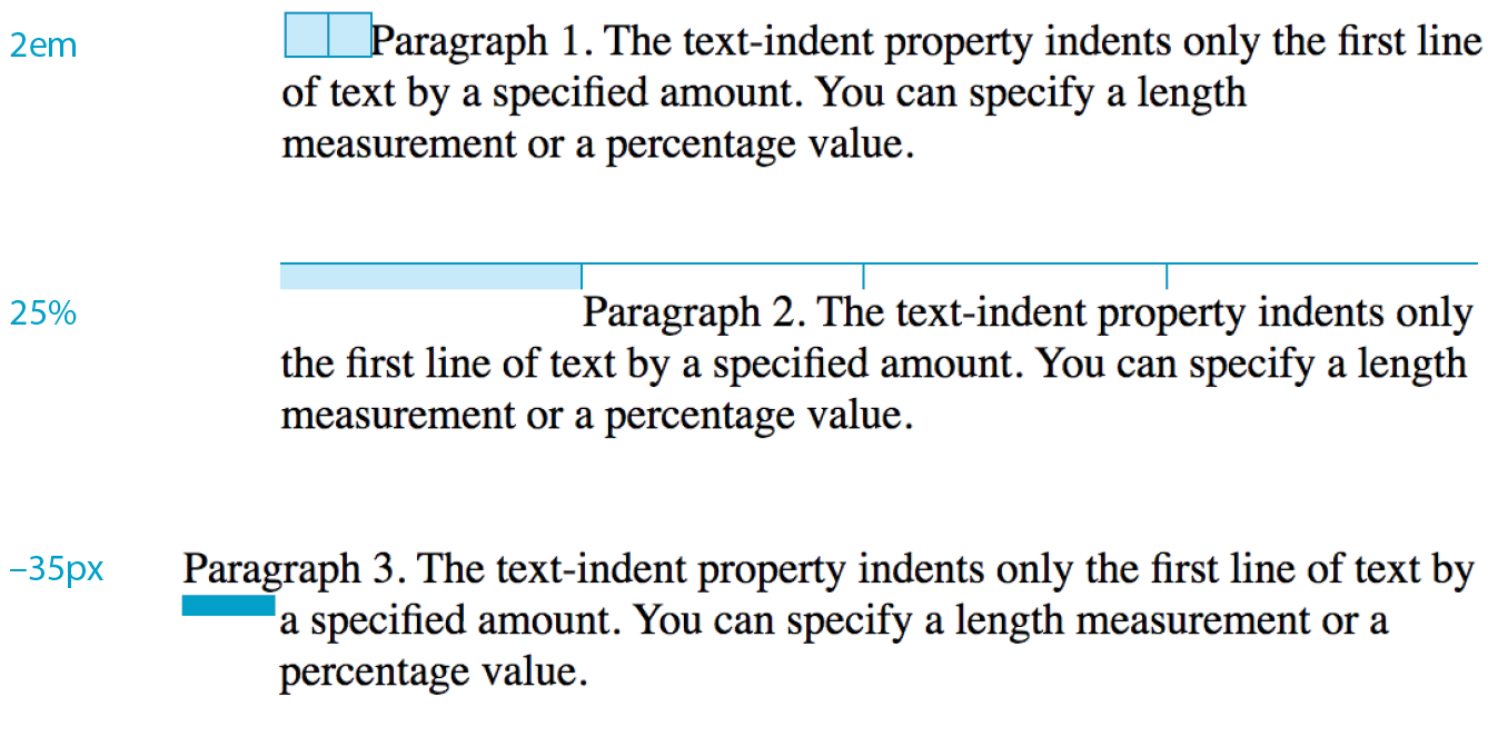
The text-indent property indents the first line of text by a specified amount.
text-indent
Values: length measurement | percentage
Default: 0
Applies to: block containers
Inherits: yes
NOTE
The property indents just the first line of a block. If you want space along the whole side of the text block, use one of the or properties to add it.
Designers may be accustomed to specifying indents and margins in tandem, but to be consistent with how CSS handles them, margins will be discussed as part of the box model in .
You can specify a length measurement or a percentage value for text-indent. The results are shown in Figure 12-13. Here are a few examples:
p#1 { text-indent: 2em; } p#2 { text-indent: 25%; } p#3 { text-indent: -35px; }
Percentage values are calculated based on the width of the parent element, and they are passed down to their descendant elements as percentage values (not calculated values). So if a div has a text-indent of 10%, so will all of its descendants.
In the third example, notice that a negative value was specified, and that’s just fine. It will cause the first line of text to hang out to the left of the left text edge (also called a hanging indent).
Horizontal Text Alignment
You can align text for web pages just as you would in a word processing or desktop publishing program with the text-align property.
text-align
Values: left | right | center | justify | start | end
Default: start
Applies to: block containers
Inherits: yes
This is a fairly straightforward property to use. The results of the various CSS2.1 text-align values are shown in Figure 12-14.
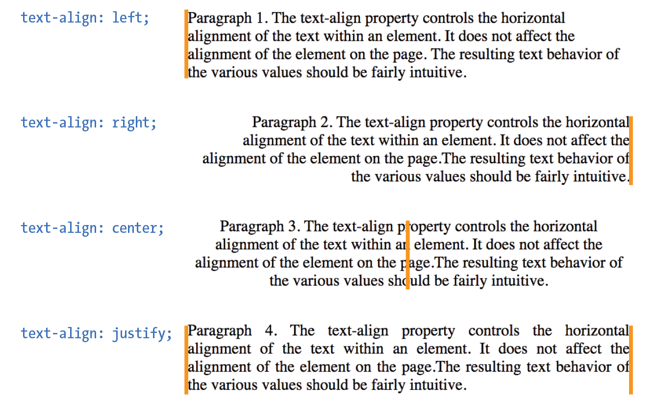
text-align: left
|
Aligns text on the left margin |
text-align: right
|
Aligns text on the right margin |
text-align: center
|
Centers the text in the text block |
text-align: justify
|
Aligns text on both right and left margins |
The CSS Text Module Level 3 added the start and end values, which specify the side of the line box the text should align to (see Note). This accommodates languages that are written vertically and right to left. For left-to-right reading languages, start corresponds to left.
NOTE
The CSS Text Module Level 3 also defines two new properties related to text alignment— (for aligning the last line of text) and (for more fine-tuned control over how space is inserted in justified text).
Good news—only five more text properties to go! Then we’ll be ready to try a few of them in the Black Goose Bistro menu.
Underlines and Other “Decorations”
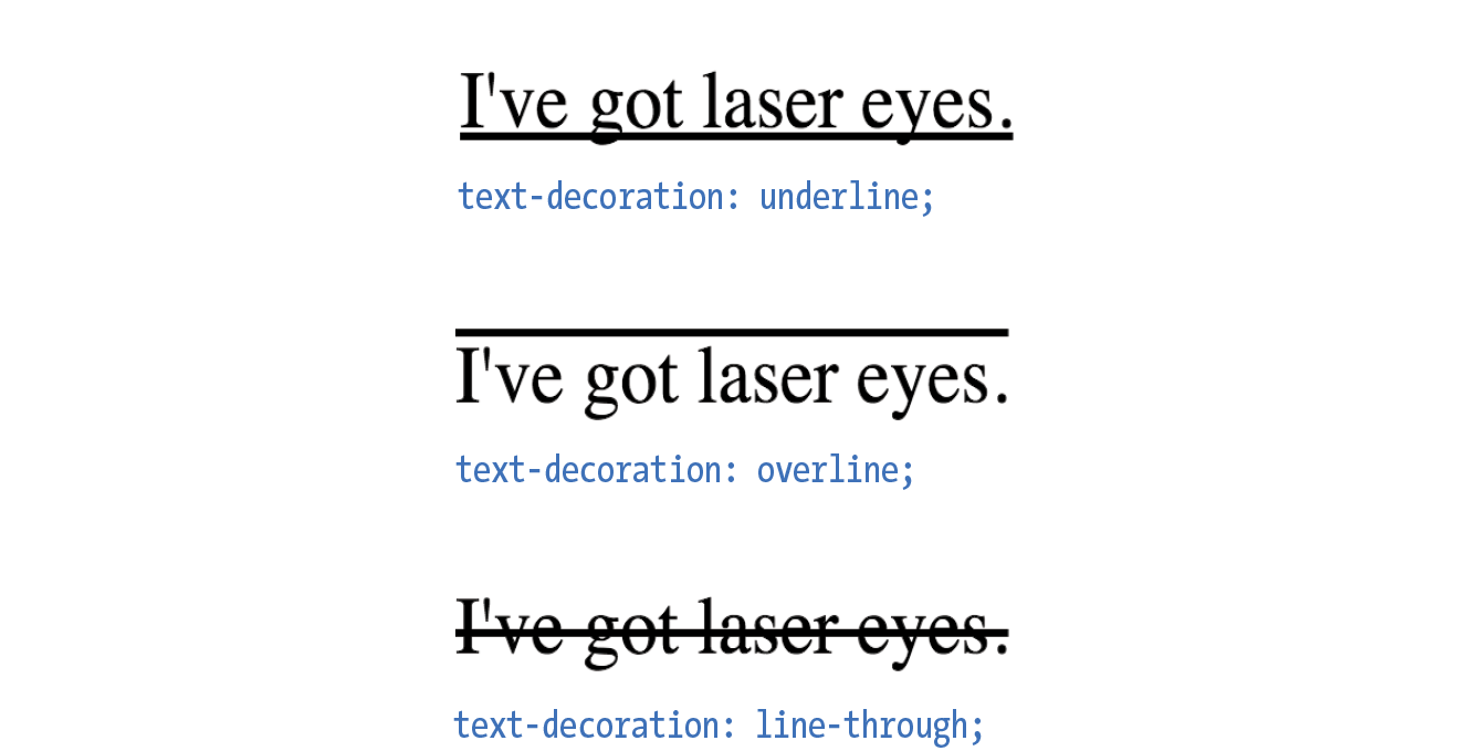
If you want to put a line under, over, or through text, or if you’d like to turn of the underline under links, then text-decoration is the property for you.
text-decoration
Values: none | underline | overline | line-through | blink
Default: none
Applies to: all elements
Inherits: no, but since lines are drawn across child elements, they may look like they are “decorated” too
The values for text-decoration are intuitive and are shown in Figure 12-15.
underline
|
Underlines the element |
overline
|
Draws a line over the text |
line-through
|
Draws a line through the text |
The most popular use of the text-decoration property is turning off the underlines that appear automatically under linked text, as shown here:
a { text-decoration: none; }
There are a few cautionary words to be said regarding text-decoration:
- First, if you get rid of the underlines under links, be sure there are other cues to compensate, such as color and weight.
- On the flip side, because underlines are such a strong visual cue to “click here,” underlining text that is not a link may be misleading and frustrating. Consider whether italics may be an acceptable alternative.
- Finally, there is no reason to make your text blink. Browser makers agree and therefore have dropped support for blinking text. IE never supported it in the first place.
Changing Capitalization
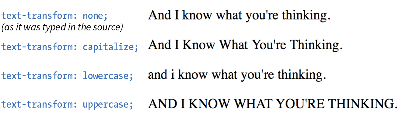
I remember when desktop publishing programs introduced a feature that let me change the capitalization of text on the fly (OK, I’m dating myself here). This made it easy to see how my headlines might look in all capital letters without needing to retype them. CSS includes this feature as well with the text-transform property.
text-transform
Values: none | capitalize | lowercase | uppercase | full-width
Default: none
Applies to: all elements
Inherits: yes
When you apply the text-transform property to a text element, it changes its capitalization when it renders without changing the way it is typed in the source. The values are as follows (Figure 12-16):
none
|
As it is typed in the source |
capitalize
|
Capitalizes the first letter of each word |
lowercase
|
Makes all letters lowercase |
uppercase
|
Makes all letters uppercase |
full-width
|
Chooses a “full-width” version of a character if one exists (not well supported) |
Spaced Out
The next two text properties are used to insert space between letters (letter-spacing) or words (word-spacing) when the text is displayed.
letter-spacing
Values: length measurement | normal
Default: normal
Applies to: all elements
Inherits: yes
word-spacing
Values: length measurement | normal
Default: normal
Applies to: all elements
Inherits: yes
The letter-spacing and word-spacing properties do what they say: add space between the letters of the text or words in a line, respectively.
Figure 12-17 shows the results of letter spacing and word spacing applied to the simple paragraph shown here:
<p>Black Goose Bistro Summer Menu</p>
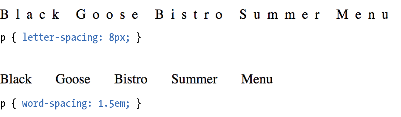
It is worth noting that when you specify em measurements, the calculated size is passed down to child elements, even if they have a smaller font size than the parent.
In Exercise 12-6 later in this chapter, we’ll make one last trip back to the Black Goose Bistro menu and use the letter-spacing property on h2s.
Text Shadow
The text-shadow property adds a “shadow” below your text that makes it seem to hover or pop out above the page. Since flat-color design has become the fashion, drop shadows have gone out of style, but they can still be a useful visual tool, particularly when your text is in front of a patterned or photographic background.
Text shadows are drawn behind the text but in front of the background and border if there is one. Text shadows are supported by all current browsers. Internet Explorer versions 9 and earlier lack support.
text-shadow
Values: ‘horizontal offset’ ‘vertical offset’ ‘blur radius’ ‘color’ | none
Default: none
Applies to: all elements
Inherits: yes
The value for the text-shadow property is two or three measurements (a horizontal offset, vertical offset, and an optional blur radius) and a color. Figure 12-18 shows an example of a minimal text shadow declaration.
h1 { color: darkgreen; text-shadow: .2em .2em silver;} h1 { color: darkgreen; text-shadow: -.3em -.3em silver; }
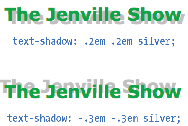
The first value is a horizontal offset that positions the shadow to the right of the text (a negative value pulls the shadow to the left of the text). The second measurement is a vertical offset that moves the shadow down by the specified amount (a negative value moves the shadow up). The declaration ends with the color specification (silver). If the color is omitted, the text color will be used.
That should give you an idea for how the first two measurements work, but that sharp shadow doesn’t look very…well…shadowy. What it needs is a blur radius measurement. Zero (0) is no blur, and the blur gets softer with higher values (Figure 12-19). Usually, you just have to fiddle with values until you get the effect you want.
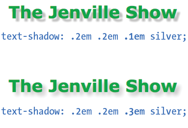
It is possible to apply several text shadows to the same element. If you vary the position and blur amounts, you can give the text the appearance of multiple light sources.
So go have some fun with text shadows, but be careful not to overdo it. Not only can drop shadows make text difficult to read, but adding a shadow to everything can slow down page performance (scrolling, mouse interactions, etc.) as well, which is particularly problematic for mobile browsers without much processing power. In addition, be careful that your text doesn’t require a shadow in order to be visible. Folks with non-supporting browsers won’t see a thing. My advice is to use drop shadows as an enhancement in a way that isn’t critical if they don’t appear.
Exercise 12-6 gives you a chance to try out more text formatting properties to put a little polish on the Black Goose Bistro menu.
exercise 12-6. Finishing touches
Changing List Bullets and Numbers
Before we close out this chapter on text properties, I want to show you a few tweaks you can make to bulleted and numbered lists. As you know, browsers automatically insert bullets before unordered list items, and numbers before items in ordered lists (the list markers). For the most part, the rendering of these markers is determined by the browser. However, CSS provides a few properties that allow authors to choose the type and position of the marker, or turn them off entirely.
Choosing a Marker
Apply the list-style-type property to the ul, ol, or li element select the type of marker that appears before each list item (see Note).
list-style-type
Values: none | disc | circle | square | decimal | decimal-leading-zero | lower-alpha | upper-alpha | lower-latin | upper-latin | lower-roman | upper-roman | lower-greek
Default: disc
Applies to: , , and (or elements whose display value is )
Inherits: yes
More often than not, developers use the list-style-type property with its value set to none to remove bullets or numbers altogether. This is handy when you’re using list markup as the foundation for a horizontal navigation menu or the entries in a web form. You can keep the semantics but get rid of the pesky markers.
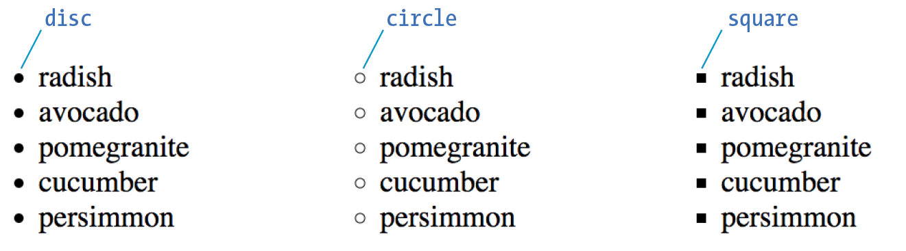
The disc, circle, and square values generate bullet shapes just as browsers have been doing since the beginning of the web itself (Figure 12-21). Unfortunately, there is no way to change the appearance (size, color, etc.) of generated bullets, so you’re stuck with the browser’s default rendering.
The remaining keywords (Table 12-1) specify various numbering and lettering styles for use with ordered lists.
|
Table 12-1. Lettering and numbering system (CSS2.1) |
|
|
Keyword |
System |
decimal |
1, 2, 3, 4, 5… |
decimal-leading-zero |
01, 02, 03, 04, 05… |
lower-alpha |
a, b, c, d, e… |
upper-alpha |
A, B, C, D, E… |
lower-latin |
a, b, c, d, e… (same as lower-alpha) |
upper-latin |
A, B, C, D, E… (same as upper-alpha) |
lower-roman |
i, ii, iii, iv, v… |
upper-roman |
I, II, III, IV, V… |
lower-greek |
α, β, γ, δ, ε… |
Marker Position
By default, the marker hangs outside the content area for the list item, displaying as a hanging indent. The list-style-position property allows you to pull the bullet inside the content area so it runs into the list content.
list-style-position
Values: inside | outside | hanging
Default: outside
Applies to: , , and (or elements whose display value is )
Inherits: yes
I’ve applied a light green background color to the list items in Figure 12-22 to reveal the boundaries of their content area boxes.
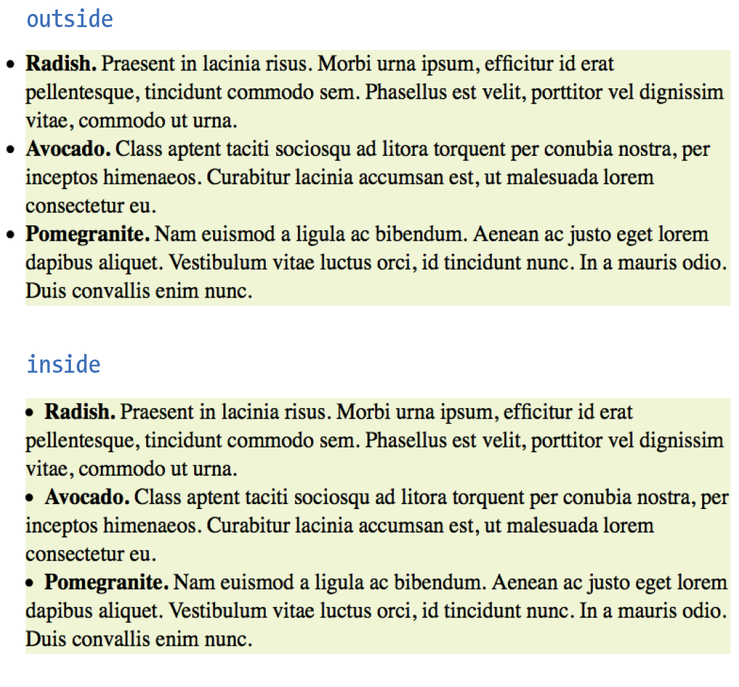
You can see that when the position is set to outside (top), the markers fall outside the content area.When it is set to inside (bottom), the markers are tucked into the content area.
li {background-color: #F99;}ul#outside {list-style-position: outside;}ul#inside {list-style-position: inside;}
CSS3 adds the hanging value for list-style-position. it is similar to inside, but the markers appear outside and abutting the left edge of the shaded area.
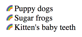
Make Your Own Bullets
You can also use your own image as a bullet by using the list-style-image property.
list-style-image
Values: url(location) | none
Default: none
Applies to: , , and (or elements whose display value is )
Inherits: yes
The value of the list-style-image property is the URL of the image you want to use as a marker. The list-style-type is set to disc as a backup in case the image does not display or the property isn’t supported by the browser or other user agent. The result is shown in Figure 12-23.
ul { list-style-type: disc; list-style-image: url(/images/rainbow.gif); list-style-position: outside;}
Wow! Whatta chapter! We started by looking at properties for specifying fonts and character shapes followed by a review of all the text-level settings and effects. You also got to use descendent, ID, and class selectors and looked a little more closely at specificity. We topped it off with the properties available for adding some style to lists. I don’t expect you to have all of these properties committed to memory (although many will become second nature the more you practice), but let’s see how you do on the following questions.
Test Yourself
It’s time to see how well you understand the font properties and selectors introduced in this chapter. Check Appendix A for the answers if you get stuck.
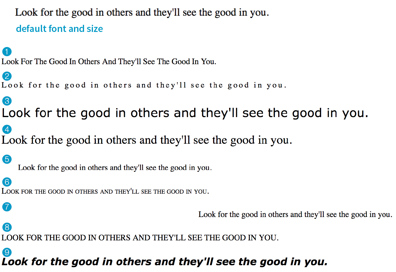
- Match the style property with the text samples in Figure 12-24.
- _______
{font-size: 1.5em;} - _______
{text-transform: capitalize;} - _______
{text-align: right;} - _______
{font-family: Verdana; font-size: 1.5em;} - _______
{letter-spacing: 3px;} - _______
{font: bold italic 1.2em Verdana;} - _______
{text-transform: uppercase;} - _______
{text-indent: 2em;} - _______
{font-variant: small-caps;}
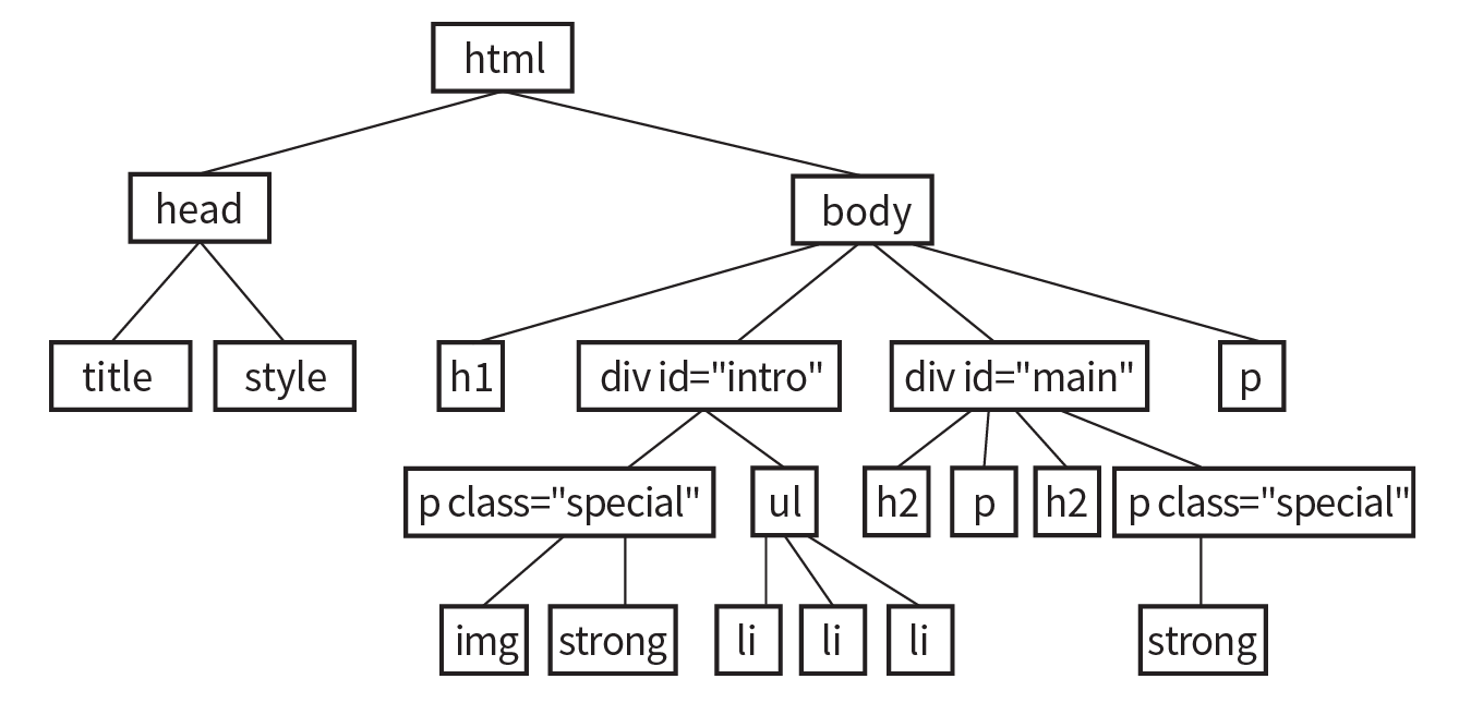
- _______
- Here is a chance to get a little practice writing selectors. Using the diagram shown in Figure 12-25, write style rules that make each of the elements described here red (color: red;). Write the selector as efficiently as possible.
- All text elements in the document
- h2 elements
- h1 elements and all paragraphs
- Elements belonging to the class special
- All elements in the “intro” section
- strong elements in the “main” section
- Extra credit: just the paragraph that appears after an h2
CSS Review: Font and Text Properties
In this chapter, we covered the properties used to format text elements. Here is a summary in alphabetical order.