Table of Contents for
Learning Web Design, 5th Edition
 Learning Web Design, 5th Edition
Published by
O'Reilly Media, Inc., 2018
Learning Web Design, 5th Edition
Published by
O'Reilly Media, Inc., 2018
- cover
- Learning Web Design, Fifth Edition
- lwd5_title_copy
- lwd5_title_copy-1
- lwd5_contents
- Foreword
- Preface
- Part I. Getting Started
- 2. How the Web Works
- 3. Some Big Concepts You Need to Know
- Part II. HTML for STRUCTURE
- 5. Marking Up Text
- 6. Adding Links
- 7. Adding Images
- 8. Table Markup
- 9. Forms
- 10. Embedded Media
- Part III. CSS for Presentation
- 12. Formatting Text
- 13. Colors and Backgrounds
- 14. Thinking Inside the Box
- 15. Floating and Positioning
- 16. CSS Layout with Flexbox and Grid
- 17. Responsive Web Design
- 18. Transitions, Transforms, and Animation
- 19. More CSS Techniques
- 20. Modern Web Development Tools
- Part IV. JavaScript for Behavior
- 22. Using JavaScript
- Part V. Web Images
- 24. Image Asset Production
- 25. SVG
- Part VI. Appendices
- B. HTML5 Global Attributes
- C. CSS Selectors, Levels 3 and 4
- D. From HTML+ to HTML5
15
In this chapter
Floating elements to the left and right
Clearing floated elements
Containing floated elements
Creating text-wrap shapes
Relative positioning
Absolute positioning and containing blocks
Fixed positioning
At this point, you’ve learned dozens of CSS properties that let you change the appearance of text elements and the boxes they generate. But so far, we’ve merely been formatting elements as they appear in the flow of the document.
In this chapter, we’ll look at floating and positioning, the CSS methods for breaking out of the normal flow and arranging elements on the page. Floating an element moves it to the left or right and allows the following text to wrap around it. Positioning is a way to specify the location of an element anywhere on the page with pixel precision.
Before we start moving elements around, let’s be sure we are well acquainted with how they behave in the normal flow.
Normal Flow
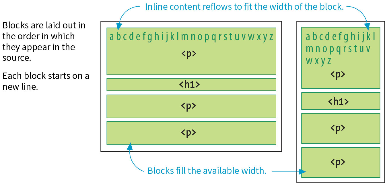
We’ve covered the normal flow in previous chapters, but it’s worth a refresher. In the CSS layout model, text elements are laid out from top to bottom in the order in which they appear in the source, and from left to right in left-to-right reading languages (see Note). Block elements stack up on top of one another and fill the available width of the browser window or other containing element. Inline elements and text characters line up next to one another to fill the block elements.
Note
For right-to-left reading languages such as Arabic and Hebrew, the normal flow is top to bottom and right to left.
When the window or containing element resizes, the block elements expand or contract to the new width, and the inline content reflows to fit as shown in Figure 15-1.
Objects in the normal flow affect the layout of the objects around them. This is the behavior you’ve come to expect in web pages—elements don’t overlap or bunch up. They make room for one another.
We’ve seen all of this before, but in this chapter we’ll be paying attention to whether elements are in the flow or removed from the flow. Floating and positioning change the relationship of elements to the normal flow in different ways. Let’s first look at the special behavior of floated elements (or “floats” for short).
Floating
Simply stated, the float property moves an element as far as possible to the left or right, allowing the following content to wrap around it. It is a unique feature built into CSS with some interesting behaviors.
float
Values: left | right | none
Default: none
Applies to: all elements
Inherits: no
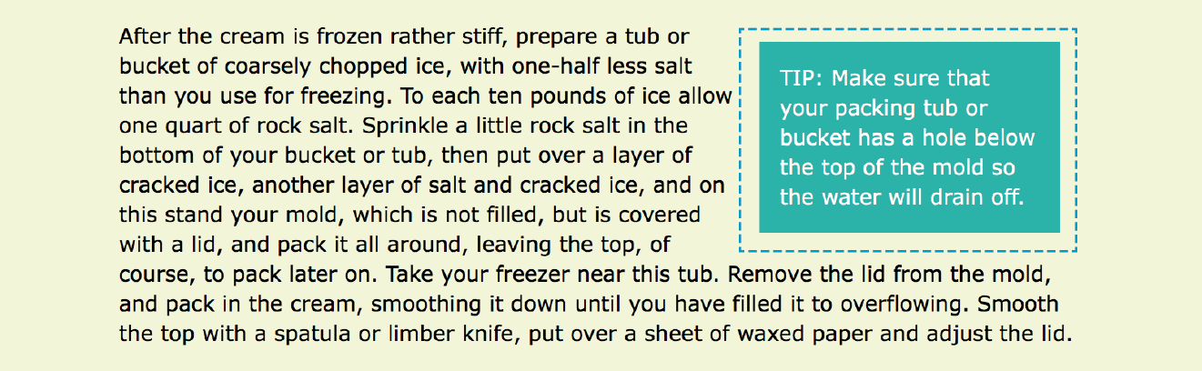
The best way to explain floating is to demonstrate it. In this example, the float property is applied to an img element to float it to the right. Figure 15-2 shows how the paragraph and the contained image are rendered by default (top) and how it looks when the float property is applied (bottom).
The markup
<p><img src="icecreambowl.png" alt=""> After the cream is frozen rather stiff,…
The styles
img { float: right; }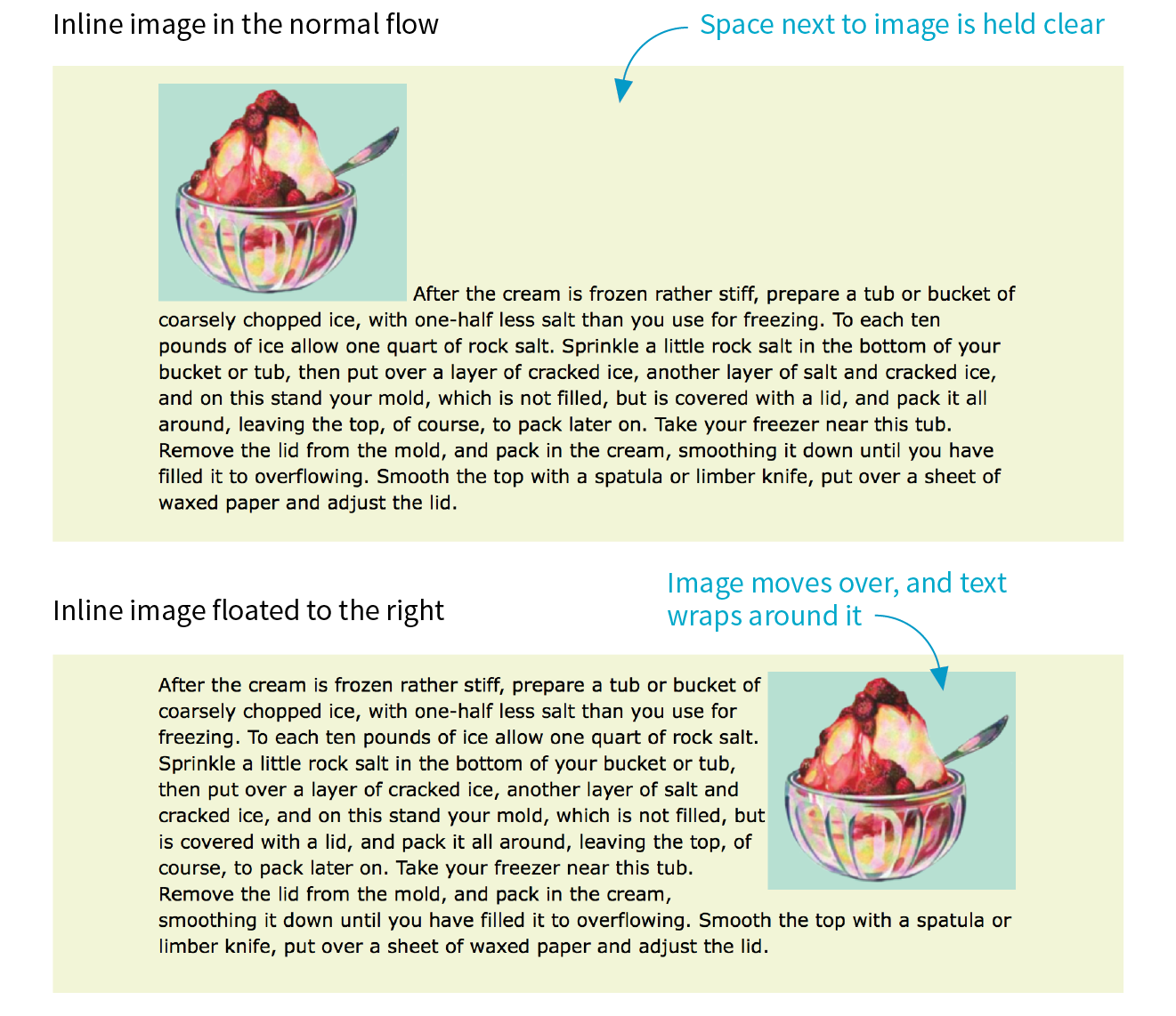
Floating an element moves it to the left or right and allows the following text to wrap around it.
That’s a nice effect. We’ve gotten rid of a lot of wasted space on the page, but now the text is bumping right up against the image. How do you think you would add some space between the image element and the surrounding text? If you guessed “add a margin,” you’re absolutely right. I’ll add 1em of space on all sides of the image with the margin property (Figure 15-3). You can begin to see how the box properties work together to improve page layout.
img { float: right; margin: 1em;}
The previous two figures demonstrate some key behaviors of floated elements:
A floated element is like an island in a stream.
First and foremost, you can see that the image is removed from its position in the normal flow yet continues to influence the surrounding content. The subsequent paragraph text reflows to make room for the floated img element. One popular analogy compares floats to islands in a stream—they are not in the flow, but the stream has to flow around them. This behavior is unique to floated elements.
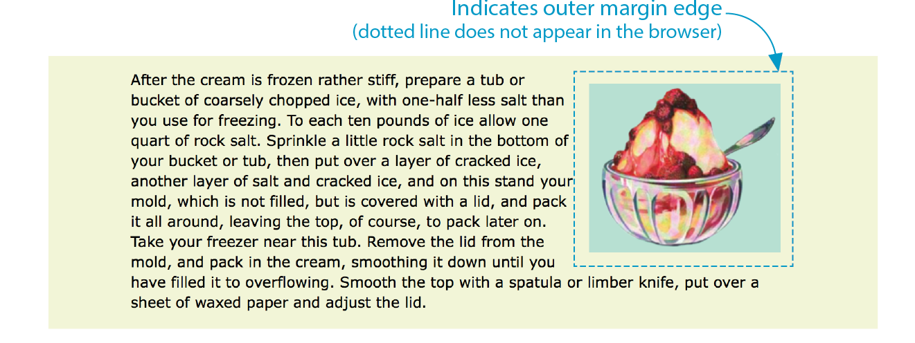
Floats stay in the content area of the containing element.
It is also important to note that the floated image is placed within the content area (the inner edges) of the paragraph that contains it. It does not extend into the padding area of the paragraph.
Margins are maintained.
In addition, margins are held on all sides of the floated image, as indicated in Figure 15-3 by the dotted line. In other words, the entire element box, from outer edge to outer edge, is floated.
Floating Inline and Block elements
Those are the basics, so now let’s look at more examples and explore additional floating behaviors. It is possible to float any HTML element, both inline and block-level, as we’ll see in the following examples.
Floating an inline text element
In the previous example, we floated an inline image element. This time, let’s look at what happens when you float an inline text (non-replaced) element—in this case, a span of text (Figure 15-4).
The markup
<p><span class="tip">TIP: Make sure that your packing tub or bucket has a hole below the top of the mold so the water will drain off.</span>After the cream is frozen rather stiff, prepare a tub or bucket of…</p>
The styles
span.tip { float: right; margin: 1em; width: 200px; color: #fff; background-color: lightseagreen; padding: 1em;}
At a glance, it is behaving the same as the floated image, which is what we’d expect. But there are some subtle things at work here that bear pointing out:
Always provide a width for floated text elements.
First, you’ll notice that the style rule that floats the span includes the width property. It is necessary to specify a width for a floated text element because without one, its box is sized wide enough to fit its content (auto). For short phrases that are narrower than the container, that might not be an issue. However, for longer, wrapped text, the box expands to the width of the container, making it so wide that there wouldn’t be room to wrap anything around it. Images have an inherent width, so we didn’t need to specify a width in the previous example (although we certainly could have).
It is necessary to specify the width for floated text elements.
Floated inline elements behave as block elements.
Notice that the margin is held on all four sides of the floated span text, even though top and bottom margins are usually not rendered on inline elements (see Figure 14-20 in the previous chapter). That is because all floated elements behave like block elements. Once you float an inline element, it follows the display rules for block-level elements, and margins are rendered on all four sides.
Margins on floated elements do not collapse.
In the normal flow, abutting top and bottom margins collapse (overlap), but margins for floated elements are maintained on all sides as specified.
Floating block elements
Let’s look at what happens when you float a block within the normal flow. In this example, the whole second paragraph element is floated to the left (Figure 15-5).
The markup
<p>If you wish to pack ice cream...</p><p id="float">After the ice cream is rather stiff,...</p><p>Make sure that your packing tub or bucket...</p><p>As cold water is warmer than the ordinary...</p>
The styleS
p { border: 2px red solid; }.#float { float: left; width: 300px; margin: 1em; background: white;}
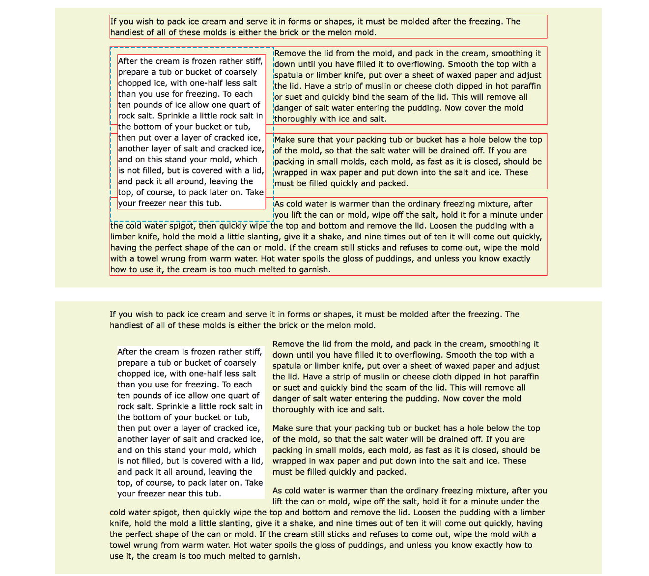
I’ve added a red border around all p elements to reveal their boundaries. In addition, I’ve made the background of the floated paragraph white so it stands out and added a 1em margin on all sides (indicated with a blue dotted line). The bottom view in Figure 15-5 shows how it looks with all the extra stuff turned off, as it would more likely appear on a real page.
Just as we saw with the image, the paragraph moves off to the side (left this time), and the following content wraps around it, even though blocks normally stack on top of one another. There are a few things I want to point out in this example:
You must provide a width for floated block elements.
If you do not provide a width value, the width of the floated block will be set to auto, which fills the available width of the browser window or other containing element. There’s not much sense in having a full-width floated box, because the idea is to wrap text next to the float, not start below it.
Elements do not float higher than their reference in the source.
A floated block will float to the left or right relative to where it occurs in the source, allowing the following elements in the flow to wrap around it. It stays below any block elements that precede it in the flow (in effect, it is “blocked” by them). That means you can’t float an element up to the top corner of a page, even if its nearest ancestor is the body element. If you want a floated element to start at the top of the page, it must appear first in the document source (see Note).
Non-floated elements maintain the normal flow.
The red borders in the top image reveal that the element boxes for the surrounding paragraphs still extend the full width of the normal flow. Only the content of those elements wraps around the float. This is a good model to keep in mind.
For example, adding a left margin to the surrounding paragraphs would add space on the left edge of the page, not between the text and the floated element. If you want space between the float and the wrapped text, you need to apply the margin to the float itself.
Clearing Floated Elements
If you’re going to be floating elements around, it’s important to know how to turn the text wrapping off and get back to normal flow as usual. You do this by clearing the element that you want to start below the float. Applying the clear property to an element prevents it from appearing next to a floated element and forces it to start against the next available “clear” space below the float.
clear
Values: left | right | both | none
Default: none
Applies to: block-level elements only
Inherits: no
Keep in mind that you apply the clear property to the element you want to start below the floated element, not the floated element itself. The left value starts the element below any elements that have been floated to the left. Similarly, the right value makes the element clear all floats on the right edge of the containing block. If there are multiple floated elements, and you want to be sure an element starts below all of them, use the both value to clear floats on both sides.
In this example, the clear property has been used to make h2 elements start below left-floated elements. Figure 15-6 shows how the h2 heading starts at the next available clear edge below the float.
img { float: left; margin-right: .5em;}h2 { clear: left; margin-top: 2em;}
Notice in Figure 15-6 that although there is a 2em top margin applied to the h2 element, it is not rendered between the heading and the floated image. That’s the result of collapsing vertical margins in the flow. If you want to make sure space is held between a float and the following text, apply a bottom margin to the floated element itself.
By now you have enough float know-how to give it a try in Exercise 15-1.
Exercise 15-1. Floating images
Floating Multiple Elements
It’s perfectly fine to float multiple elements on a page or even within a single element. In fact, for years, floats have been the primary method for lining up elements like navigation menus and even for creating whole page layouts (please take time to read the sidebar “Float-Based Layouts”).
When you float multiple elements, there is a complex system of behind-the-scenes rendering rules that ensures floated elements do not overlap. You can consult the CSS specification for details, but the upshot of it is that floated elements will be placed as far left or right (as specified) and as high up as space allows.
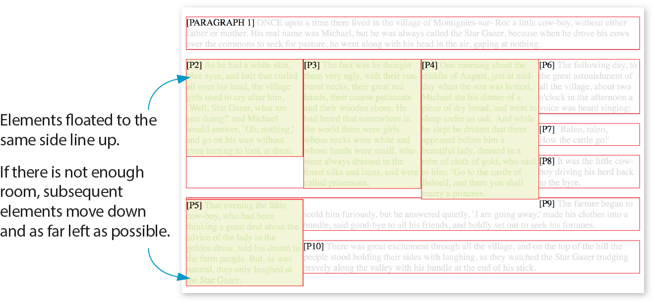
Figure 15-8 shows what happens when a series of sequential paragraphs is floated to the same side. The first three floats start stacking up from the left edge, but when there isn’t enough room for the fourth, it moves down and to the left until it bumps into something—in this case, the edge of the browser window. However, if one of the floats, such as P2, had been very long, it would have bumped up against the edge of the long float instead. Notice that the next paragraph in the normal flow (P6) starts wrapping at the highest point it can find, just below P1.
The Markup
<p>[PARAGRAPH 1] ONCE upon a time…</p><pclass="float">[P2]…</p><pclass="float">[P3]…</p><pclass="float">[P4]…</p><pclass="float">[P5]…</p><p>[P6]…</p><p>[P7]…</p><p>[P8]…</p><p>[P9]…</p><p>[P10]…</p>
The styles
p.float { float: left; width: 200px; margin: 0px; background: #F2F5d5; color: #DAEAB1;}
Containing Floats
This is a good time to address a quirky float behavior: float containment. By default, floats are designed to hang out of the element they are contained in. That’s just fine for allowing text to flow around a floated image, but sometimes it can cause some unwanted behaviors.
Take a look at the example in Figure 15-9. It would be nicer if the border expanded around all the content, but the floated image hangs out the bottom.
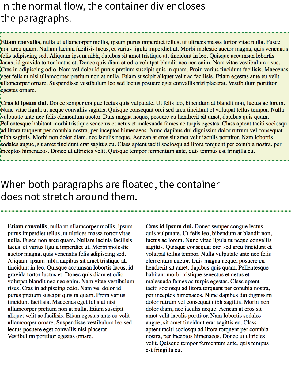
If you float all the elements in a container element, there will be no elements remaining in the flow to hold the containing element open. This phenomenon is illustrated in Figure 15-10. The #container div contains two paragraphs. The view of the normal flow (top) shows that the #container has a background color and border that wraps around the content.
<div id="container"> <p>…</p> <p>…</p></div> #container { background: #f2f5d5; border: 2px dashed green;}
However, when both paragraphs (that is, all of the content within the div) are floated, as shown in the figure on the bottom), the element box for the #container closes up to a height of zero, leaving the floats hanging down below (you can still see the empty border at the top). There’s no content left in the normal flow to give the containing div height. This clearly is not the effect we are after.
p { float: left; width: 44%; padding: 2%;}
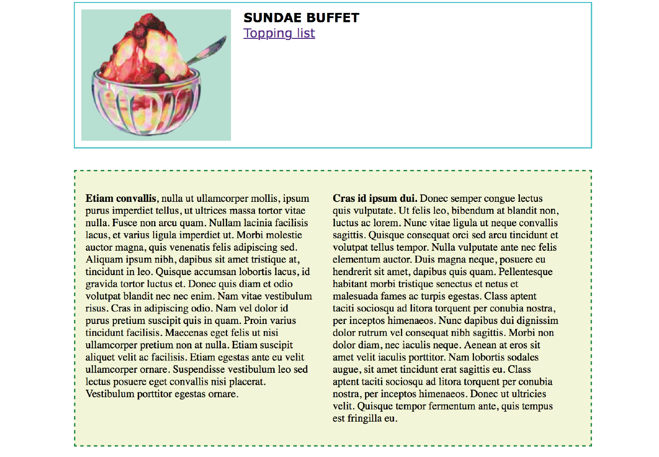
Fortunately, there are a few fixes to this problem, and they are pretty straightforward. The most popular and foolproof solution is the “clearfix” technique. It uses the :after pseudo-element to insert a character space after the container, set its display to “block,” and clear it on both sides. For more information on this version of clearfix, see Thierry Koblentz’s article “The very latest clearfix reloaded” (cssmojo.com/the-very-latest-clearfix-reloaded). Here it is applied to the #container div in Figure 15-10:
#container:after{content: " "; display: block; clear: both;background-color: #f2f5d5; /*light green*/ border: 2px dashed green; padding: 1em; }
Another option is to float the containing element as well and give it a width of 100%:
#container { float: left; width: 100%; … }
Figure 15-11 shows the result of applying a containment technique to the previous examples. Either will do the trick.
That covers the fundamentals of floating. If you are thinking that rectangular text wraps are a little ho-hum, you could add some pizzazz (or just eliminate extra whitespace) by using CSS Shapes.
Fancy Text Wrap with CSS Shapes
Look at the previous float examples, and you will see that the text always wraps in a rectangular shape around a floated image or element box. However, you can change the shape of the wrapped text to a circle, ellipse, polygon, or any image shape by using the shape-outside property. This is an up-and-coming CSS feature, so be sure to check the Browser Support Note. Following is a quick introduction to CSS Shapes, which should inspire and prepare you for more exploration on your own.
Browser Support Note
As of this writing in 2018, text wrap shapes are supported only by Chrome 37+, Opera 24+, Safari 7.1+ (with prefix; without starting in 10.1), iOS Safari 8+ (with prefix; without in 10.3+), and Android 56+. The feature is under consideration at Microsoft Edge and in development at Firefox, so the support situation may be better by the time you are reading this. Check for the current state of support.
For the time being, feel free to use it as a progressive enhancement for designs in which a rectangular text wrap would be perfectly acceptable. Another alternative is to use a feature query () to serve a fallback set of styles to non-supporting browsers. Feature queries are introduced in .
shape-outside
Values: none | circle() | ellipse() | polygon() | url() | [margin-box | padding-box | content-box ]
Default: none
Applies to: floats
Inherits: no
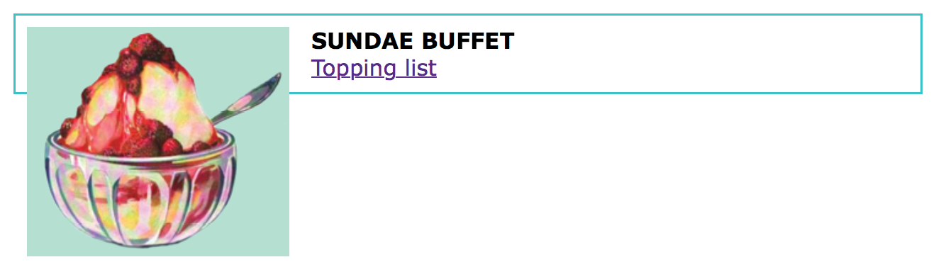
Figure 15-12 shows the default text wrap around a floated image (left) and the same wrap with shape-outside applied (right). This is the kind of thing you’d expect to see in a print magazine, but now we can do it on the web!
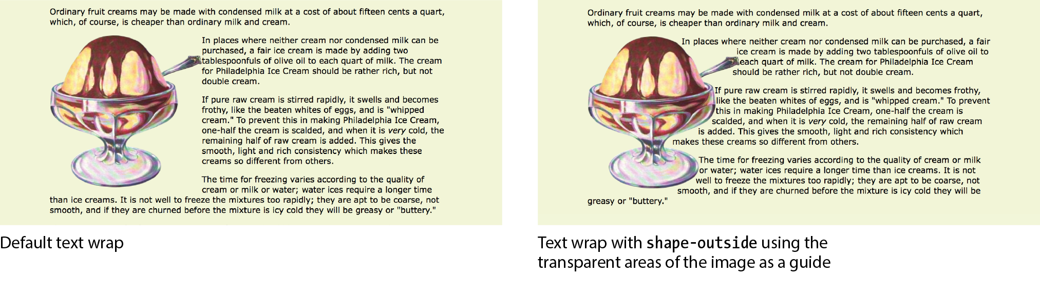
It is worth noting that you can change the text wrap shape around any floated element (see Note), but I will focus on images in this discussion, as text elements are generally boxes that fit nicely in the default rectangular wrap.
Note
works only on floated elements for now, but it is believed that this will change in the future.
There are two approaches to making text wrap around a shape. One way is to provide the path coordinates of the wrap shape with circle(), ellipse(), or polygon(). Another way is to use url() to specify an image that has transparent areas (such as a GIF or a PNG). With the image method, text flows into the transparent areas of the image and stops at the opaque areas. This is the shape method shown in Figure 15-12 and the method I’ll introduce first.
Using a Transparent Image
In the example in Figure 15-12, I placed the sundae.png image in the HTML document to display on the page, and I’ve specified the same image in the style rule using url() so that its transparent areas define the wrap shape (see important Warning). It makes sense to use the same image in the document and for the CSS shape, but it is not required. You could apply a wrap shape derived from one image to another image on the page.
WARNING
There is a security setting in Chrome and Opera that makes image-based text wraps a little tricky to use. Without getting into too much sys-admin detail, the browser restricts the use of the image used to create the CSS shape if it isn’t on the same domain as the file requesting it. This is not a bug; they are following the rules set out in the specification.
The rule also means that compliant browsers won’t allow images to be used for shapes when the files are served locally (i.e., on your computer). They need to be uploaded to a server to work, which makes the design process a little more cumbersome, especially for beginners.
If you use image-based text wraps, you know your CSS is written correctly, but you aren’t seeing wrapping in the browser, this security setting (related to Cross-Origin Resource Sharing, or CORS, if you’re curious) is probably the culprit.
The markup
<p><img src="sundae.png" class="wrap" alt=""> In places…</p>
The styles
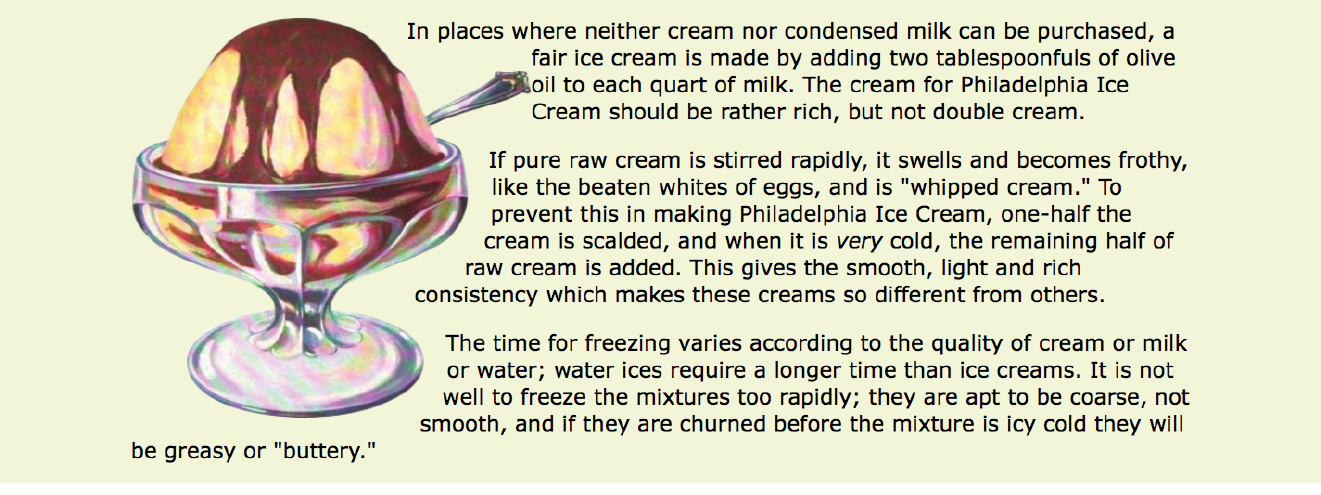
img.wrap { float: left; width: 300px; height: 300px; -webkit-shape-outside: url(sundae.png); /* prefix required in 2018 */
shape-outside: url(sundae.png);
Notice that the wrapped text is now bumping right into the image. How about we give it a little extra space with shape-margin?
shape-margin
Values: length | percentage
Default: 0
Applies to: floats
Inherits: no
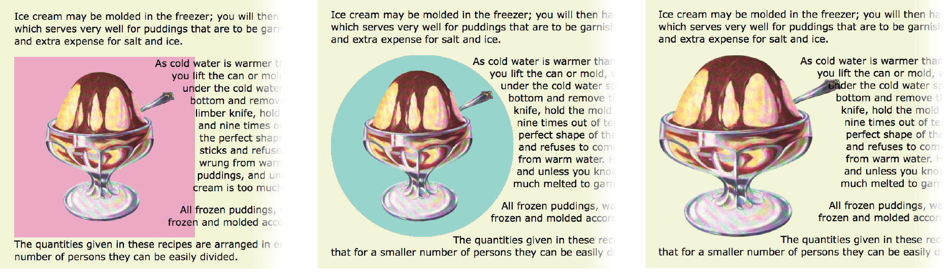
The shape-margin property specifies an amount of space to hold between the shape and the wrapped text. In Figure 15-13, you can see the effect of adding 1em of space between the opaque image areas and the wrapped text lines. It gives it a little breathing room the way any good margin should.
-webkit-shape-margin: 1em; shape-margin: 1em;
Using a Path
The other method for creating a text wrap shape is to define it using one of the path keywords: circle(), ellipse(), and polygon().
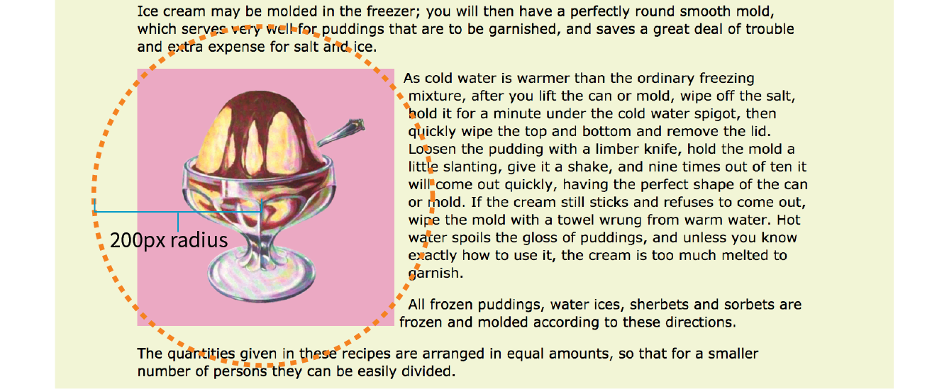
The circle() notation creates a circle shape for the text to wrap around. The value provided within the parentheses represents the length of the radius of the circle:
circle(radius)
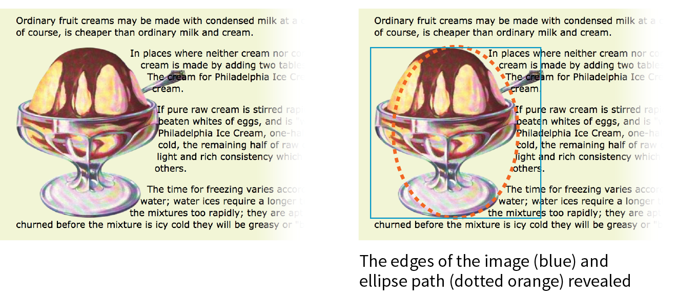
In this example, the radius is 150px, half of the image width of 300 pixels. By default, the circle is centered vertically and horizontally on the float:
img.round { float: left; -webkit-shape-outside: circle(150px); shape-outside: circle(150px);}
Figure 15-14 shows this style rule applied to different images. Notice that the transparency of the image is not at play here. It’s just a path overlaid on the image that sets the boundaries for text wrap. Any path can be applied to any image or other floated element.
This is a good point to demonstrate a critical behavior of wrap shapes. They allow text to flow into the floated image or element, but they cannot hold space free beyond it.
In the example in Figure 15-15, I’ve increased the diameter of the circle path from 150px to 200px. Notice that the text lines up along the right edge of the image, even though the circle is set 50 pixels beyond the edge. The path does not push text away from the float. If you need to keep wrapped text away from the outside edge of the floated image or element, apply a margin to the element itself (it will be the standard rectangular shape, of course).
img.round { float: left; -webkit-shape-outside: circle(200px); shape-outside: circle(200px);}
Elliptical shapes are created with the ellipse() notation, which provides the horizontal and vertical radius lengths followed by the word at and then the x,y coordinates for the center of the shape. Here is the syntax:
ellipse(rx ry at x y);
The position coordinates can be listed as a specific measurement or a percentage. Here I’ve created an ellipse with a 100-pixel horizontal radius and a 150-pixel vertical radius, centered in the floated element it is applied to (Figure 15-16):
img.round { float: left; -webkit-shape-outside: ellipse(200px 100px at 50% 50%); shape-outside: ellipse(200px 100px at 50% 50%);}
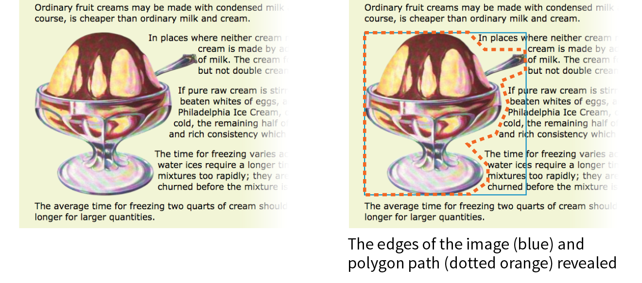
Finally, we come to polygon(), which lets you create a custom path using a series of comma-separated x,y coordinates along the path. This style rule creates the wrap effect shown in Figure 15-17:
img.wrap { float: left; width: 300px; height: 300px; shape-outside: polygon(0px 0px, 186px 0px, 225px 34px, 300px 34px, 300px 66px, 255px 88px, 267px 127px, 246px 178px, 192px 211px, 226px 236px, 226px 273px, 209px 300px, 0px 300px);}
Holy coordinates! That’s a lot of numbers, and my path was fairly simple. I’d like to be able to point you to a great tool for drawing and exporting polygon paths, but sadly, as of this writing I have none to recommend (see Note). I got the coordinates for my polygon examples by opening the image in Photoshop and gathering them manually, which, although possible, is not ideal.
CSS Shapes Resources
There are some finer points regarding CSS Shapes that I must leave to you to research further. Here are a few resources to get you started:
- CSS Shapes Module, Level 1 (www.w3.org/TR/css-shapes-1/)
- “Getting Started with CSS Shapes” by Razvan Caliman (www.html5rocks.com/en/tutorials/shapes/getting-started)
- CSS Shapes at the Experimental Layout Lab of Jen Simmons (labs.jensimmons.com/#shapes)
- “A Redesign with CSS Shapes” by Eric Meyer (alistapart.com/article/redesign-with-css-shapes)
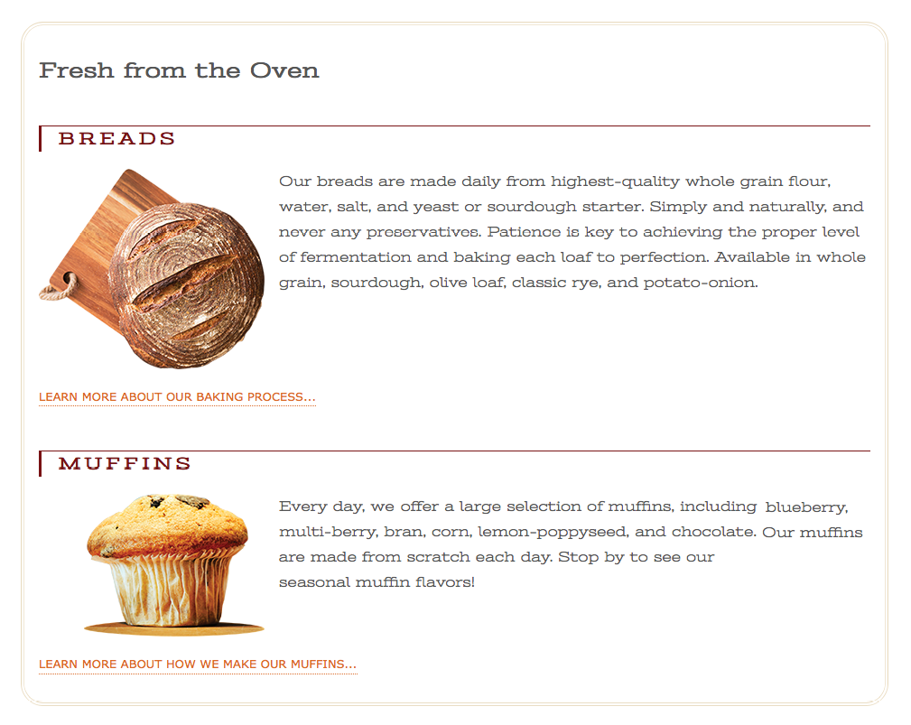
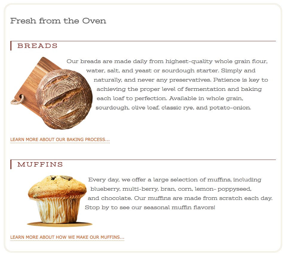
Why don’t we make the text wrap around the images in the Black Goose Bakery page in a more interesting way for users with browsers that support it (Exercise 15-2)?
Exercise 15-2. Adding shapes around floats
img[src*="bread"] { -webkit-shape-outside: circle(125px); shape-outside: circle(125px);
}
img[src*="muffin"] { margin-left: 50px; -webkit-shape-outside: circle(110px); shape-outside: circle(110px);
}
img[src*="bread"] { -webkit-shape-outside: ellipse(130px 95px at 50% 50%); shape-outside: ellipse(130px 95px at 50% 50%); }
img[src*="muffin"] { …
shape-outside: polygon(0px 0px, 197px 0px, 241px 31px, 241px 68px, 226px 82px, 219px 131px, 250px 142px, 250px 158px, 0px 158px);}
Well, that covers floating! You’ve learned how to float elements left and right, clear the following elements so they start below the floats, and even make fancy text wrapping shapes. Now let’s move on to the other approach to moving elements around on the page—positioning.
Positioning Basics
CSS provides several methods for positioning elements on the page. They can be positioned relative to where they would normally appear in the flow, or removed from the flow altogether and placed at a particular spot on the page. You can also position an element relative to the viewport, and it will stay put while the rest of the page scrolls.
Types of Positioning
position
Values: static | relative | absolute | fixed | sticky
Default: static
Applies to: all elements
Inherits: no
The position property indicates that an element is to be positioned and specifies which positioning method to use. I’ll introduce each keyword value briefly here, and then we’ll take a more detailed look at each method in the remainder of this chapter.
static
This is the normal positioning scheme in which elements are positioned as they occur in the normal document flow.
relative
Relative positioning moves the element box relative to its original position in the flow. The distinctive behavior of relative positioning is that the space the element would have occupied in the normal flow is preserved as empty space.
absolute
Absolutely positioned elements are removed from the document flow entirely and positioned with respect to the viewport or a containing element (we’ll talk more about this later). Unlike relatively positioned elements, the space they would have occupied is closed up. In fact, they have no influence at all on the layout of surrounding elements.
fixed
The distinguishing characteristic of fixed positioning is that the element stays in one position in the viewport even when the document scrolls. Fixed elements are removed from the document flow and positioned relative to the viewport rather than another element in the document.
sticky
Sticky positioning is a combination of relative and fixed in that it behaves as though it is relatively positioned, until it is scrolled into a specified position relative to the viewport, at which point it remains fixed.
The MDN Web Docs site has this description for a potential use case:
Sticky positioning is commonly used for the headings in an alphabetized listing. The B heading will appear just below the items that begin with A until they are scrolled offscreen. Rather than sliding offscreen with the rest of the content, the B heading will then remain fixed to the top of the viewport until all the B items have scrolled offscreen, at which point it will be covered up by the C heading.
The sticky position value is supported by current versions of Chrome, Firefox, Opera, MS Edge, Android, as well as Safari and iOS Safari with the -webkit- prefix. No version of IE supports it. Happily, sticky positioning degrades gracefully, as the element simply stays inline and scrolls with the document if it is not supported.
Each positioning method has its purpose, but absolute positioning is the most versatile. With absolute positioning, you can place an object anywhere in the viewport or within another element. Absolute positioning has been used to create multicolumn layouts, but it is more commonly used for small tasks, like positioning a search box in the top corner of a header. It’s a handy tool when used carefully and sparingly.
Specifying Position
Once you’ve established the positioning method, the actual position is specified with some combination of up to four offset properties.
top, right, bottom, left
Values: length | percentage | auto
Default: auto
Applies to: positioned elements (where position value is relative, absolute, or fixed)
Inherits: no
The value provided for each offset property defines the distance the element should be moved away from that respective edge. For example, the value of top defines the distance the top outer edge of the positioned element should be offset from the top edge of the browser or other containing element. A positive value for top results in the element box moving down by that amount (see Note). Similarly, a positive value for left would move the positioned element to the right (toward the center of the containing block) by that amount.
Note
Negative values are acceptable and move the element in the opposite direction of positive values. For example, a negative value for would have the effect of moving the element up.
Further explanations and examples of the offset properties will be provided in the discussions of each positioning method. We’ll start our exploration of positioning with the fairly straightforward relative method.
Relative Positioning
As mentioned previously, relative positioning moves an element relative to its original spot in the flow. The space it would have occupied is preserved and continues to influence the layout of surrounding content. This is easier to understand with a simple example.
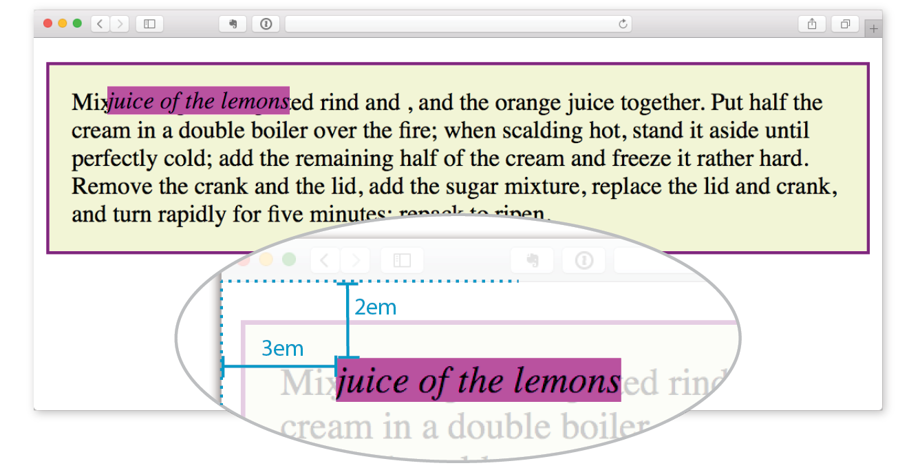
Here I’ve positioned an inline em element. A bright background color on the em and a border on the containing paragraph make their boundaries apparent. First, I used the position property to set the method to relative, and then I used the top offset property to move the element 2em down from its initial position, and the left property to move it 3em to the right. Remember, offset property values move the element away from the specified edge, so if you want something to move to the right, as I did here, you use the left offset property. The results are shown in Figure 15-19.
em { position: relative; top: 2em; /* moves element down */
left: 3em; /* moves element right */
background-color: fuchsia;}
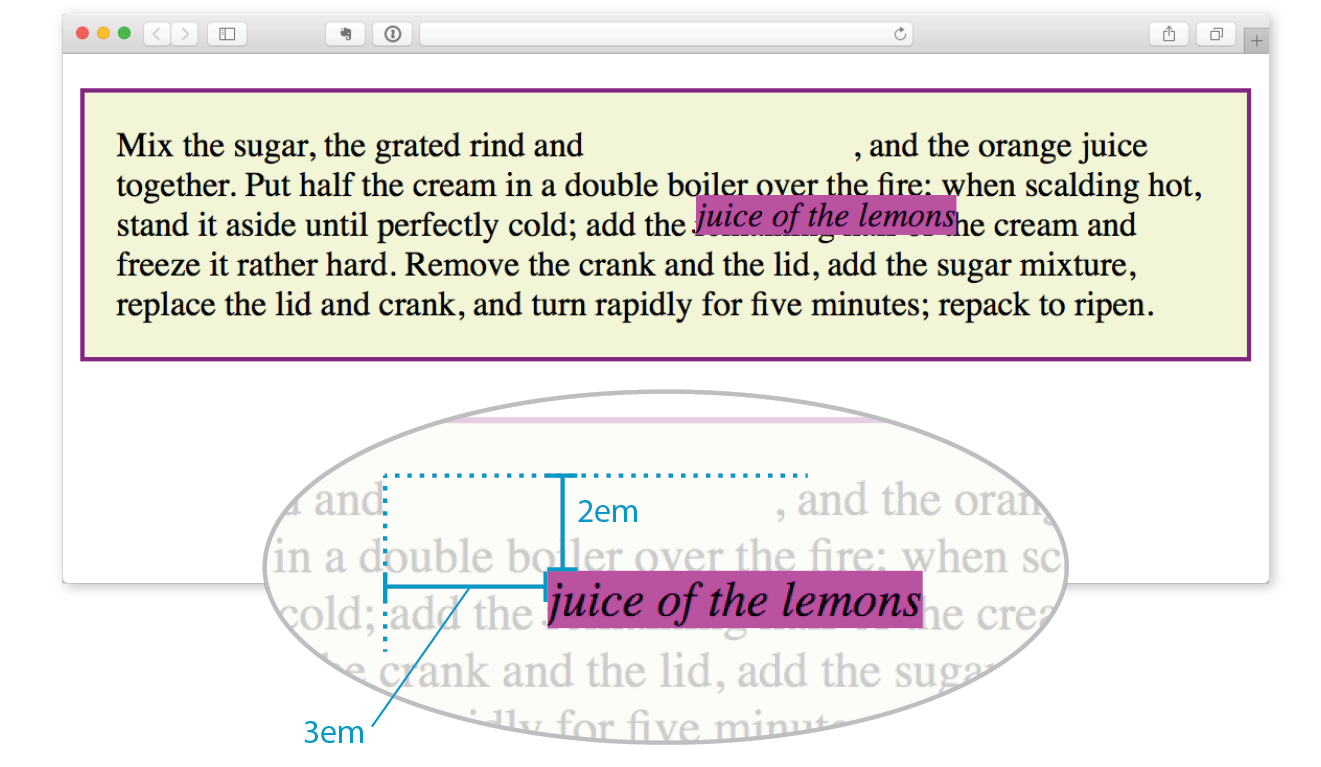
I want to point out a few things that are happening here:
The original space in the document flow is preserved.
You can see that there is a blank space where the emphasized text would have been if the element had not been positioned. The surrounding content is laid out as though the element were still there, and therefore we say that the element still “influences” the surrounding content.
Overlap happens.
Because this is a positioned element, it can potentially overlap other elements, as happens in Figure 15-19.
The empty space left behind by relatively positioned objects can be a little awkward, so this method is not used as often as absolute positioning. However, relative positioning is commonly used to create a “positioning context” for an absolutely positioned element. Remember that term positioning context—I’ll explain it in the next section.
Absolute Positioning
Absolute positioning works a bit differently and is a more flexible method for accurately placing items on the page than relative positioning.
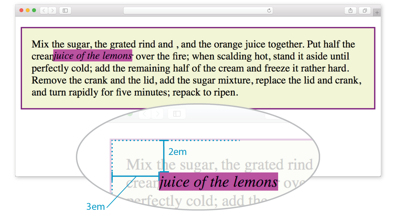
Now that you’ve seen how relative positioning works, let’s take the same example as shown in Figure 15-19, only this time we’ll change the value of the position property to absolute (Figure 15-20):
em { position: absolute; top: 2em; left: 3em; background-color: fuchsia;}
As you can see in Figure 15-20, the space once occupied by the em element is now closed up, as is the case for all absolutely positioned elements. In its new position, the element box overlaps the surrounding content. In the end, absolutely positioned elements have no influence whatsoever on the layout of surrounding elements.
The most significant difference here, however, is the location of the positioned element. This time, the offset values position the em element 2em down and 3em to the right of the top-left corner of the viewport (browser window).
But wait—before you start thinking that absolutely positioned elements are always placed relative to the viewport, I’m afraid that there’s more to it than that.
What actually happens in absolute positioning is that the element is positioned relative to its nearest containing block. It just so happens that the nearest containing block in Figure 15-20 is the root (html) element, also known as the initial containing block, so the offset values position the em element relative to the whole document.
Getting a handle on the containing block concept is the first step to tackling absolute positioning.
Containing Blocks
The CSS Positioned Layout Module, Level 3, states, “The position and size of an element’s box(es) are sometimes computed relative to a certain rectangle, called the containing block of the element.” It is critical to be aware of the containing block of the element you want to position. We sometimes refer to this as the positioning context.
The spec lays out a number of intricate rules for determining the containing block of an element, but it basically boils down to this:
- If the positioned element is not contained within another positioned element, then it will be placed relative to the initial containing block (created by the html element).
- But if the element has an ancestor (i.e., is contained within an element) that has its position set to relative, absolute, or fixed, the element will be positioned relative to the edges of that element instead.
Figure 15-20 is an example of the first case: the p element that contains the absolutely positioned em element is not positioned itself, and there are no other positioned elements higher in the hierarchy. Therefore, the em element is positioned relative to the initial containing block, which is equivalent to the viewport area.
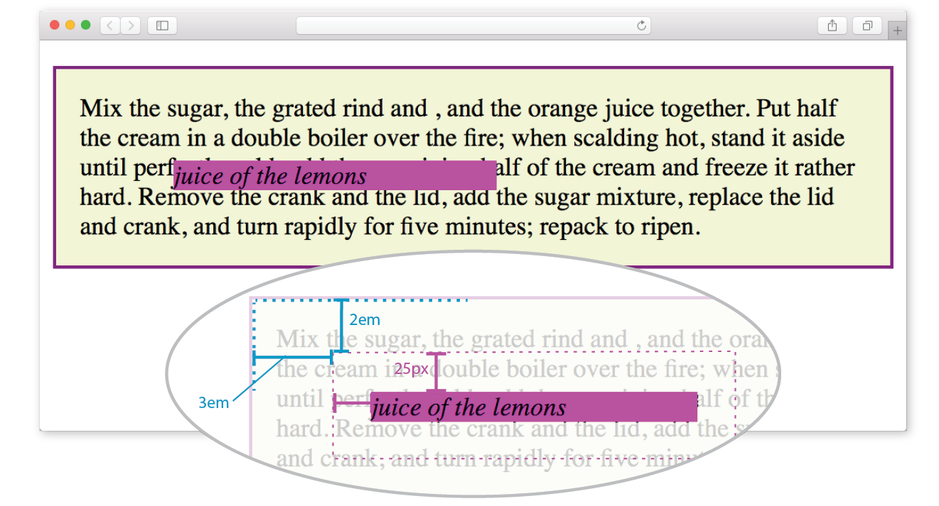
Let’s deliberately turn the p element into a containing block and see what happens. All we have to do is apply the position property to it; we don’t have to actually move it. The most common way to make an element into a containing block is to set its position to relative, but not move it with any offset values. This is what I was talking about earlier when I said that relative positioning is used to create a positioning context for an absolutely positioned element.
In this example, we’ll keep the style rule for the em element the same, but we’ll add a position property to the p element, thus making it the containing block for the positioned em element. Figure 15-21 shows the results.
p { position: relative; padding: 15px; background-color: #F2F5D5; border: 2px solid purple;}
You can see that the em element is now positioned 2em down and 3em from the top-left corner of the paragraph box, not the browser window. Notice also that it is positioned relative to the padding edge of the paragraph (just inside the border), not the content area edge. This is the normal behavior when block elements are used as containing blocks (see Note).
I’m going to poke around at this some more to reveal additional aspects of absolutely positioned objects. This time, I’ve added width and margin properties to the positioned em element (Figure 15-22):
em { width: 200px; margin: 25px; position: absolute; top: 2em; left: 3em; background-color: fuchsia;}
Here we can see that:
- The offset values apply to the outer edges of the element box (the outer margin edge) for absolutely positioned elements (see Note).
Note
For relatively positioned elements, the offset is measured to the box itself (not the outer margin edge).
- Absolutely positioned elements always behave as block-level elements. For example, the margins on all sides are maintained, even though this is an inline element. It also permits a width to be set for the element.
It is important to keep in mind that once you’ve positioned an element, it becomes the new containing block for all the elements it contains. Say you position a narrow div at the top-left corner of a page, creating a column. If you were to absolutely position an image within that div with offset values that place it in the top-right corner, it appears in the top-right corner of that div, not the entire page. Once the parent element is positioned, it acts as the containing block for the img and any other contained elements.
Specifying Position
Now that you have a better feel for the containing block concept, let’s take some time to get better acquainted with the offset properties. So far, we’ve only seen an element moved a few ems down and to the right, but that’s not all you can do, of course.
Pixel measurements
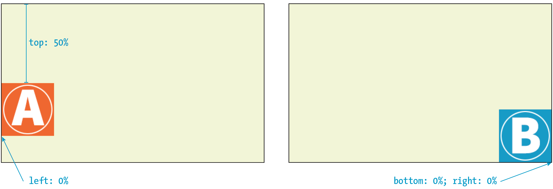
As mentioned previously, positive offset values push the positioned element box away from the specified edge and toward the center of the containing block. If there is no value provided for a side, it is set to auto, and the browser adds enough space to make the layout work. In this example, div#B is contained within div#A, which has been given the dimensions 600 pixels wide by 300 pixels high. I’ve used pixel lengths for all four offset properties to place the positioned element (#B) at a particular spot in its containing element (#A) (Figure 15-23).
The markup
<div id="A"> <div id="B"> </div></div>
The styles
div#A { position: relative; /* creates the containing block */
width: 600px; height: 300px; background-color: #C6DE89; /* green */
}
div#B { position: absolute; top: 25px; right: 50px; bottom: 75px; left: 100px; background-color: steelblue;}
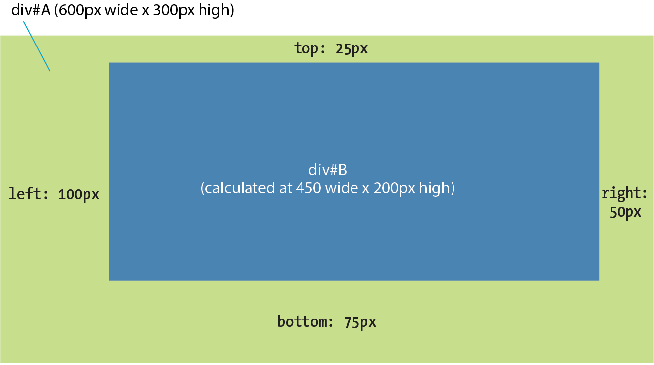
Notice that by setting offsets on all four sides, I have indirectly set the dimensions of the positioned div#B. It fills the 450 × 200 pixel space that is left over within the containing block after the offset values are applied. If I had also specified a width and other box properties for div#B, there is the potential for conflicts if the total of the values for the positioned box and its offsets does not match the available space within the containing block.
The CSS specification provides a daunting set of rules for handling conflicts, but the upshot is that you should just be careful not to over-specify box properties and offsets. In general, a width (factoring in margins as well as padding and border if you are using the content-box box-sizing model) and one or two offset properties are all that are necessary to achieve the layout you’re looking for. Let the browser take care of the remaining calculations.
Percentage values
You can also specify positions with percentage values. In the first example in Figure 15-24, the image is positioned halfway (50%) down the left edge of the containing block. In the second example on the right, the img element is positioned so that it always appears in the bottom-right corner of the containing block.
img#A { position: absolute; top: 50%; left: 0%; }img#B { position: absolute; bottom: 0%; right: 0%; }
WARNING
Be careful when positioning elements at the bottom of the initial containing block (the element). Although you may expect it to be positioned at the bottom of the whole page, browsers actually place the element at the bottom of the browser window. Results may be unpredictable. If you want something positioned at the bottom of your page, put it in a containing block element at the end of the document source, and go from there.
Although the examples here specify both a vertical and horizontal offset, it is common to provide just one offset for a positioned element—for example, to move it left or right into a margin using either left or right properties.
In Exercise 15-3, we’ll make further changes to the Black Goose Bakery home page, this time using absolute positioning.
Exercise 15-3. Absolute positioning

Stacking Order
Before we close the book on absolute positioning, there is one last related concept that I want to introduce. As we’ve seen, absolutely positioned elements overlap other elements, so it follows that multiple positioned elements have the potential to stack up on one another.
By default, elements stack up in the order in which they appear in the document, but you can change the stacking order with the z-index property (see Note). Picture the z-axis as a line that runs perpendicular to the page, as though from the tip of your nose, through this page, and out the other side.
Note
The property is also useful for items in a grid, which also have the potential to overlap, as discussed in .
z-index
Values: number | auto
Default: auto
Applies to: positioned elements
Inherits: no
The value of the z-index property is a number (positive or negative). The higher the number, the higher the element will appear in the stack (that is, closer to your nose). Lower numbers and negative values move the element lower in the stack. Let’s look at an example to make this clear (Figure 15-26).
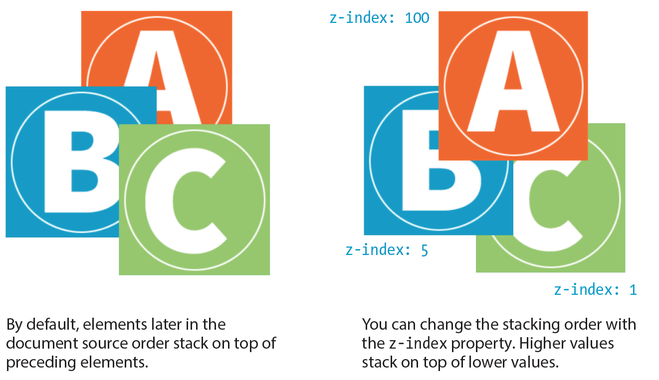
Here are three paragraph elements, each containing a letter image (A, B, and C, respectively) that have been absolutely positioned in such a way that they overlap on the page. By default, paragraph C would appear on top because it appears last in the source. However, by assigning higher z-index values to paragraphs A and B, we can force them to stack in our preferred order.
Note that the values of z-index do not need to be sequential, and they do not relate to anything in particular. All that matters is that higher number values position the element higher in the stack.
The markup
<p id="A"><img src="A.gif" alt="A"></p><p id="B"><img src="B.gif" alt="B"></p><p id="C"><img src="C.gif" alt="C"></p>
The styles
#A { z-index: 100; position: absolute; top: 175px; left: 200px;} #B { z-index: 5; position: absolute; top: 275px; left: 100px;
} #C { z-index: 1; position: absolute; top: 325px; left: 250px;}
To be honest, the z-index property is not often required for most page layouts, but you should know it’s there if you need it. If you want to guarantee that a positioned element always ends up on top, assign it a very high z-index value, such as 100 or 1000. If you want to make sure it’s at the bottom, give it a negative value. The number itself doesn’t actually matter.
Fixed Positioning
We’ve covered relative and absolute positioning, so now it’s time to take on fixed positioning.
For the most part, fixed positioning works just like absolute positioning. The significant difference is that the offset values for fixed elements are always relative to the viewport, which means the positioned element stays put even when the rest of the page scrolls. By contrast, you may remember that when you scrolled the Black Goose Bakery page in Exercise 15-3, the award graphic scrolled along with the document—even though it was positioned relative to the initial containing block (equivalent to the viewport). Not so with fixed positioning, where the position is, well, fixed.
Fixed elements are often used for menus that stay in the same place at the top, bottom, or side of a screen so they are always available, even when the content scrolls (see Warning). Bear in mind that if you fix an element to the bottom of the viewport, you’ll need to leave enough space at the end of the document so the content doesn’t get hidden behind the fixed element. Fixed elements are also problematic when the document is printed because they will print on every page without reserving any space for themselves. It’s best to turn off fixed elements when printing the document. (Targeting print with @media is addressed in Chapter 17, Responsive Web Design.)
Warning
The property causes some buggy behaviors on old versions of mobile Safari (5, 6, and 7) and Android (<4.4). Fortunately, these mobile browsers are nearly obsolete as of this writing, but it is a reminder to do thorough testing on a range of mobile devices if you have fixed elements.
Let’s switch the award graphic on the Black Goose Bakery page to a fixed position in Exercise 15-4 to see the difference.
Exercise 15-4. Fixed positioning
#award { position: fixed; top: 30px; left: 50px; }
That does it for floating and positioning. In the next chapter, you’ll learn about flexible boxes and grid layout, which are powerful tools for designing the overall structure of a page and specific page features. But first, try your hand at a few questions about floating and positioning.
Test Yourself
Before we move on, take a moment to see how well you absorbed the principles in this chapter. You’ll find the answers in Appendix A.
- Which of the following is not true of floated elements?
- All floated elements behave as block elements.
- Floats are positioned against the padding edge of the containing element.
- The contents of inline elements flow around a float, but the element box is unchanged.
- You must provide a width property for floated block elements.
- Which of these style rules is incorrect? Why?
img { float: left; margin: 20px;}img { float: right; width: 120px; height: 80px; }img { float: right; right: 30px; }img { float: left; margin-bottom: 2em; }
- How do you make sure a footer element always starts below any floated sidebars on the page?
- Write the name of the positioning method or methods (static, relative, absolute, or fixed) that best matches each of the following descriptions.
- Positions the element relative to a containing block.
- Removes the element from the normal flow.
- Always positions the element relative to the viewport.
- The positioned element may overlap other content.
- Positions the element in the normal flow.
- The space the element would have occupied in the normal flow is preserved.
- The space the element would have occupied in the normal flow is closed up.
- You can change the stacking order with z-index.
- Positions the element relative to its original position in the normal flow.
CSS Review: Floating and Positioning Properties
Here is a summary of the properties covered in this chapter.