Table of Contents for
Learning Web Design, 5th Edition
 Learning Web Design, 5th Edition
Published by
O'Reilly Media, Inc., 2018
Learning Web Design, 5th Edition
Published by
O'Reilly Media, Inc., 2018
- cover
- Learning Web Design, Fifth Edition
- lwd5_title_copy
- lwd5_title_copy-1
- lwd5_contents
- Foreword
- Preface
- Part I. Getting Started
- 2. How the Web Works
- 3. Some Big Concepts You Need to Know
- Part II. HTML for STRUCTURE
- 5. Marking Up Text
- 6. Adding Links
- 7. Adding Images
- 8. Table Markup
- 9. Forms
- 10. Embedded Media
- Part III. CSS for Presentation
- 12. Formatting Text
- 13. Colors and Backgrounds
- 14. Thinking Inside the Box
- 15. Floating and Positioning
- 16. CSS Layout with Flexbox and Grid
- 17. Responsive Web Design
- 18. Transitions, Transforms, and Animation
- 19. More CSS Techniques
- 20. Modern Web Development Tools
- Part IV. JavaScript for Behavior
- 22. Using JavaScript
- Part V. Web Images
- 24. Image Asset Production
- 25. SVG
- Part VI. Appendices
- B. HTML5 Global Attributes
- C. CSS Selectors, Levels 3 and 4
- D. From HTML+ to HTML5
14
In this chapter
The parts of an element box
Setting box dimensions
Padding
Borders
Outlines
Margins
Assigning display roles
Adding a drop shadow
In Chapter 11, Introducing Cascading Style Sheets I described the box model as one of the fundamental concepts of CSS. According to the box model, every element in a document generates a box to which properties such as width, height, padding, borders, and margins can be applied. You probably already have a feel for how element boxes work from adding backgrounds to elements. This chapter covers all the box-related properties, beginning with an overview of the components of an element box, and then taking on the box properties from the inside out: content dimensions, padding, borders, and margins.
The Element Box
As we’ve seen, every element in a document, both block-level and inline, generates a rectangular element box. The components of an element box are diagrammed in Figure 14-1. Pay attention to the new terminology—it will be helpful in keeping things straight later in the chapter.
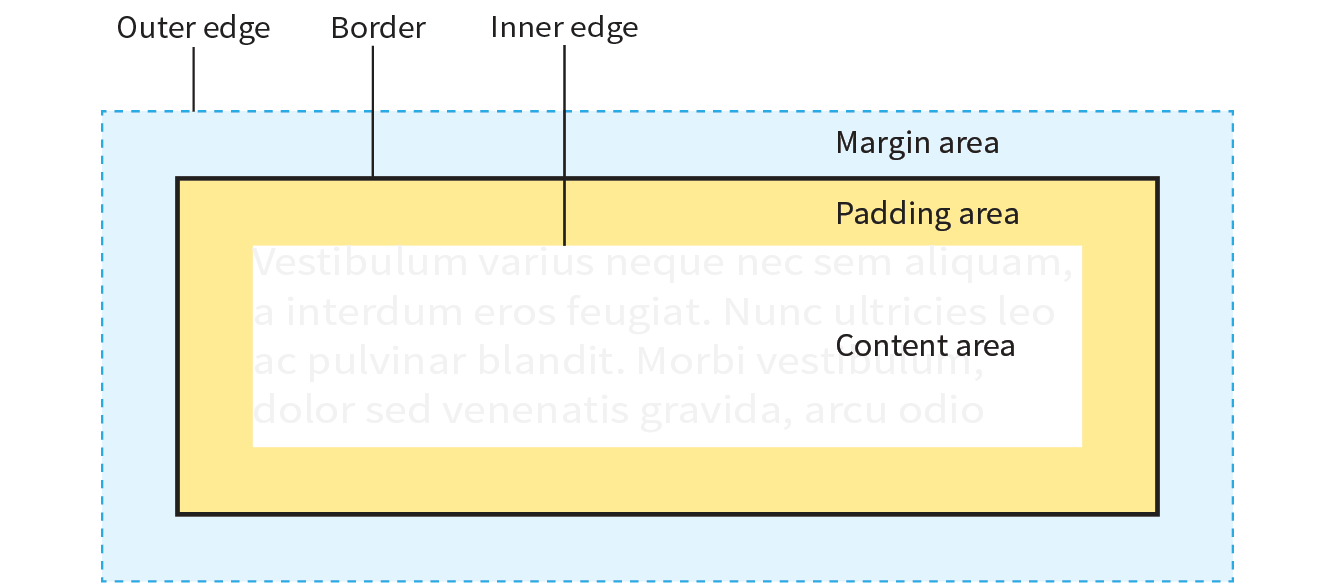
Content area
At the core of the element box is the content itself. In Figure 14-1, the content area is indicated by a white box.
Inner edges
The edges of the content area are referred to as the inner edges of the element box. Although the inner edges are made distinct by a color change in Figure 14-1, in real pages, the edge of the content area is invisible.
Padding
The padding is the area between the content area and an optional border. In the diagram, the padding area is indicated by a yellow-orange color. Padding is optional.
Border
The border is a line (or stylized line) that surrounds the element and its padding. Borders are also optional.
Margin
The margin is an optional amount of space added on the outside of the border. In the diagram, the margin is indicated with light-blue shading, but in reality, margins are always transparent, allowing the background of the parent element to show through.
Outer edge
The outside edges of the margin area make up the outer edges of the element box. This is the total area the element takes up on the page, and it includes the width of the content area plus the total amount of padding, border, and margins applied to the element. The outer edge in the diagram is indicated with a dotted line, but in real web pages, the edge of the margin is invisible.
The amount of space taken up by an element on the page includes the content plus the total amount of padding, borders, and margins applied to the element.
All elements have these box components; however, as you will see, some properties behave differently based on whether the element is block or inline. In fact, we’ll see some of those differences right away as we look at box dimensions.
Specifying Box Dimensions
width
Values: length | percentage | auto
Default: auto
Applies to: block-level elements and replaced inline elements (such as images)
Inherits: no
height
Values: length | percentage | auto
Default: auto
Applies to: block-level elements and replaced inline elements (such as images)
Inherits: no
box-sizing
Values: content-box | border-box
Default: content-box
Applies to: all elements
Inherits: no
By default, the width and height of a block element are calculated automatically by the browser (thus the default auto value). The box will be as wide as the browser window or other containing block element, and as tall as necessary to fit the content. However, you can use the width and height properties to make the content area of an element a specific width or height.
Unfortunately, setting box dimensions is not as simple as just dropping those properties in your style sheet. You have to know exactly which part of the element box you are sizing.
There are two ways to specify the size of an element. The default method—introduced way back in CSS1—applies the width and height values to the content box. That means that the resulting size of the element will be the dimensions you specify plus the amount of padding and borders that have been added to the element. The other method—introduced as part of the box-sizing property in CSS3—applies the width and height values to the border box, which includes the content, padding, and border. With this method, the resulting visible element box, including padding and borders, will be exactly the dimensions you specify. We’re going to get familiar with both methods in this section.
Browser Support Tip
The major browsers began supporting the property in 2011 and 2012. For browsers released prior to that (Chrome <10, Safari <5.1, Safari iOS <5.1, or Android <4.3), there is the prefixed version , but at this point, the prefix is considered no longer necessary. Internet Explorer 6 and 7 do not support at all, but they are fairly extinct.
Regardless of the method you choose, you can specify the width and height only for block-level elements and non-text inline elements such as images. The width and height properties do not apply to inline text (non-replaced) elements and are ignored by the browser. In other words, you cannot specify the width and height of an anchor (a) or strong element (see Note).
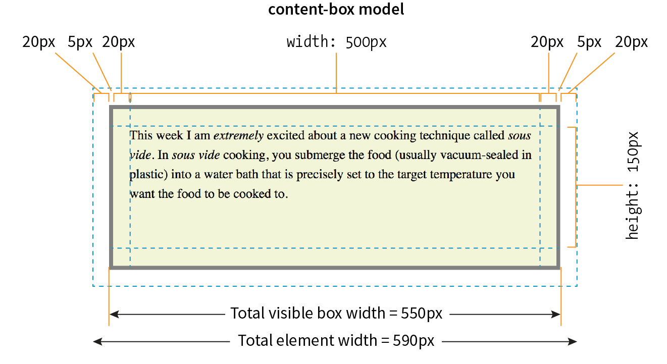
Sizing the Content Box
By default (that is, if you do not include a box-sizing rule in your styles), the width and height properties are applied to the content box. That is the way all current browsers interpret width and height values, but you can explicitly specify this behavior by setting box-sizing: content-box.
In the following example and in Figure 14-2, a simple box is given a width of 500 pixels and a height of 150 pixels, with 20 pixels of padding, a 5-pixel border, and a 20-pixel margin all around. In the default content box model, the width and height values are applied to the content area only.
p { background: #f2f5d5; width: 500px; height: 150px; padding: 20px; border: 5px solid gray; margin: 20px;}
The resulting width of the visible element box ends up being 550 pixels: the content plus 40px padding (20px left and right) and 10px of border (5px left and right).
Visible element box =
5px + 20px + 500px width + 20px + 5px = 550 pixels
When you throw in 40 pixels of margin, the width of the entire element box is 590 pixels. Knowing the resulting size of your elements is critical to getting layouts to behave predictably.
Element box =
20px + 5px + 20px + 500px width + 20px + 5px + 20px = 590 pixels
Using the border-box Model
The other way to specify the size of an element is to apply width and height dimensions to the entire visible box, including the padding and border. Because this is not the default browser behavior, you need to explicitly set box-sizing: border-box in the style sheet.
Let’s look at the same paragraph example from the previous section and see what happens when we make it 500 pixels using the border-box method (Figure 14-3). All other style declarations for the box stay the same.
p { … box-sizing: border-box; width: 500px; height: 150px;}
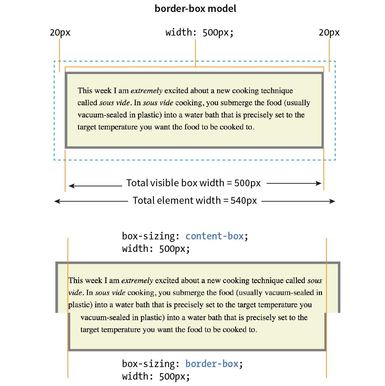
Now the width of the visible box is 500 pixels (compare to 550 pixels in the content-box model), and the total element widh is 540px. Many developers find the border-box model to be a more intuitive way to size elements. It is particularly helpful for specifying widths in percentages, which is a cornerstone of responsive design. For example, you can make two columns 50% wide and know that they will fit next to each other without having to mess around with adding calculated padding and border widths to the mix (although you still need to account for margins).
In fact, many developers simply set everything in the document to use the border-box model by setting it on the root (html) element, then setting all other elements to inherit using the universal selecter (*), like this:
html {box-sizing: border-box;} *, *:before, *:after {box-sizing: inherit;}
For more information on this technique, read Chris Coyier’s article “Inheriting box-sizing Probably Slightly Better Best-Practice” (css-tricks.com/inheriting-box-sizing-probably-slightly-better-best-practice).
Specifying Height
The height property works just the same as width. In general practice, it is less common to specify the height of elements. It is more in keeping with the nature of the medium to allow the height to be calculated automatically, allowing the element box to change based on the font size, user settings, or other factors. If you do specify a height for an element containing text, be sure to also consider what happens should the content not fit. Fortunately, CSS gives you some options, as we’ll see in the next section.
Handling Overflow
When an element is sized too small for its contents, you can specify what to do with the content that doesn’t fit by using the overflow property.
overflow
Values: visible | hidden | scroll | auto
Default: visible
Applies to: block-level elements and replaced inline elements (such as images)
Inherits: no
Figure 14-4 demonstrates the predefined values for overflow. In the figure, the various values are applied to an element that is 150 pixels square. The background color makes the edges of the content area apparent.
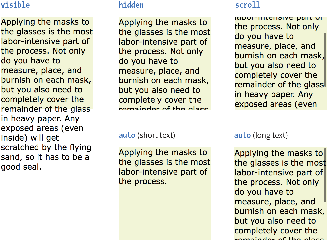
visible
The default value is visible, which allows the content to hang out over the element box so that it all can be seen.
hidden
When overflow is set to hidden, the content that does not fit gets clipped off and does not appear beyond the edges of the element’s content area.
scroll
When scroll is specified, scrollbars are added to the element box to let users scroll through the content. Be aware that they may become visible only when you click the element to scroll it. There is an issue with this value on old iOS (<4), Android (<2.3), and a few other older mobile browsers, so it may be worthwhile to use a simpler alternative to overflow:scroll for mobile.
auto
The auto value allows the browser to decide how to handle overflow. In most cases, scrollbars are added only when the content doesn’t fit and they are needed.
Padding
Padding is the space between the content area and the border (or the place the border would be if one isn’t specified). I find it helpful to add padding to elements when using a background color or a border. It gives the content a little breathing room, and prevents the border or edge of the background from bumping right up against the text.
You can add padding to the individual sides of any element (block-level or inline). There is also a shorthand padding property that lets you add padding on all sides at once.
padding-top, padding-right, padding-bottom, padding-left
Values: length | percentage
Default: 0
Applies to: all elements
Inherits: no
padding
Values: length | percentage
Default: 0
Applies to: all elements
Inherits: no
The padding-top, padding-right, padding-bottom, and padding-left properties specify an amount of padding for each side of an element, as shown in this example and Figure 14-5 (note that I’ve also added a background color to make the outer edges of the padding area apparent).
blockquote { padding-top: 2em; padding-right: 4em; padding-bottom: 2em; padding-left: 4em; background-color: #D098D4; /* light green */
}
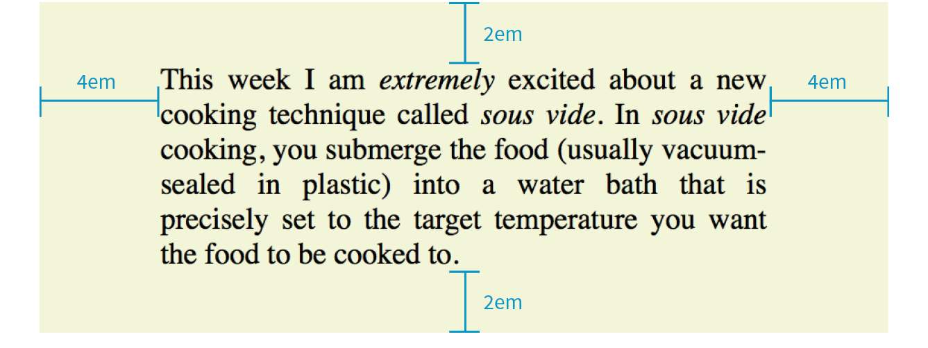
Specify padding in any of the CSS length units (em and px are the most common) or as a percentage of the width of the parent element. Yes, the parent’s width is used as the basis, even for top and bottom padding. If the width of the parent element changes, so will the padding values on all sides of the child element, which makes percentage values somewhat tricky to manage.
The Shorthand padding Property
As an alternative to setting padding one side at a time, you can use the shorthand padding property to add padding all around the element. The syntax is interesting; you can specify four, three, two, or one value for a single padding property. Let’s see how that works, starting with four values.
When you supply four padding values, they are applied to each side in clockwise order, starting at the top. Some people use the mnemonic device “TRouBLe” for the order Top Right Bottom Left. This is a common syntax for applying shorthand values in CSS, so take a careful look:
padding: top right bottom left;
Using the padding property, we could reproduce the padding specified with the four individual properties in the previous example like this:
blockquote { padding: 2em 4em 2em 4em; background-color: #D098D4;}
If the left and right padding are the same, you can shorten it by supplying only three values. The value for “right” (the second value in the string) will be mirrored and used for “left” as well. It is as though the browser assumes the “left” value is missing, so it just uses the “right” value on both sides. The syntax for three values is as follows:
padding: top right/left bottom;
This rule would be equivalent to the previous example because the padding on both the left and right edges of the element is set to 4em:
blockquote { padding: 2em 4em 2em; background-color: #D098D4;}
Continuing with this pattern, if you provide only two values, the first one is used for the top and the bottom edges, and the second one is used for the left and right edges:
padding: top/bottom right/left;
Again, the same effect achieved by the previous two examples could be accomplished with this rule:
blockquote { padding: 2em 4em; background-color: #D098D4;}
Note that all of the previous examples have the same visual effect as shown in Figure 14-5.
Finally, if you provide just one value, it will be applied to all four sides of the element. This declaration applies 15 pixels of padding on all sides of a div element:
div#announcement { padding: 15px; border: 1px solid;}
Get a feel for adding padding to elements in Exercise 14-1.
Exercise 14-1. Adding a little padding
- Save the document, and then open (or reload) in the browser to see the result of your work. The changes at this point are pretty subtle. Figure 14-7 highlights the padding additions.
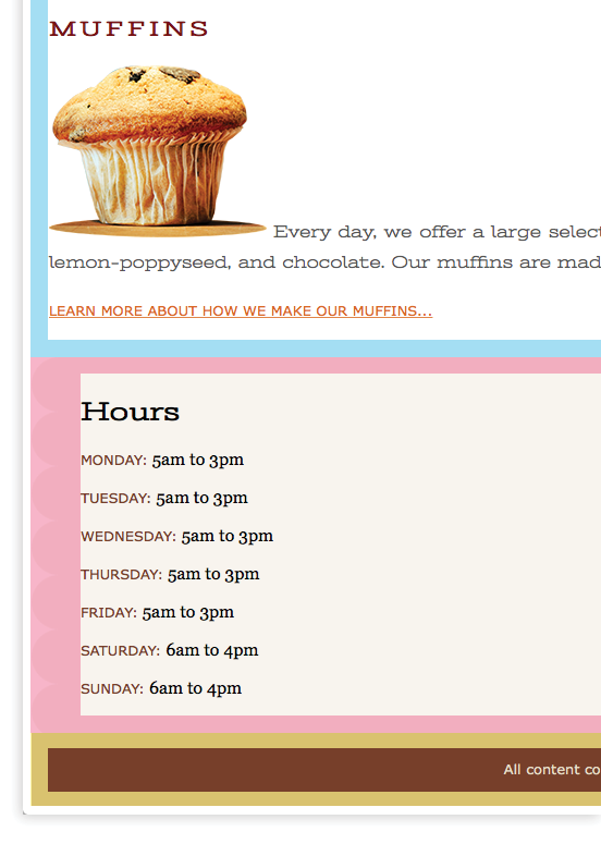
Figure 14-7. The shaded areas indicate the padding added to (blue), (pink), and (yellow). Colors added for demo purposes but wouldn’t render in the browser.
Borders
A border is simply a line drawn around the content area and its (optional) padding. You can choose from eight border styles and make them any width and color you like. Borders can be applied all around the element or just on a particular side or sides. CSS3 introduced properties for rounding the corners or applying images to borders. We’ll start our border exploration with the various border styles.
Border Style
The style is the most important of the border properties because, according to the CSS specification, if there is no border style specified, the border does not exist (the default is none). In other words, you must always declare the style of the border, or the other border properties will be ignored.
Border styles can be applied one side at a time or with the shorthand border-style property.
border-top-style, border-right-style, border-bottom-style, border-left-style
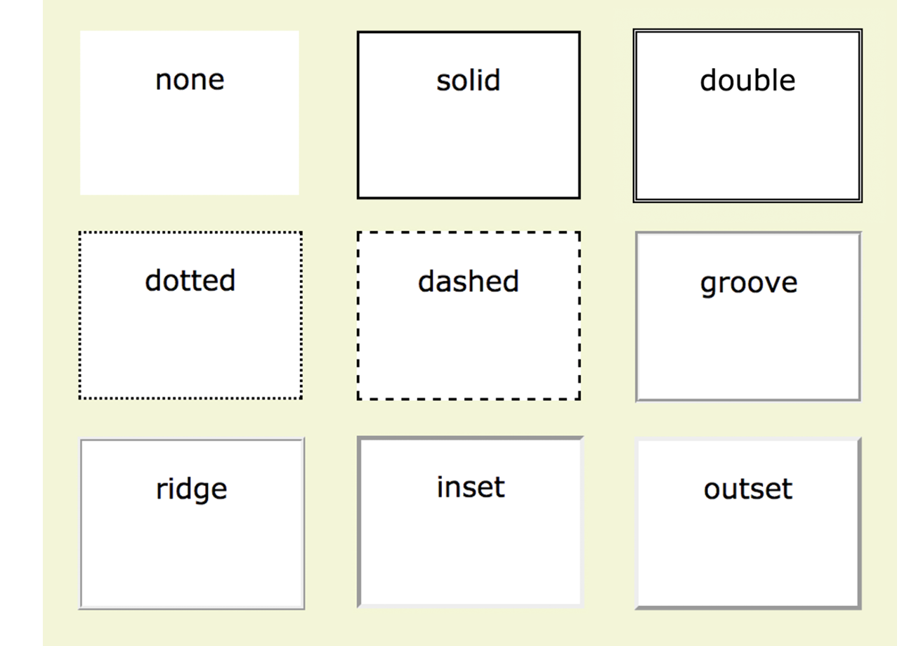
Values: none | solid | hidden | dotted | dashed | double | groove | ridge | inset | outset
Default: none
Applies to: all elements
Inherits: no
border-style
Values: none | solid | hidden | dotted | dashed | double | groove | ridge | inset | outset
Default: none
Applies to: all elements
Inherits: no
The value of the border-style property is one of 10 keywords describing the available border styles, as shown in Figure 14-8. The value hidden is equivalent to none.
Use the side-specific border style properties (border-top-style, border-right-style, border-bottom-style, and border-left-style) to apply a style to one side of the element. If you do not specify a width, the default medium width will be used. If there is no color specified, the border uses the foreground color of the element (same as the text).
In the following example, I’ve applied a different style to each side of an element to show the single-side border properties in action (Figure 14-9).
div#silly { border-top-style: solid; border-right-style: dashed; border-bottom-style: double; border-left-style: dotted; width: 300px; height: 100px;}
The border-style shorthand property works on the clockwise (TRouBLe) system described for padding earlier. You can supply four values for all four sides or fewer values when the left/right and top/bottom borders are the same. The silly border effect in the previous example could also be specified with the border-style property as shown here, and the result would be the same as shown in Figure 14-9:
border-style: solid dashed double dotted;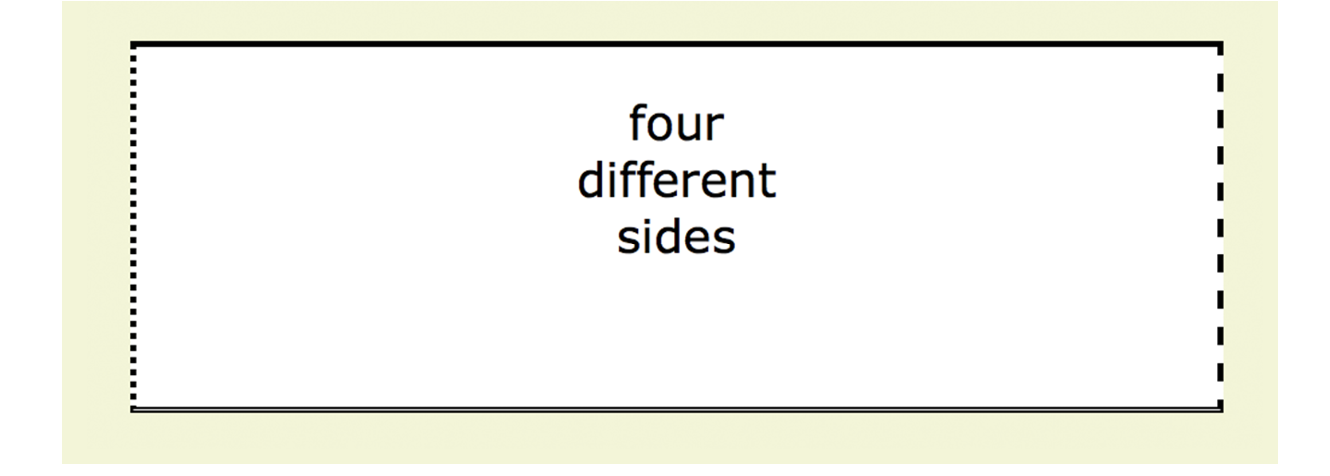
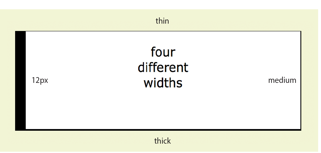
Border Width (Thickness)
Use one of the border-width properties to specify the thickness of the border. Once again, you can target each side of the element with a single-side property, or specify several sides at once in clockwise order with the shorthand border-width property.
border-top-width, border-right-width, border-bottom-width, border-left-width
Values: length | thin | medium | thick
Default: medium
Applies to: all elements
Inherits: no
border-width
Values: length | thin | medium | thick
Default: medium
Applies to: all elements
Inherits: no
The most common way to specify the width of borders is using a pixel or em measurement; however, you can also specify one of the keywords (thin, medium, or thick) and leave the rendering up to the browser.
I’ve included a mix of values in this example (Figure 14-10). Notice that I’ve also included the border-style property because if I didn’t, the border would not render at all:
div#help { border-top-width: thin; border-right-width: medium; border-bottom-width: thick; border-left-width: 12px; border-style: solid; width: 300px; height: 100px; }
or:
div#help { border-width: thin medium thick 12px; border-style: solid; width: 300px; height: 100px; }
Border Color
Border colors are specified in the same way: via the side-specific properties or the border-color shorthand property. When you specify a border color, it overrides the foreground color as set by the color property for the element.
border-top-color, border-right-color, border-bottom-color, border-left-color
Values: color name or RGB/HSL value | transparent
Default: the value of the color property for the element
Applies to: all elements
Inherits: no
border-color
Values: color name or RGB/HSL value | transparent
Default: the value of the color property for the element
Applies to: all elements
Inherits: no
You know all about specifying color values, and you should be getting used to the shorthand properties as well, so I’ll keep this example short and sweet (Figure 14-11). Here, I’ve provided two values for the shorthand border-color property to make the top and bottom of a div maroon and the left and right sides aqua:
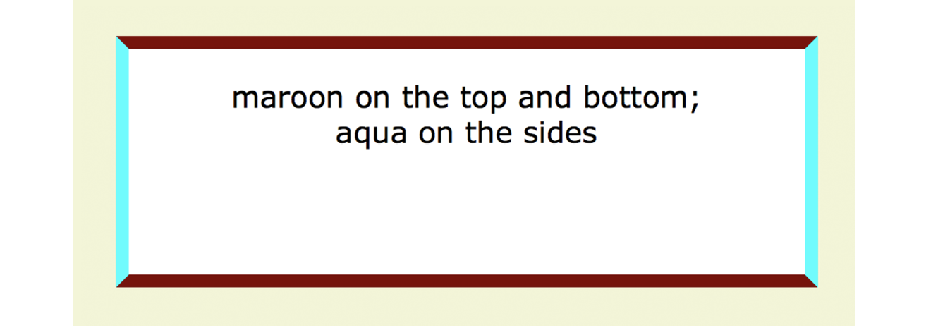
div#special { border-color: maroon aqua; border-style: solid; border-width: 6px; width: 300px; height: 100px;}
Combining Style, Width, and Color
The authors of CSS didn’t skimp when it came to border shortcuts. They also created properties for providing style, width, and color values in one declaration, one side at a time. You can specify the appearance of specific sides, or use the border property to change all four sides at once.
border-top, border-right, border-bottom, border-left
Values: border-style border-width border-color
Default: defaults for each property
Applies to: all elements
Inherits: no
border
Values: border-style border-width border-color
Default: defaults for each property
Applies to: all elements
Inherits: no
The values for border and the side-specific border properties may include style, width, and color values in any order. You do not need to declare all three, but if the border style value is omitted, no border will render.
The border shorthand property works a bit differently than the other shorthand properties that we’ve covered in that it takes one set of values and always applies them to all four sides of the element. In other words, it does not use the clockwise TRBL system that we’ve seen with other shorthand properties.
Here is a smattering of valid border shortcut examples to give you an idea of how they work:
h1 { border-left: red .5em solid; } /* left border only */
h2 { border-bottom: 1px solid; } /* bottom border only */p.example { border: 2px dotted #663; } /* all four sides */
Rounded Corners with border-radius
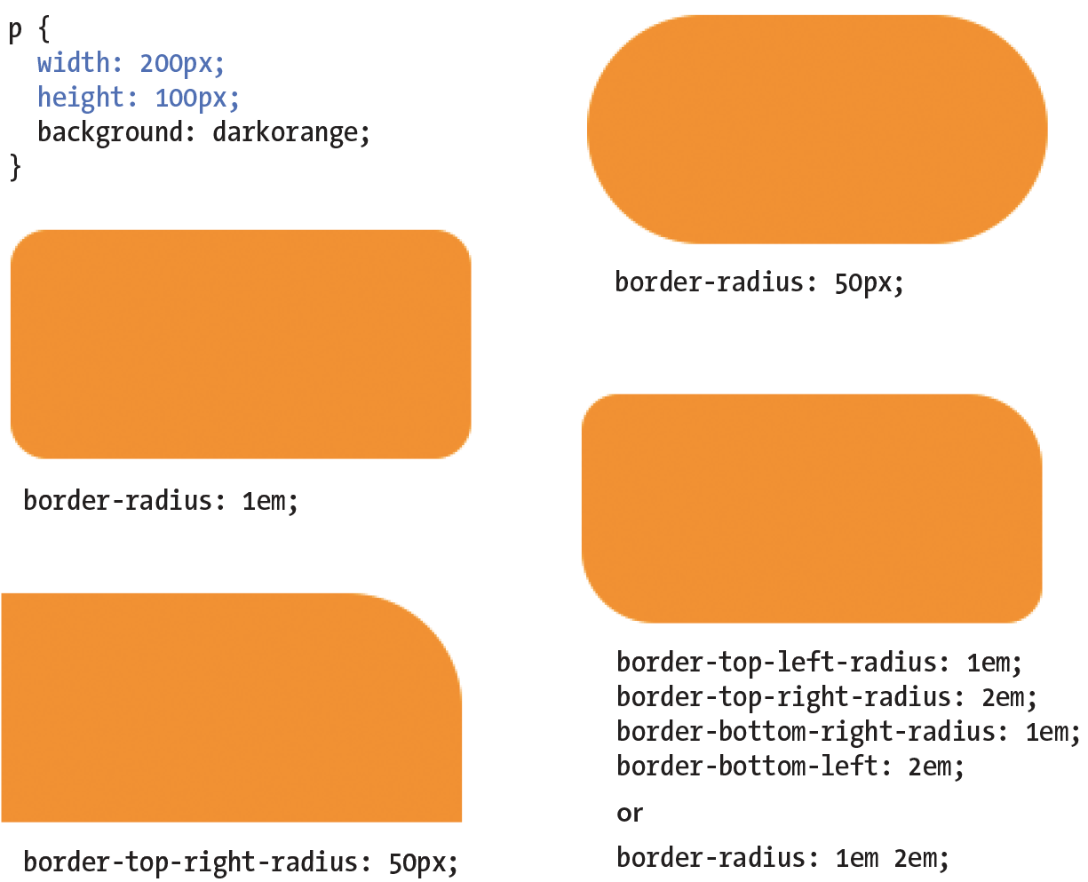
Perhaps you’d like your element boxes to look a little softer and rounder. Well, then, the border-radius property is for you! There are individual corner properties as well as a border-radius shorthand.
border-top-left-radius, border-top-right-radius, border-bottom-right-radius, border-bottom-left-radius
Values: length | percentage
Default: 0
Applies to: all elements
Inherits: no
border-radius
Values: 1, 2, 3, or 4 length or percentage values
Default: 0
Applies to: all elements
Inherits: no
To round off the corner of an element, simply apply one of the border-radius properties, but keep in mind that you will see the result only if the element has a border or background color. Values are typically provided in ems or pixels. Percentages are allowed and are nice for keeping the curve proportional to the box should it resize, but you may run into some browser inconsistencies.
You can target the corners individually or use the shorthand border-radius property. If you provide one value for border-radius, it is applied to all four corners. Four values are applied clockwise, starting in the top-left corner (top-left, top-right, bottom-right, bottom-left). When you supply two values, the first one is used for top-left and bottom-right, and the second is for the other two corners.
Compare the border-radius values to the resulting boxes in Figure 14-12. You can achieve many different effects, from slightly softened corners to a long capsule shape, depending on how you set the values.
Browser support Note
All browsers have been supporting properties using the standard syntax (that is, without prefixes) since about 2010. There are prefixed properties for Firefox <3.6 and Safari <5.0, but they’re so old it’s probably not worth worrying about. Internet Explorer 8 and earlier, however, do not support at all. But in this case, chances are the usability of your site doesn’t depend on rounded corners, so this is a good opportunity to practice progressive enhancement: non-supporting browsers get perfectly acceptable square corners, and all modern browsers get a little something extra.
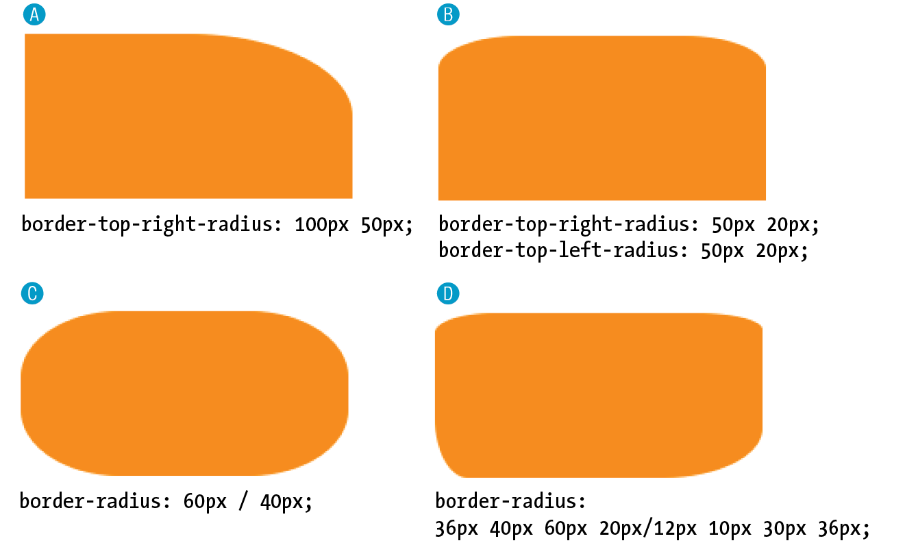
Elliptical corners
So far, the corners we’ve made are sections of perfect circles, but you can also make a corner elliptical by specifying two values: the first for the horizontal radius and the second for the vertical radius (see Figure 14-13, A and B).
A border-top-right-radius: 100px 50px; B border-top-right-radius: 50px 20px; border-top-left-radius: 50px 20px;
If you want to use the shorthand property, the horizontal and vertical radii get separated by a slash (otherwise, they’d be confused for different corner values). The following example sets the horizontal radius on all corners to 60px and the vertical radius to 40px (Figure 14-13, C):
C border-radius: 60px / 40px;
If you want to see something really nutty, take a look at a border-radius shorthand property that specifies a different ellipse for each of the four corners. All of the horizontal values are lined up on the left of the slash in clockwise order (top-left, top-right, bottom-right, bottom-left), and all of the corresponding vertical values are lined up on the right (Figure 14-13, D):
D border-radius: 36px 40px 60px 20px / 12px 10px 30px 36px;
Now it’s time to try your hand at borders. Exercise 14-2 will not only give you some practice, but it should also give you some ideas on the ways borders can be used to add visual interest to designs.
Exercise 14-2. Border tricks
- The last thing we’ll do is to replace the standard underline with a decorative bottom border under links. Start by turning off the underline for all links. Add this rule in the “link styles” section of the style sheet:
a { text-decoration: none;}a { text-decoration: none;border-bottom: 1px dotted;}a { text-decoration: none; border-bottom: 1px dotted;padding-bottom: .2em;}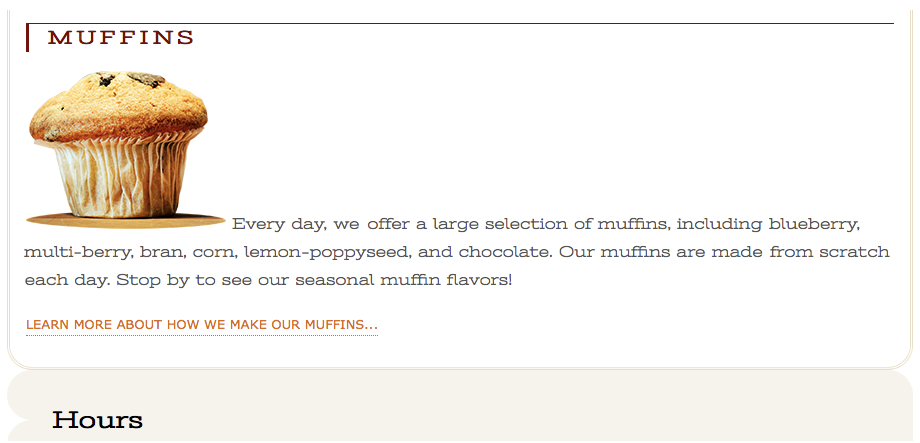
Figure 14-14. The results of our border additions.
Picture-Perfect Borders
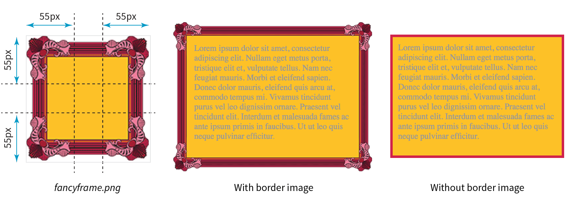
border-image: / / ;
border: 5px solid #d1214a; /* red */
border-image:url(fancyframe.png) 55 fill / 55px / 25px stretch;
Margins
A margin is an optional amount of space that you can add on the outside of the border. Margins keep elements from bumping into one another or the edge of the browser window or viewport.
The side-specific and shorthand margin properties work much like the padding properties we’ve looked at already; however, margins have some special behaviors to be aware of.
margin-top, margin-right, margin-bottom, margin-left
Values: length | percentage | auto
Default: auto
Applies to: all elements
Inherits: no
margin
Values: length | percentage | auto
Default: auto
Applies to: all elements
Inherits: no
The margin properties are very straightforward to use. You can either specify an amount of margin to appear on each side of the element or use the margin property to specify all sides at once.
The shorthand margin property works the same as the padding shorthand. When you supply four values, they are applied in clockwise order (top, right, bottom, left) to the sides of the element. If you supply three values, the middle value applies to both the left and right sides. When two values are provided, the first is used for the top and bottom, and the second applies to the left and right edges. Finally, one value will be applied to all four sides of the element.
As with most web measurements, ems, pixels, and percentages are the most common ways to specify margins. Be aware, however, that if you specify a percentage value, it is calculated based on the width of the parent element. If the parent’s width changes, so will the margins on all four sides of the child element (padding has this behavior as well). The auto keyword allows the browser to fill in the amount of margin necessary to fit or fill the available space (see Power Tool sidebar).
Figure 14-16 shows the results of the following margin examples. I’ve added a red border to the elements in the examples to make their boundaries more clear. The dotted rules were added in the figure illustration to indicate the outer edges of the margins for clarity purposes only, but they are not something you’d see in the browser.
A p#A { margin: 4em; border: 2px solid red; background: #e2f3f5; }B p#B {
margin-top: 2em; margin-right: 250px; margin-bottom: 1em; margin-left: 4em;border: 2px solid red; background: #e2f3f5; }C body {margin: 0 20%;border: 3px solid red; background-color: #e2f3f5; }
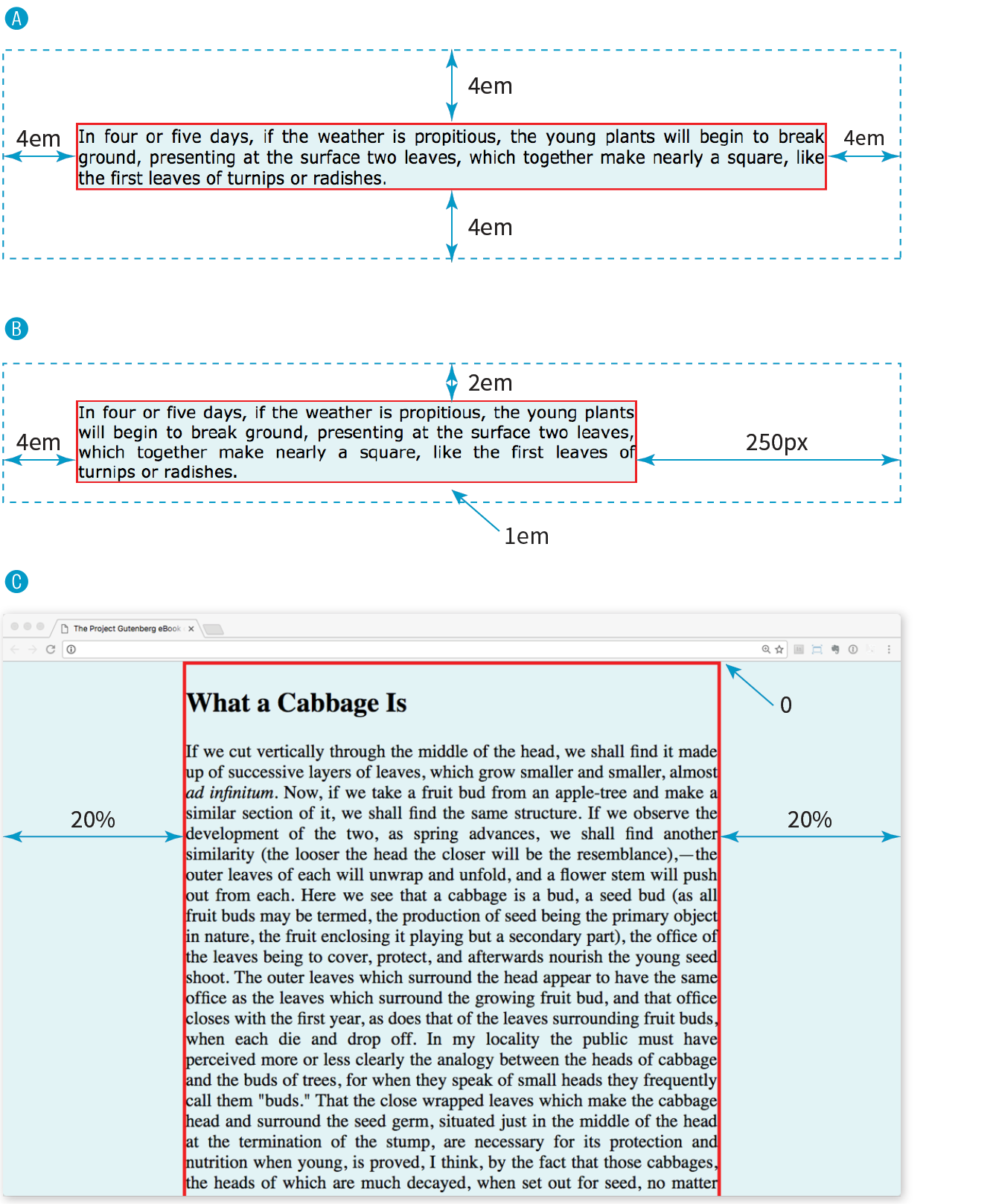
Take a look at Example C in Figure 14-16. Here I’ve applied the margin property to the body element of the document. For this particular design, I set the top margin to zero (0) so the body starts flush against the top edge of the browser window. Adding equal amounts of margin to the left and right sides of the body keeps the content of the page centered and gives it a little breathing room.
Adding a margin to the body element adds space between the page content and the edges of the viewport.
Margin Behavior
Although it is easy to write rules that apply margin amounts around HTML elements, it is important to be familiar with some of the quirks of margin behavior.
Collapsing margins
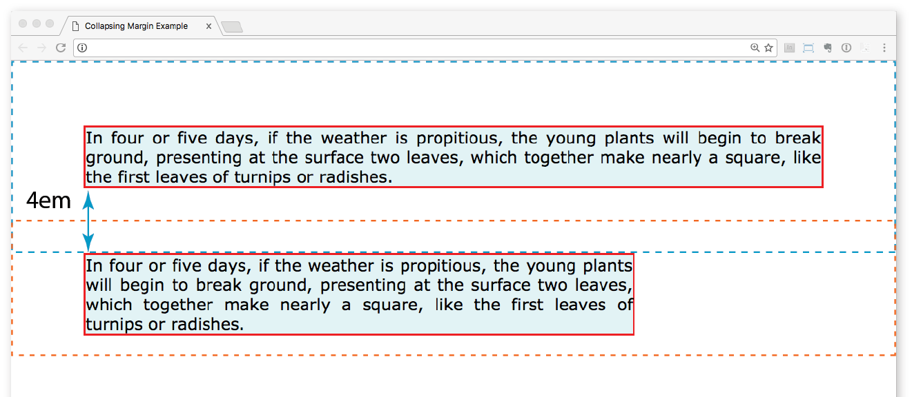
The most significant margin behavior to be aware of is that the top and bottom margins of neighboring elements collapse. This means that instead of accumulating, adjacent margins overlap, and only the largest value is used.
Using the two paragraphs from the previous figure as an example, if the top element has a bottom margin of 4em, and the following element has a top margin of 2em, the resulting margin space between elements does not add up to 6ems Rather, the margins collapse and the resulting margin between the paragraphs will be 4em, the largest specified value. This is demonstrated in Figure 14-17.
The only time top and bottom margins don’t collapse is for floated or absolutely positioned elements (we’ll get to that in Chapter 15, Floating and Positioning). Margins on the left and right sides never collapse, so they’re nice and predictable.
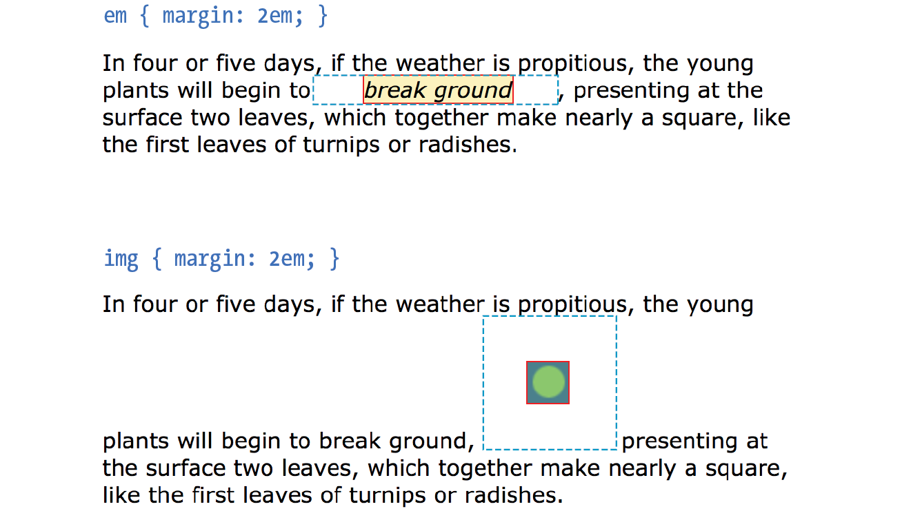
Margins on inline elements
You can apply top and bottom margins to inline text elements (or “non-replaced inline elements,” to use the proper CSS terminology), but it won’t add vertical space above and below the element, and the height of the line will not change. However, when you apply left and right margins to inline text elements, margin space will be held clear before and after the text in the flow of the element, even if that element breaks over several lines.
Just to keep things interesting, margins on replaced inline elements, such as images, do render on all sides, and therefore do affect the height of the line. See Figure 14-18 for examples of each.
Negative margins
It is worth noting that it is possible to specify negative values for margins. When you apply a negative margin, the content, padding, and border are moved in the opposite direction that would have resulted from a positive margin value.
I’ll make this clear with an example. Figure 14-19 shows two neighboring paragraphs with different-colored borders applied to show their boundaries. In the left view, I’ve added a 3em bottom margin to the top paragraph, which has the effect of pushing the following paragraph down by that amount. If I specify a negative value (–3em), the following element moves up by that amount and overlaps the element with the negative margin.
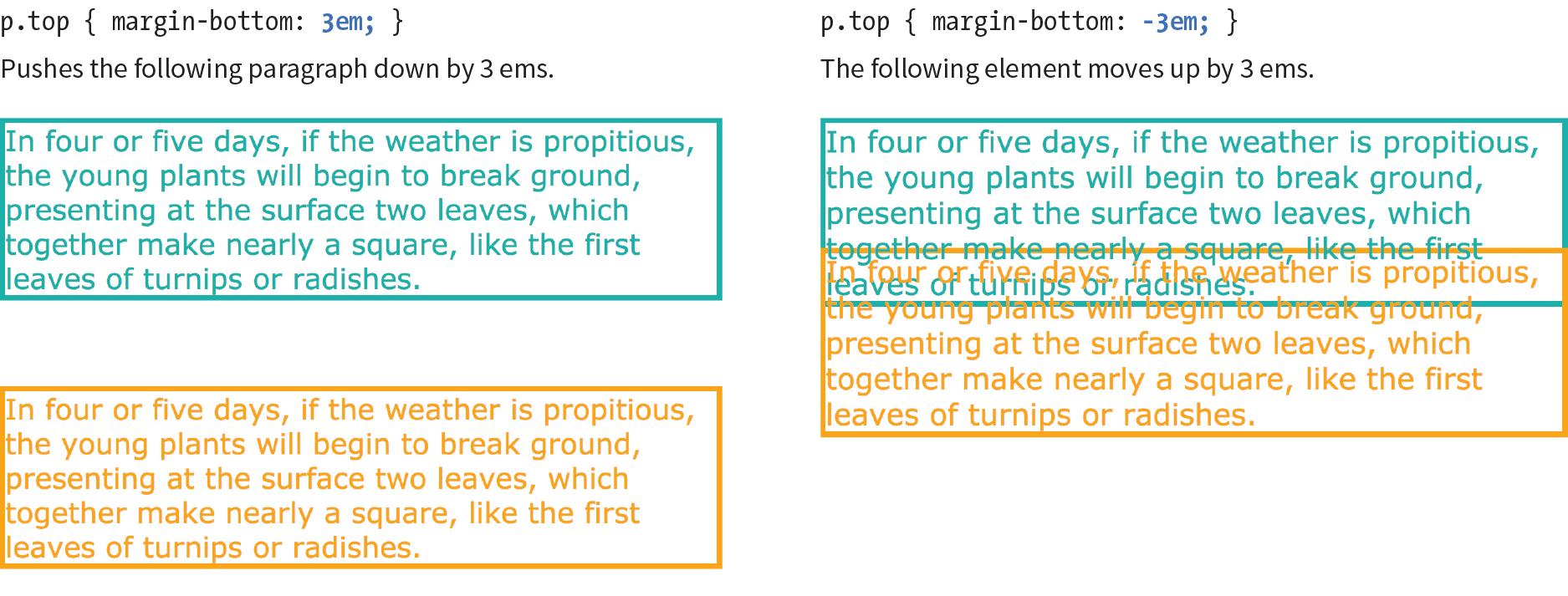
This may seem like a strange thing to do, and in fact, you probably wouldn’t make blocks of text overlap as shown. The point here is that you can use margins with both positive and negative values to move elements around on the page. This is the basis of some older CSS layout techniques.
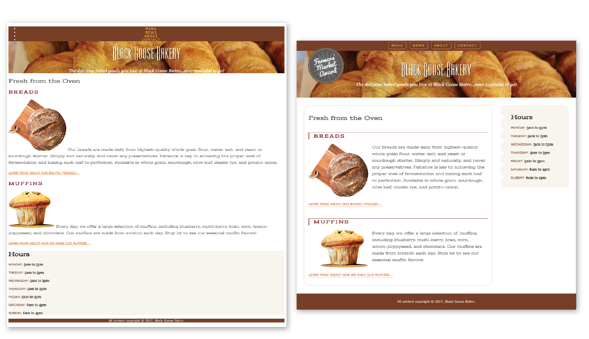
Now let’s use margins to add some space between parts of the Black Goose Bakery home page in Exercise 14-3.
Exercise 14-3. Adding margin space around elements
- Save the style sheet again, and reload the page in the browser. It should look like the one in Figure 14-20. This isn’t the most beautiful design, particularly if your browser window is set wide. However, if you resize your browser window narrow, you’ll find that it wouldn’t be too bad as the small-screen version in a responsive design. (Bet you can’t wait for the Responsive Web Design chapter to learn how to fix this!)
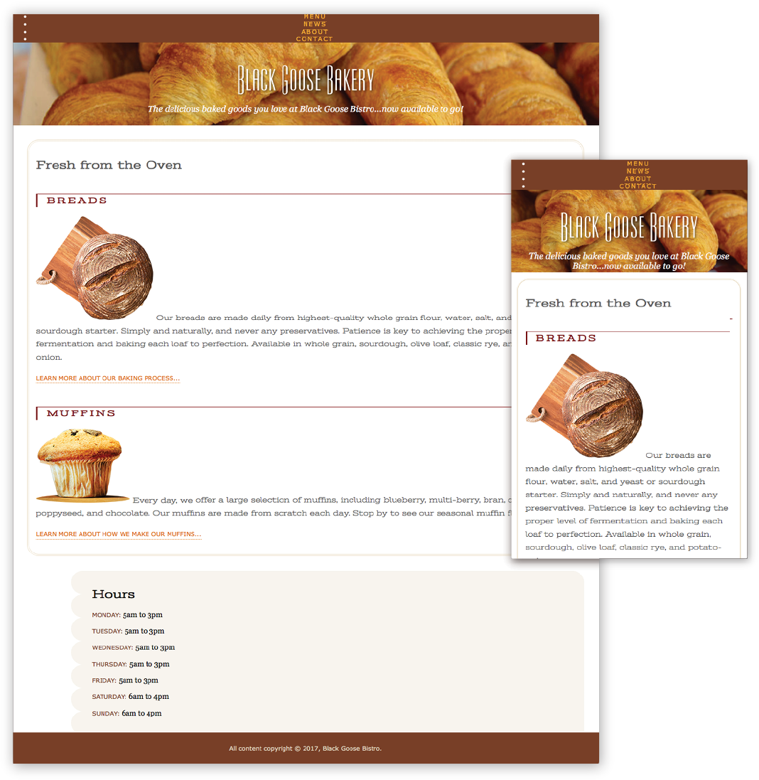
Figure 14-20. The Black Goose Bakery home page after padding, borders, and margins are added.
Assigning Display Types
As long as we’re talking about boxes and the CSS layout model, this is a good time to introduce the display property. You should already be familiar with the display behavior of block and inline elements. Although HTML assigns display behaviors (or display types, to use the latest CSS term) to the elements it defines, there are other XML-based languages that can use CSS that don’t do the same. For this reason, the display property was created to allow authors to specify how elements should behave in layouts.
display
Values: inline | block | run-in | flex | grid | flow | flow-root | list-item | table | table-row-group | table-header-group | table-footer-group | table-row | table-cell | table-column-group | table-column | table-caption | ruby | ruby-base | ruby-text | ruby-base-container | ruby-text-container | inline-block | inline-table | inline-flex | inline-grid | contents | none
Default: inline
Applies to: all elements
Inherits: yes
The display property defines the type of element box an element generates in the layout. In addition to the familiar inline and block display types, you can also make elements display as list items or the various parts of a table. There are also a number of values for ruby annotation for East Asian languages. As you can see from the list of values, there are a lot of display types, but there are only a few that are used in everyday practice.
Display type assignment is useful for achieving layout effects while keeping the semantics of the HTML source intact. For example, it is common practice to make li elements (which usually display with the characteristics of block elements) display as inline elements to turn a list into a horizontal navigation bar. You may also make an otherwise inline a (anchor) element display as a block in order to give it a specific width and height:
ul.navigation li { display: inline; } ul.navigation li a { display: block; }
WARNING
Bear in mind that changing the presentation of an HTML element with the CSS property does not change the definition of that element as block-level or inline in HTML. Putting a block-level element within an inline element will always be invalid, regardless of its display role.
Another useful value for the display property is none, which removes the content from the normal flow entirely. Unlike visibility: hidden, which just makes the element invisible but keeps the space it would have occupied blank, display: none removes the content, and the space it would have occupied is closed up.
One popular use of display: none is to prevent certain content in the source document from displaying in specific media, such as when the page is printed or displayed on devices with small screens. For example, you could display URLs for links in a document when it is printed, but not when it is displayed on a computer screen where the links are interactive.
Be aware that content that has its display set to none still downloads with the document. Setting some content to display:none for devices with small screens may keep the page shorter, but it is not doing anything to reduce data usage or download times.
Box Drop Shadows
We’ve arrived at the last stop on the element box tour. In Chapter 12, Formatting Text you learned about the text-shadow property, which adds a drop shadow to text. The box-shadow property applies a drop shadow around the entire visible element box (excluding the margin).
box-shadow
Values: ‘horizontal offset’ ‘vertical offset’ ‘blur distance’ ‘spread distance’ color inset | none
Default: none
Applies to: all elements
Inherits: no
Browser Support Note
Browsers released before 2011 require vendor prefixes for . Box shadows are not supported at all in Internet Explorer versions 8 and earlier. This is a case for progressive enhancement—it is likely that a box without a shadow will be just fine for users clinging to old browser versions.
The value of the box-shadow property should seem familiar to you after working with text-shadow: specify the horizontal and vertical offset distances, the amount the shadow should blur, and a color. For box shadows, you can also specify a spread amount, which increases (or decreases with negative values) the size of the shadow. By default, the shadow color is the same as the foreground color of the element, but specifying a color overrides it.
Figure 14-21 shows the results of the following code examples. A adds a simple box shadow 6 pixels to the right and 6 pixels down, without blur or spread. B adds a blur value of 5 pixels, and C shows the effect of a 10-pixel spread value. Box shadows are always applied to the area outside the border of the element (or the place it would be if a border isn’t specified). If the element has a transparent or translucent background, you will not see the box shadow in the area behind the element.
box-shadow: 6px 6px gray;box-shadow: 6px 6px 5px gray;/* 5 pixel blur */box-shadow: 6px 6px 5px 10px gray;/* 5px blur, 10px spread */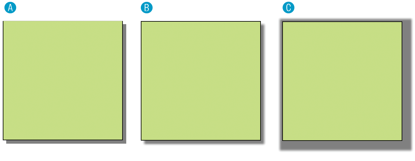
Figure 14-21. Adding drop shadows around an element with the property.
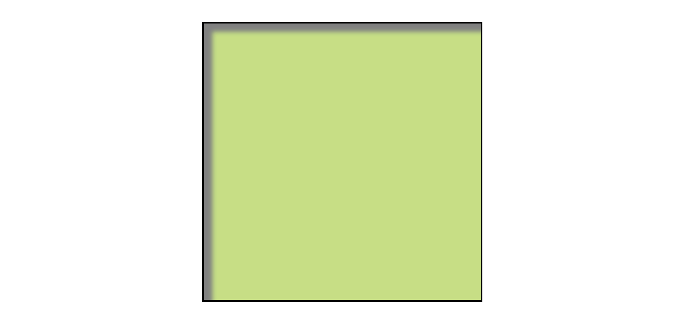
You can make the shadow render inside the edges of the visible element box by adding the inset keyword to the rule. This makes it look like the element is pressed into the screen (Figure 14-22).
box-shadow:inset6px 6px 5px gray;
As for text-shadow, you can specify multiple box shadows on an element by providing the values in a comma-separated list. The values that come first get placed on top, and subsequent shadows are placed behind it in the order in which they appear in the list.
Test Yourself
At this point, you should have a good feel for element boxes and how to manipulate the space within and around them. In the next chapter, we’ll start moving the boxes around on the page, but first, why not get some practice at writing rules for padding, borders, and margins in the following test?
In this test, your task is to write the declarations that create the effects shown in each example in Figure 14-23 (see Useful Hints). All the paragraphs shown here share a rule that sets the dimensions and the background color for each paragraph. You just need to provide the box-related property declarations. Answers, as always, appear in Appendix A.
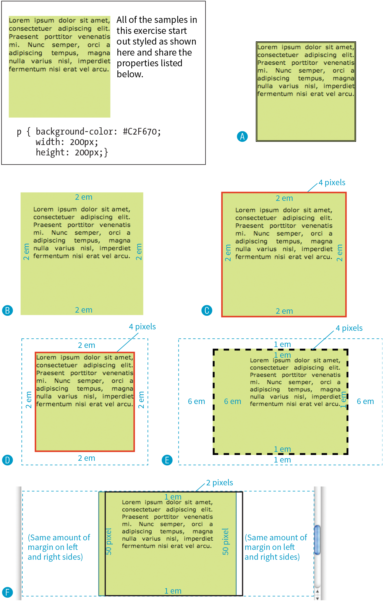
Figure 14-23. Write the declarations for these examples.