Table of Contents for
Learning Web Design, 5th Edition
 Learning Web Design, 5th Edition
Published by
O'Reilly Media, Inc., 2018
Learning Web Design, 5th Edition
Published by
O'Reilly Media, Inc., 2018
- cover
- Learning Web Design, Fifth Edition
- lwd5_title_copy
- lwd5_title_copy-1
- lwd5_contents
- Foreword
- Preface
- Part I. Getting Started
- 2. How the Web Works
- 3. Some Big Concepts You Need to Know
- Part II. HTML for STRUCTURE
- 5. Marking Up Text
- 6. Adding Links
- 7. Adding Images
- 8. Table Markup
- 9. Forms
- 10. Embedded Media
- Part III. CSS for Presentation
- 12. Formatting Text
- 13. Colors and Backgrounds
- 14. Thinking Inside the Box
- 15. Floating and Positioning
- 16. CSS Layout with Flexbox and Grid
- 17. Responsive Web Design
- 18. Transitions, Transforms, and Animation
- 19. More CSS Techniques
- 20. Modern Web Development Tools
- Part IV. JavaScript for Behavior
- 22. Using JavaScript
- Part V. Web Images
- 24. Image Asset Production
- 25. SVG
- Part VI. Appendices
- B. HTML5 Global Attributes
- C. CSS Selectors, Levels 3 and 4
- D. From HTML+ to HTML5
A
Chapter 1: Getting Started in Web Design
- b, d, a, c
- The W3C guides the development of web-related technologies.
- c, d, a, b
- Frontend development is concerned with aspects of the site that appear in or are related to the browser. Backend development involves the applications and databases required on the server for site functionality.
- An FTP tool is used to transfer files between computers over the internet, such as between your local machine and the server. You may use an FTP tool provided by your hosting company, built into a code editor, or as a standalone application.
Chapter 2: How the Web Works
1. c; 2. j; 3. h; 4. g; 5. f; 6. i; 7. b; 8. a; 9. d; 10. e
Chapter 3: Some Big Concepts You Need to Know
- There are a number of unknown factors when you’re developing a site. Some that were addressed in this chapter include:
- The size of the screen or browser window
- The user’s internet connection speed
- Whether JavaScript is enabled
- Whether the browser supports specific features
- Whether the user is at a desk or on the go (context and attention span)
- 1. c; 2. d; 3. e; 4. a; 5. b
- The four general disability categories include:
- Sight impairment: make sure the content is semantic and in logical order for when it is read by a screen reader.
- Hearing impairment: provide transcripts for audio and video content.
- Mobility impairment: use measures that help users without a mouse or keyboard.
- Cognitive impairment: content should be simple and clearly organized.
- You would use a waterfall chart to evaluate your site’s performance in the optimization process.
Chapter 4: Creating a Simple Page
- A tag is part of the markup (brackets and element name) used to delimit an element. An element consists of the content and its tags.
- The recommended markup for a minimal HTML5 document is as follows:
<!DOCTYPE html><html> <head> <meta charset="utf8"> <title>Title</title> </head> <body> </body></html>
- Sunflower.html—Yes.
- index.doc—No, it must end in .html or .htm.
- cooking home page.html—No, there may be no character spaces.
- Song_Lyrics.html—Yes.
- games/rubix.html—No, there may be no slashes in the name.
- %whatever.html—No, there may be no percent symbols.
- It is missing the src attribute:
<img src="birthday.jpg"> - The slash in the end tag is missing:
<em>Congratulations!</em> - There should be no attribute in the end tag:
<a href="file.html">linked text</a> - The slash should be a forward slash:
<p>This is a new paragraph</p>- It is missing the src attribute:
- Make it a comment:
<!-- product list begins here -->
Chapter 5: Marking Up Text
- Here is the markup for a thematic break between these paragraphs:
<p>People who know me know that I love to cook.</p><hr><p>I've created this site to share some of my favorite recipes.</p> - A blockquote is a block-level element used for long quotations or quoted material that may consist of other block elements. The q (quote) element is for short quotations that go in the flow of text and do not cause line breaks.
- The pre element.
- The ul element is an unordered list element. It is used for lists that don’t need to appear in a particular sequence. They display with bullets by default. The ol element is an ordered list in which sequence matters. The browser automatically inserts numbers for ordered lists.
- Use a style sheet to remove bullets from an unordered list.
<abbr title="World Wide Web Consortium">W3C</abbr>- dl is the element used to identify an entire description list. The dt element is used to identify just one term within that list.
- The id attribute is used to identify a unique element in a document, and the name in its value may appear only once in a document. class is used to classify multiple elements into conceptual groups.
- An article element is intended for a self-contained body of content that would be appropriate for syndication or might appear in a different context. A section element divides content into thematically related chunks.
Chapter 6: Adding Links
Exercise 6-7
<p><a href="tapenade.html">Go to the tapenade recipe</a></p><p><a href="../salmon.html">Try this with Garlic Salmon.</a></p><p><a href="pasta/linguine.html">Try the Linguine with Clam Sauce</a></p><p><a href="../../about.html">About Jen's Kitchen</a></p><p><a href="http://www.allrecipes.com">Go to Allrecipes.com</a></p>
Test Yourself
<a href="tutorial.html">...</a><a href="examples/instructions.html">...</a><a href="examples/people/family.html">...</a><a href="/examples/things/boot.html">...</a><a href="../index.html">...</a><a href="http://www.learningwebdesign.com">...</a><a href="../instructions.html">...</a><a href="../../index.html">...</a><img src="images/arrow.gif" alt="" /><img src="../images/arrow.gif" alt="" /><img src="../../images/bullet.gif" alt="" />
Chapter 7: Adding Images
- The src and alt attributes are required for the document to be valid. If the src attribute is omitted, the browser won’t know which image to use. You may leave the value of the alt attribute empty if alternative text would be meaningless or clumsy when read in context.
<img src="furry.jpg" alt="">- a) Because HTML documents are not valid if the alt attribute is omitted, and b) alt improves accessibility by providing a description of the image if it is not available or not viewable.
- The three likely causes for a missing image are a) the URL is incorrect, so the browser is looking in the wrong place or for the wrong filename (names are case-sensitive); b) the image file is not in an acceptable format; and c) the image file is not named with the proper suffix (.gif, .jpg, or .png, as appropriate).
- x-descriptors specify the screen resolution used for targeting high-resolution monitors. The w-descriptor provides the actual size of the image file that the browser uses to make the best selection based on viewport width.
- A device pixel is the square of colored light that makes up the screen display. CSS pixels (also called “reference pixels”) make up the grid that devices use to lay out what appears on the screen. The CSS pixel may be made up of multiple device pixels.
- b, c, d, a, d, b
- The picture element provides a set of images for the browser to choose from. When the viewport is 480 pixels or wider, the image will appear at 80% of the viewport width. For smaller viewport sizes, it fills 100% of the viewport. There is a set of images in WebP format for browsers that support them; otherwise, the browser will choose from the set of JPEGs.
- Disk cache is where browsers temporarily store files downloaded over the network so they can be reused. Taking advantage of cached resources eliminates the need for repeated server requests for the same file and can increase performance.
- Advantages include simple and familiar markup, excellent browser support, image caching, and available fallbacks. Disadvantages include the inability to manipulate the parts of the SVG with style sheets or JavaScript.
- Advantages of inline SVGs include the ability to take advantage of all of SVG’s features (animation, scripting, and applying CSS style rules), good browser support, and fewer server requests. Disadvantages include potentially unwieldy amounts of code in the HTML document, more complicated image maintenance, and lack of caching.
- When it is purely presentational and not part of the editorial content of the page.
- image/svg+xml is the MIME type of an SVG file. You may need to include it as the value of the type attribute in the picture element or use it to configure your server to recognize SVG files as images.
- http://www.w3.org/2000/svg is the pointer to the SVG namespace as standardized by the W3C. It appears as the value of the xmlns (XML namespace) attribute in svg elements.
Chapter 8: Table Markup
- The table itself (table), rows (tr), header cells (th), data cells (td), and an optional caption (caption).
- The table element can directly contain tr, caption, colgroup, thead, tbody, and tfoot elements.
- The tr element can contain only some number of th and td elements.
- Use the col element if you want to include additional information about the structure of a table, to specify widths to speed up display, or to add certain style properties to a column of cells.
- a) The caption should be the first element inside the table element;
b) There may not be text directly in the table element; it must go in a th or td;
c) The th elements must go inside the tr element;
d) The second tr element is missing a closing tag;
e) There is no colspan element; it should be a td with a colspan attribute.
Chapter 9: Forms
- POST (because of security issues)
- POST (because it uses the file selection input type)
- GET (because you may want to bookmark search results)
- POST (because it is likely to have a lengthy text entry)
- Drop-down menu: <select>
- Radio buttons: <input type="radio">
- <textarea>
- Eight checkboxes: <input type="checkbox">
- Scrolling menu: <select multiple="multiple">
- checkbox is not an element name; it is a value of the type attribute in the input element.
- The option element is not empty. It should contain the value for each option (for example, <option>Orange</option>).
- The required name attribute is missing.
- The width and height of a text area are specified with the cols and rows attributes, respectively.
Chapter 10: Embedded Media
- A nested browsing context works like a browser window inside another browser window. You can create one with an iframe element or an object element (bonus points if you got both).
- The sandbox attribute allows developers to set limitations on what nested content can do, and is important for security reasons.
- To specify it with the required type attribute in a source element and to configure the server to recognize the media type.
- a. container, b. video codec, c. video codec, d. audio codec, e. container, f. video codec, g. audio codec, h. container
- The poster attribute specifies an image that appears in the video player until the video is played.
- A .vtt file is a text file in the WebVTT format that contains subtitles, captions, descriptions, chapter titles, or metadata that are synchronized to a video or audio file.
- SVG is a vector format, and canvas is pixel-based (raster). SVGs can scale without loss of quality, but canvas is resolution-dependent and does not scale well. You can style the elements in an SVG with CSS and affect them with JavaScript, but canvas can be manipulated with JavaScript only.
- strokeRect() and fill()
Chapter 11: Introducing Cascading Style Sheets
- selector: blockquote; property: line-height; value: 1.5; declaration: line-height: 1.5;
- The paragraph text will be gray because when there are conflicting rules of identical weight, the last one listed in the style sheet will be used.
- Use one rule with multiple declarations applied to the p element.
p { font-family: sans-serif;font-size: 1em; line-height: 1.2em; } - The semicolons are missing.
blockquote { font-size: 1em;line-height: 150%; color: gray; } - There should not be curly brackets around every declaration, only around the entire declaration block.
body {background-color: black; color: #666; margin-left: 12em; margin-right: 12em; } - This could be handled with a single rule with a grouped element type selector.
p, blockquote, li {color: white;} - This inline style is missing the property name.
<strong style="color: red">Act now!</strong>- Use one rule with multiple declarations applied to the p element.
Chapter 12: Formatting Text
- a. 4; b. 1; c. 7; d. 3; e. 2; f. 9; g. 8; h. 5; i. 6
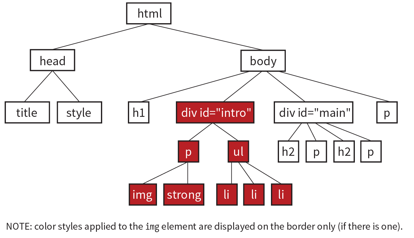
body {color: red;}h2 {color: red;}h1, p {color: red;}.special {color: red; }#intro {color: red;}#main strong {color: red;}h2 + p {color: red;}
Chapter 13: Colors and Backgrounds
- g. a, b, and c
- d.
rgb(FF, FF, FF) - a. 5; b. 1; c. 4; d. 6; e. 2; f. 3
- a. 1; b. 3; c. 2; d. 6; e. 5; f. 4
Chapter 14: Thinking Inside the Box
border: double black medium;padding: 2em;padding: 2em; border: 4px solid red;border: 4px solid red; margin: 2em;padding: 1em 1em 1em 6em; border: 4px dashed black; margin: 1em 6em;or
padding: 1em; padding-left: 6em; border: 4px dashed; margin: 1em 6em;padding: 1em 50px; border: 2px solid black; margin: 0 auto;
Chapter 15: Floating and Positioning
- b is not true. Floats are positioned against the content edge, not the padding edge.
- c is incorrect. Floats do not use offset properties, so there is no reason to include right.
- Clear the footer to make it start below a floated sidebar on either side: footer {clear: both;}
- a) absolute; b) absolute, fixed; c) fixed; d) relative, absolute, fixed; e) static; f) relative; g) absolute, fixed h) relative, absolute, fixed; i) relative
Chapter 16: CSS Layout with Flexbox and Grid
- Turn its parent element into a flex container by setting display to flex. The child element becomes a flex item automatically with no extra code.
- a. 2; b. 4; c. 1; d. 3
- The align-items property positions items relative to their flex line, while align-content distributes space around and within multiple lines. Both properties are applied to the container, and both are concerned with positioning along the cross axis.
- a. 4; b. 1; c. 3; d. 2
- a. 4; b. 3; c. 2; d. 5; e. 1
- Style rules for displaying the items in the order shown in Figure 16-49.
.box6 {order: -1;}.box1, .box2, .box3 {order: 1;} - The key difference between Grid Layout and Flexbox is that Grid creates layouts in two dimensions—rows and columns—but Flexbox arranges elements on one axis. (Continued...)
Similarities between Grid and Flexbox include:
- For both Grid and Flexbox, making an element a container automatically turns its direct children into items.
- They are both based on the language direction of the document.
- Both can create whole-page layouts (although Grid is better suited to the task).
- You can change the order of the items with the order property.
- They both use the Box Alignment Module for item and content alignment.
- Grid template for the layout shown in Figure 16-50:
grid-template-rows: 12em min-content 100px;grid-template-columns: 300px 2fr 1fr;Using the grid shorthand property:
grid: 12em min-content 100px / 300px 2fr 1fr;(Note: auto could be used instead of min-content in both examples.)
- a. E; b. D; c. C; d. A; e. B
#gallery:column-gap: 1em;}- d, a, c, b, e
Chapter 17: Responsive Web Design
- A responsive site delivers the same HTML source at the same URL regardless of the device used. An m-dot site sends a document at a separate URL when it receives a request from a mobile device. Mobile-specific sites also tend to reduce the number of options and content on the first screen.
- It sets the size of the viewport the mobile browser uses to render the page to the same size as the screen.
img { max-width: 100%; }- It sets the margin on the left and right side of the page to 10% if the viewport is 60em or wider.
- If the layout is created with CSS Grid Layout, use fr and minmax() units to make columns and rows flexible while setting limits. If you have page elements in Flexbox, use the flex properties to let them grow and shrink as needed. Otherwise, use percentage values for page elements so they resize proportionally. Avoid fixed pixel measurements.
- When you use ems for media queries, the page elements stay proportional to the size of the type. This can help keep line lengths consistent.
- In an @media rule in a style sheet, in @import rules that call in external style sheets, and in the link element to an external style sheet.
- Use a legible font, make the size slightly smaller, use a tighter line height, and use smaller margins.
- You could use an accordion to hide and reveal the submenu options, or put the submenu on a separate landing page and link to it from the main navigation.
- Test it on real devices, use an emulator, or use a third-party testing service.
Chapter 18: Transitions, Transforms, and Animation
- Tweening is the process in animation in which frames are generated between two end point states.
- A transition would have two keyframes, one for the beginning state and one for the end.
transition-delay: 0.5s;transition-timing-function: linear;transition-duration: 0.5s;transition-property: line-height;
- c. text-transform is not an animatable property.
- ease is the default timing function. It starts out slowly, speeds up quickly, and then slows down again at the very end.
- .2s is the transition-duration value (how long the animation lasts).
- Trick question! They will arrive at the same time, 300ms after the transition begins. The timing function has no effect on the total amount of time it takes.
transform: rotate(7deg);transform: translate(-50px, -25px);transform-origin: right bottom;transform: scale(1.25);
- The 3 value indicates that the element should be resized three times larger than its original height.
- perspective: 250; because lower number values indicate closer distance and are more dramatic.
- The border is 3 pixels wide at 50% through the animation.
-
animation-direction: reverse;animation-duration: 5s;animation-delay: 2s;animation-iteration-count: 3;animation-fill-mode: forwards;
Chapter 19: More CSS Techniques
- d. All of the above.
- d. a and c
- e. b and d
- Use Flexbox or floats.
- a. 2; b. 5; c. 1; d .4; e. 3
- a. no; b. yes; c. no (if the .border class is required for styles to appear)
- As of this writing, Modernizr has better browser support than CSS feature detection. Once all browsers support CSS feature detection, CSS will be faster and more reliable than a solution that requires JavaScript.
Chapter 20: Modern Web Development Tools
- It is the program that interprets commands you type into a command-line tool.
- d. All of the above.
- A string of characters that indicates the computer is ready to receive a command.
- You’d create a new directory (folder) in the current directory with the name “newsite”.
- Providing a more efficient syntax for authoring (traditionally known as “preprocessing”) and optimizing (known as “postprocessing”) standard CSS files.
- Once you learn the syntax, Sass (or LESS and Stylus) can make writing styles less redundant and easier to edit. You may also be required to know Sass for some web development jobs.
- Common CSS postprocessor tasks include error checking, adding vendor prefixes, inserting hacks that fix bugs in old versions of IE, including fallbacks for newer CSS features, converting rems to pixels, converting color formats to RGB, and analyzing the structure of your CSS code. This is by no means an exhaustive list, so you may come up with other features.
- It is anything you might do manually from the command line.
- It means that the task runner, Grunt, has been configured to “watch” the file so that when it detects any changes to that file, it automatically performs a series of tasks.
- Each user has a local copy of the shared repository that they can work on even offline.
- When a file is staged, it means that it has been added to the Git index, and Git is tracking it, but it has not yet been committed.
- A branch is a sequential series of commits and reflects a thread of development. A fork is a copy of somebody else’s repository that you can work on and that is not linked to the original.
- Pulling refers to merging the recent copy of the remote master repo into your local version. You should pull in a fresh copy to be sure you have the most up-to-date version before you push your changes to the master. This helps prevent conflicts if other users have been making changes to the same files.
- A pull request is when you ask the owner of a repo you forked to merge in your changes.
Chapter 21: Introduction to JavaScript
Exercise 21-1
var friends = ["name", "othername", "thirdname", "lastname"];alert( friends[2] );var name ="yourName";if( name === Jennifer ) { alert("That's my name too! ");}var myVariable = #;|if(myVariable > 5) { alert ("upper");} else { alert ("lower");}
Exercise 21-2
<script>var originalTitle = document.title;function showUnreadCount( unread ) { document.title = originalTitle + " (" + unread + "new message!");}showUnreadCount(3);</script>Test Yourself
- When you link to an external .js file, you can reuse the same scripts for multiple documents. The downside is that it requires an additional HTTP request.
- a. 1; b. 1two; c. 34; d. 2
- a. 10; b. 6; c. “2 remaining”; d. “Jennifer is longer.”; e. false
- It loops through a number of items by starting at the first one in the array and ending when there are no more left.
- Globally scoped variables may “collide” with variables with the same names in other scripts. It is best to use the var keyword in functions to keep your variables scoped locally.
- a. 2; b. 5; c. 4; d. 3; e. 1
Chapter 22: Using JavaScript
- Ajax is a combination of HTML, CSS, and JavaScript (with the XMLHttpRequest JavaScript method used to get data in the background).
- It accesses the element that has the id value “main”.
- It creates a nodeList of all the section elements in the element with the id of “main”.
- It sets the background color of the page (body element) to “papayawhip”.
- It creates a new text node that says, “Hey, I’m walking here!”, inserts it in a newly created p element, and puts the new p element in the element with the id “main”.
- d. All of the above.
Chapter 23: Web Image Basics
- You can get a license to have exclusive rights to an image so that your competitor doesn’t use the same photo on their site. You also know the source of the image is verified (i.e., it’s not stolen).
- ppi stands for “pixels per inch” and is a measure of resolution.
- Indexed color is a mode for storing pixel color information. GIF and PNG-8 formats are indexed color images.
- There are 256 colors in an 8-bit graphic, and 32 colors in a 5-bit graphic.
- GIF can contain animation and transparency. JPEG cannot.
- GIF can contain animation. Regular PNGs cannot (although APNG format can).
- PNGs can have multiple levels of transparency. GIF has only binary (on/off) transparency.
- Cumulative lossy compression means you lose image data every time you save an image as a JPEG. If you open a JPEG and save it as a JPEG again, even more image information is thrown out than the first time you saved it. Be sure to keep your full-quality original and save JPEG copies as needed.
- In binary transparency, a pixel is either entirely transparent or entirely opaque. Alpha transparency allows up to 256 levels of transparency.
- A GIF or PNG-8 because it is text, flat colors, and hard edges. B JPEG because it is a photograph. C GIF or PNG-8 because although it has some photographic areas, most of the image is flat colors with hard edges. D GIF or PNG-8 because it is a flat graphical image. E JPEG because it is a photograph.
Chapter 24: Image Asset Production
- PNG-24 or PNG-8+alpha are the best supported. The WebP and JPEG 2000 formats also include alpha transparency, but lack tool and browser support.
- Adjusting the Quality setting is the most effective tool for optimizing a JPEG.
- Reducing the number of colors in the color palette has the greatest effect on the size of indexed color images.
- The pattern in the dithering breaks up solid areas of color and results in larger files. Dithering should be turned off or limited.
- Because JPEG compression works well on smooth transitions of color and less well on hard edges, blurring the image slightly improves compression and results in a smaller file.
- sRGB: Yes, because it is the RGB encoding used by the web.
- If the image needs to look crisp on high-density screens.
- If your site has a lot of images, companies like Cloudinary and Akamai generate and host multiple, optimized versions of every image automatically. They keep you from doing all the image creation manually.
Chapter 25: SVG
- rect is the SVG element that creates a rectangle.
- The x and y coordinates position the rectangle element in the top-left corner of the SVG viewport.
- The width and height attributes establish the dimensions of the SVG viewport, the area on which the drawing will be rendered.
- In XML, all elements must be closed. When the element is a standalone element (without an opening and closing tag), it is closed with a forward slash (/) character before the closing bracket.
- Clipping uses a vector shape to reveal or hide portions of an image. Masking is pixel-based, using the lightness and darkness of a raster image to hide and reveal the masked image.
- Ways to reduce the size of an SVG include:
- Simplifing paths.
- Reducing the number of decimal places.
- Using shapes instead of complex paths when possible.
- Avoiding raster images and effects in the SVG.
- Running it through an optimizer like SVGO.
- Enabling Gzip compression on the server.
- b. SVG 1.1 (and for the record, SVG Electric Boogaloo isn’t a thing).
- You can style SVGs in the following ways:
- SVG presentation attributes
- The inline style attribute
- A style sheet in the SVG itself (style element)
- An external style sheet called into the SVG (for SVGs placed with the img element)
- If the SVG is inline, the style sheet in the HTML document in which it appears
- d. All of the above.