Table of Contents for
Learning Web Design, 5th Edition
 Learning Web Design, 5th Edition
Published by
O'Reilly Media, Inc., 2018
Learning Web Design, 5th Edition
Published by
O'Reilly Media, Inc., 2018
- cover
- Learning Web Design, Fifth Edition
- lwd5_title_copy
- lwd5_title_copy-1
- lwd5_contents
- Foreword
- Preface
- Part I. Getting Started
- 2. How the Web Works
- 3. Some Big Concepts You Need to Know
- Part II. HTML for STRUCTURE
- 5. Marking Up Text
- 6. Adding Links
- 7. Adding Images
- 8. Table Markup
- 9. Forms
- 10. Embedded Media
- Part III. CSS for Presentation
- 12. Formatting Text
- 13. Colors and Backgrounds
- 14. Thinking Inside the Box
- 15. Floating and Positioning
- 16. CSS Layout with Flexbox and Grid
- 17. Responsive Web Design
- 18. Transitions, Transforms, and Animation
- 19. More CSS Techniques
- 20. Modern Web Development Tools
- Part IV. JavaScript for Behavior
- 22. Using JavaScript
- Part V. Web Images
- 24. Image Asset Production
- 25. SVG
- Part VI. Appendices
- B. HTML5 Global Attributes
- C. CSS Selectors, Levels 3 and 4
- D. From HTML+ to HTML5
16
In this chapter
Flex containers and items
Flow direction and wrapping
Flex item alignment
Controlling item “flex”
Grid containers and items
Setting up a grid template
Placing items in the grid
Implicit grid features
Grid item alignment
Get ready…this is a whopper of a chapter! In it, you will learn about two important CSS page layout tools:
- Flexbox for greater control over arranging items along one axis
- Grid for honest-to-goodness grid-based layouts, like those print designers have used for decades
Each tool has its special purpose, but you can use them together to achieve layouts we’ve only dreamed of until now. For example, you could create the overall page structure with a grid and use a flexbox to tame the header and navigation elements. Use each technique for what it’s best suited for—you don’t have to choose just one.
Now that browsers have begun to support these techniques, designers and developers have true options for achieving sophisticated layouts with baked-in flexibility needed for dealing with a wide array of screen sizes. Once old browsers fade from use, we can kiss our old float layout hacks goodbye (in the meantime, they make decent fallbacks).
You may notice that this chapter is big. Really big. That’s because the specs are overflowing with options and new concepts that require explanation and examples. It’s a lot to pack in your mind all at once, so I recommend treating it as two mini-chapters and spend some time getting up to speed with each technique individually.
Multicolumn Layout
Flexible Boxes with CSS Flexbox
The CSS Flexible Box Layout Module (also known as simply Flexbox) gives designers and developers a handy tool for laying out components of web pages such as menu bars, product listings, galleries, and much more.
According to the spec,
The defining aspect of flex layout is the ability to make the flex items “flex,” altering their width/height to fill the available space in the main dimension.
That means it allows items to stretch or shrink inside their containers, preventing wasted space and overflow—a real plus for making layouts fit a variety of viewport sizes. Other advantages include the following:
- The ability to make all neighboring items the same height
- Easy horizontal and vertical centering (curiously elusive with old CSS methods)
- The ability to change the order in which items display, independent of the source
The Flexbox layout model is incredibly robust, but because it was designed for maximum flexibility, it takes a little time to wrap your head around it (at least it did for me). Here’s how it helped me to think about it: when you tell an element to become a flexbox, all of its child elements line up on one axis, like beads on a string. The string may be horizontal, it may hang vertically, or it may even wrap onto multiple lines, but the beads are always on one string (or to use the proper term, one axis). If you want to line things up both horizontally and vertically, that is the job of CSS Grid, which I’ll introduce in the next section of this chapter.
Before we dig in, I have a quick heads-up about browser support. All current browser versions support the latest W3C Flexible Box Layout Module spec; however, older browsers require prefixes and even different, outdated properties and values altogether. I’ll be sticking with the current standard properties to keep everything simple while you learn this for the first time, but know that production-ready style sheets may require more code. I’ll give you the nitty-gritty on browser support at the end of this section.
Setting Up a Flexbox Container
You’ve already learned about the block layout mode for stacking elements in the normal flow and the inline mode for displaying content within it horizontally. Flexbox is another layout mode with its own behaviors. To turn on flexbox mode for an element, set its display property to flex or inline-flex (see Note). It is now a flex container, and all of its direct child elements (whether they are divs, list items, paragraphs, etc.) automatically become flex items in that container. The flex items (the beads) are laid out and aligned along flex lines (the string).
Note
The value generates an inline-level flex container box. We’ll be focusing on the more commonly used value in this chapter.
Figure 16-2 shows the effect of simply adding display: flex to a div, thus turning on the Flexbox switch. I’ve added a blue border to the container to make its boundaries clear. To save space, I am not showing purely cosmetic styles such as colors and fonts.
The markup
<div id="container"> <div class="box box1">1</div> <div class="box box2">2</div> <div class="box box3">3</div> <div class="box box4">4</div> <div class="box box5">5</div></div>
The STYLES
#container { display: flex;}
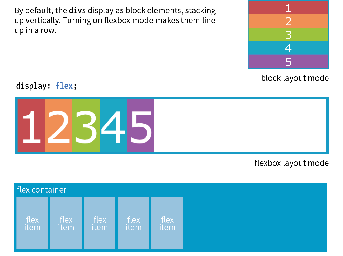
You can see that the items have lined up in a row from left to right, which is the default Flexbox behavior if your page is in English or another language written in rows from left to right. That is because the default flexbox direction matches the direction of the language the page is written in. It would go from right to left by default in Hebrew or Arabic or in columns if the page is set with a vertical writing direction. Because it is not tied to one default direction, the terminology for specifying directions tends to be a little abstract. You’ll see what I mean when we talk about “flow” in the following section.
It is worth noting that you can turn any flex item into a flex container by setting its display to flex, resulting in a nested flexbox. In fact, you’ll get to try that yourself in an upcoming exercise. Some Flexbox solutions use flexboxes nested several layers deep.
Controlling the “Flow” Within the Container
Once you turn an element into a flex container, there are a few properties you can set on that container to control how items flow within it. The flow refers to the direction in which flex items are laid out as well as whether they are permitted to wrap onto additional lines.
Specifying flow direction
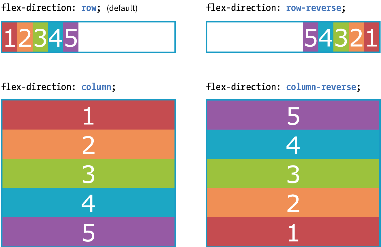
You may be happy with items lining up in a row as shown in Figure 16-2, but there are a few other options that are controllled with the flex-direction property.
flex-direction
Values: row | column | row-reverse | column-reverse
Default: row
Applies to: flex containers
Inherits: no
The default value is row, as we saw in the previous example (see the “Row and Column Direction” sidebar). You can also specify that items get aligned vertically in a column. The other options, row-reverse and column-reverse, arrange items in the direction you would expect, but they start at the end and get filled in the opposite direction. Figure 16-3 shows the effects of each keyword as applied to our simple example.
Now that you’ve seen Flexbox in action, it’s a good time to familiarize yourself with the formal Flexbox terminology. Because the system is direction-agnostic, there are no references to “left,” “right,” “top,” or “bottom” in the property values. Instead, we talk about the main axis and the cross axis. The main axis is the flow direction you’ve specified for the flex container. For primarily horizontal languages, when set to row, the main axis is horizontal; for column, the main axis is vertical (again, rows and columns are language-dependent, as explained earlier in the “Row and Column Direction” sidebar). The cross axis is whatever direction is perpendicular to the main axis (vertical for row, horizontal for column). The parts of a flex container are illustrated in Figure 16-4.
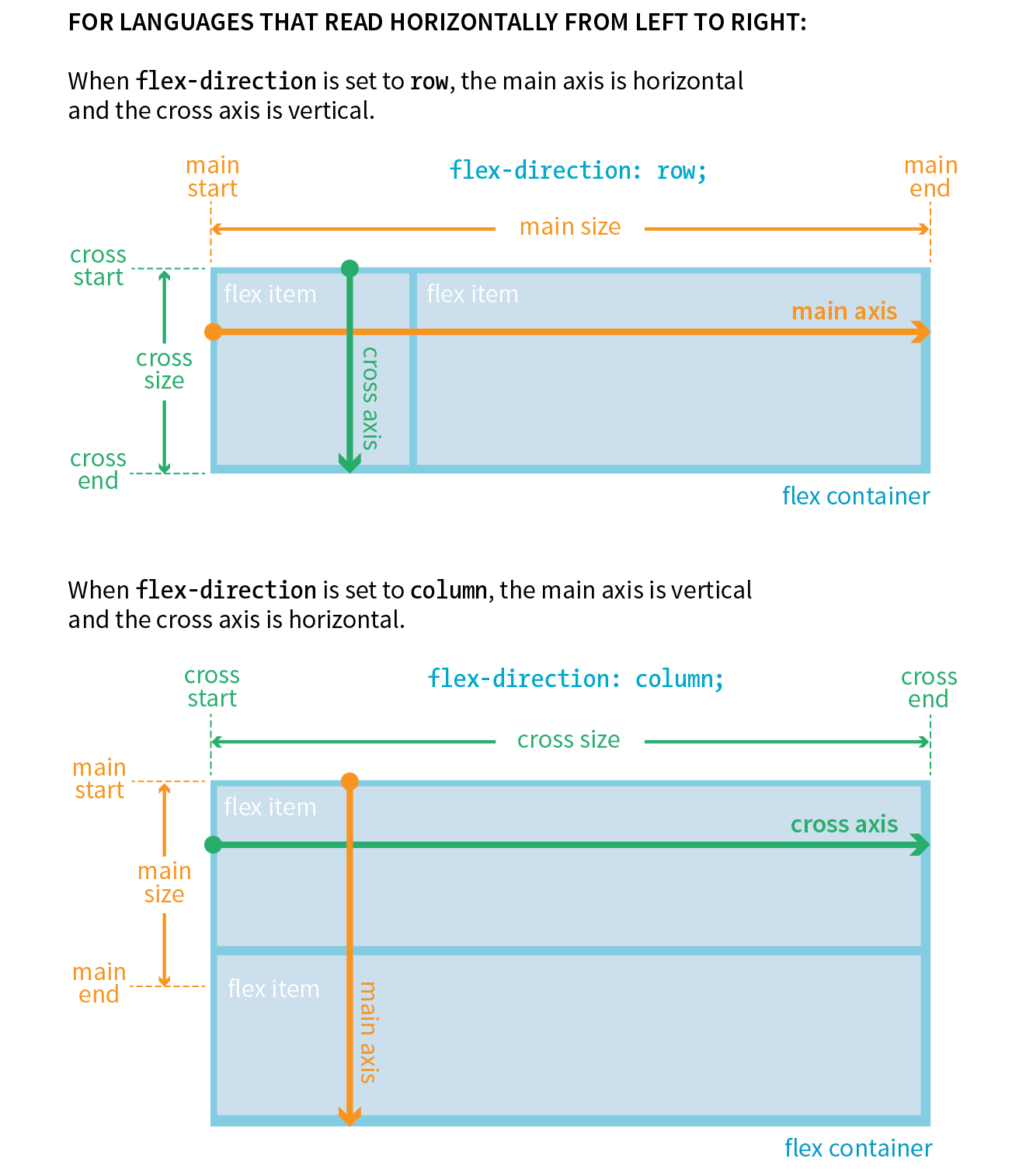
In addition to the axes, understanding the other parts of the Flexbox system makes the properties easier to learn. Both the main and cross axes have a start and an end, based on the direction in which the items flow. The main size is the width (or height if it’s a column) of the container along the main axis, and the cross size is height (or width if it’s a column) along the cross axis.
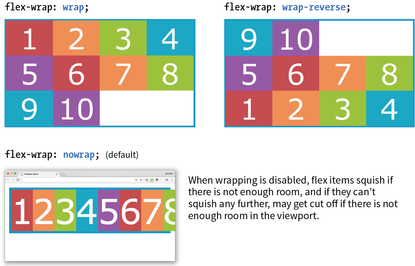
Wrapping onto multiple lines
If you have a large or unknown number of flex items in a container and don’t want them to get all squished into the available space, you can allow them to break onto additional lines with the flex-wrap property.
flex-wrap
Values: nowrap | wrap | wrap-reverse
Default: nowrap
Applies to: flex containers
Inherits: no
By default, items do the squish thing and do not wrap onto additional lines (nowrap). The wrap keyword turns on the ability to wrap onto multiple lines in the direction from cross start to cross end. For example, if the direction is row, then lines are positioned from the top down.
wrap-reverse breaks the elements onto multiple lines, but flows them in the opposite direction, from cross end to cross start (from the bottom up, in this case). It feels a little esoteric to me, but you never know when an occasion might arise to put it to use.
I’ve added more divs to our numbered flexbox example and I’ve given the flex items a width of 25% so that only four will fit across the width of the container. Figure 16-5 shows a comparison of the various wrap options when the flex-direction is the default row.
The markup
<div id="container"> <div class="box box1">1</div> <!-- more boxes here -->
<div class="box box10">10</div></div>
The Styles
#container { display: flex; flex-direction: row; flex-wrap: wrap;
} .box { width: 25%;}
|
The markup |
The Styles |
<div id="container"> |
#container {
|
<div class="box box1">1</div> |
display: flex; |
<!-- more boxes here -->
|
flex-direction: row; |
<div class="box box10">10</div> |
|
</div> |
} |
.box {
|
|
width: 25%; |
|
} |
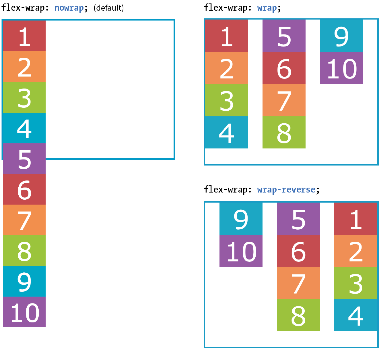
By default, when the flex-direction is set to column, the container expands to contain the height of the items. In order to see wrapping kick in, you need to set a height on the container, as I’ve done here. Figure 16-6 shows how wrapping works for each of the flex-wrap keywords. Notice that the items are still 25% the width of their parent container, so there is space left over between the columns.
#container { display: flex; height: 350px; flex-direction: column; flex-wrap: wrap;} .box { width: 25%;}
Putting it together with flex-flow
The shorthand property flex-flow makes specifying flex-direction and flex-wrap short and sweet. Omitting one value results in the default value for its respective property, which means you can use flex-flow for either or both direction and wrap.
flex-flow
Values: flex-direction flex-wrap
Default: row nowrap
Applies to: flex containers
Inherits: no
Using flex-flow, I could shorten the previous example (Figure 16-6) like so:
#container { display: flex; height: 350px; flex-flow: column wrap;}
You’ve only scratched the surface of Flexbox, but you’ve got what it takes to whip that ugly nav menu on the bakery page into shape in Exercise 16-1.
Exercise 16-1. Making a navigation bar with Flexbox

Controlling the Alignment of Flex Items in the Container
So far we’ve seen how to turn flexbox mode on, turning an element into a flex container and its children into flex items. We’ve also learned how to change the direction in which items flow, and allow them to wrap onto multiple lines. The remaining set of container properties affects the alignment of items along the main axis (justify-content) and cross axis (align-items and align-content).
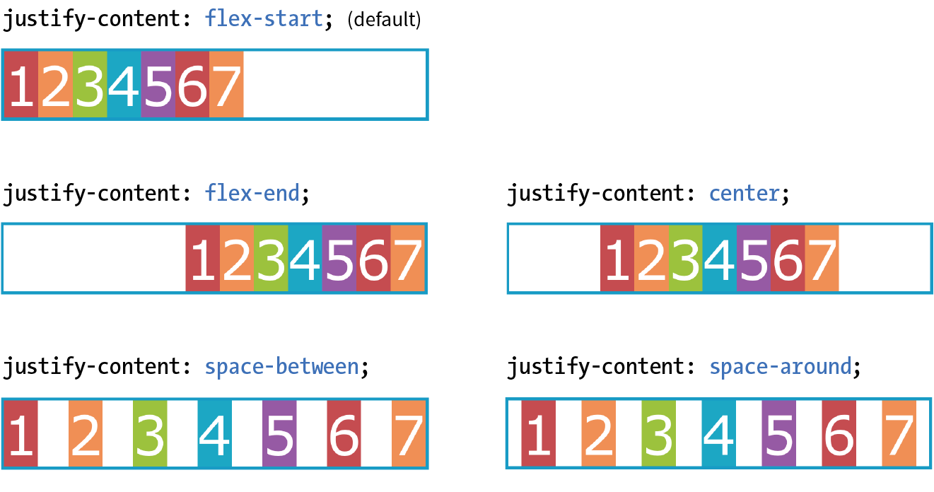
Aligning on the main axis
By default, flex items are just as wide as they need to be to contain the element’s content, which means the container may potentially have space to spare on the flex line. We saw this back in Figure 16-2. Also by default, the items flow in right next to each other from the “main start” (based on language direction and the direction of the flex line).
The justify-content property defines how extra space should be distributed around or between items that are inflexible or have reached their maximum size (see Note).
Note
You can also distribute extra space along the main axis by making the flex items themselves wider to fill the available space. That is the job of the properties, which we'll look at in a moment.
justify-content
Values: flex-start | flex-end | center | space-between | space-around
Default: flex-start
Applies to: flex containers
Inherits: no
Apply justify-content to the flex container element because it controls spacing within the container itself:
#container { display: flex; justify-content: flex-start;}
Figure 16-8 shows how items align using each of the keyword values for justify-content. As you would expect, flex-start and flex-end position the line of items toward the start and end of the main axis, respectively, and center centers them.
space-between and space-around warrant a little more explanation. When justify-content is set to space-between, the first item is positioned at the start point, the last item goes at the end point, and the remaining space is distributed evenly between the remaining items. The space-around property adds an equal amount of space on the left and right side of each item, resulting in a doubling up of space between neighboring items.
Note
As new alignment keywords are added to the Grid Layout spec, they are available for Flexbox as well; however, because they are newer, they will be less well supported. Be sure to check the Flexbox spec for updates.
Note
The setting is applied after margins have been calculated on items and after the way that items have been set to “flex” has been accounted for. If the value for items allows them to grow to fill the container width, then is not applicable.
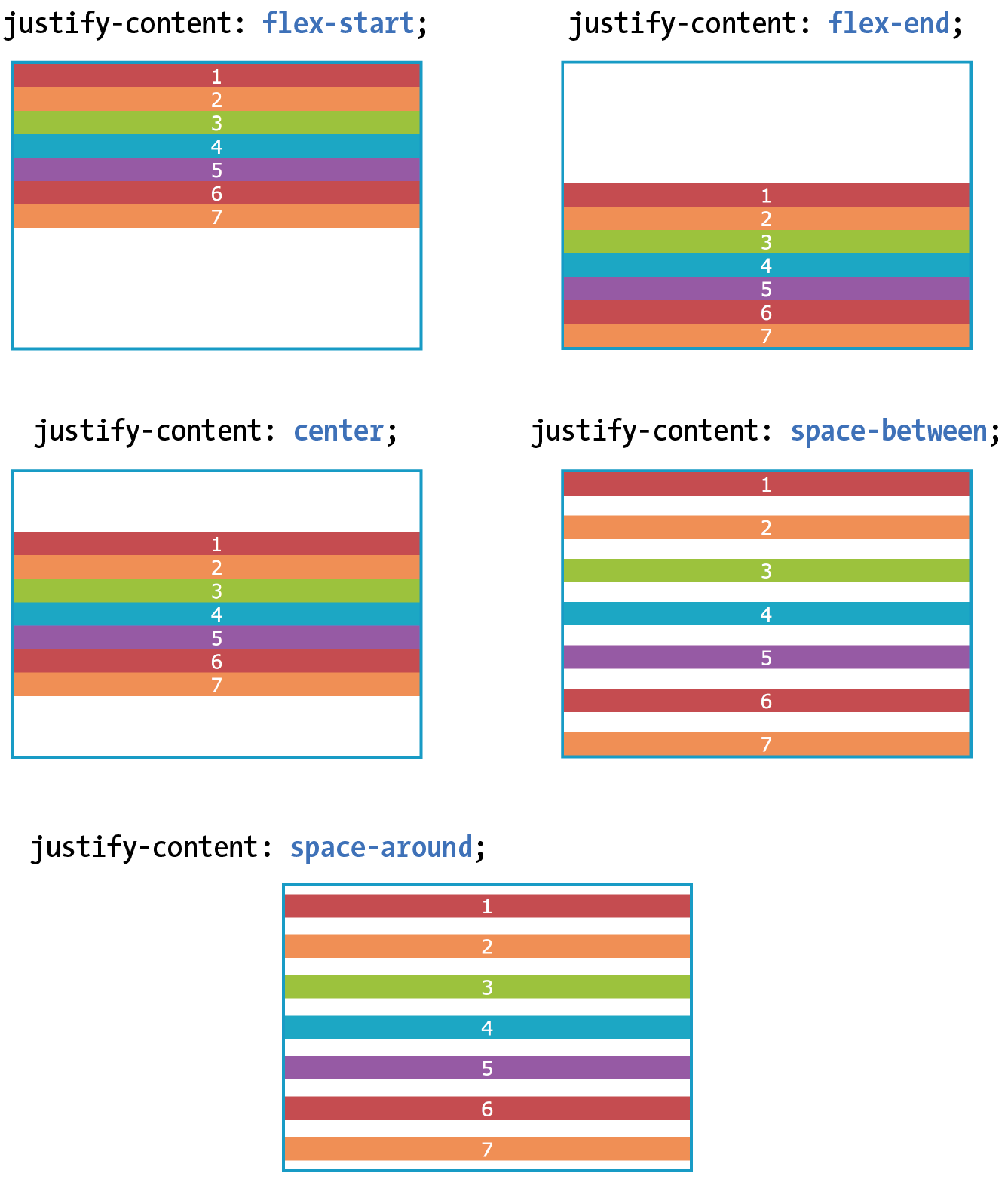
When the direction is set to a column with a vertical main axis, the keywords work the same way; however, there needs to be an explicit container height with space left over in order for you to see the effect. I’ve changed the size of the text and set a height on the container element in Figure 16-9 to demonstrate the same keywords as applied to a vertical main axis.
Aligning on the cross axis
That takes care of arranging things on the main axis, but you may also want to play around with alignment on the cross axis (up and down when the direction is row, left and right if the direction is column). Cross-axis alignment and stretching is the job of the align-items property.
align-items
Values: flex-start | flex-end | center | baseline | stretch
Default: stretch
Applies to: flex containers
Inherits: no
I’ve demonstrated the various keyword values for align-items as it applies to rows in Figure 16-10. In order to see the effect, you must specify the container height; otherwise, it expands just enough to contain the content with no extra space. I’ve given the container a height to show how items are positioned on the cross axis.
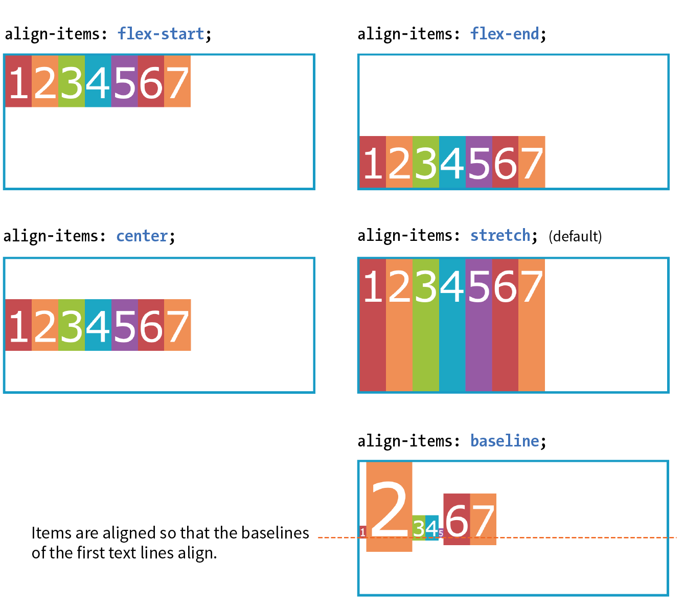
Like justify-content, the align-items property applies to the flex container (that can be a little confusing because “items” is in the name).
#container { display: flex; flex-direction: row; height: 200px; align-items: flex-start;}
The flex-start, flex-end, and center values should be familiar, only this time they refer to the start, end, and center of the cross axis. The baseline value aligns the baselines of the first lines of text, regardless of their size. It may be a good option for lining up elements with different text sizes, such as headlines and paragraphs across multiple items. Finally, stretch, which is the default, causes items to stretch until they fill the cross axis.
When the flex container’s direction is set to column, align-items aligns items left and right. Look back at Figures 16-2 and 16-9 and you will see that when we set the items in a column and did not provide any alignment information, each item stretched to the full width of the cross axis because stretch is the default value.
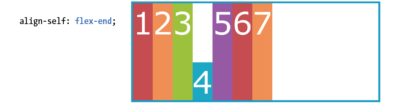
If you’d like one or more items to override the cross-axis setting, use the align-self property on the individual item element(s). This is the first property we’ve seen that applies to an item, not the container itself. align-self uses the same values as align-items; it just works on one item at a time.
align-self
Values: flex-start | flex-end | center | baseline | stretch
Default: stretch
Applies to: flex items
Inherits: no
In the following code and Figure 16-11, the fourth box is set to align at the end of the cross axis, while the others have the default stretch behavior.
.box4 { align-self: flex-end;}
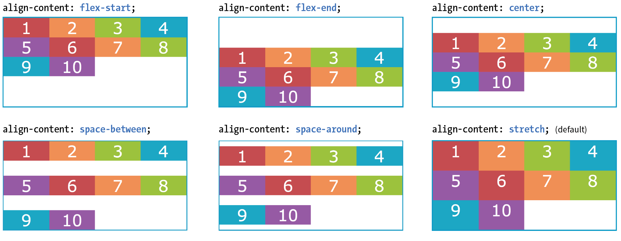
Aligning multiple lines
The final alignment option, align-content, affects how multiple flex lines are spread out across the cross axis. This property applies only when flex-wrap is set to wrap or wrap-reverse and there are multiple lines to align. If the items are on a single line, it does nothing.
align-content applies only when there are multiple wrapped flex lines.
align-content
Values: flex-start | flex-end | center | space-around | space-between | stretch
Default: stretch
Applies to: multi-line flex containers
Inherits: no
All of the values you see in the property listing should look familiar, and they work the way you would expect. This time, however, they apply to how extra space is distributed around multiple lines on the cross axis, as shown in Figure 16-12.
Again, the align-content property applies to the flex container element. A height is required for the container as well, because without it the container would be just tall enough to accommodate the content and there would be no space left over.
#container { display: flex; flex-direction: row; flex-wrap: wrap; height: 350px; align-items: flex-start;} box { width: 25%;}
Aligning items with margins
As long as we’re talking about alignment, there is one good trick I’d like to show you that will be useful when you start laying out components with Flexbox.
Menu bars are ubiquitous on the web, and it is common for one element of the bar, such as a logo or a search field, to be set off visually from the others. You can use a margin to put the extra container space on a specified side or sides of a flex item, thus setting one item apart. This should be more clear with an example.
The menu in Figure 16-13 has a logo and four menu options. I’d like the logo to stay in the left corner but the options to stay over to the right, regardless of the width of the viewport.
The markup
<ul> <li class="logo"><img src="logo.png" alt="LoGoCo"></li> <li>About</li> <li>Blog</li> <li>Shop</li> <li>Contact</li></ul>
The Styles
ul { display: flex; align-items: center; background-color: #00af8f; list-style: none; /* removes bullets */
padding: .5em; margin: 0; }li { margin: 0 1em;}li.logo { margin-right: auto;}

I’ve turned the unordered list (ul) into a flex container, so its list items (li) are now flex items. By default, the items would stay together at the start of the main axis (on the left) with extra space on the right. Setting the right margin on the logo item to auto moves the extra space to the right of the logo, pushing the remaining items all the way to the right (the “main end”).
This technique applies to a number of scenarios. If you want just the last item to appear on the right, set its left margin to auto. Want equal space around the center item in a list? Set both its left and right margins to auto. Want to push a button to the bottom of a column? Set the top margin of the last item to auto. The extra space in the container goes into the margin and pushes the neighboring items away.
We’ve covered a lot of territory, so it’s a good time to try out Flexbox in Exercise 16-2.
Exercise 16-2. A flexible online menu
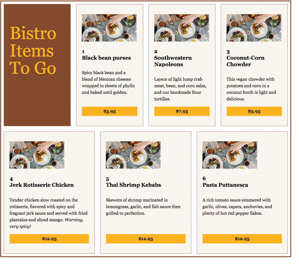
- First, we’ll go for maximum impact with minimal effort by making the wrapper a flex container. There is already a rule for , so add this declaration to it:
#menu { border: 3px solid #783F27;display: flex;}- The sections have their widths set to 240 pixels, and that measurement is preserved by default. Depending on how wide your browser window is set, you may see content extending beyond the container and getting clipped off, as shown in the figure.
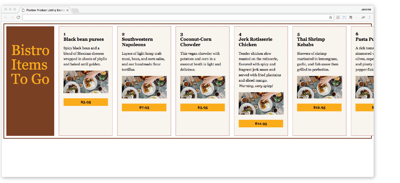
Figure 16-14. The bistro menu in default flexbox mode. By default, the items stay in one row even though there is not enough room for them and content gets clipped.
- The sections have their widths set to 240 pixels, and that measurement is preserved by default. Depending on how wide your browser window is set, you may see content extending beyond the container and getting clipped off, as shown in the figure.
- Set the back to , and let’s play around with the cross-axis alignment by using the property. Begin by setting it to (Figure 16-15). Save and reload, and see that the items all line up at the start of the cross axis (the top, in this case). Try some of the other values for (, , , and ) to get a feel for how each behaves.
align-items: flex-start;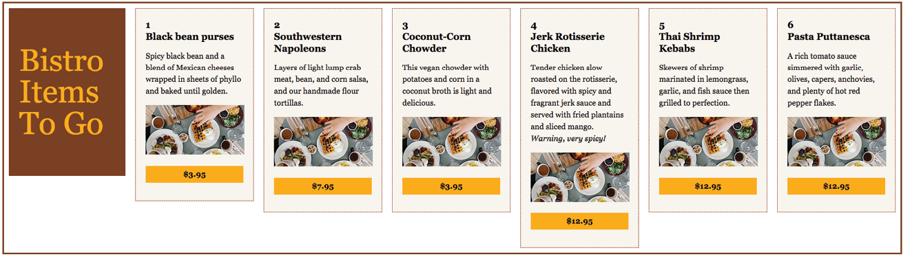
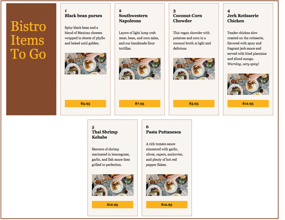
Figure 16-15. Using the align-items property to align the items at the start of the cross axis (). - When you are done experimenting, set back to . Instead of having all the items on one line and getting cropped by the edge of the browser, let’s have them wrap onto multiple lines by using the property on the container:
flex-wrap: wrap;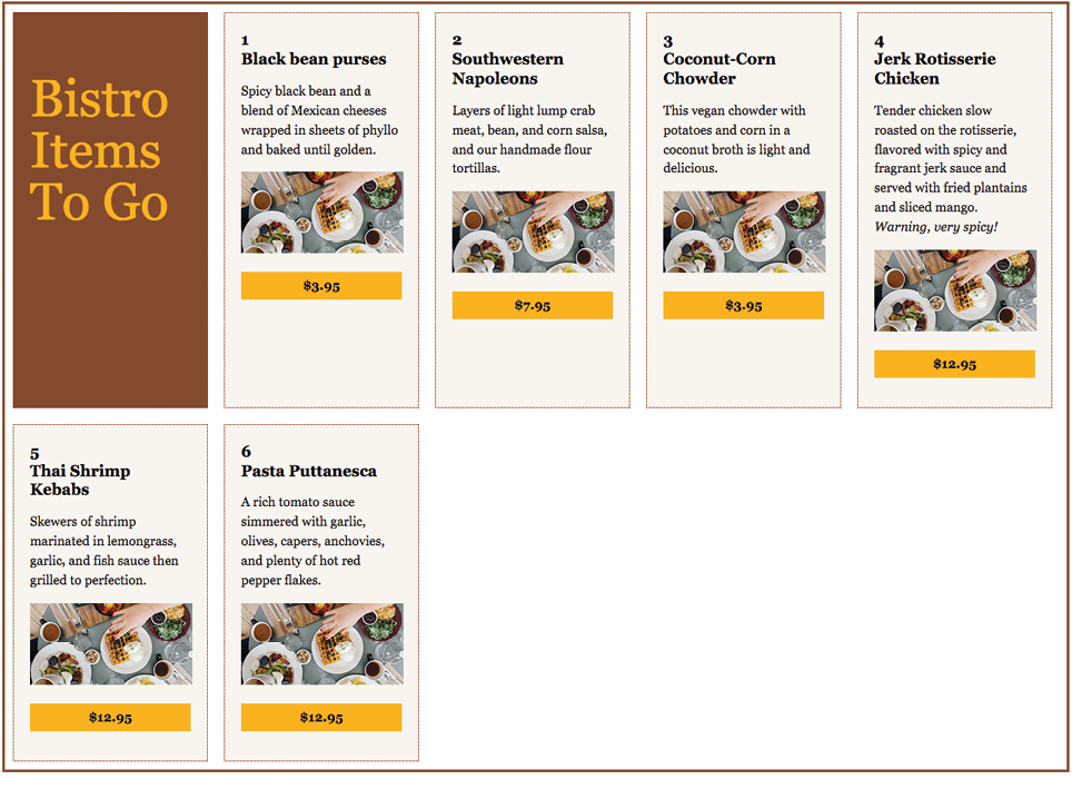
Figure 16-16. The menu with wrapping turned on.
Determining How Items “Flex” in the Container
One of the great marvels of the flexbox model is that items resize, or flex to use the formal term, to fit the available space. It’s this flexibility that makes Flexbox such a powerful tool for designing for the wide array of screen and browser window sizes we encounter as web designers. The beauty is that the browser figures out the sizes on the fly, and that means less math for us! In this section, we’ll get to know the flex properties.
Earlier, you learned about the justify-content property, which distributes extra space in the container between and around items along the main axis. The concept of flex is concerned with how space is distributed within items, growing or shrinking items as required to make them fit.
Flex is controlled with the flex property, which specifies how much an item can grow and shrink, and identifies its starting size. The full story is that flex is a shorthand property for flex-grow, flex-shrink, and flex-basis, but the spec strongly recommends that authors use the flex shorthand instead of individual properties in order to avoid conflicting default values and to ensure that authors consider all three aspects of flex for every instance.
The flex properties apply to flex items, not the container.
flex
Values: none | 'flex-grow flex-shrink flex-basis'
Default: 0 1 auto
Applies to: flex items
Inherits: no
The value for the flex property is typically three flex properties listed in this order:
flex: flex-grow flex-shrink flex-basis;
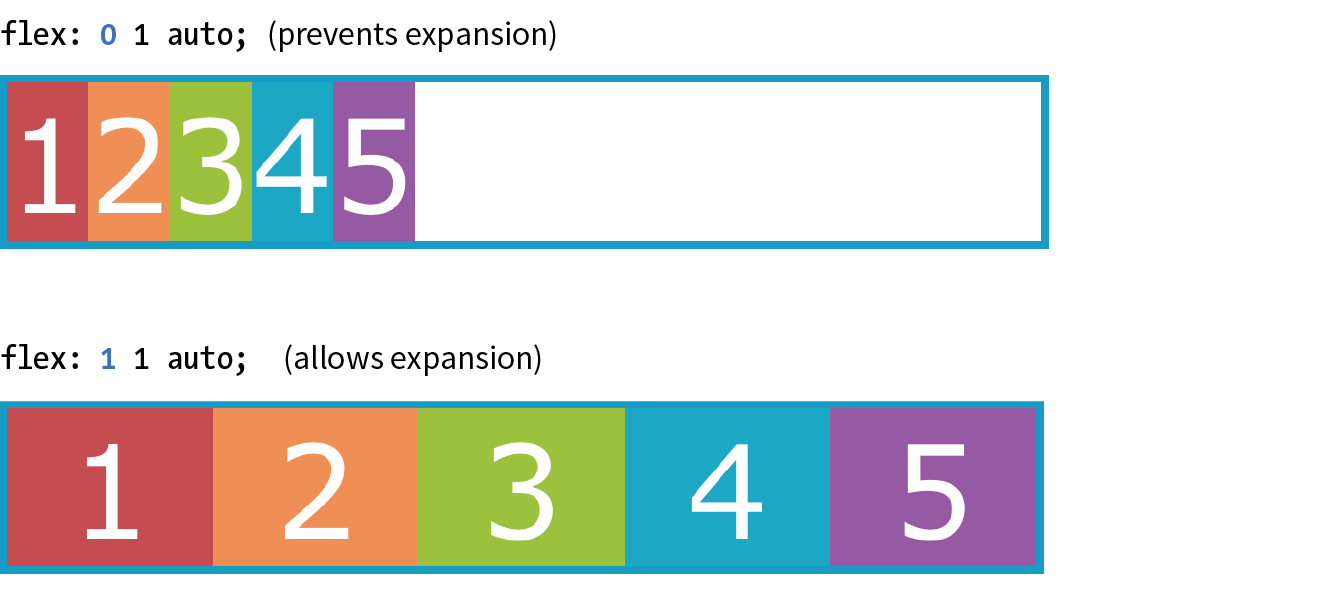
For the flex-grow and flex-shrink properties, the values 1 and 0 work like on/off switches, where 1 “turns on” or allows an item to grow or shrink, and 0 prevents it. The flex-basis property sets the starting dimensions, either to a specific size or a size based on the contents.
In this quick example, a list item starts at 200 pixels wide, is allowed to expand to fill extra space (1), but is not allowed to shrink (0) narrower than the original 200 pixels.
li {
flex: 1 0 200px;}
That should give you the general idea. In this section, we’ll take a much closer look at growing, shrinking, and base size, in that order.
But first, it is important to note that flex and its component properties apply to flex items, not the container. Keeping track of which properties go on the container and which go on items is one of the tricks of using Flexbox. See the “Flex Properties” sidebar for a handy list of how the properties are divided.
Expanding items (flex-grow)
The first value in the flex property specifies whether (and in what proportion) an item may stretch larger—in other words, its flex-grow value (see Note). By default it is set to 0, which means an item is not permitted to grow wider than the size of its content or its specified width. Because items do not expand by default, the alignment properties have the opportunity to go into effect. If the extra space was taken up inside items, alignment wouldn’t work.
Note
is the individual property that specifies how an item may expand. Authors are encouraged to use the shorthand property instead.
flex-grow
Values: number
Default: 0
Applies to: flex items
Inherits: no
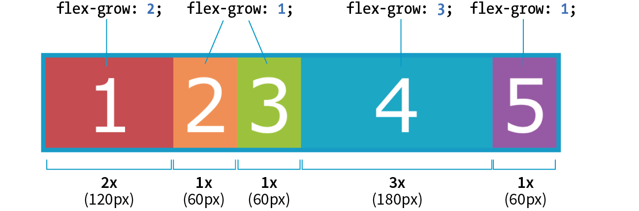
If you set the flex-grow value for all the items in a container to 1, the browser takes whatever extra space is available along the main axis and applies it equally to each item, allowing them all to stretch the same amount.
Let’s take the simple box example from earlier in the chapter and see how it behaves with various flex settings applied. Figure 16-18 shows what happens when flex-grow is set to 1 for all box items (flex-shrink and flex-basis are left at their default values). Compare this to the same example with flex-grow set to the default 0 (this is the same behavior we observed in Figure 16-2).
The markup
<div id="container"> <div class="box box1">1</div> <div class="box box2">2</div> <div class="box box3">3</div> <div class="box box4">4</div> <div class="box box5">5</div></div>
The Styles
.box { … flex: 1 1 auto;}
|
The markup |
The Styles |
<div id="container"> |
.box {
|
<div class="box box1">1</div> |
… |
<div class="box box2">2</div> |
|
<div class="box box3">3</div> |
} |
<div class="box box4">4</div> |
|
<div class="box box5">5</div> |
|
</div> |
If you specify a higher flex-grow integer to an item, it acts as a ratio that applies more space within that item. For example, giving “box4” the value flex-grow: 3 means that it receives three times the amount of space than the remaining items set to flex-grow: 1. Figure 16-19 shows the result.
.box4 { flex: 3 1 auto;}
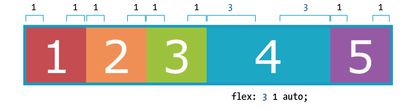
Notice that the resulting item is not three times as wide as the others; it just got three times the amount of space added to it.
If there’s not much space left over on the line, there’s a chance that each portion of space could be small enough that it would not add up to much difference. You may just need to play around with the flex-grow values and adjust the width of the browser until you get the effect you want.
Now that you have that concept down, shrinking should be straightforward because it is based on the same principle.
Squishing items (flex-shrink)
The second flex property value, flex-shrink, kicks in when the container is not wide enough to contain the items, resulting in a space deficit. It essentially takes away some space from within the items, shrinking them to fit, according to a specified ratio.
flex-shrink
Values: number
Default: 1
Applies to: flex items
Inherits: no
Note
is the individual property that specifies how an item may contract. Authors are encouraged to use the shorthand property instead.
By default, the flex-shrink value is set to 1, which means if you do nothing, items shrink to fit at the same rate. When flex-shrink is 0, items are not permitted to shrink, and they may hang out of their container and out of view of the viewport. Finally, as in flex-grow, a higher integer works as a ratio. An item with a flex-shrink of 2 will shrink twice as fast as if it were set to 1. You will not generally need to specify a shrink ratio value. Just turning shrinking on (1) or off (0) should suffice.
By default, items may shrink when the container is not wide enough (flex-shrink: 1).
Flex items stop shrinking when they reach their minimum size (defined by min-width/min-height). By default (when min-width/min-height is auto), this minimum is based on its min-content size. But it can easily be set to zero, or 12em, or any other length that seems useful. Watch for this effect when deeply nested items force a flex item to be wider than expected.
You will see the flex-shrink property in action in Figure 16-20 in the next section.
Providing an initial size (flex-basis)
The third flex value defines the starting size of the item before any wrapping, growing, or shrinking occurs (flex-basis). It may be used instead of the width property (or height property for columns) for flex items.
flex-basis
Values: length | percentage | content | auto
Default: auto
Applies to: flex items
Inherits: no
Note
is the individual property that sets the initial size of the item. Authors are encouraged to use the shorthand property instead.
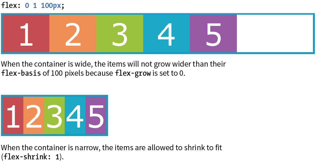
In this example, the flex-basis of the boxes is set to 100 pixels (Figure 16-20). The items are allowed to shrink smaller to fit in the available space (flex-shrink: 1), but they are not allowed to grow any wider (flex-grow: 0) than 100 pixels, leaving extra space in the container.
box { flex: 0 1 100px;}
Flex settings override specified widths/heights for flex items.
By default, flex-basis is set to auto, which uses the specified width/height property values for the item size. If the item’s main size property (width or height) is not set or is auto (its default), flex-basis uses the content width. You can also explicitly set flex-basis to be the width of the content with the content keyword; however, that value is poorly supported as of this writing.
In this example, the flex basis for the boxes is set to 100 pixels because the auto value uses the value set by width. Items are allowed to grow, taking up any extra space in the container, but they are not allowed to shrink.
box { width: 100px; flex: 1 0 auto;}
When the browser goes about sizing a flex item, it consults the flex-basis value, compares it to the available space along the axis, and then adds or removes space from items according to their grow and shrink settings. It’s important to note that if you allow an item to grow or shrink, it could end up being narrower or wider than the length provided by flex-basis or width.
Handy shortcut flex values
The advantage to using the flex property is that there are some handy shortcut values that cover typical Flexbox scenarios. Curiously, some of the shortcut values override the defaults of the individual properties, which was confusing to me at first, but in the end it results in more predictable behaviors. When creating a flexbox component, see if one of these easy settings will do the trick:
flex: initial;
This is the same as flex: 0 1 auto. It prevents the flex item from growing even when there is extra space, but allows it to shrink to fit in the container. The size is based on the specified width/height properties, defaulting to the size of the content. With the initial value, you can use justify-content for horizontal alignment.
flex: auto;
This is the same as flex: 1 1 auto. It allows items to be fully flexible, growing or shrinking as needed. The size is based on the specified width/height properties.
flex: none;
This is equivalent to flex: 0 0 auto. It creates a completely inflexible flex item while sizing it to the width and height properties. You can also use justify-content for alignment when flex is set to none.
flex: integer;
This is the same as flex: integer 1 0px. The result is a flexible item with a flex basis of 0, which means it has absolute flex (see the sidebar “Absolute Versus Relative Flex”) and free space is allocated according to the flex number applied to items.
How are you doing? Are you hanging in there with all this Flexbox stuff? I know it’s a lot to take in at once. We have just one more Flexbox item property to cover before you get another chance to try it out yourself.
Absolute Versus Relative Flex
.box { /* applied to all boxes */
flex: 1 0 0%; }.box1 { flex: 2; /* shortcut value for flex: 2 1 0px */
}.box4 { flex: 3; /* shortcut value for flex: 3 1 0px */
}
Note
I use Flexbox to format a responsive form in the “Styling Forms” section of . Flex properties allow form fields to adapt to the available width, while labels are set to always stay the same size. Wrapping allows form fields to move below their labels on smaller screens. You’ve probably got Flexbox in your head right now, so it might be worth taking a look ahead.
Changing the Order of Flex Items
One of the killer features of Flexbox is the ability to display items in an order that differs from their order in the source (see the “When to Reorder (and When Not To)” sidebar). That means you can change the layout order of elements by using CSS alone. This is a powerful tool for responsive design, allowing content from later in a document to be moved up on smaller screens.
To change the order of items, apply the order property to the particular item(s) you wish to move.
order
Values: integer
Default: 0
Applies to: flex items and absolutely positioned children of flex containers
Inherits: no
The value of the order property is a positive or negative number that affects the item’s placement along the flex line. It is similar to the z-index property in that the specific number value doesn’t matter, only how it relates to other values.
By default, all items have an order value of zero (0). When items have the same order value, they are laid out in the order in which they appear in the HTML source. If they have different order values, they are arranged from the lowest order value to the highest.
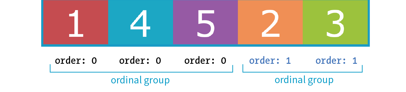
Going back to our colorful numbered box example, I’ve given box3 an order value of 1. With a higher order value, it appears after all the items set to 0 (the default), as shown in Figure 16-22.
.box3 { order: 1;}
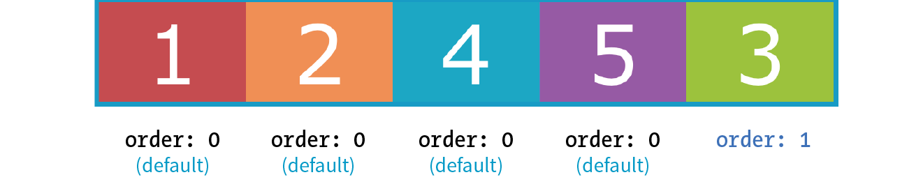
When multiple items share the same order value, that group of value-sharing items (called an ordinal group) sticks together and displays in source order. What happens if I give box2 an order value of 1 as well? Now both box2 and box3 have an order value of 1 (making them an ordinal group), and they get displayed in source order after all the items with the lower order value of 0 (Figure 16-23).
.box2, .box3 { order: 1 }
You can also use negative values for order. To continue with our example, I’ve given box5 an order value of –1. Notice in Figure 16-24 that it doesn’t just move back one space; it moves before all of the items that still have order set to 0, which is a higher value than –1.
.box5 { order: -1 }
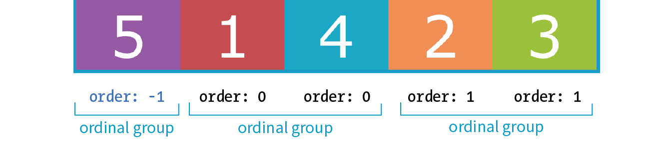
I’ve used simple values of 1 and –1 in my examples, but I could have used 10008 or –649, and the result would be the same; the order goes from least value to greatest value. Number values don’t need to be in sequential order.
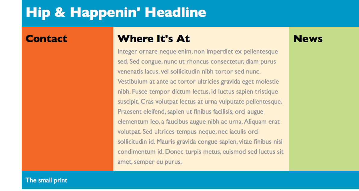
Now let’s take a look at how we can use order for something more useful than moving little boxes around in a line. Here is a simple document with a header, a main section consisting of an article and two aside elements, and a footer:
<header>…</header><main> <article><h2>Where It's At</h2></article> <aside id="news"><h2>News></h2></aside> <aside id="contact"><h2>Contact</h2><aside></main><footer>…<footer>
In the following CSS, I’ve made the main element a flexbox container so the article and aside elements line up in a row, creating three columns (Figure 16-25). I set the flex factor for each item, allowing them to grow and shrink, and set their widths with flex-basis. Finally, I used the order property to specify the order in which I’d like them to appear. Notice that the Contact section is now first in the row, although it appears last in the source order. And, as an added bonus, all of the columns fill the height of the main container despite the amount of content in them.
main { display: flex;}article { flex: 1 1 50%; order: 2;
}#news { flex: 1 1 25%; order: 3;
}#contact { flex: 1 1 25%; order: 1;}
Note
Although you can create a full-page layout with Flexbox, the task is more appropriately handled with Grid Layout, which we’ll cover next. However, because Flexbox has better browser support than Grid Layout, it may be a suitable fallback. Flexbox is better suited for individual components on the page such as navigation, series of product “cards,” or anything that you want to put in a line.
That concludes our tour of Flexbox properties! In Exercise 16-3, you can put some of the item-level properties to use in the bistro menu. When you are finished, come back for some tips on dealing with varying browser support in the next section.
Exercise 16-3. Adjusting flex and order
Browser Support for Flexbox
The current Flexible Box Layout Module became a stable Candidate Recommendation in 2012 (www.w3.org/TR/css-flexbox-1/). The good news is that all major desktop and mobile browsers have supported the standard since 2015 and a few since as far back as 2013. That covers roughly 80–90% of users as of this writing according to CanIUse.com.
The Flexbox specification went through a lot of big changes in its path to stabilization, and along the way, some older browsers implemented those old specs. The three main releases are as follows:
Current version (2012)
Syntax example: display: flex;
Supported by: IE11+, Edge 12+, Chrome 21-28 (-webkit-), Chrome 29+, Firefox 22–27 (-moz-, no wrapping), Firefox 28+, Safari 6–8 (-webkit-), Safari 9+, Opera 17+, Android 4.4+, iOS 7–8.4 (-webkit-), iOS 9.2+
“Tweener” version (2011)
Syntax example: display: flexbox;
Supported by: IE10
Old version (2009)
Syntax example: display: box;
Supported by: Chrome <21, Safari 3.1–6, Firefox 2–21, iOS 3.2–6.1, Android 2.1–4.3
What you won’t find in these listings is Internet Explorer 9 and earlier, which lack Flexbox support altogether.
Ensuring Flexbox works on the maximum number of browsers requires a gnarly stack of prefixes and alternative properties, the details of which are too complicated to dive into here. It’s also not something you’d want to write out by hand anyway, but fortunately there are options.
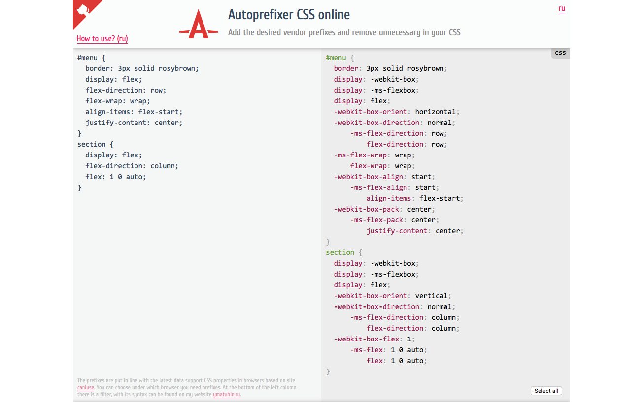
You can use Autoprefixer to magically generate that gnarly stack for you automatically. As you’re learning and practicing your CSS skills, you can convert your styles online at autoprefixer.github.io. Just paste in your styles, and it spits out the code (Figure 16-27) that you can add to your style sheet.
Warning
Be aware that although Autoprefixer makes adding prefixes easier, it does not guarantee that your flexboxes will work seamlessly in all browsers. There are behavior differences that can be unpredictable, so be sure to test on all of your target browsers.
When you are ready to bring your workflow to a professional level, you can include Autoprefixer as part of a “build step” that automates a lot of the development gruntwork. If you are using a CSS preprocessor such as SASS, you can also use “mixins” to manage tedious prefixes. We’ll look at build tools and preprocessors in Chapter 20, Modern Web Development Tools.
You may still want to provide fallback styles for non-supporting browsers (floats, inline blocks, and table display values are all options). If that is the case, you can use a feature detection technique to determine whether the browser supports Flexbox. If the browser fails the test, it gets a fallback set of styles, while supporting browsers get the full Flexbox treatment. We’ll take a look at feature detection in Chapter 19.
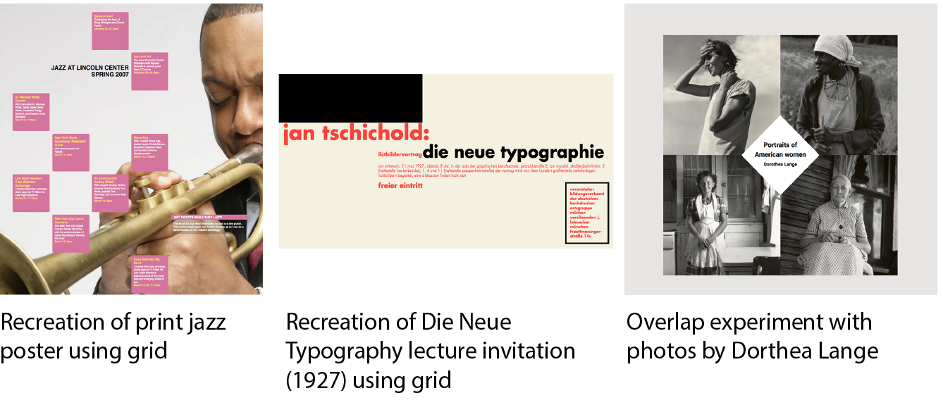
One big layout technique down, one big layout technique to go! Are you still with me? We’ve covered a lot of nitty-gritty details, and if you’re like me, your head may be swimming. That’s why I’ve included Figure 16-28. It has nothing to do with CSS layout, but I figured we could use a breather. In fact, why don’t you put down this book and take a little walk before taking on grids?

CSS Grid Layout
At long last, we web designers and developers have a CSS module for using an underlying grid to achieve true page layout—and we only had to wait 25 years to get it! The CSS Grid Layout Module provides a system for laying out elements in rows and columns (remember that Flexbox lays out elements on one axis only) in a way that can remain completely flexible to fit a variety of screen sizes or mimic a print page layout. You can use grids to create the sort of web page layouts that are familiar today, or get more sophisticated with typography and whitespace as Jen Simmons has done in her Lab demos (Figure 16-29). You can also use a grid to format just a portion of a page, such as a gallery of images or products.
In this section, I will give you a good head start on using Grid Layout; however, I should note that there will be a few stones left unturned that you can explore on your own.
The Grid Layout Module is one of the more complex specs in CSS, the finer points of which could fill a book. In fact, Eric Meyer has written that book: Grid Layout in CSS (O’Reilly)(see Note). I found that Eric helped me make practical sense of the dense language of the spec itself (which you will also want to reference at www.w3.org/TR/css-grid-1/). I also highly recommend Grid expert Rachel Andrew’s book, The New CSS Layout (A Book Apart) for a complete view of how we got to grid layouts and how to use them.
You will also find many great Grid resources online, which I will round up at the end of this section.
The Obligatory Talk About Browser Support
There’s great and not-so-great news about browser support for Grid Layout. The great news is that Chrome 57+, Opera, Firefox 52+, Safari 10+, and iOS Safari 10+ all started supporting the Grid standard free and clear of browser prefixes in March 2017. Microsoft Edge added support in version 16 in 2017.
The not-so-great news is that in addition to lingering older versions of those browsers, no version of Internet Explorer supports the current Grid standard (see the Browser Support Note).
Browser Support Note
Internet Explorer versions 10 and 11 and MS Edge through 15 implemented an early draft of the Grid Layout Module, much of which has since been made obsolete. They should be treated as non-supporting browsers when it comes to the standard grid styles outlined in this chapter. However, if those Microsoft browsers are used by a significant share of your target audience, it is probably worth targeting them with an alternative version of your layout written in the older grid syntax they understand.
So, for the time being, you need to provide an alternative layout for non-supporting browsers by using Flexbox or old-fashioned floats (or the older Grid specification for IE and Edge <15), depending on the browsers you need to target. A good way to get your Grid-based layouts to the browsers that can handle them is to use a CSS Feature Query that checks for Grid support and provides the appropriate set of styles. Feature queries are discussed in detail in Chapter 19.
Be sure to check CanIUse.com for updated browser support information. Another good resource is the Browser Support page at the “Grid by Example” site, created by Rachel Andrew (gridbyexample.com/browsers), where she posts browser support news as well as known bugs.
How Grid Layout Works
The process for using the CSS Grid Layout Module is fundamentally simple:
- Use the display property to turn an element into a grid container. The element’s children automatically become grid items.
- Set up the columns and rows for the grid. You can set them up explicitly and/or provide directions for how rows and columns should get created on the fly.
- Assign each grid item to an area on the grid. If you don’t assign them explicitly, they flow into the cells sequentially.
What makes Grid Layout complicated is that the spec provides so many options for specifying every little thing. All those options are terrific for customizing production work, but they can feel cumbersome when you are learning Grids for the first time. In this chapter, I’ll set you up with a solid Grid toolbox to get started, which you can expand on your own as needed.
Grid Terminology
Before we dive into specific properties, you’ll need to be familiar with the basic parts and vocabulary of the Grid system.
Starting with the markup, the element that has the display: grid property applied to it becomes the grid container and defines the context for grid formatting. All of its direct child elements automatically become grid items that end up positioned in the grid. If you’ve just read the Flexbox section of this chapter, this children-become-items scheme should sound familiar.
The key words in that previous paragraph are “direct child,” as only those elements become grid items. Elements contained in those elements do not, so you cannot place them on the grid. You can, however, nest a grid inside another grid if you need to apply a grid to a deeper level.
The grid itself has a number of components, as pointed out in Figure 16-30.
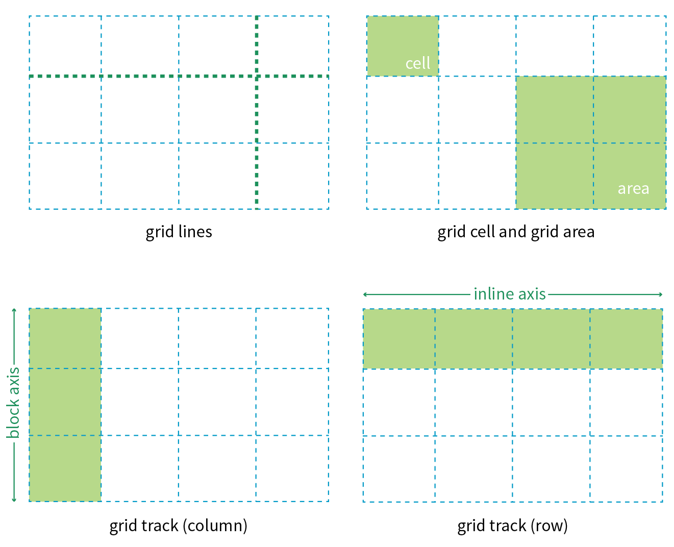
Grid line
The horizontal and vertical dividing lines of the grid are called grid lines.
Grid cell
The smallest unit of a grid is a grid cell, which is bordered by four adjacent grid lines with no grid lines running through it.
Grid area
A grid area is a rectangular area made up of one or more adjacent grid cells.
Grid track
The space between two adjacent grid lines is a grid track, which is a generic name for a grid column or a grid row. Grid columns are said to go along the block axis, which is vertical (as block elements are stacked) for languages written horizontally. Grid rows follow the inline (horizontal) axis.
It is worth pointing out that the structure established for the grid is independent from the number of grid items in the container. You could place 4 grid items in a grid with 12 cells, leaving 8 of the cells as “whitespace.” That’s the beauty of grids. You can also set up a grid with fewer cells than grid items, and the browser adds cells to the grid to accommodate them. It’s a wonderfully flexible system.
Without further ado, it’s time to get into some code.
Declaring Grid Display
To turn an element into a grid container, set its display property to grid or inline-grid (see Note).
Note
Inline grids function the same as block-level grids, but they can be used in the flow of content. In this section, I focus only on block-level grids.
As of this writing, work has begun on a Working Draft of CSS Grid Layout Module Level 2, which incudes a “subgrid” mode that allows a nested grid to inherit its grid structure from its parent.
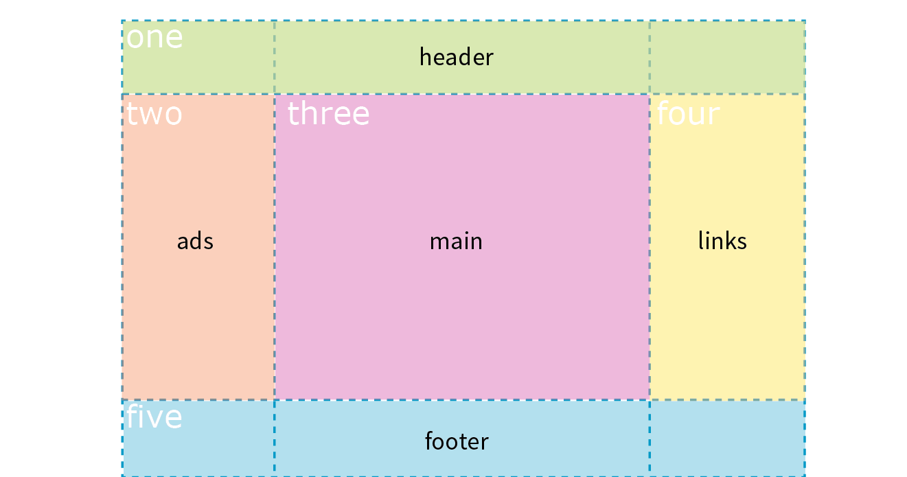
In this simple example, the #layout div becomes a grid container, and each of its children (#one, #two, #three, #four, and #five), therefore, is a grid item.
The markup
<div id="layout"> <div id="one">One</div> <div id="two">Two</div> <div id="three">Three</div> <div id="four">Four</div> <div id="five">Five</div></div>
The styles
#layout { display: grid;}
That sets the stage (or to use the more accurate term, the context) for the grid. Now we can specify how many rows and columns we want and how wide they should be.
Setting Up the Grid
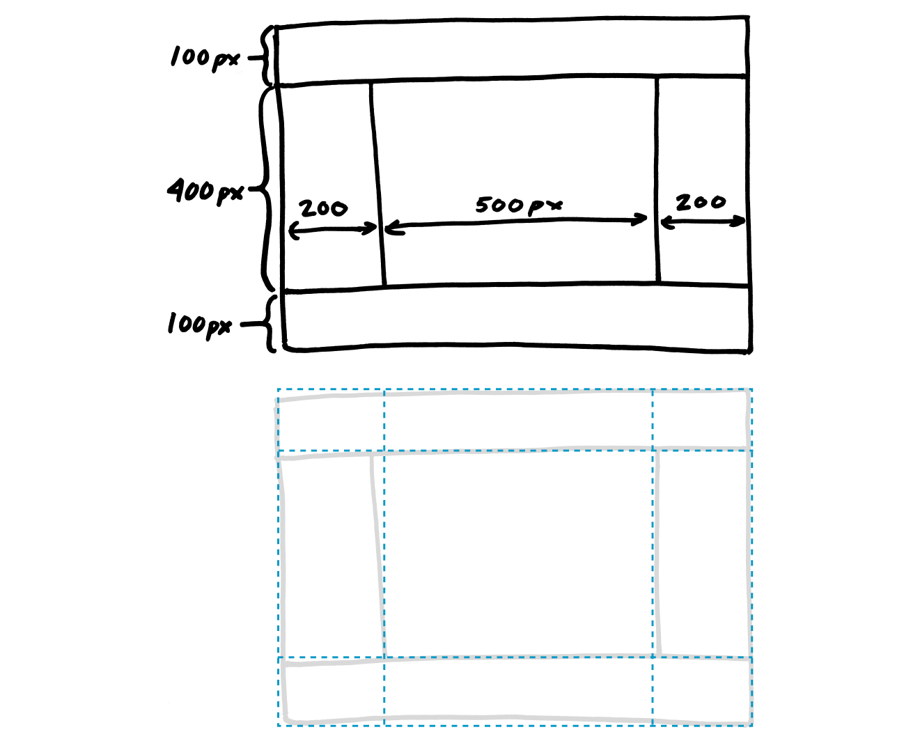
Because I don’t want to have to figure out cells and spans in my head, I’ve made a quick sketch of how I’d like my final grid to look (Figure 16-31). A sketch is a good first step for working with grids. From the sketch, I can see that my layout requires three row tracks and three column tracks even though some of the content areas span over more than one cell. This is a pretty standard arrangement for a web page, and although I’m sticking with one-word content so we can focus on structure, you can imagine longer text content filling each area.
Note
You probably noticed that this page layout with its header, footer, and three columns looks like the one we made using Flexbox in Figure 16-25. And you’re right! It just goes to show that there may be several solutions for getting to an intended result. Once Grid Layout becomes solidly supported, it will be the clear winner for creating flexible, whole-page layouts like this one.
Defining grid tracks
To set up a grid in CSS, specify the height of each row and the width of each column (see Note) with the template properties, grid-template-rows and grid-template-columns, which get applied to the container element.
Note
Like the Flexbox Module, the Grid Layout Module is dependent on the direction of the language in which the page is written. In this book, I will base grid terminology on the left-to-right, top-to-bottom writing direction.
grid-template-rows
grid-template-columns
Values: none | list of track sizes and optional line names
Default: none
Applies to: grid containers
Inherits: no
The value of the grid-template-rows property is a list of the heights for each row track in the grid. The value of the grid-template-columns is a list of the widths for each column track. The number of track sizes determines the number of rows or columns. For example, if you provide four lengths for grid-template-columns, you get a grid that is initially divided into four columns.
You can also include names for the grid lines between tracks, which we’ll get to in a moment, but for now, let’s start off as simply as possible.
Grid track sizes
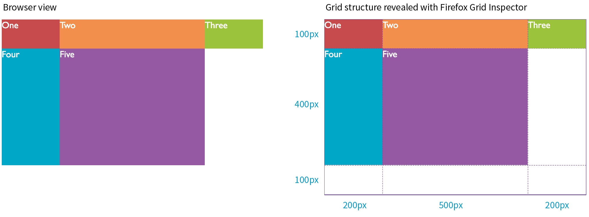
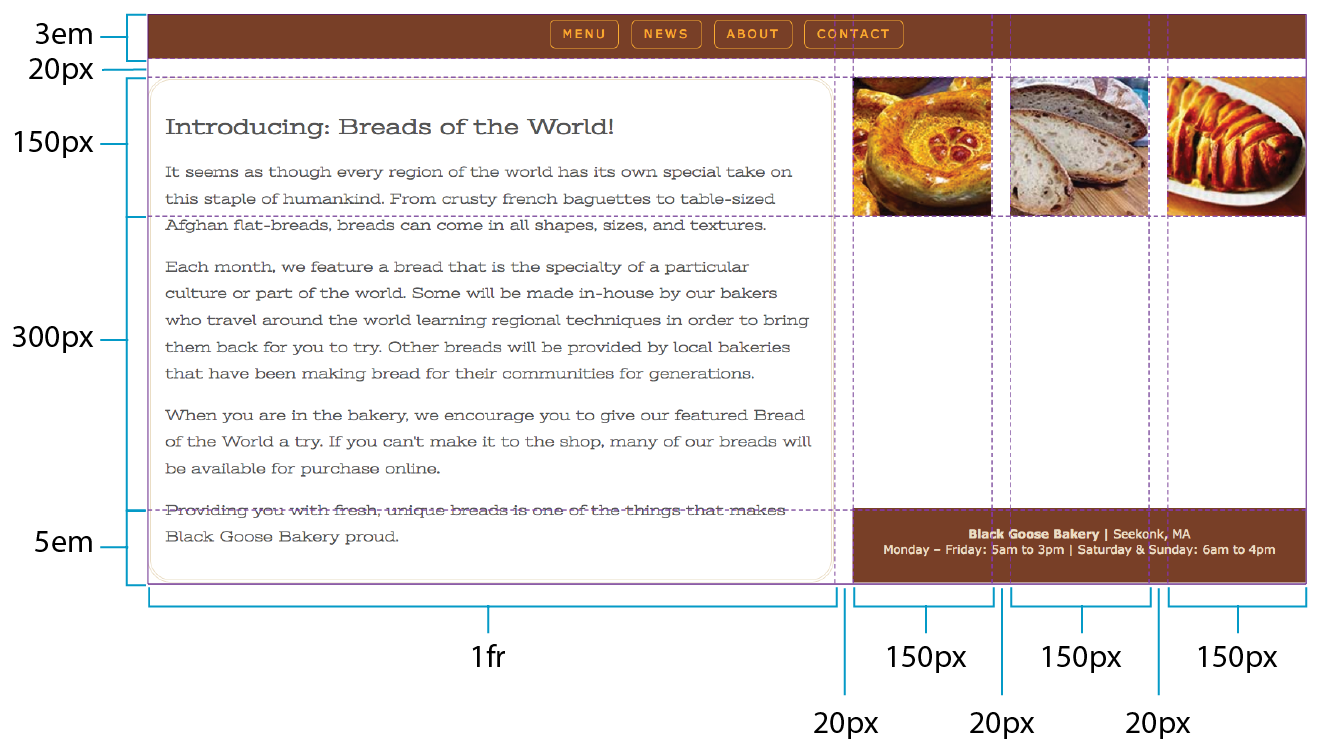
In the following example, I’ve added template properties to divide the #layout container into three columns and three rows with the sizes I designated in my original sketch (Figure 16-31):
#layout { display: grid; grid-template-rows: 100px 400px 100px; grid-template-columns: 200px 500px 200px;}
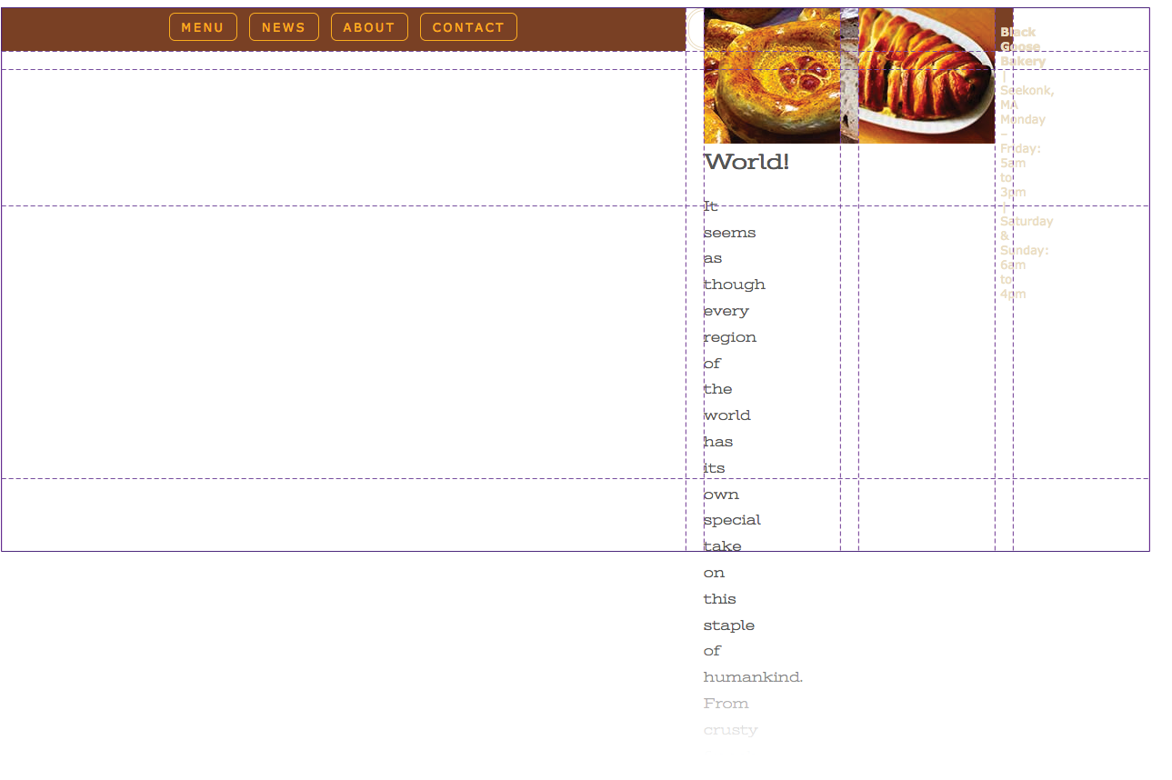
Let’s see what happens if I do a quick check of the grid so far in the browser. Figure 16-32 shows that by default, the grid items flow in order into the available grid cells. I’ve added background colors to the items so their boundaries are clear, and I used Firefox CSS Grid Inspector (right) to reveal the entire grid structure.
Because there are only five child elements in the #layout div, only the first five cells are filled. This automatic flowing behavior isn’t what I’m after for this grid, but it is useful for instances in which it is OK for content to pour into a grid sequentially, such as a gallery of images. Soon, we will place each of our items on this grid deliberately, but first, let’s look at the template property values in greater depth.
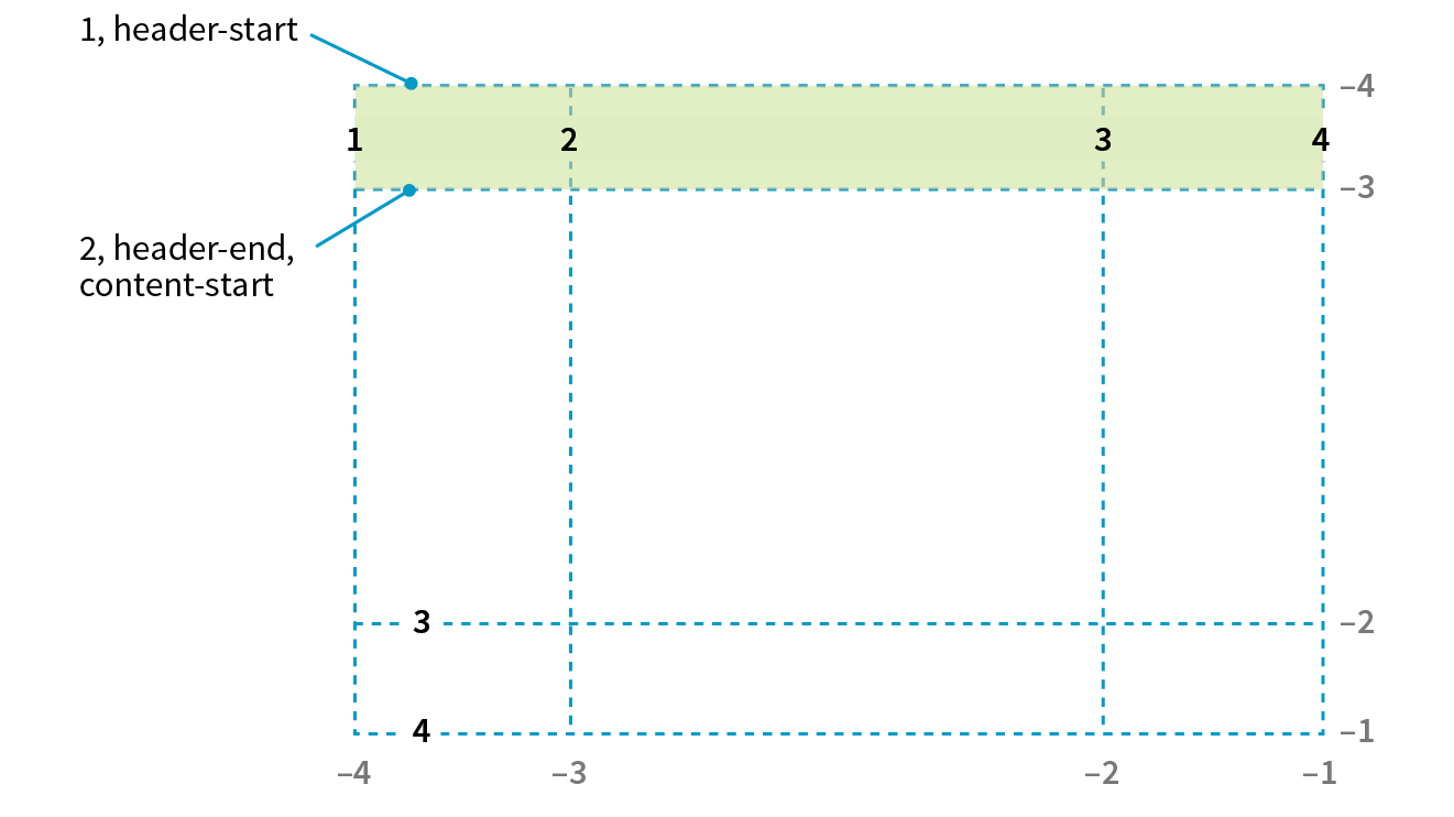
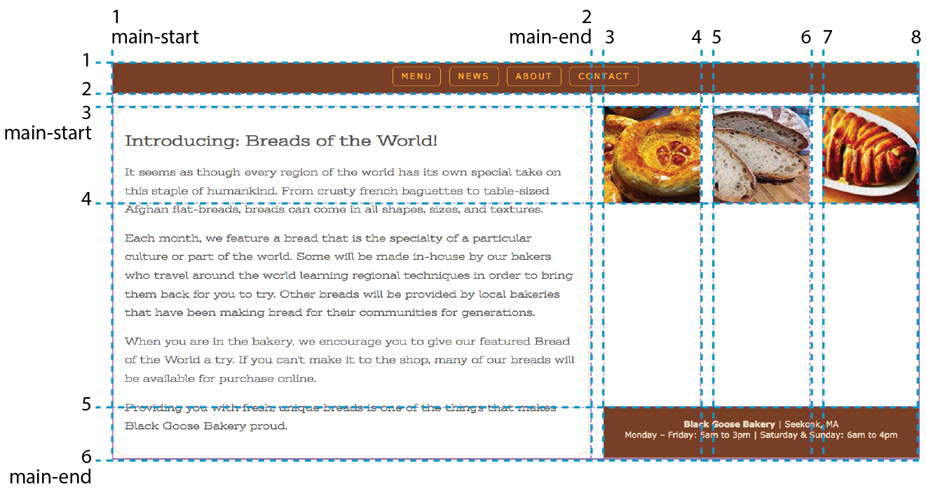
Grid line numbers and names
When the browser creates a grid, it also automatically assigns each grid line a number that you can reference when positioning items. The grid line at the start of the grid track is 1, and lines are numbered sequentially from there. Figure 16-33 shows how the grid lines are numbered for our sample grid.
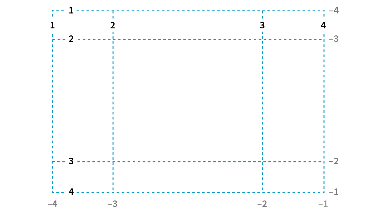
The lines are numbered from the end of tracks as well, starting with –1, and numbers count back from there (–2, –3, etc.), as shown by the gray numbers in Figure 16-33. Being able to target the end of a row or column without counting lines (or even knowing how many rows or columns there are) is a handy feature. You’ll come to love that –1.
But if you don’t like to keep track of numbers, you can also assign names to lines that may be more intuitive. In the following example, I’ve assigned names that correspond to how I will be using the grid in the final page. Line names are added within square brackets in the position they appear relative to the tracks.
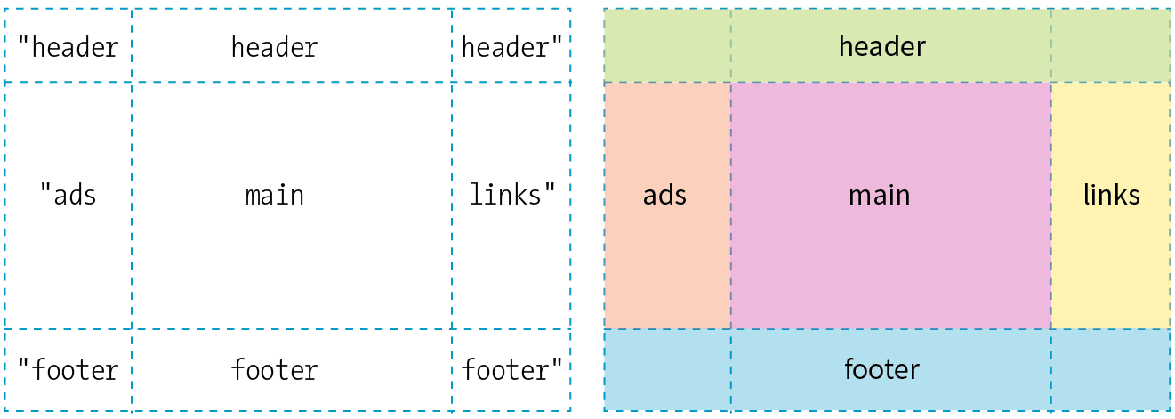
#layout { display: grid; grid-template-rows: [header-start] 100px [content-start] 400px [footer-start] 100px; grid-template-columns: [ads] 200px [main] 500px [links] 200px;}
Based on this example, the grid line at the top of the grid can now be referred to as “header-start,” “1,” or “–4.” I could also name the line that comes after the first row track “header-end” even though I’ve already named it “content-start.” To give a line more than one name, just include all the names in the brackets, separated by spaces:
grid-template-rows: [header-start] 100px [header-end content-start] 400px [footer-start] 100px;
It is common for each grid line to end up with multiple names and numbers, and you can choose whichever is the easiest to use. We’ll be using these numbers and names to place items on the grid in a moment.
Specifying track size values
I provided all of the track sizes in my example in specific pixel lengths to make them easy to visualize, but fixed sizes are one of many options. They also don’t offer the kind of flexibility required in our multi-device world. The Grid Layout Module provides a whole bunch of ways to specify track sizes, including old standbys like lengths (e.g., pixels or ems) and percentage values, but also some newer and Grid-specific values. I’m going to give you quick introductions to some useful Grid-specific values: the fr unit, the minmax() function, auto, and the content-based values min-content/max-content. We’ll also look at functions that allow you to set up a repeating pattern of track widths: the repeat() function with optional auto-fill and auto-fit values.
Fractional units (flex factor)
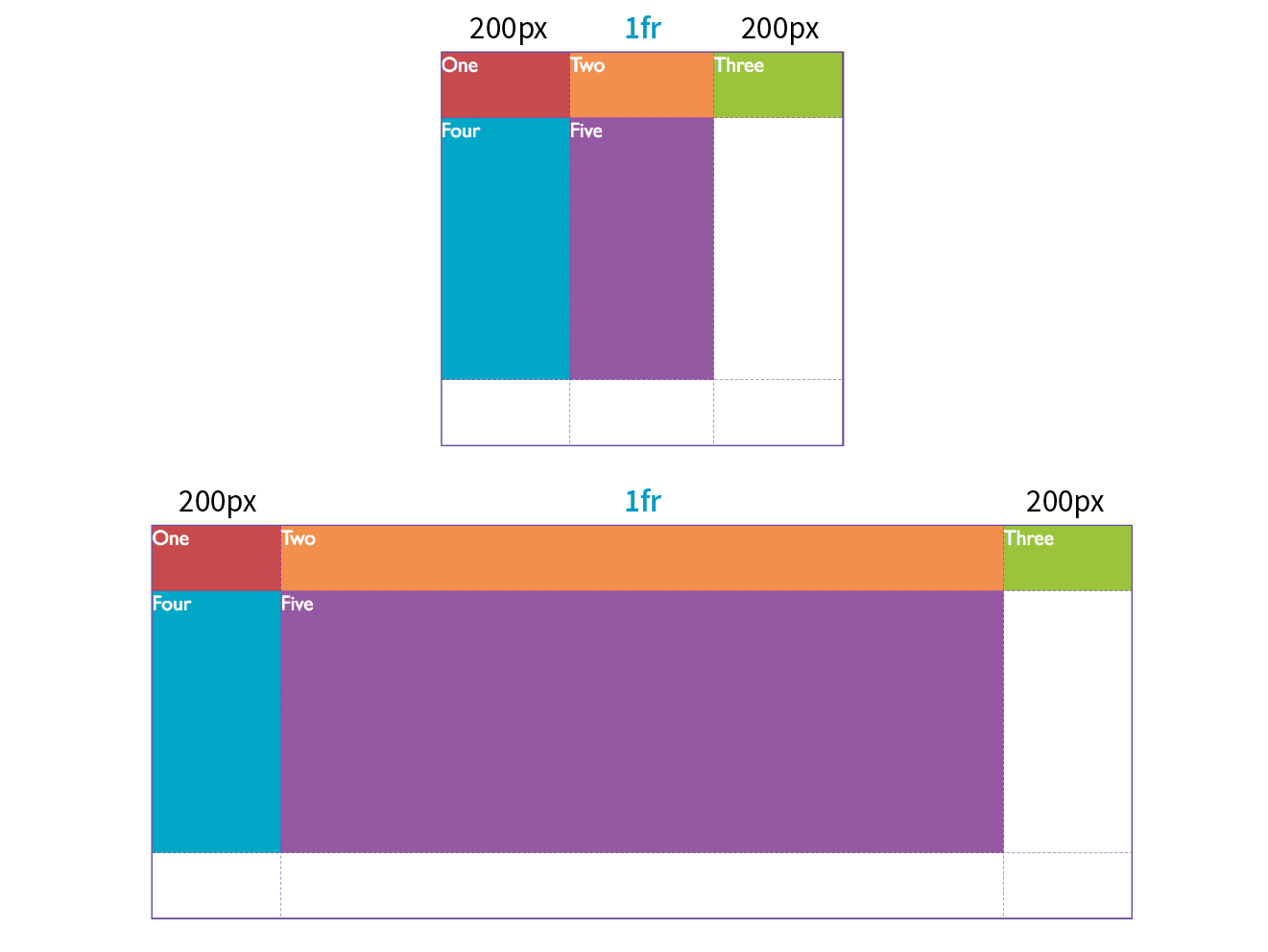
The Grid-specific fractional unit (fr) allows developers to create track widths that expand and contract depending on available space. To go back to the example, if I change the middle column from 500px to 1fr, the browser assigns all leftover space (after the 200-pixel column tracks are accommodated) to that column track (Figure 16-34).
#layout { display: grid; grid-template-rows: 100px 400px 100px; grid-template-columns: 200px 1fr 200px;}
The fr unit is great for combining fixed and flexible track widths, but I could also use all fr units to give all the columns proportional widths. In this example, all of the column widths flex according to the available browser width, but the middle column will always be twice the width of the side columns (see Note).
grid-template-columns: 1fr 2fr 1fr;
Note
Technically, the browser adds up the units (4 in our example), divides the leftover space into that many portions, and then assigns the portions based on the number of units specified.
Minimum and maximum size range
You can constrict the size range of a track by setting its minimum and maximum widths using the minmax() function in place of a specific track size.
grid-template-columns: 200px minmax(15em, 45em) 200px;
This rule sets the middle column to a width that is at least 15em but never wider than 45em. This method allows for flexibility but allows the author to set limits.
Warning
units are not permitted as the minimum value in a statement.
Content-based sizing
The min-content, max-content, and auto values size the track based on the size of the content within it (Figure 16-35).
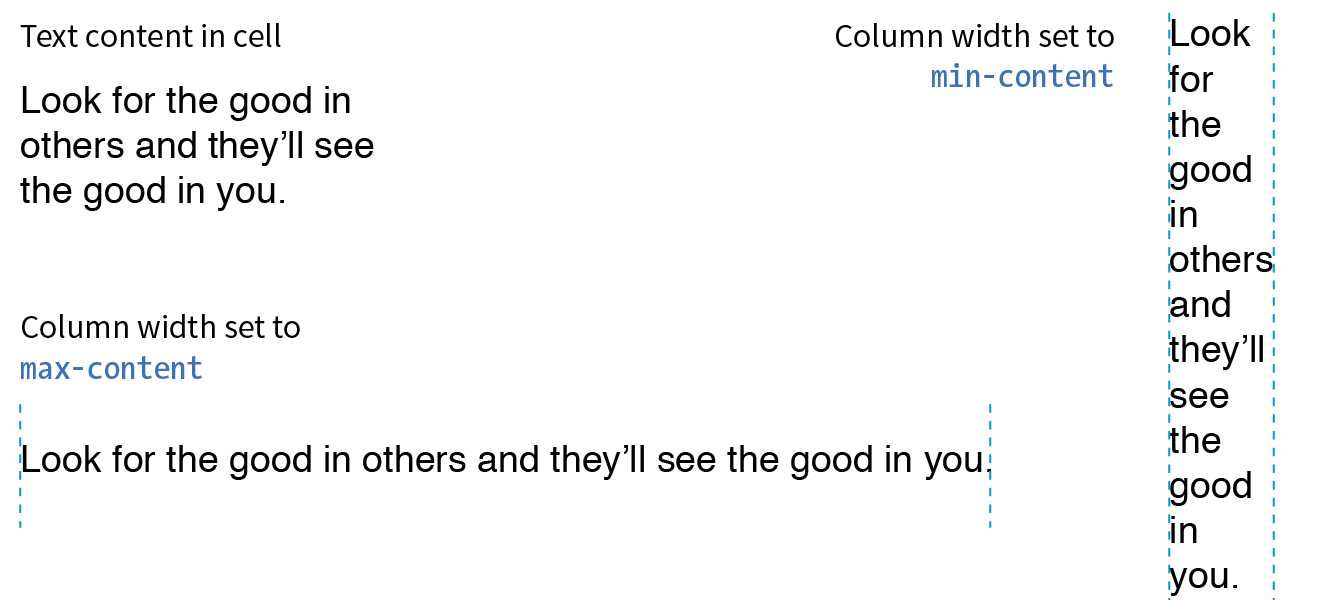
The min-content value is the smallest that track can get without overflowing (by default, unless overridden by an explicit min-width). It is equivalent to the “largest unbreakable bit of content”—in other words, the width of the longest word or widest image. It may not be useful for items that contain normal paragraphs, but it may be useful in some cases when you don’t want the track larger than it needs to be. This example establishes three columns, with the right column sized just wide enough to hold the longest word or image:
grid-template-columns: 50px 1fr min-content;
The max-content property allots the maximum amount of space needed for the content, even if that means extending the track beyond the boundaries of the grid container. When used as a column width, the column track will be as wide as the widest content in that track without line wrapping. That means if you have a paragraph, the track will be wide enough to contain the text set on one line. This makes max-content more appropriate for short phrases or navigation items when you don’t want their text to wrap (auto may work better because it allows wrapping if there’s not enough room).
Using the auto keyword for a track size is basically like handing the keys over to the browser. In general, it causes the track to be sized large enough to accommodate its content, while taking into consideration what other restrictions are in place.
In the minmax() function, the auto keyword behaves very similarly to either min-content or max-content, depending on whether you put it in the minimum or maximum slot. As a keyword on its own, it functions similarly to minmax(min-content, max-content), allowing the track to squeeze as narrow as it can without anything overflowing, but grow to fit its content without wrapping if there’s enough space.
Unlike max-content, an auto maximum allows align-content and justify-content to stretch the track beyond the size of the content. As a minimum, it has a few more smarts than min-content—for example, using a specified min-width or min-height on an item (if any) instead of its min-content size, and ignoring the contents of any grid items with scrollbars.
If you want to size a track based on its content, but you’re not sure which keyword to use, start with auto.
Repeating track sizes
Say you have a grid that has 10 columns with alternating column widths, like so:
grid-template-columns: 20px 1fr 20px 1fr 20px 1fr 20px 1fr 20px 1fr 20px 1fr;
That’s kind of a bummer to have to type out (I know, I just did it), so the fine folks at the W3C have provided a nice shortcut in the form of the repeat() function. In the previous example, the pattern “20px 1fr” repeats five times, which can be written as follows:
grid-template-columns: repeat(5, 20px 1fr);
Much better, isn’t it? The first number indicates the number of repetitions, and the track sizes after the comma provide the pattern. You can use the repeat() notation in a longer sequence of track sizes—for example, if those 10 columns are sandwiched between two 200-pixel-wide columns at the start and end:
grid-template-columns: 200px repeat(5, 20px 1fr) 200px;
You can also provide grid line names before and/or after each track size, and those names will be repeated in the pattern:
grid-template-rows: repeat(4, [date] 5em [event] 1fr);
auto-fill and auto-fit
In the previous repeat() examples, we told the browser how many times to repeat the provided pattern. You can also let the browser figure it out itself based on the available space by using the auto-fill and auto-fit values instead of an integer in repeat().
For example, if I specify
grid-template-rows: repeat(auto-fill, 10em);
and the grid container is 35em tall, then the browser creates a row every 10 ems until it runs out of room, resulting in three rows. Even if there is only enough content to fill the first row, all three rows are created and the space is held in the layout.
Warning
You can only use one repeat() notation for a given declaration. You cannot use units with repeat(). Content-based keywords (auto, min-content, and max-content) cannot be used with auto-fill or auto-fit. Note that you can use minmax() notation inside repeat(), and you can use it with frs and content-based keywords if they are in the max position with a min length..
The auto-fit value works similarly, except any tracks that do not have content get dropped from the layout. If there is leftover space, it is distributed according to the vertical (align-content) and horizontal (justify-content) alignment values provided (we’ll discuss alignment later in this section).
Defining grid areas
So far we’ve been exploring how to divide a grid container into row and column tracks by using the grid-template-columns and grid-template-rows properties, and we’ve looked at many of the possible values for track dimensions. We’ve learned that you can assign names to individual grid lines to make them easy to refer to when placing items on the grid.
You can also assign names to areas of the grid, which for some developers is an even more intuitive method than calling out specific lines. Remember that a grid area is made up of one or more cells in a rectangle (no L-shapes or other non-rectangular collections of cells). Naming grid areas is a little funky to implement, but provides nice shortcuts when you need them.
To assign names to grid areas, use the grid-template-areas property.
grid-template-areas
Values: none | series of area names
Default: none
Applies to: grid containers
Inherits: no
The value of the property is a list of names provided for every cell in the grid, listed row by row, with each row in quotation marks. When neighboring cells share a name, they form a grid area with that name (see Bonus Grid Line Names sidebar).
In the following example, I’ve given names to areas in the example grid we’ve been working on so far (Figure 16-36). Notice that there is a cell name for each of the nine cells as they appear in each row. The row cell lists don’t need to be stacked as I’ve done here, but many developers find it helpful to line up the cell by names using character spaces to better visualize the grid structure.
#layout { display: grid; grid-template-rows: [header-start] 100px [content-start] 400px [footer-start] 100px; grid-template-columns: [ads] 200px [main] 1fr [links] 200px; grid-template-areas: "header header header" "ads main links" "footer footer footer";}
Heads-up
Be sure that you place the cell names in a way that forms rectangles when they combine to identify a named area. No L-shapes or fragments.
If there are three columns in the grid, there must be three names provided for each row. If you want to leave a cell unnamed, type one or more periods (.) in its place as a space holder so that every cell is still accounted for. Again, a sketch of your grid with the areas identified will make it easier to plan out the grid-template-areas value.
Be aware that the track sizes are still coming from the grid-template-columns and grid-template-rows properties. The grid-template-areas property simply assigns names to the areas, making it easier to plop items in them later.
The grid shorthand property
Use the grid shorthand property to set values for grid-template-rows, grid-template-columns, and grid-template-areas with one style rule. Bear in mind that any properties you do not use will be reset to their defaults, as is the case for all shorthands.
grid
Values: none | row info / column info
Default: none
Applies to: grid containers
Inherits: no
In grid, the row values and column values are separated by a slash, with the row values appearing first:
grid: rows / columns
It’s easier to grasp without the clutter of line and area names, so here is the shorthand declaration for our example grid with just the row and column track information:
#layout { display: grid; grid: 100px 400px 100px / 200px 1fr 200px;}
To include custom line names, add the names in brackets around their respective tracks, as we saw in the earlier named line example.
Including area names looks a little convoluted at first, but if you remember that you list cell names row by row, it makes sense that they appear with the other row information, before the slash. The complete order goes as follows:
[start line name] "area names" <track size> [end line name]
The line names and area names are optional. Repeat this for each row in the grid, simply listing them one after another with no special character separating rows. You may find it helpful to stack them as I’ve done in the following example to help keep each row distinct. When the rows are done, add a slash, and list the column track information after it. Here’s a complete example of our grid written with the grid shorthand:
#layout { display: grid; grid: [header-start] "header header header" 100px [content-start] "ads main links" 400px [footer-start] "footer footer footer" 100px /[ads] 200px [main] 1fr [links] 200px; }
This expands to the following:
#layout { display: grid; grid-template-rows: [header-start] 100px [content-start] 400px [footer-start] 100px; grid-template-columns: [ads] 200px [main] 1fr [links] 200px; grid-template-areas: "header header header" "ads main links" "footer footer footer" }
There is also a grid-template property that works exactly like grid, but it may be used only with explicitly defined grids (as opposed to implicit grids, which I cover later). The Grid Layout spec strongly recommends that you use the grid shorthand instead of grid-template (see Note) unless you specifically want the cascading behavior of grid-template.
Note
The Grid experts I’ve talked to don’t tend to use or except for the simplest of grid structures. The code becomes overly complex, and one small slip can make the whole grid fall apart. For complicated grid structures, stick to separate properties for defining rows, columns, and areas.
I’m thinking that it’s a good time for you to put all of these grid setup styles to use in Exercise 16-4.
Exercise 16-4. Setting up a grid
NOTE
You will need to use a browser that supports grids for this exercise. I am using Firefox in order to take advantage of the Grid Inspector tool. Supporting browsers are listed earlier in this section. See the sidebar for instructions on how to open the tool.
Placing Grid Items
Now that we’ve covered all the ins and outs of setting up a grid, including giving ourselves handy line and area names, we can move on to assigning items to areas on the grid.
As we saw in Figures 16-32 and 16-38, without any explicit placement instruction, grid items flow into the available grid cells sequentially. That’s fine for some use cases, but let’s tell our grid items where to go!
Positioning using lines
One method for describing a grid item’s location on the grid is to specify the four lines bordering the target grid area with four properties that specify the start and end row lines and the start and end column lines. Apply these properties to the individual grid item element you are positioning.
grid-row-start
grid-row-end
grid-column-start
grid-column-end
Values: auto | grid line | span number | span ‘line name’ | number ‘line name’
Default: auto
Applies to: grid items
Inherits: no
This set of properties provides a straightforward way to describe an element’s position on the grid by identifying either the name or number of the grid line on each border. As an alternative, you can provide just one line identifier and tell the item to “span” a certain number of cells. By default, an item occupies one track width, which is what you get with the auto keyword.
Getting back to our five-item example, I would like the first item to go in the top row and span across all three columns (Figure 16-39).
One way to do this is to use the four line start/end properties and identify lines by their numbers like so:
#one { grid-row-start: 1; grid-row-end: 2; grid-column-start: 1; grid-column-end: 4;}
Take a moment to compare this to the position of the #one div back in Figure 16-36. For grid-row-start, the 1 value refers to the first (top) line of the grid container. For grid-column-start, 1 refers to the first line on the left edge of the container, and the value 4 for grid-column-end identifies the fourth and last line on the right edge of the container.
Here’s one more for good measure. This style declaration positions the #four item element in the right side column as shown in Figure 16-36:
#four { grid-row-start: 2; grid-row-end: 3; grid-column-start: 3; grid-column-end: 4;}
Note
If you omit a start or end line, the area will be one track wide (the default, ).
Remember how grid lines are also numbered in the opposite direction starting at –1? We can use that here. I could specify the grid-column-end for #one as –1, and it would be the same as 4. In fact, this method has the advantage of guaranteeing to span to the end of the track and avoids miscounting.
I could also use the named lines I set up here. These row values are interchangeable with the previous example:
#one { grid-row-start: header-start; grid-row-end: header-end; …}
If I omit the end line declaration, the row would be one track high (the default). That’s what I want here, so omitting the end declaration altogether is one more way to achieve the effect I want.
Ready for yet another option? I can tell the item what line to start on, but instead of providing an end line, I can use the span keyword to specify how many tracks to span over. In this example, the item starts at the left edge of the track (line 1) and spans over three columns, effectively ending at line 4.
#one { … grid-column-start: 1; grid-column-end: span 3;}
Spans can work in reverse as well. If you provide only an end line, the span searches toward the start of the track. The following styles have the same effect as our previous examples because they define the target area by its end line at the far right of the grid and span back three columns to the beginning:
#one { … grid-column-start: span 3; grid-column-end: -1;}
If four declarations feels like too many, use the shorthand grid-row and grid-column properties instead.
grid-row
grid-column
Values: start line / end line
Default: see individual properties
Applies to: grid items
Inherits: no
These properties combine the *-start and *-end properties into a single declaration. The start and end line values are separated by a slash (/). With the shorthand, I can shorten my example to the following two declarations. Any of the methods for referring to lines work in the shorthand values.
#one { grid-row: 1 / 2; grid-column: 1 / span 3;}
Positioning by area
The other way to position an item on a grid is to tell it go into one of the named areas by using the grid-area property.
grid-area
Values: area name | 1 to 4 line identifiers
Default: see individual properties
Applies to: grid items
Inherits: no
The grid-area property points to one of the areas named with grid-template-areas. It can also point to an area name that is implicitly created when you name lines delimiting an area with the suffixes “-start” and “-end”. With this method, I can drop all of the grid items into the areas I set up with my template earlier (Figure 16-40):
#one { grid-area: header; }#two { grid-area: ads; }#three { grid-area: main; }#four { grid-area: links; }#five { grid-area: footer; }
How easy was that?! One benefit of using areas is that you can change the grid, and as long as you provide consistently named grid areas, the items will end up in the right place. There’s no need to renumber lines in the style sheet.
You can also use grid-area to provide a list of four grid lines that define an area, separated by slashes. The order in which they appear is “row-start,” “column-start,” “row-end,” “column-end” (counterclockwise from the top). There are a lot of rules for what happens when you omit values, but I’m not going to get into all those finer points here. The grid-area declaration for the first grid item could be written like this to achieve the same result as previous examples:
#one { grid-area: 1 / 1 / 2 / span 3; /* row-start / column-start / row-end / column-end */
}
As you can see, the Grid Layout Module gives you a variety of ways to set up a grid and a variety of ways to place items on it. In fact, the spec includes a few more uses of span that you can explore. Choose the methods that work best for the grid you are designing or that work best for your brain.
Now let’s finish up the grid we’ve been working on in Exercise 16-5.
Exercise 16-5. Placing items on a grid
Now you know the basics of creating an explicit grid and placing items on it. There are a few more grid-related topics that are important to be familiar with: implicit grids, gutter spaces, and grid alignment. I have space for only a basic introduction to each topic, but when you start implementing grid layouts on your own, you can do the deep dive required to meet your needs.
Implicit Grid Behavior
So far, we’ve been focusing on ways to define an explicit grid and place items on it deliberately. But along the way, we’ve encountered a few of the Grid system’s automatic, or implicit, behaviors. For example, without explicit placement instructions, grid items flow into the grid sequentially, as we saw in Figure 16-32. I also pointed out how creating a named area implicitly generates grid lines with the “-start” and “-end” suffixes, and vice versa.
Another implicit Grid behavior is the creation of row and column tracks on the fly to accommodate items that don’t fit in the defined grid. For example, if you place an item outside a defined grid, the browser automatically generates tracks in the grid to accommodate it. Similarly, if you simply have more items than there are cells or areas, the browser generates more tracks until all the items are placed.
By default, any row or column automatically added to a grid will have the size auto, sized just large enough to accommodate the height or width of the contents. If you want to give implicit rows and columns specific dimensions, such as to match a rhythm established elsewhere in the grid, use the grid-auto-* properties.
grid-auto-rows
grid-auto-columns
Values: list of track sizes
Default: auto
Applies to: grid containers
Inherits: no
The grid-auto-row and grid-auto-columns properties provide one or more track sizes for automatically generated tracks and apply to the grid container. If you provide more than one value, it acts as a repeating pattern. As just mentioned, the default value is auto, which sizes the row or column to accommodate the content.
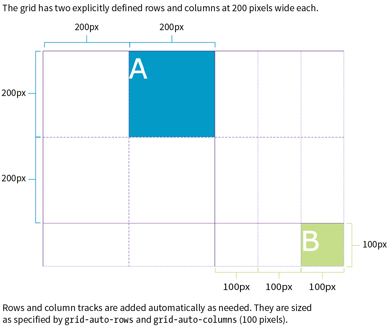
In this example, I’ve explicitly created a grid that is two columns wide and two columns high. I’ve placed one of the grid items in a position equivalent to the fifth column and third row. My explicit grid isn’t big enough to accommodate it, so tracks get added according to the sizes I provided in the grid-auto-* properties (Figure 16-42).
The markup
<div id="littlegrid"> <div id="A">A</div> <div id="B">B</div></div>
The styles
#littlegrid { display: grid; grid-template-columns: 200px 200px; grid-template-rows: 200px 200px; grid-auto-columns: 100px; grid-auto-rows: 100px;}#A { grid-row: 1 / 2; grid-column: 2 / 3;}#B { grid-row: 3 / 4; grid-column: 5 / 6;}
Hopefully, that example helped you form a mental model for automatically generated rows and columns. A more common use of auto-generated tracks is to tile images, product listings, and the like into columns, letting rows be created as needed. These styles set up a grid with explicit columns (as many as will fit the width of the viewport, no narrower than 200px) and as many 200px-high rows as needed:
grid-template-columns: repeat(auto-fill, minmax(200px, 1fr));grid-auto-rows: 200px;
You can also control the manner in which items automatically flow into the grid with the grid-auto-flow property.
Flow direction and density
grid-auto-flow
Values: row or column | dense (optional)
Default: row
Applies to: grid containers
Inherits: no
Use grid-auto-flow to specify whether you’d like items to flow in by row or column. The default flow follows the writing direction of the document (left-to-right and top-to-bottom for English and other left-to-right languages).
In this example, I’ve specified that I’d like grid items to flow in by columns instead of the default rows:
#listings { display: grid; grid-auto-flow: column;}
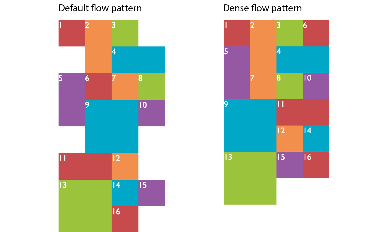
By default, items are placed in the first area in which they fit. Cells that are too small to accommodate the content will be skipped over until a cell large enough is found for placement. If you include the optional dense keyword for the grid-auto-flow property, it instructs the browser to fill the grid as densely as possible, allowing the items to appear out of sequence in order to fill the available space:
#listings { display: grid; grid-auto-flow: dense rows;}
The example on the left of Figure 16-43 shows the default flow method. Look closely and you’ll see that the grid items are in order. When there isn’t enough room for the whole item, it moves down and to the left until it fits (similar to floats). This method may leave empty cells as shown in the figure. By comparison, the dense flow example on the right is all filled in, and if you look at the numbering, you can see that putting items wherever they fit makes them end up out of order. Note that dense flow doesn’t always result in a completely filled-in grid like the figure, but it is likely to have fewer holes and be more compact than the default mode.
The grid shorthand property revisited
Earlier we saw the grid shorthand property used to provide track sizes as well as area names. In that section, we were dealing with explicit grids, but grid can be used with implicit grid properties as well.
Adding the auto-flow keyword to either the row or track information indicates that the tracks on that axis should be automatically generated at the provided dimension.
Say we want to establish columns explicitly, but let rows generate automatically as needed. The grid shorthand for this common scenario is shown here:
grid: auto-flow 12em / repeat(5, 1fr);
Remember that the grid shorthand syntax lists row information first, then a slash, then the column information. Here, the rule says to create rows automatically that are 12 ems high and create 5 columns at 1fr each. When auto-flow is applied to rows, the grid-auto-flow is set to row.
In this example, the resulting grid will have two 300px rows, but 100px-wide columns will be generated on the fly as grid items are added:
grid: 300px 300px / auto-flow 100px;
With auto-flow applied to columns, the grid-auto-flow is set to column.
It is important to keep in mind that because grid is a shorthand property, any omitted value will be reset to its default. Therefore, if you’ve also used grid to set up explicit rows and columns, those will be essentially lost if a grid shorthand with implicit grid instructions appears later in the style sheet.
Spacing and Alignment
The remaining properties defined in the Grid Layout Module relate to spacing and alignment. You can add space between tracks and adjust alignment of the grid and its items by using many of the same methods you learned for Flexbox.
Spacing between tracks (gutters)
grid-row-gap
grid-column-gap
Values: length (must not be negative)
Default: 0
Applies to: grid containers
Inherits: no
grid-gap
Values: grid-row-gap grid-column-gap
Default: 0 0
Applies to: grid containers
Inherits: no
Setting a length value for grid-row-gap adds space between the row tracks of the grid, and grid-column-gap adds space between (you guessed it) column tracks. The effect is as if the grid lines have a width; however, the gap width is applied only to lines between tracks, not outside the first and last lines in the grid. (Spacing on the outside edges can be controlled with padding.) You can use the grid-gap shorthand to specify gap widths for rows and columns in one go, with rows first, as usual.
In this example, I’ve added 20px space between rows and 50px space between columns by using the grid-gap shorthand (Figure 16-44).
div#container { border: 2px solid gray; display: grid; grid: repeat(4, 150px) / repeat(4, 1fr); grid-gap: 20px 50px; }
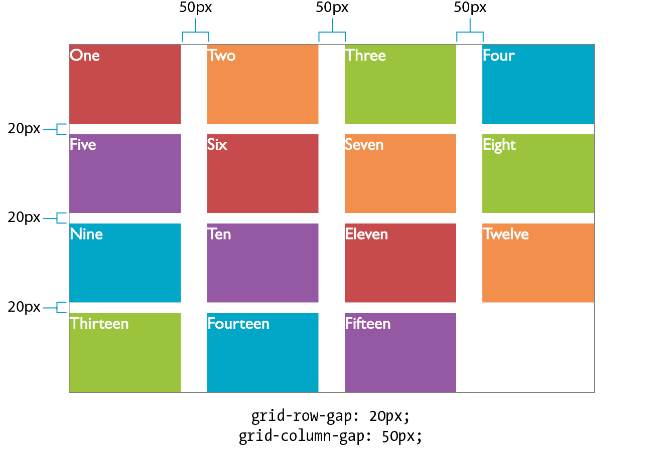
Grid and item alignment
You can align grid items in their cells with the same alignment vocabulary used for Flexbox items (see the “Box Alignment” sidebar). I’m going to touch on these quickly, but you can play around with them on your own.
Aligning individual items
justify-self
Values: start | end | center | left | right | self-start | self-end | stretch | normal | auto
Default: auto (looks at the value for justify-items, which defaults to normal)
Applies to: grid items
Inherits: no
align-self
Values: start | end | center | left | right | self-start | self-end | stretch | normal | auto
Default: auto (looks at the value for align-items)
Applies to: grid items
Inherits: no
Note
The and values look at the writing direction of the content of the item and use its start or end edge for alignment. For example, if an item is in Arabic, its edge is on the right, and it would be aligned to the right. The and values consider the writing direction of the grid container. The and keywords are absolute and would not change with the writing system, but they correspond to and in left-to-right languages.
When a grid item doesn’t fill its entire grid area, you can specify how you’d like it to be aligned in that space. Specify the horizontal (inline) alignment with the justify-self property. align-self specifies alignment on the vertical (block) axis. These properties apply to the grid item element, which makes sense because you want the item to align itself.
Figure 16-45 shows the effects of each keyword value. For items with their size set to auto (or in other words, not explicitly set with width and height properties), the default is stretch. This is what we’ve seen in all the previous grid examples. If the grid item has a width and height specified, those dimensions are preserved and the default is start.
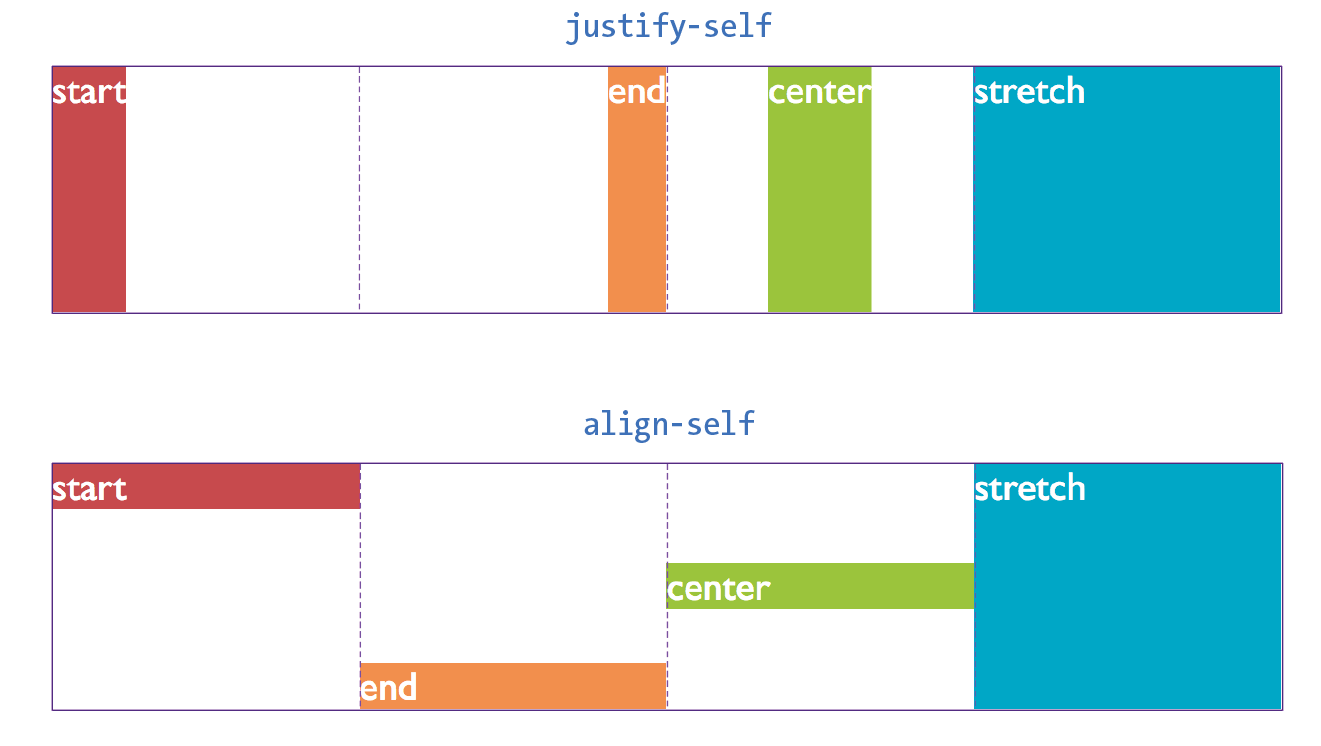
After reading about Flexbox, you should find these familiar—for example, the use of “start” and “end” to keep the system language direction-agnostic.
Aligning all the items in a grid
justify-items
Values: start | end | center | left | right | self-start | self-end | stretch | normal
Default: normal (stretch for non-replaced elements; start for replaced elements)
Applies to: grid containers
Inherits: no
align-items
Values: start | end | center | left | right | self-start | self-end | stretch | normal
Default: normal (stretch for non-replaced elements; start for replaced elements)
Applies to: grid containers
Inherits: no
To align all of the items in a grid in one fell swoop, use the justify-items property for horizontal/inline axis alignment and align-items for vertical/block axis. Apply these properties to the grid container element so it affects all of the items in the grid. The keywords do the same things shown in Figure 16-43; just picture it happening consistently across the entire grid. Keep in mind that these settings will be overridden by the *-self properties.
Aligning tracks in the grid container
There may be instances in which the tracks of your grid do not fill the entire area of their grid container—for example, if you’ve specified track widths and heights in specific pixel measurements. You can decide how the browser should handle leftover space within the container by using the justify-content (horizontal/inline axis) and align-content (vertical/block axis) properties.
justify-content
Values: start | end | left | right | center | stretch | space-around | space-between | space-evenly
Default: start
Applies to: grid containers
Inherits: no
align-content
Values: start | end | left | right | center | stretch | space-around | space-between | space-evenly
Default: start
Applies to: grid containers
Inherits: no
In Figure 16-46, the grid container is indicated with a gray outline. The rows and columns of the drawn grid do not fill the whole container, so something has to happen to that extra space. The start, end, and center keywords move the whole grid around within the container by putting the extra space after, before, or equally on either side, respectively. The space-around and space-between keywords distribute space around tracks as discussed in the Flexbox section. The space-evenly keyword adds an equal amount of space at the start and end of each track and between items.
Note
The keyword works only when the track width or height is set to .
Warning
When you distribute space around and between tracks, it adds to whatever settings you may have.
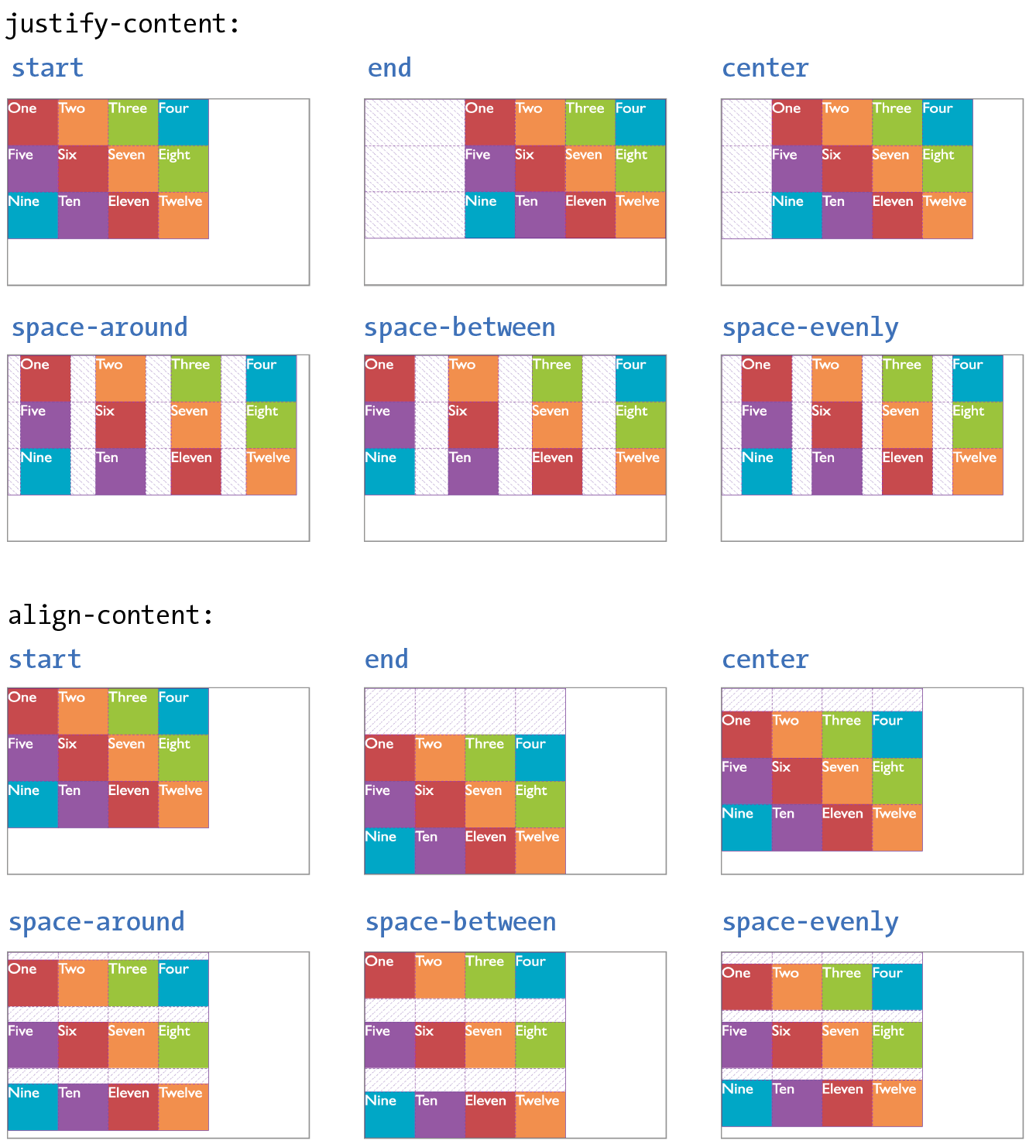
Before we close out this discussion of Grid Layout, let’s give the Black Goose Bakery page a nice two-column layout in Exercise 16-6.
Exercise 16-6. A grid layout for the bakery page
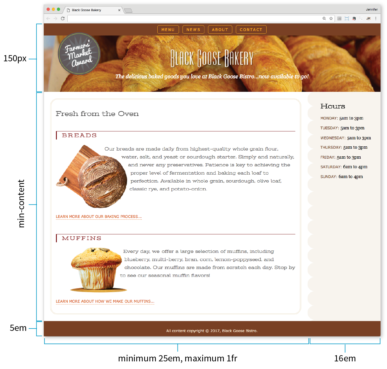
aside { … /* border-top-right-radius: 25px; */
/* margin: 1em 2.5% 0 10%; */
}
Online Grid Resources
As you continue your Grid Layout adventure, I’m sure you’ll find plenty of excellent resources online, as more are popping up all the time. I’d like to point you to a few of the most complete and authoritative resources that I found helpful as I learned about grids myself.
Rachel Andrew’s “Grid By Example” site (gridbyexample.com)
Rachel Andrew, one of the first champions of Grid Layout, has assembled an incredible collection of articles, free video tutorials, browser support information, and more. You can also try searching the web for her excellent conference talks on the topic.
Jen Simmons’ “Experimental Layout Lab” (labs.jensimmons.com)
Jen Simmons, who works for Mozilla Foundation, shows off what Grid Layout can do in her Experimental Layout Lab. It’s definitely worth a visit for the cool examples of Grid and other emerging CSS technologies as well as exercises that let you code along.
You can find Jen’s many articles on CSS Grid at jensimmons.com/writing. I also recommend her roundup of resources for learning Grid Layout at jensimmons.com/post/feb-27-2017/learn-css-grid. See also Jen’s YouTube video series called “Layout Land” (youtube.com, search for “Layout Land Jen Simmons”).
Grid Garden by Thomas Park (cssgridgarden.com)
If you enjoyed the Flexbox Froggy game created by Thomas Park, you will have fun playing his Grid Garden game for getting familiar with CSS Grid Layout.
Test Yourself
We covered lots of ground in this chapter. See how you do on this quiz of some of the highlights. As always, Appendix 16 has the answers.
Flexbox
- How do you turn an element into a flex item?
- Match the properties with their functions.
a.
justify-content1. Distribute space around and between flex lines on the cross axis.
b.
align-self2. Distribute space around and between items on the main axis.
c.
align-content3. Position items on the cross axis.
d.
align-items4. Position a particular item on the cross axis.
- How is align-items different from align-content? What do they have in common?
- Match the properties and values to the resulting effects.
a.
flex: 0 1 auto;1. Items are completely inflexible, neither shrinking nor growing.
b.
flex: none;2. Item will be twice as wide as others with
flex: 1and may also shrink.c.
flex: 1 1 auto;3. Items are fully flexible.
d.
flex: 2 1 0px;4. Items can shrink but not grow bigger.
- Match the following flex-flow declarations with the resulting flexboxes (Figure 16-48).
flex-flow: row wrap;flex-flow: column nowrap;flex-flow: row wrap-reverse;flex-flow: column wrap-reverse;flex-flow: row nowrap;
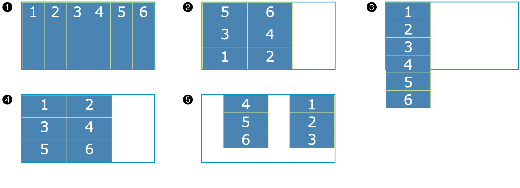
Figure 16-48. Various settings. - Write style rules for displaying the flexbox items in the order shown in Figure 16-49.
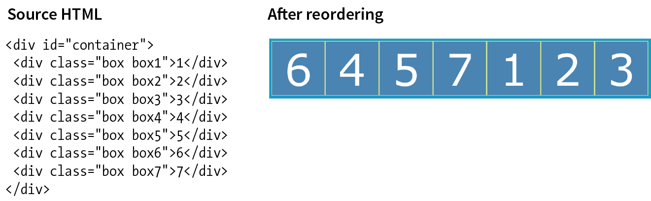
Figure 16-49. Write styles to put items in the shown order. Grid Layout
- What is the key difference between Grid Layout and Flexbox? Name at least one similarity (there are multiple answers).
- Create the grid template for the layout shown in Figure 16-50 by using grid-template-rows and grid-template-columns.
Write it again, this time using the grid shorthand property.
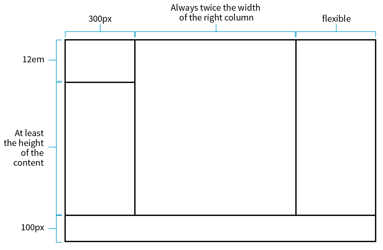
Figure 16-50. Create the grid template for this grid structure. - Match the following style declarations with the lettered grid items in Figure 16-51. In addition to automatic numbering, some of the grid lines have been named, as labeled.
- _________
grid-row-start: 1; grid-row-end: 3; grid-column-start: 3; grid-column-end: 7;
- _________
grid-area: 2 / 2 / span 4 / 3;
- _________
grid-area: bowie;
- _________
grid-row: -2 / -1; grid-column: -2 / -1;
- _________
grid-row-start: george; grid-row-end: ringo; grid-column-start: paul; grid-column-end: john;
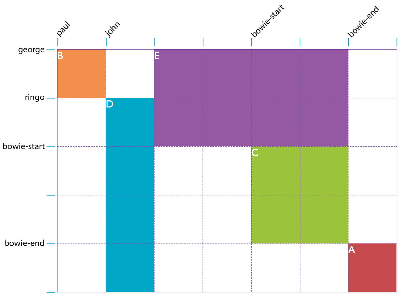
Figure 16-51. Match the style examples to the items in this grid. - _________
- Write a style rule that adds 1em space between columns in a grid container named #gallery.
- Match the tasks with the declarations.
justify-self: end;align-items: end;align-content: center;align-self: stretch;justify-items: center;
_____ Make a particular item stretch to fill its container.
_____ Position an image on the right edge of its grid area (in a left-to-right reading language).
_____ Center the whole grid vertically in its container.
_____ Push all of the images in a grid to the bottom of their respective cells.
_____ Center all items in their areas horizontally.
CSS Review: Layout Properties
Here are the properties covered in this chapter, sorted into Flexbox and Grid sections and whether they apply to the container or item.