Table of Contents for
Learning Web Design, 5th Edition
 Learning Web Design, 5th Edition
Published by
O'Reilly Media, Inc., 2018
Learning Web Design, 5th Edition
Published by
O'Reilly Media, Inc., 2018
- cover
- Learning Web Design, Fifth Edition
- lwd5_title_copy
- lwd5_title_copy-1
- lwd5_contents
- Foreword
- Preface
- Part I. Getting Started
- 2. How the Web Works
- 3. Some Big Concepts You Need to Know
- Part II. HTML for STRUCTURE
- 5. Marking Up Text
- 6. Adding Links
- 7. Adding Images
- 8. Table Markup
- 9. Forms
- 10. Embedded Media
- Part III. CSS for Presentation
- 12. Formatting Text
- 13. Colors and Backgrounds
- 14. Thinking Inside the Box
- 15. Floating and Positioning
- 16. CSS Layout with Flexbox and Grid
- 17. Responsive Web Design
- 18. Transitions, Transforms, and Animation
- 19. More CSS Techniques
- 20. Modern Web Development Tools
- Part IV. JavaScript for Behavior
- 22. Using JavaScript
- Part V. Web Images
- 24. Image Asset Production
- 25. SVG
- Part VI. Appendices
- B. HTML5 Global Attributes
- C. CSS Selectors, Levels 3 and 4
- D. From HTML+ to HTML5
3
In this chapter
The web on mobile devices
The benefits of web standards
Progressive enhancement
Responsive Web Design
Accessibility
Site performance
As the web matures and the number of devices we access it from increases exponentially, our jobs as web designers and developers get significantly more complicated. Frankly, there’s a lot more going on out there than I can fit in this book. In the chapters that follow, I will focus on the basic building blocks of web design—HTML elements, CSS styles, a taste of JavaScript, and web image production—that will give you a solid foundation for the further development of your skills.
Before we get to the nuts and bolts, I want to introduce some Big Concepts that every web designer needs to know. We’ll look at ideas and concerns that inform our decisions and contribute to the contemporary web environment. I’ll be referring back to the terminology introduced here frequently.
The heart of the matter is that as web designers, we never know exactly how the pages we create will be viewed. We don’t know which of the dozens of browsers might be used, whether it is on a desktop computer or something more portable, how large the browser window will be, what fonts are installed, whether functionality such as JavaScript is enabled, how fast the internet connection is, whether the pages are being read by a screen reader, and so on. The Big Concepts in this chapter are primarily reactions to and methods for coping with the inescapable element of the Unknown in our medium. They include the following:
- The multitude of devices
- Web standards
- Progressive enhancement
- Responsive Web Design
- Accessibility
- Site performance
Because we’re just getting started, I will keep the descriptions brief and fairly non-technical. My goal is that you have a basic understanding of what I mean by terms like “progressive enhancement” when you encounter them in lessons later. Many excellent articles and books have been written on each of these topics and their related production techniques, and I’ll provide pointers to resources for further reading.
A Multitude of Devices
Until 2007, we could be relatively certain that our users were visiting our sites while sitting at their desks, looking at a large monitor, using a speedy internet connection. We had all more or less settled on 960 pixels as a good width for a web page based on the most common monitor size. Back then, our biggest concern was dealing with the dozen or so desktop browsers and jumping through a few extra hoops to support quirky old versions of Internet Explorer. And we thought we had it rough!
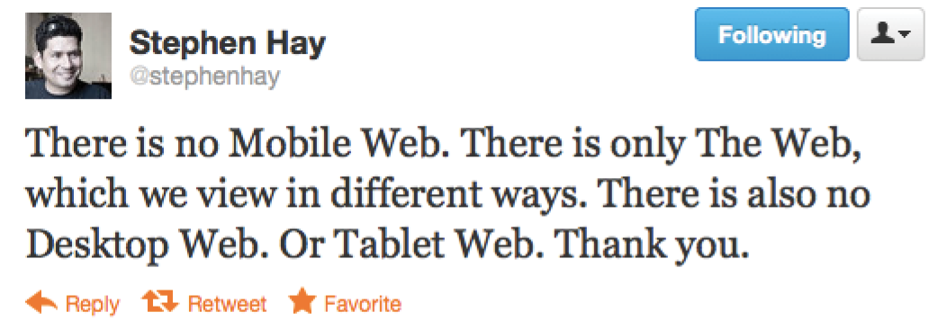
Although you could access web pages and web content on mobile phones prior to 2007, the introduction of the iPhone and Android smartphones as well as faster networks heralded a huge shift in how, when, and where we do our web surfing (particularly in the United States, which lagged behind Asia and the EU in mobile technology). Since then, we’ve seen the introduction of phones and tablets of all different dimensions, as well as web browsers on TVs, gaming systems, and other devices. And the diversity is only going to increase. I think mobile web design expert Brad Frost sums it up nicely in his illustrations in Figure 3-1.

The challenge of designing for all of these devices goes beyond addressing differing screen sizes. There is a world of difference between using a site over a broadband connection and over a slow cell network. Designers need to resist making assumptions about network speed and context based on the screen size. Just because it is a small screen doesn’t mean it’s a slow connection or that the person is in a hurry. It’s not uncommon to leisurely browse the web on a smartphone while sitting on the couch at home with a solid WiFi connection. And iPads with larger, high-resolution displays may be accessing the internet on pokey 3G connections. In other words, it’s complicated!
Resist making assumptions about network speed and context based on the screen size.
For a lot of sites today, more people access the web via their mobile devices than on a desktop computer. Already, a significant portion of Americans use their mobile phones as their only access to the internet. That means it is critical to get the design and functionality right. We’ve made huge strides in serving a pleasing experience to users with handheld devices, and the technology for targeting their needs continues to head in the right direction.
What I want you to learn here is that the way you see your design as you’re working on it on your nice desktop machine is not how it will be experienced by everyone. Some will see it much smaller. Some will see it load painfully slowly. Some may be looking at it on a TV across the room. All web design professionals should keep this fact in mind.
For Further Reading
- Mobile First by Luke Wroblewski (A Book Apart). Luke was way ahead of the curve in insisting that sites work well on mobile devices, and he shares his perspective in this little book, which is jam-packed with ideas.
Sticking with the Standards
So how do we deal with this diversity? A good start is to follow the standards documented by the World Wide Web Consortium (W3C). Sticking with web standards is your primary tool for ensuring your site is consistent on all standards-compliant browsers (that’s approximately 99% of browsers in current use). It also helps make your content forward-compatible as web technologies and browser capabilities evolve. Another benefit is that you can tell your clients that you create “standards-compliant” sites, and they will like you more.
The notion of standards compliance may seem like a no-brainer, but it used to be that everyone, including the browser makers, played fast and loose with HTML and scripting. The price we paid was incompatible browser implementations and the need to create sites twice to make them work for everyone. I talk more about web standards throughout this book, so I won’t go into too much detail here. Suffice it to say that the web standards are your friends. Everything you learn in this book will start you off on the right foot.
Sticking with web standards is your primary tool for ensuring your site is as consistent as possible.
For Further Reading
- The W3C site (w3.org/standards) is the primary resource for all web standards documents.
- The bible for standards compliance and how it makes good business sense is Designing with Web Standards, 3rd Edition, by Jeffrey Zeldman (New Riders). It’s getting on in years, but the fundamentals are still solid.
Progressive Enhancement
With a multitude of browsers comes a multitude of levels of support for the web standards. In fact, no browser has implemented all the standards 100%, and there are always new technologies that are slowly gaining steam. Furthermore, users can set their own browser preferences, so they may have a browser that supports JavaScript but have chosen to turn it off. The point here is that we are faced with a wide range of browser capabilities—from only basic HTML support to all the bells and whistles.
Progressive enhancement is one strategy for dealing with unknown browser capabilities (see Note). When designing with progressive enhancement, you start with a baseline experience that makes the content or core functionality available to even the most rudimentary browsers or assistive devices. From there, you layer on more advanced features for the browsers that can handle them. You might finish with some “nice to have” effects, like animation or wrapping text around images in interesting shapes, that enhance the experience for users with the most advanced browsers, but aren’t really critical to the brand or message.
NOTE
Progressive enhancement is the flip side of an approach to browser diversity called , in which you design the fully enhanced experience first, then create a series of fallbacks for non-supporting browsers. Both methods have their place in modern development. You will find many fallback techniques suggested in this book to be sure less capable browsers are accommodated.
Progressive enhancement is an approach that informs all aspects of page design and production, including HTML, CSS, and JavaScript:
Authoring strategy
When an HTML document is written in logical order and its elements are marked up in a meaningful way, it will be usable on the widest range of browsing environments, including the oldest browsers, future browsers, and mobile and assistive devices. It may not look exactly the same, but the important thing is that your content is available. It also ensures that search engines like Google will catalog the content correctly. A clean HTML document with its elements accurately and thoroughly described is the foundation for accessibility.
Styling strategy
You can create layers of experience simply by taking advantage of the way browsers parse style sheet rules. Without going into too much technical detail, you can write a style rule that makes an element background red, but also include a style that gives it a cool gradient (a blend from one color to another) for browsers that know how to render gradients. Or you can use a cutting-edge CSS selector to deliver certain styles only to cutting-edge browsers. The knowledge that browsers simply ignore properties and rules they don’t understand gives you license to innovate without bringing older browsers to their knees. You just have to be mindful of styling the baseline experience first, then adding improvements once the minimum requirements are met.
Scripting strategy
As with other web technologies, there are discrepancies in how browsers handle JavaScript (particularly on non-desktop devices), and some users opt to turn it off entirely. The first rule in progressive enhancement is to make sure basic functionality—such as linking from page to page or accomplishing essential tasks like data submission via forms—is intact even when JavaScript is off. In this way, you ensure the baseline experience, and enhance it when JavaScript is available.
Progressive enhancement is a strategy for coping with unknown browser capabilities.
For Further Reading
- There is no better introduction to the progressive enhancement approach than the book Adaptive Web Design: Crafting Rich Experiences with Progressive Enhancement, 2nd Edition, by Aaron Gustafson (New Riders).
- The Uncertain Web: Web Development in a Changing Landscape by Rob Larson (O’Reilly).
- Once you have more chops, the book Designing with Progressive Enhancement by Todd Parker, Patty Toland, Scott Jehl, and Maggie Costello Wachs (New Riders) is an excellent deep-dive into techniques and best practices. Read more about it at filamentgroup.com/dwpe/.
Responsive Web Design
By default, most browsers on small devices such as smartphones and tablets shrink a web page down to fit the screen and provide mechanisms for zooming and moving around the page. Although it technically works, it is not a great experience. The text is too small to read, the links are too small to tap, and all that zooming and panning around is distracting.
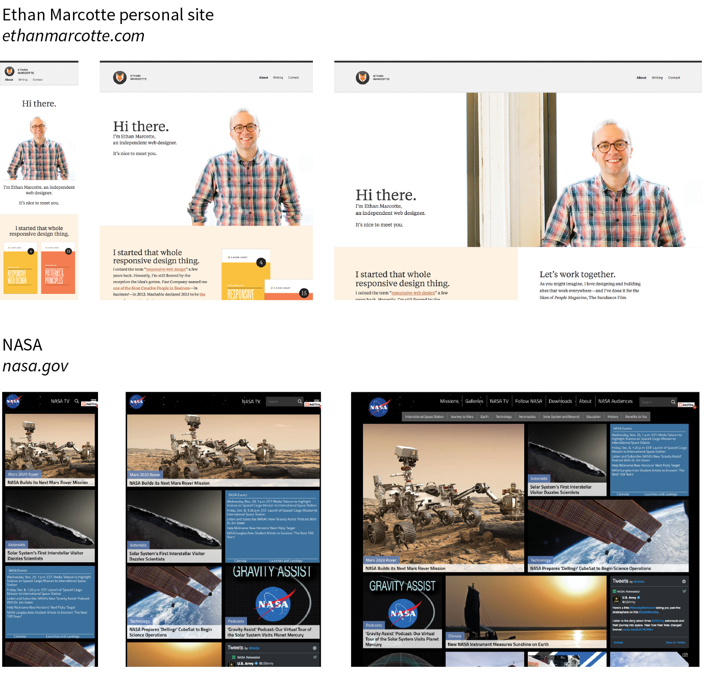
Responsive Web Design (RWD) is a strategy for providing appropriate layouts to devices based on the size of the viewport (browser window). The key to Responsive Web Design is serving a single HTML document (with one URL) to all devices, but applying different style sheets based on the screen size in order to provide the most optimized layout for that device. For example, when the page is viewed on a smartphone, it appears in one column with large links for easy tapping. But when that same page is viewed on a large desktop browser, the content rearranges into multiple columns with traditional navigation elements. It’s like magic! (Except that it’s actually just CSS.)
Responsive Web Design is a strategy for dealing with unknown screen size.
The web design community has been abuzz about responsive design since Ethan Marcotte first wrote about it and coined the phrase in his article “Responsive Web Design” on A List Apart in 2010 (alistapart.com/articles/responsive-web-design/). It’s become one of the primary tools we use to cope with unknown viewport size.
Figure 3-3 shows some examples of responsive sites at the typical dimensions for a desktop monitor, tablet, and smartphone. You can see many more inspirational examples at the Media Queries gallery site (mediaqueri.es). Try opening one of the responsive sites in your browser and then resizing the window narrow and wide. Watch as the layout changes based on window size. Très cool.
Responsive Web Design helps with matters of layout, but it is not a solution to all mobile web design challenges. The fact is that providing the best experiences for your users and their chosen device may require optimizations that go beyond adjusting the look and feel. You can better address some problems by using the server to detect the device and its capabilities and then making decisions on what to send back.
For some sites and services, it may be preferable to build a separate mobile site (see the “M-dot Sites” sidebar) with a customized interface and feature set that takes advantage of phone capabilities like geolocation. That said, although responsive design won’t fix everything, it is an important part of the solution for delivering satisfactory experiences on a wide variety of browsers.
For Further Reading
I’ll cover Responsive Web Design in more detail in Chapter 17, Responsive Web Design, once you have more code experience under your belt. There you will find plenty of resources to continue your responsive design education.

One Web for All (Accessibility)
We’ve been talking about the daunting number of browsers in use today, but so far, we’ve only addressed visual browsers controlled with mouse pointers or fingertips. It is critical, however, to keep in mind that people access the web in many different ways—with a keyboard, mouse, voice commands, screen readers, Braille output, magnifiers, joysticks, foot pedals, and so on. Web designers must build pages in a manner that creates as few barriers as possible to getting to information, regardless of the user’s ability and the device used to access the web. In other words, you must design for accessibility.
Although intended for users with disabilities such as poor vision or limited mobility, the techniques and strategies developed for accessibility also benefit other users with less-than-optimum browsing experiences. Accessible sites are also more effectively indexed by search engines such as Google. Making your site accessible is well worth the extra effort.
There are four broad categories of disabilities that affect how people interact with their computers and the information on them:
Vision impairment
People with low or no vision may use an assistive device such as a screen reader, Braille display, or a screen magnifier to get content from the screen. They may also simply use the browser’s text zoom function to make the text large enough to read.
Mobility impairment
Users with limited or no use of their hands may use special devices such as modified mice and keyboards, foot pedals, voice commands, or joysticks to navigate the web and enter information.
Auditory impairment
Users with limited or no hearing will miss out on audio aspects of multimedia, so it is necessary to provide alternatives, such as transcripts for audio tracks or captions for video.
Cognitive impairment
Users with memory, reading comprehension, problem solving, and attention limitations benefit when sites are designed simply and clearly. These qualities are helpful to anyone using your site.
The W3C started the Web Accessibility Initiative (WAI) to address the need to make the web usable for everyone. The WAI site (www.w3.org/WAI) is an excellent starting point for learning more about web accessibility. One of the documents produced by the WAI to help developers create accessible sites is the Web Content Accessibility Guidelines (WCAG and WCAG 2.0). You can read them all at www.w3.org/WAI/intro/wcag.php. The US government based its Section 508 accessibility guidelines on the Priority 1 points of the WCAG (see the sidebar “Government Accessibility Requirements: Section 508”). All sites benefit from these guidelines, but if you are designing a government site, adherence is a requirement.
Another W3C effort is the WAI-ARIA (Accessible Rich Internet Applications) spec, which addresses the accessibility of web applications that include dynamically generated content, scripting, and advanced interface elements that are particularly confounding to assistive devices. The ARIA Recommendation defines a number of roles for content and widgets that authors can explicitly apply using the role attribute. Roles include menubar, progressbar, slider, timer, and tooltip, to name just a few. For the complete list of roles, go to www.w3.org/TR/wai-aria/#role_definitions.
For Further Reading
The following resources are good starting points for further exploration of web accessibility:
- The Web Accessibility Initiative (WAI), www.w3.org/WAI
- WebAIM: Web Accessibility in Mind, www.webaim.org
- Accessibility Handbook: Making 508 Compliant Websites by Katie Cunningham (O’Reilly)
- Universal Design for Web Applications: Web Applications That Reach Everyone by Wendy Chisholm and Matt May (O’Reilly)
The Need for Speed (Site Performance)
Although the number of users accessing the internet on slow dial-up connections is shrinking (3–5% in the US as of this writing), the percentage of folks using mobile phones to access the web is increasing dramatically; and for some sectors, such as social media and search, mobile has already exceeded desktop usage. If you have a smartphone, then you know how frustrating it is to wait for a web page to fully display over a cellular data connection.
Site performance is critical regardless of how your users access your site. A study by Google in 20091 showed that the addition of just 100 to 400 milliseconds to their search results page resulted in reduced searches (–0.2 to –0.6%). Amazon.com showed that reducing page load times by just 100ms resulted in a 1% increase in revenue.2 Other studies show that users expect a site to load in under 2 seconds, and nearly a third of your audience will leave your site for another if it doesn’t. Furthermore, those people aren’t likely to come back. Google has added site speed to its search algorithm, so if your site is a slowpoke, it’s not likely to show up in that coveted first screen of results. The takeaway here is that site performance (down to the millisecond!) matters a lot.
There are many things you can do to improve the performance of your site, and they fall under two broad categories: limiting file sizes and reducing the number of requests to the server. The following list only scratches the surface for site optimization, but it gives you a general idea of what can be done:
- Optimize images so they are the smallest file size possible without sacrificing quality. You’ll learn image optimization techniques in Chapter 24, Image Asset Production.
- Streamline HTML markup, avoiding unnecessary levels of nested elements.
- Minimize HTML and CSS documents by removing extra character spaces and line returns.
- Keep JavaScript to a minimum.
- Add scripts in such a way that they load in parallel with other page assets and don’t block rendering.
- Don’t load unnecessary assets (such as images, scripts, or JavaScript libraries).
- Reduce the number of times the browser makes requests of the server (known as HTTP requests).
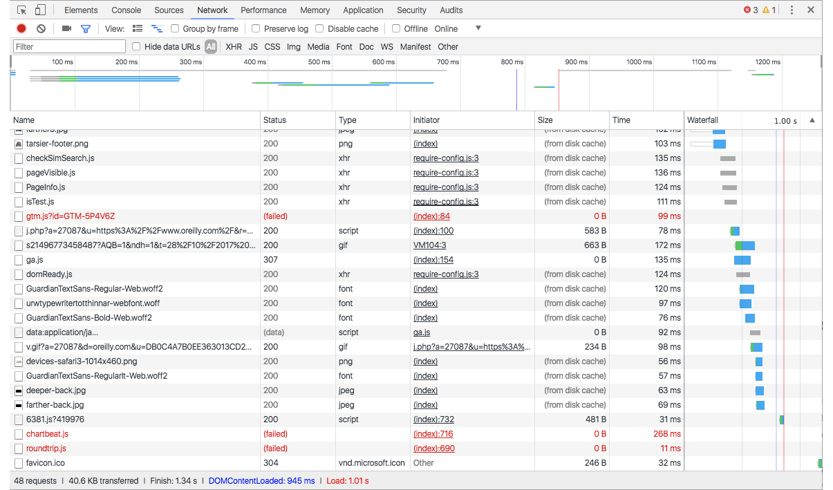
Every trip to the server in the form of an HTTP request takes a few milliseconds, and those milliseconds can add up. All those little Twitter widgets, Facebook Like buttons, and advertisements can make dozens of server requests each. You may be surprised to see how many server requests even a simple site makes.
If you’d like to see for yourself, you can use the Network tool available with the Developer tools in Chrome, Safari, or Firefox. The Network tool displays each request to the server and how many milliseconds it took. Here’s how you use it in Chrome (but all the browsers work similarly):
- Launch the Chrome browser and go to any web page.
- Go to the menu and select . A panel will open at the bottom of the browser.
- Select the Network tab in the tools view and load a web page. The chart (commonly referred to as a waterfall chart) shows you all the requests made and assets downloaded. The columns on the right show the amount of time each request took in milliseconds. At the bottom of the chart, you can see a summary of the number of requests made and the total amount of data transferred.
Figure 3-5 shows a portion of the performance waterfall chart for oreilly.com. You can poke around any site on the web this way. It can be very educational.
I won’t address site performance in deep technical detail in this book, but I do want you to remember the importance of keeping file sizes as small as possible and eliminating unnecessary server requests in your web design work.
For Further Reading
There are other techniques that are too technical for this book (and frankly, for me), and I figure if you are reading this book, you are probably not quite ready to become a site performance wizard. But when you are ready to take it on, here are some resources that should help:
- Lara Hogan has assembled a list of performance-related studies, tools, and resources at larahogan.me/design. You can also read her book, Designing for Performance (O’Reilly), there for free.
- High Performance Mobile Web: Best Practices for Optimizing Mobile Web Apps by Maximiliano Firtman (O’Reilly) covers optimization methods and tools to check your progress.
- Google’s site Make the Web Faster (code.google.com/speed/) is an excellent first stop for learning about site optimization. It compiles a number of excellent tutorials and articles as well as tools for measuring site speed.
Test Yourself
Here are a few questions that check your knowledge of the Big Concepts. If you are stumped, you can find the answers in Appendix A.
- List at least two unknown factors you need to consider when designing and developing a site.
- Match the technology or practice on the left with the problem it best addresses:
1. ____ Progressive enhancement
a. Assistive reading and input devices
2. ____ Server-side detection
b. Slow connection speeds
3. ____ Responsive design
c. All levels of browser capabilities
4. ____ WAI-ARIA
d. Determining which device is being used
5. ____ Site performance optimization
e. A variety of screen sizes
- Web accessibility strategies take into account four broad categories of disabilities. Name at least three, and provide a measure you might take to ensure content is accessible for each.
- When would you use a waterfall chart?