Table of Contents for
Learning Web Design, 5th Edition
 Learning Web Design, 5th Edition
Published by
O'Reilly Media, Inc., 2018
Learning Web Design, 5th Edition
Published by
O'Reilly Media, Inc., 2018
- cover
- Learning Web Design, Fifth Edition
- lwd5_title_copy
- lwd5_title_copy-1
- lwd5_contents
- Foreword
- Preface
- Part I. Getting Started
- 2. How the Web Works
- 3. Some Big Concepts You Need to Know
- Part II. HTML for STRUCTURE
- 5. Marking Up Text
- 6. Adding Links
- 7. Adding Images
- 8. Table Markup
- 9. Forms
- 10. Embedded Media
- Part III. CSS for Presentation
- 12. Formatting Text
- 13. Colors and Backgrounds
- 14. Thinking Inside the Box
- 15. Floating and Positioning
- 16. CSS Layout with Flexbox and Grid
- 17. Responsive Web Design
- 18. Transitions, Transforms, and Animation
- 19. More CSS Techniques
- 20. Modern Web Development Tools
- Part IV. JavaScript for Behavior
- 22. Using JavaScript
- Part V. Web Images
- 24. Image Asset Production
- 25. SVG
- Part VI. Appendices
- B. HTML5 Global Attributes
- C. CSS Selectors, Levels 3 and 4
- D. From HTML+ to HTML5
23
In this chapter
Where to get images
PNG, JPEG, GIF, and WebP
Image and screen resolution
Web image production strategy
How to make favicons
Unless you plan to publish text-only sites, chances are you’ll need images. For many of you, that might mean getting your hands on an image-editing program for the first time and acquiring some basic graphics production skills. If you are a seasoned designer, you may need to adapt your style and process to make graphics that are appropriate for web delivery.
In Chapter 7, Adding Images, we covered the basics of embedding images in the HTML document, including the difference between bitmapped graphic formats and the vector-based SVG. This chapter covers the fundamentals of the images themselves. We’ll start by reviewing sources for imagery. From there, we’ll get to know the file formats available for web graphics to help you decide which one to use. We’ll look at image resolution and how it relates to the resolution of the screens on which they appear, including high-density displays. I’ll also walk you through a series of questions that will help you form a strategy for creating images for your site. Finally, the chapter wraps up with a quick Favicon how-to.
Image Sources
You need to have an image to save an image, so before we jump into the nitty-gritty of file formats, let’s look at some ways to get images in the first place. There are many options: from scanning, shooting, or illustrating them yourself, to using available stock photos and clip art, to just hiring someone to create images for you.
Create Your Own Images
In most cases, the most cost-effective way to generate images for your site is to make your own from scratch. The added bonus is that you know you have full rights to use the images (we’ll address copyright in a moment). Designers may generate imagery with scanners, cameras, or a drawing program:
Photographs
You can capture the world around you and pipe it right into an image-editing program. Depending on the type of imagery you’re after, you may get sufficient quality with the camera in your phone. Keep in mind that it’s always a good idea to create high-resolution versions of your images and save smaller copies as needed.
Electronic illustration
If you have illustration skills, you can make your own image in a drawing or photo-editing application. Every designer has her own favorite tools and techniques. For logos and line drawings, I recommend starting with a vector drawing program like Adobe Illustrator, Corel Draw, or Sketch, and then saving to a web-appropriate copy as needed.
Scanning
Scanning is a great way to collect source material. You can scan almost anything, from flat art to small 3-D objects. Beware, however, the temptation to scan and use found images. Keep in mind that most images you find are probably copyright-protected and may not be used without permission, even if you modify them considerably. See the “Scanning Tips” sidebar for some how-to information.
Stock Photography and Illustrations
If you aren’t confident in your design skills, or you just want a head start with some fresh imagery, there are plenty of collections of ready-made photos, illustrations, buttons, animations, and textures available for sale or for free. Stock photos and illustrations generally fall into two broad categories: rights-managed and royalty-free.
Rights-managed
Rights-managed means that the copyright holder (or a company representing them) controls who may reproduce the image. In order to use a rights-managed image, you must obtain a license to reproduce it for a particular use and for a particular period of time. One of the advantages to licensing images is that you can arrange to have exclusive rights to an image within a particular medium (such as the web) or a particular business sector (such as the health-care industry or banking). You also know that the source of the image is verified (i.e., it is not stolen).
On the downside, rights-managed images get quite pricey. Depending on the breadth and length of the license, the price tag may be many thousands of dollars for a single image. If you don’t want exclusive rights and you want to use the image only on the web, the cost is more likely to be a few hundred dollars, depending on the source.
Getty Images (gettyimages.com) is the largest stock image house for rights-managed images, having acquired most of its competitors over recent years. It also offers royalty-free images, which we’ll look at next.
Royalty-free
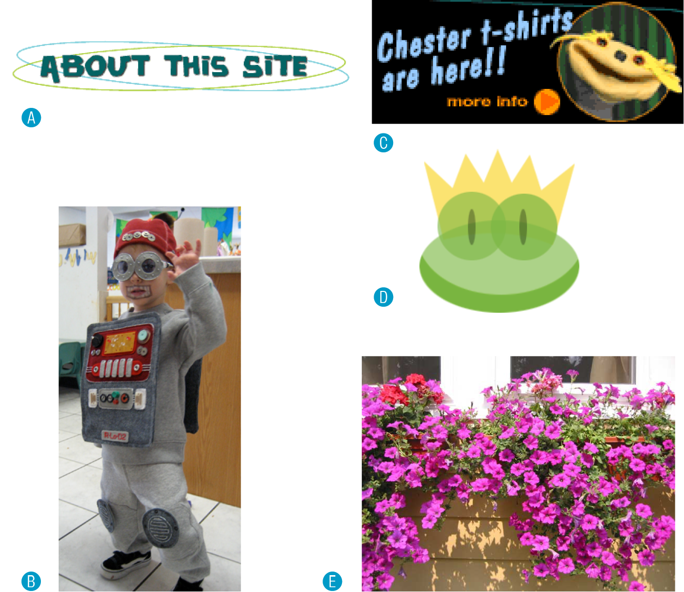
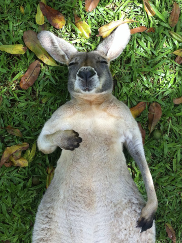
If you don’t have a four-digit or even three-digit budget for images, consider using royalty-free artwork for which you don’t need to pay a licensing fee. Royalty-free artwork is available for a one-time fee that gives you unlimited use of the image, but you have no control over who else is using it. Royalty-free images are available from the top-notch professional stock houses such as Getty Images for as little as 50 bucks for a small image appropriate for the web (like the blissed-out kangaroo in Figure 23-1), and from other sites for less (or even for free).
One of my favorite sources is iStockPhoto (istockphoto.com). They have a huge collection of images starting around US$10 a pop. You can buy one image at a time or get a subscription plan.
Creative Commons
Another way to get free images is to find photos and drawings released by the artists under a Creative Commons license. There are a few types of Creative Commons licenses, so be sure to check the terms. Some artists make their work free to use however you want; some artists ask only that you give them credit (“attribution-only”); and some limit the image use to non-commercial purposes.
There are a number of resources for images released on a Creative Commons license, but these are three good first stops:
Flickr Creative Commons (www.flickr.com/creativecommons)
The photo-sharing service Flickr is my first stop for finding photos released on a Creative Commons license. The quality varies, but I can usually find what I need (such as the red panda in Figure 16-28) for the cost of a photo credit.
Unsplash (unsplash.com)
Unsplash provides free images of top-notch quality, “gifted by the world’s most generous community of photographers.” It is the source of many of the food images I use in this book.
Wikimedia Commons (commons.wikimedia.org/wiki/Main_Page)
A sister site to Wikipedia, Wikimedia Commons is a vast resource of millions of Creative Commons and public domain images and other media files. They are contributed by the community and free to use.
Clip Art and Icons
Clip art refers to collections of royalty-free illustrations, animations, buttons, and other doodads that you can copy and paste for a wide range of uses. There are a number of resources online, and the good news is that some of these sites give graphics away for free, although you may have to suffer through a barrage of pop-up ads. Others charge a membership fee, anywhere from $10 to $200 a year. The drawback is that a lot of them are poor quality or kind of hokey (but then, “hokey” is in the eye of the beholder). The following are two sites to get you started:
Clipart.com (www.clipart.com)
This service charges a membership fee, but is well organized and tends to provide higher-quality artwork than the free sites.
#1 Free Clip Art (www.1clipart.com)
Another no-frills free clip-art site.
It is also easy to find icons for web pages and applications for free or for a low price (a simple search for “free icons” will do the trick). Here are two resources to start you off:
The Noun Project (thenounproject.com)
The Noun Project collects and organizes classic, one-color icons from around the world. Dozens of collections are available for free, and a yearly subscription fee gives you access to everything.
Icon Finder (www.iconfinder.com)
This is a good resource for full-color icons of all styles. Some are free, but most are available via a monthly subscription plan. Be sure to check the terms of the Creative Commons license, which varies by icon set.
Hire a Designer
Finding and creating custom images takes time and particular talents. If you have more money than either of those things, consider hiring a graphic designer, photographer, or illustrator to generate the imagery for your site for you. The advantage to hiring a professional is that you get custom images tailored to your message or brand, not just generic stock images. If you start with high-quality original images, you can use the skills you learn in this book to produce web versions as you need them.
Meet the Formats
Once you have your hands on some images, you need to get them into a format that will work on a web page. There are dozens of graphics file formats out there in the world. For example, if you use Windows, you may be familiar with BMP graphics, or if you are a print designer, you may commonly use images in TIFF and EPS format. On the web, bitmapped (pixel-based) images can be saved in the following formats (see Note): JPEG (“jay-peg”), PNG (“ping” or “Pee-en-gee”), GIF (pronounced “giff” or “jiff”), and WebP (I’ve seen it referred to as “weppy,” but “web-p” sounds fine to me).
There is also the vector format SVG (Scalable Vector Graphics) that we looked at it in terms of markup back in Chapter 7. SVG is a bit of an oddball in that it is generated by an XML text file. It is so unique, in fact, that I’ve given it its own chapter: Chapter 25, SVG. This chapter and the next focus primarily on the bitmap formats.
When you’re saving an image asset for a web page, it is important that it has the best image quality at the smallest file size. The first step to achieving those goals is making sure you save the image in the most appropriate format based on the image type. This section tackles terminology and digs deep into the features and functions of GIF, JPEG, PNG, and WebP. Knowing how they work will help you make the best format decision.
The Photogenic JPEG
One of the most popular graphic formats on the web is JPEG, which stands for Joint Photographic Experts Group, the standards body that created it.
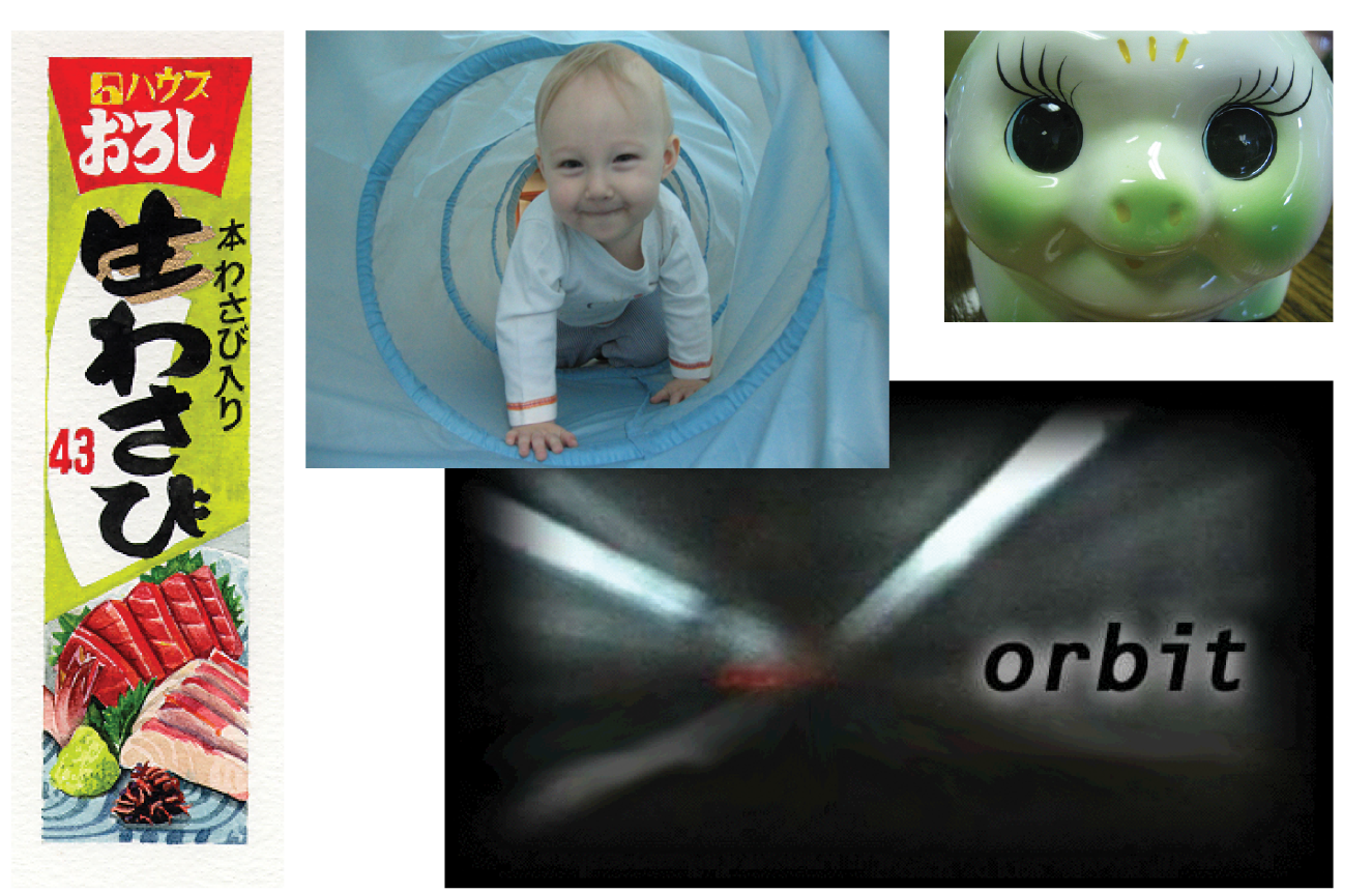
JPEG is the best format to use if your image is a photograph or contains soft, smooth color transitions (Figure 23-2). The JPEG compression scheme loves gradient and blended colors, but doesn’t work especially well on flat colors or hard edges.
24-bit Truecolor images
JPEGs are capable of displaying millions of colors in the RGB color space (also referred to as the Truecolor space; see Note). This is also known as 24-bit color because each of the three color channels (Red, Green, and Blue) is defined with 8 bits of information.
NOTE
RGB color is explained in
Displaying 24-bit color is one aspect that makes JPEGs ideal for photographs—they have all the colors you’ll ever need. By comparison, other formats such as PNG-8 and GIF use a palette that limits the number of colors in the image to 256 total (we’ll talk about why in a moment).
Lossy compression
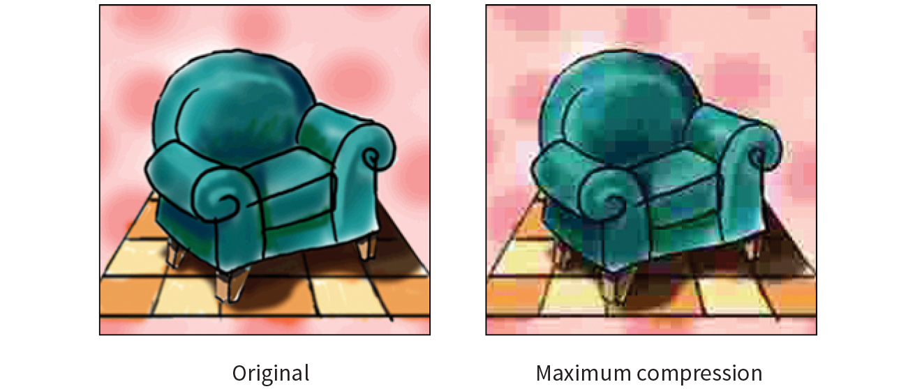
The JPEG compression scheme is lossy, which means that some of the image information is thrown out in the compression process (see Warning). Fortunately, this loss is not discernible for most images at most compression levels. When an image is compressed with high levels of JPEG compression, you begin to see color blotches and squares (referred to as artifacts) that result from the way the compression scheme samples the image (Figure 23-3).
WARNING
Cumulative Image Quality Loss
Be aware that once image quality is lost in JPEG compression, you can never get it back again. For this reason, you should avoid resaving a JPEG as a JPEG. The image loss is cumulative—in other words, you lose image quality every time.
It is better to hang on to the original image and export JPEG copies as needed. That way, if you need to make a change, you can go back to the original and do a fresh save or export.
In most programs, you can control how aggressively you want the image to be compressed with a Quality setting when saving or exporting. This involves a trade-off between file size and image quality. The more you compress the image (for a smaller file size), the more the image quality suffers. Conversely, when you maximize quality, you also end up with larger files. The best compression level is based on the particular image and your objectives for the site.
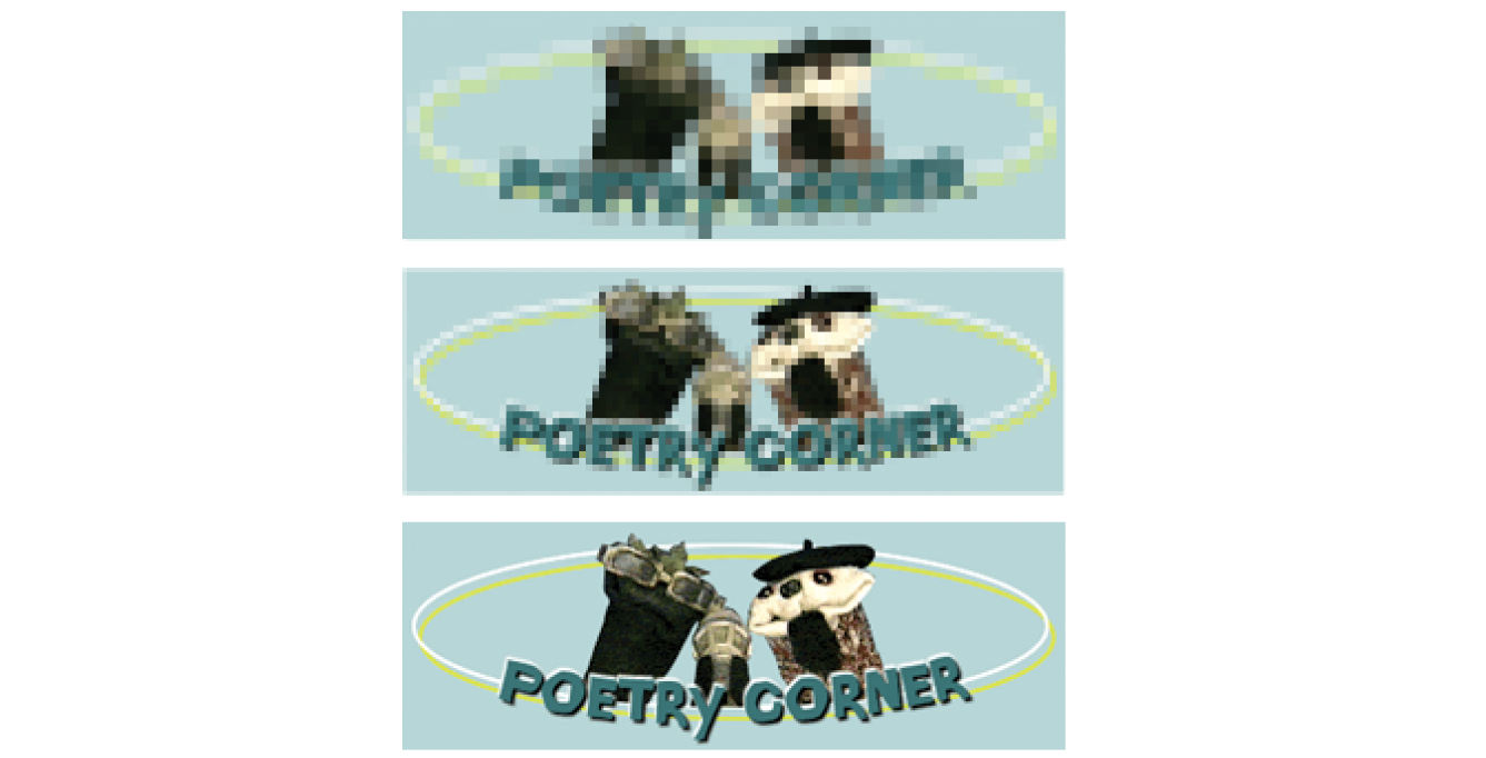
Progressive JPEGs
Progressive JPEGs display in a series of passes, starting with a low-resolution version that gets clearer with each pass, as shown in Figure 23-4. In some image editing programs, you can specify the number of passes it takes to fill in the final image (3, 4, or 5).
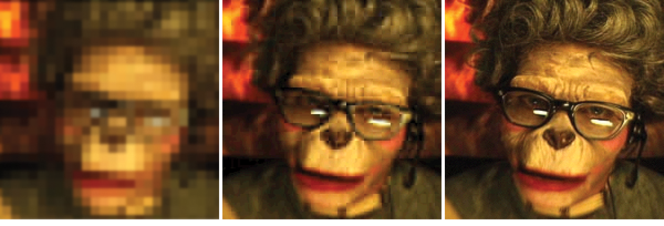
The advantage to using progressive JPEGs is that viewers can get an idea of the image before it downloads completely. Also, making a JPEG progressive usually reduces its file size slightly. The disadvantage is that progressive JPEGs take more processing power, which can make them problematic for low-end mobile devices. Despite that minor hitch, the best practice is to make all JPEGs progressive, not only for the smaller file size, but because they appear on the page faster, improving perceived performance.
The Powerful PNG
The PNG (Portable Network Graphics) format was designed to replace GIF for online purposes and TIFF for image storage and printing. A PNG can be used to save many image types: 8-bit indexed color, 24- and 48-bit RGB color, and 16-bit grayscale, but for the purposes of web production, you need to choose only between 8-bit (PNG-8) and 24-bit (PNG-24).
Despite getting off to a slow start in terms of browser support, PNGs have become developers’ first choice in web graphics formats, and for good reason. PNGs offer an impressive lineup of features:
- Lossless compression
- Multiple-level (alpha) or simple on/off (binary) transparency
- Progressive display in multiple passes
- Embedded gamma (brightness) adjustment information
- Embedded text for attaching information about the image
PNG-8
PNG-8 is good for images that have flat colors, such as logos, line art, and icons (Figure 23-5). You can save photographs or textured images too, but they won’t be saved as efficiently, resulting in larger file sizes. However, PNG-8 does work nicely for images with a combination of small amounts of photographic imagery and large, flat areas of color. The two key characteristics of PNG-8s are that they use an indexed color model and they support transparency. These concepts are worth exploring a bit deeper.

Note
Because they are simple illustrations, the images in Figure 23-5 could also have been drawn with vectors and saved in SVG format.
8-bit indexed color
I mentioned earlier that PNG-8 files contain a maximum of 256 colors. Let’s talk about why.
PNG-8 files are indexed color images that contain 8-bit color information (they can also be saved at lower bit depths). Let’s decipher that statement one term at a time. First, 8-bit means PNG-8s can contain up to 256 colors—the maximum number that 8 bits of information can define (28 = 256). Lower bit depths result in fewer colors and also reduce file size. For example, 4-bit images contain only 16 colors (24 = 16).
Note
GIFs are also 8-bit indexed color images, so this discussion of bit depth and palettes applies to GIFs as well.
Indexed color means that the set of colors in the image, its palette, is stored in a color table (also called a color map). Each pixel in the image contains a numeric reference (or index) to a position in the color table. Let’s make this clear with a simple demonstration. Figure 23-6 shows how a 2-bit (4-color) indexed color image references its color table for display. For 8-bit images, there are 256 slots in the color table.
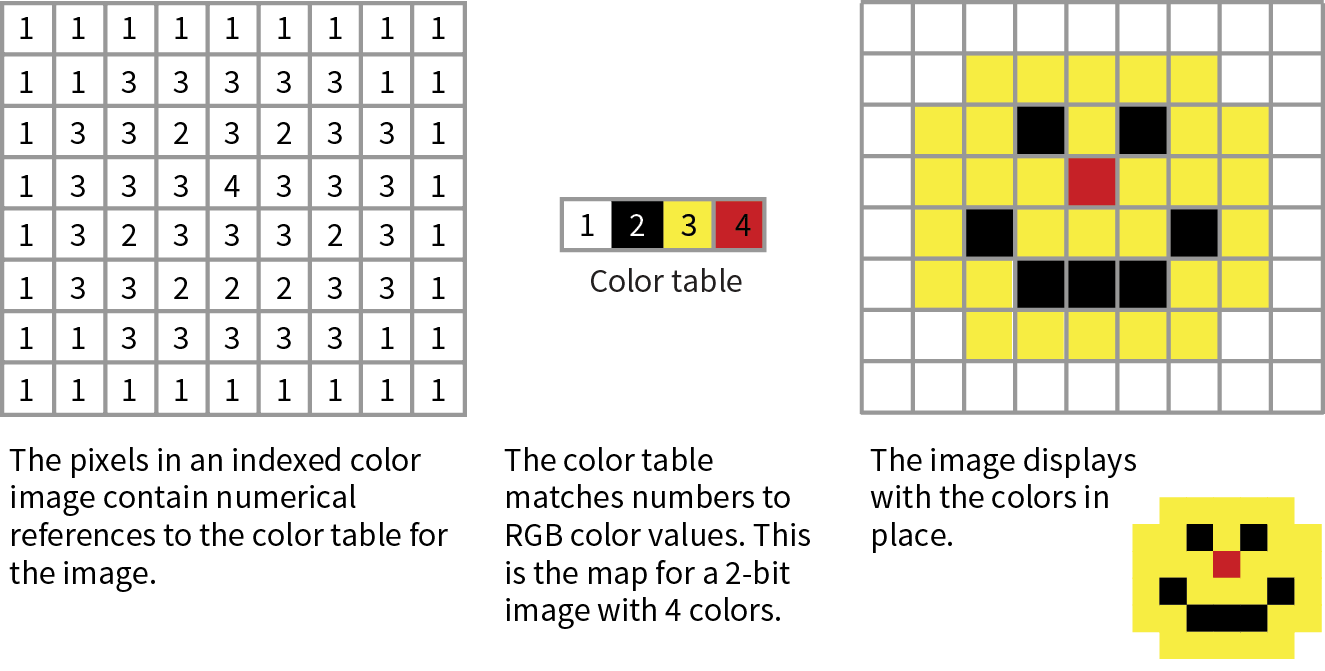
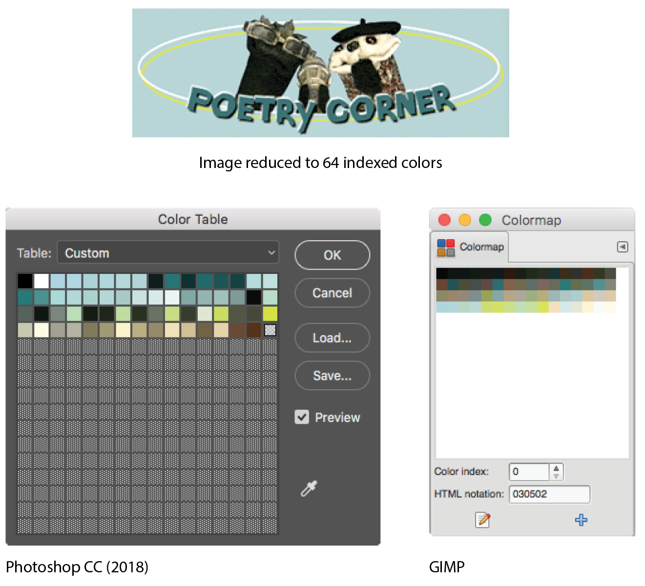
Image-editing programs generally allow you to view the color table for an image. In Photoshop, you can view (and even edit) the color table by selecting (Figure 23-7). In GIMP, go to (the image must be converted to indexed color mode first).
Most source images (scans, illustrations, photos, etc.) start out in RGB format, so they need to be converted to indexed color in order to be saved as a PNG-8 or GIF. When an image goes from RGB to indexed mode, the colors in the image are reduced to a palette of 256 colors or fewer, a process known as quantization. For most programs, including Photoshop, the conversion takes place when you save or export the image. Some image-editing programs, like GIMP, may require you to convert the image to indexed color manually first, and then export the PNG-8 as a second step.
In either case, you might be asked to select a palette for the indexed color image. The sidebar “Common Color Palettes” outlines the various palette options available in the most popular image tools. It is recommended that you use Selective or Perceptual in Photoshop and Optimized Median Cut in PaintShop Pro for the best results for most image types. In GIMP, “Generate optimum palette” should do the trick, although it also provides a long list of crazy custom palettes you could use (Coldfire, Plasma, Paintjet, and Bears, to name just a few).
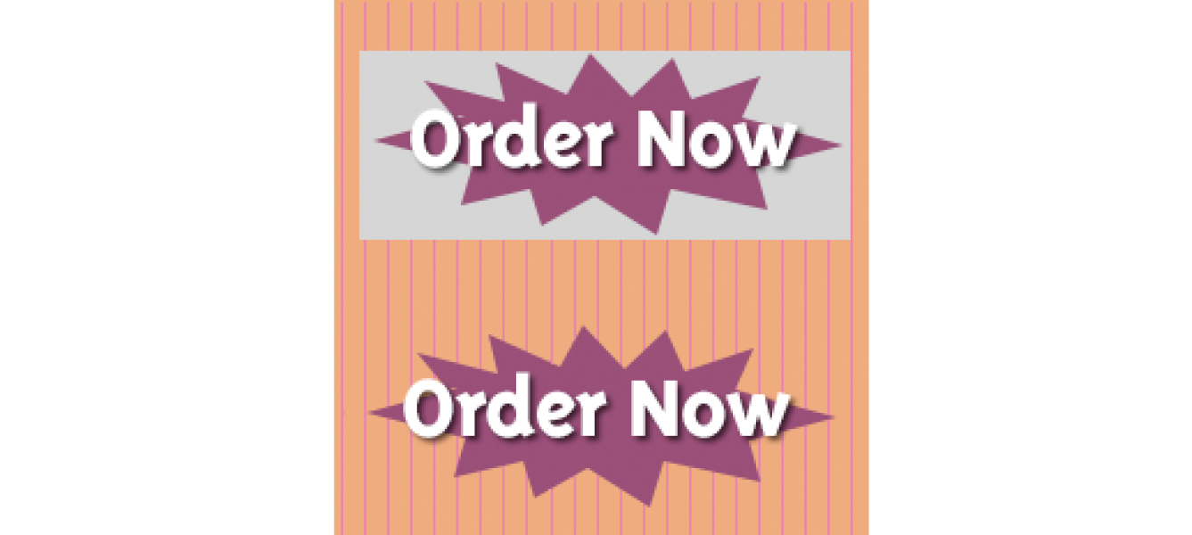
Transparency
You can make parts of a PNG-8 image fully transparent so that the background image or color shows through. Although all bitmapped graphics are rectangular by nature, transparency creates the illusion that the image has a more interesting shape (Figure 23-8). In the most commonly supported type of PNG-8 transparency, pixels are either fully transparent or fully opaque, also known as binary transparency.
PNG-8 files are also capable of storing multiple levels of transparency in their indexed color maps, allowing soft edges and shadows to blend in with the background. In the past, although browsers supported PNG-8 with variable levels, it was a challenge to find an image-editing tool that could create them. Today, you can create transparent PNG-8s right from Photoshop CC, and there are a number of tools for converting a PNG-24 to PNG-8 while maintaining its transparency levels.
We’ll look at both binary and variable transparency as it applies to PNG-8 files in the “Working with Transparency” section in Chapter 24, Image Asset Production.
PNG-24
A PNG can also be saved as a Truecolor image, with each channel (red, green, and blue) defined by 8- or 16-bit information, resulting in 24- or 48-bit RGB images, respectively. In many graphics programs, 24-bit RGB PNGs are identified as PNG-24. It should be noted that 48-bit images, while great for storage of high-quality originals, are useless for the web becuse of file size, and even 24-bit images may not be the best choice. Like JPEG, PNG-24 is good for photographic images where you want the maximum color range.
The two key characteristics of PNG-24s are that they are “lossless” and they can contain multiple levels of transparency. Let’s dig into that a bit deeper.
Lossless compression
We learned that in JPEG’s lossy compression algorithm, image data is tossed out in order to reduce the size of the file. PNG-24 files are lossless, meaning nothing is sacrificed. Because it is a lossless format, a 24-bit PNG is nearly always significantly larger than a lossy JPEG of the same image. For that reason, JPEGs are the best choice for photos on the web.
However, PNG-24 was the first format to include a killer feature that has made it one of the web’s most popular formats, and that is…
Alpha transparency
PNG-24 files can contain multiple levels of transparency, commonly referred to as alpha transparency. They do this by storing 8-bit transparency information (256 levels) in a fourth channel, called the alpha channel.
Note
You sometimes see PNG-24 with alpha transparency referred to as a 32-bit PNG because there are 8 bits for each of four channels: red, green, blue, and alpha.
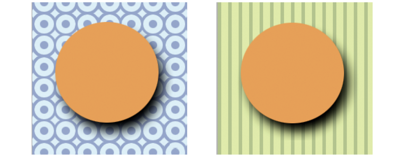
Figure 23-9 shows the same PNG against two different background images. The orange circle is entirely opaque, but the drop shadow contains multiple levels of transparency, ranging from nearly opaque to entirely transparent. The multiple transparency levels stored in the PNG allow the drop shadow to blend seamlessly with any background. The ins and outs of alpha transparency will be addressed in the section “Working with Transparency” in Chapter 24.
Additional features
There are a few other features that make PNG a Pretty Nifty Graphic format (see what I did there?).
Gamma correction
Gamma refers to the brightness setting of a monitor. PNGs can be tagged with information regarding the gamma setting of the environment in which they were created. When implemented in the image and the browser, the PNG retains its intended brightness and color intensity. Unfortunately, this feature is not consistently supported. In fact, image-optimizing tools typically remove the chunk of code that controls gamma. With poor browser support for gamma anyway, nothing is lost but unnecessary bytes.
Embedded color profile information
The PNG format can also store the ICC color profile information of the system it was created on. In fact, if you are finding that it is difficult to match an RGB value in a PNG to the same RGB value in a background color, the embedded color profile is to blame. The block of code for storing ICC profiles also generally gets tossed by image optimizers.
Embedded text
PNGs also have the ability to store strings of text. This is useful for permanently attaching text to an image, such as copyright information or a description of what is in the image. Ideally, the meta-information in the PNG would be accessible via right-clicking the graphic in a browser, but this feature has never been implemented.
Progressive display (interlacing)
PNGs can also be coded for interlaced display, revealing the image in a series of seven passes, filling in the image both horizontally and vertically. Interlacing adds to the file size and is usually not necessary, so to keep files as small as possible, turn interlacing display off. I’m finding that most tools these days don’t give you the option to turn it on anyway.
In conclusion…
Before we move on, here’s the skinny on what you should know about PNGs:
- If you have a bitmapped image with areas of flat color, with or without transparent areas, PNG-8 is the most appropriate format as it will likely result in the smallest file size.
- If you need variable levels of transparency, regardless of the image type, PNG-24 may be the only option based on the tools you are working with; however, the file will be smaller as a PNG-8.
- If you have a photographic image with no transparency, you could use PNG-24, but JPEG will almost always result in a smaller file.
Ol’ Grandpa GIF
The GIF (Graphic Interchange Format) file was the first image format supported by web browsers and for a while, it was the only file format that would display in a browser window. (I know. I was there.) Although not designed specifically for the web, it was adopted for its versatility, small file size, and cross-platform compatibility.
Note
You may see GIF listed as “Compuserve GIF” because Compuserve invented the format. The patent on GIF which was owned by Unisys expired in 2006.
These days, GIF is synonymous with “animated viral meme,” and, as the only well-supported web image format capable of animation, the GIF format still has a place at the table (at least until APNG and animated WebP have more thorough support). For still images, however, GIF has lost ground to the PNG format, which can do everything GIF can do and usually better. Furthermore, newer graphics tools are simply omitting the option to save files in GIF format. Our old friend GIF may be heading for retirement. That’s OK…we just fight about how to pronounce it anyway.
That said, let’s quickly look at what makes GIF tick.
8-bit indexed color
Like PNG-8, GIF is an 8-bit indexed color format. You can save a GIF at even lower bit depths, resulting in fewer colors and smaller file sizes.
GIF compression
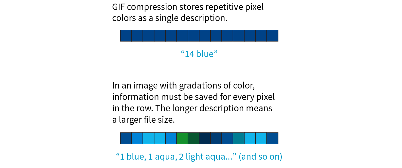
GIF compression is lossless, although some image information is lost when the RGB image is converted to indexed color. It uses a compression scheme (called “LZW” for “Lempel-Ziv-Welch”) that takes advantage of repetition in data. When it encounters a string of pixels of identical color, it compresses them into one data description (Figure 23-10). This is why images with large areas of flat color condense better than images with textures. PNG uses a similar like-color compression scheme.
Transparency
GIF images use binary transparency, in which pixels are either entirely opaque or transparent.
Interlacing
Interlacing makes a GIF display in a series of passes, like progressive JPEGs. Each pass is clearer than the pass before, until the image is fully rendered in the browser window (Figure 23-11). Over a fast connection, these effects (interlacing or image delays) may not be perceptible. However, over slow connections, interlacing large images may be a way to provide a hint of the image to come.
Animation
Another feature built into the GIF file format is the ability to display simple animations (Figure 23-12). Many of the spinning, blinking, fading, or otherwise moving ad banners you see are animated GIFs, and they certainly show up in your social media feeds.

Animated GIFs contain a number of animation frames, which are separate images that, when viewed together quickly, give the illusion of motion or change over time, kind of like a flipbook. All of the frames are stored within a single GIF file along with settings that describe how they should be played. Settings include whether and how many times the sequence repeats, how long each frame stays visible (frame delay), the manner in which one frame replaces another (disposal method), whether the image is transparent, and whether it is interlaced.
There are many tools for creating animated GIFs (just do a quick search). Many are web apps that you can use right in the browser or mobile device, and many are free. You can also make an animated GIF in Photoshop by using the Timeline window and clicking Create Frame Animation.
The Performant WebP
There’s a new image format in town, and it’s here to beat up all the other formats. Google calls its open source WebP format “the Swiss Army knife of image formats.” It has virtually all the features we’ve looked at in JPEG, PNG, and GIF at sizes that are typically 25–35% smaller:
Lossless or lossy compression
WebP can be saved in a lossy format (like JPEG) or lossless (like PNG). Its lossy compression scheme uses the same encoding used in the VP8 video codec.
Alpha transparency
WebP has an alpha channel for multiple levels of transparency, like PNG-24. Alpha transparency can be used with either the lossless (PNG-like) image compression or—and this is special—lossy (JPEG-like) compression. It is the only format that can combine a lossy RGB channel with a lossless alpha channel, resulting in a file that is 60–70% smaller than a PNG-24 of the same image.
Animation
It is also possible to animate WebP images. Sorry GIF, there goes your advantage.
Metadata
Like PNG, the WebP container can store metadata right in its code.
Color profile
The WebP container can also embed color profile (ICC) information.
Support
Here’s where we get to the “sad trombone” portion of the story. Because WebP is new, it has sparse browser support. As of this writing, it is supported in only newer Chrome, Android, Opera, Vivaldi, and Samsung browsers. But that doesn’t mean you can’t use it! The modern web developer knows it’s a good approach to supply the best (in this case, fastest) experience to browsers that can handle it and the next best thing to the rest.
You can use Modernizr (covered in Chapter 19, More CSS Techniques) to detect WebP in its lossy, lossless, alpha-channel, and animated varieties. You can also use the picture element to deliver a .webp image to browsers that can use it and a JPEG as a fallback, as we saw back in Chapter 7:
<picture> <sourcetype="image/webp"srcset="pizza.webp"> <img src="pizza.jpg" alt="pizza"></picture>
It is also common to have the server make the call and deliver WebP images when it detects that the browser supports them (based on the “accept encoding header”). Backend solutions are beyond the scope of this discussion, but it’s an option you should be aware of.
Creating WebP files
As with browsers, it will take a while for WebP to find its way into image creation tools. You can already make WebP files in Sketch, Pixelmator, and a few other graphics programs. You will find a current list of supporting programs on the WebP Wikipedia page (en.wikipedia.org/wiki/WebP). There is word that full WebP support will be added to GIMP in version 2.10, which has not yet been released as of this writing.
If you use Adobe Photoshop, there are two plug-ins that let you save to WebP format. The first, by Toby Thain, is at telegraphics.com.au/sw/product/WebPFormat, and a newer one by Brendan Bolles is available atgithub.com/fnordware/AdobeWebM). Once you install the plug-in, you’ll see WebP in the list of formats you can save to.
Finally, you may also use the cwebp command-line tool (see, they’re not just for coders!) to convert PNG and JPEG images to WebP format. The corresponding dwebp command converts WebP to PNG.
Where to learn more
WebP has an official site at developers.google.com/speed/webp, where you will find detailed documentation, an explanation of its compression schemes, updated lists of supporting tools and browsers (including links to download the aforementioned plug-ins and command-line tools), and a gallery of samples. It’s definitely worth reading if you enjoy geeking out on image formats. WebP is certainly worth keeping an eye on.
Choosing the Best Bitmapped Format
The first step to making quality web graphics that maintain quality and download quickly is choosing the right format. Table 23-1 provides a good starting point. Because of poor support for WebP as of this writing, I will stick with the supported bitmap formats PNG, JPEG, and GIF here.
Note that SVG should be your first choice for illustrations and icons with flat colors. SVG may also result in smaller files for images with a combination of flat colors and a small areas of bitmapped image, gradients, or effects like drop shadows. You’ll learn all about them in Chapter 25, but for now, Table 23-1 should help you sort out the bitmapped file options.
|
Table 23-1. Choosing the best bitmapped (raster) file format |
||
|
If your image... |
use... |
because... |
|
Is graphical, with flat colors |
8-bit PNG or GIF |
PNG and GIF excel at compressing flat color. |
|
Is a photograph or contains graduated color |
JPEG |
JPEG compression works best on images with blended colors. Because it is lossy, it generally results in smaller file sizes than 24-bit PNG. |
|
Is a combination of flat and photographic imagery |
8-bit PNG or GIF |
Indexed color formats are best at preserving and compressing flat color areas. The pixelation (dithering) that appears in the photographic areas as a result of reducing to a palette is usually not problematic. |
|
Requires transparency |
GIF or PNG-8 |
Both GIF and PNG allow on/off transparency in images. |
|
Requires multiple levels of transparency |
PNG-24 or PNG-8 |
Only PNG supports multiple levels of transparency. PNG-24s with alpha transparency have a much larger file size, but it is easier to find tools to create them. WebP also supports alpha transparency, and may be a better option once it is better supported. |
|
Requires animation |
GIF |
GIF is the only supported format that can contain animation frames. APNG and WebP may be better options in the future. |
That concludes our exploration of image formats. I think we just took the very long way around to say, “if it’s a photo, use JPEG, and if it’s mostly flat colors, use PNG-8,” but I think it’s important to understand why.
Image Size and Resolution
There is a new term floating around to describe folks who design web pages and apps: screen designer. I like it. As the web and smartphones evolve, it is clear that the requirements and concerns of designing for screens are distinct from designing for print. As a web designer, you will need to be well versed in how images display on screens, so let’s zoom in.
One thing that GIF, JPEG, PNG, and WebP images have in common is that they are all bitmapped (also called raster) images. When you zoom in on a bitmapped image, you can see that it is like a mosaic made up of many pixels (tiny, single-colored squares). These are different from vector graphics that are made up of smooth lines and filled areas, all based on mathematical formulas. Figure 23-13 illustrates the difference between bitmapped and vector graphics.
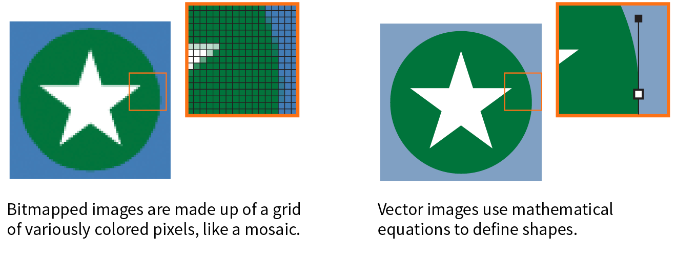
Image Resolution
Image-editing programs keep track of how many pixels an image has per inch. This pixel per inch (ppi) measurement is the resolution of the digital image. When an image is printed on paper, higher ppi means sharper, higher quality because there is more information packed into each square inch (see the “DPI Versus PPI” sidebar). In the print world, image resolutions of 300ppi and 600ppi are common.
On the web, however, the notion of “inches” is irrelevant because the final display size of the image is dependent on the resolution of the screen on which it is displayed (Figure 23-14).
If we’re throwing out “inches,” we have to toss out “pixels per inch” as well. The only thing we know for sure is that the graphic in Figure 23-14 is 72 pixels across, and it will be twice as wide as a graphic that is 36 pixels across. Here’s the bottom line: web images are measured in number of pixels, and the ppi at which they are created is irrelevant.
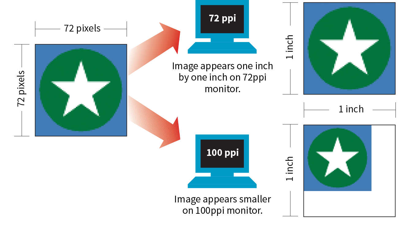
That said, it is the recommended practice to create images at 72ppi if you are designing in a bitmap image editor like Photoshop or GIMP. This is the default and keeps images at roughly the size they’ll appear on a desktop monitor. You are welcome to create your images at a different ppi, but just be sure to be consistent so images don’t get resized when you’re copying and pasting from one file to another.
Screen Resolution
Screen displays are made up of pixels, so you can measure their resolution in pixels per inch (ppi) as well. This is often referred to as the pixel density of the screen (see Note).
Note
You may see ads for screens with “a screen resolution of 2560 × 1440,” but that’s not its “resolution,” that’s its screen dimension. Resolution is a measure of pixel density.
The first Macintosh computers had 72ppi screens, which is pretty crude by today’s standards. Early PCs used 96ppi. These days, standard desktop and laptop monitors have resolutions of about 109 to 160ppi. Over the years, manufacturers have been pushing resolution of displays higher and higher, which leads us to...
High-density displays
From the 1980s to 2010, we could pretty much count on the pixels in our images mapping one-to-one with the hardware pixels in the desktop monitor, as shown in Figure 23-14. Of course, there were exceptions—browsers could zoom images larger or smaller on command, and images were scaled down to fit on smartphone screens—but that was the general rule.
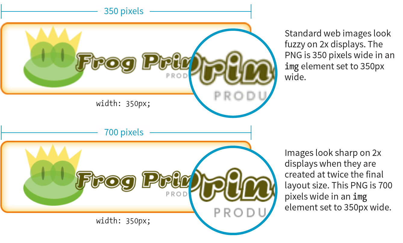
There was a seismic shift in 2010, however, when Apple introduced the iPhone 4 with its Retina display. The Retina display packed literally twice the number of pixels into the same physical screen space, resulting in images that were much sharper (remember, the more pixels per inch, the better the image quality). The flip side of that, of course, was that the bitmapped images we were already using got rendered by twice as many pixels, and ended up looking a bit blurry (Figure 23-15).
The Retina screen was just the beginning. There are now both 2x and 3x Apple devices (including tablets and laptops), and Android devices come in with 1.5x, 2x, 3x, and even 4x standard pixel densities. As a result, an actual device pixel is so small that images and text would be illegibly tiny if they were mapped one to one. What to do?!
Reference pixels: PT and DP
If you think back to our responsive images discussion in Chapter 7, you’ll remember that we’ve got a solution. High-resolution devices use a measurement called a reference pixel that can be used for the purposes of layout. Reference pixels go by different names and get calculated slightly differently depending on the operating system, but they enable us to specify pixel sizes without getting caught up in pixel densities.
Apple calls its reference pixels points (PT). One point on a standard 1x screen equals one device pixel. On a 2x screen, a point is 2 × 2 device pixels, and on 3x screens, a point is 3 × 3 device pixels. They all look about the same size because the high-resolution pixels are so incredibly small. Android calls its reference pixels device-independent pixels, or DiP, or simply DP. They are always equal to one pixel at 160ppi, but they work the same way.
You would probably use the terms PT and DP more when designing graphics to be used in native smartphone apps. For the web, it is sufficient to do the layout design in pixels and relevant CSS units. For example, you would say that the image in Figure 23-15 has a width of 350 (reference) pixels in the layout, even though the image file itself is 700 pixels wide for 2x displays.
The Upshot
At the end of the day, you can go about your business creating images at the pixel dimensions you intend for the layout. For important images, however, you may decide that you want them to look as crisp as possible on high-density displays. In that case, you’ll need to create several versions and deliver them with responsive image markup or let the server handle it. If you have a product shot that appears at 150 × 150 pixels at 1x, you’ll need at least a 2x version (300 × 300) and perhaps a 3x version (450 × 450) as well, knowing that they will all occupy 150 reference pixels in the layout.
In Chapter 24, we’ll look at tools and techniques for creating multiple image sizes aimed at high-density displays. The markup for delivering the right image size to the right device is covered in Chapter 7.
Image Asset Strategy
Now you know where to get images, are acquainted with the various web format options, and have a feel for screen resolution. Throughout this book, you’ve also gotten to know the important principles of performance and Responsive Web Design. Let’s put all of this know-how together in a strategy for approaching image production.
As a conscientious web designer concerned with providing the best experience across a wide range of devices, you should have these priorities in mind when creating graphics for a site:
- Keeping the file sizes of images as small as possible
- Minimizing the number of HTTP requests to the server
- Not downloading more image data than is needed for devices with smaller screens
- Delivering high-quality images to high-density displays
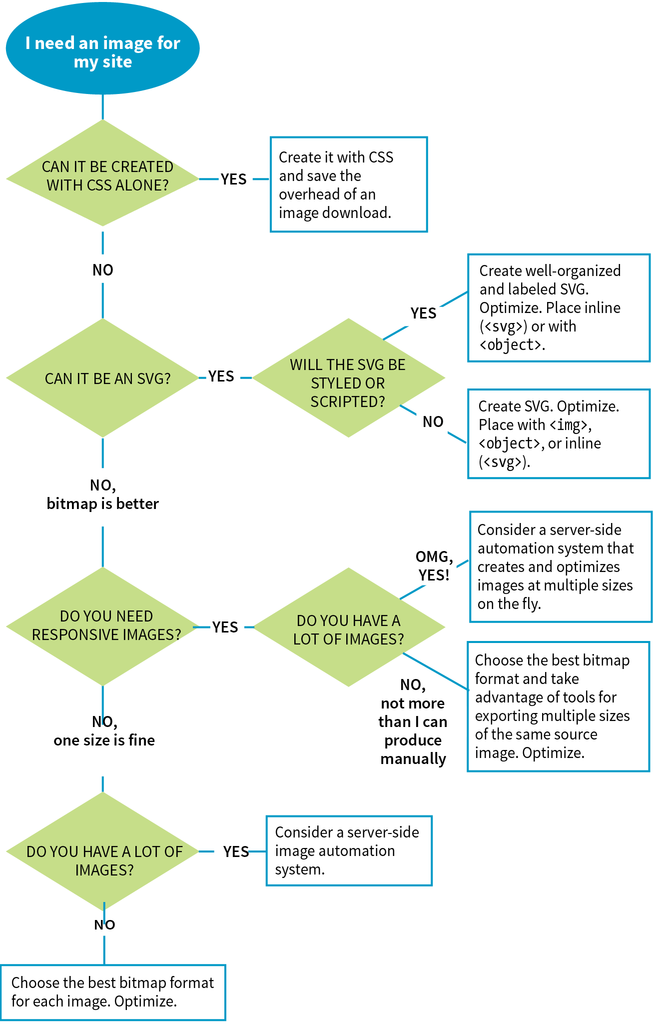
It may be helpful to approach your image requirements systematically, ruling out classes of images and unnecessary tasks, so you are left with a clear set of production options. Figure 23-16 diagrams a series of questions you can use to cull your image production options. In this section, we’ll address each step of the process at a conceptual level. In Chapter 24, you’ll get to try out specific image production techniques that address these goals.
First off, let’s determine whether you need an image at all.
Can It Be Done with CSS?
Before you break out Photoshop, consider whether you can achieve what you’re after with CSS alone. Not only will the effect be a fraction of the file size, but you’ll also avoid another call to the server.
Effects like rounded corners and gradients that once required images are now achievable with CSS properties (border-radius and radial-gradient/linear-gradient, respectively).
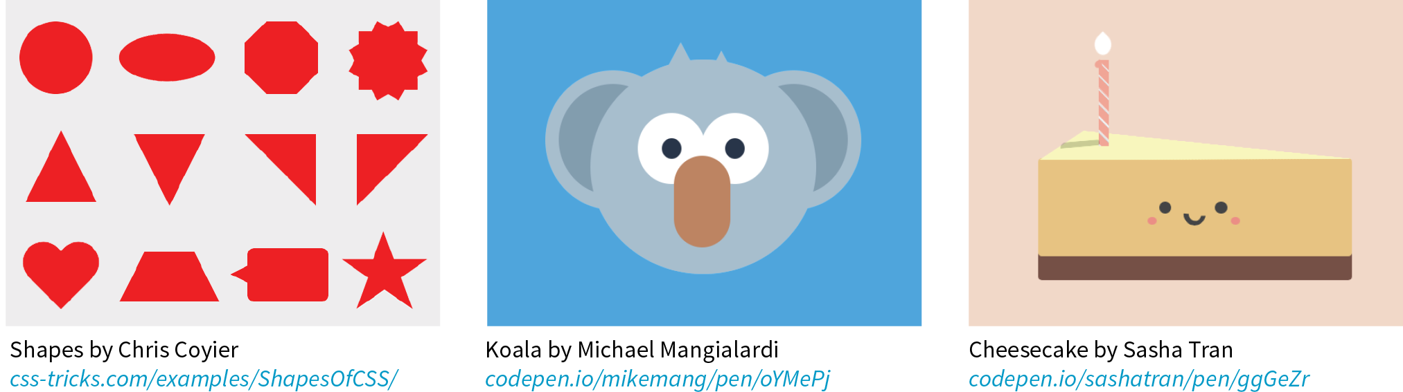
It is also possible to make little drawings with CSS, which may be useful in place of icons (Figure 23-17). Basic shapes such as circles, rectangles, triangles, and more can be created with empty div elements and some trickery with borders and transforms. Some people have created amazingly complex illustrations using HTML and CSS, but the technique, which had its heyday around 2010–11, is largely for demonstration purposes rather than for serious production.
I don’t want to stray too far from image production in this chapter, so I will leave you with these articles, where you can learn more about CSS shapes and illustrations:
- “The Shapes of CSS,” a gallery of one-element CSS shapes with the code used to create them, compiled by Chris Coyier: css-tricks.com/examples/ShapesOfCSS/
- “Beginners Guide to Pure CSS Images,” a step-by-step tutorial by Michael Mangialardi for creating the koala bear in Figure 23-17: medium.com/coding-artist/a-beginners-guide-to-pure-css-images-ef9a5d069dd2
- A collection of “not-so-semantic drawings made with CSS,” on Codepen, collected by Hugo Giraudel: codepen.io/collection/kFeDz/3/
If you need something more complex than a CSS effect, it’s time to think about image formats.
Can It Be an SVG?
If your image is a logo, icon, or other illustration, creating it in a vector drawing tool and saving it as an SVG offers the benefits of small file size and resolution independence. Now that browser support is reliable, it is a good solution to dealing with the variety of devices and displays we need to design for.
If you place the SVG code inline, with the svg element, you save another HTTP request and gain the ability to style and script the elements. Or, if a static illustration is all you need, embedding the SVG in the document with the img element is a perfectly fine option.
In Chapter 25, you’ll take a long journey through the SVG format, so I won’t say much more here other than the fact that SVG should be your first choice if you can create the image or illustration in vector format.
If SVG is not appropriate for your image type or if your target audience is known to use non-supporting browsers in significant numbers, then you may need to go with a bitmapped format. There are still a few things to consider.
What Is the Best Bitmapped Format?
Image format has a large impact on file size, so choosing the most appropriate format for your image is an important step to optimizing images. As we learned, PNG-8 is the best option for images with areas of flat color, and JPEG is the best format for photographic images. In Chapter 24, I’ll show you how to save images in various formats, and you’ll get to see how format affects file size firsthand.
Consider also saving the image in the much smaller WebP format and using the picture element to deliver it to the browsers that can render it (see the “Responsive Image Markup” section in Chapter 7, for details). It helps speed things up on supporting browsers and provides a reliable JPEG or PNG fallback for the others.
With the format decided, it’s time to start thinking about how many versions of each image you need to create.
Does Your Layout Require Responsive Images?
The next thing to consider is whether your layout requires responsive images.
No, one size is fine
Some pages, such as text-heavy pages with small illustrations, might get by fine with just one version of each image that serves all screen sizes. If that is the case, save or export your image in the most appropriate file format and you’re nearly done. The final step is to optimize the image to make it as small as it can be. Optimization techniques are discussed in detail in Chapter 24.
Yes, I need each image saved at multiple sizes
Your responsive layout may require that you take advantage of the responsive image techniques we outlined in Chapter 7. To recap, “responsive images” refers to the process of providing images that are tailored to the user’s viewing environment. This includes preventing browsers on small screens from downloading more image data than they need as well as providing images large enough to look crisp on high-density displays. You can also provide alternative versions of the image based on content (called the “art direction” scenario) or to take advantage of newer formats, such as WebP.
If you’re going the responsive images route, things start getting interesting.
Does Your Site Have a Lot of Images?
Yes, my site has a ton of images (Hint: Automate it!)
Although it is terrific to have an HTML solution for getting the right images to the right browsers, the current system is a bit cumbersome with stacks of code and the need to produce multiple images. If you work on a large, image-heavy site, it could prove to be unmanageable. Image processing is a task that begs to be automated. The solution: let the server do it!
Fortunately, there are many tools and services, both open source and for pay, that let the server do the work of creating appropriate image versions on the fly. You upload the image at the highest quality and largest size required and let the server handle the rest—no need to create and store multiple versions of every image. Some services go beyond simple resizing, including the ability to crop images intelligently, add special effects such as sepia tones, or otherwise transform images on the fly.
Some content management systems have image-resizing features built in. Another option is to install software or an open source script (like Glide, glide.thephpleague.com) on your own server. Bear in mind, however, that requiring JavaScript to be running is less than ideal. There are also third-party solutions that provide image-resizing services (like Cloudinary.com, Akamai.com, or Kraken.io), for a fee. For large, image-heavy sites, they are worth looking into.
For more information, read “Image Resizing Services” by Jason Grigsby of Cloud Four (cloudfour.com/thinks/image-resizing-services/). He maintains a list of current image services, which you can find linked from the article.
No, I can handle images manually
If your site has a reasonable number of images that are updated on a reasonable schedule, you should be able to produce them by hand on your computer and upload them to the server. The good news is that there’s a whole slew of new tools designed especially to support the web image asset production process, including ways to create several versions at once and to optimize them in batches. Even our old standby, Adobe Photoshop, is evolving to better support the needs of web image producers. We’ll look at these tools in the following chapter.
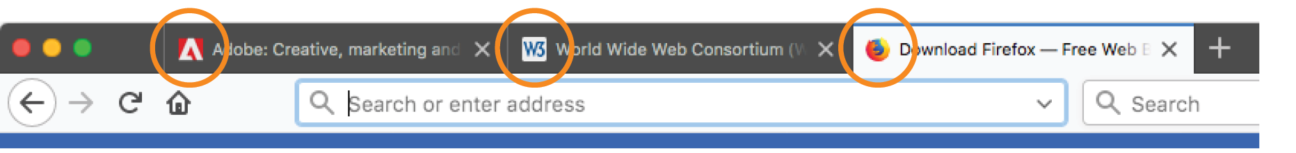
Favicons
As long as we’re talking about images, there is one last site-related image to cover: the favicon. A favicon is the little icon that shows up to the left of the page title in the browser tab and in bookmark lists (Figure 23-18). First introduced as an Internet Explorer 5 feature in 1999, favicons were quickly adopted by other browsers. Favicons aren’t required, but they do help users identify and find your site in a long lineup of tabs or bookmarks. They’re a little attention to detail that can strengthen your brand.
Other web-enabled devices use site-associated icons that are similar to favicons. For example, Apple iPhone and iPad represent sites or web apps with an icon (called a touch icon) when you save them to the home screen. Site icons are also used by Microsoft Metro tiles, GoogleTV, and other systems.
This section introduces what it takes to create a basic desktop favicon as well as a full icon set that covers all the bases. We’ll also look at one tool that does all the repetitive work for you.
Old-Fashioned Browser Favicons
For desktop browsers, the standard favicon process is easy:
- Save your icon in ICO format and name it favicon.ico.
- Put that file in the root directory of the site, where browsers know to look for it.
- There is no third step. That’s it!
This is the method that is supported by the most browsers, and the only favicon method supported by Internet Explorer 10 and earlier.
There are a few important things to know about the favicon.ico file itself. Favicons should be created at 16 × 16 pixels with an additional 32 × 32 pixel version for crisp display on Retina display devices. The good news is that you need only one favicon.ico file because the ICO format is capable of storing multiple images in a single file. The bad news is that most graphics tools, including Adobe Photoshop, can’t save images in ICO format, so you need to use a conversion tool that takes in PNG or JPEG and spits out ICO. There are several free drag-and-drop ICO converters online, such as icoconverter.com and convertico.com. If you are on a Mac and want a more full-featured conversion tool, check out Icon Slate by Kodlian (www.kodlian.com/apps/icon-slate) available in the App Store for US$5.
As mentioned previously, once you have your favicon.ico file, just place it in the root directory for the site alongside index.html, and the browser will find it automatically. There is no need to add any markup in the files.
Full Favicon Set
You may decide to go the extra mile and create a complete favicon set to represent your site on other devices. You can save these icons in good old PNG format and even include transparent areas, so it’s a more familiar process.
When your icons are in PNG format, you must link them to your files with the link element in the markup, as in this example that adds a touch icon for the iPhone with a Retina screen (see the sidebar “iOS Icon Effects”):
<link rel="apple-touch-icon-precomposed" sizes="120x120" href="apple-touch-icon-120x120.png">
Table 23-2 lists most of the standard icon sizes as of this writing.
|
Table 23-2. Most popular standard favicon sizes |
|
|
Size (in pixels) |
Purpose |
|
32 × 32 |
Standard for most desktop browsers |
|
57 × 57 |
Standard iOS screen (iPod Touch, iPhone first generation) |
|
76 × 76 |
iPad home screen icon |
|
96 × 96 |
GoogleTV icon |
|
120 × 120 |
iPhone Retina |
|
128 × 128 |
Chrome web store |
|
144 × 144 |
IE10 Metro tile for pinned site |
|
152 × 152 |
iPad touch icon; Android icon (auto-downscaled as needed) |
|
167 × 167 |
iPad Retina touch icon |
|
180 × 180 |
iPhone 6 plus |
|
196 × 196 |
Chrome for Android home screen |
|
228 × 228 |
Opera Coast icon |
Icon Creation
For ultimate control over icon quality, it’s best to create your icons by hand. Everyone has their own process, but it is generally recommended to start with a vector-based original and export to the required sizes. If you start with a bitmapped image, scale down in increments and check the quality at each step.
For very small icons (32- and especially 16-pixel square), you’ll likely need to do some pixel-by-pixel fine-tuning to get the best result. If your logo is complicated, consider using just a distinctive detail as O’Reilly Media does (Figure 23-19).

For excellent how-to advice on creating icons in general, I heartily recommend The Icon Handbook (Five Simple Steps), by icon expert John Hicks. John shares his tricks for effective icon design and how to maintain the best quality at small sizes.
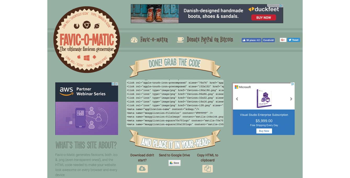
If manually creating all your icons feels like a burden, an easier option is to use a favicon generator that creates all the icons from one original and generates all of the required code as well. There are a few of them out there, but one I like is Favic-o-matic (www.favicomatic.com) shown in Figure 23-20. Just upload one PNG larger than 300px square, and the tool does the rest.
Summing Up Images
We’ve covered a lot of ground in this chapter. If I’ve done my job, you should now have a good foundation in web graphics, including where to find an image and what file format to save it in. You know about image resolution and screen resolution, including working with high-density displays. You also have a strategy for identifying your image requirements in order to whittle down the wide array of options. And of course, you know what it takes to add a favicon to your site.
In the next chapter, you’ll get hands-on experience creating and optimizing web images as we explore the particulars of the production process. But first, a little quiz.
Test Yourself
Answer the following questions to see if you got the big picture on web graphics. The answers appear in Appendix A.
- What is the primary advantage to using rights-managed images?
- What does “ppi” stand for?
- What is “indexed color”? What file formats use it?
- How many colors are in the color table for an 8-bit image? If you are up for a bit of math, figure out the maximum number of colors in a 5-bit image.
- Name two things you can do with a GIF that you can’t do with a JPEG.
- Name one thing you can do with a GIF that you can’t do with a PNG.
- Name one thing you can do with a PNG that you can’t do with a GIF.
- JPEG’s lossy compression is cumulative. What does that mean? Why is it important to know?
- What is the difference between binary and alpha transparency?
- Pick the best bitmap file format for each of the images in Figure 23-21. You should be able to make the decision just by looking at the images as they’re printed here and explain your choice. Some images may have more than one option.