Table of Contents for
Learning Web Design, 5th Edition
 Learning Web Design, 5th Edition
Published by
O'Reilly Media, Inc., 2018
Learning Web Design, 5th Edition
Published by
O'Reilly Media, Inc., 2018
- cover
- Learning Web Design, Fifth Edition
- lwd5_title_copy
- lwd5_title_copy-1
- lwd5_contents
- Foreword
- Preface
- Part I. Getting Started
- 2. How the Web Works
- 3. Some Big Concepts You Need to Know
- Part II. HTML for STRUCTURE
- 5. Marking Up Text
- 6. Adding Links
- 7. Adding Images
- 8. Table Markup
- 9. Forms
- 10. Embedded Media
- Part III. CSS for Presentation
- 12. Formatting Text
- 13. Colors and Backgrounds
- 14. Thinking Inside the Box
- 15. Floating and Positioning
- 16. CSS Layout with Flexbox and Grid
- 17. Responsive Web Design
- 18. Transitions, Transforms, and Animation
- 19. More CSS Techniques
- 20. Modern Web Development Tools
- Part IV. JavaScript for Behavior
- 22. Using JavaScript
- Part V. Web Images
- 24. Image Asset Production
- 25. SVG
- Part VI. Appendices
- B. HTML5 Global Attributes
- C. CSS Selectors, Levels 3 and 4
- D. From HTML+ to HTML5
11
In this Chapter
The benefits and power of CSS
How HTML markup creates a document structure
Writing style rules
Attaching styles to the HTML document
Big concepts: inheritance, specificity, the cascade, rule order, and the box model
You’ve heard style sheets mentioned quite a bit already, and now we’ll finally put them to work and start giving our pages some much-needed style. Cascading Style Sheets (CSS) is the W3C standard for defining the presentation of documents written in HTML, and in fact, any XML language. Presentation, again, refers to the way the document is delivered to the user, whether shown on a computer screen, displayed on a cell phone, printed on paper, or read aloud by a screen reader. With style sheets handling the presentation, HTML can handle the business of defining document structure and meaning, as intended.
CSS is a separate language with its own syntax. This chapter covers CSS terminology and fundamental concepts that will help you get your bearings for the upcoming chapters, where you’ll learn how to change text and font styles, add colors and backgrounds, and even do basic page layout. By the end of Part III, I aim to give you a solid foundation for further reading on your own and lots of practice.
The Benefits of CSS
Not that you need further convincing that style sheets are the way to go, but here is a quick rundown of the benefits of using style sheets.
- Precise type and layout controls. You can achieve print-like precision using CSS. There is even a set of properties aimed specifically at the printed page (but we won’t be covering them in this book).
- Less work. You can change the appearance of an entire site by editing one style sheet. This also ensures consistency of formatting throughout the site.
- More accessible sites. When all matters of presentation are handled by CSS, you can mark up your content meaningfully, making it more accessible for non-visual or mobile devices.
Come to think of it, there really aren’t any disadvantages to using style sheets. There are some lingering hassles from browser inconsistencies, but they can either be avoided or worked around if you know where to look for them.
The Power of CSS
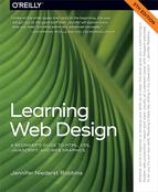
We’re not talking about minor visual tweaks here, like changing the color of headlines or adding text indents. When used to its full potential, CSS is a robust and powerful design tool. My eyes were first opened to the possibilities of using CSS for design by the variety and richness of the designs at CSS Zen Garden (www.csszengarden.com).
In the misty days of yore (2003), when developers were still hesitant to give up their table-based layouts for CSS, David Shea’s CSS Zen Garden site demonstrated exactly what could be accomplished using CSS alone. David posted an HTML document and invited designers to contribute their own style sheets that gave the document a visual design. Figure 11-1 shows just a few of my favorites. All of these designs use the exact same HTML source document.
Not only that, they don’t include a single img element (all of the images are in the background of elements). But look at how different each page looks—and how sophisticated. That’s all done with style sheets. It is proof of the power in keeping CSS separate from HTML, and presentation separate from structure.
The CSS Zen Garden is no longer being updated and now is considered a historical document of a turning point in the adoption of web standards. Despite its age, I still find it to be a nice one-stop lesson for demonstrating exactly what CSS can do.
Granted, it takes a lot of practice to be able to create CSS layouts like those shown in Figure 11-1. Killer graphic design skills help too (unfortunately, you won’t get those in this book). I’m showing this to you up front because I want you to be aware of the potential of CSS-based design, particularly because the examples in this beginners’ book tend to be simple and straightforward. Take your time learning, but keep your eye on the prize.
How Style Sheets Work
- Start with a document that has been marked up in HTML.
- Write style rules for how you’d like certain elements to look.
- Attach the style rules to the document. When the browser displays the document, it follows your rules for rendering elements (unless the user has applied some mandatory styles, but we’ll get to that later).
OK, so there’s a bit more to it than that, of course. Let’s give each of these steps a little more consideration.
1. Marking Up the Document
You know a lot about marking up content from the previous chapters. For example, you know that it is important to choose elements that accurately describe the meaning of the content. You also heard me say that the markup creates the structure of the document, sometimes called the structural layer, upon which the presentation layer can be applied.
In this and the upcoming chapters, you’ll see that having an understanding of your document’s structure and the relationships between elements is central to your work as a style sheet author.
In the exercises throughout this chapter you will get a feel for how simple it is to change the look of a document with style sheets. The good news is that I’ve whipped up a little HTML document for you to play with. You can get acquainted with the page we’ll be working with in Exercise 11-1.
exercise 11-1. A first look
2. Writing the Rules
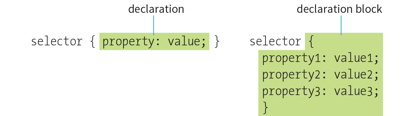
A style sheet is made up of one or more style instructions (called style rules) that describe how an element or group of elements should be displayed. The first step in learning CSS is to get familiar with the parts of a rule. As you’ll see, they’re fairly intuitive to follow. Each rule selects an element and declares how it should look.
The following example contains two rules. The first makes all the h1 elements in the document green; the second specifies that the paragraphs should be in a large, sans-serif font. Sans-serif fonts do not have a little slab (a serif) at the ends of strokes and tend to look more sleek and modern.
h1 { color: green; }p { font-size: large; font-family: sans-serif; }
In CSS terminology, the two main sections of a rule are the selector that identifies the element or elements to be affected, and the declaration that provides the rendering instructions. The declaration, in turn, is made up of a property (such as color) and its value (green), separated by a colon and a space. One or more declarations are placed inside curly brackets, as shown in Figure 11-3.
Selectors
In the previous small style sheet example, the h1 and p elements are used as selectors. This is called an element type selector, and it is the most basic type of selector. The properties defined for each rule will apply to every h1 and p element in the document, respectively.
Another type of selector is an ID selector, which selects an element based on the value of an element’s id attribute. It is indicated with the # symbol. For example, the selector #recipe targets an element with id="recipe".
In upcoming chapters, I’ll introduce you to more sophisticated selectors that you can use to target elements, including ways to select groups of elements, and elements that appear in a particular context. See the “Selectors in this Book” sidebar for details.
Mastering selectors—that is, choosing the best type of selector and using it strategically—is an important step in mastering CSS.
Declarations
The declaration is made up of a property/value pair. There can be more than one declaration in a single rule; for example, the rule for the p element shown earlier in the code example has both the font-size and font-family properties. Each declaration must end with a semicolon to keep it separate from the following declaration (see Note). If you omit the semicolon, the declaration and the one following it will be ignored. The curly brackets and the declarations they contain are often referred to as the declaration block (Figure 11-3).
Because CSS ignores whitespace and line returns within the declaration block, authors typically write each declaration in the block on its own line, as shown in the following example. This makes it easier to find the properties applied to the selector and to tell when the style rule ends.
p { font-size: large; font-family: sans-serif; }
Note that nothing has really changed here—there is still one set of curly brackets, semicolons after each declaration, and so on. The only difference is the insertion of line returns and some character spaces for alignment.
Properties
The heart of style sheets lies in the collection of standard properties that can be applied to selected elements. The complete CSS specification defines dozens of properties for everything from text indents to how table headers should be read aloud. This book covers the most common and best-supported properties that you can begin using right away.
Values
Values are dependent on the property. Some properties take length measurements, some take color values, and others have a predefined list of keywords. When you use a property, it is important to know which values it accepts; however, in many cases, simple common sense will serve you well. Authoring tools such as Dreamweaver or Visual Studio provide hints of suitable values to choose from. Before we move on, why not get a little practice writing style rules yourself in Exercise 11-2?
exercise 11-2. Your first style sheet
<style>h1 { color: green;}p { font-size: large; font-family: sans-serif; }</style>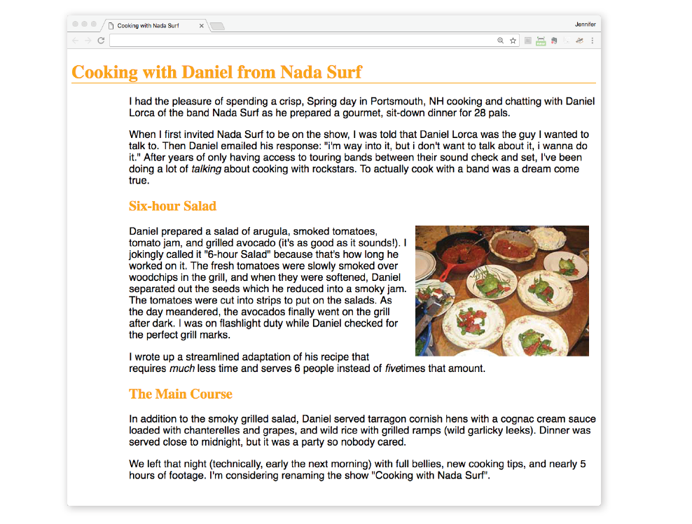
3. Attaching the Styles to the Document
In the previous exercise, we embedded the style sheet right in the document by using the style element. That is just one of three ways that style information can be applied to an HTML document. You’ll get to try out each of these soon, but it is helpful to have an overview of the methods and terminology up front.
External style sheets
An external style sheet is a separate, text-only document that contains a number of style rules. It must be named with the .css suffix. The .css document is then linked to (via the link element) or imported (via an @import rule in a style sheet) into one or more HTML documents. In this way, all the files in a website may share the same style sheet. This is the most powerful and preferred method for attaching style sheets to content. We’ll discuss external style sheets more and start using them in the exercises in Chapter 13.
Embedded style sheets
This is the type of style sheet we worked with in the exercise. It is placed in a document via the style element, and its rules apply only to that document. The style element must be placed in the head of the document. This example also includes a comment (see the “Comments in Style Sheets” sidebar).
<head> <title>Required document title here</title><style>/* style rules go here */</style></head>
Inline styles
You can apply properties and values to a single element by using the style attribute in the element itself, as shown here:
<h1 style="color: red">Introduction</h1>
To add multiple properties, just separate them with semicolons, like this:
<h1 style="color: red; margin-top: 2em">Introduction</h1>
Inline styles apply only to the particular element in which they appear. Inline styles should be avoided, unless it is absolutely necessary to override styles from an embedded or external style sheet. Inline styles are problematic in that they intersperse presentation information into the structural markup. They also make it more difficult to make changes because every style attribute must be hunted down in the source.
Exercise 11-3 gives you an opportunity to write an inline style and see how it works. We won’t be working with inline styles after this point for the reasons listed earlier, so here’s your chance.
exercise 11-3. Applying an inline style
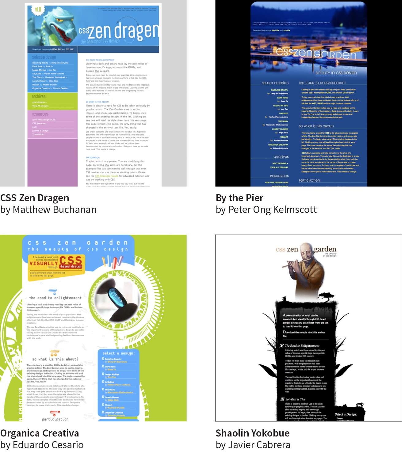
<h2 style="color: gray">The Main Course</h2>
The Big Concepts
There are a few big ideas that you need to get your head around to be comfortable with how Cascading Style Sheets behave. I’m going to introduce you to these concepts now so we don’t have to slow down for a lecture once we’re rolling through the style properties. Each of these ideas will be revisited and illustrated in more detail in the upcoming chapters.
Inheritance
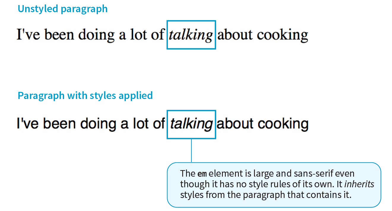
Are your eyes the same color as your parents’? Did you inherit their hair color? Well, just as parents pass down traits to their children, styled HTML elements pass down certain style properties to the elements they contain. Notice in Exercise 11-1, when we styled the p elements in a large, sans-serif font, the em element in the second paragraph became large and sans-serif as well, even though we didn’t write a rule for it specifically (Figure 11-5). That is because the em element inherited the styles from the paragraph it is in. Inheritance provides a mechanism for styling elements that don’t have any explicit styles rules of their own.
Document structure
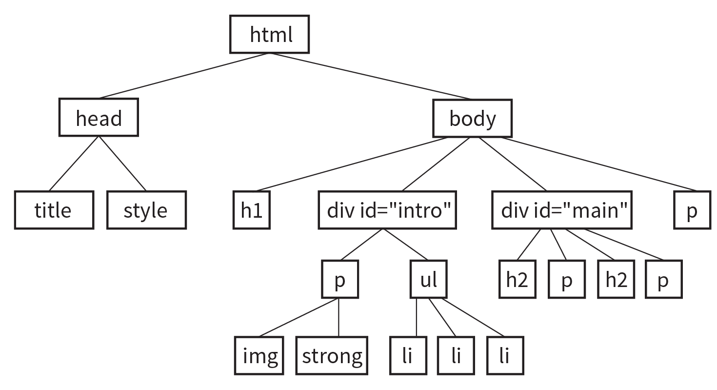
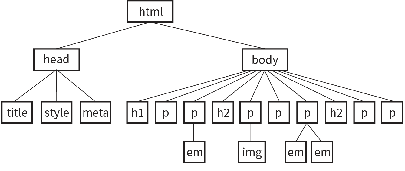
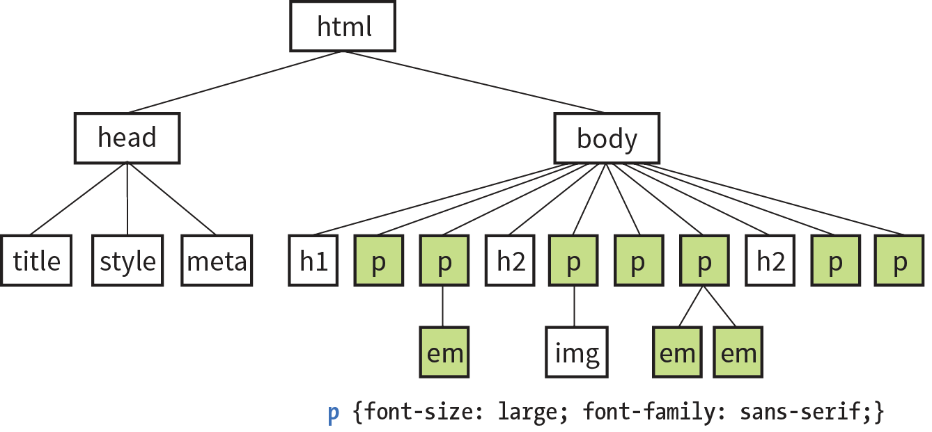
This is where an understanding of your document’s structure becomes important. As I’ve noted before, HTML documents have an implicit structure, or hierarchy. For example, the sample article we’ve been playing with has an html root element that contains a head and a body, and the body contains heading and paragraph elements. A few of the paragraphs, in turn, contain inline elements such as images (img) and emphasized text (em). You can visualize the structure as an upside-down tree, branching out from the root, as shown in Figure 11-6.
Parents and children
The document tree becomes a family tree when it comes to referring to the relationship between elements. All the elements contained within a given element are said to be its descendants. For example, the h1, h2, p, em, and img elements in the document in Figure 11-6 are all descendants of the body element.
An element that is directly contained within another element (with no intervening hierarchical levels) is said to be the child of that element. Conversely, the containing element is the parent. For example, the em element is the child of the p element, and the p element is its parent.
All of the elements higher than a particular element in the hierarchy are its ancestors. Two elements with the same parent are siblings. We don’t refer to “aunts” or “cousins,” so the analogy stops there. This may all seem academic, but it will come in handy when you’re writing CSS selectors.
Pass it on
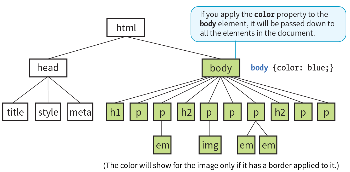
When you write a font-related style rule using the p element as a selector, the rule applies to all of the paragraphs in the document as well as the inline text elements they contain. We’ve seen the evidence of the em element inheriting the style properties applied to its parent (p) back in Figure 11-5. Figure 11-7 demonstrates what’s happening in terms of the document structure diagram. Note that the img element is excluded because font-related properties do not apply to images.
Notice that I’ve been saying “certain” properties are inherited. It’s important to note that some style sheet properties inherit and others do not. In general, properties related to the styling of text—font size, color, style, and the like—are passed down. Properties such as borders, margins, backgrounds, and so on that affect the boxed area around the element tend not to be passed down. This makes sense when you think about it. For example, if you put a border around a paragraph, you wouldn’t want a border around every inline element (such as em, strong, or a) it contains as well.
You can use inheritance to your advantage when writing style sheets. For example, if you want all text elements to be blue, you could write separate style rules for every element in the document and set the color to “blue”. A better way would be to write a single style rule that applies the color property to the body element, and let all the elements contained in the body inherit that style (Figure 11-8).
Any property applied to a specific element overrides the inherited values for that property. Going back to the article example, if we specify that the em element should be orange, that would override the inherited blue setting.
Conflicting Styles: The Cascade
Ever wonder why they are called “cascading” style sheets? CSS allows you to apply several style sheets to the same document, which means there are bound to be conflicts. For example, what should the browser do if a document’s imported style sheet says that h1 elements should be red, but its embedded style sheet has a rule that makes h1s purple? The two style rules with h1 selectors have equal weight, right?
The folks who wrote the style sheet specification anticipated this problem and devised a hierarchical system that assigns different weights to the various sources of style information. The cascade refers to what happens when several sources of style information vie for control of the elements on a page: style information is passed down (“cascades” down) until it is overridden by a style rule with more weight. Weight is considered based on the priority of the style rule source, the specificity of the selector, and rule order.
The “cascade” refers to what happens when several sources of style information vie for control of the elements on a page.
Priority
If you don’t apply any style information to a web page, it renders according to the browser’s internal style sheet. We’ve been calling this the default rendering; the W3C calls it the user agent style sheet. Individual users can apply their own styles as well (the user style sheet, also called the reader style sheet), which override the default styles in their browser. However, if the author of the web page has attached a style sheet (the author style sheet), that overrides both the user and the user agent styles. The sidebar “Style Rule Hierarchy” provides an overview of the cascading order from highest to lowest priority.
The only exception is if the user has identified a style as “important,” in which case that style will override all competing styles (see the “Assigning Importance” sidebar). This permits users to keep settings accommodating a disability such as extra large type for sight impairment.
Specificity
It is possible for conflicts to arise in which an element is getting style instructions from more than one rule. For example, there may be a rule that applies to paragraphs and another rule for a paragraph that has the ID “intro.” Which rule should the intro paragraph use?
When two rules in a style sheet conflict, the type of selector is used to determine the winner. The more specific the selector, the more weight it is given to override conflicting declarations. In our example, the selector that includes the ID name (#intro) is more specific than a general element selector (like p), so that rule would apply to the “intro” paragraph, overriding the rules set for all paragraphs.
When two rules in a single style sheet conflict, the type of selector is used to determine the winner.
It’s a little soon to be discussing specificity because we’ve looked at only two types of selectors. For now, put the term specificity and the concept that some selectors have more “weight,” and therefore override others, on your radar. We will revisit specificity in much more detail in Chapter 12, Formatting Text when you have more selector types under your belt.
Rule order
After all the style sheet sources have been sorted by priority, and after all the linked and imported style sheets have been shuffled into place, there are likely to be conflicts in rules with equal weights. When that is the case, the order in which the rules appear is important. The cascade follows a “last one wins” rule. Whichever rule appears last has the last word.
Within a style sheet, if there are conflicts within style rules of identical weight, whichever one comes last in the list “wins.” Take these three rules, for example:
<style> p { color: red; } p { color: blue; } p { color: green; }</style>
In this scenario, paragraph text will be green because it is the last rule in the style sheet—that is, the one closest to the content in the document—overrides the earlier ones. Procedurally, the paragraph is assigned a color, then assigned a new one, and finally a third one (green) that gets used. The same thing happens when conflicting styles occur within a single declaration stack:
<style> p { color: red; color: blue; color: green; }</style>
The resulting color will be green because the last declaration overrides the previous two. It is easy to accidentally override previous declarations within a rule when you get into compound properties, so this is an important behavior to keep in mind. That is a very simple example. What happens when style sheet rules from different sources come into play?
Let’s consider an HTML document that has an embedded style sheet (added with the style element) that starts with an @import rule for importing an external .css file. That same HTML document also has a few inline style attributes applied to particular h1 elements.
Style document (external.css):
…h1 { color: red }…
HTML document:
<!DOCTYPE html><html><head> <title>…</title> <style>@import url(external.css);/* set to red first */h1 { color: purple;}/* overridden by purple */ </style></head><body> <h1style="color: blue">Heading</h1> /* blue comes last and wins */ …</body></html>
When the browser parses the file, it gets to the imported style sheet first, which sets h1s to red. Then it finds a rule with equal weight in the embedded style sheet that overrides the imported rule, so h1s are set to purple. As it continues, it encounters a style rule right in an h1 that sets its color to blue. Because that rule came last, it’s the winner, and that h1 will be blue. That’s the effect we witnessed in Exercise 11-3. Note that other h1s in this document without inline style rules would be purple, because that was the last h1 color applied to the whole document.
The Box Model
As long as we’re talking about Big CSS Concepts, it is only appropriate to introduce the cornerstone of the CSS visual formatting system: the box model. The easiest way to think of the box model is that browsers see every element on the page (both block and inline) as being contained in a little rectangular box. You can apply properties such as borders, margins, padding, and backgrounds to these boxes, and even reposition them on the page.
We’re going to go into a lot more detail about the box model in Chapter 14, but having a general feel for it will benefit you even as we discuss text and backgrounds in the following two chapters.
To see the elements roughly the way the browser sees them, I’ve written style rules that add borders around every content element in our sample article:
h1 { border: 1px solid blue; }h2 { border: 1px solid blue; }p { border: 1px solid blue; }em { border: 1px solid blue; }img { border: 1px solid blue; }
Figure 11-9 shows the results. The borders reveal the shape of each block element box. There are boxes around the inline elements (em and img) as well. If you look at the headings, you will see that block element boxes expand to fill the available width of the browser window, which is the nature of block elements in the normal document flow. Inline boxes encompass just the characters or image they contain.

Grouped Selectors
Hey! This is a good opportunity to show you a handy style rule shortcut. If you ever need to apply the same style property to a number of elements, you can group the selectors into one rule by separating them with commas. This one rule has the same effect as the five rules listed previously. Grouping them makes future edits more efficient and results in a smaller file size:
h1, h2, p, em, img { border: 1px solid blue; }Now you have two selector types in your toolbox: a simple element selector and grouped selectors.
CSS Units of Measurement
This chapter lays the groundwork for upcoming lessons, so it’s a good time to get familiar with the units of measurement used in CSS. You’ll be using them to set font size, the width and height of elements, margins, indents, and so on. The complete list is provided in the sidebar “CSS Units.”
Some will look familiar (like inches and millimeters), but there are some units that bear more explanation: absolute units, rem, em, and vw/vh. Knowing how to use CSS units effectively is another one of those core CSS skills.
Absolute Units
Absolute units have predefined meanings or real-world equivalents. They are always the same size, regardless of the context in which they appear.
The most popular absolute unit for web design is the pixel, which CSS3 defines as 1/96 inch. Pixels are right at home on a pixel-based screen and offer precise control over the size of the text and elements on the page. For a while there, pixels were all we used. Then we realized they are too rigid for pages that need to adapt to a wide variety of screen sizes and user preferences. Relative measurements like rem, em, and % are more appropriate to the fluid nature of the medium.
As long as we are kicking px to the curb, all of the absolute units—such as pt, pc, in, mm, and cm—are out because they are irrelevant on screens, although they may be useful for print style sheets. That narrows down your unit choices a bit.
That said, pixels do still have their place in web design for elements that truly should stay the same size regardless of context. Border widths are appropriate in pixels, as are images that have inherent pixel dimensions.
Relative Units
As I just established, relative units are the way to go for most web measurements, and there are a few options: rem, em, and vw/vh.
The rem unit
CSS3 introduced a relative measurement called a rem (for root em) that is based on the font size of the root (html) element, whatever that happens to be. In modern browsers, the default root font size is 16 pixels; therefore, a rem is equivalent to a 16-pixel unit (unless you set it explicitly to another value). An element sized to 10rem would measure 160 pixels.
For the most part, you can use rem units like an absolute measurement in style rules; however, because it is relative, if the base font size changes, so does the size of a rem. If a user changes the base font size to 24 pixels for easier reading from a distance, or if the page is displayed on a device that has a default font size of 24 pixels, that 10rem element becomes 240 pixels. That seems dodgy, but rest assured that it is a feature, not a bug. There are many instances in which you want a layout element to expand should the text size increase. It keeps the page proportional with the font size, which can help maintain optimum line lengths.
The em unit
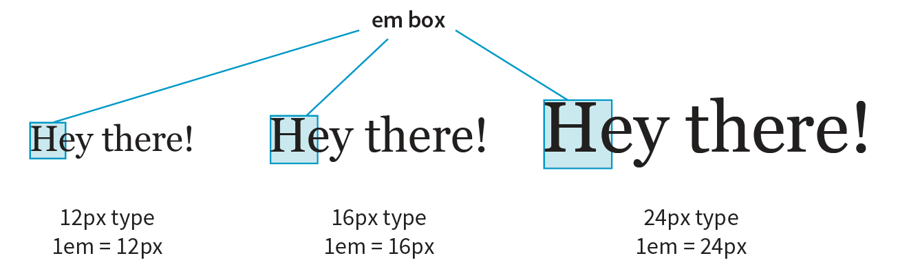
An em is a relative unit of measurement that, in traditional typography, is based on the width of the capital letter M (thus the name “em”). In the CSS specification, an em is calculated as the distance between baselines when the font is set without any extra space between the lines (also known as leading). For text with a font size of 16 pixels, an em measures 16 pixels; for 12-pixel text, an em equals 12 pixels; and so on, as shown in Figure 11-10.
NOTE
Don’t confuse the em unit of measurement with the HTML element used to indicate emphasized text. They are totally different things.
Once the dimension of an em for a text element is calculated by the browser, it can be used for all sorts of other measurements, such as indents, margins, the width of the element on the page, and so on. Basing measurements on text size helps keep everything in proportion should the text be resized.
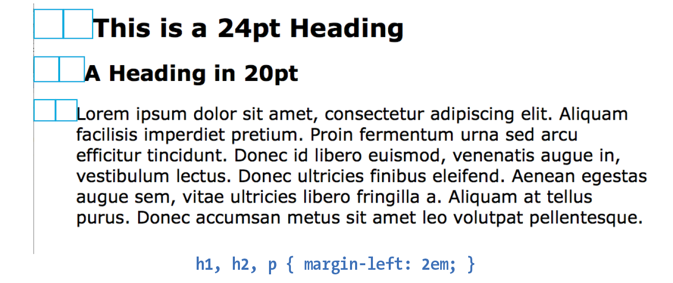
The trick to working with ems is to remember they are always relevant to the current font size of the element. To borrow an example from Eric Meyer and Estelle Weyl’s CSS: The Definitive Guide (O’Reilly), if you set a 2em left margin on an h1, h2, and p, those elements will not line up nicely because the em units are based on their respective element’s sizes (Figure 11-11).
Viewport percentage lengths (vw/vh)
The viewport width (vw) and viewport height (vh) units are relative to the size of the viewport (browser window). A vw is equal to 1/100 the width of the viewport. Similarly, a vh is equal to 1/100 the height of the viewport. Viewport-based units are useful for making images and text elements stay the full width or height of the viewport:
header { width: 100vw; height: 100vh; }
It’s also easy to specify a unit to be a specific percentage of the window size, such as 50%:
img { width: 50vw; height: 50vh; }
Related are the vmin unit (equal to the value of vw or vh, whichever is smaller) and vmax (equal to the value of vw or vh, whichever is larger).
Browser support note
IE9 supports instead of . IE and Edge (all versions as of 2017) do not support .
That should give you a good introduction to the units you’ll be using in your style sheets. I recommend reading the full CSS Values and Units Module (www.w3.org/TR/css3-values/) to deepen your knowledge and make the values listed for properties in this book easier to understand. In addition to length units, it includes text-based values (such as keywords, text strings, and URLs), numbers and percentage values, colors, and more.
Developer Tools Right in Your Browser
Because of the cascade, a single page element may have styles applied from a number of sources. This can make it tricky to debug a page when styles aren’t displaying the way you think they should. Fortunately, every major browser comes with developer tools that can help you sort things out.
I’ve opened the simple cooking.html document that we’ve been working on in the Chrome browser, then selected from the menu. The Developer Tools panel opens at the bottom of the document, as you can see in Figure 11-12. You can also make it its own separate window by clicking the windows icon in the top left.
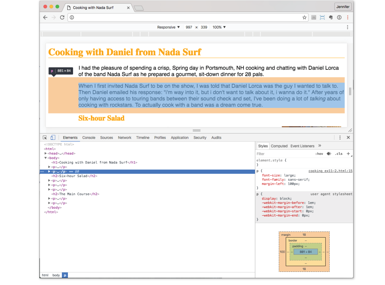
In the Elements tab on the left, I can see the HTML source for the document. The content is initially hidden so you can see the structure of the document more clearly, but clicking the arrows opens each section. When I click the element in the source (like the second p element shown in the figure), that element is also highlighted in the browser window view.
In the Styles tab on the right, I can see all of the styles that are being applied to the selected element. In the example, I see the font-size, font-family, and margin-left properties from the style element in the document. If there were external CSS documents, they’d be listed too. I can also see the “User Agent Style Sheet,” which is the browser’s default styles. In this case, the browser style sheet adds the margin space around the paragraph. Chrome also provides a box model diagram for the selected element that shows the content dimensions, padding, border, and margins that are applied. This is a great tool for troubleshooting unexpected spacing in layouts.
The cool thing is that when you edit the style rules in the panel, the changes are reflected in the browser view of the page in real time! If I select the h1 element and change the color from orange to green, it turns green in the window. It’s a great way to experiment with or troubleshoot a design; however, the changes are not being made to the document itself. It’s just a preview, so you’ll have to duplicate the changes in your source.
You can inspect any page on the web in this way, play around with turning styles off and on, and even add some of your own. Nothing you do has any effect on the actual site, so it is just for your education and amusement.
The element and style inspectors are just the tip of the iceberg of what browser developer tools can do. You can also tweak and debug JavaScript, check performance, view the document in various device simulations, and much more. The good news is that all major browsers now have built-in tools with similar features. As a web developer, you’ll find they are your best friend.
- Chrome DevTools ()developer.chrome.com/devtools
- Firefox ()developer.mozilla.org/en-US/docs/Tools
- Microsoft Edge (open with F12 key)developer.microsoft.com/en-us/microsoft-edge/platform/documentation/f12-devtools-guide/
- Safari (developer.apple.com/safari/tools/
- Opera ()www.opera.com/dragonfly/
- Internet Explorer 9+ (open with F12 key)msdn.microsoft.com/en-us/library/gg589512(v=vs.85).aspx
Moving Forward with CSS
This chapter covered all the fundamentals of Cascading Style Sheets, including rule syntax, ways to apply styles to a document, and the central concepts of inheritance, the cascade (including priority, specificity, and rule order), and the box model. Style sheets should no longer be a mystery, and from this point on, we’ll merely be building on this foundation by adding properties and selectors to your arsenal and expanding on the concepts introduced here.
CSS is a vast topic, well beyond the scope of this book. Bookstores and the web are loaded with information about style sheets for all skill levels. I’ve compiled a list of the resources I’ve found the most useful during my learning process. I’ve also provided a list of popular tools that assist in writing style sheets.
Books
There is no shortage of good books on CSS out there, but these are the ones that taught me, and I feel good recommending them.
- CSS: The Definitive Guide, 4th Edition by Eric A. Meyer and Estelle Weyl (O’Reilly)
- CSS Cookbook by Christopher Schmitt (O’Reilly)
Online Resources
The sites listed here are good starting points for online exploration of style sheets.
CSS-Tricks (css-tricks.com)
The is the blog of CSS guru Chris Coyier. Chris loves CSS and enthusiastically shares his research and tinkering on his site.
World Wide Web Consortium (www.w3.org/TR/CSS/)
The World Wide Web Consortium oversees the development of web technologies, including CSS. This page is a “snapshot” of the CSS specifications. See also www.w3.org/Style/CSS/current-work.
MDN Web Docs (developer.mozilla.org)
The CSS pages at MDN include detailed reference pages, step-by-step tutorials, and demos. It’s a great hub for researching any web technology.
A List Apart (www.alistapart.com/topics/code/css/)
This online magazine features some of the best thinking and writing on cutting-edge, standards-based web design. It was founded in 1998 by Jeffrey Zeldman and Brian Platz.
Test Yourself
Here are a few questions to test your knowledge of the CSS basics. Answers are provided in Appendix A.
- Identify the various parts of this style rule:
blockquote { line-height: 1.5; }selector: ______________ value: ____________________
property: _____________ declaration: ________________
- What color will paragraphs be when this embedded style sheet is applied to a document? Why?
<style type="text/css"> p { color: purple; } p { color: green; } p { color: gray; }</style> - Rewrite each of these CSS examples. Some of them are completely incorrect, and some could just be written more efficiently.
p {font-family: sans-serif;}p {font-size: 1em;}p {line-height: 1.2em;}blockquote {font-size: 1em line-height: 150%color: gray }body{background-color: black;}{color: #666;}{margin-left: 12em;}{margin-right: 12em;}p {color: white;}blockquote {color: white;}li {color: white;}<strong style="red">Act now!</strong>
- Circle all the elements that you would expect to appear in red when the following style rule is applied to a document with the structure diagrammed in Figure 11-13.
div#intro { color: red;}