A Beginner’s Guide to HTML, CSS, JavaScript, and Web Graphics
by Jennifer Niederst Robbins
Copyright © 2018 O’Reilly Media, Inc. All rights reserved.Printed in Canada.
Published by O’Reilly Media, Inc., 1005 Gravenstein Highway North, Sebastopol, CA 95472.
O’Reilly Media books may be purchased for educational, business, or sales promotional use. Online editions are also available for most titles (oreilly.com/safari). For more information, contact our corporate/institutional sales department: 800-998-9938 or corporate@oreilly.com.
Editors: Meg Foley and Jeff Bleiel
Production Editor: Kristen Brown
Cover Designer: Edie Freedman
Interior Designer: Jennifer Robbins
Print History:
March 2001: First edition.
June 2003: Second edition.
June 2007: Third edition.
August 2012: Fourth edition.
May 2018: Fifth edition.
The O’Reilly logo is a registered trademark of O’Reilly Media, Inc. “O’Reilly Digital Studio” and related trade dress are trademarks of O’Reilly Media, Inc. Photoshop, Illustrator, Dreamweaver, Elements, HomeSite, and Fireworks are either registered trademarks or trademarks of Adobe Systems Incorporated in the United States and/or other countries. Microsoft and Expression Web are either registered trademarks or trademarks of Microsoft Corporation in the United States and/or other countries. Many of the designations used by manufacturers and sellers to distinguish their products are claimed as trademarks. Where those designations appear in this book, and O’ReillyMedia, Inc. was aware of a trademark claim, the designations have been printed in caps or initial caps.
While every precaution has been taken in the preparation of this book, the publisher and author assume no responsibility for errors or omissions, or for damages resulting from the use of the information contained herein.
ISBN: 978-1-491-96020-2
[TI] [2018-11-30]
Contents
1. Getting Started in Web Design
It Takes a Village (Website Creation Roles)
3. Some Big Concepts You Need to Know
One Web for All (Accessibility)
The Need for Speed (Site Performance)
Step 2: Give the HTML Document Structure
Step 3: Identify Text Elements
Step 5: Change the Look with a Style Sheet
Element Review: HTML Document Setup
Thematic Breaks (Horizontal Rule)
Generic Elements (div and span)
Improving Accessibility with ARIA
Targeting a New Browser Window
First, a Word on Image Formats
The Great Form Control Roundup
Multipurpose Embedder (object)
Element Review: Embedded Media
Part III. CSS for Presentation
11. Introducing Cascading Style Sheets
Developer Tools Right in Your Browser
Underlines and Other “Decorations”
Changing List Bullets and Numbers
CSS Review: Font and Text Properties
The Shorthand background Property
Finally, External Style Sheets
CSS Review: Color and Background Properties
Fancy Text Wrap with CSS Shapes
CSS Review: Floating and Positioning Properties
16. CSS Layout with Flexbox and Grid
Flexible Boxes with CSS Flexbox
18. Transitions, Transforms, and Animation
Ease-y Does It (CSS Transitions)
CSS Review: Transitions, Transforms, and Animation
A Clean Slate (Reset and Normalize.css)
20. Modern Web Development Tools
Getting Cozy with the Command Line
Version Control with Git and GitHub
Part IV. JavaScript for Behavior
21. Introduction to JavaScript
Learning More About JavaScript
Responsive Image Production Tips
C. CSS Selectors, Levels 3 and 4
If you travel to Silicon Valley and navigate between the global headquarters of some of the world’s most famous internet companies, you can head to the Computer History Museum. Wander through the museum, past the ancient mainframes and the story of the punch card, and you’ll eventually find yourself at the beginning of the Wide World Web. There’s a copy of the Mosaic browser on a floppy disk tucked in a book of the same name, a copy of Netscape Navigator that was sold in a box, and something called “Internet in a Box,” the #1 best-selling internet solution for Windows. Then there are the websites. Some of the earliest, most notable, and most important websites are on permanent display, including something called the “Global Network Navigator,” from 1993. It was designed by none other than the author of this book, Jennifer Robbins. Long before most of us had any idea the web existed, or even before many of you were born, Jen was busy designing the first commercial website. She’s been there from the very beginning, and has watched, taught, and written about every stage of evolution of the web.
Learning Web Design is now in its 5th edition, with a gazillion new pages and updates from those early days.
I am constantly asked, “What are the best resources for learning web technology?” I learned by reading books. Blog posts are great, but you also need an in-depth comprehensive look at the subject. In the beginning, all books were beginner books, teaching HTML, URLs, and how to use a browser. When CSS came along, the books assumed you’d already been using HTML, and taught you how to change to the new techniques. Then CSS3 came along, and all the books taught us how to add new CSS properties to our preexisting understanding of CSS2. Of course there were always books for beginners, but they were super basic. They never touched on professional techniques for aspiring professionals. Each new generation of books assumed that you had prior knowledge. Great for those of us in the industry. Tough for anyone new. But how in the world are you supposed to read about two decades of techniques, discarding what is outdated, and remembering what is still correct? How are you supposed to build a career from knowledge that’s so basic that you have no idea what real pros code in their everyday jobs?
You can’t. That’s why today when people ask me for a book recommendation, I have only one answer. This book.
This book you are reading now doesn’t require any prior knowledge. You don’t need to have made a web page before, or to have any idea where to get a code editor. It starts at the very beginning. And yet, unlike all the other books that start at the beginning, this one will get you to the good stuff, fast. Jen will explain every step you need, including some very advanced concepts. She’s packed this book full of cutting edge, insider knowledge from top experts.
I honestly don’t know how she does it. How can someone teach the basics and the advanced stuff at the same time? Usually you’ll learn those things years apart, with lots of struggling in the dark in the meantime. Here, Jen will lift you up from wherever you are in your journey, and take you farther. Every one of us—myself included, and I’m on the CSS Working Group (the group of people who invent new CSS)—can learn a lot from this book. I do every time I pick it up.
Pay attention to the notes in the margins. Read the websites she recommends, watch the videos. Jen is giving you a shortcut to a professional network. Follow the people she mentions. Read the links they suggest. These might be your future colleagues. Dare to dream that you will meet them. They are, after all, only a tweet away. It is a small world, full of real people, and you can become part of it all. This book will get you started.
—Jen Simmons
Designer and Developer Advocate at Mozilla
Member of the CSS Working Group
April 2018
Hello and welcome to the fifth edition of Learning Web Design!
I’ve been documenting web design and development in books like this one for decades, and it continues to fascinate me how the web landscape changes from edition to edition. This fifth edition is no exception! Not only is this version nearly 200 pages longer than the last one, but there are also some significant updates and additions worth noting.
First, some technologies and techniques that were brand new or even experimental in the last edition have become nicely settled in. HTML5 is the new normal, and CSS is moving ahead with its modular approach, allowing new technologies to emerge and be adopted one at a time. We’ve largely gotten our heads around designing for a seemingly infinite range of devices. Responsive Web Design is now the de facto approach to building sites. As a result, RWD has earned its own chapter in this edition (Chapter 17, Responsive Web Design). Where in the last edition we pondered and argued how to handle responsive image markup, in this edition, the new responsive image elements are standardized and well supported (Chapter 7, Adding Images). I think we’re getting the hang of this mobile thing!
I’ve seen a lot of seismic shifts in web design over the years, and this time, Flexbox and Grid are fundamentally changing the way we approach design. Just as we saw CSS put table-based layouts and 1-pixel spacer GIFs out of their misery, Flexbox and Grid are finally poised to kick our old float-based layout hacks to the curb. It is nothing short of a revolution, and after 25 years, it’s refreshing to have an honest-to-goodness solution for layout. This edition sports a new (and hefty!) chapter on proper page layout with Flexbox and Grid (Chapter 16, CSS Layout with Flexbox and Grid).
Although knowledge of HTML, CSS, and JavaScript is at the heart of web development, the discipline has been evolving, and frankly, becoming more complicated. I would be shirking my duty if I didn’t at least introduce you to some of the new tools of the trade—CSS processors, feature detection, the command line, task runners, and Git—in a new chapter on the modern web developer toolkit (Chapter 20, Modern Web Development Tools). Sure, it’s more stuff to learn, but the benefit is a streamlined and more efficient workflow.
The biggest surprise to me personally was how much web image production has changed since the fourth edition. Other than the introduction of the PNG format, my graphics chapters have remained essentially unchanged for 20 years. Not so this time around! Our old standby, GIF, is on the brink of retirement, and PNG is the default thanks to its performance advantages and new tools that let even smaller 8-bit PNGs include multiple levels of transparency. But PNG will have to keep its eye on WebP, mentioned in this edition for the first time, which may give it a run for its money in terms of file size and capabilities. The biggest web graphics story, however, is the emergence of SVG (Scalable Vector Graphics). Thanks to widespread browser support (finally!), SVG went from a small “some day” section in the previous edition to an entire “go for it!” chapter in this one (Chapter 25, SVG).
As in the first four editions, this book addresses the specific needs and concerns of beginners of all backgrounds, including seasoned graphic designers, programmers looking to expand their skills, and anyone else wanting to learn how to make websites. I’ve done my best to put the experience of sitting in my beginner web design class into a book, with exercises and tests along the way, so you get hands-on experience and can check your progress.
Whether you are reading this book on your own or using it as a companion to a web design course, I hope it gives you a good head start and that you have fun in the process.
Learning Web Design, Fifth Edition, is divided into five parts, each dealing with an important aspect of web development.
Part I: Getting Started
Part I lays a foundation for everything that follows in the book. I start off with some important general information about the web design environment, including the various roles you might play, the technologies you might learn, and tools that are available to you. You’ll get your feet wet right away with HTML and CSS and learn how the web and web pages generally work. I’ll also introduce you to some Big Concepts that get you thinking in the same way that modern web designers think about their craft.
Part II: HTML for Structure
The chapters in Part II cover the nitty-gritty of every element and attribute available to give content semantic structure. We’ll cover the markup for text, links, images, tables, forms, and embedded media.
Part III: CSS for Presentation
In the course of Part III, you’ll go from learning the basics of Cascading Style Sheets for changing the presentation of text to creating multicolumn layouts and even adding time-based animation and interactivity to the page. It provides an introduction to Responsive Web Design, as well as the tools and techniques that are part of the modern developer’s workflow.
Part IV: JavaScript for Behavior
Mat Marquis starts Part IV out with a rundown of JavaScript syntax so that you can tell a variable from a function. You’ll get to know some ways that JavaScript is used (including DOM scripting) and existing JavaScript tools such as polyfills and libraries that let you put JavaScript to use quickly, even if you aren’t quite ready to write your own code from scratch.
Part V: Web Images
Part V introduces the various image file formats that are appropriate for the web, provides strategies for choosing them as part of a responsive workflow, and describes how to optimize them to make their file size as small as possible. It also includes a chapter on SVG graphics, which offer great advantages for responsive and interaction design.
Part VI: Appendices
Part VI holds reference material such as test answers, lists of HTML global attributes and CSS Selectors, and a look at HTML5 and its history.
Italic
Used to indicate filenames and directory names, as well as for emphasis.
Colored italic
Used to indicate URLs and email addresses.
Colored roman text
Used for special terms that are being defined.
Constant width
Used to indicate code examples and keyboard commands.
Colored constant width
Used for emphasis in code examples.
Constant width italic
Used to indicate placeholders for attribute and style sheet property values.
→
Indicates that a line of code was broken in the text but should remain together on one line in use.
Once again, many smart and lovely people had my back on this edition.
I want to say a special thanks to my two amazing tech reviewers. I am quite indebted to Elika J. Etemad (fantasai), who, as a member of the W3C CSS Working Group, helped me make this edition more accurate and up-to-date with standards than ever before. She was tough, but the results are worth it. Petter Dessne brought his computer science expertise as well as valuable perspective as a professor and a reader for whom English is a second language. His good humor and photos of his home in Sweden were appreciated as well!
I am also grateful for this roster of web design superstars who reviewed particular chapters and passages in their areas of expertise (in alphabetical order): Amelia Bellamy-Royds (SVG), Brent Beer (developer tools), Chris Coyier (SVG), Terence Eden (audio/video), Brad Frost (Responsive Web Design), Lyza Danger Gardner (developer tools), Jason Grigsby (images), Val Head (animation), Daniel Hengeveld (developer tools), Mat Marquis (responsive images), Eric Meyer (CSS layout), Jason Pamental (web fonts), Dan Rose (images), Arsenio Santos (embedded media), Jen Simmons (CSS layout), Adam Simpson (developer tools), and James Williamson (structured data).
Thanks also to Mat Marquis for his contribution of two lively JavaScript chapters that I could never have written myself, and to Jen Simmons for writing the Foreword and for her ongoing support of Learning Web Design.
I want to thank my terrific team of folks at O’Reilly Media: Meg Foley (Acquisitions Editor), Jeff Bleiel (Developmental Editor), Kristen Brown (Production Editor), Rachel Monaghan (Copyeditor), Sharon Wilkey (Proofreader), and Lucie Haskins (Indexer). Special thanks go to InDesign and book production expert Ron Bilodeau, who turned my design into a template and a set of tools that made book production an absolute joy. Special thanks also go to Edie Freedman for the beautiful cover design and half a lifetime of friendship and guidance.
Finally, no Acknowledgments would be complete without profound appreciation for the love and support of my dearest ones, Jeff and Arlo.
Jennifer Robbins began designing for the web in 1993 as the graphic designer for Global Network Navigator, the first commercial website. In addition to this book, she has written multiple editions of Web Design in a Nutshell and HTML5 Pocket Reference, published by O’Reilly. She is a founder and organizer of the Artifact Conference, which addresses issues related to mobile web design. Jennifer has spoken at many conferences and has taught beginning web design at Johnson and Wales University in Providence, Rhode Island. When not on the clock, Jennifer enjoys making things, indie rock, cooking, travel, and raising a cool kid.
Please address comments and questions concerning this book to the publisher:
O’Reilly Media, Inc.
1005 Gravenstein Highway North
Sebastopol, CA 95472
800-998-9938 (in the United States or Canada)
707-829-0515 (international or local)
707-829-0104 (fax)
We have a web page for this book, where we list errata, examples, and any additional information. You can access this page at bit.ly/learningWebDesign_5e.
To comment or ask technical questions about this book, send email to bookquestions@oreilly.com.
For more information about our books, courses, conferences, and news, see our website at www.oreilly.com.
Find us on Facebook: facebook.com/oreilly
Follow us on Twitter: twitter.com/oreillymedia
Watch us on YouTube: www.youtube.com/oreillymedia
In this Chapter
Content-related disciplines
Design specialties
Frontend development
Backend development
Recommended equipment
Web-related software
The web has been around for more than 25 years now, experiencing euphoric early expansion, an economic-driven bust, an innovation-driven rebirth, and constant evolution along the way. One thing is certain: the web as a communication and commercial medium is here to stay. Not only that, it has found its way onto devices such as smartphones, tablets, TVs, and more. There have never been more opportunities to put web design know-how to use.
Through my experience teaching web design courses and workshops, I’ve had the opportunity to meet people of all backgrounds who are interested in learning how to build web pages. Allow me to introduce you to just a few:
“I’ve been a print designer for 17 years, and now I am feeling pressure to provide web design services.”
“I’ve been a programmer for years, but I want shift my skills to web development because there are good job opportunities in my area.”
“I tinkered with web pages in high school and I think it might be something I’d like to do for a living.”
“I’ve made a few sites using themes in WordPress, but I’d like to expand my skills and create custom sites for small businesses.”
Whatever the motivation, the first question is always the same: “Where do I start?” It may seem like there is a mountain of stuff to learn, and it’s not easy to know where to jump in. But you have to start somewhere.
This chapter provides an overview of the profession before we leap into building sites. It begins with an introduction to the roles and responsibilities associated with creating websites, so you can consider which role is right for you. I will also give you a heads-up on the equipment and software you will be likely to use—in other words, the tools of the trade.
Maybe you are reading this book as part of a full course on web design and development. Maybe you bought it to expand your current skill set on your own. Maybe you just picked it up out of curiosity. Whatever the case, this book is a good place to start learning what makes the web tick.
There are many levels of involvement in web design, from building a small site for yourself to making it a full-blown career. You may enjoy being a “full-stack” web developer or just specializing in one skill. There are a lot of ways you can go.
If you are interested in pursuing web design or production as a career, you’ll need to bring your skills up to a professional level. Employers may not require a web design degree, but they will expect to see working sample sites that demonstrate your skills and experience. These sites can be the result of class assignments, personal projects, or a site for a small business or organization. What’s important is that they look professional and have well-written, clean HTML; style sheets; and scripts behind the scenes.
If your involvement is at a smaller scale—say you just have a site or two you’d like to publish—you may find using a template on an online website service is a great head start (see the sidebar “I Just Want My Own Site”). Most allow you to tweak the underlying code, so what you learn in this book will help you customize the template to your liking.
When I look at a site, I see the multitude of decisions and areas of expertise that went into building it. Sites are more than just code and pictures. They often begin with a business plan or other defined mission. Before they launch, the content must be created and organized, research is performed, design from the broadest goals to finest details must happen, code gets written, and everything must be coordinated with what’s happening on the server to bring it to fruition.
Big, well-known sites are created by teams of dozens, hundreds, or even thousands of contributors. There are also sites that are created and maintained by a team with only a handful of members. It is also absolutely possible to create a respectable site with a team of only yourself. That’s the beauty of the web.
In this section, I’ll introduce you to the various disciplines that contribute to the creation of a site, including roles related to content, design, and code. You may end up specializing in just one area of expertise, working as part of a team of specialists. If you are designing sites on your own, you will need to wear many hats. Consider that the day-to-day upkeep of your household requires you to be part-time chef, housecleaner, accountant, diplomat, gardener, and construction worker—but to you it’s just the stuff you do around the house. As a solo designer, you’ll handle many web-related disciplines, but it will just feel like the stuff you do to make a website.
Anyone who uses the title “web designer” needs to be aware that everything we do supports the process of getting the content, message, or functionality to our users. Furthermore, good writing can help the user interfaces we create be more effective, from button labels to error messages.
Of course, someone needs to create all that content and maintain it—don’t underestimate the resources required to do this successfully. Good writers and editors are an important part of the team. In addition, I want to call your attention to two content-related specialists in modern web development: the Information Architect (IA) and the Content Strategist.
An Information Architect (also called an Information Designer) organizes the content logically and for ease of findability. They may be responsible for search functionality, site diagrams, and how the content and data are organized on the server. Information architecture is inevitably entwined with UX and UI design (defined shortly) as well as content management. If you like organizing or are gaga for taxonomies, information architecture may be the job for you. The definitive text for this field as it relates to the web is Information Architecture: For the Web and Beyond, by Louis Rosenfeld and Peter Morville (O’Reilly).
When the content isn’t right, the site can’t be fully effective. A Content Strategist makes sure that every bit of text on a site, from long explanatory text down to the labels on buttons, supports the brand identity and marketing goals of the organization. Content strategy may also extend to data modeling and content management on a large and ongoing scale, such as planning for content reuse and update schedules. Their responsibilities may also include how the organization’s voice is represented on social media. A good place to learn more is the book Content Strategy for the Web, 2nd Edition, by Kristina Halvorson and Melissa Rich (New Riders).
Ah, design! It sounds fairly straightforward, but even this simple requirement has been divided into a number of specializations when it comes to creating sites. Here are a few of the job descriptions related to designing a site, but bear in mind that the disciplines often overlap and that the person calling herself the “designer” often is responsible for more than one (if not all) of these responsibilities.
Often, when we think of design, we think about how something looks. On the web, the first matter of business is designing how the site works. Before you pick colors and fonts, it is important to identify the site’s goals, how it will be used, and how visitors move through it. These tasks fall under the disciplines of User Experience (UX) design, Interaction Design (IxD), and User Interface (UI) design. There is a lot of overlap between these responsibilities, and it is not uncommon for one person or team to handle all three.
The User Experience designer takes a holistic view of the design process—ensuring the entire experience with the site is favorable. UX design is based on a solid understanding of users and their needs based on observations and interviews. According to Donald Norman (who coined the term), UX design includes “all aspects of the user’s interaction with the product: how it is perceived, learned, and used.” For a website or application, that includes the visual design, the user interface, the quality and message of the content, and even the overall site performance. The experience must be in line with the organization’s brand and business goals in order to be successful.
The goal of the Interaction Designer is to make the site as easy, efficient, and delightful to use as possible. Closely related to interaction design is User Interface design, which tends to be more narrowly focused on the functional organization of the page as well as the specific tools (buttons, links, menus, and so on) that users use to navigate content or accomplish tasks.
The following are deliverables that UX, UI, or interaction designers produce:
User research and testing reports
Understanding the needs, desires, and limitations of users is central to the success of the design of the site or web application. The approach of designing around the user’s needs is referred to as User-Centered Design (UCD), and it is central to contemporary web design. Site designs often begin with user research, including interviews and observations, in order to gain a better understanding of how the site can solve problems or how it will be used. It is typical for designers to do a round of user testing at each phase of the design process to ensure the usability of their designs. If users are having a hard time figuring out where to find content or how to move to the next step in a process, then it’s back to the drawing board.
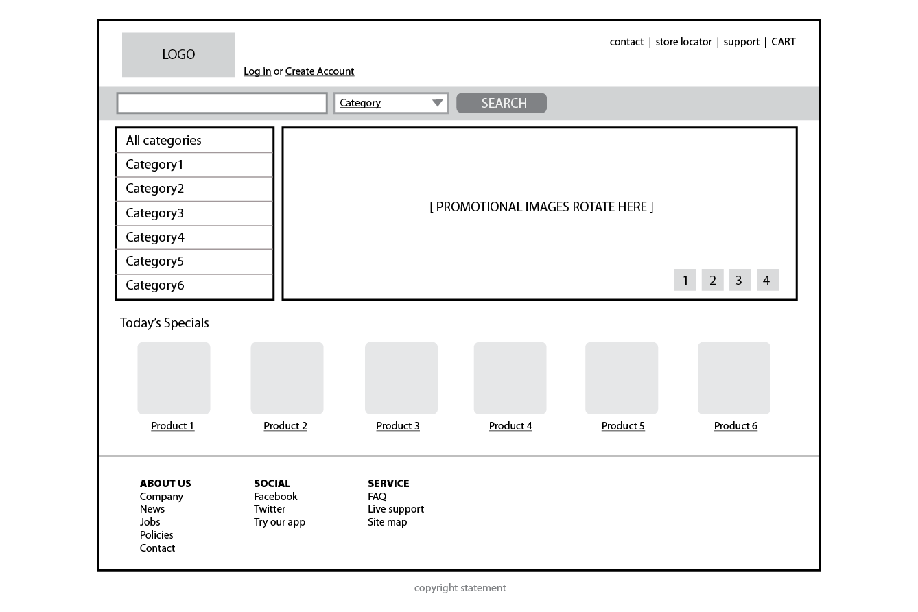
Wireframe diagrams
A wireframe diagram shows the structure of a web page using only outlines for each content type and widget (Figure 1-1). The purpose of a wireframe diagram is to indicate how the screen real estate is divided and where functionality and content such as navigation, search boxes, form elements, and so on, are placed. Colors, fonts, and other visual identity elements are deliberately omitted so as not to distract from the structure of the page. These diagrams are usually annotated with instructions for how things should work so the development team knows what to build.
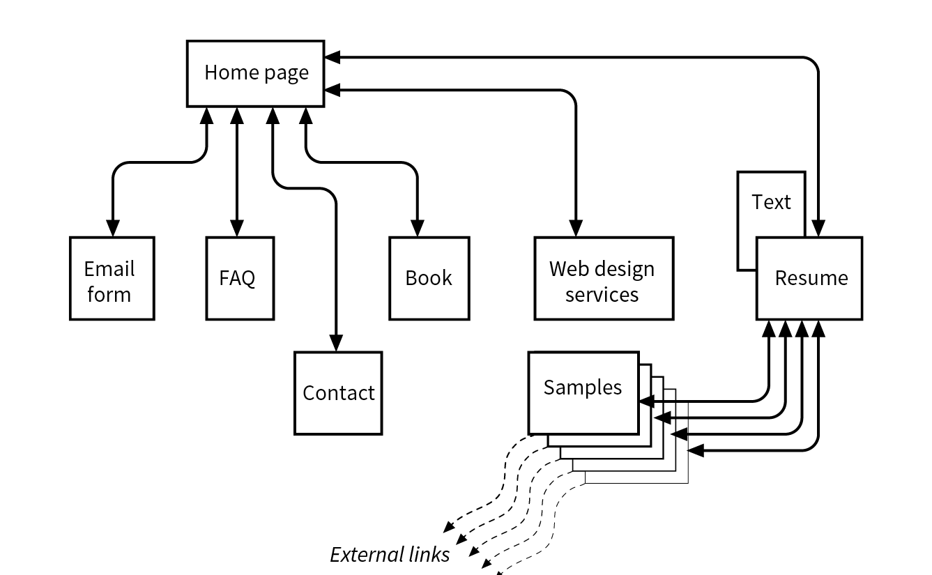
Site diagram
A site diagram indicates the structure of the site as a whole and how individual pages relate to one another. Figure 1-2 shows a very simple site diagram. Some site diagrams fill entire walls!
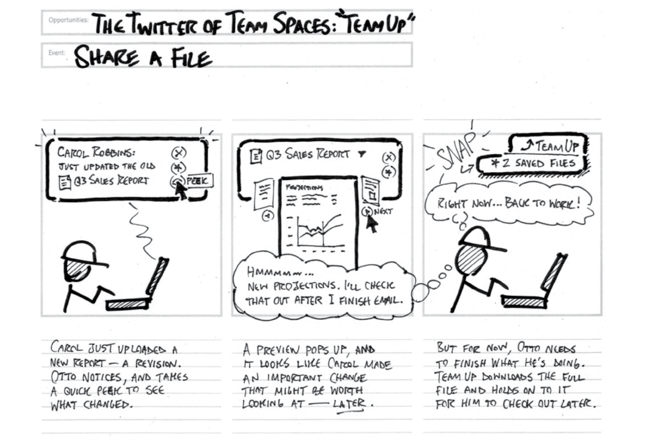
Storyboards and user flow charts
A storyboard traces the path through a site or application from the point of view of a typical user (a persona in UX lingo). It usually includes a script and “scenes” consisting of screen views or the user interacting with the screen. The storyboard aims to demonstrate the steps it takes to accomplish tasks, outlines possible options, and also introduces some standard page types. Figure 1-3 shows a simple storyboard. A user flow chart is another method for showing how the parts of a site or application are connected, but it tends to focus on technical details rather than telling a story. For example, “when the user does this, it triggers that function on the server.” It is common for designers to create a user flow chart for the steps in a process such as member registration or online payments.
There are many books on UX, interaction, and UI design, but these are a few of the classics to get you started:
Because the web is a visual medium, web pages require attention to their visual presentation. First impressions are everything. A graphic designer creates the “look and feel” of the site—logos, graphics, type, colors, layout, and so on—to ensure that the site makes a good first impression and is consistent with the brand and message of the organization it represents.
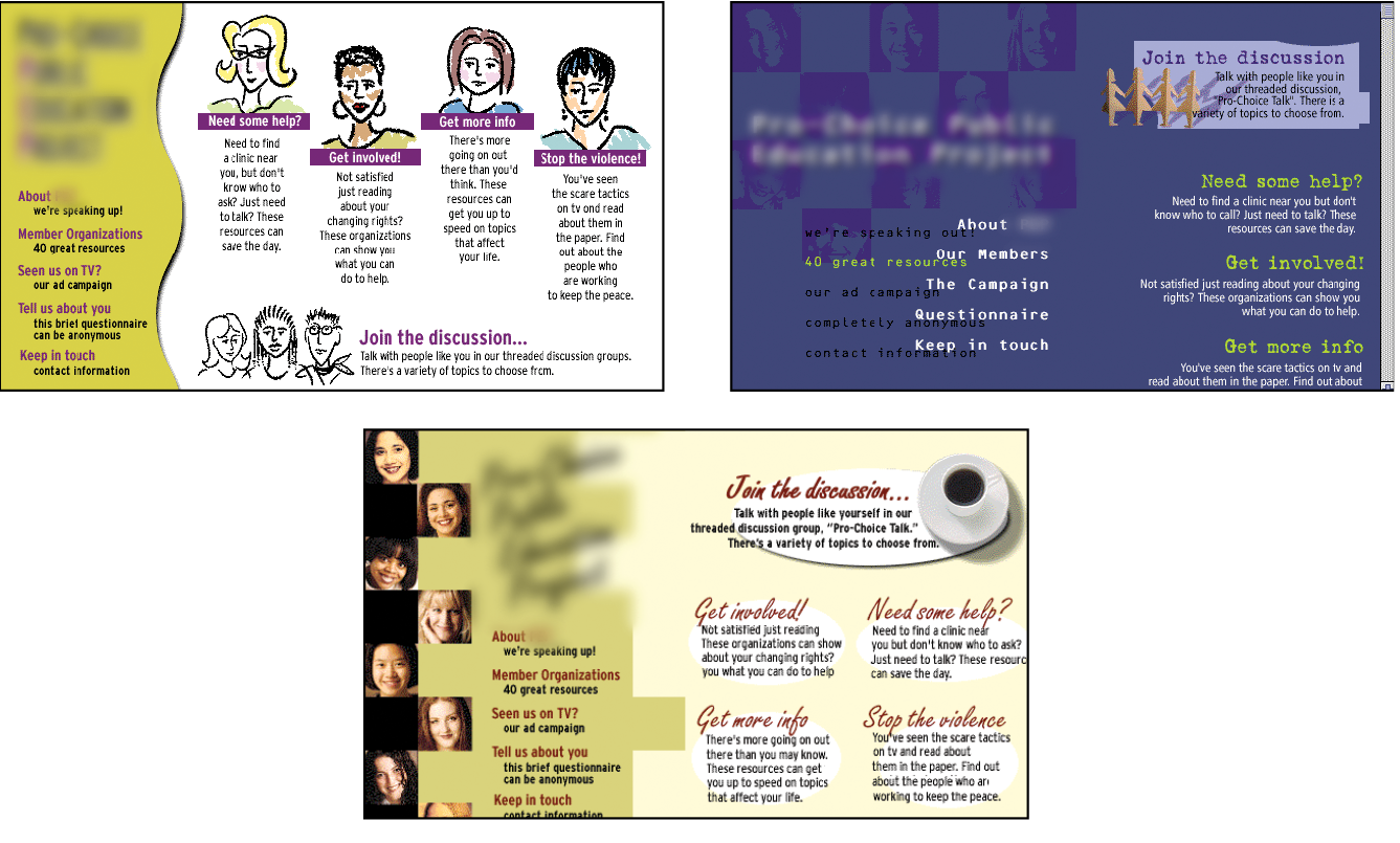
There are many methods and deliverables that can be used to present a visual design to clients and stakeholders. The most traditional are sketches or mockups (created in Photoshop or a similar tool) of the way the site might look, such as the home page mockups shown in Figure 1-4.
Now that sites appear on screens of all sizes, many designers prefer to discuss the visual identity (colors, fonts, image style, etc.) in a way that isn’t tied to a specific layout like the typical desktop view shown in Figure 1-4. The idea is to agree upon a visual language for the site before production begins.
One option for separating style from screen size is to use style tiles, a technique introduced by Samantha Warren (see Note). Style tiles include examples of color schemes, branding elements, UI treatments, text treatment, and mood (Figure 1-5). Once the details are decided upon, they can be implemented into working prototypes and the final site. For more on this technique, visit Samantha’s excellent site, styletil.es, where you can download a template.

Graphic designers may also be responsible for producing the image assets for the site. They will need to know how to optimize images for the fastest delivery and how to address the requirements of varying screen sizes. It is also common for the development team to handle image optimization, but I think it is a skill every visual designer should have. We’ll discuss image optimization in Chapter 24, Image Asset Production.
Designers may also be responsible for creating a style guide that documents style choices, such as fonts, colors, and other style embellishments, in order to keep the site consistent over time. For a list of examples, articles, books, and podcasts about web style guides, visit the “Website Style Guide Resources” page at styleguides.io.
A large share of the website building process involves creating and troubleshooting the documents, style sheets, scripts, and images that make up a site. At web design firms, the team that handles the creation of the files that make up the site (or templates for pages that get assembled dynamically) is usually called the development or production department.
Development falls under two broad categories: frontend development and backend development. Once again, these tasks may fall to specialists, but it is just as common for one person or team to handle both responsibilities.
Frontend refers to any aspect of the design process that appears in or relates directly to the browser. That includes HTML, CSS, and JavaScript, all of which you will need to have intricate knowledge of if you want a job as a web developer. Let’s take a quick look at each.
Authoring is the process of preparing content for delivery on the web, or more specifically, marking up the content with HTML tags that describe its content and function.
HTML (HyperText Markup Language) is the authoring language used to create web page documents. The current version (and the version documented in this book) is HTML 5.2. Appendix D, From HTML+ to HTML5, tells the history of HTML and lists what makes HTML5 unique.
HTML is not a programming language; it is a markup language, which means it is a system for identifying and describing the various components of a document such as headings, paragraphs, and lists. The markup indicates the document’s underlying structure (you can think of it as a detailed, machine-readable outline). You don’t need programming skills—only patience and common sense—to write HTML.
The best way to learn HTML is to write out some pages by hand, as we will be doing in the exercises in Part II of this book.
While HTML is used to describe the content in a web page, Cascading Style Sheets (CSS) describe how that content should look (see Note). The way the page looks is referred to as its presentation. Fonts, colors, background images, line spacing, page layout, and so on, are all controlled with CSS. You can even add special effects and basic animation to your page.
When this book uses the term “style sheets,” it always refers to Cascading Style Sheets, the standard style sheet language for the World Wide Web. Style sheets (including what “cascading” means!) are discussed further in Part III.
The CSS specification also provides methods for controlling how documents will be presented in contexts other than a browser, such as in print or read aloud by a screen reader; however, we won’t be covering them much here.
Although it is possible to publish web pages using HTML alone, you’ll probably want to take on style sheets so you’re not stuck with the browser’s default styles. If you’re looking into designing websites professionally, either as a designer or as a developer, proficiency at style sheets is mandatory.
JavaScript is a scripting language that adds interactivity and behaviors to web pages, including these (to name just a few):
You may also hear the term DOM scripting used in relation to JavaScript. DOM stands for Document Object Model, and it refers to the standardized list of web page elements that can be accessed and manipulated using JavaScript (or another scripting language).
Frontend developers may also be required to be familiar with JavaScript frameworks (such as React, Bootstrap, Angular, and others) that automate a lot of the production process. They’ll likely also need to be handy with AJAX (which stands for “Asynchronous JavaScript And XML”), a technique used to load content in the background, allowing the page to update smoothly without reloading (like those automatically refreshing feeds).
Web scripting definitely requires some traditional computer programming prowess. While many web developers have degrees in computer science, it is also common for developers to be self-taught. A few developers I know started by copying and adapting existing scripts, then gradually added to their programming skills with each new project. Still, if you have no experience with programming languages, the initial learning curve may be a bit steep.
If you want to be a web developer for a living, JavaScript is a basic requirement. Designers will benefit from understanding what JavaScript can do, but may not need to learn to write it if they are working with a development team. Chapter 21, Introduction to JavaScript, will get you started understanding how it works, and I recommend Learning JavaScript by Ethan Brown (O’Reilly) to learn more.
Backend developers focus on the server, including the applications and databases that run on it. They may be responsible for installing and configuring the server software (we’ll be looking more at servers in Chapter 2, How the Web Works). They will certainly be required to know at least one, and probably more, server-side programming languages, such as PHP, Ruby, .NET (or ASP.NET), Python, or JSP, in order to create applications that provide the functionality required by the site. Applications handle tasks and features like forms processing, content management systems (CMSs), and online shopping, just to name a few.
Additionally, backend developers need to be familiar with configuring and maintaining databases that store all of the data for a site, such as the content that gets poured into templates, user accounts, product inventories, and more. Some common database languages include MySQL, Oracle, and SQL Server.
Backend development is well beyond the scope of this book, but it is important to know the sorts of tasks that get taken care of at the server level. You should be aware that it is possible to get functionality like shopping carts, mailing lists, and so on as prepackaged solutions from your hosting company without having to program it from scratch.
Not surprisingly, there are a myriad of other roles that contribute to the creation and maintenance of a site. Here are a few common roles that fall just outside the moniker “web design.”
Product manager
The product manager of a website or application guides its design and development in a way that meets business goals. This member of the team must have a thorough understanding of the target market as well as the processes involved in the creation of the site itself. Product managers develop the overall strategy for the site from a marketing perspective, including how and when it gets released.
Project manager
The project manager coordinates the designers, developers, and everyone else who is working on the site. They manage things like timelines, development approaches, deliverables, and so on. The project manager works with the product manager and other product owners to make sure that the project gets done on time and on budget.
SEO specialist
A website or application isn’t much good if nobody knows it exists, so it is crucial that a site be easily found by search engines. Search Engine Optimization (SEO) is a discipline focused on tweaking the site structure and code in a way that increases the chances it will be highly ranked in search results. There may be an SEO specialist on the in-house team, or a company may choose to hire an outside SEO firm. SEO is sometimes perceived as a dark art, but there are many ways to improve findability that are not underhanded. In fact, the number one technique for improving SEO is simply having good content with savvy HTML markup.
Multimedia producers
One of the cool things about the web is that you can add multimedia elements to a site, including sound, video, animation, and even interactive games. Creating multimedia elements is generally best left to artists and technicians in those fields, although they may be part of the web team if video, animation, or interactivity are core to the site’s mission.
That concludes our stroll through the virtual village of workers involved in the creation of a website. The larger the site, the more likely each team member will have a narrow specialization and job titles like “UX Lead for Error Messages.” More likely, everybody on the team will possess a spectrum of skills, and the lines between disciplines will blur. For example, I do Interaction and User Interface design, graphic design, HTML, and CSS, but I do not write JavaScript, work on the server, or get involved with content organization. In this book, I aim to give you a foundation in the frontend technologies that will prepare you for a number of roles.
It should come as no surprise that professional web designers require a fair amount of gear, both hardware and software. One question I’m frequently asked is, “What do I need to buy?” I can’t tell you specifically what to buy, but I will provide an overview of the typical tools of the trade.
For a comfortable web development environment, I recommend the following equipment:
A solid, up-to-date computer
Macintosh, Windows, or Linux is fine, so use whatever you have and are comfortable with. Creative departments in professional web development companies tend to be Mac-based. For backend work, Linux and Windows are popular. Although it is nice to have a super-fast machine, the files that make up web pages are very small and tend not to be too taxing on computers. Unless you’re getting into sound and video editing, don’t worry if your current setup is not the very latest and greatest.
A large monitor
Although not a requirement, a large monitor makes life easier. The more monitor real estate you have, the more windows and control panels you can have open at the same time. You can also see more of your page to make design decisions. If you’re using a large monitor, just make sure you design for users with smaller monitors and devices in mind.
A second computer for testing
Many designers and developers find it useful to have a test computer running a different platform than the computer they use for development (i.e., if you design on a Mac, test on a PC). Because browsers work differently on Macs than on Windows machines, it’s critical to test your pages in as many environments as possible, and particularly on the current Windows operating system. If you are a hobbyist web designer working at home, you could check your pages on a friend’s machine. Mac users should check out the “Run Windows on Your Mac” sidebar.
Mobile devices for testing
The web has gone mobile! That means it is absolutely critical that you test the appearance and performance of your site on browsers on smartphones and tablet devices. Device testing is discussed in Chapter 17, Responsive Web Design.
A scanner and/or camera
If you anticipate making your own images and textures, you’ll need some tools for creating them.
There’s no shortage of software available for creating web pages. In the early days, we just made do with tools originally designed for print. Today, there are wonderful tools created specifically with web design in mind that make the process more efficient. It is a delicate business listing software in a book such as this because a) there are so many programs, b) everyone has their personal favorite, and c) new tools come along so rapidly that there are surely newer, cooler options that you have access to that didn’t exist as I wrote this.
That said, here is a general overview of the types of software that comprise the tools of our trade, along with a few specific mentions of the most popular in each class.
To do the exercises in this book, all you’ll need is the text editor that came with your operating system and free image creation software. There is no need to purchase anything to follow along.
Although you can get by with the simple text editors that come with your computer, a dedicated code editor makes the task of writing HTML, CSS, and JavaScript much easier. Code editors understand the syntax of the code you write, so they can do things for you like color coding, error detection, and automatically finishing simple tasks like closing HTML tags. Some provide page previews so you can view the results of your code as you work.
Figure 1-6 shows how an HTML document looks in the Sublime Text editor. Here are just a few of the better-known code editors for web production that are worth exploring:
There is a new breed of interface design tools made specifically for websites and other applications. Because they have been designed from scratch with interface design in mind, they seem to anticipate a web designer’s every need. Interface design tools make it easy to design multiple layouts (such as layouts at various screen sizes) as well as export images and code for use in production. Some allow basic interactivity such as clicks and swipes, so your mockups can be shared online and used for basic interface testing.
Sketch (sketchapp.com, Mac only), shown in Figure 1-7, is extremely popular at the time of this writing. Other options include the following:
It is certainly possible to create all of the images you need for a site by using one of the interface design tools just listed. There are also programs that focus solely on image creation that can export files in web-appropriate formats. For professional designers, the Adobe Creative Cloud (adobe.com) suite of tools, which includes Photoshop (Figure 1-8), Illustrator, and other high-end design tools, is worth the investment.
If the Adobe monthly subscription fee is out of reach, you can try lower-cost alternatives that provide many of the same features. The number of graphics tools out there is dizzying, so I’m gathering just a few here:
The following image editors work right in your browser, without the need to download a program, although you do need to pay for an account:
One of the biggest challenges for web designers is that our sites may look and behave differently from browser to browser. For this reason, it is critical that we test our designs early and often on the widest range of browsers possible. These are the browsers designers and developers keep around for testing:
You will also need to test on a variety of smartphone browsers including iOS Safari, Android browsers, and third-party mobile browsers. We will discuss mobile testing further in Chapter 17.
Web design and development involves a lot of moving files around, particularly from the computer where you do your work to the server computer that hosts the site. To move files across the internet, you use an FTP (short for File Transfer Protocol) program. You will find that many hosting services offer their own FTP tools for uploading your files to their servers. Many of the code editors listed earlier also include built-in FTP functionality. Or, you can use a standalone FTP program, such as one of these:
You may also find it useful to have a terminal application (command-line tool) that allows you to type Unix commands for setting file permissions, moving or copying files and directories, or managing the server software. Command-line tools, which have a number of uses in web design and development workflow, are discussed in more detail in Chapter 20, Modern Web Development Tools:
I hope that this chapter has given you an overview of the many roles and responsibilities that fall under the umbrella of “web design.” I also hope that you come away realizing that you don’t need to learn everything. And even if you want to learn everything eventually, you don’t need to learn it all at once. So relax, and don’t worry. The other good news is that, while many professional tools exist, it is possible to create a basic website and get it up and running without spending much money by using freely available or inexpensive tools and your existing computer setup.
As you’ll soon see, it’s easy to get started making web pages—you will be able to create simple pages by the time you’re done reading this book. From there, you can continue adding to your bag of tricks and find your particular niche in web design. In the meantime, try answering the questions in Exercise 1-1.
Each chapter in this book ends with a few questions that you can answer to see if you picked up the important bits of information. Answers appear in Appendix A.
a. | Graphic designer | _____ | HTML and CSS documents |
b. | Production department | _____ | PHP scripts |
c. | User experience designer | _____ | “Look and feel” deliverables |
d. | Backend programmer | _____ | Storyboards |
a. | HTML | _____ | Checks a form field for a valid entry |
b. | CSS | _____ | Creates a custom server-side web application |
c. | JavaScript | _____ | Identifies text as a second-level heading |
d. | Ruby | _____ | Makes all second-level headings blue |
In this chapter
An explanation of the web as it relates to the internet
The role of the server
The role of the browser
URLs and their components
The anatomy of a web page
I got started in web design in early 1993—pretty close to the start of the web itself. That’s a quarter of a century ago (gasp!), but I still distinctly remember the first time I looked at a web page. It was difficult to tell where the information was coming from and how it all worked.
This chapter sorts out the pieces and introduces some basic terminology. We’ll start with the big picture and work down to specifics.
No, it’s not a battle to the death, just an opportunity to point out the distinction between two words that are increasingly being used interchangeably.
The internet is an international network of connected computers. No company owns the internet; it is a cooperative effort governed by a system of standards and rules. The purpose of connecting computers together, of course, is to share information. There are many ways information can be passed between computers, including email (POP3/IMAP/SMTP), file transfer (FTP), secure shell (SSH), and many more specialized modes upon which the internet is built. These standardized methods for transferring data or documents over a network are known as protocols.
The web (originally called the World Wide Web, thus the “www” in site addresses) is just one of the ways information can be shared over the internet. It is unique in that it allows documents to be linked to one another via hypertext links—thus forming a huge “web” of connected information. The web uses a protocol called HTTP (HyperText Transfer Protocol). That acronym should look familiar because it is the first four letters of nearly all website addresses, as we’ll discuss in an upcoming section.
The web is a subset of the internet. It is just one of many ways information can be transferred over networked computers.
Let’s talk more about the computers that make up the internet. Because they “serve up” documents upon request, these computers are known as servers. More accurately, the server is the software (not the computer itself) that allows the computer to communicate with other computers; however, it is common to use the word “server” to refer to the computer as well. The role of server software is to wait for a request for information, and then retrieve and send that information back as quickly as possible.
There’s nothing special about the computers themselves…picture anything from a high-powered Unix machine to a humble personal computer. It’s the server software that makes it all happen. In order for a computer to be part of the web, it must be running special web server software that allows it to handle HyperText Transfer Protocol transactions. Web servers are also called HTTP servers.
There are many server software options out there, but the two most popular are Apache (open source software) and Microsoft Internet Information Services (IIS). Apache is freely available for Unix-based computers and comes installed on Macs running macOS. There is a Windows version as well. Microsoft IIS is part of Microsoft’s family of server solutions.
Every computer and device (router, smartphone, car, etc.) connected to the internet is assigned a unique numeric IP address (“IP” stands for “Internet Protocol”). For example, as I write this, the computer that hosts oreilly.com has the IP address 199.27.145.64. All those numbers can be dizzying, so fortunately, the Domain Name System (DNS) was developed to allow us to refer to that server by its domain name, “oreilly.com”, as well. The numeric IP address is useful for computer software, while the domain name is more accessible to humans. Matching the text domain names to their respective numeric IP addresses is the job of a separate DNS server. If you think of an IP address as a telephone number, the DNS server would be the phonebook.
It is possible to configure your web server so that more than one domain name is mapped to a single IP address, allowing several sites to share a single server.
We now know that the server does the servin’, but what about the other half of the equation? The software that does the requesting is called the client. People use desktop browsers, mobile browsers, and other assistive technologies (such as screen readers) as clients to access documents on the web. The server returns the documents for the browser (also referred to as the user agent in technical circles) to display.
The requests and responses are handled via the HTTP protocol, mentioned earlier. Although we’ve been talking about “documents,” HTTP can be used to transfer images, movies, audio files, data, scripts, and all the other web resources that commonly make up websites and applications.
It is common to think of a browser as a window on a computer monitor with a web page displayed in it. These are known as graphical browsers or desktop browsers and for a long time, they were the only web-viewing game in town. The most popular desktop browsers as of this writing include Edge and Internet Explorer for Windows, Chrome, Firefox, and Safari, with Opera and Vivaldi bringing up the rear.
These days, however, more than half of web traffic comes from mobile browsers on smartphones and tablets such as Safari on iOS, Android and Chrome browsers on Android devices, Opera Mini, and a myriad of other default and installable mobile browsers (see en.wikipedia.org/wiki/Mobile_browser for a complete list). Navigating the web on a touch screen is the new normal.
It is also important to keep alternative web experiences in mind. Users with impaired sight may be listening to a web page read by a screen reader (or simply make their text extremely large). Users with limited mobility may use assistive technology such as joysticks or voice commands to access links and enter content. The sites we build must be accessible and usable for all users, regardless of their browsing experiences.
The web is also finding its way onto smart TVs and gaming systems, where users access our pages with TV remotes or Xbox controllers. You never know where the web will pop up next!
The reality is that pages may look and perform differently from browser to browser. This is due to varying support for web technologies, varying device capabilities, and the users’ ability to set their own browsing preferences. It is the most challenging aspect of designing and developing for our medium.
Every page and resource on the web has its own special address called a URL, which stands for Uniform Resource Locator. It’s nearly impossible to get through a day without seeing a URL (pronounced “U-R-L,” not “erl”) plastered on the side of a bus, printed on a business card, or broadcast on a television commercial. Web addresses are fully integrated into modern vernacular.
Some URLs are short and sweet. Others may look like crazy strings of characters separated by dots (periods) and slashes, but each part has a specific purpose. Let’s pick one apart.
A complete URL is generally made up of three components: the protocol, the site name, and the absolute path to the document or resource, as shown in Figure 2-1.
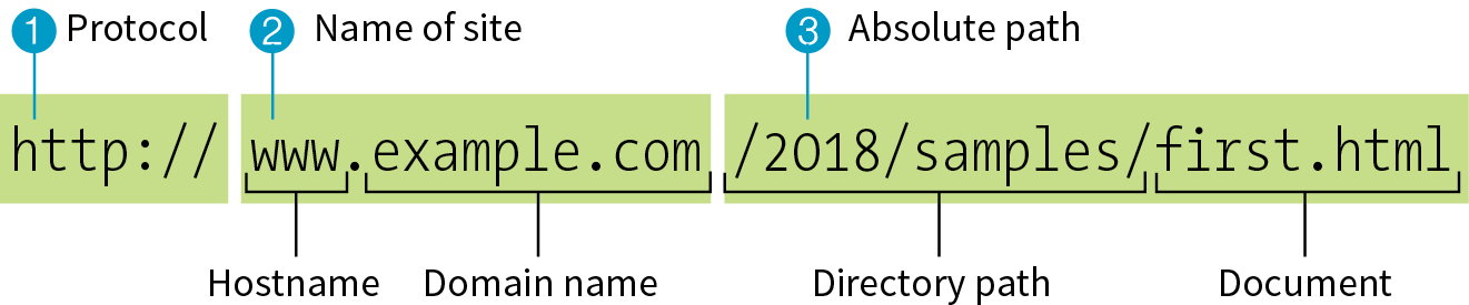
1 http://
The first thing the URL does is to define the protocol that will be used for that particular transaction. The letters “HTTP” let the server know to use HyperText Transfer Protocol, or get into “web mode.” You may also see a URL begin with https://, which I explain in the “HTTPS, The Secure Web Protocol” sidebar.
2 www.example.com
The next portion of the URL identifies the website by its domain name. In this example, the domain name is “example.com.” The “www.” part at the beginning is the particular hostname at that domain. The hostname “www” has become a convention, but is not a rule. In fact, sometimes the hostname may be omitted. There can be more than one website at a domain (called subdomains). For example, there might also be “development.example.com,” “clients.example.com,” and so on.
3 /2018/samples/first.html
This is the absolute path through directories on the server to the requested HTML document, first.html. The words separated by slashes are the directory names, starting with the root directory of the host (as indicated by the initial /). Because the internet originally comprised computers running the Unix operating system, our current way of doing things still follows Unix rules and conventions, hence the / separating directory names.
To sum it up, the URL in Figure 2-1 says it would like to use the HTTP protocol to connect to a web server on the internet called “www.example.com” and to request the document first.html, located in the samples directory, which is in the 2018 directory.
Obviously, not every URL you see is so lengthy. To get to O’Reilly’s site, you’d expect to type oreilly.com instead of http://www.oreilly.com/index.html. Here’s why that works.
Because nearly all web pages use the HyperText Transfer Protocol, the http:// part is often just implied. This is the case when site names are advertised in print or on TV, as a way to keep the URL easy to remember.
Additionally, browsers are programmed to add http:// automatically as a convenience to save you some keystrokes. It may seem like you’re leaving it out, but it is being sent to the server behind the scenes.
When we begin using URLs to create hyperlinks in HTML documents in Chapter 6, Adding Links, you’ll learn that it is necessary to include the protocol when making a link to a web page on another server.
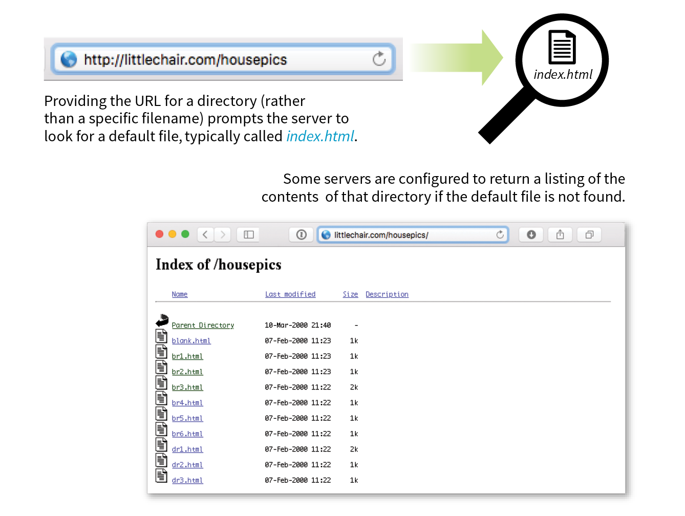
Many addresses do not include a filename, but simply point to a directory, like these:
http://www.oreilly.com http://www.jendesign.com/resume/
When a server receives a request for a directory name rather than a specific file, it looks in that directory for a default document, typically named index.html. So when someone types the previous URLs into his browser, what he’ll actually see is this:
http://www.oreilly.com/index.htmlhttp://www.jendesign.com/resume/index.html
The name of the default file (also referred to as the index file) may vary, and depends on how the server is configured. In these examples, it is named index.html, but some servers use the filename default.htm. If your site uses server-side programming to generate pages, the index file might be named index.php or Default.aspx. Just check with your server administrator or the tech support department at your hosting service to make sure you give your default file the proper name.
Another thing to notice is that in the first example, the original URL did not have a trailing slash to indicate it was a directory. If the slash is omitted, the server checks to see if the request is a file or a directory. If it is a directory, the server asks the browser to send the request again with a slash. In the end, the slash is included for directories, even if it isn’t included the first time it is entered (see Performance Tip).
The index file is also useful for security. Some servers (depending on their configuration) display the contents of the directory if the default file is not found. Figure 2-2 shows how the documents in the housepics directory are exposed as the result of a missing default file. One way to prevent people from snooping around in your files is to be sure there is an index file in every directory. Your server administrator may also add other protections to prevent your directories from displaying in the browser.
We’re all familiar with what web pages look like in the browser window, but what’s happening “under the hood”?
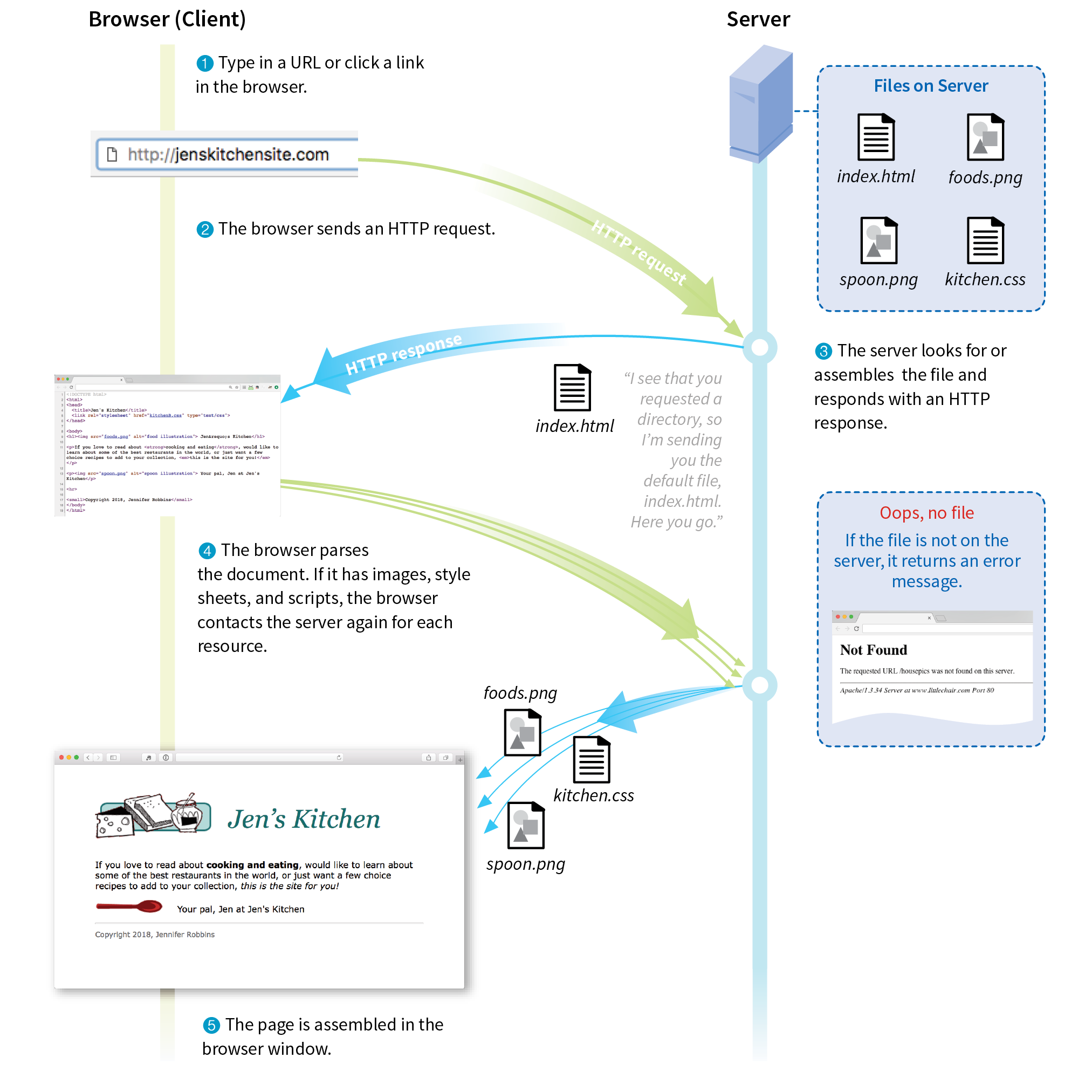
At the top of Figure 2-3, you see a minimal web page as it appears in a graphical browser. Although you see it as one coherent page, it is actually assembled from four separate files: an HTML document (index.html), a style sheet (kitchen.css), and two graphics (foods.png and spoon.png). The HTML document is running the show.
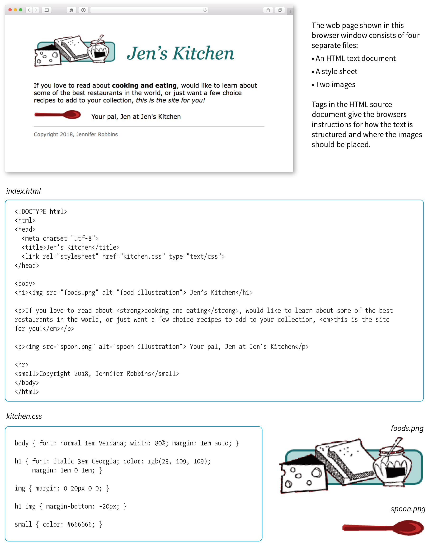
You may be as surprised as I was to learn that the graphically rich and interactive pages we see on the web are generated by simple, text-only documents. The text file behind the scenes is referred to as the source document.
Take a look at index.html, the source document for the Jen’s Kitchen web page. You can see that it contains the text content of the page plus special tags (indicated with angle brackets, < and >) that describe each element on the page.
Adding descriptive tags to a text document is known as “marking up” the document. Web pages use a markup language called HyperText Markup Language, or HTML for short, which was created especially for documents with hypertext links. HTML defines dozens of text elements that make up documents such as headings, paragraphs, emphasized text, and of course, links. There are also elements that add information about the document (such as its title), media such as images and videos, and widgets for form inputs, just to name a few.
You can view the source for any web page. Exercise 2-1 gives you some prompts and pointers.
The version of HTML we use today is HTML5. There have been several versions of HTML since its birth in 1989, and a few that are still in use today. There is a complete history of HTML, all its versions, and an overview of what makes HTML5 unique in Appendix D, From HTML+ to HTML5.
Keep in mind that while learning from others’ work is fine, stealing other people’s code is poor form (or even illegal). If you want to use code as you see it, ask for permission and always give credit to those who did the work.
You’ll be learning the nitty-gritty of markup in Part II, so I don’t want to bog you down with too much detail right now, but there are a few things I’d like to point out about how HTML works and how browsers interpret it.
Read through the HTML document in Figure 2-3 and compare it to the browser results. It’s easy to see how the elements marked up with HTML tags in the source document correspond to what displays in the browser window.
First, you’ll notice that the text within brackets (for example, <body> and <strong>) does not display in the final page. The browser displays only what’s between the tags—the content of the element. The markup is hidden. The tag provides the name of the HTML element—usually an abbreviation such as “h1” for “heading level 1,” or “em” for “emphasized text.”
Second, you’ll see that most of the HTML tags appear in pairs surrounding the content of the element. In our HTML document, <h1> indicates that the following text should be a first-level heading; </h1> indicates the end of the heading. Some elements, called empty elements, do not have content. In our sample, the <hr> tag indicates an empty element that tells the browser to “insert a horizontal rule here” as a thematic divider.
Because I was unfamiliar with computer programming when I first began writing HTML, it helped me to think of the tags and text as “beads on a string” that the browser interprets one by one, in sequence. For example, when the browser encounters an open bracket (<), it assumes all of the following characters are part of the markup until it finds the closing bracket (>). Similarly, it assumes all of the content following an opening <h1> tag is a heading until it encounters the closing </h1> tag. This is the manner in which the browser parses the HTML document. Understanding the browser’s method can be helpful when troubleshooting a misbehaving HTML document.
Obviously, there are no pictures in the HTML file itself, so how do they get there when you view the final page? You can see in Figure 2-3 that each image is a separate file. The images are placed in the flow of the text with the HTML image element (img), which tells the browser where to find the graphic (its URL). When the browser sees the img element, it makes another request to the server for the image file, and then places it in the content flow.
The browser also sends requests to the server for style sheets (like kitchen.css), JavaScript files (.js), and other embedded media like audio and videos. The browser software (or more specifically, its rendering engine) brings the separate pieces together into the final page.
The assembly of the page generally happens in an instant, so it appears as though the whole page loads all at once. Over slow connections or if the page includes huge graphics or media files, the assembly process may be more apparent as images lag behind the text. The page may even need to be redrawn as new images, fonts, and style sheets arrive (although you can construct your pages in such a way that prevents this from happening).
I want to direct your attention to one last key ingredient of our minimal page. Near the top of the HTML document there is a link element that points to the style sheet document kitchen.css. That style sheet includes a few lines of instructions for how the page should look in the browser. These are style instructions written according to the rules of Cascading Style Sheets (CSS). CSS allows designers to add visual style instructions (known as the document’s presentation) to the marked-up text (the document’s structure, in web design terminology). In Part III, you’ll get to know the power of Cascading Style Sheets.
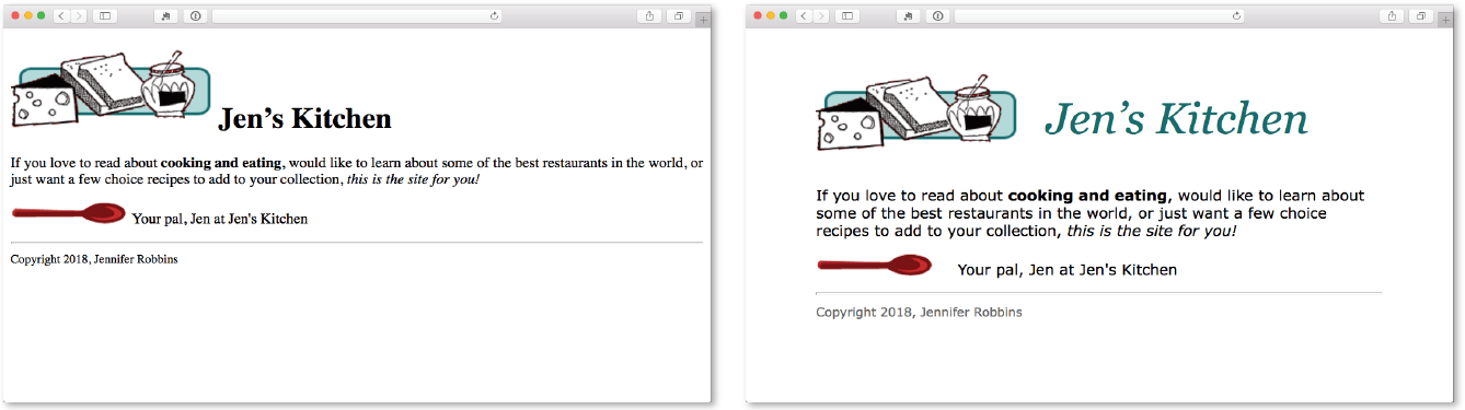
Figure 2-4 shows the Jen’s Kitchen page without (top) and with (bottom) the style instructions. Browsers come equipped with default styles for every HTML element they support, so if an HTML document lacks custom style instructions, the browser will use its own. That’s what you see in the screenshot on the top. Even just a few style rules can make big improvements to the appearance of a page.
To make elements on the page do something, you use a scripting language called JavaScript (see Note). There are no scripts on the Jen’s Kitchen page because I thought it best to keep things simple this early in the book, but know that JavaScript is an essential ingredient in modern websites.
Whereas HTML provides the structure and the CSS style sheet alters how things look, JavaScript adds a behavior component that controls how things work. Scripts may be standalone files on the server (with the .js suffix) or be written out right in the document. They may be triggered to run immediately when the page loads or be triggered by something the user does, like click or hover on an element or enter something in a form field.
You’ll get a basic introduction to JavaScript in Part IV of this book.
I should note that I’ve depicted a traditional and simplified scenario here to tell you how web pages are put together. These days, it is common for web pages to be generated from content management systems (CMSs) that keep content in databases and use templates to assemble the data into pages on the fly. In that case, in Step 3b, there is a more complicated process of assembling the file from various parts rather than just handing off an existing file.
Let’s play a round of “Identify That Acronym!” The following are a few basic web terms mentioned in this chapter. Answers are in Appendix A.
|
1. |
HTML |
______ |
a. |
Home of Mosaic, the first graphical browser |
|
2. |
W3C |
______ |
b. |
The location of a web document or resource |
|
3. |
CERN |
______ |
c. |
The markup language used to describe web content |
|
4. |
CSS |
______ |
d. |
Matches domain names with numeric IP addresses |
|
5. |
HTTP |
______ |
e. |
A protocol for file transfer |
|
6. |
IP |
______ |
f. |
Protocol for transferring web documents on the internet |
|
7. |
URL |
______ |
g. |
The language used to instruct how web content looks |
|
8. |
NCSA |
______ |
h. |
Particle physics lab where the web was born |
|
9. |
DNS |
______ |
i. |
Internet Protocol |
|
10. |
FTP |
______ |
j. |
The organization that monitors web technologies |
In this chapter
The web on mobile devices
The benefits of web standards
Progressive enhancement
Responsive Web Design
Accessibility
Site performance
As the web matures and the number of devices we access it from increases exponentially, our jobs as web designers and developers get significantly more complicated. Frankly, there’s a lot more going on out there than I can fit in this book. In the chapters that follow, I will focus on the basic building blocks of web design—HTML elements, CSS styles, a taste of JavaScript, and web image production—that will give you a solid foundation for the further development of your skills.
Before we get to the nuts and bolts, I want to introduce some Big Concepts that every web designer needs to know. We’ll look at ideas and concerns that inform our decisions and contribute to the contemporary web environment. I’ll be referring back to the terminology introduced here frequently.
The heart of the matter is that as web designers, we never know exactly how the pages we create will be viewed. We don’t know which of the dozens of browsers might be used, whether it is on a desktop computer or something more portable, how large the browser window will be, what fonts are installed, whether functionality such as JavaScript is enabled, how fast the internet connection is, whether the pages are being read by a screen reader, and so on. The Big Concepts in this chapter are primarily reactions to and methods for coping with the inescapable element of the Unknown in our medium. They include the following:
Because we’re just getting started, I will keep the descriptions brief and fairly non-technical. My goal is that you have a basic understanding of what I mean by terms like “progressive enhancement” when you encounter them in lessons later. Many excellent articles and books have been written on each of these topics and their related production techniques, and I’ll provide pointers to resources for further reading.
Until 2007, we could be relatively certain that our users were visiting our sites while sitting at their desks, looking at a large monitor, using a speedy internet connection. We had all more or less settled on 960 pixels as a good width for a web page based on the most common monitor size. Back then, our biggest concern was dealing with the dozen or so desktop browsers and jumping through a few extra hoops to support quirky old versions of Internet Explorer. And we thought we had it rough!
Although you could access web pages and web content on mobile phones prior to 2007, the introduction of the iPhone and Android smartphones as well as faster networks heralded a huge shift in how, when, and where we do our web surfing (particularly in the United States, which lagged behind Asia and the EU in mobile technology). Since then, we’ve seen the introduction of phones and tablets of all different dimensions, as well as web browsers on TVs, gaming systems, and other devices. And the diversity is only going to increase. I think mobile web design expert Brad Frost sums it up nicely in his illustrations in Figure 3-1.
The challenge of designing for all of these devices goes beyond addressing differing screen sizes. There is a world of difference between using a site over a broadband connection and over a slow cell network. Designers need to resist making assumptions about network speed and context based on the screen size. Just because it is a small screen doesn’t mean it’s a slow connection or that the person is in a hurry. It’s not uncommon to leisurely browse the web on a smartphone while sitting on the couch at home with a solid WiFi connection. And iPads with larger, high-resolution displays may be accessing the internet on pokey 3G connections. In other words, it’s complicated!
Resist making assumptions about network speed and context based on the screen size.
For a lot of sites today, more people access the web via their mobile devices than on a desktop computer. Already, a significant portion of Americans use their mobile phones as their only access to the internet. That means it is critical to get the design and functionality right. We’ve made huge strides in serving a pleasing experience to users with handheld devices, and the technology for targeting their needs continues to head in the right direction.
What I want you to learn here is that the way you see your design as you’re working on it on your nice desktop machine is not how it will be experienced by everyone. Some will see it much smaller. Some will see it load painfully slowly. Some may be looking at it on a TV across the room. All web design professionals should keep this fact in mind.
So how do we deal with this diversity? A good start is to follow the standards documented by the World Wide Web Consortium (W3C). Sticking with web standards is your primary tool for ensuring your site is consistent on all standards-compliant browsers (that’s approximately 99% of browsers in current use). It also helps make your content forward-compatible as web technologies and browser capabilities evolve. Another benefit is that you can tell your clients that you create “standards-compliant” sites, and they will like you more.
The notion of standards compliance may seem like a no-brainer, but it used to be that everyone, including the browser makers, played fast and loose with HTML and scripting. The price we paid was incompatible browser implementations and the need to create sites twice to make them work for everyone. I talk more about web standards throughout this book, so I won’t go into too much detail here. Suffice it to say that the web standards are your friends. Everything you learn in this book will start you off on the right foot.
Sticking with web standards is your primary tool for ensuring your site is as consistent as possible.
With a multitude of browsers comes a multitude of levels of support for the web standards. In fact, no browser has implemented all the standards 100%, and there are always new technologies that are slowly gaining steam. Furthermore, users can set their own browser preferences, so they may have a browser that supports JavaScript but have chosen to turn it off. The point here is that we are faced with a wide range of browser capabilities—from only basic HTML support to all the bells and whistles.
Progressive enhancement is one strategy for dealing with unknown browser capabilities (see Note). When designing with progressive enhancement, you start with a baseline experience that makes the content or core functionality available to even the most rudimentary browsers or assistive devices. From there, you layer on more advanced features for the browsers that can handle them. You might finish with some “nice to have” effects, like animation or wrapping text around images in interesting shapes, that enhance the experience for users with the most advanced browsers, but aren’t really critical to the brand or message.
Progressive enhancement is the flip side of an approach to browser diversity called , in which you design the fully enhanced experience first, then create a series of fallbacks for non-supporting browsers. Both methods have their place in modern development. You will find many fallback techniques suggested in this book to be sure less capable browsers are accommodated.
Progressive enhancement is an approach that informs all aspects of page design and production, including HTML, CSS, and JavaScript:
Authoring strategy
When an HTML document is written in logical order and its elements are marked up in a meaningful way, it will be usable on the widest range of browsing environments, including the oldest browsers, future browsers, and mobile and assistive devices. It may not look exactly the same, but the important thing is that your content is available. It also ensures that search engines like Google will catalog the content correctly. A clean HTML document with its elements accurately and thoroughly described is the foundation for accessibility.
Styling strategy
You can create layers of experience simply by taking advantage of the way browsers parse style sheet rules. Without going into too much technical detail, you can write a style rule that makes an element background red, but also include a style that gives it a cool gradient (a blend from one color to another) for browsers that know how to render gradients. Or you can use a cutting-edge CSS selector to deliver certain styles only to cutting-edge browsers. The knowledge that browsers simply ignore properties and rules they don’t understand gives you license to innovate without bringing older browsers to their knees. You just have to be mindful of styling the baseline experience first, then adding improvements once the minimum requirements are met.
Scripting strategy
As with other web technologies, there are discrepancies in how browsers handle JavaScript (particularly on non-desktop devices), and some users opt to turn it off entirely. The first rule in progressive enhancement is to make sure basic functionality—such as linking from page to page or accomplishing essential tasks like data submission via forms—is intact even when JavaScript is off. In this way, you ensure the baseline experience, and enhance it when JavaScript is available.
Progressive enhancement is a strategy for coping with unknown browser capabilities.
By default, most browsers on small devices such as smartphones and tablets shrink a web page down to fit the screen and provide mechanisms for zooming and moving around the page. Although it technically works, it is not a great experience. The text is too small to read, the links are too small to tap, and all that zooming and panning around is distracting.
Responsive Web Design (RWD) is a strategy for providing appropriate layouts to devices based on the size of the viewport (browser window). The key to Responsive Web Design is serving a single HTML document (with one URL) to all devices, but applying different style sheets based on the screen size in order to provide the most optimized layout for that device. For example, when the page is viewed on a smartphone, it appears in one column with large links for easy tapping. But when that same page is viewed on a large desktop browser, the content rearranges into multiple columns with traditional navigation elements. It’s like magic! (Except that it’s actually just CSS.)
Responsive Web Design is a strategy for dealing with unknown screen size.
The web design community has been abuzz about responsive design since Ethan Marcotte first wrote about it and coined the phrase in his article “Responsive Web Design” on A List Apart in 2010 (alistapart.com/articles/responsive-web-design/). It’s become one of the primary tools we use to cope with unknown viewport size.
Figure 3-3 shows some examples of responsive sites at the typical dimensions for a desktop monitor, tablet, and smartphone. You can see many more inspirational examples at the Media Queries gallery site (mediaqueri.es). Try opening one of the responsive sites in your browser and then resizing the window narrow and wide. Watch as the layout changes based on window size. Très cool.
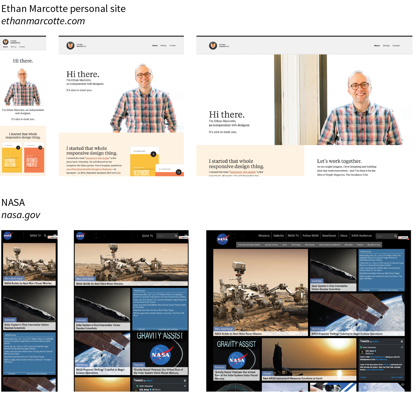
Responsive Web Design helps with matters of layout, but it is not a solution to all mobile web design challenges. The fact is that providing the best experiences for your users and their chosen device may require optimizations that go beyond adjusting the look and feel. You can better address some problems by using the server to detect the device and its capabilities and then making decisions on what to send back.
For some sites and services, it may be preferable to build a separate mobile site (see the “M-dot Sites” sidebar) with a customized interface and feature set that takes advantage of phone capabilities like geolocation. That said, although responsive design won’t fix everything, it is an important part of the solution for delivering satisfactory experiences on a wide variety of browsers.
I’ll cover Responsive Web Design in more detail in Chapter 17, Responsive Web Design, once you have more code experience under your belt. There you will find plenty of resources to continue your responsive design education.
We’ve been talking about the daunting number of browsers in use today, but so far, we’ve only addressed visual browsers controlled with mouse pointers or fingertips. It is critical, however, to keep in mind that people access the web in many different ways—with a keyboard, mouse, voice commands, screen readers, Braille output, magnifiers, joysticks, foot pedals, and so on. Web designers must build pages in a manner that creates as few barriers as possible to getting to information, regardless of the user’s ability and the device used to access the web. In other words, you must design for accessibility.
Although intended for users with disabilities such as poor vision or limited mobility, the techniques and strategies developed for accessibility also benefit other users with less-than-optimum browsing experiences. Accessible sites are also more effectively indexed by search engines such as Google. Making your site accessible is well worth the extra effort.
There are four broad categories of disabilities that affect how people interact with their computers and the information on them:
Vision impairment
People with low or no vision may use an assistive device such as a screen reader, Braille display, or a screen magnifier to get content from the screen. They may also simply use the browser’s text zoom function to make the text large enough to read.
Mobility impairment
Users with limited or no use of their hands may use special devices such as modified mice and keyboards, foot pedals, voice commands, or joysticks to navigate the web and enter information.
Auditory impairment
Users with limited or no hearing will miss out on audio aspects of multimedia, so it is necessary to provide alternatives, such as transcripts for audio tracks or captions for video.
Cognitive impairment
Users with memory, reading comprehension, problem solving, and attention limitations benefit when sites are designed simply and clearly. These qualities are helpful to anyone using your site.
The W3C started the Web Accessibility Initiative (WAI) to address the need to make the web usable for everyone. The WAI site (www.w3.org/WAI) is an excellent starting point for learning more about web accessibility. One of the documents produced by the WAI to help developers create accessible sites is the Web Content Accessibility Guidelines (WCAG and WCAG 2.0). You can read them all at www.w3.org/WAI/intro/wcag.php. The US government based its Section 508 accessibility guidelines on the Priority 1 points of the WCAG (see the sidebar “Government Accessibility Requirements: Section 508”). All sites benefit from these guidelines, but if you are designing a government site, adherence is a requirement.
Another W3C effort is the WAI-ARIA (Accessible Rich Internet Applications) spec, which addresses the accessibility of web applications that include dynamically generated content, scripting, and advanced interface elements that are particularly confounding to assistive devices. The ARIA Recommendation defines a number of roles for content and widgets that authors can explicitly apply using the role attribute. Roles include menubar, progressbar, slider, timer, and tooltip, to name just a few. For the complete list of roles, go to www.w3.org/TR/wai-aria/#role_definitions.
The following resources are good starting points for further exploration of web accessibility:
Although the number of users accessing the internet on slow dial-up connections is shrinking (3–5% in the US as of this writing), the percentage of folks using mobile phones to access the web is increasing dramatically; and for some sectors, such as social media and search, mobile has already exceeded desktop usage. If you have a smartphone, then you know how frustrating it is to wait for a web page to fully display over a cellular data connection.
Site performance is critical regardless of how your users access your site. A study by Google in 20091 showed that the addition of just 100 to 400 milliseconds to their search results page resulted in reduced searches (–0.2 to –0.6%). Amazon.com showed that reducing page load times by just 100ms resulted in a 1% increase in revenue.2 Other studies show that users expect a site to load in under 2 seconds, and nearly a third of your audience will leave your site for another if it doesn’t. Furthermore, those people aren’t likely to come back. Google has added site speed to its search algorithm, so if your site is a slowpoke, it’s not likely to show up in that coveted first screen of results. The takeaway here is that site performance (down to the millisecond!) matters a lot.
There are many things you can do to improve the performance of your site, and they fall under two broad categories: limiting file sizes and reducing the number of requests to the server. The following list only scratches the surface for site optimization, but it gives you a general idea of what can be done:
Every trip to the server in the form of an HTTP request takes a few milliseconds, and those milliseconds can add up. All those little Twitter widgets, Facebook Like buttons, and advertisements can make dozens of server requests each. You may be surprised to see how many server requests even a simple site makes.
If you’d like to see for yourself, you can use the Network tool available with the Developer tools in Chrome, Safari, or Firefox. The Network tool displays each request to the server and how many milliseconds it took. Here’s how you use it in Chrome (but all the browsers work similarly):
Figure 3-5 shows a portion of the performance waterfall chart for oreilly.com. You can poke around any site on the web this way. It can be very educational.
I won’t address site performance in deep technical detail in this book, but I do want you to remember the importance of keeping file sizes as small as possible and eliminating unnecessary server requests in your web design work.
There are other techniques that are too technical for this book (and frankly, for me), and I figure if you are reading this book, you are probably not quite ready to become a site performance wizard. But when you are ready to take it on, here are some resources that should help:
Here are a few questions that check your knowledge of the Big Concepts. If you are stumped, you can find the answers in Appendix A.
1. ____ Progressive enhancement | a. Assistive reading and input devices |
2. ____ Server-side detection | b. Slow connection speeds |
3. ____ Responsive design | c. All levels of browser capabilities |
4. ____ WAI-ARIA | d. Determining which device is being used |
5. ____ Site performance optimization | e. A variety of screen sizes |
In This Chapter
An introduction to elements and attributes
Marking up a simple web page
The elements that provide document structure
Troubleshooting broken web pages
provided a general overview of the web design environment. Now that we’ve covered the big concepts, it’s time to roll up our sleeves and start creating a real web page. It will be an extremely simple page, but even the most complicated pages are based on the principles described here.
In this chapter, we’ll create a web page step-by-step so you can get a feel for what it’s like to mark up a document with HTML tags. The exercises allow you to work along.
This is what I want you to get out of this chapter:
Don’t worry about learning the specific text elements or style sheet rules at this point; we’ll get to those in the following chapters. For now, just pay attention to the process, the overall structure of the document, and the new terminology.
You got a look at an HTML document in Chapter 2, How the Web Works, but now you’ll get to create one yourself and play around with it in the browser. The demonstration in this chapter has five steps that cover the basics of page production:
Step 1: Start with content. As a starting point, we’ll write up raw text content and see what browsers do with it.
Step 2: Give the document structure. You’ll learn about HTML element syntax and the elements that set up areas for content and metadata.
Step 3: Identify text elements. You’ll describe the content using the appropriate text elements and learn about the proper way to use HTML.
Step 4: Add an image. By adding an image to the page, you’ll learn about attributes and empty elements.
Step 5: Change how the text looks with a style sheet. This exercise gives you a taste of formatting content with Cascading Style Sheets.
By the time we’re finished, you’ll have written the document for the page shown in Figure 4-1. It’s not very fancy, but you have to start somewhere.
We’ll be checking our work in a browser frequently throughout this demonstration—probably more than you would in real life. But because this is an introduction to HTML, it’s helpful to see the cause and effect of each small change to the source file along the way.
In this chapter and throughout the book, we’ll be writing out HTML documents by hand, so the first thing we need to do is launch a text editor. The text editor that is provided with your operating system, such as Notepad (Windows) or TextEdit (Macintosh), will do for these purposes. Other text editors are fine as long as you can save plain-text files with the .html extension. If you have a visual web-authoring tool such as Dreamweaver, set it aside for now. I want you to get a feel for marking up a document manually (see the sidebar “HTML the Hard Way”).
This section shows how to open new documents in Notepad and TextEdit. Even if you’ve used these programs before, skim through for some special settings that will make the exercises go more smoothly. We’ll start with Notepad; Mac users can jump ahead.
These are the steps to creating a new document in Notepad on Windows 10 (Figure 4-2):
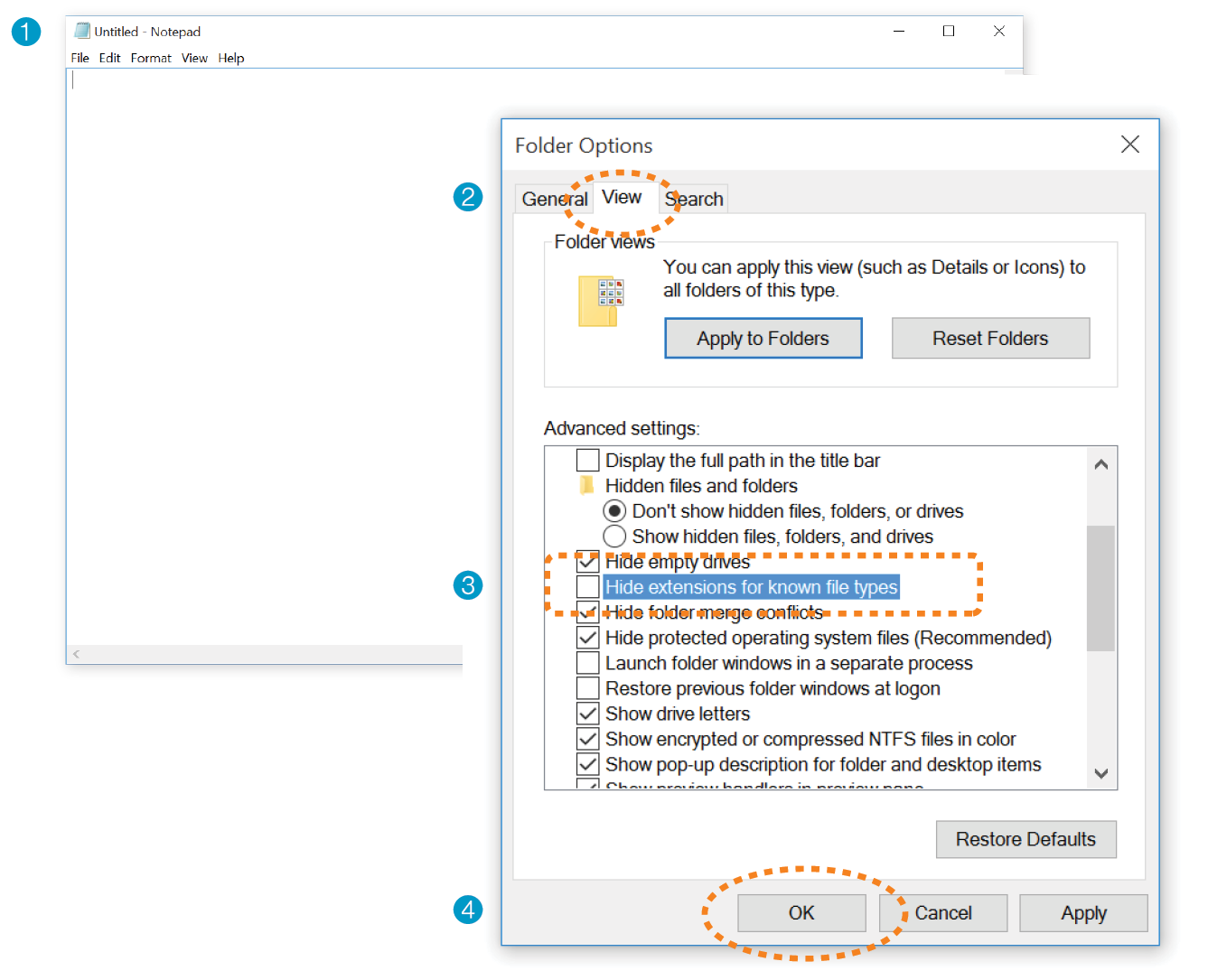
By default, TextEdit creates rich-text documents—that is, documents that have hidden style-formatting instructions for making text bold, setting font size, and so on. You can tell that TextEdit is in rich-text mode when it has a formatting toolbar at the top of the window (plain-text mode does not). HTML documents need to be plain-text documents, so we’ll need to change the format, as shown in this example (Figure 4-3):
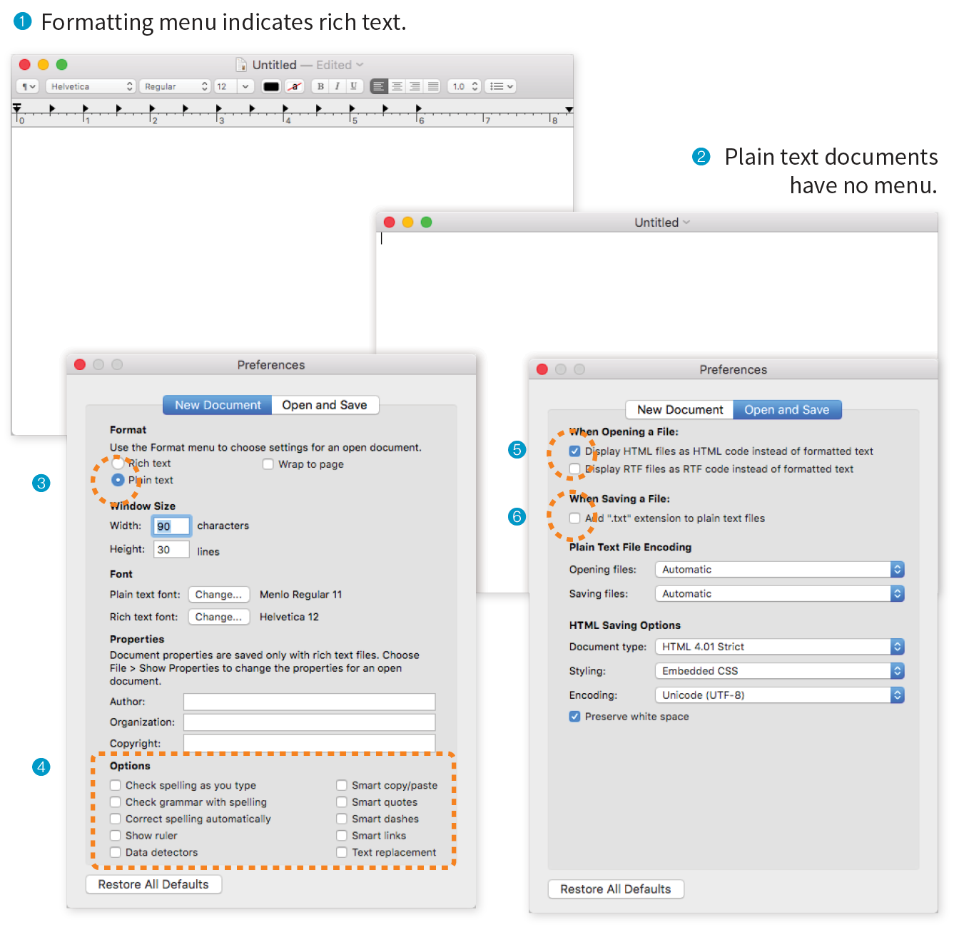
On the New Document tab, select Plain text 3. Under Options, deselect all of the automatic formatting options 4.
On the Open and Save tab, select Display HTML files as HTML Code 5 and deselect “Add ‘.txt’ extensions to plain text files” 6. The rest of the defaults should be fine.
Now that we have our new document, it’s time to get typing. A web page is all about content, so that’s where we begin our demonstration. Exercise 4-1 walks you through entering the raw text content and saving the document in a new folder.
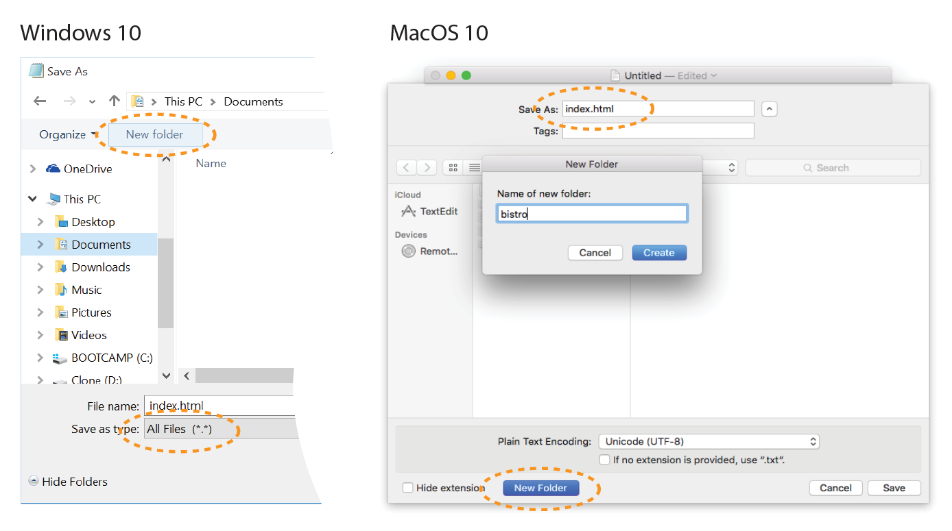
Our page isn’t looking so good (Figure 4-5). The text is all run together into one block—that’s not how it looked when we typed it into the original document. There are a couple of lessons to be learned here. The first thing that is apparent is that the browser ignores line breaks in the source document. The sidebar “What Browsers Ignore” lists other types of information in the source document that are not displayed in the browser window.
Second, we see that simply typing in some content and naming the document .html is not enough. While the browser can display the text from the file, we haven’t indicated the structure of the content. That’s where HTML comes in. We’ll use markup to add structure: first to the HTML document itself (coming up in Step 2), then to the page’s content (Step 3). Once the browser knows the structure of the content, it can display the page in a more meaningful way.
We have our content saved in an HTML document—now we’re ready to start marking it up.
Back in Chapter 2 you saw examples of elements with an opening tag (<p> for a paragraph, for example) and a closing tag (</p>). Before we start adding tags to our document, let’s look at the anatomy of an HTML element (its syntax) and firm up some important terminology. A generic container element is labeled in Figure 4-6.
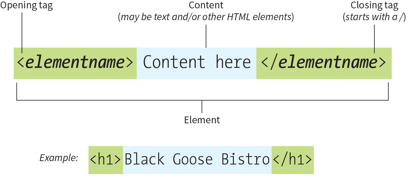
Elements are identified by tags in the text source. A tag consists of the element name (usually an abbreviation of a longer descriptive name) within angle brackets (< >). The browser knows that any text within brackets is hidden and not displayed in the browser window.
The element name appears in the opening tag (also called a start tag) and again in the closing (or end) tag preceded by a slash (/). The closing tag works something like an “off” switch for the element. Be careful not to use the similar backslash character in end tags (see the tip “Slash Versus Backslash”).
The tags added around content are referred to as the markup. It is important to note that an element consists of both the content and its markup (the start and end tags). Not all elements have content, however. Some are empty by definition, such as the img element used to add an image to the page. We’ll talk about empty elements a little later in this chapter.
One last thing: capitalization. In HTML, the capitalization of element names is not important (it is not case-sensitive). So <img>, <Img>, and <IMG> are all the same as far as the browser is concerned. However, most developers prefer the consistency of writing element names in all lowercase (see Note), as I will be doing throughout this book.
There is a stricter version of HTML called XHTML that requires all element and attribute names to appear in lowercase. HTML5 has made XHTML all but obsolete except for certain use cases when it is combined with other XML languages, but the preference for all lowercase element names has persisted.
Figure 4-8 shows the recommended minimal skeleton of an HTML document. I say “recommended” because the only element that is required in HTML is the title. But I feel it is better, particularly for beginners, to explicitly organize documents into metadata (head) and content (body) areas. Let’s take a look at what’s going on in this minimal markup example.
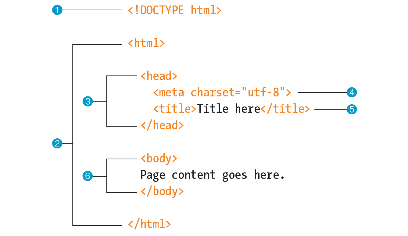
Are you ready to start marking up the Black Goose Bistro home page? Open the index.html document in your text editor and move on to Exercise 4-2.
Not much has changed in the bistro page after setting up the document, except that the browser now displays the title of the document in the top bar or tab (Figure 4-9). If someone were to bookmark this page, that title would be added to their Bookmarks or Favorites list as well (see the sidebar “Don’t Forget a Good Title”). But the content still runs together because we haven’t given the browser any indication of how it should be structured. We’ll take care of that next.
With a little markup experience under your belt, it should be a no-brainer to add the markup for headings and subheads (h1 and h2), paragraphs (p), and emphasized text (em) to our content, as we’ll do in Exercise 4-3. However, before we begin, I want to take a moment to talk about what we’re doing and not doing when marking up content with HTML.
The purpose of HTML is to add meaning and structure to the content. It is not intended to describe how the content should look (its presentation).
Your job when marking up content is to choose the HTML element that provides the most meaningful description of the content at hand. In the biz, we call this semantic markup. For example, the most important heading at the beginning of the document should be marked up as an h1 because it is the most important heading on the page. Don’t worry about what it looks like…you can easily change that with a style sheet. The important thing is that you choose elements based on what makes the most sense for the content.
The purpose of HTML is to add meaning and structure to the content.
In addition to adding meaning to content, the markup gives the document structure. The way elements follow each other or nest within one another creates relationships between them. You can think of this structure as an outline (its technical name is the DOM, for Document Object Model). The underlying document hierarchy gives browsers cues on how to handle the content. It is also the foundation upon which we add presentation instructions with style sheets and behaviors with JavaScript.
Although HTML was intended to be used strictly for meaning and structure since its creation, that mission was somewhat thwarted in the early years of the web. With no style sheet system in place, HTML was extended to give authors ways to change the appearance of fonts, colors, and alignment using markup alone. Those presentational extras are still out there, so you may run across them if you view the source of older sites or a site made with old tools. In this book, however, I’ll focus on using HTML the right way, in keeping with the contemporary standards-based, semantic approach to web design.
OK, enough lecturing. It’s time to get to work on that content in Exercise 4-3.
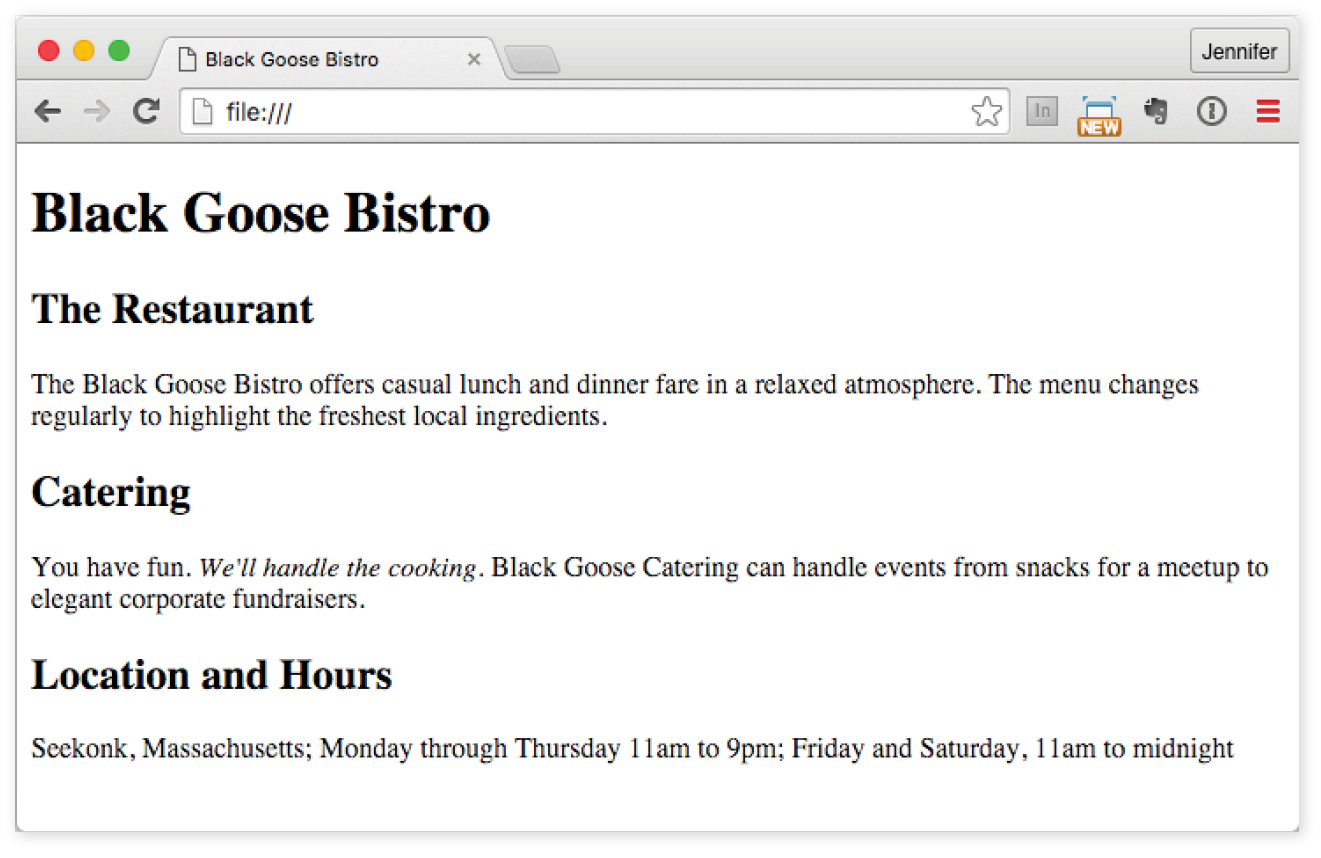
Now we’re getting somewhere. With the elements properly identified, the browser can now display the text in a more meaningful manner. There are a few significant things to note about what’s happening in Figure 4-10.
Although it may seem like stating the obvious, it’s worth pointing out that the heading and paragraph elements start on new lines and do not run together as they did before. That is because by default, headings and paragraphs display as block elements. Browsers treat block elements as though they are in little rectangular boxes, stacked up in the page. Each block element begins on a new line, and some space is also usually added above and below the entire element by default. In Figure 4-11, the edges of the block elements are outlined in red.
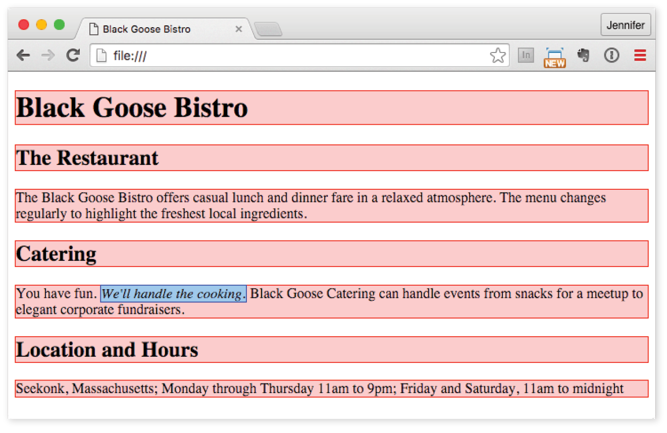
By contrast, look at the text we marked up as emphasized (em, outlined in blue in Figure 4-11). It does not start a new line, but rather stays in the flow of the paragraph. That is because the em element is an inline element (also called a text-level semantic element or phrasing element). Inline elements do not start new lines; they just go with the flow.
The other thing that you will notice about the marked-up page in Figures 4-10 and 4-11is that the browser makes an attempt to give the page some visual hierarchy by making the first-level heading the biggest and boldest thing on the page, with the second-level headings slightly smaller, and so on.
How does the browser determine what an h1 should look like? It uses a style sheet! All browsers have their own built-in style sheets (called user agent style sheets in the spec) that describe the default rendering of elements. The default rendering is similar from browser to browser (for example, h1s are always big and bold), but there are some variations (the blockquote element for long quotes may or may not be indented).
If you think the h1 is too big and clunky as the browser renders it, just change it with your own style sheet rule. Resist the urge to mark up the heading with another element just to get it to look better—for example, using an h3 instead of an h1 so it isn’t as large. In the days before ubiquitous style sheet support, elements were abused in just that way. You should always choose elements based on how accurately they describe the content, and don’t worry about the browser’s default rendering.
We’ll fix the presentation of the page with style sheets in a moment, but first, let’s add an image to the page.
What fun is a web page with no images? In Exercise 4-4, we’ll add an image to the page with the img element. Images will be discussed in more detail in Chapter 7, Adding Images, but for now, they give us an opportunity to introduce two more basic markup concepts: empty elements and attributes.
So far, nearly all of the elements we’ve used in the Black Goose Bistro home page have followed the syntax shown in Figure 4-6: a bit of text content surrounded by start and end tags.
A handful of elements, however, do not have content because they are used to provide a simple directive. These elements are said to be empty. The image element (img) is an example of an empty element. It tells the browser to get an image file from the server and insert it at that spot in the flow of the text. Other empty elements include the line break (br), thematic breaks (hr, a.k.a. “horizontal rules”), and elements that provide information about a document but don’t affect its displayed content, such as the meta element that we used earlier.
Figure 4-12 shows the very simple syntax of an empty element (compare it to Figure 4-6).
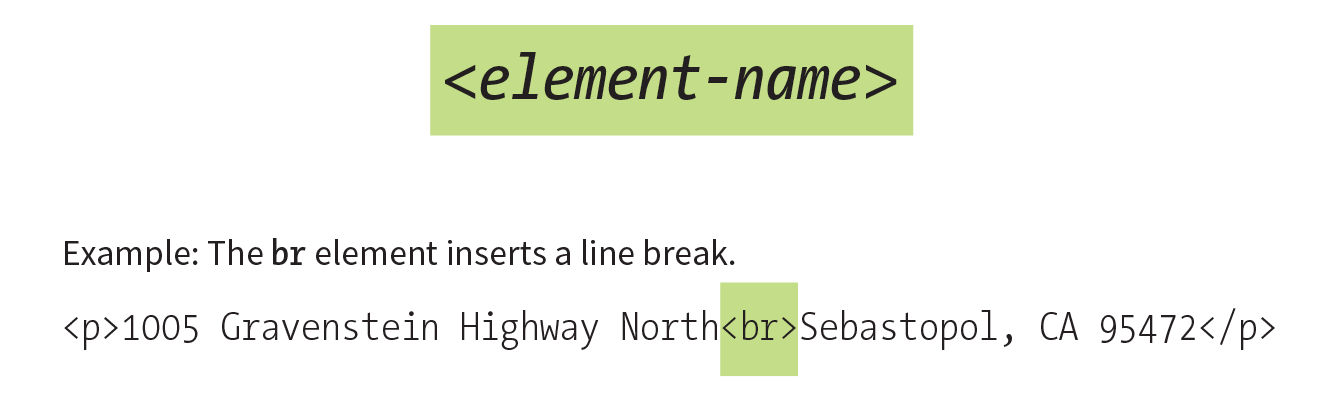
Let’s get back to adding an image with the empty img element. Obviously, an <img> tag is not very useful by itself—it doesn’t indicate which image to use. That’s where attributes come in. Attributes are instructions that clarify or modify an element. For the img element, the src (short for “source”) attribute is required, and specifies the location (URL) of the image file.
Attributes are instructions that clarify or modify an element.
The syntax for an attribute is as follows:
attributename="value"
Attributes go after the element name, separated by a space. In non-empty elements, attributes go in the opening tag only:
<elementattributename="value"><elementattributename="value">Content</element>
You can also put more than one attribute in an element in any order. Just keep them separated with spaces:
<elementattribute1="value"attribute2="value">
Figure 4-13 shows an img element with its required attributes labeled.
Here’s what you need to know about attributes:
Now you should be more than ready to try your hand at adding the img element with its attributes to the Black Goose Bistro page in Exercise 4-4. We’ll throw a few line breaks in there as well.
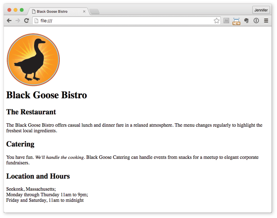
Depending on the content and purpose of your website, you may decide that the browser’s default rendering of your document is perfectly adequate. However, I think I’d like to pretty up the Black Goose Bistro home page a bit to make a good first impression on potential patrons. “Prettying up” is just my way of saying that I’d like to change its presentation, which is the job of Cascading Style Sheets (CSS).
In Exercise 4-5, we’ll change the appearance of the text elements and the page background by using some simple style sheet rules. Don’t worry about understanding them all right now. We’ll get into CSS in more detail in Part III. But I want to at least give you a taste of what it means to add a “layer” of presentation onto the structure we’ve created with our markup.
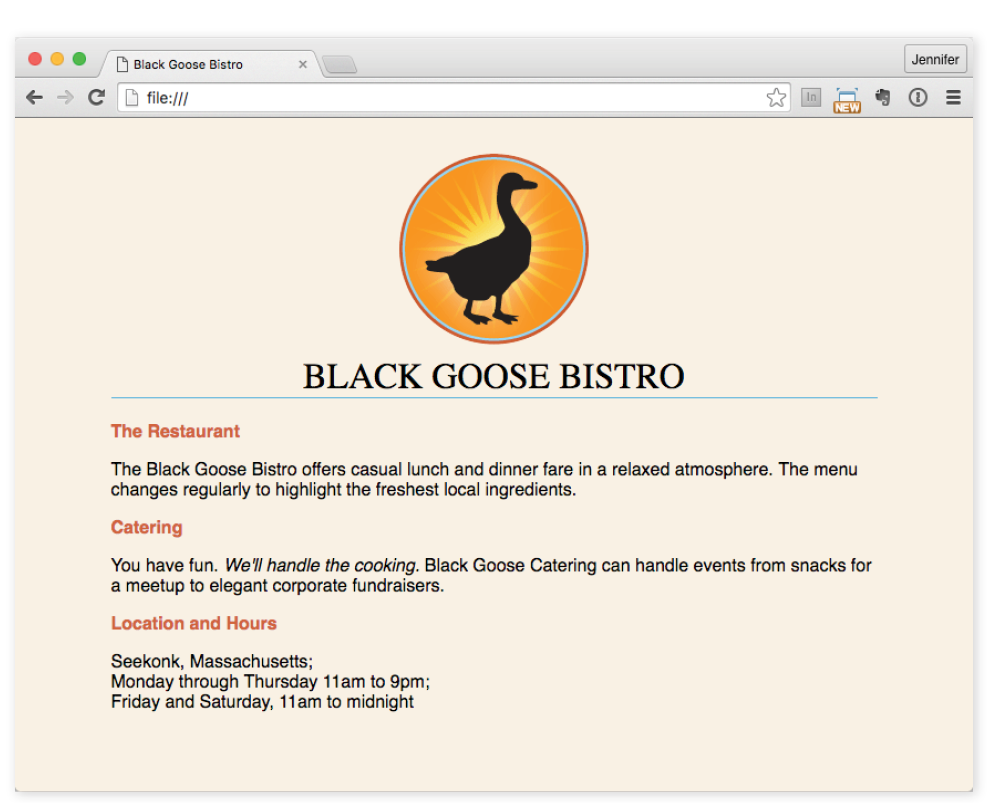
We’re finished with the Black Goose Bistro page. Not only have you written your first web page, complete with a style sheet, but you’ve also learned about elements, attributes, empty elements, block and inline elements, the basic structure of an HTML document, and the correct use of markup along the way. Not bad for one chapter!
The previous demonstration went smoothly, but it’s easy for small things to go wrong when you’re typing out HTML markup by hand. Unfortunately, one missed character can break a whole page. I’m going to break my page on purpose so we can see what happens.
What if I had neglected to type the slash in the closing emphasis tag (</em>)? With just one character out of place (Figure 4-17), the remainder of the document displays in emphasized (italic) text. That’s because without that slash, there’s nothing telling the browser to turn “off” the emphasized formatting, so it just keeps going (see Note).
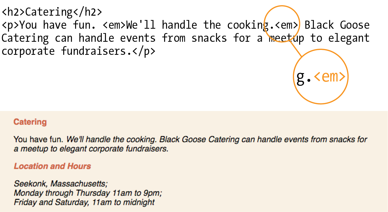
Omitting the slash in the closing tag (or even omitting the closing tag itself) for block elements, such as headings or paragraphs, may not be so dramatic. Browsers interpret the start of a new block element to mean that the previous block element is finished.
I’ve fixed the slash, but this time, let’s see what would have happened if I had accidentally omitted a bracket from the end of the first <h2> tag (Figure 4-18).
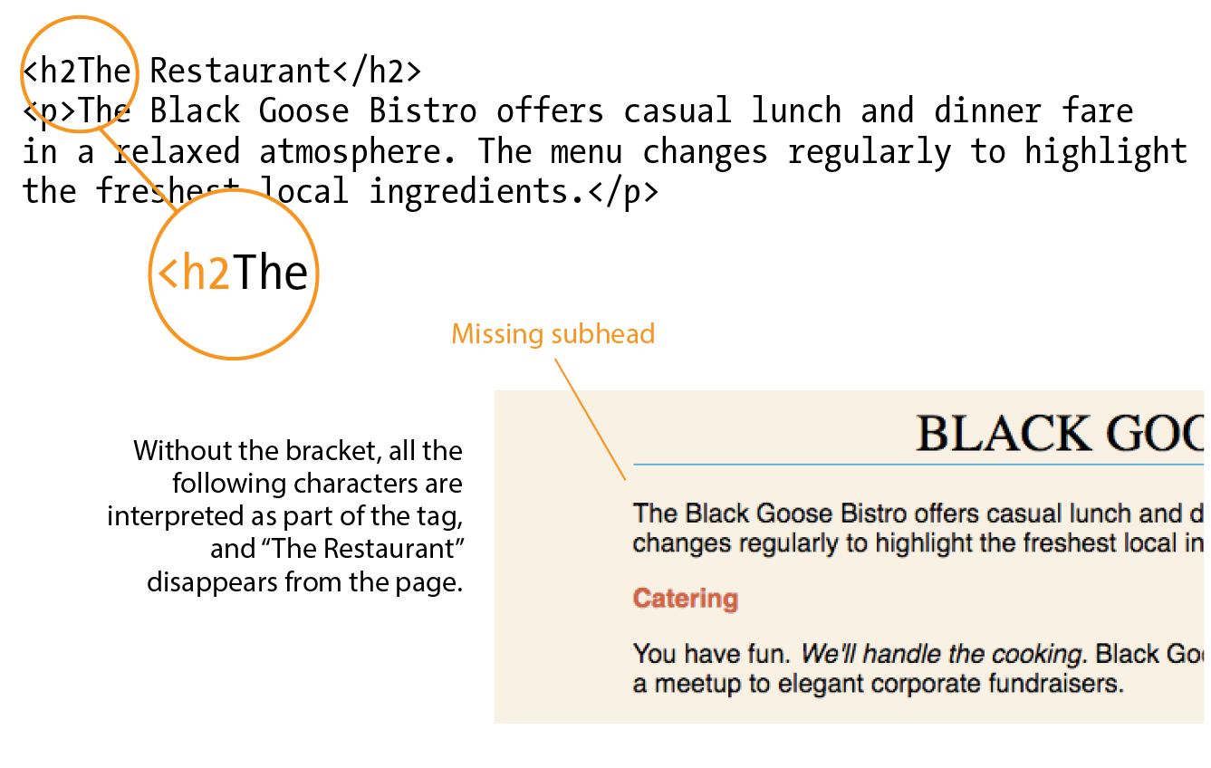
See how the headline is missing? That’s because without the closing tag bracket, the browser assumes that all the following text—all the way up to the next closing bracket (>) it finds—is part of the <h2> opening tag. Browsers don’t display any text within a tag, so my heading disappeared. The browser just ignored the foreign-looking element name and moved on to the next element.
Making mistakes in your first HTML documents and fixing them is a great way to learn. If you write your first pages perfectly, I’d recommend fiddling with the code to see how the browser reacts to various changes. This can be extremely useful in troubleshooting pages later. I’ve listed some common problems in the sidebar “Having Problems?” Note that these problems are not specific to beginners. Little stuff like this goes wrong all the time, even for the pros.
One way that professional web developers catch errors in their markup is to validate their documents. What does that mean? To validate a document is to check your markup to make sure that you have abided by all the rules of whatever version of HTML you are using. Documents that are error-free are said to be valid. It is strongly recommended that you validate your documents, especially for professional sites. Valid documents are more consistent on a variety of browsers, they display more quickly, and they are more accessible.
Right now, browsers don’t require documents to be valid (in other words, they’ll do their best to display them, errors and all), but anytime you stray from the standard, you introduce unpredictability in the way the page is handled by browsers or alternative devices.
So how do you make sure your document is valid? You could check it yourself or ask a friend, but humans make mistakes, and you aren’t expected to memorize every minute rule in the specifications. Instead, use a validator, software that checks your source against the HTML version you specify. These are some of the things validators check for:
Developers use a number of helpful tools for checking and correcting errors in HTML documents. The best web-based validator is at html5.validator.nu. There you can upload a file or provide a link to a page that is already online. Figure 4-19 shows the report the validator generates when I upload the version of the Bistro index.html file that doesn’t have any markup. For this document, there are a number of missing elements that keep this document from being valid. It also shows the problem source code and provides an explanation of how the code should appear. Pretty darned handy!
Built-in browser developer tools for Safari and Chrome also have validators so you can check your work on the fly. Some code editors have validators built in as well.
Now is a good time to make sure you understand the basics of markup. Use what you’ve learned in this chapter to answer the following questions. Answers are in Appendix A.
a. Sunflower.html | Yes | No |
b. index.doc | Yes | No |
c. cooking home page.html | Yes | No |
d. Song_Lyrics.html | Yes | No |
e. games/rubix.html | Yes | No |
f. %whatever.html | Yes | No |
<img "birthday.jpg"> <em>Congratulations!<em>
<a href="file.html">linked text</a href="file.html">
<p>This is a new paragraph<\p>product list begins here
This chapter introduced the elements that establish metadata and content portions of an HTML document. The remaining elements introduced in the exercises will be treated in more depth in the following chapters.
In this chapter
Choosing the best element for your content
Paragraphs and headings
Three types of lists
Organizing content into sections
Text-level (inline) elements
Generic elements, div and span
Special characters
Once your content is ready to go (you’ve proofread it, right?) and you’ve added the markup to structure the document (<!DOCTYPE>, html, head, title, meta charset, and body), you are ready to identify the elements in the content. This chapter introduces the elements you have to choose from for marking up text. There probably aren’t as many of them as you might think, and really just a handful that you’ll use with regularity. That said, this chapter is a big one and covers a lot of ground.
As we begin our tour of elements, I want to reiterate how important it is to choose elements semantically—that is, in a way that most accurately describes the content’s meaning. If you don’t like how it looks, change it with a style sheet. A semantically marked-up document ensures your content is available and accessible in the widest range of browsing environments, from desktop computers and mobile devices to assistive screen readers. It also allows non-human readers, such as search engine indexing programs, to correctly parse your content and make decisions about the relative importance of elements on the page.
With these principles in mind, it is time to meet the HTML text elements, starting with the most basic element of them all, the humble paragraph.
<p>…</p>
Paragraph element
Paragraphs are the most rudimentary elements of a text document. Indicate a paragraph with the p element by inserting an opening <p> tag at the beginning of the paragraph and a closing </p> tag after it, as shown in this example:
<p>Serif typefaces have small slabs at the ends of letter strokes. In general, serif fonts can make large amounts of text easier to read.</p>
<p>Sans-serif fonts do not have serif slabs; their strokes are square on the end. Helvetica and Arial are examples of sans-serif fonts. In general, sans-serif fonts appear sleeker and more modern.</p>
Visual browsers nearly always display paragraphs on new lines with a bit of space between them by default (to use a term from CSS, they are displayed as a block). Paragraphs may contain text, images, and other inline elements (called phrasing content), but they may not contain headings, lists, sectioning elements, or any elements that typically display as blocks by default.
Technically, it is OK to omit the closing </p> tag because it is not required in order for the document to be valid. A browser just assumes it is closed when it encounters the next block element. Many web developers, including myself, prefer to close paragraphs and all elements for the sake of consistency and clarity. I recommend folks who are just learning markup do the same.
<h1>…</h1>
<h2>…</h2>
<h3>…</h3>
<h4>…</h4>
<h5>…</h5>
<h6>…</h6>
Heading elements
In the last chapter, we used the h1 and h2 elements to indicate headings for the Black Goose Bistro page. There are actually six levels of headings, from h1 to h6. When you add headings to content, the browser uses them to create a document outline for the page. Assistive reading devices such as screen readers use the document outline to help users quickly scan and navigate through a page. In addition, search engines look at heading levels as part of their algorithms (information in higher heading levels may be given more weight). For these reasons, it is a best practice to start with the Level 1 heading (h1) and work down in numerical order, creating a logical document structure and outline.
This example shows the markup for four heading levels. Additional heading levels would be marked up in a similar manner.
<h1>Type Design</h1><h2>Serif Typefaces</h2><p>Serif typefaces have small slabs at the ends of letter strokes. In general, serif fonts can make large amounts of text easier to read.</p><h3>Baskerville</h3><h4>Description</h4><p>Description of the Baskerville typeface.</p><h4>History</h4><p>The history of the Baskerville typeface.</p><h3>Georgia</h3><p>Description and history of the Georgia typeface.</p><h2>Sans-serif Typefaces</h2><p>Sans-serif typefaces do not have slabs at the ends of strokes.</p>
The markup in this example would create the following document outline:
By default, the headings in our example display in bold text, starting in very large type for h1s, with each consecutive level in smaller text, as shown in Figure 5-1. You can use a style sheet to change their appearance.
<hr>
A horizontal rule
If you want to indicate that one topic has completed and another one is beginning, you can insert what the spec calls a “paragraph-level thematic break” with the hr element. The hr element adds a logical divider between sections of a page or paragraphs without introducing a new heading level.
In older HTML versions, hr was defined as a “horizontal rule” because it inserts a horizontal line on the page. Browsers still render hr as a 3-D shaded rule and put it on a line by itself with some space above and below by default; but in the HTML5 spec, it has a new semantic name and definition. If a decorative line is all you’re after, it is better to create a rule by specifying a colored border before or after an element with CSS.
hr is an empty element—you just drop it into place where you want the thematic break to occur, as shown in this example and Figure 5-2:
<h3>Times</h3><p>Description and history of the Times typeface.</p><hr><h3>Georgia</h3><p>Description and history of the Georgia typeface.</p>
Humans are natural list makers, and HTML provides elements for marking up three types of lists:
Unordered lists
Collections of items that appear in no particular order
Ordered lists
Lists in which the sequence of the items is important
Description lists
Lists that consist of name and value pairs, including but not limited to terms and definitions
All list elements—the lists themselves and the items that go in them—are displayed as block elements by default, which means that they start on a new line and have some space above and below, but that may be altered with CSS. In this section, we’ll look at each list type in detail.
<ul>…</ul>
Unordered list
<li>…</li>
List item within an unordered list
Just about any list of examples, names, components, thoughts, or options qualifies as an unordered list. In fact, most lists fall into this category. By default, unordered lists display with a bullet before each list item, but you can change that with a style sheet, as you’ll see in a moment.
To identify an unordered list, mark it up as a ul element. The opening <ul> tag goes before the first list item, and the closing tag </ul> goes after the last item. Then, to mark up each item in the list as a list item (li), enclose it in opening and closing li tags, as shown in this example. Notice that there are no bullets in the source document. The browser adds them automatically (Figure 5-3).
The only thing that is permitted within an unordered list (that is, between the start and end ul tags) is one or more list items. You can’t put other elements in there, and there may not be any untagged text. However, you can put any type of content element within a list item (li):
<ul><li>Serif</li><li>Sans-serif</li><li>Script</li><li>Display</li><li>Dingbats</li></ul>
But here’s the cool part. We can take that same unordered list markup and radically change its appearance by applying different style sheets, as shown in Figure 5-4. In the figure, I’ve turned off the bullets, added bullets of my own, made the items line up horizontally, and even made them look like graphical buttons. The markup stays exactly the same.
<ol>…</ol>
Ordered list
<li>…</li>
List item within an ordered list
Ordered lists are for items that occur in a particular order, such as step-by-step instructions or driving directions. They work just like the unordered lists described earlier, but they are defined with the ol element (for “ordered list,” of course). Instead of bullets, the browser automatically inserts numbers before ordered list items (see Note), so you don’t need to number them in the source document. This makes it easy to rearrange list items without renumbering them.
If something is logically an ordered list, but you don’t want numbers to display, remember that you can always remove the numbering with style sheets. So go ahead and mark up the list semantically as an and adjust how it displays with a style rule.
Ordered list elements must contain one or more list item elements, as shown in this example and in Figure 5-5:
<ol><li>Gutenberg develops moveable type (1450s)</li><li>Linotype is introduced (1890s)</li><li>Photocomposition catches on (1950s)</li><li>Type goes digital (1980s)</li></ol>
If you want a numbered list to start at a number other than 1, you can use the start attribute in the ol element to specify another starting number, as shown here:
<ol start="17"> <li>Highlight the text with the text tool.</li> <li>Select the Character tab.</li> <li>Choose a typeface from the pop-up menu.</li></ol>
The resulting list items would be numbered 17, 18, and 19, consecutively.
<dl>…</dl>
A description list
<dt>…</dt>
A name, such as a term or label
<dd>…</dd>
A value, such as a description or definition
Description lists are used for any type of name/value pairs, such as terms and their definitions, questions and answers, or other types of terms and their associated information. Their structure is a bit different from the other two lists that we just discussed. The whole description list is marked up as a dl element. The content of a dl is some number of dt elements indicating the names, and dd elements for their respective values. I find it helpful to think of them as “terms” (to remember the “t” in dt) and “definitions” (for the “d” in dd), even though that is only one use of description lists.
Here is an example of a list that associates forms of typesetting with their descriptions (Figure 5-6):
<dl><dt>Linotype</dt><dd>Line-casting allowed type to be selected, used, then recirculated into the machine automatically. This advance increased the speed of typesetting and printing dramatically.</dd><dt>Photocomposition</dt><dd>Typefaces are stored on film then projected onto photo-sensitive paper. Lenses adjust the size of the type.</dd><dt>Digital type</dt><dd><p>Digital typefaces store the outline of the font shape in a format such as Postscript. The outline may be scaled to any size for output.</p> <p>Postscript emerged as a standard due to its support of graphics and its early support on the Macintosh computer and Apple laser printer.</p></dd></dl>
The dl element is allowed to contain only dt and dd elements. You cannot put headings or content-grouping elements (like paragraphs) in names (dt), but the value (dd) can contain any type of flow content. For example, the last dd element in the previous example contains two paragraph elements (the awkward default spacing could be cleaned up with a style sheet).
It is permitted to have multiple definitions with one term and vice versa. Here, each term-description group has one term and multiple definitions:
<dl> <dt>Serif examples</dt> <dd>Baskerville</dd> <dd>Goudy</dd> <dt>Sans-serif examples</dt> <dd>Helvetica</dd> <dd>Futura</dd> <dd>Avenir</dd></dl>
We’ve covered paragraphs, headings, and lists, but there are a few more special text elements to add to your HTML toolbox that don’t fit into a neat category: long quotations (blockquote), preformatted text (pre), and figures (figure and figcaption). One thing these elements do have in common is that they are considered “grouping content” in the HTML5 spec (along with p, hr, the list elements, main, and the generic div, covered later in this chapter). The other thing they share is that browsers typically display them as block elements by default. The one exception is the newer main element, which is not recognized by any version of Internet Explorer (although it is supported in the Edge browser); see the sidebar “HTML5 Support in Internet Explorer,” later in this chapter, for a workaround.
<blockquote>…</blockquote>
A lengthy, block-level quotation
If you have a long quotation, a testimonial, or a section of copy from another source, mark it up as a blockquote element. It is recommended that content within blockquote elements be contained in other elements, such as paragraphs, headings, or lists, as shown in this example:
<p>Renowned type designer, Matthew Carter, has this to say about his profession:</p><blockquote><p>Our alphabet hasn't changed in eons; there isn't much latitude in what a designer can do with the individual letters.</p> <p>Much like a piece of classical music, the score is written down. It's not something that is tampered with, and yet, each conductor interprets that score differently. There is tension in the interpretation.</p></blockquote>
Figure 5-7 shows the default rendering of the blockquote example. This can be altered with CSS.
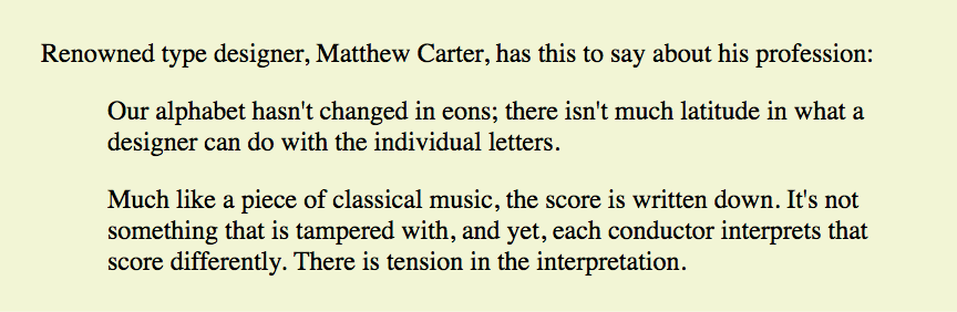
<pre>…</pre>
Preformatted text
In the previous chapter, you learned that browsers ignore whitespace such as line returns and character spaces in the source document. But in some types of information, such as code examples or certain poems, the whitespace is important for conveying meaning. For content in which whitespace is semantically significant, use the preformatted text (pre) element. It is a unique element in that it is displayed exactly as it is typed—including all the carriage returns and multiple character spaces. By default, preformatted text is also displayed in a constant-width font (one in which all the characters are the same width, also called monospace), such as Courier; however, you can easily change the font with a style sheet rule.
The pre element in this example displays as shown in Figure 5-8. The second part of the figure shows the same content marked up as a paragraph (p) element for comparison.
<pre>This is an example of text with a lot of curious whitespace.</pre>
<p>This is an example of text with a lot of curious whitespace. </p>
<figure>…</figure>
Related image or resource
<figcaption>…</figcaption>
Text description of a figure
The figure element identifies content that illustrates or supports some point in the text. A figure may contain an image, a video, a code snippet, text, or even a table—pretty much anything that can go in the flow of web content. Content in a figure element should be treated and referenced as a self-contained unit. That means if a figure is removed from its original placement in the main flow (to a sidebar or appendix, for example), both the figure and the main flow should continue to make sense.
Although you can simply add an image to a page, wrapping it in figure tags makes its purpose explicitly clear semantically. It also works as a hook for applying special styles to figures but not to other images on the page:
<figure><img src="piechart.png" alt="chart showing fonts on mobile devices"></figure>
If you want to provide a text caption for the figure, use the figcaption element above or below the content inside the figure element. It is a more semantically rich way to mark up the caption than using a simple p element.
<figure><pre> <code> body { background-color: #000; color: red; } </code> </pre><figcaption>Sample CSS rule.</figcaption></figure>
In Exercise 5-1, you’ll get a chance to mark up a document yourself and try out the basic text elements we’ve covered so far.
Tapenade (Olive Spread) This is a really simple dish to prepare and it’s always a big hit at parties. My father recommends: "Make this the night before so that the flavors have time to blend. Just bring it up to room temperature before you serve it. In the winter, try serving it warm." Ingredients 1 8oz. jar sundried tomatoes 2 large garlic cloves 2/3 c. kalamata olives 1 t. capers Instructions Combine tomatoes and garlic in a food processor. Blend until as smooth as possible. Add capers and olives. Pulse the motor a few times until they are incorporated, but still retain some texture. Serve on thin toast rounds with goat cheese and fresh basil garnish (optional).
So far, the elements we’ve covered handle very specific tidbits of content: a paragraph, a heading, a figure, and so on. Prior to HTML5, there was no way to group these bits into larger parts other than wrapping them in a generic division (div) element (I’ll cover div in more detail later). HTML5 introduced new elements that give semantic meaning to sections of a typical web page or application (see Note), including main content (main), headers (header), footers (footer), sections (section), articles (article), navigation (nav), and tangentially related or complementary content (aside). Curiously, the spec lists the old address element as a section as well, so we’ll look at that one here too.
<main>…</main>
Primary content area of page or app
Web pages these days are loaded with different types of content: mastheads, sidebars, ads, footers, more ads, even more ads, and so on. It is helpful to cut to the chase and explicitly point out the main content on the page. Use the main element to identify the primary content of a page or application. It helps screen readers and other assistive technologies know where the main content of the page begins and replaces the “Skip to main content” links that have been utilized in the past. The content of a main element should be unique to that page. In other words, headers, sidebars, and other elements that appear across multiple pages in a site should not be included in the main section:
<body><header>…</header><main><h1>Humanist Sans Serif</h1> <!-- code continues --></main></body>
The W3C HTML5 specification states that pages should have only one main section and that it should not be nested within an article, aside, header, footer, or nav. Doing so will cause the document to be invalid.
The main element is the most recent addition to the roster of HTML5 grouping elements. You can use it and style it in most browsers, but for Internet Explorer (including version 11, the most current as of this writing), you’ll need to create the element with JavaScript and set its display to block with a style sheet, as discussed in the “HTML5 Support in Internet Explorer” sidebar. Note that main is supported in MS Edge.
<header>…</header>
Introductory material for page, section, or article
<footer>…</footer>
Footer for page, section, or article
Because web authors have been labeling header and footer sections in their documents for years, it was kind of a no-brainer that full-fledged header and footer elements would come in handy. Let’s start with headers.
The header element is used for introductory material that typically appears at the beginning of a web page or at the top of a section or article (we’ll get to those elements next). There is no specified list of what a header must or should contain; anything that makes sense as the introduction to a page or section is acceptable. In the following example, the document header includes a logo image, the site title, and navigation:
<body><header><img src="/images/logo.png" alt="logo"> <h1>Nuts about Web Fonts</h1> <nav> <ul> <li><a href="/">Home</a></li> <li><a href="/">Blog</a></li> <li><a href="/">Shop</a></li> </ul> </nav></header><!--page content--> </body>
When used in an individual article, the header might include the article title, author, and the publication date, as shown here:
<article><header><h1>More about WOFF</h1> <p>by Jennifer Robbins, <time datetime="2017-11-11">November 11, 2017</time></p></header><!-- article content here --> </article>
Neither nor elements are permitted to contain nested or elements.
The footer element is used to indicate the type of information that typically comes at the end of a page or an article, such as its author, copyright information, related documents, or navigation. The footer element may apply to the entire document, or it could be associated with a particular section or article. If the footer is contained directly within the body element, either before or after all the other body content, then it applies to the entire page or application. If it is contained in a sectioning element (section, article, nav, or aside), it is parsed as the footer for just that section. Note that although it is called “footer,” there is no requirement that it appear last in the document or sectioning element. It could also appear at or near the beginning if that makes sense.
In this simple example, we see the typical information listed at the bottom of an article marked up as a footer:
<article> <header> <h1>More about WOFF</h1> <p>by Jennifer Robbins, <time datetime="2017-11-11">November 11, 2017</time></p> </header> <!-- article content here --><footer><p><small>Copyright ©2017 Jennifer Robbins.</small></p> <nav> <ul> <li><a href="/">Previous</a></li> <li><a href="/">Next</a></li> </ul> </nav></footer></article>
<section>…</section>
Thematic group of content
<article>…</article>
Self-contained, reusable composition
Long documents are easier to use when they are divided into smaller parts. For example, books are divided into chapters, and newspapers have sections for local news, sports, comics, and so on. To divide long web documents into thematic sections, use the aptly named section element. Sections typically include a heading (inside the section element) plus content that has a meaningful reason to be grouped together.
The section element has a broad range of uses, from dividing a whole page into major sections or identifying thematic sections within a single article. In the following example, a document with information about typography resources has been divided into two sections based on resource type:
<section><h2>Typography Books</h2> <ul> <li>…</li> </ul></section>
<section><h2>Online Tutorials</h2> <p>These are the best tutorials on the web.</p> <ul> <li>…</li> </ul></section>
Use the article element for self-contained works that could stand alone or be reused in a different context (such as syndication). It is useful for magazine or newspaper articles, blog posts, comments, or other items that could be extracted for external use. You can think of it as a specialized section element that answers “yes” to the question “Could this appear on another site and make sense?”
A long article could be broken into a number of sections, as shown here:
<article> <h1>Get to Know Helvetica</h1> <section> <h2>History of Helvetica</h2> <p>…</p> </section>
<section> <h2>Helvetica Today</h2> <p>…</p> </section></article>
Conversely, a section in a web document might be composed of a number of articles:
<section id="essays"> <article> <h1>A Fresh Look at Futura</h1> <p>…</p> </article>
<article> <h1>Getting Personal with Humanist</h1> <p>…</p> </article></section>
The section and article elements are easily confused, particularly because it is possible to nest one in the other and vice versa. Keep in mind that if the content is self-contained and could appear outside the current context, it is best marked up as an article.
<aside>…</aside>
Tangentially related material
The aside element identifies content that is separate from, but tangentially related to, the surrounding content. In print, its equivalent is a sidebar, but it couldn’t be called “sidebar” because putting something on the “side” is a presentational description, not semantic. Nonetheless, a sidebar is a good mental model for using the aside element. aside can be used for pull quotes, background information, lists of links, callouts, or anything else that might be associated with (but not critical to) a document.
In this example, an aside element is used for a list of links related to the main article:
<h1>Web Typography</h1><p>Back in 1997, there were competing font formats and tools for making them…</p><p>We now have a number of methods for using beautiful fonts on web pages…</p><aside><h2>Web Font Resources</h2> <ul> <li><a href="http://typekit.com/">Typekit</a></li> <li><a href="http://fonts.google.com">Google Fonts</a></li> </ul></aside>
The aside element has no default rendering, so you will need to make it a block element and adjust its appearance and layout with style sheet rules.
<nav>…</nav>
Primary navigation links
The nav element gives developers a semantic way to identify navigation for a site. Earlier in this chapter, we saw an unordered list that might be used as the top-level navigation for a font catalog site. Wrapping that list in a nav element makes its purpose explicitly clear:
<nav><ul> <li><a href="/">Serif</a></li> <li><a href="/">Sans-serif</a></li> <li><a href="/">Script</a></li> <li><a href="/">Display</a></li> <li><a href="/">Dingbats</a></li> </ul></nav>
Not all lists of links should be wrapped in nav tags, however. The spec makes it clear that nav should be used for links that provide primary navigation around a site or a lengthy section or article. The nav element may be especially helpful from an accessibility perspective.
<address>…</address>
Contact information
Last, and well, least, is the address element that is used to create an area for contact information for the author or maintainer of the document. It is generally placed at the end of the document or in a section or article within a document. An address would be right at home in a footer element. It is important to note that the address element should not be used for any old address on a page, such as mailing addresses. It is intended specifically for author contact information (although that could potentially be a mailing address). Following is an example of its intended use:
<address>Contributed by <a href="../authors/robbins/">Jennifer Robbins</a>, <a href="http://www.oreilly.com/">O'Reilly Media</a></address>
Now that we’ve identified the larger chunks of content, we can provide semantic meaning to phrases within the chunks by using what the HTML5 specification calls text-level semantic elements. On the street, you are likely to hear them called inline elements because they display in the flow of text by default and do not cause any line breaks. That’s also how they were referred to in HTML versions prior to HTML5.
Despite all the types of information you could add to a document, there are only a couple dozen text-level semantic elements. Table 5-1 lists all of them.
Although it may be handy seeing all of the text-level elements listed together in a table, they certainly deserve more detailed explanations.
<em>…</em>
Stressed emphasis
Use the em element to indicate which part of a sentence should be stressed or emphasized. The placement of em elements affects how a sentence’s meaning is interpreted. Consider the following sentences that are identical, except for which words are stressed:
<p><em>Arlo</em>is very smart.</p><p>Arlo is<em>very</em>smart.</p>
The first sentence indicates who is very smart. The second example is about how smart he is. Notice that the em element has an effect on the meaning of the sentence.
Emphasized text (em) elements nearly always display in italics by default (Figure 5-9), but of course you can make them display any way you like with a style sheet. Screen readers may use a different tone of voice to convey stressed content, which is why you should use an em element only when it makes sense semantically, not just to achieve italic text.
<strong>…</strong>
Strong importance
The strong element indicates that a word or phrase is important, serious, or urgent. In the following example, the strong element identifies the portion of instructions that requires extra attention. The strong element does not change the meaning of the sentence; it merely draws attention to the important parts:
<p>When returning the car,<strong>drop the keys in the red box by the front desk</strong>.</p>
Visual browsers typically display strong text elements in bold text by default. Screen readers may use a distinct tone of voice for important content, so mark text as strong only when it makes sense semantically, not just to make text bold.
The following is a brief example of our em and strong text examples. Figure 5-9 should hold no surprises.
<b>…</b>
Keywords or visually emphasized text (bold)
<i>…</i>
Alternative voice (italic)
<s>…</s>
Incorrect text (strike-through)
<u>…</u>
Annotated text (underline)
<small>…</small>
Legal text; small print (smaller type size)
As long as we’re talking about bold and italic text, let’s see what the old b and i elements are up to now. The elements b, i, u, s, and small were introduced in the old days of the web as a way to provide typesetting instructions (bold, italic, underline, strike-through, and smaller text, respectively). Despite their original presentational purposes, these elements have been included in HTML5 and given updated, semantic definitions based on patterns of how they’ve been used. Browsers still render them by default as you’d expect (Figure 5-10). However, if a type style change is all you’re after, using a style sheet rule is the appropriate solution. Save these for when they are semantically appropriate.
Let’s look at these elements and their correct usage, as well as the style sheet alternatives.
Keywords, product names, and other phrases that need to stand out from the surrounding text without conveying added importance or emphasis (see Note). [Old definition: Bold]
CSS Property: For bold text, use font-weight. Example: font-weight: bold;
Example: <p>The slabs at the ends of letter strokes are called <b>serifs</b>.</p>
Indicates text that is in a different voice or mood than the surrounding text, such as a phrase from another language, a technical term, or a thought. [Old definition: Italic]
CSS Property: For italic text, use font-style. Example: font-style: italic;
Example: <p>Simply change the font and <i>Voila!</i>, a new personality!</p>
Indicates text that is incorrect. [Old definition: Strike-through text]
CSS Property: To draw a line through a selection of text, use text-decoration. Example: text-decoration: line-through
Example: <p>Scala Sans was designed by <s>Eric Gill</s> Martin Majoor.</p>
There are a few instances when underlining has semantic significance, such as underlining a formal name in Chinese or indicating a misspelled word after a spell check, such as the misspelled “Helvitica” in the following example. Note that underlined text is easily confused with a link and should generally be avoided except for a few niche cases. [Old definition: Underline]
CSS Property: For underlined text, use text-decoration. Example: text-decoration: underline
Example: <p>New York subway signage is set in <u>Helviteca</u>.</p>
Indicates an addendum or side note to the main text, such as the legal “small print” at the bottom of a document. [Old definition: Renders in font smaller than the surrounding text]
CSS Property: To make text smaller, use font-size. Example: font-size: 80%
Example: <p><small>(This font is free for personal and commercial use.)</small></p>
<q>…</q>
Short inline quotation
Use the quotation (q) element to mark up short quotations, such as “To be or not to be,” in the flow of text, as shown in this example (Figure 5-11):
Matthew Carter says,<q>Our alphabet hasn't changed in eons.</q>
According to the HTML spec, browsers should add quotation marks around q elements automatically, so you don’t need to include them in the source document. Some browsers, like Firefox, render curly quotes, which is preferable. Others (Safari and Chrome, which I used for my examples) render them as straight quotes as shown in the figure.
<abbr>…</abbr>
Abbreviation or acronym
Marking up acronyms and abbreviations with the abbr element provides useful information for search engines, screen readers, and other devices. Abbreviations are shortened versions of a word ending in a period (“Conn.” for “Connecticut,” for example). Acronyms are abbreviations formed by the first letters of the words in a phrase (such as NASA or USA). The title attribute provides the long version of the shortened term, as shown in this example:
<abbr title="Points">pts.</abbr><abbr title="American Type Founders">ATF</abbr>
In HTML 4.01, there was an element especially for acronyms, but HTML5 has made it obsolete in favor of using the for both.
<cite>…</cite>
Citation
The cite element is used to identify a reference to another document, such as a book, magazine, article title, and so on. Citations are typically rendered in italic text by default. Here’s an example:
<p>Passages of this article were inspired by<cite>The Complete Manual of Typography</cite>by James Felici.</p>
<dfn>…</dfn>
Defining term
It is common to point out the first and defining instance of a word in a document in some fashion. In this book, defining terms are set in blue text. In HTML, you can identify them with the dfn element and format them visually using style sheets.
<p><dfn>Script typefaces</dfn>are based on handwriting.</p>
<code>…</code>
Code
<var>…</var>
Variable
<samp>…</samp>
Program sample
<kbd>…</kbd>
User-entered keyboard strokes
A number of inline elements are used for describing the parts of technical documents, such as code (code), variables (var), program samples (samp), and user-entered keyboard strokes (kbd). For me, it’s a quaint reminder of HTML’s origins in the scientific world (Tim Berners-Lee developed HTML to share documents at the CERN particle physics lab in 1989).
Code, sample, and keyboard elements typically render in a constant-width (also called monospace) font such as Courier by default. Variables usually render in italics.
<sub>…</sub>
Subscript
<sup>…</sup>
Superscript
The subscript (sub) and superscript (sup) elements cause the selected text to display in a smaller size, positioned slightly below (sub) or above (sup) the baseline. These elements may be helpful for indicating chemical formulas or mathematical equations.
Figure 5-12 shows how these examples of subscript and superscript typically render in a browser.
<p>H<sub>2</sub>0</p> <p>E=MC<sup>2</sup></p>
<mark>…</mark>
Contextually relevant text
The mark element indicates a word that may be considered especially relevant to the reader. One might use it to dynamically highlight a search term in a page of results, to manually call attention to a passage of text, or to indicate the current page in a series. Some designers (and browsers) give marked text a light colored background as though it were marked with a highlighter marker, as shown in Figure 5-13.
<p> ... PART I. ADMINISTRATION OF THE GOVERNMENT. TITLE IX.TAXATION. CHAPTER 65C. MASS.<mark>ESTATE TAX</mark>. Chapter 65C: Sect. 2. Computation of<mark>estate tax</mark>.</p>
<time>…</time>
Time data
When we look at the phrase “noon on November 4,” we know that it is a date and a time. But the context might not be so obvious to a computer program. The time element allows us to mark up dates and times in a way that is comfortable for a human to read, but also encoded in a standardized way that computers can use. The content of the element presents the information to people, and the datetime attribute presents the same information in a machine-readable way.
The element is not intended for marking up times for which a precise time or date cannot be established, such as “the end of last year” or “the turn of the century.”
The time element indicates dates, times, or date-time combos. It might be used to pass the date and time information to an application, such as saving an event to a personal calendar. It might be used by search engines to find the most recently published articles. Or it could be used to restyle time information into an alternate format (e.g., changing 18:00 to 6 p.m.).
The datetime attribute specifies the date and/or time information in a standardized time format illustrated in Figure 5-14. The full time format begins with the date (year–month–day). The time section begins with a letter “T” and lists hours (on the 24-hour clock), minutes, seconds (optional), and milliseconds (also optional). Finally, the time zone is indicated by the number of hours behind (-) or ahead (+) of Greenwich Mean Time (GMT). For example, “-05:00” indicates the Eastern Standard time zone, which is five hours behind GMT. When identifying dates and times alone, you can omit the other sections.
Here are a few examples of valid values for datetime:
<time datetime="21:30">9:30p.m.</time><time datetime="2016-06-19">June 19, 2016</time><time datetime="1970-09-05T01:11:00">Sept. 5, 1970, 1:11a.m.</time><time datetime="2015-07-19T08:00:00-05:00">July 19, 2015, 8am, Providence RI</time>You can also use the element without the attribute, but its content must be a valid date/time string:
<time>2016-06-19</time>
<data>…</data>
Machine-readable data
The data element is another tool for helping computers make sense of content. It can be used for all sorts of data, including dates, times, measurements, weights, microdata, and so on. The required value attribute provides the machine-readable information. Here are a couple of examples:
<data value="12">Twelve</data><data value="978-1-449-39319-9">CSS: The Definitive Guide</data>
I’m not going to go into more detail on the data element, because as a beginner, you are unlikely to be dealing with machine-readable data quite yet. But it is interesting to see how markup can be used to provide usable information to computer programs and scripts as well as to your fellow humans.
<ins>…</ins>
Inserted text
<del>…</del>
Deleted text
The ins and del elements are used to mark up edits indicating parts of a document that have been inserted or deleted (respectively). These elements rely on style rules for presentation (i.e., there is no dependable browser default). Both the ins and del elements can contain either inline or block elements, depending on what type of content they contain:
Chief Executive Officer:<del title="retired">Peter Pan</del><ins>Pippi Longstocking</ins>
<br>
Line break
Occasionally, you may need to add a line break within the flow of text. We’ve seen how browsers ignore line breaks in the source document, so we need a specific directive to tell the browser to “add a line break here.”
The inline line break element (br) does exactly that. The br element could be used to break up lines of addresses or poetry. It is an empty element, which means it does not have content. Just add the br element in the flow of text where you want a break to occur, as shown here and in Figure 5-15:
<p>So much depends<br>upon<br><br>a red wheel<br>barrow</p>
Unfortunately, the br element is easily abused. Be careful that you aren’t using br elements to force breaks into text that really ought to be a list. For example, don’t do this:
<p>Times<br>Georgia<br>Garamond </p>
If it’s a list, use the semantically correct unordered list element instead, and turn off the bullets with style sheets:
<ul> <li>Times</li> <li>Georgia</li> <li>Garamond</li></ul>
<wbr>
Word break
The word break (wbr) element lets you mark the place where a word should break (a “line break opportunity” according to the spec) should there not be enough room for the whole word (Figure 5-16). It takes some of the guesswork away from the browser and allows authors to control the best spot for the word to be split over two lines. If there is enough room, the word stays in one piece. Without word breaks, the word stays together, and if there is not enough room, the whole word wraps to the next line. Note that the browser does not add a hyphen when the word breaks over two lines. The wbr behaves as though it were a character space in the middle of the word:
<p>The biggest word you've ever heard and this is how it goes: <em>supercali<wbr>fragilistic<wbr>expialidocious</em>!</p>
The element is not supported by any version of Internet Explorer as of this writing. It is supported in MS Edge.
You’ve been introduced to 32 new elements since your last exercise. I’d say it’s time to give some of the inline elements a try in Exercise 5-2.
b br cite dfn em
i q small time
<article> <header><p>posted by BGB, November 15, 2016</p></header> <h2>Low and Slow</h2><p>This week I am extremely excited about a new cooking technique called sous vide. In sous vide cooking, you submerge the food (usually vacuum-sealed in plastic) into a water bath that is precisely set to the target temperature you want the food to be cooked to. In his book, Cooking for Geeks, Jeff Potter describes it as ultra-low-temperature poaching.</p><p>Next month, we will be serving Sous Vide Salmon with Dill Hollandaise. To reserve a seat at the chef table, contact us before November 30.</p> <p>blackgoose@example.com 555-336-1800</p> <p>Warning: Sous vide cooked salmon is not pasteurized. Avoid it if you are pregnant or have immunity issues.</p></article>
<div>…</div>
Generic block-level element
<span>…</span>
Generic inline element
What if none of the elements we’ve talked about so far accurately describes your content? After all, there are endless types of information in the world, but as you’ve seen, not all that many semantic elements. Fortunately, HTML provides two generic elements that can be customized to describe your content perfectly. The div element indicates a division of content, and span indicates a word or phrase for which no text-level element currently exists. The generic elements are given meaning and context with the id and class attributes, which we’ll discuss in a moment.
The div and span elements have no inherent presentation qualities of their own, but you can use style sheets to format them however you like. In fact, generic elements are a primary tool in standards-based web design because they enable authors to accurately describe content and offer plenty of “hooks” for adding style rules. They also allow elements on the page to be accessed and manipulated by JavaScript.
We’re going to spend a little time on div and span elements, as well as the id and class attributes, to learn how authors use them to structure content.
Use the div element to create a logical grouping of content or elements on the page. It indicates that they belong together in a conceptual unit or should be treated as a unit by CSS or JavaScript. By marking related content as a div and giving it a unique id or indicating that it is part of a class, you give context to the elements in the grouping. Let’s look at a few examples of div elements.
In this example, a div element is used as a container to group an image and two paragraphs into a product “listing”:
<div class="listing"><img src="images/felici-cover.gif" alt=""> <p><cite>The Complete Manual of Typography</cite>, James Felici</p> <p>A combination of type history and examples of good and bad type design.</p></div>
By putting those elements in a div, I’ve made it clear that they are conceptually related. It also allows me to style p elements within listings differently than other p elements in the document.
Here is another common use of a div used to break a page into sections for layout purposes. In this example, a heading and several paragraphs are enclosed in a div and identified as the “news” division:
<div id="news"><h1>New This Week</h1> <p>We've been working on...</p> <p>And last but not least,... </p></div>
Now I have a custom element that I’ve given the name “news.” You might be thinking, “Hey Jen, couldn’t you use a section element for that?” You could! In fact, authors may turn to generic divs less often now that we have better semantic sectioning elements in HTML5.
A span offers the same benefits as the div element, except it is used for phrase elements and does not introduce line breaks. Because spans are inline elements, they may contain only text and other inline elements (in other words, you cannot put headings, lists, content-grouping elements, and so on, in a span). Let’s get right to some examples.
There is no telephone element, but we can use a span to give meaning to telephone numbers. In this example, each telephone number is marked up as a span and classified as “tel”:
<ul> <li>John:<span class="tel">999.8282</span></li> <li>Paul:<span class="tel">888.4889</span></li> <li>George:<span class="tel">888.1628</span></li> <li>Ringo:<span class="tel">999.3220</span></li></ul>
You can see how the classified spans add meaning to what otherwise might be a random string of digits. As a bonus, the span element enables us to apply the same style to phone numbers throughout the site (for example, ensuring line breaks never happen within them, using a CSS white-space: nowrap declaration). It makes the information recognizable not only to humans but also to computer programs that know that “tel” is telephone number information. In fact, some values—including “tel”—have been standardized in a markup system known as Microformats that makes web content more useful to software (see the upcoming sidebar “Structured Data in a Nutshell”).
In the previous examples, we saw the id and class attributes used to provide context to generic div and span elements. id and class have different purposes, however, and it’s important to know the difference.
The id attribute is used to assign a unique identifier to an element in the document. In other words, the value of id must be used only once in the document. This makes it useful for assigning a name to a particular element, as though it were a piece of data. See the sidebar “id and class Values” for information on providing values for the id attribute.
This example uses the books’ ISBNs (International Standard Book Numbers) to uniquely identify each listing. No two book listings may share the same id.
<div id="ISBN0321127307"> <img src="felici-cover.gif" alt=""> <p><cite>The Complete Manual of Typography</cite>, James Felici</p> <p>A combination of type history and examples of good and bad type. </p></div>
<div id="ISBN0881792063"> <img src="bringhurst-cover.gif" alt=""> <p><cite>The Elements of Typographic Style</cite>, Robert Bringhurst </p> <p>This lovely, well-written book is concerned foremost with creating beautiful typography.</p></div>
Web authors also use id when identifying the various sections of a page. In the following example, there may not be more than one element with the id of “links” or “news” in the document:
<section id="news"> <!-- news items here -->
</section>
<aside id="links"> <!-- list of links here -->
</aside>
The class attribute classifies elements into conceptual groups; therefore, unlike the id attribute, a class name may be shared by multiple elements. By making elements part of the same class, you can apply styles to all of the labeled elements at once with a single style rule or manipulate them all with a script. Let’s start by classifying some elements in the earlier book example. In this first example, I’ve added class attributes to classify each div as a “listing” and to classify paragraphs as “descriptions”:
<div id="ISBN0321127307"class="listing"> <header> <img src="felici-cover.gif" alt=""> <p><cite>The Complete Manual of Typography</cite>, James Felici</p> </header> <pclass="description">A combination of type history and examples of good and bad type.</p></div>
<div id="ISBN0881792063"class="listing"> <header> <img src="bringhurst-cover.gif" alt=""> <p><cite>The Elements of Typographic Style</cite>, Robert Bringhurst </p> </header> <pclass="description">This lovely, well-written book is concerned foremost with creating beautiful typography.</p></div>
Notice how the same element may have both a class and an id. It is also possible for elements to belong to multiple classes. When there is a list of class values, simply separate them with character spaces. In this example, I’ve classified each div as a “book” to set them apart from possible “cd” or “dvd” listings elsewhere in the document:
<div id="ISBN0321127307" class="listing book"> <img src="felici-cover.gif" alt="CMT cover"> <p><cite>The Complete Manual of Typography</cite>, James Felici</p> <p class="description">A combination of type history and examples of good and bad type.</p></div>
<div id="ISBN0881792063" class="listing book"> <img src="bringhurst-cover.gif" alt="ETS cover"> <p><cite>The Elements of Typographic Style</cite>, Robert Bringhurst </p> <p class="description">This lovely, well-written book is concerned foremost with creating beautiful typography.</p></div>
The id and class attributes are not limited to just div and span—they are two of the global attributes (see the “Global Attributes” sidebar) in HTML, which means you may use them with all HTML elements. For example, you could identify an ordered list as “directions” instead of wrapping it in a div:
<ol id="directions"> <li>...</li> <li>...</li> <li>...</li></ol>
This should have given you a good introduction to how to use the class and id attributes to add meaning and organization to documents. We’ll work with them even more in the style sheet chapters in Part III. The sidebar “Structured Data in a Nutshell” discusses more advanced ways of adding meaning and machine-readable data to documents.
As web designers, we must always consider the experience of users with assistive technologies for navigating pages and interacting with web applications. Your users may be listening to the content on the page read aloud by a screen reader and using keyboards, joysticks, voice commands, or other non-mouse input devices to navigate through the page.
Many HTML elements are plainly understood when you look at (or read) only the HTML source. Elements like the title, headings, lists, images, and tables have implicit meanings in the context of a page, but generic elements like div and span lack the semantics necessary to be interpreted by an assistive device. In rich web applications, especially those that rely heavily on JavaScript and AJAX (see Note), the markup alone does not provide enough clues as to how elements are being used or whether a form control is currently selected, required, or in some other state.
Fortunately, we have ARIA (Accessible Rich Internet Applications), a standardized set of attributes for making pages easier to navigate and interactive features easier to use. The specification was created and is maintained by a Working Group of the Web Accessibility Initiative (WAI), which is why you also hear it referred to as WAI-ARIA. ARIA defines roles, states, and properties that developers can add to markup and scripts to provide richer semantic information.
Roles describe an element’s function or purpose in the context of the document. Some roles include alert, button, dialog, slider, and menubar, to name only a few. For example, as we saw earlier, you can turn an unordered list into a tabbed menu of options using style sheets, but what if you can’t see that it is styled that way? Adding role="toolbar" to the list makes its purpose clear:
<ul id="tabs" role="toolbar"> <li>A-G</li> <li>H-O</li> <li>P-T</li> <li>U-Z</li></ul>
Here’s another example that reveals that the “status” div is used as an alert message:
<div id="status" role="alert">You are no longer connected to the server.</div>
Some roles describe “landmarks” that help readers find their way through the document, such as navigation, banner, contentinfo, complementary, and main. You may notice that some of these sound similar to the page-structuring elements that were added in HTML5, and that’s no coincidence. One of the benefits of having improved semantic section elements is that they can be used as landmarks, replacing <div id="main" role="main"> with main.
Most current browsers already recognize the implicit roles of the new elements, but some developers explicitly add ARIA roles until all browsers comply. The sectioning elements pair with the ARIA landmark roles in the following way:
<nav role="navigation">
<header role="banner"> (see )
<main role="main">
<aside role="complementary">
<footer role="contentinfo">
The banner role is used when the applies to only the whole page, not just a section or article.
ARIA also defines a long list of states and properties that apply to interactive elements such as form widgets and dynamic content. States and properties are indicated with attributes prefixed with aria-, such as aria-disabled, aria-describedby, and many more.
The difference between a state and property is subtle. For properties, the value of the attribute is more likely to be stable, such as aria-labelledby, which associates labels with their respective form controls, or aria-haspopup, which indicates the element has a related pop-up menu. States have values that are more likely to be changed as the user interacts with the element, such as aria-selected.
Obviously, this is not enough ARIA coaching to allow you to start confidently using it today, but it should give you a good feel for how it works and its potential value. When you are ready to dig in and take your skills to a professional level, here is some recommended reading:
The WAI-ARIA Working Draft (www.w3.org/TR/wai-aria-1.1/)
This is the current Working Draft of the specification as of this writing.
ARIA in HTML (www.w3.org/TR/html-aria/)
This W3C Working Draft helps developers use ARIA attributes with HTML correctly. It features a great list of every HTML element, whether it has an implicit role (in which ARIA should not be used), and what roles, states, and properties apply.
ARIA Resources at MDN Web Docs (developer.mozilla.org/en-US/docs/Web/Accessibility/ARIA)
This site features lots of links to ARIA-related and up-to-date resources. It is a good starting point for exploration.
HTML5 Accessibility (www.html5accessibility.com)
This site tests which new HTML5 features are accessibly supported by major browsers.
There’s just one more text-related topic before we close out this chapter. The section title makes it sound like someone left the gate open and all the characters got out. The real meaning is more mundane, albeit useful to know.
You already know that as a browser parses an HTML document, when it runs into a < symbol, it interprets it as the beginning of a tag. But what if you just need a less-than symbol in your text? Characters that might be misinterpreted as code need to be escaped in the source document. Escaping means that instead of typing in the character itself, you represent it by its numeric or named character entity reference. When the browser sees the character reference, it substitutes the proper character in that spot when the page is displayed.
There are two ways of referring to (escaping) a specific character:
HTML defines hundreds of named entities as part of the markup language, which is to say you can’t make up your own entity.
All character references begin with an & (ampersand) and end with a ; (semicolon).
An example should make this clear. I’d like to use a less-than symbol in my text, so I must use the named entity (<) or its numeric equivalent (<) where I want the symbol to appear (Figure 5-17):
<p>3 tsp. < 3 Tsp.</p>
or:
<p>3 tsp. < 3 Tsp.</p>
There are a few instances in which you may need or want to use a character reference.
The <, >, &, ", and ' characters have special syntax meaning in HTML, and may be misinterpreted as code. Therefore, the W3C recommends that you escape <, >, and & characters in content. If attribute values contain single or double quotes, escaping the quote characters in the values is advised. Quote marks are fine in the content and do not need to be escaped. (See Table 5-2.)
|
Character |
Description |
Entity name |
Decimal no. |
Hexadecimal no. |
|
< |
Less-than symbol |
< |
< |
< |
|
> |
Greater-than symbol |
> |
> |
> |
|
" |
Quotation mark |
" |
" |
" |
|
' |
Apostrophe |
' |
' |
' |
|
& |
Ampersand |
& |
& |
& |
Some characters have no graphic display and are difficult to see in the markup (Table 5-3). These include the non-breaking space ( ), which is used to ensure that a line doesn’t break between two words. So, for instance, if I mark up my name like this:
Jennifer Robbins
I can be sure that my first and last names will always stay together on a line. Another use for non-breaking spaces is to separate digits in a long number, such as 32 000 000.
Zero-width space can be placed in languages that do not use spaces between words to indicate where the line should break. A zero-width joiner is a non-printing space that causes neighboring characters to display in their connected forms (common in Arabic and Indic languages). Zero-width non-joiners prevent neighboring characters from joining to form ligatures or other connected forms.
|
Table 5-3. Invisible characters and their character references |
||||
|
Character |
Description |
Entity name |
Decimal no. |
Hexadecimal no. |
|
(non-printing) |
Non-breaking space |
|
  |
  |
|
(non-printing) |
En space |
  |
  |
  |
|
(non-printing) |
Em space |
  |
  |
  |
|
(non-printing) |
Zero-width space |
(none) |
​ |
​ |
|
(non-printing) |
Zero-width non-joiner |
‌ |
‌ |
‌ |
|
(non-printing) |
Zero-width joiner |
‍ |
‍ |
‍ |
If your keyboard or editing software does not include the character you need (or if you simply can’t find it), you can use a character entity to make sure you get the character you want. The W3C doesn’t endorse this practice, so use the proper character in your source if you are able. Table 5-4 lists some special characters that may be less straightforward to type into the source.
|
Table 5-4. Special characters and their character references |
||||
|
Character |
Description |
Entity name |
Decimal no. |
Hexadecimal no. |
|
‘ |
‘ |
‘ |
‘ |
|
|
’ |
Right curly single quote |
’ |
’ |
’ |
|
“ |
Left curly double quote |
“ |
“ |
“ |
|
” |
Right curly double quote |
” |
” |
” |
|
... |
… |
… |
… |
|
|
© |
© |
© |
© |
|
|
® |
® |
® |
® |
|
|
™ |
™ |
™ |
… |
|
|
£ |
£ |
£ |
£ |
|
|
¥ |
¥ |
¥ |
¥ |
|
|
€ |
€ |
€ |
€ |
|
|
– |
– |
– |
– |
|
|
— |
— |
— |
— |
|
A complete list of HTML named entities and their Unicode code-points can be found as part of the HTML5 specification at www.w3.org/TR/html5/syntax.html#named-character-references. For a more user-friendly listing of named and numerical entities, I recommend this archived page at the Web Standards Project: www.webstandards.org/learn/reference/charts/entities.
So far, you’ve learned how to mark up elements, and you’ve met all of the HTML elements for adding structure and meaning to text content. Now it’s just a matter of practice. Exercise 5-3 gives you an opportunity to try out everything we’ve covered so far: document structure elements, grouping (block) elements, phrasing (inline) elements, sectioning elements, and character entities. Have fun!
The “Low and Slow” paragraph is already marked up with the inline elements from Exercise 5-2).
The Black Goose Bistro News
Home
Menu
News
Contact
Summer Menu Items
posted by BGB, June 18, 2017
Our chef has been busy putting together the perfect menu for the summer months. Stop by to try these appetizers and main courses while the days are still long.
Appetizers
Black bean purses
Spicy black bean and a blend of Mexican cheeses wrapped in sheets of phyllo and baked until golden. $3.95
Southwestern napoleons with lump crab -- new item!
Layers of light lump crab meat, bean and corn salsa, and our handmade flour tortillas. $7.95
Main courses
Shrimp sate kebabs with peanut sauce
Skewers of shrimp marinated in lemongrass, garlic, and fish sauce then grilled to perfection. Served with spicy peanut sauce and jasmine rice. $12.95
Jerk rotisserie chicken with fried plantains -- new item!
Tender chicken slow-roasted on the rotisserie, flavored with spicy and fragrant jerk sauce and served with fried plantains and fresh mango. $12.95
Low and Slow
posted by BGB, November 15, 2016
<p>This week I am <em>extremely</em> excited about a new cooking technique called <dfn><i>sous vide</i></dfn>. In <i>sous vide</i> cooking, you submerge the food (usually vacuum-sealed in plastic) into a water bath that is precisely set to the target temperature you want the food to be cooked to. In his book, <cite>Cooking for Geeks</cite>, Jeff Potter describes it as <q>ultra-low-temperature poaching.</q></p>
<p>Next month, we will be serving <b><i>Sous Vide</i> Salmon with Dill Hollandaise</b>. To reserve a seat at the chef table, contact us before <time datetime="20161130">November 30</time>.</p>
Location: Baker’s Corner, Seekonk, MA
Hours: Tuesday to Saturday, 11am to 11pm
All content copyright 2017, Black Goose Bistro and Jennifer Robbins
Were you paying attention? Here is a rapid-fire set of questions to find out. Find the answers in Appendix A.
<p>People who know me know that I love to cook.</p>
<p>I've created this site to share some of my favorite recipes.</p>
The global attributes apply to all text elements. Additional attributes are listed under their respective elements.
|
Page sections |
|
address |
|
article |
|
aside |
|
footer |
|
header |
|
nav |
|
section |
|
|
Heading content |
|
h1...h6 |
|
|
Grouping content elements and attributes |
|
blockquote |
|
cite |
|
div |
|
figure |
|
figcaption |
|
hr |
|
main |
|
p |
|
pre |
Preformatted text |
|
List elements and attributes |
|
dd |
|
dl |
|
dt |
|
li |
|
value |
|
ol |
|
reversed |
|
start |
|
ul |
|
|
Breaks |
|
br |
|
wbr |
|
|
Phrasing elements and attributes |
|
abbr |
|
b |
|
bdi |
|
bdo |
|
cite |
|
code |
|
data |
|
del |
|
cite |
|
datetime |
|
dfn |
|
em |
|
i |
|
ins |
|
cite |
|
datetime |
|
kbd |
|
mark |
|
q |
|
cite |
|
ruby |
|
rp |
|
rt |
|
s |
|
samp |
|
small |
|
span |
|
strong |
|
sub |
Subscript |
sup |
Superscript |
time |
|
datetime |
|
pubdate |
|
u |
|
In this Chapter
Linking to external pages
Linking to documents on your own server
Linking to a specific point in a page
Targeting new windows
If you’re creating a page for the web, chances are you’ll want to link to other web pages and resources, whether on your own site or someone else’s. Linking, after all, is what the web is all about. In this chapter, we’ll look at the markup that makes links work—links to other sites, to your own site, and within a page. There is one element that makes linking possible: the anchor (a).
<a>…</a>
Anchor element (hypertext link)
To make a selection of text a link, simply wrap it in opening and closing <a>...</a> tags and use the href attribute to provide the URL of the target page. The content of the anchor element becomes the hypertext link. Here is an example that creates a link to the O’Reilly Media site:
<a href="http://www.oreilly.com">Go to the O'Reilly Media site</a>
To make an image a link, simply put the img element in the anchor element:
<a href="http://www.oreilly.com"><img src="tarsierlogo.gif" alt="O'Reilly Media site"></a>
By the way, you can put any HTML content element in an anchor to make it a link, not just images.
Nearly all graphical browsers display linked text as blue and underlined by default. Some older browsers put a blue border around linked images, but most current ones do not. Visited links generally display in purple. Users can change these colors in their browser preferences, and, of course, you can change the appearance of links for your sites using style sheets. I’ll show you how in Chapter 13, Colors and Backgrounds.
When a user clicks or taps the linked text or image, the page you specify in the anchor element loads in the browser window. The linked image markup sample shown previously might look like Figure 6-1.
You’ll need to tell the browser which document to link to, right? The href (hypertext reference) attribute provides the address of the page or resource (its URL) to the browser. The URL must always appear in quotation marks. Most of the time you’ll point to other HTML documents; however, you can also point to other web resources, such as images, audio, and video files.
Because there’s not much to slapping anchor tags around some content, the real trick to linking comes in getting the URL correct. There are two ways to specify the URL:
Absolute URLs
Absolute URLs provide the full URL for the document, including the protocol (http:// or https://), the domain name, and the pathname as necessary. You need to use an absolute URL when pointing to a document out on the web (i.e., not on your own server):
href="http://www.oreilly.com/"
Sometimes, when the page you’re linking to has a long URL pathname, the link can end up looking pretty confusing (Figure 6-2). Just keep in mind that the structure is still a simple container element with one attribute. Don’t let the long pathname intimidate you.
Relative URLs
Relative URLs describe the pathname to a file relative to the current document. Relative URLs can be used when you are linking to another document on your own site (i.e., on the same server). It doesn’t require the protocol or domain name—just the pathname:
href="recipes/index.html"
In this chapter, we’ll add links using absolute and relative URLs to my cooking website, Jen’s Kitchen (see Figure 6-3). Absolute URLs are easy, so let’s get them out of the way first.
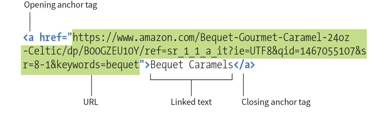
Many times, you’ll want to create a link to a page that you’ve found on the web. This is known as an external link because it is going to a page outside of your own server or site. To make an external link, provide the absolute URL, beginning with http:// (the protocol). This tells the browser, “Go out on the web and get the following document.”
I want to add some external links to the Jen’s Kitchen home page (Figure 6-3). First, I’ll link the list item “The Food Network” to the www.foodnetwork.com site. I marked up the link text in an anchor element by adding opening and closing anchor tags. Notice that I’ve added the anchor tags inside the list item (li) element. That’s because only li elements are permitted to be children of a ul element; placing an a element directly inside the ul element would be invalid HTML.
<li><a>The Food Network</a></li>
Next, I add the href attribute with the complete URL for the site:
<li><a href="http://www.foodnetwork.com">The Food Network</a></li>
And voilà! Now “The Food Network” appears as a link and takes my visitors to that site when they click or tap it. Give it a try in Exercise 6-1.

<ul> <li><a href="http://www.foodnetwork.com/">The Food Network</a></li> <li>Epicurious</li></ul>
A large portion of the linking you do is between pages of your own site: from the home page to section pages, from section pages to content pages, and so on. In these cases, you can use a relative URL—one that calls for a page on your own server.
Without “http://”, the browser looks on the current server for the linked document. A pathname, the notation used to point to a particular file or directory, (see Note) tells the browser where to find the file. Web pathnames follow the Unix convention of separating directory and filenames with forward slashes (/). A relative pathname describes how to get to the linked document starting from the location of the current document.
Relative pathnames can get a bit tricky. In my teaching experience, nothing stumps beginners like writing relative pathnames, so we’ll take it one step at a time. I recommend you do Exercises 6-2 through 6-8 as we go along.
All of the pathname examples in this section are based on the structure of the Jen’s Kitchen site shown in Figure 6-4. When you diagram the structure of the directories for a site, it generally ends up looking like an inverted tree with the root directory at the top of the hierarchy. For the Jen’s Kitchen site, the root directory is named jenskitchen. For another way to look at it, there is also a view of the directory and subdirectories as they appear in the Finder on my Mac.
The most straightforward relative URL points to another file within the same directory. When linking to a file in the same directory, you need to provide only the name of the file (its filename). When the URL is just a filename, the server looks in the current directory (that is, the directory that contains the document with the link) for the file.
A link to a filename indicates the linked file is in the same directory as the current document.
In this example, I want to make a link from my home page (index.html) to a general information page (about.html). Both files are in the same directory (jenskitchen). So, from my home page, I can make a link to the information page by simply providing its filename in the URL (Figure 6-5):
<a href="about.html">About the site...</a>
Exercise 6-2 gives you a chance to mark up a simple link yourself.
<p>Back to the home page</p>
But what if the files aren’t in the same directory? You have to give the browser directions by including the pathname in the URL. Let’s see how this works.
Getting back to our example, my recipe files are stored in a subdirectory called recipes. I want to make a link from index.html to a file in the recipes directory called salmon.html. The pathname in the URL tells the browser to look in the current directory for a directory called recipes, and then look for the file salmon.html (Figure 6-6):
<li><a href="recipes/salmon.html">Garlic Salmon</a></li>
Have a try at linking to a file in a directory in Exercise 6-3.
<li>Tapenade (Olive Spread)</li>
Now let’s link down to the file called couscous.html, which is located in the pasta subdirectory. All we need to do is provide the directions through two subdirectories (recipes, then pasta) to couscous.html (Figure 6-7):
<li><a href="recipes/pasta/couscous.html">Couscous...</a></li>
Directories are separated by forward slashes. The resulting anchor tag tells the browser, “Look in the current directory for a directory called recipes. There you’ll find a directory called pasta, and in there is the file couscous.html.”
When you link to a file in a lower directory, the pathname contains the names of each subdirectory you go through to get to the file.
Now that we’ve done two directory levels, you should get the idea of how pathnames are assembled. This same method applies for relative pathnames that drill down through any number of directories. Just start with the name of the directory that is in the same location as the current file, and follow each directory name with a slash until you get to the linked filename.
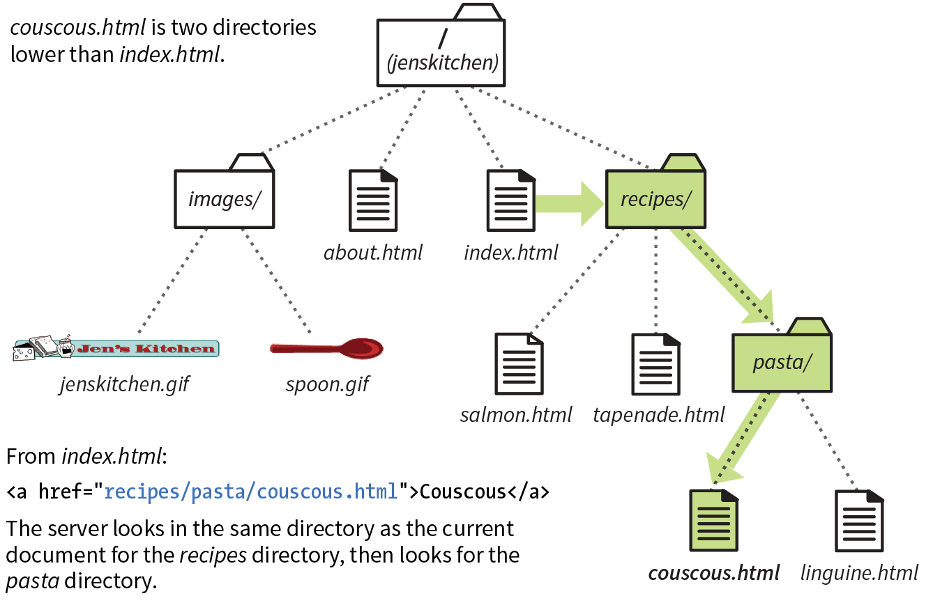
<li>Linguine with Clam Sauce</li>
So far, so good, right? Now it gets more interesting. This time we’re going to go in the other direction and make a link from the salmon recipe page back to the home page, which is one directory level up.
In Unix, there is a pathname convention just for this purpose, the “dot-dot-slash” (../). When you begin a pathname with ../, it’s the same as telling the browser “back up one directory level” and then follow the path to the specified file. If you are familiar with browsing files on your desktop, it is helpful to know that a “../” has the same effect as clicking the Up button in Windows Explorer or the left-arrow button in the Finder on macOS.
Each ../ at the beginning of the pathname tells the browser to go up one directory level to look for the file.
Let’s start by making a link from salmon.html back to the home page (index.html). Because salmon.html is in the recipes subdirectory, we need to go back up to the jenskitchen directory to find index.html. This pathname tells the browser to “back up one level,” then look in that directory for index.html (Figure 6-8):
<p><a href="../index.html">[Back to home page]</a></p>
Note that the ../ stands in for the name of the higher directory, and we don’t need to write out jenskitchen in the pathname.
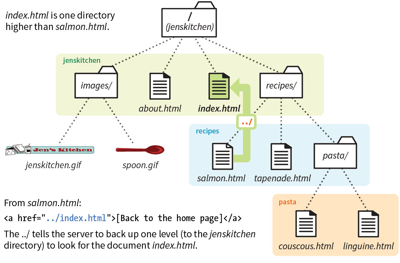
Try adding a dot-dot-slash pathname to a higher directory in Exercise 6-5.
<p>[Back to the home page]</p>
But how about linking back to the home page from couscous.html? Can you guess how you’d back your way out of two directory levels? Simple: just use the dot-dot-slash twice (Figure 6-9).
A link on the couscous.html page back to the home page (index.html) would look like this:
<p><a href="../../index.html">[Back to home page]</a></p>
The first ../ backs up to the recipes directory; the second ../ backs up to the top-level directory (jenskitchen), where index.html can be found. Again, there is no need to write out the directory names; the ../ does it all.
Now you try (Exercise 6-6).
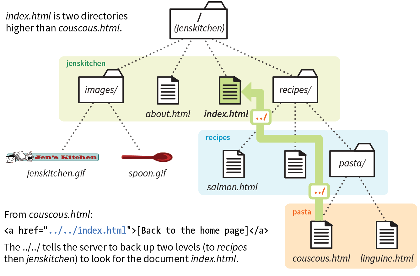
<p>[Back to the home page]</p>
All sites have a root directory, the directory that contains all the directories and files for the site. So far, all of the pathnames we’ve looked at are relative to the document with the link. Another way to write a relative pathname is to start at the root directory and list the subdirectory names to the file you want to link to. This type of pathname is known as site root relative.
Site root relative links are generally preferred because of their flexibility.
In the Unix pathname convention, a forward slash (/) at the start of the pathname indicates that the path begins at the root directory. The site root relative pathname in the following link reads, “Go to the very top-level directory for this site, open the recipes directory, and then find the salmon.html file” (Figure 6-10):
<a href="/recipes/salmon.html">Garlic Salmon</a>
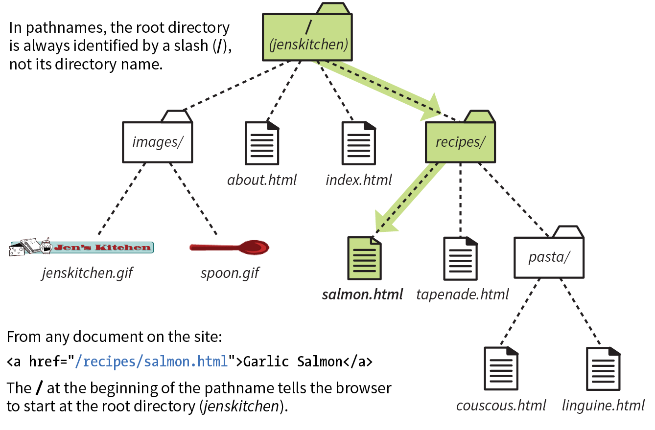
Note that you don’t need to (and you shouldn’t) write the name of the root directory (jenskitchen) in the path—the forward slash (/) at the beginning represents the top-level directory in the pathname. From there, just specify the directories the browser should look in.
Because this type of link starts at the root to describe the pathname, it works from any document on the server, regardless of which subdirectory it may be located in. Site root relative links are useful for content that might not always be in the same directory, or for dynamically generated material. They also make it easy to copy and paste links between documents.
On the downside, however, the links won’t work on your local machine, because they will be relative to your hard drive. You’ll have to wait until the site is on the final server to check that links are working.
Site root relative pathnames won’t work on your local computer unless it is set up as a server.
The src attribute in the img element works the same as the href attribute in anchors. Because you’ll most likely be using images from your own server, the src attributes within your image elements will be set to relative URLs.
Let’s look at a few examples from the Jen’s Kitchen site. First, to add an image to the index.html page, you’d use the following markup:
<img src="images/jenskitchen.gif" alt="">
The URL says, “Look in the current directory (jenskitchen) for the images directory; in there you will find jenskitchen.gif.”
Now for the pièce de résistance. Let’s add an image to the file couscous.html:
<img src="../../images/spoon.gif" alt="">
This is a little more complicated than what we’ve seen so far. This pathname tells the browser to go up two directory levels to the top-level directory and, once there, look in the images directory for an image called spoon.gif. Whew!
Of course, you could simplify that path by going the site root relative route, in which case the pathname to spoon.gif (and any other file in the images directory) could be accessed like this:
<img src="/images/spoon.gif" alt="">
The trade-off is that you won’t see the image in place until the site is uploaded to the server, but it does make maintenance easier once it’s there.
Most of the pathnames in Exercise 6-7 could be site root relative, but write them relative to the listed document for the practice.
Did you know you can link to a specific point in a web page? This is useful for providing shortcuts to information at the bottom of a long, scrolling page or for getting back to the top of a page with just one click or tap. Linking to a specific point in the page is also known as linking to a document fragment.
Linking to a particular spot within a page is a two-part process. First, identify the destination, and then make a link to it. In the following example, I create an alphabetical index at the top of the page that links down to each alphabetical section of a glossary page (Figure 6-11). When users click the letter H, they’ll jump to the “H” heading lower on the page.
Linking to another spot on the same page works well for long, scrolling pages, but the effect may be lost on a short web page.
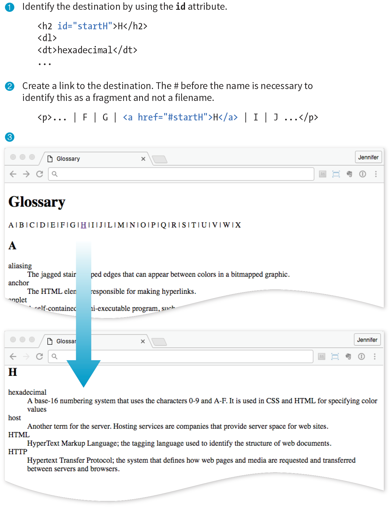
I like to think of this step as planting a flag in the document so I can get back to it easily. To create a destination, use the id attribute to give the target element in the document a unique name (that’s “unique” as in the name may appear only once in the document, not “unique” as in funky and interesting). In web lingo, this is the fragment identifier.
You may remember the id attribute from Chapter 5, Marking Up Text, where we used it to name generic div and span elements. Here, we’re going to use it to name an element so that it can serve as a fragment identifier—that is, the destination of a link.
Here is a sample of the source for the glossary page. Because I want users to be able to link directly to the “H” heading, I’ll add the id attribute to it and give it the value “startH” (Figure 6-11 1):
<h2 id="startH">H</h2>
With the identifier in place, now I can make a link to it.
At the top of the page, I’ll create a link down to the “startH” fragment 2. As for any link, I use the a element with the href attribute to provide the location of the link. To indicate that I’m linking to a fragment, I use the octothorpe symbol (#), also called a hash, pound, or number symbol, before the fragment name:
<p>... F | G |<a href="#startH">H</a>| I | J ...</p>
And that’s it. Now when someone clicks the H from the listing at the top of the page, the browser will jump down and display the section starting with the “H” heading 3.
You can link to a fragment in another document by adding the fragment name to the end of the URL (absolute or relative). For example, to make a link to the “H” heading of the glossary page from another document in that directory, the URL would look like this:
<a href="glossary.html#startH">See the Glossary, letter H</a>
Some developers help their brothers and sisters out by proactively adding s as anchors at the beginning of any thematic section of content (within a reasonable level, and depending on the site). That way, other people can link back to any section in their content.
You can even link to specific destinations in pages on other sites by putting the fragment identifier at the end of an absolute URL, like so:
<a href="http://www.example.com/glossary.html#startH">See the Glossary, letter H</a>
Of course, you don’t have any control over the named fragments in other people’s web pages. The destination points must be inserted by the author of those documents in order for them to be available to you. The only way to know whether they are there and where they are is to “View Source” for the page and look for them in the markup. If the fragments in external documents move or go away, the page will still load; the browser will just go to the top of the page as it does for regular links.
Exercise 6-8 gives you an opportunity to add links to fragments in the example glossary page.
One problem with putting links on your page is that when people click them, they may never come back to your content. The traditional solution to this dilemma has been to make the linked page open in a new browser window. That way, your visitors can check out the link and still have your content available where they left it.
Be aware that opening new browser windows can cause hiccups in the user experience of your site. Opening new windows is problematic for accessibility, and may be confusing to some users. They might not be able to tell that a new window has opened or they may never find their way back to the original page. At the very least, new windows may be perceived as an annoyance rather than a convenience. So consider carefully whether you need a new window and whether the benefits outweigh the potential drawbacks.
The method you use to open a link in a new browser window depends on whether you want to control its size. If the size of the window doesn’t matter, you can use HTML markup alone. However, if you want to open the new window with particular pixel dimensions, then you need to use JavaScript (see the “Pop-up Windows” sidebar).
To open a new window with markup, use the target attribute in the anchor (a) element to tell the browser the name of the window in which you want the linked document to open. Set the value of target to _blank or to any name of your choosing. Remember that with this method, you have no control over the size of the window, but it will generally open as a new tab or in a new window the same size as the most recently opened window in the user’s browser. The new window may or may not be brought to the front depending on the browser and device used.
Setting target="_blank" always causes the browser to open a fresh window. For example:
<a href="http://www.oreilly.com" target="_blank">O'Reilly</a>
If you include target="_blank" for every link, every link will launch a new window, potentially leaving your user with a mess of open windows. There’s nothing wrong with it, per se, as long as it is not overused.
Another method is to give the target window a specific name, which can then be used by subsequent links. You can give the window any name you like (“new,” “sample,” whatever), as long as it doesn’t start with an underscore. The following link will open a new window called “display”:
<a href="http://www.oreilly.com" target="display">O'Reilly</a>
If you target the “display” window from every link on the page, each linked document will open in the same second window. Unfortunately, if that second window stays hidden behind the user’s current window, it may look as though the link simply didn’t work.
You can decide which method (a new window for every link or reusing named windows) is most appropriate for your content and interface.
Here’s a nifty little linking trick: the mailto link. By using the mailto protocol in a link, you can link to an email address. When the user clicks a mailto link, the browser opens a new mail message preaddressed to that address in a designated mail program (see the “Spam-Bots” sidebar).
A sample mailto link is shown here:
<a href="mailto:alklecker@example.com">Contact Al Klecker</a>
As you can see, it’s a standard anchor element with the href attribute. But the value is set to mailto:name@address.com.
The browser has to be configured to launch a mail program, so the effect won’t work for 100% of your audience. If you use the email address itself as the linked text, nobody will be left out if the mailto function does not work (a nice little example of progressive enhancement).
Keep in mind that the smartphones people are using to access your site can also be used to make phone calls! Why not save your visitors a step by letting them dial a phone number on your site simply by tapping on it on the page? The syntax uses the tel: protocol and is very simple:
<a href="tel:+01-800-555-1212">Call us free at (800) 555-1212</a>
When mobile users tap the link, what happens depends on the device: Android launches the phone app; BlackBerry and IE11 Mobile initiate the call immediately; and iOS launches a dialog box giving the option to call, message, or add the number to Contacts. Desktop browsers may launch a dialog box to switch apps (for example, to FaceTime on Safari) or they may ignore the link.
If you don’t want any interruption on desktop browsers, you could use a CSS rule that hides the link for non-mobile devices (unfortunately, that is beyond the scope of this discussion).
There are a few best practices for using telephone links:
<meta name="format-detection" content="telephone=no">
The most important lesson in this chapter is how to write URLs for links and images. Here’s another chance to brush up on your pathname skills.
Using the directory hierarchy shown in Figure 6-12, write out the markup for the following links and graphics.
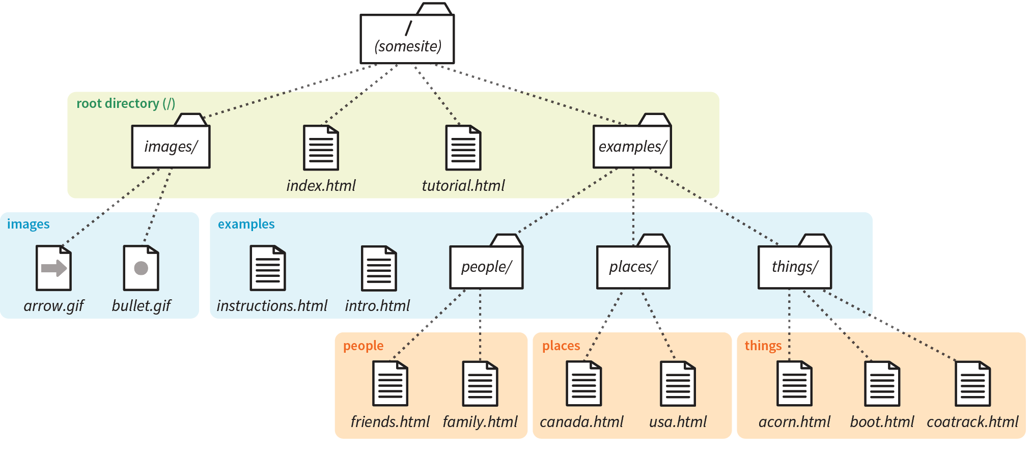
This diagram should provide you with enough information to answer the questions. If you need hands-on work to figure them out, the directory structure is available in the test directory in the materials for this chapter. The documents are just dummy files and contain no content. I filled in the first one for you as an example. The answers are located in Appendix A.
<a href="tutorial.html">...</a>We haven’t covered the image (img) element in detail yet, but you should be able to fill in the relative URLs after the src attribute to specify the location of the image files for these examples.
<img src=" " alt="">
<img src=" " alt="">
<img src=" " alt="">
There’s really only one element relevant to creating hypertext links.
|
Element and attributes |
Description |
a |
|
href=""
|
|
target=""
|
In this Chapter
Adding images with the img element
Image accessibility
Adding SVG images
Responsive images
The web’s explosion into mass popularity was due in part to the fact that there were images on the page. Before images, the internet was a text-only tundra.
Images appear on web pages in two ways: embedded in the inline content or as background images. If the image is part of the editorial content, such as product shots, gallery images, ads, illustrations, and so on, then it should be placed in the flow of the HTML document. If the image is purely decorative, such as a stunning image in the background of the header or a patterned border around an element, then it should be added through Cascading Style Sheets. Not only does it make sense to put images that affect presentation in a style sheet, but it makes the document cleaner and more accessible and makes the design much easier to update later. I will talk about CSS background images at length in Chapter 13, Colors and Backgrounds.
This chapter focuses on embedding image content into the flow of the document, and it is divided into three parts. First, we’ll look at the tried-and-true img element for adding basic images to a page the way we’ve been doing it since 1992. It has worked just fine for over 25 years, and as a beginner, you’ll find it meets most of your needs as well.
The second part of this chapter introduces some of the methods available for embedding SVG images (Scalable Vector Graphics) in HTML documents. SVGs are a special case and demand special attention.
Finally, we’ll look at the way image markup has had to adapt to the wide variety of mobile devices with an introduction to new responsive image elements (picture and source) and attributes (srcset and sizes). As the number of types of devices used to view the web began to skyrocket, we realized that a single image may not meet the needs of all viewing environments, from palm-sized screens on slow cellular networks to high-density cinema displays. We needed a way to make images “responsive”—that is, to serve images appropriate for their browsing environments. After a few years of back and forth between the W3C and the development community, responsive image features were added to the HTML 5.1 specification and are beginning to see widespread browser support.
I want to point out up front that responsive image markup is not as straightforward as the examples we’ve seen so far in this book. It’s based on more advanced web development concepts, and the syntax may be tricky for someone just getting started writing HTML (heck, it’s a challenge for seasoned professionals!). I’ve included it in this chapter because it is relevant to adding inline images, but frankly, I wouldn’t blame you if you’d like to skip the “Responsive Image Markup” section and come back to it after we’ve done more work with Responsive Web Design and you have more HTML and CSS experience under your belt.
We’ll get to the img element and other markup examples in a moment, but first it’s important to know that you can’t put just any image on a web page; it needs to be in one of the web-supported formats.
In general, images that are made up of a grid of colored pixels (called bitmapped or raster images, as shown in Figure 7-1, top) must be saved in the PNG, JPEG, or GIF file formats in order to be placed inline in the content. Newer, more optimized WebP and JPEG-XR bitmapped image formats are slowly gaining in popularity, particularly now that we have markup to make them available to browsers that support them.
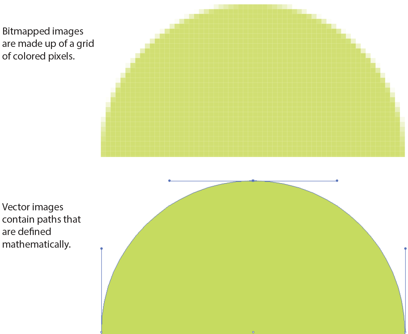
For vector images (Figure 7-1, bottom), such as the kind of icons and illustrations you create with drawing tools such as Adobe Illustrator, we have the SVG format. There is so much to say about SVGs and their features that I’ve given them their own chapter (Chapter 25, SVG), but we’ll look at how to add them to HTML documents later in this chapter.
If you have a source image that is in another popular format, such as TIFF, BMP, or EPS, you’ll need to convert it to a web format before you can add it to the page. If, for some reason, you must keep your graphic file in its original format (for example, a file for a CAD program), you can make it available as an external image by making a link directly to the image file, like this:
<a href="architecture.eps">Get the drawing</a>
You should name your image files with the proper suffixes—.png, .jpg (or .jpeg), .gif, .webp, and .jxr, respectively. In addition, your server must be configured to recognize and serve these various image types properly. All web server software today is configured to handle PNG, JPEG, and GIF out of the box, but if you are using SVG or one of the newer formats, you may need to deliberately add that media type to the server’s official list.
A little background information may be useful here. Image files, and indeed any media files that may reside on a server, have an official media type (also called a MIME type) and suffixes. For example, SVG has the MIME type image/svg+xml and the suffixes .svg and .svgz.
Server packages have different ways of handling MIME information. The popular Apache server software uses a file in the root directory called htaccess that contains a list of all the file types and their acceptable suffixes. Be sure to add (or ask your server administrator to add) the MIME types of new image formats so they may be served correctly. The server looks up the suffix (.webp, for example) of requested files in the list and matches it with the Content-Type (image/webp) that it includes in its HTTP response to the browser. That tells the browser what kind of data is coming and how to parse it.
Browsers use helper applications to display media they can’t handle alone. The browser matches the suffix of the file in the link to the appropriate helper application. The external image may open in a separate application window or within the browser window if the helper application is a browser plug-in. The browser may also ask the user to save the file or open an application manually. It is also possible that it won’t be able to be opened at all.
Without further ado, let’s take a look at the img element and its required and recommended attributes.
<img>
Adds an inline image
The img element tells the browser, “Place an image here.” You’ve already gotten a glimpse of it used to place banner graphics in the examples in Chapter 4, Creating a Simple Page. You can also place an image element right in the flow of the text at the point where you want the image to appear, as in the following example. Images stay in the flow of text, aligned with the baseline of the text, and do not cause any line breaks (HTML5 calls this a phrasing element), as shown in Figure 7-2:
<p>This summer, try making pizza <img src="pizza.png" alt=""> on your grill.</p>
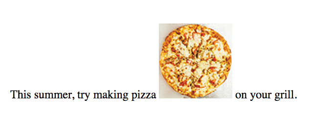
When the browser sees the img element, it makes a request to the server and retrieves the image file before displaying it on the page. On a fast network with a fast computer or device, even though a separate request is made for each image file, the page usually appears to arrive instantaneously. On mobile devices with slow network connections, we may be well aware of the wait for images to be fetched one at a time. The same is true for users using dial-up internet connections or other slow networks, like the expensive WiFi at luxury hotels.
The src and alt attributes shown in the sample are required. The src (source) attribute provides the location of the image file (its URL). The alt attribute provides alternative text that displays if the image is not available. We’ll talk about src and alt a little more in upcoming sections.
There are a few other things of note about the img element:
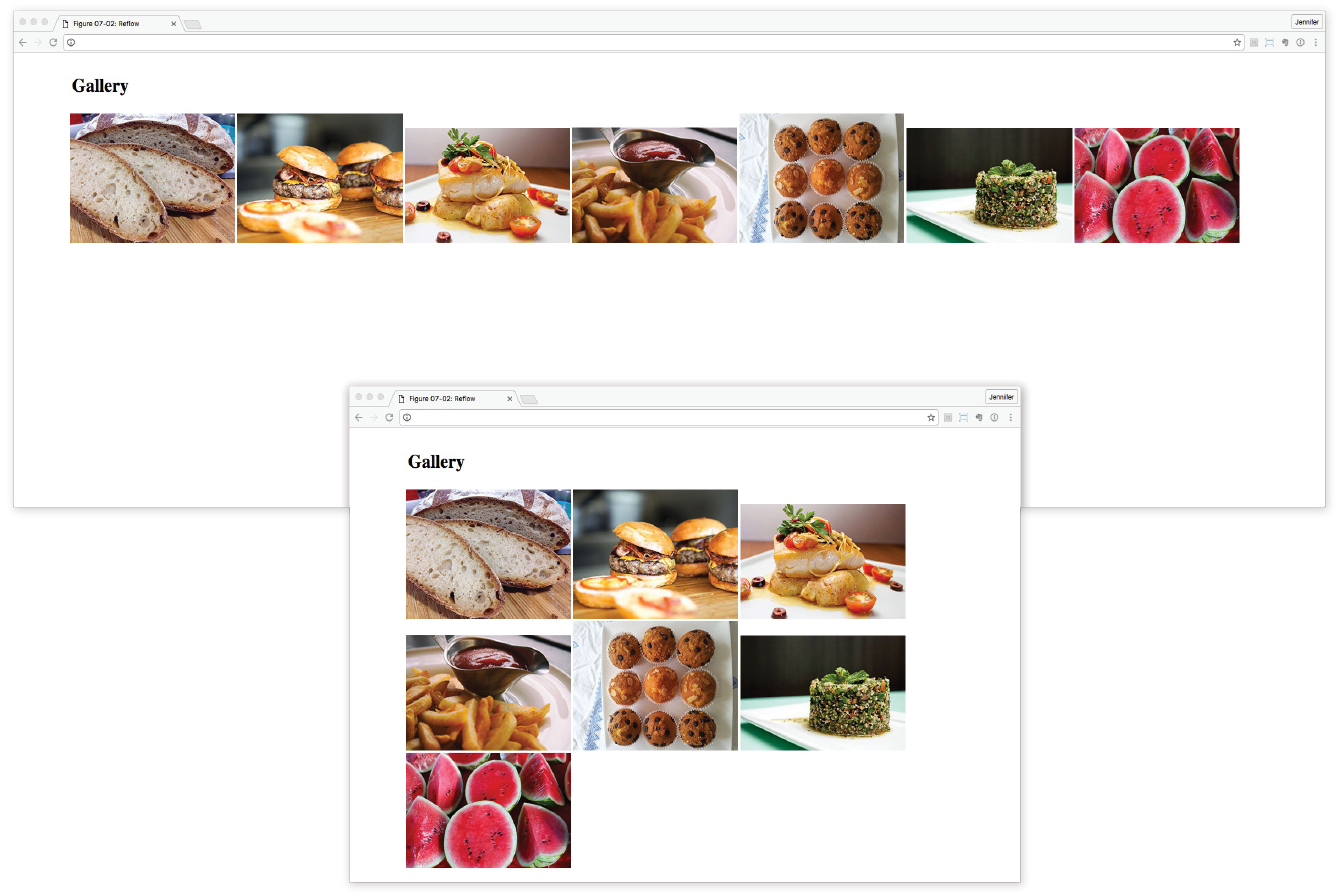
src="URL"
Source (location) of the image
The value of the src attribute is the URL of the image file. In most cases, the images you use on your pages will reside on your own server, so you will use relative URLs to point to them.
If you just read Chapter 6, Adding Links, you should be pretty handy with writing relative URLs. In short, if the image is in the same directory as the HTML document, you can refer to the image by name in the src attribute:
<img src="icon.gif" alt="">
Developers usually organize the images for a site into a directory called images or img (in fact, it helps search engines when you do it that way). There may even be separate image directories for each section of the site. If an image is not in the same directory as the document, you need to provide the pathname to the image file:
<img src="/images/arrow.gif" alt="">
Of course, you could place images from other websites by using a full URL, like this, but it is not recommended (see Warning):
<img src="http://www.example.com/images/smile.gif" alt="">
Before you use any image on your web page, be sure that you own the image, that you have explicit written permission by the copyright holder, or that it is in the public domain. Linking to an image on another server (called ) is considered seriously uncool, so don’t do it unless there is a specific use case in which you have permission. Even then, be aware that you cannot control the image and risk having it moved or renamed, which would break your link.
alt="text"
Alternative text
Every img element must also contain an alt attribute that provides a text alternative to the image for those who are not able to see it. Alternative text (also called alt text) should serve as a substitute for the image content—conveying the same information and function. Alternative text is used by screen readers, search engines, and graphical browsers when the image doesn’t load (Figure 7-4).
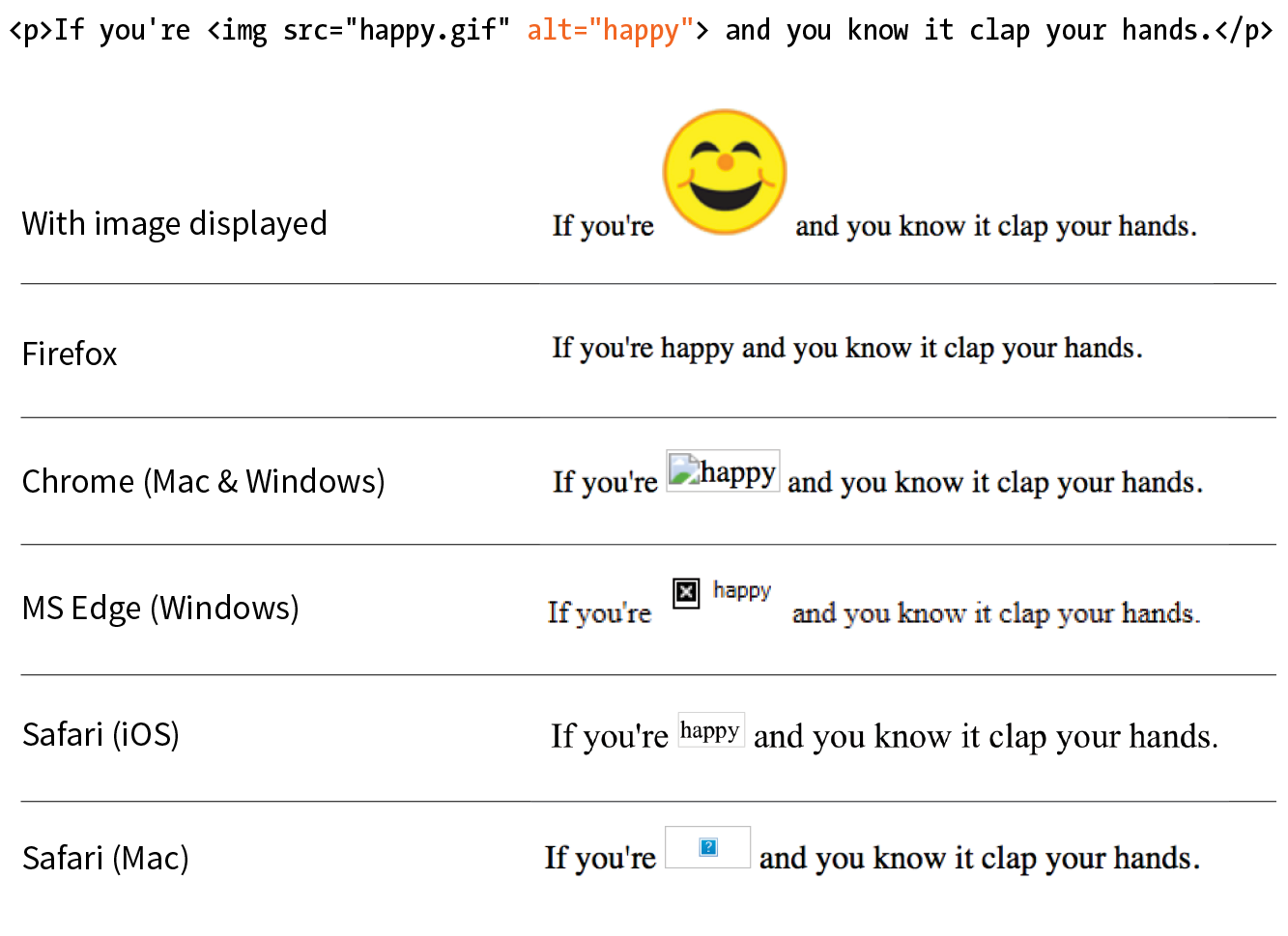
In this example, a PDF icon indicates that the linked text downloads a file in PDF format. In this case, the image is conveying valuable content that would be missing if the image cannot be seen. Providing the alt text “PDF file” replicates the purpose of the image:
<a href="application.pdf">High school application</a> <img src="images/pdflogo.png alt="PDF file">
A screen reader might indicate the image by reading its alt value this way:
“High school application. Image: PDF file”
Sometimes images function as links, in which case providing alternative text is critical because the screen reader needs something to read for the link. In the next example, an image of a book cover is used as a link to the book’s website. Its alt text does not describe the cover itself, but rather performs the same function as the cover image on the page (indicating a link to the site):
<a href="http://learningwebdesign.com"><img src="/images/LWD_cover.png" alt="Learning Web Design site"></a>
If an image does not add anything meaningful to the text content of the page, it is recommended that you leave the value of the alt attribute empty (null). In the following example, a decorative floral accent is not contributing to the content of the page, so its alt value is null. (You may also consider whether it is more appropriately handled as a background image in CSS, but I digress.) Note that there is no character space between the quotation marks:
<img src="/images/floralembellishment.png" alt="">
For each inline image on your page, consider what the alternative text would sound like when read aloud and whether that enhances the experience or might be obtrusive to a user with assistive technology.
Alternative text may benefit users with graphical browsers as well. If the user has opted to turn images off in the browser preferences or if the image simply fails to load, the browser may display the alternative text to give the user an idea of what is missing. The handling of alternative text is inconsistent among modern browsers, however, as shown in Figure 7-4.
width="number"
Image width in pixels
height="number"
Image height in pixels
The width and height attributes indicate the dimensions of the image in number of pixels. Browsers use the specified dimensions to hold the right amount of space in the layout while the images are loading rather than reconstructing the page each time a new image arrives, resulting in faster page display. If only one dimension is set, the image will scale proportionally.
These attributes have become less useful in the age of modern web development. They should never be used to resize an image (use your image-editing program or CSS for that), and they should be omitted entirely when you’re using one of the responsive image techniques introduced later in this chapter. They may be used with images that will appear at the same fixed size across all devices, such as a logo or an icon, to give the browser a layout hint.
Be sure that the pixel dimensions you specify are the actual dimensions of the image. If the pixel values differ from the actual dimensions of your image, the browser resizes the image to match the specified values (Figure 7-5). If you are using width and height attributes and your image looks distorted or even slightly blurry, check to make sure that the values are in sync.
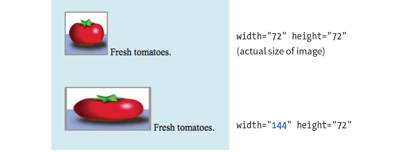
Now that you know the basics of the img element, you should be ready to add a few photos to the Black Goose Bistro Gallery site in Exercise 7-1.
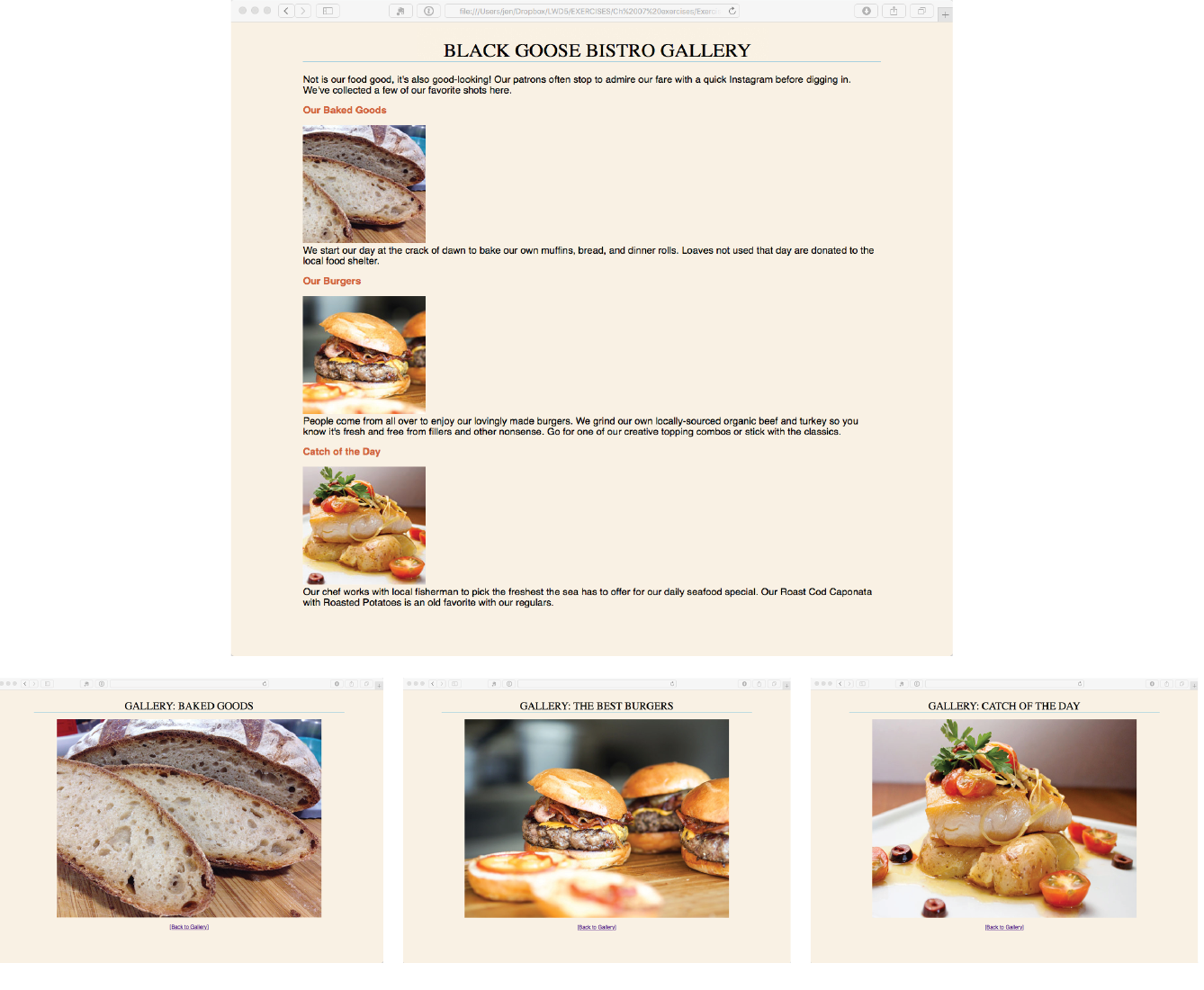
<p><img src="thumbnails/bread-200.jpg" alt="close-up of sliced rustic bread" width="200" height="200"><br>We start our day at the…
That takes care of the basics of adding images to a page. Next we’ll take on adding SVG images, which are a special case, both in terms of the underlying format and the ways they can be added to HTML.
No lesson on adding images to web pages would be complete without an introduction to adding SVGs (Scalable Vector Graphics). After all, the popularity of SVG images has been gaining momentum thanks to nearly ubiquitous browser support and the need for images that can resize without loss of quality. For illustration-style images, they are a responsive dream come true. I’m saving my deep-dive into all things SVG for Chapter 25, but for now I’ll give you a quick peek at what they’re made of so that the embedding markup makes sense.
As I mentioned at the beginning of this chapter, SVGs are an appropriate format for storing vector images (Figure 7-1). Instead of a grid of pixels, vectors are made up of shapes and paths that are defined mathematically. And even more interesting, in SVGs those shapes and paths are specified by instructions written out in a text file. Let that sink in: they are images that are written out in text! All of the shapes and paths as well as their properties are written out in the standardized SVG markup language (see Note). As HTML has elements for paragraphs (p) and tables (table), SVG has elements that define shapes like rectangle (rect), circle (circle), and paths (path).
SVG is an example, or , of XML (Extensible Markup Language), which provides the rules and standards for how markup languages should be written and work together. As a result, SVG plays well alongside HTML content.
A simple example will give you the general idea. Here is the SVG code that describes a rectangle (rect) with rounded corners (rx and ry, for x-radius and y-radius) and the word “hello” set as text with attributes for the font and color (Figure 7-7). Browsers that support SVG read the instructions and draw the image exactly as I designed it:
<svg xmlns="http://www.w3.org/2000/svg" viewBox="0 0 300 180"> <rect width="300" height="180" fill="purple" rx="20" ry="20"/> <text x="40" y="114" fill="yellow" font-family="'Verdana-Bold'" font-size="72"> hello! </text></svg>

SVGs offer some significant advantages over their bitmapped counterparts for certain image types:
Again, all of the ins and outs of creating SVGs, as well as their many features, are discussed in detail in Chapter 25. For now, I’d like to focus on the HTML required to place them in the flow of a web page. You have a few options: embedded with the img element, written out in code as an inline svg element, embedded with object, and used as a background image with CSS.
SVG text files saved with the .svg suffix (sometimes referred to as a standalone SVG) can be treated as any other image, including placing it in the document by using the img element. You’re an expert on the img element by now, so the following example should be clear:
<img src="/images/circle.svg" alt="">
The advantage to embedding an SVG with img is that it is universally supported in browsers that support SVG.
This approach works fine when you are using a standalone SVG as a simple substitute for a GIF or a PNG, but there are a few disadvantages to embedding SVGs with img:
In other words, standalone SVGs behave as though they are in their own little, self-contained bubble. But for static illustrations, that is just fine.
The good news is that all modern browsers support SVGs embedded with the img element. The two notable exceptions are Internet Explorer versions 8 and earlier, and the Android browser prior to version 3. As of this writing, users with those browsers may still show up in small but significant numbers in your user logs. If you see a reason for your site to support these older browsers, there are workarounds, which I address briefly in the upcoming “SVG Fallbacks” section.
<svg>
An inline SVG image
Another option for putting an SVG on a web page is to copy the content of the SVG file and paste it directly into the HTML document. This is called using the SVG inline. Here is an example that looks a lot like the inline img example that we saw way back in Figure 7-2, only this time our pizza is a vector image drawn with circles and inserted with the svg element (Figure 7-8). Each circle element has attributes that describe the fill color, the position of its center point (cx and cy), and the length of its radius (r):
<p>This summer, try making pizza<svgxmlns="http://www.w3.org/2000/svg" viewBox="0 0 72 72" width="100" height="100"><circle fill="#D4AB00" cx="36" cy="36" r="36"/> <circle opacity=".7" fill="#FFF" stroke="#8A291C" cx="36.1" cy="35.9" r="31.2"/> <circle fill="#A52C1B" cx="38.8" cy="13.5" r="4.8"/> <circle fill="#A52C1B" cx="22.4" cy="20.9" r="4.8"/> <circle fill="#A52C1B" cx="32" cy="37.2" r="4.8"/> <circle fill="#A52C1B" cx="16.6" cy="39.9" r="4.8"/> <circle fill="#A52C1B" cx="26.2" cy="53.3" r="4.8"/> <circle fill="#A52C1B" cx="42.5" cy="27.3" r="4.8"/> <circle fill="#A52C1B" cx="44.3" cy="55.2" r="4.8"/> <circle fill="#A52C1B" cx="54.7" cy="42.9" r="4.8"/> <circle fill="#A52C1B" cx="56" cy="28.3" r="4.8"/></svg>on your grill.</p>
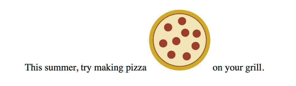
This code was generated by Adobe Illustrator, where I created the illustration and saved it in SVG format. I also optimized it to strip out a lot of cruft that Illustrator adds in there. We’ll discuss SVG optimization in Chapter 25.
Inline SVGs allow developers to take full advantage of SVG features. When the SVG markup is alongside the HTML markup, all of its elements are part of the main DOM tree. That means you can access and manipulate SVG objects with JavaScript, making them respond to user interaction or input. There are similar benefits for style sheets because the elements in the SVG can inherit styles from HTML elements. That makes it easy to apply the same styles to elements on the page and within the SVG graphic.
On the downside, the code for SVG illustrations can get extremely long and unwieldy, resulting in bloated HTML documents that are difficult to read. Even that little pepperoni pizza requires a serious block of code. It also makes the images for a site more difficult to maintain, since they are tucked away in the HTML documents. Another disadvantage is that inline SVGs are not cached by the browser separate from the HTML file, so avoid this method for large images that are reused across many HTML pages.
The good news is that all modern browsers support SVG images placed inline with the svg element. The following older browser versions lack support: Internet Explorer versions 8 and earlier, Safari versions 5 and earlier, Android mobile browser prior to version 3, and iOS prior to version 5.
HTML has an all-purpose media embedding element called object. We’ll talk about it more in Chapter 10, Embedded Media, but for now, know that object is another option for embedding an SVG in a web page. It is a good compromise between img and inline SVG, allowing a fully functional SVG that is still encapsulated in a separate, cacheable file.
The opening object tag specifies the media type (an svg+xml image) and points to the file to be used with the data attribute. The object element comes with its own fallback mechanism—any content within the object gets rendered if the media specified with data can’t be displayed. In this case, a PNG version of the image will be placed with an img if the .svg is not supported or fails to load:
<object type="image/svg+xml" data="pizza.svg"> <img src="pizza.png" alt="pizza"></object>
There is one catch, however. Some browsers download the fallback image even if they support SVG and don’t need it. Useless downloads are not ideal. The workaround is to make the fallback image a CSS background image in an empty div container. Unfortunately, it is not as flexible for scaling and sizing, but it does solve the extra download issue.
<object type="image/svg+xml" data="pizza.svg"> <div style="background-image: url(pizza.png); width 100px; height: 100px;" role="img" aria-label="pizza"></object>
The main advantage to embedding SVGs with the object element is that they can be scripted and load external files. They can also use scripts to access the parent HTML document (with some security restrictions). However, because they are separate files and not part of the DOM for the page, you can’t use a style sheet in the HTML document to style elements within the SVG. Embedded SVGs may also have some buggy behaviors in browsers, so be sure to test thoroughly.
I know that this is an HTML chapter, but I’d be remiss if I didn’t at least mention that SVGs can be used as background images with CSS. This style rule example puts a decorative image in the background of a header:
header { background-image: url(/images/decorative.svg);}
As mentioned earlier, all modern browsers support SVGs either embedded as an img, embedded as an object, or included inline, which is very good news. However, if your server logs show significant traffic from Internet Explorer 8 and earlier, Android version 3 and earlier, or Safari 5 and earlier, or if your client just requires support for those browsers, you may need to use a fallback technique. One option is to use the object element to embed the SVG on the page and take advantage of its fallback content feature shown earlier.
If you are using SVG as an image with the img element, another option is to use the picture element (it’s discussed as part of the “Responsive Image Markup” section later in this chapter). The picture element can be used to provide several versions of an image in different formats. Each version is suggested with the source element, which in the following example points to the pizza.svg image and defines its media type. The picture element also has a built-in fallback mechanism. If the browser doesn’t support the suggested source files, or if it does not support the picture element, users will see the PNG image provided with the good old img element instead:
<picture> <source type="image/svg+xml" srcset="pizza.svg"> <img srcset="pizza.png" alt="No SVG support"></picture>
If you Google for “SVG fallbacks,” you’ll likely get quite a few hits, many of which use JavaScript to detect support. For more detailed information on SVG fallbacks, I recommend reading Amelia Bellamy-Royd’s article, “A Complete Guide to SVG Fallbacks” (css-tricks.com/a-complete-guide-to-svg-fallbacks/) or Chris Coyier’s book, Practical SVG (A Book Apart) when you are ready. Ideally, you will be reading this in a world where old Internet Explorer and Android versions are no longer an issue.
Are you ready to give SVGs a spin? Try out some of the embedding techniques we discussed in Exercise 7-2.

Pretty quickly after smartphones, tablets, “phablets,” and other devices hit the scene, it became clear that large images that look great on a large screen were overkill on smaller screens. All that image data…downloaded and wasted. Forcing huge images onto small devices slows down page display and may cost real money too, depending on the user’s data plan (and your server costs). Conversely, small images that download quickly may be blurry on large, high-resolution screens. Just as we need a way to make whole web pages respond and adapt to various screen sizes, we need a way to make images on those page “responsive” as well. Our trusty img element with its single src attribute just doesn’t cut it in most cases.
It took a couple of years of proposals, experimentation, and discussion between browser makers and the web development community, but we now have a way to suggest alternate images by using HTML markup alone. No complicated JavaScript or server-side hacks. The resulting responsive image features (srcset and sizes attributes as well as the picture element) have been incorporated into the HTML 5.1 specification, and browser support is growing steadily, led by the Chrome browser in September 2014.
Thanks to a foolproof fallback and scripts that add support to older browsers, you can start using these techniques right away. That said, none of this is set in stone. Responsive image solutions are likely to be tweaked and improved, or perhaps one day even made obsolete. If you are going to include them in your sites, a good starting place for getting up-to-speed is the Responsive Images Community Group (responsiveimages.org). RICG is a group of developers who worked together to hammer out the current spec with the browser creators. They are on top of this stuff. You should also look for recent articles and perhaps even crack open the spec.
When we say “responsive images,” we are talking about providing images that are tailored to the user’s viewing environment. First and foremost, responsive image techniques prevent browsers on small screens from downloading more image data than they need. They also include a mechanism to give high-resolution displays on fast networks images large enough to look extra-gorgeous. In addition, they provide a way for developers to take advantage of new, more efficient image formats.
In short, responsive images work this way: you provide multiple images, sized or cropped for different screen sizes, and the browser picks the most appropriate one based on what it knows about the current viewing environment. Screen dimensions are one factor, but resolution, network speed, what’s already in its cache, user preferences, and other considerations may also be involved.
You provide multiple images, sized or cropped for different screen sizes, and the browser picks the most appropriate one based on what it knows about the current viewing environment.
The responsive image attributes and elements address the following four basic scenarios:
Let’s take a look at each of these common use cases.
Everything that you see on a screen display is made up of little squares of colored light called pixels. We call the pixels that make up the screen itself device pixels (you’ll also sometimes see them referred to as hardware pixels or physical pixels). Until recently, screens commonly fit 72 or 96 device pixels in an inch (now 109 to 160 is the norm). The number of pixels per inch (ppi) is the resolution of the screen.
Bitmapped images, like JPEG, PNG, and GIF, are made up of a grid of pixels too. It used to be that the pixels in images as well as pixel dimensions specified in our style sheets mapped one-to-one with the device pixels. An image or box element that was 100 pixels wide would be laid out across 100 device pixels. Nice and straightforward.
It should come as no surprise that it’s not so straightforward today. Manufacturers have been pushing screen resolutions higher and higher in an effort to improve image quality. The result is that device pixels have been getting smaller and smaller, so small that our images and text would be illegibly tiny if they were mapped one-to-one.
Devices use a measurement called a reference pixel for layout purposes.
To compensate, devices use a measurement called a reference pixel for layout purposes. Reference pixels are also known as points (PT) in iOS, Device Independent Pixels (DP or DiP) in Android, or CSS pixels because they are the unit of measurement we use in style sheets. The iPhone 8 has a screen that is made up of 750 × 1334 device pixels, but it uses a layout grid of 375 × 667 points or CSS pixels (a ratio of 2 device pixels to 1 layout pixel—2:1 or 2x). A box sized to 100 pixels wide in CSS would be laid out across 200 device pixels on the iPhone8. The iPhone X has a screen that is made up of 1125 × 2436 pixels, but it uses a layout grid of 375 × 812 points (a ratio of 3 device pixels to one point—or 3x). A box sized to 100 pixels is laid out across 300 device pixels on the iPhone X.
The ratio of the number of device pixels to CSS pixels is called the device-pixel-ratio (Figure 7-10). Common device-pixel-ratios on handheld devices are 1.325x, 1.5x, 1.7x, 2x, 2.4x, 3x, and even 4x (the “x” is the convention for indicating a device-pixel-ratio). Even large desktop displays are featuring ratios of 2x, 3x, and 4x.
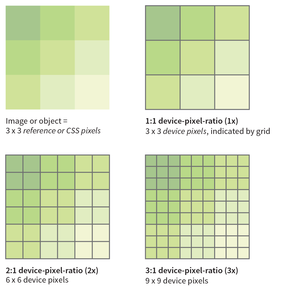
Let’s say you have an image that you want to appear 200 pixels wide on all displays. You can make the image exactly 200px wide (px is short for pixels), and it will look fine on standard-resolution displays, but it might be a little blurry on high-resolution displays. To get that image to look sharp on a display with a device-pixel-ratio of 2x, you’d need to make that same image 400 pixels wide. It would need to be 600 pixels wide to look sharp on a 3x display. Unfortunately, the larger images may have file sizes that are four or more times the size of the original. Who wants to send all that extra data to a 1x device that really only needs the smaller image?
We now have a way to serve larger images just to the browsers on displays that benefit from them. We do it using the new srcset attribute with our old friend the img element. srcset allows developers to specify a list of image source options for the browser to choose from.
The value of srcset is a comma-separated list of options. Each item in that list has two parts: the URL of an image and an x-descriptor that specifies the target device-pixel-ratio. Note that the whole list is the value of srcset and goes inside a single set of quotation marks. This sample shows the structure of a srcset value:
srcset="image-URL#x,image-URL#x"
The src attribute is still required, and is generally used to specify the default 1x image for browsers that don’t support srcset. Make sure there is an alt attribute as well:
<img src="image-URL" alt="" srcset="image-URL#x,image-URL#x">
Let’s look at an example. I have an image of a turkey that I’d like to appear 200 pixels wide. For standard resolution, I created the image at 200 pixels wide and named it turkey-200px.jpg. I’d also like it to look crisp in high-resolution displays, so I have two more versions: turkey-400px.jpg (for 2x) and turkey-600px.jpg (for 3x). Here is the markup for adding the image and indicating its high-density equivalents with x-descriptors:
<img src="/images/turkey-200px.jpg" alt="" srcset="/images/turkey-400px.jpg 2x, /images/turkey-600px.jpg 3x" >
Because browsers ignore line returns and spaces in the source document, I can also write that same element stacked in this way to make it a little easier to read, as I will be doing throughout this chapter:
<img src="/images/turkey-200px.jpg" alt="" srcset="/images/turkey-400px.jpg 2x, /images/turkey-600px.jpg 3x" >
That makes the options and structure more clear at a glance, don’t you think?
Browsers that recognize the srcset attribute check the screen resolution and download what they believe to be the most appropriate image. If the browser is on a Mac with a 2x Retina display, it may download image-400px.jpg. If the device-pixel-ratio is 1.5x, 2.4x, or something else, it checks the overall viewing environment and makes the best selection. It is important to know that when we use srcset with the img element, we are handing the keys to the browser to make the final image selection.
When we use srcset with the img element, we are allowing the browser to make the best image selection.
X-descriptors tell the browser to make a selection based on screen resolution only, with no regard for the dimensions of the screen or viewport. For this reason, x-descriptors are best used for images that stay the same pixel dimensions regardless of the screen size, such as logos, social media badges, or other fixed-width images.
It is much more likely that you’ll want images to resize based on the size of the screen and to be able to serve small images to small handheld devices, and large images to desktops (that’s kind of the crux of this responsive image thing, after all). Now that you are familiar with using the srcset attribute, let’s see how it can be used to deliver images targeted to various screen sizes. Here’s where srcset really shines.
When you’re designing a responsive web page, chances are you’ll want image sizes to change based on the size of the browser viewport (see Note). This is known as a viewport-based selection. And because you are the type of web developer who cares about how fast pages display, you’ll want to limit unnecessary data downloads by providing appropriately sized images.
On a mobile device, the viewport fills the whole screen. On a desktop browser, the viewport is the area where the page displays, not including the scrollbars and other browser “chrome.”
To achieve this goal, use the srcset and sizes attributes with the img element. As we saw in previous examples, the srcset gives the browser a set of image file options, but this time, it uses a w-descriptor (width descriptor) that provides the actual pixel width of each image. Using srcset with a w-descriptor is appropriate when the images are identical except for their dimensions (in other words, they differ only in scale). Here’s an example of a srcset attribute that provides four image options and specifies their respective pixel widths via w-descriptors. Note again that the whole list is in a single set of quotation marks:
srcset="strawberries-480.jpg480w, strawberries-960.jpg960w, strawberries-1280.jpg1280w, strawberries-2400.jpg2400w"
That’s a good start, but whenever you use w-descriptors, you also need to use the sizes attribute to tell the browser the approximate size that the image will appear in the page’s layout. There is a very good reason (in addition to being required in the spec), and it is worth understanding.
The sizes attribute is required when you use width descriptors.
When a browser downloads the HTML document for a web page, the first thing it does is look through the whole document and establish its outline structure (its Document Object Model, or DOM). Then, almost immediately, a preloader goes out to get all the images from the server so they are ready to go. Finally, the CSS and the JavaScript are downloaded. It is likely that the style sheet has instructions for layout and image sizes, but by the time the browser sees the styles, the images are already downloaded. For that reason, we have to give the browser a good hint with the sizes attribute whether the image will fill the whole viewport width or only a portion of it. That allows the preloader to pick the correct image file from the srcset list.
We’ll start with the simplest scenario in which the image is a banner and always appears at 100% of the viewport width, regardless of the device (Figure 7-11). Here’s the complete img element:
<img src="strawberries-640.jpg" alt="baskets of ripe strawberries" srcset="strawberries-480.jpg 480w, strawberries-960.jpg 960w, strawberries-1280.jpg 1280w, strawberries-2400.jpg 2400w" sizes="100vw">
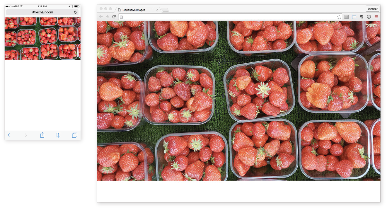
In this example, the sizes attribute tells the browser that the image fills the full viewport by using viewport width units (vw), the most common unit for the sizes attribute, so the browser can pick the best image for the job. For example, 100vw translates to 100% of the viewport width, 50vw would be 50%, and so on. You can also use em, px, and a few other CSS units, but you cannot use percentages. Browsers that do not support srcset and sizes simply use the image specified in the src attribute.
Sizing an image to fill the whole width of the browser is a pretty specific case. More likely, your images will be one component in a responsive page layout that resizes and rearranges to make best use of the available screen width. Figure 7-12 shows a sidebar of food photos that take up the full width of the screen on small devices, take up a portion of the width on larger devices, and appear three across in a layout for large browser windows.
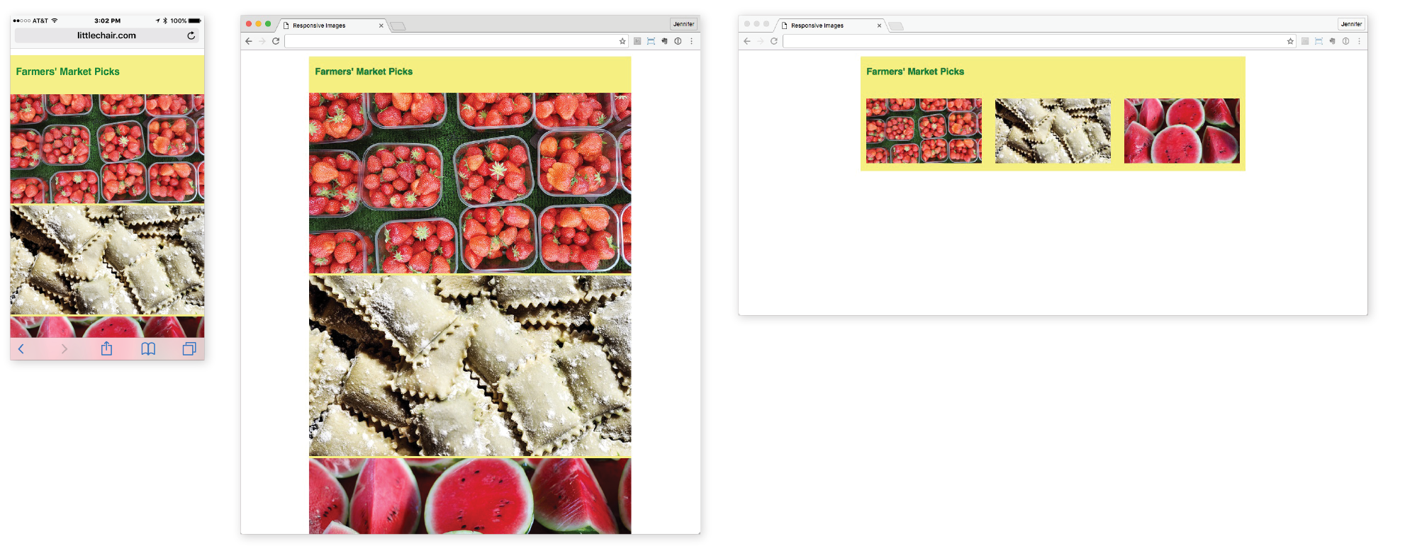
For cases like these, use the sizes attribute to tell the browser something about how the image will be sized for each layout. The sizes value is a comma-separated list in which each item has two parts. The first part in parentheses is a media condition that describes a parameter such as the width of the viewport. The second part is a length that indicates the width that image will occupy in the layout if the media condition is met. Here’s how that syntax looks:
sizes="(media-feature:condition)length,(media-feature:condition)length,(media-feature:condition)length"
I’ve added some media conditions to the previous example, and now we have a complete valid img element for one of the photo images in Figure 7-12:
<img src="strawberries-640.jpg" alt="baskets of ripe strawberries" srcset="strawberries-240.jpg 240w, strawberries-480.jpg 480w, strawberries-672.jpg 672w" sizes="(max-width: 480px) 100vw, (max-width: 960px) 70vw, 240px">
The sizes attribute tells the browser the following:
Now that the browser knows the width of the viewport and how big the image will appear within it, it can select the most appropriate image from the srcset list to download.
The sizes attribute will resize an image even if there is no CSS applied to it. If there is a CSS rule specifying image size that conflicts with the value of the sizes attribute, the style rule wins (i.e., it overrides the sizes value).
There’s a bit more to using sizes than shown here—other media conditions, additional length units, even the ability to ask the browser to calculate widths for you. If you plan on using viewport-width-based images in your designs, I recommend reading the spec to take full advantage of the possibilities.
Strategies and tools for producing the image sets for responsive layouts are introduced in .
<picture>…</picture>
Specifies a number of image options
<source>…</source>
Specifies alternate image sources
So far, we’ve looked at image selection based on the resolution of the screen and the size of the viewport. In both of these scenarios, the content of the image does not change but merely resizes.
But sometimes, resizing isn’t enough. You might want to crop into important details of an image when it is displayed on a small screen. You may want to change or remove text from the image if it gets too small to be legible. Or you might want to provide both landscape (wide) and portrait (tall) versions of the same image for different layouts.
Use the picture element when simply resizing the image is not enough.
For example, in Figure 7-13, the whole image of the table as well as the dish reads fine on larger screens, but at smartphone size, it gets difficult to see the delicious detail. It would be nice to provide alternate versions of the image that make sense for the browsing conditions.
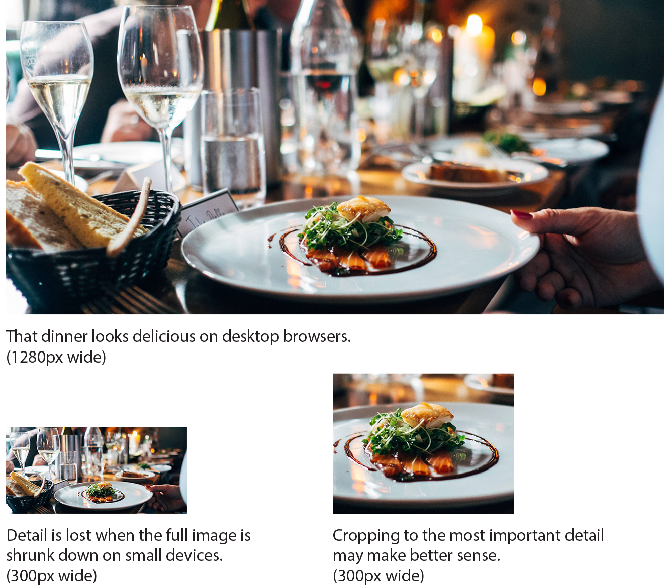
This scenario is known as an art-direction-based selection and it is accomplished with the picture element. The picture element has no attributes; it is just a wrapper for some number of source elements and an img element. The img element is required and must be the last element in the list. If the img is left out, no image will display at all because it is the piece that is actually placing the image on the page. Let’s look at a sample picture element and then pick it apart:
<picture><sourcemedia="(min-width: 1024px)"srcset="icecream-large.jpg"><sourcemedia="(min-width: 760px)"srcset="icecream-medium.jpg"><img src="icecream-small.jpg" alt="hand holding ice cream cone and text that reads Savor the Summer"></picture>
This example tells the browser that if the viewport is 1024 pixels wide or larger, use the large version of the ice cream cone image. If it is wider than 760 pixels (but smaller than 1024, such as on a tablet), use the medium version. Finally, for viewports that are smaller than 760 pixels and therefore don’t match any of the media queries in the previous source elements, the small version should be used (Figure 7-14). The small version, as specified in the img element, will be used for browsers that do not recognize picture and source.
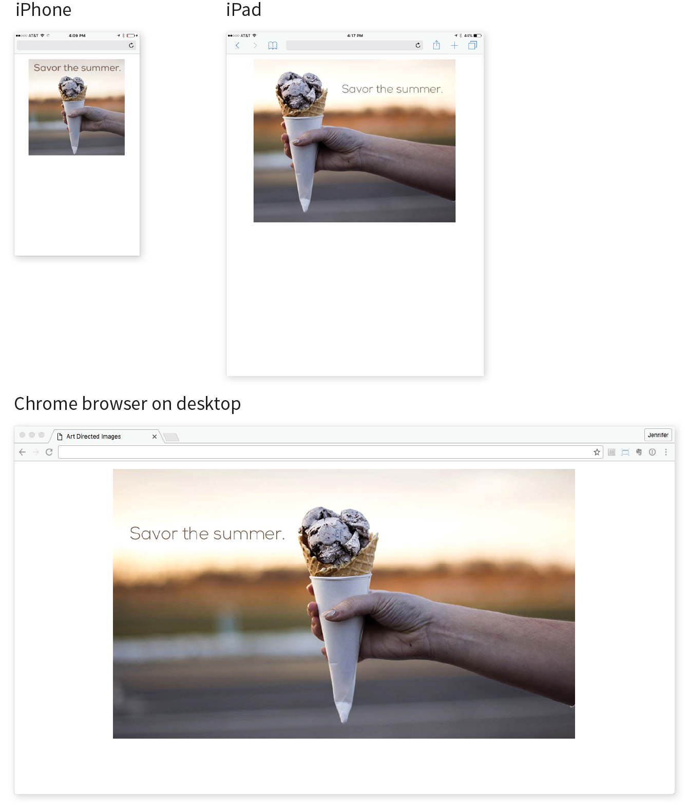
Each source element includes a media attribute and a srcset attribute. It can also use the sizes attribute, although that is not shown in the previous example. The media attribute supplies a media query for checking the current browsing conditions. It is similar to the media conditions we saw in the earlier srcset example, but the media attribute specifies a full-featured CSS media query (we’ll talk more about media queries in Chapter 17, Responsive Web Design). The srcset attribute supplies the URL for the image to use if the media query is a match. In the previous example, there is just one image specified, but it could also be a comma-separated list if you wanted to provide several options using x- or w-descriptors.
Browsers download the image from the first source that matches the current conditions, so the order of the source elements is important. The URL provided in the srcset attribute gets passed to the src attribute in the img element. Again, it’s the img that places the image on the page, so don’t omit it. The alt attribute for the img element is required, but alt is not permitted in the source element.
Art direction is the primary use of the picture element, but let’s look at one more thing it can do to round out our discussion on responsive images.
Once upon a time, in the early 1990s, the only image type you could put on a web page was a GIF. JPEGs came along not long after, and we waited nearly a decade for reliable browser support for the more feature-rich PNG format. It takes a notoriously long time for new image formats to become universally supported. In the past, that meant simply avoiding newer formats.
In an effort to reduce image file sizes, more efficient image formats have been developed—such as WebP, JPEG 2000, and JPEG XR—that can compress images significantly smaller than their JPEG and PNG counterparts (see Note). And once again, some browsers support them and some don’t. The difference is that today we can use the picture element to serve the newer image formats to browsers that can handle them, and a standard image format to browsers that can’t. We no longer have to wait for universal browser support.
The bitmapped image formats, including WebP, JPEG 2000, and JPEG XR, are discussed in more detail in .
In the following example, the picture element specifies two image alternatives before the fallback JPEG listed in the img element:
<picture> <sourcetype="image/webp"srcset="pizza.webp"> <sourcetype="image/jxr"srcset="pizza.jxr"> <img src="pizza.jpg" alt=""></picture>
For image-format-based selections, each source element has two attributes: the srcset attribute that we’ve seen before, and the type attribute for specifying the type of file (also known as its MIME type, see the “File (MIME) Types” sidebar). In this example, the first source points to an image that is in the WebP format, and the second specifies a JPEG XR. Again, the browser uses the image from the first source that matches the browser’s image support, so it makes sense to put them in order from smallest to largest file size.
As I write this section, it seems like a new browser is adding support for picture, srcset, and sizes every day, but of course, old browser versions have a bad habit of sticking around for years. This is not a reason to avoid using responsive images, however. First of all, all of these features are designed to include the img element as a built-in fallback for browsers that don’t recognize the newer markup. In the worst case, the browser grabs the image specified in the img element.
If that isn’t good enough, try including Picturefill with your web pages. Picturefill is an example of a polyfill, a script that makes older browsers behave as though they support a new technology—in this case, responsive images. It was created by Scott Jehl of Filament Group, creators of many fine responsive design and frontend development tools. Go to scottjehl.github.io/picturefill/ to download the script and read the very thorough tutorial on how it works and how to use it.
This has been a long discussion about responsive images, and we’ve really only scratched the surface. We’ve looked at how to use the img element with srcset and sizes to make pixel-ratio-based and viewport-size-based selections (you can try them yourself in Exercise 7-3). We also saw how the picture element can be used for art-direction-based and image-type-based selections.
I’ve kept my examples short and sweet, but know that it is possible to combine techniques in different ways, often resulting in a tower of code for each image. To see some examples of how these responsive image techniques might be combined to target more than one condition, I recommend Andreas Bovens’s article “Responsive Images: Use Cases and Documented Code Snippets to Get You Started” on the Dev.Opera site (dev.opera.com/articles/responsive-images/).
I also recommend the 10-part “Responsive Images 101” tutorial by Jason Grigsby at Cloud Four. He goes into a bit more detail than I was able to here and provides links to other good resources. Start with “Part 1: Definitions” (cloudfour.com/thinks/responsive-images-101-definitions/).
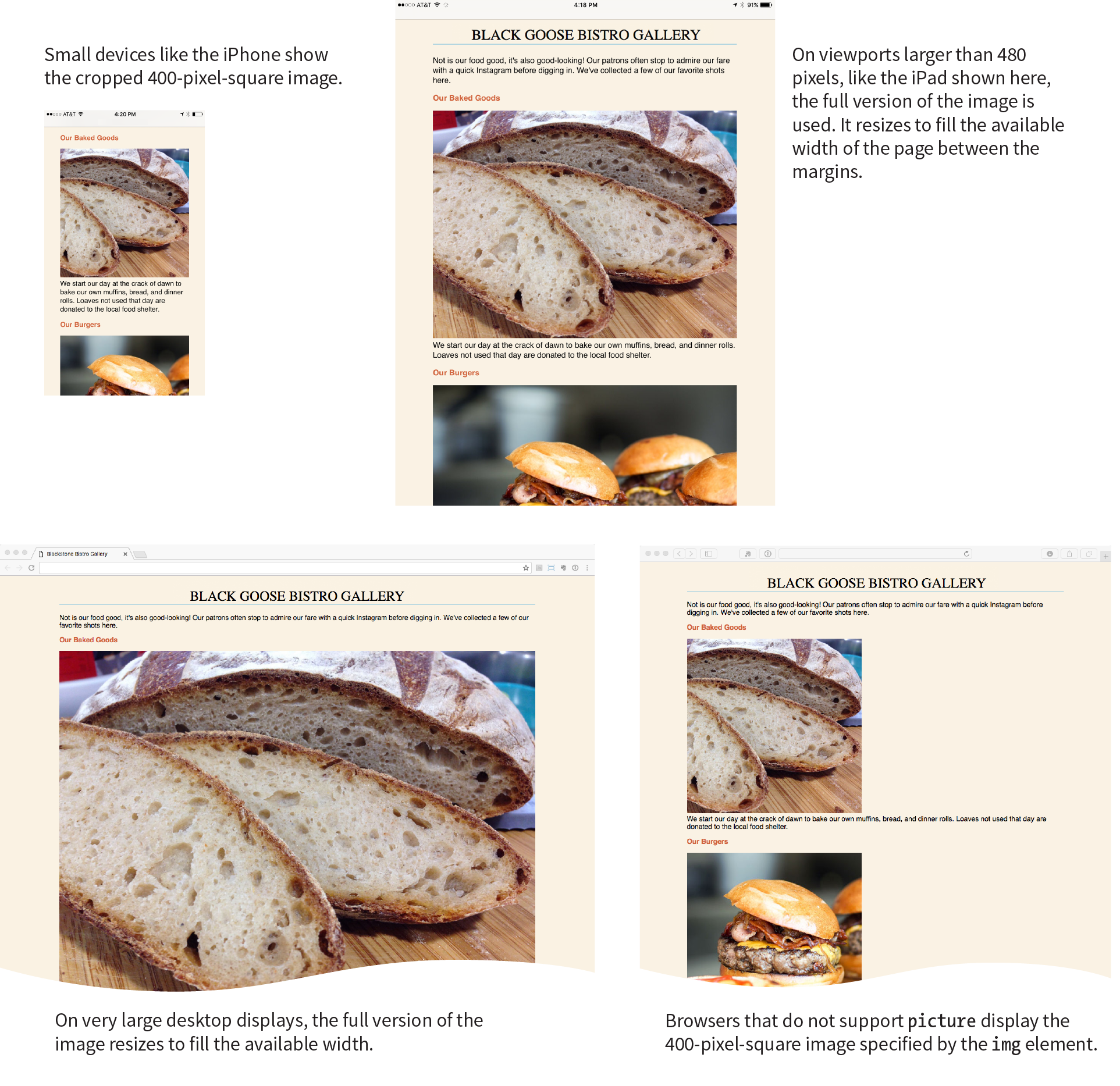
That wraps up our exploration of images. We’ve seen how to place images with the img element and its required src and alt attributes. We’ve talked about the importance of good alternative text for accessibility. We also looked at a few ways to embed SVG images into a web page. Finally, we took on the newly minted responsive image features, including srcset and sizes for the img element to target high-density displays or to provide a variety of image sizes for the browser to choose from, and the picture and source elements for art direction and alternative image formats. Now try answering a few questions to test your knowledge.
Images are a big part of the web experience. Answer these questions to see how well you’ve absorbed the key concepts of this chapter. The correct answers can be found in Appendix A.
<img src="" alt="" srcset="URL x-descriptor"><img src="" alt=" srcset="URL w-descriptor" sizes="#"><picture> <source type="…" srcset=""> <img src="" alt=""></picture><picture> <source media="()" srcset=""> <img src="" alt=""></picture>____ You want the image to always fill the width of the browser window.
____ You want to take advantage of the file savings of the WebP image format.
____ You want to remove the text from an image when it is on small screens.
____ You want your product images to look as sharp as possible on high-resolution screens.
____ You want to show a close-up of the action in a news image on small screens.
____ You want the image to resize smaller when it is part of the layout on a large screen.
<picture> <source sizes="(min-width: 480px) 80vw, 100vw" srcset="photo-200.webp 200w photo-400.webp 400w, photo-800.webp 800w, photo-1200.webp 1200w" type="image/webp"> <img src=" photo-400.jpg" alt="" sizes="(min-width: 480px) 80vw, 100vw" srcset="photo-200.jpg 200w, photo-400.jpg 400w, photo-800.jpg 800w, photo-1200.jpg 1200w"></picture>
image/svg+xml
http://www.w3.org/2000/svg
Following are the elements you learned in your exploration of image markup.
In this Chapter
How tables are used
Basic table structure
Spanning rows and columns
Row and column groups
Making tables accessible
Before we launch into the markup for tables, let’s check in with our progress so far. We’ve covered a lot of territory: how to establish the basic structure of an HTML document, how to mark up text to give it meaning and structure, how to make links, and how to embed simple images on the page.
This chapter and the next two chapters, Chapter 9, Forms, and Chapter 10, Embedded Media, describe the markup for specialized content that you might not have a need for right away. If you’re getting antsy to make your pages look good, skip right to Part III and start playing with Cascading Style Sheets. The tables, forms, and media chapters will be here when you’re ready for them.
Are you still with me? Great. Let’s talk tables. We’ll start out by reviewing how tables should be used, then learn the elements used to create them. Remember, this is an HTML chapter, so we’re going to focus on the markup that structures the content into tables, and we won’t be concerned with how the tables look (that will be tackled in various CSS chapters in Part III).
HTML tables were created for instances when you need to add tabular material (data arranged into rows and columns) to a web page. Tables may be used to organize schedules, product comparisons, statistics, or other types of information, as shown in Figure 8-1. Note that “data” doesn’t necessarily mean numbers. A table cell may contain any sort of information, including numbers, text elements, and even images and multimedia objects.
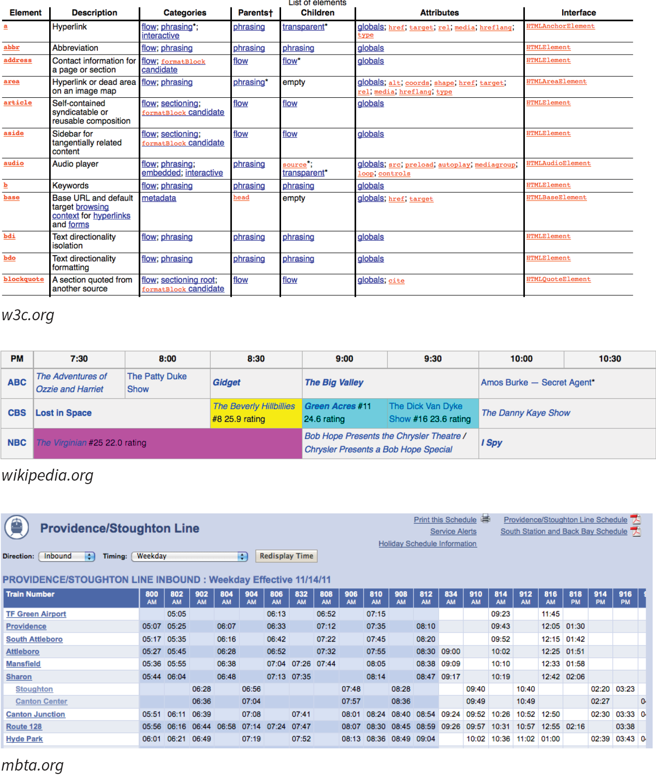
In visual browsers, the arrangement of data in rows and columns gives readers an instant understanding of the relationships between data cells and their respective header labels. Bear in mind when you are creating tables, however, that some readers will be hearing your data read aloud with a screen reader or reading Braille output. Later in this chapter, we’ll discuss measures you can take to make table content accessible to users who don’t have the benefit of visual presentation.
In the days before style sheets, tables were the only option for creating multicolumn layouts or controlling alignment and whitespace. Layout tables, particularly the complex nested table arrangements that were once standard web design fare, have gone the way of the dodo. If you need rows and columns for presentation purposes, there are alternatives that use CSS to achieve the desired effect. In one approach known as CSS Tables, nested divs provide the markup, and CSS Table properties make them behave like rows and cells in the browser. You can also achieve many of the effects that previously required table markup using Flexbox and Grid Layout techniques (see Chapter 16, CSS Layout with Flexbox and Grid).
That said, this chapter focuses on HTML table elements used to semantically mark up rows and columns of data as described in the HTML specification.
<table>…</table>
Tabular content (rows and columns)
<tr>…</tr>
Table row
<th>…</th>
Table header
<td>…</td>
Table cell data
Let’s take a look at a simple table to see what it’s made of. Here is a small table with three rows and three columns that lists nutritional information.
|
Menu item |
Calories |
Fat (g) |
|
Chicken noodle soup |
120 |
2 |
|
Caesar salad |
400 |
26 |
Figure 8-2 reveals the structure of this table according to the HTML table model. All of the table’s content goes into cells that are arranged into rows. Cells contain either header information (titles for the columns, such as “Calories”) or data, which may be any sort of content.
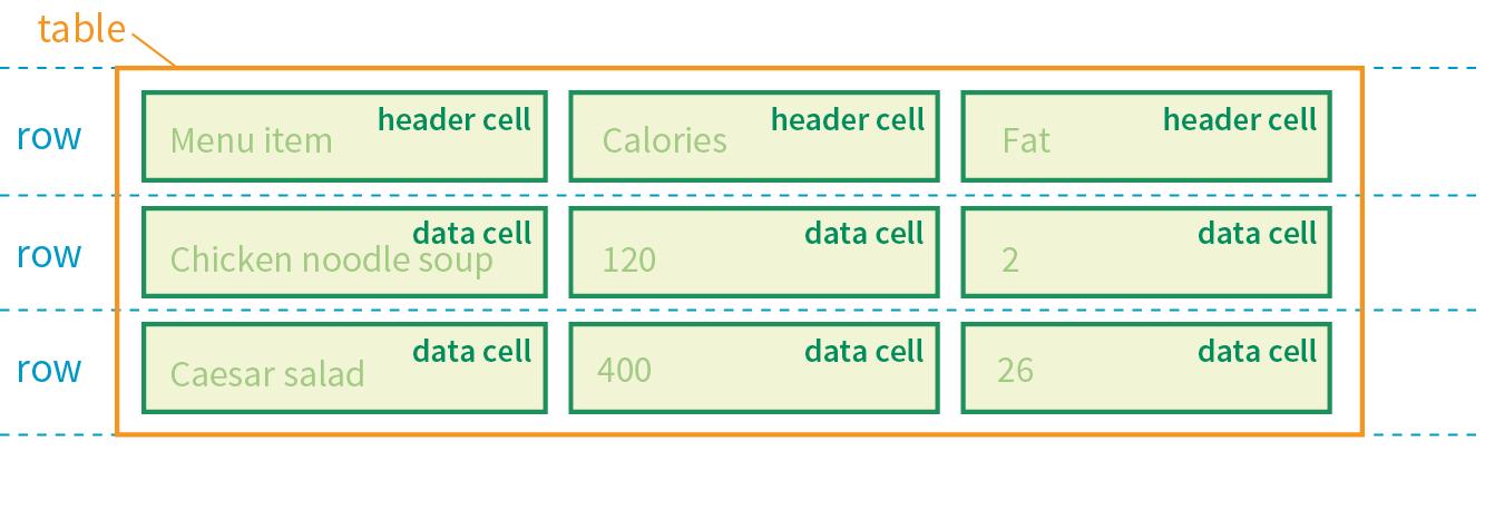
Simple enough, right? Now let’s look at how those parts translate into elements (Figure 8-3).
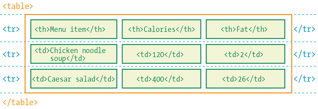
Figure 8-3 shows the elements that identify the table (table), rows (tr, for “table row”), and cells (th, for “table headers,” and td, for “table data”). Cells are the heart of the table, because that’s where the actual content goes. The other elements just hold things together.
What we don’t see are column elements. The number of columns in a table is implied by the number of cells in each row. This is one of the things that make HTML tables potentially tricky. Rows are easy—if you want the table to have three rows, just use three tr elements. Columns are different. For a table with four columns, you need to make sure that every row has four td or th elements. (There’s more to the column story, which I cover in the section “Row and Column Groups” later in this chapter.)
Written out in a source document, the markup for the table in Figure 8-3 looks like the following sample. It is common to stack the th and td elements in order to make them easier to find in the source. This does not affect how the browser renders them.
<table> <tr> <th>Menu item</th> <th>Calories</th> <th>Fat (g)</th> </tr> <tr> <td>Chicken noodle soup</td> <td>120</td> <td>2</td> </tr> <tr> <td>Caesar salad</td> <td>400</td> <td>26</td> </tr> </table>
Remember, all the content must go in cells—that is, within td or th elements. You can put any content in a cell: text, a graphic, or even another table.
Start and end table tags identify the beginning and end of the tabular material. The table element may directly contain only some number of tr (row) elements, a caption and, optionally, the row and column group elements listed in the “Row and Column Groups” section. The only thing that can go in the tr element is some number of td or th elements. In other words, there may be no text content within the table and tr elements that isn’t contained within a td or th.
Finally, Figure 8-4 shows how the table would look in a simple web page, as displayed by default in a browser. I know it’s not exciting. Excitement happens in the CSS. What is worth noting is that tables always start on new lines by default in browsers.
Here is the source for another table. Can you tell how many rows and columns it will have when it is displayed in a browser?
<table> <tr> <th>Burgers</th> <td>Organic Grass-fed Beef</td> <td>Black Bean Veggie</td> </tr> <tr> <th>Fries</th> <td>Hand-cut Idaho potato</td> <td>Seasoned sweet potato</td> </tr></table>
If you guessed that it’s a table with two rows and three columns, you are correct! Two tr elements create two rows; one th and two td elements in each row create three columns.
As you can see in Figure 8-4, the text marked up as headers (th elements) is displayed differently from the other cells in the table (td elements). The difference, however, is not purely cosmetic. Table headers are important because they provide information or context about the cells in the row or column they precede. The th element may be handled differently than tds by alternative browsing devices. For example, screen readers may read the header aloud before each data cell (“Menu item: Caesar salad, Calories: 400, Fat-g: 26”).
In this way, headers are a key tool for making table content accessible. Don’t try to fake them by formatting a row of td elements differently than the rest of the table. Conversely, don’t avoid using th elements because of their default rendering (bold and centered). Instead, mark up the headers semantically and change the presentation later with a style rule.
That covers the basics. Before we get fancier, try your hand at Exercise 8-1.
<style> td, th { border: 1px solid gray;} </style>
One fundamental feature of table structure is cell spanning, which is the stretching of a cell to cover several rows or columns. Spanning cells allows you to create complex table structures, but it has the side effect of making the markup a little more difficult to keep track of. It can also make it potentially more difficult for users with screen readers to follow.
You make a header or data cell span by adding the colspan or rowspan attributes, as we’ll discuss next.
Column spans, created with the colspan attribute in the td or th element, stretch a cell to the right to span over the subsequent columns (Figure 8-6). Here a column span is used to make a header apply to two columns (I’ve added a border around the cells to reveal the structure of the table in the screenshot).
<table> <tr> <th colspan="2">Fat</th> </tr> <tr> <td>Saturated Fat (g)</td> <td>Unsaturated Fat (g)</td> </tr></table>
Notice in the first row (tr) that there is only one th element, while the second row has two td elements. The th for the column that was spanned over is no longer in the source; the cell with the colspan stands in for it. Every row should have the same number of cells or equivalent colspan values. For example, there are two td elements and the colspan value is 2, so the implied number of columns in each row is equal.
Be careful with values. If you specify a number that exceeds the number of columns in the table, browsers add columns to the existing table, which typically screws things up.
Try your hand at column spanning in Exercise 8-2.
Row spans, created with the rowspan attribute, work just like column spans, but they cause the cell to span downward over several rows. In this example, the first cell in the table spans down three rows (Figure 8-8).
<table> <tr> <th rowspan="3">Serving Size</th> <td>Small (8oz.)</td> </tr> <tr> <td>Medium (16oz.)</td> </tr> <tr> <td>Large (24oz.)</td> </tr></table>
Again, notice that the td elements for the cells that were spanned over (the first cells in the remaining rows) do not appear in the source. The rowspan="3" implies cells for the subsequent two rows, so no td elements are needed.
If you loved spanning columns, you’ll love spanning rows in Exercise 8-3.

By default, tables expand just enough to fit the content of the cells, which can look a little cramped. Old versions of HTML included cellpadding and cellspacing attributes for adding space within and between cells, but they have been kicked out of HTML5 as they are obsolete, presentational markup.The proper way to adjust table cell spacing is with style sheets, of course. The “Styling Tables” section in Chapter 19, More CSS Techniques addresses cell spacing.
As a web designer, it is important that you always keep in mind how your site’s content is going to be used by visitors with impaired sight. It is especially challenging to make sense of tabular material by using a screen reader, but the HTML specification provides measures to improve the experience and make your content more understandable.
<caption>…</caption>
Title or description to be displayed with the table
The most effective way to give sight-impaired users an overview of your table is to give it a title or description with the caption element. Captions display next to the table (generally, above it) and can be used to describe the table’s contents or provide hints on how it is structured.
When used, the caption element must be the first thing within the table element, as shown in this example, which adds a caption to the nutritional chart from earlier in the chapter:
<table><caption>Nutritional Information</caption><tr> <th>Menu item</th> <th>Calories</th> <th>Fat (g)</th> </tr> <!-- table continues --> </table>
The caption is displayed above the table by default, as shown in Figure 8-10, although you can use a style sheet property to move it below the table (caption-side: bottom).
For longer descriptions, you could consider putting the table in a figure element and using the figcaption element for the description. The HTML5 specification has a number of suggestions for providing table descriptions (www.w3.org/TR/html5/tabular-data.html#table-descriptions-techniques).
We discussed headers briefly as a straightforward method for improving the accessibility of table content, but sometimes it may be difficult to know which header applies to which cells. For example, headers may be at the left or right edge of a row rather than at the top of a column. And although it may be easy for sighted users to understand a table structure at a glance, for users hearing the data as text, the overall organization is not as clear. The scope and headers attributes allow authors to explicitly associate headers and their respective content.
scope
The scope attribute associates a table header with the row, column, group of rows (such as tbody), or column group in which it appears by using the values row, col, rowgroup, or colgroup, respectively. This example uses the scope attribute to declare that a header cell applies to the current row:
<tr> <th scope="row">Mars</th> <td>.95</td> <td>.62</td> <td>0</td></tr>
Accessibility experts recommend that every th element contain a scope attribute to make its associated data explicitly clear.
headers
For really complicated tables in which scope is not sufficient to associate a table data cell with its respective header (such as when the table contains multiple spanned cells), the headers attribute is used in the td element to explicitly tie it to a header’s id value. In this example, the cell content “.38” is tied to the header “Diameter measured in earths”:
<thid="diameter">Diameter measured in earths</th><!-- many other cells --> <tdheaders="diameter">.38</td><!-- many other cells -->
Unfortunately, support of the id/headers feature is unreliable. The recommended best practice is to create tables in a way that a simple scope attribute will do the job.
Although the advanced table features intended to improve accessibility have been in the specs for many years, support by screen readers and other assistive devices is unreliable at best. It is still recommended that you mark up your data semantically within table cells and that they make sense when read in order from the source, which is exactly how some of your visitors may encounter them.
This section is obviously only the tip of the iceberg of table accessibility. In-depth instruction on authoring accessible tables is beyond the scope of this beginner book. If you’d like to learn more, I recommend “Creating Accessible Tables” at WebAIM (webaim.org/techniques/tables/data) as an excellent starting point.
There is one more important set of elements for helping make the semantic structure of a table clear: row and column grouping elements.
The sample tables we’ve been looking at so far in this chapter have been stripped down to their bare essentials to make the structure clear while you’re learning how tables work. But tables in the real world are not always so simple. Check out the beauty in Figure 8-11 from the CSS Writing Modes Level 3 spec. You can identify three groups of columns (one with headers, two with two columns each), and three groupings of rows (headers, data, and a footnote).
Conceptual table groupings like these are marked up with row group and column group elements that provide additional semantic structure and more “hooks” for styling or scripting. For example, the row and column groups in Figure 8-11 were styled with thicker borders to make them stand out visually.
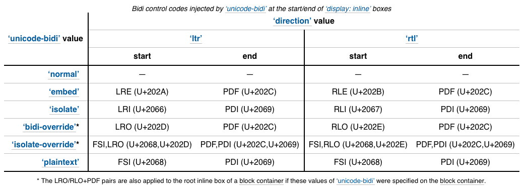
<thead>…</thead>
Table header row group
<tbody>…</tbody>
Table body row group
<tfoot>…</tfoot>
Table footer row group
You can describe rows or groups of rows as belonging to a header, footer, or the body of a table by using the thead, tfoot, and tbody elements, respectively. Some user agents (another word for a browser) may repeat the header and footer rows on tables that span multiple pages. For example, the head and foot rows may print on every page of a multipage table. Authors may also use these elements to apply styles to various regions of a table.
Row group elements may only contain one or more tr elements. They contain no direct text content. The thead element should appear first, followed by any number of tbody elements, followed by an optional tfoot.
This is the row group markup for the table in Figure 8-11 (td and th elements are hidden to save space):
<table>…<thead><!-- headers in these rows--> <tr></tr> <tr></tr> <tr></tr><thead><tbody><!-- data --> <tr></tr> <tr></tr> <tr></tr> <tr></tr> <tr></tr> <tr></tr></tbody><tfoot><!-- footnote --> <tr></tr></tfoot></table>
<colgroup>…</colgroup>
A semantically related group of columns
<col>…</col>
One column in a column group
As you’ve learned, columns are implied by the number of cells (td or th) in each row. You can semantically group columns (and assign id and class values) using the colgroup element.
Column groups are identified at the start of the table, just after the caption if there is one, and they give the browser a little heads-up as to the column arrangement in the table. The number of columns a colgroup represents is specified with the span attribute. Here is the column group section at the beginning of the table in Figure 8-11:
<table> <caption>…</caption> <colgroup></colgroup> <colgroup span="2"></colgroup> <colgroup span="2"></colgroup>
<!-- rest of table... -->
That’s all there is to it. If you need to access individual columns within a colgroup for scripting or styling, identify them with col elements. The previous column group section could also have been written like this:
<colgroup></colgroup> <colgroup><col class="start"> <col class="end"></colgroup> <colgroup><col class="start"> <col class="end"></colgroup>
Note that the colgroup elements contain no content—they only provide an indication of semantically relevant column structure. The empty col elements are used as handles for scripts or styles, but are not required.
This chapter gave you a good overview of the components of HTML tables. Exercise 8-4 combines most of what we’ve covered to give you a little more practice at authoring tables.
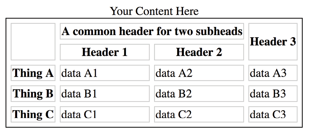
The answers to these questions appear in Appendix A.
<caption>Primetime Television 1965</caption><table> Thursday Night <tr></tr> <th>7:30</th> <th>8:00</th> <th>8:30</th> <tr> <td>Shindig</td> <td>Donna Reed Show</td> <td>Bewitched</td> <tr> <colspan="2">Laredo</colspan> <td>Daniel Boone</td> </tr></table>
The following is a summary of the elements we covered in this chapter.
In This Chapter
How forms work
Elements for adding form widgets
Making forms accessible
Form design basics
It didn’t take long for the web to shift from a network of pages to read to a place where you go to get things done—making purchases, booking plane tickets, signing petitions, searching a site, posting a tweet…the list goes on! Web forms handle all of these interactions.
In fact, in response to this shift from page to application, HTML5 introduced a bonanza of new form controls and attributes that make it easier for users to fill out forms and for developers to create them. Tasks that have traditionally relied on JavaScript may be handled by markup and native browser behavior alone. HTML5 introduces a number of new form-related elements, 12 new input types, and many new attributes (they are listed in Table 9-1 at the end of this chapter). Some of these features are waiting for browser implementation to catch up, so I will be sure to note which controls may not be universally supported.
This chapter introduces web forms, how they work, and the markup used to create them. I’ll also briefly discuss the importance of web form design.
There are two parts to a working form. The first part is the form that you see on the page itself that is created using HTML markup. Forms are made up of buttons, input fields, and drop-down menus (collectively known as form controls) used to collect information from the user. Forms may also contain text and other elements.
The other component of a web form is an application or script on the server that processes the information collected by the form and returns an appropriate response. It’s what makes the form work. In other words, posting an HTML document with form elements isn’t enough. Web applications and scripts require programming know-how that is beyond the scope of this book, but the “Getting Your Forms to Work” sidebar, later in this chapter, provides some options for getting the scripts you need.
If you are going to be creating web forms, it is beneficial to understand what is happening behind the scenes. This example traces the steps of a transaction using a simple form that gathers names and email addresses for a mailing list; however, it is typical of the process for many forms.
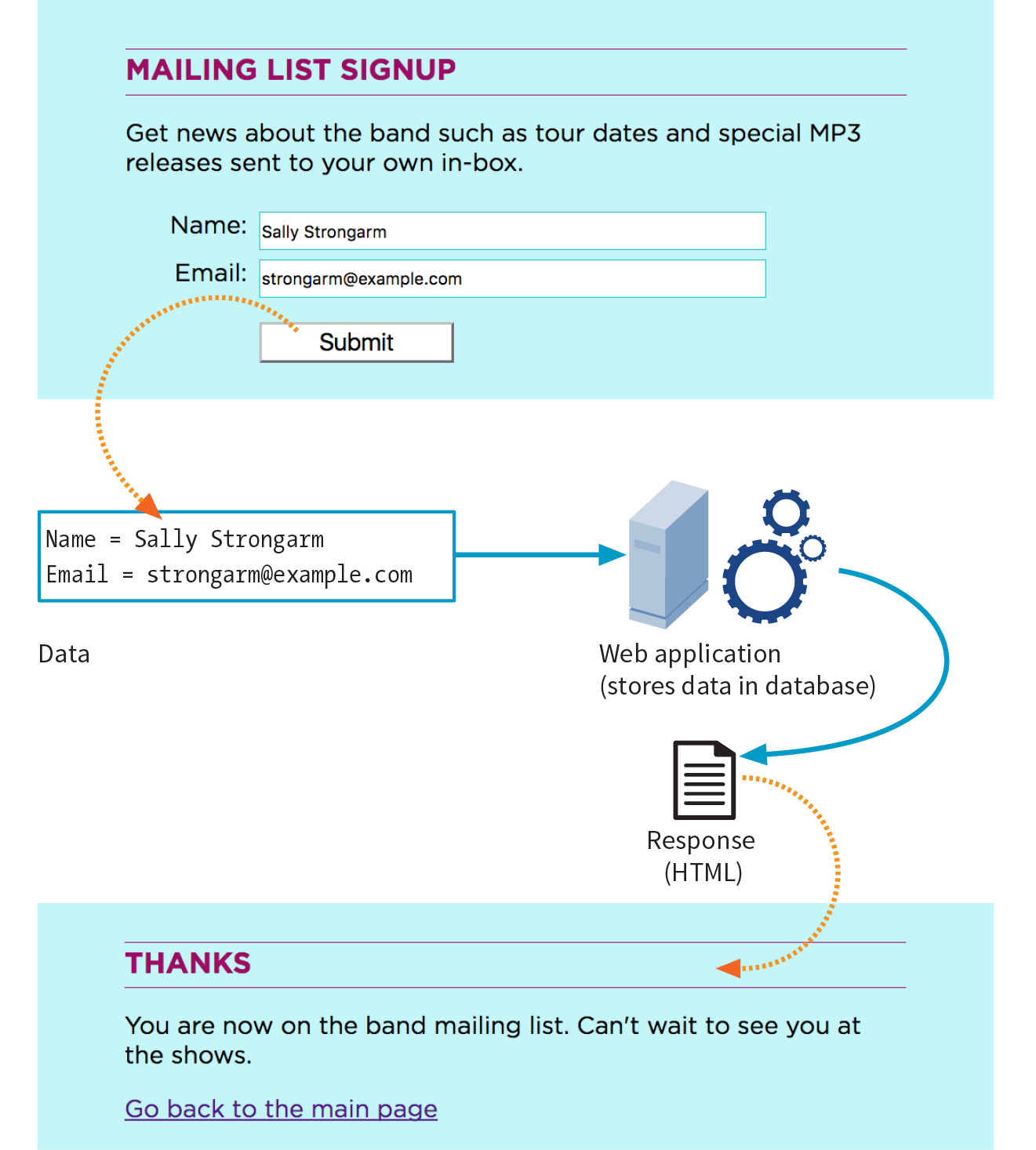
<form>…</form>
Interactive form
Forms are added to web pages with (no surprise here) the form element. The form element is a container for all the content of the form, including some number of form controls, such as text-entry fields and buttons. It may also contain block elements (h1, p, and lists, for example). However, it may not contain another form element.
This sample source document contains a form similar to the one shown in Figure 9-1:
<!DOCTYPE html><html><head> <title>Mailing List Signup</title> <meta charset="utf-8"></head><body> <h1>Mailing List Signup</h1><form action="/mailinglist.php" method="POST"><fieldset> <legend>Join our email list</legend> <p>Get news about the band such as tour dates and special MP3 releases sent to your own in-box.</p> <ol> <li><label for="firstlast">Name:</label> <input type="text" name="fullname" id="firstlast"></li> <li><label for="email">Email:</label> <input type="text" name="email" id="email"></li> </ol> <input type="submit" value="Submit"> </fieldset></form></body></html>
It is current best practice to wrap form controls in semantic HTML elements such as lists or s. Ordered lists, as shown in this example, are a popular solution, but know that there are often default styles that you’ll need to clear out before styling them, particularly on mobile browsers. The , , and elements used in the example improve accessibility. They are explained later in this chapter.
In addition to being a container for form control elements, the form element has some attributes that are necessary for interacting with the form processing program on the server. Let’s take a look at each.
The action attribute provides the location (URL) of the application or script that will be used to process the form. The action attribute in this example sends the data to a script called mailinglist.php:
<form action="/mailinglist.php" method="POST">...</form>
The .php suffix indicates that this form is processed by a script written in the PHP scripting language, but web forms may be processed by any of the following technologies:
There are other form-processing options that may have their own suffixes or none at all (as is the case for the Ruby on Rails platform). Check with your programmer, server administrator, or script documentation for the proper name and location of the program to be provided by the action attribute (see Web Hosting Tip).
Sometimes there is form processing code such as PHP embedded right in the HTML file. In that case, leave the action empty, and the form will post to the page itself.
The method attribute specifies how the information should be sent to the server. Let’s use this data gathered from the sample form in Figure 9-1 as an example.
fullname = Sally Strongarm email = strongarm@example.com
When the browser encodes that information for its trip to the server, it looks like this (see the earlier sidebar if you need a refresher on encoding):
fullname=Sally+Strongarm&email=strongarm%40example.com
There are only two methods for sending this encoded data to the server: POST or GET, indicated by the method attribute in the form element. The method is optional and will default to GET if omitted. We’ll look at the difference between the two methods in the following sections. Our example uses the POST method, as shown here:
<form action="/mailinglist.php" method="POST">...</form>
With the GET method, the encoded form data gets tacked right onto the URL sent to the server. A question mark character separates the URL from the following data, as shown here:
get http://www.bandname.com/mailinglist.php?name=Sally+Strongarm&email=strongarm%40example.com
GET is inappropriate if the form submission performs an action, such as deleting something or adding data to a database, because if the user goes back, it gets submitted again.
When the form’s method is set to POST, the browser sends a separate server request containing some special headers followed by the data. In theory, only the server sees the content of this request, and thus it is the best method for sending secure information such as a home address or other personal information. In practice, make sure HTTPS is enabled on your server so the user’s data is encrypted and inaccessible in transit. (HTTPS is discussed in Chapter 2, How the Web Works.)
The POST method is also preferable for sending a lot of data, such as a lengthy text entry, because there is no character limit as there is for GET.
The GET method is appropriate if you want users to be able to bookmark the results of a form submission (such as a list of search results). Because the content of the form is in plain sight, GET is not appropriate for forms with private personal or financial information. In addition, GET may not be used when the form is used to upload a file.
POST and GET are not case-sensitive and are commonly listed in all uppercase by convention. In XHTML documents, however, the value of the attribute (post or get) must be provided in all lowercase letters.
In this chapter, we’ll stick with the more prevalent POST method. Now that we’ve gotten through the technical aspects of the form element, let’s turn our attention to form controls.
Web forms use a variety of controls that allow users to enter information or choose between options. Control types include various text-entry fields, buttons, menus, and a few controls with special functions. They are added to the document with a collection of form control elements that we’ll be examining one by one in the upcoming “The Great Form Control Roundup” section.
As a web designer, you need to be familiar with control options to make your forms easy and intuitive to use. It is also useful to have an idea of what form controls are doing behind the scenes.
The job of each form control is to collect one bit of information from a user. In the previous form example, text-entry fields collect the visitor’s name and email address. To use the technical term, “fullname” and “email” are two variables collected by the form. The data entered by the user (“Sally Strongarm” and “strongarm@example.com”) is the value or content of the variables.
All form controls (except submit and reset buttons) must include a name attribute.
The name attribute provides the variable name for the control. In this example, the text gathered by a textarea element is defined as the “comment” variable:
<textarea name="comment" rows="4" cols="45" placeholder="Leave us a comment."></textarea>
When a user enters a comment in the field (“This is the best band ever!”), it would be passed to the server as a name/value (variable/content) pair like this:
comment=This+is+the+best+band+ever%21
All form control elements must include a name attribute so the form processing application can sort the information. You may include a name attribute for submit and reset button elements, but they are not required, because they have special functions (submitting or resetting the form) not related to data collection.
You can’t just name controls willy-nilly. The web application that processes the data is programmed to look for specific variable names. If you are designing a form to work with a preexisting application or script, you need to find out the specific variable names to use in the form so they are speaking the same language. You can get the variable names from the instructions provided with a ready-to-use script on your server, your system administrator, or the programmer you are working with.
If the script or application will be created later, be sure to name your variables simply and descriptively and to document them well. In addition, to avoid confusion, you are advised to name each variable uniquely—that is, don’t use the same name for two variables (however, there may be exceptions for which it is desirable). You should also avoid putting character spaces in variable names. Use an underscore or hyphen instead.
We’ve covered the basics of the form element and how variables are named. Now we can get to the real meat of form markup: the controls.
This is the fun part—playing with the markup that adds form controls to the page. This section introduces the elements used to create the following:
We’ll pause along the way to allow you to try them out by constructing the pizza ordering form shown in Figure 9-2.
As you will see, the majority of controls are added to a form via the input element. The functionality and appearance of the input element changes based on the value of the type attribute in the tag. In HTML5.2, there are twenty-two types of input controls. We’ll take a look at them all.
The attributes associated with each input type are listed in Table 9-1 at the end of this chapter.
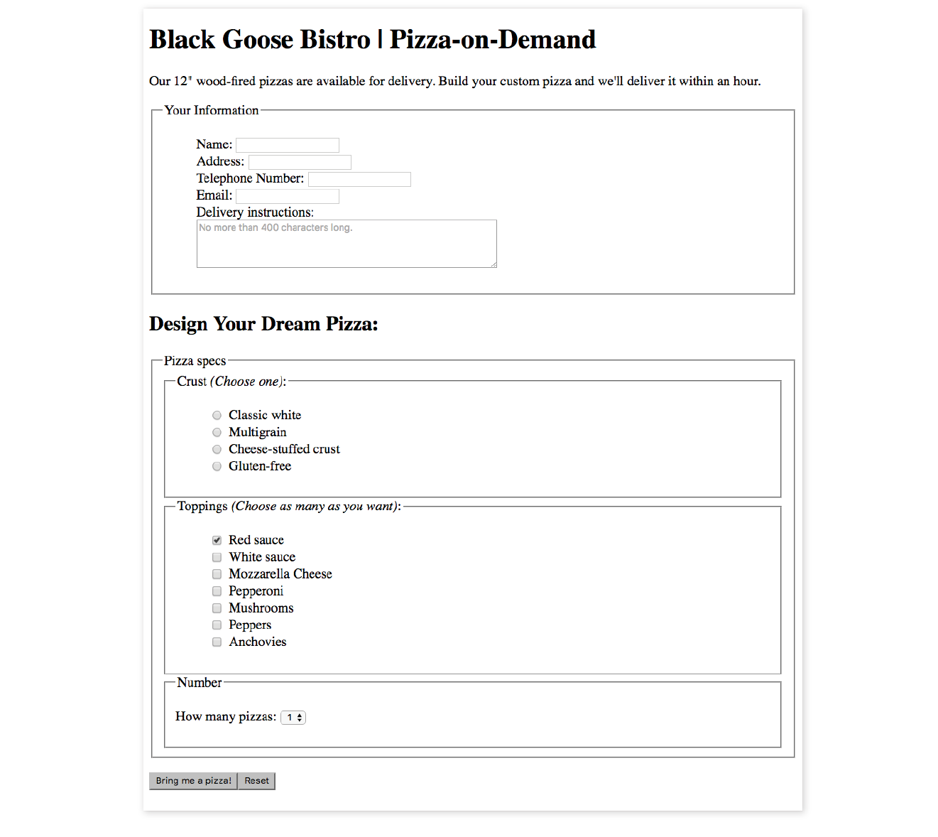
One of the most common web form tasks is entering text information. Which element you use to collect text input depends on whether users are asked to enter a single line of text (input) or multiple lines (textarea).
Be aware that if your form has text-entry fields, it needs to use the secure HTTPS protocol to protect the user-entered content while their data is in transit to the server (see the “HTTPS, the Secure Web Protocol” sidebar in for more information).
<input type="text">
Single-line text-entry control
One of the most straightforward form input types is the text-entry field for entering a single word or line of text. In fact, it is the default input type, which means it is what you’ll get if you forget to include the type attribute or include an unrecognized value. Add a text input field to a form by inserting an input element with its type attribute set to text, as shown here and in Figure 9-3:
<li><label>Favorite color:<input type="text"name="favcolor" value="Red" maxlength="50"></label></li>
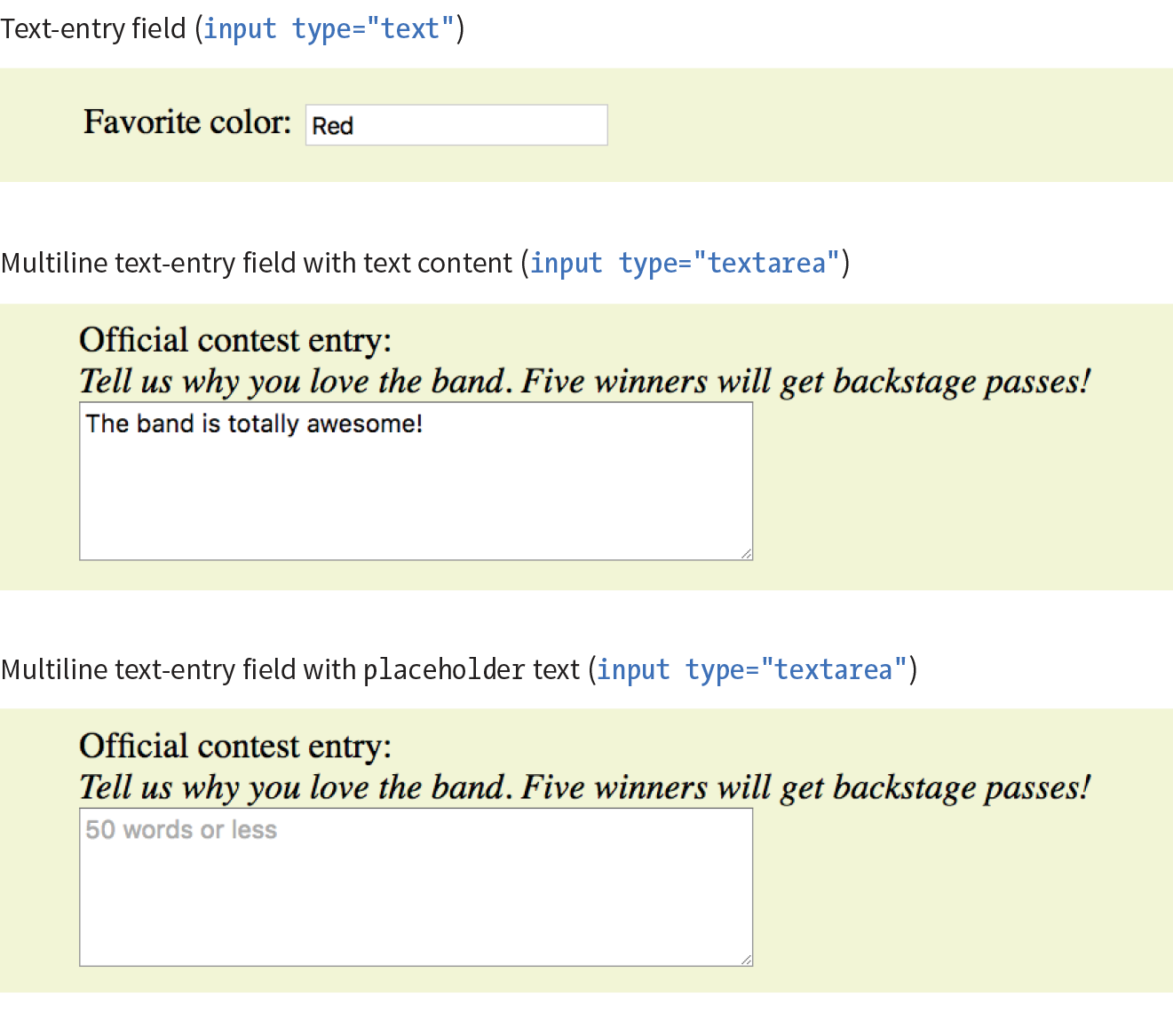
The specific rendering style of form controls varies by operating system and browser version.
There are a few attributes in there that I’d like to point out:
name
The name attribute is required for indicating the variable name.
value
The value attribute specifies default text that appears in the field when the form is loaded. When you reset a form, it returns to this value. The value of the value attribute gets submitted to the server, so in this example, the value “Red” will be sent with the form unless the user changes it. As an alternative, you could use the placeholder attribute to provide a hint of what to type in the field, such as “My favorite color”. The value of placeholder is not submitted with the form, and is purely a user interface enhancement. You’ll see it in action in the upcoming section.
maxlength, minlength
By default, users can type an unlimited number of characters in a text field regardless of its size (the display scrolls to the right if the text exceeds the character width of the box). You can set a maximum character limit using the maxlength attribute if the form-processing program you are using requires it. The minlength attribute specifies the minimum number of characters.
size
The size attribute specifies the length of the input field in number of visible characters. It is more common, however, to use style sheets to set the size of the input area. By default, a text input widget displays at a size that accommodates 20 characters.
<textarea>…</textarea>
Multiline text-entry control
At times, you’ll want your users to be able to enter more than just one line of text. For these instances, use the textarea element, which is replaced by a multiline, scrollable text entry box when displayed by the browser (Figure 9-3).
Unlike the empty input element, you can put content between the opening and closing tags in the textarea element. The content of the textarea element shows up in the text box when the form is displayed in the browser. It also gets sent to the server when the form is submitted, so carefully consider what goes there.
<p><label>Official contest entry: <br><em>Tell us why you love the band. Five winners will get backstage passes!</em><br><textarea name="contest_entry" rows="5" cols="50">The band is totally awesome!</textarea></label></p>
The rows and cols attributes provide a way to specify the size of the textarea with markup. rows specifies the number of lines the text area should display, and cols specifies the width in number of characters (although it is more common to use CSS to specify the width of the field). Scrollbars will be provided if the user types more text than fits in the allotted space.
There are also a few attributes not shown in the example. The wrap attribute specifies whether the soft line breaks (where the text naturally wraps at the edge of the box) are preserved when the form is submitted. A value of soft (the default) does not preserve line breaks. The hard value preserves line breaks when the cols attribute is used to set the character width of the box. The maxlength and minlength attributes set the maximum and minimum number of characters that can be typed into the field.
It is not uncommon for developers to put nothing between the opening and closing tags, and provide a hint of what should go there with a placeholder attribute instead. Placeholder text, unlike textarea content, is not sent to the server when the form is submitted. Examples of textarea content and placeholder text are shown in Figure 9-3.
<p>Official contest entry:<br><em>Tell us why you love the band. Five winners will get backstage passes!</em><br><textarea name="contest_entry" placeholder="50 words or less" rows="5" cols="50"></textarea></p>
In addition to the generic single-line text entry, there are a number of input types for entering specific types of information such as passwords, search terms, email addresses, telephone numbers, and URLs.
<input type="password">
Password text control
A password field works just like a text-entry field, except the characters are obscured from view by asterisk (*) or bullet (•) characters, or another character determined by the browser.
It’s important to note that although the characters entered in the password field are not visible to casual onlookers, the form does not encrypt the information, so it should not be considered a real security measure.
Here is an example of the markup for a password field. Figure 9-4 shows how it might look after the user enters a password in the field.
<li><label for="form-pswd">Password:</label><br> <input type="password" name="pswd" maxlength="12" id="form-pswd"></li>
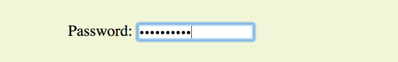
<input type="search">
Search field
<input type="email">
Email address
<input type="tel">
Telephone number
<input type="url">
Location (URL)
Until HTML5, the only way to collect email addresses, telephone numbers, URLs, or search terms was to insert a generic text input field. In HTML5, the email, tel, url, and search input types give the browser a heads-up as to what type of information to expect in the field. These input types use the same attributes as the generic text input type described earlier (name, maxlength, minlength, size, and value), as well as a number of other attributes (see Table 9-1 at the end of the chapter).
All of these input types are typically displayed as single-line text inputs. But browsers that support them can do some interesting things with the extra semantic information. For example, Safari on iOS uses the input type to provide a keyboard well suited to the entry task, such as the keyboard featuring a Search button for the search input type or a “.com” button when the input type is set to url (Figure 9-5). Browsers usually add a one-click “clear field” icon (usually a little X) in search fields. A supporting browser could check the user’s input to see that it is valid—for example, by making sure text entered in an email input follows the standard email address structure (in the past, you needed JavaScript for validation). For example, the Opera (Figure 9-6) and Chrome browsers display a warning if the input does not match the expected format.
Although email, search, telephone, and URL inputs are well supported by up-to-date browsers, there may be inconsistencies in the way they are handled. Older browsers, such as Opera Mini and any version of Internet Explorer prior to 11, do not recognize them at all, but will display the default generic text input instead, which works perfectly fine.
The values from form controls should be checked by the server code (PHP, ASP.NET, etc.), as they can be hacked or manipulated. So, although they make controlling and validating user input easier, it is still vital to perform server-side checks before updating the database on the server.
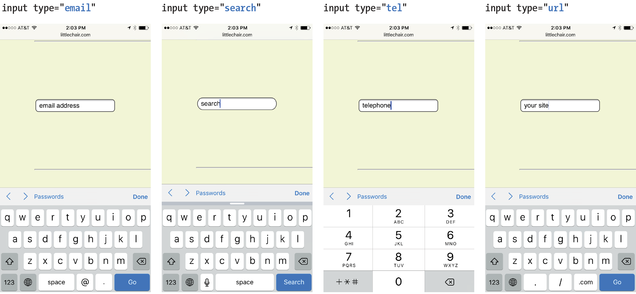
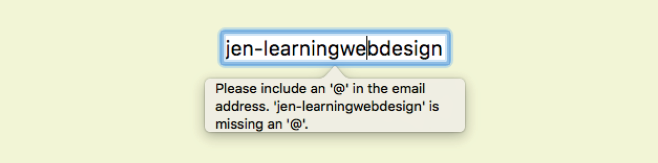
<datalist>…</datalist>
Drop-down menu input
<p>Education completed: <input type="text"list="edulevel"name="education"></p><datalist id="edulevel"><option value="High School"> <option value="Bachelors Degree"> <option value="Masters Degree"> <option value="PhD"></datalist>
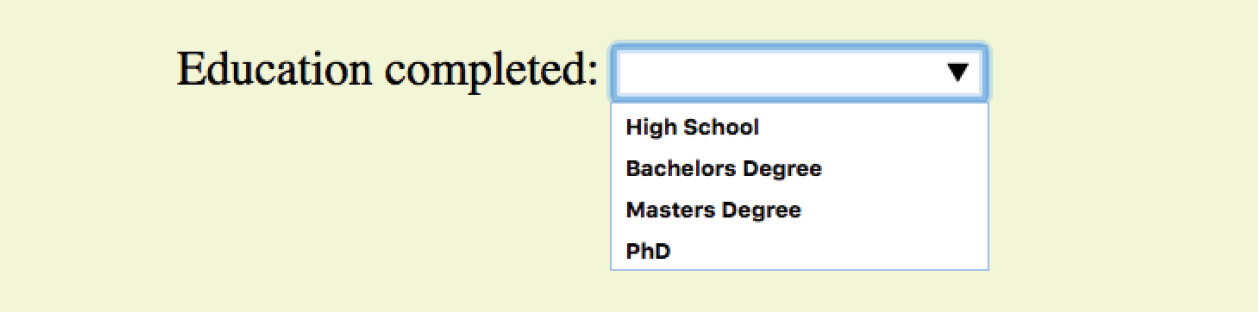
<input type="submit">
Submits the form data to the server
<input type="reset">
Resets the form controls to their default settings
There are several kinds of buttons that can be added to web forms. The most fundamental is the submit button. When clicked or tapped, the submit button immediately sends the collected form data to the server for processing. A reset button returns the form controls to the state they were in when the form initially loaded. In other words, resetting the form doesn’t simply clear all the fields.
Both submit and reset buttons are added via the input element. As mentioned earlier, because these buttons have specific functions that do not include the entry of data, they are the only form control elements that do not require the name attribute, although it is OK to add one if you need it.
Submit and reset buttons are straightforward to use. Just place them in the appropriate place in the form, which in most cases is at the very end. By default, the submit button displays with the label “Submit” or “Submit Query,” and the reset button is labeled “Reset.” You can change the text on the button by using the value attribute, as shown in the reset button in this example (Figure 9-8).
<p><inputtype="submit"> <inputtype="reset" value="Start over"></p>
The reset button is not used in forms as commonly as it used to be. That is because in contemporary form development, we use JavaScript to check the validity of form inputs along the way, so users get feedback as they go along. With thoughtful design and assistance, fewer users should get to the end of the form and need to reset the whole thing. Still, it is a good function to be aware of.
At this point, you know enough about form markup to start building the questionnaire shown in Figure 9-2.
Exercise 9-1 walks you through the first steps.
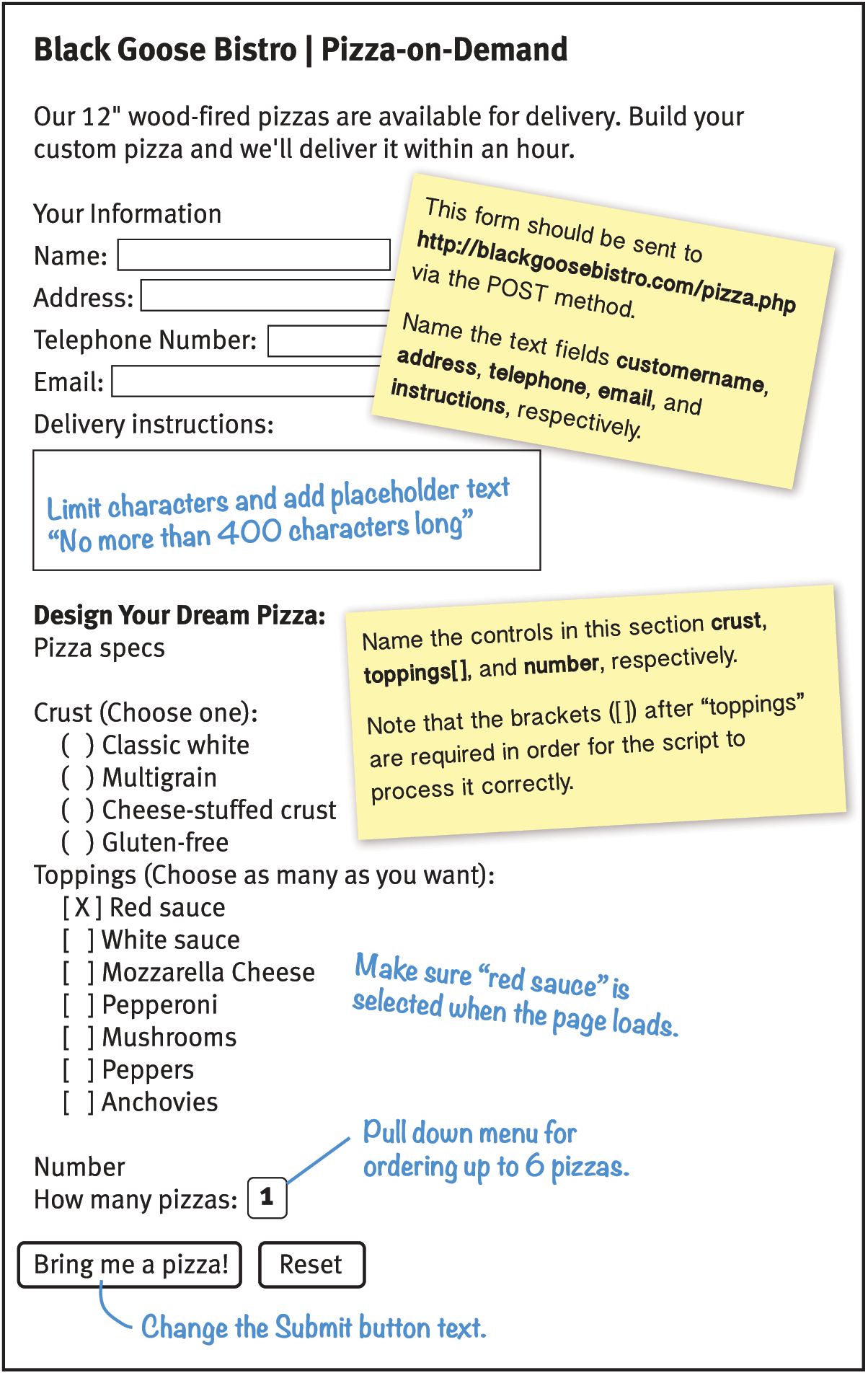
Both checkbox and radio buttons make it simple for your visitors to choose from a number of provided options. They are similar in that they function like little on/off switches that can be toggled by the user and are added with the input element. They serve distinct functions, however.
A form control made up of a collection of radio buttons is appropriate when only one option from the group is permitted—in other words, when the selections are mutually exclusive (such as “Yes or No,” or “Pick-up or Delivery”). When one radio button is “on,” all of the others must be “off,” sort of the way buttons used to work on old radios: press one button in, and the rest pop out.
When checkboxes are grouped together, however, it is possible to select as many or as few from the group as desired. This makes them the right choice for lists in which more than one selection is OK.
<input type="radio">
Radio button
Radio buttons are added to a form via the input element with the type attribute set to “radio.” Here is the syntax for a minimal radio button:
<input type="radio" name="variable" value="value">
The name attribute is required and plays an important role in binding multiple radio inputs into a set. When you give a number of radio button inputs the same name value (“age” in the following example), they create a group of mutually exclusive options.
In this example, radio buttons are used as an interface for users to enter their age group. A person can’t belong to more than one age group, so radio buttons are the right choice. Figure 9-11 shows how radio buttons are rendered in the browser.
<p>How old are you?</p><ol> <li><input type="radio" name="age"value="under24" checked> under 24</li> <li><input type="radio" name="age"value="25-34"> 25 to 34</li> <li><input type="radio" name="age"value="35-44"> 35 to 44</li> <li><input type="radio" name="age"value="over45"> 45+</li></ol>
Notice that all of the input elements have the same variable name (“age”), but their values are different. Because these are radio buttons, only one button can be checked at a time, and therefore, only one value will be sent to the server for processing when the form is submitted.
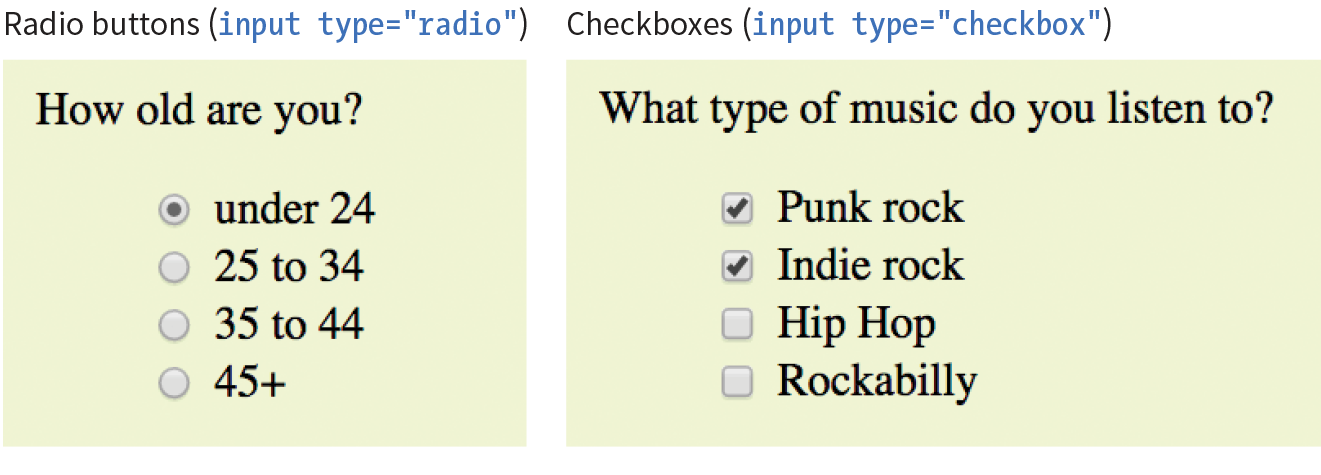
You can decide which button is checked when the form loads by adding the checked attribute to the input element (see Note). In this example, the button next to “under 24” will be checked when the page loads.
It may look like the attribute has no value, but it is one of the attributes in HTML that can be to one word. Behind the scenes, the minimized attribute stands for the rather redundant:
checked="checked"
One of the rules of the stricter XHTML syntax is that attributes cannot be minimized in this way.
<input type="checkbox">
Checkbox button
Checkboxes are added via the input element with its type set to checkbox. As with radio buttons, you create groups of checkboxes by assigning them the same name value. The difference, as we’ve already noted, is that more than one checkbox may be checked at a time. The value of every checked button will be sent to the server when the form is submitted. Here’s an example of a group of checkbox buttons used to indicate musical interests; Figure 9-11 shows how they look in the browser:
<p>What type of music do you listen to?</p><ul> <li><input type="checkbox" name="genre"value="punk" checked> Punk rock</li> <li><input type="checkbox" name="genre"value="indie" checked> Indie rock</li> <li><input type="checkbox" name="genre"value="hiphop"> Hip Hop</li> <li><input type="checkbox" name="genre"value="rockabilly"> Rockabilly</li></ul>
Checkboxes don’t necessarily need to be used in groups, of course. In this example, a single checkbox is used to allow visitors to opt in to special promotions. The value of the control will be passed along to the server only if the user checks the box.
<p><input type="checkbox" name="OptIn" value="yes"> Yes, send me news and special promotions by email.</p>
Checkbox buttons also use the checked attribute to make them preselected when the form loads.
In Exercise 9-2, you’ll get a chance to add both radio and checkbox buttons to the pizza ordering form.
<select>…</select>
Menu control
<option>…</option>
An option within a menu
<optgroup>…</optgroup>
A logical grouping of options within a menu
Another way to provide a list of choices is to put them in a drop-down or scrolling menu. Menus tend to be more compact than groups of buttons and checkboxes.
You add both drop-down and scrolling menus to a form with the select element. Whether the menu pulls down or scrolls is the result of how you specify its size and whether you allow more than one option to be selected. Let’s take a look at both menu types.
The select element displays as a drop-down menu (also called a pull-down menu) by default when no size is specified or if the size attribute is set to 1. In pull-down menus, only one item may be selected. Here’s an example (shown in Figure 9-12):
<p>What is your favorite 80s band?<select name="EightiesFave"><option>The Cure</option> <option>Cocteau Twins</option> <option>Tears for Fears</option> <option>Thompson Twins</option> <optionvalue="EBTG">Everything But the Girl</option> <option>Depeche Mode</option> <option>The Smiths</option> <option>New Order</option></select></p>
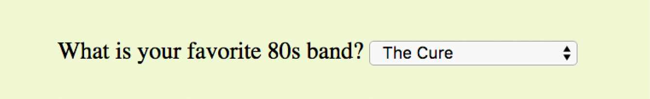
You can see that the select element is just a container for a number of option elements. The content of the chosen option element is what gets passed to the web application when the form is submitted. If, for some reason, you want to send a different value than what appears in the menu, use the value attribute to provide an overriding value. For example, if someone selects “Everything But the Girl” from the sample menu, the form submits the value “EBTG” for the “EightiesFave” variable. For the others, the content between the option tags will be sent as the value.
To make the menu display as a scrolling list, simply specify the number of lines you’d like to be visible using the size attribute. This example menu has the same options as the previous one, except it has been set to display as a scrolling list that is six lines tall (Figure 9-13):
<p>What 80s bands did you listen to?<select name="EightiesBands" size="6" multiple><option>The Cure</option> <option>Cocteau Twins</option> <optionselected>Tears for Fears</option> <optionselected>Thompson Twins</option> <option value="EBTG">Everything But the Girl</option> <option>Depeche Mode</option> <option>The Smiths</option> <option>New Order</option></select></p>
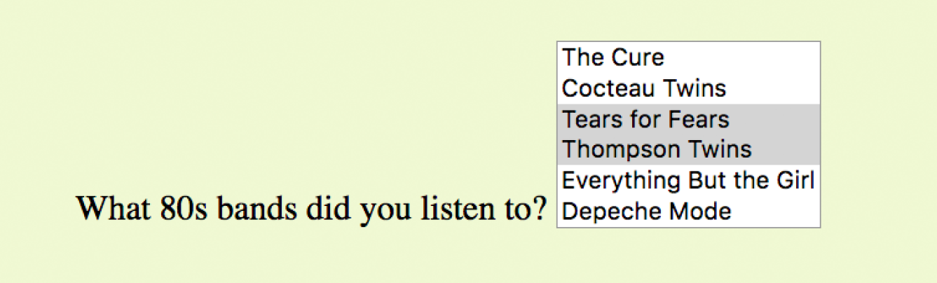
You may notice a few minimized attributes tucked in there. The multiple attribute allows users to make more than one selection from the scrolling list. Note that pull-down menus do not allow multiple selections; when the browser detects the multiple attribute, it displays a small scrolling menu automatically by default.
Use the selected attribute in an option element to make it the default value for the menu control. Selected options are highlighted when the form loads. The selected attribute can be used with pull-down menus as well.
You can use the optgroup element to create conceptual groups of options. The required label attribute provides the heading for the group (see Note). Figure 9-14 shows how option groups are rendered in modern browsers.
<select name="icecream" size="7" multiple><optgroup label="traditional"><option>vanilla</option> <option>chocolate</option></optgroup> <optgroup label="fancy"><option>Super praline</option> <option>Nut surprise</option> <option>Candy corn</option></optgroup></select>
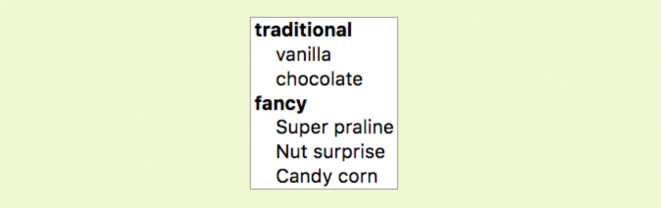
In Exercise 9-3, you will use the select element to let Black Goose Bistro customers choose a number of pizzas for their order.
<input type="file">
File selection field
Web forms can collect more than just data. They can also be used to transmit external documents from a user’s hard drive. For example, a printing company could use a web form to upload artwork for a business card order. A magazine could use a form to collect digital photos for a photo contest.
The file selection control makes it possible for users to select a document from the hard drive to be submitted with the form data. We add it to the form by using our old friend, the input element, with its type set to file.
The markup sample here (Figure 9-15) shows a file selection control used for photo submissions:
<form action="/client.php" method="POST"enctype="multipart/form-data"> <label>Send a photo to be used as your online icon <em>(optional) </em><br><input type="file" name="photo"></label></form>
The file upload widget varies slightly by browser and operating system, but it is generally a button that allows you to access the file organization system on your computer (Figure 9-15).
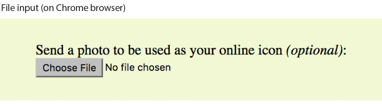
It is important to note that when a form contains a file selection input element, you must specify the encoding type (enctype) as multipart/form-data in the form element and use the POST method.
The file input type has a few attributes. The accept attribute gives the browser a heads-up on what file types may be accepted (audio, video, image, or some other format identified by its media type). Adding the multiple attributes allows multiple files to be selected for upload. The required attribute, as it says, requires a file to be selected.
<input type="hidden">
Hidden control field
There may be times when you need to send information to the form processing application that does not come from the user. In these instances, you can use a hidden form control that sends data when the form is submitted, but is not visible when the form is displayed in a browser.
Hidden controls are added via the input element with the type set to hidden. Its sole purpose is to pass a name/value pair to the server when the form is submitted. In this example, a hidden form element is used to provide the location of the appropriate thank-you document to display when the transaction is complete:
<input type="hidden" name="success-link" value="http://www.example.com/ thankyou.html">
I’ve worked with forms that have had dozens of hidden controls in the form element before getting to the parts that the user actually fills out. This is the kind of information you get from the application programmer, system administrator, or whoever is helping you get your forms processed. If you are using an existing script, be sure to check the accompanying instructions to see if any hidden form variables are required.
It is possible for users to access and manipulate hidden form controls. If you should become a professional web developer, you will learn to program defensively for this sort of thing.
<input type="date">
Date input control
<input type="time">
Time input control
<input type="datetime-local">
Date/time control
<input type="month">
Specifies a month in a year
<input type="week">
Specifies a particular week in a year
If you’ve ever booked a hotel or a flight online, you’ve no doubt used a little calendar widget for choosing the date. Chances are, that little calendar was created with JavaScript. HTML5 introduced six new input types that make date and time selection widgets part of a browser’s standard built-in display capabilities, just as they can display checkboxes, pop-up menus, and other widgets today. As of this writing, the date and time pickers are implemented on only a few browsers (Chrome, Microsoft Edge, Opera, Vivaldi, and Android), but on non-supporting browsers, the date and time input types display as a perfectly usable text-entry field instead. Figure 9-16 shows date and time widgets as rendered in Chrome on macOS.
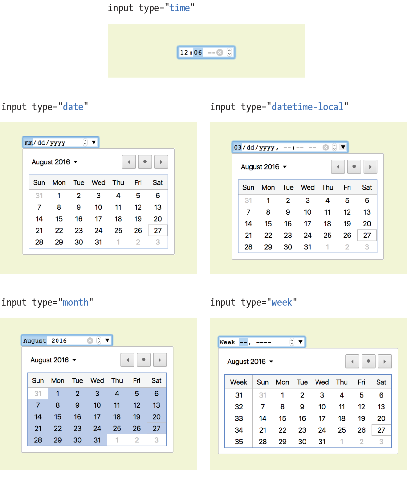
The new date- and time-related input types are as follows:
<input type="date" name="name" value="2017-01-14">
Creates a date input control, such as a pop-up calendar, for specifying a date (year, month, day). The initial value must be provided in ISO date format (YYYY-MM-DD).
<input type="time" name="name" value="03:13:00">
Creates a time input control for specifying a time (hour, minute, seconds, fractional sections) with no time zone indicated. The value is provided as hh:mm:ss.
<input type="datetime-local" name="name" value="2017-01-14T03:13:00">
Creates a combined date/time input control with no time zone information (YYYY-MM-DDThh:mm:ss).
<input type="month" name="name" value="2017-01">
Creates a date input control that specifies a particular month in a year (YYYY-MM).
<input type="week" name="name" value="2017-W2">
Creates a date input control for specifying a particular week in a year using an ISO week numbering format (YYYY-W#).
<input type="number">
Number input
<input type="range">
Slider input
The number and range input types collect numerical data. For the number input, the browser may supply a spinner widget with up and down arrows for selecting a specific numerical value (a text input may display in user agents that don’t support the input type). The range input is typically displayed as a slider (Figure 9-17) that allows the user to select a value within a specified range:
<label>Number of guests <input type="number"name="guests" min="1" max="6"></label> <label>Satisfaction (0 to 10) <input type="range"name="satisfaction" min="0" max="10" step="1"></label>
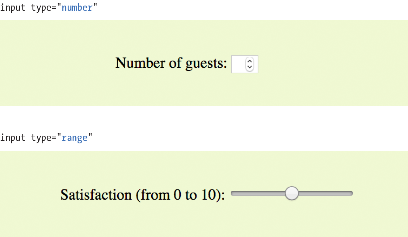
Both the number and range input types accept the min and max attributes for specifying the minimum and maximum values allowed for the input (again, the browser could check that the user input complies with the constraint). Both min and max are optional, and you can also set one without the other. Negative values are allowed. When the element is selected, the value can be increased or decreased with the number keys on a computer keyboard, in addition to being moved with the mouse or a finger.
The step attribute allows developers to specify the acceptable increments for numerical input. The default is 1. A value of “.5” would permit values 1, 1.5, 2, 2.5, and so on; a value of 100 would permit 100, 200, 300, and so on. You can also set the step attribute to any to explicitly accept any value increment.
These two elements allow for only the calculated step values, not for a specified list of allowed values (such as 1, 2, 3, 5, 8, 13, 21). If you need customized values, you need to use JavaScript to program that behavior.
Because these are newer elements, browser support is inconsistent. Some UI widgets include up and down arrows for increasing or decreasing the amount, but many don’t. Mobile browsers (iOS Safari, Android, Chrome for Android) currently do not support min, max, and step. Internet Explorer 9 and earlier do not support number and range inputs at all. Again, browsers that don’t support these new input types display a standard text input field instead, which is a fine fallback.
<input type="color">
Color picker
The intent of the color control type is to create a pop-up color picker for visually selecting a color value similar to those used in operating systems or image-editing programs. Values are provided in hexadecimal RGB values (#RRGGBB). Figure 9-18 shows the color picker in Chrome on macOS (it is the same as the macOS color picker). Non-supporting browsers—currently all versions of IE, iOS Safari, and older versions of Android—display the default text input instead.
<label>Your favorite color: <input type="color" name="favorite"></label>
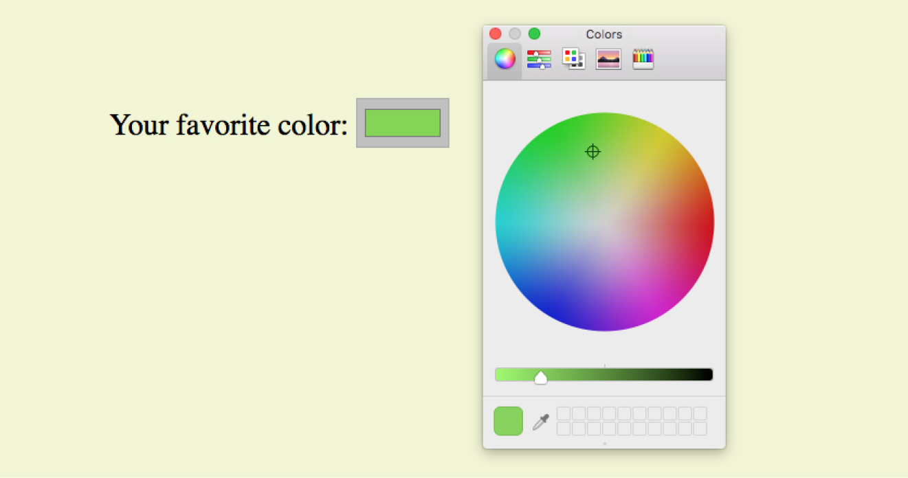
That wraps up the form control roundup. Learning how to insert form controls is one part of the forms production process, but any web developer worth her salt will take the time to make sure the form is as accessible as possible. Fortunately, there are a few things we can do in markup to describe the form’s structure.
It is essential to consider how users without the benefit of visual browsers will be able to understand and navigate through your web forms. The label, fieldset, and legend form elements improve accessibility by making the semantic connections between the components of a form clear. Not only is the resulting markup more semantically rich, but there are also more elements available to act as “hooks” for style sheet rules. Everybody wins!
<label>…</label>
Attaches information to form controls
Although we may see the label “Address” right next to a text field for entering an address in a visual browser, in the source, the label and field input may be separated. The label element associates descriptive text with its respective form field. This provides important context for users with speech-based browsers. Another advantage to using labels is that users can click or tap anywhere on them to select or focus the form control. Users with touch devices will appreciate the larger tap target.
Each label element is associated with exactly one form control. There are two ways to use it. One method, called implicit association, nests the control and its description within a label element. In the following example, labels are assigned to individual checkboxes and their related text descriptions. (By the way, this is the way to label radio buttons and checkboxes. You can’t assign a label to the entire group.)
<ul> <li><label><input type="checkbox" name="genre" value="punk"> Punk rock</label></li> <li><label><input type="checkbox" name="genre" value="indie"> Indie rock</label></li> <li><label><input type="checkbox" name="genre" value="hiphop"> Hip Hop</label></li> <li><label><input type="checkbox" name="genre" value="rockabilly"> Rockabilly</label></li></ul>
The other method, called explicit association, matches the label with the control’s id reference. The for attribute says which control the label is for. This approach is useful when the control is not directly next to its descriptive text in the source. It also offers the potential advantage of keeping the label and the control as two distinct elements, which you may find handy when aligning them with style sheets.
<label for="form-login-username">Login account</label><input type="text" name="login"id="form-login-username"><label for="form-login-password">Password</label><input type="password" name="password"id="form-login-password">
<fieldset>…</fieldset
Groups related controls and labels
<legend>…</legend>
Assigns a caption to a fieldset
The fieldset element indicates a logical group of form controls. A fieldset may also include a legend element that provides a caption for the enclosed fields.
Figure 9-19 shows the default rendering of the following example, but you could use style sheets to change the way the fieldset and legend appear (see Warning):
Fieldsets and legends tend to throw some curveballs when it comes to styling. For example, background colors in fieldsets are handled differently from browser to browser. Legends are unique in that their text doesn’t wrap. The solution is to put a or element in them and control presentation of the contained element without sacrificing accessibility. Be sure to do lots of testing if you style these form elements.
<fieldset> <legend>Mailing List Sign-up</legend><ul> <li><label>Add me to your mailing list <input type="radio" name="list" value="yes" checked></label></li> <li><label>No thanks <input type="radio" name="list" value="no"> </label></li> </ul></fieldset><fieldset><legend>Customer Information</legend><ul> <li><label>Full name: <input type="text" name="fullname"></label> </li> <li><label>Email: <input type="text" name="email"></label></li> <li><label>State: <input type="text" name="state"></label></li> </ul></fieldset>
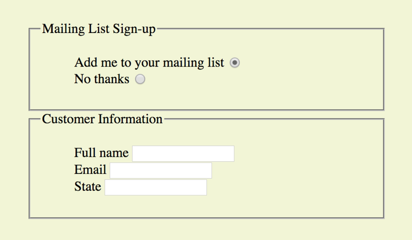
In Exercise 9-4, we’ll wrap up the pizza order form by making it more accessible with labels and fieldsets.
I can’t close this chapter without saying a few words about form design, even though this chapter is about markup, not presentation.
A poorly designed form can ruin a user’s experience on your site and negatively impact your business goals. Badly designed forms mean lost customers, so it is critical to get it right—both on the desktop and for small-screen devices with their special requirements. You want the path to a purchase or other action to be as frictionless as possible.
The topic of good web form design is a rich one that could fill a book in itself. In fact, there is such a book: Web Form Design (Rosenfeld Media) by web form expert Luke Wroblewski, and I recommend it highly. Luke’s subsequent book, Mobile First (A Book Apart), includes tips for how to format forms in a mobile context. You can browse over a hundred articles about forms on his site at www.lukew.com/ff?tag=forms.
Here I’ll offer just a very small sampling of tips from Web Form Design to get you started, but the whole book is worth a read:
Avoid unnecessary questions.
Help your users get through your form as easily as possible by not including questions that are not absolutely necessary to the task at hand. Extra questions, in addition to slowing things down, may make a user wary of your motivations for asking. If you have another way of getting the information (for example, the type of credit card can be determined from the first four numbers of the account), then use alternative means and don’t put the burden on the user. If there is information that might be nice to have but is not required, consider asking at a later time, after the form has been submitted and you have built a relationship with the user.
Consider the impact of label placement.
The position of the label relative to the input affects the time it takes to fill out the form. The less the user’s eye needs to bounce around the page, the quicker the form completion. Putting the labels above their respective fields creates a single alignment for faster scans and completion, particularly when you’re asking for familiar information (name, address, etc.). Top-positioned labels can also accommodate labels of varying lengths and work best on narrow, small-screen devices. They do result in a longer form, however, so if vertical space is a concern, you can position the labels to the left of the inputs. Left alignment of labels results in the slowest form completion, but it may be appropriate if you want the user to slow down or be able to scan and consider the types of required information.
Choose input types carefully.
As you’ve seen in this chapter, there are quite a few input types to choose from, and sometimes it’s not easy to decide which one to use. For example, a list of options could be presented as a pull-down menu or a number of choices with checkboxes. Weigh the pros and cons of each control type carefully, and follow up with user testing.
Group related inputs.
It is easier to parse the many fields, menus, and buttons in a form if they are visually grouped by related topic. For example, a user’s contact information could be presented in a compact group so that five or six inputs are perceived as one unit. Usually, all you need is a very subtle indication, such as a fine horizontal rule and some extra space. Don’t overdo it.
Clarify primary and secondary actions.
The primary action at the end of the form is usually some form of submit button (“Buy,” “Register,” etc.) that signals the completion of the form and the readiness to move forward. You want that button to be visually dominant and easy to find (aligning it along the main axis of the form is helpful as well). Using JavaScript, you can gray out the submit button as non-functioning until all necessary data has been filled in.
Secondary actions tend to take you a step back, such as clearing or resetting the form. If you must include a secondary action, make sure that it is styled to look different and less important than the primary action. It is also a good idea to provide an opportunity to undo the action.
As we’ve seen in this chapter, the default rendering of form markup is not up to par with the quality we see on most professional web forms today. As for other elements, you can use style sheets to create a clean form layout as well as change the appearance of most form controls. Something as simple as nice alignment and a look that is consistent with the rest of your site can go a long way toward improving the impression you make on a user.
Keep in mind that form widgets are drawn by the browser and are informed by operating system conventions. However, you can still apply dimensions, margins, fonts, colors, borders, and background effects to form elements such as text inputs, select menus, textareas, fieldsets, labels, and legends. Be sure to test in a variety of browsers to check for unpleasant surprises. Chapter 19, More CSS Techniques, in Part III, lists some specific techniques once you have more experience with CSS. For more help, a web search for “CSS for forms” will turn up a number of tutorials.
Ready to put your web form know-how to the test? Here are a few questions to make sure you’ve gotten the basics. You’ll find the answers in Appendix A.
<checkbox name="color" value="teal"><select name="popsicle"> <option value="orange"> <option value="grape"> <option value="cherry"> </select><input type="password"><textarea name="essay" width="100" height="6">Your story.</textarea>The following table lists all of the form-related elements and attributes included in HTML 5.2 (some attributes were not covered in this chapter). The attributes for each input type are listed in Table 9-1.
|
Input type |
Accepted attributes |
submit |
autofocus, disabled form, formaction, formenctype, formmethod, formnovalidate, formtarget, name, value |
reset |
autofocus, disabled, form, name, value |
button |
autofocus, disabled, form, name, value |
text |
autocomplete, autofocus, disabled, form, list, maxlength, minlength, name, pattern, placeholder, readonly, required, size, value |
password |
autocomplete, autofocus, disabled, form, maxlength, minlength, name, pattern, placeholder, readonly, required, size, valu |
checkbox |
autofocus, checked, disabled, form, name, required, value |
radio |
autofocus, checked, disabled, form, name, required, value |
image |
alt, autofocus, disabled, form, formaction, formenctype, formmethod, formnovalidate, formtarget, height, name, src, width |
file |
accept, autofocus, disabled, form, maxlength, minlength, multiple, name, required, size, value |
hidden |
disabled, form, name, value |
|
|
autocomplete, autofocus, disabled, form, list, maxlength, minlength, multiple, name, pattern, placeholder, readonly, required, size, value |
telephone |
autocomplete, autofocus, disabled, form, list, maxlength, minlength, name, pattern, placeholder, readonly, required, size, value |
search |
autocomplete, autofocus, disabled, form, list, maxlength, minlength, name, pattern, placeholder, readonly, required, size, valu |
url |
autocomplete, autofocus, disabled, form, list, maxlength, minlength, name, pattern, placeholder, readonly, required, size, valu |
number |
autocomplete, autofocus, disabled, form, list, max, min, name, readonly, required, step, value |
range |
autocomplete, autofocus, disabled, form, list, max, min, name, step, value |
date |
autocomplete, autofocus, disabled, form, list, max, min, name, required, step, value |
time |
autocomplete, autofocus, disabled, form, list, max, min, name, required, step, value |
datetime-local |
autocomplete, autofocus, disabled, form, list, max, min, name, required, step, value |
month |
autocomplete, autofocus, disabled, form, list, max, min, name, required, step, value |
week |
autocomplete, autofocus, disabled, form, list, max, min, name, required, step, value |
color |
autocomplete, autofocus, disabled, form, list, name, value |
In This Chapter
The iframe element
The object element
Video and audio players
The canvas element
The HTML specification defines embedded content as follows:
content that imports another resource into the document, or content from another vocabulary that is inserted into the document
In Chapter 7, Adding Images, you saw examples of both parts of that definition because images are one type of embedded content. The img and picture elements point to an external image resource using the src or srcset attributes, and the svg element embeds an image file written in the SVG vocabulary right in the page.
But images certainly aren’t the only things you can stick in a web page. In this chapter, we’ll look at other types of embedded content and their respective markup, including the following:
<iframe>…</iframe>
A nested browsing window
The iframe (short for inline frame) element lets you embed a separate HTML document or other web resource in a document. It has been around for many years, but it has recently become one of the most popular ways to share content between sites.
For example, when you request the code to embed a video from YouTube or a map from Google Maps, they provide iframe-based code to copy and paste into your page. Many other media sites are following suit because it allows them to control aspects of the content you are putting on your page. Inline frames have also become a standard tool for embedding ad content that might have been handled with Flash back in the day. Web tutorial sites may use inline frames to embed code samples on pages.
Adding an iframe to the page creates a little window-in-a-window (or a nested browsing context, as it is known in the spec) that displays the external resource. You place an inline frame on a page similarly to an image, specifying the source (src) of its content. The width and height attributes specify the dimensions of the frame. The content in the iframe element itself is fallback content for browsers that don’t support the element, although virtually all browsers support iframes at this point.
In this very crude example, the parent document displays the web page glossary.html in an inline frame (Figure 10-1). If iframe is not supported, a link to read the glossary is provided. This iframe has its own set of scrollbars because the embedded HTML document is too long to fit. To be honest, you don’t often see iframes used this way in the wild (except for code examples, perhaps), but it is a good way to understand how they work.
<h1>An Inline Frame</h1>
<iframe src="glossary.html" width="400" height="250" >Read the <a href="glossary.html">glossary</a>.</iframe>
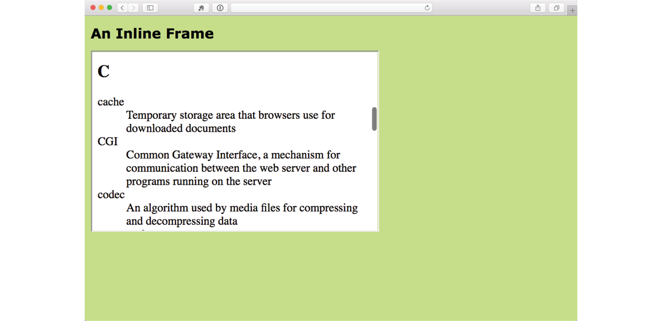
In modern uses of iframe, the window is not so obvious. In fact, there is usually no indication that there is an embedded frame there at all, as shown by the Google Maps example in Figure 10-2.

There are some security concerns with using iframes because they may act like open windows through which hackers can sneak. The sandbox attribute puts restrictions on what the framed content can do, such as not allowing forms, pop ups, scripts, and the like.
Iframe security is beyond the scope of this chapter, but you’ll need to brush up if you are going to make use of iframes on your site. I recommend the MDN Web Docs article “From object to iframe: Other Embedding Technologies” (developer.mozilla.org/en-US/docs/Learn/HTML/Multimedia_and_embedding/Other_embedding_technologies), which provides a good overview of iframe security issues.
To get a feel for how iframes work, use one to embed your favorite video on a page in Exercise 10-1.
<object>…</object>
Represents external resource
<param>
Parameters of an object
In the early days, web browsers were extremely limited in what they were able to render, so they relied on plug-ins to help them display media that they couldn’t handle natively. Java applets, Flash movies, RealMedia (an old web video and audio format), and other media required third-party plug-ins in order to be played in the browser. Heck, even JPEG images once required a plug-in to display.
A plug-in is software that gives a browser functionality that it doesn’t have natively.
To embed those media resources on the page, we used the object and embed elements. They have slightly different uses. The object element is a multipurpose object placer. It can be used to place an image, create a nested browsing context (like an iframe), or embed a resource that must be handled by a plug-in. The embed element was for use with plug-ins only.
To put it frankly, although still in use, object is going out of style, and embed is all but extinct (I’ve tucked it away in a brief sidebar). Media like Java applets and Flash movies are disappearing fast, and modern browsers use APIs to display many types of media natively. In addition, mobile browsers as well as the desktop Microsoft Edge browser don’t support plug-ins.
That said, let’s take a look at the object element. At its most minimal, the object element uses the data attribute to point to the resource and the type attribute to provide its MIME type. Any content within the object element tags will be used as a fallback for browsers that don’t support the embedded resource type. Here is a simple object element that places an SVG image on the page and provides a PNG fallback:
<object data="picture.svg" type="image/svg+xml"><img src="picture.png" alt=""></object>
Additional attributes for the object element are available and vary according to the type of media it is placing. The media format may also require that the object contain a number of param elements that set parameters specific to that type of media.
In this example, param elements specify whether the movie starts automatically (no) or has visible controls (yes):
<object type="video/quicktime" data="movies/hekboy.mov" width="320" height="256"> <param name="autostart" value="false"> <param name="controller" value="true"></object>
Until recently, browsers did not have built-in capabilities for handling video or sound, so they used plug-ins to fill in the gap. With the development of the web as an open standards platform, and with broadband connections allowing for heftier downloads than previously, it seemed to be time to make multimedia support part of browsers’ out-of-the-box capabilities. Enter the new video and audio elements and their respective APIs (see the “API” sidebar).
The good news is that the video and audio elements are well supported in modern browsers, including IE 9+, Safari, Chrome, Opera, and Firefox for the desktop and iOS Safari 4+, Android 2.3+, and Opera Mobile (however, not Opera Mini).
But if you’re envisioning a perfect world where all browsers are supporting video and audio in perfect harmony, I’m afraid it’s not that simple. Although they have all lined up on the markup and JavaScript for embedding media players, unfortunately they have not agreed on which formats to support. Let’s take a brief journey through the land of media file formats. If you want to add video or audio to your page, this stuff is important to understand.
When you prepare audio or video content for web delivery, there are two format decisions to make. The first is how the media is encoded (the algorithms used to convert the source to 1s and 0s and how they are compressed). The method used for encoding is called the codec, which is short for “code/decode” or “compress/decompress.” There are a bazillion codecs out there (that’s an estimate). Some probably sound familiar, like MP3; others might sound new, such as H.264, Vorbis, Theora, VP8, and AAC.
Second, you need to choose the container format for the media. You can think of it as a ZIP file that holds the compressed media and its metadata together in a package. Usually a container format is compatible with more than one codec type, and the full story is complicated. Because space is limited in this chapter, I’m going to cut to the chase and introduce the most common container/codec combinations for the web. If you are going to add video or audio to your site, I encourage you to get more familiar with all of these formats.
For video, the most common options are as follows:
MPEG-4 container + H.264 video codec + AAC audio codec. This combination is generally referred to as “MPEG-4,” and it takes the .mp4 or .m4v file suffix. H.264 is a high-quality and flexible video codec, but it is patented and must be licensed for a fee. All current browsers that support HTML5 video can play MPEG-4 files with the H.264 codec. The newer H.265 codec (also known as HEVC, High Efficiency Video Coding) is in development and reduces the bitrate by half, but is not well supported as of this writing.
WebM container + VP8 video codec + Vorbis audio codec. “WebM” is a container format that has the advantage of being open source and royalty-free. It uses the .webm file extension. It was originally designed to work with VP8 and Vorbis codecs.
WebM container + VP9 video codec + Opus audio codec. The VP9 video codec from the WebM project offers the same video quality as VP8 and H.264 at half the bitrate. Because it is newer, it is not as well supported, but it is a great option for browsers that can play it.
Ogg container + Theora video codec + Vorbis audio codec. This is typically called “Ogg Theora,” and the file should have an .ogv suffix. All of the codecs and the container in this option are open source and unencumbered by patents or royalty restrictions, but some say the quality is inferior to other options. In addition to new browsers, it is supported on some older versions of Chrome, Firefox, and Android that don’t support WebM or MP4, so including it ensures playback for more users.
Of course, the problem that I referred to earlier is that browser makers have not agreed on a single format to support. Some go with open source, royalty-free options like Ogg Theora or WebM. Others are sticking with H.264 despite the royalty requirements. What that means is that we web developers need to make multiple versions of videos to ensure support across all browsers. Table 10-1 lists which browsers support the various video options (see the “Server Setup” sidebar).
The landscape looks similar for audio formats: several to choose from, but no format that is supported by all browsers (Table 10-2).
MP3. The MP3 (short for MPEG-1 Audio Layer 3) format is a codec and container in one, with the file extension.mp3. It has become ubiquitous as a music download format.
WAV. The WAV format (.wav) is also a codec and container in one. This format is uncompressed so it is only good for very short clips, like sound effects.
Ogg container + Vorbis audio codec. This is usually referred to as “Ogg Vorbis” and is served with the .ogg or .oga file extension.
MPEG 4 container + AAC audio codec. “MPEG4 audio” (.m4a) is less common than MP3.
WebM container + Vorbis audio codec. The WebM (.webm) format can also contain audio only.
WebM container + Opus audio codec. Opus is a newer, more efficient audio codec that can be used with WebM.
|
Table 10-2. Audio support in current browsers (as of 2017) |
|||||||||
|
Format |
Type |
IE |
MS Edge |
Chrome |
Firefox |
Opera |
Safari |
iOS Safari |
Android |
|
MP3 |
audio/mpeg mp3 |
9.0+ |
12+ |
3.0+ |
22+ |
15+ |
4+ |
4.1 |
2.3+ |
|
WAV |
audio/wav or audio/wave |
– |
12+ |
8.0+ |
3.5+ |
11.5+ |
4+ |
3.2+ |
2.3+ |
|
Ogg Vorbis |
audio/ogg ogg oga |
– |
– |
4.0+ |
3.5+ |
11.5+ |
– |
– |
2.3+ |
|
MPEG-4/AAC |
audio/mp4 m4a |
11.0+ |
12+ |
12.0+ |
– |
15+ |
4+ |
4.1+ |
3.0+ |
|
WebM/Vorbis |
audio/webm webm |
– |
– |
6.0+ |
4.0+ |
11.5+ |
– |
– |
2.3.3+ |
|
WebM/Opus |
audio/webm webm |
– |
14+ |
33+ |
15+ |
20+ |
– |
– |
– |
<video>…</video>
Adds a video player to the page
I guess it’s about time we got to the markup for adding a video to a web page (this is an HTML chapter, after all). Let’s start with an example that assumes you are designing for an environment where you know exactly what browser your user will be using. When this is the case, you can provide only one video format using the src attribute in the video tag (just as you do for an img). Figure 10-3 shows a movie with the default player in the Chrome browser.
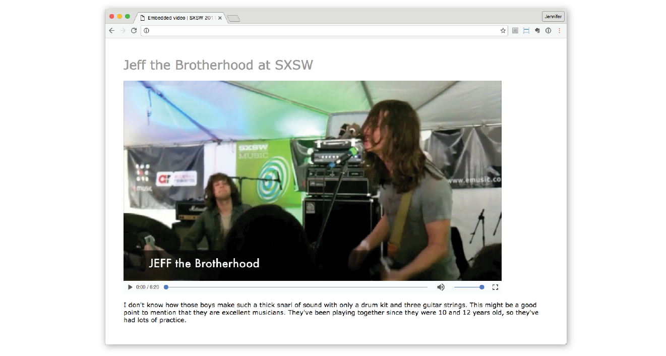
Here is a simple video element that embeds a movie and player on a web page:
<video src="highlight_reel.mp4"width="640"height="480"poster="highlight_still.jpg"controls autoplay>Your browser does not support HTML5 video. Get the <a href="highlight_reel.mp4">MP4 video</a></video>
Browsers that do not support video display whatever content is provided within the video element. In this example, it provides a link to the movie that your visitor could download and play in another player.
There are also some attributes in that example worth looking at in detail:
width="pixel measurement" height="pixel measurement"
Specifies the size of the box the embedded media player takes up on the screen. Generally, it is best to set the dimensions to exactly match the pixel dimensions of the movie. The movie will resize to match the dimensions set here.
poster="url of image"
Provides the location of an image that is shown in place of the video before it plays.
controls
Adding the controls attribute prompts the browser to display its built-in media controls, generally a play/pause button, a “seeker” that lets you move to a position within the video, and volume controls. It is possible to create your own custom player interface using CSS and JavaScript if you want more consistency across browsers.
autoplay
Makes the video start playing automatically after it has downloaded enough of the media file to play through without stopping. In general, use of autoplay should be avoided in favor of letting the user decide when the video should start. autoplay does not work on iOS Safari and some other mobile browsers in order to protect users from unnecessary data downloads.
In addition, the video element can use the loop attribute to make the video play again after it has finished (ad infinitum), muted for playing the video track without the audio, and preload for suggesting to the browser whether the video data should be fetched as soon as the page loads (preload="auto") or wait until the user clicks the play button (preload="none"). Setting preload="metadata" loads information about the media file, but not the media itself. A device can decide how to best handle the auto setting; for example, a browser in a smartphone may protect a user’s data usage by not preloading media, even when it is set to auto.
Do you remember back in Chapter 7 when we supplied multiple image formats with the picture element using a number of source elements? Well, picture got that idea from video!
As you’ve seen, it is not easy to find one video format to please all browsers (although MPEG4/H.264 gets close). In addition, new efficient video formats like VP9 and H.265 are available but not supported in older browsers. Using source elements, we can let the browsers use what they can.
In the markup, a series of source elements inside the video element point to each video file. Browsers look down the list until they find one they support and download only that version. The following example provides a video clip in the souped-up WebM/VP9 format for supporing browsers, as well as an MP4 and Ogg Theora for other browsers. This will cover pretty much all browsers that support HTML5 video (see the sidebar “Flash Video Fallback”).
<video id="video" controls poster="img/poster.jpg" <source src="clip.webm" type="video/webm"> <source src="clip.mp4" type="video/mp4"> <source src="clip.ogg" type="video/ogg"> <a href="clip.mp4">Download the MP4 of the clip.</a></video>
One of the powerful things about the video element and the Media Player API is that the system allows for a lot of customization. You can change the appearance of the control buttons with CSS and manipulate the functionality with JavaScript. That is all beyond the scope of this chapter, but I recommend the article “Creating a Cross-Browser Video Player” by Eric Shepherd, Chris Mills, and Ian Devlin (developer.mozilla.org/en-US/Apps/Fundamentals/Audio_and_video_delivery/cross_browser_video_player) for a good overview.
You may also be interested in trying out a prefab video player that provides good looks and advanced performance such as support for streaming video formats. You can implement many of them by adding a line or two of JavaScript to your document and then by using the video element, so it’s not hard to get started. There’s a nice roundup of plug-and-play video player options listed at VideoSWS (videosws.praegnanz.de/).
<audio>…</audio>
Adds an audio file to the page
If you’ve wrapped your head around the video markup example, you already know how to add audio to a page. The audio element uses the same attributes as the video element, with the exception of width, height, and poster (because there is nothing to display). Just like the video element, you can provide a stack of audio format options using the source element, as shown in the example here. Figure 10-4 shows how the audio player might look when it’s rendered in the browser.
<p>Play "Percussion Gun" by White Rabbits</p><audio id="whiterabbits" controls preload="auto"><source src="percussiongun.mp3" type="audio/mp3"> <source src="percussiongun.ogg" type="audio/ogg"> <source src="percussiongun.webm" type="audio/webm"> <p>Download "Percussion Gun":</p> <ul> <li><a href="percussiongun.mp3">MP3</a></li> <li><a href="percussiongun.ogg">Ogg Vorbis</a></li> </ul></audio>

If you have only one audio file, you can simply use the src attribute instead. If you want to be evil, you could embed audio in a page, set it to play automatically and then loop, and not provide any controls to stop it like this:
<audio src="jetfighter.mp3" autoplay loop></audio>
But you would never, ever do something like that, right? Right?! Of course you wouldn’t.
<track>…</track>
Adds synchronized text to embedded media
The track element provides a way to add text that is synchronized with the timeline of a video or audio track. Some uses include the following:
Clearly, adding text tracks makes the media more accessible, but it has the added bonus of improving SEO (Search Engine Optimization). It can also allow for deep linking, linking to a particular spot within the media’s timeline.
Figure 10-5 shows how captions might be rendered in a browser that supports the track element.
Use the track element inside the video or audio element you wish to annotate. The track element must appear after all the source elements, if any, and may include these attributes:
src
kind
Specifies the type of text annotation you are providing (subtitles, captions, descriptions, chapters, or metadata). If kind is set to subtitle, you must also specify the language (srclang attribute) by using a standardized IANA two-letter language tag (see Note).
label
Provides a name for the track that can be used in the interface for selecting a particular track.
default
Marks a particular track as the default and it may be used on only one track within a media element.
The following code provides English and French subtitle options for a movie:
<video width="640" height="320" controls> <source src="japanese_movie.mp4" type="video/mp4"> <source src="japanese_movie.webm" type="video/webm"><track src="english_subtitles.vtt" kind="subtitles" srclang="en" label="English subtitles" default> <track src="french.vtt" kind="subtitles" srclang="fr" label="Sous-titres en français"></video>
You’ll notice in the previous example that the track points to a file with a .vtt suffix. That is a text file in the WebVTT (Web Video Text Tracks) format that contains a list of cues. It looks like this:
WEBVTT 00:00:01.345 --> 00:00:03.456 Welcome to Artifact [applause] 00:00:06.289 --> 00:00:09.066 There is a lot of new mobile technology to discuss. 00:00:06.289 --> 00:00:13.049 We're glad you could all join us at the Alamo Drafthouse.
Cues are separated by empty line spaces. Each cue has a start and end time in hours:minutes:seconds:milliseconds format, separated by an “arrow” (-->). The cue text (subtitle, caption, description, chapter, or metadata) is on a line below. Optionally, an ID can be provided for each cue on the line above the time sequence.
You can probably guess that there’s a lot more to mastering text tracks for video and audio. Take a look at the following resources:
If you’d like to play around with the video element, spend some time with Exercise 10-2.
Another cool, “Look Ma, no plug-ins!” addition in HTML5 is the canvas element and the associated Canvas API. The canvas element creates an area on a web page for drawing with a set of JavaScript functions for creating lines, shapes, fills, text, animations, and so on. You could use it to display an illustration, but what gives the canvas element so much potential (and has the web development world so delighted) is that it’s all generated with scripting. That means it is dynamic and can draw things on the fly and respond to user input. This makes it a nifty platform for creating animations, games, and even whole applications—all using the native browser behavior and without proprietary plug-ins like Flash.
It is worth noting that the canvas drawing area is raster-based, meaning that it is made up of a grid of pixels. This sets it apart from the other drawing standard, SVG, which uses vector shapes and paths that are defined with points and mathematics.
The good news is that every current browser supports the canvas element as of this writing, with the exception of Internet Explorer 8 and earlier (see Note). It has become so well established that Adobe’s Animate software (the replacement for Flash Pro) now exports to canvas format.
Figure 10-6 shows a few examples of the canvas element used to create games, drawing programs, an interactive molecule structure tool, and an asteroid animation. You can find more examples at EnvatoTuts+ (code.tutsplus.com/articles/21-ridiculously-impressive-html5-canvas-experiments--net-14210), on David Walsh’s blog (davidwalsh.name/canvas-demos), as well as the results of your own web search.
Mastering the canvas element is more than we can take on here, particularly without any JavaScript experience under our belts, but I will give you a taste of what it is like to draw with JavaScript. That should give you a good idea of how it works, and also a new appreciation for the complexity of some of those examples.
<canvas>…</canvas>
Adds a 2-D dynamic drawing area
You add a canvas space to the page with the canvas element and specify the dimensions with the width and height attributes. And that’s really all there is to the markup. For browsers that don’t support the canvas element, you can provide some fallback content (a message, image, or whatever seems appropriate) inside the tags:
<canvas width="600" height="400"id="my_first_canvas">Your browser does not support HTML5 canvas. Try using Chrome, Firefox, Safari or MS Edge.</canvas>
The markup just clears a space upon which the drawing will happen. You can affect the drawing space itself with CSS (add a border or a background color, for example), but all of the contents of the canvas are generated by scripting and cannot be selected for styling with CSS.
The Canvas API includes functions for creating shapes, such as strokeRect() for drawing a rectangular outline and beginPath() for starting a line drawing. Some functions move things around, such as rotate() and scale(). It also includes attributes for applying styles (for example, lineWidth, font, strokeStyle, and fillStyle).
Sanders Kleinfeld created the following code example for his book HTML5 for Publishers (O’Reilly). He was kind enough to allow me to use it in this book. Figure 10-7 shows the simple smiley face we’ll be creating with the Canvas API.
And here is the script that created it. Don’t worry that you don’t know any JavaScript yet. Just skim through the script and pay attention to the inline comments. I’ll also describe some of the functions in use at the end. I bet you’ll get the gist of it just fine.
<script type="text/javascript">window.addEventListener('load', eventWindowLoaded, false);function eventWindowLoaded() { canvasApp();} function canvasApp(){var theCanvas = document.getElementById('my_first_canvas');var my_canvas = theCanvas.getContext('2d');my_canvas.strokeRect(0,0,200,225) // to start, draw a border around the canvas //draw face my_canvas.beginPath();my_canvas.arc(100, 100, 75, (Math.PI/180)*0, (Math.PI/180)*360, false);
// circle dimensions my_canvas.strokeStyle = "black"; // circle outline is black my_canvas.lineWidth = 3; // outline is three pixels wide my_canvas.fillStyle = "yellow"; // fill circle with yellow my_canvas.stroke(); // draw circle my_canvas.fill(); // fill in circle my_canvas.closePath(); // now, draw left eye my_canvas.fillStyle = "black"; // switch to black for the fill my_canvas.beginPath();my_canvas.arc(65, 70, 10, (Math.PI/180)*0, (Math.PI/180)*360, false); // circle dimensions my_canvas.stroke(); // draw circle my_canvas.fill(); // fill in circle my_canvas.closePath(); // now, draw right eye my_canvas.beginPath();my_canvas.arc(135, 70, 10, (Math.PI/180)*0, (Math.PI/180)*360, false); // circle dimensions my_canvas.stroke(); // draw circlemy_canvas.fill(); // fill in circlemy_canvas.closePath(); // draw smilemy_canvas.lineWidth = 6;// switch to six pixels wide for outlinemy_canvas.beginPath();my_canvas.arc(99, 120, 35, (Math.PI/180)*0, (Math.PI/180)*-180, false); // semicircle dimensions my_canvas.stroke();my_canvas.closePath(); // Smiley Speaks!my_canvas.fillStyle = "black"; // switch to black for text fillmy_canvas.font = '20px _sans'; // use 20 pixel sans serif fontmy_canvas.fillText ("Hello Canvas!", 45, 200); // write text }</script>
Finally, here is a little more information on the Canvas API functions used in the example:
strokeRect(x1, y1, x2, y2)
Draws a rectangular outline from the point (x1, y1) to (x2, y2). By default, the origin of the canvas (0, 0) is the top-left corner, and x and y coordinates are measured to the right and down.
beginPath()
Starts a line drawing.
closePath()
Ends a line drawing that was started with beginPath().
arc(x, y, arc_radius, angle_radians_beg, angle_radians_end)
Draws an arc where (x,y) is the center of the circle, arc_radius is the length of the radius of the circle, and angle_radians_beg and _end indicate the beginning and end of the arc angle.
stroke()
Draws the line defined by the path. If you don’t include this, the path won’t appear on the canvas.
fill()
Fills in the path specified with beginPath() and endPath().
fillText(your_text, x1, y1)
Adds text to the canvas starting at the (x,y) coordinate specified.
In addition, the following attributes were used to specify colors and styles:
lineWidth
Width of the border of the path.
strokeStyle
fillStyle
Color of the fill (interior) of the shape created with the path.
font
The font and size of the text.
Of course, the Canvas API includes many more functions and attributes than we’ve used here. For a complete list, see the W3C’s HTML5 Canvas 2D Context specification at www.w3.org/TR/2dcontext. A web search will turn up lots of Canvas tutorials should you be ready to learn more. In addition, I can recommend these resources:
We’ve looked at all sorts of ways to stick things in web pages in this chapter. We’ve seen how to use iframe to create a “window-in-a-window” for displaying external web resources; object for resources that require plug-ins, video and audio players; and the canvas 2-D scriptable drawing space. Now see if you were paying attention. As always, answers are in Appendix A.
a. Ogg | ____________________ |
b. H.264 | ____________________ |
c. VP8 | ____________________ |
d. Vorbis | ____________________ |
e. WebM | ____________________ |
f. Theora | ____________________ |
g. Opus | ____________________ |
h. MPEG-4 | ____________________ |
The following elements are used to embed media files of many types into web pages.
In this Chapter
The benefits and power of CSS
How HTML markup creates a document structure
Writing style rules
Attaching styles to the HTML document
Big concepts: inheritance, specificity, the cascade, rule order, and the box model
You’ve heard style sheets mentioned quite a bit already, and now we’ll finally put them to work and start giving our pages some much-needed style. Cascading Style Sheets (CSS) is the W3C standard for defining the presentation of documents written in HTML, and in fact, any XML language. Presentation, again, refers to the way the document is delivered to the user, whether shown on a computer screen, displayed on a cell phone, printed on paper, or read aloud by a screen reader. With style sheets handling the presentation, HTML can handle the business of defining document structure and meaning, as intended.
CSS is a separate language with its own syntax. This chapter covers CSS terminology and fundamental concepts that will help you get your bearings for the upcoming chapters, where you’ll learn how to change text and font styles, add colors and backgrounds, and even do basic page layout. By the end of Part III, I aim to give you a solid foundation for further reading on your own and lots of practice.
Not that you need further convincing that style sheets are the way to go, but here is a quick rundown of the benefits of using style sheets.
Come to think of it, there really aren’t any disadvantages to using style sheets. There are some lingering hassles from browser inconsistencies, but they can either be avoided or worked around if you know where to look for them.
We’re not talking about minor visual tweaks here, like changing the color of headlines or adding text indents. When used to its full potential, CSS is a robust and powerful design tool. My eyes were first opened to the possibilities of using CSS for design by the variety and richness of the designs at CSS Zen Garden (www.csszengarden.com).
In the misty days of yore (2003), when developers were still hesitant to give up their table-based layouts for CSS, David Shea’s CSS Zen Garden site demonstrated exactly what could be accomplished using CSS alone. David posted an HTML document and invited designers to contribute their own style sheets that gave the document a visual design. Figure 11-1 shows just a few of my favorites. All of these designs use the exact same HTML source document.

Not only that, they don’t include a single img element (all of the images are in the background of elements). But look at how different each page looks—and how sophisticated. That’s all done with style sheets. It is proof of the power in keeping CSS separate from HTML, and presentation separate from structure.
The CSS Zen Garden is no longer being updated and now is considered a historical document of a turning point in the adoption of web standards. Despite its age, I still find it to be a nice one-stop lesson for demonstrating exactly what CSS can do.
Granted, it takes a lot of practice to be able to create CSS layouts like those shown in Figure 11-1. Killer graphic design skills help too (unfortunately, you won’t get those in this book). I’m showing this to you up front because I want you to be aware of the potential of CSS-based design, particularly because the examples in this beginners’ book tend to be simple and straightforward. Take your time learning, but keep your eye on the prize.
OK, so there’s a bit more to it than that, of course. Let’s give each of these steps a little more consideration.
You know a lot about marking up content from the previous chapters. For example, you know that it is important to choose elements that accurately describe the meaning of the content. You also heard me say that the markup creates the structure of the document, sometimes called the structural layer, upon which the presentation layer can be applied.
In this and the upcoming chapters, you’ll see that having an understanding of your document’s structure and the relationships between elements is central to your work as a style sheet author.
In the exercises throughout this chapter you will get a feel for how simple it is to change the look of a document with style sheets. The good news is that I’ve whipped up a little HTML document for you to play with. You can get acquainted with the page we’ll be working with in Exercise 11-1.
A style sheet is made up of one or more style instructions (called style rules) that describe how an element or group of elements should be displayed. The first step in learning CSS is to get familiar with the parts of a rule. As you’ll see, they’re fairly intuitive to follow. Each rule selects an element and declares how it should look.
The following example contains two rules. The first makes all the h1 elements in the document green; the second specifies that the paragraphs should be in a large, sans-serif font. Sans-serif fonts do not have a little slab (a serif) at the ends of strokes and tend to look more sleek and modern.
h1 { color: green; }p { font-size: large; font-family: sans-serif; }
In CSS terminology, the two main sections of a rule are the selector that identifies the element or elements to be affected, and the declaration that provides the rendering instructions. The declaration, in turn, is made up of a property (such as color) and its value (green), separated by a colon and a space. One or more declarations are placed inside curly brackets, as shown in Figure 11-3.
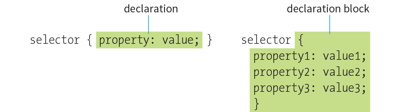
In the previous small style sheet example, the h1 and p elements are used as selectors. This is called an element type selector, and it is the most basic type of selector. The properties defined for each rule will apply to every h1 and p element in the document, respectively.
Another type of selector is an ID selector, which selects an element based on the value of an element’s id attribute. It is indicated with the # symbol. For example, the selector #recipe targets an element with id="recipe".
In upcoming chapters, I’ll introduce you to more sophisticated selectors that you can use to target elements, including ways to select groups of elements, and elements that appear in a particular context. See the “Selectors in this Book” sidebar for details.
Mastering selectors—that is, choosing the best type of selector and using it strategically—is an important step in mastering CSS.
The declaration is made up of a property/value pair. There can be more than one declaration in a single rule; for example, the rule for the p element shown earlier in the code example has both the font-size and font-family properties. Each declaration must end with a semicolon to keep it separate from the following declaration (see Note). If you omit the semicolon, the declaration and the one following it will be ignored. The curly brackets and the declarations they contain are often referred to as the declaration block (Figure 11-3).
Because CSS ignores whitespace and line returns within the declaration block, authors typically write each declaration in the block on its own line, as shown in the following example. This makes it easier to find the properties applied to the selector and to tell when the style rule ends.
p { font-size: large; font-family: sans-serif; }
Note that nothing has really changed here—there is still one set of curly brackets, semicolons after each declaration, and so on. The only difference is the insertion of line returns and some character spaces for alignment.
The heart of style sheets lies in the collection of standard properties that can be applied to selected elements. The complete CSS specification defines dozens of properties for everything from text indents to how table headers should be read aloud. This book covers the most common and best-supported properties that you can begin using right away.
Values are dependent on the property. Some properties take length measurements, some take color values, and others have a predefined list of keywords. When you use a property, it is important to know which values it accepts; however, in many cases, simple common sense will serve you well. Authoring tools such as Dreamweaver or Visual Studio provide hints of suitable values to choose from. Before we move on, why not get a little practice writing style rules yourself in Exercise 11-2?
<style>h1 { color: green;}p { font-size: large; font-family: sans-serif; }</style>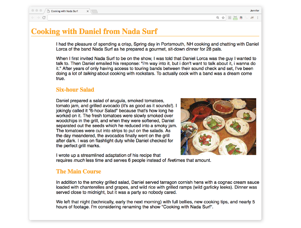
In the previous exercise, we embedded the style sheet right in the document by using the style element. That is just one of three ways that style information can be applied to an HTML document. You’ll get to try out each of these soon, but it is helpful to have an overview of the methods and terminology up front.
External style sheets
An external style sheet is a separate, text-only document that contains a number of style rules. It must be named with the .css suffix. The .css document is then linked to (via the link element) or imported (via an @import rule in a style sheet) into one or more HTML documents. In this way, all the files in a website may share the same style sheet. This is the most powerful and preferred method for attaching style sheets to content. We’ll discuss external style sheets more and start using them in the exercises in Chapter 13.
Embedded style sheets
This is the type of style sheet we worked with in the exercise. It is placed in a document via the style element, and its rules apply only to that document. The style element must be placed in the head of the document. This example also includes a comment (see the “Comments in Style Sheets” sidebar).
<head> <title>Required document title here</title><style>/* style rules go here */</style></head>
Inline styles
You can apply properties and values to a single element by using the style attribute in the element itself, as shown here:
<h1 style="color: red">Introduction</h1>
To add multiple properties, just separate them with semicolons, like this:
<h1 style="color: red; margin-top: 2em">Introduction</h1>
Inline styles apply only to the particular element in which they appear. Inline styles should be avoided, unless it is absolutely necessary to override styles from an embedded or external style sheet. Inline styles are problematic in that they intersperse presentation information into the structural markup. They also make it more difficult to make changes because every style attribute must be hunted down in the source.
Exercise 11-3 gives you an opportunity to write an inline style and see how it works. We won’t be working with inline styles after this point for the reasons listed earlier, so here’s your chance.
<h2 style="color: gray">The Main Course</h2>
There are a few big ideas that you need to get your head around to be comfortable with how Cascading Style Sheets behave. I’m going to introduce you to these concepts now so we don’t have to slow down for a lecture once we’re rolling through the style properties. Each of these ideas will be revisited and illustrated in more detail in the upcoming chapters.
Are your eyes the same color as your parents’? Did you inherit their hair color? Well, just as parents pass down traits to their children, styled HTML elements pass down certain style properties to the elements they contain. Notice in Exercise 11-1, when we styled the p elements in a large, sans-serif font, the em element in the second paragraph became large and sans-serif as well, even though we didn’t write a rule for it specifically (Figure 11-5). That is because the em element inherited the styles from the paragraph it is in. Inheritance provides a mechanism for styling elements that don’t have any explicit styles rules of their own.
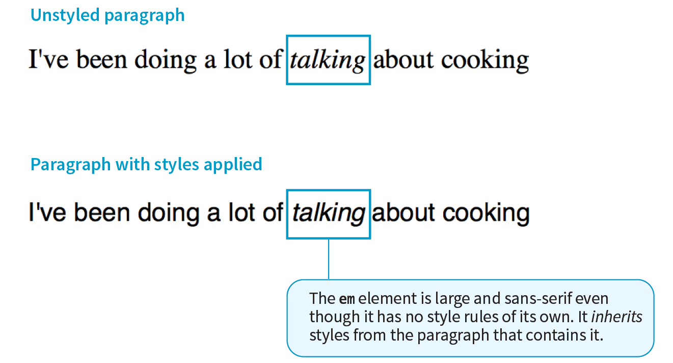
This is where an understanding of your document’s structure becomes important. As I’ve noted before, HTML documents have an implicit structure, or hierarchy. For example, the sample article we’ve been playing with has an html root element that contains a head and a body, and the body contains heading and paragraph elements. A few of the paragraphs, in turn, contain inline elements such as images (img) and emphasized text (em). You can visualize the structure as an upside-down tree, branching out from the root, as shown in Figure 11-6.
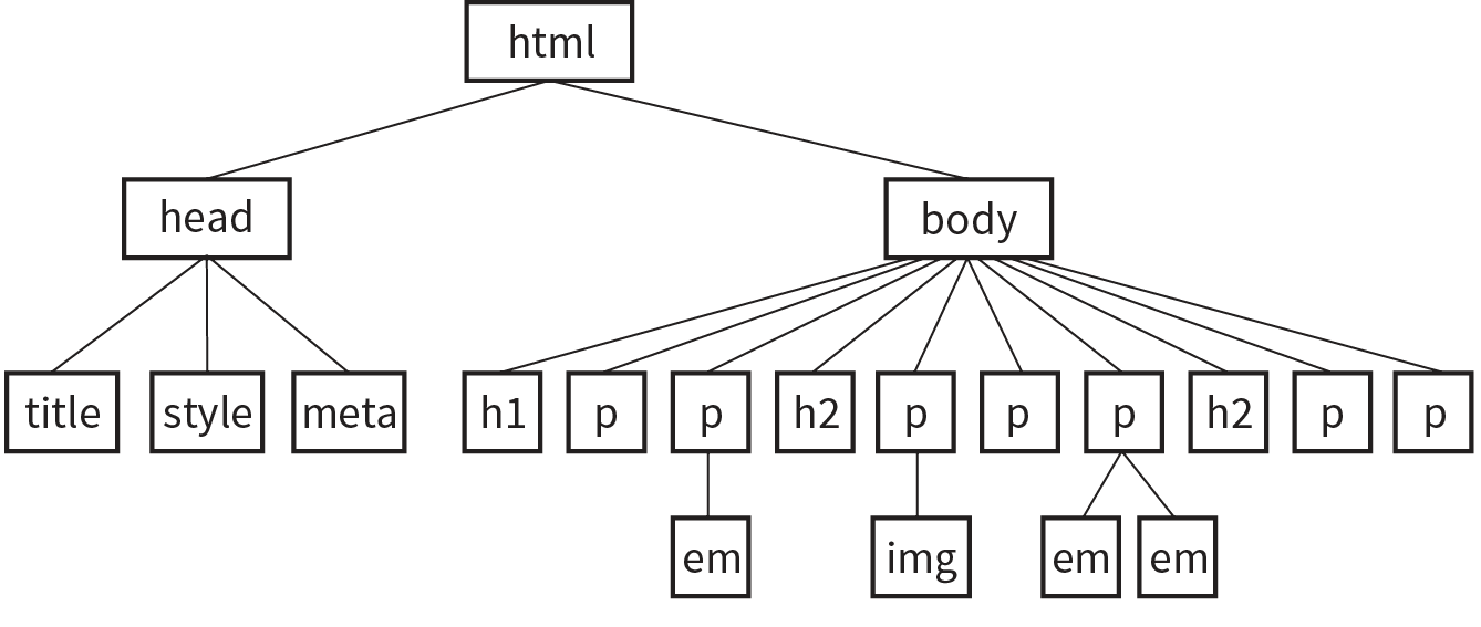
The document tree becomes a family tree when it comes to referring to the relationship between elements. All the elements contained within a given element are said to be its descendants. For example, the h1, h2, p, em, and img elements in the document in Figure 11-6 are all descendants of the body element.
An element that is directly contained within another element (with no intervening hierarchical levels) is said to be the child of that element. Conversely, the containing element is the parent. For example, the em element is the child of the p element, and the p element is its parent.
All of the elements higher than a particular element in the hierarchy are its ancestors. Two elements with the same parent are siblings. We don’t refer to “aunts” or “cousins,” so the analogy stops there. This may all seem academic, but it will come in handy when you’re writing CSS selectors.
When you write a font-related style rule using the p element as a selector, the rule applies to all of the paragraphs in the document as well as the inline text elements they contain. We’ve seen the evidence of the em element inheriting the style properties applied to its parent (p) back in Figure 11-5. Figure 11-7 demonstrates what’s happening in terms of the document structure diagram. Note that the img element is excluded because font-related properties do not apply to images.
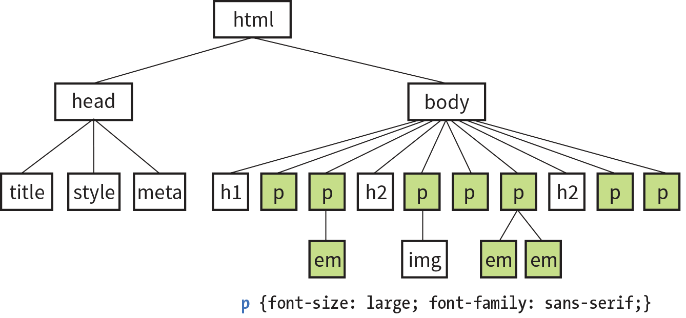
Notice that I’ve been saying “certain” properties are inherited. It’s important to note that some style sheet properties inherit and others do not. In general, properties related to the styling of text—font size, color, style, and the like—are passed down. Properties such as borders, margins, backgrounds, and so on that affect the boxed area around the element tend not to be passed down. This makes sense when you think about it. For example, if you put a border around a paragraph, you wouldn’t want a border around every inline element (such as em, strong, or a) it contains as well.
You can use inheritance to your advantage when writing style sheets. For example, if you want all text elements to be blue, you could write separate style rules for every element in the document and set the color to “blue”. A better way would be to write a single style rule that applies the color property to the body element, and let all the elements contained in the body inherit that style (Figure 11-8).
Any property applied to a specific element overrides the inherited values for that property. Going back to the article example, if we specify that the em element should be orange, that would override the inherited blue setting.
Ever wonder why they are called “cascading” style sheets? CSS allows you to apply several style sheets to the same document, which means there are bound to be conflicts. For example, what should the browser do if a document’s imported style sheet says that h1 elements should be red, but its embedded style sheet has a rule that makes h1s purple? The two style rules with h1 selectors have equal weight, right?
The folks who wrote the style sheet specification anticipated this problem and devised a hierarchical system that assigns different weights to the various sources of style information. The cascade refers to what happens when several sources of style information vie for control of the elements on a page: style information is passed down (“cascades” down) until it is overridden by a style rule with more weight. Weight is considered based on the priority of the style rule source, the specificity of the selector, and rule order.
The “cascade” refers to what happens when several sources of style information vie for control of the elements on a page.
If you don’t apply any style information to a web page, it renders according to the browser’s internal style sheet. We’ve been calling this the default rendering; the W3C calls it the user agent style sheet. Individual users can apply their own styles as well (the user style sheet, also called the reader style sheet), which override the default styles in their browser. However, if the author of the web page has attached a style sheet (the author style sheet), that overrides both the user and the user agent styles. The sidebar “Style Rule Hierarchy” provides an overview of the cascading order from highest to lowest priority.
The only exception is if the user has identified a style as “important,” in which case that style will override all competing styles (see the “Assigning Importance” sidebar). This permits users to keep settings accommodating a disability such as extra large type for sight impairment.
It is possible for conflicts to arise in which an element is getting style instructions from more than one rule. For example, there may be a rule that applies to paragraphs and another rule for a paragraph that has the ID “intro.” Which rule should the intro paragraph use?
When two rules in a style sheet conflict, the type of selector is used to determine the winner. The more specific the selector, the more weight it is given to override conflicting declarations. In our example, the selector that includes the ID name (#intro) is more specific than a general element selector (like p), so that rule would apply to the “intro” paragraph, overriding the rules set for all paragraphs.
When two rules in a single style sheet conflict, the type of selector is used to determine the winner.
It’s a little soon to be discussing specificity because we’ve looked at only two types of selectors. For now, put the term specificity and the concept that some selectors have more “weight,” and therefore override others, on your radar. We will revisit specificity in much more detail in Chapter 12, Formatting Text when you have more selector types under your belt.
After all the style sheet sources have been sorted by priority, and after all the linked and imported style sheets have been shuffled into place, there are likely to be conflicts in rules with equal weights. When that is the case, the order in which the rules appear is important. The cascade follows a “last one wins” rule. Whichever rule appears last has the last word.
Within a style sheet, if there are conflicts within style rules of identical weight, whichever one comes last in the list “wins.” Take these three rules, for example:
<style> p { color: red; } p { color: blue; } p { color: green; }</style>
In this scenario, paragraph text will be green because it is the last rule in the style sheet—that is, the one closest to the content in the document—overrides the earlier ones. Procedurally, the paragraph is assigned a color, then assigned a new one, and finally a third one (green) that gets used. The same thing happens when conflicting styles occur within a single declaration stack:
<style> p { color: red; color: blue; color: green; }</style>
The resulting color will be green because the last declaration overrides the previous two. It is easy to accidentally override previous declarations within a rule when you get into compound properties, so this is an important behavior to keep in mind. That is a very simple example. What happens when style sheet rules from different sources come into play?
Let’s consider an HTML document that has an embedded style sheet (added with the style element) that starts with an @import rule for importing an external .css file. That same HTML document also has a few inline style attributes applied to particular h1 elements.
Style document (external.css):
…h1 { color: red }…
HTML document:
<!DOCTYPE html><html><head> <title>…</title> <style>@import url(external.css);/* set to red first */h1 { color: purple;}/* overridden by purple */ </style></head><body> <h1style="color: blue">Heading</h1> /* blue comes last and wins */ …</body></html>
When the browser parses the file, it gets to the imported style sheet first, which sets h1s to red. Then it finds a rule with equal weight in the embedded style sheet that overrides the imported rule, so h1s are set to purple. As it continues, it encounters a style rule right in an h1 that sets its color to blue. Because that rule came last, it’s the winner, and that h1 will be blue. That’s the effect we witnessed in Exercise 11-3. Note that other h1s in this document without inline style rules would be purple, because that was the last h1 color applied to the whole document.
As long as we’re talking about Big CSS Concepts, it is only appropriate to introduce the cornerstone of the CSS visual formatting system: the box model. The easiest way to think of the box model is that browsers see every element on the page (both block and inline) as being contained in a little rectangular box. You can apply properties such as borders, margins, padding, and backgrounds to these boxes, and even reposition them on the page.
We’re going to go into a lot more detail about the box model in Chapter 14, but having a general feel for it will benefit you even as we discuss text and backgrounds in the following two chapters.
To see the elements roughly the way the browser sees them, I’ve written style rules that add borders around every content element in our sample article:
h1 { border: 1px solid blue; }h2 { border: 1px solid blue; }p { border: 1px solid blue; }em { border: 1px solid blue; }img { border: 1px solid blue; }
Figure 11-9 shows the results. The borders reveal the shape of each block element box. There are boxes around the inline elements (em and img) as well. If you look at the headings, you will see that block element boxes expand to fill the available width of the browser window, which is the nature of block elements in the normal document flow. Inline boxes encompass just the characters or image they contain.

Hey! This is a good opportunity to show you a handy style rule shortcut. If you ever need to apply the same style property to a number of elements, you can group the selectors into one rule by separating them with commas. This one rule has the same effect as the five rules listed previously. Grouping them makes future edits more efficient and results in a smaller file size:
h1, h2, p, em, img { border: 1px solid blue; }Now you have two selector types in your toolbox: a simple element selector and grouped selectors.
This chapter lays the groundwork for upcoming lessons, so it’s a good time to get familiar with the units of measurement used in CSS. You’ll be using them to set font size, the width and height of elements, margins, indents, and so on. The complete list is provided in the sidebar “CSS Units.”
Some will look familiar (like inches and millimeters), but there are some units that bear more explanation: absolute units, rem, em, and vw/vh. Knowing how to use CSS units effectively is another one of those core CSS skills.
Absolute units have predefined meanings or real-world equivalents. They are always the same size, regardless of the context in which they appear.
The most popular absolute unit for web design is the pixel, which CSS3 defines as 1/96 inch. Pixels are right at home on a pixel-based screen and offer precise control over the size of the text and elements on the page. For a while there, pixels were all we used. Then we realized they are too rigid for pages that need to adapt to a wide variety of screen sizes and user preferences. Relative measurements like rem, em, and % are more appropriate to the fluid nature of the medium.
As long as we are kicking px to the curb, all of the absolute units—such as pt, pc, in, mm, and cm—are out because they are irrelevant on screens, although they may be useful for print style sheets. That narrows down your unit choices a bit.
That said, pixels do still have their place in web design for elements that truly should stay the same size regardless of context. Border widths are appropriate in pixels, as are images that have inherent pixel dimensions.
As I just established, relative units are the way to go for most web measurements, and there are a few options: rem, em, and vw/vh.
CSS3 introduced a relative measurement called a rem (for root em) that is based on the font size of the root (html) element, whatever that happens to be. In modern browsers, the default root font size is 16 pixels; therefore, a rem is equivalent to a 16-pixel unit (unless you set it explicitly to another value). An element sized to 10rem would measure 160 pixels.
For the most part, you can use rem units like an absolute measurement in style rules; however, because it is relative, if the base font size changes, so does the size of a rem. If a user changes the base font size to 24 pixels for easier reading from a distance, or if the page is displayed on a device that has a default font size of 24 pixels, that 10rem element becomes 240 pixels. That seems dodgy, but rest assured that it is a feature, not a bug. There are many instances in which you want a layout element to expand should the text size increase. It keeps the page proportional with the font size, which can help maintain optimum line lengths.
An em is a relative unit of measurement that, in traditional typography, is based on the width of the capital letter M (thus the name “em”). In the CSS specification, an em is calculated as the distance between baselines when the font is set without any extra space between the lines (also known as leading). For text with a font size of 16 pixels, an em measures 16 pixels; for 12-pixel text, an em equals 12 pixels; and so on, as shown in Figure 11-10.
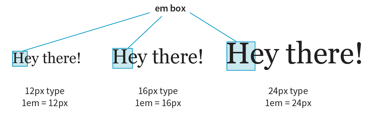
Don’t confuse the em unit of measurement with the HTML element used to indicate emphasized text. They are totally different things.
Once the dimension of an em for a text element is calculated by the browser, it can be used for all sorts of other measurements, such as indents, margins, the width of the element on the page, and so on. Basing measurements on text size helps keep everything in proportion should the text be resized.
The trick to working with ems is to remember they are always relevant to the current font size of the element. To borrow an example from Eric Meyer and Estelle Weyl’s CSS: The Definitive Guide (O’Reilly), if you set a 2em left margin on an h1, h2, and p, those elements will not line up nicely because the em units are based on their respective element’s sizes (Figure 11-11).
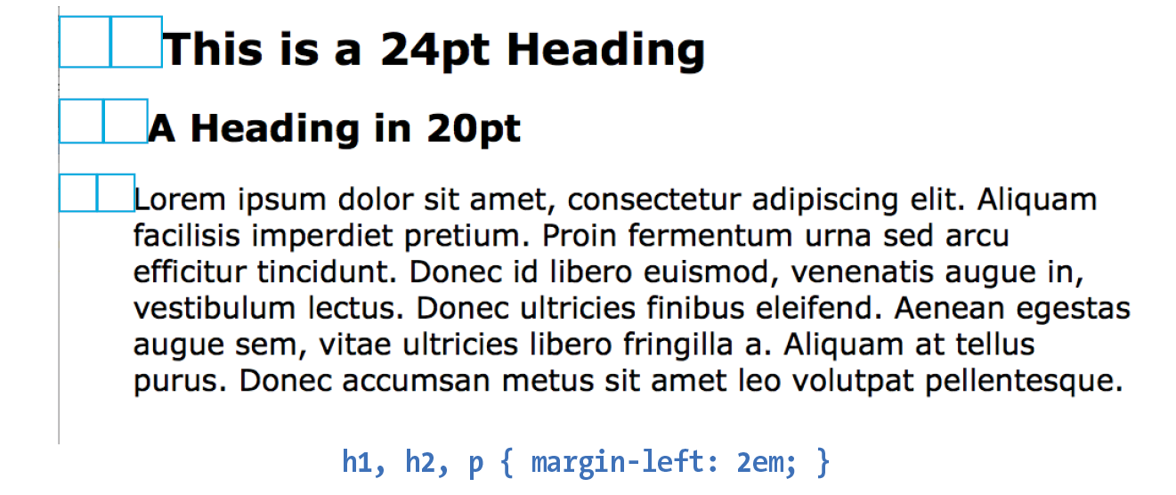
The viewport width (vw) and viewport height (vh) units are relative to the size of the viewport (browser window). A vw is equal to 1/100 the width of the viewport. Similarly, a vh is equal to 1/100 the height of the viewport. Viewport-based units are useful for making images and text elements stay the full width or height of the viewport:
header { width: 100vw; height: 100vh; }
It’s also easy to specify a unit to be a specific percentage of the window size, such as 50%:
img { width: 50vw; height: 50vh; }
Related are the vmin unit (equal to the value of vw or vh, whichever is smaller) and vmax (equal to the value of vw or vh, whichever is larger).
IE9 supports instead of . IE and Edge (all versions as of 2017) do not support .
That should give you a good introduction to the units you’ll be using in your style sheets. I recommend reading the full CSS Values and Units Module (www.w3.org/TR/css3-values/) to deepen your knowledge and make the values listed for properties in this book easier to understand. In addition to length units, it includes text-based values (such as keywords, text strings, and URLs), numbers and percentage values, colors, and more.
Because of the cascade, a single page element may have styles applied from a number of sources. This can make it tricky to debug a page when styles aren’t displaying the way you think they should. Fortunately, every major browser comes with developer tools that can help you sort things out.
I’ve opened the simple cooking.html document that we’ve been working on in the Chrome browser, then selected from the menu. The Developer Tools panel opens at the bottom of the document, as you can see in Figure 11-12. You can also make it its own separate window by clicking the windows icon in the top left.
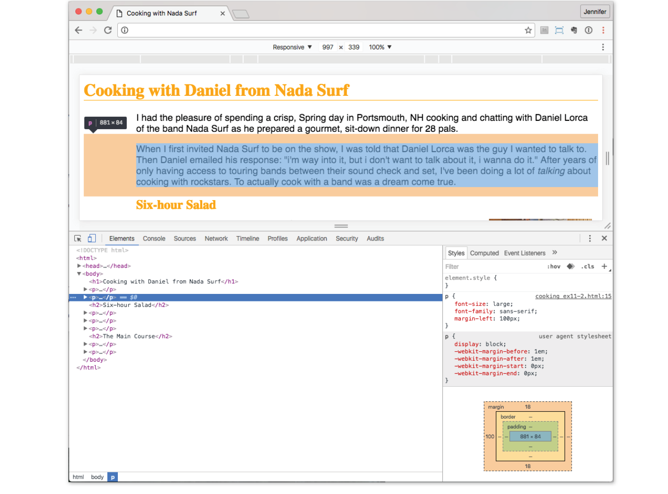
In the Elements tab on the left, I can see the HTML source for the document. The content is initially hidden so you can see the structure of the document more clearly, but clicking the arrows opens each section. When I click the element in the source (like the second p element shown in the figure), that element is also highlighted in the browser window view.
In the Styles tab on the right, I can see all of the styles that are being applied to the selected element. In the example, I see the font-size, font-family, and margin-left properties from the style element in the document. If there were external CSS documents, they’d be listed too. I can also see the “User Agent Style Sheet,” which is the browser’s default styles. In this case, the browser style sheet adds the margin space around the paragraph. Chrome also provides a box model diagram for the selected element that shows the content dimensions, padding, border, and margins that are applied. This is a great tool for troubleshooting unexpected spacing in layouts.
The cool thing is that when you edit the style rules in the panel, the changes are reflected in the browser view of the page in real time! If I select the h1 element and change the color from orange to green, it turns green in the window. It’s a great way to experiment with or troubleshoot a design; however, the changes are not being made to the document itself. It’s just a preview, so you’ll have to duplicate the changes in your source.
You can inspect any page on the web in this way, play around with turning styles off and on, and even add some of your own. Nothing you do has any effect on the actual site, so it is just for your education and amusement.
The element and style inspectors are just the tip of the iceberg of what browser developer tools can do. You can also tweak and debug JavaScript, check performance, view the document in various device simulations, and much more. The good news is that all major browsers now have built-in tools with similar features. As a web developer, you’ll find they are your best friend.
This chapter covered all the fundamentals of Cascading Style Sheets, including rule syntax, ways to apply styles to a document, and the central concepts of inheritance, the cascade (including priority, specificity, and rule order), and the box model. Style sheets should no longer be a mystery, and from this point on, we’ll merely be building on this foundation by adding properties and selectors to your arsenal and expanding on the concepts introduced here.
CSS is a vast topic, well beyond the scope of this book. Bookstores and the web are loaded with information about style sheets for all skill levels. I’ve compiled a list of the resources I’ve found the most useful during my learning process. I’ve also provided a list of popular tools that assist in writing style sheets.
There is no shortage of good books on CSS out there, but these are the ones that taught me, and I feel good recommending them.
The sites listed here are good starting points for online exploration of style sheets.
CSS-Tricks (css-tricks.com)
The is the blog of CSS guru Chris Coyier. Chris loves CSS and enthusiastically shares his research and tinkering on his site.
World Wide Web Consortium (www.w3.org/TR/CSS/)
The World Wide Web Consortium oversees the development of web technologies, including CSS. This page is a “snapshot” of the CSS specifications. See also www.w3.org/Style/CSS/current-work.
MDN Web Docs (developer.mozilla.org)
The CSS pages at MDN include detailed reference pages, step-by-step tutorials, and demos. It’s a great hub for researching any web technology.
A List Apart (www.alistapart.com/topics/code/css/)
This online magazine features some of the best thinking and writing on cutting-edge, standards-based web design. It was founded in 1998 by Jeffrey Zeldman and Brian Platz.
Here are a few questions to test your knowledge of the CSS basics. Answers are provided in Appendix A.
blockquote { line-height: 1.5; }selector: ______________ value: ____________________
property: _____________ declaration: ________________
<style type="text/css"> p { color: purple; } p { color: green; } p { color: gray; }</style>p {font-family: sans-serif;}
p {font-size: 1em;}p {line-height: 1.2em;}blockquote { font-size: 1em line-height: 150%color: gray }body {background-color: black;}{color: #666;}{margin-left: 12em;}{margin-right: 12em;}p {color: white;}blockquote {color: white;}li {color: white;}<strong style="red">Act now!</strong> div#intro { color: red;} 
In this chapter
Font properties
Web fonts
Advanced typography with CSS3
Text line settings
Text effects
Selectors: descendent, ID, and class
Specificity overview
List styles
Now that you’ve gotten your feet wet formatting text, are you ready to jump into the deep end? By the end of this chapter, you’ll pick up over 40 additional CSS properties used to manipulate the appearance of text. Along the way, you’ll also learn how to use more powerful selectors for targeting elements in a particular context and with a specific id or class name.
The nature of the web makes specifying type tricky, if not downright frustrating, particularly if you have experience designing for print or even formatting text in a word processing program. There is no way to know for sure whether the font you specify will be available or how large or small the type will appear when it hits your users’ browsers. We’ll address the best practices for dealing with these challenges as we go along.
Throughout this chapter, we’ll be sprucing up a Black Goose Bistro online menu similar to the one we marked up back in Chapter 5, Marking Up Text I encourage you to work along with the exercises to get a feel for how the properties work. Figure 12-1 shows how the menu looks before and after we’re done. It’s not a masterpiece, because we’re just scratching the surface of CSS here, but at least the text has more personality.
When I design a text document (for print or the web), one of the first things I do is specify a font. In CSS, fonts are specified using a set of font-related properties for typeface, size, weight, font style, and special characters. There are also shortcut properties that let you specify multiple font attributes in a single rule.
Choosing a typeface, or font family as it is called in CSS, for your text is a good place to start. Let’s begin with the font-family property and its values.
font-family
Values: one or more font or generic font family names, separated by commas
Default: depends on the browser
Applies to: all elements
Inherits: yes
Use the font-family property to specify a font or list of fonts (known as a font stack) by name, as shown in these examples:
body { font-family: Arial; }var { font-family: Courier, monospace; }p { font-family: "Duru Sans", Verdana, sans-serif; }
Here are some important syntax requirements:
You might be asking, “Why specify more than one font?” That’s a good question, and it brings us to one of the challenges of specifying fonts for the web.
Browsers are limited to displaying fonts they have access to. Traditionally, that meant the fonts that were already installed on the user’s hard drive. In 2010, however, there was a boom in browser support for embedded web fonts using the CSS @font-face rule, so it became possible for designers to provide their own fonts. See the sidebar “Say Hello to Web Fonts” for more information.
But back to our font-family rule. Even when you specify that the font should be Futura in a style rule, if the browser can’t find it (for example, if that font is not installed on the user’s computer or the provided web font fails to load), the browser uses its default font instead.
Fortunately, CSS allows us to provide a list of back-up fonts (that font stack we saw earlier) should our first choice not be available. If the first specified font is not found, the browser tries the next one, and down through the list until it finds one that works. In the third font-family rule shown in the previous code example, if the browser does not find Duru Sans, it will use Verdana, and if Verdana is not available, it will substitute some other sans-serif font.
That last option, “some other sans-serif font,” bears more discussion. “Sans-serif” is just one of five generic font families that you can specify with the font-family property. When you specify a generic font family, the browser chooses an available font from that stylistic category. Figure 12-2 shows examples from each family.
Generic font family names do not need to be capitalized in the style rule.
Examples: Times, Times New Roman, Georgia
Serif typefaces have decorative slab-like appendages (serifs) on the ends of certain letter strokes.
sans-serif
Examples: Arial, Arial Black, Verdana, Trebuchet MS, Helvetica, Geneva
Sans-serif typefaces have straight letter strokes that do not end in serifs.
monospace
Examples: Courier, Courier New, and Andale Mono
In monospace (also called constant width) typefaces, all characters take up the same amount of space on a line. For example, a capital W will be no wider than a lowercase i. Compare this to proportional typefaces (such as the one you’re reading now) that allot different widths to different characters.
cursive
Examples: Apple Chancery, Zapf-Chancery, and Comic Sans
Cursive fonts emulate a script or handwritten appearance.
fantasy
Examples: Impact, Western, or other decorative font
Fantasy fonts are purely decorative and would be appropriate for headlines and other display type.
The best practice for specifying fonts for web pages is to start with your first choice, provide some similar alternatives, and then end with a generic font family that at least gets users in the right stylistic ballpark. For example, if you want an upright, sans-serif font, you might start with a web font if you are providing one (Oswald), list a few that are more common (Univers, Tahoma, Geneva), and finish with the generic sans-serif. There is no limit to the number of fonts you can include, but many designers strive to keep it under 10.
font-family: Oswald, Univers, Tahoma, Geneva, sans-serif;
A good font stack should include stylistically related fonts that are known to be installed on most computers. Sticking with fonts that come with the Windows, macOS, and Linux operating systems, as well as fonts that get installed with popular software packages such as Microsoft Office and Adobe Creative Suite, gives you a solid list of “web-safe” fonts to choose from. A good place to look for stylistically related web-safe fonts is CSS Font Stack (www.cssfontstack.com). There are many articles on font stack strategies that are just a Google search away. I recommend Michael Tuck’s “8 Definitive Font Stacks” (www.sitepoint.com/eight-definitive-font-stacks), which is an oldie but goodie.
So, as you see, specifying fonts for the web is more like merely suggesting them. You don’t have absolute control over which font your users will see. You might get your first choice; you might get the generic fallback. It’s one of those web design quirks you learn to live with.
Now seems like a good time to get started formatting the Black Goose Bistro menu. We’ll add new style rules one at a time as we learn new properties, staring with Exercise 12-1.
Use the aptly named font-size property to specify the size of the text.
font-size
Values: length unit | percentage | xx-small | x-small | small | medium | large | x-large | xx-large | smaller | larger
Default: medium
Applies to: all elements
Inherits: yes
You can specify text size in several ways:
h1 { font-size: 1.5em; }When specifying a number of units, be sure the unit abbreviation immediately follows the number, with no extra character space in between (see the sidebar “Providing Measurement Values”).
CSS length units are discussed in Chapter 11, Introducing Cascading Style Sheets. See also the “CSS Units Cheat Sheet” sidebar.
h1 { font-size: 150%; }h1 { font-size: x-large; }strong { font-size: larger; }I’m going to cut to the chase and tell you that, despite all these options, the preferred values for font-size in contemporary web design are the relative length units em and rem, as well as percentage values. You can specify font size in pixels (px), but in general, they do not provide the flexibility required in web page design. All of the other absolute units (pt, pc, in, etc.) are out too, unless you are creating a style sheet specifically for print.
The preferred font-size values are em, rem, and %.
I’ll explain the keyword-based font-size values in a moment, but let’s start our discussion with the best practice using relative values.
The best practice for setting the font size of web page elements is to do it in a way that respects the user’s preference. Relative sizing values %, rem, and em allow you to use the default font size as the basis for proportional sizing of other text elements. It’s usually not important that the headlines are exactly 24 pixels; it is important that they are 1.5 times larger than the main text so they stand out. If the user changes their preferences to make their default font size larger, the headlines appear larger, too.
To maintain the browser’s default size, set the font-size of the root element to 100% (see Note):
html { font-size: 100%;}
It is also common practice to set the to 100%, but setting it on the element is a more flexible approach.
That sets the basis for relative sizing. Because the default font size for all modern browsers is 16 pixels, we’ll assume our base size is 16 pixels going forward (we’ll also keep in mind that it could be different).
The rem unit, which stands for “root em,” is always relative to the size of the root (html) element. If the root size is 16 pixels, then a rem equals 16 pixels. What’s nice about rem units is, because they are always relative to the same element, they are the same size wherever you use them throughout the document. In that way, they work like an absolute unit. However, should the root size be something other than 16 pixels, elements specified in rem values will resize accordingly and proportionally. It’s the best of both worlds.
Here is that same heading sized with rem values:
h1 { font-size: 1.5rem; } /* 1.5 x 16 = 24 */
Note that rem units are not supported in Internet Explorer 8 and earlier. If for some reason you need to support old browsers, you’ll need to provide a fallback declaration set in pixels. There are also tools that change all your rem units to pixels automatically, as discussed in .
Em units are based on the font size of the current element. When you specify font-size in ems, it will be relative to the inherited size for that element. Once the em is calculated for an element, it can be used for other measurements as well, such as margins, padding, element widths, and any other setting you want to always be relative to the size of the font.
Here I’ve used em units to specify the size of an h1 that has inherited the default 16-pixel font size from the root:
h1 { font-size: 1.5em; } /* 1.5 x 16 = 24 */
There are a few snags to working with ems. One is that because of rounding errors, there is some inconsistency in how browsers and platforms render text set in ems.
The other tricky aspect to using ems is that they are based on the inherited size of the element, which means that their size is based on the context in which they are applied.
The h1 in the previous example was based on an inherited size of 16 pixels. But if this h1 had appeared in an article element that had its font size set to 14 pixels, it would inherit the 14-pixel size, and its resulting size would be just 21 pixels (1.5 × 14 = 21). Figure 12-4 shows the results.
The markup
<h1>Headline in Body</h1><p>Pellentesque ligula leo,…</p><article> <h1>Headline in Article</h1> <p>Vivamus …</p></article>
The styles
h1 { font-size: 1.5em; /* sets all h1s to 1.5em */
}article { font-size: .875em /* 14 pixels based on 16px default */
}
From this example, you can see that an element set in ems might appear at different sizes in different parts of the document. If you wanted the h1 in the article to be 24 pixels as well, you could calculate the em value by dividing the target size by its context: 24 / 14 = 1.71428571 em. (No need to round that figure down…the browser knows what to do with it.)
If you have elements nested several layers deep, the size increase or decrease compounds, which can create problems. With many layers of nesting, text may end up being way too small. When working with ems, pay close attention and write style rules in a way that takes the context into account.
This compounding nature of the em is what has driven the popularity of the predictable rem unit.
We saw a percentage value (100%) used to preserve the default font size, but you can use percentage values for any element. They are pretty straightforward.
In this example, the h1 inherits the default 16px size from the html element, and applying the 150% value multiplies that inherited value, resulting in an h1 that is 24 pixels:
h1 { font-size: 150%; } /* 150% of 16 = 24 */
An alternative way to specify font-size is by using one of the predefined absolute keywords: xx-small, x-small, small, medium, large, x-large, and xx-large. The keywords do not correspond to particular measurements, but rather are scaled consistently in relation to one another. The default size is medium in current browsers. Figure 12-5 shows how each of the absolute keywords renders in a browser when the default text is set at 16 pixels. I’ve included samples in Verdana and Times to show that, even with the same base size, there is a big difference in legibility at sizes small and below. Verdana was designed to be legible on screens at small font sizes; Times was designed for print so is less legible in that context.
The relative keywords, larger and smaller, are used to shift the size of text relative to the size of the parent element text. The exact amount of the size change is determined by each browser and is out of your control. Despite that limitation, it is an easy way to nudge type a bit larger or smaller if the exact proportions are not critical.
You can apply your new CSS font knowledge in Exercise 12-2.
After font families and size, the remaining font properties are straightforward. For example, if you want a text element to appear in bold, use the font-weight property to adjust the boldness of type.
font-weight
Values: normal | bold | bolder | lighter | 100 | 200 | 300 | 400 | 500 | 600 | 700 | 800 | 900
Default: normal
Applies to: all elements
Inherits: yes
As you can see, the font-weight property has many predefined values, including descriptive terms (normal, bold, bolder, and lighter) and nine numeric values (100 to 900) for targeting various weights of a font if they are available. Because most fonts commonly used on the web have only two weights, normal (or Roman) and bold, the only font weight value you will use in most cases is bold. You may also use normal to make text that would otherwise appear in bold (such as strong text or headlines) appear at a normal weight.
The numeric chart may come in handy when using web fonts with a large range of weights (I’ve seen a few Google web fonts that require numeric size values). If multiple weights are not available, numeric settings of 600 and higher generally result in bold text, as shown in Figure 12-7 (although even that can vary by browser).
If a separate bold face is not available, the browser may “synthesize” a bold font by beefing up the available normal face (see Note).
The font-style property affects the posture of the text—that is, whether the letter shapes are vertical (normal) or slanted (italic and oblique).
font-style
Values: normal | italic | oblique
Default: normal
Applies to: all elements
Inherits: yes
Use the font-style property to make text italic. Another common use is to make text that is italicized in the browser’s default styles (such as emphasized text) display as normal. There is an oblique value that specifies a slanted version of the font; however, browsers generally display oblique exactly the same as italic.
Try out weight and style in Exercise 12-3.
dt { font-weight: bold; }strong { font-style: italic;}
font-variant
Values: normal | small-caps
Default: normal
Applies to: all elements
Inherits: yes
Some typefaces come in a “small caps” variant. This is a separate font design that uses small uppercase-style letters in place of lowercase letters. Small caps characters are designed to match the size and density of lowercase text so they blend in.
Small caps should be used for strings of three or more capital letters appearing in the flow of text, such as acronyms and abbreviations, that may look jarring as full-sized capitals. Compare NASA and USA in the standard font to nasa and usa in small caps. Small caps are also recommended for times, like 1am or 2017ad.
When the font-variant property was introduced in CSS2.1, it was a one-trick pony that allowed designers to specify a small-caps font for text elements. CSS3 has greatly expanded the role of font-variant, as I will cover in the upcoming section “Advanced Typography with CSS3.” For now, we’ll look at only the CSS2.1 version of font-variant.
In most cases, browsers simulate small caps by scaling down uppercase letters in the current font. To typography sticklers, this is less than ideal and results in inconsistent stroke weights, but you may find it an acceptable option for adding variety to small amounts of text. You will see an example of small caps when we use the font-variant property in Exercise 12-5.
font-stretch
Values: normal | ultra-condensed | extra-condensed | condensed | semi-condensed | semi-expanded | expanded | extra-expanded | ultra-expanded
Default: normal
Applies to: all elements
Inherits: yes
The CSS3 font-stretch property tells the browser to select a normal, condensed, or extended font in the font family (Figure 12-9). If the browser cannot find a matching font, it will not try to synthesize the width by stretching or squeezing text; it may just substitute a font of a different width. Browser support is just beginning to kick in for this property. As of this writing, it works on IE11+, Edge, Firefox, Chrome 48+, Opera, and Android 52+, but it is not yet supported on Safari or iOS Safari; however, that may change.
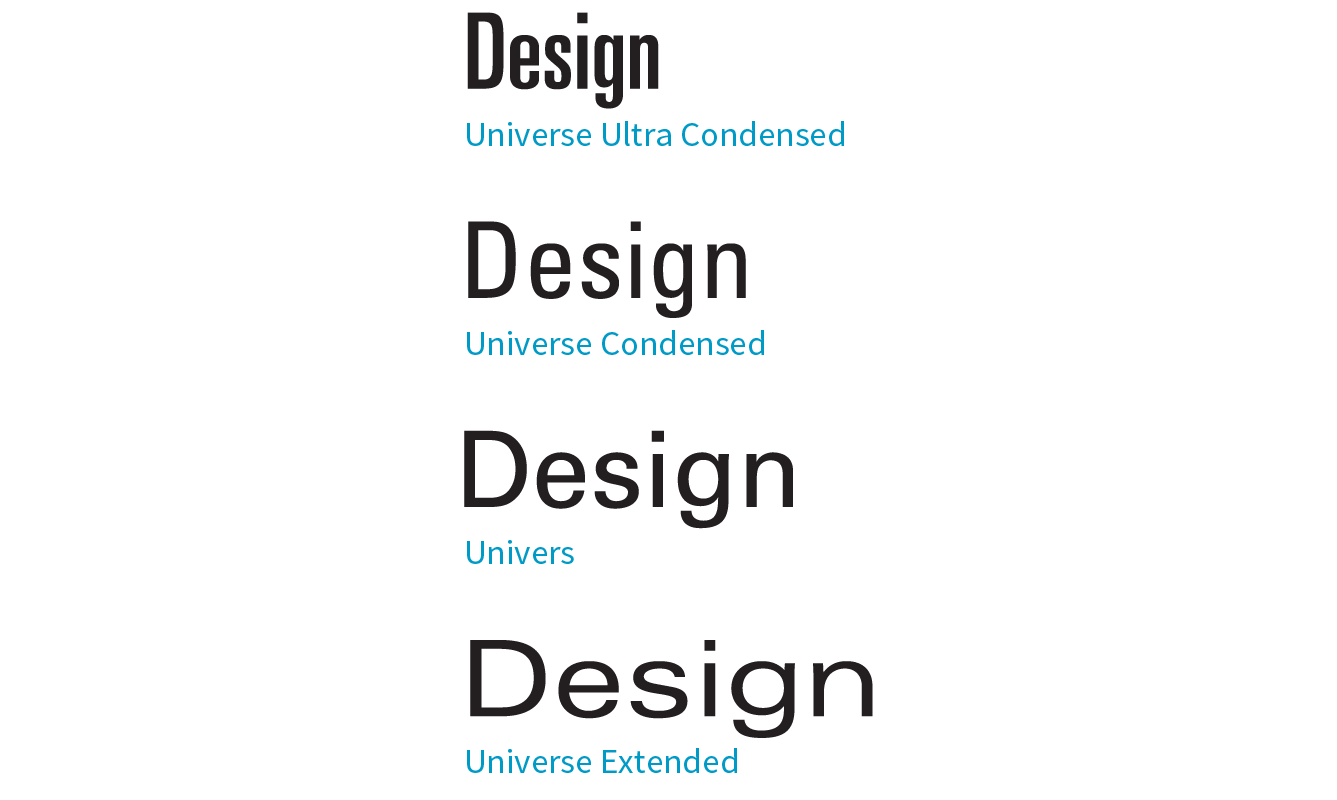
Specifying multiple font properties for each text element can get repetitive and lengthy, so the creators of CSS provided the shorthand font property, which compiles all the font-related properties into one rule.
Be careful when using shorthand properties like . Any omitted property resets to its default value. On the flip side, the shorthands are a good way to get a blank slate if you need one.
font
Values: font-style font-weight font-variant font-stretch font-size/line-height font-family | caption | icon | menu | message-box | small-caption | status-bar
Default: depends on default value for each property listed
Applies to: all elements
Inherits: yes
The value of the font property is a list of values for all the font properties we just looked at, separated by character spaces. It is important to note that only the CSS2.1 version of font-variant (small-caps) can be used in the font shortcut (which is one reason I kept it separate). In this property, the order of the values is important:
{ font: style weight stretch variant size/line-height font-family; }
At minimum, the font property must include a font-size value and a font-family value, in that order. Omitting one or putting them in the wrong order causes the entire rule to be invalid. This is an example of a minimal font property value:
p { font: 1em sans-serif; }
Once you’ve met the size and family requirements, the other values are optional and may appear in any order prior to the font-size. When style, weight, stretch, or variant is omitted, its value is set to normal. That makes it easy to accidentally override a previous setting with the shorthand property, so be careful when you use it.
There is one value in there, line-height, that we have not seen yet. As it sounds, it adjusts the height of the text line and is used to add space between lines of text. It appears just after font-size, separated by a slash, as shown in these examples. The line-height property is covered in more detail later in this chapter.
h3 { font: oblique bold small-caps 1.5em/1.8em Verdana, sans-serif; }h2 { font: bold 1.75em/2 sans-serif; }
In Exercise 12-4, we’ll use the shorthand font property to make some changes to the h1 headings in the bistro menu.
The font property also has a number of keyword values (caption, icon, menu, message-box, small-caption, and status-bar) that represent system fonts, the fonts used by operating systems for things like labels for icons and menu items. These may be useful when you’re designing a web application so that it matches the environment the user is working on. These are considered shorthand values because they encapsulate the font, size, style, and weight of the font used for each purpose with only one keyword.
Like the shorthand font property, Exercise 12-4 is short and sweet.
h1 { font: bold 1.5em "Marko One", Georgia, serif;}
Now you have a good basic toolkit for formatting fonts with CSS. If you want to get fancy, you should read up on all the properties in the CSS Fonts Module Level 3, which give you far more control over character selection and position. I’m going to keep my descriptions brief because of space restraints and the fact that many of these features are still experimental or have very limited browser support. But if nice typography is your thing, I urge you to do more research, starting with the specification at www.w3.org/TR/css-fonts-3.
The collection of font-variant- prefixed properties in CSS3 aims to give designers and developers access to special characters (glyphs) in fonts that can make the typography on a page more sophisticated.
As I mentioned earlier, the CSS3 Font Module greatly expanded the definition of font-variant. Now it can serve as a shorthand property for a number of font-variant- prefixed properties. These properties are still considered experimental, although browser support is starting to pick up. Still, it’s interesting to see how font control in web design is evolving, so let’s take a look.
With the exception of , which has a specific purpose, the other properties are great opportunities to practice progressive enhancement. They are nice to have but OK to lose.
font-variant-ligatures
A ligature is a glyph that combines two or more characters into one symbol. One common example is the combination of a lowercase f and i, where the dot on the i becomes part of the f (). Ligatures can smooth out the appearance of known awkward letter pairings, and ligature glyphs are included in many fonts. The font-variant-ligatures property provides a way to control the use of ligatures on web pages. This one is better supported than the others, and already works in IE10+, Chrome 34+, as well as Safari and Opera (with the -webkit- prefix). I would expect browser support to steadily improve.
font-variant-caps
Allows the selection of small-cap glyphs (small-caps) from the font’s character set rather than simulating them in the browser. The all-small-caps value uses small caps for upper- and lowercase letters. unicase uses small caps for uppercase only, and lowercase letters in the word stay the same. titling-caps is used for all-caps titles but is designed to be less strong. Other options are petite-caps and all-petite-caps.
font-variant-position
Selects superscript (super) or subscript (sub) glyphs from the font’s character set when they are available. Otherwise, the browser creates superscript or subscript text for the sup and sub elements by shrinking the character and moving it above or below the baseline.
font-variant-numeric
Allows the selection of various number character styles if they are available. For example, you can pick numerals that are proportional or line up in columns as for a spreadsheet (proportional-numbers/tabular-numbers) opt for old-style numerals (old-style-nums) where some characters dip below the baseline, and specify whether fractions should be on a diagonal or stacked (diagonal-fractions/stacked-fractions). It also allows you to make ordinal numbers look like 2nd instead of 2nd (ordinal) and gives you a way to use zeros with slashes through them as is preferred in some contexts (slashed-zero).
font-variant-alternates
Fonts sometimes offer more than one glyph for a particular character—for example, a few swash designs for the letter S, or an old-fashioned s that looks more like an f. font-variant-alternates provides a way to specify swashes and other alternative characters. Many of its values are font-specific and must be defined first with the @font-features-values at-rule. I’ll leave a deeper explanation to the spec.
font-variant-east-asian
Allows selection of particular Asian glyphs.
Finally, the old font-variant property that has been around since the beginning of CSS has been upgraded to be a shorthand property for all of the properties listed here. You can use it today with the original small-caps value, and it will be perfectly valid. Once these properties gain traction, it will be able to do a whole lot more.
It’s time to finish up our review of the font properties in the Fonts Module Level 3. I’ll give you a general idea of what is available (or will be, after browser support catches up) and you can dig deeper in the spec on your own:
font-size-adjust
The size text looks on the page often has more to do with the height of the lowercase x (its x-height) than the specified size of the text. For example, 10-point type with relatively large x-height is likely easier to read than 10-point type with dainty little lowercase letters. The font-size-adjust property allows the browser to adjust the size of a fallback font until its x-height matches the x-height of the first-choice font. This can ensure better legibility even when a fallback font needs to be used.
font-kerning
Kerning is the space between character glyphs. Fonts typically contain metadata about which letter pairs need to be cozied up together to make the spacing in a word look consistent. The font-kerning property allows the font’s kerning information to be applied (normal), turned off (none), or left to the browser’s discretion (auto).
font-feature-settings
This property gives authors the ability to control advanced typographic features in OpenType fonts that are not widely used, such as swashes, small caps, ligatures, automatic fractions, and more. Those features should look familiar, as many of them can be controlled with various font-variant properties. In fact, the spec recommends you use font-variant whenever possible and reserve font-feature-settings for edge cases. As of this writing, however, the font-feature-settings property has better browser support, so for the time being it may be a better option. Just be aware that it cascades poorly, meaning it is easy to undo a setting when you use it later to set something else. CSS-Tricks provides a good overview by Robin Rendle (css-tricks.com/almanac/properties/f/font-feature-settings).
font-language-override
This experimental property controls the use of language-specific glyphs.
We’ve finally made our way through the various ways to control fonts in CSS (it took a while!), but that is just one aspect of text presentation. Changing the color of text is another common design choice.
You got a glimpse of how to change text color in Chapter 11, Introducing Cascading Style Sheets, and to be honest, there’s not a lot more to say about it here. You change the color of text with the color property.
color
Values: color value (name or numeric)
Default: depends on the browser and user’s preferences
Applies to: all elements
Inherits: yes
Using the color property is very straightforward. The value of the color property can be a predefined color name (see the “Color Names” sidebar) or a numeric value describing a specific RGB color. Here are a few examples, all of which make the h1 elements in a document gray:
h1 { color: gray; }h1 { color: #666666; }h1 { color: #666; }h1 { color: rgb(102,102,102); }
Don’t worry about the numeric values for now; I just wanted you to see what they look like. RGB color is discussed in detail in Chapter 13, Colors and Backgrounds so in this chapter, we’ll just stick with color names for demonstration purposes.
Color is inherited, so you can change the color of all the text in a document by applying the color property to the body element, as shown here:
body { color: fuchsia; }
OK, so you probably wouldn’t want all your text to be fuchsia, but you get the idea.
For the sake of accuracy, I want to point out that the color property is not strictly a text-related property. In fact, according to the CSS specification, it is used to change the foreground (as opposed to the background) color of an element. The foreground of an element consists of both the text it contains as well as its border. So, when you apply a color to an element (including image elements), know that color will be used for the border as well, unless there is a specific border-color property that overrides it. We’ll talk more about borders and border color in Chapter 14, Thinking Inside the BoxBefore we add color to the online menu, I want to take a little side trip and introduce you to a few more types of selectors that will give us more flexibility in targeting elements in the document for styling.
So far, we’ve been using element names as selectors. In the last chapter, you saw how to group selectors together in a comma-separated list so you can apply properties to several elements at once. Here are examples of the selectors you already know:
Element selector p { color: navy; }
Grouped selectors p, ul, td, th { color: navy; }
The disadvantage of selecting elements this way, of course, is that the property (in this case, navy blue text) is applied to every paragraph and other listed elements in the document. Sometimes you want to apply a rule to a particular paragraph or paragraphs. In this section, we’ll look at three selector types that allow us to do just that: descendant selectors, ID selectors, and class selectors.
A descendant selector targets elements that are contained within (and therefore are descendants of) another element. It is an example of a contextual selector because it selects the element based on its context or relation to another element. The sidebar “Other Contextual Selectors” lists some more.
Descendant selectors are indicated in a list separated by a character space. This example targets emphasized text (em) elements, but only when they appear in list items (li). Emphasized text in paragraphs and other elements would be unaffected (Figure 12-10).
li em { color: olive; }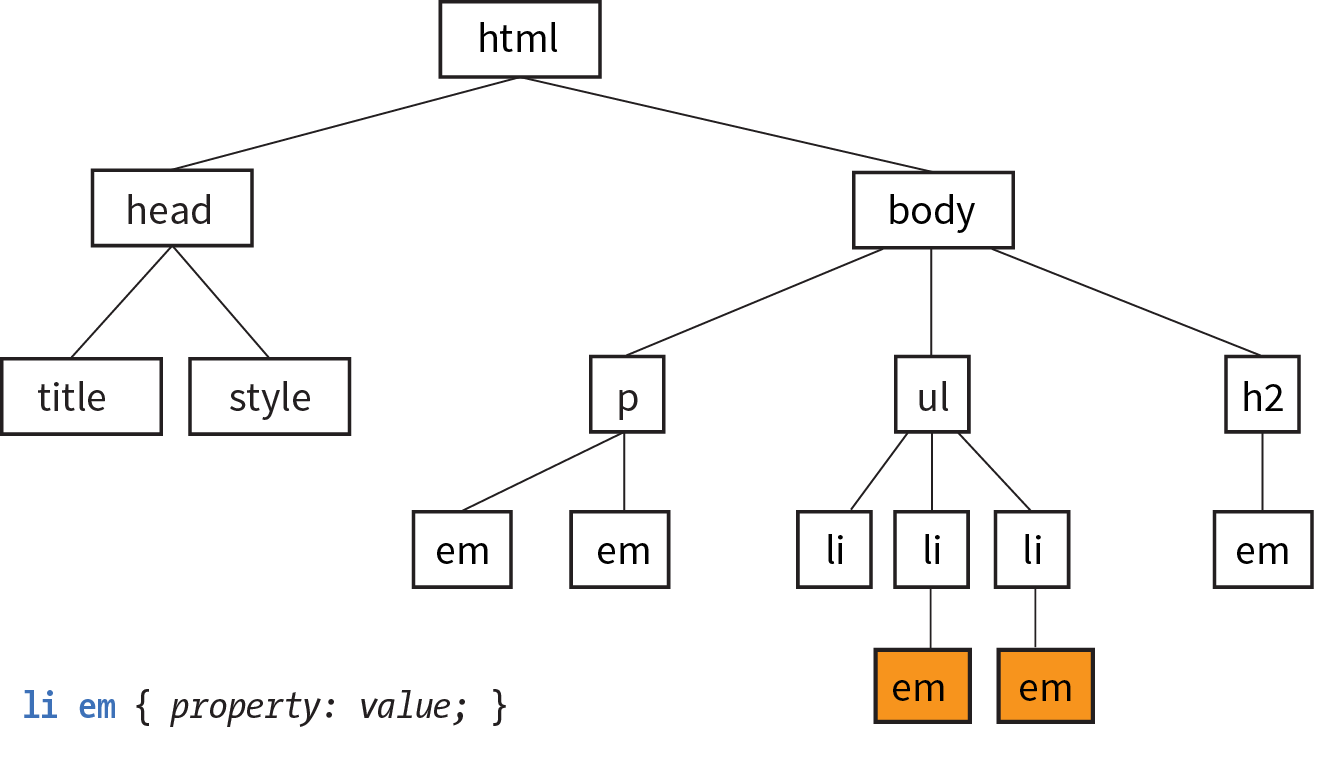
Here’s another example that shows how contextual selectors can be grouped in a comma-separated list, just as we saw earlier. This rule targets em elements, but only when they appear in h1, h2, and h3 headings:
h1 em, h2 em, h3 em { color: red; }It is also possible to nest descendant selectors several layers deep. This example targets em elements that appear in anchors (a) in ordered lists (ol):
ol a em { font-variant: small-caps; }Back in Chapter 5, Marking Up Text, we learned about the id attribute, which gives an element a unique identifying name (its id reference). The id attribute can be used with any element, and it is commonly used to give meaning to the generic div and span elements. ID selectors allow you to target elements by their id values. The symbol that identifies ID selectors is the octothorpe (#), also known as a hash or pound symbol.
Here is an example of a list item with an id reference:
<li id="sleestak">Sleestak T-shirt</li>
Now you can write a style rule just for that list item using an ID selector, like so (notice the # preceding the id reference):
li#sleestak { color: olive; }Because id values must be unique in the document, it is acceptable to omit the element name. The following rule is equivalent to the last one:
#sleestak { color: olive; }You can also use an ID selector as part of a contextual selector. In this example, a style is applied only to a elements that appear within the element identified as “resources.” In this way, you can treat links in the element named “resources” differently than all the other links on the page without any additional markup.
#resources a { text-decoration: none; }You should be beginning to see the power of selectors and how they can be used strategically along with well-planned semantic markup.
One last selector type, and then we can get back to text style properties. The other element identifier you learned about in Chapter 5 is the class identifier, used to classify elements into a conceptual group. Unlike the id attribute, multiple elements may share a class name. Not only that, but an element may belong to more than one class.
You can target elements belonging to the same class with—you guessed it—a class selector. Class names are indicated with a period (.) at the beginning of the selector. For example, to select all paragraphs with class="special", use this selector (the period indicates the following word is a class selector):
p.special { color: orange; }To apply a property to all elements of the same class, omit the element name in the selector (be sure to leave the period; it’s the character that indicates a class). This example targets all paragraphs and any other element that has been marked up with class="special":
.special { color: orange; }In Chapter 11, I introduced you to the term specificity, which refers to the fact that more specific selectors have more weight when it comes to handling style rule conflicts. Now that you know a few more selectors, it is a good time to revisit this very important concept.
This list of selector types from most to least specific should serve you well in most scenarios:
The full story is a little more complicated, but here it is in a nutshell. To calculate specificity, start by drawing three boxes:
[ ] [ ] [ ]
Now count up the number of IDs in the selector, and put that number in the first box. Next count up the number of classes and pseudo-classes in the selector, and put that number in the second box. Third, count up the element names, and put that number in the third box.
Specificity is compared box by box. The first box that is not a tie determines which selector wins. Here is a simple example of two conflicting rules for the h1 element:
h1{ color: red;} [0] [0] [1]h1.special{ color: lime; } [0] [1] [1]
The second one has a class selector and the first one doesn’t; therefore, the second one is more specific and has more weight.
How about something more complicated?
article#main aside.sidebar:hover > h1:first-of-type [1] [3] [3] .x.x.x.x.x.x.x.x a:link [0] [8] [1]
The second selector targets a link in an element with a string of class names (represented by “.x”). But the first selector has an ID (#main) and is therefore more specific.
You may need to do this full specificity calculation, but in most cases you’ll have a feel for which selector is more specific by following previously listed general guidelines.
You can use specificity strategically to keep your style sheets simple and your markup minimal. For example, it is possible to set a style for an element (p, in this example), and then override when necessary by using more specific selectors.
p{ line-height: 1.2em; } [0] [0] [1]blockquote p{ line-height: 1em; } [0] [0] [2]p.intro{ line-height: 2em; } [0] [1] [1]
In these examples, p elements that appear within a blockquote have a smaller line height than ordinary paragraphs. However, all paragraphs with a class of “intro” will have a 2em line height, even if it appears within a blockquote, because class selectors are more specific.
Understanding the concepts of inheritance and specificity is critical to mastering CSS, and there is a lot more to be said about specificity. The “More About Specificity” sidebar provides useful references.
Now, back to the menu. Fortunately, our Black Goose Bistro page has been marked up thoroughly and semantically, so we have a lot of options for selecting specific elements. Give these new selectors a try in Exercise 12-5.
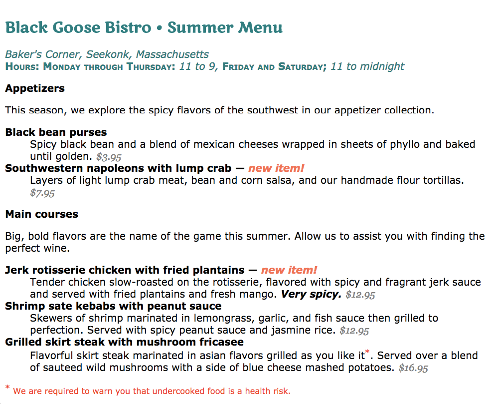
The next batch of text properties has to do with the treatment of whole lines of text rather than the shapes of characters. They allow web authors to format web text with indents, extra space between lines (leading), and different horizontal alignments, similar to print.
line-height
Values: number | length measurement | percentage | normal
Default: normal
Applies to: all elements
Inherits: yes
The line-height property defines the minimum distance from baseline to baseline in text. We saw it earlier as part of the shorthand font property. The line-height property is said to specify a “minimum” distance because if you put a tall image or large characters on a line, the height of that line expands to accommodate it.
A baseline is the imaginary line upon which the bottoms of characters sit. Setting a line height in CSS is similar to adding leading in traditional typesetting; however, instead of space being added between lines, the extra space is split above and below the text. The result is that line-height defines the height of a line-box in which the text line is vertically centered (Figure 12-12).
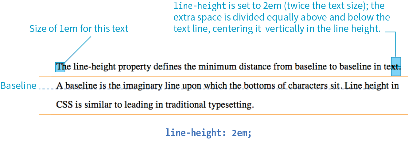
These examples show three different ways to make the line height twice the height of the font size:
p { line-height: 2; } p { line-height: 2em; } p { line-height: 200%; }
When a number is specified alone, as shown in the first example, it acts as a scaling factor that is multiplied by the current font size to calculate the line-height value.
Line heights can also be specified in one of the CSS length units. Ems and percentage values are based on the current font size of the element. In the three examples, if the font size is 16 pixels, the calculated line height would be 32 pixels (see Figure 12-12).
The difference between using a scaling factor (number value) and a relative value (em or %) is how they inherit. If you set the line height with a scaling factor for a whole document on the body element, its descendants inherit the multiplier. If the scaling factor is set to 2 for the body, a 24-pixel headline will end up with a line height of 48 pixels.
If you set the line-height on the body element using ems or percentages, its descendants inherit the calculated size based on the body’s font size. For example, if the line height is set to 1em for the body element (calculated at 16 pixels), a 24-pixel headline inherits the calculated 16-pixel line height, not the 1em value. This is likely not the effect you are after, making number values a more intuitive option.
The text-indent property indents the first line of text by a specified amount.
text-indent
Values: length measurement | percentage
Default: 0
Applies to: block containers
Inherits: yes
The property indents just the first line of a block. If you want space along the whole side of the text block, use one of the or properties to add it.
Designers may be accustomed to specifying indents and margins in tandem, but to be consistent with how CSS handles them, margins will be discussed as part of the box model in .
You can specify a length measurement or a percentage value for text-indent. The results are shown in Figure 12-13. Here are a few examples:
p#1 { text-indent: 2em; } p#2 { text-indent: 25%; } p#3 { text-indent: -35px; }
Percentage values are calculated based on the width of the parent element, and they are passed down to their descendant elements as percentage values (not calculated values). So if a div has a text-indent of 10%, so will all of its descendants.
In the third example, notice that a negative value was specified, and that’s just fine. It will cause the first line of text to hang out to the left of the left text edge (also called a hanging indent).
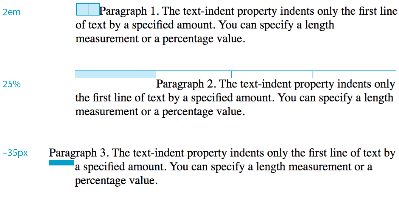
You can align text for web pages just as you would in a word processing or desktop publishing program with the text-align property.
text-align
Values: left | right | center | justify | start | end
Default: start
Applies to: block containers
Inherits: yes
This is a fairly straightforward property to use. The results of the various CSS2.1 text-align values are shown in Figure 12-14.
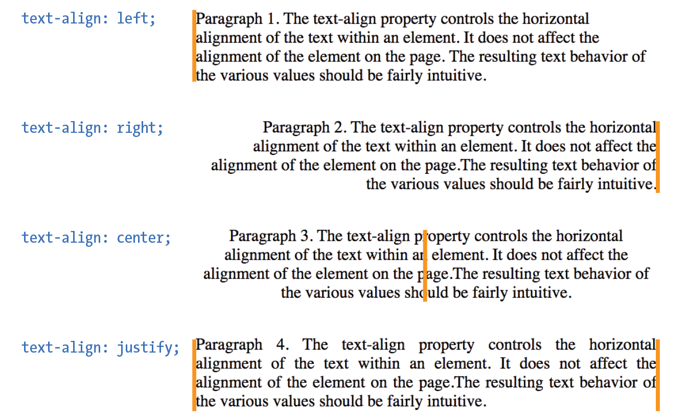
text-align: left
|
Aligns text on the left margin |
text-align: right
|
Aligns text on the right margin |
text-align: center
|
Centers the text in the text block |
text-align: justify
|
Aligns text on both right and left margins |
The CSS Text Module Level 3 added the start and end values, which specify the side of the line box the text should align to (see Note). This accommodates languages that are written vertically and right to left. For left-to-right reading languages, start corresponds to left.
The CSS Text Module Level 3 also defines two new properties related to text alignment— (for aligning the last line of text) and (for more fine-tuned control over how space is inserted in justified text).
Good news—only five more text properties to go! Then we’ll be ready to try a few of them in the Black Goose Bistro menu.
If you want to put a line under, over, or through text, or if you’d like to turn of the underline under links, then text-decoration is the property for you.
text-decoration
Values: none | underline | overline | line-through | blink
Default: none
Applies to: all elements
Inherits: no, but since lines are drawn across child elements, they may look like they are “decorated” too
The values for text-decoration are intuitive and are shown in Figure 12-15.
underline
|
Underlines the element |
overline
|
Draws a line over the text |
line-through
|
Draws a line through the text |
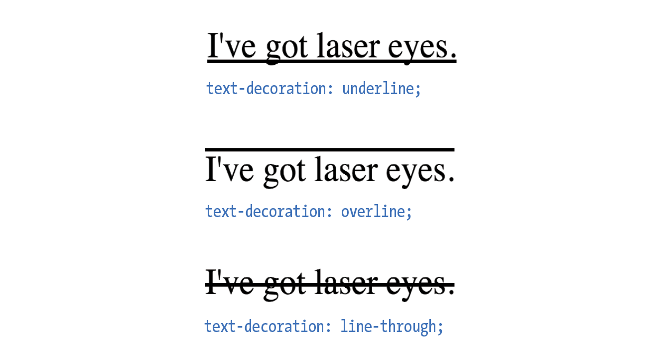
The most popular use of the text-decoration property is turning off the underlines that appear automatically under linked text, as shown here:
a { text-decoration: none; }
There are a few cautionary words to be said regarding text-decoration:
I remember when desktop publishing programs introduced a feature that let me change the capitalization of text on the fly (OK, I’m dating myself here). This made it easy to see how my headlines might look in all capital letters without needing to retype them. CSS includes this feature as well with the text-transform property.
text-transform
Values: none | capitalize | lowercase | uppercase | full-width
Default: none
Applies to: all elements
Inherits: yes
When you apply the text-transform property to a text element, it changes its capitalization when it renders without changing the way it is typed in the source. The values are as follows (Figure 12-16):
none
|
As it is typed in the source |
capitalize
|
Capitalizes the first letter of each word |
lowercase
|
Makes all letters lowercase |
uppercase
|
Makes all letters uppercase |
full-width
|
Chooses a “full-width” version of a character if one exists (not well supported) |
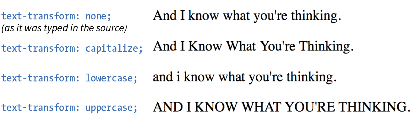
The next two text properties are used to insert space between letters (letter-spacing) or words (word-spacing) when the text is displayed.
letter-spacing
Values: length measurement | normal
Default: normal
Applies to: all elements
Inherits: yes
word-spacing
Values: length measurement | normal
Default: normal
Applies to: all elements
Inherits: yes
The letter-spacing and word-spacing properties do what they say: add space between the letters of the text or words in a line, respectively.
Figure 12-17 shows the results of letter spacing and word spacing applied to the simple paragraph shown here:
<p>Black Goose Bistro Summer Menu</p>
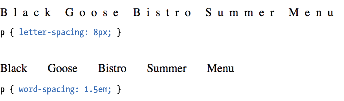
It is worth noting that when you specify em measurements, the calculated size is passed down to child elements, even if they have a smaller font size than the parent.
In Exercise 12-6 later in this chapter, we’ll make one last trip back to the Black Goose Bistro menu and use the letter-spacing property on h2s.
The text-shadow property adds a “shadow” below your text that makes it seem to hover or pop out above the page. Since flat-color design has become the fashion, drop shadows have gone out of style, but they can still be a useful visual tool, particularly when your text is in front of a patterned or photographic background.
Text shadows are drawn behind the text but in front of the background and border if there is one. Text shadows are supported by all current browsers. Internet Explorer versions 9 and earlier lack support.
text-shadow
Values: ‘horizontal offset’ ‘vertical offset’ ‘blur radius’ ‘color’ | none
Default: none
Applies to: all elements
Inherits: yes
The value for the text-shadow property is two or three measurements (a horizontal offset, vertical offset, and an optional blur radius) and a color. Figure 12-18 shows an example of a minimal text shadow declaration.
h1 { color: darkgreen; text-shadow: .2em .2em silver;} h1 { color: darkgreen; text-shadow: -.3em -.3em silver; }
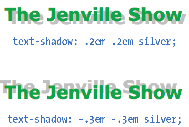
The first value is a horizontal offset that positions the shadow to the right of the text (a negative value pulls the shadow to the left of the text). The second measurement is a vertical offset that moves the shadow down by the specified amount (a negative value moves the shadow up). The declaration ends with the color specification (silver). If the color is omitted, the text color will be used.
That should give you an idea for how the first two measurements work, but that sharp shadow doesn’t look very…well…shadowy. What it needs is a blur radius measurement. Zero (0) is no blur, and the blur gets softer with higher values (Figure 12-19). Usually, you just have to fiddle with values until you get the effect you want.
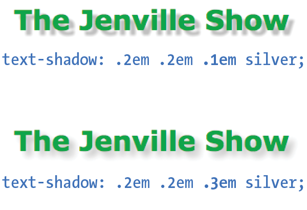
It is possible to apply several text shadows to the same element. If you vary the position and blur amounts, you can give the text the appearance of multiple light sources.
So go have some fun with text shadows, but be careful not to overdo it. Not only can drop shadows make text difficult to read, but adding a shadow to everything can slow down page performance (scrolling, mouse interactions, etc.) as well, which is particularly problematic for mobile browsers without much processing power. In addition, be careful that your text doesn’t require a shadow in order to be visible. Folks with non-supporting browsers won’t see a thing. My advice is to use drop shadows as an enhancement in a way that isn’t critical if they don’t appear.
Exercise 12-6 gives you a chance to try out more text formatting properties to put a little polish on the Black Goose Bistro menu.
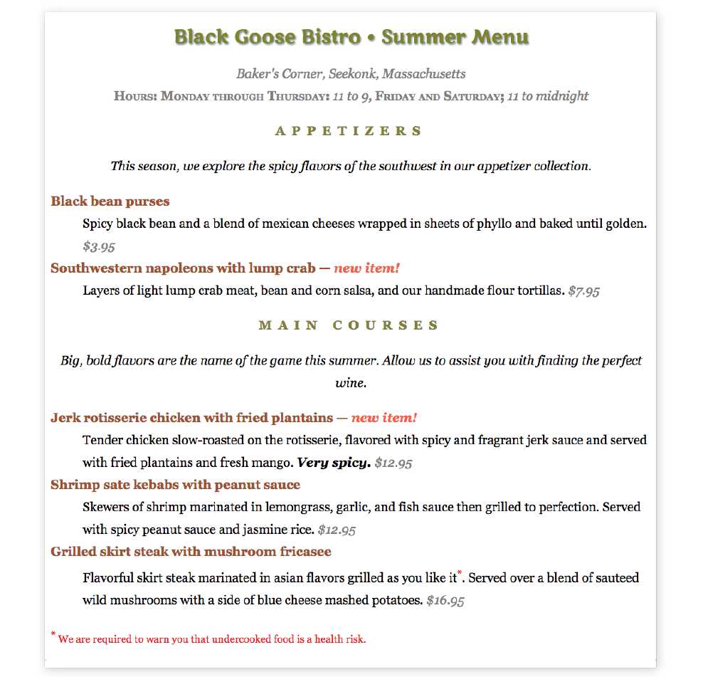
Before we close out this chapter on text properties, I want to show you a few tweaks you can make to bulleted and numbered lists. As you know, browsers automatically insert bullets before unordered list items, and numbers before items in ordered lists (the list markers). For the most part, the rendering of these markers is determined by the browser. However, CSS provides a few properties that allow authors to choose the type and position of the marker, or turn them off entirely.
Apply the list-style-type property to the ul, ol, or li element select the type of marker that appears before each list item (see Note).
list-style-type
Values: none | disc | circle | square | decimal | decimal-leading-zero | lower-alpha | upper-alpha | lower-latin | upper-latin | lower-roman | upper-roman | lower-greek
Default: disc
Applies to: , , and (or elements whose display value is )
Inherits: yes
More often than not, developers use the list-style-type property with its value set to none to remove bullets or numbers altogether. This is handy when you’re using list markup as the foundation for a horizontal navigation menu or the entries in a web form. You can keep the semantics but get rid of the pesky markers.
The disc, circle, and square values generate bullet shapes just as browsers have been doing since the beginning of the web itself (Figure 12-21). Unfortunately, there is no way to change the appearance (size, color, etc.) of generated bullets, so you’re stuck with the browser’s default rendering.
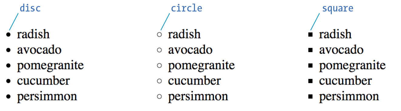
The remaining keywords (Table 12-1) specify various numbering and lettering styles for use with ordered lists.
|
Table 12-1. Lettering and numbering system (CSS2.1) |
|
|
Keyword |
System |
decimal |
1, 2, 3, 4, 5… |
decimal-leading-zero |
01, 02, 03, 04, 05… |
lower-alpha |
a, b, c, d, e… |
upper-alpha |
A, B, C, D, E… |
lower-latin |
a, b, c, d, e… (same as lower-alpha) |
upper-latin |
A, B, C, D, E… (same as upper-alpha) |
lower-roman |
i, ii, iii, iv, v… |
upper-roman |
I, II, III, IV, V… |
lower-greek |
α, β, γ, δ, ε… |
By default, the marker hangs outside the content area for the list item, displaying as a hanging indent. The list-style-position property allows you to pull the bullet inside the content area so it runs into the list content.
list-style-position
Values: inside | outside | hanging
Default: outside
Applies to: , , and (or elements whose display value is )
Inherits: yes
I’ve applied a light green background color to the list items in Figure 12-22 to reveal the boundaries of their content area boxes.
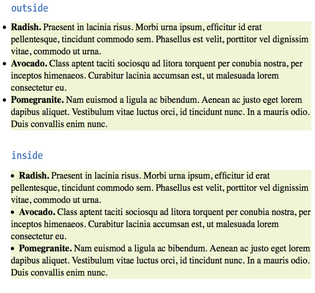
You can see that when the position is set to outside (top), the markers fall outside the content area.When it is set to inside (bottom), the markers are tucked into the content area.
li {background-color: #F99;}ul#outside {list-style-position: outside;}ul#inside {list-style-position: inside;}
CSS3 adds the hanging value for list-style-position. it is similar to inside, but the markers appear outside and abutting the left edge of the shaded area.
You can also use your own image as a bullet by using the list-style-image property.
list-style-image
Values: url(location) | none
Default: none
Applies to: , , and (or elements whose display value is )
Inherits: yes
The value of the list-style-image property is the URL of the image you want to use as a marker. The list-style-type is set to disc as a backup in case the image does not display or the property isn’t supported by the browser or other user agent. The result is shown in Figure 12-23.
ul { list-style-type: disc; list-style-image: url(/images/rainbow.gif); list-style-position: outside;}
Wow! Whatta chapter! We started by looking at properties for specifying fonts and character shapes followed by a review of all the text-level settings and effects. You also got to use descendent, ID, and class selectors and looked a little more closely at specificity. We topped it off with the properties available for adding some style to lists. I don’t expect you to have all of these properties committed to memory (although many will become second nature the more you practice), but let’s see how you do on the following questions.
It’s time to see how well you understand the font properties and selectors introduced in this chapter. Check Appendix A for the answers if you get stuck.
{font-size: 1.5em;}{text-transform: capitalize;}{text-align: right;}{font-family: Verdana; font-size: 1.5em;}{letter-spacing: 3px;}{font: bold italic 1.2em Verdana;}{text-transform: uppercase;}{text-indent: 2em;}{font-variant: small-caps;}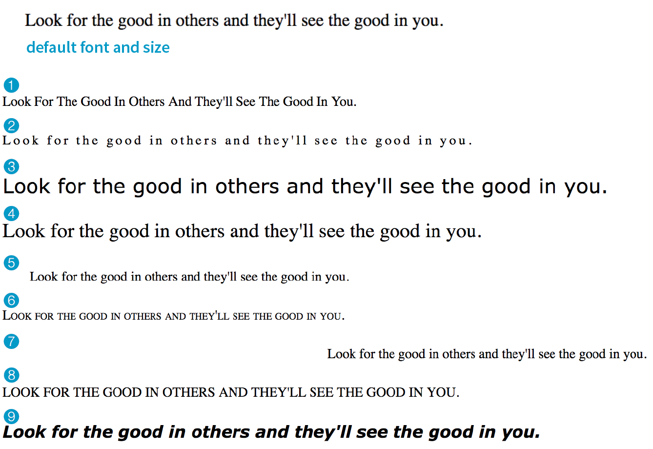
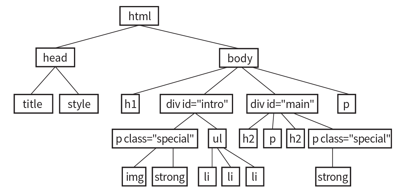
In this chapter, we covered the properties used to format text elements. Here is a summary in alphabetical order.
In this Chapter
CSS color names
RGB color values
Foreground and background colors
Tiling background images
Color gradients
Pseudo-class, pseudo-element, and attribute selectors
External style sheets
If you had seen the web back in 1993, you would have found it to be a dreary affair by today’s standards—every background was gray, and all the text was black. Then came Netscape Navigator and, with it, a handful of HTML attributes that allowed rudimentary (but welcome) control over font colors and backgrounds. For years, we made do. But thankfully, we now have style sheet properties that have laid those unmentionable presentational attributes to rest.
We’re going to cover a lot of ground in this chapter. Of course, I’ll introduce you to all of the properties for specifying colors and backgrounds. This chapter also rounds out your collection of selector types and shows you how to create an external style sheet. Our first order of business, however, is to explore the options for specifying color in CSS, including a primer on the nature of color on computer monitors.
There are two main ways to specify colors in style sheets—with a predefined color name, as we have been doing so far:
color: red; color: olive; color: blue;
Or, more commonly, with a numeric value that describes a particular RGB color (the color model on computer monitors). You may have seen color values that look like these:
color: #FF0000; color: #808000; color: #00F;
We’ll get to all the ins and outs of RGB color in a moment, but first, a short and sweet section on the standard color names.
The most intuitive way to specify a color is to call it by name. Unfortunately, you can’t make up just any color name and expect it to work. It has to be one of the color keywords predefined in the CSS Recommendation. CSS1 and CSS2 adopted the 16 standard color names originally introduced in HTML 4.01. CSS2.1 tossed in orange for a total of 17 (Figure 13-1).
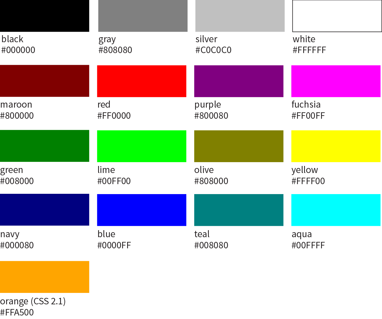
CSS3 adds support for the extended set of 140 (rather fanciful) color names. Now we can specify names like burlywood, peachpuff, oldlace, and my long-time favorite, papayawhip! The extended colors are shown in Figure 13-2, but if you want a more accurate view, point your browser at learningwebdesign.com/colornames.html. CSS3 also added the transparent keyword, which can be used with any property that has a color value.
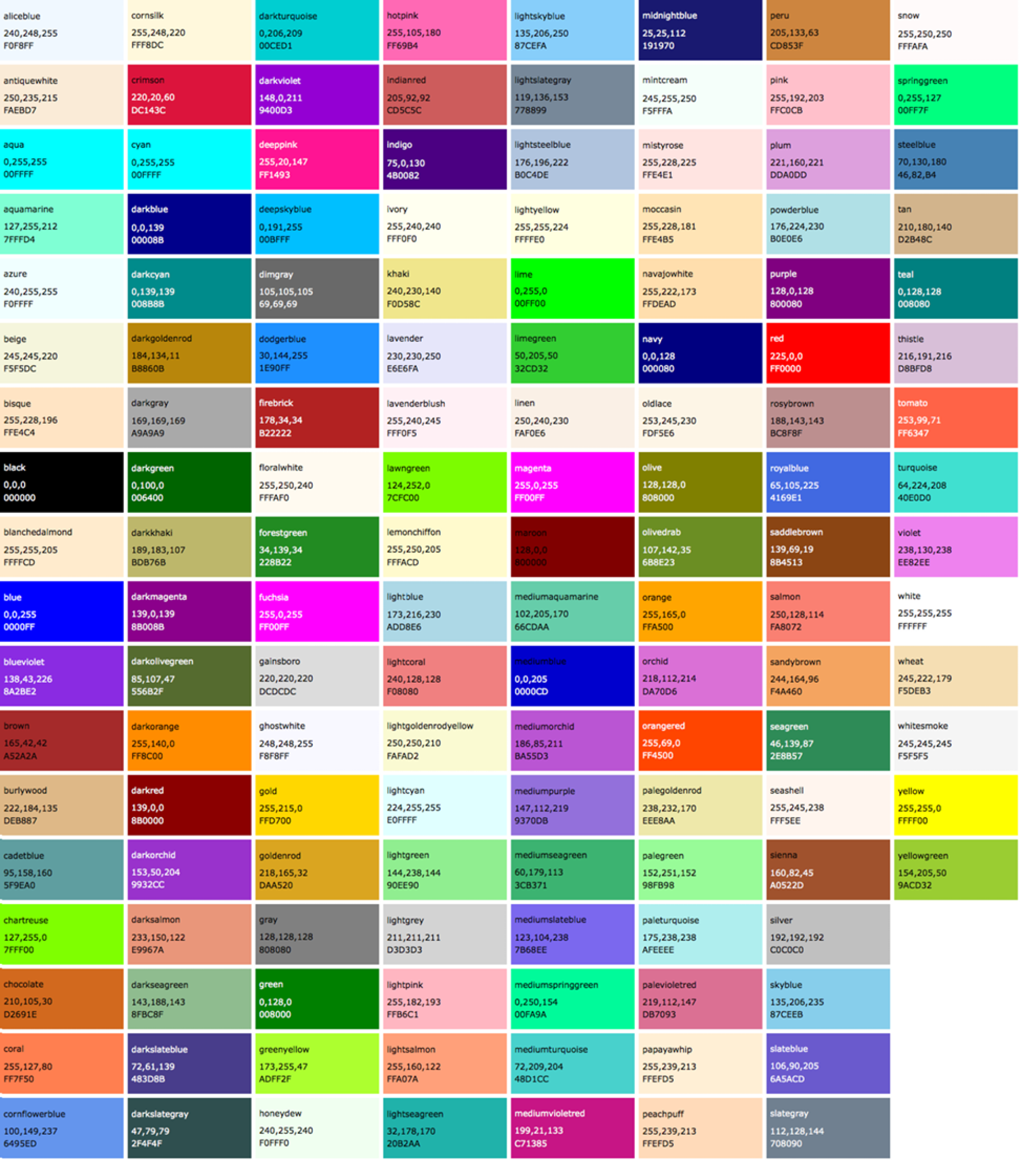
Color names are easy to use—just drop one into place as the value for any color-related property:
color:silver;background-color:gray;border-bottom-color:teal;
Names are easy, but as you can see, they are limited. By far, the most common way to specify a color is by its RGB value. It also gives you millions of colors to choose from.
For those who are not familiar with how computers deal with color, I’ll start with the basics before jumping into the CSS syntax.
Computers create the colors you see on a monitor by combining three colors of light: red, green, and blue. This is known as the RGB color model. You can provide recipes (of sorts) for colors by telling the computer how much of each color to mix in. The amount of light in each color “channel” is typically described on a scale from 0 (none) to 255 (full blast), although it can also be provided as a percent. The closer the three values get to 255 (100%), the closer the resulting color gets to white (Figure 13-3). Wondering why the scale is from 0 to 255? See the “Why 255?” sidebar.
Any color you see on your monitor can be described by a series of three numbers: a red value, a green value, and a blue value. This is one of the ways that image editors such as Adobe Photoshop keep track of the colors for every pixel in an image. With the RGB color system, a pleasant lavender can be described as R:200, G:178, B:230.
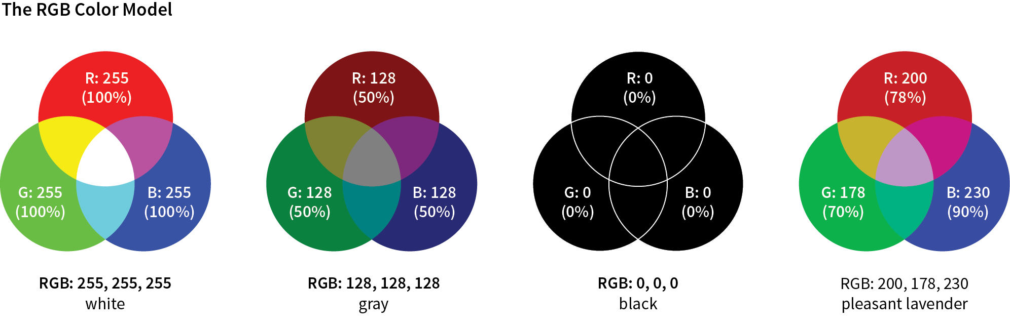
Taken together, 255 colors in each channel can define around 16.7 million color combinations. This color space of millions of colors is known as Truecolor. There are different ways to encode those colors (that is, convert them to bytes for computers), and the web uses an encoding called sRGB. So, if you see an option for saving images as sRGB in a graphics program, click Yes.
There are a number of ways to pick a color and find its RGB color values. One quick and easy option is to go to Google.com and search “color picker,” and voilà—a full-featured color picker (Figure 13-4, left)! If you tend to keep an image-editing program such as Adobe Photoshop open and handy, you can use its built-in color picker (Figure 13-4, right).
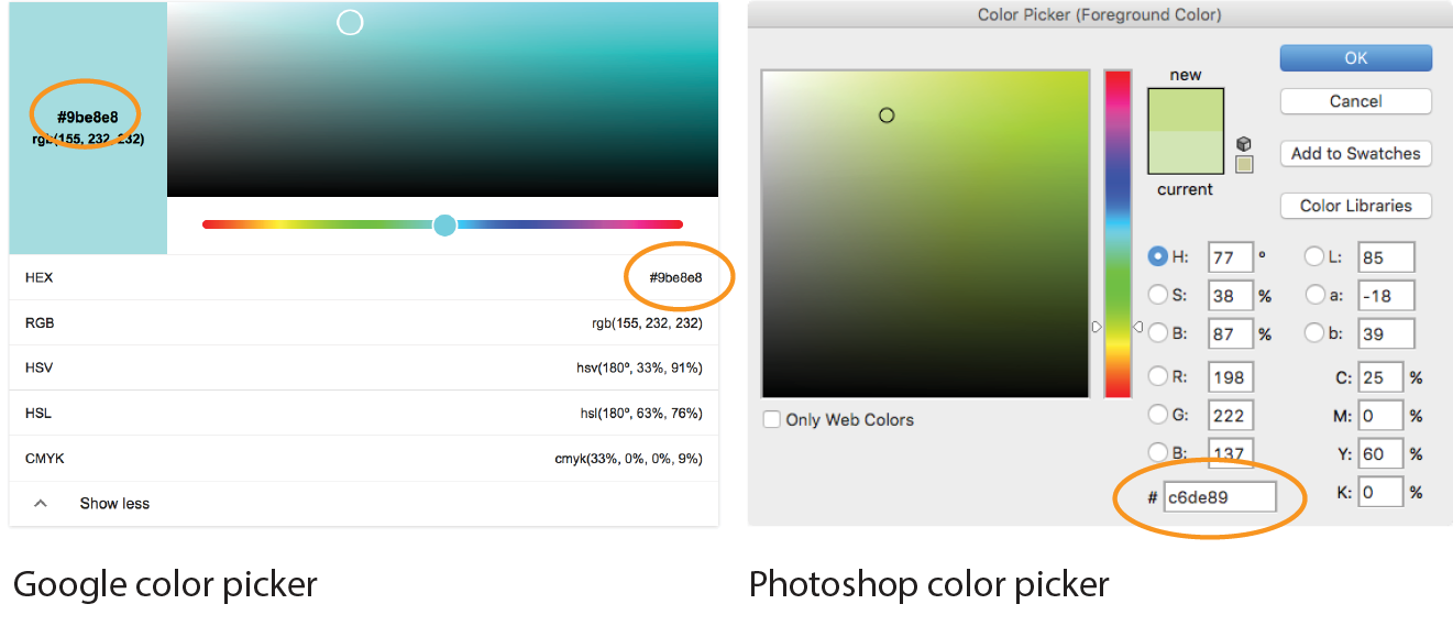
Both the Google and image editor color pickers show how the selected color would be expressed in a variety of color models (to reveal the values in Google, click “Show color values” below the picker). RGB is the most common for web design, so we’re focusing our attention on that one. HSL (Hue Saturation Lightness or Luminosity) is another option for specifying color in style sheets, and we’ll take a look at it in a moment (see Note). CMYK (Cyan Magenta Yellow blacK) is used primarily for print media, so you won’t use it except perhaps to translate print colors to their screen equivalents.
When you select a color from the spectrum in the color picker, the red, green, and blue values are listed, as pointed out in Figure 13-4. And look next to the # symbol—those are the same three values, converted to hexadecimal equivalents so they are ready to go in a style sheet. I’ll explain the six-digit hex values in a moment.
CSS allows RGB color values to be specified in a number of formats. Going back to that pleasant lavender, we could add it to a style sheet by listing each value on a scale from 0 to 255:
color: rgb(200, 178, 230);
You can also list them as percentage values, although that is less common:
color: rgb(78%, 70%, 90%);
Or, you can provide the six-digit hexadecimal version that we saw in the color pickers. These six digits represent the same three RGB values, except they have been converted into hexadecimal (or hex for short) equivalents. Note that hex RGB values are preceded by the # symbol and do not require the rgb() notation shown in the previous examples. They may be upper- or lowercase, but it is recommended that you be consistent:
color: #C8B2E6;
There is one last shorthand way to specify hex color values. If your value happens to be made up of three pairs of double digits or letters, such as
color:#FFCC00; or color:#993366;
you can condense each pair down to one digit or letter. It’s easier to type and to read, and it slightly reduces the size of your file. These examples are equivalent to the ones just listed:
color:#FC0; or color:#936;
It’s time to clarify what’s going on with that six-digit string of characters. What you’re looking at is actually a series of three two-digit numbers, one each for red, green, and blue. But instead of decimal (base-10, the system we’re used to), these values are written in hexadecimal, or base-16. Figure 13-5 shows the structure of the hex RGB value.
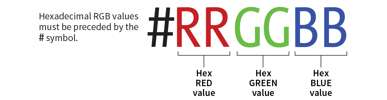
The hexadecimal numbering system uses 16 digits: 0–9 and A–F (for representing the quantities 10–15). Figure 13-6 shows how this works. The hex system is used widely in computing because it reduces the space it takes to store certain information. For example, the RGB values are reduced from three to two digits once they’re converted to hexadecimal.
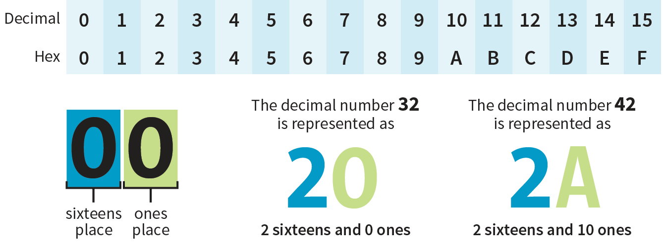
Now that most graphics and web development software provides easy access to hexadecimal color values (as we saw in Figure 13-4), there isn’t much need to translate RGB values to hex yourself, as we needed to do back in the old days. Should you need to, there are plenty of decimal-to-hexadecimal converters online.
RGBa color allows you to specify a color and make it as transparent or as opaque as you like. The “a” in “RGBa” stands for alpha, which is an additional channel that controls the level of transparency on a scale from 0 (fully transparent) to 1 (fully opaque). Here’s how it looks written in a style rule:
color: rgba(0, 0, 0, .5);
The first three values in the parentheses are regular old RGB values, in this case creating the color black. The fourth value, .5, is the transparency level. So this color is black with 50% transparency. That allows other colors or background patterns to show through slightly (Figure 13-7).
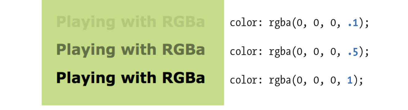
Internet Explorer versions 8 and earlier do not support RGBa color, so if a significant percentage of your users have those browsers, you may want to provide a fallback. Pick an RGB color that approximates the look you’re going for and list it first in the style rule. IE ignores the RGBa value, and supporting browsers will override the opaque color when they get to the second declaration.
h1 { color: rgb(120, 120, 120); color: rgba(0, 0, 0, .5);}
CSS3 introduced the ability to specify colors by their HSL values: Hue (color), Saturation, and Lightness (or Luminosity). In this system, the colors are spread out around a circle in the order of the rainbow, with red at the top (12 o’clock) position. Hue values are then measured in degrees around the circle: red at 0°/360°, green at 120°, and blue at 240°, with other colors in between. Saturation is a percentage value from 0% (gray) to 100% (color at full blast). Lightness (or brightness) is also a percentage value from 0% (darkest) to 100% (lightest).
Figure 13-8 shows one hue, cyan (located at 180° on the wheel) with its associated saturation and lightness levels. You can see why some people find this system more intuitive to use, because once you lock into a hue, it is easy to make it stronger, darker, or lighter by increasing or decreasing the percentage values. RGB values are not intuitive at all, although some practiced designers develop a feel for them.
In CSS, HSL values are provided as the hue value and two percentages. They are never converted to hexadecimal values, as may be done for RGB. Here is that lavender from Figure 13-3 as it would be specified using HSL:
color: hsl(265, 51%, 80%);
There are a number of HSL color pickers online. In the Google color picker, click “Show color values” below the panel to reveal the HSL values for your selected color. Here are some other cool tools worth checking out:
As with RGB, you can add an alpha channel to set the transparency of HSL colors, resulting in the HSLa color model. As for RGBa, the fourth value is the degree of transparency on a scale from 0 (fully transparent) to 1 (fully opaque). This example specifies a spring green color that is 65% opaque:
color:hsla(70, 60%, 58%,.65);
It took us a few pages to get here, but the process for picking and specifying colors in style sheets is actually easy:
or
There is one more colorful way to fill an element, and that’s gradients (colors that fade from one hue to another), but I’m going to save them for the end of this chapter.
Now that we know how to write color values, let’s get to the color-related properties. You can specify the foreground and background colors for any HTML element. There are also border-color properties that take color values, but we’ll get to those in Chapter 14, Thinking Inside the Box.
The foreground of an element consists of its text and border (if one is specified). You specify a foreground color with the color property, as we saw in the last chapter when we rolled it out to give text a little pizzazz. Here are the details for the color property one more time.
color
Values: color value (name or numeric)
Default: depends on the browser and user’s preferences
Applies to: all elements
Inherits: yes
In the following example, the foreground of a blockquote element is set to green with a color name. You can see that applying the color property to the blockquote element means the color is inherited by the p and em elements it contains (Figure 13-9). The thick dashed border around the whole blockquote is green as well; however, if we were to apply a border-color property to this same element, that color would override the green foreground setting.
The foreground of an element consists of its text and border (if one is specified).
The style rule
blockquote { border: 4px dashed; color: green;}
The markup
<blockquote>In the latitude of central New England, cabbages are not secure ... </blockquote>
Use background-color to apply a background color to any element.
background-color
Values: color value (name or numeric) | transparent
Default: transparent
Applies to: all elements
Inherits: no
A background color fills the canvas behind the element that includes the content area, and any padding (extra space) added around the content, extending behind the border out to its outer edge. Let’s see what happens when we use the background-color property to make the background of the same sample blockquote light green (Figure 13-10):
blockquote { border: 4px dashed; color: green; background-color: #c6de89;}
As expected, the background color fills the area behind the text, all the way to the border. Look closely at the gaps in the border, and you’ll see that the background color goes to its outer edge. But that’s where the background stops; if we apply a margin around this element, the background will not extend into the margin. We’ll revisit all these components of an element when we talk about the CSS box model. For now, just know that, by default, if your border has gaps, the background will show through.
It’s worth noting that background colors do not inherit, but because the default background setting for all elements is transparent, the parent’s background color shows through its descendant elements. For example, you can change the background color of a whole page by applying the background-color property to the body element and the color will show through all the elements on the page (see ).
In addition to setting the color of the whole page, you can change the background color of any element, both block-level (like the blockquote shown in the previous example) as well as inline. In this example, I’ve used the color and background-color properties to highlight a word marked up as a “glossary” term. You can see in Figure 13-11 that the background color fills the little box created by the inline dfn element.
The style rule
.glossary { color: #0378a9; /* blue */
background-color: yellow; }
The markup
<p>Every variety of cabbage had their origin in the wild cabbage of Europe (<dfn class="glossary"><i>Brassica oleracea</i></dfn>)</p>
Traditionally, the background painting area (the area on which fill colors are applied) of an element extends all the way out to the outer edge of the border, as we saw in Figure 13-10. CSS3 introduced the background-clip property to give designers more control over where the painting area begins and ends.
background-clip
Values: border-box | padding-box | content-box
Default: border-box
Applies to: all elements
Inherits: no
The default border-box value draws the painting area to the outside edge of the border, as we’ve seen. Figure 13-12 shows that padding-box starts the painting area on the outside edge of the padding area for the element (and to the inside edge of the border). Finally, content-box allows the background to fill only the content area for the element.
I can’t help but feel like I’m spoiling the surprise of the element box model and its properties here a little, since I was saving that for the next chapter. I’ve added some padding (space between the content and the border) so the effects of the clip settings will be more apparent.
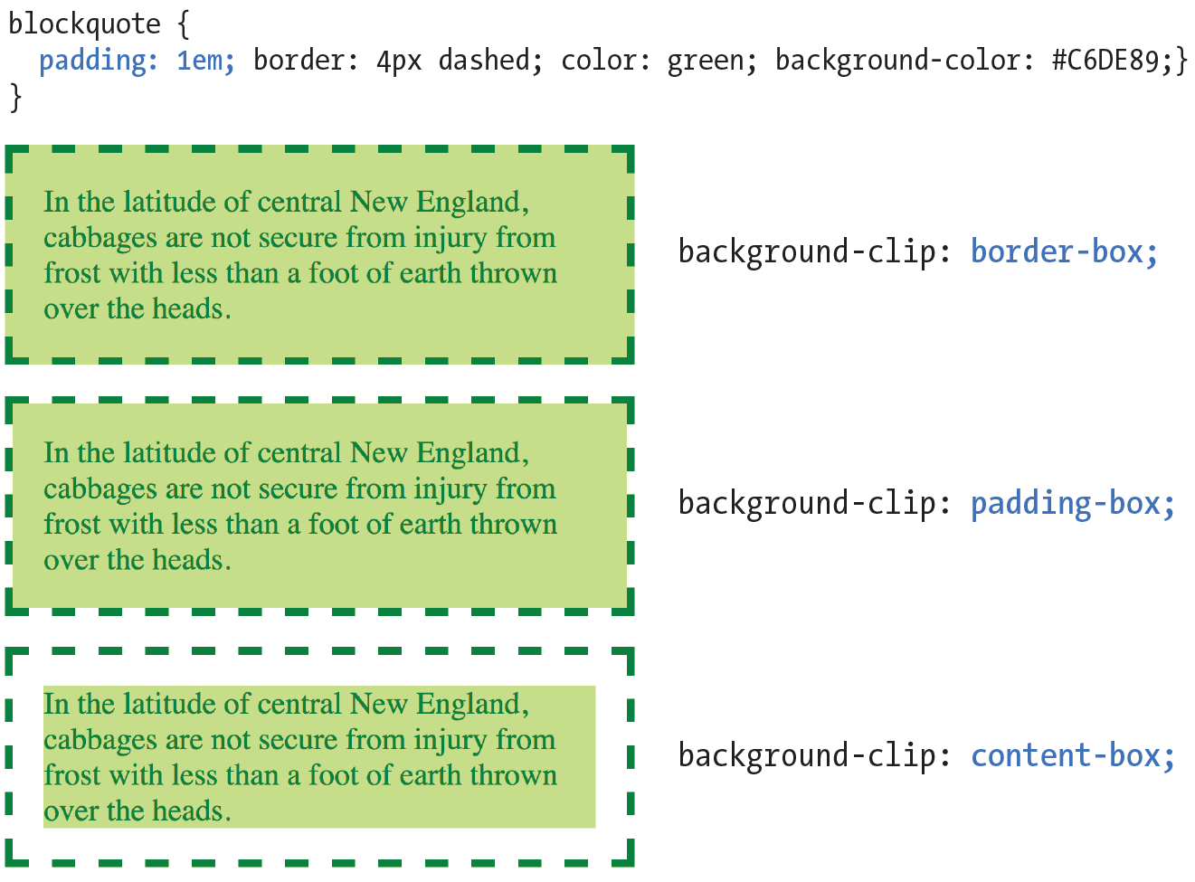
Earlier, we talked about the RGBa color format, which adds a level of transparency when it is applied to a color or background. There is another way to make an element slightly see-through, however—the CSS3 opacity property.
opacity
Values: number (0 to 1)
Default: 1
Applies to: all elements
Inherits: no
The value for opacity is a number between 0 (completely transparent) and 1 (completely opaque). A value of .5 gives the element an opacity of 50%. The opacity setting applies to the entire element—both the foreground and the background (if one has been set). If you want to affect just one or the other, use an RGBa color value instead.
The opacity setting applies to the entire element—both the foreground and the background.
In the following code example (and Figure 13-13), a heading has been given a color of gold and a background color of white. When the opacity property is set, it allows the blue background of the page to show through both the text and the element box.
h1 {color: gold; background: white; opacity: .25;} h1 {color: gold; background: white; opacity: .5;} h1 {color: gold; background: white; opacity: 1;}
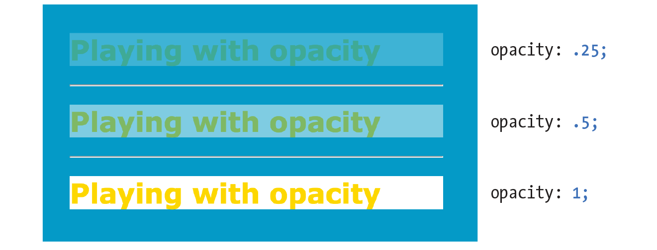
You may be itching to take these color and background properties out for a spin, and we will in a moment, but first, I want to introduce you to some of the fancier CSS selectors and round out your collection. The “At a Glance” sidebar lists the selectors you should feel comfortable with so far.
The property is not supported in Internet Explorer versions 8 and earlier. If you need to support IE8, use a style rule with Microsoft’s proprietary property, then override it with the standard opacity style rule.
h1 {
filter:alpha(opacity=50);
opacity: .5;
}
Have you ever noticed that a link is often one color when you click it and another color when you go back to that page? That’s because, behind the scenes, your browser is keeping track of which links have been clicked (or “visited,” to use the lingo). The browser keeps track of other states too, such as whether the user’s cursor is over an element (hover state), whether an element is the first of its type, whether it’s the first or last child of its parent, and whether a form element has been checked or disabled, just to name a few.
In CSS, you can apply styles to elements in these states by using a special kind of selector called a pseudo-class selector. It’s an odd name, but you can think of it as though elements in a certain state belong to the same class. However, the class name isn’t in the markup—it’s something the browser just keeps track of. So it’s kinda like a class…it’s a pseudo-class.
Pseudo-class selectors are indicated by the colon (:) character. They typically go immediately after an element name—for example, li:first-child.
There are quite a few pseudo-classes in CSS3, and the W3C has been going a little crazy in the CSS Selector Module Level 4 slinging around new pseudo-classes, the majority of which have no browser support as of this writing. In this section, I’ll introduce you to the most commonly used and the best supported as a solid starter kit. You can explore the cutting-edge selectors as you gain more experience. The full list of CSS selectors (including Level 4), with descriptions, can be found in Appendix C.
The most basic pseudo-class selectors target links (a elements) based on whether they have been clicked. Link pseudo-classes are a type of dynamic pseudo-class because they are applied as the result of the user interacting with the page rather than something in the markup.
|
:link |
|
|
:visited |
By default, browsers typically display linked text as blue and links that have been clicked as purple, but you can change that with a few style rules. There are limitations on what properties may be applied to :visited links, as explained in the “Visited Links and Security” sidebar.
In these examples, I’ve changed the color of unclicked links to maroon and visited links to gray. It is common for visited links to be a more muted color than unclicked links:
a:link{ color: maroon;}a:visited{ color: gray;}
Another type of dynamic pseudo-class targets states that result from direct user actions.
:focus Applies when the element is selected and ready for input
:hover Applies when the mouse pointer is over the element
:active Applies when the element (such as a link or button) is in the process of being clicked or tapped
If you’ve ever used a web form, then you should be familiar with how a browser visually emphasizes a form element when you select it. When an element is highlighted and ready for input, it is said to have “focus.” The :focus selector lets you apply custom styles to elements when they are in the focused state.
In this example, when a user selects a text input, it gets a yellow background color to make it stand out from the other form inputs:
input:focus { background-color: yellow; }The :hover selector is an interesting one. It targets elements while the user’s mouse pointer is directly over them. You can use the hover state with any element, although it is most commonly used with links to give the user visual feedback that an action is possible. Hover states are also used to trigger pop-up menus for navigation or for revealing more information about an object on the page.
This rule gives links a light pink background color while the mouse hovers over them:
a:hover{ color: maroon;background-color: #ffd9d9;}
In the previous chapter, we saw the text-decoration property used to turn off underlines under links. You could use the :hover selector to make the underlines appear only “on hover”:
a:hover { text-decoration: underline;}
It is important to note that there is no true hover state on touch-screen devices such as smartphones and tablets, so hover effects must be used with care and alternative solutions (see the sidebar “Hover on Touch Devices”).
Finally, the :active selector applies styles to an element while it is in the process of being activated. In the case of a link, it is the style that is applied while it is being clicked or while a fingertip is in contact with it on a touch screen. This style may be displayed only for an instant, but it can give a subtle indication that something has happened. In this example, I’ve brightened up the color for the active state (from maroon to red):
a:active { color: red; background-color: #ffd9d9;}Web designers commonly provide styles for all of these link states because it is an easy way to give a nice bit of feedback at every stage of clicking a link (and it usually improves on the browser defaults). In fact, users have come to expect this feedback: seeing at a glance which links have been followed, having links do something when they point at them, and receiving confirmation when the links are successfully clicked.
When you apply styles to a elements with all five pseudo-classes, the order in which they appear is important for them to function properly. For example, if you put :link or :visited last, they override the other states, preventing them from appearing. The required order for link pseudo-classes is :link, :visited, :focus, :hover, :active (LVFHA, which you can remember with LoVe For Hairy Animals, or the mnemonic device of your choice).
The required order for pseudo-classes is:
:link :visited :focus :hover :active
It is recommended that you provide a :focus style for users who use the keyboard to tab through links on a page rather than clicking with a mouse. Applying the same style used for :hover is common, although not required.
To sum things up, the link styles I’ve shown should look like this in the style sheet. Figure 13-14 shows the results.
a { text-decoration: none; } /* turns underlines off for all links */
a:link { color: maroon; } a:visited { color: gray; } a:focus { color: maroon; background-color: #ffd9d9; } a:hover { color: maroon; background-color: #ffd9d9; } a:active { color: red; background-color: #ffd9d9; }
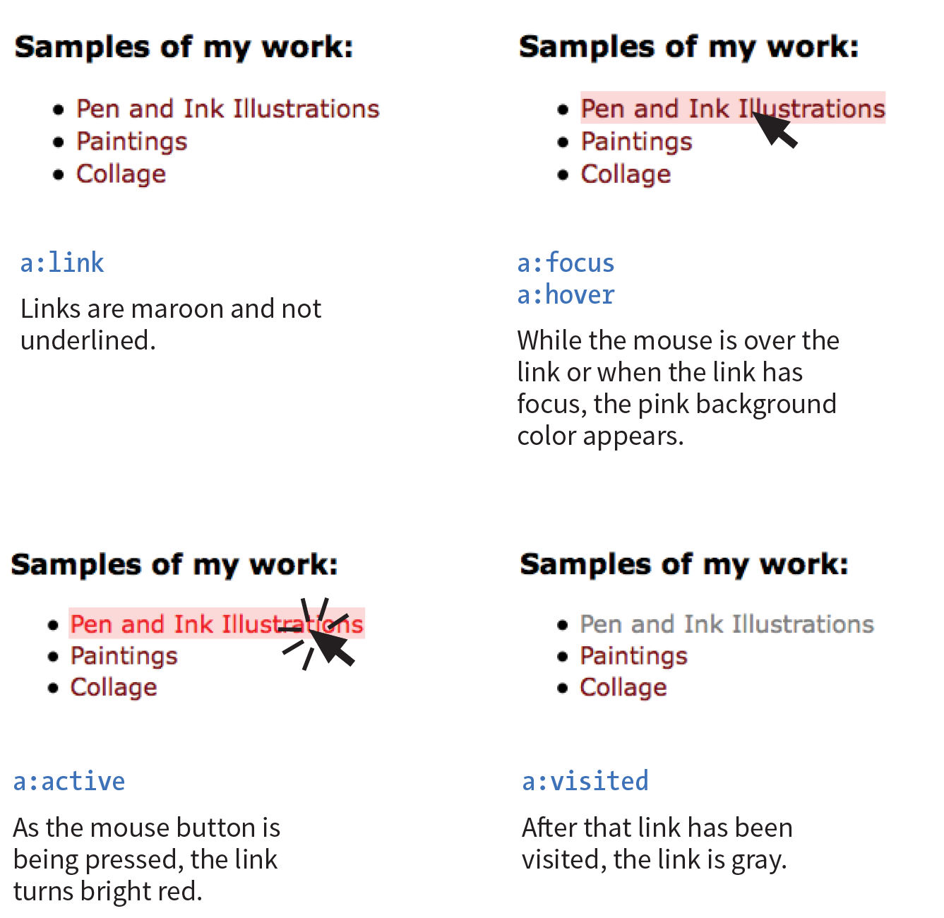
OK…five CSS3 pseudo-classes down, only 40 more to go! Well, I don’t know about you, but that sounds like it would take a while, and we have other selector types to explore. However, I do want you to know what is possible today and what is in the works, so I’ve tucked the CSS3 pseudo-class selectors into the “More CSS Pseudo-Classes” sidebar. In addition, you can find the complete list of Level 3 and 4 selectors in Appendix C, CSS Selectors, Levels 3 and 4 with brief descriptions.
I also highly recommend reading “An Ultimate Guide to CSS Pseudo-Classes and Pseudo-Elements” by Ricardo Zea of Smashing Magazine (www.smashingmagazine.com/2016/05/an-ultimate-guide-to-css-pseudo-classes-and-pseudo-elements/). He’s done the hard work of providing explanations and examples of all of the CSS3 pseudo-class selectors in one big roundup.
Pseudo-classes aren’t the only kind of pseudo-selectors. There are also four pseudo-elements that act as though they are inserting fictional elements into the document structure for styling. In CSS3, pseudo-elements are indicated by a double colon (::) symbol to differentiate them from pseudo-classes. However, all browsers support the single-colon syntax (:) as they were defined in CSS2, so many developers stick with that to ensure backward compatibility with older browsers.
The following pseudo-elements are used to select the first line or the first letter of text in an element as displayed in the browser.
::first-line
This selector applies a style rule to the first line of the specified element. The only properties you can apply, however, are as follows:
color fontpropertiesbackgroundpropertiesword-spacing letter-spacing text-decoration vertical-align text-transform line-height
::first-letter
This applies a style rule to the first letter of the specified element. The properties you can apply are limited to the following:
colorfontpropertiesbackgroundpropertiesletter-spacing word-spacing text-decoration text-transform vertical-align(if float is none)paddingpropertiesmarginpropertiesborderpropertiesline-height float
Figure 13-15 shows examples of the ::first-line and ::first-letter pseudo-element selectors.
p::first-line{ letter-spacing: 9px; }p::first-letter{ font-size: 300%; color: orange; }
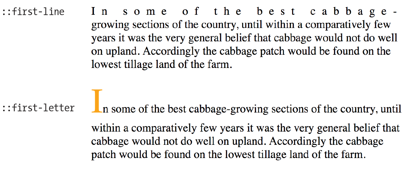
You’ve seen how browsers add bullets and numbers to lists automatically, even though they are not actually in the HTML source. That is an example of generated content, content that browsers insert on the fly. It is possible to tell browsers to generate content before or after any element you like by using the ::before and ::after pseudo-elements (see Note).
Although double colons are specified in CSS3, you can use single colons for backward compatibility. Browsers are also required to support single colons going forward.
Generated content could be used to add icons before list items, to display URLs next to links when web documents get printed out, to add language-appropriate quotation marks around a quote, and much more. Here’s a simple example that inserts an image by using the url() function before the paragraph and “Thank you.” at the end of the paragraph. Compare the markup to what you see rendered in the browser (Figure 13-16).
The styles:
p.warning::before{content: url(exclamation.png); margin-right: 6px; }p.warning::after{content: " Thank you."; color: red; }
The markup:
<p class="warning">We are required to warn you that undercooked food is a health risk.</p>
There are a few things of note in this example:
If you want to insert an image, such as an icon or other mark, specify the URL without quotations marks:
li:before { content: url(images/star.png) }
When using generated content, keep in mind that whatever you insert does not become part of the document’s DOM. It exists in the browser’s display only and is not accessible to assistive devices like screen readers. It is best to use generated content for decorations and other “extras” that are not critical to your meaning and message.
We’re finally in the home stretch with selectors. Attribute selectors target elements based on attribute names or values, which provides a lot of flexibility for selecting elements without needing to add a lot of class or id markup. The CSS3 attribute selectors are listed here:
element[attribute]
The simple attribute selector targets elements with a particular attribute regardless of its value. The following example selects any image that has a title attribute.
img[title] {border: 3px solid;}element[attribute="exact value"]
The exact attribute value selector selects elements with a specific value for the attribute. This selector matches images with exactly the title value “first grade”.
img[title="first grade"] {border: 3px solid;}element[attribute~="value"]
The partial attribute value selector (indicated with a tilde, ~) allows you to specify one part of an attribute value. The following example looks for the word “grade” in the title, so images with the title value “first grade” and “second grade” would be selected.
img[title~="grade"] {border: 3px solid;}element[attribute|="value"]
The hyphen-separated attribute value selector (indicated with a bar, |) targets hyphen-separated values. This selector matches any link that points to a document written in a variation on the English language (en), whether the attribute value is en-us (American English), en-in (Indian English), en-au-tas (Australian English), and so on.
[hreflang|="en"] {border: 3px solid;}element[attribute^="first part of the value"]
The beginning substring attribute value selector (indicated with a carat, ^) matches elements whose specified attribute values start in the string of characters in the selector. This example applies the style only to images that are found in the /images/icons directory.
img[src^="/images/icons"] {border: 3px solid;}element[attribute$="last part of the value"]
The ending substring attribute value selector (indicated with a dollar sign, $) matches elements whose specified attribute values end in the string of characters in the selector. In this example, you can apply a style to just the a elements that link to PDF files.
a[href$=".pdf"] {border-bottom: 3px solid;}element[attribute*="any part of the value"]
The arbitrary substring attribute value selector (indicated with an asterisk, *) looks for the provided text string in any part of the attribute value specified. This rule selects any image that contains the word “February” somewhere in its title.
img[title*="February"] {border: 3px solid;}OK, we’re done with selectors! You’ve been a real trouper. I think it’s definitely time to try out foreground and background colors as well as a few of these new selector types in Exercise 13-1 before moving on to background images.
We’ve seen how to add images to the content of the document by using the img element, but most decorative images are added to pages and elements as backgrounds with CSS. After all, decorations such as tiling background patterns are firmly part of presentation, not structure. We’ve come a long way from the days when sites were giant graphics cut up and held together with tables (shudder).
In this section, we’ll look at the collection of properties used to place and push around background images, starting with the basic background-image property.
The background-image property adds a background image to any element. Its primary job is to provide the location of the image file.
background-image
Values: url(location of image) | none
Default: none
Applies to: all elements
Inherits: no
The value of background-image is a sort of URL holder that contains the location of the image (see Note).
The URL is relative to wherever the CSS rule is at the time. If the rule is in an embedded style sheet (a style element in the HTML document), then the pathname in the URL should be relative to the location of the HTML file. If the CSS rule is in an external style sheet, then the pathname to the image should be relative to the location of the .css file.
As an alternative, providing site root relative URLs for images ensures that the background image can be found regardless of the location of the style rules. The root directory is indicated by a slash at the beginning of the URL. For example:
background-image: url(/images/background.jpg);
The downside, as for all site root relative URLs, is that you won’t be able to test it locally (from your own computer) unless you have it set up as a server.
These examples and Figure 13-18 show background images applied behind a whole page (body) and a single blockquote element with padding and a border applied.
body { background-image: url(star.png); } blockquote { background-image: url(dot.png); padding: 2em; border: 4px dashed; }
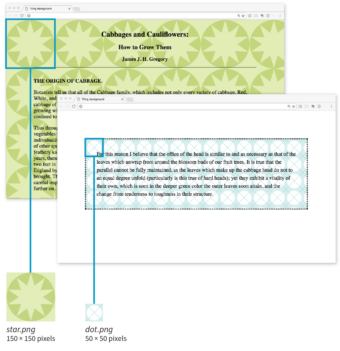
Here you can see the default behavior of background-image. The image starts in the top-left corner and tiles horizontally and vertically until the entire element is filled (although you’ll learn how to change that in a moment). Like background colors, tiling background images fill the area behind the content area, fill the extra padding space around the content, and extend to the outer edge of the border (if there is one). You can change the background painting area with the background-clip property.
If you provide both a background-color and a background-image to an element, the image is placed on top of the color. In fact, it is recommended that you do provide a backup color that is similar in hue, in the event that the image fails to download.
Now you can try your hand at adding a tiling background image to a page in Exercise 13-2.
As we saw in Figure 13-18, images tile left and right, up and down, when left to their own devices. You can change this behavior with the background-repeat property.
background-repeat
Values: repeat | no-repeat | repeat-x | repeat-y | space | round
Default: repeat
Applies to: all elements
Inherits: no
If you want a background image to appear just once, use the no-repeat keyword value:
body { background-image: url(star.png); background-repeat: no-repeat;}
You can also restrict the image to tiling only horizontally (repeat-x) or vertically (repeat-y), as shown in these examples:
body { background-image: url(star.png); background-repeat: repeat-x;}body { background-image: url(star.png); background-repeat: repeat-y;}
Figure 13-20 shows examples of each of these keyword values. Notice that in all the examples, the tiling begins in the top-left corner of the element (or browser window when an image is applied to the body element). In the next section, I’ll show you how to change that.
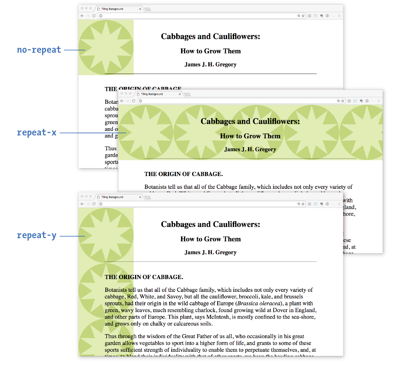
The remaining keyword values, space and round, attempt to fill the available background painting area an even number of times.
When background-repeat is set to space, the browser calculates how many background images can fit across the width and height of the background area, then adds equal amounts of space between each image. The result is even rows and columns and no clipped images (Figure 13-21).
The round keyword makes the browser squish the background image horizontally and vertically (not necessarily proportionally) to fit in the background area an even number of times (Figure 13-21).
Internet Explorer 8 and earlier do not support the and keywords for .
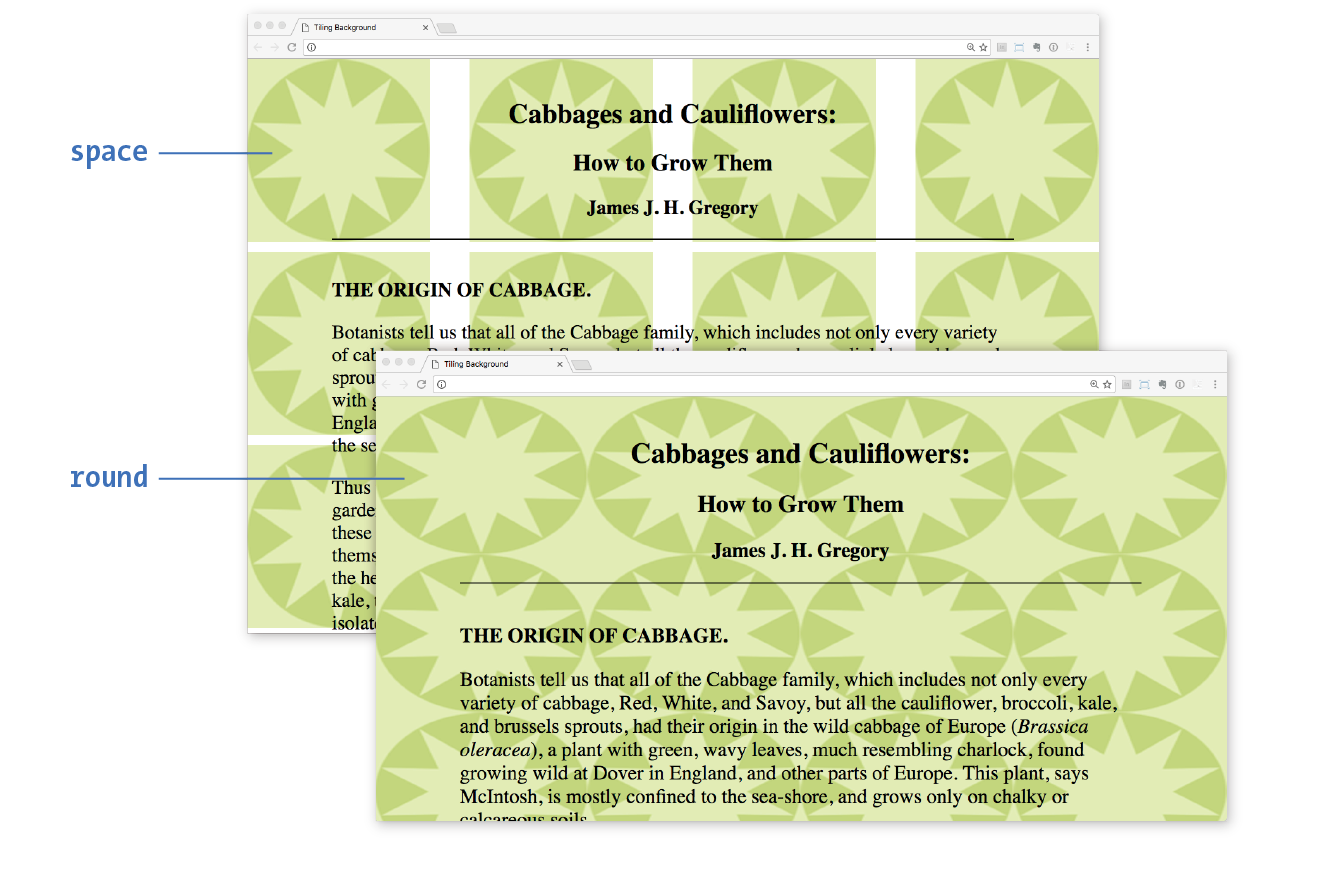
Let’s try out some background repeating patterns in Exercise 13-3.
The background-position property specifies the position of the origin image in the background. You can think of the origin image as the first image that is placed in the background from which tiling images extend. Here is the property and its various values.
background-position
Values: length measurement | percentage | left | center | right | top | bottom
Default: 0% 0% (same as left top)
Applies to: all elements
Inherits: no
To position the origin image, provide horizontal and vertical values that describe where to place it. There are a variety of ways to do it.
Keyword positioning
The keyword values (left, right, top, bottom, and center) position the origin image relative to the outer edges of the element’s padding. For example, left positions the image all the way to the left edge of the background area. The default origin position corresponds to left top.
Keywords are typically used in pairs, as in these examples:
background-position: left bottom; background-position: right center;
The keywords may appear in any order. If you provide only one keyword, the missing keyword is assumed to be center. Thus, background-position: right has the same effect as background-position: right center.
Length measurements
Specifying position using length measurements such as pixels or ems indicates an amount of offset from the top-left corner of the element to the top-left corner of the background origin image. When you are providing length values, the horizontal measurement always goes first. Specifying negative values is allowed and causes the image to hang outside the visible background area.
This example positions the top-left corner of the image 200 pixels from the left edge and 50 pixels down from the top edge of the element (or more specifically, the padding edge by default):
background-position: 200px 50px;
When you are providing length or percentage values, the horizontal measurement always goes first.
Percentages
Percentage values are provided in horizontal/vertical pairs, with 0% 0% corresponding to the top-left corner and 100% 100% corresponding to the bottom-right corner. As with length values, the horizontal measurement always goes first.
It is important to note that the percentage value applies to both the canvas area and the image itself. A horizontal value of 25% positions the point 25% from the left edge of the image at a point that is 25% from the left edge of the background positioning area. A vertical value of 100% positions the bottom edge of the image at the bottom edge of the positioning area.
background-position: 25% 100%;
As with keywords, if you provide only one percentage, the other is assumed to be 50% (centered).
Figure 13-23 shows the results of each of the aforementioned background-position examples with the background-repeat set to no-repeat for clarity. It is possible to position the origin image and let it tile from there, in both directions or just horizontally or vertically. When the image tiles, the position of the initial image might not be obvious, but you can use background-position to make a tile pattern start at a point other than the left edge of the image. This might be used to keep a background pattern centered and symmetrical.
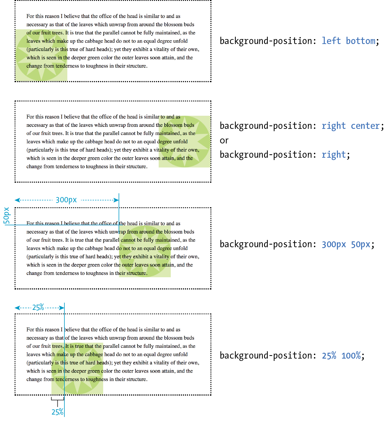
Notice in Figure 13-23 that when the origin image was placed in the corner of an element, it was placed inside the border (only repeated images extend under the border to its outer edge). This is the default position, but you can change it with the background-origin property.
is not supported by Internet Explorer 8 and earlier.
background-origin
Values: border-box | padding-box | content-box
Default: padding-box
Applies to: all elements
Inherits: no
This property defines the boundaries of the background positioning area in the same way background-clip defined the background painting area. You can set the boundaries to the border-box (so the origin image is placed under the outer edge of the border, padding-box (outer edge of the padding, just inside the border), or content-box (the actual content area of the element). These terms will become more meaningful once you get more familiar with the box model in the next chapter. In the meantime, Figure 13-24 shows the results of each of the keyword options.
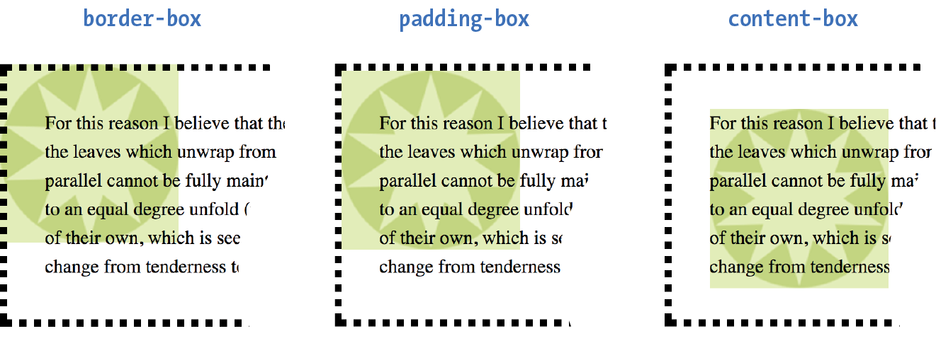
Before we move on to the remaining background properties, check out Exercise 13-4 to get a feel for background positioning.
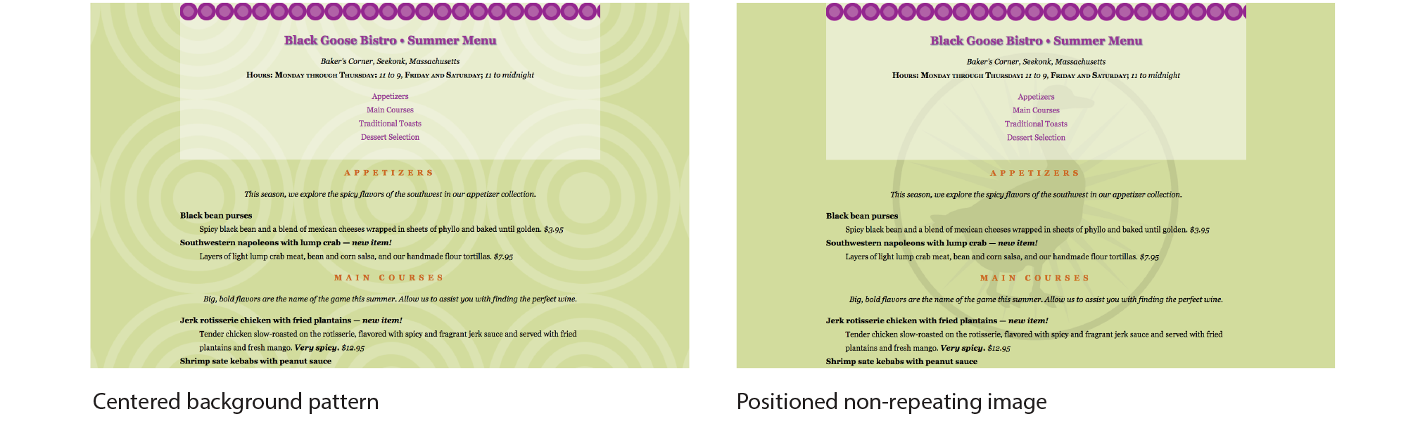
In the previous exercise, I asked you to scroll the page and watch what happens to the background image. As expected, it scrolls along with the document and off the top of the browser window, which is its default behavior. However, you can use the background-attachment property to free the background from the content and allow it to stay fixed in one position while the rest of the content scrolls.
background-attachment
Values: scroll | fixed | local
Default: scroll
Applies to: all elements
Inherits: no
With the background-attachment property, you have the choice of whether the background image scrolls with the content or stays in a fixed position. When an image is fixed, it stays in the same position relative to the viewport of the browser (as opposed to being relative to the element it fills). You’ll see what I mean in a minute (and you can try it yourself in Exercise 13-5).
In the following example, a large, non-tiling image is placed in the background of the whole document (the body element). By default, when the document scrolls, the image scrolls too, moving up and off the page, as shown in Figure 13-26. However, if you set the value of background-attachment to fixed, it stays where it is initially placed, and the text scrolls up over it.
body { background-image: url(images/bigstar.gif); background-repeat: no-repeat; background-position: center 300px; background-attachment: fixed; }
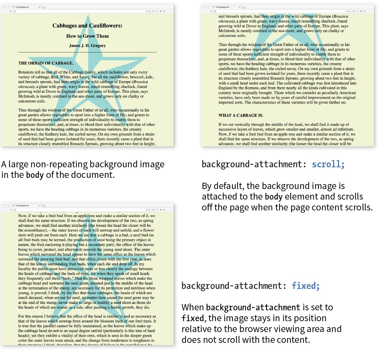
The local value, which was added in CSS3, is useful when an element has its own scrolling mechanism. Instead of scrolling with the viewport’s scroller, local makes the background image fixed to the content of the scrolling element. This keyword is not supported in IE8 and earlier and may also be problematic on mobile browsers.
body { background-image: url(images/blackgoose.png); background-repeat: no-repeat; background-position: center 100px; background-attachment: fixed;}
OK, we have just one more background image property to cover before we wrap it all up with the background shorthand property. So far, the background images we’ve seen are displayed at the actual size of the image itself. You can change the size of the image by using the background-size property.
background-size
Values: length | percentage | auto | cover | contain
Default: auto
Applies to: all elements
Inherits: no
There are several ways to specify the size of the background image. Perhaps the most straightforward is to specify the dimensions in length units such as pixels or ems. As usual, when two values are provided, the first one is used as the horizontal measurement. If you provide just one value, it is used as the horizontal measurement, and the vertical value is set to auto.
This example resizes the target.png background image, which has an intrinsic size of 300 pixels by 300 pixels (Figure 13-27):
header { background-image: url(images/target.png); background-size: 600px 150px;}
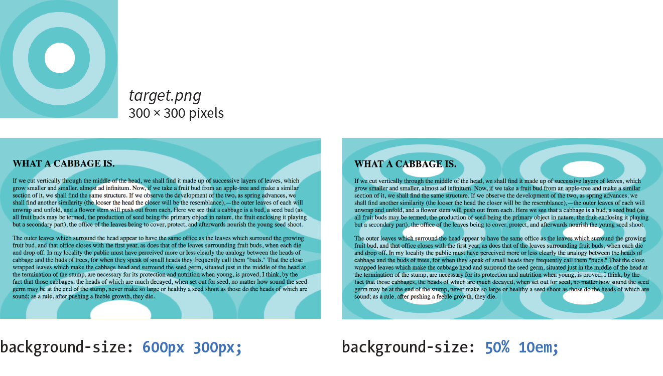
Percentage values are calculated based on the background positioning area, which by default runs to the inside edge of the border, but may have been altered with background-origin—something to keep in mind. So a horizontal value of 50% does not make the image half its width; rather, it sizes it to 50% of the width of the positioning area (Figure 13-27). Again, the horizontal value goes first. It is OK to mix percentage and length values, as shown in this example:
header { background-image: url(images/target.png); background-size: 50% 10em;}
When sizing a bitmapped image such as a GIF or PNG larger, you run the risk that it will end up blurry and pixelated. Use background sizing with care.
The auto keyword resizes the image in whatever direction is necessary to maintain its proportions. Bitmapped images such as GIF, JPEG, and PNG have intrinsic proportions, so they will always stay proportional when one sizing value is set to auto. Some images, such as SVG and CSS gradients, don’t have intrinsic proportions. In that case, auto sets the width or height to 100% of the width or height of the background positioning area.
The cover and contain keywords are interesting additions in CSS3. When you set the background size to cover, the browser resizes a background image large enough to reach all the sides of the background positioning area. There will be only one image because it fills the whole element, and it is likely that portions of the image will fall outside the positioning area if the proportions of the image and the positioning area do not match (Figure 13-28).
By contrast, contain sizes the image just large enough to fill either the width or the height of the positioning area (depending on the proportions of the image). The whole image will be visible and “contained” within the background area (Figure 13-28). If there is leftover space, the background image repeats unless background-repeat is set to no-repeat.
div#A { background-image: url(target.png); background-size: cover; } div#B { background-image: url(target.png); background-size: contain; }
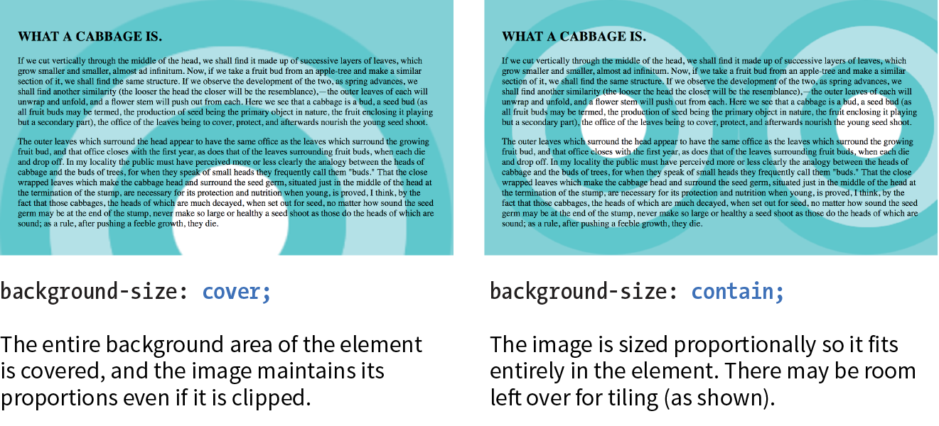
You can use the handy background property to specify all of your background styles in one declaration.
background
Values: background-color background-image background-repeat background-attachment background-position background-clip background-origin background-size
Default: see individual properties
Applies to: all elements
Inherits: no
The value of the background property is a list of values that would be provided for the individual background properties previously listed. For example, this one background rule
body { background: white url(star.png) no-repeat right top fixed; }
replaces this rule with five separate declarations:
body { background-color: white; background-image: url(star.png); background-repeat: no-repeat; background-position: right top; background-attachment: fixed;}
All of the property values for background are optional and may appear in any order. The only restriction is that when you are providing the coordinates for the background-position property, the horizontal value must appear first, immediately followed by the vertical value. As with any shorthand property, be aware that if any value is omitted, it will be reset to its default value. See the “Watch Out for Overrides” sidebar.
In Exercise 13-6, you can convert your long-winded background properties to a single declaration with background.
body { font-family: Georgia, serif; font-size: 100%; line-height: 175%; margin: 0 15%; background: #d2dc9d url(images/blackgoose.png) no-repeat center 100px fixed;}
CSS3 introduced the ability to apply multiple background images to a single element. To apply multiple values for background-image, put them in a list separated by commas. Additional background-related property values also go in comma-separated lists; the first value listed applies to the first image, the second value to the second, and so on.
Although CSS declarations usually work on a “last one wins” rule, for multiple background images, whichever is listed last goes on the bottom, and each image prior in the list layers on top of it. You can think of them like Photoshop layers in that they get stacked in the order in which they appear in the list. Put another way, the image defined by the first value will go in front, and others line up behind it, in the order in which they are listed.
body { background-image: url(image1.png), url(image2.png), url(image3.png); background-position: left top, center center, right bottom; background-repeat: no-repeat, no-repeat, no-repeat; …}
Alternatively, you can take advantage of the background shorthand property to make the rule simpler. Now the background property has three value series, separated by commas:
body { background: url(image1.png) left top no-repeat,
url(image2.png) center center no-repeat,
url(image3.png) right bottom no-repeat;
}
Figure 13-29 shows the result. The big, orange 1 is positioned in the top-left corner, the 2 is centered vertically and horizontally, and the 3 is in the bottom-right corner. All three background images share the background positioning area of one body element. Try it out for yourself in Exercise 13-7.
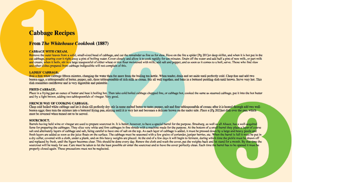
Internet Explorer 8 and earlier do not support multiple background images and will entirely ignore any background declaration with more than one value. The fix is to choose one for the element as a fallback for IE and other non-supporting browsers, and then specify the multiple rules that override it:
body {/* for non-supporting browsers */ background: url(image_fallback.png) top left no-repeat /* multiple backgrounds */background: url(image1.png) left top no-repeat, url(image2.png) center center no-repeat, url(image3.png) right bottom no-repeat;/* background color */background-color: papayawhip; }
header { … background: url(images/purpledot.png) center top repeat-x; background: url(images/purpledot.png) left top repeat-y, url(images/purpledot.png) right top repeat-y, url(images/gooseshadow.png) 90% bottom no-repeat; background-color: rgba(255,255,255,.5);}

A gradient is a transition from one color to another, sometimes through multiple colors. In the past, the only way to put a gradient on a web page was to create one in an image-editing program and add the resulting image with CSS.
Now we can specify color gradients by using CSS notation alone, leaving the task of rendering color blends to the browser. Although they are specified with code, gradients are images. They just happen to be generated on the fly. A gradient image has no intrinsic size or proportions; the size matches the element it gets applied to. Gradients can be applied anywhere an image may be applied: background-image, border-image, and list-style-image. We’ll stick with background-image examples in this chapter.
Gradients are images that browsers generate on the fly. Use them as you would use a background image.
There are two types of gradients:
The linear-gradient() notation provides the angle of the gradient line and one or more points along that line where the pure color is positioned (color stops). You can use color names or any of the numerical color values discussed earlier in the chapter, including transparency. The angle of the gradient line is specified in degrees (ndeg) or with keywords. With degrees, 0deg points upward, and positive angles go around clockwise so that 90deg points to the right. Therefore, if you want to go from aqua on the top edge to green on the bottom edge, set the rotation to 180deg:
background-image: linear-gradient(180deg, aqua, green);
The keywords describe direction in increments of 90° (to top, to right, to bottom, to left). Our 180deg gradient could also be specified with the to bottom keyword. The result is shown in Figure 13-31 (top):
background-image: linear-gradient(to bottom, aqua, green);
You can use the “to” syntax to point to corners as well. The following gradient would be drawn from the bottom-left corner to the top-right corner. The resulting angle of a gradient drawn between corners is determined by the aspect ratio of the box.
background-image: linear-gradient(to top right, aqua, green);
In the following example, the gradient now goes from left to right (90deg) and includes a third color, orange, which appears 25% of the way across the gradient line (Figure 13-31, middle). You can see that the placement of the color stop is indicated after the color value. You can use percentages or any length measurement. The first and last color stops don’t require positions because they are set to 0% and 100%, respectively, by default.
background-image: linear-gradient(90deg, yellow, orange 25%, purple);
You certainly aren’t limited to right angles. Specify any degree you like to make the linear gradient head in that direction. You can also specify as many colors as you like. If no positions are specified, the colors are spaced evenly across the length of the gradient line. If you position the last color stop short of the end of the gradient line (such as the blue at 50% in this example), the last color continues to the end of the gradient line (Figure 13-31, bottom):
background-image: linear-gradient(54deg, red, orange, yellow, green, blue 50%);
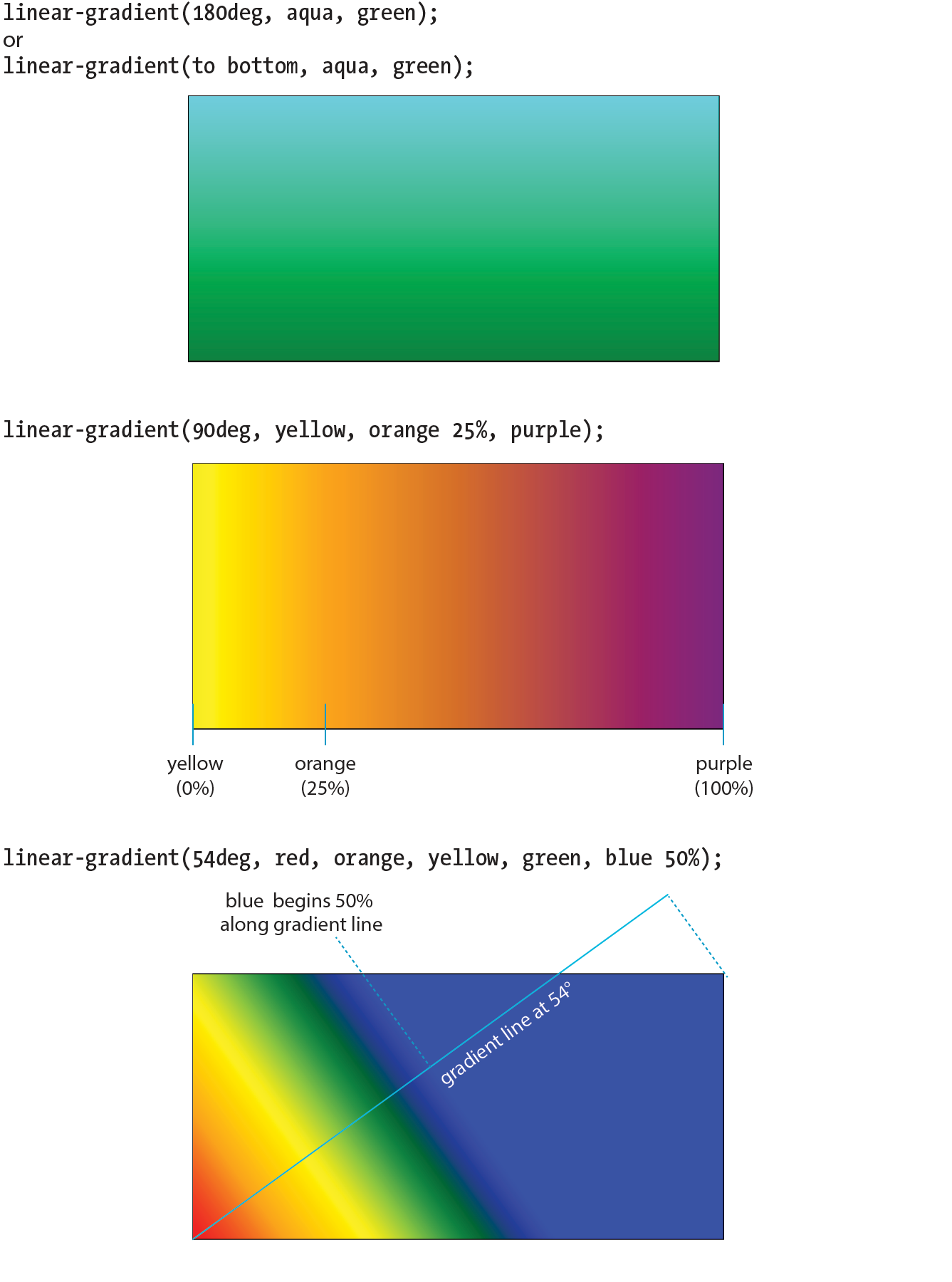
These examples are pretty garish, but if you choose your colors and stops right, gradients are a nice way to give elements subtle shading and a 3-D appearance. The button in Figure 13-32 uses a background gradient to achieve a 3-D look without graphics.
a.button-like { background: linear-gradient(to bottom, #e2e2e2 0%, #dbdbdb 50%, #d1d1d1 51%, #fefefe 100%);}
That concludes our quick-and-dirty tour of linear gradients. You should know that I really only scratched the surface of linear gradient behavior and possibilities, so you may want to check out the resources in the “Further Reading” sidebar. It’s time to move on to radial gradients.
Radial gradients, like the name says, radiate out from a point in a circle along a gradient ray (like a gradient line, but it always points outward from the center). At minimum, a radial gradient requires two color stops, as shown in this example:
background-image: radial-gradient(yellow, green);
By default, the gradient fills the available background area, and its center is positioned in the center of the element (Figure 13-33). The result is an ellipse if the containing element is a rectangle and a circle if the element is square.

That looks pretty spiffy already, but you don’t have to settle for the default. The radial-gradient() notation allows you to specify the shape, size, and center position of the gradient:
Shape
In most cases, the shape of the radial gradient will result from the shape of the element or an explicit size you apply to it, but you can also specify the shape by using the circle or ellipse keywords. When you make a gradient a circle (without conflicting size specifications), it stays circular even when it is in a rectangular element (Figure 13-34, top).
background-image: radial-gradient(circle, yellow, green);
Size
The size of the radial gradient can be specified in length units or percentages, which apply to the gradient ray, or with keywords. If you supply just one length, it is used for both width and height, resulting in a circle. When you provide two lengths, the first one is the horizontal measurement and the second is vertical (Figure 13-34, middle). For ellipses, you can provide percentage values as well, or mix percentages with length values.
background-image: radial-gradient(200px 80px, aqua, green);
There are also four keywords—closest-side, closest-corner, farthest-side, and farthest-corner—that set the length of the gradient ray relative to points on the containing element.
Position
By default, the center of the gradient is positioned at center center, but you can change that by using the positioning syntax we covered for the background-position property. The syntax is the same, but it should be preceded by the at keyword, as in this example (Figure 13-34, bottom). Notice that in this example, I have included an additional color stop of orange at the 50% mark.
background-image: radial-gradient(farthest-side at right bottom, yellow, orange 50%, purple);
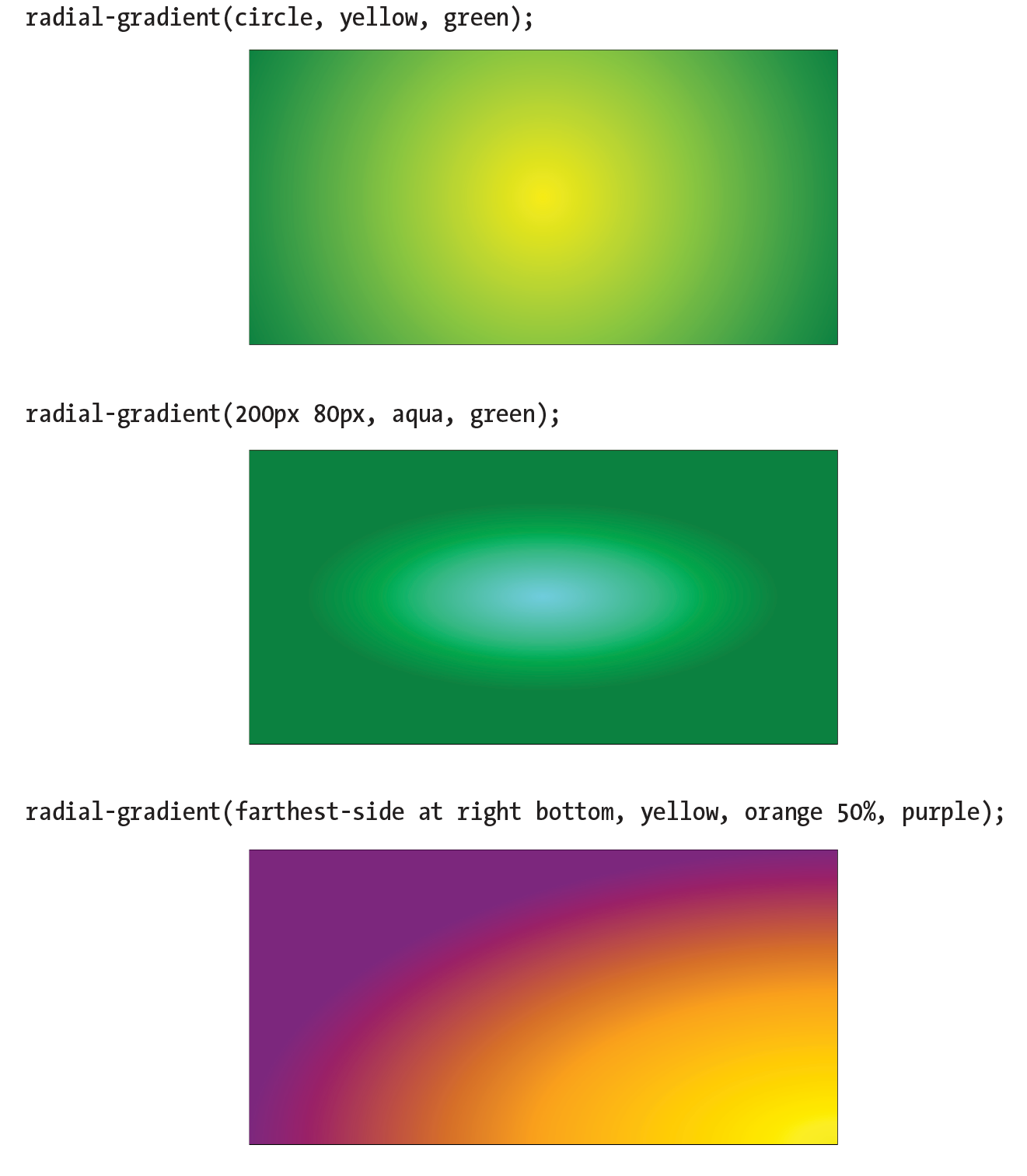
If you’d like your gradient pattern to repeat, use the repeating-linear-gradient() or repeating-radial-gradient() notation. The syntax is the same as for single gradients, but adding “repeating-” causes the pattern to repeat the color stops infinitely in both directions. This is commonly used to create interesting striped patterns. In this simple example, a gradient from white to silver (light gray) repeats every 30 pixels because the silver color stop is set to 30px (Figure 13-35, top):
background: repeating-linear-gradient(to bottom, white, silver 30px);
This example makes a diagonal pattern of orange and white stripes (Figure 13-35, bottom). The edges are sharp because the white stripe starts at exactly the point where the orange one ends (at 12px) with no fading:
background: repeating-linear-gradient(45deg, orange, orange 12px, white 12px, white 24px);
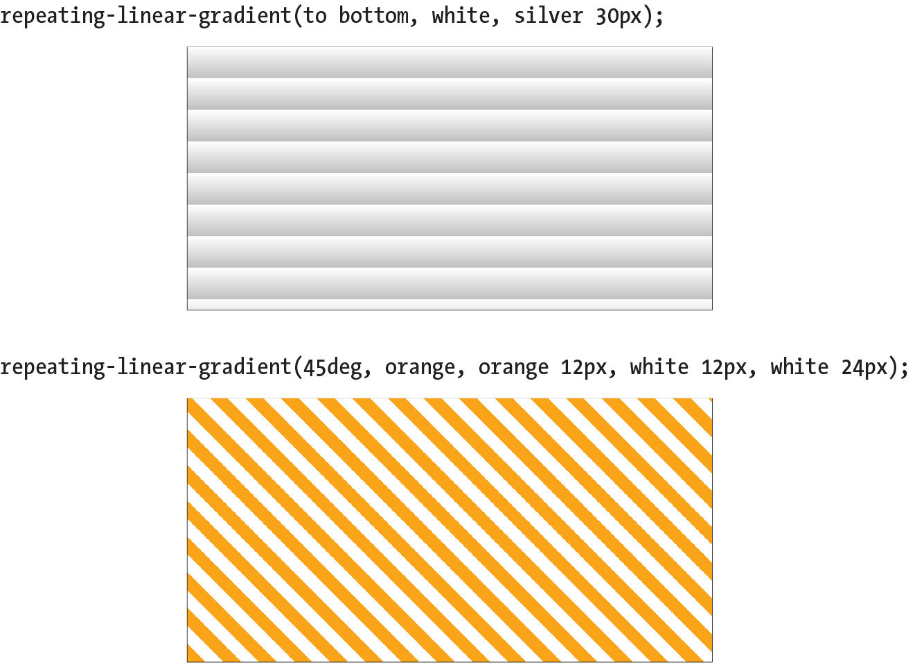
All of the major browsers started adding support for the standard gradient syntax between 2012 and 2013 (see Browser Support Note), so they’ve been reliable for a good number of years. However, if you need to support older browsers, you can do so using each browser’s proprietary gradient syntax with a vendor prefix (see the “Vendor Prefixes” sidebar). For Internet Explorer 9 and earlier, you can use its proprietary filter function. Or, go the progressive enhancement route and use a solid color as a fallback.
Standard gradient syntax is supported in Internet Explorer 10+, Edge, Firefox 16+, Chrome 26+, Safari 6.1+, iOS 7.1+, and Android 4.4+.
The following example shows the yellow-to-green linear gradient written to address every browser, past and present, with the Internet Explorer filter equivalent thrown in for good measure. Notice that there are differences in syntax. Where the CSS3 spec uses the to bottom keyword, most of the others use top. A very old version used by WebKit browsers used –webkit-gradient for both linear and radial gradients, but it was quickly replaced with separate functions. Another difference not evident in this example is that in the old syntax, 0deg pointed to the right edge, not to the top edge as was standardized in CSS3, and the angles increased counterclockwise.
This is a serious chunk of code for a single gradient, and thankfully, we are very close to this no longer being necessary:
background: #ffff00; /* Old browsers */ background:-moz-linear-gradient(top, #ffff00 0%, #00ff00 100%); /* FF3.6+ */ background:-webkit-gradient(linear, left top, left bottom, color-stop(0%,#ffff00), color-stop(100%,#00ff00)); /* Chrome,Safari4+ */ background:-webkit-linear-gradient(top, #ffff00 0%,#00ff00 100%); /* Chrome10+,Safari5.1+ */ background:-o-linear-gradient(top, #ffff00 0%,#00ff00 100%); /* Opera 11.10+ */ background:-ms-linear-gradient(top, #ffff00 0%,#00ff00 100%); /* IE10+ */
background: linear-gradient(to bottom, #ffff00 0%,#00ff00 100%); /* W3C Standard */
filter: progid:DXImageTransform.Microsoft.gradient( startColorstr='#ffff00', endColorstr='#00ff00',GradientType=0 ); /* IE6-9 */
In upcoming chapters, whenever a property requires vendor prefixes, I will be sure to note it. Otherwise, you can assume that the standard CSS is all you need.
That last code example was a doozy! Vendor prefixes aside, just the task of describing gradients can be daunting. Although it is not impossible to write the code by hand, I recommend you do what I do—use an online gradient tool. One option is the Ultimate CSS Gradient Generator from Colorzilla (www.colorzilla.com/gradient-editor/), shown in Figure 13-36. Simply enter as many color stops as you’d like, slide the sliders around until you get the look you want, and then copy the code. That’s exactly what I did to get the example we just looked at. The CSS Gradient Generator by Virtuosoft is another fine option that also includes support for repeating gradients (www.virtuosoft.eu/tools/css-gradient-generator/).
If you want your mind blown, take a look at the wild background patterns made with gradients assembled by Lea Verou in her CSS3 Patterns Gallery (lea.verou.me/css3patterns) (Figure 13-37). It’s inspirational, and you can take a peek at the code used to create them.
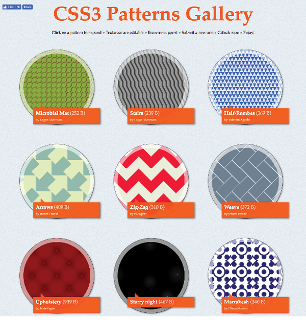
Back in Appendix 11, Introducing Cascading Style Sheets I told you that there are three ways to connect style sheets to an HTML document: inline with the style attribute, embedded with the style element, and as an external .css document linked to or imported into the document. In this section, we finally get to that third option.
External style sheets are by far the most powerful way to use CSS because you can make style changes across an entire site simply by editing a single style sheet document. That is the advantage to having all the style information in one place, and not mixed in with the document source.
Furthermore, because a single style document is downloaded and cached by the browser for the whole site, there is less code to download with every document, resulting in better performance.
First, a little bit about the style sheet document itself. An external style sheet is a plain-text document with at least one style sheet rule. It may not include any HTML tags (there’s no reason to include them, anyway). It may contain comments, but they must use the CSS comment syntax that you’ve seen already:
/*This is the end of the section*/
The style sheet should be named with the .css suffix (there are some exceptions to this rule, but you’re unlikely to encounter them as a beginner). It may also begin with the @charset at-rule to declare the character encoding, although you really need to do that only if you are using an encoding other than UTF-8. If you use @charset, it must be the first element in the style sheet, with no characters, including comments or style rules, preceding it.
Figure 13-38 shows how a short style sheet document looks in my text editor.
There are two ways to apply an external style sheet: the link element and an @import rule. Let’s look at both of these attachment methods.
The link element defines a relationship between the current document and an external resource. By far, its most popular use is to link to style sheets. The link element goes in the head of the document, as shown here:
<head> <title>Titles are required.</title> <link rel="stylesheet" href="/path/stylesheet.css"></head>
You need to include two attributes in the link element:
rel="stylesheet"
Defines the linked document’s relation to the current document. The value of the rel attribute is always stylesheet when you are linking to a style sheet.
href="url"
Provides the location of the .css file.
You can include multiple link elements to different style sheets, and they’ll all apply. If there are conflicts, whichever one is listed last will override previous settings, because of the rule order and the cascade.
The other method for attaching an external style sheet to a document is to import it with an @import rule. The @import at-rule is another type of rule you can add to a style sheet, either in an external .css style sheet document, or right in the style element, as shown in the following example:
<head> <style> @import url("/path/stylesheet.css"); p { font-face: Verdana;} </style> <title>Titles are required.</title></head>
In this example, a relative URL is shown, but it could also be an absolute URL (beginning with http://). The @import rule must go at the beginning of the style sheet before any selectors. You can import more than one style sheet, and they all will apply, but rules from the last style sheet listed take precedence over earlier ones.
You can also limit a style sheet’s import to specific media types (such as screen, print, or projection, to name a few) or viewing environments (orientation, screen size, etc.) using media queries. Media queries are a method for applying styles based on the medium used to display the document. They appear after the @import rule in a comma-separated list. For example, if you have created a style sheet that should be imported and used only when the document is printed, use this rule:
@import url(print_styles.css) print;
Or to serve a special style sheet just for small devices, you could also query the viewport:
@import url(small_device.css) screen and (max-width: 320px;);
We’ll talk a lot more about media queries in Appendix 17, Responsive Web Design, but I mention them here as they are relevant to importing style sheets.
You can try both the link and @import methods in Exercise 13-8.
Because you can compile information from multiple external style sheets, modular style sheets have become a popular technique for style management. Many developers keep styles they frequently reuse—such as typography treatments, layout rules, or form-related styles—in separate style sheets, then combine them in mix-and-match fashion using @import rules. Again, the @import rules need to go before rules that use selectors.
Here’s an example of a style sheet that imports multiple external style sheets:
/* basic typography */ @import url("type.css"); /* form inputs */ @import url("forms.css"); /* navigation */ @import url("list-nav.css"); /* site-specific styles */ body { background: orange; } /* more style rules */
This is a good technique to keep in mind as you build experience in creating sites. You’ll find that there are some solutions that work well for you, and it is nice not to have to reinvent the wheel for every new site. Modular style sheets are a good time-saving and organizational device; however, they can be a problem for performance and caching.
If you use this method, it is recommended that you compile all of the styles into a single document before delivering them to a browser. Not to worry, you don’t need to do it manually; there are tools out there that will do it for you. The LESS and Sass CSS preprocessors (which will be formally introduced in Chapter 20) are just two tools that offer compiling functionality.
We’ve covered a lot of ground (or background, to be more accurate) in this chapter. We looked at ways to set the foreground and background colors for an element by using various numeric systems and color names. We looked at options for adjusting the level of transparency with the opacity property and RGBa, and HSLa color spaces. We spent a long time exploring the various ways to add a background image and adjust how it repeats, where the origin image is placed, and how it is sized. We saw how linear and radial gradients can be used as background images as well. Along the way, you picked up pseudo-class, pseudo-element, and attribute selectors and looked at ways to attach external style sheets. I think that’s enough for one chapter! See how much you remember with this little quiz.
This time I’ll test your background prowess entirely with matching and multiple-choice questions. Answers appear in Appendix A.
a. #FFFFFF
b. #FFF
c. rgb(255, 255, 255)
d. rgb(FF, FF, FF)
e. white
f. rgb(100%, 100%, 100%)
a. | 1. Links that have already been clicked |
b. | 2. An element that is highlighted and ready for input |
c. | 3. An element that is the first child element of its parent |
d. | 4. A link with the mouse pointer over it |
e. | 5. Links that have not yet been visited |
f. | 6. A link that is in the process of being clicked |
body { background-image: url(graphic.gif);}p { background-image: url(graphic.gif); background-repeat: no-repeat; background-position: 50% 0%;}body { background-image: url(graphic.gif);
background-repeat: repeat-x;}p { background: url(graphic.gif) no-repeat right center;}body { background-image: url(graphic.gif); background-repeat: repeat-y; }body { background: url(graphic.gif) no-repeat right center;}Here is a summary of the properties covered in this chapter, in alphabetical order.
In this chapter
The parts of an element box
Setting box dimensions
Padding
Borders
Outlines
Margins
Assigning display roles
Adding a drop shadow
In Chapter 11, Introducing Cascading Style Sheets I described the box model as one of the fundamental concepts of CSS. According to the box model, every element in a document generates a box to which properties such as width, height, padding, borders, and margins can be applied. You probably already have a feel for how element boxes work from adding backgrounds to elements. This chapter covers all the box-related properties, beginning with an overview of the components of an element box, and then taking on the box properties from the inside out: content dimensions, padding, borders, and margins.
As we’ve seen, every element in a document, both block-level and inline, generates a rectangular element box. The components of an element box are diagrammed in Figure 14-1. Pay attention to the new terminology—it will be helpful in keeping things straight later in the chapter.
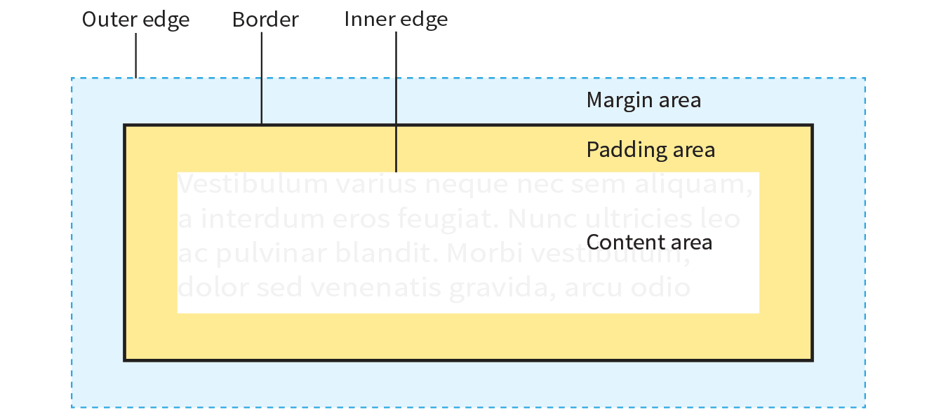
Content area
At the core of the element box is the content itself. In Figure 14-1, the content area is indicated by a white box.
Inner edges
The edges of the content area are referred to as the inner edges of the element box. Although the inner edges are made distinct by a color change in Figure 14-1, in real pages, the edge of the content area is invisible.
Padding
The padding is the area between the content area and an optional border. In the diagram, the padding area is indicated by a yellow-orange color. Padding is optional.
Border
The border is a line (or stylized line) that surrounds the element and its padding. Borders are also optional.
Margin
The margin is an optional amount of space added on the outside of the border. In the diagram, the margin is indicated with light-blue shading, but in reality, margins are always transparent, allowing the background of the parent element to show through.
Outer edge
The outside edges of the margin area make up the outer edges of the element box. This is the total area the element takes up on the page, and it includes the width of the content area plus the total amount of padding, border, and margins applied to the element. The outer edge in the diagram is indicated with a dotted line, but in real web pages, the edge of the margin is invisible.
The amount of space taken up by an element on the page includes the content plus the total amount of padding, borders, and margins applied to the element.
All elements have these box components; however, as you will see, some properties behave differently based on whether the element is block or inline. In fact, we’ll see some of those differences right away as we look at box dimensions.
width
Values: length | percentage | auto
Default: auto
Applies to: block-level elements and replaced inline elements (such as images)
Inherits: no
height
Values: length | percentage | auto
Default: auto
Applies to: block-level elements and replaced inline elements (such as images)
Inherits: no
box-sizing
Values: content-box | border-box
Default: content-box
Applies to: all elements
Inherits: no
By default, the width and height of a block element are calculated automatically by the browser (thus the default auto value). The box will be as wide as the browser window or other containing block element, and as tall as necessary to fit the content. However, you can use the width and height properties to make the content area of an element a specific width or height.
Unfortunately, setting box dimensions is not as simple as just dropping those properties in your style sheet. You have to know exactly which part of the element box you are sizing.
There are two ways to specify the size of an element. The default method—introduced way back in CSS1—applies the width and height values to the content box. That means that the resulting size of the element will be the dimensions you specify plus the amount of padding and borders that have been added to the element. The other method—introduced as part of the box-sizing property in CSS3—applies the width and height values to the border box, which includes the content, padding, and border. With this method, the resulting visible element box, including padding and borders, will be exactly the dimensions you specify. We’re going to get familiar with both methods in this section.
The major browsers began supporting the property in 2011 and 2012. For browsers released prior to that (Chrome <10, Safari <5.1, Safari iOS <5.1, or Android <4.3), there is the prefixed version , but at this point, the prefix is considered no longer necessary. Internet Explorer 6 and 7 do not support at all, but they are fairly extinct.
Regardless of the method you choose, you can specify the width and height only for block-level elements and non-text inline elements such as images. The width and height properties do not apply to inline text (non-replaced) elements and are ignored by the browser. In other words, you cannot specify the width and height of an anchor (a) or strong element (see Note).
By default (that is, if you do not include a box-sizing rule in your styles), the width and height properties are applied to the content box. That is the way all current browsers interpret width and height values, but you can explicitly specify this behavior by setting box-sizing: content-box.
In the following example and in Figure 14-2, a simple box is given a width of 500 pixels and a height of 150 pixels, with 20 pixels of padding, a 5-pixel border, and a 20-pixel margin all around. In the default content box model, the width and height values are applied to the content area only.
p { background: #f2f5d5; width: 500px; height: 150px; padding: 20px; border: 5px solid gray; margin: 20px;}
The resulting width of the visible element box ends up being 550 pixels: the content plus 40px padding (20px left and right) and 10px of border (5px left and right).
Visible element box =
5px + 20px + 500px width + 20px + 5px = 550 pixels
When you throw in 40 pixels of margin, the width of the entire element box is 590 pixels. Knowing the resulting size of your elements is critical to getting layouts to behave predictably.
Element box =
20px + 5px + 20px + 500px width + 20px + 5px + 20px = 590 pixels
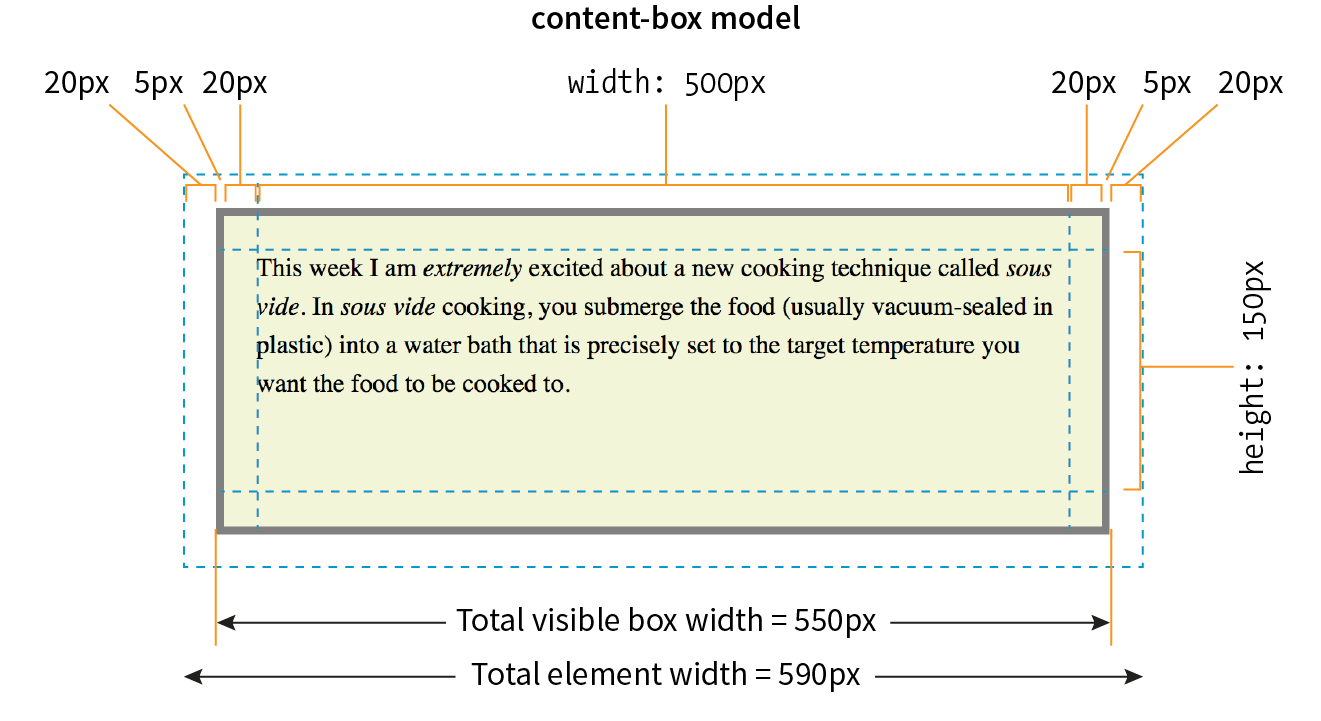
The other way to specify the size of an element is to apply width and height dimensions to the entire visible box, including the padding and border. Because this is not the default browser behavior, you need to explicitly set box-sizing: border-box in the style sheet.
Let’s look at the same paragraph example from the previous section and see what happens when we make it 500 pixels using the border-box method (Figure 14-3). All other style declarations for the box stay the same.
p { … box-sizing: border-box; width: 500px; height: 150px;}
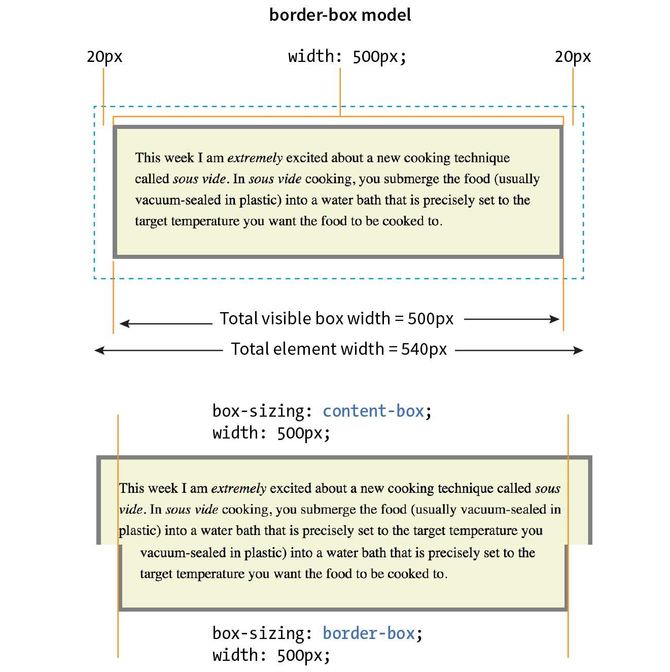
Now the width of the visible box is 500 pixels (compare to 550 pixels in the content-box model), and the total element widh is 540px. Many developers find the border-box model to be a more intuitive way to size elements. It is particularly helpful for specifying widths in percentages, which is a cornerstone of responsive design. For example, you can make two columns 50% wide and know that they will fit next to each other without having to mess around with adding calculated padding and border widths to the mix (although you still need to account for margins).
In fact, many developers simply set everything in the document to use the border-box model by setting it on the root (html) element, then setting all other elements to inherit using the universal selecter (*), like this:
html {box-sizing: border-box;} *, *:before, *:after {box-sizing: inherit;}
For more information on this technique, read Chris Coyier’s article “Inheriting box-sizing Probably Slightly Better Best-Practice” (css-tricks.com/inheriting-box-sizing-probably-slightly-better-best-practice).
The height property works just the same as width. In general practice, it is less common to specify the height of elements. It is more in keeping with the nature of the medium to allow the height to be calculated automatically, allowing the element box to change based on the font size, user settings, or other factors. If you do specify a height for an element containing text, be sure to also consider what happens should the content not fit. Fortunately, CSS gives you some options, as we’ll see in the next section.
When an element is sized too small for its contents, you can specify what to do with the content that doesn’t fit by using the overflow property.
overflow
Values: visible | hidden | scroll | auto
Default: visible
Applies to: block-level elements and replaced inline elements (such as images)
Inherits: no
Figure 14-4 demonstrates the predefined values for overflow. In the figure, the various values are applied to an element that is 150 pixels square. The background color makes the edges of the content area apparent.
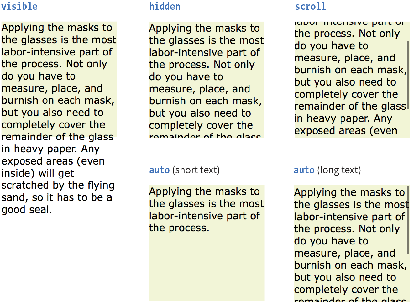
visible
The default value is visible, which allows the content to hang out over the element box so that it all can be seen.
hidden
When overflow is set to hidden, the content that does not fit gets clipped off and does not appear beyond the edges of the element’s content area.
scroll
When scroll is specified, scrollbars are added to the element box to let users scroll through the content. Be aware that they may become visible only when you click the element to scroll it. There is an issue with this value on old iOS (<4), Android (<2.3), and a few other older mobile browsers, so it may be worthwhile to use a simpler alternative to overflow:scroll for mobile.
auto
The auto value allows the browser to decide how to handle overflow. In most cases, scrollbars are added only when the content doesn’t fit and they are needed.
Padding is the space between the content area and the border (or the place the border would be if one isn’t specified). I find it helpful to add padding to elements when using a background color or a border. It gives the content a little breathing room, and prevents the border or edge of the background from bumping right up against the text.
You can add padding to the individual sides of any element (block-level or inline). There is also a shorthand padding property that lets you add padding on all sides at once.
padding-top, padding-right, padding-bottom, padding-left
Values: length | percentage
Default: 0
Applies to: all elements
Inherits: no
padding
Values: length | percentage
Default: 0
Applies to: all elements
Inherits: no
The padding-top, padding-right, padding-bottom, and padding-left properties specify an amount of padding for each side of an element, as shown in this example and Figure 14-5 (note that I’ve also added a background color to make the outer edges of the padding area apparent).
blockquote { padding-top: 2em; padding-right: 4em; padding-bottom: 2em; padding-left: 4em; background-color: #D098D4; /* light green */
}
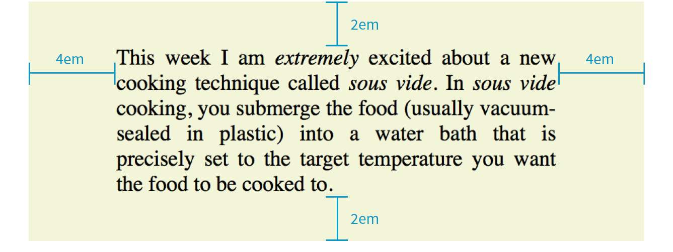
Specify padding in any of the CSS length units (em and px are the most common) or as a percentage of the width of the parent element. Yes, the parent’s width is used as the basis, even for top and bottom padding. If the width of the parent element changes, so will the padding values on all sides of the child element, which makes percentage values somewhat tricky to manage.
As an alternative to setting padding one side at a time, you can use the shorthand padding property to add padding all around the element. The syntax is interesting; you can specify four, three, two, or one value for a single padding property. Let’s see how that works, starting with four values.
When you supply four padding values, they are applied to each side in clockwise order, starting at the top. Some people use the mnemonic device “TRouBLe” for the order Top Right Bottom Left. This is a common syntax for applying shorthand values in CSS, so take a careful look:
padding: top right bottom left;
Using the padding property, we could reproduce the padding specified with the four individual properties in the previous example like this:
blockquote { padding: 2em 4em 2em 4em; background-color: #D098D4;}
If the left and right padding are the same, you can shorten it by supplying only three values. The value for “right” (the second value in the string) will be mirrored and used for “left” as well. It is as though the browser assumes the “left” value is missing, so it just uses the “right” value on both sides. The syntax for three values is as follows:
padding: top right/left bottom;
This rule would be equivalent to the previous example because the padding on both the left and right edges of the element is set to 4em:
blockquote { padding: 2em 4em 2em; background-color: #D098D4;}
Continuing with this pattern, if you provide only two values, the first one is used for the top and the bottom edges, and the second one is used for the left and right edges:
padding: top/bottom right/left;
Again, the same effect achieved by the previous two examples could be accomplished with this rule:
blockquote { padding: 2em 4em; background-color: #D098D4;}
Note that all of the previous examples have the same visual effect as shown in Figure 14-5.
Finally, if you provide just one value, it will be applied to all four sides of the element. This declaration applies 15 pixels of padding on all sides of a div element:
div#announcement { padding: 15px; border: 1px solid;}
Get a feel for adding padding to elements in Exercise 14-1.
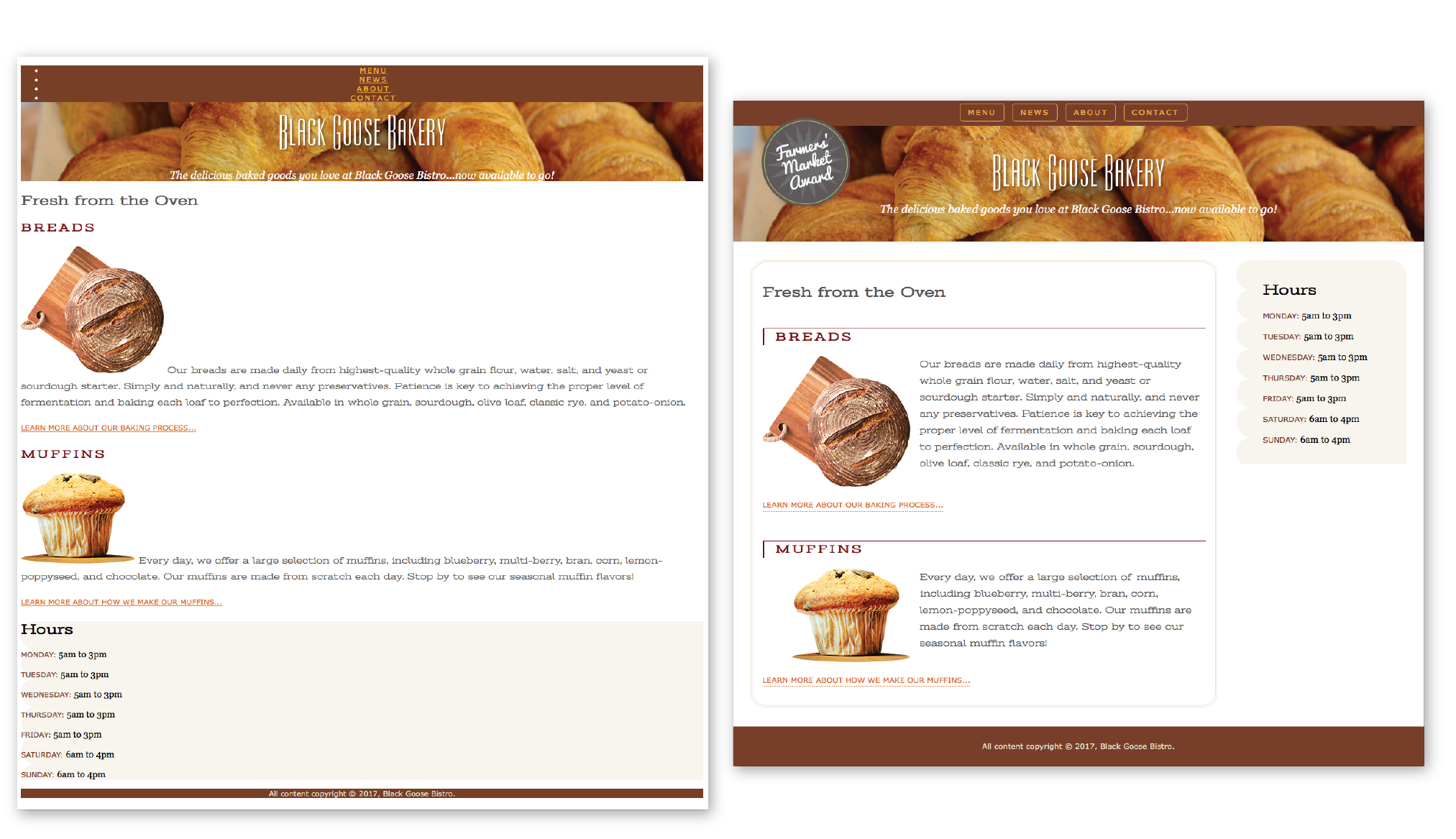
A border is simply a line drawn around the content area and its (optional) padding. You can choose from eight border styles and make them any width and color you like. Borders can be applied all around the element or just on a particular side or sides. CSS3 introduced properties for rounding the corners or applying images to borders. We’ll start our border exploration with the various border styles.
The style is the most important of the border properties because, according to the CSS specification, if there is no border style specified, the border does not exist (the default is none). In other words, you must always declare the style of the border, or the other border properties will be ignored.
Border styles can be applied one side at a time or with the shorthand border-style property.
border-top-style, border-right-style, border-bottom-style, border-left-style
Values: none | solid | hidden | dotted | dashed | double | groove | ridge | inset | outset
Default: none
Applies to: all elements
Inherits: no
border-style
Values: none | solid | hidden | dotted | dashed | double | groove | ridge | inset | outset
Default: none
Applies to: all elements
Inherits: no
The value of the border-style property is one of 10 keywords describing the available border styles, as shown in Figure 14-8. The value hidden is equivalent to none.
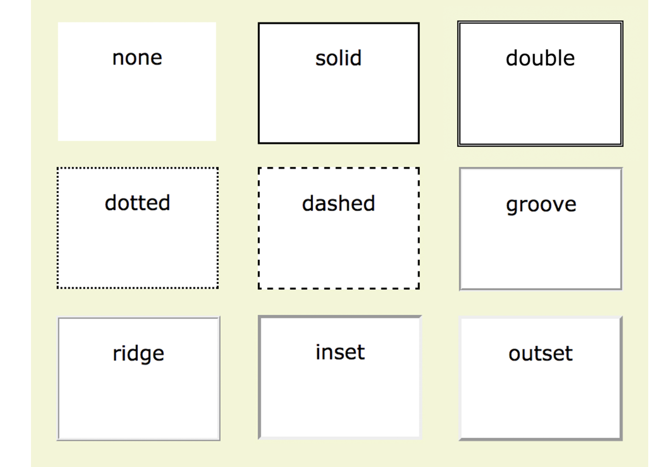
Use the side-specific border style properties (border-top-style, border-right-style, border-bottom-style, and border-left-style) to apply a style to one side of the element. If you do not specify a width, the default medium width will be used. If there is no color specified, the border uses the foreground color of the element (same as the text).
In the following example, I’ve applied a different style to each side of an element to show the single-side border properties in action (Figure 14-9).
div#silly { border-top-style: solid; border-right-style: dashed; border-bottom-style: double; border-left-style: dotted; width: 300px; height: 100px;}
The border-style shorthand property works on the clockwise (TRouBLe) system described for padding earlier. You can supply four values for all four sides or fewer values when the left/right and top/bottom borders are the same. The silly border effect in the previous example could also be specified with the border-style property as shown here, and the result would be the same as shown in Figure 14-9:
border-style: solid dashed double dotted;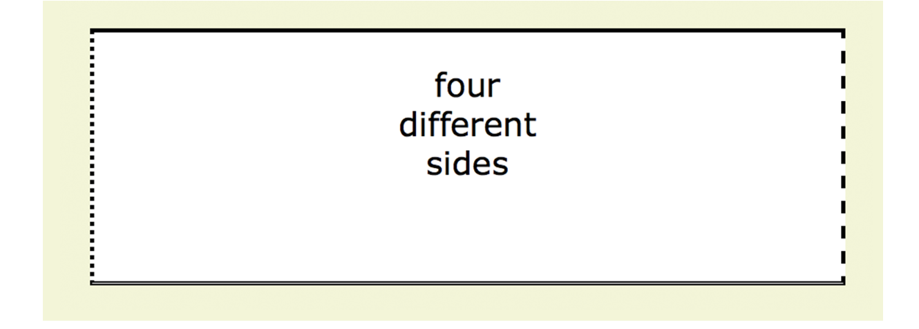
Use one of the border-width properties to specify the thickness of the border. Once again, you can target each side of the element with a single-side property, or specify several sides at once in clockwise order with the shorthand border-width property.
border-top-width, border-right-width, border-bottom-width, border-left-width
Values: length | thin | medium | thick
Default: medium
Applies to: all elements
Inherits: no
border-width
Values: length | thin | medium | thick
Default: medium
Applies to: all elements
Inherits: no
The most common way to specify the width of borders is using a pixel or em measurement; however, you can also specify one of the keywords (thin, medium, or thick) and leave the rendering up to the browser.
I’ve included a mix of values in this example (Figure 14-10). Notice that I’ve also included the border-style property because if I didn’t, the border would not render at all:
div#help { border-top-width: thin; border-right-width: medium; border-bottom-width: thick; border-left-width: 12px; border-style: solid; width: 300px; height: 100px; }
or:
div#help { border-width: thin medium thick 12px; border-style: solid; width: 300px; height: 100px; }
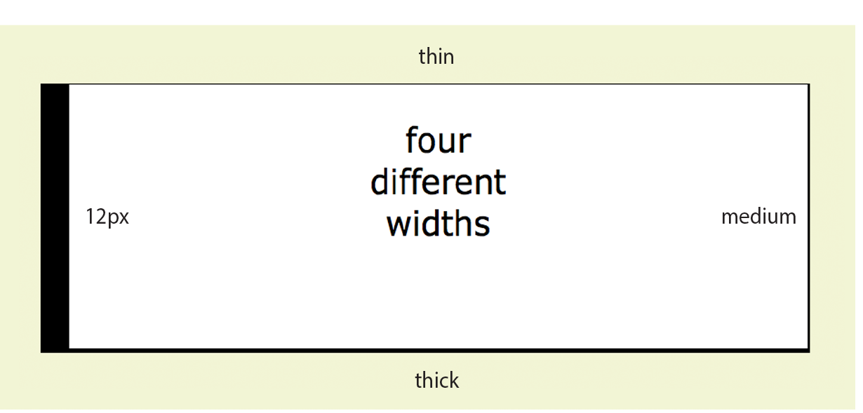
Border colors are specified in the same way: via the side-specific properties or the border-color shorthand property. When you specify a border color, it overrides the foreground color as set by the color property for the element.
border-top-color, border-right-color, border-bottom-color, border-left-color
Values: color name or RGB/HSL value | transparent
Default: the value of the color property for the element
Applies to: all elements
Inherits: no
border-color
Values: color name or RGB/HSL value | transparent
Default: the value of the color property for the element
Applies to: all elements
Inherits: no
You know all about specifying color values, and you should be getting used to the shorthand properties as well, so I’ll keep this example short and sweet (Figure 14-11). Here, I’ve provided two values for the shorthand border-color property to make the top and bottom of a div maroon and the left and right sides aqua:
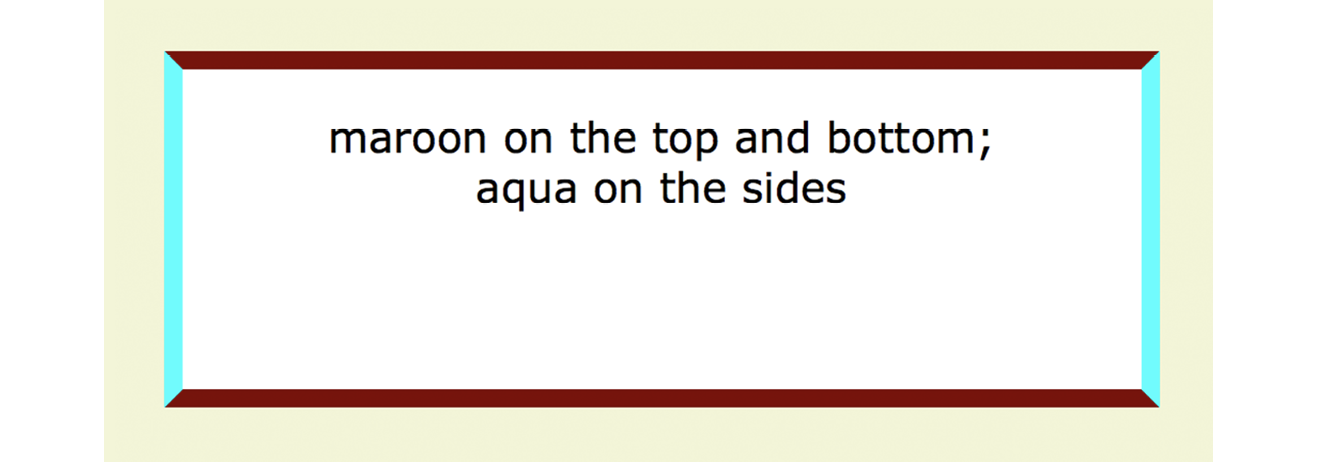
div#special { border-color: maroon aqua; border-style: solid; border-width: 6px; width: 300px; height: 100px;}
The authors of CSS didn’t skimp when it came to border shortcuts. They also created properties for providing style, width, and color values in one declaration, one side at a time. You can specify the appearance of specific sides, or use the border property to change all four sides at once.
border-top, border-right, border-bottom, border-left
Values: border-style border-width border-color
Default: defaults for each property
Applies to: all elements
Inherits: no
border
Values: border-style border-width border-color
Default: defaults for each property
Applies to: all elements
Inherits: no
The values for border and the side-specific border properties may include style, width, and color values in any order. You do not need to declare all three, but if the border style value is omitted, no border will render.
The border shorthand property works a bit differently than the other shorthand properties that we’ve covered in that it takes one set of values and always applies them to all four sides of the element. In other words, it does not use the clockwise TRBL system that we’ve seen with other shorthand properties.
Here is a smattering of valid border shortcut examples to give you an idea of how they work:
h1 { border-left: red .5em solid; } /* left border only */
h2 { border-bottom: 1px solid; } /* bottom border only */p.example { border: 2px dotted #663; } /* all four sides */
Perhaps you’d like your element boxes to look a little softer and rounder. Well, then, the border-radius property is for you! There are individual corner properties as well as a border-radius shorthand.
border-top-left-radius, border-top-right-radius, border-bottom-right-radius, border-bottom-left-radius
Values: length | percentage
Default: 0
Applies to: all elements
Inherits: no
border-radius
Values: 1, 2, 3, or 4 length or percentage values
Default: 0
Applies to: all elements
Inherits: no
To round off the corner of an element, simply apply one of the border-radius properties, but keep in mind that you will see the result only if the element has a border or background color. Values are typically provided in ems or pixels. Percentages are allowed and are nice for keeping the curve proportional to the box should it resize, but you may run into some browser inconsistencies.
You can target the corners individually or use the shorthand border-radius property. If you provide one value for border-radius, it is applied to all four corners. Four values are applied clockwise, starting in the top-left corner (top-left, top-right, bottom-right, bottom-left). When you supply two values, the first one is used for top-left and bottom-right, and the second is for the other two corners.
Compare the border-radius values to the resulting boxes in Figure 14-12. You can achieve many different effects, from slightly softened corners to a long capsule shape, depending on how you set the values.
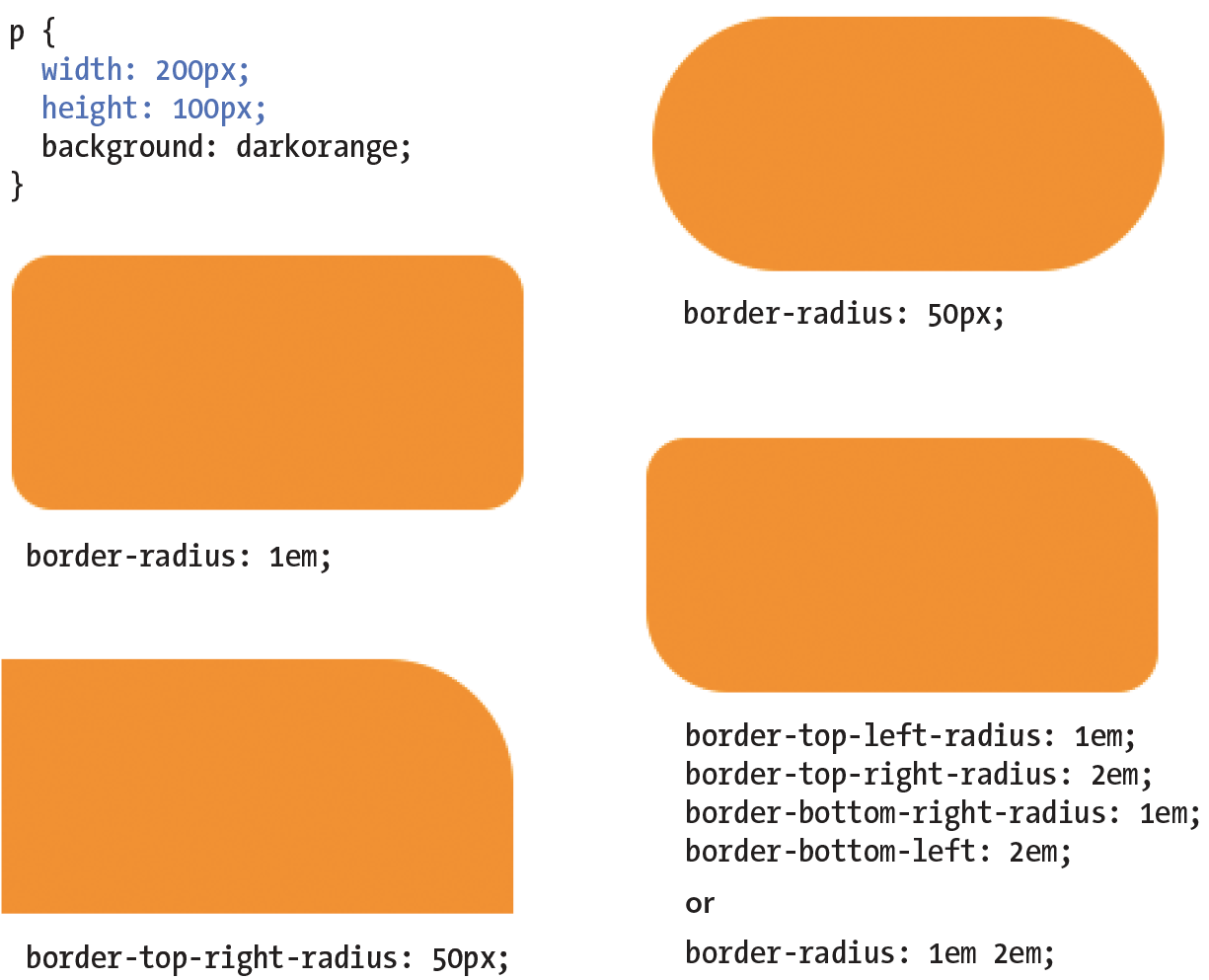
All browsers have been supporting properties using the standard syntax (that is, without prefixes) since about 2010. There are prefixed properties for Firefox <3.6 and Safari <5.0, but they’re so old it’s probably not worth worrying about. Internet Explorer 8 and earlier, however, do not support at all. But in this case, chances are the usability of your site doesn’t depend on rounded corners, so this is a good opportunity to practice progressive enhancement: non-supporting browsers get perfectly acceptable square corners, and all modern browsers get a little something extra.
So far, the corners we’ve made are sections of perfect circles, but you can also make a corner elliptical by specifying two values: the first for the horizontal radius and the second for the vertical radius (see Figure 14-13, A and B).
A border-top-right-radius: 100px 50px; B border-top-right-radius: 50px 20px; border-top-left-radius: 50px 20px;
If you want to use the shorthand property, the horizontal and vertical radii get separated by a slash (otherwise, they’d be confused for different corner values). The following example sets the horizontal radius on all corners to 60px and the vertical radius to 40px (Figure 14-13, C):
C border-radius: 60px / 40px;
If you want to see something really nutty, take a look at a border-radius shorthand property that specifies a different ellipse for each of the four corners. All of the horizontal values are lined up on the left of the slash in clockwise order (top-left, top-right, bottom-right, bottom-left), and all of the corresponding vertical values are lined up on the right (Figure 14-13, D):
D border-radius: 36px 40px 60px 20px / 12px 10px 30px 36px;
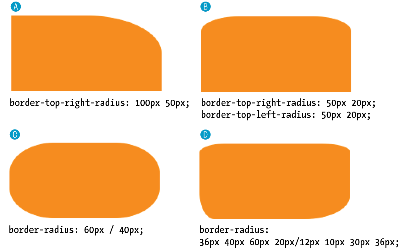
Now it’s time to try your hand at borders. Exercise 14-2 will not only give you some practice, but it should also give you some ideas on the ways borders can be used to add visual interest to designs.
a { text-decoration: none;}a { text-decoration: none; border-bottom: 1px dotted;}a { text-decoration: none; border-bottom: 1px dotted; padding-bottom: .2em;}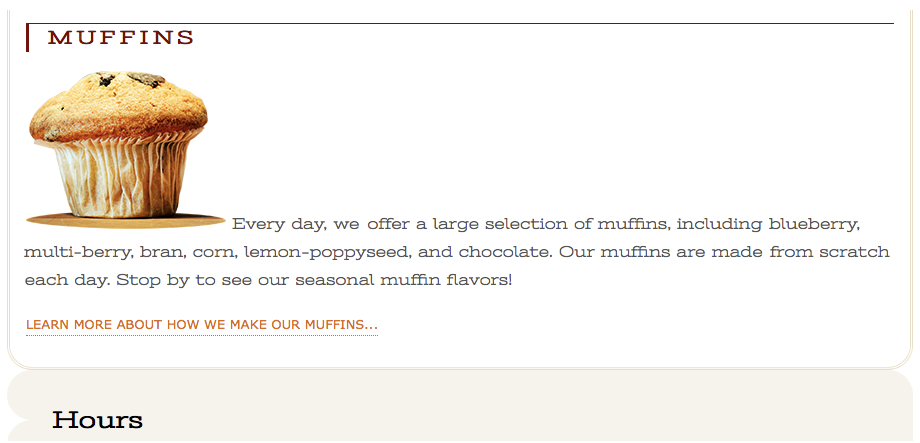
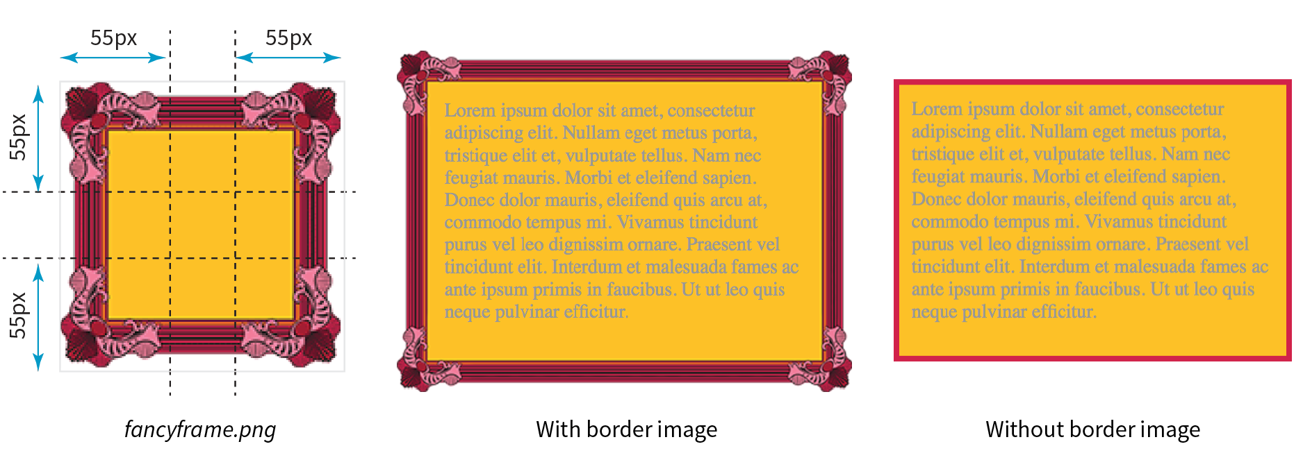
border-image: / / ;
border: 5px solid #d1214a; /* red */
border-image:url(fancyframe.png) 55 fill / 55px / 25px stretch;
A margin is an optional amount of space that you can add on the outside of the border. Margins keep elements from bumping into one another or the edge of the browser window or viewport.
The side-specific and shorthand margin properties work much like the padding properties we’ve looked at already; however, margins have some special behaviors to be aware of.
margin-top, margin-right, margin-bottom, margin-left
Values: length | percentage | auto
Default: auto
Applies to: all elements
Inherits: no
margin
Values: length | percentage | auto
Default: auto
Applies to: all elements
Inherits: no
The margin properties are very straightforward to use. You can either specify an amount of margin to appear on each side of the element or use the margin property to specify all sides at once.
The shorthand margin property works the same as the padding shorthand. When you supply four values, they are applied in clockwise order (top, right, bottom, left) to the sides of the element. If you supply three values, the middle value applies to both the left and right sides. When two values are provided, the first is used for the top and bottom, and the second applies to the left and right edges. Finally, one value will be applied to all four sides of the element.
As with most web measurements, ems, pixels, and percentages are the most common ways to specify margins. Be aware, however, that if you specify a percentage value, it is calculated based on the width of the parent element. If the parent’s width changes, so will the margins on all four sides of the child element (padding has this behavior as well). The auto keyword allows the browser to fill in the amount of margin necessary to fit or fill the available space (see Power Tool sidebar).
Figure 14-16 shows the results of the following margin examples. I’ve added a red border to the elements in the examples to make their boundaries more clear. The dotted rules were added in the figure illustration to indicate the outer edges of the margins for clarity purposes only, but they are not something you’d see in the browser.
A p#A { margin: 4em; border: 2px solid red; background: #e2f3f5; }B p#B {
margin-top: 2em; margin-right: 250px; margin-bottom: 1em; margin-left: 4em;border: 2px solid red; background: #e2f3f5; }C body {margin: 0 20%;border: 3px solid red; background-color: #e2f3f5; }
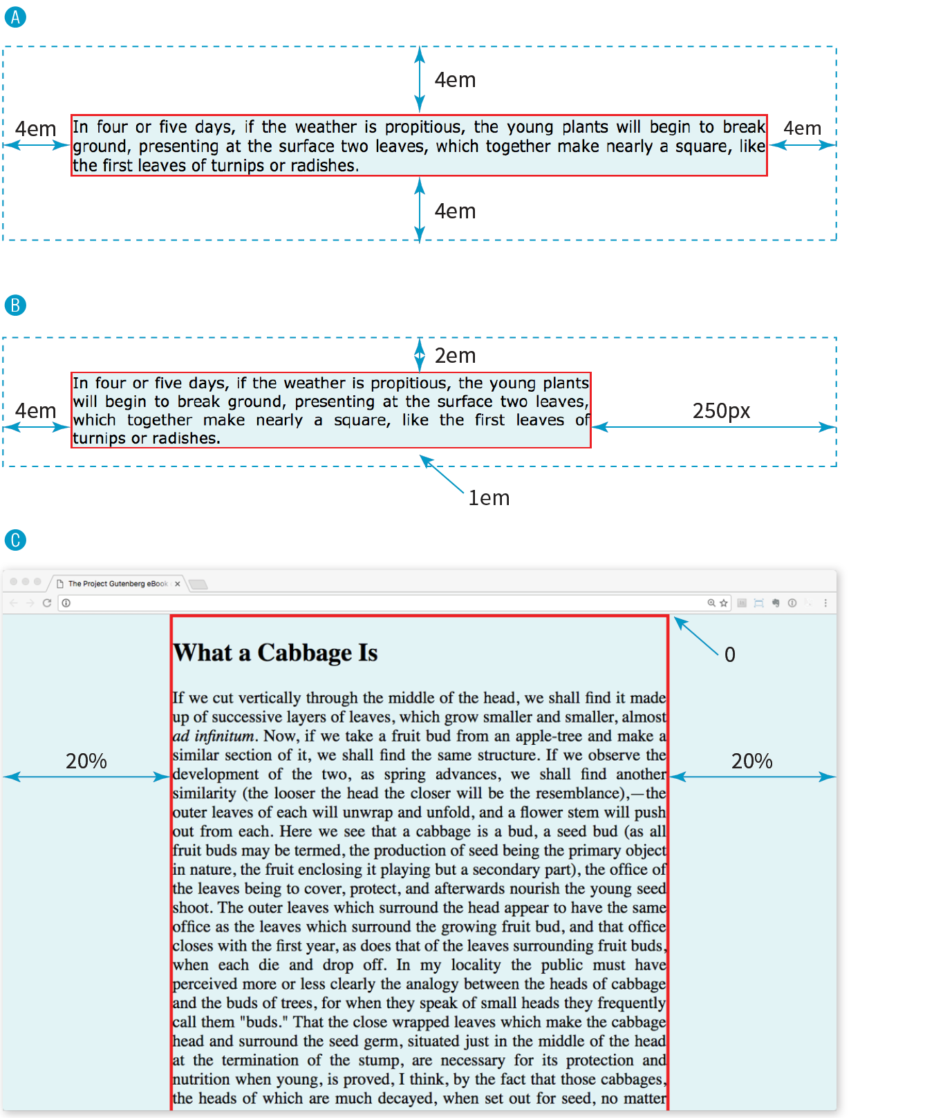
Take a look at Example C in Figure 14-16. Here I’ve applied the margin property to the body element of the document. For this particular design, I set the top margin to zero (0) so the body starts flush against the top edge of the browser window. Adding equal amounts of margin to the left and right sides of the body keeps the content of the page centered and gives it a little breathing room.
Adding a margin to the body element adds space between the page content and the edges of the viewport.
Although it is easy to write rules that apply margin amounts around HTML elements, it is important to be familiar with some of the quirks of margin behavior.
The most significant margin behavior to be aware of is that the top and bottom margins of neighboring elements collapse. This means that instead of accumulating, adjacent margins overlap, and only the largest value is used.
Using the two paragraphs from the previous figure as an example, if the top element has a bottom margin of 4em, and the following element has a top margin of 2em, the resulting margin space between elements does not add up to 6ems Rather, the margins collapse and the resulting margin between the paragraphs will be 4em, the largest specified value. This is demonstrated in Figure 14-17.
The only time top and bottom margins don’t collapse is for floated or absolutely positioned elements (we’ll get to that in Chapter 15, Floating and Positioning). Margins on the left and right sides never collapse, so they’re nice and predictable.
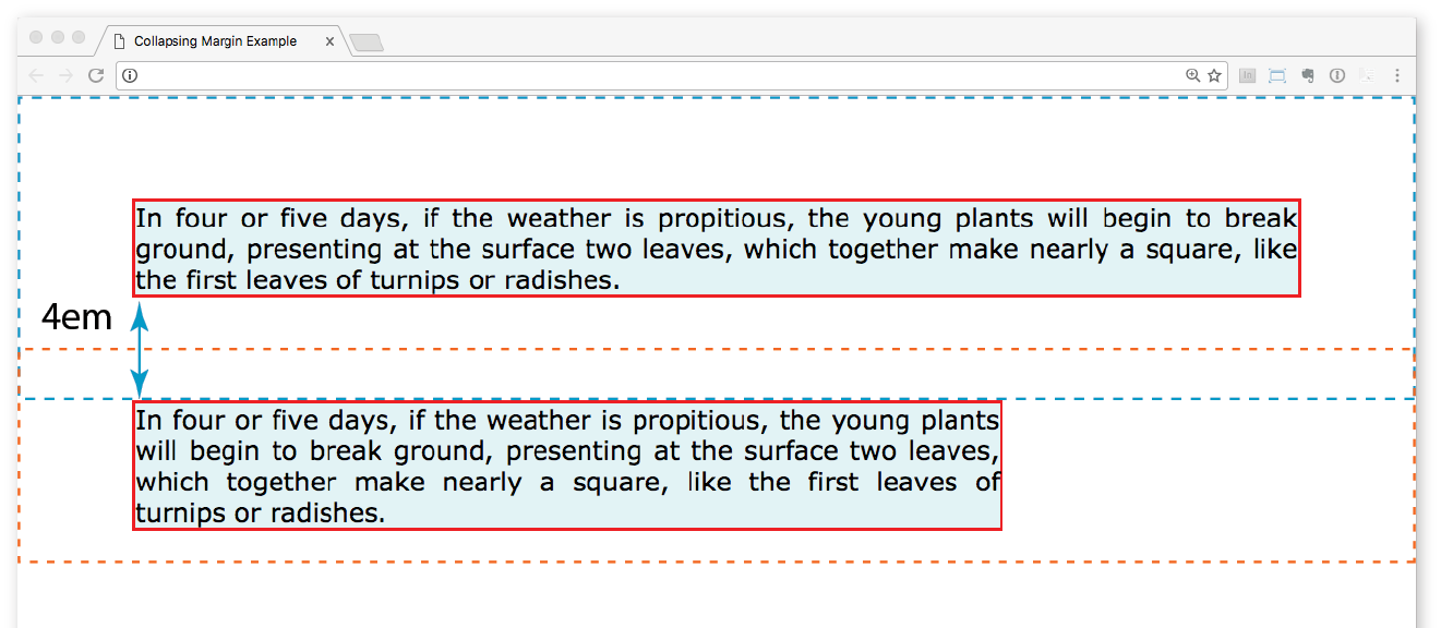
You can apply top and bottom margins to inline text elements (or “non-replaced inline elements,” to use the proper CSS terminology), but it won’t add vertical space above and below the element, and the height of the line will not change. However, when you apply left and right margins to inline text elements, margin space will be held clear before and after the text in the flow of the element, even if that element breaks over several lines.
Just to keep things interesting, margins on replaced inline elements, such as images, do render on all sides, and therefore do affect the height of the line. See Figure 14-18 for examples of each.
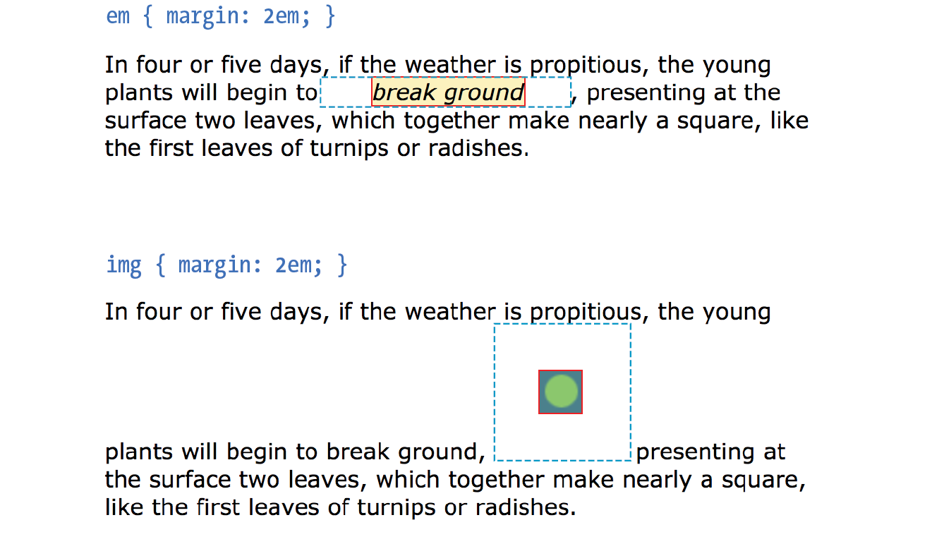
It is worth noting that it is possible to specify negative values for margins. When you apply a negative margin, the content, padding, and border are moved in the opposite direction that would have resulted from a positive margin value.
I’ll make this clear with an example. Figure 14-19 shows two neighboring paragraphs with different-colored borders applied to show their boundaries. In the left view, I’ve added a 3em bottom margin to the top paragraph, which has the effect of pushing the following paragraph down by that amount. If I specify a negative value (–3em), the following element moves up by that amount and overlaps the element with the negative margin.
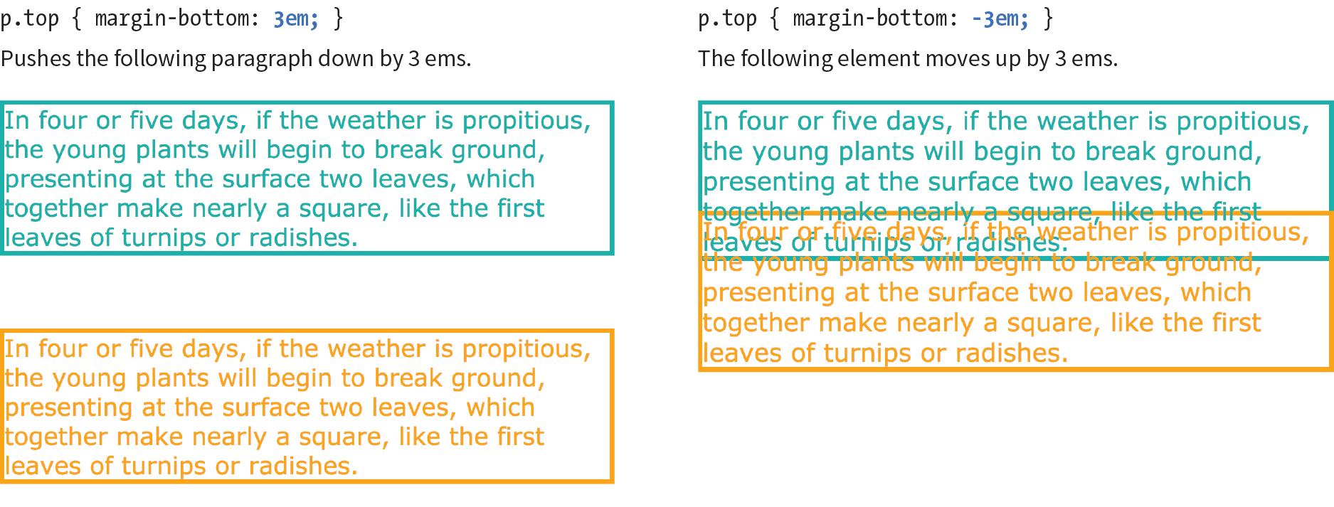
This may seem like a strange thing to do, and in fact, you probably wouldn’t make blocks of text overlap as shown. The point here is that you can use margins with both positive and negative values to move elements around on the page. This is the basis of some older CSS layout techniques.
Now let’s use margins to add some space between parts of the Black Goose Bakery home page in Exercise 14-3.
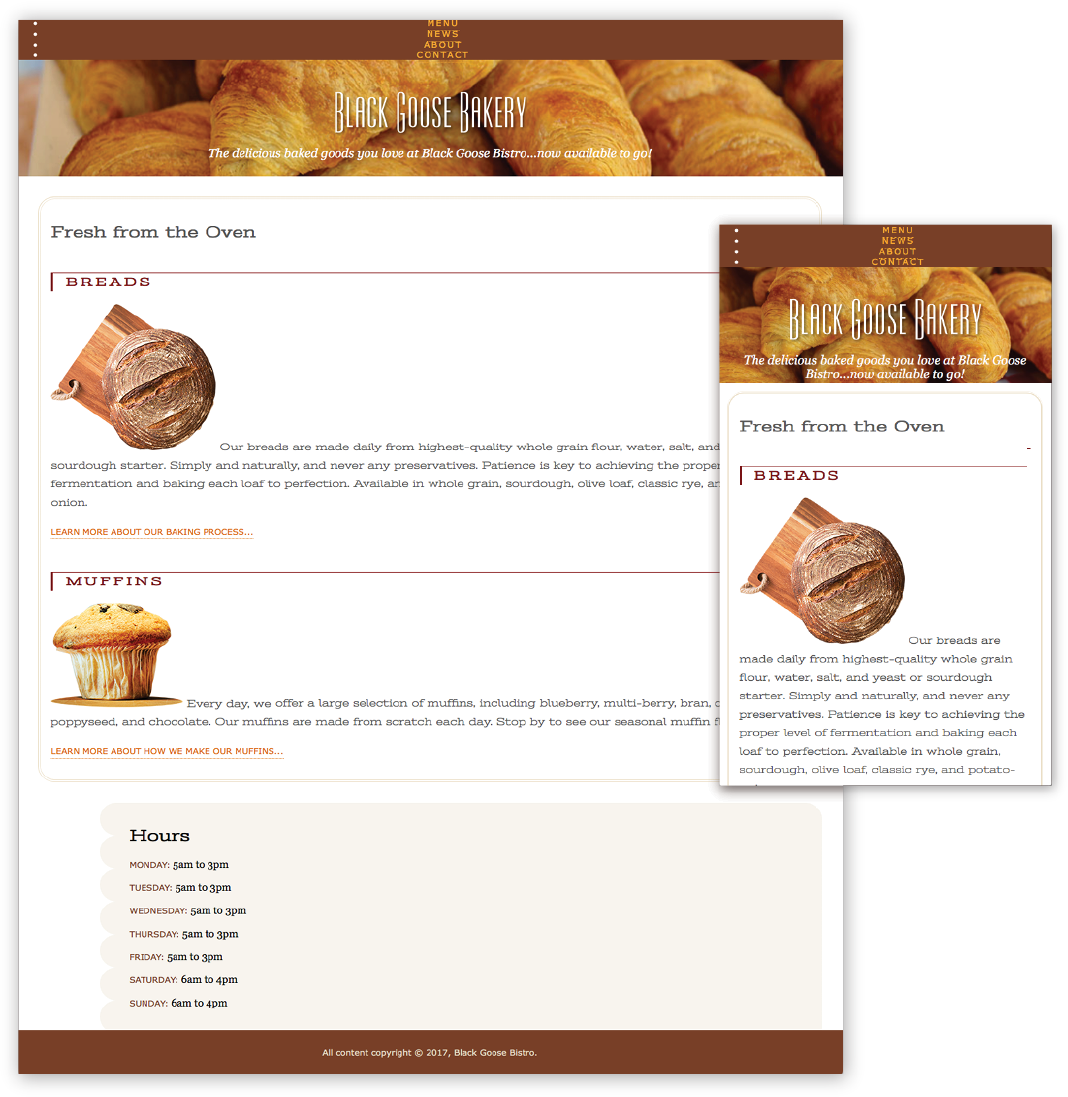
As long as we’re talking about boxes and the CSS layout model, this is a good time to introduce the display property. You should already be familiar with the display behavior of block and inline elements. Although HTML assigns display behaviors (or display types, to use the latest CSS term) to the elements it defines, there are other XML-based languages that can use CSS that don’t do the same. For this reason, the display property was created to allow authors to specify how elements should behave in layouts.
display
Values: inline | block | run-in | flex | grid | flow | flow-root | list-item | table | table-row-group | table-header-group | table-footer-group | table-row | table-cell | table-column-group | table-column | table-caption | ruby | ruby-base | ruby-text | ruby-base-container | ruby-text-container | inline-block | inline-table | inline-flex | inline-grid | contents | none
Default: inline
Applies to: all elements
Inherits: yes
The display property defines the type of element box an element generates in the layout. In addition to the familiar inline and block display types, you can also make elements display as list items or the various parts of a table. There are also a number of values for ruby annotation for East Asian languages. As you can see from the list of values, there are a lot of display types, but there are only a few that are used in everyday practice.
Display type assignment is useful for achieving layout effects while keeping the semantics of the HTML source intact. For example, it is common practice to make li elements (which usually display with the characteristics of block elements) display as inline elements to turn a list into a horizontal navigation bar. You may also make an otherwise inline a (anchor) element display as a block in order to give it a specific width and height:
ul.navigation li { display: inline; } ul.navigation li a { display: block; }
Bear in mind that changing the presentation of an HTML element with the CSS property does not change the definition of that element as block-level or inline in HTML. Putting a block-level element within an inline element will always be invalid, regardless of its display role.
Another useful value for the display property is none, which removes the content from the normal flow entirely. Unlike visibility: hidden, which just makes the element invisible but keeps the space it would have occupied blank, display: none removes the content, and the space it would have occupied is closed up.
One popular use of display: none is to prevent certain content in the source document from displaying in specific media, such as when the page is printed or displayed on devices with small screens. For example, you could display URLs for links in a document when it is printed, but not when it is displayed on a computer screen where the links are interactive.
Be aware that content that has its display set to none still downloads with the document. Setting some content to display:none for devices with small screens may keep the page shorter, but it is not doing anything to reduce data usage or download times.
We’ve arrived at the last stop on the element box tour. In Chapter 12, Formatting Text you learned about the text-shadow property, which adds a drop shadow to text. The box-shadow property applies a drop shadow around the entire visible element box (excluding the margin).
box-shadow
Values: ‘horizontal offset’ ‘vertical offset’ ‘blur distance’ ‘spread distance’ color inset | none
Default: none
Applies to: all elements
Inherits: no
Browsers released before 2011 require vendor prefixes for . Box shadows are not supported at all in Internet Explorer versions 8 and earlier. This is a case for progressive enhancement—it is likely that a box without a shadow will be just fine for users clinging to old browser versions.
The value of the box-shadow property should seem familiar to you after working with text-shadow: specify the horizontal and vertical offset distances, the amount the shadow should blur, and a color. For box shadows, you can also specify a spread amount, which increases (or decreases with negative values) the size of the shadow. By default, the shadow color is the same as the foreground color of the element, but specifying a color overrides it.
Figure 14-21 shows the results of the following code examples. A adds a simple box shadow 6 pixels to the right and 6 pixels down, without blur or spread. B adds a blur value of 5 pixels, and C shows the effect of a 10-pixel spread value. Box shadows are always applied to the area outside the border of the element (or the place it would be if a border isn’t specified). If the element has a transparent or translucent background, you will not see the box shadow in the area behind the element.
box-shadow: 6px 6px gray;box-shadow: 6px 6px 5px gray; /* 5 pixel blur */box-shadow: 6px 6px 5px 10px gray; /* 5px blur, 10px spread */
You can make the shadow render inside the edges of the visible element box by adding the inset keyword to the rule. This makes it look like the element is pressed into the screen (Figure 14-22).
box-shadow:inset6px 6px 5px gray;
As for text-shadow, you can specify multiple box shadows on an element by providing the values in a comma-separated list. The values that come first get placed on top, and subsequent shadows are placed behind it in the order in which they appear in the list.
At this point, you should have a good feel for element boxes and how to manipulate the space within and around them. In the next chapter, we’ll start moving the boxes around on the page, but first, why not get some practice at writing rules for padding, borders, and margins in the following test?
In this test, your task is to write the declarations that create the effects shown in each example in Figure 14-23 (see Useful Hints). All the paragraphs shown here share a rule that sets the dimensions and the background color for each paragraph. You just need to provide the box-related property declarations. Answers, as always, appear in Appendix A.
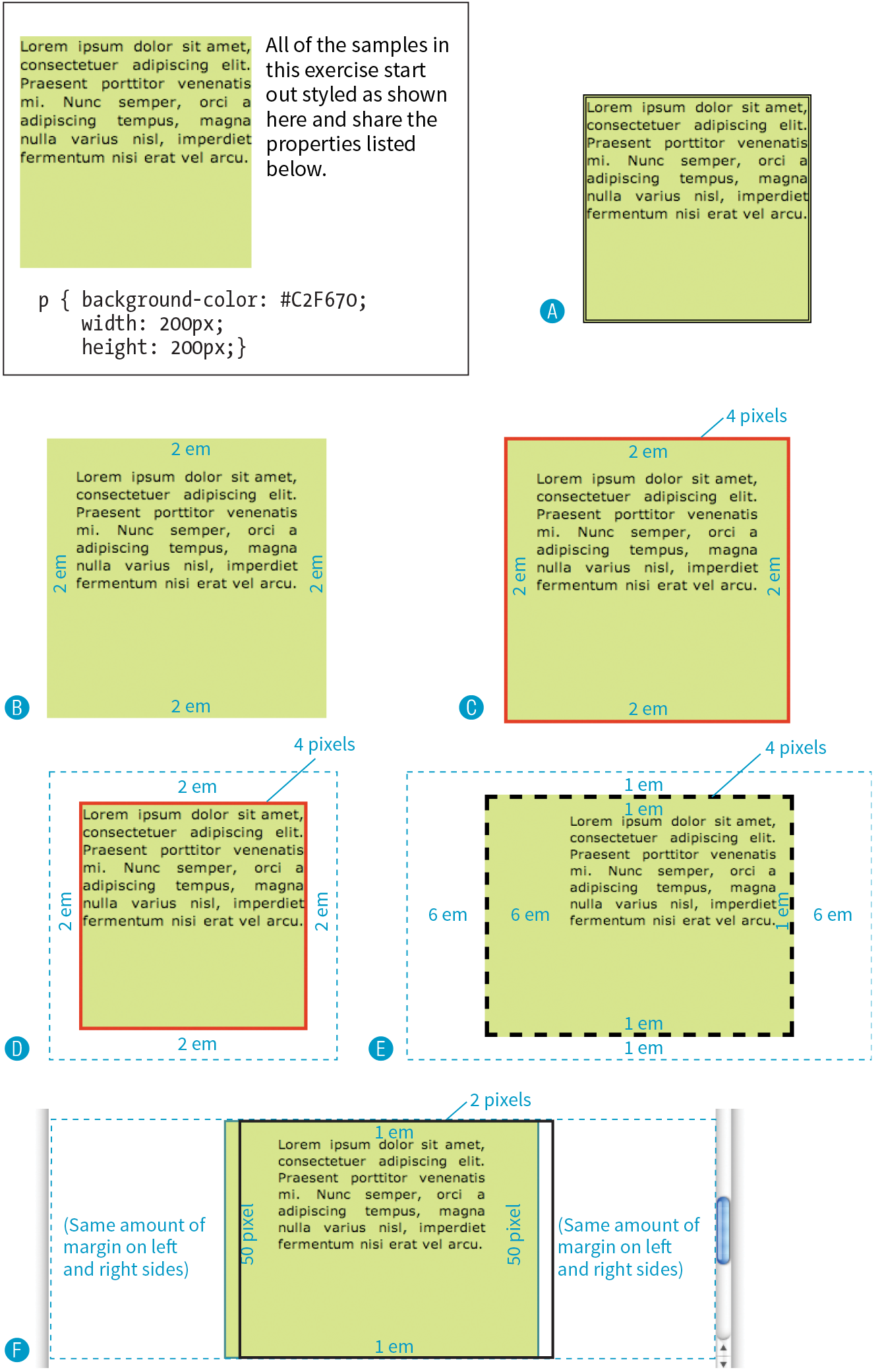
In this chapter
Floating elements to the left and right
Clearing floated elements
Containing floated elements
Creating text-wrap shapes
Relative positioning
Absolute positioning and containing blocks
Fixed positioning
At this point, you’ve learned dozens of CSS properties that let you change the appearance of text elements and the boxes they generate. But so far, we’ve merely been formatting elements as they appear in the flow of the document.
In this chapter, we’ll look at floating and positioning, the CSS methods for breaking out of the normal flow and arranging elements on the page. Floating an element moves it to the left or right and allows the following text to wrap around it. Positioning is a way to specify the location of an element anywhere on the page with pixel precision.
Before we start moving elements around, let’s be sure we are well acquainted with how they behave in the normal flow.
We’ve covered the normal flow in previous chapters, but it’s worth a refresher. In the CSS layout model, text elements are laid out from top to bottom in the order in which they appear in the source, and from left to right in left-to-right reading languages (see Note). Block elements stack up on top of one another and fill the available width of the browser window or other containing element. Inline elements and text characters line up next to one another to fill the block elements.
For right-to-left reading languages such as Arabic and Hebrew, the normal flow is top to bottom and right to left.
When the window or containing element resizes, the block elements expand or contract to the new width, and the inline content reflows to fit as shown in Figure 15-1.
Objects in the normal flow affect the layout of the objects around them. This is the behavior you’ve come to expect in web pages—elements don’t overlap or bunch up. They make room for one another.
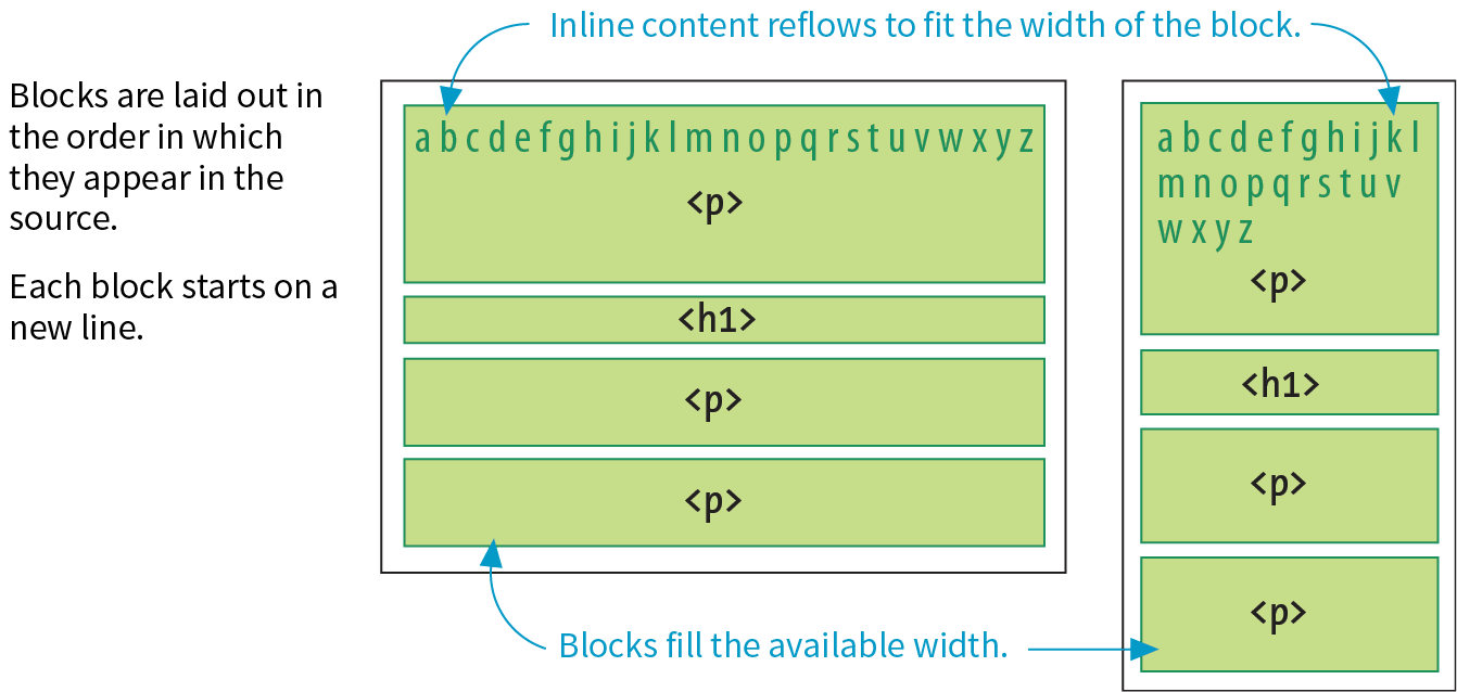
We’ve seen all of this before, but in this chapter we’ll be paying attention to whether elements are in the flow or removed from the flow. Floating and positioning change the relationship of elements to the normal flow in different ways. Let’s first look at the special behavior of floated elements (or “floats” for short).
Simply stated, the float property moves an element as far as possible to the left or right, allowing the following content to wrap around it. It is a unique feature built into CSS with some interesting behaviors.
float
Values: left | right | none
Default: none
Applies to: all elements
Inherits: no
The best way to explain floating is to demonstrate it. In this example, the float property is applied to an img element to float it to the right. Figure 15-2 shows how the paragraph and the contained image are rendered by default (top) and how it looks when the float property is applied (bottom).
The markup
<p><img src="icecreambowl.png" alt=""> After the cream is frozen rather stiff,…
The styles
img { float: right; }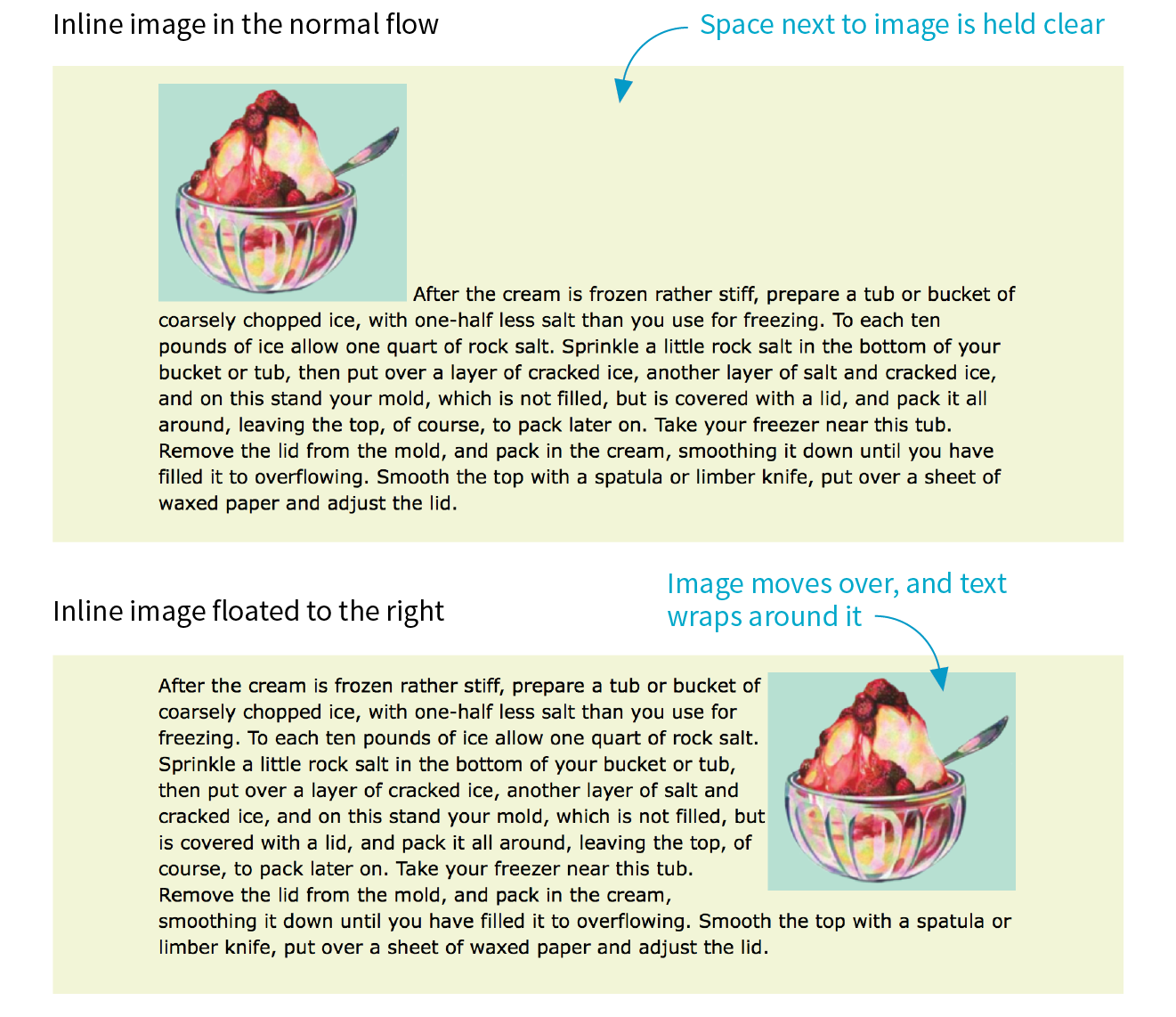
Floating an element moves it to the left or right and allows the following text to wrap around it.
That’s a nice effect. We’ve gotten rid of a lot of wasted space on the page, but now the text is bumping right up against the image. How do you think you would add some space between the image element and the surrounding text? If you guessed “add a margin,” you’re absolutely right. I’ll add 1em of space on all sides of the image with the margin property (Figure 15-3). You can begin to see how the box properties work together to improve page layout.
img { float: right; margin: 1em;}
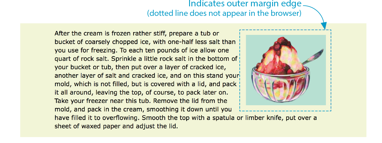
The previous two figures demonstrate some key behaviors of floated elements:
A floated element is like an island in a stream.
First and foremost, you can see that the image is removed from its position in the normal flow yet continues to influence the surrounding content. The subsequent paragraph text reflows to make room for the floated img element. One popular analogy compares floats to islands in a stream—they are not in the flow, but the stream has to flow around them. This behavior is unique to floated elements.
Floats stay in the content area of the containing element.
It is also important to note that the floated image is placed within the content area (the inner edges) of the paragraph that contains it. It does not extend into the padding area of the paragraph.
Margins are maintained.
In addition, margins are held on all sides of the floated image, as indicated in Figure 15-3 by the dotted line. In other words, the entire element box, from outer edge to outer edge, is floated.
Those are the basics, so now let’s look at more examples and explore additional floating behaviors. It is possible to float any HTML element, both inline and block-level, as we’ll see in the following examples.
In the previous example, we floated an inline image element. This time, let’s look at what happens when you float an inline text (non-replaced) element—in this case, a span of text (Figure 15-4).
The markup
<p><span class="tip">TIP: Make sure that your packing tub or bucket has a hole below the top of the mold so the water will drain off.</span>After the cream is frozen rather stiff, prepare a tub or bucket of…</p>
The styles
span.tip { float: right; margin: 1em; width: 200px; color: #fff; background-color: lightseagreen; padding: 1em;}
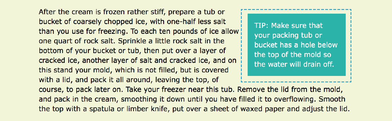
At a glance, it is behaving the same as the floated image, which is what we’d expect. But there are some subtle things at work here that bear pointing out:
Always provide a width for floated text elements.
First, you’ll notice that the style rule that floats the span includes the width property. It is necessary to specify a width for a floated text element because without one, its box is sized wide enough to fit its content (auto). For short phrases that are narrower than the container, that might not be an issue. However, for longer, wrapped text, the box expands to the width of the container, making it so wide that there wouldn’t be room to wrap anything around it. Images have an inherent width, so we didn’t need to specify a width in the previous example (although we certainly could have).
It is necessary to specify the width for floated text elements.
Floated inline elements behave as block elements.
Notice that the margin is held on all four sides of the floated span text, even though top and bottom margins are usually not rendered on inline elements (see Figure 14-20 in the previous chapter). That is because all floated elements behave like block elements. Once you float an inline element, it follows the display rules for block-level elements, and margins are rendered on all four sides.
Margins on floated elements do not collapse.
In the normal flow, abutting top and bottom margins collapse (overlap), but margins for floated elements are maintained on all sides as specified.
Let’s look at what happens when you float a block within the normal flow. In this example, the whole second paragraph element is floated to the left (Figure 15-5).
The markup
<p>If you wish to pack ice cream...</p><p id="float">After the ice cream is rather stiff,...</p><p>Make sure that your packing tub or bucket...</p><p>As cold water is warmer than the ordinary...</p>
The styleS
p { border: 2px red solid; }.#float { float: left; width: 300px; margin: 1em; background: white;}
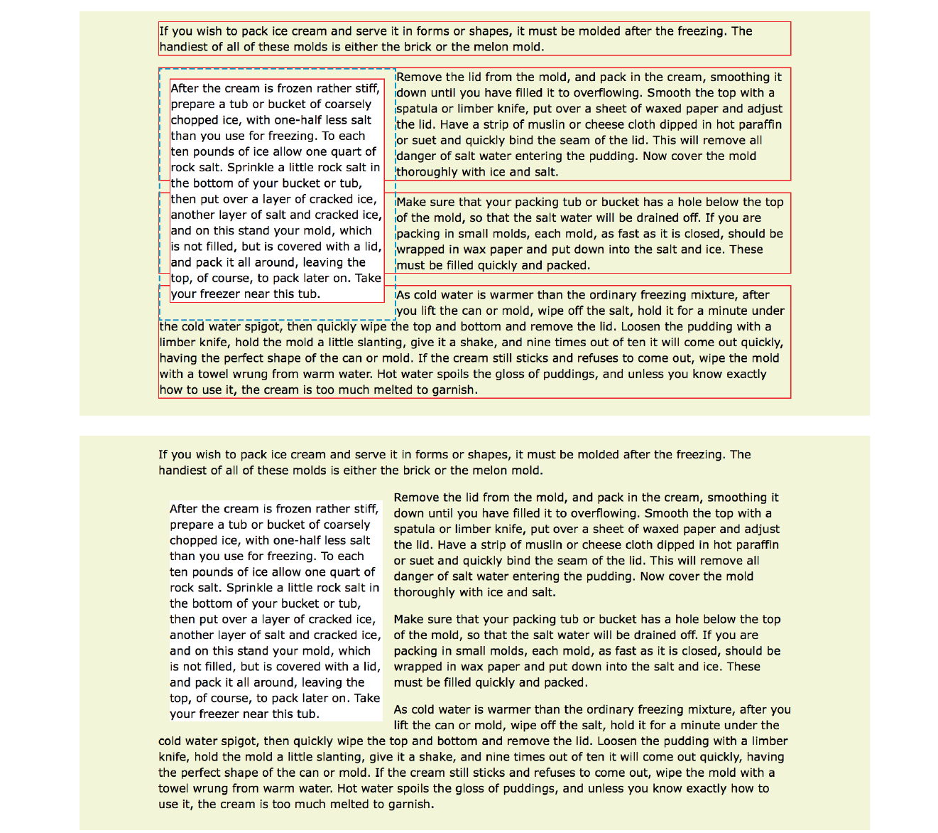
I’ve added a red border around all p elements to reveal their boundaries. In addition, I’ve made the background of the floated paragraph white so it stands out and added a 1em margin on all sides (indicated with a blue dotted line). The bottom view in Figure 15-5 shows how it looks with all the extra stuff turned off, as it would more likely appear on a real page.
Just as we saw with the image, the paragraph moves off to the side (left this time), and the following content wraps around it, even though blocks normally stack on top of one another. There are a few things I want to point out in this example:
You must provide a width for floated block elements.
If you do not provide a width value, the width of the floated block will be set to auto, which fills the available width of the browser window or other containing element. There’s not much sense in having a full-width floated box, because the idea is to wrap text next to the float, not start below it.
Elements do not float higher than their reference in the source.
A floated block will float to the left or right relative to where it occurs in the source, allowing the following elements in the flow to wrap around it. It stays below any block elements that precede it in the flow (in effect, it is “blocked” by them). That means you can’t float an element up to the top corner of a page, even if its nearest ancestor is the body element. If you want a floated element to start at the top of the page, it must appear first in the document source (see Note).
Non-floated elements maintain the normal flow.
The red borders in the top image reveal that the element boxes for the surrounding paragraphs still extend the full width of the normal flow. Only the content of those elements wraps around the float. This is a good model to keep in mind.
For example, adding a left margin to the surrounding paragraphs would add space on the left edge of the page, not between the text and the floated element. If you want space between the float and the wrapped text, you need to apply the margin to the float itself.
If you’re going to be floating elements around, it’s important to know how to turn the text wrapping off and get back to normal flow as usual. You do this by clearing the element that you want to start below the float. Applying the clear property to an element prevents it from appearing next to a floated element and forces it to start against the next available “clear” space below the float.
clear
Values: left | right | both | none
Default: none
Applies to: block-level elements only
Inherits: no
Keep in mind that you apply the clear property to the element you want to start below the floated element, not the floated element itself. The left value starts the element below any elements that have been floated to the left. Similarly, the right value makes the element clear all floats on the right edge of the containing block. If there are multiple floated elements, and you want to be sure an element starts below all of them, use the both value to clear floats on both sides.
In this example, the clear property has been used to make h2 elements start below left-floated elements. Figure 15-6 shows how the h2 heading starts at the next available clear edge below the float.
img { float: left; margin-right: .5em;}h2 { clear: left; margin-top: 2em;}
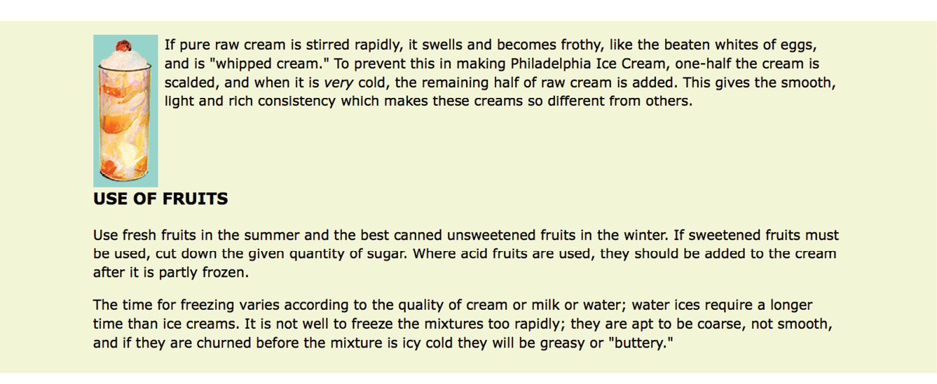
Notice in Figure 15-6 that although there is a 2em top margin applied to the h2 element, it is not rendered between the heading and the floated image. That’s the result of collapsing vertical margins in the flow. If you want to make sure space is held between a float and the following text, apply a bottom margin to the floated element itself.
By now you have enough float know-how to give it a try in Exercise 15-1.
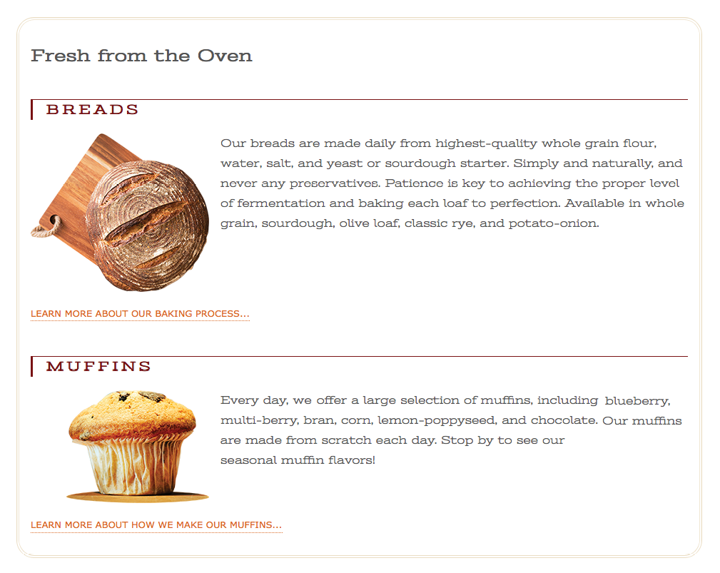
It’s perfectly fine to float multiple elements on a page or even within a single element. In fact, for years, floats have been the primary method for lining up elements like navigation menus and even for creating whole page layouts (please take time to read the sidebar “Float-Based Layouts”).
When you float multiple elements, there is a complex system of behind-the-scenes rendering rules that ensures floated elements do not overlap. You can consult the CSS specification for details, but the upshot of it is that floated elements will be placed as far left or right (as specified) and as high up as space allows.
Figure 15-8 shows what happens when a series of sequential paragraphs is floated to the same side. The first three floats start stacking up from the left edge, but when there isn’t enough room for the fourth, it moves down and to the left until it bumps into something—in this case, the edge of the browser window. However, if one of the floats, such as P2, had been very long, it would have bumped up against the edge of the long float instead. Notice that the next paragraph in the normal flow (P6) starts wrapping at the highest point it can find, just below P1.
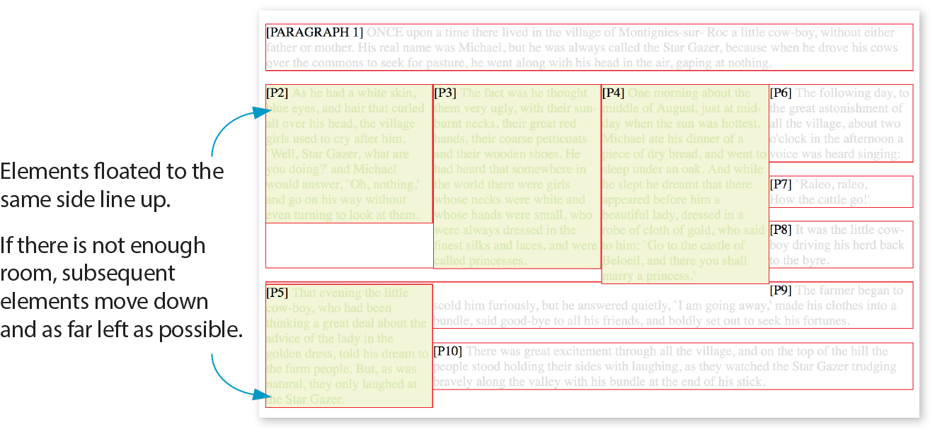
The Markup
<p>[PARAGRAPH 1] ONCE upon a time…</p><pclass="float">[P2]…</p><pclass="float">[P3]…</p><pclass="float">[P4]…</p><pclass="float">[P5]…</p><p>[P6]…</p><p>[P7]…</p><p>[P8]…</p><p>[P9]…</p><p>[P10]…</p>
The styles
p.float { float: left; width: 200px; margin: 0px; background: #F2F5d5; color: #DAEAB1;}
This is a good time to address a quirky float behavior: float containment. By default, floats are designed to hang out of the element they are contained in. That’s just fine for allowing text to flow around a floated image, but sometimes it can cause some unwanted behaviors.
Take a look at the example in Figure 15-9. It would be nicer if the border expanded around all the content, but the floated image hangs out the bottom.
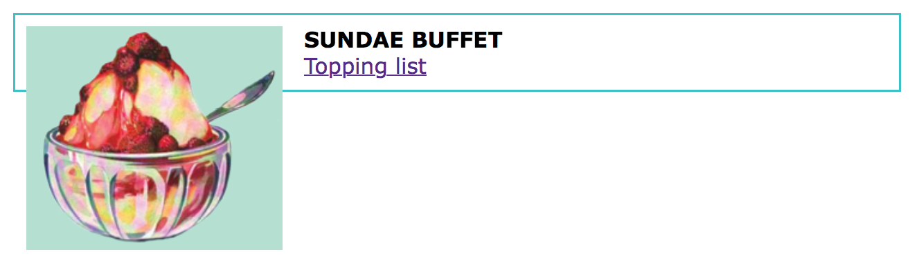
If you float all the elements in a container element, there will be no elements remaining in the flow to hold the containing element open. This phenomenon is illustrated in Figure 15-10. The #container div contains two paragraphs. The view of the normal flow (top) shows that the #container has a background color and border that wraps around the content.
<div id="container"> <p>…</p> <p>…</p></div> #container { background: #f2f5d5; border: 2px dashed green;}
However, when both paragraphs (that is, all of the content within the div) are floated, as shown in the figure on the bottom), the element box for the #container closes up to a height of zero, leaving the floats hanging down below (you can still see the empty border at the top). There’s no content left in the normal flow to give the containing div height. This clearly is not the effect we are after.
p { float: left; width: 44%; padding: 2%;}
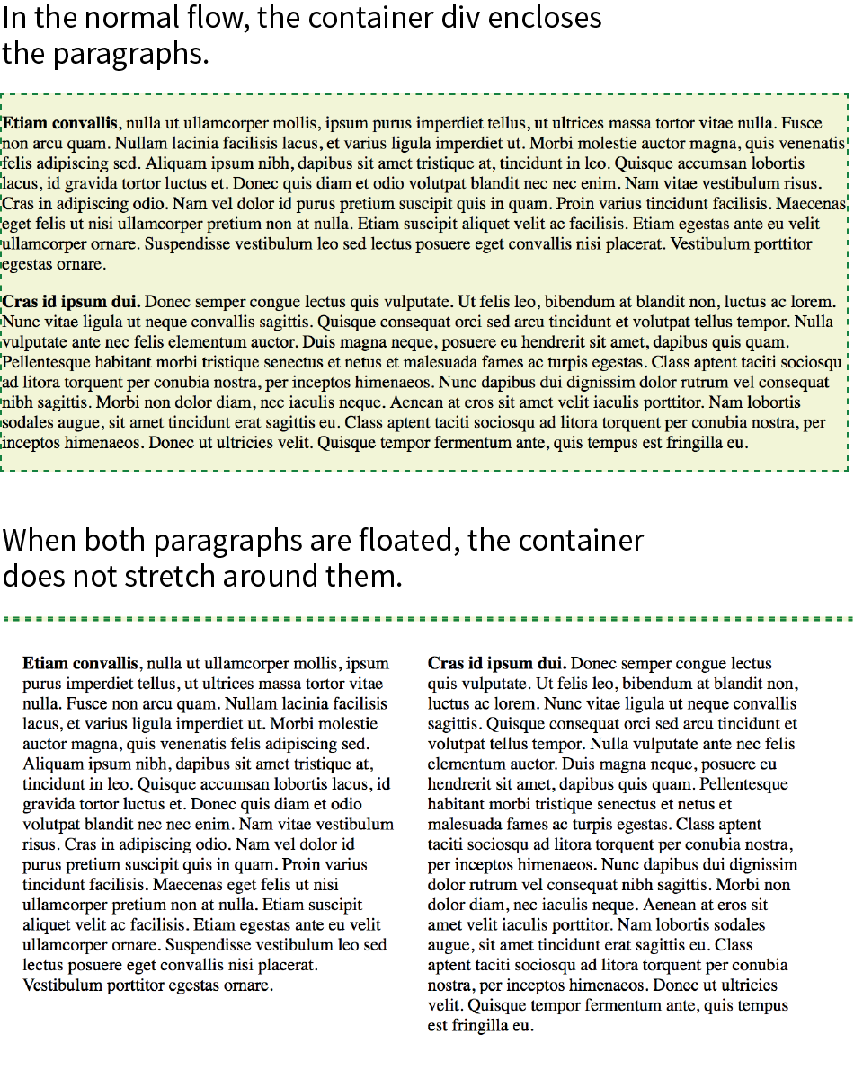
Fortunately, there are a few fixes to this problem, and they are pretty straightforward. The most popular and foolproof solution is the “clearfix” technique. It uses the :after pseudo-element to insert a character space after the container, set its display to “block,” and clear it on both sides. For more information on this version of clearfix, see Thierry Koblentz’s article “The very latest clearfix reloaded” (cssmojo.com/the-very-latest-clearfix-reloaded). Here it is applied to the #container div in Figure 15-10:
#container:after{content: " "; display: block; clear: both;background-color: #f2f5d5; /*light green*/ border: 2px dashed green; padding: 1em; }
Another option is to float the containing element as well and give it a width of 100%:
#container { float: left; width: 100%; … }
Figure 15-11 shows the result of applying a containment technique to the previous examples. Either will do the trick.
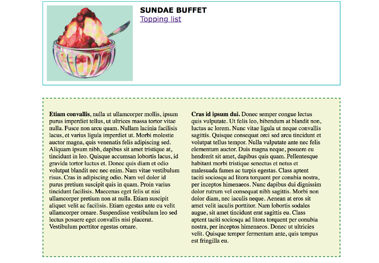
That covers the fundamentals of floating. If you are thinking that rectangular text wraps are a little ho-hum, you could add some pizzazz (or just eliminate extra whitespace) by using CSS Shapes.
Look at the previous float examples, and you will see that the text always wraps in a rectangular shape around a floated image or element box. However, you can change the shape of the wrapped text to a circle, ellipse, polygon, or any image shape by using the shape-outside property. This is an up-and-coming CSS feature, so be sure to check the Browser Support Note. Following is a quick introduction to CSS Shapes, which should inspire and prepare you for more exploration on your own.
As of this writing in 2018, text wrap shapes are supported only by Chrome 37+, Opera 24+, Safari 7.1+ (with prefix; without starting in 10.1), iOS Safari 8+ (with prefix; without in 10.3+), and Android 56+. The feature is under consideration at Microsoft Edge and in development at Firefox, so the support situation may be better by the time you are reading this. Check for the current state of support.
For the time being, feel free to use it as a progressive enhancement for designs in which a rectangular text wrap would be perfectly acceptable. Another alternative is to use a feature query () to serve a fallback set of styles to non-supporting browsers. Feature queries are introduced in .
shape-outside
Values: none | circle() | ellipse() | polygon() | url() | [margin-box | padding-box | content-box ]
Default: none
Applies to: floats
Inherits: no
Figure 15-12 shows the default text wrap around a floated image (left) and the same wrap with shape-outside applied (right). This is the kind of thing you’d expect to see in a print magazine, but now we can do it on the web!
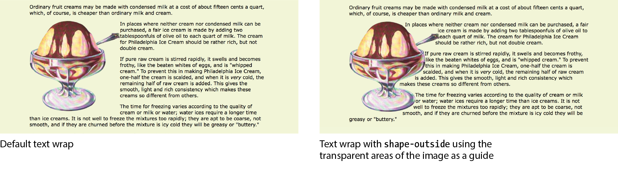
It is worth noting that you can change the text wrap shape around any floated element (see Note), but I will focus on images in this discussion, as text elements are generally boxes that fit nicely in the default rectangular wrap.
works only on floated elements for now, but it is believed that this will change in the future.
There are two approaches to making text wrap around a shape. One way is to provide the path coordinates of the wrap shape with circle(), ellipse(), or polygon(). Another way is to use url() to specify an image that has transparent areas (such as a GIF or a PNG). With the image method, text flows into the transparent areas of the image and stops at the opaque areas. This is the shape method shown in Figure 15-12 and the method I’ll introduce first.
In the example in Figure 15-12, I placed the sundae.png image in the HTML document to display on the page, and I’ve specified the same image in the style rule using url() so that its transparent areas define the wrap shape (see important Warning). It makes sense to use the same image in the document and for the CSS shape, but it is not required. You could apply a wrap shape derived from one image to another image on the page.
There is a security setting in Chrome and Opera that makes image-based text wraps a little tricky to use. Without getting into too much sys-admin detail, the browser restricts the use of the image used to create the CSS shape if it isn’t on the same domain as the file requesting it. This is not a bug; they are following the rules set out in the specification.
The rule also means that compliant browsers won’t allow images to be used for shapes when the files are served locally (i.e., on your computer). They need to be uploaded to a server to work, which makes the design process a little more cumbersome, especially for beginners.
If you use image-based text wraps, you know your CSS is written correctly, but you aren’t seeing wrapping in the browser, this security setting (related to Cross-Origin Resource Sharing, or CORS, if you’re curious) is probably the culprit.
The markup
<p><img src="sundae.png" class="wrap" alt=""> In places…</p>
The styles
img.wrap { float: left; width: 300px; height: 300px; -webkit-shape-outside: url(sundae.png); /* prefix required in 2018 */
shape-outside: url(sundae.png);
Notice that the wrapped text is now bumping right into the image. How about we give it a little extra space with shape-margin?
shape-margin
Values: length | percentage
Default: 0
Applies to: floats
Inherits: no
The shape-margin property specifies an amount of space to hold between the shape and the wrapped text. In Figure 15-13, you can see the effect of adding 1em of space between the opaque image areas and the wrapped text lines. It gives it a little breathing room the way any good margin should.
-webkit-shape-margin: 1em; shape-margin: 1em;
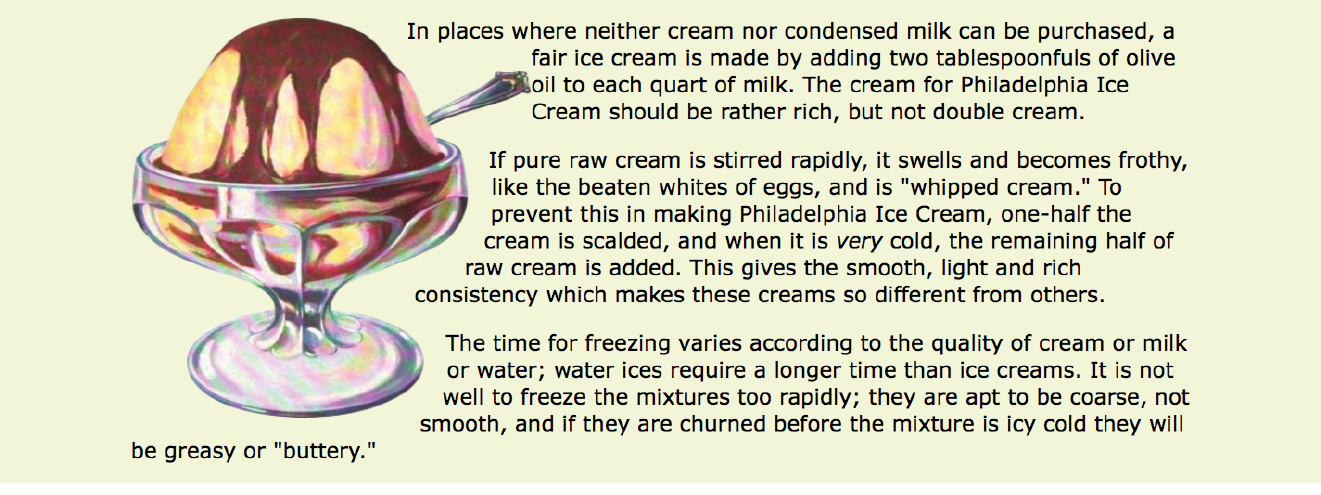
The other method for creating a text wrap shape is to define it using one of the path keywords: circle(), ellipse(), and polygon().
The circle() notation creates a circle shape for the text to wrap around. The value provided within the parentheses represents the length of the radius of the circle:
circle(radius)
In this example, the radius is 150px, half of the image width of 300 pixels. By default, the circle is centered vertically and horizontally on the float:
img.round { float: left; -webkit-shape-outside: circle(150px); shape-outside: circle(150px);}
Figure 15-14 shows this style rule applied to different images. Notice that the transparency of the image is not at play here. It’s just a path overlaid on the image that sets the boundaries for text wrap. Any path can be applied to any image or other floated element.
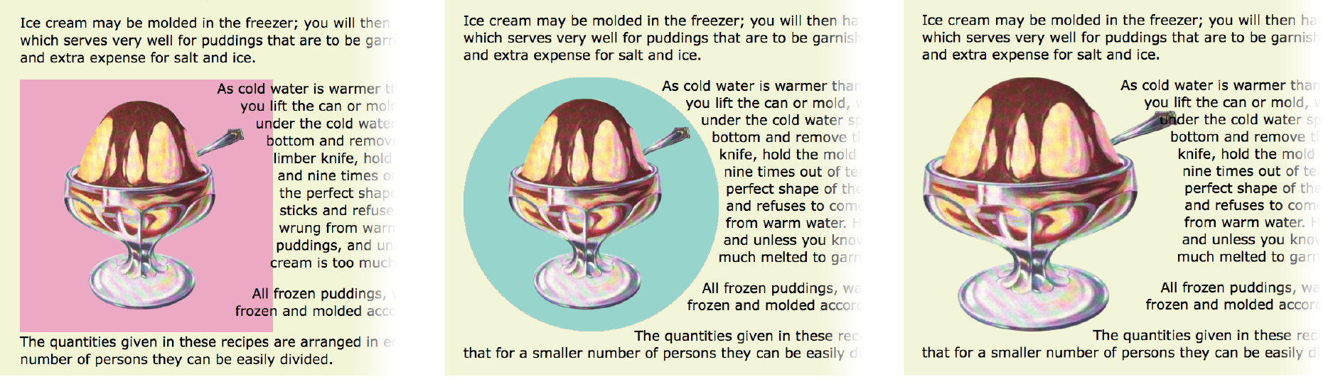
This is a good point to demonstrate a critical behavior of wrap shapes. They allow text to flow into the floated image or element, but they cannot hold space free beyond it.
In the example in Figure 15-15, I’ve increased the diameter of the circle path from 150px to 200px. Notice that the text lines up along the right edge of the image, even though the circle is set 50 pixels beyond the edge. The path does not push text away from the float. If you need to keep wrapped text away from the outside edge of the floated image or element, apply a margin to the element itself (it will be the standard rectangular shape, of course).
img.round { float: left; -webkit-shape-outside: circle(200px); shape-outside: circle(200px);}
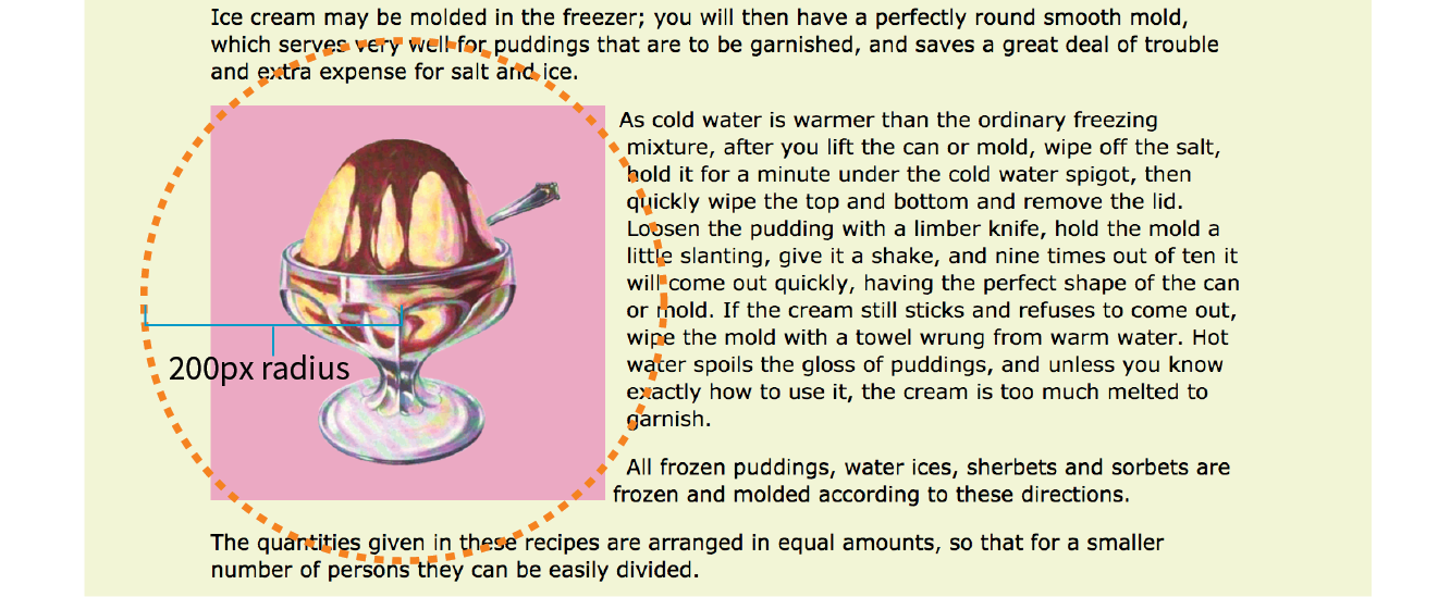
Elliptical shapes are created with the ellipse() notation, which provides the horizontal and vertical radius lengths followed by the word at and then the x,y coordinates for the center of the shape. Here is the syntax:
ellipse(rx ry at x y);
The position coordinates can be listed as a specific measurement or a percentage. Here I’ve created an ellipse with a 100-pixel horizontal radius and a 150-pixel vertical radius, centered in the floated element it is applied to (Figure 15-16):
img.round { float: left; -webkit-shape-outside: ellipse(200px 100px at 50% 50%); shape-outside: ellipse(200px 100px at 50% 50%);}
Finally, we come to polygon(), which lets you create a custom path using a series of comma-separated x,y coordinates along the path. This style rule creates the wrap effect shown in Figure 15-17:
img.wrap { float: left; width: 300px; height: 300px; shape-outside: polygon(0px 0px, 186px 0px, 225px 34px, 300px 34px, 300px 66px, 255px 88px, 267px 127px, 246px 178px, 192px 211px, 226px 236px, 226px 273px, 209px 300px, 0px 300px);}
Holy coordinates! That’s a lot of numbers, and my path was fairly simple. I’d like to be able to point you to a great tool for drawing and exporting polygon paths, but sadly, as of this writing I have none to recommend (see Note). I got the coordinates for my polygon examples by opening the image in Photoshop and gathering them manually, which, although possible, is not ideal.
There are some finer points regarding CSS Shapes that I must leave to you to research further. Here are a few resources to get you started:
Why don’t we make the text wrap around the images in the Black Goose Bakery page in a more interesting way for users with browsers that support it (Exercise 15-2)?
img[src*="bread"] { -webkit-shape-outside: circle(125px); shape-outside: circle(125px);
}
img[src*="muffin"] { margin-left: 50px; -webkit-shape-outside: circle(110px); shape-outside: circle(110px);
}
img[src*="bread"] { -webkit-shape-outside: ellipse(130px 95px at 50% 50%); shape-outside: ellipse(130px 95px at 50% 50%); }
img[src*="muffin"] { …
shape-outside: polygon(0px 0px, 197px 0px, 241px 31px, 241px 68px, 226px 82px, 219px 131px, 250px 142px, 250px 158px, 0px 158px);}
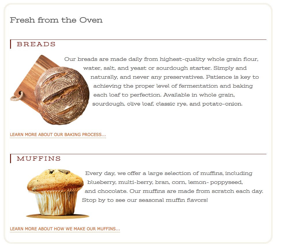
Well, that covers floating! You’ve learned how to float elements left and right, clear the following elements so they start below the floats, and even make fancy text wrapping shapes. Now let’s move on to the other approach to moving elements around on the page—positioning.
CSS provides several methods for positioning elements on the page. They can be positioned relative to where they would normally appear in the flow, or removed from the flow altogether and placed at a particular spot on the page. You can also position an element relative to the viewport, and it will stay put while the rest of the page scrolls.
position
Values: static | relative | absolute | fixed | sticky
Default: static
Applies to: all elements
Inherits: no
The position property indicates that an element is to be positioned and specifies which positioning method to use. I’ll introduce each keyword value briefly here, and then we’ll take a more detailed look at each method in the remainder of this chapter.
static
This is the normal positioning scheme in which elements are positioned as they occur in the normal document flow.
relative
Relative positioning moves the element box relative to its original position in the flow. The distinctive behavior of relative positioning is that the space the element would have occupied in the normal flow is preserved as empty space.
absolute
Absolutely positioned elements are removed from the document flow entirely and positioned with respect to the viewport or a containing element (we’ll talk more about this later). Unlike relatively positioned elements, the space they would have occupied is closed up. In fact, they have no influence at all on the layout of surrounding elements.
fixed
The distinguishing characteristic of fixed positioning is that the element stays in one position in the viewport even when the document scrolls. Fixed elements are removed from the document flow and positioned relative to the viewport rather than another element in the document.
sticky
Sticky positioning is a combination of relative and fixed in that it behaves as though it is relatively positioned, until it is scrolled into a specified position relative to the viewport, at which point it remains fixed.
The MDN Web Docs site has this description for a potential use case:
Sticky positioning is commonly used for the headings in an alphabetized listing. The B heading will appear just below the items that begin with A until they are scrolled offscreen. Rather than sliding offscreen with the rest of the content, the B heading will then remain fixed to the top of the viewport until all the B items have scrolled offscreen, at which point it will be covered up by the C heading.
The sticky position value is supported by current versions of Chrome, Firefox, Opera, MS Edge, Android, as well as Safari and iOS Safari with the -webkit- prefix. No version of IE supports it. Happily, sticky positioning degrades gracefully, as the element simply stays inline and scrolls with the document if it is not supported.
Each positioning method has its purpose, but absolute positioning is the most versatile. With absolute positioning, you can place an object anywhere in the viewport or within another element. Absolute positioning has been used to create multicolumn layouts, but it is more commonly used for small tasks, like positioning a search box in the top corner of a header. It’s a handy tool when used carefully and sparingly.
Once you’ve established the positioning method, the actual position is specified with some combination of up to four offset properties.
top, right, bottom, left
Values: length | percentage | auto
Default: auto
Applies to: positioned elements (where position value is relative, absolute, or fixed)
Inherits: no
The value provided for each offset property defines the distance the element should be moved away from that respective edge. For example, the value of top defines the distance the top outer edge of the positioned element should be offset from the top edge of the browser or other containing element. A positive value for top results in the element box moving down by that amount (see Note). Similarly, a positive value for left would move the positioned element to the right (toward the center of the containing block) by that amount.
Negative values are acceptable and move the element in the opposite direction of positive values. For example, a negative value for would have the effect of moving the element up.
Further explanations and examples of the offset properties will be provided in the discussions of each positioning method. We’ll start our exploration of positioning with the fairly straightforward relative method.
As mentioned previously, relative positioning moves an element relative to its original spot in the flow. The space it would have occupied is preserved and continues to influence the layout of surrounding content. This is easier to understand with a simple example.
Here I’ve positioned an inline em element. A bright background color on the em and a border on the containing paragraph make their boundaries apparent. First, I used the position property to set the method to relative, and then I used the top offset property to move the element 2em down from its initial position, and the left property to move it 3em to the right. Remember, offset property values move the element away from the specified edge, so if you want something to move to the right, as I did here, you use the left offset property. The results are shown in Figure 15-19.
em { position: relative; top: 2em; /* moves element down */
left: 3em; /* moves element right */
background-color: fuchsia;}
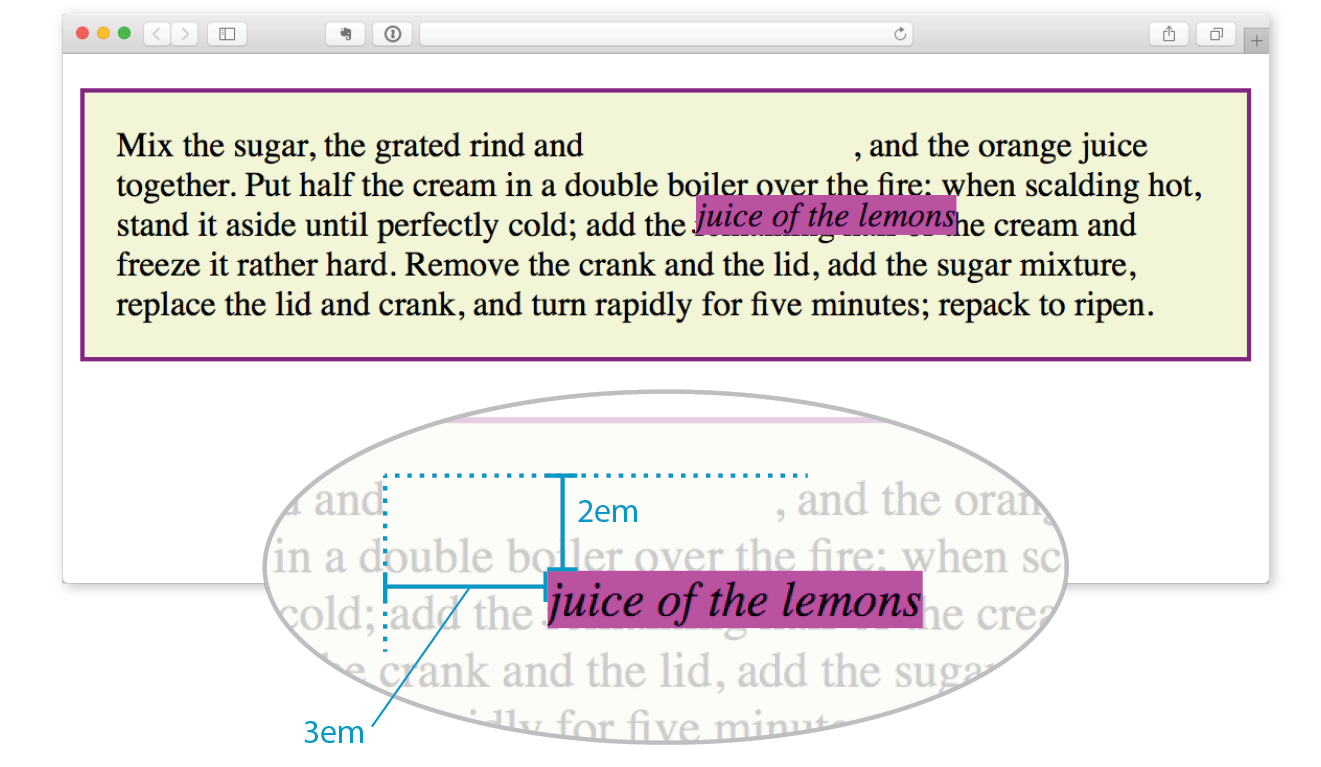
I want to point out a few things that are happening here:
The original space in the document flow is preserved.
You can see that there is a blank space where the emphasized text would have been if the element had not been positioned. The surrounding content is laid out as though the element were still there, and therefore we say that the element still “influences” the surrounding content.
Overlap happens.
Because this is a positioned element, it can potentially overlap other elements, as happens in Figure 15-19.
The empty space left behind by relatively positioned objects can be a little awkward, so this method is not used as often as absolute positioning. However, relative positioning is commonly used to create a “positioning context” for an absolutely positioned element. Remember that term positioning context—I’ll explain it in the next section.
Absolute positioning works a bit differently and is a more flexible method for accurately placing items on the page than relative positioning.
Now that you’ve seen how relative positioning works, let’s take the same example as shown in Figure 15-19, only this time we’ll change the value of the position property to absolute (Figure 15-20):
em { position: absolute; top: 2em; left: 3em; background-color: fuchsia;}
As you can see in Figure 15-20, the space once occupied by the em element is now closed up, as is the case for all absolutely positioned elements. In its new position, the element box overlaps the surrounding content. In the end, absolutely positioned elements have no influence whatsoever on the layout of surrounding elements.
The most significant difference here, however, is the location of the positioned element. This time, the offset values position the em element 2em down and 3em to the right of the top-left corner of the viewport (browser window).
But wait—before you start thinking that absolutely positioned elements are always placed relative to the viewport, I’m afraid that there’s more to it than that.
What actually happens in absolute positioning is that the element is positioned relative to its nearest containing block. It just so happens that the nearest containing block in Figure 15-20 is the root (html) element, also known as the initial containing block, so the offset values position the em element relative to the whole document.
Getting a handle on the containing block concept is the first step to tackling absolute positioning.
The CSS Positioned Layout Module, Level 3, states, “The position and size of an element’s box(es) are sometimes computed relative to a certain rectangle, called the containing block of the element.” It is critical to be aware of the containing block of the element you want to position. We sometimes refer to this as the positioning context.
The spec lays out a number of intricate rules for determining the containing block of an element, but it basically boils down to this:
Figure 15-20 is an example of the first case: the p element that contains the absolutely positioned em element is not positioned itself, and there are no other positioned elements higher in the hierarchy. Therefore, the em element is positioned relative to the initial containing block, which is equivalent to the viewport area.
Let’s deliberately turn the p element into a containing block and see what happens. All we have to do is apply the position property to it; we don’t have to actually move it. The most common way to make an element into a containing block is to set its position to relative, but not move it with any offset values. This is what I was talking about earlier when I said that relative positioning is used to create a positioning context for an absolutely positioned element.
In this example, we’ll keep the style rule for the em element the same, but we’ll add a position property to the p element, thus making it the containing block for the positioned em element. Figure 15-21 shows the results.
p { position: relative; padding: 15px; background-color: #F2F5D5; border: 2px solid purple;}
You can see that the em element is now positioned 2em down and 3em from the top-left corner of the paragraph box, not the browser window. Notice also that it is positioned relative to the padding edge of the paragraph (just inside the border), not the content area edge. This is the normal behavior when block elements are used as containing blocks (see Note).
I’m going to poke around at this some more to reveal additional aspects of absolutely positioned objects. This time, I’ve added width and margin properties to the positioned em element (Figure 15-22):
em { width: 200px; margin: 25px; position: absolute; top: 2em; left: 3em; background-color: fuchsia;}
Here we can see that:
For relatively positioned elements, the offset is measured to the box itself (not the outer margin edge).
It is important to keep in mind that once you’ve positioned an element, it becomes the new containing block for all the elements it contains. Say you position a narrow div at the top-left corner of a page, creating a column. If you were to absolutely position an image within that div with offset values that place it in the top-right corner, it appears in the top-right corner of that div, not the entire page. Once the parent element is positioned, it acts as the containing block for the img and any other contained elements.
Now that you have a better feel for the containing block concept, let’s take some time to get better acquainted with the offset properties. So far, we’ve only seen an element moved a few ems down and to the right, but that’s not all you can do, of course.
As mentioned previously, positive offset values push the positioned element box away from the specified edge and toward the center of the containing block. If there is no value provided for a side, it is set to auto, and the browser adds enough space to make the layout work. In this example, div#B is contained within div#A, which has been given the dimensions 600 pixels wide by 300 pixels high. I’ve used pixel lengths for all four offset properties to place the positioned element (#B) at a particular spot in its containing element (#A) (Figure 15-23).
The markup
<div id="A"> <div id="B"> </div></div>
The styles
div#A { position: relative; /* creates the containing block */
width: 600px; height: 300px; background-color: #C6DE89; /* green */
}
div#B { position: absolute; top: 25px; right: 50px; bottom: 75px; left: 100px; background-color: steelblue;}
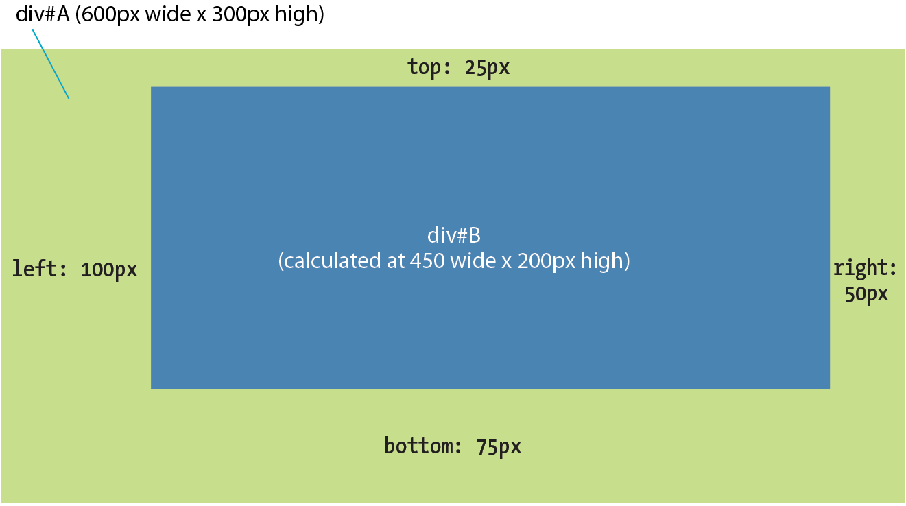
Notice that by setting offsets on all four sides, I have indirectly set the dimensions of the positioned div#B. It fills the 450 × 200 pixel space that is left over within the containing block after the offset values are applied. If I had also specified a width and other box properties for div#B, there is the potential for conflicts if the total of the values for the positioned box and its offsets does not match the available space within the containing block.
The CSS specification provides a daunting set of rules for handling conflicts, but the upshot is that you should just be careful not to over-specify box properties and offsets. In general, a width (factoring in margins as well as padding and border if you are using the content-box box-sizing model) and one or two offset properties are all that are necessary to achieve the layout you’re looking for. Let the browser take care of the remaining calculations.
You can also specify positions with percentage values. In the first example in Figure 15-24, the image is positioned halfway (50%) down the left edge of the containing block. In the second example on the right, the img element is positioned so that it always appears in the bottom-right corner of the containing block.
img#A { position: absolute; top: 50%; left: 0%; }img#B { position: absolute; bottom: 0%; right: 0%; }
Be careful when positioning elements at the bottom of the initial containing block (the element). Although you may expect it to be positioned at the bottom of the whole page, browsers actually place the element at the bottom of the browser window. Results may be unpredictable. If you want something positioned at the bottom of your page, put it in a containing block element at the end of the document source, and go from there.
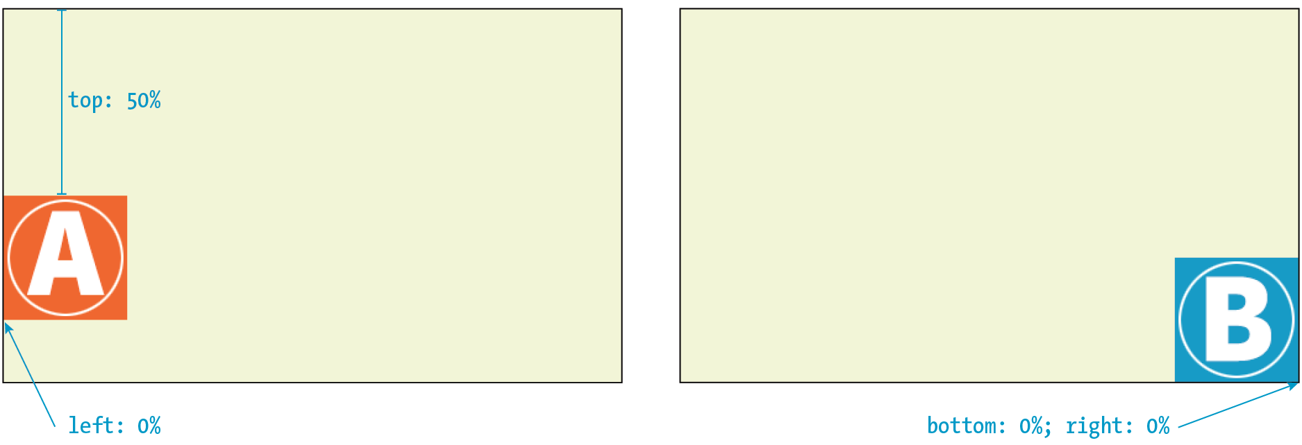
Although the examples here specify both a vertical and horizontal offset, it is common to provide just one offset for a positioned element—for example, to move it left or right into a margin using either left or right properties.
In Exercise 15-3, we’ll make further changes to the Black Goose Bakery home page, this time using absolute positioning.

Before we close the book on absolute positioning, there is one last related concept that I want to introduce. As we’ve seen, absolutely positioned elements overlap other elements, so it follows that multiple positioned elements have the potential to stack up on one another.
By default, elements stack up in the order in which they appear in the document, but you can change the stacking order with the z-index property (see Note). Picture the z-axis as a line that runs perpendicular to the page, as though from the tip of your nose, through this page, and out the other side.
The property is also useful for items in a grid, which also have the potential to overlap, as discussed in .
z-index
Values: number | auto
Default: auto
Applies to: positioned elements
Inherits: no
The value of the z-index property is a number (positive or negative). The higher the number, the higher the element will appear in the stack (that is, closer to your nose). Lower numbers and negative values move the element lower in the stack. Let’s look at an example to make this clear (Figure 15-26).
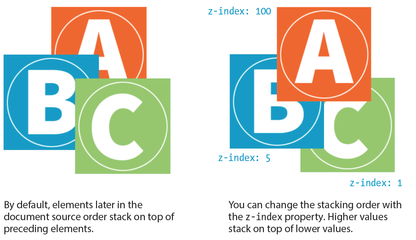
Here are three paragraph elements, each containing a letter image (A, B, and C, respectively) that have been absolutely positioned in such a way that they overlap on the page. By default, paragraph C would appear on top because it appears last in the source. However, by assigning higher z-index values to paragraphs A and B, we can force them to stack in our preferred order.
Note that the values of z-index do not need to be sequential, and they do not relate to anything in particular. All that matters is that higher number values position the element higher in the stack.
The markup
<p id="A"><img src="A.gif" alt="A"></p><p id="B"><img src="B.gif" alt="B"></p><p id="C"><img src="C.gif" alt="C"></p>
The styles
#A { z-index: 100; position: absolute; top: 175px; left: 200px;} #B { z-index: 5; position: absolute; top: 275px; left: 100px;
} #C { z-index: 1; position: absolute; top: 325px; left: 250px;}
To be honest, the z-index property is not often required for most page layouts, but you should know it’s there if you need it. If you want to guarantee that a positioned element always ends up on top, assign it a very high z-index value, such as 100 or 1000. If you want to make sure it’s at the bottom, give it a negative value. The number itself doesn’t actually matter.
We’ve covered relative and absolute positioning, so now it’s time to take on fixed positioning.
For the most part, fixed positioning works just like absolute positioning. The significant difference is that the offset values for fixed elements are always relative to the viewport, which means the positioned element stays put even when the rest of the page scrolls. By contrast, you may remember that when you scrolled the Black Goose Bakery page in Exercise 15-3, the award graphic scrolled along with the document—even though it was positioned relative to the initial containing block (equivalent to the viewport). Not so with fixed positioning, where the position is, well, fixed.
Fixed elements are often used for menus that stay in the same place at the top, bottom, or side of a screen so they are always available, even when the content scrolls (see Warning). Bear in mind that if you fix an element to the bottom of the viewport, you’ll need to leave enough space at the end of the document so the content doesn’t get hidden behind the fixed element. Fixed elements are also problematic when the document is printed because they will print on every page without reserving any space for themselves. It’s best to turn off fixed elements when printing the document. (Targeting print with @media is addressed in Chapter 17, Responsive Web Design.)
The property causes some buggy behaviors on old versions of mobile Safari (5, 6, and 7) and Android (<4.4). Fortunately, these mobile browsers are nearly obsolete as of this writing, but it is a reminder to do thorough testing on a range of mobile devices if you have fixed elements.
Let’s switch the award graphic on the Black Goose Bakery page to a fixed position in Exercise 15-4 to see the difference.
#award { position: fixed; top: 30px; left: 50px; }
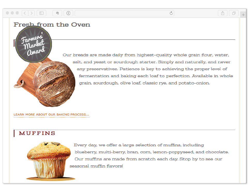
That does it for floating and positioning. In the next chapter, you’ll learn about flexible boxes and grid layout, which are powerful tools for designing the overall structure of a page and specific page features. But first, try your hand at a few questions about floating and positioning.
Before we move on, take a moment to see how well you absorbed the principles in this chapter. You’ll find the answers in Appendix A.
img { float: left; margin: 20px;}img { float: right; width: 120px; height: 80px; }img { float: right; right: 30px; }img { float: left; margin-bottom: 2em; }Here is a summary of the properties covered in this chapter.
In this chapter
Flex containers and items
Flow direction and wrapping
Flex item alignment
Controlling item “flex”
Grid containers and items
Setting up a grid template
Placing items in the grid
Implicit grid features
Grid item alignment
Get ready…this is a whopper of a chapter! In it, you will learn about two important CSS page layout tools:
Each tool has its special purpose, but you can use them together to achieve layouts we’ve only dreamed of until now. For example, you could create the overall page structure with a grid and use a flexbox to tame the header and navigation elements. Use each technique for what it’s best suited for—you don’t have to choose just one.
Now that browsers have begun to support these techniques, designers and developers have true options for achieving sophisticated layouts with baked-in flexibility needed for dealing with a wide array of screen sizes. Once old browsers fade from use, we can kiss our old float layout hacks goodbye (in the meantime, they make decent fallbacks).
You may notice that this chapter is big. Really big. That’s because the specs are overflowing with options and new concepts that require explanation and examples. It’s a lot to pack in your mind all at once, so I recommend treating it as two mini-chapters and spend some time getting up to speed with each technique individually.
The CSS Flexible Box Layout Module (also known as simply Flexbox) gives designers and developers a handy tool for laying out components of web pages such as menu bars, product listings, galleries, and much more.
According to the spec,
The defining aspect of flex layout is the ability to make the flex items “flex,” altering their width/height to fill the available space in the main dimension.
That means it allows items to stretch or shrink inside their containers, preventing wasted space and overflow—a real plus for making layouts fit a variety of viewport sizes. Other advantages include the following:
The Flexbox layout model is incredibly robust, but because it was designed for maximum flexibility, it takes a little time to wrap your head around it (at least it did for me). Here’s how it helped me to think about it: when you tell an element to become a flexbox, all of its child elements line up on one axis, like beads on a string. The string may be horizontal, it may hang vertically, or it may even wrap onto multiple lines, but the beads are always on one string (or to use the proper term, one axis). If you want to line things up both horizontally and vertically, that is the job of CSS Grid, which I’ll introduce in the next section of this chapter.
Before we dig in, I have a quick heads-up about browser support. All current browser versions support the latest W3C Flexible Box Layout Module spec; however, older browsers require prefixes and even different, outdated properties and values altogether. I’ll be sticking with the current standard properties to keep everything simple while you learn this for the first time, but know that production-ready style sheets may require more code. I’ll give you the nitty-gritty on browser support at the end of this section.
You’ve already learned about the block layout mode for stacking elements in the normal flow and the inline mode for displaying content within it horizontally. Flexbox is another layout mode with its own behaviors. To turn on flexbox mode for an element, set its display property to flex or inline-flex (see Note). It is now a flex container, and all of its direct child elements (whether they are divs, list items, paragraphs, etc.) automatically become flex items in that container. The flex items (the beads) are laid out and aligned along flex lines (the string).
The value generates an inline-level flex container box. We’ll be focusing on the more commonly used value in this chapter.
Figure 16-2 shows the effect of simply adding display: flex to a div, thus turning on the Flexbox switch. I’ve added a blue border to the container to make its boundaries clear. To save space, I am not showing purely cosmetic styles such as colors and fonts.
The markup
<div id="container"> <div class="box box1">1</div> <div class="box box2">2</div> <div class="box box3">3</div> <div class="box box4">4</div> <div class="box box5">5</div></div>
The STYLES
#container { display: flex;}
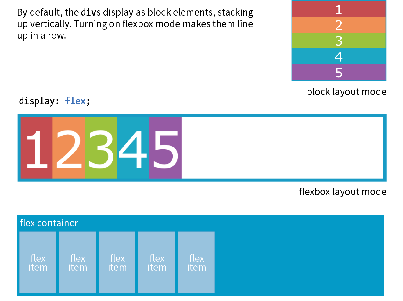
You can see that the items have lined up in a row from left to right, which is the default Flexbox behavior if your page is in English or another language written in rows from left to right. That is because the default flexbox direction matches the direction of the language the page is written in. It would go from right to left by default in Hebrew or Arabic or in columns if the page is set with a vertical writing direction. Because it is not tied to one default direction, the terminology for specifying directions tends to be a little abstract. You’ll see what I mean when we talk about “flow” in the following section.
It is worth noting that you can turn any flex item into a flex container by setting its display to flex, resulting in a nested flexbox. In fact, you’ll get to try that yourself in an upcoming exercise. Some Flexbox solutions use flexboxes nested several layers deep.
Once you turn an element into a flex container, there are a few properties you can set on that container to control how items flow within it. The flow refers to the direction in which flex items are laid out as well as whether they are permitted to wrap onto additional lines.
You may be happy with items lining up in a row as shown in Figure 16-2, but there are a few other options that are controllled with the flex-direction property.
flex-direction
Values: row | column | row-reverse | column-reverse
Default: row
Applies to: flex containers
Inherits: no
The default value is row, as we saw in the previous example (see the “Row and Column Direction” sidebar). You can also specify that items get aligned vertically in a column. The other options, row-reverse and column-reverse, arrange items in the direction you would expect, but they start at the end and get filled in the opposite direction. Figure 16-3 shows the effects of each keyword as applied to our simple example.
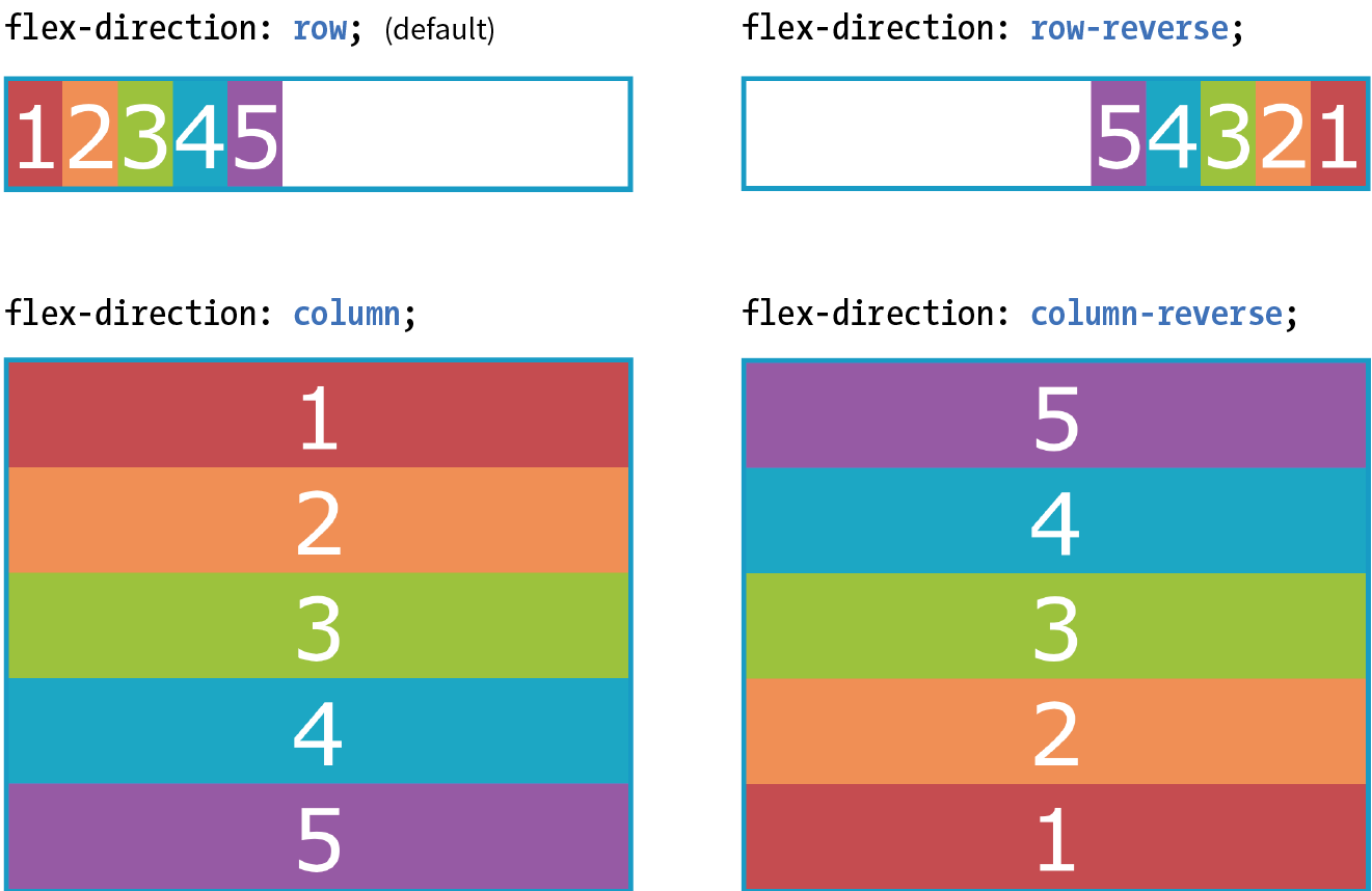
Now that you’ve seen Flexbox in action, it’s a good time to familiarize yourself with the formal Flexbox terminology. Because the system is direction-agnostic, there are no references to “left,” “right,” “top,” or “bottom” in the property values. Instead, we talk about the main axis and the cross axis. The main axis is the flow direction you’ve specified for the flex container. For primarily horizontal languages, when set to row, the main axis is horizontal; for column, the main axis is vertical (again, rows and columns are language-dependent, as explained earlier in the “Row and Column Direction” sidebar). The cross axis is whatever direction is perpendicular to the main axis (vertical for row, horizontal for column). The parts of a flex container are illustrated in Figure 16-4.
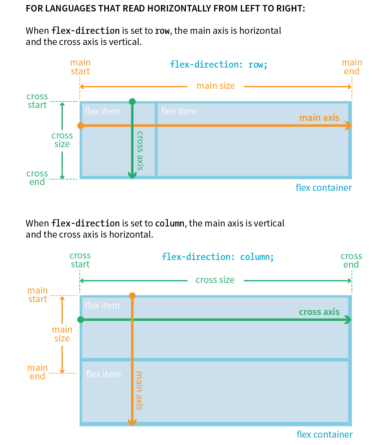
In addition to the axes, understanding the other parts of the Flexbox system makes the properties easier to learn. Both the main and cross axes have a start and an end, based on the direction in which the items flow. The main size is the width (or height if it’s a column) of the container along the main axis, and the cross size is height (or width if it’s a column) along the cross axis.
If you have a large or unknown number of flex items in a container and don’t want them to get all squished into the available space, you can allow them to break onto additional lines with the flex-wrap property.
flex-wrap
Values: nowrap | wrap | wrap-reverse
Default: nowrap
Applies to: flex containers
Inherits: no
By default, items do the squish thing and do not wrap onto additional lines (nowrap). The wrap keyword turns on the ability to wrap onto multiple lines in the direction from cross start to cross end. For example, if the direction is row, then lines are positioned from the top down.
wrap-reverse breaks the elements onto multiple lines, but flows them in the opposite direction, from cross end to cross start (from the bottom up, in this case). It feels a little esoteric to me, but you never know when an occasion might arise to put it to use.
I’ve added more divs to our numbered flexbox example and I’ve given the flex items a width of 25% so that only four will fit across the width of the container. Figure 16-5 shows a comparison of the various wrap options when the flex-direction is the default row.
The markup
<div id="container"> <div class="box box1">1</div> <!-- more boxes here -->
<div class="box box10">10</div></div>
The Styles
#container { display: flex; flex-direction: row; flex-wrap: wrap;
} .box { width: 25%;}
|
The markup |
The Styles |
<div id="container"> |
#container {
|
<div class="box box1">1</div> |
display: flex; |
<!-- more boxes here -->
|
flex-direction: row; |
<div class="box box10">10</div> |
|
</div> |
} |
.box {
|
|
width: 25%; |
|
} |
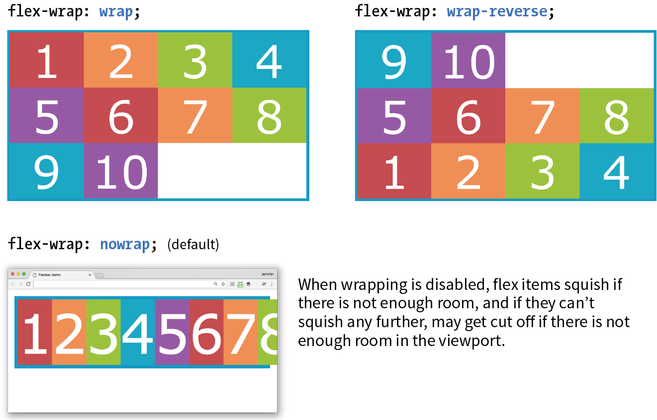
By default, when the flex-direction is set to column, the container expands to contain the height of the items. In order to see wrapping kick in, you need to set a height on the container, as I’ve done here. Figure 16-6 shows how wrapping works for each of the flex-wrap keywords. Notice that the items are still 25% the width of their parent container, so there is space left over between the columns.
#container { display: flex; height: 350px; flex-direction: column; flex-wrap: wrap;} .box { width: 25%;}
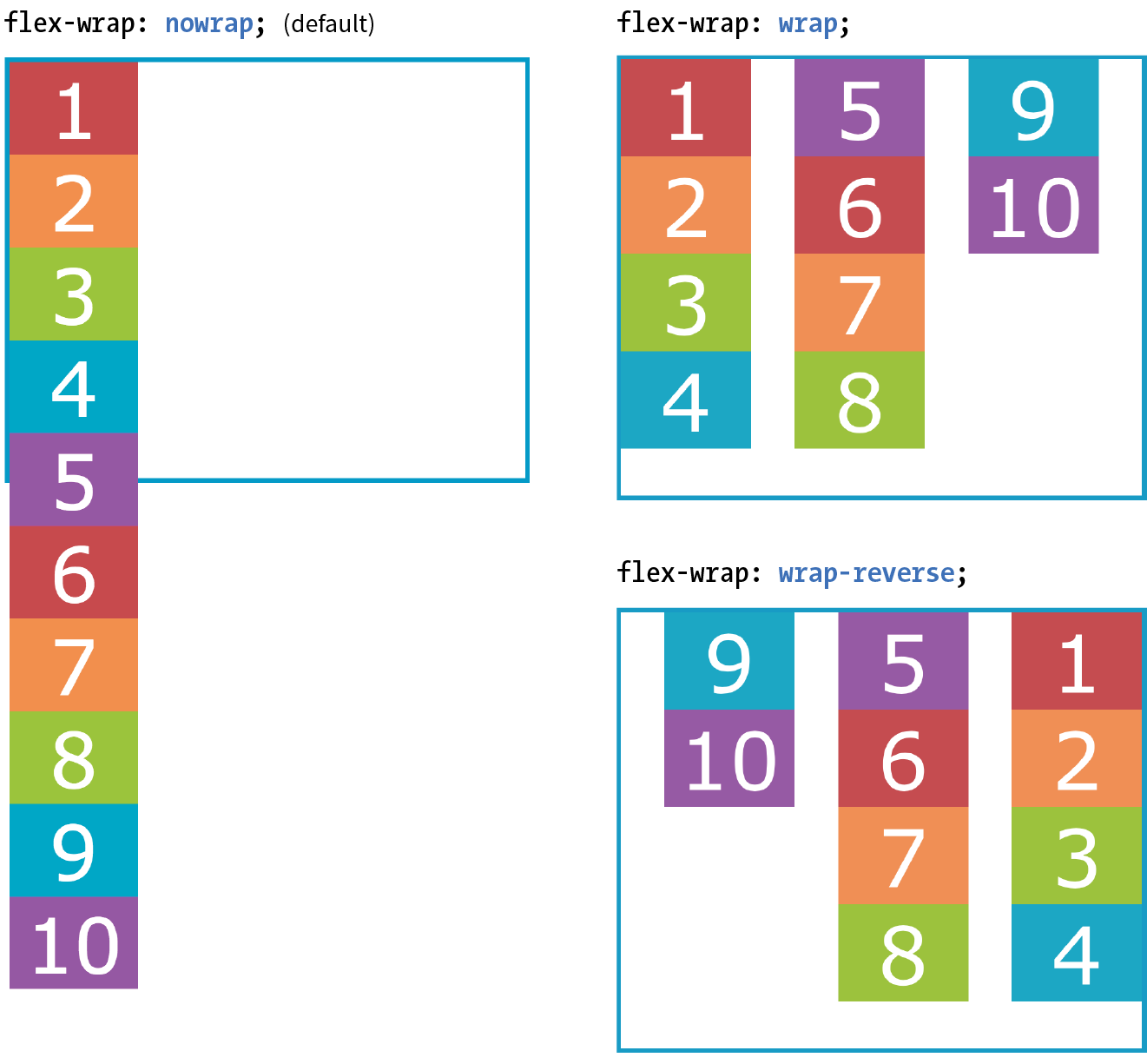
The shorthand property flex-flow makes specifying flex-direction and flex-wrap short and sweet. Omitting one value results in the default value for its respective property, which means you can use flex-flow for either or both direction and wrap.
flex-flow
Values: flex-direction flex-wrap
Default: row nowrap
Applies to: flex containers
Inherits: no
Using flex-flow, I could shorten the previous example (Figure 16-6) like so:
#container { display: flex; height: 350px; flex-flow: column wrap;}
You’ve only scratched the surface of Flexbox, but you’ve got what it takes to whip that ugly nav menu on the bakery page into shape in Exercise 16-1.

So far we’ve seen how to turn flexbox mode on, turning an element into a flex container and its children into flex items. We’ve also learned how to change the direction in which items flow, and allow them to wrap onto multiple lines. The remaining set of container properties affects the alignment of items along the main axis (justify-content) and cross axis (align-items and align-content).
By default, flex items are just as wide as they need to be to contain the element’s content, which means the container may potentially have space to spare on the flex line. We saw this back in Figure 16-2. Also by default, the items flow in right next to each other from the “main start” (based on language direction and the direction of the flex line).
The justify-content property defines how extra space should be distributed around or between items that are inflexible or have reached their maximum size (see Note).
You can also distribute extra space along the main axis by making the flex items themselves wider to fill the available space. That is the job of the properties, which we'll look at in a moment.
justify-content
Values: flex-start | flex-end | center | space-between | space-around
Default: flex-start
Applies to: flex containers
Inherits: no
Apply justify-content to the flex container element because it controls spacing within the container itself:
#container { display: flex; justify-content: flex-start;}
Figure 16-8 shows how items align using each of the keyword values for justify-content. As you would expect, flex-start and flex-end position the line of items toward the start and end of the main axis, respectively, and center centers them.
space-between and space-around warrant a little more explanation. When justify-content is set to space-between, the first item is positioned at the start point, the last item goes at the end point, and the remaining space is distributed evenly between the remaining items. The space-around property adds an equal amount of space on the left and right side of each item, resulting in a doubling up of space between neighboring items.
As new alignment keywords are added to the Grid Layout spec, they are available for Flexbox as well; however, because they are newer, they will be less well supported. Be sure to check the Flexbox spec for updates.
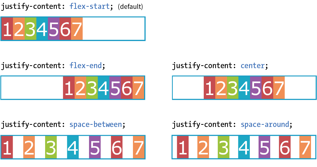
The setting is applied after margins have been calculated on items and after the way that items have been set to “flex” has been accounted for. If the value for items allows them to grow to fill the container width, then is not applicable.
When the direction is set to a column with a vertical main axis, the keywords work the same way; however, there needs to be an explicit container height with space left over in order for you to see the effect. I’ve changed the size of the text and set a height on the container element in Figure 16-9 to demonstrate the same keywords as applied to a vertical main axis.
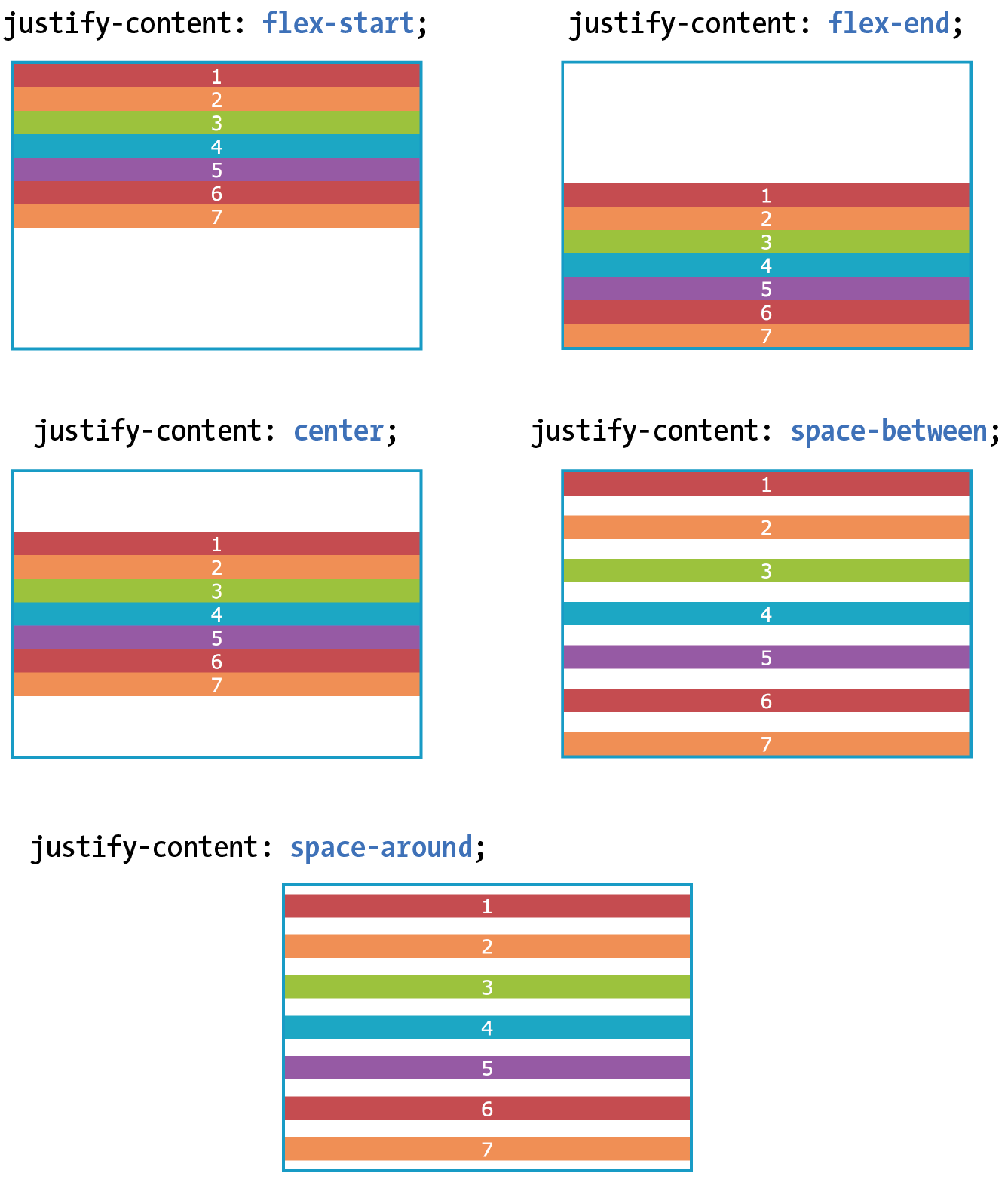
That takes care of arranging things on the main axis, but you may also want to play around with alignment on the cross axis (up and down when the direction is row, left and right if the direction is column). Cross-axis alignment and stretching is the job of the align-items property.
align-items
Values: flex-start | flex-end | center | baseline | stretch
Default: stretch
Applies to: flex containers
Inherits: no
I’ve demonstrated the various keyword values for align-items as it applies to rows in Figure 16-10. In order to see the effect, you must specify the container height; otherwise, it expands just enough to contain the content with no extra space. I’ve given the container a height to show how items are positioned on the cross axis.
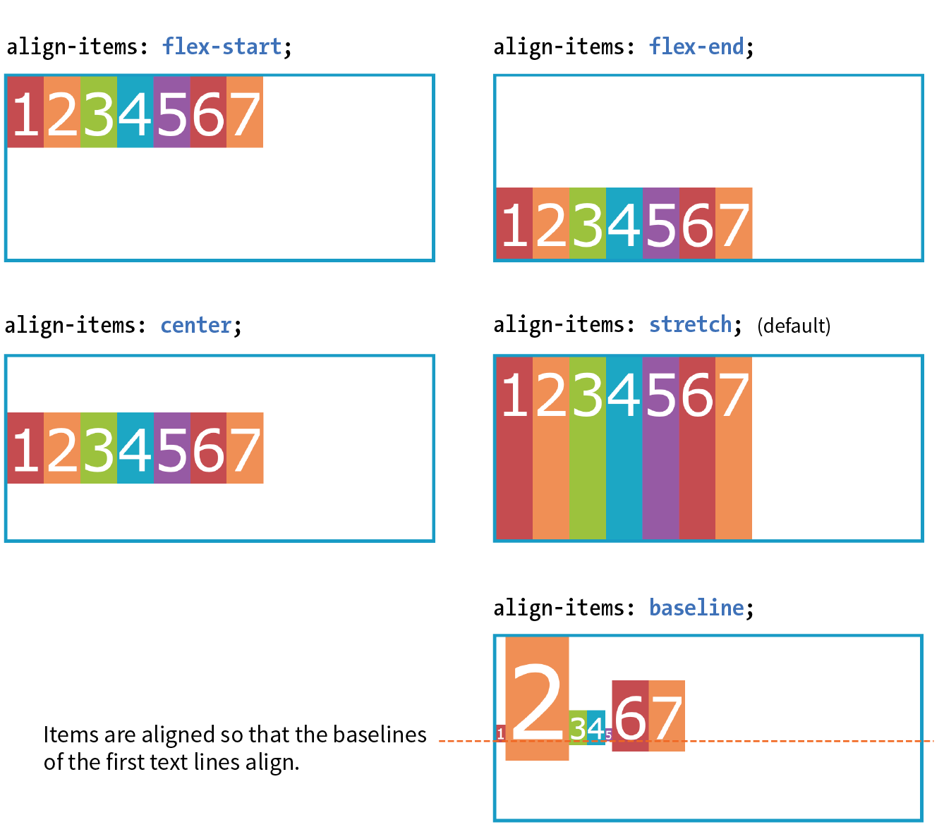
Like justify-content, the align-items property applies to the flex container (that can be a little confusing because “items” is in the name).
#container { display: flex; flex-direction: row; height: 200px; align-items: flex-start;}
The flex-start, flex-end, and center values should be familiar, only this time they refer to the start, end, and center of the cross axis. The baseline value aligns the baselines of the first lines of text, regardless of their size. It may be a good option for lining up elements with different text sizes, such as headlines and paragraphs across multiple items. Finally, stretch, which is the default, causes items to stretch until they fill the cross axis.
When the flex container’s direction is set to column, align-items aligns items left and right. Look back at Figures 16-2 and 16-9 and you will see that when we set the items in a column and did not provide any alignment information, each item stretched to the full width of the cross axis because stretch is the default value.
If you’d like one or more items to override the cross-axis setting, use the align-self property on the individual item element(s). This is the first property we’ve seen that applies to an item, not the container itself. align-self uses the same values as align-items; it just works on one item at a time.
align-self
Values: flex-start | flex-end | center | baseline | stretch
Default: stretch
Applies to: flex items
Inherits: no
In the following code and Figure 16-11, the fourth box is set to align at the end of the cross axis, while the others have the default stretch behavior.
.box4 { align-self: flex-end;}
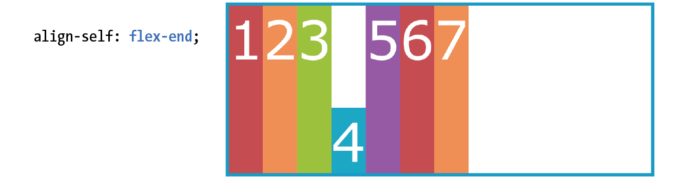
The final alignment option, align-content, affects how multiple flex lines are spread out across the cross axis. This property applies only when flex-wrap is set to wrap or wrap-reverse and there are multiple lines to align. If the items are on a single line, it does nothing.
align-content applies only when there are multiple wrapped flex lines.
align-content
Values: flex-start | flex-end | center | space-around | space-between | stretch
Default: stretch
Applies to: multi-line flex containers
Inherits: no
All of the values you see in the property listing should look familiar, and they work the way you would expect. This time, however, they apply to how extra space is distributed around multiple lines on the cross axis, as shown in Figure 16-12.
Again, the align-content property applies to the flex container element. A height is required for the container as well, because without it the container would be just tall enough to accommodate the content and there would be no space left over.
#container { display: flex; flex-direction: row; flex-wrap: wrap; height: 350px; align-items: flex-start;} box { width: 25%;}
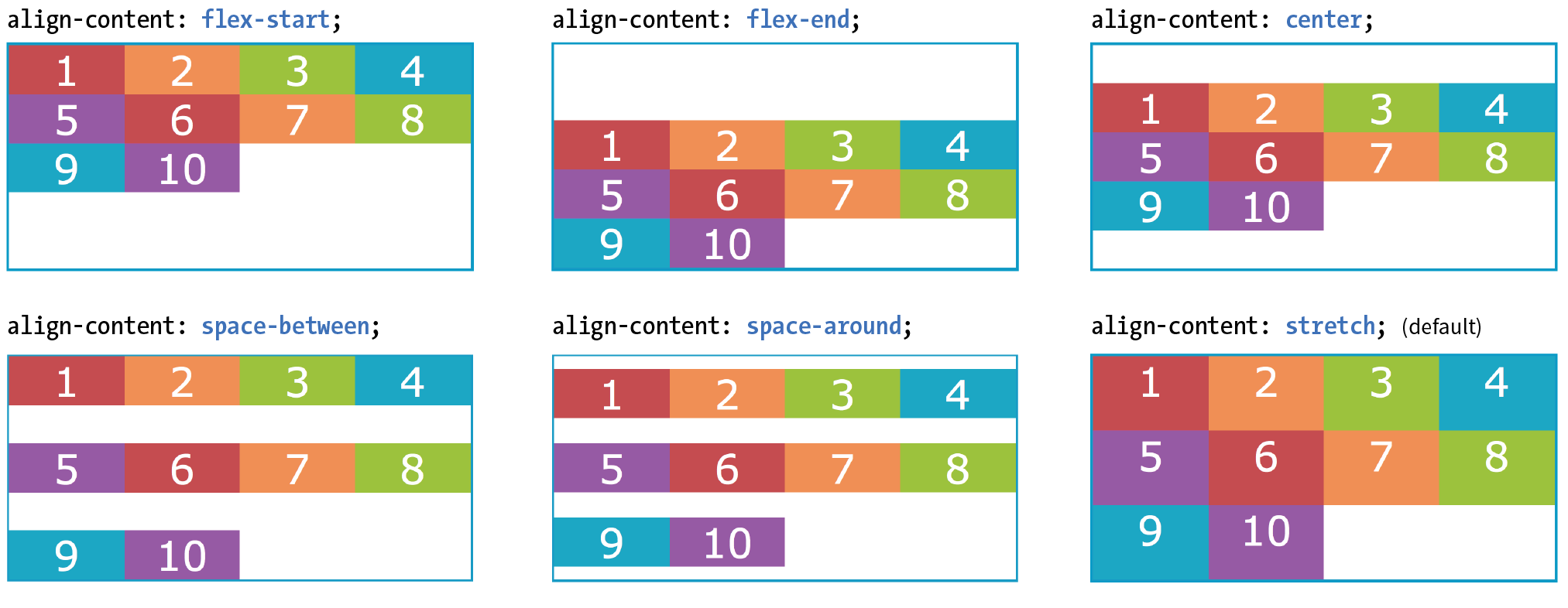
As long as we’re talking about alignment, there is one good trick I’d like to show you that will be useful when you start laying out components with Flexbox.
Menu bars are ubiquitous on the web, and it is common for one element of the bar, such as a logo or a search field, to be set off visually from the others. You can use a margin to put the extra container space on a specified side or sides of a flex item, thus setting one item apart. This should be more clear with an example.
The menu in Figure 16-13 has a logo and four menu options. I’d like the logo to stay in the left corner but the options to stay over to the right, regardless of the width of the viewport.
The markup
<ul> <li class="logo"><img src="logo.png" alt="LoGoCo"></li> <li>About</li> <li>Blog</li> <li>Shop</li> <li>Contact</li></ul>
The Styles
ul { display: flex; align-items: center; background-color: #00af8f; list-style: none; /* removes bullets */
padding: .5em; margin: 0; }li { margin: 0 1em;}li.logo { margin-right: auto;}

I’ve turned the unordered list (ul) into a flex container, so its list items (li) are now flex items. By default, the items would stay together at the start of the main axis (on the left) with extra space on the right. Setting the right margin on the logo item to auto moves the extra space to the right of the logo, pushing the remaining items all the way to the right (the “main end”).
This technique applies to a number of scenarios. If you want just the last item to appear on the right, set its left margin to auto. Want equal space around the center item in a list? Set both its left and right margins to auto. Want to push a button to the bottom of a column? Set the top margin of the last item to auto. The extra space in the container goes into the margin and pushes the neighboring items away.
We’ve covered a lot of territory, so it’s a good time to try out Flexbox in Exercise 16-2.
#menu { border: 3px solid #783F27; display: flex;}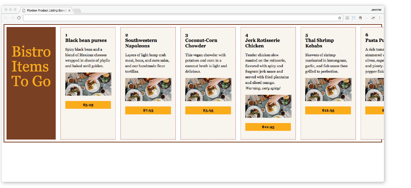
align-items: flex-start;
flex-wrap: wrap;
One of the great marvels of the flexbox model is that items resize, or flex to use the formal term, to fit the available space. It’s this flexibility that makes Flexbox such a powerful tool for designing for the wide array of screen and browser window sizes we encounter as web designers. The beauty is that the browser figures out the sizes on the fly, and that means less math for us! In this section, we’ll get to know the flex properties.
Earlier, you learned about the justify-content property, which distributes extra space in the container between and around items along the main axis. The concept of flex is concerned with how space is distributed within items, growing or shrinking items as required to make them fit.
Flex is controlled with the flex property, which specifies how much an item can grow and shrink, and identifies its starting size. The full story is that flex is a shorthand property for flex-grow, flex-shrink, and flex-basis, but the spec strongly recommends that authors use the flex shorthand instead of individual properties in order to avoid conflicting default values and to ensure that authors consider all three aspects of flex for every instance.
The flex properties apply to flex items, not the container.
flex
Values: none | 'flex-grow flex-shrink flex-basis'
Default: 0 1 auto
Applies to: flex items
Inherits: no
The value for the flex property is typically three flex properties listed in this order:
flex: flex-grow flex-shrink flex-basis;
For the flex-grow and flex-shrink properties, the values 1 and 0 work like on/off switches, where 1 “turns on” or allows an item to grow or shrink, and 0 prevents it. The flex-basis property sets the starting dimensions, either to a specific size or a size based on the contents.
In this quick example, a list item starts at 200 pixels wide, is allowed to expand to fill extra space (1), but is not allowed to shrink (0) narrower than the original 200 pixels.
li {
flex: 1 0 200px;}
That should give you the general idea. In this section, we’ll take a much closer look at growing, shrinking, and base size, in that order.
But first, it is important to note that flex and its component properties apply to flex items, not the container. Keeping track of which properties go on the container and which go on items is one of the tricks of using Flexbox. See the “Flex Properties” sidebar for a handy list of how the properties are divided.
The first value in the flex property specifies whether (and in what proportion) an item may stretch larger—in other words, its flex-grow value (see Note). By default it is set to 0, which means an item is not permitted to grow wider than the size of its content or its specified width. Because items do not expand by default, the alignment properties have the opportunity to go into effect. If the extra space was taken up inside items, alignment wouldn’t work.
is the individual property that specifies how an item may expand. Authors are encouraged to use the shorthand property instead.
flex-grow
Values: number
Default: 0
Applies to: flex items
Inherits: no
If you set the flex-grow value for all the items in a container to 1, the browser takes whatever extra space is available along the main axis and applies it equally to each item, allowing them all to stretch the same amount.
Let’s take the simple box example from earlier in the chapter and see how it behaves with various flex settings applied. Figure 16-18 shows what happens when flex-grow is set to 1 for all box items (flex-shrink and flex-basis are left at their default values). Compare this to the same example with flex-grow set to the default 0 (this is the same behavior we observed in Figure 16-2).
The markup
<div id="container"> <div class="box box1">1</div> <div class="box box2">2</div> <div class="box box3">3</div> <div class="box box4">4</div> <div class="box box5">5</div></div>
The Styles
.box { … flex: 1 1 auto;}
|
The markup |
The Styles |
<div id="container"> |
.box {
|
<div class="box box1">1</div> |
… |
<div class="box box2">2</div> |
|
<div class="box box3">3</div> |
} |
<div class="box box4">4</div> |
|
<div class="box box5">5</div> |
|
</div> |
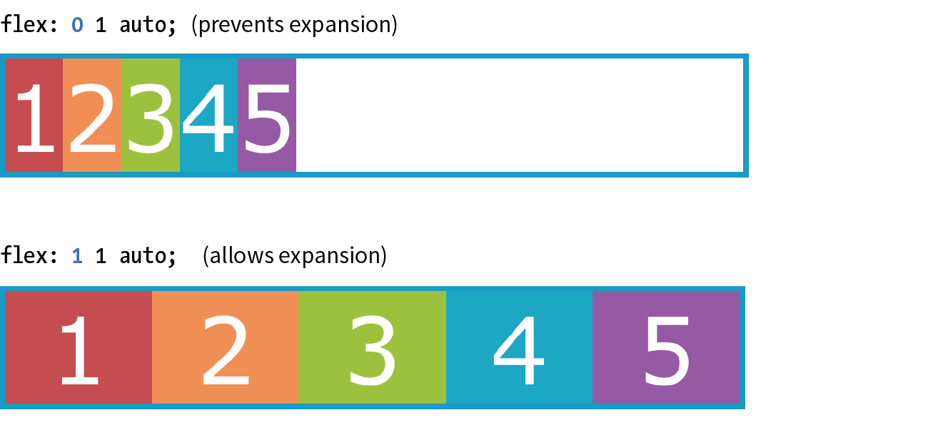
If you specify a higher flex-grow integer to an item, it acts as a ratio that applies more space within that item. For example, giving “box4” the value flex-grow: 3 means that it receives three times the amount of space than the remaining items set to flex-grow: 1. Figure 16-19 shows the result.
.box4 { flex: 3 1 auto;}
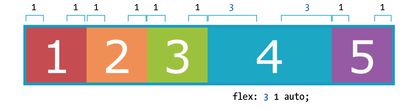
Notice that the resulting item is not three times as wide as the others; it just got three times the amount of space added to it.
If there’s not much space left over on the line, there’s a chance that each portion of space could be small enough that it would not add up to much difference. You may just need to play around with the flex-grow values and adjust the width of the browser until you get the effect you want.
Now that you have that concept down, shrinking should be straightforward because it is based on the same principle.
The second flex property value, flex-shrink, kicks in when the container is not wide enough to contain the items, resulting in a space deficit. It essentially takes away some space from within the items, shrinking them to fit, according to a specified ratio.
flex-shrink
Values: number
Default: 1
Applies to: flex items
Inherits: no
is the individual property that specifies how an item may contract. Authors are encouraged to use the shorthand property instead.
By default, the flex-shrink value is set to 1, which means if you do nothing, items shrink to fit at the same rate. When flex-shrink is 0, items are not permitted to shrink, and they may hang out of their container and out of view of the viewport. Finally, as in flex-grow, a higher integer works as a ratio. An item with a flex-shrink of 2 will shrink twice as fast as if it were set to 1. You will not generally need to specify a shrink ratio value. Just turning shrinking on (1) or off (0) should suffice.
By default, items may shrink when the container is not wide enough (flex-shrink: 1).
Flex items stop shrinking when they reach their minimum size (defined by min-width/min-height). By default (when min-width/min-height is auto), this minimum is based on its min-content size. But it can easily be set to zero, or 12em, or any other length that seems useful. Watch for this effect when deeply nested items force a flex item to be wider than expected.
You will see the flex-shrink property in action in Figure 16-20 in the next section.
The third flex value defines the starting size of the item before any wrapping, growing, or shrinking occurs (flex-basis). It may be used instead of the width property (or height property for columns) for flex items.
flex-basis
Values: length | percentage | content | auto
Default: auto
Applies to: flex items
Inherits: no
is the individual property that sets the initial size of the item. Authors are encouraged to use the shorthand property instead.
In this example, the flex-basis of the boxes is set to 100 pixels (Figure 16-20). The items are allowed to shrink smaller to fit in the available space (flex-shrink: 1), but they are not allowed to grow any wider (flex-grow: 0) than 100 pixels, leaving extra space in the container.
box { flex: 0 1 100px;}
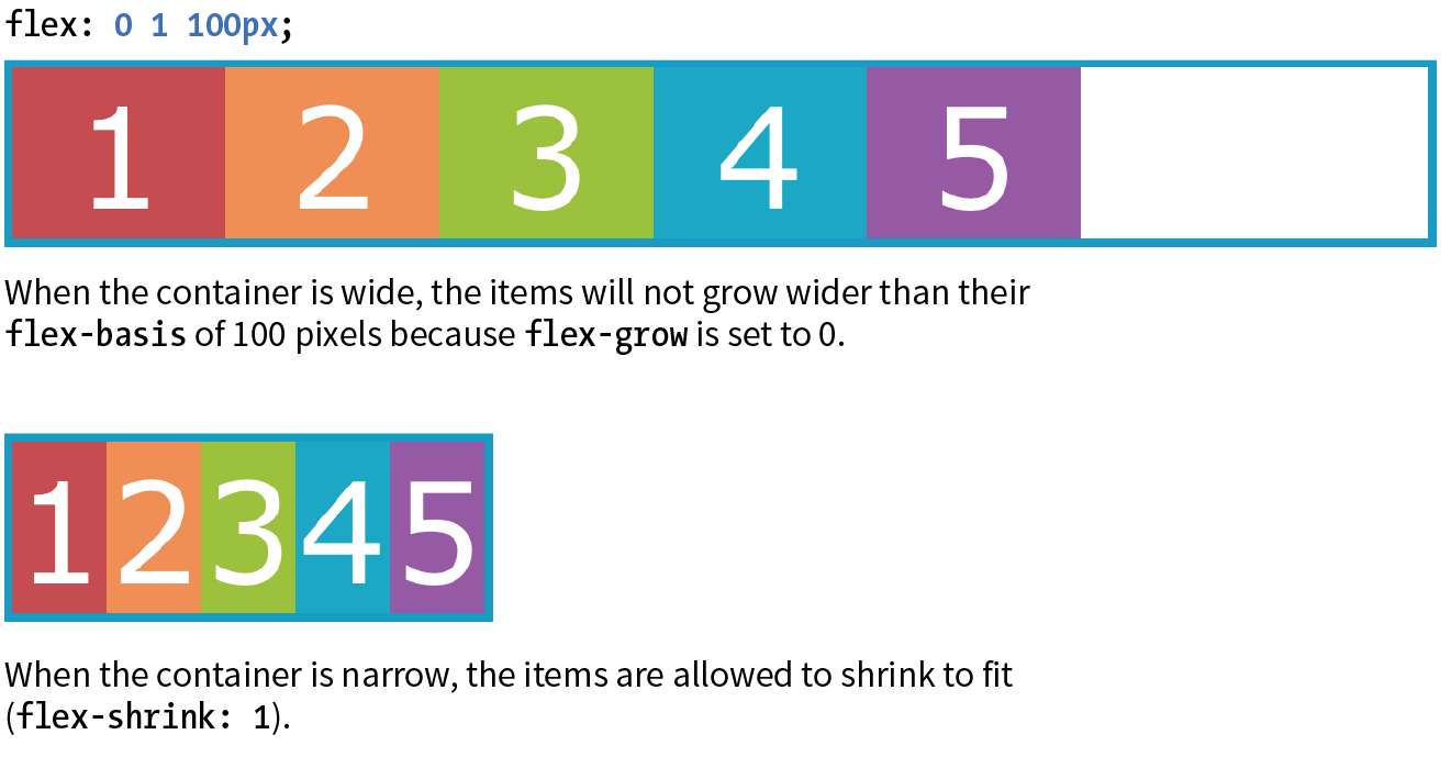
Flex settings override specified widths/heights for flex items.
By default, flex-basis is set to auto, which uses the specified width/height property values for the item size. If the item’s main size property (width or height) is not set or is auto (its default), flex-basis uses the content width. You can also explicitly set flex-basis to be the width of the content with the content keyword; however, that value is poorly supported as of this writing.
In this example, the flex basis for the boxes is set to 100 pixels because the auto value uses the value set by width. Items are allowed to grow, taking up any extra space in the container, but they are not allowed to shrink.
box { width: 100px; flex: 1 0 auto;}
When the browser goes about sizing a flex item, it consults the flex-basis value, compares it to the available space along the axis, and then adds or removes space from items according to their grow and shrink settings. It’s important to note that if you allow an item to grow or shrink, it could end up being narrower or wider than the length provided by flex-basis or width.
The advantage to using the flex property is that there are some handy shortcut values that cover typical Flexbox scenarios. Curiously, some of the shortcut values override the defaults of the individual properties, which was confusing to me at first, but in the end it results in more predictable behaviors. When creating a flexbox component, see if one of these easy settings will do the trick:
flex: initial;
This is the same as flex: 0 1 auto. It prevents the flex item from growing even when there is extra space, but allows it to shrink to fit in the container. The size is based on the specified width/height properties, defaulting to the size of the content. With the initial value, you can use justify-content for horizontal alignment.
flex: auto;
This is the same as flex: 1 1 auto. It allows items to be fully flexible, growing or shrinking as needed. The size is based on the specified width/height properties.
flex: none;
This is equivalent to flex: 0 0 auto. It creates a completely inflexible flex item while sizing it to the width and height properties. You can also use justify-content for alignment when flex is set to none.
flex: integer;
This is the same as flex: integer 1 0px. The result is a flexible item with a flex basis of 0, which means it has absolute flex (see the sidebar “Absolute Versus Relative Flex”) and free space is allocated according to the flex number applied to items.
How are you doing? Are you hanging in there with all this Flexbox stuff? I know it’s a lot to take in at once. We have just one more Flexbox item property to cover before you get another chance to try it out yourself.
.box { /* applied to all boxes */
flex: 1 0 0%; }.box1 { flex: 2; /* shortcut value for flex: 2 1 0px */
}.box4 { flex: 3; /* shortcut value for flex: 3 1 0px */
}
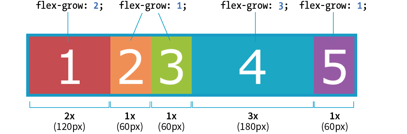
I use Flexbox to format a responsive form in the “Styling Forms” section of . Flex properties allow form fields to adapt to the available width, while labels are set to always stay the same size. Wrapping allows form fields to move below their labels on smaller screens. You’ve probably got Flexbox in your head right now, so it might be worth taking a look ahead.
One of the killer features of Flexbox is the ability to display items in an order that differs from their order in the source (see the “When to Reorder (and When Not To)” sidebar). That means you can change the layout order of elements by using CSS alone. This is a powerful tool for responsive design, allowing content from later in a document to be moved up on smaller screens.
To change the order of items, apply the order property to the particular item(s) you wish to move.
order
Values: integer
Default: 0
Applies to: flex items and absolutely positioned children of flex containers
Inherits: no
The value of the order property is a positive or negative number that affects the item’s placement along the flex line. It is similar to the z-index property in that the specific number value doesn’t matter, only how it relates to other values.
By default, all items have an order value of zero (0). When items have the same order value, they are laid out in the order in which they appear in the HTML source. If they have different order values, they are arranged from the lowest order value to the highest.
Going back to our colorful numbered box example, I’ve given box3 an order value of 1. With a higher order value, it appears after all the items set to 0 (the default), as shown in Figure 16-22.
.box3 { order: 1;}
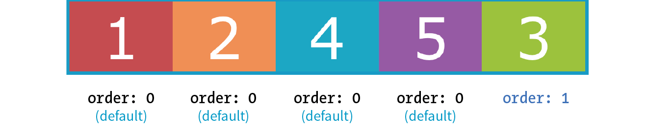
When multiple items share the same order value, that group of value-sharing items (called an ordinal group) sticks together and displays in source order. What happens if I give box2 an order value of 1 as well? Now both box2 and box3 have an order value of 1 (making them an ordinal group), and they get displayed in source order after all the items with the lower order value of 0 (Figure 16-23).
.box2, .box3 { order: 1 }
You can also use negative values for order. To continue with our example, I’ve given box5 an order value of –1. Notice in Figure 16-24 that it doesn’t just move back one space; it moves before all of the items that still have order set to 0, which is a higher value than –1.
.box5 { order: -1 }
I’ve used simple values of 1 and –1 in my examples, but I could have used 10008 or –649, and the result would be the same; the order goes from least value to greatest value. Number values don’t need to be in sequential order.
Now let’s take a look at how we can use order for something more useful than moving little boxes around in a line. Here is a simple document with a header, a main section consisting of an article and two aside elements, and a footer:
<header>…</header><main> <article><h2>Where It's At</h2></article> <aside id="news"><h2>News></h2></aside> <aside id="contact"><h2>Contact</h2><aside></main><footer>…<footer>
In the following CSS, I’ve made the main element a flexbox container so the article and aside elements line up in a row, creating three columns (Figure 16-25). I set the flex factor for each item, allowing them to grow and shrink, and set their widths with flex-basis. Finally, I used the order property to specify the order in which I’d like them to appear. Notice that the Contact section is now first in the row, although it appears last in the source order. And, as an added bonus, all of the columns fill the height of the main container despite the amount of content in them.
main { display: flex;}article { flex: 1 1 50%; order: 2;
}#news { flex: 1 1 25%; order: 3;
}#contact { flex: 1 1 25%; order: 1;}
Although you can create a full-page layout with Flexbox, the task is more appropriately handled with Grid Layout, which we’ll cover next. However, because Flexbox has better browser support than Grid Layout, it may be a suitable fallback. Flexbox is better suited for individual components on the page such as navigation, series of product “cards,” or anything that you want to put in a line.
That concludes our tour of Flexbox properties! In Exercise 16-3, you can put some of the item-level properties to use in the bistro menu. When you are finished, come back for some tips on dealing with varying browser support in the next section.
The current Flexible Box Layout Module became a stable Candidate Recommendation in 2012 (www.w3.org/TR/css-flexbox-1/). The good news is that all major desktop and mobile browsers have supported the standard since 2015 and a few since as far back as 2013. That covers roughly 80–90% of users as of this writing according to CanIUse.com.
The Flexbox specification went through a lot of big changes in its path to stabilization, and along the way, some older browsers implemented those old specs. The three main releases are as follows:
Current version (2012)
Syntax example: display: flex;
Supported by: IE11+, Edge 12+, Chrome 21-28 (-webkit-), Chrome 29+, Firefox 22–27 (-moz-, no wrapping), Firefox 28+, Safari 6–8 (-webkit-), Safari 9+, Opera 17+, Android 4.4+, iOS 7–8.4 (-webkit-), iOS 9.2+
“Tweener” version (2011)
Syntax example: display: flexbox;
Supported by: IE10
Old version (2009)
Syntax example: display: box;
Supported by: Chrome <21, Safari 3.1–6, Firefox 2–21, iOS 3.2–6.1, Android 2.1–4.3
What you won’t find in these listings is Internet Explorer 9 and earlier, which lack Flexbox support altogether.
Ensuring Flexbox works on the maximum number of browsers requires a gnarly stack of prefixes and alternative properties, the details of which are too complicated to dive into here. It’s also not something you’d want to write out by hand anyway, but fortunately there are options.
You can use Autoprefixer to magically generate that gnarly stack for you automatically. As you’re learning and practicing your CSS skills, you can convert your styles online at autoprefixer.github.io. Just paste in your styles, and it spits out the code (Figure 16-27) that you can add to your style sheet.
Be aware that although Autoprefixer makes adding prefixes easier, it does not guarantee that your flexboxes will work seamlessly in all browsers. There are behavior differences that can be unpredictable, so be sure to test on all of your target browsers.
When you are ready to bring your workflow to a professional level, you can include Autoprefixer as part of a “build step” that automates a lot of the development gruntwork. If you are using a CSS preprocessor such as SASS, you can also use “mixins” to manage tedious prefixes. We’ll look at build tools and preprocessors in Chapter 20, Modern Web Development Tools.
You may still want to provide fallback styles for non-supporting browsers (floats, inline blocks, and table display values are all options). If that is the case, you can use a feature detection technique to determine whether the browser supports Flexbox. If the browser fails the test, it gets a fallback set of styles, while supporting browsers get the full Flexbox treatment. We’ll take a look at feature detection in Chapter 19.
One big layout technique down, one big layout technique to go! Are you still with me? We’ve covered a lot of nitty-gritty details, and if you’re like me, your head may be swimming. That’s why I’ve included Figure 16-28. It has nothing to do with CSS layout, but I figured we could use a breather. In fact, why don’t you put down this book and take a little walk before taking on grids?

At long last, we web designers and developers have a CSS module for using an underlying grid to achieve true page layout—and we only had to wait 25 years to get it! The CSS Grid Layout Module provides a system for laying out elements in rows and columns (remember that Flexbox lays out elements on one axis only) in a way that can remain completely flexible to fit a variety of screen sizes or mimic a print page layout. You can use grids to create the sort of web page layouts that are familiar today, or get more sophisticated with typography and whitespace as Jen Simmons has done in her Lab demos (Figure 16-29). You can also use a grid to format just a portion of a page, such as a gallery of images or products.
In this section, I will give you a good head start on using Grid Layout; however, I should note that there will be a few stones left unturned that you can explore on your own.
The Grid Layout Module is one of the more complex specs in CSS, the finer points of which could fill a book. In fact, Eric Meyer has written that book: Grid Layout in CSS (O’Reilly)(see Note). I found that Eric helped me make practical sense of the dense language of the spec itself (which you will also want to reference at www.w3.org/TR/css-grid-1/). I also highly recommend Grid expert Rachel Andrew’s book, The New CSS Layout (A Book Apart) for a complete view of how we got to grid layouts and how to use them.
You will also find many great Grid resources online, which I will round up at the end of this section.
There’s great and not-so-great news about browser support for Grid Layout. The great news is that Chrome 57+, Opera, Firefox 52+, Safari 10+, and iOS Safari 10+ all started supporting the Grid standard free and clear of browser prefixes in March 2017. Microsoft Edge added support in version 16 in 2017.
The not-so-great news is that in addition to lingering older versions of those browsers, no version of Internet Explorer supports the current Grid standard (see the Browser Support Note).
Internet Explorer versions 10 and 11 and MS Edge through 15 implemented an early draft of the Grid Layout Module, much of which has since been made obsolete. They should be treated as non-supporting browsers when it comes to the standard grid styles outlined in this chapter. However, if those Microsoft browsers are used by a significant share of your target audience, it is probably worth targeting them with an alternative version of your layout written in the older grid syntax they understand.
So, for the time being, you need to provide an alternative layout for non-supporting browsers by using Flexbox or old-fashioned floats (or the older Grid specification for IE and Edge <15), depending on the browsers you need to target. A good way to get your Grid-based layouts to the browsers that can handle them is to use a CSS Feature Query that checks for Grid support and provides the appropriate set of styles. Feature queries are discussed in detail in Chapter 19.
Be sure to check CanIUse.com for updated browser support information. Another good resource is the Browser Support page at the “Grid by Example” site, created by Rachel Andrew (gridbyexample.com/browsers), where she posts browser support news as well as known bugs.
The process for using the CSS Grid Layout Module is fundamentally simple:
What makes Grid Layout complicated is that the spec provides so many options for specifying every little thing. All those options are terrific for customizing production work, but they can feel cumbersome when you are learning Grids for the first time. In this chapter, I’ll set you up with a solid Grid toolbox to get started, which you can expand on your own as needed.
Before we dive into specific properties, you’ll need to be familiar with the basic parts and vocabulary of the Grid system.
Starting with the markup, the element that has the display: grid property applied to it becomes the grid container and defines the context for grid formatting. All of its direct child elements automatically become grid items that end up positioned in the grid. If you’ve just read the Flexbox section of this chapter, this children-become-items scheme should sound familiar.
The key words in that previous paragraph are “direct child,” as only those elements become grid items. Elements contained in those elements do not, so you cannot place them on the grid. You can, however, nest a grid inside another grid if you need to apply a grid to a deeper level.
The grid itself has a number of components, as pointed out in Figure 16-30.
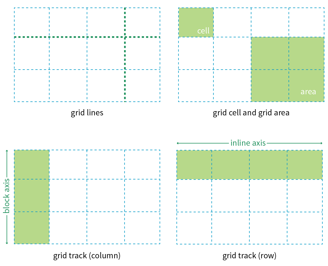
Grid line
The horizontal and vertical dividing lines of the grid are called grid lines.
Grid cell
The smallest unit of a grid is a grid cell, which is bordered by four adjacent grid lines with no grid lines running through it.
Grid area
A grid area is a rectangular area made up of one or more adjacent grid cells.
Grid track
The space between two adjacent grid lines is a grid track, which is a generic name for a grid column or a grid row. Grid columns are said to go along the block axis, which is vertical (as block elements are stacked) for languages written horizontally. Grid rows follow the inline (horizontal) axis.
It is worth pointing out that the structure established for the grid is independent from the number of grid items in the container. You could place 4 grid items in a grid with 12 cells, leaving 8 of the cells as “whitespace.” That’s the beauty of grids. You can also set up a grid with fewer cells than grid items, and the browser adds cells to the grid to accommodate them. It’s a wonderfully flexible system.
Without further ado, it’s time to get into some code.
To turn an element into a grid container, set its display property to grid or inline-grid (see Note).
Inline grids function the same as block-level grids, but they can be used in the flow of content. In this section, I focus only on block-level grids.
As of this writing, work has begun on a Working Draft of CSS Grid Layout Module Level 2, which incudes a “subgrid” mode that allows a nested grid to inherit its grid structure from its parent.
In this simple example, the #layout div becomes a grid container, and each of its children (#one, #two, #three, #four, and #five), therefore, is a grid item.
The markup
<div id="layout"> <div id="one">One</div> <div id="two">Two</div> <div id="three">Three</div> <div id="four">Four</div> <div id="five">Five</div></div>
The styles
#layout { display: grid;}
That sets the stage (or to use the more accurate term, the context) for the grid. Now we can specify how many rows and columns we want and how wide they should be.
Because I don’t want to have to figure out cells and spans in my head, I’ve made a quick sketch of how I’d like my final grid to look (Figure 16-31). A sketch is a good first step for working with grids. From the sketch, I can see that my layout requires three row tracks and three column tracks even though some of the content areas span over more than one cell. This is a pretty standard arrangement for a web page, and although I’m sticking with one-word content so we can focus on structure, you can imagine longer text content filling each area.
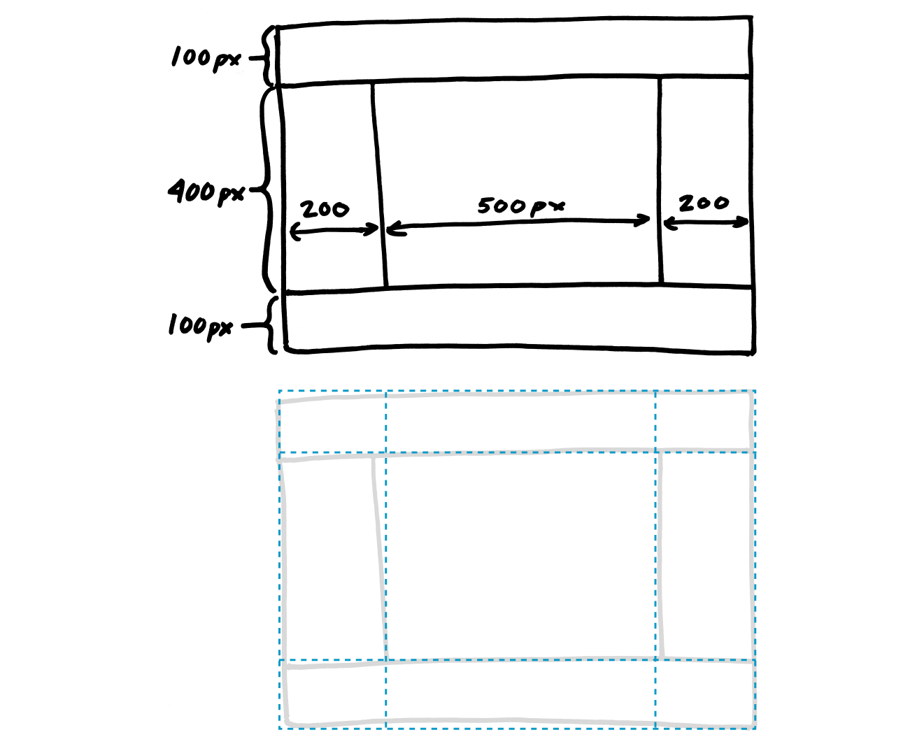
You probably noticed that this page layout with its header, footer, and three columns looks like the one we made using Flexbox in Figure 16-25. And you’re right! It just goes to show that there may be several solutions for getting to an intended result. Once Grid Layout becomes solidly supported, it will be the clear winner for creating flexible, whole-page layouts like this one.
To set up a grid in CSS, specify the height of each row and the width of each column (see Note) with the template properties, grid-template-rows and grid-template-columns, which get applied to the container element.
Like the Flexbox Module, the Grid Layout Module is dependent on the direction of the language in which the page is written. In this book, I will base grid terminology on the left-to-right, top-to-bottom writing direction.
grid-template-rows
grid-template-columns
Values: none | list of track sizes and optional line names
Default: none
Applies to: grid containers
Inherits: no
The value of the grid-template-rows property is a list of the heights for each row track in the grid. The value of the grid-template-columns is a list of the widths for each column track. The number of track sizes determines the number of rows or columns. For example, if you provide four lengths for grid-template-columns, you get a grid that is initially divided into four columns.
You can also include names for the grid lines between tracks, which we’ll get to in a moment, but for now, let’s start off as simply as possible.
In the following example, I’ve added template properties to divide the #layout container into three columns and three rows with the sizes I designated in my original sketch (Figure 16-31):
#layout { display: grid; grid-template-rows: 100px 400px 100px; grid-template-columns: 200px 500px 200px;}
Let’s see what happens if I do a quick check of the grid so far in the browser. Figure 16-32 shows that by default, the grid items flow in order into the available grid cells. I’ve added background colors to the items so their boundaries are clear, and I used Firefox CSS Grid Inspector (right) to reveal the entire grid structure.
Because there are only five child elements in the #layout div, only the first five cells are filled. This automatic flowing behavior isn’t what I’m after for this grid, but it is useful for instances in which it is OK for content to pour into a grid sequentially, such as a gallery of images. Soon, we will place each of our items on this grid deliberately, but first, let’s look at the template property values in greater depth.
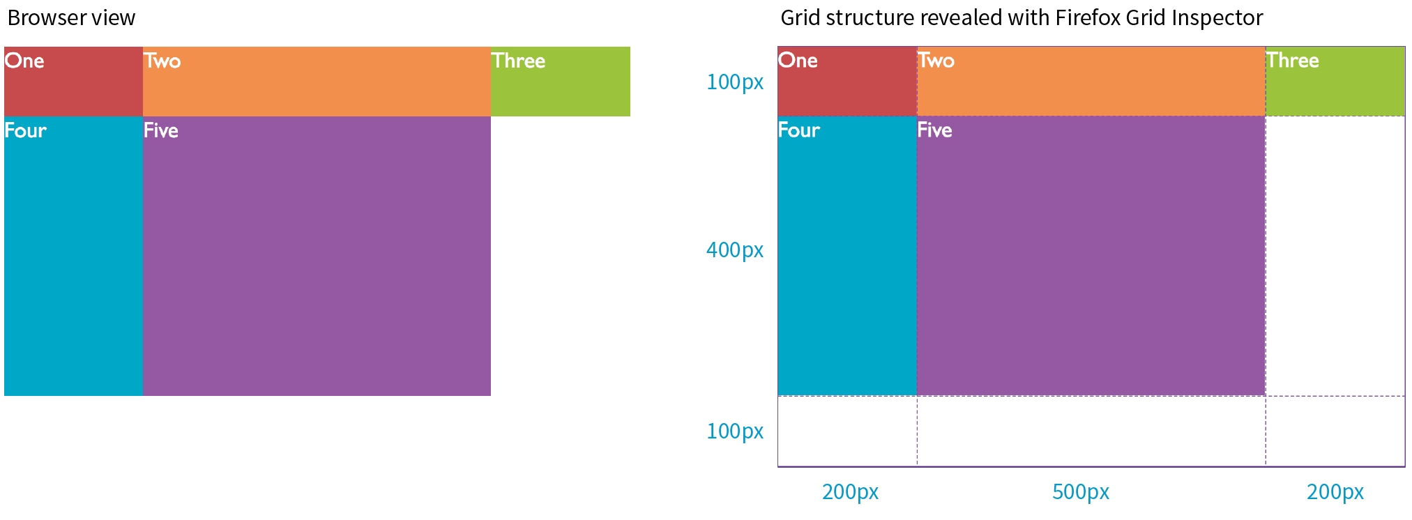
When the browser creates a grid, it also automatically assigns each grid line a number that you can reference when positioning items. The grid line at the start of the grid track is 1, and lines are numbered sequentially from there. Figure 16-33 shows how the grid lines are numbered for our sample grid.
The lines are numbered from the end of tracks as well, starting with –1, and numbers count back from there (–2, –3, etc.), as shown by the gray numbers in Figure 16-33. Being able to target the end of a row or column without counting lines (or even knowing how many rows or columns there are) is a handy feature. You’ll come to love that –1.
But if you don’t like to keep track of numbers, you can also assign names to lines that may be more intuitive. In the following example, I’ve assigned names that correspond to how I will be using the grid in the final page. Line names are added within square brackets in the position they appear relative to the tracks.
#layout { display: grid; grid-template-rows: [header-start] 100px [content-start] 400px [footer-start] 100px; grid-template-columns: [ads] 200px [main] 500px [links] 200px;}
Based on this example, the grid line at the top of the grid can now be referred to as “header-start,” “1,” or “–4.” I could also name the line that comes after the first row track “header-end” even though I’ve already named it “content-start.” To give a line more than one name, just include all the names in the brackets, separated by spaces:
grid-template-rows: [header-start] 100px [header-end content-start] 400px [footer-start] 100px;
It is common for each grid line to end up with multiple names and numbers, and you can choose whichever is the easiest to use. We’ll be using these numbers and names to place items on the grid in a moment.
I provided all of the track sizes in my example in specific pixel lengths to make them easy to visualize, but fixed sizes are one of many options. They also don’t offer the kind of flexibility required in our multi-device world. The Grid Layout Module provides a whole bunch of ways to specify track sizes, including old standbys like lengths (e.g., pixels or ems) and percentage values, but also some newer and Grid-specific values. I’m going to give you quick introductions to some useful Grid-specific values: the fr unit, the minmax() function, auto, and the content-based values min-content/max-content. We’ll also look at functions that allow you to set up a repeating pattern of track widths: the repeat() function with optional auto-fill and auto-fit values.
The Grid-specific fractional unit (fr) allows developers to create track widths that expand and contract depending on available space. To go back to the example, if I change the middle column from 500px to 1fr, the browser assigns all leftover space (after the 200-pixel column tracks are accommodated) to that column track (Figure 16-34).
#layout { display: grid; grid-template-rows: 100px 400px 100px; grid-template-columns: 200px 1fr 200px;}
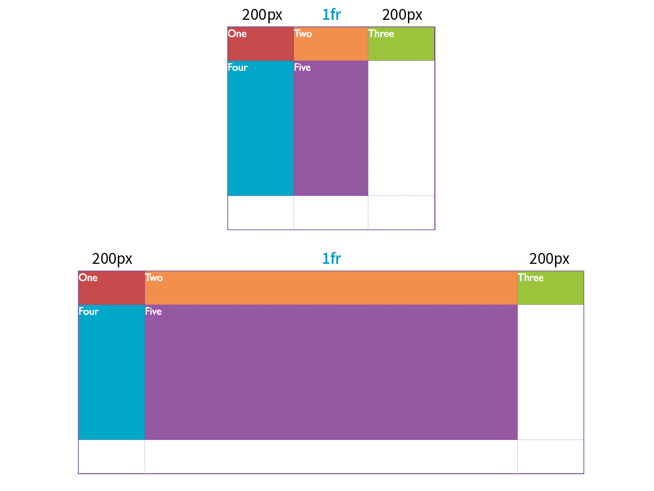
The fr unit is great for combining fixed and flexible track widths, but I could also use all fr units to give all the columns proportional widths. In this example, all of the column widths flex according to the available browser width, but the middle column will always be twice the width of the side columns (see Note).
grid-template-columns: 1fr 2fr 1fr;
Technically, the browser adds up the units (4 in our example), divides the leftover space into that many portions, and then assigns the portions based on the number of units specified.
You can constrict the size range of a track by setting its minimum and maximum widths using the minmax() function in place of a specific track size.
grid-template-columns: 200px minmax(15em, 45em) 200px;
This rule sets the middle column to a width that is at least 15em but never wider than 45em. This method allows for flexibility but allows the author to set limits.
units are not permitted as the minimum value in a statement.
The min-content, max-content, and auto values size the track based on the size of the content within it (Figure 16-35).
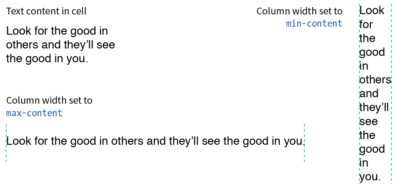
The min-content value is the smallest that track can get without overflowing (by default, unless overridden by an explicit min-width). It is equivalent to the “largest unbreakable bit of content”—in other words, the width of the longest word or widest image. It may not be useful for items that contain normal paragraphs, but it may be useful in some cases when you don’t want the track larger than it needs to be. This example establishes three columns, with the right column sized just wide enough to hold the longest word or image:
grid-template-columns: 50px 1fr min-content;
The max-content property allots the maximum amount of space needed for the content, even if that means extending the track beyond the boundaries of the grid container. When used as a column width, the column track will be as wide as the widest content in that track without line wrapping. That means if you have a paragraph, the track will be wide enough to contain the text set on one line. This makes max-content more appropriate for short phrases or navigation items when you don’t want their text to wrap (auto may work better because it allows wrapping if there’s not enough room).
Using the auto keyword for a track size is basically like handing the keys over to the browser. In general, it causes the track to be sized large enough to accommodate its content, while taking into consideration what other restrictions are in place.
In the minmax() function, the auto keyword behaves very similarly to either min-content or max-content, depending on whether you put it in the minimum or maximum slot. As a keyword on its own, it functions similarly to minmax(min-content, max-content), allowing the track to squeeze as narrow as it can without anything overflowing, but grow to fit its content without wrapping if there’s enough space.
Unlike max-content, an auto maximum allows align-content and justify-content to stretch the track beyond the size of the content. As a minimum, it has a few more smarts than min-content—for example, using a specified min-width or min-height on an item (if any) instead of its min-content size, and ignoring the contents of any grid items with scrollbars.
If you want to size a track based on its content, but you’re not sure which keyword to use, start with auto.
Say you have a grid that has 10 columns with alternating column widths, like so:
grid-template-columns: 20px 1fr 20px 1fr 20px 1fr 20px 1fr 20px 1fr 20px 1fr;
That’s kind of a bummer to have to type out (I know, I just did it), so the fine folks at the W3C have provided a nice shortcut in the form of the repeat() function. In the previous example, the pattern “20px 1fr” repeats five times, which can be written as follows:
grid-template-columns: repeat(5, 20px 1fr);
Much better, isn’t it? The first number indicates the number of repetitions, and the track sizes after the comma provide the pattern. You can use the repeat() notation in a longer sequence of track sizes—for example, if those 10 columns are sandwiched between two 200-pixel-wide columns at the start and end:
grid-template-columns: 200px repeat(5, 20px 1fr) 200px;
You can also provide grid line names before and/or after each track size, and those names will be repeated in the pattern:
grid-template-rows: repeat(4, [date] 5em [event] 1fr);
In the previous repeat() examples, we told the browser how many times to repeat the provided pattern. You can also let the browser figure it out itself based on the available space by using the auto-fill and auto-fit values instead of an integer in repeat().
For example, if I specify
grid-template-rows: repeat(auto-fill, 10em);
and the grid container is 35em tall, then the browser creates a row every 10 ems until it runs out of room, resulting in three rows. Even if there is only enough content to fill the first row, all three rows are created and the space is held in the layout.
You can only use one repeat() notation for a given declaration. You cannot use units with repeat(). Content-based keywords (auto, min-content, and max-content) cannot be used with auto-fill or auto-fit. Note that you can use minmax() notation inside repeat(), and you can use it with frs and content-based keywords if they are in the max position with a min length..
The auto-fit value works similarly, except any tracks that do not have content get dropped from the layout. If there is leftover space, it is distributed according to the vertical (align-content) and horizontal (justify-content) alignment values provided (we’ll discuss alignment later in this section).
So far we’ve been exploring how to divide a grid container into row and column tracks by using the grid-template-columns and grid-template-rows properties, and we’ve looked at many of the possible values for track dimensions. We’ve learned that you can assign names to individual grid lines to make them easy to refer to when placing items on the grid.
You can also assign names to areas of the grid, which for some developers is an even more intuitive method than calling out specific lines. Remember that a grid area is made up of one or more cells in a rectangle (no L-shapes or other non-rectangular collections of cells). Naming grid areas is a little funky to implement, but provides nice shortcuts when you need them.
To assign names to grid areas, use the grid-template-areas property.
grid-template-areas
Values: none | series of area names
Default: none
Applies to: grid containers
Inherits: no
The value of the property is a list of names provided for every cell in the grid, listed row by row, with each row in quotation marks. When neighboring cells share a name, they form a grid area with that name (see Bonus Grid Line Names sidebar).
In the following example, I’ve given names to areas in the example grid we’ve been working on so far (Figure 16-36). Notice that there is a cell name for each of the nine cells as they appear in each row. The row cell lists don’t need to be stacked as I’ve done here, but many developers find it helpful to line up the cell by names using character spaces to better visualize the grid structure.
#layout { display: grid; grid-template-rows: [header-start] 100px [content-start] 400px [footer-start] 100px; grid-template-columns: [ads] 200px [main] 1fr [links] 200px; grid-template-areas: "header header header" "ads main links" "footer footer footer";}
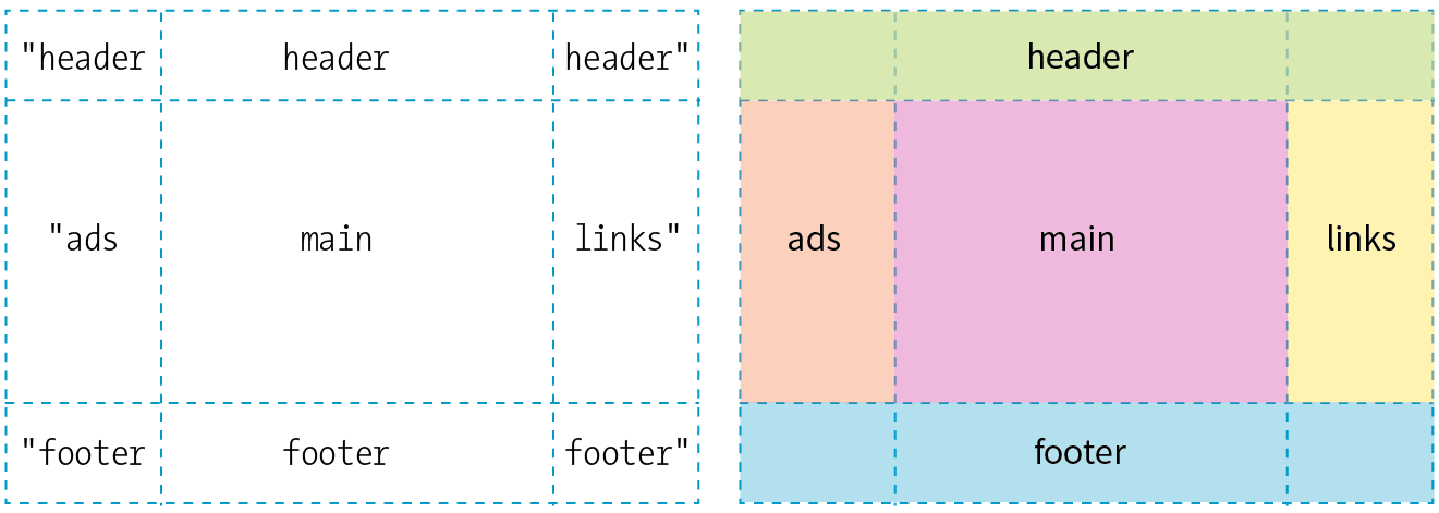
Be sure that you place the cell names in a way that forms rectangles when they combine to identify a named area. No L-shapes or fragments.
If there are three columns in the grid, there must be three names provided for each row. If you want to leave a cell unnamed, type one or more periods (.) in its place as a space holder so that every cell is still accounted for. Again, a sketch of your grid with the areas identified will make it easier to plan out the grid-template-areas value.
Be aware that the track sizes are still coming from the grid-template-columns and grid-template-rows properties. The grid-template-areas property simply assigns names to the areas, making it easier to plop items in them later.
Use the grid shorthand property to set values for grid-template-rows, grid-template-columns, and grid-template-areas with one style rule. Bear in mind that any properties you do not use will be reset to their defaults, as is the case for all shorthands.
grid
Values: none | row info / column info
Default: none
Applies to: grid containers
Inherits: no
In grid, the row values and column values are separated by a slash, with the row values appearing first:
grid: rows / columns
It’s easier to grasp without the clutter of line and area names, so here is the shorthand declaration for our example grid with just the row and column track information:
#layout { display: grid; grid: 100px 400px 100px / 200px 1fr 200px;}
To include custom line names, add the names in brackets around their respective tracks, as we saw in the earlier named line example.
Including area names looks a little convoluted at first, but if you remember that you list cell names row by row, it makes sense that they appear with the other row information, before the slash. The complete order goes as follows:
[start line name] "area names" <track size> [end line name]
The line names and area names are optional. Repeat this for each row in the grid, simply listing them one after another with no special character separating rows. You may find it helpful to stack them as I’ve done in the following example to help keep each row distinct. When the rows are done, add a slash, and list the column track information after it. Here’s a complete example of our grid written with the grid shorthand:
#layout { display: grid; grid: [header-start] "header header header" 100px [content-start] "ads main links" 400px [footer-start] "footer footer footer" 100px /[ads] 200px [main] 1fr [links] 200px; }
This expands to the following:
#layout { display: grid; grid-template-rows: [header-start] 100px [content-start] 400px [footer-start] 100px; grid-template-columns: [ads] 200px [main] 1fr [links] 200px; grid-template-areas: "header header header" "ads main links" "footer footer footer" }
There is also a grid-template property that works exactly like grid, but it may be used only with explicitly defined grids (as opposed to implicit grids, which I cover later). The Grid Layout spec strongly recommends that you use the grid shorthand instead of grid-template (see Note) unless you specifically want the cascading behavior of grid-template.
The Grid experts I’ve talked to don’t tend to use or except for the simplest of grid structures. The code becomes overly complex, and one small slip can make the whole grid fall apart. For complicated grid structures, stick to separate properties for defining rows, columns, and areas.
I’m thinking that it’s a good time for you to put all of these grid setup styles to use in Exercise 16-4.
You will need to use a browser that supports grids for this exercise. I am using Firefox in order to take advantage of the Grid Inspector tool. Supporting browsers are listed earlier in this section. See the sidebar for instructions on how to open the tool.
Now that we’ve covered all the ins and outs of setting up a grid, including giving ourselves handy line and area names, we can move on to assigning items to areas on the grid.
As we saw in Figures 16-32 and 16-38, without any explicit placement instruction, grid items flow into the available grid cells sequentially. That’s fine for some use cases, but let’s tell our grid items where to go!
One method for describing a grid item’s location on the grid is to specify the four lines bordering the target grid area with four properties that specify the start and end row lines and the start and end column lines. Apply these properties to the individual grid item element you are positioning.
grid-row-start
grid-row-end
grid-column-start
grid-column-end
Values: auto | grid line | span number | span ‘line name’ | number ‘line name’
Default: auto
Applies to: grid items
Inherits: no
This set of properties provides a straightforward way to describe an element’s position on the grid by identifying either the name or number of the grid line on each border. As an alternative, you can provide just one line identifier and tell the item to “span” a certain number of cells. By default, an item occupies one track width, which is what you get with the auto keyword.
Getting back to our five-item example, I would like the first item to go in the top row and span across all three columns (Figure 16-39).
One way to do this is to use the four line start/end properties and identify lines by their numbers like so:
#one { grid-row-start: 1; grid-row-end: 2; grid-column-start: 1; grid-column-end: 4;}
Take a moment to compare this to the position of the #one div back in Figure 16-36. For grid-row-start, the 1 value refers to the first (top) line of the grid container. For grid-column-start, 1 refers to the first line on the left edge of the container, and the value 4 for grid-column-end identifies the fourth and last line on the right edge of the container.
Here’s one more for good measure. This style declaration positions the #four item element in the right side column as shown in Figure 16-36:
#four { grid-row-start: 2; grid-row-end: 3; grid-column-start: 3; grid-column-end: 4;}
If you omit a start or end line, the area will be one track wide (the default, ).
Remember how grid lines are also numbered in the opposite direction starting at –1? We can use that here. I could specify the grid-column-end for #one as –1, and it would be the same as 4. In fact, this method has the advantage of guaranteeing to span to the end of the track and avoids miscounting.
I could also use the named lines I set up here. These row values are interchangeable with the previous example:
#one { grid-row-start: header-start; grid-row-end: header-end; …}
If I omit the end line declaration, the row would be one track high (the default). That’s what I want here, so omitting the end declaration altogether is one more way to achieve the effect I want.
Ready for yet another option? I can tell the item what line to start on, but instead of providing an end line, I can use the span keyword to specify how many tracks to span over. In this example, the item starts at the left edge of the track (line 1) and spans over three columns, effectively ending at line 4.
#one { … grid-column-start: 1; grid-column-end: span 3;}
Spans can work in reverse as well. If you provide only an end line, the span searches toward the start of the track. The following styles have the same effect as our previous examples because they define the target area by its end line at the far right of the grid and span back three columns to the beginning:
#one { … grid-column-start: span 3; grid-column-end: -1;}
If four declarations feels like too many, use the shorthand grid-row and grid-column properties instead.
grid-row
grid-column
Values: start line / end line
Default: see individual properties
Applies to: grid items
Inherits: no
These properties combine the *-start and *-end properties into a single declaration. The start and end line values are separated by a slash (/). With the shorthand, I can shorten my example to the following two declarations. Any of the methods for referring to lines work in the shorthand values.
#one { grid-row: 1 / 2; grid-column: 1 / span 3;}
The other way to position an item on a grid is to tell it go into one of the named areas by using the grid-area property.
grid-area
Values: area name | 1 to 4 line identifiers
Default: see individual properties
Applies to: grid items
Inherits: no
The grid-area property points to one of the areas named with grid-template-areas. It can also point to an area name that is implicitly created when you name lines delimiting an area with the suffixes “-start” and “-end”. With this method, I can drop all of the grid items into the areas I set up with my template earlier (Figure 16-40):
#one { grid-area: header; }#two { grid-area: ads; }#three { grid-area: main; }#four { grid-area: links; }#five { grid-area: footer; }
How easy was that?! One benefit of using areas is that you can change the grid, and as long as you provide consistently named grid areas, the items will end up in the right place. There’s no need to renumber lines in the style sheet.
You can also use grid-area to provide a list of four grid lines that define an area, separated by slashes. The order in which they appear is “row-start,” “column-start,” “row-end,” “column-end” (counterclockwise from the top). There are a lot of rules for what happens when you omit values, but I’m not going to get into all those finer points here. The grid-area declaration for the first grid item could be written like this to achieve the same result as previous examples:
#one { grid-area: 1 / 1 / 2 / span 3; /* row-start / column-start / row-end / column-end */
}
As you can see, the Grid Layout Module gives you a variety of ways to set up a grid and a variety of ways to place items on it. In fact, the spec includes a few more uses of span that you can explore. Choose the methods that work best for the grid you are designing or that work best for your brain.
Now let’s finish up the grid we’ve been working on in Exercise 16-5.
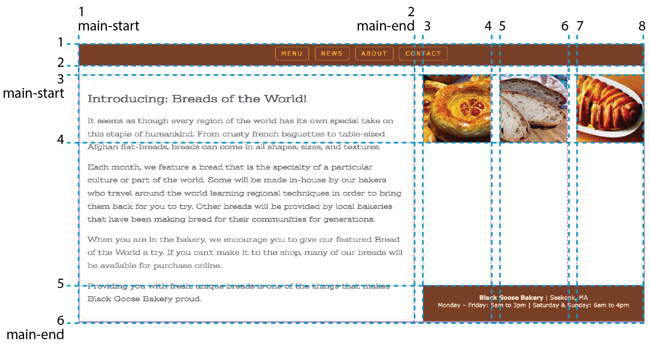
Now you know the basics of creating an explicit grid and placing items on it. There are a few more grid-related topics that are important to be familiar with: implicit grids, gutter spaces, and grid alignment. I have space for only a basic introduction to each topic, but when you start implementing grid layouts on your own, you can do the deep dive required to meet your needs.
So far, we’ve been focusing on ways to define an explicit grid and place items on it deliberately. But along the way, we’ve encountered a few of the Grid system’s automatic, or implicit, behaviors. For example, without explicit placement instructions, grid items flow into the grid sequentially, as we saw in Figure 16-32. I also pointed out how creating a named area implicitly generates grid lines with the “-start” and “-end” suffixes, and vice versa.
Another implicit Grid behavior is the creation of row and column tracks on the fly to accommodate items that don’t fit in the defined grid. For example, if you place an item outside a defined grid, the browser automatically generates tracks in the grid to accommodate it. Similarly, if you simply have more items than there are cells or areas, the browser generates more tracks until all the items are placed.
By default, any row or column automatically added to a grid will have the size auto, sized just large enough to accommodate the height or width of the contents. If you want to give implicit rows and columns specific dimensions, such as to match a rhythm established elsewhere in the grid, use the grid-auto-* properties.
grid-auto-rows
grid-auto-columns
Values: list of track sizes
Default: auto
Applies to: grid containers
Inherits: no
The grid-auto-row and grid-auto-columns properties provide one or more track sizes for automatically generated tracks and apply to the grid container. If you provide more than one value, it acts as a repeating pattern. As just mentioned, the default value is auto, which sizes the row or column to accommodate the content.
In this example, I’ve explicitly created a grid that is two columns wide and two columns high. I’ve placed one of the grid items in a position equivalent to the fifth column and third row. My explicit grid isn’t big enough to accommodate it, so tracks get added according to the sizes I provided in the grid-auto-* properties (Figure 16-42).
The markup
<div id="littlegrid"> <div id="A">A</div> <div id="B">B</div></div>
The styles
#littlegrid { display: grid; grid-template-columns: 200px 200px; grid-template-rows: 200px 200px; grid-auto-columns: 100px; grid-auto-rows: 100px;}#A { grid-row: 1 / 2; grid-column: 2 / 3;}#B { grid-row: 3 / 4; grid-column: 5 / 6;}
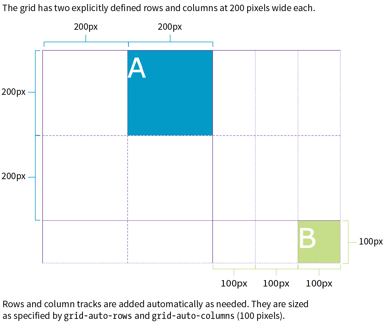
Hopefully, that example helped you form a mental model for automatically generated rows and columns. A more common use of auto-generated tracks is to tile images, product listings, and the like into columns, letting rows be created as needed. These styles set up a grid with explicit columns (as many as will fit the width of the viewport, no narrower than 200px) and as many 200px-high rows as needed:
grid-template-columns: repeat(auto-fill, minmax(200px, 1fr));grid-auto-rows: 200px;
You can also control the manner in which items automatically flow into the grid with the grid-auto-flow property.
grid-auto-flow
Values: row or column | dense (optional)
Default: row
Applies to: grid containers
Inherits: no
Use grid-auto-flow to specify whether you’d like items to flow in by row or column. The default flow follows the writing direction of the document (left-to-right and top-to-bottom for English and other left-to-right languages).
In this example, I’ve specified that I’d like grid items to flow in by columns instead of the default rows:
#listings { display: grid; grid-auto-flow: column;}
By default, items are placed in the first area in which they fit. Cells that are too small to accommodate the content will be skipped over until a cell large enough is found for placement. If you include the optional dense keyword for the grid-auto-flow property, it instructs the browser to fill the grid as densely as possible, allowing the items to appear out of sequence in order to fill the available space:
#listings { display: grid; grid-auto-flow: dense rows;}
The example on the left of Figure 16-43 shows the default flow method. Look closely and you’ll see that the grid items are in order. When there isn’t enough room for the whole item, it moves down and to the left until it fits (similar to floats). This method may leave empty cells as shown in the figure. By comparison, the dense flow example on the right is all filled in, and if you look at the numbering, you can see that putting items wherever they fit makes them end up out of order. Note that dense flow doesn’t always result in a completely filled-in grid like the figure, but it is likely to have fewer holes and be more compact than the default mode.
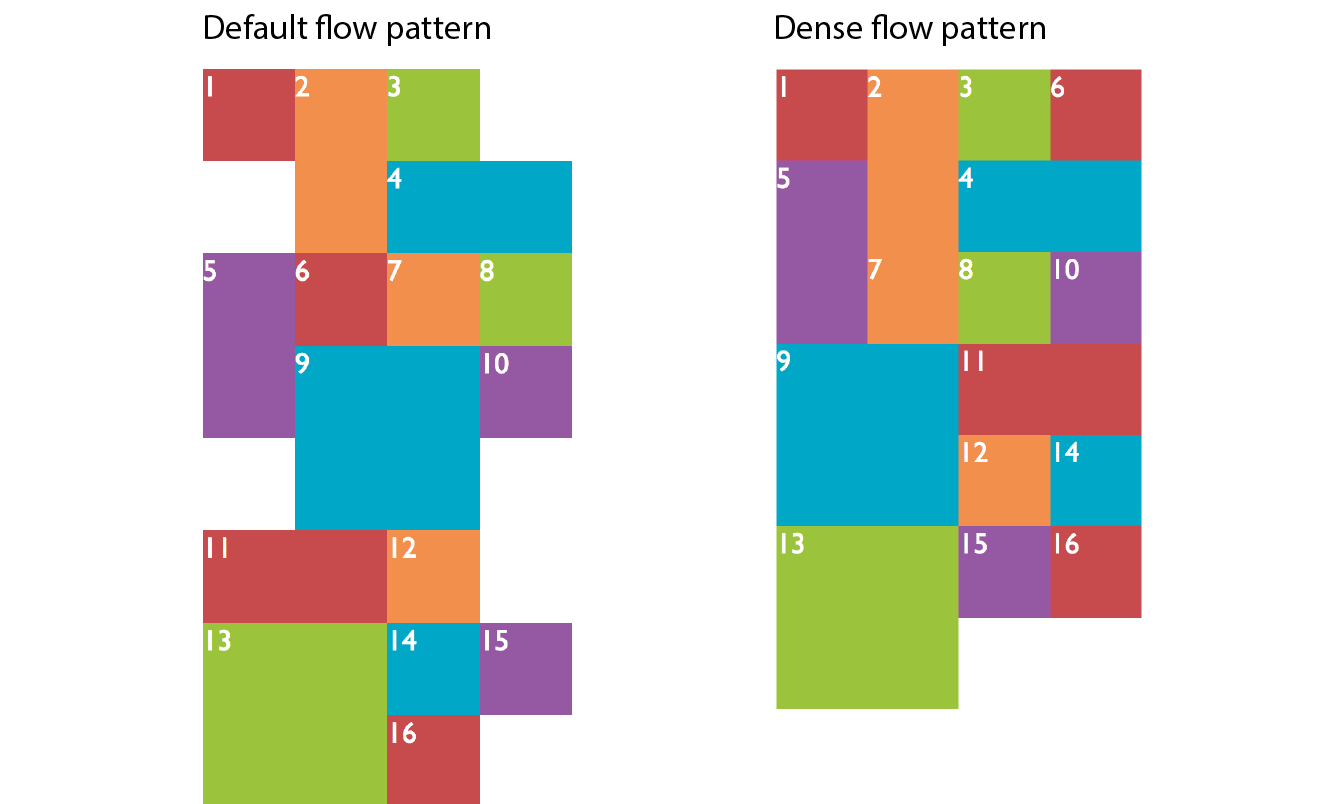
Earlier we saw the grid shorthand property used to provide track sizes as well as area names. In that section, we were dealing with explicit grids, but grid can be used with implicit grid properties as well.
Adding the auto-flow keyword to either the row or track information indicates that the tracks on that axis should be automatically generated at the provided dimension.
Say we want to establish columns explicitly, but let rows generate automatically as needed. The grid shorthand for this common scenario is shown here:
grid: auto-flow 12em / repeat(5, 1fr);
Remember that the grid shorthand syntax lists row information first, then a slash, then the column information. Here, the rule says to create rows automatically that are 12 ems high and create 5 columns at 1fr each. When auto-flow is applied to rows, the grid-auto-flow is set to row.
In this example, the resulting grid will have two 300px rows, but 100px-wide columns will be generated on the fly as grid items are added:
grid: 300px 300px / auto-flow 100px;
With auto-flow applied to columns, the grid-auto-flow is set to column.
It is important to keep in mind that because grid is a shorthand property, any omitted value will be reset to its default. Therefore, if you’ve also used grid to set up explicit rows and columns, those will be essentially lost if a grid shorthand with implicit grid instructions appears later in the style sheet.
The remaining properties defined in the Grid Layout Module relate to spacing and alignment. You can add space between tracks and adjust alignment of the grid and its items by using many of the same methods you learned for Flexbox.
grid-row-gap
grid-column-gap
Values: length (must not be negative)
Default: 0
Applies to: grid containers
Inherits: no
grid-gap
Values: grid-row-gap grid-column-gap
Default: 0 0
Applies to: grid containers
Inherits: no
Setting a length value for grid-row-gap adds space between the row tracks of the grid, and grid-column-gap adds space between (you guessed it) column tracks. The effect is as if the grid lines have a width; however, the gap width is applied only to lines between tracks, not outside the first and last lines in the grid. (Spacing on the outside edges can be controlled with padding.) You can use the grid-gap shorthand to specify gap widths for rows and columns in one go, with rows first, as usual.
In this example, I’ve added 20px space between rows and 50px space between columns by using the grid-gap shorthand (Figure 16-44).
div#container { border: 2px solid gray; display: grid; grid: repeat(4, 150px) / repeat(4, 1fr); grid-gap: 20px 50px; }
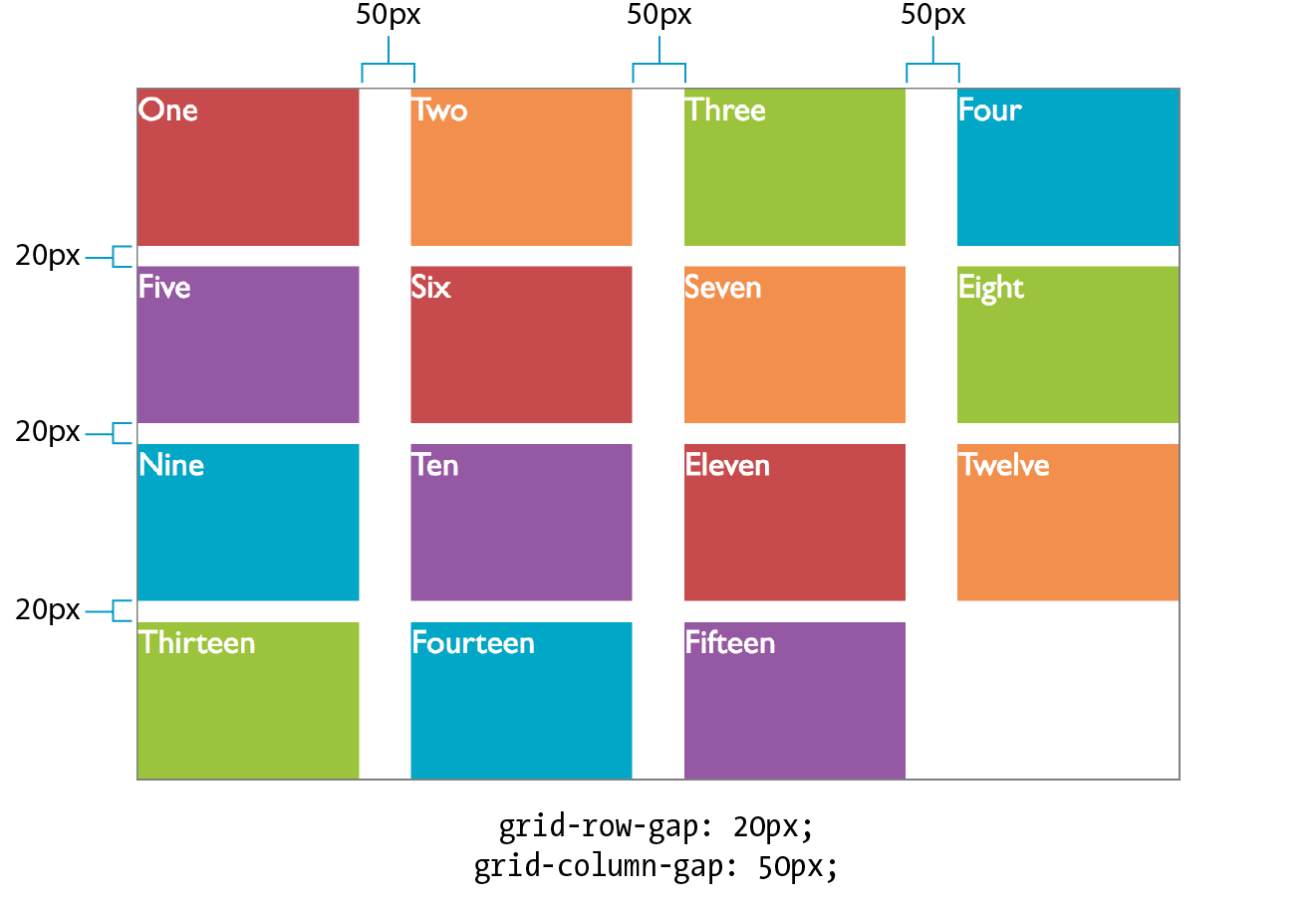
You can align grid items in their cells with the same alignment vocabulary used for Flexbox items (see the “Box Alignment” sidebar). I’m going to touch on these quickly, but you can play around with them on your own.
justify-self
Values: start | end | center | left | right | self-start | self-end | stretch | normal | auto
Default: auto (looks at the value for justify-items, which defaults to normal)
Applies to: grid items
Inherits: no
align-self
Values: start | end | center | left | right | self-start | self-end | stretch | normal | auto
Default: auto (looks at the value for align-items)
Applies to: grid items
Inherits: no
The and values look at the writing direction of the content of the item and use its start or end edge for alignment. For example, if an item is in Arabic, its edge is on the right, and it would be aligned to the right. The and values consider the writing direction of the grid container. The and keywords are absolute and would not change with the writing system, but they correspond to and in left-to-right languages.
When a grid item doesn’t fill its entire grid area, you can specify how you’d like it to be aligned in that space. Specify the horizontal (inline) alignment with the justify-self property. align-self specifies alignment on the vertical (block) axis. These properties apply to the grid item element, which makes sense because you want the item to align itself.
Figure 16-45 shows the effects of each keyword value. For items with their size set to auto (or in other words, not explicitly set with width and height properties), the default is stretch. This is what we’ve seen in all the previous grid examples. If the grid item has a width and height specified, those dimensions are preserved and the default is start.
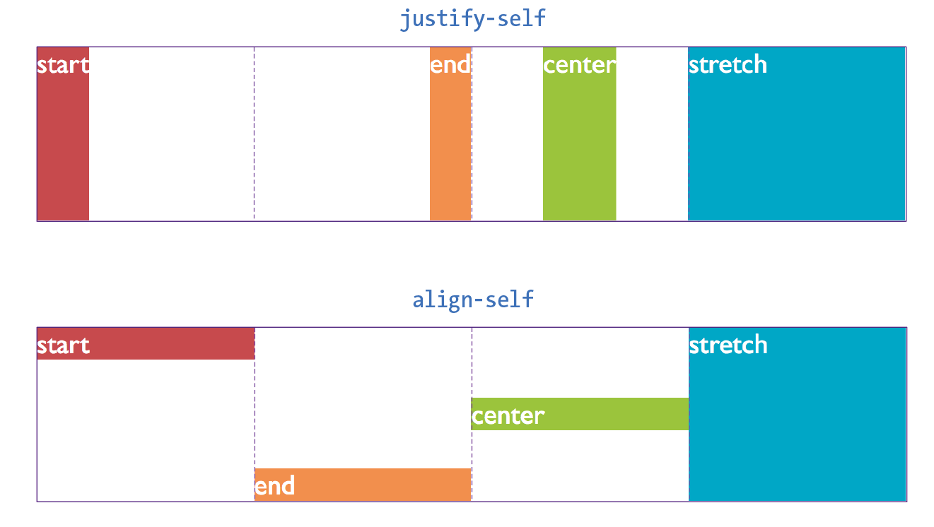
After reading about Flexbox, you should find these familiar—for example, the use of “start” and “end” to keep the system language direction-agnostic.
justify-items
Values: start | end | center | left | right | self-start | self-end | stretch | normal
Default: normal (stretch for non-replaced elements; start for replaced elements)
Applies to: grid containers
Inherits: no
align-items
Values: start | end | center | left | right | self-start | self-end | stretch | normal
Default: normal (stretch for non-replaced elements; start for replaced elements)
Applies to: grid containers
Inherits: no
To align all of the items in a grid in one fell swoop, use the justify-items property for horizontal/inline axis alignment and align-items for vertical/block axis. Apply these properties to the grid container element so it affects all of the items in the grid. The keywords do the same things shown in Figure 16-43; just picture it happening consistently across the entire grid. Keep in mind that these settings will be overridden by the *-self properties.
There may be instances in which the tracks of your grid do not fill the entire area of their grid container—for example, if you’ve specified track widths and heights in specific pixel measurements. You can decide how the browser should handle leftover space within the container by using the justify-content (horizontal/inline axis) and align-content (vertical/block axis) properties.
justify-content
Values: start | end | left | right | center | stretch | space-around | space-between | space-evenly
Default: start
Applies to: grid containers
Inherits: no
align-content
Values: start | end | left | right | center | stretch | space-around | space-between | space-evenly
Default: start
Applies to: grid containers
Inherits: no
In Figure 16-46, the grid container is indicated with a gray outline. The rows and columns of the drawn grid do not fill the whole container, so something has to happen to that extra space. The start, end, and center keywords move the whole grid around within the container by putting the extra space after, before, or equally on either side, respectively. The space-around and space-between keywords distribute space around tracks as discussed in the Flexbox section. The space-evenly keyword adds an equal amount of space at the start and end of each track and between items.
The keyword works only when the track width or height is set to .
When you distribute space around and between tracks, it adds to whatever settings you may have.
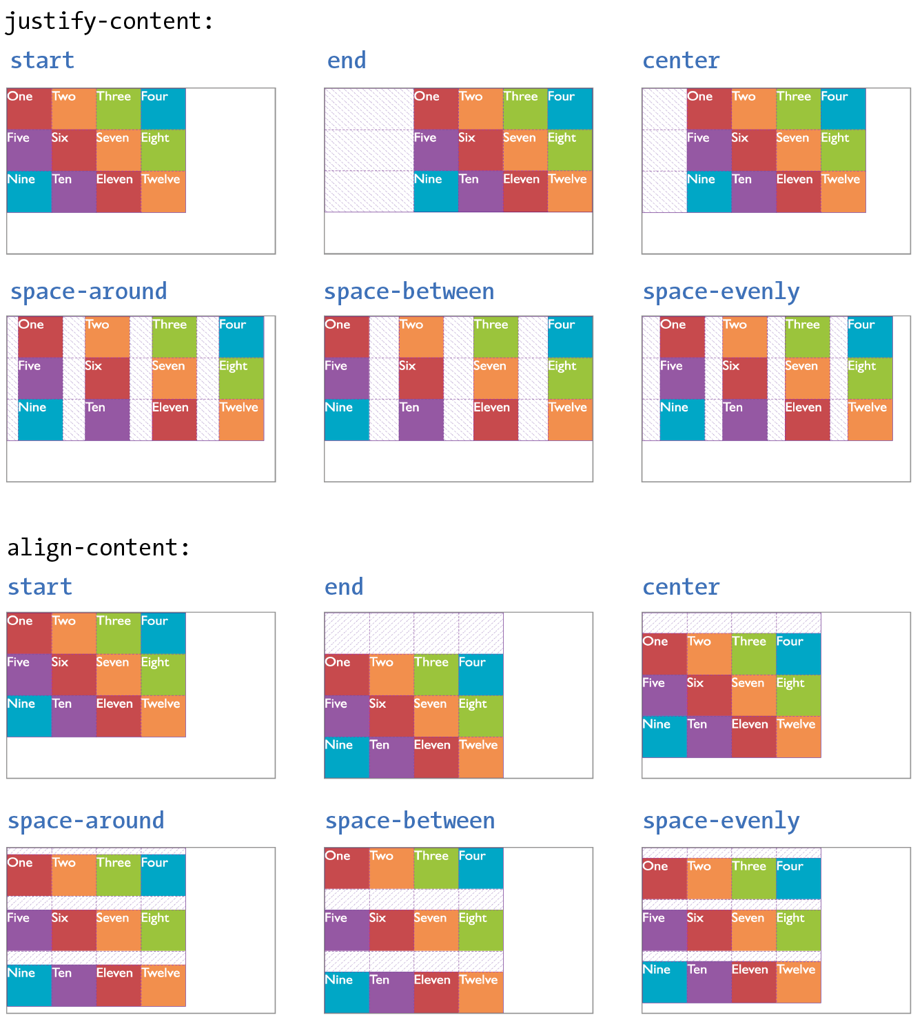
Before we close out this discussion of Grid Layout, let’s give the Black Goose Bakery page a nice two-column layout in Exercise 16-6.
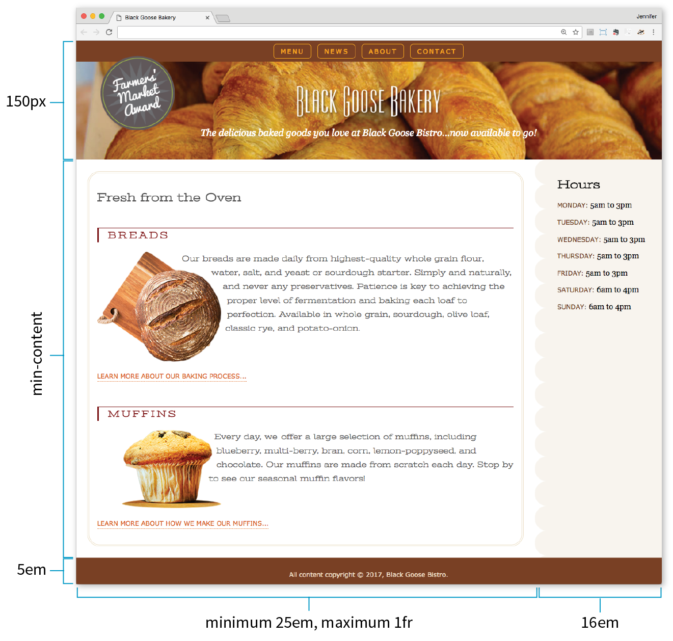
aside { … /* border-top-right-radius: 25px; */
/* margin: 1em 2.5% 0 10%; */
}
As you continue your Grid Layout adventure, I’m sure you’ll find plenty of excellent resources online, as more are popping up all the time. I’d like to point you to a few of the most complete and authoritative resources that I found helpful as I learned about grids myself.
Rachel Andrew’s “Grid By Example” site (gridbyexample.com)
Rachel Andrew, one of the first champions of Grid Layout, has assembled an incredible collection of articles, free video tutorials, browser support information, and more. You can also try searching the web for her excellent conference talks on the topic.
Jen Simmons’ “Experimental Layout Lab” (labs.jensimmons.com)
Jen Simmons, who works for Mozilla Foundation, shows off what Grid Layout can do in her Experimental Layout Lab. It’s definitely worth a visit for the cool examples of Grid and other emerging CSS technologies as well as exercises that let you code along.
You can find Jen’s many articles on CSS Grid at jensimmons.com/writing. I also recommend her roundup of resources for learning Grid Layout at jensimmons.com/post/feb-27-2017/learn-css-grid. See also Jen’s YouTube video series called “Layout Land” (youtube.com, search for “Layout Land Jen Simmons”).
Grid Garden by Thomas Park (cssgridgarden.com)
If you enjoyed the Flexbox Froggy game created by Thomas Park, you will have fun playing his Grid Garden game for getting familiar with CSS Grid Layout.
We covered lots of ground in this chapter. See how you do on this quiz of some of the highlights. As always, Appendix 16 has the answers.
a. | 1. Distribute space around and between flex lines on the cross axis. |
b. | 2. Distribute space around and between items on the main axis. |
c. | 3. Position items on the cross axis. |
d. | 4. Position a particular item on the cross axis. |
a. | 1. Items are completely inflexible, neither shrinking nor growing. |
b. | 2. Item will be twice as wide as others with |
c. | 3. Items are fully flexible. |
d. | 4. Items can shrink but not grow bigger. |
flex-flow: row wrap; flex-flow: column nowrap; flex-flow: row wrap-reverse; flex-flow: column wrap-reverse;flex-flow: row nowrap;
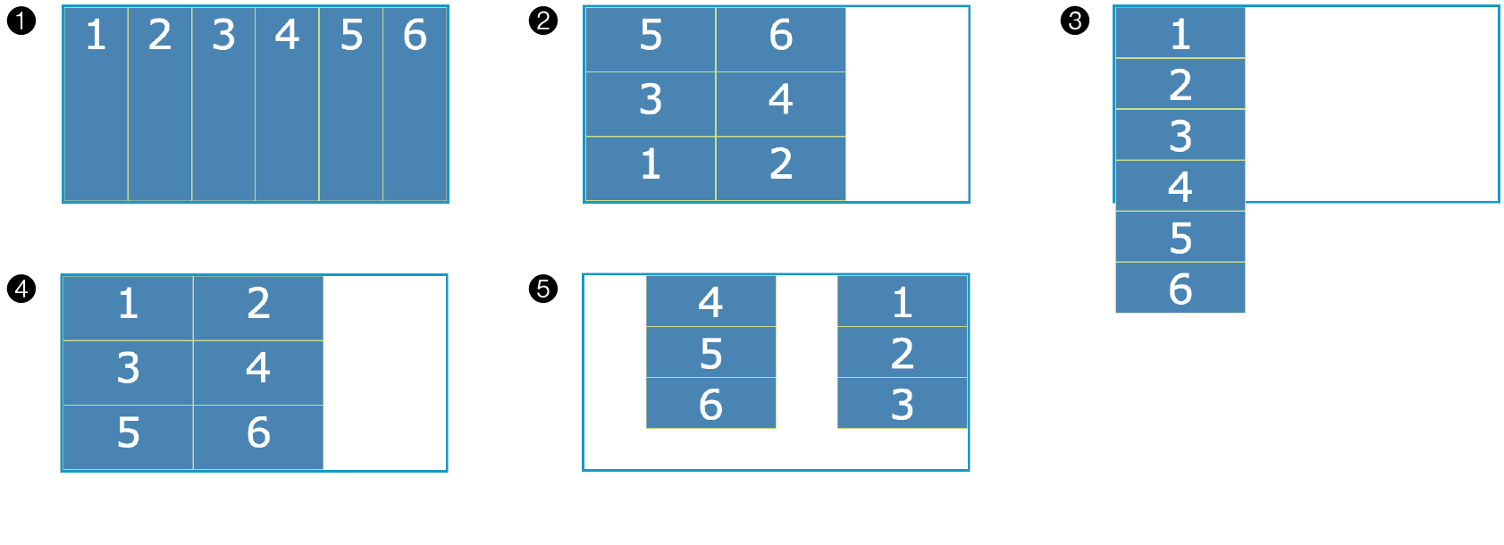
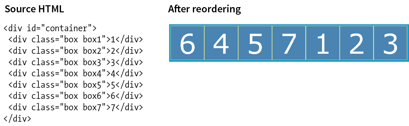
Write it again, this time using the grid shorthand property.
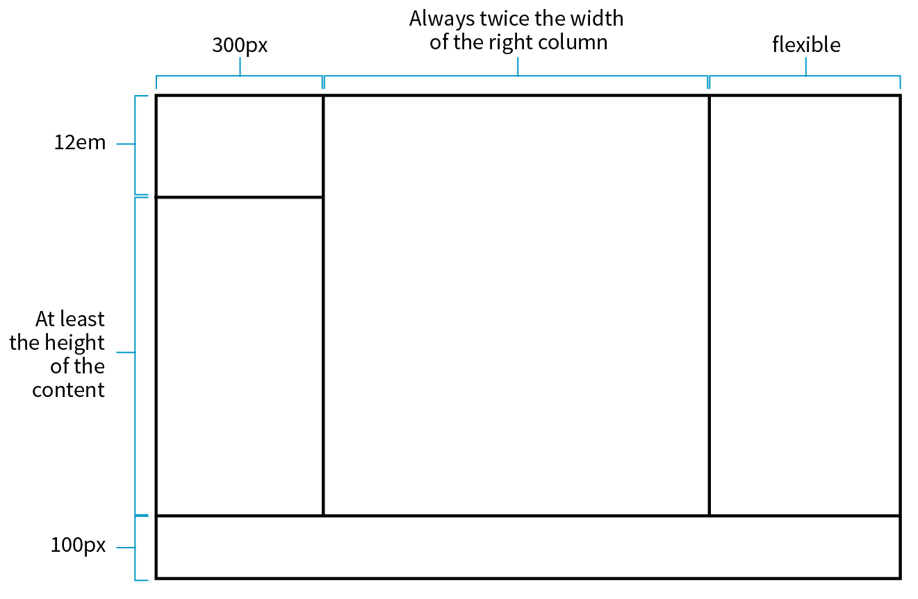
grid-row-start: 1; grid-row-end: 3; grid-column-start: 3; grid-column-end: 7;
grid-area: 2 / 2 / span 4 / 3;
grid-area: bowie;
grid-row: -2 / -1; grid-column: -2 / -1;
grid-row-start: george; grid-row-end: ringo; grid-column-start: paul; grid-column-end: john;
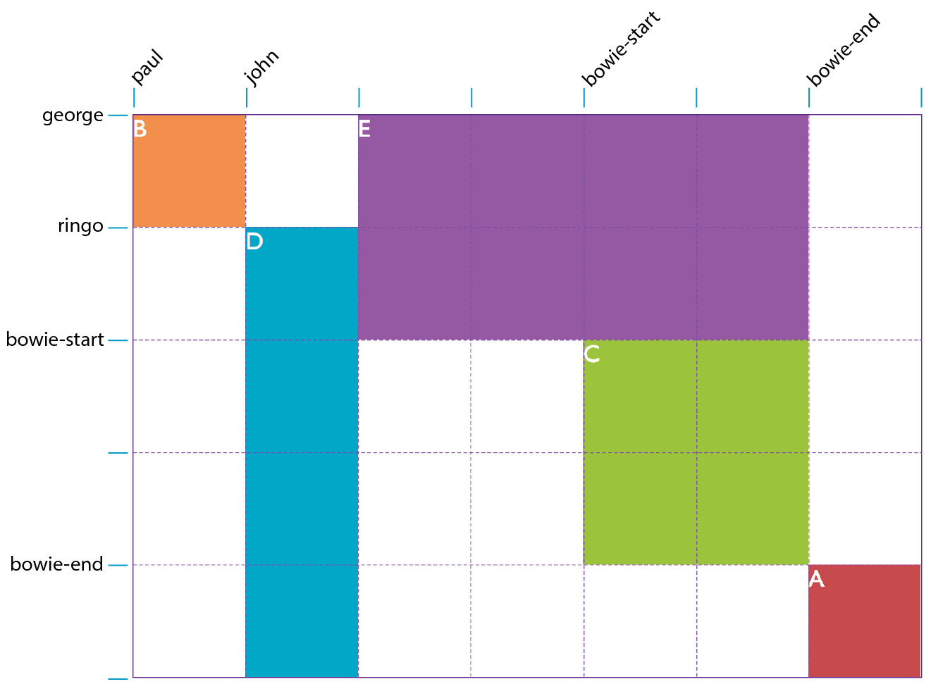
justify-self: end;align-items: end; align-content: center;align-self: stretch;justify-items: center;_____ Make a particular item stretch to fill its container.
_____ Position an image on the right edge of its grid area (in a left-to-right reading language).
_____ Center the whole grid vertically in its container.
_____ Push all of the images in a grid to the bottom of their respective cells.
_____ Center all items in their areas horizontally.
Here are the properties covered in this chapter, sorted into Flexbox and Grid sections and whether they apply to the container or item.
In this chapter
What RWD is and why it’s important
Fluid layouts
Media queries
Design strategies and patterns
Testing options
I first introduced you to the concept of Responsive Web Design way back in Chapter 3, Some Big Concepts You Need to Know, and we’ve been addressing ways to keep all screen sizes in mind throughout this book. In this chapter, we get to do a deeper dive into responsive strategies and techniques.
Just to recap, Responsive Web Design (or RWD) is a design and production approach that allows a website to be comfortably viewed and used on all manner of devices. The core principle is that all devices get the same HTML source, located at the same URL, but different styles are applied based on the viewport size to rearrange components and optimize usability. Figure 17-1 shows examples of responsive sites as they might appear on a smartphone, tablet, and desktop, but it is important to keep in mind that these sites are designed to work well on the continuum of every screen width in between.
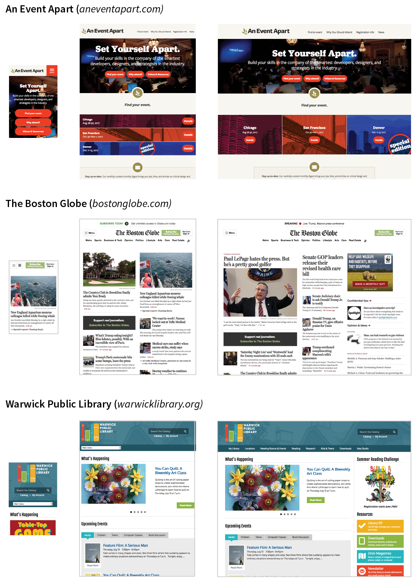
Each site in Figure 17-1has one morphing design, not three distinct layouts. Some sites do have a limited number of layouts aimed at specific devices, which is an approach known as .
Since the iPhone shook things up in 2007, folks now view the web on phones of all sizes, tablets, “phablets,” touch-enabled laptops, wearables, televisions, video game consoles, refrigerators, and who knows what else that may be coming down the line.
In 2016, mobile internet usage surpassed desktop usage—an important milestone. The percentage of web traffic that comes from devices other than desktop browsers is steadily increasing. For roughly 10% of Americans, a smartphone or tablet is their only access to the internet because of lack of access to a computer or high-speed WiFi at work or home.* Younger users may be mobile-only by choice. Furthermore, the vast majority of us access the web from a number of platforms (phone, tablet, computer) over the course of the day. And guess what—we expect to have a similar experience using your content or service regardless of how we access your site.
That’s where RWD fits in. With one source, you ensure that mobile visitors receive the same content as other visitors (although it might be organized differently). Users are not penalized with stripped-down content or features just because they are using a smartphone. And for visitors who might start using your site on one device and finish it on another, you can ensure a consistent experience.
In fact, for many web designers, “responsive design” is now just “web design.” Instead of a niche approach, it is becoming the default way to build a website that meets the demands of our current multidevice environment.
The deluge of web-enabled mobile devices initially sent shockwaves through the web design community. Accustomed to designing exclusively for large desktop screens, we were unclear about how we could accommodate screens that fit in the palm of your hand.
One solution was to rely on the phone’s built-in web display functionality. By default, mobile devices display an entire web page shrunken down to fit on whatever screen real estate is available. Users can pinch to zoom into the details and scroll around to various parts of the page. While that technically works, it is far from an optimal experience. Another approach was to create a separate mobile site just for small screens and people “on the go.” There are still many companies and services that use dedicated mobile (“m-dot”) sites—Twitter and Facebook come to mind—but in general, m-dot sites are going away in favor of RWD. Google is helping the process along by favoring responsive sites with single URLs over m. or mobile. versions.
In 2010, Ethan Marcotte gave name to another, more flexible solution in his article “Responsive Web Design” (alistapart.com/article/responsive-web-design), which has since become a cornerstone of modern web design. In this chapter, I will follow the “ingredients” for RWD that Ethan outlines in his book Responsive Web Design (A Book Apart).
The technique has three core components:
A flexible grid
Rather than remaining at a static width, responsive sites use methods that allow them to squeeze and flow into the available browser space.
Flexible images
Images and other embedded media need to be able to scale to fit their containing elements.
CSS media queries
Media queries give us a way to deliver sets of rules only to devices that meet certain criteria, such as width and orientation.
To this list of ingredients, I would add the viewport meta element, which makes the width of the web page match the width of the screen. That’s where we’ll begin our tour of the mechanics of RWD.
To fit standard websites onto small screens, mobile browsers render the page on a canvas called the viewport and then shrink that viewport down to fit the width of the screen (device width). For example, on iPhones, mobile Safari sets the viewport width to 980 points (see Note), so a web page is rendered as though it were on a desktop browser window set to 980 pixels wide. That rendering gets shrunk down to the width of the screen (ranging from 320 to 414 points, depending on the iPhone model), cramming a lot of information into a tiny space.
Mobile Safari introduced the viewport meta element, which allows us to define the size of that initial viewport. Soon, the other mobile browsers followed suit. The following meta element, which goes in the head of the HTML document, tells the browser to set the width of the viewport equal to the width of the device screen (width=device-width), whatever that happens to be (Figure 17-2). The initial-scale value sets the zoom level to 1 (100%).
<meta name="viewport" content="width=device-width, initial-scale=1">
With the viewport meta element in place, if the device’s screen is 320 pixels wide, the rendering viewport on that device will also be 320 pixels across (not 980) and will appear on the screen at full size. That is the width we test for with media queries, so setting the viewport is a crucial first step.
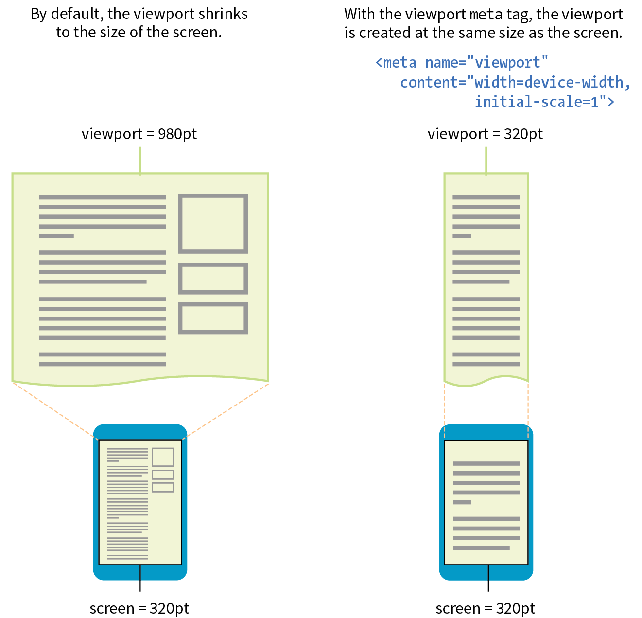
In the Flexbox and Grid discussions in the previous chapter, we saw examples of items expanding and contracting to fill the available space of their containers. That fluidity is exactly the sort of behavior you need to make content neatly fit a wide range of viewport sizes. Fluid layouts (or “flexible grids,” as Ethan Marcotte calls them in his article and book) are the foundation of responsive design.
In a fluid layout, the page area and its grid resize proportionally to fill the available width of the screen or window (Figure 17-3, top). That is easily accomplished with fr and minmax() units in CSS Grid layouts and with flex property settings in Flexbox. If you need to also target older browsers that don’t support CSS layout standards, you can use percentage values for horizontal measurements so elements remain proportional at varying sizes (see the sidebar “Converting Pixels to Percentages”).
In the past, when we knew that everyone was looking at our sites on desktop monitors, fixed-width layouts were the norm. (Ahh, those simple pre-mobile days when we only needed to deal with radically incompatible browser support!) As the name implies, fixed-width layouts are created at a specific pixel width (Figure 17-3, bottom), with 960 pixels being quite fashionable (see Note). Specifying all measurements in pixel values gave designers control over the layout as they might have in print, and ensured that users across all platforms and browsers got similar, if not the same, rendering of the page.
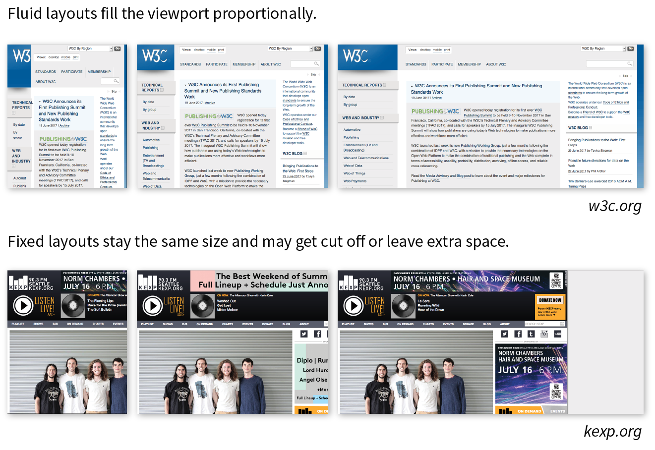
It didn’t take long to realize, however, that it would be impossible to create separate fixed-width designs tailored to every device size. Clearly, fluidity has the advantage. It is based on the intrinsic nature of the normal flow, so we’re working with the medium here rather than against it. When the layout reflows to fill the available width, you don’t need to worry about horizontal scrollbars or awkward empty space in the browser.
On the downside, fluid layouts may allow text line lengths to become uncomfortably long, so that is something to watch out for. We’ll go into more detail on layouts later in this chapter.
Every now and then a solution is simple. Take, for example, the style rule required to make images scale down to fit the size of their container:
img { max-width: 100%;}
That’s it! When the layout gets smaller, the images in it scale down to fit the width of their respective containers. If the container is larger than the image—for example, in the tablet or desktop layouts—the image does not scale larger; it stops at 100% of its original size (Figure 17-4). When you apply the max-width property, you can omit the width and height attributes in the img elements in the HTML document. If you do set the width attribute, be sure the height attribute is set to auto; otherwise, the image won’t scale proportionately.
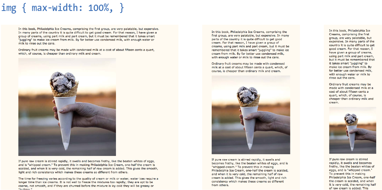
But wait—things are never that simple, right? If you think back to our discussion of responsive images in Chapter 7, Adding Images, you’ll remember that there is some elbow grease required to avoid serving unnecessarily large images to small devices as well as making sure large, high-density monitors get high-resolution images that shine. Choosing the best image size for performance is part of the responsive design process, but we won’t be concentrating on that in this chapter. We’ve got bigger fish to fry!
Videos and other embedded media (using object or embed elements) also need to scale down in a responsive environment. Unfortunately, videos do not retain their intrinsic ratios when the width is scaled down, so there are a few more hoops to jump through to get good results. Thierry Koblentz documents one strategy nicely in his article “Creating Intrinsic Ratios for Video” at www.alistapart.com/articles/creating-intrinsic-ratios-for-video. There is also a JavaScript plug-in called FitVids.js (created by Chris Coyier and the folks at Paravel) that automates Koblentz’s technique for fluid-width videos. It is available at fitvidsjs.com.
Now we get to the real meat of responsive design—media queries! Media queries apply different styles based on characteristics of the browser: its width, whether it is vertically or horizontally oriented, its resolution, and more. They are what make it possible to send a one-column layout to small screens and a multicolumn layout to larger screens on the fly.
The query itself includes a media type followed by a particular feature and a value for which to test. The criteria are followed by a set of curly brackets that contain styles to apply if the test is passed. The structure of a media query as used within a style sheet goes like this:
@mediatypeand (feature:value) {/* styles for browsers that meet this criteria */}
Let’s clarify that with an example. The following media queries look at whether the viewport is on a screen and in landscape (horizontal) or portrait (vertical) orientation. When the query detects that the viewport is in landscape mode, the background color of the page is “skyblue”; when it is in portrait orientation, the background is “coral” (Figure 17-5). If this were displayed on a smartphone that tips from vertical to horizontal and back again, the colors would change as it tilts. This isn’t a very practical design choice, but it does provide a very simple illustration of media queries at work.
@mediascreenand (orientation: landscape) { body { background: skyblue; }}@mediascreenand (orientation: portrait) { body { background: coral; }}
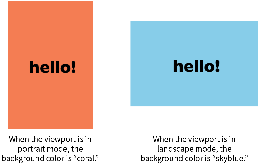
Having style declaration curly brackets nested inside media query curly brackets can get a little confusing. Be sure that you have the right number of curly brackets and nest them properly. Careful indenting is helpful. Many code-editing programs also use color coding to help you keep them straight.
Media types, as included in the first part of a query, were introduced in CSS2 as a way to target styles to particular media. For example, this @media rule delivers a set of styles only when the document is printed (it does not test for any specific features or values):
@media print { /* print-specific styles here */
}
The most current defined media types are all, print, screen, and speech (see Note). If you are designing for screen, the media type is optional, so you can omit it as shown in the syntax example shown here, but including it doesn’t hurt. I’ll be including the screen media type for the sake of clarity in my examples.
@media (feature: value) { }
CSS2 also defined , , , , , , and , but they have been deprecated in the latest Media Queries Level 4 spec (currently a Working Draft) and are discouraged from use.
CSS3 media queries take targeting one step further by letting us test for a particular feature of a viewport or device. We saw an example of testing the orientation of a device in Figure 17-5. The most common feature to test for is the viewport width. You can also test for a minimum width (min-width) and maximum width (max-width).
Here is a simple example that displays headline fonts in a fancy cursive font only when the viewport is 40em or wider—that is, when there is enough space for the font to be legible. Viewports that do not match the query (because they are narrower than 40em) use a simple serif face.
h1 { font-family: Georgia, serif; }
@media screen and (min-width: 40em) {h1 { font-family: 'Lobster', cursive; }}
The complete list of device features you can detect with media queries appears in Table 17-1.
You can use media queries within a style sheet or to conditionally load external style sheets. Media queries may not be used with inline styles.
The most common way to utilize media queries is to use an @media (“at-media”) rule right in the style sheet. The examples in this chapter so far are all @media rules.
When you use media queries within a style sheet, the order of rules is very important. Because rules later in the style sheet override the rules that come before them, your media query needs to come after any rules with the same declaration.
The strategy is to specify the baseline styles that serve as a default, and then override specific rules as needed to optimize for alternate viewing environments. In RWD, the best practice is to set up styles for small screens and browsers that don’t support media queries, and then introduce styles for increasingly larger screens later in the style sheet.
That’s exactly what I did in the headline font-switching example earlier. The h1 sets a baseline experience with a local serif font, and then gets enhanced for larger screens with a media query.
For large or complicated sites, developers may choose to put styles for different devices into separate style sheets and call in the whole .css file when certain conditions are met. One method is to use the media attribute in the link element to conditionally load separate .css files. In this example, the basic styles for a site are requested first, followed by a style sheet that will be used only if the device is more than 1,024 pixels wide (and if the browser supports media queries):
<head> <link rel="stylesheet" href="styles.css"> <link rel="stylesheet" href="2column-styles.css" media="screen and (min-width:1024px)"></head>
Some developers find this method helpful for managing modular style sheets, but it comes with the disadvantage of requiring extra HTTP requests for each additional .css file. Be sure to provide only as many links as necessary (perhaps one for each major breakpoint), and rely on @media rules within style sheets to make minor adjustments for sizes in between.
Similarly, you can carry out media queries with @import rules that pull in external style sheets from within a style sheet. Notice that the word “media” does not appear in this syntax, only the type and query.
<style>@import url("/default-styles.css");@import url("/wide-styles.css") screen and (min-width: 1024px);/* other styles */ </style>
We can’t close out a discussion of media queries without a nod to browser support. The good news is that media queries are supported by virtually all desktop and mobile browsers in use today. The big exceptions are Internet Explorer versions 8 and earlier, which have no support. Because of the staying power of the Windows XP operating system, IE8 continues to show up in browser use statistics (at 1–2% as I write, ahead of IE 9 and 10). If your site has hundreds of thousands of users, that 1% ends up being a significant number of broken experiences.
If you expect to have visitors using old versions of IE, you have a couple of options. First, you could use the Respond.js polyfill, which adds support for min-width and max-width to non-supporting browsers. It was created by Scott Jehl and is available at github.com/scottjehl/Respond.
The other option is to create a separate style sheet with a no-frills desktop layout and deliver it only to users with IE8 or earlier by using a conditional comment. Other browsers ignore the content of this IE-specific comment:
<!-- [if lte IE 8]> <link rel="stylesheet" href="/path/IE_fallback.css"><![endif]-->
Depending on your site statistics and when you are reading this, you may not need to worry about media query support at all. Lucky you!
A breakpoint is the point at which we use a media query to introduce a style change. When you specify min-width: 800px in a media query, you are saying that 800 pixels is the “breakpoint” at which those particular styles should be used. Figure 17-6 shows some of the breakpoints at which Etsy.com makes both major layout changes and subtle design tweaks on its home page.
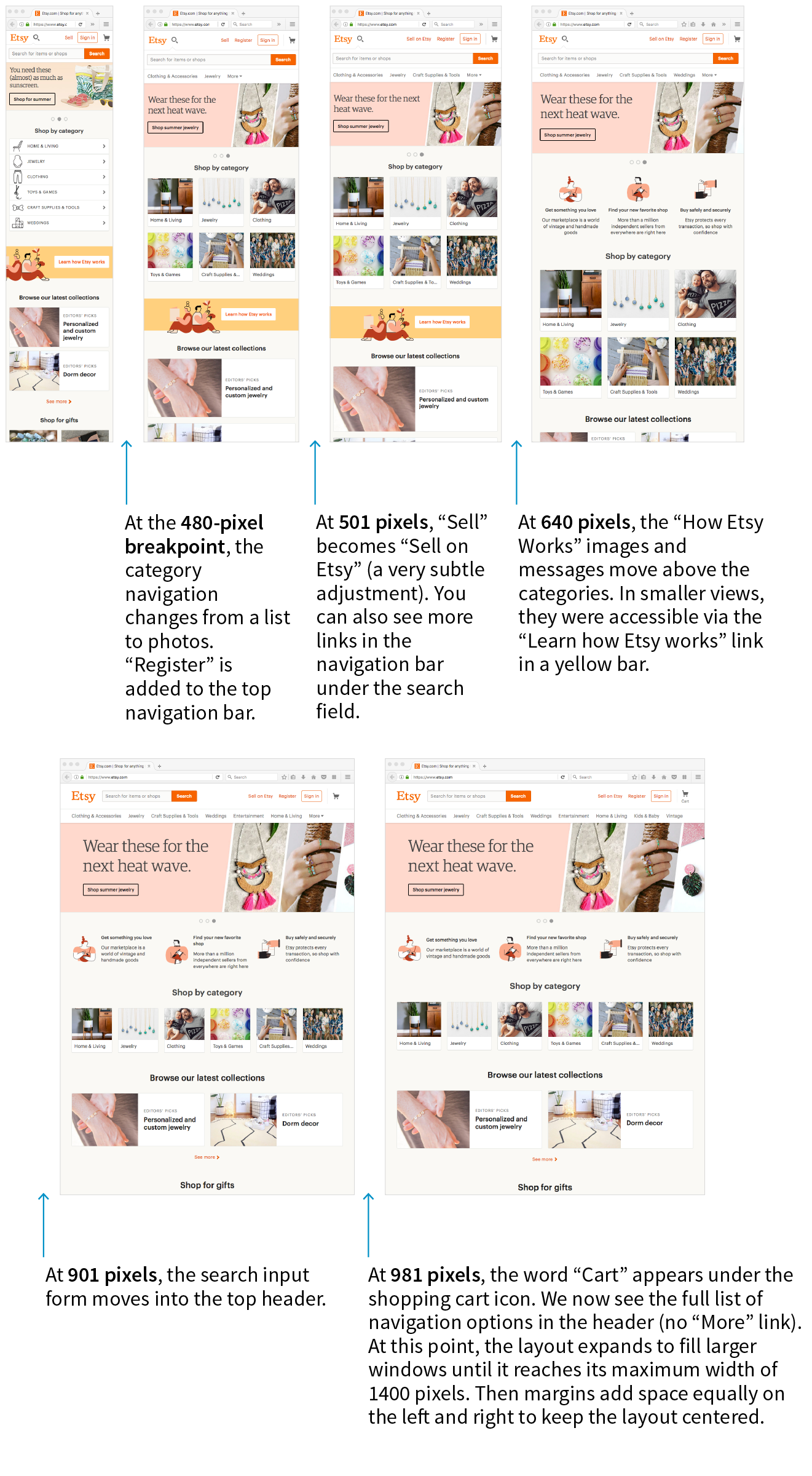
Choosing breakpoints can be challenging, but there are a few best practices to keep in mind.
When RWD was first introduced, there were only a handful of devices to worry about, so we tended to base our breakpoints on the common device sizes (320 pixels for smartphones, 768 pixels for iPads, and so on), and we created a separate design for each breakpoint. It didn’t take long until we had to deal with device widths at nearly every point from 240 to 3,000+ pixels. That device-based approach definitely didn’t scale.
A better approach is to create breakpoints for the individual parts of a page rather than switching out the entire page at once (although for some pages that may work just fine). A common practice is to create the design for narrow screens first, and then resize the browser wider and pay attention to the point at which each part of the page starts to become unacceptable. The navigation might become too awkward and need a breakpoint at 400 pixels wide, but the one-column layout might be OK until it reaches 800 pixels, at which point a two-column design could be introduced.
In his book Responsive Design: Patterns & Principles (A Book Apart), Ethan Marcotte calls this “content out” design and puts it like this:
It is common to create breakpoints for each component of the page rather than changing the entire page at once.
For me, that “content out” process begins by looking at the smallest version of a piece of content, then expanding that element until its seams begin to show and it starts to lose its shape. Once that happens, that’s an opportunity to make a change—to introduce a breakpoint that reshapes the element and preserves its integrity.
If you find that you have a lot of breakpoints within a few pixels or ems of one another, grouping them together may streamline your style sheet and process. And it doesn’t hurt to keep the screen sizes of the most popular devices in mind in case nudging your breakpoint down a little helps improve the experience for a whole class of users. The site Screen Sizes (screensiz.es) lists the dimensions of a wide range of popular devices. A web search will turn up similar resources.
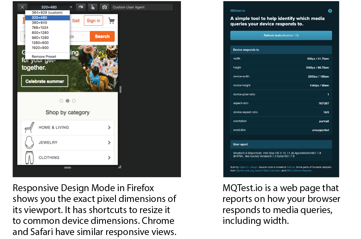
The examples in this section have been based on breakpoints with pixel measurements. An alternative, and many would say better, method is to use ems instead of pixels in the media query. Remember that an em is equal to the current font size of an element. When used in a media query, an em is based on the base font size for the document (16 pixels by default, although that can be changed by the user or the page author).
Em-based media queries keep the layout proportional to the font size.
Pixel-based media queries don’t adapt if the user changes their font size settings, which people do in order to be able to read the page more easily. But em-based media queries respond to the size of the text, keeping the layout of the page in proportion.
For example, say you have a layout that switches to two columns when the page reaches 800 pixels. You’ve designed it so the main column has an optimum text line length when the base font size is the default 16 pixels. If the user changes their base font size to 32 pixels, that double-sized text will pour into a space intended for text half its size. Line lengths would be awkward.
Using em-based queries, if the query targets browsers wider than 50em, when the base font size is 16 pixels, the switch happens at 800 pixels (as designed). However, should the base font size change to 32 pixels, the two-column layout would kick in at 1,600 pixels (50em × 32px = 1,600px), when there is plenty of room for the text to fill the main column with the same line lengths as the original design.
This example used a whole-page layout switch, but media queries on individual components (as discussed earlier) can use ems as well. In the next section, I’ll introduce some of the aspects of web pages that require attention when you’re choosing breakpoints.
We’ve covered the RWD nuts and bolts—now let’s talk about some of the decisions designers make when creating responsive sites. I am only going to be able to scratch the surface here, but you’ll find much deeper explorations on these themes in the books and articles listed along the way. For now, I just want to raise your awareness of responsive strategies. At the end of the section, you will use some of these strategies to make the Black Goose Bakery page responsive.
We’ve seen a few examples in our exercises of content looking wonky when the browser gets very narrow or very wide. A three-column layout just doesn’t fit, and text in an image may become unreadable when it is scaled down to fit a 320-pixel-wide screen. At the other end of the spectrum, the line length in single-column layouts becomes too long to read comfortably when the viewport fills a high-resolution desktop monitor. For many aspects of a web page, one size does not fit all. As designers, we need to pay attention to where things fall apart and set breakpoints to “preserve the integrity” of the elements (as Ethan Marcotte so nicely puts it).
In the broadest of strokes, the tricky bits to keep optimized over a wide range of viewport sizes include the following:
Content is king on the web, so it is critical that content is carefully considered and organized before any code gets written. These are tasks for Information Architects and Content Strategists who address the challenges of organizing, labeling, planning, and managing web content.
Organization and hierarchy across various views of the site are a primary concern, with a particular focus on the small-screen experience. It is best to start with an inventory of potential content and pare it down to what is most useful and important for all browsing experiences. Once you know what the content modules are, you can begin deciding in what order they appear on various screen sizes.
Keep in mind that you should strive for content parity—that is, the notion that the same content is accessible regardless of the device used to access the site. It might be that visitors need to follow a slightly different navigational path to that information, but dropping portions of your site on small screens because you think mobile users won’t need it is false thinking. People do bop between devices mid-task, and you want to be sure they have everything they need.
This is a woefully brief introduction to what is perhaps the most important first step of creating a site, but it is just outside the focus of this book. To get up to speed properly with content strategy, particularly as it applies to RWD, I recommend the following books:
Rearranging content into different layouts may be the first thing you think of when you picture responsive design, and with good reason. The layout helps form our first impression of a site’s content and usability.
As mentioned earlier, responsive design is based on fluid layouts that expand and contract to fill the available space in the viewport. One fluid layout is usually not enough, however, to serve all screen sizes. More often, two or three layouts are produced to meet requirements across devices, with small adjustments between layout shifts.
Designers typically start with a one-column layout that fits well on small handheld devices and rearrange elements into columns as more space is available. They may also have the design for the widest screens worked out early on so there is an end-point in mind. The design process may involve a certain amount of switching between views and making decisions about what happens along the way.
A good trigger for deciding when to adjust the layout is to look at text line lengths. Lines of text that are too stubby or too long are difficult to read, so you should aim for optimal line lengths of 45 to 75 characters, including spaces. If your text lines are significantly longer, it’s time to make changes to the layout such as increasing the margins or introducing an additional column. You might also increase the font size of the text to keep the character count in the desired range.
Clarissa Peterson introduces a neat trick for testing line lengths in her book Learning Responsive Web Design (O’Reilly). Put a span around the 45th to 75th characters in the text and give it a background color (Figure 17-8). That way, you can easily check whether the line breaks are happening in the safe zone at a glance. Of course, this line length hint would be removed before the site is made public.
The manner in which a site transitions from a small-screen layout to a wide-screen layout must make sense for that particular site, but there are a few patterns (common and repeated approaches) that have emerged over the years. We can thank Luke Wroblewski (known for his “Mobile First” approach to web design, which has become the standard) for doing a survey of how responsive sites handle layout. The article detailing his findings, “Multi-Device Layout Patterns” (www.lukew.com/ff/entry.asp?1514), is getting on in years, but the patterns persist today. Following are the top patterns Luke named in his article (Figure 17-9):
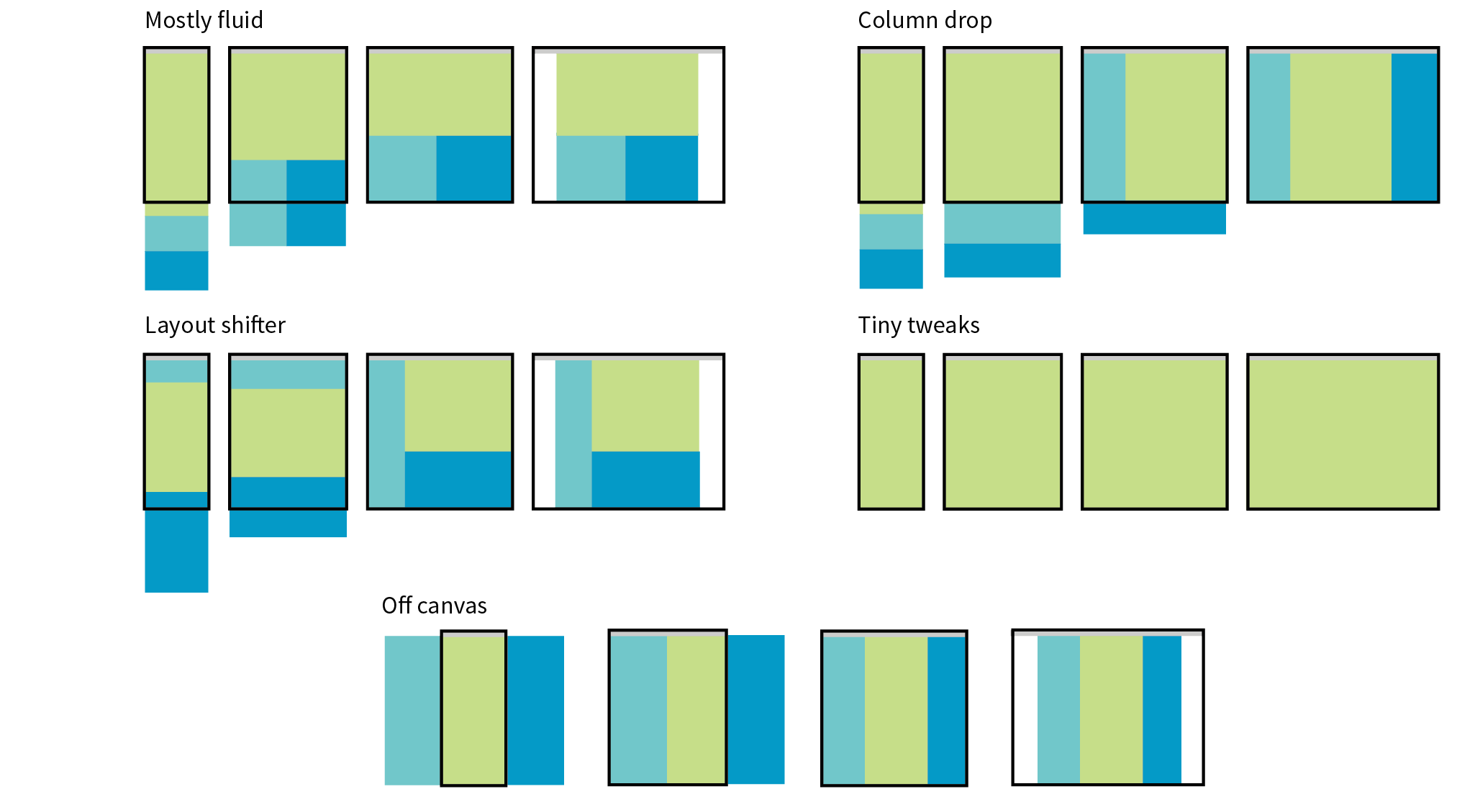
Mostly fluid
This pattern uses a single-column layout for small screens, and another fluid layout that covers medium and large screens, with a maximum width set to prevent it from becoming too wide. It generally requires less work than other solutions.
Column drop
This solution shifts between one-, two-, and three-column layouts based on available space. When there isn’t room for extra columns, the sidebar columns drop below the other columns until everything is stacked vertically in the one-column view.
Layout shifter
If you want to get really fancy, you can completely reinvent the layout for a variety of screen sizes. Although expressive and potentially cool, it is not necessary. In general, you can solve the problem of fitting your content to multiple environments without going overboard.
Tiny tweaks
Some sites use a single-column layout and make tweaks to type, spacing, and images to make it work across a range of device sizes.
Off canvas
As an alternative to stacking content vertically on small screens, you may choose to use an “off-canvas” solution. In this pattern, a page component is located just out of sight on the left or right of the screen and flies into view when requested. A bit of the main content screen remains visible on the edge to orient users as to the relationship of moving parts. This was made popular by Facebook, wherein Favorites and Settings were placed on a panel that slid in from the left when users clicked a menu icon.
You can see working examples of these and additional layout patterns on the “Responsive Patterns” page assembled by Brad Frost (bradfrost.github.io/this-is-responsive/patterns.html).
Typography requires fine-tuning along the spectrum from small-screen to wide-screen views in order to keep it legible and pleasant to read. Here are a few typography-related pointers (Figure 17-10):
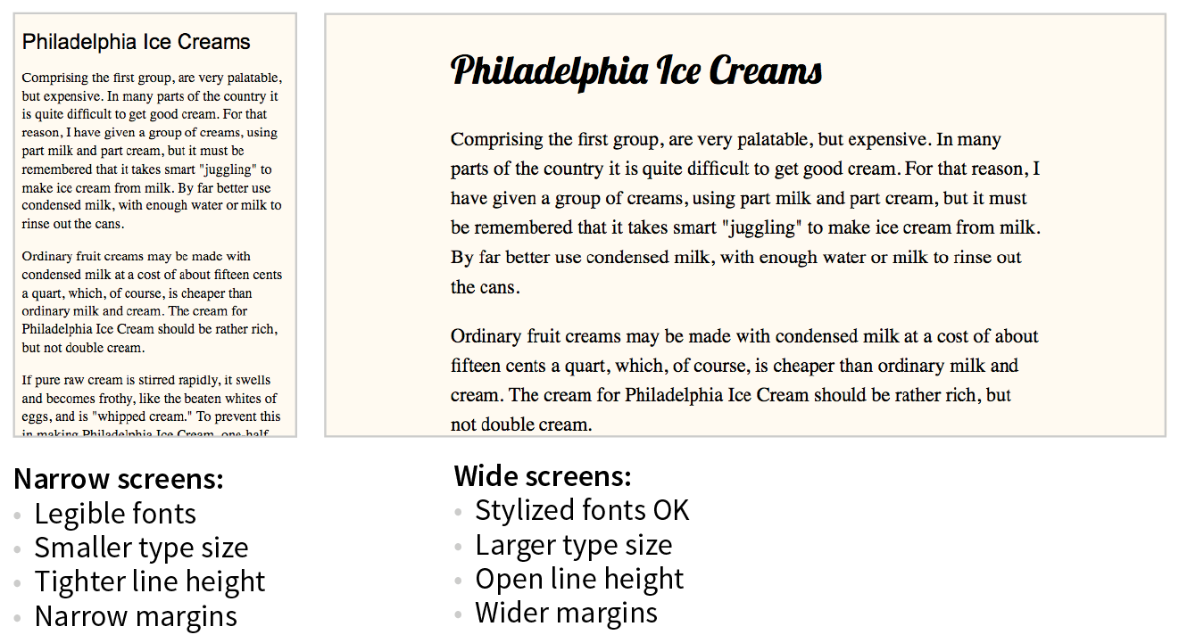
Font face
Be careful about using fancy fonts on small screens and be sure to test for legibility. At small sizes, some fonts become difficult to read because line strokes become too light or extra flourishes become little blobs. Consider also that small screens may be connecting over cellular, so taking advantage of locally available fonts may be better for performance than requiring a web font to download. If a strict brand identity requires font consistency on all devices, be sure to choose a font face that works well at all sizes. If that is not a concern, consider using a web font only on larger screens. We strive to serve the same design to all devices, but as with everything else in web design, flexibility is important.
Font size
Varying viewport widths can wreak havoc on line lengths. You may find that you need to increase the font size of text elements for wider viewports to maintain a line length of between 45 and 75 characters. It also makes it easier to read from the distance users typically sit from their large screens. Conversely, you could use em-based media queries so that the layout stays proportional to the font size. With em-based queries, line lengths stay consistent.
Line height
Line height is another measurement that you may want to tweak as screens get larger. On average, line height should be about 1.5 (using a number value for the line-height property); however, slightly tighter line spacing (1.2 to 1.5) is easier to read with the shorter line lengths on small screens. Large screens, where the type is also likely to be larger, can handle more open line heights (1.4 to 1.6).
Margins
On small screens, make the most of the available space by keeping left and right margins on the main column to a minimum (2–4%). As screens get larger, you will likely need to increase side margins to keep the line lengths under control and just to add some welcome whitespace to the layout. Remember to specify margins above and below text elements in em units so they stay proportional to the type.
Navigation feels a little like the Holy Grail of Responsive Web Design. It is critical to get it right. Because navigation at desktop widths has pretty much been conquered, the real challenges come in re-creating our navigation options on small screens. A number of successful patterns have emerged for small screens, which I will briefly summarize here (Figure 17-11):
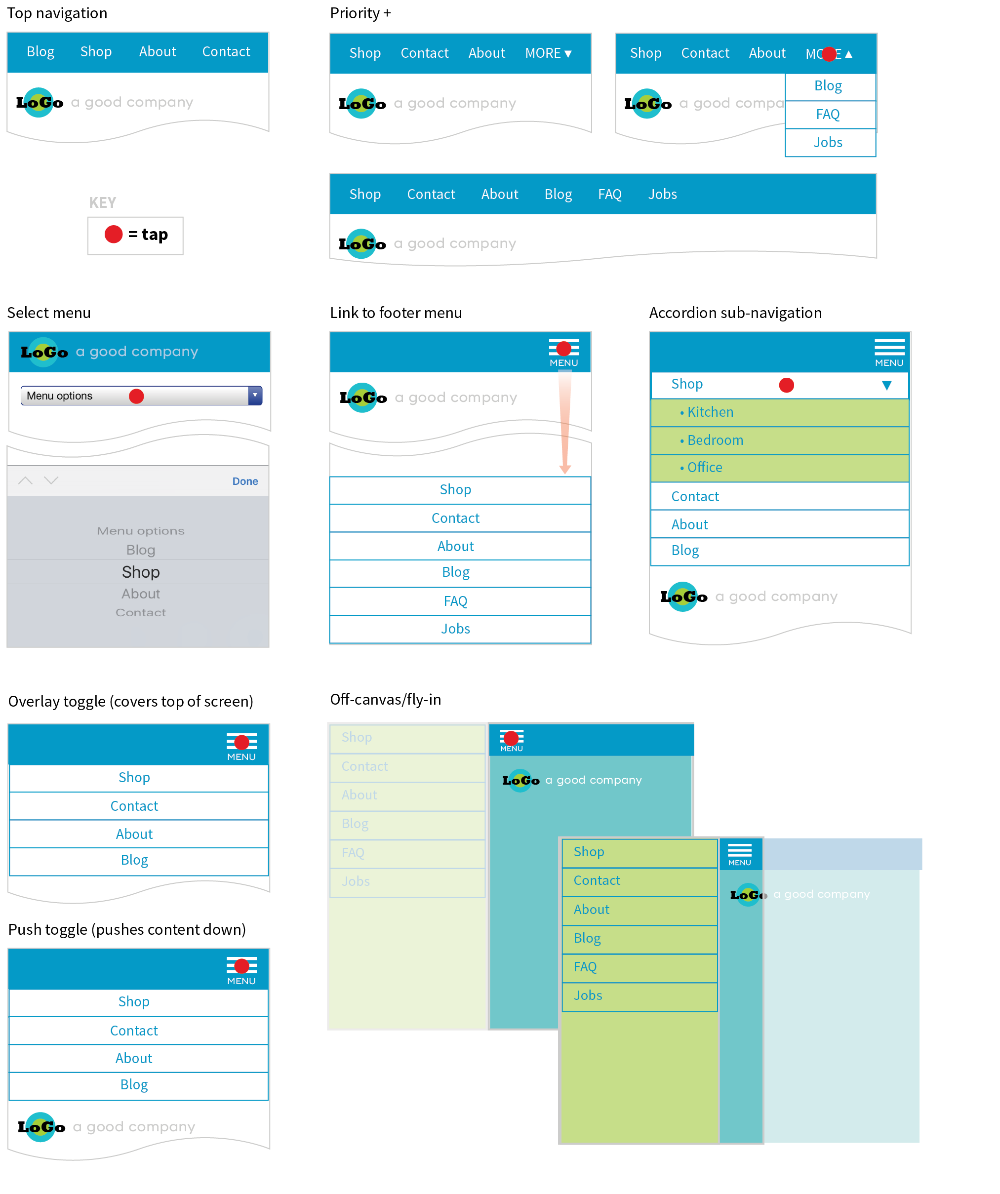
Top navigation
If your site has just a few navigation links, they may fit just fine in one or two rows at the top of the screen.
Priority +
In this pattern, the most important navigation links appear in a line across the top of the screen alongside a More link that exposes additional options. The pros are that the primary links are in plain view, and the number of links shown can increase as the device width increases. The cons include the difficulty of determining which links are worthy of the prime small-screen real estate.
Select menu
For a medium list of links, some sites use a select input form element. Tapping the menu opens the list of options using the select menu UI of the operating system, such as a scrolling list of links at the bottom of the screen or on an overlay. The advantage is that it is compact, but on the downside, forms aren’t typically used for navigation, and the menu may be overlooked.
Link to footer menu
One straightforward approach places a Menu link at the top of the page that links to the full navigation located at the bottom of the page. The risk with this pattern is that it may be disorienting to users who suddenly find themselves at the bottom of the scroll.
Accordion sub-navigation
When there are a lot of navigation choices with sub-navigation menus, the small-screen solution becomes more challenging, particularly when you can’t hover to get more options as you can with a mouse. Accordions that expand when you tap a small arrow icon are commonly used to reveal and hide sub-navigation. They may even be nested several levels deep. To avoid nesting navigation in accordion submenus, some sites simply link to separate landing pages that contain a list of the sub-navigation for that section.
Push and overlay toggles
In toggle navigation, the navigation is hidden but expands downward when the menu link is tapped. It may push the main content down below it (push toggle) or slide down in front of the content (overlay toggle).
Off-canvas/fly-in
This popular pattern puts the navigation in an off-screen panel to the left or right of the main content that slides into view when you tap the menu icon.
For a deeper dive into the pros and cons of navigation patterns, read Brad Frost’s article “Responsive Navigation Patterns” (bradfrost.com/blog/web/responsive-nav-patterns). Brad also includes examples of these patterns and more on his Responsive Patterns page (bradfrost.github.io/this-is-responsive/patterns.html).
For working examples of these patterns with the code used to create them, see the “Adventures in Responsive Navigation” page assembled by Eric Arbé at responsivenavigation.net.
Images require special attention in responsive designs. Here is a quick rundown of some of the key issues, most of which should sound familiar:
Without the luxury of wide-open, desktop viewports, some of our common page elements pose challenges when it comes to fitting on smaller screens:
Forms
Forms often take a little finagling to fit the available space appropriately. Flexbox is a great tool for adding flexibility and conditional wrapping to form fields and their labels. A web search will turn up some fine tutorials. Also make sure that your form is as efficient as possible, with no unnecessary fields, which is good advice for any screen size. Finally, consider that form inputs will be used with fingertips, not mouse pointers, so increase the target size by adding ample padding or margins and by making labels tappable to select an input.
Tables
One of the greatest challenges in small-screen design is how to deal with large data tables. Not surprisingly, because there are many types of tables, there are also many solutions. See the “The Trouble with Tables” sidebar for more information and resources.
Interactive elements
A big embedded map may be great on a desktop view of a site, but it is less useful when it is the size of a postage stamp. Consider whether some interactive features should be substituted for other methods for performing the same task. In the case of the map, adding a link to a map can trigger the device’s native mapping app to open, which is designed to provide a better small-screen experience. Other interactive components, such as carousels, can be adapted for smaller viewports.
That should give you a feel for some of the aspects of a site that need special attention in a responsive design. We covered content hierarchy, various layout patterns, typography tweaks, responsive navigation patterns, and image strategies, and addressed tables, forms, and interactive features. I’d say that’s enough lecturing. Now you’ll get some hands-on time in Exercise 17-1.

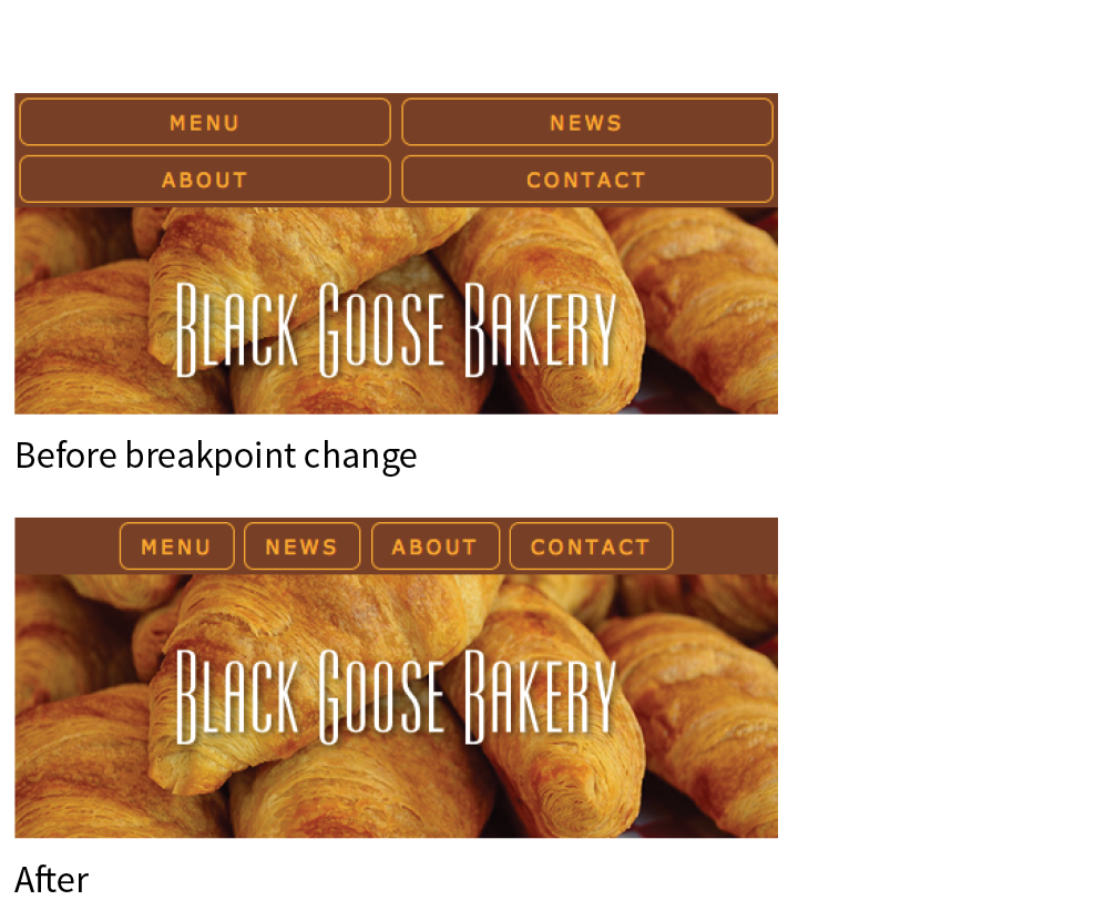
@media screen and (min-width: 400px) {nav ul li { flex: none; } nav ul { justify-content: center; }}
@media screen and (min-width: 480px) {main img { float: left; margin: 0 1em 1em 0; }}
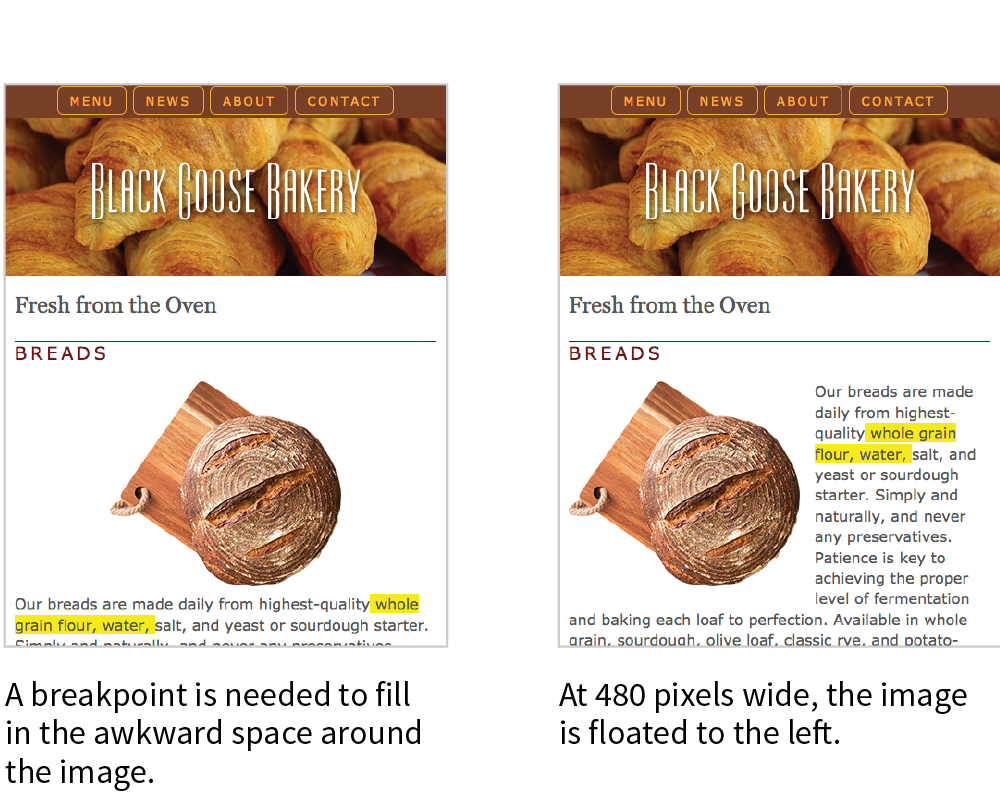
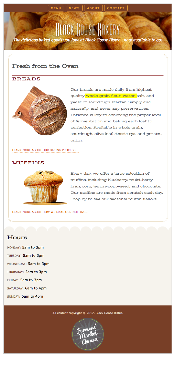
@media screen and (min-width: 600px) {header p { display: block; margin-top: -1.5em; font-family: Georgia, serif; font-style: italic; font-size: 1.2em; } main, h2, h3 { font-family: 'Stint Ultra Expanded', Georgia, serif; } h2, h3 { font-weight: bold; } main { line-height: 1.8em; padding: 1em; border: double 4px #EADDC4; border-radius: 25px; margin: 2.5%; }}
The highlighted background on the length span should be turned off before you publish, but I’ve left it visible in the figures so you can see how our line length is faring across layouts.
@media screen and (min-width: 940px) { #container { display: grid; grid-template-rows: auto min-height 5em; grid-template-columns: minmax(25em, 1fr) 16em; grid-template-areas: "banner banner" "main hours" "footer footer"; max-width: 1200px; margin: 0 auto; position: relative; } header { grid-area: banner; } main { grid-area: main;
} aside { grid-area: hours; background: url(images/scallop.png) repeat-y left top; background-color: #F6F3ED; padding: 1em; padding-left: 45px; } footer { grid-area: footer; } #award { position: absolute; top: 30px; left: 50px; } }
In the previous exercise, we relied on the Responsive View in a modern browser to make decisions about style changes at various sizes, but although it’s a handy tool for creating an initial design, much more testing is required before the design can be considered ready for final launch. That is even more critical for sites that include features that rely on JavaScript or server-side functionality.
There are three general options for testing sites: real devices, emulators, and third-party services. We’ll look at each in this section.
There is really no substitute for testing a site on a variety of real devices and operating systems. Beyond just seeing how the site looks, testing on real devices shows you how your site performs. How fast does it load? Are the links easy to tap? Do all the interactive features work smoothly? Do they work at all?
Web development companies may have a device lab comprising iPhones and iPads of various sizes, Android smartphones and tablets of various sizes, and Macs and PCs with recent operating systems (Windows and Linux) that can be used by designers and developers for testing sites (Figure 17-17). The size of the device lab depends on the size of the budget, of course (electronic devices aren’t cheap!).
If you don’t have the luxury of working at a big company with a big lab, there are alternatives:
If you do have multiple real devices for testing, using a synchronization tool makes the process a whole lot smoother. Software like BrowserSync (browsersync.io) and Ghostlab (www.vanamco.com/ghostlab/) runs on your computer and beams whatever is on your screen to all your devices simultaneously so you don’t need to load the page on each one individually. It’s like magic!
If a particular device is out of your reach, you could use an emulator, a desktop application that emulates mobile device hardware and operating systems. The emulator presents a window that shows exactly how your site would behave on that particular device (Figure 17-18). Emulators require a lot of space on your computer and they can be buggy, but it is certainly better than not testing on that device at all.
A good starting point for exploring emulators is Maximiliano Firtman’s “Mobile Emulators & Simulators: The Ultimate Guide” (www.mobilexweb.com/emulators).
Another option for testing your site on over 1,000 devices is to subscribe to a service like BrowserStack (browserstack.com) or CrossBrowserTesting (crossbrowsertesting.com). For a monthly fee, you get access to a huge variety of device simulators (Figure 17-19). There are many such services available, some of which are free or offer free trials. They don’t give you the same insights as testing on actual devices, but it is another better-than-nothing alternative.
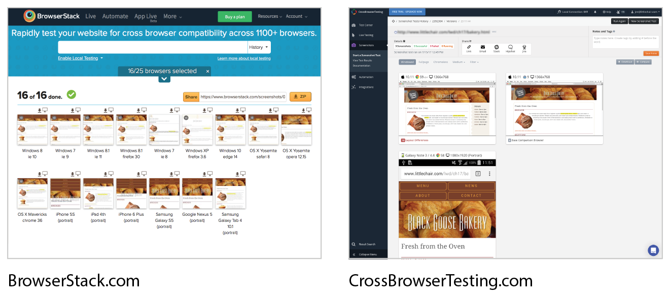
We’ve covered the mechanics of using fluid layouts, flexible images, and media queries to make a page that is usable across a wide range of screen sizes. We’ve looked at the design concerns and some common responsive patterns for layout, navigation, typography, and images. You even got a chance to try out creating a responsive page on your own. But this is really only the tip of the iceberg, and I encourage you to continue learning about RWD, particularly if you are considering web design or development as a career. Following is a list of RWD resources that I’ve found helpful and should point you in the right direction.
Most of these titles were written before CSS Grid Layout became a viable option. Keep in mind that you have advanced tools for flexible layouts not mentioned in these books.
Responsive Web Design, 2e, by Ethan Marcotte (A Book Apart)
This book is required reading. Ethan goes into much greater detail than I was able to here on how to calculate flexible grids and how to use media queries. Plus, it’s just plain fun to read.
Learning Responsive Web Design: A Beginner’s Guide by Clarissa Peterson (O’Reilly)
Clarissa provides a comprehensive overview of all aspects of responsive design, from detailed code examples to broad strategies on workflow and mobile-first design.
Smashing Book #5: Real-Life Responsive Web Design, various authors (Smashing Magazine)
A collection of practical techniques and strategies from prominent web designers.
Atomic Design by Brad Frost (self-published)
Brad describes his modular approach to RWD, which has become quite popular for large site development.
Responsive Design Workflow by Stephen Hay (New Riders)
Stephen Hay introduces his “design in the browser” method to creating responsive sites. This book is jam-packed with suggestions on how to approach web design and development.
Implementing Responsive Design by Tim Kadlec (New Riders)
Tim Kadlec is a leader in the mobile web design community, and his book is a comprehensive guide to designing and building a responsive site.
Responsive Web Design Is… (responsivedesign.is)
A collection of articles and podcasts about web design. You can also sign up for the “RWD Weekly” newsletter and keep your finger on the pulse of RWD. The site is a side project of Justin Avery and Simple Things.
Responsive Resources (bradfrost.github.io/this-is-responsive/resources.html)
For one-stop shopping for everything you could possibly want to know about RWD, look no further than Brad Frost’s Responsive Resources. He has gathered hundreds of links to resources related to strategy, design tools, layout, media queries, typography, images, components, development, testing, content management systems, email, tutorials, and more. Seriously, there is enough here to keep you busy for months.
Media Queries (mediaqueri.es)
A gallery of exceptional examples of responsive websites curated by Eivind Uggedal.
Here we are at the end of another chapter, so you know what that means… quiz time! Get the answers in Appendix A if you’re stumped.
<meta name="viewport" content="width=device-width, initial-scale=1">
@media screen and (min-width: 60em) { body { margin: 0 10%; }} * Pew Research Center, “Smartphone Use in 2015,” .
In This Chapter
Creating smooth transitions
Moving, rotating, and scaling elements
Combining transitions and transforms
A few words about 3-D transforms
Keyframe animations
We’ve seen CSS used for visual effects like rounded corners, color gradients, and drop shadows that previously had to be created with graphics. In this chapter, we’ll look at some CSS3 properties for producing animated interactive effects that were previously possible only with JavaScript or Flash.
We’ll start with CSS Transitions, a nifty way to make style changes fade smoothly from one to another. Then we’ll discuss CSS Transforms for repositioning, scaling, rotating, and skewing elements and look at how you can animate them with transitions. I’m going to close out the chapter with brief introductions to 3-D Transforms and CSS Animation, which are important to know about but are too vast a topic to cover here, so I’ll give you just a taste.
The problem with this chapter is that animation and time-based effects don’t work on paper, so I can’t show them off right here. I did the next best thing, though, and made the source code for the figures available in the materials for this chapter (learningwebdesign.com/5e/materials) in a folder called figures. Just open the file in your browser.
Picture, if you will, a link in a navigation menu that changes from blue to red when the mouse hovers over it. The background is blue…mouse passes over it…BAM! Red! It goes from state to state instantly, with no states in between. Now imagine putting your mouse over the link and having the background gradually change from blue to red, passing through several shades of purple on the way. It’s smoooooth. And when you remove the mouse, it fades back down to blue again.
That’s what CSS Transitions do. They smooth out otherwise abrupt changes to property values between two states over time by filling in the frames in between. Animators call that tweening. When used with reserve, CSS Transitions can add sophistication and polish to your interfaces and even improve usability.
CSS Transitions were originally developed by the WebKit team for the Safari browser, and they are a Working Draft at the W3C (see Note). Browser support for Transitions is excellent (see the “CSS Transition Support” sidebar), so there is no reason not to use them in your designs, particularly if you treat them as an enhancement. For example, on the rare non-supporting browser (I’m looking at you, old IE), our link snapping directly from blue to red is not a big deal.
You can read CSS Transitions Module for yourself at
Transitions are a lot of fun, so let’s give them a whirl. When applying a transition, you have a few decisions to make, each of which is set with a CSS property:
Transitions require a beginning state and an end state. The element as it appears when it first loads is the beginning state. The end state needs to be triggered by a state change such as :hover, :focus, or :active, which is what we’ll be using for the examples in this chapter. You could use JavaScript to change the element (such as adding a class attribute) and use that as a transition trigger as well.
Let’s put that all together with a simple example. Here is that blue-to-red link you imagined earlier (Figure 18-1). There’s nothing special about the markup. I added a class so I could be specific about which links receive transitions.
The transition properties are applied to the object that will be transitioned—in this case, the a element in its normal state. You’ll see them in the set of other declarations for .smooth, like padding and background-color. I’ve changed the background color of the link to red by declaring the background-color for the :hover state (and :focus too, in case someone is tabbing through links with a keyboard).
The markup
<a href="…" class="smooth">awesomesauce</a>
The styles
.smooth { display: block; text-decoration:none; text-align: center; padding: 1em 2em; width: 10em; border-radius: 1.5em; color: #fff; background-color: mediumblue; transition-property: background-color; transition-duration: 0.3s;
}.smooth:hover, .smooth:focus { background-color: red;}
transition-property
Values: property-name | all | none
Default: all
Applies to: all elements, and pseudo-elements
Inherits: no
transition-property identifies the CSS property that is changing and that you want to transition smoothly. In our example, it’s the background-color. You can also change the foreground color, borders, dimensions, font- and text-related attributes, and many more. Table 18-1 lists the animatable CSS properties as of this writing. The general rule is that if its value is a color, length, or number, that property can be a transition property.
transition-duration
Values: time
Default: 0s
Applies to: all elements, and pseudo-elements
Inherits: no
transition-duration sets the amount of time it takes for the animation to complete in seconds (s) or milliseconds (ms). I’ve chosen .3 seconds, which is just enough to notice something happened but not so long that the transition feels sluggish or slows the user down. There is no correct duration, of course, but I’ve found that .2s seems to be a popular transition time for UI elements. Experiment to find the duration that makes sense for your application.
transition-timing-function
Values: ease | linear | ease-in | ease-out | ease-in-out | step-start | step-end | steps | cubic-bezier(#,#,#,#)
Default: ease
Applies to: all elements, :before and :after pseudo-elements
Inherits: no
The property and the duration are required and form the foundation of a transition, but you can refine it further. There are a number of ways a transition can roll out over time. For example, it could start out fast and then slow down, start out slow and speed up, or stay the same speed all the way through, just to name a few possibilities. I think of it as the transition “style,” but in the spec, it is known as the timing function or easing function.
The timing function you choose can have a big impact on the feel and believability of the animation, so if you plan on using transitions and CSS animations, it is a good idea to get familiar with the options.
If I set the transition-timing-function to ease-in-out, the transition will start out slow, then speed up, then slow down again as it comes to the end state.
.smooth { … transition-property: background-color; transition-duration: 0.3s; transition-timing-function: ease-in-out;}
The transition-timing-function property takes one of the following keyword values:
ease
Starts slowly, accelerates quickly, and then slows down at the end. This is the default value and works just fine for most short transitions.
linear
Stays consistent from the transition’s beginning to end. Because it is so consistent, some say it has a mechanical feeling.
ease-in
Starts slowly, then speeds up.
ease-out
Starts out fast, then slows down.
ease-in-out
Starts slowly, speeds up, and then slows down again at the very end. It is similar to ease, but with less pronounced acceleration in the middle.
cubic-bezier(x1,y1,x2,y2)
The acceleration of a transition can be plotted with a curve called a Bezier curve. The steep parts of the curve indicate a fast rate of change, and the flat parts indicate a slow rate of change. Figure 18-2 shows the Bezier curves that represent the function keywords as well as a custom curve I created. You can see that the ease curve is a tiny bit flat in the beginning, gets very steep (fast), then ends flat (slow). The linear keyword, on the other hand, moves at a consistent rate for the whole transition.
You can get the feel of your animation just right by creating a custom curve. The site Cubic-Bezier.com is a great tool for playing around with transition timing and generating the resulting code. The four numbers in the value represent the x and y positions of the start and end Bezier curve handles (the pink and blue dots in Figure 18-2).
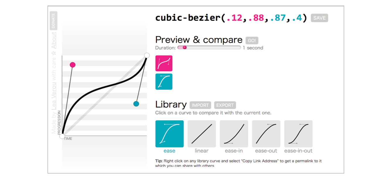
#
Divides the transitions into a number of steps as defined by a stepping function. The first value is the number of steps, and the start and end keywords define whether the change in state happens at the beginning (start) or end of each step. Step animation is especially useful for keyframe animation with sprite images. For a better explanation and examples, I recommend the article “Using Multi-Step Animations and Transitions,” by Geoff Graham on CSS-Tricks (css-tricks.com/using-multi-step-animations-transitions/).
step-start
Changes states in one step, at the beginning of the duration time (the same as steps(1,start)). The result is a sudden state change, the same as if no transition had been applied at all.
step-end
Changes states in one step, at the end of the duration time (the same as steps(1,end)).
It’s difficult to show the various options on a still page, but I have put together a little demo, which is illustrated in Figure 18-3 and available in the figures folder with the materials for this chapter. The width of each labeled element (white with a blue border) transitions over the course of 4 seconds when you hover over the green box. They all arrive at their full width at exactly the same time, but they get there in different manners. The image shown in Figure 18-3 was taken at the 2-second mark, halfway through the duration of the transition.
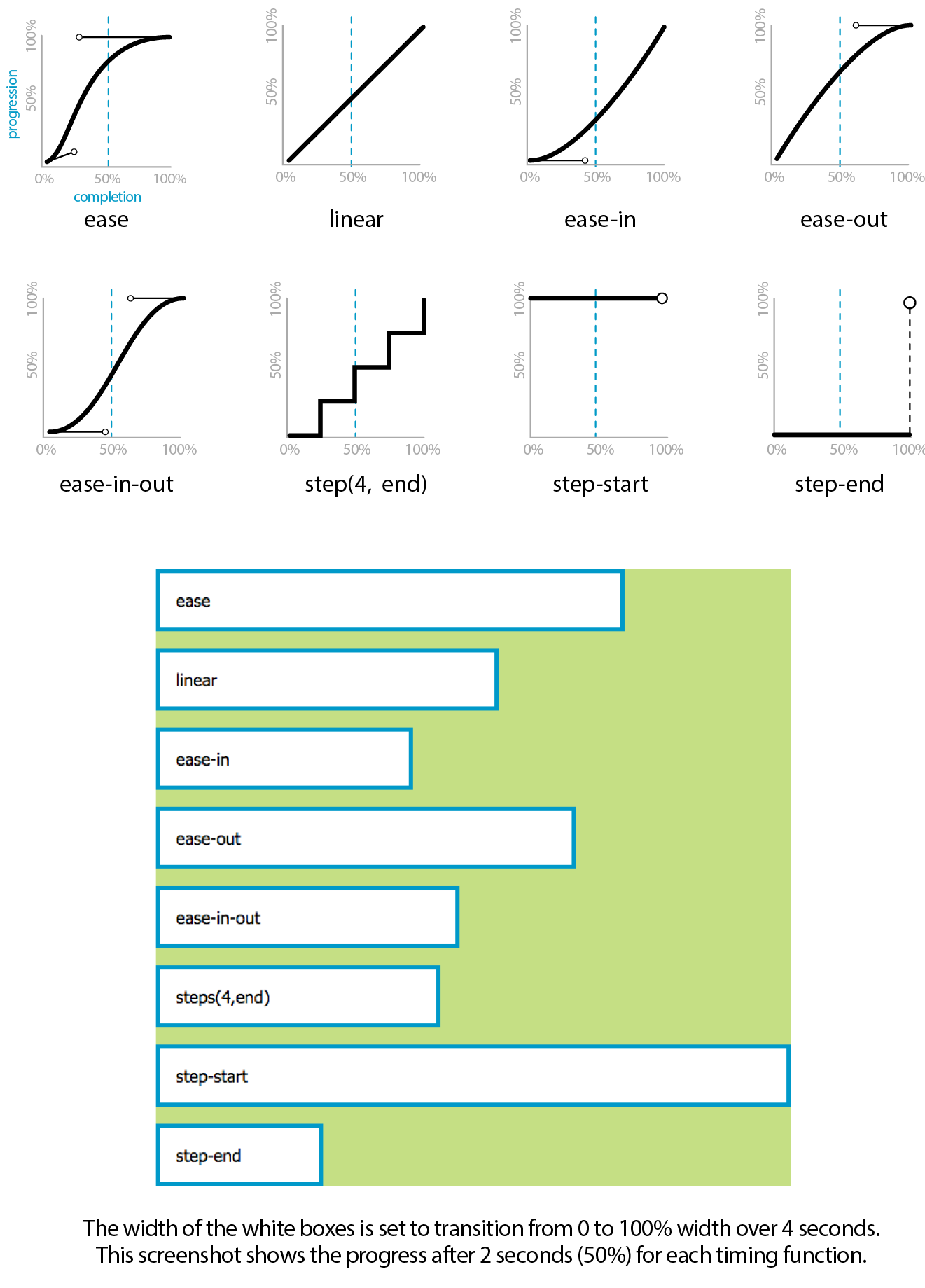
transition-delay
Values: time
Default: 0s
Applies to: all elements, :before and :after pseudo-elements
Inherits: no
The transition-delay property, as you might guess, delays the start of the animation by a specified amount of time. In the following example, the background color transition starts .2 seconds after the pointer moves over the link.
.smooth { … transition-property: background-color; transition-duration: 0.3s; transition-timing-function: ease-in-out; transition-delay: 0.2s;}
Thankfully, the authors of the CSS3 spec had the good sense to give us the shorthand transition property to combine all of these properties into one declaration. You’ve seen this sort of thing with the shorthand border property. Here is the syntax:
transition: property duration timing-function delay;
The values for each of the transition-* properties are listed out, separated by character spaces. The order isn’t important as long as the duration (which is required) appears before delay (which is optional). If you provide only one time value, it will be assumed to be the duration.
Using the blue-to-red link example, we could combine the four transition properties we’ve applied so far into this one line:
.smooth { … transition: background-color 0.3s ease-in-out 0.2s;}
Definitely an improvement.
So far, we’ve changed only one property at a time, but it is possible to transition several properties at once. Let’s go back to the “awesomesauce” link example. This time, in addition to changing from blue to red, I’d like the letter-spacing to increase a bit. I also want the text color to change to black, but more slowly than the other animations. Figure 18-4 attempts to show these transitions on this static page.
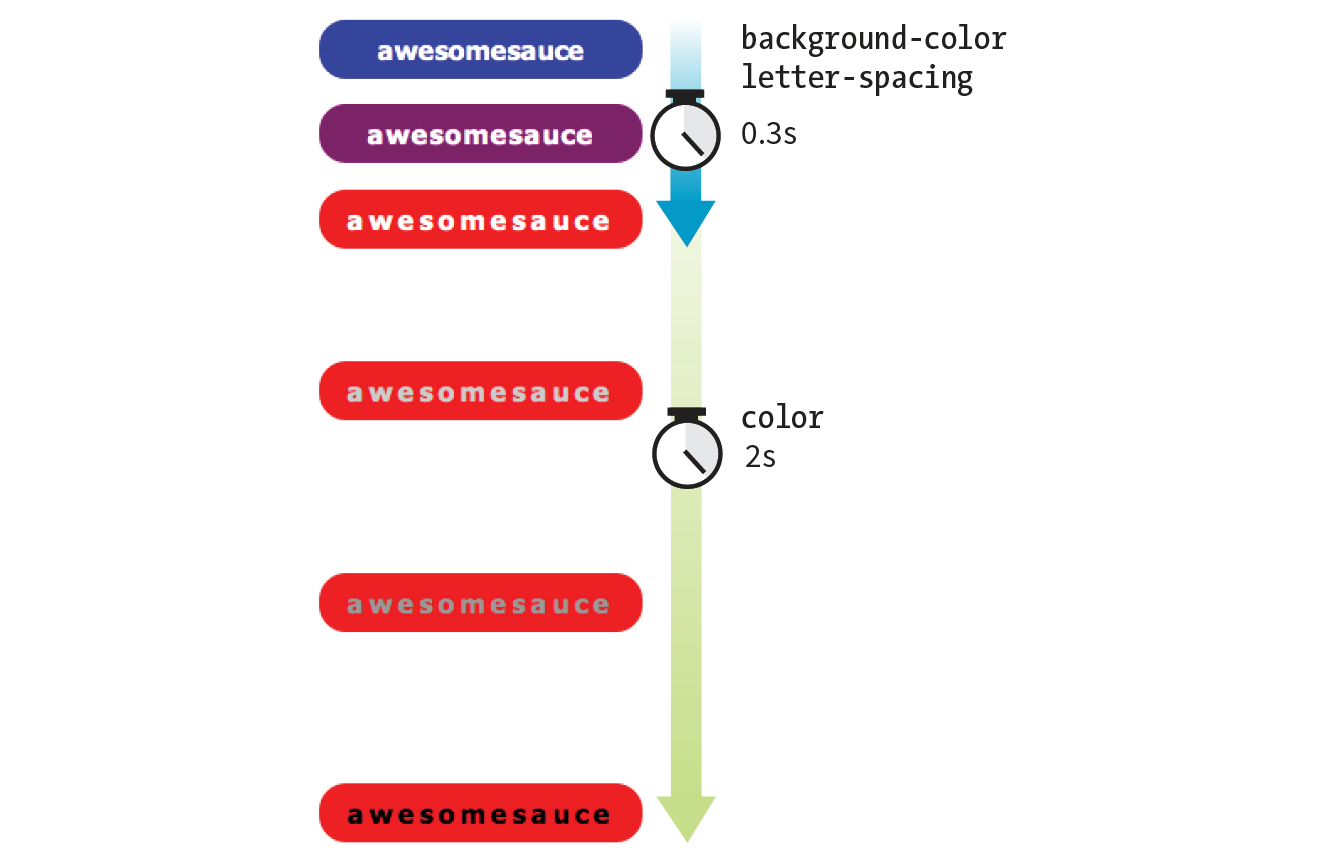
One way to do this is to list all of the values for each property separated by commas, as shown in this example:
.smooth { … transition-property: background-color, color, letter-spacing; transition-duration: 0.3s, 2s, 0.3s; transition-timing-function: ease-out, ease-in, ease-out;
}.smooth:hover, .smooth:focus { background-color: red; letter-spacing: 3px; color: black;}
The values are matched up according to their positions in the list. For example, the transition on the color property (second in the list) has a duration of 2s and uses the ease-in timing function. If one list has fewer values than the others, the browser repeats the values in the list, starting over at the beginning. In the previous example, if I had omitted the third value (.3s) for transition-duration, the browser would loop back to the beginning of the list and use the first value (.3s) for letter-spacing. In this case, the effect would be the same.
You can line up values for the shorthand transition property as well. The same set of styles we just saw could also be written as follows:
.smooth { … transition: background-color 0.3s ease-out, color 2s ease-in, letter-spacing 0.3s ease-out;
}
But what if you just want to add a little bit of smoothness to all your state changes, regardless of which property might change? For cases when you want the same duration, timing function, and delay to apply to all transitions that might occur on an element, use the all value for transition-property. In the following example, I’ve specified that any property that might change for the .smooth element should last .2 seconds and animate via the ease-in-out function.
.smooth {
…
transition: all 0.2s ease-in-out;
}
For user interface changes, a short, subtle transition is often all you need for all your transitions, so the all value will come in handy. Well, that wraps up our lesson on CSS3 Transitions. Now you give it a try in Exercise 18-1.
If you’re using a touch device for this exercise, you’ll miss out on this effect because there is no hover state on touch screens. You may see the hover state with a single tap. Transitions triggered by a click/tap or when the page loads will work on all devices, but they are not covered here.
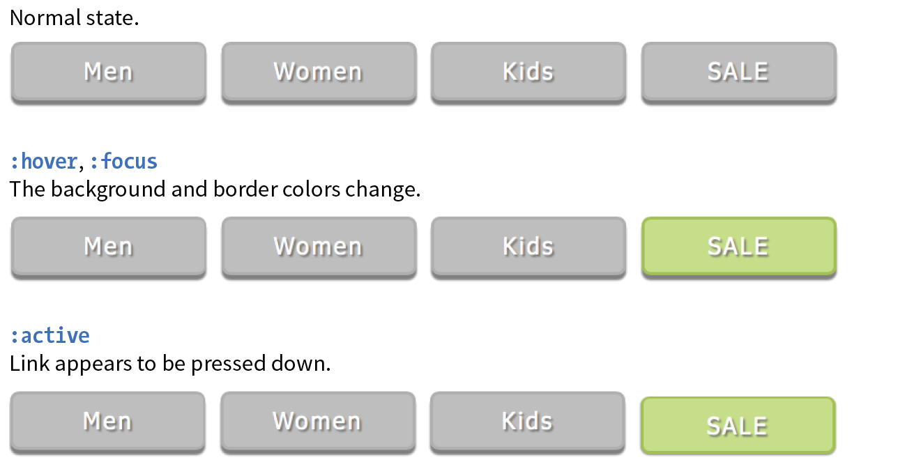
transform
Values: rotate() | rotateX() | rotateY() | rotateZ() | rotate3d() | translate() | translateX() | translateY() | scale() | scaleX() | scaleY() | skew() | skewX() | skewY() | none
Default: none
Applies to: transformable elements (see sidebar)
Inherits: no
The CSS3 Transforms Module (www.w3.org/TR/css-transforms-1) gives authors a way to rotate, relocate, resize, and skew HTML elements in both two- and three-dimensional space. It is worth noting up front that transforms change how an element displays, but it is not motion- or time-based. However, you can animate from one transform state to another using transitions or keyframe animations, so they are useful to learn about in the context of animation.
This chapter focuses on the more straightforward two-dimensional transforms because they have more practical uses. Transforms are supported on virtually all current browser versions without vendor prefixes (see the sidebar “CSS Transforms Support” for exceptions).
You can apply a transform to the normal state of an element, and it appears in its transformed state when the page loads. Just be sure that the page is still usable on browsers that don’t support transforms. It is common to introduce a transform only when users interact with the element via :hover or a JavaScript event. Either way, transforms are a good candidate for progressive enhancement—if an IE8 user sees an element straight instead of at a jaunty angle, it’s probably no biggie.
Figure 18-6 shows a representation of four two-dimensional transform functions: rotate(), translate(), scale(), and skew() (see Note). The dashed outline shows the element’s original position.
There are actually five 2-D transform functions in the CSS spec. The fifth, , allows you to craft your own combined transformation using six values and some badass trigonometry. There are tools that can take a number of transforms and combine them into a matrix function, but the result isn’t very user-friendly. Fascinating in theory, but more than I want to take on personally.
When an element transforms, its element box keeps its original position and influences the layout around it, in the same way that space is left behind by a relatively positioned element. It is as though the transformation magically picks up the pixels of the rendered element, messes around with them, and lays them back down on top of the page. So, if you move an element with transform, you’re moving only a picture of it. That picture has no effect on the surrounding layout. Let’s go through the transform functions one by one, starting with rotate().
If you’d like an element to appear on a bit of an angle, use the rotate() transform function. The value of the rotate() function is an angle specified in positive (clockwise) or negative (counterclockwise) degrees. The image in Figure 18-7 has been rotated –10 degrees (350 degrees) with the following style rule. The tinted image shows the element’s original position for reference.
img { width: 400px; height: 300px; transform: rotate(-10deg);}
Notice that the image rotates around its center point, which is the default point around which all transformations happen. But you can change that easily with the transform-origin property.
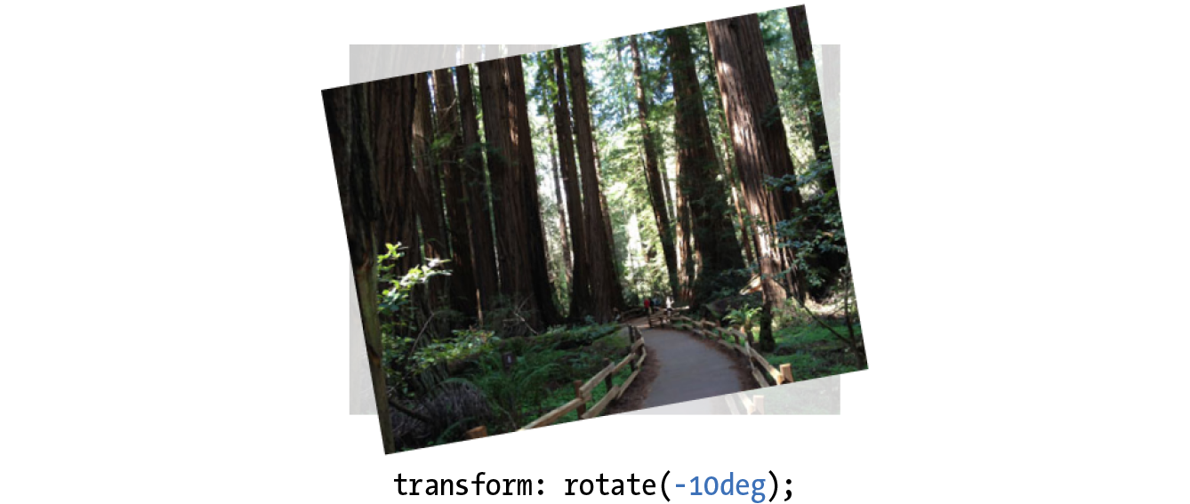
transform-origin
Values: percentage | length | left | center | right | top | bottom
Default: 50% 50%
Applies to: transformable elements
Inherits: no
The value for transform-origin is either two keywords, length measurements, or percentage values. The first value is the horizontal offset, and the second is the vertical offset. If only one value is provided, it will be used for both. The syntax is the same as you learned for background-position back in Chapter 13, Colors and Backgrounds. If we wanted to rotate our image around a point at the center of its top edge, we could write it in any of the following ways:
transform-origin: center top; transform-origin: 50%, 0%; transform-origin: 200px, 0;
The images in Figure 18-8 have all been rotated 25 degrees, but from different origin points. It is easy to demonstrate the origin point with the rotate() function, but keep in mind that you can set an origin point for any of the transform functions.
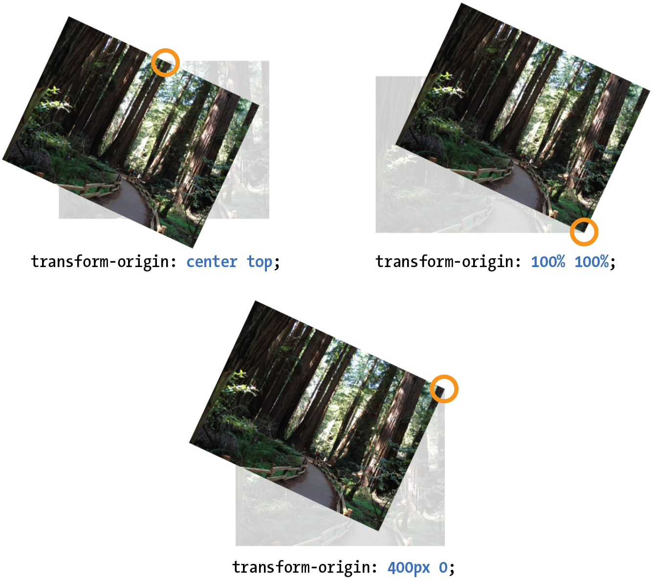
Another thing you can do with the transform property is give the element’s rendering a new location on the page by using one of three translate() functions, as shown in the examples in Figure 18-9. The translateX() function allows you to move an element on a horizontal axis; translateY() is for moving along the vertical axis; and translate() combines both x and y values.
transform:translateX(50px); transform:translateY(25px); transform:translate(50px, 25px); /* (translateX, translateY) */
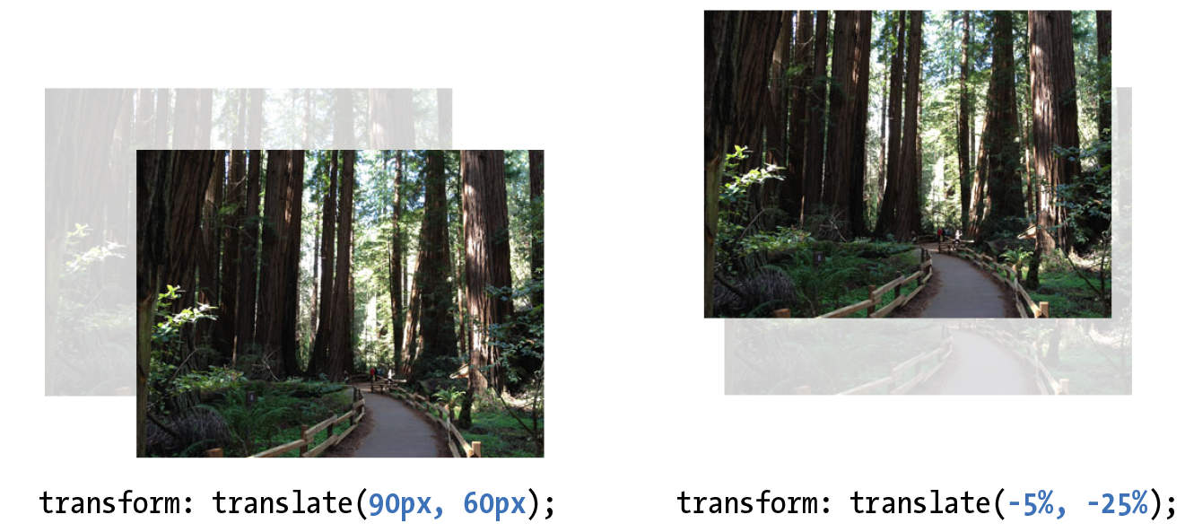
Provide length values in any of the CSS units or as a percentage value. Percentages are calculated on the width of the bounding box—that is, from border edge to border edge (which, incidentally, is how percentages are calculated in SVG, from which transforms were adapted). You can provide positive or negative values, as shown in Figure 18-9.
If you provide only one value for the shorthand translate() function, it will be presumed to be the translateX value, and translateY will be set to zero. So translate(20px) would be equivalent to applying both translateX(20px) and translateY(0).
How do you like the transform property so far? We have two more functions to go.
Make an element appear larger or smaller by using one of three scale functions: scaleX() (horizontal), scaleY() (vertical), and the shorthand scale(). The value is a unitless number that specifies a size ratio. This example makes an image 150% its original width:
a img { transform: scaleX(1.5);}
The scale() shorthand lists a value for scaleX and a value for scaleY. This example makes an element twice as wide but half as tall as the original:
a img { transform: scale(2, .5);}
Unlike translate(), however, if you provide only one value for scale(), it will be used as the scaling factor in both directions. So specifying scale(2) is the same as applying scaleX(2) and scaleY(2), which is intuitively the way you’d want it to be.
Figure 18-10 shows the results of all our scaling endeavors.
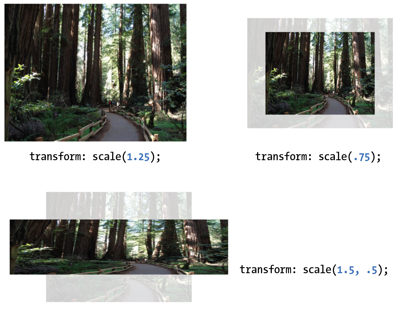
The quirky collection of skew properties—skewX(), skewY(), and the shorthand skew()—changes the angle of either the horizontal or vertical axis (or both axes) by a specified number of degrees. As for translate(), if you provide only one value, it is used for skewX(), and skewY() will be set to zero.
The best way to get an idea of how skewing works is to take a look at some examples (Figure 18-11):
a img { transform: skewX(15deg);} a img { transform: skewY(30deg);} a img { transform: skew(15deg, 30deg);}
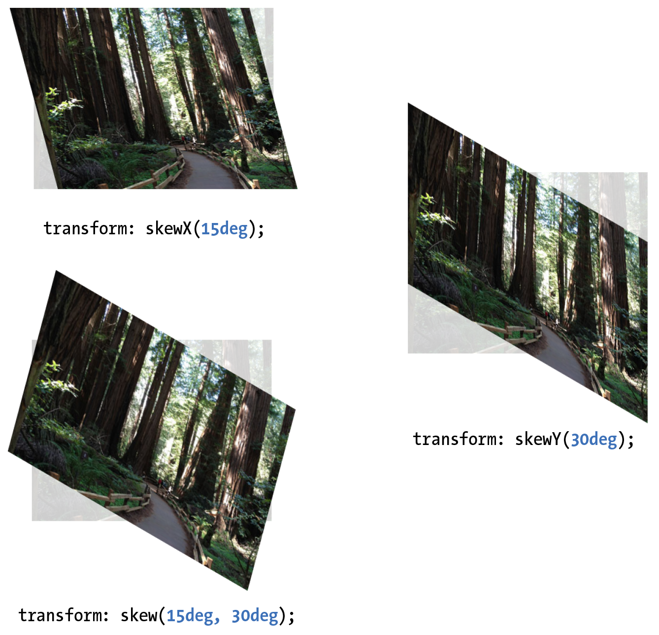
It is possible to apply more than one transform to a single element by listing out the functions and their values, separated by spaces, like this:
transform: function(value) function(value);
In the example in Figure 18-12, I’ve made the forest image get larger, tilt a little, and move down and to the right when the mouse is over it or when it is in focus:
img:hover, img:focus { transform: scale(1.5) rotate(-5deg) translate(50px,30px);}
It is important to note that transforms are applied in the order in which they are listed. For example, if you apply a translate() and then rotate(), you get a different result than with a rotate() and then a translate(). Order matters.
Another thing to watch out for is that if you want to apply an additional transform on a different state (such as :hover, :focus, or :active), you need to repeat all of the transforms already applied to the element. For example, this a element is rotated 45 degrees in its normal state. If I apply a scale() transform on the hover state, I would lose the rotation unless I explicitly declare it again:
a { transform: rotate(45deg);}a:hover { transform: scale(1.25); /* rotate on a element would be lost */
}
To achieve both the rotation and the scale, provide both transform values:
a:hover { transform: rotate(45deg) scale(1.25); /* rotates and scales */
}
The multiple transforms applied to the redwood forest image look interesting, but it might feel better if we got there with a smooth animation instead of just BAM! Now that you know about transitions and transforms, let’s put them together and make some magic happen. And by “magic,” of course I mean some basic animation effects between two states. We’ll do that together, step-by-step, in Exercise 18-2.

The prefixed property should be included in the context of a transition as well, as shown in this fully prefixed declaration:
-webkit-transition: -webkit-transform .3s linear;The prefix is not needed because transitions are not supported by IE9. Those users will see an immediate change to the transformed image without the smooth transition, which is fine.
In addition to the two-dimensional transform functions we’ve just seen, the CSS Transforms spec also describes a system for creating a sense of three-dimensional space and perspective. Combined with transitions, you can use 3-D transforms to create rich interactive interfaces, such as image carousels, flippable cards, or spinning cubes! Figure 18-14 shows a few examples of interfaces created with 3-D transforms.
It’s worth noting that this method does not create 3-D objects with a sense of volume; it merely tilts the otherwise flat element box around on three axes (animation expert Val Head calls them “postcards in space”). The rotating cube example in the figure merely stitches together six element boxes at different angles. That said, 3-D transforms still add some interesting depth to an otherwise flat web page.
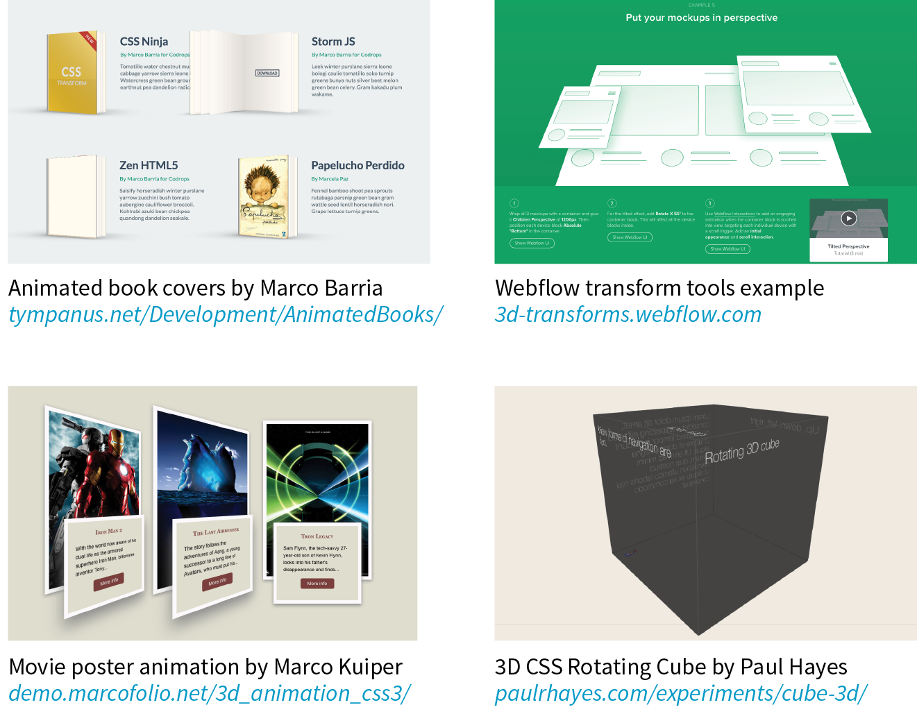
3-D transforms are not a need-to-know skill for folks just starting out in web design, so I’m not going to go into full detail here, but I will give you a taste of what it takes to add a third dimension to a design. If you’d like to learn more, the following tutorials are good places to start (although the browser support information they contain may be out-of-date):
To give you a very basic example, I’m going to use the images from Exercise 18-2 and arrange them as though they are in a 3-D carousel-style gallery (Figure 18-15).
The markup is the same unordered list used in the previous exercise:
<ul> <li><a href=""><img src="anchovies.jpg" id="img1" alt=""></a></li> <li><a href=""><img src="jellyfish1.jpg" id="img2" alt=""></a></li> <li><a href=""><img src="bluejellyfish.jpg" id="img3" alt=""></a> </li> <li><a href=""><img src="seadragon.jpg" id="img4" alt=""></a></li></ul>
The first step is to add some amount of “perspective” to the containing element by using the perspective property. This tells the browser that the child elements should behave as though they are in 3-D space. The value of the perspective property is some integer larger than zero that specifies a distance from the element’s origin on the z-axis. The lower the value, the more extreme the perspective. I have found that values between 300 and 1,500 are reasonable, but this is something you need to fuss around with until you get the desired effect.
ul { width: 1000px; height: 100px; list-style-type: none; padding: 0; margin: 0; perspective: 600;}
When using the prefix for , include the prefixed version of as well ().
The perspective-origin property (not shown) describes the position of your eyes relative to the transformed items. The values are a horizontal position (left, center, right, or a length or percentage) and a vertical position (top, bottom, center, or a length or percentage value). The default (Figure 18-15) is centered vertically and horizontally (perspective-origin: 50% 50%). The final transform-related property is backface-visibility, which controls whether the reverse side of the element is visible when it spins around.
With the 3-D space established, apply one of the 3-D transform functions to each child element—in this case, the li within the ul. The 3-D functions include translate3d, translateZ, scale3d, scaleZ, rotate3d, rotateX, rotateY, rotateZ, and matrix3d. You should recognize some terms in there. The *Z functions define the object’s orientation relative to the z-axis (picture it running from your nose to this page, whereas the x- and y-axes lie flat on the page).
In our example in Figure 18-15, each li is rotated 45 degrees around its y-axis (vertical axis) by using the rotateY function, which works as though the element boxes are rotating around a pole.
Compare the result to Figure 18-16, in which each li is rotated on its x-axis (horizontal axis) by using rotateX. It’s as though the element boxes are rotating around a horizontal bar.
li { float: left; margin-right: 10px; transform: rotateX(45deg);}
Obviously, I’m barely scratching the surface of what can be done with 3-D transforms, but this should give you a mental model for how it works. Next up, I’ll introduce you to a more sophisticated way to set your web pages in motion.
The CSS Animations Module allows authors to create real, honest-to-goodness keyframe animation. Figure 18-17 shows just a few examples that you can see in action online. Unlike transitions that go from a beginning state to an end state, keyframe animation allows you to explicitly specify other states at points along the way, allowing for more granular control of the action. Those “points along the way” are established by keyframes that define the beginning or end of a segment of animation.
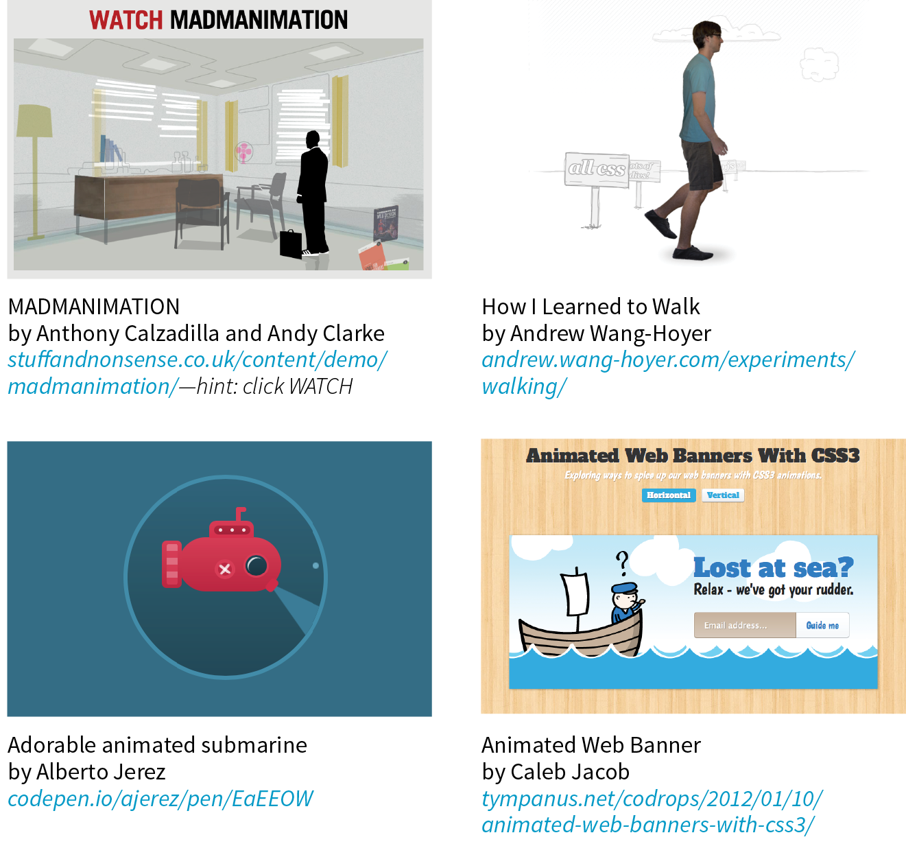
Creating keyframe animations is complex, and more than I can cover here. But I would like for you to have some idea of how it works, so I’ll sketch out the minimal details. The following resources are good starting points for learning more:
The animation process has two parts:
Here is a very simple set of keyframes that changes the background color of an element over time. It’s not a very action-packed animation, but it should give you a basic understanding of what a @keyframes rule does.
@keyframes colors { 0% { background-color: red; } 20% { background-color: orange; } 40% { background-color: yellow; } 60% { background-color: green; } 80% { background-color: blue; } 100% { background-color: purple; }}
The keyframes at-rule identifies the name of the animation, the stages of the animation represented by percentage (%) values, and the CSS properties that are affected for each stage. Here’s what a @keyframes rule looks like abstracted down to its syntax:
@keyframes animation-name{keyframe { property: value;} /* additional keyframes */ }
The sample @keyframes rule says: create an animation sequence called “colors.” At the beginning of the animation, the background-color of the element should be red; at 20% through the animation runtime, the background color should be orange; and so on, until it reaches the end of the animation. The browser fills in all the shades of color in between each keyframe (or tweens it, to use the lingo). This is represented the best I could in Figure 18-18.
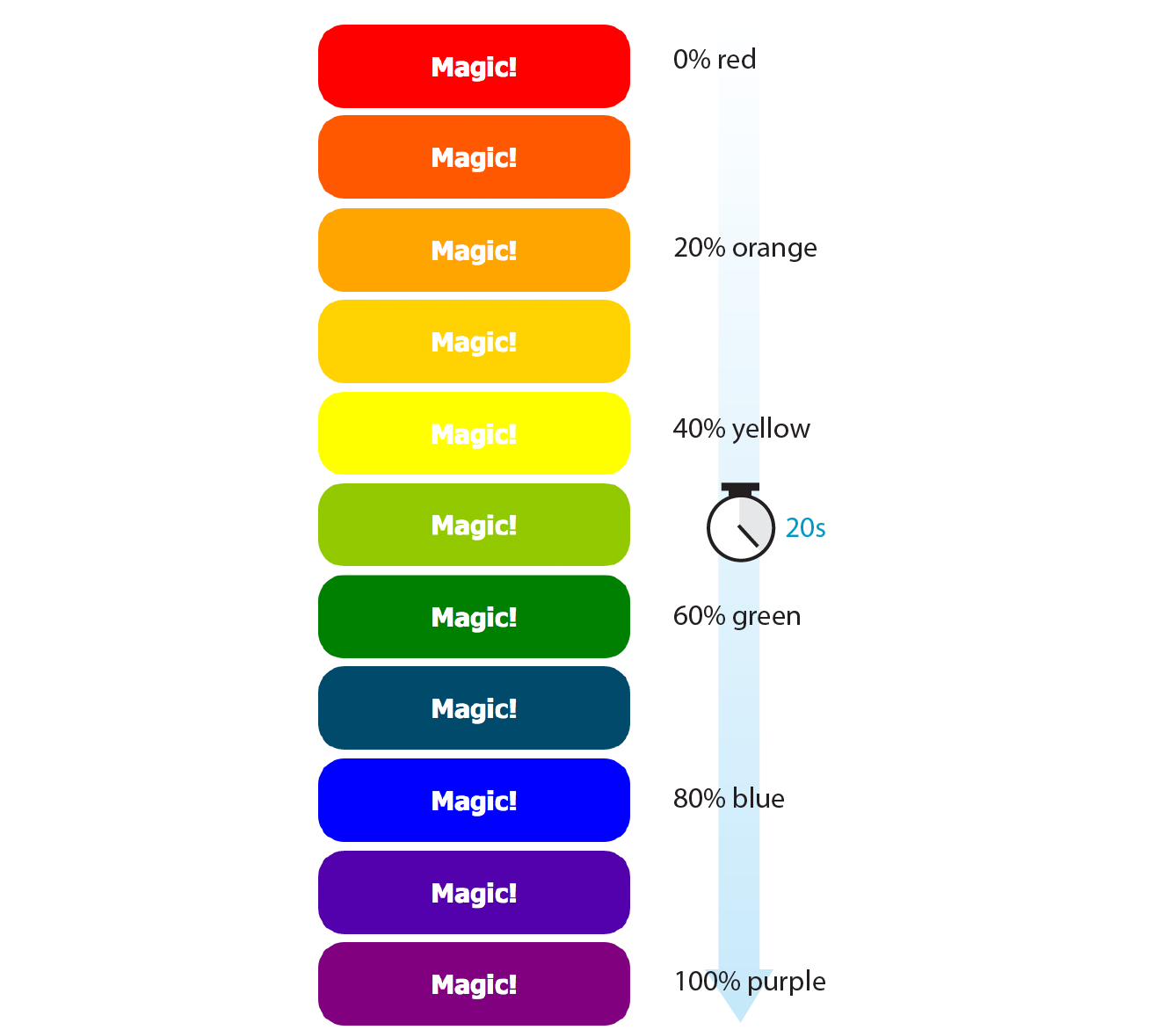
Each percentage value and the property/value declaration defines a keyframe in the animation sequence.
As an alternative to percentages, you can use the keyword from for the start of an animation sequence (equivalent to 0%) and the keyword to for denoting the end (100%). The following example makes an element slide in from right to left as the left margin reduces to 0:
@keyframe slide { from { margin-left: 100% } to { margin-left: 0%; }}
Now we can apply this animation sequence to an element or multiple elements in the document by using a collection of animation properties that are very similar to the set of transition properties that you already know.
I am going to apply the rainbow animation to the #magic div in my document:
<div id="magic">Magic!</div>
In the CSS rule for #magic, I make decisions about the animation I want to apply:
Looks familiar, right? There are a few other animation-specific properties to know about as well:
animation-iteration-count
How many times the animation should repeat. This can be set to a whole number or infinite.
animation-direction
Whether the animation plays forward (normal), in reverse (reverse), or alternates back and forth starting at the beginning (alternate), or alternates starting from the end (alternate-reverse).
animation-fill-mode
The animation fill mode determines what happens with the animation before it begins and after it ends. By default (none), the animation shows whatever property values were not specified via @keyframes. If you want the last keyframe to stay visible after the animation plays, use the forwards keyword. If there is a delay set on the animation and you want the first keyframe to show during that delay, use backwards. To retain the beginning and end states, use both.
animation-play-state
Whether the animation should be running or paused when it loads. The play-state can be toggled on and off based on user input with JavaScript or on hover.
The animation-name property tells the browser which keyframe sequence to apply to the #magic div. I’ve also set the duration and timing function, and used animation-iteration-count to make it repeat infinitely. I could have provided a specific number value, like 2 to play it twice, but how fun are only two rainbows? And for fun, I’ve set the animation-direction to alternate, which makes the animation play in reverse after it has played forward. Here is the resulting rule for the animated div:
#magic { … animation-name: colors; animation-duration: 5s; animation-timing-function: linear; animation-iteration-count: infinite; animation-direction: alternate;}
That gets a bit verbose, especially when you consider that each property may also follow a prefixed version. You can also use the animation shorthand property to combine the values, just as we did for transition:
#magic { animation: colors 5s linear infinite alternate;}
Those are the bare bones of creating keyframes and applying animations to an element on the page. To make elements move around (what we typically think of as “animation”), use keyframes to change the position of an element on the screen with translate (the best option for performance) or with the top, right, bottom, and left properties. When the keyframes are tweened, the object will move smoothly from position to position. You can also animate the other transform functions such as scale and skew.
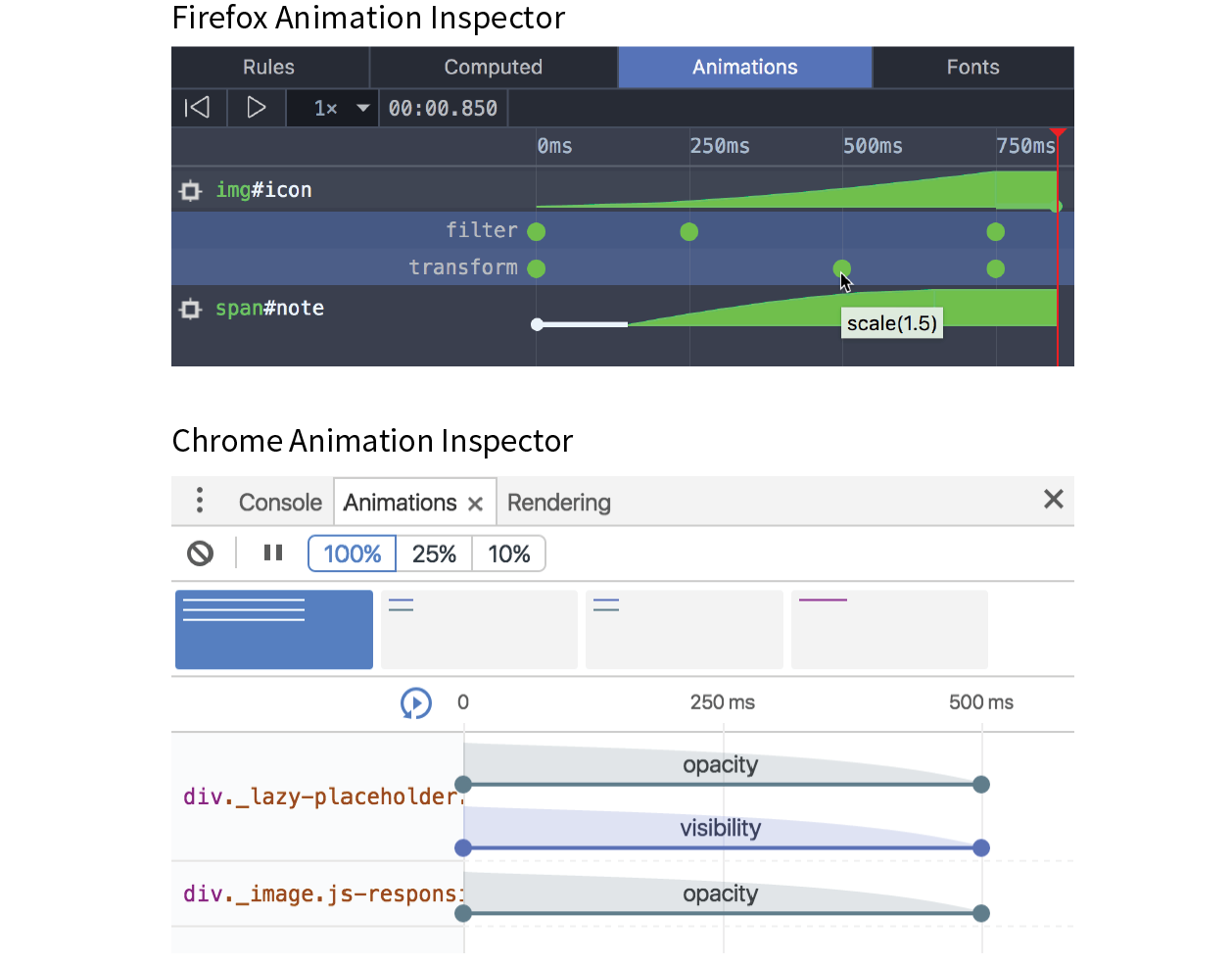
To keep my example simple, I chose to change only the background color of a button element, but of course, keyframe animations can be used to create real animations, especially when combined with the CSS transform functions for spinning and moving elements around on the page. If you only need to change an element from one state to another, a transition is the way to go. But if you have a linear animation such as moving a character, an object, or its parts around, keyframe animation is the most appropriate choice.
For more complex keyframe animations, particularly those that change with user interaction or require complex physics, using JavaScript for animation may be a better choice than CSS animation. JavaScript animation also has better support in older browsers, making it preferable if animation is critical to the mission of the page. CSS keyframe animation is a good solution for simple animations used as an enhancement to a baseline experience.
I should note that as I write this, there is a lot of excitement in the web community for animating SVG graphics. When you place the source code for an SVG directly in the HTML document, the elements in it are available to be animated. As of this writing, there are still limitations and browser support issues around using CSS to animate SVGs, but as browser support grows, this approach looks very promising. In the meantime, JavaScript has better access to SVG properties, has better browser support, and is the more common solution for SVG animation.
I hope I’ve helped you to wrap your head around how CSS can be used to add a little motion and smoothness to your pages. For adding motion to a web page, we have CSS Transitions to smooth out changes from one state to another and CSS Keyframe Animation for animating a series of states. We also looked at CSS Transforms for repositioning, spinning, resizing, or skewing an element when it is rendered on the screen.
Used thoughtfully, animation can make your interfaces more intuitive and enhance your brand personality. It’s powerful stuff, but with great power comes great responsibility. To learn how to use web animation to enhance the user experience in a meaningful way, I recommend the book Designing Interface Animation: Meaningful Motion for User Experience by Val Head (Rosenfeld Media).
Now let’s see if you were paying attention with a 12-question quiz!
Think you know your way around transitions, transforms, and keyframe animations? Here are a few questions to find out (answers in Appendix A):
widthpaddingtext-transformword-spacingtransition: color .2s linear;transition: width 300ms ease-in;transition: width 300ms ease-out;transform: scale(2, 3)perspective: 250;perspective: 1250;@keyframes border-bulge {from { border-width: 1px; } 25% { border-width: 10px; } 50% { border-width: 3px; } to { border-width: 5px; }}
Here is a summary of the properties covered in this chapter.
In this chapter
Styling forms
Style properties for tables
Using a CSS reset or normalizer
Image replacement techniques
CSS sprites
CSS feature detection
By now you have a solid foundation in writing style sheets. You can style text and element boxes, float and position objects, create responsive page layouts using Flexbox and Grid, and even add subtle animation effects to your designs. But there are a few more common techniques that you should know about.
If you look over at the “In This Chapter” list, you’ll see that this chapter is a grab bag of sorts. It starts with general approaches to styling forms and the special properties for table formatting. We’ll cover other tricks of the trade including clearing out browser styles with a CSS reset, using images in place of text (only when necessary!), reducing the number of server requests with CSS sprites, and checking whether a browser supports a particular CSS feature. Let’s dig in!
Web forms can look a bit hodgepodge right out of the box with no styles applied (Figure 19-1), so you’ll certainly want to give them a more professional appearance using CSS. Not only do they look better, but studies show that forms are much easier and faster to use when the labels and inputs are lined up nicely. In this section, we’ll look at how various form elements can be styled.
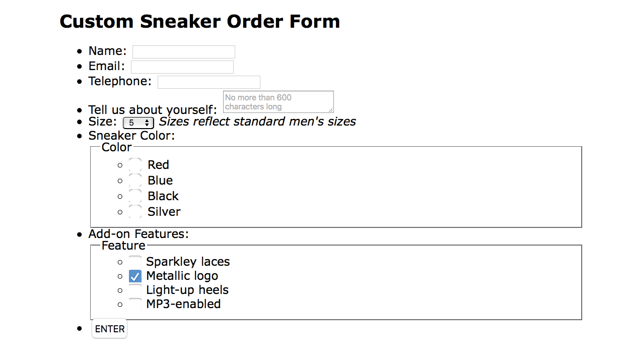
Now, I’m not going to lie: styling forms is somewhat of a dark art because of the variety of ways in which browsers handle form elements. And for really slick, custom forms, you will generally need to turn to JavaScript. But the efforts are well worth it to improve usability.
There aren’t any special CSS properties for styling forms; just use the standard color, background, font, border, margin, and padding properties that you’ve learned in the previous chapters. The following is a quick rundown of the types of things you can do for each form control type.
Text inputs (text, password, email, search, tel, url)
Change the appearance of the box itself with width, height, background-color, background-image, border, border-radius, margin, padding, and box-shadow. You can also style the text inside the entry field with the color property and the various font properties.
The textarea element
This can be styled in the same way as text-entry fields. textarea elements use a monospace font by default, so you may want to change that to match your other text-entry fields. Because there are multiple lines, you may also specify the line height. Note that some browsers display a handle on the lower-right corner of the textarea box that makes it resizable, but you can turn it off by adding the style resize: none. Text areas display as inline-block by default, but you can change them to block with the display property.
Button inputs (submit, reset, button)
Apply any of the box properties to submit and reset buttons (width, height, border, background, margin, padding, and box-shadow). It is worth noting that buttons are set to the border-box sizing model by default. Most browsers also add a bit of padding by default, which can be overridden by your own padding value. You can also style the text that appears on the buttons.
Radio and checkbox buttons
The best practice for radio and checkbox buttons is to leave them alone. If you are tenacious, you can use JavaScript to change the buttons altogether.
Drop-down and select menus (select)
You can specify the width and height for a select element, but note that it uses the border-box box-sizing model by default. Some browsers allow you to apply color, background-color, and font properties to option elements, but it’s probably best to leave them alone to be rendered by the browser and operating system.
Fieldsets and legends
You can treat a fieldset as any other element box, adjusting the border, background, margin, and padding. Turning the border off entirely is one way to keep your form looking tidy while preserving semantics and accessibility. By default, legend elements are above the top border of the fieldset, and, unfortunately, browsers make them very difficult to change. Some developers use a span or b element within the legend and apply styles to the contained element for more predictable results. Some choose to hide it in a way that it will still be read by screen readers (legend {width: 1px; height: 1px; overflow: hidden;}).
Now we know what we can do to style individual controls, but the grander goal is to make the form more organized and easier to use. Figure 19-2 shows the “after” shots of the unstyled form from Figure 19-1. There color, font, border, and spacing changes, and the labels and input elements are nicely aligned as well. And not only that, the form is responsive! I’ve used Flexbox to make the labels stack on top of their respective inputs and fieldsets on narrow screens so there is no wasted space.
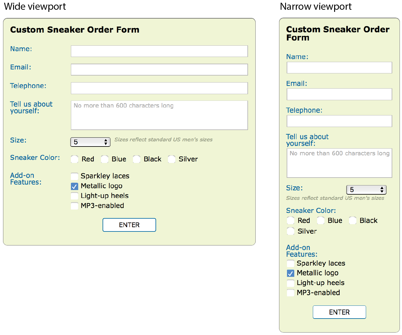
If you’d like to take a look at the actual markup and styles, the document sneakerform.html is available with the materials for this chapter (learningwebdesign.com/5e/materials). I’ve left careful and thorough comments throughout that explain exactly what each style is for. My approach to styling the Custom Sneaker Order Form can be summarized as follows:
This is a very simple example, but it should give you a general idea of how forms can be styled. You may also want to add highlight styles for interactivity, such as :hover styles on the buttons and :focus styles for text inputs when they are selected.
Like any other text content on a web page, content within table cells can be formatted with various font, text, and background properties.
You will probably want to adjust the spacing in and around tables. To adjust the amount of space within a cell (cell padding), apply the padding property to the td or th element. Spacing between cells (cell spacing) is a little more complicated and is related to how CSS handles cell borders. CSS provides two methods for displaying borders between table cells: separated or collapsed. These options are specified with the table-specific border-collapse property with separate and collapse values, respectively.
border-collapse
Values: separate | collapse
Default: separate
Applies to: table and inline-table elements
Inherits: yes
In the past, cell padding and spacing were handled by the and attributes in the element, respectively, but they have been made obsolete in HTML5 because of their presentational nature.
By default, borders are separated, and a border is drawn on all four sides of each cell. The border-spacing property lets you specify the space between cell borders.
border-spacing
Values: horizontal-length vertical-length
Default: 0
Applies to: table and inline-table elements
Inherits: yes
The values for border-spacing are two length measurements. The horizontal value comes first and applies between columns. The second measurement is applied between rows. If you provide one value, it will be used both horizontally and vertically. The default setting is 0, causing the borders to double up on the inside grid of the table (see Note).
The table in Figure 19-3 is set to separate with 15 pixels of space between columns and 5 pixels of space between rows. A purple border has been applied to the cells to make their boundaries clear.
Although the default is 0, browsers generally add 2 pixels of space for the obsolete attribute by default. If you want to see the borders double up, you need to set the attribute to 0 in the element.
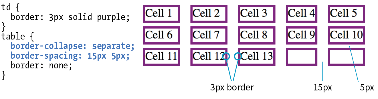
For tables with separated borders, you can indicate whether you want empty cells to display their backgrounds and borders by using the empty-cells property. For a cell to be “empty,” it may not contain any text, images, or non-breaking spaces. It may contain carriage returns and space characters.
empty-cells
Values: show | hide
Default: show
Applies to: table cell elements
Inherits: yes
Figure 19-4 shows the previous separated table-border example with its empty cells (what would be Cell 14 and Cell 15) set to hide.
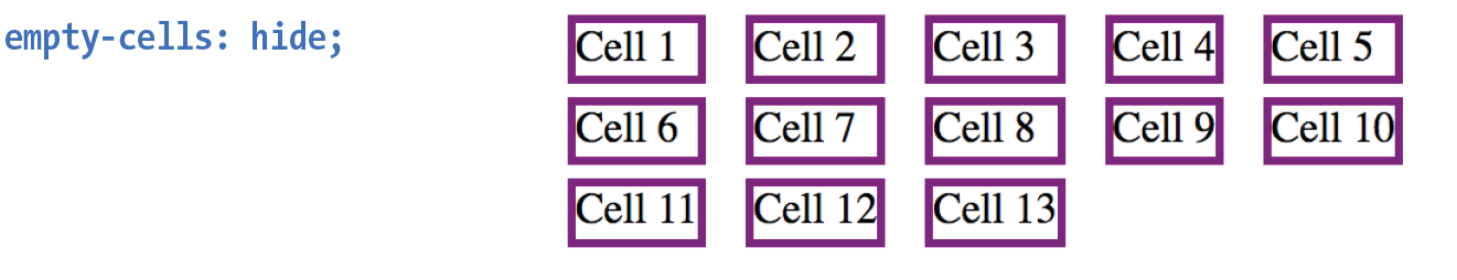
In the collapsed border model, the borders of adjacent borders “collapse” so that only one of the borders is visible and the space is removed (Figure 19-5). In the example, although each table cell has a 3-pixel border, the borders between cells measure a total of 3 pixels, not 6. In instances where neighboring cells have different border styles, a complicated pecking order is called in to determine which border will display, which you can read in the spec.
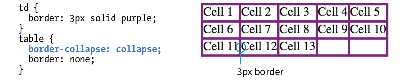
The advantage to using the collapsed table-border model is that you can style the borders for tr, col, rowgroup, and colgroup elements. With the separated model, you can’t. Strategic use of horizontal and vertical borders improves the readability of complicated tables, making the collapsed model an attractive choice.
table-layout
Values: auto | fixed
Default: auto
Applies to: table or inline-table elements
Inherits: yes
The table-layout property allows authors to specify one of two methods of calculating the width of a table. The fixed value bases the table width on width values provided for the table, columns, or cells. The auto value bases the width of the table on the minimum width of the contents of the table. Auto layout may display nominally more slowly because the browser must calculate the default width of every cell before arriving at the width of the table.
That covers basic form and table formatting. I know this is a beginner’s book, but in the next section, I’m going to introduce you to a few intermediate CSS techniques that may make your work easier and your pages faster.
As you know, browsers have their own built-in style sheets (called user agent style sheets) for rendering HTML elements. If you don’t supply styles for an h1, you can be certain that it will display as large, bold text with space above and below. But just how much larger and how much space may vary from browser to browser, giving inconsistent results. Furthermore, even if you do provide your own style sheet, elements in your document may be secretly inheriting certain styles from the user agent style sheets, causing unexpected results.
There are two methods for getting a consistent starting point for applying your own styles: a CSS reset or normalize.css. They take different approaches, so one or the other may be the best solution for what you need to achieve.
The older approach is a CSS reset, a collection of style rules that overrides all user agent styles and creates a starting point that is as neutral as possible. With this method, you need to specify all the font and spacing properties for every element you use. It’s a truly from-scratch starting point.
The most popular reset was written by Eric Meyer (the author of too many CSS books to list). It is presented here, and I’ve also included a copy of it in the materials folder for this chapter for your copy-and-paste pleasure (see Note). If you look through the code, you’ll see that the margins, border, and padding have been set to 0 for a long list of block elements. There are also styles that get typography to a neutral starting point, clear out styles on lists, and prevent browsers from adding quotation marks to quotes and blockquotes.
/*http://meyerweb.com/eric/tools/css/reset/v2.0 | 20110126 License: none (public domain)*/html, body, div, span, applet, object, iframe, h1, h2, h3, h4, h5, h6, p, blockquote, pre, a, abbr, acronym, address, big, cite, code, del, dfn, em, img, ins, kbd, q, s, samp, small, strike, strong, sub, sup, tt, var, b, u, i, center, dl, dt, dd, ol, ul, li, fieldset, form, label, legend, table, caption, tbody, tfoot, thead, tr, th, td, article, aside, canvas, details, embed,figure, figcaption, footer,header, hgroup,menu, nav, output, ruby, section, summary, time, mark, audio, video { margin: 0; padding: 0; border: 0; font-size: 100%; font: inherit; vertical-align: baseline; }
/* HTML5 display-role reset for older browsers */ article, aside, details, figcaption, figure,footer, header, hgroup, menu, nav, section { display: block; } body { line-height: 1; } ol, ul { list-style: none; } blockquote, q { quotes: none; } blockquote:before, blockquote:after, q:before, q:after { content: ''; content: none; }table { border-collapse: collapse; border-spacing: 0; }
To use the reset, place these styles at the top of your own style sheet so your own styles override them. You can use them exactly as you see them here or customize them as your project requires. I also recommend reading Eric’s posts about the thinking that went into his settings at meyerweb.com/eric/tools/css/reset/ and meyerweb.com/eric/thoughts/2007/04/18/reset-reasoning/. A web search will reveal other, potentially smaller, CSS reset options.
A more nuanced approach is to use Normalize.css, created by Nicolas Gallagher and Jonathan Neal. They painstakingly combed through the user agent styles of every modern browser (desktop and mobile) and created a style sheet that tweaks their styles for consistency, rather than just turning them all off. Normalize.css gives you a reasonable starting point: paragraphs still have some space above and below, headings are bold in descending sizes, lists have markers and indents as you would expect. It also includes styles that make form widgets consistent, which is a nice service. Figure 19-6 shows the difference between CSS reset and Normalize.css starting points.
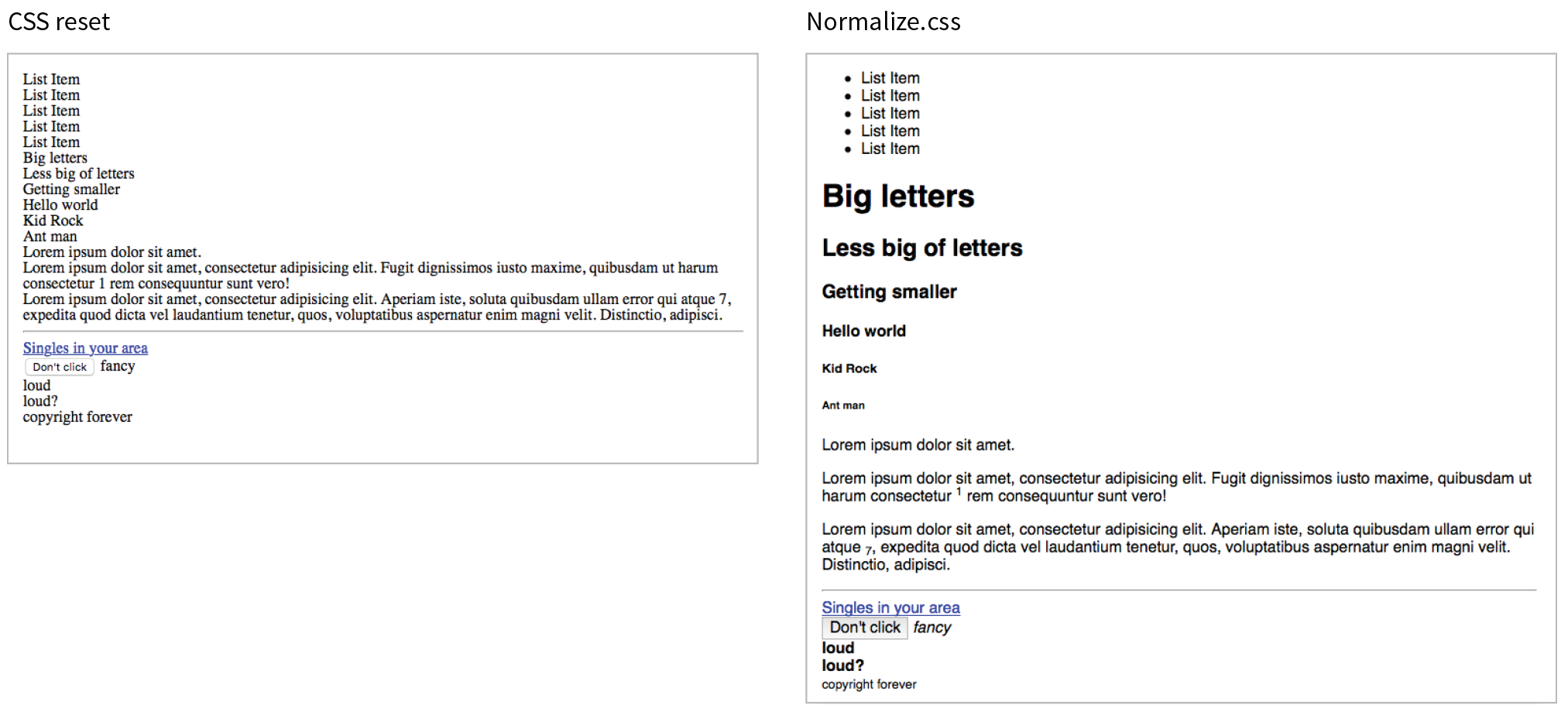
You can download Normalize.css at necolas.github.io/normalize.css/ and include it before your own styles. It is too long to print here, but you will find that it is well organized and includes comments with clear explanations for each section. For Nicolas’s thoughts on the project, see nicolasgallagher.com/about-normalize-css/.
Normalize.css is considered a superior successor to the cruder CSS reset, but I think it is important to be aware of both options. Or, if slight differences from browser to browser are just fine with you (as they are for a lot of professional developers), you don’t need to use either.
Before web fonts were a viable option, we needed to use an image anytime we wanted text in a font fancier than Times or Helvetica. Fortunately, that is no longer the case, but every now and then, it may still be necessary to replace a text element with an image in a way that is still accessible to screen readers. One common scenario is using a stylized logo in place of a company name in a heading (see Note).
Before going through the effort of an image replacement technique, consider whether the text in an element is all you need. In the case of a logo, the text could represent the company name should the image of the logo not be seen. Frankly, the logo example in this section could probably be handled that way. That said, there may be instances in which you need to replace an actual string of text with an image, in which case an image replacement technique might be a good thing to have in your CSS toolbox.
Removing the text altogether and replacing it with an img element is a bad idea because the text content is gone forever. The solution is to use a CSS-based image replacement technique that uses the image as a background in the element, then shifts the text out of the way so that it is not rendered on the page. Visual browsers see the background image, while the text content stays in the file for the benefit of search engines, screen readers, and other assistive devices. Everybody wins!
Many image replacement techniques have been developed over the years (see Note), but the most popular is the Phark technique created by Mike Rundle. It uses a large negative indent to move the text off to the left of the visible page.
In the example in Figure 19-7, I use the Phark technique to display the Jenware logo in place of the h1 “Jenware” text in the HTML source. The markup is simple:
<h1 id="logo">Jenware</h1>
The style rule is as follows:
#logo { width: 450px; height: 80px; background: url(jenware.png) no-repeat; text-indent: -9999px;}
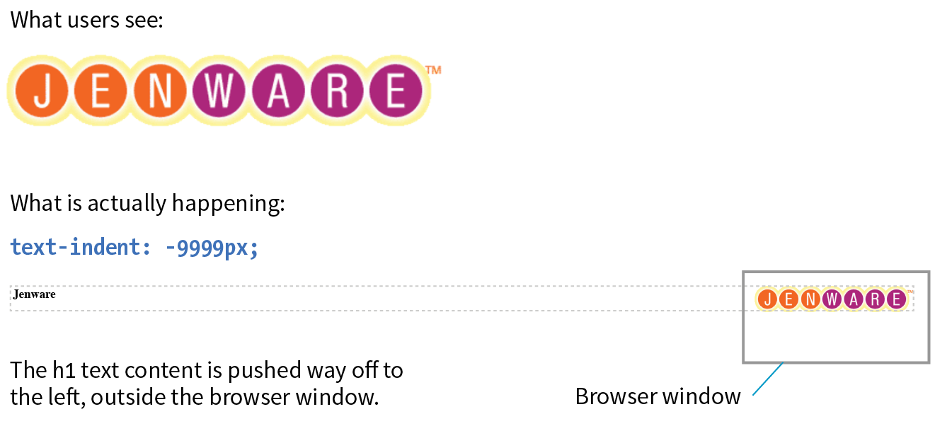
There are a few things of note here. First, the h1 element displays as a block by default, so we can just specify its width and height to match the dimensions of the image used as a background. The text-indent property pushes the word Jenware over to the left by 9,999 pixels. This requires the browser to render a very wide element box, but the performance hit is minimal.
The downside to any image replacement approach is that it means an extra request to the server for every image used. It can also be more work creating graphics every time a heading changes. Again, before you reach for an image replacement, consider whether a web font or inline image with alt text may do the trick. In the next section, we’ll look at a way to curb unnecessary server requests.
When I talked about performance back in Chapter 3, Some Big Concepts You Need to Know, I noted that you can improve site performance by reducing the number of requests your page makes to the server (a.k.a. HTTP requests). One strategy for reducing the number of image requests is to combine all your little images into one big image file so that only one image gets requested. The large image that contains multiple images is known as a sprite, a term coined by the early computer graphic and video game industry. That image gets positioned in the element via the background-position property in such a way that only the relevant portion of it is visible. An example should make this clear.
If I want to show a collection of six social media icons on my page, I can turn those six graphics into one sprite and reduce the number of HTTP requests accordingly (Figure 19-8). You can see in the figure that the icons have been stacked into one tall graphic (social.png). This example also uses an image replacement technique so the text for each link is still available to screen readers.
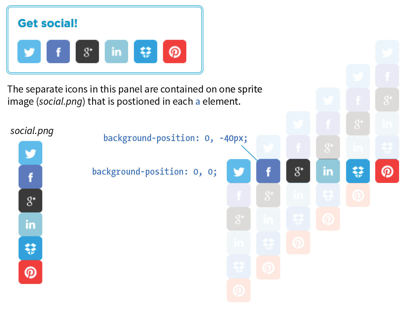
The markup
<ul> <li><a href="" class="hide twitter">Twitter</a></li> <li><a href="" class="hide fb">Facebook</a></li> <li><a href="" class="hide gplus">Google+</a></li> <li><a href="" class="hide linkedin">LinkedIn</a></li> <li><a href="" class="hide dropbox">Dropbox</a></li> <li><a href="" class="hide pinterest">Pinterest</a></li></ul>
The styles
.hide{ text-indent: 100%; white-space: nowrap; overflow: hidden; }li a { display: block; width: 40px; height: 40px;background-image: url(social.png);} li a.twitter { background-position:0 0;}li a.fb { background-position:0 -40px;} li a.gplus { background-position:0 -80px;}li a.linkedin { background-position:0 -120px;}li a.dropbox { background-position:0 -160px;}li a.pinterest { background-position: 0-200px;}
In the markup, each item has two class values. The hide class is used as a selector to apply an image replacement technique. This one was developed by Scott Kellum and uses a left indent of 100% to move the text out of sight. The other class name is particular to each social network link. The unique class values allow us to position the sprite appropriately for each link.
At the top of the style sheet you’ll see the image replacement styles. Notice in the next rule that all link (a) elements use social.png as their background image.
Finally, we get to the styles that do the heavy lifting. The background-position is set differently for each link in the list, and the visible element box works like a little window revealing a portion of the background image. The first item has the value 0,0; this positions the top-left corner of the image in the top-left corner of the element box. To make the Facebook icon visible, we need to move the image up by 40 pixels, so its vertical position is set to –40px (its horizontal position of 0 is fine). The image is moved up by 40-pixel increments for each link, revealing image areas farther and farther down the sprite stack.
In this example, all of the icons have the same dimensions and stack up nicely, but that is not a requirement. You can combine images with a variety of dimensions on one sprite. The process of setting a size for the element and then lining the sprite up perfectly with the background-position property is the same.
One of the dominant challenges facing web designers and developers is dealing with uneven browser support. Useful new CSS properties emerge regularly, but it takes a while for them find their way into browsers, and it takes much longer for the old non-supporting browsers to fade into extinction.
Fortunately, we have a few methods for checking to see if a browser supports a particular feature so we can take advantage of cutting-edge CSS while also providing thoughtful fallbacks for non-supporting browsers. Using feature detection with fallbacks sure beats the alternatives of a) not using a property until it is universally supported, or b) using it and letting users with non-supporting browsers have a broken experience.
We’ll look at two ways to detect whether a feature is supported: feature queries with a new CSS at-rule (@supports) and a JavaScript-based tool called Modernizr.
The CSS3 Conditional Rules Module Level 3 (www.w3.org/TR/css3-conditional/) introduces the @supports rule for checking browser support of a particular property and value declaration. Commonly referred to as a feature query, it works like a media query in that it runs a test, and if the browser passes that test, it applies the styles contained in the brackets of the at-rule. The syntax for @supports is as follows:
@supports (property:value) {/* Style rules for supporting browsers here */}
Note that the query is for an entire declaration, both the property and a value. It was designed this way because sometimes you may test for a new property (such as initial-letter), and sometimes you may need to test for a new value for an existing property. For example, the display property is universally supported, but the newer grid keyword value is not. Note also that there is no semicolon at the end.
Let’s look at a more specific example. I think it would be cool to use the new mix-blend-mode property to make a photo of watermelons blend in with the background (similar to a Layer Blending Mode in Photoshop). As of this writing, it is supported only in Firefox, Chrome, and Safari. As a fallback for non-supporting browsers, I create a somewhat less interesting blended effect using the opacity property (Figure 19-9).
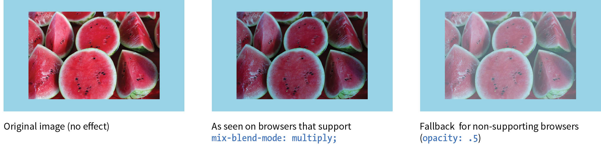
As of this writing, the best practice is to specify the fallback styles first, and then override them with a set of styles targeted at browsers that support the feature. Note that I also need to set the opacity back to 1 so it overrides my fallback style.
The markup
<div id="container"> <figure class="blend"> <img src="watermelon.jpg" alt=""> </figure> </div>
The styles
#container { background-color: #96D4E7; padding: 5em; } .blend img { opacity: .5;}@supports (mix-blend-mode: multiply) { .blend img { mix-blend-mode: multiply; opacity: 1; }}
The browser has to report for itself whether it has implemented the feature. If the feature is implemented in a buggy way, you may still encounter problems even when using feature queries.
The @supports rule can be used with three operators to refine the feature test: not, and, and or:
not
The not operator lets us test for when a specific property/value pair is not supported.
@supports not (mix-blend-mode: hue) { /* styles for non-supporting browsers */
}
Someday, this will be useful for supplying fallback styles, but with the current browser support, you risk non-supporting browsers skipping everything in the @supports rules, including the fallbacks. That’s why I used the override method in the previous example.
and
Applies styles only when all of the conditions in a series of two or more are met.
@supports (border-radius: 10em) and (shape-outside: circle()) { /* styles that apply only when the browser supports shape-outside AND border-radius */
}
or
Use the or operator to apply styles when any of a series of conditions are met. This one is particularly useful for vendor-prefixed properties.
@supports (-webkit-transform: rotate(10deg))or(-ms-transform: rotate(10deg))or(transform: rotate(10deg)) /* transform styles */ }
Feature queries began working in Chrome, Firefox, and Opera back in 2013, and they are supported by every version of Microsoft Edge. Safari added support in version 9 in 2015. Unfortunately, no version of Internet Explorer supports feature queries, which leaves a big hole in the support picture until those old browsers go away.
Non-supporting browsers use your fallback design, so make sure that it is usable at the very least. Beware, however, of browsers that do not support @supports but may support newer CSS features that you might be inclined to test. Flexbox is a great example. Safari 8 recognizes the Flexbox properties, but does not recognize @supports, so if all of your Flexbox layout rules are tucked away inside a feature query, Safari 8 won’t see them. That’s why feature queries aren’t the best tool for detecting Flexbox or any property that has better support than @supports itself. Grid Layout, on the other hand, is a great place to put feature queries to work because every browser that supports display: grid also supports @supports. Again, CanIUse.com is a good resource for comparing support.
Feature queries are an exciting new tool for web development. They allow us to take advantage of new CSS properties sooner in a way that doesn’t rely on JavaScript (we’ll look at Modernizr, a JavaScript solution, next). Downloading and running a script (even a small one) is slower than using CSS alone.
On the downside, limited browser support (for now) means @supports is not as far-reaching as Modernizr. However, if it accomplishes your goals, it should be your first choice. Fortunately, the browser environment will only continue to improve, giving CSS feature queries the advantage over a script-based solution in the long run.
So what is this “Modernizr” you’re hearing so much about?
Modernizr is a lightweight JavaScript library that runs behind the scenes and tests for a long list of HTML5 and CSS3 features when the page is loaded in the browser. For each feature it tests, it stores the result (supports/doesn’t support) in a JavaScript object that can be accessed with scripts and optionally as a class name in the html root element that can be used in CSS selectors. I’m going to focus on the latter CSS method.
When Modernizr runs, it appends the html element with a class name for each feature it detects. For example, if it is configured to test for Flexbox, when it runs on a browser that does support Flexbox, it adds the .flexbox class name to the html element:
<html class="js flexbox">
If the feature is not supported, it adds the feature name with a .no- prefix. On a non-supporting browser, the Flexbox test would be reported like this:
<html class="js no-flexbox">
With the class name in place on the root element, everything on the page becomes part of that class. We can use the class name as part of a selector to provide different sets of styles depending on feature support:
.flexboxnav { /* flexbox styles for the nav element here */ }.no-flexboxnav { /* fallback styles for the nav element here */ }
This example is short and sweet for demonstration purposes. Typically, you’ll use Modernizr to test for many features, and the html tag gets filled with a long list of class names.
First, you need to download the Modernizr.js script. Go to Modernizr.com and find the Download link. From there you can customize the script to contain just the HTML and CSS features you want to test, a nice way to keep the file size of the script down. Click the Build button, and you will be given several options for how it can be saved. A simple click on Download saves the script in a .js file on your computer.
Once you have your script, put it in the directory with the rest of the files for your project. Add it to the head of your HTML document, before any linked style sheets or other scripts that need to use it:
<head> <script src="modernizr-custom.js"></script> <!--other scripts and style sheets -->
</head>
Finally, open your HTML document and assign the no-js class name to the html element.
<html class="no-js">
Modernizr will change it to js once it detects that the browser supports JavaScript. If JavaScript (and therefore Modernizr) fails to run, you will not know whether or not features are supported.
Modernizr is one of the most popular tools in web developers’ arsenals because it allows us to design for particular features rather than whole browsers. It is easy to use, and the Modernizr site has thorough and clear documentation to help you along. Because it’s JavaScript, it works on the vast majority of browsers. The flip side to that, however, is that because it relies on JavaScript, you can’t be 100% certain that it will run, which is its main disadvantage. It will also be slightly slower than using CSS alone for feature detection.
That concludes our whirlwind tour of Cascading Style Sheets. You’ve come a long way since styling an h1 and a p back in Chapter 11, Introducing Cascading Style Sheets. By now, you should be comfortable formatting text and even doing basic page layout. While CSS is easy to learn, it takes a lot of time and practice to master. If you get stuck, you will find that there are many resources online to help you find the answers you need. The nice thing about CSS is that you can start with just the basics and then build on that knowledge as you gain proficiency in your web development skills.
In the next chapter, I’ll introduce you to tools that web developers use to improve their workflow, including tools for writing CSS more efficiently and optimizing the results. But if you’re feeling overwhelmed with CSS properties, you can breathe a sigh of relief. We’re done!
See how well you picked up the CSS techniques in this chapter with these questions. As you may have guessed, the answers are available in Appendix A.
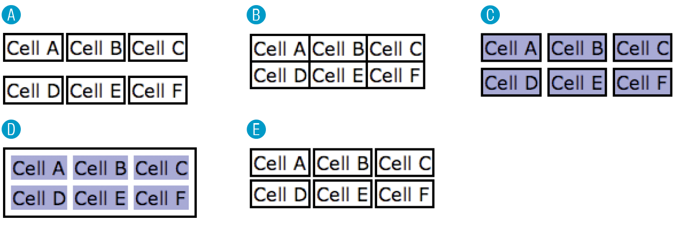
table { border-collapse: collapse;}td { border: 2px black solid; }table { border-collapse: separate; }td { border: 2px black solid; }table { border-collapse: separate; border-spacing: 2px 12px; }td { border: 2px black solid; }table { border-collapse: separate; border-spacing: 5px; border: 2px black solid; }td { background-color: #99f; }table { border-collapse: separate;
border-spacing: 5px; }td { background-color: #99f;border: 2px black solid; }.border-radius div { border: 1px solid green; border-radius: .5em;}<html class="js .no-border-radius"><html class="js .border-radius"><html class="no-js">The following is a summary of the properties covered in this chapter.
In this chapter
Introduction to the command line
CSS preprocessors and postprocessors
Build tools and task runners
Git version control
In the exercises in this book, you’ve been writing static HTML pages with embedded style sheets, saving them, and opening them in your browser. Although that is a perfectly valid approach, it is likely not the way you would work if you were doing web development for a living. I figure if you are learning web design and development, you should be familiar with how things are done in a professional environment.
This chapter introduces you to some of the tools used by web developers to make their work easier and their code more robust:
What these advanced tools have in common is that they are generally used with a command-line interface (CLI). So, before we look at specific tools, let’s first get up to speed with the command line.
You probably use a computer with a graphical user Interface (GUI), with icons that stand for files and folders, pull-down menus full of options, and intuitive actions like dragging files from folder to folder or into the trash.
Computer users in the ’60s and ’70s didn’t have that luxury. The only way to get a computer to perform a task was to type in a command. Despite our fancy GUIs, typing commands into a command-line terminal is far from obsolete. In fact, the more experienced you become at web development, the more likely it is you’ll dip into the command line for certain tasks. If you are already a programmer, the command line will be nothing new.
The command line is still popular for a number of reasons. First, it is useful for accessing remote computers, and developers often need to access and manage files on remote web servers. In addition, it is easier to write a program for the command line than a standalone application with a GUI, so many of the best tools for optimizing our workflow exist as command-line programs only. A lot of those tools can be used together in a pipeline for accomplishing complex tasks.
The time- and sanity-saving benefits are powerful incentives to take on the command line. Trust me: if you can learn all those elements and style properties, you can get used to typing a few commands.
The program that interprets the commands you type is called a shell (visual interfaces are also technically a shell; they’re just fancier). Every Mac and Linux machine comes installed with Terminal, which uses a shell program called bash. On macOS, you will find the Terminal program in (Figure 20-1).
Windows users have a few more hoops to jump through to get set up. The default command-line tool on Windows is Command Prompt (most easily accessed with Search), which can perform many of the functions you may want to do as a developer; however, it does not use bash. Because so many tools use bash, it is better to install a bash-based shell emulator like Cygwin (cygwin.com) or cmder (cmder.net). If you use Windows 10, it is recommended that you install a Linux environment on your machine by using Windows Subsystem (msdn.microsoft.com/en-us/commandline/wsl/about) or Ubuntu, available in the Windows store (www.microsoft.com/en-us/store/p/ubuntu/9nblggh4msv6).
When you launch a Terminal window, the first thing you see is a command-line prompt, which is a string of characters that indicates the computer is ready to receive your command:
$: _
The dollar sign is common, but you may see another symbol in your terminal program (see Terminal Tip). The underscore in this example stands for the cursor position, which may appear as a little rectangle or a flashing line.
The complete prompt that I see in Terminal begins with my computer’s name (“JensAir”) and an indication of the working directory—that is, the directory the shell is currently looking at. In GUI terms, the working directory is the folder you are “in.” In this example, the tilde (~) indicates that I am looking at my root User directory. The “jen” before the prompt character is my username. In future examples, I will abbreviate the prompt to simply $:.
JensAir:~ jen$: _
When you see the prompt, type in a command, and hit Enter. The computer executes the command and gives you a new prompt when it is finished. It is very no-nonsense about it. For some commands, there may be feedback or information displayed before the next prompt appears. Sometimes everything happens behind the scenes, and all you see is a fresh prompt.
When you’re learning about the command line, it is common to start with the built-in commands for navigating the file system, tasks typically handled by the Finder on the Mac and My Computer on Windows. Because they are fairly intuitive, that’s where I’m going to start my simple command-line lesson as well.
A nice little utility to try as a beginner is pwd (for “print working directory”), which displays the complete path of the working (current) directory. To use it, simply type pwd after the prompt. It’s a good one to try first because you can’t break anything with it, but for seasoned users, it is useful for figuring out exactly where you’ve landed if you’re disoriented. The forward slash indicates that this path starts at the root directory for the entire computer.
$: pwd /Users/jen
Here’s another easy (and low-risk!) example. Typing the ls command at the prompt returns a list of the files and directories in the working directory (/Users/jen). You can compare it to the Finder view of the same folder in Figure 20-2. They are two ways of looking at the same thing, just as directory and folder are two terms for the same thing depending on your view.
JensAir:~ jen$
|
|||
Applications |
Downloads |
Movies |
Public |
Desktop |
Dropbox |
Music |
Sites |
Documents |
Library |
Pictures |
|
JensAir:~ jen$ |
|||
Some utilities, like pwd, require only their name at the prompt to run, but it is more common that you’ll need to provide additional information in the form of flags and arguments. A flag changes how the utility operates, like an option or a preference. It follows the command name and is indicated by a single or double dash (-). In many cases, flags can be abbreviated to just their first letter because they are used in context with a particular utility. For example, I can modify the ls utility with the –l flag, which instructs the computer to display my directory contents in “long” format, including permission settings and creation dates:
JensAir:~ jen$ ls -l total 0 drwxr-xr-x 5 jen staff 170 Jul 8 2016 Applications drwx------ 57 jen staff 1938 Sep 11 09:47 Desktop drwx------ 26 jen staff 884 May 18 11:34 Documents drwx------+ 151 jen staff 5134 Sep 3 15:47 Downloads drwx------@ 48 jen staff 1632 Aug 16 16:34 Dropbox drwx------@ 72 jen staff 2448 Jul 15 11:21 Library drwx------ 22 jen staff 748 Oct 6 2016 Movies drwx------ 12 jen staff 408 Sep 29 2016 Music drwx------ 14 jen staff 476 Oct 13 2016 Pictures drwxr-xr-x 6 jen staff 204 May 6 2015 Public drwxr-xr-x 11 jen staff 374 Jul 10 2016 Sites JensAir:~ jen$
An argument provides the specific information required for a particular function. For example, if I want to change to another directory, I type cd (for “change directory”) as well as the name of the directory I want to go to (see Mac Terminal Tip). To make my Dropbox directory the new working directory, I type this:
JensAir:~ jen$: cd Dropbox
After I hit Enter, my prompt changes to JensAir:Dropbox jen$, indicating that I am now in the Dropbox directory. If I entered ls now, I’d get a list of the files and folders contained in the Dropbox folder (definitely way too long to show here).
To go up a level, and get back to my home user directory (~), I can use the Unix shorthand for “go up a level”: .. (remember that from your URL path lesson?). The returned prompt shows I’m back at my root directory (~).
JensAir:Dropbox jen$ cd ..JensAir:~ jen$
Some other useful file-manipulation commands include mv (moves files and folders), cp (copies files), and mkdir (creates a new empty directory). The rm command removes a file or folder in the working directory. Be careful with this command, however, because it doesn’t just move files to the Trash; it removes them from your computer entirely (see the “A Word of Caution” note).
The command line allows you to muck around in critical parts of your computer that your GUI graciously protects from you. It’s best not to type in a command if you don’t know exactly what it does and how it works. Make a complete backup of your computer before you start playing around with command line so you have the peace of mind that your files are still available if something goes horribly wrong.
Another handy command is man (short for manual), which displays documentation for any command you pass to it. For example, man ls shows a description of the ls (list) command and all of its available flags. Some man pages are long. To move down in the scroll, hitting the Return key moves you down one line at a time. To move down a page at a time, hit fn+down arrow on a Mac or Shift+Page Down on Linux. To go back up a page, it’s fn+up arrow or Shift+Page Up, respectively. Finally, to quit out of the man page, type q to return to the prompt.
Not surprisingly, these commands are just the tip of the tip of the iceberg when it comes to command-line utilities. For a complete list of commands that can be used with bash, see “An A–Z Index of the Bash Command Line for Linux” at ss64.com/bash/. You’ll pick these up on an as-needed basis, so don’t get overwhelmed. In addition, as you start installing and using new tools like the ones listed in this chapter, you’ll gradually learn the commands, flags, and arguments for those too. All part of a day’s work!
Clearly, I don’t have the space (and if I’m being honest, the experience) to write a comprehensive tutorial on the command line in this chapter, but you will find books and plenty of tutorials online that can teach you. I found Michael Hartl’s tutorial “Learn Enough Command Line to Be Dangerous” to be thorough and accessible if you are starting from square one (www.learnenough.com/command-line-tutorial#sec-basics). I also recommend the series of tutorials from Envato Tuts+, “The Command Line for Web Design” (webdesign.tutsplus.com/series/the-command-line-for-web-design--cms-777). If you enjoy video tutorials, try the “Command Line for Non-Techies” course by Remy Sharp (terminal.training).
Now that you have a basic familiarity with the command line, let’s look at tools you might use it for, beginning with tools for writing and optimizing CSS.
I know that you are just getting used to writing CSS, but I would be negligent if I didn’t introduce you to some advanced CSS power tools that have become central to the professional web developer workflow. They fall into two general categories:
Before you get too comfortable with the terms preprocessor and postprocessor, you should know that the distinction is not exactly clear-cut. Preprocessors have always been able to do some of the optimization tasks that postprocessors are good for, and postprocessors are starting to allow some functions typically found in preprocessors. The lines are blurring, so some folks refer to all of these tools simply as CSS processors, including souped-up special syntaxes for authoring as well as CSS optimizers. Many CSS processor functions are also built in to third-party tools such as CodeKit (codekitapp.com, Mac only) for one-stop shopping. I think it is beneficial for you to be familiar with the traditional terms as they are still in widespread use, and I’m going to use them here for the sake of simplicity.
Preprocessors consist of an authoring syntax and a program that translates (or compiles, to use the proper term) files written in that syntax to plain old CSS files that browsers can use (Figure 20-3). For example, in Sass, you write in the Sass syntax language and save your files with the .scss suffix, indicating it is in that language and not a CSS file. The Sass program, originally written in the Ruby language (see Technical Note), converts the SCSS syntax to standard CSS syntax and saves the resulting file with the .css suffix. LESS and Stylus work the same way, but they use JavaScript for conversion. All of these tools are installed and run via the command line.
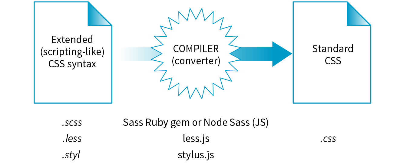
By far, the most popular preprocessor is Sass (“Syntactically awesome style sheets”), created by Hampton Catlin and Nathan Weizenbaum, who were tired of the repetitiveness of normal CSS. Their new syntax allowed CSS authors to use the type of shortcuts typical in scripting. Originally, it used an indented, bracket-free syntax (which is still an option), but a later release known as SCSS (for “Sassy CSS”) is based on the bracketed ({ }) CSS format we know and love. In fact, a valid CSS document would also be a valid SCSS document. This makes it much easier to get started with Sass, because it is familiar, and you can use just a little bit of Sass in style sheets written the way you’ve learned in this book.
I’m going to show you a few examples of Sass syntax to give you the general idea. When you are ready to take on learning Sass, a great first step is Dan Cederholm’s book Sass for Web Designers (A Book Apart). I’ve listed additional resources at the end of the section. In the meantime, let’s look at three of the most popular Sass features: nesting, variables, and mixins.
Let’s say you have an HTML document with a nav element that contains an unordered list for several menu options. Sass lets you nest the style rules for the nav, ul, and li elements to reflect the structure of the HTML markup. That alleviates the need to type out the selectors multiple times—the Sass compiler does that for you. The following example shows nested styles as they can be written in Sass syntax:
nav{ margin: 1em 2em;ul{ list-style: none; padding: 0; margin: 0;li{ display: block; width: 6em; height: 2em; } }}
When Sass converts the SCSS file to standard CSS, it compiles to this:
nav{ margin: 1em 2em;}nav ul{ list-style: none; padding: 0; margin: 0;}nav ul li{ display: block; width: 6em; height: 2em;}
A variable is a value you can define once, and then use multiple times throughout the style sheet. For example, O’Reilly uses the same shade of red repeatedly on its site, so their developers could create a variable named “oreilly-red” and use the variable name for color values. That way, if they needed to tweak the shade later, they need to change the variable value (the actual RGB color) only in one place. Here’s what setting up and using a variable looks like in Sass:
$oreilly-red: #900; a { border-color:$oreilly-red; }
When it compiles to standard CSS, the variable value is plugged into the place where it is called:
a { border-color: #900;}
The advantage of using a variable is that you can change the value in one place instead of searching and replacing through the whole document. When teams use variable names, it also helps keep styles consistent across the site.
Sass allows you to reuse whole sets of styles by using a convention called mixins. The following example saves a combination of background, color, and border styles as a mixin named “special.” To apply that combination of styles, @include it in the declaration and call it by name:
@mixin special{ color: #fff; background-color: #befc6d; border: 1px dotted #59950c;}a.nav {@include special;}a.nav: hover {@include special;border: 1px yellow solid; }
When compiled, the final CSS looks like this:
a.nav { color: #fff; background-color: #befc6d; border: 1px dotted #59950c;}
a.nav: hover { color: #fff; background-color: #befc6d; border: 1px dotted #59950c; border: 1px yellow solid; }
Notice that the hover state has a second border declaration that overrides the values in the mixin, and that’s just fine. Mixins are a popular solution for dealing with vendor prefixes. Here is a mixin for border-radius that includes an argument (a placeholder for a value you provide indicated with a $):
@mixin rounded($radius) { -webkit-border-radius: $radius; -moz-border-radius: $radius; border-radius: $radius;}When including the mixin in a style rule, provide the value for $radius, and it gets plugged into each instance in the declarations:
aside { @include rounded(.5em); background: #f2f5d5;}
This compiles to the following:
aside { -webkit-border-radius: .5em; -moz-border-radius: .5em; border-radius: .5em; background: #f2f5d5;}
Building a mixin around fill-in-the-blank arguments makes them reusable and even shareable. Many developers create their own mixin libraries to use on multiple projects. You can also take advantage of existing mixin libraries in tools like Compass (an open source CSS authoring framework at compass-style.org) or Bourbon (bourbon.io). By the time you read this, there may be others, so search around to see what’s available.
Nesting, variables, and mixins are only a tiny fraction of what Sass can do. It can handle math operations, “darken” and “lighten” colors mathematically on the fly, and process if/else statements, just to name a few features.
Once you get some practice under your belt and feel that you are ready to take your style sheets to the next level, explore some of these Sass and LESS articles and resources:
As I mentioned earlier, postprocessors are scripts that optimize standard CSS code to make it better (Figure 20-4). “Better” usually means consistent and bug-free browser support, but there are hundreds of postprocessing scripts that do a wide variety of cool things. We’ll look at some examples in a moment.
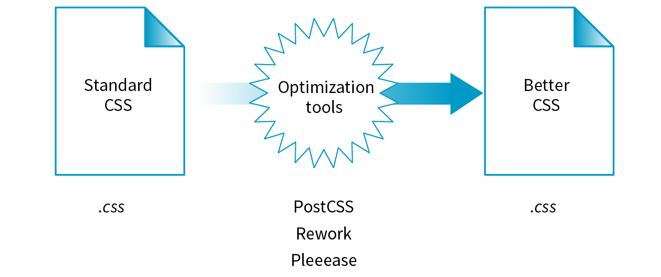
The poster child for postprocessing is Autoprefixer, which takes the CSS styles you write, scans them for properties that require vendor prefixes, and then inserts the prefixed properties automatically. What a time- and headache-saver!
Back in Chapter 16, CSS Layout with Flexbox and Grid, we used Autoprefixer via a web page interface (autoprefixer.github.io) to generate the required prefixes. Although the web page is handy (especially while you are learning), it is more common for postprocessors to be implemented with a task runner such as Grunt or Gulp. We’ll take a quick look at them later in this chapter.
As of this writing, the postprocessing scene is dominated by PostCSS (postcss.org). PostCSS is “a tool for transforming CSS with JavaScript” created by Andrey Sitnik, who also created Autoprefixer. PostCSS is both a JavaScript-based program (a Node.js module, to be precise) and an ecosystem of community-created plug-ins that solve all sorts of CSS problems.
PostCSS parses the CSS (or a CSS-like syntax such as Sass or LESS), analyzes its structure, and makes the resulting “tree” available for plug-ins to manipulate the code (see Note).
This open API makes it easy for anyone to create a PostCSS plug-in, and as a result, there are literally hundreds of plug-ins created and shared by developers (see them at www.postcss.parts). They range from the life-saving to the esoteric, but because it is a modular system, you can pick and choose just the tools that you find useful or even create your own. Here are just a few:
From that short list, you can probably see why postprocessors have become so popular. They free you up to write CSS with the syntax you want, taking advantage of cutting-edge properties and values, but with the peace of mind that everything will work well across browsers. They also eliminate the need to know about every browser idiosyncrasy, past and present, in order to do your job. It’s definitely worth knowing about even if you aren’t quite ready to take it on right away. Check out these resources for more information:
In the world of software, a build process is required to test source code and compile it into a piece of executable software. As websites evolved from a collection of static HTML files to complex JavaScript-reliant applications, often generated from templates, build tools have become integral to the web development workflow as well. Some web build tools like Grunt and Gulp are commonly referred to as task runners. You use them to define and run various tasks (anything you might do manually from the command line) on your working HTML, JavaScript, CSS, and image files to get them ready to publish.
You can automate your tasks, too, so they happen in the background without your needing to type commands. To do this, you tell the build tool to “watch” your files and folders for changes. When a change is detected, it triggers the relevant tasks to run automatically as you’ve configured them.
Once you have the task runner configured and set to watch your files, you can go about your business writing CSS, and all that command-line stuff happens for you without ever touching a terminal appplication. Here’s how that might look. Imagine making a change to your Sass file and saving it. Grunt instantly sees that the .scss file has changed, automatically converts it to .css (see Note), and then reloads the browser to reflect your change.
There is a Grunt plug-in for converting SCSS files, but it is not as full featured as Ruby.
The previous section on CSS processors should have given you an idea of some things that would be nice to automate. Allow me to list several more to give you a solid view of the ways task runners make your job easier.
The first and most established web build tool is Grunt (gruntjs.com), presumably named for handling all of the “grunt work” for you. It is a JavaScript tool built on the open source Node.js framework, and you operate it using the command line. The compelling thing about Grunt is that the development community has created literally thousands of plug-ins that perform just about any task you can think of. Just download one, configure it, and start using it. You do not have to be a JavaScript master to get started.
Another popular option is Gulp (gulpjs.com), which has the advantage of running a little faster but also requires more technical knowledge than Grunt because you configure it with actual JS code. Other contenders as of this writing are Webpack (quite popular!), Brunch, Browserify, and Broccoli. New tools with amusing names pop up on a regular basis. Some developers simply use Node.js-based scripts without using a task-runner program as a go-between. The point is, there are plenty of options.
You will find many online tutorials for learning how to download and configure the build tool of your choice when you are ready to automate your workflow. I hope that I have made you aware of the possibilities, and when a job interviewer mentions Grunt and Gulp, you’ll know they aren’t just suffering from indigestion.

speaker--name: "Jennifer Robbins" speaker--description: "Designer, Author, ARTIFACT Co-founder" speaker--photo: "/img/speakers/jennifer-robbins.jpg" #HTMLspeaker--biography:| <p>Jennifer has been designing for the web since 1993 when she worked on the first commercial web site, GNN, from O'Reilly Media. Since then she has gone on to write several books on web design for O'Reilly, including <i>Web Design in a Nutshell</i>, <i>Learning Web Design</i>, and the <i>HTML5 Pocket Reference</i>. More recently, Jennifer's days are filled with organizing the ARTIFACT Conference. …</p>speaker--links:- link--label:"Website"link--target:"http://www.jenville.com"link--title:"jenville.com"- link--label:"Twitter"link--target:"http://www.twitter.com/jenville"link--title:"@jenville"
<div class="layout--container"><div class="speaker--photo-container"> <img src="{{page-data.speaker--photo}}"></div><article class="speaker--content"> <div class="speaker--biography">{{{page-data.speaker--biography}}}</div> <ul class="speaker--links"> {{#each page-data.speaker--links}} <li class="speaker--link-item">{{link--label}}: <a href="http://{{link--target}}" class="speaker--link">{{link--title}}</a></li> {{/each}}
</ul></article></div
If you’ve done any sort of work on a computer, you’ve probably used some sort of system for keeping track of the versions of your work. You might have come up with a system of naming drafts until you get to the “final” version (and the “final-final” version, and the “final-final-no-really” version, and so on). You might take advantage of macOS’s Time Machine to save versions that you can go back to in an emergency. Or you might have used one of the professional version control systems that have been employed by teams for decades.
The king of version control systems (VCS) for web development is a robust program called Git (git-scm.com). At this point, knowing your way around Git is a requirement if you are working on a team and is a good skill to have even for your own projects.
In this section, I’ll introduce you to the terminology and mental models that will make it easier to get started with Git. Teaching all the ins and outs of how to configure and use Git from the command line is a job for another book and online tutorials (I list a few at the end of the section), but I wish someone had explained the difference between a “branch” and a “fork” to me when I was starting out, so that’s what I’ll do for you.
We’ll begin with a basic distinction: Git is the version control program that you run on your computer; GitHub (github.com) is a service that hosts Git projects, either free or for a fee. You interact with GitHub by using Git, either from the command line, with the user interface on the GitHub website, or using a standalone application that offers a GUI interface for Git commands. This was not obvious to me at first, and I want it to be clear to you from the get-go.
GitHub and services like it (see Note) are mainly web-based wrappers around Git, offering features like issue tracking, a code review tool, and a web UI for browsing files and history. They are convenient, but keep in mind that you can also set up Git on your own server and share it with your team members with no third-party service like GitHub involved at all.
There are several advantages to making Git (and GitHub) part of your workflow. First, you can easily roll back to an earlier version of your project if problems show up down the line. Because every change you make is logged and described, it helps you determine at which point things might have gone wrong.
Git also makes it easy to collaborate on a shared code source. You may tightly collaborate with one or more developers on a private project, merging all of your changes into a primary copy. As an added benefit, the sharing process is a way to get an extra set of eyes on your work before it is incorporated. You may also encourage loose collaboration on a public project by welcoming contributions of people you don’t even know in a way that is safe and managed. Git is a favorite tool for this type of collaboration on all sorts of open source projects.
Getting up to speed with GitHub in particular is important because it’s what everyone is using. If your project is public (accessible to anyone), the hosting is free. For private and commercial projects, GitHub charges a fee for hosting. In addition to hosting projects, they provide collaboration tools such as issue tracking. You may have already found that some of the links to tools I mentioned in this book go to GitHub repositories. I want you to know what you can do when you get there.
Git keeps a copy of every revision of your files and folders as you go along, with every change (called a commit) logged in with a unique ID (generated by Git), a message (written by you) describing the change, and other metadata. All of those versions and the commit log are stored in a repository, often referred to as a “repo.”
Once you have Git installed on your computer, every time you create a new repository or clone an existing one, Git adds a directory and files representing the repo’s metadata alongside other files in the project’s folder. Once the Git repository is initialized, you can commit changes and take advantage of the “time machine” feature if you need to get back to an earlier version. In this way, Git is a good tool for a solo workflow.
More likely you’ll be working with a team of other folks on a project. In that case, a hub model is used in which there is an official repository on a central server that each team member makes a local copy of to work on. Each team member works on their own machine, committing to their local repo, and at logical intervals, uploads their work back to the central repository.
That’s what makes Git a distributed version control system compared to other systems, like SVN, that require you to commit every change directly to the server. With Git, you can work locally and offline.
The first part of mastering Git is mastering its vocabulary. Let’s run through some of the terminology that will come in handy when you’re learning Git and the GitHub service. Figure 20-6 is a simplified diagram that should help you visualize how the parts fit together.
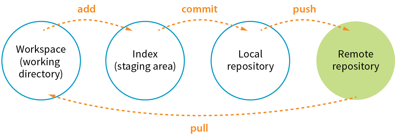
The working directory is the directory of files on your computer in which you do your actual work. Your working copy of a file is the one that you can make changes to, or to put it another way, it’s the file you can open from the hard drive by using Finder or My Computer.
Your local Git repository lives alongside the files in your working directory. It contains copies, or snapshots, of all the files in a single project at every step in its development, although these are kept hidden. It also contains the metadata stored with each change. There may also be a central repository for the project that lives on a remote server like GitHub.
A commit is the smallest unit of Git interaction and the bulk of what you will do with Git. Git uses “commit” as a verb and a noun. You may “save” your working document frequently as you work, but you commit (v.) a change when you want to deliberately add that version to the repository. Usually you commit at a logical pause in the workflow—for example, when you’ve fixed a bug or finished changing a set of styles.
When you commit, Git records the state of all the project files and assigns metadata to the change, including the username, email, date and time, a unique multidigit ID number (see the “Hashes” sidebar), and a message that describes the change. These stored records are referred to as commits (n.). A commit is like a snapshot of your entire repository—every file it contains—at the moment in time you made the commit.
Commits are additive, so even when you delete a file, Git adds a commit to the stack. The list of commits is available for your perusal at any time. On GitHub, use the History button to see the list of commits for a file or folder.
The level of granularity in commits allows you to view the repository (project) at any state it’s ever been at, ever. You never lose work, even as you proceed further and further. It’s a great safety net. Indirectly this also means that there’s nothing you can do with Git that you can’t undo—you can’t ever get yourself into an impossible situation.
Before you can commit a change, you first have to make Git aware of the file (or to track it, to use the proper term). This is called staging the file, accomplished by adding it to Git. In the command line, it’s git add filename, but other tools may provide an Add button to stage files. This creates a local index of files that you intend to commit to your local repository but haven’t been committed yet. It is worth noting that you need to “add” any file that you’ve changed, not just new files, before committing them. Staging as a concept may take a little while to get used to at first because it isn’t especially intuitive.
A branch is a sequential series of commits, also sometimes referred to as a stack of commits. The most recent commit on any given branch is the head (see Note). You can also think of a branch as a thread of development. Projects usually have a primary or default branch, typically (although not necessarily) called master, which is the official version of the project. To work on a branch, you need to have it checked out.
There are exceptions, as it is possible to reorder commits; however, it is almost always true that the head commit is also the most recent.
When working in a branch, at any point you can start a new branch to do a little work without affecting the source branch. You might start a new branch to experiment with a new feature, or to do some debugging, or to play around with presentation. Branches are often used for small, specific tasks like that, but you can create a new branch for any purpose you want.
For example, if you are working on “master,” but want to fix a bug, you can create a new branch off master and give the branch a new descriptive name, like “bugfix.” You can think of the bugfix branch as a copy of master at the point at which bugfix was created (Figure 20-7), although that’s not exactly what is happening under the hood.
To work on the bugfix branch, you first need to check it out (git checkout bugfix), and then you can go about your business of making changes, saving them, adding them to Git, and committing them. Eventually, the new branch ends up with a commit history that is different from the source branch.
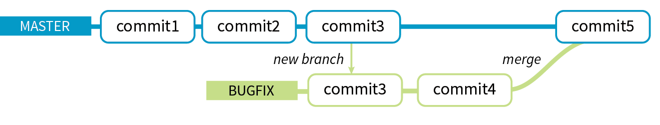
When you are done working on your new branch, you can merge the changes you made back into the source branch and delete the branch. If you don’t like what’s happening with the new branch, delete it without merging, and no one’s the wiser.
Merging is Git’s killer feature for sharing code. You can merge commits from one branch into another (such as all of the commits on a feature branch into master) or you might merge different versions of the same branch that are on different computers. According to the Git documentation, merging “incorporates changes from the named commits (since the time their histories diverged from the current branch) into the current branch.” Put another way, Git sees merging as “joining two histories together,” so it useful to think of merging happening at the commit level.
Git attempts to merge each commit, one by one, into the target branch. If only one branch has changed, the other branch can simply fast-forward to catch up with the changes. If both branches have commits that are not in the other branch—that is, if both branches have changes—Git walks through each of those commits and, on a line-by-line basis, attempts to merge the differences. Git actually changes the code inside files for you automatically so you don’t have to hunt for what’s changed.
However, if Git finds conflicts, such as two different changes made to the same line of code, it gives you a report of the conflicts instead of trying to change the code itself. Conflicts are pointed out in the source files between ======= and <<<<<<< characters (Figure 20-8). When conflicts arise, a real person needs to read through the list and manually edit the file by keeping the intended change and deleting the other. Once the conflicts are resolved, the files need to be added and committed again.
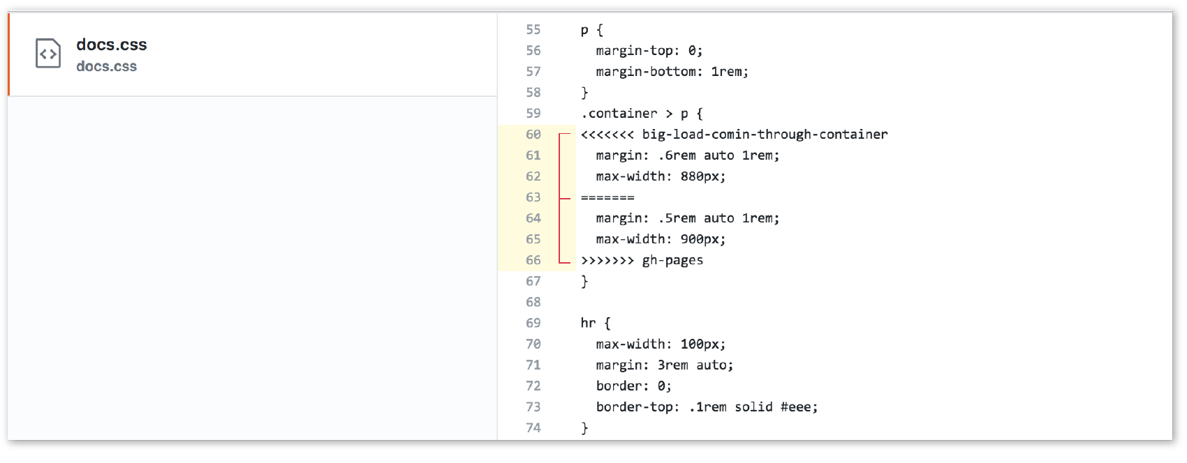
All of the features we’ve looked at so far (commits, branches, merges) can be done on your local computer, but it is far more common to use Git with one or more remote repositories. The remote repo could be on another computer within your organization, but it is likely to be hosted on a remote server like GitHub. Coordinating with a remote repository opens up a few other key Git features.
Cloning is making an exact replica of a repository and everything it contains. It’s common to clone a repo from a remote server to your own computer, but it is also possible to clone to another directory locally. If you are getting started on an existing project, making a clone of project’s repo is a logical first step.
If you are working with a remote repository, you will no doubt need to upload and download your changes to the server. The process of moving data from your local repository to a remote repository is known as pushing. When you push commits to the remote, they are automatically merged with the current version on the server. To update your local version with the version that is on the server, you pull it, which retrieves the metadata about the changes and applies the changes to your working files. You can think of pushing and pulling as the remote version of merging.
It is a best practice to pull the remote master frequently to keep your own copy up-to-date. That helps eliminate conflicts, particularly if there are a lot of other people working on the code. Many GUI Git tools provide a Sync button that pulls and pushes in one go.
You may hear talk of “forking” a repo on GitHub. Forking makes a copy of a GitHub repository to your GitHub account so you have your own copy to play around with. Having the repo in your account is not the same as having a working copy on your computer, so once you’ve forked it, you need to clone (copy) it to your own computer (Figure 20-9).
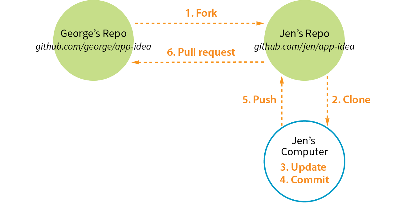
People fork projects for all sorts of reasons (see Note). You might just want to have a look under the hood. You may want to iterate and turn it into something new. You may want to contribute to that project in the form of pull requests. In any scenario, forking is a safeguard for repository owners so they can make the project available to the public while also controlling what gets merged back into it.
Forking is most often used for contributing to an open source project. For commercial or personal projects, you generally commit directly to the repository shared by your team.
It is important to keep in mind that your forked copy is no longer directly connected to the original repository it was forked from. You will not be able to push to the original. If you come up with something you think is valuable to the original project, you can do what is called a pull request—that is, asking the owner to pull your changes into the original master.
You can also do a pull request for a repo that you have access to, not just one that you’ve forked. For example, if you’ve made a branch off the main project branch, you can do a pull request to get your team to review what you’ve done and give you feedback before merging your changes back in. In fact, pull requests may be used earlier in the process to start a discussion about a possible feature.
Most Git users will tell you that the best way to use Git is with the command line. As David Demaree says in his book Git for Humans, “Git’s command-line interface is its native tongue.” He recommends typing commands and seeing what happens as the best way to learn Git. The downside of the command line, of course, is that you need to learn all the Git commands and perhaps also tackle the command-line interface hurdle itself. The following resources will help get you up to speed:
There are also several graphical Git applications available for those who prefer icons, buttons, and menus for interacting with their repositories, and there’s no shame in it. I know many developers who use a graphical app and Terminal side by-side, choosing the tool that most easily allows them to do the task they need to do. If you feel more comfortable getting started with a graphical Git tool, I recommend the following:
Many code editors have built-in Git support or Git/GitHub plug-ins as well.
If you go to the GitHub.com site, they do a good job of walking you through the setup process with easy-to-follow tutorials. You can set up an account and gain some basic GitHub skills in a matter of minutes. Their online documentation is top-notch, and they even have a YouTube channel with video tutorials aimed at beginners (www.youtube.com/githubguides).
And speaking of GitHub, for a good introduction to the ins and outs of the GitHub interface, I recommend the book Introducing GitHub: A Non-Technical Guide by Brent Beer (O’Reilly).
When you are ready to get started using Git for version control, you’ll find all the support you need.
This concludes the web developer “power tools” chapter. We began with an introduction to the command line, and looked at some strong incentives for learning to use it. You can write CSS faster and make it more cross-browser compliant. You can take advantage of task runners and build tools that automate a lot of the repetitive grunt work you come across as a developer. Finally, although the command line is not required to use Git, it may make learning Git easier and will give you repo superpowers as you begin to master it.
We’ve talked a fair amount about JavaScript in this chapter. In Part IV, I hand over the keyboard to JavaScript master Mat Marquis, who will introduce you to JavaScript and its syntax (also somehow managing to make it very entertaining). I’ll be back in Part V to talk about web images.
It’s time to test your knowledge of the topics introduced in this chapter. See Appendix A for the answers.
In This Chapter
What JavaScript is and isn’t
Variables and arrays
if/else statements and loops
Native and custom functions
Browser objects
Event handlers
by Mat Marquis
In this chapter, I’m going to introduce you to JavaScript. Now, it’s possible you’ve just recoiled a little bit, and I understand. We’re into full-blown “programming language” territory now, and that can be a little intimidating. I promise, it’s not so bad!
We’ll start by going over what JavaScript is—and what it isn’t—and discuss some of the ways it is used. The majority of the chapter is made up of an introduction to JavaScript syntax—variables, functions, operators, loops, stuff like that. Will you be coding by the end of the chapter? Probably not. But you will have a good head start toward understanding what’s going on in a script when you see one. I’ll finish up with a look at some of the ways you can manipulate the browser window and tie scripts to user actions such as clicking or submitting a form.
If you’ve made it this far in the book, you no doubt already know that JavaScript is a programming language that adds interactivity and custom behaviors to our sites. It is a client-side scripting language, which means it runs on the user’s machine and not on the server, as other web programming languages such as PHP and Ruby do. That means JavaScript (and the way we use it) is reliant on the browser’s capabilities and settings. It may not even be available at all, either because the user has chosen to turn it off or because the device doesn’t support it, which good developers keep in mind and plan for. JavaScript is also what is known as a dynamic and loosely typed programming language. Don’t sweat this description too much; I’ll explain what all that means later.
First, I want to establish that JavaScript is kind of misunderstood.
Right off the bat, the name is pretty confusing. Despite its name, JavaScript has nothing to do with Java. It was created by Brendan Eich at Netscape in 1995 and originally named “LiveScript.” But Java was all the rage around that time, so for the sake of marketing, “LiveScript” became “JavaScript.” Or just “JS,” if you want to sound as cool as one possibly can while talking about JavaScript.
JS also has something of a bad reputation. For a while it was synonymous with all sorts of unscrupulous internet shenanigans—unwanted redirects, obnoxious pop-up windows, and a host of nebulous “security vulnerabilities,” just to name a few. There was a time when JavaScript allowed less reputable developers to do all these things (and worse), but modern browsers have largely caught on to the darker side of JavaScript development and locked it down. We shouldn’t fault JavaScript itself for that era, though. As the not-so-old cliché goes, “with great power comes great responsibility.” JavaScript has always allowed developers a tremendous amount of control over how pages are rendered and how our browsers behave, and it’s up to us to use that control in responsible ways.
Now we know what JavaScript isn’t: it isn’t related to Java, and it isn’t a mustachioed villain lurking within your browser, wringing its hands and waiting to alert you to “hot singles in your area.” Let’s talk more about what JavaScript is.
JavaScript is a lightweight but incredibly powerful scripting language. We most frequently encounter it through our browsers, but JavaScript has snuck into everything from native applications to PDFs to ebooks. Even web servers themselves can be powered by JavaScript.
As a dynamic programming language, JavaScript doesn’t need to be run through any form of compiler that interprets our human-readable code into something the browser can understand. The browser effectively reads the code the same way we do and interprets it on the fly.
JavaScript is also loosely typed. All this means is that we don’t necessarily have to tell JavaScript what a variable is. If we’re setting a variable to a value of 5, we don’t have to programmatically specify that variable as a number; that is, 5 is a number, and JavaScript recognizes it as such.
Now, you don’t necessarily need to memorize these terms to get started writing JS, mind you—to be honest, I didn’t. This is just to introduce you to a few of the terms you’ll hear often while you’re learning JavaScript, and they’ll start making more and more sense as you go along. This is also to provide you with conversation material for your next cocktail party! “Oh, me? Well, I’ve been really into loosely typed dynamic scripting languages lately.” People will just nod silently at you, which I think means you’re doing well conversationally. I don’t go to a lot of cocktail parties.
Most commonly we’ll encounter JavaScript as a way to add interactivity to a page. Whereas the “structural” layer of a page is our HTML markup, and the “presentational” layer of a page is made up of CSS, the third “behavioral” layer is made up of our JavaScript. All of the elements, attributes, and text on a web page can be accessed by scripts using the DOM (Document Object Model), which we’ll be looking at in Chapter 22, Using JavaScript We can also write scripts that react to user input, altering either the contents of the page, the CSS styles, or the browser’s behavior on the fly.
You’ve likely seen this in action if you’ve ever attempted to register for a website, entered a username, and immediately received feedback that the username you’ve entered is already taken by someone else (Figure 21-1). The red border around the text input and the appearance of the “sorry, this username is already in use” message are examples of JavaScript altering the contents of the page. Blocking the form submission is an example of JavaScript altering the browser’s default behavior. Ultimately, verifying this information is a job for the server—but JavaScript allows the website to make that request and offer immediate feedback without the need for a page reload.
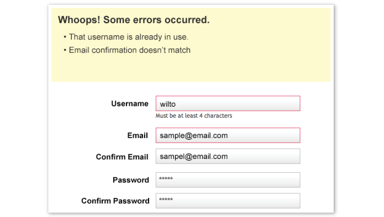
In short, JavaScript allows you to create highly responsive interfaces that improve the user experience and provide dynamic functionality, without waiting for the server to load up a new page. For example, we can use JavaScript to do any of the following:
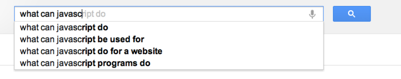
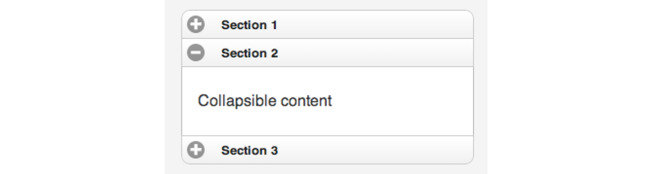
This list is nowhere near exhaustive!
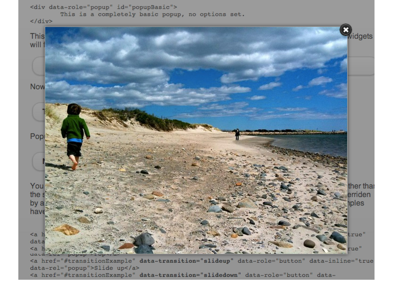
As with CSS, you can embed a script right in a document or keep it in an external file and link it to the page. Both methods use the script element.
To embed a script on a page, just add the code as the content of a script element:
<script>… JavaScript code goes here</script>
The other method uses the src attribute to point to a script file (with a .js suffix) by its URL. In this case, the script element has no content:
<script src="my_script.js"></script>
The advantage to external scripts is that you can apply the same script to multiple pages (the same benefit external style sheets offer). The downside, of course, is that each external script requires an additional HTTP request of the server, which slows down performance.
The script element can go anywhere in the document, but the most common places for scripts are in the head of the document and at the very end of the body. It is recommended that you don’t sprinkle them throughout the document, because they would be difficult to find and maintain.
For most scripts, the end of the document, just before the </body> tag, is the preferred placement because the browser will be done parsing the document and its DOM structure:
<!DOCTYPE html> <html lang="en"> <head> <meta charset="utf-8"> </head> <body> …contents of page… <script src="script.js"></script>
</body></html>
Consequently, that information will be ready and available by the time it gets to the scripts, and they can execute faster. In addition, the script download and execution blocks the rendering of the page, so moving the script to the bottom improves the perceived performance.
However, in some cases, you might want your script to do something before the body completely loads, so putting it in the head will result in better performance. For example, Modernizr (the feature detection tool discussed in Chapter 19, More CSS Techniques) recommends its script be placed in the head so the feature detection tests can be run up front.
There’s a reason why the book JavaScript: The Definitive Guide by David Flanagan (O’Reilly) is 1,100 pages long. There’s a lot to say about JavaScript! In this section, we have only a few pages to make you familiar with the basic building blocks of JavaScript so you can begin to understand scripts when you encounter them. Many developers have taught themselves to program by finding existing scripts and adapting them for their own needs. After some practice, they are ready to start writing their own from scratch. Recognizing the parts of a script is the first step, so that’s where we’ll start.
Originally, JavaScript’s functionality was mostly limited to crude methods of interaction with the user. We could use a few of JavaScript’s built-in functions (Figure 21-5) to provide user feedback, such as alert() to push a notification to a user, and confirm() to ask a user to approve or decline an action. To request the user’s input, we were more or less limited to the built-in prompt() function. Although these methods still have their time and place today, they’re jarring, obtrusive, and—in common opinion, at least—fairly obnoxious ways of interacting with users. As JavaScript has evolved over time, we’ve been afforded much more graceful ways of adding behavior to our pages, creating a more seamless experience for our users.
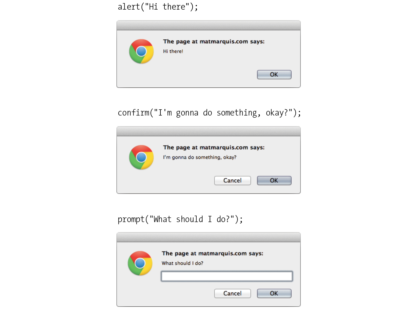
In order to take advantage of these interaction methods, we have to first understand the underlying logic that goes into scripting. These are logic patterns common to all manner of programming languages, although the syntax may vary. To draw a parallel between programming languages and spoken languages: although the vocabulary may vary from one language to another, many grammar patterns are shared by the majority of them.
By the end of this section, you’re going to know about variables, arrays, comparison operators, if/else statements, loops, functions, and more. Ready?
There are a few common syntactical rules that wind their way though all of JavaScript.
It is important to know that JavaScript is case-sensitive. A variable named myVariable, a variable named myvariable, and a variable named MYVariable will be treated as three different objects.
Also, whitespace such as tabs and spaces is ignored, unless it’s part of a string of text and enclosed in quotes. All of the character spaces added to scripts such as the ones in this chapter are for the benefit of humans—they make reading through the code easier. JavaScript doesn’t see them.
A script is made up of a series of statements. A statement is a command that tells the browser what to do. Here is a simple statement that makes the browser display an alert with the phrase “Thank you”:
alert("Thank you.");
The semicolon at the end of the statement tells JavaScript that it’s the end of the command, just as a period ends a sentence. According to the JavaScript standard, a line break will also trigger the end of a command, but it is a best practice to end each statement with a semicolon.
JavaScript allows you to leave comments that will be ignored at the time the script is executed, so you can provide reminders and explanations throughout your code. This is especially helpful if this code is likely to be edited by another developer in the future.
There are two methods of using comments. For single-line comments, use two slash characters (//) at the beginning of the line. You can put single-line comments on the same line as a statement, as long as the comment comes after the statement. It does not need to be closed, as a line break effectively closes it.
// This is a single-line comment. Multiple-line comments use the same syntax that you’ve seen in CSS. Everything within the /* */ characters is ignored by the browser. You can use this syntax to “comment out” notes and even chunks of the script when troubleshooting.
/*This is a multiline comment.Anything between these sets of characters will be completely ignored when the script is executed. This form of comment needs to be closed.*/
I’ll be using the single-line comment notation to add short explanations to example code, and we’ll make use of the alert() function we saw earlier (Figure 21-5) so we can quickly view the results of our work.
If you’re anything like me, the very term “variables” triggers nightmarish flashbacks to eighth-grade math class. The premise is pretty much the same, though your teacher doesn’t have a bad comb-over this time around.
A variable is like an information container. You give it a name and then assign it a value, which can be a number, text string, an element in the DOM, or a function—anything, really. This gives us a convenient way to reference that value later by name. The value itself can be modified and reassigned in whatever way our scripts’ logic dictates.
The following declaration creates a variable with the name foo and assigns it the value 5:
var foo = 5;
We start by declaring the variable by using the var keyword. The single equals sign (=) indicates that we are assigning it a value. Because that’s the end of our statement, we end the line with a semicolon. Variables can also be declared without the var keyword, which impacts what part of your script will have access to the information they contain. We’ll discuss that further in the section “Variable Scope and the var Keyword” later in this chapter.
You can use anything you like as a variable name, but make sure it’s a name that will make sense to you later. You wouldn’t want to name a variable something like data; it should describe the information it contains. In our earlier very specific example, productName might be a more useful name than foo. There are a few rules for naming a variable:
You can change the value of a variable at any time by redeclaring it anywhere in your script. Remember: JavaScript is case-sensitive, and so are those variable names.
The values we assign to variables fall under a few distinct data types:
Undefined
The simplest of these data types is likely undefined. If we declare a variable by giving it a name but no value, that variable contains a value of undefined.
var foo;alert(foo); // This will open a dialog containing "undefined".
Odds are you won’t find a lot of use for this right away, but it’s worth knowing for the sake of troubleshooting some of the errors you’re likely to encounter early on in your JavaScript career. If a variable has a value of undefined when it shouldn’t, you may want to double-check that it has been declared correctly or that there isn’t a typo in the variable name. (We’ve all been there.)
Null
Similar to undefined, assigning a variable of null (again, case-sensitive) simply says, “Define this variable, but give it no inherent value.”
var foo = null;alert(foo); // This will open a dialog containing "null".
Numbers
You can assign variables numeric values.
var foo = 5;alert(foo); // This will open a dialog containing "5".
The word foo now means the exact same thing as the number 5 as far as JavaScript is concerned. Because JavaScript is loosely typed, we don’t have to tell our script to treat the variable foo as the number 5. The variable behaves the same as the number itself, so you can do things to it that you would do to any other number by using classic mathematical notation: +, -, *, and / for plus, minus, multiply, and divide, respectively. In this example, we use the plus sign (+) to add foo to itself (foo + foo).
var foo = 5;alert(foo + foo); // This will alert "10".
Strings
Another type of data that can be saved to a variable is a string, which is basically a line of text. Enclosing characters in a set of single or double quotes indicates that it’s a string, as shown here:
var foo = "five";alert( foo ); // This will alert "five"
The variable foo is now treated exactly the same as the word five. This applies to any combination of characters: letters, numbers, spaces, and so on. If the value is wrapped in quotation marks, it will be treated as a string of text. If we were to wrap the number 5 in quotes and assign it to a variable, that variable wouldn’t behave as a number; instead, it would behave as a string of text containing the character “5.”
Earlier we saw the plus sign (+) used to add numbers. When the plus sign is used with strings, it sticks the strings together (called concatenation) into one long string, as shown in this example.
var foo = "bye"alert(foo + foo); // This will alert "byebye"
Notice what the alert returns in the following example when we define the value 5 in quotation marks, treating it as a string instead of a number:
var foo = "5";alert( foo + foo ); // This will alert "55"
If we concatenate a string and a number, JavaScript will assume that the number should be treated as a string as well, since the math would be impossible.
var foo = "five";var bar = 5;alert( foo + bar ); // This will alert "five5"
Booleans
We can also assign a variable a true or false value. This is called a Boolean value, and it is the lynchpin for all manner of advanced logic. Boolean values use the true and false keywords built into JavaScript, so quotation marks are not necessary.
var foo = true; // The variable "foo" is now true
Just as with numbers, if we were to wrap the preceding value in quotation marks, we’d be saving the word true to our variable instead of the inherent value of true (i.e., “not false”).
In a sense, everything in JavaScript has either an inherently true or false value. For example, null, undefined, 0, and empty strings (" ") are all inherently false, while every other value is inherently true. These values, although not identical to the Booleans true and false, are commonly referred to as being “truthy” and “falsy.” I promise I didn’t make that up.
An array is a group of multiple values (called members) that can be assigned to a single variable. The values in an array are said to be indexed, meaning you can refer to them by number according to the order in which they appear in the list. The first member is given the index number 0, the second is 1, and so on, which is why one almost invariably hears us nerds start counting things at zero—because that’s how JavaScript counts things, and many other programming languages do the same. We can avoid a lot of future coding headaches by keeping this in mind.
So, let’s say our script needs all of the variables we defined earlier. We could define them three times and name them something like foo1, foo2, and so on, or we can store them in an array, indicated by square brackets ([ ]).
var foo = [5, "five", "5"];
Now anytime you need to access any of those values, you can grab them from the single foo array by referencing their index number:
alert(foo[0]); // Alerts "5" alert(foo[1]); // Alerts "five" alert(foo[2]); // Also alerts "5"
Now that we know how to save values to variables and arrays, the next logical step is knowing how to compare those values. There is a set of special characters called comparison operators that evaluate and compare values in different ways:
|
== |
Is equal to |
|
!= |
Is not equal to |
|
=== |
Is identical to (equal to and of the same data type) |
|
!== |
Is not identical to |
|
> |
Is greater than |
|
>= |
Is greater than or equal to |
|
< |
Is less than |
|
<= |
Is less than or equal to |
There’s a reason all of these definitions read as parts of a statement. In comparing values, we’re making an assertion, and the goal is to obtain a result that is either inherently true or inherently false. When we compare two values, JavaScript evaluates the statement and gives us back a Boolean value depending on whether the statement is true or false.
alert( 5 == 5 ); // This will alert "true" alert( 5 != 6 ); // This will alert "true" alert( 5 < 1 ); // This will alert "false"
The tricky part is understanding the difference between “equal to” (==) and “identical to” (===). We already learned that all of these values fall under a certain data type. For example, a string of “5” and a number 5 are similar, but they’re not quite the same thing.
Well, that’s exactly what === is meant to check.
alert( "5" == 5 ); // This will alert "true". They're both "5". alert( "5" === 5 ); /* This will alert "false". They're both "5", but they're not the same data type. */ alert( "5" !== 5 ); /* This will alert "true", since they're not the same data type. */
Be careful not to accidentally use a single equals sign, or you’ll be reassigning the value of the first variable to the value of the second variable!
Even if you have to read through this part a couple of times, understanding the difference between “equal” and “identical to” means you’ve already begun to adopt the special kind of crazy one needs to be a programmer. Welcome! You’re in good company.
The other type of operator is a mathematical operator, which performs mathematical functions on numeric values (and, of course, variables that contain numeric values). We touched briefly on the straightforward mathematical operators for add (+), subtract (-), multiply (*), and divide (/). There are also some useful shortcuts you should be aware of:
|
+= |
Adds the value to itself |
|
++ |
Increases the value of a number (or a variable containing a number value) by 1 |
|
-- |
Decreases the value of a number (or a variable containing a number value) by 1 |
if/else statements are how we get JavaScript to ask itself a true/false question. They are more or less the foundation for all the advanced logic that can be written in JavaScript, and they’re about as simple as programming gets. In fact, they’re almost written in plain English. The structure of a conditional statement is as follows:
if( true ) {// Do something.}
It tells the browser “if this condition is met, then execute the commands listed between the curly brackets ({ }).” JavaScript doesn’t care about whitespace in our code, remember, so the spaces on either side of the ( true ) are purely for the sake of more readable code.
Here is a simple example using the array we declared earlier:
var foo = [5, "five", "5"];if( foo[1] === "five" ) {alert("This is the word five, written in plain English.");}
Since we’re making a comparison, JavaScript is going to give us a value of either true or false. The highlighted line of code says “true or false: the value of the foo variable with an index of 1 is identical to the word ‘five’?”
In this case, the alert would fire because the foo variable with an index of 1 (the second in the list, if you’ll remember) is identical to “five”. It is indeed true, and the alert fires.
We can also explicitly check if something is false by using the != comparison operator, which reads as “not equal to.”
if( 1 != 2 ) {alert("If you're not seeing this alert, we have bigger problems than JavaScript."); // 1 is never equal to 2, so we should always see this alert.}
I’m not much good at math, but near as I can tell, 1 will never be equal to 2. JavaScript says, “That ‘1 is not equal to 2’ line is a true statement, so I’ll run this code.”
If the statement doesn’t evaluate to true, the code inside the curly brackets will be skipped over completely:
if( 1 == 2 ) {alert("If you're seeing this alert, we have bigger problems than JavaScript.");// 1 is not equal to 2, so this code will never run.}
Lastly—and I promise we’re almost done here—what if we want to do one thing if something is true and something else if that thing is false? We could write two if statements, but that’s a little clunky. Instead, we can just say, “else, do something…else.”
var test = "testing";if( test == "testing" ){ alert( "You haven't changed anything." );}else{ alert( "You've changed something!" );}
Changing the value of the test variable to something else—anything other than the word testing—will trigger the alert “You’ve changed something!”
Exercise 21-1 gives you a chance to write a bit of JavaScript yourself.
There are cases in which we’ll want to go through every item in an array and do something with it, but we won’t want to write out the entire list of items and repeat ourselves a dozen or more times. You are about to learn a technique of devastating power, readers: loops.
I know. Maybe I overstated how exciting loops can be, but they are incredibly useful. With what we’ve covered already, we’re getting good at dealing with single variables, but that can get us only so far. Loops allow us to easily deal with huge sets of data.
Say we have a form that requires none of the fields to be left blank. If we use the DOM to fetch every text input on the page, the DOM provides an array of every text input element. (I’ll tell you more about how the DOM does this in the next chapter.) We could check every value stored in that array one item at a time, sure, but that’s a lot of code and a maintenance nightmare. If we use a loop to check each value, we won’t have to modify our script, regardless of how many fields are added to or removed from the page. Loops allow us to act on every item in an array, regardless of that array’s size.
There are several ways to write a loop, but the for method is one of the most popular. The basic structure of a for loop is as follows:
for( initialize the variable; test the condition; alter the value; ) { // do something }
Here’s an example of a for loop in action:
for( var i = 0; i <= 2; i++ ) { alert( i ); // This loop will trigger three alerts, reading "0", "1", and "2" respectively.
}That’s a little dense, so let’s break it down:
for()
First, we’re calling the for() statement, which is built into JavaScript. It says, “For every time this is true, do this.” Next we need to supply that statement with some information.
var i = 0;
This creates a new variable, i, with its value set to zero. You can tell it’s a variable by the single equals sign. More often than not, you’ll see coders using the letter “i” (short for “index”) as the variable name, but keep in mind that you could use any variable name in its place. It’s a common convention, not a rule.
We set that initial value to 0 because we want to stay in the habit of counting from zero up. That’s where JavaScript starts counting, after all.
i <= 2;
With i <= 2;, we’re saying, “for as long as i is less than or equal to 2, keep on looping.” Since we’re counting from zero, that means the loop will run three times.
i++
Finally, i++ is shorthand for “every time this loop runs, add one to the value of i” (++ is one of the mathematical shortcut operators we saw earlier). Without this step, i would always equal zero, and the loop would run forever! Fortunately, modern browsers are smart enough not to let this happen. If one of these three pieces is missing, the loop simply won’t run at all.
{ script }
Anything inside those curly brackets is executed once for each time the loop runs, which is three times in this case. That i variable is available for use in the code the loop executes as well, as we’ll see next.
Let’s go back to the “check each item in an array” example. How would we write a loop to do that for us?
var items = ["foo", "bar", "baz"]; // First we create an array. for( var i = 0;i < items.length; i++ ) { alert(items[i]); // This will alert each item in the array. }
This example differs from our first loop in two key ways:
items.length
Instead of using a number to limit the number of times the loop runs, we’re using a property built right into JavaScript to determine the “length” of our array, which is the number of items it contains. .length is just one of the standard properties and methods of the Array object in JavaScript. In our example, there are three items in the array, so it will loop three times.
items[i]
Remember how I mentioned that we can use that i variable inside the loop? Well, we can use it to reference each index of the array. Good thing we started counting from zero; if we had set the initial value of i to 1, the first item in the array would have been skipped. The result of our for loop example is that each item in the array (the text strings foo, bar, and baz) gets returned after each loop and fed to an alert.
Now no matter how large or small that array should become, the loop will execute only as many times as there are items in the array, and will always hold a convenient reference to each item in the array.
There are literally dozens of ways to write a loop in JavaScript, but this is one of the more common patterns you’re going to encounter out there in the wild. Developers use loops to perform a number of tasks, such as the following:
I’ve introduced you to a few functions already in a sneaky way. Here’s an example of a function that you might recognize:
alert("I've been a function all along!");
A function is a bit of code for performing a task that doesn’t run until it is referenced or called. alert() is a function built into our browser. It’s a block of code that runs only when we explicitly tell it to. In a way, we can think of a function as a variable that contains logic, in that referencing that variable will run all the code stored inside it. Functions allow code to be reused any time it is referenced so you don’t need to write it over and over.
The structure of a function:
function() {
}
All functions share a common pattern (Figure 21-6). The function name is always immediately followed by a set of parentheses (no space), then a pair of curly brackets that contains their associated code. The parentheses sometimes contain additional information used by the function called arguments. Arguments are data that can influence how the function behaves. For example, the alert() function we know so well accepts a string of text as an argument, and uses that information to populate the resulting dialog.
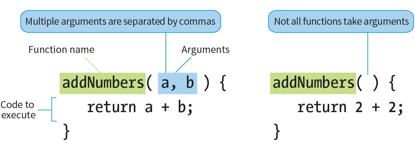
There are two types of functions: those that come “out of the box” (native JavaScript functions) and those that you make up yourself (custom functions). Let’s look at each.
Hundreds of predefined functions are built into JavaScript, including these:
alert(), confirm(), and prompt()
These functions trigger browser-level dialog boxes.
Date()
Returns the current date and time.
parseInt("123")
This function will, among other things, take a string data type containing numbers and turn it into a number data type. The string is passed to the function as an argument.
setTimeout(functionName, 5000)
Executes a function after a delay. The function is specified in the first argument, and the delay is specified in milliseconds in the second argument (in the example, 5,000 milliseconds, which equals 5 seconds).
There are scores more beyond this as well. Note that names of functions are case-sensitive, so be sure to write setTimeout instead of SetTimeout.
To create a custom function, we type the function keyword followed by a name for the function, followed by opening and closing parentheses, followed by opening and closing curly brackets:
function name() {// Our function code goes here.}
Just as with variables and arrays, the function’s name can be anything you want, but all the same naming syntax rules apply.
If we were to create a function that just alerts some text (which is a little redundant, I know), it would look like this:
function foo() { alert("Our function just ran!"); // This code won't run until we call the function 'foo()'
}
We can then call that function and execute the code inside it anywhere in our script by writing the following:
foo(); // Alerts "Our function just ran!"We can call this function any number of times throughout our code. It saves a lot of time and redundant coding.
Having a function that executes the exact same code throughout your script isn’t likely to be all that useful. We can “pass arguments” (provide data) to native and custom functions in order to apply a function’s logic to different sets of data at different times. To hold a place for the arguments, create a variable name (or a series of comma-separated names) in the parentheses after the name of the function at the time the function is defined.
For example, let’s say we wanted to create a very simple function that alerts the number of items contained in an array. We’ve already learned that we can use .length to get the number of items in an array, so we just need a way to pass the array to be measured into our function. We do that by supplying the array to be measured as an argument. In the code, I’ve defined a new function named alertArraySize() and created the variable arr that holds a place for the argument. That variable will then be available inside the function and will contain whatever argument we pass when we call the function.
function alertArraySize(arr) { alert(arr.length);}
When we call that function, anything we include between the parentheses after the function name (in this case, test) will be passed to the argument with the arr placeholder as the function executes. Here we’ve defined the variable test as an array of five items. We’ve passed that variable to the function, and now that array gets plugged in and the length is returned.
vartest= [1,2,3,4,5];alertArraySize(test); // Alerts "5"
This part is particularly wild and incredibly useful.
It’s pretty common to use a function to calculate something and then give you back a value that you can use elsewhere in your script. We could accomplish this using what we know now, through clever application of variables, but there’s a much easier way.
The return keyword inside a function effectively turns that function into a variable with a dynamic value! This one is a little easier to show than it is to tell, so bear with me while we consider this example:
function addNumbers(a,b) { return a + b;}
We now have a function that accepts two arguments and adds them together. That wouldn’t be much use if the result always lived inside that function, because we wouldn’t be able to use the result anywhere else in our script. Here we use the return keyword to pass the result out of the function. Now any reference you make to that function gives you the result of the function—just like a variable would:
alert( addNumbers(2,5) ); // Alerts "7"
In a way, the addNumbers() function is now a variable that contains a dynamic value: the value of our calculation. If we didn’t return a value inside our function, the preceding script would alert undefined, just like a variable that we haven’t given a value.
The return keyword has one catch. As soon as JavaScript sees that it’s time to return a value, the function ends. Consider the following:
function bar() { return 3; alert("We'll never see this alert.");}
When you call this function by using bar(), the alert on the second line never runs. The function ends as soon as it sees it’s time to return a value.
There are times when you’ll want a variable that you’ve defined within a function to be available anywhere throughout your script. Other times, you may want to restrict it and make it available only to the function it lives in. This notion of the availability of the variable is known as its scope. A variable that can be used by any of the scripts on your page is globally scoped, and a variable that’s available only within its parent function is locally scoped.
JavaScript variables use functions to manage their scope. If a variable is defined outside a function, it will be globally scoped and available to all scripts. When you define a variable within a function and you want it to be used only by that function, you can flag it as locally scoped by preceding the variable name with the var keyword:
var foo = "value";
To expose a variable within a function to the global scope, we omit the var keyword and simply define the variable:
foo = "value";
You need to be careful about how you define variables within functions, or you could end up with unexpected results. Take the following JavaScript snippet, for example:
function double( num ){ total = num + num; return total;}var total = 10;var number = double( 20 );alert( total ); // Alerts 40.
You may expect that because you specifically assigned a value of 10 to the variable total, the alert(total) function at the end of the script would return 10. But because we didn’t scope the total variable in the function with the var keyword, it bleeds into the global scope. Therefore, although the variable total is set to 10, the following statement runs the function and grabs the value for total defined there. Without the var, the variable “leaked out.”
As you can see, the trouble with global variables is that they’ll be shared throughout all the scripting on a page. The more variables that bleed into the global scope, the better the chances you’ll run into a “collision” in which a variable named elsewhere (in another script altogether, even) matches one of yours. This can lead to variables being inadvertently redefined with unexpected values, which can lead to errors in your script.
Remember that we can’t always control all the code in play on our page. It’s very common for pages to include code written by third parties, for example:
It’s best not to take any chances on variable collisions, so when you start writing scripts on your own, locally scope your variables whenever you can (see the sidebar “Keeping Variables Out of the Global Scope”).
This concludes our little (OK, not so little) introductory tour of JavaScript syntax. There’s a lot more to it, but this should give you a decent foundation for learning more on your own and being able to interpret scripts when you see them. We have just a few more JavaScript-related features to tackle before we look at a few examples.
In addition to being able to control elements on a web page, JavaScript also gives you access to and the ability to manipulate the parts of the browser window itself. For example, you might want to get or replace the URL that is in the browser’s address bar, or open or close a browser window.
In JavaScript, the browser is known as the window object. The window object has a number of properties and methods that we can use to interact with it. In fact, our old friend alert() is actually one of the standard browser object methods. Table 21-1 lists just a few of the properties and methods that can be used with window to give you an idea of what’s possible. For a complete list, see the Window API reference at MDN Web Docs (developer.mozilla.org/en-US/docs/Web/API/Window).
JavaScript can access objects in the page and the browser window, but did you know it’s also “listening” for certain events to happen? An event is an action that can be detected with JavaScript, such as when the document loads or when the user clicks an element or just moves her mouse over it. HTML 4.0 made it possible for a script to be tied to events on the page, whether initiated by the user, the browser itself, or other scripts. This is known as event binding.
In scripts, an event is identified by an event handler. For example, the onload event handler triggers a script when the document loads, and the onclick and onmouseover handlers trigger a script when the user clicks or mouses over an element, respectively. Table 21-2 lists some of the most common event handlers. Keep in mind that these are also case-sensitive.
|
Table 21-2. Common events. |
|
|
Event handler |
Event description |
onblur |
|
onchange |
|
onclick |
The mouse clicks an object. |
onerror |
|
onfocus |
|
onkeydown |
|
onkeypress |
|
onkeyup |
|
onload |
A page or an image is finished loading. |
onmousedown |
|
onmousemove |
|
onmouseout |
|
onmouseover |
The mouse is moved over an element. |
onmouseup |
|
onsubmit |
|
There are three common methods for applying event handlers to items within our pages:
In the upcoming examples of the latter two approaches, we’ll use the window object. Any events we attach to window apply to the entire document. We’ll be using the onclick event in all of these as well.
You can specify the function to be run in an attribute in the markup, as shown in the following example:
<body onclick="myFunction();"> /* myFunction will now run when the user clicks anything within 'body' */
Although still functional, this is an antiquated way of attaching events to elements within the page. It should be avoided for the same reason we avoid using style attributes in our markup to apply styles to individual elements. In this case, it blurs the line between the semantic layer and behavioral layers of our pages, and can quickly lead to a maintenance nightmare.
This is another somewhat dated approach to attaching events, though it does keep things strictly within our scripts. We can attach functions by using helpers already built into JavaScript:
window.onclick = myFunction; /* myFunction will run when the user clicks anything within the browser window */
We can also use an anonymous function rather than a predefined one:
window.onclick = function() { /* Any code placed here will run when the user clicks anything within the browser window */
};
This approach has the benefit of both simplicity and ease of maintenance, but does have a fairly major drawback: we can bind only one event at a time with this method.
window.onclick = myFunction; window.onclick = myOtherFunction;
In the example just shown, the second binding overwrites the first, so when the user clicks inside the browser window, only myOtherFunction will run. The reference to myFunction is thrown away.
Although a little more complex at first glance, this approach allows us to keep our logic within our scripts and allows us to perform multiple bindings on a single object. The syntax is a bit more verbose. We start by calling the addEventListener() method of the target object, and then specify the event in question and the function to be executed as two arguments:
window.addEventListener("click", myFunction);
Notice that we omit the preceding “on” from the event handler with this syntax.
Like the previous method, addEventListener() can be used with an anonymous function as well:
window.addEventListener("click", function(e) { });
This was just a brief introduction, so I recommend getting more information on addEventListener() at the “eventTarget.addEventListener” page on the MDN Web Docs (developer.mozilla.org/en/DOM/element.addEventListener).
Now you have been introduced to many of the important building blocks of JavaScript. You’ve seen variables, data types, and arrays. You’ve met if/else statements, loops, and functions. You know your browser objects from your event handlers. That’s a lot of bits and pieces. Let’s walk through a couple of simple script examples to see how they get put together.
Here’s a simple function that accepts two arguments and returns the greater of the two values:
greatestOfTwo( first, second ) { if( first > second ) { return first; } else { return second; }}
We start by naming our function greatestOfTwo. We set it up to accept two arguments, which we’ll just call “first” and “second” for want of more descriptive words. The function contains an if/else statement that returns first if the first argument is greater than the second, and returns second if it isn’t.
Here’s a function that accepts an array of strings as a single argument and returns the longest string in the array. It returns the first occurrence of one of the longest strings (in case they are of the same length).
longestWord( strings ) { var longest = strings[0]; for( i = 1; i < strings.length; i++ ) { if ( strings[i].length > longest.length ) { longest = strings[i]; } } return longest;}
First, we name the function and allow it to accept a single argument. Then, we set the longest variable to an initial value of the first item in the array: strings[0]. We start our loop at 1 instead of 0 since we already have the first value in the array captured. Each time we iterate through the loop, we compare the length of the current item in the array to the length of the value saved in the longest variable. If the current item in the array contains more characters than the current value of the longest variable, we change the value of longest to that item. If not, we do nothing. After the loop is complete we return the value of longest, which now contains the longest string in the array.
Now that you’ve seen the basic building blocks and a few simple examples, does it whet your appetite for more? Here are a few resources to take you to the next step:
JavaScript Resources at MDN Web Docs (developer.mozilla.org/en-US/docs/Web/JavaScript)
The folks at MDN Web Docs have assembled excellent tutorials as well as thorough documentation on all the components of JavaScript. It’s a great site to visit when you’re just starting out, and it is likely to be a go-to reference even after you have years of experience.
JavaScript for Web Designers by Mat Marquis (A Book Apart)
I can say a lot more in a book than in a chapter, so if you’re looking for a little more depth in a beginner-level manual, I wrote this book for you.
Learning JavaScript by Ethan Brown (O’Reilly)
For a deeper dive into JavaScript, this book will take you to the next level.
Why not see how you’re doing with JavaScript so far with Exercise 21-2 and a quick quiz? In the next chapter, you’ll see how we use these tools in the context of web design.
var originalTitle = document.title; function showUnreadCount( unread ) { document.title = originalTitle + unread; }showUnreadCount(3);
var originalTitle = document.title; function showUnreadCount( unread ) { document.title = originalTitle + "(" + unread + " new messages!)"; }showUnreadCount(3);
We covered a lot of new material in this chapter. Here’s a chance to test what sunk in. You will find the answers in Appendix A.
var myArray = [1, "two", 3, "4"]write what the alert message will say for each of these examples:
alert( myArray[0] );alert( myArray[0] + myArray[1] );alert( myArray[2] + myArray[3] );alert( myArray[2] – myArray[0] );var foo = 5; foo += 5; alert( foo );i = 5;
i++;alert( i );var foo = 2;
alert( foo + " " + "remaining");var foo = "Mat";
var bar = "Jennifer"; if( foo.length > bar.length ) { alert( foo + " is longer." );} else { alert( bar + " is longer." );}alert( 10 === "10" );for( var i = 0; i < items.length; i++ ) { } |
a. |
1. The user finishes a form and hits the submit button. |
|
b. |
2. The page finishes loading. |
|
c. |
3. The pointer hovers over a link. |
|
d. |
4. A text-entry field is selected and ready for typing. |
|
e. |
5. A user changes her name in a form field. |
In This Chapter
Using the DOM to access and change elements, attributes, and contents
Using polyfills to make browser versions work consistently
Using JavaScript libraries
A brief introduction to Ajax
by Mat Marquis
Now that you have a sense for the language of JavaScript, let’s look at some of the ways we can put it to use in modern web design. First, we’ll explore DOM scripting, which allows us to manipulate the elements, attributes, and text on a page. I’ll introduce you to some ready-made JavaScript and DOM scripting resources, so you don’t have to go it alone. You’ll learn about polyfills, which provide older browsers with modern features and normalize functionality. I’ll also introduce you to JavaScript libraries that make developers’ lives easier with collections of polyfills and shortcuts for common tasks.
You’ve seen references to the Document Object Model (DOM for short) several times throughout this book, but now is the time to give it the attention it deserves. The DOM gives us a way to access and manipulate the contents of a document. We commonly use it for HTML, but the DOM can be used with any XML language as well. And although we’re focusing on its relationship with JavaScript, it’s worth noting that the DOM can be accessed by other languages too, such as PHP, Ruby, C++, and more. Although DOM Level 1 was released by the W3C in 1998, it was nearly five years later that DOM scripting began to gain steam.
The DOM gives us a way to access and manipulate the contents of a document.
The DOM is a programming interface (an API) for HTML and XML pages. It provides a structured map of the document, as well as a set of methods to interface with the elements contained therein. Effectively, it translates our markup into a format that JavaScript (and other languages) can understand. It sounds pretty dry, I know, but the basic gist is that the DOM serves as a map to all the elements on a page and lets us do things with them. We can use it to find elements by their names or attributes, and then add, modify, or delete elements and their content.
Without the DOM, JavaScript wouldn’t have any sense of a document’s contents—and by that, I mean the entirety of the document’s contents. Everything from the page’s doctype to each individual letter in the text can be accessed via the DOM and manipulated with JavaScript.
A simple way to think of the DOM is in terms of the document tree as diagrammed in Figure 22-1. You saw documents diagrammed in this way when you were learning about CSS selectors.
<!DOCTYPE html><html><head> <title>Document title</title> <meta charset="utf-8"></head><body> <div> <h1>Heading</h1> <p>Paragraph text with a <a href="foo.html">link</a> here.</p> </div> <div> <p>More text here.</p> </div></body></html>
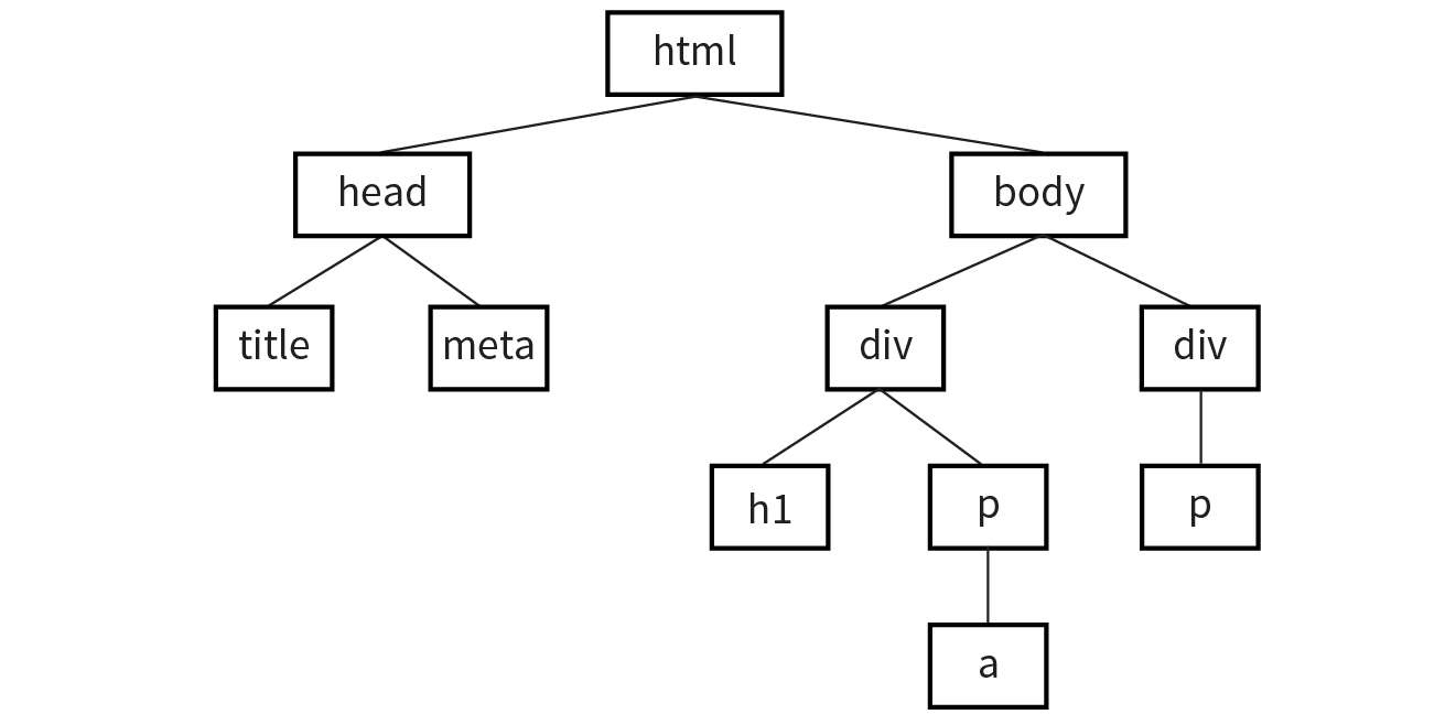
Each element within the page is referred to as a node. If you think of the DOM as a tree, each node is an individual branch that can contain further branches. But the DOM allows deeper access to the content than CSS because it treats the actual content as a node as well. Figure 22-2 shows the structure of the first p element. The element, its attributes, and its contents are all nodes in the DOM’s node tree.
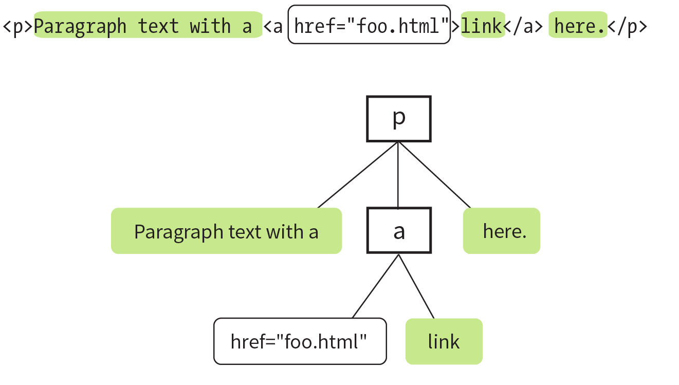
The DOM also provides a standardized set of methods and functions through which JavaScript can interact with the elements on our page. Most DOM scripting involves reading from and writing to the document.
There are several ways to use the DOM to find what you want in a document. Let’s go over some of the specific methods we can use for accessing objects defined by the DOM (we JS folks call this “crawling the DOM” or “traversing the DOM”), as well as some of the methods for manipulating those elements.
The document object in the DOM identifies the page itself, and more often than not will serve as the starting point for our DOM crawling. The document object comes with a number of standard properties and methods for accessing collections of elements. This is reminiscent of the length property we learned about in Chapter 21, Introduction to JavaScript. Just as length is a standard property of all arrays, the document object comes with a number of built-in properties containing information about the document. We then wind our way to the element we’re after by chaining those properties and methods together, separated by periods, to form a sort of route through the document.
To give you a general idea of what I mean, the statement in this example says to look on the page (document), find the element that has the id value “beginner”, find the HTML content within that element (innerHTML), and save those contents to a variable (foo):
var foo = document.getElementById("beginner").innerHTML;
Because the chains tend to get long, it is also common to see each property or method broken onto its own line to make it easier to read at a glance. Remember, whitespace in JavaScript is ignored, so this has no effect on how the statement is parsed.
var foo = document .getElementById("beginner") .innerHTML;
There are several methods for accessing nodes in the document.
getElementsByTagName()
We can access individual elements by the tags themselves, using document.getElementsByTagName(). This method retrieves any element or elements you specify as an argument.
For example, document.getElementsByTagName("p") returns every paragraph on the page, wrapped in something called a collection or nodeList, in the order they appear in the document from top to bottom. nodeLists behave much like arrays. To access specific paragraphs in the nodeList, we reference them by their index, just like an array.
var paragraphs = document.getElementsByTagName("p");
Based on this variable statement, paragraphs[0] is a reference to the first paragraph in the document, paragraphs[1] refers to the second, and so on. If we had to access each element in the nodeList separately, one at a time…well, it’s a good thing we learned about looping through arrays earlier. Loops work the exact same way with a nodeList.
var paragraphs = document.getElementsByTagName("p");for( var i = 0; i < paragraphs.length; i++ ) { // do something }
Now we can access each paragraph on the page individually by referencing paragraphs[i] inside the loop, just as with an array, but with elements on the page instead of values.
getElementById()
This method returns a single element based on that element’s ID (the value of its id attribute), which we provide to the method as an argument. For example, to access this particular image
<img src="photo.jpg" alt="" id="lead-photo">
we include the id value as an argument for the getElementById() method:
var photo = document.getElementById("lead-photo");
getElementsByClassName()
This is a relatively new method for accessing DOM nodes. Although is available in the current versions of modern browsers, it will not work in IE8 or below.
Just as it says on the tin, this allows you to access nodes in the document based on the value of a class attribute. This statement assigns any element with a class value of “column-a” to the variable firstColumn so it can be accessed easily from within a script:
var firstColumn = document.getElementsByClassName("column-a");
Like getElementsByTagName(), this returns a nodeList that we can reference by index or loop through one at a time.
querySelectorAll()
isn’t supported in IE7 or below.
querySelectorAll() allows you to access nodes of the DOM based on a CSS-style selector. The syntax of the arguments in the following examples should look familiar to you. It can be as simple as accessing the child elements of a specific element:
var sidebarPara = document.querySelectorAll(".sidebar p");
or as complex as selecting an element based on an attribute:
var textInput = document.querySelectorAll("input[type='text']");
querySelectorAll() returns a nodeList, like getElementsByTagName() and getElementsByClassName(), even if the selector matches only a single element.
getAttribute()
As I mentioned earlier, elements aren’t the only thing you can access with the DOM. To get the value of an attribute attached to an element node, we call getAttribute() with a single argument: the attribute name. Let’s assume we have an image, stratocaster.jpg, marked up like this:
<img src="stratocaster.jpg" alt="electric guitar" id="lead-image">
In the following example, we access that specific image (getElementbyId()) and save a reference to it in a variable (“bigImage”). At that point, we could access any of the element’s attributes (alt, src, or id) by specifying it as an argument in the getAttribute() method. In the example, we get the value of the src attribute and use it as the content in an alert message. (I’m not sure why we would ever do that, but it does demonstrate the method.)
var bigImage = document.getElementById("lead-image"); alert( bigImage.getAttribute("src") ); // Alerts "stratocaster.jpg".
Once we’ve accessed a node by using one of the methods discussed previously, the DOM gives us several built-in methods for manipulating those elements, their attributes, and their contents.
setAttribute()
To continue with the previous example, we saw how we get the attribute value, but what if we wanted to set the value of that src attribute to a new pathname altogether? Use setAttribute()! This method requires two arguments: the attribute to be changed and the new value for that attribute.
In this example, we use a bit of JavaScript to swap out the image by changing the value of the src attribute:
var bigImage = document.getElementById("lead-image"); bigImage.setAttribute("src", "lespaul.jpg");
Just think of all the things you could do with a document by changing the values of attributes. Here we swapped out an image, but we could use this same method to make a number of changes throughout our document:
innerHTML
innerHTML gives us a simple method for accessing and changing the text and markup inside an element. It behaves differently from the methods we’ve covered so far. Let’s say we need a quick way of adding a paragraph of text to the first element on our page with a class of intro:
varintroDiv= document.getElementsByClassName("intro");introDiv[0].innerHTML= "<p>This is our intro text</p>";
The second statement here adds the content of the string to introDiv (an element with the class value “intro”) as a real live element because innerHTML tells JavaScript to parse the strings “<p>” and “</p>” as markup.
style
The DOM also allows you to add, modify, or remove a CSS style from an element by using the style property. It works similarly to applying a style with the inline style attribute. The individual CSS properties are available as properties of the style property. I bet you can figure out what these statements are doing by using your new CSS and DOM know-how:
document.getElementById("intro").style.color = "#fff"; document.getElementById("intro").style.backgroundColor = "#f58220";
//orange
In JavaScript and the DOM, property names that are hyphenated in CSS (such as background-color and border-top-width) become camel case (backgroundColor and borderTopWidth, respectively) so the “–” character isn’t mistaken for an operator.
In the examples you’ve just seen, the style property is used to set the styles for the node. It can also be used to get a style value for use elsewhere in the script. This statement gets the background color of the #intro element and assigns it to the brandColor variable:
var brandColor = document.getElementById("intro").style.backgroundColor;
So far, we’ve seen examples of getting and setting nodes in the existing document. The DOM also allows developers to change the document structure itself by adding and removing nodes on the fly. We’ll start out by creating new nodes, which is fairly straightforward, and then we’ll see how we add the nodes we’ve created to the page. The methods shown here are more surgical and precise than adding content with innerHTML. While we’re at it, we’ll remove nodes, too.
createElement()
To create a new element, use the aptly named createElement() method. This function accepts a single argument: the element to be created. Using this method is a little counterintuitive at first because the new element doesn’t appear on the page right away. Once we create an element in this way, that new element remains floating in the JavaScript ether until we add it to the document. Think of it as creating a reference to a new element that lives purely in memory—something that we can manipulate in JavaScript as we see fit, and then add to the page once we’re ready:
var newDiv = document.createElement("div");
createTextNode()
If we want to enter text into either an element we’ve created or an existing element on the page, we can call the createTextNode() method. To use it, provide a string of text as an argument, and the method creates a DOM-friendly version of that text, ready for inclusion on the page. Like createElement(), this creates a reference to the new text node that we can store in a variable and add to the page when the time comes:
var ourText = document.createTextNode("This is our text.");
appendChild()
So we’ve created a new element and a new string of text, but how do we make them part of the document? Enter the appendChild() method. This method takes a single argument: the node you want to add to the DOM. You call it on the existing element that will be its parent in the document structure. Time for an example.
Here we have a simple div on the page with the id “our-div”:
<div id="our-div"></div>
Let’s say we want to add a paragraph to #our-div that contains the text “Hello, world!” We start by creating the p element (document.createElement()) as well as a text node for the content that will go inside it (createTextNode()):
var ourDiv = document.getElementById("our-div");var newParagraph = document.createElement("p");var copy = document.createTextNode("Hello, world!");
Now we have our element and some text, and we can use appendChild() to put the pieces together:
newParagraph.appendChild( copy ); ourDiv.appendChild( newParagraph );
The first statement appends copy (that’s our “Hello, world!” text node) to the new paragraph we created (newParagraph), so now that element has some content. The second line appends the newParagraph to the original div (ourDiv). Now ourDiv isn’t sitting there all empty in the DOM, and it will display on the page with the content “Hello, world!”
You should be getting the idea of how it works. How about a couple more?
insertBefore()
The insertBefore() method, as you might guess, inserts an element before another element. It takes two arguments: the first is the node that gets inserted, and the second is the element it gets inserted in front of. You also need to know the parent to which the element will be added.
So, for example, to insert a new heading before the paragraph in this markup
<div id="our-div"> <p id="our-paragraph">Our paragraph text</p></div>
we start by assigning variable names to the div and the p it contains, and then create the h1 element and its text node and put them together, just as we saw in the last example:
varourDiv= document.getElementById("our-div");varpara= document.getElementById("our-paragraph"); varnewHeading= document.createElement("h1"); var headingText = document.createTextNode("A new heading"); newHeading.appendChild( headingText ); // Add our new text node to the new heading
Finally, in the last statement shown here, the insertBefore() method places the newHeading h1 element before the para element inside ourDiv.
ourDiv.insertBefore( newHeading, para ); replaceChild()
The replaceChild() method replaces one node with another and takes two arguments. The first argument is the new child (i.e., the node you want to end up with). The second is the node that gets replaced by the first. As with insertBefore(), you also need to identify the parent element in which the swap happens. For the sake of simplicity, let’s say we start with the following markup:
<div id="our-div"> <div id="swap-me"></div></div>
And we want to replace the div with the id “swap-me” with an image. We start by creating a new img element and setting the src attribute to the pathname to the image file. In the final statement, we use replaceChild() to put newImg in place of swapMe.
varourDiv= document.getElementById("our-div");varswapMe= document.getElementById("swap-me");varnewImg= document.createElement("img"); // Create a new image element newImg.setAttribute( "src", "path/to/image.jpg" ); // Give the new image a "src" attributeourDiv.replaceChild( newImg, swapMe );
removeChild()
To paraphrase my mother, “We brought these elements into this world, and we can take them out again.” You remove a node or an entire branch from the document tree with the removeChild() method. The method takes one argument, which is the node you want to remove. Remember that the DOM thinks in terms of nodes, not just elements, so the child of an element may be the text (node) it contains, not just other elements.
Like appendChild(), the removeChild() method is always called on the parent element of the element to be removed (hence, “remove child”). That means we’ll need a reference to both the parent node and the node we’re looking to remove. Let’s assume the following markup pattern:
<div id="parent"> <div id="remove-me"> <p>Pssh, I never liked it here anyway.</p> </div></div>
Our script would look something like this:
varparentDiv= document.getElementById("parent");varremoveMe= document.getElementById("remove-me");parentDiv.removeChild( removeMe ); // Removes the div with the id "remove-me" from the page.
That should give you a good idea of what DOM scripting is all about. Of course, I’ve just barely scratched the surface of what can be done with the DOM, but if you’d like to learn more, definitely check out the book DOM Scripting: Web Design with JavaScript and the Document Object Model, Second Edition, by Jeremy Keith and Jeffrey Sambells (Friends of Ed).
You’ve gotten familiar with a lot of new technologies in this book so far: new HTML5 elements, new ways of doing things with CSS3, using JavaScript to manipulate the DOM, and more. In a perfect world, all browsers would be in lockstep, keeping up with the cutting-edge technologies and getting the established ones right along the way (see the sidebar “The Browser Wars”). In that perfect world, browsers that couldn’t keep up (I’m looking at you, IE8) would just vanish completely. Sadly, that is not the world we live in, and browser inadequacies remain the thorn in every developer’s side.
I’ll be the first to admit that I enjoy a good wheel reinvention. It’s a great way to learn, for one thing. For another, it’s the reason our cars aren’t rolling around on roundish rocks and sections of tree trunk. But when it comes to dealing with every strange browser quirk out there, we don’t have to start from scratch. Tons of people smarter than I am have run into these issues before, and have already found clever ways to work around them and fix the parts of JavaScript and the DOM where some browsers may fall short. We can use JavaScript to fix JavaScript.
Polyfill is a term coined by Remy Sharp to describe a JavaScript “shim” that normalizes differing behavior from browser to browser (remysharp.com/2010/10/08/what-is-a-polyfill). Or, as Paul Irish put it, a polyfill is
A shim that mimics a future API providing fallback functionality to older browsers.
There’s a lot of time travel going on in that quote, but basically what he’s saying is that we’re making something new work in browsers that don’t natively support it—whether that’s brand-new technology like detecting a user’s physical location or fixing something that one of the browsers just plain got wrong.
There are tons of polyfills out there targeted to specific tasks, such as making old browsers recognize new HTML5 elements or CSS3 selectors, and new ones are popping up all the time as new problems arise. I’m going to fill you in on the most commonly used polyfills in the modern developer’s toolbox as of the release of this book. You may find that new ones are necessary by the time you hit the web design trenches. You may also find that some of these techniques aren’t needed for the browsers you need to support.
If you don’t need to support IE8 and earlier, you don’t need an HTML5 shim.
You may remember seeing this one back in Chapter 5, Marking Up Text but let’s give it a little more attention now that you have some JavaScript under your belt.
An HTML5 shim/shiv is used to enable Internet Explorer 8 and earlier to recognize and style newer HTML5 elements such as article, section, and nav.
There are several variations on the HTML5 shim/shiv, but they all work in much the same way: crawl the DOM looking for elements that IE doesn’t recognize, and then immediately replace them with the same element so they are visible to IE in the DOM. Now any styles we write against those elements work as expected. Sjoerd Visscher originally discovered this technique, and many, many variations of these scripts exist now. Remy Sharp’s version is the one in widest use today.
The shim must be referenced in the head of the document, in order to “tell” Internet Explorer about these new elements before it finishes rendering the page. The script is referenced inside an IE-specific conditional comment and runs only if the browser is less than (lt) IE9—in other words, versions 8 and earlier:
<!--[if lt IE 9]> <script src="html5shim.js"></script><![endif]-->
The major caveat here is that older versions of Internet Explorer that have JavaScript disabled or unavailable will receive unstyled elements. To learn more about HTML5 shim/shiv, try these resources:
If you don’t need to support IE8 and earlier, you don’t need Selectivizr.
Selectivizr (created by Keith Clark) allows Internet Explorer 6–8 to understand complex CSS3 selectors such as :nth-child and ::first-letter. It uses JavaScript to fetch and parse the contents of your style sheet and patch holes where the browser’s native CSS parser falls short.
Selectivizr must be used with a JavaScript library (I talk about them in the next section). The link to the script goes in an IE conditional comment after the link to the library .js file, like so:
<script type="text/javascript" src="[JS library]"></script><!--[if (gte IE 6)&(lte IE 8)]> <script type="text/javascript" src="selectivizr.js"></script><noscript><link rel="stylesheet" href="[fallback css]" /></noscript><![endif]-->
Because we’re forgoing the native CSS parser here, we may see a slight performance hit in applicable browsers. See the Selectivizr site (selectivizr.com) for more information.
Picturefill enables support for the picture element, srcset and sizes attributes, and features related to delivering images based on viewport size and resolution (also known as responsive images, as discussed in Chapter 7, Adding Images). It was created by Scott Jehl of Filament Group and is maintained by the Picturefill group.
To use Picturefill, download the script and add it to the head of the document. The first script creates a picture element for browsers that don’t recognize it. The second script calls the Picturefill script itself and the async attribute tells the browser it can load Picturefill asynchronously—that is, without waiting for the script to finish before loading the rest of the document.
<head> <script> // Picture element HTML5 shiv
document.createElement( "picture" ); </script> <script src="picturefill.js" async></script></head>
On the downside, browsers without JavaScript that also do not support the picture element will see only alt-text for the image. Download Picturefill and get information about its use at scottjehl.github.io/picturefill/.
Continuing on the “you don’t have to write everything from scratch yourself” theme, it’s time to take on JavaScript libraries. A JavaScript library is a collection of prewritten functions and methods that you can use in your scripts to accomplish common tasks or simplify complex ones.
There are many JS libraries out there. Some are large frameworks that include all of the most common polyfills, shortcuts, and widgets you’d ever need to build full-blown Ajax web applications (see the sidebar “What Is Ajax?”). Some are targeted at specific tasks, such as handling forms, animation, charts, or math functions. For seasoned JavaScript-writing pros, starting with a library is an awesome time-saver. And for folks like you who are just getting started, a library can handle tasks that might be beyond the reach of your own skills.
The disadvantage of libraries is that because they generally contain all of their functionality in one big .js file, you may end up forcing your users to download a lot of code that never gets used. But the library authors are aware of this and have made many of their libraries modular, and they continue to make efforts to optimize their code. In some cases, it’s also possible to customize the script and use just the parts you need.
As of this writing, the overwhelmingly dominant JavaScript library is jQuery (jquery.com). Chances are, if you use a library, it will be that one (or at least that one first). Written in 2005 by John Resig, jQuery has found its way into over two-thirds of all websites. Furthermore, if a site uses a library at all, there is a 97% chance that it’s jQuery.
It is free, it’s open source, and it employs a syntax that makes it easy to use if you are already handy with CSS, JavaScript, and the DOM. You can supplement jQuery with the jQuery UI library, which adds cool interface elements such as calendar widgets, drag-and-drop functionality, expanding accordion lists, and simple animation effects. jQuery Mobile is another jQuery-based library that provides UI elements and polyfills designed to account for the variety of mobile browsers and their notorious quirks.
Of course, jQuery isn’t the only library in town. Others include MooTools (mootools.net), Dojo (dojotoolkit.org), and Prototype (prototypejs.org). As for smaller JS libraries that handle specialized functions, because they are being created and made obsolete all the time, I recommend doing a web search for “JavaScript libraries for _____________” and see what is available. Some library categories include the following:
It’s easy to implement any of the libraries I just listed. All you do is download the JavaScript (.js) file, put it on your server, point to it in your script tag, and you’re good to go. It’s the .js file that does all the heavy lifting, providing prewritten functions and syntax shortcuts. Once you’ve included it, you can write your own scripts that leverage the features built into the framework. Of course, what you actually do with it is the interesting part (and largely beyond the scope of this chapter, unfortunately).
As a member of the jQuery Mobile team, I have a pretty obvious bias here, so we’re going to stick with jQuery in the upcoming examples. Not only is it the most popular library anyway, but they said they’d give me a dollar every time I say “jQuery.”
To get started with jQuery (cha-ching), go to jQuery.com and hit the big Download button to get your own copy of jquery.js. You have a choice between a production version that has all the extra whitespace removed for a smaller file size, or a development version that is easier to read but nearly eight times larger in file size. The production version should be just fine if you are not going to edit it yourself.
Copy the code, paste it into a new plain-text document, and save it with the same filename that you see in the address bar in the browser window. As of this writing, the latest version of jQuery is 3.2.1, and the filename of the production version is jquery-3.2.1.min.js (the min stands for “minimized”). Put the file in the directory with the other files for your site. Some developers keep their scripts in a js directory for the sake of organization, or they may simply keep them in the root directory for the site. Wherever you decide put it, be sure to note the pathname to the file because you’ll need it in the markup.
Include the jQuery script the same way you’d include any other script in the document, with a script element:
<script src="pathtoyourjs/jquery-3.2.1.min.js"></script>
And that’s pretty much it. There is an alternative worth mentioning, however. If you don’t want to host the file yourself, you can point to one of the publicly hosted versions and use it that way. One advantage to this method is that it gets cached by the browser, so there’s a chance some of your users’ browsers already have a copy of it. The jQuery Download page lists a few options, including the following link to the code on Google’s server. Simply copy this code exactly as you see it here, paste it into the head of the document or before the </body> tag, and you’ve got yourself some jQuery!
<script src="https://ajax.googleapis.com/ajax/libs/jquery/3.2.1/→jquery.min.js"></script>
You don’t want to go firing scripts before the document and the DOM are ready for them, do you? Well, jQuery has a statement known as the ready event that checks the document and waits until it’s ready to be manipulated. Not all scripts require this (for example, if you were only firing a browser alert), but if you are doing anything with the DOM, it is a good idea to start by setting the stage for your scripts by including this function in your custom script or .js file:
<script src="pathtoyourjs/jquery-3.2.1.min.js"></script> <script>$(document).ready(function(){// Your code here});</script>
Once you’re set up, you can begin writing your own scripts using jQuery. The shortcuts jQuery offers break down into two general categories:
You should have a decent sense of what the polyfills do after making your way through that last section, so let’s take a look at what the selector engine does for you.
One of the things that jQuery simplifies is moving around through the DOM because you can use the selector syntax that you learned for CSS. Here is an example of getting an element by its id value without a library:
var paragraph = document.getElementById( "status" );
The statement finds the element with the ID “status” and saves a reference to the element in a variable (paragraph). That’s a lot of characters for a simple task. You can probably imagine how things get a little verbose when you’re accessing lots of elements on the page. Now that we have jQuery in play, however, we can use this shorthand:
var paragraph = $("#status");
That’s right—that’s the id selector you know and love from writing CSS. And it doesn’t just stop there. Any selector you’d use in CSS will work within that special helper function.
You want to find everything with a class of header? Use $(".header");.
By the element’s name? Sure: $("div");.
Every subhead in your sidebar? Easy-peasy: $("#sidebar .sub");.
You can even target elements based on the value of attributes: $("[href='http://google.com']");.
But it doesn’t stop with selectors. We can use a huge number of helper functions built into jQuery and libraries like it to crawl the DOM like so many, uh, Spider-men. Spider-persons. Web-slingers.
jQuery also allows us to chain objects together in a way that can target things even CSS can’t (an element’s parent element, for example). Let’s say we have a paragraph and we want to add a class to that paragraph’s parent element. We don’t necessarily know what that parent element will be, so we’re unable to target the parent element directly. In jQuery we can use the parent() object to get to it:
$("p.error").parent().addClass("error-dialog");
Another major benefit is that this is highly readable at a glance: “find any paragraph(s) with the class ‘error’ and add the class ‘error-dialog’ to their parent(s).”
It takes time to learn JavaScript, and it may be a while before you can write scripts on your own. But not to worry. If you do a web search for what you need (for example, “jQuery image carousel” or “jQuery accordion list”), there’s a very good chance you will find lots of scripts that people have created and shared, complete with documentation on how to use them. Because jQuery uses a selector syntax very similar to CSS, it makes it easier to customize jQuery scripts for use with your own markup.
In all of two chapters, we’ve gone from learning the very basics of variables to manipulating the DOM to leveraging a JavaScript library. Even with all we’ve covered here, we’ve just barely begun to cover all the things JavaScript can do.
The next time you’re looking at a website and it does something cool, view the source in your browser and have a look around for the JavaScript. You can learn a lot from reading and even taking apart someone else’s code. And remember, there’s nothing you can break with JavaScript that can’t be undone with a few strokes of the Delete key.
Better still, JavaScript comes with an entire community of passionate developers who are eager to learn and just as eager to teach. Seek out like-minded developers and share the things you’ve learned along the way. If you’re stuck on a tricky problem, don’t hesitate to seek out help and ask questions. It’s rare that you’ll encounter a problem that nobody else has, and the open source developer community is always excited to share the things they’ve learned. That’s why you’ve had to put up with me for two chapters, as a matter of fact.
Just a few questions for those of you playing along at home. If you need some help, peek in Appendix A for the answers.
document.getElementById("main")document.getElementById("main").getElementsByTagName("section");document.body.style.backgroundColor = "papayawhip"document .getElementById("main") .appendChild( document.createElement("p") .appendChild( documentCreateTextNode("Hey, I'm walking here!") ) );In this chapter
Where to get images
PNG, JPEG, GIF, and WebP
Image and screen resolution
Web image production strategy
How to make favicons
Unless you plan to publish text-only sites, chances are you’ll need images. For many of you, that might mean getting your hands on an image-editing program for the first time and acquiring some basic graphics production skills. If you are a seasoned designer, you may need to adapt your style and process to make graphics that are appropriate for web delivery.
In Chapter 7, Adding Images, we covered the basics of embedding images in the HTML document, including the difference between bitmapped graphic formats and the vector-based SVG. This chapter covers the fundamentals of the images themselves. We’ll start by reviewing sources for imagery. From there, we’ll get to know the file formats available for web graphics to help you decide which one to use. We’ll look at image resolution and how it relates to the resolution of the screens on which they appear, including high-density displays. I’ll also walk you through a series of questions that will help you form a strategy for creating images for your site. Finally, the chapter wraps up with a quick Favicon how-to.
You need to have an image to save an image, so before we jump into the nitty-gritty of file formats, let’s look at some ways to get images in the first place. There are many options: from scanning, shooting, or illustrating them yourself, to using available stock photos and clip art, to just hiring someone to create images for you.
In most cases, the most cost-effective way to generate images for your site is to make your own from scratch. The added bonus is that you know you have full rights to use the images (we’ll address copyright in a moment). Designers may generate imagery with scanners, cameras, or a drawing program:
Photographs
You can capture the world around you and pipe it right into an image-editing program. Depending on the type of imagery you’re after, you may get sufficient quality with the camera in your phone. Keep in mind that it’s always a good idea to create high-resolution versions of your images and save smaller copies as needed.
Electronic illustration
If you have illustration skills, you can make your own image in a drawing or photo-editing application. Every designer has her own favorite tools and techniques. For logos and line drawings, I recommend starting with a vector drawing program like Adobe Illustrator, Corel Draw, or Sketch, and then saving to a web-appropriate copy as needed.
Scanning
Scanning is a great way to collect source material. You can scan almost anything, from flat art to small 3-D objects. Beware, however, the temptation to scan and use found images. Keep in mind that most images you find are probably copyright-protected and may not be used without permission, even if you modify them considerably. See the “Scanning Tips” sidebar for some how-to information.
If you aren’t confident in your design skills, or you just want a head start with some fresh imagery, there are plenty of collections of ready-made photos, illustrations, buttons, animations, and textures available for sale or for free. Stock photos and illustrations generally fall into two broad categories: rights-managed and royalty-free.
Rights-managed means that the copyright holder (or a company representing them) controls who may reproduce the image. In order to use a rights-managed image, you must obtain a license to reproduce it for a particular use and for a particular period of time. One of the advantages to licensing images is that you can arrange to have exclusive rights to an image within a particular medium (such as the web) or a particular business sector (such as the health-care industry or banking). You also know that the source of the image is verified (i.e., it is not stolen).
On the downside, rights-managed images get quite pricey. Depending on the breadth and length of the license, the price tag may be many thousands of dollars for a single image. If you don’t want exclusive rights and you want to use the image only on the web, the cost is more likely to be a few hundred dollars, depending on the source.
Getty Images (gettyimages.com) is the largest stock image house for rights-managed images, having acquired most of its competitors over recent years. It also offers royalty-free images, which we’ll look at next.
If you don’t have a four-digit or even three-digit budget for images, consider using royalty-free artwork for which you don’t need to pay a licensing fee. Royalty-free artwork is available for a one-time fee that gives you unlimited use of the image, but you have no control over who else is using it. Royalty-free images are available from the top-notch professional stock houses such as Getty Images for as little as 50 bucks for a small image appropriate for the web (like the blissed-out kangaroo in Figure 23-1), and from other sites for less (or even for free).

One of my favorite sources is iStockPhoto (istockphoto.com). They have a huge collection of images starting around US$10 a pop. You can buy one image at a time or get a subscription plan.
Another way to get free images is to find photos and drawings released by the artists under a Creative Commons license. There are a few types of Creative Commons licenses, so be sure to check the terms. Some artists make their work free to use however you want; some artists ask only that you give them credit (“attribution-only”); and some limit the image use to non-commercial purposes.
There are a number of resources for images released on a Creative Commons license, but these are three good first stops:
Flickr Creative Commons (www.flickr.com/creativecommons)
The photo-sharing service Flickr is my first stop for finding photos released on a Creative Commons license. The quality varies, but I can usually find what I need (such as the red panda in Figure 16-28) for the cost of a photo credit.
Unsplash (unsplash.com)
Unsplash provides free images of top-notch quality, “gifted by the world’s most generous community of photographers.” It is the source of many of the food images I use in this book.
Wikimedia Commons (commons.wikimedia.org/wiki/Main_Page)
A sister site to Wikipedia, Wikimedia Commons is a vast resource of millions of Creative Commons and public domain images and other media files. They are contributed by the community and free to use.
Clip art refers to collections of royalty-free illustrations, animations, buttons, and other doodads that you can copy and paste for a wide range of uses. There are a number of resources online, and the good news is that some of these sites give graphics away for free, although you may have to suffer through a barrage of pop-up ads. Others charge a membership fee, anywhere from $10 to $200 a year. The drawback is that a lot of them are poor quality or kind of hokey (but then, “hokey” is in the eye of the beholder). The following are two sites to get you started:
Clipart.com (www.clipart.com)
This service charges a membership fee, but is well organized and tends to provide higher-quality artwork than the free sites.
#1 Free Clip Art (www.1clipart.com)
Another no-frills free clip-art site.
It is also easy to find icons for web pages and applications for free or for a low price (a simple search for “free icons” will do the trick). Here are two resources to start you off:
The Noun Project (thenounproject.com)
The Noun Project collects and organizes classic, one-color icons from around the world. Dozens of collections are available for free, and a yearly subscription fee gives you access to everything.
Icon Finder (www.iconfinder.com)
This is a good resource for full-color icons of all styles. Some are free, but most are available via a monthly subscription plan. Be sure to check the terms of the Creative Commons license, which varies by icon set.
Finding and creating custom images takes time and particular talents. If you have more money than either of those things, consider hiring a graphic designer, photographer, or illustrator to generate the imagery for your site for you. The advantage to hiring a professional is that you get custom images tailored to your message or brand, not just generic stock images. If you start with high-quality original images, you can use the skills you learn in this book to produce web versions as you need them.
Once you have your hands on some images, you need to get them into a format that will work on a web page. There are dozens of graphics file formats out there in the world. For example, if you use Windows, you may be familiar with BMP graphics, or if you are a print designer, you may commonly use images in TIFF and EPS format. On the web, bitmapped (pixel-based) images can be saved in the following formats (see Note): JPEG (“jay-peg”), PNG (“ping” or “Pee-en-gee”), GIF (pronounced “giff” or “jiff”), and WebP (I’ve seen it referred to as “weppy,” but “web-p” sounds fine to me).
There is also the vector format SVG (Scalable Vector Graphics) that we looked at it in terms of markup back in Chapter 7. SVG is a bit of an oddball in that it is generated by an XML text file. It is so unique, in fact, that I’ve given it its own chapter: Chapter 25, SVG. This chapter and the next focus primarily on the bitmap formats.
When you’re saving an image asset for a web page, it is important that it has the best image quality at the smallest file size. The first step to achieving those goals is making sure you save the image in the most appropriate format based on the image type. This section tackles terminology and digs deep into the features and functions of GIF, JPEG, PNG, and WebP. Knowing how they work will help you make the best format decision.
One of the most popular graphic formats on the web is JPEG, which stands for Joint Photographic Experts Group, the standards body that created it.
JPEG is the best format to use if your image is a photograph or contains soft, smooth color transitions (Figure 23-2). The JPEG compression scheme loves gradient and blended colors, but doesn’t work especially well on flat colors or hard edges.
JPEGs are capable of displaying millions of colors in the RGB color space (also referred to as the Truecolor space; see Note). This is also known as 24-bit color because each of the three color channels (Red, Green, and Blue) is defined with 8 bits of information.
RGB color is explained in
Displaying 24-bit color is one aspect that makes JPEGs ideal for photographs—they have all the colors you’ll ever need. By comparison, other formats such as PNG-8 and GIF use a palette that limits the number of colors in the image to 256 total (we’ll talk about why in a moment).
The JPEG compression scheme is lossy, which means that some of the image information is thrown out in the compression process (see Warning). Fortunately, this loss is not discernible for most images at most compression levels. When an image is compressed with high levels of JPEG compression, you begin to see color blotches and squares (referred to as artifacts) that result from the way the compression scheme samples the image (Figure 23-3).
Be aware that once image quality is lost in JPEG compression, you can never get it back again. For this reason, you should avoid resaving a JPEG as a JPEG. The image loss is cumulative—in other words, you lose image quality every time.
It is better to hang on to the original image and export JPEG copies as needed. That way, if you need to make a change, you can go back to the original and do a fresh save or export.
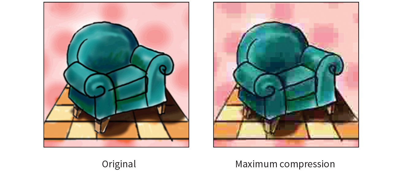
In most programs, you can control how aggressively you want the image to be compressed with a Quality setting when saving or exporting. This involves a trade-off between file size and image quality. The more you compress the image (for a smaller file size), the more the image quality suffers. Conversely, when you maximize quality, you also end up with larger files. The best compression level is based on the particular image and your objectives for the site.
Progressive JPEGs display in a series of passes, starting with a low-resolution version that gets clearer with each pass, as shown in Figure 23-4. In some image editing programs, you can specify the number of passes it takes to fill in the final image (3, 4, or 5).

The advantage to using progressive JPEGs is that viewers can get an idea of the image before it downloads completely. Also, making a JPEG progressive usually reduces its file size slightly. The disadvantage is that progressive JPEGs take more processing power, which can make them problematic for low-end mobile devices. Despite that minor hitch, the best practice is to make all JPEGs progressive, not only for the smaller file size, but because they appear on the page faster, improving perceived performance.
The PNG (Portable Network Graphics) format was designed to replace GIF for online purposes and TIFF for image storage and printing. A PNG can be used to save many image types: 8-bit indexed color, 24- and 48-bit RGB color, and 16-bit grayscale, but for the purposes of web production, you need to choose only between 8-bit (PNG-8) and 24-bit (PNG-24).
Despite getting off to a slow start in terms of browser support, PNGs have become developers’ first choice in web graphics formats, and for good reason. PNGs offer an impressive lineup of features:
PNG-8 is good for images that have flat colors, such as logos, line art, and icons (Figure 23-5). You can save photographs or textured images too, but they won’t be saved as efficiently, resulting in larger file sizes. However, PNG-8 does work nicely for images with a combination of small amounts of photographic imagery and large, flat areas of color. The two key characteristics of PNG-8s are that they use an indexed color model and they support transparency. These concepts are worth exploring a bit deeper.

Because they are simple illustrations, the images in Figure 23-5 could also have been drawn with vectors and saved in SVG format.
I mentioned earlier that PNG-8 files contain a maximum of 256 colors. Let’s talk about why.
PNG-8 files are indexed color images that contain 8-bit color information (they can also be saved at lower bit depths). Let’s decipher that statement one term at a time. First, 8-bit means PNG-8s can contain up to 256 colors—the maximum number that 8 bits of information can define (28 = 256). Lower bit depths result in fewer colors and also reduce file size. For example, 4-bit images contain only 16 colors (24 = 16).
GIFs are also 8-bit indexed color images, so this discussion of bit depth and palettes applies to GIFs as well.
Indexed color means that the set of colors in the image, its palette, is stored in a color table (also called a color map). Each pixel in the image contains a numeric reference (or index) to a position in the color table. Let’s make this clear with a simple demonstration. Figure 23-6 shows how a 2-bit (4-color) indexed color image references its color table for display. For 8-bit images, there are 256 slots in the color table.
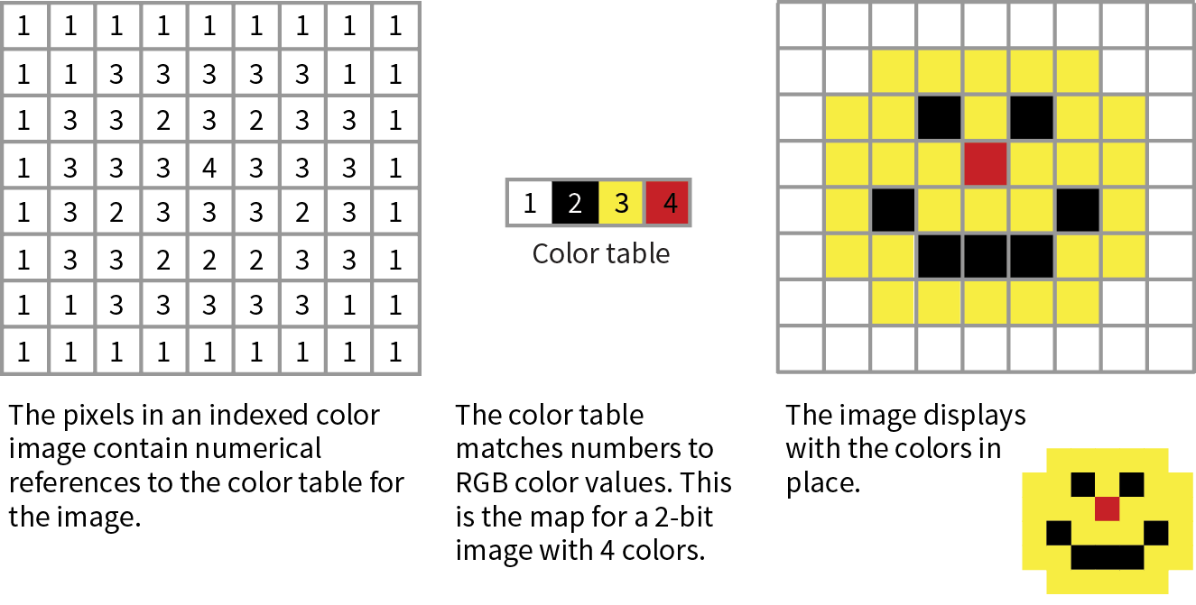
Image-editing programs generally allow you to view the color table for an image. In Photoshop, you can view (and even edit) the color table by selecting (Figure 23-7). In GIMP, go to (the image must be converted to indexed color mode first).
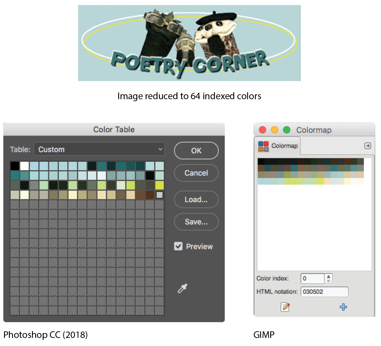
Most source images (scans, illustrations, photos, etc.) start out in RGB format, so they need to be converted to indexed color in order to be saved as a PNG-8 or GIF. When an image goes from RGB to indexed mode, the colors in the image are reduced to a palette of 256 colors or fewer, a process known as quantization. For most programs, including Photoshop, the conversion takes place when you save or export the image. Some image-editing programs, like GIMP, may require you to convert the image to indexed color manually first, and then export the PNG-8 as a second step.
In either case, you might be asked to select a palette for the indexed color image. The sidebar “Common Color Palettes” outlines the various palette options available in the most popular image tools. It is recommended that you use Selective or Perceptual in Photoshop and Optimized Median Cut in PaintShop Pro for the best results for most image types. In GIMP, “Generate optimum palette” should do the trick, although it also provides a long list of crazy custom palettes you could use (Coldfire, Plasma, Paintjet, and Bears, to name just a few).
You can make parts of a PNG-8 image fully transparent so that the background image or color shows through. Although all bitmapped graphics are rectangular by nature, transparency creates the illusion that the image has a more interesting shape (Figure 23-8). In the most commonly supported type of PNG-8 transparency, pixels are either fully transparent or fully opaque, also known as binary transparency.
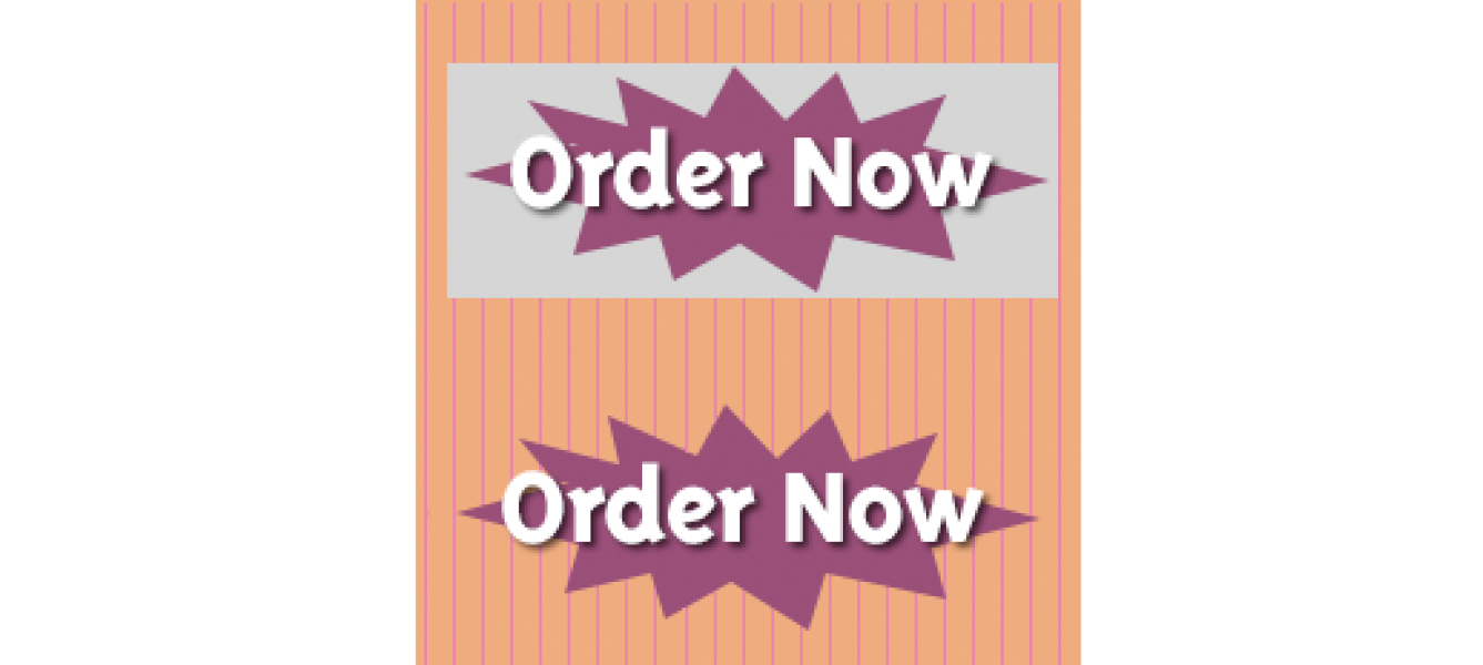
PNG-8 files are also capable of storing multiple levels of transparency in their indexed color maps, allowing soft edges and shadows to blend in with the background. In the past, although browsers supported PNG-8 with variable levels, it was a challenge to find an image-editing tool that could create them. Today, you can create transparent PNG-8s right from Photoshop CC, and there are a number of tools for converting a PNG-24 to PNG-8 while maintaining its transparency levels.
We’ll look at both binary and variable transparency as it applies to PNG-8 files in the “Working with Transparency” section in Chapter 24, Image Asset Production.
A PNG can also be saved as a Truecolor image, with each channel (red, green, and blue) defined by 8- or 16-bit information, resulting in 24- or 48-bit RGB images, respectively. In many graphics programs, 24-bit RGB PNGs are identified as PNG-24. It should be noted that 48-bit images, while great for storage of high-quality originals, are useless for the web becuse of file size, and even 24-bit images may not be the best choice. Like JPEG, PNG-24 is good for photographic images where you want the maximum color range.
The two key characteristics of PNG-24s are that they are “lossless” and they can contain multiple levels of transparency. Let’s dig into that a bit deeper.
We learned that in JPEG’s lossy compression algorithm, image data is tossed out in order to reduce the size of the file. PNG-24 files are lossless, meaning nothing is sacrificed. Because it is a lossless format, a 24-bit PNG is nearly always significantly larger than a lossy JPEG of the same image. For that reason, JPEGs are the best choice for photos on the web.
However, PNG-24 was the first format to include a killer feature that has made it one of the web’s most popular formats, and that is…
PNG-24 files can contain multiple levels of transparency, commonly referred to as alpha transparency. They do this by storing 8-bit transparency information (256 levels) in a fourth channel, called the alpha channel.
You sometimes see PNG-24 with alpha transparency referred to as a 32-bit PNG because there are 8 bits for each of four channels: red, green, blue, and alpha.
Figure 23-9 shows the same PNG against two different background images. The orange circle is entirely opaque, but the drop shadow contains multiple levels of transparency, ranging from nearly opaque to entirely transparent. The multiple transparency levels stored in the PNG allow the drop shadow to blend seamlessly with any background. The ins and outs of alpha transparency will be addressed in the section “Working with Transparency” in Chapter 24.
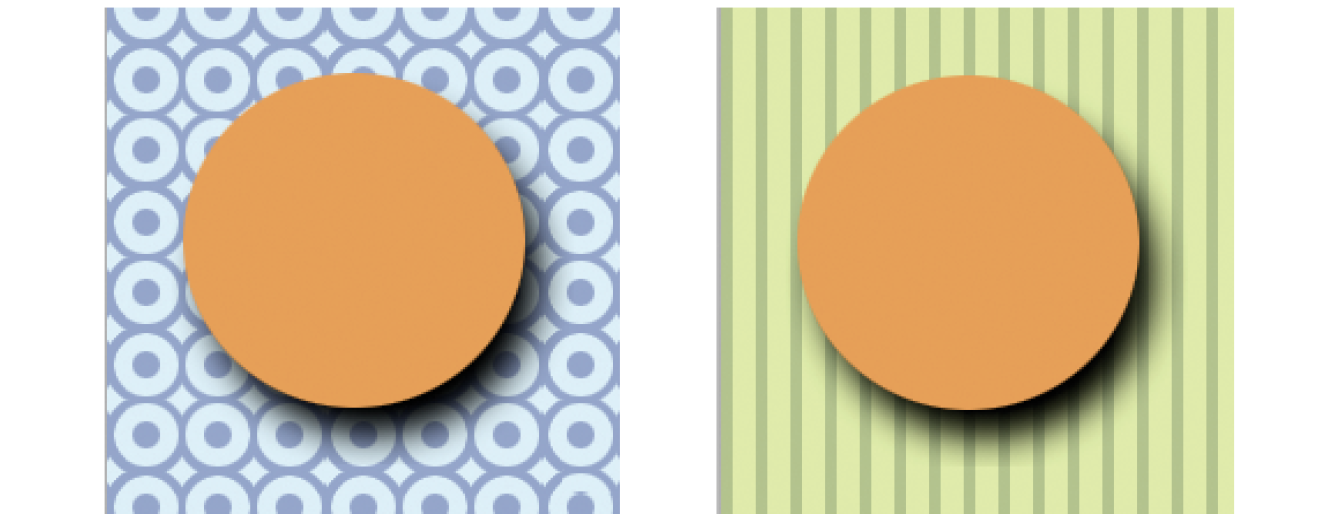
There are a few other features that make PNG a Pretty Nifty Graphic format (see what I did there?).
Gamma correction
Gamma refers to the brightness setting of a monitor. PNGs can be tagged with information regarding the gamma setting of the environment in which they were created. When implemented in the image and the browser, the PNG retains its intended brightness and color intensity. Unfortunately, this feature is not consistently supported. In fact, image-optimizing tools typically remove the chunk of code that controls gamma. With poor browser support for gamma anyway, nothing is lost but unnecessary bytes.
Embedded color profile information
The PNG format can also store the ICC color profile information of the system it was created on. In fact, if you are finding that it is difficult to match an RGB value in a PNG to the same RGB value in a background color, the embedded color profile is to blame. The block of code for storing ICC profiles also generally gets tossed by image optimizers.
Embedded text
PNGs also have the ability to store strings of text. This is useful for permanently attaching text to an image, such as copyright information or a description of what is in the image. Ideally, the meta-information in the PNG would be accessible via right-clicking the graphic in a browser, but this feature has never been implemented.
Progressive display (interlacing)
PNGs can also be coded for interlaced display, revealing the image in a series of seven passes, filling in the image both horizontally and vertically. Interlacing adds to the file size and is usually not necessary, so to keep files as small as possible, turn interlacing display off. I’m finding that most tools these days don’t give you the option to turn it on anyway.
Before we move on, here’s the skinny on what you should know about PNGs:
The GIF (Graphic Interchange Format) file was the first image format supported by web browsers and for a while, it was the only file format that would display in a browser window. (I know. I was there.) Although not designed specifically for the web, it was adopted for its versatility, small file size, and cross-platform compatibility.
You may see GIF listed as “Compuserve GIF” because Compuserve invented the format. The patent on GIF which was owned by Unisys expired in 2006.
These days, GIF is synonymous with “animated viral meme,” and, as the only well-supported web image format capable of animation, the GIF format still has a place at the table (at least until APNG and animated WebP have more thorough support). For still images, however, GIF has lost ground to the PNG format, which can do everything GIF can do and usually better. Furthermore, newer graphics tools are simply omitting the option to save files in GIF format. Our old friend GIF may be heading for retirement. That’s OK…we just fight about how to pronounce it anyway.
That said, let’s quickly look at what makes GIF tick.
Like PNG-8, GIF is an 8-bit indexed color format. You can save a GIF at even lower bit depths, resulting in fewer colors and smaller file sizes.
GIF compression is lossless, although some image information is lost when the RGB image is converted to indexed color. It uses a compression scheme (called “LZW” for “Lempel-Ziv-Welch”) that takes advantage of repetition in data. When it encounters a string of pixels of identical color, it compresses them into one data description (Figure 23-10). This is why images with large areas of flat color condense better than images with textures. PNG uses a similar like-color compression scheme.
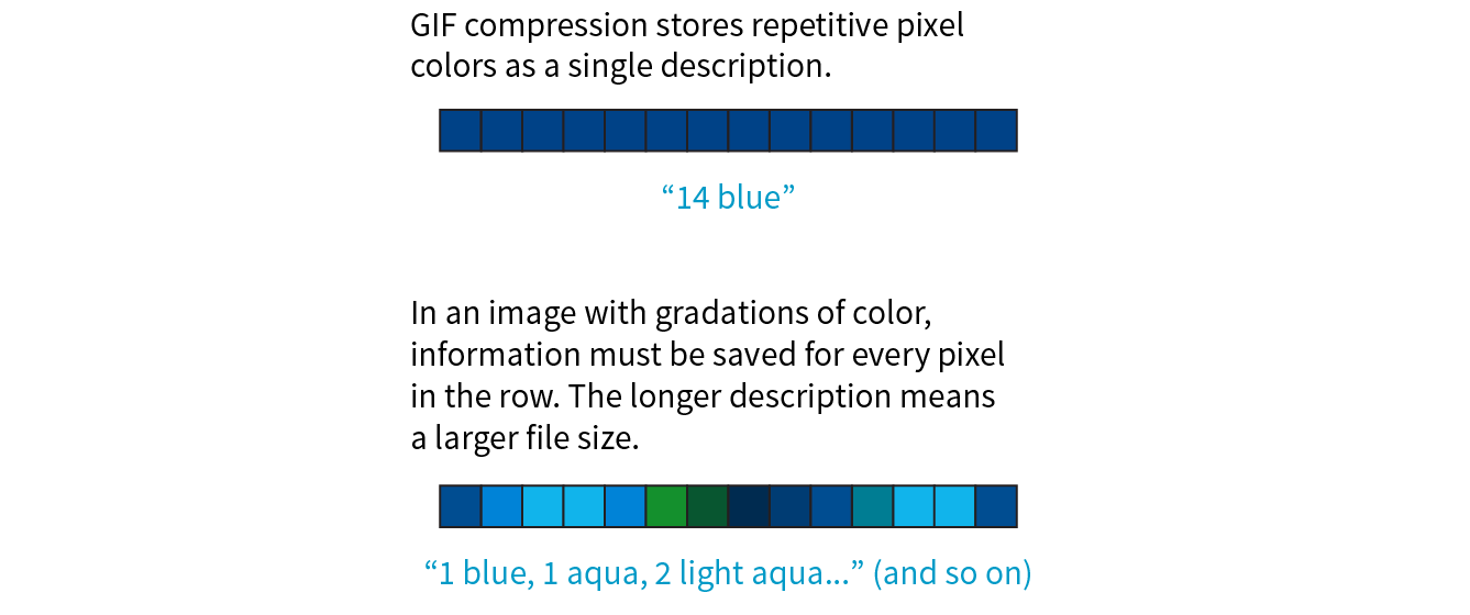
GIF images use binary transparency, in which pixels are either entirely opaque or transparent.
Interlacing makes a GIF display in a series of passes, like progressive JPEGs. Each pass is clearer than the pass before, until the image is fully rendered in the browser window (Figure 23-11). Over a fast connection, these effects (interlacing or image delays) may not be perceptible. However, over slow connections, interlacing large images may be a way to provide a hint of the image to come.
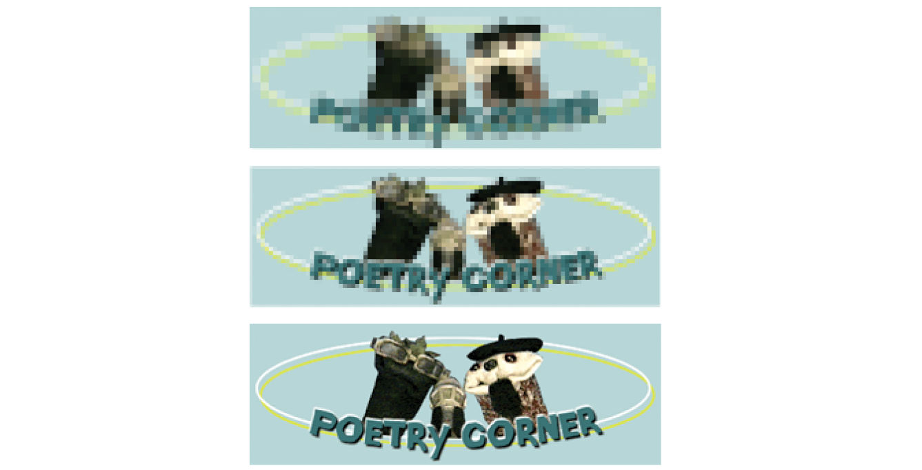
Another feature built into the GIF file format is the ability to display simple animations (Figure 23-12). Many of the spinning, blinking, fading, or otherwise moving ad banners you see are animated GIFs, and they certainly show up in your social media feeds.

Animated GIFs contain a number of animation frames, which are separate images that, when viewed together quickly, give the illusion of motion or change over time, kind of like a flipbook. All of the frames are stored within a single GIF file along with settings that describe how they should be played. Settings include whether and how many times the sequence repeats, how long each frame stays visible (frame delay), the manner in which one frame replaces another (disposal method), whether the image is transparent, and whether it is interlaced.
There are many tools for creating animated GIFs (just do a quick search). Many are web apps that you can use right in the browser or mobile device, and many are free. You can also make an animated GIF in Photoshop by using the Timeline window and clicking Create Frame Animation.
There’s a new image format in town, and it’s here to beat up all the other formats. Google calls its open source WebP format “the Swiss Army knife of image formats.” It has virtually all the features we’ve looked at in JPEG, PNG, and GIF at sizes that are typically 25–35% smaller:
Lossless or lossy compression
WebP can be saved in a lossy format (like JPEG) or lossless (like PNG). Its lossy compression scheme uses the same encoding used in the VP8 video codec.
Alpha transparency
WebP has an alpha channel for multiple levels of transparency, like PNG-24. Alpha transparency can be used with either the lossless (PNG-like) image compression or—and this is special—lossy (JPEG-like) compression. It is the only format that can combine a lossy RGB channel with a lossless alpha channel, resulting in a file that is 60–70% smaller than a PNG-24 of the same image.
Animation
It is also possible to animate WebP images. Sorry GIF, there goes your advantage.
Metadata
Like PNG, the WebP container can store metadata right in its code.
Color profile
The WebP container can also embed color profile (ICC) information.
Here’s where we get to the “sad trombone” portion of the story. Because WebP is new, it has sparse browser support. As of this writing, it is supported in only newer Chrome, Android, Opera, Vivaldi, and Samsung browsers. But that doesn’t mean you can’t use it! The modern web developer knows it’s a good approach to supply the best (in this case, fastest) experience to browsers that can handle it and the next best thing to the rest.
You can use Modernizr (covered in Chapter 19, More CSS Techniques) to detect WebP in its lossy, lossless, alpha-channel, and animated varieties. You can also use the picture element to deliver a .webp image to browsers that can use it and a JPEG as a fallback, as we saw back in Chapter 7:
<picture> <sourcetype="image/webp"srcset="pizza.webp"> <img src="pizza.jpg" alt="pizza"></picture>
It is also common to have the server make the call and deliver WebP images when it detects that the browser supports them (based on the “accept encoding header”). Backend solutions are beyond the scope of this discussion, but it’s an option you should be aware of.
As with browsers, it will take a while for WebP to find its way into image creation tools. You can already make WebP files in Sketch, Pixelmator, and a few other graphics programs. You will find a current list of supporting programs on the WebP Wikipedia page (en.wikipedia.org/wiki/WebP). There is word that full WebP support will be added to GIMP in version 2.10, which has not yet been released as of this writing.
If you use Adobe Photoshop, there are two plug-ins that let you save to WebP format. The first, by Toby Thain, is at telegraphics.com.au/sw/product/WebPFormat, and a newer one by Brendan Bolles is available atgithub.com/fnordware/AdobeWebM). Once you install the plug-in, you’ll see WebP in the list of formats you can save to.
Finally, you may also use the cwebp command-line tool (see, they’re not just for coders!) to convert PNG and JPEG images to WebP format. The corresponding dwebp command converts WebP to PNG.
WebP has an official site at developers.google.com/speed/webp, where you will find detailed documentation, an explanation of its compression schemes, updated lists of supporting tools and browsers (including links to download the aforementioned plug-ins and command-line tools), and a gallery of samples. It’s definitely worth reading if you enjoy geeking out on image formats. WebP is certainly worth keeping an eye on.
The first step to making quality web graphics that maintain quality and download quickly is choosing the right format. Table 23-1 provides a good starting point. Because of poor support for WebP as of this writing, I will stick with the supported bitmap formats PNG, JPEG, and GIF here.
Note that SVG should be your first choice for illustrations and icons with flat colors. SVG may also result in smaller files for images with a combination of flat colors and a small areas of bitmapped image, gradients, or effects like drop shadows. You’ll learn all about them in Chapter 25, but for now, Table 23-1 should help you sort out the bitmapped file options.
|
Table 23-1. Choosing the best bitmapped (raster) file format |
||
|
If your image... |
use... |
because... |
|
Is graphical, with flat colors |
8-bit PNG or GIF |
PNG and GIF excel at compressing flat color. |
|
Is a photograph or contains graduated color |
JPEG |
JPEG compression works best on images with blended colors. Because it is lossy, it generally results in smaller file sizes than 24-bit PNG. |
|
Is a combination of flat and photographic imagery |
8-bit PNG or GIF |
Indexed color formats are best at preserving and compressing flat color areas. The pixelation (dithering) that appears in the photographic areas as a result of reducing to a palette is usually not problematic. |
|
Requires transparency |
GIF or PNG-8 |
Both GIF and PNG allow on/off transparency in images. |
|
Requires multiple levels of transparency |
PNG-24 or PNG-8 |
Only PNG supports multiple levels of transparency. PNG-24s with alpha transparency have a much larger file size, but it is easier to find tools to create them. WebP also supports alpha transparency, and may be a better option once it is better supported. |
|
Requires animation |
GIF |
GIF is the only supported format that can contain animation frames. APNG and WebP may be better options in the future. |
That concludes our exploration of image formats. I think we just took the very long way around to say, “if it’s a photo, use JPEG, and if it’s mostly flat colors, use PNG-8,” but I think it’s important to understand why.
There is a new term floating around to describe folks who design web pages and apps: screen designer. I like it. As the web and smartphones evolve, it is clear that the requirements and concerns of designing for screens are distinct from designing for print. As a web designer, you will need to be well versed in how images display on screens, so let’s zoom in.
One thing that GIF, JPEG, PNG, and WebP images have in common is that they are all bitmapped (also called raster) images. When you zoom in on a bitmapped image, you can see that it is like a mosaic made up of many pixels (tiny, single-colored squares). These are different from vector graphics that are made up of smooth lines and filled areas, all based on mathematical formulas. Figure 23-13 illustrates the difference between bitmapped and vector graphics.
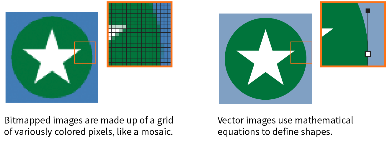
Image-editing programs keep track of how many pixels an image has per inch. This pixel per inch (ppi) measurement is the resolution of the digital image. When an image is printed on paper, higher ppi means sharper, higher quality because there is more information packed into each square inch (see the “DPI Versus PPI” sidebar). In the print world, image resolutions of 300ppi and 600ppi are common.
On the web, however, the notion of “inches” is irrelevant because the final display size of the image is dependent on the resolution of the screen on which it is displayed (Figure 23-14).
If we’re throwing out “inches,” we have to toss out “pixels per inch” as well. The only thing we know for sure is that the graphic in Figure 23-14 is 72 pixels across, and it will be twice as wide as a graphic that is 36 pixels across. Here’s the bottom line: web images are measured in number of pixels, and the ppi at which they are created is irrelevant.
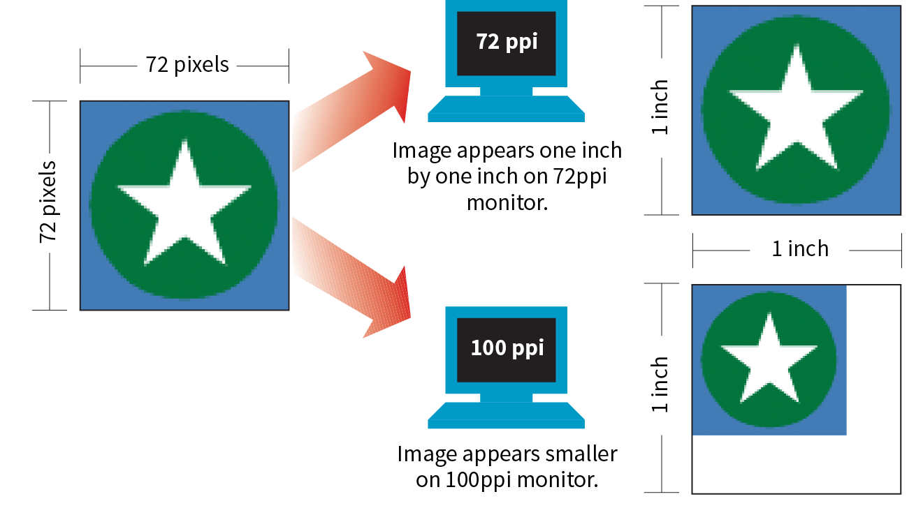
That said, it is the recommended practice to create images at 72ppi if you are designing in a bitmap image editor like Photoshop or GIMP. This is the default and keeps images at roughly the size they’ll appear on a desktop monitor. You are welcome to create your images at a different ppi, but just be sure to be consistent so images don’t get resized when you’re copying and pasting from one file to another.
Screen displays are made up of pixels, so you can measure their resolution in pixels per inch (ppi) as well. This is often referred to as the pixel density of the screen (see Note).
You may see ads for screens with “a screen resolution of 2560 × 1440,” but that’s not its “resolution,” that’s its screen dimension. Resolution is a measure of pixel density.
The first Macintosh computers had 72ppi screens, which is pretty crude by today’s standards. Early PCs used 96ppi. These days, standard desktop and laptop monitors have resolutions of about 109 to 160ppi. Over the years, manufacturers have been pushing resolution of displays higher and higher, which leads us to...
From the 1980s to 2010, we could pretty much count on the pixels in our images mapping one-to-one with the hardware pixels in the desktop monitor, as shown in Figure 23-14. Of course, there were exceptions—browsers could zoom images larger or smaller on command, and images were scaled down to fit on smartphone screens—but that was the general rule.
There was a seismic shift in 2010, however, when Apple introduced the iPhone 4 with its Retina display. The Retina display packed literally twice the number of pixels into the same physical screen space, resulting in images that were much sharper (remember, the more pixels per inch, the better the image quality). The flip side of that, of course, was that the bitmapped images we were already using got rendered by twice as many pixels, and ended up looking a bit blurry (Figure 23-15).
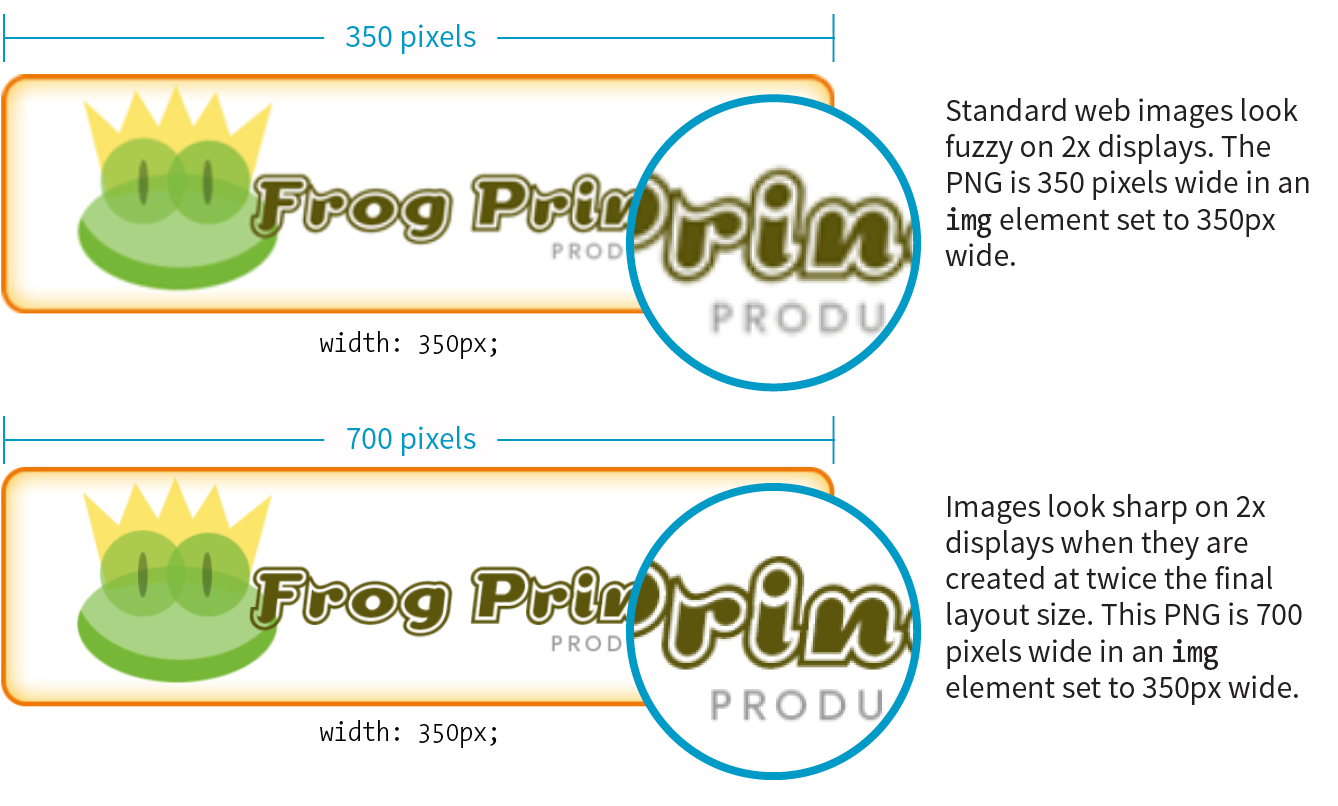
The Retina screen was just the beginning. There are now both 2x and 3x Apple devices (including tablets and laptops), and Android devices come in with 1.5x, 2x, 3x, and even 4x standard pixel densities. As a result, an actual device pixel is so small that images and text would be illegibly tiny if they were mapped one to one. What to do?!
If you think back to our responsive images discussion in Chapter 7, you’ll remember that we’ve got a solution. High-resolution devices use a measurement called a reference pixel that can be used for the purposes of layout. Reference pixels go by different names and get calculated slightly differently depending on the operating system, but they enable us to specify pixel sizes without getting caught up in pixel densities.
Apple calls its reference pixels points (PT). One point on a standard 1x screen equals one device pixel. On a 2x screen, a point is 2 × 2 device pixels, and on 3x screens, a point is 3 × 3 device pixels. They all look about the same size because the high-resolution pixels are so incredibly small. Android calls its reference pixels device-independent pixels, or DiP, or simply DP. They are always equal to one pixel at 160ppi, but they work the same way.
You would probably use the terms PT and DP more when designing graphics to be used in native smartphone apps. For the web, it is sufficient to do the layout design in pixels and relevant CSS units. For example, you would say that the image in Figure 23-15 has a width of 350 (reference) pixels in the layout, even though the image file itself is 700 pixels wide for 2x displays.
At the end of the day, you can go about your business creating images at the pixel dimensions you intend for the layout. For important images, however, you may decide that you want them to look as crisp as possible on high-density displays. In that case, you’ll need to create several versions and deliver them with responsive image markup or let the server handle it. If you have a product shot that appears at 150 × 150 pixels at 1x, you’ll need at least a 2x version (300 × 300) and perhaps a 3x version (450 × 450) as well, knowing that they will all occupy 150 reference pixels in the layout.
In Chapter 24, we’ll look at tools and techniques for creating multiple image sizes aimed at high-density displays. The markup for delivering the right image size to the right device is covered in Chapter 7.
Now you know where to get images, are acquainted with the various web format options, and have a feel for screen resolution. Throughout this book, you’ve also gotten to know the important principles of performance and Responsive Web Design. Let’s put all of this know-how together in a strategy for approaching image production.
As a conscientious web designer concerned with providing the best experience across a wide range of devices, you should have these priorities in mind when creating graphics for a site:
It may be helpful to approach your image requirements systematically, ruling out classes of images and unnecessary tasks, so you are left with a clear set of production options. Figure 23-16 diagrams a series of questions you can use to cull your image production options. In this section, we’ll address each step of the process at a conceptual level. In Chapter 24, you’ll get to try out specific image production techniques that address these goals.
First off, let’s determine whether you need an image at all.
Before you break out Photoshop, consider whether you can achieve what you’re after with CSS alone. Not only will the effect be a fraction of the file size, but you’ll also avoid another call to the server.
Effects like rounded corners and gradients that once required images are now achievable with CSS properties (border-radius and radial-gradient/linear-gradient, respectively).
It is also possible to make little drawings with CSS, which may be useful in place of icons (Figure 23-17). Basic shapes such as circles, rectangles, triangles, and more can be created with empty div elements and some trickery with borders and transforms. Some people have created amazingly complex illustrations using HTML and CSS, but the technique, which had its heyday around 2010–11, is largely for demonstration purposes rather than for serious production.
I don’t want to stray too far from image production in this chapter, so I will leave you with these articles, where you can learn more about CSS shapes and illustrations:
If you need something more complex than a CSS effect, it’s time to think about image formats.
If your image is a logo, icon, or other illustration, creating it in a vector drawing tool and saving it as an SVG offers the benefits of small file size and resolution independence. Now that browser support is reliable, it is a good solution to dealing with the variety of devices and displays we need to design for.
If you place the SVG code inline, with the svg element, you save another HTTP request and gain the ability to style and script the elements. Or, if a static illustration is all you need, embedding the SVG in the document with the img element is a perfectly fine option.
In Chapter 25, you’ll take a long journey through the SVG format, so I won’t say much more here other than the fact that SVG should be your first choice if you can create the image or illustration in vector format.
If SVG is not appropriate for your image type or if your target audience is known to use non-supporting browsers in significant numbers, then you may need to go with a bitmapped format. There are still a few things to consider.
Image format has a large impact on file size, so choosing the most appropriate format for your image is an important step to optimizing images. As we learned, PNG-8 is the best option for images with areas of flat color, and JPEG is the best format for photographic images. In Chapter 24, I’ll show you how to save images in various formats, and you’ll get to see how format affects file size firsthand.
Consider also saving the image in the much smaller WebP format and using the picture element to deliver it to the browsers that can render it (see the “Responsive Image Markup” section in Chapter 7, for details). It helps speed things up on supporting browsers and provides a reliable JPEG or PNG fallback for the others.
With the format decided, it’s time to start thinking about how many versions of each image you need to create.
The next thing to consider is whether your layout requires responsive images.
Some pages, such as text-heavy pages with small illustrations, might get by fine with just one version of each image that serves all screen sizes. If that is the case, save or export your image in the most appropriate file format and you’re nearly done. The final step is to optimize the image to make it as small as it can be. Optimization techniques are discussed in detail in Chapter 24.
Your responsive layout may require that you take advantage of the responsive image techniques we outlined in Chapter 7. To recap, “responsive images” refers to the process of providing images that are tailored to the user’s viewing environment. This includes preventing browsers on small screens from downloading more image data than they need as well as providing images large enough to look crisp on high-density displays. You can also provide alternative versions of the image based on content (called the “art direction” scenario) or to take advantage of newer formats, such as WebP.
If you’re going the responsive images route, things start getting interesting.
Although it is terrific to have an HTML solution for getting the right images to the right browsers, the current system is a bit cumbersome with stacks of code and the need to produce multiple images. If you work on a large, image-heavy site, it could prove to be unmanageable. Image processing is a task that begs to be automated. The solution: let the server do it!
Fortunately, there are many tools and services, both open source and for pay, that let the server do the work of creating appropriate image versions on the fly. You upload the image at the highest quality and largest size required and let the server handle the rest—no need to create and store multiple versions of every image. Some services go beyond simple resizing, including the ability to crop images intelligently, add special effects such as sepia tones, or otherwise transform images on the fly.
Some content management systems have image-resizing features built in. Another option is to install software or an open source script (like Glide, glide.thephpleague.com) on your own server. Bear in mind, however, that requiring JavaScript to be running is less than ideal. There are also third-party solutions that provide image-resizing services (like Cloudinary.com, Akamai.com, or Kraken.io), for a fee. For large, image-heavy sites, they are worth looking into.
For more information, read “Image Resizing Services” by Jason Grigsby of Cloud Four (cloudfour.com/thinks/image-resizing-services/). He maintains a list of current image services, which you can find linked from the article.
If your site has a reasonable number of images that are updated on a reasonable schedule, you should be able to produce them by hand on your computer and upload them to the server. The good news is that there’s a whole slew of new tools designed especially to support the web image asset production process, including ways to create several versions at once and to optimize them in batches. Even our old standby, Adobe Photoshop, is evolving to better support the needs of web image producers. We’ll look at these tools in the following chapter.
As long as we’re talking about images, there is one last site-related image to cover: the favicon. A favicon is the little icon that shows up to the left of the page title in the browser tab and in bookmark lists (Figure 23-18). First introduced as an Internet Explorer 5 feature in 1999, favicons were quickly adopted by other browsers. Favicons aren’t required, but they do help users identify and find your site in a long lineup of tabs or bookmarks. They’re a little attention to detail that can strengthen your brand.
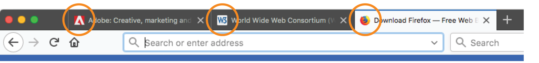
Other web-enabled devices use site-associated icons that are similar to favicons. For example, Apple iPhone and iPad represent sites or web apps with an icon (called a touch icon) when you save them to the home screen. Site icons are also used by Microsoft Metro tiles, GoogleTV, and other systems.
This section introduces what it takes to create a basic desktop favicon as well as a full icon set that covers all the bases. We’ll also look at one tool that does all the repetitive work for you.
For desktop browsers, the standard favicon process is easy:
This is the method that is supported by the most browsers, and the only favicon method supported by Internet Explorer 10 and earlier.
There are a few important things to know about the favicon.ico file itself. Favicons should be created at 16 × 16 pixels with an additional 32 × 32 pixel version for crisp display on Retina display devices. The good news is that you need only one favicon.ico file because the ICO format is capable of storing multiple images in a single file. The bad news is that most graphics tools, including Adobe Photoshop, can’t save images in ICO format, so you need to use a conversion tool that takes in PNG or JPEG and spits out ICO. There are several free drag-and-drop ICO converters online, such as icoconverter.com and convertico.com. If you are on a Mac and want a more full-featured conversion tool, check out Icon Slate by Kodlian (www.kodlian.com/apps/icon-slate) available in the App Store for US$5.
As mentioned previously, once you have your favicon.ico file, just place it in the root directory for the site alongside index.html, and the browser will find it automatically. There is no need to add any markup in the files.
You may decide to go the extra mile and create a complete favicon set to represent your site on other devices. You can save these icons in good old PNG format and even include transparent areas, so it’s a more familiar process.
When your icons are in PNG format, you must link them to your files with the link element in the markup, as in this example that adds a touch icon for the iPhone with a Retina screen (see the sidebar “iOS Icon Effects”):
<link rel="apple-touch-icon-precomposed" sizes="120x120" href="apple-touch-icon-120x120.png">
Table 23-2 lists most of the standard icon sizes as of this writing.
|
Table 23-2. Most popular standard favicon sizes |
|
|
Size (in pixels) |
Purpose |
|
32 × 32 |
Standard for most desktop browsers |
|
57 × 57 |
Standard iOS screen (iPod Touch, iPhone first generation) |
|
76 × 76 |
iPad home screen icon |
|
96 × 96 |
GoogleTV icon |
|
120 × 120 |
iPhone Retina |
|
128 × 128 |
Chrome web store |
|
144 × 144 |
IE10 Metro tile for pinned site |
|
152 × 152 |
iPad touch icon; Android icon (auto-downscaled as needed) |
|
167 × 167 |
iPad Retina touch icon |
|
180 × 180 |
iPhone 6 plus |
|
196 × 196 |
Chrome for Android home screen |
|
228 × 228 |
Opera Coast icon |
For ultimate control over icon quality, it’s best to create your icons by hand. Everyone has their own process, but it is generally recommended to start with a vector-based original and export to the required sizes. If you start with a bitmapped image, scale down in increments and check the quality at each step.
For very small icons (32- and especially 16-pixel square), you’ll likely need to do some pixel-by-pixel fine-tuning to get the best result. If your logo is complicated, consider using just a distinctive detail as O’Reilly Media does (Figure 23-19).
For excellent how-to advice on creating icons in general, I heartily recommend The Icon Handbook (Five Simple Steps), by icon expert John Hicks. John shares his tricks for effective icon design and how to maintain the best quality at small sizes.
If manually creating all your icons feels like a burden, an easier option is to use a favicon generator that creates all the icons from one original and generates all of the required code as well. There are a few of them out there, but one I like is Favic-o-matic (www.favicomatic.com) shown in Figure 23-20. Just upload one PNG larger than 300px square, and the tool does the rest.
We’ve covered a lot of ground in this chapter. If I’ve done my job, you should now have a good foundation in web graphics, including where to find an image and what file format to save it in. You know about image resolution and screen resolution, including working with high-density displays. You also have a strategy for identifying your image requirements in order to whittle down the wide array of options. And of course, you know what it takes to add a favicon to your site.
In the next chapter, you’ll get hands-on experience creating and optimizing web images as we explore the particulars of the production process. But first, a little quiz.
Answer the following questions to see if you got the big picture on web graphics. The answers appear in Appendix A.
In this Chapter
Selecting web file formats when exporting
Binary and alpha transparency
Producing responsive images
Image optimization tools and techniques
In the previous chapter, you learned a lot about images, but now we’re going to focus on making them. Because images typically make up 60–70% of the data on the web, it is critical to approach image creation thoughtfully, with a mind toward responsive design requirements and performance. Once again, we’ll be working with bitmapped formats: JPEG, PNG, and GIF. SVG has a different set of considerations and has been given the next chapter all to itself. This chapter is all about pixel-pushing!
You’ll get a chance to save or export images in a variety of bitmap formats and create an image with transparent areas. You’ll learn some shortcuts for creating multiple versions of an image at once for responsive layouts and high-density displays. Finally, you’ll pick up some optimization tools and techniques so you can make your image files as small as they can be.
Let’s start out with the most basic of image production tasks, saving an image in a web-appropriate format.
Let’s dig right in with saving web images in Photoshop CC and GIMP. You may be thinking, “Why just those two?” I wrote you a little sidebar, “Why Just Photoshop and GIMP?” to explain. If you use one of the dozens of other image editors, the process and terminology is likely similar to those described here.
In most programs, you can count on seeing JPEG and PNG options (if there’s only one PNG option, it’s PNG-24) when you Save or Export the final graphic. GIF is available in more established programs like Photoshop, GIMP, and PaintShop Pro; and WebP is beginning to make an appearance.
This section goes over the process of saving or exporting images step-by-step for those who may not be familiar with using graphics tools. If you are already pretty handy with image editors, this could be a review, or you might skip right to Exercise 24-1.
There are a number of ways to save graphics in web-appropriate formats in Photoshop:
Export As
The recommended and most streamlined method is to use the Export As function, either from the → → menu, or by right-clicking (Control-clicking on a Mac) a layer to export its contents (Figure 24-1, A). From there, you get a dialog box with an image preview and a File Settings pop-up menu for selecting JPEG, PNG, GIF, or SVG format B. When you use Export As, Photoshop uses aggressive compression options to give you the smallest file size.
The Export As dialog box includes format-specific options with a preview of the image as it appears with the settings applied.
The Export As dialog box B also gives you the option to resize the image. This is useful for maintaining a full-size original while exporting copies sized for different layouts.
Save As
You can also use to save the file you’re working on in a new format (you’ll see the web-friendly formats in the long list of options). You’ll generally get a few more options with Save As, such as the ability to turn on interlacing and select a palette for GIFs and to make a JPEG progressive, but you miss out on the extra compression. And it’s a lot of compression. Depending on the image and the file type, a Saved As image could be 10× larger than its exported counterpart.
Save for Web (legacy)
Photoshop’s Save for Web function provides settings for manually optimizing the size of a file while keeping an eye on the resulting image in a preview window, and even comparing up to four settings at a time. For GIF and PNG-8 you can reduce the number of colors (the bit depth), reduce dithering, and turn on interlacing, among other settings. For JPEG, you can choose the quality, make it progressive or optimized, or apply a slight amount of blur to the image to reduce its file size.
Adobe has tagged the Save for Web function as “legacy” starting around 2014, and it will be going away entirely in future versions with no substitutes for many of the settings. But the fact is that there are tools available now that achieve the same amount of compression without all the manual work. If you have access to an older version of Photoshop, you can give it a try, but don’t get too attached (as I am!).
In GIMP, working files are always in GIMP’s native XCF format. From there, you need to choose → to select your file format. The quickest way to get the format you want is to type .jpg, .png, or .gif at the end of the filename in the Name field. For example, typing “name.png” triggers GIMP to export that file in PNG format. Alternatively, you can select a file type from the list of options in the menu (shown in Figure 24-2, A).
After you hit the Export button, you get a dialog box with settings appropriate for the format you’ve chosen.
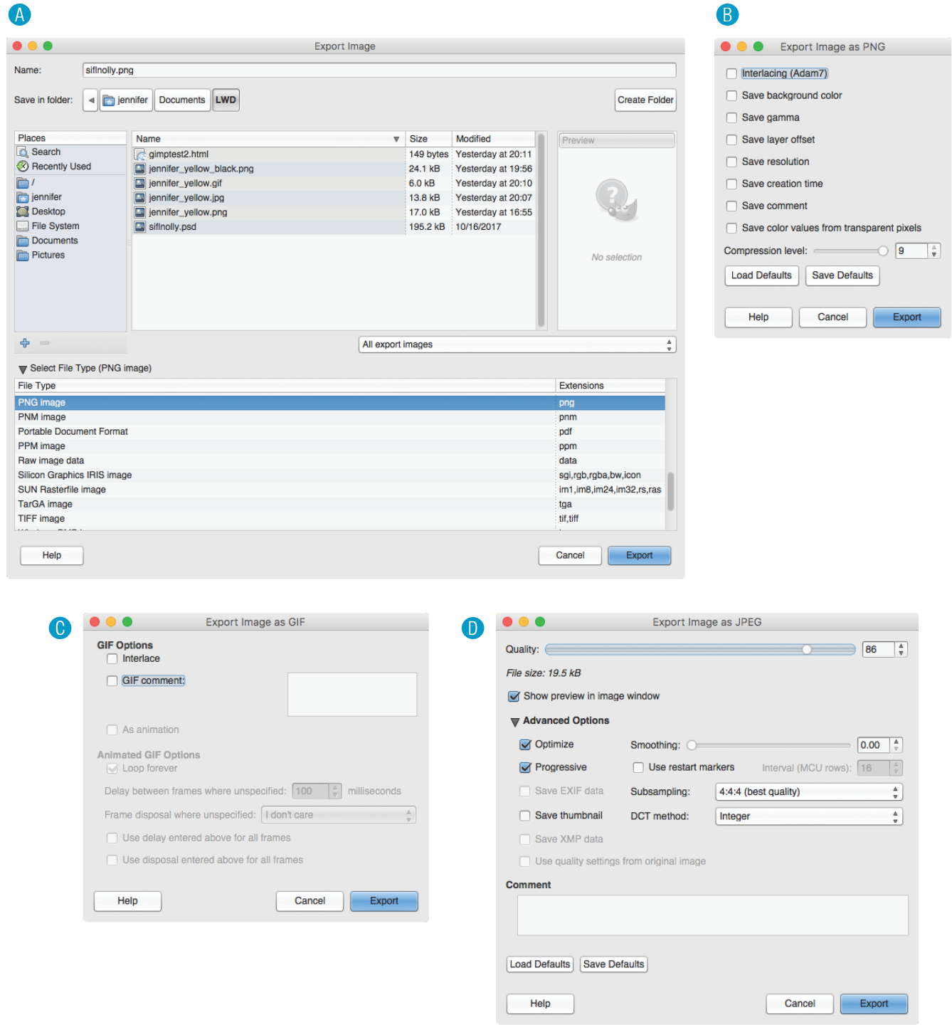
Why don’t you give this web-image-making a try in Exercise 24-1? You’ll find that the format you choose greatly impacts the size of the file. If you have Photoshop or GIMP, you can follow the instructions just listed, but if you don’t, there’s a good chance that whatever image creation tool you do have will have similar save or export options. Remember that you can download a free trial of Photoshop, and GIMP is always free.
That takes care of basic web image output. After the exercise, we’ll turn our attention to one of the core features of web images that you will certainly want to become handy with: transparency.

|
Tool |
JPEG (100) |
JPEG (60) |
JPEG (10) |
PNG-24 |
PNG-8 (32 colors) |
GIF (32 colors) |
|
PhotoshopCC |
22.7 KB |
8.7 KB |
3.3 KB |
14.8 KB |
4.2 KB |
4.3 KB |
|
GIMP |
27.3 KB |
6.8 KB |
3.3 KB |
14.5 KB |
3.3 KB |
3.8 KB |
Both GIF and PNG formats allow parts of an image to be transparent, so that the background color or image shows through. In this section, we’ll take a closer look at transparent graphics, including tips on how to make them.
Remember that there are two types of transparency. In binary transparency, pixels are either entirely transparent or entirely opaque, like an on/off switch. Both GIF and PNG-8 files support binary transparency.
In alpha (or alpha-channel) transparency, a pixel may be totally transparent, totally opaque, or up to 254 levels of opacity in between (a total of 256 opacity levels). Only PNG, WebP, and JPEG 2000 support true alpha-layer transparency (see Note). The advantage of PNGs with alpha transparency is that they blend seamlessly with any background color or pattern, as shown back in Figure 23-9. PNG-8 also allows multiple levels of transparency, but it handles it a little differently, as you’ll learn in a moment.
Because of poor tool and browser support for WebP and JPEG 2000, we’ll be focusing on alpha transparency in PNGs in this section.
In this section, you’ll become familiar with how each type of transparency works, and learn how to make transparent images using GIMP and Photoshop.
Remember that the pixel colors for PNG-8s and GIFs are stored in an indexed color table. Transparency is simply treated as a separate color, occupying one position in the color table. Figure 24-4 shows the color table in Photoshop for a simple transparent GIF. The slot in the color table that is set to transparent is indicated by a checker pattern. Pixels that correspond to that position in the color map are completely transparent when the image displays in the browser. Note that only one slot is transparent—all the other pixel colors are opaque.
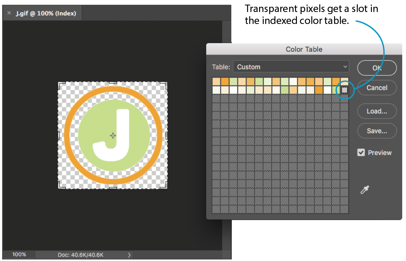
When an image has multiple transparency levels, it blends seamlessly with the web page background. With binary transparency, however, there is a risk that the soft edges around the image will have a fringe of pixels that don’t match the color behind it (Figure 24-5). This fringe is commonly known as a halo and it is a potential hazard of binary transparency.

Prevention is the name of the game when it comes to dealing with binary transparency and halos. The trick is to blend the semitransparent pixels in the original image (such as the anti-aliased edges around text or a shape with feathered edges) with a color that is as close as possible to the background color of the page. Many image-editing tools that support web graphic formats provide a way to pick the blend color (also known as the matte color) when saving or exporting.
Some programs use whatever color is selected as the background color to fill in soft edges. Others may allow you to pick your blend color manually. For example, in Photoshop’s legacy Save for Web feature, you can select a matte color whenever transparency is turned on for the image (see Note). The matte color is also used to fill in any transparent image areas when you’re converting an image to JPEG. GIMP, on the other hand, prevents halos by avoiding any sort of blend at all. You get the choice of hard, stair-stepped edges or a dithering pattern made of color and transparent pixels meant to simulate the blurred edge. Neither option looks good, but hey, no halos.
Curiously, Photoshop’s preferred Export As function automatically fills the blurred edges with white and does not seem to provide a way to select a matte color for GIFs and JPEGs. However, with the ability to export PNG-8s with alpha transparency, you may never need to select a matte color in Photoshop again.
Of course, avoiding halos with these methods requires that you know the RGB values of the page’s background color in advance so you can match the matte color to it. If the page color changes, you need to go back and export the graphics again with the new color. That’s where alpha transparency has a real advantage—you can change the background, and everything will still blend in perfectly.
RGB images, such as JPEGs and PNG-24s, store color in separate channels: one for red, one for green, and one for blue. PNG-24 files add another channel, called the alpha channel, to store transparency information. In that channel, each pixel may display one of 256 values, which correspond to 256 levels of transparency when the image is displayed. The black areas of the alpha channel mask are transparent, the white areas are opaque, and the grays are on a scale in between. I think of it as a blanket laid over the image that tells each pixel below it how transparent it is (Figure 24-6).
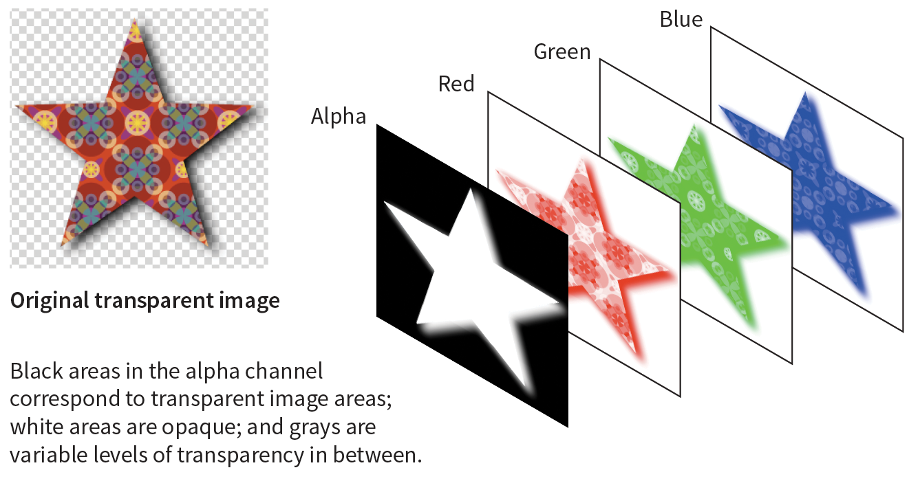
Variable levels of transparency are not limited to 24-bit PNGs—PNG-8 files can do it too! Although they are referred to as PNG8+alpha or alpha-palette PNGs, they do not store transparency information in a separate alpha channel overlay as we saw in Figure 24-6.
PNG expert Greg Roelofs explains PNG-8 “alpha” transparency well in this excerpt from his 1999 book PNG: The Definitive Guide (O’Reilly):
A PNG alpha-palette image is just that: an image whose palette also has alpha information associated with it, not a palette image with a full alpha mask. In other words, each pixel corresponds to an entry in the palette with red, green, blue, and alpha components. So if you want to have bright red pixels with four different levels of transparency, you must use four separate palette entries to accommodate them—all four entries will have identical RGB components, but the alpha values will differ. If you want all of your colors to have four levels of transparency, you’ve effectively reduced your total number of available colors from 256 to 64.
No image program (that I know of) displays PNG-8 color tables with multiple transparency levels, so I’ve simulated one for you in Figure 24-7. I based it on the orange circle with the soft drop shadow from Figure 23-9, with the palette reduced to just 16 colors. The resulting image has a bit of dithering in the drop shadow, but it’s not that noticeable when it appears over a background pattern. With file size savings of 75%, it’s worth it.
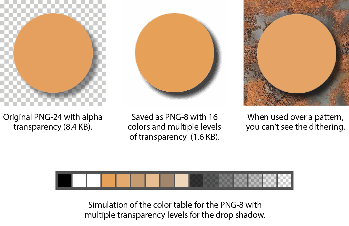
The easiest way to make parts of an image transparent is to design them that way from the start and preserve the transparent areas when you export. Although it is possible to doctor up an existing flattened opaque image and make areas transparent, it is usually difficult to get a seamless blend with the background while avoiding jagged edges.
Instead of just telling you, I’ll let you create a layered image and preserve the transparent areas in Exercise 24-2. When you create your layered Photoshop or GIMP file, be sure that the background layer appears as a gray checkerboard pattern and is not filled with a color. If you end up with a color in the background anyway, you can select it all and delete it.
When you’ve finished playing with transparency, you can come back for some tips on responsive images.
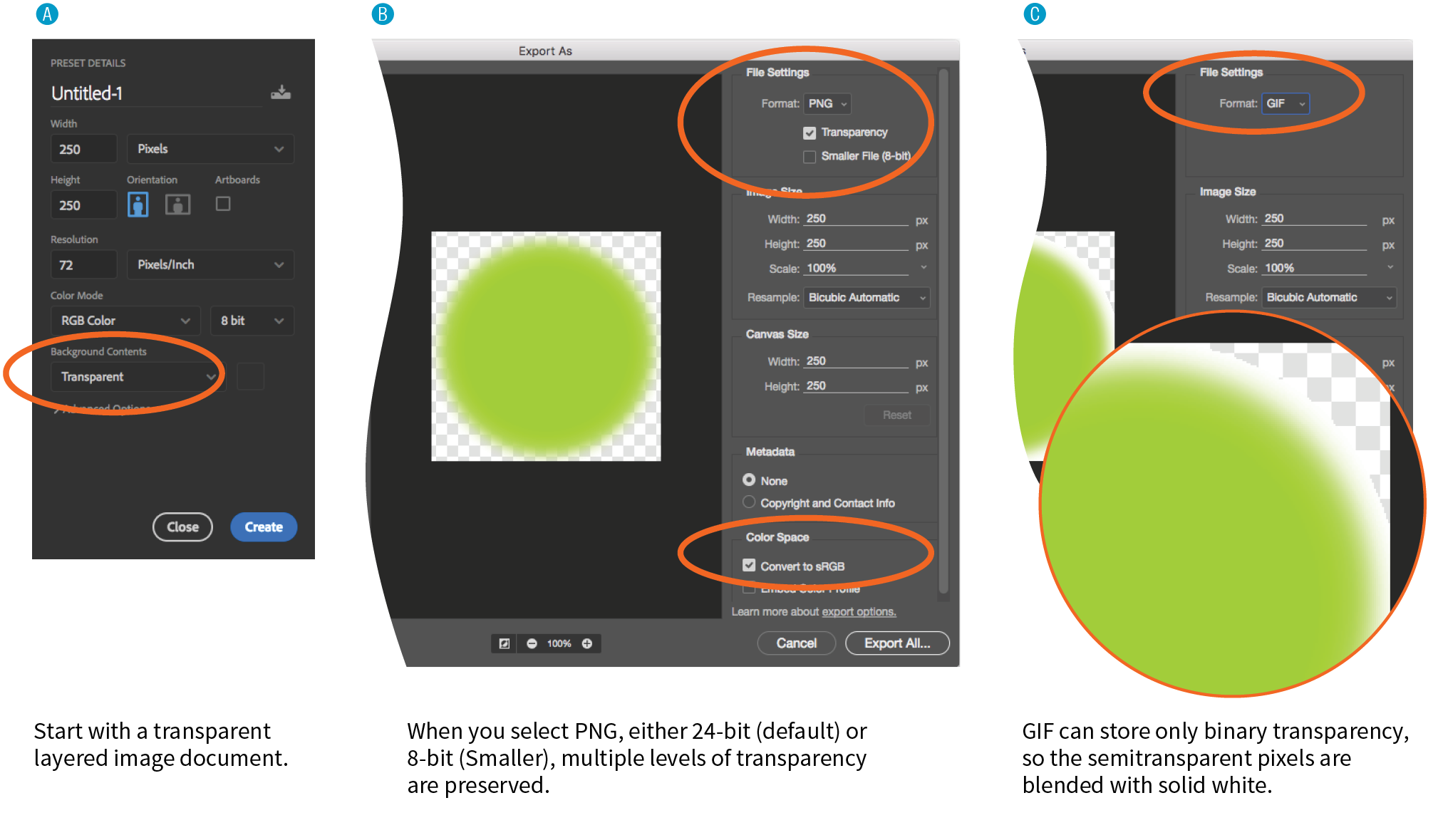
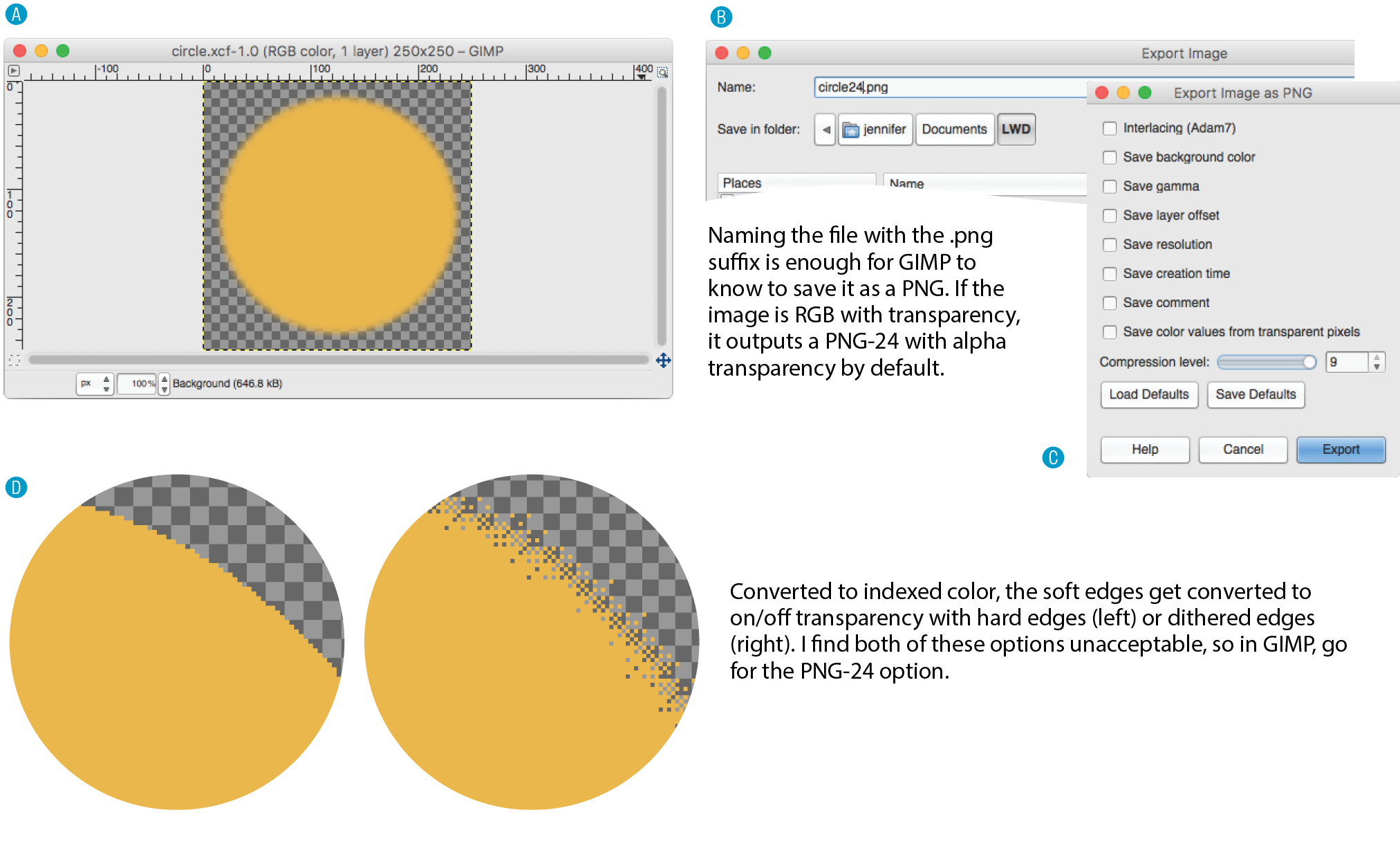
<!DOCTYPE html><html><head> <title>Transparency test</title> <style>body {background-color: white;}p {text-align: center;} img {margin: 2em;} </style></head><body><p> <img src="circle.gif" alt=""><!-- left --><img src="circle24.png" alt=""><!-- center --><img src="circle8.png" alt=""><!-- right --></p></body></html>
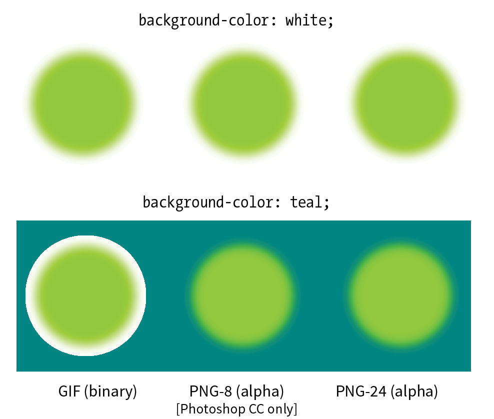
If your site is responsive, chances are you’ll need responsive images to go with it. When it comes to bitmapped images, “responsive” actually means “multiple versions” (see Note).
Responsive SVGs are covered in .
In the “Responsive Image Markup” section in Chapter 7, Adding Images, you learned about four responsive image scenarios, but it’s worth a refresher here (that was hundreds of pages ago, after all). Whereas in the past one image did the trick, in our current environment we may choose to do the following:
This section introduces tools, tips, and general strategies for producing (or automating!) the images you need for the first three scenarios. Alternative image formats were addressed in Chapter 23, Web Image Basics.
The first scenario addresses providing a range of image sizes that the browser selects from based on the viewport size. In HTML, you would specify these using srcset with a w-selector that provides the exact pixel width of the image, and the sizes attribute that tells the browser how large the image will appear in the layout.
This example should look familiar:
<img src="strawberries-640.jpg" alt="baskets of ripe strawberries" srcset="strawberries-240.jpg 240w, strawberries-480.jpg 480w, strawberries-672.jpg 672w" sizes="(max-width: 480px) 100vw, (max-width: 960px) 70vw, 240px">
For this particular img element, we’ve provided JPEGs of the strawberry image at 240, 480, and 672 pixels wide. Other layouts may require fewer or more breakpoints for each image. The first question you may ask when producing images for responsive layouts is, “How many images do I need to create?” That is a good question that doesn’t have an easy answer.
Start by determining the smallest and largest dimensions at which you know the image is likely to appear. Then, decide how many interim sizes would be useful to meet the goal of reducing unnecessary downloads. If the range isn’t that large, you might find that providing small, medium, and large versions is fine and better than nothing. If there is a large difference between the extremes, more breakpoints may be required. If there is very little difference, one image size may suffice.
If you find you need only a few versions, resizing images on export is a fine option. Figure 24-11 shows resizing options in Photoshop CC’s Export As dialog box, but you will find similar settings in other programs. Alternatively, you could use the Image Size tool to resize the image manually before saving or exporting. That gives you an opportunity to make adjustments to the image (such as sharpening it up) before committing to the export.
Remember that you always want to start with the image at its largest size in your image editor, and resize it smaller to your target image sizes. Resizing larger (upscaling) results in blurry images.
If your image is used at a wide range of sizes, more breakpoints than “small, medium, and large” may be required. In that case, providing a range of selections based on file size, not pixel dimensions, is a more appropriate approach (see Further Reading). Keep in mind that the primary goal for viewport-based responsive images is limiting wasted data downloads. Remember also that the browser makes the final image file selection based on the user’s viewing environment—we only provide options with our responsive image markup. We can trust the browser to make the right selection, scaling up or down slightly as required.
In the file-size approach to breakpoints, you create a set of images with file sizes that step up in fixed increments, such as 20 KB, 40 KB, or 80 KB, to cover all the possibilities and fine-tune the amount of data that gets downloaded. Granted, that takes a lot of extra work and may not be feasible to do manually for a site with a lot of images.
Fortunately, there is a tool that generates the images for you. The Responsive Image Breakpoints Generator by Cloudinary (responsivebreakpoints.com) lets you upload a large image and set the maximum/minimum dimensions, the size step, and the maximum number of images, and it generates all the images automatically. Figure 24-12 shows how I used the tool to create strawberry images at 20 KB increments. By the time you are reading this, there may be more tools like this, so it’s worth a quick web search to see what’s available.
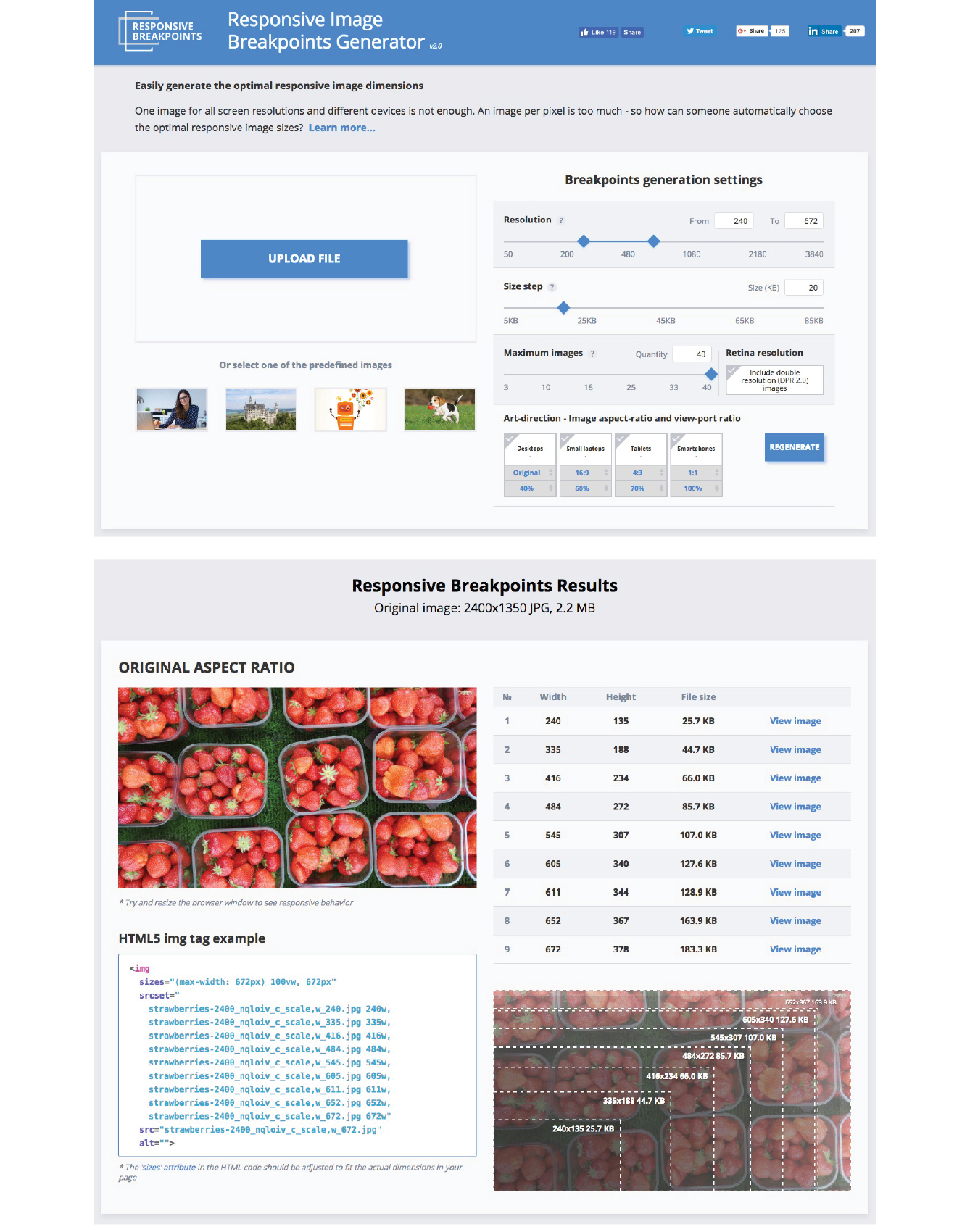
For some images, simply resizing to fit a layout isn’t sufficient. It may be necessary to crop or alter the image so that it works successfully at smartphone size as well as desktop monitor size. This is what is known as the “art direction” case for responsive images. Chapter 7 has a full explanation and examples of art direction–based selections, but as a quick reminder, this is a scenario for the picture element:
<picture> <source media="(min-width: 1024px)" srcset="icecream-large.jpg"> <source media="(min-width: 760px)" srcset="icecream-medium.jpg"> <img src="icecream-small.jpg" alt="Savor the Summer"></picture>
If you want total control over what appears in an image at each size, you need to design and export each image manually in your favorite image editor. Each art-directed version may also need to be generated at several sizes, depending on your breakpoints. That may be just fine if you don’t have too many images to deal with.
But hold onto your hat! Cloudinary figured out a way to automate art direction too. You can use the tools in the bottom-right corner of the Responsive Image Breakpoints Generator to specify image proportions for desktops, laptops, tablets, and smartphones. Cloudinary’s tool does some sophisticated image analysis, including edge detection, face detection, and visual uniqueness to determine the most important parts of the image. The final image is cropped to include the visually “hot” spots. For more information on how it’s done, read the article “Automating Art Direction with the Responsive Image Breakpoints Generator” by Eric Portis at www.smashingmagazine.com/2016/09/automating-art-direction-with-the-responsive-image-breakpoints-generator/.
Other image hosting and automation services also offer face detection and features that improve the quality of the images they generate. If you are shopping for such a service, check to see if smart cropping is available.
If you want an image to look its sharpest on high-density screens (@1.5x, @2x and @3x), it needs to be created large enough to cover the device pixels at the highest densities. For example, if you want an image to be 300 pixels wide in your layout, you’ll need a 300-pixel-wide version for standard displays, a 600-pixel-wide version for 2x displays, and a 900-pixel-wide version targeted to 3x displays.
To brush up on the special requirements of high-density displays, see , where I first introduced device-pixel-ratios as well as the markup for targeting images to specific densities. See also the discussion of image and screen resolutions in .
To review, this high-resolution scenario uses the srcset attribute in the img element with an x-descriptor that specifies the target screen density for each image:
<img src="/images/apple-300px.jpg" alt="apple" srcset="/images/apple-600px.jpg2x, /images/apple-900px.jpg3x" >
Thankfully, the people who make our image creation programs get it, and they’ve begun building features into their tools that make it easier to output multiple high-density versions at once.
Photoshop CC 2018, Sketch, Illustrator, and Affinity Designer are four tools aimed at screen designers that make it easy to set up simultaneous exports at multiple scales. It’s a nice little time (and math!) saver. If you use another design tool, check to see if it is an option (it is generally located wherever your tool handles exporting). Later in this section, I’ll give you some strategies for making sure the image quality stays crisp even at larger scales.
Adobe Photoshop CC 2018
Photoshop lets you add scales on the top-left corner of the Export As dialog box (Figure 24-13). To export a whole artboard, choose Export As (). You can also export a specific element by right-clicking (Control-clicking on a Mac) its layer name and selecting Export As from the pop-up menu. In the Scale All section, click the + button to add more scales for export. The little down arrows open a menu of standard scales (1x, .5x, 3x, etc.). Click the garbage can to remove a scale. When you click Export All, all of the images are created at once, named with the -@nx suffix (see Note).
The “@nx” (@1x, @2x, etc.) convention was established in the Apple iOS Developer Library. It seems to have crossed over to the web world as well.
Adobe Illustrator CC
In Illustrator, to export the entire artboard, choose . You’ll find the option to Add Scale in the right column (Figure 24-13). You can also export individual assets (such as icons and other elements) via the Assets Export panel (), which has its own export settings. Just drag elements into the panel, and they are ready to go. The Export As dialog box also provides access to individual assets via the Assets tab, but they need to be added to the Assets Export panel first. One click on Export, and voilà! All your scaled assets exported at once!
Sketch
Sketch (Mac only) is a tool for designing website and app interfaces that has rapidly grown in popularity. In Sketch, select an artboard or a page element and click the + icon next to Make Exportable in the bottom-right corner of the Sketch window. In the revealed Export panel (Figure 24-13), select a file format and click the + icon to add more scales to be created on export.
Affinity Designer
Affinity Designer has an export mode (which it calls a “Persona”) in which you access all of its export settings. Create slices for the elements you want to export. Enter the Export Persona (using the menu or clicking the icon that looks like a molecule). Select the slice or slices you want to export in the Slices panel (Figure 24-13); then click the small arrow to the left of the slice name to expose export settings, including file format and the ability to add scales with the + icon. When you are ready, click Export Slices.
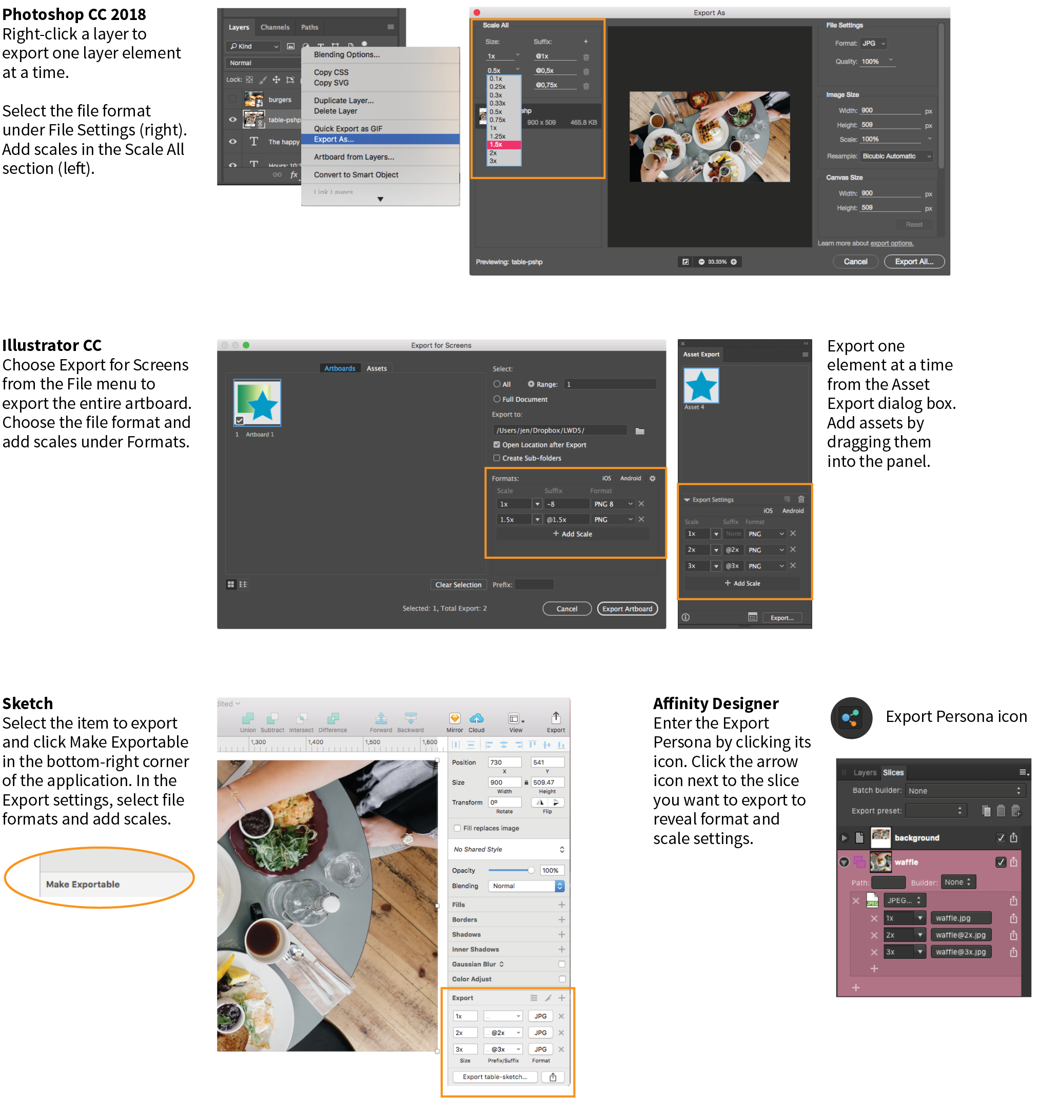
The problem to watch out for with all of these tools is that if you design at standard (@1x) resolution, the exported @2x and @3x versions will be much bigger than they are in your working document. That should raise a red flag in your mind, because doubling or tripling the dimensions of images typically makes them blurry. There are ways around that, however, which I’ll discuss next.
Even if you are creating high-definition versions of your images, it is still recommended that you do your design work at @1x scale (see Note). In other words, the pixel dimensions in your working document (whether it’s in Photoshop, Sketch, or some other tool) should match the layout pixels of your design. In Photoshop and other image-editing tools, @1x scale is equivalent to 72ppi. The advantages to working at @1x scale include the following:
One way to maintain quality when your design is upscaled is to use vector source images whenever possible. As you’ve learned, vectors can scale up with no loss of quality, so they make a great starting point for web and app design.
Many new UI design tools for screen and web interfaces, such as Sketch, Affinity Designer, and Adobe XD, are vector-based by default, so you’ll have no problem outputting larger versions of elements you create there (the same goes for vector-based Adobe Illustrator). If you prefer to design in Photoshop, make sure to use its vector tools such as shapes, paths, and imported vector smart objects for common web page elements like buttons, icons, and illustrations whenever possible.
To preserve the image quality of photographs and other necessarily bitmapped page elements at large scales, start with an image source that is at least as large as your largest scale. For example, if you know that your @3x version is 2,880 pixels wide, your source image should be that wide or wider.
In Illustrator, Sketch, and Affinity Designer, “placing” the high-resolution source image on the @1x artboard and resizing it to fit the needs of the layout gives the program all the pixel information it needs to export high-quality, large-scale assets.
In Photoshop CC, to take advantage of the full image resolution, the trick is to add the image to your design as a linked Smart Object. The Smart Object is like a placeholder for the image in your @1x design, with the high-resolution original remaining separate. When it comes time to export at various scales, Photoshop references the high-res version, and you end up with full-resolution exports (see Important Warning). To place an image as a Smart Object, choose and resize the image to fit into your design.
As of this writing, there is a bug in Photoshop CC 2018 that prevents this technique from working with JPEG images. When you link a large-scale JPEG, Photoshop ignores it and scales up a screenshot of the image in the current file. The workaround is to convert the high-resolution JPEG image to a PSD file before adding it as a Smart Object. Adobe knows about this bug, so hopefully they will fix it in an upcoming release.
I mentioned this in the section “Image Asset Strategy” in the previous chapter, but it bears repeating—if your site is image-heavy, consider using server software that automates the process of responsive image generation. As Jason Grigsby says in his article, “Humans shouldn’t be doing this.” I couldn’t agree more (unless you have a penchant for repetitive tasks).
You may choose to install software on your own server, or as a convenience, use a third-party vendor that provides hosted image management services. Again, some popular services currently are Cloudinary (cloudinary.com), Akamai (akamai.com), and Kraken.io (kraken.io).
I hope that you’ve come away with some strategies to improve the workflow for creating multiple versions of images for responsive layouts. Or perhaps you’ve just decided to let the server handle it! Let’s move on to the final topic in our image asset production deep-dive: optimization.
All web designers should have multiple image optimization tricks up their sleeves.
Because a web page is published over a network, it needs to zip through the lines as little packets of data in order to reach the end user. It is fairly intuitive, then, that larger amounts of data will require a longer time to arrive. And guess which part of a standard web page packs a whole lotta bytes—that’s right, the images.
Thus is born the conflicted relationship with images on the web. On the one hand, images make a web page more interesting than text alone, and the ability to display images is one of the factors contributing to the web’s success. On the other hand, images also try the patience of users with slow internet connections and gobble the data plans of mobile devices.
If you study the flowchart back in Figure 23-16, you will see that all paths end with “Optimize.” Making your image files as small as they can be is critical for fast-loading sites, so all web designers and developers should have multiple image optimization tricks up their sleeves.
As you saw firsthand in Exercise 24-1, choosing the appropriate file format is your first line of defense against bloated file sizes, but it doesn’t stop there. It’s possible to squeeze a lot more data out of the images that your image editor exports.
Optimization approaches fall into two broad categories:
This section starts with general guidelines for limiting file size. Next, because each image format is slightly different under the hood, we’ll examine optimization strategies for JPEG, PNG-24, PNG-8, and GIF files (see Note). Finally, we’ll round up some optimization tools that work on multiple formats and are a good last step in any image production process.
Of course it is important to optimize SVGs as well, but I’ve saved that discussion for the SVG chapter ().
Regardless of the image or file type, there are a few basic strategies to keep in mind for limiting file size. In the broadest of terms, they are as follows:
Start with a high-quality original
Start with the best-quality source image you can get your hands on. From there, you can make copies at various sizes and compression settings, but you’ll want to keep that original safe.
Limit dimensions
Although fairly obvious, the easiest way to keep file size down is to limit the dimensions of the image itself. There aren’t any magic numbers; just don’t make images any larger than they need to be. By simply eliminating extra space in the graphic in Figure 24-14, I was able to reduce the file size by 3 KB (23%).
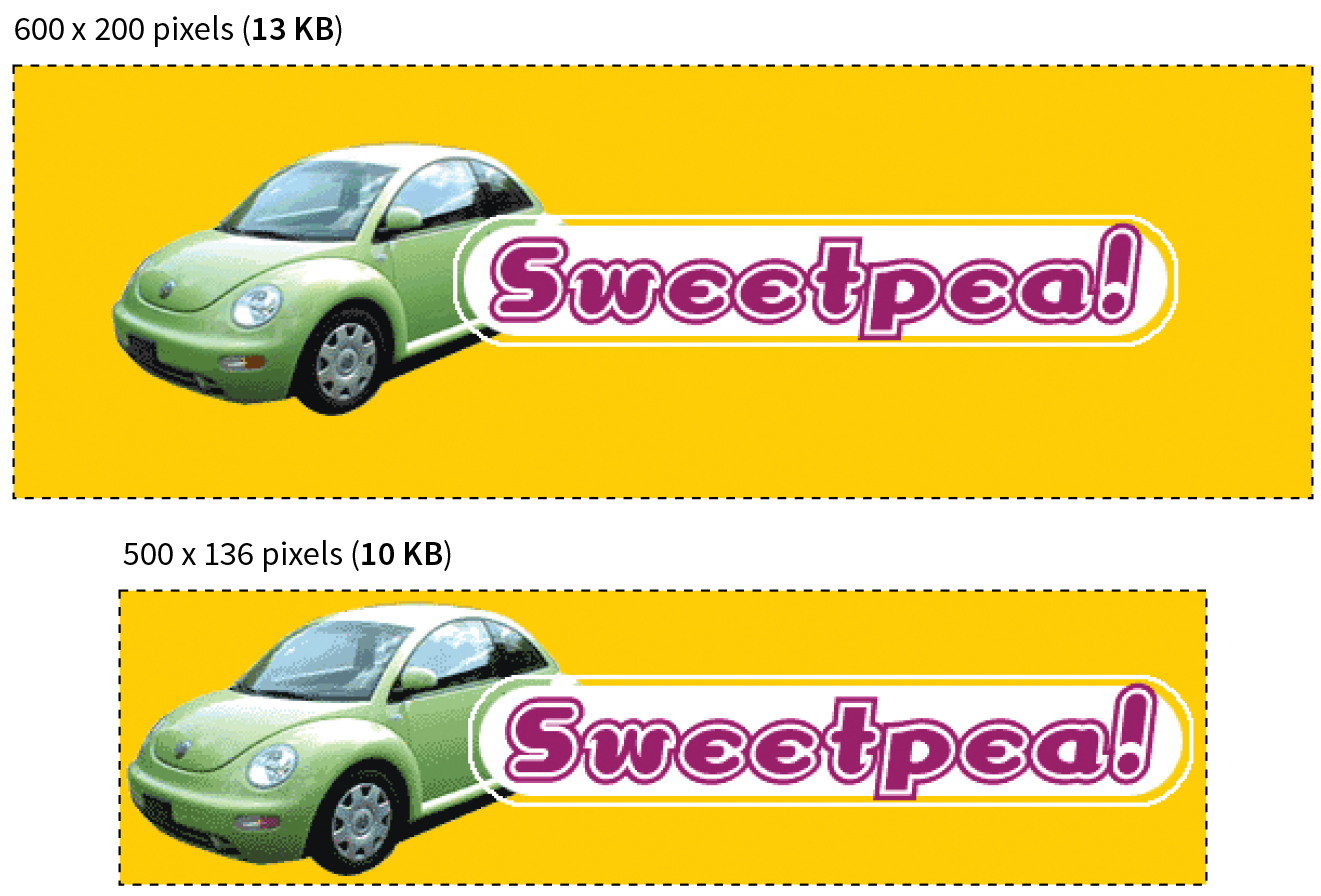
Reuse and recycle
If you use the same image repeatedly in a site, it is best to create only one image file and point to it repeatedly wherever it is needed. This allows the browser to take advantage of the cached image and avoid additional downloads.
Use appropriate tools
If you know you will be doing a lot of web image production work, it is worth investing in professional image-editing software with web-specific features. Whether you choose Photoshop, Sketch, PaintShop Pro, or some other program mentioned in this book is up to your personal preference and budget limitations.
Run the image through an optimizer
You should have a number of image optimization tools at your disposal. I’ll list several throughout this section, many of which are free to use.
Here are the general strategies for reducing the file size of JPEGs:
Your number one tool for optimizing JPEGs is the Quality setting that you’ll find in just about every graphics tool. The Quality setting allows you to set the rate of compression; lower quality means higher compression and smaller files. If your image editor has a preview, you can keep an eye on the image quality while changing the compression level. Different images can withstand different amounts of compression, but in general, images hold up reasonably well at moderate (50–70) and even low (30–40) quality settings. The quality at particular settings varies from program to program, so use whatever setting results in the best balance of quality and file size for your particular image.
Optimized JPEGs have slightly smaller file sizes and better color fidelity than standard JPEGs (although I’ve never been able to see the difference). For this reason, you should select the Optimized option if your image software offers it.
Because soft images compress smaller than sharp ones, you can try applying a slight Gaussian blur to the image to give the JPEG compression something to chew on. Even an imperceptible blur over the whole image can reduce file size. In GIMP’s Export as JPEG dialog box, there is a Smoothing setting that does just that. Photoshop’s legacy Save for Web feature also includes an option to apply varying amounts of blur across the whole image.
You might also choose to apply a more aggressive blur to less important areas of the image while preserving areas of interest. In Figure 24-15, I applied a blur to all areas of the image except the face, which remains at the original quality, and reduced the file size by 6 KB, or 23%. For this image, I’d say the savings are worth the loss of detail around the edges, but of course, you should decide whether blurring is appropriate based on the content and purpose of your images.
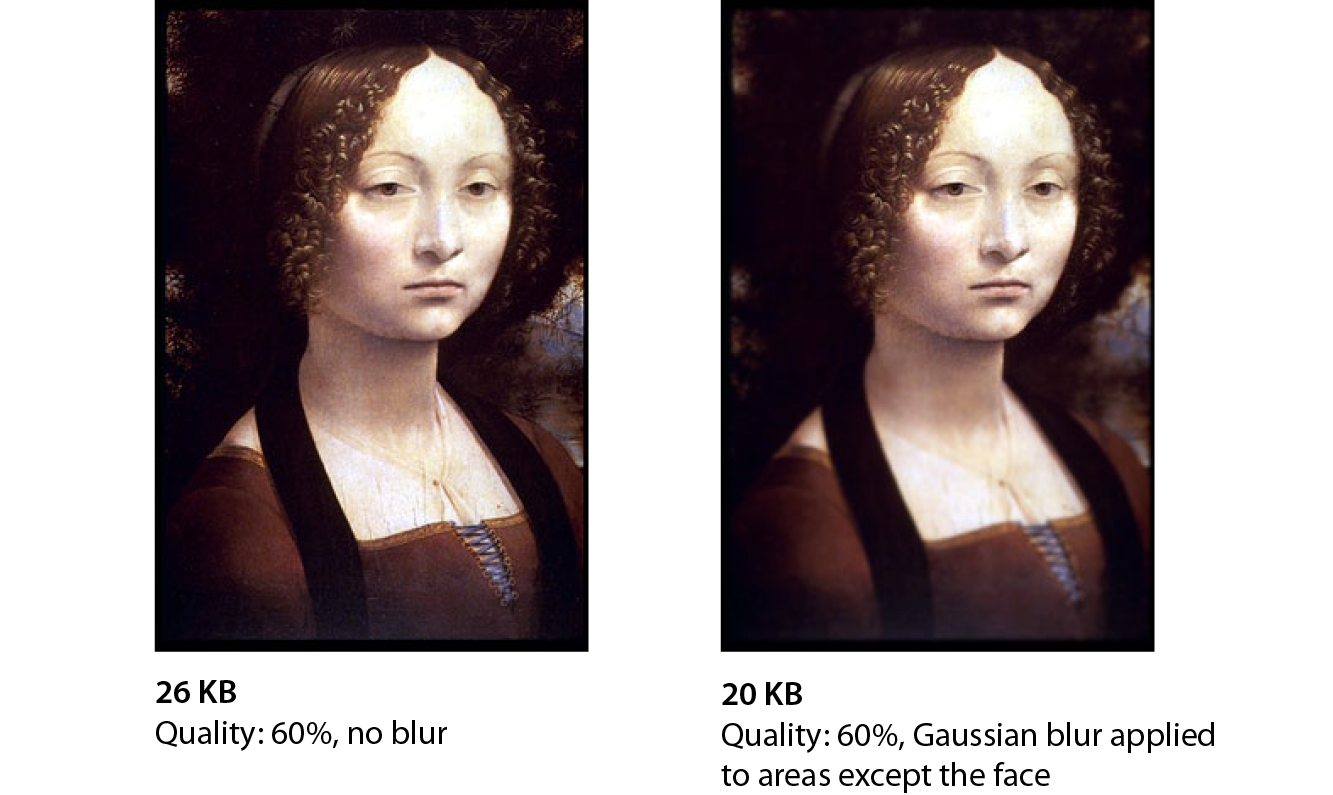
JPEGs compress areas of smooth, blended colors more efficiently than areas with high contrast, hard edges, and sharp detail. To demonstrate the difference, Figure 24-16 shows two similar graphics with blended colors. The image with more contrast and detail is more than four times larger at the same quality setting. You can keep this principle in mind when creating your images. If a photograph has a lot of hard edges, consider whether they can be softened or edited out. Also see whether a PNG-8 might offer similar image quality at a smaller size.
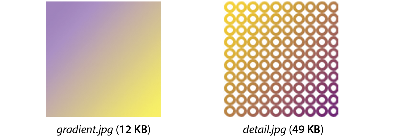
Because PNG-24 is a lossless format, there isn’t much you can do to these images in terms of optimization. Your best bets are to do the following:
PNG’s lossless compression makes PNG-24 a wonderful format for preserving quality in images, but the same image will always be smaller saved as a lossy JPEG. Therefore, your first “lean and mean” strategy for photographs is to avoid PNG-24 and go with JPEG instead.
You may be using PNG-24 because you need multiple levels of transparency (a valid reason). If that is the case, you have two options. Running the image through one of the image optimizers listed later in this section is a good way to strip out useless metadata but preserve the image. The other option is to convert it to a PNG-8 while maintaining alpha transparency.
Until recently, we didn’t have tools for making PNG-8 with alpha transparency (see Note). Now Photoshop CC gives you the option to make PNG-8 with alpha transparency and a smaller file size right in the Export As dialog box.
Adobe Fireworks had the little-known ability to create PNG-8 + alpha, but it was discontinued in 2013.
You can also use a standalone utility for converting a PNG-24 to PNG-8 with alpha transparency. Some options are as follows:
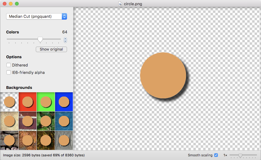
Follow these optimization strategies in the PNG-8 and GIF creation and export process:
The most effective way to reduce the size of an indexed color image, and therefore the first stop in your optimization journey, is to reduce the number of colors in the image.
Although PNG-8s and GIFs can contain up to 256 colors, there’s no rule that says they have to. In fact, by reducing the number of colors (bit depth), you significantly reduce the file size of the image. One reason for this is that files with lower bit depths contain less data. Another byproduct of the color reduction is that you create more areas of flat color by combining similar, abutting pixel colors. More flat color areas mean more-efficient compression.
Photoshop and GIMP give you the opportunity to reduce the number of colors when you convert the image from RGB to indexed color. In Photoshop, select , and enter the number of colors to use in the color map in the Colors box. If you have access to Photoshop’s legacy Save for Web feature, there is a bit-depth setting you can play around with while observing the resulting image in the preview before saving the image. In GIMP, go to and enter the “Maximum number of colors” you’d like to use.
If you reduce the number of colors too far, of course, the image begins to fall apart or may cease to communicate effectively. For example, in Figure 24-18, once I reduced the number of colors in the PNG to eight, I lost the rainbow, which was the whole point of the image. This “meltdown” point is different from image to image. (Granted, this barn and sky image should be a JPEG, but it demonstrates the effects of optimization dramatically, so thank you for bearing with me.)
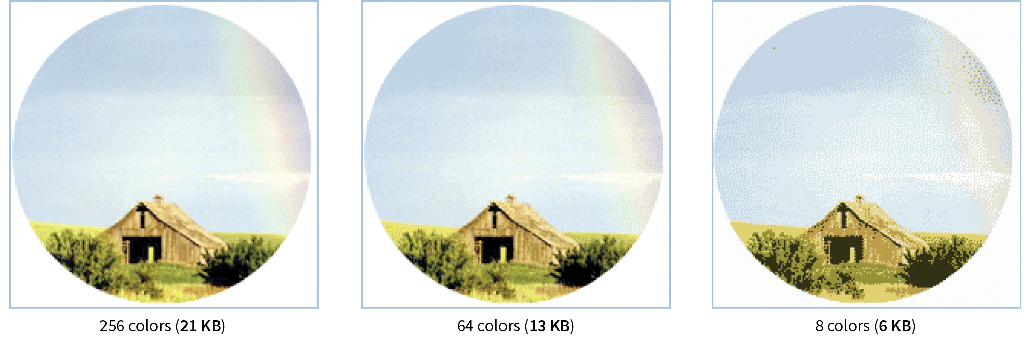
You’ll be surprised to find how many images look perfectly fine with only 32 pixel colors (5-bit), such as the Asian Cuisine image in Exercise 24-1. That is usually my starting point for color reduction, and I go higher only if necessary. Some image types fare better than others with reduced color palettes, but as a general rule, the fewer the colors, the smaller the file.
The real size savings kick in when there are large areas of flat color. Keep in mind that even if your image has 8 pixel colors, if it has a lot of blends, gradients, and detail, you won’t see the kind of file size savings you might expect with such a severe color reduction.
When the colors in an RGB image are reduced to a specific palette, the colors that are not in that palette get approximated by dithering. Dithering is a speckle pattern that results when palette colors are mixed to simulate an unavailable color. When converting to indexed color, Photoshop and GIMP (and most other image editors) allow you to specify whether and how the image dithers.
In photographic images, dithering is not a problem and can even be beneficial; however, dithering in flat color areas is usually distracting and undesirable. In terms of optimization, dithering is undesirable because the speckles disrupt otherwise smooth areas of color. Those stray speckles stand in the way of the compression and result in larger files.
Not all image-editing tools give you control over the amount of dithering.
One way to shave bytes off a PNG or GIF is to turn off dithering entirely. For some images, that may result in a banding effect as shown in Figure 24-19. If that is unacceptable, you can turn the dithering back on or try a higher number of colors if the bit depth was set to less than 8-bit.
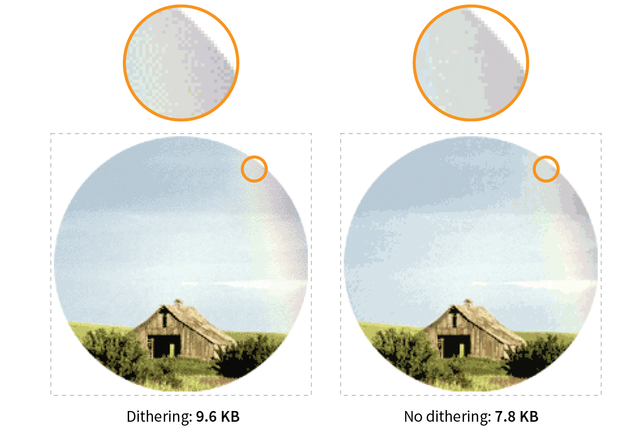
When designing your images keep in mind the fact that PNGs and GIFs are good at compressing areas of flat color.
Choosing flat colors over gradients and patterns makes a big difference in file size, as shown in Figure 24-20. Reducing the colors from 256 to 8 goes a long way in reducing the file size, but the colors in the blend are approximated with a dither pattern, which we just learned is counterproductive to GIF and PNG compression. However, if you create the image with flat colors in the first place, the file size is half that of the dithered version, even though both images have been reduced to 8 colors.
I feel obliged to say that images like this one should be drawn with vectors and saved in SVG format, which will be smaller and more versatile than bitmapped versions. However, if you have a reason for saving PNGs, design them in a way that complements the compression. Similarly, if you are starting with a bitmapped source image, you may be able to edit it in a way that eliminates unnecessary color blends and patterns.
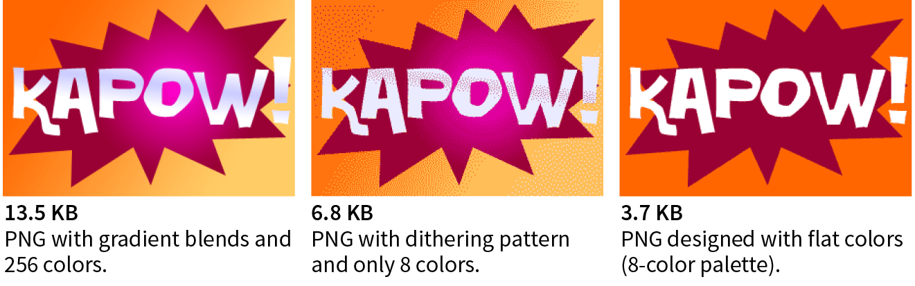
Even if you design images to take advantage of their end compression scheme and take full advantage of all the optimizations in your image-editing tool, there’s a good chance that you can squeeze down the file size of your images even further using an optimization tool. These tools are generally lossless, meaning they do not alter the appearance of your image. They find the file savings by tossing out chunks of code dedicated to metadata, color profiles, and other redundant code.
It is recommended that you always run your images through an optimization tool as the last step in the image production process. The good news is, there are many ways to do it, so you will surely find one that fits into your workflow. Let’s look at some options.
One easy solution is to use one of the freely available online optimizers. Just drag your images onto the web page interface and download the resulting compressed files. They are a good option if you don’t have too many images to process, and they have the advantage of being cross-platform. In addition to free web-based tools, most of these companies also offer Pro packages that allow you to upload more data and provide additional compression options. Some also offer server-side solutions:
You might prefer to have an optimization program running on your own computer. If that is the case, look into these popular downloadable tools:
If your workflow is based around a task runner such as Grunt or Gulp, you can make optimization of PNGs and JPEGs an automated task with the “imagemin” plug-in. imagemin is maintained at github.com/gruntjs/grunt-contrib-imagemin, where you can get instructions and links to download.
Now you should have some strategies for making your images as lean and mean as possible, including techniques for each file format during the creation process as well as tools for squooshing them down even further after they are made. Let’s put them to the test in Exercise 24-3.

And with that, we end our tour of image asset production techniques. You should feel comfortable opening an image in an image-editing application and saving or exporting to the various web image formats. You’ve gotten to know the various ways image formats store transparency information and how to pick the most appropriate format for transparent images. You’ve picked up some tricks for generating sets of images for responsive sites, and finally, you have some options for optimizing your images as a final step.
As usual, this chapter ends with a quiz so you can put your new knowledge to work.
Are you an image asset master? Answer these questions to find out. Answers are in Appendix A.
In this chapter
Shapes in SVG
Clipping and masking
Filter effects
Styling SVGs
Interactivity and animation
SVG tools
Production tips
Responsive SVGs
SVGs (Scalable Vector Graphics) have made several guest appearances in this book, but in this chapter they finally get to be the star.
When rendered in a browser window, an SVG graphic may look like an image in any other format, but it’s what’s under the hood that makes it truly unique and versatile. First, as the name says, it is a vector format, meaning shapes within SVGs are defined by coordinates and lines, not grids of pixels. That’s what makes them scalable—they can resize infinitely without loss of quality.
Figure 25-1 shows the same tiger image saved as an SVG and a PNG. The SVG can scale very large without any change in quality. Lines and text stay sharp, regardless of whether the image is viewed at 100 pixels or 10,000 pixels—try doing that with a bitmapped image! Now that our web pages and interfaces must work on all devices of all scales, from smartphones to high-density monitors and large-screen televisions, the ability to create a single image that looks great in all contexts is an epic win.
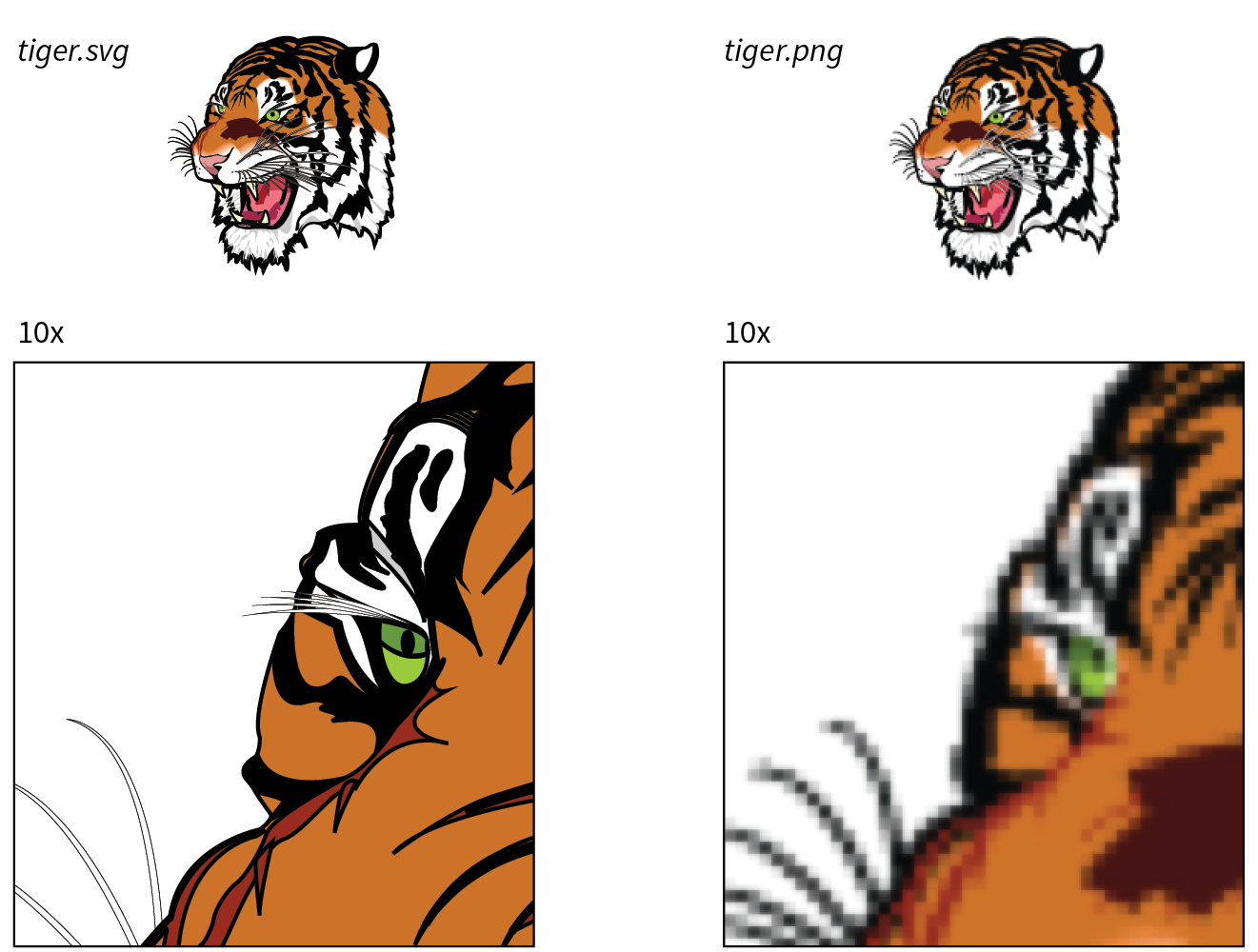
The vector nature of SVG makes it a good choice for icons, logos, charts, and other line drawings (Figure 25-2). And because these drawings are made up of shapes and paths, the file size is often significantly smaller than the same image made up of a grid of pixels.
SVGs may contain raster image content as well—in fact, you can do some pretty cool effects with them, but you miss out on the file size savings. SVGs are also an attractive choice for adding animation and interactivity to an interface. We’ll review all of these capabilities throughout this chapter.
That takes care of the “scalable” and “vector” aspects of SVG. What really sets SVG apart from other formats, though, is that it is an XML language (see the sidebar “A Quick Introduction to XML”) for describing two-dimensional graphics, including shapes, paths, text, and even special filter effects. Bitmapped graphics are stored as largely unintelligible code (should you care to peek inside), but SVG images are generated by text files that are fairly human-readable. In fact, it is possible to create SVG graphics by typing out the code directly in a code editor instead of using a graphics program.
SVG is a markup language, just like HTML, only it includes elements for two-dimensional graphics, such as the following:
Of course, this is by no means an exhaustive list (see Note), but it should give you the general idea of what SVG is about. A simple example should make it even clearer. Figure 25-3 shows an SVG image, simple.svg, that contains a sampling of simple SVG elements. It’s not a masterpiece, I know, but it will introduce you to some common SVG elements.
Here are the contents of the simple.svg file that generates the image in Figure 25-3. If you read through it closely, I think you’ll find it’s fairly intuitive, but my annotations follow.
<?xml version="1.0" encoding="utf-8"?> A <svg version="1.1" B xmlns="http://www.w3.org/2000/svg" xmlns:xlink="http://www.w3.org/1999/xlink" width="150" height="200" viewBox="0 0 150 200"> C <defs> D <radialGradientid="fade"> E <stop offset="0" stop-color="white"/> <stop offset="1" stop-color="orange"/> </radialGradient></defs> <g id="greenbox"> F <rectx="25" y="25" width="100" height="100" fill="#c6de89" stroke-width="2" stroke="green"/> G <circlecx="75" cy="75" r="40" fill="url(#fade)"/> <pathd="M 13 100 L 60 50 L 90 90 L 140 30" stroke="black" stroke-width="2" fill="none"/> H </g> <textx="25" y="150" fill="#000000" font-family="Helvetica" font-size="16">A Simple SVG</text> I </svg>
Let’s take a closer look at the various parts of simple.svg:
The and attributes are not required when the SVG is placed inline in an HTML5 document.
The viewport and viewbox are discussed in more detail in the section later in this chapter.
The x and y attributes position it on the pixel grid within the viewport (see Figure 25-4 in the “SVG Coordinates” sidebar). You can see that attributes are used to provide the dimensions, fill color, stroke width, and stroke color (see Note). The center of the circle element is positioned with the cx and cy attributes, and its radius is set with r. This circle is filled with the radial gradient we defined earlier, which is called by its id “fade” in the url() notation.
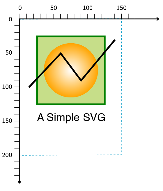
“Stroke” is what SVG calls the line or border around a shape.
SVGs have some cool image features in addition to drawing lines and shapes.
SVGs aren’t limited to vector drawings; you can embed bitmap images in them too. You might do this in order to apply special effects or add some sort of behavior or interactivity that a PNG or JPEG can’t do on its own. Images are embedded with the image element.
<image xlink:href="kangaroo.jpg" x="45" y="0" width="100" height="150"/>
Note that because SVG is an XML format, it requires the xlink:href attribute to point to the external image file.
SVG lets you selectively show parts of an image and hide others by clipping and masking.
In clipping, a vector path is used to “cut out” a section of an image. The parts of the image that fall outside the clipping path are hidden completely. Figure 25-5 uses a path in the shape of a star to clip the starry sky image. Clipping paths are defined with the clipPath element.
<defs><clipPath id="star"><polygon points="390,12 440,154 590,157 470,250 513,393 390,307 266,393 310,248 189,157 340,154 390,12" style="fill: none"/></clipPath></defs> <image xlink:href="starrysky_600.jpg" width="600" height="400" style="clip-path: url(#star)"/>
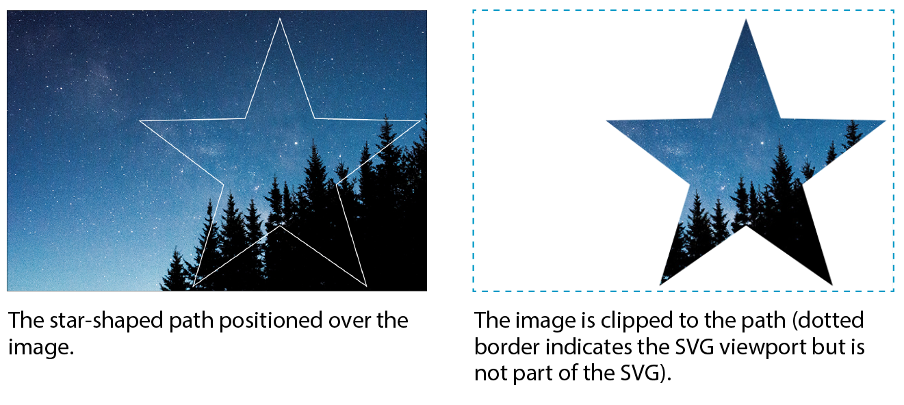
Masking works similarly but is a pixel-based effect. Varying levels of darkness in the mask result in varying amounts of transparency at each point, similar to an alpha channel. In SVG masks, pure white areas correspond to 100% opacity, and pure black corresponds to 0% opacity (fully transparent). Levels of gray in between result in levels of semitransparency.
You can play with the fill color of the mask to reveal more or less of the object it is masking. The effect is more interesting when the mask contains gradients rather than solid fill colors. You can even use an image as a mask (see Note).
If the mask is a color image, it is converted to grayscale based on its luminance (brightness) using a formula that interprets yellows and greens as lighter than reds and blues.
Figure 25-6 shows the same star shape filled with a gradient and used as a mask over the starry sky photograph. Note that the areas of the image that fall outside the mask object are completely transparent, just like the clipping path.
<defs> <linearGradientid="blend"> <stop offset="0%" stop-color="#ffffff"/> <stop offset="100%" stop-color="#000000"/> </linearGradient><mask id="star"x="0" y="0" width="400" height="381"> <polygon points="390,12 440,154 590,157 470,250 513,393 390,307 266,393 310,248 189,157 340,154 390,12"style="fill: url(#blend)"/></mask></defs><image xlink:href="starrysky_600.jpg" width="600" height="400"style="mask: url(#star);"/>
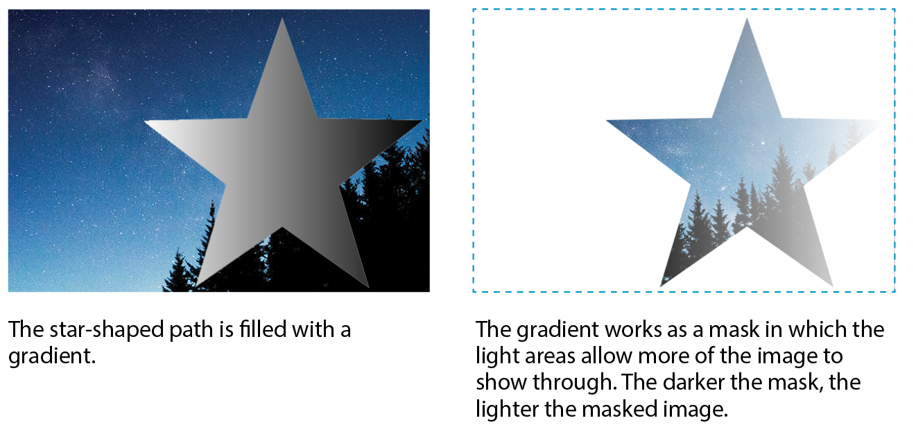
Masking is not supported in Android versions 4.3 and earlier.
You might be surprised to learn that a vector-based graphic format includes Photoshop-like filters for manipulating images. SVG features more than a dozen filter effects that can be used alone or layered and combined for all sorts of effects, such as simple Gaussian blurs, color shifting, mosaic-like patterns, and good ol’ drop shadows.
The nice thing about filters is that the original image is untouched; all the messing around happens when the browser renders the image with the filters applied. Figure 25-7 shows just a few SVG filters to give you an idea of what can be done.
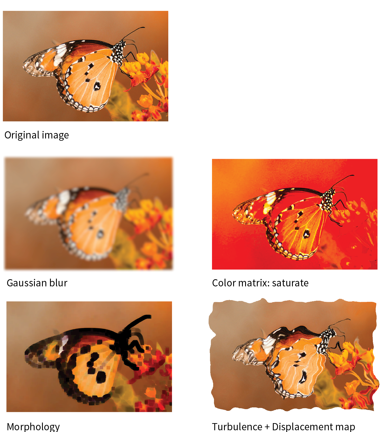
To give you a brief taste of how filters work, here is an example that puts a blur effect on an ellipse element. The filter is defined with a filter element, which contains one or more filter primitives (a very specific effect that can be combined with other effects). The filter is given an id and then is called in as a style on the element that uses it. Figure 25-8 shows the ellipse without and with the blur filter.
This example and the next use the attribute (the same one we use in HTML) to add inline styles to elements. We’ll talk about options for styling SVGs in the next section.
<defs><filter id="blurry"> <feGaussianBlur in="SourceGraphic" stdDeviation="4"/> </filter></defs> <ellipse cx="200" cy="50" rx="150" ry="100" style="fill: orange;"/> <ellipse cx="200" cy="300" rx="150" ry="100" style="fill: orange;filter: url(#blurry);"/>
To make a drop shadow, the blur filter is defined and then merged with an offset that moves it down and to the right. Figure 25-9 shows the result.

<defs><filter id="shadow"> <feGaussianBlurin="SourceAlpha" stdDeviation="4" result="blur"/> <feOffsetin="blur" dx="7" dy="5" result="offsetBlur" /> <feMerge> <feMergeNode in="offsetBlur"/> <feMergeNode in="SourceGraphic"/> </feMerge></filter></defs><polygon points="390,12 440,154 590,157 470,250 513,393 390,307 266,393 310,248 189,157 340,154 390,12" style="fill: pink;filter: url(#shadow)"/>
Of course, there is a lot more to SVG filters than I can cover here, but I hope that I’ve provided a good introduction.
A powerful feature in SVG is the ability to define a shape or effect once and then reuse it wherever you need it, as many times as you need it. This keeps the file small by removing redundant code and is a good example of DRY (Don’t Repeat Yourself) coding.
The trick is defining the element you want to repeat, such as an icon, in a symbol. The symbol element does not get rendered; it just sets up a drawing for future use (see Note).
Because symbols won’t render, you don’t need to put them in a section, but it’s a good practice because it is a logical container for elements you’re defining for later use.
<symbol id="iconA" viewBox="0 0 44 44"> <!-- all the paths and shapes that make up the icon -->
</symbol>
When you want to use the symbol on the page, call it up with the use element, which triggers the symbol to render. The following is a minimal use element example. The reused symbol scales to whatever dimensions are set on svg.icon in the web page’s style sheet.
<svg class="icon"> <use xlink:href="#iconA" /></svg>
You could include other attributes with instructions such as x,y coordinates for positioning, width and height dimensions, and styles that override styles inherited by the copy of the symbol.
The use element doesn’t work only with symbol. You can use it to reuse any basic SVG shape, image, or group in a similar manner. The advantage to making the initial SVG a symbol is you can include the viewBox attribute to enable proportional scaling.
The symbol and use elements are the tools behind SVG sprites. Sprites are a technique in which multiple SVG drawings (such as an icon set, to use the most popular example) are defined in one SVG, either in the HTML document or as an external .svg file. In the HTML document, the use element (inside an inline svg) pulls a particular icon symbol onto the page. It is a powerful tool for managing SVG icons. You will find plenty of tutorials for SVG sprites online, and Chris Coyier includes a nice how-to in his book Practical SVG (A Book Apart).
So far you’ve seen SVG used to draw basic shapes, embed images, clip and mask selected areas, and add some pretty groovy special effects. The SVG drawing features are core to the SVG format; however, if we focus only on what gets drawn in the browser window, we would be missing out on some of the best features of SVG. Let’s look at them now.
Now you know that behind every SVG that renders on a screen is a structured text document. In that respect, it’s pretty much the same as HTML. Furthermore, SVG, as a structured document language, has a DOM that includes objects, properties, and methods related to manipulating graphic elements. This opens up some really exciting possibilities that make SVG more flexible and useful than its static-image counterparts.
You can target elements in an SVG (or the svg element itself if it’s inline) to change their presentation with CSS—for example, applying the same color or border style to HTML elements on the page as well as shapes within the SVG.
Styles are added to SVG in four ways:
Presentation attributes
The earlier “Simple SVG” example in Figure 25-3 uses presentational attributes defined in the SVG language, such as fill and stroke-width, to control how shapes should appear. Presentation attributes are always overridden by styles applied with CSS rules.
<rect x="25" y="25" width="100" height="100"fill="#c6de89"stroke-width="2"stroke="green"/>
Inline styles
SVG elements may use the inline style attribute, which works the same as it does in HTML elements. Many developers prefer this approach. The same rect element could also be written as follows:
<rect x="25" y="25" width="100" height="100"style="fill:#c6de89; stroke-width:2; stroke:green;"/>
Internal style sheet
As in HTML, you can include a style element at the top of the svg (or in the defs section if there is one) that contains all the styles used in the SVG document:
<svg> <!-- XML business omitted for brevity --><style>/* styles here */</style><!--drawing here --></svg>
External style sheet
If your SVG is inline or placed on the page with the object or iframe elements, you can import an external style sheet with the @import rule in the style element. Remember that external files won’t work for standalone SVGs embedded with the img element. That includes the style sheet itself as well as references to external resources using the url() notation within style rules.
<svg> <style type="text/css"> @import "svg-style.css"; /* more styles */ </style> <!-- drawing here --></svg>
For inline SVGs, you can also style elements with a style sheet linked to the HTML document with the link element:
<head> <!-- additional head elements -->
<link href="svg-style.css" rel="stylesheet" type="text/css"></head><body> <svg> <!-- drawing here -->
</svg></body>
SVGs aren’t just pretty pictures—SVGs are images you can program! You can add interactivity to the elements in an SVG with JavaScript because all of its element and attribute nodes are accessible in the DOM. It is worth noting that SVGs may also include simple a links, are a basic kind of interactivity.
For example, because an SVG can listen for mouseovers, you can create fun hover effects that add personality to UI elements. You can also trigger changes in the SVG on a click or a tap. JavaScript can do everything from adding a little motion to an icon to creating whole Flash-like game interfaces and multimedia presentations, as shown in Figure 25-10.

If your SVG is inline, scripts in the HTML document can access elements within the SVG. For standalone SVGs, you can use SVG’s script element. Because it is an XML document, the code needs to be wrapped in an XML Character Data Block (<![CDATA[ ]]>) so <, >, and & symbols are parsed correctly, as shown in this example:
<script><![CDATA[//script here]]></script>
SVG is a popular choice for adding animated elements to a web page. Figure 25-11 is my attempt to capture some charming animation in a still image. For more inspiration, I recommend going to codepen.io and searching for “SVG animation.”
There are a number of ways to animate an SVG: animation elements in SVG, CSS animation, and JavaScript:
SVG/SMIL
The SVG specification includes animation effects based on SMIL (Synchronized Multimedia Integration Language), an XML language for creating synchronized audio, video, and animated elements. Each animation effect is defined by an element, with attributes for fine-tuning. Although the built-in SVG/SMIL animation elements provide good tools for all sorts of animation tasks, lack of browser support means that it’s not a great option if animation is critical to your message.
No Microsoft browser (Internet Explorer or Edge) supports SVG/SMIL animation. Chrome temporarily deprecated it, which sent a message to other browser vendors to stop active development of SVG/SMIL support. With CSS and JavaScript offering better animation options, this part of the SVG spec may wither on the vine.
CSS animation
SVG elements can also be animated with CSS transitions and keyframes. It should be noted that CSS can animate only CSS properties, not attribute values, which may be limiting for SVG, which uses attributes for most of the geometry and layout. This technique is also hampered by limited browser support (see Note), although that continues to improve. CSS animation is good for simple, non-critical animation effects.
CSS animation is not supported in Internet Explorer 9 and earlier (at all, not just for SVGs), and there is no SVG support (at all) in IE8 and earlier. IE 10 and 11 support animation of CSS properties, but not SVG-specific properties (, , etc.). In MSEdge and Firefox browsers released prior to 2017, CSS animation won’t work if the SVG is added with the element. Older Chrome and Safari browsers require the prefix.
JavaScript
With JavaScript, you can create complex, interactive animations that compete with the functionality Flash once offered. There is much better browser support, although there is always the possibility that some users don’t have JavaScript enabled and will miss out. If you don’t want to reinvent the wheel, you can take advantage of the many SVG Animation JavaScript libraries (see the “SVG Animation JS Libaries” sidebar).
If you’d like to learn more about SVG animation, I recommend SVG Animations by Sarah Drasner (O’Reilly) and Creating Web Animations by Kirupa Chinnathambi (O’Reilly).
SVGs have become a go-to tool of the data visualization (“dataviz”) world because they can be generated dynamically with real data. For example, you could make the temperature level on an SVG thermometer illustration rise and fall with real weather data gathered in the user’s location, or you could change progress bars or pie charts as data updates in real time. Figure 25-12 shows examples of SVG used for dataviz from the D3.js Gallery. D3.js is a JavaScript library created specifically for “data-driven documents.” Find out more at d3js.org.
The methods for generating SVGs with data are dependent on the type of data and the programming language used. One option is to translate the XML document that contains the data into the SVG by using XSLT. XSLT (eXtensible Stylesheet Language Transformations) is an XML language that provides structured instructions for translating one XML language into another. Clearly, that is some advanced XML mojo that we will not be delving into here, but I thought you ought to know. Other options include JavaScript and server-side template languages (also more than we’ll take on here).
If you are eager to know more about data-generated SVGs, the book Interactive Data Visualization for the Web by Scott Murray (O’Reilly) is a good place to start.
Unlike text in bitmapped image formats, the text in SVGs can be accessed by search engines and read by screen readers when labeled properly. There are a few things you can do to make your SVGs more accessible to screen readers:
Technically, all you need to create SVG graphics is a text editor (and genius visualization skills plus heroic patience!), but you’ll be much happier having a graphics program do the heavy lifting for you. It is also common for designers to create the complex illustrations in a graphics program, and then bring them into a text editor to clean up the code and add scripts and styles manually. It’s a matter of preference based on your skills and interests.
The most appropriate tool for creating SVGs is a vector drawing tool such as Adobe Illustrator, although even image editors like Photoshop and GIMP use shapes that can be exported as SVG. These days, there are many vector software options, ranging from pricey to free, and full-featured to bare-bones.
Illustrator is the granddaddy of vector illustration tools and is available today as part of Adobe’s Creative Suite for a monthly fee. Illustrator is a vector tool, but it uses PostScript natively and needs to translate those vectors to SVG. Although it is possible to “Save” a drawing in SVG format, the better option is to “Export As” because the resulting SVG will be web-optimized. If you use Illustrator, it is worth doing a search for how to create optimized SVGs in Illustrator because people have published all sorts of tips that will help your design and production process.
Inkscape (inkscape.org) is an open source image editor made specifically for SVG (SVG is its native format). It is available for Windows, Mac (see Note), and Linux. Inkscape’s interface has evolved quite a bit over the last few years (Figure 25-13), but if you are accustomed to Adobe tools, it may take a little getting used to. You definitely can’t beat the price (free)!
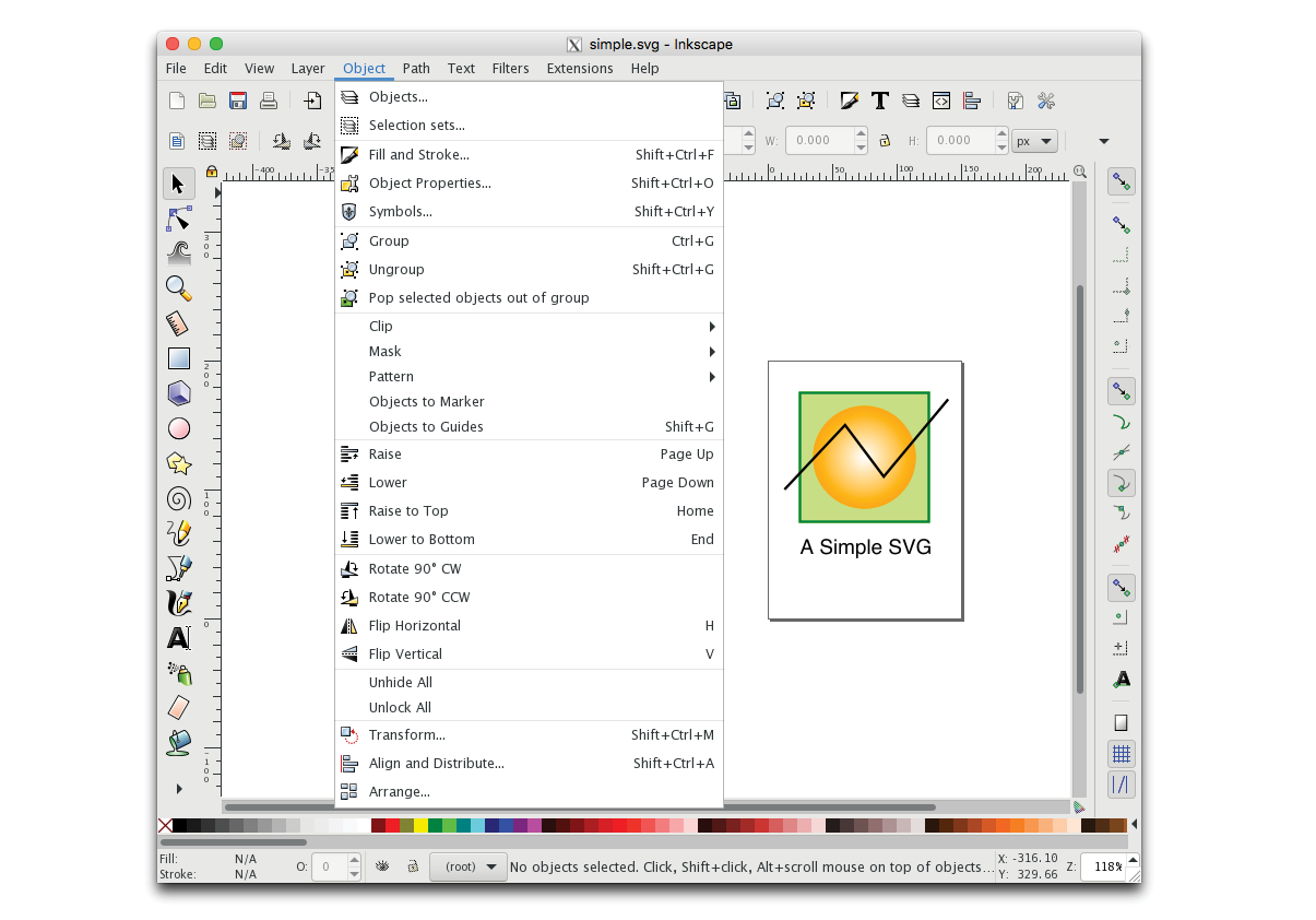
There are a number of nifty little SVG-specific drawing tools available for little or no investment. Because they are designed just for SVG, they have a manageable number of tools and settings that map to SVG capabilities (no wading through hundreds of tools you don’t need). Some of them allow you to view and edit the underlying SVG code as well. Here are a couple of SVG editors of note:
Boxy (boxy-svg.com)
Boxy is a full-featured graphics program available for Mac, Windows, and Linux for a modest US$10 (as of this writing). It has an easy-to-use interface as well as a code inspector (Figure 25-14).
SVG-Edit (github.com/SVG-Edit/svgedit)
SVG-Edit works right in the browser (svg-edit.github.io/svgedit/releases/svg-edit-2.8.1/svg-editor.html) or as a downloaded program. It provides all the basic drawing tools, layers, and the ability to view and edit the SVG source (Figure 25-14). You can also export to PNG, JPEG, BMP, and WebP. And it’s free, so there’s no reason not to give it a try.
A whole slew of tools have recently emerged for designing web page and app interfaces, such as Sketch, AdobeXD, and Affinity Designer. All of them are vector-based and make it easy to export components in SVG format. As with many visual design tools that export code, the results are not always as well constructed as you might like, particularly if you intend to use the SVG programmatically with JavaScript, CSS, and animation.
If writing SVG by hand is your thing, or if you need to tinker with preexisting SVGs, you should look to see if your code editor of choice has an SVG preview extension that renders your code as you write. SVG previews are available for these editors:
When you create an SVG drawing in a graphical tool, keep in mind that the end result is a text file. As with any file that is being delivered on a web page, you want that file to be as small as possible. If you have plans to style the SVG with CSS or manipulate it with JavaScript, you want the markup to be structured as well as possible.
The downside to using graphical tools is that you don’t have much control over the code they output. Most of them export SVG code that is inefficient, redundant, and full of proprietary cruft. There are measures you can take while designing and after you export the SVG to ensure it is as lean and mean as possible. Many a blog post has been written about SVG optimization, but the following tips, although not comprehensive, should point you in the right direction. In the end, you will need to get familiar with your chosen tool’s quirks to anticipate and correct its shortcomings.
Decisions you make in the design space can improve your SVG output in terms of organization and file size. Again, keeping in mind that the final product is a text file is useful for optimization. Here are some production tips that will help you create SVGs with the best quality at smallest file sizes:
Define the artboard or drawing size in pixels
The artboard dimensions correspond to the viewport (width and height attributes) of the svg element.
Use layers to group elements logically
If you plan on animating or scripting your SVG, keeping your design document well organized as you work will help with accessing the pieces you need later. In Illustrator and most other tools, layers are converted to group (g) elements, and nested layers are stored as nested groups.
Give elements and layers meaningful names
The names you give elements and layers are used as class and id values in the SVG code, so make sure they are descriptive. Names should be all lowercase and with no character spaces so they are appropriate as attribute values.
Simplify paths
The more points and handles used to define a path, the more coordinates appear in the SVG source. More coordinates means more characters and a larger file size. Take advantage of any “simplify path” function your tool offers. Also consider using methods that reduce the number of elements in the file, such as merging objects that always appear as one unit and using one wide stroke instead of two strokes and a fill. If possible, ensure your tool uses shape elements like circle and rect instead of multipoint paths for simple shapes. If your tool does not provide a way to do this, it is possible to replace the path code with the simple shape element manually.
Be aware of decimal places
Keeping in mind that more characters results in a larger file size, you can shave bytes off your file by limiting the number of characters after the decimal points in your designs. For example, an x, y coordinate “100.3004598, 248.9998765” requires more data than simply “100.3, 249”. Many tools allow you to limit the number of decimal places on export. You may also choose to “snap to pixels” when you set up the document so that points always fall on even integers. The general rule of thumb is that the smaller the image, the more decimal places are required to accurately define the points in objects. Large images can tolerate lower accuracy without compromising quality. You may need to experiment to find the right balance of decimal places and quality for the type of image.
Avoid raster effects inside the SVG
SVG’s efficiency lies in the fact that it is vector-based. When you introduce raster (bitmapped) image material to the SVG, that file size advantage is lost. In some cases, you may be adding a raster image deliberately for manipulation in the SVG, which is fine. But be aware that certain effects in drawing programs—such as blurs, drop shadows, glows, and so on—often generate a raster image area when you may not be expecting it, adding greatly to the file size. Some filter effects, such as drop shadows, can be done in code after export more efficiently. If you find that your .svg file is unusually large, unexpected raster image material is a likely suspect.
Pay attention to fonts
Like any font style suggestion on the web, there is no guarantee that your chosen font will be available on the user’s machine, so the font you use in your SVG may not display. Be sure to test and provide fallbacks. If there is a small amount of text, and it doesn't need to be searchable or read aloud by an assistive device, consider whether converting the text to paths is a better option.
Use centered strokes
Although not related to file size, you will achieve better results if you design with strokes set to be centered over the path because that is how SVG handles strokes natively. Some tools, like Sketch, make adjustments to compensate for an outside or inside stroke, but just centering your strokes is a better starting point.
Of course, there are many tool-specific tips that I am not able to cover here. Adobe offers tips for optimizing SVGs in Illustrator on its “About SVG” page (helpx.adobe.com/illustrator/using/svg.html). If you use Sketch, you may want to invest in Peter Nowell’s “SVG Workflows in Sketch” video course at Sketchmaster.com.
Even with careful planning up front, exported SVGs have a lot of redundant code, unnecessary metadata, hidden elements, and other fluff that can be safely removed without affecting the way the SVG renders. It is a good idea to run your SVGs through an optimizer to strip all that out and slim down the file size.
The best SVG optimizer in town as of this writing is SVGO (github.com/svg/svgo). It uses plug-ins that affect individual tweaks—such as removing empty attributes, removing the xmlns attribute (just fine if the SVG is used inline), removing comments, and dozens more—so you can pick and choose how you want to squeeze down the file depending on its end use.
The best thing about SVGO is that there are so many ways to use it! It is Node.js-based, so you can use it as a Node.js module or incorporate it in a Grunt or Gulp task. There are SVGO plug-ins for Illustrator (SVGNow), Inkscape (SVGO-Inkscape), and Sketch (SVGO Compressor). It’s also available as a macOS folder action, whereby optimization is performed when you drag files into it. The full list of options is listed on the SVGO site.
The easiest way to see SVGO in action is to use the web-based SVGOMG tool, created by Jake Archibald, which provides a graphical user interface (GUI) for SVGO (jakearchibald.github.io/svgomg/). SVGOMG lets you toggle the various optimization plug-ins individually and view the results in the live preview (Figure 25-15), which is a handy feature during development.
Because they are text files, SVGs can be compressed with tools such as Gzip or Brotli.
Gzip is a utility on the server that compresses text files with fancy algorithms. Gzipped SVGs may result in files that are a mere 16–25% of their original size. A gzipped SVG file uses the suffix .svgz. In order to use Gzip for SVG, you must configure it on the server, which is beyond the scope of this chapter, but you can find plenty of tutorials online. The file savings are well worth the effort.
Brotli is an open source compression algorithm released by Google in 2015 that is giving Gzip a run for its money in terms of compression and performance. Like Gzip, Brotli must be configured on the server. Browsers began supporting Brotli content encoding in 2017. There is a nice explanation of Brotli on the MaxCDN site at www.maxcdn.com/one/visual-glossary/brotli/. The official Brotli GitHub page is at github.com/google/brotli.
I’ve talked a lot about how the scalable nature of SVGs makes them great for use in responsive layouts, where they can scale to fit changing element widths with no loss of quality. Although that is absolutely true, the reality is that there are a few hoops to jump through to ensure SVGs scale predictably across all browsers.
In Responsive Web Design, we often want graphics to stretch or shrink to fit the width of a text container. With bitmap images, this is easy. Just set the width of the img to 100%, and its height is set to auto by default. The browser automatically calculates the auto height based on the width you specify and determines the aspect ratio (the ratio of its width to height) of the image based on its dimensions in pixels. That allows the image to scale proportionally, without being stretched or distorted.
With SVG, it’s a little more complicated. First, you have to give your graphic an explicit aspect ratio. SVGs can be drawn at any size, and do not have intrinsic aspect ratios by default. Second (in some cases), you have to work around browser bugs involving automatic height calculations.
To understand how SVGs scale, you need to have a good grasp of the SVG viewport and its viewbox. The viewport, defined by the width and height attributes on the svg element (see Note), is like a window through which you can see the drawing area. You can think of the viewport as a little browser window (which we’ve also been referring to as the “viewport” throughout this book) or an iframe element displaying an HTML document. Just as there is no guarantee that the entire HTML document will fit inside the browser window or iframe, there is no guarantee that the entire SVG drawing will fit perfectly within its viewport. It might be smaller; it might be bigger and get cropped off. The dimensions of the drawing space (also called user space) and the viewport dimensions are independent of one another.
When the SVG is embedded with , , or , the and attributes on those elements set up the viewport size.
Earlier in this chapter, we saw that the viewport uses a set of coordinates (the viewport coordinate system) that start at 0 in the top-left corner and increase to the right and downward. The drawing space has its own set of coordinates, the user coordinate system, which is established with the viewBox attribute in the svg element and works the same way. This viewBox attribute is the key to making responsive scaling possible while preserving the aspect ratio of the drawing.
The syntax for the viewBox attribute is as follows:
viewBox="x y width height"
The x and y values determine the position of the top-left corner of the viewbox within the viewport. The width and height attributes give it dimensions and establish its aspect ratio. Values may be separated by space characters, as shown, or by commas. The x and y coordinates may have negative values, but width and height must always be positive integers.
The SVG in this example has both its viewport (width and height) and its viewbox (viewBox) set to 400×500 pixels:
<svg width="400" height="500" viewBox="0 0 400 500"> <!-- drawing content here --></svg>
The viewbox matches the viewport in this example (this is the default behavior if viewBox is omitted), but let’s see what happens when we change the viewbox dimensions. Keeping the viewport the same size, we can reduce the size of the viewbox by half (viewBox="0 0 200 250"). The result is the drawing scales up in the viewport by twice its size (Figure 25-16). The two coordinate systems (user and viewport), which are the same by default, now have different scales: one user unit is now equal to two viewport units. The point of this example is merely to demonstrate that the dimensions and coordinate systems of the viewport and the viewbox work independently of one another and can be used to adjust scale.
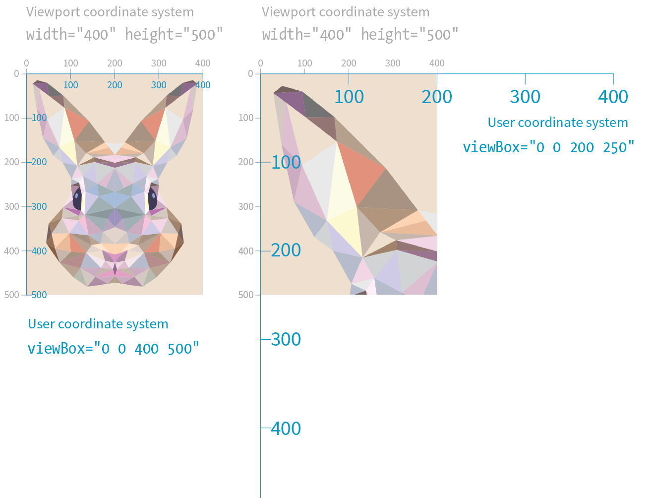
I could fill half a chapter describing the full capabilities and effects of the viewBox attribute. I want you to know everything about it, but for the sake of space, I will refer you to this wonderful tutorial by Sara Soueidan: “Understanding SVG Coordinate Systems and Transformations (Part 1)—The viewport, viewBox, and preserveAspectRatio” (www.sarasoueidan.com/blog/svg-coordinate-systems/). You will also find thorough explanations in the SVG books recommended at the end of the chapter.
For the purposes of this responsive SVG discussion, however, just keep in mind that the viewBox attribute is the key to establishing the width and height and the resulting user coordinate system of the SVG drawing itself, independent of the viewport “window” it will be displayed in.
The preserveAspectRatio attribute in the svg element is responsible for making sure the drawing maintains its aspect ratio, so it is important to our goal of creating a proportional responsive SVG. Conveniently, it is turned on by default, which means you don’t need to include it if that is your desired effect. Setting it to none means you can stretch and squish the drawing however you like, just as you can a bitmapped image.
The preserveAspectRatio attribute also takes keyword values for how the viewbox should be aligned in its viewport. They work a lot like percentage values for the background-image-position CSS property.
<svg viewBox="0 0 300 200" preserveAspectRatio="xMaxYMax meet">
In this example, xMaxYMax places the viewbox all the way to the right and against the bottom axis of the viewport (“Max” is equivalent to 100%). The meet keyword says to size it until it meets either the height or the width of the viewport (similar to contain for background images). The alternative is slice, which sizes the drawing so that it covers the entire viewport, even if some of the drawing is cut off (like cover for background images).
Again, I recommend you get to know the capabilities of preserveAspectRatio on your own, but for now, know that it is the attribute that does the work of keeping the aspect ratio intact, even if we take advantage of the default setting and don’t include it explicitly.
Now that you have some familiarity with the SVG scaling mechanisms at work behind the scenes, let’s look at the techniques for making SVGs in web pages scale proportionally within a changing container size.
If you embed your SVG in the source document with the img or object elements, the process for making it scale automatically is pretty straightforward.
First, in the SVG file itself, make sure the svg element includes the viewBox attribute to establish the dimensions of the drawing. By default, the aspect ratio will be preserved even if you don’t include the preserveAspectRatio attribute. If you want the graphic to completely fill the width of its container, omit the width and height attributes for the svg element because they default to 100%, which is the behavior we are after (see Note).
The and attributes should be included when you want to set an initial size for the SVG, such as for icons that should stay icon-sized regardless of the layout.
Now let’s look at the img or object element that embeds it. The width and height applied to the embedding element determines the size at which the SVG appears in the layout. Because width and height properties are auto by default, if you omit them, the dimensions of the SVG (100%) will be used. If you specify just width or just height, the browser uses the aspect ratio of the viewbox to calculate the unspecified dimension.
Relying on the default sizing of the img or object elements works in current browsers, but you’ll get better results in older browsers (particularly Internet Explorer; see Warning) if you explicitly set the width and height of the embedding element. For example:
img { width: 100%; height: auto;}
When and values for the embedding object are omitted, Internet Explorer makes the SVG fill the container width, but gives it a height of 150 pixels. The HTML5 specification defines the default size of embedded media such as , , and elements to be 300 pixels wide by 150 pixels high. So IE’s 150-pixel height on SVGs is not entirely random; they honored the value from the HTML5 spec.
This approach leaves nothing to chance. The result is an SVG file with its default width and height of 100% filling an img element set to fill the width of its container proportionally.
In the following example, I embedded an SVG with an img element in a div that is always set to 50% of the browser window width, as might occur in a responsive layout (Figure 25-17). Note that there are no width and height attributes in the SVG source, and the viewBox defines the aspect ratio. As the window gets larger and smaller, the SVG scales with it, maintaining that crisp, vector quality at all scales. An outline on the div reveals its boundaries, and I’ve set its side margins to auto to keep it centered in the browser window:
The SVG markup (flowers.svg)
<?xml version="1.0" encoding="utf-8"?><svg version="1.1" viewBox="0 0 160 120"> <!-- flower drawing -->
</svg>
The HTML markup
<div class="container"><imgsrc="flowers.svg"alt="flowers"></div>
The styles
.container { width: 50%; outline: 1px solid gray; margin: 2em auto; } /* IE fix */
img { width: 100%; height: auto;}
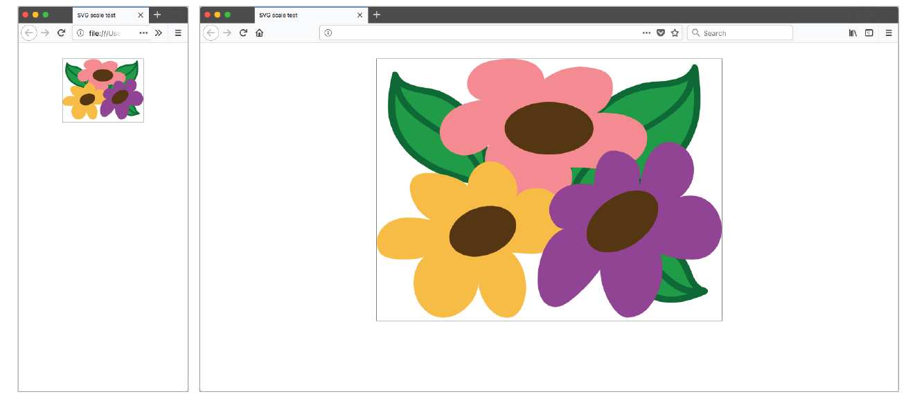
I’ll just let you know up front that preserving the aspect ratio of inline SVGs placed in the source with the svg element is not as simple as the previous example. You need to employ an interesting hack to get many browsers to comply. I will explain the technique here as efficiently as possible.
First, as with embedded media, include the viewBox attribute and omit the width and height attributes on the svg element if you want the width to be 100% of the container (taking advantage of their default values).
In the absence of a style rule specifically overriding the svg defaults, the width will be 100%, and its aspect ratio will be preserved. Current browser versions support this as expected—scaling the SVG in its container proportionally. However, older browsers (including all versions of Internet Explorer) do not, so we need to employ the “padding hack” to maintain the proportions of the inline SVG.
The padding hack is a little tricky, but the steps are as follows (Figure 24-18):
Both the padding hack and normal aspect ratio auto-height scaling can break inside Grid and Flexbox layouts. As of early 2018, there are important differences between browsers, so be sure to test your designs thoroughly.
It’s a little convoluted (they don’t call it a “hack” for nothing!), but it works. The foundation of this hack is the defined behavior of padding. Padding, when specified in percentage values, is always based on the width of the element (even top and bottom values). That means that as the width of the container div changes, so too does the amount of padding, always maintaining the same relationship. That sets up a constant aspect ratio for the SVG to fill.
Here’s an example that shows how the padding hack works:
The markup
<div class="container"> <svg version="1.1" viewBox="0 0 160 120"> /* drawing contents */
</svg></div>
The styles
.container { width: 100%; height: 0; padding-top: 75%; /* (120/160)*100% */
position: relative;}svg { position: absolute; top: 0; left: 0; width: 100%; height: 100%;}
In the markup, you see the svg element in its #container div and its viewbox dimensions set to 160 × 120 pixels. The width of the container is set to 100% (it could also be set to a different percentage) with a 0 height. The padding-top declaration expands the div to the proper aspect ratio, which is calculated by dividing the height of the SVG by its width, and multiplying the result by the percentage width of the div:
(svg-height / svg-width) * div-width%
In our example, the padding is set to 75% [(120 / 160) × 100% = 75%], which matches the 4:3 aspect ratio of the SVG. Notice also that the container is relatively positioned to create the positioning context for the svg child element (do you remember turning elements into positioning contexts with position: relative from Chapter 15, Floating and Positioning?)
This section cut to the chase and provided just what you need to know to make SVGs scale in responsive layouts. Of course, there is a lot more to the story, so I recommend these articles for additional background information and techniques:
To provide an even more customized SVG experience in your user interface, go beyond simple scaling and change the design of the icon with an adaptive SVG (see the sidebar “Adaptive Icons”).

Obviously, I could only scratch the surface of Scalable Vector Graphics in this chapter. When you are ready to use SVG on your site, you’ll have more brushing up to do. There are many volumes and online tutorials written about SVG, but these are the resources that helped me the most in my own exploration. I recommend them heartily.
I just threw a lot of SVG info at you. Try taking this quiz to see what stuck. The answers appear in Appendix A.
The first four questions refer to this SVG element:
<rect x="0" y="0" width="600" height="400" />
Now back to our regularly scheduled questions:
Hey! Here we are at the end of the book! I hope that you’ve enjoyed this detailed tour through HTML, CSS, JavaScript, and image production. I know the content here is pretty dense, but remember that you don’t have to learn it all at once, and you don’t need to keep it all in your head. Heck, I wrote this book, and I still go back to it to look up attributes, properties, and values. With practice, however, a lot of it will become second-nature to you.
I hope that you will find plenty of opportunities to put your new knowledge to use. Best of luck in your web endeavors!
1. c; 2. j; 3. h; 4. g; 5. f; 6. i; 7. b; 8. a; 9. d; 10. e
<!DOCTYPE html><html> <head> <meta charset="utf8"> <title>Title</title> </head> <body> </body></html>
<img src="birthday.jpg"> <em>Congratulations!</em> <a href="file.html">linked text</a> <p>This is a new paragraph</p><!-- product list begins here --><p>People who know me know that I love to cook.</p><hr><p>I've created this site to share some of my favorite recipes.</p>
<abbr title="World Wide Web Consortium">W3C</abbr><p><a href="tapenade.html">Go to the tapenade recipe</a></p><p><a href="../salmon.html">Try this with Garlic Salmon.</a></p><p><a href="pasta/linguine.html">Try the Linguine with Clam Sauce</a></p><p><a href="../../about.html">About Jen's Kitchen</a></p><p><a href="http://www.allrecipes.com">Go to Allrecipes.com</a></p><a href="tutorial.html">...</a><a href="examples/instructions.html">...</a><a href="examples/people/family.html">...</a><a href="/examples/things/boot.html">...</a><a href="../index.html">...</a><a href="http://www.learningwebdesign.com">...</a><a href="../instructions.html">...</a><a href="../../index.html">...</a><img src="images/arrow.gif" alt="" /><img src="../images/arrow.gif" alt="" /><img src="../../images/bullet.gif" alt="" /><img src="furry.jpg" alt="">b) There may not be text directly in the table element; it must go in a th or td;
c) The th elements must go inside the tr element;
d) The second tr element is missing a closing tag;
e) There is no colspan element; it should be a td with a colspan attribute.
p { font-family: sans-serif;font-size: 1em; line-height: 1.2em; }
blockquote { font-size: 1em;line-height: 150%; color: gray; }
body {background-color: black; color: #666; margin-left: 12em; margin-right: 12em; }p, blockquote, li {color: white;}
<strong style="color: red">Act now!</strong>
body {color: red;}h2 {color: red;}h1, p {color: red;}.special {color: red; }#intro {color: red;}#main strong {color: red;}h2 + p {color: red;}rgb(FF, FF, FF)border: double black medium;padding: 2em;padding: 2em; border: 4px solid red;border: 4px solid red; margin: 2em;padding: 1em 1em 1em 6em; border: 4px dashed black; margin: 1em 6em;or
padding: 1em; padding-left: 6em; border: 4px dashed; margin: 1em 6em;
padding: 1em 50px; border: 2px solid black; margin: 0 auto;.box6 {order: -1;} .box1, .box2, .box3 {order: 1;}Similarities between Grid and Flexbox include:
grid-template-rows: 12em min-content 100px; grid-template-columns: 300px 2fr 1fr;Using the grid shorthand property:
grid: 12em min-content 100px / 300px 2fr 1fr;(Note: auto could be used instead of min-content in both examples.)
#gallery: column-gap: 1em;
}img { max-width: 100%; }transition-delay: 0.5s;transition-timing-function: linear;transition-duration: 0.5s;transition-property: line-height;transform: rotate(7deg);transform: translate(-50px, -25px);transform-origin: right bottom;transform: scale(1.25);animation-direction: reverse;animation-duration: 5s;animation-delay: 2s;animation-iteration-count: 3;animation-fill-mode: forwards;var friends = ["name", "othername", "thirdname", "lastname"];alert( friends[2] );var name = "yourName";if( name === Jennifer ) { alert("That's my name too! ");}var myVariable = #;|if(myVariable > 5) { alert ("upper");} else { alert ("lower");}<script>var originalTitle = document.title;function showUnreadCount( unread ) { document.title = originalTitle + " (" + unread + "new message!");}showUnreadCount(3);</script>The following attributes may be used with any HTML element.
The following table lists the selectors in the Selectors Level 4 Editor’s Draft (drafts.csswg.org/selectors-4/, December 2017).
Note that selectors marked “(Level 4)” are new and may not yet be implemented by browsers. Check CanIUse.com and be sure to test well if you use them. All other selectors are part of CSS3 and are generally well supported.
I’m not sure any HTML specification has had such fanfare as HTML5. It offers so many promising possibilities, in fact, that it has become something of a buzzword with connotations far beyond the spec itself. When marketers and journalists use the term “HTML5,” they are sometimes referring to any new web technology that replaces Flash. Throughout this book, you have gotten familiar with the elements of HTML5, and in this appendix, I’ll tell you a bit more about the spec itself, so you can join those of us who are irked when we hear “HTML5” used incorrectly. The important thing, however, is that mainstream awareness of web standards is certainly a win and makes our job easier when we’re communicating with clients.
But first, I think it’s important to know how we got here and what makes HTML5 a breakthrough. I’ll start with a brief history of HTML, and then point out some unique qualities of HTML5, including its APIs.
Understanding where we’ve been provides useful context for where we are going. Our journey to HTML5 passes through the frontier of the early web, the dangerous battlegrounds of the Browser Wars, and a flirtatious fling with XML.
The story of HTML, from Tim Berners-Lee’s initial draft in 1991 to the HTML5 standard in development today, is both fascinating and tumultuous. Early versions of HTML (HTML+ in 1994 and HTML 2.0 in 1995) built on Tim’s early work with the intent of making it a viable publishing option.
But when the World Wide Web (as it was adorably called back in the day) took the world by storm, browser creators, most notably Mosaic Netscape and later Microsoft Internet Explorer, each said, “We ain’t waitin’ for no stinkin’ standards!” They gave the people what they wanted by creating a slew of browser-specific elements for improving the look of pages on their respective browsers. This divisive one-upping is what has come to be known as the Browser Wars. As a result, it became common in the late 1990s to create two entirely separate versions of a site that targeted each of the Big Two browsers. Signs on sites reading “Best viewed in Netscape” were the norm. I shudder just thinking about it.
In 1996, the newly formed W3C put a stake in the ground and released its first Recommendation: HTML 3.2. It is a snapshot of all the HTML elements in common use at the time, and includes many presentational extensions to HTML (such as the font and center elements) that were the result of the Netscape/IE feud and the lack of a style sheet alternative. HTML 4.0 (1998) and HTML 4.01 (the slight revision that superseded it in 1999) aimed to get HTML back on track by emphasizing the separation of structure and presentation and improving accessibility. All matters of presentation were handed over to the newly minted Cascading Style Sheets standard that was gaining support.
HTML 4.01—along with XHTML 1.0, its stricter XML-based sibling (discussed next)—became the cornerstone of the web standards movement (see the sidebar “The Web Standards Project”).
Around the same time that HTML 4.01 was in development, folks at the W3C became aware that one limited markup language wasn’t going to cut it for describing all the sorts of information (chemical notation, mathematical equations, multimedia presentations, financial information, and so on) that might be shared over the web. Their solution: XML (eXtensible Markup Language), a metalanguage for creating markup languages. XML was a simplification of SGML (Standardized Generalized Markup Language), the big kahuna of metalanguages that Tim Berners-Lee used to create his original HTML application. But SGML itself proved to be more complex than the web required.
The W3C had a vision of an XML-based web with many specialized markup languages working together—even within a single document. Of course, to pull that off, everyone would have to mark up documents very carefully, strictly abiding by XML syntax, to rule out potential confusion.
Their first step was to rewrite HTML according to the rules of XML so that it could play well with others. The result is XHTML (eXtensible HTML). The first version, XHTML 1.0, is nearly identical to HTML 4.01, sharing the same elements and attributes, but with stricter syntax requirements (see the “XHTML Markup Requirements” sidebar).
But the W3C didn’t stop there. With a vision of an XML-based web in mind, they began work on XHTML 2.0, an even bolder attempt to make things work “right” than HTML 4.01 had been. The problem was that it was not backward-compatible with old standards and browser behavior. The writing and approval process dragged on for years with no browser implementation. Without browser implementation, XHTML 2.0 was stuck.
Meanwhile…
In 2004, members of Apple, Mozilla, and Opera formed the Web Hypertext Application Technology Working Group (WHATWG, whatwg.org), separate from the W3C. The goal of the WHATWG was to further the development of HTML to meet new demands in a way that was consistent with real-world authoring practices and browser behavior (in contrast to the start-from-scratch ideal that XHTML 2.0 described). Their initial documents, Web Applications 1.0 and Web Forms 1.0, were rolled together into HTML5. Today, the WHATWG maintains an unnumbered, “living” HTML standard.
The W3C eventually established its own HTML5 Working Group based on the work done by the WHATWG. HTML5 reached formal Recommendation status in October 2014. As of early 2018, the latest version is HTML 5.2, which is a “Proposed Recommendation.”
Work on the HTML5 specification is happening in both organizations in tandem, sometimes with slight inconsistencies. For the most part, browser vendors use the WHATWG copy as their implementation reference.
And XHTML 2.0? At the end of 2009, the W3C officially put it out of its misery, pulling the plug on the Working Group and putting its resources and efforts into HTML5.
So that’s how we got here. Now let’s get to know HTML5 a little better.
Prior HTML versions concerned themselves mainly with elements for marking up content to be viewed on web pages. HTML5 is a bundle of new methods for accomplishing tasks that previously required special programming or proprietary plug-in technology such as Flash or Silverlight. Solutions include both markup and scripting components, including APIs for things like putting audio and video on the page, storing data locally, working offline, taking advantage of location information, and more. With HTML5 for common tasks, developers can rely on built-in browser capabilities and not reinvent the wheel for every application.
Much of what’s new in HTML5 requires advanced web development skills, so it’s unlikely you’ll use those features right away (if ever), but as always, I think it is beneficial to everyone to have a basic familiarity with what can be done. And “basic familiarity” is what I’m aiming at here. For more in-depth discussions of HTML5 features, see the “Further Reading” sidebar.
You’ve been learning the elements and attributes of HTML5 throughout this book.
HTML5 is based on HTML 4.01 Strict, the version of HTML that did not include any presentation-based or other deprecated elements and attributes. That means the vast majority of HTML5 is made up of the same elements that were used for years, and browsers know what to do with them.
HTML5 introduced a number of new elements, form input types, and global attributes. It also made many deprecated elements and attributes in HTML 4.01 officially obsolete.
One departure from previous HTML versions is that HTML5 is the first specification that includes detailed instructions for how browsers should handle malformed and legacy markup. It bases the instructions on legacy browser behavior, but for once, there is a standard protocol for browser makers to follow when browsers encounter incorrect or non-standard markup.
As we saw in Chapter 4, Creating a Simple Page, HTML documents should begin with a Document Type (DOCTYPE) declaration that identifies which version of HTML the document follows. The HTML5 declaration is short and sweet:
<!DOCTYPE html>
Compare that to a declaration for a Strict HTML 4.01 document:
<!DOCTYPE HTML PUBLIC "-//W3C//DTD HTML 4.01//EN" "http://www.w3.org/TR/HTML4.01/strict.dtd">
Why so complicated? For documents written in HTML 4.01 and XHTML 1.0 and 1.1, the declaration must point to the public DTD (Document Type Definition), a document that defines all of the elements in a markup language as well as the rules for using them. DTDs are a remnant of SGML and proved to be less helpful on the web than originally thought, so the authors of HTML5 simply didn’t use one. As a result, the DOCTYPE declaration is much simpler.
Validators—software that checks that all the markup in a document is correct (see Note)—use the DOCTYPE declaration to make sure the document abides by the rules of the specification it claims to follow.
Both HTML 4.01 and XHTML 1.0 had three separate DTDs (for Traditional, Strict, and Frameset versions of each spec), so there were a lot of little details to keep track of. For a full list of DOCTYPE declarations (including DTD references) for HTML 4.01, XHTML, SVG, and other document types, go to www.w3.org/QA/2002/04/valid-dtd-list.html.
HTML specifications prior to HTML5 included only documentation of the elements, attributes, and values permitted in the language. That’s fine for simple text documents, but the creators of HTML5 had their minds set on making it easier to create web-based applications that require scripting and programming. For that reason, HTML5 also defines a number of new APIs for making it easier to communicate with an application.
An API (application programming interface) is a documented set of commands, data names, and so on, that lets one software application communicate with another. For example, the developers of Twitter documented the names of each data type (users, tweets, timestamps, etc.) and the methods for accessing them in an API document (dev.twitter.com/docs) that lets other developers include Twitter feeds and elements in their programs. That is why there are so many Twitter programs and widgets available. Amazon.com also opens up its product data via an API. In fact, publishers of every ilk are recognizing the power of having their content available via an API.
But let’s bring it back to HTML5, which includes APIs for tasks that traditionally required proprietary plug-ins (like Flash) or custom programming. The idea is that if browsers offer those features natively—with standardized sets of hooks for accessing them—developers can do all sorts of nifty things and count on them working in all browsers, just as we count on the ability to embed an image on a page today. Of course, we have a way to go before there is ubiquitous support of these cutting-edge features, but we’re getting there steadily. Some APIs have a markup component, such as embedding multimedia with the new HTML5 video and audio elements. Others happen entirely behind the scenes with JavaScript or server-side components, such as creating web applications that work even when there is no internet connection (Offline Web Application API).
The W3C and WHATWG are working on lots and lots of APIs for use with web applications, all in varying stages of completion and implementation. Most have their own specifications, separate from the HTML5 spec itself, but they are generally included under the wide HTML5 umbrella that covers web-based applications. HTML5 includes specifications for these APIs:
Media Player API
For controlling audio and video players embedded on a web page, used with the new video and audio elements.
Editing API
Provides a set of commands that could be used to create in-browser text editors, allowing users to insert and delete text; format text as bold, italic, or hypertext; and more. In addition, there is a new contenteditable attribute that allows any content element to be editable right on the page.
Session History API
Exposes the browser history for better control over the Back button.
Drag and Drop API
Adds the ability to drag a text selection or file to a target area on the page or another web page. The draggable attribute indicates the element can be selected and dragged.
The following are just a handful of the APIs in development at the W3C with specifications of their own:
Canvas API
The canvas element adds a dynamic, two-dimensional drawing space to a page. The canvas element is discussed in Chapter 10, Embedded Media.
Service Workers API
This specification describes a method that enables web applications to work while offline.
Web Storage API
Allows data to be stored in the browser’s cache so that an application can use it later. Traditionally, that has been done with “cookies,” but the Web Storage API allows more data to be stored. It also controls whether the data is limited to one session (sessionStorage: when the window is closed, the data is cleared) or based on domain (localStorage: all open windows pointed to that domain have access to the data).
Geolocation API
Lets users share their geographical location (longitude and latitude) so that it is accessible to scripts in a web application. This allows the app to provide location-aware features such as suggesting a nearby restaurant or finding other users in your area.
Web Sockets API
Creates a socket, which is an open connection between the browser client and the server. This allows information to flow between the client and the server in real time, with no lags for the traditional HTTP requests. You can think of a web socket as an ongoing telephone call between the browser and server compared to the walkie-talkie, one-at-a-time style of traditional browser/server communication. (A hat tip to Jen Simmons for this analogy.) It is useful for multiplayer games, chat, or data streams that update constantly, such as sports or stock tickers or social media streams.
With a system in place that seems to be working, all indications are that the HTML specification will continue to undergo minor revisions in order to keep up with the changing demands of how we use the web and the devices we use it on. Minor revisions generally include adding attributes, elements, and APIs and putting to rest features that were never implemented. In other words, I have not heard talk of another seismic shift such as the switch from XHTML to HTML5.
At the W3C, HTML 5.2 (the 5th major version and second minor revision of HTML) became a Recommendation on December 14, 2017. As this book goes to press, there is already a Working Draft of HTML 5.3. Meanwhile, the WHATWG maintains its “living” (unnumbered) version of HTML that is continually updated and forms the basis for most browser vendors’ implementation.
So know that HTML is always changing, and as a web designer or developer, you will need to keep your ear to the ground. There is always something new to learn.
A Beginner’s Guide to HTML, CSS, JavaScript, and Web Graphics
by Jennifer Niederst Robbins
Copyright © 2018 O’Reilly Media, Inc. All rights reserved.Printed in Canada.
Published by O’Reilly Media, Inc., 1005 Gravenstein Highway North, Sebastopol, CA 95472.
O’Reilly Media books may be purchased for educational, business, or sales promotional use. Online editions are also available for most titles (oreilly.com/safari). For more information, contact our corporate/institutional sales department: 800-998-9938 or corporate@oreilly.com.
Editors: Meg Foley and Jeff Bleiel
Production Editor: Kristen Brown
Cover Designer: Edie Freedman
Interior Designer: Jennifer Robbins
Print History:
March 2001: First edition.
June 2003: Second edition.
June 2007: Third edition.
August 2012: Fourth edition.
May 2018: Fifth edition.
The O’Reilly logo is a registered trademark of O’Reilly Media, Inc. “O’Reilly Digital Studio” and related trade dress are trademarks of O’Reilly Media, Inc. Photoshop, Illustrator, Dreamweaver, Elements, HomeSite, and Fireworks are either registered trademarks or trademarks of Adobe Systems Incorporated in the United States and/or other countries. Microsoft and Expression Web are either registered trademarks or trademarks of Microsoft Corporation in the United States and/or other countries. Many of the designations used by manufacturers and sellers to distinguish their products are claimed as trademarks. Where those designations appear in this book, and O’ReillyMedia, Inc. was aware of a trademark claim, the designations have been printed in caps or initial caps.
While every precaution has been taken in the preparation of this book, the publisher and author assume no responsibility for errors or omissions, or for damages resulting from the use of the information contained herein.
ISBN: 978-1-491-96020-2
[TI] [2018-11-30]
Contents
1. Getting Started in Web Design
It Takes a Village (Website Creation Roles)
3. Some Big Concepts You Need to Know
One Web for All (Accessibility)
The Need for Speed (Site Performance)
Step 2: Give the HTML Document Structure
Step 3: Identify Text Elements
Step 5: Change the Look with a Style Sheet
Element Review: HTML Document Setup
Thematic Breaks (Horizontal Rule)
Generic Elements (div and span)
Improving Accessibility with ARIA
Targeting a New Browser Window
First, a Word on Image Formats
The Great Form Control Roundup
Multipurpose Embedder (object)
Element Review: Embedded Media
Part III. CSS for Presentation
11. Introducing Cascading Style Sheets
Developer Tools Right in Your Browser
Underlines and Other “Decorations”
Changing List Bullets and Numbers
CSS Review: Font and Text Properties
The Shorthand background Property
Finally, External Style Sheets
CSS Review: Color and Background Properties
Fancy Text Wrap with CSS Shapes
CSS Review: Floating and Positioning Properties
16. CSS Layout with Flexbox and Grid
Flexible Boxes with CSS Flexbox
18. Transitions, Transforms, and Animation
Ease-y Does It (CSS Transitions)
CSS Review: Transitions, Transforms, and Animation
A Clean Slate (Reset and Normalize.css)
20. Modern Web Development Tools
Getting Cozy with the Command Line
Version Control with Git and GitHub
Part IV. JavaScript for Behavior
21. Introduction to JavaScript
Learning More About JavaScript
Responsive Image Production Tips
C. CSS Selectors, Levels 3 and 4
If you travel to Silicon Valley and navigate between the global headquarters of some of the world’s most famous internet companies, you can head to the Computer History Museum. Wander through the museum, past the ancient mainframes and the story of the punch card, and you’ll eventually find yourself at the beginning of the Wide World Web. There’s a copy of the Mosaic browser on a floppy disk tucked in a book of the same name, a copy of Netscape Navigator that was sold in a box, and something called “Internet in a Box,” the #1 best-selling internet solution for Windows. Then there are the websites. Some of the earliest, most notable, and most important websites are on permanent display, including something called the “Global Network Navigator,” from 1993. It was designed by none other than the author of this book, Jennifer Robbins. Long before most of us had any idea the web existed, or even before many of you were born, Jen was busy designing the first commercial website. She’s been there from the very beginning, and has watched, taught, and written about every stage of evolution of the web.
Learning Web Design is now in its 5th edition, with a gazillion new pages and updates from those early days.
I am constantly asked, “What are the best resources for learning web technology?” I learned by reading books. Blog posts are great, but you also need an in-depth comprehensive look at the subject. In the beginning, all books were beginner books, teaching HTML, URLs, and how to use a browser. When CSS came along, the books assumed you’d already been using HTML, and taught you how to change to the new techniques. Then CSS3 came along, and all the books taught us how to add new CSS properties to our preexisting understanding of CSS2. Of course there were always books for beginners, but they were super basic. They never touched on professional techniques for aspiring professionals. Each new generation of books assumed that you had prior knowledge. Great for those of us in the industry. Tough for anyone new. But how in the world are you supposed to read about two decades of techniques, discarding what is outdated, and remembering what is still correct? How are you supposed to build a career from knowledge that’s so basic that you have no idea what real pros code in their everyday jobs?
You can’t. That’s why today when people ask me for a book recommendation, I have only one answer. This book.
This book you are reading now doesn’t require any prior knowledge. You don’t need to have made a web page before, or to have any idea where to get a code editor. It starts at the very beginning. And yet, unlike all the other books that start at the beginning, this one will get you to the good stuff, fast. Jen will explain every step you need, including some very advanced concepts. She’s packed this book full of cutting edge, insider knowledge from top experts.
I honestly don’t know how she does it. How can someone teach the basics and the advanced stuff at the same time? Usually you’ll learn those things years apart, with lots of struggling in the dark in the meantime. Here, Jen will lift you up from wherever you are in your journey, and take you farther. Every one of us—myself included, and I’m on the CSS Working Group (the group of people who invent new CSS)—can learn a lot from this book. I do every time I pick it up.
Pay attention to the notes in the margins. Read the websites she recommends, watch the videos. Jen is giving you a shortcut to a professional network. Follow the people she mentions. Read the links they suggest. These might be your future colleagues. Dare to dream that you will meet them. They are, after all, only a tweet away. It is a small world, full of real people, and you can become part of it all. This book will get you started.
—Jen Simmons
Designer and Developer Advocate at Mozilla
Member of the CSS Working Group
April 2018
Hello and welcome to the fifth edition of Learning Web Design!
I’ve been documenting web design and development in books like this one for decades, and it continues to fascinate me how the web landscape changes from edition to edition. This fifth edition is no exception! Not only is this version nearly 200 pages longer than the last one, but there are also some significant updates and additions worth noting.
First, some technologies and techniques that were brand new or even experimental in the last edition have become nicely settled in. HTML5 is the new normal, and CSS is moving ahead with its modular approach, allowing new technologies to emerge and be adopted one at a time. We’ve largely gotten our heads around designing for a seemingly infinite range of devices. Responsive Web Design is now the de facto approach to building sites. As a result, RWD has earned its own chapter in this edition (Chapter 17, Responsive Web Design). Where in the last edition we pondered and argued how to handle responsive image markup, in this edition, the new responsive image elements are standardized and well supported (Chapter 7, Adding Images). I think we’re getting the hang of this mobile thing!
I’ve seen a lot of seismic shifts in web design over the years, and this time, Flexbox and Grid are fundamentally changing the way we approach design. Just as we saw CSS put table-based layouts and 1-pixel spacer GIFs out of their misery, Flexbox and Grid are finally poised to kick our old float-based layout hacks to the curb. It is nothing short of a revolution, and after 25 years, it’s refreshing to have an honest-to-goodness solution for layout. This edition sports a new (and hefty!) chapter on proper page layout with Flexbox and Grid (Chapter 16, CSS Layout with Flexbox and Grid).
Although knowledge of HTML, CSS, and JavaScript is at the heart of web development, the discipline has been evolving, and frankly, becoming more complicated. I would be shirking my duty if I didn’t at least introduce you to some of the new tools of the trade—CSS processors, feature detection, the command line, task runners, and Git—in a new chapter on the modern web developer toolkit (Chapter 20, Modern Web Development Tools). Sure, it’s more stuff to learn, but the benefit is a streamlined and more efficient workflow.
The biggest surprise to me personally was how much web image production has changed since the fourth edition. Other than the introduction of the PNG format, my graphics chapters have remained essentially unchanged for 20 years. Not so this time around! Our old standby, GIF, is on the brink of retirement, and PNG is the default thanks to its performance advantages and new tools that let even smaller 8-bit PNGs include multiple levels of transparency. But PNG will have to keep its eye on WebP, mentioned in this edition for the first time, which may give it a run for its money in terms of file size and capabilities. The biggest web graphics story, however, is the emergence of SVG (Scalable Vector Graphics). Thanks to widespread browser support (finally!), SVG went from a small “some day” section in the previous edition to an entire “go for it!” chapter in this one (Chapter 25, SVG).
As in the first four editions, this book addresses the specific needs and concerns of beginners of all backgrounds, including seasoned graphic designers, programmers looking to expand their skills, and anyone else wanting to learn how to make websites. I’ve done my best to put the experience of sitting in my beginner web design class into a book, with exercises and tests along the way, so you get hands-on experience and can check your progress.
Whether you are reading this book on your own or using it as a companion to a web design course, I hope it gives you a good head start and that you have fun in the process.
Learning Web Design, Fifth Edition, is divided into five parts, each dealing with an important aspect of web development.
Part I: Getting Started
Part I lays a foundation for everything that follows in the book. I start off with some important general information about the web design environment, including the various roles you might play, the technologies you might learn, and tools that are available to you. You’ll get your feet wet right away with HTML and CSS and learn how the web and web pages generally work. I’ll also introduce you to some Big Concepts that get you thinking in the same way that modern web designers think about their craft.
Part II: HTML for Structure
The chapters in Part II cover the nitty-gritty of every element and attribute available to give content semantic structure. We’ll cover the markup for text, links, images, tables, forms, and embedded media.
Part III: CSS for Presentation
In the course of Part III, you’ll go from learning the basics of Cascading Style Sheets for changing the presentation of text to creating multicolumn layouts and even adding time-based animation and interactivity to the page. It provides an introduction to Responsive Web Design, as well as the tools and techniques that are part of the modern developer’s workflow.
Part IV: JavaScript for Behavior
Mat Marquis starts Part IV out with a rundown of JavaScript syntax so that you can tell a variable from a function. You’ll get to know some ways that JavaScript is used (including DOM scripting) and existing JavaScript tools such as polyfills and libraries that let you put JavaScript to use quickly, even if you aren’t quite ready to write your own code from scratch.
Part V: Web Images
Part V introduces the various image file formats that are appropriate for the web, provides strategies for choosing them as part of a responsive workflow, and describes how to optimize them to make their file size as small as possible. It also includes a chapter on SVG graphics, which offer great advantages for responsive and interaction design.
Part VI: Appendices
Part VI holds reference material such as test answers, lists of HTML global attributes and CSS Selectors, and a look at HTML5 and its history.
Italic
Used to indicate filenames and directory names, as well as for emphasis.
Colored italic
Used to indicate URLs and email addresses.
Colored roman text
Used for special terms that are being defined.
Constant width
Used to indicate code examples and keyboard commands.
Colored constant width
Used for emphasis in code examples.
Constant width italic
Used to indicate placeholders for attribute and style sheet property values.
→
Indicates that a line of code was broken in the text but should remain together on one line in use.
Once again, many smart and lovely people had my back on this edition.
I want to say a special thanks to my two amazing tech reviewers. I am quite indebted to Elika J. Etemad (fantasai), who, as a member of the W3C CSS Working Group, helped me make this edition more accurate and up-to-date with standards than ever before. She was tough, but the results are worth it. Petter Dessne brought his computer science expertise as well as valuable perspective as a professor and a reader for whom English is a second language. His good humor and photos of his home in Sweden were appreciated as well!
I am also grateful for this roster of web design superstars who reviewed particular chapters and passages in their areas of expertise (in alphabetical order): Amelia Bellamy-Royds (SVG), Brent Beer (developer tools), Chris Coyier (SVG), Terence Eden (audio/video), Brad Frost (Responsive Web Design), Lyza Danger Gardner (developer tools), Jason Grigsby (images), Val Head (animation), Daniel Hengeveld (developer tools), Mat Marquis (responsive images), Eric Meyer (CSS layout), Jason Pamental (web fonts), Dan Rose (images), Arsenio Santos (embedded media), Jen Simmons (CSS layout), Adam Simpson (developer tools), and James Williamson (structured data).
Thanks also to Mat Marquis for his contribution of two lively JavaScript chapters that I could never have written myself, and to Jen Simmons for writing the Foreword and for her ongoing support of Learning Web Design.
I want to thank my terrific team of folks at O’Reilly Media: Meg Foley (Acquisitions Editor), Jeff Bleiel (Developmental Editor), Kristen Brown (Production Editor), Rachel Monaghan (Copyeditor), Sharon Wilkey (Proofreader), and Lucie Haskins (Indexer). Special thanks go to InDesign and book production expert Ron Bilodeau, who turned my design into a template and a set of tools that made book production an absolute joy. Special thanks also go to Edie Freedman for the beautiful cover design and half a lifetime of friendship and guidance.
Finally, no Acknowledgments would be complete without profound appreciation for the love and support of my dearest ones, Jeff and Arlo.
Jennifer Robbins began designing for the web in 1993 as the graphic designer for Global Network Navigator, the first commercial website. In addition to this book, she has written multiple editions of Web Design in a Nutshell and HTML5 Pocket Reference, published by O’Reilly. She is a founder and organizer of the Artifact Conference, which addresses issues related to mobile web design. Jennifer has spoken at many conferences and has taught beginning web design at Johnson and Wales University in Providence, Rhode Island. When not on the clock, Jennifer enjoys making things, indie rock, cooking, travel, and raising a cool kid.
Please address comments and questions concerning this book to the publisher:
O’Reilly Media, Inc.
1005 Gravenstein Highway North
Sebastopol, CA 95472
800-998-9938 (in the United States or Canada)
707-829-0515 (international or local)
707-829-0104 (fax)
We have a web page for this book, where we list errata, examples, and any additional information. You can access this page at bit.ly/learningWebDesign_5e.
To comment or ask technical questions about this book, send email to bookquestions@oreilly.com.
For more information about our books, courses, conferences, and news, see our website at www.oreilly.com.
Find us on Facebook: facebook.com/oreilly
Follow us on Twitter: twitter.com/oreillymedia
Watch us on YouTube: www.youtube.com/oreillymedia
In this Chapter
Content-related disciplines
Design specialties
Frontend development
Backend development
Recommended equipment
Web-related software
The web has been around for more than 25 years now, experiencing euphoric early expansion, an economic-driven bust, an innovation-driven rebirth, and constant evolution along the way. One thing is certain: the web as a communication and commercial medium is here to stay. Not only that, it has found its way onto devices such as smartphones, tablets, TVs, and more. There have never been more opportunities to put web design know-how to use.
Through my experience teaching web design courses and workshops, I’ve had the opportunity to meet people of all backgrounds who are interested in learning how to build web pages. Allow me to introduce you to just a few:
“I’ve been a print designer for 17 years, and now I am feeling pressure to provide web design services.”
“I’ve been a programmer for years, but I want shift my skills to web development because there are good job opportunities in my area.”
“I tinkered with web pages in high school and I think it might be something I’d like to do for a living.”
“I’ve made a few sites using themes in WordPress, but I’d like to expand my skills and create custom sites for small businesses.”
Whatever the motivation, the first question is always the same: “Where do I start?” It may seem like there is a mountain of stuff to learn, and it’s not easy to know where to jump in. But you have to start somewhere.
This chapter provides an overview of the profession before we leap into building sites. It begins with an introduction to the roles and responsibilities associated with creating websites, so you can consider which role is right for you. I will also give you a heads-up on the equipment and software you will be likely to use—in other words, the tools of the trade.
Maybe you are reading this book as part of a full course on web design and development. Maybe you bought it to expand your current skill set on your own. Maybe you just picked it up out of curiosity. Whatever the case, this book is a good place to start learning what makes the web tick.
There are many levels of involvement in web design, from building a small site for yourself to making it a full-blown career. You may enjoy being a “full-stack” web developer or just specializing in one skill. There are a lot of ways you can go.
If you are interested in pursuing web design or production as a career, you’ll need to bring your skills up to a professional level. Employers may not require a web design degree, but they will expect to see working sample sites that demonstrate your skills and experience. These sites can be the result of class assignments, personal projects, or a site for a small business or organization. What’s important is that they look professional and have well-written, clean HTML; style sheets; and scripts behind the scenes.
If your involvement is at a smaller scale—say you just have a site or two you’d like to publish—you may find using a template on an online website service is a great head start (see the sidebar “I Just Want My Own Site”). Most allow you to tweak the underlying code, so what you learn in this book will help you customize the template to your liking.
When I look at a site, I see the multitude of decisions and areas of expertise that went into building it. Sites are more than just code and pictures. They often begin with a business plan or other defined mission. Before they launch, the content must be created and organized, research is performed, design from the broadest goals to finest details must happen, code gets written, and everything must be coordinated with what’s happening on the server to bring it to fruition.
Big, well-known sites are created by teams of dozens, hundreds, or even thousands of contributors. There are also sites that are created and maintained by a team with only a handful of members. It is also absolutely possible to create a respectable site with a team of only yourself. That’s the beauty of the web.
In this section, I’ll introduce you to the various disciplines that contribute to the creation of a site, including roles related to content, design, and code. You may end up specializing in just one area of expertise, working as part of a team of specialists. If you are designing sites on your own, you will need to wear many hats. Consider that the day-to-day upkeep of your household requires you to be part-time chef, housecleaner, accountant, diplomat, gardener, and construction worker—but to you it’s just the stuff you do around the house. As a solo designer, you’ll handle many web-related disciplines, but it will just feel like the stuff you do to make a website.
Anyone who uses the title “web designer” needs to be aware that everything we do supports the process of getting the content, message, or functionality to our users. Furthermore, good writing can help the user interfaces we create be more effective, from button labels to error messages.
Of course, someone needs to create all that content and maintain it—don’t underestimate the resources required to do this successfully. Good writers and editors are an important part of the team. In addition, I want to call your attention to two content-related specialists in modern web development: the Information Architect (IA) and the Content Strategist.
An Information Architect (also called an Information Designer) organizes the content logically and for ease of findability. They may be responsible for search functionality, site diagrams, and how the content and data are organized on the server. Information architecture is inevitably entwined with UX and UI design (defined shortly) as well as content management. If you like organizing or are gaga for taxonomies, information architecture may be the job for you. The definitive text for this field as it relates to the web is Information Architecture: For the Web and Beyond, by Louis Rosenfeld and Peter Morville (O’Reilly).
When the content isn’t right, the site can’t be fully effective. A Content Strategist makes sure that every bit of text on a site, from long explanatory text down to the labels on buttons, supports the brand identity and marketing goals of the organization. Content strategy may also extend to data modeling and content management on a large and ongoing scale, such as planning for content reuse and update schedules. Their responsibilities may also include how the organization’s voice is represented on social media. A good place to learn more is the book Content Strategy for the Web, 2nd Edition, by Kristina Halvorson and Melissa Rich (New Riders).
Ah, design! It sounds fairly straightforward, but even this simple requirement has been divided into a number of specializations when it comes to creating sites. Here are a few of the job descriptions related to designing a site, but bear in mind that the disciplines often overlap and that the person calling herself the “designer” often is responsible for more than one (if not all) of these responsibilities.
Often, when we think of design, we think about how something looks. On the web, the first matter of business is designing how the site works. Before you pick colors and fonts, it is important to identify the site’s goals, how it will be used, and how visitors move through it. These tasks fall under the disciplines of User Experience (UX) design, Interaction Design (IxD), and User Interface (UI) design. There is a lot of overlap between these responsibilities, and it is not uncommon for one person or team to handle all three.
The User Experience designer takes a holistic view of the design process—ensuring the entire experience with the site is favorable. UX design is based on a solid understanding of users and their needs based on observations and interviews. According to Donald Norman (who coined the term), UX design includes “all aspects of the user’s interaction with the product: how it is perceived, learned, and used.” For a website or application, that includes the visual design, the user interface, the quality and message of the content, and even the overall site performance. The experience must be in line with the organization’s brand and business goals in order to be successful.
The goal of the Interaction Designer is to make the site as easy, efficient, and delightful to use as possible. Closely related to interaction design is User Interface design, which tends to be more narrowly focused on the functional organization of the page as well as the specific tools (buttons, links, menus, and so on) that users use to navigate content or accomplish tasks.
The following are deliverables that UX, UI, or interaction designers produce:
User research and testing reports
Understanding the needs, desires, and limitations of users is central to the success of the design of the site or web application. The approach of designing around the user’s needs is referred to as User-Centered Design (UCD), and it is central to contemporary web design. Site designs often begin with user research, including interviews and observations, in order to gain a better understanding of how the site can solve problems or how it will be used. It is typical for designers to do a round of user testing at each phase of the design process to ensure the usability of their designs. If users are having a hard time figuring out where to find content or how to move to the next step in a process, then it’s back to the drawing board.
Wireframe diagrams
A wireframe diagram shows the structure of a web page using only outlines for each content type and widget (Figure 1-1). The purpose of a wireframe diagram is to indicate how the screen real estate is divided and where functionality and content such as navigation, search boxes, form elements, and so on, are placed. Colors, fonts, and other visual identity elements are deliberately omitted so as not to distract from the structure of the page. These diagrams are usually annotated with instructions for how things should work so the development team knows what to build.
Site diagram
A site diagram indicates the structure of the site as a whole and how individual pages relate to one another. Figure 1-2 shows a very simple site diagram. Some site diagrams fill entire walls!
Storyboards and user flow charts
A storyboard traces the path through a site or application from the point of view of a typical user (a persona in UX lingo). It usually includes a script and “scenes” consisting of screen views or the user interacting with the screen. The storyboard aims to demonstrate the steps it takes to accomplish tasks, outlines possible options, and also introduces some standard page types. Figure 1-3 shows a simple storyboard. A user flow chart is another method for showing how the parts of a site or application are connected, but it tends to focus on technical details rather than telling a story. For example, “when the user does this, it triggers that function on the server.” It is common for designers to create a user flow chart for the steps in a process such as member registration or online payments.
There are many books on UX, interaction, and UI design, but these are a few of the classics to get you started:
Because the web is a visual medium, web pages require attention to their visual presentation. First impressions are everything. A graphic designer creates the “look and feel” of the site—logos, graphics, type, colors, layout, and so on—to ensure that the site makes a good first impression and is consistent with the brand and message of the organization it represents.
There are many methods and deliverables that can be used to present a visual design to clients and stakeholders. The most traditional are sketches or mockups (created in Photoshop or a similar tool) of the way the site might look, such as the home page mockups shown in Figure 1-4.
Now that sites appear on screens of all sizes, many designers prefer to discuss the visual identity (colors, fonts, image style, etc.) in a way that isn’t tied to a specific layout like the typical desktop view shown in Figure 1-4. The idea is to agree upon a visual language for the site before production begins.
One option for separating style from screen size is to use style tiles, a technique introduced by Samantha Warren (see Note). Style tiles include examples of color schemes, branding elements, UI treatments, text treatment, and mood (Figure 1-5). Once the details are decided upon, they can be implemented into working prototypes and the final site. For more on this technique, visit Samantha’s excellent site, styletil.es, where you can download a template.
Graphic designers may also be responsible for producing the image assets for the site. They will need to know how to optimize images for the fastest delivery and how to address the requirements of varying screen sizes. It is also common for the development team to handle image optimization, but I think it is a skill every visual designer should have. We’ll discuss image optimization in Chapter 24, Image Asset Production.
Designers may also be responsible for creating a style guide that documents style choices, such as fonts, colors, and other style embellishments, in order to keep the site consistent over time. For a list of examples, articles, books, and podcasts about web style guides, visit the “Website Style Guide Resources” page at styleguides.io.
A large share of the website building process involves creating and troubleshooting the documents, style sheets, scripts, and images that make up a site. At web design firms, the team that handles the creation of the files that make up the site (or templates for pages that get assembled dynamically) is usually called the development or production department.
Development falls under two broad categories: frontend development and backend development. Once again, these tasks may fall to specialists, but it is just as common for one person or team to handle both responsibilities.
Frontend refers to any aspect of the design process that appears in or relates directly to the browser. That includes HTML, CSS, and JavaScript, all of which you will need to have intricate knowledge of if you want a job as a web developer. Let’s take a quick look at each.
Authoring is the process of preparing content for delivery on the web, or more specifically, marking up the content with HTML tags that describe its content and function.
HTML (HyperText Markup Language) is the authoring language used to create web page documents. The current version (and the version documented in this book) is HTML 5.2. Appendix D, From HTML+ to HTML5, tells the history of HTML and lists what makes HTML5 unique.
HTML is not a programming language; it is a markup language, which means it is a system for identifying and describing the various components of a document such as headings, paragraphs, and lists. The markup indicates the document’s underlying structure (you can think of it as a detailed, machine-readable outline). You don’t need programming skills—only patience and common sense—to write HTML.
The best way to learn HTML is to write out some pages by hand, as we will be doing in the exercises in Part II of this book.
While HTML is used to describe the content in a web page, Cascading Style Sheets (CSS) describe how that content should look (see Note). The way the page looks is referred to as its presentation. Fonts, colors, background images, line spacing, page layout, and so on, are all controlled with CSS. You can even add special effects and basic animation to your page.
When this book uses the term “style sheets,” it always refers to Cascading Style Sheets, the standard style sheet language for the World Wide Web. Style sheets (including what “cascading” means!) are discussed further in Part III.
The CSS specification also provides methods for controlling how documents will be presented in contexts other than a browser, such as in print or read aloud by a screen reader; however, we won’t be covering them much here.
Although it is possible to publish web pages using HTML alone, you’ll probably want to take on style sheets so you’re not stuck with the browser’s default styles. If you’re looking into designing websites professionally, either as a designer or as a developer, proficiency at style sheets is mandatory.
JavaScript is a scripting language that adds interactivity and behaviors to web pages, including these (to name just a few):
You may also hear the term DOM scripting used in relation to JavaScript. DOM stands for Document Object Model, and it refers to the standardized list of web page elements that can be accessed and manipulated using JavaScript (or another scripting language).
Frontend developers may also be required to be familiar with JavaScript frameworks (such as React, Bootstrap, Angular, and others) that automate a lot of the production process. They’ll likely also need to be handy with AJAX (which stands for “Asynchronous JavaScript And XML”), a technique used to load content in the background, allowing the page to update smoothly without reloading (like those automatically refreshing feeds).
Web scripting definitely requires some traditional computer programming prowess. While many web developers have degrees in computer science, it is also common for developers to be self-taught. A few developers I know started by copying and adapting existing scripts, then gradually added to their programming skills with each new project. Still, if you have no experience with programming languages, the initial learning curve may be a bit steep.
If you want to be a web developer for a living, JavaScript is a basic requirement. Designers will benefit from understanding what JavaScript can do, but may not need to learn to write it if they are working with a development team. Chapter 21, Introduction to JavaScript, will get you started understanding how it works, and I recommend Learning JavaScript by Ethan Brown (O’Reilly) to learn more.
Backend developers focus on the server, including the applications and databases that run on it. They may be responsible for installing and configuring the server software (we’ll be looking more at servers in Chapter 2, How the Web Works). They will certainly be required to know at least one, and probably more, server-side programming languages, such as PHP, Ruby, .NET (or ASP.NET), Python, or JSP, in order to create applications that provide the functionality required by the site. Applications handle tasks and features like forms processing, content management systems (CMSs), and online shopping, just to name a few.
Additionally, backend developers need to be familiar with configuring and maintaining databases that store all of the data for a site, such as the content that gets poured into templates, user accounts, product inventories, and more. Some common database languages include MySQL, Oracle, and SQL Server.
Backend development is well beyond the scope of this book, but it is important to know the sorts of tasks that get taken care of at the server level. You should be aware that it is possible to get functionality like shopping carts, mailing lists, and so on as prepackaged solutions from your hosting company without having to program it from scratch.
Not surprisingly, there are a myriad of other roles that contribute to the creation and maintenance of a site. Here are a few common roles that fall just outside the moniker “web design.”
Product manager
The product manager of a website or application guides its design and development in a way that meets business goals. This member of the team must have a thorough understanding of the target market as well as the processes involved in the creation of the site itself. Product managers develop the overall strategy for the site from a marketing perspective, including how and when it gets released.
Project manager
The project manager coordinates the designers, developers, and everyone else who is working on the site. They manage things like timelines, development approaches, deliverables, and so on. The project manager works with the product manager and other product owners to make sure that the project gets done on time and on budget.
SEO specialist
A website or application isn’t much good if nobody knows it exists, so it is crucial that a site be easily found by search engines. Search Engine Optimization (SEO) is a discipline focused on tweaking the site structure and code in a way that increases the chances it will be highly ranked in search results. There may be an SEO specialist on the in-house team, or a company may choose to hire an outside SEO firm. SEO is sometimes perceived as a dark art, but there are many ways to improve findability that are not underhanded. In fact, the number one technique for improving SEO is simply having good content with savvy HTML markup.
Multimedia producers
One of the cool things about the web is that you can add multimedia elements to a site, including sound, video, animation, and even interactive games. Creating multimedia elements is generally best left to artists and technicians in those fields, although they may be part of the web team if video, animation, or interactivity are core to the site’s mission.
That concludes our stroll through the virtual village of workers involved in the creation of a website. The larger the site, the more likely each team member will have a narrow specialization and job titles like “UX Lead for Error Messages.” More likely, everybody on the team will possess a spectrum of skills, and the lines between disciplines will blur. For example, I do Interaction and User Interface design, graphic design, HTML, and CSS, but I do not write JavaScript, work on the server, or get involved with content organization. In this book, I aim to give you a foundation in the frontend technologies that will prepare you for a number of roles.
It should come as no surprise that professional web designers require a fair amount of gear, both hardware and software. One question I’m frequently asked is, “What do I need to buy?” I can’t tell you specifically what to buy, but I will provide an overview of the typical tools of the trade.
For a comfortable web development environment, I recommend the following equipment:
A solid, up-to-date computer
Macintosh, Windows, or Linux is fine, so use whatever you have and are comfortable with. Creative departments in professional web development companies tend to be Mac-based. For backend work, Linux and Windows are popular. Although it is nice to have a super-fast machine, the files that make up web pages are very small and tend not to be too taxing on computers. Unless you’re getting into sound and video editing, don’t worry if your current setup is not the very latest and greatest.
A large monitor
Although not a requirement, a large monitor makes life easier. The more monitor real estate you have, the more windows and control panels you can have open at the same time. You can also see more of your page to make design decisions. If you’re using a large monitor, just make sure you design for users with smaller monitors and devices in mind.
A second computer for testing
Many designers and developers find it useful to have a test computer running a different platform than the computer they use for development (i.e., if you design on a Mac, test on a PC). Because browsers work differently on Macs than on Windows machines, it’s critical to test your pages in as many environments as possible, and particularly on the current Windows operating system. If you are a hobbyist web designer working at home, you could check your pages on a friend’s machine. Mac users should check out the “Run Windows on Your Mac” sidebar.
Mobile devices for testing
The web has gone mobile! That means it is absolutely critical that you test the appearance and performance of your site on browsers on smartphones and tablet devices. Device testing is discussed in Chapter 17, Responsive Web Design.
A scanner and/or camera
If you anticipate making your own images and textures, you’ll need some tools for creating them.
There’s no shortage of software available for creating web pages. In the early days, we just made do with tools originally designed for print. Today, there are wonderful tools created specifically with web design in mind that make the process more efficient. It is a delicate business listing software in a book such as this because a) there are so many programs, b) everyone has their personal favorite, and c) new tools come along so rapidly that there are surely newer, cooler options that you have access to that didn’t exist as I wrote this.
That said, here is a general overview of the types of software that comprise the tools of our trade, along with a few specific mentions of the most popular in each class.
To do the exercises in this book, all you’ll need is the text editor that came with your operating system and free image creation software. There is no need to purchase anything to follow along.
Although you can get by with the simple text editors that come with your computer, a dedicated code editor makes the task of writing HTML, CSS, and JavaScript much easier. Code editors understand the syntax of the code you write, so they can do things for you like color coding, error detection, and automatically finishing simple tasks like closing HTML tags. Some provide page previews so you can view the results of your code as you work.
Figure 1-6 shows how an HTML document looks in the Sublime Text editor. Here are just a few of the better-known code editors for web production that are worth exploring:
There is a new breed of interface design tools made specifically for websites and other applications. Because they have been designed from scratch with interface design in mind, they seem to anticipate a web designer’s every need. Interface design tools make it easy to design multiple layouts (such as layouts at various screen sizes) as well as export images and code for use in production. Some allow basic interactivity such as clicks and swipes, so your mockups can be shared online and used for basic interface testing.
Sketch (sketchapp.com, Mac only), shown in Figure 1-7, is extremely popular at the time of this writing. Other options include the following:
It is certainly possible to create all of the images you need for a site by using one of the interface design tools just listed. There are also programs that focus solely on image creation that can export files in web-appropriate formats. For professional designers, the Adobe Creative Cloud (adobe.com) suite of tools, which includes Photoshop (Figure 1-8), Illustrator, and other high-end design tools, is worth the investment.
If the Adobe monthly subscription fee is out of reach, you can try lower-cost alternatives that provide many of the same features. The number of graphics tools out there is dizzying, so I’m gathering just a few here:
The following image editors work right in your browser, without the need to download a program, although you do need to pay for an account:
One of the biggest challenges for web designers is that our sites may look and behave differently from browser to browser. For this reason, it is critical that we test our designs early and often on the widest range of browsers possible. These are the browsers designers and developers keep around for testing:
You will also need to test on a variety of smartphone browsers including iOS Safari, Android browsers, and third-party mobile browsers. We will discuss mobile testing further in Chapter 17.
Web design and development involves a lot of moving files around, particularly from the computer where you do your work to the server computer that hosts the site. To move files across the internet, you use an FTP (short for File Transfer Protocol) program. You will find that many hosting services offer their own FTP tools for uploading your files to their servers. Many of the code editors listed earlier also include built-in FTP functionality. Or, you can use a standalone FTP program, such as one of these:
You may also find it useful to have a terminal application (command-line tool) that allows you to type Unix commands for setting file permissions, moving or copying files and directories, or managing the server software. Command-line tools, which have a number of uses in web design and development workflow, are discussed in more detail in Chapter 20, Modern Web Development Tools:
I hope that this chapter has given you an overview of the many roles and responsibilities that fall under the umbrella of “web design.” I also hope that you come away realizing that you don’t need to learn everything. And even if you want to learn everything eventually, you don’t need to learn it all at once. So relax, and don’t worry. The other good news is that, while many professional tools exist, it is possible to create a basic website and get it up and running without spending much money by using freely available or inexpensive tools and your existing computer setup.
As you’ll soon see, it’s easy to get started making web pages—you will be able to create simple pages by the time you’re done reading this book. From there, you can continue adding to your bag of tricks and find your particular niche in web design. In the meantime, try answering the questions in Exercise 1-1.
Each chapter in this book ends with a few questions that you can answer to see if you picked up the important bits of information. Answers appear in Appendix A.
a. | Graphic designer | _____ | HTML and CSS documents |
b. | Production department | _____ | PHP scripts |
c. | User experience designer | _____ | “Look and feel” deliverables |
d. | Backend programmer | _____ | Storyboards |
a. | HTML | _____ | Checks a form field for a valid entry |
b. | CSS | _____ | Creates a custom server-side web application |
c. | JavaScript | _____ | Identifies text as a second-level heading |
d. | Ruby | _____ | Makes all second-level headings blue |
In this chapter
An explanation of the web as it relates to the internet
The role of the server
The role of the browser
URLs and their components
The anatomy of a web page
I got started in web design in early 1993—pretty close to the start of the web itself. That’s a quarter of a century ago (gasp!), but I still distinctly remember the first time I looked at a web page. It was difficult to tell where the information was coming from and how it all worked.
This chapter sorts out the pieces and introduces some basic terminology. We’ll start with the big picture and work down to specifics.
No, it’s not a battle to the death, just an opportunity to point out the distinction between two words that are increasingly being used interchangeably.
The internet is an international network of connected computers. No company owns the internet; it is a cooperative effort governed by a system of standards and rules. The purpose of connecting computers together, of course, is to share information. There are many ways information can be passed between computers, including email (POP3/IMAP/SMTP), file transfer (FTP), secure shell (SSH), and many more specialized modes upon which the internet is built. These standardized methods for transferring data or documents over a network are known as protocols.
The web (originally called the World Wide Web, thus the “www” in site addresses) is just one of the ways information can be shared over the internet. It is unique in that it allows documents to be linked to one another via hypertext links—thus forming a huge “web” of connected information. The web uses a protocol called HTTP (HyperText Transfer Protocol). That acronym should look familiar because it is the first four letters of nearly all website addresses, as we’ll discuss in an upcoming section.
The web is a subset of the internet. It is just one of many ways information can be transferred over networked computers.
Let’s talk more about the computers that make up the internet. Because they “serve up” documents upon request, these computers are known as servers. More accurately, the server is the software (not the computer itself) that allows the computer to communicate with other computers; however, it is common to use the word “server” to refer to the computer as well. The role of server software is to wait for a request for information, and then retrieve and send that information back as quickly as possible.
There’s nothing special about the computers themselves…picture anything from a high-powered Unix machine to a humble personal computer. It’s the server software that makes it all happen. In order for a computer to be part of the web, it must be running special web server software that allows it to handle HyperText Transfer Protocol transactions. Web servers are also called HTTP servers.
There are many server software options out there, but the two most popular are Apache (open source software) and Microsoft Internet Information Services (IIS). Apache is freely available for Unix-based computers and comes installed on Macs running macOS. There is a Windows version as well. Microsoft IIS is part of Microsoft’s family of server solutions.
Every computer and device (router, smartphone, car, etc.) connected to the internet is assigned a unique numeric IP address (“IP” stands for “Internet Protocol”). For example, as I write this, the computer that hosts oreilly.com has the IP address 199.27.145.64. All those numbers can be dizzying, so fortunately, the Domain Name System (DNS) was developed to allow us to refer to that server by its domain name, “oreilly.com”, as well. The numeric IP address is useful for computer software, while the domain name is more accessible to humans. Matching the text domain names to their respective numeric IP addresses is the job of a separate DNS server. If you think of an IP address as a telephone number, the DNS server would be the phonebook.
It is possible to configure your web server so that more than one domain name is mapped to a single IP address, allowing several sites to share a single server.
We now know that the server does the servin’, but what about the other half of the equation? The software that does the requesting is called the client. People use desktop browsers, mobile browsers, and other assistive technologies (such as screen readers) as clients to access documents on the web. The server returns the documents for the browser (also referred to as the user agent in technical circles) to display.
The requests and responses are handled via the HTTP protocol, mentioned earlier. Although we’ve been talking about “documents,” HTTP can be used to transfer images, movies, audio files, data, scripts, and all the other web resources that commonly make up websites and applications.
It is common to think of a browser as a window on a computer monitor with a web page displayed in it. These are known as graphical browsers or desktop browsers and for a long time, they were the only web-viewing game in town. The most popular desktop browsers as of this writing include Edge and Internet Explorer for Windows, Chrome, Firefox, and Safari, with Opera and Vivaldi bringing up the rear.
These days, however, more than half of web traffic comes from mobile browsers on smartphones and tablets such as Safari on iOS, Android and Chrome browsers on Android devices, Opera Mini, and a myriad of other default and installable mobile browsers (see en.wikipedia.org/wiki/Mobile_browser for a complete list). Navigating the web on a touch screen is the new normal.
It is also important to keep alternative web experiences in mind. Users with impaired sight may be listening to a web page read by a screen reader (or simply make their text extremely large). Users with limited mobility may use assistive technology such as joysticks or voice commands to access links and enter content. The sites we build must be accessible and usable for all users, regardless of their browsing experiences.
The web is also finding its way onto smart TVs and gaming systems, where users access our pages with TV remotes or Xbox controllers. You never know where the web will pop up next!
The reality is that pages may look and perform differently from browser to browser. This is due to varying support for web technologies, varying device capabilities, and the users’ ability to set their own browsing preferences. It is the most challenging aspect of designing and developing for our medium.
Every page and resource on the web has its own special address called a URL, which stands for Uniform Resource Locator. It’s nearly impossible to get through a day without seeing a URL (pronounced “U-R-L,” not “erl”) plastered on the side of a bus, printed on a business card, or broadcast on a television commercial. Web addresses are fully integrated into modern vernacular.
Some URLs are short and sweet. Others may look like crazy strings of characters separated by dots (periods) and slashes, but each part has a specific purpose. Let’s pick one apart.
A complete URL is generally made up of three components: the protocol, the site name, and the absolute path to the document or resource, as shown in Figure 2-1.
1 http://
The first thing the URL does is to define the protocol that will be used for that particular transaction. The letters “HTTP” let the server know to use HyperText Transfer Protocol, or get into “web mode.” You may also see a URL begin with https://, which I explain in the “HTTPS, The Secure Web Protocol” sidebar.
2 www.example.com
The next portion of the URL identifies the website by its domain name. In this example, the domain name is “example.com.” The “www.” part at the beginning is the particular hostname at that domain. The hostname “www” has become a convention, but is not a rule. In fact, sometimes the hostname may be omitted. There can be more than one website at a domain (called subdomains). For example, there might also be “development.example.com,” “clients.example.com,” and so on.
3 /2018/samples/first.html
This is the absolute path through directories on the server to the requested HTML document, first.html. The words separated by slashes are the directory names, starting with the root directory of the host (as indicated by the initial /). Because the internet originally comprised computers running the Unix operating system, our current way of doing things still follows Unix rules and conventions, hence the / separating directory names.
To sum it up, the URL in Figure 2-1 says it would like to use the HTTP protocol to connect to a web server on the internet called “www.example.com” and to request the document first.html, located in the samples directory, which is in the 2018 directory.
Obviously, not every URL you see is so lengthy. To get to O’Reilly’s site, you’d expect to type oreilly.com instead of http://www.oreilly.com/index.html. Here’s why that works.
Because nearly all web pages use the HyperText Transfer Protocol, the http:// part is often just implied. This is the case when site names are advertised in print or on TV, as a way to keep the URL easy to remember.
Additionally, browsers are programmed to add http:// automatically as a convenience to save you some keystrokes. It may seem like you’re leaving it out, but it is being sent to the server behind the scenes.
When we begin using URLs to create hyperlinks in HTML documents in Chapter 6, Adding Links, you’ll learn that it is necessary to include the protocol when making a link to a web page on another server.
Many addresses do not include a filename, but simply point to a directory, like these:
http://www.oreilly.com http://www.jendesign.com/resume/
When a server receives a request for a directory name rather than a specific file, it looks in that directory for a default document, typically named index.html. So when someone types the previous URLs into his browser, what he’ll actually see is this:
http://www.oreilly.com/index.htmlhttp://www.jendesign.com/resume/index.html
The name of the default file (also referred to as the index file) may vary, and depends on how the server is configured. In these examples, it is named index.html, but some servers use the filename default.htm. If your site uses server-side programming to generate pages, the index file might be named index.php or Default.aspx. Just check with your server administrator or the tech support department at your hosting service to make sure you give your default file the proper name.
Another thing to notice is that in the first example, the original URL did not have a trailing slash to indicate it was a directory. If the slash is omitted, the server checks to see if the request is a file or a directory. If it is a directory, the server asks the browser to send the request again with a slash. In the end, the slash is included for directories, even if it isn’t included the first time it is entered (see Performance Tip).
The index file is also useful for security. Some servers (depending on their configuration) display the contents of the directory if the default file is not found. Figure 2-2 shows how the documents in the housepics directory are exposed as the result of a missing default file. One way to prevent people from snooping around in your files is to be sure there is an index file in every directory. Your server administrator may also add other protections to prevent your directories from displaying in the browser.
We’re all familiar with what web pages look like in the browser window, but what’s happening “under the hood”?
At the top of Figure 2-3, you see a minimal web page as it appears in a graphical browser. Although you see it as one coherent page, it is actually assembled from four separate files: an HTML document (index.html), a style sheet (kitchen.css), and two graphics (foods.png and spoon.png). The HTML document is running the show.
You may be as surprised as I was to learn that the graphically rich and interactive pages we see on the web are generated by simple, text-only documents. The text file behind the scenes is referred to as the source document.
Take a look at index.html, the source document for the Jen’s Kitchen web page. You can see that it contains the text content of the page plus special tags (indicated with angle brackets, < and >) that describe each element on the page.
Adding descriptive tags to a text document is known as “marking up” the document. Web pages use a markup language called HyperText Markup Language, or HTML for short, which was created especially for documents with hypertext links. HTML defines dozens of text elements that make up documents such as headings, paragraphs, emphasized text, and of course, links. There are also elements that add information about the document (such as its title), media such as images and videos, and widgets for form inputs, just to name a few.
You can view the source for any web page. Exercise 2-1 gives you some prompts and pointers.
The version of HTML we use today is HTML5. There have been several versions of HTML since its birth in 1989, and a few that are still in use today. There is a complete history of HTML, all its versions, and an overview of what makes HTML5 unique in Appendix D, From HTML+ to HTML5.
Keep in mind that while learning from others’ work is fine, stealing other people’s code is poor form (or even illegal). If you want to use code as you see it, ask for permission and always give credit to those who did the work.
You’ll be learning the nitty-gritty of markup in Part II, so I don’t want to bog you down with too much detail right now, but there are a few things I’d like to point out about how HTML works and how browsers interpret it.
Read through the HTML document in Figure 2-3 and compare it to the browser results. It’s easy to see how the elements marked up with HTML tags in the source document correspond to what displays in the browser window.
First, you’ll notice that the text within brackets (for example, <body> and <strong>) does not display in the final page. The browser displays only what’s between the tags—the content of the element. The markup is hidden. The tag provides the name of the HTML element—usually an abbreviation such as “h1” for “heading level 1,” or “em” for “emphasized text.”
Second, you’ll see that most of the HTML tags appear in pairs surrounding the content of the element. In our HTML document, <h1> indicates that the following text should be a first-level heading; </h1> indicates the end of the heading. Some elements, called empty elements, do not have content. In our sample, the <hr> tag indicates an empty element that tells the browser to “insert a horizontal rule here” as a thematic divider.
Because I was unfamiliar with computer programming when I first began writing HTML, it helped me to think of the tags and text as “beads on a string” that the browser interprets one by one, in sequence. For example, when the browser encounters an open bracket (<), it assumes all of the following characters are part of the markup until it finds the closing bracket (>). Similarly, it assumes all of the content following an opening <h1> tag is a heading until it encounters the closing </h1> tag. This is the manner in which the browser parses the HTML document. Understanding the browser’s method can be helpful when troubleshooting a misbehaving HTML document.
Obviously, there are no pictures in the HTML file itself, so how do they get there when you view the final page? You can see in Figure 2-3 that each image is a separate file. The images are placed in the flow of the text with the HTML image element (img), which tells the browser where to find the graphic (its URL). When the browser sees the img element, it makes another request to the server for the image file, and then places it in the content flow.
The browser also sends requests to the server for style sheets (like kitchen.css), JavaScript files (.js), and other embedded media like audio and videos. The browser software (or more specifically, its rendering engine) brings the separate pieces together into the final page.
The assembly of the page generally happens in an instant, so it appears as though the whole page loads all at once. Over slow connections or if the page includes huge graphics or media files, the assembly process may be more apparent as images lag behind the text. The page may even need to be redrawn as new images, fonts, and style sheets arrive (although you can construct your pages in such a way that prevents this from happening).
I want to direct your attention to one last key ingredient of our minimal page. Near the top of the HTML document there is a link element that points to the style sheet document kitchen.css. That style sheet includes a few lines of instructions for how the page should look in the browser. These are style instructions written according to the rules of Cascading Style Sheets (CSS). CSS allows designers to add visual style instructions (known as the document’s presentation) to the marked-up text (the document’s structure, in web design terminology). In Part III, you’ll get to know the power of Cascading Style Sheets.
Figure 2-4 shows the Jen’s Kitchen page without (top) and with (bottom) the style instructions. Browsers come equipped with default styles for every HTML element they support, so if an HTML document lacks custom style instructions, the browser will use its own. That’s what you see in the screenshot on the top. Even just a few style rules can make big improvements to the appearance of a page.
To make elements on the page do something, you use a scripting language called JavaScript (see Note). There are no scripts on the Jen’s Kitchen page because I thought it best to keep things simple this early in the book, but know that JavaScript is an essential ingredient in modern websites.
Whereas HTML provides the structure and the CSS style sheet alters how things look, JavaScript adds a behavior component that controls how things work. Scripts may be standalone files on the server (with the .js suffix) or be written out right in the document. They may be triggered to run immediately when the page loads or be triggered by something the user does, like click or hover on an element or enter something in a form field.
You’ll get a basic introduction to JavaScript in Part IV of this book.
I should note that I’ve depicted a traditional and simplified scenario here to tell you how web pages are put together. These days, it is common for web pages to be generated from content management systems (CMSs) that keep content in databases and use templates to assemble the data into pages on the fly. In that case, in Step 3b, there is a more complicated process of assembling the file from various parts rather than just handing off an existing file.
Let’s play a round of “Identify That Acronym!” The following are a few basic web terms mentioned in this chapter. Answers are in Appendix A.
|
1. |
HTML |
______ |
a. |
Home of Mosaic, the first graphical browser |
|
2. |
W3C |
______ |
b. |
The location of a web document or resource |
|
3. |
CERN |
______ |
c. |
The markup language used to describe web content |
|
4. |
CSS |
______ |
d. |
Matches domain names with numeric IP addresses |
|
5. |
HTTP |
______ |
e. |
A protocol for file transfer |
|
6. |
IP |
______ |
f. |
Protocol for transferring web documents on the internet |
|
7. |
URL |
______ |
g. |
The language used to instruct how web content looks |
|
8. |
NCSA |
______ |
h. |
Particle physics lab where the web was born |
|
9. |
DNS |
______ |
i. |
Internet Protocol |
|
10. |
FTP |
______ |
j. |
The organization that monitors web technologies |
In this chapter
The web on mobile devices
The benefits of web standards
Progressive enhancement
Responsive Web Design
Accessibility
Site performance
As the web matures and the number of devices we access it from increases exponentially, our jobs as web designers and developers get significantly more complicated. Frankly, there’s a lot more going on out there than I can fit in this book. In the chapters that follow, I will focus on the basic building blocks of web design—HTML elements, CSS styles, a taste of JavaScript, and web image production—that will give you a solid foundation for the further development of your skills.
Before we get to the nuts and bolts, I want to introduce some Big Concepts that every web designer needs to know. We’ll look at ideas and concerns that inform our decisions and contribute to the contemporary web environment. I’ll be referring back to the terminology introduced here frequently.
The heart of the matter is that as web designers, we never know exactly how the pages we create will be viewed. We don’t know which of the dozens of browsers might be used, whether it is on a desktop computer or something more portable, how large the browser window will be, what fonts are installed, whether functionality such as JavaScript is enabled, how fast the internet connection is, whether the pages are being read by a screen reader, and so on. The Big Concepts in this chapter are primarily reactions to and methods for coping with the inescapable element of the Unknown in our medium. They include the following:
Because we’re just getting started, I will keep the descriptions brief and fairly non-technical. My goal is that you have a basic understanding of what I mean by terms like “progressive enhancement” when you encounter them in lessons later. Many excellent articles and books have been written on each of these topics and their related production techniques, and I’ll provide pointers to resources for further reading.
Until 2007, we could be relatively certain that our users were visiting our sites while sitting at their desks, looking at a large monitor, using a speedy internet connection. We had all more or less settled on 960 pixels as a good width for a web page based on the most common monitor size. Back then, our biggest concern was dealing with the dozen or so desktop browsers and jumping through a few extra hoops to support quirky old versions of Internet Explorer. And we thought we had it rough!
Although you could access web pages and web content on mobile phones prior to 2007, the introduction of the iPhone and Android smartphones as well as faster networks heralded a huge shift in how, when, and where we do our web surfing (particularly in the United States, which lagged behind Asia and the EU in mobile technology). Since then, we’ve seen the introduction of phones and tablets of all different dimensions, as well as web browsers on TVs, gaming systems, and other devices. And the diversity is only going to increase. I think mobile web design expert Brad Frost sums it up nicely in his illustrations in Figure 3-1.
The challenge of designing for all of these devices goes beyond addressing differing screen sizes. There is a world of difference between using a site over a broadband connection and over a slow cell network. Designers need to resist making assumptions about network speed and context based on the screen size. Just because it is a small screen doesn’t mean it’s a slow connection or that the person is in a hurry. It’s not uncommon to leisurely browse the web on a smartphone while sitting on the couch at home with a solid WiFi connection. And iPads with larger, high-resolution displays may be accessing the internet on pokey 3G connections. In other words, it’s complicated!
Resist making assumptions about network speed and context based on the screen size.
For a lot of sites today, more people access the web via their mobile devices than on a desktop computer. Already, a significant portion of Americans use their mobile phones as their only access to the internet. That means it is critical to get the design and functionality right. We’ve made huge strides in serving a pleasing experience to users with handheld devices, and the technology for targeting their needs continues to head in the right direction.
What I want you to learn here is that the way you see your design as you’re working on it on your nice desktop machine is not how it will be experienced by everyone. Some will see it much smaller. Some will see it load painfully slowly. Some may be looking at it on a TV across the room. All web design professionals should keep this fact in mind.
So how do we deal with this diversity? A good start is to follow the standards documented by the World Wide Web Consortium (W3C). Sticking with web standards is your primary tool for ensuring your site is consistent on all standards-compliant browsers (that’s approximately 99% of browsers in current use). It also helps make your content forward-compatible as web technologies and browser capabilities evolve. Another benefit is that you can tell your clients that you create “standards-compliant” sites, and they will like you more.
The notion of standards compliance may seem like a no-brainer, but it used to be that everyone, including the browser makers, played fast and loose with HTML and scripting. The price we paid was incompatible browser implementations and the need to create sites twice to make them work for everyone. I talk more about web standards throughout this book, so I won’t go into too much detail here. Suffice it to say that the web standards are your friends. Everything you learn in this book will start you off on the right foot.
Sticking with web standards is your primary tool for ensuring your site is as consistent as possible.
With a multitude of browsers comes a multitude of levels of support for the web standards. In fact, no browser has implemented all the standards 100%, and there are always new technologies that are slowly gaining steam. Furthermore, users can set their own browser preferences, so they may have a browser that supports JavaScript but have chosen to turn it off. The point here is that we are faced with a wide range of browser capabilities—from only basic HTML support to all the bells and whistles.
Progressive enhancement is one strategy for dealing with unknown browser capabilities (see Note). When designing with progressive enhancement, you start with a baseline experience that makes the content or core functionality available to even the most rudimentary browsers or assistive devices. From there, you layer on more advanced features for the browsers that can handle them. You might finish with some “nice to have” effects, like animation or wrapping text around images in interesting shapes, that enhance the experience for users with the most advanced browsers, but aren’t really critical to the brand or message.
Progressive enhancement is the flip side of an approach to browser diversity called , in which you design the fully enhanced experience first, then create a series of fallbacks for non-supporting browsers. Both methods have their place in modern development. You will find many fallback techniques suggested in this book to be sure less capable browsers are accommodated.
Progressive enhancement is an approach that informs all aspects of page design and production, including HTML, CSS, and JavaScript:
Authoring strategy
When an HTML document is written in logical order and its elements are marked up in a meaningful way, it will be usable on the widest range of browsing environments, including the oldest browsers, future browsers, and mobile and assistive devices. It may not look exactly the same, but the important thing is that your content is available. It also ensures that search engines like Google will catalog the content correctly. A clean HTML document with its elements accurately and thoroughly described is the foundation for accessibility.
Styling strategy
You can create layers of experience simply by taking advantage of the way browsers parse style sheet rules. Without going into too much technical detail, you can write a style rule that makes an element background red, but also include a style that gives it a cool gradient (a blend from one color to another) for browsers that know how to render gradients. Or you can use a cutting-edge CSS selector to deliver certain styles only to cutting-edge browsers. The knowledge that browsers simply ignore properties and rules they don’t understand gives you license to innovate without bringing older browsers to their knees. You just have to be mindful of styling the baseline experience first, then adding improvements once the minimum requirements are met.
Scripting strategy
As with other web technologies, there are discrepancies in how browsers handle JavaScript (particularly on non-desktop devices), and some users opt to turn it off entirely. The first rule in progressive enhancement is to make sure basic functionality—such as linking from page to page or accomplishing essential tasks like data submission via forms—is intact even when JavaScript is off. In this way, you ensure the baseline experience, and enhance it when JavaScript is available.
Progressive enhancement is a strategy for coping with unknown browser capabilities.
By default, most browsers on small devices such as smartphones and tablets shrink a web page down to fit the screen and provide mechanisms for zooming and moving around the page. Although it technically works, it is not a great experience. The text is too small to read, the links are too small to tap, and all that zooming and panning around is distracting.
Responsive Web Design (RWD) is a strategy for providing appropriate layouts to devices based on the size of the viewport (browser window). The key to Responsive Web Design is serving a single HTML document (with one URL) to all devices, but applying different style sheets based on the screen size in order to provide the most optimized layout for that device. For example, when the page is viewed on a smartphone, it appears in one column with large links for easy tapping. But when that same page is viewed on a large desktop browser, the content rearranges into multiple columns with traditional navigation elements. It’s like magic! (Except that it’s actually just CSS.)
Responsive Web Design is a strategy for dealing with unknown screen size.
The web design community has been abuzz about responsive design since Ethan Marcotte first wrote about it and coined the phrase in his article “Responsive Web Design” on A List Apart in 2010 (alistapart.com/articles/responsive-web-design/). It’s become one of the primary tools we use to cope with unknown viewport size.
Figure 3-3 shows some examples of responsive sites at the typical dimensions for a desktop monitor, tablet, and smartphone. You can see many more inspirational examples at the Media Queries gallery site (mediaqueri.es). Try opening one of the responsive sites in your browser and then resizing the window narrow and wide. Watch as the layout changes based on window size. Très cool.
Responsive Web Design helps with matters of layout, but it is not a solution to all mobile web design challenges. The fact is that providing the best experiences for your users and their chosen device may require optimizations that go beyond adjusting the look and feel. You can better address some problems by using the server to detect the device and its capabilities and then making decisions on what to send back.
For some sites and services, it may be preferable to build a separate mobile site (see the “M-dot Sites” sidebar) with a customized interface and feature set that takes advantage of phone capabilities like geolocation. That said, although responsive design won’t fix everything, it is an important part of the solution for delivering satisfactory experiences on a wide variety of browsers.
I’ll cover Responsive Web Design in more detail in Chapter 17, Responsive Web Design, once you have more code experience under your belt. There you will find plenty of resources to continue your responsive design education.
We’ve been talking about the daunting number of browsers in use today, but so far, we’ve only addressed visual browsers controlled with mouse pointers or fingertips. It is critical, however, to keep in mind that people access the web in many different ways—with a keyboard, mouse, voice commands, screen readers, Braille output, magnifiers, joysticks, foot pedals, and so on. Web designers must build pages in a manner that creates as few barriers as possible to getting to information, regardless of the user’s ability and the device used to access the web. In other words, you must design for accessibility.
Although intended for users with disabilities such as poor vision or limited mobility, the techniques and strategies developed for accessibility also benefit other users with less-than-optimum browsing experiences. Accessible sites are also more effectively indexed by search engines such as Google. Making your site accessible is well worth the extra effort.
There are four broad categories of disabilities that affect how people interact with their computers and the information on them:
Vision impairment
People with low or no vision may use an assistive device such as a screen reader, Braille display, or a screen magnifier to get content from the screen. They may also simply use the browser’s text zoom function to make the text large enough to read.
Mobility impairment
Users with limited or no use of their hands may use special devices such as modified mice and keyboards, foot pedals, voice commands, or joysticks to navigate the web and enter information.
Auditory impairment
Users with limited or no hearing will miss out on audio aspects of multimedia, so it is necessary to provide alternatives, such as transcripts for audio tracks or captions for video.
Cognitive impairment
Users with memory, reading comprehension, problem solving, and attention limitations benefit when sites are designed simply and clearly. These qualities are helpful to anyone using your site.
The W3C started the Web Accessibility Initiative (WAI) to address the need to make the web usable for everyone. The WAI site (www.w3.org/WAI) is an excellent starting point for learning more about web accessibility. One of the documents produced by the WAI to help developers create accessible sites is the Web Content Accessibility Guidelines (WCAG and WCAG 2.0). You can read them all at www.w3.org/WAI/intro/wcag.php. The US government based its Section 508 accessibility guidelines on the Priority 1 points of the WCAG (see the sidebar “Government Accessibility Requirements: Section 508”). All sites benefit from these guidelines, but if you are designing a government site, adherence is a requirement.
Another W3C effort is the WAI-ARIA (Accessible Rich Internet Applications) spec, which addresses the accessibility of web applications that include dynamically generated content, scripting, and advanced interface elements that are particularly confounding to assistive devices. The ARIA Recommendation defines a number of roles for content and widgets that authors can explicitly apply using the role attribute. Roles include menubar, progressbar, slider, timer, and tooltip, to name just a few. For the complete list of roles, go to www.w3.org/TR/wai-aria/#role_definitions.
The following resources are good starting points for further exploration of web accessibility:
Although the number of users accessing the internet on slow dial-up connections is shrinking (3–5% in the US as of this writing), the percentage of folks using mobile phones to access the web is increasing dramatically; and for some sectors, such as social media and search, mobile has already exceeded desktop usage. If you have a smartphone, then you know how frustrating it is to wait for a web page to fully display over a cellular data connection.
Site performance is critical regardless of how your users access your site. A study by Google in 20091 showed that the addition of just 100 to 400 milliseconds to their search results page resulted in reduced searches (–0.2 to –0.6%). Amazon.com showed that reducing page load times by just 100ms resulted in a 1% increase in revenue.2 Other studies show that users expect a site to load in under 2 seconds, and nearly a third of your audience will leave your site for another if it doesn’t. Furthermore, those people aren’t likely to come back. Google has added site speed to its search algorithm, so if your site is a slowpoke, it’s not likely to show up in that coveted first screen of results. The takeaway here is that site performance (down to the millisecond!) matters a lot.
There are many things you can do to improve the performance of your site, and they fall under two broad categories: limiting file sizes and reducing the number of requests to the server. The following list only scratches the surface for site optimization, but it gives you a general idea of what can be done:
Every trip to the server in the form of an HTTP request takes a few milliseconds, and those milliseconds can add up. All those little Twitter widgets, Facebook Like buttons, and advertisements can make dozens of server requests each. You may be surprised to see how many server requests even a simple site makes.
If you’d like to see for yourself, you can use the Network tool available with the Developer tools in Chrome, Safari, or Firefox. The Network tool displays each request to the server and how many milliseconds it took. Here’s how you use it in Chrome (but all the browsers work similarly):
Figure 3-5 shows a portion of the performance waterfall chart for oreilly.com. You can poke around any site on the web this way. It can be very educational.
I won’t address site performance in deep technical detail in this book, but I do want you to remember the importance of keeping file sizes as small as possible and eliminating unnecessary server requests in your web design work.
There are other techniques that are too technical for this book (and frankly, for me), and I figure if you are reading this book, you are probably not quite ready to become a site performance wizard. But when you are ready to take it on, here are some resources that should help:
Here are a few questions that check your knowledge of the Big Concepts. If you are stumped, you can find the answers in Appendix A.
1. ____ Progressive enhancement | a. Assistive reading and input devices |
2. ____ Server-side detection | b. Slow connection speeds |
3. ____ Responsive design | c. All levels of browser capabilities |
4. ____ WAI-ARIA | d. Determining which device is being used |
5. ____ Site performance optimization | e. A variety of screen sizes |
In This Chapter
An introduction to elements and attributes
Marking up a simple web page
The elements that provide document structure
Troubleshooting broken web pages
provided a general overview of the web design environment. Now that we’ve covered the big concepts, it’s time to roll up our sleeves and start creating a real web page. It will be an extremely simple page, but even the most complicated pages are based on the principles described here.
In this chapter, we’ll create a web page step-by-step so you can get a feel for what it’s like to mark up a document with HTML tags. The exercises allow you to work along.
This is what I want you to get out of this chapter:
Don’t worry about learning the specific text elements or style sheet rules at this point; we’ll get to those in the following chapters. For now, just pay attention to the process, the overall structure of the document, and the new terminology.
You got a look at an HTML document in Chapter 2, How the Web Works, but now you’ll get to create one yourself and play around with it in the browser. The demonstration in this chapter has five steps that cover the basics of page production:
Step 1: Start with content. As a starting point, we’ll write up raw text content and see what browsers do with it.
Step 2: Give the document structure. You’ll learn about HTML element syntax and the elements that set up areas for content and metadata.
Step 3: Identify text elements. You’ll describe the content using the appropriate text elements and learn about the proper way to use HTML.
Step 4: Add an image. By adding an image to the page, you’ll learn about attributes and empty elements.
Step 5: Change how the text looks with a style sheet. This exercise gives you a taste of formatting content with Cascading Style Sheets.
By the time we’re finished, you’ll have written the document for the page shown in Figure 4-1. It’s not very fancy, but you have to start somewhere.
We’ll be checking our work in a browser frequently throughout this demonstration—probably more than you would in real life. But because this is an introduction to HTML, it’s helpful to see the cause and effect of each small change to the source file along the way.
In this chapter and throughout the book, we’ll be writing out HTML documents by hand, so the first thing we need to do is launch a text editor. The text editor that is provided with your operating system, such as Notepad (Windows) or TextEdit (Macintosh), will do for these purposes. Other text editors are fine as long as you can save plain-text files with the .html extension. If you have a visual web-authoring tool such as Dreamweaver, set it aside for now. I want you to get a feel for marking up a document manually (see the sidebar “HTML the Hard Way”).
This section shows how to open new documents in Notepad and TextEdit. Even if you’ve used these programs before, skim through for some special settings that will make the exercises go more smoothly. We’ll start with Notepad; Mac users can jump ahead.
These are the steps to creating a new document in Notepad on Windows 10 (Figure 4-2):
By default, TextEdit creates rich-text documents—that is, documents that have hidden style-formatting instructions for making text bold, setting font size, and so on. You can tell that TextEdit is in rich-text mode when it has a formatting toolbar at the top of the window (plain-text mode does not). HTML documents need to be plain-text documents, so we’ll need to change the format, as shown in this example (Figure 4-3):
On the New Document tab, select Plain text 3. Under Options, deselect all of the automatic formatting options 4.
On the Open and Save tab, select Display HTML files as HTML Code 5 and deselect “Add ‘.txt’ extensions to plain text files” 6. The rest of the defaults should be fine.
Now that we have our new document, it’s time to get typing. A web page is all about content, so that’s where we begin our demonstration. Exercise 4-1 walks you through entering the raw text content and saving the document in a new folder.
Our page isn’t looking so good (Figure 4-5). The text is all run together into one block—that’s not how it looked when we typed it into the original document. There are a couple of lessons to be learned here. The first thing that is apparent is that the browser ignores line breaks in the source document. The sidebar “What Browsers Ignore” lists other types of information in the source document that are not displayed in the browser window.
Second, we see that simply typing in some content and naming the document .html is not enough. While the browser can display the text from the file, we haven’t indicated the structure of the content. That’s where HTML comes in. We’ll use markup to add structure: first to the HTML document itself (coming up in Step 2), then to the page’s content (Step 3). Once the browser knows the structure of the content, it can display the page in a more meaningful way.
We have our content saved in an HTML document—now we’re ready to start marking it up.
Back in Chapter 2 you saw examples of elements with an opening tag (<p> for a paragraph, for example) and a closing tag (</p>). Before we start adding tags to our document, let’s look at the anatomy of an HTML element (its syntax) and firm up some important terminology. A generic container element is labeled in Figure 4-6.
Elements are identified by tags in the text source. A tag consists of the element name (usually an abbreviation of a longer descriptive name) within angle brackets (< >). The browser knows that any text within brackets is hidden and not displayed in the browser window.
The element name appears in the opening tag (also called a start tag) and again in the closing (or end) tag preceded by a slash (/). The closing tag works something like an “off” switch for the element. Be careful not to use the similar backslash character in end tags (see the tip “Slash Versus Backslash”).
The tags added around content are referred to as the markup. It is important to note that an element consists of both the content and its markup (the start and end tags). Not all elements have content, however. Some are empty by definition, such as the img element used to add an image to the page. We’ll talk about empty elements a little later in this chapter.
One last thing: capitalization. In HTML, the capitalization of element names is not important (it is not case-sensitive). So <img>, <Img>, and <IMG> are all the same as far as the browser is concerned. However, most developers prefer the consistency of writing element names in all lowercase (see Note), as I will be doing throughout this book.
There is a stricter version of HTML called XHTML that requires all element and attribute names to appear in lowercase. HTML5 has made XHTML all but obsolete except for certain use cases when it is combined with other XML languages, but the preference for all lowercase element names has persisted.
Figure 4-8 shows the recommended minimal skeleton of an HTML document. I say “recommended” because the only element that is required in HTML is the title. But I feel it is better, particularly for beginners, to explicitly organize documents into metadata (head) and content (body) areas. Let’s take a look at what’s going on in this minimal markup example.
Are you ready to start marking up the Black Goose Bistro home page? Open the index.html document in your text editor and move on to Exercise 4-2.
Not much has changed in the bistro page after setting up the document, except that the browser now displays the title of the document in the top bar or tab (Figure 4-9). If someone were to bookmark this page, that title would be added to their Bookmarks or Favorites list as well (see the sidebar “Don’t Forget a Good Title”). But the content still runs together because we haven’t given the browser any indication of how it should be structured. We’ll take care of that next.
With a little markup experience under your belt, it should be a no-brainer to add the markup for headings and subheads (h1 and h2), paragraphs (p), and emphasized text (em) to our content, as we’ll do in Exercise 4-3. However, before we begin, I want to take a moment to talk about what we’re doing and not doing when marking up content with HTML.
The purpose of HTML is to add meaning and structure to the content. It is not intended to describe how the content should look (its presentation).
Your job when marking up content is to choose the HTML element that provides the most meaningful description of the content at hand. In the biz, we call this semantic markup. For example, the most important heading at the beginning of the document should be marked up as an h1 because it is the most important heading on the page. Don’t worry about what it looks like…you can easily change that with a style sheet. The important thing is that you choose elements based on what makes the most sense for the content.
The purpose of HTML is to add meaning and structure to the content.
In addition to adding meaning to content, the markup gives the document structure. The way elements follow each other or nest within one another creates relationships between them. You can think of this structure as an outline (its technical name is the DOM, for Document Object Model). The underlying document hierarchy gives browsers cues on how to handle the content. It is also the foundation upon which we add presentation instructions with style sheets and behaviors with JavaScript.
Although HTML was intended to be used strictly for meaning and structure since its creation, that mission was somewhat thwarted in the early years of the web. With no style sheet system in place, HTML was extended to give authors ways to change the appearance of fonts, colors, and alignment using markup alone. Those presentational extras are still out there, so you may run across them if you view the source of older sites or a site made with old tools. In this book, however, I’ll focus on using HTML the right way, in keeping with the contemporary standards-based, semantic approach to web design.
OK, enough lecturing. It’s time to get to work on that content in Exercise 4-3.
Now we’re getting somewhere. With the elements properly identified, the browser can now display the text in a more meaningful manner. There are a few significant things to note about what’s happening in Figure 4-10.
Although it may seem like stating the obvious, it’s worth pointing out that the heading and paragraph elements start on new lines and do not run together as they did before. That is because by default, headings and paragraphs display as block elements. Browsers treat block elements as though they are in little rectangular boxes, stacked up in the page. Each block element begins on a new line, and some space is also usually added above and below the entire element by default. In Figure 4-11, the edges of the block elements are outlined in red.
By contrast, look at the text we marked up as emphasized (em, outlined in blue in Figure 4-11). It does not start a new line, but rather stays in the flow of the paragraph. That is because the em element is an inline element (also called a text-level semantic element or phrasing element). Inline elements do not start new lines; they just go with the flow.
The other thing that you will notice about the marked-up page in Figures 4-10 and 4-11is that the browser makes an attempt to give the page some visual hierarchy by making the first-level heading the biggest and boldest thing on the page, with the second-level headings slightly smaller, and so on.
How does the browser determine what an h1 should look like? It uses a style sheet! All browsers have their own built-in style sheets (called user agent style sheets in the spec) that describe the default rendering of elements. The default rendering is similar from browser to browser (for example, h1s are always big and bold), but there are some variations (the blockquote element for long quotes may or may not be indented).
If you think the h1 is too big and clunky as the browser renders it, just change it with your own style sheet rule. Resist the urge to mark up the heading with another element just to get it to look better—for example, using an h3 instead of an h1 so it isn’t as large. In the days before ubiquitous style sheet support, elements were abused in just that way. You should always choose elements based on how accurately they describe the content, and don’t worry about the browser’s default rendering.
We’ll fix the presentation of the page with style sheets in a moment, but first, let’s add an image to the page.
What fun is a web page with no images? In Exercise 4-4, we’ll add an image to the page with the img element. Images will be discussed in more detail in Chapter 7, Adding Images, but for now, they give us an opportunity to introduce two more basic markup concepts: empty elements and attributes.
So far, nearly all of the elements we’ve used in the Black Goose Bistro home page have followed the syntax shown in Figure 4-6: a bit of text content surrounded by start and end tags.
A handful of elements, however, do not have content because they are used to provide a simple directive. These elements are said to be empty. The image element (img) is an example of an empty element. It tells the browser to get an image file from the server and insert it at that spot in the flow of the text. Other empty elements include the line break (br), thematic breaks (hr, a.k.a. “horizontal rules”), and elements that provide information about a document but don’t affect its displayed content, such as the meta element that we used earlier.
Figure 4-12 shows the very simple syntax of an empty element (compare it to Figure 4-6).
Let’s get back to adding an image with the empty img element. Obviously, an <img> tag is not very useful by itself—it doesn’t indicate which image to use. That’s where attributes come in. Attributes are instructions that clarify or modify an element. For the img element, the src (short for “source”) attribute is required, and specifies the location (URL) of the image file.
Attributes are instructions that clarify or modify an element.
The syntax for an attribute is as follows:
attributename="value"
Attributes go after the element name, separated by a space. In non-empty elements, attributes go in the opening tag only:
<elementattributename="value"><elementattributename="value">Content</element>
You can also put more than one attribute in an element in any order. Just keep them separated with spaces:
<elementattribute1="value"attribute2="value">
Figure 4-13 shows an img element with its required attributes labeled.
Here’s what you need to know about attributes:
Now you should be more than ready to try your hand at adding the img element with its attributes to the Black Goose Bistro page in Exercise 4-4. We’ll throw a few line breaks in there as well.
Depending on the content and purpose of your website, you may decide that the browser’s default rendering of your document is perfectly adequate. However, I think I’d like to pretty up the Black Goose Bistro home page a bit to make a good first impression on potential patrons. “Prettying up” is just my way of saying that I’d like to change its presentation, which is the job of Cascading Style Sheets (CSS).
In Exercise 4-5, we’ll change the appearance of the text elements and the page background by using some simple style sheet rules. Don’t worry about understanding them all right now. We’ll get into CSS in more detail in Part III. But I want to at least give you a taste of what it means to add a “layer” of presentation onto the structure we’ve created with our markup.
We’re finished with the Black Goose Bistro page. Not only have you written your first web page, complete with a style sheet, but you’ve also learned about elements, attributes, empty elements, block and inline elements, the basic structure of an HTML document, and the correct use of markup along the way. Not bad for one chapter!
The previous demonstration went smoothly, but it’s easy for small things to go wrong when you’re typing out HTML markup by hand. Unfortunately, one missed character can break a whole page. I’m going to break my page on purpose so we can see what happens.
What if I had neglected to type the slash in the closing emphasis tag (</em>)? With just one character out of place (Figure 4-17), the remainder of the document displays in emphasized (italic) text. That’s because without that slash, there’s nothing telling the browser to turn “off” the emphasized formatting, so it just keeps going (see Note).
Omitting the slash in the closing tag (or even omitting the closing tag itself) for block elements, such as headings or paragraphs, may not be so dramatic. Browsers interpret the start of a new block element to mean that the previous block element is finished.
I’ve fixed the slash, but this time, let’s see what would have happened if I had accidentally omitted a bracket from the end of the first <h2> tag (Figure 4-18).
See how the headline is missing? That’s because without the closing tag bracket, the browser assumes that all the following text—all the way up to the next closing bracket (>) it finds—is part of the <h2> opening tag. Browsers don’t display any text within a tag, so my heading disappeared. The browser just ignored the foreign-looking element name and moved on to the next element.
Making mistakes in your first HTML documents and fixing them is a great way to learn. If you write your first pages perfectly, I’d recommend fiddling with the code to see how the browser reacts to various changes. This can be extremely useful in troubleshooting pages later. I’ve listed some common problems in the sidebar “Having Problems?” Note that these problems are not specific to beginners. Little stuff like this goes wrong all the time, even for the pros.
One way that professional web developers catch errors in their markup is to validate their documents. What does that mean? To validate a document is to check your markup to make sure that you have abided by all the rules of whatever version of HTML you are using. Documents that are error-free are said to be valid. It is strongly recommended that you validate your documents, especially for professional sites. Valid documents are more consistent on a variety of browsers, they display more quickly, and they are more accessible.
Right now, browsers don’t require documents to be valid (in other words, they’ll do their best to display them, errors and all), but anytime you stray from the standard, you introduce unpredictability in the way the page is handled by browsers or alternative devices.
So how do you make sure your document is valid? You could check it yourself or ask a friend, but humans make mistakes, and you aren’t expected to memorize every minute rule in the specifications. Instead, use a validator, software that checks your source against the HTML version you specify. These are some of the things validators check for:
Developers use a number of helpful tools for checking and correcting errors in HTML documents. The best web-based validator is at html5.validator.nu. There you can upload a file or provide a link to a page that is already online. Figure 4-19 shows the report the validator generates when I upload the version of the Bistro index.html file that doesn’t have any markup. For this document, there are a number of missing elements that keep this document from being valid. It also shows the problem source code and provides an explanation of how the code should appear. Pretty darned handy!
Built-in browser developer tools for Safari and Chrome also have validators so you can check your work on the fly. Some code editors have validators built in as well.
Now is a good time to make sure you understand the basics of markup. Use what you’ve learned in this chapter to answer the following questions. Answers are in Appendix A.
a. Sunflower.html | Yes | No |
b. index.doc | Yes | No |
c. cooking home page.html | Yes | No |
d. Song_Lyrics.html | Yes | No |
e. games/rubix.html | Yes | No |
f. %whatever.html | Yes | No |
<img "birthday.jpg"> <em>Congratulations!<em>
<a href="file.html">linked text</a href="file.html">
<p>This is a new paragraph<\p>product list begins here
This chapter introduced the elements that establish metadata and content portions of an HTML document. The remaining elements introduced in the exercises will be treated in more depth in the following chapters.
In this chapter
Choosing the best element for your content
Paragraphs and headings
Three types of lists
Organizing content into sections
Text-level (inline) elements
Generic elements, div and span
Special characters
Once your content is ready to go (you’ve proofread it, right?) and you’ve added the markup to structure the document (<!DOCTYPE>, html, head, title, meta charset, and body), you are ready to identify the elements in the content. This chapter introduces the elements you have to choose from for marking up text. There probably aren’t as many of them as you might think, and really just a handful that you’ll use with regularity. That said, this chapter is a big one and covers a lot of ground.
As we begin our tour of elements, I want to reiterate how important it is to choose elements semantically—that is, in a way that most accurately describes the content’s meaning. If you don’t like how it looks, change it with a style sheet. A semantically marked-up document ensures your content is available and accessible in the widest range of browsing environments, from desktop computers and mobile devices to assistive screen readers. It also allows non-human readers, such as search engine indexing programs, to correctly parse your content and make decisions about the relative importance of elements on the page.
With these principles in mind, it is time to meet the HTML text elements, starting with the most basic element of them all, the humble paragraph.
<p>…</p>
Paragraph element
Paragraphs are the most rudimentary elements of a text document. Indicate a paragraph with the p element by inserting an opening <p> tag at the beginning of the paragraph and a closing </p> tag after it, as shown in this example:
<p>Serif typefaces have small slabs at the ends of letter strokes. In general, serif fonts can make large amounts of text easier to read.</p>
<p>Sans-serif fonts do not have serif slabs; their strokes are square on the end. Helvetica and Arial are examples of sans-serif fonts. In general, sans-serif fonts appear sleeker and more modern.</p>
Visual browsers nearly always display paragraphs on new lines with a bit of space between them by default (to use a term from CSS, they are displayed as a block). Paragraphs may contain text, images, and other inline elements (called phrasing content), but they may not contain headings, lists, sectioning elements, or any elements that typically display as blocks by default.
Technically, it is OK to omit the closing </p> tag because it is not required in order for the document to be valid. A browser just assumes it is closed when it encounters the next block element. Many web developers, including myself, prefer to close paragraphs and all elements for the sake of consistency and clarity. I recommend folks who are just learning markup do the same.
<h1>…</h1>
<h2>…</h2>
<h3>…</h3>
<h4>…</h4>
<h5>…</h5>
<h6>…</h6>
Heading elements
In the last chapter, we used the h1 and h2 elements to indicate headings for the Black Goose Bistro page. There are actually six levels of headings, from h1 to h6. When you add headings to content, the browser uses them to create a document outline for the page. Assistive reading devices such as screen readers use the document outline to help users quickly scan and navigate through a page. In addition, search engines look at heading levels as part of their algorithms (information in higher heading levels may be given more weight). For these reasons, it is a best practice to start with the Level 1 heading (h1) and work down in numerical order, creating a logical document structure and outline.
This example shows the markup for four heading levels. Additional heading levels would be marked up in a similar manner.
<h1>Type Design</h1><h2>Serif Typefaces</h2><p>Serif typefaces have small slabs at the ends of letter strokes. In general, serif fonts can make large amounts of text easier to read.</p><h3>Baskerville</h3><h4>Description</h4><p>Description of the Baskerville typeface.</p><h4>History</h4><p>The history of the Baskerville typeface.</p><h3>Georgia</h3><p>Description and history of the Georgia typeface.</p><h2>Sans-serif Typefaces</h2><p>Sans-serif typefaces do not have slabs at the ends of strokes.</p>
The markup in this example would create the following document outline:
By default, the headings in our example display in bold text, starting in very large type for h1s, with each consecutive level in smaller text, as shown in Figure 5-1. You can use a style sheet to change their appearance.
<hr>
A horizontal rule
If you want to indicate that one topic has completed and another one is beginning, you can insert what the spec calls a “paragraph-level thematic break” with the hr element. The hr element adds a logical divider between sections of a page or paragraphs without introducing a new heading level.
In older HTML versions, hr was defined as a “horizontal rule” because it inserts a horizontal line on the page. Browsers still render hr as a 3-D shaded rule and put it on a line by itself with some space above and below by default; but in the HTML5 spec, it has a new semantic name and definition. If a decorative line is all you’re after, it is better to create a rule by specifying a colored border before or after an element with CSS.
hr is an empty element—you just drop it into place where you want the thematic break to occur, as shown in this example and Figure 5-2:
<h3>Times</h3><p>Description and history of the Times typeface.</p><hr><h3>Georgia</h3><p>Description and history of the Georgia typeface.</p>
Humans are natural list makers, and HTML provides elements for marking up three types of lists:
Unordered lists
Collections of items that appear in no particular order
Ordered lists
Lists in which the sequence of the items is important
Description lists
Lists that consist of name and value pairs, including but not limited to terms and definitions
All list elements—the lists themselves and the items that go in them—are displayed as block elements by default, which means that they start on a new line and have some space above and below, but that may be altered with CSS. In this section, we’ll look at each list type in detail.
<ul>…</ul>
Unordered list
<li>…</li>
List item within an unordered list
Just about any list of examples, names, components, thoughts, or options qualifies as an unordered list. In fact, most lists fall into this category. By default, unordered lists display with a bullet before each list item, but you can change that with a style sheet, as you’ll see in a moment.
To identify an unordered list, mark it up as a ul element. The opening <ul> tag goes before the first list item, and the closing tag </ul> goes after the last item. Then, to mark up each item in the list as a list item (li), enclose it in opening and closing li tags, as shown in this example. Notice that there are no bullets in the source document. The browser adds them automatically (Figure 5-3).
The only thing that is permitted within an unordered list (that is, between the start and end ul tags) is one or more list items. You can’t put other elements in there, and there may not be any untagged text. However, you can put any type of content element within a list item (li):
<ul><li>Serif</li><li>Sans-serif</li><li>Script</li><li>Display</li><li>Dingbats</li></ul>
But here’s the cool part. We can take that same unordered list markup and radically change its appearance by applying different style sheets, as shown in Figure 5-4. In the figure, I’ve turned off the bullets, added bullets of my own, made the items line up horizontally, and even made them look like graphical buttons. The markup stays exactly the same.
<ol>…</ol>
Ordered list
<li>…</li>
List item within an ordered list
Ordered lists are for items that occur in a particular order, such as step-by-step instructions or driving directions. They work just like the unordered lists described earlier, but they are defined with the ol element (for “ordered list,” of course). Instead of bullets, the browser automatically inserts numbers before ordered list items (see Note), so you don’t need to number them in the source document. This makes it easy to rearrange list items without renumbering them.
If something is logically an ordered list, but you don’t want numbers to display, remember that you can always remove the numbering with style sheets. So go ahead and mark up the list semantically as an and adjust how it displays with a style rule.
Ordered list elements must contain one or more list item elements, as shown in this example and in Figure 5-5:
<ol><li>Gutenberg develops moveable type (1450s)</li><li>Linotype is introduced (1890s)</li><li>Photocomposition catches on (1950s)</li><li>Type goes digital (1980s)</li></ol>
If you want a numbered list to start at a number other than 1, you can use the start attribute in the ol element to specify another starting number, as shown here:
<ol start="17"> <li>Highlight the text with the text tool.</li> <li>Select the Character tab.</li> <li>Choose a typeface from the pop-up menu.</li></ol>
The resulting list items would be numbered 17, 18, and 19, consecutively.
<dl>…</dl>
A description list
<dt>…</dt>
A name, such as a term or label
<dd>…</dd>
A value, such as a description or definition
Description lists are used for any type of name/value pairs, such as terms and their definitions, questions and answers, or other types of terms and their associated information. Their structure is a bit different from the other two lists that we just discussed. The whole description list is marked up as a dl element. The content of a dl is some number of dt elements indicating the names, and dd elements for their respective values. I find it helpful to think of them as “terms” (to remember the “t” in dt) and “definitions” (for the “d” in dd), even though that is only one use of description lists.
Here is an example of a list that associates forms of typesetting with their descriptions (Figure 5-6):
<dl><dt>Linotype</dt><dd>Line-casting allowed type to be selected, used, then recirculated into the machine automatically. This advance increased the speed of typesetting and printing dramatically.</dd><dt>Photocomposition</dt><dd>Typefaces are stored on film then projected onto photo-sensitive paper. Lenses adjust the size of the type.</dd><dt>Digital type</dt><dd><p>Digital typefaces store the outline of the font shape in a format such as Postscript. The outline may be scaled to any size for output.</p> <p>Postscript emerged as a standard due to its support of graphics and its early support on the Macintosh computer and Apple laser printer.</p></dd></dl>
The dl element is allowed to contain only dt and dd elements. You cannot put headings or content-grouping elements (like paragraphs) in names (dt), but the value (dd) can contain any type of flow content. For example, the last dd element in the previous example contains two paragraph elements (the awkward default spacing could be cleaned up with a style sheet).
It is permitted to have multiple definitions with one term and vice versa. Here, each term-description group has one term and multiple definitions:
<dl> <dt>Serif examples</dt> <dd>Baskerville</dd> <dd>Goudy</dd> <dt>Sans-serif examples</dt> <dd>Helvetica</dd> <dd>Futura</dd> <dd>Avenir</dd></dl>
We’ve covered paragraphs, headings, and lists, but there are a few more special text elements to add to your HTML toolbox that don’t fit into a neat category: long quotations (blockquote), preformatted text (pre), and figures (figure and figcaption). One thing these elements do have in common is that they are considered “grouping content” in the HTML5 spec (along with p, hr, the list elements, main, and the generic div, covered later in this chapter). The other thing they share is that browsers typically display them as block elements by default. The one exception is the newer main element, which is not recognized by any version of Internet Explorer (although it is supported in the Edge browser); see the sidebar “HTML5 Support in Internet Explorer,” later in this chapter, for a workaround.
<blockquote>…</blockquote>
A lengthy, block-level quotation
If you have a long quotation, a testimonial, or a section of copy from another source, mark it up as a blockquote element. It is recommended that content within blockquote elements be contained in other elements, such as paragraphs, headings, or lists, as shown in this example:
<p>Renowned type designer, Matthew Carter, has this to say about his profession:</p><blockquote><p>Our alphabet hasn't changed in eons; there isn't much latitude in what a designer can do with the individual letters.</p> <p>Much like a piece of classical music, the score is written down. It's not something that is tampered with, and yet, each conductor interprets that score differently. There is tension in the interpretation.</p></blockquote>
Figure 5-7 shows the default rendering of the blockquote example. This can be altered with CSS.
<pre>…</pre>
Preformatted text
In the previous chapter, you learned that browsers ignore whitespace such as line returns and character spaces in the source document. But in some types of information, such as code examples or certain poems, the whitespace is important for conveying meaning. For content in which whitespace is semantically significant, use the preformatted text (pre) element. It is a unique element in that it is displayed exactly as it is typed—including all the carriage returns and multiple character spaces. By default, preformatted text is also displayed in a constant-width font (one in which all the characters are the same width, also called monospace), such as Courier; however, you can easily change the font with a style sheet rule.
The pre element in this example displays as shown in Figure 5-8. The second part of the figure shows the same content marked up as a paragraph (p) element for comparison.
<pre>This is an example of text with a lot of curious whitespace.</pre>
<p>This is an example of text with a lot of curious whitespace. </p>
<figure>…</figure>
Related image or resource
<figcaption>…</figcaption>
Text description of a figure
The figure element identifies content that illustrates or supports some point in the text. A figure may contain an image, a video, a code snippet, text, or even a table—pretty much anything that can go in the flow of web content. Content in a figure element should be treated and referenced as a self-contained unit. That means if a figure is removed from its original placement in the main flow (to a sidebar or appendix, for example), both the figure and the main flow should continue to make sense.
Although you can simply add an image to a page, wrapping it in figure tags makes its purpose explicitly clear semantically. It also works as a hook for applying special styles to figures but not to other images on the page:
<figure><img src="piechart.png" alt="chart showing fonts on mobile devices"></figure>
If you want to provide a text caption for the figure, use the figcaption element above or below the content inside the figure element. It is a more semantically rich way to mark up the caption than using a simple p element.
<figure><pre> <code> body { background-color: #000; color: red; } </code> </pre><figcaption>Sample CSS rule.</figcaption></figure>
In Exercise 5-1, you’ll get a chance to mark up a document yourself and try out the basic text elements we’ve covered so far.
Tapenade (Olive Spread) This is a really simple dish to prepare and it’s always a big hit at parties. My father recommends: "Make this the night before so that the flavors have time to blend. Just bring it up to room temperature before you serve it. In the winter, try serving it warm." Ingredients 1 8oz. jar sundried tomatoes 2 large garlic cloves 2/3 c. kalamata olives 1 t. capers Instructions Combine tomatoes and garlic in a food processor. Blend until as smooth as possible. Add capers and olives. Pulse the motor a few times until they are incorporated, but still retain some texture. Serve on thin toast rounds with goat cheese and fresh basil garnish (optional).
So far, the elements we’ve covered handle very specific tidbits of content: a paragraph, a heading, a figure, and so on. Prior to HTML5, there was no way to group these bits into larger parts other than wrapping them in a generic division (div) element (I’ll cover div in more detail later). HTML5 introduced new elements that give semantic meaning to sections of a typical web page or application (see Note), including main content (main), headers (header), footers (footer), sections (section), articles (article), navigation (nav), and tangentially related or complementary content (aside). Curiously, the spec lists the old address element as a section as well, so we’ll look at that one here too.
<main>…</main>
Primary content area of page or app
Web pages these days are loaded with different types of content: mastheads, sidebars, ads, footers, more ads, even more ads, and so on. It is helpful to cut to the chase and explicitly point out the main content on the page. Use the main element to identify the primary content of a page or application. It helps screen readers and other assistive technologies know where the main content of the page begins and replaces the “Skip to main content” links that have been utilized in the past. The content of a main element should be unique to that page. In other words, headers, sidebars, and other elements that appear across multiple pages in a site should not be included in the main section:
<body><header>…</header><main><h1>Humanist Sans Serif</h1> <!-- code continues --></main></body>
The W3C HTML5 specification states that pages should have only one main section and that it should not be nested within an article, aside, header, footer, or nav. Doing so will cause the document to be invalid.
The main element is the most recent addition to the roster of HTML5 grouping elements. You can use it and style it in most browsers, but for Internet Explorer (including version 11, the most current as of this writing), you’ll need to create the element with JavaScript and set its display to block with a style sheet, as discussed in the “HTML5 Support in Internet Explorer” sidebar. Note that main is supported in MS Edge.
<header>…</header>
Introductory material for page, section, or article
<footer>…</footer>
Footer for page, section, or article
Because web authors have been labeling header and footer sections in their documents for years, it was kind of a no-brainer that full-fledged header and footer elements would come in handy. Let’s start with headers.
The header element is used for introductory material that typically appears at the beginning of a web page or at the top of a section or article (we’ll get to those elements next). There is no specified list of what a header must or should contain; anything that makes sense as the introduction to a page or section is acceptable. In the following example, the document header includes a logo image, the site title, and navigation:
<body><header><img src="/images/logo.png" alt="logo"> <h1>Nuts about Web Fonts</h1> <nav> <ul> <li><a href="/">Home</a></li> <li><a href="/">Blog</a></li> <li><a href="/">Shop</a></li> </ul> </nav></header><!--page content--> </body>
When used in an individual article, the header might include the article title, author, and the publication date, as shown here:
<article><header><h1>More about WOFF</h1> <p>by Jennifer Robbins, <time datetime="2017-11-11">November 11, 2017</time></p></header><!-- article content here --> </article>
Neither nor elements are permitted to contain nested or elements.
The footer element is used to indicate the type of information that typically comes at the end of a page or an article, such as its author, copyright information, related documents, or navigation. The footer element may apply to the entire document, or it could be associated with a particular section or article. If the footer is contained directly within the body element, either before or after all the other body content, then it applies to the entire page or application. If it is contained in a sectioning element (section, article, nav, or aside), it is parsed as the footer for just that section. Note that although it is called “footer,” there is no requirement that it appear last in the document or sectioning element. It could also appear at or near the beginning if that makes sense.
In this simple example, we see the typical information listed at the bottom of an article marked up as a footer:
<article> <header> <h1>More about WOFF</h1> <p>by Jennifer Robbins, <time datetime="2017-11-11">November 11, 2017</time></p> </header> <!-- article content here --><footer><p><small>Copyright ©2017 Jennifer Robbins.</small></p> <nav> <ul> <li><a href="/">Previous</a></li> <li><a href="/">Next</a></li> </ul> </nav></footer></article>
<section>…</section>
Thematic group of content
<article>…</article>
Self-contained, reusable composition
Long documents are easier to use when they are divided into smaller parts. For example, books are divided into chapters, and newspapers have sections for local news, sports, comics, and so on. To divide long web documents into thematic sections, use the aptly named section element. Sections typically include a heading (inside the section element) plus content that has a meaningful reason to be grouped together.
The section element has a broad range of uses, from dividing a whole page into major sections or identifying thematic sections within a single article. In the following example, a document with information about typography resources has been divided into two sections based on resource type:
<section><h2>Typography Books</h2> <ul> <li>…</li> </ul></section>
<section><h2>Online Tutorials</h2> <p>These are the best tutorials on the web.</p> <ul> <li>…</li> </ul></section>
Use the article element for self-contained works that could stand alone or be reused in a different context (such as syndication). It is useful for magazine or newspaper articles, blog posts, comments, or other items that could be extracted for external use. You can think of it as a specialized section element that answers “yes” to the question “Could this appear on another site and make sense?”
A long article could be broken into a number of sections, as shown here:
<article> <h1>Get to Know Helvetica</h1> <section> <h2>History of Helvetica</h2> <p>…</p> </section>
<section> <h2>Helvetica Today</h2> <p>…</p> </section></article>
Conversely, a section in a web document might be composed of a number of articles:
<section id="essays"> <article> <h1>A Fresh Look at Futura</h1> <p>…</p> </article>
<article> <h1>Getting Personal with Humanist</h1> <p>…</p> </article></section>
The section and article elements are easily confused, particularly because it is possible to nest one in the other and vice versa. Keep in mind that if the content is self-contained and could appear outside the current context, it is best marked up as an article.
<aside>…</aside>
Tangentially related material
The aside element identifies content that is separate from, but tangentially related to, the surrounding content. In print, its equivalent is a sidebar, but it couldn’t be called “sidebar” because putting something on the “side” is a presentational description, not semantic. Nonetheless, a sidebar is a good mental model for using the aside element. aside can be used for pull quotes, background information, lists of links, callouts, or anything else that might be associated with (but not critical to) a document.
In this example, an aside element is used for a list of links related to the main article:
<h1>Web Typography</h1><p>Back in 1997, there were competing font formats and tools for making them…</p><p>We now have a number of methods for using beautiful fonts on web pages…</p><aside><h2>Web Font Resources</h2> <ul> <li><a href="http://typekit.com/">Typekit</a></li> <li><a href="http://fonts.google.com">Google Fonts</a></li> </ul></aside>
The aside element has no default rendering, so you will need to make it a block element and adjust its appearance and layout with style sheet rules.
<nav>…</nav>
Primary navigation links
The nav element gives developers a semantic way to identify navigation for a site. Earlier in this chapter, we saw an unordered list that might be used as the top-level navigation for a font catalog site. Wrapping that list in a nav element makes its purpose explicitly clear:
<nav><ul> <li><a href="/">Serif</a></li> <li><a href="/">Sans-serif</a></li> <li><a href="/">Script</a></li> <li><a href="/">Display</a></li> <li><a href="/">Dingbats</a></li> </ul></nav>
Not all lists of links should be wrapped in nav tags, however. The spec makes it clear that nav should be used for links that provide primary navigation around a site or a lengthy section or article. The nav element may be especially helpful from an accessibility perspective.
<address>…</address>
Contact information
Last, and well, least, is the address element that is used to create an area for contact information for the author or maintainer of the document. It is generally placed at the end of the document or in a section or article within a document. An address would be right at home in a footer element. It is important to note that the address element should not be used for any old address on a page, such as mailing addresses. It is intended specifically for author contact information (although that could potentially be a mailing address). Following is an example of its intended use:
<address>Contributed by <a href="../authors/robbins/">Jennifer Robbins</a>, <a href="http://www.oreilly.com/">O'Reilly Media</a></address>
Now that we’ve identified the larger chunks of content, we can provide semantic meaning to phrases within the chunks by using what the HTML5 specification calls text-level semantic elements. On the street, you are likely to hear them called inline elements because they display in the flow of text by default and do not cause any line breaks. That’s also how they were referred to in HTML versions prior to HTML5.
Despite all the types of information you could add to a document, there are only a couple dozen text-level semantic elements. Table 5-1 lists all of them.
Although it may be handy seeing all of the text-level elements listed together in a table, they certainly deserve more detailed explanations.
<em>…</em>
Stressed emphasis
Use the em element to indicate which part of a sentence should be stressed or emphasized. The placement of em elements affects how a sentence’s meaning is interpreted. Consider the following sentences that are identical, except for which words are stressed:
<p><em>Arlo</em>is very smart.</p><p>Arlo is<em>very</em>smart.</p>
The first sentence indicates who is very smart. The second example is about how smart he is. Notice that the em element has an effect on the meaning of the sentence.
Emphasized text (em) elements nearly always display in italics by default (Figure 5-9), but of course you can make them display any way you like with a style sheet. Screen readers may use a different tone of voice to convey stressed content, which is why you should use an em element only when it makes sense semantically, not just to achieve italic text.
<strong>…</strong>
Strong importance
The strong element indicates that a word or phrase is important, serious, or urgent. In the following example, the strong element identifies the portion of instructions that requires extra attention. The strong element does not change the meaning of the sentence; it merely draws attention to the important parts:
<p>When returning the car,<strong>drop the keys in the red box by the front desk</strong>.</p>
Visual browsers typically display strong text elements in bold text by default. Screen readers may use a distinct tone of voice for important content, so mark text as strong only when it makes sense semantically, not just to make text bold.
The following is a brief example of our em and strong text examples. Figure 5-9 should hold no surprises.
<b>…</b>
Keywords or visually emphasized text (bold)
<i>…</i>
Alternative voice (italic)
<s>…</s>
Incorrect text (strike-through)
<u>…</u>
Annotated text (underline)
<small>…</small>
Legal text; small print (smaller type size)
As long as we’re talking about bold and italic text, let’s see what the old b and i elements are up to now. The elements b, i, u, s, and small were introduced in the old days of the web as a way to provide typesetting instructions (bold, italic, underline, strike-through, and smaller text, respectively). Despite their original presentational purposes, these elements have been included in HTML5 and given updated, semantic definitions based on patterns of how they’ve been used. Browsers still render them by default as you’d expect (Figure 5-10). However, if a type style change is all you’re after, using a style sheet rule is the appropriate solution. Save these for when they are semantically appropriate.
Let’s look at these elements and their correct usage, as well as the style sheet alternatives.
Keywords, product names, and other phrases that need to stand out from the surrounding text without conveying added importance or emphasis (see Note). [Old definition: Bold]
CSS Property: For bold text, use font-weight. Example: font-weight: bold;
Example: <p>The slabs at the ends of letter strokes are called <b>serifs</b>.</p>
Indicates text that is in a different voice or mood than the surrounding text, such as a phrase from another language, a technical term, or a thought. [Old definition: Italic]
CSS Property: For italic text, use font-style. Example: font-style: italic;
Example: <p>Simply change the font and <i>Voila!</i>, a new personality!</p>
Indicates text that is incorrect. [Old definition: Strike-through text]
CSS Property: To draw a line through a selection of text, use text-decoration. Example: text-decoration: line-through
Example: <p>Scala Sans was designed by <s>Eric Gill</s> Martin Majoor.</p>
There are a few instances when underlining has semantic significance, such as underlining a formal name in Chinese or indicating a misspelled word after a spell check, such as the misspelled “Helvitica” in the following example. Note that underlined text is easily confused with a link and should generally be avoided except for a few niche cases. [Old definition: Underline]
CSS Property: For underlined text, use text-decoration. Example: text-decoration: underline
Example: <p>New York subway signage is set in <u>Helviteca</u>.</p>
Indicates an addendum or side note to the main text, such as the legal “small print” at the bottom of a document. [Old definition: Renders in font smaller than the surrounding text]
CSS Property: To make text smaller, use font-size. Example: font-size: 80%
Example: <p><small>(This font is free for personal and commercial use.)</small></p>
<q>…</q>
Short inline quotation
Use the quotation (q) element to mark up short quotations, such as “To be or not to be,” in the flow of text, as shown in this example (Figure 5-11):
Matthew Carter says,<q>Our alphabet hasn't changed in eons.</q>
According to the HTML spec, browsers should add quotation marks around q elements automatically, so you don’t need to include them in the source document. Some browsers, like Firefox, render curly quotes, which is preferable. Others (Safari and Chrome, which I used for my examples) render them as straight quotes as shown in the figure.
<abbr>…</abbr>
Abbreviation or acronym
Marking up acronyms and abbreviations with the abbr element provides useful information for search engines, screen readers, and other devices. Abbreviations are shortened versions of a word ending in a period (“Conn.” for “Connecticut,” for example). Acronyms are abbreviations formed by the first letters of the words in a phrase (such as NASA or USA). The title attribute provides the long version of the shortened term, as shown in this example:
<abbr title="Points">pts.</abbr><abbr title="American Type Founders">ATF</abbr>
In HTML 4.01, there was an element especially for acronyms, but HTML5 has made it obsolete in favor of using the for both.
<cite>…</cite>
Citation
The cite element is used to identify a reference to another document, such as a book, magazine, article title, and so on. Citations are typically rendered in italic text by default. Here’s an example:
<p>Passages of this article were inspired by<cite>The Complete Manual of Typography</cite>by James Felici.</p>
<dfn>…</dfn>
Defining term
It is common to point out the first and defining instance of a word in a document in some fashion. In this book, defining terms are set in blue text. In HTML, you can identify them with the dfn element and format them visually using style sheets.
<p><dfn>Script typefaces</dfn>are based on handwriting.</p>
<code>…</code>
Code
<var>…</var>
Variable
<samp>…</samp>
Program sample
<kbd>…</kbd>
User-entered keyboard strokes
A number of inline elements are used for describing the parts of technical documents, such as code (code), variables (var), program samples (samp), and user-entered keyboard strokes (kbd). For me, it’s a quaint reminder of HTML’s origins in the scientific world (Tim Berners-Lee developed HTML to share documents at the CERN particle physics lab in 1989).
Code, sample, and keyboard elements typically render in a constant-width (also called monospace) font such as Courier by default. Variables usually render in italics.
<sub>…</sub>
Subscript
<sup>…</sup>
Superscript
The subscript (sub) and superscript (sup) elements cause the selected text to display in a smaller size, positioned slightly below (sub) or above (sup) the baseline. These elements may be helpful for indicating chemical formulas or mathematical equations.
Figure 5-12 shows how these examples of subscript and superscript typically render in a browser.
<p>H<sub>2</sub>0</p> <p>E=MC<sup>2</sup></p>
<mark>…</mark>
Contextually relevant text
The mark element indicates a word that may be considered especially relevant to the reader. One might use it to dynamically highlight a search term in a page of results, to manually call attention to a passage of text, or to indicate the current page in a series. Some designers (and browsers) give marked text a light colored background as though it were marked with a highlighter marker, as shown in Figure 5-13.
<p> ... PART I. ADMINISTRATION OF THE GOVERNMENT. TITLE IX.TAXATION. CHAPTER 65C. MASS.<mark>ESTATE TAX</mark>. Chapter 65C: Sect. 2. Computation of<mark>estate tax</mark>.</p>
<time>…</time>
Time data
When we look at the phrase “noon on November 4,” we know that it is a date and a time. But the context might not be so obvious to a computer program. The time element allows us to mark up dates and times in a way that is comfortable for a human to read, but also encoded in a standardized way that computers can use. The content of the element presents the information to people, and the datetime attribute presents the same information in a machine-readable way.
The element is not intended for marking up times for which a precise time or date cannot be established, such as “the end of last year” or “the turn of the century.”
The time element indicates dates, times, or date-time combos. It might be used to pass the date and time information to an application, such as saving an event to a personal calendar. It might be used by search engines to find the most recently published articles. Or it could be used to restyle time information into an alternate format (e.g., changing 18:00 to 6 p.m.).
The datetime attribute specifies the date and/or time information in a standardized time format illustrated in Figure 5-14. The full time format begins with the date (year–month–day). The time section begins with a letter “T” and lists hours (on the 24-hour clock), minutes, seconds (optional), and milliseconds (also optional). Finally, the time zone is indicated by the number of hours behind (-) or ahead (+) of Greenwich Mean Time (GMT). For example, “-05:00” indicates the Eastern Standard time zone, which is five hours behind GMT. When identifying dates and times alone, you can omit the other sections.
Here are a few examples of valid values for datetime:
<time datetime="21:30">9:30p.m.</time><time datetime="2016-06-19">June 19, 2016</time><time datetime="1970-09-05T01:11:00">Sept. 5, 1970, 1:11a.m.</time><time datetime="2015-07-19T08:00:00-05:00">July 19, 2015, 8am, Providence RI</time>You can also use the element without the attribute, but its content must be a valid date/time string:
<time>2016-06-19</time>
<data>…</data>
Machine-readable data
The data element is another tool for helping computers make sense of content. It can be used for all sorts of data, including dates, times, measurements, weights, microdata, and so on. The required value attribute provides the machine-readable information. Here are a couple of examples:
<data value="12">Twelve</data><data value="978-1-449-39319-9">CSS: The Definitive Guide</data>
I’m not going to go into more detail on the data element, because as a beginner, you are unlikely to be dealing with machine-readable data quite yet. But it is interesting to see how markup can be used to provide usable information to computer programs and scripts as well as to your fellow humans.
<ins>…</ins>
Inserted text
<del>…</del>
Deleted text
The ins and del elements are used to mark up edits indicating parts of a document that have been inserted or deleted (respectively). These elements rely on style rules for presentation (i.e., there is no dependable browser default). Both the ins and del elements can contain either inline or block elements, depending on what type of content they contain:
Chief Executive Officer:<del title="retired">Peter Pan</del><ins>Pippi Longstocking</ins>
<br>
Line break
Occasionally, you may need to add a line break within the flow of text. We’ve seen how browsers ignore line breaks in the source document, so we need a specific directive to tell the browser to “add a line break here.”
The inline line break element (br) does exactly that. The br element could be used to break up lines of addresses or poetry. It is an empty element, which means it does not have content. Just add the br element in the flow of text where you want a break to occur, as shown here and in Figure 5-15:
<p>So much depends<br>upon<br><br>a red wheel<br>barrow</p>
Unfortunately, the br element is easily abused. Be careful that you aren’t using br elements to force breaks into text that really ought to be a list. For example, don’t do this:
<p>Times<br>Georgia<br>Garamond </p>
If it’s a list, use the semantically correct unordered list element instead, and turn off the bullets with style sheets:
<ul> <li>Times</li> <li>Georgia</li> <li>Garamond</li></ul>
<wbr>
Word break
The word break (wbr) element lets you mark the place where a word should break (a “line break opportunity” according to the spec) should there not be enough room for the whole word (Figure 5-16). It takes some of the guesswork away from the browser and allows authors to control the best spot for the word to be split over two lines. If there is enough room, the word stays in one piece. Without word breaks, the word stays together, and if there is not enough room, the whole word wraps to the next line. Note that the browser does not add a hyphen when the word breaks over two lines. The wbr behaves as though it were a character space in the middle of the word:
<p>The biggest word you've ever heard and this is how it goes: <em>supercali<wbr>fragilistic<wbr>expialidocious</em>!</p>
The element is not supported by any version of Internet Explorer as of this writing. It is supported in MS Edge.
You’ve been introduced to 32 new elements since your last exercise. I’d say it’s time to give some of the inline elements a try in Exercise 5-2.
b br cite dfn em
i q small time
<article> <header><p>posted by BGB, November 15, 2016</p></header> <h2>Low and Slow</h2><p>This week I am extremely excited about a new cooking technique called sous vide. In sous vide cooking, you submerge the food (usually vacuum-sealed in plastic) into a water bath that is precisely set to the target temperature you want the food to be cooked to. In his book, Cooking for Geeks, Jeff Potter describes it as ultra-low-temperature poaching.</p><p>Next month, we will be serving Sous Vide Salmon with Dill Hollandaise. To reserve a seat at the chef table, contact us before November 30.</p> <p>blackgoose@example.com 555-336-1800</p> <p>Warning: Sous vide cooked salmon is not pasteurized. Avoid it if you are pregnant or have immunity issues.</p></article>
<div>…</div>
Generic block-level element
<span>…</span>
Generic inline element
What if none of the elements we’ve talked about so far accurately describes your content? After all, there are endless types of information in the world, but as you’ve seen, not all that many semantic elements. Fortunately, HTML provides two generic elements that can be customized to describe your content perfectly. The div element indicates a division of content, and span indicates a word or phrase for which no text-level element currently exists. The generic elements are given meaning and context with the id and class attributes, which we’ll discuss in a moment.
The div and span elements have no inherent presentation qualities of their own, but you can use style sheets to format them however you like. In fact, generic elements are a primary tool in standards-based web design because they enable authors to accurately describe content and offer plenty of “hooks” for adding style rules. They also allow elements on the page to be accessed and manipulated by JavaScript.
We’re going to spend a little time on div and span elements, as well as the id and class attributes, to learn how authors use them to structure content.
Use the div element to create a logical grouping of content or elements on the page. It indicates that they belong together in a conceptual unit or should be treated as a unit by CSS or JavaScript. By marking related content as a div and giving it a unique id or indicating that it is part of a class, you give context to the elements in the grouping. Let’s look at a few examples of div elements.
In this example, a div element is used as a container to group an image and two paragraphs into a product “listing”:
<div class="listing"><img src="images/felici-cover.gif" alt=""> <p><cite>The Complete Manual of Typography</cite>, James Felici</p> <p>A combination of type history and examples of good and bad type design.</p></div>
By putting those elements in a div, I’ve made it clear that they are conceptually related. It also allows me to style p elements within listings differently than other p elements in the document.
Here is another common use of a div used to break a page into sections for layout purposes. In this example, a heading and several paragraphs are enclosed in a div and identified as the “news” division:
<div id="news"><h1>New This Week</h1> <p>We've been working on...</p> <p>And last but not least,... </p></div>
Now I have a custom element that I’ve given the name “news.” You might be thinking, “Hey Jen, couldn’t you use a section element for that?” You could! In fact, authors may turn to generic divs less often now that we have better semantic sectioning elements in HTML5.
A span offers the same benefits as the div element, except it is used for phrase elements and does not introduce line breaks. Because spans are inline elements, they may contain only text and other inline elements (in other words, you cannot put headings, lists, content-grouping elements, and so on, in a span). Let’s get right to some examples.
There is no telephone element, but we can use a span to give meaning to telephone numbers. In this example, each telephone number is marked up as a span and classified as “tel”:
<ul> <li>John:<span class="tel">999.8282</span></li> <li>Paul:<span class="tel">888.4889</span></li> <li>George:<span class="tel">888.1628</span></li> <li>Ringo:<span class="tel">999.3220</span></li></ul>
You can see how the classified spans add meaning to what otherwise might be a random string of digits. As a bonus, the span element enables us to apply the same style to phone numbers throughout the site (for example, ensuring line breaks never happen within them, using a CSS white-space: nowrap declaration). It makes the information recognizable not only to humans but also to computer programs that know that “tel” is telephone number information. In fact, some values—including “tel”—have been standardized in a markup system known as Microformats that makes web content more useful to software (see the upcoming sidebar “Structured Data in a Nutshell”).
In the previous examples, we saw the id and class attributes used to provide context to generic div and span elements. id and class have different purposes, however, and it’s important to know the difference.
The id attribute is used to assign a unique identifier to an element in the document. In other words, the value of id must be used only once in the document. This makes it useful for assigning a name to a particular element, as though it were a piece of data. See the sidebar “id and class Values” for information on providing values for the id attribute.
This example uses the books’ ISBNs (International Standard Book Numbers) to uniquely identify each listing. No two book listings may share the same id.
<div id="ISBN0321127307"> <img src="felici-cover.gif" alt=""> <p><cite>The Complete Manual of Typography</cite>, James Felici</p> <p>A combination of type history and examples of good and bad type. </p></div>
<div id="ISBN0881792063"> <img src="bringhurst-cover.gif" alt=""> <p><cite>The Elements of Typographic Style</cite>, Robert Bringhurst </p> <p>This lovely, well-written book is concerned foremost with creating beautiful typography.</p></div>
Web authors also use id when identifying the various sections of a page. In the following example, there may not be more than one element with the id of “links” or “news” in the document:
<section id="news"> <!-- news items here -->
</section>
<aside id="links"> <!-- list of links here -->
</aside>
The class attribute classifies elements into conceptual groups; therefore, unlike the id attribute, a class name may be shared by multiple elements. By making elements part of the same class, you can apply styles to all of the labeled elements at once with a single style rule or manipulate them all with a script. Let’s start by classifying some elements in the earlier book example. In this first example, I’ve added class attributes to classify each div as a “listing” and to classify paragraphs as “descriptions”:
<div id="ISBN0321127307"class="listing"> <header> <img src="felici-cover.gif" alt=""> <p><cite>The Complete Manual of Typography</cite>, James Felici</p> </header> <pclass="description">A combination of type history and examples of good and bad type.</p></div>
<div id="ISBN0881792063"class="listing"> <header> <img src="bringhurst-cover.gif" alt=""> <p><cite>The Elements of Typographic Style</cite>, Robert Bringhurst </p> </header> <pclass="description">This lovely, well-written book is concerned foremost with creating beautiful typography.</p></div>
Notice how the same element may have both a class and an id. It is also possible for elements to belong to multiple classes. When there is a list of class values, simply separate them with character spaces. In this example, I’ve classified each div as a “book” to set them apart from possible “cd” or “dvd” listings elsewhere in the document:
<div id="ISBN0321127307" class="listing book"> <img src="felici-cover.gif" alt="CMT cover"> <p><cite>The Complete Manual of Typography</cite>, James Felici</p> <p class="description">A combination of type history and examples of good and bad type.</p></div>
<div id="ISBN0881792063" class="listing book"> <img src="bringhurst-cover.gif" alt="ETS cover"> <p><cite>The Elements of Typographic Style</cite>, Robert Bringhurst </p> <p class="description">This lovely, well-written book is concerned foremost with creating beautiful typography.</p></div>
The id and class attributes are not limited to just div and span—they are two of the global attributes (see the “Global Attributes” sidebar) in HTML, which means you may use them with all HTML elements. For example, you could identify an ordered list as “directions” instead of wrapping it in a div:
<ol id="directions"> <li>...</li> <li>...</li> <li>...</li></ol>
This should have given you a good introduction to how to use the class and id attributes to add meaning and organization to documents. We’ll work with them even more in the style sheet chapters in Part III. The sidebar “Structured Data in a Nutshell” discusses more advanced ways of adding meaning and machine-readable data to documents.
As web designers, we must always consider the experience of users with assistive technologies for navigating pages and interacting with web applications. Your users may be listening to the content on the page read aloud by a screen reader and using keyboards, joysticks, voice commands, or other non-mouse input devices to navigate through the page.
Many HTML elements are plainly understood when you look at (or read) only the HTML source. Elements like the title, headings, lists, images, and tables have implicit meanings in the context of a page, but generic elements like div and span lack the semantics necessary to be interpreted by an assistive device. In rich web applications, especially those that rely heavily on JavaScript and AJAX (see Note), the markup alone does not provide enough clues as to how elements are being used or whether a form control is currently selected, required, or in some other state.
Fortunately, we have ARIA (Accessible Rich Internet Applications), a standardized set of attributes for making pages easier to navigate and interactive features easier to use. The specification was created and is maintained by a Working Group of the Web Accessibility Initiative (WAI), which is why you also hear it referred to as WAI-ARIA. ARIA defines roles, states, and properties that developers can add to markup and scripts to provide richer semantic information.
Roles describe an element’s function or purpose in the context of the document. Some roles include alert, button, dialog, slider, and menubar, to name only a few. For example, as we saw earlier, you can turn an unordered list into a tabbed menu of options using style sheets, but what if you can’t see that it is styled that way? Adding role="toolbar" to the list makes its purpose clear:
<ul id="tabs" role="toolbar"> <li>A-G</li> <li>H-O</li> <li>P-T</li> <li>U-Z</li></ul>
Here’s another example that reveals that the “status” div is used as an alert message:
<div id="status" role="alert">You are no longer connected to the server.</div>
Some roles describe “landmarks” that help readers find their way through the document, such as navigation, banner, contentinfo, complementary, and main. You may notice that some of these sound similar to the page-structuring elements that were added in HTML5, and that’s no coincidence. One of the benefits of having improved semantic section elements is that they can be used as landmarks, replacing <div id="main" role="main"> with main.
Most current browsers already recognize the implicit roles of the new elements, but some developers explicitly add ARIA roles until all browsers comply. The sectioning elements pair with the ARIA landmark roles in the following way:
<nav role="navigation">
<header role="banner"> (see )
<main role="main">
<aside role="complementary">
<footer role="contentinfo">
The banner role is used when the applies to only the whole page, not just a section or article.
ARIA also defines a long list of states and properties that apply to interactive elements such as form widgets and dynamic content. States and properties are indicated with attributes prefixed with aria-, such as aria-disabled, aria-describedby, and many more.
The difference between a state and property is subtle. For properties, the value of the attribute is more likely to be stable, such as aria-labelledby, which associates labels with their respective form controls, or aria-haspopup, which indicates the element has a related pop-up menu. States have values that are more likely to be changed as the user interacts with the element, such as aria-selected.
Obviously, this is not enough ARIA coaching to allow you to start confidently using it today, but it should give you a good feel for how it works and its potential value. When you are ready to dig in and take your skills to a professional level, here is some recommended reading:
The WAI-ARIA Working Draft (www.w3.org/TR/wai-aria-1.1/)
This is the current Working Draft of the specification as of this writing.
ARIA in HTML (www.w3.org/TR/html-aria/)
This W3C Working Draft helps developers use ARIA attributes with HTML correctly. It features a great list of every HTML element, whether it has an implicit role (in which ARIA should not be used), and what roles, states, and properties apply.
ARIA Resources at MDN Web Docs (developer.mozilla.org/en-US/docs/Web/Accessibility/ARIA)
This site features lots of links to ARIA-related and up-to-date resources. It is a good starting point for exploration.
HTML5 Accessibility (www.html5accessibility.com)
This site tests which new HTML5 features are accessibly supported by major browsers.
There’s just one more text-related topic before we close out this chapter. The section title makes it sound like someone left the gate open and all the characters got out. The real meaning is more mundane, albeit useful to know.
You already know that as a browser parses an HTML document, when it runs into a < symbol, it interprets it as the beginning of a tag. But what if you just need a less-than symbol in your text? Characters that might be misinterpreted as code need to be escaped in the source document. Escaping means that instead of typing in the character itself, you represent it by its numeric or named character entity reference. When the browser sees the character reference, it substitutes the proper character in that spot when the page is displayed.
There are two ways of referring to (escaping) a specific character:
HTML defines hundreds of named entities as part of the markup language, which is to say you can’t make up your own entity.
All character references begin with an & (ampersand) and end with a ; (semicolon).
An example should make this clear. I’d like to use a less-than symbol in my text, so I must use the named entity (<) or its numeric equivalent (<) where I want the symbol to appear (Figure 5-17):
<p>3 tsp. < 3 Tsp.</p>
or:
<p>3 tsp. < 3 Tsp.</p>
There are a few instances in which you may need or want to use a character reference.
The <, >, &, ", and ' characters have special syntax meaning in HTML, and may be misinterpreted as code. Therefore, the W3C recommends that you escape <, >, and & characters in content. If attribute values contain single or double quotes, escaping the quote characters in the values is advised. Quote marks are fine in the content and do not need to be escaped. (See Table 5-2.)
|
Character |
Description |
Entity name |
Decimal no. |
Hexadecimal no. |
|
< |
Less-than symbol |
< |
< |
< |
|
> |
Greater-than symbol |
> |
> |
> |
|
" |
Quotation mark |
" |
" |
" |
|
' |
Apostrophe |
' |
' |
' |
|
& |
Ampersand |
& |
& |
& |
Some characters have no graphic display and are difficult to see in the markup (Table 5-3). These include the non-breaking space ( ), which is used to ensure that a line doesn’t break between two words. So, for instance, if I mark up my name like this:
Jennifer Robbins
I can be sure that my first and last names will always stay together on a line. Another use for non-breaking spaces is to separate digits in a long number, such as 32 000 000.
Zero-width space can be placed in languages that do not use spaces between words to indicate where the line should break. A zero-width joiner is a non-printing space that causes neighboring characters to display in their connected forms (common in Arabic and Indic languages). Zero-width non-joiners prevent neighboring characters from joining to form ligatures or other connected forms.
|
Table 5-3. Invisible characters and their character references |
||||
|
Character |
Description |
Entity name |
Decimal no. |
Hexadecimal no. |
|
(non-printing) |
Non-breaking space |
|
  |
  |
|
(non-printing) |
En space |
  |
  |
  |
|
(non-printing) |
Em space |
  |
  |
  |
|
(non-printing) |
Zero-width space |
(none) |
​ |
​ |
|
(non-printing) |
Zero-width non-joiner |
‌ |
‌ |
‌ |
|
(non-printing) |
Zero-width joiner |
‍ |
‍ |
‍ |
If your keyboard or editing software does not include the character you need (or if you simply can’t find it), you can use a character entity to make sure you get the character you want. The W3C doesn’t endorse this practice, so use the proper character in your source if you are able. Table 5-4 lists some special characters that may be less straightforward to type into the source.
|
Table 5-4. Special characters and their character references |
||||
|
Character |
Description |
Entity name |
Decimal no. |
Hexadecimal no. |
|
‘ |
‘ |
‘ |
‘ |
|
|
’ |
Right curly single quote |
’ |
’ |
’ |
|
“ |
Left curly double quote |
“ |
“ |
“ |
|
” |
Right curly double quote |
” |
” |
” |
|
... |
… |
… |
… |
|
|
© |
© |
© |
© |
|
|
® |
® |
® |
® |
|
|
™ |
™ |
™ |
… |
|
|
£ |
£ |
£ |
£ |
|
|
¥ |
¥ |
¥ |
¥ |
|
|
€ |
€ |
€ |
€ |
|
|
– |
– |
– |
– |
|
|
— |
— |
— |
— |
|
A complete list of HTML named entities and their Unicode code-points can be found as part of the HTML5 specification at www.w3.org/TR/html5/syntax.html#named-character-references. For a more user-friendly listing of named and numerical entities, I recommend this archived page at the Web Standards Project: www.webstandards.org/learn/reference/charts/entities.
So far, you’ve learned how to mark up elements, and you’ve met all of the HTML elements for adding structure and meaning to text content. Now it’s just a matter of practice. Exercise 5-3 gives you an opportunity to try out everything we’ve covered so far: document structure elements, grouping (block) elements, phrasing (inline) elements, sectioning elements, and character entities. Have fun!
The “Low and Slow” paragraph is already marked up with the inline elements from Exercise 5-2).
The Black Goose Bistro News
Home
Menu
News
Contact
Summer Menu Items
posted by BGB, June 18, 2017
Our chef has been busy putting together the perfect menu for the summer months. Stop by to try these appetizers and main courses while the days are still long.
Appetizers
Black bean purses
Spicy black bean and a blend of Mexican cheeses wrapped in sheets of phyllo and baked until golden. $3.95
Southwestern napoleons with lump crab -- new item!
Layers of light lump crab meat, bean and corn salsa, and our handmade flour tortillas. $7.95
Main courses
Shrimp sate kebabs with peanut sauce
Skewers of shrimp marinated in lemongrass, garlic, and fish sauce then grilled to perfection. Served with spicy peanut sauce and jasmine rice. $12.95
Jerk rotisserie chicken with fried plantains -- new item!
Tender chicken slow-roasted on the rotisserie, flavored with spicy and fragrant jerk sauce and served with fried plantains and fresh mango. $12.95
Low and Slow
posted by BGB, November 15, 2016
<p>This week I am <em>extremely</em> excited about a new cooking technique called <dfn><i>sous vide</i></dfn>. In <i>sous vide</i> cooking, you submerge the food (usually vacuum-sealed in plastic) into a water bath that is precisely set to the target temperature you want the food to be cooked to. In his book, <cite>Cooking for Geeks</cite>, Jeff Potter describes it as <q>ultra-low-temperature poaching.</q></p>
<p>Next month, we will be serving <b><i>Sous Vide</i> Salmon with Dill Hollandaise</b>. To reserve a seat at the chef table, contact us before <time datetime="20161130">November 30</time>.</p>
Location: Baker’s Corner, Seekonk, MA
Hours: Tuesday to Saturday, 11am to 11pm
All content copyright 2017, Black Goose Bistro and Jennifer Robbins
Were you paying attention? Here is a rapid-fire set of questions to find out. Find the answers in Appendix A.
<p>People who know me know that I love to cook.</p>
<p>I've created this site to share some of my favorite recipes.</p>
The global attributes apply to all text elements. Additional attributes are listed under their respective elements.
|
Page sections |
|
address |
|
article |
|
aside |
|
footer |
|
header |
|
nav |
|
section |
|
|
Heading content |
|
h1...h6 |
|
|
Grouping content elements and attributes |
|
blockquote |
|
cite |
|
div |
|
figure |
|
figcaption |
|
hr |
|
main |
|
p |
|
pre |
Preformatted text |
|
List elements and attributes |
|
dd |
|
dl |
|
dt |
|
li |
|
value |
|
ol |
|
reversed |
|
start |
|
ul |
|
|
Breaks |
|
br |
|
wbr |
|
|
Phrasing elements and attributes |
|
abbr |
|
b |
|
bdi |
|
bdo |
|
cite |
|
code |
|
data |
|
del |
|
cite |
|
datetime |
|
dfn |
|
em |
|
i |
|
ins |
|
cite |
|
datetime |
|
kbd |
|
mark |
|
q |
|
cite |
|
ruby |
|
rp |
|
rt |
|
s |
|
samp |
|
small |
|
span |
|
strong |
|
sub |
Subscript |
sup |
Superscript |
time |
|
datetime |
|
pubdate |
|
u |
|
In this Chapter
Linking to external pages
Linking to documents on your own server
Linking to a specific point in a page
Targeting new windows
If you’re creating a page for the web, chances are you’ll want to link to other web pages and resources, whether on your own site or someone else’s. Linking, after all, is what the web is all about. In this chapter, we’ll look at the markup that makes links work—links to other sites, to your own site, and within a page. There is one element that makes linking possible: the anchor (a).
<a>…</a>
Anchor element (hypertext link)
To make a selection of text a link, simply wrap it in opening and closing <a>...</a> tags and use the href attribute to provide the URL of the target page. The content of the anchor element becomes the hypertext link. Here is an example that creates a link to the O’Reilly Media site:
<a href="http://www.oreilly.com">Go to the O'Reilly Media site</a>
To make an image a link, simply put the img element in the anchor element:
<a href="http://www.oreilly.com"><img src="tarsierlogo.gif" alt="O'Reilly Media site"></a>
By the way, you can put any HTML content element in an anchor to make it a link, not just images.
Nearly all graphical browsers display linked text as blue and underlined by default. Some older browsers put a blue border around linked images, but most current ones do not. Visited links generally display in purple. Users can change these colors in their browser preferences, and, of course, you can change the appearance of links for your sites using style sheets. I’ll show you how in Chapter 13, Colors and Backgrounds.
When a user clicks or taps the linked text or image, the page you specify in the anchor element loads in the browser window. The linked image markup sample shown previously might look like Figure 6-1.
You’ll need to tell the browser which document to link to, right? The href (hypertext reference) attribute provides the address of the page or resource (its URL) to the browser. The URL must always appear in quotation marks. Most of the time you’ll point to other HTML documents; however, you can also point to other web resources, such as images, audio, and video files.
Because there’s not much to slapping anchor tags around some content, the real trick to linking comes in getting the URL correct. There are two ways to specify the URL:
Absolute URLs
Absolute URLs provide the full URL for the document, including the protocol (http:// or https://), the domain name, and the pathname as necessary. You need to use an absolute URL when pointing to a document out on the web (i.e., not on your own server):
href="http://www.oreilly.com/"
Sometimes, when the page you’re linking to has a long URL pathname, the link can end up looking pretty confusing (Figure 6-2). Just keep in mind that the structure is still a simple container element with one attribute. Don’t let the long pathname intimidate you.
Relative URLs
Relative URLs describe the pathname to a file relative to the current document. Relative URLs can be used when you are linking to another document on your own site (i.e., on the same server). It doesn’t require the protocol or domain name—just the pathname:
href="recipes/index.html"
In this chapter, we’ll add links using absolute and relative URLs to my cooking website, Jen’s Kitchen (see Figure 6-3). Absolute URLs are easy, so let’s get them out of the way first.
Many times, you’ll want to create a link to a page that you’ve found on the web. This is known as an external link because it is going to a page outside of your own server or site. To make an external link, provide the absolute URL, beginning with http:// (the protocol). This tells the browser, “Go out on the web and get the following document.”
I want to add some external links to the Jen’s Kitchen home page (Figure 6-3). First, I’ll link the list item “The Food Network” to the www.foodnetwork.com site. I marked up the link text in an anchor element by adding opening and closing anchor tags. Notice that I’ve added the anchor tags inside the list item (li) element. That’s because only li elements are permitted to be children of a ul element; placing an a element directly inside the ul element would be invalid HTML.
<li><a>The Food Network</a></li>
Next, I add the href attribute with the complete URL for the site:
<li><a href="http://www.foodnetwork.com">The Food Network</a></li>
And voilà! Now “The Food Network” appears as a link and takes my visitors to that site when they click or tap it. Give it a try in Exercise 6-1.
<ul> <li><a href="http://www.foodnetwork.com/">The Food Network</a></li> <li>Epicurious</li></ul>
A large portion of the linking you do is between pages of your own site: from the home page to section pages, from section pages to content pages, and so on. In these cases, you can use a relative URL—one that calls for a page on your own server.
Without “http://”, the browser looks on the current server for the linked document. A pathname, the notation used to point to a particular file or directory, (see Note) tells the browser where to find the file. Web pathnames follow the Unix convention of separating directory and filenames with forward slashes (/). A relative pathname describes how to get to the linked document starting from the location of the current document.
Relative pathnames can get a bit tricky. In my teaching experience, nothing stumps beginners like writing relative pathnames, so we’ll take it one step at a time. I recommend you do Exercises 6-2 through 6-8 as we go along.
All of the pathname examples in this section are based on the structure of the Jen’s Kitchen site shown in Figure 6-4. When you diagram the structure of the directories for a site, it generally ends up looking like an inverted tree with the root directory at the top of the hierarchy. For the Jen’s Kitchen site, the root directory is named jenskitchen. For another way to look at it, there is also a view of the directory and subdirectories as they appear in the Finder on my Mac.
The most straightforward relative URL points to another file within the same directory. When linking to a file in the same directory, you need to provide only the name of the file (its filename). When the URL is just a filename, the server looks in the current directory (that is, the directory that contains the document with the link) for the file.
A link to a filename indicates the linked file is in the same directory as the current document.
In this example, I want to make a link from my home page (index.html) to a general information page (about.html). Both files are in the same directory (jenskitchen). So, from my home page, I can make a link to the information page by simply providing its filename in the URL (Figure 6-5):
<a href="about.html">About the site...</a>
Exercise 6-2 gives you a chance to mark up a simple link yourself.
<p>Back to the home page</p>
But what if the files aren’t in the same directory? You have to give the browser directions by including the pathname in the URL. Let’s see how this works.
Getting back to our example, my recipe files are stored in a subdirectory called recipes. I want to make a link from index.html to a file in the recipes directory called salmon.html. The pathname in the URL tells the browser to look in the current directory for a directory called recipes, and then look for the file salmon.html (Figure 6-6):
<li><a href="recipes/salmon.html">Garlic Salmon</a></li>
Have a try at linking to a file in a directory in Exercise 6-3.
<li>Tapenade (Olive Spread)</li>
Now let’s link down to the file called couscous.html, which is located in the pasta subdirectory. All we need to do is provide the directions through two subdirectories (recipes, then pasta) to couscous.html (Figure 6-7):
<li><a href="recipes/pasta/couscous.html">Couscous...</a></li>
Directories are separated by forward slashes. The resulting anchor tag tells the browser, “Look in the current directory for a directory called recipes. There you’ll find a directory called pasta, and in there is the file couscous.html.”
When you link to a file in a lower directory, the pathname contains the names of each subdirectory you go through to get to the file.
Now that we’ve done two directory levels, you should get the idea of how pathnames are assembled. This same method applies for relative pathnames that drill down through any number of directories. Just start with the name of the directory that is in the same location as the current file, and follow each directory name with a slash until you get to the linked filename.
<li>Linguine with Clam Sauce</li>
So far, so good, right? Now it gets more interesting. This time we’re going to go in the other direction and make a link from the salmon recipe page back to the home page, which is one directory level up.
In Unix, there is a pathname convention just for this purpose, the “dot-dot-slash” (../). When you begin a pathname with ../, it’s the same as telling the browser “back up one directory level” and then follow the path to the specified file. If you are familiar with browsing files on your desktop, it is helpful to know that a “../” has the same effect as clicking the Up button in Windows Explorer or the left-arrow button in the Finder on macOS.
Each ../ at the beginning of the pathname tells the browser to go up one directory level to look for the file.
Let’s start by making a link from salmon.html back to the home page (index.html). Because salmon.html is in the recipes subdirectory, we need to go back up to the jenskitchen directory to find index.html. This pathname tells the browser to “back up one level,” then look in that directory for index.html (Figure 6-8):
<p><a href="../index.html">[Back to home page]</a></p>
Note that the ../ stands in for the name of the higher directory, and we don’t need to write out jenskitchen in the pathname.
Try adding a dot-dot-slash pathname to a higher directory in Exercise 6-5.
<p>[Back to the home page]</p>
But how about linking back to the home page from couscous.html? Can you guess how you’d back your way out of two directory levels? Simple: just use the dot-dot-slash twice (Figure 6-9).
A link on the couscous.html page back to the home page (index.html) would look like this:
<p><a href="../../index.html">[Back to home page]</a></p>
The first ../ backs up to the recipes directory; the second ../ backs up to the top-level directory (jenskitchen), where index.html can be found. Again, there is no need to write out the directory names; the ../ does it all.
Now you try (Exercise 6-6).
<p>[Back to the home page]</p>
All sites have a root directory, the directory that contains all the directories and files for the site. So far, all of the pathnames we’ve looked at are relative to the document with the link. Another way to write a relative pathname is to start at the root directory and list the subdirectory names to the file you want to link to. This type of pathname is known as site root relative.
Site root relative links are generally preferred because of their flexibility.
In the Unix pathname convention, a forward slash (/) at the start of the pathname indicates that the path begins at the root directory. The site root relative pathname in the following link reads, “Go to the very top-level directory for this site, open the recipes directory, and then find the salmon.html file” (Figure 6-10):
<a href="/recipes/salmon.html">Garlic Salmon</a>
Note that you don’t need to (and you shouldn’t) write the name of the root directory (jenskitchen) in the path—the forward slash (/) at the beginning represents the top-level directory in the pathname. From there, just specify the directories the browser should look in.
Because this type of link starts at the root to describe the pathname, it works from any document on the server, regardless of which subdirectory it may be located in. Site root relative links are useful for content that might not always be in the same directory, or for dynamically generated material. They also make it easy to copy and paste links between documents.
On the downside, however, the links won’t work on your local machine, because they will be relative to your hard drive. You’ll have to wait until the site is on the final server to check that links are working.
Site root relative pathnames won’t work on your local computer unless it is set up as a server.
The src attribute in the img element works the same as the href attribute in anchors. Because you’ll most likely be using images from your own server, the src attributes within your image elements will be set to relative URLs.
Let’s look at a few examples from the Jen’s Kitchen site. First, to add an image to the index.html page, you’d use the following markup:
<img src="images/jenskitchen.gif" alt="">
The URL says, “Look in the current directory (jenskitchen) for the images directory; in there you will find jenskitchen.gif.”
Now for the pièce de résistance. Let’s add an image to the file couscous.html:
<img src="../../images/spoon.gif" alt="">
This is a little more complicated than what we’ve seen so far. This pathname tells the browser to go up two directory levels to the top-level directory and, once there, look in the images directory for an image called spoon.gif. Whew!
Of course, you could simplify that path by going the site root relative route, in which case the pathname to spoon.gif (and any other file in the images directory) could be accessed like this:
<img src="/images/spoon.gif" alt="">
The trade-off is that you won’t see the image in place until the site is uploaded to the server, but it does make maintenance easier once it’s there.
Most of the pathnames in Exercise 6-7 could be site root relative, but write them relative to the listed document for the practice.
Did you know you can link to a specific point in a web page? This is useful for providing shortcuts to information at the bottom of a long, scrolling page or for getting back to the top of a page with just one click or tap. Linking to a specific point in the page is also known as linking to a document fragment.
Linking to a particular spot within a page is a two-part process. First, identify the destination, and then make a link to it. In the following example, I create an alphabetical index at the top of the page that links down to each alphabetical section of a glossary page (Figure 6-11). When users click the letter H, they’ll jump to the “H” heading lower on the page.
Linking to another spot on the same page works well for long, scrolling pages, but the effect may be lost on a short web page.
I like to think of this step as planting a flag in the document so I can get back to it easily. To create a destination, use the id attribute to give the target element in the document a unique name (that’s “unique” as in the name may appear only once in the document, not “unique” as in funky and interesting). In web lingo, this is the fragment identifier.
You may remember the id attribute from Chapter 5, Marking Up Text, where we used it to name generic div and span elements. Here, we’re going to use it to name an element so that it can serve as a fragment identifier—that is, the destination of a link.
Here is a sample of the source for the glossary page. Because I want users to be able to link directly to the “H” heading, I’ll add the id attribute to it and give it the value “startH” (Figure 6-11 1):
<h2 id="startH">H</h2>
With the identifier in place, now I can make a link to it.
At the top of the page, I’ll create a link down to the “startH” fragment 2. As for any link, I use the a element with the href attribute to provide the location of the link. To indicate that I’m linking to a fragment, I use the octothorpe symbol (#), also called a hash, pound, or number symbol, before the fragment name:
<p>... F | G |<a href="#startH">H</a>| I | J ...</p>
And that’s it. Now when someone clicks the H from the listing at the top of the page, the browser will jump down and display the section starting with the “H” heading 3.
You can link to a fragment in another document by adding the fragment name to the end of the URL (absolute or relative). For example, to make a link to the “H” heading of the glossary page from another document in that directory, the URL would look like this:
<a href="glossary.html#startH">See the Glossary, letter H</a>
Some developers help their brothers and sisters out by proactively adding s as anchors at the beginning of any thematic section of content (within a reasonable level, and depending on the site). That way, other people can link back to any section in their content.
You can even link to specific destinations in pages on other sites by putting the fragment identifier at the end of an absolute URL, like so:
<a href="http://www.example.com/glossary.html#startH">See the Glossary, letter H</a>
Of course, you don’t have any control over the named fragments in other people’s web pages. The destination points must be inserted by the author of those documents in order for them to be available to you. The only way to know whether they are there and where they are is to “View Source” for the page and look for them in the markup. If the fragments in external documents move or go away, the page will still load; the browser will just go to the top of the page as it does for regular links.
Exercise 6-8 gives you an opportunity to add links to fragments in the example glossary page.
One problem with putting links on your page is that when people click them, they may never come back to your content. The traditional solution to this dilemma has been to make the linked page open in a new browser window. That way, your visitors can check out the link and still have your content available where they left it.
Be aware that opening new browser windows can cause hiccups in the user experience of your site. Opening new windows is problematic for accessibility, and may be confusing to some users. They might not be able to tell that a new window has opened or they may never find their way back to the original page. At the very least, new windows may be perceived as an annoyance rather than a convenience. So consider carefully whether you need a new window and whether the benefits outweigh the potential drawbacks.
The method you use to open a link in a new browser window depends on whether you want to control its size. If the size of the window doesn’t matter, you can use HTML markup alone. However, if you want to open the new window with particular pixel dimensions, then you need to use JavaScript (see the “Pop-up Windows” sidebar).
To open a new window with markup, use the target attribute in the anchor (a) element to tell the browser the name of the window in which you want the linked document to open. Set the value of target to _blank or to any name of your choosing. Remember that with this method, you have no control over the size of the window, but it will generally open as a new tab or in a new window the same size as the most recently opened window in the user’s browser. The new window may or may not be brought to the front depending on the browser and device used.
Setting target="_blank" always causes the browser to open a fresh window. For example:
<a href="http://www.oreilly.com" target="_blank">O'Reilly</a>
If you include target="_blank" for every link, every link will launch a new window, potentially leaving your user with a mess of open windows. There’s nothing wrong with it, per se, as long as it is not overused.
Another method is to give the target window a specific name, which can then be used by subsequent links. You can give the window any name you like (“new,” “sample,” whatever), as long as it doesn’t start with an underscore. The following link will open a new window called “display”:
<a href="http://www.oreilly.com" target="display">O'Reilly</a>
If you target the “display” window from every link on the page, each linked document will open in the same second window. Unfortunately, if that second window stays hidden behind the user’s current window, it may look as though the link simply didn’t work.
You can decide which method (a new window for every link or reusing named windows) is most appropriate for your content and interface.
Here’s a nifty little linking trick: the mailto link. By using the mailto protocol in a link, you can link to an email address. When the user clicks a mailto link, the browser opens a new mail message preaddressed to that address in a designated mail program (see the “Spam-Bots” sidebar).
A sample mailto link is shown here:
<a href="mailto:alklecker@example.com">Contact Al Klecker</a>
As you can see, it’s a standard anchor element with the href attribute. But the value is set to mailto:name@address.com.
The browser has to be configured to launch a mail program, so the effect won’t work for 100% of your audience. If you use the email address itself as the linked text, nobody will be left out if the mailto function does not work (a nice little example of progressive enhancement).
Keep in mind that the smartphones people are using to access your site can also be used to make phone calls! Why not save your visitors a step by letting them dial a phone number on your site simply by tapping on it on the page? The syntax uses the tel: protocol and is very simple:
<a href="tel:+01-800-555-1212">Call us free at (800) 555-1212</a>
When mobile users tap the link, what happens depends on the device: Android launches the phone app; BlackBerry and IE11 Mobile initiate the call immediately; and iOS launches a dialog box giving the option to call, message, or add the number to Contacts. Desktop browsers may launch a dialog box to switch apps (for example, to FaceTime on Safari) or they may ignore the link.
If you don’t want any interruption on desktop browsers, you could use a CSS rule that hides the link for non-mobile devices (unfortunately, that is beyond the scope of this discussion).
There are a few best practices for using telephone links:
<meta name="format-detection" content="telephone=no">
The most important lesson in this chapter is how to write URLs for links and images. Here’s another chance to brush up on your pathname skills.
Using the directory hierarchy shown in Figure 6-12, write out the markup for the following links and graphics.
This diagram should provide you with enough information to answer the questions. If you need hands-on work to figure them out, the directory structure is available in the test directory in the materials for this chapter. The documents are just dummy files and contain no content. I filled in the first one for you as an example. The answers are located in Appendix A.
<a href="tutorial.html">...</a>We haven’t covered the image (img) element in detail yet, but you should be able to fill in the relative URLs after the src attribute to specify the location of the image files for these examples.
<img src=" " alt="">
<img src=" " alt="">
<img src=" " alt="">
There’s really only one element relevant to creating hypertext links.
|
Element and attributes |
Description |
a |
|
href=""
|
|
target=""
|
In this Chapter
Adding images with the img element
Image accessibility
Adding SVG images
Responsive images
The web’s explosion into mass popularity was due in part to the fact that there were images on the page. Before images, the internet was a text-only tundra.
Images appear on web pages in two ways: embedded in the inline content or as background images. If the image is part of the editorial content, such as product shots, gallery images, ads, illustrations, and so on, then it should be placed in the flow of the HTML document. If the image is purely decorative, such as a stunning image in the background of the header or a patterned border around an element, then it should be added through Cascading Style Sheets. Not only does it make sense to put images that affect presentation in a style sheet, but it makes the document cleaner and more accessible and makes the design much easier to update later. I will talk about CSS background images at length in Chapter 13, Colors and Backgrounds.
This chapter focuses on embedding image content into the flow of the document, and it is divided into three parts. First, we’ll look at the tried-and-true img element for adding basic images to a page the way we’ve been doing it since 1992. It has worked just fine for over 25 years, and as a beginner, you’ll find it meets most of your needs as well.
The second part of this chapter introduces some of the methods available for embedding SVG images (Scalable Vector Graphics) in HTML documents. SVGs are a special case and demand special attention.
Finally, we’ll look at the way image markup has had to adapt to the wide variety of mobile devices with an introduction to new responsive image elements (picture and source) and attributes (srcset and sizes). As the number of types of devices used to view the web began to skyrocket, we realized that a single image may not meet the needs of all viewing environments, from palm-sized screens on slow cellular networks to high-density cinema displays. We needed a way to make images “responsive”—that is, to serve images appropriate for their browsing environments. After a few years of back and forth between the W3C and the development community, responsive image features were added to the HTML 5.1 specification and are beginning to see widespread browser support.
I want to point out up front that responsive image markup is not as straightforward as the examples we’ve seen so far in this book. It’s based on more advanced web development concepts, and the syntax may be tricky for someone just getting started writing HTML (heck, it’s a challenge for seasoned professionals!). I’ve included it in this chapter because it is relevant to adding inline images, but frankly, I wouldn’t blame you if you’d like to skip the “Responsive Image Markup” section and come back to it after we’ve done more work with Responsive Web Design and you have more HTML and CSS experience under your belt.
We’ll get to the img element and other markup examples in a moment, but first it’s important to know that you can’t put just any image on a web page; it needs to be in one of the web-supported formats.
In general, images that are made up of a grid of colored pixels (called bitmapped or raster images, as shown in Figure 7-1, top) must be saved in the PNG, JPEG, or GIF file formats in order to be placed inline in the content. Newer, more optimized WebP and JPEG-XR bitmapped image formats are slowly gaining in popularity, particularly now that we have markup to make them available to browsers that support them.
For vector images (Figure 7-1, bottom), such as the kind of icons and illustrations you create with drawing tools such as Adobe Illustrator, we have the SVG format. There is so much to say about SVGs and their features that I’ve given them their own chapter (Chapter 25, SVG), but we’ll look at how to add them to HTML documents later in this chapter.
If you have a source image that is in another popular format, such as TIFF, BMP, or EPS, you’ll need to convert it to a web format before you can add it to the page. If, for some reason, you must keep your graphic file in its original format (for example, a file for a CAD program), you can make it available as an external image by making a link directly to the image file, like this:
<a href="architecture.eps">Get the drawing</a>
You should name your image files with the proper suffixes—.png, .jpg (or .jpeg), .gif, .webp, and .jxr, respectively. In addition, your server must be configured to recognize and serve these various image types properly. All web server software today is configured to handle PNG, JPEG, and GIF out of the box, but if you are using SVG or one of the newer formats, you may need to deliberately add that media type to the server’s official list.
A little background information may be useful here. Image files, and indeed any media files that may reside on a server, have an official media type (also called a MIME type) and suffixes. For example, SVG has the MIME type image/svg+xml and the suffixes .svg and .svgz.
Server packages have different ways of handling MIME information. The popular Apache server software uses a file in the root directory called htaccess that contains a list of all the file types and their acceptable suffixes. Be sure to add (or ask your server administrator to add) the MIME types of new image formats so they may be served correctly. The server looks up the suffix (.webp, for example) of requested files in the list and matches it with the Content-Type (image/webp) that it includes in its HTTP response to the browser. That tells the browser what kind of data is coming and how to parse it.
Browsers use helper applications to display media they can’t handle alone. The browser matches the suffix of the file in the link to the appropriate helper application. The external image may open in a separate application window or within the browser window if the helper application is a browser plug-in. The browser may also ask the user to save the file or open an application manually. It is also possible that it won’t be able to be opened at all.
Without further ado, let’s take a look at the img element and its required and recommended attributes.
<img>
Adds an inline image
The img element tells the browser, “Place an image here.” You’ve already gotten a glimpse of it used to place banner graphics in the examples in Chapter 4, Creating a Simple Page. You can also place an image element right in the flow of the text at the point where you want the image to appear, as in the following example. Images stay in the flow of text, aligned with the baseline of the text, and do not cause any line breaks (HTML5 calls this a phrasing element), as shown in Figure 7-2:
<p>This summer, try making pizza <img src="pizza.png" alt=""> on your grill.</p>
When the browser sees the img element, it makes a request to the server and retrieves the image file before displaying it on the page. On a fast network with a fast computer or device, even though a separate request is made for each image file, the page usually appears to arrive instantaneously. On mobile devices with slow network connections, we may be well aware of the wait for images to be fetched one at a time. The same is true for users using dial-up internet connections or other slow networks, like the expensive WiFi at luxury hotels.
The src and alt attributes shown in the sample are required. The src (source) attribute provides the location of the image file (its URL). The alt attribute provides alternative text that displays if the image is not available. We’ll talk about src and alt a little more in upcoming sections.
There are a few other things of note about the img element:
src="URL"
Source (location) of the image
The value of the src attribute is the URL of the image file. In most cases, the images you use on your pages will reside on your own server, so you will use relative URLs to point to them.
If you just read Chapter 6, Adding Links, you should be pretty handy with writing relative URLs. In short, if the image is in the same directory as the HTML document, you can refer to the image by name in the src attribute:
<img src="icon.gif" alt="">
Developers usually organize the images for a site into a directory called images or img (in fact, it helps search engines when you do it that way). There may even be separate image directories for each section of the site. If an image is not in the same directory as the document, you need to provide the pathname to the image file:
<img src="/images/arrow.gif" alt="">
Of course, you could place images from other websites by using a full URL, like this, but it is not recommended (see Warning):
<img src="http://www.example.com/images/smile.gif" alt="">
Before you use any image on your web page, be sure that you own the image, that you have explicit written permission by the copyright holder, or that it is in the public domain. Linking to an image on another server (called ) is considered seriously uncool, so don’t do it unless there is a specific use case in which you have permission. Even then, be aware that you cannot control the image and risk having it moved or renamed, which would break your link.
alt="text"
Alternative text
Every img element must also contain an alt attribute that provides a text alternative to the image for those who are not able to see it. Alternative text (also called alt text) should serve as a substitute for the image content—conveying the same information and function. Alternative text is used by screen readers, search engines, and graphical browsers when the image doesn’t load (Figure 7-4).
In this example, a PDF icon indicates that the linked text downloads a file in PDF format. In this case, the image is conveying valuable content that would be missing if the image cannot be seen. Providing the alt text “PDF file” replicates the purpose of the image:
<a href="application.pdf">High school application</a> <img src="images/pdflogo.png alt="PDF file">
A screen reader might indicate the image by reading its alt value this way:
“High school application. Image: PDF file”
Sometimes images function as links, in which case providing alternative text is critical because the screen reader needs something to read for the link. In the next example, an image of a book cover is used as a link to the book’s website. Its alt text does not describe the cover itself, but rather performs the same function as the cover image on the page (indicating a link to the site):
<a href="http://learningwebdesign.com"><img src="/images/LWD_cover.png" alt="Learning Web Design site"></a>
If an image does not add anything meaningful to the text content of the page, it is recommended that you leave the value of the alt attribute empty (null). In the following example, a decorative floral accent is not contributing to the content of the page, so its alt value is null. (You may also consider whether it is more appropriately handled as a background image in CSS, but I digress.) Note that there is no character space between the quotation marks:
<img src="/images/floralembellishment.png" alt="">
For each inline image on your page, consider what the alternative text would sound like when read aloud and whether that enhances the experience or might be obtrusive to a user with assistive technology.
Alternative text may benefit users with graphical browsers as well. If the user has opted to turn images off in the browser preferences or if the image simply fails to load, the browser may display the alternative text to give the user an idea of what is missing. The handling of alternative text is inconsistent among modern browsers, however, as shown in Figure 7-4.
width="number"
Image width in pixels
height="number"
Image height in pixels
The width and height attributes indicate the dimensions of the image in number of pixels. Browsers use the specified dimensions to hold the right amount of space in the layout while the images are loading rather than reconstructing the page each time a new image arrives, resulting in faster page display. If only one dimension is set, the image will scale proportionally.
These attributes have become less useful in the age of modern web development. They should never be used to resize an image (use your image-editing program or CSS for that), and they should be omitted entirely when you’re using one of the responsive image techniques introduced later in this chapter. They may be used with images that will appear at the same fixed size across all devices, such as a logo or an icon, to give the browser a layout hint.
Be sure that the pixel dimensions you specify are the actual dimensions of the image. If the pixel values differ from the actual dimensions of your image, the browser resizes the image to match the specified values (Figure 7-5). If you are using width and height attributes and your image looks distorted or even slightly blurry, check to make sure that the values are in sync.
Now that you know the basics of the img element, you should be ready to add a few photos to the Black Goose Bistro Gallery site in Exercise 7-1.
<p><img src="thumbnails/bread-200.jpg" alt="close-up of sliced rustic bread" width="200" height="200"><br>We start our day at the…
That takes care of the basics of adding images to a page. Next we’ll take on adding SVG images, which are a special case, both in terms of the underlying format and the ways they can be added to HTML.
No lesson on adding images to web pages would be complete without an introduction to adding SVGs (Scalable Vector Graphics). After all, the popularity of SVG images has been gaining momentum thanks to nearly ubiquitous browser support and the need for images that can resize without loss of quality. For illustration-style images, they are a responsive dream come true. I’m saving my deep-dive into all things SVG for Chapter 25, but for now I’ll give you a quick peek at what they’re made of so that the embedding markup makes sense.
As I mentioned at the beginning of this chapter, SVGs are an appropriate format for storing vector images (Figure 7-1). Instead of a grid of pixels, vectors are made up of shapes and paths that are defined mathematically. And even more interesting, in SVGs those shapes and paths are specified by instructions written out in a text file. Let that sink in: they are images that are written out in text! All of the shapes and paths as well as their properties are written out in the standardized SVG markup language (see Note). As HTML has elements for paragraphs (p) and tables (table), SVG has elements that define shapes like rectangle (rect), circle (circle), and paths (path).
SVG is an example, or , of XML (Extensible Markup Language), which provides the rules and standards for how markup languages should be written and work together. As a result, SVG plays well alongside HTML content.
A simple example will give you the general idea. Here is the SVG code that describes a rectangle (rect) with rounded corners (rx and ry, for x-radius and y-radius) and the word “hello” set as text with attributes for the font and color (Figure 7-7). Browsers that support SVG read the instructions and draw the image exactly as I designed it:
<svg xmlns="http://www.w3.org/2000/svg" viewBox="0 0 300 180"> <rect width="300" height="180" fill="purple" rx="20" ry="20"/> <text x="40" y="114" fill="yellow" font-family="'Verdana-Bold'" font-size="72"> hello! </text></svg>
SVGs offer some significant advantages over their bitmapped counterparts for certain image types:
Again, all of the ins and outs of creating SVGs, as well as their many features, are discussed in detail in Chapter 25. For now, I’d like to focus on the HTML required to place them in the flow of a web page. You have a few options: embedded with the img element, written out in code as an inline svg element, embedded with object, and used as a background image with CSS.
SVG text files saved with the .svg suffix (sometimes referred to as a standalone SVG) can be treated as any other image, including placing it in the document by using the img element. You’re an expert on the img element by now, so the following example should be clear:
<img src="/images/circle.svg" alt="">
The advantage to embedding an SVG with img is that it is universally supported in browsers that support SVG.
This approach works fine when you are using a standalone SVG as a simple substitute for a GIF or a PNG, but there are a few disadvantages to embedding SVGs with img:
In other words, standalone SVGs behave as though they are in their own little, self-contained bubble. But for static illustrations, that is just fine.
The good news is that all modern browsers support SVGs embedded with the img element. The two notable exceptions are Internet Explorer versions 8 and earlier, and the Android browser prior to version 3. As of this writing, users with those browsers may still show up in small but significant numbers in your user logs. If you see a reason for your site to support these older browsers, there are workarounds, which I address briefly in the upcoming “SVG Fallbacks” section.
<svg>
An inline SVG image
Another option for putting an SVG on a web page is to copy the content of the SVG file and paste it directly into the HTML document. This is called using the SVG inline. Here is an example that looks a lot like the inline img example that we saw way back in Figure 7-2, only this time our pizza is a vector image drawn with circles and inserted with the svg element (Figure 7-8). Each circle element has attributes that describe the fill color, the position of its center point (cx and cy), and the length of its radius (r):
<p>This summer, try making pizza<svgxmlns="http://www.w3.org/2000/svg" viewBox="0 0 72 72" width="100" height="100"><circle fill="#D4AB00" cx="36" cy="36" r="36"/> <circle opacity=".7" fill="#FFF" stroke="#8A291C" cx="36.1" cy="35.9" r="31.2"/> <circle fill="#A52C1B" cx="38.8" cy="13.5" r="4.8"/> <circle fill="#A52C1B" cx="22.4" cy="20.9" r="4.8"/> <circle fill="#A52C1B" cx="32" cy="37.2" r="4.8"/> <circle fill="#A52C1B" cx="16.6" cy="39.9" r="4.8"/> <circle fill="#A52C1B" cx="26.2" cy="53.3" r="4.8"/> <circle fill="#A52C1B" cx="42.5" cy="27.3" r="4.8"/> <circle fill="#A52C1B" cx="44.3" cy="55.2" r="4.8"/> <circle fill="#A52C1B" cx="54.7" cy="42.9" r="4.8"/> <circle fill="#A52C1B" cx="56" cy="28.3" r="4.8"/></svg>on your grill.</p>
This code was generated by Adobe Illustrator, where I created the illustration and saved it in SVG format. I also optimized it to strip out a lot of cruft that Illustrator adds in there. We’ll discuss SVG optimization in Chapter 25.
Inline SVGs allow developers to take full advantage of SVG features. When the SVG markup is alongside the HTML markup, all of its elements are part of the main DOM tree. That means you can access and manipulate SVG objects with JavaScript, making them respond to user interaction or input. There are similar benefits for style sheets because the elements in the SVG can inherit styles from HTML elements. That makes it easy to apply the same styles to elements on the page and within the SVG graphic.
On the downside, the code for SVG illustrations can get extremely long and unwieldy, resulting in bloated HTML documents that are difficult to read. Even that little pepperoni pizza requires a serious block of code. It also makes the images for a site more difficult to maintain, since they are tucked away in the HTML documents. Another disadvantage is that inline SVGs are not cached by the browser separate from the HTML file, so avoid this method for large images that are reused across many HTML pages.
The good news is that all modern browsers support SVG images placed inline with the svg element. The following older browser versions lack support: Internet Explorer versions 8 and earlier, Safari versions 5 and earlier, Android mobile browser prior to version 3, and iOS prior to version 5.
HTML has an all-purpose media embedding element called object. We’ll talk about it more in Chapter 10, Embedded Media, but for now, know that object is another option for embedding an SVG in a web page. It is a good compromise between img and inline SVG, allowing a fully functional SVG that is still encapsulated in a separate, cacheable file.
The opening object tag specifies the media type (an svg+xml image) and points to the file to be used with the data attribute. The object element comes with its own fallback mechanism—any content within the object gets rendered if the media specified with data can’t be displayed. In this case, a PNG version of the image will be placed with an img if the .svg is not supported or fails to load:
<object type="image/svg+xml" data="pizza.svg"> <img src="pizza.png" alt="pizza"></object>
There is one catch, however. Some browsers download the fallback image even if they support SVG and don’t need it. Useless downloads are not ideal. The workaround is to make the fallback image a CSS background image in an empty div container. Unfortunately, it is not as flexible for scaling and sizing, but it does solve the extra download issue.
<object type="image/svg+xml" data="pizza.svg"> <div style="background-image: url(pizza.png); width 100px; height: 100px;" role="img" aria-label="pizza"></object>
The main advantage to embedding SVGs with the object element is that they can be scripted and load external files. They can also use scripts to access the parent HTML document (with some security restrictions). However, because they are separate files and not part of the DOM for the page, you can’t use a style sheet in the HTML document to style elements within the SVG. Embedded SVGs may also have some buggy behaviors in browsers, so be sure to test thoroughly.
I know that this is an HTML chapter, but I’d be remiss if I didn’t at least mention that SVGs can be used as background images with CSS. This style rule example puts a decorative image in the background of a header:
header { background-image: url(/images/decorative.svg);}
As mentioned earlier, all modern browsers support SVGs either embedded as an img, embedded as an object, or included inline, which is very good news. However, if your server logs show significant traffic from Internet Explorer 8 and earlier, Android version 3 and earlier, or Safari 5 and earlier, or if your client just requires support for those browsers, you may need to use a fallback technique. One option is to use the object element to embed the SVG on the page and take advantage of its fallback content feature shown earlier.
If you are using SVG as an image with the img element, another option is to use the picture element (it’s discussed as part of the “Responsive Image Markup” section later in this chapter). The picture element can be used to provide several versions of an image in different formats. Each version is suggested with the source element, which in the following example points to the pizza.svg image and defines its media type. The picture element also has a built-in fallback mechanism. If the browser doesn’t support the suggested source files, or if it does not support the picture element, users will see the PNG image provided with the good old img element instead:
<picture> <source type="image/svg+xml" srcset="pizza.svg"> <img srcset="pizza.png" alt="No SVG support"></picture>
If you Google for “SVG fallbacks,” you’ll likely get quite a few hits, many of which use JavaScript to detect support. For more detailed information on SVG fallbacks, I recommend reading Amelia Bellamy-Royd’s article, “A Complete Guide to SVG Fallbacks” (css-tricks.com/a-complete-guide-to-svg-fallbacks/) or Chris Coyier’s book, Practical SVG (A Book Apart) when you are ready. Ideally, you will be reading this in a world where old Internet Explorer and Android versions are no longer an issue.
Are you ready to give SVGs a spin? Try out some of the embedding techniques we discussed in Exercise 7-2.
Pretty quickly after smartphones, tablets, “phablets,” and other devices hit the scene, it became clear that large images that look great on a large screen were overkill on smaller screens. All that image data…downloaded and wasted. Forcing huge images onto small devices slows down page display and may cost real money too, depending on the user’s data plan (and your server costs). Conversely, small images that download quickly may be blurry on large, high-resolution screens. Just as we need a way to make whole web pages respond and adapt to various screen sizes, we need a way to make images on those page “responsive” as well. Our trusty img element with its single src attribute just doesn’t cut it in most cases.
It took a couple of years of proposals, experimentation, and discussion between browser makers and the web development community, but we now have a way to suggest alternate images by using HTML markup alone. No complicated JavaScript or server-side hacks. The resulting responsive image features (srcset and sizes attributes as well as the picture element) have been incorporated into the HTML 5.1 specification, and browser support is growing steadily, led by the Chrome browser in September 2014.
Thanks to a foolproof fallback and scripts that add support to older browsers, you can start using these techniques right away. That said, none of this is set in stone. Responsive image solutions are likely to be tweaked and improved, or perhaps one day even made obsolete. If you are going to include them in your sites, a good starting place for getting up-to-speed is the Responsive Images Community Group (responsiveimages.org). RICG is a group of developers who worked together to hammer out the current spec with the browser creators. They are on top of this stuff. You should also look for recent articles and perhaps even crack open the spec.
When we say “responsive images,” we are talking about providing images that are tailored to the user’s viewing environment. First and foremost, responsive image techniques prevent browsers on small screens from downloading more image data than they need. They also include a mechanism to give high-resolution displays on fast networks images large enough to look extra-gorgeous. In addition, they provide a way for developers to take advantage of new, more efficient image formats.
In short, responsive images work this way: you provide multiple images, sized or cropped for different screen sizes, and the browser picks the most appropriate one based on what it knows about the current viewing environment. Screen dimensions are one factor, but resolution, network speed, what’s already in its cache, user preferences, and other considerations may also be involved.
You provide multiple images, sized or cropped for different screen sizes, and the browser picks the most appropriate one based on what it knows about the current viewing environment.
The responsive image attributes and elements address the following four basic scenarios:
Let’s take a look at each of these common use cases.
Everything that you see on a screen display is made up of little squares of colored light called pixels. We call the pixels that make up the screen itself device pixels (you’ll also sometimes see them referred to as hardware pixels or physical pixels). Until recently, screens commonly fit 72 or 96 device pixels in an inch (now 109 to 160 is the norm). The number of pixels per inch (ppi) is the resolution of the screen.
Bitmapped images, like JPEG, PNG, and GIF, are made up of a grid of pixels too. It used to be that the pixels in images as well as pixel dimensions specified in our style sheets mapped one-to-one with the device pixels. An image or box element that was 100 pixels wide would be laid out across 100 device pixels. Nice and straightforward.
It should come as no surprise that it’s not so straightforward today. Manufacturers have been pushing screen resolutions higher and higher in an effort to improve image quality. The result is that device pixels have been getting smaller and smaller, so small that our images and text would be illegibly tiny if they were mapped one-to-one.
Devices use a measurement called a reference pixel for layout purposes.
To compensate, devices use a measurement called a reference pixel for layout purposes. Reference pixels are also known as points (PT) in iOS, Device Independent Pixels (DP or DiP) in Android, or CSS pixels because they are the unit of measurement we use in style sheets. The iPhone 8 has a screen that is made up of 750 × 1334 device pixels, but it uses a layout grid of 375 × 667 points or CSS pixels (a ratio of 2 device pixels to 1 layout pixel—2:1 or 2x). A box sized to 100 pixels wide in CSS would be laid out across 200 device pixels on the iPhone8. The iPhone X has a screen that is made up of 1125 × 2436 pixels, but it uses a layout grid of 375 × 812 points (a ratio of 3 device pixels to one point—or 3x). A box sized to 100 pixels is laid out across 300 device pixels on the iPhone X.
The ratio of the number of device pixels to CSS pixels is called the device-pixel-ratio (Figure 7-10). Common device-pixel-ratios on handheld devices are 1.325x, 1.5x, 1.7x, 2x, 2.4x, 3x, and even 4x (the “x” is the convention for indicating a device-pixel-ratio). Even large desktop displays are featuring ratios of 2x, 3x, and 4x.
Let’s say you have an image that you want to appear 200 pixels wide on all displays. You can make the image exactly 200px wide (px is short for pixels), and it will look fine on standard-resolution displays, but it might be a little blurry on high-resolution displays. To get that image to look sharp on a display with a device-pixel-ratio of 2x, you’d need to make that same image 400 pixels wide. It would need to be 600 pixels wide to look sharp on a 3x display. Unfortunately, the larger images may have file sizes that are four or more times the size of the original. Who wants to send all that extra data to a 1x device that really only needs the smaller image?
We now have a way to serve larger images just to the browsers on displays that benefit from them. We do it using the new srcset attribute with our old friend the img element. srcset allows developers to specify a list of image source options for the browser to choose from.
The value of srcset is a comma-separated list of options. Each item in that list has two parts: the URL of an image and an x-descriptor that specifies the target device-pixel-ratio. Note that the whole list is the value of srcset and goes inside a single set of quotation marks. This sample shows the structure of a srcset value:
srcset="image-URL#x,image-URL#x"
The src attribute is still required, and is generally used to specify the default 1x image for browsers that don’t support srcset. Make sure there is an alt attribute as well:
<img src="image-URL" alt="" srcset="image-URL#x,image-URL#x">
Let’s look at an example. I have an image of a turkey that I’d like to appear 200 pixels wide. For standard resolution, I created the image at 200 pixels wide and named it turkey-200px.jpg. I’d also like it to look crisp in high-resolution displays, so I have two more versions: turkey-400px.jpg (for 2x) and turkey-600px.jpg (for 3x). Here is the markup for adding the image and indicating its high-density equivalents with x-descriptors:
<img src="/images/turkey-200px.jpg" alt="" srcset="/images/turkey-400px.jpg 2x, /images/turkey-600px.jpg 3x" >
Because browsers ignore line returns and spaces in the source document, I can also write that same element stacked in this way to make it a little easier to read, as I will be doing throughout this chapter:
<img src="/images/turkey-200px.jpg" alt="" srcset="/images/turkey-400px.jpg 2x, /images/turkey-600px.jpg 3x" >
That makes the options and structure more clear at a glance, don’t you think?
Browsers that recognize the srcset attribute check the screen resolution and download what they believe to be the most appropriate image. If the browser is on a Mac with a 2x Retina display, it may download image-400px.jpg. If the device-pixel-ratio is 1.5x, 2.4x, or something else, it checks the overall viewing environment and makes the best selection. It is important to know that when we use srcset with the img element, we are handing the keys to the browser to make the final image selection.
When we use srcset with the img element, we are allowing the browser to make the best image selection.
X-descriptors tell the browser to make a selection based on screen resolution only, with no regard for the dimensions of the screen or viewport. For this reason, x-descriptors are best used for images that stay the same pixel dimensions regardless of the screen size, such as logos, social media badges, or other fixed-width images.
It is much more likely that you’ll want images to resize based on the size of the screen and to be able to serve small images to small handheld devices, and large images to desktops (that’s kind of the crux of this responsive image thing, after all). Now that you are familiar with using the srcset attribute, let’s see how it can be used to deliver images targeted to various screen sizes. Here’s where srcset really shines.
When you’re designing a responsive web page, chances are you’ll want image sizes to change based on the size of the browser viewport (see Note). This is known as a viewport-based selection. And because you are the type of web developer who cares about how fast pages display, you’ll want to limit unnecessary data downloads by providing appropriately sized images.
On a mobile device, the viewport fills the whole screen. On a desktop browser, the viewport is the area where the page displays, not including the scrollbars and other browser “chrome.”
To achieve this goal, use the srcset and sizes attributes with the img element. As we saw in previous examples, the srcset gives the browser a set of image file options, but this time, it uses a w-descriptor (width descriptor) that provides the actual pixel width of each image. Using srcset with a w-descriptor is appropriate when the images are identical except for their dimensions (in other words, they differ only in scale). Here’s an example of a srcset attribute that provides four image options and specifies their respective pixel widths via w-descriptors. Note again that the whole list is in a single set of quotation marks:
srcset="strawberries-480.jpg480w, strawberries-960.jpg960w, strawberries-1280.jpg1280w, strawberries-2400.jpg2400w"
That’s a good start, but whenever you use w-descriptors, you also need to use the sizes attribute to tell the browser the approximate size that the image will appear in the page’s layout. There is a very good reason (in addition to being required in the spec), and it is worth understanding.
The sizes attribute is required when you use width descriptors.
When a browser downloads the HTML document for a web page, the first thing it does is look through the whole document and establish its outline structure (its Document Object Model, or DOM). Then, almost immediately, a preloader goes out to get all the images from the server so they are ready to go. Finally, the CSS and the JavaScript are downloaded. It is likely that the style sheet has instructions for layout and image sizes, but by the time the browser sees the styles, the images are already downloaded. For that reason, we have to give the browser a good hint with the sizes attribute whether the image will fill the whole viewport width or only a portion of it. That allows the preloader to pick the correct image file from the srcset list.
We’ll start with the simplest scenario in which the image is a banner and always appears at 100% of the viewport width, regardless of the device (Figure 7-11). Here’s the complete img element:
<img src="strawberries-640.jpg" alt="baskets of ripe strawberries" srcset="strawberries-480.jpg 480w, strawberries-960.jpg 960w, strawberries-1280.jpg 1280w, strawberries-2400.jpg 2400w" sizes="100vw">
In this example, the sizes attribute tells the browser that the image fills the full viewport by using viewport width units (vw), the most common unit for the sizes attribute, so the browser can pick the best image for the job. For example, 100vw translates to 100% of the viewport width, 50vw would be 50%, and so on. You can also use em, px, and a few other CSS units, but you cannot use percentages. Browsers that do not support srcset and sizes simply use the image specified in the src attribute.
Sizing an image to fill the whole width of the browser is a pretty specific case. More likely, your images will be one component in a responsive page layout that resizes and rearranges to make best use of the available screen width. Figure 7-12 shows a sidebar of food photos that take up the full width of the screen on small devices, take up a portion of the width on larger devices, and appear three across in a layout for large browser windows.
For cases like these, use the sizes attribute to tell the browser something about how the image will be sized for each layout. The sizes value is a comma-separated list in which each item has two parts. The first part in parentheses is a media condition that describes a parameter such as the width of the viewport. The second part is a length that indicates the width that image will occupy in the layout if the media condition is met. Here’s how that syntax looks:
sizes="(media-feature:condition)length,(media-feature:condition)length,(media-feature:condition)length"
I’ve added some media conditions to the previous example, and now we have a complete valid img element for one of the photo images in Figure 7-12:
<img src="strawberries-640.jpg" alt="baskets of ripe strawberries" srcset="strawberries-240.jpg 240w, strawberries-480.jpg 480w, strawberries-672.jpg 672w" sizes="(max-width: 480px) 100vw, (max-width: 960px) 70vw, 240px">
The sizes attribute tells the browser the following:
Now that the browser knows the width of the viewport and how big the image will appear within it, it can select the most appropriate image from the srcset list to download.
The sizes attribute will resize an image even if there is no CSS applied to it. If there is a CSS rule specifying image size that conflicts with the value of the sizes attribute, the style rule wins (i.e., it overrides the sizes value).
There’s a bit more to using sizes than shown here—other media conditions, additional length units, even the ability to ask the browser to calculate widths for you. If you plan on using viewport-width-based images in your designs, I recommend reading the spec to take full advantage of the possibilities.
Strategies and tools for producing the image sets for responsive layouts are introduced in .
<picture>…</picture>
Specifies a number of image options
<source>…</source>
Specifies alternate image sources
So far, we’ve looked at image selection based on the resolution of the screen and the size of the viewport. In both of these scenarios, the content of the image does not change but merely resizes.
But sometimes, resizing isn’t enough. You might want to crop into important details of an image when it is displayed on a small screen. You may want to change or remove text from the image if it gets too small to be legible. Or you might want to provide both landscape (wide) and portrait (tall) versions of the same image for different layouts.
Use the picture element when simply resizing the image is not enough.
For example, in Figure 7-13, the whole image of the table as well as the dish reads fine on larger screens, but at smartphone size, it gets difficult to see the delicious detail. It would be nice to provide alternate versions of the image that make sense for the browsing conditions.
This scenario is known as an art-direction-based selection and it is accomplished with the picture element. The picture element has no attributes; it is just a wrapper for some number of source elements and an img element. The img element is required and must be the last element in the list. If the img is left out, no image will display at all because it is the piece that is actually placing the image on the page. Let’s look at a sample picture element and then pick it apart:
<picture><sourcemedia="(min-width: 1024px)"srcset="icecream-large.jpg"><sourcemedia="(min-width: 760px)"srcset="icecream-medium.jpg"><img src="icecream-small.jpg" alt="hand holding ice cream cone and text that reads Savor the Summer"></picture>
This example tells the browser that if the viewport is 1024 pixels wide or larger, use the large version of the ice cream cone image. If it is wider than 760 pixels (but smaller than 1024, such as on a tablet), use the medium version. Finally, for viewports that are smaller than 760 pixels and therefore don’t match any of the media queries in the previous source elements, the small version should be used (Figure 7-14). The small version, as specified in the img element, will be used for browsers that do not recognize picture and source.
Each source element includes a media attribute and a srcset attribute. It can also use the sizes attribute, although that is not shown in the previous example. The media attribute supplies a media query for checking the current browsing conditions. It is similar to the media conditions we saw in the earlier srcset example, but the media attribute specifies a full-featured CSS media query (we’ll talk more about media queries in Chapter 17, Responsive Web Design). The srcset attribute supplies the URL for the image to use if the media query is a match. In the previous example, there is just one image specified, but it could also be a comma-separated list if you wanted to provide several options using x- or w-descriptors.
Browsers download the image from the first source that matches the current conditions, so the order of the source elements is important. The URL provided in the srcset attribute gets passed to the src attribute in the img element. Again, it’s the img that places the image on the page, so don’t omit it. The alt attribute for the img element is required, but alt is not permitted in the source element.
Art direction is the primary use of the picture element, but let’s look at one more thing it can do to round out our discussion on responsive images.
Once upon a time, in the early 1990s, the only image type you could put on a web page was a GIF. JPEGs came along not long after, and we waited nearly a decade for reliable browser support for the more feature-rich PNG format. It takes a notoriously long time for new image formats to become universally supported. In the past, that meant simply avoiding newer formats.
In an effort to reduce image file sizes, more efficient image formats have been developed—such as WebP, JPEG 2000, and JPEG XR—that can compress images significantly smaller than their JPEG and PNG counterparts (see Note). And once again, some browsers support them and some don’t. The difference is that today we can use the picture element to serve the newer image formats to browsers that can handle them, and a standard image format to browsers that can’t. We no longer have to wait for universal browser support.
The bitmapped image formats, including WebP, JPEG 2000, and JPEG XR, are discussed in more detail in .
In the following example, the picture element specifies two image alternatives before the fallback JPEG listed in the img element:
<picture> <sourcetype="image/webp"srcset="pizza.webp"> <sourcetype="image/jxr"srcset="pizza.jxr"> <img src="pizza.jpg" alt=""></picture>
For image-format-based selections, each source element has two attributes: the srcset attribute that we’ve seen before, and the type attribute for specifying the type of file (also known as its MIME type, see the “File (MIME) Types” sidebar). In this example, the first source points to an image that is in the WebP format, and the second specifies a JPEG XR. Again, the browser uses the image from the first source that matches the browser’s image support, so it makes sense to put them in order from smallest to largest file size.
As I write this section, it seems like a new browser is adding support for picture, srcset, and sizes every day, but of course, old browser versions have a bad habit of sticking around for years. This is not a reason to avoid using responsive images, however. First of all, all of these features are designed to include the img element as a built-in fallback for browsers that don’t recognize the newer markup. In the worst case, the browser grabs the image specified in the img element.
If that isn’t good enough, try including Picturefill with your web pages. Picturefill is an example of a polyfill, a script that makes older browsers behave as though they support a new technology—in this case, responsive images. It was created by Scott Jehl of Filament Group, creators of many fine responsive design and frontend development tools. Go to scottjehl.github.io/picturefill/ to download the script and read the very thorough tutorial on how it works and how to use it.
This has been a long discussion about responsive images, and we’ve really only scratched the surface. We’ve looked at how to use the img element with srcset and sizes to make pixel-ratio-based and viewport-size-based selections (you can try them yourself in Exercise 7-3). We also saw how the picture element can be used for art-direction-based and image-type-based selections.
I’ve kept my examples short and sweet, but know that it is possible to combine techniques in different ways, often resulting in a tower of code for each image. To see some examples of how these responsive image techniques might be combined to target more than one condition, I recommend Andreas Bovens’s article “Responsive Images: Use Cases and Documented Code Snippets to Get You Started” on the Dev.Opera site (dev.opera.com/articles/responsive-images/).
I also recommend the 10-part “Responsive Images 101” tutorial by Jason Grigsby at Cloud Four. He goes into a bit more detail than I was able to here and provides links to other good resources. Start with “Part 1: Definitions” (cloudfour.com/thinks/responsive-images-101-definitions/).
That wraps up our exploration of images. We’ve seen how to place images with the img element and its required src and alt attributes. We’ve talked about the importance of good alternative text for accessibility. We also looked at a few ways to embed SVG images into a web page. Finally, we took on the newly minted responsive image features, including srcset and sizes for the img element to target high-density displays or to provide a variety of image sizes for the browser to choose from, and the picture and source elements for art direction and alternative image formats. Now try answering a few questions to test your knowledge.
Images are a big part of the web experience. Answer these questions to see how well you’ve absorbed the key concepts of this chapter. The correct answers can be found in Appendix A.
<img src="" alt="" srcset="URL x-descriptor"><img src="" alt=" srcset="URL w-descriptor" sizes="#"><picture> <source type="…" srcset=""> <img src="" alt=""></picture><picture> <source media="()" srcset=""> <img src="" alt=""></picture>____ You want the image to always fill the width of the browser window.
____ You want to take advantage of the file savings of the WebP image format.
____ You want to remove the text from an image when it is on small screens.
____ You want your product images to look as sharp as possible on high-resolution screens.
____ You want to show a close-up of the action in a news image on small screens.
____ You want the image to resize smaller when it is part of the layout on a large screen.
<picture> <source sizes="(min-width: 480px) 80vw, 100vw" srcset="photo-200.webp 200w photo-400.webp 400w, photo-800.webp 800w, photo-1200.webp 1200w" type="image/webp"> <img src=" photo-400.jpg" alt="" sizes="(min-width: 480px) 80vw, 100vw" srcset="photo-200.jpg 200w, photo-400.jpg 400w, photo-800.jpg 800w, photo-1200.jpg 1200w"></picture>
image/svg+xml
http://www.w3.org/2000/svg
Following are the elements you learned in your exploration of image markup.
In this Chapter
How tables are used
Basic table structure
Spanning rows and columns
Row and column groups
Making tables accessible
Before we launch into the markup for tables, let’s check in with our progress so far. We’ve covered a lot of territory: how to establish the basic structure of an HTML document, how to mark up text to give it meaning and structure, how to make links, and how to embed simple images on the page.
This chapter and the next two chapters, Chapter 9, Forms, and Chapter 10, Embedded Media, describe the markup for specialized content that you might not have a need for right away. If you’re getting antsy to make your pages look good, skip right to Part III and start playing with Cascading Style Sheets. The tables, forms, and media chapters will be here when you’re ready for them.
Are you still with me? Great. Let’s talk tables. We’ll start out by reviewing how tables should be used, then learn the elements used to create them. Remember, this is an HTML chapter, so we’re going to focus on the markup that structures the content into tables, and we won’t be concerned with how the tables look (that will be tackled in various CSS chapters in Part III).
HTML tables were created for instances when you need to add tabular material (data arranged into rows and columns) to a web page. Tables may be used to organize schedules, product comparisons, statistics, or other types of information, as shown in Figure 8-1. Note that “data” doesn’t necessarily mean numbers. A table cell may contain any sort of information, including numbers, text elements, and even images and multimedia objects.
In visual browsers, the arrangement of data in rows and columns gives readers an instant understanding of the relationships between data cells and their respective header labels. Bear in mind when you are creating tables, however, that some readers will be hearing your data read aloud with a screen reader or reading Braille output. Later in this chapter, we’ll discuss measures you can take to make table content accessible to users who don’t have the benefit of visual presentation.
In the days before style sheets, tables were the only option for creating multicolumn layouts or controlling alignment and whitespace. Layout tables, particularly the complex nested table arrangements that were once standard web design fare, have gone the way of the dodo. If you need rows and columns for presentation purposes, there are alternatives that use CSS to achieve the desired effect. In one approach known as CSS Tables, nested divs provide the markup, and CSS Table properties make them behave like rows and cells in the browser. You can also achieve many of the effects that previously required table markup using Flexbox and Grid Layout techniques (see Chapter 16, CSS Layout with Flexbox and Grid).
That said, this chapter focuses on HTML table elements used to semantically mark up rows and columns of data as described in the HTML specification.
<table>…</table>
Tabular content (rows and columns)
<tr>…</tr>
Table row
<th>…</th>
Table header
<td>…</td>
Table cell data
Let’s take a look at a simple table to see what it’s made of. Here is a small table with three rows and three columns that lists nutritional information.
|
Menu item |
Calories |
Fat (g) |
|
Chicken noodle soup |
120 |
2 |
|
Caesar salad |
400 |
26 |
Figure 8-2 reveals the structure of this table according to the HTML table model. All of the table’s content goes into cells that are arranged into rows. Cells contain either header information (titles for the columns, such as “Calories”) or data, which may be any sort of content.
Simple enough, right? Now let’s look at how those parts translate into elements (Figure 8-3).
Figure 8-3 shows the elements that identify the table (table), rows (tr, for “table row”), and cells (th, for “table headers,” and td, for “table data”). Cells are the heart of the table, because that’s where the actual content goes. The other elements just hold things together.
What we don’t see are column elements. The number of columns in a table is implied by the number of cells in each row. This is one of the things that make HTML tables potentially tricky. Rows are easy—if you want the table to have three rows, just use three tr elements. Columns are different. For a table with four columns, you need to make sure that every row has four td or th elements. (There’s more to the column story, which I cover in the section “Row and Column Groups” later in this chapter.)
Written out in a source document, the markup for the table in Figure 8-3 looks like the following sample. It is common to stack the th and td elements in order to make them easier to find in the source. This does not affect how the browser renders them.
<table> <tr> <th>Menu item</th> <th>Calories</th> <th>Fat (g)</th> </tr> <tr> <td>Chicken noodle soup</td> <td>120</td> <td>2</td> </tr> <tr> <td>Caesar salad</td> <td>400</td> <td>26</td> </tr> </table>
Remember, all the content must go in cells—that is, within td or th elements. You can put any content in a cell: text, a graphic, or even another table.
Start and end table tags identify the beginning and end of the tabular material. The table element may directly contain only some number of tr (row) elements, a caption and, optionally, the row and column group elements listed in the “Row and Column Groups” section. The only thing that can go in the tr element is some number of td or th elements. In other words, there may be no text content within the table and tr elements that isn’t contained within a td or th.
Finally, Figure 8-4 shows how the table would look in a simple web page, as displayed by default in a browser. I know it’s not exciting. Excitement happens in the CSS. What is worth noting is that tables always start on new lines by default in browsers.
Here is the source for another table. Can you tell how many rows and columns it will have when it is displayed in a browser?
<table> <tr> <th>Burgers</th> <td>Organic Grass-fed Beef</td> <td>Black Bean Veggie</td> </tr> <tr> <th>Fries</th> <td>Hand-cut Idaho potato</td> <td>Seasoned sweet potato</td> </tr></table>
If you guessed that it’s a table with two rows and three columns, you are correct! Two tr elements create two rows; one th and two td elements in each row create three columns.
As you can see in Figure 8-4, the text marked up as headers (th elements) is displayed differently from the other cells in the table (td elements). The difference, however, is not purely cosmetic. Table headers are important because they provide information or context about the cells in the row or column they precede. The th element may be handled differently than tds by alternative browsing devices. For example, screen readers may read the header aloud before each data cell (“Menu item: Caesar salad, Calories: 400, Fat-g: 26”).
In this way, headers are a key tool for making table content accessible. Don’t try to fake them by formatting a row of td elements differently than the rest of the table. Conversely, don’t avoid using th elements because of their default rendering (bold and centered). Instead, mark up the headers semantically and change the presentation later with a style rule.
That covers the basics. Before we get fancier, try your hand at Exercise 8-1.
<style> td, th { border: 1px solid gray;} </style>
One fundamental feature of table structure is cell spanning, which is the stretching of a cell to cover several rows or columns. Spanning cells allows you to create complex table structures, but it has the side effect of making the markup a little more difficult to keep track of. It can also make it potentially more difficult for users with screen readers to follow.
You make a header or data cell span by adding the colspan or rowspan attributes, as we’ll discuss next.
Column spans, created with the colspan attribute in the td or th element, stretch a cell to the right to span over the subsequent columns (Figure 8-6). Here a column span is used to make a header apply to two columns (I’ve added a border around the cells to reveal the structure of the table in the screenshot).
<table> <tr> <th colspan="2">Fat</th> </tr> <tr> <td>Saturated Fat (g)</td> <td>Unsaturated Fat (g)</td> </tr></table>
Notice in the first row (tr) that there is only one th element, while the second row has two td elements. The th for the column that was spanned over is no longer in the source; the cell with the colspan stands in for it. Every row should have the same number of cells or equivalent colspan values. For example, there are two td elements and the colspan value is 2, so the implied number of columns in each row is equal.
Be careful with values. If you specify a number that exceeds the number of columns in the table, browsers add columns to the existing table, which typically screws things up.
Try your hand at column spanning in Exercise 8-2.
Row spans, created with the rowspan attribute, work just like column spans, but they cause the cell to span downward over several rows. In this example, the first cell in the table spans down three rows (Figure 8-8).
<table> <tr> <th rowspan="3">Serving Size</th> <td>Small (8oz.)</td> </tr> <tr> <td>Medium (16oz.)</td> </tr> <tr> <td>Large (24oz.)</td> </tr></table>
Again, notice that the td elements for the cells that were spanned over (the first cells in the remaining rows) do not appear in the source. The rowspan="3" implies cells for the subsequent two rows, so no td elements are needed.
If you loved spanning columns, you’ll love spanning rows in Exercise 8-3.
By default, tables expand just enough to fit the content of the cells, which can look a little cramped. Old versions of HTML included cellpadding and cellspacing attributes for adding space within and between cells, but they have been kicked out of HTML5 as they are obsolete, presentational markup.The proper way to adjust table cell spacing is with style sheets, of course. The “Styling Tables” section in Chapter 19, More CSS Techniques addresses cell spacing.
As a web designer, it is important that you always keep in mind how your site’s content is going to be used by visitors with impaired sight. It is especially challenging to make sense of tabular material by using a screen reader, but the HTML specification provides measures to improve the experience and make your content more understandable.
<caption>…</caption>
Title or description to be displayed with the table
The most effective way to give sight-impaired users an overview of your table is to give it a title or description with the caption element. Captions display next to the table (generally, above it) and can be used to describe the table’s contents or provide hints on how it is structured.
When used, the caption element must be the first thing within the table element, as shown in this example, which adds a caption to the nutritional chart from earlier in the chapter:
<table><caption>Nutritional Information</caption><tr> <th>Menu item</th> <th>Calories</th> <th>Fat (g)</th> </tr> <!-- table continues --> </table>
The caption is displayed above the table by default, as shown in Figure 8-10, although you can use a style sheet property to move it below the table (caption-side: bottom).
For longer descriptions, you could consider putting the table in a figure element and using the figcaption element for the description. The HTML5 specification has a number of suggestions for providing table descriptions (www.w3.org/TR/html5/tabular-data.html#table-descriptions-techniques).
We discussed headers briefly as a straightforward method for improving the accessibility of table content, but sometimes it may be difficult to know which header applies to which cells. For example, headers may be at the left or right edge of a row rather than at the top of a column. And although it may be easy for sighted users to understand a table structure at a glance, for users hearing the data as text, the overall organization is not as clear. The scope and headers attributes allow authors to explicitly associate headers and their respective content.
scope
The scope attribute associates a table header with the row, column, group of rows (such as tbody), or column group in which it appears by using the values row, col, rowgroup, or colgroup, respectively. This example uses the scope attribute to declare that a header cell applies to the current row:
<tr> <th scope="row">Mars</th> <td>.95</td> <td>.62</td> <td>0</td></tr>
Accessibility experts recommend that every th element contain a scope attribute to make its associated data explicitly clear.
headers
For really complicated tables in which scope is not sufficient to associate a table data cell with its respective header (such as when the table contains multiple spanned cells), the headers attribute is used in the td element to explicitly tie it to a header’s id value. In this example, the cell content “.38” is tied to the header “Diameter measured in earths”:
<thid="diameter">Diameter measured in earths</th><!-- many other cells --> <tdheaders="diameter">.38</td><!-- many other cells -->
Unfortunately, support of the id/headers feature is unreliable. The recommended best practice is to create tables in a way that a simple scope attribute will do the job.
Although the advanced table features intended to improve accessibility have been in the specs for many years, support by screen readers and other assistive devices is unreliable at best. It is still recommended that you mark up your data semantically within table cells and that they make sense when read in order from the source, which is exactly how some of your visitors may encounter them.
This section is obviously only the tip of the iceberg of table accessibility. In-depth instruction on authoring accessible tables is beyond the scope of this beginner book. If you’d like to learn more, I recommend “Creating Accessible Tables” at WebAIM (webaim.org/techniques/tables/data) as an excellent starting point.
There is one more important set of elements for helping make the semantic structure of a table clear: row and column grouping elements.
The sample tables we’ve been looking at so far in this chapter have been stripped down to their bare essentials to make the structure clear while you’re learning how tables work. But tables in the real world are not always so simple. Check out the beauty in Figure 8-11 from the CSS Writing Modes Level 3 spec. You can identify three groups of columns (one with headers, two with two columns each), and three groupings of rows (headers, data, and a footnote).
Conceptual table groupings like these are marked up with row group and column group elements that provide additional semantic structure and more “hooks” for styling or scripting. For example, the row and column groups in Figure 8-11 were styled with thicker borders to make them stand out visually.
<thead>…</thead>
Table header row group
<tbody>…</tbody>
Table body row group
<tfoot>…</tfoot>
Table footer row group
You can describe rows or groups of rows as belonging to a header, footer, or the body of a table by using the thead, tfoot, and tbody elements, respectively. Some user agents (another word for a browser) may repeat the header and footer rows on tables that span multiple pages. For example, the head and foot rows may print on every page of a multipage table. Authors may also use these elements to apply styles to various regions of a table.
Row group elements may only contain one or more tr elements. They contain no direct text content. The thead element should appear first, followed by any number of tbody elements, followed by an optional tfoot.
This is the row group markup for the table in Figure 8-11 (td and th elements are hidden to save space):
<table>…<thead><!-- headers in these rows--> <tr></tr> <tr></tr> <tr></tr><thead><tbody><!-- data --> <tr></tr> <tr></tr> <tr></tr> <tr></tr> <tr></tr> <tr></tr></tbody><tfoot><!-- footnote --> <tr></tr></tfoot></table>
<colgroup>…</colgroup>
A semantically related group of columns
<col>…</col>
One column in a column group
As you’ve learned, columns are implied by the number of cells (td or th) in each row. You can semantically group columns (and assign id and class values) using the colgroup element.
Column groups are identified at the start of the table, just after the caption if there is one, and they give the browser a little heads-up as to the column arrangement in the table. The number of columns a colgroup represents is specified with the span attribute. Here is the column group section at the beginning of the table in Figure 8-11:
<table> <caption>…</caption> <colgroup></colgroup> <colgroup span="2"></colgroup> <colgroup span="2"></colgroup>
<!-- rest of table... -->
That’s all there is to it. If you need to access individual columns within a colgroup for scripting or styling, identify them with col elements. The previous column group section could also have been written like this:
<colgroup></colgroup> <colgroup><col class="start"> <col class="end"></colgroup> <colgroup><col class="start"> <col class="end"></colgroup>
Note that the colgroup elements contain no content—they only provide an indication of semantically relevant column structure. The empty col elements are used as handles for scripts or styles, but are not required.
This chapter gave you a good overview of the components of HTML tables. Exercise 8-4 combines most of what we’ve covered to give you a little more practice at authoring tables.
The answers to these questions appear in Appendix A.
<caption>Primetime Television 1965</caption><table> Thursday Night <tr></tr> <th>7:30</th> <th>8:00</th> <th>8:30</th> <tr> <td>Shindig</td> <td>Donna Reed Show</td> <td>Bewitched</td> <tr> <colspan="2">Laredo</colspan> <td>Daniel Boone</td> </tr></table>
The following is a summary of the elements we covered in this chapter.
In This Chapter
How forms work
Elements for adding form widgets
Making forms accessible
Form design basics
It didn’t take long for the web to shift from a network of pages to read to a place where you go to get things done—making purchases, booking plane tickets, signing petitions, searching a site, posting a tweet…the list goes on! Web forms handle all of these interactions.
In fact, in response to this shift from page to application, HTML5 introduced a bonanza of new form controls and attributes that make it easier for users to fill out forms and for developers to create them. Tasks that have traditionally relied on JavaScript may be handled by markup and native browser behavior alone. HTML5 introduces a number of new form-related elements, 12 new input types, and many new attributes (they are listed in Table 9-1 at the end of this chapter). Some of these features are waiting for browser implementation to catch up, so I will be sure to note which controls may not be universally supported.
This chapter introduces web forms, how they work, and the markup used to create them. I’ll also briefly discuss the importance of web form design.
There are two parts to a working form. The first part is the form that you see on the page itself that is created using HTML markup. Forms are made up of buttons, input fields, and drop-down menus (collectively known as form controls) used to collect information from the user. Forms may also contain text and other elements.
The other component of a web form is an application or script on the server that processes the information collected by the form and returns an appropriate response. It’s what makes the form work. In other words, posting an HTML document with form elements isn’t enough. Web applications and scripts require programming know-how that is beyond the scope of this book, but the “Getting Your Forms to Work” sidebar, later in this chapter, provides some options for getting the scripts you need.
If you are going to be creating web forms, it is beneficial to understand what is happening behind the scenes. This example traces the steps of a transaction using a simple form that gathers names and email addresses for a mailing list; however, it is typical of the process for many forms.
<form>…</form>
Interactive form
Forms are added to web pages with (no surprise here) the form element. The form element is a container for all the content of the form, including some number of form controls, such as text-entry fields and buttons. It may also contain block elements (h1, p, and lists, for example). However, it may not contain another form element.
This sample source document contains a form similar to the one shown in Figure 9-1:
<!DOCTYPE html><html><head> <title>Mailing List Signup</title> <meta charset="utf-8"></head><body> <h1>Mailing List Signup</h1><form action="/mailinglist.php" method="POST"><fieldset> <legend>Join our email list</legend> <p>Get news about the band such as tour dates and special MP3 releases sent to your own in-box.</p> <ol> <li><label for="firstlast">Name:</label> <input type="text" name="fullname" id="firstlast"></li> <li><label for="email">Email:</label> <input type="text" name="email" id="email"></li> </ol> <input type="submit" value="Submit"> </fieldset></form></body></html>
It is current best practice to wrap form controls in semantic HTML elements such as lists or s. Ordered lists, as shown in this example, are a popular solution, but know that there are often default styles that you’ll need to clear out before styling them, particularly on mobile browsers. The , , and elements used in the example improve accessibility. They are explained later in this chapter.
In addition to being a container for form control elements, the form element has some attributes that are necessary for interacting with the form processing program on the server. Let’s take a look at each.
The action attribute provides the location (URL) of the application or script that will be used to process the form. The action attribute in this example sends the data to a script called mailinglist.php:
<form action="/mailinglist.php" method="POST">...</form>
The .php suffix indicates that this form is processed by a script written in the PHP scripting language, but web forms may be processed by any of the following technologies:
There are other form-processing options that may have their own suffixes or none at all (as is the case for the Ruby on Rails platform). Check with your programmer, server administrator, or script documentation for the proper name and location of the program to be provided by the action attribute (see Web Hosting Tip).
Sometimes there is form processing code such as PHP embedded right in the HTML file. In that case, leave the action empty, and the form will post to the page itself.
The method attribute specifies how the information should be sent to the server. Let’s use this data gathered from the sample form in Figure 9-1 as an example.
fullname = Sally Strongarm email = strongarm@example.com
When the browser encodes that information for its trip to the server, it looks like this (see the earlier sidebar if you need a refresher on encoding):
fullname=Sally+Strongarm&email=strongarm%40example.com
There are only two methods for sending this encoded data to the server: POST or GET, indicated by the method attribute in the form element. The method is optional and will default to GET if omitted. We’ll look at the difference between the two methods in the following sections. Our example uses the POST method, as shown here:
<form action="/mailinglist.php" method="POST">...</form>
With the GET method, the encoded form data gets tacked right onto the URL sent to the server. A question mark character separates the URL from the following data, as shown here:
get http://www.bandname.com/mailinglist.php?name=Sally+Strongarm&email=strongarm%40example.com
GET is inappropriate if the form submission performs an action, such as deleting something or adding data to a database, because if the user goes back, it gets submitted again.
When the form’s method is set to POST, the browser sends a separate server request containing some special headers followed by the data. In theory, only the server sees the content of this request, and thus it is the best method for sending secure information such as a home address or other personal information. In practice, make sure HTTPS is enabled on your server so the user’s data is encrypted and inaccessible in transit. (HTTPS is discussed in Chapter 2, How the Web Works.)
The POST method is also preferable for sending a lot of data, such as a lengthy text entry, because there is no character limit as there is for GET.
The GET method is appropriate if you want users to be able to bookmark the results of a form submission (such as a list of search results). Because the content of the form is in plain sight, GET is not appropriate for forms with private personal or financial information. In addition, GET may not be used when the form is used to upload a file.
POST and GET are not case-sensitive and are commonly listed in all uppercase by convention. In XHTML documents, however, the value of the attribute (post or get) must be provided in all lowercase letters.
In this chapter, we’ll stick with the more prevalent POST method. Now that we’ve gotten through the technical aspects of the form element, let’s turn our attention to form controls.
Web forms use a variety of controls that allow users to enter information or choose between options. Control types include various text-entry fields, buttons, menus, and a few controls with special functions. They are added to the document with a collection of form control elements that we’ll be examining one by one in the upcoming “The Great Form Control Roundup” section.
As a web designer, you need to be familiar with control options to make your forms easy and intuitive to use. It is also useful to have an idea of what form controls are doing behind the scenes.
The job of each form control is to collect one bit of information from a user. In the previous form example, text-entry fields collect the visitor’s name and email address. To use the technical term, “fullname” and “email” are two variables collected by the form. The data entered by the user (“Sally Strongarm” and “strongarm@example.com”) is the value or content of the variables.
All form controls (except submit and reset buttons) must include a name attribute.
The name attribute provides the variable name for the control. In this example, the text gathered by a textarea element is defined as the “comment” variable:
<textarea name="comment" rows="4" cols="45" placeholder="Leave us a comment."></textarea>
When a user enters a comment in the field (“This is the best band ever!”), it would be passed to the server as a name/value (variable/content) pair like this:
comment=This+is+the+best+band+ever%21
All form control elements must include a name attribute so the form processing application can sort the information. You may include a name attribute for submit and reset button elements, but they are not required, because they have special functions (submitting or resetting the form) not related to data collection.
You can’t just name controls willy-nilly. The web application that processes the data is programmed to look for specific variable names. If you are designing a form to work with a preexisting application or script, you need to find out the specific variable names to use in the form so they are speaking the same language. You can get the variable names from the instructions provided with a ready-to-use script on your server, your system administrator, or the programmer you are working with.
If the script or application will be created later, be sure to name your variables simply and descriptively and to document them well. In addition, to avoid confusion, you are advised to name each variable uniquely—that is, don’t use the same name for two variables (however, there may be exceptions for which it is desirable). You should also avoid putting character spaces in variable names. Use an underscore or hyphen instead.
We’ve covered the basics of the form element and how variables are named. Now we can get to the real meat of form markup: the controls.
This is the fun part—playing with the markup that adds form controls to the page. This section introduces the elements used to create the following:
We’ll pause along the way to allow you to try them out by constructing the pizza ordering form shown in Figure 9-2.
As you will see, the majority of controls are added to a form via the input element. The functionality and appearance of the input element changes based on the value of the type attribute in the tag. In HTML5.2, there are twenty-two types of input controls. We’ll take a look at them all.
The attributes associated with each input type are listed in Table 9-1 at the end of this chapter.
One of the most common web form tasks is entering text information. Which element you use to collect text input depends on whether users are asked to enter a single line of text (input) or multiple lines (textarea).
Be aware that if your form has text-entry fields, it needs to use the secure HTTPS protocol to protect the user-entered content while their data is in transit to the server (see the “HTTPS, the Secure Web Protocol” sidebar in for more information).
<input type="text">
Single-line text-entry control
One of the most straightforward form input types is the text-entry field for entering a single word or line of text. In fact, it is the default input type, which means it is what you’ll get if you forget to include the type attribute or include an unrecognized value. Add a text input field to a form by inserting an input element with its type attribute set to text, as shown here and in Figure 9-3:
<li><label>Favorite color:<input type="text"name="favcolor" value="Red" maxlength="50"></label></li>
The specific rendering style of form controls varies by operating system and browser version.
There are a few attributes in there that I’d like to point out:
name
The name attribute is required for indicating the variable name.
value
The value attribute specifies default text that appears in the field when the form is loaded. When you reset a form, it returns to this value. The value of the value attribute gets submitted to the server, so in this example, the value “Red” will be sent with the form unless the user changes it. As an alternative, you could use the placeholder attribute to provide a hint of what to type in the field, such as “My favorite color”. The value of placeholder is not submitted with the form, and is purely a user interface enhancement. You’ll see it in action in the upcoming section.
maxlength, minlength
By default, users can type an unlimited number of characters in a text field regardless of its size (the display scrolls to the right if the text exceeds the character width of the box). You can set a maximum character limit using the maxlength attribute if the form-processing program you are using requires it. The minlength attribute specifies the minimum number of characters.
size
The size attribute specifies the length of the input field in number of visible characters. It is more common, however, to use style sheets to set the size of the input area. By default, a text input widget displays at a size that accommodates 20 characters.
<textarea>…</textarea>
Multiline text-entry control
At times, you’ll want your users to be able to enter more than just one line of text. For these instances, use the textarea element, which is replaced by a multiline, scrollable text entry box when displayed by the browser (Figure 9-3).
Unlike the empty input element, you can put content between the opening and closing tags in the textarea element. The content of the textarea element shows up in the text box when the form is displayed in the browser. It also gets sent to the server when the form is submitted, so carefully consider what goes there.
<p><label>Official contest entry: <br><em>Tell us why you love the band. Five winners will get backstage passes!</em><br><textarea name="contest_entry" rows="5" cols="50">The band is totally awesome!</textarea></label></p>
The rows and cols attributes provide a way to specify the size of the textarea with markup. rows specifies the number of lines the text area should display, and cols specifies the width in number of characters (although it is more common to use CSS to specify the width of the field). Scrollbars will be provided if the user types more text than fits in the allotted space.
There are also a few attributes not shown in the example. The wrap attribute specifies whether the soft line breaks (where the text naturally wraps at the edge of the box) are preserved when the form is submitted. A value of soft (the default) does not preserve line breaks. The hard value preserves line breaks when the cols attribute is used to set the character width of the box. The maxlength and minlength attributes set the maximum and minimum number of characters that can be typed into the field.
It is not uncommon for developers to put nothing between the opening and closing tags, and provide a hint of what should go there with a placeholder attribute instead. Placeholder text, unlike textarea content, is not sent to the server when the form is submitted. Examples of textarea content and placeholder text are shown in Figure 9-3.
<p>Official contest entry:<br><em>Tell us why you love the band. Five winners will get backstage passes!</em><br><textarea name="contest_entry" placeholder="50 words or less" rows="5" cols="50"></textarea></p>
In addition to the generic single-line text entry, there are a number of input types for entering specific types of information such as passwords, search terms, email addresses, telephone numbers, and URLs.
<input type="password">
Password text control
A password field works just like a text-entry field, except the characters are obscured from view by asterisk (*) or bullet (•) characters, or another character determined by the browser.
It’s important to note that although the characters entered in the password field are not visible to casual onlookers, the form does not encrypt the information, so it should not be considered a real security measure.
Here is an example of the markup for a password field. Figure 9-4 shows how it might look after the user enters a password in the field.
<li><label for="form-pswd">Password:</label><br> <input type="password" name="pswd" maxlength="12" id="form-pswd"></li>
<input type="search">
Search field
<input type="email">
Email address
<input type="tel">
Telephone number
<input type="url">
Location (URL)
Until HTML5, the only way to collect email addresses, telephone numbers, URLs, or search terms was to insert a generic text input field. In HTML5, the email, tel, url, and search input types give the browser a heads-up as to what type of information to expect in the field. These input types use the same attributes as the generic text input type described earlier (name, maxlength, minlength, size, and value), as well as a number of other attributes (see Table 9-1 at the end of the chapter).
All of these input types are typically displayed as single-line text inputs. But browsers that support them can do some interesting things with the extra semantic information. For example, Safari on iOS uses the input type to provide a keyboard well suited to the entry task, such as the keyboard featuring a Search button for the search input type or a “.com” button when the input type is set to url (Figure 9-5). Browsers usually add a one-click “clear field” icon (usually a little X) in search fields. A supporting browser could check the user’s input to see that it is valid—for example, by making sure text entered in an email input follows the standard email address structure (in the past, you needed JavaScript for validation). For example, the Opera (Figure 9-6) and Chrome browsers display a warning if the input does not match the expected format.
Although email, search, telephone, and URL inputs are well supported by up-to-date browsers, there may be inconsistencies in the way they are handled. Older browsers, such as Opera Mini and any version of Internet Explorer prior to 11, do not recognize them at all, but will display the default generic text input instead, which works perfectly fine.
The values from form controls should be checked by the server code (PHP, ASP.NET, etc.), as they can be hacked or manipulated. So, although they make controlling and validating user input easier, it is still vital to perform server-side checks before updating the database on the server.
<datalist>…</datalist>
Drop-down menu input
<p>Education completed: <input type="text"list="edulevel"name="education"></p><datalist id="edulevel"><option value="High School"> <option value="Bachelors Degree"> <option value="Masters Degree"> <option value="PhD"></datalist>
<input type="submit">
Submits the form data to the server
<input type="reset">
Resets the form controls to their default settings
There are several kinds of buttons that can be added to web forms. The most fundamental is the submit button. When clicked or tapped, the submit button immediately sends the collected form data to the server for processing. A reset button returns the form controls to the state they were in when the form initially loaded. In other words, resetting the form doesn’t simply clear all the fields.
Both submit and reset buttons are added via the input element. As mentioned earlier, because these buttons have specific functions that do not include the entry of data, they are the only form control elements that do not require the name attribute, although it is OK to add one if you need it.
Submit and reset buttons are straightforward to use. Just place them in the appropriate place in the form, which in most cases is at the very end. By default, the submit button displays with the label “Submit” or “Submit Query,” and the reset button is labeled “Reset.” You can change the text on the button by using the value attribute, as shown in the reset button in this example (Figure 9-8).
<p><inputtype="submit"> <inputtype="reset" value="Start over"></p>
The reset button is not used in forms as commonly as it used to be. That is because in contemporary form development, we use JavaScript to check the validity of form inputs along the way, so users get feedback as they go along. With thoughtful design and assistance, fewer users should get to the end of the form and need to reset the whole thing. Still, it is a good function to be aware of.
At this point, you know enough about form markup to start building the questionnaire shown in Figure 9-2.
Exercise 9-1 walks you through the first steps.
Both checkbox and radio buttons make it simple for your visitors to choose from a number of provided options. They are similar in that they function like little on/off switches that can be toggled by the user and are added with the input element. They serve distinct functions, however.
A form control made up of a collection of radio buttons is appropriate when only one option from the group is permitted—in other words, when the selections are mutually exclusive (such as “Yes or No,” or “Pick-up or Delivery”). When one radio button is “on,” all of the others must be “off,” sort of the way buttons used to work on old radios: press one button in, and the rest pop out.
When checkboxes are grouped together, however, it is possible to select as many or as few from the group as desired. This makes them the right choice for lists in which more than one selection is OK.
<input type="radio">
Radio button
Radio buttons are added to a form via the input element with the type attribute set to “radio.” Here is the syntax for a minimal radio button:
<input type="radio" name="variable" value="value">
The name attribute is required and plays an important role in binding multiple radio inputs into a set. When you give a number of radio button inputs the same name value (“age” in the following example), they create a group of mutually exclusive options.
In this example, radio buttons are used as an interface for users to enter their age group. A person can’t belong to more than one age group, so radio buttons are the right choice. Figure 9-11 shows how radio buttons are rendered in the browser.
<p>How old are you?</p><ol> <li><input type="radio" name="age"value="under24" checked> under 24</li> <li><input type="radio" name="age"value="25-34"> 25 to 34</li> <li><input type="radio" name="age"value="35-44"> 35 to 44</li> <li><input type="radio" name="age"value="over45"> 45+</li></ol>
Notice that all of the input elements have the same variable name (“age”), but their values are different. Because these are radio buttons, only one button can be checked at a time, and therefore, only one value will be sent to the server for processing when the form is submitted.
You can decide which button is checked when the form loads by adding the checked attribute to the input element (see Note). In this example, the button next to “under 24” will be checked when the page loads.
It may look like the attribute has no value, but it is one of the attributes in HTML that can be to one word. Behind the scenes, the minimized attribute stands for the rather redundant:
checked="checked"
One of the rules of the stricter XHTML syntax is that attributes cannot be minimized in this way.
<input type="checkbox">
Checkbox button
Checkboxes are added via the input element with its type set to checkbox. As with radio buttons, you create groups of checkboxes by assigning them the same name value. The difference, as we’ve already noted, is that more than one checkbox may be checked at a time. The value of every checked button will be sent to the server when the form is submitted. Here’s an example of a group of checkbox buttons used to indicate musical interests; Figure 9-11 shows how they look in the browser:
<p>What type of music do you listen to?</p><ul> <li><input type="checkbox" name="genre"value="punk" checked> Punk rock</li> <li><input type="checkbox" name="genre"value="indie" checked> Indie rock</li> <li><input type="checkbox" name="genre"value="hiphop"> Hip Hop</li> <li><input type="checkbox" name="genre"value="rockabilly"> Rockabilly</li></ul>
Checkboxes don’t necessarily need to be used in groups, of course. In this example, a single checkbox is used to allow visitors to opt in to special promotions. The value of the control will be passed along to the server only if the user checks the box.
<p><input type="checkbox" name="OptIn" value="yes"> Yes, send me news and special promotions by email.</p>
Checkbox buttons also use the checked attribute to make them preselected when the form loads.
In Exercise 9-2, you’ll get a chance to add both radio and checkbox buttons to the pizza ordering form.
<select>…</select>
Menu control
<option>…</option>
An option within a menu
<optgroup>…</optgroup>
A logical grouping of options within a menu
Another way to provide a list of choices is to put them in a drop-down or scrolling menu. Menus tend to be more compact than groups of buttons and checkboxes.
You add both drop-down and scrolling menus to a form with the select element. Whether the menu pulls down or scrolls is the result of how you specify its size and whether you allow more than one option to be selected. Let’s take a look at both menu types.
The select element displays as a drop-down menu (also called a pull-down menu) by default when no size is specified or if the size attribute is set to 1. In pull-down menus, only one item may be selected. Here’s an example (shown in Figure 9-12):
<p>What is your favorite 80s band?<select name="EightiesFave"><option>The Cure</option> <option>Cocteau Twins</option> <option>Tears for Fears</option> <option>Thompson Twins</option> <optionvalue="EBTG">Everything But the Girl</option> <option>Depeche Mode</option> <option>The Smiths</option> <option>New Order</option></select></p>
You can see that the select element is just a container for a number of option elements. The content of the chosen option element is what gets passed to the web application when the form is submitted. If, for some reason, you want to send a different value than what appears in the menu, use the value attribute to provide an overriding value. For example, if someone selects “Everything But the Girl” from the sample menu, the form submits the value “EBTG” for the “EightiesFave” variable. For the others, the content between the option tags will be sent as the value.
To make the menu display as a scrolling list, simply specify the number of lines you’d like to be visible using the size attribute. This example menu has the same options as the previous one, except it has been set to display as a scrolling list that is six lines tall (Figure 9-13):
<p>What 80s bands did you listen to?<select name="EightiesBands" size="6" multiple><option>The Cure</option> <option>Cocteau Twins</option> <optionselected>Tears for Fears</option> <optionselected>Thompson Twins</option> <option value="EBTG">Everything But the Girl</option> <option>Depeche Mode</option> <option>The Smiths</option> <option>New Order</option></select></p>
You may notice a few minimized attributes tucked in there. The multiple attribute allows users to make more than one selection from the scrolling list. Note that pull-down menus do not allow multiple selections; when the browser detects the multiple attribute, it displays a small scrolling menu automatically by default.
Use the selected attribute in an option element to make it the default value for the menu control. Selected options are highlighted when the form loads. The selected attribute can be used with pull-down menus as well.
You can use the optgroup element to create conceptual groups of options. The required label attribute provides the heading for the group (see Note). Figure 9-14 shows how option groups are rendered in modern browsers.
<select name="icecream" size="7" multiple><optgroup label="traditional"><option>vanilla</option> <option>chocolate</option></optgroup> <optgroup label="fancy"><option>Super praline</option> <option>Nut surprise</option> <option>Candy corn</option></optgroup></select>
In Exercise 9-3, you will use the select element to let Black Goose Bistro customers choose a number of pizzas for their order.
<input type="file">
File selection field
Web forms can collect more than just data. They can also be used to transmit external documents from a user’s hard drive. For example, a printing company could use a web form to upload artwork for a business card order. A magazine could use a form to collect digital photos for a photo contest.
The file selection control makes it possible for users to select a document from the hard drive to be submitted with the form data. We add it to the form by using our old friend, the input element, with its type set to file.
The markup sample here (Figure 9-15) shows a file selection control used for photo submissions:
<form action="/client.php" method="POST"enctype="multipart/form-data"> <label>Send a photo to be used as your online icon <em>(optional) </em><br><input type="file" name="photo"></label></form>
The file upload widget varies slightly by browser and operating system, but it is generally a button that allows you to access the file organization system on your computer (Figure 9-15).
It is important to note that when a form contains a file selection input element, you must specify the encoding type (enctype) as multipart/form-data in the form element and use the POST method.
The file input type has a few attributes. The accept attribute gives the browser a heads-up on what file types may be accepted (audio, video, image, or some other format identified by its media type). Adding the multiple attributes allows multiple files to be selected for upload. The required attribute, as it says, requires a file to be selected.
<input type="hidden">
Hidden control field
There may be times when you need to send information to the form processing application that does not come from the user. In these instances, you can use a hidden form control that sends data when the form is submitted, but is not visible when the form is displayed in a browser.
Hidden controls are added via the input element with the type set to hidden. Its sole purpose is to pass a name/value pair to the server when the form is submitted. In this example, a hidden form element is used to provide the location of the appropriate thank-you document to display when the transaction is complete:
<input type="hidden" name="success-link" value="http://www.example.com/ thankyou.html">
I’ve worked with forms that have had dozens of hidden controls in the form element before getting to the parts that the user actually fills out. This is the kind of information you get from the application programmer, system administrator, or whoever is helping you get your forms processed. If you are using an existing script, be sure to check the accompanying instructions to see if any hidden form variables are required.
It is possible for users to access and manipulate hidden form controls. If you should become a professional web developer, you will learn to program defensively for this sort of thing.
<input type="date">
Date input control
<input type="time">
Time input control
<input type="datetime-local">
Date/time control
<input type="month">
Specifies a month in a year
<input type="week">
Specifies a particular week in a year
If you’ve ever booked a hotel or a flight online, you’ve no doubt used a little calendar widget for choosing the date. Chances are, that little calendar was created with JavaScript. HTML5 introduced six new input types that make date and time selection widgets part of a browser’s standard built-in display capabilities, just as they can display checkboxes, pop-up menus, and other widgets today. As of this writing, the date and time pickers are implemented on only a few browsers (Chrome, Microsoft Edge, Opera, Vivaldi, and Android), but on non-supporting browsers, the date and time input types display as a perfectly usable text-entry field instead. Figure 9-16 shows date and time widgets as rendered in Chrome on macOS.
The new date- and time-related input types are as follows:
<input type="date" name="name" value="2017-01-14">
Creates a date input control, such as a pop-up calendar, for specifying a date (year, month, day). The initial value must be provided in ISO date format (YYYY-MM-DD).
<input type="time" name="name" value="03:13:00">
Creates a time input control for specifying a time (hour, minute, seconds, fractional sections) with no time zone indicated. The value is provided as hh:mm:ss.
<input type="datetime-local" name="name" value="2017-01-14T03:13:00">
Creates a combined date/time input control with no time zone information (YYYY-MM-DDThh:mm:ss).
<input type="month" name="name" value="2017-01">
Creates a date input control that specifies a particular month in a year (YYYY-MM).
<input type="week" name="name" value="2017-W2">
Creates a date input control for specifying a particular week in a year using an ISO week numbering format (YYYY-W#).
<input type="number">
Number input
<input type="range">
Slider input
The number and range input types collect numerical data. For the number input, the browser may supply a spinner widget with up and down arrows for selecting a specific numerical value (a text input may display in user agents that don’t support the input type). The range input is typically displayed as a slider (Figure 9-17) that allows the user to select a value within a specified range:
<label>Number of guests <input type="number"name="guests" min="1" max="6"></label> <label>Satisfaction (0 to 10) <input type="range"name="satisfaction" min="0" max="10" step="1"></label>
Both the number and range input types accept the min and max attributes for specifying the minimum and maximum values allowed for the input (again, the browser could check that the user input complies with the constraint). Both min and max are optional, and you can also set one without the other. Negative values are allowed. When the element is selected, the value can be increased or decreased with the number keys on a computer keyboard, in addition to being moved with the mouse or a finger.
The step attribute allows developers to specify the acceptable increments for numerical input. The default is 1. A value of “.5” would permit values 1, 1.5, 2, 2.5, and so on; a value of 100 would permit 100, 200, 300, and so on. You can also set the step attribute to any to explicitly accept any value increment.
These two elements allow for only the calculated step values, not for a specified list of allowed values (such as 1, 2, 3, 5, 8, 13, 21). If you need customized values, you need to use JavaScript to program that behavior.
Because these are newer elements, browser support is inconsistent. Some UI widgets include up and down arrows for increasing or decreasing the amount, but many don’t. Mobile browsers (iOS Safari, Android, Chrome for Android) currently do not support min, max, and step. Internet Explorer 9 and earlier do not support number and range inputs at all. Again, browsers that don’t support these new input types display a standard text input field instead, which is a fine fallback.
<input type="color">
Color picker
The intent of the color control type is to create a pop-up color picker for visually selecting a color value similar to those used in operating systems or image-editing programs. Values are provided in hexadecimal RGB values (#RRGGBB). Figure 9-18 shows the color picker in Chrome on macOS (it is the same as the macOS color picker). Non-supporting browsers—currently all versions of IE, iOS Safari, and older versions of Android—display the default text input instead.
<label>Your favorite color: <input type="color" name="favorite"></label>
That wraps up the form control roundup. Learning how to insert form controls is one part of the forms production process, but any web developer worth her salt will take the time to make sure the form is as accessible as possible. Fortunately, there are a few things we can do in markup to describe the form’s structure.
It is essential to consider how users without the benefit of visual browsers will be able to understand and navigate through your web forms. The label, fieldset, and legend form elements improve accessibility by making the semantic connections between the components of a form clear. Not only is the resulting markup more semantically rich, but there are also more elements available to act as “hooks” for style sheet rules. Everybody wins!
<label>…</label>
Attaches information to form controls
Although we may see the label “Address” right next to a text field for entering an address in a visual browser, in the source, the label and field input may be separated. The label element associates descriptive text with its respective form field. This provides important context for users with speech-based browsers. Another advantage to using labels is that users can click or tap anywhere on them to select or focus the form control. Users with touch devices will appreciate the larger tap target.
Each label element is associated with exactly one form control. There are two ways to use it. One method, called implicit association, nests the control and its description within a label element. In the following example, labels are assigned to individual checkboxes and their related text descriptions. (By the way, this is the way to label radio buttons and checkboxes. You can’t assign a label to the entire group.)
<ul> <li><label><input type="checkbox" name="genre" value="punk"> Punk rock</label></li> <li><label><input type="checkbox" name="genre" value="indie"> Indie rock</label></li> <li><label><input type="checkbox" name="genre" value="hiphop"> Hip Hop</label></li> <li><label><input type="checkbox" name="genre" value="rockabilly"> Rockabilly</label></li></ul>
The other method, called explicit association, matches the label with the control’s id reference. The for attribute says which control the label is for. This approach is useful when the control is not directly next to its descriptive text in the source. It also offers the potential advantage of keeping the label and the control as two distinct elements, which you may find handy when aligning them with style sheets.
<label for="form-login-username">Login account</label><input type="text" name="login"id="form-login-username"><label for="form-login-password">Password</label><input type="password" name="password"id="form-login-password">
<fieldset>…</fieldset
Groups related controls and labels
<legend>…</legend>
Assigns a caption to a fieldset
The fieldset element indicates a logical group of form controls. A fieldset may also include a legend element that provides a caption for the enclosed fields.
Figure 9-19 shows the default rendering of the following example, but you could use style sheets to change the way the fieldset and legend appear (see Warning):
Fieldsets and legends tend to throw some curveballs when it comes to styling. For example, background colors in fieldsets are handled differently from browser to browser. Legends are unique in that their text doesn’t wrap. The solution is to put a or element in them and control presentation of the contained element without sacrificing accessibility. Be sure to do lots of testing if you style these form elements.
<fieldset> <legend>Mailing List Sign-up</legend><ul> <li><label>Add me to your mailing list <input type="radio" name="list" value="yes" checked></label></li> <li><label>No thanks <input type="radio" name="list" value="no"> </label></li> </ul></fieldset><fieldset><legend>Customer Information</legend><ul> <li><label>Full name: <input type="text" name="fullname"></label> </li> <li><label>Email: <input type="text" name="email"></label></li> <li><label>State: <input type="text" name="state"></label></li> </ul></fieldset>
In Exercise 9-4, we’ll wrap up the pizza order form by making it more accessible with labels and fieldsets.
I can’t close this chapter without saying a few words about form design, even though this chapter is about markup, not presentation.
A poorly designed form can ruin a user’s experience on your site and negatively impact your business goals. Badly designed forms mean lost customers, so it is critical to get it right—both on the desktop and for small-screen devices with their special requirements. You want the path to a purchase or other action to be as frictionless as possible.
The topic of good web form design is a rich one that could fill a book in itself. In fact, there is such a book: Web Form Design (Rosenfeld Media) by web form expert Luke Wroblewski, and I recommend it highly. Luke’s subsequent book, Mobile First (A Book Apart), includes tips for how to format forms in a mobile context. You can browse over a hundred articles about forms on his site at www.lukew.com/ff?tag=forms.
Here I’ll offer just a very small sampling of tips from Web Form Design to get you started, but the whole book is worth a read:
Avoid unnecessary questions.
Help your users get through your form as easily as possible by not including questions that are not absolutely necessary to the task at hand. Extra questions, in addition to slowing things down, may make a user wary of your motivations for asking. If you have another way of getting the information (for example, the type of credit card can be determined from the first four numbers of the account), then use alternative means and don’t put the burden on the user. If there is information that might be nice to have but is not required, consider asking at a later time, after the form has been submitted and you have built a relationship with the user.
Consider the impact of label placement.
The position of the label relative to the input affects the time it takes to fill out the form. The less the user’s eye needs to bounce around the page, the quicker the form completion. Putting the labels above their respective fields creates a single alignment for faster scans and completion, particularly when you’re asking for familiar information (name, address, etc.). Top-positioned labels can also accommodate labels of varying lengths and work best on narrow, small-screen devices. They do result in a longer form, however, so if vertical space is a concern, you can position the labels to the left of the inputs. Left alignment of labels results in the slowest form completion, but it may be appropriate if you want the user to slow down or be able to scan and consider the types of required information.
Choose input types carefully.
As you’ve seen in this chapter, there are quite a few input types to choose from, and sometimes it’s not easy to decide which one to use. For example, a list of options could be presented as a pull-down menu or a number of choices with checkboxes. Weigh the pros and cons of each control type carefully, and follow up with user testing.
Group related inputs.
It is easier to parse the many fields, menus, and buttons in a form if they are visually grouped by related topic. For example, a user’s contact information could be presented in a compact group so that five or six inputs are perceived as one unit. Usually, all you need is a very subtle indication, such as a fine horizontal rule and some extra space. Don’t overdo it.
Clarify primary and secondary actions.
The primary action at the end of the form is usually some form of submit button (“Buy,” “Register,” etc.) that signals the completion of the form and the readiness to move forward. You want that button to be visually dominant and easy to find (aligning it along the main axis of the form is helpful as well). Using JavaScript, you can gray out the submit button as non-functioning until all necessary data has been filled in.
Secondary actions tend to take you a step back, such as clearing or resetting the form. If you must include a secondary action, make sure that it is styled to look different and less important than the primary action. It is also a good idea to provide an opportunity to undo the action.
As we’ve seen in this chapter, the default rendering of form markup is not up to par with the quality we see on most professional web forms today. As for other elements, you can use style sheets to create a clean form layout as well as change the appearance of most form controls. Something as simple as nice alignment and a look that is consistent with the rest of your site can go a long way toward improving the impression you make on a user.
Keep in mind that form widgets are drawn by the browser and are informed by operating system conventions. However, you can still apply dimensions, margins, fonts, colors, borders, and background effects to form elements such as text inputs, select menus, textareas, fieldsets, labels, and legends. Be sure to test in a variety of browsers to check for unpleasant surprises. Chapter 19, More CSS Techniques, in Part III, lists some specific techniques once you have more experience with CSS. For more help, a web search for “CSS for forms” will turn up a number of tutorials.
Ready to put your web form know-how to the test? Here are a few questions to make sure you’ve gotten the basics. You’ll find the answers in Appendix A.
<checkbox name="color" value="teal"><select name="popsicle"> <option value="orange"> <option value="grape"> <option value="cherry"> </select><input type="password"><textarea name="essay" width="100" height="6">Your story.</textarea>The following table lists all of the form-related elements and attributes included in HTML 5.2 (some attributes were not covered in this chapter). The attributes for each input type are listed in Table 9-1.
|
Input type |
Accepted attributes |
submit |
autofocus, disabled form, formaction, formenctype, formmethod, formnovalidate, formtarget, name, value |
reset |
autofocus, disabled, form, name, value |
button |
autofocus, disabled, form, name, value |
text |
autocomplete, autofocus, disabled, form, list, maxlength, minlength, name, pattern, placeholder, readonly, required, size, value |
password |
autocomplete, autofocus, disabled, form, maxlength, minlength, name, pattern, placeholder, readonly, required, size, valu |
checkbox |
autofocus, checked, disabled, form, name, required, value |
radio |
autofocus, checked, disabled, form, name, required, value |
image |
alt, autofocus, disabled, form, formaction, formenctype, formmethod, formnovalidate, formtarget, height, name, src, width |
file |
accept, autofocus, disabled, form, maxlength, minlength, multiple, name, required, size, value |
hidden |
disabled, form, name, value |
|
|
autocomplete, autofocus, disabled, form, list, maxlength, minlength, multiple, name, pattern, placeholder, readonly, required, size, value |
telephone |
autocomplete, autofocus, disabled, form, list, maxlength, minlength, name, pattern, placeholder, readonly, required, size, value |
search |
autocomplete, autofocus, disabled, form, list, maxlength, minlength, name, pattern, placeholder, readonly, required, size, valu |
url |
autocomplete, autofocus, disabled, form, list, maxlength, minlength, name, pattern, placeholder, readonly, required, size, valu |
number |
autocomplete, autofocus, disabled, form, list, max, min, name, readonly, required, step, value |
range |
autocomplete, autofocus, disabled, form, list, max, min, name, step, value |
date |
autocomplete, autofocus, disabled, form, list, max, min, name, required, step, value |
time |
autocomplete, autofocus, disabled, form, list, max, min, name, required, step, value |
datetime-local |
autocomplete, autofocus, disabled, form, list, max, min, name, required, step, value |
month |
autocomplete, autofocus, disabled, form, list, max, min, name, required, step, value |
week |
autocomplete, autofocus, disabled, form, list, max, min, name, required, step, value |
color |
autocomplete, autofocus, disabled, form, list, name, value |
In This Chapter
The iframe element
The object element
Video and audio players
The canvas element
The HTML specification defines embedded content as follows:
content that imports another resource into the document, or content from another vocabulary that is inserted into the document
In Chapter 7, Adding Images, you saw examples of both parts of that definition because images are one type of embedded content. The img and picture elements point to an external image resource using the src or srcset attributes, and the svg element embeds an image file written in the SVG vocabulary right in the page.
But images certainly aren’t the only things you can stick in a web page. In this chapter, we’ll look at other types of embedded content and their respective markup, including the following:
<iframe>…</iframe>
A nested browsing window
The iframe (short for inline frame) element lets you embed a separate HTML document or other web resource in a document. It has been around for many years, but it has recently become one of the most popular ways to share content between sites.
For example, when you request the code to embed a video from YouTube or a map from Google Maps, they provide iframe-based code to copy and paste into your page. Many other media sites are following suit because it allows them to control aspects of the content you are putting on your page. Inline frames have also become a standard tool for embedding ad content that might have been handled with Flash back in the day. Web tutorial sites may use inline frames to embed code samples on pages.
Adding an iframe to the page creates a little window-in-a-window (or a nested browsing context, as it is known in the spec) that displays the external resource. You place an inline frame on a page similarly to an image, specifying the source (src) of its content. The width and height attributes specify the dimensions of the frame. The content in the iframe element itself is fallback content for browsers that don’t support the element, although virtually all browsers support iframes at this point.
In this very crude example, the parent document displays the web page glossary.html in an inline frame (Figure 10-1). If iframe is not supported, a link to read the glossary is provided. This iframe has its own set of scrollbars because the embedded HTML document is too long to fit. To be honest, you don’t often see iframes used this way in the wild (except for code examples, perhaps), but it is a good way to understand how they work.
<h1>An Inline Frame</h1>
<iframe src="glossary.html" width="400" height="250" >Read the <a href="glossary.html">glossary</a>.</iframe>
In modern uses of iframe, the window is not so obvious. In fact, there is usually no indication that there is an embedded frame there at all, as shown by the Google Maps example in Figure 10-2.
There are some security concerns with using iframes because they may act like open windows through which hackers can sneak. The sandbox attribute puts restrictions on what the framed content can do, such as not allowing forms, pop ups, scripts, and the like.
Iframe security is beyond the scope of this chapter, but you’ll need to brush up if you are going to make use of iframes on your site. I recommend the MDN Web Docs article “From object to iframe: Other Embedding Technologies” (developer.mozilla.org/en-US/docs/Learn/HTML/Multimedia_and_embedding/Other_embedding_technologies), which provides a good overview of iframe security issues.
To get a feel for how iframes work, use one to embed your favorite video on a page in Exercise 10-1.
<object>…</object>
Represents external resource
<param>
Parameters of an object
In the early days, web browsers were extremely limited in what they were able to render, so they relied on plug-ins to help them display media that they couldn’t handle natively. Java applets, Flash movies, RealMedia (an old web video and audio format), and other media required third-party plug-ins in order to be played in the browser. Heck, even JPEG images once required a plug-in to display.
A plug-in is software that gives a browser functionality that it doesn’t have natively.
To embed those media resources on the page, we used the object and embed elements. They have slightly different uses. The object element is a multipurpose object placer. It can be used to place an image, create a nested browsing context (like an iframe), or embed a resource that must be handled by a plug-in. The embed element was for use with plug-ins only.
To put it frankly, although still in use, object is going out of style, and embed is all but extinct (I’ve tucked it away in a brief sidebar). Media like Java applets and Flash movies are disappearing fast, and modern browsers use APIs to display many types of media natively. In addition, mobile browsers as well as the desktop Microsoft Edge browser don’t support plug-ins.
That said, let’s take a look at the object element. At its most minimal, the object element uses the data attribute to point to the resource and the type attribute to provide its MIME type. Any content within the object element tags will be used as a fallback for browsers that don’t support the embedded resource type. Here is a simple object element that places an SVG image on the page and provides a PNG fallback:
<object data="picture.svg" type="image/svg+xml"><img src="picture.png" alt=""></object>
Additional attributes for the object element are available and vary according to the type of media it is placing. The media format may also require that the object contain a number of param elements that set parameters specific to that type of media.
In this example, param elements specify whether the movie starts automatically (no) or has visible controls (yes):
<object type="video/quicktime" data="movies/hekboy.mov" width="320" height="256"> <param name="autostart" value="false"> <param name="controller" value="true"></object>
Until recently, browsers did not have built-in capabilities for handling video or sound, so they used plug-ins to fill in the gap. With the development of the web as an open standards platform, and with broadband connections allowing for heftier downloads than previously, it seemed to be time to make multimedia support part of browsers’ out-of-the-box capabilities. Enter the new video and audio elements and their respective APIs (see the “API” sidebar).
The good news is that the video and audio elements are well supported in modern browsers, including IE 9+, Safari, Chrome, Opera, and Firefox for the desktop and iOS Safari 4+, Android 2.3+, and Opera Mobile (however, not Opera Mini).
But if you’re envisioning a perfect world where all browsers are supporting video and audio in perfect harmony, I’m afraid it’s not that simple. Although they have all lined up on the markup and JavaScript for embedding media players, unfortunately they have not agreed on which formats to support. Let’s take a brief journey through the land of media file formats. If you want to add video or audio to your page, this stuff is important to understand.
When you prepare audio or video content for web delivery, there are two format decisions to make. The first is how the media is encoded (the algorithms used to convert the source to 1s and 0s and how they are compressed). The method used for encoding is called the codec, which is short for “code/decode” or “compress/decompress.” There are a bazillion codecs out there (that’s an estimate). Some probably sound familiar, like MP3; others might sound new, such as H.264, Vorbis, Theora, VP8, and AAC.
Second, you need to choose the container format for the media. You can think of it as a ZIP file that holds the compressed media and its metadata together in a package. Usually a container format is compatible with more than one codec type, and the full story is complicated. Because space is limited in this chapter, I’m going to cut to the chase and introduce the most common container/codec combinations for the web. If you are going to add video or audio to your site, I encourage you to get more familiar with all of these formats.
For video, the most common options are as follows:
MPEG-4 container + H.264 video codec + AAC audio codec. This combination is generally referred to as “MPEG-4,” and it takes the .mp4 or .m4v file suffix. H.264 is a high-quality and flexible video codec, but it is patented and must be licensed for a fee. All current browsers that support HTML5 video can play MPEG-4 files with the H.264 codec. The newer H.265 codec (also known as HEVC, High Efficiency Video Coding) is in development and reduces the bitrate by half, but is not well supported as of this writing.
WebM container + VP8 video codec + Vorbis audio codec. “WebM” is a container format that has the advantage of being open source and royalty-free. It uses the .webm file extension. It was originally designed to work with VP8 and Vorbis codecs.
WebM container + VP9 video codec + Opus audio codec. The VP9 video codec from the WebM project offers the same video quality as VP8 and H.264 at half the bitrate. Because it is newer, it is not as well supported, but it is a great option for browsers that can play it.
Ogg container + Theora video codec + Vorbis audio codec. This is typically called “Ogg Theora,” and the file should have an .ogv suffix. All of the codecs and the container in this option are open source and unencumbered by patents or royalty restrictions, but some say the quality is inferior to other options. In addition to new browsers, it is supported on some older versions of Chrome, Firefox, and Android that don’t support WebM or MP4, so including it ensures playback for more users.
Of course, the problem that I referred to earlier is that browser makers have not agreed on a single format to support. Some go with open source, royalty-free options like Ogg Theora or WebM. Others are sticking with H.264 despite the royalty requirements. What that means is that we web developers need to make multiple versions of videos to ensure support across all browsers. Table 10-1 lists which browsers support the various video options (see the “Server Setup” sidebar).
The landscape looks similar for audio formats: several to choose from, but no format that is supported by all browsers (Table 10-2).
MP3. The MP3 (short for MPEG-1 Audio Layer 3) format is a codec and container in one, with the file extension.mp3. It has become ubiquitous as a music download format.
WAV. The WAV format (.wav) is also a codec and container in one. This format is uncompressed so it is only good for very short clips, like sound effects.
Ogg container + Vorbis audio codec. This is usually referred to as “Ogg Vorbis” and is served with the .ogg or .oga file extension.
MPEG 4 container + AAC audio codec. “MPEG4 audio” (.m4a) is less common than MP3.
WebM container + Vorbis audio codec. The WebM (.webm) format can also contain audio only.
WebM container + Opus audio codec. Opus is a newer, more efficient audio codec that can be used with WebM.
|
Table 10-2. Audio support in current browsers (as of 2017) |
|||||||||
|
Format |
Type |
IE |
MS Edge |
Chrome |
Firefox |
Opera |
Safari |
iOS Safari |
Android |
|
MP3 |
audio/mpeg mp3 |
9.0+ |
12+ |
3.0+ |
22+ |
15+ |
4+ |
4.1 |
2.3+ |
|
WAV |
audio/wav or audio/wave |
– |
12+ |
8.0+ |
3.5+ |
11.5+ |
4+ |
3.2+ |
2.3+ |
|
Ogg Vorbis |
audio/ogg ogg oga |
– |
– |
4.0+ |
3.5+ |
11.5+ |
– |
– |
2.3+ |
|
MPEG-4/AAC |
audio/mp4 m4a |
11.0+ |
12+ |
12.0+ |
– |
15+ |
4+ |
4.1+ |
3.0+ |
|
WebM/Vorbis |
audio/webm webm |
– |
– |
6.0+ |
4.0+ |
11.5+ |
– |
– |
2.3.3+ |
|
WebM/Opus |
audio/webm webm |
– |
14+ |
33+ |
15+ |
20+ |
– |
– |
– |
<video>…</video>
Adds a video player to the page
I guess it’s about time we got to the markup for adding a video to a web page (this is an HTML chapter, after all). Let’s start with an example that assumes you are designing for an environment where you know exactly what browser your user will be using. When this is the case, you can provide only one video format using the src attribute in the video tag (just as you do for an img). Figure 10-3 shows a movie with the default player in the Chrome browser.
Here is a simple video element that embeds a movie and player on a web page:
<video src="highlight_reel.mp4"width="640"height="480"poster="highlight_still.jpg"controls autoplay>Your browser does not support HTML5 video. Get the <a href="highlight_reel.mp4">MP4 video</a></video>
Browsers that do not support video display whatever content is provided within the video element. In this example, it provides a link to the movie that your visitor could download and play in another player.
There are also some attributes in that example worth looking at in detail:
width="pixel measurement" height="pixel measurement"
Specifies the size of the box the embedded media player takes up on the screen. Generally, it is best to set the dimensions to exactly match the pixel dimensions of the movie. The movie will resize to match the dimensions set here.
poster="url of image"
Provides the location of an image that is shown in place of the video before it plays.
controls
Adding the controls attribute prompts the browser to display its built-in media controls, generally a play/pause button, a “seeker” that lets you move to a position within the video, and volume controls. It is possible to create your own custom player interface using CSS and JavaScript if you want more consistency across browsers.
autoplay
Makes the video start playing automatically after it has downloaded enough of the media file to play through without stopping. In general, use of autoplay should be avoided in favor of letting the user decide when the video should start. autoplay does not work on iOS Safari and some other mobile browsers in order to protect users from unnecessary data downloads.
In addition, the video element can use the loop attribute to make the video play again after it has finished (ad infinitum), muted for playing the video track without the audio, and preload for suggesting to the browser whether the video data should be fetched as soon as the page loads (preload="auto") or wait until the user clicks the play button (preload="none"). Setting preload="metadata" loads information about the media file, but not the media itself. A device can decide how to best handle the auto setting; for example, a browser in a smartphone may protect a user’s data usage by not preloading media, even when it is set to auto.
Do you remember back in Chapter 7 when we supplied multiple image formats with the picture element using a number of source elements? Well, picture got that idea from video!
As you’ve seen, it is not easy to find one video format to please all browsers (although MPEG4/H.264 gets close). In addition, new efficient video formats like VP9 and H.265 are available but not supported in older browsers. Using source elements, we can let the browsers use what they can.
In the markup, a series of source elements inside the video element point to each video file. Browsers look down the list until they find one they support and download only that version. The following example provides a video clip in the souped-up WebM/VP9 format for supporing browsers, as well as an MP4 and Ogg Theora for other browsers. This will cover pretty much all browsers that support HTML5 video (see the sidebar “Flash Video Fallback”).
<video id="video" controls poster="img/poster.jpg" <source src="clip.webm" type="video/webm"> <source src="clip.mp4" type="video/mp4"> <source src="clip.ogg" type="video/ogg"> <a href="clip.mp4">Download the MP4 of the clip.</a></video>
One of the powerful things about the video element and the Media Player API is that the system allows for a lot of customization. You can change the appearance of the control buttons with CSS and manipulate the functionality with JavaScript. That is all beyond the scope of this chapter, but I recommend the article “Creating a Cross-Browser Video Player” by Eric Shepherd, Chris Mills, and Ian Devlin (developer.mozilla.org/en-US/Apps/Fundamentals/Audio_and_video_delivery/cross_browser_video_player) for a good overview.
You may also be interested in trying out a prefab video player that provides good looks and advanced performance such as support for streaming video formats. You can implement many of them by adding a line or two of JavaScript to your document and then by using the video element, so it’s not hard to get started. There’s a nice roundup of plug-and-play video player options listed at VideoSWS (videosws.praegnanz.de/).
<audio>…</audio>
Adds an audio file to the page
If you’ve wrapped your head around the video markup example, you already know how to add audio to a page. The audio element uses the same attributes as the video element, with the exception of width, height, and poster (because there is nothing to display). Just like the video element, you can provide a stack of audio format options using the source element, as shown in the example here. Figure 10-4 shows how the audio player might look when it’s rendered in the browser.
<p>Play "Percussion Gun" by White Rabbits</p><audio id="whiterabbits" controls preload="auto"><source src="percussiongun.mp3" type="audio/mp3"> <source src="percussiongun.ogg" type="audio/ogg"> <source src="percussiongun.webm" type="audio/webm"> <p>Download "Percussion Gun":</p> <ul> <li><a href="percussiongun.mp3">MP3</a></li> <li><a href="percussiongun.ogg">Ogg Vorbis</a></li> </ul></audio>
If you have only one audio file, you can simply use the src attribute instead. If you want to be evil, you could embed audio in a page, set it to play automatically and then loop, and not provide any controls to stop it like this:
<audio src="jetfighter.mp3" autoplay loop></audio>
But you would never, ever do something like that, right? Right?! Of course you wouldn’t.
<track>…</track>
Adds synchronized text to embedded media
The track element provides a way to add text that is synchronized with the timeline of a video or audio track. Some uses include the following:
Clearly, adding text tracks makes the media more accessible, but it has the added bonus of improving SEO (Search Engine Optimization). It can also allow for deep linking, linking to a particular spot within the media’s timeline.
Figure 10-5 shows how captions might be rendered in a browser that supports the track element.
Use the track element inside the video or audio element you wish to annotate. The track element must appear after all the source elements, if any, and may include these attributes:
src
kind
Specifies the type of text annotation you are providing (subtitles, captions, descriptions, chapters, or metadata). If kind is set to subtitle, you must also specify the language (srclang attribute) by using a standardized IANA two-letter language tag (see Note).
label
Provides a name for the track that can be used in the interface for selecting a particular track.
default
Marks a particular track as the default and it may be used on only one track within a media element.
The following code provides English and French subtitle options for a movie:
<video width="640" height="320" controls> <source src="japanese_movie.mp4" type="video/mp4"> <source src="japanese_movie.webm" type="video/webm"><track src="english_subtitles.vtt" kind="subtitles" srclang="en" label="English subtitles" default> <track src="french.vtt" kind="subtitles" srclang="fr" label="Sous-titres en français"></video>
You’ll notice in the previous example that the track points to a file with a .vtt suffix. That is a text file in the WebVTT (Web Video Text Tracks) format that contains a list of cues. It looks like this:
WEBVTT 00:00:01.345 --> 00:00:03.456 Welcome to Artifact [applause] 00:00:06.289 --> 00:00:09.066 There is a lot of new mobile technology to discuss. 00:00:06.289 --> 00:00:13.049 We're glad you could all join us at the Alamo Drafthouse.
Cues are separated by empty line spaces. Each cue has a start and end time in hours:minutes:seconds:milliseconds format, separated by an “arrow” (-->). The cue text (subtitle, caption, description, chapter, or metadata) is on a line below. Optionally, an ID can be provided for each cue on the line above the time sequence.
You can probably guess that there’s a lot more to mastering text tracks for video and audio. Take a look at the following resources:
If you’d like to play around with the video element, spend some time with Exercise 10-2.
Another cool, “Look Ma, no plug-ins!” addition in HTML5 is the canvas element and the associated Canvas API. The canvas element creates an area on a web page for drawing with a set of JavaScript functions for creating lines, shapes, fills, text, animations, and so on. You could use it to display an illustration, but what gives the canvas element so much potential (and has the web development world so delighted) is that it’s all generated with scripting. That means it is dynamic and can draw things on the fly and respond to user input. This makes it a nifty platform for creating animations, games, and even whole applications—all using the native browser behavior and without proprietary plug-ins like Flash.
It is worth noting that the canvas drawing area is raster-based, meaning that it is made up of a grid of pixels. This sets it apart from the other drawing standard, SVG, which uses vector shapes and paths that are defined with points and mathematics.
The good news is that every current browser supports the canvas element as of this writing, with the exception of Internet Explorer 8 and earlier (see Note). It has become so well established that Adobe’s Animate software (the replacement for Flash Pro) now exports to canvas format.
Figure 10-6 shows a few examples of the canvas element used to create games, drawing programs, an interactive molecule structure tool, and an asteroid animation. You can find more examples at EnvatoTuts+ (code.tutsplus.com/articles/21-ridiculously-impressive-html5-canvas-experiments--net-14210), on David Walsh’s blog (davidwalsh.name/canvas-demos), as well as the results of your own web search.
Mastering the canvas element is more than we can take on here, particularly without any JavaScript experience under our belts, but I will give you a taste of what it is like to draw with JavaScript. That should give you a good idea of how it works, and also a new appreciation for the complexity of some of those examples.
<canvas>…</canvas>
Adds a 2-D dynamic drawing area
You add a canvas space to the page with the canvas element and specify the dimensions with the width and height attributes. And that’s really all there is to the markup. For browsers that don’t support the canvas element, you can provide some fallback content (a message, image, or whatever seems appropriate) inside the tags:
<canvas width="600" height="400"id="my_first_canvas">Your browser does not support HTML5 canvas. Try using Chrome, Firefox, Safari or MS Edge.</canvas>
The markup just clears a space upon which the drawing will happen. You can affect the drawing space itself with CSS (add a border or a background color, for example), but all of the contents of the canvas are generated by scripting and cannot be selected for styling with CSS.
The Canvas API includes functions for creating shapes, such as strokeRect() for drawing a rectangular outline and beginPath() for starting a line drawing. Some functions move things around, such as rotate() and scale(). It also includes attributes for applying styles (for example, lineWidth, font, strokeStyle, and fillStyle).
Sanders Kleinfeld created the following code example for his book HTML5 for Publishers (O’Reilly). He was kind enough to allow me to use it in this book. Figure 10-7 shows the simple smiley face we’ll be creating with the Canvas API.
And here is the script that created it. Don’t worry that you don’t know any JavaScript yet. Just skim through the script and pay attention to the inline comments. I’ll also describe some of the functions in use at the end. I bet you’ll get the gist of it just fine.
<script type="text/javascript">window.addEventListener('load', eventWindowLoaded, false);function eventWindowLoaded() { canvasApp();} function canvasApp(){var theCanvas = document.getElementById('my_first_canvas');var my_canvas = theCanvas.getContext('2d');my_canvas.strokeRect(0,0,200,225) // to start, draw a border around the canvas //draw face my_canvas.beginPath();my_canvas.arc(100, 100, 75, (Math.PI/180)*0, (Math.PI/180)*360, false);
// circle dimensions my_canvas.strokeStyle = "black"; // circle outline is black my_canvas.lineWidth = 3; // outline is three pixels wide my_canvas.fillStyle = "yellow"; // fill circle with yellow my_canvas.stroke(); // draw circle my_canvas.fill(); // fill in circle my_canvas.closePath(); // now, draw left eye my_canvas.fillStyle = "black"; // switch to black for the fill my_canvas.beginPath();my_canvas.arc(65, 70, 10, (Math.PI/180)*0, (Math.PI/180)*360, false); // circle dimensions my_canvas.stroke(); // draw circle my_canvas.fill(); // fill in circle my_canvas.closePath(); // now, draw right eye my_canvas.beginPath();my_canvas.arc(135, 70, 10, (Math.PI/180)*0, (Math.PI/180)*360, false); // circle dimensions my_canvas.stroke(); // draw circlemy_canvas.fill(); // fill in circlemy_canvas.closePath(); // draw smilemy_canvas.lineWidth = 6;// switch to six pixels wide for outlinemy_canvas.beginPath();my_canvas.arc(99, 120, 35, (Math.PI/180)*0, (Math.PI/180)*-180, false); // semicircle dimensions my_canvas.stroke();my_canvas.closePath(); // Smiley Speaks!my_canvas.fillStyle = "black"; // switch to black for text fillmy_canvas.font = '20px _sans'; // use 20 pixel sans serif fontmy_canvas.fillText ("Hello Canvas!", 45, 200); // write text }</script>
Finally, here is a little more information on the Canvas API functions used in the example:
strokeRect(x1, y1, x2, y2)
Draws a rectangular outline from the point (x1, y1) to (x2, y2). By default, the origin of the canvas (0, 0) is the top-left corner, and x and y coordinates are measured to the right and down.
beginPath()
Starts a line drawing.
closePath()
Ends a line drawing that was started with beginPath().
arc(x, y, arc_radius, angle_radians_beg, angle_radians_end)
Draws an arc where (x,y) is the center of the circle, arc_radius is the length of the radius of the circle, and angle_radians_beg and _end indicate the beginning and end of the arc angle.
stroke()
Draws the line defined by the path. If you don’t include this, the path won’t appear on the canvas.
fill()
Fills in the path specified with beginPath() and endPath().
fillText(your_text, x1, y1)
Adds text to the canvas starting at the (x,y) coordinate specified.
In addition, the following attributes were used to specify colors and styles:
lineWidth
Width of the border of the path.
strokeStyle
fillStyle
Color of the fill (interior) of the shape created with the path.
font
The font and size of the text.
Of course, the Canvas API includes many more functions and attributes than we’ve used here. For a complete list, see the W3C’s HTML5 Canvas 2D Context specification at www.w3.org/TR/2dcontext. A web search will turn up lots of Canvas tutorials should you be ready to learn more. In addition, I can recommend these resources:
We’ve looked at all sorts of ways to stick things in web pages in this chapter. We’ve seen how to use iframe to create a “window-in-a-window” for displaying external web resources; object for resources that require plug-ins, video and audio players; and the canvas 2-D scriptable drawing space. Now see if you were paying attention. As always, answers are in Appendix A.
a. Ogg | ____________________ |
b. H.264 | ____________________ |
c. VP8 | ____________________ |
d. Vorbis | ____________________ |
e. WebM | ____________________ |
f. Theora | ____________________ |
g. Opus | ____________________ |
h. MPEG-4 | ____________________ |
The following elements are used to embed media files of many types into web pages.
In this Chapter
The benefits and power of CSS
How HTML markup creates a document structure
Writing style rules
Attaching styles to the HTML document
Big concepts: inheritance, specificity, the cascade, rule order, and the box model
You’ve heard style sheets mentioned quite a bit already, and now we’ll finally put them to work and start giving our pages some much-needed style. Cascading Style Sheets (CSS) is the W3C standard for defining the presentation of documents written in HTML, and in fact, any XML language. Presentation, again, refers to the way the document is delivered to the user, whether shown on a computer screen, displayed on a cell phone, printed on paper, or read aloud by a screen reader. With style sheets handling the presentation, HTML can handle the business of defining document structure and meaning, as intended.
CSS is a separate language with its own syntax. This chapter covers CSS terminology and fundamental concepts that will help you get your bearings for the upcoming chapters, where you’ll learn how to change text and font styles, add colors and backgrounds, and even do basic page layout. By the end of Part III, I aim to give you a solid foundation for further reading on your own and lots of practice.
Not that you need further convincing that style sheets are the way to go, but here is a quick rundown of the benefits of using style sheets.
Come to think of it, there really aren’t any disadvantages to using style sheets. There are some lingering hassles from browser inconsistencies, but they can either be avoided or worked around if you know where to look for them.
We’re not talking about minor visual tweaks here, like changing the color of headlines or adding text indents. When used to its full potential, CSS is a robust and powerful design tool. My eyes were first opened to the possibilities of using CSS for design by the variety and richness of the designs at CSS Zen Garden (www.csszengarden.com).
In the misty days of yore (2003), when developers were still hesitant to give up their table-based layouts for CSS, David Shea’s CSS Zen Garden site demonstrated exactly what could be accomplished using CSS alone. David posted an HTML document and invited designers to contribute their own style sheets that gave the document a visual design. Figure 11-1 shows just a few of my favorites. All of these designs use the exact same HTML source document.
Not only that, they don’t include a single img element (all of the images are in the background of elements). But look at how different each page looks—and how sophisticated. That’s all done with style sheets. It is proof of the power in keeping CSS separate from HTML, and presentation separate from structure.
The CSS Zen Garden is no longer being updated and now is considered a historical document of a turning point in the adoption of web standards. Despite its age, I still find it to be a nice one-stop lesson for demonstrating exactly what CSS can do.
Granted, it takes a lot of practice to be able to create CSS layouts like those shown in Figure 11-1. Killer graphic design skills help too (unfortunately, you won’t get those in this book). I’m showing this to you up front because I want you to be aware of the potential of CSS-based design, particularly because the examples in this beginners’ book tend to be simple and straightforward. Take your time learning, but keep your eye on the prize.
OK, so there’s a bit more to it than that, of course. Let’s give each of these steps a little more consideration.
You know a lot about marking up content from the previous chapters. For example, you know that it is important to choose elements that accurately describe the meaning of the content. You also heard me say that the markup creates the structure of the document, sometimes called the structural layer, upon which the presentation layer can be applied.
In this and the upcoming chapters, you’ll see that having an understanding of your document’s structure and the relationships between elements is central to your work as a style sheet author.
In the exercises throughout this chapter you will get a feel for how simple it is to change the look of a document with style sheets. The good news is that I’ve whipped up a little HTML document for you to play with. You can get acquainted with the page we’ll be working with in Exercise 11-1.
A style sheet is made up of one or more style instructions (called style rules) that describe how an element or group of elements should be displayed. The first step in learning CSS is to get familiar with the parts of a rule. As you’ll see, they’re fairly intuitive to follow. Each rule selects an element and declares how it should look.
The following example contains two rules. The first makes all the h1 elements in the document green; the second specifies that the paragraphs should be in a large, sans-serif font. Sans-serif fonts do not have a little slab (a serif) at the ends of strokes and tend to look more sleek and modern.
h1 { color: green; }p { font-size: large; font-family: sans-serif; }
In CSS terminology, the two main sections of a rule are the selector that identifies the element or elements to be affected, and the declaration that provides the rendering instructions. The declaration, in turn, is made up of a property (such as color) and its value (green), separated by a colon and a space. One or more declarations are placed inside curly brackets, as shown in Figure 11-3.
In the previous small style sheet example, the h1 and p elements are used as selectors. This is called an element type selector, and it is the most basic type of selector. The properties defined for each rule will apply to every h1 and p element in the document, respectively.
Another type of selector is an ID selector, which selects an element based on the value of an element’s id attribute. It is indicated with the # symbol. For example, the selector #recipe targets an element with id="recipe".
In upcoming chapters, I’ll introduce you to more sophisticated selectors that you can use to target elements, including ways to select groups of elements, and elements that appear in a particular context. See the “Selectors in this Book” sidebar for details.
Mastering selectors—that is, choosing the best type of selector and using it strategically—is an important step in mastering CSS.
The declaration is made up of a property/value pair. There can be more than one declaration in a single rule; for example, the rule for the p element shown earlier in the code example has both the font-size and font-family properties. Each declaration must end with a semicolon to keep it separate from the following declaration (see Note). If you omit the semicolon, the declaration and the one following it will be ignored. The curly brackets and the declarations they contain are often referred to as the declaration block (Figure 11-3).
Because CSS ignores whitespace and line returns within the declaration block, authors typically write each declaration in the block on its own line, as shown in the following example. This makes it easier to find the properties applied to the selector and to tell when the style rule ends.
p { font-size: large; font-family: sans-serif; }
Note that nothing has really changed here—there is still one set of curly brackets, semicolons after each declaration, and so on. The only difference is the insertion of line returns and some character spaces for alignment.
The heart of style sheets lies in the collection of standard properties that can be applied to selected elements. The complete CSS specification defines dozens of properties for everything from text indents to how table headers should be read aloud. This book covers the most common and best-supported properties that you can begin using right away.
Values are dependent on the property. Some properties take length measurements, some take color values, and others have a predefined list of keywords. When you use a property, it is important to know which values it accepts; however, in many cases, simple common sense will serve you well. Authoring tools such as Dreamweaver or Visual Studio provide hints of suitable values to choose from. Before we move on, why not get a little practice writing style rules yourself in Exercise 11-2?
<style>h1 { color: green;}p { font-size: large; font-family: sans-serif; }</style>
In the previous exercise, we embedded the style sheet right in the document by using the style element. That is just one of three ways that style information can be applied to an HTML document. You’ll get to try out each of these soon, but it is helpful to have an overview of the methods and terminology up front.
External style sheets
An external style sheet is a separate, text-only document that contains a number of style rules. It must be named with the .css suffix. The .css document is then linked to (via the link element) or imported (via an @import rule in a style sheet) into one or more HTML documents. In this way, all the files in a website may share the same style sheet. This is the most powerful and preferred method for attaching style sheets to content. We’ll discuss external style sheets more and start using them in the exercises in Chapter 13.
Embedded style sheets
This is the type of style sheet we worked with in the exercise. It is placed in a document via the style element, and its rules apply only to that document. The style element must be placed in the head of the document. This example also includes a comment (see the “Comments in Style Sheets” sidebar).
<head> <title>Required document title here</title><style>/* style rules go here */</style></head>
Inline styles
You can apply properties and values to a single element by using the style attribute in the element itself, as shown here:
<h1 style="color: red">Introduction</h1>
To add multiple properties, just separate them with semicolons, like this:
<h1 style="color: red; margin-top: 2em">Introduction</h1>
Inline styles apply only to the particular element in which they appear. Inline styles should be avoided, unless it is absolutely necessary to override styles from an embedded or external style sheet. Inline styles are problematic in that they intersperse presentation information into the structural markup. They also make it more difficult to make changes because every style attribute must be hunted down in the source.
Exercise 11-3 gives you an opportunity to write an inline style and see how it works. We won’t be working with inline styles after this point for the reasons listed earlier, so here’s your chance.
<h2 style="color: gray">The Main Course</h2>
There are a few big ideas that you need to get your head around to be comfortable with how Cascading Style Sheets behave. I’m going to introduce you to these concepts now so we don’t have to slow down for a lecture once we’re rolling through the style properties. Each of these ideas will be revisited and illustrated in more detail in the upcoming chapters.
Are your eyes the same color as your parents’? Did you inherit their hair color? Well, just as parents pass down traits to their children, styled HTML elements pass down certain style properties to the elements they contain. Notice in Exercise 11-1, when we styled the p elements in a large, sans-serif font, the em element in the second paragraph became large and sans-serif as well, even though we didn’t write a rule for it specifically (Figure 11-5). That is because the em element inherited the styles from the paragraph it is in. Inheritance provides a mechanism for styling elements that don’t have any explicit styles rules of their own.
This is where an understanding of your document’s structure becomes important. As I’ve noted before, HTML documents have an implicit structure, or hierarchy. For example, the sample article we’ve been playing with has an html root element that contains a head and a body, and the body contains heading and paragraph elements. A few of the paragraphs, in turn, contain inline elements such as images (img) and emphasized text (em). You can visualize the structure as an upside-down tree, branching out from the root, as shown in Figure 11-6.
The document tree becomes a family tree when it comes to referring to the relationship between elements. All the elements contained within a given element are said to be its descendants. For example, the h1, h2, p, em, and img elements in the document in Figure 11-6 are all descendants of the body element.
An element that is directly contained within another element (with no intervening hierarchical levels) is said to be the child of that element. Conversely, the containing element is the parent. For example, the em element is the child of the p element, and the p element is its parent.
All of the elements higher than a particular element in the hierarchy are its ancestors. Two elements with the same parent are siblings. We don’t refer to “aunts” or “cousins,” so the analogy stops there. This may all seem academic, but it will come in handy when you’re writing CSS selectors.
When you write a font-related style rule using the p element as a selector, the rule applies to all of the paragraphs in the document as well as the inline text elements they contain. We’ve seen the evidence of the em element inheriting the style properties applied to its parent (p) back in Figure 11-5. Figure 11-7 demonstrates what’s happening in terms of the document structure diagram. Note that the img element is excluded because font-related properties do not apply to images.
Notice that I’ve been saying “certain” properties are inherited. It’s important to note that some style sheet properties inherit and others do not. In general, properties related to the styling of text—font size, color, style, and the like—are passed down. Properties such as borders, margins, backgrounds, and so on that affect the boxed area around the element tend not to be passed down. This makes sense when you think about it. For example, if you put a border around a paragraph, you wouldn’t want a border around every inline element (such as em, strong, or a) it contains as well.
You can use inheritance to your advantage when writing style sheets. For example, if you want all text elements to be blue, you could write separate style rules for every element in the document and set the color to “blue”. A better way would be to write a single style rule that applies the color property to the body element, and let all the elements contained in the body inherit that style (Figure 11-8).
Any property applied to a specific element overrides the inherited values for that property. Going back to the article example, if we specify that the em element should be orange, that would override the inherited blue setting.
Ever wonder why they are called “cascading” style sheets? CSS allows you to apply several style sheets to the same document, which means there are bound to be conflicts. For example, what should the browser do if a document’s imported style sheet says that h1 elements should be red, but its embedded style sheet has a rule that makes h1s purple? The two style rules with h1 selectors have equal weight, right?
The folks who wrote the style sheet specification anticipated this problem and devised a hierarchical system that assigns different weights to the various sources of style information. The cascade refers to what happens when several sources of style information vie for control of the elements on a page: style information is passed down (“cascades” down) until it is overridden by a style rule with more weight. Weight is considered based on the priority of the style rule source, the specificity of the selector, and rule order.
The “cascade” refers to what happens when several sources of style information vie for control of the elements on a page.
If you don’t apply any style information to a web page, it renders according to the browser’s internal style sheet. We’ve been calling this the default rendering; the W3C calls it the user agent style sheet. Individual users can apply their own styles as well (the user style sheet, also called the reader style sheet), which override the default styles in their browser. However, if the author of the web page has attached a style sheet (the author style sheet), that overrides both the user and the user agent styles. The sidebar “Style Rule Hierarchy” provides an overview of the cascading order from highest to lowest priority.
The only exception is if the user has identified a style as “important,” in which case that style will override all competing styles (see the “Assigning Importance” sidebar). This permits users to keep settings accommodating a disability such as extra large type for sight impairment.
It is possible for conflicts to arise in which an element is getting style instructions from more than one rule. For example, there may be a rule that applies to paragraphs and another rule for a paragraph that has the ID “intro.” Which rule should the intro paragraph use?
When two rules in a style sheet conflict, the type of selector is used to determine the winner. The more specific the selector, the more weight it is given to override conflicting declarations. In our example, the selector that includes the ID name (#intro) is more specific than a general element selector (like p), so that rule would apply to the “intro” paragraph, overriding the rules set for all paragraphs.
When two rules in a single style sheet conflict, the type of selector is used to determine the winner.
It’s a little soon to be discussing specificity because we’ve looked at only two types of selectors. For now, put the term specificity and the concept that some selectors have more “weight,” and therefore override others, on your radar. We will revisit specificity in much more detail in Chapter 12, Formatting Text when you have more selector types under your belt.
After all the style sheet sources have been sorted by priority, and after all the linked and imported style sheets have been shuffled into place, there are likely to be conflicts in rules with equal weights. When that is the case, the order in which the rules appear is important. The cascade follows a “last one wins” rule. Whichever rule appears last has the last word.
Within a style sheet, if there are conflicts within style rules of identical weight, whichever one comes last in the list “wins.” Take these three rules, for example:
<style> p { color: red; } p { color: blue; } p { color: green; }</style>
In this scenario, paragraph text will be green because it is the last rule in the style sheet—that is, the one closest to the content in the document—overrides the earlier ones. Procedurally, the paragraph is assigned a color, then assigned a new one, and finally a third one (green) that gets used. The same thing happens when conflicting styles occur within a single declaration stack:
<style> p { color: red; color: blue; color: green; }</style>
The resulting color will be green because the last declaration overrides the previous two. It is easy to accidentally override previous declarations within a rule when you get into compound properties, so this is an important behavior to keep in mind. That is a very simple example. What happens when style sheet rules from different sources come into play?
Let’s consider an HTML document that has an embedded style sheet (added with the style element) that starts with an @import rule for importing an external .css file. That same HTML document also has a few inline style attributes applied to particular h1 elements.
Style document (external.css):
…h1 { color: red }…
HTML document:
<!DOCTYPE html><html><head> <title>…</title> <style>@import url(external.css);/* set to red first */h1 { color: purple;}/* overridden by purple */ </style></head><body> <h1style="color: blue">Heading</h1> /* blue comes last and wins */ …</body></html>
When the browser parses the file, it gets to the imported style sheet first, which sets h1s to red. Then it finds a rule with equal weight in the embedded style sheet that overrides the imported rule, so h1s are set to purple. As it continues, it encounters a style rule right in an h1 that sets its color to blue. Because that rule came last, it’s the winner, and that h1 will be blue. That’s the effect we witnessed in Exercise 11-3. Note that other h1s in this document without inline style rules would be purple, because that was the last h1 color applied to the whole document.
As long as we’re talking about Big CSS Concepts, it is only appropriate to introduce the cornerstone of the CSS visual formatting system: the box model. The easiest way to think of the box model is that browsers see every element on the page (both block and inline) as being contained in a little rectangular box. You can apply properties such as borders, margins, padding, and backgrounds to these boxes, and even reposition them on the page.
We’re going to go into a lot more detail about the box model in Chapter 14, but having a general feel for it will benefit you even as we discuss text and backgrounds in the following two chapters.
To see the elements roughly the way the browser sees them, I’ve written style rules that add borders around every content element in our sample article:
h1 { border: 1px solid blue; }h2 { border: 1px solid blue; }p { border: 1px solid blue; }em { border: 1px solid blue; }img { border: 1px solid blue; }
Figure 11-9 shows the results. The borders reveal the shape of each block element box. There are boxes around the inline elements (em and img) as well. If you look at the headings, you will see that block element boxes expand to fill the available width of the browser window, which is the nature of block elements in the normal document flow. Inline boxes encompass just the characters or image they contain.
Hey! This is a good opportunity to show you a handy style rule shortcut. If you ever need to apply the same style property to a number of elements, you can group the selectors into one rule by separating them with commas. This one rule has the same effect as the five rules listed previously. Grouping them makes future edits more efficient and results in a smaller file size:
h1, h2, p, em, img { border: 1px solid blue; }Now you have two selector types in your toolbox: a simple element selector and grouped selectors.
This chapter lays the groundwork for upcoming lessons, so it’s a good time to get familiar with the units of measurement used in CSS. You’ll be using them to set font size, the width and height of elements, margins, indents, and so on. The complete list is provided in the sidebar “CSS Units.”
Some will look familiar (like inches and millimeters), but there are some units that bear more explanation: absolute units, rem, em, and vw/vh. Knowing how to use CSS units effectively is another one of those core CSS skills.
Absolute units have predefined meanings or real-world equivalents. They are always the same size, regardless of the context in which they appear.
The most popular absolute unit for web design is the pixel, which CSS3 defines as 1/96 inch. Pixels are right at home on a pixel-based screen and offer precise control over the size of the text and elements on the page. For a while there, pixels were all we used. Then we realized they are too rigid for pages that need to adapt to a wide variety of screen sizes and user preferences. Relative measurements like rem, em, and % are more appropriate to the fluid nature of the medium.
As long as we are kicking px to the curb, all of the absolute units—such as pt, pc, in, mm, and cm—are out because they are irrelevant on screens, although they may be useful for print style sheets. That narrows down your unit choices a bit.
That said, pixels do still have their place in web design for elements that truly should stay the same size regardless of context. Border widths are appropriate in pixels, as are images that have inherent pixel dimensions.
As I just established, relative units are the way to go for most web measurements, and there are a few options: rem, em, and vw/vh.
CSS3 introduced a relative measurement called a rem (for root em) that is based on the font size of the root (html) element, whatever that happens to be. In modern browsers, the default root font size is 16 pixels; therefore, a rem is equivalent to a 16-pixel unit (unless you set it explicitly to another value). An element sized to 10rem would measure 160 pixels.
For the most part, you can use rem units like an absolute measurement in style rules; however, because it is relative, if the base font size changes, so does the size of a rem. If a user changes the base font size to 24 pixels for easier reading from a distance, or if the page is displayed on a device that has a default font size of 24 pixels, that 10rem element becomes 240 pixels. That seems dodgy, but rest assured that it is a feature, not a bug. There are many instances in which you want a layout element to expand should the text size increase. It keeps the page proportional with the font size, which can help maintain optimum line lengths.
An em is a relative unit of measurement that, in traditional typography, is based on the width of the capital letter M (thus the name “em”). In the CSS specification, an em is calculated as the distance between baselines when the font is set without any extra space between the lines (also known as leading). For text with a font size of 16 pixels, an em measures 16 pixels; for 12-pixel text, an em equals 12 pixels; and so on, as shown in Figure 11-10.
Don’t confuse the em unit of measurement with the HTML element used to indicate emphasized text. They are totally different things.
Once the dimension of an em for a text element is calculated by the browser, it can be used for all sorts of other measurements, such as indents, margins, the width of the element on the page, and so on. Basing measurements on text size helps keep everything in proportion should the text be resized.
The trick to working with ems is to remember they are always relevant to the current font size of the element. To borrow an example from Eric Meyer and Estelle Weyl’s CSS: The Definitive Guide (O’Reilly), if you set a 2em left margin on an h1, h2, and p, those elements will not line up nicely because the em units are based on their respective element’s sizes (Figure 11-11).
The viewport width (vw) and viewport height (vh) units are relative to the size of the viewport (browser window). A vw is equal to 1/100 the width of the viewport. Similarly, a vh is equal to 1/100 the height of the viewport. Viewport-based units are useful for making images and text elements stay the full width or height of the viewport:
header { width: 100vw; height: 100vh; }
It’s also easy to specify a unit to be a specific percentage of the window size, such as 50%:
img { width: 50vw; height: 50vh; }
Related are the vmin unit (equal to the value of vw or vh, whichever is smaller) and vmax (equal to the value of vw or vh, whichever is larger).
IE9 supports instead of . IE and Edge (all versions as of 2017) do not support .
That should give you a good introduction to the units you’ll be using in your style sheets. I recommend reading the full CSS Values and Units Module (www.w3.org/TR/css3-values/) to deepen your knowledge and make the values listed for properties in this book easier to understand. In addition to length units, it includes text-based values (such as keywords, text strings, and URLs), numbers and percentage values, colors, and more.
Because of the cascade, a single page element may have styles applied from a number of sources. This can make it tricky to debug a page when styles aren’t displaying the way you think they should. Fortunately, every major browser comes with developer tools that can help you sort things out.
I’ve opened the simple cooking.html document that we’ve been working on in the Chrome browser, then selected from the menu. The Developer Tools panel opens at the bottom of the document, as you can see in Figure 11-12. You can also make it its own separate window by clicking the windows icon in the top left.
In the Elements tab on the left, I can see the HTML source for the document. The content is initially hidden so you can see the structure of the document more clearly, but clicking the arrows opens each section. When I click the element in the source (like the second p element shown in the figure), that element is also highlighted in the browser window view.
In the Styles tab on the right, I can see all of the styles that are being applied to the selected element. In the example, I see the font-size, font-family, and margin-left properties from the style element in the document. If there were external CSS documents, they’d be listed too. I can also see the “User Agent Style Sheet,” which is the browser’s default styles. In this case, the browser style sheet adds the margin space around the paragraph. Chrome also provides a box model diagram for the selected element that shows the content dimensions, padding, border, and margins that are applied. This is a great tool for troubleshooting unexpected spacing in layouts.
The cool thing is that when you edit the style rules in the panel, the changes are reflected in the browser view of the page in real time! If I select the h1 element and change the color from orange to green, it turns green in the window. It’s a great way to experiment with or troubleshoot a design; however, the changes are not being made to the document itself. It’s just a preview, so you’ll have to duplicate the changes in your source.
You can inspect any page on the web in this way, play around with turning styles off and on, and even add some of your own. Nothing you do has any effect on the actual site, so it is just for your education and amusement.
The element and style inspectors are just the tip of the iceberg of what browser developer tools can do. You can also tweak and debug JavaScript, check performance, view the document in various device simulations, and much more. The good news is that all major browsers now have built-in tools with similar features. As a web developer, you’ll find they are your best friend.
This chapter covered all the fundamentals of Cascading Style Sheets, including rule syntax, ways to apply styles to a document, and the central concepts of inheritance, the cascade (including priority, specificity, and rule order), and the box model. Style sheets should no longer be a mystery, and from this point on, we’ll merely be building on this foundation by adding properties and selectors to your arsenal and expanding on the concepts introduced here.
CSS is a vast topic, well beyond the scope of this book. Bookstores and the web are loaded with information about style sheets for all skill levels. I’ve compiled a list of the resources I’ve found the most useful during my learning process. I’ve also provided a list of popular tools that assist in writing style sheets.
There is no shortage of good books on CSS out there, but these are the ones that taught me, and I feel good recommending them.
The sites listed here are good starting points for online exploration of style sheets.
CSS-Tricks (css-tricks.com)
The is the blog of CSS guru Chris Coyier. Chris loves CSS and enthusiastically shares his research and tinkering on his site.
World Wide Web Consortium (www.w3.org/TR/CSS/)
The World Wide Web Consortium oversees the development of web technologies, including CSS. This page is a “snapshot” of the CSS specifications. See also www.w3.org/Style/CSS/current-work.
MDN Web Docs (developer.mozilla.org)
The CSS pages at MDN include detailed reference pages, step-by-step tutorials, and demos. It’s a great hub for researching any web technology.
A List Apart (www.alistapart.com/topics/code/css/)
This online magazine features some of the best thinking and writing on cutting-edge, standards-based web design. It was founded in 1998 by Jeffrey Zeldman and Brian Platz.
Here are a few questions to test your knowledge of the CSS basics. Answers are provided in Appendix A.
blockquote { line-height: 1.5; }selector: ______________ value: ____________________
property: _____________ declaration: ________________
<style type="text/css"> p { color: purple; } p { color: green; } p { color: gray; }</style>p {font-family: sans-serif;}
p {font-size: 1em;}p {line-height: 1.2em;}blockquote { font-size: 1em line-height: 150%color: gray }body {background-color: black;}{color: #666;}{margin-left: 12em;}{margin-right: 12em;}p {color: white;}blockquote {color: white;}li {color: white;}<strong style="red">Act now!</strong> div#intro { color: red;}
In this chapter
Font properties
Web fonts
Advanced typography with CSS3
Text line settings
Text effects
Selectors: descendent, ID, and class
Specificity overview
List styles
Now that you’ve gotten your feet wet formatting text, are you ready to jump into the deep end? By the end of this chapter, you’ll pick up over 40 additional CSS properties used to manipulate the appearance of text. Along the way, you’ll also learn how to use more powerful selectors for targeting elements in a particular context and with a specific id or class name.
The nature of the web makes specifying type tricky, if not downright frustrating, particularly if you have experience designing for print or even formatting text in a word processing program. There is no way to know for sure whether the font you specify will be available or how large or small the type will appear when it hits your users’ browsers. We’ll address the best practices for dealing with these challenges as we go along.
Throughout this chapter, we’ll be sprucing up a Black Goose Bistro online menu similar to the one we marked up back in Chapter 5, Marking Up Text I encourage you to work along with the exercises to get a feel for how the properties work. Figure 12-1 shows how the menu looks before and after we’re done. It’s not a masterpiece, because we’re just scratching the surface of CSS here, but at least the text has more personality.
When I design a text document (for print or the web), one of the first things I do is specify a font. In CSS, fonts are specified using a set of font-related properties for typeface, size, weight, font style, and special characters. There are also shortcut properties that let you specify multiple font attributes in a single rule.
Choosing a typeface, or font family as it is called in CSS, for your text is a good place to start. Let’s begin with the font-family property and its values.
font-family
Values: one or more font or generic font family names, separated by commas
Default: depends on the browser
Applies to: all elements
Inherits: yes
Use the font-family property to specify a font or list of fonts (known as a font stack) by name, as shown in these examples:
body { font-family: Arial; }var { font-family: Courier, monospace; }p { font-family: "Duru Sans", Verdana, sans-serif; }
Here are some important syntax requirements:
You might be asking, “Why specify more than one font?” That’s a good question, and it brings us to one of the challenges of specifying fonts for the web.
Browsers are limited to displaying fonts they have access to. Traditionally, that meant the fonts that were already installed on the user’s hard drive. In 2010, however, there was a boom in browser support for embedded web fonts using the CSS @font-face rule, so it became possible for designers to provide their own fonts. See the sidebar “Say Hello to Web Fonts” for more information.
But back to our font-family rule. Even when you specify that the font should be Futura in a style rule, if the browser can’t find it (for example, if that font is not installed on the user’s computer or the provided web font fails to load), the browser uses its default font instead.
Fortunately, CSS allows us to provide a list of back-up fonts (that font stack we saw earlier) should our first choice not be available. If the first specified font is not found, the browser tries the next one, and down through the list until it finds one that works. In the third font-family rule shown in the previous code example, if the browser does not find Duru Sans, it will use Verdana, and if Verdana is not available, it will substitute some other sans-serif font.
That last option, “some other sans-serif font,” bears more discussion. “Sans-serif” is just one of five generic font families that you can specify with the font-family property. When you specify a generic font family, the browser chooses an available font from that stylistic category. Figure 12-2 shows examples from each family.
Generic font family names do not need to be capitalized in the style rule.
Examples: Times, Times New Roman, Georgia
Serif typefaces have decorative slab-like appendages (serifs) on the ends of certain letter strokes.
sans-serif
Examples: Arial, Arial Black, Verdana, Trebuchet MS, Helvetica, Geneva
Sans-serif typefaces have straight letter strokes that do not end in serifs.
monospace
Examples: Courier, Courier New, and Andale Mono
In monospace (also called constant width) typefaces, all characters take up the same amount of space on a line. For example, a capital W will be no wider than a lowercase i. Compare this to proportional typefaces (such as the one you’re reading now) that allot different widths to different characters.
cursive
Examples: Apple Chancery, Zapf-Chancery, and Comic Sans
Cursive fonts emulate a script or handwritten appearance.
fantasy
Examples: Impact, Western, or other decorative font
Fantasy fonts are purely decorative and would be appropriate for headlines and other display type.
The best practice for specifying fonts for web pages is to start with your first choice, provide some similar alternatives, and then end with a generic font family that at least gets users in the right stylistic ballpark. For example, if you want an upright, sans-serif font, you might start with a web font if you are providing one (Oswald), list a few that are more common (Univers, Tahoma, Geneva), and finish with the generic sans-serif. There is no limit to the number of fonts you can include, but many designers strive to keep it under 10.
font-family: Oswald, Univers, Tahoma, Geneva, sans-serif;
A good font stack should include stylistically related fonts that are known to be installed on most computers. Sticking with fonts that come with the Windows, macOS, and Linux operating systems, as well as fonts that get installed with popular software packages such as Microsoft Office and Adobe Creative Suite, gives you a solid list of “web-safe” fonts to choose from. A good place to look for stylistically related web-safe fonts is CSS Font Stack (www.cssfontstack.com). There are many articles on font stack strategies that are just a Google search away. I recommend Michael Tuck’s “8 Definitive Font Stacks” (www.sitepoint.com/eight-definitive-font-stacks), which is an oldie but goodie.
So, as you see, specifying fonts for the web is more like merely suggesting them. You don’t have absolute control over which font your users will see. You might get your first choice; you might get the generic fallback. It’s one of those web design quirks you learn to live with.
Now seems like a good time to get started formatting the Black Goose Bistro menu. We’ll add new style rules one at a time as we learn new properties, staring with Exercise 12-1.
Use the aptly named font-size property to specify the size of the text.
font-size
Values: length unit | percentage | xx-small | x-small | small | medium | large | x-large | xx-large | smaller | larger
Default: medium
Applies to: all elements
Inherits: yes
You can specify text size in several ways:
h1 { font-size: 1.5em; }When specifying a number of units, be sure the unit abbreviation immediately follows the number, with no extra character space in between (see the sidebar “Providing Measurement Values”).
CSS length units are discussed in Chapter 11, Introducing Cascading Style Sheets. See also the “CSS Units Cheat Sheet” sidebar.
h1 { font-size: 150%; }h1 { font-size: x-large; }strong { font-size: larger; }I’m going to cut to the chase and tell you that, despite all these options, the preferred values for font-size in contemporary web design are the relative length units em and rem, as well as percentage values. You can specify font size in pixels (px), but in general, they do not provide the flexibility required in web page design. All of the other absolute units (pt, pc, in, etc.) are out too, unless you are creating a style sheet specifically for print.
The preferred font-size values are em, rem, and %.
I’ll explain the keyword-based font-size values in a moment, but let’s start our discussion with the best practice using relative values.
The best practice for setting the font size of web page elements is to do it in a way that respects the user’s preference. Relative sizing values %, rem, and em allow you to use the default font size as the basis for proportional sizing of other text elements. It’s usually not important that the headlines are exactly 24 pixels; it is important that they are 1.5 times larger than the main text so they stand out. If the user changes their preferences to make their default font size larger, the headlines appear larger, too.
To maintain the browser’s default size, set the font-size of the root element to 100% (see Note):
html { font-size: 100%;}
It is also common practice to set the to 100%, but setting it on the element is a more flexible approach.
That sets the basis for relative sizing. Because the default font size for all modern browsers is 16 pixels, we’ll assume our base size is 16 pixels going forward (we’ll also keep in mind that it could be different).
The rem unit, which stands for “root em,” is always relative to the size of the root (html) element. If the root size is 16 pixels, then a rem equals 16 pixels. What’s nice about rem units is, because they are always relative to the same element, they are the same size wherever you use them throughout the document. In that way, they work like an absolute unit. However, should the root size be something other than 16 pixels, elements specified in rem values will resize accordingly and proportionally. It’s the best of both worlds.
Here is that same heading sized with rem values:
h1 { font-size: 1.5rem; } /* 1.5 x 16 = 24 */
Note that rem units are not supported in Internet Explorer 8 and earlier. If for some reason you need to support old browsers, you’ll need to provide a fallback declaration set in pixels. There are also tools that change all your rem units to pixels automatically, as discussed in .
Em units are based on the font size of the current element. When you specify font-size in ems, it will be relative to the inherited size for that element. Once the em is calculated for an element, it can be used for other measurements as well, such as margins, padding, element widths, and any other setting you want to always be relative to the size of the font.
Here I’ve used em units to specify the size of an h1 that has inherited the default 16-pixel font size from the root:
h1 { font-size: 1.5em; } /* 1.5 x 16 = 24 */
There are a few snags to working with ems. One is that because of rounding errors, there is some inconsistency in how browsers and platforms render text set in ems.
The other tricky aspect to using ems is that they are based on the inherited size of the element, which means that their size is based on the context in which they are applied.
The h1 in the previous example was based on an inherited size of 16 pixels. But if this h1 had appeared in an article element that had its font size set to 14 pixels, it would inherit the 14-pixel size, and its resulting size would be just 21 pixels (1.5 × 14 = 21). Figure 12-4 shows the results.
The markup
<h1>Headline in Body</h1><p>Pellentesque ligula leo,…</p><article> <h1>Headline in Article</h1> <p>Vivamus …</p></article>
The styles
h1 { font-size: 1.5em; /* sets all h1s to 1.5em */
}article { font-size: .875em /* 14 pixels based on 16px default */
}
From this example, you can see that an element set in ems might appear at different sizes in different parts of the document. If you wanted the h1 in the article to be 24 pixels as well, you could calculate the em value by dividing the target size by its context: 24 / 14 = 1.71428571 em. (No need to round that figure down…the browser knows what to do with it.)
If you have elements nested several layers deep, the size increase or decrease compounds, which can create problems. With many layers of nesting, text may end up being way too small. When working with ems, pay close attention and write style rules in a way that takes the context into account.
This compounding nature of the em is what has driven the popularity of the predictable rem unit.
We saw a percentage value (100%) used to preserve the default font size, but you can use percentage values for any element. They are pretty straightforward.
In this example, the h1 inherits the default 16px size from the html element, and applying the 150% value multiplies that inherited value, resulting in an h1 that is 24 pixels:
h1 { font-size: 150%; } /* 150% of 16 = 24 */
An alternative way to specify font-size is by using one of the predefined absolute keywords: xx-small, x-small, small, medium, large, x-large, and xx-large. The keywords do not correspond to particular measurements, but rather are scaled consistently in relation to one another. The default size is medium in current browsers. Figure 12-5 shows how each of the absolute keywords renders in a browser when the default text is set at 16 pixels. I’ve included samples in Verdana and Times to show that, even with the same base size, there is a big difference in legibility at sizes small and below. Verdana was designed to be legible on screens at small font sizes; Times was designed for print so is less legible in that context.
The relative keywords, larger and smaller, are used to shift the size of text relative to the size of the parent element text. The exact amount of the size change is determined by each browser and is out of your control. Despite that limitation, it is an easy way to nudge type a bit larger or smaller if the exact proportions are not critical.
You can apply your new CSS font knowledge in Exercise 12-2.
After font families and size, the remaining font properties are straightforward. For example, if you want a text element to appear in bold, use the font-weight property to adjust the boldness of type.
font-weight
Values: normal | bold | bolder | lighter | 100 | 200 | 300 | 400 | 500 | 600 | 700 | 800 | 900
Default: normal
Applies to: all elements
Inherits: yes
As you can see, the font-weight property has many predefined values, including descriptive terms (normal, bold, bolder, and lighter) and nine numeric values (100 to 900) for targeting various weights of a font if they are available. Because most fonts commonly used on the web have only two weights, normal (or Roman) and bold, the only font weight value you will use in most cases is bold. You may also use normal to make text that would otherwise appear in bold (such as strong text or headlines) appear at a normal weight.
The numeric chart may come in handy when using web fonts with a large range of weights (I’ve seen a few Google web fonts that require numeric size values). If multiple weights are not available, numeric settings of 600 and higher generally result in bold text, as shown in Figure 12-7 (although even that can vary by browser).
If a separate bold face is not available, the browser may “synthesize” a bold font by beefing up the available normal face (see Note).
The font-style property affects the posture of the text—that is, whether the letter shapes are vertical (normal) or slanted (italic and oblique).
font-style
Values: normal | italic | oblique
Default: normal
Applies to: all elements
Inherits: yes
Use the font-style property to make text italic. Another common use is to make text that is italicized in the browser’s default styles (such as emphasized text) display as normal. There is an oblique value that specifies a slanted version of the font; however, browsers generally display oblique exactly the same as italic.
Try out weight and style in Exercise 12-3.
dt { font-weight: bold; }strong { font-style: italic;}
font-variant
Values: normal | small-caps
Default: normal
Applies to: all elements
Inherits: yes
Some typefaces come in a “small caps” variant. This is a separate font design that uses small uppercase-style letters in place of lowercase letters. Small caps characters are designed to match the size and density of lowercase text so they blend in.
Small caps should be used for strings of three or more capital letters appearing in the flow of text, such as acronyms and abbreviations, that may look jarring as full-sized capitals. Compare NASA and USA in the standard font to nasa and usa in small caps. Small caps are also recommended for times, like 1am or 2017ad.
When the font-variant property was introduced in CSS2.1, it was a one-trick pony that allowed designers to specify a small-caps font for text elements. CSS3 has greatly expanded the role of font-variant, as I will cover in the upcoming section “Advanced Typography with CSS3.” For now, we’ll look at only the CSS2.1 version of font-variant.
In most cases, browsers simulate small caps by scaling down uppercase letters in the current font. To typography sticklers, this is less than ideal and results in inconsistent stroke weights, but you may find it an acceptable option for adding variety to small amounts of text. You will see an example of small caps when we use the font-variant property in Exercise 12-5.
font-stretch
Values: normal | ultra-condensed | extra-condensed | condensed | semi-condensed | semi-expanded | expanded | extra-expanded | ultra-expanded
Default: normal
Applies to: all elements
Inherits: yes
The CSS3 font-stretch property tells the browser to select a normal, condensed, or extended font in the font family (Figure 12-9). If the browser cannot find a matching font, it will not try to synthesize the width by stretching or squeezing text; it may just substitute a font of a different width. Browser support is just beginning to kick in for this property. As of this writing, it works on IE11+, Edge, Firefox, Chrome 48+, Opera, and Android 52+, but it is not yet supported on Safari or iOS Safari; however, that may change.
Specifying multiple font properties for each text element can get repetitive and lengthy, so the creators of CSS provided the shorthand font property, which compiles all the font-related properties into one rule.
Be careful when using shorthand properties like . Any omitted property resets to its default value. On the flip side, the shorthands are a good way to get a blank slate if you need one.
font
Values: font-style font-weight font-variant font-stretch font-size/line-height font-family | caption | icon | menu | message-box | small-caption | status-bar
Default: depends on default value for each property listed
Applies to: all elements
Inherits: yes
The value of the font property is a list of values for all the font properties we just looked at, separated by character spaces. It is important to note that only the CSS2.1 version of font-variant (small-caps) can be used in the font shortcut (which is one reason I kept it separate). In this property, the order of the values is important:
{ font: style weight stretch variant size/line-height font-family; }
At minimum, the font property must include a font-size value and a font-family value, in that order. Omitting one or putting them in the wrong order causes the entire rule to be invalid. This is an example of a minimal font property value:
p { font: 1em sans-serif; }
Once you’ve met the size and family requirements, the other values are optional and may appear in any order prior to the font-size. When style, weight, stretch, or variant is omitted, its value is set to normal. That makes it easy to accidentally override a previous setting with the shorthand property, so be careful when you use it.
There is one value in there, line-height, that we have not seen yet. As it sounds, it adjusts the height of the text line and is used to add space between lines of text. It appears just after font-size, separated by a slash, as shown in these examples. The line-height property is covered in more detail later in this chapter.
h3 { font: oblique bold small-caps 1.5em/1.8em Verdana, sans-serif; }h2 { font: bold 1.75em/2 sans-serif; }
In Exercise 12-4, we’ll use the shorthand font property to make some changes to the h1 headings in the bistro menu.
The font property also has a number of keyword values (caption, icon, menu, message-box, small-caption, and status-bar) that represent system fonts, the fonts used by operating systems for things like labels for icons and menu items. These may be useful when you’re designing a web application so that it matches the environment the user is working on. These are considered shorthand values because they encapsulate the font, size, style, and weight of the font used for each purpose with only one keyword.
Like the shorthand font property, Exercise 12-4 is short and sweet.
h1 { font: bold 1.5em "Marko One", Georgia, serif;}
Now you have a good basic toolkit for formatting fonts with CSS. If you want to get fancy, you should read up on all the properties in the CSS Fonts Module Level 3, which give you far more control over character selection and position. I’m going to keep my descriptions brief because of space restraints and the fact that many of these features are still experimental or have very limited browser support. But if nice typography is your thing, I urge you to do more research, starting with the specification at www.w3.org/TR/css-fonts-3.
The collection of font-variant- prefixed properties in CSS3 aims to give designers and developers access to special characters (glyphs) in fonts that can make the typography on a page more sophisticated.
As I mentioned earlier, the CSS3 Font Module greatly expanded the definition of font-variant. Now it can serve as a shorthand property for a number of font-variant- prefixed properties. These properties are still considered experimental, although browser support is starting to pick up. Still, it’s interesting to see how font control in web design is evolving, so let’s take a look.
With the exception of , which has a specific purpose, the other properties are great opportunities to practice progressive enhancement. They are nice to have but OK to lose.
font-variant-ligatures
A ligature is a glyph that combines two or more characters into one symbol. One common example is the combination of a lowercase f and i, where the dot on the i becomes part of the f (). Ligatures can smooth out the appearance of known awkward letter pairings, and ligature glyphs are included in many fonts. The font-variant-ligatures property provides a way to control the use of ligatures on web pages. This one is better supported than the others, and already works in IE10+, Chrome 34+, as well as Safari and Opera (with the -webkit- prefix). I would expect browser support to steadily improve.
font-variant-caps
Allows the selection of small-cap glyphs (small-caps) from the font’s character set rather than simulating them in the browser. The all-small-caps value uses small caps for upper- and lowercase letters. unicase uses small caps for uppercase only, and lowercase letters in the word stay the same. titling-caps is used for all-caps titles but is designed to be less strong. Other options are petite-caps and all-petite-caps.
font-variant-position
Selects superscript (super) or subscript (sub) glyphs from the font’s character set when they are available. Otherwise, the browser creates superscript or subscript text for the sup and sub elements by shrinking the character and moving it above or below the baseline.
font-variant-numeric
Allows the selection of various number character styles if they are available. For example, you can pick numerals that are proportional or line up in columns as for a spreadsheet (proportional-numbers/tabular-numbers) opt for old-style numerals (old-style-nums) where some characters dip below the baseline, and specify whether fractions should be on a diagonal or stacked (diagonal-fractions/stacked-fractions). It also allows you to make ordinal numbers look like 2nd instead of 2nd (ordinal) and gives you a way to use zeros with slashes through them as is preferred in some contexts (slashed-zero).
font-variant-alternates
Fonts sometimes offer more than one glyph for a particular character—for example, a few swash designs for the letter S, or an old-fashioned s that looks more like an f. font-variant-alternates provides a way to specify swashes and other alternative characters. Many of its values are font-specific and must be defined first with the @font-features-values at-rule. I’ll leave a deeper explanation to the spec.
font-variant-east-asian
Allows selection of particular Asian glyphs.
Finally, the old font-variant property that has been around since the beginning of CSS has been upgraded to be a shorthand property for all of the properties listed here. You can use it today with the original small-caps value, and it will be perfectly valid. Once these properties gain traction, it will be able to do a whole lot more.
It’s time to finish up our review of the font properties in the Fonts Module Level 3. I’ll give you a general idea of what is available (or will be, after browser support catches up) and you can dig deeper in the spec on your own:
font-size-adjust
The size text looks on the page often has more to do with the height of the lowercase x (its x-height) than the specified size of the text. For example, 10-point type with relatively large x-height is likely easier to read than 10-point type with dainty little lowercase letters. The font-size-adjust property allows the browser to adjust the size of a fallback font until its x-height matches the x-height of the first-choice font. This can ensure better legibility even when a fallback font needs to be used.
font-kerning
Kerning is the space between character glyphs. Fonts typically contain metadata about which letter pairs need to be cozied up together to make the spacing in a word look consistent. The font-kerning property allows the font’s kerning information to be applied (normal), turned off (none), or left to the browser’s discretion (auto).
font-feature-settings
This property gives authors the ability to control advanced typographic features in OpenType fonts that are not widely used, such as swashes, small caps, ligatures, automatic fractions, and more. Those features should look familiar, as many of them can be controlled with various font-variant properties. In fact, the spec recommends you use font-variant whenever possible and reserve font-feature-settings for edge cases. As of this writing, however, the font-feature-settings property has better browser support, so for the time being it may be a better option. Just be aware that it cascades poorly, meaning it is easy to undo a setting when you use it later to set something else. CSS-Tricks provides a good overview by Robin Rendle (css-tricks.com/almanac/properties/f/font-feature-settings).
font-language-override
This experimental property controls the use of language-specific glyphs.
We’ve finally made our way through the various ways to control fonts in CSS (it took a while!), but that is just one aspect of text presentation. Changing the color of text is another common design choice.
You got a glimpse of how to change text color in Chapter 11, Introducing Cascading Style Sheets, and to be honest, there’s not a lot more to say about it here. You change the color of text with the color property.
color
Values: color value (name or numeric)
Default: depends on the browser and user’s preferences
Applies to: all elements
Inherits: yes
Using the color property is very straightforward. The value of the color property can be a predefined color name (see the “Color Names” sidebar) or a numeric value describing a specific RGB color. Here are a few examples, all of which make the h1 elements in a document gray:
h1 { color: gray; }h1 { color: #666666; }h1 { color: #666; }h1 { color: rgb(102,102,102); }
Don’t worry about the numeric values for now; I just wanted you to see what they look like. RGB color is discussed in detail in Chapter 13, Colors and Backgrounds so in this chapter, we’ll just stick with color names for demonstration purposes.
Color is inherited, so you can change the color of all the text in a document by applying the color property to the body element, as shown here:
body { color: fuchsia; }
OK, so you probably wouldn’t want all your text to be fuchsia, but you get the idea.
For the sake of accuracy, I want to point out that the color property is not strictly a text-related property. In fact, according to the CSS specification, it is used to change the foreground (as opposed to the background) color of an element. The foreground of an element consists of both the text it contains as well as its border. So, when you apply a color to an element (including image elements), know that color will be used for the border as well, unless there is a specific border-color property that overrides it. We’ll talk more about borders and border color in Chapter 14, Thinking Inside the BoxBefore we add color to the online menu, I want to take a little side trip and introduce you to a few more types of selectors that will give us more flexibility in targeting elements in the document for styling.
So far, we’ve been using element names as selectors. In the last chapter, you saw how to group selectors together in a comma-separated list so you can apply properties to several elements at once. Here are examples of the selectors you already know:
Element selector p { color: navy; }
Grouped selectors p, ul, td, th { color: navy; }
The disadvantage of selecting elements this way, of course, is that the property (in this case, navy blue text) is applied to every paragraph and other listed elements in the document. Sometimes you want to apply a rule to a particular paragraph or paragraphs. In this section, we’ll look at three selector types that allow us to do just that: descendant selectors, ID selectors, and class selectors.
A descendant selector targets elements that are contained within (and therefore are descendants of) another element. It is an example of a contextual selector because it selects the element based on its context or relation to another element. The sidebar “Other Contextual Selectors” lists some more.
Descendant selectors are indicated in a list separated by a character space. This example targets emphasized text (em) elements, but only when they appear in list items (li). Emphasized text in paragraphs and other elements would be unaffected (Figure 12-10).
li em { color: olive; }
Here’s another example that shows how contextual selectors can be grouped in a comma-separated list, just as we saw earlier. This rule targets em elements, but only when they appear in h1, h2, and h3 headings:
h1 em, h2 em, h3 em { color: red; }It is also possible to nest descendant selectors several layers deep. This example targets em elements that appear in anchors (a) in ordered lists (ol):
ol a em { font-variant: small-caps; }Back in Chapter 5, Marking Up Text, we learned about the id attribute, which gives an element a unique identifying name (its id reference). The id attribute can be used with any element, and it is commonly used to give meaning to the generic div and span elements. ID selectors allow you to target elements by their id values. The symbol that identifies ID selectors is the octothorpe (#), also known as a hash or pound symbol.
Here is an example of a list item with an id reference:
<li id="sleestak">Sleestak T-shirt</li>
Now you can write a style rule just for that list item using an ID selector, like so (notice the # preceding the id reference):
li#sleestak { color: olive; }Because id values must be unique in the document, it is acceptable to omit the element name. The following rule is equivalent to the last one:
#sleestak { color: olive; }You can also use an ID selector as part of a contextual selector. In this example, a style is applied only to a elements that appear within the element identified as “resources.” In this way, you can treat links in the element named “resources” differently than all the other links on the page without any additional markup.
#resources a { text-decoration: none; }You should be beginning to see the power of selectors and how they can be used strategically along with well-planned semantic markup.
One last selector type, and then we can get back to text style properties. The other element identifier you learned about in Chapter 5 is the class identifier, used to classify elements into a conceptual group. Unlike the id attribute, multiple elements may share a class name. Not only that, but an element may belong to more than one class.
You can target elements belonging to the same class with—you guessed it—a class selector. Class names are indicated with a period (.) at the beginning of the selector. For example, to select all paragraphs with class="special", use this selector (the period indicates the following word is a class selector):
p.special { color: orange; }To apply a property to all elements of the same class, omit the element name in the selector (be sure to leave the period; it’s the character that indicates a class). This example targets all paragraphs and any other element that has been marked up with class="special":
.special { color: orange; }In Chapter 11, I introduced you to the term specificity, which refers to the fact that more specific selectors have more weight when it comes to handling style rule conflicts. Now that you know a few more selectors, it is a good time to revisit this very important concept.
This list of selector types from most to least specific should serve you well in most scenarios:
The full story is a little more complicated, but here it is in a nutshell. To calculate specificity, start by drawing three boxes:
[ ] [ ] [ ]
Now count up the number of IDs in the selector, and put that number in the first box. Next count up the number of classes and pseudo-classes in the selector, and put that number in the second box. Third, count up the element names, and put that number in the third box.
Specificity is compared box by box. The first box that is not a tie determines which selector wins. Here is a simple example of two conflicting rules for the h1 element:
h1{ color: red;} [0] [0] [1]h1.special{ color: lime; } [0] [1] [1]
The second one has a class selector and the first one doesn’t; therefore, the second one is more specific and has more weight.
How about something more complicated?
article#main aside.sidebar:hover > h1:first-of-type [1] [3] [3] .x.x.x.x.x.x.x.x a:link [0] [8] [1]
The second selector targets a link in an element with a string of class names (represented by “.x”). But the first selector has an ID (#main) and is therefore more specific.
You may need to do this full specificity calculation, but in most cases you’ll have a feel for which selector is more specific by following previously listed general guidelines.
You can use specificity strategically to keep your style sheets simple and your markup minimal. For example, it is possible to set a style for an element (p, in this example), and then override when necessary by using more specific selectors.
p{ line-height: 1.2em; } [0] [0] [1]blockquote p{ line-height: 1em; } [0] [0] [2]p.intro{ line-height: 2em; } [0] [1] [1]
In these examples, p elements that appear within a blockquote have a smaller line height than ordinary paragraphs. However, all paragraphs with a class of “intro” will have a 2em line height, even if it appears within a blockquote, because class selectors are more specific.
Understanding the concepts of inheritance and specificity is critical to mastering CSS, and there is a lot more to be said about specificity. The “More About Specificity” sidebar provides useful references.
Now, back to the menu. Fortunately, our Black Goose Bistro page has been marked up thoroughly and semantically, so we have a lot of options for selecting specific elements. Give these new selectors a try in Exercise 12-5.
The next batch of text properties has to do with the treatment of whole lines of text rather than the shapes of characters. They allow web authors to format web text with indents, extra space between lines (leading), and different horizontal alignments, similar to print.
line-height
Values: number | length measurement | percentage | normal
Default: normal
Applies to: all elements
Inherits: yes
The line-height property defines the minimum distance from baseline to baseline in text. We saw it earlier as part of the shorthand font property. The line-height property is said to specify a “minimum” distance because if you put a tall image or large characters on a line, the height of that line expands to accommodate it.
A baseline is the imaginary line upon which the bottoms of characters sit. Setting a line height in CSS is similar to adding leading in traditional typesetting; however, instead of space being added between lines, the extra space is split above and below the text. The result is that line-height defines the height of a line-box in which the text line is vertically centered (Figure 12-12).
These examples show three different ways to make the line height twice the height of the font size:
p { line-height: 2; } p { line-height: 2em; } p { line-height: 200%; }
When a number is specified alone, as shown in the first example, it acts as a scaling factor that is multiplied by the current font size to calculate the line-height value.
Line heights can also be specified in one of the CSS length units. Ems and percentage values are based on the current font size of the element. In the three examples, if the font size is 16 pixels, the calculated line height would be 32 pixels (see Figure 12-12).
The difference between using a scaling factor (number value) and a relative value (em or %) is how they inherit. If you set the line height with a scaling factor for a whole document on the body element, its descendants inherit the multiplier. If the scaling factor is set to 2 for the body, a 24-pixel headline will end up with a line height of 48 pixels.
If you set the line-height on the body element using ems or percentages, its descendants inherit the calculated size based on the body’s font size. For example, if the line height is set to 1em for the body element (calculated at 16 pixels), a 24-pixel headline inherits the calculated 16-pixel line height, not the 1em value. This is likely not the effect you are after, making number values a more intuitive option.
The text-indent property indents the first line of text by a specified amount.
text-indent
Values: length measurement | percentage
Default: 0
Applies to: block containers
Inherits: yes
The property indents just the first line of a block. If you want space along the whole side of the text block, use one of the or properties to add it.
Designers may be accustomed to specifying indents and margins in tandem, but to be consistent with how CSS handles them, margins will be discussed as part of the box model in .
You can specify a length measurement or a percentage value for text-indent. The results are shown in Figure 12-13. Here are a few examples:
p#1 { text-indent: 2em; } p#2 { text-indent: 25%; } p#3 { text-indent: -35px; }
Percentage values are calculated based on the width of the parent element, and they are passed down to their descendant elements as percentage values (not calculated values). So if a div has a text-indent of 10%, so will all of its descendants.
In the third example, notice that a negative value was specified, and that’s just fine. It will cause the first line of text to hang out to the left of the left text edge (also called a hanging indent).
You can align text for web pages just as you would in a word processing or desktop publishing program with the text-align property.
text-align
Values: left | right | center | justify | start | end
Default: start
Applies to: block containers
Inherits: yes
This is a fairly straightforward property to use. The results of the various CSS2.1 text-align values are shown in Figure 12-14.
text-align: left
|
Aligns text on the left margin |
text-align: right
|
Aligns text on the right margin |
text-align: center
|
Centers the text in the text block |
text-align: justify
|
Aligns text on both right and left margins |
The CSS Text Module Level 3 added the start and end values, which specify the side of the line box the text should align to (see Note). This accommodates languages that are written vertically and right to left. For left-to-right reading languages, start corresponds to left.
The CSS Text Module Level 3 also defines two new properties related to text alignment— (for aligning the last line of text) and (for more fine-tuned control over how space is inserted in justified text).
Good news—only five more text properties to go! Then we’ll be ready to try a few of them in the Black Goose Bistro menu.
If you want to put a line under, over, or through text, or if you’d like to turn of the underline under links, then text-decoration is the property for you.
text-decoration
Values: none | underline | overline | line-through | blink
Default: none
Applies to: all elements
Inherits: no, but since lines are drawn across child elements, they may look like they are “decorated” too
The values for text-decoration are intuitive and are shown in Figure 12-15.
underline
|
Underlines the element |
overline
|
Draws a line over the text |
line-through
|
Draws a line through the text |
The most popular use of the text-decoration property is turning off the underlines that appear automatically under linked text, as shown here:
a { text-decoration: none; }
There are a few cautionary words to be said regarding text-decoration:
I remember when desktop publishing programs introduced a feature that let me change the capitalization of text on the fly (OK, I’m dating myself here). This made it easy to see how my headlines might look in all capital letters without needing to retype them. CSS includes this feature as well with the text-transform property.
text-transform
Values: none | capitalize | lowercase | uppercase | full-width
Default: none
Applies to: all elements
Inherits: yes
When you apply the text-transform property to a text element, it changes its capitalization when it renders without changing the way it is typed in the source. The values are as follows (Figure 12-16):
none
|
As it is typed in the source |
capitalize
|
Capitalizes the first letter of each word |
lowercase
|
Makes all letters lowercase |
uppercase
|
Makes all letters uppercase |
full-width
|
Chooses a “full-width” version of a character if one exists (not well supported) |
The next two text properties are used to insert space between letters (letter-spacing) or words (word-spacing) when the text is displayed.
letter-spacing
Values: length measurement | normal
Default: normal
Applies to: all elements
Inherits: yes
word-spacing
Values: length measurement | normal
Default: normal
Applies to: all elements
Inherits: yes
The letter-spacing and word-spacing properties do what they say: add space between the letters of the text or words in a line, respectively.
Figure 12-17 shows the results of letter spacing and word spacing applied to the simple paragraph shown here:
<p>Black Goose Bistro Summer Menu</p>
It is worth noting that when you specify em measurements, the calculated size is passed down to child elements, even if they have a smaller font size than the parent.
In Exercise 12-6 later in this chapter, we’ll make one last trip back to the Black Goose Bistro menu and use the letter-spacing property on h2s.
The text-shadow property adds a “shadow” below your text that makes it seem to hover or pop out above the page. Since flat-color design has become the fashion, drop shadows have gone out of style, but they can still be a useful visual tool, particularly when your text is in front of a patterned or photographic background.
Text shadows are drawn behind the text but in front of the background and border if there is one. Text shadows are supported by all current browsers. Internet Explorer versions 9 and earlier lack support.
text-shadow
Values: ‘horizontal offset’ ‘vertical offset’ ‘blur radius’ ‘color’ | none
Default: none
Applies to: all elements
Inherits: yes
The value for the text-shadow property is two or three measurements (a horizontal offset, vertical offset, and an optional blur radius) and a color. Figure 12-18 shows an example of a minimal text shadow declaration.
h1 { color: darkgreen; text-shadow: .2em .2em silver;} h1 { color: darkgreen; text-shadow: -.3em -.3em silver; }
The first value is a horizontal offset that positions the shadow to the right of the text (a negative value pulls the shadow to the left of the text). The second measurement is a vertical offset that moves the shadow down by the specified amount (a negative value moves the shadow up). The declaration ends with the color specification (silver). If the color is omitted, the text color will be used.
That should give you an idea for how the first two measurements work, but that sharp shadow doesn’t look very…well…shadowy. What it needs is a blur radius measurement. Zero (0) is no blur, and the blur gets softer with higher values (Figure 12-19). Usually, you just have to fiddle with values until you get the effect you want.
It is possible to apply several text shadows to the same element. If you vary the position and blur amounts, you can give the text the appearance of multiple light sources.
So go have some fun with text shadows, but be careful not to overdo it. Not only can drop shadows make text difficult to read, but adding a shadow to everything can slow down page performance (scrolling, mouse interactions, etc.) as well, which is particularly problematic for mobile browsers without much processing power. In addition, be careful that your text doesn’t require a shadow in order to be visible. Folks with non-supporting browsers won’t see a thing. My advice is to use drop shadows as an enhancement in a way that isn’t critical if they don’t appear.
Exercise 12-6 gives you a chance to try out more text formatting properties to put a little polish on the Black Goose Bistro menu.
Before we close out this chapter on text properties, I want to show you a few tweaks you can make to bulleted and numbered lists. As you know, browsers automatically insert bullets before unordered list items, and numbers before items in ordered lists (the list markers). For the most part, the rendering of these markers is determined by the browser. However, CSS provides a few properties that allow authors to choose the type and position of the marker, or turn them off entirely.
Apply the list-style-type property to the ul, ol, or li element select the type of marker that appears before each list item (see Note).
list-style-type
Values: none | disc | circle | square | decimal | decimal-leading-zero | lower-alpha | upper-alpha | lower-latin | upper-latin | lower-roman | upper-roman | lower-greek
Default: disc
Applies to: , , and (or elements whose display value is )
Inherits: yes
More often than not, developers use the list-style-type property with its value set to none to remove bullets or numbers altogether. This is handy when you’re using list markup as the foundation for a horizontal navigation menu or the entries in a web form. You can keep the semantics but get rid of the pesky markers.
The disc, circle, and square values generate bullet shapes just as browsers have been doing since the beginning of the web itself (Figure 12-21). Unfortunately, there is no way to change the appearance (size, color, etc.) of generated bullets, so you’re stuck with the browser’s default rendering.
The remaining keywords (Table 12-1) specify various numbering and lettering styles for use with ordered lists.
|
Table 12-1. Lettering and numbering system (CSS2.1) |
|
|
Keyword |
System |
decimal |
1, 2, 3, 4, 5… |
decimal-leading-zero |
01, 02, 03, 04, 05… |
lower-alpha |
a, b, c, d, e… |
upper-alpha |
A, B, C, D, E… |
lower-latin |
a, b, c, d, e… (same as lower-alpha) |
upper-latin |
A, B, C, D, E… (same as upper-alpha) |
lower-roman |
i, ii, iii, iv, v… |
upper-roman |
I, II, III, IV, V… |
lower-greek |
α, β, γ, δ, ε… |
By default, the marker hangs outside the content area for the list item, displaying as a hanging indent. The list-style-position property allows you to pull the bullet inside the content area so it runs into the list content.
list-style-position
Values: inside | outside | hanging
Default: outside
Applies to: , , and (or elements whose display value is )
Inherits: yes
I’ve applied a light green background color to the list items in Figure 12-22 to reveal the boundaries of their content area boxes.
You can see that when the position is set to outside (top), the markers fall outside the content area.When it is set to inside (bottom), the markers are tucked into the content area.
li {background-color: #F99;}ul#outside {list-style-position: outside;}ul#inside {list-style-position: inside;}
CSS3 adds the hanging value for list-style-position. it is similar to inside, but the markers appear outside and abutting the left edge of the shaded area.
You can also use your own image as a bullet by using the list-style-image property.
list-style-image
Values: url(location) | none
Default: none
Applies to: , , and (or elements whose display value is )
Inherits: yes
The value of the list-style-image property is the URL of the image you want to use as a marker. The list-style-type is set to disc as a backup in case the image does not display or the property isn’t supported by the browser or other user agent. The result is shown in Figure 12-23.
ul { list-style-type: disc; list-style-image: url(/images/rainbow.gif); list-style-position: outside;}
Wow! Whatta chapter! We started by looking at properties for specifying fonts and character shapes followed by a review of all the text-level settings and effects. You also got to use descendent, ID, and class selectors and looked a little more closely at specificity. We topped it off with the properties available for adding some style to lists. I don’t expect you to have all of these properties committed to memory (although many will become second nature the more you practice), but let’s see how you do on the following questions.
It’s time to see how well you understand the font properties and selectors introduced in this chapter. Check Appendix A for the answers if you get stuck.
{font-size: 1.5em;}{text-transform: capitalize;}{text-align: right;}{font-family: Verdana; font-size: 1.5em;}{letter-spacing: 3px;}{font: bold italic 1.2em Verdana;}{text-transform: uppercase;}{text-indent: 2em;}{font-variant: small-caps;}
In this chapter, we covered the properties used to format text elements. Here is a summary in alphabetical order.
In this Chapter
CSS color names
RGB color values
Foreground and background colors
Tiling background images
Color gradients
Pseudo-class, pseudo-element, and attribute selectors
External style sheets
If you had seen the web back in 1993, you would have found it to be a dreary affair by today’s standards—every background was gray, and all the text was black. Then came Netscape Navigator and, with it, a handful of HTML attributes that allowed rudimentary (but welcome) control over font colors and backgrounds. For years, we made do. But thankfully, we now have style sheet properties that have laid those unmentionable presentational attributes to rest.
We’re going to cover a lot of ground in this chapter. Of course, I’ll introduce you to all of the properties for specifying colors and backgrounds. This chapter also rounds out your collection of selector types and shows you how to create an external style sheet. Our first order of business, however, is to explore the options for specifying color in CSS, including a primer on the nature of color on computer monitors.
There are two main ways to specify colors in style sheets—with a predefined color name, as we have been doing so far:
color: red; color: olive; color: blue;
Or, more commonly, with a numeric value that describes a particular RGB color (the color model on computer monitors). You may have seen color values that look like these:
color: #FF0000; color: #808000; color: #00F;
We’ll get to all the ins and outs of RGB color in a moment, but first, a short and sweet section on the standard color names.
The most intuitive way to specify a color is to call it by name. Unfortunately, you can’t make up just any color name and expect it to work. It has to be one of the color keywords predefined in the CSS Recommendation. CSS1 and CSS2 adopted the 16 standard color names originally introduced in HTML 4.01. CSS2.1 tossed in orange for a total of 17 (Figure 13-1).
CSS3 adds support for the extended set of 140 (rather fanciful) color names. Now we can specify names like burlywood, peachpuff, oldlace, and my long-time favorite, papayawhip! The extended colors are shown in Figure 13-2, but if you want a more accurate view, point your browser at learningwebdesign.com/colornames.html. CSS3 also added the transparent keyword, which can be used with any property that has a color value.
Color names are easy to use—just drop one into place as the value for any color-related property:
color:silver;background-color:gray;border-bottom-color:teal;
Names are easy, but as you can see, they are limited. By far, the most common way to specify a color is by its RGB value. It also gives you millions of colors to choose from.
For those who are not familiar with how computers deal with color, I’ll start with the basics before jumping into the CSS syntax.
Computers create the colors you see on a monitor by combining three colors of light: red, green, and blue. This is known as the RGB color model. You can provide recipes (of sorts) for colors by telling the computer how much of each color to mix in. The amount of light in each color “channel” is typically described on a scale from 0 (none) to 255 (full blast), although it can also be provided as a percent. The closer the three values get to 255 (100%), the closer the resulting color gets to white (Figure 13-3). Wondering why the scale is from 0 to 255? See the “Why 255?” sidebar.
Any color you see on your monitor can be described by a series of three numbers: a red value, a green value, and a blue value. This is one of the ways that image editors such as Adobe Photoshop keep track of the colors for every pixel in an image. With the RGB color system, a pleasant lavender can be described as R:200, G:178, B:230.
Taken together, 255 colors in each channel can define around 16.7 million color combinations. This color space of millions of colors is known as Truecolor. There are different ways to encode those colors (that is, convert them to bytes for computers), and the web uses an encoding called sRGB. So, if you see an option for saving images as sRGB in a graphics program, click Yes.
There are a number of ways to pick a color and find its RGB color values. One quick and easy option is to go to Google.com and search “color picker,” and voilà—a full-featured color picker (Figure 13-4, left)! If you tend to keep an image-editing program such as Adobe Photoshop open and handy, you can use its built-in color picker (Figure 13-4, right).
Both the Google and image editor color pickers show how the selected color would be expressed in a variety of color models (to reveal the values in Google, click “Show color values” below the picker). RGB is the most common for web design, so we’re focusing our attention on that one. HSL (Hue Saturation Lightness or Luminosity) is another option for specifying color in style sheets, and we’ll take a look at it in a moment (see Note). CMYK (Cyan Magenta Yellow blacK) is used primarily for print media, so you won’t use it except perhaps to translate print colors to their screen equivalents.
When you select a color from the spectrum in the color picker, the red, green, and blue values are listed, as pointed out in Figure 13-4. And look next to the # symbol—those are the same three values, converted to hexadecimal equivalents so they are ready to go in a style sheet. I’ll explain the six-digit hex values in a moment.
CSS allows RGB color values to be specified in a number of formats. Going back to that pleasant lavender, we could add it to a style sheet by listing each value on a scale from 0 to 255:
color: rgb(200, 178, 230);
You can also list them as percentage values, although that is less common:
color: rgb(78%, 70%, 90%);
Or, you can provide the six-digit hexadecimal version that we saw in the color pickers. These six digits represent the same three RGB values, except they have been converted into hexadecimal (or hex for short) equivalents. Note that hex RGB values are preceded by the # symbol and do not require the rgb() notation shown in the previous examples. They may be upper- or lowercase, but it is recommended that you be consistent:
color: #C8B2E6;
There is one last shorthand way to specify hex color values. If your value happens to be made up of three pairs of double digits or letters, such as
color:#FFCC00; or color:#993366;
you can condense each pair down to one digit or letter. It’s easier to type and to read, and it slightly reduces the size of your file. These examples are equivalent to the ones just listed:
color:#FC0; or color:#936;
It’s time to clarify what’s going on with that six-digit string of characters. What you’re looking at is actually a series of three two-digit numbers, one each for red, green, and blue. But instead of decimal (base-10, the system we’re used to), these values are written in hexadecimal, or base-16. Figure 13-5 shows the structure of the hex RGB value.
The hexadecimal numbering system uses 16 digits: 0–9 and A–F (for representing the quantities 10–15). Figure 13-6 shows how this works. The hex system is used widely in computing because it reduces the space it takes to store certain information. For example, the RGB values are reduced from three to two digits once they’re converted to hexadecimal.
Now that most graphics and web development software provides easy access to hexadecimal color values (as we saw in Figure 13-4), there isn’t much need to translate RGB values to hex yourself, as we needed to do back in the old days. Should you need to, there are plenty of decimal-to-hexadecimal converters online.
RGBa color allows you to specify a color and make it as transparent or as opaque as you like. The “a” in “RGBa” stands for alpha, which is an additional channel that controls the level of transparency on a scale from 0 (fully transparent) to 1 (fully opaque). Here’s how it looks written in a style rule:
color: rgba(0, 0, 0, .5);
The first three values in the parentheses are regular old RGB values, in this case creating the color black. The fourth value, .5, is the transparency level. So this color is black with 50% transparency. That allows other colors or background patterns to show through slightly (Figure 13-7).
Internet Explorer versions 8 and earlier do not support RGBa color, so if a significant percentage of your users have those browsers, you may want to provide a fallback. Pick an RGB color that approximates the look you’re going for and list it first in the style rule. IE ignores the RGBa value, and supporting browsers will override the opaque color when they get to the second declaration.
h1 { color: rgb(120, 120, 120); color: rgba(0, 0, 0, .5);}
CSS3 introduced the ability to specify colors by their HSL values: Hue (color), Saturation, and Lightness (or Luminosity). In this system, the colors are spread out around a circle in the order of the rainbow, with red at the top (12 o’clock) position. Hue values are then measured in degrees around the circle: red at 0°/360°, green at 120°, and blue at 240°, with other colors in between. Saturation is a percentage value from 0% (gray) to 100% (color at full blast). Lightness (or brightness) is also a percentage value from 0% (darkest) to 100% (lightest).
Figure 13-8 shows one hue, cyan (located at 180° on the wheel) with its associated saturation and lightness levels. You can see why some people find this system more intuitive to use, because once you lock into a hue, it is easy to make it stronger, darker, or lighter by increasing or decreasing the percentage values. RGB values are not intuitive at all, although some practiced designers develop a feel for them.
In CSS, HSL values are provided as the hue value and two percentages. They are never converted to hexadecimal values, as may be done for RGB. Here is that lavender from Figure 13-3 as it would be specified using HSL:
color: hsl(265, 51%, 80%);
There are a number of HSL color pickers online. In the Google color picker, click “Show color values” below the panel to reveal the HSL values for your selected color. Here are some other cool tools worth checking out:
As with RGB, you can add an alpha channel to set the transparency of HSL colors, resulting in the HSLa color model. As for RGBa, the fourth value is the degree of transparency on a scale from 0 (fully transparent) to 1 (fully opaque). This example specifies a spring green color that is 65% opaque:
color:hsla(70, 60%, 58%,.65);
It took us a few pages to get here, but the process for picking and specifying colors in style sheets is actually easy:
or
There is one more colorful way to fill an element, and that’s gradients (colors that fade from one hue to another), but I’m going to save them for the end of this chapter.
Now that we know how to write color values, let’s get to the color-related properties. You can specify the foreground and background colors for any HTML element. There are also border-color properties that take color values, but we’ll get to those in Chapter 14, Thinking Inside the Box.
The foreground of an element consists of its text and border (if one is specified). You specify a foreground color with the color property, as we saw in the last chapter when we rolled it out to give text a little pizzazz. Here are the details for the color property one more time.
color
Values: color value (name or numeric)
Default: depends on the browser and user’s preferences
Applies to: all elements
Inherits: yes
In the following example, the foreground of a blockquote element is set to green with a color name. You can see that applying the color property to the blockquote element means the color is inherited by the p and em elements it contains (Figure 13-9). The thick dashed border around the whole blockquote is green as well; however, if we were to apply a border-color property to this same element, that color would override the green foreground setting.
The foreground of an element consists of its text and border (if one is specified).
The style rule
blockquote { border: 4px dashed; color: green;}
The markup
<blockquote>In the latitude of central New England, cabbages are not secure ... </blockquote>
Use background-color to apply a background color to any element.
background-color
Values: color value (name or numeric) | transparent
Default: transparent
Applies to: all elements
Inherits: no
A background color fills the canvas behind the element that includes the content area, and any padding (extra space) added around the content, extending behind the border out to its outer edge. Let’s see what happens when we use the background-color property to make the background of the same sample blockquote light green (Figure 13-10):
blockquote { border: 4px dashed; color: green; background-color: #c6de89;}
As expected, the background color fills the area behind the text, all the way to the border. Look closely at the gaps in the border, and you’ll see that the background color goes to its outer edge. But that’s where the background stops; if we apply a margin around this element, the background will not extend into the margin. We’ll revisit all these components of an element when we talk about the CSS box model. For now, just know that, by default, if your border has gaps, the background will show through.
It’s worth noting that background colors do not inherit, but because the default background setting for all elements is transparent, the parent’s background color shows through its descendant elements. For example, you can change the background color of a whole page by applying the background-color property to the body element and the color will show through all the elements on the page (see ).
In addition to setting the color of the whole page, you can change the background color of any element, both block-level (like the blockquote shown in the previous example) as well as inline. In this example, I’ve used the color and background-color properties to highlight a word marked up as a “glossary” term. You can see in Figure 13-11 that the background color fills the little box created by the inline dfn element.
The style rule
.glossary { color: #0378a9; /* blue */
background-color: yellow; }
The markup
<p>Every variety of cabbage had their origin in the wild cabbage of Europe (<dfn class="glossary"><i>Brassica oleracea</i></dfn>)</p>
Traditionally, the background painting area (the area on which fill colors are applied) of an element extends all the way out to the outer edge of the border, as we saw in Figure 13-10. CSS3 introduced the background-clip property to give designers more control over where the painting area begins and ends.
background-clip
Values: border-box | padding-box | content-box
Default: border-box
Applies to: all elements
Inherits: no
The default border-box value draws the painting area to the outside edge of the border, as we’ve seen. Figure 13-12 shows that padding-box starts the painting area on the outside edge of the padding area for the element (and to the inside edge of the border). Finally, content-box allows the background to fill only the content area for the element.
I can’t help but feel like I’m spoiling the surprise of the element box model and its properties here a little, since I was saving that for the next chapter. I’ve added some padding (space between the content and the border) so the effects of the clip settings will be more apparent.
Earlier, we talked about the RGBa color format, which adds a level of transparency when it is applied to a color or background. There is another way to make an element slightly see-through, however—the CSS3 opacity property.
opacity
Values: number (0 to 1)
Default: 1
Applies to: all elements
Inherits: no
The value for opacity is a number between 0 (completely transparent) and 1 (completely opaque). A value of .5 gives the element an opacity of 50%. The opacity setting applies to the entire element—both the foreground and the background (if one has been set). If you want to affect just one or the other, use an RGBa color value instead.
The opacity setting applies to the entire element—both the foreground and the background.
In the following code example (and Figure 13-13), a heading has been given a color of gold and a background color of white. When the opacity property is set, it allows the blue background of the page to show through both the text and the element box.
h1 {color: gold; background: white; opacity: .25;} h1 {color: gold; background: white; opacity: .5;} h1 {color: gold; background: white; opacity: 1;}
You may be itching to take these color and background properties out for a spin, and we will in a moment, but first, I want to introduce you to some of the fancier CSS selectors and round out your collection. The “At a Glance” sidebar lists the selectors you should feel comfortable with so far.
The property is not supported in Internet Explorer versions 8 and earlier. If you need to support IE8, use a style rule with Microsoft’s proprietary property, then override it with the standard opacity style rule.
h1 {
filter:alpha(opacity=50);
opacity: .5;
}
Have you ever noticed that a link is often one color when you click it and another color when you go back to that page? That’s because, behind the scenes, your browser is keeping track of which links have been clicked (or “visited,” to use the lingo). The browser keeps track of other states too, such as whether the user’s cursor is over an element (hover state), whether an element is the first of its type, whether it’s the first or last child of its parent, and whether a form element has been checked or disabled, just to name a few.
In CSS, you can apply styles to elements in these states by using a special kind of selector called a pseudo-class selector. It’s an odd name, but you can think of it as though elements in a certain state belong to the same class. However, the class name isn’t in the markup—it’s something the browser just keeps track of. So it’s kinda like a class…it’s a pseudo-class.
Pseudo-class selectors are indicated by the colon (:) character. They typically go immediately after an element name—for example, li:first-child.
There are quite a few pseudo-classes in CSS3, and the W3C has been going a little crazy in the CSS Selector Module Level 4 slinging around new pseudo-classes, the majority of which have no browser support as of this writing. In this section, I’ll introduce you to the most commonly used and the best supported as a solid starter kit. You can explore the cutting-edge selectors as you gain more experience. The full list of CSS selectors (including Level 4), with descriptions, can be found in Appendix C.
The most basic pseudo-class selectors target links (a elements) based on whether they have been clicked. Link pseudo-classes are a type of dynamic pseudo-class because they are applied as the result of the user interacting with the page rather than something in the markup.
|
:link |
|
|
:visited |
By default, browsers typically display linked text as blue and links that have been clicked as purple, but you can change that with a few style rules. There are limitations on what properties may be applied to :visited links, as explained in the “Visited Links and Security” sidebar.
In these examples, I’ve changed the color of unclicked links to maroon and visited links to gray. It is common for visited links to be a more muted color than unclicked links:
a:link{ color: maroon;}a:visited{ color: gray;}
Another type of dynamic pseudo-class targets states that result from direct user actions.
:focus Applies when the element is selected and ready for input
:hover Applies when the mouse pointer is over the element
:active Applies when the element (such as a link or button) is in the process of being clicked or tapped
If you’ve ever used a web form, then you should be familiar with how a browser visually emphasizes a form element when you select it. When an element is highlighted and ready for input, it is said to have “focus.” The :focus selector lets you apply custom styles to elements when they are in the focused state.
In this example, when a user selects a text input, it gets a yellow background color to make it stand out from the other form inputs:
input:focus { background-color: yellow; }The :hover selector is an interesting one. It targets elements while the user’s mouse pointer is directly over them. You can use the hover state with any element, although it is most commonly used with links to give the user visual feedback that an action is possible. Hover states are also used to trigger pop-up menus for navigation or for revealing more information about an object on the page.
This rule gives links a light pink background color while the mouse hovers over them:
a:hover{ color: maroon;background-color: #ffd9d9;}
In the previous chapter, we saw the text-decoration property used to turn off underlines under links. You could use the :hover selector to make the underlines appear only “on hover”:
a:hover { text-decoration: underline;}
It is important to note that there is no true hover state on touch-screen devices such as smartphones and tablets, so hover effects must be used with care and alternative solutions (see the sidebar “Hover on Touch Devices”).
Finally, the :active selector applies styles to an element while it is in the process of being activated. In the case of a link, it is the style that is applied while it is being clicked or while a fingertip is in contact with it on a touch screen. This style may be displayed only for an instant, but it can give a subtle indication that something has happened. In this example, I’ve brightened up the color for the active state (from maroon to red):
a:active { color: red; background-color: #ffd9d9;}Web designers commonly provide styles for all of these link states because it is an easy way to give a nice bit of feedback at every stage of clicking a link (and it usually improves on the browser defaults). In fact, users have come to expect this feedback: seeing at a glance which links have been followed, having links do something when they point at them, and receiving confirmation when the links are successfully clicked.
When you apply styles to a elements with all five pseudo-classes, the order in which they appear is important for them to function properly. For example, if you put :link or :visited last, they override the other states, preventing them from appearing. The required order for link pseudo-classes is :link, :visited, :focus, :hover, :active (LVFHA, which you can remember with LoVe For Hairy Animals, or the mnemonic device of your choice).
The required order for pseudo-classes is:
:link :visited :focus :hover :active
It is recommended that you provide a :focus style for users who use the keyboard to tab through links on a page rather than clicking with a mouse. Applying the same style used for :hover is common, although not required.
To sum things up, the link styles I’ve shown should look like this in the style sheet. Figure 13-14 shows the results.
a { text-decoration: none; } /* turns underlines off for all links */
a:link { color: maroon; } a:visited { color: gray; } a:focus { color: maroon; background-color: #ffd9d9; } a:hover { color: maroon; background-color: #ffd9d9; } a:active { color: red; background-color: #ffd9d9; }
OK…five CSS3 pseudo-classes down, only 40 more to go! Well, I don’t know about you, but that sounds like it would take a while, and we have other selector types to explore. However, I do want you to know what is possible today and what is in the works, so I’ve tucked the CSS3 pseudo-class selectors into the “More CSS Pseudo-Classes” sidebar. In addition, you can find the complete list of Level 3 and 4 selectors in Appendix C, CSS Selectors, Levels 3 and 4 with brief descriptions.
I also highly recommend reading “An Ultimate Guide to CSS Pseudo-Classes and Pseudo-Elements” by Ricardo Zea of Smashing Magazine (www.smashingmagazine.com/2016/05/an-ultimate-guide-to-css-pseudo-classes-and-pseudo-elements/). He’s done the hard work of providing explanations and examples of all of the CSS3 pseudo-class selectors in one big roundup.
Pseudo-classes aren’t the only kind of pseudo-selectors. There are also four pseudo-elements that act as though they are inserting fictional elements into the document structure for styling. In CSS3, pseudo-elements are indicated by a double colon (::) symbol to differentiate them from pseudo-classes. However, all browsers support the single-colon syntax (:) as they were defined in CSS2, so many developers stick with that to ensure backward compatibility with older browsers.
The following pseudo-elements are used to select the first line or the first letter of text in an element as displayed in the browser.
::first-line
This selector applies a style rule to the first line of the specified element. The only properties you can apply, however, are as follows:
color fontpropertiesbackgroundpropertiesword-spacing letter-spacing text-decoration vertical-align text-transform line-height
::first-letter
This applies a style rule to the first letter of the specified element. The properties you can apply are limited to the following:
colorfontpropertiesbackgroundpropertiesletter-spacing word-spacing text-decoration text-transform vertical-align(if float is none)paddingpropertiesmarginpropertiesborderpropertiesline-height float
Figure 13-15 shows examples of the ::first-line and ::first-letter pseudo-element selectors.
p::first-line{ letter-spacing: 9px; }p::first-letter{ font-size: 300%; color: orange; }
You’ve seen how browsers add bullets and numbers to lists automatically, even though they are not actually in the HTML source. That is an example of generated content, content that browsers insert on the fly. It is possible to tell browsers to generate content before or after any element you like by using the ::before and ::after pseudo-elements (see Note).
Although double colons are specified in CSS3, you can use single colons for backward compatibility. Browsers are also required to support single colons going forward.
Generated content could be used to add icons before list items, to display URLs next to links when web documents get printed out, to add language-appropriate quotation marks around a quote, and much more. Here’s a simple example that inserts an image by using the url() function before the paragraph and “Thank you.” at the end of the paragraph. Compare the markup to what you see rendered in the browser (Figure 13-16).
The styles:
p.warning::before{content: url(exclamation.png); margin-right: 6px; }p.warning::after{content: " Thank you."; color: red; }
The markup:
<p class="warning">We are required to warn you that undercooked food is a health risk.</p>
There are a few things of note in this example:
If you want to insert an image, such as an icon or other mark, specify the URL without quotations marks:
li:before { content: url(images/star.png) }
When using generated content, keep in mind that whatever you insert does not become part of the document’s DOM. It exists in the browser’s display only and is not accessible to assistive devices like screen readers. It is best to use generated content for decorations and other “extras” that are not critical to your meaning and message.
We’re finally in the home stretch with selectors. Attribute selectors target elements based on attribute names or values, which provides a lot of flexibility for selecting elements without needing to add a lot of class or id markup. The CSS3 attribute selectors are listed here:
element[attribute]
The simple attribute selector targets elements with a particular attribute regardless of its value. The following example selects any image that has a title attribute.
img[title] {border: 3px solid;}element[attribute="exact value"]
The exact attribute value selector selects elements with a specific value for the attribute. This selector matches images with exactly the title value “first grade”.
img[title="first grade"] {border: 3px solid;}element[attribute~="value"]
The partial attribute value selector (indicated with a tilde, ~) allows you to specify one part of an attribute value. The following example looks for the word “grade” in the title, so images with the title value “first grade” and “second grade” would be selected.
img[title~="grade"] {border: 3px solid;}element[attribute|="value"]
The hyphen-separated attribute value selector (indicated with a bar, |) targets hyphen-separated values. This selector matches any link that points to a document written in a variation on the English language (en), whether the attribute value is en-us (American English), en-in (Indian English), en-au-tas (Australian English), and so on.
[hreflang|="en"] {border: 3px solid;}element[attribute^="first part of the value"]
The beginning substring attribute value selector (indicated with a carat, ^) matches elements whose specified attribute values start in the string of characters in the selector. This example applies the style only to images that are found in the /images/icons directory.
img[src^="/images/icons"] {border: 3px solid;}element[attribute$="last part of the value"]
The ending substring attribute value selector (indicated with a dollar sign, $) matches elements whose specified attribute values end in the string of characters in the selector. In this example, you can apply a style to just the a elements that link to PDF files.
a[href$=".pdf"] {border-bottom: 3px solid;}element[attribute*="any part of the value"]
The arbitrary substring attribute value selector (indicated with an asterisk, *) looks for the provided text string in any part of the attribute value specified. This rule selects any image that contains the word “February” somewhere in its title.
img[title*="February"] {border: 3px solid;}OK, we’re done with selectors! You’ve been a real trouper. I think it’s definitely time to try out foreground and background colors as well as a few of these new selector types in Exercise 13-1 before moving on to background images.
We’ve seen how to add images to the content of the document by using the img element, but most decorative images are added to pages and elements as backgrounds with CSS. After all, decorations such as tiling background patterns are firmly part of presentation, not structure. We’ve come a long way from the days when sites were giant graphics cut up and held together with tables (shudder).
In this section, we’ll look at the collection of properties used to place and push around background images, starting with the basic background-image property.
The background-image property adds a background image to any element. Its primary job is to provide the location of the image file.
background-image
Values: url(location of image) | none
Default: none
Applies to: all elements
Inherits: no
The value of background-image is a sort of URL holder that contains the location of the image (see Note).
The URL is relative to wherever the CSS rule is at the time. If the rule is in an embedded style sheet (a style element in the HTML document), then the pathname in the URL should be relative to the location of the HTML file. If the CSS rule is in an external style sheet, then the pathname to the image should be relative to the location of the .css file.
As an alternative, providing site root relative URLs for images ensures that the background image can be found regardless of the location of the style rules. The root directory is indicated by a slash at the beginning of the URL. For example:
background-image: url(/images/background.jpg);
The downside, as for all site root relative URLs, is that you won’t be able to test it locally (from your own computer) unless you have it set up as a server.
These examples and Figure 13-18 show background images applied behind a whole page (body) and a single blockquote element with padding and a border applied.
body { background-image: url(star.png); } blockquote { background-image: url(dot.png); padding: 2em; border: 4px dashed; }
Here you can see the default behavior of background-image. The image starts in the top-left corner and tiles horizontally and vertically until the entire element is filled (although you’ll learn how to change that in a moment). Like background colors, tiling background images fill the area behind the content area, fill the extra padding space around the content, and extend to the outer edge of the border (if there is one). You can change the background painting area with the background-clip property.
If you provide both a background-color and a background-image to an element, the image is placed on top of the color. In fact, it is recommended that you do provide a backup color that is similar in hue, in the event that the image fails to download.
Now you can try your hand at adding a tiling background image to a page in Exercise 13-2.
As we saw in Figure 13-18, images tile left and right, up and down, when left to their own devices. You can change this behavior with the background-repeat property.
background-repeat
Values: repeat | no-repeat | repeat-x | repeat-y | space | round
Default: repeat
Applies to: all elements
Inherits: no
If you want a background image to appear just once, use the no-repeat keyword value:
body { background-image: url(star.png); background-repeat: no-repeat;}
You can also restrict the image to tiling only horizontally (repeat-x) or vertically (repeat-y), as shown in these examples:
body { background-image: url(star.png); background-repeat: repeat-x;}body { background-image: url(star.png); background-repeat: repeat-y;}
Figure 13-20 shows examples of each of these keyword values. Notice that in all the examples, the tiling begins in the top-left corner of the element (or browser window when an image is applied to the body element). In the next section, I’ll show you how to change that.
The remaining keyword values, space and round, attempt to fill the available background painting area an even number of times.
When background-repeat is set to space, the browser calculates how many background images can fit across the width and height of the background area, then adds equal amounts of space between each image. The result is even rows and columns and no clipped images (Figure 13-21).
The round keyword makes the browser squish the background image horizontally and vertically (not necessarily proportionally) to fit in the background area an even number of times (Figure 13-21).
Internet Explorer 8 and earlier do not support the and keywords for .
Let’s try out some background repeating patterns in Exercise 13-3.
The background-position property specifies the position of the origin image in the background. You can think of the origin image as the first image that is placed in the background from which tiling images extend. Here is the property and its various values.
background-position
Values: length measurement | percentage | left | center | right | top | bottom
Default: 0% 0% (same as left top)
Applies to: all elements
Inherits: no
To position the origin image, provide horizontal and vertical values that describe where to place it. There are a variety of ways to do it.
Keyword positioning
The keyword values (left, right, top, bottom, and center) position the origin image relative to the outer edges of the element’s padding. For example, left positions the image all the way to the left edge of the background area. The default origin position corresponds to left top.
Keywords are typically used in pairs, as in these examples:
background-position: left bottom; background-position: right center;
The keywords may appear in any order. If you provide only one keyword, the missing keyword is assumed to be center. Thus, background-position: right has the same effect as background-position: right center.
Length measurements
Specifying position using length measurements such as pixels or ems indicates an amount of offset from the top-left corner of the element to the top-left corner of the background origin image. When you are providing length values, the horizontal measurement always goes first. Specifying negative values is allowed and causes the image to hang outside the visible background area.
This example positions the top-left corner of the image 200 pixels from the left edge and 50 pixels down from the top edge of the element (or more specifically, the padding edge by default):
background-position: 200px 50px;
When you are providing length or percentage values, the horizontal measurement always goes first.
Percentages
Percentage values are provided in horizontal/vertical pairs, with 0% 0% corresponding to the top-left corner and 100% 100% corresponding to the bottom-right corner. As with length values, the horizontal measurement always goes first.
It is important to note that the percentage value applies to both the canvas area and the image itself. A horizontal value of 25% positions the point 25% from the left edge of the image at a point that is 25% from the left edge of the background positioning area. A vertical value of 100% positions the bottom edge of the image at the bottom edge of the positioning area.
background-position: 25% 100%;
As with keywords, if you provide only one percentage, the other is assumed to be 50% (centered).
Figure 13-23 shows the results of each of the aforementioned background-position examples with the background-repeat set to no-repeat for clarity. It is possible to position the origin image and let it tile from there, in both directions or just horizontally or vertically. When the image tiles, the position of the initial image might not be obvious, but you can use background-position to make a tile pattern start at a point other than the left edge of the image. This might be used to keep a background pattern centered and symmetrical.
Notice in Figure 13-23 that when the origin image was placed in the corner of an element, it was placed inside the border (only repeated images extend under the border to its outer edge). This is the default position, but you can change it with the background-origin property.
is not supported by Internet Explorer 8 and earlier.
background-origin
Values: border-box | padding-box | content-box
Default: padding-box
Applies to: all elements
Inherits: no
This property defines the boundaries of the background positioning area in the same way background-clip defined the background painting area. You can set the boundaries to the border-box (so the origin image is placed under the outer edge of the border, padding-box (outer edge of the padding, just inside the border), or content-box (the actual content area of the element). These terms will become more meaningful once you get more familiar with the box model in the next chapter. In the meantime, Figure 13-24 shows the results of each of the keyword options.
Before we move on to the remaining background properties, check out Exercise 13-4 to get a feel for background positioning.
In the previous exercise, I asked you to scroll the page and watch what happens to the background image. As expected, it scrolls along with the document and off the top of the browser window, which is its default behavior. However, you can use the background-attachment property to free the background from the content and allow it to stay fixed in one position while the rest of the content scrolls.
background-attachment
Values: scroll | fixed | local
Default: scroll
Applies to: all elements
Inherits: no
With the background-attachment property, you have the choice of whether the background image scrolls with the content or stays in a fixed position. When an image is fixed, it stays in the same position relative to the viewport of the browser (as opposed to being relative to the element it fills). You’ll see what I mean in a minute (and you can try it yourself in Exercise 13-5).
In the following example, a large, non-tiling image is placed in the background of the whole document (the body element). By default, when the document scrolls, the image scrolls too, moving up and off the page, as shown in Figure 13-26. However, if you set the value of background-attachment to fixed, it stays where it is initially placed, and the text scrolls up over it.
body { background-image: url(images/bigstar.gif); background-repeat: no-repeat; background-position: center 300px; background-attachment: fixed; }
The local value, which was added in CSS3, is useful when an element has its own scrolling mechanism. Instead of scrolling with the viewport’s scroller, local makes the background image fixed to the content of the scrolling element. This keyword is not supported in IE8 and earlier and may also be problematic on mobile browsers.
body { background-image: url(images/blackgoose.png); background-repeat: no-repeat; background-position: center 100px; background-attachment: fixed;}
OK, we have just one more background image property to cover before we wrap it all up with the background shorthand property. So far, the background images we’ve seen are displayed at the actual size of the image itself. You can change the size of the image by using the background-size property.
background-size
Values: length | percentage | auto | cover | contain
Default: auto
Applies to: all elements
Inherits: no
There are several ways to specify the size of the background image. Perhaps the most straightforward is to specify the dimensions in length units such as pixels or ems. As usual, when two values are provided, the first one is used as the horizontal measurement. If you provide just one value, it is used as the horizontal measurement, and the vertical value is set to auto.
This example resizes the target.png background image, which has an intrinsic size of 300 pixels by 300 pixels (Figure 13-27):
header { background-image: url(images/target.png); background-size: 600px 150px;}
Percentage values are calculated based on the background positioning area, which by default runs to the inside edge of the border, but may have been altered with background-origin—something to keep in mind. So a horizontal value of 50% does not make the image half its width; rather, it sizes it to 50% of the width of the positioning area (Figure 13-27). Again, the horizontal value goes first. It is OK to mix percentage and length values, as shown in this example:
header { background-image: url(images/target.png); background-size: 50% 10em;}
When sizing a bitmapped image such as a GIF or PNG larger, you run the risk that it will end up blurry and pixelated. Use background sizing with care.
The auto keyword resizes the image in whatever direction is necessary to maintain its proportions. Bitmapped images such as GIF, JPEG, and PNG have intrinsic proportions, so they will always stay proportional when one sizing value is set to auto. Some images, such as SVG and CSS gradients, don’t have intrinsic proportions. In that case, auto sets the width or height to 100% of the width or height of the background positioning area.
The cover and contain keywords are interesting additions in CSS3. When you set the background size to cover, the browser resizes a background image large enough to reach all the sides of the background positioning area. There will be only one image because it fills the whole element, and it is likely that portions of the image will fall outside the positioning area if the proportions of the image and the positioning area do not match (Figure 13-28).
By contrast, contain sizes the image just large enough to fill either the width or the height of the positioning area (depending on the proportions of the image). The whole image will be visible and “contained” within the background area (Figure 13-28). If there is leftover space, the background image repeats unless background-repeat is set to no-repeat.
div#A { background-image: url(target.png); background-size: cover; } div#B { background-image: url(target.png); background-size: contain; }
You can use the handy background property to specify all of your background styles in one declaration.
background
Values: background-color background-image background-repeat background-attachment background-position background-clip background-origin background-size
Default: see individual properties
Applies to: all elements
Inherits: no
The value of the background property is a list of values that would be provided for the individual background properties previously listed. For example, this one background rule
body { background: white url(star.png) no-repeat right top fixed; }
replaces this rule with five separate declarations:
body { background-color: white; background-image: url(star.png); background-repeat: no-repeat; background-position: right top; background-attachment: fixed;}
All of the property values for background are optional and may appear in any order. The only restriction is that when you are providing the coordinates for the background-position property, the horizontal value must appear first, immediately followed by the vertical value. As with any shorthand property, be aware that if any value is omitted, it will be reset to its default value. See the “Watch Out for Overrides” sidebar.
In Exercise 13-6, you can convert your long-winded background properties to a single declaration with background.
body { font-family: Georgia, serif; font-size: 100%; line-height: 175%; margin: 0 15%; background: #d2dc9d url(images/blackgoose.png) no-repeat center 100px fixed;}
CSS3 introduced the ability to apply multiple background images to a single element. To apply multiple values for background-image, put them in a list separated by commas. Additional background-related property values also go in comma-separated lists; the first value listed applies to the first image, the second value to the second, and so on.
Although CSS declarations usually work on a “last one wins” rule, for multiple background images, whichever is listed last goes on the bottom, and each image prior in the list layers on top of it. You can think of them like Photoshop layers in that they get stacked in the order in which they appear in the list. Put another way, the image defined by the first value will go in front, and others line up behind it, in the order in which they are listed.
body { background-image: url(image1.png), url(image2.png), url(image3.png); background-position: left top, center center, right bottom; background-repeat: no-repeat, no-repeat, no-repeat; …}
Alternatively, you can take advantage of the background shorthand property to make the rule simpler. Now the background property has three value series, separated by commas:
body { background: url(image1.png) left top no-repeat,
url(image2.png) center center no-repeat,
url(image3.png) right bottom no-repeat;
}
Figure 13-29 shows the result. The big, orange 1 is positioned in the top-left corner, the 2 is centered vertically and horizontally, and the 3 is in the bottom-right corner. All three background images share the background positioning area of one body element. Try it out for yourself in Exercise 13-7.
Internet Explorer 8 and earlier do not support multiple background images and will entirely ignore any background declaration with more than one value. The fix is to choose one for the element as a fallback for IE and other non-supporting browsers, and then specify the multiple rules that override it:
body {/* for non-supporting browsers */ background: url(image_fallback.png) top left no-repeat /* multiple backgrounds */background: url(image1.png) left top no-repeat, url(image2.png) center center no-repeat, url(image3.png) right bottom no-repeat;/* background color */background-color: papayawhip; }
header { … background: url(images/purpledot.png) center top repeat-x; background: url(images/purpledot.png) left top repeat-y, url(images/purpledot.png) right top repeat-y, url(images/gooseshadow.png) 90% bottom no-repeat; background-color: rgba(255,255,255,.5);}
A gradient is a transition from one color to another, sometimes through multiple colors. In the past, the only way to put a gradient on a web page was to create one in an image-editing program and add the resulting image with CSS.
Now we can specify color gradients by using CSS notation alone, leaving the task of rendering color blends to the browser. Although they are specified with code, gradients are images. They just happen to be generated on the fly. A gradient image has no intrinsic size or proportions; the size matches the element it gets applied to. Gradients can be applied anywhere an image may be applied: background-image, border-image, and list-style-image. We’ll stick with background-image examples in this chapter.
Gradients are images that browsers generate on the fly. Use them as you would use a background image.
There are two types of gradients:
The linear-gradient() notation provides the angle of the gradient line and one or more points along that line where the pure color is positioned (color stops). You can use color names or any of the numerical color values discussed earlier in the chapter, including transparency. The angle of the gradient line is specified in degrees (ndeg) or with keywords. With degrees, 0deg points upward, and positive angles go around clockwise so that 90deg points to the right. Therefore, if you want to go from aqua on the top edge to green on the bottom edge, set the rotation to 180deg:
background-image: linear-gradient(180deg, aqua, green);
The keywords describe direction in increments of 90° (to top, to right, to bottom, to left). Our 180deg gradient could also be specified with the to bottom keyword. The result is shown in Figure 13-31 (top):
background-image: linear-gradient(to bottom, aqua, green);
You can use the “to” syntax to point to corners as well. The following gradient would be drawn from the bottom-left corner to the top-right corner. The resulting angle of a gradient drawn between corners is determined by the aspect ratio of the box.
background-image: linear-gradient(to top right, aqua, green);
In the following example, the gradient now goes from left to right (90deg) and includes a third color, orange, which appears 25% of the way across the gradient line (Figure 13-31, middle). You can see that the placement of the color stop is indicated after the color value. You can use percentages or any length measurement. The first and last color stops don’t require positions because they are set to 0% and 100%, respectively, by default.
background-image: linear-gradient(90deg, yellow, orange 25%, purple);
You certainly aren’t limited to right angles. Specify any degree you like to make the linear gradient head in that direction. You can also specify as many colors as you like. If no positions are specified, the colors are spaced evenly across the length of the gradient line. If you position the last color stop short of the end of the gradient line (such as the blue at 50% in this example), the last color continues to the end of the gradient line (Figure 13-31, bottom):
background-image: linear-gradient(54deg, red, orange, yellow, green, blue 50%);
These examples are pretty garish, but if you choose your colors and stops right, gradients are a nice way to give elements subtle shading and a 3-D appearance. The button in Figure 13-32 uses a background gradient to achieve a 3-D look without graphics.
a.button-like { background: linear-gradient(to bottom, #e2e2e2 0%, #dbdbdb 50%, #d1d1d1 51%, #fefefe 100%);}
That concludes our quick-and-dirty tour of linear gradients. You should know that I really only scratched the surface of linear gradient behavior and possibilities, so you may want to check out the resources in the “Further Reading” sidebar. It’s time to move on to radial gradients.
Radial gradients, like the name says, radiate out from a point in a circle along a gradient ray (like a gradient line, but it always points outward from the center). At minimum, a radial gradient requires two color stops, as shown in this example:
background-image: radial-gradient(yellow, green);
By default, the gradient fills the available background area, and its center is positioned in the center of the element (Figure 13-33). The result is an ellipse if the containing element is a rectangle and a circle if the element is square.
That looks pretty spiffy already, but you don’t have to settle for the default. The radial-gradient() notation allows you to specify the shape, size, and center position of the gradient:
Shape
In most cases, the shape of the radial gradient will result from the shape of the element or an explicit size you apply to it, but you can also specify the shape by using the circle or ellipse keywords. When you make a gradient a circle (without conflicting size specifications), it stays circular even when it is in a rectangular element (Figure 13-34, top).
background-image: radial-gradient(circle, yellow, green);
Size
The size of the radial gradient can be specified in length units or percentages, which apply to the gradient ray, or with keywords. If you supply just one length, it is used for both width and height, resulting in a circle. When you provide two lengths, the first one is the horizontal measurement and the second is vertical (Figure 13-34, middle). For ellipses, you can provide percentage values as well, or mix percentages with length values.
background-image: radial-gradient(200px 80px, aqua, green);
There are also four keywords—closest-side, closest-corner, farthest-side, and farthest-corner—that set the length of the gradient ray relative to points on the containing element.
Position
By default, the center of the gradient is positioned at center center, but you can change that by using the positioning syntax we covered for the background-position property. The syntax is the same, but it should be preceded by the at keyword, as in this example (Figure 13-34, bottom). Notice that in this example, I have included an additional color stop of orange at the 50% mark.
background-image: radial-gradient(farthest-side at right bottom, yellow, orange 50%, purple);
If you’d like your gradient pattern to repeat, use the repeating-linear-gradient() or repeating-radial-gradient() notation. The syntax is the same as for single gradients, but adding “repeating-” causes the pattern to repeat the color stops infinitely in both directions. This is commonly used to create interesting striped patterns. In this simple example, a gradient from white to silver (light gray) repeats every 30 pixels because the silver color stop is set to 30px (Figure 13-35, top):
background: repeating-linear-gradient(to bottom, white, silver 30px);
This example makes a diagonal pattern of orange and white stripes (Figure 13-35, bottom). The edges are sharp because the white stripe starts at exactly the point where the orange one ends (at 12px) with no fading:
background: repeating-linear-gradient(45deg, orange, orange 12px, white 12px, white 24px);
All of the major browsers started adding support for the standard gradient syntax between 2012 and 2013 (see Browser Support Note), so they’ve been reliable for a good number of years. However, if you need to support older browsers, you can do so using each browser’s proprietary gradient syntax with a vendor prefix (see the “Vendor Prefixes” sidebar). For Internet Explorer 9 and earlier, you can use its proprietary filter function. Or, go the progressive enhancement route and use a solid color as a fallback.
Standard gradient syntax is supported in Internet Explorer 10+, Edge, Firefox 16+, Chrome 26+, Safari 6.1+, iOS 7.1+, and Android 4.4+.
The following example shows the yellow-to-green linear gradient written to address every browser, past and present, with the Internet Explorer filter equivalent thrown in for good measure. Notice that there are differences in syntax. Where the CSS3 spec uses the to bottom keyword, most of the others use top. A very old version used by WebKit browsers used –webkit-gradient for both linear and radial gradients, but it was quickly replaced with separate functions. Another difference not evident in this example is that in the old syntax, 0deg pointed to the right edge, not to the top edge as was standardized in CSS3, and the angles increased counterclockwise.
This is a serious chunk of code for a single gradient, and thankfully, we are very close to this no longer being necessary:
background: #ffff00; /* Old browsers */ background:-moz-linear-gradient(top, #ffff00 0%, #00ff00 100%); /* FF3.6+ */ background:-webkit-gradient(linear, left top, left bottom, color-stop(0%,#ffff00), color-stop(100%,#00ff00)); /* Chrome,Safari4+ */ background:-webkit-linear-gradient(top, #ffff00 0%,#00ff00 100%); /* Chrome10+,Safari5.1+ */ background:-o-linear-gradient(top, #ffff00 0%,#00ff00 100%); /* Opera 11.10+ */ background:-ms-linear-gradient(top, #ffff00 0%,#00ff00 100%); /* IE10+ */
background: linear-gradient(to bottom, #ffff00 0%,#00ff00 100%); /* W3C Standard */
filter: progid:DXImageTransform.Microsoft.gradient( startColorstr='#ffff00', endColorstr='#00ff00',GradientType=0 ); /* IE6-9 */
In upcoming chapters, whenever a property requires vendor prefixes, I will be sure to note it. Otherwise, you can assume that the standard CSS is all you need.
That last code example was a doozy! Vendor prefixes aside, just the task of describing gradients can be daunting. Although it is not impossible to write the code by hand, I recommend you do what I do—use an online gradient tool. One option is the Ultimate CSS Gradient Generator from Colorzilla (www.colorzilla.com/gradient-editor/), shown in Figure 13-36. Simply enter as many color stops as you’d like, slide the sliders around until you get the look you want, and then copy the code. That’s exactly what I did to get the example we just looked at. The CSS Gradient Generator by Virtuosoft is another fine option that also includes support for repeating gradients (www.virtuosoft.eu/tools/css-gradient-generator/).
If you want your mind blown, take a look at the wild background patterns made with gradients assembled by Lea Verou in her CSS3 Patterns Gallery (lea.verou.me/css3patterns) (Figure 13-37). It’s inspirational, and you can take a peek at the code used to create them.
Back in Appendix 11, Introducing Cascading Style Sheets I told you that there are three ways to connect style sheets to an HTML document: inline with the style attribute, embedded with the style element, and as an external .css document linked to or imported into the document. In this section, we finally get to that third option.
External style sheets are by far the most powerful way to use CSS because you can make style changes across an entire site simply by editing a single style sheet document. That is the advantage to having all the style information in one place, and not mixed in with the document source.
Furthermore, because a single style document is downloaded and cached by the browser for the whole site, there is less code to download with every document, resulting in better performance.
First, a little bit about the style sheet document itself. An external style sheet is a plain-text document with at least one style sheet rule. It may not include any HTML tags (there’s no reason to include them, anyway). It may contain comments, but they must use the CSS comment syntax that you’ve seen already:
/*This is the end of the section*/
The style sheet should be named with the .css suffix (there are some exceptions to this rule, but you’re unlikely to encounter them as a beginner). It may also begin with the @charset at-rule to declare the character encoding, although you really need to do that only if you are using an encoding other than UTF-8. If you use @charset, it must be the first element in the style sheet, with no characters, including comments or style rules, preceding it.
Figure 13-38 shows how a short style sheet document looks in my text editor.
There are two ways to apply an external style sheet: the link element and an @import rule. Let’s look at both of these attachment methods.
The link element defines a relationship between the current document and an external resource. By far, its most popular use is to link to style sheets. The link element goes in the head of the document, as shown here:
<head> <title>Titles are required.</title> <link rel="stylesheet" href="/path/stylesheet.css"></head>
You need to include two attributes in the link element:
rel="stylesheet"
Defines the linked document’s relation to the current document. The value of the rel attribute is always stylesheet when you are linking to a style sheet.
href="url"
Provides the location of the .css file.
You can include multiple link elements to different style sheets, and they’ll all apply. If there are conflicts, whichever one is listed last will override previous settings, because of the rule order and the cascade.
The other method for attaching an external style sheet to a document is to import it with an @import rule. The @import at-rule is another type of rule you can add to a style sheet, either in an external .css style sheet document, or right in the style element, as shown in the following example:
<head> <style> @import url("/path/stylesheet.css"); p { font-face: Verdana;} </style> <title>Titles are required.</title></head>
In this example, a relative URL is shown, but it could also be an absolute URL (beginning with http://). The @import rule must go at the beginning of the style sheet before any selectors. You can import more than one style sheet, and they all will apply, but rules from the last style sheet listed take precedence over earlier ones.
You can also limit a style sheet’s import to specific media types (such as screen, print, or projection, to name a few) or viewing environments (orientation, screen size, etc.) using media queries. Media queries are a method for applying styles based on the medium used to display the document. They appear after the @import rule in a comma-separated list. For example, if you have created a style sheet that should be imported and used only when the document is printed, use this rule:
@import url(print_styles.css) print;
Or to serve a special style sheet just for small devices, you could also query the viewport:
@import url(small_device.css) screen and (max-width: 320px;);
We’ll talk a lot more about media queries in Appendix 17, Responsive Web Design, but I mention them here as they are relevant to importing style sheets.
You can try both the link and @import methods in Exercise 13-8.
Because you can compile information from multiple external style sheets, modular style sheets have become a popular technique for style management. Many developers keep styles they frequently reuse—such as typography treatments, layout rules, or form-related styles—in separate style sheets, then combine them in mix-and-match fashion using @import rules. Again, the @import rules need to go before rules that use selectors.
Here’s an example of a style sheet that imports multiple external style sheets:
/* basic typography */ @import url("type.css"); /* form inputs */ @import url("forms.css"); /* navigation */ @import url("list-nav.css"); /* site-specific styles */ body { background: orange; } /* more style rules */
This is a good technique to keep in mind as you build experience in creating sites. You’ll find that there are some solutions that work well for you, and it is nice not to have to reinvent the wheel for every new site. Modular style sheets are a good time-saving and organizational device; however, they can be a problem for performance and caching.
If you use this method, it is recommended that you compile all of the styles into a single document before delivering them to a browser. Not to worry, you don’t need to do it manually; there are tools out there that will do it for you. The LESS and Sass CSS preprocessors (which will be formally introduced in Chapter 20) are just two tools that offer compiling functionality.
We’ve covered a lot of ground (or background, to be more accurate) in this chapter. We looked at ways to set the foreground and background colors for an element by using various numeric systems and color names. We looked at options for adjusting the level of transparency with the opacity property and RGBa, and HSLa color spaces. We spent a long time exploring the various ways to add a background image and adjust how it repeats, where the origin image is placed, and how it is sized. We saw how linear and radial gradients can be used as background images as well. Along the way, you picked up pseudo-class, pseudo-element, and attribute selectors and looked at ways to attach external style sheets. I think that’s enough for one chapter! See how much you remember with this little quiz.
This time I’ll test your background prowess entirely with matching and multiple-choice questions. Answers appear in Appendix A.
a. #FFFFFF
b. #FFF
c. rgb(255, 255, 255)
d. rgb(FF, FF, FF)
e. white
f. rgb(100%, 100%, 100%)
a. | 1. Links that have already been clicked |
b. | 2. An element that is highlighted and ready for input |
c. | 3. An element that is the first child element of its parent |
d. | 4. A link with the mouse pointer over it |
e. | 5. Links that have not yet been visited |
f. | 6. A link that is in the process of being clicked |
body { background-image: url(graphic.gif);}p { background-image: url(graphic.gif); background-repeat: no-repeat; background-position: 50% 0%;}body { background-image: url(graphic.gif);
background-repeat: repeat-x;}p { background: url(graphic.gif) no-repeat right center;}body { background-image: url(graphic.gif); background-repeat: repeat-y; }body { background: url(graphic.gif) no-repeat right center;}Here is a summary of the properties covered in this chapter, in alphabetical order.
In this chapter
The parts of an element box
Setting box dimensions
Padding
Borders
Outlines
Margins
Assigning display roles
Adding a drop shadow
In Chapter 11, Introducing Cascading Style Sheets I described the box model as one of the fundamental concepts of CSS. According to the box model, every element in a document generates a box to which properties such as width, height, padding, borders, and margins can be applied. You probably already have a feel for how element boxes work from adding backgrounds to elements. This chapter covers all the box-related properties, beginning with an overview of the components of an element box, and then taking on the box properties from the inside out: content dimensions, padding, borders, and margins.
As we’ve seen, every element in a document, both block-level and inline, generates a rectangular element box. The components of an element box are diagrammed in Figure 14-1. Pay attention to the new terminology—it will be helpful in keeping things straight later in the chapter.
Content area
At the core of the element box is the content itself. In Figure 14-1, the content area is indicated by a white box.
Inner edges
The edges of the content area are referred to as the inner edges of the element box. Although the inner edges are made distinct by a color change in Figure 14-1, in real pages, the edge of the content area is invisible.
Padding
The padding is the area between the content area and an optional border. In the diagram, the padding area is indicated by a yellow-orange color. Padding is optional.
Border
The border is a line (or stylized line) that surrounds the element and its padding. Borders are also optional.
Margin
The margin is an optional amount of space added on the outside of the border. In the diagram, the margin is indicated with light-blue shading, but in reality, margins are always transparent, allowing the background of the parent element to show through.
Outer edge
The outside edges of the margin area make up the outer edges of the element box. This is the total area the element takes up on the page, and it includes the width of the content area plus the total amount of padding, border, and margins applied to the element. The outer edge in the diagram is indicated with a dotted line, but in real web pages, the edge of the margin is invisible.
The amount of space taken up by an element on the page includes the content plus the total amount of padding, borders, and margins applied to the element.
All elements have these box components; however, as you will see, some properties behave differently based on whether the element is block or inline. In fact, we’ll see some of those differences right away as we look at box dimensions.
width
Values: length | percentage | auto
Default: auto
Applies to: block-level elements and replaced inline elements (such as images)
Inherits: no
height
Values: length | percentage | auto
Default: auto
Applies to: block-level elements and replaced inline elements (such as images)
Inherits: no
box-sizing
Values: content-box | border-box
Default: content-box
Applies to: all elements
Inherits: no
By default, the width and height of a block element are calculated automatically by the browser (thus the default auto value). The box will be as wide as the browser window or other containing block element, and as tall as necessary to fit the content. However, you can use the width and height properties to make the content area of an element a specific width or height.
Unfortunately, setting box dimensions is not as simple as just dropping those properties in your style sheet. You have to know exactly which part of the element box you are sizing.
There are two ways to specify the size of an element. The default method—introduced way back in CSS1—applies the width and height values to the content box. That means that the resulting size of the element will be the dimensions you specify plus the amount of padding and borders that have been added to the element. The other method—introduced as part of the box-sizing property in CSS3—applies the width and height values to the border box, which includes the content, padding, and border. With this method, the resulting visible element box, including padding and borders, will be exactly the dimensions you specify. We’re going to get familiar with both methods in this section.
The major browsers began supporting the property in 2011 and 2012. For browsers released prior to that (Chrome <10, Safari <5.1, Safari iOS <5.1, or Android <4.3), there is the prefixed version , but at this point, the prefix is considered no longer necessary. Internet Explorer 6 and 7 do not support at all, but they are fairly extinct.
Regardless of the method you choose, you can specify the width and height only for block-level elements and non-text inline elements such as images. The width and height properties do not apply to inline text (non-replaced) elements and are ignored by the browser. In other words, you cannot specify the width and height of an anchor (a) or strong element (see Note).
By default (that is, if you do not include a box-sizing rule in your styles), the width and height properties are applied to the content box. That is the way all current browsers interpret width and height values, but you can explicitly specify this behavior by setting box-sizing: content-box.
In the following example and in Figure 14-2, a simple box is given a width of 500 pixels and a height of 150 pixels, with 20 pixels of padding, a 5-pixel border, and a 20-pixel margin all around. In the default content box model, the width and height values are applied to the content area only.
p { background: #f2f5d5; width: 500px; height: 150px; padding: 20px; border: 5px solid gray; margin: 20px;}
The resulting width of the visible element box ends up being 550 pixels: the content plus 40px padding (20px left and right) and 10px of border (5px left and right).
Visible element box =
5px + 20px + 500px width + 20px + 5px = 550 pixels
When you throw in 40 pixels of margin, the width of the entire element box is 590 pixels. Knowing the resulting size of your elements is critical to getting layouts to behave predictably.
Element box =
20px + 5px + 20px + 500px width + 20px + 5px + 20px = 590 pixels
The other way to specify the size of an element is to apply width and height dimensions to the entire visible box, including the padding and border. Because this is not the default browser behavior, you need to explicitly set box-sizing: border-box in the style sheet.
Let’s look at the same paragraph example from the previous section and see what happens when we make it 500 pixels using the border-box method (Figure 14-3). All other style declarations for the box stay the same.
p { … box-sizing: border-box; width: 500px; height: 150px;}
Now the width of the visible box is 500 pixels (compare to 550 pixels in the content-box model), and the total element widh is 540px. Many developers find the border-box model to be a more intuitive way to size elements. It is particularly helpful for specifying widths in percentages, which is a cornerstone of responsive design. For example, you can make two columns 50% wide and know that they will fit next to each other without having to mess around with adding calculated padding and border widths to the mix (although you still need to account for margins).
In fact, many developers simply set everything in the document to use the border-box model by setting it on the root (html) element, then setting all other elements to inherit using the universal selecter (*), like this:
html {box-sizing: border-box;} *, *:before, *:after {box-sizing: inherit;}
For more information on this technique, read Chris Coyier’s article “Inheriting box-sizing Probably Slightly Better Best-Practice” (css-tricks.com/inheriting-box-sizing-probably-slightly-better-best-practice).
The height property works just the same as width. In general practice, it is less common to specify the height of elements. It is more in keeping with the nature of the medium to allow the height to be calculated automatically, allowing the element box to change based on the font size, user settings, or other factors. If you do specify a height for an element containing text, be sure to also consider what happens should the content not fit. Fortunately, CSS gives you some options, as we’ll see in the next section.
When an element is sized too small for its contents, you can specify what to do with the content that doesn’t fit by using the overflow property.
overflow
Values: visible | hidden | scroll | auto
Default: visible
Applies to: block-level elements and replaced inline elements (such as images)
Inherits: no
Figure 14-4 demonstrates the predefined values for overflow. In the figure, the various values are applied to an element that is 150 pixels square. The background color makes the edges of the content area apparent.
visible
The default value is visible, which allows the content to hang out over the element box so that it all can be seen.
hidden
When overflow is set to hidden, the content that does not fit gets clipped off and does not appear beyond the edges of the element’s content area.
scroll
When scroll is specified, scrollbars are added to the element box to let users scroll through the content. Be aware that they may become visible only when you click the element to scroll it. There is an issue with this value on old iOS (<4), Android (<2.3), and a few other older mobile browsers, so it may be worthwhile to use a simpler alternative to overflow:scroll for mobile.
auto
The auto value allows the browser to decide how to handle overflow. In most cases, scrollbars are added only when the content doesn’t fit and they are needed.
Padding is the space between the content area and the border (or the place the border would be if one isn’t specified). I find it helpful to add padding to elements when using a background color or a border. It gives the content a little breathing room, and prevents the border or edge of the background from bumping right up against the text.
You can add padding to the individual sides of any element (block-level or inline). There is also a shorthand padding property that lets you add padding on all sides at once.
padding-top, padding-right, padding-bottom, padding-left
Values: length | percentage
Default: 0
Applies to: all elements
Inherits: no
padding
Values: length | percentage
Default: 0
Applies to: all elements
Inherits: no
The padding-top, padding-right, padding-bottom, and padding-left properties specify an amount of padding for each side of an element, as shown in this example and Figure 14-5 (note that I’ve also added a background color to make the outer edges of the padding area apparent).
blockquote { padding-top: 2em; padding-right: 4em; padding-bottom: 2em; padding-left: 4em; background-color: #D098D4; /* light green */
}
Specify padding in any of the CSS length units (em and px are the most common) or as a percentage of the width of the parent element. Yes, the parent’s width is used as the basis, even for top and bottom padding. If the width of the parent element changes, so will the padding values on all sides of the child element, which makes percentage values somewhat tricky to manage.
As an alternative to setting padding one side at a time, you can use the shorthand padding property to add padding all around the element. The syntax is interesting; you can specify four, three, two, or one value for a single padding property. Let’s see how that works, starting with four values.
When you supply four padding values, they are applied to each side in clockwise order, starting at the top. Some people use the mnemonic device “TRouBLe” for the order Top Right Bottom Left. This is a common syntax for applying shorthand values in CSS, so take a careful look:
padding: top right bottom left;
Using the padding property, we could reproduce the padding specified with the four individual properties in the previous example like this:
blockquote { padding: 2em 4em 2em 4em; background-color: #D098D4;}
If the left and right padding are the same, you can shorten it by supplying only three values. The value for “right” (the second value in the string) will be mirrored and used for “left” as well. It is as though the browser assumes the “left” value is missing, so it just uses the “right” value on both sides. The syntax for three values is as follows:
padding: top right/left bottom;
This rule would be equivalent to the previous example because the padding on both the left and right edges of the element is set to 4em:
blockquote { padding: 2em 4em 2em; background-color: #D098D4;}
Continuing with this pattern, if you provide only two values, the first one is used for the top and the bottom edges, and the second one is used for the left and right edges:
padding: top/bottom right/left;
Again, the same effect achieved by the previous two examples could be accomplished with this rule:
blockquote { padding: 2em 4em; background-color: #D098D4;}
Note that all of the previous examples have the same visual effect as shown in Figure 14-5.
Finally, if you provide just one value, it will be applied to all four sides of the element. This declaration applies 15 pixels of padding on all sides of a div element:
div#announcement { padding: 15px; border: 1px solid;}
Get a feel for adding padding to elements in Exercise 14-1.
A border is simply a line drawn around the content area and its (optional) padding. You can choose from eight border styles and make them any width and color you like. Borders can be applied all around the element or just on a particular side or sides. CSS3 introduced properties for rounding the corners or applying images to borders. We’ll start our border exploration with the various border styles.
The style is the most important of the border properties because, according to the CSS specification, if there is no border style specified, the border does not exist (the default is none). In other words, you must always declare the style of the border, or the other border properties will be ignored.
Border styles can be applied one side at a time or with the shorthand border-style property.
border-top-style, border-right-style, border-bottom-style, border-left-style
Values: none | solid | hidden | dotted | dashed | double | groove | ridge | inset | outset
Default: none
Applies to: all elements
Inherits: no
border-style
Values: none | solid | hidden | dotted | dashed | double | groove | ridge | inset | outset
Default: none
Applies to: all elements
Inherits: no
The value of the border-style property is one of 10 keywords describing the available border styles, as shown in Figure 14-8. The value hidden is equivalent to none.
Use the side-specific border style properties (border-top-style, border-right-style, border-bottom-style, and border-left-style) to apply a style to one side of the element. If you do not specify a width, the default medium width will be used. If there is no color specified, the border uses the foreground color of the element (same as the text).
In the following example, I’ve applied a different style to each side of an element to show the single-side border properties in action (Figure 14-9).
div#silly { border-top-style: solid; border-right-style: dashed; border-bottom-style: double; border-left-style: dotted; width: 300px; height: 100px;}
The border-style shorthand property works on the clockwise (TRouBLe) system described for padding earlier. You can supply four values for all four sides or fewer values when the left/right and top/bottom borders are the same. The silly border effect in the previous example could also be specified with the border-style property as shown here, and the result would be the same as shown in Figure 14-9:
border-style: solid dashed double dotted;
Use one of the border-width properties to specify the thickness of the border. Once again, you can target each side of the element with a single-side property, or specify several sides at once in clockwise order with the shorthand border-width property.
border-top-width, border-right-width, border-bottom-width, border-left-width
Values: length | thin | medium | thick
Default: medium
Applies to: all elements
Inherits: no
border-width
Values: length | thin | medium | thick
Default: medium
Applies to: all elements
Inherits: no
The most common way to specify the width of borders is using a pixel or em measurement; however, you can also specify one of the keywords (thin, medium, or thick) and leave the rendering up to the browser.
I’ve included a mix of values in this example (Figure 14-10). Notice that I’ve also included the border-style property because if I didn’t, the border would not render at all:
div#help { border-top-width: thin; border-right-width: medium; border-bottom-width: thick; border-left-width: 12px; border-style: solid; width: 300px; height: 100px; }
or:
div#help { border-width: thin medium thick 12px; border-style: solid; width: 300px; height: 100px; }
Border colors are specified in the same way: via the side-specific properties or the border-color shorthand property. When you specify a border color, it overrides the foreground color as set by the color property for the element.
border-top-color, border-right-color, border-bottom-color, border-left-color
Values: color name or RGB/HSL value | transparent
Default: the value of the color property for the element
Applies to: all elements
Inherits: no
border-color
Values: color name or RGB/HSL value | transparent
Default: the value of the color property for the element
Applies to: all elements
Inherits: no
You know all about specifying color values, and you should be getting used to the shorthand properties as well, so I’ll keep this example short and sweet (Figure 14-11). Here, I’ve provided two values for the shorthand border-color property to make the top and bottom of a div maroon and the left and right sides aqua:
div#special { border-color: maroon aqua; border-style: solid; border-width: 6px; width: 300px; height: 100px;}
The authors of CSS didn’t skimp when it came to border shortcuts. They also created properties for providing style, width, and color values in one declaration, one side at a time. You can specify the appearance of specific sides, or use the border property to change all four sides at once.
border-top, border-right, border-bottom, border-left
Values: border-style border-width border-color
Default: defaults for each property
Applies to: all elements
Inherits: no
border
Values: border-style border-width border-color
Default: defaults for each property
Applies to: all elements
Inherits: no
The values for border and the side-specific border properties may include style, width, and color values in any order. You do not need to declare all three, but if the border style value is omitted, no border will render.
The border shorthand property works a bit differently than the other shorthand properties that we’ve covered in that it takes one set of values and always applies them to all four sides of the element. In other words, it does not use the clockwise TRBL system that we’ve seen with other shorthand properties.
Here is a smattering of valid border shortcut examples to give you an idea of how they work:
h1 { border-left: red .5em solid; } /* left border only */
h2 { border-bottom: 1px solid; } /* bottom border only */p.example { border: 2px dotted #663; } /* all four sides */
Perhaps you’d like your element boxes to look a little softer and rounder. Well, then, the border-radius property is for you! There are individual corner properties as well as a border-radius shorthand.
border-top-left-radius, border-top-right-radius, border-bottom-right-radius, border-bottom-left-radius
Values: length | percentage
Default: 0
Applies to: all elements
Inherits: no
border-radius
Values: 1, 2, 3, or 4 length or percentage values
Default: 0
Applies to: all elements
Inherits: no
To round off the corner of an element, simply apply one of the border-radius properties, but keep in mind that you will see the result only if the element has a border or background color. Values are typically provided in ems or pixels. Percentages are allowed and are nice for keeping the curve proportional to the box should it resize, but you may run into some browser inconsistencies.
You can target the corners individually or use the shorthand border-radius property. If you provide one value for border-radius, it is applied to all four corners. Four values are applied clockwise, starting in the top-left corner (top-left, top-right, bottom-right, bottom-left). When you supply two values, the first one is used for top-left and bottom-right, and the second is for the other two corners.
Compare the border-radius values to the resulting boxes in Figure 14-12. You can achieve many different effects, from slightly softened corners to a long capsule shape, depending on how you set the values.
All browsers have been supporting properties using the standard syntax (that is, without prefixes) since about 2010. There are prefixed properties for Firefox <3.6 and Safari <5.0, but they’re so old it’s probably not worth worrying about. Internet Explorer 8 and earlier, however, do not support at all. But in this case, chances are the usability of your site doesn’t depend on rounded corners, so this is a good opportunity to practice progressive enhancement: non-supporting browsers get perfectly acceptable square corners, and all modern browsers get a little something extra.
So far, the corners we’ve made are sections of perfect circles, but you can also make a corner elliptical by specifying two values: the first for the horizontal radius and the second for the vertical radius (see Figure 14-13, A and B).
A border-top-right-radius: 100px 50px; B border-top-right-radius: 50px 20px; border-top-left-radius: 50px 20px;
If you want to use the shorthand property, the horizontal and vertical radii get separated by a slash (otherwise, they’d be confused for different corner values). The following example sets the horizontal radius on all corners to 60px and the vertical radius to 40px (Figure 14-13, C):
C border-radius: 60px / 40px;
If you want to see something really nutty, take a look at a border-radius shorthand property that specifies a different ellipse for each of the four corners. All of the horizontal values are lined up on the left of the slash in clockwise order (top-left, top-right, bottom-right, bottom-left), and all of the corresponding vertical values are lined up on the right (Figure 14-13, D):
D border-radius: 36px 40px 60px 20px / 12px 10px 30px 36px;
Now it’s time to try your hand at borders. Exercise 14-2 will not only give you some practice, but it should also give you some ideas on the ways borders can be used to add visual interest to designs.
a { text-decoration: none;}a { text-decoration: none; border-bottom: 1px dotted;}a { text-decoration: none; border-bottom: 1px dotted; padding-bottom: .2em;}
border-image: / / ;
border: 5px solid #d1214a; /* red */
border-image:url(fancyframe.png) 55 fill / 55px / 25px stretch;
A margin is an optional amount of space that you can add on the outside of the border. Margins keep elements from bumping into one another or the edge of the browser window or viewport.
The side-specific and shorthand margin properties work much like the padding properties we’ve looked at already; however, margins have some special behaviors to be aware of.
margin-top, margin-right, margin-bottom, margin-left
Values: length | percentage | auto
Default: auto
Applies to: all elements
Inherits: no
margin
Values: length | percentage | auto
Default: auto
Applies to: all elements
Inherits: no
The margin properties are very straightforward to use. You can either specify an amount of margin to appear on each side of the element or use the margin property to specify all sides at once.
The shorthand margin property works the same as the padding shorthand. When you supply four values, they are applied in clockwise order (top, right, bottom, left) to the sides of the element. If you supply three values, the middle value applies to both the left and right sides. When two values are provided, the first is used for the top and bottom, and the second applies to the left and right edges. Finally, one value will be applied to all four sides of the element.
As with most web measurements, ems, pixels, and percentages are the most common ways to specify margins. Be aware, however, that if you specify a percentage value, it is calculated based on the width of the parent element. If the parent’s width changes, so will the margins on all four sides of the child element (padding has this behavior as well). The auto keyword allows the browser to fill in the amount of margin necessary to fit or fill the available space (see Power Tool sidebar).
Figure 14-16 shows the results of the following margin examples. I’ve added a red border to the elements in the examples to make their boundaries more clear. The dotted rules were added in the figure illustration to indicate the outer edges of the margins for clarity purposes only, but they are not something you’d see in the browser.
A p#A { margin: 4em; border: 2px solid red; background: #e2f3f5; }B p#B {
margin-top: 2em; margin-right: 250px; margin-bottom: 1em; margin-left: 4em;border: 2px solid red; background: #e2f3f5; }C body {margin: 0 20%;border: 3px solid red; background-color: #e2f3f5; }
Take a look at Example C in Figure 14-16. Here I’ve applied the margin property to the body element of the document. For this particular design, I set the top margin to zero (0) so the body starts flush against the top edge of the browser window. Adding equal amounts of margin to the left and right sides of the body keeps the content of the page centered and gives it a little breathing room.
Adding a margin to the body element adds space between the page content and the edges of the viewport.
Although it is easy to write rules that apply margin amounts around HTML elements, it is important to be familiar with some of the quirks of margin behavior.
The most significant margin behavior to be aware of is that the top and bottom margins of neighboring elements collapse. This means that instead of accumulating, adjacent margins overlap, and only the largest value is used.
Using the two paragraphs from the previous figure as an example, if the top element has a bottom margin of 4em, and the following element has a top margin of 2em, the resulting margin space between elements does not add up to 6ems Rather, the margins collapse and the resulting margin between the paragraphs will be 4em, the largest specified value. This is demonstrated in Figure 14-17.
The only time top and bottom margins don’t collapse is for floated or absolutely positioned elements (we’ll get to that in Chapter 15, Floating and Positioning). Margins on the left and right sides never collapse, so they’re nice and predictable.
You can apply top and bottom margins to inline text elements (or “non-replaced inline elements,” to use the proper CSS terminology), but it won’t add vertical space above and below the element, and the height of the line will not change. However, when you apply left and right margins to inline text elements, margin space will be held clear before and after the text in the flow of the element, even if that element breaks over several lines.
Just to keep things interesting, margins on replaced inline elements, such as images, do render on all sides, and therefore do affect the height of the line. See Figure 14-18 for examples of each.
It is worth noting that it is possible to specify negative values for margins. When you apply a negative margin, the content, padding, and border are moved in the opposite direction that would have resulted from a positive margin value.
I’ll make this clear with an example. Figure 14-19 shows two neighboring paragraphs with different-colored borders applied to show their boundaries. In the left view, I’ve added a 3em bottom margin to the top paragraph, which has the effect of pushing the following paragraph down by that amount. If I specify a negative value (–3em), the following element moves up by that amount and overlaps the element with the negative margin.
This may seem like a strange thing to do, and in fact, you probably wouldn’t make blocks of text overlap as shown. The point here is that you can use margins with both positive and negative values to move elements around on the page. This is the basis of some older CSS layout techniques.
Now let’s use margins to add some space between parts of the Black Goose Bakery home page in Exercise 14-3.
As long as we’re talking about boxes and the CSS layout model, this is a good time to introduce the display property. You should already be familiar with the display behavior of block and inline elements. Although HTML assigns display behaviors (or display types, to use the latest CSS term) to the elements it defines, there are other XML-based languages that can use CSS that don’t do the same. For this reason, the display property was created to allow authors to specify how elements should behave in layouts.
display
Values: inline | block | run-in | flex | grid | flow | flow-root | list-item | table | table-row-group | table-header-group | table-footer-group | table-row | table-cell | table-column-group | table-column | table-caption | ruby | ruby-base | ruby-text | ruby-base-container | ruby-text-container | inline-block | inline-table | inline-flex | inline-grid | contents | none
Default: inline
Applies to: all elements
Inherits: yes
The display property defines the type of element box an element generates in the layout. In addition to the familiar inline and block display types, you can also make elements display as list items or the various parts of a table. There are also a number of values for ruby annotation for East Asian languages. As you can see from the list of values, there are a lot of display types, but there are only a few that are used in everyday practice.
Display type assignment is useful for achieving layout effects while keeping the semantics of the HTML source intact. For example, it is common practice to make li elements (which usually display with the characteristics of block elements) display as inline elements to turn a list into a horizontal navigation bar. You may also make an otherwise inline a (anchor) element display as a block in order to give it a specific width and height:
ul.navigation li { display: inline; } ul.navigation li a { display: block; }
Bear in mind that changing the presentation of an HTML element with the CSS property does not change the definition of that element as block-level or inline in HTML. Putting a block-level element within an inline element will always be invalid, regardless of its display role.
Another useful value for the display property is none, which removes the content from the normal flow entirely. Unlike visibility: hidden, which just makes the element invisible but keeps the space it would have occupied blank, display: none removes the content, and the space it would have occupied is closed up.
One popular use of display: none is to prevent certain content in the source document from displaying in specific media, such as when the page is printed or displayed on devices with small screens. For example, you could display URLs for links in a document when it is printed, but not when it is displayed on a computer screen where the links are interactive.
Be aware that content that has its display set to none still downloads with the document. Setting some content to display:none for devices with small screens may keep the page shorter, but it is not doing anything to reduce data usage or download times.
We’ve arrived at the last stop on the element box tour. In Chapter 12, Formatting Text you learned about the text-shadow property, which adds a drop shadow to text. The box-shadow property applies a drop shadow around the entire visible element box (excluding the margin).
box-shadow
Values: ‘horizontal offset’ ‘vertical offset’ ‘blur distance’ ‘spread distance’ color inset | none
Default: none
Applies to: all elements
Inherits: no
Browsers released before 2011 require vendor prefixes for . Box shadows are not supported at all in Internet Explorer versions 8 and earlier. This is a case for progressive enhancement—it is likely that a box without a shadow will be just fine for users clinging to old browser versions.
The value of the box-shadow property should seem familiar to you after working with text-shadow: specify the horizontal and vertical offset distances, the amount the shadow should blur, and a color. For box shadows, you can also specify a spread amount, which increases (or decreases with negative values) the size of the shadow. By default, the shadow color is the same as the foreground color of the element, but specifying a color overrides it.
Figure 14-21 shows the results of the following code examples. A adds a simple box shadow 6 pixels to the right and 6 pixels down, without blur or spread. B adds a blur value of 5 pixels, and C shows the effect of a 10-pixel spread value. Box shadows are always applied to the area outside the border of the element (or the place it would be if a border isn’t specified). If the element has a transparent or translucent background, you will not see the box shadow in the area behind the element.
box-shadow: 6px 6px gray;box-shadow: 6px 6px 5px gray; /* 5 pixel blur */box-shadow: 6px 6px 5px 10px gray; /* 5px blur, 10px spread */
You can make the shadow render inside the edges of the visible element box by adding the inset keyword to the rule. This makes it look like the element is pressed into the screen (Figure 14-22).
box-shadow:inset6px 6px 5px gray;
As for text-shadow, you can specify multiple box shadows on an element by providing the values in a comma-separated list. The values that come first get placed on top, and subsequent shadows are placed behind it in the order in which they appear in the list.
At this point, you should have a good feel for element boxes and how to manipulate the space within and around them. In the next chapter, we’ll start moving the boxes around on the page, but first, why not get some practice at writing rules for padding, borders, and margins in the following test?
In this test, your task is to write the declarations that create the effects shown in each example in Figure 14-23 (see Useful Hints). All the paragraphs shown here share a rule that sets the dimensions and the background color for each paragraph. You just need to provide the box-related property declarations. Answers, as always, appear in Appendix A.
In this chapter
Floating elements to the left and right
Clearing floated elements
Containing floated elements
Creating text-wrap shapes
Relative positioning
Absolute positioning and containing blocks
Fixed positioning
At this point, you’ve learned dozens of CSS properties that let you change the appearance of text elements and the boxes they generate. But so far, we’ve merely been formatting elements as they appear in the flow of the document.
In this chapter, we’ll look at floating and positioning, the CSS methods for breaking out of the normal flow and arranging elements on the page. Floating an element moves it to the left or right and allows the following text to wrap around it. Positioning is a way to specify the location of an element anywhere on the page with pixel precision.
Before we start moving elements around, let’s be sure we are well acquainted with how they behave in the normal flow.
We’ve covered the normal flow in previous chapters, but it’s worth a refresher. In the CSS layout model, text elements are laid out from top to bottom in the order in which they appear in the source, and from left to right in left-to-right reading languages (see Note). Block elements stack up on top of one another and fill the available width of the browser window or other containing element. Inline elements and text characters line up next to one another to fill the block elements.
For right-to-left reading languages such as Arabic and Hebrew, the normal flow is top to bottom and right to left.
When the window or containing element resizes, the block elements expand or contract to the new width, and the inline content reflows to fit as shown in Figure 15-1.
Objects in the normal flow affect the layout of the objects around them. This is the behavior you’ve come to expect in web pages—elements don’t overlap or bunch up. They make room for one another.
We’ve seen all of this before, but in this chapter we’ll be paying attention to whether elements are in the flow or removed from the flow. Floating and positioning change the relationship of elements to the normal flow in different ways. Let’s first look at the special behavior of floated elements (or “floats” for short).
Simply stated, the float property moves an element as far as possible to the left or right, allowing the following content to wrap around it. It is a unique feature built into CSS with some interesting behaviors.
float
Values: left | right | none
Default: none
Applies to: all elements
Inherits: no
The best way to explain floating is to demonstrate it. In this example, the float property is applied to an img element to float it to the right. Figure 15-2 shows how the paragraph and the contained image are rendered by default (top) and how it looks when the float property is applied (bottom).
The markup
<p><img src="icecreambowl.png" alt=""> After the cream is frozen rather stiff,…
The styles
img { float: right; }
Floating an element moves it to the left or right and allows the following text to wrap around it.
That’s a nice effect. We’ve gotten rid of a lot of wasted space on the page, but now the text is bumping right up against the image. How do you think you would add some space between the image element and the surrounding text? If you guessed “add a margin,” you’re absolutely right. I’ll add 1em of space on all sides of the image with the margin property (Figure 15-3). You can begin to see how the box properties work together to improve page layout.
img { float: right; margin: 1em;}
The previous two figures demonstrate some key behaviors of floated elements:
A floated element is like an island in a stream.
First and foremost, you can see that the image is removed from its position in the normal flow yet continues to influence the surrounding content. The subsequent paragraph text reflows to make room for the floated img element. One popular analogy compares floats to islands in a stream—they are not in the flow, but the stream has to flow around them. This behavior is unique to floated elements.
Floats stay in the content area of the containing element.
It is also important to note that the floated image is placed within the content area (the inner edges) of the paragraph that contains it. It does not extend into the padding area of the paragraph.
Margins are maintained.
In addition, margins are held on all sides of the floated image, as indicated in Figure 15-3 by the dotted line. In other words, the entire element box, from outer edge to outer edge, is floated.
Those are the basics, so now let’s look at more examples and explore additional floating behaviors. It is possible to float any HTML element, both inline and block-level, as we’ll see in the following examples.
In the previous example, we floated an inline image element. This time, let’s look at what happens when you float an inline text (non-replaced) element—in this case, a span of text (Figure 15-4).
The markup
<p><span class="tip">TIP: Make sure that your packing tub or bucket has a hole below the top of the mold so the water will drain off.</span>After the cream is frozen rather stiff, prepare a tub or bucket of…</p>
The styles
span.tip { float: right; margin: 1em; width: 200px; color: #fff; background-color: lightseagreen; padding: 1em;}
At a glance, it is behaving the same as the floated image, which is what we’d expect. But there are some subtle things at work here that bear pointing out:
Always provide a width for floated text elements.
First, you’ll notice that the style rule that floats the span includes the width property. It is necessary to specify a width for a floated text element because without one, its box is sized wide enough to fit its content (auto). For short phrases that are narrower than the container, that might not be an issue. However, for longer, wrapped text, the box expands to the width of the container, making it so wide that there wouldn’t be room to wrap anything around it. Images have an inherent width, so we didn’t need to specify a width in the previous example (although we certainly could have).
It is necessary to specify the width for floated text elements.
Floated inline elements behave as block elements.
Notice that the margin is held on all four sides of the floated span text, even though top and bottom margins are usually not rendered on inline elements (see Figure 14-20 in the previous chapter). That is because all floated elements behave like block elements. Once you float an inline element, it follows the display rules for block-level elements, and margins are rendered on all four sides.
Margins on floated elements do not collapse.
In the normal flow, abutting top and bottom margins collapse (overlap), but margins for floated elements are maintained on all sides as specified.
Let’s look at what happens when you float a block within the normal flow. In this example, the whole second paragraph element is floated to the left (Figure 15-5).
The markup
<p>If you wish to pack ice cream...</p><p id="float">After the ice cream is rather stiff,...</p><p>Make sure that your packing tub or bucket...</p><p>As cold water is warmer than the ordinary...</p>
The styleS
p { border: 2px red solid; }.#float { float: left; width: 300px; margin: 1em; background: white;}
I’ve added a red border around all p elements to reveal their boundaries. In addition, I’ve made the background of the floated paragraph white so it stands out and added a 1em margin on all sides (indicated with a blue dotted line). The bottom view in Figure 15-5 shows how it looks with all the extra stuff turned off, as it would more likely appear on a real page.
Just as we saw with the image, the paragraph moves off to the side (left this time), and the following content wraps around it, even though blocks normally stack on top of one another. There are a few things I want to point out in this example:
You must provide a width for floated block elements.
If you do not provide a width value, the width of the floated block will be set to auto, which fills the available width of the browser window or other containing element. There’s not much sense in having a full-width floated box, because the idea is to wrap text next to the float, not start below it.
Elements do not float higher than their reference in the source.
A floated block will float to the left or right relative to where it occurs in the source, allowing the following elements in the flow to wrap around it. It stays below any block elements that precede it in the flow (in effect, it is “blocked” by them). That means you can’t float an element up to the top corner of a page, even if its nearest ancestor is the body element. If you want a floated element to start at the top of the page, it must appear first in the document source (see Note).
Non-floated elements maintain the normal flow.
The red borders in the top image reveal that the element boxes for the surrounding paragraphs still extend the full width of the normal flow. Only the content of those elements wraps around the float. This is a good model to keep in mind.
For example, adding a left margin to the surrounding paragraphs would add space on the left edge of the page, not between the text and the floated element. If you want space between the float and the wrapped text, you need to apply the margin to the float itself.
If you’re going to be floating elements around, it’s important to know how to turn the text wrapping off and get back to normal flow as usual. You do this by clearing the element that you want to start below the float. Applying the clear property to an element prevents it from appearing next to a floated element and forces it to start against the next available “clear” space below the float.
clear
Values: left | right | both | none
Default: none
Applies to: block-level elements only
Inherits: no
Keep in mind that you apply the clear property to the element you want to start below the floated element, not the floated element itself. The left value starts the element below any elements that have been floated to the left. Similarly, the right value makes the element clear all floats on the right edge of the containing block. If there are multiple floated elements, and you want to be sure an element starts below all of them, use the both value to clear floats on both sides.
In this example, the clear property has been used to make h2 elements start below left-floated elements. Figure 15-6 shows how the h2 heading starts at the next available clear edge below the float.
img { float: left; margin-right: .5em;}h2 { clear: left; margin-top: 2em;}
Notice in Figure 15-6 that although there is a 2em top margin applied to the h2 element, it is not rendered between the heading and the floated image. That’s the result of collapsing vertical margins in the flow. If you want to make sure space is held between a float and the following text, apply a bottom margin to the floated element itself.
By now you have enough float know-how to give it a try in Exercise 15-1.
It’s perfectly fine to float multiple elements on a page or even within a single element. In fact, for years, floats have been the primary method for lining up elements like navigation menus and even for creating whole page layouts (please take time to read the sidebar “Float-Based Layouts”).
When you float multiple elements, there is a complex system of behind-the-scenes rendering rules that ensures floated elements do not overlap. You can consult the CSS specification for details, but the upshot of it is that floated elements will be placed as far left or right (as specified) and as high up as space allows.
Figure 15-8 shows what happens when a series of sequential paragraphs is floated to the same side. The first three floats start stacking up from the left edge, but when there isn’t enough room for the fourth, it moves down and to the left until it bumps into something—in this case, the edge of the browser window. However, if one of the floats, such as P2, had been very long, it would have bumped up against the edge of the long float instead. Notice that the next paragraph in the normal flow (P6) starts wrapping at the highest point it can find, just below P1.
The Markup
<p>[PARAGRAPH 1] ONCE upon a time…</p><pclass="float">[P2]…</p><pclass="float">[P3]…</p><pclass="float">[P4]…</p><pclass="float">[P5]…</p><p>[P6]…</p><p>[P7]…</p><p>[P8]…</p><p>[P9]…</p><p>[P10]…</p>
The styles
p.float { float: left; width: 200px; margin: 0px; background: #F2F5d5; color: #DAEAB1;}
This is a good time to address a quirky float behavior: float containment. By default, floats are designed to hang out of the element they are contained in. That’s just fine for allowing text to flow around a floated image, but sometimes it can cause some unwanted behaviors.
Take a look at the example in Figure 15-9. It would be nicer if the border expanded around all the content, but the floated image hangs out the bottom.
If you float all the elements in a container element, there will be no elements remaining in the flow to hold the containing element open. This phenomenon is illustrated in Figure 15-10. The #container div contains two paragraphs. The view of the normal flow (top) shows that the #container has a background color and border that wraps around the content.
<div id="container"> <p>…</p> <p>…</p></div> #container { background: #f2f5d5; border: 2px dashed green;}
However, when both paragraphs (that is, all of the content within the div) are floated, as shown in the figure on the bottom), the element box for the #container closes up to a height of zero, leaving the floats hanging down below (you can still see the empty border at the top). There’s no content left in the normal flow to give the containing div height. This clearly is not the effect we are after.
p { float: left; width: 44%; padding: 2%;}
Fortunately, there are a few fixes to this problem, and they are pretty straightforward. The most popular and foolproof solution is the “clearfix” technique. It uses the :after pseudo-element to insert a character space after the container, set its display to “block,” and clear it on both sides. For more information on this version of clearfix, see Thierry Koblentz’s article “The very latest clearfix reloaded” (cssmojo.com/the-very-latest-clearfix-reloaded). Here it is applied to the #container div in Figure 15-10:
#container:after{content: " "; display: block; clear: both;background-color: #f2f5d5; /*light green*/ border: 2px dashed green; padding: 1em; }
Another option is to float the containing element as well and give it a width of 100%:
#container { float: left; width: 100%; … }
Figure 15-11 shows the result of applying a containment technique to the previous examples. Either will do the trick.
That covers the fundamentals of floating. If you are thinking that rectangular text wraps are a little ho-hum, you could add some pizzazz (or just eliminate extra whitespace) by using CSS Shapes.
Look at the previous float examples, and you will see that the text always wraps in a rectangular shape around a floated image or element box. However, you can change the shape of the wrapped text to a circle, ellipse, polygon, or any image shape by using the shape-outside property. This is an up-and-coming CSS feature, so be sure to check the Browser Support Note. Following is a quick introduction to CSS Shapes, which should inspire and prepare you for more exploration on your own.
As of this writing in 2018, text wrap shapes are supported only by Chrome 37+, Opera 24+, Safari 7.1+ (with prefix; without starting in 10.1), iOS Safari 8+ (with prefix; without in 10.3+), and Android 56+. The feature is under consideration at Microsoft Edge and in development at Firefox, so the support situation may be better by the time you are reading this. Check for the current state of support.
For the time being, feel free to use it as a progressive enhancement for designs in which a rectangular text wrap would be perfectly acceptable. Another alternative is to use a feature query () to serve a fallback set of styles to non-supporting browsers. Feature queries are introduced in .
shape-outside
Values: none | circle() | ellipse() | polygon() | url() | [margin-box | padding-box | content-box ]
Default: none
Applies to: floats
Inherits: no
Figure 15-12 shows the default text wrap around a floated image (left) and the same wrap with shape-outside applied (right). This is the kind of thing you’d expect to see in a print magazine, but now we can do it on the web!
It is worth noting that you can change the text wrap shape around any floated element (see Note), but I will focus on images in this discussion, as text elements are generally boxes that fit nicely in the default rectangular wrap.
works only on floated elements for now, but it is believed that this will change in the future.
There are two approaches to making text wrap around a shape. One way is to provide the path coordinates of the wrap shape with circle(), ellipse(), or polygon(). Another way is to use url() to specify an image that has transparent areas (such as a GIF or a PNG). With the image method, text flows into the transparent areas of the image and stops at the opaque areas. This is the shape method shown in Figure 15-12 and the method I’ll introduce first.
In the example in Figure 15-12, I placed the sundae.png image in the HTML document to display on the page, and I’ve specified the same image in the style rule using url() so that its transparent areas define the wrap shape (see important Warning). It makes sense to use the same image in the document and for the CSS shape, but it is not required. You could apply a wrap shape derived from one image to another image on the page.
There is a security setting in Chrome and Opera that makes image-based text wraps a little tricky to use. Without getting into too much sys-admin detail, the browser restricts the use of the image used to create the CSS shape if it isn’t on the same domain as the file requesting it. This is not a bug; they are following the rules set out in the specification.
The rule also means that compliant browsers won’t allow images to be used for shapes when the files are served locally (i.e., on your computer). They need to be uploaded to a server to work, which makes the design process a little more cumbersome, especially for beginners.
If you use image-based text wraps, you know your CSS is written correctly, but you aren’t seeing wrapping in the browser, this security setting (related to Cross-Origin Resource Sharing, or CORS, if you’re curious) is probably the culprit.
The markup
<p><img src="sundae.png" class="wrap" alt=""> In places…</p>
The styles
img.wrap { float: left; width: 300px; height: 300px; -webkit-shape-outside: url(sundae.png); /* prefix required in 2018 */
shape-outside: url(sundae.png);
Notice that the wrapped text is now bumping right into the image. How about we give it a little extra space with shape-margin?
shape-margin
Values: length | percentage
Default: 0
Applies to: floats
Inherits: no
The shape-margin property specifies an amount of space to hold between the shape and the wrapped text. In Figure 15-13, you can see the effect of adding 1em of space between the opaque image areas and the wrapped text lines. It gives it a little breathing room the way any good margin should.
-webkit-shape-margin: 1em; shape-margin: 1em;
The other method for creating a text wrap shape is to define it using one of the path keywords: circle(), ellipse(), and polygon().
The circle() notation creates a circle shape for the text to wrap around. The value provided within the parentheses represents the length of the radius of the circle:
circle(radius)
In this example, the radius is 150px, half of the image width of 300 pixels. By default, the circle is centered vertically and horizontally on the float:
img.round { float: left; -webkit-shape-outside: circle(150px); shape-outside: circle(150px);}
Figure 15-14 shows this style rule applied to different images. Notice that the transparency of the image is not at play here. It’s just a path overlaid on the image that sets the boundaries for text wrap. Any path can be applied to any image or other floated element.
This is a good point to demonstrate a critical behavior of wrap shapes. They allow text to flow into the floated image or element, but they cannot hold space free beyond it.
In the example in Figure 15-15, I’ve increased the diameter of the circle path from 150px to 200px. Notice that the text lines up along the right edge of the image, even though the circle is set 50 pixels beyond the edge. The path does not push text away from the float. If you need to keep wrapped text away from the outside edge of the floated image or element, apply a margin to the element itself (it will be the standard rectangular shape, of course).
img.round { float: left; -webkit-shape-outside: circle(200px); shape-outside: circle(200px);}
Elliptical shapes are created with the ellipse() notation, which provides the horizontal and vertical radius lengths followed by the word at and then the x,y coordinates for the center of the shape. Here is the syntax:
ellipse(rx ry at x y);
The position coordinates can be listed as a specific measurement or a percentage. Here I’ve created an ellipse with a 100-pixel horizontal radius and a 150-pixel vertical radius, centered in the floated element it is applied to (Figure 15-16):
img.round { float: left; -webkit-shape-outside: ellipse(200px 100px at 50% 50%); shape-outside: ellipse(200px 100px at 50% 50%);}
Finally, we come to polygon(), which lets you create a custom path using a series of comma-separated x,y coordinates along the path. This style rule creates the wrap effect shown in Figure 15-17:
img.wrap { float: left; width: 300px; height: 300px; shape-outside: polygon(0px 0px, 186px 0px, 225px 34px, 300px 34px, 300px 66px, 255px 88px, 267px 127px, 246px 178px, 192px 211px, 226px 236px, 226px 273px, 209px 300px, 0px 300px);}
Holy coordinates! That’s a lot of numbers, and my path was fairly simple. I’d like to be able to point you to a great tool for drawing and exporting polygon paths, but sadly, as of this writing I have none to recommend (see Note). I got the coordinates for my polygon examples by opening the image in Photoshop and gathering them manually, which, although possible, is not ideal.
There are some finer points regarding CSS Shapes that I must leave to you to research further. Here are a few resources to get you started:
Why don’t we make the text wrap around the images in the Black Goose Bakery page in a more interesting way for users with browsers that support it (Exercise 15-2)?
img[src*="bread"] { -webkit-shape-outside: circle(125px); shape-outside: circle(125px);
}
img[src*="muffin"] { margin-left: 50px; -webkit-shape-outside: circle(110px); shape-outside: circle(110px);
}
img[src*="bread"] { -webkit-shape-outside: ellipse(130px 95px at 50% 50%); shape-outside: ellipse(130px 95px at 50% 50%); }
img[src*="muffin"] { …
shape-outside: polygon(0px 0px, 197px 0px, 241px 31px, 241px 68px, 226px 82px, 219px 131px, 250px 142px, 250px 158px, 0px 158px);}
Well, that covers floating! You’ve learned how to float elements left and right, clear the following elements so they start below the floats, and even make fancy text wrapping shapes. Now let’s move on to the other approach to moving elements around on the page—positioning.
CSS provides several methods for positioning elements on the page. They can be positioned relative to where they would normally appear in the flow, or removed from the flow altogether and placed at a particular spot on the page. You can also position an element relative to the viewport, and it will stay put while the rest of the page scrolls.
position
Values: static | relative | absolute | fixed | sticky
Default: static
Applies to: all elements
Inherits: no
The position property indicates that an element is to be positioned and specifies which positioning method to use. I’ll introduce each keyword value briefly here, and then we’ll take a more detailed look at each method in the remainder of this chapter.
static
This is the normal positioning scheme in which elements are positioned as they occur in the normal document flow.
relative
Relative positioning moves the element box relative to its original position in the flow. The distinctive behavior of relative positioning is that the space the element would have occupied in the normal flow is preserved as empty space.
absolute
Absolutely positioned elements are removed from the document flow entirely and positioned with respect to the viewport or a containing element (we’ll talk more about this later). Unlike relatively positioned elements, the space they would have occupied is closed up. In fact, they have no influence at all on the layout of surrounding elements.
fixed
The distinguishing characteristic of fixed positioning is that the element stays in one position in the viewport even when the document scrolls. Fixed elements are removed from the document flow and positioned relative to the viewport rather than another element in the document.
sticky
Sticky positioning is a combination of relative and fixed in that it behaves as though it is relatively positioned, until it is scrolled into a specified position relative to the viewport, at which point it remains fixed.
The MDN Web Docs site has this description for a potential use case:
Sticky positioning is commonly used for the headings in an alphabetized listing. The B heading will appear just below the items that begin with A until they are scrolled offscreen. Rather than sliding offscreen with the rest of the content, the B heading will then remain fixed to the top of the viewport until all the B items have scrolled offscreen, at which point it will be covered up by the C heading.
The sticky position value is supported by current versions of Chrome, Firefox, Opera, MS Edge, Android, as well as Safari and iOS Safari with the -webkit- prefix. No version of IE supports it. Happily, sticky positioning degrades gracefully, as the element simply stays inline and scrolls with the document if it is not supported.
Each positioning method has its purpose, but absolute positioning is the most versatile. With absolute positioning, you can place an object anywhere in the viewport or within another element. Absolute positioning has been used to create multicolumn layouts, but it is more commonly used for small tasks, like positioning a search box in the top corner of a header. It’s a handy tool when used carefully and sparingly.
Once you’ve established the positioning method, the actual position is specified with some combination of up to four offset properties.
top, right, bottom, left
Values: length | percentage | auto
Default: auto
Applies to: positioned elements (where position value is relative, absolute, or fixed)
Inherits: no
The value provided for each offset property defines the distance the element should be moved away from that respective edge. For example, the value of top defines the distance the top outer edge of the positioned element should be offset from the top edge of the browser or other containing element. A positive value for top results in the element box moving down by that amount (see Note). Similarly, a positive value for left would move the positioned element to the right (toward the center of the containing block) by that amount.
Negative values are acceptable and move the element in the opposite direction of positive values. For example, a negative value for would have the effect of moving the element up.
Further explanations and examples of the offset properties will be provided in the discussions of each positioning method. We’ll start our exploration of positioning with the fairly straightforward relative method.
As mentioned previously, relative positioning moves an element relative to its original spot in the flow. The space it would have occupied is preserved and continues to influence the layout of surrounding content. This is easier to understand with a simple example.
Here I’ve positioned an inline em element. A bright background color on the em and a border on the containing paragraph make their boundaries apparent. First, I used the position property to set the method to relative, and then I used the top offset property to move the element 2em down from its initial position, and the left property to move it 3em to the right. Remember, offset property values move the element away from the specified edge, so if you want something to move to the right, as I did here, you use the left offset property. The results are shown in Figure 15-19.
em { position: relative; top: 2em; /* moves element down */
left: 3em; /* moves element right */
background-color: fuchsia;}
I want to point out a few things that are happening here:
The original space in the document flow is preserved.
You can see that there is a blank space where the emphasized text would have been if the element had not been positioned. The surrounding content is laid out as though the element were still there, and therefore we say that the element still “influences” the surrounding content.
Overlap happens.
Because this is a positioned element, it can potentially overlap other elements, as happens in Figure 15-19.
The empty space left behind by relatively positioned objects can be a little awkward, so this method is not used as often as absolute positioning. However, relative positioning is commonly used to create a “positioning context” for an absolutely positioned element. Remember that term positioning context—I’ll explain it in the next section.
Absolute positioning works a bit differently and is a more flexible method for accurately placing items on the page than relative positioning.
Now that you’ve seen how relative positioning works, let’s take the same example as shown in Figure 15-19, only this time we’ll change the value of the position property to absolute (Figure 15-20):
em { position: absolute; top: 2em; left: 3em; background-color: fuchsia;}
As you can see in Figure 15-20, the space once occupied by the em element is now closed up, as is the case for all absolutely positioned elements. In its new position, the element box overlaps the surrounding content. In the end, absolutely positioned elements have no influence whatsoever on the layout of surrounding elements.
The most significant difference here, however, is the location of the positioned element. This time, the offset values position the em element 2em down and 3em to the right of the top-left corner of the viewport (browser window).
But wait—before you start thinking that absolutely positioned elements are always placed relative to the viewport, I’m afraid that there’s more to it than that.
What actually happens in absolute positioning is that the element is positioned relative to its nearest containing block. It just so happens that the nearest containing block in Figure 15-20 is the root (html) element, also known as the initial containing block, so the offset values position the em element relative to the whole document.
Getting a handle on the containing block concept is the first step to tackling absolute positioning.
The CSS Positioned Layout Module, Level 3, states, “The position and size of an element’s box(es) are sometimes computed relative to a certain rectangle, called the containing block of the element.” It is critical to be aware of the containing block of the element you want to position. We sometimes refer to this as the positioning context.
The spec lays out a number of intricate rules for determining the containing block of an element, but it basically boils down to this:
Figure 15-20 is an example of the first case: the p element that contains the absolutely positioned em element is not positioned itself, and there are no other positioned elements higher in the hierarchy. Therefore, the em element is positioned relative to the initial containing block, which is equivalent to the viewport area.
Let’s deliberately turn the p element into a containing block and see what happens. All we have to do is apply the position property to it; we don’t have to actually move it. The most common way to make an element into a containing block is to set its position to relative, but not move it with any offset values. This is what I was talking about earlier when I said that relative positioning is used to create a positioning context for an absolutely positioned element.
In this example, we’ll keep the style rule for the em element the same, but we’ll add a position property to the p element, thus making it the containing block for the positioned em element. Figure 15-21 shows the results.
p { position: relative; padding: 15px; background-color: #F2F5D5; border: 2px solid purple;}
You can see that the em element is now positioned 2em down and 3em from the top-left corner of the paragraph box, not the browser window. Notice also that it is positioned relative to the padding edge of the paragraph (just inside the border), not the content area edge. This is the normal behavior when block elements are used as containing blocks (see Note).
I’m going to poke around at this some more to reveal additional aspects of absolutely positioned objects. This time, I’ve added width and margin properties to the positioned em element (Figure 15-22):
em { width: 200px; margin: 25px; position: absolute; top: 2em; left: 3em; background-color: fuchsia;}
Here we can see that:
For relatively positioned elements, the offset is measured to the box itself (not the outer margin edge).
It is important to keep in mind that once you’ve positioned an element, it becomes the new containing block for all the elements it contains. Say you position a narrow div at the top-left corner of a page, creating a column. If you were to absolutely position an image within that div with offset values that place it in the top-right corner, it appears in the top-right corner of that div, not the entire page. Once the parent element is positioned, it acts as the containing block for the img and any other contained elements.
Now that you have a better feel for the containing block concept, let’s take some time to get better acquainted with the offset properties. So far, we’ve only seen an element moved a few ems down and to the right, but that’s not all you can do, of course.
As mentioned previously, positive offset values push the positioned element box away from the specified edge and toward the center of the containing block. If there is no value provided for a side, it is set to auto, and the browser adds enough space to make the layout work. In this example, div#B is contained within div#A, which has been given the dimensions 600 pixels wide by 300 pixels high. I’ve used pixel lengths for all four offset properties to place the positioned element (#B) at a particular spot in its containing element (#A) (Figure 15-23).
The markup
<div id="A"> <div id="B"> </div></div>
The styles
div#A { position: relative; /* creates the containing block */
width: 600px; height: 300px; background-color: #C6DE89; /* green */
}
div#B { position: absolute; top: 25px; right: 50px; bottom: 75px; left: 100px; background-color: steelblue;}
Notice that by setting offsets on all four sides, I have indirectly set the dimensions of the positioned div#B. It fills the 450 × 200 pixel space that is left over within the containing block after the offset values are applied. If I had also specified a width and other box properties for div#B, there is the potential for conflicts if the total of the values for the positioned box and its offsets does not match the available space within the containing block.
The CSS specification provides a daunting set of rules for handling conflicts, but the upshot is that you should just be careful not to over-specify box properties and offsets. In general, a width (factoring in margins as well as padding and border if you are using the content-box box-sizing model) and one or two offset properties are all that are necessary to achieve the layout you’re looking for. Let the browser take care of the remaining calculations.
You can also specify positions with percentage values. In the first example in Figure 15-24, the image is positioned halfway (50%) down the left edge of the containing block. In the second example on the right, the img element is positioned so that it always appears in the bottom-right corner of the containing block.
img#A { position: absolute; top: 50%; left: 0%; }img#B { position: absolute; bottom: 0%; right: 0%; }
Be careful when positioning elements at the bottom of the initial containing block (the element). Although you may expect it to be positioned at the bottom of the whole page, browsers actually place the element at the bottom of the browser window. Results may be unpredictable. If you want something positioned at the bottom of your page, put it in a containing block element at the end of the document source, and go from there.
Although the examples here specify both a vertical and horizontal offset, it is common to provide just one offset for a positioned element—for example, to move it left or right into a margin using either left or right properties.
In Exercise 15-3, we’ll make further changes to the Black Goose Bakery home page, this time using absolute positioning.
Before we close the book on absolute positioning, there is one last related concept that I want to introduce. As we’ve seen, absolutely positioned elements overlap other elements, so it follows that multiple positioned elements have the potential to stack up on one another.
By default, elements stack up in the order in which they appear in the document, but you can change the stacking order with the z-index property (see Note). Picture the z-axis as a line that runs perpendicular to the page, as though from the tip of your nose, through this page, and out the other side.
The property is also useful for items in a grid, which also have the potential to overlap, as discussed in .
z-index
Values: number | auto
Default: auto
Applies to: positioned elements
Inherits: no
The value of the z-index property is a number (positive or negative). The higher the number, the higher the element will appear in the stack (that is, closer to your nose). Lower numbers and negative values move the element lower in the stack. Let’s look at an example to make this clear (Figure 15-26).
Here are three paragraph elements, each containing a letter image (A, B, and C, respectively) that have been absolutely positioned in such a way that they overlap on the page. By default, paragraph C would appear on top because it appears last in the source. However, by assigning higher z-index values to paragraphs A and B, we can force them to stack in our preferred order.
Note that the values of z-index do not need to be sequential, and they do not relate to anything in particular. All that matters is that higher number values position the element higher in the stack.
The markup
<p id="A"><img src="A.gif" alt="A"></p><p id="B"><img src="B.gif" alt="B"></p><p id="C"><img src="C.gif" alt="C"></p>
The styles
#A { z-index: 100; position: absolute; top: 175px; left: 200px;} #B { z-index: 5; position: absolute; top: 275px; left: 100px;
} #C { z-index: 1; position: absolute; top: 325px; left: 250px;}
To be honest, the z-index property is not often required for most page layouts, but you should know it’s there if you need it. If you want to guarantee that a positioned element always ends up on top, assign it a very high z-index value, such as 100 or 1000. If you want to make sure it’s at the bottom, give it a negative value. The number itself doesn’t actually matter.
We’ve covered relative and absolute positioning, so now it’s time to take on fixed positioning.
For the most part, fixed positioning works just like absolute positioning. The significant difference is that the offset values for fixed elements are always relative to the viewport, which means the positioned element stays put even when the rest of the page scrolls. By contrast, you may remember that when you scrolled the Black Goose Bakery page in Exercise 15-3, the award graphic scrolled along with the document—even though it was positioned relative to the initial containing block (equivalent to the viewport). Not so with fixed positioning, where the position is, well, fixed.
Fixed elements are often used for menus that stay in the same place at the top, bottom, or side of a screen so they are always available, even when the content scrolls (see Warning). Bear in mind that if you fix an element to the bottom of the viewport, you’ll need to leave enough space at the end of the document so the content doesn’t get hidden behind the fixed element. Fixed elements are also problematic when the document is printed because they will print on every page without reserving any space for themselves. It’s best to turn off fixed elements when printing the document. (Targeting print with @media is addressed in Chapter 17, Responsive Web Design.)
The property causes some buggy behaviors on old versions of mobile Safari (5, 6, and 7) and Android (<4.4). Fortunately, these mobile browsers are nearly obsolete as of this writing, but it is a reminder to do thorough testing on a range of mobile devices if you have fixed elements.
Let’s switch the award graphic on the Black Goose Bakery page to a fixed position in Exercise 15-4 to see the difference.
#award { position: fixed; top: 30px; left: 50px; }
That does it for floating and positioning. In the next chapter, you’ll learn about flexible boxes and grid layout, which are powerful tools for designing the overall structure of a page and specific page features. But first, try your hand at a few questions about floating and positioning.
Before we move on, take a moment to see how well you absorbed the principles in this chapter. You’ll find the answers in Appendix A.
img { float: left; margin: 20px;}img { float: right; width: 120px; height: 80px; }img { float: right; right: 30px; }img { float: left; margin-bottom: 2em; }Here is a summary of the properties covered in this chapter.
In this chapter
Flex containers and items
Flow direction and wrapping
Flex item alignment
Controlling item “flex”
Grid containers and items
Setting up a grid template
Placing items in the grid
Implicit grid features
Grid item alignment
Get ready…this is a whopper of a chapter! In it, you will learn about two important CSS page layout tools:
Each tool has its special purpose, but you can use them together to achieve layouts we’ve only dreamed of until now. For example, you could create the overall page structure with a grid and use a flexbox to tame the header and navigation elements. Use each technique for what it’s best suited for—you don’t have to choose just one.
Now that browsers have begun to support these techniques, designers and developers have true options for achieving sophisticated layouts with baked-in flexibility needed for dealing with a wide array of screen sizes. Once old browsers fade from use, we can kiss our old float layout hacks goodbye (in the meantime, they make decent fallbacks).
You may notice that this chapter is big. Really big. That’s because the specs are overflowing with options and new concepts that require explanation and examples. It’s a lot to pack in your mind all at once, so I recommend treating it as two mini-chapters and spend some time getting up to speed with each technique individually.
The CSS Flexible Box Layout Module (also known as simply Flexbox) gives designers and developers a handy tool for laying out components of web pages such as menu bars, product listings, galleries, and much more.
According to the spec,
The defining aspect of flex layout is the ability to make the flex items “flex,” altering their width/height to fill the available space in the main dimension.
That means it allows items to stretch or shrink inside their containers, preventing wasted space and overflow—a real plus for making layouts fit a variety of viewport sizes. Other advantages include the following:
The Flexbox layout model is incredibly robust, but because it was designed for maximum flexibility, it takes a little time to wrap your head around it (at least it did for me). Here’s how it helped me to think about it: when you tell an element to become a flexbox, all of its child elements line up on one axis, like beads on a string. The string may be horizontal, it may hang vertically, or it may even wrap onto multiple lines, but the beads are always on one string (or to use the proper term, one axis). If you want to line things up both horizontally and vertically, that is the job of CSS Grid, which I’ll introduce in the next section of this chapter.
Before we dig in, I have a quick heads-up about browser support. All current browser versions support the latest W3C Flexible Box Layout Module spec; however, older browsers require prefixes and even different, outdated properties and values altogether. I’ll be sticking with the current standard properties to keep everything simple while you learn this for the first time, but know that production-ready style sheets may require more code. I’ll give you the nitty-gritty on browser support at the end of this section.
You’ve already learned about the block layout mode for stacking elements in the normal flow and the inline mode for displaying content within it horizontally. Flexbox is another layout mode with its own behaviors. To turn on flexbox mode for an element, set its display property to flex or inline-flex (see Note). It is now a flex container, and all of its direct child elements (whether they are divs, list items, paragraphs, etc.) automatically become flex items in that container. The flex items (the beads) are laid out and aligned along flex lines (the string).
The value generates an inline-level flex container box. We’ll be focusing on the more commonly used value in this chapter.
Figure 16-2 shows the effect of simply adding display: flex to a div, thus turning on the Flexbox switch. I’ve added a blue border to the container to make its boundaries clear. To save space, I am not showing purely cosmetic styles such as colors and fonts.
The markup
<div id="container"> <div class="box box1">1</div> <div class="box box2">2</div> <div class="box box3">3</div> <div class="box box4">4</div> <div class="box box5">5</div></div>
The STYLES
#container { display: flex;}
You can see that the items have lined up in a row from left to right, which is the default Flexbox behavior if your page is in English or another language written in rows from left to right. That is because the default flexbox direction matches the direction of the language the page is written in. It would go from right to left by default in Hebrew or Arabic or in columns if the page is set with a vertical writing direction. Because it is not tied to one default direction, the terminology for specifying directions tends to be a little abstract. You’ll see what I mean when we talk about “flow” in the following section.
It is worth noting that you can turn any flex item into a flex container by setting its display to flex, resulting in a nested flexbox. In fact, you’ll get to try that yourself in an upcoming exercise. Some Flexbox solutions use flexboxes nested several layers deep.
Once you turn an element into a flex container, there are a few properties you can set on that container to control how items flow within it. The flow refers to the direction in which flex items are laid out as well as whether they are permitted to wrap onto additional lines.
You may be happy with items lining up in a row as shown in Figure 16-2, but there are a few other options that are controllled with the flex-direction property.
flex-direction
Values: row | column | row-reverse | column-reverse
Default: row
Applies to: flex containers
Inherits: no
The default value is row, as we saw in the previous example (see the “Row and Column Direction” sidebar). You can also specify that items get aligned vertically in a column. The other options, row-reverse and column-reverse, arrange items in the direction you would expect, but they start at the end and get filled in the opposite direction. Figure 16-3 shows the effects of each keyword as applied to our simple example.
Now that you’ve seen Flexbox in action, it’s a good time to familiarize yourself with the formal Flexbox terminology. Because the system is direction-agnostic, there are no references to “left,” “right,” “top,” or “bottom” in the property values. Instead, we talk about the main axis and the cross axis. The main axis is the flow direction you’ve specified for the flex container. For primarily horizontal languages, when set to row, the main axis is horizontal; for column, the main axis is vertical (again, rows and columns are language-dependent, as explained earlier in the “Row and Column Direction” sidebar). The cross axis is whatever direction is perpendicular to the main axis (vertical for row, horizontal for column). The parts of a flex container are illustrated in Figure 16-4.
In addition to the axes, understanding the other parts of the Flexbox system makes the properties easier to learn. Both the main and cross axes have a start and an end, based on the direction in which the items flow. The main size is the width (or height if it’s a column) of the container along the main axis, and the cross size is height (or width if it’s a column) along the cross axis.
If you have a large or unknown number of flex items in a container and don’t want them to get all squished into the available space, you can allow them to break onto additional lines with the flex-wrap property.
flex-wrap
Values: nowrap | wrap | wrap-reverse
Default: nowrap
Applies to: flex containers
Inherits: no
By default, items do the squish thing and do not wrap onto additional lines (nowrap). The wrap keyword turns on the ability to wrap onto multiple lines in the direction from cross start to cross end. For example, if the direction is row, then lines are positioned from the top down.
wrap-reverse breaks the elements onto multiple lines, but flows them in the opposite direction, from cross end to cross start (from the bottom up, in this case). It feels a little esoteric to me, but you never know when an occasion might arise to put it to use.
I’ve added more divs to our numbered flexbox example and I’ve given the flex items a width of 25% so that only four will fit across the width of the container. Figure 16-5 shows a comparison of the various wrap options when the flex-direction is the default row.
The markup
<div id="container"> <div class="box box1">1</div> <!-- more boxes here -->
<div class="box box10">10</div></div>
The Styles
#container { display: flex; flex-direction: row; flex-wrap: wrap;
} .box { width: 25%;}
|
The markup |
The Styles |
<div id="container"> |
#container {
|
<div class="box box1">1</div> |
display: flex; |
<!-- more boxes here -->
|
flex-direction: row; |
<div class="box box10">10</div> |
|
</div> |
} |
.box {
|
|
width: 25%; |
|
} |
By default, when the flex-direction is set to column, the container expands to contain the height of the items. In order to see wrapping kick in, you need to set a height on the container, as I’ve done here. Figure 16-6 shows how wrapping works for each of the flex-wrap keywords. Notice that the items are still 25% the width of their parent container, so there is space left over between the columns.
#container { display: flex; height: 350px; flex-direction: column; flex-wrap: wrap;} .box { width: 25%;}
The shorthand property flex-flow makes specifying flex-direction and flex-wrap short and sweet. Omitting one value results in the default value for its respective property, which means you can use flex-flow for either or both direction and wrap.
flex-flow
Values: flex-direction flex-wrap
Default: row nowrap
Applies to: flex containers
Inherits: no
Using flex-flow, I could shorten the previous example (Figure 16-6) like so:
#container { display: flex; height: 350px; flex-flow: column wrap;}
You’ve only scratched the surface of Flexbox, but you’ve got what it takes to whip that ugly nav menu on the bakery page into shape in Exercise 16-1.
So far we’ve seen how to turn flexbox mode on, turning an element into a flex container and its children into flex items. We’ve also learned how to change the direction in which items flow, and allow them to wrap onto multiple lines. The remaining set of container properties affects the alignment of items along the main axis (justify-content) and cross axis (align-items and align-content).
By default, flex items are just as wide as they need to be to contain the element’s content, which means the container may potentially have space to spare on the flex line. We saw this back in Figure 16-2. Also by default, the items flow in right next to each other from the “main start” (based on language direction and the direction of the flex line).
The justify-content property defines how extra space should be distributed around or between items that are inflexible or have reached their maximum size (see Note).
You can also distribute extra space along the main axis by making the flex items themselves wider to fill the available space. That is the job of the properties, which we'll look at in a moment.
justify-content
Values: flex-start | flex-end | center | space-between | space-around
Default: flex-start
Applies to: flex containers
Inherits: no
Apply justify-content to the flex container element because it controls spacing within the container itself:
#container { display: flex; justify-content: flex-start;}
Figure 16-8 shows how items align using each of the keyword values for justify-content. As you would expect, flex-start and flex-end position the line of items toward the start and end of the main axis, respectively, and center centers them.
space-between and space-around warrant a little more explanation. When justify-content is set to space-between, the first item is positioned at the start point, the last item goes at the end point, and the remaining space is distributed evenly between the remaining items. The space-around property adds an equal amount of space on the left and right side of each item, resulting in a doubling up of space between neighboring items.
As new alignment keywords are added to the Grid Layout spec, they are available for Flexbox as well; however, because they are newer, they will be less well supported. Be sure to check the Flexbox spec for updates.
The setting is applied after margins have been calculated on items and after the way that items have been set to “flex” has been accounted for. If the value for items allows them to grow to fill the container width, then is not applicable.
When the direction is set to a column with a vertical main axis, the keywords work the same way; however, there needs to be an explicit container height with space left over in order for you to see the effect. I’ve changed the size of the text and set a height on the container element in Figure 16-9 to demonstrate the same keywords as applied to a vertical main axis.
That takes care of arranging things on the main axis, but you may also want to play around with alignment on the cross axis (up and down when the direction is row, left and right if the direction is column). Cross-axis alignment and stretching is the job of the align-items property.
align-items
Values: flex-start | flex-end | center | baseline | stretch
Default: stretch
Applies to: flex containers
Inherits: no
I’ve demonstrated the various keyword values for align-items as it applies to rows in Figure 16-10. In order to see the effect, you must specify the container height; otherwise, it expands just enough to contain the content with no extra space. I’ve given the container a height to show how items are positioned on the cross axis.
Like justify-content, the align-items property applies to the flex container (that can be a little confusing because “items” is in the name).
#container { display: flex; flex-direction: row; height: 200px; align-items: flex-start;}
The flex-start, flex-end, and center values should be familiar, only this time they refer to the start, end, and center of the cross axis. The baseline value aligns the baselines of the first lines of text, regardless of their size. It may be a good option for lining up elements with different text sizes, such as headlines and paragraphs across multiple items. Finally, stretch, which is the default, causes items to stretch until they fill the cross axis.
When the flex container’s direction is set to column, align-items aligns items left and right. Look back at Figures 16-2 and 16-9 and you will see that when we set the items in a column and did not provide any alignment information, each item stretched to the full width of the cross axis because stretch is the default value.
If you’d like one or more items to override the cross-axis setting, use the align-self property on the individual item element(s). This is the first property we’ve seen that applies to an item, not the container itself. align-self uses the same values as align-items; it just works on one item at a time.
align-self
Values: flex-start | flex-end | center | baseline | stretch
Default: stretch
Applies to: flex items
Inherits: no
In the following code and Figure 16-11, the fourth box is set to align at the end of the cross axis, while the others have the default stretch behavior.
.box4 { align-self: flex-end;}
The final alignment option, align-content, affects how multiple flex lines are spread out across the cross axis. This property applies only when flex-wrap is set to wrap or wrap-reverse and there are multiple lines to align. If the items are on a single line, it does nothing.
align-content applies only when there are multiple wrapped flex lines.
align-content
Values: flex-start | flex-end | center | space-around | space-between | stretch
Default: stretch
Applies to: multi-line flex containers
Inherits: no
All of the values you see in the property listing should look familiar, and they work the way you would expect. This time, however, they apply to how extra space is distributed around multiple lines on the cross axis, as shown in Figure 16-12.
Again, the align-content property applies to the flex container element. A height is required for the container as well, because without it the container would be just tall enough to accommodate the content and there would be no space left over.
#container { display: flex; flex-direction: row; flex-wrap: wrap; height: 350px; align-items: flex-start;} box { width: 25%;}
As long as we’re talking about alignment, there is one good trick I’d like to show you that will be useful when you start laying out components with Flexbox.
Menu bars are ubiquitous on the web, and it is common for one element of the bar, such as a logo or a search field, to be set off visually from the others. You can use a margin to put the extra container space on a specified side or sides of a flex item, thus setting one item apart. This should be more clear with an example.
The menu in Figure 16-13 has a logo and four menu options. I’d like the logo to stay in the left corner but the options to stay over to the right, regardless of the width of the viewport.
The markup
<ul> <li class="logo"><img src="logo.png" alt="LoGoCo"></li> <li>About</li> <li>Blog</li> <li>Shop</li> <li>Contact</li></ul>
The Styles
ul { display: flex; align-items: center; background-color: #00af8f; list-style: none; /* removes bullets */
padding: .5em; margin: 0; }li { margin: 0 1em;}li.logo { margin-right: auto;}
I’ve turned the unordered list (ul) into a flex container, so its list items (li) are now flex items. By default, the items would stay together at the start of the main axis (on the left) with extra space on the right. Setting the right margin on the logo item to auto moves the extra space to the right of the logo, pushing the remaining items all the way to the right (the “main end”).
This technique applies to a number of scenarios. If you want just the last item to appear on the right, set its left margin to auto. Want equal space around the center item in a list? Set both its left and right margins to auto. Want to push a button to the bottom of a column? Set the top margin of the last item to auto. The extra space in the container goes into the margin and pushes the neighboring items away.
We’ve covered a lot of territory, so it’s a good time to try out Flexbox in Exercise 16-2.
#menu { border: 3px solid #783F27; display: flex;}
align-items: flex-start;
flex-wrap: wrap;
One of the great marvels of the flexbox model is that items resize, or flex to use the formal term, to fit the available space. It’s this flexibility that makes Flexbox such a powerful tool for designing for the wide array of screen and browser window sizes we encounter as web designers. The beauty is that the browser figures out the sizes on the fly, and that means less math for us! In this section, we’ll get to know the flex properties.
Earlier, you learned about the justify-content property, which distributes extra space in the container between and around items along the main axis. The concept of flex is concerned with how space is distributed within items, growing or shrinking items as required to make them fit.
Flex is controlled with the flex property, which specifies how much an item can grow and shrink, and identifies its starting size. The full story is that flex is a shorthand property for flex-grow, flex-shrink, and flex-basis, but the spec strongly recommends that authors use the flex shorthand instead of individual properties in order to avoid conflicting default values and to ensure that authors consider all three aspects of flex for every instance.
The flex properties apply to flex items, not the container.
flex
Values: none | 'flex-grow flex-shrink flex-basis'
Default: 0 1 auto
Applies to: flex items
Inherits: no
The value for the flex property is typically three flex properties listed in this order:
flex: flex-grow flex-shrink flex-basis;
For the flex-grow and flex-shrink properties, the values 1 and 0 work like on/off switches, where 1 “turns on” or allows an item to grow or shrink, and 0 prevents it. The flex-basis property sets the starting dimensions, either to a specific size or a size based on the contents.
In this quick example, a list item starts at 200 pixels wide, is allowed to expand to fill extra space (1), but is not allowed to shrink (0) narrower than the original 200 pixels.
li {
flex: 1 0 200px;}
That should give you the general idea. In this section, we’ll take a much closer look at growing, shrinking, and base size, in that order.
But first, it is important to note that flex and its component properties apply to flex items, not the container. Keeping track of which properties go on the container and which go on items is one of the tricks of using Flexbox. See the “Flex Properties” sidebar for a handy list of how the properties are divided.
The first value in the flex property specifies whether (and in what proportion) an item may stretch larger—in other words, its flex-grow value (see Note). By default it is set to 0, which means an item is not permitted to grow wider than the size of its content or its specified width. Because items do not expand by default, the alignment properties have the opportunity to go into effect. If the extra space was taken up inside items, alignment wouldn’t work.
is the individual property that specifies how an item may expand. Authors are encouraged to use the shorthand property instead.
flex-grow
Values: number
Default: 0
Applies to: flex items
Inherits: no
If you set the flex-grow value for all the items in a container to 1, the browser takes whatever extra space is available along the main axis and applies it equally to each item, allowing them all to stretch the same amount.
Let’s take the simple box example from earlier in the chapter and see how it behaves with various flex settings applied. Figure 16-18 shows what happens when flex-grow is set to 1 for all box items (flex-shrink and flex-basis are left at their default values). Compare this to the same example with flex-grow set to the default 0 (this is the same behavior we observed in Figure 16-2).
The markup
<div id="container"> <div class="box box1">1</div> <div class="box box2">2</div> <div class="box box3">3</div> <div class="box box4">4</div> <div class="box box5">5</div></div>
The Styles
.box { … flex: 1 1 auto;}
|
The markup |
The Styles |
<div id="container"> |
.box {
|
<div class="box box1">1</div> |
… |
<div class="box box2">2</div> |
|
<div class="box box3">3</div> |
} |
<div class="box box4">4</div> |
|
<div class="box box5">5</div> |
|
</div> |
If you specify a higher flex-grow integer to an item, it acts as a ratio that applies more space within that item. For example, giving “box4” the value flex-grow: 3 means that it receives three times the amount of space than the remaining items set to flex-grow: 1. Figure 16-19 shows the result.
.box4 { flex: 3 1 auto;}
Notice that the resulting item is not three times as wide as the others; it just got three times the amount of space added to it.
If there’s not much space left over on the line, there’s a chance that each portion of space could be small enough that it would not add up to much difference. You may just need to play around with the flex-grow values and adjust the width of the browser until you get the effect you want.
Now that you have that concept down, shrinking should be straightforward because it is based on the same principle.
The second flex property value, flex-shrink, kicks in when the container is not wide enough to contain the items, resulting in a space deficit. It essentially takes away some space from within the items, shrinking them to fit, according to a specified ratio.
flex-shrink
Values: number
Default: 1
Applies to: flex items
Inherits: no
is the individual property that specifies how an item may contract. Authors are encouraged to use the shorthand property instead.
By default, the flex-shrink value is set to 1, which means if you do nothing, items shrink to fit at the same rate. When flex-shrink is 0, items are not permitted to shrink, and they may hang out of their container and out of view of the viewport. Finally, as in flex-grow, a higher integer works as a ratio. An item with a flex-shrink of 2 will shrink twice as fast as if it were set to 1. You will not generally need to specify a shrink ratio value. Just turning shrinking on (1) or off (0) should suffice.
By default, items may shrink when the container is not wide enough (flex-shrink: 1).
Flex items stop shrinking when they reach their minimum size (defined by min-width/min-height). By default (when min-width/min-height is auto), this minimum is based on its min-content size. But it can easily be set to zero, or 12em, or any other length that seems useful. Watch for this effect when deeply nested items force a flex item to be wider than expected.
You will see the flex-shrink property in action in Figure 16-20 in the next section.
The third flex value defines the starting size of the item before any wrapping, growing, or shrinking occurs (flex-basis). It may be used instead of the width property (or height property for columns) for flex items.
flex-basis
Values: length | percentage | content | auto
Default: auto
Applies to: flex items
Inherits: no
is the individual property that sets the initial size of the item. Authors are encouraged to use the shorthand property instead.
In this example, the flex-basis of the boxes is set to 100 pixels (Figure 16-20). The items are allowed to shrink smaller to fit in the available space (flex-shrink: 1), but they are not allowed to grow any wider (flex-grow: 0) than 100 pixels, leaving extra space in the container.
box { flex: 0 1 100px;}
Flex settings override specified widths/heights for flex items.
By default, flex-basis is set to auto, which uses the specified width/height property values for the item size. If the item’s main size property (width or height) is not set or is auto (its default), flex-basis uses the content width. You can also explicitly set flex-basis to be the width of the content with the content keyword; however, that value is poorly supported as of this writing.
In this example, the flex basis for the boxes is set to 100 pixels because the auto value uses the value set by width. Items are allowed to grow, taking up any extra space in the container, but they are not allowed to shrink.
box { width: 100px; flex: 1 0 auto;}
When the browser goes about sizing a flex item, it consults the flex-basis value, compares it to the available space along the axis, and then adds or removes space from items according to their grow and shrink settings. It’s important to note that if you allow an item to grow or shrink, it could end up being narrower or wider than the length provided by flex-basis or width.
The advantage to using the flex property is that there are some handy shortcut values that cover typical Flexbox scenarios. Curiously, some of the shortcut values override the defaults of the individual properties, which was confusing to me at first, but in the end it results in more predictable behaviors. When creating a flexbox component, see if one of these easy settings will do the trick:
flex: initial;
This is the same as flex: 0 1 auto. It prevents the flex item from growing even when there is extra space, but allows it to shrink to fit in the container. The size is based on the specified width/height properties, defaulting to the size of the content. With the initial value, you can use justify-content for horizontal alignment.
flex: auto;
This is the same as flex: 1 1 auto. It allows items to be fully flexible, growing or shrinking as needed. The size is based on the specified width/height properties.
flex: none;
This is equivalent to flex: 0 0 auto. It creates a completely inflexible flex item while sizing it to the width and height properties. You can also use justify-content for alignment when flex is set to none.
flex: integer;
This is the same as flex: integer 1 0px. The result is a flexible item with a flex basis of 0, which means it has absolute flex (see the sidebar “Absolute Versus Relative Flex”) and free space is allocated according to the flex number applied to items.
How are you doing? Are you hanging in there with all this Flexbox stuff? I know it’s a lot to take in at once. We have just one more Flexbox item property to cover before you get another chance to try it out yourself.
.box { /* applied to all boxes */
flex: 1 0 0%; }.box1 { flex: 2; /* shortcut value for flex: 2 1 0px */
}.box4 { flex: 3; /* shortcut value for flex: 3 1 0px */
}
I use Flexbox to format a responsive form in the “Styling Forms” section of . Flex properties allow form fields to adapt to the available width, while labels are set to always stay the same size. Wrapping allows form fields to move below their labels on smaller screens. You’ve probably got Flexbox in your head right now, so it might be worth taking a look ahead.
One of the killer features of Flexbox is the ability to display items in an order that differs from their order in the source (see the “When to Reorder (and When Not To)” sidebar). That means you can change the layout order of elements by using CSS alone. This is a powerful tool for responsive design, allowing content from later in a document to be moved up on smaller screens.
To change the order of items, apply the order property to the particular item(s) you wish to move.
order
Values: integer
Default: 0
Applies to: flex items and absolutely positioned children of flex containers
Inherits: no
The value of the order property is a positive or negative number that affects the item’s placement along the flex line. It is similar to the z-index property in that the specific number value doesn’t matter, only how it relates to other values.
By default, all items have an order value of zero (0). When items have the same order value, they are laid out in the order in which they appear in the HTML source. If they have different order values, they are arranged from the lowest order value to the highest.
Going back to our colorful numbered box example, I’ve given box3 an order value of 1. With a higher order value, it appears after all the items set to 0 (the default), as shown in Figure 16-22.
.box3 { order: 1;}
When multiple items share the same order value, that group of value-sharing items (called an ordinal group) sticks together and displays in source order. What happens if I give box2 an order value of 1 as well? Now both box2 and box3 have an order value of 1 (making them an ordinal group), and they get displayed in source order after all the items with the lower order value of 0 (Figure 16-23).
.box2, .box3 { order: 1 }
You can also use negative values for order. To continue with our example, I’ve given box5 an order value of –1. Notice in Figure 16-24 that it doesn’t just move back one space; it moves before all of the items that still have order set to 0, which is a higher value than –1.
.box5 { order: -1 }
I’ve used simple values of 1 and –1 in my examples, but I could have used 10008 or –649, and the result would be the same; the order goes from least value to greatest value. Number values don’t need to be in sequential order.
Now let’s take a look at how we can use order for something more useful than moving little boxes around in a line. Here is a simple document with a header, a main section consisting of an article and two aside elements, and a footer:
<header>…</header><main> <article><h2>Where It's At</h2></article> <aside id="news"><h2>News></h2></aside> <aside id="contact"><h2>Contact</h2><aside></main><footer>…<footer>
In the following CSS, I’ve made the main element a flexbox container so the article and aside elements line up in a row, creating three columns (Figure 16-25). I set the flex factor for each item, allowing them to grow and shrink, and set their widths with flex-basis. Finally, I used the order property to specify the order in which I’d like them to appear. Notice that the Contact section is now first in the row, although it appears last in the source order. And, as an added bonus, all of the columns fill the height of the main container despite the amount of content in them.
main { display: flex;}article { flex: 1 1 50%; order: 2;
}#news { flex: 1 1 25%; order: 3;
}#contact { flex: 1 1 25%; order: 1;}
Although you can create a full-page layout with Flexbox, the task is more appropriately handled with Grid Layout, which we’ll cover next. However, because Flexbox has better browser support than Grid Layout, it may be a suitable fallback. Flexbox is better suited for individual components on the page such as navigation, series of product “cards,” or anything that you want to put in a line.
That concludes our tour of Flexbox properties! In Exercise 16-3, you can put some of the item-level properties to use in the bistro menu. When you are finished, come back for some tips on dealing with varying browser support in the next section.
The current Flexible Box Layout Module became a stable Candidate Recommendation in 2012 (www.w3.org/TR/css-flexbox-1/). The good news is that all major desktop and mobile browsers have supported the standard since 2015 and a few since as far back as 2013. That covers roughly 80–90% of users as of this writing according to CanIUse.com.
The Flexbox specification went through a lot of big changes in its path to stabilization, and along the way, some older browsers implemented those old specs. The three main releases are as follows:
Current version (2012)
Syntax example: display: flex;
Supported by: IE11+, Edge 12+, Chrome 21-28 (-webkit-), Chrome 29+, Firefox 22–27 (-moz-, no wrapping), Firefox 28+, Safari 6–8 (-webkit-), Safari 9+, Opera 17+, Android 4.4+, iOS 7–8.4 (-webkit-), iOS 9.2+
“Tweener” version (2011)
Syntax example: display: flexbox;
Supported by: IE10
Old version (2009)
Syntax example: display: box;
Supported by: Chrome <21, Safari 3.1–6, Firefox 2–21, iOS 3.2–6.1, Android 2.1–4.3
What you won’t find in these listings is Internet Explorer 9 and earlier, which lack Flexbox support altogether.
Ensuring Flexbox works on the maximum number of browsers requires a gnarly stack of prefixes and alternative properties, the details of which are too complicated to dive into here. It’s also not something you’d want to write out by hand anyway, but fortunately there are options.
You can use Autoprefixer to magically generate that gnarly stack for you automatically. As you’re learning and practicing your CSS skills, you can convert your styles online at autoprefixer.github.io. Just paste in your styles, and it spits out the code (Figure 16-27) that you can add to your style sheet.
Be aware that although Autoprefixer makes adding prefixes easier, it does not guarantee that your flexboxes will work seamlessly in all browsers. There are behavior differences that can be unpredictable, so be sure to test on all of your target browsers.
When you are ready to bring your workflow to a professional level, you can include Autoprefixer as part of a “build step” that automates a lot of the development gruntwork. If you are using a CSS preprocessor such as SASS, you can also use “mixins” to manage tedious prefixes. We’ll look at build tools and preprocessors in Chapter 20, Modern Web Development Tools.
You may still want to provide fallback styles for non-supporting browsers (floats, inline blocks, and table display values are all options). If that is the case, you can use a feature detection technique to determine whether the browser supports Flexbox. If the browser fails the test, it gets a fallback set of styles, while supporting browsers get the full Flexbox treatment. We’ll take a look at feature detection in Chapter 19.
One big layout technique down, one big layout technique to go! Are you still with me? We’ve covered a lot of nitty-gritty details, and if you’re like me, your head may be swimming. That’s why I’ve included Figure 16-28. It has nothing to do with CSS layout, but I figured we could use a breather. In fact, why don’t you put down this book and take a little walk before taking on grids?
At long last, we web designers and developers have a CSS module for using an underlying grid to achieve true page layout—and we only had to wait 25 years to get it! The CSS Grid Layout Module provides a system for laying out elements in rows and columns (remember that Flexbox lays out elements on one axis only) in a way that can remain completely flexible to fit a variety of screen sizes or mimic a print page layout. You can use grids to create the sort of web page layouts that are familiar today, or get more sophisticated with typography and whitespace as Jen Simmons has done in her Lab demos (Figure 16-29). You can also use a grid to format just a portion of a page, such as a gallery of images or products.
In this section, I will give you a good head start on using Grid Layout; however, I should note that there will be a few stones left unturned that you can explore on your own.
The Grid Layout Module is one of the more complex specs in CSS, the finer points of which could fill a book. In fact, Eric Meyer has written that book: Grid Layout in CSS (O’Reilly)(see Note). I found that Eric helped me make practical sense of the dense language of the spec itself (which you will also want to reference at www.w3.org/TR/css-grid-1/). I also highly recommend Grid expert Rachel Andrew’s book, The New CSS Layout (A Book Apart) for a complete view of how we got to grid layouts and how to use them.
You will also find many great Grid resources online, which I will round up at the end of this section.
There’s great and not-so-great news about browser support for Grid Layout. The great news is that Chrome 57+, Opera, Firefox 52+, Safari 10+, and iOS Safari 10+ all started supporting the Grid standard free and clear of browser prefixes in March 2017. Microsoft Edge added support in version 16 in 2017.
The not-so-great news is that in addition to lingering older versions of those browsers, no version of Internet Explorer supports the current Grid standard (see the Browser Support Note).
Internet Explorer versions 10 and 11 and MS Edge through 15 implemented an early draft of the Grid Layout Module, much of which has since been made obsolete. They should be treated as non-supporting browsers when it comes to the standard grid styles outlined in this chapter. However, if those Microsoft browsers are used by a significant share of your target audience, it is probably worth targeting them with an alternative version of your layout written in the older grid syntax they understand.
So, for the time being, you need to provide an alternative layout for non-supporting browsers by using Flexbox or old-fashioned floats (or the older Grid specification for IE and Edge <15), depending on the browsers you need to target. A good way to get your Grid-based layouts to the browsers that can handle them is to use a CSS Feature Query that checks for Grid support and provides the appropriate set of styles. Feature queries are discussed in detail in Chapter 19.
Be sure to check CanIUse.com for updated browser support information. Another good resource is the Browser Support page at the “Grid by Example” site, created by Rachel Andrew (gridbyexample.com/browsers), where she posts browser support news as well as known bugs.
The process for using the CSS Grid Layout Module is fundamentally simple:
What makes Grid Layout complicated is that the spec provides so many options for specifying every little thing. All those options are terrific for customizing production work, but they can feel cumbersome when you are learning Grids for the first time. In this chapter, I’ll set you up with a solid Grid toolbox to get started, which you can expand on your own as needed.
Before we dive into specific properties, you’ll need to be familiar with the basic parts and vocabulary of the Grid system.
Starting with the markup, the element that has the display: grid property applied to it becomes the grid container and defines the context for grid formatting. All of its direct child elements automatically become grid items that end up positioned in the grid. If you’ve just read the Flexbox section of this chapter, this children-become-items scheme should sound familiar.
The key words in that previous paragraph are “direct child,” as only those elements become grid items. Elements contained in those elements do not, so you cannot place them on the grid. You can, however, nest a grid inside another grid if you need to apply a grid to a deeper level.
The grid itself has a number of components, as pointed out in Figure 16-30.
Grid line
The horizontal and vertical dividing lines of the grid are called grid lines.
Grid cell
The smallest unit of a grid is a grid cell, which is bordered by four adjacent grid lines with no grid lines running through it.
Grid area
A grid area is a rectangular area made up of one or more adjacent grid cells.
Grid track
The space between two adjacent grid lines is a grid track, which is a generic name for a grid column or a grid row. Grid columns are said to go along the block axis, which is vertical (as block elements are stacked) for languages written horizontally. Grid rows follow the inline (horizontal) axis.
It is worth pointing out that the structure established for the grid is independent from the number of grid items in the container. You could place 4 grid items in a grid with 12 cells, leaving 8 of the cells as “whitespace.” That’s the beauty of grids. You can also set up a grid with fewer cells than grid items, and the browser adds cells to the grid to accommodate them. It’s a wonderfully flexible system.
Without further ado, it’s time to get into some code.
To turn an element into a grid container, set its display property to grid or inline-grid (see Note).
Inline grids function the same as block-level grids, but they can be used in the flow of content. In this section, I focus only on block-level grids.
As of this writing, work has begun on a Working Draft of CSS Grid Layout Module Level 2, which incudes a “subgrid” mode that allows a nested grid to inherit its grid structure from its parent.
In this simple example, the #layout div becomes a grid container, and each of its children (#one, #two, #three, #four, and #five), therefore, is a grid item.
The markup
<div id="layout"> <div id="one">One</div> <div id="two">Two</div> <div id="three">Three</div> <div id="four">Four</div> <div id="five">Five</div></div>
The styles
#layout { display: grid;}
That sets the stage (or to use the more accurate term, the context) for the grid. Now we can specify how many rows and columns we want and how wide they should be.
Because I don’t want to have to figure out cells and spans in my head, I’ve made a quick sketch of how I’d like my final grid to look (Figure 16-31). A sketch is a good first step for working with grids. From the sketch, I can see that my layout requires three row tracks and three column tracks even though some of the content areas span over more than one cell. This is a pretty standard arrangement for a web page, and although I’m sticking with one-word content so we can focus on structure, you can imagine longer text content filling each area.
You probably noticed that this page layout with its header, footer, and three columns looks like the one we made using Flexbox in Figure 16-25. And you’re right! It just goes to show that there may be several solutions for getting to an intended result. Once Grid Layout becomes solidly supported, it will be the clear winner for creating flexible, whole-page layouts like this one.
To set up a grid in CSS, specify the height of each row and the width of each column (see Note) with the template properties, grid-template-rows and grid-template-columns, which get applied to the container element.
Like the Flexbox Module, the Grid Layout Module is dependent on the direction of the language in which the page is written. In this book, I will base grid terminology on the left-to-right, top-to-bottom writing direction.
grid-template-rows
grid-template-columns
Values: none | list of track sizes and optional line names
Default: none
Applies to: grid containers
Inherits: no
The value of the grid-template-rows property is a list of the heights for each row track in the grid. The value of the grid-template-columns is a list of the widths for each column track. The number of track sizes determines the number of rows or columns. For example, if you provide four lengths for grid-template-columns, you get a grid that is initially divided into four columns.
You can also include names for the grid lines between tracks, which we’ll get to in a moment, but for now, let’s start off as simply as possible.
In the following example, I’ve added template properties to divide the #layout container into three columns and three rows with the sizes I designated in my original sketch (Figure 16-31):
#layout { display: grid; grid-template-rows: 100px 400px 100px; grid-template-columns: 200px 500px 200px;}
Let’s see what happens if I do a quick check of the grid so far in the browser. Figure 16-32 shows that by default, the grid items flow in order into the available grid cells. I’ve added background colors to the items so their boundaries are clear, and I used Firefox CSS Grid Inspector (right) to reveal the entire grid structure.
Because there are only five child elements in the #layout div, only the first five cells are filled. This automatic flowing behavior isn’t what I’m after for this grid, but it is useful for instances in which it is OK for content to pour into a grid sequentially, such as a gallery of images. Soon, we will place each of our items on this grid deliberately, but first, let’s look at the template property values in greater depth.
When the browser creates a grid, it also automatically assigns each grid line a number that you can reference when positioning items. The grid line at the start of the grid track is 1, and lines are numbered sequentially from there. Figure 16-33 shows how the grid lines are numbered for our sample grid.
The lines are numbered from the end of tracks as well, starting with –1, and numbers count back from there (–2, –3, etc.), as shown by the gray numbers in Figure 16-33. Being able to target the end of a row or column without counting lines (or even knowing how many rows or columns there are) is a handy feature. You’ll come to love that –1.
But if you don’t like to keep track of numbers, you can also assign names to lines that may be more intuitive. In the following example, I’ve assigned names that correspond to how I will be using the grid in the final page. Line names are added within square brackets in the position they appear relative to the tracks.
#layout { display: grid; grid-template-rows: [header-start] 100px [content-start] 400px [footer-start] 100px; grid-template-columns: [ads] 200px [main] 500px [links] 200px;}
Based on this example, the grid line at the top of the grid can now be referred to as “header-start,” “1,” or “–4.” I could also name the line that comes after the first row track “header-end” even though I’ve already named it “content-start.” To give a line more than one name, just include all the names in the brackets, separated by spaces:
grid-template-rows: [header-start] 100px [header-end content-start] 400px [footer-start] 100px;
It is common for each grid line to end up with multiple names and numbers, and you can choose whichever is the easiest to use. We’ll be using these numbers and names to place items on the grid in a moment.
I provided all of the track sizes in my example in specific pixel lengths to make them easy to visualize, but fixed sizes are one of many options. They also don’t offer the kind of flexibility required in our multi-device world. The Grid Layout Module provides a whole bunch of ways to specify track sizes, including old standbys like lengths (e.g., pixels or ems) and percentage values, but also some newer and Grid-specific values. I’m going to give you quick introductions to some useful Grid-specific values: the fr unit, the minmax() function, auto, and the content-based values min-content/max-content. We’ll also look at functions that allow you to set up a repeating pattern of track widths: the repeat() function with optional auto-fill and auto-fit values.
The Grid-specific fractional unit (fr) allows developers to create track widths that expand and contract depending on available space. To go back to the example, if I change the middle column from 500px to 1fr, the browser assigns all leftover space (after the 200-pixel column tracks are accommodated) to that column track (Figure 16-34).
#layout { display: grid; grid-template-rows: 100px 400px 100px; grid-template-columns: 200px 1fr 200px;}
The fr unit is great for combining fixed and flexible track widths, but I could also use all fr units to give all the columns proportional widths. In this example, all of the column widths flex according to the available browser width, but the middle column will always be twice the width of the side columns (see Note).
grid-template-columns: 1fr 2fr 1fr;
Technically, the browser adds up the units (4 in our example), divides the leftover space into that many portions, and then assigns the portions based on the number of units specified.
You can constrict the size range of a track by setting its minimum and maximum widths using the minmax() function in place of a specific track size.
grid-template-columns: 200px minmax(15em, 45em) 200px;
This rule sets the middle column to a width that is at least 15em but never wider than 45em. This method allows for flexibility but allows the author to set limits.
units are not permitted as the minimum value in a statement.
The min-content, max-content, and auto values size the track based on the size of the content within it (Figure 16-35).
The min-content value is the smallest that track can get without overflowing (by default, unless overridden by an explicit min-width). It is equivalent to the “largest unbreakable bit of content”—in other words, the width of the longest word or widest image. It may not be useful for items that contain normal paragraphs, but it may be useful in some cases when you don’t want the track larger than it needs to be. This example establishes three columns, with the right column sized just wide enough to hold the longest word or image:
grid-template-columns: 50px 1fr min-content;
The max-content property allots the maximum amount of space needed for the content, even if that means extending the track beyond the boundaries of the grid container. When used as a column width, the column track will be as wide as the widest content in that track without line wrapping. That means if you have a paragraph, the track will be wide enough to contain the text set on one line. This makes max-content more appropriate for short phrases or navigation items when you don’t want their text to wrap (auto may work better because it allows wrapping if there’s not enough room).
Using the auto keyword for a track size is basically like handing the keys over to the browser. In general, it causes the track to be sized large enough to accommodate its content, while taking into consideration what other restrictions are in place.
In the minmax() function, the auto keyword behaves very similarly to either min-content or max-content, depending on whether you put it in the minimum or maximum slot. As a keyword on its own, it functions similarly to minmax(min-content, max-content), allowing the track to squeeze as narrow as it can without anything overflowing, but grow to fit its content without wrapping if there’s enough space.
Unlike max-content, an auto maximum allows align-content and justify-content to stretch the track beyond the size of the content. As a minimum, it has a few more smarts than min-content—for example, using a specified min-width or min-height on an item (if any) instead of its min-content size, and ignoring the contents of any grid items with scrollbars.
If you want to size a track based on its content, but you’re not sure which keyword to use, start with auto.
Say you have a grid that has 10 columns with alternating column widths, like so:
grid-template-columns: 20px 1fr 20px 1fr 20px 1fr 20px 1fr 20px 1fr 20px 1fr;
That’s kind of a bummer to have to type out (I know, I just did it), so the fine folks at the W3C have provided a nice shortcut in the form of the repeat() function. In the previous example, the pattern “20px 1fr” repeats five times, which can be written as follows:
grid-template-columns: repeat(5, 20px 1fr);
Much better, isn’t it? The first number indicates the number of repetitions, and the track sizes after the comma provide the pattern. You can use the repeat() notation in a longer sequence of track sizes—for example, if those 10 columns are sandwiched between two 200-pixel-wide columns at the start and end:
grid-template-columns: 200px repeat(5, 20px 1fr) 200px;
You can also provide grid line names before and/or after each track size, and those names will be repeated in the pattern:
grid-template-rows: repeat(4, [date] 5em [event] 1fr);
In the previous repeat() examples, we told the browser how many times to repeat the provided pattern. You can also let the browser figure it out itself based on the available space by using the auto-fill and auto-fit values instead of an integer in repeat().
For example, if I specify
grid-template-rows: repeat(auto-fill, 10em);
and the grid container is 35em tall, then the browser creates a row every 10 ems until it runs out of room, resulting in three rows. Even if there is only enough content to fill the first row, all three rows are created and the space is held in the layout.
You can only use one repeat() notation for a given declaration. You cannot use units with repeat(). Content-based keywords (auto, min-content, and max-content) cannot be used with auto-fill or auto-fit. Note that you can use minmax() notation inside repeat(), and you can use it with frs and content-based keywords if they are in the max position with a min length..
The auto-fit value works similarly, except any tracks that do not have content get dropped from the layout. If there is leftover space, it is distributed according to the vertical (align-content) and horizontal (justify-content) alignment values provided (we’ll discuss alignment later in this section).
So far we’ve been exploring how to divide a grid container into row and column tracks by using the grid-template-columns and grid-template-rows properties, and we’ve looked at many of the possible values for track dimensions. We’ve learned that you can assign names to individual grid lines to make them easy to refer to when placing items on the grid.
You can also assign names to areas of the grid, which for some developers is an even more intuitive method than calling out specific lines. Remember that a grid area is made up of one or more cells in a rectangle (no L-shapes or other non-rectangular collections of cells). Naming grid areas is a little funky to implement, but provides nice shortcuts when you need them.
To assign names to grid areas, use the grid-template-areas property.
grid-template-areas
Values: none | series of area names
Default: none
Applies to: grid containers
Inherits: no
The value of the property is a list of names provided for every cell in the grid, listed row by row, with each row in quotation marks. When neighboring cells share a name, they form a grid area with that name (see Bonus Grid Line Names sidebar).
In the following example, I’ve given names to areas in the example grid we’ve been working on so far (Figure 16-36). Notice that there is a cell name for each of the nine cells as they appear in each row. The row cell lists don’t need to be stacked as I’ve done here, but many developers find it helpful to line up the cell by names using character spaces to better visualize the grid structure.
#layout { display: grid; grid-template-rows: [header-start] 100px [content-start] 400px [footer-start] 100px; grid-template-columns: [ads] 200px [main] 1fr [links] 200px; grid-template-areas: "header header header" "ads main links" "footer footer footer";}
Be sure that you place the cell names in a way that forms rectangles when they combine to identify a named area. No L-shapes or fragments.
If there are three columns in the grid, there must be three names provided for each row. If you want to leave a cell unnamed, type one or more periods (.) in its place as a space holder so that every cell is still accounted for. Again, a sketch of your grid with the areas identified will make it easier to plan out the grid-template-areas value.
Be aware that the track sizes are still coming from the grid-template-columns and grid-template-rows properties. The grid-template-areas property simply assigns names to the areas, making it easier to plop items in them later.
Use the grid shorthand property to set values for grid-template-rows, grid-template-columns, and grid-template-areas with one style rule. Bear in mind that any properties you do not use will be reset to their defaults, as is the case for all shorthands.
grid
Values: none | row info / column info
Default: none
Applies to: grid containers
Inherits: no
In grid, the row values and column values are separated by a slash, with the row values appearing first:
grid: rows / columns
It’s easier to grasp without the clutter of line and area names, so here is the shorthand declaration for our example grid with just the row and column track information:
#layout { display: grid; grid: 100px 400px 100px / 200px 1fr 200px;}
To include custom line names, add the names in brackets around their respective tracks, as we saw in the earlier named line example.
Including area names looks a little convoluted at first, but if you remember that you list cell names row by row, it makes sense that they appear with the other row information, before the slash. The complete order goes as follows:
[start line name] "area names" <track size> [end line name]
The line names and area names are optional. Repeat this for each row in the grid, simply listing them one after another with no special character separating rows. You may find it helpful to stack them as I’ve done in the following example to help keep each row distinct. When the rows are done, add a slash, and list the column track information after it. Here’s a complete example of our grid written with the grid shorthand:
#layout { display: grid; grid: [header-start] "header header header" 100px [content-start] "ads main links" 400px [footer-start] "footer footer footer" 100px /[ads] 200px [main] 1fr [links] 200px; }
This expands to the following:
#layout { display: grid; grid-template-rows: [header-start] 100px [content-start] 400px [footer-start] 100px; grid-template-columns: [ads] 200px [main] 1fr [links] 200px; grid-template-areas: "header header header" "ads main links" "footer footer footer" }
There is also a grid-template property that works exactly like grid, but it may be used only with explicitly defined grids (as opposed to implicit grids, which I cover later). The Grid Layout spec strongly recommends that you use the grid shorthand instead of grid-template (see Note) unless you specifically want the cascading behavior of grid-template.
The Grid experts I’ve talked to don’t tend to use or except for the simplest of grid structures. The code becomes overly complex, and one small slip can make the whole grid fall apart. For complicated grid structures, stick to separate properties for defining rows, columns, and areas.
I’m thinking that it’s a good time for you to put all of these grid setup styles to use in Exercise 16-4.
You will need to use a browser that supports grids for this exercise. I am using Firefox in order to take advantage of the Grid Inspector tool. Supporting browsers are listed earlier in this section. See the sidebar for instructions on how to open the tool.
Now that we’ve covered all the ins and outs of setting up a grid, including giving ourselves handy line and area names, we can move on to assigning items to areas on the grid.
As we saw in Figures 16-32 and 16-38, without any explicit placement instruction, grid items flow into the available grid cells sequentially. That’s fine for some use cases, but let’s tell our grid items where to go!
One method for describing a grid item’s location on the grid is to specify the four lines bordering the target grid area with four properties that specify the start and end row lines and the start and end column lines. Apply these properties to the individual grid item element you are positioning.
grid-row-start
grid-row-end
grid-column-start
grid-column-end
Values: auto | grid line | span number | span ‘line name’ | number ‘line name’
Default: auto
Applies to: grid items
Inherits: no
This set of properties provides a straightforward way to describe an element’s position on the grid by identifying either the name or number of the grid line on each border. As an alternative, you can provide just one line identifier and tell the item to “span” a certain number of cells. By default, an item occupies one track width, which is what you get with the auto keyword.
Getting back to our five-item example, I would like the first item to go in the top row and span across all three columns (Figure 16-39).
One way to do this is to use the four line start/end properties and identify lines by their numbers like so:
#one { grid-row-start: 1; grid-row-end: 2; grid-column-start: 1; grid-column-end: 4;}
Take a moment to compare this to the position of the #one div back in Figure 16-36. For grid-row-start, the 1 value refers to the first (top) line of the grid container. For grid-column-start, 1 refers to the first line on the left edge of the container, and the value 4 for grid-column-end identifies the fourth and last line on the right edge of the container.
Here’s one more for good measure. This style declaration positions the #four item element in the right side column as shown in Figure 16-36:
#four { grid-row-start: 2; grid-row-end: 3; grid-column-start: 3; grid-column-end: 4;}
If you omit a start or end line, the area will be one track wide (the default, ).
Remember how grid lines are also numbered in the opposite direction starting at –1? We can use that here. I could specify the grid-column-end for #one as –1, and it would be the same as 4. In fact, this method has the advantage of guaranteeing to span to the end of the track and avoids miscounting.
I could also use the named lines I set up here. These row values are interchangeable with the previous example:
#one { grid-row-start: header-start; grid-row-end: header-end; …}
If I omit the end line declaration, the row would be one track high (the default). That’s what I want here, so omitting the end declaration altogether is one more way to achieve the effect I want.
Ready for yet another option? I can tell the item what line to start on, but instead of providing an end line, I can use the span keyword to specify how many tracks to span over. In this example, the item starts at the left edge of the track (line 1) and spans over three columns, effectively ending at line 4.
#one { … grid-column-start: 1; grid-column-end: span 3;}
Spans can work in reverse as well. If you provide only an end line, the span searches toward the start of the track. The following styles have the same effect as our previous examples because they define the target area by its end line at the far right of the grid and span back three columns to the beginning:
#one { … grid-column-start: span 3; grid-column-end: -1;}
If four declarations feels like too many, use the shorthand grid-row and grid-column properties instead.
grid-row
grid-column
Values: start line / end line
Default: see individual properties
Applies to: grid items
Inherits: no
These properties combine the *-start and *-end properties into a single declaration. The start and end line values are separated by a slash (/). With the shorthand, I can shorten my example to the following two declarations. Any of the methods for referring to lines work in the shorthand values.
#one { grid-row: 1 / 2; grid-column: 1 / span 3;}
The other way to position an item on a grid is to tell it go into one of the named areas by using the grid-area property.
grid-area
Values: area name | 1 to 4 line identifiers
Default: see individual properties
Applies to: grid items
Inherits: no
The grid-area property points to one of the areas named with grid-template-areas. It can also point to an area name that is implicitly created when you name lines delimiting an area with the suffixes “-start” and “-end”. With this method, I can drop all of the grid items into the areas I set up with my template earlier (Figure 16-40):
#one { grid-area: header; }#two { grid-area: ads; }#three { grid-area: main; }#four { grid-area: links; }#five { grid-area: footer; }
How easy was that?! One benefit of using areas is that you can change the grid, and as long as you provide consistently named grid areas, the items will end up in the right place. There’s no need to renumber lines in the style sheet.
You can also use grid-area to provide a list of four grid lines that define an area, separated by slashes. The order in which they appear is “row-start,” “column-start,” “row-end,” “column-end” (counterclockwise from the top). There are a lot of rules for what happens when you omit values, but I’m not going to get into all those finer points here. The grid-area declaration for the first grid item could be written like this to achieve the same result as previous examples:
#one { grid-area: 1 / 1 / 2 / span 3; /* row-start / column-start / row-end / column-end */
}
As you can see, the Grid Layout Module gives you a variety of ways to set up a grid and a variety of ways to place items on it. In fact, the spec includes a few more uses of span that you can explore. Choose the methods that work best for the grid you are designing or that work best for your brain.
Now let’s finish up the grid we’ve been working on in Exercise 16-5.
Now you know the basics of creating an explicit grid and placing items on it. There are a few more grid-related topics that are important to be familiar with: implicit grids, gutter spaces, and grid alignment. I have space for only a basic introduction to each topic, but when you start implementing grid layouts on your own, you can do the deep dive required to meet your needs.
So far, we’ve been focusing on ways to define an explicit grid and place items on it deliberately. But along the way, we’ve encountered a few of the Grid system’s automatic, or implicit, behaviors. For example, without explicit placement instructions, grid items flow into the grid sequentially, as we saw in Figure 16-32. I also pointed out how creating a named area implicitly generates grid lines with the “-start” and “-end” suffixes, and vice versa.
Another implicit Grid behavior is the creation of row and column tracks on the fly to accommodate items that don’t fit in the defined grid. For example, if you place an item outside a defined grid, the browser automatically generates tracks in the grid to accommodate it. Similarly, if you simply have more items than there are cells or areas, the browser generates more tracks until all the items are placed.
By default, any row or column automatically added to a grid will have the size auto, sized just large enough to accommodate the height or width of the contents. If you want to give implicit rows and columns specific dimensions, such as to match a rhythm established elsewhere in the grid, use the grid-auto-* properties.
grid-auto-rows
grid-auto-columns
Values: list of track sizes
Default: auto
Applies to: grid containers
Inherits: no
The grid-auto-row and grid-auto-columns properties provide one or more track sizes for automatically generated tracks and apply to the grid container. If you provide more than one value, it acts as a repeating pattern. As just mentioned, the default value is auto, which sizes the row or column to accommodate the content.
In this example, I’ve explicitly created a grid that is two columns wide and two columns high. I’ve placed one of the grid items in a position equivalent to the fifth column and third row. My explicit grid isn’t big enough to accommodate it, so tracks get added according to the sizes I provided in the grid-auto-* properties (Figure 16-42).
The markup
<div id="littlegrid"> <div id="A">A</div> <div id="B">B</div></div>
The styles
#littlegrid { display: grid; grid-template-columns: 200px 200px; grid-template-rows: 200px 200px; grid-auto-columns: 100px; grid-auto-rows: 100px;}#A { grid-row: 1 / 2; grid-column: 2 / 3;}#B { grid-row: 3 / 4; grid-column: 5 / 6;}
Hopefully, that example helped you form a mental model for automatically generated rows and columns. A more common use of auto-generated tracks is to tile images, product listings, and the like into columns, letting rows be created as needed. These styles set up a grid with explicit columns (as many as will fit the width of the viewport, no narrower than 200px) and as many 200px-high rows as needed:
grid-template-columns: repeat(auto-fill, minmax(200px, 1fr));grid-auto-rows: 200px;
You can also control the manner in which items automatically flow into the grid with the grid-auto-flow property.
grid-auto-flow
Values: row or column | dense (optional)
Default: row
Applies to: grid containers
Inherits: no
Use grid-auto-flow to specify whether you’d like items to flow in by row or column. The default flow follows the writing direction of the document (left-to-right and top-to-bottom for English and other left-to-right languages).
In this example, I’ve specified that I’d like grid items to flow in by columns instead of the default rows:
#listings { display: grid; grid-auto-flow: column;}
By default, items are placed in the first area in which they fit. Cells that are too small to accommodate the content will be skipped over until a cell large enough is found for placement. If you include the optional dense keyword for the grid-auto-flow property, it instructs the browser to fill the grid as densely as possible, allowing the items to appear out of sequence in order to fill the available space:
#listings { display: grid; grid-auto-flow: dense rows;}
The example on the left of Figure 16-43 shows the default flow method. Look closely and you’ll see that the grid items are in order. When there isn’t enough room for the whole item, it moves down and to the left until it fits (similar to floats). This method may leave empty cells as shown in the figure. By comparison, the dense flow example on the right is all filled in, and if you look at the numbering, you can see that putting items wherever they fit makes them end up out of order. Note that dense flow doesn’t always result in a completely filled-in grid like the figure, but it is likely to have fewer holes and be more compact than the default mode.
Earlier we saw the grid shorthand property used to provide track sizes as well as area names. In that section, we were dealing with explicit grids, but grid can be used with implicit grid properties as well.
Adding the auto-flow keyword to either the row or track information indicates that the tracks on that axis should be automatically generated at the provided dimension.
Say we want to establish columns explicitly, but let rows generate automatically as needed. The grid shorthand for this common scenario is shown here:
grid: auto-flow 12em / repeat(5, 1fr);
Remember that the grid shorthand syntax lists row information first, then a slash, then the column information. Here, the rule says to create rows automatically that are 12 ems high and create 5 columns at 1fr each. When auto-flow is applied to rows, the grid-auto-flow is set to row.
In this example, the resulting grid will have two 300px rows, but 100px-wide columns will be generated on the fly as grid items are added:
grid: 300px 300px / auto-flow 100px;
With auto-flow applied to columns, the grid-auto-flow is set to column.
It is important to keep in mind that because grid is a shorthand property, any omitted value will be reset to its default. Therefore, if you’ve also used grid to set up explicit rows and columns, those will be essentially lost if a grid shorthand with implicit grid instructions appears later in the style sheet.
The remaining properties defined in the Grid Layout Module relate to spacing and alignment. You can add space between tracks and adjust alignment of the grid and its items by using many of the same methods you learned for Flexbox.
grid-row-gap
grid-column-gap
Values: length (must not be negative)
Default: 0
Applies to: grid containers
Inherits: no
grid-gap
Values: grid-row-gap grid-column-gap
Default: 0 0
Applies to: grid containers
Inherits: no
Setting a length value for grid-row-gap adds space between the row tracks of the grid, and grid-column-gap adds space between (you guessed it) column tracks. The effect is as if the grid lines have a width; however, the gap width is applied only to lines between tracks, not outside the first and last lines in the grid. (Spacing on the outside edges can be controlled with padding.) You can use the grid-gap shorthand to specify gap widths for rows and columns in one go, with rows first, as usual.
In this example, I’ve added 20px space between rows and 50px space between columns by using the grid-gap shorthand (Figure 16-44).
div#container { border: 2px solid gray; display: grid; grid: repeat(4, 150px) / repeat(4, 1fr); grid-gap: 20px 50px; }
You can align grid items in their cells with the same alignment vocabulary used for Flexbox items (see the “Box Alignment” sidebar). I’m going to touch on these quickly, but you can play around with them on your own.
justify-self
Values: start | end | center | left | right | self-start | self-end | stretch | normal | auto
Default: auto (looks at the value for justify-items, which defaults to normal)
Applies to: grid items
Inherits: no
align-self
Values: start | end | center | left | right | self-start | self-end | stretch | normal | auto
Default: auto (looks at the value for align-items)
Applies to: grid items
Inherits: no
The and values look at the writing direction of the content of the item and use its start or end edge for alignment. For example, if an item is in Arabic, its edge is on the right, and it would be aligned to the right. The and values consider the writing direction of the grid container. The and keywords are absolute and would not change with the writing system, but they correspond to and in left-to-right languages.
When a grid item doesn’t fill its entire grid area, you can specify how you’d like it to be aligned in that space. Specify the horizontal (inline) alignment with the justify-self property. align-self specifies alignment on the vertical (block) axis. These properties apply to the grid item element, which makes sense because you want the item to align itself.
Figure 16-45 shows the effects of each keyword value. For items with their size set to auto (or in other words, not explicitly set with width and height properties), the default is stretch. This is what we’ve seen in all the previous grid examples. If the grid item has a width and height specified, those dimensions are preserved and the default is start.
After reading about Flexbox, you should find these familiar—for example, the use of “start” and “end” to keep the system language direction-agnostic.
justify-items
Values: start | end | center | left | right | self-start | self-end | stretch | normal
Default: normal (stretch for non-replaced elements; start for replaced elements)
Applies to: grid containers
Inherits: no
align-items
Values: start | end | center | left | right | self-start | self-end | stretch | normal
Default: normal (stretch for non-replaced elements; start for replaced elements)
Applies to: grid containers
Inherits: no
To align all of the items in a grid in one fell swoop, use the justify-items property for horizontal/inline axis alignment and align-items for vertical/block axis. Apply these properties to the grid container element so it affects all of the items in the grid. The keywords do the same things shown in Figure 16-43; just picture it happening consistently across the entire grid. Keep in mind that these settings will be overridden by the *-self properties.
There may be instances in which the tracks of your grid do not fill the entire area of their grid container—for example, if you’ve specified track widths and heights in specific pixel measurements. You can decide how the browser should handle leftover space within the container by using the justify-content (horizontal/inline axis) and align-content (vertical/block axis) properties.
justify-content
Values: start | end | left | right | center | stretch | space-around | space-between | space-evenly
Default: start
Applies to: grid containers
Inherits: no
align-content
Values: start | end | left | right | center | stretch | space-around | space-between | space-evenly
Default: start
Applies to: grid containers
Inherits: no
In Figure 16-46, the grid container is indicated with a gray outline. The rows and columns of the drawn grid do not fill the whole container, so something has to happen to that extra space. The start, end, and center keywords move the whole grid around within the container by putting the extra space after, before, or equally on either side, respectively. The space-around and space-between keywords distribute space around tracks as discussed in the Flexbox section. The space-evenly keyword adds an equal amount of space at the start and end of each track and between items.
The keyword works only when the track width or height is set to .
When you distribute space around and between tracks, it adds to whatever settings you may have.
Before we close out this discussion of Grid Layout, let’s give the Black Goose Bakery page a nice two-column layout in Exercise 16-6.
aside { … /* border-top-right-radius: 25px; */
/* margin: 1em 2.5% 0 10%; */
}
As you continue your Grid Layout adventure, I’m sure you’ll find plenty of excellent resources online, as more are popping up all the time. I’d like to point you to a few of the most complete and authoritative resources that I found helpful as I learned about grids myself.
Rachel Andrew’s “Grid By Example” site (gridbyexample.com)
Rachel Andrew, one of the first champions of Grid Layout, has assembled an incredible collection of articles, free video tutorials, browser support information, and more. You can also try searching the web for her excellent conference talks on the topic.
Jen Simmons’ “Experimental Layout Lab” (labs.jensimmons.com)
Jen Simmons, who works for Mozilla Foundation, shows off what Grid Layout can do in her Experimental Layout Lab. It’s definitely worth a visit for the cool examples of Grid and other emerging CSS technologies as well as exercises that let you code along.
You can find Jen’s many articles on CSS Grid at jensimmons.com/writing. I also recommend her roundup of resources for learning Grid Layout at jensimmons.com/post/feb-27-2017/learn-css-grid. See also Jen’s YouTube video series called “Layout Land” (youtube.com, search for “Layout Land Jen Simmons”).
Grid Garden by Thomas Park (cssgridgarden.com)
If you enjoyed the Flexbox Froggy game created by Thomas Park, you will have fun playing his Grid Garden game for getting familiar with CSS Grid Layout.
We covered lots of ground in this chapter. See how you do on this quiz of some of the highlights. As always, Appendix 16 has the answers.
a. | 1. Distribute space around and between flex lines on the cross axis. |
b. | 2. Distribute space around and between items on the main axis. |
c. | 3. Position items on the cross axis. |
d. | 4. Position a particular item on the cross axis. |
a. | 1. Items are completely inflexible, neither shrinking nor growing. |
b. | 2. Item will be twice as wide as others with |
c. | 3. Items are fully flexible. |
d. | 4. Items can shrink but not grow bigger. |
flex-flow: row wrap; flex-flow: column nowrap; flex-flow: row wrap-reverse; flex-flow: column wrap-reverse;flex-flow: row nowrap;
Write it again, this time using the grid shorthand property.
grid-row-start: 1; grid-row-end: 3; grid-column-start: 3; grid-column-end: 7;
grid-area: 2 / 2 / span 4 / 3;
grid-area: bowie;
grid-row: -2 / -1; grid-column: -2 / -1;
grid-row-start: george; grid-row-end: ringo; grid-column-start: paul; grid-column-end: john;
justify-self: end;align-items: end; align-content: center;align-self: stretch;justify-items: center;_____ Make a particular item stretch to fill its container.
_____ Position an image on the right edge of its grid area (in a left-to-right reading language).
_____ Center the whole grid vertically in its container.
_____ Push all of the images in a grid to the bottom of their respective cells.
_____ Center all items in their areas horizontally.
Here are the properties covered in this chapter, sorted into Flexbox and Grid sections and whether they apply to the container or item.
In this chapter
What RWD is and why it’s important
Fluid layouts
Media queries
Design strategies and patterns
Testing options
I first introduced you to the concept of Responsive Web Design way back in Chapter 3, Some Big Concepts You Need to Know, and we’ve been addressing ways to keep all screen sizes in mind throughout this book. In this chapter, we get to do a deeper dive into responsive strategies and techniques.
Just to recap, Responsive Web Design (or RWD) is a design and production approach that allows a website to be comfortably viewed and used on all manner of devices. The core principle is that all devices get the same HTML source, located at the same URL, but different styles are applied based on the viewport size to rearrange components and optimize usability. Figure 17-1 shows examples of responsive sites as they might appear on a smartphone, tablet, and desktop, but it is important to keep in mind that these sites are designed to work well on the continuum of every screen width in between.
Each site in Figure 17-1has one morphing design, not three distinct layouts. Some sites do have a limited number of layouts aimed at specific devices, which is an approach known as .
Since the iPhone shook things up in 2007, folks now view the web on phones of all sizes, tablets, “phablets,” touch-enabled laptops, wearables, televisions, video game consoles, refrigerators, and who knows what else that may be coming down the line.
In 2016, mobile internet usage surpassed desktop usage—an important milestone. The percentage of web traffic that comes from devices other than desktop browsers is steadily increasing. For roughly 10% of Americans, a smartphone or tablet is their only access to the internet because of lack of access to a computer or high-speed WiFi at work or home.* Younger users may be mobile-only by choice. Furthermore, the vast majority of us access the web from a number of platforms (phone, tablet, computer) over the course of the day. And guess what—we expect to have a similar experience using your content or service regardless of how we access your site.
That’s where RWD fits in. With one source, you ensure that mobile visitors receive the same content as other visitors (although it might be organized differently). Users are not penalized with stripped-down content or features just because they are using a smartphone. And for visitors who might start using your site on one device and finish it on another, you can ensure a consistent experience.
In fact, for many web designers, “responsive design” is now just “web design.” Instead of a niche approach, it is becoming the default way to build a website that meets the demands of our current multidevice environment.
The deluge of web-enabled mobile devices initially sent shockwaves through the web design community. Accustomed to designing exclusively for large desktop screens, we were unclear about how we could accommodate screens that fit in the palm of your hand.
One solution was to rely on the phone’s built-in web display functionality. By default, mobile devices display an entire web page shrunken down to fit on whatever screen real estate is available. Users can pinch to zoom into the details and scroll around to various parts of the page. While that technically works, it is far from an optimal experience. Another approach was to create a separate mobile site just for small screens and people “on the go.” There are still many companies and services that use dedicated mobile (“m-dot”) sites—Twitter and Facebook come to mind—but in general, m-dot sites are going away in favor of RWD. Google is helping the process along by favoring responsive sites with single URLs over m. or mobile. versions.
In 2010, Ethan Marcotte gave name to another, more flexible solution in his article “Responsive Web Design” (alistapart.com/article/responsive-web-design), which has since become a cornerstone of modern web design. In this chapter, I will follow the “ingredients” for RWD that Ethan outlines in his book Responsive Web Design (A Book Apart).
The technique has three core components:
A flexible grid
Rather than remaining at a static width, responsive sites use methods that allow them to squeeze and flow into the available browser space.
Flexible images
Images and other embedded media need to be able to scale to fit their containing elements.
CSS media queries
Media queries give us a way to deliver sets of rules only to devices that meet certain criteria, such as width and orientation.
To this list of ingredients, I would add the viewport meta element, which makes the width of the web page match the width of the screen. That’s where we’ll begin our tour of the mechanics of RWD.
To fit standard websites onto small screens, mobile browsers render the page on a canvas called the viewport and then shrink that viewport down to fit the width of the screen (device width). For example, on iPhones, mobile Safari sets the viewport width to 980 points (see Note), so a web page is rendered as though it were on a desktop browser window set to 980 pixels wide. That rendering gets shrunk down to the width of the screen (ranging from 320 to 414 points, depending on the iPhone model), cramming a lot of information into a tiny space.
Mobile Safari introduced the viewport meta element, which allows us to define the size of that initial viewport. Soon, the other mobile browsers followed suit. The following meta element, which goes in the head of the HTML document, tells the browser to set the width of the viewport equal to the width of the device screen (width=device-width), whatever that happens to be (Figure 17-2). The initial-scale value sets the zoom level to 1 (100%).
<meta name="viewport" content="width=device-width, initial-scale=1">
With the viewport meta element in place, if the device’s screen is 320 pixels wide, the rendering viewport on that device will also be 320 pixels across (not 980) and will appear on the screen at full size. That is the width we test for with media queries, so setting the viewport is a crucial first step.
In the Flexbox and Grid discussions in the previous chapter, we saw examples of items expanding and contracting to fill the available space of their containers. That fluidity is exactly the sort of behavior you need to make content neatly fit a wide range of viewport sizes. Fluid layouts (or “flexible grids,” as Ethan Marcotte calls them in his article and book) are the foundation of responsive design.
In a fluid layout, the page area and its grid resize proportionally to fill the available width of the screen or window (Figure 17-3, top). That is easily accomplished with fr and minmax() units in CSS Grid layouts and with flex property settings in Flexbox. If you need to also target older browsers that don’t support CSS layout standards, you can use percentage values for horizontal measurements so elements remain proportional at varying sizes (see the sidebar “Converting Pixels to Percentages”).
In the past, when we knew that everyone was looking at our sites on desktop monitors, fixed-width layouts were the norm. (Ahh, those simple pre-mobile days when we only needed to deal with radically incompatible browser support!) As the name implies, fixed-width layouts are created at a specific pixel width (Figure 17-3, bottom), with 960 pixels being quite fashionable (see Note). Specifying all measurements in pixel values gave designers control over the layout as they might have in print, and ensured that users across all platforms and browsers got similar, if not the same, rendering of the page.
It didn’t take long to realize, however, that it would be impossible to create separate fixed-width designs tailored to every device size. Clearly, fluidity has the advantage. It is based on the intrinsic nature of the normal flow, so we’re working with the medium here rather than against it. When the layout reflows to fill the available width, you don’t need to worry about horizontal scrollbars or awkward empty space in the browser.
On the downside, fluid layouts may allow text line lengths to become uncomfortably long, so that is something to watch out for. We’ll go into more detail on layouts later in this chapter.
Every now and then a solution is simple. Take, for example, the style rule required to make images scale down to fit the size of their container:
img { max-width: 100%;}
That’s it! When the layout gets smaller, the images in it scale down to fit the width of their respective containers. If the container is larger than the image—for example, in the tablet or desktop layouts—the image does not scale larger; it stops at 100% of its original size (Figure 17-4). When you apply the max-width property, you can omit the width and height attributes in the img elements in the HTML document. If you do set the width attribute, be sure the height attribute is set to auto; otherwise, the image won’t scale proportionately.
But wait—things are never that simple, right? If you think back to our discussion of responsive images in Chapter 7, Adding Images, you’ll remember that there is some elbow grease required to avoid serving unnecessarily large images to small devices as well as making sure large, high-density monitors get high-resolution images that shine. Choosing the best image size for performance is part of the responsive design process, but we won’t be concentrating on that in this chapter. We’ve got bigger fish to fry!
Videos and other embedded media (using object or embed elements) also need to scale down in a responsive environment. Unfortunately, videos do not retain their intrinsic ratios when the width is scaled down, so there are a few more hoops to jump through to get good results. Thierry Koblentz documents one strategy nicely in his article “Creating Intrinsic Ratios for Video” at www.alistapart.com/articles/creating-intrinsic-ratios-for-video. There is also a JavaScript plug-in called FitVids.js (created by Chris Coyier and the folks at Paravel) that automates Koblentz’s technique for fluid-width videos. It is available at fitvidsjs.com.
Now we get to the real meat of responsive design—media queries! Media queries apply different styles based on characteristics of the browser: its width, whether it is vertically or horizontally oriented, its resolution, and more. They are what make it possible to send a one-column layout to small screens and a multicolumn layout to larger screens on the fly.
The query itself includes a media type followed by a particular feature and a value for which to test. The criteria are followed by a set of curly brackets that contain styles to apply if the test is passed. The structure of a media query as used within a style sheet goes like this:
@mediatypeand (feature:value) {/* styles for browsers that meet this criteria */}
Let’s clarify that with an example. The following media queries look at whether the viewport is on a screen and in landscape (horizontal) or portrait (vertical) orientation. When the query detects that the viewport is in landscape mode, the background color of the page is “skyblue”; when it is in portrait orientation, the background is “coral” (Figure 17-5). If this were displayed on a smartphone that tips from vertical to horizontal and back again, the colors would change as it tilts. This isn’t a very practical design choice, but it does provide a very simple illustration of media queries at work.
@mediascreenand (orientation: landscape) { body { background: skyblue; }}@mediascreenand (orientation: portrait) { body { background: coral; }}
Having style declaration curly brackets nested inside media query curly brackets can get a little confusing. Be sure that you have the right number of curly brackets and nest them properly. Careful indenting is helpful. Many code-editing programs also use color coding to help you keep them straight.
Media types, as included in the first part of a query, were introduced in CSS2 as a way to target styles to particular media. For example, this @media rule delivers a set of styles only when the document is printed (it does not test for any specific features or values):
@media print { /* print-specific styles here */
}
The most current defined media types are all, print, screen, and speech (see Note). If you are designing for screen, the media type is optional, so you can omit it as shown in the syntax example shown here, but including it doesn’t hurt. I’ll be including the screen media type for the sake of clarity in my examples.
@media (feature: value) { }
CSS2 also defined , , , , , , and , but they have been deprecated in the latest Media Queries Level 4 spec (currently a Working Draft) and are discouraged from use.
CSS3 media queries take targeting one step further by letting us test for a particular feature of a viewport or device. We saw an example of testing the orientation of a device in Figure 17-5. The most common feature to test for is the viewport width. You can also test for a minimum width (min-width) and maximum width (max-width).
Here is a simple example that displays headline fonts in a fancy cursive font only when the viewport is 40em or wider—that is, when there is enough space for the font to be legible. Viewports that do not match the query (because they are narrower than 40em) use a simple serif face.
h1 { font-family: Georgia, serif; }
@media screen and (min-width: 40em) {h1 { font-family: 'Lobster', cursive; }}
The complete list of device features you can detect with media queries appears in Table 17-1.
You can use media queries within a style sheet or to conditionally load external style sheets. Media queries may not be used with inline styles.
The most common way to utilize media queries is to use an @media (“at-media”) rule right in the style sheet. The examples in this chapter so far are all @media rules.
When you use media queries within a style sheet, the order of rules is very important. Because rules later in the style sheet override the rules that come before them, your media query needs to come after any rules with the same declaration.
The strategy is to specify the baseline styles that serve as a default, and then override specific rules as needed to optimize for alternate viewing environments. In RWD, the best practice is to set up styles for small screens and browsers that don’t support media queries, and then introduce styles for increasingly larger screens later in the style sheet.
That’s exactly what I did in the headline font-switching example earlier. The h1 sets a baseline experience with a local serif font, and then gets enhanced for larger screens with a media query.
For large or complicated sites, developers may choose to put styles for different devices into separate style sheets and call in the whole .css file when certain conditions are met. One method is to use the media attribute in the link element to conditionally load separate .css files. In this example, the basic styles for a site are requested first, followed by a style sheet that will be used only if the device is more than 1,024 pixels wide (and if the browser supports media queries):
<head> <link rel="stylesheet" href="styles.css"> <link rel="stylesheet" href="2column-styles.css" media="screen and (min-width:1024px)"></head>
Some developers find this method helpful for managing modular style sheets, but it comes with the disadvantage of requiring extra HTTP requests for each additional .css file. Be sure to provide only as many links as necessary (perhaps one for each major breakpoint), and rely on @media rules within style sheets to make minor adjustments for sizes in between.
Similarly, you can carry out media queries with @import rules that pull in external style sheets from within a style sheet. Notice that the word “media” does not appear in this syntax, only the type and query.
<style>@import url("/default-styles.css");@import url("/wide-styles.css") screen and (min-width: 1024px);/* other styles */ </style>
We can’t close out a discussion of media queries without a nod to browser support. The good news is that media queries are supported by virtually all desktop and mobile browsers in use today. The big exceptions are Internet Explorer versions 8 and earlier, which have no support. Because of the staying power of the Windows XP operating system, IE8 continues to show up in browser use statistics (at 1–2% as I write, ahead of IE 9 and 10). If your site has hundreds of thousands of users, that 1% ends up being a significant number of broken experiences.
If you expect to have visitors using old versions of IE, you have a couple of options. First, you could use the Respond.js polyfill, which adds support for min-width and max-width to non-supporting browsers. It was created by Scott Jehl and is available at github.com/scottjehl/Respond.
The other option is to create a separate style sheet with a no-frills desktop layout and deliver it only to users with IE8 or earlier by using a conditional comment. Other browsers ignore the content of this IE-specific comment:
<!-- [if lte IE 8]> <link rel="stylesheet" href="/path/IE_fallback.css"><![endif]-->
Depending on your site statistics and when you are reading this, you may not need to worry about media query support at all. Lucky you!
A breakpoint is the point at which we use a media query to introduce a style change. When you specify min-width: 800px in a media query, you are saying that 800 pixels is the “breakpoint” at which those particular styles should be used. Figure 17-6 shows some of the breakpoints at which Etsy.com makes both major layout changes and subtle design tweaks on its home page.
Choosing breakpoints can be challenging, but there are a few best practices to keep in mind.
When RWD was first introduced, there were only a handful of devices to worry about, so we tended to base our breakpoints on the common device sizes (320 pixels for smartphones, 768 pixels for iPads, and so on), and we created a separate design for each breakpoint. It didn’t take long until we had to deal with device widths at nearly every point from 240 to 3,000+ pixels. That device-based approach definitely didn’t scale.
A better approach is to create breakpoints for the individual parts of a page rather than switching out the entire page at once (although for some pages that may work just fine). A common practice is to create the design for narrow screens first, and then resize the browser wider and pay attention to the point at which each part of the page starts to become unacceptable. The navigation might become too awkward and need a breakpoint at 400 pixels wide, but the one-column layout might be OK until it reaches 800 pixels, at which point a two-column design could be introduced.
In his book Responsive Design: Patterns & Principles (A Book Apart), Ethan Marcotte calls this “content out” design and puts it like this:
It is common to create breakpoints for each component of the page rather than changing the entire page at once.
For me, that “content out” process begins by looking at the smallest version of a piece of content, then expanding that element until its seams begin to show and it starts to lose its shape. Once that happens, that’s an opportunity to make a change—to introduce a breakpoint that reshapes the element and preserves its integrity.
If you find that you have a lot of breakpoints within a few pixels or ems of one another, grouping them together may streamline your style sheet and process. And it doesn’t hurt to keep the screen sizes of the most popular devices in mind in case nudging your breakpoint down a little helps improve the experience for a whole class of users. The site Screen Sizes (screensiz.es) lists the dimensions of a wide range of popular devices. A web search will turn up similar resources.
The examples in this section have been based on breakpoints with pixel measurements. An alternative, and many would say better, method is to use ems instead of pixels in the media query. Remember that an em is equal to the current font size of an element. When used in a media query, an em is based on the base font size for the document (16 pixels by default, although that can be changed by the user or the page author).
Em-based media queries keep the layout proportional to the font size.
Pixel-based media queries don’t adapt if the user changes their font size settings, which people do in order to be able to read the page more easily. But em-based media queries respond to the size of the text, keeping the layout of the page in proportion.
For example, say you have a layout that switches to two columns when the page reaches 800 pixels. You’ve designed it so the main column has an optimum text line length when the base font size is the default 16 pixels. If the user changes their base font size to 32 pixels, that double-sized text will pour into a space intended for text half its size. Line lengths would be awkward.
Using em-based queries, if the query targets browsers wider than 50em, when the base font size is 16 pixels, the switch happens at 800 pixels (as designed). However, should the base font size change to 32 pixels, the two-column layout would kick in at 1,600 pixels (50em × 32px = 1,600px), when there is plenty of room for the text to fill the main column with the same line lengths as the original design.
This example used a whole-page layout switch, but media queries on individual components (as discussed earlier) can use ems as well. In the next section, I’ll introduce some of the aspects of web pages that require attention when you’re choosing breakpoints.
We’ve covered the RWD nuts and bolts—now let’s talk about some of the decisions designers make when creating responsive sites. I am only going to be able to scratch the surface here, but you’ll find much deeper explorations on these themes in the books and articles listed along the way. For now, I just want to raise your awareness of responsive strategies. At the end of the section, you will use some of these strategies to make the Black Goose Bakery page responsive.
We’ve seen a few examples in our exercises of content looking wonky when the browser gets very narrow or very wide. A three-column layout just doesn’t fit, and text in an image may become unreadable when it is scaled down to fit a 320-pixel-wide screen. At the other end of the spectrum, the line length in single-column layouts becomes too long to read comfortably when the viewport fills a high-resolution desktop monitor. For many aspects of a web page, one size does not fit all. As designers, we need to pay attention to where things fall apart and set breakpoints to “preserve the integrity” of the elements (as Ethan Marcotte so nicely puts it).
In the broadest of strokes, the tricky bits to keep optimized over a wide range of viewport sizes include the following:
Content is king on the web, so it is critical that content is carefully considered and organized before any code gets written. These are tasks for Information Architects and Content Strategists who address the challenges of organizing, labeling, planning, and managing web content.
Organization and hierarchy across various views of the site are a primary concern, with a particular focus on the small-screen experience. It is best to start with an inventory of potential content and pare it down to what is most useful and important for all browsing experiences. Once you know what the content modules are, you can begin deciding in what order they appear on various screen sizes.
Keep in mind that you should strive for content parity—that is, the notion that the same content is accessible regardless of the device used to access the site. It might be that visitors need to follow a slightly different navigational path to that information, but dropping portions of your site on small screens because you think mobile users won’t need it is false thinking. People do bop between devices mid-task, and you want to be sure they have everything they need.
This is a woefully brief introduction to what is perhaps the most important first step of creating a site, but it is just outside the focus of this book. To get up to speed properly with content strategy, particularly as it applies to RWD, I recommend the following books:
Rearranging content into different layouts may be the first thing you think of when you picture responsive design, and with good reason. The layout helps form our first impression of a site’s content and usability.
As mentioned earlier, responsive design is based on fluid layouts that expand and contract to fill the available space in the viewport. One fluid layout is usually not enough, however, to serve all screen sizes. More often, two or three layouts are produced to meet requirements across devices, with small adjustments between layout shifts.
Designers typically start with a one-column layout that fits well on small handheld devices and rearrange elements into columns as more space is available. They may also have the design for the widest screens worked out early on so there is an end-point in mind. The design process may involve a certain amount of switching between views and making decisions about what happens along the way.
A good trigger for deciding when to adjust the layout is to look at text line lengths. Lines of text that are too stubby or too long are difficult to read, so you should aim for optimal line lengths of 45 to 75 characters, including spaces. If your text lines are significantly longer, it’s time to make changes to the layout such as increasing the margins or introducing an additional column. You might also increase the font size of the text to keep the character count in the desired range.
Clarissa Peterson introduces a neat trick for testing line lengths in her book Learning Responsive Web Design (O’Reilly). Put a span around the 45th to 75th characters in the text and give it a background color (Figure 17-8). That way, you can easily check whether the line breaks are happening in the safe zone at a glance. Of course, this line length hint would be removed before the site is made public.
The manner in which a site transitions from a small-screen layout to a wide-screen layout must make sense for that particular site, but there are a few patterns (common and repeated approaches) that have emerged over the years. We can thank Luke Wroblewski (known for his “Mobile First” approach to web design, which has become the standard) for doing a survey of how responsive sites handle layout. The article detailing his findings, “Multi-Device Layout Patterns” (www.lukew.com/ff/entry.asp?1514), is getting on in years, but the patterns persist today. Following are the top patterns Luke named in his article (Figure 17-9):
Mostly fluid
This pattern uses a single-column layout for small screens, and another fluid layout that covers medium and large screens, with a maximum width set to prevent it from becoming too wide. It generally requires less work than other solutions.
Column drop
This solution shifts between one-, two-, and three-column layouts based on available space. When there isn’t room for extra columns, the sidebar columns drop below the other columns until everything is stacked vertically in the one-column view.
Layout shifter
If you want to get really fancy, you can completely reinvent the layout for a variety of screen sizes. Although expressive and potentially cool, it is not necessary. In general, you can solve the problem of fitting your content to multiple environments without going overboard.
Tiny tweaks
Some sites use a single-column layout and make tweaks to type, spacing, and images to make it work across a range of device sizes.
Off canvas
As an alternative to stacking content vertically on small screens, you may choose to use an “off-canvas” solution. In this pattern, a page component is located just out of sight on the left or right of the screen and flies into view when requested. A bit of the main content screen remains visible on the edge to orient users as to the relationship of moving parts. This was made popular by Facebook, wherein Favorites and Settings were placed on a panel that slid in from the left when users clicked a menu icon.
You can see working examples of these and additional layout patterns on the “Responsive Patterns” page assembled by Brad Frost (bradfrost.github.io/this-is-responsive/patterns.html).
Typography requires fine-tuning along the spectrum from small-screen to wide-screen views in order to keep it legible and pleasant to read. Here are a few typography-related pointers (Figure 17-10):
Font face
Be careful about using fancy fonts on small screens and be sure to test for legibility. At small sizes, some fonts become difficult to read because line strokes become too light or extra flourishes become little blobs. Consider also that small screens may be connecting over cellular, so taking advantage of locally available fonts may be better for performance than requiring a web font to download. If a strict brand identity requires font consistency on all devices, be sure to choose a font face that works well at all sizes. If that is not a concern, consider using a web font only on larger screens. We strive to serve the same design to all devices, but as with everything else in web design, flexibility is important.
Font size
Varying viewport widths can wreak havoc on line lengths. You may find that you need to increase the font size of text elements for wider viewports to maintain a line length of between 45 and 75 characters. It also makes it easier to read from the distance users typically sit from their large screens. Conversely, you could use em-based media queries so that the layout stays proportional to the font size. With em-based queries, line lengths stay consistent.
Line height
Line height is another measurement that you may want to tweak as screens get larger. On average, line height should be about 1.5 (using a number value for the line-height property); however, slightly tighter line spacing (1.2 to 1.5) is easier to read with the shorter line lengths on small screens. Large screens, where the type is also likely to be larger, can handle more open line heights (1.4 to 1.6).
Margins
On small screens, make the most of the available space by keeping left and right margins on the main column to a minimum (2–4%). As screens get larger, you will likely need to increase side margins to keep the line lengths under control and just to add some welcome whitespace to the layout. Remember to specify margins above and below text elements in em units so they stay proportional to the type.
Navigation feels a little like the Holy Grail of Responsive Web Design. It is critical to get it right. Because navigation at desktop widths has pretty much been conquered, the real challenges come in re-creating our navigation options on small screens. A number of successful patterns have emerged for small screens, which I will briefly summarize here (Figure 17-11):
Top navigation
If your site has just a few navigation links, they may fit just fine in one or two rows at the top of the screen.
Priority +
In this pattern, the most important navigation links appear in a line across the top of the screen alongside a More link that exposes additional options. The pros are that the primary links are in plain view, and the number of links shown can increase as the device width increases. The cons include the difficulty of determining which links are worthy of the prime small-screen real estate.
Select menu
For a medium list of links, some sites use a select input form element. Tapping the menu opens the list of options using the select menu UI of the operating system, such as a scrolling list of links at the bottom of the screen or on an overlay. The advantage is that it is compact, but on the downside, forms aren’t typically used for navigation, and the menu may be overlooked.
Link to footer menu
One straightforward approach places a Menu link at the top of the page that links to the full navigation located at the bottom of the page. The risk with this pattern is that it may be disorienting to users who suddenly find themselves at the bottom of the scroll.
Accordion sub-navigation
When there are a lot of navigation choices with sub-navigation menus, the small-screen solution becomes more challenging, particularly when you can’t hover to get more options as you can with a mouse. Accordions that expand when you tap a small arrow icon are commonly used to reveal and hide sub-navigation. They may even be nested several levels deep. To avoid nesting navigation in accordion submenus, some sites simply link to separate landing pages that contain a list of the sub-navigation for that section.
Push and overlay toggles
In toggle navigation, the navigation is hidden but expands downward when the menu link is tapped. It may push the main content down below it (push toggle) or slide down in front of the content (overlay toggle).
Off-canvas/fly-in
This popular pattern puts the navigation in an off-screen panel to the left or right of the main content that slides into view when you tap the menu icon.
For a deeper dive into the pros and cons of navigation patterns, read Brad Frost’s article “Responsive Navigation Patterns” (bradfrost.com/blog/web/responsive-nav-patterns). Brad also includes examples of these patterns and more on his Responsive Patterns page (bradfrost.github.io/this-is-responsive/patterns.html).
For working examples of these patterns with the code used to create them, see the “Adventures in Responsive Navigation” page assembled by Eric Arbé at responsivenavigation.net.
Images require special attention in responsive designs. Here is a quick rundown of some of the key issues, most of which should sound familiar:
Without the luxury of wide-open, desktop viewports, some of our common page elements pose challenges when it comes to fitting on smaller screens:
Forms
Forms often take a little finagling to fit the available space appropriately. Flexbox is a great tool for adding flexibility and conditional wrapping to form fields and their labels. A web search will turn up some fine tutorials. Also make sure that your form is as efficient as possible, with no unnecessary fields, which is good advice for any screen size. Finally, consider that form inputs will be used with fingertips, not mouse pointers, so increase the target size by adding ample padding or margins and by making labels tappable to select an input.
Tables
One of the greatest challenges in small-screen design is how to deal with large data tables. Not surprisingly, because there are many types of tables, there are also many solutions. See the “The Trouble with Tables” sidebar for more information and resources.
Interactive elements
A big embedded map may be great on a desktop view of a site, but it is less useful when it is the size of a postage stamp. Consider whether some interactive features should be substituted for other methods for performing the same task. In the case of the map, adding a link to a map can trigger the device’s native mapping app to open, which is designed to provide a better small-screen experience. Other interactive components, such as carousels, can be adapted for smaller viewports.
That should give you a feel for some of the aspects of a site that need special attention in a responsive design. We covered content hierarchy, various layout patterns, typography tweaks, responsive navigation patterns, and image strategies, and addressed tables, forms, and interactive features. I’d say that’s enough lecturing. Now you’ll get some hands-on time in Exercise 17-1.
@media screen and (min-width: 400px) {nav ul li { flex: none; } nav ul { justify-content: center; }}
@media screen and (min-width: 480px) {main img { float: left; margin: 0 1em 1em 0; }}
@media screen and (min-width: 600px) {header p { display: block; margin-top: -1.5em; font-family: Georgia, serif; font-style: italic; font-size: 1.2em; } main, h2, h3 { font-family: 'Stint Ultra Expanded', Georgia, serif; } h2, h3 { font-weight: bold; } main { line-height: 1.8em; padding: 1em; border: double 4px #EADDC4; border-radius: 25px; margin: 2.5%; }}
The highlighted background on the length span should be turned off before you publish, but I’ve left it visible in the figures so you can see how our line length is faring across layouts.
@media screen and (min-width: 940px) { #container { display: grid; grid-template-rows: auto min-height 5em; grid-template-columns: minmax(25em, 1fr) 16em; grid-template-areas: "banner banner" "main hours" "footer footer"; max-width: 1200px; margin: 0 auto; position: relative; } header { grid-area: banner; } main { grid-area: main;
} aside { grid-area: hours; background: url(images/scallop.png) repeat-y left top; background-color: #F6F3ED; padding: 1em; padding-left: 45px; } footer { grid-area: footer; } #award { position: absolute; top: 30px; left: 50px; } }
In the previous exercise, we relied on the Responsive View in a modern browser to make decisions about style changes at various sizes, but although it’s a handy tool for creating an initial design, much more testing is required before the design can be considered ready for final launch. That is even more critical for sites that include features that rely on JavaScript or server-side functionality.
There are three general options for testing sites: real devices, emulators, and third-party services. We’ll look at each in this section.
There is really no substitute for testing a site on a variety of real devices and operating systems. Beyond just seeing how the site looks, testing on real devices shows you how your site performs. How fast does it load? Are the links easy to tap? Do all the interactive features work smoothly? Do they work at all?
Web development companies may have a device lab comprising iPhones and iPads of various sizes, Android smartphones and tablets of various sizes, and Macs and PCs with recent operating systems (Windows and Linux) that can be used by designers and developers for testing sites (Figure 17-17). The size of the device lab depends on the size of the budget, of course (electronic devices aren’t cheap!).
If you don’t have the luxury of working at a big company with a big lab, there are alternatives:
If you do have multiple real devices for testing, using a synchronization tool makes the process a whole lot smoother. Software like BrowserSync (browsersync.io) and Ghostlab (www.vanamco.com/ghostlab/) runs on your computer and beams whatever is on your screen to all your devices simultaneously so you don’t need to load the page on each one individually. It’s like magic!
If a particular device is out of your reach, you could use an emulator, a desktop application that emulates mobile device hardware and operating systems. The emulator presents a window that shows exactly how your site would behave on that particular device (Figure 17-18). Emulators require a lot of space on your computer and they can be buggy, but it is certainly better than not testing on that device at all.
A good starting point for exploring emulators is Maximiliano Firtman’s “Mobile Emulators & Simulators: The Ultimate Guide” (www.mobilexweb.com/emulators).
Another option for testing your site on over 1,000 devices is to subscribe to a service like BrowserStack (browserstack.com) or CrossBrowserTesting (crossbrowsertesting.com). For a monthly fee, you get access to a huge variety of device simulators (Figure 17-19). There are many such services available, some of which are free or offer free trials. They don’t give you the same insights as testing on actual devices, but it is another better-than-nothing alternative.
We’ve covered the mechanics of using fluid layouts, flexible images, and media queries to make a page that is usable across a wide range of screen sizes. We’ve looked at the design concerns and some common responsive patterns for layout, navigation, typography, and images. You even got a chance to try out creating a responsive page on your own. But this is really only the tip of the iceberg, and I encourage you to continue learning about RWD, particularly if you are considering web design or development as a career. Following is a list of RWD resources that I’ve found helpful and should point you in the right direction.
Most of these titles were written before CSS Grid Layout became a viable option. Keep in mind that you have advanced tools for flexible layouts not mentioned in these books.
Responsive Web Design, 2e, by Ethan Marcotte (A Book Apart)
This book is required reading. Ethan goes into much greater detail than I was able to here on how to calculate flexible grids and how to use media queries. Plus, it’s just plain fun to read.
Learning Responsive Web Design: A Beginner’s Guide by Clarissa Peterson (O’Reilly)
Clarissa provides a comprehensive overview of all aspects of responsive design, from detailed code examples to broad strategies on workflow and mobile-first design.
Smashing Book #5: Real-Life Responsive Web Design, various authors (Smashing Magazine)
A collection of practical techniques and strategies from prominent web designers.
Atomic Design by Brad Frost (self-published)
Brad describes his modular approach to RWD, which has become quite popular for large site development.
Responsive Design Workflow by Stephen Hay (New Riders)
Stephen Hay introduces his “design in the browser” method to creating responsive sites. This book is jam-packed with suggestions on how to approach web design and development.
Implementing Responsive Design by Tim Kadlec (New Riders)
Tim Kadlec is a leader in the mobile web design community, and his book is a comprehensive guide to designing and building a responsive site.
Responsive Web Design Is… (responsivedesign.is)
A collection of articles and podcasts about web design. You can also sign up for the “RWD Weekly” newsletter and keep your finger on the pulse of RWD. The site is a side project of Justin Avery and Simple Things.
Responsive Resources (bradfrost.github.io/this-is-responsive/resources.html)
For one-stop shopping for everything you could possibly want to know about RWD, look no further than Brad Frost’s Responsive Resources. He has gathered hundreds of links to resources related to strategy, design tools, layout, media queries, typography, images, components, development, testing, content management systems, email, tutorials, and more. Seriously, there is enough here to keep you busy for months.
Media Queries (mediaqueri.es)
A gallery of exceptional examples of responsive websites curated by Eivind Uggedal.
Here we are at the end of another chapter, so you know what that means… quiz time! Get the answers in Appendix A if you’re stumped.
<meta name="viewport" content="width=device-width, initial-scale=1">
@media screen and (min-width: 60em) { body { margin: 0 10%; }} * Pew Research Center, “Smartphone Use in 2015,” .
In This Chapter
Creating smooth transitions
Moving, rotating, and scaling elements
Combining transitions and transforms
A few words about 3-D transforms
Keyframe animations
We’ve seen CSS used for visual effects like rounded corners, color gradients, and drop shadows that previously had to be created with graphics. In this chapter, we’ll look at some CSS3 properties for producing animated interactive effects that were previously possible only with JavaScript or Flash.
We’ll start with CSS Transitions, a nifty way to make style changes fade smoothly from one to another. Then we’ll discuss CSS Transforms for repositioning, scaling, rotating, and skewing elements and look at how you can animate them with transitions. I’m going to close out the chapter with brief introductions to 3-D Transforms and CSS Animation, which are important to know about but are too vast a topic to cover here, so I’ll give you just a taste.
The problem with this chapter is that animation and time-based effects don’t work on paper, so I can’t show them off right here. I did the next best thing, though, and made the source code for the figures available in the materials for this chapter (learningwebdesign.com/5e/materials) in a folder called figures. Just open the file in your browser.
Picture, if you will, a link in a navigation menu that changes from blue to red when the mouse hovers over it. The background is blue…mouse passes over it…BAM! Red! It goes from state to state instantly, with no states in between. Now imagine putting your mouse over the link and having the background gradually change from blue to red, passing through several shades of purple on the way. It’s smoooooth. And when you remove the mouse, it fades back down to blue again.
That’s what CSS Transitions do. They smooth out otherwise abrupt changes to property values between two states over time by filling in the frames in between. Animators call that tweening. When used with reserve, CSS Transitions can add sophistication and polish to your interfaces and even improve usability.
CSS Transitions were originally developed by the WebKit team for the Safari browser, and they are a Working Draft at the W3C (see Note). Browser support for Transitions is excellent (see the “CSS Transition Support” sidebar), so there is no reason not to use them in your designs, particularly if you treat them as an enhancement. For example, on the rare non-supporting browser (I’m looking at you, old IE), our link snapping directly from blue to red is not a big deal.
You can read CSS Transitions Module for yourself at
Transitions are a lot of fun, so let’s give them a whirl. When applying a transition, you have a few decisions to make, each of which is set with a CSS property:
Transitions require a beginning state and an end state. The element as it appears when it first loads is the beginning state. The end state needs to be triggered by a state change such as :hover, :focus, or :active, which is what we’ll be using for the examples in this chapter. You could use JavaScript to change the element (such as adding a class attribute) and use that as a transition trigger as well.
Let’s put that all together with a simple example. Here is that blue-to-red link you imagined earlier (Figure 18-1). There’s nothing special about the markup. I added a class so I could be specific about which links receive transitions.
The transition properties are applied to the object that will be transitioned—in this case, the a element in its normal state. You’ll see them in the set of other declarations for .smooth, like padding and background-color. I’ve changed the background color of the link to red by declaring the background-color for the :hover state (and :focus too, in case someone is tabbing through links with a keyboard).
The markup
<a href="…" class="smooth">awesomesauce</a>
The styles
.smooth { display: block; text-decoration:none; text-align: center; padding: 1em 2em; width: 10em; border-radius: 1.5em; color: #fff; background-color: mediumblue; transition-property: background-color; transition-duration: 0.3s;
}.smooth:hover, .smooth:focus { background-color: red;}
transition-property
Values: property-name | all | none
Default: all
Applies to: all elements, and pseudo-elements
Inherits: no
transition-property identifies the CSS property that is changing and that you want to transition smoothly. In our example, it’s the background-color. You can also change the foreground color, borders, dimensions, font- and text-related attributes, and many more. Table 18-1 lists the animatable CSS properties as of this writing. The general rule is that if its value is a color, length, or number, that property can be a transition property.
transition-duration
Values: time
Default: 0s
Applies to: all elements, and pseudo-elements
Inherits: no
transition-duration sets the amount of time it takes for the animation to complete in seconds (s) or milliseconds (ms). I’ve chosen .3 seconds, which is just enough to notice something happened but not so long that the transition feels sluggish or slows the user down. There is no correct duration, of course, but I’ve found that .2s seems to be a popular transition time for UI elements. Experiment to find the duration that makes sense for your application.
transition-timing-function
Values: ease | linear | ease-in | ease-out | ease-in-out | step-start | step-end | steps | cubic-bezier(#,#,#,#)
Default: ease
Applies to: all elements, :before and :after pseudo-elements
Inherits: no
The property and the duration are required and form the foundation of a transition, but you can refine it further. There are a number of ways a transition can roll out over time. For example, it could start out fast and then slow down, start out slow and speed up, or stay the same speed all the way through, just to name a few possibilities. I think of it as the transition “style,” but in the spec, it is known as the timing function or easing function.
The timing function you choose can have a big impact on the feel and believability of the animation, so if you plan on using transitions and CSS animations, it is a good idea to get familiar with the options.
If I set the transition-timing-function to ease-in-out, the transition will start out slow, then speed up, then slow down again as it comes to the end state.
.smooth { … transition-property: background-color; transition-duration: 0.3s; transition-timing-function: ease-in-out;}
The transition-timing-function property takes one of the following keyword values:
ease
Starts slowly, accelerates quickly, and then slows down at the end. This is the default value and works just fine for most short transitions.
linear
Stays consistent from the transition’s beginning to end. Because it is so consistent, some say it has a mechanical feeling.
ease-in
Starts slowly, then speeds up.
ease-out
Starts out fast, then slows down.
ease-in-out
Starts slowly, speeds up, and then slows down again at the very end. It is similar to ease, but with less pronounced acceleration in the middle.
cubic-bezier(x1,y1,x2,y2)
The acceleration of a transition can be plotted with a curve called a Bezier curve. The steep parts of the curve indicate a fast rate of change, and the flat parts indicate a slow rate of change. Figure 18-2 shows the Bezier curves that represent the function keywords as well as a custom curve I created. You can see that the ease curve is a tiny bit flat in the beginning, gets very steep (fast), then ends flat (slow). The linear keyword, on the other hand, moves at a consistent rate for the whole transition.
You can get the feel of your animation just right by creating a custom curve. The site Cubic-Bezier.com is a great tool for playing around with transition timing and generating the resulting code. The four numbers in the value represent the x and y positions of the start and end Bezier curve handles (the pink and blue dots in Figure 18-2).
#
Divides the transitions into a number of steps as defined by a stepping function. The first value is the number of steps, and the start and end keywords define whether the change in state happens at the beginning (start) or end of each step. Step animation is especially useful for keyframe animation with sprite images. For a better explanation and examples, I recommend the article “Using Multi-Step Animations and Transitions,” by Geoff Graham on CSS-Tricks (css-tricks.com/using-multi-step-animations-transitions/).
step-start
Changes states in one step, at the beginning of the duration time (the same as steps(1,start)). The result is a sudden state change, the same as if no transition had been applied at all.
step-end
Changes states in one step, at the end of the duration time (the same as steps(1,end)).
It’s difficult to show the various options on a still page, but I have put together a little demo, which is illustrated in Figure 18-3 and available in the figures folder with the materials for this chapter. The width of each labeled element (white with a blue border) transitions over the course of 4 seconds when you hover over the green box. They all arrive at their full width at exactly the same time, but they get there in different manners. The image shown in Figure 18-3 was taken at the 2-second mark, halfway through the duration of the transition.
transition-delay
Values: time
Default: 0s
Applies to: all elements, :before and :after pseudo-elements
Inherits: no
The transition-delay property, as you might guess, delays the start of the animation by a specified amount of time. In the following example, the background color transition starts .2 seconds after the pointer moves over the link.
.smooth { … transition-property: background-color; transition-duration: 0.3s; transition-timing-function: ease-in-out; transition-delay: 0.2s;}
Thankfully, the authors of the CSS3 spec had the good sense to give us the shorthand transition property to combine all of these properties into one declaration. You’ve seen this sort of thing with the shorthand border property. Here is the syntax:
transition: property duration timing-function delay;
The values for each of the transition-* properties are listed out, separated by character spaces. The order isn’t important as long as the duration (which is required) appears before delay (which is optional). If you provide only one time value, it will be assumed to be the duration.
Using the blue-to-red link example, we could combine the four transition properties we’ve applied so far into this one line:
.smooth { … transition: background-color 0.3s ease-in-out 0.2s;}
Definitely an improvement.
So far, we’ve changed only one property at a time, but it is possible to transition several properties at once. Let’s go back to the “awesomesauce” link example. This time, in addition to changing from blue to red, I’d like the letter-spacing to increase a bit. I also want the text color to change to black, but more slowly than the other animations. Figure 18-4 attempts to show these transitions on this static page.
One way to do this is to list all of the values for each property separated by commas, as shown in this example:
.smooth { … transition-property: background-color, color, letter-spacing; transition-duration: 0.3s, 2s, 0.3s; transition-timing-function: ease-out, ease-in, ease-out;
}.smooth:hover, .smooth:focus { background-color: red; letter-spacing: 3px; color: black;}
The values are matched up according to their positions in the list. For example, the transition on the color property (second in the list) has a duration of 2s and uses the ease-in timing function. If one list has fewer values than the others, the browser repeats the values in the list, starting over at the beginning. In the previous example, if I had omitted the third value (.3s) for transition-duration, the browser would loop back to the beginning of the list and use the first value (.3s) for letter-spacing. In this case, the effect would be the same.
You can line up values for the shorthand transition property as well. The same set of styles we just saw could also be written as follows:
.smooth { … transition: background-color 0.3s ease-out, color 2s ease-in, letter-spacing 0.3s ease-out;
}
But what if you just want to add a little bit of smoothness to all your state changes, regardless of which property might change? For cases when you want the same duration, timing function, and delay to apply to all transitions that might occur on an element, use the all value for transition-property. In the following example, I’ve specified that any property that might change for the .smooth element should last .2 seconds and animate via the ease-in-out function.
.smooth {
…
transition: all 0.2s ease-in-out;
}
For user interface changes, a short, subtle transition is often all you need for all your transitions, so the all value will come in handy. Well, that wraps up our lesson on CSS3 Transitions. Now you give it a try in Exercise 18-1.
If you’re using a touch device for this exercise, you’ll miss out on this effect because there is no hover state on touch screens. You may see the hover state with a single tap. Transitions triggered by a click/tap or when the page loads will work on all devices, but they are not covered here.
transform
Values: rotate() | rotateX() | rotateY() | rotateZ() | rotate3d() | translate() | translateX() | translateY() | scale() | scaleX() | scaleY() | skew() | skewX() | skewY() | none
Default: none
Applies to: transformable elements (see sidebar)
Inherits: no
The CSS3 Transforms Module (www.w3.org/TR/css-transforms-1) gives authors a way to rotate, relocate, resize, and skew HTML elements in both two- and three-dimensional space. It is worth noting up front that transforms change how an element displays, but it is not motion- or time-based. However, you can animate from one transform state to another using transitions or keyframe animations, so they are useful to learn about in the context of animation.
This chapter focuses on the more straightforward two-dimensional transforms because they have more practical uses. Transforms are supported on virtually all current browser versions without vendor prefixes (see the sidebar “CSS Transforms Support” for exceptions).
You can apply a transform to the normal state of an element, and it appears in its transformed state when the page loads. Just be sure that the page is still usable on browsers that don’t support transforms. It is common to introduce a transform only when users interact with the element via :hover or a JavaScript event. Either way, transforms are a good candidate for progressive enhancement—if an IE8 user sees an element straight instead of at a jaunty angle, it’s probably no biggie.
Figure 18-6 shows a representation of four two-dimensional transform functions: rotate(), translate(), scale(), and skew() (see Note). The dashed outline shows the element’s original position.
There are actually five 2-D transform functions in the CSS spec. The fifth, , allows you to craft your own combined transformation using six values and some badass trigonometry. There are tools that can take a number of transforms and combine them into a matrix function, but the result isn’t very user-friendly. Fascinating in theory, but more than I want to take on personally.
When an element transforms, its element box keeps its original position and influences the layout around it, in the same way that space is left behind by a relatively positioned element. It is as though the transformation magically picks up the pixels of the rendered element, messes around with them, and lays them back down on top of the page. So, if you move an element with transform, you’re moving only a picture of it. That picture has no effect on the surrounding layout. Let’s go through the transform functions one by one, starting with rotate().
If you’d like an element to appear on a bit of an angle, use the rotate() transform function. The value of the rotate() function is an angle specified in positive (clockwise) or negative (counterclockwise) degrees. The image in Figure 18-7 has been rotated –10 degrees (350 degrees) with the following style rule. The tinted image shows the element’s original position for reference.
img { width: 400px; height: 300px; transform: rotate(-10deg);}
Notice that the image rotates around its center point, which is the default point around which all transformations happen. But you can change that easily with the transform-origin property.
transform-origin
Values: percentage | length | left | center | right | top | bottom
Default: 50% 50%
Applies to: transformable elements
Inherits: no
The value for transform-origin is either two keywords, length measurements, or percentage values. The first value is the horizontal offset, and the second is the vertical offset. If only one value is provided, it will be used for both. The syntax is the same as you learned for background-position back in Chapter 13, Colors and Backgrounds. If we wanted to rotate our image around a point at the center of its top edge, we could write it in any of the following ways:
transform-origin: center top; transform-origin: 50%, 0%; transform-origin: 200px, 0;
The images in Figure 18-8 have all been rotated 25 degrees, but from different origin points. It is easy to demonstrate the origin point with the rotate() function, but keep in mind that you can set an origin point for any of the transform functions.
Another thing you can do with the transform property is give the element’s rendering a new location on the page by using one of three translate() functions, as shown in the examples in Figure 18-9. The translateX() function allows you to move an element on a horizontal axis; translateY() is for moving along the vertical axis; and translate() combines both x and y values.
transform:translateX(50px); transform:translateY(25px); transform:translate(50px, 25px); /* (translateX, translateY) */
Provide length values in any of the CSS units or as a percentage value. Percentages are calculated on the width of the bounding box—that is, from border edge to border edge (which, incidentally, is how percentages are calculated in SVG, from which transforms were adapted). You can provide positive or negative values, as shown in Figure 18-9.
If you provide only one value for the shorthand translate() function, it will be presumed to be the translateX value, and translateY will be set to zero. So translate(20px) would be equivalent to applying both translateX(20px) and translateY(0).
How do you like the transform property so far? We have two more functions to go.
Make an element appear larger or smaller by using one of three scale functions: scaleX() (horizontal), scaleY() (vertical), and the shorthand scale(). The value is a unitless number that specifies a size ratio. This example makes an image 150% its original width:
a img { transform: scaleX(1.5);}
The scale() shorthand lists a value for scaleX and a value for scaleY. This example makes an element twice as wide but half as tall as the original:
a img { transform: scale(2, .5);}
Unlike translate(), however, if you provide only one value for scale(), it will be used as the scaling factor in both directions. So specifying scale(2) is the same as applying scaleX(2) and scaleY(2), which is intuitively the way you’d want it to be.
Figure 18-10 shows the results of all our scaling endeavors.
The quirky collection of skew properties—skewX(), skewY(), and the shorthand skew()—changes the angle of either the horizontal or vertical axis (or both axes) by a specified number of degrees. As for translate(), if you provide only one value, it is used for skewX(), and skewY() will be set to zero.
The best way to get an idea of how skewing works is to take a look at some examples (Figure 18-11):
a img { transform: skewX(15deg);} a img { transform: skewY(30deg);} a img { transform: skew(15deg, 30deg);}
It is possible to apply more than one transform to a single element by listing out the functions and their values, separated by spaces, like this:
transform: function(value) function(value);
In the example in Figure 18-12, I’ve made the forest image get larger, tilt a little, and move down and to the right when the mouse is over it or when it is in focus:
img:hover, img:focus { transform: scale(1.5) rotate(-5deg) translate(50px,30px);}
It is important to note that transforms are applied in the order in which they are listed. For example, if you apply a translate() and then rotate(), you get a different result than with a rotate() and then a translate(). Order matters.
Another thing to watch out for is that if you want to apply an additional transform on a different state (such as :hover, :focus, or :active), you need to repeat all of the transforms already applied to the element. For example, this a element is rotated 45 degrees in its normal state. If I apply a scale() transform on the hover state, I would lose the rotation unless I explicitly declare it again:
a { transform: rotate(45deg);}a:hover { transform: scale(1.25); /* rotate on a element would be lost */
}
To achieve both the rotation and the scale, provide both transform values:
a:hover { transform: rotate(45deg) scale(1.25); /* rotates and scales */
}
The multiple transforms applied to the redwood forest image look interesting, but it might feel better if we got there with a smooth animation instead of just BAM! Now that you know about transitions and transforms, let’s put them together and make some magic happen. And by “magic,” of course I mean some basic animation effects between two states. We’ll do that together, step-by-step, in Exercise 18-2.
The prefixed property should be included in the context of a transition as well, as shown in this fully prefixed declaration:
-webkit-transition: -webkit-transform .3s linear;The prefix is not needed because transitions are not supported by IE9. Those users will see an immediate change to the transformed image without the smooth transition, which is fine.
In addition to the two-dimensional transform functions we’ve just seen, the CSS Transforms spec also describes a system for creating a sense of three-dimensional space and perspective. Combined with transitions, you can use 3-D transforms to create rich interactive interfaces, such as image carousels, flippable cards, or spinning cubes! Figure 18-14 shows a few examples of interfaces created with 3-D transforms.
It’s worth noting that this method does not create 3-D objects with a sense of volume; it merely tilts the otherwise flat element box around on three axes (animation expert Val Head calls them “postcards in space”). The rotating cube example in the figure merely stitches together six element boxes at different angles. That said, 3-D transforms still add some interesting depth to an otherwise flat web page.
3-D transforms are not a need-to-know skill for folks just starting out in web design, so I’m not going to go into full detail here, but I will give you a taste of what it takes to add a third dimension to a design. If you’d like to learn more, the following tutorials are good places to start (although the browser support information they contain may be out-of-date):
To give you a very basic example, I’m going to use the images from Exercise 18-2 and arrange them as though they are in a 3-D carousel-style gallery (Figure 18-15).
The markup is the same unordered list used in the previous exercise:
<ul> <li><a href=""><img src="anchovies.jpg" id="img1" alt=""></a></li> <li><a href=""><img src="jellyfish1.jpg" id="img2" alt=""></a></li> <li><a href=""><img src="bluejellyfish.jpg" id="img3" alt=""></a> </li> <li><a href=""><img src="seadragon.jpg" id="img4" alt=""></a></li></ul>
The first step is to add some amount of “perspective” to the containing element by using the perspective property. This tells the browser that the child elements should behave as though they are in 3-D space. The value of the perspective property is some integer larger than zero that specifies a distance from the element’s origin on the z-axis. The lower the value, the more extreme the perspective. I have found that values between 300 and 1,500 are reasonable, but this is something you need to fuss around with until you get the desired effect.
ul { width: 1000px; height: 100px; list-style-type: none; padding: 0; margin: 0; perspective: 600;}
When using the prefix for , include the prefixed version of as well ().
The perspective-origin property (not shown) describes the position of your eyes relative to the transformed items. The values are a horizontal position (left, center, right, or a length or percentage) and a vertical position (top, bottom, center, or a length or percentage value). The default (Figure 18-15) is centered vertically and horizontally (perspective-origin: 50% 50%). The final transform-related property is backface-visibility, which controls whether the reverse side of the element is visible when it spins around.
With the 3-D space established, apply one of the 3-D transform functions to each child element—in this case, the li within the ul. The 3-D functions include translate3d, translateZ, scale3d, scaleZ, rotate3d, rotateX, rotateY, rotateZ, and matrix3d. You should recognize some terms in there. The *Z functions define the object’s orientation relative to the z-axis (picture it running from your nose to this page, whereas the x- and y-axes lie flat on the page).
In our example in Figure 18-15, each li is rotated 45 degrees around its y-axis (vertical axis) by using the rotateY function, which works as though the element boxes are rotating around a pole.
Compare the result to Figure 18-16, in which each li is rotated on its x-axis (horizontal axis) by using rotateX. It’s as though the element boxes are rotating around a horizontal bar.
li { float: left; margin-right: 10px; transform: rotateX(45deg);}
Obviously, I’m barely scratching the surface of what can be done with 3-D transforms, but this should give you a mental model for how it works. Next up, I’ll introduce you to a more sophisticated way to set your web pages in motion.
The CSS Animations Module allows authors to create real, honest-to-goodness keyframe animation. Figure 18-17 shows just a few examples that you can see in action online. Unlike transitions that go from a beginning state to an end state, keyframe animation allows you to explicitly specify other states at points along the way, allowing for more granular control of the action. Those “points along the way” are established by keyframes that define the beginning or end of a segment of animation.
Creating keyframe animations is complex, and more than I can cover here. But I would like for you to have some idea of how it works, so I’ll sketch out the minimal details. The following resources are good starting points for learning more:
The animation process has two parts:
Here is a very simple set of keyframes that changes the background color of an element over time. It’s not a very action-packed animation, but it should give you a basic understanding of what a @keyframes rule does.
@keyframes colors { 0% { background-color: red; } 20% { background-color: orange; } 40% { background-color: yellow; } 60% { background-color: green; } 80% { background-color: blue; } 100% { background-color: purple; }}
The keyframes at-rule identifies the name of the animation, the stages of the animation represented by percentage (%) values, and the CSS properties that are affected for each stage. Here’s what a @keyframes rule looks like abstracted down to its syntax:
@keyframes animation-name{keyframe { property: value;} /* additional keyframes */ }
The sample @keyframes rule says: create an animation sequence called “colors.” At the beginning of the animation, the background-color of the element should be red; at 20% through the animation runtime, the background color should be orange; and so on, until it reaches the end of the animation. The browser fills in all the shades of color in between each keyframe (or tweens it, to use the lingo). This is represented the best I could in Figure 18-18.
Each percentage value and the property/value declaration defines a keyframe in the animation sequence.
As an alternative to percentages, you can use the keyword from for the start of an animation sequence (equivalent to 0%) and the keyword to for denoting the end (100%). The following example makes an element slide in from right to left as the left margin reduces to 0:
@keyframe slide { from { margin-left: 100% } to { margin-left: 0%; }}
Now we can apply this animation sequence to an element or multiple elements in the document by using a collection of animation properties that are very similar to the set of transition properties that you already know.
I am going to apply the rainbow animation to the #magic div in my document:
<div id="magic">Magic!</div>
In the CSS rule for #magic, I make decisions about the animation I want to apply:
Looks familiar, right? There are a few other animation-specific properties to know about as well:
animation-iteration-count
How many times the animation should repeat. This can be set to a whole number or infinite.
animation-direction
Whether the animation plays forward (normal), in reverse (reverse), or alternates back and forth starting at the beginning (alternate), or alternates starting from the end (alternate-reverse).
animation-fill-mode
The animation fill mode determines what happens with the animation before it begins and after it ends. By default (none), the animation shows whatever property values were not specified via @keyframes. If you want the last keyframe to stay visible after the animation plays, use the forwards keyword. If there is a delay set on the animation and you want the first keyframe to show during that delay, use backwards. To retain the beginning and end states, use both.
animation-play-state
Whether the animation should be running or paused when it loads. The play-state can be toggled on and off based on user input with JavaScript or on hover.
The animation-name property tells the browser which keyframe sequence to apply to the #magic div. I’ve also set the duration and timing function, and used animation-iteration-count to make it repeat infinitely. I could have provided a specific number value, like 2 to play it twice, but how fun are only two rainbows? And for fun, I’ve set the animation-direction to alternate, which makes the animation play in reverse after it has played forward. Here is the resulting rule for the animated div:
#magic { … animation-name: colors; animation-duration: 5s; animation-timing-function: linear; animation-iteration-count: infinite; animation-direction: alternate;}
That gets a bit verbose, especially when you consider that each property may also follow a prefixed version. You can also use the animation shorthand property to combine the values, just as we did for transition:
#magic { animation: colors 5s linear infinite alternate;}
Those are the bare bones of creating keyframes and applying animations to an element on the page. To make elements move around (what we typically think of as “animation”), use keyframes to change the position of an element on the screen with translate (the best option for performance) or with the top, right, bottom, and left properties. When the keyframes are tweened, the object will move smoothly from position to position. You can also animate the other transform functions such as scale and skew.
To keep my example simple, I chose to change only the background color of a button element, but of course, keyframe animations can be used to create real animations, especially when combined with the CSS transform functions for spinning and moving elements around on the page. If you only need to change an element from one state to another, a transition is the way to go. But if you have a linear animation such as moving a character, an object, or its parts around, keyframe animation is the most appropriate choice.
For more complex keyframe animations, particularly those that change with user interaction or require complex physics, using JavaScript for animation may be a better choice than CSS animation. JavaScript animation also has better support in older browsers, making it preferable if animation is critical to the mission of the page. CSS keyframe animation is a good solution for simple animations used as an enhancement to a baseline experience.
I should note that as I write this, there is a lot of excitement in the web community for animating SVG graphics. When you place the source code for an SVG directly in the HTML document, the elements in it are available to be animated. As of this writing, there are still limitations and browser support issues around using CSS to animate SVGs, but as browser support grows, this approach looks very promising. In the meantime, JavaScript has better access to SVG properties, has better browser support, and is the more common solution for SVG animation.
I hope I’ve helped you to wrap your head around how CSS can be used to add a little motion and smoothness to your pages. For adding motion to a web page, we have CSS Transitions to smooth out changes from one state to another and CSS Keyframe Animation for animating a series of states. We also looked at CSS Transforms for repositioning, spinning, resizing, or skewing an element when it is rendered on the screen.
Used thoughtfully, animation can make your interfaces more intuitive and enhance your brand personality. It’s powerful stuff, but with great power comes great responsibility. To learn how to use web animation to enhance the user experience in a meaningful way, I recommend the book Designing Interface Animation: Meaningful Motion for User Experience by Val Head (Rosenfeld Media).
Now let’s see if you were paying attention with a 12-question quiz!
Think you know your way around transitions, transforms, and keyframe animations? Here are a few questions to find out (answers in Appendix A):
widthpaddingtext-transformword-spacingtransition: color .2s linear;transition: width 300ms ease-in;transition: width 300ms ease-out;transform: scale(2, 3)perspective: 250;perspective: 1250;@keyframes border-bulge {from { border-width: 1px; } 25% { border-width: 10px; } 50% { border-width: 3px; } to { border-width: 5px; }}
Here is a summary of the properties covered in this chapter.
In this chapter
Styling forms
Style properties for tables
Using a CSS reset or normalizer
Image replacement techniques
CSS sprites
CSS feature detection
By now you have a solid foundation in writing style sheets. You can style text and element boxes, float and position objects, create responsive page layouts using Flexbox and Grid, and even add subtle animation effects to your designs. But there are a few more common techniques that you should know about.
If you look over at the “In This Chapter” list, you’ll see that this chapter is a grab bag of sorts. It starts with general approaches to styling forms and the special properties for table formatting. We’ll cover other tricks of the trade including clearing out browser styles with a CSS reset, using images in place of text (only when necessary!), reducing the number of server requests with CSS sprites, and checking whether a browser supports a particular CSS feature. Let’s dig in!
Web forms can look a bit hodgepodge right out of the box with no styles applied (Figure 19-1), so you’ll certainly want to give them a more professional appearance using CSS. Not only do they look better, but studies show that forms are much easier and faster to use when the labels and inputs are lined up nicely. In this section, we’ll look at how various form elements can be styled.
Now, I’m not going to lie: styling forms is somewhat of a dark art because of the variety of ways in which browsers handle form elements. And for really slick, custom forms, you will generally need to turn to JavaScript. But the efforts are well worth it to improve usability.
There aren’t any special CSS properties for styling forms; just use the standard color, background, font, border, margin, and padding properties that you’ve learned in the previous chapters. The following is a quick rundown of the types of things you can do for each form control type.
Text inputs (text, password, email, search, tel, url)
Change the appearance of the box itself with width, height, background-color, background-image, border, border-radius, margin, padding, and box-shadow. You can also style the text inside the entry field with the color property and the various font properties.
The textarea element
This can be styled in the same way as text-entry fields. textarea elements use a monospace font by default, so you may want to change that to match your other text-entry fields. Because there are multiple lines, you may also specify the line height. Note that some browsers display a handle on the lower-right corner of the textarea box that makes it resizable, but you can turn it off by adding the style resize: none. Text areas display as inline-block by default, but you can change them to block with the display property.
Button inputs (submit, reset, button)
Apply any of the box properties to submit and reset buttons (width, height, border, background, margin, padding, and box-shadow). It is worth noting that buttons are set to the border-box sizing model by default. Most browsers also add a bit of padding by default, which can be overridden by your own padding value. You can also style the text that appears on the buttons.
Radio and checkbox buttons
The best practice for radio and checkbox buttons is to leave them alone. If you are tenacious, you can use JavaScript to change the buttons altogether.
Drop-down and select menus (select)
You can specify the width and height for a select element, but note that it uses the border-box box-sizing model by default. Some browsers allow you to apply color, background-color, and font properties to option elements, but it’s probably best to leave them alone to be rendered by the browser and operating system.
Fieldsets and legends
You can treat a fieldset as any other element box, adjusting the border, background, margin, and padding. Turning the border off entirely is one way to keep your form looking tidy while preserving semantics and accessibility. By default, legend elements are above the top border of the fieldset, and, unfortunately, browsers make them very difficult to change. Some developers use a span or b element within the legend and apply styles to the contained element for more predictable results. Some choose to hide it in a way that it will still be read by screen readers (legend {width: 1px; height: 1px; overflow: hidden;}).
Now we know what we can do to style individual controls, but the grander goal is to make the form more organized and easier to use. Figure 19-2 shows the “after” shots of the unstyled form from Figure 19-1. There color, font, border, and spacing changes, and the labels and input elements are nicely aligned as well. And not only that, the form is responsive! I’ve used Flexbox to make the labels stack on top of their respective inputs and fieldsets on narrow screens so there is no wasted space.
If you’d like to take a look at the actual markup and styles, the document sneakerform.html is available with the materials for this chapter (learningwebdesign.com/5e/materials). I’ve left careful and thorough comments throughout that explain exactly what each style is for. My approach to styling the Custom Sneaker Order Form can be summarized as follows:
This is a very simple example, but it should give you a general idea of how forms can be styled. You may also want to add highlight styles for interactivity, such as :hover styles on the buttons and :focus styles for text inputs when they are selected.
Like any other text content on a web page, content within table cells can be formatted with various font, text, and background properties.
You will probably want to adjust the spacing in and around tables. To adjust the amount of space within a cell (cell padding), apply the padding property to the td or th element. Spacing between cells (cell spacing) is a little more complicated and is related to how CSS handles cell borders. CSS provides two methods for displaying borders between table cells: separated or collapsed. These options are specified with the table-specific border-collapse property with separate and collapse values, respectively.
border-collapse
Values: separate | collapse
Default: separate
Applies to: table and inline-table elements
Inherits: yes
In the past, cell padding and spacing were handled by the and attributes in the element, respectively, but they have been made obsolete in HTML5 because of their presentational nature.
By default, borders are separated, and a border is drawn on all four sides of each cell. The border-spacing property lets you specify the space between cell borders.
border-spacing
Values: horizontal-length vertical-length
Default: 0
Applies to: table and inline-table elements
Inherits: yes
The values for border-spacing are two length measurements. The horizontal value comes first and applies between columns. The second measurement is applied between rows. If you provide one value, it will be used both horizontally and vertically. The default setting is 0, causing the borders to double up on the inside grid of the table (see Note).
The table in Figure 19-3 is set to separate with 15 pixels of space between columns and 5 pixels of space between rows. A purple border has been applied to the cells to make their boundaries clear.
Although the default is 0, browsers generally add 2 pixels of space for the obsolete attribute by default. If you want to see the borders double up, you need to set the attribute to 0 in the element.
For tables with separated borders, you can indicate whether you want empty cells to display their backgrounds and borders by using the empty-cells property. For a cell to be “empty,” it may not contain any text, images, or non-breaking spaces. It may contain carriage returns and space characters.
empty-cells
Values: show | hide
Default: show
Applies to: table cell elements
Inherits: yes
Figure 19-4 shows the previous separated table-border example with its empty cells (what would be Cell 14 and Cell 15) set to hide.
In the collapsed border model, the borders of adjacent borders “collapse” so that only one of the borders is visible and the space is removed (Figure 19-5). In the example, although each table cell has a 3-pixel border, the borders between cells measure a total of 3 pixels, not 6. In instances where neighboring cells have different border styles, a complicated pecking order is called in to determine which border will display, which you can read in the spec.
The advantage to using the collapsed table-border model is that you can style the borders for tr, col, rowgroup, and colgroup elements. With the separated model, you can’t. Strategic use of horizontal and vertical borders improves the readability of complicated tables, making the collapsed model an attractive choice.
table-layout
Values: auto | fixed
Default: auto
Applies to: table or inline-table elements
Inherits: yes
The table-layout property allows authors to specify one of two methods of calculating the width of a table. The fixed value bases the table width on width values provided for the table, columns, or cells. The auto value bases the width of the table on the minimum width of the contents of the table. Auto layout may display nominally more slowly because the browser must calculate the default width of every cell before arriving at the width of the table.
That covers basic form and table formatting. I know this is a beginner’s book, but in the next section, I’m going to introduce you to a few intermediate CSS techniques that may make your work easier and your pages faster.
As you know, browsers have their own built-in style sheets (called user agent style sheets) for rendering HTML elements. If you don’t supply styles for an h1, you can be certain that it will display as large, bold text with space above and below. But just how much larger and how much space may vary from browser to browser, giving inconsistent results. Furthermore, even if you do provide your own style sheet, elements in your document may be secretly inheriting certain styles from the user agent style sheets, causing unexpected results.
There are two methods for getting a consistent starting point for applying your own styles: a CSS reset or normalize.css. They take different approaches, so one or the other may be the best solution for what you need to achieve.
The older approach is a CSS reset, a collection of style rules that overrides all user agent styles and creates a starting point that is as neutral as possible. With this method, you need to specify all the font and spacing properties for every element you use. It’s a truly from-scratch starting point.
The most popular reset was written by Eric Meyer (the author of too many CSS books to list). It is presented here, and I’ve also included a copy of it in the materials folder for this chapter for your copy-and-paste pleasure (see Note). If you look through the code, you’ll see that the margins, border, and padding have been set to 0 for a long list of block elements. There are also styles that get typography to a neutral starting point, clear out styles on lists, and prevent browsers from adding quotation marks to quotes and blockquotes.
/*http://meyerweb.com/eric/tools/css/reset/v2.0 | 20110126 License: none (public domain)*/html, body, div, span, applet, object, iframe, h1, h2, h3, h4, h5, h6, p, blockquote, pre, a, abbr, acronym, address, big, cite, code, del, dfn, em, img, ins, kbd, q, s, samp, small, strike, strong, sub, sup, tt, var, b, u, i, center, dl, dt, dd, ol, ul, li, fieldset, form, label, legend, table, caption, tbody, tfoot, thead, tr, th, td, article, aside, canvas, details, embed,figure, figcaption, footer,header, hgroup,menu, nav, output, ruby, section, summary, time, mark, audio, video { margin: 0; padding: 0; border: 0; font-size: 100%; font: inherit; vertical-align: baseline; }
/* HTML5 display-role reset for older browsers */ article, aside, details, figcaption, figure,footer, header, hgroup, menu, nav, section { display: block; } body { line-height: 1; } ol, ul { list-style: none; } blockquote, q { quotes: none; } blockquote:before, blockquote:after, q:before, q:after { content: ''; content: none; }table { border-collapse: collapse; border-spacing: 0; }
To use the reset, place these styles at the top of your own style sheet so your own styles override them. You can use them exactly as you see them here or customize them as your project requires. I also recommend reading Eric’s posts about the thinking that went into his settings at meyerweb.com/eric/tools/css/reset/ and meyerweb.com/eric/thoughts/2007/04/18/reset-reasoning/. A web search will reveal other, potentially smaller, CSS reset options.
A more nuanced approach is to use Normalize.css, created by Nicolas Gallagher and Jonathan Neal. They painstakingly combed through the user agent styles of every modern browser (desktop and mobile) and created a style sheet that tweaks their styles for consistency, rather than just turning them all off. Normalize.css gives you a reasonable starting point: paragraphs still have some space above and below, headings are bold in descending sizes, lists have markers and indents as you would expect. It also includes styles that make form widgets consistent, which is a nice service. Figure 19-6 shows the difference between CSS reset and Normalize.css starting points.
You can download Normalize.css at necolas.github.io/normalize.css/ and include it before your own styles. It is too long to print here, but you will find that it is well organized and includes comments with clear explanations for each section. For Nicolas’s thoughts on the project, see nicolasgallagher.com/about-normalize-css/.
Normalize.css is considered a superior successor to the cruder CSS reset, but I think it is important to be aware of both options. Or, if slight differences from browser to browser are just fine with you (as they are for a lot of professional developers), you don’t need to use either.
Before web fonts were a viable option, we needed to use an image anytime we wanted text in a font fancier than Times or Helvetica. Fortunately, that is no longer the case, but every now and then, it may still be necessary to replace a text element with an image in a way that is still accessible to screen readers. One common scenario is using a stylized logo in place of a company name in a heading (see Note).
Before going through the effort of an image replacement technique, consider whether the text in an element is all you need. In the case of a logo, the text could represent the company name should the image of the logo not be seen. Frankly, the logo example in this section could probably be handled that way. That said, there may be instances in which you need to replace an actual string of text with an image, in which case an image replacement technique might be a good thing to have in your CSS toolbox.
Removing the text altogether and replacing it with an img element is a bad idea because the text content is gone forever. The solution is to use a CSS-based image replacement technique that uses the image as a background in the element, then shifts the text out of the way so that it is not rendered on the page. Visual browsers see the background image, while the text content stays in the file for the benefit of search engines, screen readers, and other assistive devices. Everybody wins!
Many image replacement techniques have been developed over the years (see Note), but the most popular is the Phark technique created by Mike Rundle. It uses a large negative indent to move the text off to the left of the visible page.
In the example in Figure 19-7, I use the Phark technique to display the Jenware logo in place of the h1 “Jenware” text in the HTML source. The markup is simple:
<h1 id="logo">Jenware</h1>
The style rule is as follows:
#logo { width: 450px; height: 80px; background: url(jenware.png) no-repeat; text-indent: -9999px;}
There are a few things of note here. First, the h1 element displays as a block by default, so we can just specify its width and height to match the dimensions of the image used as a background. The text-indent property pushes the word Jenware over to the left by 9,999 pixels. This requires the browser to render a very wide element box, but the performance hit is minimal.
The downside to any image replacement approach is that it means an extra request to the server for every image used. It can also be more work creating graphics every time a heading changes. Again, before you reach for an image replacement, consider whether a web font or inline image with alt text may do the trick. In the next section, we’ll look at a way to curb unnecessary server requests.
When I talked about performance back in Chapter 3, Some Big Concepts You Need to Know, I noted that you can improve site performance by reducing the number of requests your page makes to the server (a.k.a. HTTP requests). One strategy for reducing the number of image requests is to combine all your little images into one big image file so that only one image gets requested. The large image that contains multiple images is known as a sprite, a term coined by the early computer graphic and video game industry. That image gets positioned in the element via the background-position property in such a way that only the relevant portion of it is visible. An example should make this clear.
If I want to show a collection of six social media icons on my page, I can turn those six graphics into one sprite and reduce the number of HTTP requests accordingly (Figure 19-8). You can see in the figure that the icons have been stacked into one tall graphic (social.png). This example also uses an image replacement technique so the text for each link is still available to screen readers.
The markup
<ul> <li><a href="" class="hide twitter">Twitter</a></li> <li><a href="" class="hide fb">Facebook</a></li> <li><a href="" class="hide gplus">Google+</a></li> <li><a href="" class="hide linkedin">LinkedIn</a></li> <li><a href="" class="hide dropbox">Dropbox</a></li> <li><a href="" class="hide pinterest">Pinterest</a></li></ul>
The styles
.hide{ text-indent: 100%; white-space: nowrap; overflow: hidden; }li a { display: block; width: 40px; height: 40px;background-image: url(social.png);} li a.twitter { background-position:0 0;}li a.fb { background-position:0 -40px;} li a.gplus { background-position:0 -80px;}li a.linkedin { background-position:0 -120px;}li a.dropbox { background-position:0 -160px;}li a.pinterest { background-position: 0-200px;}
In the markup, each item has two class values. The hide class is used as a selector to apply an image replacement technique. This one was developed by Scott Kellum and uses a left indent of 100% to move the text out of sight. The other class name is particular to each social network link. The unique class values allow us to position the sprite appropriately for each link.
At the top of the style sheet you’ll see the image replacement styles. Notice in the next rule that all link (a) elements use social.png as their background image.
Finally, we get to the styles that do the heavy lifting. The background-position is set differently for each link in the list, and the visible element box works like a little window revealing a portion of the background image. The first item has the value 0,0; this positions the top-left corner of the image in the top-left corner of the element box. To make the Facebook icon visible, we need to move the image up by 40 pixels, so its vertical position is set to –40px (its horizontal position of 0 is fine). The image is moved up by 40-pixel increments for each link, revealing image areas farther and farther down the sprite stack.
In this example, all of the icons have the same dimensions and stack up nicely, but that is not a requirement. You can combine images with a variety of dimensions on one sprite. The process of setting a size for the element and then lining the sprite up perfectly with the background-position property is the same.
One of the dominant challenges facing web designers and developers is dealing with uneven browser support. Useful new CSS properties emerge regularly, but it takes a while for them find their way into browsers, and it takes much longer for the old non-supporting browsers to fade into extinction.
Fortunately, we have a few methods for checking to see if a browser supports a particular feature so we can take advantage of cutting-edge CSS while also providing thoughtful fallbacks for non-supporting browsers. Using feature detection with fallbacks sure beats the alternatives of a) not using a property until it is universally supported, or b) using it and letting users with non-supporting browsers have a broken experience.
We’ll look at two ways to detect whether a feature is supported: feature queries with a new CSS at-rule (@supports) and a JavaScript-based tool called Modernizr.
The CSS3 Conditional Rules Module Level 3 (www.w3.org/TR/css3-conditional/) introduces the @supports rule for checking browser support of a particular property and value declaration. Commonly referred to as a feature query, it works like a media query in that it runs a test, and if the browser passes that test, it applies the styles contained in the brackets of the at-rule. The syntax for @supports is as follows:
@supports (property:value) {/* Style rules for supporting browsers here */}
Note that the query is for an entire declaration, both the property and a value. It was designed this way because sometimes you may test for a new property (such as initial-letter), and sometimes you may need to test for a new value for an existing property. For example, the display property is universally supported, but the newer grid keyword value is not. Note also that there is no semicolon at the end.
Let’s look at a more specific example. I think it would be cool to use the new mix-blend-mode property to make a photo of watermelons blend in with the background (similar to a Layer Blending Mode in Photoshop). As of this writing, it is supported only in Firefox, Chrome, and Safari. As a fallback for non-supporting browsers, I create a somewhat less interesting blended effect using the opacity property (Figure 19-9).
As of this writing, the best practice is to specify the fallback styles first, and then override them with a set of styles targeted at browsers that support the feature. Note that I also need to set the opacity back to 1 so it overrides my fallback style.
The markup
<div id="container"> <figure class="blend"> <img src="watermelon.jpg" alt=""> </figure> </div>
The styles
#container { background-color: #96D4E7; padding: 5em; } .blend img { opacity: .5;}@supports (mix-blend-mode: multiply) { .blend img { mix-blend-mode: multiply; opacity: 1; }}
The browser has to report for itself whether it has implemented the feature. If the feature is implemented in a buggy way, you may still encounter problems even when using feature queries.
The @supports rule can be used with three operators to refine the feature test: not, and, and or:
not
The not operator lets us test for when a specific property/value pair is not supported.
@supports not (mix-blend-mode: hue) { /* styles for non-supporting browsers */
}
Someday, this will be useful for supplying fallback styles, but with the current browser support, you risk non-supporting browsers skipping everything in the @supports rules, including the fallbacks. That’s why I used the override method in the previous example.
and
Applies styles only when all of the conditions in a series of two or more are met.
@supports (border-radius: 10em) and (shape-outside: circle()) { /* styles that apply only when the browser supports shape-outside AND border-radius */
}
or
Use the or operator to apply styles when any of a series of conditions are met. This one is particularly useful for vendor-prefixed properties.
@supports (-webkit-transform: rotate(10deg))or(-ms-transform: rotate(10deg))or(transform: rotate(10deg)) /* transform styles */ }
Feature queries began working in Chrome, Firefox, and Opera back in 2013, and they are supported by every version of Microsoft Edge. Safari added support in version 9 in 2015. Unfortunately, no version of Internet Explorer supports feature queries, which leaves a big hole in the support picture until those old browsers go away.
Non-supporting browsers use your fallback design, so make sure that it is usable at the very least. Beware, however, of browsers that do not support @supports but may support newer CSS features that you might be inclined to test. Flexbox is a great example. Safari 8 recognizes the Flexbox properties, but does not recognize @supports, so if all of your Flexbox layout rules are tucked away inside a feature query, Safari 8 won’t see them. That’s why feature queries aren’t the best tool for detecting Flexbox or any property that has better support than @supports itself. Grid Layout, on the other hand, is a great place to put feature queries to work because every browser that supports display: grid also supports @supports. Again, CanIUse.com is a good resource for comparing support.
Feature queries are an exciting new tool for web development. They allow us to take advantage of new CSS properties sooner in a way that doesn’t rely on JavaScript (we’ll look at Modernizr, a JavaScript solution, next). Downloading and running a script (even a small one) is slower than using CSS alone.
On the downside, limited browser support (for now) means @supports is not as far-reaching as Modernizr. However, if it accomplishes your goals, it should be your first choice. Fortunately, the browser environment will only continue to improve, giving CSS feature queries the advantage over a script-based solution in the long run.
So what is this “Modernizr” you’re hearing so much about?
Modernizr is a lightweight JavaScript library that runs behind the scenes and tests for a long list of HTML5 and CSS3 features when the page is loaded in the browser. For each feature it tests, it stores the result (supports/doesn’t support) in a JavaScript object that can be accessed with scripts and optionally as a class name in the html root element that can be used in CSS selectors. I’m going to focus on the latter CSS method.
When Modernizr runs, it appends the html element with a class name for each feature it detects. For example, if it is configured to test for Flexbox, when it runs on a browser that does support Flexbox, it adds the .flexbox class name to the html element:
<html class="js flexbox">
If the feature is not supported, it adds the feature name with a .no- prefix. On a non-supporting browser, the Flexbox test would be reported like this:
<html class="js no-flexbox">
With the class name in place on the root element, everything on the page becomes part of that class. We can use the class name as part of a selector to provide different sets of styles depending on feature support:
.flexboxnav { /* flexbox styles for the nav element here */ }.no-flexboxnav { /* fallback styles for the nav element here */ }
This example is short and sweet for demonstration purposes. Typically, you’ll use Modernizr to test for many features, and the html tag gets filled with a long list of class names.
First, you need to download the Modernizr.js script. Go to Modernizr.com and find the Download link. From there you can customize the script to contain just the HTML and CSS features you want to test, a nice way to keep the file size of the script down. Click the Build button, and you will be given several options for how it can be saved. A simple click on Download saves the script in a .js file on your computer.
Once you have your script, put it in the directory with the rest of the files for your project. Add it to the head of your HTML document, before any linked style sheets or other scripts that need to use it:
<head> <script src="modernizr-custom.js"></script> <!--other scripts and style sheets -->
</head>
Finally, open your HTML document and assign the no-js class name to the html element.
<html class="no-js">
Modernizr will change it to js once it detects that the browser supports JavaScript. If JavaScript (and therefore Modernizr) fails to run, you will not know whether or not features are supported.
Modernizr is one of the most popular tools in web developers’ arsenals because it allows us to design for particular features rather than whole browsers. It is easy to use, and the Modernizr site has thorough and clear documentation to help you along. Because it’s JavaScript, it works on the vast majority of browsers. The flip side to that, however, is that because it relies on JavaScript, you can’t be 100% certain that it will run, which is its main disadvantage. It will also be slightly slower than using CSS alone for feature detection.
That concludes our whirlwind tour of Cascading Style Sheets. You’ve come a long way since styling an h1 and a p back in Chapter 11, Introducing Cascading Style Sheets. By now, you should be comfortable formatting text and even doing basic page layout. While CSS is easy to learn, it takes a lot of time and practice to master. If you get stuck, you will find that there are many resources online to help you find the answers you need. The nice thing about CSS is that you can start with just the basics and then build on that knowledge as you gain proficiency in your web development skills.
In the next chapter, I’ll introduce you to tools that web developers use to improve their workflow, including tools for writing CSS more efficiently and optimizing the results. But if you’re feeling overwhelmed with CSS properties, you can breathe a sigh of relief. We’re done!
See how well you picked up the CSS techniques in this chapter with these questions. As you may have guessed, the answers are available in Appendix A.
table { border-collapse: collapse;}td { border: 2px black solid; }table { border-collapse: separate; }td { border: 2px black solid; }table { border-collapse: separate; border-spacing: 2px 12px; }td { border: 2px black solid; }table { border-collapse: separate; border-spacing: 5px; border: 2px black solid; }td { background-color: #99f; }table { border-collapse: separate;
border-spacing: 5px; }td { background-color: #99f;border: 2px black solid; }.border-radius div { border: 1px solid green; border-radius: .5em;}<html class="js .no-border-radius"><html class="js .border-radius"><html class="no-js">The following is a summary of the properties covered in this chapter.
In this chapter
Introduction to the command line
CSS preprocessors and postprocessors
Build tools and task runners
Git version control
In the exercises in this book, you’ve been writing static HTML pages with embedded style sheets, saving them, and opening them in your browser. Although that is a perfectly valid approach, it is likely not the way you would work if you were doing web development for a living. I figure if you are learning web design and development, you should be familiar with how things are done in a professional environment.
This chapter introduces you to some of the tools used by web developers to make their work easier and their code more robust:
What these advanced tools have in common is that they are generally used with a command-line interface (CLI). So, before we look at specific tools, let’s first get up to speed with the command line.
You probably use a computer with a graphical user Interface (GUI), with icons that stand for files and folders, pull-down menus full of options, and intuitive actions like dragging files from folder to folder or into the trash.
Computer users in the ’60s and ’70s didn’t have that luxury. The only way to get a computer to perform a task was to type in a command. Despite our fancy GUIs, typing commands into a command-line terminal is far from obsolete. In fact, the more experienced you become at web development, the more likely it is you’ll dip into the command line for certain tasks. If you are already a programmer, the command line will be nothing new.
The command line is still popular for a number of reasons. First, it is useful for accessing remote computers, and developers often need to access and manage files on remote web servers. In addition, it is easier to write a program for the command line than a standalone application with a GUI, so many of the best tools for optimizing our workflow exist as command-line programs only. A lot of those tools can be used together in a pipeline for accomplishing complex tasks.
The time- and sanity-saving benefits are powerful incentives to take on the command line. Trust me: if you can learn all those elements and style properties, you can get used to typing a few commands.
The program that interprets the commands you type is called a shell (visual interfaces are also technically a shell; they’re just fancier). Every Mac and Linux machine comes installed with Terminal, which uses a shell program called bash. On macOS, you will find the Terminal program in (Figure 20-1).
Windows users have a few more hoops to jump through to get set up. The default command-line tool on Windows is Command Prompt (most easily accessed with Search), which can perform many of the functions you may want to do as a developer; however, it does not use bash. Because so many tools use bash, it is better to install a bash-based shell emulator like Cygwin (cygwin.com) or cmder (cmder.net). If you use Windows 10, it is recommended that you install a Linux environment on your machine by using Windows Subsystem (msdn.microsoft.com/en-us/commandline/wsl/about) or Ubuntu, available in the Windows store (www.microsoft.com/en-us/store/p/ubuntu/9nblggh4msv6).
When you launch a Terminal window, the first thing you see is a command-line prompt, which is a string of characters that indicates the computer is ready to receive your command:
$: _
The dollar sign is common, but you may see another symbol in your terminal program (see Terminal Tip). The underscore in this example stands for the cursor position, which may appear as a little rectangle or a flashing line.
The complete prompt that I see in Terminal begins with my computer’s name (“JensAir”) and an indication of the working directory—that is, the directory the shell is currently looking at. In GUI terms, the working directory is the folder you are “in.” In this example, the tilde (~) indicates that I am looking at my root User directory. The “jen” before the prompt character is my username. In future examples, I will abbreviate the prompt to simply $:.
JensAir:~ jen$: _
When you see the prompt, type in a command, and hit Enter. The computer executes the command and gives you a new prompt when it is finished. It is very no-nonsense about it. For some commands, there may be feedback or information displayed before the next prompt appears. Sometimes everything happens behind the scenes, and all you see is a fresh prompt.
When you’re learning about the command line, it is common to start with the built-in commands for navigating the file system, tasks typically handled by the Finder on the Mac and My Computer on Windows. Because they are fairly intuitive, that’s where I’m going to start my simple command-line lesson as well.
A nice little utility to try as a beginner is pwd (for “print working directory”), which displays the complete path of the working (current) directory. To use it, simply type pwd after the prompt. It’s a good one to try first because you can’t break anything with it, but for seasoned users, it is useful for figuring out exactly where you’ve landed if you’re disoriented. The forward slash indicates that this path starts at the root directory for the entire computer.
$: pwd /Users/jen
Here’s another easy (and low-risk!) example. Typing the ls command at the prompt returns a list of the files and directories in the working directory (/Users/jen). You can compare it to the Finder view of the same folder in Figure 20-2. They are two ways of looking at the same thing, just as directory and folder are two terms for the same thing depending on your view.
JensAir:~ jen$
|
|||
Applications |
Downloads |
Movies |
Public |
Desktop |
Dropbox |
Music |
Sites |
Documents |
Library |
Pictures |
|
JensAir:~ jen$ |
|||
Some utilities, like pwd, require only their name at the prompt to run, but it is more common that you’ll need to provide additional information in the form of flags and arguments. A flag changes how the utility operates, like an option or a preference. It follows the command name and is indicated by a single or double dash (-). In many cases, flags can be abbreviated to just their first letter because they are used in context with a particular utility. For example, I can modify the ls utility with the –l flag, which instructs the computer to display my directory contents in “long” format, including permission settings and creation dates:
JensAir:~ jen$ ls -l total 0 drwxr-xr-x 5 jen staff 170 Jul 8 2016 Applications drwx------ 57 jen staff 1938 Sep 11 09:47 Desktop drwx------ 26 jen staff 884 May 18 11:34 Documents drwx------+ 151 jen staff 5134 Sep 3 15:47 Downloads drwx------@ 48 jen staff 1632 Aug 16 16:34 Dropbox drwx------@ 72 jen staff 2448 Jul 15 11:21 Library drwx------ 22 jen staff 748 Oct 6 2016 Movies drwx------ 12 jen staff 408 Sep 29 2016 Music drwx------ 14 jen staff 476 Oct 13 2016 Pictures drwxr-xr-x 6 jen staff 204 May 6 2015 Public drwxr-xr-x 11 jen staff 374 Jul 10 2016 Sites JensAir:~ jen$
An argument provides the specific information required for a particular function. For example, if I want to change to another directory, I type cd (for “change directory”) as well as the name of the directory I want to go to (see Mac Terminal Tip). To make my Dropbox directory the new working directory, I type this:
JensAir:~ jen$: cd Dropbox
After I hit Enter, my prompt changes to JensAir:Dropbox jen$, indicating that I am now in the Dropbox directory. If I entered ls now, I’d get a list of the files and folders contained in the Dropbox folder (definitely way too long to show here).
To go up a level, and get back to my home user directory (~), I can use the Unix shorthand for “go up a level”: .. (remember that from your URL path lesson?). The returned prompt shows I’m back at my root directory (~).
JensAir:Dropbox jen$ cd ..JensAir:~ jen$
Some other useful file-manipulation commands include mv (moves files and folders), cp (copies files), and mkdir (creates a new empty directory). The rm command removes a file or folder in the working directory. Be careful with this command, however, because it doesn’t just move files to the Trash; it removes them from your computer entirely (see the “A Word of Caution” note).
The command line allows you to muck around in critical parts of your computer that your GUI graciously protects from you. It’s best not to type in a command if you don’t know exactly what it does and how it works. Make a complete backup of your computer before you start playing around with command line so you have the peace of mind that your files are still available if something goes horribly wrong.
Another handy command is man (short for manual), which displays documentation for any command you pass to it. For example, man ls shows a description of the ls (list) command and all of its available flags. Some man pages are long. To move down in the scroll, hitting the Return key moves you down one line at a time. To move down a page at a time, hit fn+down arrow on a Mac or Shift+Page Down on Linux. To go back up a page, it’s fn+up arrow or Shift+Page Up, respectively. Finally, to quit out of the man page, type q to return to the prompt.
Not surprisingly, these commands are just the tip of the tip of the iceberg when it comes to command-line utilities. For a complete list of commands that can be used with bash, see “An A–Z Index of the Bash Command Line for Linux” at ss64.com/bash/. You’ll pick these up on an as-needed basis, so don’t get overwhelmed. In addition, as you start installing and using new tools like the ones listed in this chapter, you’ll gradually learn the commands, flags, and arguments for those too. All part of a day’s work!
Clearly, I don’t have the space (and if I’m being honest, the experience) to write a comprehensive tutorial on the command line in this chapter, but you will find books and plenty of tutorials online that can teach you. I found Michael Hartl’s tutorial “Learn Enough Command Line to Be Dangerous” to be thorough and accessible if you are starting from square one (www.learnenough.com/command-line-tutorial#sec-basics). I also recommend the series of tutorials from Envato Tuts+, “The Command Line for Web Design” (webdesign.tutsplus.com/series/the-command-line-for-web-design--cms-777). If you enjoy video tutorials, try the “Command Line for Non-Techies” course by Remy Sharp (terminal.training).
Now that you have a basic familiarity with the command line, let’s look at tools you might use it for, beginning with tools for writing and optimizing CSS.
I know that you are just getting used to writing CSS, but I would be negligent if I didn’t introduce you to some advanced CSS power tools that have become central to the professional web developer workflow. They fall into two general categories:
Before you get too comfortable with the terms preprocessor and postprocessor, you should know that the distinction is not exactly clear-cut. Preprocessors have always been able to do some of the optimization tasks that postprocessors are good for, and postprocessors are starting to allow some functions typically found in preprocessors. The lines are blurring, so some folks refer to all of these tools simply as CSS processors, including souped-up special syntaxes for authoring as well as CSS optimizers. Many CSS processor functions are also built in to third-party tools such as CodeKit (codekitapp.com, Mac only) for one-stop shopping. I think it is beneficial for you to be familiar with the traditional terms as they are still in widespread use, and I’m going to use them here for the sake of simplicity.
Preprocessors consist of an authoring syntax and a program that translates (or compiles, to use the proper term) files written in that syntax to plain old CSS files that browsers can use (Figure 20-3). For example, in Sass, you write in the Sass syntax language and save your files with the .scss suffix, indicating it is in that language and not a CSS file. The Sass program, originally written in the Ruby language (see Technical Note), converts the SCSS syntax to standard CSS syntax and saves the resulting file with the .css suffix. LESS and Stylus work the same way, but they use JavaScript for conversion. All of these tools are installed and run via the command line.
By far, the most popular preprocessor is Sass (“Syntactically awesome style sheets”), created by Hampton Catlin and Nathan Weizenbaum, who were tired of the repetitiveness of normal CSS. Their new syntax allowed CSS authors to use the type of shortcuts typical in scripting. Originally, it used an indented, bracket-free syntax (which is still an option), but a later release known as SCSS (for “Sassy CSS”) is based on the bracketed ({ }) CSS format we know and love. In fact, a valid CSS document would also be a valid SCSS document. This makes it much easier to get started with Sass, because it is familiar, and you can use just a little bit of Sass in style sheets written the way you’ve learned in this book.
I’m going to show you a few examples of Sass syntax to give you the general idea. When you are ready to take on learning Sass, a great first step is Dan Cederholm’s book Sass for Web Designers (A Book Apart). I’ve listed additional resources at the end of the section. In the meantime, let’s look at three of the most popular Sass features: nesting, variables, and mixins.
Let’s say you have an HTML document with a nav element that contains an unordered list for several menu options. Sass lets you nest the style rules for the nav, ul, and li elements to reflect the structure of the HTML markup. That alleviates the need to type out the selectors multiple times—the Sass compiler does that for you. The following example shows nested styles as they can be written in Sass syntax:
nav{ margin: 1em 2em;ul{ list-style: none; padding: 0; margin: 0;li{ display: block; width: 6em; height: 2em; } }}
When Sass converts the SCSS file to standard CSS, it compiles to this:
nav{ margin: 1em 2em;}nav ul{ list-style: none; padding: 0; margin: 0;}nav ul li{ display: block; width: 6em; height: 2em;}
A variable is a value you can define once, and then use multiple times throughout the style sheet. For example, O’Reilly uses the same shade of red repeatedly on its site, so their developers could create a variable named “oreilly-red” and use the variable name for color values. That way, if they needed to tweak the shade later, they need to change the variable value (the actual RGB color) only in one place. Here’s what setting up and using a variable looks like in Sass:
$oreilly-red: #900; a { border-color:$oreilly-red; }
When it compiles to standard CSS, the variable value is plugged into the place where it is called:
a { border-color: #900;}
The advantage of using a variable is that you can change the value in one place instead of searching and replacing through the whole document. When teams use variable names, it also helps keep styles consistent across the site.
Sass allows you to reuse whole sets of styles by using a convention called mixins. The following example saves a combination of background, color, and border styles as a mixin named “special.” To apply that combination of styles, @include it in the declaration and call it by name:
@mixin special{ color: #fff; background-color: #befc6d; border: 1px dotted #59950c;}a.nav {@include special;}a.nav: hover {@include special;border: 1px yellow solid; }
When compiled, the final CSS looks like this:
a.nav { color: #fff; background-color: #befc6d; border: 1px dotted #59950c;}
a.nav: hover { color: #fff; background-color: #befc6d; border: 1px dotted #59950c; border: 1px yellow solid; }
Notice that the hover state has a second border declaration that overrides the values in the mixin, and that’s just fine. Mixins are a popular solution for dealing with vendor prefixes. Here is a mixin for border-radius that includes an argument (a placeholder for a value you provide indicated with a $):
@mixin rounded($radius) { -webkit-border-radius: $radius; -moz-border-radius: $radius; border-radius: $radius;}When including the mixin in a style rule, provide the value for $radius, and it gets plugged into each instance in the declarations:
aside { @include rounded(.5em); background: #f2f5d5;}
This compiles to the following:
aside { -webkit-border-radius: .5em; -moz-border-radius: .5em; border-radius: .5em; background: #f2f5d5;}
Building a mixin around fill-in-the-blank arguments makes them reusable and even shareable. Many developers create their own mixin libraries to use on multiple projects. You can also take advantage of existing mixin libraries in tools like Compass (an open source CSS authoring framework at compass-style.org) or Bourbon (bourbon.io). By the time you read this, there may be others, so search around to see what’s available.
Nesting, variables, and mixins are only a tiny fraction of what Sass can do. It can handle math operations, “darken” and “lighten” colors mathematically on the fly, and process if/else statements, just to name a few features.
Once you get some practice under your belt and feel that you are ready to take your style sheets to the next level, explore some of these Sass and LESS articles and resources:
As I mentioned earlier, postprocessors are scripts that optimize standard CSS code to make it better (Figure 20-4). “Better” usually means consistent and bug-free browser support, but there are hundreds of postprocessing scripts that do a wide variety of cool things. We’ll look at some examples in a moment.
The poster child for postprocessing is Autoprefixer, which takes the CSS styles you write, scans them for properties that require vendor prefixes, and then inserts the prefixed properties automatically. What a time- and headache-saver!
Back in Chapter 16, CSS Layout with Flexbox and Grid, we used Autoprefixer via a web page interface (autoprefixer.github.io) to generate the required prefixes. Although the web page is handy (especially while you are learning), it is more common for postprocessors to be implemented with a task runner such as Grunt or Gulp. We’ll take a quick look at them later in this chapter.
As of this writing, the postprocessing scene is dominated by PostCSS (postcss.org). PostCSS is “a tool for transforming CSS with JavaScript” created by Andrey Sitnik, who also created Autoprefixer. PostCSS is both a JavaScript-based program (a Node.js module, to be precise) and an ecosystem of community-created plug-ins that solve all sorts of CSS problems.
PostCSS parses the CSS (or a CSS-like syntax such as Sass or LESS), analyzes its structure, and makes the resulting “tree” available for plug-ins to manipulate the code (see Note).
This open API makes it easy for anyone to create a PostCSS plug-in, and as a result, there are literally hundreds of plug-ins created and shared by developers (see them at www.postcss.parts). They range from the life-saving to the esoteric, but because it is a modular system, you can pick and choose just the tools that you find useful or even create your own. Here are just a few:
From that short list, you can probably see why postprocessors have become so popular. They free you up to write CSS with the syntax you want, taking advantage of cutting-edge properties and values, but with the peace of mind that everything will work well across browsers. They also eliminate the need to know about every browser idiosyncrasy, past and present, in order to do your job. It’s definitely worth knowing about even if you aren’t quite ready to take it on right away. Check out these resources for more information:
In the world of software, a build process is required to test source code and compile it into a piece of executable software. As websites evolved from a collection of static HTML files to complex JavaScript-reliant applications, often generated from templates, build tools have become integral to the web development workflow as well. Some web build tools like Grunt and Gulp are commonly referred to as task runners. You use them to define and run various tasks (anything you might do manually from the command line) on your working HTML, JavaScript, CSS, and image files to get them ready to publish.
You can automate your tasks, too, so they happen in the background without your needing to type commands. To do this, you tell the build tool to “watch” your files and folders for changes. When a change is detected, it triggers the relevant tasks to run automatically as you’ve configured them.
Once you have the task runner configured and set to watch your files, you can go about your business writing CSS, and all that command-line stuff happens for you without ever touching a terminal appplication. Here’s how that might look. Imagine making a change to your Sass file and saving it. Grunt instantly sees that the .scss file has changed, automatically converts it to .css (see Note), and then reloads the browser to reflect your change.
There is a Grunt plug-in for converting SCSS files, but it is not as full featured as Ruby.
The previous section on CSS processors should have given you an idea of some things that would be nice to automate. Allow me to list several more to give you a solid view of the ways task runners make your job easier.
The first and most established web build tool is Grunt (gruntjs.com), presumably named for handling all of the “grunt work” for you. It is a JavaScript tool built on the open source Node.js framework, and you operate it using the command line. The compelling thing about Grunt is that the development community has created literally thousands of plug-ins that perform just about any task you can think of. Just download one, configure it, and start using it. You do not have to be a JavaScript master to get started.
Another popular option is Gulp (gulpjs.com), which has the advantage of running a little faster but also requires more technical knowledge than Grunt because you configure it with actual JS code. Other contenders as of this writing are Webpack (quite popular!), Brunch, Browserify, and Broccoli. New tools with amusing names pop up on a regular basis. Some developers simply use Node.js-based scripts without using a task-runner program as a go-between. The point is, there are plenty of options.
You will find many online tutorials for learning how to download and configure the build tool of your choice when you are ready to automate your workflow. I hope that I have made you aware of the possibilities, and when a job interviewer mentions Grunt and Gulp, you’ll know they aren’t just suffering from indigestion.
speaker--name: "Jennifer Robbins" speaker--description: "Designer, Author, ARTIFACT Co-founder" speaker--photo: "/img/speakers/jennifer-robbins.jpg" #HTMLspeaker--biography:| <p>Jennifer has been designing for the web since 1993 when she worked on the first commercial web site, GNN, from O'Reilly Media. Since then she has gone on to write several books on web design for O'Reilly, including <i>Web Design in a Nutshell</i>, <i>Learning Web Design</i>, and the <i>HTML5 Pocket Reference</i>. More recently, Jennifer's days are filled with organizing the ARTIFACT Conference. …</p>speaker--links:- link--label:"Website"link--target:"http://www.jenville.com"link--title:"jenville.com"- link--label:"Twitter"link--target:"http://www.twitter.com/jenville"link--title:"@jenville"
<div class="layout--container"><div class="speaker--photo-container"> <img src="{{page-data.speaker--photo}}"></div><article class="speaker--content"> <div class="speaker--biography">{{{page-data.speaker--biography}}}</div> <ul class="speaker--links"> {{#each page-data.speaker--links}} <li class="speaker--link-item">{{link--label}}: <a href="http://{{link--target}}" class="speaker--link">{{link--title}}</a></li> {{/each}}
</ul></article></div
If you’ve done any sort of work on a computer, you’ve probably used some sort of system for keeping track of the versions of your work. You might have come up with a system of naming drafts until you get to the “final” version (and the “final-final” version, and the “final-final-no-really” version, and so on). You might take advantage of macOS’s Time Machine to save versions that you can go back to in an emergency. Or you might have used one of the professional version control systems that have been employed by teams for decades.
The king of version control systems (VCS) for web development is a robust program called Git (git-scm.com). At this point, knowing your way around Git is a requirement if you are working on a team and is a good skill to have even for your own projects.
In this section, I’ll introduce you to the terminology and mental models that will make it easier to get started with Git. Teaching all the ins and outs of how to configure and use Git from the command line is a job for another book and online tutorials (I list a few at the end of the section), but I wish someone had explained the difference between a “branch” and a “fork” to me when I was starting out, so that’s what I’ll do for you.
We’ll begin with a basic distinction: Git is the version control program that you run on your computer; GitHub (github.com) is a service that hosts Git projects, either free or for a fee. You interact with GitHub by using Git, either from the command line, with the user interface on the GitHub website, or using a standalone application that offers a GUI interface for Git commands. This was not obvious to me at first, and I want it to be clear to you from the get-go.
GitHub and services like it (see Note) are mainly web-based wrappers around Git, offering features like issue tracking, a code review tool, and a web UI for browsing files and history. They are convenient, but keep in mind that you can also set up Git on your own server and share it with your team members with no third-party service like GitHub involved at all.
There are several advantages to making Git (and GitHub) part of your workflow. First, you can easily roll back to an earlier version of your project if problems show up down the line. Because every change you make is logged and described, it helps you determine at which point things might have gone wrong.
Git also makes it easy to collaborate on a shared code source. You may tightly collaborate with one or more developers on a private project, merging all of your changes into a primary copy. As an added benefit, the sharing process is a way to get an extra set of eyes on your work before it is incorporated. You may also encourage loose collaboration on a public project by welcoming contributions of people you don’t even know in a way that is safe and managed. Git is a favorite tool for this type of collaboration on all sorts of open source projects.
Getting up to speed with GitHub in particular is important because it’s what everyone is using. If your project is public (accessible to anyone), the hosting is free. For private and commercial projects, GitHub charges a fee for hosting. In addition to hosting projects, they provide collaboration tools such as issue tracking. You may have already found that some of the links to tools I mentioned in this book go to GitHub repositories. I want you to know what you can do when you get there.
Git keeps a copy of every revision of your files and folders as you go along, with every change (called a commit) logged in with a unique ID (generated by Git), a message (written by you) describing the change, and other metadata. All of those versions and the commit log are stored in a repository, often referred to as a “repo.”
Once you have Git installed on your computer, every time you create a new repository or clone an existing one, Git adds a directory and files representing the repo’s metadata alongside other files in the project’s folder. Once the Git repository is initialized, you can commit changes and take advantage of the “time machine” feature if you need to get back to an earlier version. In this way, Git is a good tool for a solo workflow.
More likely you’ll be working with a team of other folks on a project. In that case, a hub model is used in which there is an official repository on a central server that each team member makes a local copy of to work on. Each team member works on their own machine, committing to their local repo, and at logical intervals, uploads their work back to the central repository.
That’s what makes Git a distributed version control system compared to other systems, like SVN, that require you to commit every change directly to the server. With Git, you can work locally and offline.
The first part of mastering Git is mastering its vocabulary. Let’s run through some of the terminology that will come in handy when you’re learning Git and the GitHub service. Figure 20-6 is a simplified diagram that should help you visualize how the parts fit together.
The working directory is the directory of files on your computer in which you do your actual work. Your working copy of a file is the one that you can make changes to, or to put it another way, it’s the file you can open from the hard drive by using Finder or My Computer.
Your local Git repository lives alongside the files in your working directory. It contains copies, or snapshots, of all the files in a single project at every step in its development, although these are kept hidden. It also contains the metadata stored with each change. There may also be a central repository for the project that lives on a remote server like GitHub.
A commit is the smallest unit of Git interaction and the bulk of what you will do with Git. Git uses “commit” as a verb and a noun. You may “save” your working document frequently as you work, but you commit (v.) a change when you want to deliberately add that version to the repository. Usually you commit at a logical pause in the workflow—for example, when you’ve fixed a bug or finished changing a set of styles.
When you commit, Git records the state of all the project files and assigns metadata to the change, including the username, email, date and time, a unique multidigit ID number (see the “Hashes” sidebar), and a message that describes the change. These stored records are referred to as commits (n.). A commit is like a snapshot of your entire repository—every file it contains—at the moment in time you made the commit.
Commits are additive, so even when you delete a file, Git adds a commit to the stack. The list of commits is available for your perusal at any time. On GitHub, use the History button to see the list of commits for a file or folder.
The level of granularity in commits allows you to view the repository (project) at any state it’s ever been at, ever. You never lose work, even as you proceed further and further. It’s a great safety net. Indirectly this also means that there’s nothing you can do with Git that you can’t undo—you can’t ever get yourself into an impossible situation.
Before you can commit a change, you first have to make Git aware of the file (or to track it, to use the proper term). This is called staging the file, accomplished by adding it to Git. In the command line, it’s git add filename, but other tools may provide an Add button to stage files. This creates a local index of files that you intend to commit to your local repository but haven’t been committed yet. It is worth noting that you need to “add” any file that you’ve changed, not just new files, before committing them. Staging as a concept may take a little while to get used to at first because it isn’t especially intuitive.
A branch is a sequential series of commits, also sometimes referred to as a stack of commits. The most recent commit on any given branch is the head (see Note). You can also think of a branch as a thread of development. Projects usually have a primary or default branch, typically (although not necessarily) called master, which is the official version of the project. To work on a branch, you need to have it checked out.
There are exceptions, as it is possible to reorder commits; however, it is almost always true that the head commit is also the most recent.
When working in a branch, at any point you can start a new branch to do a little work without affecting the source branch. You might start a new branch to experiment with a new feature, or to do some debugging, or to play around with presentation. Branches are often used for small, specific tasks like that, but you can create a new branch for any purpose you want.
For example, if you are working on “master,” but want to fix a bug, you can create a new branch off master and give the branch a new descriptive name, like “bugfix.” You can think of the bugfix branch as a copy of master at the point at which bugfix was created (Figure 20-7), although that’s not exactly what is happening under the hood.
To work on the bugfix branch, you first need to check it out (git checkout bugfix), and then you can go about your business of making changes, saving them, adding them to Git, and committing them. Eventually, the new branch ends up with a commit history that is different from the source branch.
When you are done working on your new branch, you can merge the changes you made back into the source branch and delete the branch. If you don’t like what’s happening with the new branch, delete it without merging, and no one’s the wiser.
Merging is Git’s killer feature for sharing code. You can merge commits from one branch into another (such as all of the commits on a feature branch into master) or you might merge different versions of the same branch that are on different computers. According to the Git documentation, merging “incorporates changes from the named commits (since the time their histories diverged from the current branch) into the current branch.” Put another way, Git sees merging as “joining two histories together,” so it useful to think of merging happening at the commit level.
Git attempts to merge each commit, one by one, into the target branch. If only one branch has changed, the other branch can simply fast-forward to catch up with the changes. If both branches have commits that are not in the other branch—that is, if both branches have changes—Git walks through each of those commits and, on a line-by-line basis, attempts to merge the differences. Git actually changes the code inside files for you automatically so you don’t have to hunt for what’s changed.
However, if Git finds conflicts, such as two different changes made to the same line of code, it gives you a report of the conflicts instead of trying to change the code itself. Conflicts are pointed out in the source files between ======= and <<<<<<< characters (Figure 20-8). When conflicts arise, a real person needs to read through the list and manually edit the file by keeping the intended change and deleting the other. Once the conflicts are resolved, the files need to be added and committed again.
All of the features we’ve looked at so far (commits, branches, merges) can be done on your local computer, but it is far more common to use Git with one or more remote repositories. The remote repo could be on another computer within your organization, but it is likely to be hosted on a remote server like GitHub. Coordinating with a remote repository opens up a few other key Git features.
Cloning is making an exact replica of a repository and everything it contains. It’s common to clone a repo from a remote server to your own computer, but it is also possible to clone to another directory locally. If you are getting started on an existing project, making a clone of project’s repo is a logical first step.
If you are working with a remote repository, you will no doubt need to upload and download your changes to the server. The process of moving data from your local repository to a remote repository is known as pushing. When you push commits to the remote, they are automatically merged with the current version on the server. To update your local version with the version that is on the server, you pull it, which retrieves the metadata about the changes and applies the changes to your working files. You can think of pushing and pulling as the remote version of merging.
It is a best practice to pull the remote master frequently to keep your own copy up-to-date. That helps eliminate conflicts, particularly if there are a lot of other people working on the code. Many GUI Git tools provide a Sync button that pulls and pushes in one go.
You may hear talk of “forking” a repo on GitHub. Forking makes a copy of a GitHub repository to your GitHub account so you have your own copy to play around with. Having the repo in your account is not the same as having a working copy on your computer, so once you’ve forked it, you need to clone (copy) it to your own computer (Figure 20-9).
People fork projects for all sorts of reasons (see Note). You might just want to have a look under the hood. You may want to iterate and turn it into something new. You may want to contribute to that project in the form of pull requests. In any scenario, forking is a safeguard for repository owners so they can make the project available to the public while also controlling what gets merged back into it.
Forking is most often used for contributing to an open source project. For commercial or personal projects, you generally commit directly to the repository shared by your team.
It is important to keep in mind that your forked copy is no longer directly connected to the original repository it was forked from. You will not be able to push to the original. If you come up with something you think is valuable to the original project, you can do what is called a pull request—that is, asking the owner to pull your changes into the original master.
You can also do a pull request for a repo that you have access to, not just one that you’ve forked. For example, if you’ve made a branch off the main project branch, you can do a pull request to get your team to review what you’ve done and give you feedback before merging your changes back in. In fact, pull requests may be used earlier in the process to start a discussion about a possible feature.
Most Git users will tell you that the best way to use Git is with the command line. As David Demaree says in his book Git for Humans, “Git’s command-line interface is its native tongue.” He recommends typing commands and seeing what happens as the best way to learn Git. The downside of the command line, of course, is that you need to learn all the Git commands and perhaps also tackle the command-line interface hurdle itself. The following resources will help get you up to speed:
There are also several graphical Git applications available for those who prefer icons, buttons, and menus for interacting with their repositories, and there’s no shame in it. I know many developers who use a graphical app and Terminal side by-side, choosing the tool that most easily allows them to do the task they need to do. If you feel more comfortable getting started with a graphical Git tool, I recommend the following:
Many code editors have built-in Git support or Git/GitHub plug-ins as well.
If you go to the GitHub.com site, they do a good job of walking you through the setup process with easy-to-follow tutorials. You can set up an account and gain some basic GitHub skills in a matter of minutes. Their online documentation is top-notch, and they even have a YouTube channel with video tutorials aimed at beginners (www.youtube.com/githubguides).
And speaking of GitHub, for a good introduction to the ins and outs of the GitHub interface, I recommend the book Introducing GitHub: A Non-Technical Guide by Brent Beer (O’Reilly).
When you are ready to get started using Git for version control, you’ll find all the support you need.
This concludes the web developer “power tools” chapter. We began with an introduction to the command line, and looked at some strong incentives for learning to use it. You can write CSS faster and make it more cross-browser compliant. You can take advantage of task runners and build tools that automate a lot of the repetitive grunt work you come across as a developer. Finally, although the command line is not required to use Git, it may make learning Git easier and will give you repo superpowers as you begin to master it.
We’ve talked a fair amount about JavaScript in this chapter. In Part IV, I hand over the keyboard to JavaScript master Mat Marquis, who will introduce you to JavaScript and its syntax (also somehow managing to make it very entertaining). I’ll be back in Part V to talk about web images.
It’s time to test your knowledge of the topics introduced in this chapter. See Appendix A for the answers.
In This Chapter
What JavaScript is and isn’t
Variables and arrays
if/else statements and loops
Native and custom functions
Browser objects
Event handlers
by Mat Marquis
In this chapter, I’m going to introduce you to JavaScript. Now, it’s possible you’ve just recoiled a little bit, and I understand. We’re into full-blown “programming language” territory now, and that can be a little intimidating. I promise, it’s not so bad!
We’ll start by going over what JavaScript is—and what it isn’t—and discuss some of the ways it is used. The majority of the chapter is made up of an introduction to JavaScript syntax—variables, functions, operators, loops, stuff like that. Will you be coding by the end of the chapter? Probably not. But you will have a good head start toward understanding what’s going on in a script when you see one. I’ll finish up with a look at some of the ways you can manipulate the browser window and tie scripts to user actions such as clicking or submitting a form.
If you’ve made it this far in the book, you no doubt already know that JavaScript is a programming language that adds interactivity and custom behaviors to our sites. It is a client-side scripting language, which means it runs on the user’s machine and not on the server, as other web programming languages such as PHP and Ruby do. That means JavaScript (and the way we use it) is reliant on the browser’s capabilities and settings. It may not even be available at all, either because the user has chosen to turn it off or because the device doesn’t support it, which good developers keep in mind and plan for. JavaScript is also what is known as a dynamic and loosely typed programming language. Don’t sweat this description too much; I’ll explain what all that means later.
First, I want to establish that JavaScript is kind of misunderstood.
Right off the bat, the name is pretty confusing. Despite its name, JavaScript has nothing to do with Java. It was created by Brendan Eich at Netscape in 1995 and originally named “LiveScript.” But Java was all the rage around that time, so for the sake of marketing, “LiveScript” became “JavaScript.” Or just “JS,” if you want to sound as cool as one possibly can while talking about JavaScript.
JS also has something of a bad reputation. For a while it was synonymous with all sorts of unscrupulous internet shenanigans—unwanted redirects, obnoxious pop-up windows, and a host of nebulous “security vulnerabilities,” just to name a few. There was a time when JavaScript allowed less reputable developers to do all these things (and worse), but modern browsers have largely caught on to the darker side of JavaScript development and locked it down. We shouldn’t fault JavaScript itself for that era, though. As the not-so-old cliché goes, “with great power comes great responsibility.” JavaScript has always allowed developers a tremendous amount of control over how pages are rendered and how our browsers behave, and it’s up to us to use that control in responsible ways.
Now we know what JavaScript isn’t: it isn’t related to Java, and it isn’t a mustachioed villain lurking within your browser, wringing its hands and waiting to alert you to “hot singles in your area.” Let’s talk more about what JavaScript is.
JavaScript is a lightweight but incredibly powerful scripting language. We most frequently encounter it through our browsers, but JavaScript has snuck into everything from native applications to PDFs to ebooks. Even web servers themselves can be powered by JavaScript.
As a dynamic programming language, JavaScript doesn’t need to be run through any form of compiler that interprets our human-readable code into something the browser can understand. The browser effectively reads the code the same way we do and interprets it on the fly.
JavaScript is also loosely typed. All this means is that we don’t necessarily have to tell JavaScript what a variable is. If we’re setting a variable to a value of 5, we don’t have to programmatically specify that variable as a number; that is, 5 is a number, and JavaScript recognizes it as such.
Now, you don’t necessarily need to memorize these terms to get started writing JS, mind you—to be honest, I didn’t. This is just to introduce you to a few of the terms you’ll hear often while you’re learning JavaScript, and they’ll start making more and more sense as you go along. This is also to provide you with conversation material for your next cocktail party! “Oh, me? Well, I’ve been really into loosely typed dynamic scripting languages lately.” People will just nod silently at you, which I think means you’re doing well conversationally. I don’t go to a lot of cocktail parties.
Most commonly we’ll encounter JavaScript as a way to add interactivity to a page. Whereas the “structural” layer of a page is our HTML markup, and the “presentational” layer of a page is made up of CSS, the third “behavioral” layer is made up of our JavaScript. All of the elements, attributes, and text on a web page can be accessed by scripts using the DOM (Document Object Model), which we’ll be looking at in Chapter 22, Using JavaScript We can also write scripts that react to user input, altering either the contents of the page, the CSS styles, or the browser’s behavior on the fly.
You’ve likely seen this in action if you’ve ever attempted to register for a website, entered a username, and immediately received feedback that the username you’ve entered is already taken by someone else (Figure 21-1). The red border around the text input and the appearance of the “sorry, this username is already in use” message are examples of JavaScript altering the contents of the page. Blocking the form submission is an example of JavaScript altering the browser’s default behavior. Ultimately, verifying this information is a job for the server—but JavaScript allows the website to make that request and offer immediate feedback without the need for a page reload.
In short, JavaScript allows you to create highly responsive interfaces that improve the user experience and provide dynamic functionality, without waiting for the server to load up a new page. For example, we can use JavaScript to do any of the following:
This list is nowhere near exhaustive!
As with CSS, you can embed a script right in a document or keep it in an external file and link it to the page. Both methods use the script element.
To embed a script on a page, just add the code as the content of a script element:
<script>… JavaScript code goes here</script>
The other method uses the src attribute to point to a script file (with a .js suffix) by its URL. In this case, the script element has no content:
<script src="my_script.js"></script>
The advantage to external scripts is that you can apply the same script to multiple pages (the same benefit external style sheets offer). The downside, of course, is that each external script requires an additional HTTP request of the server, which slows down performance.
The script element can go anywhere in the document, but the most common places for scripts are in the head of the document and at the very end of the body. It is recommended that you don’t sprinkle them throughout the document, because they would be difficult to find and maintain.
For most scripts, the end of the document, just before the </body> tag, is the preferred placement because the browser will be done parsing the document and its DOM structure:
<!DOCTYPE html> <html lang="en"> <head> <meta charset="utf-8"> </head> <body> …contents of page… <script src="script.js"></script>
</body></html>
Consequently, that information will be ready and available by the time it gets to the scripts, and they can execute faster. In addition, the script download and execution blocks the rendering of the page, so moving the script to the bottom improves the perceived performance.
However, in some cases, you might want your script to do something before the body completely loads, so putting it in the head will result in better performance. For example, Modernizr (the feature detection tool discussed in Chapter 19, More CSS Techniques) recommends its script be placed in the head so the feature detection tests can be run up front.
There’s a reason why the book JavaScript: The Definitive Guide by David Flanagan (O’Reilly) is 1,100 pages long. There’s a lot to say about JavaScript! In this section, we have only a few pages to make you familiar with the basic building blocks of JavaScript so you can begin to understand scripts when you encounter them. Many developers have taught themselves to program by finding existing scripts and adapting them for their own needs. After some practice, they are ready to start writing their own from scratch. Recognizing the parts of a script is the first step, so that’s where we’ll start.
Originally, JavaScript’s functionality was mostly limited to crude methods of interaction with the user. We could use a few of JavaScript’s built-in functions (Figure 21-5) to provide user feedback, such as alert() to push a notification to a user, and confirm() to ask a user to approve or decline an action. To request the user’s input, we were more or less limited to the built-in prompt() function. Although these methods still have their time and place today, they’re jarring, obtrusive, and—in common opinion, at least—fairly obnoxious ways of interacting with users. As JavaScript has evolved over time, we’ve been afforded much more graceful ways of adding behavior to our pages, creating a more seamless experience for our users.
In order to take advantage of these interaction methods, we have to first understand the underlying logic that goes into scripting. These are logic patterns common to all manner of programming languages, although the syntax may vary. To draw a parallel between programming languages and spoken languages: although the vocabulary may vary from one language to another, many grammar patterns are shared by the majority of them.
By the end of this section, you’re going to know about variables, arrays, comparison operators, if/else statements, loops, functions, and more. Ready?
There are a few common syntactical rules that wind their way though all of JavaScript.
It is important to know that JavaScript is case-sensitive. A variable named myVariable, a variable named myvariable, and a variable named MYVariable will be treated as three different objects.
Also, whitespace such as tabs and spaces is ignored, unless it’s part of a string of text and enclosed in quotes. All of the character spaces added to scripts such as the ones in this chapter are for the benefit of humans—they make reading through the code easier. JavaScript doesn’t see them.
A script is made up of a series of statements. A statement is a command that tells the browser what to do. Here is a simple statement that makes the browser display an alert with the phrase “Thank you”:
alert("Thank you.");
The semicolon at the end of the statement tells JavaScript that it’s the end of the command, just as a period ends a sentence. According to the JavaScript standard, a line break will also trigger the end of a command, but it is a best practice to end each statement with a semicolon.
JavaScript allows you to leave comments that will be ignored at the time the script is executed, so you can provide reminders and explanations throughout your code. This is especially helpful if this code is likely to be edited by another developer in the future.
There are two methods of using comments. For single-line comments, use two slash characters (//) at the beginning of the line. You can put single-line comments on the same line as a statement, as long as the comment comes after the statement. It does not need to be closed, as a line break effectively closes it.
// This is a single-line comment. Multiple-line comments use the same syntax that you’ve seen in CSS. Everything within the /* */ characters is ignored by the browser. You can use this syntax to “comment out” notes and even chunks of the script when troubleshooting.
/*This is a multiline comment.Anything between these sets of characters will be completely ignored when the script is executed. This form of comment needs to be closed.*/
I’ll be using the single-line comment notation to add short explanations to example code, and we’ll make use of the alert() function we saw earlier (Figure 21-5) so we can quickly view the results of our work.
If you’re anything like me, the very term “variables” triggers nightmarish flashbacks to eighth-grade math class. The premise is pretty much the same, though your teacher doesn’t have a bad comb-over this time around.
A variable is like an information container. You give it a name and then assign it a value, which can be a number, text string, an element in the DOM, or a function—anything, really. This gives us a convenient way to reference that value later by name. The value itself can be modified and reassigned in whatever way our scripts’ logic dictates.
The following declaration creates a variable with the name foo and assigns it the value 5:
var foo = 5;
We start by declaring the variable by using the var keyword. The single equals sign (=) indicates that we are assigning it a value. Because that’s the end of our statement, we end the line with a semicolon. Variables can also be declared without the var keyword, which impacts what part of your script will have access to the information they contain. We’ll discuss that further in the section “Variable Scope and the var Keyword” later in this chapter.
You can use anything you like as a variable name, but make sure it’s a name that will make sense to you later. You wouldn’t want to name a variable something like data; it should describe the information it contains. In our earlier very specific example, productName might be a more useful name than foo. There are a few rules for naming a variable:
You can change the value of a variable at any time by redeclaring it anywhere in your script. Remember: JavaScript is case-sensitive, and so are those variable names.
The values we assign to variables fall under a few distinct data types:
Undefined
The simplest of these data types is likely undefined. If we declare a variable by giving it a name but no value, that variable contains a value of undefined.
var foo;alert(foo); // This will open a dialog containing "undefined".
Odds are you won’t find a lot of use for this right away, but it’s worth knowing for the sake of troubleshooting some of the errors you’re likely to encounter early on in your JavaScript career. If a variable has a value of undefined when it shouldn’t, you may want to double-check that it has been declared correctly or that there isn’t a typo in the variable name. (We’ve all been there.)
Null
Similar to undefined, assigning a variable of null (again, case-sensitive) simply says, “Define this variable, but give it no inherent value.”
var foo = null;alert(foo); // This will open a dialog containing "null".
Numbers
You can assign variables numeric values.
var foo = 5;alert(foo); // This will open a dialog containing "5".
The word foo now means the exact same thing as the number 5 as far as JavaScript is concerned. Because JavaScript is loosely typed, we don’t have to tell our script to treat the variable foo as the number 5. The variable behaves the same as the number itself, so you can do things to it that you would do to any other number by using classic mathematical notation: +, -, *, and / for plus, minus, multiply, and divide, respectively. In this example, we use the plus sign (+) to add foo to itself (foo + foo).
var foo = 5;alert(foo + foo); // This will alert "10".
Strings
Another type of data that can be saved to a variable is a string, which is basically a line of text. Enclosing characters in a set of single or double quotes indicates that it’s a string, as shown here:
var foo = "five";alert( foo ); // This will alert "five"
The variable foo is now treated exactly the same as the word five. This applies to any combination of characters: letters, numbers, spaces, and so on. If the value is wrapped in quotation marks, it will be treated as a string of text. If we were to wrap the number 5 in quotes and assign it to a variable, that variable wouldn’t behave as a number; instead, it would behave as a string of text containing the character “5.”
Earlier we saw the plus sign (+) used to add numbers. When the plus sign is used with strings, it sticks the strings together (called concatenation) into one long string, as shown in this example.
var foo = "bye"alert(foo + foo); // This will alert "byebye"
Notice what the alert returns in the following example when we define the value 5 in quotation marks, treating it as a string instead of a number:
var foo = "5";alert( foo + foo ); // This will alert "55"
If we concatenate a string and a number, JavaScript will assume that the number should be treated as a string as well, since the math would be impossible.
var foo = "five";var bar = 5;alert( foo + bar ); // This will alert "five5"
Booleans
We can also assign a variable a true or false value. This is called a Boolean value, and it is the lynchpin for all manner of advanced logic. Boolean values use the true and false keywords built into JavaScript, so quotation marks are not necessary.
var foo = true; // The variable "foo" is now true
Just as with numbers, if we were to wrap the preceding value in quotation marks, we’d be saving the word true to our variable instead of the inherent value of true (i.e., “not false”).
In a sense, everything in JavaScript has either an inherently true or false value. For example, null, undefined, 0, and empty strings (" ") are all inherently false, while every other value is inherently true. These values, although not identical to the Booleans true and false, are commonly referred to as being “truthy” and “falsy.” I promise I didn’t make that up.
An array is a group of multiple values (called members) that can be assigned to a single variable. The values in an array are said to be indexed, meaning you can refer to them by number according to the order in which they appear in the list. The first member is given the index number 0, the second is 1, and so on, which is why one almost invariably hears us nerds start counting things at zero—because that’s how JavaScript counts things, and many other programming languages do the same. We can avoid a lot of future coding headaches by keeping this in mind.
So, let’s say our script needs all of the variables we defined earlier. We could define them three times and name them something like foo1, foo2, and so on, or we can store them in an array, indicated by square brackets ([ ]).
var foo = [5, "five", "5"];
Now anytime you need to access any of those values, you can grab them from the single foo array by referencing their index number:
alert(foo[0]); // Alerts "5" alert(foo[1]); // Alerts "five" alert(foo[2]); // Also alerts "5"
Now that we know how to save values to variables and arrays, the next logical step is knowing how to compare those values. There is a set of special characters called comparison operators that evaluate and compare values in different ways:
|
== |
Is equal to |
|
!= |
Is not equal to |
|
=== |
Is identical to (equal to and of the same data type) |
|
!== |
Is not identical to |
|
> |
Is greater than |
|
>= |
Is greater than or equal to |
|
< |
Is less than |
|
<= |
Is less than or equal to |
There’s a reason all of these definitions read as parts of a statement. In comparing values, we’re making an assertion, and the goal is to obtain a result that is either inherently true or inherently false. When we compare two values, JavaScript evaluates the statement and gives us back a Boolean value depending on whether the statement is true or false.
alert( 5 == 5 ); // This will alert "true" alert( 5 != 6 ); // This will alert "true" alert( 5 < 1 ); // This will alert "false"
The tricky part is understanding the difference between “equal to” (==) and “identical to” (===). We already learned that all of these values fall under a certain data type. For example, a string of “5” and a number 5 are similar, but they’re not quite the same thing.
Well, that’s exactly what === is meant to check.
alert( "5" == 5 ); // This will alert "true". They're both "5". alert( "5" === 5 ); /* This will alert "false". They're both "5", but they're not the same data type. */ alert( "5" !== 5 ); /* This will alert "true", since they're not the same data type. */
Be careful not to accidentally use a single equals sign, or you’ll be reassigning the value of the first variable to the value of the second variable!
Even if you have to read through this part a couple of times, understanding the difference between “equal” and “identical to” means you’ve already begun to adopt the special kind of crazy one needs to be a programmer. Welcome! You’re in good company.
The other type of operator is a mathematical operator, which performs mathematical functions on numeric values (and, of course, variables that contain numeric values). We touched briefly on the straightforward mathematical operators for add (+), subtract (-), multiply (*), and divide (/). There are also some useful shortcuts you should be aware of:
|
+= |
Adds the value to itself |
|
++ |
Increases the value of a number (or a variable containing a number value) by 1 |
|
-- |
Decreases the value of a number (or a variable containing a number value) by 1 |
if/else statements are how we get JavaScript to ask itself a true/false question. They are more or less the foundation for all the advanced logic that can be written in JavaScript, and they’re about as simple as programming gets. In fact, they’re almost written in plain English. The structure of a conditional statement is as follows:
if( true ) {// Do something.}
It tells the browser “if this condition is met, then execute the commands listed between the curly brackets ({ }).” JavaScript doesn’t care about whitespace in our code, remember, so the spaces on either side of the ( true ) are purely for the sake of more readable code.
Here is a simple example using the array we declared earlier:
var foo = [5, "five", "5"];if( foo[1] === "five" ) {alert("This is the word five, written in plain English.");}
Since we’re making a comparison, JavaScript is going to give us a value of either true or false. The highlighted line of code says “true or false: the value of the foo variable with an index of 1 is identical to the word ‘five’?”
In this case, the alert would fire because the foo variable with an index of 1 (the second in the list, if you’ll remember) is identical to “five”. It is indeed true, and the alert fires.
We can also explicitly check if something is false by using the != comparison operator, which reads as “not equal to.”
if( 1 != 2 ) {alert("If you're not seeing this alert, we have bigger problems than JavaScript."); // 1 is never equal to 2, so we should always see this alert.}
I’m not much good at math, but near as I can tell, 1 will never be equal to 2. JavaScript says, “That ‘1 is not equal to 2’ line is a true statement, so I’ll run this code.”
If the statement doesn’t evaluate to true, the code inside the curly brackets will be skipped over completely:
if( 1 == 2 ) {alert("If you're seeing this alert, we have bigger problems than JavaScript.");// 1 is not equal to 2, so this code will never run.}
Lastly—and I promise we’re almost done here—what if we want to do one thing if something is true and something else if that thing is false? We could write two if statements, but that’s a little clunky. Instead, we can just say, “else, do something…else.”
var test = "testing";if( test == "testing" ){ alert( "You haven't changed anything." );}else{ alert( "You've changed something!" );}
Changing the value of the test variable to something else—anything other than the word testing—will trigger the alert “You’ve changed something!”
Exercise 21-1 gives you a chance to write a bit of JavaScript yourself.
There are cases in which we’ll want to go through every item in an array and do something with it, but we won’t want to write out the entire list of items and repeat ourselves a dozen or more times. You are about to learn a technique of devastating power, readers: loops.
I know. Maybe I overstated how exciting loops can be, but they are incredibly useful. With what we’ve covered already, we’re getting good at dealing with single variables, but that can get us only so far. Loops allow us to easily deal with huge sets of data.
Say we have a form that requires none of the fields to be left blank. If we use the DOM to fetch every text input on the page, the DOM provides an array of every text input element. (I’ll tell you more about how the DOM does this in the next chapter.) We could check every value stored in that array one item at a time, sure, but that’s a lot of code and a maintenance nightmare. If we use a loop to check each value, we won’t have to modify our script, regardless of how many fields are added to or removed from the page. Loops allow us to act on every item in an array, regardless of that array’s size.
There are several ways to write a loop, but the for method is one of the most popular. The basic structure of a for loop is as follows:
for( initialize the variable; test the condition; alter the value; ) { // do something }
Here’s an example of a for loop in action:
for( var i = 0; i <= 2; i++ ) { alert( i ); // This loop will trigger three alerts, reading "0", "1", and "2" respectively.
}That’s a little dense, so let’s break it down:
for()
First, we’re calling the for() statement, which is built into JavaScript. It says, “For every time this is true, do this.” Next we need to supply that statement with some information.
var i = 0;
This creates a new variable, i, with its value set to zero. You can tell it’s a variable by the single equals sign. More often than not, you’ll see coders using the letter “i” (short for “index”) as the variable name, but keep in mind that you could use any variable name in its place. It’s a common convention, not a rule.
We set that initial value to 0 because we want to stay in the habit of counting from zero up. That’s where JavaScript starts counting, after all.
i <= 2;
With i <= 2;, we’re saying, “for as long as i is less than or equal to 2, keep on looping.” Since we’re counting from zero, that means the loop will run three times.
i++
Finally, i++ is shorthand for “every time this loop runs, add one to the value of i” (++ is one of the mathematical shortcut operators we saw earlier). Without this step, i would always equal zero, and the loop would run forever! Fortunately, modern browsers are smart enough not to let this happen. If one of these three pieces is missing, the loop simply won’t run at all.
{ script }
Anything inside those curly brackets is executed once for each time the loop runs, which is three times in this case. That i variable is available for use in the code the loop executes as well, as we’ll see next.
Let’s go back to the “check each item in an array” example. How would we write a loop to do that for us?
var items = ["foo", "bar", "baz"]; // First we create an array. for( var i = 0;i < items.length; i++ ) { alert(items[i]); // This will alert each item in the array. }
This example differs from our first loop in two key ways:
items.length
Instead of using a number to limit the number of times the loop runs, we’re using a property built right into JavaScript to determine the “length” of our array, which is the number of items it contains. .length is just one of the standard properties and methods of the Array object in JavaScript. In our example, there are three items in the array, so it will loop three times.
items[i]
Remember how I mentioned that we can use that i variable inside the loop? Well, we can use it to reference each index of the array. Good thing we started counting from zero; if we had set the initial value of i to 1, the first item in the array would have been skipped. The result of our for loop example is that each item in the array (the text strings foo, bar, and baz) gets returned after each loop and fed to an alert.
Now no matter how large or small that array should become, the loop will execute only as many times as there are items in the array, and will always hold a convenient reference to each item in the array.
There are literally dozens of ways to write a loop in JavaScript, but this is one of the more common patterns you’re going to encounter out there in the wild. Developers use loops to perform a number of tasks, such as the following:
I’ve introduced you to a few functions already in a sneaky way. Here’s an example of a function that you might recognize:
alert("I've been a function all along!");
A function is a bit of code for performing a task that doesn’t run until it is referenced or called. alert() is a function built into our browser. It’s a block of code that runs only when we explicitly tell it to. In a way, we can think of a function as a variable that contains logic, in that referencing that variable will run all the code stored inside it. Functions allow code to be reused any time it is referenced so you don’t need to write it over and over.
The structure of a function:
function() {
}
All functions share a common pattern (Figure 21-6). The function name is always immediately followed by a set of parentheses (no space), then a pair of curly brackets that contains their associated code. The parentheses sometimes contain additional information used by the function called arguments. Arguments are data that can influence how the function behaves. For example, the alert() function we know so well accepts a string of text as an argument, and uses that information to populate the resulting dialog.
There are two types of functions: those that come “out of the box” (native JavaScript functions) and those that you make up yourself (custom functions). Let’s look at each.
Hundreds of predefined functions are built into JavaScript, including these:
alert(), confirm(), and prompt()
These functions trigger browser-level dialog boxes.
Date()
Returns the current date and time.
parseInt("123")
This function will, among other things, take a string data type containing numbers and turn it into a number data type. The string is passed to the function as an argument.
setTimeout(functionName, 5000)
Executes a function after a delay. The function is specified in the first argument, and the delay is specified in milliseconds in the second argument (in the example, 5,000 milliseconds, which equals 5 seconds).
There are scores more beyond this as well. Note that names of functions are case-sensitive, so be sure to write setTimeout instead of SetTimeout.
To create a custom function, we type the function keyword followed by a name for the function, followed by opening and closing parentheses, followed by opening and closing curly brackets:
function name() {// Our function code goes here.}
Just as with variables and arrays, the function’s name can be anything you want, but all the same naming syntax rules apply.
If we were to create a function that just alerts some text (which is a little redundant, I know), it would look like this:
function foo() { alert("Our function just ran!"); // This code won't run until we call the function 'foo()'
}
We can then call that function and execute the code inside it anywhere in our script by writing the following:
foo(); // Alerts "Our function just ran!"We can call this function any number of times throughout our code. It saves a lot of time and redundant coding.
Having a function that executes the exact same code throughout your script isn’t likely to be all that useful. We can “pass arguments” (provide data) to native and custom functions in order to apply a function’s logic to different sets of data at different times. To hold a place for the arguments, create a variable name (or a series of comma-separated names) in the parentheses after the name of the function at the time the function is defined.
For example, let’s say we wanted to create a very simple function that alerts the number of items contained in an array. We’ve already learned that we can use .length to get the number of items in an array, so we just need a way to pass the array to be measured into our function. We do that by supplying the array to be measured as an argument. In the code, I’ve defined a new function named alertArraySize() and created the variable arr that holds a place for the argument. That variable will then be available inside the function and will contain whatever argument we pass when we call the function.
function alertArraySize(arr) { alert(arr.length);}
When we call that function, anything we include between the parentheses after the function name (in this case, test) will be passed to the argument with the arr placeholder as the function executes. Here we’ve defined the variable test as an array of five items. We’ve passed that variable to the function, and now that array gets plugged in and the length is returned.
vartest= [1,2,3,4,5];alertArraySize(test); // Alerts "5"
This part is particularly wild and incredibly useful.
It’s pretty common to use a function to calculate something and then give you back a value that you can use elsewhere in your script. We could accomplish this using what we know now, through clever application of variables, but there’s a much easier way.
The return keyword inside a function effectively turns that function into a variable with a dynamic value! This one is a little easier to show than it is to tell, so bear with me while we consider this example:
function addNumbers(a,b) { return a + b;}
We now have a function that accepts two arguments and adds them together. That wouldn’t be much use if the result always lived inside that function, because we wouldn’t be able to use the result anywhere else in our script. Here we use the return keyword to pass the result out of the function. Now any reference you make to that function gives you the result of the function—just like a variable would:
alert( addNumbers(2,5) ); // Alerts "7"
In a way, the addNumbers() function is now a variable that contains a dynamic value: the value of our calculation. If we didn’t return a value inside our function, the preceding script would alert undefined, just like a variable that we haven’t given a value.
The return keyword has one catch. As soon as JavaScript sees that it’s time to return a value, the function ends. Consider the following:
function bar() { return 3; alert("We'll never see this alert.");}
When you call this function by using bar(), the alert on the second line never runs. The function ends as soon as it sees it’s time to return a value.
There are times when you’ll want a variable that you’ve defined within a function to be available anywhere throughout your script. Other times, you may want to restrict it and make it available only to the function it lives in. This notion of the availability of the variable is known as its scope. A variable that can be used by any of the scripts on your page is globally scoped, and a variable that’s available only within its parent function is locally scoped.
JavaScript variables use functions to manage their scope. If a variable is defined outside a function, it will be globally scoped and available to all scripts. When you define a variable within a function and you want it to be used only by that function, you can flag it as locally scoped by preceding the variable name with the var keyword:
var foo = "value";
To expose a variable within a function to the global scope, we omit the var keyword and simply define the variable:
foo = "value";
You need to be careful about how you define variables within functions, or you could end up with unexpected results. Take the following JavaScript snippet, for example:
function double( num ){ total = num + num; return total;}var total = 10;var number = double( 20 );alert( total ); // Alerts 40.
You may expect that because you specifically assigned a value of 10 to the variable total, the alert(total) function at the end of the script would return 10. But because we didn’t scope the total variable in the function with the var keyword, it bleeds into the global scope. Therefore, although the variable total is set to 10, the following statement runs the function and grabs the value for total defined there. Without the var, the variable “leaked out.”
As you can see, the trouble with global variables is that they’ll be shared throughout all the scripting on a page. The more variables that bleed into the global scope, the better the chances you’ll run into a “collision” in which a variable named elsewhere (in another script altogether, even) matches one of yours. This can lead to variables being inadvertently redefined with unexpected values, which can lead to errors in your script.
Remember that we can’t always control all the code in play on our page. It’s very common for pages to include code written by third parties, for example:
It’s best not to take any chances on variable collisions, so when you start writing scripts on your own, locally scope your variables whenever you can (see the sidebar “Keeping Variables Out of the Global Scope”).
This concludes our little (OK, not so little) introductory tour of JavaScript syntax. There’s a lot more to it, but this should give you a decent foundation for learning more on your own and being able to interpret scripts when you see them. We have just a few more JavaScript-related features to tackle before we look at a few examples.
In addition to being able to control elements on a web page, JavaScript also gives you access to and the ability to manipulate the parts of the browser window itself. For example, you might want to get or replace the URL that is in the browser’s address bar, or open or close a browser window.
In JavaScript, the browser is known as the window object. The window object has a number of properties and methods that we can use to interact with it. In fact, our old friend alert() is actually one of the standard browser object methods. Table 21-1 lists just a few of the properties and methods that can be used with window to give you an idea of what’s possible. For a complete list, see the Window API reference at MDN Web Docs (developer.mozilla.org/en-US/docs/Web/API/Window).
JavaScript can access objects in the page and the browser window, but did you know it’s also “listening” for certain events to happen? An event is an action that can be detected with JavaScript, such as when the document loads or when the user clicks an element or just moves her mouse over it. HTML 4.0 made it possible for a script to be tied to events on the page, whether initiated by the user, the browser itself, or other scripts. This is known as event binding.
In scripts, an event is identified by an event handler. For example, the onload event handler triggers a script when the document loads, and the onclick and onmouseover handlers trigger a script when the user clicks or mouses over an element, respectively. Table 21-2 lists some of the most common event handlers. Keep in mind that these are also case-sensitive.
|
Table 21-2. Common events. |
|
|
Event handler |
Event description |
onblur |
|
onchange |
|
onclick |
The mouse clicks an object. |
onerror |
|
onfocus |
|
onkeydown |
|
onkeypress |
|
onkeyup |
|
onload |
A page or an image is finished loading. |
onmousedown |
|
onmousemove |
|
onmouseout |
|
onmouseover |
The mouse is moved over an element. |
onmouseup |
|
onsubmit |
|
There are three common methods for applying event handlers to items within our pages:
In the upcoming examples of the latter two approaches, we’ll use the window object. Any events we attach to window apply to the entire document. We’ll be using the onclick event in all of these as well.
You can specify the function to be run in an attribute in the markup, as shown in the following example:
<body onclick="myFunction();"> /* myFunction will now run when the user clicks anything within 'body' */
Although still functional, this is an antiquated way of attaching events to elements within the page. It should be avoided for the same reason we avoid using style attributes in our markup to apply styles to individual elements. In this case, it blurs the line between the semantic layer and behavioral layers of our pages, and can quickly lead to a maintenance nightmare.
This is another somewhat dated approach to attaching events, though it does keep things strictly within our scripts. We can attach functions by using helpers already built into JavaScript:
window.onclick = myFunction; /* myFunction will run when the user clicks anything within the browser window */
We can also use an anonymous function rather than a predefined one:
window.onclick = function() { /* Any code placed here will run when the user clicks anything within the browser window */
};
This approach has the benefit of both simplicity and ease of maintenance, but does have a fairly major drawback: we can bind only one event at a time with this method.
window.onclick = myFunction; window.onclick = myOtherFunction;
In the example just shown, the second binding overwrites the first, so when the user clicks inside the browser window, only myOtherFunction will run. The reference to myFunction is thrown away.
Although a little more complex at first glance, this approach allows us to keep our logic within our scripts and allows us to perform multiple bindings on a single object. The syntax is a bit more verbose. We start by calling the addEventListener() method of the target object, and then specify the event in question and the function to be executed as two arguments:
window.addEventListener("click", myFunction);
Notice that we omit the preceding “on” from the event handler with this syntax.
Like the previous method, addEventListener() can be used with an anonymous function as well:
window.addEventListener("click", function(e) { });
This was just a brief introduction, so I recommend getting more information on addEventListener() at the “eventTarget.addEventListener” page on the MDN Web Docs (developer.mozilla.org/en/DOM/element.addEventListener).
Now you have been introduced to many of the important building blocks of JavaScript. You’ve seen variables, data types, and arrays. You’ve met if/else statements, loops, and functions. You know your browser objects from your event handlers. That’s a lot of bits and pieces. Let’s walk through a couple of simple script examples to see how they get put together.
Here’s a simple function that accepts two arguments and returns the greater of the two values:
greatestOfTwo( first, second ) { if( first > second ) { return first; } else { return second; }}
We start by naming our function greatestOfTwo. We set it up to accept two arguments, which we’ll just call “first” and “second” for want of more descriptive words. The function contains an if/else statement that returns first if the first argument is greater than the second, and returns second if it isn’t.
Here’s a function that accepts an array of strings as a single argument and returns the longest string in the array. It returns the first occurrence of one of the longest strings (in case they are of the same length).
longestWord( strings ) { var longest = strings[0]; for( i = 1; i < strings.length; i++ ) { if ( strings[i].length > longest.length ) { longest = strings[i]; } } return longest;}
First, we name the function and allow it to accept a single argument. Then, we set the longest variable to an initial value of the first item in the array: strings[0]. We start our loop at 1 instead of 0 since we already have the first value in the array captured. Each time we iterate through the loop, we compare the length of the current item in the array to the length of the value saved in the longest variable. If the current item in the array contains more characters than the current value of the longest variable, we change the value of longest to that item. If not, we do nothing. After the loop is complete we return the value of longest, which now contains the longest string in the array.
Now that you’ve seen the basic building blocks and a few simple examples, does it whet your appetite for more? Here are a few resources to take you to the next step:
JavaScript Resources at MDN Web Docs (developer.mozilla.org/en-US/docs/Web/JavaScript)
The folks at MDN Web Docs have assembled excellent tutorials as well as thorough documentation on all the components of JavaScript. It’s a great site to visit when you’re just starting out, and it is likely to be a go-to reference even after you have years of experience.
JavaScript for Web Designers by Mat Marquis (A Book Apart)
I can say a lot more in a book than in a chapter, so if you’re looking for a little more depth in a beginner-level manual, I wrote this book for you.
Learning JavaScript by Ethan Brown (O’Reilly)
For a deeper dive into JavaScript, this book will take you to the next level.
Why not see how you’re doing with JavaScript so far with Exercise 21-2 and a quick quiz? In the next chapter, you’ll see how we use these tools in the context of web design.
var originalTitle = document.title; function showUnreadCount( unread ) { document.title = originalTitle + unread; }showUnreadCount(3);
var originalTitle = document.title; function showUnreadCount( unread ) { document.title = originalTitle + "(" + unread + " new messages!)"; }showUnreadCount(3);
We covered a lot of new material in this chapter. Here’s a chance to test what sunk in. You will find the answers in Appendix A.
var myArray = [1, "two", 3, "4"]write what the alert message will say for each of these examples:
alert( myArray[0] );alert( myArray[0] + myArray[1] );alert( myArray[2] + myArray[3] );alert( myArray[2] – myArray[0] );var foo = 5; foo += 5; alert( foo );i = 5;
i++;alert( i );var foo = 2;
alert( foo + " " + "remaining");var foo = "Mat";
var bar = "Jennifer"; if( foo.length > bar.length ) { alert( foo + " is longer." );} else { alert( bar + " is longer." );}alert( 10 === "10" );for( var i = 0; i < items.length; i++ ) { } |
a. |
1. The user finishes a form and hits the submit button. |
|
b. |
2. The page finishes loading. |
|
c. |
3. The pointer hovers over a link. |
|
d. |
4. A text-entry field is selected and ready for typing. |
|
e. |
5. A user changes her name in a form field. |
In This Chapter
Using the DOM to access and change elements, attributes, and contents
Using polyfills to make browser versions work consistently
Using JavaScript libraries
A brief introduction to Ajax
by Mat Marquis
Now that you have a sense for the language of JavaScript, let’s look at some of the ways we can put it to use in modern web design. First, we’ll explore DOM scripting, which allows us to manipulate the elements, attributes, and text on a page. I’ll introduce you to some ready-made JavaScript and DOM scripting resources, so you don’t have to go it alone. You’ll learn about polyfills, which provide older browsers with modern features and normalize functionality. I’ll also introduce you to JavaScript libraries that make developers’ lives easier with collections of polyfills and shortcuts for common tasks.
You’ve seen references to the Document Object Model (DOM for short) several times throughout this book, but now is the time to give it the attention it deserves. The DOM gives us a way to access and manipulate the contents of a document. We commonly use it for HTML, but the DOM can be used with any XML language as well. And although we’re focusing on its relationship with JavaScript, it’s worth noting that the DOM can be accessed by other languages too, such as PHP, Ruby, C++, and more. Although DOM Level 1 was released by the W3C in 1998, it was nearly five years later that DOM scripting began to gain steam.
The DOM gives us a way to access and manipulate the contents of a document.
The DOM is a programming interface (an API) for HTML and XML pages. It provides a structured map of the document, as well as a set of methods to interface with the elements contained therein. Effectively, it translates our markup into a format that JavaScript (and other languages) can understand. It sounds pretty dry, I know, but the basic gist is that the DOM serves as a map to all the elements on a page and lets us do things with them. We can use it to find elements by their names or attributes, and then add, modify, or delete elements and their content.
Without the DOM, JavaScript wouldn’t have any sense of a document’s contents—and by that, I mean the entirety of the document’s contents. Everything from the page’s doctype to each individual letter in the text can be accessed via the DOM and manipulated with JavaScript.
A simple way to think of the DOM is in terms of the document tree as diagrammed in Figure 22-1. You saw documents diagrammed in this way when you were learning about CSS selectors.
<!DOCTYPE html><html><head> <title>Document title</title> <meta charset="utf-8"></head><body> <div> <h1>Heading</h1> <p>Paragraph text with a <a href="foo.html">link</a> here.</p> </div> <div> <p>More text here.</p> </div></body></html>
Each element within the page is referred to as a node. If you think of the DOM as a tree, each node is an individual branch that can contain further branches. But the DOM allows deeper access to the content than CSS because it treats the actual content as a node as well. Figure 22-2 shows the structure of the first p element. The element, its attributes, and its contents are all nodes in the DOM’s node tree.
The DOM also provides a standardized set of methods and functions through which JavaScript can interact with the elements on our page. Most DOM scripting involves reading from and writing to the document.
There are several ways to use the DOM to find what you want in a document. Let’s go over some of the specific methods we can use for accessing objects defined by the DOM (we JS folks call this “crawling the DOM” or “traversing the DOM”), as well as some of the methods for manipulating those elements.
The document object in the DOM identifies the page itself, and more often than not will serve as the starting point for our DOM crawling. The document object comes with a number of standard properties and methods for accessing collections of elements. This is reminiscent of the length property we learned about in Chapter 21, Introduction to JavaScript. Just as length is a standard property of all arrays, the document object comes with a number of built-in properties containing information about the document. We then wind our way to the element we’re after by chaining those properties and methods together, separated by periods, to form a sort of route through the document.
To give you a general idea of what I mean, the statement in this example says to look on the page (document), find the element that has the id value “beginner”, find the HTML content within that element (innerHTML), and save those contents to a variable (foo):
var foo = document.getElementById("beginner").innerHTML;
Because the chains tend to get long, it is also common to see each property or method broken onto its own line to make it easier to read at a glance. Remember, whitespace in JavaScript is ignored, so this has no effect on how the statement is parsed.
var foo = document .getElementById("beginner") .innerHTML;
There are several methods for accessing nodes in the document.
getElementsByTagName()
We can access individual elements by the tags themselves, using document.getElementsByTagName(). This method retrieves any element or elements you specify as an argument.
For example, document.getElementsByTagName("p") returns every paragraph on the page, wrapped in something called a collection or nodeList, in the order they appear in the document from top to bottom. nodeLists behave much like arrays. To access specific paragraphs in the nodeList, we reference them by their index, just like an array.
var paragraphs = document.getElementsByTagName("p");
Based on this variable statement, paragraphs[0] is a reference to the first paragraph in the document, paragraphs[1] refers to the second, and so on. If we had to access each element in the nodeList separately, one at a time…well, it’s a good thing we learned about looping through arrays earlier. Loops work the exact same way with a nodeList.
var paragraphs = document.getElementsByTagName("p");for( var i = 0; i < paragraphs.length; i++ ) { // do something }
Now we can access each paragraph on the page individually by referencing paragraphs[i] inside the loop, just as with an array, but with elements on the page instead of values.
getElementById()
This method returns a single element based on that element’s ID (the value of its id attribute), which we provide to the method as an argument. For example, to access this particular image
<img src="photo.jpg" alt="" id="lead-photo">
we include the id value as an argument for the getElementById() method:
var photo = document.getElementById("lead-photo");
getElementsByClassName()
This is a relatively new method for accessing DOM nodes. Although is available in the current versions of modern browsers, it will not work in IE8 or below.
Just as it says on the tin, this allows you to access nodes in the document based on the value of a class attribute. This statement assigns any element with a class value of “column-a” to the variable firstColumn so it can be accessed easily from within a script:
var firstColumn = document.getElementsByClassName("column-a");
Like getElementsByTagName(), this returns a nodeList that we can reference by index or loop through one at a time.
querySelectorAll()
isn’t supported in IE7 or below.
querySelectorAll() allows you to access nodes of the DOM based on a CSS-style selector. The syntax of the arguments in the following examples should look familiar to you. It can be as simple as accessing the child elements of a specific element:
var sidebarPara = document.querySelectorAll(".sidebar p");
or as complex as selecting an element based on an attribute:
var textInput = document.querySelectorAll("input[type='text']");
querySelectorAll() returns a nodeList, like getElementsByTagName() and getElementsByClassName(), even if the selector matches only a single element.
getAttribute()
As I mentioned earlier, elements aren’t the only thing you can access with the DOM. To get the value of an attribute attached to an element node, we call getAttribute() with a single argument: the attribute name. Let’s assume we have an image, stratocaster.jpg, marked up like this:
<img src="stratocaster.jpg" alt="electric guitar" id="lead-image">
In the following example, we access that specific image (getElementbyId()) and save a reference to it in a variable (“bigImage”). At that point, we could access any of the element’s attributes (alt, src, or id) by specifying it as an argument in the getAttribute() method. In the example, we get the value of the src attribute and use it as the content in an alert message. (I’m not sure why we would ever do that, but it does demonstrate the method.)
var bigImage = document.getElementById("lead-image"); alert( bigImage.getAttribute("src") ); // Alerts "stratocaster.jpg".
Once we’ve accessed a node by using one of the methods discussed previously, the DOM gives us several built-in methods for manipulating those elements, their attributes, and their contents.
setAttribute()
To continue with the previous example, we saw how we get the attribute value, but what if we wanted to set the value of that src attribute to a new pathname altogether? Use setAttribute()! This method requires two arguments: the attribute to be changed and the new value for that attribute.
In this example, we use a bit of JavaScript to swap out the image by changing the value of the src attribute:
var bigImage = document.getElementById("lead-image"); bigImage.setAttribute("src", "lespaul.jpg");
Just think of all the things you could do with a document by changing the values of attributes. Here we swapped out an image, but we could use this same method to make a number of changes throughout our document:
innerHTML
innerHTML gives us a simple method for accessing and changing the text and markup inside an element. It behaves differently from the methods we’ve covered so far. Let’s say we need a quick way of adding a paragraph of text to the first element on our page with a class of intro:
varintroDiv= document.getElementsByClassName("intro");introDiv[0].innerHTML= "<p>This is our intro text</p>";
The second statement here adds the content of the string to introDiv (an element with the class value “intro”) as a real live element because innerHTML tells JavaScript to parse the strings “<p>” and “</p>” as markup.
style
The DOM also allows you to add, modify, or remove a CSS style from an element by using the style property. It works similarly to applying a style with the inline style attribute. The individual CSS properties are available as properties of the style property. I bet you can figure out what these statements are doing by using your new CSS and DOM know-how:
document.getElementById("intro").style.color = "#fff"; document.getElementById("intro").style.backgroundColor = "#f58220";
//orange
In JavaScript and the DOM, property names that are hyphenated in CSS (such as background-color and border-top-width) become camel case (backgroundColor and borderTopWidth, respectively) so the “–” character isn’t mistaken for an operator.
In the examples you’ve just seen, the style property is used to set the styles for the node. It can also be used to get a style value for use elsewhere in the script. This statement gets the background color of the #intro element and assigns it to the brandColor variable:
var brandColor = document.getElementById("intro").style.backgroundColor;
So far, we’ve seen examples of getting and setting nodes in the existing document. The DOM also allows developers to change the document structure itself by adding and removing nodes on the fly. We’ll start out by creating new nodes, which is fairly straightforward, and then we’ll see how we add the nodes we’ve created to the page. The methods shown here are more surgical and precise than adding content with innerHTML. While we’re at it, we’ll remove nodes, too.
createElement()
To create a new element, use the aptly named createElement() method. This function accepts a single argument: the element to be created. Using this method is a little counterintuitive at first because the new element doesn’t appear on the page right away. Once we create an element in this way, that new element remains floating in the JavaScript ether until we add it to the document. Think of it as creating a reference to a new element that lives purely in memory—something that we can manipulate in JavaScript as we see fit, and then add to the page once we’re ready:
var newDiv = document.createElement("div");
createTextNode()
If we want to enter text into either an element we’ve created or an existing element on the page, we can call the createTextNode() method. To use it, provide a string of text as an argument, and the method creates a DOM-friendly version of that text, ready for inclusion on the page. Like createElement(), this creates a reference to the new text node that we can store in a variable and add to the page when the time comes:
var ourText = document.createTextNode("This is our text.");
appendChild()
So we’ve created a new element and a new string of text, but how do we make them part of the document? Enter the appendChild() method. This method takes a single argument: the node you want to add to the DOM. You call it on the existing element that will be its parent in the document structure. Time for an example.
Here we have a simple div on the page with the id “our-div”:
<div id="our-div"></div>
Let’s say we want to add a paragraph to #our-div that contains the text “Hello, world!” We start by creating the p element (document.createElement()) as well as a text node for the content that will go inside it (createTextNode()):
var ourDiv = document.getElementById("our-div");var newParagraph = document.createElement("p");var copy = document.createTextNode("Hello, world!");
Now we have our element and some text, and we can use appendChild() to put the pieces together:
newParagraph.appendChild( copy ); ourDiv.appendChild( newParagraph );
The first statement appends copy (that’s our “Hello, world!” text node) to the new paragraph we created (newParagraph), so now that element has some content. The second line appends the newParagraph to the original div (ourDiv). Now ourDiv isn’t sitting there all empty in the DOM, and it will display on the page with the content “Hello, world!”
You should be getting the idea of how it works. How about a couple more?
insertBefore()
The insertBefore() method, as you might guess, inserts an element before another element. It takes two arguments: the first is the node that gets inserted, and the second is the element it gets inserted in front of. You also need to know the parent to which the element will be added.
So, for example, to insert a new heading before the paragraph in this markup
<div id="our-div"> <p id="our-paragraph">Our paragraph text</p></div>
we start by assigning variable names to the div and the p it contains, and then create the h1 element and its text node and put them together, just as we saw in the last example:
varourDiv= document.getElementById("our-div");varpara= document.getElementById("our-paragraph"); varnewHeading= document.createElement("h1"); var headingText = document.createTextNode("A new heading"); newHeading.appendChild( headingText ); // Add our new text node to the new heading
Finally, in the last statement shown here, the insertBefore() method places the newHeading h1 element before the para element inside ourDiv.
ourDiv.insertBefore( newHeading, para ); replaceChild()
The replaceChild() method replaces one node with another and takes two arguments. The first argument is the new child (i.e., the node you want to end up with). The second is the node that gets replaced by the first. As with insertBefore(), you also need to identify the parent element in which the swap happens. For the sake of simplicity, let’s say we start with the following markup:
<div id="our-div"> <div id="swap-me"></div></div>
And we want to replace the div with the id “swap-me” with an image. We start by creating a new img element and setting the src attribute to the pathname to the image file. In the final statement, we use replaceChild() to put newImg in place of swapMe.
varourDiv= document.getElementById("our-div");varswapMe= document.getElementById("swap-me");varnewImg= document.createElement("img"); // Create a new image element newImg.setAttribute( "src", "path/to/image.jpg" ); // Give the new image a "src" attributeourDiv.replaceChild( newImg, swapMe );
removeChild()
To paraphrase my mother, “We brought these elements into this world, and we can take them out again.” You remove a node or an entire branch from the document tree with the removeChild() method. The method takes one argument, which is the node you want to remove. Remember that the DOM thinks in terms of nodes, not just elements, so the child of an element may be the text (node) it contains, not just other elements.
Like appendChild(), the removeChild() method is always called on the parent element of the element to be removed (hence, “remove child”). That means we’ll need a reference to both the parent node and the node we’re looking to remove. Let’s assume the following markup pattern:
<div id="parent"> <div id="remove-me"> <p>Pssh, I never liked it here anyway.</p> </div></div>
Our script would look something like this:
varparentDiv= document.getElementById("parent");varremoveMe= document.getElementById("remove-me");parentDiv.removeChild( removeMe ); // Removes the div with the id "remove-me" from the page.
That should give you a good idea of what DOM scripting is all about. Of course, I’ve just barely scratched the surface of what can be done with the DOM, but if you’d like to learn more, definitely check out the book DOM Scripting: Web Design with JavaScript and the Document Object Model, Second Edition, by Jeremy Keith and Jeffrey Sambells (Friends of Ed).
You’ve gotten familiar with a lot of new technologies in this book so far: new HTML5 elements, new ways of doing things with CSS3, using JavaScript to manipulate the DOM, and more. In a perfect world, all browsers would be in lockstep, keeping up with the cutting-edge technologies and getting the established ones right along the way (see the sidebar “The Browser Wars”). In that perfect world, browsers that couldn’t keep up (I’m looking at you, IE8) would just vanish completely. Sadly, that is not the world we live in, and browser inadequacies remain the thorn in every developer’s side.
I’ll be the first to admit that I enjoy a good wheel reinvention. It’s a great way to learn, for one thing. For another, it’s the reason our cars aren’t rolling around on roundish rocks and sections of tree trunk. But when it comes to dealing with every strange browser quirk out there, we don’t have to start from scratch. Tons of people smarter than I am have run into these issues before, and have already found clever ways to work around them and fix the parts of JavaScript and the DOM where some browsers may fall short. We can use JavaScript to fix JavaScript.
Polyfill is a term coined by Remy Sharp to describe a JavaScript “shim” that normalizes differing behavior from browser to browser (remysharp.com/2010/10/08/what-is-a-polyfill). Or, as Paul Irish put it, a polyfill is
A shim that mimics a future API providing fallback functionality to older browsers.
There’s a lot of time travel going on in that quote, but basically what he’s saying is that we’re making something new work in browsers that don’t natively support it—whether that’s brand-new technology like detecting a user’s physical location or fixing something that one of the browsers just plain got wrong.
There are tons of polyfills out there targeted to specific tasks, such as making old browsers recognize new HTML5 elements or CSS3 selectors, and new ones are popping up all the time as new problems arise. I’m going to fill you in on the most commonly used polyfills in the modern developer’s toolbox as of the release of this book. You may find that new ones are necessary by the time you hit the web design trenches. You may also find that some of these techniques aren’t needed for the browsers you need to support.
If you don’t need to support IE8 and earlier, you don’t need an HTML5 shim.
You may remember seeing this one back in Chapter 5, Marking Up Text but let’s give it a little more attention now that you have some JavaScript under your belt.
An HTML5 shim/shiv is used to enable Internet Explorer 8 and earlier to recognize and style newer HTML5 elements such as article, section, and nav.
There are several variations on the HTML5 shim/shiv, but they all work in much the same way: crawl the DOM looking for elements that IE doesn’t recognize, and then immediately replace them with the same element so they are visible to IE in the DOM. Now any styles we write against those elements work as expected. Sjoerd Visscher originally discovered this technique, and many, many variations of these scripts exist now. Remy Sharp’s version is the one in widest use today.
The shim must be referenced in the head of the document, in order to “tell” Internet Explorer about these new elements before it finishes rendering the page. The script is referenced inside an IE-specific conditional comment and runs only if the browser is less than (lt) IE9—in other words, versions 8 and earlier:
<!--[if lt IE 9]> <script src="html5shim.js"></script><![endif]-->
The major caveat here is that older versions of Internet Explorer that have JavaScript disabled or unavailable will receive unstyled elements. To learn more about HTML5 shim/shiv, try these resources:
If you don’t need to support IE8 and earlier, you don’t need Selectivizr.
Selectivizr (created by Keith Clark) allows Internet Explorer 6–8 to understand complex CSS3 selectors such as :nth-child and ::first-letter. It uses JavaScript to fetch and parse the contents of your style sheet and patch holes where the browser’s native CSS parser falls short.
Selectivizr must be used with a JavaScript library (I talk about them in the next section). The link to the script goes in an IE conditional comment after the link to the library .js file, like so:
<script type="text/javascript" src="[JS library]"></script><!--[if (gte IE 6)&(lte IE 8)]> <script type="text/javascript" src="selectivizr.js"></script><noscript><link rel="stylesheet" href="[fallback css]" /></noscript><![endif]-->
Because we’re forgoing the native CSS parser here, we may see a slight performance hit in applicable browsers. See the Selectivizr site (selectivizr.com) for more information.
Picturefill enables support for the picture element, srcset and sizes attributes, and features related to delivering images based on viewport size and resolution (also known as responsive images, as discussed in Chapter 7, Adding Images). It was created by Scott Jehl of Filament Group and is maintained by the Picturefill group.
To use Picturefill, download the script and add it to the head of the document. The first script creates a picture element for browsers that don’t recognize it. The second script calls the Picturefill script itself and the async attribute tells the browser it can load Picturefill asynchronously—that is, without waiting for the script to finish before loading the rest of the document.
<head> <script> // Picture element HTML5 shiv
document.createElement( "picture" ); </script> <script src="picturefill.js" async></script></head>
On the downside, browsers without JavaScript that also do not support the picture element will see only alt-text for the image. Download Picturefill and get information about its use at scottjehl.github.io/picturefill/.
Continuing on the “you don’t have to write everything from scratch yourself” theme, it’s time to take on JavaScript libraries. A JavaScript library is a collection of prewritten functions and methods that you can use in your scripts to accomplish common tasks or simplify complex ones.
There are many JS libraries out there. Some are large frameworks that include all of the most common polyfills, shortcuts, and widgets you’d ever need to build full-blown Ajax web applications (see the sidebar “What Is Ajax?”). Some are targeted at specific tasks, such as handling forms, animation, charts, or math functions. For seasoned JavaScript-writing pros, starting with a library is an awesome time-saver. And for folks like you who are just getting started, a library can handle tasks that might be beyond the reach of your own skills.
The disadvantage of libraries is that because they generally contain all of their functionality in one big .js file, you may end up forcing your users to download a lot of code that never gets used. But the library authors are aware of this and have made many of their libraries modular, and they continue to make efforts to optimize their code. In some cases, it’s also possible to customize the script and use just the parts you need.
As of this writing, the overwhelmingly dominant JavaScript library is jQuery (jquery.com). Chances are, if you use a library, it will be that one (or at least that one first). Written in 2005 by John Resig, jQuery has found its way into over two-thirds of all websites. Furthermore, if a site uses a library at all, there is a 97% chance that it’s jQuery.
It is free, it’s open source, and it employs a syntax that makes it easy to use if you are already handy with CSS, JavaScript, and the DOM. You can supplement jQuery with the jQuery UI library, which adds cool interface elements such as calendar widgets, drag-and-drop functionality, expanding accordion lists, and simple animation effects. jQuery Mobile is another jQuery-based library that provides UI elements and polyfills designed to account for the variety of mobile browsers and their notorious quirks.
Of course, jQuery isn’t the only library in town. Others include MooTools (mootools.net), Dojo (dojotoolkit.org), and Prototype (prototypejs.org). As for smaller JS libraries that handle specialized functions, because they are being created and made obsolete all the time, I recommend doing a web search for “JavaScript libraries for _____________” and see what is available. Some library categories include the following:
It’s easy to implement any of the libraries I just listed. All you do is download the JavaScript (.js) file, put it on your server, point to it in your script tag, and you’re good to go. It’s the .js file that does all the heavy lifting, providing prewritten functions and syntax shortcuts. Once you’ve included it, you can write your own scripts that leverage the features built into the framework. Of course, what you actually do with it is the interesting part (and largely beyond the scope of this chapter, unfortunately).
As a member of the jQuery Mobile team, I have a pretty obvious bias here, so we’re going to stick with jQuery in the upcoming examples. Not only is it the most popular library anyway, but they said they’d give me a dollar every time I say “jQuery.”
To get started with jQuery (cha-ching), go to jQuery.com and hit the big Download button to get your own copy of jquery.js. You have a choice between a production version that has all the extra whitespace removed for a smaller file size, or a development version that is easier to read but nearly eight times larger in file size. The production version should be just fine if you are not going to edit it yourself.
Copy the code, paste it into a new plain-text document, and save it with the same filename that you see in the address bar in the browser window. As of this writing, the latest version of jQuery is 3.2.1, and the filename of the production version is jquery-3.2.1.min.js (the min stands for “minimized”). Put the file in the directory with the other files for your site. Some developers keep their scripts in a js directory for the sake of organization, or they may simply keep them in the root directory for the site. Wherever you decide put it, be sure to note the pathname to the file because you’ll need it in the markup.
Include the jQuery script the same way you’d include any other script in the document, with a script element:
<script src="pathtoyourjs/jquery-3.2.1.min.js"></script>
And that’s pretty much it. There is an alternative worth mentioning, however. If you don’t want to host the file yourself, you can point to one of the publicly hosted versions and use it that way. One advantage to this method is that it gets cached by the browser, so there’s a chance some of your users’ browsers already have a copy of it. The jQuery Download page lists a few options, including the following link to the code on Google’s server. Simply copy this code exactly as you see it here, paste it into the head of the document or before the </body> tag, and you’ve got yourself some jQuery!
<script src="https://ajax.googleapis.com/ajax/libs/jquery/3.2.1/→jquery.min.js"></script>
You don’t want to go firing scripts before the document and the DOM are ready for them, do you? Well, jQuery has a statement known as the ready event that checks the document and waits until it’s ready to be manipulated. Not all scripts require this (for example, if you were only firing a browser alert), but if you are doing anything with the DOM, it is a good idea to start by setting the stage for your scripts by including this function in your custom script or .js file:
<script src="pathtoyourjs/jquery-3.2.1.min.js"></script> <script>$(document).ready(function(){// Your code here});</script>
Once you’re set up, you can begin writing your own scripts using jQuery. The shortcuts jQuery offers break down into two general categories:
You should have a decent sense of what the polyfills do after making your way through that last section, so let’s take a look at what the selector engine does for you.
One of the things that jQuery simplifies is moving around through the DOM because you can use the selector syntax that you learned for CSS. Here is an example of getting an element by its id value without a library:
var paragraph = document.getElementById( "status" );
The statement finds the element with the ID “status” and saves a reference to the element in a variable (paragraph). That’s a lot of characters for a simple task. You can probably imagine how things get a little verbose when you’re accessing lots of elements on the page. Now that we have jQuery in play, however, we can use this shorthand:
var paragraph = $("#status");
That’s right—that’s the id selector you know and love from writing CSS. And it doesn’t just stop there. Any selector you’d use in CSS will work within that special helper function.
You want to find everything with a class of header? Use $(".header");.
By the element’s name? Sure: $("div");.
Every subhead in your sidebar? Easy-peasy: $("#sidebar .sub");.
You can even target elements based on the value of attributes: $("[href='http://google.com']");.
But it doesn’t stop with selectors. We can use a huge number of helper functions built into jQuery and libraries like it to crawl the DOM like so many, uh, Spider-men. Spider-persons. Web-slingers.
jQuery also allows us to chain objects together in a way that can target things even CSS can’t (an element’s parent element, for example). Let’s say we have a paragraph and we want to add a class to that paragraph’s parent element. We don’t necessarily know what that parent element will be, so we’re unable to target the parent element directly. In jQuery we can use the parent() object to get to it:
$("p.error").parent().addClass("error-dialog");
Another major benefit is that this is highly readable at a glance: “find any paragraph(s) with the class ‘error’ and add the class ‘error-dialog’ to their parent(s).”
It takes time to learn JavaScript, and it may be a while before you can write scripts on your own. But not to worry. If you do a web search for what you need (for example, “jQuery image carousel” or “jQuery accordion list”), there’s a very good chance you will find lots of scripts that people have created and shared, complete with documentation on how to use them. Because jQuery uses a selector syntax very similar to CSS, it makes it easier to customize jQuery scripts for use with your own markup.
In all of two chapters, we’ve gone from learning the very basics of variables to manipulating the DOM to leveraging a JavaScript library. Even with all we’ve covered here, we’ve just barely begun to cover all the things JavaScript can do.
The next time you’re looking at a website and it does something cool, view the source in your browser and have a look around for the JavaScript. You can learn a lot from reading and even taking apart someone else’s code. And remember, there’s nothing you can break with JavaScript that can’t be undone with a few strokes of the Delete key.
Better still, JavaScript comes with an entire community of passionate developers who are eager to learn and just as eager to teach. Seek out like-minded developers and share the things you’ve learned along the way. If you’re stuck on a tricky problem, don’t hesitate to seek out help and ask questions. It’s rare that you’ll encounter a problem that nobody else has, and the open source developer community is always excited to share the things they’ve learned. That’s why you’ve had to put up with me for two chapters, as a matter of fact.
Just a few questions for those of you playing along at home. If you need some help, peek in Appendix A for the answers.
document.getElementById("main")document.getElementById("main").getElementsByTagName("section");document.body.style.backgroundColor = "papayawhip"document .getElementById("main") .appendChild( document.createElement("p") .appendChild( documentCreateTextNode("Hey, I'm walking here!") ) );In this chapter
Where to get images
PNG, JPEG, GIF, and WebP
Image and screen resolution
Web image production strategy
How to make favicons
Unless you plan to publish text-only sites, chances are you’ll need images. For many of you, that might mean getting your hands on an image-editing program for the first time and acquiring some basic graphics production skills. If you are a seasoned designer, you may need to adapt your style and process to make graphics that are appropriate for web delivery.
In Chapter 7, Adding Images, we covered the basics of embedding images in the HTML document, including the difference between bitmapped graphic formats and the vector-based SVG. This chapter covers the fundamentals of the images themselves. We’ll start by reviewing sources for imagery. From there, we’ll get to know the file formats available for web graphics to help you decide which one to use. We’ll look at image resolution and how it relates to the resolution of the screens on which they appear, including high-density displays. I’ll also walk you through a series of questions that will help you form a strategy for creating images for your site. Finally, the chapter wraps up with a quick Favicon how-to.
You need to have an image to save an image, so before we jump into the nitty-gritty of file formats, let’s look at some ways to get images in the first place. There are many options: from scanning, shooting, or illustrating them yourself, to using available stock photos and clip art, to just hiring someone to create images for you.
In most cases, the most cost-effective way to generate images for your site is to make your own from scratch. The added bonus is that you know you have full rights to use the images (we’ll address copyright in a moment). Designers may generate imagery with scanners, cameras, or a drawing program:
Photographs
You can capture the world around you and pipe it right into an image-editing program. Depending on the type of imagery you’re after, you may get sufficient quality with the camera in your phone. Keep in mind that it’s always a good idea to create high-resolution versions of your images and save smaller copies as needed.
Electronic illustration
If you have illustration skills, you can make your own image in a drawing or photo-editing application. Every designer has her own favorite tools and techniques. For logos and line drawings, I recommend starting with a vector drawing program like Adobe Illustrator, Corel Draw, or Sketch, and then saving to a web-appropriate copy as needed.
Scanning
Scanning is a great way to collect source material. You can scan almost anything, from flat art to small 3-D objects. Beware, however, the temptation to scan and use found images. Keep in mind that most images you find are probably copyright-protected and may not be used without permission, even if you modify them considerably. See the “Scanning Tips” sidebar for some how-to information.
If you aren’t confident in your design skills, or you just want a head start with some fresh imagery, there are plenty of collections of ready-made photos, illustrations, buttons, animations, and textures available for sale or for free. Stock photos and illustrations generally fall into two broad categories: rights-managed and royalty-free.
Rights-managed means that the copyright holder (or a company representing them) controls who may reproduce the image. In order to use a rights-managed image, you must obtain a license to reproduce it for a particular use and for a particular period of time. One of the advantages to licensing images is that you can arrange to have exclusive rights to an image within a particular medium (such as the web) or a particular business sector (such as the health-care industry or banking). You also know that the source of the image is verified (i.e., it is not stolen).
On the downside, rights-managed images get quite pricey. Depending on the breadth and length of the license, the price tag may be many thousands of dollars for a single image. If you don’t want exclusive rights and you want to use the image only on the web, the cost is more likely to be a few hundred dollars, depending on the source.
Getty Images (gettyimages.com) is the largest stock image house for rights-managed images, having acquired most of its competitors over recent years. It also offers royalty-free images, which we’ll look at next.
If you don’t have a four-digit or even three-digit budget for images, consider using royalty-free artwork for which you don’t need to pay a licensing fee. Royalty-free artwork is available for a one-time fee that gives you unlimited use of the image, but you have no control over who else is using it. Royalty-free images are available from the top-notch professional stock houses such as Getty Images for as little as 50 bucks for a small image appropriate for the web (like the blissed-out kangaroo in Figure 23-1), and from other sites for less (or even for free).
One of my favorite sources is iStockPhoto (istockphoto.com). They have a huge collection of images starting around US$10 a pop. You can buy one image at a time or get a subscription plan.
Another way to get free images is to find photos and drawings released by the artists under a Creative Commons license. There are a few types of Creative Commons licenses, so be sure to check the terms. Some artists make their work free to use however you want; some artists ask only that you give them credit (“attribution-only”); and some limit the image use to non-commercial purposes.
There are a number of resources for images released on a Creative Commons license, but these are three good first stops:
Flickr Creative Commons (www.flickr.com/creativecommons)
The photo-sharing service Flickr is my first stop for finding photos released on a Creative Commons license. The quality varies, but I can usually find what I need (such as the red panda in Figure 16-28) for the cost of a photo credit.
Unsplash (unsplash.com)
Unsplash provides free images of top-notch quality, “gifted by the world’s most generous community of photographers.” It is the source of many of the food images I use in this book.
Wikimedia Commons (commons.wikimedia.org/wiki/Main_Page)
A sister site to Wikipedia, Wikimedia Commons is a vast resource of millions of Creative Commons and public domain images and other media files. They are contributed by the community and free to use.
Clip art refers to collections of royalty-free illustrations, animations, buttons, and other doodads that you can copy and paste for a wide range of uses. There are a number of resources online, and the good news is that some of these sites give graphics away for free, although you may have to suffer through a barrage of pop-up ads. Others charge a membership fee, anywhere from $10 to $200 a year. The drawback is that a lot of them are poor quality or kind of hokey (but then, “hokey” is in the eye of the beholder). The following are two sites to get you started:
Clipart.com (www.clipart.com)
This service charges a membership fee, but is well organized and tends to provide higher-quality artwork than the free sites.
#1 Free Clip Art (www.1clipart.com)
Another no-frills free clip-art site.
It is also easy to find icons for web pages and applications for free or for a low price (a simple search for “free icons” will do the trick). Here are two resources to start you off:
The Noun Project (thenounproject.com)
The Noun Project collects and organizes classic, one-color icons from around the world. Dozens of collections are available for free, and a yearly subscription fee gives you access to everything.
Icon Finder (www.iconfinder.com)
This is a good resource for full-color icons of all styles. Some are free, but most are available via a monthly subscription plan. Be sure to check the terms of the Creative Commons license, which varies by icon set.
Finding and creating custom images takes time and particular talents. If you have more money than either of those things, consider hiring a graphic designer, photographer, or illustrator to generate the imagery for your site for you. The advantage to hiring a professional is that you get custom images tailored to your message or brand, not just generic stock images. If you start with high-quality original images, you can use the skills you learn in this book to produce web versions as you need them.
Once you have your hands on some images, you need to get them into a format that will work on a web page. There are dozens of graphics file formats out there in the world. For example, if you use Windows, you may be familiar with BMP graphics, or if you are a print designer, you may commonly use images in TIFF and EPS format. On the web, bitmapped (pixel-based) images can be saved in the following formats (see Note): JPEG (“jay-peg”), PNG (“ping” or “Pee-en-gee”), GIF (pronounced “giff” or “jiff”), and WebP (I’ve seen it referred to as “weppy,” but “web-p” sounds fine to me).
There is also the vector format SVG (Scalable Vector Graphics) that we looked at it in terms of markup back in Chapter 7. SVG is a bit of an oddball in that it is generated by an XML text file. It is so unique, in fact, that I’ve given it its own chapter: Chapter 25, SVG. This chapter and the next focus primarily on the bitmap formats.
When you’re saving an image asset for a web page, it is important that it has the best image quality at the smallest file size. The first step to achieving those goals is making sure you save the image in the most appropriate format based on the image type. This section tackles terminology and digs deep into the features and functions of GIF, JPEG, PNG, and WebP. Knowing how they work will help you make the best format decision.
One of the most popular graphic formats on the web is JPEG, which stands for Joint Photographic Experts Group, the standards body that created it.
JPEG is the best format to use if your image is a photograph or contains soft, smooth color transitions (Figure 23-2). The JPEG compression scheme loves gradient and blended colors, but doesn’t work especially well on flat colors or hard edges.
JPEGs are capable of displaying millions of colors in the RGB color space (also referred to as the Truecolor space; see Note). This is also known as 24-bit color because each of the three color channels (Red, Green, and Blue) is defined with 8 bits of information.
RGB color is explained in
Displaying 24-bit color is one aspect that makes JPEGs ideal for photographs—they have all the colors you’ll ever need. By comparison, other formats such as PNG-8 and GIF use a palette that limits the number of colors in the image to 256 total (we’ll talk about why in a moment).
The JPEG compression scheme is lossy, which means that some of the image information is thrown out in the compression process (see Warning). Fortunately, this loss is not discernible for most images at most compression levels. When an image is compressed with high levels of JPEG compression, you begin to see color blotches and squares (referred to as artifacts) that result from the way the compression scheme samples the image (Figure 23-3).
Be aware that once image quality is lost in JPEG compression, you can never get it back again. For this reason, you should avoid resaving a JPEG as a JPEG. The image loss is cumulative—in other words, you lose image quality every time.
It is better to hang on to the original image and export JPEG copies as needed. That way, if you need to make a change, you can go back to the original and do a fresh save or export.
In most programs, you can control how aggressively you want the image to be compressed with a Quality setting when saving or exporting. This involves a trade-off between file size and image quality. The more you compress the image (for a smaller file size), the more the image quality suffers. Conversely, when you maximize quality, you also end up with larger files. The best compression level is based on the particular image and your objectives for the site.
Progressive JPEGs display in a series of passes, starting with a low-resolution version that gets clearer with each pass, as shown in Figure 23-4. In some image editing programs, you can specify the number of passes it takes to fill in the final image (3, 4, or 5).
The advantage to using progressive JPEGs is that viewers can get an idea of the image before it downloads completely. Also, making a JPEG progressive usually reduces its file size slightly. The disadvantage is that progressive JPEGs take more processing power, which can make them problematic for low-end mobile devices. Despite that minor hitch, the best practice is to make all JPEGs progressive, not only for the smaller file size, but because they appear on the page faster, improving perceived performance.
The PNG (Portable Network Graphics) format was designed to replace GIF for online purposes and TIFF for image storage and printing. A PNG can be used to save many image types: 8-bit indexed color, 24- and 48-bit RGB color, and 16-bit grayscale, but for the purposes of web production, you need to choose only between 8-bit (PNG-8) and 24-bit (PNG-24).
Despite getting off to a slow start in terms of browser support, PNGs have become developers’ first choice in web graphics formats, and for good reason. PNGs offer an impressive lineup of features:
PNG-8 is good for images that have flat colors, such as logos, line art, and icons (Figure 23-5). You can save photographs or textured images too, but they won’t be saved as efficiently, resulting in larger file sizes. However, PNG-8 does work nicely for images with a combination of small amounts of photographic imagery and large, flat areas of color. The two key characteristics of PNG-8s are that they use an indexed color model and they support transparency. These concepts are worth exploring a bit deeper.
Because they are simple illustrations, the images in Figure 23-5 could also have been drawn with vectors and saved in SVG format.
I mentioned earlier that PNG-8 files contain a maximum of 256 colors. Let’s talk about why.
PNG-8 files are indexed color images that contain 8-bit color information (they can also be saved at lower bit depths). Let’s decipher that statement one term at a time. First, 8-bit means PNG-8s can contain up to 256 colors—the maximum number that 8 bits of information can define (28 = 256). Lower bit depths result in fewer colors and also reduce file size. For example, 4-bit images contain only 16 colors (24 = 16).
GIFs are also 8-bit indexed color images, so this discussion of bit depth and palettes applies to GIFs as well.
Indexed color means that the set of colors in the image, its palette, is stored in a color table (also called a color map). Each pixel in the image contains a numeric reference (or index) to a position in the color table. Let’s make this clear with a simple demonstration. Figure 23-6 shows how a 2-bit (4-color) indexed color image references its color table for display. For 8-bit images, there are 256 slots in the color table.
Image-editing programs generally allow you to view the color table for an image. In Photoshop, you can view (and even edit) the color table by selecting (Figure 23-7). In GIMP, go to (the image must be converted to indexed color mode first).
Most source images (scans, illustrations, photos, etc.) start out in RGB format, so they need to be converted to indexed color in order to be saved as a PNG-8 or GIF. When an image goes from RGB to indexed mode, the colors in the image are reduced to a palette of 256 colors or fewer, a process known as quantization. For most programs, including Photoshop, the conversion takes place when you save or export the image. Some image-editing programs, like GIMP, may require you to convert the image to indexed color manually first, and then export the PNG-8 as a second step.
In either case, you might be asked to select a palette for the indexed color image. The sidebar “Common Color Palettes” outlines the various palette options available in the most popular image tools. It is recommended that you use Selective or Perceptual in Photoshop and Optimized Median Cut in PaintShop Pro for the best results for most image types. In GIMP, “Generate optimum palette” should do the trick, although it also provides a long list of crazy custom palettes you could use (Coldfire, Plasma, Paintjet, and Bears, to name just a few).
You can make parts of a PNG-8 image fully transparent so that the background image or color shows through. Although all bitmapped graphics are rectangular by nature, transparency creates the illusion that the image has a more interesting shape (Figure 23-8). In the most commonly supported type of PNG-8 transparency, pixels are either fully transparent or fully opaque, also known as binary transparency.
PNG-8 files are also capable of storing multiple levels of transparency in their indexed color maps, allowing soft edges and shadows to blend in with the background. In the past, although browsers supported PNG-8 with variable levels, it was a challenge to find an image-editing tool that could create them. Today, you can create transparent PNG-8s right from Photoshop CC, and there are a number of tools for converting a PNG-24 to PNG-8 while maintaining its transparency levels.
We’ll look at both binary and variable transparency as it applies to PNG-8 files in the “Working with Transparency” section in Chapter 24, Image Asset Production.
A PNG can also be saved as a Truecolor image, with each channel (red, green, and blue) defined by 8- or 16-bit information, resulting in 24- or 48-bit RGB images, respectively. In many graphics programs, 24-bit RGB PNGs are identified as PNG-24. It should be noted that 48-bit images, while great for storage of high-quality originals, are useless for the web becuse of file size, and even 24-bit images may not be the best choice. Like JPEG, PNG-24 is good for photographic images where you want the maximum color range.
The two key characteristics of PNG-24s are that they are “lossless” and they can contain multiple levels of transparency. Let’s dig into that a bit deeper.
We learned that in JPEG’s lossy compression algorithm, image data is tossed out in order to reduce the size of the file. PNG-24 files are lossless, meaning nothing is sacrificed. Because it is a lossless format, a 24-bit PNG is nearly always significantly larger than a lossy JPEG of the same image. For that reason, JPEGs are the best choice for photos on the web.
However, PNG-24 was the first format to include a killer feature that has made it one of the web’s most popular formats, and that is…
PNG-24 files can contain multiple levels of transparency, commonly referred to as alpha transparency. They do this by storing 8-bit transparency information (256 levels) in a fourth channel, called the alpha channel.
You sometimes see PNG-24 with alpha transparency referred to as a 32-bit PNG because there are 8 bits for each of four channels: red, green, blue, and alpha.
Figure 23-9 shows the same PNG against two different background images. The orange circle is entirely opaque, but the drop shadow contains multiple levels of transparency, ranging from nearly opaque to entirely transparent. The multiple transparency levels stored in the PNG allow the drop shadow to blend seamlessly with any background. The ins and outs of alpha transparency will be addressed in the section “Working with Transparency” in Chapter 24.
There are a few other features that make PNG a Pretty Nifty Graphic format (see what I did there?).
Gamma correction
Gamma refers to the brightness setting of a monitor. PNGs can be tagged with information regarding the gamma setting of the environment in which they were created. When implemented in the image and the browser, the PNG retains its intended brightness and color intensity. Unfortunately, this feature is not consistently supported. In fact, image-optimizing tools typically remove the chunk of code that controls gamma. With poor browser support for gamma anyway, nothing is lost but unnecessary bytes.
Embedded color profile information
The PNG format can also store the ICC color profile information of the system it was created on. In fact, if you are finding that it is difficult to match an RGB value in a PNG to the same RGB value in a background color, the embedded color profile is to blame. The block of code for storing ICC profiles also generally gets tossed by image optimizers.
Embedded text
PNGs also have the ability to store strings of text. This is useful for permanently attaching text to an image, such as copyright information or a description of what is in the image. Ideally, the meta-information in the PNG would be accessible via right-clicking the graphic in a browser, but this feature has never been implemented.
Progressive display (interlacing)
PNGs can also be coded for interlaced display, revealing the image in a series of seven passes, filling in the image both horizontally and vertically. Interlacing adds to the file size and is usually not necessary, so to keep files as small as possible, turn interlacing display off. I’m finding that most tools these days don’t give you the option to turn it on anyway.
Before we move on, here’s the skinny on what you should know about PNGs:
The GIF (Graphic Interchange Format) file was the first image format supported by web browsers and for a while, it was the only file format that would display in a browser window. (I know. I was there.) Although not designed specifically for the web, it was adopted for its versatility, small file size, and cross-platform compatibility.
You may see GIF listed as “Compuserve GIF” because Compuserve invented the format. The patent on GIF which was owned by Unisys expired in 2006.
These days, GIF is synonymous with “animated viral meme,” and, as the only well-supported web image format capable of animation, the GIF format still has a place at the table (at least until APNG and animated WebP have more thorough support). For still images, however, GIF has lost ground to the PNG format, which can do everything GIF can do and usually better. Furthermore, newer graphics tools are simply omitting the option to save files in GIF format. Our old friend GIF may be heading for retirement. That’s OK…we just fight about how to pronounce it anyway.
That said, let’s quickly look at what makes GIF tick.
Like PNG-8, GIF is an 8-bit indexed color format. You can save a GIF at even lower bit depths, resulting in fewer colors and smaller file sizes.
GIF compression is lossless, although some image information is lost when the RGB image is converted to indexed color. It uses a compression scheme (called “LZW” for “Lempel-Ziv-Welch”) that takes advantage of repetition in data. When it encounters a string of pixels of identical color, it compresses them into one data description (Figure 23-10). This is why images with large areas of flat color condense better than images with textures. PNG uses a similar like-color compression scheme.
GIF images use binary transparency, in which pixels are either entirely opaque or transparent.
Interlacing makes a GIF display in a series of passes, like progressive JPEGs. Each pass is clearer than the pass before, until the image is fully rendered in the browser window (Figure 23-11). Over a fast connection, these effects (interlacing or image delays) may not be perceptible. However, over slow connections, interlacing large images may be a way to provide a hint of the image to come.
Another feature built into the GIF file format is the ability to display simple animations (Figure 23-12). Many of the spinning, blinking, fading, or otherwise moving ad banners you see are animated GIFs, and they certainly show up in your social media feeds.
Animated GIFs contain a number of animation frames, which are separate images that, when viewed together quickly, give the illusion of motion or change over time, kind of like a flipbook. All of the frames are stored within a single GIF file along with settings that describe how they should be played. Settings include whether and how many times the sequence repeats, how long each frame stays visible (frame delay), the manner in which one frame replaces another (disposal method), whether the image is transparent, and whether it is interlaced.
There are many tools for creating animated GIFs (just do a quick search). Many are web apps that you can use right in the browser or mobile device, and many are free. You can also make an animated GIF in Photoshop by using the Timeline window and clicking Create Frame Animation.
There’s a new image format in town, and it’s here to beat up all the other formats. Google calls its open source WebP format “the Swiss Army knife of image formats.” It has virtually all the features we’ve looked at in JPEG, PNG, and GIF at sizes that are typically 25–35% smaller:
Lossless or lossy compression
WebP can be saved in a lossy format (like JPEG) or lossless (like PNG). Its lossy compression scheme uses the same encoding used in the VP8 video codec.
Alpha transparency
WebP has an alpha channel for multiple levels of transparency, like PNG-24. Alpha transparency can be used with either the lossless (PNG-like) image compression or—and this is special—lossy (JPEG-like) compression. It is the only format that can combine a lossy RGB channel with a lossless alpha channel, resulting in a file that is 60–70% smaller than a PNG-24 of the same image.
Animation
It is also possible to animate WebP images. Sorry GIF, there goes your advantage.
Metadata
Like PNG, the WebP container can store metadata right in its code.
Color profile
The WebP container can also embed color profile (ICC) information.
Here’s where we get to the “sad trombone” portion of the story. Because WebP is new, it has sparse browser support. As of this writing, it is supported in only newer Chrome, Android, Opera, Vivaldi, and Samsung browsers. But that doesn’t mean you can’t use it! The modern web developer knows it’s a good approach to supply the best (in this case, fastest) experience to browsers that can handle it and the next best thing to the rest.
You can use Modernizr (covered in Chapter 19, More CSS Techniques) to detect WebP in its lossy, lossless, alpha-channel, and animated varieties. You can also use the picture element to deliver a .webp image to browsers that can use it and a JPEG as a fallback, as we saw back in Chapter 7:
<picture> <sourcetype="image/webp"srcset="pizza.webp"> <img src="pizza.jpg" alt="pizza"></picture>
It is also common to have the server make the call and deliver WebP images when it detects that the browser supports them (based on the “accept encoding header”). Backend solutions are beyond the scope of this discussion, but it’s an option you should be aware of.
As with browsers, it will take a while for WebP to find its way into image creation tools. You can already make WebP files in Sketch, Pixelmator, and a few other graphics programs. You will find a current list of supporting programs on the WebP Wikipedia page (en.wikipedia.org/wiki/WebP). There is word that full WebP support will be added to GIMP in version 2.10, which has not yet been released as of this writing.
If you use Adobe Photoshop, there are two plug-ins that let you save to WebP format. The first, by Toby Thain, is at telegraphics.com.au/sw/product/WebPFormat, and a newer one by Brendan Bolles is available atgithub.com/fnordware/AdobeWebM). Once you install the plug-in, you’ll see WebP in the list of formats you can save to.
Finally, you may also use the cwebp command-line tool (see, they’re not just for coders!) to convert PNG and JPEG images to WebP format. The corresponding dwebp command converts WebP to PNG.
WebP has an official site at developers.google.com/speed/webp, where you will find detailed documentation, an explanation of its compression schemes, updated lists of supporting tools and browsers (including links to download the aforementioned plug-ins and command-line tools), and a gallery of samples. It’s definitely worth reading if you enjoy geeking out on image formats. WebP is certainly worth keeping an eye on.
The first step to making quality web graphics that maintain quality and download quickly is choosing the right format. Table 23-1 provides a good starting point. Because of poor support for WebP as of this writing, I will stick with the supported bitmap formats PNG, JPEG, and GIF here.
Note that SVG should be your first choice for illustrations and icons with flat colors. SVG may also result in smaller files for images with a combination of flat colors and a small areas of bitmapped image, gradients, or effects like drop shadows. You’ll learn all about them in Chapter 25, but for now, Table 23-1 should help you sort out the bitmapped file options.
|
Table 23-1. Choosing the best bitmapped (raster) file format |
||
|
If your image... |
use... |
because... |
|
Is graphical, with flat colors |
8-bit PNG or GIF |
PNG and GIF excel at compressing flat color. |
|
Is a photograph or contains graduated color |
JPEG |
JPEG compression works best on images with blended colors. Because it is lossy, it generally results in smaller file sizes than 24-bit PNG. |
|
Is a combination of flat and photographic imagery |
8-bit PNG or GIF |
Indexed color formats are best at preserving and compressing flat color areas. The pixelation (dithering) that appears in the photographic areas as a result of reducing to a palette is usually not problematic. |
|
Requires transparency |
GIF or PNG-8 |
Both GIF and PNG allow on/off transparency in images. |
|
Requires multiple levels of transparency |
PNG-24 or PNG-8 |
Only PNG supports multiple levels of transparency. PNG-24s with alpha transparency have a much larger file size, but it is easier to find tools to create them. WebP also supports alpha transparency, and may be a better option once it is better supported. |
|
Requires animation |
GIF |
GIF is the only supported format that can contain animation frames. APNG and WebP may be better options in the future. |
That concludes our exploration of image formats. I think we just took the very long way around to say, “if it’s a photo, use JPEG, and if it’s mostly flat colors, use PNG-8,” but I think it’s important to understand why.
There is a new term floating around to describe folks who design web pages and apps: screen designer. I like it. As the web and smartphones evolve, it is clear that the requirements and concerns of designing for screens are distinct from designing for print. As a web designer, you will need to be well versed in how images display on screens, so let’s zoom in.
One thing that GIF, JPEG, PNG, and WebP images have in common is that they are all bitmapped (also called raster) images. When you zoom in on a bitmapped image, you can see that it is like a mosaic made up of many pixels (tiny, single-colored squares). These are different from vector graphics that are made up of smooth lines and filled areas, all based on mathematical formulas. Figure 23-13 illustrates the difference between bitmapped and vector graphics.
Image-editing programs keep track of how many pixels an image has per inch. This pixel per inch (ppi) measurement is the resolution of the digital image. When an image is printed on paper, higher ppi means sharper, higher quality because there is more information packed into each square inch (see the “DPI Versus PPI” sidebar). In the print world, image resolutions of 300ppi and 600ppi are common.
On the web, however, the notion of “inches” is irrelevant because the final display size of the image is dependent on the resolution of the screen on which it is displayed (Figure 23-14).
If we’re throwing out “inches,” we have to toss out “pixels per inch” as well. The only thing we know for sure is that the graphic in Figure 23-14 is 72 pixels across, and it will be twice as wide as a graphic that is 36 pixels across. Here’s the bottom line: web images are measured in number of pixels, and the ppi at which they are created is irrelevant.
That said, it is the recommended practice to create images at 72ppi if you are designing in a bitmap image editor like Photoshop or GIMP. This is the default and keeps images at roughly the size they’ll appear on a desktop monitor. You are welcome to create your images at a different ppi, but just be sure to be consistent so images don’t get resized when you’re copying and pasting from one file to another.
Screen displays are made up of pixels, so you can measure their resolution in pixels per inch (ppi) as well. This is often referred to as the pixel density of the screen (see Note).
You may see ads for screens with “a screen resolution of 2560 × 1440,” but that’s not its “resolution,” that’s its screen dimension. Resolution is a measure of pixel density.
The first Macintosh computers had 72ppi screens, which is pretty crude by today’s standards. Early PCs used 96ppi. These days, standard desktop and laptop monitors have resolutions of about 109 to 160ppi. Over the years, manufacturers have been pushing resolution of displays higher and higher, which leads us to...
From the 1980s to 2010, we could pretty much count on the pixels in our images mapping one-to-one with the hardware pixels in the desktop monitor, as shown in Figure 23-14. Of course, there were exceptions—browsers could zoom images larger or smaller on command, and images were scaled down to fit on smartphone screens—but that was the general rule.
There was a seismic shift in 2010, however, when Apple introduced the iPhone 4 with its Retina display. The Retina display packed literally twice the number of pixels into the same physical screen space, resulting in images that were much sharper (remember, the more pixels per inch, the better the image quality). The flip side of that, of course, was that the bitmapped images we were already using got rendered by twice as many pixels, and ended up looking a bit blurry (Figure 23-15).
The Retina screen was just the beginning. There are now both 2x and 3x Apple devices (including tablets and laptops), and Android devices come in with 1.5x, 2x, 3x, and even 4x standard pixel densities. As a result, an actual device pixel is so small that images and text would be illegibly tiny if they were mapped one to one. What to do?!
If you think back to our responsive images discussion in Chapter 7, you’ll remember that we’ve got a solution. High-resolution devices use a measurement called a reference pixel that can be used for the purposes of layout. Reference pixels go by different names and get calculated slightly differently depending on the operating system, but they enable us to specify pixel sizes without getting caught up in pixel densities.
Apple calls its reference pixels points (PT). One point on a standard 1x screen equals one device pixel. On a 2x screen, a point is 2 × 2 device pixels, and on 3x screens, a point is 3 × 3 device pixels. They all look about the same size because the high-resolution pixels are so incredibly small. Android calls its reference pixels device-independent pixels, or DiP, or simply DP. They are always equal to one pixel at 160ppi, but they work the same way.
You would probably use the terms PT and DP more when designing graphics to be used in native smartphone apps. For the web, it is sufficient to do the layout design in pixels and relevant CSS units. For example, you would say that the image in Figure 23-15 has a width of 350 (reference) pixels in the layout, even though the image file itself is 700 pixels wide for 2x displays.
At the end of the day, you can go about your business creating images at the pixel dimensions you intend for the layout. For important images, however, you may decide that you want them to look as crisp as possible on high-density displays. In that case, you’ll need to create several versions and deliver them with responsive image markup or let the server handle it. If you have a product shot that appears at 150 × 150 pixels at 1x, you’ll need at least a 2x version (300 × 300) and perhaps a 3x version (450 × 450) as well, knowing that they will all occupy 150 reference pixels in the layout.
In Chapter 24, we’ll look at tools and techniques for creating multiple image sizes aimed at high-density displays. The markup for delivering the right image size to the right device is covered in Chapter 7.
Now you know where to get images, are acquainted with the various web format options, and have a feel for screen resolution. Throughout this book, you’ve also gotten to know the important principles of performance and Responsive Web Design. Let’s put all of this know-how together in a strategy for approaching image production.
As a conscientious web designer concerned with providing the best experience across a wide range of devices, you should have these priorities in mind when creating graphics for a site:
It may be helpful to approach your image requirements systematically, ruling out classes of images and unnecessary tasks, so you are left with a clear set of production options. Figure 23-16 diagrams a series of questions you can use to cull your image production options. In this section, we’ll address each step of the process at a conceptual level. In Chapter 24, you’ll get to try out specific image production techniques that address these goals.
First off, let’s determine whether you need an image at all.
Before you break out Photoshop, consider whether you can achieve what you’re after with CSS alone. Not only will the effect be a fraction of the file size, but you’ll also avoid another call to the server.
Effects like rounded corners and gradients that once required images are now achievable with CSS properties (border-radius and radial-gradient/linear-gradient, respectively).
It is also possible to make little drawings with CSS, which may be useful in place of icons (Figure 23-17). Basic shapes such as circles, rectangles, triangles, and more can be created with empty div elements and some trickery with borders and transforms. Some people have created amazingly complex illustrations using HTML and CSS, but the technique, which had its heyday around 2010–11, is largely for demonstration purposes rather than for serious production.
I don’t want to stray too far from image production in this chapter, so I will leave you with these articles, where you can learn more about CSS shapes and illustrations:
If you need something more complex than a CSS effect, it’s time to think about image formats.
If your image is a logo, icon, or other illustration, creating it in a vector drawing tool and saving it as an SVG offers the benefits of small file size and resolution independence. Now that browser support is reliable, it is a good solution to dealing with the variety of devices and displays we need to design for.
If you place the SVG code inline, with the svg element, you save another HTTP request and gain the ability to style and script the elements. Or, if a static illustration is all you need, embedding the SVG in the document with the img element is a perfectly fine option.
In Chapter 25, you’ll take a long journey through the SVG format, so I won’t say much more here other than the fact that SVG should be your first choice if you can create the image or illustration in vector format.
If SVG is not appropriate for your image type or if your target audience is known to use non-supporting browsers in significant numbers, then you may need to go with a bitmapped format. There are still a few things to consider.
Image format has a large impact on file size, so choosing the most appropriate format for your image is an important step to optimizing images. As we learned, PNG-8 is the best option for images with areas of flat color, and JPEG is the best format for photographic images. In Chapter 24, I’ll show you how to save images in various formats, and you’ll get to see how format affects file size firsthand.
Consider also saving the image in the much smaller WebP format and using the picture element to deliver it to the browsers that can render it (see the “Responsive Image Markup” section in Chapter 7, for details). It helps speed things up on supporting browsers and provides a reliable JPEG or PNG fallback for the others.
With the format decided, it’s time to start thinking about how many versions of each image you need to create.
The next thing to consider is whether your layout requires responsive images.
Some pages, such as text-heavy pages with small illustrations, might get by fine with just one version of each image that serves all screen sizes. If that is the case, save or export your image in the most appropriate file format and you’re nearly done. The final step is to optimize the image to make it as small as it can be. Optimization techniques are discussed in detail in Chapter 24.
Your responsive layout may require that you take advantage of the responsive image techniques we outlined in Chapter 7. To recap, “responsive images” refers to the process of providing images that are tailored to the user’s viewing environment. This includes preventing browsers on small screens from downloading more image data than they need as well as providing images large enough to look crisp on high-density displays. You can also provide alternative versions of the image based on content (called the “art direction” scenario) or to take advantage of newer formats, such as WebP.
If you’re going the responsive images route, things start getting interesting.
Although it is terrific to have an HTML solution for getting the right images to the right browsers, the current system is a bit cumbersome with stacks of code and the need to produce multiple images. If you work on a large, image-heavy site, it could prove to be unmanageable. Image processing is a task that begs to be automated. The solution: let the server do it!
Fortunately, there are many tools and services, both open source and for pay, that let the server do the work of creating appropriate image versions on the fly. You upload the image at the highest quality and largest size required and let the server handle the rest—no need to create and store multiple versions of every image. Some services go beyond simple resizing, including the ability to crop images intelligently, add special effects such as sepia tones, or otherwise transform images on the fly.
Some content management systems have image-resizing features built in. Another option is to install software or an open source script (like Glide, glide.thephpleague.com) on your own server. Bear in mind, however, that requiring JavaScript to be running is less than ideal. There are also third-party solutions that provide image-resizing services (like Cloudinary.com, Akamai.com, or Kraken.io), for a fee. For large, image-heavy sites, they are worth looking into.
For more information, read “Image Resizing Services” by Jason Grigsby of Cloud Four (cloudfour.com/thinks/image-resizing-services/). He maintains a list of current image services, which you can find linked from the article.
If your site has a reasonable number of images that are updated on a reasonable schedule, you should be able to produce them by hand on your computer and upload them to the server. The good news is that there’s a whole slew of new tools designed especially to support the web image asset production process, including ways to create several versions at once and to optimize them in batches. Even our old standby, Adobe Photoshop, is evolving to better support the needs of web image producers. We’ll look at these tools in the following chapter.
As long as we’re talking about images, there is one last site-related image to cover: the favicon. A favicon is the little icon that shows up to the left of the page title in the browser tab and in bookmark lists (Figure 23-18). First introduced as an Internet Explorer 5 feature in 1999, favicons were quickly adopted by other browsers. Favicons aren’t required, but they do help users identify and find your site in a long lineup of tabs or bookmarks. They’re a little attention to detail that can strengthen your brand.
Other web-enabled devices use site-associated icons that are similar to favicons. For example, Apple iPhone and iPad represent sites or web apps with an icon (called a touch icon) when you save them to the home screen. Site icons are also used by Microsoft Metro tiles, GoogleTV, and other systems.
This section introduces what it takes to create a basic desktop favicon as well as a full icon set that covers all the bases. We’ll also look at one tool that does all the repetitive work for you.
For desktop browsers, the standard favicon process is easy:
This is the method that is supported by the most browsers, and the only favicon method supported by Internet Explorer 10 and earlier.
There are a few important things to know about the favicon.ico file itself. Favicons should be created at 16 × 16 pixels with an additional 32 × 32 pixel version for crisp display on Retina display devices. The good news is that you need only one favicon.ico file because the ICO format is capable of storing multiple images in a single file. The bad news is that most graphics tools, including Adobe Photoshop, can’t save images in ICO format, so you need to use a conversion tool that takes in PNG or JPEG and spits out ICO. There are several free drag-and-drop ICO converters online, such as icoconverter.com and convertico.com. If you are on a Mac and want a more full-featured conversion tool, check out Icon Slate by Kodlian (www.kodlian.com/apps/icon-slate) available in the App Store for US$5.
As mentioned previously, once you have your favicon.ico file, just place it in the root directory for the site alongside index.html, and the browser will find it automatically. There is no need to add any markup in the files.
You may decide to go the extra mile and create a complete favicon set to represent your site on other devices. You can save these icons in good old PNG format and even include transparent areas, so it’s a more familiar process.
When your icons are in PNG format, you must link them to your files with the link element in the markup, as in this example that adds a touch icon for the iPhone with a Retina screen (see the sidebar “iOS Icon Effects”):
<link rel="apple-touch-icon-precomposed" sizes="120x120" href="apple-touch-icon-120x120.png">
Table 23-2 lists most of the standard icon sizes as of this writing.
|
Table 23-2. Most popular standard favicon sizes |
|
|
Size (in pixels) |
Purpose |
|
32 × 32 |
Standard for most desktop browsers |
|
57 × 57 |
Standard iOS screen (iPod Touch, iPhone first generation) |
|
76 × 76 |
iPad home screen icon |
|
96 × 96 |
GoogleTV icon |
|
120 × 120 |
iPhone Retina |
|
128 × 128 |
Chrome web store |
|
144 × 144 |
IE10 Metro tile for pinned site |
|
152 × 152 |
iPad touch icon; Android icon (auto-downscaled as needed) |
|
167 × 167 |
iPad Retina touch icon |
|
180 × 180 |
iPhone 6 plus |
|
196 × 196 |
Chrome for Android home screen |
|
228 × 228 |
Opera Coast icon |
For ultimate control over icon quality, it’s best to create your icons by hand. Everyone has their own process, but it is generally recommended to start with a vector-based original and export to the required sizes. If you start with a bitmapped image, scale down in increments and check the quality at each step.
For very small icons (32- and especially 16-pixel square), you’ll likely need to do some pixel-by-pixel fine-tuning to get the best result. If your logo is complicated, consider using just a distinctive detail as O’Reilly Media does (Figure 23-19).
For excellent how-to advice on creating icons in general, I heartily recommend The Icon Handbook (Five Simple Steps), by icon expert John Hicks. John shares his tricks for effective icon design and how to maintain the best quality at small sizes.
If manually creating all your icons feels like a burden, an easier option is to use a favicon generator that creates all the icons from one original and generates all of the required code as well. There are a few of them out there, but one I like is Favic-o-matic (www.favicomatic.com) shown in Figure 23-20. Just upload one PNG larger than 300px square, and the tool does the rest.
We’ve covered a lot of ground in this chapter. If I’ve done my job, you should now have a good foundation in web graphics, including where to find an image and what file format to save it in. You know about image resolution and screen resolution, including working with high-density displays. You also have a strategy for identifying your image requirements in order to whittle down the wide array of options. And of course, you know what it takes to add a favicon to your site.
In the next chapter, you’ll get hands-on experience creating and optimizing web images as we explore the particulars of the production process. But first, a little quiz.
Answer the following questions to see if you got the big picture on web graphics. The answers appear in Appendix A.
In this Chapter
Selecting web file formats when exporting
Binary and alpha transparency
Producing responsive images
Image optimization tools and techniques
In the previous chapter, you learned a lot about images, but now we’re going to focus on making them. Because images typically make up 60–70% of the data on the web, it is critical to approach image creation thoughtfully, with a mind toward responsive design requirements and performance. Once again, we’ll be working with bitmapped formats: JPEG, PNG, and GIF. SVG has a different set of considerations and has been given the next chapter all to itself. This chapter is all about pixel-pushing!
You’ll get a chance to save or export images in a variety of bitmap formats and create an image with transparent areas. You’ll learn some shortcuts for creating multiple versions of an image at once for responsive layouts and high-density displays. Finally, you’ll pick up some optimization tools and techniques so you can make your image files as small as they can be.
Let’s start out with the most basic of image production tasks, saving an image in a web-appropriate format.
Let’s dig right in with saving web images in Photoshop CC and GIMP. You may be thinking, “Why just those two?” I wrote you a little sidebar, “Why Just Photoshop and GIMP?” to explain. If you use one of the dozens of other image editors, the process and terminology is likely similar to those described here.
In most programs, you can count on seeing JPEG and PNG options (if there’s only one PNG option, it’s PNG-24) when you Save or Export the final graphic. GIF is available in more established programs like Photoshop, GIMP, and PaintShop Pro; and WebP is beginning to make an appearance.
This section goes over the process of saving or exporting images step-by-step for those who may not be familiar with using graphics tools. If you are already pretty handy with image editors, this could be a review, or you might skip right to Exercise 24-1.
There are a number of ways to save graphics in web-appropriate formats in Photoshop:
Export As
The recommended and most streamlined method is to use the Export As function, either from the → → menu, or by right-clicking (Control-clicking on a Mac) a layer to export its contents (Figure 24-1, A). From there, you get a dialog box with an image preview and a File Settings pop-up menu for selecting JPEG, PNG, GIF, or SVG format B. When you use Export As, Photoshop uses aggressive compression options to give you the smallest file size.
The Export As dialog box includes format-specific options with a preview of the image as it appears with the settings applied.
The Export As dialog box B also gives you the option to resize the image. This is useful for maintaining a full-size original while exporting copies sized for different layouts.
Save As
You can also use to save the file you’re working on in a new format (you’ll see the web-friendly formats in the long list of options). You’ll generally get a few more options with Save As, such as the ability to turn on interlacing and select a palette for GIFs and to make a JPEG progressive, but you miss out on the extra compression. And it’s a lot of compression. Depending on the image and the file type, a Saved As image could be 10× larger than its exported counterpart.
Save for Web (legacy)
Photoshop’s Save for Web function provides settings for manually optimizing the size of a file while keeping an eye on the resulting image in a preview window, and even comparing up to four settings at a time. For GIF and PNG-8 you can reduce the number of colors (the bit depth), reduce dithering, and turn on interlacing, among other settings. For JPEG, you can choose the quality, make it progressive or optimized, or apply a slight amount of blur to the image to reduce its file size.
Adobe has tagged the Save for Web function as “legacy” starting around 2014, and it will be going away entirely in future versions with no substitutes for many of the settings. But the fact is that there are tools available now that achieve the same amount of compression without all the manual work. If you have access to an older version of Photoshop, you can give it a try, but don’t get too attached (as I am!).
In GIMP, working files are always in GIMP’s native XCF format. From there, you need to choose → to select your file format. The quickest way to get the format you want is to type .jpg, .png, or .gif at the end of the filename in the Name field. For example, typing “name.png” triggers GIMP to export that file in PNG format. Alternatively, you can select a file type from the list of options in the menu (shown in Figure 24-2, A).
After you hit the Export button, you get a dialog box with settings appropriate for the format you’ve chosen.
Why don’t you give this web-image-making a try in Exercise 24-1? You’ll find that the format you choose greatly impacts the size of the file. If you have Photoshop or GIMP, you can follow the instructions just listed, but if you don’t, there’s a good chance that whatever image creation tool you do have will have similar save or export options. Remember that you can download a free trial of Photoshop, and GIMP is always free.
That takes care of basic web image output. After the exercise, we’ll turn our attention to one of the core features of web images that you will certainly want to become handy with: transparency.
|
Tool |
JPEG (100) |
JPEG (60) |
JPEG (10) |
PNG-24 |
PNG-8 (32 colors) |
GIF (32 colors) |
|
PhotoshopCC |
22.7 KB |
8.7 KB |
3.3 KB |
14.8 KB |
4.2 KB |
4.3 KB |
|
GIMP |
27.3 KB |
6.8 KB |
3.3 KB |
14.5 KB |
3.3 KB |
3.8 KB |
Both GIF and PNG formats allow parts of an image to be transparent, so that the background color or image shows through. In this section, we’ll take a closer look at transparent graphics, including tips on how to make them.
Remember that there are two types of transparency. In binary transparency, pixels are either entirely transparent or entirely opaque, like an on/off switch. Both GIF and PNG-8 files support binary transparency.
In alpha (or alpha-channel) transparency, a pixel may be totally transparent, totally opaque, or up to 254 levels of opacity in between (a total of 256 opacity levels). Only PNG, WebP, and JPEG 2000 support true alpha-layer transparency (see Note). The advantage of PNGs with alpha transparency is that they blend seamlessly with any background color or pattern, as shown back in Figure 23-9. PNG-8 also allows multiple levels of transparency, but it handles it a little differently, as you’ll learn in a moment.
Because of poor tool and browser support for WebP and JPEG 2000, we’ll be focusing on alpha transparency in PNGs in this section.
In this section, you’ll become familiar with how each type of transparency works, and learn how to make transparent images using GIMP and Photoshop.
Remember that the pixel colors for PNG-8s and GIFs are stored in an indexed color table. Transparency is simply treated as a separate color, occupying one position in the color table. Figure 24-4 shows the color table in Photoshop for a simple transparent GIF. The slot in the color table that is set to transparent is indicated by a checker pattern. Pixels that correspond to that position in the color map are completely transparent when the image displays in the browser. Note that only one slot is transparent—all the other pixel colors are opaque.
When an image has multiple transparency levels, it blends seamlessly with the web page background. With binary transparency, however, there is a risk that the soft edges around the image will have a fringe of pixels that don’t match the color behind it (Figure 24-5). This fringe is commonly known as a halo and it is a potential hazard of binary transparency.
Prevention is the name of the game when it comes to dealing with binary transparency and halos. The trick is to blend the semitransparent pixels in the original image (such as the anti-aliased edges around text or a shape with feathered edges) with a color that is as close as possible to the background color of the page. Many image-editing tools that support web graphic formats provide a way to pick the blend color (also known as the matte color) when saving or exporting.
Some programs use whatever color is selected as the background color to fill in soft edges. Others may allow you to pick your blend color manually. For example, in Photoshop’s legacy Save for Web feature, you can select a matte color whenever transparency is turned on for the image (see Note). The matte color is also used to fill in any transparent image areas when you’re converting an image to JPEG. GIMP, on the other hand, prevents halos by avoiding any sort of blend at all. You get the choice of hard, stair-stepped edges or a dithering pattern made of color and transparent pixels meant to simulate the blurred edge. Neither option looks good, but hey, no halos.
Curiously, Photoshop’s preferred Export As function automatically fills the blurred edges with white and does not seem to provide a way to select a matte color for GIFs and JPEGs. However, with the ability to export PNG-8s with alpha transparency, you may never need to select a matte color in Photoshop again.
Of course, avoiding halos with these methods requires that you know the RGB values of the page’s background color in advance so you can match the matte color to it. If the page color changes, you need to go back and export the graphics again with the new color. That’s where alpha transparency has a real advantage—you can change the background, and everything will still blend in perfectly.
RGB images, such as JPEGs and PNG-24s, store color in separate channels: one for red, one for green, and one for blue. PNG-24 files add another channel, called the alpha channel, to store transparency information. In that channel, each pixel may display one of 256 values, which correspond to 256 levels of transparency when the image is displayed. The black areas of the alpha channel mask are transparent, the white areas are opaque, and the grays are on a scale in between. I think of it as a blanket laid over the image that tells each pixel below it how transparent it is (Figure 24-6).
Variable levels of transparency are not limited to 24-bit PNGs—PNG-8 files can do it too! Although they are referred to as PNG8+alpha or alpha-palette PNGs, they do not store transparency information in a separate alpha channel overlay as we saw in Figure 24-6.
PNG expert Greg Roelofs explains PNG-8 “alpha” transparency well in this excerpt from his 1999 book PNG: The Definitive Guide (O’Reilly):
A PNG alpha-palette image is just that: an image whose palette also has alpha information associated with it, not a palette image with a full alpha mask. In other words, each pixel corresponds to an entry in the palette with red, green, blue, and alpha components. So if you want to have bright red pixels with four different levels of transparency, you must use four separate palette entries to accommodate them—all four entries will have identical RGB components, but the alpha values will differ. If you want all of your colors to have four levels of transparency, you’ve effectively reduced your total number of available colors from 256 to 64.
No image program (that I know of) displays PNG-8 color tables with multiple transparency levels, so I’ve simulated one for you in Figure 24-7. I based it on the orange circle with the soft drop shadow from Figure 23-9, with the palette reduced to just 16 colors. The resulting image has a bit of dithering in the drop shadow, but it’s not that noticeable when it appears over a background pattern. With file size savings of 75%, it’s worth it.
The easiest way to make parts of an image transparent is to design them that way from the start and preserve the transparent areas when you export. Although it is possible to doctor up an existing flattened opaque image and make areas transparent, it is usually difficult to get a seamless blend with the background while avoiding jagged edges.
Instead of just telling you, I’ll let you create a layered image and preserve the transparent areas in Exercise 24-2. When you create your layered Photoshop or GIMP file, be sure that the background layer appears as a gray checkerboard pattern and is not filled with a color. If you end up with a color in the background anyway, you can select it all and delete it.
When you’ve finished playing with transparency, you can come back for some tips on responsive images.
<!DOCTYPE html><html><head> <title>Transparency test</title> <style>body {background-color: white;}p {text-align: center;} img {margin: 2em;} </style></head><body><p> <img src="circle.gif" alt=""><!-- left --><img src="circle24.png" alt=""><!-- center --><img src="circle8.png" alt=""><!-- right --></p></body></html>
If your site is responsive, chances are you’ll need responsive images to go with it. When it comes to bitmapped images, “responsive” actually means “multiple versions” (see Note).
Responsive SVGs are covered in .
In the “Responsive Image Markup” section in Chapter 7, Adding Images, you learned about four responsive image scenarios, but it’s worth a refresher here (that was hundreds of pages ago, after all). Whereas in the past one image did the trick, in our current environment we may choose to do the following:
This section introduces tools, tips, and general strategies for producing (or automating!) the images you need for the first three scenarios. Alternative image formats were addressed in Chapter 23, Web Image Basics.
The first scenario addresses providing a range of image sizes that the browser selects from based on the viewport size. In HTML, you would specify these using srcset with a w-selector that provides the exact pixel width of the image, and the sizes attribute that tells the browser how large the image will appear in the layout.
This example should look familiar:
<img src="strawberries-640.jpg" alt="baskets of ripe strawberries" srcset="strawberries-240.jpg 240w, strawberries-480.jpg 480w, strawberries-672.jpg 672w" sizes="(max-width: 480px) 100vw, (max-width: 960px) 70vw, 240px">
For this particular img element, we’ve provided JPEGs of the strawberry image at 240, 480, and 672 pixels wide. Other layouts may require fewer or more breakpoints for each image. The first question you may ask when producing images for responsive layouts is, “How many images do I need to create?” That is a good question that doesn’t have an easy answer.
Start by determining the smallest and largest dimensions at which you know the image is likely to appear. Then, decide how many interim sizes would be useful to meet the goal of reducing unnecessary downloads. If the range isn’t that large, you might find that providing small, medium, and large versions is fine and better than nothing. If there is a large difference between the extremes, more breakpoints may be required. If there is very little difference, one image size may suffice.
If you find you need only a few versions, resizing images on export is a fine option. Figure 24-11 shows resizing options in Photoshop CC’s Export As dialog box, but you will find similar settings in other programs. Alternatively, you could use the Image Size tool to resize the image manually before saving or exporting. That gives you an opportunity to make adjustments to the image (such as sharpening it up) before committing to the export.
Remember that you always want to start with the image at its largest size in your image editor, and resize it smaller to your target image sizes. Resizing larger (upscaling) results in blurry images.
If your image is used at a wide range of sizes, more breakpoints than “small, medium, and large” may be required. In that case, providing a range of selections based on file size, not pixel dimensions, is a more appropriate approach (see Further Reading). Keep in mind that the primary goal for viewport-based responsive images is limiting wasted data downloads. Remember also that the browser makes the final image file selection based on the user’s viewing environment—we only provide options with our responsive image markup. We can trust the browser to make the right selection, scaling up or down slightly as required.
In the file-size approach to breakpoints, you create a set of images with file sizes that step up in fixed increments, such as 20 KB, 40 KB, or 80 KB, to cover all the possibilities and fine-tune the amount of data that gets downloaded. Granted, that takes a lot of extra work and may not be feasible to do manually for a site with a lot of images.
Fortunately, there is a tool that generates the images for you. The Responsive Image Breakpoints Generator by Cloudinary (responsivebreakpoints.com) lets you upload a large image and set the maximum/minimum dimensions, the size step, and the maximum number of images, and it generates all the images automatically. Figure 24-12 shows how I used the tool to create strawberry images at 20 KB increments. By the time you are reading this, there may be more tools like this, so it’s worth a quick web search to see what’s available.
For some images, simply resizing to fit a layout isn’t sufficient. It may be necessary to crop or alter the image so that it works successfully at smartphone size as well as desktop monitor size. This is what is known as the “art direction” case for responsive images. Chapter 7 has a full explanation and examples of art direction–based selections, but as a quick reminder, this is a scenario for the picture element:
<picture> <source media="(min-width: 1024px)" srcset="icecream-large.jpg"> <source media="(min-width: 760px)" srcset="icecream-medium.jpg"> <img src="icecream-small.jpg" alt="Savor the Summer"></picture>
If you want total control over what appears in an image at each size, you need to design and export each image manually in your favorite image editor. Each art-directed version may also need to be generated at several sizes, depending on your breakpoints. That may be just fine if you don’t have too many images to deal with.
But hold onto your hat! Cloudinary figured out a way to automate art direction too. You can use the tools in the bottom-right corner of the Responsive Image Breakpoints Generator to specify image proportions for desktops, laptops, tablets, and smartphones. Cloudinary’s tool does some sophisticated image analysis, including edge detection, face detection, and visual uniqueness to determine the most important parts of the image. The final image is cropped to include the visually “hot” spots. For more information on how it’s done, read the article “Automating Art Direction with the Responsive Image Breakpoints Generator” by Eric Portis at www.smashingmagazine.com/2016/09/automating-art-direction-with-the-responsive-image-breakpoints-generator/.
Other image hosting and automation services also offer face detection and features that improve the quality of the images they generate. If you are shopping for such a service, check to see if smart cropping is available.
If you want an image to look its sharpest on high-density screens (@1.5x, @2x and @3x), it needs to be created large enough to cover the device pixels at the highest densities. For example, if you want an image to be 300 pixels wide in your layout, you’ll need a 300-pixel-wide version for standard displays, a 600-pixel-wide version for 2x displays, and a 900-pixel-wide version targeted to 3x displays.
To brush up on the special requirements of high-density displays, see , where I first introduced device-pixel-ratios as well as the markup for targeting images to specific densities. See also the discussion of image and screen resolutions in .
To review, this high-resolution scenario uses the srcset attribute in the img element with an x-descriptor that specifies the target screen density for each image:
<img src="/images/apple-300px.jpg" alt="apple" srcset="/images/apple-600px.jpg2x, /images/apple-900px.jpg3x" >
Thankfully, the people who make our image creation programs get it, and they’ve begun building features into their tools that make it easier to output multiple high-density versions at once.
Photoshop CC 2018, Sketch, Illustrator, and Affinity Designer are four tools aimed at screen designers that make it easy to set up simultaneous exports at multiple scales. It’s a nice little time (and math!) saver. If you use another design tool, check to see if it is an option (it is generally located wherever your tool handles exporting). Later in this section, I’ll give you some strategies for making sure the image quality stays crisp even at larger scales.
Adobe Photoshop CC 2018
Photoshop lets you add scales on the top-left corner of the Export As dialog box (Figure 24-13). To export a whole artboard, choose Export As (). You can also export a specific element by right-clicking (Control-clicking on a Mac) its layer name and selecting Export As from the pop-up menu. In the Scale All section, click the + button to add more scales for export. The little down arrows open a menu of standard scales (1x, .5x, 3x, etc.). Click the garbage can to remove a scale. When you click Export All, all of the images are created at once, named with the -@nx suffix (see Note).
The “@nx” (@1x, @2x, etc.) convention was established in the Apple iOS Developer Library. It seems to have crossed over to the web world as well.
Adobe Illustrator CC
In Illustrator, to export the entire artboard, choose . You’ll find the option to Add Scale in the right column (Figure 24-13). You can also export individual assets (such as icons and other elements) via the Assets Export panel (), which has its own export settings. Just drag elements into the panel, and they are ready to go. The Export As dialog box also provides access to individual assets via the Assets tab, but they need to be added to the Assets Export panel first. One click on Export, and voilà! All your scaled assets exported at once!
Sketch
Sketch (Mac only) is a tool for designing website and app interfaces that has rapidly grown in popularity. In Sketch, select an artboard or a page element and click the + icon next to Make Exportable in the bottom-right corner of the Sketch window. In the revealed Export panel (Figure 24-13), select a file format and click the + icon to add more scales to be created on export.
Affinity Designer
Affinity Designer has an export mode (which it calls a “Persona”) in which you access all of its export settings. Create slices for the elements you want to export. Enter the Export Persona (using the menu or clicking the icon that looks like a molecule). Select the slice or slices you want to export in the Slices panel (Figure 24-13); then click the small arrow to the left of the slice name to expose export settings, including file format and the ability to add scales with the + icon. When you are ready, click Export Slices.
The problem to watch out for with all of these tools is that if you design at standard (@1x) resolution, the exported @2x and @3x versions will be much bigger than they are in your working document. That should raise a red flag in your mind, because doubling or tripling the dimensions of images typically makes them blurry. There are ways around that, however, which I’ll discuss next.
Even if you are creating high-definition versions of your images, it is still recommended that you do your design work at @1x scale (see Note). In other words, the pixel dimensions in your working document (whether it’s in Photoshop, Sketch, or some other tool) should match the layout pixels of your design. In Photoshop and other image-editing tools, @1x scale is equivalent to 72ppi. The advantages to working at @1x scale include the following:
One way to maintain quality when your design is upscaled is to use vector source images whenever possible. As you’ve learned, vectors can scale up with no loss of quality, so they make a great starting point for web and app design.
Many new UI design tools for screen and web interfaces, such as Sketch, Affinity Designer, and Adobe XD, are vector-based by default, so you’ll have no problem outputting larger versions of elements you create there (the same goes for vector-based Adobe Illustrator). If you prefer to design in Photoshop, make sure to use its vector tools such as shapes, paths, and imported vector smart objects for common web page elements like buttons, icons, and illustrations whenever possible.
To preserve the image quality of photographs and other necessarily bitmapped page elements at large scales, start with an image source that is at least as large as your largest scale. For example, if you know that your @3x version is 2,880 pixels wide, your source image should be that wide or wider.
In Illustrator, Sketch, and Affinity Designer, “placing” the high-resolution source image on the @1x artboard and resizing it to fit the needs of the layout gives the program all the pixel information it needs to export high-quality, large-scale assets.
In Photoshop CC, to take advantage of the full image resolution, the trick is to add the image to your design as a linked Smart Object. The Smart Object is like a placeholder for the image in your @1x design, with the high-resolution original remaining separate. When it comes time to export at various scales, Photoshop references the high-res version, and you end up with full-resolution exports (see Important Warning). To place an image as a Smart Object, choose and resize the image to fit into your design.
As of this writing, there is a bug in Photoshop CC 2018 that prevents this technique from working with JPEG images. When you link a large-scale JPEG, Photoshop ignores it and scales up a screenshot of the image in the current file. The workaround is to convert the high-resolution JPEG image to a PSD file before adding it as a Smart Object. Adobe knows about this bug, so hopefully they will fix it in an upcoming release.
I mentioned this in the section “Image Asset Strategy” in the previous chapter, but it bears repeating—if your site is image-heavy, consider using server software that automates the process of responsive image generation. As Jason Grigsby says in his article, “Humans shouldn’t be doing this.” I couldn’t agree more (unless you have a penchant for repetitive tasks).
You may choose to install software on your own server, or as a convenience, use a third-party vendor that provides hosted image management services. Again, some popular services currently are Cloudinary (cloudinary.com), Akamai (akamai.com), and Kraken.io (kraken.io).
I hope that you’ve come away with some strategies to improve the workflow for creating multiple versions of images for responsive layouts. Or perhaps you’ve just decided to let the server handle it! Let’s move on to the final topic in our image asset production deep-dive: optimization.
All web designers should have multiple image optimization tricks up their sleeves.
Because a web page is published over a network, it needs to zip through the lines as little packets of data in order to reach the end user. It is fairly intuitive, then, that larger amounts of data will require a longer time to arrive. And guess which part of a standard web page packs a whole lotta bytes—that’s right, the images.
Thus is born the conflicted relationship with images on the web. On the one hand, images make a web page more interesting than text alone, and the ability to display images is one of the factors contributing to the web’s success. On the other hand, images also try the patience of users with slow internet connections and gobble the data plans of mobile devices.
If you study the flowchart back in Figure 23-16, you will see that all paths end with “Optimize.” Making your image files as small as they can be is critical for fast-loading sites, so all web designers and developers should have multiple image optimization tricks up their sleeves.
As you saw firsthand in Exercise 24-1, choosing the appropriate file format is your first line of defense against bloated file sizes, but it doesn’t stop there. It’s possible to squeeze a lot more data out of the images that your image editor exports.
Optimization approaches fall into two broad categories:
This section starts with general guidelines for limiting file size. Next, because each image format is slightly different under the hood, we’ll examine optimization strategies for JPEG, PNG-24, PNG-8, and GIF files (see Note). Finally, we’ll round up some optimization tools that work on multiple formats and are a good last step in any image production process.
Of course it is important to optimize SVGs as well, but I’ve saved that discussion for the SVG chapter ().
Regardless of the image or file type, there are a few basic strategies to keep in mind for limiting file size. In the broadest of terms, they are as follows:
Start with a high-quality original
Start with the best-quality source image you can get your hands on. From there, you can make copies at various sizes and compression settings, but you’ll want to keep that original safe.
Limit dimensions
Although fairly obvious, the easiest way to keep file size down is to limit the dimensions of the image itself. There aren’t any magic numbers; just don’t make images any larger than they need to be. By simply eliminating extra space in the graphic in Figure 24-14, I was able to reduce the file size by 3 KB (23%).
Reuse and recycle
If you use the same image repeatedly in a site, it is best to create only one image file and point to it repeatedly wherever it is needed. This allows the browser to take advantage of the cached image and avoid additional downloads.
Use appropriate tools
If you know you will be doing a lot of web image production work, it is worth investing in professional image-editing software with web-specific features. Whether you choose Photoshop, Sketch, PaintShop Pro, or some other program mentioned in this book is up to your personal preference and budget limitations.
Run the image through an optimizer
You should have a number of image optimization tools at your disposal. I’ll list several throughout this section, many of which are free to use.
Here are the general strategies for reducing the file size of JPEGs:
Your number one tool for optimizing JPEGs is the Quality setting that you’ll find in just about every graphics tool. The Quality setting allows you to set the rate of compression; lower quality means higher compression and smaller files. If your image editor has a preview, you can keep an eye on the image quality while changing the compression level. Different images can withstand different amounts of compression, but in general, images hold up reasonably well at moderate (50–70) and even low (30–40) quality settings. The quality at particular settings varies from program to program, so use whatever setting results in the best balance of quality and file size for your particular image.
Optimized JPEGs have slightly smaller file sizes and better color fidelity than standard JPEGs (although I’ve never been able to see the difference). For this reason, you should select the Optimized option if your image software offers it.
Because soft images compress smaller than sharp ones, you can try applying a slight Gaussian blur to the image to give the JPEG compression something to chew on. Even an imperceptible blur over the whole image can reduce file size. In GIMP’s Export as JPEG dialog box, there is a Smoothing setting that does just that. Photoshop’s legacy Save for Web feature also includes an option to apply varying amounts of blur across the whole image.
You might also choose to apply a more aggressive blur to less important areas of the image while preserving areas of interest. In Figure 24-15, I applied a blur to all areas of the image except the face, which remains at the original quality, and reduced the file size by 6 KB, or 23%. For this image, I’d say the savings are worth the loss of detail around the edges, but of course, you should decide whether blurring is appropriate based on the content and purpose of your images.
JPEGs compress areas of smooth, blended colors more efficiently than areas with high contrast, hard edges, and sharp detail. To demonstrate the difference, Figure 24-16 shows two similar graphics with blended colors. The image with more contrast and detail is more than four times larger at the same quality setting. You can keep this principle in mind when creating your images. If a photograph has a lot of hard edges, consider whether they can be softened or edited out. Also see whether a PNG-8 might offer similar image quality at a smaller size.
Because PNG-24 is a lossless format, there isn’t much you can do to these images in terms of optimization. Your best bets are to do the following:
PNG’s lossless compression makes PNG-24 a wonderful format for preserving quality in images, but the same image will always be smaller saved as a lossy JPEG. Therefore, your first “lean and mean” strategy for photographs is to avoid PNG-24 and go with JPEG instead.
You may be using PNG-24 because you need multiple levels of transparency (a valid reason). If that is the case, you have two options. Running the image through one of the image optimizers listed later in this section is a good way to strip out useless metadata but preserve the image. The other option is to convert it to a PNG-8 while maintaining alpha transparency.
Until recently, we didn’t have tools for making PNG-8 with alpha transparency (see Note). Now Photoshop CC gives you the option to make PNG-8 with alpha transparency and a smaller file size right in the Export As dialog box.
Adobe Fireworks had the little-known ability to create PNG-8 + alpha, but it was discontinued in 2013.
You can also use a standalone utility for converting a PNG-24 to PNG-8 with alpha transparency. Some options are as follows:
Follow these optimization strategies in the PNG-8 and GIF creation and export process:
The most effective way to reduce the size of an indexed color image, and therefore the first stop in your optimization journey, is to reduce the number of colors in the image.
Although PNG-8s and GIFs can contain up to 256 colors, there’s no rule that says they have to. In fact, by reducing the number of colors (bit depth), you significantly reduce the file size of the image. One reason for this is that files with lower bit depths contain less data. Another byproduct of the color reduction is that you create more areas of flat color by combining similar, abutting pixel colors. More flat color areas mean more-efficient compression.
Photoshop and GIMP give you the opportunity to reduce the number of colors when you convert the image from RGB to indexed color. In Photoshop, select , and enter the number of colors to use in the color map in the Colors box. If you have access to Photoshop’s legacy Save for Web feature, there is a bit-depth setting you can play around with while observing the resulting image in the preview before saving the image. In GIMP, go to and enter the “Maximum number of colors” you’d like to use.
If you reduce the number of colors too far, of course, the image begins to fall apart or may cease to communicate effectively. For example, in Figure 24-18, once I reduced the number of colors in the PNG to eight, I lost the rainbow, which was the whole point of the image. This “meltdown” point is different from image to image. (Granted, this barn and sky image should be a JPEG, but it demonstrates the effects of optimization dramatically, so thank you for bearing with me.)
You’ll be surprised to find how many images look perfectly fine with only 32 pixel colors (5-bit), such as the Asian Cuisine image in Exercise 24-1. That is usually my starting point for color reduction, and I go higher only if necessary. Some image types fare better than others with reduced color palettes, but as a general rule, the fewer the colors, the smaller the file.
The real size savings kick in when there are large areas of flat color. Keep in mind that even if your image has 8 pixel colors, if it has a lot of blends, gradients, and detail, you won’t see the kind of file size savings you might expect with such a severe color reduction.
When the colors in an RGB image are reduced to a specific palette, the colors that are not in that palette get approximated by dithering. Dithering is a speckle pattern that results when palette colors are mixed to simulate an unavailable color. When converting to indexed color, Photoshop and GIMP (and most other image editors) allow you to specify whether and how the image dithers.
In photographic images, dithering is not a problem and can even be beneficial; however, dithering in flat color areas is usually distracting and undesirable. In terms of optimization, dithering is undesirable because the speckles disrupt otherwise smooth areas of color. Those stray speckles stand in the way of the compression and result in larger files.
Not all image-editing tools give you control over the amount of dithering.
One way to shave bytes off a PNG or GIF is to turn off dithering entirely. For some images, that may result in a banding effect as shown in Figure 24-19. If that is unacceptable, you can turn the dithering back on or try a higher number of colors if the bit depth was set to less than 8-bit.
When designing your images keep in mind the fact that PNGs and GIFs are good at compressing areas of flat color.
Choosing flat colors over gradients and patterns makes a big difference in file size, as shown in Figure 24-20. Reducing the colors from 256 to 8 goes a long way in reducing the file size, but the colors in the blend are approximated with a dither pattern, which we just learned is counterproductive to GIF and PNG compression. However, if you create the image with flat colors in the first place, the file size is half that of the dithered version, even though both images have been reduced to 8 colors.
I feel obliged to say that images like this one should be drawn with vectors and saved in SVG format, which will be smaller and more versatile than bitmapped versions. However, if you have a reason for saving PNGs, design them in a way that complements the compression. Similarly, if you are starting with a bitmapped source image, you may be able to edit it in a way that eliminates unnecessary color blends and patterns.
Even if you design images to take advantage of their end compression scheme and take full advantage of all the optimizations in your image-editing tool, there’s a good chance that you can squeeze down the file size of your images even further using an optimization tool. These tools are generally lossless, meaning they do not alter the appearance of your image. They find the file savings by tossing out chunks of code dedicated to metadata, color profiles, and other redundant code.
It is recommended that you always run your images through an optimization tool as the last step in the image production process. The good news is, there are many ways to do it, so you will surely find one that fits into your workflow. Let’s look at some options.
One easy solution is to use one of the freely available online optimizers. Just drag your images onto the web page interface and download the resulting compressed files. They are a good option if you don’t have too many images to process, and they have the advantage of being cross-platform. In addition to free web-based tools, most of these companies also offer Pro packages that allow you to upload more data and provide additional compression options. Some also offer server-side solutions:
You might prefer to have an optimization program running on your own computer. If that is the case, look into these popular downloadable tools:
If your workflow is based around a task runner such as Grunt or Gulp, you can make optimization of PNGs and JPEGs an automated task with the “imagemin” plug-in. imagemin is maintained at github.com/gruntjs/grunt-contrib-imagemin, where you can get instructions and links to download.
Now you should have some strategies for making your images as lean and mean as possible, including techniques for each file format during the creation process as well as tools for squooshing them down even further after they are made. Let’s put them to the test in Exercise 24-3.
And with that, we end our tour of image asset production techniques. You should feel comfortable opening an image in an image-editing application and saving or exporting to the various web image formats. You’ve gotten to know the various ways image formats store transparency information and how to pick the most appropriate format for transparent images. You’ve picked up some tricks for generating sets of images for responsive sites, and finally, you have some options for optimizing your images as a final step.
As usual, this chapter ends with a quiz so you can put your new knowledge to work.
Are you an image asset master? Answer these questions to find out. Answers are in Appendix A.
In this chapter
Shapes in SVG
Clipping and masking
Filter effects
Styling SVGs
Interactivity and animation
SVG tools
Production tips
Responsive SVGs
SVGs (Scalable Vector Graphics) have made several guest appearances in this book, but in this chapter they finally get to be the star.
When rendered in a browser window, an SVG graphic may look like an image in any other format, but it’s what’s under the hood that makes it truly unique and versatile. First, as the name says, it is a vector format, meaning shapes within SVGs are defined by coordinates and lines, not grids of pixels. That’s what makes them scalable—they can resize infinitely without loss of quality.
Figure 25-1 shows the same tiger image saved as an SVG and a PNG. The SVG can scale very large without any change in quality. Lines and text stay sharp, regardless of whether the image is viewed at 100 pixels or 10,000 pixels—try doing that with a bitmapped image! Now that our web pages and interfaces must work on all devices of all scales, from smartphones to high-density monitors and large-screen televisions, the ability to create a single image that looks great in all contexts is an epic win.
The vector nature of SVG makes it a good choice for icons, logos, charts, and other line drawings (Figure 25-2). And because these drawings are made up of shapes and paths, the file size is often significantly smaller than the same image made up of a grid of pixels.
SVGs may contain raster image content as well—in fact, you can do some pretty cool effects with them, but you miss out on the file size savings. SVGs are also an attractive choice for adding animation and interactivity to an interface. We’ll review all of these capabilities throughout this chapter.
That takes care of the “scalable” and “vector” aspects of SVG. What really sets SVG apart from other formats, though, is that it is an XML language (see the sidebar “A Quick Introduction to XML”) for describing two-dimensional graphics, including shapes, paths, text, and even special filter effects. Bitmapped graphics are stored as largely unintelligible code (should you care to peek inside), but SVG images are generated by text files that are fairly human-readable. In fact, it is possible to create SVG graphics by typing out the code directly in a code editor instead of using a graphics program.
SVG is a markup language, just like HTML, only it includes elements for two-dimensional graphics, such as the following:
Of course, this is by no means an exhaustive list (see Note), but it should give you the general idea of what SVG is about. A simple example should make it even clearer. Figure 25-3 shows an SVG image, simple.svg, that contains a sampling of simple SVG elements. It’s not a masterpiece, I know, but it will introduce you to some common SVG elements.
Here are the contents of the simple.svg file that generates the image in Figure 25-3. If you read through it closely, I think you’ll find it’s fairly intuitive, but my annotations follow.
<?xml version="1.0" encoding="utf-8"?> A <svg version="1.1" B xmlns="http://www.w3.org/2000/svg" xmlns:xlink="http://www.w3.org/1999/xlink" width="150" height="200" viewBox="0 0 150 200"> C <defs> D <radialGradientid="fade"> E <stop offset="0" stop-color="white"/> <stop offset="1" stop-color="orange"/> </radialGradient></defs> <g id="greenbox"> F <rectx="25" y="25" width="100" height="100" fill="#c6de89" stroke-width="2" stroke="green"/> G <circlecx="75" cy="75" r="40" fill="url(#fade)"/> <pathd="M 13 100 L 60 50 L 90 90 L 140 30" stroke="black" stroke-width="2" fill="none"/> H </g> <textx="25" y="150" fill="#000000" font-family="Helvetica" font-size="16">A Simple SVG</text> I </svg>
Let’s take a closer look at the various parts of simple.svg:
The and attributes are not required when the SVG is placed inline in an HTML5 document.
The viewport and viewbox are discussed in more detail in the section later in this chapter.
The x and y attributes position it on the pixel grid within the viewport (see Figure 25-4 in the “SVG Coordinates” sidebar). You can see that attributes are used to provide the dimensions, fill color, stroke width, and stroke color (see Note). The center of the circle element is positioned with the cx and cy attributes, and its radius is set with r. This circle is filled with the radial gradient we defined earlier, which is called by its id “fade” in the url() notation.
“Stroke” is what SVG calls the line or border around a shape.
SVGs have some cool image features in addition to drawing lines and shapes.
SVGs aren’t limited to vector drawings; you can embed bitmap images in them too. You might do this in order to apply special effects or add some sort of behavior or interactivity that a PNG or JPEG can’t do on its own. Images are embedded with the image element.
<image xlink:href="kangaroo.jpg" x="45" y="0" width="100" height="150"/>
Note that because SVG is an XML format, it requires the xlink:href attribute to point to the external image file.
SVG lets you selectively show parts of an image and hide others by clipping and masking.
In clipping, a vector path is used to “cut out” a section of an image. The parts of the image that fall outside the clipping path are hidden completely. Figure 25-5 uses a path in the shape of a star to clip the starry sky image. Clipping paths are defined with the clipPath element.
<defs><clipPath id="star"><polygon points="390,12 440,154 590,157 470,250 513,393 390,307 266,393 310,248 189,157 340,154 390,12" style="fill: none"/></clipPath></defs> <image xlink:href="starrysky_600.jpg" width="600" height="400" style="clip-path: url(#star)"/>
Masking works similarly but is a pixel-based effect. Varying levels of darkness in the mask result in varying amounts of transparency at each point, similar to an alpha channel. In SVG masks, pure white areas correspond to 100% opacity, and pure black corresponds to 0% opacity (fully transparent). Levels of gray in between result in levels of semitransparency.
You can play with the fill color of the mask to reveal more or less of the object it is masking. The effect is more interesting when the mask contains gradients rather than solid fill colors. You can even use an image as a mask (see Note).
If the mask is a color image, it is converted to grayscale based on its luminance (brightness) using a formula that interprets yellows and greens as lighter than reds and blues.
Figure 25-6 shows the same star shape filled with a gradient and used as a mask over the starry sky photograph. Note that the areas of the image that fall outside the mask object are completely transparent, just like the clipping path.
<defs> <linearGradientid="blend"> <stop offset="0%" stop-color="#ffffff"/> <stop offset="100%" stop-color="#000000"/> </linearGradient><mask id="star"x="0" y="0" width="400" height="381"> <polygon points="390,12 440,154 590,157 470,250 513,393 390,307 266,393 310,248 189,157 340,154 390,12"style="fill: url(#blend)"/></mask></defs><image xlink:href="starrysky_600.jpg" width="600" height="400"style="mask: url(#star);"/>
Masking is not supported in Android versions 4.3 and earlier.
You might be surprised to learn that a vector-based graphic format includes Photoshop-like filters for manipulating images. SVG features more than a dozen filter effects that can be used alone or layered and combined for all sorts of effects, such as simple Gaussian blurs, color shifting, mosaic-like patterns, and good ol’ drop shadows.
The nice thing about filters is that the original image is untouched; all the messing around happens when the browser renders the image with the filters applied. Figure 25-7 shows just a few SVG filters to give you an idea of what can be done.
To give you a brief taste of how filters work, here is an example that puts a blur effect on an ellipse element. The filter is defined with a filter element, which contains one or more filter primitives (a very specific effect that can be combined with other effects). The filter is given an id and then is called in as a style on the element that uses it. Figure 25-8 shows the ellipse without and with the blur filter.
This example and the next use the attribute (the same one we use in HTML) to add inline styles to elements. We’ll talk about options for styling SVGs in the next section.
<defs><filter id="blurry"> <feGaussianBlur in="SourceGraphic" stdDeviation="4"/> </filter></defs> <ellipse cx="200" cy="50" rx="150" ry="100" style="fill: orange;"/> <ellipse cx="200" cy="300" rx="150" ry="100" style="fill: orange;filter: url(#blurry);"/>
To make a drop shadow, the blur filter is defined and then merged with an offset that moves it down and to the right. Figure 25-9 shows the result.
<defs><filter id="shadow"> <feGaussianBlurin="SourceAlpha" stdDeviation="4" result="blur"/> <feOffsetin="blur" dx="7" dy="5" result="offsetBlur" /> <feMerge> <feMergeNode in="offsetBlur"/> <feMergeNode in="SourceGraphic"/> </feMerge></filter></defs><polygon points="390,12 440,154 590,157 470,250 513,393 390,307 266,393 310,248 189,157 340,154 390,12" style="fill: pink;filter: url(#shadow)"/>
Of course, there is a lot more to SVG filters than I can cover here, but I hope that I’ve provided a good introduction.
A powerful feature in SVG is the ability to define a shape or effect once and then reuse it wherever you need it, as many times as you need it. This keeps the file small by removing redundant code and is a good example of DRY (Don’t Repeat Yourself) coding.
The trick is defining the element you want to repeat, such as an icon, in a symbol. The symbol element does not get rendered; it just sets up a drawing for future use (see Note).
Because symbols won’t render, you don’t need to put them in a section, but it’s a good practice because it is a logical container for elements you’re defining for later use.
<symbol id="iconA" viewBox="0 0 44 44"> <!-- all the paths and shapes that make up the icon -->
</symbol>
When you want to use the symbol on the page, call it up with the use element, which triggers the symbol to render. The following is a minimal use element example. The reused symbol scales to whatever dimensions are set on svg.icon in the web page’s style sheet.
<svg class="icon"> <use xlink:href="#iconA" /></svg>
You could include other attributes with instructions such as x,y coordinates for positioning, width and height dimensions, and styles that override styles inherited by the copy of the symbol.
The use element doesn’t work only with symbol. You can use it to reuse any basic SVG shape, image, or group in a similar manner. The advantage to making the initial SVG a symbol is you can include the viewBox attribute to enable proportional scaling.
The symbol and use elements are the tools behind SVG sprites. Sprites are a technique in which multiple SVG drawings (such as an icon set, to use the most popular example) are defined in one SVG, either in the HTML document or as an external .svg file. In the HTML document, the use element (inside an inline svg) pulls a particular icon symbol onto the page. It is a powerful tool for managing SVG icons. You will find plenty of tutorials for SVG sprites online, and Chris Coyier includes a nice how-to in his book Practical SVG (A Book Apart).
So far you’ve seen SVG used to draw basic shapes, embed images, clip and mask selected areas, and add some pretty groovy special effects. The SVG drawing features are core to the SVG format; however, if we focus only on what gets drawn in the browser window, we would be missing out on some of the best features of SVG. Let’s look at them now.
Now you know that behind every SVG that renders on a screen is a structured text document. In that respect, it’s pretty much the same as HTML. Furthermore, SVG, as a structured document language, has a DOM that includes objects, properties, and methods related to manipulating graphic elements. This opens up some really exciting possibilities that make SVG more flexible and useful than its static-image counterparts.
You can target elements in an SVG (or the svg element itself if it’s inline) to change their presentation with CSS—for example, applying the same color or border style to HTML elements on the page as well as shapes within the SVG.
Styles are added to SVG in four ways:
Presentation attributes
The earlier “Simple SVG” example in Figure 25-3 uses presentational attributes defined in the SVG language, such as fill and stroke-width, to control how shapes should appear. Presentation attributes are always overridden by styles applied with CSS rules.
<rect x="25" y="25" width="100" height="100"fill="#c6de89"stroke-width="2"stroke="green"/>
Inline styles
SVG elements may use the inline style attribute, which works the same as it does in HTML elements. Many developers prefer this approach. The same rect element could also be written as follows:
<rect x="25" y="25" width="100" height="100"style="fill:#c6de89; stroke-width:2; stroke:green;"/>
Internal style sheet
As in HTML, you can include a style element at the top of the svg (or in the defs section if there is one) that contains all the styles used in the SVG document:
<svg> <!-- XML business omitted for brevity --><style>/* styles here */</style><!--drawing here --></svg>
External style sheet
If your SVG is inline or placed on the page with the object or iframe elements, you can import an external style sheet with the @import rule in the style element. Remember that external files won’t work for standalone SVGs embedded with the img element. That includes the style sheet itself as well as references to external resources using the url() notation within style rules.
<svg> <style type="text/css"> @import "svg-style.css"; /* more styles */ </style> <!-- drawing here --></svg>
For inline SVGs, you can also style elements with a style sheet linked to the HTML document with the link element:
<head> <!-- additional head elements -->
<link href="svg-style.css" rel="stylesheet" type="text/css"></head><body> <svg> <!-- drawing here -->
</svg></body>
SVGs aren’t just pretty pictures—SVGs are images you can program! You can add interactivity to the elements in an SVG with JavaScript because all of its element and attribute nodes are accessible in the DOM. It is worth noting that SVGs may also include simple a links, are a basic kind of interactivity.
For example, because an SVG can listen for mouseovers, you can create fun hover effects that add personality to UI elements. You can also trigger changes in the SVG on a click or a tap. JavaScript can do everything from adding a little motion to an icon to creating whole Flash-like game interfaces and multimedia presentations, as shown in Figure 25-10.
If your SVG is inline, scripts in the HTML document can access elements within the SVG. For standalone SVGs, you can use SVG’s script element. Because it is an XML document, the code needs to be wrapped in an XML Character Data Block (<![CDATA[ ]]>) so <, >, and & symbols are parsed correctly, as shown in this example:
<script><![CDATA[//script here]]></script>
SVG is a popular choice for adding animated elements to a web page. Figure 25-11 is my attempt to capture some charming animation in a still image. For more inspiration, I recommend going to codepen.io and searching for “SVG animation.”
There are a number of ways to animate an SVG: animation elements in SVG, CSS animation, and JavaScript:
SVG/SMIL
The SVG specification includes animation effects based on SMIL (Synchronized Multimedia Integration Language), an XML language for creating synchronized audio, video, and animated elements. Each animation effect is defined by an element, with attributes for fine-tuning. Although the built-in SVG/SMIL animation elements provide good tools for all sorts of animation tasks, lack of browser support means that it’s not a great option if animation is critical to your message.
No Microsoft browser (Internet Explorer or Edge) supports SVG/SMIL animation. Chrome temporarily deprecated it, which sent a message to other browser vendors to stop active development of SVG/SMIL support. With CSS and JavaScript offering better animation options, this part of the SVG spec may wither on the vine.
CSS animation
SVG elements can also be animated with CSS transitions and keyframes. It should be noted that CSS can animate only CSS properties, not attribute values, which may be limiting for SVG, which uses attributes for most of the geometry and layout. This technique is also hampered by limited browser support (see Note), although that continues to improve. CSS animation is good for simple, non-critical animation effects.
CSS animation is not supported in Internet Explorer 9 and earlier (at all, not just for SVGs), and there is no SVG support (at all) in IE8 and earlier. IE 10 and 11 support animation of CSS properties, but not SVG-specific properties (, , etc.). In MSEdge and Firefox browsers released prior to 2017, CSS animation won’t work if the SVG is added with the element. Older Chrome and Safari browsers require the prefix.
JavaScript
With JavaScript, you can create complex, interactive animations that compete with the functionality Flash once offered. There is much better browser support, although there is always the possibility that some users don’t have JavaScript enabled and will miss out. If you don’t want to reinvent the wheel, you can take advantage of the many SVG Animation JavaScript libraries (see the “SVG Animation JS Libaries” sidebar).
If you’d like to learn more about SVG animation, I recommend SVG Animations by Sarah Drasner (O’Reilly) and Creating Web Animations by Kirupa Chinnathambi (O’Reilly).
SVGs have become a go-to tool of the data visualization (“dataviz”) world because they can be generated dynamically with real data. For example, you could make the temperature level on an SVG thermometer illustration rise and fall with real weather data gathered in the user’s location, or you could change progress bars or pie charts as data updates in real time. Figure 25-12 shows examples of SVG used for dataviz from the D3.js Gallery. D3.js is a JavaScript library created specifically for “data-driven documents.” Find out more at d3js.org.
The methods for generating SVGs with data are dependent on the type of data and the programming language used. One option is to translate the XML document that contains the data into the SVG by using XSLT. XSLT (eXtensible Stylesheet Language Transformations) is an XML language that provides structured instructions for translating one XML language into another. Clearly, that is some advanced XML mojo that we will not be delving into here, but I thought you ought to know. Other options include JavaScript and server-side template languages (also more than we’ll take on here).
If you are eager to know more about data-generated SVGs, the book Interactive Data Visualization for the Web by Scott Murray (O’Reilly) is a good place to start.
Unlike text in bitmapped image formats, the text in SVGs can be accessed by search engines and read by screen readers when labeled properly. There are a few things you can do to make your SVGs more accessible to screen readers:
Technically, all you need to create SVG graphics is a text editor (and genius visualization skills plus heroic patience!), but you’ll be much happier having a graphics program do the heavy lifting for you. It is also common for designers to create the complex illustrations in a graphics program, and then bring them into a text editor to clean up the code and add scripts and styles manually. It’s a matter of preference based on your skills and interests.
The most appropriate tool for creating SVGs is a vector drawing tool such as Adobe Illustrator, although even image editors like Photoshop and GIMP use shapes that can be exported as SVG. These days, there are many vector software options, ranging from pricey to free, and full-featured to bare-bones.
Illustrator is the granddaddy of vector illustration tools and is available today as part of Adobe’s Creative Suite for a monthly fee. Illustrator is a vector tool, but it uses PostScript natively and needs to translate those vectors to SVG. Although it is possible to “Save” a drawing in SVG format, the better option is to “Export As” because the resulting SVG will be web-optimized. If you use Illustrator, it is worth doing a search for how to create optimized SVGs in Illustrator because people have published all sorts of tips that will help your design and production process.
Inkscape (inkscape.org) is an open source image editor made specifically for SVG (SVG is its native format). It is available for Windows, Mac (see Note), and Linux. Inkscape’s interface has evolved quite a bit over the last few years (Figure 25-13), but if you are accustomed to Adobe tools, it may take a little getting used to. You definitely can’t beat the price (free)!
There are a number of nifty little SVG-specific drawing tools available for little or no investment. Because they are designed just for SVG, they have a manageable number of tools and settings that map to SVG capabilities (no wading through hundreds of tools you don’t need). Some of them allow you to view and edit the underlying SVG code as well. Here are a couple of SVG editors of note:
Boxy (boxy-svg.com)
Boxy is a full-featured graphics program available for Mac, Windows, and Linux for a modest US$10 (as of this writing). It has an easy-to-use interface as well as a code inspector (Figure 25-14).
SVG-Edit (github.com/SVG-Edit/svgedit)
SVG-Edit works right in the browser (svg-edit.github.io/svgedit/releases/svg-edit-2.8.1/svg-editor.html) or as a downloaded program. It provides all the basic drawing tools, layers, and the ability to view and edit the SVG source (Figure 25-14). You can also export to PNG, JPEG, BMP, and WebP. And it’s free, so there’s no reason not to give it a try.
A whole slew of tools have recently emerged for designing web page and app interfaces, such as Sketch, AdobeXD, and Affinity Designer. All of them are vector-based and make it easy to export components in SVG format. As with many visual design tools that export code, the results are not always as well constructed as you might like, particularly if you intend to use the SVG programmatically with JavaScript, CSS, and animation.
If writing SVG by hand is your thing, or if you need to tinker with preexisting SVGs, you should look to see if your code editor of choice has an SVG preview extension that renders your code as you write. SVG previews are available for these editors:
When you create an SVG drawing in a graphical tool, keep in mind that the end result is a text file. As with any file that is being delivered on a web page, you want that file to be as small as possible. If you have plans to style the SVG with CSS or manipulate it with JavaScript, you want the markup to be structured as well as possible.
The downside to using graphical tools is that you don’t have much control over the code they output. Most of them export SVG code that is inefficient, redundant, and full of proprietary cruft. There are measures you can take while designing and after you export the SVG to ensure it is as lean and mean as possible. Many a blog post has been written about SVG optimization, but the following tips, although not comprehensive, should point you in the right direction. In the end, you will need to get familiar with your chosen tool’s quirks to anticipate and correct its shortcomings.
Decisions you make in the design space can improve your SVG output in terms of organization and file size. Again, keeping in mind that the final product is a text file is useful for optimization. Here are some production tips that will help you create SVGs with the best quality at smallest file sizes:
Define the artboard or drawing size in pixels
The artboard dimensions correspond to the viewport (width and height attributes) of the svg element.
Use layers to group elements logically
If you plan on animating or scripting your SVG, keeping your design document well organized as you work will help with accessing the pieces you need later. In Illustrator and most other tools, layers are converted to group (g) elements, and nested layers are stored as nested groups.
Give elements and layers meaningful names
The names you give elements and layers are used as class and id values in the SVG code, so make sure they are descriptive. Names should be all lowercase and with no character spaces so they are appropriate as attribute values.
Simplify paths
The more points and handles used to define a path, the more coordinates appear in the SVG source. More coordinates means more characters and a larger file size. Take advantage of any “simplify path” function your tool offers. Also consider using methods that reduce the number of elements in the file, such as merging objects that always appear as one unit and using one wide stroke instead of two strokes and a fill. If possible, ensure your tool uses shape elements like circle and rect instead of multipoint paths for simple shapes. If your tool does not provide a way to do this, it is possible to replace the path code with the simple shape element manually.
Be aware of decimal places
Keeping in mind that more characters results in a larger file size, you can shave bytes off your file by limiting the number of characters after the decimal points in your designs. For example, an x, y coordinate “100.3004598, 248.9998765” requires more data than simply “100.3, 249”. Many tools allow you to limit the number of decimal places on export. You may also choose to “snap to pixels” when you set up the document so that points always fall on even integers. The general rule of thumb is that the smaller the image, the more decimal places are required to accurately define the points in objects. Large images can tolerate lower accuracy without compromising quality. You may need to experiment to find the right balance of decimal places and quality for the type of image.
Avoid raster effects inside the SVG
SVG’s efficiency lies in the fact that it is vector-based. When you introduce raster (bitmapped) image material to the SVG, that file size advantage is lost. In some cases, you may be adding a raster image deliberately for manipulation in the SVG, which is fine. But be aware that certain effects in drawing programs—such as blurs, drop shadows, glows, and so on—often generate a raster image area when you may not be expecting it, adding greatly to the file size. Some filter effects, such as drop shadows, can be done in code after export more efficiently. If you find that your .svg file is unusually large, unexpected raster image material is a likely suspect.
Pay attention to fonts
Like any font style suggestion on the web, there is no guarantee that your chosen font will be available on the user’s machine, so the font you use in your SVG may not display. Be sure to test and provide fallbacks. If there is a small amount of text, and it doesn't need to be searchable or read aloud by an assistive device, consider whether converting the text to paths is a better option.
Use centered strokes
Although not related to file size, you will achieve better results if you design with strokes set to be centered over the path because that is how SVG handles strokes natively. Some tools, like Sketch, make adjustments to compensate for an outside or inside stroke, but just centering your strokes is a better starting point.
Of course, there are many tool-specific tips that I am not able to cover here. Adobe offers tips for optimizing SVGs in Illustrator on its “About SVG” page (helpx.adobe.com/illustrator/using/svg.html). If you use Sketch, you may want to invest in Peter Nowell’s “SVG Workflows in Sketch” video course at Sketchmaster.com.
Even with careful planning up front, exported SVGs have a lot of redundant code, unnecessary metadata, hidden elements, and other fluff that can be safely removed without affecting the way the SVG renders. It is a good idea to run your SVGs through an optimizer to strip all that out and slim down the file size.
The best SVG optimizer in town as of this writing is SVGO (github.com/svg/svgo). It uses plug-ins that affect individual tweaks—such as removing empty attributes, removing the xmlns attribute (just fine if the SVG is used inline), removing comments, and dozens more—so you can pick and choose how you want to squeeze down the file depending on its end use.
The best thing about SVGO is that there are so many ways to use it! It is Node.js-based, so you can use it as a Node.js module or incorporate it in a Grunt or Gulp task. There are SVGO plug-ins for Illustrator (SVGNow), Inkscape (SVGO-Inkscape), and Sketch (SVGO Compressor). It’s also available as a macOS folder action, whereby optimization is performed when you drag files into it. The full list of options is listed on the SVGO site.
The easiest way to see SVGO in action is to use the web-based SVGOMG tool, created by Jake Archibald, which provides a graphical user interface (GUI) for SVGO (jakearchibald.github.io/svgomg/). SVGOMG lets you toggle the various optimization plug-ins individually and view the results in the live preview (Figure 25-15), which is a handy feature during development.
Because they are text files, SVGs can be compressed with tools such as Gzip or Brotli.
Gzip is a utility on the server that compresses text files with fancy algorithms. Gzipped SVGs may result in files that are a mere 16–25% of their original size. A gzipped SVG file uses the suffix .svgz. In order to use Gzip for SVG, you must configure it on the server, which is beyond the scope of this chapter, but you can find plenty of tutorials online. The file savings are well worth the effort.
Brotli is an open source compression algorithm released by Google in 2015 that is giving Gzip a run for its money in terms of compression and performance. Like Gzip, Brotli must be configured on the server. Browsers began supporting Brotli content encoding in 2017. There is a nice explanation of Brotli on the MaxCDN site at www.maxcdn.com/one/visual-glossary/brotli/. The official Brotli GitHub page is at github.com/google/brotli.
I’ve talked a lot about how the scalable nature of SVGs makes them great for use in responsive layouts, where they can scale to fit changing element widths with no loss of quality. Although that is absolutely true, the reality is that there are a few hoops to jump through to ensure SVGs scale predictably across all browsers.
In Responsive Web Design, we often want graphics to stretch or shrink to fit the width of a text container. With bitmap images, this is easy. Just set the width of the img to 100%, and its height is set to auto by default. The browser automatically calculates the auto height based on the width you specify and determines the aspect ratio (the ratio of its width to height) of the image based on its dimensions in pixels. That allows the image to scale proportionally, without being stretched or distorted.
With SVG, it’s a little more complicated. First, you have to give your graphic an explicit aspect ratio. SVGs can be drawn at any size, and do not have intrinsic aspect ratios by default. Second (in some cases), you have to work around browser bugs involving automatic height calculations.
To understand how SVGs scale, you need to have a good grasp of the SVG viewport and its viewbox. The viewport, defined by the width and height attributes on the svg element (see Note), is like a window through which you can see the drawing area. You can think of the viewport as a little browser window (which we’ve also been referring to as the “viewport” throughout this book) or an iframe element displaying an HTML document. Just as there is no guarantee that the entire HTML document will fit inside the browser window or iframe, there is no guarantee that the entire SVG drawing will fit perfectly within its viewport. It might be smaller; it might be bigger and get cropped off. The dimensions of the drawing space (also called user space) and the viewport dimensions are independent of one another.
When the SVG is embedded with , , or , the and attributes on those elements set up the viewport size.
Earlier in this chapter, we saw that the viewport uses a set of coordinates (the viewport coordinate system) that start at 0 in the top-left corner and increase to the right and downward. The drawing space has its own set of coordinates, the user coordinate system, which is established with the viewBox attribute in the svg element and works the same way. This viewBox attribute is the key to making responsive scaling possible while preserving the aspect ratio of the drawing.
The syntax for the viewBox attribute is as follows:
viewBox="x y width height"
The x and y values determine the position of the top-left corner of the viewbox within the viewport. The width and height attributes give it dimensions and establish its aspect ratio. Values may be separated by space characters, as shown, or by commas. The x and y coordinates may have negative values, but width and height must always be positive integers.
The SVG in this example has both its viewport (width and height) and its viewbox (viewBox) set to 400×500 pixels:
<svg width="400" height="500" viewBox="0 0 400 500"> <!-- drawing content here --></svg>
The viewbox matches the viewport in this example (this is the default behavior if viewBox is omitted), but let’s see what happens when we change the viewbox dimensions. Keeping the viewport the same size, we can reduce the size of the viewbox by half (viewBox="0 0 200 250"). The result is the drawing scales up in the viewport by twice its size (Figure 25-16). The two coordinate systems (user and viewport), which are the same by default, now have different scales: one user unit is now equal to two viewport units. The point of this example is merely to demonstrate that the dimensions and coordinate systems of the viewport and the viewbox work independently of one another and can be used to adjust scale.
I could fill half a chapter describing the full capabilities and effects of the viewBox attribute. I want you to know everything about it, but for the sake of space, I will refer you to this wonderful tutorial by Sara Soueidan: “Understanding SVG Coordinate Systems and Transformations (Part 1)—The viewport, viewBox, and preserveAspectRatio” (www.sarasoueidan.com/blog/svg-coordinate-systems/). You will also find thorough explanations in the SVG books recommended at the end of the chapter.
For the purposes of this responsive SVG discussion, however, just keep in mind that the viewBox attribute is the key to establishing the width and height and the resulting user coordinate system of the SVG drawing itself, independent of the viewport “window” it will be displayed in.
The preserveAspectRatio attribute in the svg element is responsible for making sure the drawing maintains its aspect ratio, so it is important to our goal of creating a proportional responsive SVG. Conveniently, it is turned on by default, which means you don’t need to include it if that is your desired effect. Setting it to none means you can stretch and squish the drawing however you like, just as you can a bitmapped image.
The preserveAspectRatio attribute also takes keyword values for how the viewbox should be aligned in its viewport. They work a lot like percentage values for the background-image-position CSS property.
<svg viewBox="0 0 300 200" preserveAspectRatio="xMaxYMax meet">
In this example, xMaxYMax places the viewbox all the way to the right and against the bottom axis of the viewport (“Max” is equivalent to 100%). The meet keyword says to size it until it meets either the height or the width of the viewport (similar to contain for background images). The alternative is slice, which sizes the drawing so that it covers the entire viewport, even if some of the drawing is cut off (like cover for background images).
Again, I recommend you get to know the capabilities of preserveAspectRatio on your own, but for now, know that it is the attribute that does the work of keeping the aspect ratio intact, even if we take advantage of the default setting and don’t include it explicitly.
Now that you have some familiarity with the SVG scaling mechanisms at work behind the scenes, let’s look at the techniques for making SVGs in web pages scale proportionally within a changing container size.
If you embed your SVG in the source document with the img or object elements, the process for making it scale automatically is pretty straightforward.
First, in the SVG file itself, make sure the svg element includes the viewBox attribute to establish the dimensions of the drawing. By default, the aspect ratio will be preserved even if you don’t include the preserveAspectRatio attribute. If you want the graphic to completely fill the width of its container, omit the width and height attributes for the svg element because they default to 100%, which is the behavior we are after (see Note).
The and attributes should be included when you want to set an initial size for the SVG, such as for icons that should stay icon-sized regardless of the layout.
Now let’s look at the img or object element that embeds it. The width and height applied to the embedding element determines the size at which the SVG appears in the layout. Because width and height properties are auto by default, if you omit them, the dimensions of the SVG (100%) will be used. If you specify just width or just height, the browser uses the aspect ratio of the viewbox to calculate the unspecified dimension.
Relying on the default sizing of the img or object elements works in current browsers, but you’ll get better results in older browsers (particularly Internet Explorer; see Warning) if you explicitly set the width and height of the embedding element. For example:
img { width: 100%; height: auto;}
When and values for the embedding object are omitted, Internet Explorer makes the SVG fill the container width, but gives it a height of 150 pixels. The HTML5 specification defines the default size of embedded media such as , , and elements to be 300 pixels wide by 150 pixels high. So IE’s 150-pixel height on SVGs is not entirely random; they honored the value from the HTML5 spec.
This approach leaves nothing to chance. The result is an SVG file with its default width and height of 100% filling an img element set to fill the width of its container proportionally.
In the following example, I embedded an SVG with an img element in a div that is always set to 50% of the browser window width, as might occur in a responsive layout (Figure 25-17). Note that there are no width and height attributes in the SVG source, and the viewBox defines the aspect ratio. As the window gets larger and smaller, the SVG scales with it, maintaining that crisp, vector quality at all scales. An outline on the div reveals its boundaries, and I’ve set its side margins to auto to keep it centered in the browser window:
The SVG markup (flowers.svg)
<?xml version="1.0" encoding="utf-8"?><svg version="1.1" viewBox="0 0 160 120"> <!-- flower drawing -->
</svg>
The HTML markup
<div class="container"><imgsrc="flowers.svg"alt="flowers"></div>
The styles
.container { width: 50%; outline: 1px solid gray; margin: 2em auto; } /* IE fix */
img { width: 100%; height: auto;}
I’ll just let you know up front that preserving the aspect ratio of inline SVGs placed in the source with the svg element is not as simple as the previous example. You need to employ an interesting hack to get many browsers to comply. I will explain the technique here as efficiently as possible.
First, as with embedded media, include the viewBox attribute and omit the width and height attributes on the svg element if you want the width to be 100% of the container (taking advantage of their default values).
In the absence of a style rule specifically overriding the svg defaults, the width will be 100%, and its aspect ratio will be preserved. Current browser versions support this as expected—scaling the SVG in its container proportionally. However, older browsers (including all versions of Internet Explorer) do not, so we need to employ the “padding hack” to maintain the proportions of the inline SVG.
The padding hack is a little tricky, but the steps are as follows (Figure 24-18):
Both the padding hack and normal aspect ratio auto-height scaling can break inside Grid and Flexbox layouts. As of early 2018, there are important differences between browsers, so be sure to test your designs thoroughly.
It’s a little convoluted (they don’t call it a “hack” for nothing!), but it works. The foundation of this hack is the defined behavior of padding. Padding, when specified in percentage values, is always based on the width of the element (even top and bottom values). That means that as the width of the container div changes, so too does the amount of padding, always maintaining the same relationship. That sets up a constant aspect ratio for the SVG to fill.
Here’s an example that shows how the padding hack works:
The markup
<div class="container"> <svg version="1.1" viewBox="0 0 160 120"> /* drawing contents */
</svg></div>
The styles
.container { width: 100%; height: 0; padding-top: 75%; /* (120/160)*100% */
position: relative;}svg { position: absolute; top: 0; left: 0; width: 100%; height: 100%;}
In the markup, you see the svg element in its #container div and its viewbox dimensions set to 160 × 120 pixels. The width of the container is set to 100% (it could also be set to a different percentage) with a 0 height. The padding-top declaration expands the div to the proper aspect ratio, which is calculated by dividing the height of the SVG by its width, and multiplying the result by the percentage width of the div:
(svg-height / svg-width) * div-width%
In our example, the padding is set to 75% [(120 / 160) × 100% = 75%], which matches the 4:3 aspect ratio of the SVG. Notice also that the container is relatively positioned to create the positioning context for the svg child element (do you remember turning elements into positioning contexts with position: relative from Chapter 15, Floating and Positioning?)
This section cut to the chase and provided just what you need to know to make SVGs scale in responsive layouts. Of course, there is a lot more to the story, so I recommend these articles for additional background information and techniques:
To provide an even more customized SVG experience in your user interface, go beyond simple scaling and change the design of the icon with an adaptive SVG (see the sidebar “Adaptive Icons”).
Obviously, I could only scratch the surface of Scalable Vector Graphics in this chapter. When you are ready to use SVG on your site, you’ll have more brushing up to do. There are many volumes and online tutorials written about SVG, but these are the resources that helped me the most in my own exploration. I recommend them heartily.
I just threw a lot of SVG info at you. Try taking this quiz to see what stuck. The answers appear in Appendix A.
The first four questions refer to this SVG element:
<rect x="0" y="0" width="600" height="400" />
Now back to our regularly scheduled questions:
Hey! Here we are at the end of the book! I hope that you’ve enjoyed this detailed tour through HTML, CSS, JavaScript, and image production. I know the content here is pretty dense, but remember that you don’t have to learn it all at once, and you don’t need to keep it all in your head. Heck, I wrote this book, and I still go back to it to look up attributes, properties, and values. With practice, however, a lot of it will become second-nature to you.
I hope that you will find plenty of opportunities to put your new knowledge to use. Best of luck in your web endeavors!
1. c; 2. j; 3. h; 4. g; 5. f; 6. i; 7. b; 8. a; 9. d; 10. e
<!DOCTYPE html><html> <head> <meta charset="utf8"> <title>Title</title> </head> <body> </body></html>
<img src="birthday.jpg"> <em>Congratulations!</em> <a href="file.html">linked text</a> <p>This is a new paragraph</p><!-- product list begins here --><p>People who know me know that I love to cook.</p><hr><p>I've created this site to share some of my favorite recipes.</p>
<abbr title="World Wide Web Consortium">W3C</abbr><p><a href="tapenade.html">Go to the tapenade recipe</a></p><p><a href="../salmon.html">Try this with Garlic Salmon.</a></p><p><a href="pasta/linguine.html">Try the Linguine with Clam Sauce</a></p><p><a href="../../about.html">About Jen's Kitchen</a></p><p><a href="http://www.allrecipes.com">Go to Allrecipes.com</a></p><a href="tutorial.html">...</a><a href="examples/instructions.html">...</a><a href="examples/people/family.html">...</a><a href="/examples/things/boot.html">...</a><a href="../index.html">...</a><a href="http://www.learningwebdesign.com">...</a><a href="../instructions.html">...</a><a href="../../index.html">...</a><img src="images/arrow.gif" alt="" /><img src="../images/arrow.gif" alt="" /><img src="../../images/bullet.gif" alt="" /><img src="furry.jpg" alt="">b) There may not be text directly in the table element; it must go in a th or td;
c) The th elements must go inside the tr element;
d) The second tr element is missing a closing tag;
e) There is no colspan element; it should be a td with a colspan attribute.
p { font-family: sans-serif;font-size: 1em; line-height: 1.2em; }
blockquote { font-size: 1em;line-height: 150%; color: gray; }
body {background-color: black; color: #666; margin-left: 12em; margin-right: 12em; }p, blockquote, li {color: white;}
<strong style="color: red">Act now!</strong>
body {color: red;}h2 {color: red;}h1, p {color: red;}.special {color: red; }#intro {color: red;}#main strong {color: red;}h2 + p {color: red;}rgb(FF, FF, FF)border: double black medium;padding: 2em;padding: 2em; border: 4px solid red;border: 4px solid red; margin: 2em;padding: 1em 1em 1em 6em; border: 4px dashed black; margin: 1em 6em;or
padding: 1em; padding-left: 6em; border: 4px dashed; margin: 1em 6em;
padding: 1em 50px; border: 2px solid black; margin: 0 auto;.box6 {order: -1;} .box1, .box2, .box3 {order: 1;}Similarities between Grid and Flexbox include:
grid-template-rows: 12em min-content 100px; grid-template-columns: 300px 2fr 1fr;Using the grid shorthand property:
grid: 12em min-content 100px / 300px 2fr 1fr;(Note: auto could be used instead of min-content in both examples.)
#gallery: column-gap: 1em;
}img { max-width: 100%; }transition-delay: 0.5s;transition-timing-function: linear;transition-duration: 0.5s;transition-property: line-height;transform: rotate(7deg);transform: translate(-50px, -25px);transform-origin: right bottom;transform: scale(1.25);animation-direction: reverse;animation-duration: 5s;animation-delay: 2s;animation-iteration-count: 3;animation-fill-mode: forwards;var friends = ["name", "othername", "thirdname", "lastname"];alert( friends[2] );var name = "yourName";if( name === Jennifer ) { alert("That's my name too! ");}var myVariable = #;|if(myVariable > 5) { alert ("upper");} else { alert ("lower");}<script>var originalTitle = document.title;function showUnreadCount( unread ) { document.title = originalTitle + " (" + unread + "new message!");}showUnreadCount(3);</script>The following attributes may be used with any HTML element.
The following table lists the selectors in the Selectors Level 4 Editor’s Draft (drafts.csswg.org/selectors-4/, December 2017).
Note that selectors marked “(Level 4)” are new and may not yet be implemented by browsers. Check CanIUse.com and be sure to test well if you use them. All other selectors are part of CSS3 and are generally well supported.
I’m not sure any HTML specification has had such fanfare as HTML5. It offers so many promising possibilities, in fact, that it has become something of a buzzword with connotations far beyond the spec itself. When marketers and journalists use the term “HTML5,” they are sometimes referring to any new web technology that replaces Flash. Throughout this book, you have gotten familiar with the elements of HTML5, and in this appendix, I’ll tell you a bit more about the spec itself, so you can join those of us who are irked when we hear “HTML5” used incorrectly. The important thing, however, is that mainstream awareness of web standards is certainly a win and makes our job easier when we’re communicating with clients.
But first, I think it’s important to know how we got here and what makes HTML5 a breakthrough. I’ll start with a brief history of HTML, and then point out some unique qualities of HTML5, including its APIs.
Understanding where we’ve been provides useful context for where we are going. Our journey to HTML5 passes through the frontier of the early web, the dangerous battlegrounds of the Browser Wars, and a flirtatious fling with XML.
The story of HTML, from Tim Berners-Lee’s initial draft in 1991 to the HTML5 standard in development today, is both fascinating and tumultuous. Early versions of HTML (HTML+ in 1994 and HTML 2.0 in 1995) built on Tim’s early work with the intent of making it a viable publishing option.
But when the World Wide Web (as it was adorably called back in the day) took the world by storm, browser creators, most notably Mosaic Netscape and later Microsoft Internet Explorer, each said, “We ain’t waitin’ for no stinkin’ standards!” They gave the people what they wanted by creating a slew of browser-specific elements for improving the look of pages on their respective browsers. This divisive one-upping is what has come to be known as the Browser Wars. As a result, it became common in the late 1990s to create two entirely separate versions of a site that targeted each of the Big Two browsers. Signs on sites reading “Best viewed in Netscape” were the norm. I shudder just thinking about it.
In 1996, the newly formed W3C put a stake in the ground and released its first Recommendation: HTML 3.2. It is a snapshot of all the HTML elements in common use at the time, and includes many presentational extensions to HTML (such as the font and center elements) that were the result of the Netscape/IE feud and the lack of a style sheet alternative. HTML 4.0 (1998) and HTML 4.01 (the slight revision that superseded it in 1999) aimed to get HTML back on track by emphasizing the separation of structure and presentation and improving accessibility. All matters of presentation were handed over to the newly minted Cascading Style Sheets standard that was gaining support.
HTML 4.01—along with XHTML 1.0, its stricter XML-based sibling (discussed next)—became the cornerstone of the web standards movement (see the sidebar “The Web Standards Project”).
Around the same time that HTML 4.01 was in development, folks at the W3C became aware that one limited markup language wasn’t going to cut it for describing all the sorts of information (chemical notation, mathematical equations, multimedia presentations, financial information, and so on) that might be shared over the web. Their solution: XML (eXtensible Markup Language), a metalanguage for creating markup languages. XML was a simplification of SGML (Standardized Generalized Markup Language), the big kahuna of metalanguages that Tim Berners-Lee used to create his original HTML application. But SGML itself proved to be more complex than the web required.
The W3C had a vision of an XML-based web with many specialized markup languages working together—even within a single document. Of course, to pull that off, everyone would have to mark up documents very carefully, strictly abiding by XML syntax, to rule out potential confusion.
Their first step was to rewrite HTML according to the rules of XML so that it could play well with others. The result is XHTML (eXtensible HTML). The first version, XHTML 1.0, is nearly identical to HTML 4.01, sharing the same elements and attributes, but with stricter syntax requirements (see the “XHTML Markup Requirements” sidebar).
But the W3C didn’t stop there. With a vision of an XML-based web in mind, they began work on XHTML 2.0, an even bolder attempt to make things work “right” than HTML 4.01 had been. The problem was that it was not backward-compatible with old standards and browser behavior. The writing and approval process dragged on for years with no browser implementation. Without browser implementation, XHTML 2.0 was stuck.
Meanwhile…
In 2004, members of Apple, Mozilla, and Opera formed the Web Hypertext Application Technology Working Group (WHATWG, whatwg.org), separate from the W3C. The goal of the WHATWG was to further the development of HTML to meet new demands in a way that was consistent with real-world authoring practices and browser behavior (in contrast to the start-from-scratch ideal that XHTML 2.0 described). Their initial documents, Web Applications 1.0 and Web Forms 1.0, were rolled together into HTML5. Today, the WHATWG maintains an unnumbered, “living” HTML standard.
The W3C eventually established its own HTML5 Working Group based on the work done by the WHATWG. HTML5 reached formal Recommendation status in October 2014. As of early 2018, the latest version is HTML 5.2, which is a “Proposed Recommendation.”
Work on the HTML5 specification is happening in both organizations in tandem, sometimes with slight inconsistencies. For the most part, browser vendors use the WHATWG copy as their implementation reference.
And XHTML 2.0? At the end of 2009, the W3C officially put it out of its misery, pulling the plug on the Working Group and putting its resources and efforts into HTML5.
So that’s how we got here. Now let’s get to know HTML5 a little better.
Prior HTML versions concerned themselves mainly with elements for marking up content to be viewed on web pages. HTML5 is a bundle of new methods for accomplishing tasks that previously required special programming or proprietary plug-in technology such as Flash or Silverlight. Solutions include both markup and scripting components, including APIs for things like putting audio and video on the page, storing data locally, working offline, taking advantage of location information, and more. With HTML5 for common tasks, developers can rely on built-in browser capabilities and not reinvent the wheel for every application.
Much of what’s new in HTML5 requires advanced web development skills, so it’s unlikely you’ll use those features right away (if ever), but as always, I think it is beneficial to everyone to have a basic familiarity with what can be done. And “basic familiarity” is what I’m aiming at here. For more in-depth discussions of HTML5 features, see the “Further Reading” sidebar.
You’ve been learning the elements and attributes of HTML5 throughout this book.
HTML5 is based on HTML 4.01 Strict, the version of HTML that did not include any presentation-based or other deprecated elements and attributes. That means the vast majority of HTML5 is made up of the same elements that were used for years, and browsers know what to do with them.
HTML5 introduced a number of new elements, form input types, and global attributes. It also made many deprecated elements and attributes in HTML 4.01 officially obsolete.
One departure from previous HTML versions is that HTML5 is the first specification that includes detailed instructions for how browsers should handle malformed and legacy markup. It bases the instructions on legacy browser behavior, but for once, there is a standard protocol for browser makers to follow when browsers encounter incorrect or non-standard markup.
As we saw in Chapter 4, Creating a Simple Page, HTML documents should begin with a Document Type (DOCTYPE) declaration that identifies which version of HTML the document follows. The HTML5 declaration is short and sweet:
<!DOCTYPE html>
Compare that to a declaration for a Strict HTML 4.01 document:
<!DOCTYPE HTML PUBLIC "-//W3C//DTD HTML 4.01//EN" "http://www.w3.org/TR/HTML4.01/strict.dtd">
Why so complicated? For documents written in HTML 4.01 and XHTML 1.0 and 1.1, the declaration must point to the public DTD (Document Type Definition), a document that defines all of the elements in a markup language as well as the rules for using them. DTDs are a remnant of SGML and proved to be less helpful on the web than originally thought, so the authors of HTML5 simply didn’t use one. As a result, the DOCTYPE declaration is much simpler.
Validators—software that checks that all the markup in a document is correct (see Note)—use the DOCTYPE declaration to make sure the document abides by the rules of the specification it claims to follow.
Both HTML 4.01 and XHTML 1.0 had three separate DTDs (for Traditional, Strict, and Frameset versions of each spec), so there were a lot of little details to keep track of. For a full list of DOCTYPE declarations (including DTD references) for HTML 4.01, XHTML, SVG, and other document types, go to www.w3.org/QA/2002/04/valid-dtd-list.html.
HTML specifications prior to HTML5 included only documentation of the elements, attributes, and values permitted in the language. That’s fine for simple text documents, but the creators of HTML5 had their minds set on making it easier to create web-based applications that require scripting and programming. For that reason, HTML5 also defines a number of new APIs for making it easier to communicate with an application.
An API (application programming interface) is a documented set of commands, data names, and so on, that lets one software application communicate with another. For example, the developers of Twitter documented the names of each data type (users, tweets, timestamps, etc.) and the methods for accessing them in an API document (dev.twitter.com/docs) that lets other developers include Twitter feeds and elements in their programs. That is why there are so many Twitter programs and widgets available. Amazon.com also opens up its product data via an API. In fact, publishers of every ilk are recognizing the power of having their content available via an API.
But let’s bring it back to HTML5, which includes APIs for tasks that traditionally required proprietary plug-ins (like Flash) or custom programming. The idea is that if browsers offer those features natively—with standardized sets of hooks for accessing them—developers can do all sorts of nifty things and count on them working in all browsers, just as we count on the ability to embed an image on a page today. Of course, we have a way to go before there is ubiquitous support of these cutting-edge features, but we’re getting there steadily. Some APIs have a markup component, such as embedding multimedia with the new HTML5 video and audio elements. Others happen entirely behind the scenes with JavaScript or server-side components, such as creating web applications that work even when there is no internet connection (Offline Web Application API).
The W3C and WHATWG are working on lots and lots of APIs for use with web applications, all in varying stages of completion and implementation. Most have their own specifications, separate from the HTML5 spec itself, but they are generally included under the wide HTML5 umbrella that covers web-based applications. HTML5 includes specifications for these APIs:
Media Player API
For controlling audio and video players embedded on a web page, used with the new video and audio elements.
Editing API
Provides a set of commands that could be used to create in-browser text editors, allowing users to insert and delete text; format text as bold, italic, or hypertext; and more. In addition, there is a new contenteditable attribute that allows any content element to be editable right on the page.
Session History API
Exposes the browser history for better control over the Back button.
Drag and Drop API
Adds the ability to drag a text selection or file to a target area on the page or another web page. The draggable attribute indicates the element can be selected and dragged.
The following are just a handful of the APIs in development at the W3C with specifications of their own:
Canvas API
The canvas element adds a dynamic, two-dimensional drawing space to a page. The canvas element is discussed in Chapter 10, Embedded Media.
Service Workers API
This specification describes a method that enables web applications to work while offline.
Web Storage API
Allows data to be stored in the browser’s cache so that an application can use it later. Traditionally, that has been done with “cookies,” but the Web Storage API allows more data to be stored. It also controls whether the data is limited to one session (sessionStorage: when the window is closed, the data is cleared) or based on domain (localStorage: all open windows pointed to that domain have access to the data).
Geolocation API
Lets users share their geographical location (longitude and latitude) so that it is accessible to scripts in a web application. This allows the app to provide location-aware features such as suggesting a nearby restaurant or finding other users in your area.
Web Sockets API
Creates a socket, which is an open connection between the browser client and the server. This allows information to flow between the client and the server in real time, with no lags for the traditional HTTP requests. You can think of a web socket as an ongoing telephone call between the browser and server compared to the walkie-talkie, one-at-a-time style of traditional browser/server communication. (A hat tip to Jen Simmons for this analogy.) It is useful for multiplayer games, chat, or data streams that update constantly, such as sports or stock tickers or social media streams.
With a system in place that seems to be working, all indications are that the HTML specification will continue to undergo minor revisions in order to keep up with the changing demands of how we use the web and the devices we use it on. Minor revisions generally include adding attributes, elements, and APIs and putting to rest features that were never implemented. In other words, I have not heard talk of another seismic shift such as the switch from XHTML to HTML5.
At the W3C, HTML 5.2 (the 5th major version and second minor revision of HTML) became a Recommendation on December 14, 2017. As this book goes to press, there is already a Working Draft of HTML 5.3. Meanwhile, the WHATWG maintains its “living” (unnumbered) version of HTML that is continually updated and forms the basis for most browser vendors’ implementation.
So know that HTML is always changing, and as a web designer or developer, you will need to keep your ear to the ground. There is always something new to learn.
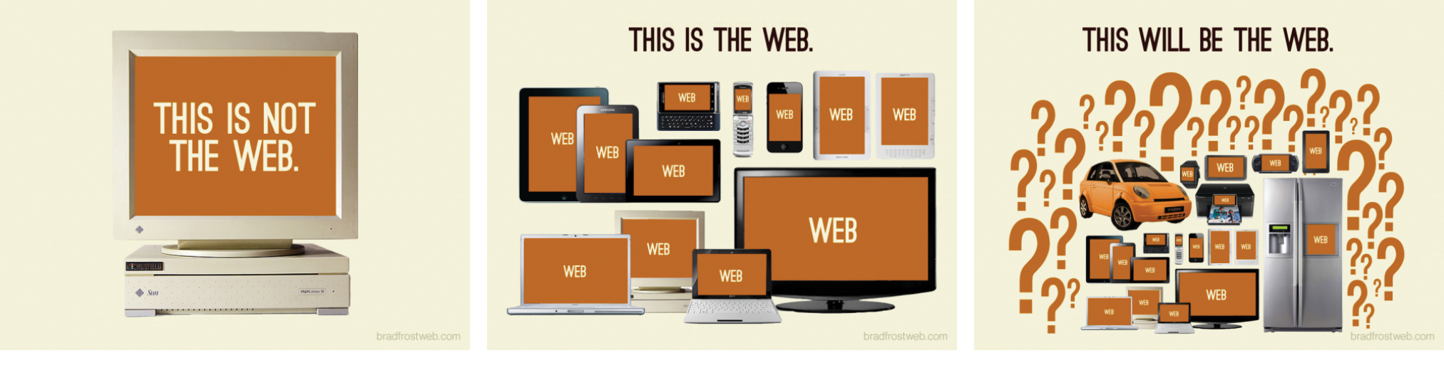
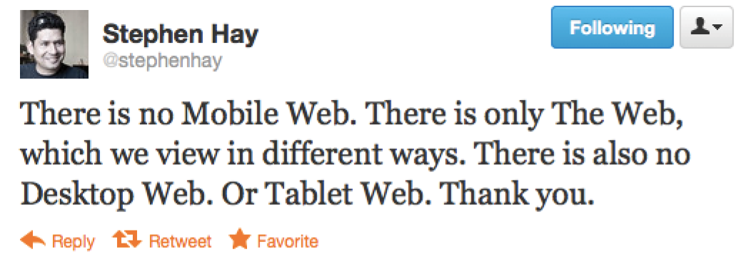
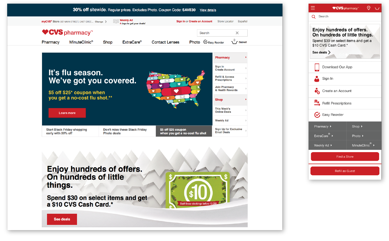
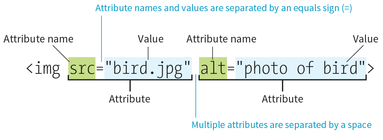
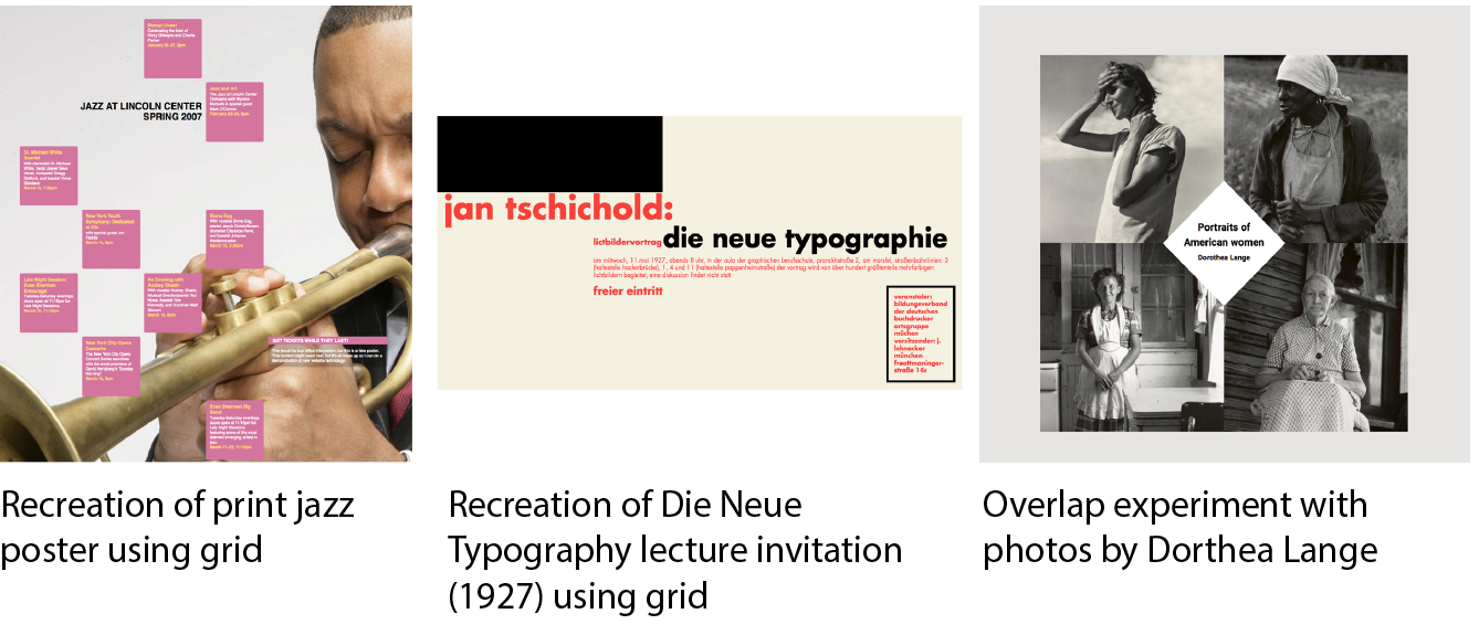
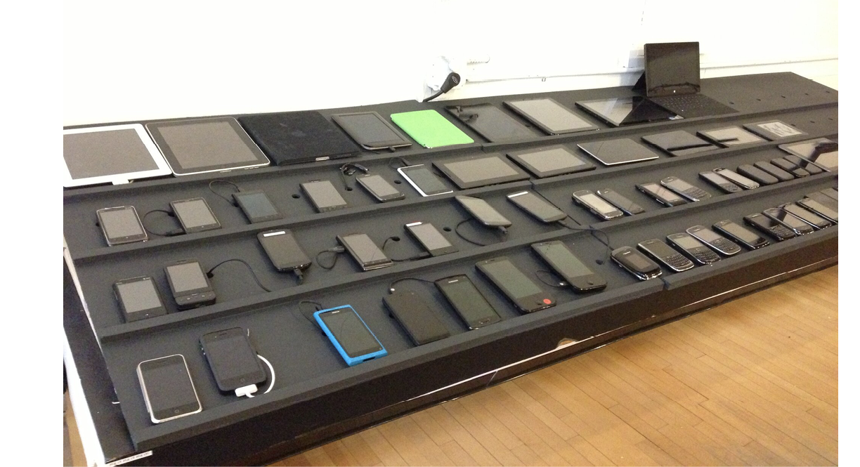
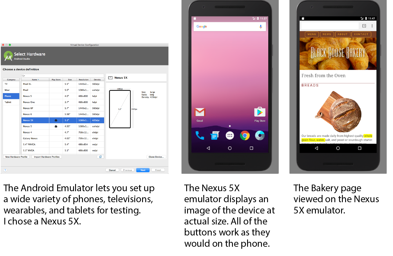
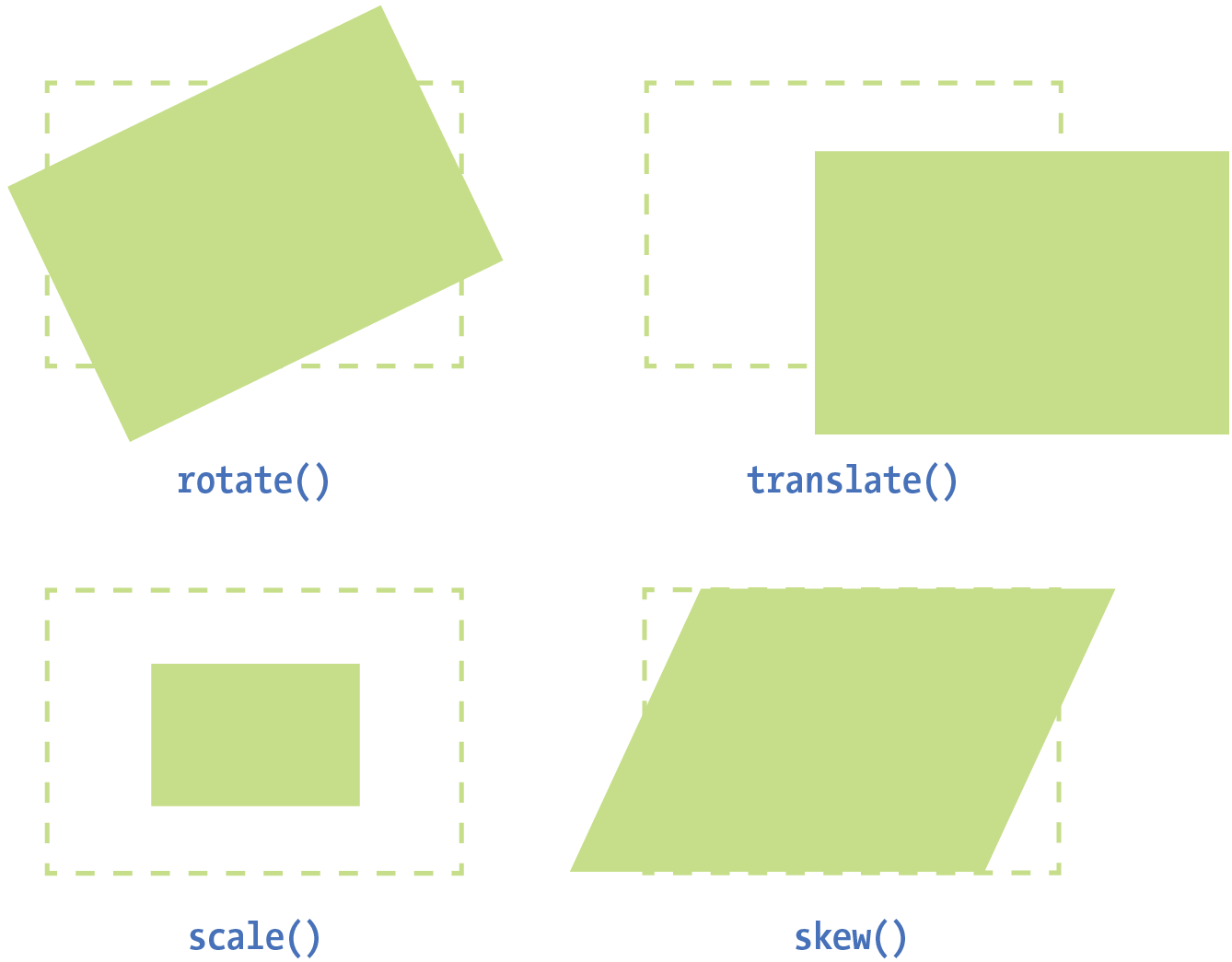
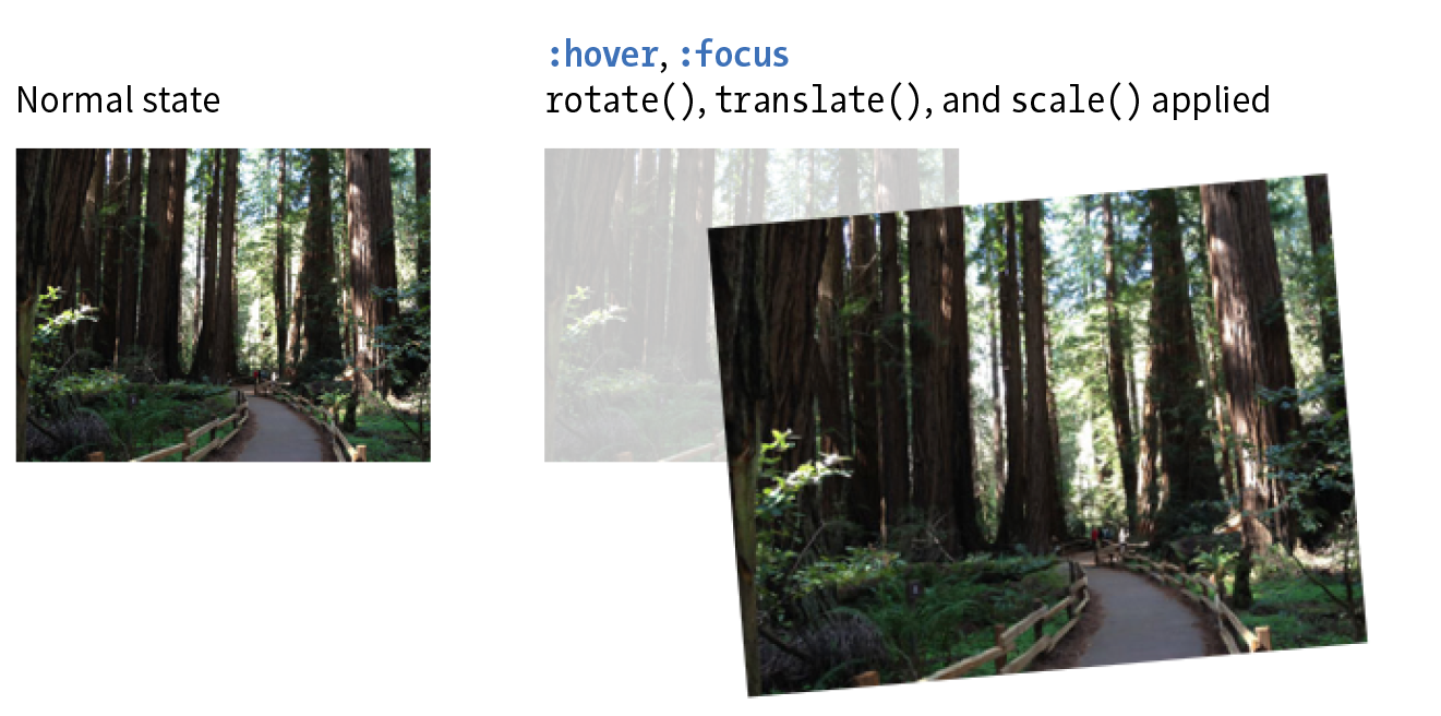