Table of Contents for
Learning Web Design, 5th Edition
 Learning Web Design, 5th Edition
Published by
O'Reilly Media, Inc., 2018
Learning Web Design, 5th Edition
Published by
O'Reilly Media, Inc., 2018
- cover
- Learning Web Design, Fifth Edition
- lwd5_title_copy
- lwd5_title_copy-1
- lwd5_contents
- Foreword
- Preface
- Part I. Getting Started
- 2. How the Web Works
- 3. Some Big Concepts You Need to Know
- Part II. HTML for STRUCTURE
- 5. Marking Up Text
- 6. Adding Links
- 7. Adding Images
- 8. Table Markup
- 9. Forms
- 10. Embedded Media
- Part III. CSS for Presentation
- 12. Formatting Text
- 13. Colors and Backgrounds
- 14. Thinking Inside the Box
- 15. Floating and Positioning
- 16. CSS Layout with Flexbox and Grid
- 17. Responsive Web Design
- 18. Transitions, Transforms, and Animation
- 19. More CSS Techniques
- 20. Modern Web Development Tools
- Part IV. JavaScript for Behavior
- 22. Using JavaScript
- Part V. Web Images
- 24. Image Asset Production
- 25. SVG
- Part VI. Appendices
- B. HTML5 Global Attributes
- C. CSS Selectors, Levels 3 and 4
- D. From HTML+ to HTML5
13
In this Chapter
CSS color names
RGB color values
Foreground and background colors
Tiling background images
Color gradients
Pseudo-class, pseudo-element, and attribute selectors
External style sheets
If you had seen the web back in 1993, you would have found it to be a dreary affair by today’s standards—every background was gray, and all the text was black. Then came Netscape Navigator and, with it, a handful of HTML attributes that allowed rudimentary (but welcome) control over font colors and backgrounds. For years, we made do. But thankfully, we now have style sheet properties that have laid those unmentionable presentational attributes to rest.
We’re going to cover a lot of ground in this chapter. Of course, I’ll introduce you to all of the properties for specifying colors and backgrounds. This chapter also rounds out your collection of selector types and shows you how to create an external style sheet. Our first order of business, however, is to explore the options for specifying color in CSS, including a primer on the nature of color on computer monitors.
Specifying Color Values
There are two main ways to specify colors in style sheets—with a predefined color name, as we have been doing so far:
color: red; color: olive; color: blue;
Or, more commonly, with a numeric value that describes a particular RGB color (the color model on computer monitors). You may have seen color values that look like these:
color: #FF0000; color: #808000; color: #00F;
We’ll get to all the ins and outs of RGB color in a moment, but first, a short and sweet section on the standard color names.
Color Names
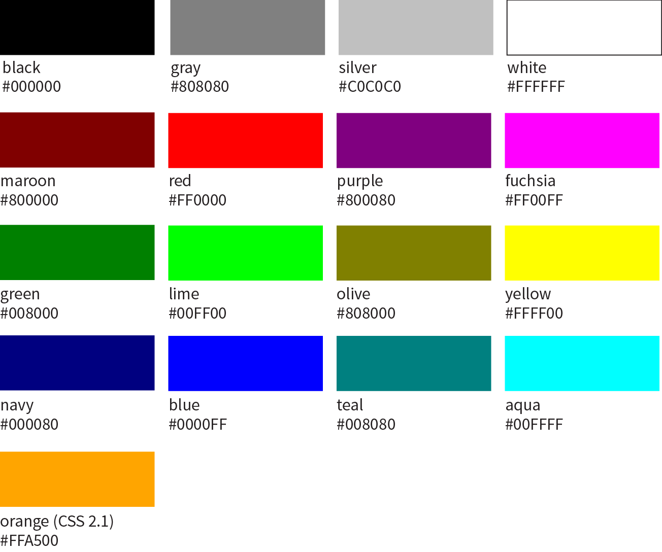
The most intuitive way to specify a color is to call it by name. Unfortunately, you can’t make up just any color name and expect it to work. It has to be one of the color keywords predefined in the CSS Recommendation. CSS1 and CSS2 adopted the 16 standard color names originally introduced in HTML 4.01. CSS2.1 tossed in orange for a total of 17 (Figure 13-1).
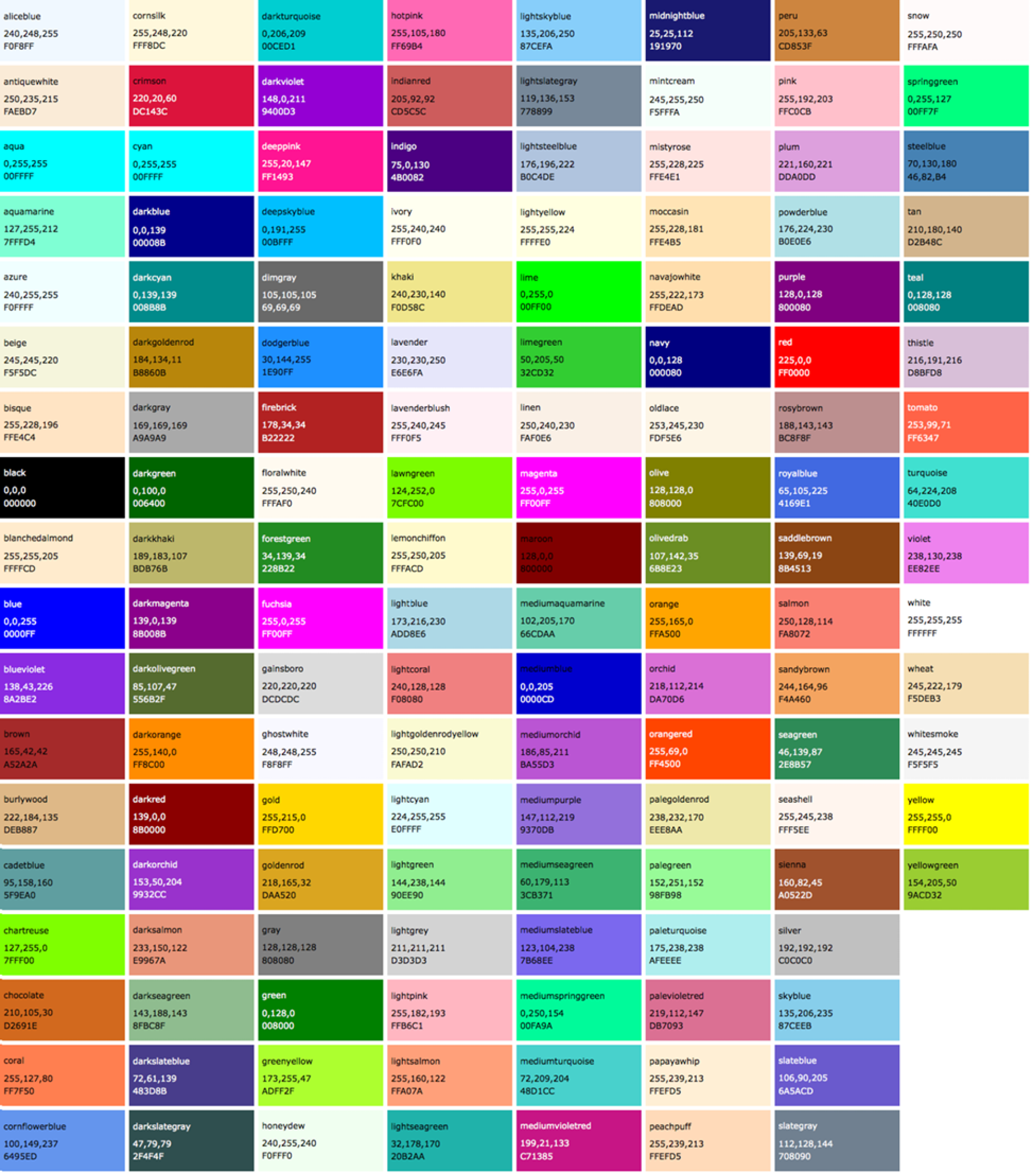
CSS3 adds support for the extended set of 140 (rather fanciful) color names. Now we can specify names like burlywood, peachpuff, oldlace, and my long-time favorite, papayawhip! The extended colors are shown in Figure 13-2, but if you want a more accurate view, point your browser at learningwebdesign.com/colornames.html. CSS3 also added the transparent keyword, which can be used with any property that has a color value.
Color names are easy to use—just drop one into place as the value for any color-related property:
color:silver;background-color:gray;border-bottom-color:teal;
RGB Color Values
Names are easy, but as you can see, they are limited. By far, the most common way to specify a color is by its RGB value. It also gives you millions of colors to choose from.
For those who are not familiar with how computers deal with color, I’ll start with the basics before jumping into the CSS syntax.
A word about RGB color
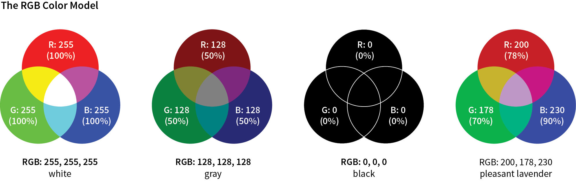
Computers create the colors you see on a monitor by combining three colors of light: red, green, and blue. This is known as the RGB color model. You can provide recipes (of sorts) for colors by telling the computer how much of each color to mix in. The amount of light in each color “channel” is typically described on a scale from 0 (none) to 255 (full blast), although it can also be provided as a percent. The closer the three values get to 255 (100%), the closer the resulting color gets to white (Figure 13-3). Wondering why the scale is from 0 to 255? See the “Why 255?” sidebar.
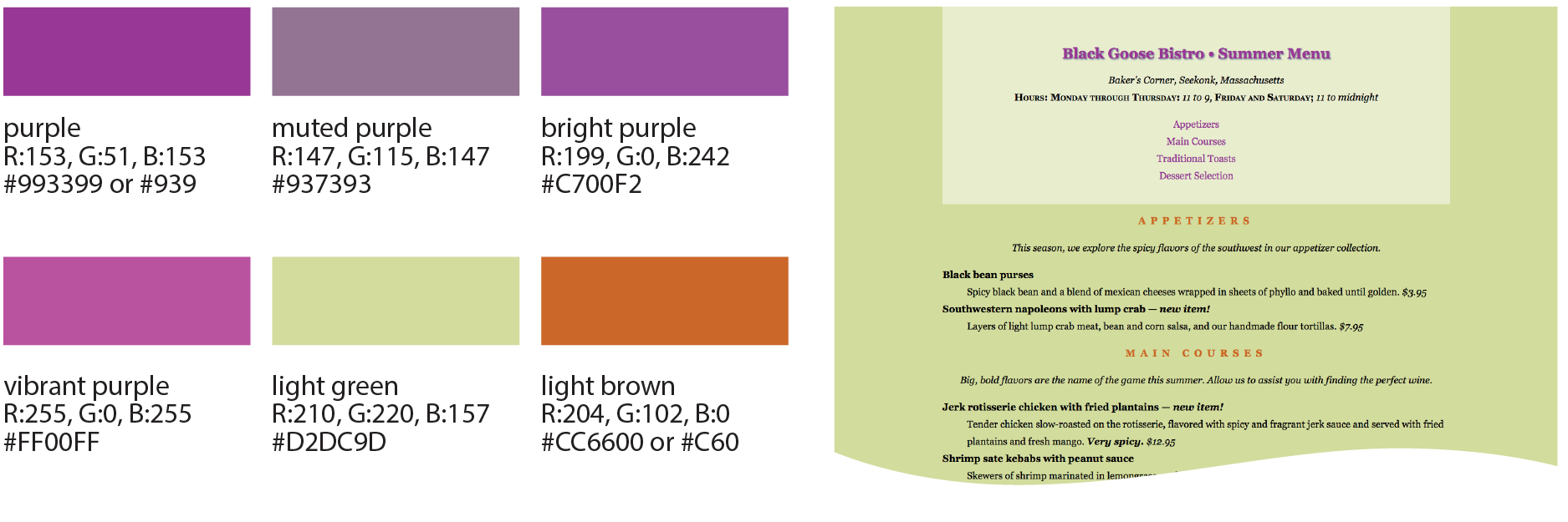
Any color you see on your monitor can be described by a series of three numbers: a red value, a green value, and a blue value. This is one of the ways that image editors such as Adobe Photoshop keep track of the colors for every pixel in an image. With the RGB color system, a pleasant lavender can be described as R:200, G:178, B:230.
Taken together, 255 colors in each channel can define around 16.7 million color combinations. This color space of millions of colors is known as Truecolor. There are different ways to encode those colors (that is, convert them to bytes for computers), and the web uses an encoding called sRGB. So, if you see an option for saving images as sRGB in a graphics program, click Yes.
Picking a color
There are a number of ways to pick a color and find its RGB color values. One quick and easy option is to go to Google.com and search “color picker,” and voilà—a full-featured color picker (Figure 13-4, left)! If you tend to keep an image-editing program such as Adobe Photoshop open and handy, you can use its built-in color picker (Figure 13-4, right).
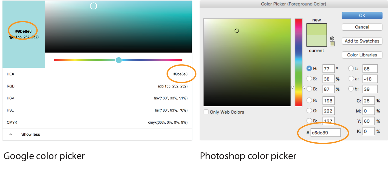
Both the Google and image editor color pickers show how the selected color would be expressed in a variety of color models (to reveal the values in Google, click “Show color values” below the picker). RGB is the most common for web design, so we’re focusing our attention on that one. HSL (Hue Saturation Lightness or Luminosity) is another option for specifying color in style sheets, and we’ll take a look at it in a moment (see Note). CMYK (Cyan Magenta Yellow blacK) is used primarily for print media, so you won’t use it except perhaps to translate print colors to their screen equivalents.
When you select a color from the spectrum in the color picker, the red, green, and blue values are listed, as pointed out in Figure 13-4. And look next to the # symbol—those are the same three values, converted to hexadecimal equivalents so they are ready to go in a style sheet. I’ll explain the six-digit hex values in a moment.
Writing RGB values in style sheets
CSS allows RGB color values to be specified in a number of formats. Going back to that pleasant lavender, we could add it to a style sheet by listing each value on a scale from 0 to 255:
color: rgb(200, 178, 230);
You can also list them as percentage values, although that is less common:
color: rgb(78%, 70%, 90%);
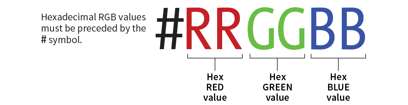
Or, you can provide the six-digit hexadecimal version that we saw in the color pickers. These six digits represent the same three RGB values, except they have been converted into hexadecimal (or hex for short) equivalents. Note that hex RGB values are preceded by the # symbol and do not require the rgb() notation shown in the previous examples. They may be upper- or lowercase, but it is recommended that you be consistent:
color: #C8B2E6;
There is one last shorthand way to specify hex color values. If your value happens to be made up of three pairs of double digits or letters, such as
color:#FFCC00; or color:#993366;
you can condense each pair down to one digit or letter. It’s easier to type and to read, and it slightly reduces the size of your file. These examples are equivalent to the ones just listed:
color:#FC0; or color:#936;
About hexadecimal values
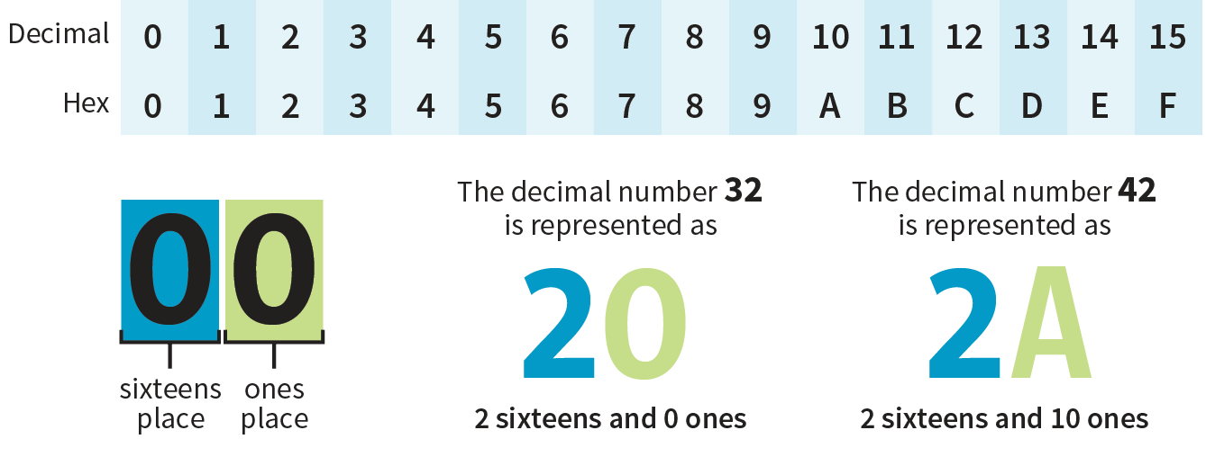
It’s time to clarify what’s going on with that six-digit string of characters. What you’re looking at is actually a series of three two-digit numbers, one each for red, green, and blue. But instead of decimal (base-10, the system we’re used to), these values are written in hexadecimal, or base-16. Figure 13-5 shows the structure of the hex RGB value.
The hexadecimal numbering system uses 16 digits: 0–9 and A–F (for representing the quantities 10–15). Figure 13-6 shows how this works. The hex system is used widely in computing because it reduces the space it takes to store certain information. For example, the RGB values are reduced from three to two digits once they’re converted to hexadecimal.
Now that most graphics and web development software provides easy access to hexadecimal color values (as we saw in Figure 13-4), there isn’t much need to translate RGB values to hex yourself, as we needed to do back in the old days. Should you need to, there are plenty of decimal-to-hexadecimal converters online.
RGBa Color
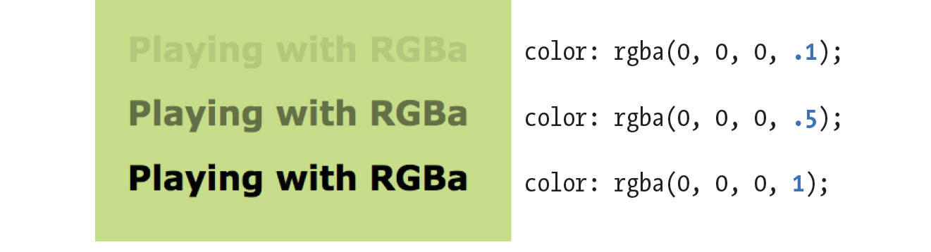
RGBa color allows you to specify a color and make it as transparent or as opaque as you like. The “a” in “RGBa” stands for alpha, which is an additional channel that controls the level of transparency on a scale from 0 (fully transparent) to 1 (fully opaque). Here’s how it looks written in a style rule:
color: rgba(0, 0, 0, .5);
The first three values in the parentheses are regular old RGB values, in this case creating the color black. The fourth value, .5, is the transparency level. So this color is black with 50% transparency. That allows other colors or background patterns to show through slightly (Figure 13-7).
Browser Support Note
Internet Explorer versions 8 and earlier do not support RGBa color, so if a significant percentage of your users have those browsers, you may want to provide a fallback. Pick an RGB color that approximates the look you’re going for and list it first in the style rule. IE ignores the RGBa value, and supporting browsers will override the opaque color when they get to the second declaration.
h1 { color: rgb(120, 120, 120); color: rgba(0, 0, 0, .5);}
HSL Color
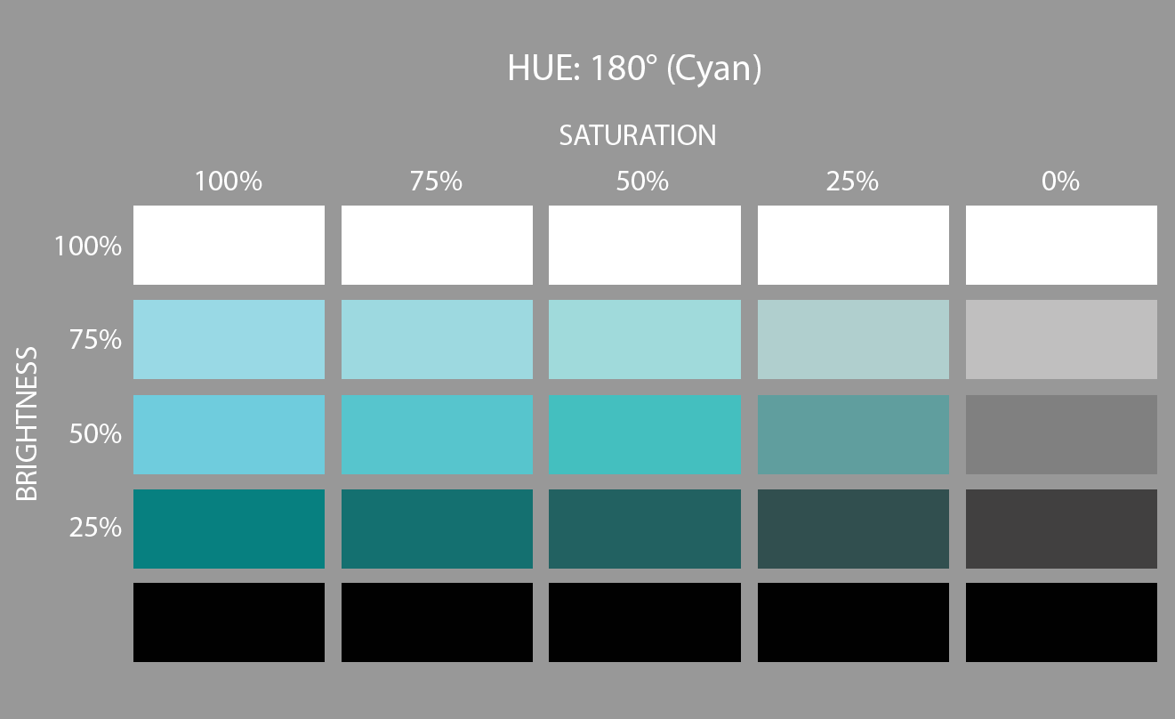
CSS3 introduced the ability to specify colors by their HSL values: Hue (color), Saturation, and Lightness (or Luminosity). In this system, the colors are spread out around a circle in the order of the rainbow, with red at the top (12 o’clock) position. Hue values are then measured in degrees around the circle: red at 0°/360°, green at 120°, and blue at 240°, with other colors in between. Saturation is a percentage value from 0% (gray) to 100% (color at full blast). Lightness (or brightness) is also a percentage value from 0% (darkest) to 100% (lightest).
Figure 13-8 shows one hue, cyan (located at 180° on the wheel) with its associated saturation and lightness levels. You can see why some people find this system more intuitive to use, because once you lock into a hue, it is easy to make it stronger, darker, or lighter by increasing or decreasing the percentage values. RGB values are not intuitive at all, although some practiced designers develop a feel for them.
In CSS, HSL values are provided as the hue value and two percentages. They are never converted to hexadecimal values, as may be done for RGB. Here is that lavender from Figure 13-3 as it would be specified using HSL:
color: hsl(265, 51%, 80%);
Picking HSL color
There are a number of HSL color pickers online. In the Google color picker, click “Show color values” below the panel to reveal the HSL values for your selected color. Here are some other cool tools worth checking out:
- A Most Excellent HSL Color Picker by Brandon Mathis (hslpicker.com/)
- HSL Color Picker (www.workwithcolor.com/hsl-color-picker-01.htm)
- HSLa Explorer by Chris Coyier at CSS-Tricks (css-tricks.com/examples/HSLaExplorer/)
HSLa color
As with RGB, you can add an alpha channel to set the transparency of HSL colors, resulting in the HSLa color model. As for RGBa, the fourth value is the degree of transparency on a scale from 0 (fully transparent) to 1 (fully opaque). This example specifies a spring green color that is 65% opaque:
color:hsla(70, 60%, 58%,.65);
Summing Up Color Values
It took us a few pages to get here, but the process for picking and specifying colors in style sheets is actually easy:
- Pick one of the predefined color names,
or
- Use a color picker to select a color and copy down the RGB values (preferably the six-digit hex values). Put those values in the style rule using one of the four RGB value formats, and you’re done. Or you could use HSL, if that feels easier to you.
There is one more colorful way to fill an element, and that’s gradients (colors that fade from one hue to another), but I’m going to save them for the end of this chapter.
Foreground Color
Now that we know how to write color values, let’s get to the color-related properties. You can specify the foreground and background colors for any HTML element. There are also border-color properties that take color values, but we’ll get to those in Chapter 14, Thinking Inside the Box.
The foreground of an element consists of its text and border (if one is specified). You specify a foreground color with the color property, as we saw in the last chapter when we rolled it out to give text a little pizzazz. Here are the details for the color property one more time.
color
Values: color value (name or numeric)
Default: depends on the browser and user’s preferences
Applies to: all elements
Inherits: yes
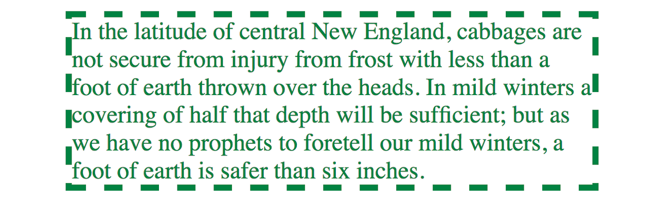
In the following example, the foreground of a blockquote element is set to green with a color name. You can see that applying the color property to the blockquote element means the color is inherited by the p and em elements it contains (Figure 13-9). The thick dashed border around the whole blockquote is green as well; however, if we were to apply a border-color property to this same element, that color would override the green foreground setting.
The foreground of an element consists of its text and border (if one is specified).
The style rule
blockquote { border: 4px dashed; color: green;}
The markup
<blockquote>In the latitude of central New England, cabbages are not secure ... </blockquote>
Background Color
Use background-color to apply a background color to any element.
background-color
Values: color value (name or numeric) | transparent
Default: transparent
Applies to: all elements
Inherits: no
A background color fills the canvas behind the element that includes the content area, and any padding (extra space) added around the content, extending behind the border out to its outer edge. Let’s see what happens when we use the background-color property to make the background of the same sample blockquote light green (Figure 13-10):
blockquote { border: 4px dashed; color: green; background-color: #c6de89;}
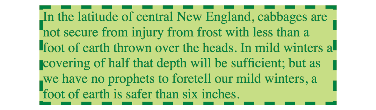
As expected, the background color fills the area behind the text, all the way to the border. Look closely at the gaps in the border, and you’ll see that the background color goes to its outer edge. But that’s where the background stops; if we apply a margin around this element, the background will not extend into the margin. We’ll revisit all these components of an element when we talk about the CSS box model. For now, just know that, by default, if your border has gaps, the background will show through.
It’s worth noting that background colors do not inherit, but because the default background setting for all elements is transparent, the parent’s background color shows through its descendant elements. For example, you can change the background color of a whole page by applying the background-color property to the body element and the color will show through all the elements on the page (see ).
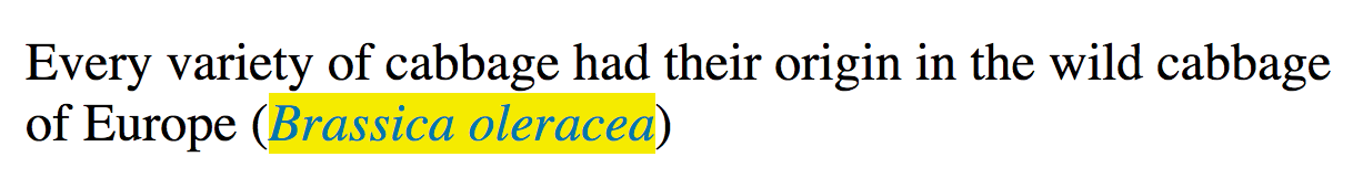
In addition to setting the color of the whole page, you can change the background color of any element, both block-level (like the blockquote shown in the previous example) as well as inline. In this example, I’ve used the color and background-color properties to highlight a word marked up as a “glossary” term. You can see in Figure 13-11 that the background color fills the little box created by the inline dfn element.
The style rule
.glossary { color: #0378a9; /* blue */
background-color: yellow; }
The markup
<p>Every variety of cabbage had their origin in the wild cabbage of Europe (<dfn class="glossary"><i>Brassica oleracea</i></dfn>)</p>
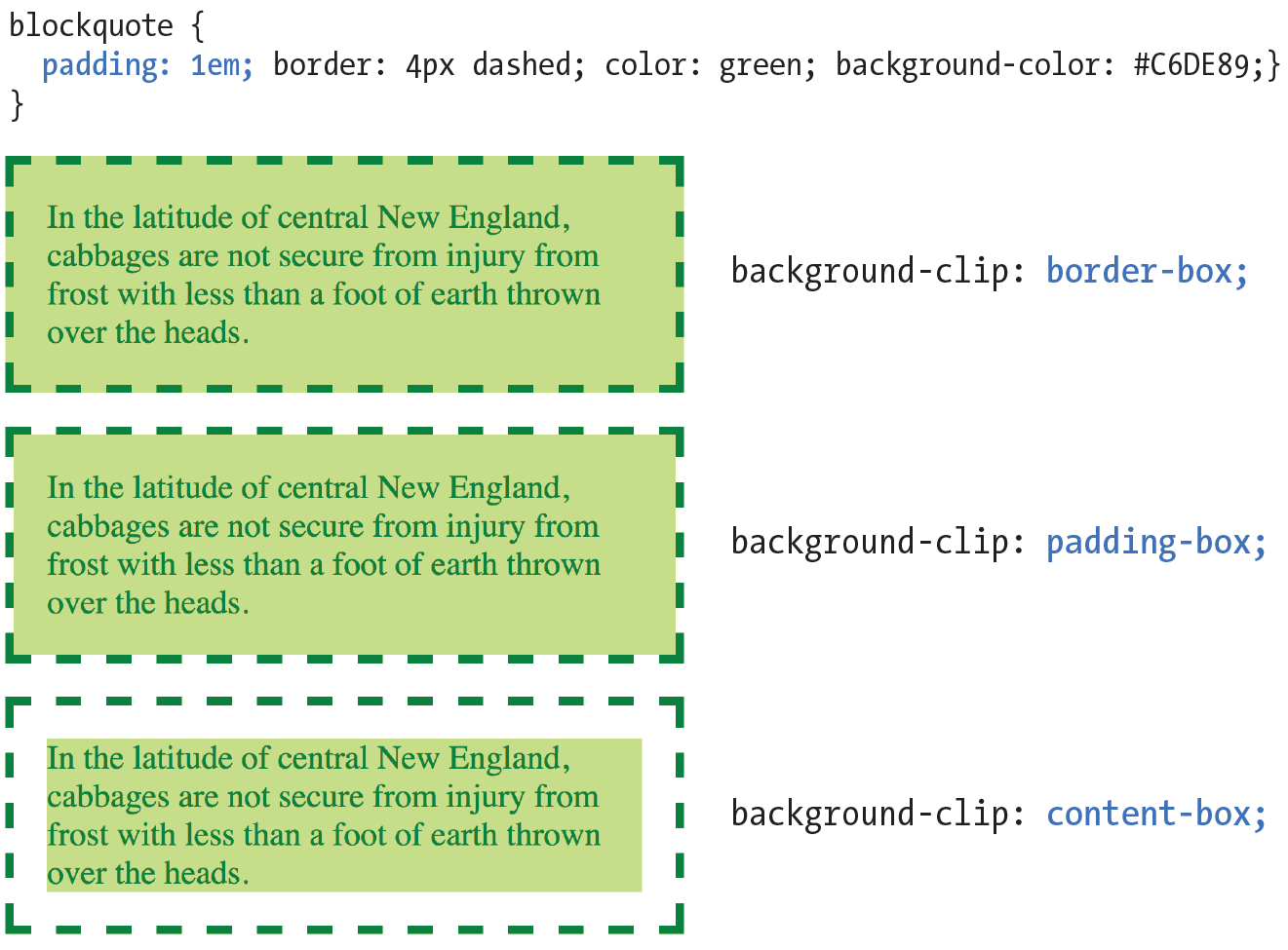
Clipping the Background
Traditionally, the background painting area (the area on which fill colors are applied) of an element extends all the way out to the outer edge of the border, as we saw in Figure 13-10. CSS3 introduced the background-clip property to give designers more control over where the painting area begins and ends.
background-clip
Values: border-box | padding-box | content-box
Default: border-box
Applies to: all elements
Inherits: no
The default border-box value draws the painting area to the outside edge of the border, as we’ve seen. Figure 13-12 shows that padding-box starts the painting area on the outside edge of the padding area for the element (and to the inside edge of the border). Finally, content-box allows the background to fill only the content area for the element.
I can’t help but feel like I’m spoiling the surprise of the element box model and its properties here a little, since I was saving that for the next chapter. I’ve added some padding (space between the content and the border) so the effects of the clip settings will be more apparent.
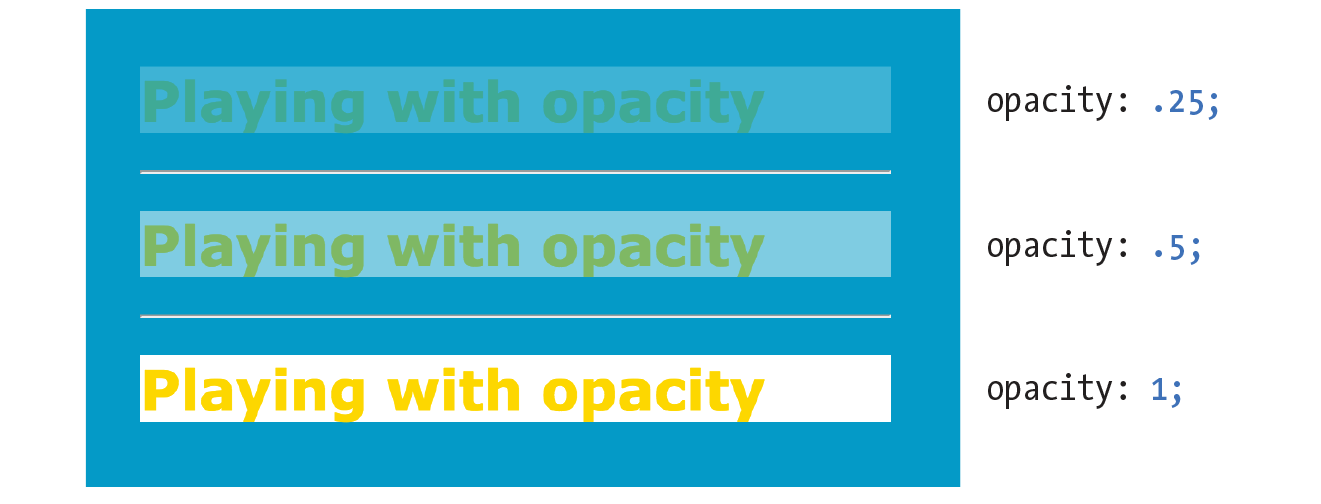
Playing with Opacity
Earlier, we talked about the RGBa color format, which adds a level of transparency when it is applied to a color or background. There is another way to make an element slightly see-through, however—the CSS3 opacity property.
opacity
Values: number (0 to 1)
Default: 1
Applies to: all elements
Inherits: no
The value for opacity is a number between 0 (completely transparent) and 1 (completely opaque). A value of .5 gives the element an opacity of 50%. The opacity setting applies to the entire element—both the foreground and the background (if one has been set). If you want to affect just one or the other, use an RGBa color value instead.
The opacity setting applies to the entire element—both the foreground and the background.
In the following code example (and Figure 13-13), a heading has been given a color of gold and a background color of white. When the opacity property is set, it allows the blue background of the page to show through both the text and the element box.
h1 {color: gold; background: white; opacity: .25;} h1 {color: gold; background: white; opacity: .5;} h1 {color: gold; background: white; opacity: 1;}
You may be itching to take these color and background properties out for a spin, and we will in a moment, but first, I want to introduce you to some of the fancier CSS selectors and round out your collection. The “At a Glance” sidebar lists the selectors you should feel comfortable with so far.
Browser Support Note
The property is not supported in Internet Explorer versions 8 and earlier. If you need to support IE8, use a style rule with Microsoft’s proprietary property, then override it with the standard opacity style rule.
h1 {
filter:alpha(opacity=50);
opacity: .5;
}
Pseudo-Class Selectors
Have you ever noticed that a link is often one color when you click it and another color when you go back to that page? That’s because, behind the scenes, your browser is keeping track of which links have been clicked (or “visited,” to use the lingo). The browser keeps track of other states too, such as whether the user’s cursor is over an element (hover state), whether an element is the first of its type, whether it’s the first or last child of its parent, and whether a form element has been checked or disabled, just to name a few.
In CSS, you can apply styles to elements in these states by using a special kind of selector called a pseudo-class selector. It’s an odd name, but you can think of it as though elements in a certain state belong to the same class. However, the class name isn’t in the markup—it’s something the browser just keeps track of. So it’s kinda like a class…it’s a pseudo-class.
Pseudo-class selectors are indicated by the colon (:) character. They typically go immediately after an element name—for example, li:first-child.
There are quite a few pseudo-classes in CSS3, and the W3C has been going a little crazy in the CSS Selector Module Level 4 slinging around new pseudo-classes, the majority of which have no browser support as of this writing. In this section, I’ll introduce you to the most commonly used and the best supported as a solid starter kit. You can explore the cutting-edge selectors as you gain more experience. The full list of CSS selectors (including Level 4), with descriptions, can be found in Appendix C.
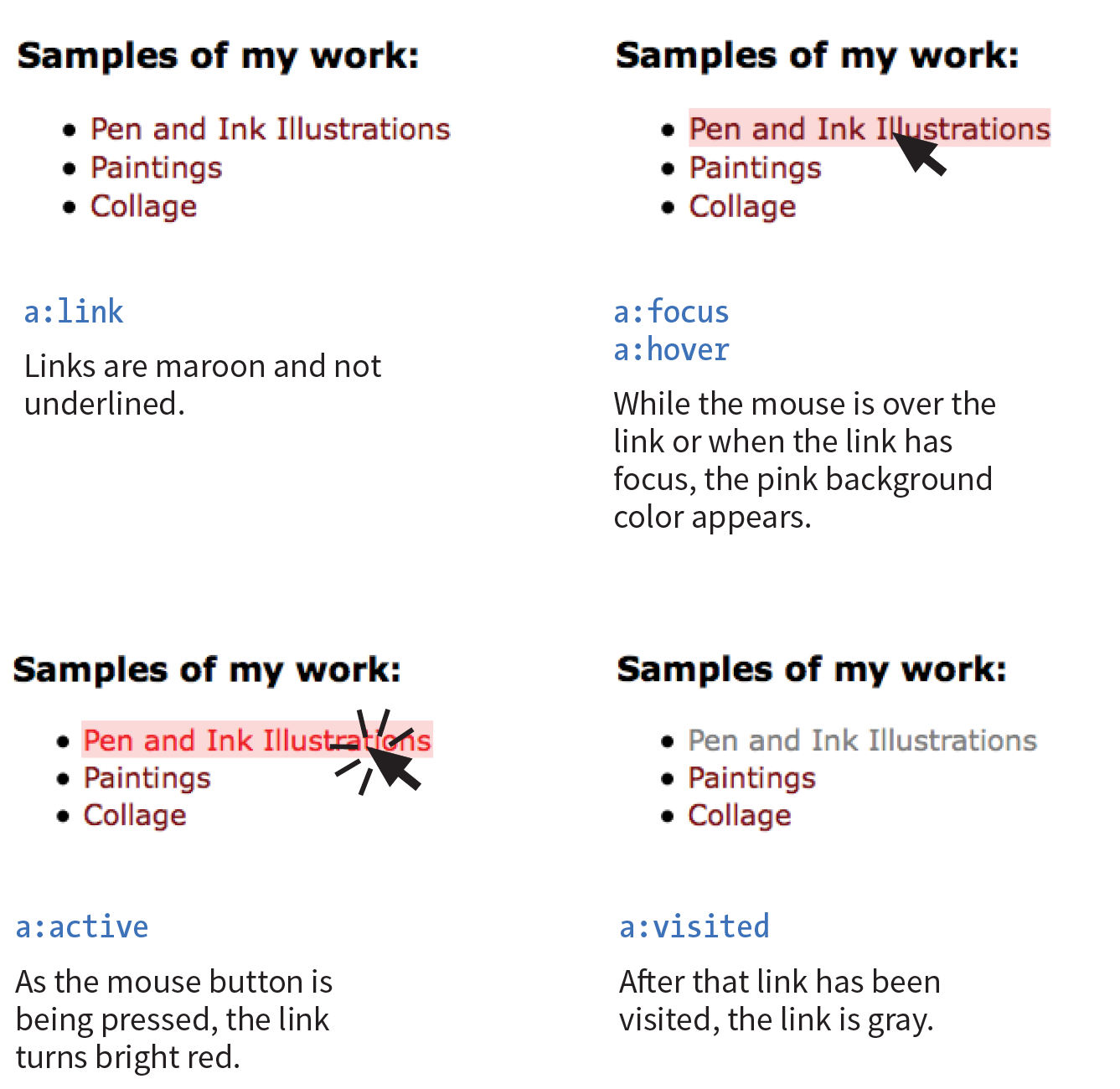
Link Pseudo-Classes
The most basic pseudo-class selectors target links (a elements) based on whether they have been clicked. Link pseudo-classes are a type of dynamic pseudo-class because they are applied as the result of the user interacting with the page rather than something in the markup.
|
:link |
|
|
:visited |
By default, browsers typically display linked text as blue and links that have been clicked as purple, but you can change that with a few style rules. There are limitations on what properties may be applied to :visited links, as explained in the “Visited Links and Security” sidebar.
In these examples, I’ve changed the color of unclicked links to maroon and visited links to gray. It is common for visited links to be a more muted color than unclicked links:
a:link{ color: maroon;}a:visited{ color: gray;}
User Action Pseudo-Classes
Another type of dynamic pseudo-class targets states that result from direct user actions.
:focus Applies when the element is selected and ready for input
:hover Applies when the mouse pointer is over the element
:active Applies when the element (such as a link or button) is in the process of being clicked or tapped
Focus state
If you’ve ever used a web form, then you should be familiar with how a browser visually emphasizes a form element when you select it. When an element is highlighted and ready for input, it is said to have “focus.” The :focus selector lets you apply custom styles to elements when they are in the focused state.
In this example, when a user selects a text input, it gets a yellow background color to make it stand out from the other form inputs:
input:focus { background-color: yellow; }Hover state
The :hover selector is an interesting one. It targets elements while the user’s mouse pointer is directly over them. You can use the hover state with any element, although it is most commonly used with links to give the user visual feedback that an action is possible. Hover states are also used to trigger pop-up menus for navigation or for revealing more information about an object on the page.
This rule gives links a light pink background color while the mouse hovers over them:
a:hover{ color: maroon;background-color: #ffd9d9;}
In the previous chapter, we saw the text-decoration property used to turn off underlines under links. You could use the :hover selector to make the underlines appear only “on hover”:
a:hover { text-decoration: underline;}
It is important to note that there is no true hover state on touch-screen devices such as smartphones and tablets, so hover effects must be used with care and alternative solutions (see the sidebar “Hover on Touch Devices”).
Active state
Finally, the :active selector applies styles to an element while it is in the process of being activated. In the case of a link, it is the style that is applied while it is being clicked or while a fingertip is in contact with it on a touch screen. This style may be displayed only for an instant, but it can give a subtle indication that something has happened. In this example, I’ve brightened up the color for the active state (from maroon to red):
a:active { color: red; background-color: #ffd9d9;}Putting It All Together
Web designers commonly provide styles for all of these link states because it is an easy way to give a nice bit of feedback at every stage of clicking a link (and it usually improves on the browser defaults). In fact, users have come to expect this feedback: seeing at a glance which links have been followed, having links do something when they point at them, and receiving confirmation when the links are successfully clicked.
When you apply styles to a elements with all five pseudo-classes, the order in which they appear is important for them to function properly. For example, if you put :link or :visited last, they override the other states, preventing them from appearing. The required order for link pseudo-classes is :link, :visited, :focus, :hover, :active (LVFHA, which you can remember with LoVe For Hairy Animals, or the mnemonic device of your choice).
The required order for pseudo-classes is:
:link :visited :focus :hover :active
It is recommended that you provide a :focus style for users who use the keyboard to tab through links on a page rather than clicking with a mouse. Applying the same style used for :hover is common, although not required.
To sum things up, the link styles I’ve shown should look like this in the style sheet. Figure 13-14 shows the results.
a { text-decoration: none; } /* turns underlines off for all links */
a:link { color: maroon; } a:visited { color: gray; } a:focus { color: maroon; background-color: #ffd9d9; } a:hover { color: maroon; background-color: #ffd9d9; } a:active { color: red; background-color: #ffd9d9; }
Other Pseudo-Class Selectors
OK…five CSS3 pseudo-classes down, only 40 more to go! Well, I don’t know about you, but that sounds like it would take a while, and we have other selector types to explore. However, I do want you to know what is possible today and what is in the works, so I’ve tucked the CSS3 pseudo-class selectors into the “More CSS Pseudo-Classes” sidebar. In addition, you can find the complete list of Level 3 and 4 selectors in Appendix C, CSS Selectors, Levels 3 and 4 with brief descriptions.
I also highly recommend reading “An Ultimate Guide to CSS Pseudo-Classes and Pseudo-Elements” by Ricardo Zea of Smashing Magazine (www.smashingmagazine.com/2016/05/an-ultimate-guide-to-css-pseudo-classes-and-pseudo-elements/). He’s done the hard work of providing explanations and examples of all of the CSS3 pseudo-class selectors in one big roundup.
Pseudo-Element Selectors
Pseudo-classes aren’t the only kind of pseudo-selectors. There are also four pseudo-elements that act as though they are inserting fictional elements into the document structure for styling. In CSS3, pseudo-elements are indicated by a double colon (::) symbol to differentiate them from pseudo-classes. However, all browsers support the single-colon syntax (:) as they were defined in CSS2, so many developers stick with that to ensure backward compatibility with older browsers.
First Letter and Line
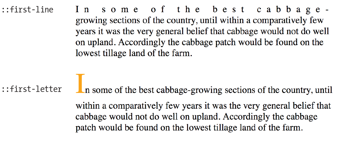
The following pseudo-elements are used to select the first line or the first letter of text in an element as displayed in the browser.
::first-line
This selector applies a style rule to the first line of the specified element. The only properties you can apply, however, are as follows:
color fontpropertiesbackgroundpropertiesword-spacing letter-spacing text-decoration vertical-align text-transform line-height
::first-letter
This applies a style rule to the first letter of the specified element. The properties you can apply are limited to the following:
colorfontpropertiesbackgroundpropertiesletter-spacing word-spacing text-decoration text-transform vertical-align(if float is none)paddingpropertiesmarginpropertiesborderpropertiesline-height float
Figure 13-15 shows examples of the ::first-line and ::first-letter pseudo-element selectors.
p::first-line{ letter-spacing: 9px; }p::first-letter{ font-size: 300%; color: orange; }
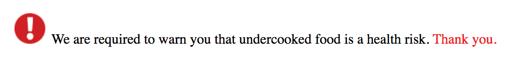
Generated Content with ::before and ::after
You’ve seen how browsers add bullets and numbers to lists automatically, even though they are not actually in the HTML source. That is an example of generated content, content that browsers insert on the fly. It is possible to tell browsers to generate content before or after any element you like by using the ::before and ::after pseudo-elements (see Note).
Note
Although double colons are specified in CSS3, you can use single colons for backward compatibility. Browsers are also required to support single colons going forward.
Generated content could be used to add icons before list items, to display URLs next to links when web documents get printed out, to add language-appropriate quotation marks around a quote, and much more. Here’s a simple example that inserts an image by using the url() function before the paragraph and “Thank you.” at the end of the paragraph. Compare the markup to what you see rendered in the browser (Figure 13-16).
The styles:
p.warning::before{content: url(exclamation.png); margin-right: 6px; }p.warning::after{content: " Thank you."; color: red; }
The markup:
<p class="warning">We are required to warn you that undercooked food is a health risk.</p>
There are a few things of note in this example:
- The pseudo-element selector goes immediately after the target element without any space.
- The pseudo-element rule both inserts the content and specifies how it should be styled in one declaration block.
- The content property, which provides the content you want inserted, is required. The selector won’t do anything without it.
- If you want spaces between the generated content and the content from the source document, you must include the character spaces inside the value’s quotation marks or apply a margin.
If you want to insert an image, such as an icon or other mark, specify the URL without quotations marks:
li:before { content: url(images/star.png) }
When using generated content, keep in mind that whatever you insert does not become part of the document’s DOM. It exists in the browser’s display only and is not accessible to assistive devices like screen readers. It is best to use generated content for decorations and other “extras” that are not critical to your meaning and message.
Attribute Selectors
We’re finally in the home stretch with selectors. Attribute selectors target elements based on attribute names or values, which provides a lot of flexibility for selecting elements without needing to add a lot of class or id markup. The CSS3 attribute selectors are listed here:
element[attribute]
The simple attribute selector targets elements with a particular attribute regardless of its value. The following example selects any image that has a title attribute.
img[title] {border: 3px solid;}element[attribute="exact value"]
The exact attribute value selector selects elements with a specific value for the attribute. This selector matches images with exactly the title value “first grade”.
img[title="first grade"] {border: 3px solid;}element[attribute~="value"]
The partial attribute value selector (indicated with a tilde, ~) allows you to specify one part of an attribute value. The following example looks for the word “grade” in the title, so images with the title value “first grade” and “second grade” would be selected.
img[title~="grade"] {border: 3px solid;}element[attribute|="value"]
The hyphen-separated attribute value selector (indicated with a bar, |) targets hyphen-separated values. This selector matches any link that points to a document written in a variation on the English language (en), whether the attribute value is en-us (American English), en-in (Indian English), en-au-tas (Australian English), and so on.
[hreflang|="en"] {border: 3px solid;}element[attribute^="first part of the value"]
The beginning substring attribute value selector (indicated with a carat, ^) matches elements whose specified attribute values start in the string of characters in the selector. This example applies the style only to images that are found in the /images/icons directory.
img[src^="/images/icons"] {border: 3px solid;}element[attribute$="last part of the value"]
The ending substring attribute value selector (indicated with a dollar sign, $) matches elements whose specified attribute values end in the string of characters in the selector. In this example, you can apply a style to just the a elements that link to PDF files.
a[href$=".pdf"] {border-bottom: 3px solid;}element[attribute*="any part of the value"]
The arbitrary substring attribute value selector (indicated with an asterisk, *) looks for the provided text string in any part of the attribute value specified. This rule selects any image that contains the word “February” somewhere in its title.
img[title*="February"] {border: 3px solid;}OK, we’re done with selectors! You’ve been a real trouper. I think it’s definitely time to try out foreground and background colors as well as a few of these new selector types in Exercise 13-1 before moving on to background images.
Background Images
We’ve seen how to add images to the content of the document by using the img element, but most decorative images are added to pages and elements as backgrounds with CSS. After all, decorations such as tiling background patterns are firmly part of presentation, not structure. We’ve come a long way from the days when sites were giant graphics cut up and held together with tables (shudder).
In this section, we’ll look at the collection of properties used to place and push around background images, starting with the basic background-image property.
Adding a Background Image
The background-image property adds a background image to any element. Its primary job is to provide the location of the image file.
background-image
Values: url(location of image) | none
Default: none
Applies to: all elements
Inherits: no
The value of background-image is a sort of URL holder that contains the location of the image (see Note).
The URL is relative to wherever the CSS rule is at the time. If the rule is in an embedded style sheet (a style element in the HTML document), then the pathname in the URL should be relative to the location of the HTML file. If the CSS rule is in an external style sheet, then the pathname to the image should be relative to the location of the .css file.
As an alternative, providing site root relative URLs for images ensures that the background image can be found regardless of the location of the style rules. The root directory is indicated by a slash at the beginning of the URL. For example:
background-image: url(/images/background.jpg);
The downside, as for all site root relative URLs, is that you won’t be able to test it locally (from your own computer) unless you have it set up as a server.
These examples and Figure 13-18 show background images applied behind a whole page (body) and a single blockquote element with padding and a border applied.
body { background-image: url(star.png); } blockquote { background-image: url(dot.png); padding: 2em; border: 4px dashed; }
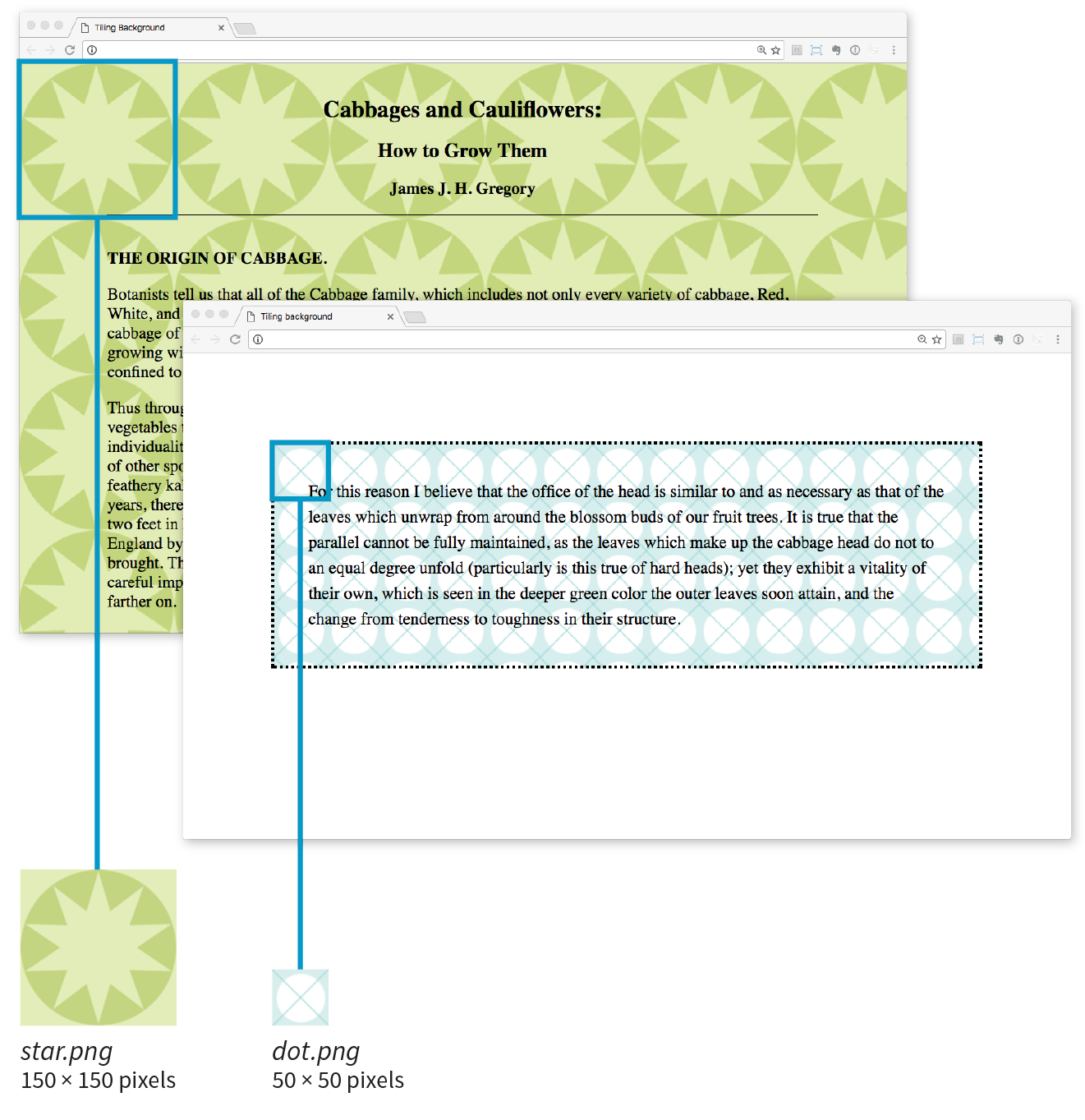
Here you can see the default behavior of background-image. The image starts in the top-left corner and tiles horizontally and vertically until the entire element is filled (although you’ll learn how to change that in a moment). Like background colors, tiling background images fill the area behind the content area, fill the extra padding space around the content, and extend to the outer edge of the border (if there is one). You can change the background painting area with the background-clip property.
If you provide both a background-color and a background-image to an element, the image is placed on top of the color. In fact, it is recommended that you do provide a backup color that is similar in hue, in the event that the image fails to download.
Now you can try your hand at adding a tiling background image to a page in Exercise 13-2.
Background Repeating
As we saw in Figure 13-18, images tile left and right, up and down, when left to their own devices. You can change this behavior with the background-repeat property.
background-repeat
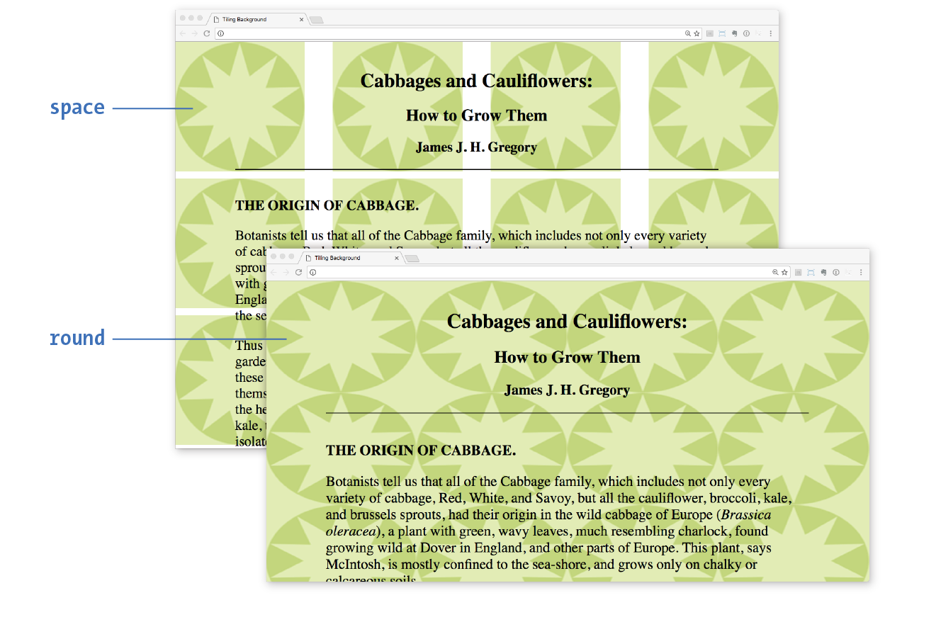
Values: repeat | no-repeat | repeat-x | repeat-y | space | round
Default: repeat
Applies to: all elements
Inherits: no
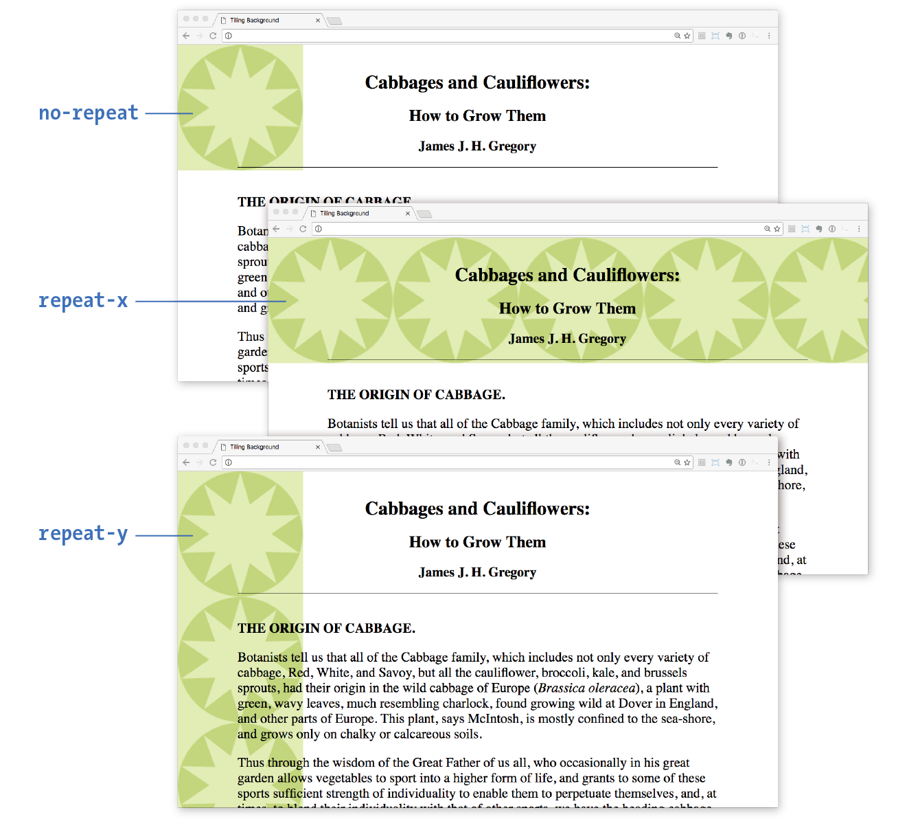
If you want a background image to appear just once, use the no-repeat keyword value:
body { background-image: url(star.png); background-repeat: no-repeat;}
You can also restrict the image to tiling only horizontally (repeat-x) or vertically (repeat-y), as shown in these examples:
body { background-image: url(star.png); background-repeat: repeat-x;}body { background-image: url(star.png); background-repeat: repeat-y;}
Figure 13-20 shows examples of each of these keyword values. Notice that in all the examples, the tiling begins in the top-left corner of the element (or browser window when an image is applied to the body element). In the next section, I’ll show you how to change that.
The remaining keyword values, space and round, attempt to fill the available background painting area an even number of times.
When background-repeat is set to space, the browser calculates how many background images can fit across the width and height of the background area, then adds equal amounts of space between each image. The result is even rows and columns and no clipped images (Figure 13-21).
The round keyword makes the browser squish the background image horizontally and vertically (not necessarily proportionally) to fit in the background area an even number of times (Figure 13-21).
Browser support note
Internet Explorer 8 and earlier do not support the and keywords for .
Let’s try out some background repeating patterns in Exercise 13-3.
Exercise 13-3. Controlling tile direction
- Save the file and look at it in the browser. It should look something like Figure 13-22. I recommend resizing your browser window wider and narrower and paying attention to the position of the background pattern. See how it’s always anchored on the left? You’re going to learn how to adjust position next. Try changing the style rule to make the dot repeat vertically only; then make it not repeat at all (set it back to and save when you’re done).
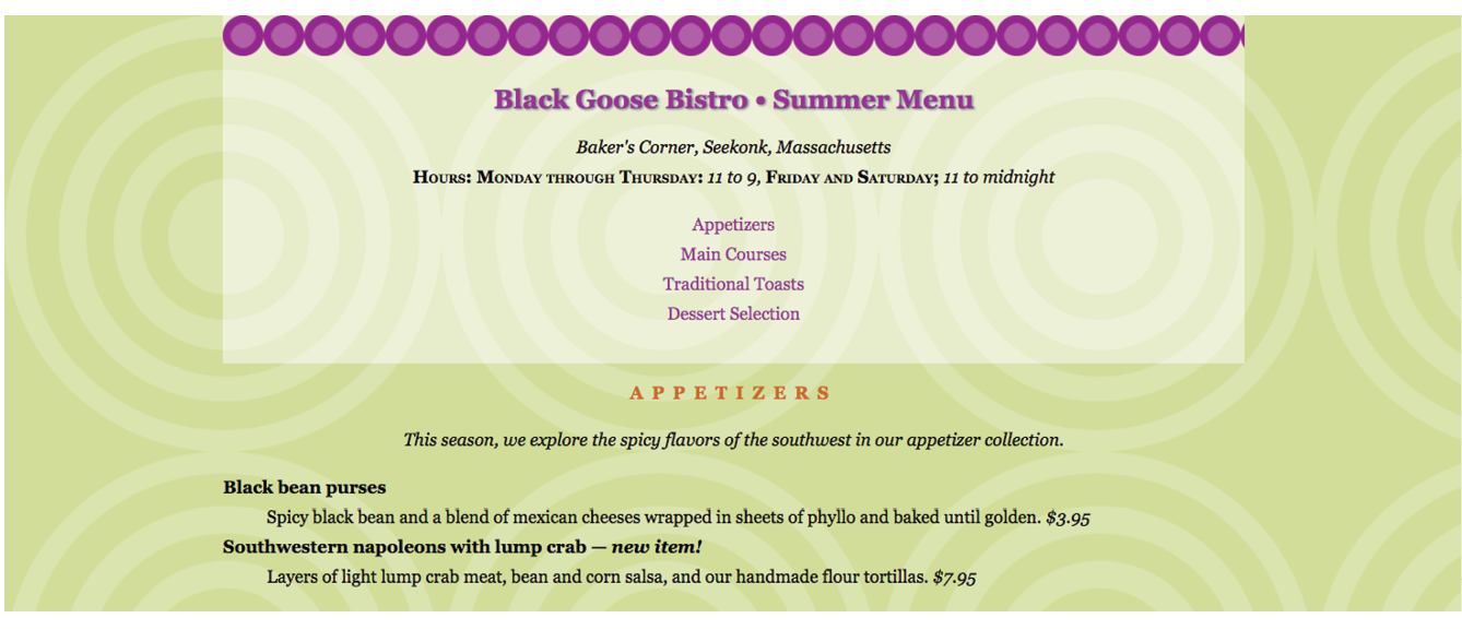
Figure 13-22. Adding a horizontal tiling image to the .
Background Position
The background-position property specifies the position of the origin image in the background. You can think of the origin image as the first image that is placed in the background from which tiling images extend. Here is the property and its various values.
background-position
Values: length measurement | percentage | left | center | right | top | bottom
Default: 0% 0% (same as left top)
Applies to: all elements
Inherits: no
To position the origin image, provide horizontal and vertical values that describe where to place it. There are a variety of ways to do it.
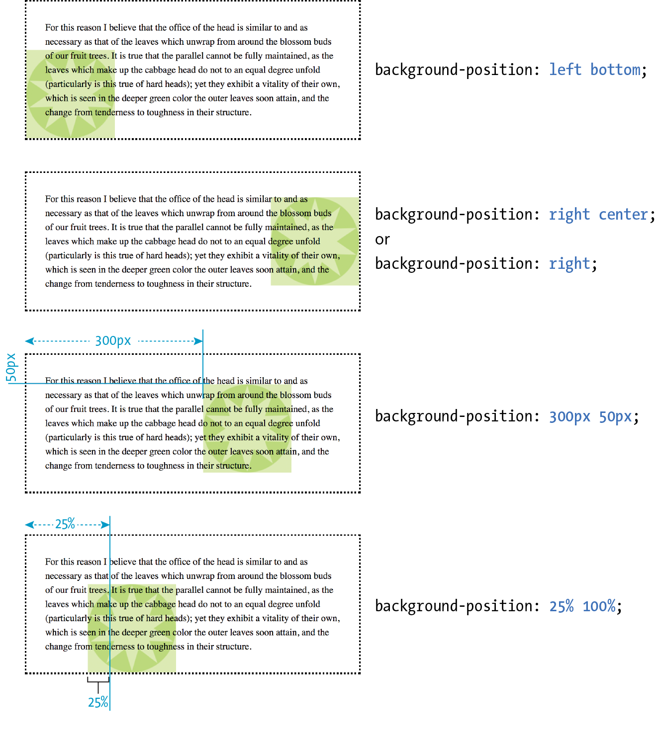
Keyword positioning
The keyword values (left, right, top, bottom, and center) position the origin image relative to the outer edges of the element’s padding. For example, left positions the image all the way to the left edge of the background area. The default origin position corresponds to left top.
Keywords are typically used in pairs, as in these examples:
background-position: left bottom; background-position: right center;
The keywords may appear in any order. If you provide only one keyword, the missing keyword is assumed to be center. Thus, background-position: right has the same effect as background-position: right center.
Length measurements
Specifying position using length measurements such as pixels or ems indicates an amount of offset from the top-left corner of the element to the top-left corner of the background origin image. When you are providing length values, the horizontal measurement always goes first. Specifying negative values is allowed and causes the image to hang outside the visible background area.
This example positions the top-left corner of the image 200 pixels from the left edge and 50 pixels down from the top edge of the element (or more specifically, the padding edge by default):
background-position: 200px 50px;
When you are providing length or percentage values, the horizontal measurement always goes first.
Percentages
Percentage values are provided in horizontal/vertical pairs, with 0% 0% corresponding to the top-left corner and 100% 100% corresponding to the bottom-right corner. As with length values, the horizontal measurement always goes first.
It is important to note that the percentage value applies to both the canvas area and the image itself. A horizontal value of 25% positions the point 25% from the left edge of the image at a point that is 25% from the left edge of the background positioning area. A vertical value of 100% positions the bottom edge of the image at the bottom edge of the positioning area.
background-position: 25% 100%;
As with keywords, if you provide only one percentage, the other is assumed to be 50% (centered).
Figure 13-23 shows the results of each of the aforementioned background-position examples with the background-repeat set to no-repeat for clarity. It is possible to position the origin image and let it tile from there, in both directions or just horizontally or vertically. When the image tiles, the position of the initial image might not be obvious, but you can use background-position to make a tile pattern start at a point other than the left edge of the image. This might be used to keep a background pattern centered and symmetrical.
Background Position Origin
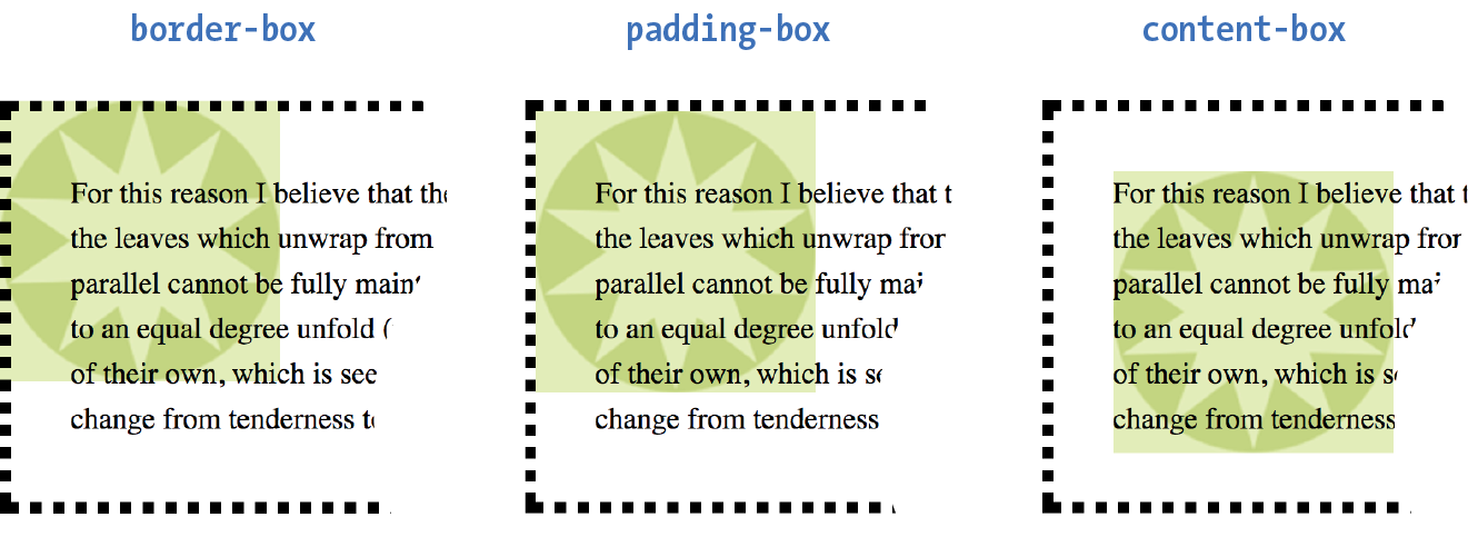
Notice in Figure 13-23 that when the origin image was placed in the corner of an element, it was placed inside the border (only repeated images extend under the border to its outer edge). This is the default position, but you can change it with the background-origin property.
Browser Support Note
is not supported by Internet Explorer 8 and earlier.
background-origin
Values: border-box | padding-box | content-box
Default: padding-box
Applies to: all elements
Inherits: no
This property defines the boundaries of the background positioning area in the same way background-clip defined the background painting area. You can set the boundaries to the border-box (so the origin image is placed under the outer edge of the border, padding-box (outer edge of the padding, just inside the border), or content-box (the actual content area of the element). These terms will become more meaningful once you get more familiar with the box model in the next chapter. In the meantime, Figure 13-24 shows the results of each of the keyword options.
Before we move on to the remaining background properties, check out Exercise 13-4 to get a feel for background positioning.
Exercise 13-4. Positioning background images
- Leave the image positioned at so you are ready to go for the next exercise. Your page should look like the one shown on the right in Figure 13-25.
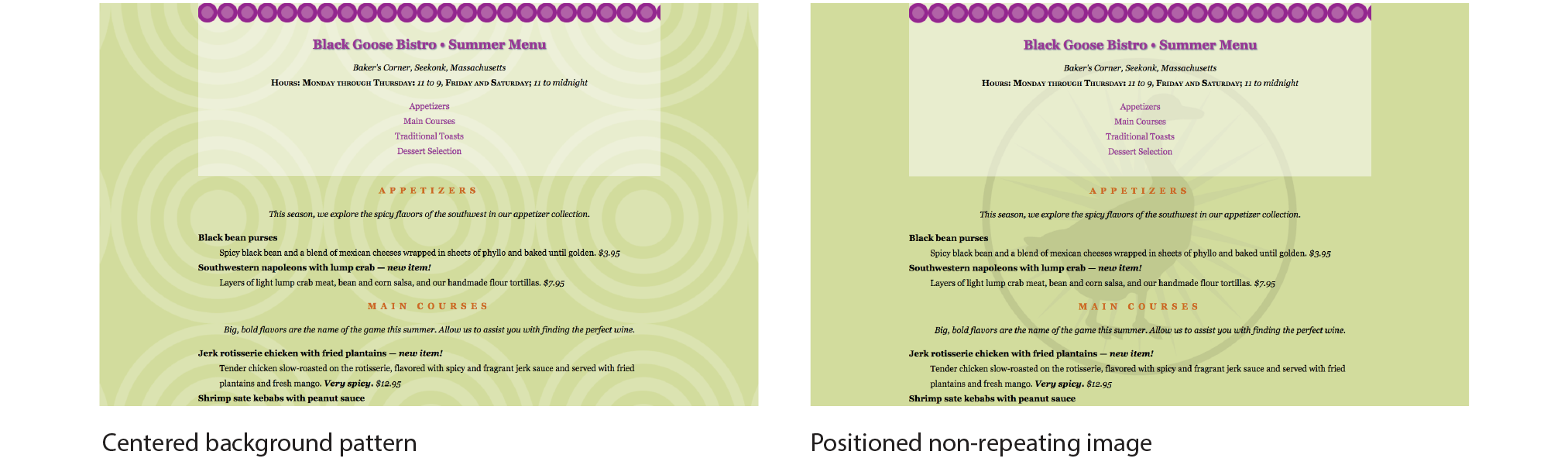
Figure 13-25. The results of positioning the origin image in the tiling background patterns (left) and positioning a single background logo (right).
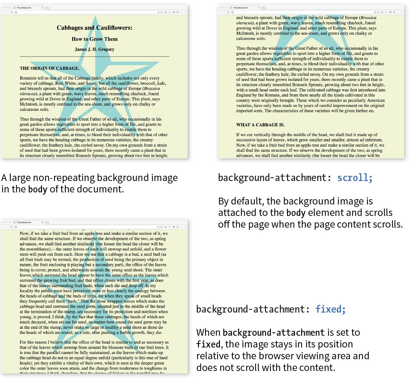
Background Attachment
In the previous exercise, I asked you to scroll the page and watch what happens to the background image. As expected, it scrolls along with the document and off the top of the browser window, which is its default behavior. However, you can use the background-attachment property to free the background from the content and allow it to stay fixed in one position while the rest of the content scrolls.
background-attachment
Values: scroll | fixed | local
Default: scroll
Applies to: all elements
Inherits: no
With the background-attachment property, you have the choice of whether the background image scrolls with the content or stays in a fixed position. When an image is fixed, it stays in the same position relative to the viewport of the browser (as opposed to being relative to the element it fills). You’ll see what I mean in a minute (and you can try it yourself in Exercise 13-5).
In the following example, a large, non-tiling image is placed in the background of the whole document (the body element). By default, when the document scrolls, the image scrolls too, moving up and off the page, as shown in Figure 13-26. However, if you set the value of background-attachment to fixed, it stays where it is initially placed, and the text scrolls up over it.
body { background-image: url(images/bigstar.gif); background-repeat: no-repeat; background-position: center 300px; background-attachment: fixed; }
The local value, which was added in CSS3, is useful when an element has its own scrolling mechanism. Instead of scrolling with the viewport’s scroller, local makes the background image fixed to the content of the scrolling element. This keyword is not supported in IE8 and earlier and may also be problematic on mobile browsers.
Exercise 13-5. Fixed position
body { background-image: url(images/blackgoose.png); background-repeat: no-repeat; background-position: center 100px; background-attachment: fixed;}
Background Size
OK, we have just one more background image property to cover before we wrap it all up with the background shorthand property. So far, the background images we’ve seen are displayed at the actual size of the image itself. You can change the size of the image by using the background-size property.
background-size
Values: length | percentage | auto | cover | contain
Default: auto
Applies to: all elements
Inherits: no
There are several ways to specify the size of the background image. Perhaps the most straightforward is to specify the dimensions in length units such as pixels or ems. As usual, when two values are provided, the first one is used as the horizontal measurement. If you provide just one value, it is used as the horizontal measurement, and the vertical value is set to auto.
This example resizes the target.png background image, which has an intrinsic size of 300 pixels by 300 pixels (Figure 13-27):
header { background-image: url(images/target.png); background-size: 600px 150px;}
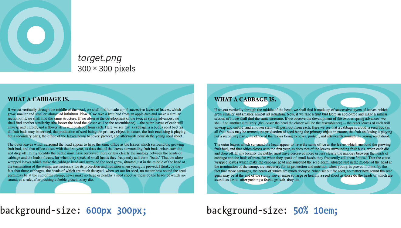
Percentage values are calculated based on the background positioning area, which by default runs to the inside edge of the border, but may have been altered with background-origin—something to keep in mind. So a horizontal value of 50% does not make the image half its width; rather, it sizes it to 50% of the width of the positioning area (Figure 13-27). Again, the horizontal value goes first. It is OK to mix percentage and length values, as shown in this example:
header { background-image: url(images/target.png); background-size: 50% 10em;}
Warning
When sizing a bitmapped image such as a GIF or PNG larger, you run the risk that it will end up blurry and pixelated. Use background sizing with care.
The auto keyword resizes the image in whatever direction is necessary to maintain its proportions. Bitmapped images such as GIF, JPEG, and PNG have intrinsic proportions, so they will always stay proportional when one sizing value is set to auto. Some images, such as SVG and CSS gradients, don’t have intrinsic proportions. In that case, auto sets the width or height to 100% of the width or height of the background positioning area.
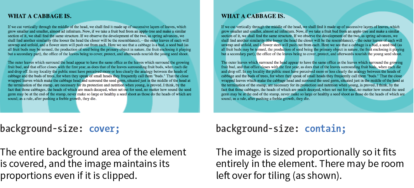
The cover and contain keywords are interesting additions in CSS3. When you set the background size to cover, the browser resizes a background image large enough to reach all the sides of the background positioning area. There will be only one image because it fills the whole element, and it is likely that portions of the image will fall outside the positioning area if the proportions of the image and the positioning area do not match (Figure 13-28).
By contrast, contain sizes the image just large enough to fill either the width or the height of the positioning area (depending on the proportions of the image). The whole image will be visible and “contained” within the background area (Figure 13-28). If there is leftover space, the background image repeats unless background-repeat is set to no-repeat.
div#A { background-image: url(target.png); background-size: cover; } div#B { background-image: url(target.png); background-size: contain; }
The Shorthand background Property
You can use the handy background property to specify all of your background styles in one declaration.
background
Values: background-color background-image background-repeat background-attachment background-position background-clip background-origin background-size
Default: see individual properties
Applies to: all elements
Inherits: no
The value of the background property is a list of values that would be provided for the individual background properties previously listed. For example, this one background rule
body { background: white url(star.png) no-repeat right top fixed; }
replaces this rule with five separate declarations:
body { background-color: white; background-image: url(star.png); background-repeat: no-repeat; background-position: right top; background-attachment: fixed;}
All of the property values for background are optional and may appear in any order. The only restriction is that when you are providing the coordinates for the background-position property, the horizontal value must appear first, immediately followed by the vertical value. As with any shorthand property, be aware that if any value is omitted, it will be reset to its default value. See the “Watch Out for Overrides” sidebar.
In Exercise 13-6, you can convert your long-winded background properties to a single declaration with background.
Exercise 13-6. Convert to shorthand property
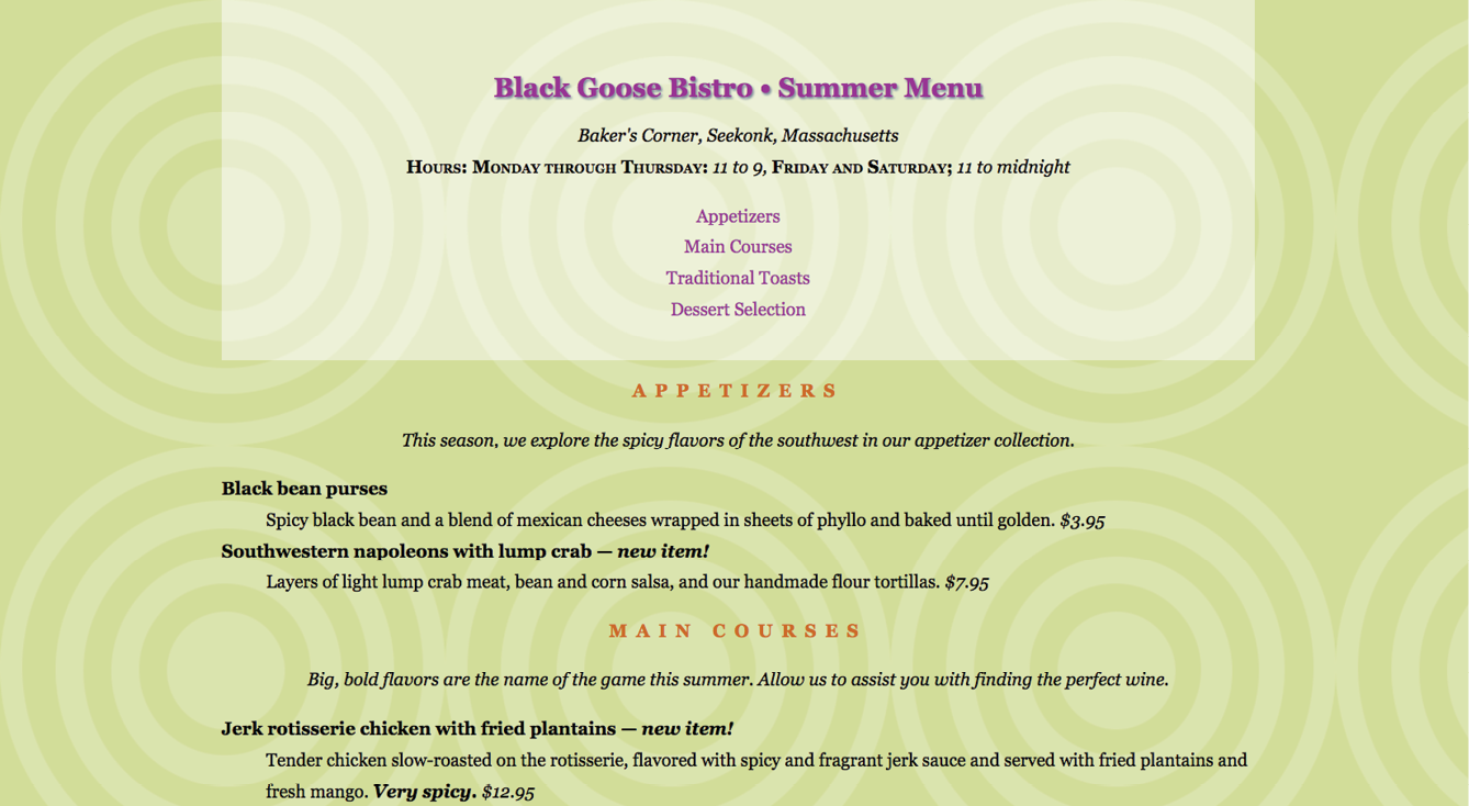
body { font-family: Georgia, serif; font-size: 100%; line-height: 175%; margin: 0 15%; background: #d2dc9d url(images/blackgoose.png) no-repeat center 100px fixed;}
Multiple Backgrounds
CSS3 introduced the ability to apply multiple background images to a single element. To apply multiple values for background-image, put them in a list separated by commas. Additional background-related property values also go in comma-separated lists; the first value listed applies to the first image, the second value to the second, and so on.
Although CSS declarations usually work on a “last one wins” rule, for multiple background images, whichever is listed last goes on the bottom, and each image prior in the list layers on top of it. You can think of them like Photoshop layers in that they get stacked in the order in which they appear in the list. Put another way, the image defined by the first value will go in front, and others line up behind it, in the order in which they are listed.
body { background-image: url(image1.png), url(image2.png), url(image3.png); background-position: left top, center center, right bottom; background-repeat: no-repeat, no-repeat, no-repeat; …}
Alternatively, you can take advantage of the background shorthand property to make the rule simpler. Now the background property has three value series, separated by commas:
body { background: url(image1.png) left top no-repeat,
url(image2.png) center center no-repeat,
url(image3.png) right bottom no-repeat;
}
Figure 13-29 shows the result. The big, orange 1 is positioned in the top-left corner, the 2 is centered vertically and horizontally, and the 3 is in the bottom-right corner. All three background images share the background positioning area of one body element. Try it out for yourself in Exercise 13-7.
Browser Support Note
Internet Explorer 8 and earlier do not support multiple background images and will entirely ignore any background declaration with more than one value. The fix is to choose one for the element as a fallback for IE and other non-supporting browsers, and then specify the multiple rules that override it:
body {/* for non-supporting browsers */ background: url(image_fallback.png) top left no-repeat /* multiple backgrounds */background: url(image1.png) left top no-repeat, url(image2.png) center center no-repeat, url(image3.png) right bottom no-repeat;/* background color */background-color: papayawhip; }
Exercise 13-7. Multiple background images
header { … background: url(images/purpledot.png) center top repeat-x; background: url(images/purpledot.png) left top repeat-y, url(images/purpledot.png) right top repeat-y, url(images/gooseshadow.png) 90% bottom no-repeat; background-color: rgba(255,255,255,.5);}
Like a Rainbow (Gradients)
A gradient is a transition from one color to another, sometimes through multiple colors. In the past, the only way to put a gradient on a web page was to create one in an image-editing program and add the resulting image with CSS.
Now we can specify color gradients by using CSS notation alone, leaving the task of rendering color blends to the browser. Although they are specified with code, gradients are images. They just happen to be generated on the fly. A gradient image has no intrinsic size or proportions; the size matches the element it gets applied to. Gradients can be applied anywhere an image may be applied: background-image, border-image, and list-style-image. We’ll stick with background-image examples in this chapter.
Gradients are images that browsers generate on the fly. Use them as you would use a background image.
There are two types of gradients:
- Linear gradients change colors along a line, from one edge of the element to the other.
- Radial gradients start at a point and spread outward in a circular or elliptical shape.
Linear Gradients
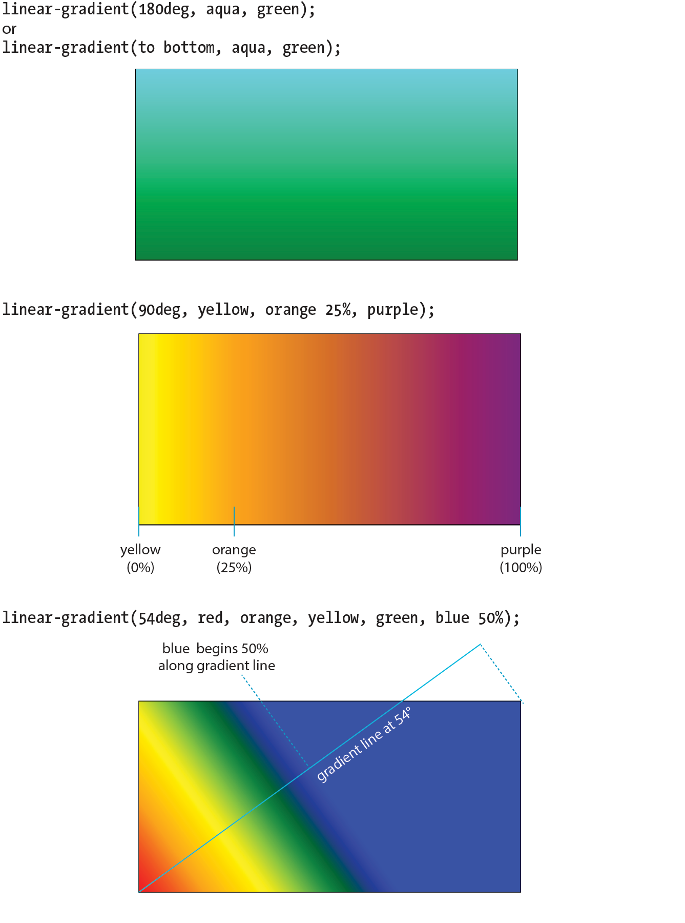
The linear-gradient() notation provides the angle of the gradient line and one or more points along that line where the pure color is positioned (color stops). You can use color names or any of the numerical color values discussed earlier in the chapter, including transparency. The angle of the gradient line is specified in degrees (ndeg) or with keywords. With degrees, 0deg points upward, and positive angles go around clockwise so that 90deg points to the right. Therefore, if you want to go from aqua on the top edge to green on the bottom edge, set the rotation to 180deg:
background-image: linear-gradient(180deg, aqua, green);
The keywords describe direction in increments of 90° (to top, to right, to bottom, to left). Our 180deg gradient could also be specified with the to bottom keyword. The result is shown in Figure 13-31 (top):
background-image: linear-gradient(to bottom, aqua, green);
You can use the “to” syntax to point to corners as well. The following gradient would be drawn from the bottom-left corner to the top-right corner. The resulting angle of a gradient drawn between corners is determined by the aspect ratio of the box.
background-image: linear-gradient(to top right, aqua, green);
In the following example, the gradient now goes from left to right (90deg) and includes a third color, orange, which appears 25% of the way across the gradient line (Figure 13-31, middle). You can see that the placement of the color stop is indicated after the color value. You can use percentages or any length measurement. The first and last color stops don’t require positions because they are set to 0% and 100%, respectively, by default.
background-image: linear-gradient(90deg, yellow, orange 25%, purple);
You certainly aren’t limited to right angles. Specify any degree you like to make the linear gradient head in that direction. You can also specify as many colors as you like. If no positions are specified, the colors are spaced evenly across the length of the gradient line. If you position the last color stop short of the end of the gradient line (such as the blue at 50% in this example), the last color continues to the end of the gradient line (Figure 13-31, bottom):
background-image: linear-gradient(54deg, red, orange, yellow, green, blue 50%);
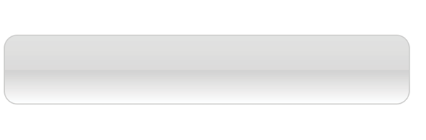
These examples are pretty garish, but if you choose your colors and stops right, gradients are a nice way to give elements subtle shading and a 3-D appearance. The button in Figure 13-32 uses a background gradient to achieve a 3-D look without graphics.
a.button-like { background: linear-gradient(to bottom, #e2e2e2 0%, #dbdbdb 50%, #d1d1d1 51%, #fefefe 100%);}
That concludes our quick-and-dirty tour of linear gradients. You should know that I really only scratched the surface of linear gradient behavior and possibilities, so you may want to check out the resources in the “Further Reading” sidebar. It’s time to move on to radial gradients.
Radial Gradients
Radial gradients, like the name says, radiate out from a point in a circle along a gradient ray (like a gradient line, but it always points outward from the center). At minimum, a radial gradient requires two color stops, as shown in this example:
background-image: radial-gradient(yellow, green);
By default, the gradient fills the available background area, and its center is positioned in the center of the element (Figure 13-33). The result is an ellipse if the containing element is a rectangle and a circle if the element is square.
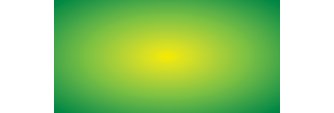
That looks pretty spiffy already, but you don’t have to settle for the default. The radial-gradient() notation allows you to specify the shape, size, and center position of the gradient:
Shape
In most cases, the shape of the radial gradient will result from the shape of the element or an explicit size you apply to it, but you can also specify the shape by using the circle or ellipse keywords. When you make a gradient a circle (without conflicting size specifications), it stays circular even when it is in a rectangular element (Figure 13-34, top).
background-image: radial-gradient(circle, yellow, green);
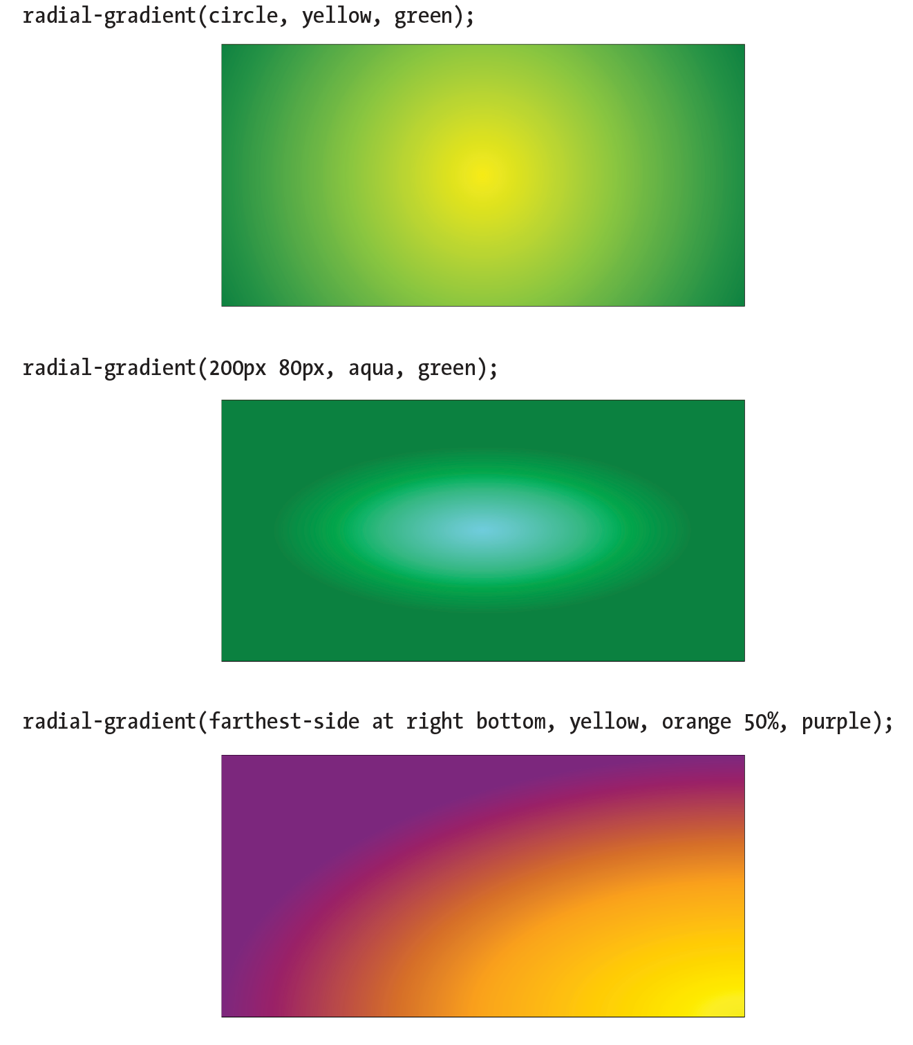
Size
The size of the radial gradient can be specified in length units or percentages, which apply to the gradient ray, or with keywords. If you supply just one length, it is used for both width and height, resulting in a circle. When you provide two lengths, the first one is the horizontal measurement and the second is vertical (Figure 13-34, middle). For ellipses, you can provide percentage values as well, or mix percentages with length values.
background-image: radial-gradient(200px 80px, aqua, green);
There are also four keywords—closest-side, closest-corner, farthest-side, and farthest-corner—that set the length of the gradient ray relative to points on the containing element.
Position
By default, the center of the gradient is positioned at center center, but you can change that by using the positioning syntax we covered for the background-position property. The syntax is the same, but it should be preceded by the at keyword, as in this example (Figure 13-34, bottom). Notice that in this example, I have included an additional color stop of orange at the 50% mark.
background-image: radial-gradient(farthest-side at right bottom, yellow, orange 50%, purple);
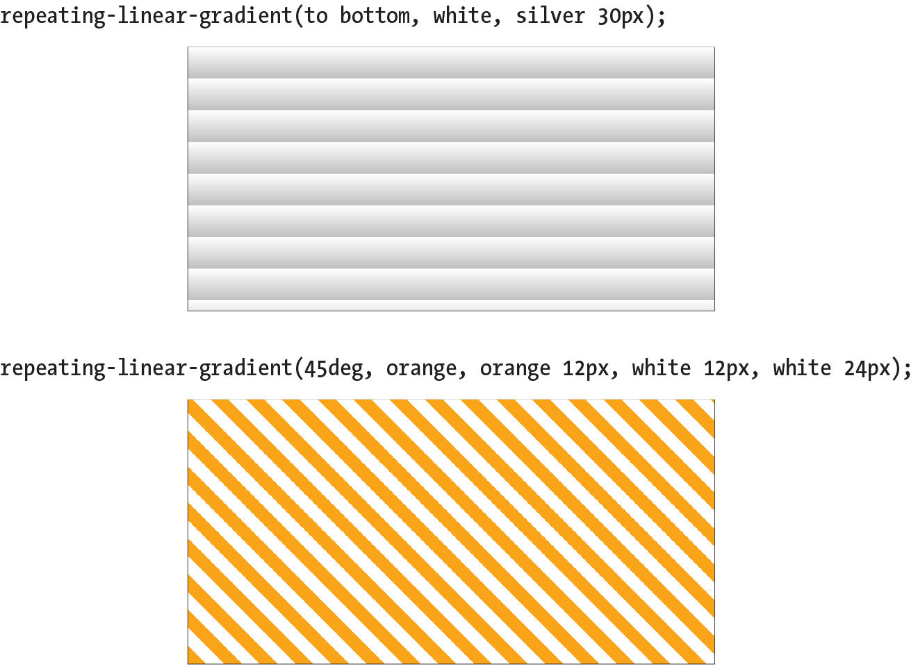
Repeating Gradients
If you’d like your gradient pattern to repeat, use the repeating-linear-gradient() or repeating-radial-gradient() notation. The syntax is the same as for single gradients, but adding “repeating-” causes the pattern to repeat the color stops infinitely in both directions. This is commonly used to create interesting striped patterns. In this simple example, a gradient from white to silver (light gray) repeats every 30 pixels because the silver color stop is set to 30px (Figure 13-35, top):
background: repeating-linear-gradient(to bottom, white, silver 30px);
This example makes a diagonal pattern of orange and white stripes (Figure 13-35, bottom). The edges are sharp because the white stripe starts at exactly the point where the orange one ends (at 12px) with no fading:
background: repeating-linear-gradient(45deg, orange, orange 12px, white 12px, white 24px);
Browser Support and Vendor Prefixes
All of the major browsers started adding support for the standard gradient syntax between 2012 and 2013 (see Browser Support Note), so they’ve been reliable for a good number of years. However, if you need to support older browsers, you can do so using each browser’s proprietary gradient syntax with a vendor prefix (see the “Vendor Prefixes” sidebar). For Internet Explorer 9 and earlier, you can use its proprietary filter function. Or, go the progressive enhancement route and use a solid color as a fallback.
Browser support Note
Standard gradient syntax is supported in Internet Explorer 10+, Edge, Firefox 16+, Chrome 26+, Safari 6.1+, iOS 7.1+, and Android 4.4+.
A gradient for all browsers
The following example shows the yellow-to-green linear gradient written to address every browser, past and present, with the Internet Explorer filter equivalent thrown in for good measure. Notice that there are differences in syntax. Where the CSS3 spec uses the to bottom keyword, most of the others use top. A very old version used by WebKit browsers used –webkit-gradient for both linear and radial gradients, but it was quickly replaced with separate functions. Another difference not evident in this example is that in the old syntax, 0deg pointed to the right edge, not to the top edge as was standardized in CSS3, and the angles increased counterclockwise.
This is a serious chunk of code for a single gradient, and thankfully, we are very close to this no longer being necessary:
background: #ffff00; /* Old browsers */ background:-moz-linear-gradient(top, #ffff00 0%, #00ff00 100%); /* FF3.6+ */ background:-webkit-gradient(linear, left top, left bottom, color-stop(0%,#ffff00), color-stop(100%,#00ff00)); /* Chrome,Safari4+ */ background:-webkit-linear-gradient(top, #ffff00 0%,#00ff00 100%); /* Chrome10+,Safari5.1+ */ background:-o-linear-gradient(top, #ffff00 0%,#00ff00 100%); /* Opera 11.10+ */ background:-ms-linear-gradient(top, #ffff00 0%,#00ff00 100%); /* IE10+ */
background: linear-gradient(to bottom, #ffff00 0%,#00ff00 100%); /* W3C Standard */
filter: progid:DXImageTransform.Microsoft.gradient( startColorstr='#ffff00', endColorstr='#00ff00',GradientType=0 ); /* IE6-9 */
In upcoming chapters, whenever a property requires vendor prefixes, I will be sure to note it. Otherwise, you can assume that the standard CSS is all you need.
Designing Gradients
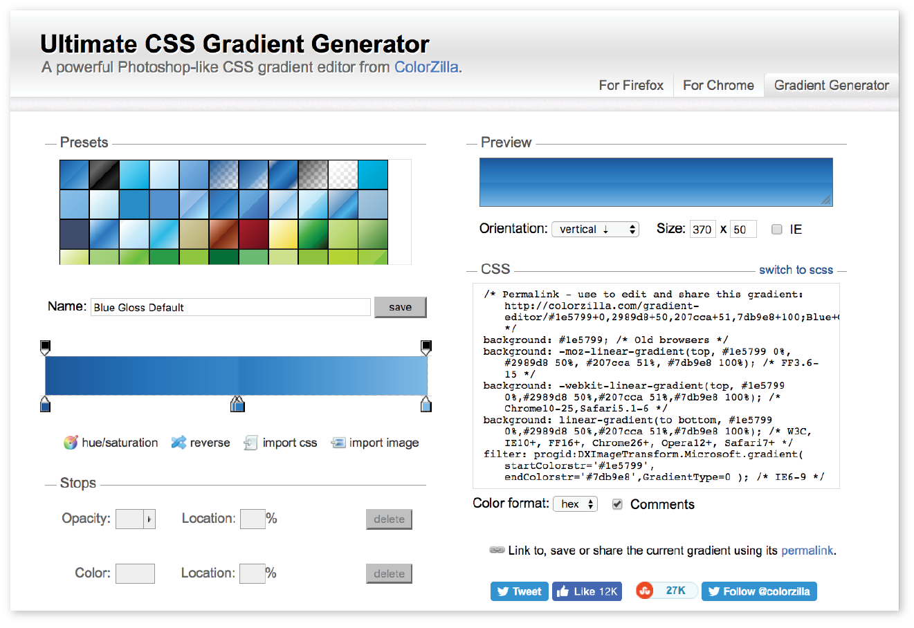
That last code example was a doozy! Vendor prefixes aside, just the task of describing gradients can be daunting. Although it is not impossible to write the code by hand, I recommend you do what I do—use an online gradient tool. One option is the Ultimate CSS Gradient Generator from Colorzilla (www.colorzilla.com/gradient-editor/), shown in Figure 13-36. Simply enter as many color stops as you’d like, slide the sliders around until you get the look you want, and then copy the code. That’s exactly what I did to get the example we just looked at. The CSS Gradient Generator by Virtuosoft is another fine option that also includes support for repeating gradients (www.virtuosoft.eu/tools/css-gradient-generator/).
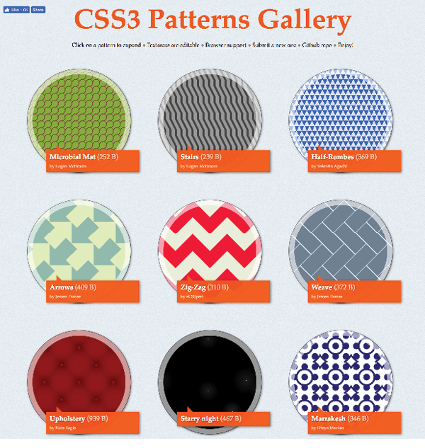
If you want your mind blown, take a look at the wild background patterns made with gradients assembled by Lea Verou in her CSS3 Patterns Gallery (lea.verou.me/css3patterns) (Figure 13-37). It’s inspirational, and you can take a peek at the code used to create them.
Finally, External Style Sheets
Back in Appendix 11, Introducing Cascading Style Sheets I told you that there are three ways to connect style sheets to an HTML document: inline with the style attribute, embedded with the style element, and as an external .css document linked to or imported into the document. In this section, we finally get to that third option.
External style sheets are by far the most powerful way to use CSS because you can make style changes across an entire site simply by editing a single style sheet document. That is the advantage to having all the style information in one place, and not mixed in with the document source.
Furthermore, because a single style document is downloaded and cached by the browser for the whole site, there is less code to download with every document, resulting in better performance.
First, a little bit about the style sheet document itself. An external style sheet is a plain-text document with at least one style sheet rule. It may not include any HTML tags (there’s no reason to include them, anyway). It may contain comments, but they must use the CSS comment syntax that you’ve seen already:
/*This is the end of the section*/
The style sheet should be named with the .css suffix (there are some exceptions to this rule, but you’re unlikely to encounter them as a beginner). It may also begin with the @charset at-rule to declare the character encoding, although you really need to do that only if you are using an encoding other than UTF-8. If you use @charset, it must be the first element in the style sheet, with no characters, including comments or style rules, preceding it.
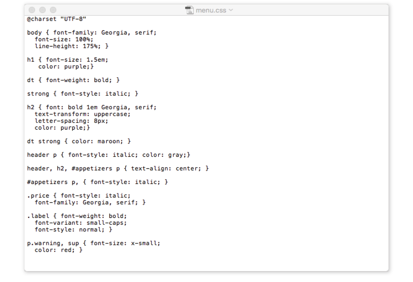
Figure 13-38 shows how a short style sheet document looks in my text editor.
There are two ways to apply an external style sheet: the link element and an @import rule. Let’s look at both of these attachment methods.
Using the link Element
The link element defines a relationship between the current document and an external resource. By far, its most popular use is to link to style sheets. The link element goes in the head of the document, as shown here:
<head> <title>Titles are required.</title> <link rel="stylesheet" href="/path/stylesheet.css"></head>
You need to include two attributes in the link element:
rel="stylesheet"
Defines the linked document’s relation to the current document. The value of the rel attribute is always stylesheet when you are linking to a style sheet.
href="url"
Provides the location of the .css file.
You can include multiple link elements to different style sheets, and they’ll all apply. If there are conflicts, whichever one is listed last will override previous settings, because of the rule order and the cascade.
Importing with @import
The other method for attaching an external style sheet to a document is to import it with an @import rule. The @import at-rule is another type of rule you can add to a style sheet, either in an external .css style sheet document, or right in the style element, as shown in the following example:
<head> <style> @import url("/path/stylesheet.css"); p { font-face: Verdana;} </style> <title>Titles are required.</title></head>
In this example, a relative URL is shown, but it could also be an absolute URL (beginning with http://). The @import rule must go at the beginning of the style sheet before any selectors. You can import more than one style sheet, and they all will apply, but rules from the last style sheet listed take precedence over earlier ones.
You can also limit a style sheet’s import to specific media types (such as screen, print, or projection, to name a few) or viewing environments (orientation, screen size, etc.) using media queries. Media queries are a method for applying styles based on the medium used to display the document. They appear after the @import rule in a comma-separated list. For example, if you have created a style sheet that should be imported and used only when the document is printed, use this rule:
@import url(print_styles.css) print;
Or to serve a special style sheet just for small devices, you could also query the viewport:
@import url(small_device.css) screen and (max-width: 320px;);
We’ll talk a lot more about media queries in Appendix 17, Responsive Web Design, but I mention them here as they are relevant to importing style sheets.
You can try both the link and @import methods in Exercise 13-8.
Exercise 13-8. Making an external style sheet
Using Modular Style Sheets
Because you can compile information from multiple external style sheets, modular style sheets have become a popular technique for style management. Many developers keep styles they frequently reuse—such as typography treatments, layout rules, or form-related styles—in separate style sheets, then combine them in mix-and-match fashion using @import rules. Again, the @import rules need to go before rules that use selectors.
Here’s an example of a style sheet that imports multiple external style sheets:
/* basic typography */ @import url("type.css"); /* form inputs */ @import url("forms.css"); /* navigation */ @import url("list-nav.css"); /* site-specific styles */ body { background: orange; } /* more style rules */
This is a good technique to keep in mind as you build experience in creating sites. You’ll find that there are some solutions that work well for you, and it is nice not to have to reinvent the wheel for every new site. Modular style sheets are a good time-saving and organizational device; however, they can be a problem for performance and caching.
If you use this method, it is recommended that you compile all of the styles into a single document before delivering them to a browser. Not to worry, you don’t need to do it manually; there are tools out there that will do it for you. The LESS and Sass CSS preprocessors (which will be formally introduced in Chapter 20) are just two tools that offer compiling functionality.
Wrapping It Up
We’ve covered a lot of ground (or background, to be more accurate) in this chapter. We looked at ways to set the foreground and background colors for an element by using various numeric systems and color names. We looked at options for adjusting the level of transparency with the opacity property and RGBa, and HSLa color spaces. We spent a long time exploring the various ways to add a background image and adjust how it repeats, where the origin image is placed, and how it is sized. We saw how linear and radial gradients can be used as background images as well. Along the way, you picked up pseudo-class, pseudo-element, and attribute selectors and looked at ways to attach external style sheets. I think that’s enough for one chapter! See how much you remember with this little quiz.
Test Yourself
This time I’ll test your background prowess entirely with matching and multiple-choice questions. Answers appear in Appendix A.
- Which of these areas gets filled with a background color by default?
- The area behind the content
- Any padding added around the content
- The area under the border
- The margin space around the element
- All of the above
- a and b
- a, b, and c
- Which of these is not a way to specify the color white in CSS?
a.
#FFFFFFb.
#FFFc.
rgb(255, 255, 255)d.
rgb(FF, FF, FF)e.
whitef.
rgb(100%, 100%, 100%) - Match the pseudo-class with the elements it targets.
a.
a:link1. Links that have already been clicked
b.
a:visited2. An element that is highlighted and ready for input
c.
a:hover3. An element that is the first child element of its parent
d.
a:active4. A link with the mouse pointer over it
e.
:focus5. Links that have not yet been visited
f.
:first-child6. A link that is in the process of being clicked
- Match the following rules with their respective samples as shown in Figure 13-39. All of the samples in the figure use the same source document, consisting of one paragraph element to which some padding and a border have been applied.
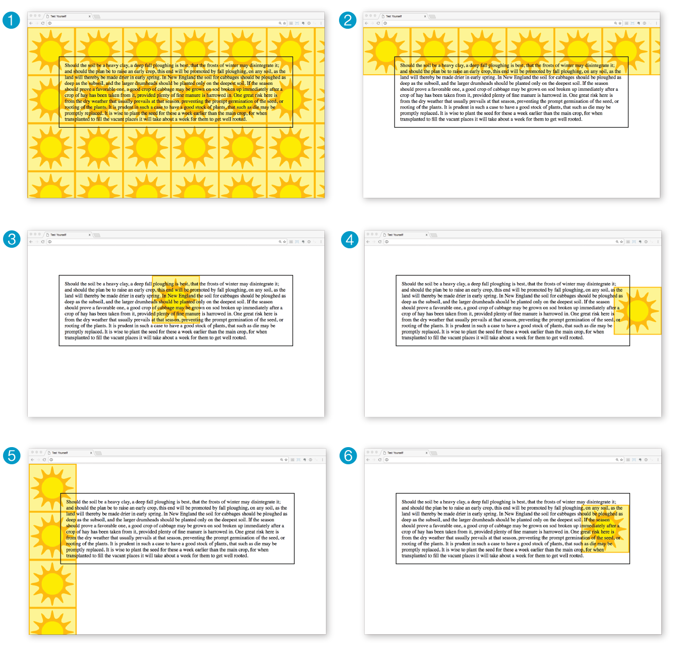
Figure 13-39. Samples for Question 4. body {background-image: url(graphic.gif);}p {background-image: url(graphic.gif); background-repeat: no-repeat; background-position: 50% 0%;}body {background-image: url(graphic.gif);background-repeat: repeat-x;}p {background: url(graphic.gif) no-repeat right center;}body {background-image: url(graphic.gif); background-repeat: repeat-y; }body {background: url(graphic.gif) no-repeat right center;}
CSS Review: Color and Background Properties
Here is a summary of the properties covered in this chapter, in alphabetical order.