Table of Contents for
Learning Web Design, 5th Edition
 Learning Web Design, 5th Edition
Published by
O'Reilly Media, Inc., 2018
Learning Web Design, 5th Edition
Published by
O'Reilly Media, Inc., 2018
- cover
- Learning Web Design, Fifth Edition
- lwd5_title_copy
- lwd5_title_copy-1
- lwd5_contents
- Foreword
- Preface
- Part I. Getting Started
- 2. How the Web Works
- 3. Some Big Concepts You Need to Know
- Part II. HTML for STRUCTURE
- 5. Marking Up Text
- 6. Adding Links
- 7. Adding Images
- 8. Table Markup
- 9. Forms
- 10. Embedded Media
- Part III. CSS for Presentation
- 12. Formatting Text
- 13. Colors and Backgrounds
- 14. Thinking Inside the Box
- 15. Floating and Positioning
- 16. CSS Layout with Flexbox and Grid
- 17. Responsive Web Design
- 18. Transitions, Transforms, and Animation
- 19. More CSS Techniques
- 20. Modern Web Development Tools
- Part IV. JavaScript for Behavior
- 22. Using JavaScript
- Part V. Web Images
- 24. Image Asset Production
- 25. SVG
- Part VI. Appendices
- B. HTML5 Global Attributes
- C. CSS Selectors, Levels 3 and 4
- D. From HTML+ to HTML5
17
In this chapter
What RWD is and why it’s important
Fluid layouts
Media queries
Design strategies and patterns
Testing options
I first introduced you to the concept of Responsive Web Design way back in Chapter 3, Some Big Concepts You Need to Know, and we’ve been addressing ways to keep all screen sizes in mind throughout this book. In this chapter, we get to do a deeper dive into responsive strategies and techniques.
Just to recap, Responsive Web Design (or RWD) is a design and production approach that allows a website to be comfortably viewed and used on all manner of devices. The core principle is that all devices get the same HTML source, located at the same URL, but different styles are applied based on the viewport size to rearrange components and optimize usability. Figure 17-1 shows examples of responsive sites as they might appear on a smartphone, tablet, and desktop, but it is important to keep in mind that these sites are designed to work well on the continuum of every screen width in between.
Note
Each site in Figure 17-1has one morphing design, not three distinct layouts. Some sites do have a limited number of layouts aimed at specific devices, which is an approach known as .
Why RWD?
Since the iPhone shook things up in 2007, folks now view the web on phones of all sizes, tablets, “phablets,” touch-enabled laptops, wearables, televisions, video game consoles, refrigerators, and who knows what else that may be coming down the line.
In 2016, mobile internet usage surpassed desktop usage—an important milestone. The percentage of web traffic that comes from devices other than desktop browsers is steadily increasing. For roughly 10% of Americans, a smartphone or tablet is their only access to the internet because of lack of access to a computer or high-speed WiFi at work or home.* Younger users may be mobile-only by choice. Furthermore, the vast majority of us access the web from a number of platforms (phone, tablet, computer) over the course of the day. And guess what—we expect to have a similar experience using your content or service regardless of how we access your site.
That’s where RWD fits in. With one source, you ensure that mobile visitors receive the same content as other visitors (although it might be organized differently). Users are not penalized with stripped-down content or features just because they are using a smartphone. And for visitors who might start using your site on one device and finish it on another, you can ensure a consistent experience.
In fact, for many web designers, “responsive design” is now just “web design.” Instead of a niche approach, it is becoming the default way to build a website that meets the demands of our current multidevice environment.
The Responsive Recipe
The deluge of web-enabled mobile devices initially sent shockwaves through the web design community. Accustomed to designing exclusively for large desktop screens, we were unclear about how we could accommodate screens that fit in the palm of your hand.
One solution was to rely on the phone’s built-in web display functionality. By default, mobile devices display an entire web page shrunken down to fit on whatever screen real estate is available. Users can pinch to zoom into the details and scroll around to various parts of the page. While that technically works, it is far from an optimal experience. Another approach was to create a separate mobile site just for small screens and people “on the go.” There are still many companies and services that use dedicated mobile (“m-dot”) sites—Twitter and Facebook come to mind—but in general, m-dot sites are going away in favor of RWD. Google is helping the process along by favoring responsive sites with single URLs over m. or mobile. versions.
In 2010, Ethan Marcotte gave name to another, more flexible solution in his article “Responsive Web Design” (alistapart.com/article/responsive-web-design), which has since become a cornerstone of modern web design. In this chapter, I will follow the “ingredients” for RWD that Ethan outlines in his book Responsive Web Design (A Book Apart).
The technique has three core components:
A flexible grid
Rather than remaining at a static width, responsive sites use methods that allow them to squeeze and flow into the available browser space.
Flexible images
Images and other embedded media need to be able to scale to fit their containing elements.
CSS media queries
Media queries give us a way to deliver sets of rules only to devices that meet certain criteria, such as width and orientation.
To this list of ingredients, I would add the viewport meta element, which makes the width of the web page match the width of the screen. That’s where we’ll begin our tour of the mechanics of RWD.
Setting the Viewport
To fit standard websites onto small screens, mobile browsers render the page on a canvas called the viewport and then shrink that viewport down to fit the width of the screen (device width). For example, on iPhones, mobile Safari sets the viewport width to 980 points (see Note), so a web page is rendered as though it were on a desktop browser window set to 980 pixels wide. That rendering gets shrunk down to the width of the screen (ranging from 320 to 414 points, depending on the iPhone model), cramming a lot of information into a tiny space.
Mobile Safari introduced the viewport meta element, which allows us to define the size of that initial viewport. Soon, the other mobile browsers followed suit. The following meta element, which goes in the head of the HTML document, tells the browser to set the width of the viewport equal to the width of the device screen (width=device-width), whatever that happens to be (Figure 17-2). The initial-scale value sets the zoom level to 1 (100%).
<meta name="viewport" content="width=device-width, initial-scale=1">
With the viewport meta element in place, if the device’s screen is 320 pixels wide, the rendering viewport on that device will also be 320 pixels across (not 980) and will appear on the screen at full size. That is the width we test for with media queries, so setting the viewport is a crucial first step.
Flexible Grids (Fluid Layouts)
In the Flexbox and Grid discussions in the previous chapter, we saw examples of items expanding and contracting to fill the available space of their containers. That fluidity is exactly the sort of behavior you need to make content neatly fit a wide range of viewport sizes. Fluid layouts (or “flexible grids,” as Ethan Marcotte calls them in his article and book) are the foundation of responsive design.
In a fluid layout, the page area and its grid resize proportionally to fill the available width of the screen or window (Figure 17-3, top). That is easily accomplished with fr and minmax() units in CSS Grid layouts and with flex property settings in Flexbox. If you need to also target older browsers that don’t support CSS layout standards, you can use percentage values for horizontal measurements so elements remain proportional at varying sizes (see the sidebar “Converting Pixels to Percentages”).
In the past, when we knew that everyone was looking at our sites on desktop monitors, fixed-width layouts were the norm. (Ahh, those simple pre-mobile days when we only needed to deal with radically incompatible browser support!) As the name implies, fixed-width layouts are created at a specific pixel width (Figure 17-3, bottom), with 960 pixels being quite fashionable (see Note). Specifying all measurements in pixel values gave designers control over the layout as they might have in print, and ensured that users across all platforms and browsers got similar, if not the same, rendering of the page.
It didn’t take long to realize, however, that it would be impossible to create separate fixed-width designs tailored to every device size. Clearly, fluidity has the advantage. It is based on the intrinsic nature of the normal flow, so we’re working with the medium here rather than against it. When the layout reflows to fill the available width, you don’t need to worry about horizontal scrollbars or awkward empty space in the browser.
On the downside, fluid layouts may allow text line lengths to become uncomfortably long, so that is something to watch out for. We’ll go into more detail on layouts later in this chapter.
Making Images Flexible
Every now and then a solution is simple. Take, for example, the style rule required to make images scale down to fit the size of their container:
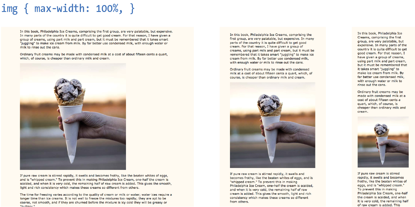
img { max-width: 100%;}
That’s it! When the layout gets smaller, the images in it scale down to fit the width of their respective containers. If the container is larger than the image—for example, in the tablet or desktop layouts—the image does not scale larger; it stops at 100% of its original size (Figure 17-4). When you apply the max-width property, you can omit the width and height attributes in the img elements in the HTML document. If you do set the width attribute, be sure the height attribute is set to auto; otherwise, the image won’t scale proportionately.
Responsive images
But wait—things are never that simple, right? If you think back to our discussion of responsive images in Chapter 7, Adding Images, you’ll remember that there is some elbow grease required to avoid serving unnecessarily large images to small devices as well as making sure large, high-density monitors get high-resolution images that shine. Choosing the best image size for performance is part of the responsive design process, but we won’t be concentrating on that in this chapter. We’ve got bigger fish to fry!
Other embedded media
Videos and other embedded media (using object or embed elements) also need to scale down in a responsive environment. Unfortunately, videos do not retain their intrinsic ratios when the width is scaled down, so there are a few more hoops to jump through to get good results. Thierry Koblentz documents one strategy nicely in his article “Creating Intrinsic Ratios for Video” at www.alistapart.com/articles/creating-intrinsic-ratios-for-video. There is also a JavaScript plug-in called FitVids.js (created by Chris Coyier and the folks at Paravel) that automates Koblentz’s technique for fluid-width videos. It is available at fitvidsjs.com.
Media Query Magic
Now we get to the real meat of responsive design—media queries! Media queries apply different styles based on characteristics of the browser: its width, whether it is vertically or horizontally oriented, its resolution, and more. They are what make it possible to send a one-column layout to small screens and a multicolumn layout to larger screens on the fly.
The query itself includes a media type followed by a particular feature and a value for which to test. The criteria are followed by a set of curly brackets that contain styles to apply if the test is passed. The structure of a media query as used within a style sheet goes like this:
@mediatypeand (feature:value) {/* styles for browsers that meet this criteria */}
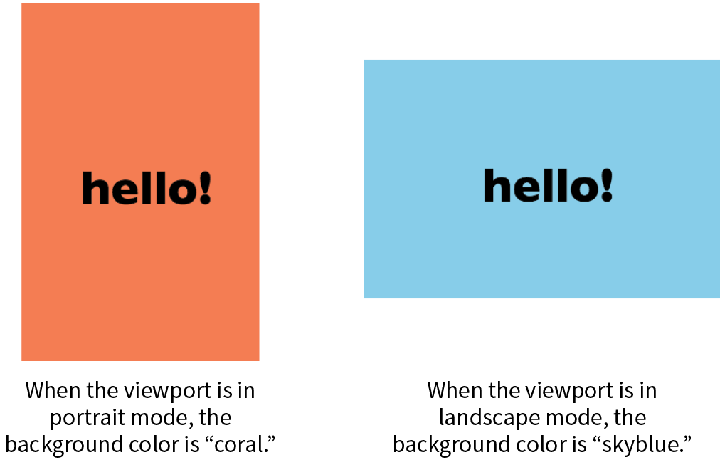
Let’s clarify that with an example. The following media queries look at whether the viewport is on a screen and in landscape (horizontal) or portrait (vertical) orientation. When the query detects that the viewport is in landscape mode, the background color of the page is “skyblue”; when it is in portrait orientation, the background is “coral” (Figure 17-5). If this were displayed on a smartphone that tips from vertical to horizontal and back again, the colors would change as it tilts. This isn’t a very practical design choice, but it does provide a very simple illustration of media queries at work.
@mediascreenand (orientation: landscape) { body { background: skyblue; }}@mediascreenand (orientation: portrait) { body { background: coral; }}
Heads Up
Having style declaration curly brackets nested inside media query curly brackets can get a little confusing. Be sure that you have the right number of curly brackets and nest them properly. Careful indenting is helpful. Many code-editing programs also use color coding to help you keep them straight.
Media types
Media types, as included in the first part of a query, were introduced in CSS2 as a way to target styles to particular media. For example, this @media rule delivers a set of styles only when the document is printed (it does not test for any specific features or values):
@media print { /* print-specific styles here */
}
The most current defined media types are all, print, screen, and speech (see Note). If you are designing for screen, the media type is optional, so you can omit it as shown in the syntax example shown here, but including it doesn’t hurt. I’ll be including the screen media type for the sake of clarity in my examples.
@media (feature: value) { }
Note
CSS2 also defined , , , , , , and , but they have been deprecated in the latest Media Queries Level 4 spec (currently a Working Draft) and are discouraged from use.
Media feature queries
CSS3 media queries take targeting one step further by letting us test for a particular feature of a viewport or device. We saw an example of testing the orientation of a device in Figure 17-5. The most common feature to test for is the viewport width. You can also test for a minimum width (min-width) and maximum width (max-width).
Here is a simple example that displays headline fonts in a fancy cursive font only when the viewport is 40em or wider—that is, when there is enough space for the font to be legible. Viewports that do not match the query (because they are narrower than 40em) use a simple serif face.
h1 { font-family: Georgia, serif; }
@media screen and (min-width: 40em) {h1 { font-family: 'Lobster', cursive; }}
The complete list of device features you can detect with media queries appears in Table 17-1.
How to use media queries
You can use media queries within a style sheet or to conditionally load external style sheets. Media queries may not be used with inline styles.
Within a style sheet
The most common way to utilize media queries is to use an @media (“at-media”) rule right in the style sheet. The examples in this chapter so far are all @media rules.
When you use media queries within a style sheet, the order of rules is very important. Because rules later in the style sheet override the rules that come before them, your media query needs to come after any rules with the same declaration.
The strategy is to specify the baseline styles that serve as a default, and then override specific rules as needed to optimize for alternate viewing environments. In RWD, the best practice is to set up styles for small screens and browsers that don’t support media queries, and then introduce styles for increasingly larger screens later in the style sheet.
That’s exactly what I did in the headline font-switching example earlier. The h1 sets a baseline experience with a local serif font, and then gets enhanced for larger screens with a media query.
With external style sheets
For large or complicated sites, developers may choose to put styles for different devices into separate style sheets and call in the whole .css file when certain conditions are met. One method is to use the media attribute in the link element to conditionally load separate .css files. In this example, the basic styles for a site are requested first, followed by a style sheet that will be used only if the device is more than 1,024 pixels wide (and if the browser supports media queries):
<head> <link rel="stylesheet" href="styles.css"> <link rel="stylesheet" href="2column-styles.css" media="screen and (min-width:1024px)"></head>
Some developers find this method helpful for managing modular style sheets, but it comes with the disadvantage of requiring extra HTTP requests for each additional .css file. Be sure to provide only as many links as necessary (perhaps one for each major breakpoint), and rely on @media rules within style sheets to make minor adjustments for sizes in between.
Similarly, you can carry out media queries with @import rules that pull in external style sheets from within a style sheet. Notice that the word “media” does not appear in this syntax, only the type and query.
<style>@import url("/default-styles.css");@import url("/wide-styles.css") screen and (min-width: 1024px);/* other styles */ </style>
Browser support
We can’t close out a discussion of media queries without a nod to browser support. The good news is that media queries are supported by virtually all desktop and mobile browsers in use today. The big exceptions are Internet Explorer versions 8 and earlier, which have no support. Because of the staying power of the Windows XP operating system, IE8 continues to show up in browser use statistics (at 1–2% as I write, ahead of IE 9 and 10). If your site has hundreds of thousands of users, that 1% ends up being a significant number of broken experiences.
If you expect to have visitors using old versions of IE, you have a couple of options. First, you could use the Respond.js polyfill, which adds support for min-width and max-width to non-supporting browsers. It was created by Scott Jehl and is available at github.com/scottjehl/Respond.
The other option is to create a separate style sheet with a no-frills desktop layout and deliver it only to users with IE8 or earlier by using a conditional comment. Other browsers ignore the content of this IE-specific comment:
<!-- [if lte IE 8]> <link rel="stylesheet" href="/path/IE_fallback.css"><![endif]-->
Depending on your site statistics and when you are reading this, you may not need to worry about media query support at all. Lucky you!
Choosing Breakpoints
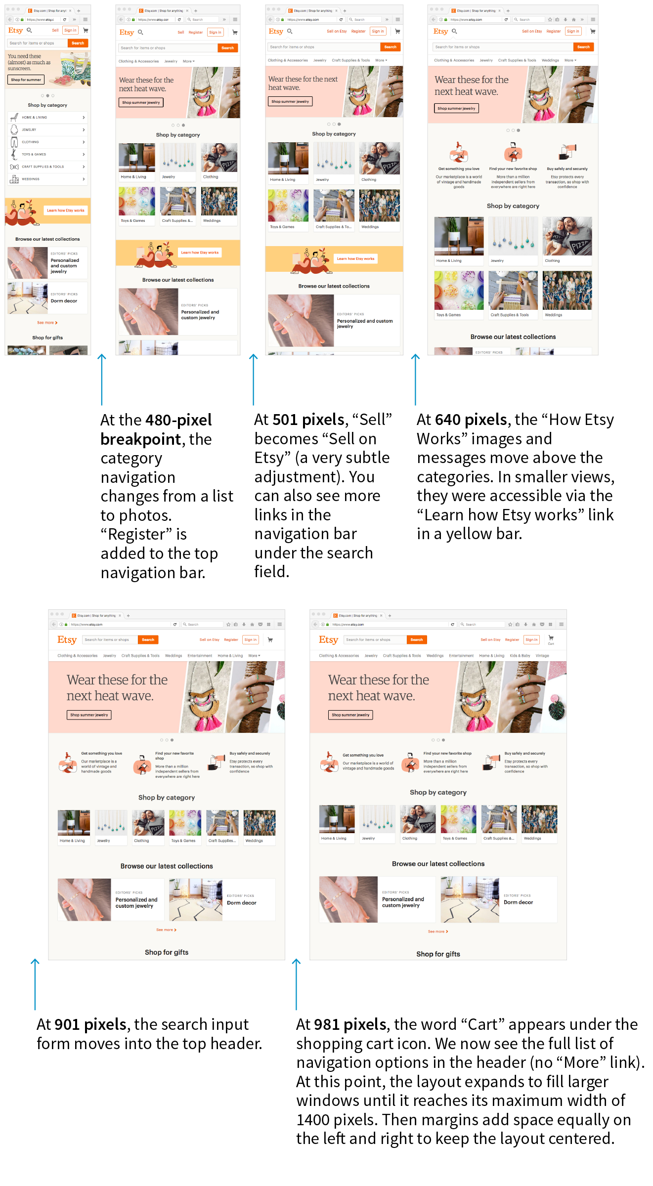
A breakpoint is the point at which we use a media query to introduce a style change. When you specify min-width: 800px in a media query, you are saying that 800 pixels is the “breakpoint” at which those particular styles should be used. Figure 17-6 shows some of the breakpoints at which Etsy.com makes both major layout changes and subtle design tweaks on its home page.
Choosing breakpoints can be challenging, but there are a few best practices to keep in mind.
When RWD was first introduced, there were only a handful of devices to worry about, so we tended to base our breakpoints on the common device sizes (320 pixels for smartphones, 768 pixels for iPads, and so on), and we created a separate design for each breakpoint. It didn’t take long until we had to deal with device widths at nearly every point from 240 to 3,000+ pixels. That device-based approach definitely didn’t scale.
Module-Based Breakpoints
A better approach is to create breakpoints for the individual parts of a page rather than switching out the entire page at once (although for some pages that may work just fine). A common practice is to create the design for narrow screens first, and then resize the browser wider and pay attention to the point at which each part of the page starts to become unacceptable. The navigation might become too awkward and need a breakpoint at 400 pixels wide, but the one-column layout might be OK until it reaches 800 pixels, at which point a two-column design could be introduced.
In his book Responsive Design: Patterns & Principles (A Book Apart), Ethan Marcotte calls this “content out” design and puts it like this:
It is common to create breakpoints for each component of the page rather than changing the entire page at once.
For me, that “content out” process begins by looking at the smallest version of a piece of content, then expanding that element until its seams begin to show and it starts to lose its shape. Once that happens, that’s an opportunity to make a change—to introduce a breakpoint that reshapes the element and preserves its integrity.
If you find that you have a lot of breakpoints within a few pixels or ems of one another, grouping them together may streamline your style sheet and process. And it doesn’t hurt to keep the screen sizes of the most popular devices in mind in case nudging your breakpoint down a little helps improve the experience for a whole class of users. The site Screen Sizes (screensiz.es) lists the dimensions of a wide range of popular devices. A web search will turn up similar resources.
How Wide Is the Viewport?
Em-Based Breakpoints
The examples in this section have been based on breakpoints with pixel measurements. An alternative, and many would say better, method is to use ems instead of pixels in the media query. Remember that an em is equal to the current font size of an element. When used in a media query, an em is based on the base font size for the document (16 pixels by default, although that can be changed by the user or the page author).
Em-based media queries keep the layout proportional to the font size.
Pixel-based media queries don’t adapt if the user changes their font size settings, which people do in order to be able to read the page more easily. But em-based media queries respond to the size of the text, keeping the layout of the page in proportion.
For example, say you have a layout that switches to two columns when the page reaches 800 pixels. You’ve designed it so the main column has an optimum text line length when the base font size is the default 16 pixels. If the user changes their base font size to 32 pixels, that double-sized text will pour into a space intended for text half its size. Line lengths would be awkward.
Using em-based queries, if the query targets browsers wider than 50em, when the base font size is 16 pixels, the switch happens at 800 pixels (as designed). However, should the base font size change to 32 pixels, the two-column layout would kick in at 1,600 pixels (50em × 32px = 1,600px), when there is plenty of room for the text to fill the main column with the same line lengths as the original design.
This example used a whole-page layout switch, but media queries on individual components (as discussed earlier) can use ems as well. In the next section, I’ll introduce some of the aspects of web pages that require attention when you’re choosing breakpoints.
Designing Responsively
We’ve covered the RWD nuts and bolts—now let’s talk about some of the decisions designers make when creating responsive sites. I am only going to be able to scratch the surface here, but you’ll find much deeper explorations on these themes in the books and articles listed along the way. For now, I just want to raise your awareness of responsive strategies. At the end of the section, you will use some of these strategies to make the Black Goose Bakery page responsive.
We’ve seen a few examples in our exercises of content looking wonky when the browser gets very narrow or very wide. A three-column layout just doesn’t fit, and text in an image may become unreadable when it is scaled down to fit a 320-pixel-wide screen. At the other end of the spectrum, the line length in single-column layouts becomes too long to read comfortably when the viewport fills a high-resolution desktop monitor. For many aspects of a web page, one size does not fit all. As designers, we need to pay attention to where things fall apart and set breakpoints to “preserve the integrity” of the elements (as Ethan Marcotte so nicely puts it).
In the broadest of strokes, the tricky bits to keep optimized over a wide range of viewport sizes include the following:
- Content hierarchy
- Layout
- Typography
- Navigation
- Images
- Special content such as tables, forms, and interactive features
Content Hierarchy
Content is king on the web, so it is critical that content is carefully considered and organized before any code gets written. These are tasks for Information Architects and Content Strategists who address the challenges of organizing, labeling, planning, and managing web content.
Organization and hierarchy across various views of the site are a primary concern, with a particular focus on the small-screen experience. It is best to start with an inventory of potential content and pare it down to what is most useful and important for all browsing experiences. Once you know what the content modules are, you can begin deciding in what order they appear on various screen sizes.
Keep in mind that you should strive for content parity—that is, the notion that the same content is accessible regardless of the device used to access the site. It might be that visitors need to follow a slightly different navigational path to that information, but dropping portions of your site on small screens because you think mobile users won’t need it is false thinking. People do bop between devices mid-task, and you want to be sure they have everything they need.
This is a woefully brief introduction to what is perhaps the most important first step of creating a site, but it is just outside the focus of this book. To get up to speed properly with content strategy, particularly as it applies to RWD, I recommend the following books:
- Content Strategy for the Web, 2nd Edition, by Kristina Halvorson and Melissa Rich (New Riders)
- Content Strategy for Mobile by Karen McGrane (A Book Apart)
Layout
Rearranging content into different layouts may be the first thing you think of when you picture responsive design, and with good reason. The layout helps form our first impression of a site’s content and usability.
As mentioned earlier, responsive design is based on fluid layouts that expand and contract to fill the available space in the viewport. One fluid layout is usually not enough, however, to serve all screen sizes. More often, two or three layouts are produced to meet requirements across devices, with small adjustments between layout shifts.
Designers typically start with a one-column layout that fits well on small handheld devices and rearrange elements into columns as more space is available. They may also have the design for the widest screens worked out early on so there is an end-point in mind. The design process may involve a certain amount of switching between views and making decisions about what happens along the way.
Layout and line length
A good trigger for deciding when to adjust the layout is to look at text line lengths. Lines of text that are too stubby or too long are difficult to read, so you should aim for optimal line lengths of 45 to 75 characters, including spaces. If your text lines are significantly longer, it’s time to make changes to the layout such as increasing the margins or introducing an additional column. You might also increase the font size of the text to keep the character count in the desired range.
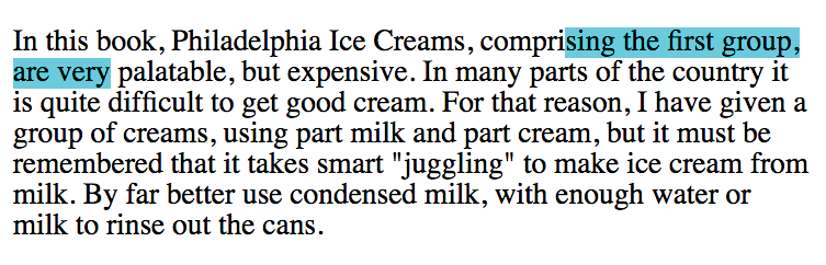
Clarissa Peterson introduces a neat trick for testing line lengths in her book Learning Responsive Web Design (O’Reilly). Put a span around the 45th to 75th characters in the text and give it a background color (Figure 17-8). That way, you can easily check whether the line breaks are happening in the safe zone at a glance. Of course, this line length hint would be removed before the site is made public.
Responsive layout patterns
The manner in which a site transitions from a small-screen layout to a wide-screen layout must make sense for that particular site, but there are a few patterns (common and repeated approaches) that have emerged over the years. We can thank Luke Wroblewski (known for his “Mobile First” approach to web design, which has become the standard) for doing a survey of how responsive sites handle layout. The article detailing his findings, “Multi-Device Layout Patterns” (www.lukew.com/ff/entry.asp?1514), is getting on in years, but the patterns persist today. Following are the top patterns Luke named in his article (Figure 17-9):
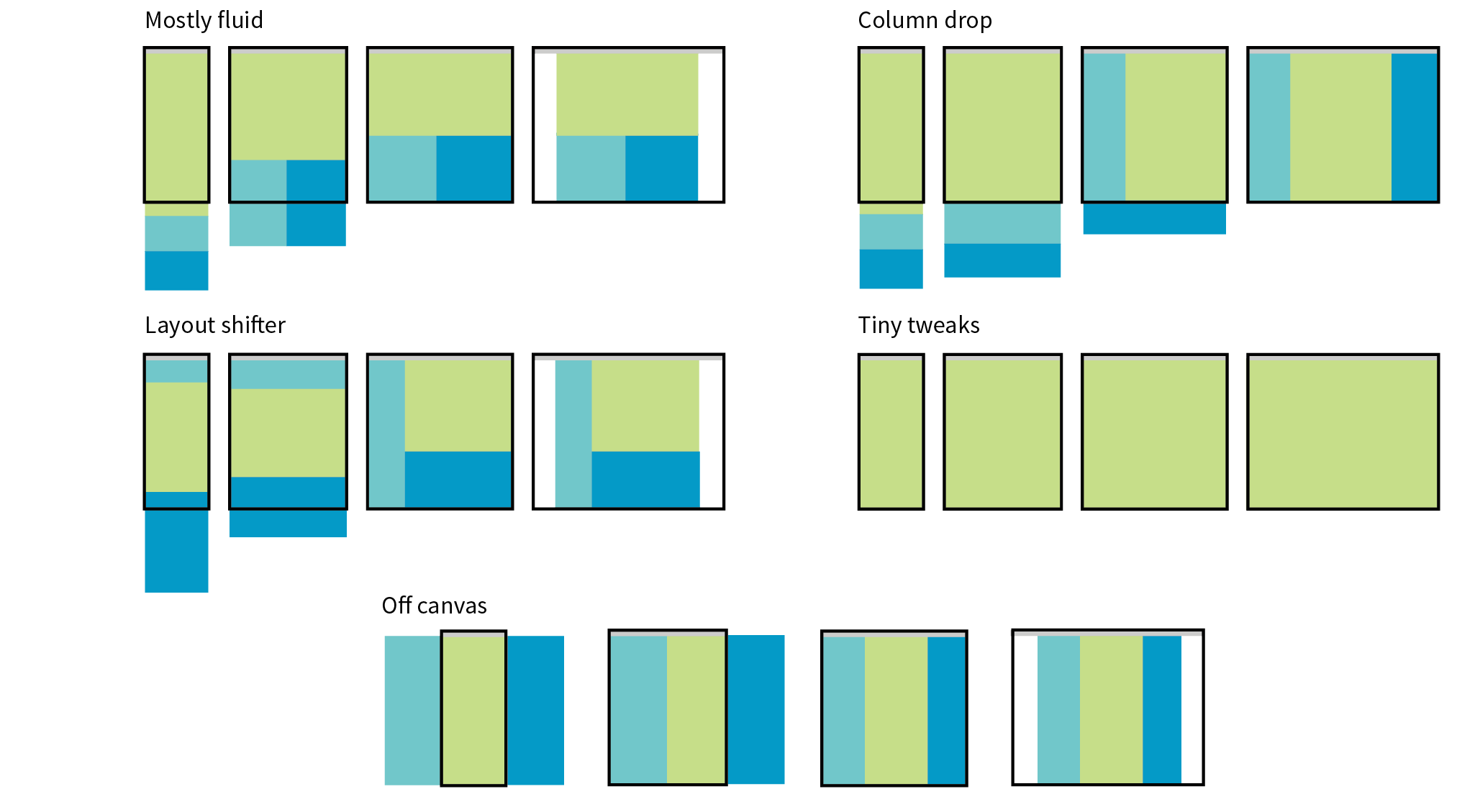
Mostly fluid
This pattern uses a single-column layout for small screens, and another fluid layout that covers medium and large screens, with a maximum width set to prevent it from becoming too wide. It generally requires less work than other solutions.
Column drop
This solution shifts between one-, two-, and three-column layouts based on available space. When there isn’t room for extra columns, the sidebar columns drop below the other columns until everything is stacked vertically in the one-column view.
Layout shifter
If you want to get really fancy, you can completely reinvent the layout for a variety of screen sizes. Although expressive and potentially cool, it is not necessary. In general, you can solve the problem of fitting your content to multiple environments without going overboard.
Tiny tweaks
Some sites use a single-column layout and make tweaks to type, spacing, and images to make it work across a range of device sizes.
Off canvas
As an alternative to stacking content vertically on small screens, you may choose to use an “off-canvas” solution. In this pattern, a page component is located just out of sight on the left or right of the screen and flies into view when requested. A bit of the main content screen remains visible on the edge to orient users as to the relationship of moving parts. This was made popular by Facebook, wherein Favorites and Settings were placed on a panel that slid in from the left when users clicked a menu icon.
You can see working examples of these and additional layout patterns on the “Responsive Patterns” page assembled by Brad Frost (bradfrost.github.io/this-is-responsive/patterns.html).
Typography
Typography requires fine-tuning along the spectrum from small-screen to wide-screen views in order to keep it legible and pleasant to read. Here are a few typography-related pointers (Figure 17-10):
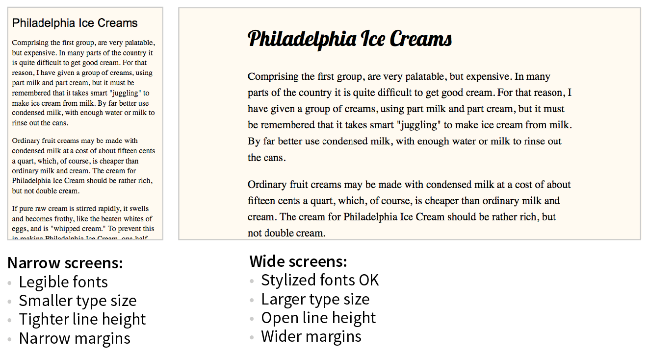
Font face
Be careful about using fancy fonts on small screens and be sure to test for legibility. At small sizes, some fonts become difficult to read because line strokes become too light or extra flourishes become little blobs. Consider also that small screens may be connecting over cellular, so taking advantage of locally available fonts may be better for performance than requiring a web font to download. If a strict brand identity requires font consistency on all devices, be sure to choose a font face that works well at all sizes. If that is not a concern, consider using a web font only on larger screens. We strive to serve the same design to all devices, but as with everything else in web design, flexibility is important.
Font size
Varying viewport widths can wreak havoc on line lengths. You may find that you need to increase the font size of text elements for wider viewports to maintain a line length of between 45 and 75 characters. It also makes it easier to read from the distance users typically sit from their large screens. Conversely, you could use em-based media queries so that the layout stays proportional to the font size. With em-based queries, line lengths stay consistent.
Line height
Line height is another measurement that you may want to tweak as screens get larger. On average, line height should be about 1.5 (using a number value for the line-height property); however, slightly tighter line spacing (1.2 to 1.5) is easier to read with the shorter line lengths on small screens. Large screens, where the type is also likely to be larger, can handle more open line heights (1.4 to 1.6).
Margins
On small screens, make the most of the available space by keeping left and right margins on the main column to a minimum (2–4%). As screens get larger, you will likely need to increase side margins to keep the line lengths under control and just to add some welcome whitespace to the layout. Remember to specify margins above and below text elements in em units so they stay proportional to the type.
Navigation
Navigation feels a little like the Holy Grail of Responsive Web Design. It is critical to get it right. Because navigation at desktop widths has pretty much been conquered, the real challenges come in re-creating our navigation options on small screens. A number of successful patterns have emerged for small screens, which I will briefly summarize here (Figure 17-11):
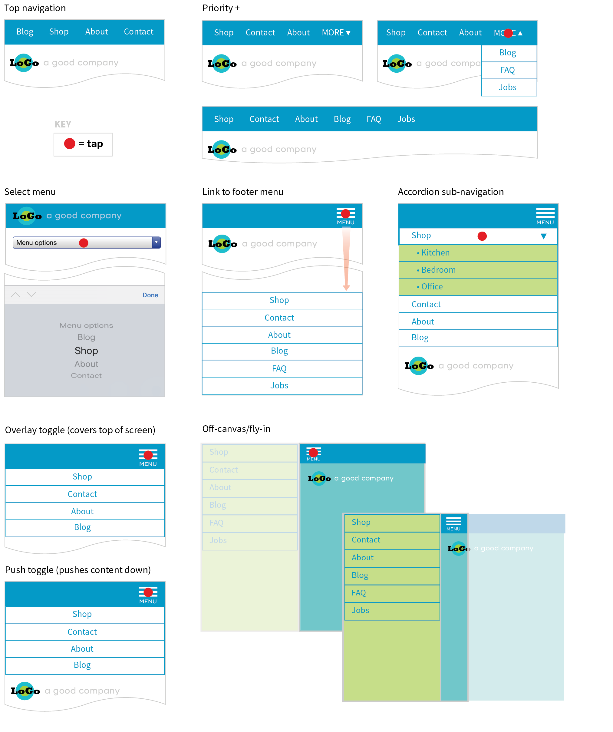
Top navigation
If your site has just a few navigation links, they may fit just fine in one or two rows at the top of the screen.
Priority +
In this pattern, the most important navigation links appear in a line across the top of the screen alongside a More link that exposes additional options. The pros are that the primary links are in plain view, and the number of links shown can increase as the device width increases. The cons include the difficulty of determining which links are worthy of the prime small-screen real estate.
Select menu
For a medium list of links, some sites use a select input form element. Tapping the menu opens the list of options using the select menu UI of the operating system, such as a scrolling list of links at the bottom of the screen or on an overlay. The advantage is that it is compact, but on the downside, forms aren’t typically used for navigation, and the menu may be overlooked.
Link to footer menu
One straightforward approach places a Menu link at the top of the page that links to the full navigation located at the bottom of the page. The risk with this pattern is that it may be disorienting to users who suddenly find themselves at the bottom of the scroll.
Accordion sub-navigation
When there are a lot of navigation choices with sub-navigation menus, the small-screen solution becomes more challenging, particularly when you can’t hover to get more options as you can with a mouse. Accordions that expand when you tap a small arrow icon are commonly used to reveal and hide sub-navigation. They may even be nested several levels deep. To avoid nesting navigation in accordion submenus, some sites simply link to separate landing pages that contain a list of the sub-navigation for that section.
Push and overlay toggles
In toggle navigation, the navigation is hidden but expands downward when the menu link is tapped. It may push the main content down below it (push toggle) or slide down in front of the content (overlay toggle).
Off-canvas/fly-in
This popular pattern puts the navigation in an off-screen panel to the left or right of the main content that slides into view when you tap the menu icon.
For a deeper dive into the pros and cons of navigation patterns, read Brad Frost’s article “Responsive Navigation Patterns” (bradfrost.com/blog/web/responsive-nav-patterns). Brad also includes examples of these patterns and more on his Responsive Patterns page (bradfrost.github.io/this-is-responsive/patterns.html).
For working examples of these patterns with the code used to create them, see the “Adventures in Responsive Navigation” page assembled by Eric Arbé at responsivenavigation.net.
Images
Images require special attention in responsive designs. Here is a quick rundown of some of the key issues, most of which should sound familiar:
- Use responsive image markup techniques (covered in Chapter 7) to provide multiple versions of key images for various sizes and resolutions.
- Serve the smallest version as the default to prevent unnecessary data downloads.
- Be sure that important image detail is not lost at smaller sizes. Consider substituting a cropped version of the image for small screens.
- Avoid putting text in graphics, but if it is necessary, provide alternate versions with larger text for small screens.
Special Content
Without the luxury of wide-open, desktop viewports, some of our common page elements pose challenges when it comes to fitting on smaller screens:
Forms
Forms often take a little finagling to fit the available space appropriately. Flexbox is a great tool for adding flexibility and conditional wrapping to form fields and their labels. A web search will turn up some fine tutorials. Also make sure that your form is as efficient as possible, with no unnecessary fields, which is good advice for any screen size. Finally, consider that form inputs will be used with fingertips, not mouse pointers, so increase the target size by adding ample padding or margins and by making labels tappable to select an input.
Tables
One of the greatest challenges in small-screen design is how to deal with large data tables. Not surprisingly, because there are many types of tables, there are also many solutions. See the “The Trouble with Tables” sidebar for more information and resources.
Interactive elements
A big embedded map may be great on a desktop view of a site, but it is less useful when it is the size of a postage stamp. Consider whether some interactive features should be substituted for other methods for performing the same task. In the case of the map, adding a link to a map can trigger the device’s native mapping app to open, which is designed to provide a better small-screen experience. Other interactive components, such as carousels, can be adapted for smaller viewports.
That should give you a feel for some of the aspects of a site that need special attention in a responsive design. We covered content hierarchy, various layout patterns, typography tweaks, responsive navigation patterns, and image strategies, and addressed tables, forms, and interactive features. I’d say that’s enough lecturing. Now you’ll get some hands-on time in Exercise 17-1.
Exercise 17-1. Making the bakery home page responsive
Getting Started
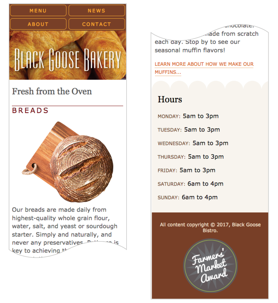
Fixing the Navigation
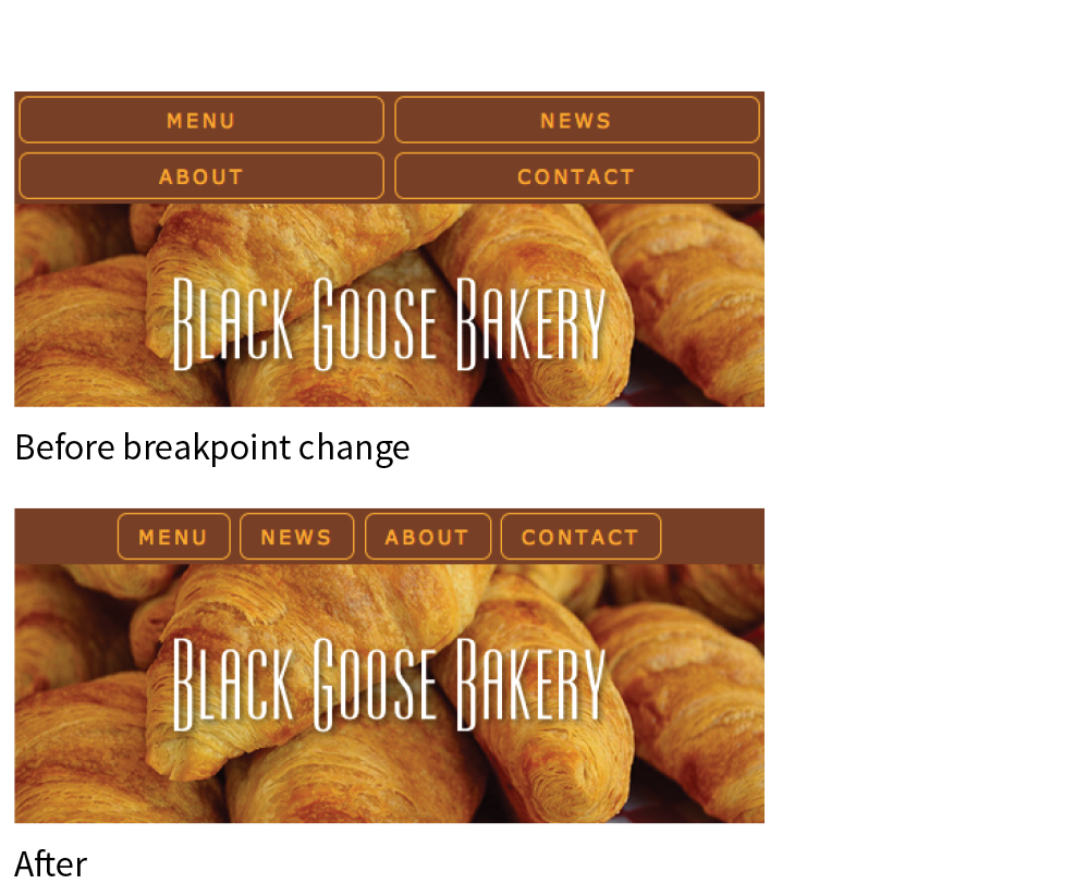
@media screen and (min-width: 400px) {nav ul li { flex: none; } nav ul { justify-content: center; }}
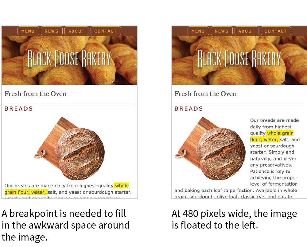
Floating Images
@media screen and (min-width: 480px) {main img { float: left; margin: 0 1em 1em 0; }}
Text and Typography
@media screen and (min-width: 600px) {header p { display: block; margin-top: -1.5em; font-family: Georgia, serif; font-style: italic; font-size: 1.2em; } main, h2, h3 { font-family: 'Stint Ultra Expanded', Georgia, serif; } h2, h3 { font-weight: bold; } main { line-height: 1.8em; padding: 1em; border: double 4px #EADDC4; border-radius: 25px; margin: 2.5%; }}
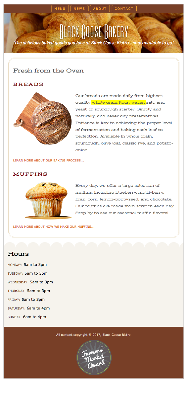
Multicolumn Layout
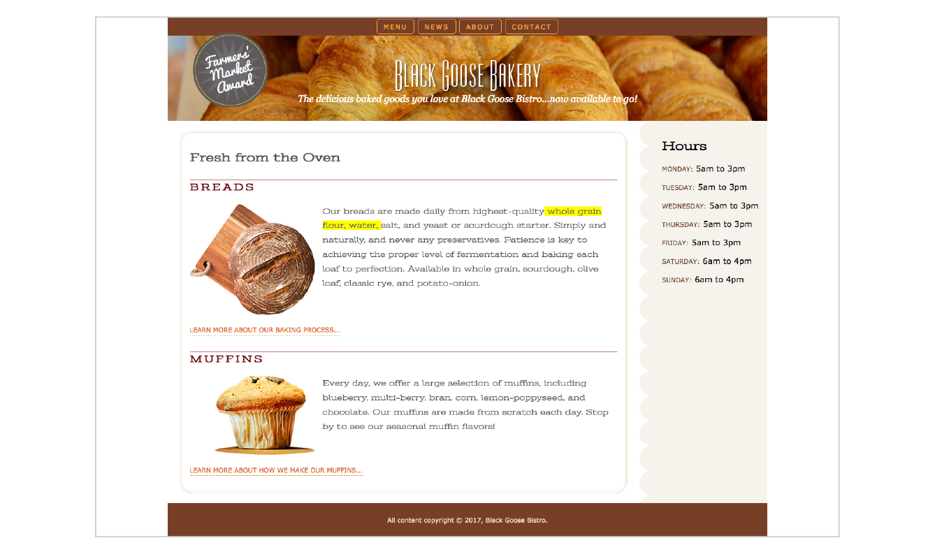
NOTE
The highlighted background on the length span should be turned off before you publish, but I’ve left it visible in the figures so you can see how our line length is faring across layouts.
@media screen and (min-width: 940px) { #container { display: grid; grid-template-rows: auto min-height 5em; grid-template-columns: minmax(25em, 1fr) 16em; grid-template-areas: "banner banner" "main hours" "footer footer"; max-width: 1200px; margin: 0 auto; position: relative; } header { grid-area: banner; } main { grid-area: main;
} aside { grid-area: hours; background: url(images/scallop.png) repeat-y left top; background-color: #F6F3ED; padding: 1em; padding-left: 45px; } footer { grid-area: footer; } #award { position: absolute; top: 30px; left: 50px; } }
A Few Words About Testing
In the previous exercise, we relied on the Responsive View in a modern browser to make decisions about style changes at various sizes, but although it’s a handy tool for creating an initial design, much more testing is required before the design can be considered ready for final launch. That is even more critical for sites that include features that rely on JavaScript or server-side functionality.
There are three general options for testing sites: real devices, emulators, and third-party services. We’ll look at each in this section.
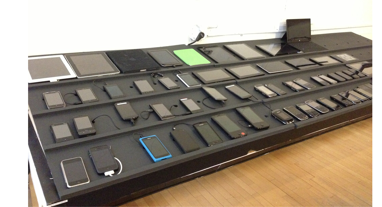
Real Devices
There is really no substitute for testing a site on a variety of real devices and operating systems. Beyond just seeing how the site looks, testing on real devices shows you how your site performs. How fast does it load? Are the links easy to tap? Do all the interactive features work smoothly? Do they work at all?
Web development companies may have a device lab comprising iPhones and iPads of various sizes, Android smartphones and tablets of various sizes, and Macs and PCs with recent operating systems (Windows and Linux) that can be used by designers and developers for testing sites (Figure 17-17). The size of the device lab depends on the size of the budget, of course (electronic devices aren’t cheap!).
If you don’t have the luxury of working at a big company with a big lab, there are alternatives:
- If you live in a big city, you may be near a device lab that is open for public use. Check the opendevicelab.com site to see if there is one near you.
- You can build your own lab with a collection of used devices. At minimum, you should have access to an iPhone, Android phone, iPad, 7" tablet (like iPad Mini), and computers running macOS and Microsoft Windows. The good news is that you generally don’t need a data plan for every device because you can test over WiFi.
- If buying devices is not feasible, you can ask friends and coworkers to borrow their phones and tablets briefly. Asking permission at a mobile retail store to load web pages on their devices is not unheard of.
If you do have multiple real devices for testing, using a synchronization tool makes the process a whole lot smoother. Software like BrowserSync (browsersync.io) and Ghostlab (www.vanamco.com/ghostlab/) runs on your computer and beams whatever is on your screen to all your devices simultaneously so you don’t need to load the page on each one individually. It’s like magic!
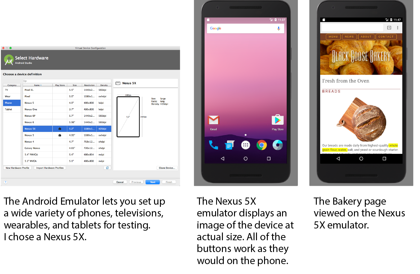
Emulators
If a particular device is out of your reach, you could use an emulator, a desktop application that emulates mobile device hardware and operating systems. The emulator presents a window that shows exactly how your site would behave on that particular device (Figure 17-18). Emulators require a lot of space on your computer and they can be buggy, but it is certainly better than not testing on that device at all.
A good starting point for exploring emulators is Maximiliano Firtman’s “Mobile Emulators & Simulators: The Ultimate Guide” (www.mobilexweb.com/emulators).
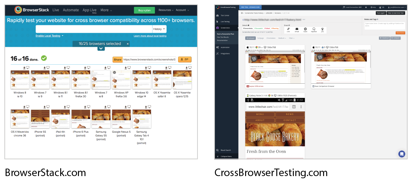
Third-Party Services
Another option for testing your site on over 1,000 devices is to subscribe to a service like BrowserStack (browserstack.com) or CrossBrowserTesting (crossbrowsertesting.com). For a monthly fee, you get access to a huge variety of device simulators (Figure 17-19). There are many such services available, some of which are free or offer free trials. They don’t give you the same insights as testing on actual devices, but it is another better-than-nothing alternative.
More RWD Resources
We’ve covered the mechanics of using fluid layouts, flexible images, and media queries to make a page that is usable across a wide range of screen sizes. We’ve looked at the design concerns and some common responsive patterns for layout, navigation, typography, and images. You even got a chance to try out creating a responsive page on your own. But this is really only the tip of the iceberg, and I encourage you to continue learning about RWD, particularly if you are considering web design or development as a career. Following is a list of RWD resources that I’ve found helpful and should point you in the right direction.
Books
Note
Most of these titles were written before CSS Grid Layout became a viable option. Keep in mind that you have advanced tools for flexible layouts not mentioned in these books.
Responsive Web Design, 2e, by Ethan Marcotte (A Book Apart)
This book is required reading. Ethan goes into much greater detail than I was able to here on how to calculate flexible grids and how to use media queries. Plus, it’s just plain fun to read.
Learning Responsive Web Design: A Beginner’s Guide by Clarissa Peterson (O’Reilly)
Clarissa provides a comprehensive overview of all aspects of responsive design, from detailed code examples to broad strategies on workflow and mobile-first design.
Smashing Book #5: Real-Life Responsive Web Design, various authors (Smashing Magazine)
A collection of practical techniques and strategies from prominent web designers.
Atomic Design by Brad Frost (self-published)
Brad describes his modular approach to RWD, which has become quite popular for large site development.
Responsive Design Workflow by Stephen Hay (New Riders)
Stephen Hay introduces his “design in the browser” method to creating responsive sites. This book is jam-packed with suggestions on how to approach web design and development.
Implementing Responsive Design by Tim Kadlec (New Riders)
Tim Kadlec is a leader in the mobile web design community, and his book is a comprehensive guide to designing and building a responsive site.
Online Resources
Responsive Web Design Is… (responsivedesign.is)
A collection of articles and podcasts about web design. You can also sign up for the “RWD Weekly” newsletter and keep your finger on the pulse of RWD. The site is a side project of Justin Avery and Simple Things.
Responsive Resources (bradfrost.github.io/this-is-responsive/resources.html)
For one-stop shopping for everything you could possibly want to know about RWD, look no further than Brad Frost’s Responsive Resources. He has gathered hundreds of links to resources related to strategy, design tools, layout, media queries, typography, images, components, development, testing, content management systems, email, tutorials, and more. Seriously, there is enough here to keep you busy for months.
Media Queries (mediaqueri.es)
A gallery of exceptional examples of responsive websites curated by Eivind Uggedal.
Test Yourself
Here we are at the end of another chapter, so you know what that means… quiz time! Get the answers in Appendix A if you’re stumped.
- What makes a responsive site different from a mobile (m-dot) site?
- What does this do?
<meta name="viewport" content="width=device-width, initial-scale=1">
- How do you make sure an image gets smaller when its container gets smaller in the layout?
- What does this do?
@media screen and (min-width: 60em) { body { margin: 0 10%; }} - What are some strategies for creating a layout that adjusts to the available width of the viewport?
- What is the advantage of using ems as a measurement in media queries?
- List three ways in which a media query may be used.
- Name three tweaks you may make to typography to make it work well on small screens.
- How might you handle navigation with a lot of submenus on a small screen?
- List three options for testing websites on multiple devices.
* Pew Research Center, “Smartphone Use in 2015,” .