Table of Contents for
Data Analysis with Open Source Tools
 Data Analysis with Open Source Tools
Published by
O'Reilly Media, Inc., 2010
Data Analysis with Open Source Tools
Published by
O'Reilly Media, Inc., 2010
- Cover
- Data Analysis with Open Source Tools
- O'Reilly Strata Conference
- Data Analysis with Open Source Tools
- Dedication
- A Note Regarding Supplemental Files
- Preface
- 1. Introduction
- I. Graphics: Looking at Data
- 2. A Single Variable: Shape and Distribution
- 3. Two Variables: Establishing Relationships
- 4. Time As a Variable: Time-Series Analysis
- 5. More Than Two Variables: Graphical Multivariate Analysis
- 6. Intermezzo: A Data Analysis Session
- II. Analytics: Modeling Data
- 7. Guesstimation and the Back of the Envelope
- 8. Models from Scaling Arguments
- 9. Arguments from Probability Models
- 10. What You Really Need to Know About Classical Statistics
- 11. Intermezzo: Mythbusting—Bigfoot, Least Squares, and All That
- III. Computation: Mining Data
- 12. Simulations
- 13. Finding Clusters
- 14. Seeing the Forest for the Trees: Finding Important Attributes
- 15. Intermezzo: When More Is Different
- IV. Applications: Using Data
- 16. Reporting, Business Intelligence, and Dashboards
- 17. Financial Calculations and Modeling
- 18. Predictive Analytics
- 19. Epilogue: Facts Are Not Reality
- A. Programming Environments for Scientific Computation and Data Analysis
- B. Results from Calculus
- C. Working with Data
- D. About the Author
- Index
- About the Author
- Colophon
- Copyright
Chapter 11. Intermezzo: Mythbusting—Bigfoot, Least Squares, and All That
EVERYBODY HAS HEARD OF BIGFOOT, THE MYSTICAL FIGURE THAT LIVES IN THE WOODS, BUT NOBODY HAS EVER actually seen him. Similarly, there are some concepts from basic statistics that everybody has heard of but that—like Bigfoot—always remain a little shrouded in mystery. Here, we take a look at three of them: the average of averages, the mystical standard deviation, and the ever-popular least squares.
How to Average Averages
Recently, someone approached me with the following question: given the numbers in Table 11-1, what number should be entered in the lower-right corner? Just adding up the individual defect rates per item and dividing by 3 (in effect, averaging them) did not seem right—if only because it would come out to about 0.75, which is pretty high when one considers that most of the units produced (100 out of 103) are not actually defective. The specific question asked was: “Should I weight the individual rates somehow?”
This situation comes up frequently but is not always recognized: we have a set of rates (or averages) and would like to summarize them into an overall rate (or overall average). The problem is that the naive way of doing so (namely, to add up the individual rates and then to divide by the number of rates) will give an incorrect result. However, this is rarely noticed unless the numbers involved are as extreme as in the present example.
Item type | Units produced | Defective units | Defect rate |
A | 2 | 1 | 0.5 |
B | 1 | 1 | 1.0 |
C | 100 | 1 | 0.01 |
Total defect rate | ??? | ||
The correct way to approach this task is to start from scratch. What is the “defect rate,” anyway? It is the number of defective items divided by the number of items produced. Hence, the total defect rate is the total number of defective items divided by the total number of items produced: 3/103 ≈ 0.03. There should be no question about that.
Can we arrive at this result in a different way by starting with the individual defect rates? Absolutely—provided we weight them appropriately. Each individual defect rate should contribute to the overall defect rate in the same way that the corresponding item type contributes to the total item count. In other words, the weight for item type A is 2/103, for B is 1/103, and for C it is 100/103. Pulling all this together, we have: 0.5 · 2/103 + 1.0 · 1/103 + 0.01 · 100/103 = (1 + 1 + 1)/103 = 3/103 as before.
To show that this agreement is not accidental, let’s write things out in greater generality:
nk | Number of items of type k |
dk | Number of defective items of type k |
Defect rate for type k | |
Contribution of type k to total production |

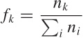
Now look at what it means to weight each individual defect rate:
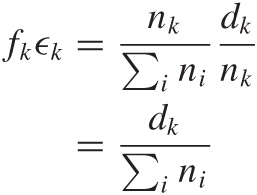
In other words, weighting the individual defect rate ϵk by the appropriate weight factor fk has the effect of turning the defect rate back to the the defect count dk (normalized by total number of items).
In this example, each item could get only one of two “grades,” namely 1 (for defective) or 0 (for not defective), and so the “defect rate” was a measure of the “average defectiveness” of a single item. The same logic as just demonstrated applies if you have a greater (or different) range of values. (You can make up your own example: give items grades from 1 to 5, and then calculate the overall “average grade” to see how it works.)
Simpson’s Paradox
Since we are talking about mystical figures that can sometimes be found in tables, we should also mention Simpson’s paradox. Look at Table 11-2 which shows applications and admissions to a fictional college in terms the applicants’ gender and department.
If you look only at the bottom line with the totals, then it might appear that the college is discriminating against women, since the acceptance rate for male applicants is higher than that for female applicants (0.77 versus 0.63).[20] But when you look at the rates for each individual department within the college, it turns out that women have higher acceptance rates than men for every department. How can that be?
The short and intuitive answer is that many more women apply to department B, which has a lower overall admission rate than department A (0.59 versus 0.81), and this drags down their (gender-specific) acceptance rate.
The more general explanation speaks of a “reversal of association due to a confounding factor.” When considering only the totals, it may seem as if there is an association between gender and admission rates, with male applicants being accepted more frequently. However, this view ignores the presence of a hidden but important factor: the choice of department. In fact, the choice of department has a greater influence on the acceptance rate than the original explanatory variable (the gender). By lumping the observations for the different departments into a single number, we have in fact masked the influence of this factor—with the consequence that the association between acceptance rate (which favors women for each department) and gender was reversed.
The important insight here is that such “reversal of association” due to a confounding factor is always possible. However, both conditions must occur: the confounding factor must be sufficiently strong (in our case, the acceptance rates for departments A and B were sufficiently different), and the assignment of experimental units to the levels of this factor must be sufficiently imbalanced (in our case, many more women applied to department B than to department A).
As opposed to Bigfoot, Simpson’s paradox is known to occur in the real world. The example in this section, for instance, was based on a well-publicized case involving the University of California (Berkeley) in the early 1970s. A quick Internet search will turn up additional examples.
The Standard Deviation
The fabled standard deviation is another close relative of Bigfoot. Everybody (it seems) has heard of it, everybody knows how to calculate it, and—most importantly—everybody knows that 68 percent of all data points fall within 1 standard deviation, 95 percent within 2, and virtually all (that is: 99.7 percent) within 3.
Problem is: this is utter nonsense.
It is true that the standard deviation is a measure for the spread (or width) of a distribution. It is also true that, for a given set of points, the standard deviation can always be calculated. But that does not mean that the standard deviation is always a good or appropriate measure for the width of a distribution; in fact, it can be quite misleading if applied indiscriminately to an unsuitable data set. Furthermore, we must be careful how to interpret it: the whole 68 percent business applies only if the data set satisfies some very specific requirements.
In my experience, the standard deviation is probably the most misunderstood and misapplied quantity in all of statistics.
Let me tell you a true story (some identifying details have been changed to protect the guilty). The story is a bit involved, but this is no accident: in the same way that Bigfoot sightings never occur in a suburban front yard on a sunny Sunday morning, severe misunderstandings in mathematical or statistical methods usually don’t reveal themselves as long as the applications are as clean and simple as the homework problems in a textbook. But once people try to apply these same methods in situations that are a bit less standard, anything can happen. This is what happened in this particular company.
I was looking over a bit of code used to identify outliers in the response times from a certain database server. The purpose of this program was to detect and report on uncommonly slow responses. The piece of code in question processed log files containing the response times and reported a threshold value: responses that took longer than this threshold were considered “outliers.”
An existing service-level agreement defined an outlier as any value “outside of 3 standard deviations.” So what did this piece of code do? It sorted the response times to identify the top 0.3 percent of data points and used those to determine the threshold. (In other words, if there were 1,000 data points in the log file, it reported the response time of the third slowest as threshold.) After all, 99.7 percent of data points fall within 3 standard deviations. Right?
After reading Chapter 2, I hope you can immediately tell where the original programmer went wrong: the threshold that the program reported had nothing at all to do with standard deviations—instead, it reported the top 0.3 percentile. In other words, the program completely failed to do what it was supposed to do. Also, keep in mind that it is incorrect to blindly consider the top x percent of any distribution as outliers (review the discussion of box plots in Chapter 2 if you need a reminder).
But the story continues. This was a database server whose typical response time was less than a few seconds. It was clear that anything that took longer than one or two minutes had to be considered “slow”—that is, an outlier. But when the program was run, the threshold value it reported (the 0.3 percentile) was on the order of hours. Clearly, this threshold value made no sense.
In what must have been a growing sense of desperation, the original programmer now made a number of changes: from selecting the top 0.3 percent, to the top 1 percent, then the top 5 percent and finally the top 10 percent. (I could tell, because each such change had dutifully been checked into source control!) Finally, the programmer had simply hard-coded some seemingly “reasonable” value (such as 47 seconds or something) into the program, and that’s what was reported as “3 standard deviations” regardless of the input.
It was the only case of outright technical fraud that I have ever witnessed: a technical work product that—with the original author’s full knowledge—in no way did what it claimed to do.
What went wrong here? Several things. First, there was a fundamental misunderstanding about the definition of the standard deviation, how it is calculated, and some of the properties that in practice it often (but not always) has. The second mistake was applying the standard deviation to a situation where it is not a suitable measure.
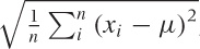
Let’s recap some basics: we often want to characterize a point
distribution by a typical value (its location) and its spread around
this location. A convenient measure for the location is the mean:
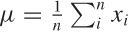 . Why is the mean so convenient? Because it is
easy to calculate: just sum all the values and divide by
n.
. Why is the mean so convenient? Because it is
easy to calculate: just sum all the values and divide by
n.
To find the width of the distribution, we would like see how far
points “typically” stray from the mean. In other words, we would like
to find the mean of the
deviations
xi –
μ. But since the deviations can be positive and negative, they would
simply cancel, so instead we calculate the mean of the
squared deviations: 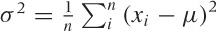 . This quantity is called the
variance, and its square root is the
standard deviation. Why do we bother with the
square root? Because it has the same units as the mean, whereas in the
variance the units are raised to the second power.
. This quantity is called the
variance, and its square root is the
standard deviation. Why do we bother with the
square root? Because it has the same units as the mean, whereas in the
variance the units are raised to the second power.
Now, if and only if the point distribution is well behaved (which in practice means: it is Gaussian), then it is true that about 68 percent of points will fall within the interval [μ – σ, μ + σ] and that 95 percent fall within the interval [μ – 2σ, μ + 2σ] and so on. The inverse is not true: you cannot conclude that 68 percent of points define a “standard deviation” (this is where the programmer in our story made the first mistake). If the point distribution is not Gaussian, then there are no particular patterns by which fractions of points will fall within 1, 2, or any number of standard deviations from the mean. However, keep in mind that the definitions of the mean and the standard deviation (as given by the previous equations) both retain their meaning: you can calculate them for any distribution and any data set.
However (and this is the second mistake that was made), if the distribution is strongly asymmetrical, then mean and standard deviation are no longer good measures of location and spread, respectively. You can still calculate them, but their values will just not be very informative. In particular, if the distribution has a fat tail then both mean and standard deviation will be influenced heavily by extreme values in the tail.
In this case, the situation was even worse: the distribution of response times was a power-law distribution, which is extremely poorly summarized by quantities such as mean and standard deviation. This explains why the top 0.3 percent of response times were on the order of hours: with power-law distributions, all values—even extreme ones—can (and do!) occur; whereas for Gaussian or exponential distributions, the range of values that do occur in practice is pretty well limited. (See Chapter 9 for more information on power-law distributions.)
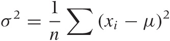
To summarize, the standard deviation, defined as
 , is a measure of the width of a distribution
(or a sample). It is a good measure for the width only if the
distribution of points is well behaved (i.e.,
symmetric and without fat tails). Points that are far away from the
center (compared to the width of the distribution) can be considered
outliers. For distributions that are less well behaved, you will have
to use other measures for the width (e.g., the
inter-quartile range); however, you can usually still identify
outliers as points that fall outside the typical range of values. (For
power-law distributions, which do not have a “typical” scale, it
doesn’t make sense to define outliers by statistical means; you will
have to justify them differently—for instance by appealing to
requirements from the business domain.)
, is a measure of the width of a distribution
(or a sample). It is a good measure for the width only if the
distribution of points is well behaved (i.e.,
symmetric and without fat tails). Points that are far away from the
center (compared to the width of the distribution) can be considered
outliers. For distributions that are less well behaved, you will have
to use other measures for the width (e.g., the
inter-quartile range); however, you can usually still identify
outliers as points that fall outside the typical range of values. (For
power-law distributions, which do not have a “typical” scale, it
doesn’t make sense to define outliers by statistical means; you will
have to justify them differently—for instance by appealing to
requirements from the business domain.)
How to Calculate
Here is a good trick for calculating the standard deviation efficiently. At first, it seems you need to make two passes over the data in order to calculate both mean and standard deviation. In the first pass you calculate the mean, but then you need to make a second pass to calculate the deviations from that mean:
It appears as if you can’t find the deviations until the mean μ is known.
However, it turns out that you can calculate both quantities
in a single pass through the data. All you need to do is to maintain
both the sum of the values  and the sum of the squares of the values
 , because you can write the preceding equation
for σ2 in a form that depends only on those two sums:
, because you can write the preceding equation
for σ2 in a form that depends only on those two sums:
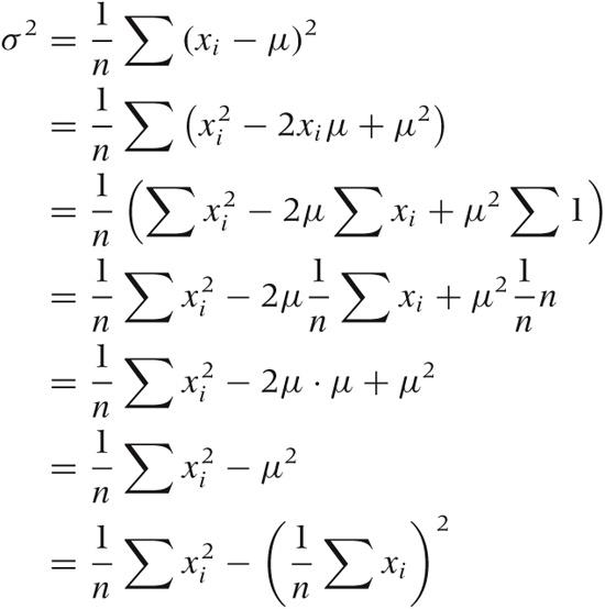
This is a good trick that is apparently too little known. Keep it in mind; similar situations crop up in different contexts from time to time. (To be sure, the floating-point properties of both methods are different, but if you care enough to worry about the difference, then you should be using a library anyway.)
Optional: One over What?
You may occasionally see the standard deviation defined with an n in the denominator and sometimes with a factor of n – 1 instead.
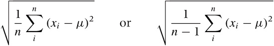
What really is the difference, and which expression should you use?
The factor 1/n applies only if you know the exact value of the mean μ ahead of time. This is usually not the case; instead, you will usually have to calculate the mean from the data. This adds a bit of uncertainty, which leads to the widening of the proper estimate for the standard deviation. A theoretical argument then leads to the use of the factor 1/(n – 1) instead of 1/n.
In short, if you calculated the mean from the data (as is usually the case), then you should really be using the 1/(n – 1) factor. The difference is going to be small, unless you are dealing with very small data sets.
Optional: The Standard Error
While we are on the topic of obscure sources of confusion, let’s talk about the standard error.
The standard error is the standard deviation of an estimated quantity. Let’s say we estimate some quantity (e.g., the mean). If we repeatedly take samples, then the means calculated from those samples will scatter around a little, according to some distribution. The standard deviation of this distribution is the “standard error” of the estimated quantity (the mean, in this example).
The following observation will make this clearer. Take a sample of size n from a normally distributed population with standard deviation σ. Then 68 percent of the members of the sample will be within ±σ from the estimated mean (i.e., the sample mean).
However, the mean itself is normally distributed (because of
the Central Limit Theorem, since the mean is a sum of random
variables) with standard deviation  (again because of the Central Limit Theorem).
So if we take several samples, each of size n,
then we can expect 68 percent of the estimated means to lie within
(again because of the Central Limit Theorem).
So if we take several samples, each of size n,
then we can expect 68 percent of the estimated means to lie within
 of the true mean
(i.e., the mean of the overall
population).
of the true mean
(i.e., the mean of the overall
population).
In this situation, the quantity is therefore the standard error of
the mean.
Least Squares
Everyone loves least squares. In the confusing and uncertain world of data and statistics, they provide a sense of security—something to rely on! They give you, after all, the “best” fit. Doesn’t that say it all?
Problem is, I have never (not once!) seen least squares applied appropriately, and I have come to doubt that it should ever be considered a suitable technique. In fact, when today I see someone doing anything involving “least-squares fitting,” I am pretty certain this person is at wit’s end—and probably does not even know it!
There are two problems with least squares. The first is that it is used for two very different purposes that are commonly confused. The second problem is that least-squares fitting is usually not the best (or even a suitable) method for either purpose. Alternative techniques should be used, depending on the overall purpose (see first problem) and on what, in the end, we want to do with the result.
Let’s try to unravel these issues.
Why do we ever want to “fit” a function to data to begin with? There are two different reasons.
Statistical Parameter Estimation
Data is corrupted by random noise, and we want to extract parameters from it.
Smooth Interpolation or Approximation
Data is given as individual points, and we would like either to find a smooth interpolation to arbitrary positions between those points or to determine an analytical “formula” describing the data.
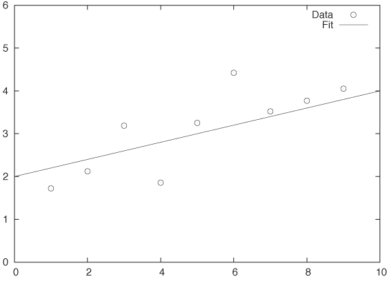
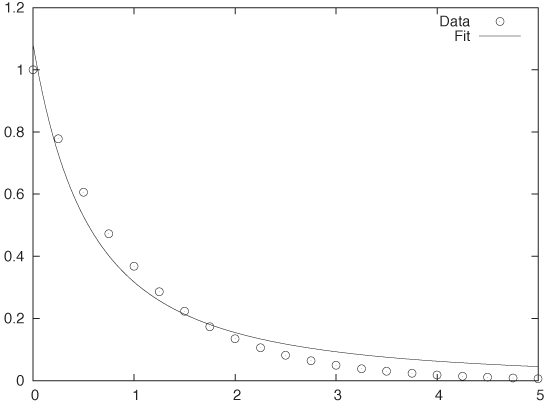
These two scenarios are conceptually depicted in Figure 11-1 and Figure 11-2.
Statistical Parameter Estimation
Statistical parameter estimation is the more legitimate of the two purposes. In this case, we have a control variable x and an outcome y. We set the former and measure the latter, resulting in a data set of pairs: {(x1, y1), (x2, y2),...}. Furthermore, we assume that the outcome is related to the control variable through some function f(x; {a, b, c,...}) of known form that depends on the control variable x and also on a set of (initially unknown) parameters {a, b, c,...}. However, in practice, the actual measurements are affected by some random noise ϵ, so that the measured values yi are a combination of the “true” value and the noise term:
yi = f(xi, {a, b, c,...}) + ϵi
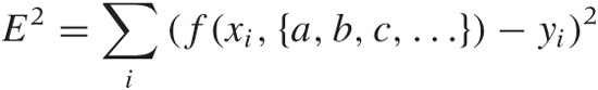
We now ask: how should we choose values for the parameters {a, b, c,...}, such that the function f(x, {a, b, c,...}) reproduces the measured values of y most faithfully? The usual answer is that we want to choose the parameters such that the total mean-square error E2 (sometimes called the residual sum of squares):
is minimized. As long as the distribution of errors is reasonably well behaved (not too asymmetric and without heavy tails), the results are adequate. If, in addition, the noise is Gaussian, then we can even invoke other parts of statistics and show that the estimates for the parameters obtained by the least-squares procedure agree with the “maximum likelihood estimate.” Thus the least-squares results are consistent with alternative ways of calculation.
But there is another important aspect to least-squares estimation that is frequently lost: we can obtain not only point estimates for the parameters {a, b, c,...} but also confidence intervals, through a self-consistent argument that links the distribution of the parameters to the distribution of the measured values.
I cannot stress this enough: a point estimate by itself is of limited use. After all, what good is knowing that the point estimate for a is 5.17 if I have no idea whether this means a = 5.17 ± 0.01 or a = 5.17 ± 250? We must have some way of judging the range over which we expect our estimate to vary, which is the same as finding a confidence interval for it. Least squares works, when applied in a probabilistic context like this, because it gives us not only an estimate for the parameters but also for their confidence intervals.
One last point: in statistical applications, it is rarely necessary to perform the minimization of E2 by numerical means. For most of the functions f(x, {a, b, c,...}) that are commonly used in statistics, the conditions that will minimize E2 can be worked out explicitly. (See Chapter 3 for the results when the function is linear.) In general, you should be reluctant to resort to numerical minimization procedures—there might be better ways of obtaining the result.
Function Approximation
In practice, however, least-squares fitting is often used for a different purpose. Consider the situation in Figure 11-2, where we have a set of individual data points. These points clearly seem to fall on a smooth curve. It would be convenient to have an explicit formula to summarize these data points rather than having to work with the collection of points directly. So, can we “fit” a formula to them?
Observe that, in this second application of least-squares fitting, there is no random noise. In fact, there is no random component at all! This is an important insight, because it implies that statistical methods and arguments don’t apply.
This becomes relevant when we want to determine the degree of confidence in the results of a fit. Let’s say we have performed a least-squares routine and obtained some values for the parameters. What confidence intervals should we associate with the parameters, and how good is the overall fit? Whatever errors we may incur in the fitting process, they will not be of a random nature, and we therefore cannot make probabilistic arguments about them.
The scenario in Figure 11-2 is typical: the plot shows the data together with the best fit for a function of the form f(x; a, b) = a/(1 + x)b, with a = 1.08 and b = 1.77. Is this a good fit? And what uncertainty do we have in the parameters? The answer depends on what you want to do with the results—but be aware that the deviations between the fit and the data are not at all “random” and hence that statistical “goodness of fit” measures are inappropriate. We have to find other ways to answer our questions. (For instance, we may find the largest of the residuals between the data points and our fitted function and report that the fit “represents the data with a maximum deviation of ....”)
This situation is typical in yet another way: given how smooth the curve is that the data points seem to fall on, our “best fit” seems really bad. In particular, the fit exhibits a systematic error: for 0 < x < 1.5, the curve is always smaller than the data, and for x > 1.5, it is always greater. Is this really the best we can do? The answer is yes, for functions of the form a/(1 + x)b. However, a different choice of function might give much better results. The problem here is that the least-squares approach forces us to specify the functional form of the function we are attempting to fit, and if we get it wrong, then the results won’t be any good. For this reason, we should use less constraining approaches (such as nonparametric or local approximations) unless we have good reasons to favor a particular functional form.
In other words, what we really have here is a problem of function interpolation or approximation: we know the function on a discrete set of points, and we would like to extend it smoothly to all values. How we should do this depends on what we want to do with the results. Here is some advice for common scenarios:
To find a “smooth curve” for plotting purposes, you should use one of the smoothing routines discussed in Chapter 3, such as splines or LOESS. These nonparametric methods have the advantage that they do not impose a particular functional form on the data (in contrast to the situation in Figure 11-2).
If you want to be able to evaluate the function easily at an arbitrary location, then you should use a local interpolation method. Such methods build a local approximation by using the three or four data points closest to the desired location. It is not necessary to find a global expression in this case: the local approximation will suffice.
Sometimes you may want to summarize the behavior of the data set in just a few “representative” values (e.g., so you can more easily compare one data set against another). This is tricky—it is probably a better idea to compare data sets directly against each other using similarity metrics such as those discussed in Chapter 13. If you still need to do this, consider a basis function expansion using Fourier, Hermite, or wavelet functions. (These are special sets of functions that enable you to extract greater and greater amounts of detail from a data set. Expansion in basis functions also allows you to evaluate and improve the quality of the approximation in a systematic fashion.)
At times you might be interested in some particular feature of the data: for example, you suspect that the data follows a power law xb and you would like to extract the exponent; or the data is periodic and you need to know the length of one period. In such cases, it is usually a better idea to transform the data in such a way that you can obtain that particular feature directly, rather than fitting a global function. (To extract exponents, you should consider a logarithmic transform. To obtain the length of an oscillatory period, measure the peak-to-peak (or, better still, the zero-to-zero) distance.)
Use specialized methods if available and applicable. Time series, for instance, should be treated with the techniques discussed in Chapter 4.
You may have noticed that none of these suggestions involve least squares!
Further Reading
Every introductory statistics book covers the standard deviation and least squares (see the book recommendations in Chapter 10). For the alternatives to least squares, consult a book on numerical analysis, such as the one listed here.
Numerical Methods That (Usually) Work. Forman S. Acton. 2nd ed., Mathematical Association of America. 1997.
Although originally published in 1970, this book does not feel the least bit dated—it is still one of the best introductions to the art of numerical analysis. Neither a cookbook nor a theoretical treatise, it stresses practicality and understanding first and foremost. It includes an inimitable chapter on “What Not to Compute.”
[20] You should check that the entries in the bottom row have been calculated properly, per the discussion in the previous section!