Table of Contents for
Data Analysis with Open Source Tools
 Data Analysis with Open Source Tools
Published by
O'Reilly Media, Inc., 2010
Data Analysis with Open Source Tools
Published by
O'Reilly Media, Inc., 2010
- Cover
- Data Analysis with Open Source Tools
- O'Reilly Strata Conference
- Data Analysis with Open Source Tools
- Dedication
- A Note Regarding Supplemental Files
- Preface
- 1. Introduction
- I. Graphics: Looking at Data
- 2. A Single Variable: Shape and Distribution
- 3. Two Variables: Establishing Relationships
- 4. Time As a Variable: Time-Series Analysis
- 5. More Than Two Variables: Graphical Multivariate Analysis
- 6. Intermezzo: A Data Analysis Session
- II. Analytics: Modeling Data
- 7. Guesstimation and the Back of the Envelope
- 8. Models from Scaling Arguments
- 9. Arguments from Probability Models
- 10. What You Really Need to Know About Classical Statistics
- 11. Intermezzo: Mythbusting—Bigfoot, Least Squares, and All That
- III. Computation: Mining Data
- 12. Simulations
- 13. Finding Clusters
- 14. Seeing the Forest for the Trees: Finding Important Attributes
- 15. Intermezzo: When More Is Different
- IV. Applications: Using Data
- 16. Reporting, Business Intelligence, and Dashboards
- 17. Financial Calculations and Modeling
- 18. Predictive Analytics
- 19. Epilogue: Facts Are Not Reality
- A. Programming Environments for Scientific Computation and Data Analysis
- B. Results from Calculus
- C. Working with Data
- D. About the Author
- Index
- About the Author
- Colophon
- Copyright
Chapter 3. Two Variables: Establishing Relationships
WHEN WE ARE DEALING WITH A DATA SET THAT CONSISTS OF TWO VARIABLES (THAT IS, A BIVARIATE DATA SET), we are mostly interested in seeing whether some kind of relationship exists between the two variables and, if so, what kind of relationship this is.
Plotting one variable against another is pretty straightforward, therefore most of our effort will be spent on various tools and transformations that can be applied to characterize the nature of the relationship between the two inputs.
Scatter Plots
Plotting one variable against another is simple—you just do it! In fact, this is precisely what most people mean when they speak about “plotting” something. Yet there are differences, as we shall see.
Figure 3-1 and Figure 3-2 show two examples. The data in Figure 3-1 might come from an experiment that measures the force between two surfaces separated by a short distance. The force is clearly a complicated function of the distance—on the other hand, the data points fall on a relatively smooth curve, and we can have confidence that it represents the data accurately. (To be sure, we should ask for the accuracy of the measurements shown in this graph: are there significant error bars attached to the data points? But it doesn’t matter; the data itself shows clearly that the amount of random noise in the data is small. This does not mean that there aren’t problems with the data but only that any problems will be systematic ones—for instance, with the apparatus—and statistical methods will not be helpful.)
In contrast, Figure 3-2 shows the kind of data typical of much of statistical analysis. Here we might be showing the prevalence of skin cancer as a function of the mean income for a group of individuals or the unemployment rate as a function of the frequency of high-school drop-outs for a number of counties, and the primary question is whether there is any relationship at all between the two quantities involved. The situation here is quite different from that shown in Figure 3-1, where it was obvious that a strong relationship existed between x and y, and therefore our main concern was to determine the precise nature of that relationship.
A figure such as Figure 3-2 is referred to as a scatter plot or xy plot. I prefer the latter term because scatter plot sounds to me too much like “splatter plot,” suggesting that the data necessarily will be noisy—but we don’t know that! Once we plot the data, it may turn out to be very clean and regular, as in Figure 3-1; hence I am more comfortable with the neutral term.
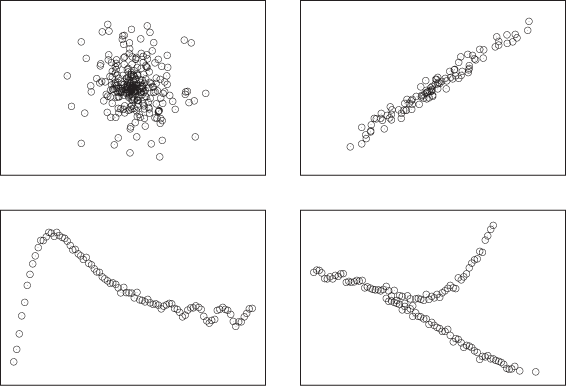
When we create a graph such as Figure 3-1 or Figure 3-2, we usually want to understand whether there is a relationship between x and y as well as what the nature of that relationship is. Figure 3-3 shows four different possibilities that we may find: no relationship; a strong, simple relationship; a strong, not-simple relationship; and finally a multivariate relationship (one that is not unique).
Conquering Noise: Smoothing
When data is noisy, we are more concerned with establishing whether the data exhibits a meaningful relationship, rather than establishing its precise character. To see this, it is often helpful to find a smooth curve that represents the noisy data set. Trends and structure of the data may be more easily visible from such a curve than from the cloud of points.
Two different methods are frequently used to provide smooth representation of noisy data sets: weighted splines and a method known as LOESS (or LOWESS), which is short for locally weighted regression.
Both methods work by approximating the data in a small neighborhood (i.e., locally) by a polynomial of low order (at most cubic). The trick is to string the various local approximations together to form a single smooth curve. Both methods contain an adjustable parameter that controls the “stiffness” of the resulting curve: the stiffer the curve, the smoother it appears but the less accurately it can follow the individual data points. Striking the right balance between smoothness and accuracy is the main challenge when it comes to smoothing methods.
Splines
Splines are constructed from piecewise polynomial functions (typically cubic) that are joined together in a smooth fashion. In addition to the local smoothness requirements at each joint, splines must also satisfy a global smoothness condition by optimizing the functional:
Here s(t) is the
spline curve,
(xi,
yi)
are the coordinates of the data points, the
wi
are weight factors (one for each data point), and α is a mixing
factor. The first term controls how “wiggly” the spline is overall,
because the second derivative measures the curvature of
s(t) and becomes large if
the curve has many wiggles. The second term captures how accurately
the spline represents the data points by measuring the squared
deviation of the spline from each data point—it becomes large if the
spline does not pass close to the data points. Each term in the sum
is multiplied by a weight factor
wi,
which can be used to give greater weight to data points that are
known with greater accuracy than others. (Put differently: we can
write
wi
as  , where
di
measures how close the spline should pass by
yi
at
xi.)
The mixing parameter α controls how much weight we give to the first
term (emphasizing overall smoothness) relative to the second term
(emphasizing accuracy of representation). In a plotting program, α
is usually the dial we use to tune the spline for a given data
set.
, where
di
measures how close the spline should pass by
yi
at
xi.)
The mixing parameter α controls how much weight we give to the first
term (emphasizing overall smoothness) relative to the second term
(emphasizing accuracy of representation). In a plotting program, α
is usually the dial we use to tune the spline for a given data
set.
To construct the spline explicitly, we form cubic interpolation polynomials for each consecutive pair of points and require that these individual polynomials have the same values, as well as the same first and second derivatives, at the points where they meet. These smoothness conditions lead to a set of linear equations for the coefficients in the polynomials, which can be solved. Once these coefficients have been found, the spline curve can be evaluated at any desired location.
LOESS
Splines have an overall smoothness goal, which means that they are less responsive to local details in the data set. The LOESS smoothing method addresses this concern. It consists of approximating the data locally through a low-order (typically linear) polynomial (regression), while weighting all the data points in such a way that points close to the location of interest contribute more strongly than do data points farther away (local weighting).
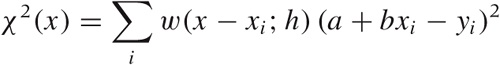
Let’s consider the case of first-order (linear) LOESS, so that the local approximation takes the particularly simple form a + bx. To find the “best fit” in a least-squares sense, we must minimize:
with respect to the two parameters a and
b. Here, w(x) is the
weight function. It should be smooth and strongly peaked—in fact, it
is basically a kernel, similar to those we encountered in Figure 2-5 when we
discussed kernel density estimates. The kernel most often used with
LOESS is the “tri-cube” kernel  for |x| < 1,
K(x) = 0 otherwise; but
any of the other kernels will also work. The weight depends on the
distance between the point x where we want to
evaluate the LOESS approximation and the location of the data
points. In addition, the weight function also depends on the
parameter h, which controls the bandwidth of
the kernel: this is the primary control parameter for LOESS
approximations. Finally, the value of the LOESS approximation at
position x is given by
y(x) =
a + bx, where
a and b minimize the
expression for χ2 stated earlier.
for |x| < 1,
K(x) = 0 otherwise; but
any of the other kernels will also work. The weight depends on the
distance between the point x where we want to
evaluate the LOESS approximation and the location of the data
points. In addition, the weight function also depends on the
parameter h, which controls the bandwidth of
the kernel: this is the primary control parameter for LOESS
approximations. Finally, the value of the LOESS approximation at
position x is given by
y(x) =
a + bx, where
a and b minimize the
expression for χ2 stated earlier.
This is the basic idea behind LOESS. You can see that it is easy to generalize—for example, to two or more dimensions or two higher-order approximation polynomials. (One problem, though: explicit, closed expressions for the parameters a and b can be found only if you use first-order polynomials; whereas for quadratic or higher polynomials you will have to resort to numerical minimization techniques. Unless you have truly compelling reasons, you want to stick to the linear case!)
LOESS is a computationally intensive method. Keep in mind that the entire calculation must be performed for every point at which we want to obtain a smoothed value. (In other words, the parameters a and b that we calculated are themselves functions of x.) This is in contrast to splines: once the spline coefficients have been calculated, the spline can be evaluated easily at any point that we wish. In this way, splines provide a summary or approximation to the data. LOESS, however, does not lend itself easily to semi-analytical work: what you see is pretty much all you get.
One final observation: if we replace the linear function a + bx in the fitting process with the constant function a, then LOESS becomes simply a weighted moving average.
Examples
Let’s look at two examples where smoothing reveals behavior that would otherwise not be visible.
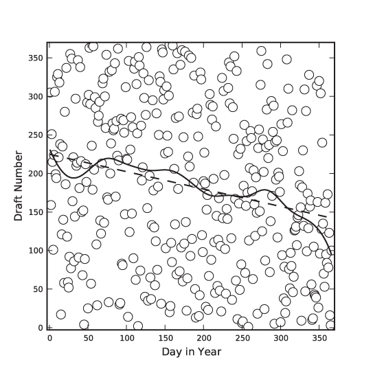
The first is a famous data set that has been analyzed in many places: the 1970 draft lottery. During the Vietnam War, men in the U.S. were drafted based on their date of birth. Each possible birth date was assigned a draft number between 1 and 366 using a lottery process, and men were drafted in the order of their draft numbers. However, complaints were soon raised that the lottery was biased—that men born later in the year had a greater chance of receiving a low draft number and, consequentially, a greater chance of being drafted early.[4]
Figure 3-4 shows all possible birth dates (as days since the beginning of the year) and their assigned draft numbers. If the lottery had been fair, these points should form a completely random pattern. Looking at the data alone, it is virtually impossible to tell whether there is any structure in the data. However, the smoothed LOESS lines reveal a strong falling tendency of the draft number over the course of the year: later birth dates are indeed more likely to have a lower draft number!
The LOESS lines have been calculated using a Gaussian kernel. For the solid line, I used a kernel bandwidth equal to 5, but for the dashed line, I used a much larger bandwidth of 100. For such a large bandwidth, practically all points in the data set contribute equally to the smoothed curve, so that the LOESS operation reverts to a linear regression of the entire data set. (In other words: if we make the bandwidth very large, then LOESS amounts to a least-squares fit of a straight line to the data.)
In this draft number example, we mostly cared about a global property of the data: the presence or absence of an overall trend. Because we were looking for a global property, a stiff curve (such as a straight line) was sufficient to reveal what we were looking for. However, if we want to extract more detail—in particular if we want to extract local features—then we need a “softer” curve, which can follow the data on smaller scales.
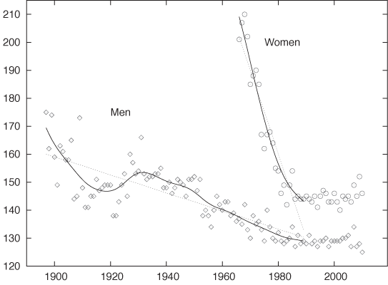
Figure 3-5 shows an amusing example.[5] Displayed are the finishing times (separately for men and women) for the winners in a marathon. Also shown are the “best fit” straight-line approximations for all events up to 1990. According to this (straight-line) model, women should start finishing faster than men before the year 2000 and then continue to become faster at a dramatic rate! This expectation is not borne out by actual observations: finishing times for women (and men) have largely leveled off.
This example demonstrates the danger of attempting to describe data by using a model of fixed form (a “formula”)—and a straight line is one of the most rigid models out there! A model that is not appropriate for the data will lead to incorrect conclusions. Moreover, it may not be obvious that the model is inappropriate. Look again at Figure 3-5: don’t the straight lines seem reasonable as a description of the data prior to 1990?
Also shown in Figure 3-5 are smoothed curves calculated using a LOESS process. Because these curves are “softer” they have a greater ability to capture features contained in the data. Indeed, the LOESS curve for the women’s results does give an indication that the trend of dramatic improvements, seen since they first started competing in the mid-1960s, had already begun to level off before the year 1990. (All curves are based strictly on data prior to 1990.) This is a good example of how an adaptive smoothing curve can highlight local behavior that is present in the data but may not be obvious from merely looking at the individual data points.
Residuals
Once you have obtained a smoothed approximation to the data, you will usually also want to check out the residuals—that is, the remainder when you subtract the smooth “trend” from the actual data.
There are several details to look for when studying residuals.
Residuals should be balanced: symmetrically distributed around zero.
Residuals should be free of a trend. The presence of a trend or of any other large-scale systematic behavior in the residuals suggests that the model is inappropriate! (By construction, this is never a problem if the smooth curve was obtained from an adaptive smoothing model; however, it is an important indicator if the smooth curve comes from an analytic model.)
Residuals will necessarily straddle the zero value; they will take on both positive and negative values. Hence you may also want to plot their absolute values to evaluate whether the overall magnitude of the residuals is the same for the entire data set or not. The assumption that the magnitude of the variance around a model is constant throughout (“homoscedasticity”) is often an important condition in statistical methods. If it is not satisfied, then such methods may not apply.
Finally, you may want to use a QQ plot (see Chapter 2) to check whether the residuals are distributed according to a Gaussian distribution. This, too, is an assumption that is often important for more advanced statistical methods.
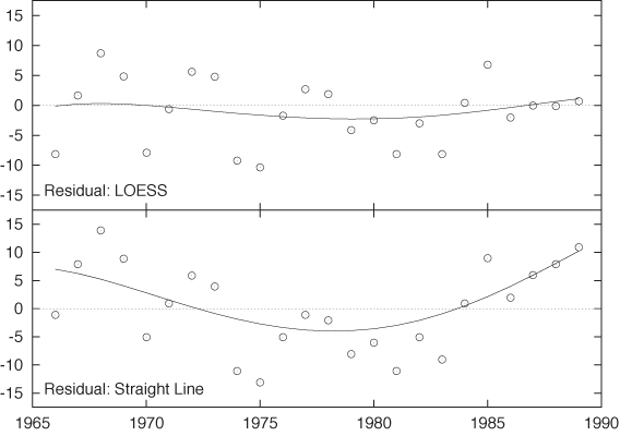
It may also be useful to apply a smoothing routine to the residuals in order to recognize their features more clearly. Figure 3-6 shows the residuals for the women’s marathon results (before 1990) both for the straight-line model and the LOESS smoothing curve. For the LOESS curve, the residuals are small overall and hardly exhibit any trend. For the straight-line model, however, there is a strong systematic trend in the residuals that is increasing in magnitude for years past 1985. This kind of systematic trend in the residuals is a clear indicator that the model is not appropriate for the data!
Additional Ideas and Warnings
Here are some additional ideas that you might want to play with.
As we have discussed before, you can calculate the residuals between the real data and the smoothed approximation. Here an isolated large residual is certainly odd: it suggests that the corresponding data point is somehow “different” than the other points in the neighborhood—in other words, an outlier. Now we argue as follows. If the data point is an outlier, then it should contribute less to the smoothed curve than other points. Taking this consideration into account, we now introduce an additional weight factor for each data point into the expression for J[s] or χ2 given previously. The magnitude of this weight factor is chosen in such a way that data points with large residuals contribute less to the smooth curve. With this new weight factor reducing the influence of points with large residuals, we calculate a new version of the smoothed approximation. This process is iterated until the smooth curve no longer changes.
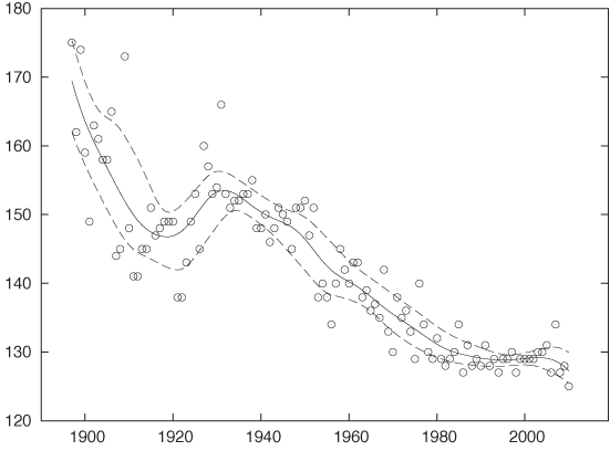
Another idea is to split the original data points into two classes: those that give rise to a positive residual and those with a negative residual. Now calculate a smooth curve for each class separately. The resulting curves can be interpreted as “confidence bands” for the data set (meaning that the majority of points will lie between the upper and the lower smooth curve). We are particularly interested to see whether the width of this band varies along the curve. Figure 3-7 shows an example that uses the men’s results from Figure 3-5.
Personally, I am a bit uncomfortable with either of these suggestions. They certainly have an unpleasant air of circular reasoning about them.
There is also a deeper reason. In my opinion, smoothing methods are a quick and useful but entirely nonrigorous way to explore the structure of a data set. With some of the more sophisticated extensions (e.g., the two suggestions just discussed), we abandon the simplicity of the approach without gaining anything in rigor! If we need or want better (or deeper) results than simple graphical methods can give us, isn’t it time to consider a more rigorous toolset?
This is a concern that I have with many of the more sophisticated graphical methods you will find discussed in the literature. Yes, we certainly can squeeze ever more information into a graph using lines, colors, symbols, textures, and what have you. But this does not necessarily mean that we should. The primary benefit of a graph is that it speaks to us directly—without the need for formal training or long explanations. Graphs that require training or complicated explanations to be properly understood are missing their mark no matter how “clever” they may be otherwise.
Similar considerations apply to some of the more involved ways of graph preparation. After all, a smooth curve such as a spline or LOESS approximation is only a rough approximation to the data set—and, by the way, contains a huge degree of arbitrariness in the form of the smoothing parameter (α or h, respectively). Given this situation, it is not clear to me that we need to worry about such details as the effect of individual outliers on the curve.
Focusing too much on graphical methods may also lead us to miss the essential point. For example, once we start worrying about confidence bands, we should really start thinking more deeply about the nature of the local distribution of residuals (Are the residuals normally distributed? Are they independent? Do we have a reason to prefer one statistical model over another?)—and possibly consider a more reliable estimation method (e.g., bootstrapping; see Chapter 12)—rather than continue with hand-waving (semi-)graphical methods.
Remember: The purpose of computing is insight, not pictures! (L. N. Trefethen)
Logarithmic Plots
Logarithmic plots are a standard tool of scientists, engineers, and stock analysts everywhere. They are so popular because they have three valuable benefits:
They rein in large variations in the data.
They turn multiplicative variations into additive ones.
They reveal exponential and power law behavior.
In a logarithmic plot, we graph the logarithm of the data instead of the raw data. Most plotting programs can do this for us (so that we don’t have to transform the data explicitly) and also take care of labeling the axes appropriately.
There are two forms of logarithmic plots: single or semi-logarithmic plots and double logarithmic or log-log plots, depending whether only one (usually the vertical or y axis) or both axes have been scaled logarithmically.
All logarithmic plots are based on the fundamental property of the logarithm to turn products into sums and powers into products:
log(xy) = log(x) + log(y)
log(xk) = k log(x)
Let’s first consider semi-log plots. Imagine you have data generated by evaluating the function:
y = C exp(αx) where C and α are constants
on a set of x values. If you plot y as a function of x, you will see an upward- or downward-sloping curve, depending on the sign of α (see Appendix B). But if you instead plot the logarithm of y as a function of x, the points will fall on a straight line. This can be easily understood by applying the logarithm to the preceding equation:
log y = αx + log C
In other words, the logarithm of y is a linear function of x with slope α and with offset log C. In particular, by measuring the slope of the line, we can determine the scale factor α, which is often of great interest in applications.
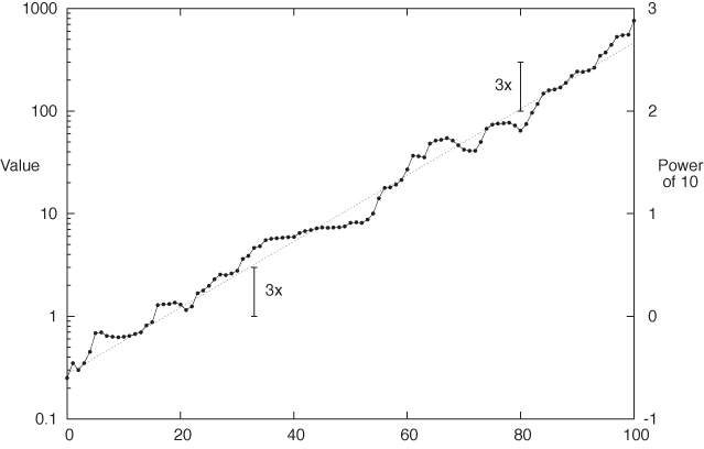
Figure 3-8 shows an example of a semi-logarithmic plot that contains some experimental data points as well as an exponential function for comparison. I’d like to point out a few details. First, in a logarithmic plot, we plot the logarithm of the values, but the axes are usually labeled with the actual values (not their logarithms). Figure 3-8 shows both: the actual values on the left and the logarithms on the right (the logarithm of 100 to base 10 is 2, the logarithm of 1,000 is 3, and so on). We can see how, in a logarithmic plot, the logarithms are equidistant, but the actual values are not. (Observe that the distance between consecutive tick marks is constant on the right, but not on the left.)
Another aspect I want to point out is that on a semi-log plot, all relative changes have the same size no matter how large the corresponding absolute change. It is this property that makes semi-log plots popular for long-running stock charts and the like: if you lost $100, your reaction may be quite different if originally you had invested $1,000 versus $200: in the first case you lost 10 percent but 50 percent in the second. In other words, relative change is what matters.
The two scale arrows in Figure 3-8 have the same length and correspond to the same relative change, but the underlying absolute change is quite different (from 1 to 3 in one case, from 100 to 300 in the other). This is another application of the fundamental property of the logarithm: if the value before the change is y1 and if y2 = γ y1 after the change (where γ = 3), then the change in absolute terms is:
y2 – y1 = γ y1 – y1 = (γ – 1)y1
which clearly depends on y1. But if we consider the change in the logarithms, we find:
log y2 – log y1 = log(γ y1) – log y1 = log γ + log y1 – log y1 = log γ
which is independent of the underlying value and depends only on γ, the size of the relative change.
Double logarithmic plots are now easy to understand—the only difference is that we plot logarithms of both x and y. This will render all power-law relations as straight lines—that is, as functions of the form y = Cxk or y = C/xk, where C and k are constants. (Taking logarithms on both sides of the first equation yields log y = k log x + log C, so that now log y is a linear function of log x with a slope that depends on the exponent k.)
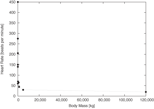
Figure 3-9 and Figure 3-10 provide stunning example for both uses of double logarithmic plots: their ability to render data spanning many order of magnitude accessible and their ability to reveal power-law relationships by turning them into straight lines. Figure 3-9 shows the typical resting heart rate (in beats per minute) as a function of the body mass (in kilograms) for a selection of mammals from the hamster to large whales. Whales weigh in at 120 tons—nothing else even comes close! The consequence is that almost all of the data points are squished against the lefthand side of the graph, literally crushed by the whale.
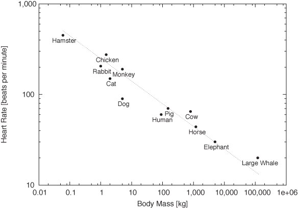
On the double logarithmic plot, the distribution of data points becomes much clearer. Moreover, we find that the data points are not randomly distributed but instead seem to fall roughly on a straight line with slope –1/4: the signature of power-law behavior. In other words, a mammal’s typical heart rate is related to its mass: larger animals have slower heart beats. If we let f denote the heart rate and m the mass, we can summarize this observation as:
f ~ m–1/4
This surprising result is known as allometric scaling. It seems to hold more generally and not just for the specific animals and quantities shown in these figures. (For example, it turns out that the lifetime of an individual organism also obeys a 1/4 power-law relationship with the body mass: larger animals live longer. The surprising consequence is that the total number of heartbeats per life of an individual is approximately constant for all species!) Allometric scaling has been explained in terms of the geometric constraints of the vascular network (veins and arteries), which brings nutrients to the cells making up a biological system. It is sufficient to assume that the network must be a space-filling fractal, that the capillaries where the actual exchange of nutrients takes place are the same size in all animals, and that the overall energy required for transport through the network is minimized, to derive the power-law relationships observed experimentally![6] We’ll have more to say about scaling laws and their uses in Part II.
Banking
Smoothing methods and logarithmic plots are both tools that help us recognize structure in a data set. Smoothing methods reduce noise, and logarithmic plots help with data sets spanning many orders of magnitude.
Banking (or “banking to 45 degrees”) is another graphical method. It is different than the preceding ones because it does not work on the data but on the plot as a whole by changing its aspect ratio.
We can recognize change (i.e., the slopes of curves) most easily if they make approximately a 45 degree angle on the graph. It is much harder to see change if the curves are nearly horizontal or (even worse) nearly vertical. The idea behind banking is therefore to adjust the aspect ratio of the entire plot in such a way that most slopes are at an approximate 45 degree angle.
Chances are, you have been doing this already by changing the plot ranges. Often when we “zoom” in on a graph it’s not so much to see more detail as to adjust the slopes of curves to make them more easily recognizable. The purpose is even more obvious when we zoom out. Banking is a more suitable technique to achieve the same effect and opens up a way to control the appearance of a plot by actively adjusting the aspect ratio.
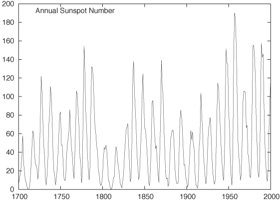
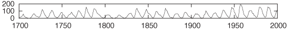
Figure 3-11 and Figure 3-12 show the classical example for this technique: the annual number of sunspots measured over the last 300 years.[7] In Figure 3-11, the oscillation is very compressed, and so it is difficult to make out much detail about the shape of the curve. In Figure 3-12, the aspect ratio of the plot has been adjusted so that most line segments are now at roughly a 45 degree angle, and we can make an interesting observation: the rising edge of each sunspot cycle is steeper than the falling edge. We would probably not have recognized this by looking at Figure 3-11.
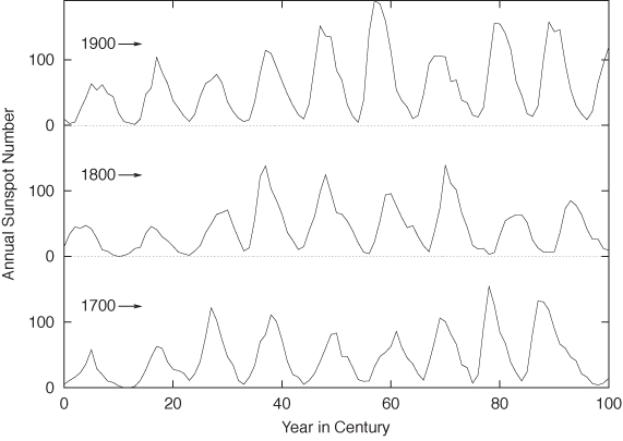
Personally, I would probably not use a graph such as Figure 3-12: shrinking the vertical axis down to almost nothing loses too much detail. It also becomes difficult to compare the behavior on the far left and far right of the graph. Instead, I would break up the time series and plot it as a cut-and-stack plot, such as the one in Figure 3-13. Note that in this plot the aspect ratio of each subplot is such that the lines are, in fact, banked to 45 degrees.
As this example demonstrates, banking is a good technique but can be taken too literally. When the aspect ratio required to achieve proper banking is too skewed, it is usually better to rethink the entire graph. No amount of banking will make the data set in Figure 3-9 look right—you need a double logarithmic transform.
There is also another issue to consider. The purpose of banking
is to improve human perception of the graph (it is, after all, exactly
the same data that is displayed). But graphs with highly skewed aspect ratios violate the great
affinity humans seem to have for proportions of roughly 4 by 3 (or 11
by 8.5 or  by 1). Witness the abundance of display formats
(paper, books, screens) that adhere approximately to these proportions
the world over. Whether we favor this display format because we are so
used to it or (more likely, I think) it is so predominant because it
works well for humans is rather irrelevant in this context. (And keep
in mind that squares seem to work particularly badly—notice how
squares, when used for furniture or appliances, are considered a
“bold” design. Unless there is a good reason for them, such as
graphing a square matrix, I recommend you avoid square
displays.)
by 1). Witness the abundance of display formats
(paper, books, screens) that adhere approximately to these proportions
the world over. Whether we favor this display format because we are so
used to it or (more likely, I think) it is so predominant because it
works well for humans is rather irrelevant in this context. (And keep
in mind that squares seem to work particularly badly—notice how
squares, when used for furniture or appliances, are considered a
“bold” design. Unless there is a good reason for them, such as
graphing a square matrix, I recommend you avoid square
displays.)
Linear Regression and All That
Linear regression is a method for finding a straight line through a two-dimensional scatter plot. It is simple to calculate and has considerable intuitive appeal—both of which together make it easily the single most-often misapplied technique in all of statistics!
There is a fundamental misconception regarding linear regression—namely that it is a good and particularly rigorous way to summarize the data in a two-dimensional scatter plot. This misconception is often associated with the notion that linear regression provides the “best fit” to the data.
This is not so. Linear regression is not a particularly good way to summarize data, and it provides a “best fit” in a much more limited sense than is generally realized.
Linear regression applies to situations where we have a set of input values (the controlled variable) and, for each of them, we measure an output value (the response variable). Now we are looking for a linear function f(x) = a + bx as a function of the controlled variable x that reproduces the response with the least amount of error. The result of a linear regression is therefore a function that minimizes the error in the responses for a given set of inputs.
This is an important understanding: the purpose of a regression procedure is not to summarize the data—the purpose is to obtain a function that allows us to predict the value of the response variable (which is affected by noise) that we expect for a certain value of the input variable (which is assumed to be known exactly).
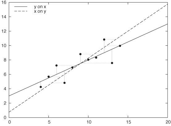
As you can see, there is a fundamental asymmetry between the two variables: the two are not interchangeable. In fact, you will obtain a different solution when you regress x on y than when you regress y on x. Figure 3-14 demonstrates this effect: the same data set is fitted both ways: y = a + bx and x = c + dy. The resulting straight lines are quite different.
This simple observation should dispel the notion that linear regression provides the best fit—after all, how could there be two different “best fits” for a single data set? Instead, linear regression provides the most faithful representation of an output in response to an input. In other words, linear regression is not so much a best fit as a best predictor.
How do we find this “best predictor”? We require it to minimize the error in the responses, so that we will be able to make the most accurate predictions. But the error in the responses is simply the sum over the errors for all the individual data points. Because errors can be positive or negative (as the function over- or undershoots the real value), they may cancel each other out. To avoid this, we do not sum the errors themselves but their squares:
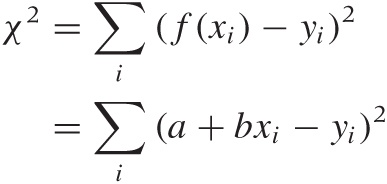
where (xi, yi) with i = 1 ... n are the data points. Using the values for the parameters a and b that minimize this quantity will yield a function that best explains y in terms of x.
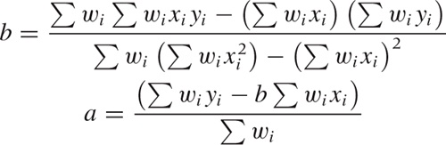
Because the dependence of χ2 on a and b is particularly simple, we can work out expressions for the optimal choice of both parameters explicitly. The results are:
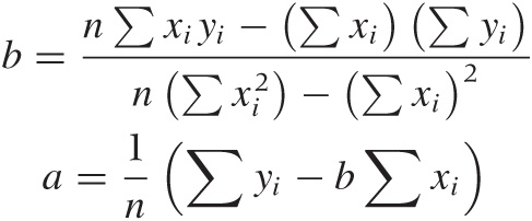
B | C | D | |||||
x | y | x | y | x | y | x | y |
10.0 | 8.04 | 10.0 | 9.14 | 10.0 | 7.46 | 8.0 | 6.58 |
8.0 | 6.95 | 8.0 | 8.14 | 8.0 | 6.77 | 8.0 | 5.76 |
13.0 | 7.58 | 13.0 | 8.74 | 13.0 | 12.74 | 8.0 | 7.71 |
9.0 | 8.81 | 9.0 | 8.77 | 9.0 | 7.11 | 8.0 | 8.84 |
11.0 | 8.33 | 11.0 | 9.26 | 11.0 | 7.81 | 8.0 | 8.47 |
14.0 | 9.96 | 14.0 | 8.10 | 14.0 | 8.84 | 8.0 | 7.04 |
6.0 | 7.24 | 6.0 | 6.13 | 6.0 | 6.08 | 8.0 | 5.25 |
4.0 | 4.26 | 4.0 | 3.10 | 4.0 | 5.39 | 19.0 | 12.50 |
12.0 | 10.84 | 12.0 | 9.13 | 12.0 | 8.15 | 8.0 | 5.56 |
7.0 | 4.82 | 7.0 | 7.26 | 7.0 | 6.42 | 8.0 | 7.91 |
5.0 | 5.68 | 5.0 | 4.74 | 5.0 | 5.73 | 8.0 | 6.89 |
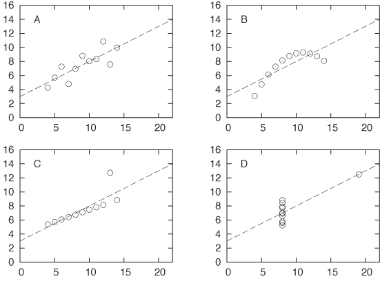
These results are simple and beautiful—and, in their simplicity, very suggestive. But they can also be highly misleading. Table 3-1 and Figure 3-15 show a famous example, Anscombe’s quartet. If you calculate the regression coefficients a and b for each of the four data sets shown in Table 3-1, you will find that they are exactly the same for all four data sets! Yet when you look at the corresponding scatter plots, it is clear that only the first data set is properly described by the linear model. The second data set is not linear, the third is corrupted by an outlier, and the fourth does not contain enough independent x values to form a regression at all! Looking only at the results of the linear regression, you would never know this.
I think this example should demonstrate once and for all how dangerous it can be to rely on linear regression (or on any form of aggregate statistics) to summarize a data set. (In fact, the situation is even worse than what I have presented: with a little bit more work, you can calculate confidence intervals on the linear regression results, and even they turn out to be equal for all four members of Anscombe’s quartet!)
Having seen this, here are some questions to ask before computing linear regressions.
Do you need regression?
Remember that regression coefficients are not a particularly good way to summarize data. Regression only makes sense when you want to use it for prediction. If this is not the case, then calculating regression coefficients is not useful.
Is the linear assumption appropriate?
Linear regression is appropriate only if the data can be described by a straight line. If this is obviously not the case (as with the second data set in Anscombe’s quartet), then linear regression does not apply.
Is something else entirely going on?
Linear regression, like all summary statistics, can be led astray by outliers or other “weird” data sets, as is demonstrated by the last two examples in Anscombe’s quartet.
Historically, one of the attractions of linear regression has
been that it is easy to calculate: all you need to do is to calculate
the four sums
Σxi,
 ,
Σyi,
and
Σxiyi,
which can be done in a single pass through the data set. Even with
moderately sized data sets (dozens of points), this is arguably easier
than plotting them using paper and pencil! However, that argument
simply does not hold anymore: graphs are easy to produce on a computer
and contain so much more information than a set of regression
coefficients that they should be the preferred way to analyze,
understand, and summarize data.
,
Σyi,
and
Σxiyi,
which can be done in a single pass through the data set. Even with
moderately sized data sets (dozens of points), this is arguably easier
than plotting them using paper and pencil! However, that argument
simply does not hold anymore: graphs are easy to produce on a computer
and contain so much more information than a set of regression
coefficients that they should be the preferred way to analyze,
understand, and summarize data.
Remember: The purpose of computing is insight, not numbers! (R. W. Hamming)
Showing What’s Important
Perhaps this is a good time to express what I believe to be the most important principle in graphical analysis:
Plot the pertinent quantities!
As obvious as it may appear, this principle is often overlooked in practice.
For example, if you look through one of those books that show and discuss examples of poor graphics, you will find that most examples fall into one of two classes. First, there are those graphs that failed visually, with garish fonts, unhelpful symbols, and useless embellishments. (These are mostly presentation graphics gone wrong, not examples of bad graphical analysis.)
The second large class of graphical failures consists of those plots that failed conceptually or, one might better say, analytically. The problem with these is not in the technical aspects of drawing the graph but in the conceptual understanding of what the graph is trying to show. These plots displayed something, but they failed to present what was most important or relevant to the question at hand.
The problem, of course, is that usually it is not at all obvious what we want to see, and it is certainly not obvious at the beginning. It usually takes several iterations, while a mental model of the data is forming in your head, to articulate the proper question that a data set is suggesting and to come up with the best way of answering it. This typically involves some form of transformation or manipulation of the data: instead of the raw data, maybe we should show the difference between two data sets. Or the residual after subtracting a trend or after subtracting the results from a model. Or perhaps we need to normalize data sets from different sources by subtracting their means and dividing by their spreads. Or maybe we should not use the original variables to display the data but instead apply some form of transformation on them (logarithmic scales are only the simplest example of such transformations). Whatever we choose to do, it will typically involve some form of transformation of the data—it’s rarely the raw data that is most interesting; but any deviation from the expected is almost always an interesting discovery.
Very roughly, I think we can identify a three-step (maybe four-step) process. It should be taken not in the sense of a prescriptive checklist but rather in the sense of a gradual process of learning and discovery.
First: The basics. Initially, we are mostly concerned with displaying what is there.
Select proper ranges.
Subtract a constant offset.
Decide whether to use symbols (for scattered data), lines (for continuous data), or perhaps both (connecting individual symbols can help emphasize trends in sparse data sets).
Second: The appearance. Next, we work with aspects of the plot that influence its overall appearance.
Log plots.
Add a smoothed curve.
Consider banking.
Third: Build a model. At this point, we start building a mathematical model and compare it against the raw data. The comparison often involves finding the differences between the model and the data (typically subtracting the model or forming a ratio).
Subtract a trend.
Form the ratio to a base value or baseline.
Rescale a set of curves to collapse them onto each other.
Fourth (for presentation graphics only): Add embellishments. Embellishments and decorations (labels, arrows, special symbols, explanations, and so on) can make a graph much more informative and self-explanatory. However, they are intended for an audience beyond the actual creator of the graph. You will rarely need them during the analysis phase, when you are trying to find out something new about the data set, but they are an essential part when presenting your results. This step should only occur if you want to communicate your results to a wider and more general audience.
Graphical Analysis and Presentation Graphics
I have used the terms graphical analysis and presentation graphics without explaining them properly. In short:
Graphical analysis
Graphical analysis is an investigation of data using graphical methods. The purpose is the discovery of new information about the underlying data set. In graphical analysis, the proper question to ask is often not known at the outset but is discovered as part of the analysis.
Presentation graphics
Presentation graphics are concerned with the communication of information and results that are already understood. The discovery has been made, and now it needs to be communicated clearly.
The distinction between these two activities is important, because they do require different techniques and yield different work products.
During the analysis process, convenience and ease of use are the predominant concerns—any amount of polishing is too much! Nothing should keep you from redrawing a graph, changing some aspect of it, zooming in or out, applying transformations, and changing styles. (When working with a data set I haven’t seen before, I probably create dozens of graphs within a few minutes—basically, “looking at the data from all angles.”) At this stage, any form of embellishment (labels, arrows, special symbols) is inappropriate—you know what you are showing, and creating any form of decoration on the graph will only make you more reluctant to throw the graph away and start over.
For presentation graphics, the opposite applies. Now you already know the results, but you would like to communicate them to others. Textual information therefore becomes very important: how else will people know what they are looking at?
You can find plenty of advice elsewhere on how to prepare “good” presentation graphics—often strongly worded and with an unfortunate tendency to use emotional responses (ridicule or derision) in place of factual arguments. In the absence of good empirical evidence one way or the other, I will not add to the discussion. But I present a checklist below, mentioning some points that are often overlooked when preparing graphs for presentation:
Try to make the text self-explanatory. Don’t rely on a (separate) caption for basic information—it might be removed during reproduction. Place basic information on the graph itself.
Explain what is plotted on the axes. This can be done with explicit labels on the axes or through explanatory text elsewhere. Don’t forget the units!
Make labels self-explanatory. Be careful with nonstandard abbreviations. Ask yourself: If this is all the context provided, are you certain that the reader will be able to figure out what you mean? (In a recent book on data graphing, I found a histogram labeled Married, Nvd, Dvd, Spd, and Wdd. I could figure out most of them, because at least Married was given in long form, but I struggled with Nvd for quite a while!)
Given how important text is on a graph, make sure to pick a suitable font. Don’t automatically rely on the default provided by your plotting software. Generally, sans-serif fonts (such as Helvetica) are preferred for short labels, such as those on a graph, whereas serif fonts (such as Times) are more suitable for body text. Also pick an appropriate size—text fonts on graphics are often too large, making them look garish. (Most text fonts are used at 10-point to 12-point size; there is no need for type on graphics to be much larger.)
If there are error bars, be sure to explain their meaning. What are they: standard deviations, inter-quartile ranges, or the limits of experimental apparatus? Also, choose an appropriate measure of uncertainty. Don’t use standard deviations for highly skewed data.
Don’t forget the basics. Choose appropriate plot ranges. Make sure that data is not unnecessarily obscured by labels.
Proofread graphs! Common errors include: typos in textual labels, interchanged data sets or switched labels, missing units, and incorrect order-of-magnitude qualifiers (e.g., milli- versus micro-).
Finally, choose an appropriate output format for your graph! Don’t use bitmap formats (GIF, JPG, PNG) for print publication—use a scalable format such as PostScript or PDF.
One last piece of advice: creating good presentation graphics is also a matter of taste, and taste can be acquired. If you want to work with data, then you should develop an interest in graphs—not just the ones you create yourself, but all that you see. If you notice one that seems to work (or not), take a moment to figure out what makes it so. Are the lines too thick? The labels too small? The choice of colors just right? The combination of curves helpful? Details matter.
Workshop: matplotlib
The matplotlib module is a Python module for creating two-dimensional xy plots, scatter plots, and other plots typical of scientific applications. It can be used in an interactive session (with the plots being shown immediately in a GUI window) or from within a script to create graphics files using common graphics file formats.
Let’s first look at some examples to demonstrate how matplotlib can be used from within an interactive session. Afterward, we will take a closer look at the structure of the library and give some pointers for more detailed investigations.
Using matplotlib Interactively
To begin an interactive matplotlib session, start IPython (the
enhanced interactive Python shell) with the -pylab option, entering the following
command line like at the shell prompt:
ipython -pylab
This will start IPython, load matplotlib and NumPy, and import both into the global namespace. The idea is to give a Matlab-like experience of interactive graphics together with numerical and matrix operations. (It is important to use IPython here—the flow of control between the Python command interpreter and the GUI eventloop for the graphics windows requires it. Other interactive shells can be used, but they may require some tinkering.)
We can now create plots right away:
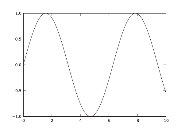
In [1]: x = linspace( 0, 10, 100 )

In [2]: plot( x, sin(x) )
Out[2]: [<matplotlib.lines.Line2D object at 0x1cfefd0>]
This will pop up a new window, showing a graph like the one in
Figure 3-16 but
decorated with some GUI buttons. (Note that the sin() function is a ufunc from the NumPy
package: it takes a vector and returns a vector of the same size,
having applied the sine function to each element in the input
vector. See the Workshop in Chapter 2.)
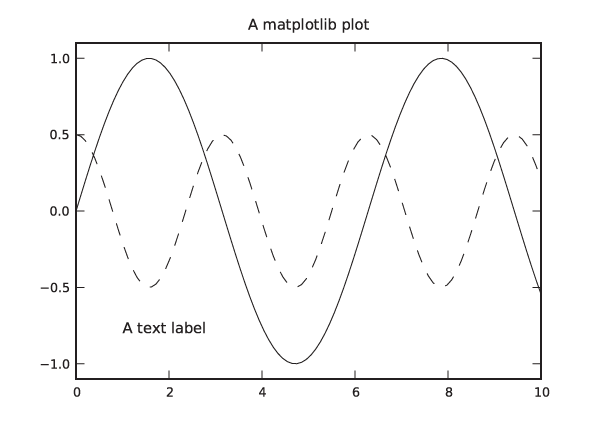
We can now add additional curves and decorations to the plot. Continuing in the same session as before, we add another curve and some labels:
In [3]: plot( x, 0.5*cos(2*x) )
Out[3]: [<matplotlib.lines.Line2D object at 0x1cee8d0>]

In [4]: title( "A matplotlib plot" )
Out[4]: <matplotlib.text.Text object at 0x1cf6950>

In [5]: text( 1, -0.8, "A text label" )
Out[5]: <matplotlib.text.Text object at 0x1f59250>

In [6]: ylim( -1.1, 1.1 )
Out[6]: (-1.1000000000000001, 1.1000000000000001)
In the last step, we increased the range of values plotted on
the vertical axis. (There is also an axis() command, which allows you to
specify limits for both axes at the same time. Don’t confuse it with
the axes() command, which creates
a new coordinate system.) The plot should now look like the one in
Figure 3-17, except
that in an interactive terminal the different lines are
distinguished by their color, not their dash pattern.
Let’s pause for a moment and point out a few details. First of
all, you should have noticed that the graph in the plot window was
updated after every operation. That is typical for the interactive
mode, but it is not how matplotlib works in a script: in general,
matplotlib tries to delay the (possibly expensive) creation of an
actual plot until the last possible moment. (In a script, you would
use the show() command to force
generation of an actual plot window.)
Furthermore, matplotlib is “stateful”: a new plot command does
not erase the previous figure and, instead, adds to it. This
behavior can be toggled with the hold() command, and the current state can
be queried using ishold().
(Decorations like the text labels are not affected by this.) You can
clear a figure explicitly using clf().
This implicit state may come as a surprise: haven’t we learned to make things explicit, when possible? In fact, this stateful behavior is a holdover from the way Matlab works. Here is another example. Start a new session and execute the following commands:
In [1]: x1 = linspace( 0, 10, 40 )

In [2]: plot( x1, sqrt(x1), 'k-' )
Out[2]: [<matplotlib.lines.Line2D object at 0x1cfef50>]
In [3]: figure(2)
Out[3]: <matplotlib.figure.Figure object at 0x1cee850>

In [4]: x2 = linspace( 0, 10, 100 )

In [5]: plot( x1, sin(x1), 'k--', x2, 0.2*cos(3*x2), 'k:' )
Out[5]:
[<matplotlib.lines.Line2D object at 0x1fb1150>,
 <matplotlib.lines.Line2D object at 0x1fba250>]

In [6]: figure(1)
Out[6]: <matplotlib.figure.Figure object at 0x1cee210>

In [7]: plot( x1, 3*exp(-x1/2), linestyle='None', color='white', marker='o',
   ...: markersize=7 )
Out[7]: [<matplotlib.lines.Line2D object at 0x1d0c150>]

In [8]: savefig( 'graph1.png' )
This snippet of code demonstrates several things. We begin as
before, by creating a plot. This time, however, we pass a third
argument to the plot() command
that controls the appearance of the graph elements. That matplotlib
library supports Matlab-style mnemonics for plot styles; the letter
k stands for the color “black”
and the single dash - for a solid
line. (The letter b stands for
“blue.”)
Next we create a second figure in a new window and switch to
it by using the figure(2)
command. All graphics commands will now be directed to this second
figure—until we switch back to the first figure using figure(1). This is another example of
“silent state.” Observe also that figures are counted starting from
1, not from 0.
In line 5, we see another way to use the plot command—namely, by specifying two sets of curves to be plotted together. (The formatting commands request a dashed and a dotted line, respectively.) Line 7 shows yet a different way to specify plot styles: by using named (keyword) arguments.
Finally, we save the currently active plot
(i.e., figure 1) to a PNG file. The savefig() function determines the desired
output format from the extension of the filename given. Other
formats that are supported out of the box are PostScript, PDF, and
SVG. Additional formats may be available, depending on the libraries
installed on your system.
Case Study: LOESS with matplotlib
As a quick example of how to put the different aspects of matplotlib together, let’s discuss the script used to generate Figure 3-4. This also gives us an opportunity to look at the LOESS method in a bit more detail.
To recap: LOESS stands for locally weighted linear regression. The difference between LOESS and regular linear regression is the introduction of a weight factor, which emphasizes those data points that are close to the location x at which we want to evaluate the smoothed curve. As explained earlier, the expression for squared error (which we want to minimize) now becomes:
Keep in mind that this expression now depends on x, the location at which we want to evaluate the smoothed curve!
If we minimize this expression with respect to the parameters a and b, we obtain the following expressions for a and b (remember that we will have to evaluate them from scratch for every point x):
This can be quite easily translated into NumPy and plotted
with matplotlib. The actual LOESS calculation is contained entirely
in the function loess(). (See the
Workshop in Chapter 2 for a
discussion of this type of programming.)
from pylab import *

# x: location; h: bandwidth; xp, yp: data points (vectors)
def loess( x, h, xp, yp ):
    w = exp( -0.5*( ((x-xp)/h)**2 )/sqrt(2*pi*h**2) )

    b = sum(w*xp)*sum(w*yp) - sum(w)*sum(w*xp*yp)
    b /= sum(w*xp)**2 - sum(w)*sum(w*xp**2)
    a = ( sum(w*yp) - b*sum(w*xp) )/sum(w)

    return a + b*x

d = loadtxt( "draftlottery" )

s1, s2 = [], []
for k in d[:,0]:
    s1.append( loess( k,   5, d[:,0], d[:,1] ) )
    s2.append( loess( k, 100, d[:,0], d[:,1] ) )

xlabel( "Day in Year" )
ylabel( "Draft Number" )

gca().set_aspect( 'equal' )

plot( d[:,0], d[:,1], 'o', color="white", markersize=7, linewidth=3 )
plot( d[:,0], array(s1), 'k-', d[:,0], array(s2), 'k--' )

q = 4
axis( [1-q, 366+q, 1-q, 366+q] )

savefig( "draftlottery.eps" )
We evaluate the smoothed curve at the locations of all
data points, using two different values for the bandwidth, and then
proceed to plot the data together with the smoothed curves. Two
details require an additional word of explanation. The function
gca() returns the current “set of
axes” (i.e., the current coordinate system on
the plot—see below for more information on this function), and we
require the aspect ratio of both x and
y axes to be equal (so that the plot is a
square). In the last command before we save the figure to file, we
adjust the plot range by using the axis() command. This function must
follow the plot() commands, because the plot() command automatically adjusts the
plot range depending on the data.
Managing Properties
Until now, we have ignored the values returned by the various
plotting commands. If you look at the output generated by IPython,
you can see that all the commands that add graph elements to the
plot return a reference to the object just created. The one
exception is the plot() command
itself, which always returns a list of objects
(because, as we have seen, it can add more than one “line” to the
plot).
These references are important because it is through them that we can control the appearance of graph elements once they have been created. In a final example, let’s study how we can use them:
In [1]: x = linspace( 0, 10, 100 )

In [2]: ps = plot( x, sin(x), x, cos(x) )

In [3]: t1 = text( 1, -0.5, "Hello" )

In [4]: t2 = text( 3, 0.5, "Hello again" )

In [5]: t1.set_position( [7, -0.5] )

In [6]: t2.set( position=[5, 0], text="Goodbye" )
Out[6]: [None, None]

In [7]: draw()

In [8]: setp( [t1, t2], fontsize=10 )
Out[8]: [None, None]

In [9]: t2.remove()

In [10]: Artist.remove( ps[1] )

In [11]: draw()
In the first four lines, we create a graph with two curves and
two text labels, as before, but now we are holding on to the object
references. This allows us to make changes to these graph elements.
Lines 5, 6, and 8 demonstrate different ways to do this: for each
property of a graph element, there is an explicit, named accessor
function (line 5). Alternatively, we can use a generic setter with
keyword arguments—this allows us to set several properties (on a
single object) in a single call (line 6). Finally, we can use the
standalone setp() function, which
takes a list of graph elements and applies the requested property
update to all of them. (It can also take a single graph element
instead of a one-member list.) Notice that setp() generates a redraw event whereas
individual property accessors do not; this is why we must generate
an explicit redraw event in line 7. (If you are confused by the
apparent duplication of functionality, read on: we will come back to
this point in the next section.)
Finally, we remove one of the text labels and one of the
curves by using the remove()
function. The remove() function
is defined for objects that are derived from the Artist class, so we can invoke it using
either member syntax (as a “bound” function, line 9) or the class
syntax (as an “unbound” function, line 10). Keep in mind that
plot() returns a
list of objects, so we need to index into the
list to access the graph objects themselves.
There are some useful functions that can help us handle object
properties. If you issue setp(r)
with only a single argument in an interactive session, then it will
print all properties that are available for object r together with information about the
values that each property is allowed to take on. The getp(r) function on the other hand prints
all properties of r together with
their current values.
Suppose we did not save the references to the objects we
created, or suppose we want to change the properties of an object
that we did not create explicitly. In such cases we can use the
functions gcf() and gca(), which return a reference to the
current figure or axes object, respectively. To make use of them, we need to
develop at least a passing familiarity with matplotlib’s object
model.
The matplotlib Object Model and Architecture
The object model for matplotlib is constructed similarly to the object model for a GUI widget set: a plot is represented by a tree of widgets, and each widget is able to render itself. Perhaps surprisingly, the object model is not flat. In other words, the plot elements (such as axes, labels, arrows, and so on) are not properties of a high-level “plot” or “figure” object. Instead, you must descend down the object tree to find the element that you want to modify and then, once you have an explicit reference to it, change the appropriate property on the element.
The top-level element (the root node of the tree) is an object
of class Figure. A figure
contains one or more Axes
objects: this class represents a “coordinate system” on which actual
graph elements can be placed. (By contrast, the actual axes that are
drawn on the graph are objects of the Axis class!) The gcf() and gca() functions therefore return a
reference to the root node of the entire figure or to the root node
of a single plot in a multiplot figure.
Both Figure and Axes are subclasses of Artist. This is the base class of all
“widgets” that can be drawn onto a graph. Other important subclasses
of Artist are Line2D (a polygonal line connecting
multiple points, optionally with a symbol at each point), Text, and Patch (a geometric shape that can be
placed onto the figure). The top-level Figure instance is owned by an object of
type FigureCanvas (in the
matplotlib.backend_bases module).
Most likely you won’t have to interact with this class yourself
directly, but it provides the bridge between the (logical) object
tree that makes up the graph and a backend, which does the actual
rendering. Depending on the backend, matplotlib creates either a
file or a graph window that can be used in an interactive GUI
session.
Although it is easy to get started with matplotlib from within an interactive session, it can be quite challenging to really get one’s arms around the whole library. This can become painfully clear when you want to change some tiny aspect of a plot—and can’t figure out how to do that.
As is so often the case, it helps to investigate how things came to be. Originally, matplotlib was conceived as a plotting library to emulate the behavior found in Matlab. Matlab traditionally uses a programming model based on functions and, being 30 years old, employs some conventions that are no longer popular (i.e., implicit state). In contrast, matplotlib was implemented using object-oriented design principles in Python, with the result that these two different paradigms clash.
One consequence of having these two different paradigms side by side is redundancy. Many operations can be performed in several different ways (using standalone functions, Python-style keyword arguments, object attributes, or a Matlab-compatible alternative syntax). We saw examples of this redundancy in the third listing when we changed object properties. This duplication of functionality matters because it drastically increases the size of the library’s interface (its application programming interface or API), which makes it that much harder to develop a comprehensive understanding. What is worse, it tends to spread information around. (Where should I be looking for plot attributes—among functions, among members, among keyword attributes? Answer: everywhere!)
Another consequence is inconsistency. At least in its favored
function-based interface, matplotlib uses some conventions that are
rather unusual for Python programming—for instance, the way a figure
is created implicitly at the beginning of every
example, and how the pointer to the current figure is maintained
through an invisible “state variable” that is opaquely manipulated
using the figure() function. (The
figure() function actually
returns the figure object just created, so the invisible state
variable is not even necessary.) Similar surprises can be found
throughout the library.
A last problem is namespace pollution (this is another Matlab
heritage—they didn’t have namespaces back then). Several operations
included in matplotlib’s function-based interface are not actually
graphics related but do generate plots as side
effects. For example, hist() calculates (and plots) a histogram,
acorr() calculates (and plots) an
autocorrelation function, and so on. From a user’s perspective, it
makes more sense to adhere to a separation of tasks: perform all
calculations in NumPy/SciPy, and then pass the results explicitly to
matplotlib for plotting.
Odds and Ends
There are three different ways to import and use matplotlib. The original method was to enter:
from pylab import *
This would load all of NumPy as well as matplotlib and import
both APIs into the global namespace! This is no longer the preferred
way to use matplotlib. Only for interactive use with IPython is it
still required (using the -pylab
command-line option to IPython).
The recommended way to import matplotlib’s function-based interface together with NumPy is by using:
import matplotlib.pyplot as plt
import numpy as np
The pyplot interface is a
function-based interface that uses the same Matlab-like stateful
conventions that we have seen in the examples of this section;
however, it does not include the NumPy
functions. Instead, NumPy must be imported separately (and into its
own namespace).
Finally, if all you want is the object-oriented API to
matplotlib, then you can import just the explicit modules from
within matplotlib that contain the class definitions you need
(although it is customary to import pyplot instead and thereby obtain access
to the whole collection).
Of course, there are many details that we have not discussed. Let me mention just a few:
Many more options (to configure the axes and tick marks, to add legend or arrows).
Additional plot types (density or “false-color” plots, vector plots, polar plots).
Digital image processing—matplotlib can read and manipulate PNG images and can also call into the Python Image Library (PIL) if it is installed.
Matplotlib can be embedded in a GUI and can handle GUI events.
The Workshop of Chapter 4 contains another example that involves matplotlib being called from a script to generate image files.
Further Reading
In addition to the books listed below, you may check the references in Chapter 10 for additional material on linear regression.
The Elements of Graphing Data. William S. Cleveland. 2nd ed., Hobart Press. 1994.
This is probably the definitive reference on graphical analysis (as opposed to presentation graphics). Cleveland is the inventor of both the LOESS and the banking techniques discussed in this chapter. My own thinking has been influenced strongly by Cleveland’s careful approach. A companion volume by the same author, entitled Visualizing Data, is also available.
Exploratory Data Analysis with MATLAB. Wendy L. Martinez and Angel R. Martinez. Chapman & Hall/CRC. 2004.
This is an interesting book—it covers almost the same topics as the book you are reading but in opposite order, starting with dimensionality reduction and clustering techniques and ending with univariate distributions! Because it demonstrates all techniques by way of Matlab, it does not develop the conceptual background in great depth. However, I found the chapter on smoothing to be quite useful.
[4] More details and a description of the lottery process can be found in The Statistical Exorcist. M. Hollander and F. Proschan. CRC Press. 1984.
[5] This example was inspired by Graphic Discovery: A Trout in the Milk and Other Visual Adventures. Howard Wainer. 2nd ed., Princeton University Press. 2007.
[6] The original reference is “A General Model for the Origin of Allometric Scaling Laws in Biology.” G. B. West, J. H. Brown, and B. J. Enquist. Science 276 (1997), p. 122. Additional references can be found on the Web.
[7] The discussion here is adapted from my book Gnuplot in Action. Manning Publications. 2010.