Table of Contents for
Data Analysis with Open Source Tools
 Data Analysis with Open Source Tools
Published by
O'Reilly Media, Inc., 2010
Data Analysis with Open Source Tools
Published by
O'Reilly Media, Inc., 2010
- Cover
- Data Analysis with Open Source Tools
- O'Reilly Strata Conference
- Data Analysis with Open Source Tools
- Dedication
- A Note Regarding Supplemental Files
- Preface
- 1. Introduction
- I. Graphics: Looking at Data
- 2. A Single Variable: Shape and Distribution
- 3. Two Variables: Establishing Relationships
- 4. Time As a Variable: Time-Series Analysis
- 5. More Than Two Variables: Graphical Multivariate Analysis
- 6. Intermezzo: A Data Analysis Session
- II. Analytics: Modeling Data
- 7. Guesstimation and the Back of the Envelope
- 8. Models from Scaling Arguments
- 9. Arguments from Probability Models
- 10. What You Really Need to Know About Classical Statistics
- 11. Intermezzo: Mythbusting—Bigfoot, Least Squares, and All That
- III. Computation: Mining Data
- 12. Simulations
- 13. Finding Clusters
- 14. Seeing the Forest for the Trees: Finding Important Attributes
- 15. Intermezzo: When More Is Different
- IV. Applications: Using Data
- 16. Reporting, Business Intelligence, and Dashboards
- 17. Financial Calculations and Modeling
- 18. Predictive Analytics
- 19. Epilogue: Facts Are Not Reality
- A. Programming Environments for Scientific Computation and Data Analysis
- B. Results from Calculus
- C. Working with Data
- D. About the Author
- Index
- About the Author
- Colophon
- Copyright
Chapter 5. More Than Two Variables: Graphical Multivariate Analysis
AS SOON AS WE ARE DEALING WITH MORE THAN TWO VARIABLES SIMULTANEOUSLY, THINGS BECOME MUCH MORE complicated—in particular, graphical methods quickly become impractical. In this chapter, I’ll introduce a number of graphical methods that can be applied to multivariate problems. All of them work best if the number of variables is not too large (less than 15–25).
The borderline case of three variables can be handled through false-color plots, which we will discuss first.
If the number of variables is greater (but not much greater) than three, then we can construct multiplots from a collection of individual bivariate plots by scanning through the various parameters in a systematic way. This gives rise to scatter-plot matrices and co-plots.
Depicting how an overall entity is composed out of its constituent parts can be a rather nasty problem, especially if the composition changes over time. Because this task is so common, I’ll treat it separately in its own section.
Multi-dimensional visualization continues to be a research topic, and in the last sections of the chapter, we look at some of the more recent ideas in this field.
One recurring theme in this chapter is the need for adequate tools: most multidimensional visualization techniques are either not practical with paper and pencil, or are outright impossible without a computer (in particular when it comes to animated techniques). Moreover, as the number of variables increases, so does the need to look at a data set from different angles; this leads to the idea of using interactive graphics for exploration. In the last section, we look at some ideas in this area.
False-Color Plots
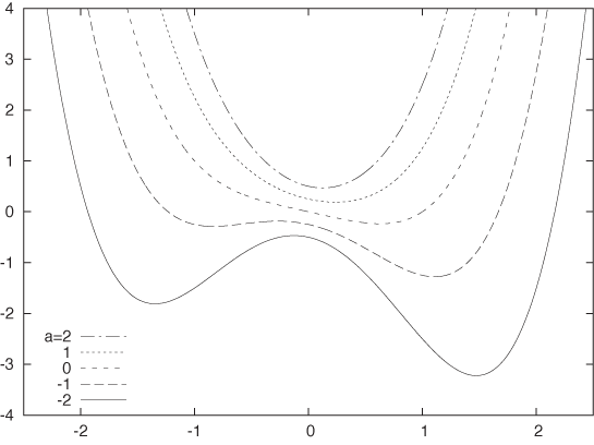
There are different ways to display information in three variables (typically, two independent variables and one dependent variable). Keep in mind that simple is sometimes best! Figure 5-1 shows the function f(x, a) = x4/2 + ax2 – x/2 + a/4 for various values of the parameter a in a simple, two-dimensional xy plot. The shape of the function and the way it changes with a are perfectly clear in this graph. It is very difficult to display this function in any other way with comparable clarity.
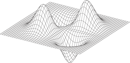
Another way to represent such trivariate data is in the form of a surface plot, such as the one shown in Figure 5-2. As a rule, surface plots are visually stunning but are of very limited practical utility. Unless the data set is very smooth and allows for a viewpoint such that we can look down onto the surface, they simply don’t work! For example, it is pretty much impossible to develop a good sense for the behavior of the function plotted in Figure 5-1 from a surface plot. (Try it!) Surface plots can help build intuition for the overall structure of the data, but it is notoriously difficult to read off quantitative information from them.
In my opinion, surface plots have only two uses:
To get an intuitive impression of the “lay of the land” for a complicated data set
To dazzle the boss (not that this isn’t important at times)
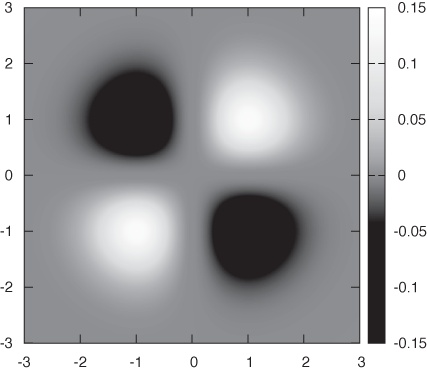
Another approach is to project the function into the base plane below the surface in Figure 5-2. There are two ways in which we can represent values: either by showing contours of constant alleviation in a contour plot or by mapping the numerical values to a palette of colors in a false-color plot. Contour plots are familiar from topographic maps—they can work quite well, in particular if the data is relatively smooth and if one is primarily interested in local properties.
The false-color plot is an alternative and quite versatile technique that can be used for different tasks and on a wide variety of data sets. To create a false-color plot, all values of the dependent variable z are mapped to a palette of colors. Each data point is then plotted as a region of the appropriate color. Figure 5-3 gives an example (where the color has been replaced by grayscale shading).
I like false-color plots because one can represent a lot of information in a them in a way that retains quantitative information. However, false-color plots depend crucially on the quality of the palette—that is, the mapping that has been used to associate colors with numeric values.
Let’s quickly recap some information on color and computer graphics. Colors for computer graphics are usually specified by a triple of numbers that specify the intensity of their red, green, and blue (RGB) components. Although RGB triples make good sense technically, they are not particularly intuitive. Instead, we tend to think of color in terms of its hue, saturation, and value (i.e., luminance or lightness). Conventionally, hue runs through all the colors of the rainbow (from red to yellow, green, blue, and magenta). Curiously, the spectrum of hues seems to circle back onto itself, since magenta smoothly transforms back to red. (The reason for this behavior is that the hues in the rainbow spectrum are arranged in order of their dominant electromagnetic frequency. For violet/magenta, no frequency dominates; instead, violet is a mixture of low-frequency reds and high-frequency blues.) Most computer graphics programs will be able to generate color graphics using a hue–saturation–value (HSV) triple.
It is surprisingly hard to find reliable recommendations on good palette design, which is even more unfortunate given that convenience and what seems like common sense often lead to particularly bad palettes. Here are some ideas and suggestions that you may wish to consider:
Keep it simple
Very simple palettes using red, white, and blue often work surprisingly well. For continuous color changes you could use a blue-white-red palette, for segmentation tasks you could use a white-blue-red-white palette with a sharp blue–red transition at the segmentation threshold.
Distinguish between segmentation tasks and the display of smooth changes
Segmentation tasks (e.g., finding all points that exceed a certain threshold, finding the locations where the data crosses zero) call for palettes with sharp color transitions at the respective thresholds, whereas representing smooth changes in a data set calls for continuous color gradients. Of course, both aspects can be combined in a single palette: gradients for part of the palette and sharp transitions elsewhere.
Try to maintain an intuitive sense of ordering
Map low values to “cold” colors and higher values to “hot” colors to provide an intuitive sense of ordering in your palette. Examples include the simple blue-red palette and the “heat scale” (black-red-yellow-white—I’ll discuss in a moment why I don’t recommend the heat scale for use). Other palettes that convey a sense of ordering (if only by convention) are the “improved rainbow” (blue-cyan-green-yellow-orange-red-magenta) and the “geo-scale” familiar from topographic maps (blue-cyan-green-brown-tan-white).
Place strong visual gradients in regions with important changes
Suppose that you have a data set with values that span the range from –100 to +100 but that all the really interesting or important change occurs in the range –10 to +10. If you use a standard palette (such as the improved rainbow) for such a data set, then the actual region of interest will appear to be all of the same color, and the rest of the spectrum will be “wasted” on parts of the data range that are not that interesting. To avoid this outcome, you have to compress the rainbow so that it maps only to the region of interest. You might want to consider mapping the extreme values (from –100 to –10 and from 10 to 100) to some unobtrusive colors (possibly even to a grayscale) and reserving the majority of hue changes for the most relevant part of the data range.
Favor subtle changes
This is possibly the most surprising recommendation. When creating palettes, there is a natural tendency to “crank it up full” by using fully saturated colors at maximal brightness throughout. That’s not necessarily a good idea, because the resulting effect can be so harsh that details are easily lost. Instead, you might want to consider using soft, pastel colors or even to experiment with mixed hues in favor of the pure primaries of the standard rainbow. (Recent versions of Microsoft Excel provide an interesting and easily accessible demonstration for this idea: all default colors offered for shading the background of cells are soft, mixed pastels—to good effect.) Furthermore, the eye is quite good at detecting even subtle variations. In particular, when working with luminance-based palettes, small changes are often all that is required.
Avoid changes that are hard to detect
Some visual changes are especially hard to perceive visually. For example, it is practically impossible to distinguish between different shades of yellow, and the transition from yellow to white is even worse! (This is why I don’t recommend the heat scale, despite its nice ordering property: the bottom third consists of hard-to-distinguish dark reds, and the entire upper third consists of very hard-to-distinguish shades of light yellow.)
Use hue- and luminance-based palettes for different purposes
In particular, consider using a luminance-based palette to emphasize fine detail and using hue- or saturation-based palettes for smooth, large-scale changes. There is some empirical evidence that luminance-based palettes are better suited for images that contain a lot of fine detail and that hue-based palettes are better suited for bringing out smooth, global changes. A pretty striking demonstration of this observation can be found when looking at medical images (surely an application where details matter!): a simple grayscale representation, which is pure luminance, often seems much clearer than a multicolored representation using a hue-based rainbow palette. This rule is more relevant to image processing of photographs or similar images (such as that in our medical example) than to visualization of the sort of abstract information that we consider here, but it is worth keeping in mind.
Don’t forget to provide a color box
No matter how intuitive you think your palette is, nobody will know for sure what you are showing unless you provide a color box (or color key) that shows the values and the colors they are mapped to. Always, always, provide one.
One big problem not properly addressed by these recommendations concerns visual uniformity. For example, consider palettes based on the “improved rainbow,” which is created by distributing the six primaries in the order blue-cyan-green-yellow-red-magenta across the palette. If you place these primaries at equal distances across from each other and interpolate linearly between them in color space, then the fraction of the palette occupied by green appears to be much larger than the fraction occupied by either yellow or cyan. Another example is that when placing a fully saturated yellow next to a fully saturated blue, then the blue region will appear to be more intense (i.e., saturated) than the yellow. Similarly, the browns that occur in a geo-scale easily appear darker than the other colors in the palette. This is a problem with our perception of color: simple interpolations in color space do not necessarily result in visually uniform gradients!
There is a variation of the HSV color space, called the HCL (hue–chroma–luminance) space that takes visual perception into account to generate visually uniform color maps and gradients. The HCL color model is more complicated to use than the HSV model, because not all combinations of hue, chroma, and luminance values exist. For instance, a fully saturated yellow appears lighter than a fully saturated blue, so a palette at full chroma and with high luminance will include the fully saturated yellow but not the blue. As a result, HCL-based palettes that span the entire rainbow of hues tend naturally toward soft, pastel colors. A disadvantage of palettes in the HCL space is that they often degrade particularly poorly when reproduced in black and white.[9]
A special case of false-color plots are geographic maps, and cartographers have significant experience developing color schemes for various purposes. Their needs are a little different and not all of their recommendations may work for general data analysis purposes, but it is worthwhile to become familiar with what they have learned.[10]
Finally, I’d like to point out two additional problems with all plots that depend on color to convey critical information.
Color does not reproduce well. Once photocopied or printed on a black-and-white laser printer, a false-color plot will become useless!
Also keep in mind that about 10 percent of all men are at least partially color blind; these individuals won’t be able to make much sense of most images that rely heavily or exclusively on color.
Either one of these problems is potentially serious enough that you might want to reconsider before relying entirely on color for the display of information.
In my experience, preparing good false-color plots is often a tedious and time-consuming task. This is one area where better tools would be highly desirable—an interactive tool that could be used to manipulate palettes directly and in real time would be very nice to have. The same is true for a publicly available set of well-tested palettes.
A Lot at a Glance: Multiplots
The primary concern in all multivariate visualizations is finding better ways to put more “stuff” on a graph. In addition to color (see the previous section), there are basically two ways we can go about this. We can make the graph elements themselves richer, so that they can convey additional information beyond their position on the graph; or we can put several similar graphs next to each other and vary the variables that are not explicitly displayed in a systematic fashion from one subgraph to the next. The first idea leads to glyphs, which we will introduce later in this chapter, whereas the latter idea leads to scatter-plot matrices and co-plots.
The Scatter-Plot Matrix
For a scatter-plot matrix (occasionally abbreviated SPLOM), we construct all possible two-dimensional scatter plots from a multivariate data set and then plot them together in a matrix format (Figure 5-4). We can now scan all of the graphs for interesting behavior, such as a marked correlation between any two variables.
The data set shown in Figure 5-4 consists of seven different properties of a sample of 250 wines.[11] It is not at all clear how these properties should relate to each other, but by studying the scatter-plot matrix, we can make a few interesting observations. For example, we can see that sugar content and density are positively correlated: if the sugar content goes up, so does the density. The opposite is true for alcohol content and density: as the alcohol content goes up, density goes down. Neither of these observations should come as a surprise (sugar syrup has a higher density than water and alcohol a lower one). What may be more interesting is that the wine quality seems to increase with increasing alcohol content: apparently, more potent wines are considered to be better!
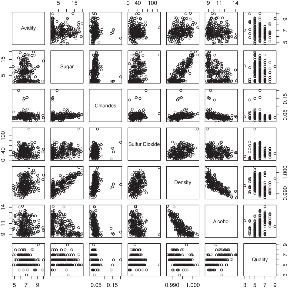
One important detail that is easy to overlook is that all graphs in each row or column show the same plot range; in other words, they use shared scales. This makes it possible to compare graphs across the entire matrix.
The scatter-plot matrix is symmetric across the diagonal: the subplots in the lower left are equal to the ones in the upper right but rotated by 90 degrees. It is nevertheless customary to plot both versions because this makes it possible to scan a single row or column in its entirety to investigate how one quantity relates to each of the other quantities.
Scatter-plot matrices are easy to prepare and easy to understand. This makes them very popular, but I think they can be overused. Once we have more than about half a dozen variables, the individual subplots become too small as that we could still recognize anything useful, in particular if the number of points is large (a few hundred points or more). Nevertheless, scatter-plot matrices are a convenient way to obtain a quick overview and to find viewpoints (variable pairings) that deserve a closer look.
The Co-Plot
In contrast to scatter-plot matrices, which always show all data points but project them onto different surfaces of the parameter space, co-plots (short for “conditional plots”) show various slices through the parameter space such that each slice contains only a subset of the data points. The slices are taken in a systematic manner, and we can form an image of the entire parameter space by mentally gluing the slices back together again (the salami principle). Because of the regular layout of the subplots, this technique is also known as a trellis plot.
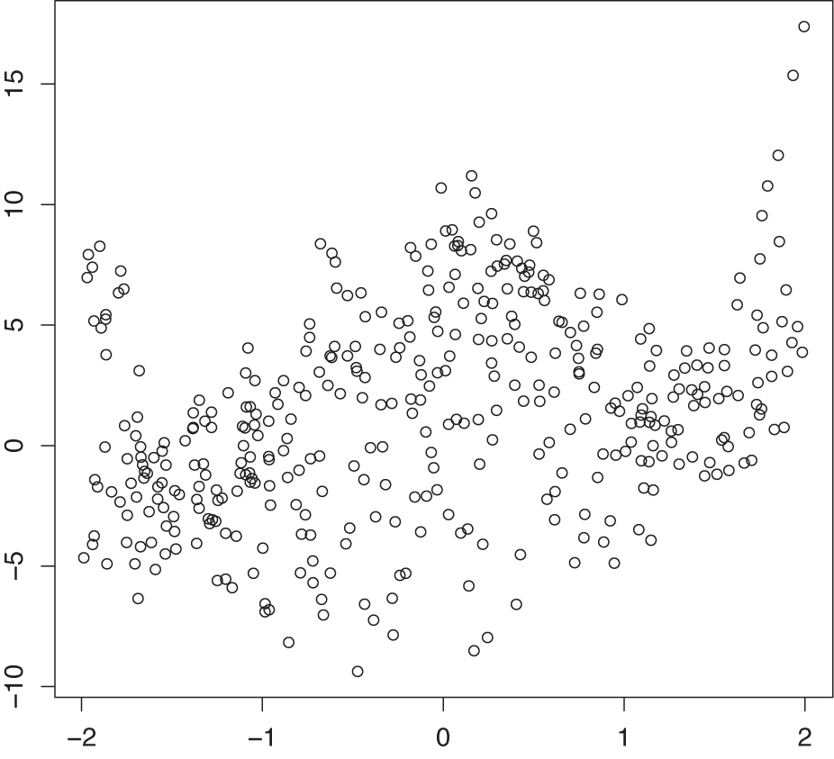
Figure 5-5 shows a trivariate data set projected onto the two-dimensional xy plane. Although there is clearly structure in the data, no definite pattern emerges. In particular, the dependence on the third parameter is entirely obscured!
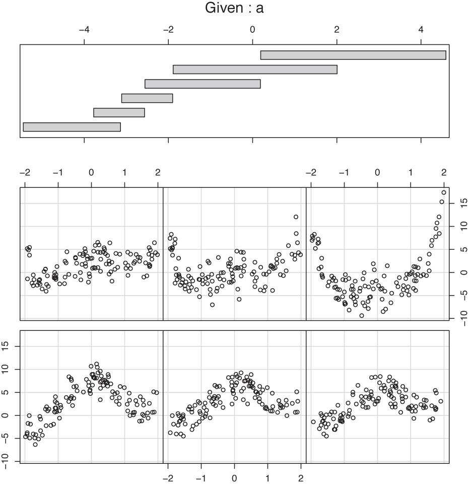
Figure 5-6 shows a co-plot of the same data set that is sliced or conditioned on the third parameter a. The bottom part of the graph shows six slices through the data corresponding to different ranges of a. (The slice for the smallest values of a is in the lower left, and the one for the largest values of a is in the upper righthand corner.) As we look at the slices, the structure in the data stands out clearly, and we can easily follow the dependence on the third parameter a.
The top part of Figure 5-6 shows the range of values that a takes on for each of the slices. If you look closely, you will find that there are some subtle issues hidden in (or rather revealed by) this panel, because it provides information on the details of the slicing operation.
Two decisions need to be made with regard to the slicing:
By what method should the overall parameter range be cut into slices?
Should slices overlap or not?
In many ways, the most “natural” answer to these questions would be to cut the entire parameter range into a set of adjacent intervals of equal width. It is interesting to observe (by looking at the top panel in Figure 5-6) that in the example graph, a different decision was made in regard to both questions! The slices are not of equal width in the range of parameter values that they span; instead, they have been made in such a way that each slice contains the same number of points. Furthermore, the slices are not adjacent but partially overlap each other.
The first decision (to have each slice contain the same number of points, instead of spanning the same range of values) is particularly interesting because it provides additional information on how the values of the parameter a are distributed. For instance, we can see that large values of a (larger than about a = –1) are relatively rare, whereas values of a between –4 and –2 are much more frequent. This kind of behavior would be much harder to recognize precisely if we had chopped the interval for a into six slices of equal width. The other decision (to make the slices overlap partially) is more important for small data sets, where otherwise each slice contains so few points that the structure becomes hard to see. Having the slices overlap makes the data “go farther” than if the slices were entirely disjunct.
Co-plots are especially useful if some of the variables in a data set are clearly “control” variables, because co-plots provide a systematic way to study the dependence of the remaining (“response”) variables on the controls.
Variations
The ideas behind scatter-plot matrices and co-plots are pretty generally applicable, and you can develop different variants depending on your needs and tastes. Here are some ideas:
In the standard scatter-plot matrix, half of the individual graphs are redundant. You can remove the individual graphs from half of the overall matrix and replace them with something different—for example, the numerical value of the appropriate correlation coefficient. However, you will then lose the ability to visually scan a full row or column to see how the corresponding quantity correlates with all other variables.
Figure 5-6. A co-plot of the same data as in Figure 5-5. Each scatter plot includes the data points for only a certain range of a values; the corresponding values of a are shown in the top panel. (The scatter plot for the smallest value of a is in the lower left corner, and that for the largest value of a is in the upper right.)Similarly, you can place a histogram showing the distribution of values for the quantity in question on the diagonal of the scatter-plot matrix.
The slicing technique used in co-plots can be used with other graphs besides scatter plots. For instance, you might want to use slicing with rank-order plots (see Chapter 2), where the conditioning “parameter” is some quantity not explicitly shown in the rank-order plot itself. Another option is to use it with histograms, making each subplot a histogram of a subset of the data where the subset is determined by the values of the control “parameter” variable.
Finally, co-plots can be extended to two conditioning variables, leading to a matrix of individual slices.
By their very nature, all multiplots consist of many individual plot elements, sometimes with nontrivial interactions (such as the overlapped slicing in certain co-plots). Without a good tool that handles most of these issues automatically, these plot types lose most of their appeal. For the plots in this section, I used R (the statistical package), which provides support for both scatter-plot matrices and co-plots as built-in functionality.
Composition Problems
Many data sets describe a composition problem; in other words, they describe how some overall quantity is composed out of its parts. Composition problems pose some special challenges because often we want to visualize two different aspects of the data simultaneously: on the one hand, we are interested in the relative magnitude of the different components, and on the other, we also care about their absolute size.
For one-dimensional problems, this is not too difficult (see Chapter 2). We can use a histogram or a similar graph to display the absolute size for all components; and we can use a cumulative distribution plot (or even the much-maligned pie chart) to visualize the relative contribution that each component makes to the total.
But once we add additional variables into the mix, things can get ugly. Two problems stand out: how to visualize changes to the composition over time and how to depict the breakdown of an overall quantity along multiple axes at the same time.
Changes in Composition
To understand the difficulties in tracking compositional problems over time, imagine a company that makes five products labeled A, B, C, D, and E. As we track the daily production numbers over time, there are two different questions that we are likely to be interested in: on the one hand, we’d like to know how many items are produced overall; on the other hand, we would like to understand how the item mix is changing over time.
Figure 5-7, Figure 5-8, and Figure 5-9 show three attempts to plot this kind of data. Figure 5-7 simply shows the absolute numbers produced per day for each of the five product lines. That’s not ideal—the graph looks messy because some of the lines obscure each other. Moreover, it is not possible to understand from this graph how the total number of items changes over time. Test yourself: does the total number of items go up over time, does it go down, or does it stay about even?
Figure 5-8 is a stacked plot of the same data. The daily numbers for each product are added to the numbers for the products that appear lower down in the diagram—in other words, the line labeled B gives the number of items produced in product lines A and B. The topmost line in this diagram shows the total number of items produced per day (and answers the question posed in the previous paragraph: the total number of items does not change appreciably over the long run—a possibly surprising observation, given the appearance of Figure 5-7).
Stacked plots can be compelling because they have intuitive appeal and appear to be clear and uncluttered. In reality, however, they tend to hide the details in the development of the individual components because the changing baseline makes comparison difficult if not impossible. For example, from Figure 5-7 it is pretty clear that production of item D increased for a while but then dropped rapidly over the last 5 to 10 days. We would never guess this fact from Figure 5-8, where the strong growth of product line A masks the smaller changes in the other product lines. (This is why you should order the components in a stacked graph in ascending order of variation—which was intentionally not done in Figure 5-8.)
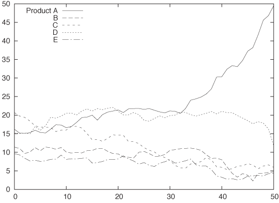
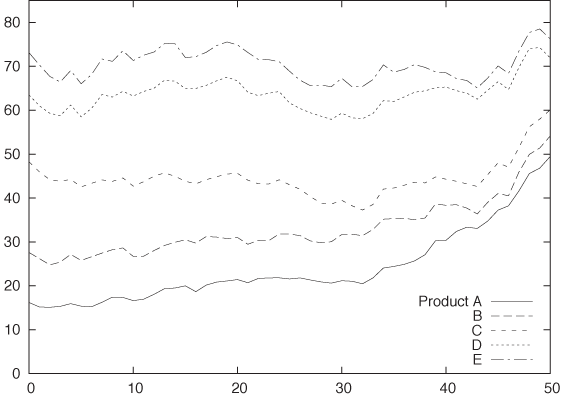
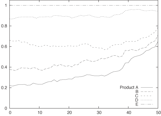
Figure 5-9 shows still another attempt to visualize this data. This figure is also a stacked graph, but now we are looking not at the absolute numbers of items produced but instead at the relative fraction that each product line contributes to the daily total. Because the change in the total number of items produced has been eliminated, this graph can help us understand how the item mix varies over time (although we still have the changing baseline problem common to all stacked graphs). However, information about the total number of items produced has been lost.
All things considered, I don’t think any one of these graphs succeeds very well. No single graph can satisfy both of our conflicting goals—to monitor both absolute numbers as well as relative contributions—and be clear and visually attractive at the same time.
I think an acceptable solution for this sort of problem will always involve a combination of graphs—for example, one for the total number of items produced and another for the relative item mix. Furthermore, despite their aesthetic appeal, stacked graphs should be avoided because they make it too difficult to recognize relevant information in the graph. A plot such as Figure 5-7 may seem messy, but at least it can be read accurately and reliably.
Multidimensional Composition: Tree and Mosaic Plots
Composition problems are generally difficult even when we do not worry about changes over time. Look at the following data:
Male    BS     NYC    Engineering
Male    MS     SFO    Engineering
Male    PhD    NYC    Engineering
Male    BS     LAX    Engineering
Male    MS     NYC    Finance
Male    PhD    SFO    Finance
Female  PhD    NYC    Engineering
Female  MS     LAX    Finance
Female  BS     NYC    Finance
Female  PhD    SFO    Finance
The data set shows information about ten employees of some company, and for each employee, we have four pieces of information: gender, highest degree obtained, office where they are located (given by airport code—NYC: New York, SFO: San Francisco, LAX: Los Angeles), and their department. Keep in mind that each line corresponds to a single person.
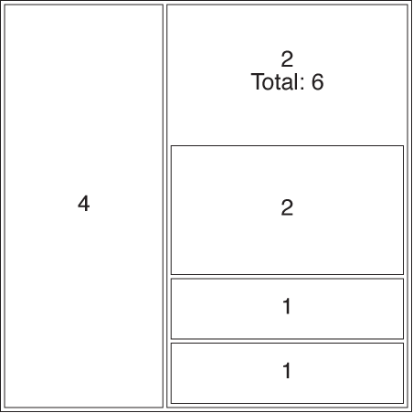
The usual way to summarize such data is in the form of a contingency table. Table 5-1 summarizes what we know about the relationship between an employee’s gender and his or her department. Contingency tables are used to determine whether there is a correlation between categorical variables: in this case, we notice that men tend to work in engineering and women in finance. (We may want to divide by the total number of records to get the fraction of employees in each cell of the table.)
The problem is that contingency tables only work for two dimensions at a time. If we also want to include the breakdown by degree or location, we have no other choice than to repeat the basic structure from Table 5-1 several times: once for each office or once for each degree.
A mosaic plot is an attempt to find a graphical representation for this kind of data. The construction of a mosaic plot is essentially recursive and proceeds as follows (see Figure 5-10):
Start with a square.
Select a dimension, and then divide the square proportionally according to the counts for this dimension.
Pick a second dimension, and then divide each subarea according to the counts along the second dimension, separately for each subarea.
Repeat for all dimensions, interchanging horizontal and vertical subdivisions for each new dimension.
Male | Female | Total | |
Engineering | 4 | 1 | 5 |
Finance | 2 | 3 | 5 |
Total | 6 | 4 | 10 |
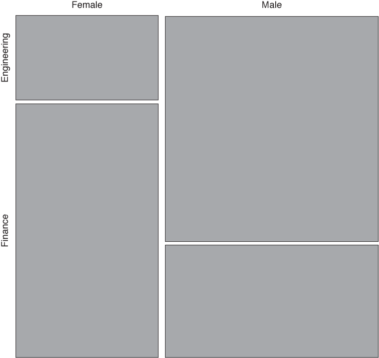
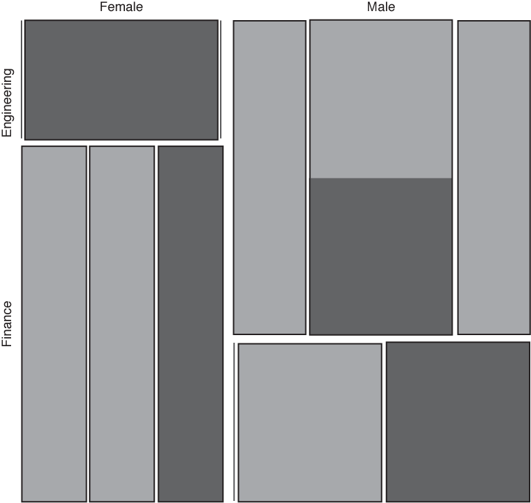
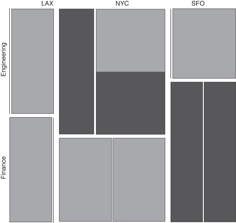
In the lower left panel of Figure 5-10, location is shown as a secondary vertical subdivision in addition to the gender (from left to right: LAX, NYC, SFO). In addition, the degree is shown through shading (shaded sections correspond to employees with a Ph.D.).
Having seen this, we should ask how much mosaic plots actually help us understand this data set. Obviously, Figure 5-10 is difficult to read and has to be studied carefully. Keep in mind that the information about the number of data points within each category is represented by the area—recursively at all levels. Also note that some categories are empty and therefore invisible (for instance, there are no female employees in either the Los Angeles or San Francisco engineering departments).
I appreciate mosaic plots because they represent a new idea for how data can be displayed graphically, but I have not found them to be useful. In my own experience, it is easier to understand a data set by poring over a set of contingency tables than by drawing mosaic plots. Several problems stand out.
The order in which the dimensions are applied matters greatly for the appearance of the plot. The lower right panel in Figure 5-10 shows the same data set yet again, but this time the data was split along the location dimension first and along the gender dimension last. Shading again indicates employees with a Ph.D. Is it obvious that this is the same data set? Is one representation more helpful than the other?
Changing the sort order changes more than just the appearance, it also influences what we are likely to recognize in the graph. Yet even with an interactive tool, I find it thoroughly confusing to view a large number of mosaic plots with changing layouts.
It seems that once we have more than about four or five dimensions, mosaic plots become too cluttered to be useful. This is not a huge advance over the two dimensions presented in basic contingency tables!
Finally, there is a problem common to all visualization methods that rely on area to indicate magnitude: human perception is not that good at comparing areas, especially areas of different shape. In the lower right panel in Figure 5-10, for example, it is not obvious that the sizes of the two shaded areas for engineering in NYC are the same. (Human perception works by comparing visual objects to each other, and the easiest to compare are lengths, not areas or angles. This is also why you should favor histograms over pie charts!)
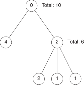
In passing, let’s quickly consider a different but related concept: tree maps. Tree maps are area-based representations of hierarchical tree structures. As shown in Figure 5-11, the area of each parent node in the tree is divided according to the weight of its children.
Tree maps are something of a media phenomenon. Originally developed for the purpose of finding large files in a directory hierarchy, they seem to be more talked about then used. They share the problems of all area-based visualizations already discussed, and even their inventors report that people find them hard to read—especially if the number of levels in the hierarchy increases. Tree maps lend themselves well to interactive explorations (where you can “zoom in” to deeper levels of the hierarchy).
My greatest concern is that tree maps have abandoned the primary advantage of graphical methods without gaining sufficiently in power, namely intuition: looking at a tree map does not conjure up the image of, well, a tree! (I also think that the focus on treelike hierarchies is driven more by the interests of computer science, rather than by the needs of data analysis—no wonder if the archetypical application consisted of browsing a file system!)
Novel Plot Types
Most of the graph types I have described so far (with the exception of mosaic plots) can be described as “classical”: they have been around for years. In this section, we will discuss a few techniques that are much more recent—or, at least, that have only recently received greater attention.
Glyphs
We can include additional information in any simple plot (such as a scatter plot) if we replace the simple symbols used for individual data points with glyphs: more complicated symbols that can express additional bits of information by themselves.
An almost trivial application of this idea occurs if we put two data sets on a single scatter plot and use different symbols (such as squares and crosses) to mark the data points from each data set. Here the symbols themselves carry meaning but only a simple, categorical one—namely, whether the point belongs to the first or second data set.
But if we make the symbols more complicated, then they can express more information. Textual labels (letters and digits) are often surprisingly effective when it comes to conveying more information—although distinctly low-tech, this is a technique to keep in mind!
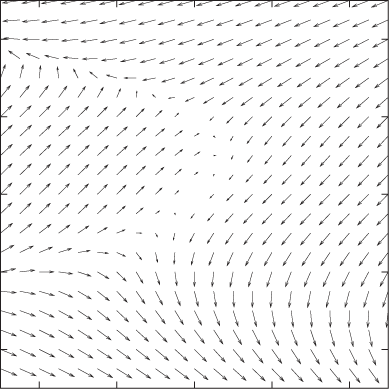
The next step up in sophistication are arrows, which can represent both a direction and a magnitude (see Figure 5-12), but we need not stop there. Each symbol can be a fully formed graph (such as a pie chart or a histogram) all by itself. And even that is not the end—probably the craziest idea in this realm are “Chernoff faces,” where different quantities are encoded as facial features (e.g., size of the mouth, distance between the eyes), and the faces are used as symbols on a plot!
As you can see, the problem lies not so much in putting more information on a graph as in being able to interpret the result in a useful manner. And that seems to depend mostly on the data, in particular on the presence of large-scale, regular structure in it. If such structure is missing, then plots using glyphs can be very hard to decode and quite possibly useless.
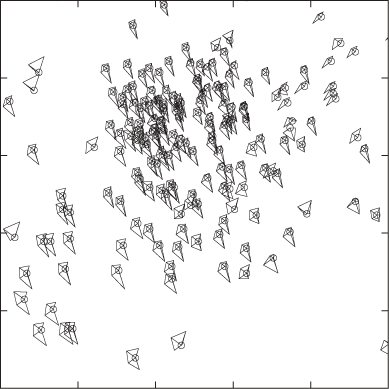
Figure 5-12 and Figure 5-13 show two extreme examples. In Figure 5-12, we visualize a four-dimensional data set using arrows (each point of the two-dimensional plot area has both a direction and a magnitude, so the total number of dimensions is four). You can think of the system as flow in a liquid, as electrical or magnetic field lines, or as deformations in an elastic medium—it does not matter, the overall nature of the data becomes quite clear. But Figure 5-13 is an entirely different matter! Here we are dealing with a data set in seven dimensions: the first two are given by the position of the symbol on the plot, and the remaining five are represented via distortions of a five-edged polygon. Although we can make out some regularities (e.g., the shapes of the symbols in the lower lefthand corner are all quite similar and different from the shapes elsewhere), this graph is hard to read and does not reveal the overall structure of the data very well. Also keep in mind that the appearance of the graph will change if we map a different pair of variables to the main axes of the plot, or even if we change the order of variables in the polygons.
Parallel Coordinate Plots
As we have seen, a scatter plot can show two variables. If we use glyphs, we can show more, but not all variables are treated equally (some are encoded in the glyphs, some are encoded by the position of the symbol on the plot). By using parallel coordinate plots, we can show all the variables of a multivariate data set on equal footing. The price we pay is that we end up with a graph that is neither pretty nor particularly intuitive, but that can be useful for exploratory work nonetheless.
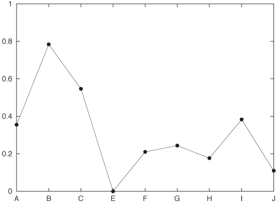
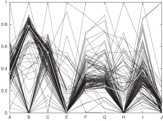
In a regular scatter plot in two (or even three) dimensions, the coordinate axes are at right angles to each other. In a parallel coordinate plot, the coordinate axes instead are parallel to each other. For every data point, its value for each of the variables is marked on the corresponding axis, and then all these points are connected with lines. Because the axes are parallel to each other, we don’t run out of spatial dimensions and therefore can have as many of them as we need. Figure 5-14 shows what a single record looks like in such a plot, and Figure 5-15 shows the entire data set. Each record consists of nine different quantities (labeled A through J).
The main use of parallel coordinate plots is to find clusters in high-dimensional data sets. For example, in Figure 5-15, we can see that the data forms two clusters for the quantity labeled B: one around 0.8 and one around 0. Furthermore, we can see that most records for which B is 0, tend to have higher values of C than those that have a B near 0.8. And so on.
A few technical points should be noted about parallel coordinate plots:
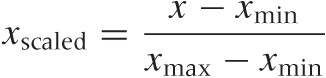
You will usually want to rescale the values in each coordinate to the unit interval via the linear transformation (also see Appendix B):
Figure 5-14. A single record (i.e., a single data point) from a multivariate data set shown in a parallel coordinate plot.Figure 5-15. All records from the data set shown in a parallel coordinate plot. The record shown in Figure 5-14 is highlighted.This is not mandatory, however. There may be situations where you care about the absolute positions of the points along the coordinate axis or about scaling to a different interval.
The appearance of parallel coordinate plots depends strongly on the order in which the coordinate lines are drawn: rearranging them can hide or reveal structure. Ideally, you have access to a tool that lets you reshuffle the coordinate axis interactively.
Especially for larger data sets (several hundreds of points or more), overplotting of lines becomes a problem. One way to deal with this is through “alpha blending”: lines are shown as semi-transparent, and their visual effects are combined where they overlap each other.
Similarly, it is often highly desirable to be able to select a set of lines and highlight them throughout the entire graph—for example, to see how data points that are clustered in one dimension are distributed in the other dimensions.
Instead of combining points on adjacent coordinate axes with straight lines that have sharp kinks at the coordinate axes, one can use smooth lines that pass the coordinate axes without kinks.
All of these issues really are tool issues, and in fact parallel coordinates don’t make sense without a tool that supports them natively and includes good implementations of the features just described. This implies that parallel coordinate plots serve less as finished, static graphs than as an interactive tool for exploring a data set.
Parallel coordinate plots still seem pretty novel. The idea itself has been around for about 25 years, but even today, tools that support parallel coordinates plots well are far from common place.
What is not yet clear is how useful parallel coordinate plots really are. On the one hand, the concept seems straightforward and easy enough to use. On the other hand, I have found the experience of actually trying to apply them frustrating and not very fruitful. It is easy to get bogged down in technicalities of the plot (ordering and scaling of coordinate axes) with little real, concrete insight resulting in the end. The erratic tool situation of course does not help. I wonder whether more computationally intensive methods (e.g., principal component analysis—see Chapter 14) do not give a better return on investment overall. But the jury is still out.
Interactive Explorations
All the graphs that we have discussed so far (in this and the preceding chapters) were by nature static. We prepared graphs, so that we then could study them, but this was the extent of our interaction. If we wanted to see something different, we had to prepare a new graph.
In this section, I shall describe some ideas for interactive graphics: graphs that we can change directly in some way without having to re-create them anew.
Interactive graphics cannot be produced with paper and pencil, not even in principle: they require a computer. Conversely, what we can do in this area is even more strongly limited by the tools or programs that are available to us than for other types of graphs. In this sense, then, this section is more about possibilities than about realities because the tool support for interactive graphical exploration seems (at the time of this writing) rather poor.
Querying and Zooming
Interaction with a graph does not have to be complicated. A very simple form of interaction consists of the ability to select a point (or possibly a group of points) and have the tool display additional information about it. In the simplest case, we hover the mouse pointer over a data point and see the coordinates (and possibly additional details) in a tool tip or a separate window. We can refer to this activity as querying.
Another simple form of interaction would allow us to change aspects of the graph directly using the mouse. Changing the plot range (i.e., zooming) is probably the most common application, but I could also imagine to adjust the aspect ratio, the color palette, or smoothing parameters in this way. (Selecting and highlighting a subset of points in a parallel coordinate plot, as described earlier, would be another application.)
Observe that neither of these activities is inherently “interactive”: they all would also be possible if we used paper and pencil. The interactive aspect consists of our ability to invoke them in real time and by using a graphical input device (the mouse).
Linking and Brushing
The ability to interact directly with graphs becomes much more interesting once we are dealing with multiple graphs at the same time! For example, consider a scatter-plot matrix like the one in Figure 5-4. Now imagine we use the mouse to select and highlight a group of points in one of the subplots. If the graphs are linked, then the symbols corresponding to the data points selected in one of the subplots will also be highlighted in all other subplots as well.
Usually selecting some points and then highlighting their corresponding symbols in the linked subgraphs requires two separate steps (or mouseclicks). A real-time version of the same idea is called brushing: any points currently under the mouse pointer are selected and highlighted in all of the linked subplots.
Of course, linking and brushing are not limited to scatter-plot matrices, but they are applicable to any group of graphs that show different aspects of the same data set. Suppose we are working with a set of histograms of a multivariate data set, each histogram showing only one of the quantities. Now I could imagine a tool that allows us to select a bin in one of the histograms and then highlights the contribution from the points in that bin in all the other histograms.
Grand Tours and Projection Pursuits
Although linking and brushing allow us to interact with the data, they leave the graph itself static. This changes when we come to Grand Tours and Projection Pursuits. Now we are talking about truly animated graphics!
Grand Tours and Projection Pursuits are attempts to enhance our understanding of a data set by presenting many closely related projections in the form of an animated “movie.”
The concept is straightforward: we begin with some projection and then continuously move the viewpoint around the data set. (For a three-dimensional data set, you can imagine the viewpoint moving on a sphere that encloses the data.)
In Grand Tours, the viewpoint is allowed to perform essentially a random walk around the data set. In Projection Pursuits, the viewpoint is moved so that it will improve the value of an index that measures how “interesting” a specific projection will appear. Most indices currently suggested measure properties such as deviation from Gaussian behavior. At each step of a Pursuit, the program evaluates several possible projections and then selects the one that most improves the chosen index. Eventually, a Pursuit will reach a local maximum for the index, at which time it needs to be restarted from a different starting point.
Obviously, Tours and Pursuits require specialized tools that can perform the required projections—and do so in real time. They are also exclusively exploratory techniques and not suitable for preserving results or presenting them to a general audience.
Although the approach is interesting, I have not found Tours to be especially useful in practice. It can be confusing to watch a movie of essentially random patterns and frustrating to interact with projections when attempting to explore the neighborhood of an interesting viewpoint.
Tools
All interactive visualization techniques require suitable tools and computer programs; they cannot be done using paper-and-pencil methods. This places considerable weight on the quality of the available tools. Two issues stand out.
It seems difficult to develop tools that support interactive features and are sufficiently general at the same time. For example, if we expect the plotting program to show additional detail on any data point that we select with the mouse, then the input (data) file will have to contain this information—possibly as metadata. But now we are talking about relatively complicated data sets, which require more complicated, structured file formats that will be specific to each tool. So before we can do anything with the data, we will have to transform it into the required format. This is a significant burden, and it may make these methods infeasible in practice. (Several of the more experimental programs mentioned in the Workshop section in this chapter are nearly unusable on actual data sets for exactly this reason.)
A second problem concerns performance. Brushing, for instance, makes sense only if it truly occurs in real time—without any discernible delay as the mouse pointer moves. For a large data set and a scatter-plot matrix of a dozen attributes, this means updating a few thousand points in real time. Although by no means infeasible, such responsiveness does require that the tool is written with an eye toward performance and using appropriate technologies. (Several of the tools mentioned in the Workshop exhibit serious performance issues on real-world data sets.)
A final concern involves the overall design of the user interface. It should be easy to learn and easy to use, and it should support the activities that are actually required. Of course, this concern is not specific to data visualization tools but common to all programs with a graphical user interface.
Workshop: Tools for Multivariate Graphics
Multivariate graphs tend to be complicated and therefore require good tool support even more strongly than do other forms of graphs. In addition, some multivariate graphics are highly specialized (e.g., mosaic plots) and cannot be easily prepared with a general-purpose plotting tool.
That being said, the tool situation is questionable at best. Here are three different starting points for exploration—each with its own set of difficulties.
R
R is not a plotting tool per se; it is a statistical analysis package and a full development environment as well. However, R has always included pretty extensive graphing capabilities. R is particularly strong at “scientific” graphs: straightforward but highly accurate line diagrams.
Because R is not simply a plotting tool, but instead a full data manipulation and programming environment, its learning curve is rather steep; you need to know a lot of different things before you can do anything. But once you are up and running, the large number of advanced functions that are already built in can make working with R very productive. For example, the scatter-plot matrix in Figure 5-4 was generated using just these three commands:
d <- read.delim( "wines", header=T )

pairs(d)

dev.copy2eps( file="splom.eps" )
(the R command pairs()
generates a plot of all pairs—i.e., a
scatter-plot matrix). The scatter plot in Figure 5-5 and the
co-plot in Figure 5-6 were generated
using:
d <- read.delim( "data", header=F )
names( d ) <- c( "x", "a", "y" )

plot( y ~ x, data=d )
dev.copy2eps( file='coplot1.eps' )

coplot(  y ~ x | a,  data=d )
dev.copy2eps( file='coplot2.eps' )
Note that these are the entire command sequences, which include reading the data from file and writing the graph back to disk! We’ll have more to say about R in the Workshop sections of Chapter 10 and Chapter 14.
R has a strong culture of user-contributed add-on
packages. For multiplots consisting of subplots arranged on a
regular grid (in particular, for generalized co-plots), you should
consider the lattice package,
which extends or even replaces the functionality of the basic R
graphic systems. This package is part of the standard R
distribution.
Experimental Tools
If you want to explore some of the more novel graphing ideas, such as parallel coordinate plots and mosaic plots, or if you want to try out interactive ideas such as brushing and Grand Tours, then there are several options open to you. All of them are academic research projects, and all are highly experimental. (In a way, this is a reflection of the state of the field: I don’t think any of these novel plot types have been refined to a point where they are clearly useful.)
The ggobi project (http://www.ggobi.org) allows brushing in scatter-plot matrices and parallel coordinate plots and includes support for animated tours and pursuits.
Mondrian (http://www.rosuda.org/mondrian) is a Java application that can produce mosaic plots (as well as some other multivariate graphs).
Again, both tools are academic research projects—and it shows. They are technology demonstrators intended to try out and experiment with new graph ideas, but neither is anywhere near production strength. Both are rather fussy about the required data input format, their graphical user interfaces are clumsy, and neither includes a proper way to export graphs to file (if you want to save a plot, you have to take a screenshot). The interactive brushing features in ggobi are slow, which makes them nearly unusable for realistically sized data sets. There are some lessons here (besides the intended ones) to be learned about the design of tools for statistical graphics. (For instance, GUI widget sets do not seem suitable for interactive visualizations: they are too slow. You have to use a lower-level graphics library instead.)
Other open source tools you may want to check out are Tulip (http://tulip.labri.fr) and ManyEyes (http://manyeyes.alphaworks.ibm.com/manyeyes). The latter project is a web-based tool and community that allows you to upload your data set and generate plots of it online.
A throwback to a different era is OpenDX (http://www.research.ibm.com/dx). Originally designed by IBM in 1991, it was donated to the open source community in 1999. It certainly feels overly complicated and dated, but it does include a selection of features not found elsewhere.
Python Chaco Library
The Chaco library (http://code.enthought.com/projects/chaco/) is a Python library for two-dimensional plotting. In addition to the usual line and symbol drawing capabilities, it includes easy support for color and color manipulation as well as—more importantly—for real-time user interaction.
Chaco is an exciting toolbox if you plan to experiment with writing your own programs to visualize data and interact with it. However, be prepared to do some research: the best available documentation seems to be the set of demos that ship with it.
Chaco is part of the Enthought Tool Suite, which is developed by Enthought, Inc., and is available under a BSD-style license.
Further Reading
Graphics of Large Datasets: Visualizing a Million. Antony Unwin, Martin Theus, and Heike Hofmann. Springer. 2006.
This is a modern book that in many ways describes the state of the art in statistical data visualization. Mosaic plots, glyph plots, parallel coordinate plots, Grand Tours—all are discussed here. Unfortunately, the basics are neglected: standard tools like logarithmic plots are never even mentioned, and simple things like labels are frequently messed up. This book is nevertheless interesting as a survey of some of the state of the art.
The Elements of Graphing Data. William S. Cleveland. 2nd ed., Hobart Press. 1994.
This book provides an interesting counterpoint to the book by Unwin and colleagues. Cleveland’s graphs often look pedestrian, but he thinks more deeply than almost anyone else about ways to incorporate more (and more quantitative) information in a graph. What stands out in his works is that he explicitly takes human perception into account as a guiding principle when developing new graphs. My discussion of scatter-plot matrices and co-plots is heavily influenced by his careful treatment.
Gnuplot in Action: Understanding Data with Graphs. Philipp K. Janert. Manning Publications. 2010.
Chapter 9 of this book contains additional details on and examples for the use of color to prepare false-color plots, including explicit recipes to create them using gnuplot. But the principles are valid more generally, even if you use different tools.
Why Should Engineers and Scientists Be Worried About Color? B. E. Rogowitz and L. A. Treinish. http://www.research.ibm.com/people/l/lloydt/color/color.HTM. 1995. This paper contains important lessons for false-color plots, including the distinction between segmentation and smooth variation as well as the difference between hue- and luminance-based palettes. The examples were prepared using IBM’s (now open source) OpenDX graphical Data Explorer.
Escaping RGBland: Selecting Colors for Statistical Graphics. A. Zeileis, K. Hornik, and P. Murrell. http://statmath.wu.ac.at/~zeileis/papers/Zeileis+Hornik+Murrell-2009.pdf. 2009. This is a more recent paper on the use of color in graphics. It emphasizes the importance of perception-based color spaces, such as the HCL model.
[9] An implementation of the transformations between HCL and RGB is available in R and C in the “colorspace” module available from CRAN.
[10] An interesting starting point is Cynthia Brewer’s online ColorBrewer at http://colorbrewer2.org/.
[11] The data can be found in the “Wine Quality” data set, available at the UCI Machine Learning repository at http://archive.ics.uci.edu/ml/.