Table of Contents for
Data Analysis with Open Source Tools
 Data Analysis with Open Source Tools
Published by
O'Reilly Media, Inc., 2010
Data Analysis with Open Source Tools
Published by
O'Reilly Media, Inc., 2010
- Cover
- Data Analysis with Open Source Tools
- O'Reilly Strata Conference
- Data Analysis with Open Source Tools
- Dedication
- A Note Regarding Supplemental Files
- Preface
- 1. Introduction
- I. Graphics: Looking at Data
- 2. A Single Variable: Shape and Distribution
- 3. Two Variables: Establishing Relationships
- 4. Time As a Variable: Time-Series Analysis
- 5. More Than Two Variables: Graphical Multivariate Analysis
- 6. Intermezzo: A Data Analysis Session
- II. Analytics: Modeling Data
- 7. Guesstimation and the Back of the Envelope
- 8. Models from Scaling Arguments
- 9. Arguments from Probability Models
- 10. What You Really Need to Know About Classical Statistics
- 11. Intermezzo: Mythbusting—Bigfoot, Least Squares, and All That
- III. Computation: Mining Data
- 12. Simulations
- 13. Finding Clusters
- 14. Seeing the Forest for the Trees: Finding Important Attributes
- 15. Intermezzo: When More Is Different
- IV. Applications: Using Data
- 16. Reporting, Business Intelligence, and Dashboards
- 17. Financial Calculations and Modeling
- 18. Predictive Analytics
- 19. Epilogue: Facts Are Not Reality
- A. Programming Environments for Scientific Computation and Data Analysis
- B. Results from Calculus
- C. Working with Data
- D. About the Author
- Index
- About the Author
- Colophon
- Copyright
Chapter 2. A Single Variable: Shape and Distribution
WHEN DEALING WITH UNIVARIATE DATA, WE ARE USUALLY MOSTLY CONCERNED WITH THE OVERALL SHAPE OF the distribution. Some of the initial questions we may ask include:
Where are the data points located, and how far do they spread? What are typical, as well as minimal and maximal, values?
How are the points distributed? Are they spread out evenly or do they cluster in certain areas?
How many points are there? Is this a large data set or a relatively small one?
Is the distribution symmetric or asymmetric? In other words, is the tail of the distribution much larger on one side than on the other?
Are the tails of the distribution relatively heavy (i.e., do many data points lie far away from the central group of points), or are most of the points—with the possible exception of individual outliers—confined to a restricted region?
If there are clusters, how many are there? Is there only one, or are there several? Approximately where are the clusters located, and how large are they—both in terms of spread and in terms of the number of data points belonging to each cluster?
Are the clusters possibly superimposed on some form of unstructured background, or does the entire data set consist only of the clustered data points?
Does the data set contain any significant outliers—that is, data points that seem to be different from all the others?
And lastly, are there any other unusual or significant features in the data set—gaps, sharp cutoffs, unusual values, anything at all that we can observe?
As you can see, even a simple, single-column data set can contain a lot of different features!
To make this concrete, let’s look at two examples. The first concerns a relatively small data set: the number of months that the various American presidents have spent in office. The second data set is much larger and stems from an application domain that may be more familiar; we will be looking at the response times from a web server.
Dot and Jitter Plots
Suppose you are given the following data set, which shows all past American presidents and the number of months each spent in office.[1] Although this data set has three columns, we can treat it as univariate because we are interested only in the times spent in office—the names don’t matter to us (at this point). What can we say about the typical tenure?
 1       Washington      94
 2       Adams           48
 3       Jefferson       96
 4       Madison         96
 5       Monroe          96
 6       Adams           48
 7       Jackson         96
 8       Van Buren       48
 9       Harrison         1
10       Tyler           47
11       Polk            48
12       Taylor          16
13       Filmore         32
14       Pierce          48
15       Buchanan        48
16       Lincoln         49
17       Johnson         47
18       Grant           96
19       Hayes           48
20       Garfield         7
21       Arthur          41
22       Cleveland       48
23       Harrison        48
24       Cleveland       48
25       McKinley        54
26       Roosevelt       90
27       Taft            48
28       Wilson          96
29       Harding         29
30       Coolidge        67
31       Hoover          48
32       Roosevelt      146
33       Truman          92
34       Eisenhower      96
35       Kennedy         34
36       Johnson         62
37       Nixon           67
38       Ford            29
39       Carter          48
40       Reagan          96
41       Bush            48
42       Clinton         96
43       Bush            96
This is not a large data set (just over 40 records), but it is a little too big to take in as a whole. A very simple way to gain an initial sense of the data set is to create a dot plot. In a dot plot, we plot all points on a single (typically horizontal) line, letting the value of each data point determine the position along the horizontal axis. (See the top part of Figure 2-1.)
A dot plot can be perfectly sufficient for a small data set such as this one. However, in our case it is slightly misleading because, whenever a certain tenure occurs more than once in the data set, the corresponding data points fall right on top of each other, which makes it impossible to distinguish them. This is a frequent problem, especially if the data assumes only integer values or is otherwise “coarse-grained.” A common remedy is to shift each point by a small random amount from its original position; this technique is called jittering and the resulting plot is a jitter plot. A jitter plot of this data set is shown in the bottom part of Figure 2-1.
What does the jitter plot tell us about the data set? We see two values where data points seem to cluster, indicating that these values occur more frequently than others. Not surprisingly, they are located at 48 and 96 months, which correspond to one and two full four-year terms in office. What may be a little surprising, however, is the relatively large number of points that occur outside these clusters. Apparently, quite a few presidents left office at irregular intervals! Even in this simple example, a plot reveals both something expected (the clusters at 48 and 96 months) and the unexpected (the larger number of points outside those clusters).
Before moving on to our second example, let me point out a few additional technical details regarding jitter plots.
It is important that the amount of “jitter” be small compared to the distance between points. The only purpose of the random displacements is to ensure that no two points fall exactly on top of one another. We must make sure that points are not shifted significantly from their true location.
We can jitter points in either the horizontal or the vertical direction (or both), depending on the data set and the purpose of the graph. In Figure 2-1, points were jittered only in the vertical direction, so that their horizontal position (which in this case corresponds to the actual data—namely, the number of months in office) is not altered and therefore remains exact.
I used open, transparent rings as symbols for the data points. This is no accident: among different symbols of equal size, open rings are most easily recognized as separate even when partially occluded by each other. In contrast, filled symbols tend to hide any substructure when they overlap, and symbols made from straight lines (e.g., boxes and crosses) can be confusing because of the large number of parallel lines; see the top part of Figure 2-1.
Jittering is a good trick that can be used in many different contexts. We will see further examples later in the book.
Histograms and Kernel Density Estimates
Dot and jitter plots are nice because they are so simple. However, they are neither pretty nor very intuitive, and most importantly, they make it hard to read off quantitative information from the graph. In particular, if we are dealing with larger data sets, then we need a better type of graph, such as a histogram.
Histograms
To form a histogram, we divide the range of values into a set of “bins” and then count the number of points (sometimes called “events”) that fall into each bin. We then plot the count of events for each bin as a function of the position of the bin.
Once again, let’s look at an example. Here is the beginning of a file containing response times (in milliseconds) for queries against a web server or database. In contrast to the previous example, this data set is fairly large, containing 1,000 data points.
 452.42
 318.58
 144.82
 129.13
1216.45
 991.56
1476.69
 662.73
1302.85
1278.55
 627.65
1030.78
 215.23
  44.50
...
Figure 2-2 shows a histogram of this data set. I divided the horizontal axis into 60 bins of 50 milliseconds width and then counted the number of events in each bin.
What does the histogram tell us? We observe a rather sharp cutoff at a nonzero value on the left, which means that there is a minimum completion time below which no request can be completed. Then there is a sharp rise to a maximum at the “typical” response time, and finally there is a relatively large tail on the right, corresponding to the smaller number of requests that take a long time to process. This kind of shape is rather typical for a histogram of task completion times. If the data set had contained completion times for students to finish their homework or for manufacturing workers to finish a work product, then it would look qualitatively similar except, of course, that the time scale would be different. Basically, there is some minimum time that nobody can beat, a small group of very fast champions, a large majority, and finally a longer or shorter tail of “stragglers.”
It is important to realize that a data set does not determine a histogram uniquely. Instead, we have to fix two parameters to form a histogram: the bin width and the alignment of the bins.
The quality of any histogram hinges on the proper choice of
bin width. If you make the width too large, then you lose too much
detailed information about the data set. Make it too small and you
will have few or no events in most of the bins, and the shape of the
distribution does not become apparent. Unfortunately, there is no
simple rule of thumb that can predict a good bin width for a given
data set; typically you have to try out several different values for
the bin width until you obtain a satisfactory result. (As a first
guess, you can start with Scott’s rule for the
bin width  , where σ is the standard deviation for the
entire data set and n is the number of points.
This rule assumes that the data follows a Gaussian distribution;
otherwise, it is likely to give a bin width that is too wide. See
the end of this chapter for more information on the standard
deviation.)
, where σ is the standard deviation for the
entire data set and n is the number of points.
This rule assumes that the data follows a Gaussian distribution;
otherwise, it is likely to give a bin width that is too wide. See
the end of this chapter for more information on the standard
deviation.)
The other parameter that we need to fix (whether we realize it or not) is the alignment of the bins on the x axis. Let’s say we fixed the width of the bins at 1. Where do we now place the first bin? We could put it flush left, so that its left edge is at 0, or we could center it at 0. In fact, we can move all bins by half a bin width in either direction.
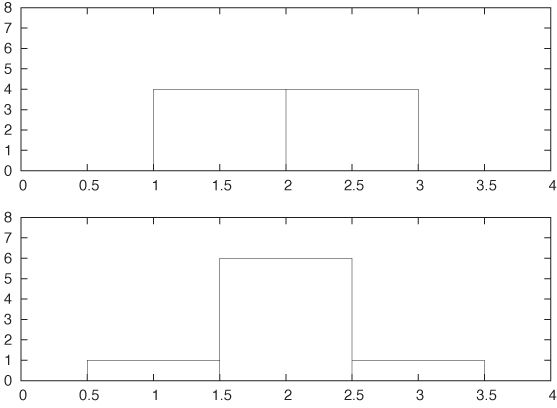
Unfortunately, this seemingly insignificant (and often overlooked) parameter can have a large influence on the appearance of the histogram. Consider this small data set:
1.4
1.7
1.8
1.9
2.1
2.2
2.3
2.6
Figure 2-3 shows two histograms of this data set. Both use the same bin width (namely, 1) but have different alignment of the bins. In the top panel, where the bin edges have been aligned to coincide with the whole numbers (1, 2, 3,...), the data set appears to be flat. Yet in the bottom panel, where the bins have been centered on the whole numbers, the data set appears to have a rather strong central peak and symmetric wings on both sides. It should be clear that we can construct even more pathological examples than this. In the next section we shall introduce an alternative to histograms that avoids this particular problem.
Before moving on, I’d like to point out some additional technical details and variants of histograms.
Histograms can be either normalized or unnormalized. In an unnormalized histogram, the value plotted for each bin is the absolute count of events in that bin. In a normalized histogram, we divide each count by the total number of points in the data set, so that the value for each bin becomes the fraction of points in that bin. If we want the percentage of points per bin instead, we simply multiply the fraction by 100.
So far I have assumed that all bins have the same width. We can relax this constraint and allow bins of differing widths—narrower where points are tightly clustered but wider in areas where there are only few points. This method can seem very appealing when the data set has outliers or areas with widely differing point density. Be warned, though, that now there is an additional source of ambiguity for your histogram: should you display the absolute number of points per bin regardless of the width of each bin; or should you display the density of points per bin by normalizing the point count per bin by the bin width? Either method is valid, and you cannot assume that your audience will know which convention you are following.
It is customary to show histograms with rectangular boxes that extend from the horizontal axis, the way I have drawn Figure 2-2 and Figure 2-3. That is perfectly all right and has the advantage of explicitly displaying the bin width as well. (Of course, the boxes should be drawn in such a way that they align in the same way that the actual bins align; see Figure 2-3.) This works well if you are only displaying a histogram for a single data set. But if you want to compare two or more data sets, then the boxes start to get in the way, and you are better off drawing “frequency polygons”: eliminate the boxes, and instead draw a symbol where the top of the box would have been. (The horizontal position of the symbol should be at the center of the bin.) Then connect consecutive symbols with straight lines. Now you can draw multiple data sets in the same plot without cluttering the graph or unnecessarily occluding points.
Don’t assume that the defaults of your graphics program will generate the best representation of a histogram! I have already discussed why I consider frequency polygons to be almost always a better choice than to construct a histogram from boxes. If you nevertheless choose to use boxes, it is best to avoid filling them (with a color or hatch pattern)—your histogram will probably look cleaner and be easier to read if you stick with just the box outlines. Finally, if you want to compare several data sets in the same graph, always use a frequency polygon, and stay away from stacked or clustered bar graphs, since these are particularly hard to read. (We will return to the problem of displaying composition problems in Chapter 5.)
Histograms are very common and have a nice, intuitive interpretation. They are also easy to generate: for a moderately sized data set, it can even be done by hand, if necessary. That being said, histograms have some serious problems. The most important ones are as follows.
The binning process required by all histograms loses information (by replacing the location of individual data points with a bin of finite width). If we only have a few data points, we can ill afford to lose any information.
Histograms are not unique. As we saw in Figure 2-3, the appearance of a histogram can be quite different. (This nonuniqueness is a direct consequence of the information loss described in the previous item.)
On a more superficial level, histograms are ragged and not smooth. This matters little if we just want to draw a picture of them, but if we want to feed them back into a computer as input for further calculations, then a smooth curve would be easier to handle.
Histograms do not handle outliers gracefully. A single outlier, far removed from the majority of the points, requires many empty cells in between or forces us to use bins that are too wide for the majority of points. It is the possibility of outliers that makes it difficult to find an acceptable bin width in an automated fashion.
Fortunately, there is an alternative to classical histograms that has none of these problems. It is called a kernel density estimate.
Kernel Density Estimates
Kernel density estimates (KDEs) are a relatively new technique. In contrast to histograms, and to many other classical methods of data analysis, they pretty much require the calculational power of a reasonably modern computer to be effective. They cannot be done “by hand” with paper and pencil, even for rather moderately sized data sets. (It is interesting to see how the accessibility of computational and graphing power enables new ways to think about data!)
To form a KDE, we place a kernel—that is, a smooth, strongly peaked function—at the position of each data point. We then add up the contributions from all kernels to obtain a smooth curve, which we can evaluate at any point along the x axis.
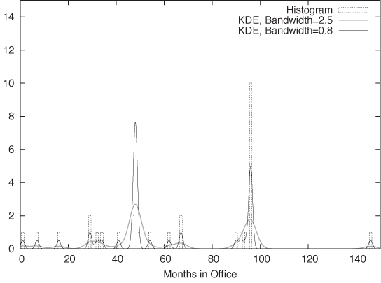
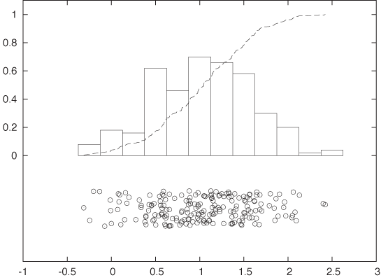
Figure 2-4 shows an example. This is yet another representation of the data set we have seen before in Figure 2-1. The dotted boxes are a histogram of the data set (with bin width equal to 1), and the solid curves are two KDEs of the same data set with different bandwidths (I’ll explain this concept in a moment). The shape of the individual kernel functions can be seen clearly—for example, by considering the three data points below 20. You can also see how the final curve is composed out of the individual kernels, in particular when you look at the points between 30 and 40.
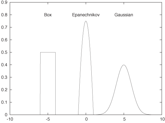
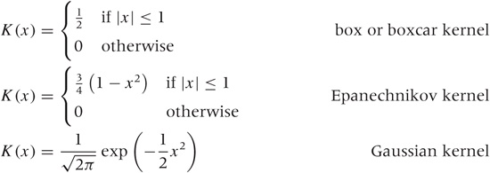
We can use any smooth, strongly peaked function as a kernel provided that it integrates to 1; in other words, the area under the curve formed by a single kernel must be 1. (This is necessary to make sure that the resulting KDE is properly normalized.) Some examples of frequently used kernel functions include (see Figure 2-5):
The box kernel and the Epanechnikov kernel are zero outside a finite range, whereas the Gaussian kernel is nonzero everywhere but negligibly small outside a limited domain. It turns out that the curve resulting from the KDE does not depend strongly on the particular choice of kernel function, so we are free to use the kernel that is most convenient. Because it is so easy to work with, the Gaussian kernel is the most widely used. (See Appendix B for more information on the Gaussian function.)
Constructing a KDE requires two things: first, we must move the kernel to the position of each point by shifting it appropriately. For example, the function K(x - xi) will have its peak at xi, not at 0. Second, we have to choose the kernel bandwidth, which controls the spread of the kernel function. To make sure that the area under the curve stays the same as we shrink the width, we have to make the curve higher (and lower if we increase the width). The final expression for the shifted, rescaled kernel function of bandwidth h is:
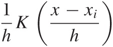
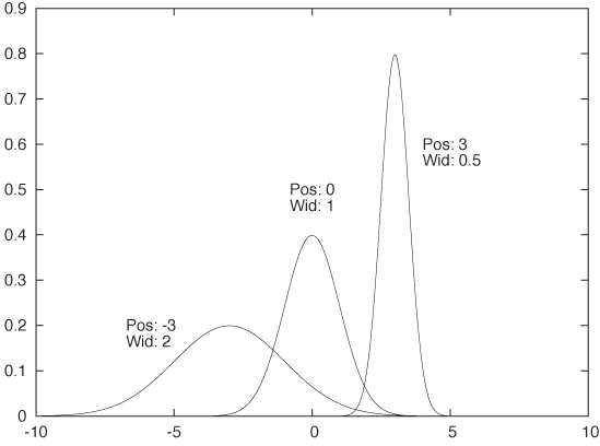
This function has a peak at xi, its width is approximately h, and its height is such that the area under the curve is still 1. Figure 2-6 shows some examples, using the Gaussian kernel. Keep in mind that the area under all three curves is the same.
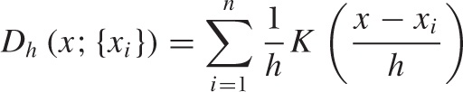
Using this expression, we can now write down a formula for the KDE with bandwidth h for any data set {x1, x2,..., xn}. This formula can be evaluated for any point x along the x axis:
All of this is straightforward and easy to implement in any computer language. Be aware that for large data sets (those with many thousands of points), the required number of kernel evaluations can lead to performance issues, especially if the function D(x) needs to be evaluated for many different positions (i.e., many different values of x). If this becomes a problem for you, you may want to choose a simpler kernel function or not evaluate a kernel if the distance x – xi is significantly greater than the bandwidth h. [2]
Now we can explain the wide gray line in Figure 2-4: it is a KDE with a larger bandwidth. Using such a large bandwidth makes it impossible to resolve the individual data points, but it does highlight entire periods of greater or smaller frequency. Which choice of bandwidth is right for you depends on your purpose.
A KDE constructed as just described is similar to a classical histogram, but it avoids two of the aforementioned problems. Given data set and bandwidth, a KDE is unique; a KDE is also smooth, provided we have chosen a smooth kernel function, such as the Gaussian.
Optional: Optimal Bandwidth Selection
We still have to fix the bandwidth. This is a different kind of problem than the other two: it’s not just a technical problem, which could be resolved through a better method; instead, it’s a fundamental problem that relates to the data set itself. If the data follows a smooth distribution, then a wider bandwidth is appropriate, but if the data follows a very wiggly distribution, then we need a smaller bandwidth to retain all relevant detail. In other words, the optimal bandwidth is a property of the data set and tells us something about the nature of the data.
So how do we choose an optimal value for the bandwidth? Intuitively, the problem is clear: we want the bandwidth to be narrow enough to retain all relevant detail but wide enough so that the resulting curve is not too “wiggly.” This is a problem that arises in every approximation problem: balancing the faithfulness of representation against the simplicity of behavior. Statisticians speak of the “bias–variance trade-off.”
To make matters concrete, we have to define a specific expression for the error of our approximation, one that takes into account both bias and variance. We can then choose a value for the bandwidth that minimizes this error. For KDEs, the generally accepted measure is the “expected mean-square error” between the approximation and the true density. The problem is that we don’t know the true density function that we are trying to approximate, so it seems impossible to calculate (and minimize) the error in this way. But clever methods have been developed to make progress. These methods fall broadly into two categories. First, we could try to find explicit expressions for both bias and variance. Balancing them leads to an equation that has to be solved numerically or—if we make additional assumptions (e.g., that the distribution is Gaussian)—can even yield explicit expressions similar to Scott’s rule (introduced earlier when talking about histograms). Alternatively, we could realize that the KDE is an approximation for the probability density from which the original set of points was chosen. We can therefore choose points from this approximation (i.e., from the probability density represented by the KDE) and see how well they replicate the KDE that we started with. Now we change the bandwidth until we find that value for which the KDE is best replicated: the result is the estimate of the “true” bandwidth of the data. (This latter method is known as cross-validation.)
Although not particularly hard, the details of both methods would lead us too far afield, and so I will skip them here. If you are interested, you will have no problem picking up the details from one of the references at the end of this chapter. Keep in mind, however, that these methods find the optimal bandwidth with respect to the mean-square error, which tends to overemphasize bias over variance and therefore these methods lead to rather narrow bandwidths and KDEs that appear too wiggly. If you are using KDEs to generate graphs for the purpose of obtaining intuitive visualizations of point distributions, then you might be better off with a bit of manual trial and error combined with visual inspection. In the end, there is no “right” answer, only the most suitable one for a given purpose. Also, the most suitable to develop intuitive understanding might not be the one that minimizes a particular mathematical quantity.
The Cumulative Distribution Function
The main advantage of histograms and kernel density estimates is that they have an immediate intuitive appeal: they tell us how probable it is to find a data point with a certain value. For example, from Figure 2-2 it is immediately clear that values around 250 milliseconds are very likely to occur, whereas values greater than 2,000 milliseconds are quite rare.
But how rare, exactly? That is a question that is much harder to answer by looking at the histogram in Figure 2-2. Besides wanting to know how much weight is in the tail, we might also be interested to know what fraction of requests completes in the typical band between 150 and 350 milliseconds. It’s certainly the majority of events, but if we want to know exactly how many, then we need to sum up the contributions from all bins in that region.
The cumulative distribution function (CDF) does just that. The CDF at point x tells us what fraction of events has occurred “to the left” of x. In other words, the CDF is the fraction of all points xi with xi ≤ x.
Figure 2-7 shows the same data set that we have already encountered in Figure 2-2, but here the data is represented by a KDE (with bandwidth h = 30) instead of a histogram. In addition, the figure also includes the corresponding CDF. (Both KDE and CDF are normalized to 1.)
We can read off several interesting observations directly from the plot of the CDF. For instance, we can see that at t = 1,500 (which certainly puts us into the tail of the distribution) the CDF is still smaller than 0.85; this means that fully 15 percent of all requests take longer than 1,500 milliseconds. In contrast, less than a third of all requests are completed in the “typical” range of 150–500 milliseconds. (How do we know this? The CDF for t = 150 is about 0.05 and is close to 0.40 for t = 500. In other words, about 40 percent of all requests are completed in less than 500 milliseconds; of these, 5 percent are completed in less than 150 milliseconds. Hence about 35 percent of all requests have response times of between 150 and 500 milliseconds.)
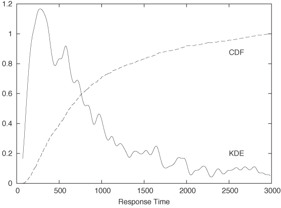
It is worth pausing to contemplate these findings, because they demonstrate how misleading a histogram (or KDE) can be despite (or because of) their intuitive appeal! Judging from the histogram or KDE alone, it seems quite reasonable to assume that “most” of the events occur within the major peak near t = 300 and that the tail for t > 1,500 contributes relatively little. Yet the CDF tells us clearly that this is not so. (The problem is that the eye is much better at judging distances than areas, and we are therefore misled by the large values of the histogram near its peak and fail to see that nevertheless the area beneath the peak is not that large compared to the total area under the curve.)
CDFs are probably the least well-known and most underappreciated tool in basic graphical analysis. They have less immediate intuitive appeal than histograms or KDEs, but they allow us to make the kind of quantitative statement that is very often required but is difficult (if not impossible) to obtain from a histogram.
Cumulative distribution functions have a number of important properties that follow directly from how they are calculated.
Because the value of the CDF at position x is the fraction of points to the left of x, a CDF is always monotonically increasing with x.
CDFs are less wiggly than a histogram (or KDE) but contain the same information in a representation that is inherently less noisy.
Because CDFs do not involve any binning, they do not lose information and are therefore a more faithful representation of the data than a histogram.
All CDFs approach 0 as x goes to negative infinity. CDFs are usually normalized so that they approach 1 (or 100 percent) as x goes to positive infinity.
A CDF is unique for a given data set.
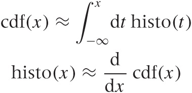
If you are mathematically inclined, you have probably already realized that the CDF is (an approximation to) the antiderivative of the histogram and that the histogram is the derivative of the CDF:
Cumulative distribution functions have several uses. First, and most importantly, they enable us to answer questions such as those posed earlier in this section: what fraction of points falls between any two values? The answer can simply be read off from the graph. Second, CDFs also help us understand how imbalanced a distribution is—in other words, what fraction of the overall weight is carried by the tails.
Cumulative distribution functions also prove useful when we want to compare two distributions. It is notoriously difficult to compare two bell-shaped curves in a histogram against each other. Comparing the corresponding CDFs is usually much more conclusive.
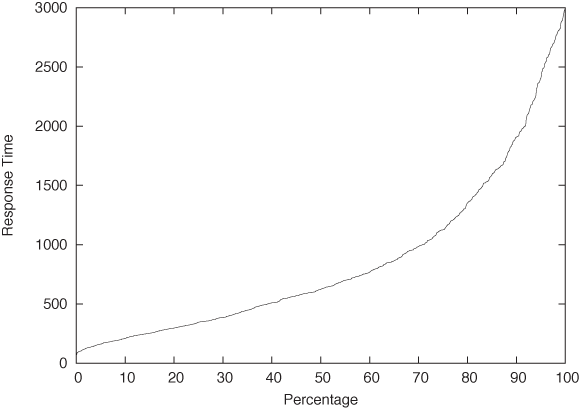
One last remark, before leaving this section: in the literature, you may find the term quantile plot. A quantile plot is just the plot of a CDF in which the x and y axes have been switched. Figure 2-8 shows an example using once again the server response time data set. Plotted this way, we can easily answer questions such as, “What response time corresponds to the 10th percentile of response times?” But the information contained in this graph is of course exactly the same as in a graph of the CDF.
Optional: Comparing Distributions with Probability Plots and QQ Plots
Occasionally you might want to confirm that a given set of points is distributed according to some specific, known distribution. For example, you have a data set and would like to determine whether it can be described well by a Gaussian (or some other) distribution.
You could compare a histogram or KDE of the data set directly against the theoretical density function, but it is notoriously difficult to compare distributions that way—especially out in the tails. A better idea would be to compare the cumulative distribution functions, which are easier to handle because they are less wiggly and are always monotonically increasing. But this is still not easy. Also keep in mind that most probability distributions depend on location and scale parameters (such as mean and variance), which you would have to estimate before being able to make a meaningful comparison. Isn’t there a way to compare a set of points directly against a theoretical distribution and, in the process, read off the estimates for all the parameters required?
As it turns out, there is. The method is technically easy to do, but the underlying logic is a bit convoluted and tends to trip up even experienced practitioners.
Here is how it works. Consider a set of points {xi} that we suspect are distributed according to the Gaussian distribution. In other words, we expect the cumulative distribution function of the set of points, yi = cdf(xi), to be the Gaussian cumulative distribution function Φ ((x – μ)/σ) with mean μ and standard deviation σ:
Here, yi is the value of the cumulative distribution function corresponding to the data point xi; in other words, yi is the quantile of the point xi.
Now comes the trick. We apply the inverse of the Gaussian distribution function to both sides of the equation:
With a little bit of algebra, this becomes
xi = μ + σΦ–1(yi)
In other words, if we plot the values in the data set as a function of Φ–1(yi), then they should fall onto a straight line with slope σ and zero intercept μ. If, on the other hand, the points do not fall onto a straight line after applying the inverse transform, then we can conclude that the data is not distributed according to a Gaussian distribution.
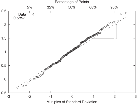
The resulting plot is known as a probability plot. Because it is easy to spot deviation from a straight line, a probability plot provides a relatively sensitive test to determine whether a set of points behaves according to the Gaussian distribution. As an added benefit, we can read off estimates for the mean and the standard deviation directly from the graph: μ is the intercept of the curve with the y axis, and σ is given by the slope of the curve. (Figure 2-10 shows the probability plot for the Gaussian data set displayed in Figure 2-9.)
One important question concerns the units that we plot along the axes. For the vertical axis the case is clear: we use whatever units the original data was measured in. But what about the horizontal axis? We plot the data as a function of Φ–1(yi), which is the inverse Gaussian distribution function, applied to the percentile yi for each point xi. We can therefore choose between two different ways to dissect the horizontal axis: either using the percentiles yi directly (in which case the tick marks will not be distributed uniformly), or dividing the horizontal axis uniformly. In the latter case we are using the width of the standard Gaussian distribution as a unit. You can convince yourself that this is really true by realizing that Φ–1(y) is the inverse of the Gaussian distribution function Φ(x). Now ask yourself: what units is x measured in? We use the same units for the horizontal axis of a Gaussian probability plot. These units are sometimes called probits. (Figure 2-10 shows both sets of units.) Beware of confused and confusing explanations of this point elsewhere in the literature.
There is one more technical detail that we need to discuss: to produce a probability plot, we need not only the data itself, but for each point xi we also need its quantile yi (we will discuss quantiles and percentiles in more detail later in this chapter). The simplest way to obtain the quantiles, given the data, is as follows:
Sort the data points in ascending order.
Assign to each data point its rank (basically, its line number in the sorted file), starting at 1 (not at 0).
The quantile yi now is the rank divided by n + 1, where n is the number of data points.
This prescription guarantees that each data point is assigned a quantile that is strictly greater than 0 and strictly less than 1. This is important because Φ–1(x) is defined only for 0 < x < 1. This prescription is easy to understand and easy to remember, but you may find other, slightly more complicated prescriptions elsewhere. For all practical purposes, the differences are going to be small.
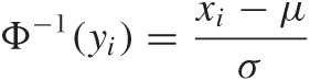
Finally, let’s look at an example where the data is clearly not Gaussian. Figure 2-11 shows the server data from Figure 2-2 plotted in a probability plot. The points don’t fall on a straight line at all—which is no surprise since we already knew from Figure 2-2 that the data is not Gaussian. But for cases that are less clear-cut, the probability plot can be a helpful tool for detecting deviations from Gaussian behavior.
A few additional comments are in order here.
Nothing in the previous discussion requires that the distribution be Gaussian! You can use almost any other commonly used distribution function (and its inverse) to generate the respective probability plots. In particular, many of the commonly used probability distributions depend on location and scale parameters in exactly the same way as the Gaussian distribution, so all the arguments discussed earlier go through as before.
Figure 2-11. A probability plot of the server response times from Figure 2-2. The data does not follow a Gaussian distribution and thus the points do not fall on a straight line.So far, I have always assumed that we want to compare an empirical data set against a theoretical distribution. But there may also be situations where we want to compare two empirical data sets against each other—for example, to find out whether they were drawn from the same family of distributions (without having to specify the family explicitly). The process is easiest to understand when both data sets we want to compare contain the same number of points. You sort both sets and then align the points from both data sets that have the same rank (once sorted). Now plot the resulting pairs of points in a regular scatter plot (see Chapter 3); the resulting graph is known as a QQ plot. (If the two data sets do not contain the same number of points, you will have to interpolate or truncate them so that they do.)
Probability plots are a relatively advanced, specialized technique, and you should evaluate whether you really need them. Their purpose is to determine whether a given data set stems from a specific, known distribution. Occasionally, this is of interest in itself; in other situations subsequent analysis depends on proper identification of the underlying model. For example, many statistical techniques assume that the errors or residuals are Gaussian and are not applicable if this condition is violated. Probability plots are a convenient technique for testing this assumption.
Rank-Order Plots and Lift Charts
There is a technique related to histograms and CDFs that is worth knowing about. Consider the following scenario. A company that is selling textbooks and other curriculum materials is planning an email marketing campaign to reach out to its existing customers. For this campaign, the company wants to use personalized email messages that are tailored to the job title of each recipient (so that teachers will receive a different email than their principals). The problem is the customer database contains about 250,000 individual customer records with over 16,000 different job titles among them! Now what?
The trick is to sort the job titles by the number of individual customer records corresponding to each job title. The first few records are shown in Table 2-1. The four columns give the job title, the number of customers for that job title, the fraction of all customers having that job title, and finally the cumulative fraction of customers. For the last column, we sum up the number of customers for the current and all previously seen job titles, then divide by the total number of customer records. This is the equivalent of the CDF we discussed earlier.
We can see immediately that fully two thirds of all customers account for only 10 different job titles. Using just the top 30 job titles gives us 75 percent coverage of customer records. That’s much more manageable than the 16,000 job titles we started with!
Let’s step back for a moment to understand how this example is different from those we have seen previously. What is important to notice here is that the independent variable has no intrinsic ordering. What does this mean?
For the web-server example, we counted the number of events for each response time; hence the count of events per bin was the dependent variable, and it was determined by the independent variable—namely, the response time. In that case, the independent variable had an inherent ordering: 100 milliseconds are always less than 400 milliseconds (and so on). But in the case of counting customer records that match a certain job title, the independent variable (the job title) has no corresponding ordering relation. It may appear otherwise since we can sort the job titles alphabetically, but realize that this ordering is entirely arbitrary! There is nothing “fundamental” about it. If we choose a different font encoding or locale, the order will change. Contrast this with the ordering relationship on numbers—there are no two ways about it: 1 is always less than 2.
In cases like this, where the independent variable does not have an intrinsic ordering, it is often a good idea to sort entries by the dependent variable. That’s what we did in the example: rather than defining some (arbitrary) sort order on the job titles, we sorted by the number of records (i.e., by the dependent variable). Once the records have been sorted in this way, we can form a histogram and a CDF as before.
Number of customers | Fraction of customers | Cumulative fraction | |
Teacher | 66,470 | 0.34047 | 0.340 |
Principal | 22,958 | 0.11759 | 0.458 |
Superintendent | 12,521 | 0.06413 | 0.522 |
Director | 12,202 | 0.06250 | 0.584 |
Secretary | 4,427 | 0.02267 | 0.607 |
Coordinator | 3,201 | 0.01639 | 0.623 |
Vice Principal | 2,771 | 0.01419 | 0.637 |
Program Director | 1,926 | 0.00986 | 0.647 |
Program Coordinator | 1,718 | 0.00880 | 0.656 |
Student | 1,596 | 0.00817 | 0.664 |
Consultant | 1,440 | 0.00737 | 0.672 |
Administrator | 1,169 | 0.00598 | 0.678 |
President | 1,114 | 0.00570 | 0.683 |
Program Manager | 1,063 | 0.00544 | 0.689 |
Supervisor | 1,009 | 0.00516 | 0.694 |
Professor | 961 | 0.00492 | 0.699 |
Librarian | 940 | 0.00481 | 0.704 |
Project Coordinator | 880 | 0.00450 | 0.708 |
Project Director | 866 | 0.00443 | 0.713 |
Office Manager | 839 | 0.00429 | 0.717 |
Assistant Director | 773 | 0.00395 | 0.721 |
Administrative Assistant | 724 | 0.00370 | 0.725 |
Bookkeeper | 697 | 0.00357 | 0.728 |
Intern | 693 | 0.00354 | 0.732 |
Program Supervisor | 602 | 0.00308 | 0.735 |
Lead Teacher | 587 | 0.00300 | 0.738 |
Instructor | 580 | 0.00297 | 0.741 |
Head Teacher | 572 | 0.00292 | 0.744 |
Program Assistant | 572 | 0.00292 | 0.747 |
Assistant Teacher | 546 | 0.00279 | 0.749 |
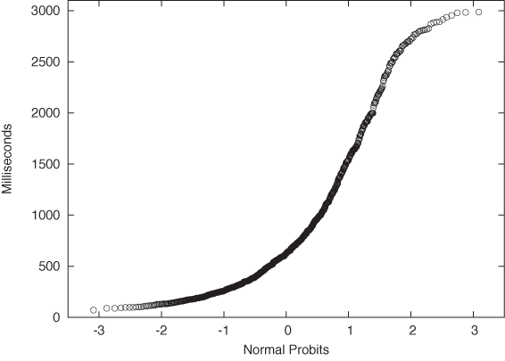
This trick of sorting by the dependent variable is useful whenever the independent variable does not have a meaningful ordering relation; it is not limited to situations where we count events per bin. Figure 2-12 and Figure 2-13 show two typical examples.
Figure 2-12 shows the sales by a certain company to different countries. Not only the sales to each country but also the cumulative sales are shown, which allows us to assess the importance of the remaining “tail” of the distribution of sales.
In this example, I chose to plot the independent variable along the vertical axis. This is often a good idea when the values are strings, since they are easier to read this way. (If you plot them along the horizontal axis, it is often necessary to rotate the strings by 90 degrees to make them fit, which makes hard to read.)
Figure 2-13 displays what in quality engineering is known as a Pareto chart. In quality engineering and process improvement, the goal is to reduce the number of defects in a certain product or process. You collect all known causes of defects and observe how often each one occurs. The results can be summarized conveniently in a chart like the one in Figure 2-13. Note that the causes of defects are sorted by their frequency of occurrence. From this chart we can see immediately that problems with the engine and the electrical system are much more common than problems with the air conditioning, the brakes, or the transmission. In fact, by looking at the cumulative error curve, we can tell that fixing just the first two problem areas would reduce the overall defect rate by 80 percent.
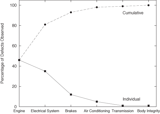
Two more bits of terminology: the term “Pareto chart” is not used widely outside the specific engineering disciplines mentioned in the previous paragraph. I personally prefer the expression rank-order chart for any plot generated by first sorting all entries by the dependent variable (i.e., by the rank of the entry). The cumulative distribution curve is occasionally referred to as a lift curve, because it tells us how much “lift” we get from each entry or range of entries.
Only When Appropriate: Summary Statistics and Box Plots
You may have noticed that so far I have not spoken at all about such simple topics as mean and median, standard deviation, and percentiles. That is quite intentional. These summary statistics apply only under certain assumptions and are misleading, if not downright wrong, if those assumptions are not fulfilled. I know that these quantities are easy to understand and easy to calculate, but if there is one message I would like you to take away from this book it is this: the fact that something is convenient and popular is no reason to follow suit. For any method that you want to use, make sure you understand the underlying assumptions and always check that they are fulfilled for the specific application you have in mind!
Mean, median, and related summary statistics apply only to distributions that have a single, central peak—that is, to unimodal distributions. If this basic assumption is not fulfilled, then conclusions based on simple summary statistics will be wrong. Even worse, nothing will tip you off that they are wrong: the numbers will look quite reasonable. (We will see an example of this problem shortly.)
Summary Statistics
If a distribution has only a single peak, then it makes sense to ask about the properties of that peak: where is it located, and what is its width? We may also want to know whether the distribution is symmetric and whether any outliers are present.
Mean and standard deviation are two popular measures for location and spread. The mean or average is both familiar and intuitive:
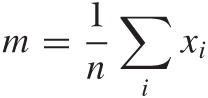
The standard deviation measures how far points spread “on average” from the mean: we take all the differences between each individual point and the mean, and then calculate the average of all these differences. Because data points can either overshoot or undershoot the mean and we don’t want the positive and negative deviations to cancel each other, we sum the square of the individual deviations and then take the mean of the square deviations. (The second equation is very useful in practice and can be found from the first after plugging in the definition of the mean.)
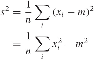
The quantity s2 calculated in this way is known as the variance and is the more important quantity from a theoretical point of view. But as a measure of the spread of a distribution, we are better off using its square root, which is known as the standard deviation. Why take the square root? Because then both measure for the location, and the measure for the spread will have the same units, which are also the units of the actual data. (If our data set consists of the prices for a basket of goods, then the variance would be given in “square dollars,” whereas the standard deviation would be given in dollars.)
For many (but certainly not all!) data sets arising in practice, one can expect about two thirds of all data points to fall within the interval [m – s, m + s] and 99 percent of all points to fall within the wider interval [m – 3s, m + 3s].
Mean and standard deviation are easy to calculate, and have certain nice mathematical properties—provided the data is symmetric and does not contain crazy outliers. Unfortunately, many data sets violate at least one of these assumptions. Here is an example for the kind of trouble that one may encounter. Assume we have 10 items costing $1 each, and one item costing $20. The mean item price comes out to be $2.73, even though no item has a price anywhere near this value. The standard deviation is even worse: it comes out to $5.46, implying that most items have a price between $2.73 – $5.46 and $2.73 + $5.46. The “expected range” now includes negative prices—an obviously absurd result. Note that the data set itself is not particularly pathological: going to the grocery store and picking up a handful of candy bars and a bottle of wine will do it (pretty good wine, to be sure, but nothing outrageous).
A different set of summary statistics that is both more flexible and more robust is based on the concepts of median and quantiles or percentiles. The median is conventionally defined as the value from a data set such that half of all points in the data set are smaller and the other half greater that that value. Percentiles are the generalization of this concept to other fractions (the 10th percentile is the value such that 10 percent of all points in the data set are smaller than it, and so on). Quantiles are similar to percentiles, only that they are taken with respect to the fraction of points, not the percentage of points (in other words, the 10th percentile equals the 0.1 quantile).
Simple as it is, the percentile concept is nevertheless ambiguous, and so we need to work a little harder to make it really concrete. As an example of the problems that occur, consider the data set {1, 2, 3}. What is the median? It is not possible to break this data set into two equal parts each containing exactly half the points. The problem becomes even more uncomfortable when we are dealing with arbitrary percentile values (rather than the median only).
The Internet standard laid down in RFC 2330 (“Framework for IP Performance Metrics”) gives a definition of percentiles in terms of the CDF, which is unambiguous and practical, as follows. The pth percentile is the smallest value x, such that the cumulative distribution function of x is greater or equal p/100.
pth percentile: smallest x for which cdf(x) ≥ p/100
This definition assumes that the CDF is normalized to 1, not to 100. If it were normalized to 100, the condition would be cdf(x) ≥ p.
With this definition, the median (i.e., the 50th percentile) of the data set {1, 2, 3} is 2 because the cdf(1) = 0.33 ..., cdf(2) = 0.66 ..., and cdf(3) = 1.0. The median of the data set {1, 2} would be 1 because now cdf(1) = 0.5, and cdf(2) = 1.0.
The median is a measure for the location of the distribution, and we can use percentiles to construct a measure for the width of the distribution. Probably the most frequently used quantity for this purpose is the inter-quartile range (IQR), which is the distance between the 75th percentile and 25th percentile.
When should you favor median and percentile over mean and standard deviation? Whenever you suspect that your distribution is not symmetric or has important outliers.
If a distribution is symmetric and well behaved, then mean and median will be quite close together, and there is little difference in using either. Once the distribution becomes skewed, however, the basic assumption that underlies the mean as a measure for the location of the distribution is no longer fulfilled, and so you are better off using the median. (This is why the average wage is usually given in official publications as the median family income, not the mean; the latter would be significantly distorted by the few households with extremely high incomes.) Furthermore, the moment you have outliers, the assumptions behind the standard deviation as a measure of the width of the distribution are violated; in this case you should favor the IQR (recall our shopping basket example earlier).
If median and percentiles are so great, then why don’t we
always use them? A large part of the preference for mean and
variance is historical. In the days before readily available
computing power, percentiles were simply not practical to calculate.
Keep in mind that finding percentiles requires to
sort the data set whereas to find the mean
requires only to add up all elements in any order. The latter is an
 (n) process, but the
former is an (n2)
process, since humans—being nonrecursive—cannot be taught Quicksort
and therefore need to resort to much less efficient sorting
algorithms. A second reason is that it is much harder to prove
rigorous theorems for percentiles, whereas mean and variance are
mathematically very well behaved and easy to work with.
(n) process, but the
former is an (n2)
process, since humans—being nonrecursive—cannot be taught Quicksort
and therefore need to resort to much less efficient sorting
algorithms. A second reason is that it is much harder to prove
rigorous theorems for percentiles, whereas mean and variance are
mathematically very well behaved and easy to work with.
Box-and-Whisker Plots
There is an interesting graphical way to represent these quantities, together with information about potential outliers, known as a box-and-whisker plot, or box plot for short. Figure 2-15 illustrates all components of a box plot. A box plot consists of:
A marker or symbol for the median as an indicator of the location of the distribution
A box, spanning the inter-quartile range, as a measure of the width of the distribution
A set of whiskers, extending from the central box to the upper and lower adjacent values, as an indicator of the tails of the distribution (where “adjacent value” is defined in the next paragraph)
Individual symbols for all values outside the range of adjacent values, as a representation for outliers
You can see that a box plot combines a lot of information in a single graph. We have encountered almost all of these concepts before, with the exception of upper and lower adjacent values. While the inter-quartile range is a measure for the width of the central “bulk” of the distribution, the adjacent values are one possible way to express how far its tails reach. The upper adjacent value is the largest value in the data set that is less than twice the inter-quartile range greater than the median. In other words: extend the whisker upward from the median to twice the length of the central box. Now trim the whisker down to the largest value that actually occurs in the data set; this value is the upper adjacent value. (A similar construction holds for the lower adjacent value.)
You may wonder about the reason for this peculiar construction. Why not simply extend the whiskers to, say, the 5th and 95th percentile and be done with it? The problem with this approach is that it does not allow us to recognize true outliers! Outliers are data points that are, when compared to the width of the distribution, unusually far from the center. Such values may or may not be present. The top and bottom 5 percent, on the other hand, are always present even for very compact distributions. To recognize outliers, we therefore cannot simply look at the most extreme values, instead we must compare their distance from the center to the overall width of the distribution. That is what box-and-whisker plots, as described in the previous paragraph, do.
The logic behind the preceding argument is extremely important (not only in this application but more generally), so I shall reiterate the steps: first we calculated a measure for the width of the distribution, then we used this width to identify outliers as those points that are far from the center, where (and this is the crucial step) “far” is measured in units of the width of the distribution. We neither impose an arbitrary distance from the outside, nor do we simply label the most extreme x percent of the distribution as outliers—instead, we determine the width of the distribution (as the range into which points “typically” fall) and then use it to identify outliers as those points that deviate from this range. The important insight here is that the distribution itself determines a typical scale, which provides a natural unit in which to measure other properties of the distribution. This idea of using some typical property of the system to describe other parts of the system will come up again later (see Chapter 8).
Box plots combine many different measures of a distribution into a single, compact graph. A box plot allows us to see whether the distribution is symmetric or not and how the weight is distributed between the central peak and the tails. Finally, outliers (if present) are not dropped but shown explicitly.
Box plots are best when used to compare several distributions against one another—for a single distribution, the overhead of preparing and managing a graph (compared to just quoting the numbers) may often not appear justified. Here is an example that compares different data sets against each other.
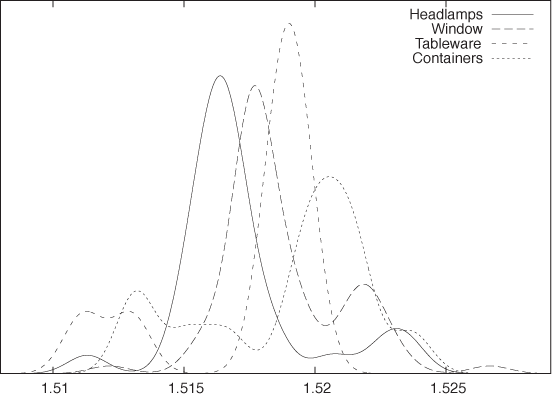
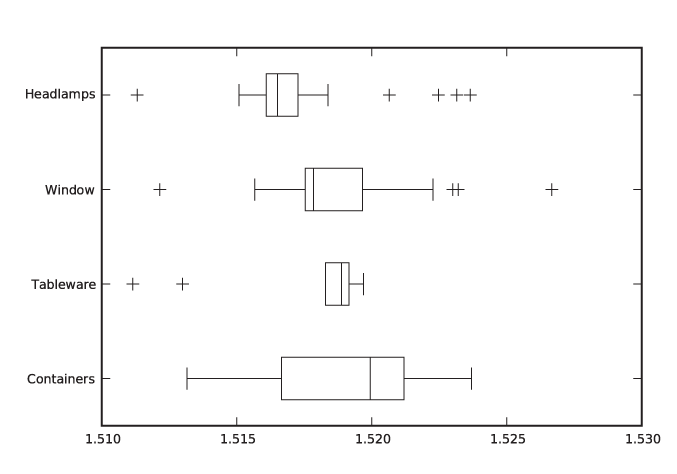
Let’s say we have a data set containing the index of refraction of 121 samples of glass.[3] The data set is broken down by the type of glass: 70 samples of window glass, 29 from headlamps, 13 from containers of various kinds, and 9 from tableware. Figure 2-14 and Figure 2-15 are two representations of the same data, the former as a kernel density estimate and the latter as a box plot.
The box plot emphasizes the overall structure of the data sets and makes it easy to compare the data sets based on their location and width. At the same time, it also loses much information. The KDE gives a more detailed view of the data—in particular showing the occurrence of multiple peaks in the distribution functions—but makes it more difficult to quickly sort and classify the data sets. Depending on your needs, one or the other technique may be preferable at any given time.
Here are some additional notes on box plots.
The specific way of drawing a box plot that I described here is especially useful but is far from universal. In particular, the specific definition of the adjacent values is often not properly understood. Whenever you find yourself looking at a box plot, always ask what exactly is shown, and whenever you prepare one, make sure to include an explanation.
The box plot described here can be modified and enhanced. For example, the width of the central box (i.e., the direction orthogonal to the whiskers) can be used to indicate the size of the underlying data set: the more points are included, the wider the box. Another possibility is to abandon the rectangular shape of the box altogether and to use the local width of the box to display the density of points at each location—which brings us almost full circle to KDEs.
Workshop: NumPy
The NumPy module provides efficient and convenient handling of large numerical arrays in Python. It is the successor to both the earlier Numeric and the alternative numarray modules. (See the Appendix A for more on the history of scientific computing with Python.) The NumPy module is used by many other libraries and projects and in this sense is a “base” technology.
Let’s look at some quick examples before delving a bit deeper into technical details.
NumPy in Action
NumPy objects are of type ndarray. There are different ways of
creating them. We can create an ndarray by:
Converting a Python list
Using a factory function that returns a populated vector
Reading data from a file directly into a NumPy object
The listing that follows shows five different ways to create NumPy objects. First we create one by converting a Python list. Then we show two different factory routines that generate equally spaced grid points. These routines differ in how they interpret the provided boundary values: one routine includes both boundary values, and the other includes one and excludes the other. Next we create a vector filled with zeros and set each element in a loop. Finally, we read data from a text file. (I am showing only the simplest or default cases here—all these routines have many more options that can be used to influence their behavior.)
# Five different ways to create a vector...

import numpy as np

# From a Python list
vec1 = np.array( [ 0., 1., 2., 3., 4. ] )

# arange( start inclusive, stop exclusive, step size )
vec2 = np.arange( 0, 5, 1, dtype=float )

# linspace( start inclusive, stop inclusive, number of elements )
vec3 = np.linspace( 0, 4, 5 )

# zeros( n ) returns a vector filled with n zeros
vec4 = np.zeros( 5 )
for i in range( 5 ):
    vec4[i] = i

# read from a text file, one number per row
vec5 = np.loadtxt( "data" )
In the end, all five vectors contain identical data. You
should observe that the values in the Python list used to initialize
vec1 are floating-point values
and that we specified the type desired for the
vector elements explicitly when using the arange() function to create vec2. (We will come back to types in a
moment.)
Now that we have created these objects, we can operate with them (see the next listing). One of the major conveniences provided by NumPy is that we can operate with NumPy objects as if they were atomic data types: we can add, subtract, and multiply them (and so forth) without the need for explicit loops. Avoiding explicit loops makes our code clearer. It also makes it faster (because the entire operation is performed in C without overhead—see the discussion that follows).
# ... continuation from previous listing

# Add a vector to another
v1 = vec1 + vec2

# Unnecessary: adding two vectors using an explicit loop
v2 = np.zeros( 5 )
for i in range( 5 ):
    v2[i] = vec1[i] + vec2[i]

# Adding a vector to another in place
vec1 += vec2

# Broadcasting: combining scalars and vectors
v3 = 2*vec3
v4 = vec4 + 3

# Ufuncs: applying a function to a vector, element by element
v5 = np.sin(vec5)

# Converting to Python list object again
lst = v5.tolist()
All operations are performed element by element: if we add two
vectors, then the corresponding elements from each vector are
combined to give the element in the resulting vector. In other
words, the compact expression vec1 +
vec2 for v1 in the
listing is equivalent to the explicit loop construction used to
calculate v2. This is true even
for multiplication: vec1 * vec2
will result in a vector in which the corresponding elements of both
operands have been multiplied element by element. (If you want a
true vector or “dot” product, you must use the dot() function instead.) Obviously, this
requires that all operands have the same number of
elements!
Now we shall demonstrate two further convenience features that in the NumPy documentation are referred to as broadcasting and ufuncs (short for “universal functions”). The term “broadcasting” in this context has nothing to do with messaging. Instead, it means that if you try to combine two arguments of different shapes, then the smaller one will be extended (“cast broader”) to match the larger one. This is especially useful when combining scalars with vectors: the scalar is expanded to a vector of appropriate size and whose elements all have the value given by the scalar; then the operation proceeds, element by element, as before. The term “ufunc” refers to a scalar function that can be applied to a NumPy object. The function is applied, element by element, to all entries in the NumPy object, and the result is a new NumPy object with the same shape as the original one.
Using these features skillfully, a function to calculate a kernel density estimate can be written as a single line of code:
# Calculating kernel density estimates

from numpy import *

# z: position, w: bandwidth, xv: vector of points
def kde( z, w, xv ):
    return sum( exp(-0.5*((z-xv)/w)**2)/sqrt(2*pi*w**2) )

d = loadtxt( "presidents", usecols=(2,) )

w = 2.5

for x in linspace( min(d)-w, max(d)+w, 1000 ):
    print x, kde( x, w, d )
This program will calculate and print the data needed to
generate Figure 2-4
(but it does not actually draw the graph—that will have to wait
until we introduce matplotlib in
the Workshop of Chapter 3).
Most of the listing is boilerplate code, such as reading and
writing files. All the actual work is done in the one-line function
kde(z, w, xv). This function
makes use of both “broadcasting” and “ufuncs” and is a good example
for the style of programming typical of NumPy. Let’s dissect
it—inside out.
First recall what we need to do when evaluating a KDE: for each location z at which we want to evaluate the KDE, we must find its distance to all the points in the data set. For each point, we evaluate the kernel for this distance and sum up the contributions from all the individual kernels to obtain the value of the KDE at z.
The expression z-xv
generates a vector that contains the distance between z and all the points in xv (that’s broadcasting). We then divide
by the required bandwidth, multiply by 1/2, and square each element.
Finally, we apply the exponential function exp() to this vector (that’s a ufunc). The
result is a vector that contains the exponential function evaluated
at the distances between the points in the data set and the location
z. Now we only need to sum all
the elements in the vector (that’s what sum() does) and we are done, having
calculated the KDE at position z.
If we want to plot the KDE as a curve, we have to repeat this
process for each location we wish to plot—that’s what the final loop
in the listing is for.
NumPy in Detail
You may have noticed that none of the warm-up examples in the listings in the previous section contained any matrices or other data structures of higher dimensionality—just one-dimensional vectors. To understand how NumPy treats objects with dimensions greater than one, we need to develop at least a superficial understanding for the way NumPy is implemented.
It is misleading to think of NumPy as a “matrix package for
Python” (although it’s commonly used as such). I find it more
helpful to think of NumPy as a wrapper and access layer for
underlying C buffers. These buffers are contiguous blocks of C
memory, which—by their nature—are one-dimensional data structures.
All elements in those data structures must be of the same size, and
we can specify almost any native C type (including C structs) as the
type of the individual elements. The default type corresponds to a C
double and that is what we use in
the examples that follow, but keep in mind that other choices are
possible. All operations that apply to the data overall are
performed in C and are therefore very fast.
To interpret the data as a matrix or other multi-dimensional data structure, the shape or layout is imposed during element access. The same 12-element data structure can therefore be interpreted as a 12-element vector or a 3 × 4 matrix or a 2 × 2 × 3 tensor—the shape comes into play only through the way we access the individual elements. (Keep in mind that although reshaping a data structure is very easy, resizing is not.)
The encapsulation of the underlying C data structures is not
perfect: when choosing the types of the atomic elements, we specify
C data types not Python types. Similarly, some features provided by
NumPy allow us to manage memory manually, rather than have the
memory be managed transparently by the Python runtime. This is an
intentional design decision, because NumPy has been designed to
accommodate large data structures—large enough
that you might want (or need) to exercise a greater degree of
control over the way memory is managed. For this reason, you have
the ability to choose types that take up less space as elements in a
collection (e.g., C float elements rather than the default
double). For the same reason, all
ufuncs accept an optional argument pointing to an (already
allocated) location where the results will be placed, thereby
avoiding the need to claim additional memory themselves. Finally,
several access and structuring routines return a
view (not a copy!) of the same underlying data.
This does pose an aliasing problem that you need to watch out
for.
The next listing quickly demonstrates the concepts of shape
and views. Here, I assume that the commands are entered at an
interactive Python prompt (shown as >>> in the listing). Output
generated by Python is shown without a prompt:
>>> import numpy as np

>>> # Generate two vectors with 12 elements each
>>> d1 = np.linspace( 0, 11, 12 )
>>> d2 = np.linspace( 0, 11, 12 )

>>> # Reshape the first vector to a 3x4 (row x col) matrix
>>> d1.shape = ( 3, 4 )
>>> print d1
[[  0.   1.    2.    3.]
 [  4.   5.    6.    7.]
 [  8.   9.   10.   11.]]

>>> # Generate a matrix VIEW to the second vector
>>> view = d2.reshape( (3,4) )

>>> # Now: possible to combine the matrix and the view
>>> total = d1 + view


>>> # Element access: [row,col] for matrix
>>> print d1[0,1]
1.0
>>> print view[0,1]
1.0
>>> # ... and [pos] for vector
>>> print d2[1]
1.0


>>> # Shape or layout information
>>> print d1.shape
(3,4)
>>> print d2.shape
(12,)
>>> print view.shape
(3,4)

>>> # Number of elements (both commands equivalent)
>>> print d1.size
12
>>> print len(d2)
12

>>> # Number of dimensions (both commands equivalent)
>>> print d1.ndim
2
>>> print np.rank(d2)
1
Let’s step through this. We create two vectors of 12 elements
each. Then we reshape the first one into a 3 ×
4 matrix. Note that the shape
property is a data member—not an accessor function! For the second
vector, we create a view in the form of a 3 × 4
matrix. Now d1 and the newly
created view of d2 have the same
shape, so we can combine them (by forming their sum, in this case).
Note that even though reshape()
is a member function, it does not change the
shape of the instance itself but instead returns a new view object:
d2 is still a one-dimensional
vector. (There is also a standalone version of this function, so we
could also have written view = np.reshape(
d2, (3,4) ). The presence of such redundant functionality
is due to the desire to maintain backward compatibility with both of
NumPy’s ancestors.)
We can now access individual elements of the data
structures, depending on their shape. Since both d1 and view are matrices, they are indexed by a
pair of indices (in the order [row,col]). However, d2 is still a one-dimensional vector and
thus takes only a single index. (We will have more to say about
indexing in a moment.)
Finally, we examine some diagnostics regarding the shape of
the data structures, emphasizing their precise semantics. The
shape is a tuple, giving the
number of elements in each dimension. The size is the total number of elements and
corresponds to the value returned by len() for the entire data structure.
Finally, ndim gives the number of
dimensions (i.e., d.ndim == len(d.shape)) and is equivalent
to the “rank” of the entire data structure. (Again, the redundant
functionality exists to maintain backward compatibility.)
Finally, let’s take a closer look at the ways in which we can
access elements or larger subsets of an ndarray. In the previous listing we saw
how to access an individual element by fully specifying an index for
each dimension. We can also specify larger subarrays of a data
structure using two additional techniques, known as
slicing and advanced
indexing. The following listing shows some representative
examples. (Again, consider this an interactive Python
session.)
>>> import numpy as np

>>> # Create a 12-element vector and reshape into 3x4 matrix
>>> d = np.linspace( 0, 11, 12 )
>>> d.shape = ( 3,4 )
>>> print d
[[  0.   1.   2.   3.]
 [  4.   5.   6.   7.]
 [  8.   9.  10.  11.]]

>>> # Slicing...
>>> # First row
>>> print d[0,:]
[ 0.  1.  2.  3.]

>>> # Second col
>>> print d[:,1]
[ 1.  5.  9.]

>>> # Individual element: scalar
>>> print d[0,1]
1.0

>>> # Subvector of shape 1
>>> print d[0:1,1]
[ 1.]

>>> # Subarray of shape 1x1
>>> print d[0:1,1:2]
[[ 1.]]
>>> # Indexing...
>>> # Integer indexing: third and first column
>>> print d[ :, [2,0] ]
[[  2.   0.]
 [  6.   4.]
 [ 10.   8.]]

>>> # Boolean indexing: second and third column
>>> k = np.array( [False, True, True] )
>>> print d[ k, : ]
[[  4.   5.   6.   7.]
 [  8.   9.  10.  11.]]
We first create a 12-element vector and reshape it into a 3 ×
4 matrix as before. Slicing uses the standard Python slicing syntax
start:stop:step, where the start
position is inclusive but the stopping position is exclusive. (In
the listing, I use only the simplest form of slicing, selecting all
available elements.)
There are two potential “gotchas” with slicing. First of all,
specifying an explicit subscripting index (not a slice!) reduces the
corresponding dimension to a scalar. Slicing, though, does not
reduce the dimensionality of the data structure. Consider the two
extreme cases: in the expression d[0,1], indices for both dimensions are
fully specified, and so we are left with a scalar. In contrast,
d[0:1,1:2] is sliced in both
dimensions. Neither dimension is removed, and the resulting object
is still a (two-dimensional) matrix but of smaller size: it has
shape 1 × 1.
The second issue to watch out for is that slices return views, not copies.
Besides slicing, we can also index an ndarray with a vector of indices, by an
operation called “advanced indexing.” The previous listing showed
two simple examples. In the first we use a Python list object, which
contains the integer indices (i.e., the
positions) of the desired columns and in the desired order, to
select a subset of columns. In the second example, we form an
ndarray of Boolean entries to
select only those rows for which the Boolean evaluates to
True.
In contrast to slicing, advanced indexing returns copies, not views.
This completes our overview of the basic capabilities of the NumPy module. NumPy is easy and convenient to use for simple use cases but can get very confusing otherwise. (For example, check out the rules for general broadcasting when both operators are multi-dimensional, or for advanced indexing).
We will present some more straightforward applications in Chapter 3 and Chapter 4.
Further Reading
The Elements of Graphing Data. William S. Cleveland. 2nd ed., Hobart Press. 1994.
A book-length discussion of graphical methods for data analysis such as those described in this chapter. In particular, you will find more information here on topics such as box plots and QQ plots. Cleveland’s methods are particularly careful and well thought-out.
All of Statistics: A Concise Course in Statistical Inference. Larry Wasserman. Springer. 2004.
A thoroughly modern treatment of mathematical statistics, very advanced and condensed. You will find some additional material here on the theory of “density estimation”—that is, on histograms and KDEs.
Multivariate Density Estimation. David W. Scott. 2nd ed., Wiley. 2006.
A research monograph on density estimation written by the creator of Scott’s rule.
Kernel Smoothing. M. P. Wand and M. C. Jones. Chapman & Hall. 1995.
An accessible treatment of kernel density estimation.
[1] The inspiration for this example comes from a paper by Robert W. Hayden in the Journal of Statistics Education. The full text is available at http://www.amstat.org/publications/jse/v13n1/datasets.hayden.html.
[2] Yet another strategy starts with the realization that forming a KDE amounts to a convolution of the kernel function with the data set. You can now take the Fourier transform of both kernel and data set and make use of the Fourier convolution theorem. This approach is suitable for very large data sets but is outside the scope of our discussion.
[3] The raw data can be found in the “Glass Identification Data Set” on the UCI Machine Learning Repository at http://archive.ics.uci.edu/ml/.