Table of Contents for
Building PHP Applications with Symfony™, CakePHP, and Zend® Framework
 Building PHP Applications with Symfony™, CakePHP, and Zend® Framework
Published by
Wrox, 2011
Building PHP Applications with Symfony™, CakePHP, and Zend® Framework
Published by
Wrox, 2011
- Copyright
- Credits
- ABOUT THE AUTHORS
- ACKNOWLEDGMENTS
- Introduction
- 1. Introducing Symfony, CakePHP, and Zend Framework
- 2. Getting Started
- 3. Working with Databases
- 4. Your First Application in the Three Frameworks
- 5. Forms
- 6. Mailing
- 7. Searching
- 8. Security
- 9. Templates
- 10. AJAX
- 11. Making Plug-ins
- 12. Web Services
- 13. Back End
- 14. Internationalization
- 15. Testing
- 16. User Management
- 17. Performance
- 18. Summary
- A. Web Resources
- B. CodeIgniter, Lithium, and Agavi with Code Examples
- GLOSSARY OF ACRONYMS AND TECHNICAL TERMS
WHAT'S IN THIS CHAPTER?
Input forms have become so common and natural that users probably do not even notice when they fill them in. There is also nothing strange about a form noticing that our e-mail address is incorrect or requesting us to write down some barely recognizable characters. This chapter explores forms: form creation and the various common tasks associated with them, such as customization and validation. Several automatic functions of frameworks regarding building forms and their validation are presented here as well.
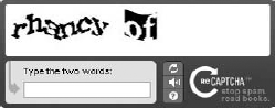
Web forms can be found at various websites throughout the Internet. They are used in all sorts of situations, allowing users to pass data that is later processed by server-side scripts. By including forms in your web application, you allow visitors to register and enter their unique content. Furthermore, forms can also be used for ordering various products online, voting in polls, and other sorts of user input. In some situations, forms can also be used when you must implement some mechanisms to ensure the security of transmitted data. (More about form security and secured connections can be found in Chapter 8.) This chapter focuses on form validation and customization. We also discuss Captcha tests as a spam protection instrument.
One of the most important parts of any web application is data validation. It is most helpful in ensuring that entered data is consistent with a web application's assumed data model. There are many common field validation methods, and they are (or should be) applied to most input forms. For example, you may want to make sure that the user creating a new account in your application enters a unique username, or that the password is no shorter than six characters and no longer than twelve. Of course, there are also more complex rules used during form validation; for example, they allow passing of only alphanumeric characters or even only strings that follow a certain predefined pattern.
There is also one very important, but often overlooked aspect of form validation. Obviously, form handling is much easier when validation rules are defined, but at the same time those rules are protecting the application from web-bots that are looking for vulnerable sites that can later be used for posting spam messages, or be targeted with other methods of attack. Later in this chapter we discuss Captcha, the second line of defense against these forms of attack. Chapter 8 of this book addresses injection and cross-site request forgery (CSRF) attacks, a special attack on a web application that utilizes poorly protected forms as an attack point.
Chapter 4 left us with a basic web application, but with no data validation, and now we will add it. We will also show alternative methods of creating forms in the project.
The address book that we created has a few fields that will require validation, so we want to add these rules:
first_name— This field will be obligatory and at least 3 characters long, but no longer than 25.last_name— This field is optional; it should be no longer than 25 characters.email— Must be an e-mail format and no longer than 25 characters.phone— Integer value no longer than 11 digits.created— Date format (MDY).
Field length values here are related to database design. It is a good practice to consider database restrictions while including validation in the project. Because, for example, if a name 10 characters long is put into a VARCHAR(5) type field in a database, the input data will be truncated accordingly. This can be avoided by adding field validation that would prohibit sending improper data into the database.
Form validation verifies submitted data against a set of validation rules. When any information is about to be submitted via a form, validation decides whether the information is correct and can be processed or not.
There are two levels of validation that can be applied to an application. The first one can be applied before any data is sent to a server and it is done on the client side using JavaScript. This is quite useful because in case of bigger forms, the user can be informed whether a field is valid or not. This validation can be easily omitted by disabling JavaScript in a user's browser. The second stage of validation is done by sending the form input to the application server where it will be validated, and a proper reply will be sent back to the user, informing him of any errors.
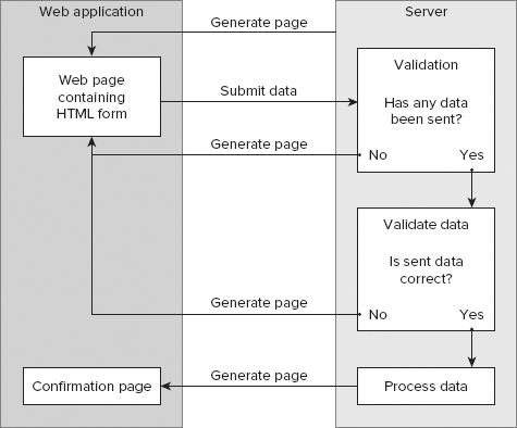
Let's consider the simplest case of server-only validation, as shown in Figure 5-1. We assume that a user is about to post a comment to a blog post via a web form. Here we can decide that there have to be some values submitted for the UserName and Comment fields. The first stage of validation will check if the UserName and the Comment fields have any values assigned, and if they do, this data is further validated by a set of predefined rules. Those rules may check whether the comment contains any unwanted scripts or contains any offensive words. Later, based on validation results, an action is performed. In this case, it is saving the submitted comment into a database. On the other hand, if the user has not filled in the UserName or the Comment fields, the form validation will generate an appropriate error message, and the page will be reloaded displaying it.
Now let's consider an example that employs JavaScript as the most commonly used client-side validation method. This example will use the scheme shown in Figure 5-2 to illustrate how client-side form validation works.
As before, the user fills in the HTML comment form and then clicks the submit button to send data. When the submit button is clicked, the JavaScript validator function is called, which checks whether the UserName and the Comment fields have been both filled in. If any of those fields has no values inside, the validator function returns false, and an appropriate message is displayed to the user. If the UserName and the Comment fields have been filled in properly and the submit button was clicked by the user, the validator function can verify form data against a set of rules.
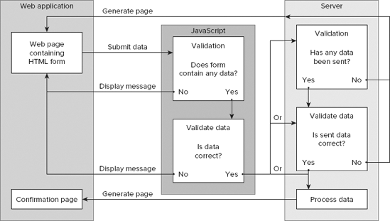
After passing all validation rules, the form data is sent to the server, where it is validated again. Server rules can be similar to the JavaScript rules from the previous example, but any security filtering should necessarily be repeated on the server side because JavaScript can be easily disabled. It is a good practice to always validate all submitted data on the server side, due to security reasons. JavaScript validation may still be performed as an auxiliary for user convenience and to reduce server workload.
So far, we have dealt with theory; now is the time to see how the validation is done in practice. We will focus on server-side validation provided by the three frameworks' core functionality.
In Chapter 4, the app was created using Doctrine and it automatically created forms by using a command-line interface (CLI) parameter: doctrine:build --all. Forms created that way have classes represented by validators and widgets. These classes provide a way to manage forms in an easy manner. Every field of a form has its own validator and widget.
While developing the first application, we used Doctrine and basic form validation rules were created. These rules can be found in the file /lib/form/doctrine/base/BaseAddressesForm.class.php.
In the following code, you can see the setup() function that calls two important methods: setWidgets() and setValidators().
<?php
abstract class BaseAddressesForm extends BaseFormDoctrine {
  public function setup() {
    $this->setWidgets(array(
'id' => new sfWidgetFormInputHidden(),
'first_name' => new sfWidgetFormInputText(),
'last_name' => new sfWidgetFormInputText(),
'email' => new sfWidgetFormInputText(),
'phone' => new sfWidgetFormInputText(),
'address' => new sfWidgetFormInputText(),
'created' => new sfWidgetFormDateTime(),
'updated' => new sfWidgetFormDateTime(),
));
$this->setValidators(array(
'id' => new sfValidatorDoctrineChoice(array(
'model' => $this->getModelName(),
'column' => 'id', 'required' => false)),
'first_name' => new sfValidatorString(array(
'max_length' => 40, 'required' => false)),
'last_name' => new sfValidatorString(array(
'max_length' => 40, 'required' => false)),
'email' => new sfValidatorString(array(
'max_length' => 40, 'required' => false)),
'phone' => new sfValidatorInteger(array('required' => false)),
'address' => new sfValidatorPass(array('required' => false)),
'created' => new sfValidatorDateTime(),
'updated' => new sfValidatorDateTime(), ));
$this->widgetSchema->setNameFormat('address[%s]');
$this->errorSchema = new sfValidatorErrorSchema($this->validatorSchema);
$this->setupInheritance();
parent::setup();
}
public function getModelName(){ return 'Addresses'; }
}?>
code snippet /validation/symfony/lib/form/doctrine/base/BaseAddressesForm.class.phpThose basic validation rules were generated according to the schema.yml file that was used to generate the first application project.
sfValidatorSchema is an array that holds the validators of the form. The setValidators() method is used to fill sfValidatorSchema with validation rules.
Symfony offers a wide range of available validators that can be defined in various ways. The setOption() and setMessage() methods can be used to customize validators.
$value = new sfValidatorString();
$value ->setOption('required', true);
$value ->setMessage('required', 'This value is required.');
It is possible to define more than one rule to a validator by using the setOptions() and setMessages() methods.
$name= new sfValidatorString();
$name->setOptions(array ('min_length' => 4, 'max_length' => 12));
$name->setMessages(array (
          'min_length' => 'Supplied name must be at least 4 characters long',
          'max_length' => 'Supplied name cannot be longer than 12 characters'));
The same validation rules can be defined like this:
$this->setValidators(array('name' => new sfValidatorString(
       array( 'min_length' => 4, 'max_length' => 12 ),
       array('min_length' => 'Supplied name must be at least 4 characters long',
             'max_length' => 'Supplied name cannot be longer than 12 characters'))
));
Let's look at a few of the most commonly used validators:
sfValidatorString— Used to validate a string. It converts the input value to a string.$value = new sfValidatorString(); $value ->setOption('required', true); $value ->setMessage('required', 'This value is required.');sfValidatorPass— Passes the value unmodified.$value= new sfValidatorPass();
sfValidatorInteger— Validates an integer value. It converts the input value to an integer value.$age => new sfValidatorInteger(array('min' => 0,'max' => 100,'required' => false));sfValidatorNumber— Used to validate a number (integer or float). It converts the input value to a float value.$percent = new sfValidatorNumber( array( 'min' => 0, 'max' => 99.99,), array('min' => 'Percentage must be grater than 0%', 'max' => 'Percentage cannot exceed 99.99%',));sfValidatorEmail— Used to validate e-mail format.$email = new sfValidatorEmail();
sfValidatorChoice— Used to check if the given value is one of the expected values.$fruit = new sfValidatorChoice(array('required' => false, 'choices' => array('banana', 'apple', 'pear')));sfValidatorTime— Used to validate time format. It converts the input value to a valid time format.$time = new sfValidatorTime();
sfValidatorDate— Used to validate a date format. It converts the input value to a valid date format.$value = new sfValidatorDate(array('with_time' => true));sfValidatorUrl— Used to verify whether a given value is a valid URL address. It has protocol options that allow specifying what protocols are allowed.$url = new sfValidatorUrl(array( 'protocols' => array('http', 'https', 'ftp', 'ftps')));sfValidatorRegex— Validates a value with a user-defined regular expression.$ip = new sfValidatorRegex(array( 'pattern' => '^[0-9]{3}\.[0-9]{3}\.[0-9]{2}\.[0-9]{3}$'));
Note
For full list of validators, please refer to the Symfony documentation.
Now modify your application so that the validation rules better match the purpose of the project, as shown in the following code. Set the required option of the first_name field to true so that it no longer will be possible to add empty entries. Next, create some messages to inform the user if the supplied values are incorrect. Finally, you should add an e-mail validation rule.
<?php
abstract class BaseAddressesForm extends BaseFormDoctrine {
  public function setup() {
    $this->setWidgets(array(
      'id'         => new sfWidgetFormInputHidden(),
      'first_name' => new sfWidgetFormInputText(),
      'last_name'  => new sfWidgetFormInputText(),
      'email'      => new sfWidgetFormInputText(),
      'phone'      => new sfWidgetFormInputText(),
      'address'    => new sfWidgetFormInputText(),
      'created'    => new sfWidgetFormDateTime(),
      'updated'    => new sfWidgetFormDateTime(),
    ));
    $this->setValidators(array(
      'id'         => new sfValidatorDoctrineChoice(array(
         'model' => $this->getModelName(),'column' => 'id','required' => false)),
      'first_name' => new sfValidatorString(
         array('max_length' => 25, 'required' => true),
         array ('max_length' => 'First name must be no longer than 25 characters',
                'required' => 'First name is required' ) ),
      'last_name' => new sfValidatorString(
         array( 'max_length' => 25, 'required' => false),
         array ('max_length' => 'Last name must be no longer than 25 characters')),
      'email'      => new sfValidatorEmail(array('required'=>false),
                      array('invalid'=>'Supplied email address email is invalid')),
      'phone'      => new sfValidatorInteger(array('required' => false)),
      'address'    => new sfValidatorPass(array('required' => false)),
      'created'    => new sfValidatorDateTime(),
      'updated'    => new sfValidatorDateTime(),
    ));
    $this->widgetSchema->setNameFormat('address[%s]');
    $this->errorSchema = new sfValidatorErrorSchema($this->validatorSchema);
    $this->setupInheritance();
    parent::setup();
  }
  public function getModelName(){ return 'Addresses'; }
}?>
code snippet /validation/symfony/lib/form/doctrine/base/BaseAddressesForm.class.php
In addition to the core validation helpers offered by Symfony, there are a few plug-ins available that offer additional validation options.
HTML5 is making its way into the web applications world quickly, so it is natural that web frameworks incorporate new features that are offered by it.
The sfHtml5FormPlugin supplies your application with an additional set of widgets and validators to be used with the new HTML5 input types.
To install the sfHtml5FormPlugin, you simply need to type following command into console from your project folder:
$ symfony plugin:install sfHtml5FormPlugin
To activate the newly installed plug-in, it is necessary to modify the /config/ProjectConfiguration.class.php file and add the following line:
$this->enablePlugins(array('sfHtml5FormPlugin'));The ProjectConfiguration.class.php file should now contain code that looks like this:
class ProjectConfiguration extends sfProjectConfiguration {
  public function setup() {
    $this->enablePlugins('sfDoctrinePlugin');
    $this->enablePlugins(array('sfHtml5FormPlugin'));
  }
}
As of this writing, the current version of the sfHtml5FormPlugin is version 0.49 and it provides validators such as sfValidator5Color, sfValidator5Date, sfValidator5DateTimeLocal, sfValidator5DateTime, sfValidator5Email, sfValidator5Month, and sfValidator5Time.
Another useful plug-in is sfJqueryFormValidationPlugin. As the name implies, it is a Symfony plug-in that introduces client-side forms validation that is performed using the jQuery library and the jQuery Validation plug-in. So how does it work? It creates JavaScript client-side validation rules and messages, according to validation rules and messages from the validation schema. This solution has a few features that are worth mentioning here. First, when an HTML page is generated, there is no need to generate additional JavaScript code because the validation is added using progressive-enhancement techniques. The second important feature is that there is no need to create new containers for client-side error messages; they are written using the same HTML elements as the server-side validation.
Installation of sfJqueryFormValidationPlugin requires modification of a few files located in the /config folder of Symfony installation.
First, it is necessary to include the jQuery library and the jQuery Validation plug-in into your site in view.yml. This can be done either by downloading them or by simply including them from their respective content delivery network (CDN), as shown here:
default:
    javascripts:
       [http://ajax.googleapis.com/ajax/libs/jquery/1.4/jquery.min.js,
       http://ajax.microsoft.com/ajax/jquery.validate/1.7/jquery.validate.min.js]
code snippet /validation/symfony/app/frontend/config/view.yml
To install the sfJqueryFormValidationPlugin, you can type the following command into the console from your project folder:
$ symfony plugin:install sfJqueryFormValidationPlugin
The filters.yml file should contain the following filter:
jquery_form_validation:
    class: sfJqueryFormValidationFilter
code snippet /validation/symfony/app/frontend/config/filters.yml
The next module should be enabled in your settings.yml by adding the following line:
all:
    .settings:
        enabled_modules: [default, sfJqueryFormVal]
code snippet /validation/symfony/app/frontend/config/settings.yml
Finally, the cache should be cleared by typing the following in the console:
$ symfony cc
There are some additional configuration options for this plug-in. For more information, please refer to the plug-in documentation.
Core validation rules that are offered by CakePHP make model data validation an easy task. These rules can automatically handle many often-used validation tasks that otherwise would need to be written manually. CakePHP is equipped with a powerful validation engine that allows a number of built-in rules such as e-mail address, postal number, IPv4, Social Security number, credit card numbers, and so on. You can also add your own validation rules that can be used the same way as built-in rules.
Previously, when the first application was created we created a model file. Basically, it was an empty class with no validation present at all.
In the following example, the same model file is expanded by a $validate array:
<?php
class Address extends AppModel {
  var $name = 'Address';
  var $validate = array( 'first_name' => 'notEmpty' );
} ?>
code snippet /validation/cakephp/app/models/address.php
The newly added $validate array tells CakePHP how data fields will be validated when values are sent and the save() method is called. The first rule introduced is very simple: It requires only that the first_name field should not be empty, but this rule will not generate any error message when that field is left empty. As well, no message will be generated when longer data is passed than the database can accept (VARCHAR(25)).
The key of the $validate array is the name of the form field, for which the validation rule is created, and it can take a single value or (more commonly) an array.
The following example illustrates the simplest method of defining a validation rule. The general syntax for defining rules in a model file looks like this:
var $validate = array('first_name' => 'alphaNumeric',
                      'last_name' => array('rule' => array('maxLength', 25)) );
The 'rule' key defines the validation method and takes either a single value or an array. An array is used when the rule requires some parameters as is illustrated by the rule created for the last_name field. The rule may be the name of a method added in your model file, a name of the core validation rule, or even a regular expression.
In this model, any data sent by a first_name field will be validated against the alphaNumeric rule, which means that the data must contain only letters and numbers. And a second rule restricts last_name to be no longer than 25 characters.
Probably the most commonly used validation rule is the email rule. It ensures that the user is providing a properly formatted e-mail address through the email field.
var $validate = array('email' => 'email');Creating validation rules in a model file allows us to define error messages that will be displayed when the data submitted does not match the defined rules. The following example uses the isUnique rule in conjunction with an error message to be displayed if the supplied phone number is not unique.
var $validate = array( 'phone' => array('rule' => 'isUnique',
                'message' => 'This phone number has already been saved.' ));
To verify data passed by a Checkbox field, a boolean rule can be applied that can be used as a protection against any code injection.
The data for the AgreeCheckbox field must be a boolean value. Values that are accepted are true or false, integers 0 or 1, or strings '0' or '1'.
var $validate = array( 'AgreeCheckbox' => array( 'rule' => 'boolean' ));
Next, rules ensure that data meets the minimum length and maximum length requirements.
var $validate = array('password' => array('rule' => array( 'minLength', 6),
             'message' => 'Password must be at least 6 characters long' )
                      'login' => array('rule' => array('maxLength', 16),
             'message' => 'Usernames must be no larger than 15 characters long.'));
Date format validation is done by using a date rule to ensure that submitted data has a valid format. By setting the value of a rule array, it is possible to specify which date format is considered valid. This value can be one of the following: dmy, mdy, ymd, dMy, Mdy, My, my. The following code demonstrates date validation:
var $validate = array('birth_date' => array( 'rule' => array( 'date', 'ymd' ),
                      'message' => 'Enter a date in YY-MM-DD format.',
                      'allowEmpty' => true ));
In a practical application of form validation, a single field may have multiple validation rules. Let's look at how these rules are defined in the model file:
<?php
class User extends AppModel {
  var $name = 'User';
  var $validate = array(
  'login' => array('login_1' => array('rule' => array('minLength', 6),
                   'message' => 'Login must be at least 6 chars long'),
                   'login_2' => array( 'rule' => array('isUnique'),
                   'message' => 'This login is already taken', 'last' => true) ),
  'email' => array('email_1' => array ( 'rule' => 'email',
                   'message' => 'Please enter valid email address'),
                   'email_2' => array ( 'rule' => array('isUnique'),
                   'message' => 'This email address was already used') ) );
} ?>
code snippet /validation/cakephp/app/models/user.php
A new validation parameter has been introduced here. Setting the last key as true will cause the validator to stop on the rule if it fails instead of continuing with the next rule. This can be used if you want validation to stop if a selected rule has failed.
Note
The examples shown so far are some of the most common validation rules that can be found in various online forms. (Of course, there are more validation options than have we presented here.) Other useful rule names include between, blank, cc (credit card), comparison, date, decimal, equalTo, extension, file, IP, money, multiple, inList, numeric, phone, postal, range, ssn, and url. For more examples, please refer to the CakePHP documentation.
In addition to already built-in validation rules, it is possible to create your own custom regular expression validation rules, simply by creating the desired regular expression and placing it into a validation rule according to following example:
var $validate = array( 'login' => array( 'rule' => '/^[a-z0-9]{3,}$/i',
    'message' => 'Only letters and integers, min 3 characters'
    ));
If none of the predefined rules meets our requirements, there is one more thing we can do about form validation in CakePHP. While using a model to apply validation rules, it is possible to add your own validation methods simply by creating them inside the model file. In a normal situation, while not using any web framework, it is necessary to write your own functions to validate form data. When writing a validation method in a model file, this situation is the same, but you keep all the validation in one file.
The following example indicates how this should be done:
<?php
class Item extends AppModel {
var $name = 'Item';
var $validate = array('field_value' => array('rule' => array('myValidation', 20),
'message' => 'Supplied value must be lower than 20',));
function myValidation($check, $limit) { return $check< $limit; }
} ?>The rule array takes the method name myValidation() as a key. That way, this method is called when validation is done. The myValidation() function takes two parameters: $check and $limit. The first one is a value posted through the form, and the second variable takes a value that is specified in a rule array (e.g., 20).
When you work with Zend Framework, you can use the Zend_Form object in order to create a web form. It is a more than adequate tool for most cases of form building and validation. It is possible to create single form elements while encapsulating it with options that allow you to configure validation, error messages, filtering (character escaping and data normalization), and rendering. For this section, we will focus on forms data-validation options, and later you will see how to customize forms some more.
In the previous chapter, we created this file to be responsible for generating an "Add a new entry" form in the address book application:
<?php
class Application_Form_AddressAdd extends Zend_Form {
    public function init() {
        $this->setMethod('post');
        $this->addElement('text', 'firstName', array('label' => 'Your first name:',
                          'required' => false, 'filters' => array('StringTrim'),));
        $this->addElement('text', 'lastName', array('label' => 'Your last name:',
                          'required' => false,'filters' => array('StringTrim'),));
        $this->addElement('text', 'email', array('label' => 'Your e-mail address:',
                          'required' => false,'filters' => array('StringTrim'),));
        $this->addElement('text', 'phone', array('label' => 'Your phone:',
                          'required' => false, 'filters' => array('StringTrim'),));
        $this->addElement('textarea', 'address', array('label' => 'Your Address:',
                          'required' => false, 'filters' => array('StringTrim'),));
        $this->addElement('submit', 'submit', array('ignore' => true,
                          'label' => 'Save',)); }
} ?>
code snippet /validation/zf/application/forms/AddressAdd.php
The addElement() method of the Zend_Form object is responsible for creating form elements, and it can take parameters that will create field validators. Let's see the simplest method of defining a validation rule for the preceding code:
$this->addElement('text', 'firstName', array( 'validators' => array('alnum'),
                  'label' => 'Your first name:', 'required' => false,
                  'filters' => array('StringTrim'), ));
By adding the 'validators' key, it is possible to include various validation parameters. Here we used the 'alnum' option. It verifies if any data sent through the firstName field is alphanumeric (letters and numbers) type. If any special characters are passed, an automatic error message will be generated and displayed. As you can see, the addElement() method received the 'required' and 'filters' keys. The first one can be used in validation to specify whether a field can be empty or not; this actually creates a 'NotEmpty' validator that will be the first one validating a field to ensure that the verified element has a value when required. And by setting 'filters' you can filter certain form data before it will be validated. For example, it is possible to strip all HTML and PHP tags from form input simply by using the following:
'filters' => array('StripTags')For more information about using filters, refer to the Zend Framework documentation.
The Zend_Validate module provides a set of commonly used validators. It also provides a simple validator mechanism that allows chaining multiple validators to be applied on data in a user defined order.
It is possible to specify multiple validation rules by adding them as values in the validators array.
$this->addElement('text', 'firstName', array(
    'validators' => array( array('stringLength', true, array(5, 15)), 'alnum'),
));
Validators created in this example ensure that the data provided is alphanumeric and 5 to 15 characters long. The first validator is stringLength and in this case it is configured by a true/false parameter and the array. The second parameter of the validation array is set to true and it means that the validation chain will be broken when the rule is not met, which means no following validation rules will be applied. The third parameter is an array that allows us to define the range in which the firstName value must be contained.
Now let's see how to validate the format of an e-mail address. Of course, there is a validator for that as well.
$this->addElement('text', 'email', array(
     'validators' => array( array('EmailAddress', false, array('domain' => true)))
));
If more complex validation options are required, the EmailAddress validator can be configured through various parameters that can regard domain, hostname, and local names. But for a basic and the most common application, this example should be adequate. As before, we use three parameters to create the validator. The third one allows us to decide if we want to validate the domain or not; by setting it to false, we tell the validator to ignore the domain part of an e-mail address.
Zend_Validate is automatically equipped with a broad range of error messages, but if there is a need to customize any of these messages, it is possible to do so by adding another parameter to the validation array. In the following example, the 'messages' key is added, and an array is created that defines two error messages:
$this->addElement('text', 'email', array(
    'validators' => array( array('EmailAddress', false,
                                 array('domain' => true, 'messages' =>array(
    Zend_Validate_EmailAddress::INVALID => 'Please enter a valid email address',
    Zend_Validate_EmailAddress::INVALID_FORMAT => 'Invalid email format' )))
));
To modify a desired message, it is necessary to know its error code. These codes can be found in the Zend Framework documentation.
Basic date format validation can be as simple as this:
$this->addElement('text', 'productionDate', array(
    'validators' => array(array('Date', false,array('YYYY-MM-dd HH:mm')))
));
But there is a whole Zend_Date API to give developers maximum control over things that can be done with dates. As in previous examples in this chapter, the validator array contains a third parameter that is an array of options. In this case, it defines an acceptable date format.
Zend Framework gives you quite a few ways to do the same thing, and you can do things according to your liking or habit. So let's look at how validators can be created by calling the addValidators() method:
$form = new Zend_Form;
$form->addElement('text', 'firstName');
$firstName->addValidators(array( array('NotEmpty', true), array('alnum'),
    array('stringLength', false, array(5, 15)), ));
A more verbose version of the same code can look like this:
$form = new Zend_Form;
$form->addElement('text', 'firstName');
$firstName->addValidators(array(
    array('validator' => 'NotEmpty','breakChainOnFailure' => true),
    array('validator' => 'alnum'),
array('validator' => 'stringLength', 'options' => array(5, 15)), ));Building validated forms manually can take quite a long time. To build a functional form with form data validation, it is necessary to enter the same values in multiple places, like in the view, the field's error messages, and the field itself. Most of this is done automatically by frameworks, giving developers tools to easily build custom forms.
A common form can contain various input elements such as text fields, checkboxes, select lists, textareas, labels, and so on. In Chapter 4, we have created basic forms, by using tools offered by frameworks. Excluding Zend Framework, we didn't have much influence on how the forms were built and how will the final result looked. It is time to change that.
You will modify forms generated for your first application. We will show you how to change labels, replace input fields, and modify their functionalities. To do that, you will use built-in core helpers and some external plug-ins.
As discussed in the validation part of this chapter, Symfony offers a wide range of validators and widgets that give you all sorts of possibilities for building your forms. There are two main classes that you will use when building forms: sfForm and sfWidget. These classes are the root classes, and every other form or widget inherits from one of them. Widgets are a type of add-on that allows you to add content to your form, such as input fields, for example. You can define your own widget that can be a customized input field not commonly used anywhere else. You can add proper widgets that are delivered within a framework by using the setup() method. Note that there are two main types of forms. The first are defined by developers; the second are generated by object-relational mapping (ORM). In this case, it's Doctrine. When you use the following command:
$ symfony doctrine:build --all
or
$ symfony doctrine:build-forms
forms will be generated by Doctrine for each model that you defined earlier. This can be very useful, especially when building the back end. These forms are stored in the project's /lib/form directory. The second directory is the application's /lib directory, in which you will store all defined forms. Doctrine also generated BaseForm classes that inherit from sfForm. These BaseForm classes are stored in the /lib/form/doctrine/base directory. An exemplary file can contain the following lines:
abstract class BaseAddressesForm extends BaseFormDoctrine {
    public function setup() {
    }
}
While not using Doctrine to build your application, you would usually have an exemplary AddressesForm.class.php in a /lib/form directory that should contain the following class:
class BaseAddressesForm extends BaseForm {
    public function setup() { }
}
Let's look at the setup() function that was built by Doctrine when first project was created in the previous chapter.
public function setup() {
  $this->setWidgets(array(
    'id'         => new sfWidgetFormInputHidden(),
    'first_name' => new sfWidgetFormInputText(),
    'last_name'  => new sfWidgetFormInputText(),
    'email'      => new sfWidgetFormInputText(),
    'phone'      => new sfWidgetFormInputText(),
    'address'    => new sfWidgetFormInputText(),
    'created'    => new sfWidgetFormDateTime(),
    'updated'    => new sfWidgetFormDateTime(), ));
  $this->setValidators(array(
    'id' => new sfValidatorDoctrineChoice(array('model' => $this->getModelName(),
                    'column' => 'id','required' => false)),
    'first_name' => new sfValidatorString(array(
                        'max_length' => 40, 'required' => false)),
    'last_name'  => new sfValidatorString(array(
                        'max_length' => 40, 'required' => false)),
    'email'      => new sfValidatorString(array(
                        'max_length' => 40, 'required' => false)),
    'phone'      => new sfValidatorInteger(array('required' => false)),
'description' => new sfValidatorPass(array('required' => false)),
'created' => new sfValidatorDateTime(),
'updated' => new sfValidatorDateTime(), ));
$this->widgetSchema->setNameFormat('address[%s]');}There are a few widgets in there that correspond to fields in a database. Those widgets were created to match field types in the database and are as simple as possible. This solution worked earlier; we wanted to see how quickly we could create a project, so we didn't interfere with the forms because they were doing their task. The fragment of HTML code responsible for displaying form fields generated by this script looks like this:
<tr><th><label for="address_first_name">First name</label></th>
<td><input type="text" name="address[first_name]" id="address_first_name" />
</td></tr>
<tr><th><label for="address_last_name">Last name</label></th>
<td><input type="text" name="address[last_name]" id="address_last_name" />
</td></tr>
<tr><th><label for="address_email">Email</label></th>
<td><input type="text" name="address[email]" id="address_email" />
</td></tr>
<tr><th><label for="address_phone">Phone</label></th>
<td><input type="text" name="address[phone]" id="address_phone" />
</td></tr>
<tr><th><label for="address_description">Description</label></th>
<td><input type="text" name="address[description]" id="address_description" />
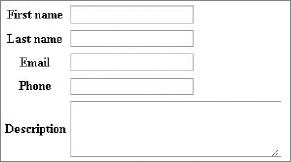
</td></tr>Figure 5-3 illustrates how input fields for the preceding code should look in a browser.
Now we want to know how customize or build these forms ourselves, so let's consider this simple example:
public function setup() {
    $this->setWidgets(array('id'          => new sfWidgetFormInputHidden(),
                            'first_name'  => new sfWidgetFormInputText(),
                            'description' => new sfWidgetFormTextarea(),));
    $this->widgetSchema->setNameFormat('address[%s]');}
The setup() function calls for the setWidgets() method that is used to define widgets that will be used to create form elements. This method accepts an associative array. Field names are accepted as the keys; as the values, the widget objects are given. The last line invokes the setNameFormat('%s') method that sets the naming convention for the name and ID attributes of HTML tags that will be form fields. For example, the name attribute of first_name input will look like this:
<input type="text" name="address[first_name]" />
Let's move on to field creation. In this example, three types of widgets are used.
The first one is sfWidgetFormInputHidden() and it corresponds to a hidden HTML field. The id field is the unique ID of the entry and this shouldn't be viewable to the user. When generated the field will look like this:
<input type="hidden" name="address[id]" id="address_id" />
Next there is a sfWidgetFormInputText() widget that will generate standard a HTML field as follows:
<tr><th><label for="address_first_name">First name</label></th>
    <td><input type="text" name="address[first_name]" id="address_first_name" />
</td></tr>
The last widget in this example is sfWidgetFormTextarea(). It is responsible for creating HTML textarea form fields that look like this:
<tr><th><label for="address_description">Description</label></th>
    <td><textarea rows="4" cols="30"name="address[description]"
                  id="address_description"></textarea> </td></tr>
Of course, every widget can take a number of parameters that will allow us to customize generated HTML code and the behavior of created form fields.
While the automatic generation of labels is very useful, the framework allows you to define personalized labels for multiple fields using the setLabels() method.
$this->widgetSchema->setLabels(array('name' => 'Your name',
'email' => 'Your email address','message' => 'Your message',));
You can also only modify a single label using the setLabel() method:
$this->widgetSchema->setLabel('email', 'Your email address');There is another way to customize HTML code generated by widgets and it enables us to pass multiple parameters to specify functionality and attributes of form fields.
$this->setWidgets(array(
    'first_name' => new sfWidgetFormInputText(
            array('label' => 'Different label'), array('class' => 'fname'))));
As illustrated in the previous example, the widget sfWidgetFormInputText() is used, and three arrays are given. These parameters affect how the HTML code will be generated:
<tr><th><label for="first_name">Different label</label></th>
<td><input class="fname" type="text" name="first_name" id="first_name" /></td></tr>
We can see that the class argument of the input tag is the same as the class parameter supplied for sfWidgetFormInputText().
Now let's look at another example of form code that can be used as a simple mailing form.
public function setup() {
  $this->setWidgets(array(
    'name'    => new sfWidgetFormInput(array('label' => 'Name')),
'email' => new sfWidgetFormInput(array('label' => 'Email')),
'subject' => new sfWidgetFormSelect(array(
'label' => 'Select subject',
'choices' => array('Item 1', 'Item 2', 'Item 3'))),
'message' => new sfWidgetFormTextarea(array('label' => 'Message')),
));
$this->widgetSchema->setNameFormat('contact[%s]');
}One new thing about this example is the sfWidgetFormSelect() widget. It is responsible for creating the select HTML tag.
Figure 5-4 illustrates how the mailing form should look in a web browser.
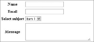
The widget sfWidgetFormSelect() is an array of selectable items, so it requires parameter choices to be defined. As a result of using this widget, the following HTML code is created:
<tr><th><label for="address_created">Select subject </label></th>
    <td><select name="contact[subject]" id="contact_subject">
             <option value="A">Subject A</option>
             <option value="B">Subject B</option>
<option value="C">Subject C</option></select></td></tr>Symfony has a large variety of widgets that can be used to build complex forms for web applications. The following list presents selected widgets with code implementation. It illustrates the range of available options. Those that can be found in most common web forms and are simplest to implement are the following:
The following code is an example of how to use these widgets in your form class:
$this->setWidgets(array(
    'first_name'    => new sfWidgetFormInputText(array('label' => 'Name')),
    'pass'          => new sfWidgetFormInputPassword (array('label' => 'Password')),
'agreement' => new sfWidgetFormInputCheckbox(array('label' => 'I agree')),
'description' => new sfWidgetFormTextarea (array('label' => 'Description')),
'file' => new sfWidgetFormInputFile(array('label' => 'Upload file:')),
));
code snippet /customization/symfony/apps/frontend/lib/form/ExampleForm.class.phpAnd to make sure that all these widgets will display correctly, your template should contain code similar to the following:
<tr><th><?php echo $form['first_name']->renderLabel() ?></th>
    <td><?php echo $form['first_name']->renderError() ?>
        <?php echo $form['first_name'] ?></td></tr>
<tr><th><?php echo $form['pass']->renderLabel() ?></th>
    <td><?php echo $form['pass']->renderError() ?>
        <?php echo $form['pass'] ?> </td></tr>
<tr><th><?php echo $form['agreement']->renderLabel() ?></th>
    <td><?php echo $form['agreement']->renderError() ?>
        <?php echo $form['agreement'] ?></td></tr>
<tr><th><?php echo $form['description']->renderLabel() ?></th>
    <td><?php echo $form['description']->renderError() ?>
        <?php echo $form['description']?> </td></tr>
<tr><th><?php echo $form['file']->renderLabel() ?></th>
    <td><?php echo $form['file']->renderError() ?>
         <?php echo $form['file'] ?></td></tr>
code snippet /customization/symfony/apps/frontend/modules/exampleForm/templates/_form.php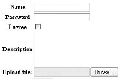
The image shown in Figure 5-5 should be rendered in the browser.
Next you can see an interesting widget because it can work four different ways, depending on how you set the 'expanded' and 'multiple' parameters for this widget. You will see how to implement and how to configure each option separately. Implementation is straightforward, and it is done in the same way as previous examples.
sfWidgetFormChoice — this widget can represent HTML select tag, checkbox, radiobutton, and list input types. The first configuration works like the select tag and toggled by setting the expanded and multiple parameters to false. The output is shown in the Figure 5-6.
sfWidgetFormChoice(array('label' => 'Select item',
    'expanded' => false, 'multiple' => false,
    'choices' => array('1' =>'item 1', '2'=>'item 2')))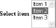
The second configuration shown in Figure 5-7 represents a selection from an expanded list, and it is achieved by setting the multiple parameter to true. This form element allows multiple item selection by holding down the Ctrl or Shift key while clicking the item selected. Item 2 was selected manually in this figure.
sfWidgetFormChoice(array('label' => 'Select item',
      'expanded' => false, 'multiple' => true,
      'choices'  => array('Item 1', 'Item 2', 'Item 3')))
The next configuration represents a radiobutton select input (see Figure 5-8), which is done by setting the expanded parameter to true.
sfWidgetFormChoice(array('label' => 'Select item',
      'expanded' => true, 'multiple' => false,
      'choices'  => array('Item 1', 'Item 2', 'Item 3')))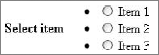
Finally when both parameters are set to true, multiple checkboxes are displayed, as shown in Figure 5-9. Items 1 and 3 were selected manually.
sfWidgetFormChoice(array('label' => 'Select items',
    'expanded' => true, 'multiple' => true,
    'choices'  => array('Item 1', 'Item 2', 'Item 3')))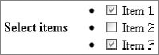
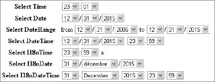
Symfony offers a number of widgets that generate date-time form inputs. Next, you will see how seven of them can be implemented in your form. First you should become familiar with the four most common date-time widgets:
The next widgets presented are those designed to help with internationalization of the forms. They include a list of months and days translated to multiple languages that can be specified by setting the culture parameter.
sfWidgetFormI18nTime— Represents a time selection input that is very similar to thesfWidgetFormTimewidget in terms of HTML generation.sfWidgetFormI18nDate— Represents a date selection input that can be customized in terms of language.sfWidgetFormI18nDateTime— Represents a date and time selection input that can be customized in terms of language.
The following code illustrates how each of above widgets can be configured for your form. Note that by setting the culture parameter in the last three widgets you can specify in which language months are written.
$this->setWidgets(array(
    'Time'          => new sfWidgetFormTime (array(
                        'label' => 'Select Time')),
    'Date'          => new sfWidgetFormDate(array(
                        'label' => 'Select Date')),
    'DateRange'     => new sfWidgetFormDateRange(array(
                        'from_date' => new sfWidgetFormDate(),
                        'to_date'   => new sfWidgetFormDate(),
                        'label' => 'Select DateRange' )),
    'DateTime'      => new sfWidgetFormDateTime(array(
                        'label' => 'Select DateTime')),
    'I18nTime'      => new sfWidgetFormI18nTime (array(
                        'label' => 'Select I18nTime',
                        'culture' => 'en')),
    'I18nDate'      => new sfWidgetFormI18nDate(array(
                        'label' => 'Select I18nDate',
                        'culture' => 'fr')),
    'I18nDateTime'  => new sfWidgetFormI18nDateTime(array(
                        'label' => 'Select I18nDateTime',
                        'culture' => 'de')),
));
code snippet /customization/symfony/apps/frontend/lib/form/I18NForm.class.php
To make sure that all widgets are rendered in your form, you need to have in your form template a code similar to the one shown here:
<tr><th><?php echo $form['Time']->renderLabel() ?></th>
    <td><?php echo $form['Time']->renderError() ?>
        <?php echo $form['Time'] ?></td></tr>
<tr><th><?php echo $form['Date']->renderLabel() ?></th>
    <td><?php echo $form['Date']->renderError() ?>
        <?php echo $form['Date'] ?></td></tr>
<tr><th><?php echo $form['DateRange']->renderLabel() ?></th>
    <td><?php echo $form['DateRange']->renderError() ?>
        <?php echo $form['DateRange'] ?></td></tr>
<tr><th><?php echo $form['DateTime']->renderLabel() ?></th>
    <td><?php echo $form['DateTime']->renderError() ?>
        <?php echo $form['DateTime'] ?></td></tr>
<tr><th><?php echo $form['I18nTime']->renderLabel() ?></th>
    <td><?php echo $form['I18nTime']->renderError() ?>
<?php echo $form['I18nTime'] ?></td></tr>
<tr><th><?php echo $form['I18nDate']->renderLabel() ?></th>
<td><?php echo $form['I18nDate']->renderError() ?>
<?php echo $form['I18nDate'] ?></td></tr>
<tr><th><?php echo $form['I18nDateTime']->renderLabel() ?></th>
<td><?php echo $form['I18nDateTime']->renderError() ?>
<?php echo $form['I18nDateTime'] ?></td></tr>
code snippet /customization/symfony/apps/frontend/modules/i18nForm/templates/_form.phpWhen you run the preceding code, your browser will render the form illustrated in Figure 5-10.
Finally, you can use a few more widgets that help with internationalization of your forms, three of which are listed here:
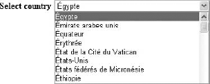
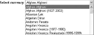
sfWidgetFormI18nChoiceCountry— Represents a country HTML select tag that can be customized in terms of language (see Figure 5-11).sfWidgetFormI18nChoiceCountry(array('label' => 'Select country','culture' => 'fr'))sfWidgetFormI18nChoiceCurrency— Represents a currency HTML select tag that can be customized in terms of language (see Figure 5-12).sfWidgetFormI18nChoiceCurrency( array('label' => 'Select currency', 'culture' => 'en'))sfWidgetFormI18nChoiceLanguage— Represents a language HTML select tag that can be customized in terms of language (see Figure 5-13).sfWidgetFormI18nChoiceLanguage (array('label' => 'Select language', 'culture' => 'en'))For a full list of widgets and more specific examples, please refer to the Symfony documentation.
It is possible to introduce even more customization options in Symfony forms by using plug-ins. This section looks at two plug-ins that extend the possibilities of automated form building.
This plug-in is a collection of very specific validators, widgets, and forms that extend the main Symfony package. Those components have some external dependencies.
To install the sfFormExtraPlugin, you simply need to type the following command into console from your project directory:
$ symfony plugin:install sfFormExtraPlugin
Next you may clear cache data by typing the following command into the console:
$ symfony cache:clear
This command will make available a new set of widgets to be used in our project. Those components may depend on the jQuery library to be displayed. Some of these widgets are as follows:
sfWidgetFormJQueryDate— Displays a date picker using jQuery.sfWidgetFormJQueryAutocompleter— Displays an input tag with auto complete support using jQuery.sfWidgetFormTextareaTinyMCE— A rich textarea rendered with TinyMCE WYSIWYG editor.sfWidgetFormSelectUSState— Creates a select menu of U.S. states.
To use jQuery-based widgets it is necessary to include into the project a jQuery UI package that will contain the jquery-1.4.2.min.js and jquery-ui-1.8.2.custom.min.js libraries and a graphic theme that consists of the jquery-ui-1.8.2.custom.css style sheet and images. You can get it at http://jqueryui.com/.
To make it all come together, it is necessary to put jQuery libraries into the /symfony/web/js/ directory and the theme folder into /symfony/web/css/.
Finally the /symfony/apps/frontend/config/view.yml file needs to be modified, so that it includes jQuery libraries:
javascripts: [jquery-1.4.2.min.js, jquery-ui-1.8.2.custom.min.js]
And the style sheet needs to be included as well using the path to the theme.
stylesheets: [main.css, [theme name]/jquery-ui-1.8.2.custom.css]After these changes are made, clearing the cache may be required. Again it can be done by typing symfony cache:clear into the command console.
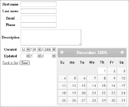
Let's now see how to use the sfWidgetFormJQueryDate() widget to give the user an option to pick a date from a jQuery calendar. To see how it is done, we can modify the earlier example simply by changing sfWidgetFormDateTime() to sfWidgetFormJQueryDate().
public function setup() {
  $this->setWidgets(array(
    'id'         => new sfWidgetFormInputHidden(),
    'first_name' => new sfWidgetFormInputText(),
    'last_name'  => new sfWidgetFormInputText(),
    'email'      => new sfWidgetFormInputText(),
    'phone'      => new sfWidgetFormInputText(),
    'address'    => new sfWidgetFormInputText(),
    'created'    => new sfWidgetFormJQueryDate( array('config' => '{}') ),
    'updated'    => new sfWidgetFormDateTime(), ));
As a result, you should see a new form in the web browser, as shown in Figure 5-14.
For data validation, CakePHP has FormHelper, which offers many useful automatic functions; the most common will be described here.
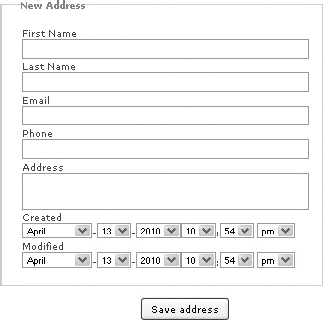
While writing the add new address action in Chapter 4, you used the following code:
<?php
    echo $form->create('Address');
    echo $form->inputs();
    echo $form->end('Save address');
?>
code snippet /customization/cakephp/views/addresses/add.ctp
This solution is quick and good for creating backend applications that give you full access to information stored in a database. For example, information such as the date when an entry was created should not be available for modifications. As a result of those three lines, the following HTML code is generated. Note that date selection lists have been removed to improve code readability.
<form id="AddressAddForm" method="post" action="/cake/addresses/add">
<fieldset style="display:none;">
    <input type="hidden" name="_method" value="POST" />
</fieldset>
<fieldset>
    <legend>New Address</legend>
    <input type="hidden" name="data[Address][id]" value="" id="AddressId" />
<div class="input text required">
    <label for="AddressFirstName">First Name</label>
    <input name="data[Address][first_name]"
           type="text" maxlength="25"
           value=""
           id="AddressFirstName" />
</div>
<div class="input text">
    <label for="AddressLastName">Last Name</label>
    <input name="data[Address][last_name]"
           type="text"
           maxlength="25"
           value=""
           id="AddressLastName" />
</div>
<div class="input text">
    <label for="AddressEmail">Email</label>
    <input name="data[Address][email]"
           type="text"
           maxlength="25"
           value=""
           id="AddressEmail" />
</div>
<div class="input text">
    <label for="AddressPhone">Phone</label>
    <input name="data[Address][phone]"
           type="text"
maxlength="11"
value=""
id="AddressPhone" />
</div>
<div class="input textarea">
<label for="AddressAddress">Address</label>
<textarea name="data[Address][address]"
cols="30"
rows="6"
id="AddressAddress" >
</textarea>
</div>
<select>
// select form goes here
</select>
</fieldset>
<div class="submit">
<input type="submit" value="Save address" />
</div>
</form>The form rendered by the browser will have the same input composition as the one shown in Figure 5-15.
Now you will see how to build your own custom form input using the input() method of the FormHelper. The following code example invokes the input() method a number of times to create a web form that is identical to the one generated by the previous solution:
<?php echo $form->create('Address', array('type' => 'post', 'action' => 'add'));
echo '<fieldset><legend>New Address</legend>';
echo $form->input( 'first_name' ).
        $form->input( 'last_name' ).
        $form->input( 'email' ).
$form->input( 'phone' ).
$form->input( 'address', array('rows' => '5', 'cols' => '5')).
$form->input( 'created' ).
$form->input( 'modified' );
echo'</fieldset>';
echo $form->end( 'Save address' ); ?>
code snippet /customization/cakephp/views/addresses/add.ctpIn this example of using the input() method, the form fields are generated according to specifications defined in the corresponding model file. It is possible to override model information and force certain input types. To do so, you need to define some additional parameters that are passed into this input() method. The following example illustrates how: By adding the 'type' parameter to the option array you can customize rendered form input. You can force normal text input to be rendered as password type form input. The implementation is shown here:
<?php
    echo $form->input('first_name');
    // input based on model data
    echo $form->input('first_name', array('type' => 'password'));
    // input with modified type field
?>
The following HTML code snippet illustrates how the <input> tag is modified when the 'type' parameter is set:
<div class="input text required">
    <label for="AddressFirstName">First Name</label>
    <input name="data[Address][first_name]"
           type="text" maxlength="25" value="" id="AddressFirstName" /></div>
<div class="input password required">
    <label for="AddressFirstName">First Name</label>
    <input name="data[Address][first_name]"
type="password" value="" id="AddressFirstName" /></div>The form generated using $form->input() function has some additional HTML code added to every form field. This includes putting elements into a <div> tag or adding labels to a created field. This can be modified to better match your preferences using an options array that is passed into the input() method.
For example, it is possible to modify label text assigned to a field simply by setting the 'label' option:
<?php echo $form->input('last_name',
           array('label' => array('text' => 'Label text'))); ?>
The same way can be used to disable label generation. It is done by setting the 'label' option to false, just like this:
<?php echo $form->input('last_name', array('label' => false)); ?>Similarly, we can disable the <div></div> tags that surround a form field or set a class name to a field:
<?php echo $form->input('last_name',
           array('div' => false, 'class'=>'last_name_class')); ?>
It is possible to add a class name to a <div> containing form field by setting an option array as shown here:
<?php echo $form->input('last_name',
           array('div' => array('class'=>'div_class'))); ?>
There are a few more options that will be shown here. First there are options that can be used to define the number of <textarea> field rows and columns, and they work like this:
<?php echo $form->input('address', array('rows' => '5', 'cols' => '5')); ?>The next thing that FormHelper allows you to do is to generate complex <select> inputs in very simple way. Suppose you want to add a group option to your address book in order to classify entries to groups such as Family, Friends, Client, or Co-worker. You need to add a new field to your database and you can use the following code to create the <select> field:
<?php echo $form->input('group', array( 'options' => array(
          'Work' => array('Value 1'=>'Client', 'Value 2'=>'Coworker' ),
          'Private' => array( 'Value 3'=>'Family', 'Value 4'=>'Friends' ))
));?>
Finally, let's look at how to customize the date field. It is possible to set the time and date format. For time, there are two formats: '12' and '24'; for date, it is possible to set it to 'DMY', 'MDY', 'YMD', and 'NONE'. The 'minYear' and 'maxYear' options are self-explanatory.
<?php echo $form->input('created',
                        array( 'timeFormat'=>'24', 'dateFormat' => 'MDY',
                        'minYear' => date('Y') - 20, 'maxYear' => date('Y') )); ?>
CakePHP FormHelper allows developers to create a large variety of different form inputs that are created using the input() method. A list of a few selected form elements is presented here:
file— Represents file selection input.checkbox— Represents standard checkbox input.gender— Represents gender selection input.dateTime— Represents a date-time selection input.
The implementation code for the previous input types can look as follows:
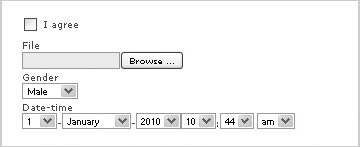
echo $form->create('Address', array( 'enctype' => 'multipart/form-data',
                                     'type' => 'post', 'action' => 'add'));
echo '<fieldset>';
echo $form->input('file', array( 'type' => 'file'));
echo $form->input('Agreement', array('type'=>'checkbox','label' => 'I agree'));
echo $form->input('gender', array('type' => 'select',
                            'options' => array('M' => 'Male','F' => 'Female')));
echo $form->input('dateTime', array('type' => 'datetime', 'label' => 'Date-time',
                  'minYear' => date('Y') - 5, 'maxYear' => date('Y'),
                  'dateFormat' => 'DMY', 'timeFormat' => '12' ));
echo'</fieldset>';
echo $form->end('Save address'); ?>
You can see that the input types utilize a set of options that are used for configuration. On form submission, most input fields send their value, but in the case of file input, an array is given. It contains the following:
name— Name of a submitted file.type— File extension and type (e.g.,'application/pdf').tmp_name— Temporary patch filename for uploaded file.error— Variable that returns0if upload is successful.size— Uploaded file size in bytes.
Note that the array is generated by PHP.
As a result of running the preceding script, the following HTML form is generated:
<form enctype="multipart/form-data" id="AddressAddForm" method="post"
  action="/cake/addresses/add">
<fieldset style="display:none;">
  <input type="hidden" name="_method" value="POST" />
</fieldset>
<fieldset>
<div class="input checkbox">
  <input type="hidden" name="data[Address][Agreement]" id="AddressAgreement_"
  value="0" />
  <input type="checkbox" name="data[Address][Agreement]" value="1"
  id="AddressAgreement" />
  <label for="AddressAgreement">I agree</label>
</div>
<div class="input file">
  <label for="AddressFile">File</label>
  <input type="file" name="data[Address][file]" value="" id="AddressFile" />
</div>
<div class="input select">
  <label for="AddressGender">Gender</label>
  <select name="data[Address][gender]" id="AddressGender">
    <option value="M">Male</option>
    <option value="F">Female</option>
  </select>
</div>
<div class="input datetime">
<label for="AddressDateTimeMonth">Date-time</label>
  <select name="data[Address][dateTime][day]" id="AddressDateTimeDay">
    <option value="01">1</option>
    <option value="02">2</option>
    ...
  </select>-<select name="data[Address][dateTime][month]"
  id="AddressDateTimeMonth">
    <option value="01">January</option>
    <option value="02">February</option>
    ...
  </select>-<select name="data[Address][dateTime][year]" id="AddressDateTimeYear">
    <option value="2010" selected="selected">2010</option>
    <option value="2009">2009</option>
...
</select><select name="data[Address][dateTime][hour]" id="AddressDateTimeHour">
...
</select>:<select name="data[Address][dateTime][min]" id="AddressDateTimeMin">
...
</select> <select name="data[Address][dateTime][meridian]"
id="AddressDateTimeMeridian">
<option value="am">am</option>
<option value="pm" selected="selected">pm</option>
</select>
</div>
</fieldset>
<div class="submit">
<input type="submit" value="Save address" />
</div>
</form>This example will render the web form illustrated in Figure 5-16.
Of course, this is not all in terms of forms customization that CakePHP can offer. For a full list of options, please refer to the FormHelper section in the CakePHP documentation.
As you saw in the preceding section, "How Does Form Validation work?" Zend Framework allows you to easily create form validation rules, and customization is done in a similar manner. The Zend_Form_Element module corresponds to a single HTML form input (e.g., text field, textarea, and so on). Such elements are used to create a web form. And to make it easier, Zend Framework is equipped with element classes that encapsulate most of the HTML form input types.
It is possible to further influence HTML code generated by utilizing decorators to modify elements of a form. These decorators have access to the elements and the methods of the web content being generated.
Let's look at the init() function that was built while creating the first project in the previous chapter.
class Application_Form_AddressAdd extends Zend_Form {
    public function init() {
      $this->setMethod('post');
      $this->addElement('text', 'firstName', array(
'label' => 'Your first name:',
'required' => true,
'filters' => array('StringTrim'),
)
);
$this->addElement('text', 'lastName', array(
'label' => 'Your last name:',
'required' => false,
'filters' => array('StringTrim'),
)
);
$this->addElement('text', 'email', array(
'label' => 'Your e-mail address:',
'required' => false,
'filters' => array('StringTrim'),
)
);
$this->addElement('text', 'phone', array(
'label' => 'Your phone:',
'required' => false,
'filters' => array('StringTrim'),
)
);
$this->addElement('textarea', 'address', array(
'label' => 'Your address:',
'required' => false,
'filters' => array('StringTrim'),
)
);
$this->addElement('submit', 'submit', array(
'ignore' => true,
'label' => 'Save'
));
}
}
code snippet /customization/zf/application/forms/AddressAdd.phpYou can see that there are a few addElement() methods in this file, and every addElement() method corresponds to a field in your form. Those elements take a list of parameters that allow you to create field types matching those of database fields.
The following HTML code fragment is a result of execution of the script above. It is responsible for displaying a form in a web browser.
<form enctype="application/x-www-form-urlencoded" method="post" action="">
<dl class="zend_form">
    <dt id="firstName-label">
        <label for="firstName" class="required">Your first name:</label>
    </dt><dd id="firstName-element">
        <input type="text" name="firstName" id="firstName" value="">
    </dd><dt id="lastName-label">
<label for="lastName" class="optional">Your last name:</label>
</dt><dd id="lastName-element">
<input type="text" name="lastName" id="lastName" value="">
</dd><dt id="email-label">
<label for="email" class="optional">Your e-mail address:</label>
</dt><dd id="email-element">
<input type="text" name="email" id="email" value="">
</dd><dt id="phone-label">
<label for="phone" class="optional">Your phone:</label>
</dt><dd id="phone-element">
<input type="text" name="phone" id="phone" value="">
</dd><dt id="address-label">
<label for="address" class="optional">Your address:</label>
</dt><dd id="address-element">
<textarea name="address" id="address" rows="24" cols="80"></textarea>
</dd>
<dt id="submit-label"> </dt>
<dd id="submit-element">
<input type="submit" name="submit" id="submit" value="Save"></dd>
</dl>
</form>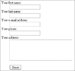
You can see in Figure 5-17 how input fields for the preceding HTML code should look in a browser. Note that the textarea field can be made larger using CSS styles.
Now you are familiar with how forms are generated step by step, it is time to move on to customization of form elements.
Zend_Form provides several accessories for adding and removing form elements.
The most basic way to add an element to your form is to use the addElement() method. This method can take either an object of a class extending Zend_Form_Element or a list of arguments that specify addElement() behavior. These include element type, field name, and number of configuration options.
Because there is a choice of how to add a new form element, we will present two possibilities here. The first one looks as follows:
$element = new Zend_Form_Element_Text('fieldName');
$form->addElement($element);
You can see that a Zend_Form_Element_Text object is created with a 'fieldName' value. This value is the name of the form field that will be generated in the web page. Next, the addElement() method is invoked using the $element parameter. This will generate a standard text input field.
Building a form this way requires the developer to use long names of classes that encapsulate fields' functionality (e.g., Zend_Form_Element_Text or Zend_Form_Element_Submit).
Exactly the same HTML output can be achieved using the next presented way for creating form elements. It is shorter and it requires passing some parameters to the addElement() method. An example of how it is done looks as follows:
$form->addElement('text', 'fieldName');As a result of running the preceding code, a standard text type form input field is rendered. Parameters passed to this method are the type of a form field (e.g., text, textarea, submit, and so on) and a name for the field that will be used to handle form data. And as you can see in following example, there is a third parameter that is an array and allows customization as well as adding functionality such as filters or validators:
$form->addElement('text', 'fieldName', array('label' => 'Enter a value:') );This example is different from the previous one simply by the label that says: 'Enter a value:' right above the input field.
Zend Framework has a variety of element classes that cover most HTML form elements that are used in web forms.
The following is an implementation of Zend_Form_Elements that can be used in your applications:
Zend_Form_Element_Hidden— Generates a hidden field that can hold data that is invisible to users.$this->addElement('hidden', 'userId', array('value' => '123') );This element will generate the following HTML code:
<dt id="userId-label"> </dt>
<dd id="userId-element">
    <input type="hidden" name="userId" value="123" id="userId"></dd>
Note that this will not render any visible form input.
The next example you will see is built using the following form elements:
Zend_Form_Element_Password— Generates a standard password form field.Zend_Form_Element_Textarea— Generates a standard textarea HTML tag.Zend_Form_Element_Submit— Generates a standard submit button that is used for sending form data.Zend_Form_Element_Reset— Standard element that generates a form reset button.Zend_Form_Element_Image— Creates an image type button. To render this element, it is necessary to give an image path either by an image parameter or by an src parameter. In this case, the path is set to the image that is located in an/addressBook/public/imagesdirectory.
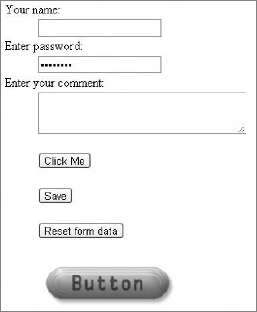
The purpose of the following code is to illustrate an implementation of the elements introduced previously because the resulting form may have little use in a real-world application:
class Application_Form_ExampleAdd extends Zend_Form {
public function init() {
 $this->setMethod('post');
 $this->addElement('text', 'name', array('label' => 'Your name:'));
 $this->addElement('password', 'pass', array( 'label' => 'Enter password:'));
 $this->addElement('textarea', 'comment', array('label' => 'Enter your comment:'));
 $this->addElement('button', 'button', array('label' => 'Click Me' ));
 $this->addElement('submit', 'submit', array('ignore' => true, 'label' => 'Save'));
 $this->addElement('reset', 'reset', array('label' => 'Reset form data'));
 $this->addElement('Image', 'imgButton', array('label' => '',
                   'image' => '../images/imageButton.png', 'alt' => 'Submit' ));
}}
code snippet /customization/zf/applications/forms/ExampleAdd.php
This example will render the form illustrated in Figure 5-18.
The form elements presented next are responsible for rendering various selection inputs such as checkboxes, radiobuttons, and select lists.
Zend_Form_Element_Checkbox— Represents an HTML checkbox input and allows you to return a specific value (basically, it works as a boolean value). When the checkbox is checked, the value is submitted; otherwise, nothing is submitted.$this->addElement('Checkbox', 'option', array('label' => 'Option', 'checkedValue' => '1', 'uncheckedValue' => '0', 'value' => '1'));
The preceding example will render a single standard checkbox field. It is possible to define the behavior of this element by setting a number of options. By setting the value option to 1, the rendered checkbox is checked by default.
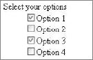
Zend_Form_Element_MultiCheckbox— This element is one of the nonstandard input field types. It allows you to group a set of related checkboxes. AMultiCheckboxensures that on form submission, the selected options are passed as an array. The following code illustrates implementation of theMultiCheckboxelement:$this->addElement('MultiCheckbox', 'options', array('label' => 'Select your options:', 'multiOptions' => array('opt_1' => 'Option 1', 'opt_2' => 'Option 2', 'opt_3' => 'Option 3',)));
To set some of the options as checked by default, you need to add another parameter to an options array, and it is a value array. The code for this should look like this:
$this->addElement('MultiCheckbox', 'options', array(
    'label' => 'Select your options:', 'multiOptions' => array(
               'opt_1' => 'Option 1', 'opt_2' => 'Option 2',
               'opt_3' => 'Option 3', 'opt_4' => 'Option 4'),
    'value' => array( 'opt_1', 'opt_3' )));
As a result of setting the value array, two options are checked by default. Figure 5-19 illustrates how this form element is rendered by the browser.
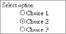
Zend_Form_Element_Radio— Renders a radio button element that is quite similar in terms of code implementation to theMultiCheckboxelement. The difference comes with avalueparameter that indicates a single radio button to be checked by default. The rendered form element is illustrated in Figure 5-20.$this->addElement('Radio', 'radioOption', array( 'label' => 'Select option', 'multiOptions' => array( 'opt_1' => 'Choice 1', 'opt_2' => 'Choice 2', 'opt_3' => 'Choice 3'), 'value' => 'opt_2'));Zend_Form_Element_Select— An HTML select tag is rendered by this element and is nearly identical in functionality and implementation to the element introduced previously, as you can see in the following code. The difference is that the rendered form element is a drop-down selection list, like the one illustrated in Figure 5-21.$this->addElement('Select', 'items', array( 'label' => 'Select an item:', 'multiOptions' => array( '1' => 'Item 1', '2' => 'Item 2', '3' => 'Item 3', ), 'value' => '2'));
By setting the value parameter to the value of an item, it is possible to specify which item is selected by default.

Zend_Form_Element_Multiselect— Allows a user to select multiple items from a selection list by holding the Shift or Control key. Thevalueparameter allows you to define multiple items that are selected by default. The rendered element is presented in Figure 5-22.$this->addElement('Multiselect', 'items', array( 'label' => 'Select multiple items:', 'multiOptions' => array( '1' => 'Item 1', '2' => 'Item 2', '3' => 'Item 3', '4' => 'Item 4', '5' => 'Item 5', '6' => 'Item 6', ), 'value' => array('2','3','5')));Zend_Form_Element_File— Provides a mechanism that makes file upload handling easier.Zend_File_Transfer— Used to handle internal file transfers. It is possible to influence file uploads by setting parameters such as destination that say where uploaded files should be saved, or by adding validators. Validators can automatically verify if an uploaded file has an acceptable file extension or that the file size does not exceed a defined limit. The following example illustrates how basic image uploading can be done:$this->addElement('File', 'file', array( 'label' => 'Upload an image:', 'destination' => 'upload', 'validators' => array( 'Extension'=> array( false, 'jpg,png,gif' ), 'Size' => array( false, 102400 )), ));

The form element rendered by the preceding code is a standard file selection input that allows users to browse through local files. Figure 5-23 illustrates this element.
So far when building forms, <dl> and <dt> tags were used every time the addElement() method was used. As a result, a form with a single text input field could look like this:
<form enctype="application/x-www-form-urlencoded" method="post" action="">
<dl class="zend_form">
<dt id="firstName-label">
        <label for="firstName" class="required">Your first name:</label>
    </dt><dd id="firstName-element">
        <input type="text" name="firstName" id="firstName" value="">
    </dd><dt id="submit-label">
    </dt><dd id="submit-element">
        <input type="submit" name="submit" id="submit" value="Save"> </dd>
</dl></form>
Zend_Form comes with decorators that can be used to customize the way the forms are rendered. These decorators can be applied to form elements to influence how the HTML code is generated. It can be used for setting the appearance of error messages or defining where field labels are displayed in relation to their input fields.
As a default behavior, the decorator wraps forms in a definition list <dl> tag and form elements in an item description <dd> tag. A decorator responsible for creating tags of a form element looks as follows:
$form->setDecorators(array('FormElements', array('HtmlTag',
                                           array('tag' => 'dl')),'Form'));
This code creates HTML output like the following:
<form action="/form/action" method="post">
    <dl></dl>
</form>
The following is a list of five decorators that are used by Zend_Form_Element by default:
ViewHelper— Simply specifies a view helper that is used to render the element.Errors— Used to add error messages to the element. If not specified, no message is added.Description— Can be used to specify the element description. As the default, the description is rendered in a<p>tag with a class of'description'. If not specified, no description is added.HtmlTag— Is used to wrap the element and errors messaged in an HTML tag. By default, it is the<dd>tag.Label— Defines a label to the element, and by default wraps it in a<dt>tag. If no label is specified then only the<dt>tag is rendered.
These decorators can be used to modify rendered form elements. The following code is an example of a basic login form with two fields — login name and password generated — without setting any custom decorators. Code required to render such a form can look like the following:
$this->addElement('text', 'login', array( 'label' => 'Enter login:',));
$this->addElement('password', 'password', array( 'label' => 'Enter password:',));
As a result the following HTML code is created:
<dt id="login-label">
    <label for="login" class="optional">Enter login:</label>
</dt><dd id="login-element">
    <input type="text" name="login" id="login" value="">
</dd><dt id="password-label">
<label for="password" class="optional">Enter password:</label>
</dt><dd id="password-element">
<input type="password" name="password" id="password" value="">
</dd>Form fields are inside <dd> tags, and labels are in <dt> tags. This makes the web browser render a form like that displayed in Figure 5-24.
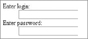
It is possible that, for some reason, you may want to have different HTML output than this solution offers. The following example illustrates how such modification can be done:
$this->addElement('text', 'login', array( 'label' => 'Enter login:',
    'Decorators' => array('ViewHelper', 'Errors', 'Description',
        array('HtmlTag', array('tag' => 'div', 'class' => 'login')),
        array('Label', array('tag' => 'b', 'placement' => 'prepend',
                    'class' => 'loginLabel')), ), ));
$this->addElement('password', 'password', array( 'label' => 'Enter password:',
    'Decorators' => array(
        'ViewHelper', 'Errors', 'Description',
        array('HtmlTag', array('tag' => 'div', 'class' => 'password')),
        array('Label', array('tag' => 'b', 'placement' => 'prepend',
                    'class' => 'passwordLabel')), ), ));
You can see that code from the previous example has been extended by adding the Decorators parameter to the addElement() method. In both elements, decorators are used to make labels precede input fields and to be enclosed in a <b></b> tags to display the text of the label in bold font. Input fields are also modified to be enclosed by <div> </div> tags. For each newly set <div> and <b> tag, classes are set to allow possible styling.
As a result of introducing these decorators, the HTML code is generated as follows:
<b id="login-label">
    <label for="login" class="loginLabel optional">Enter login:</label>
</b>
<div class="login">
    <input type="text" name="login" id="login" value="">
</div>
<b id="password-label">
    <label for="password" class="passwordLabel optional">Enter password:</label>
</b>
<div class="password">
    <input type="password" name="password" id="password" value=""></div>
And if no additional CSS styles are included, the form illustrated by Figure 5-25 would be rendered.
As you can see, it is possible to customize forms rendering by setting a number of parameters while creating form fields.
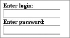
Spam refers not only to unwanted mail but also to any messages that can be displayed to any group of users after being posted by automated software through an unsecured form. A Captcha, which stands for Completely Automated Public Turing Test to Tell Computers and Humans Apart, is a program designed to protect websites against automated bots by generating tests that humans can pass but current computer programs cannot.
We all are accustomed to regular e-mail spam. If someone gets your e-mail address, you can anticipate your inbox getting filled with all kinds of junk. Web form spam is a slightly different problem.
Spam-bots are automated programs that surf the Web in search of web forms that can be used for spamming. Once a proper form is found, it is analyzed by a spambot to determine whether the form is usable for spamming purposes. Later, the targeted form is filled with data, hyperlinks, and content that is supposed to be exposed.
If a website contains at least one web form (e.g., registration, comments, message board, and so on), it is highly likely that spambots will infest this website soon enough. When that happens, forums are flooded with unwanted content and spam messages are posted on websites and displayed to the site visitors.
Captcha is a technology that is used as a security system by websites, aiming to allow only data submitted by humans. This mechanism is commonly used when we want to allow only users to pass any data through a form, or we want to prevent passing any values generated by computers. One good example of automatically generated values may be automated software that browses websites and automatically creates accounts on popular web applications. When Captcha is present in the registration form on such websites, this software cannot figure out what to enter into the Captcha field to pass the form validation. Other popular applications of Captcha are to protect systems vulnerable to e-mail spam or to block automated posting to blogs or forums.
Captcha protection is most commonly applied as automatically generated images (usually random sets of characters or random words) that must be recognized. It is possible for people to read the image, but computers should find that reading it is very difficult.
Unfortunately, many authors that design their own Captcha mechanisms are convinced that if an image is difficult to read for them, it will be difficult for the machine as well. This is not always the case.
Optical character recognition (OCR) software can be used to attempt to defeat Captcha. This software has a wide range of tools at its disposal that are dedicated to recognizing various fonts or handwritten characters. You can find online articles that describe how Captcha systems used by Windows Live, Gmail, or Yahoo have been broken. Examples of filtered-out Captcha tests are shown in Figures 5-26 and 5-27.

Captcha's strength lies elsewhere, namely in fact that it takes time to break a certain variation of the standard Captcha, and these variations can be easily changed.
Text-based Captcha, in which the user has to type a few letters that are displayed on the screen to complete the form submission, is not the only type of Captcha used on the Internet. There are other types of Captcha as well:
Math Captcha — User has to solve a mathematical equation (for example: What is the result of 2+2?).
Question Captcha — Solution requires answers to questions regarding some context (for example: What day is it today?).
Audio Captcha — User has to type a word that is played-back through speakers. This solution is similar to text-based Captcha and is frequently combined with it.
However, in those solutions, automatic generation is the usual problem.
In addition to this form-protection arsenal, there is the following:
ReCaptcha — a free antibot service that according to the authors of this service: "It helps digitize books, newspapers and old time radio shows." (See Figure 5-28).
We have mentioned that OCR programs are used for text recognition. During the digitization process of the scanned text (e.g., books), unintelligible fragments can often occur, for which the OCR software cannot give a clear result. Because humans are better than machines at dealing with the recognition of such fragments, the institutions involved in the digitization of library resources employ staff whose task is to verify the OCR results.
The idea of reCaptcha is that it can replace the work of the people who verify OCR results with a random group of users who can solve everyday millions of Captcha tasks. This solution can save thousands of work hours a day that otherwise would have to be done by employees working on scanned text digitization. This solution is important because it utilizes users' online activity to aid in the recognition of scanned text fragments that OCR software cannot handle. It combines websites' protection mechanisms with the beneficial work of digitization of library resources.
There are a few things to keep in mind while designing your own text-based Captcha system. If letters are close together, there is a high chance that two characters will be interpreted as one. Next, if nonlinear transformations are applied to a generated image, this transformation is difficult to identify on the basis of the outline of the text. Rotating or fluctuating a text string is not hard to undo automatically. More troublesome is the "fish-eye" effect applied in a few random places.
OCR usually gives several possible answers that are then checked in the dictionary, which makes it easier to choose the final text. For example when OCR recognizes a text like "thir," it assumes that it is the most probable word, "this," and not "their" or "third." That's why a completely random set of letters is much more difficult than dictionary words.
Let's proceed with implementing some Captcha protection in our forms. We will go through framework-specific solutions and those offered online. We will use a different solution for each framework because the implementation should be fairly similar regardless of framework chosen.
In the "Customizing Forms" section of this chapter, plug-ins were used to add multiple new elements that expanded functionality of the forms. To add Captcha elements to secure your forms from unwanted web-bots, you need to install plug-ins as well. Symfony offers various Captcha plug-ins that you can install easily. Plug-ins available to install are sfFormExtraPlugin, sfCaptchaGDPlugin, sfReCaptchaPlugin, gyCaptchaPlugin, sfPHPCaptchaPlugin, and sfCryptoCaptchaPlugin. Of these plug-ins, only the first three are available for the newest Symfony version. All unavailable plug-ins are also graphical systems similar to those described in the following section.
The sfWidgetFormReCaptcha widget is available when the sfFormExtraPlugin is installed. The sfFormExtraPlugin was used in the "Customizing Forms" section of this chapter. If you haven't read that section, you can follow these instructions.
To install sfFormExtraPlugin you simply need to type the following command into the console from your project directory:
symfony plugin:install sfFormExtraPlugin
Next it is recommended to clear cache data by typing the following command into the console:
symfony cache:clear
Note
If you haven't done so already, you need to acquire public and private keys by registering on the reCaptcha website at www.google.com/recaptcha.
Now it is possible to use sfWidgetFormReCaptcha() and sfValidatorReCaptcha() in your project. You can use the sfWidgetFormReCaptcha() widget to render the reCaptcha form element. This will require you to add one line to an array that is used in setWidgets(), and the same thing needs to be done for the setValidators() array.
Note that sfWidgetFormReCaptcha() requires you to set the public_key value, and sfValidatorReCaptcha() requires the private_key value. The public and private keys are are those values received from the reCaptcha website.
An example of the extended form used in Chapter 4 is shown here:
public function setup() {
  $this->setWidgets(array(
    'id'         => new sfWidgetFormInputHidden(),
    'first_name' => new sfWidgetFormInputText(),
    'last_name'  => new sfWidgetFormInputText(),
    'email'      => new sfWidgetFormInputText(),
    'phone'      => new sfWidgetFormInputText(),
    'address'    => new sfWidgetFormInputText(),
    'created'    => new sfWidgetFormDateTime(),
    'updated'    => new sfWidgetFormDateTime(),
    'captcha'    => new sfWidgetFormReCaptcha(
            array('public_key'=>'6Ldq_QkAAAAAAKEyHHrEbMz9FkDJaxwVGi7hjh22')), ));
  $this->setValidators(array(
    'id'          => new sfValidatorDoctrineChoice(array(
                     'model' => $this->getModelName(), 'column' => 'id',
                     'required' => false)),
    'first_name'  => new sfValidatorString(array(
                     'max_length' => 40, 'required' => false)),
    'last_name'   => new sfValidatorString(array(
                     'max_length' => 40, 'required' => false)),
    'email'       => new sfValidatorString(array(
                     'max_length' => 40, 'required' => false)),
    'phone'       => new sfValidatorInteger(array('required' => false)),
    'description' => new sfValidatorPass(array('required' => false)),
    'created'     => new sfValidatorDateTime(),
    'updated'     => new sfValidatorDateTime(),
    'captcha'     => new sfValidatorReCaptcha(
         array('private_key' => '6Ldq_QkAAAAAAJ-pdmnNYWxhe7GM1apcL6YI2B1_')), ));
code snippet /captcha/symfony/apps/frontend/lib/form/RegistrationForm.class.php
Now you need to make sure that the newly added form element will be rendered properly. To do so, add the following code into the _form.php file:
<tr><th><?php echo $form['captcha']->renderLabel() ?></th>
   <td><?php echo $form['captcha']->renderError() ?>
        <?php echo $form['captcha'] ?></td></tr>
As the result of the preceding code, a web form is rendered like the one illustrated in Figure 5-29.
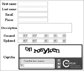
There are various Captcha solutions for CakePHP that you could include in your forms, but only OpenCaptcha and reCaptcha will be shown here because they are free solutions.
Installation of OpenCaptcha is quite easy, so let's incorporate it with one of the forms you created earlier in this chapter while upgrading your first application.
To begin, you need to dynamically create a filename (www.opencaptcha.com/img/{random}.jpgx) that will be displayed in the form page. The following code shows how to insert Captcha into your form. Basically it needs to be placed somewhere between the $form->create() and $form->end() functions:
<?php
echo $form->create('Address', array('type' => 'post', 'action' => 'add'));
echo '<fieldset><legend>New Address</legend>';
echo $form->input('first_name', array('type' => 'password')).
     $form->input('last_name', array('div' => array(
                                     'class'=>'last_name_class'))).
     $form->input('email').
     $form->input('phone').
     $form->input('address', array('rows' => '5','cols' => '5')).
     $form->input('group', array('options' => array(
                'Work' => array('Value 1'=>'Client', 'Value 2'=>'Coworker' ),
'Private' => array('Value 3'=>'Family', 'Value 4'=>'Friends')) )).
$form->input('created', array('timeFormat'=>'24', 'dateFormat' => 'MDY',
'minYear' => date('Y') - 20, 'maxYear' => date('Y') ))
$form->input('modified');
if( isset($opencaptcha) && $opencaptcha=='failed' ) {
echo " <script> alert('You Did Not Fill In The Security Code Correctly');
</script>";
}
$date = date("Ymd");
$rand = rand(0,9999999999999);
$img = "$date$rand.jpgx";
$height = "80";
$width = "240";
echo "<input type='hidden' name='img' value='$img'>";
echo "<img src='http://www.opencaptcha.com/img/$img'
alt='captcha' width='240' height='80' /><br />";
echo „<input type='text' name='code' value='Enter Above Code' size='35' />";
echo'</fieldset>';
echo $form->end('Save address');
?>
code snippet /captcha/cakephp/views/addresses/add.ctpTo generate a random filename, we have used the current timestamp and a random number. And to indicate a failed verification, a JavaScript alert is generated. An example of this plug-in is shown in Figure 5-30.
In the addresses_controller.php file, it is necessary to check whether www.opencaptcha.com/validate.php?img={imageName}&ans={usersAnswer} returns "pass" or "fail", as shown in the following code:
<?php
class AddressesController extends AppController {
  var $name = 'addresses';
  function add() {
    if (!empty($this->data) ) {
      if (file_get_contents("http://www.opencaptcha.com/validate.php?ans=".$_POST
      ['code']."&img=".$_POST['img'])=='pass' && $this->Address->save
      ($this->data) )
      {   $this->Session->setFlash('New address has been saved.');
          $this->redirect(array('action' => 'index'));
      } else { $this->set('opencaptcha', 'failed');
       $this->Session->setFlash('You Did Not Fill In The Security Code Correctly');
      }
}
}
} ?>
code snippet /captcha/cakephp/controllers/addresses_controller.phpThis should be enough to get OpenCaptcha working in our form. Alternatively, you could use the CakePHP $this->Session->setFlash() function to generate a message that will be displayed in case of Captcha verification failure.
Earlier you learned how to include reCaptcha into your Symfony application using two different methods. In this section, you learn how to use reCaptcha in CakePHP forms.
First obtain the private and public keys as was shown in the Symfony section. Then visit the Bakery web page for CakePHP and get the reCaptcha component and helper. Those files can be found at http://bakery.cakephp.org/articles/view/recaptcha-component-helper-for-cakephp.
The component file should be downloaded and placed in the /app/controllers/components/ directory and the helper file in the /app/views/helpers/ directory.
If you have acquired both reCaptcha keys as well as the component and helper files, you can modify your controller file by adding the $components array and a function beforeFilter(), as shown in the following code:
class AddressesController extends AppController {
  var $name = 'addresses';
  var $components = array('Recaptcha'); //new line
  function beforeFilter() {
   $this->Recaptcha->publickey = "6Ldq_QkAAAAAAKEyHHrEbMz9FkDJaxwVGi7hjh22";
   $this->Recaptcha->privatekey = "6Ldq_QkAAAAAAJ-pdmnNYWxhe7GM1apcL6YI2B1_"; }
}
Next you can modify your view so that the reCaptcha element is rendered. Just call the display_form() method of the $recaptcha object in your code.
<?php
    echo $form->create('Address', array('type' => 'post', 'action' => 'add'));
    echo '<fieldset><legend>New Address</legend>'.
    $form->input('first_name', array('type' => 'password')).
    $form->input('last_name', array('div' => array('class'=>'last_name_class'))).
    $form->input('email').
    $form->input('phone').
    $form->input('address', array('rows' => '5', 'cols' => '5')).
    $recaptcha->display_form('echo').
    .'</fieldset>'.
    $form->end('Save address');
?>
The preceding example renders a form similar to the one presented in Figure 5-31. Any difference should be only in the element styles.
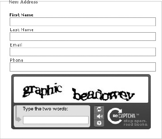
And finally, validation should be added in a controller file, as shown in the following example:
function add() {
  if (!empty($this->data) ) {
     if($this->Recaptcha->valid($this->params['form'])) // recaptcha validation
     {
         $this->Address->save($this->data)
         $this->Session->setFlash('New address has been saved.');
         $this->redirect(array('action' => 'index'));
     } else {
         $this->Session->setFlash('Invalid reCaptcha code');
     }
  }
}In this section, you will see how to implement Zend_Captcha into your Zend_Form. Zend Framework comes with four Captcha solutions to work with: Image, Figlet, Dumb, and ReCaptcha. Three of these are available by using Zend_Form_Element_Captcha; the other one relies on using Zend_Service_ReCaptcha.
First, Zend_Captcha_Image will be implemented because it is probably the most common type of Captcha used throughout the Internet. It relies on a user's ability to read obscured and disfigured text from an image. To add this type of Captcha in your form, you simply need to create a new form element using the addElement() method the same way it was done earlier with form building. The main difference is a set of options that can be used to customize the Captcha element. This solution requires a folder that has write permission. This is where Captcha images will be generated and saved. This folder should be located in the /public folder. (For this example, it will be in the ./public/captcha/ folder.) The following code shows that it is possible to specify your own font used to generate the Captcha image.
$this->addElement('captcha', 'captchaImage', array(
    'label' => 'Enter image code:',
'captcha' => array( 'captcha' => 'Image', 'wordLen' => 6, 'timeout' => 300,
'imgDir' => 'captcha/', 'imgUrl' => '../captcha/',
'width' => 250, 'height' => 150,
'font' => 'font/font.ttf', 'fontSize' => 34, ) ));In addition to the standard parameters that are used to customize form elements, there is a captcha parameter that is associated to an option array you can modify:
captcha— Specifies the type of Captcha that is used. In this case. it isimagetype Captcha.wordLen— Specifies how long the words generated in the image are.timeout— A number seconds after which image will become invalid. Here it is set to 5 minutes (300s).imgDir— A directory for storing generated images.imgUrl— Patch to generated images. It is used for display purposes.width— Width of the generated image.height— Height of the generated image.font— Patch to a font file.fontSize— Font size parameter.
The image rendered by a web browser looks like the one shown in Figure 5-32.
A form element generated that way has full functionality, and no additional coding is required to verify whether a user posted a valid image code.
The second implementation is Zend_Captcha_Figlet, and the implementation is quite similar to the previous one. The difference is only in the number of options that are used for customization.
$this->addElement('captcha', 'captchaFiglet', array(
    'label' => 'Enter image code:',
    'captcha' => array( 'captcha' => 'Figlet', 'wordLen' => 6, 'timeout' => 300,)
));
As you can see, the Captcha parameter is changed from image to figlet, and only the wordLen and timeout parameters are set. Functionality is similar to the previous example, and it requires a user to read the text from an image that is generated using only ASCII characters to form the text. Following is the HTML code that forms the text for a user to read:
<pre>
             ___     ____     ____     _____      _____
     __        / _ \\    / ___// /_ _//    / ____|| |    ___||
    |  \\  | / \ || \___ \\ -| ||- / //---`' | ||__
    |[]||  | \_/ ||     /     // _| ||_ \ \\___ | | ||__
    | _//    \___//    /___// /_____// \_____|| |_____||
    |_|`-`    `---`  `-----` `-----`     `----`     `-----`
    `-`
</pre>
The resulting web form rendered for this example will contain an "image" similar to the one presented in Figure 5-33.
Next you will see the one of the simplest Captcha elements: Zend_Captcha_Dumb. What it does is write random sets of letters and requires a user to write it backward into a text field. The implementation is as simple as this:
$this->addElement('captcha', 'captchaDumb', array(
    'captcha' => array( 'captcha' => 'Dumb', 'wordLen' => 6, 'timeout' => 300,) ));
No label is set in this example because the text next to the field is generated automatically. Figure 5-34 illustrates rendered Zend_Captcha_Dumb.
Finally Zend_Captcha_ReCaptcha is the reCaptcha service used to secure your forms. It requires having public and private keys that are given to registered users on the reCaptcha website.
When you have the required keys, you need to create an object for the reCaptcha Zend service, and the rest goes the same as previously:
$publicKey = "6Ldq_QkAAAAAAKEyHHrEbMz9FkDJaxwVGi7hjh22";
$privateKey = "6Ldq_QkAAAAAAJ-pdmnNYWxhe7GM1apcL6YI2B1_";
$recaptcha = new Zend_Service_ReCaptcha($publicKey, $privateKey);

$this->addElement('captcha', 'captchaRecaptcha', array(
    'captcha' => array( 'captcha' => 'ReCaptcha', 'service' => $recaptcha ) ));
Again, the value of the captcha parameter has been changed to ReCaptcha, and a new parameter defining the service is set. As a result, you will get a reCaptcha form element that looks like the one in Figure 5-35.