
Maps are a great data visualization tool, but sometimes a bar chart will do the trick. In this section, you will learn how to chart your data using pandas.DataFrame.
A DataFrame stores two-dimensional tabular data (think of a spreadsheet). Data frames can be loaded with data from many different sources and data structures, but what interests us is that it can load data from SQL queries.
The following code loads an SQL query into a DataFrame:
import pandas as pd
d=datetime.datetime.strptime('2017101','%Y%m%d').date()
cursor.execute("SELECT date, count(date) from incidents where date > '{}' group by date".format(str(d)))
df=pd.DataFrame(cursor.fetchall(),columns=["date","count"])
df.head()
The previous code selects the date, and then counts the occurrence of each date in incidents where the date is greater than October 1, 2017. The DataFrame is then populated using DataFrame (SQL, columns). In this case, the code passes cursor.fetchall(), and columns=["date","count"]. The resulting five records are displayed using df.head(). You could use df.tial() to see the last five records, or df to see it all.
The following screenshot shows df.head():
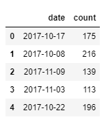
The preceding screenshot shows that on 2017-10-17, there were 175 incidents.
You can plot a DataFrame by calling the plot() method from the pandas library. The following code will plot a bar chart of the DataFrame df:
df.sort_values(by='date').plot(x="date",y="count",kind='bar',figsize=(15,10))
The previous code sorts the data frame by date. This is so that the dates are in chronological order in our bar chart. It then plots the data using a bar chart, with the x-axis being the date, and the y-axis is the count. I specified the figure size to make it fit on the screen. For smaller data sets, the default figure size tends to work well.
The following screenshot is the result of the plot:
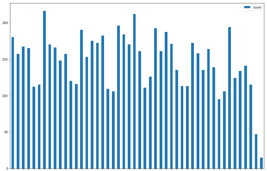
This chart shows us what a map cannot—that crimes seem to decrease on Friday and Saturday.
Let's walk through another example using beats. The following code will load crimes by beat:
cursor.execute("SELECT beats.beat, beats.agency, count(incidents.geom) as crimes from beats left join incidents on ST_Contains(beats.geom,incidents.geom) group by beats.beat, beats.agency")
area=pd.DataFrame(cursor.fetchall(),columns=["Area","Agency","Crimes"])
area.head()
The previous code selects the beat, agency, and count of incidents from the beats table. Notice the left join. The left join will give us beats that may have zero incidents. The join is based on an incident being in a beat polygon. We group by each field we selected.
The query is loaded into a DataFrame, and the head() is displayed. The result is in the screenshot as follows:
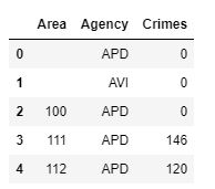
Notice that we have beats with no crimes instead of missing beats. There are too many beats to scroll through, so let's chart the DataFrame. We will use the plot function again, passing an x, y, kind, and figsize as follows:
area.plot(x="Area",y="Crimes",kind='bar',figsize=(25,10))
The result of the plot is shown in the following screenshot:
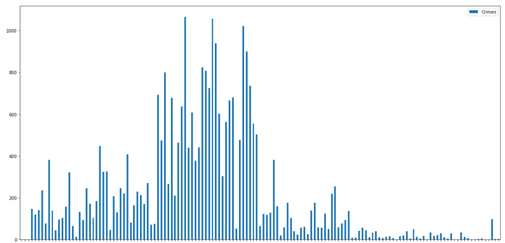
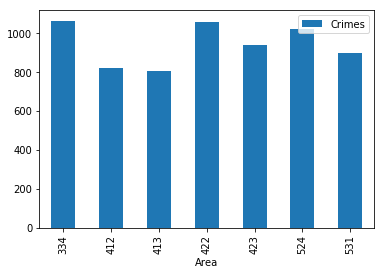
That is a lot of data to look through, but certain beats stand out as high crime. This is where data frames can help. You can query the DataFrame instead of requerying the database. The following code will plot the selection of beats:
area[(area['Crimes']>800)].plot(x='Area',y='Crimes',kind='bar')
The previous code passes an expression to the area. The expression selects records in the DataFrame column Crimes, where the value is over 800; Crimes is the count column. The result is shown in the following screenshot:
Loading your queries into a DataFrame will allow you to plot the data, but also to slice and query the data again without having to requery the database. You can also use the interactive widgets to allow users to modify the charts as you learned with the maps.