Table of Contents for
Mastering Responsive Web Design

Version ebook / Retour

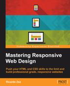
Cover image for bash Cookbook, 2nd Edition Mastering Responsive Web Design by Ricardo Zea Published by Packt Publishing, 2015
  1. Cover
  2. Table of Contents
  3. Mastering Responsive Web Design
  4. Mastering Responsive Web Design
  5. Credits
  6. About the Author
  7. Acknowledgment
  8. About the Reviewers
  9. www.PacktPub.com
  10. Preface
  11. What you need for this book
  12. Who this book is for
  13. Conventions
  14. Reader feedback
  15. Customer support
  16. 1. Harness the Power of Sass for Responsive Web Design
  17. The basic concepts of Sass for RWD
  18. Summary
  19. 2. Marking Our Content with HTML5
  20. The
  21. The
    element
  22. The
  23. The
    element
  24. The
  25. The
  26. Using WAI-ARIA landmark roles to increase accessibility
  27. A full HTML5 example page with ARIA roles and meta tags
  28. Output screenshots for desktop and mobile
  29. Summary
  30. 3. Mobile-first or Desktop-first?
  31. Sass mixins for the mobile-first and desktop-first media queries
  32. Dealing with legacy browsers
  33. How to deal with high-density screens
  34. Sometimes RWD is not necessarily the right solution
  35. Retrofitting an old website with RWD
  36. Retrofitting with AWD
  37. Retrofitting with RWD
  38. Summary
  39. 4. CSS Grids, CSS Frameworks, UI Kits, and Flexbox for RWD
  40. CSS grids
  41. CSS frameworks
  42. UI kits
  43. The pros and cons of CSS frameworks for RWD
  44. Creating a custom CSS grid
  45. Building a sample page with the custom CSS grid
  46. Stop using CSS grids, use Flexbox!
  47. Summary
  48. 5. Designing Small UIs Driven by Large Finger
  49. The posture patterns and the touch zones
  50. The nav icon – basic guidelines to consider for RWD
  51. The navigation patterns for RWD
  52. Summary
  53. 6. Working with Images and Videos in Responsive Web Design
  54. Third-party image resizing services
  55. The element and the srcset and sizes attributes
  56. Replacing 1x images with 2x images on the fly with Retina.js
  57. Making videos responsive
  58. The Vector Formats
  59. Summary
  60. 7. Meaningful Typography for Responsive Web Design
  61. Calculating relative font sizes
  62. Creating a Modular Scale for a harmonious typography
  63. Using the Modular Scale for typography
  64. Web fonts and how they affect RWD
  65. Sass mixin for implementing web fonts
  66. Using FlowType.js for increased legibility
  67. Summary
  68. 8. Responsive E-mails
  69. Don't overlook your analytics
  70. Recommendations for building better responsive e-mails
  71. Responsive e-mail build
  72. Third-party services
  73. Summary
  74. Index

Credits

Author

Ricardo Zea

Reviewers

Jean-Marc Buytaert

Tristan Denyer

Alan Plotko

J. Pedro Ribeiro

Marija Zaric

Commissioning Editor

Usha Iyer

Acquisition Editor

Meeta Rajani

Content Development Editor

Neeshma Ramakrishnan

Technical Editor

Manali Gonsalves

Copy Editors

Roshni Banerjee

Project Coordinator

Shweta H. Birwatkar

Proofreader

Safis Editing

Indexer

Priya Sane

Production Coordinator

Shantanu N. Zagade

Cover Work

Shantanu N. Zagade

Cover Image

Ricardo Zea