Table of Contents for
Mastering Responsive Web Design
 Mastering Responsive Web Design
Published by
Packt Publishing, 2015
Mastering Responsive Web Design
Published by
Packt Publishing, 2015
- Cover
- Table of Contents
- Mastering Responsive Web Design
- Mastering Responsive Web Design
- Credits
- About the Author
- Acknowledgment
- About the Reviewers
- www.PacktPub.com
- Preface
- What you need for this book
- Who this book is for
- Conventions
- Reader feedback
- Customer support
- 1. Harness the Power of Sass for Responsive Web Design
- The basic concepts of Sass for RWD
- Summary
- 2. Marking Our Content with HTML5
- The
element - The
element - The
- The
element - The
- The
- Using WAI-ARIA landmark roles to increase accessibility
- A full HTML5 example page with ARIA roles and meta tags
- Output screenshots for desktop and mobile
- Summary
- 3. Mobile-first or Desktop-first?
- Sass mixins for the mobile-first and desktop-first media queries
- Dealing with legacy browsers
- How to deal with high-density screens
- Sometimes RWD is not necessarily the right solution
- Retrofitting an old website with RWD
- Retrofitting with AWD
- Retrofitting with RWD
- Summary
- 4. CSS Grids, CSS Frameworks, UI Kits, and Flexbox for RWD
- CSS grids
- CSS frameworks
- UI kits
- The pros and cons of CSS frameworks for RWD
- Creating a custom CSS grid
- Building a sample page with the custom CSS grid
- Stop using CSS grids, use Flexbox!
- Summary
- 5. Designing Small UIs Driven by Large Finger
- The posture patterns and the touch zones
- The nav icon – basic guidelines to consider for RWD
- The navigation patterns for RWD
- Summary
- 6. Working with Images and Videos in Responsive Web Design
- Third-party image resizing services
- The
element and the srcset and sizes attributes - Replacing 1x images with 2x images on the fly with Retina.js
- Making videos responsive
- The Vector Formats
- Summary
- 7. Meaningful Typography for Responsive Web Design
- Calculating relative font sizes
- Creating a Modular Scale for a harmonious typography
- Using the Modular Scale for typography
- Web fonts and how they affect RWD
- Sass mixin for implementing web fonts
- Using FlowType.js for increased legibility
- Summary
- 8. Responsive E-mails
- Don't overlook your analytics
- Recommendations for building better responsive e-mails
- Responsive e-mail build
- Third-party services
- Summary
- Index
If you click on the Table view, all the text is now gone and we're left with a list of font sizes—ranging from ridiculously small values to just as ridiculously large values. But that's ok. That's the power of a modular scale.
This is what we see:
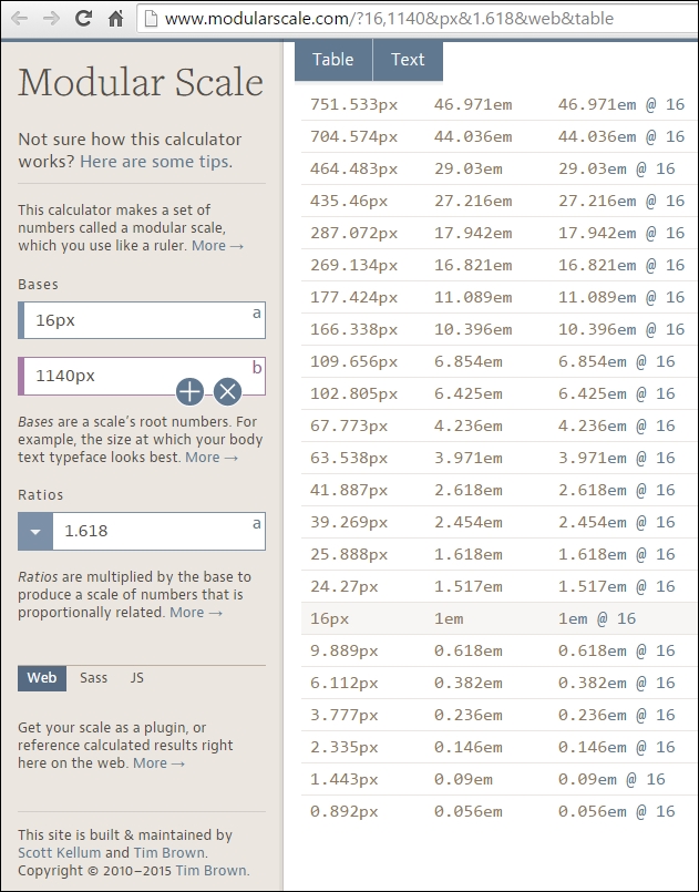
As you can see in the preceding image, there are three columns:
- The first column shows the font size in pixels.
- The second column shows the font size in ems.
- The third column shows the font size if the base was 16px.
What we need to do is focus on the first and second columns only. The highlighted row that says 16px, or 1em, is going to be the font size of our paragraphs. 16px is the default font size in most browsers.
Then, we define our header elements. Let's say we define only h1, h2 and h3. This means that we're going to select the rows above 16px that have larger font sizes:
<h1>: 39.269px that is 2.454em<h2>: 25.888px that is 1.618em<h3>: 24.57px that is 1.517em
For the <small> element, if we have any disclaimers on our site, we select the font size right below 16px:
<small>: 9.889px that is 0.618em
That's it! All the numbers in this Modular Scale are harmonious and when used together will provide a clear visual hierarchy, and a relationship difficult to obtain through other methods.
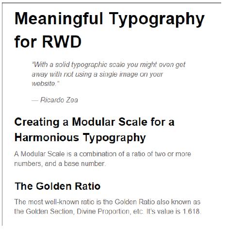
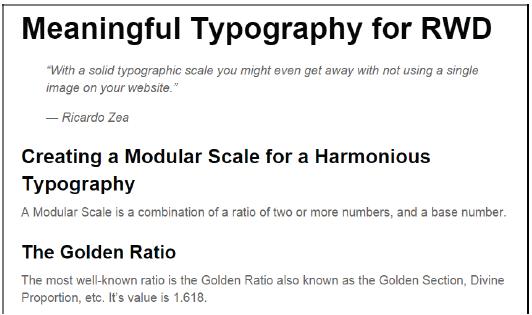
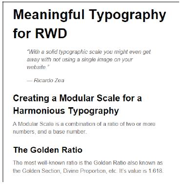
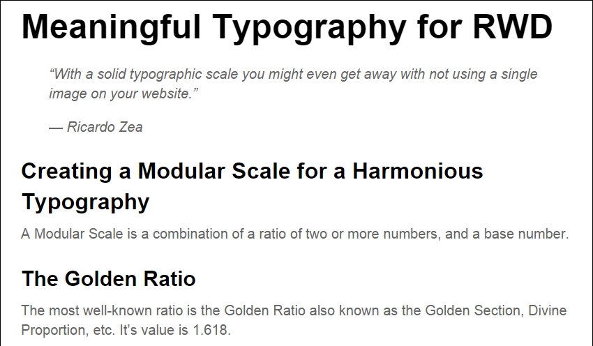
Here's an example.
This is the HTML:
<h1>Meaningful Typography for RWD</h1>
<blockquote>
    <p>"With a solid typographic scale you might even get away with not using a single image on your website."</p>
    <p>— Ricardo Zea</p>
</blockquote>
<h2>Creating a Modular Scale for a Harmonious Typography</h2>
<p>A Modular Scale is a combination of a ratio of two or more numbers, and a base number.</p>
<h3>The Golden Ratio</h3>
<p>The most well-known ratio is the Golden Ratio also known as the Golden Section, Divine Proportion, etc. It's value is 1.618.</p>
This is the SCSS:
//Mobile-first Media Query Mixin
@mixin forLargeScreens($media) {
    @media (min-width: $media/16+em) { @content; }
}
body {
    font:16px/1.4 Arial, "Helvetica Neue", Helvetica, sans-serif;
    @include forLargeScreens(640) {
        font-size: 20px;
    }
}
h1 { font-size: 2.454em; }
h2 { font-size: 1.618em; }
h3 { font-size: 1.517em; }body {
font: 16px/1.4 Arial, "Helvetica Neue", Helvetica, sans-serif;
}
@media (min-width: 40em) {
body {
font-size: 20px;
}
}
h1 {
font-size: 2.454em;
}
h2 {
font-size: 1.618em;
}
h3 {
font-size: 1.517em;
}The Modular Scale looks like this on small screens (510px wide):
And like this on large screens (850px wide):
The only potential problem we have here is what I mentioned before about using ems: keeping track of the font size of the parent elements can turn into a font management nightmare.
Using pixels is a no-go because of its scalability issues in legacy browsers. Using rems, however, keeps things in the "relative font size" realm, while providing a pixel-based mentality but without the scalability problems. This allows us to support legacy browsers that do not support rems.
Here's a demo I created for this in CodePen:
http://codepen.io/ricardozea/pen/0b781bef63029bff6155c00ff3caed85
All we need is a Sass mixin that allows us to set the font values without a specific unit and the mixin takes care of adding the font sizes for both rem-based for modern browsers, and the pixel-based for legacy browsers.
This is the Sass mixin created by Chris Coyer:
//Pixels to Rems Mixin
@mixin fontSize($sizeValue: 1.6) {
    font-size: ($sizeValue * 10) + px;
    font-size: $sizeValue + rem;
}@include fontSize(2);
This example uses the same markup used in an earlier chapter, so I'm going to show you only the SCSS and some screenshots.
The SCSS is as follows:
//Mobile-first Media Query Mixin
@mixin forLargeScreens($media) {
    @media (min-width: $media/16+em) { @content; }
}
//Pixels to Rems Mixin
@mixin fontSize($sizeValue: 1.6) {
    font-size: ($sizeValue * 10) + px;
    font-size: $sizeValue + rem;
}
//Base-10 model
html { font-size: 62.5%;
    @include forLargeScreens(640) {
        font-size: 75%;
    }
}
h1 { @include fontSize(3.9269); }
h2 { @include fontSize(2.5888); }
h3 { @include fontSize(2.457); }
p { @include fontSize(1.6); }
Consider the following points:
- We're setting the root font size to 62.5 percent, which reduces the font size to 10px. This makes declaring the font values a lot easier. For example, a font size of 1.2rem is the same as 12px, .8rem is 8px, and so on.
- We need to move the decimal dot from the pixel-based values one spot to the left when declaring the font size in rems. For example, according to our Modular Scale the
<h1>pixel size is 39.269px, so when declaring the font size in rems, we declare it as 3.9269, without a unit.
The compiled CSS is as follows:
html {
    font-size: 62.5%;
}
@media (min-width: 40em) {
    html {
        font-size: 75%;
    }
}
h1 {
    font-size: 39.269px;
    font-size: 3.9269rem;
}
h2 {
    font-size: 25.888px;
    font-size: 2.5888rem;
}
h3 {
    font-size: 24.57px;
    font-size: 2.457rem;
}
p {
    font-size: 16px;
    font-size: 1.6rem;
}
This is what the Modular Scale using the rems-to-pixels mixin looks like on small screens (510px wide):
This is what it looks like on large screens (850px wide):
Here's a demo I created for this in CodePen:
http://codepen.io/ricardozea/pen/8a95403db5b73c995443720475fdd900
The examples we just saw are using the system font Arial. Let's go ahead and spruce these examples up with some web fonts to give them a bit more character.