Table of Contents for
Mastering Responsive Web Design
 Mastering Responsive Web Design
Published by
Packt Publishing, 2015
Mastering Responsive Web Design
Published by
Packt Publishing, 2015
- Cover
- Table of Contents
- Mastering Responsive Web Design
- Mastering Responsive Web Design
- Credits
- About the Author
- Acknowledgment
- About the Reviewers
- www.PacktPub.com
- Preface
- What you need for this book
- Who this book is for
- Conventions
- Reader feedback
- Customer support
- 1. Harness the Power of Sass for Responsive Web Design
- The basic concepts of Sass for RWD
- Summary
- 2. Marking Our Content with HTML5
- The
element - The
element - The
- The
element - The
- The
- Using WAI-ARIA landmark roles to increase accessibility
- A full HTML5 example page with ARIA roles and meta tags
- Output screenshots for desktop and mobile
- Summary
- 3. Mobile-first or Desktop-first?
- Sass mixins for the mobile-first and desktop-first media queries
- Dealing with legacy browsers
- How to deal with high-density screens
- Sometimes RWD is not necessarily the right solution
- Retrofitting an old website with RWD
- Retrofitting with AWD
- Retrofitting with RWD
- Summary
- 4. CSS Grids, CSS Frameworks, UI Kits, and Flexbox for RWD
- CSS grids
- CSS frameworks
- UI kits
- The pros and cons of CSS frameworks for RWD
- Creating a custom CSS grid
- Building a sample page with the custom CSS grid
- Stop using CSS grids, use Flexbox!
- Summary
- 5. Designing Small UIs Driven by Large Finger
- The posture patterns and the touch zones
- The nav icon – basic guidelines to consider for RWD
- The navigation patterns for RWD
- Summary
- 6. Working with Images and Videos in Responsive Web Design
- Third-party image resizing services
- The
element and the srcset and sizes attributes - Replacing 1x images with 2x images on the fly with Retina.js
- Making videos responsive
- The Vector Formats
- Summary
- 7. Meaningful Typography for Responsive Web Design
- Calculating relative font sizes
- Creating a Modular Scale for a harmonious typography
- Using the Modular Scale for typography
- Web fonts and how they affect RWD
- Sass mixin for implementing web fonts
- Using FlowType.js for increased legibility
- Summary
- 8. Responsive E-mails
- Don't overlook your analytics
- Recommendations for building better responsive e-mails
- Responsive e-mail build
- Third-party services
- Summary
- Index
I bet you didn't see this one coming, ha!
Indeed, Flexbox is one amazing CSS property that opens the layout possibilities to new horizons. Here are a few things about Flexbox:
- Its browser support is perfect in modern browsers.
- IE8 and IE9 don't support it. But no worries, addressing these two browsers is very simple using the conditional classes technique mentioned in Chapter 3, Mobile-first or Desktop-first?
- IE10 only supports the 2012 syntax, but Autoprefixer (within Prepros) takes care of this old vendor prefixing automatically for us.
- We need to be careful when using Flexbox because the old
display: box;syntax causes the browser to do a multi-pass in the layout, deteriorating the performance. - In contrast, the new/current syntax
display: flex; has no impact on performance whatsoever. Browser performance issues have now been addressed since the old syntax, so we should be in good shape.
Tip
Paul Irish and Ojan Vafai explain this very well in the post Flexbox layout isn't slow, which can be found at http://updates.html5rocks.com/2013/10/Flexbox-layout-isn-t-slow.
Let's get down to it, shall we?
In the following example, we are going to build the same layout we built using the custom CSS grid but using the Flexbox property. This will help us better understand the power of Flexbox and eventually detach us from using CSS grids altogether, while keeping a more semantic structure in our HTML.
Tip
A great article by Chris Coyer, A Complete Guide to Flexbox, can be found at https://css-tricks.com/snippets/css/a-guide-to-flexbox/.
A few things to note about the sample page:
- We're including the conditional classes in the
<html>element to support legacy browsers and save one request to the server from using a JavaScript file dependency. - Since we're not using a CSS grid, the nested containers are just going to have to the term Content, display in them.
- We're going to use the HTML5 Shiv polyfill to have IE8 support for all the necessary HTML5 tags.
- Since IE10 has some math calculation issues with Flexbox, we need to target it with an
.ie10class added to the<html>element. We're going to accomplish this by using a simple script created by Louis Lazaris inside an IE-excluding Conditional Comment so that IE8/9 doesn't run the script. All the information about this script can be found in the article at http://www.impressivewebs.com/ie10-css-hacks/.
Tip
The script we're using to target IE10 is not using User Agent sniffing. UA sniffing isn't considered a good practice. The script is using a Conditional Compilation statement. More information about the @cc_on statement can be found in the Microsoft Developer Network (MSDN): https://msdn.microsoft.com/en-us/library/8ka90k2e(v=vs.94).aspx.
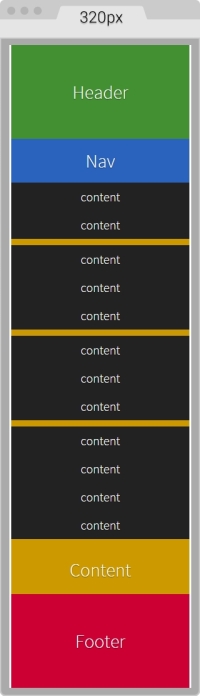
This is what the Flexbox layout looks like on small screens (320px wide):
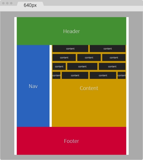
This is what it looks like on large screens. This screen is 768px wide but the content is 40em (640px):
Here's the markup we're going to use in the sample page:
<!DOCTYPE html>
<!--[if IE 8]> <html class="no-js ie8" lang="en"> <![endif]-->
<!--[if IE 9]> <html class="no-js ie9" lang="en"> <![endif]-->
<!--[if gt IE 9]><!--><html class="no-js" lang="en"><!--<![endif]-->
<head>
    <meta charset="utf-8">
    <meta name="viewport" content="width=device-width, initial-scale=1">
    <meta http-equiv="X-UA-Compatible" content="IE=edge">
    <title>Basic Layout Using Flexbox</title>
    <!--[if lt IE 9]>
      <script src="http://html5shiv.googlecode.com/svn/trunk/html5.js">
	  </script>
    <![endif]-->
	<!--[if !IE]><!-->
      <script>
        if (/*@cc_on!@*/false && document.documentMode === 10) {
          document.documentElement.className+=' ie10';
        }
      </script>
    <!--<![endif]-->
</head>
<body>
    <h1>Basic Layout Using Flexbox</h1>
    <main class="main-container" role="main">
        <header role="banner">Header</header>
        <!-- Flexible elements need to be wrapped in a container -->
        <div class="flex-container">
            <nav role="navigation">Nav</nav>
            <section>
                <div class="flex-container row-1">
                    <div class="level-1">content</div>
                    <div class="level-1">content</div>
                </div>
                <div class="flex-container row-2">
                    <div class="level-1">content</div>
                    <div class="level-1">content</div>
                    <div class="level-1">content</div>
                </div>
                <div class="flex-container row-3">
                    <div class="level-1">content</div>
                    <div class="level-1">content</div>
                    <div class="level-1">content</div>
                    <div class="level-1">content</div>
                </div>
                <div class="flex-container row-4">
                    <div class="level-1 content-a">content</div>
                    <div class="level-1 content-b">">content</div>
                    <div class="level-1 content-c">content</div>
                </div>
                <p>Content</p>
            </section>
        </div>
        <footer role="contentinfo">Footer</footer>
    </main>
</body>
</html>
The SCSS code has a few sections similar to the code used in the CSS grid. However, there are important differences.
Let's take it apart.
We're going to start by creating the Credits section, the box-sizing: border-box; parameter to account for the padding inside the containers rather than outside, the mobile-first mixin, and the main container properties:
/*
    Custom Fluid & Responsive Grid System
    Structure: Mobile-first (min-width)
    Syntax: SCSS
    Grid: Flexbox-based
    Created by: Your Name
    Date: MM/DD/YY
*/
*, *:before, *:after {
  box-sizing: border-box;
}
//Moble-first Media Queries Mixin
@mixin forLargeScreens($media) {
    @media (min-width: $media/16+em) { @content }
}
//Main container
.main-container {
    width: 100%;
    //Change this value to ANYTHING you want, no need to edit anything else
    max-width: 1200px;
    //Any value you want
    padding: 0 1.67%;
    margin: auto;
}Now, let's add the properties for the Flexbox container that acts somewhat similar to the .row in the CSS grid. The code is as follows:
/*
    Custom Fluid & Responsive Grid System
    Structure: Mobile-first (min-width)
    Syntax: SCSS
    Grid: Flexbox-based
    Created by: Your Name
    Date: MM/DD/YY
*/
*, *:before, *:after {
    box-sizing: border-box;
}
//Moble-first Media Queries Mixin
@mixin forLargeScreens($media) {
    @media (min-width: $media/16+em) { @content }
}
//Main container
.main-container {
    width: 100%;
  //Change this value to ANYTHING you want, no need to edit anything else
    max-width: 1200px;
    //Any value you want
    padding: 0 1.67%;
    margin: auto;
}
//Flexbox container
.flex-container {
    margin-bottom: 10px;
    //Remove the margin from the last flexbox container
    &:last-of-type {
        margin-bottom: 0;
    }
    @include forLargeScreens(640) {
        display: flex;
    }
}
As you can see, we're adding margin-bottom: 10px; to separate the content rows. However, we're removing that margin on the last Flexbox container so that it doesn't generate unwanted extra padding at the end.
Then we're including the mobile-first mixin that targets a screen width of 640px (40em). This means that we're only going to use Flexbox for large screens, but for small screens, we are not going to use it.
Now, let's add the .83% left and right margins to the columns on large screens. On small screens, the columns have no margins. Remember that 10px = 0.83%.
We are going to use the attribute selector with the star/asterisk so we can target all the DIVs that contain at least one value with the term level- in their class name. We're also going to remove the left margin on the first container and the right margin on the last container, so our DIVs are flushed to the edges of their parent containers. The code is as follows:
/*
    Custom Fluid & Responsive Grid System
    Structure: Mobile-first (min-width)
    Syntax: SCSS
    Grid: Flexbox-based
    Created by: Your Name
    Date: MM/DD/YY
*/
*, *:before, *:after {
    box-sizing: border-box;
}
//Moble-first Media Queries Mixin
@mixin forLargeScreens($media) {
    @media (min-width: $media/16+em) { @content }
}
//Main container
.main-container {
    width: 100%;
    //Change this value to ANYTHING you want, no need to edit anything else
    max-width: 1200px;
    //Any value you want
    padding: 0 1.67%;
    margin: auto;
}
//Flexbox container
.flex-container {
    margin-bottom: 10px;
    //Remove the margin from the last flexbox container
    &:last-of-type {
        margin-bottom: 0;
    }
    @include forLargeScreens(640) {
        display: flex;
    }
}
//DIVs inside the flex container
[class*="level-"] {
    width: 100%;
    @include forLargeScreens(640) {
        margin: 0 .83%;
    }
    &:first-of-type { margin-left: 0; }
    &:last-of-type { margin-right: 0; }
}
Now, the Header and Footer sections are 100% wide on both small and large screens, so they don't need any specific rules. This example, however, adds a few properties to both the Header and Footer sections but only for styling reasons, not really for layout. Nonetheless, the Nav and Section containers do have particular widths depending on the available screen width.
On small screens, the Nav and Section containers are 100% wide, while on large screens they stay side by side; The Nav container is 33% wide with a right margin to create the gutter of 1.67% (which equals 20px). The Section container is 65.33% wide on large screens. Here's the formula: 33% + 1.67% + 65.33 = 100%.
Let's go ahead and define those properties for the Nav and Section containers:
/*
    Custom Fluid & Responsive Grid System
    Structure: Mobile-first (min-width)
    Syntax: SCSS
    Grid: Flexbox-based
    Created by: Your Name
    Date: MM/DD/YY
*/
*, *:before, *:after {
    box-sizing: border-box;
}
//Moble-first Media Queries Mixin
@mixin forLargeScreens($media) {
    @media (min-width: $media/16+em) { @content }
}
//Main container
.main-container {
    width: 100%;
    //Change this value to ANYTHING you want, no need to edit anything else
    max-width: 1200px;
    //Any value you want
    padding: 0 1.67%;
    margin: auto;
}
//Flexbox container
.flex-container {
    margin-bottom: 10px;
    //Remove the margin from the last flexbox container
    &:last-of-type {
        margin-bottom: 0;
    }
    @include forLargeScreens(640) {
        display: flex;
    }
}
//DIVs inside the flex container
[class*="level-"] {
    width: 100%;
    @include forLargeScreens(640) {
        margin: 0 .83%;
    }
    &:first-of-type { margin-left: 0; }
    &:last-of-type { margin-right: 0; }
}
//Nav
nav {
    width: 100%;
    @include forLargeScreens(640) {
        width: 33%;
        margin-right: 1.67%;
    }
}
//Content area
section {
    width: 100%;
    @include forLargeScreens(640) {
        width: 65.33%;
    }
}
Finally, for this example, we're going to define widths for different content sections with a black background so you can have a clear idea about how to nest containers.
What we're basically doing is assigning specific but different widths to both .content-a and .content-c, which are the first and third content areas of that row. There's no need to assign a width to the second content area, unless we wanted to. Flexbox will make that second container fully occupy all the remaining space between the first and third content areas.
The reason I'm using arbitrary values such as 30% and 42% is to show you that we can play with these values all we want and Flexbox will always try to maintain these proportions as long as there's space available.
Let's add those properties now for the different nested containers:
/*
    Custom Fluid & Responsive Grid System
    Structure: Mobile-first (min-width)
    Syntax: SCSS
    Grid: Flexbox-based
    Created by: Your Name
    Date: MM/DD/YY
*/
*, *:before, *:after {
    box-sizing: border-box;
}
//Moble-first Media Queries Mixin
@mixin forLargeScreens($media) {
    @media (min-width: $media/16+em) { @content }
}
.main-container {
    //Change this value to ANYTHING you want, no need to edit anything else.
    width: 100%;
    max-width: 1200px;
    //Any value you want
    padding: 0 1.67%;
    margin: auto;
}
//Flexbox container
.flex-container {
    margin-bottom: 10px;
    //Remove the margin from the last flexbox container
    &:last-of-type {
        margin-bottom: 0;
    }
    @include forLargeScreens(640) {
        display: flex;
    }
}
//DIVs inside the flex container
[class*="level-"] {
    width: 100%;
    @include forLargeScreens(640) {
        margin: 0 .83%;
    }
    &:first-of-type { margin-left: 0; }
    &:last-of-type { margin-right: 0; }
}
//Nav
nav {
    width: 100%;
    @include forLargeScreens(640) {
        width: 33%;
        margin-right: 1.67%;
    }
}
//Content area
section {
    width: 100%;
    @include forLargeScreens(640) {
        width: 65.33%;
    }
}
//Different width containers
.content- {
    @include forLargeScreens(640) {
        &a { width: 30%; }
        &c { width: 42%; }
    }
}
Using Flexbox doesn't come with its caveats regarding IE8, IE9 and IE10 as well.
As with legacy browsers, it's a matter of tweaking values and testing to get the best results. And remember that websites do not have to look exactly the same in every browser.
Let's clarify a few things. The classes .ie8 and .ie9 come from the Conditional Classes in the <html> element. The class .ie10 comes from the script inside an IE-excluding Conditional Comment. Therefore, IE8 and IE9 are unable to run this script. But no need to fret, the solutions are simple, you'll see. Let's check them out.
The first thing we do is create a rule for all three: IE8, IE9 and IE10. In this rule, we're going to declare the widths of the nested containers in percentages. Truth be told, we could declare these widths in pixels as well, but we're going to use percentages for consistency reasons with all other responsive examples.
Here's the one rule that… well, rules them all:
/*
    Custom Fluid & Responsive Grid System
    Structure: Mobile-first (min-width)
    Syntax: SCSS
    Grid: Flexbox-based
    Created by: Your Name
    Date: MM/DD/YY
*/
*, *:before, *:after {
    box-sizing: border-box;
}
//Moble-first Media Queries Mixin
@mixin forLargeScreens($media) {
    @media (min-width: $media/16+em) { @content }
}
.main-container {
    //Change this value to ANYTHING you want, no need to edit anything else.
    width: 100%;
    max-width: 1200px;
    //Any value you want
    padding: 0 1.67%;
    margin: auto;
}
//Flexbox container
.flex-container {
    margin-bottom: 10px;
    //Remove the margin from the last flexbox container
    &:last-of-type {
        margin-bottom: 0;
    }
    @include forLargeScreens(640) {
        display: flex;
    }
}
//DIVs inside the flex container
[class*="level-"] {
    width: 100%;
    @include forLargeScreens(640) {
        margin: 0 .83%;
    }
    &:first-of-type { margin-left: 0; }
    &:last-of-type { margin-right: 0; }
}
//Nav
nav {
    width: 100%;
    @include forLargeScreens(640) {
        width: 33%;
        margin-right: 1.67%;
    }
}
//Content area
section {
    width: 100%;
    @include forLargeScreens(640) {
        width: 65.33%;
    }

}
//Different width containers
.content- {
    @include forLargeScreens(640) {
        &a { width: 30%; }
        &c { width: 42%; }
    }
}
//All IEs
.ie8, .ie9, .ie10 {
    //Exact values (desired width − 0.83% = result %) are commented, but they need tweaked to have one value for all IEs
    section {
        .row-1 .level-1 { width: 49.17%; }
        //Exact value is 32.17%
        .row-2 .level-1 { width: 32.20%; }
        //Exact value is 24.17%
        .row-3 .level-1 { width: 23.75%; }
        .row-4 {
          .content-a { width: 19.17%; }
          .content-b { width: 49.17%; }
          //Exact value is 29.17%
          .content-c { width: 28.3%; }
        }
    }
}
We will now declare the rule that will handle the values for IE8 and IE9. We declare overflow: hidden; to clear the floats in their parent container, the .flex-container DIVs. We then float left to the Nav and Content sections and give them a height; this height is merely for styling purposes.
We give the Nav section a width and a margin right of 1% to keep things simple. We assign a width to the Content section as well. Then, we use the Footer to clear the floating Nav and Content sections with both the clear: both; and zoom: 1; parameters for good measure.
Here's the SCSS for IE8/9:
/*
    Custom Fluid & Responsive Grid System
    Structure: Mobile-first (min-width)
    Syntax: SCSS
    Grid: Flexbox-based
    Created by: Your Name
    Date: MM/DD/YY
*/
*, *:before, *:after {
    box-sizing: border-box;
}
//Moble-first Media Queries Mixin
@mixin forLargeScreens($media) {
    @media (min-width: $media/16+em) { @content }
}
.main-container {
    //Change this value to ANYTHING you want, no need to edit anything else.
    width: 100%;
    max-width: 1200px;
    //Any value you want
    padding: 0 1.67%;
    margin: auto;
}
//Flexbox container
.flex-container {
    margin-bottom: 10px;
    //Remove the margin from the last flexbox container
    &:last-of-type {
        margin-bottom: 0;
    }
    @include forLargeScreens(640) {
        display: flex;
    }
}
//DIVs inside the flex container
[class*="level-"] {
    width: 100%;
    @include forLargeScreens(640) {
        margin: 0 .83%;
    }
    &:first-of-type { margin-left: 0; }
    &:last-of-type { margin-right: 0; }
}
//Nav
nav {
    width: 100%;
    @include forLargeScreens(640) {
        width: 33%;
        margin-right: 1.67%;
    }
}
//Content area
section {
    width: 100%;
    @include forLargeScreens(640) {
        width: 65.33%;
    }
}
//Different width containers
.content- {
    @include forLargeScreens(640) {
        &a { width: 30%; }
        &c { width: 42%; }
    }
}
//All IEs
.ie8, .ie9, .ie10 {
    //Exact values (desired width − 0.83% = result %) are commented, but they need tweaked to have one value for all IEs
    section {
        .row-1 .level-1 { width: 49.17%; }
        //Exact value is 32.17%
        .row-2 .level-1 { width: 32.20%; }
        //Exact value is 24.17%
        .row-3 .level-1 { width: 23.75%; }
        .row-4 {
          .content-a { width: 19.17%; }
          .content-b { width: 49.17%; }
          //Exact value is 29.17%
          .content-c { width: 28.3%; }
        }
    }
}
//IE8/9
.ie8, .ie9 {
    .flex-container { overflow: hidden; }
    nav, section { float: left; min-height: 440px; }
    nav { width: 29%; margin-right: 1%; }
    section { width: 70%; }
    footer { clear: both; zoom: 1; }
}
Finally, we seal the deal for legacy browsers with a couple of rules: one for IE8 and another one for IE9 using the attribute selector for all the nested containers.
For IE8, we give the nested containers display: inline-block; rather than float: left; to make the groups of nested containers centered in their corresponding rows. If we don't do this, there are going to be weird gaps on the right side of all the rows. We're also going to declare a left and right margin of .2%. After testing, any larger value makes the nested containers wrap.
For IE9, we're going to float the nested containers to the left.
Let's check these two rules out:
/*
  Custom Fluid & Responsive Grid System
    Structure: Mobile-first (min-width)
    Syntax: SCSS
    Grid: Flexbox-based
    Created by: Your Name
    Date: MM/DD/YY
*/
*, *:before, *:after {
    box-sizing: border-box;
}
//Moble-first Media Queries Mixin
@mixin forLargeScreens($media) {
    @media (min-width: $media/16+em) { @content }
}
.main-container {
    //Change this value to ANYTHING you want, no need to edit anything else.
    width: 100%;
    max-width: 1200px;
    //Any value you want
    padding: 0 1.67%;
    margin: auto;
}
//Flexbox container
.flex-container {
    margin-bottom: 10px;
    //Remove the margin from the last flexbox container
    &:last-of-type {
        margin-bottom: 0;
    }
  @include forLargeScreens(640) {
        display: flex;
    }
}
//DIVs inside the flex container
[class*="level-"] {
    width: 100%;
    @include forLargeScreens(640) {
        margin: 0 .83%;
    }
    &:first-of-type { margin-left: 0; }
    &:last-of-type { margin-right: 0; }
}
//Nav
nav {
    width: 100%;
    @include forLargeScreens(640) {
        width: 33%;
        margin-right: 1.67%;
    }
}
//Content area
section {
    width: 100%;
    @include forLargeScreens(640) {
        width: 65.33%;
    }
}
//Different width containers
.content- {
    @include forLargeScreens(640) {
        &a { width: 30%; }
        &c { width: 42%; }
    }
}
//All IEs
.ie8, .ie9, .ie10 {
    //Exact values (desired width − 0.83% = result %) are commented, but they need tweaked to have one value for all IEs
    section {
        .row-1 .level-1 { width: 49.17%; }
        //Exact value is 32.17%
        .row-2 .level-1 { width: 32.20%; }
        //Exact value is 24.17%
        .row-3 .level-1 { width: 23.75%; }
        .row-4 {
          .content-a { width: 19.17%; }
          .content-b { width: 49.17%; }
          //Exact value is 29.17%
          .content-c { width: 28.3%; }
        }
    }
}
//IE8/9
.ie8, .ie9 {
    .flex-container { overflow: hidden; }
    nav, section { float: left; min-height: 440px; }
    nav { width: 29%; margin-right: 1%; }
    section { width: 70%; }
    footer { clear: both; zoom: 1; }
}
//IE8
.ie8 {
    [class*="level-"] {
        display: inline-block;
        margin: 0 .2%;
    }
}
//IE9
.ie9 {
    [class*="level-"] { float: left; }
}